Embed Size (px)
Citation preview
ECMWF COPERNICUS REPORT
Copernicus Atmosphere Monitoring Service
Annual air quality assessment report 2016
Issued by: INERIS/ Laurence ROUÏL
Date: 14/02/2019
Ref: CAMS71_2016SC3_D71.2.11_201811_2016AAR_v2

This document has been produced in the context of the Copernicus Atmosphere Monitoring Service (CAMS).
The activities leading to these results have been contracted by the European Centre for Medium-Range Weather Forecasts,
operator of CAMS on behalf of the European Union (Delegation Agreement signed on 11/11/2014). All information in this
document is provided "as is" and no guarantee or warranty is given that the information is fit for any particular purpose.
The user thereof uses the information at its sole risk and liability. For the avoidance of all doubts, the European Commission
and the European Centre for Medium-Range Weather Forecasts has no liability in respect of this document, which is merely
representing the authors view.

Copernicus Atmosphere Monitoring Service
CAMS71_2016SC3 – Annual air quality assessment report for 2016 Page 3 of 47
Annual air quality assessment report -2016
INERIS Laurence ROUÏL
Frédérik MELEUX
Date: 14/02/2019
Ref: CAMS71_2016SC3_D71.2.11_201811_2016AAR_v2

CAMS71_2016SC3 – Annual air quality assessment report for 2016 Page 4 of 47
Table of Contents
1. Rationale 10
2. Ozone 12
2.1 Annual and seasonal averages 12
2.2 Exposure indicators 16
2.3 Peaks indicators 23
2.4 Conclusions for ozone 24
3. Nitrogen dioxide 26
3.1 Annual and seasonal averages 26
3.2 Conclusions for nitrogen dioxide 30
4. Particulate Matter (PM10) 31
4.1 Annual and seasonal averages 31
4.2 Daily exceedances 33
4.3 Conclusions for PM10 36
5. Particulate Matter (PM2.5) 37
5.1 Annual and seasonal averages 37
5.2 Conclusions for PM2.5 41

CAMS71_2016SC3 – Annual air quality assessment report for 2016 Page 5 of 47
Table of figures
Annual average of ozone concentrations in 2016 13
Annual average of ozone concentrations in 2015 (left) and 2014 (right) (Source : CAMS – 2015 and 2014
air quality assessment reports) 13
Seasonal averages of ozone concentrations in 2016: Spring (a), Summer (b), autumn (c), winter(d) 14
Surface air temperature in 2016 relative to its 1981-2010 average (a) May, (b) June, (c) July, (d) August
(source: ECMWF, Copernicus Climate Change Service -C3S temperature re-analyses) 15
AOT40 indicator in 2016 – CAMS re-analysis 17
AOT indicator in 2016 issued from ozone observations reported to the EEA (source: EEA data viewer) 18
SOMO35 indicator in 2016 – CAMS re-analysis 19
SOMO35 indicator in 2016 issued from ozone observations reported to the EEA (source: EEA data viewer)
19
SOMO35 indicator in 2015 (source : CAMS – 2015 air quality assessment report) 20
Number of days when 120 µg/m3 (maximum daily 8-hours average) was exceeded in 2016 - CAMS re-
analysis 21
Number of days when 120 µg/m3 (maximum daily 8-hours average) was exceeded in 2016 -CAMS re-
analysis- zoom over the Pô Valley (left) and the Benelux (right) 21
Number of days when 100 µg/m3 (maximum daily 8-hours average) was exceeded in 2016 -CAMS re-
analysis- zoom over the Pô Valley (left) and the “Black Triangle” (right) 22
Number of hours when the information ozone threshold (180 µg/m3) was exceeded in 2016 -CAMS re-
analysis - 23
Stations where the information ozone threshold (180 µg/m3) has been exceeded in 2016 (in dark
orange) according to observation data reported to the EEA (Source : EEA data viewer) 24
Annual average of NO2 concentrations in 2016 27
Annual average of NO2 concentrations in 2015 (Source : CAMS – 2015 air quality assessment report) 27
Annual average of NO2 concentrations in 2016 - CAMS re-analysis- zoom over the Pô Valley (left) and the
Benelux (right) 28
NO2 annual average in 2016 at the monitoring background stations reported to the EEA (source: EEA
data viewer) 28
Seasonal averages of NO2 concentrations in 2016; Spring (a), Summer (b), autumn (c), winter (d) 29
Surface air temperature in 2016 relative to its 1981-2010 average (a) October, (b) November (source:
ECMWF, Copernicus Climate Change Service -C3S temperature re-analyses) 30
Annual average of PM10 concentrations in 2016- CAMS re-analysis 32
PM10 annual average in 2016 at the monitoring background stations reported to the EEA (source: EEA
data viewer) 32
Seasonal averages of PM10 concentrations in 2016; Spring (a), Summer (b), autumn (c), winter (d) 33
Number of days when the daily limit PM10 value was exceeded in 2016 34
Number of days when PM10 daily average exceeded the daily limit value in 2016 at the monitoring
background stations reported to the EEA (source: EEA data viewer) 35
Number of days when the daily limit PM10 value was exceeded in 2016; zooms over the Pô Valley (left)
and the “Black triangle” (right) 35
Annual average of PM2.5 concentrations in 2016- CAMS re-analysis- 38
PM2.5 annual average in 2016 at the monitoring background stations reported to the EEA (source: EEA
data viewer) 38
Seasonal averages of PM2.5 concentrations in 2016; Spring (a), Summer (b), autumn (c), winter (d) 39
Number of days when daily average exceeded 25 µg/m3 in 2016 -CAMS re-analysis 40
Number of days when daily average exceeded 25 µg/m3 in 2016 -CAMS re-analysis; zooms over Benelux
(left), the “Black triangle” (right) and the Pô valley (bottom) 40
Taylor diagram synthesizing scores for IRA2016 and VRA2016 by station typology for ozone daily
maximum indicator 44
Taylor diagram synthesizing scores for IRA2016 and VRA2016 by station typology for PM10 daily average
45

CAMS71_2016SC3 – Annual air quality assessment report for 2016 Page 6 of 47
Taylor diagram synthesizing scores for IRA2016 and VRA2016 by station typology for PM2.5 daily average
45
Number of days when daily average exceeded 35 µg/m3 in 2016 simulated by CAMS Ensemble model:
interim re-analyses (left) and validated re-analyses (right) 46

CAMS71_2016SC3 – Annual air quality assessment report for 2016 Page 7 of 47
Executive summary
This report is the CAMS air quality annual assessment report for the year 2016 delivered by the CAMS
regional air quality re-analysis multi-model system implemented. The air quality assessment
European maps presented and discussed in this report, result from an Ensemble model built upon
seven European regional air quality modelling and data assimilation systems. Such approaches
combine raw simulation outputs from chemistry-transport models (CTM) with validated observations
data issued from monitoring in-situ stations from regulatory air quality networks implemented in the
EU Member States to comply with air quality Directives (2008/50/EC).
For main air pollutants - ozone, nitrogen dioxide, and particulate matter (PM10 and PM2.5)- regulatory
and exposure indicators established on yearly and seasonal bases are presented. It is expected this
very comprehensive information on air pollution patterns and levels, can be considered as the “best
estimate” to describe status of air pollution in Europe in 2016. It should be noted that within CAMS
quality assurance processes, systematic evaluation of the modeled and data assimilated results
against a relevant set of dedicated observation data (not used for assimilation in the models) is
performed. It showed very satisfactory performances confirming reliability and quality of the results
presented, and the relevance of the approach to support analysis of air pollution issues in Europe and
support decision making.
It is important to note that CAMS regional air quality re-analyses are relevant for assessing rural and
urban background concentrations and areas where they exceed limit values and quality objectives
set in the Directive on ambient air pollution and cleaner air in Europe (2008/50/EC). However, it is
also agreed that the CAMS air quality regional assessments are not suited for mapping local
exceedances (street canyons, industrial sites). Models resolution (10 km) is too coarse to simulate
correctly such situations. Indicators fields mapped in this report are compared to air pollutants
observations reported to the European Environment Agency (EEA) by the Member States in
compliance with the implementation provision of the air quality Directive 2008/50/EC. The EEA has
developed a data viewer (http://eeadmz1-cws-wp-air.azurewebsites.net/products/data-
viewers/statistical-viewer-public/) which allows to display observed indicators at monitoring stations.
This report includes a number of snapshots of the EEA’s data viewer which show good consistency
between CAMS re-analyses and reported air quality measurements. The review of the status of air
quality in Europe in 2016 has been published in October 2018 by the EEA1.
The year 2016 revealed interesting issues in terms of air pollution and although rather comparable to
the previous years in term of air pollution patterns. Globally temperatures in Europe were high, but
less than in 2015 which was exceptional on this point of view. This impacted the air pollution patterns
1 Air Quality in Europe- 2018 report, EEA report N° 12/2018; https://www.eea.europa.eu/publications/air-
quality-in-europe-2018
CAMS71_2016SC3 – Annual air quality assessment report for 2016 Page 8 of 47
and in particular ozone concentrations (which are largely driven by sunny and warm temperatures)
and particulate matter episodes.
Main conclusions and lessons learnt from this analysis are summarized below.
For ozone:
• The situation improved compared to previous years. But decrease in ozone concentration is
mainly due to the favorable meteorological situations that occurred over the year, even if one
can expect positive impact of precursors emission reduction strategies implemented in the
European Union for several years. Ozone is very sensitive to inter-annual meteorological
variability and yearly results may only reflect the influence of this factor.
• However, ozone annual average in Europe ranged from 35 to 90 µg/m3 and they are still high
in the Mediterranean countries: Portugal, Spain, Italy, Slovenia, Croatia, Montenegro, Albania,
Greece, Turkey.
• Spring average concentrations were remarkably high everywhere in Europe (also in
Scandinavia and Northern Europe) which confirms the trend to “early ozone episodes” already
observed in the previous years.
• Ecosystems and human health exposure indicators still show areas where regulatory target
values were exceeded. The most exposed regions were Southern countries. However, when
the threshold recommended by WHO for the 8-hours daily maximum average is considered,
the area exposed to its exceedance included a large part of Europe and not only
Mediterranean countries. Only Iceland, the UK, Scandinavia and far-Eastern countries were
spared.
• The number of hourly peaks exceeding the information regulatory threshold (180 µg/m3) was
not very high and lower than in 2015. Such exceedances occurred mainly in the Pô Valley.
• Considering the 2016 situation and the previous years, we cannot conclude about a decreasing
trend, regarding ozone background concentrations in Europe despite precursor emissions
strategies implemented in European Union over the past years. The situation seemed to
improve in 2016 but it can be the consequence of favorable meteorological conditions.
Sensitivity of ozone formation processes to meteorological variability and increasing
temperatures and influence of hemispheric transport of ozone may counter-balance the
efficiency of regional emissions control strategies.
For nitrogen dioxide:
• Background nitrogen dioxide concentrations exceeded in 2016 the annual limit value in
several places generally characterized by high NOx emissions. The Pô Valley is one of the most
exposed area, because of the convergence of high emission levels and non-dispersive
meteorological conditions in the valley. Paris area and Benelux were also impacted by
exceedances of the limit value in 2016.
• NO2 concentrations were the highest in the biggest cities, near main roads and in sea areas
because of shipping emissions.

CAMS71_2016SC3 – Annual air quality assessment report for 2016 Page 9 of 47
• Air concentrations distribution of NO2 in Europe and their seasonal variability remain
relatively stable compared to the past years. Influence of meteorology can lead to slight
changes in the distribution patterns, especially in winter and fall, when because of colder and
more stable meteorological conditions, the extension of areas with high concentrations can
vary from a season to another. Thus, in 2016, because of colder temperatures, NO2
concentrations where higher in fall than in winter..
For particulate matter (PM10 and PM2.5):
• PM10 annual average of background concentrations ranged in 2016 from very low level (3
µg/m3) in a large part of Northern Europe to high values (higher than 35 µg/m3 in average) in
the Pô Valley and Eastern Europe (Poland, Serbia, republic of Northern Macedonia in
particular). The annual limit value was exceeded in those countries. The conjunction of high
emissions, especially in the residential heating and wood burning sector together with cold
and stable meteorological conditions can partly explain increasing PM concentrations in those
regions where concentrations were generally higher than in 2015.
• Western Europe (France, Benelux, Germany) usually exposed to high PM concentrations was
rather spared in 2016, certainly because of the absence of meteorological conditions likely to
favor PM formation in spring period when agriculture ammonia emissions are usually high,
making ammonia available in the atmosphere to contribute to ammonium nitrate particles
formation.
• However, geographical distribution of PM10 concentrations in Europe in 2016 was very
consistent with what was observed the previous years. Eastern part of Europe and Pô valley
remained the most exposed areas.
• Comparing the re-analyses to the observations reported to the EEA by the countries, it seems
that high concentrations measured in the south-East of Europe (Turkey, Bulgaria) were largely
underestimated by the modelling results. The reason why (uncertainties in the emission
inventories, in the chemistry or lack of observations to be assimilated) should be furthermore
investigated.
• Exposure to fine particulate matter in Europe (PM.2.5) remains a sensitive issue in Europe. If
the current limit value for annual average set in the Air Quality Directive (25 µg/m3) was
exceeded in 2016 only in few areas in Northern Italy, Poland, Serbia and Turkey, exposure to
more stringent thresholds (20 µg/m3 as the indicative limit value proposed in the air quality
Directive to be implemented in 2020 or 10 µg/m3 according to WHO recommendations) is
worrying. Considering such threshold values, a large part of Europe was concerned by
exceedances in 2016.
• This conclusion is the same when considering the number of days when the daily mean
exceeds the 25 µg/m3 threshold (which is just indicative and not regulatory). A large part of
Europe (Pô Valley, Central and South-Eastern Europe, and Benelux) recorded more than 25
exceedance days.
• Pô Valley, Poland, South-Central Europe, were the most sensitive areas in 2016, with highest
concentrations in autumn and winter. The influence of residential heating is one of the main
drivers explaining this situation, together with cold and stable meteorological conditions
which avoided dispersion of the pollutants, again in 2016, but not only since quite high
concentrations are recorded in spring and summer as well.
CAMS71_2016SC3 – Annual air quality assessment report for 2016 Page 10 of 47
1. Rationale
This report is the Copernicus air quality assessment report for the year 2016 for Europe.
It presents, and comments best estimates and maps of air quality indicators elaborated by air quality
models (regional chemistry-transport models) and assimilating validated or “official” air quality
observations from in-situ regulatory observation networks implemented in Europe. Such simulations
are called re-analyses. Within the CAMS framework, air quality regional re-analyses are built upon a
set of seven air quality models implemented with data assimilation systems to improve air pollution
patterns and levels. Their results are combined as the median of the individual models results in a
unique Ensemble model that is more robust and more accurate, in general, than the individual ones.
Regional re-analyses (or assessments) of air pollutant concentrations and metrics which describe the
situation over the past years are considered as the best estimates that can be achieved to describe
background air pollution in Europe
Thus, so-called CAMS European air quality assessment reports describe, with a yearly frequency, the
state and the evolution of background concentrations of air pollutants in European countries. Special
care is given to pollutants characterized by the influence of long range transport, correctly caught by
European scale modelling systems: ozone, nitrogen dioxide, particulate matter (PM10 and PM2.5).
The Copernicus annual air quality assessment reports aspire to become useful tools for supporting
European policy and decision makers in charge of air quality monitoring and management. For the
targeted pollutants, regulatory and exposure indicators built up from airborne hourly concentrations
are proposed. They are interpreted with respect to the limit, objective and target values set in the
Directive on Ambient Air quality and Cleaner Air for Europe (the AQ 2008/50/EC of 21 May 2008).
Therefore, this report can provide the EU Member States with valuable information when they have
to report to the European Commission air pollution levels and situations when those threshold values
are exceeded and to inform their citizens about which levels they are exposed to.
According to the 2008 Directive, situations (or episodes) when nitrogen dioxide and particulate
matter concentrations exceed regulatory limit values (or target values for ozone) must be carefully
analyzed, described (geographical extension, duration, intensity, population exposed...) and action
plans to limit their impact and to avoid their future development must be proposed. Member states
usually base their investigations on observations available from national air quality monitoring
networks implemented to comply with the Directives requirements, and national expertise.
This report provides complementary information with an accurate and reliable description of air
pollution patterns that developed throughout the European region. Maps resulting from modelling
and observation data assimilation processes are synthesized and interpreted for policy users as well
as general public. For each pollutant considered, annual and seasonal indicators (averages, exposure
indicators, number of exceedances of threshold values) are proposed and commented. It should be
noted that the spatial resolution of the proposed maps does not allow a fine description of very local
patterns (inside the city) or hot spots (near busy roads or industrial sites). Only background
concentrations in or outside cities are proposed. They are representative of the influence of both
local and regional sources.

CAMS71_2016SC3 – Annual air quality assessment report for 2016 Page 11 of 47
Finally, annex I gives a very short description of the modelling set-up implemented by the regional
Copernicus Atmosphere Monitoring Services to elaborated validated air quality re-analyses presented
in this report.
Technical annex II presents a preliminary analysis of performance indicators for interim and validated
re-analyses related to the year 2016, demonstrating the added-value of use of validated observation
datasets to be assimilated in the models.

CAMS71_2016SC3 – Annual air quality assessment report for 2016 Page 12 of 47
2. Ozone
2.1 Annual and seasonal averages
Figure 1 and Figure 3 present 2016 ozone annual and seasonal averages respectively. These metrics
are not directly used for air quality policy implementation in Europe but help in understanding:
1) the North-South gradient of concentrations
2) the seasonal variability
In 2016, ozone annual average in Europe (Figure 1) ranged from 30 to 90 µg/m3. Highest
concentrations were recorded in the Mediterranean basin which is perfectly drawn, while in other
countries concentrations rather ranged from 40 to 60 µg/m3, and the overall concentration
distribution is quite similar to in 2015 (Figure 2). Ozone annual averages were remarkably high in
some parts of Scandinavia (higher than 60 µg/m3), as in the previous years. Locally ozone annual
average exceeded 70 µg/m3 in Switzerland, Austria, Czech Republic and in Iceland.
The seasonal variability of ozone concentrations is displayed on maps of Figure 3. The most
remarkable facts highlighted are very high spring ozone concentrations everywhere in Europe on one
side, and quite high concentrations in winter (especially in Scandinavia and Western Europe) on the
other side. Spring ozone concentrations exceeded 60-70 µg/m3 in areas where they were even higher
than the summer average (North Scandinavia).
The Mediterranean area was the most impacted by ozone in summer with average concentrations
exceeding 90-100 µg/m3 as an average in spring and summer.
Figure 4 series are issued from the C3S Copernicus Climate services and show the global surface
temperature anomaly in 2016 compared to the 1980-2010 average for May, June, July, August and
December 2016. When colors tend to red, surface temperature is higher than the average recorded
over the last 3 decades. Exceptional high temperatures were recorded in May and December in
Scandinavia and North-Eastern Europe, with anomalies exceeding 5°C. It can explain the high ozone
concentrations recorded in those regions in spring and Winter (Figure 3 a and d).
In July and August 2016, the anomaly is not so pronounced throughout the European domain which
can explain that ozone concentrations, driven by sunny and warm meteorological conditions, did not
increase so drastically in summer 2016 compared to previous years. In particular, August was rather
cool in a large part of Eastern Europe.

CAMS71_2016SC3 – Annual air quality assessment report for 2016 Page 13 of 47
Annual average of ozone concentrations in 2016
Annual average of ozone concentrations in 2015 (left) and 2014 (right)
(Source : CAMS – 2015 and 2014 air quality assessment reports)

CAMS71_2016SC3 – Annual air quality assessment report for 2016 Page 14 of 47
Seasonal averages of ozone concentrations in 2016:
Spring (a), Summer (b), autumn (c), winter(d)
(a) (b)
(c) (d)

CAMS71_2016SC3 – Annual air quality assessment report for 2016 Page 15 of 47
Surface air temperature in 2016 relative to its 1981-2010 average
(a) May, (b) June, (c) July, (d) August
(source: ECMWF, Copernicus Climate Change Service -C3S temperature re-analyses)
(a)
(b)
(c)
(d)

CAMS71_2016SC3 – Annual air quality assessment report for 2016 Page 16 of 47
(e)
2.2 Exposure indicators
Three regulatory exposure indicators are presented in this section:
• AOT 40 (Accumulated dose over a threshold of 40 ppb) used to assess ozone impact on
vegetation.
• Number of days when maximum daily eight hours mean exceeds 120 µg/m3 used as an
indicator for protection of human health
• SOMO35 (Sum of ozone mean over a threshold of 35 ppb) used to assess long term human
exposure to ozone concentrations
The two first indicators are defined in the Air Quality Directive 2008/50/EC, while the third one is
recommended by the World Health Organization (WHO) for quantification of health impacts of ozone
and was used to set target effect objectives for the negotiations of the revision of the Gothenburg
protocol of the UNECE Convention on Long Range Transboundary Air pollution and of the EU Directive
on National Emission Ceilings (2016/2284/EU). Regarding daily maximum 8-hours average exposure,
WHO recommends rather the threshold of 100 µg/m3 not to be exceeded (instead of 120 µg/m3 in
the air quality directive)
AOT 40 (Accumulated dose over a threshold of 40 ppb) requires for its calculation hourly ozone data.
It is the sum of the differences between the hourly ozone concentration (in ppb) and 40 ppb, for each
hour when the concentration exceeds 40 ppb, accumulated during daylight hours (8:00-20:00 UTC).
AOT40 has a dimension of (µg/m3)·hours. In the 2008 Air Quality Directive, the target value for the
protection of vegetation is defined as the AOT40 calculated from May to July and is set at 18.000
(µg/m3)·hours, with a long term objective of 6.000 (µg/m3)·hours.
Figure 5 presents AOT4O indicator calculated from the CAMS re-analyses for the period from May to
July 2016, which significantly improved compared to the year 2015 (see CAMS 2015 annual
assessment report on air quality in Europe). However, considering longer term analyses 2 this
improvement should rather be attributed to favorable meteorological conditions that occurred in
2016. The impact of emission reductions strategies implemented for several years cannot be
2 Air Quality in Europe- 2018 report, EEA report N° 12/2018; https://www.eea.europa.eu/publications/air-
quality-in-europe-2018

CAMS71_2016SC3 – Annual air quality assessment report for 2016 Page 17 of 47
monitored in a year per year analysis. Indeed, over the 20 past years no clear decreasing trend in
ozone concentrations was observed in Europe. All Mediterranean countries are concerned by
exceedances of the current target value for protection of the vegetation: Spain, South of France, Italy,
Slovenia, Croatia, Greece, Turkey.
As usually, more worrying is compliance with the long term objective of 6000 (µg/m3).hours. This
objective is exceeded in a large part of Europe, except in Nordic countries, in the United Kingdom,
along the Atlantic coast and in Romania and far-East of Europe.
Figure 6 displays the same AOT40 indicator monitor by the ozone stations that report measurements
to the EEA. It is issued, as several snapshots proposed in this report from the EEA data viewer available
at http://eeadmz1-cws-wp-air.azurewebsites.net/products/data-viewers/statistical-viewer-public/.
Same colour scales are used to facilitate comparison and we show that modelling (Figure 5) and
measurement (Figure 6) pictures are very similar with a pronounced North/South gradient and low
impacts in the UK and Eastern Europe.
AOT40 indicator in 2016 – CAMS re-analysis

CAMS71_2016SC3 – Annual air quality assessment report for 2016 Page 18 of 47
AOT indicator in 2016 issued from ozone observations reported to the EEA
(source: EEA data viewer)
SOMO35 is the sum of the differences between maximum daily 8-hour running mean concentrations
greater than 35 ppb. SOMO35’s dimension is (µg/m3)·days. This indicator is calculated for the whole
year to be representative of long term exposure of human health to ozone background
concentrations. There is currently no target value or long term objective for this indicator. Its annual
variation is monitored to assess its improvement or degradation with implementation of emissions
control strategies.
Figure 7 represents the SOMO35 calculated for the year 2016 thanks to the CAMS re-analyses, and
Figure 8 is a snapshot from the EEA data viewer which presents the SOMO35 indicator calculated at
each station reported by the Member states. Both are very similar and highlight clearly a South/North
gradient showing Mediterranean countries are much more exposed than other countries. Figure 9 is
issued from the 2015 annual assessment report and highlights the facts that ozone impacts patterns
are quite similar from a year to another. Almost all countries in Western, Southern and Central Europe
had SOMO35 values still higher than 4 000 (µg/m3).days in 2016. Only Atlantic and North Sea sides
were spared with the United Kingdom, Scandinavia and the far-East part of Europe, with values lower
than 2 000 (µg/m3).days.
CAMS71_2016SC3 – Annual air quality assessment report for 2016 Page 19 of 47
SOMO35 indicator in 2016 – CAMS re-analysis
SOMO35 indicator in 2016 issued from ozone observations reported to the EEA
(source: EEA data viewer)
CAMS71_2016SC3 – Annual air quality assessment report for 2016 Page 20 of 47
SOMO35 indicator in 2015
(source : CAMS – 2015 air quality assessment report)
In the Air Quality Directive 2008/50/EC, health protection target value refers to the number of days
when the 8-hours average daily maximum of ozone exceeds 120 µg/m3. This number of days should
not be higher than 25 per year as an average over 3 years.
This indicator is displayed for the year 2016 on Figure 10, and zooms over two of the most concerned
regions (Pô Valley and Benelux) are proposed on Figure 11. The areas where the target value are
found in a quite limited number of Mediterranean countries: local exceedances in Portugal, Spain,
France, Italy, Greece and Turkey. At this stage, we can only attribute these encouraging results to
favorable metrological conditions, since the situation was worse in 2015 (example Figure 9).
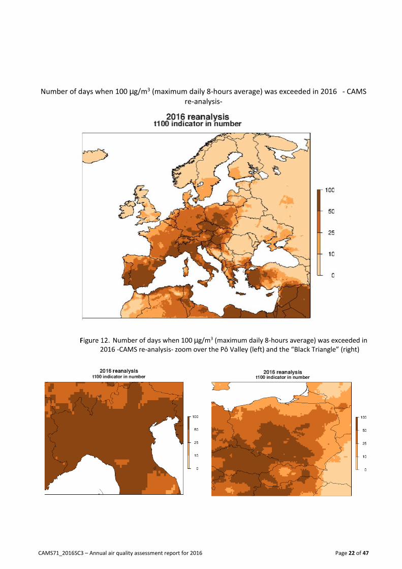
However, it is interesting to consider the same indicator (8-hours average daily maximum of ozone)
calculated with the threshold value recommended in the World Health Organization (WHO)
guidelines: 100 µg/m3. The annual map and zooms are proposed respectively on Figure 10 and Figure
11. They show different conclusions than those drawn with the regulatory threshold, since almost the
whole of Europe recorded more than 25 days when the WHO threshold is exceeded. Only
Scandinavia, Iceland, the United Kingdom and the Far-East of Europe had less than 10. It should be
noted that the geographical distribution of areas where health impacts of ozone are likely to be the
highest changes as well with this new threshold. Pô valley is still the most exposed area in Europe
with more than 50 days of exceedance recorded everywhere (Figure 12- left), but other areas give a
worrying picture, for instance the “Black Triangle” region covering Poland, Czech Republic and East
of Germany (Figure 12- right). Czech Republic and a large part of Poland recorded more than 50
exceedance days as well.

CAMS71_2016SC3 – Annual air quality assessment report for 2016 Page 21 of 47
Number of days when 120 µg/m3 (maximum daily 8-hours average) was exceeded in
2016 - CAMS re-analysis
Number of days when 120 µg/m3 (maximum daily 8-hours average) was exceeded in
2016 -CAMS re-analysis- zoom over the Pô Valley (left) and the Benelux (right)
CAMS71_2016SC3 – Annual air quality assessment report for 2016 Page 22 of 47
Number of days when 100 µg/m3 (maximum daily 8-hours average) was exceeded in 2016 - CAMS
re-analysis-
Number of days when 100 µg/m3 (maximum daily 8-hours average) was exceeded in
2016 -CAMS re-analysis- zoom over the Pô Valley (left) and the “Black Triangle” (right)

CAMS71_2016SC3 – Annual air quality assessment report for 2016 Page 23 of 47
2.3 Peaks indicators
The European legislation sets information and alert hourly thresholds values for ozone concentrations
that should not be exceeded. Those are not limit values, however they are used to describe situations
when ozone concentrations become very high and justify implementation of short term action plans
or emergency measures to quickly decrease or stabilize ozone levels, and to control harmful impacts
of ozone on human health. Threshold values are respectively 180 µg/m3 and 240 µg/m3 (hourly
averages) for information and alert levels.
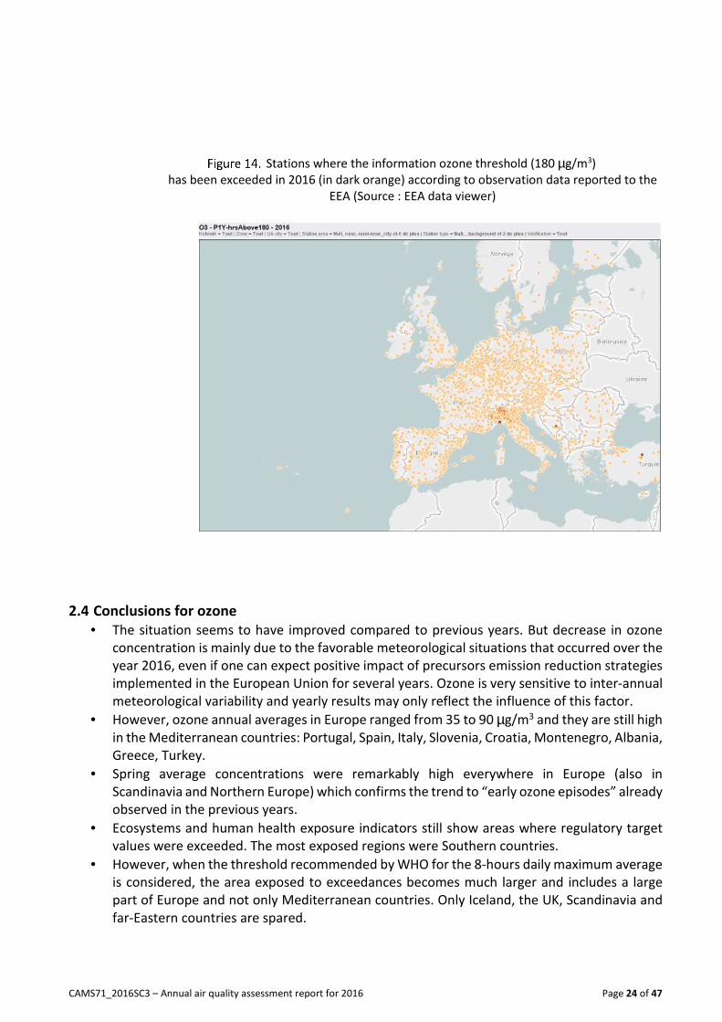
Figure 13 shows the number of hours when the information threshold was exceeded in 2016, and as
expected it is very low. Only Italy and the Pô Valley showed exceedances of the information threshold,
and no exceedance of the alert threshold was detected. The number estimated is confirmed by EEA’s
observation map (Figure 14) which presents, among all available stations (in light-orange) those that
recorded exceedances of the information hourly threshold (plotted in dark-orange). The map is very
consistent with CAMS result with a spot in Northern Italy and 1 or 2 stations in Turkey that were not
targeted by the re-analyses. However, both approaches give quite similar results.
Number of hours when the information ozone threshold (180 µg/m3)
was exceeded in 2016 -CAMS re-analysis -
CAMS71_2016SC3 – Annual air quality assessment report for 2016 Page 24 of 47
Stations where the information ozone threshold (180 µg/m3)
has been exceeded in 2016 (in dark orange) according to observation data reported to the
EEA (Source : EEA data viewer)
2.4 Conclusions for ozone
• The situation seems to have improved compared to previous years. But decrease in ozone
concentration is mainly due to the favorable meteorological situations that occurred over the
year 2016, even if one can expect positive impact of precursors emission reduction strategies
implemented in the European Union for several years. Ozone is very sensitive to inter-annual
meteorological variability and yearly results may only reflect the influence of this factor.
• However, ozone annual averages in Europe ranged from 35 to 90 µg/m3 and they are still high
in the Mediterranean countries: Portugal, Spain, Italy, Slovenia, Croatia, Montenegro, Albania,
Greece, Turkey.
• Spring average concentrations were remarkably high everywhere in Europe (also in
Scandinavia and Northern Europe) which confirms the trend to “early ozone episodes” already
observed in the previous years.
• Ecosystems and human health exposure indicators still show areas where regulatory target
values were exceeded. The most exposed regions were Southern countries.
• However, when the threshold recommended by WHO for the 8-hours daily maximum average
is considered, the area exposed to exceedances becomes much larger and includes a large
part of Europe and not only Mediterranean countries. Only Iceland, the UK, Scandinavia and
far-Eastern countries are spared.

CAMS71_2016SC3 – Annual air quality assessment report for 2016 Page 25 of 47
• The number of hourly peaks exceeding the information regulatory threshold (180 µg/m3) was
quite low in 2016. Such exceedances occurred mainly in the Pô Valley.
• Considering the 2016 situation and the previous years, we cannot conclude about a decreasing
trend, regarding ozone background concentrations in Europe despite precursor emissions
strategies implemented in European Union over the past years. The situation seemed to
improve in 2016 but it can be the consequence of favorable meteorological conditions.
Sensitivity of ozone formation processes to meteorological variability and increasing
temperatures and influence of hemispheric transport of ozone may counter-balance the
efficiency of regional emissions control strategies.

CAMS71_2016SC3 – Annual air quality assessment report for 2016 Page 26 of 47
3. Nitrogen dioxide Warning note: It should be noted that the CAMS re-analyses mapping system is not fitted to deal with
local hot spot situations that can develop near busy or on industrial sites. Actually, the models
resolution is about 10*10 km, and is not sufficient to catch actual NO2 concentrations at traffic and
industrial sites. This is also the reason why no map of indicators related to the number of situations
when the limit hourly value of the Air Quality Directive is exceeded is proposed in this report. In most
of the cases such situations occur at traffic sites, near busy roads, and cannot be described by the
European-wide re-analysis system implemented in CAMS. However, the maps presented below give a
good estimate of background concentrations levels and patterns.
3.1 Annual and seasonal averages
Annual and seasonal averages of NO2 concentrations are presented on Figure 15 and Figure 19b. The
2008 Air Quality Directive sets a limit value for the annual average of NO2 concentrations which
must not exceed 40 µg/m3.
Figure 15 shows that background concentrations exceeded the annual limit value in Milan, Ankara
and in Moscow areas, as in 2015 (Figure 16). Cities footprints appear very clearly as main roads and
maritime routes. Highest concentrations are found in the Benelux, South-East of the United Kingdom,
Western Germany, Poland, Paris and Ile de France, Madrid, Istanbul and Ankara areas, and in the Pô
Valley. In those places, annual averages generally exceeded 30 µg/m3 according to the CAMS re-
analyses. The concentrations distribution is driven by the location of main sources of nitrogen oxides
(NOx), NO2 behaving as a “local pollutant” with very shorts life time in the atmosphere.
Figure 17 proposes zooms of NO2 annual averages over the Pô valley and the Benelux regions. A
simplified color scale helps in highlighting the places where the annual limit value of 40 µg/m3 was
exceeded in the concerned countries. They correspond to urban areas. This diagnostic is confirmed
by the snapshot fromestimate the EEA data viewer web site which presents NO2 annual average
concentrations in 2016 monitored at background stations (industrial and traffic stations are excluded
since they are out of scope of CAMS products). It illustrates good consistency with CAMS re-analyses
regarding the spatial distribution of NO2 concentrations. However, the highest levels are
underestimated in large urban areas: Madrid, Barcelona, London, Belgrade, Izmir, Istanbul and more
generally a large part of Turkey monitored NO2 annual averages higher than the limit values which
are not picked at this level by the analyzed maps3. Lack of observations to be assimilated in the models
and uncertainties in the emission inventories can explain this situation.
3 According to EEA’s data, the hourly limit value (200 µg/m3) had been exceeded only in Belgrade and in
Turkish cities

CAMS71_2016SC3 – Annual air quality assessment report for 2016 Page 27 of 47
Annual average of NO2 concentrations in 2016
Annual average of NO2 concentrations in 2015
(Source : CAMS – 2015 air quality assessment report)

CAMS71_2016SC3 – Annual air quality assessment report for 2016 Page 28 of 47
Annual average of NO2 concentrations in 2016 - CAMS re-analysis- zoom over the Pô
Valley (left) and the Benelux (right)
NO2 annual average in 2016 at the monitoring background stations reported to the
EEA (source: EEA data viewer)
Maps on Figure 19 propose geographical distribution of seasonal NO2 concentrations. They are
significantly lower in spring and summer than in fall and winter. Two main reasons explain this
difference: higher NOx emissions from residential heating that usually go along with temperatures
decrease on one side and stable and cold meteorological conditions leading to thermal inversions

CAMS71_2016SC3 – Annual air quality assessment report for 2016 Page 29 of 47
that stick ground level emissions near the surface on the other side. However, a remarkable point for
the year 2016 was that average concentrations in fall are as high as in winter (and even locally higher),
especially in the large city centers. A quick look at the temperatures anomalies maps in October and
November 2016 assessed by the C3S Copernicus climate services allows a first explanation with
temperatures lower by almost 4 °C than the last 3 decades average during these months. Cold and
stable meteorological conditions (with the formation of persistent inversion layers) are the main
reasons to explain NO2 raise of concentrations since this pollutant is mainly emitted by ground level
combustion processes (road traffic, residential heating).
Biggest cities (Paris, Madrid, Barcelona, Brussels, Berlin, London, Ankara and Moscow), the Benelux
and the Pô valley are clearly impacted by such effects with seasonal concentration averages above
40 µg/m3 in fall and winter times.
Seasonal averages of NO2 concentrations in 2016;
Spring (a), Summer (b), autumn (c), winter (d)
(a) (b)
(c) (d)

CAMS71_2016SC3 – Annual air quality assessment report for 2016 Page 30 of 47
Surface air temperature in 2016 relative to its 1981-2010 average
(a) October, (b) November
(source: ECMWF, Copernicus Climate Change Service -C3S temperature re-analyses)
(a)
(b)
3.2 Conclusions for nitrogen dioxide
• Background nitrogen dioxide concentrations exceeded in 2016 the annual limit value in
several places generally characterized by high NOx emissions. The Pô Valley is one of the most
exposed area, because of the convergence of high emission levels and non-dispersive
meteorological conditions in the valley. Paris area and Benelux were also impacted by
exceedances of the limit value in 2016.
• NO2 concentrations were the highest in the biggest cities, near main roads and in sea areas
because of shipping emissions.
• Air concentrations distribution of NO2 in Europe and their seasonal variability remain
relatively stable compared to the past years. Influence of meteorology can lead to slight
changes in the distribution patterns, especially in winter and fall, when because of colder and
more stable meteorological conditions, the extension of areas with high concentrations can
vary from a season to another. Thus, in 2016, because of colder temperatures, NO2
concentrations where higher in fall than in winter.
.

CAMS71_2016SC3 – Annual air quality assessment report for 2016 Page 31 of 47
4. Particulate Matter (PM10)
4.1 Annual and seasonal averages
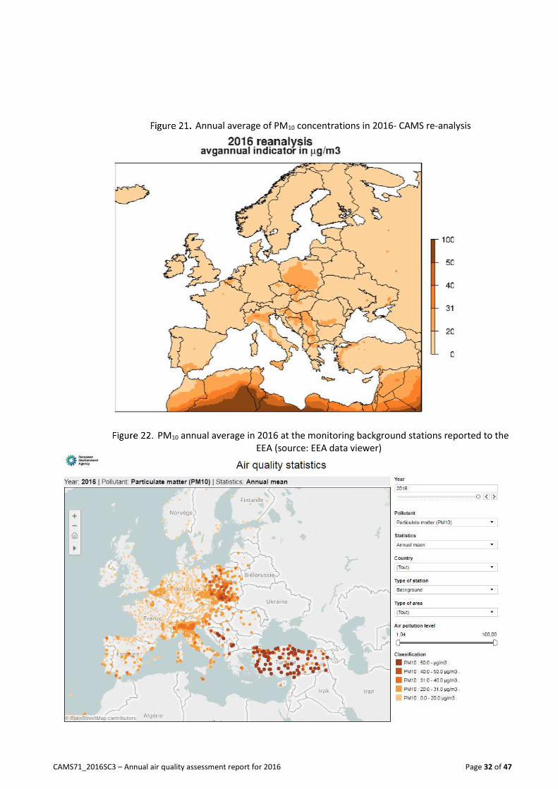
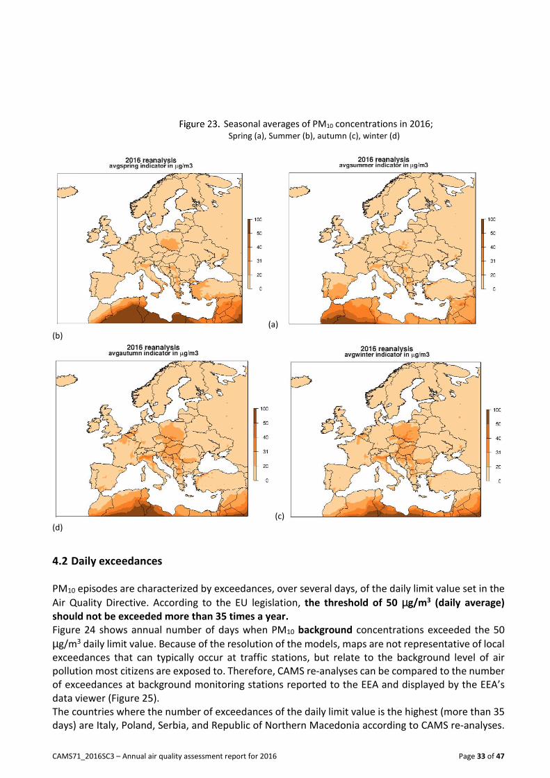
Annual and seasonal averages of PM10 concentrations in 2016 are presented in Figure 21 and Figure
23 respectively. The air quality Directive 2008/50/EC sets a limit value for PM10 annual average to
40 µg/m3.
In 2016, PM10 background annual average ranged from 5 µg/m3 in Northern Europe (Iceland,
Scandinavia), to more than 30 µg/m3 locally (Figure 21), and especially in the Eastern part of Europe
(in Poland, Serbia, Republic of Northern Macedonia) and in the Pô Valley, and this pattern is
remarkably similar to the distribution in 2015 re-analyses. This diagnostic is confirmed by the
comparison of the 2016 CAMS re-analyzed map with background observation data reported to the
EEA in accordance to the air quality Directive (Figure 22). However, it should be noted a strong
underestimation of CAMS re-analysis PM values in Turkey (compared to the observations) which can
be explained by a lack of observation data assimilated in the model for this country. This
underestimation can be noted for other the countries in the South-East of Europe: Albania,
Montenegro, Bosnia and Herzegovina, Republic of Northern Macedonia. Uncertainties in emissions
inventories and lack of observation data to be assimilated can explain this shortcoming.
Seasonal analyses (Figure 23) show that PM concentrations were generally quite low (no larger than
30 µg/m3) everywhere in summer and spring 2016, except in the South of the domain. Mineral
Saharan dust contributed to high levels of PM in North Africa and impacted Mediterranean countries.
Concentrations in fall and winter were significantly higher and influence the annual average. Also,
autumn and winter present remarkably similar patterns in PM10 distribution, which proves the
influence of local sources, and residential heating in particular (October-November were particularly
cold – see Figure 20). Combination of increasing emissions and stable and cold meteorological
conditions that generally develop at the same time and stuck air pollutants near the ground can
explain increasing ambient concentrations. During these seasons CAMS re-analyses detect local
exceedances of the annual limit value in the Pô valley, Poland, Serbia, Republic of Northern
Macedonia.
It is interesting to note that 2016 did not really experience high PM concentrations in spring or at the
end of winter as observed in 2014 and 2015. In this period, in Western Europe, daily temperature
gradients may be very important (cold nights and mild days) which favors thermal inversions, and
ammonia emissions from agriculture activities (manure and fertilizers spreading) may be very
important due to volatilization processes. Combined with NOx emitted by road traffic and combustion
activities, ammonia can form ammonium nitrate which contributes to PM concentrations increase.
Such spring episodes did not occur in 2016.
CAMS71_2016SC3 – Annual air quality assessment report for 2016 Page 32 of 47
Annual average of PM10 concentrations in 2016- CAMS re-analysis
PM10 annual average in 2016 at the monitoring background stations reported to the
EEA (source: EEA data viewer)
CAMS71_2016SC3 – Annual air quality assessment report for 2016 Page 33 of 47
Seasonal averages of PM10 concentrations in 2016; Spring (a), Summer (b), autumn (c), winter (d)
(a)
(b)
(c)
(d)
4.2 Daily exceedances
PM10 episodes are characterized by exceedances, over several days, of the daily limit value set in the
Air Quality Directive. According to the EU legislation, the threshold of 50 µg/m3 (daily average)
should not be exceeded more than 35 times a year.
Figure 24 shows annual number of days when PM10 background concentrations exceeded the 50
µg/m3 daily limit value. Because of the resolution of the models, maps are not representative of local
exceedances that can typically occur at traffic stations, but relate to the background level of air
pollution most citizens are exposed to. Therefore, CAMS re-analyses can be compared to the number
of exceedances at background monitoring stations reported to the EEA and displayed by the EEA’s
data viewer (Figure 25).
The countries where the number of exceedances of the daily limit value is the highest (more than 35
days) are Italy, Poland, Serbia, and Republic of Northern Macedonia according to CAMS re-analyses.
CAMS71_2016SC3 – Annual air quality assessment report for 2016 Page 34 of 47
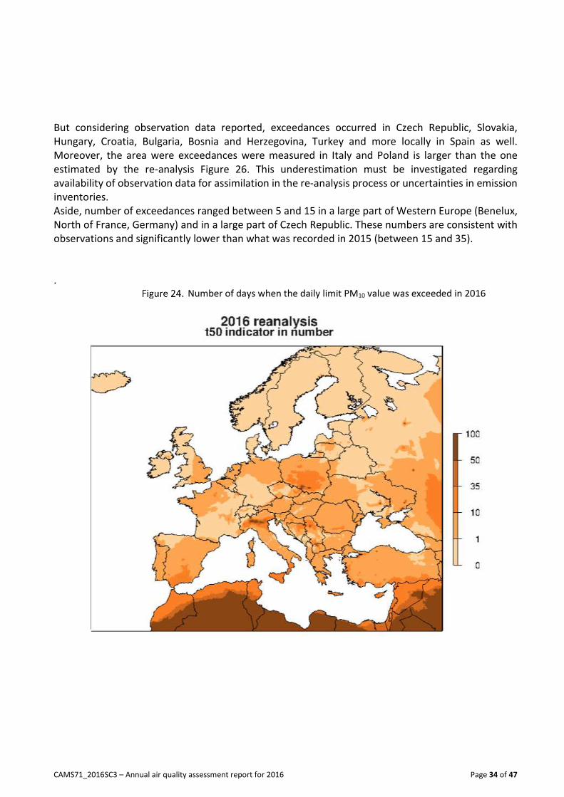
But considering observation data reported, exceedances occurred in Czech Republic, Slovakia,
Hungary, Croatia, Bulgaria, Bosnia and Herzegovina, Turkey and more locally in Spain as well.
Moreover, the area were exceedances were measured in Italy and Poland is larger than the one
estimated by the re-analysis Figure 26. This underestimation must be investigated regarding
availability of observation data for assimilation in the re-analysis process or uncertainties in emission
inventories.
Aside, number of exceedances ranged between 5 and 15 in a large part of Western Europe (Benelux,
North of France, Germany) and in a large part of Czech Republic. These numbers are consistent with
observations and significantly lower than what was recorded in 2015 (between 15 and 35).
. Number of days when the daily limit PM10 value was exceeded in 2016

CAMS71_2016SC3 – Annual air quality assessment report for 2016 Page 35 of 47
Number of days when PM10 daily average exceeded the daily limit value in 2016 at
the monitoring background stations reported to the EEA
(source: EEA data viewer)
Number of days when the daily limit PM10 value was exceeded in 2016; zooms over
the Pô Valley (left) and the “Black triangle” (right)

CAMS71_2016SC3 – Annual air quality assessment report for 2016 Page 36 of 47
4.3 Conclusions for PM10
The main points that can summarize the PM10 diagnostic in 2016 are the following:
• PM10 annual average of background concentrations ranged in 2016 from very low level (3
µg/m3) in a large part of Northern Europe to high values (higher than 35 µg/m3 in average) in
the Pô Valley and Eastern Europe (Poland, Serbia, republic of Northern Macedonia in
particular). The annual limit value was exceeded in those countries. The conjunction of high
emissions, especially in the residential heating and wood burning sector together with cold
and stable meteorological conditions can partly explain increasing PM concentrations in those
regions where concentrations were generally higher than in 2015.
• Western Europe (France, Benelux, Germany) usually exposed to high PM concentrations was
rather spared in 2016, certainly because of the absence of meteorological conditions likely to
favor PM formation in spring period when agriculture ammonia emissions are usually high,
making ammonia available in the atmosphere to contribute to ammonium nitrate particles
formation.
• However, geographical distribution of PM10 concentrations in Europe in 2016 was very
consistent with what was observed the previous years. Eastern part of Europe and Pô valley
remained the most exposed areas.
• Comparing the re-analyses to the observations reported to the EEA by the countries, it seems
that high concentrations measured in the south-East of Europe (Turkey, Bulgaria, Croatia,
Bosnia and Herzegovina) were largely underestimated by the modelling results. The reason
why (uncertainties in the emission inventories, in the chemistry or lack of observations to be
assimilated) should be furthermore investigated.
CAMS71_2016SC3 – Annual air quality assessment report for 2016 Page 37 of 47
5. Particulate Matter (PM2.5)
5.1 Annual and seasonal averages
Annual and seasonal averages of PM2.5 concentrations in 2016 are presented in Figure 27 and Figure
29. The 2008 Air Quality Directive sets an annual limit value of 25 µg/m3 that may be reinforced to
20 µg/m3 according to new knowledge and evidences about health impacts and feasibility of
mitigation measures.
As for PM10, only background concentration levels4 are considered. The current limit value for PM2.5
annual mean was exceeded in Northern Italy, Poland, Serbia, Bosnia and Herzegovina, Republic of
Northern Macedonia, Turkey and Ukraine. Exceedances were generally local (see Turkey, Ukraine),
but quite high concentrations (higher than 20 µg/m3) developed over areas larger than the cities in
the most exposed countries. Therefore, the diagnostic would worsen if the more stringent 2020
target value would apply. PM2.5 concentrations were generally higher in 2016 than in 2015 although
geographical patterns are quite similar.
Diagnostic is confirmed by the observations reported to the EEA in compliance with the Air Quality
Directive and presented on the EEA’s data viewer (Erreur ! Source du renvoi introuvable.).
Consistency between observations and CAMS re-analyses is remarkably good for PM2.5, and better
than for PM10.
The situation can even be more critical if the guideline value recommended by the WHO for
controlling human health exposure to fine particulate matter is considered. This value is 10 µg/m3
(annual average). Except in the Northern part of Europe and in few regions in Portugal, Spain, South-
West of France, the UK, and in the mountainous parts of Switzerland, and Austria, this value was likely
to be exceeded everywhere.
Seasonal analysis (Figure 29) shows that the situation was more critical in autumn and winter than in
spring and summer, like for PM10 and NO2, and for the same reasons: cold and stable meteorological
conditions and emissions from the residential heating sector. Italy, Croatia, Poland, Serbia, Bosnia
and Herzegovina, Republic of Northern Macedonia and Romania were the most concerned countries,
especially by winter episodes. However, those maps also show that the WHO guideline value is
exceeded almost everywhere whatever the season, and demonstrate the critical potential harmful
impact of exposure to fine particulate matter in Europe.
4 Local exceedances that can occur near traffic sites cannot be represented on this map because of model
resolution.

CAMS71_2016SC3 – Annual air quality assessment report for 2016 Page 38 of 47
Annual average of PM2.5 concentrations in 2016- CAMS re-analysis-
PM2.5 annual average in 2016 at the monitoring background stations reported to the
EEA (source: EEA data viewer)

CAMS71_2016SC3 – Annual air quality assessment report for 2016 Page 39 of 47
Seasonal averages of PM2.5 concentrations in 2016; Spring (a), Summer (b), autumn (c), winter (d)
(a)
(b)
(c) (d)
Even if this is not a regulatory indicator, the number of days when daily average exceeded 25 µg/m3
in 2016 gives another instructive overview of fine particulate pollution status in Europe (Figure 30).
In a large part of Europe this indicator exceeded 25 days in 2016. Logically, the countries where the
annual limit value was exceeded recorded highest number of days when the PM2.5 daily mean exceeds
25 µg/m3, but not only. Actually PM2.5 remains an issue in numerous European countries: France,
Belgium, Italy, Croatia, Poland, Czech Republic, Slovakia, Serbia, Bosnia and Herzegovina, Hungary,
Republic of Northern Macedonia and Romania. The map also demonstrates the problem is no longer
local since areas where a high number of days exceeding 25 µg/m3 (daily mean) is recorded are quite
large (Figure 31).

CAMS71_2016SC3 – Annual air quality assessment report for 2016 Page 40 of 47
Number of days when daily average exceeded 25 µg/m3 in 2016 -CAMS re-analysis
Number of days when daily average exceeded 25 µg/m3 in 2016 -CAMS re-analysis;
zooms over Benelux (left), the “Black triangle” (right) and the Pô valley (bottom)

CAMS71_2016SC3 – Annual air quality assessment report for 2016 Page 41 of 47
5.2 Conclusions for PM2.5
• Exposure to fine particulate matter in Europe (PM.2.5) remains a sensitive issue in Europe. If
the current limit value for annual average set in the Air Quality Directive (25 µg/m3) was
exceeded in 2016 only in few areas in Northern Italy, Poland, Serbia and Turkey, exposure to
more stringent thresholds (20 µg/m3 as the indicative limit value proposed in the air quality
Directive to be implemented in 2020 or 10 µg/m3 according to WHO recommendations) is
worrying. Considering such threshold values, a large part of Europe was concerned by
exceedances in 2016.
• This conclusion is the same when considering the number of days when the daily mean
exceeds the 25 µg/m3 threshold (which is just indicative and not regulatory). A large part of
Europe (Pô Valley, Central and South-Eastern Europe, and Benelux) recorded more than 25
exceedance days.
• Pô Valley, Poland, South-Central Europe, were the most sensitive areas in 2016, with highest
concentrations in autumn and winter. The influence of residential heating is one of the main
drivers explaining this situation, together with cold and stable meteorological conditions
which avoided dispersion of the pollutants, again in 2016, but not only since quite high
concentrations are recorded in spring and summer as well.
CAMS71_2016SC3 – Annual air quality assessment report for 2016 Page 42 of 47
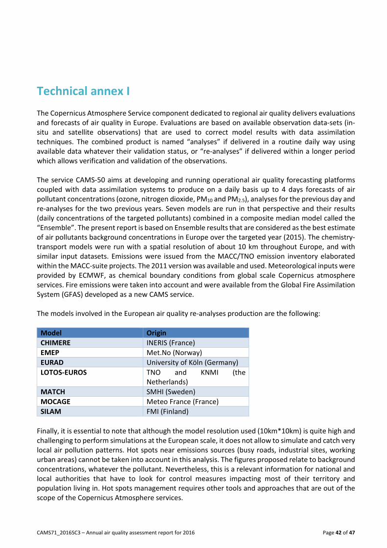
Technical annex I
The Copernicus Atmosphere Service component dedicated to regional air quality delivers evaluations
and forecasts of air quality in Europe. Evaluations are based on available observation data-sets (in-
situ and satellite observations) that are used to correct model results with data assimilation
techniques. The combined product is named “analyses” if delivered in a routine daily way using
available data whatever their validation status, or “re-analyses” if delivered within a longer period
which allows verification and validation of the observations.
The service CAMS-50 aims at developing and running operational air quality forecasting platforms
coupled with data assimilation systems to produce on a daily basis up to 4 days forecasts of air
pollutant concentrations (ozone, nitrogen dioxide, PM10 and PM2.5), analyses for the previous day and
re-analyses for the two previous years. Seven models are run in that perspective and their results
(daily concentrations of the targeted pollutants) combined in a composite median model called the
“Ensemble”. The present report is based on Ensemble results that are considered as the best estimate
of air pollutants background concentrations in Europe over the targeted year (2015). The chemistry-
transport models were run with a spatial resolution of about 10 km throughout Europe, and with
similar input datasets. Emissions were issued from the MACC/TNO emission inventory elaborated
within the MACC-suite projects. The 2011 version was available and used. Meteorological inputs were
provided by ECMWF, as chemical boundary conditions from global scale Copernicus atmosphere
services. Fire emissions were taken into account and were available from the Global Fire Assimilation
System (GFAS) developed as a new CAMS service.
The models involved in the European air quality re-analyses production are the following:
Model Origin
CHIMERE INERIS (France)
EMEP Met.No (Norway)
EURAD University of Köln (Germany)
LOTOS-EUROS TNO and KNMI (the
Netherlands)
MATCH SMHI (Sweden)
MOCAGE Meteo France (France)
SILAM FMI (Finland)
Finally, it is essential to note that although the model resolution used (10km*10km) is quite high and
challenging to perform simulations at the European scale, it does not allow to simulate and catch very
local air pollution patterns. Hot spots near emissions sources (busy roads, industrial sites, working
urban areas) cannot be taken into account in this analysis. The figures proposed relate to background
concentrations, whatever the pollutant. Nevertheless, this is a relevant information for national and
local authorities that have to look for control measures impacting most of their territory and
population living in. Hot spots management requires other tools and approaches that are out of the
scope of the Copernicus Atmosphere services.

CAMS71_2016SC3 – Annual air quality assessment report for 2016 Page 43 of 47
Technical annex II: The present report was based on validated CAMS European air quality re-analyses produced by
regional CAMS services thanks to an Ensemble modelling approach. Re-analyses are built upon data
assimilation techniques that allow to account for observations when mapping air pollutant fields. The
validated assessments use validated observation datasets (according to complex quality assurance
protocols compliant with the air quality directives) while interim re-analyses use near-real-time or
up-to-date datasets that are not fully validated, that are generally incomplete (because not all
countries report up-to-date observation data with the same frequency). Interim re-analyses are
generally also issued from older model versions than the validated ones. For these reasons, validated
re-analyses are considered as more robust and more accurate than interim re-analyses.
For the year 2016, both reports have been produced within the framework of the CAMS services.
The 2016 interim assessment report for air quality in Europe was published in July 2017
(CAMS71_2016SC2_D71.1.1.6_201707_2016IAR).
We propose below few quality indicators showing the differences between the interim (IRA) and the
validated (VRA) production. It appears to be worthwhile to maintain both production channels since
the VRA production is significantly better, although it comes also significantly later. Therefore, the
IRA production should be considered as a first guess or analysis of what happened during the targeted
year.
To synthesize several statistical indicators on the same graph, Taylor diagrams are used for the various
pollutants. Model results can be compared on the same diagram, a quarter of disk where the
observation reference is represented by the dot on the x-axis. Correlation coefficient is related to the
azimuthal angle; the centered RMS error (RMSE) is displayed by inner arc of circles; and the standard
deviation of the simulated pattern is proportional to the radial distance from the origin. For each
station typology, results issued from the interim re-analyses (IRA) and from validated re-analyses
(VRA) are plotted on the same graphs.
Ozone daily Maximum:
Erreur ! Source du renvoi introuvable. shows the Taylor diagram associated to 2016 IRA and VRA
ensemble re-analyses for the ozone daily maximum. A slight improvement is obtained for all
indicators with VRA simulations whatever the station typology. 1 to 2 µg/m3 are won for the RMS
error and the correlation increases by 1 or 2 points. However, the ozone interim re-analyses provided
quite satisfactory results.

CAMS71_2016SC3 – Annual air quality assessment report for 2016 Page 44 of 47
Taylor diagram synthesizing scores for IRA2016 and VRA2016 by station typology for
ozone daily maximum indicator
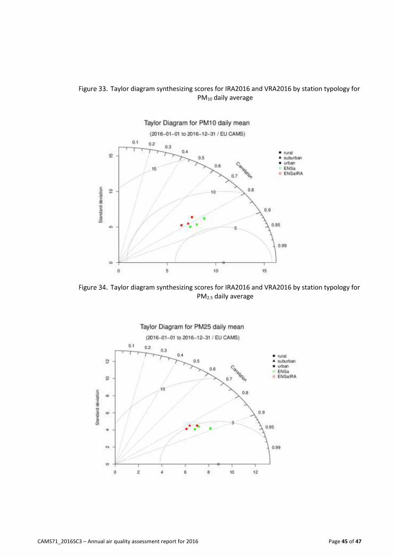
PM10 and PM2.5 Daily average The differences between interim and validated re-analyses performance scores are more significant
for PM10 PM2.5 indicators than for ozone. The Taylor diagrams presented on Figure 33 and Erreur !
Source du renvoi introuvable. for PM simulations highlight this point. Root mean square error for
validated re-analyses are lower by 1-3 µg/m3 compared to the interim ones. Same conclusions hold
for correlation coefficients with a significant improvement of the indicator for PM10validated re-
analyses (of about 5 %) but also for PM2.5 even if it is a bit lower. Impact on the air pollution patterns
can be high as illustrated by Figure 35 which shows the number of days when the daily limit value was
exceeded in 2016 according to the interim and the validated re-analyses respectively. Large
underestimation of the interim assessment, especially in the Pô Valley and in Central Europe is clearly
compensated by assimilation of new data in the validated assessment.
CAMS71_2016SC3 – Annual air quality assessment report for 2016 Page 45 of 47
Taylor diagram synthesizing scores for IRA2016 and VRA2016 by station typology for
PM10 daily average
Taylor diagram synthesizing scores for IRA2016 and VRA2016 by station typology for
PM2.5 daily average

CAMS71_2016SC3 – Annual air quality assessment report for 2016 Page 46 of 47
Number of days when daily average exceeded 35 µg/m3 in 2016 simulated by CAMS
Ensemble model: interim re-analyses (left) and validated re-analyses (right)

Copernicus Atmosphere Monitoring Service
atmosphere.copernicus.eu copernicus.eu ecmwf.int
ECMWF - Shinfield Park, Reading RG2 9AX, UK
Contact: [email protected]