Embed Size (px)
Citation preview

Chapter 6:
Statistics
© 2013 W. H. Freeman and Company 1
Quantitative Literacy:Thinking Between the Lines
Crauder, Noell, Evans, Johnson

Chapter 6: Statistics
Lesson Plan
2
Data summary and presentation: Boiling down the numbers
The normal distribution: Why the bell curve?
The statistics of polling: Can we believe the polls?
Statistical inference and clinical trials: Effective drugs?
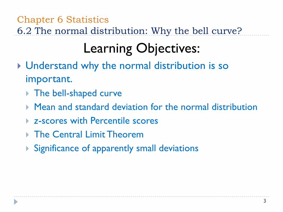
Chapter 6 Statistics
6.2 The normal distribution: Why the bell curve?
3
Learning Objectives:
Understand why the normal distribution is so
important.
The bell-shaped curve
Mean and standard deviation for the normal distribution
z-scores with Percentile scores
The Central Limit Theorem
Significance of apparently small deviations

Chapter 6 Statistics
6.2 The normal distribution: Why the bell curve?
4
The bell-shaped curve: Figure 6.13 shows the distribution of heights
of adult males in the United States. A graph shaped like this one
resembles a bell—thus the bell curve. This bell-shaped graph is typical of
normally distributed data.
The mean and median are the same: For normally distributed data, the
mean and median are the same. Figure 6.13 indicates that the median height of
adult males is 69.1 inches. The average height of adult males is 69.1 inches.

Chapter 6 Statistics
6.2 The normal distribution: Why the bell curve?
5
Most data are clustered about the mean:The vast majority of
adult males are within a few inches of the mean.

Chapter 6 Statistics
6.2 The normal distribution: Why the bell curve?
6
The bell curve is symmetric about the mean: The curve to
the left of the mean is a mirror image of the curve to the right of
the mean. In terms of heights, there are about the same number of
men 2 inches taller than the mean as there are men 2 inches
shorter than the mean. This is illustrated in Figure 6.16.
If data are normally distributed:
1. Their graph is a bell-shaped curve.
2. The mean and median are the same.
3. Most of the data tend to be clustered relatively near the mean.
4. The data are symmetrically distributed above and below the mean.

Chapter 6 Statistics
6.2 The normal distribution: Why the bell curve?
7
Example: Figure 6.17 shows the distribution of IQ scores,
and Figure 6.18 shows the percentage of American families and
level of income. Which of these data sets appear to be
normally distributed, and why?

Chapter 6 Statistics
6.2 The normal distribution: Why the bell curve?
8
Solution: The IQ scores appear to be normally distributed
because they are symmetric about the median score of 100,
and most of the data relatively close to this value.
Family incomes do not appear to be normally distributed
because they are not symmetric. They are skewed toward the
lower end of the scale, meaning there are many more families
with low incomes than with high incomes.

Chapter 6 Statistics
6.2 The normal distribution: Why the bell curve?
9
Mean and standard deviation for the normal distribution: A
normal distribution, the mean and standard deviation completely
determine the bell shape for the graph of the data.
The mean determines the middle of the bell curve.
The standard deviation determines how steep the curve is.
A large standard deviation results in a very wide bell, and small
standard deviation results in a thin, steep bell.

Chapter 6 Statistics
6.2 The normal distribution: Why the bell curve?
10
Normal Data: 68-95-99.7% Rule
If a set of data is normally distributed:
• About 68% of the data lie within one standard deviation of the mean (34%
within one standard deviation above the mean and 34% within one
standard deviation below the mean). See Figure 6.23.
• About 95% of the data lie within two standard deviations of the mean
(47.5% within two standard deviations above the mean and 47.5% within
two standard deviations below the mean). See Figure 6.24.
• About 99.7% of the data lie within three standard deviations of the mean
(49.85% within three standard deviations above the mean and 49.85%
within three standard deviations below the mean). See Figure 6.25.

Chapter 6 Statistics
6.2 The normal distribution: Why the bell curve?
11

Chapter 6 Statistics
6.2 The normal distribution: Why the bell curve?
12
Example: We noted earlier that adult male heights in the United
States are normally distributed, with a mean of 69.1 inches. The
standard deviation is 2.65 inches.
What dose the 68-95-99.7% rule tell us about the heights of adult
males?
Solution: 68% of adult males are between
69.1 – 2.65 = 66.45 inches (5 feet 6.45 inches) and69.1 + 2.65 = 71.75 inches (5 feet 11.75 inches) tall
95% are between
69.1 – (2 × 2.65) = 63.8 inches and69.1 + (2 × 2.65) = 74.4 inches tall
99.7% are between
69.1 – (3 × 2.65) = 61.15 inches and69.1 + (3 × 2.65) = 77.05 inches tall

Chapter 6 Statistics
6.2 The normal distribution: Why the bell curve?
13
Example: The weights of apples in the fall harvest are normally
distributed, with a mean weight of 200 grams and standard deviation
of 12 grams. Figure 6.28 shows the weight distribution of 2000
apples. In a supply of 2000 apples, how many will weigh between
176 and 224 grams?

Chapter 6 Statistics
6.2 The normal distribution: Why the bell curve?
14
Solution:
Apples weighing 176 grams are 200– 176 = 24 grams below the
mean, and apples weighing 224 grams are 224 − 200 = 24 grams
above the mean.
Now 24 grams represents 24/12 = 2 standard deviations. So the
weight range of 176 grams to 224 grams is within two standard
deviations of the mean.
Therefore, about 95% of data points will lie in this range. This
means that about 95% of 2000, or 1900 apples, weigh between
176 and 224 grams.
Chapter 6 Statistics
6.2 The normal distribution: Why the bell curve?
15
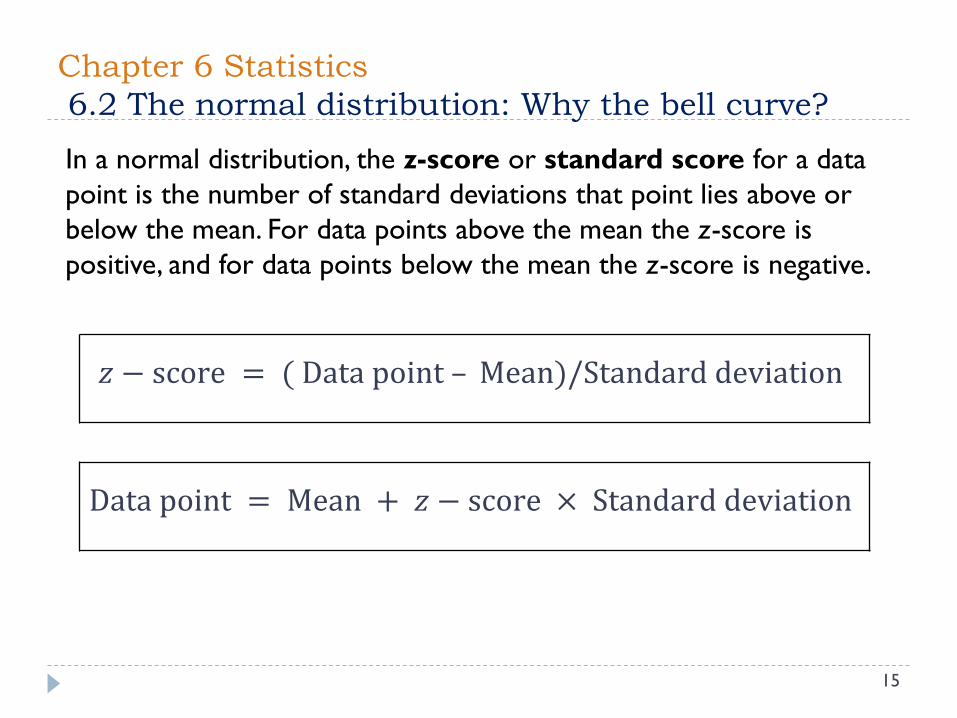
𝑧 − score = ( Data point – Mean)/Standard deviation
Data point = Mean + 𝑧 − score × Standard deviation
In a normal distribution, the z-score or standard score for a data
point is the number of standard deviations that point lies above or
below the mean. For data points above the mean the z-score is
positive, and for data points below the mean the z-score is negative.

Chapter 6 Statistics
6.2 The normal distribution: Why the bell curve?
16
Example: The weights of newborns in the United States are
approximately normally distributed. The mean birthweight (for
single births) is about 3332 grams (7 pounds, 5 ounces). The
standard deviation is about 530 grams. Calculate the z-score
for a newborn weighing 3700 grams (about 8 pounds, 2
ounces).
Solution: A 3700-gram newborn is 3700 –3332 =368 grams above the mean weight of 3332 grams. We divide
by the number of grams in one standard deviation to find the
z-score:
𝑧 − score for 3700 grams =368
530= 0.7

Chapter 6 Statistics
6.2 The normal distribution: Why the bell curve?
17

Chapter 6 Statistics
6.2 The normal distribution: Why the bell curve?
18
The percentile for a number relative to a list of data is the
percentage of data points that are less than or equal to that
number.
Example: The average length of illness for flu patients in a
season is normally distributed, with a mean of 8 days and
standard deviation of 0.9 day. What percentage of flu patients
will be ill for more than 10 days?
Solution: Ten days is 2 days above the mean of 8 days. This
gives a z-score of 2/0.9 or about 2.2. Table 6.2 gives a
percentile of about 98.6% for this z-score. It means that about
98.6% of patients will recover in 10 days or less. Thus, only
about 100%− 98.6% = 1.4% will be ill for more than 10 days.

Chapter 6 Statistics
6.2 The normal distribution: Why the bell curve?
19
Example: Recall from the previous Example that the weights
of newborns in the United States are approximately normally
distributed. The mean birthweight (for single births) is about
3332 grams (7 pounds, 5 ounces). The standard deviation is
about 530 grams.
1. What percentage of newborns weigh more than 8 pounds
(3636.4 grams)?
2. Low birthweight is a medical concern. The American Medical
Association defines low birthweight to be 2500 grams (5
pounds, 8 ounces) or less. What percentage of newborns are
classified as low-birthweight babies?

Chapter 6 Statistics
6.2 The normal distribution: Why the bell curve?
20
Solution:
1. 𝑧 − score =3636.4−mean
standard deviation=
3636.4−3332
530=
304.4
530= 0.6
Consulting Table 6.2, we find that this represents a percentile of
about 72.6%.
This means that about 72.6% of newborns weigh 8 pounds or less.
So, 100% − 72.6% = 27.4% of newborns weigh more than 8
pounds.
2. 𝑧 − score =2500−mean
standard deviation=
3332−2500
530=
832
530= 1.6
Table 6.2 shows a percentile of about 5.5% for a z-score of—1.6.
Hence, about 5.5% of newborns are classified as low-birthweight
babies.

Chapter 6 Statistics
6.2 The normal distribution: Why the bell curve?
21
The Central Limit Theorem
According to the Central Limit Theorem, percentages
obtained by taking many samples of the same size from a
population are approximately normally distributed.
The mean p% of the normal distribution is the mean of the
whole population.
If the sample size is n, the standard deviation of the normal
distribution is:
Standard deviation = σ =𝑝(100 − 𝑝)
𝑛percentage points
Here, p is a percentage, not a decimal.
Chapter 6 Statistics
6.2 The normal distribution: Why the bell curve?
22
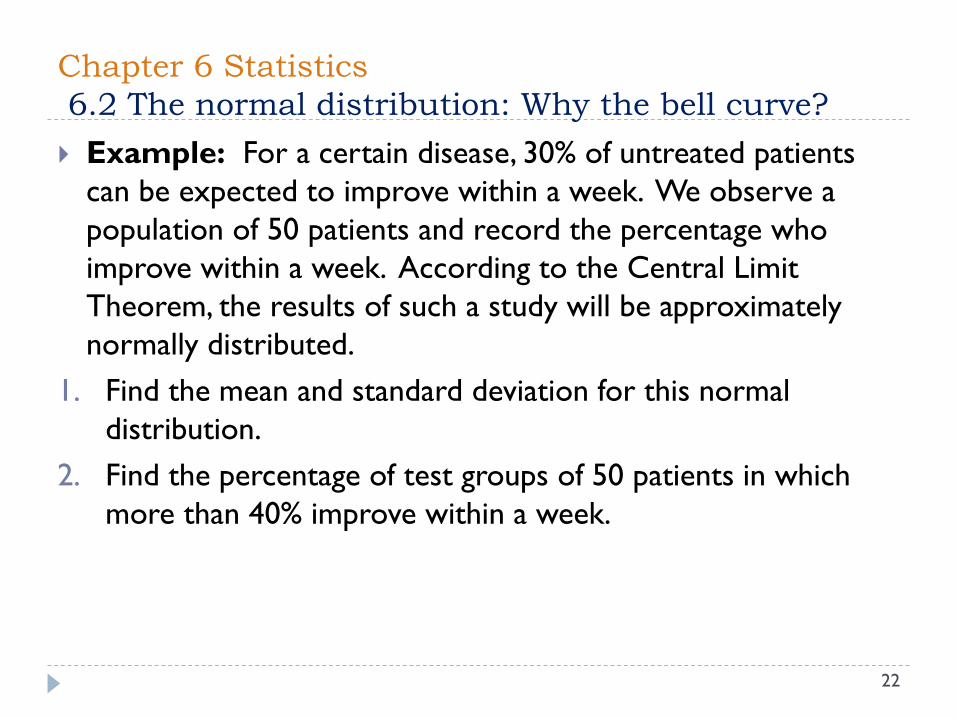
Example: For a certain disease, 30% of untreated patients
can be expected to improve within a week. We observe a
population of 50 patients and record the percentage who
improve within a week. According to the Central Limit
Theorem, the results of such a study will be approximately
normally distributed.
1. Find the mean and standard deviation for this normal
distribution.
2. Find the percentage of test groups of 50 patients in which
more than 40% improve within a week.

Chapter 6 Statistics
6.2 The normal distribution: Why the bell curve?
23
Solution:
1. 𝑝 = 30%, 𝑛 = 50. A standard deviation of
𝜎 =𝑝(100−𝑝)
𝑛=
30(100−30)
50= 6.5 percentage points
2. The z-score for 40%:
z − score =40 −mean
standard deviation=40 − 30
6.5=
10
6.5= 1.5
Table 6.2 gives a percentile of about 93.3%.
This means that in 93.3% of test groups, we expect that
40% or fewer will improve within a week.
Only 100%− 93.3% = 6.7% of test groups will show more
than 40% improving within a week.

Chapter 6 Statistics
6.2 The normal distribution: Why the bell curve?
24
Example: Assume we know that 20% of Americans suffer
from a certain type of allergy. Suppose we take a random
sample of 100,000 Americans and record the percentage who
suffer from this allergy.
1. The Central Limit Theorem says that percentages from such
surveys will be normally distributed. What is the mean of this
distribution?
2. What is the standard deviation of the normal distribution in
part 1?
3. Suppose we find that in a town of 100,000 people, 21% suffer
from this allergy. Is this an unusual sample? What does the
answer to such a question tell us about this town?
Chapter 6 Statistics
6.2 The normal distribution: Why the bell curve?
25
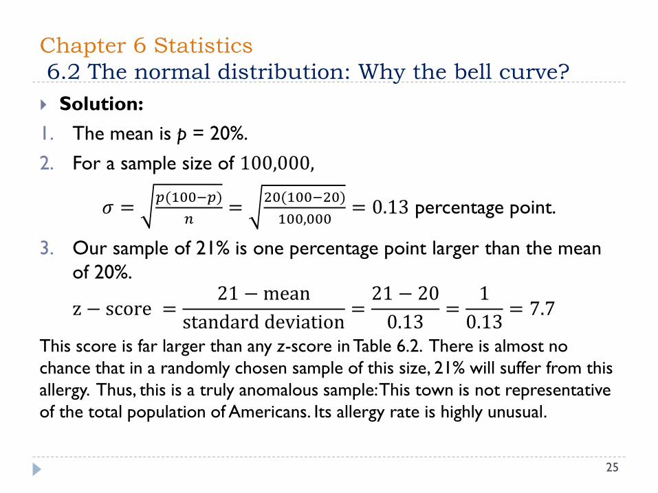
Solution:
1. The mean is p = 20%.
2. For a sample size of 100,000,
𝜎 =𝑝(100−𝑝)
𝑛=
20(100−20)
100,000= 0.13 percentage point.
3. Our sample of 21% is one percentage point larger than the mean
of 20%.
z − score =21 −mean
standard deviation=21 − 20
0.13=
1
0.13= 7.7
This score is far larger than any z-score in Table 6.2. There is almost no
chance that in a randomly chosen sample of this size, 21% will suffer from this
allergy. Thus, this is a truly anomalous sample: This town is not representative
of the total population of Americans. Its allergy rate is highly unusual.

Chapter 6 Statistics: Chapter Summary
26
Data summary and presentation: Boiling down
Four important measures in descriptive statistics:
mean, median, mode, and standard deviation
The normal distribution: Why the bell curve?
A plot of normally distributed data: the bell-shape curve.
The z-score for a data point
The Central Limit Theorem

Chapter 6 Statistics: Chapter Summary
27
The statistics of polling: Can we believe the polls?
Polling involves: a margin of error, a confidence level, and a
confidence interval.
Statistical inference and clinical trials: Effective
drugs?
Statistical significance and p-values.
Positive correlated, negative correlated, uncorrelated or
linearly correlated