Embed Size (px)
Citation preview

CSE 255 Assignment II
Perfecting Passenger Pickups: An Uber Case Study Ajeet Kumar Jigar Surana Madhur Kapoor Piyush Anil Nahar [email protected] [email protected] [email protected] [email protected]
Introduction
With rising trend of private real-time cab services like Uber and Lyft, commuters have a lot of options
but drivers face a lot of competition to get passengers, making it important for them to be in the right
place at the right time. Taking a metropolitan like New York City, we analyzed Uber pickups across 6
months from April to September in 2014 and report our findings and analysis. We clustered the activity
across NYC to find out hot spots throughout the city on weekends, where a driver is most likely to find
a passenger at a given hour in the city. We used k-means clustering for this unsupervised learning task
and compared our predictions with general results from NYC. To validate our predictions, we
calculated the distance between our cluster centroids and pickup points from Lyft spread across 3
months from July 2014 to September 2014. Further exploring the dataset, we analyzed the nightlife
spots in NYC from Uber pickup activity from 9pm to 3am on weekends (Friday-Saturday). To validate
our results on nightlife zones, we took top 25 nightlife spots in NYC from Yelp and calculated the
distance for each spot to its nearest cluster centroid. We also analyzed the difference in cab
frequencies and behavior of people on Holidays in that time period, namely, Easter, Independence
Day, Memorial Day and Labor Day. Since Uber is the most common and popular cab service, we
assumed that it could be used to model peoples’ commute behavior in general. Results from tests on
Lyft pickup points (our test set) proved our assumption was fairly correct.
Related Work
For our analysis, we used Uber trip data from a freedom of information request to NYC’s Taxi and
Limousine Commission [1]. This data has been analyzed before and used for a few FiveThirtyEight
stories: Uber is Serving New York’s Outer Boroughs More Than Taxis Are [2], Public Transit Should be
Uber’s New Best Friend [3]. There were a lot of insights gained by these articles, e.g., most of Uber
rides start in Manhattan, Uber is busiest at the evening rush etc.
A systematic study of these data is necessitated by the fact that we now have huge volume of such
data. There were nearly 93 million trips taken by Uber and conventional taxis over a six-month period
from April to September 2014. On one hand, these studies might help cab companies understand the
customer demand better and gain more revenue. On the other hand, customers benefit from these
studies as they might get faster and better services. There have been many studies on similar datasets.
A few of them and their findings:
1) Visualizing the paths of 10,000 taxi rides across Manhattan [4]: Using data from 10,000 taxi
trips and the Google Maps API, graduate students at Columbia University created an
animation of the transit arteries of New York City. The visualization recreates a ‘breathing’
map of Manhattan based on the migration of vehicles across the city over a period of 24 hours,
displaying the periods of intensity, density and decreased activity.
2) Making a Bayesian Model to Infer Uber Rider Destinations [5]: The UberData team analyzed
the riding patterns of over 3000 unique riders in San Francisco earlier in 2014. The analysis
was aimed at determining which businesses Uber riders like to patronize, e.g. what kind of
food or which hotels? Uber used Bayesian statistics and drop-off points for the trips to predict
where a user would be going with an accuracy of 75%.
3) The Pulse of a City: How People Move Using Uber [6]: Uber analyzed their trip activity
distributed hourly across each day of the ordinary week in various cities across the world. The
data was then visualized as a heatmap and various inferences were made as well as cities were
compared, e.g., When is a city most alive? Which cities are more nocturnal compared to
others?
Our analysis conforms to a few findings of earlier studies, like most of Uber rides start at Manhattan
and Uber is busiest at evening rush. At the same time our analysis focuses on a different aspect of
finding locations where an Uber driver is most likely to find a ride at a given hour and inferring nightlife
hotspots of NYC.
Data & exploratory analysis on the data
Uber data for pick-ups was found at [1] and contained over 4.5 million Uber pickups in New York City
from April to September 2014, and 14.3 million more Uber pickups from January to June 2015. We
choose the data-set from April-September, 2014 for further analysis.
The data consisted of 4 features, date / time of the pickup, latitude and longitude of the pickup and
base-id (3rd party company ID used by Uber, which is ignored for this task).
Example tuple of the form of data-set is shown below denoting 2 pickups:
4/1/2014 21:00:03, 40.7531, -74.0039, B02512
4/1/2014 21:00:05, 40.7791, -73.9623, B02512
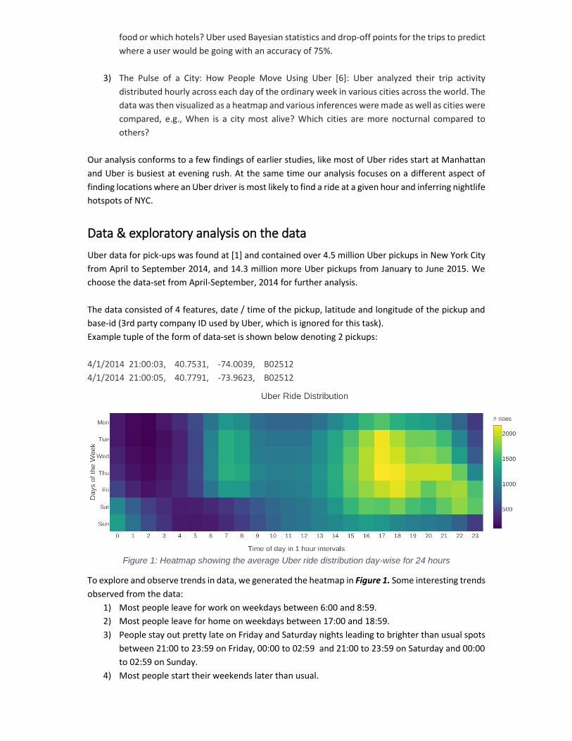
Figure 1: Heatmap showing the average Uber ride distribution day-wise for 24 hours
To explore and observe trends in data, we generated the heatmap in Figure 1. Some interesting trends
observed from the data:
1) Most people leave for work on weekdays between 6:00 and 8:59.
2) Most people leave for home on weekdays between 17:00 and 18:59.
3) People stay out pretty late on Friday and Saturday nights leading to brighter than usual spots
between 21:00 to 23:59 on Friday, 00:00 to 02:59 and 21:00 to 23:59 on Saturday and 00:00
to 02:59 on Sunday.
4) Most people start their weekends later than usual.
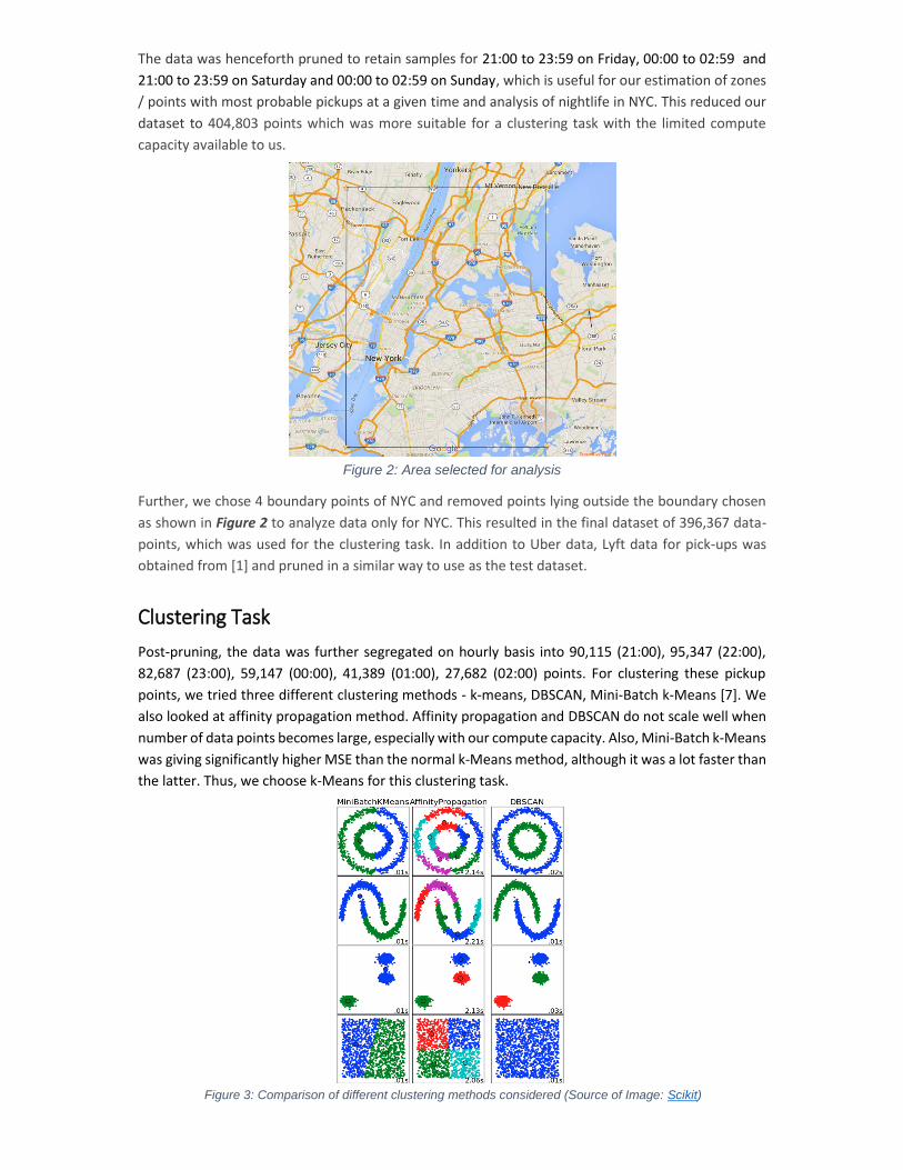
The data was henceforth pruned to retain samples for 21:00 to 23:59 on Friday, 00:00 to 02:59 and
21:00 to 23:59 on Saturday and 00:00 to 02:59 on Sunday, which is useful for our estimation of zones
/ points with most probable pickups at a given time and analysis of nightlife in NYC. This reduced our
dataset to 404,803 points which was more suitable for a clustering task with the limited compute
capacity available to us.
Figure 2: Area selected for analysis
Further, we chose 4 boundary points of NYC and removed points lying outside the boundary chosen
as shown in Figure 2 to analyze data only for NYC. This resulted in the final dataset of 396,367 data-
points, which was used for the clustering task. In addition to Uber data, Lyft data for pick-ups was
obtained from [1] and pruned in a similar way to use as the test dataset.
Clustering Task
Post-pruning, the data was further segregated on hourly basis into 90,115 (21:00), 95,347 (22:00),
82,687 (23:00), 59,147 (00:00), 41,389 (01:00), 27,682 (02:00) points. For clustering these pickup
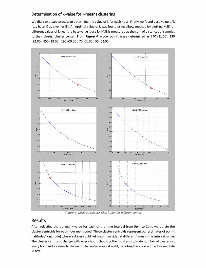
points, we tried three different clustering methods - k-means, DBSCAN, Mini-Batch k-Means [7]. We
also looked at affinity propagation method. Affinity propagation and DBSCAN do not scale well when
number of data points becomes large, especially with our compute capacity. Also, Mini-Batch k-Means
was giving significantly higher MSE than the normal k-Means method, although it was a lot faster than
the latter. Thus, we choose k-Means for this clustering task.
Figure 3: Comparison of different clustering methods considered (Source of Image: Scikit)
Determination of k-value for k-means clustering
We did a two-step process to determine the value of k for each hour. Firstly we found base value of k
(say base k) as given in [8]. An optimal value of k was found using elbow method by plotting MSE for
different values of k near the base value (base k). MSE is measured as the sum of distances of samples
to their closest cluster center. From Figure 4, elbow points were determined as 240 (21:00), 230
(22:00), 250 (23:00), 190 (00:00), 70 (01:00), 55 (02:00).
Results After selecting the optimal k-value for each of the time interval from 9pm to 2am, we obtain the
cluster centroids for each hour mentioned. These cluster centroids represent our estimates of points
(latitude / longitude) where a driver could get maximum rides at different times in this interval range.
The cluster centroids change with every hour, choosing the most appropriate number of clusters at
every hour and localizes to the night-life centric areas at night, denoting the areas with active nightlife
in NYC.
Figure 4: MSE vs Cluster Size k plot for different times
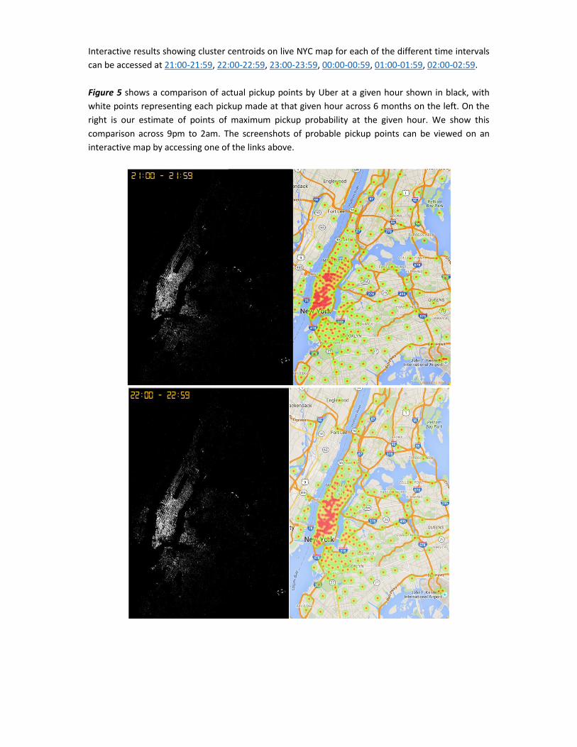
Interactive results showing cluster centroids on live NYC map for each of the different time intervals
can be accessed at 21:00-21:59, 22:00-22:59, 23:00-23:59, 00:00-00:59, 01:00-01:59, 02:00-02:59.
Figure 5 shows a comparison of actual pickup points by Uber at a given hour shown in black, with
white points representing each pickup made at that given hour across 6 months on the left. On the
right is our estimate of points of maximum pickup probability at the given hour. We show this
comparison across 9pm to 2am. The screenshots of probable pickup points can be viewed on an
interactive map by accessing one of the links above.
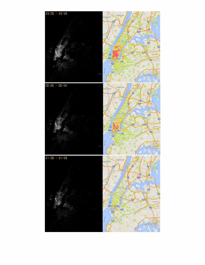
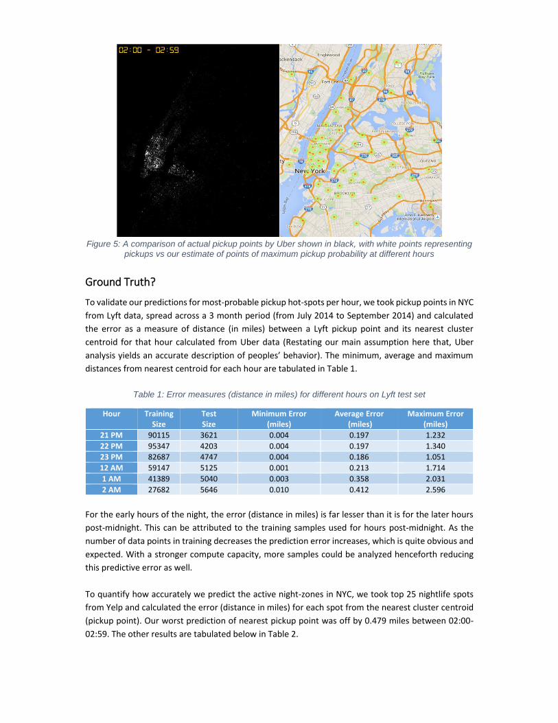
Figure 5: A comparison of actual pickup points by Uber shown in black, with white points representing
pickups vs our estimate of points of maximum pickup probability at different hours
Ground Truth?
To validate our predictions for most-probable pickup hot-spots per hour, we took pickup points in NYC
from Lyft data, spread across a 3 month period (from July 2014 to September 2014) and calculated
the error as a measure of distance (in miles) between a Lyft pickup point and its nearest cluster
centroid for that hour calculated from Uber data (Restating our main assumption here that, Uber
analysis yields an accurate description of peoples’ behavior). The minimum, average and maximum
distances from nearest centroid for each hour are tabulated in Table 1.
Table 1: Error measures (distance in miles) for different hours on Lyft test set
Hour Training Size
Test Size
Minimum Error (miles)
Average Error (miles)
Maximum Error (miles)
21 PM 90115 3621 0.004 0.197 1.232
22 PM 95347 4203 0.004 0.197 1.340
23 PM 82687 4747 0.004 0.186 1.051
12 AM 59147 5125 0.001 0.213 1.714
1 AM 41389 5040 0.003 0.358 2.031
2 AM 27682 5646 0.010 0.412 2.596
For the early hours of the night, the error (distance in miles) is far lesser than it is for the later hours
post-midnight. This can be attributed to the training samples used for hours post-midnight. As the
number of data points in training decreases the prediction error increases, which is quite obvious and
expected. With a stronger compute capacity, more samples could be analyzed henceforth reducing
this predictive error as well.
To quantify how accurately we predict the active night-zones in NYC, we took top 25 nightlife spots
from Yelp and calculated the error (distance in miles) for each spot from the nearest cluster centroid
(pickup point). Our worst prediction of nearest pickup point was off by 0.479 miles between 02:00-
02:59. The other results are tabulated below in Table 2.
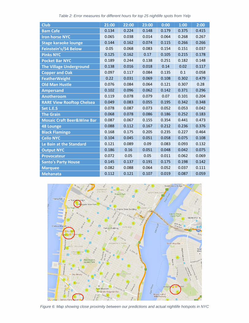
Table 2: Error measures for different hours for top 25 nightlife spots from Yelp
Club 21:00 22:00 23:00 0:00 1:00 2:00
Bam Cafe 0.134 0.224 0.148 0.179 0.375 0.415
Iron horse NYC 0.065 0.038 0.014 0.064 0.268 0.267
Stage karaoke lounge 0.144 0.162 0.074 0.115 0.266 0.266
Feinstein’s/54 Below 0.05 0.068 0.083 0.154 0.151 0.037
Pinks NYC 0.125 0.162 0.17 0.105 0.215 0.178
Pocket Bar NYC 0.189 0.244 0.138 0.251 0.182 0.148
The Village Underground 0.138 0.016 0.018 0.14 0.02 0.117
Copper and Oak 0.097 0.117 0.084 0.135 0.1 0.058
FeatherWeight 0.22 0.031 0.069 0.108 0.302 0.479
Old Man Hustle 0.076 0.084 0.064 0.121 0.307 0.28
Ampersand 0.102 0.096 0.062 0.142 0.371 0.296
Anotheroom 0.119 0.078 0.079 0.07 0.101 0.204
RARE View Rooftop Chelsea 0.049 0.083 0.055 0.195 0.342 0.348
Set L.E.S 0.078 0.087 0.073 0.052 0.053 0.042
The Grain 0.068 0.078 0.086 0.186 0.252 0.183
Mosaic Craft Beer&Wine Bar 0.087 0.067 0.155 0.354 0.441 0.473
48 Lounge 0.088 0.112 0.167 0.212 0.236 0.376
Black Flamingo 0.168 0.175 0.205 0.235 0.227 0.464
Ceilo NYC 0.104 0.045 0.051 0.058 0.075 0.108
Le Bain at the Standard 0.121 0.089 0.09 0.083 0.093 0.132
Output NYC 0.186 0.16 0.051 0.048 0.042 0.075
Provocateur 0.072 0.05 0.05 0.011 0.062 0.069
Santo's Party House 0.145 0.137 0.191 0.175 0.198 0.142
Marquee 0.082 0.088 0.064 0.052 0.037 0.111
Mehanata 0.112 0.121 0.107 0.019 0.087 0.059
Figure 6: Map showing close proximity between our predictions and actual nightlife hotspots in NYC
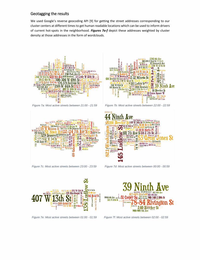
Geotagging the results
We used Google’s reverse geocoding API [9] for getting the street addresses corresponding to our
cluster centers at different times to get human readable locations which can be used to inform drivers
of current hot-spots in the neighborhood. Figures 7a-f depict these addresses weighted by cluster
density at those addresses in the form of wordclouds.
Figure 7a: Most active streets between 21:00 - 21:59 Figure 7b: Most active streets between 22:00 - 22:59
Figure 7d: Most active streets between 00:00 - 00:59 Figure 7c: Most active streets between 23:00 - 23:59
Figure 7e: Most active streets between 01:00 - 01:59 Figure 7f: Most active streets between 02:00 - 02:59

Another Interesting Insight
We decided to do another interesting analysis to find about people’s behavior on holidays. Four
holidays occurred between April 2014 and September 2014, Easter (Sunday), Independence Day
(Friday), Memorial Day (Monday) and Labor Day (Monday). We compared each of them with the
corresponding control day.
As can be seen from Figure 8, people prefer staying in on holidays at almost all times except the early
morning which is probably because stay out late the night before.
Figure 8: Ride distribution on a holiday vs a control day
Conclusion
As can be seen from the results, k-means clustering can be used to successfully and closely estimate
the most likely pickup points at any given hour and also predict the top nightlife hotspots by learning
trends from past Uber pickups. This has been verified using Lyft test set and is coherent with top
results from Yelp.
A Day In NYC: Uber Pickups Perspective
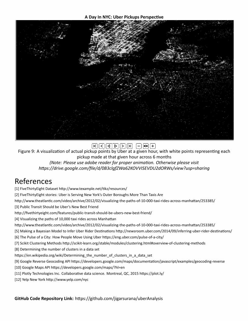
Figure 9: A visualization of actual pickup points by Uber at a given hour, with white points representing each
pickup made at that given hour across 6 months
(Note: Please use adobe reader for proper animation. Otherwise please visit
https://drive.google.com/file/d/0B3clgfZWa62KOVVISEVDU2dORWs/view?usp=sharing
References[1] FiveThirtyEight Dataset http://www.texample.net/tikz/resources/
[2] FiveThirtyEight stories: Uber is Serving New York’s Outer Boroughs More Than Taxis Are
http://www.theatlantic.com/video/archive/2012/02/visualizing-the-paths-of-10-000-taxi-rides-across-manhattan/253385/
[3] Public Transit Should be Uber’s New Best Friend
http://fivethirtyeight.com/features/public-transit-should-be-ubers-new-best-friend/
[4] Visualizing the paths of 10,000 taxi rides across Manhattan
http://www.theatlantic.com/video/archive/2012/02/visualizing-the-paths-of-10-000-taxi-rides-across-manhattan/253385/
[5] Making a Bayesian Model to Infer Uber Rider Destinations http://newsroom.uber.com/2014/09/inferring-uber-rider-destinations/
[6] The Pulse of a City: How People Move Using Uber https://eng.uber.com/pulse-of-a-city/
[7] Scikit Clustering Methods http://scikit-learn.org/stable/modules/clustering.html#overview-of-clustering-methods
[8] Determining the number of clusters in a data set
https://en.wikipedia.org/wiki/Determining_the_number_of_clusters_in_a_data_set
[9] Google Reverse Geocoding API https://developers.google.com/maps/documentation/javascript/examples/geocoding-reverse
[10] Google Maps API https://developers.google.com/maps/?hl=en
[11] Plotly Technologies Inc. Collaborative data science. Montreal, QC, 2015 https://plot.ly/
[12] Yelp New York http://www.yelp.com/nyc
GitHub Code Repository Link: https://github.com/jigarsurana/uberAnalysis