Embed Size (px)
Citation preview


CURRICULUM VITAERESUME

Brock Scott
We are a multidisciplinary team whose roots are in graffiti, born in late 2001 in Madrid. We develop our work mainly in the public space.
We understand our work as an urban transformative tool that ties new bonds between people. We feel a big responsi-bility towards the time and city we live in.
Pablo Ferreiro Mederos. Licenciado en Bellas Artes por la especialidad de Diseño Gráfico en la Aalto School of Design de Helsinki / Fine Arts graduated, with specialty in graphic design at Aalto School of Design in Helsinki
Pablo Purón Carrillo. Ilustrador y Licenciado en Publici-dad y Relaciones Públicas por la URJC de Madrid / Public Relationship and Advertisement graduated at URJC, and Illustrator
Javier Serrano Guerra. Arquitecto por la ETSAG, especia-lizado en paisaje por la IUAV de Venecia / Architect from ETSAG, with specialty in landscape design at IUAV in Venice
Juan Jaume Fernández. Licenciado en Bellas Artes por la rama de Artes de la Imagen, en la Universität Der Künste de Berlín / Fine Arts graduated, with specialty in visual Arts at Universität Der Künste, Berlin
BOA MISTURA SON / BOA MISTURA ARE
QUIÉNES SOMOS ABOUT US1
Somos un equipo multidisciplinar con raíces en el grafiti nacido a finales de 2001 en Madrid. Nuestro trabajo se de-sarrolla principalmente en el espacio público.
Entendemos nuestro trabajo como una herramienta para transformar la calle y crear vínculos entre las perso-nas. Sentimos una responsabilidad para con la ciudad y el tiempo en el que vivimos.

CV RESUME2
INSTITUCIONES / INSTITUTIONS
CONFIARON EN NOSOTROS
Organización de Naciones Unidas, UNPNUD - Programa de las Naciones Unidas para el Desarrollo Ayuntamiento de Madrid (España)Ajuntament de Barcelona (España)Ayuntamiento de París (Francia)Ayuntamiento de Segovia (España)Ayuntamiento de Murcia (España)Ayuntamiento de Rivas Vaciamadrid (España)Ayuntamiento de Getafe (España)Ayuntamiento de Alcobendas (España)Ayuntamiento de Alcalá de Henares (España)Concelho do Abrantes, PortugalAlcaldía de Ciudad de México (México)Alcaldía de Guadalajara (México)Alcaldía de Bogotá (Colombia)Alcaldía de Cali (Colombia)Alcaldía de Barranquilla (Colombia)Alcaldía de Ciudad de Panamá (Panamá)Alcaldía de Asunción (Paraguay)Municipalidad de Somoto (Madriz, Nicaragua)Municipalidad de Tirrases (San José, Costa Rica)Ayuntamiento de Lódz (Polonia)Ministerio de Medio Ambiente de la República Dominicana SEGIB - Secretaría General IberoamericanaPlan de desarrollo CREO Antofagasta (Chile)INFONAVIT, Instituto del Fondo Nacional de la vivienda para los trabajadores (México)SESC - Servicio Social de Comercio (Brasil)GCPHE - Grupo Ciudades Patrimonio de la Humanidad de España (España)Metro de Madrid (España)
DOT - NYC Department of Transportation (Nueva York, USA) DADEP - Departamento Administrativo de la Defensora del Espacio Público de Bogotá (Colombia)AECID - Agencia Española de Cooperación Internacional para el Desarrollo (España)Instituto Cervantes (España) Casa América (Madrid, España) Ministerio de Igualdad, España
FUNDACIONES / FOUNDATIONS
GreenpeaceOxfam IntermónOnce FoundationWWF - World Wild FoundationAmnistía InternacionalCEAR - Comisión Española de Ayuda al RefugiadoACF Acción Contra el HambreAldeas InfantilesPlena Inclusión MadridAsociación APNEEFCooperación SuizaFundación TelefónicaFundación OrangeFundación BobathFundación Mustakis (Chile)Fundación Grupo Orbis (Colombia)Obra Social Caja MadridFundación MonteMadridFundación Obra Social La CaixaFundación Botín
MUSEOS Y CENTROS CULTURALES / MUSEUMS AND CULTURAL CENTERS
Bauhaus ArchivMAXXI RomaMuseo Atlántico Norte, Barranquilla, ColombiaMuseo Nacional Centro de Arte Reina Sofía (Madrid, España)Es Baluard, Palma de Mallorca (España)La Térmica (Málaga, España)Matadero (Madrid, España)CCE en Malabo (Guinea Ecuatorial)CCE en São Paulo (Brasil)CCE en Panamá (Panamá)CCE en Guatemala (Guatemala)CCE en Lima (Perú)CCE en Ciudad de México (México)CCE en Managua (Nicaragua)Instituto Cervantes de Nueva York (USA)Instituto Cervantes de Argel (Argelia)
UNIVERSIDADES / UNIVERSITIES
Universidad de Harvard (Boston,USA)Universidad de Caldas (Manizales, Colombia)Universidad de Costa Rica - UCRUniversidad de Málaga (España)UPV (Valencia, España)UPM (Madrid, España)TEC de Monterrey - ITESM (Santiago de Querétaro, México) Universidad Francisco de Vitoria (Madrid, España)Universidad de Arquitectura y Diseño ISTHMUS (Ciudad de Panamá, Panamá y Chiuahua, México)Universidad de Alcalá de Henares (Madrid)Facultad de Bellas Artes UCM (Madrid, España)Facultad de Bellas Artes de la Universidad de Sevilla (España)
SOME OF WHO TRUSTED IN US

PROGRAMAS DE MURALISMO /MURALISM PROGRAMS
HITOS SIGNIFICATIVOS RELEVANT MILESTONES
2019 “SOUL” para Living Walls (Atlanta, USA)
“PRIDE / IDENTITY” para El Punto Urban Art Museum (Salem, Massachusetts, USA)
“DESTINO” para Muros Tabacalera, organizado por Madrid Street Art Project y Promoción del Arte del Ministerio de Cultura de España (Madrid, España)
“MÁS ALLÁ DE LOS MUROS, LA CALLE” para la cárcel Model (Barcelona, España)
“ROOTS OF RUBBER” para el Downtown Akron Partnerhip (Akron, Ohio, USA)
“MORDIDA DE INFINITA SAUDADE” para Vigo Ciudad del Color organizado por el Concello de Vigo (Vigo, España)
“CRECER UNIDOS” para MIAU Fanzara (Valencia, España)
“SOY PORQUE SOMOS” para The Beauty Project (Ciudad de México, México)
“KALEVIPOEG” para MEXTONIA (Tallín, Estonia)
“PINTURAS PARTICIPATIVAS II” organizado por el CREO (Antofagasta, Chile)
“OS OLHOS QUEREM O TEMPO” comisionado por el Sesc Osasco (São Paulo, Brasil)
“ORGULLO” en la Bienal Internacional de Muralismo y Arte Público de Cali, organizada por el MULI (Cali, Colombia)
“PINTURAS PARTICIPATIVAS” organizado por el CREO (Antofagasta, Chile)
“QUERER VOLVER” en el Museo - Foro de Arte Contemporáneo (CEMFAC) (La Palma, España)
2015
“ZYCIE JEST STANEM UMYSLU / LA VIDA ES UN ESTADO MENTAL” para el Łódzkie Centrum Wydarzeń (Łódz, Polonia)
“BACATÁ” con el Instituto Distrital de las Artes (IDARTES) (Bogotá, Colombia)
“SPREAD LOVE” en Open Source Gallery (New York, USA)
“CANVI” para el Festival Intramurs (Valencia, España)
“PARATGES DE PAU” en la Nit de l’Art de Campos (Mallorca, España)
“REALITÉ” para la “Nuite Blanche” (París, Francia)
“PALABRA BONITA” para el Mikser Festival (Belgrado, Serbia)
2017
2016
2018 2014
FERIAS Y EXPOSICIONES /ART FAIRS AND EXHIBITIONS
2019
2020
2018
“TAIHE” en la Bienal Bi-City Biennale of Urbanism/ Architecture (Shenzhen, China)
“SPREAD LOVE” Solo Show en Open Source Gallery (New York, USA)
“MI RAÍZ ES” Solo show para PhotoEspaña 2016 en la Galería Ponce+Robles (Madrid, España)
“AGOPUNTURA NELLO SPAZIO PUBBLICO” en “The Independent” en el MAXXI (Roma, Italia)
“ORGULLO” en la Bienal de Muralismo (Cali, Colombia)
“MI RAÍZ ES” en la Bienal de La Habana (La Habana, Cuba)
“HOPE AND LIFE” en el Pabellón CIBUS de la Expo Milano 2015 (Milán, Italia)
MICRO-TRASFORMAZIONI 2.0 para la Triennale Milano (Milán, Italia)
“LUZ NAS VIELAS” en la Prague Quadriennal of Performance Design and Space (Praga, República Checa)
EXPO Diseño Iberoamericano XXI, CCE Panamá (Ciudad de Panamá, Panamá)
“NUEVOS MODOS, MODELOS Y GEOGRAFÍAS” para la Harvard University Graduate School of Design (Boston, USA)
“ANAMORFOSIS” Solo show en la Galería Ponce+Robles (Madrid, España)
“SOMOS LUZ” en la Bienal del Sur en Panamá (Ciudad de Panamá, Panamá)
Harmonies. Solo show en la Galería ADDA & SARTO (París, Francia)
Feria Buenos Aires Photo 2020 junto a PONCE+ROBLES (Buenos Aires, Argentina)
«La Strada: dove si crea il mondo» en el MAXXI de Roma (Italia)
Feria Estampa 2019 junto a Ponce+Robles (Madrid, España)
“Nada” Solo show para la feria Photoespaña en la Galería Ponce+Robles (Madrid, España)
“Crossroads” en UNHABITAT-WUF 2018 (Kuala Lumpur, Malasia)
2016
2015
2014
2013
2017
CV RESUME2

Profesores en el Máster Arquitecturas Efímeras de la ETSAM (Madrid, España)
Profesores en el Máster Arquitecturas Efímeras de la ETSAM (Madrid, España)
Residencia artística en la Ambassade du Turfu (Marsella, Francia)
Profesores en el Máster Arquitecturas Efímeras de laETSAM (Madrid, España)
Profesores en el Máster Arquitecturas Efímeras de la ETSAM (Madrid, España)
Taller en la UIMP (Santander, España)
Taller en la Casa de los Picos (Segovia, España)
Taller en la Casa Encendida (Madrid, España)
Taller en el CCE Juan de Salazar (Asunción, Paraguay)
Taller en la Fundación Mustakis (Santiago de Chile, Chile)
Taller con niños de la Unidad de Pediatría del Hospital Vall d’Hebrón junto a la Fundación DKV (Barcelona, España)
Profesores en el Máster Profesional en Estimulación Creativa Hoala (Valencia, España)
Profesores en el Máster Arquitecturas Efímeras de la ETSAM (Madrid, España)
Taller en el 180 Creative Camp (Abrantes, Portugal)
Profesores en el proyecto de Lenguas aplicadas y Arquitectura de la Universidad Antonio de Nebrija (Madrid, España)
Selección oficial como representación de España para la Bienal Iberoamericana de Diseño 2020
Bronce en los World Habitat Awards de ONU Habitat + World Habitat
Premio Iniciativa - Empresa por la Sociedad Geográfica Española
Nominación al IAPA (International Award for Public Art)
“Videourbana” VII Bienal Iberoamericana de Arquitectura y Urbanismo (Madrid, España)
Premio GRÀFFICA 2014
Premio ARTAQ (Arte Urbano)
Taller con niños de la Unidad de Pediatría del Hospital Gregorio Marañón de Madrid junto a la Fundación DKV (Madrid, España)
Taller con las asociaciones que forman Plena Inclusión Madrid en la estación de metro de Chamartín (Madrid, España)
Profesores en el Máster Arquitecturas Efímeras de la ETSAM (Madrid, España)
“TYPE ON” workshop en el Museo Patio Herreriano (Valladolid, España)
Colaboradores en el curso “Nuevo Urbanismo en México (CINUM)” en el TEC de Monterrey - ITESM (Querétaro, México)
Taller de diseño en la Universidad Autónoma de Querétaro (Santiago de Querétaro, México)
Profesores en el Máster Arquitecturas Efímeras de la ETSAM (Madrid, España)
Taller en la Universidad de Arquitectura y Diseño ISTHMUS (Panamá)
Taller en “Scarpia XII, Jornadas de Arte Contemporáneo” (Córdoba, España)
Taller en el TEC de Monterrey - ITESM (Querétaro, México)
2019
2020
2018
2015
2014
2013
2018
2020
2011
2015
2016
2017
2016
2014
TALLERES / WORKSHOPS PREMIOS / AWARDS
HITOS SIGNIFICATIVOS RELEVANT MILESTONES
CV RESUME2

PROYECTOS PARTICIPATIVOSPARTICIPATORY PROJECTS

LUZ NAS VIELAS 2012
SÃO PAULO. BRASIL / SÃO PAULO. BRAZIL
“Luz Nas Vielas” se realizó en Vila Brasilândia. Tuvimos la oportunidad de vivir en la favela, acogidos por la familia Reis Gonçálves, y acceder al contacto directo con la comunidad.
Definimos como marco de actuación las callejuelas que sirven de elementos conectores en el tejido urbano, conocidas como “vielas” y “becos”. El diálogo con los vecinos y su participación activa fueron determinantes en la dirección del proyecto.
Usando la técnica de la anamorfosis, se puede leer BELEZA, FIRMEZA, AMOR, DOÇURA y ORGULHO, enmarcadas en un continuo de color plano, que cubre por igual todos los materiales, democratizándolos.
Jardim Guaraní, Brasilândia, en la periferia norte PaulistaJardim Guaraní, Brasilândia, in the north periphery of São Paulo
Beleza / Belleza / Beauty
PROYECTOS PARTICIPATIVOS PARTICIPATORY PROJECTS3

Orgulho / Orgullo / Pride Firmeza / Strength
Doçura / Dulzura / Sweetness Amor / Love

“Luz nas vielas” was developed in Vila Brasilândia, a favela located in the Northeast of São Paulo, where we had the chance to spend a couple of weeks hosted by the wonderful Gonçalves family. This way, we got access to get to know the community.
We defined the framework in the narrow and winding alleyways which connect the higher and lower urban areas, known as “vielas.” The dialogue with the neighbors and their engagement were the key for the project success.
The project aims to respond to this particular spatial complexity. We flattened the perspective, so from a certain spot (anamorphosis), the words «BELEZA», «FIRMEZA», «AMOR», «DOÇURA» and «ORGULHO» can be read. All the words were surrounded by a flat color, equally covering all the construction materials, democratizing the space.
PROYECTOS PARTICIPATIVOS PARTICIPATORY PROJECTS3
Viela “poesia” antes de la intervención“Poesia” alleyway before the intervention
Poesia / Poesía / Poetry


Somos luz es el mensaje con el que intervinimos, ayudados por los propios vecinos, las 50 viviendas del edificio Begonia I en el barrio de El Chorrillo.
Inspirados en la identidad del barrio, tomamos como punto de partida la retícula de colores que se genera de forma espontánea al pintar cada vecino la porción del edificio que entiende como suya. Modificando esta retícula, al introducir la tipografía se pierde la unicidad de vivienda para ganar concepto de comunidad.
Los corredores y núcleos de escaleras han sido también intervenidos, convertidos así en composiciones abstractas de color que cobran vida con la ropa tendida o cuando alguien se asoma al balcón.
SOMOS LUZ
CIUDAD DE PANAMÁ, PANAMÁ / PANAMA CITY, PANAMA
PROYECTOS PARTICIPATIVOS PARTICIPATORY PROJECTS3
Jenesí y Yahomi / Jenesí and Yahomi
Edificio Begonia I, antes / Begonia building before
Proceso de intervención / Intervention process
2013

Patrones de color de “El Chorrillo” / El Chorrillo color patchworks
Capa tipográfica
Capa cromática
Alzado
18
PROYECTOS PARTICIPATIVOS PARTICIPATORY PROJECTS3
«Somos Luz» (We are light) is the message we chose to write, with the neighbors help, on the 50 apartments of the Begonia I building in the community of El Chorrillo in Panama.
Inspired by the colors of the area, we begin the concept design by usign the spontaneous grid created when each neighbor paint his own balcony. By modifying this grid, and introducing the typography, we tried to break the individual module, increasing the sense of community.
Not only the façade, but the corridors and stairways were painted as well, they are turned now into an abstract color composition that comes to life every time the neighbors hang the wet clothes or just look out from the balcony.


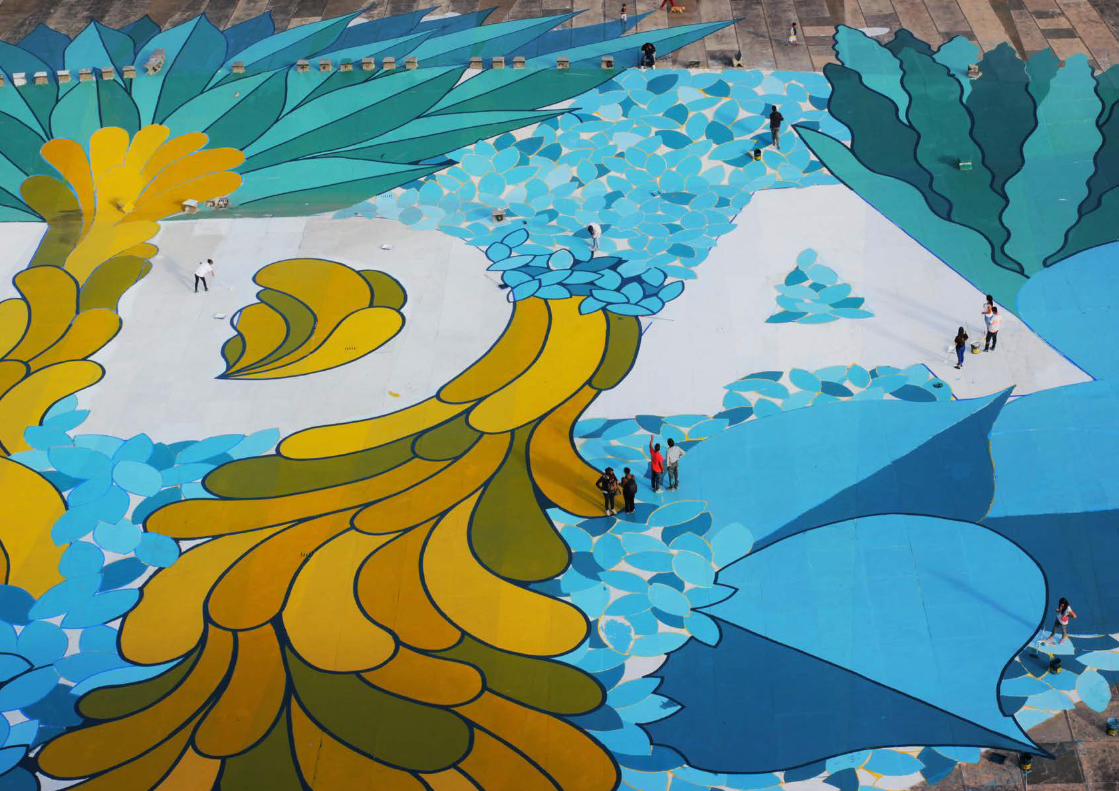
Pintamos una hoja de 5.000 m2 en el suelo de una plaza para recordarle a las 457 familias que han sido realojadas en esta urbanización de vivienda social que deben construir su futuro de forma conjunta para salir adelante.
Es en este contexto, validado por los vecinos y generado de forma participativa, donde se va a transformar el nuevo lugar en el que viven y se construirán relaciones que fortalezcan la comunidad y sirvan como origen de una nueva identidad.
La obra consiste en una hoja gigante formada por cientos de hojas más pequeñas, que se ordenan de tal forma que se puede leer la palabra VIDA. Cada una de esas hojas pertenece a las especies más significativas de los diferentes ecosistemas del país, representando el lugar de origen de cada uno de ellas.
PROYECTOS PARTICIPATIVOS PARTICIPATORY PROJECTS3
VIDA
BOGOTÁ, COLOMBIA
2015
Vecinos pintando/ Neighbors painting
La plaza antes de la intervención/ Plaza before the intervention

A 5.000m2 leaf painted on the ground of a plaza, shouting the word LIFE. This is our way for honouring the 457 relocated families in this new urbanization of social homes, rebuilding their future together so they can move forward.
In this context is where the mural is born, approbed by the neighbors and created in a participatory way together with them and other citizens. The aim is to transform the new home, building new relationships that strength this new community as part of their new identity.
The work consists on a big leaf, made up by hundreds of smaller leafs, that are assembled in a way that can be read the word VIDA (LIFE). Each one of those leafs belongs to the country’s most significative species, representing with a symbolic way their places of origin.
PROYECTOS PARTICIPATIVOS PARTICIPATORY PROJECTS3
Vista de la plaza / Panoramic view of the plaza
Boceto de la obra / Sketch

La intervención ronda los 7.000m2 de mural en el encuentro entre las poblaciones de Villa las Condes y Corvallis en Antofagasta, y propone un nuevo paisaje urbano. El mural ha sido realizado de manera colaborativa con más de 200 vecinos y 20 artistas locales.
La Fiesta de La Tirana es una festividad andina que rela-ciona la Pachamama con la Virgen del Carmen. Cada 16 de julio congrega agrupaciones de todo el país que bailan inin-terrumpidamente para agradecer los ruegos que han pedido a la Virgen. Son los vecinos del área quienes nos proponen el tema a través de una consulta vecinal.
Durante el proceso hemos diseñado unas 10 máscaras com-pletas, algunas de ellas propuestas por los artistas locales Basco y Lovart. De esas máscaras hemos seleccionado solo los fragmentos de los ojos, para que sus miradas les acom-pañen por todo el recorrido. El mural representa fragmen-tos de máscaras de la Diablada, uno de los bailes más em-blemáticos.
PROYECTOS PARTICIPATIVOS PARTICIPATORY PROJECTS3
Artista local involucrada / One of the involved local artists
MÁSCARAS DE LA TIRANA
ANTOFAGASTA, CHILE
2016

27
PROYECTOS PARTICIPATIVOS PARTICIPATORY PROJECTS3
Diseños de máscaras propios / New masks designs and sketches
Festividad de la Tirana / Tirana festivity
This intervention is around 7.000 m2 mural paintings in the spot where the neighborhoods Villa las Condes and Corvallis merge, proposing a new urban landscape. The project has been made in a participatory way with more than 200 neighbors and 20 local artists.
The festivity of «La Tirana» is an andean parade that corre-lates the Pachamama with the Virgin of El Carmen. Every July 16th gathers groups of people from all over the country, specially from the north, who dance nonstop day and night, in order to thank the previous year prays. It is the neighbors who propose us this concept in a local query.
During the process we’ve design 10 complete masks, some of them proposed by two local artists. From these masks we’ve framed the eyes to make them stare at you along the way. The murals represent pieces of these Diablada masks, one of the most popular dances.


El proyecto abarca los 4.500 m2 del principal espacio público, situado dentro de la colonia obrera Infonavit Independencia, en Guadalajara, México. El conjunto, con escasos recursos destina-dos a su mantenimiento, fue construido en los años 80 y alberga a unas 2.500 personas.
El proceso se realizó conjuntamente con la Concejalía de Cul-tura de Guadalajara, que decidió activar el área a través de varios programas culturales.
La fase de ejecución se concibió de forma colaborativa con la comunidad, considerando la contratación de vecinos en situ-ación de desempleo, a quiénes se les formó para trabajar en al-tura.
PROYECTOS PARTICIPATIVOS PARTICIPATORY PROJECTS3
Resultado final de Nierika / Final resultÁrea de intervención / Internvention area
NIERIKA
GUADALAJARA, MÉXICO
2017

El diseño se inspira en la cultura wixárika, donde todo se relaciona y todos están en comunicación constante.
• El Nierika es para ellos una fuente de energía que prolonga la sabiduría de los antepasados en las generaciones siguientes, guiándoles para construir el porvenir. Los elementos que lo forman son:
• El Hi’ikuri (Peyote): su consumo ritual está asociado a la capacidad de ver, de entender el mundo desde las revelaciones divinas. Aporta una manera de entender el mundo mas allá de lo evidente.
• FUI, SOY, SERÉ representa la fuerza de la identidad del pueblo mexicano. La riqueza de su pasado, la firmeza de mantenerlo vivo en el presente y la fuerza de su identidad en el futuro.
• Tsik+ri es un niérika de suma importancia. Existe la creencia de que permite ver lo desconocido. También sirve de guía y como elemento de protección.
34
PROYECTOS PARTICIPATIVOS PARTICIPATORY PROJECTS3
Alzados de FUI, SOY, SERÉ / FUI, SOY, SERÉ blueprints
Tsik + ri

This project takes over 4.500 m2 of public space. It is spotted inside the working class community Infonavit Independencia, in the city of Guadalajara, Mexico. The complex was built du-ring the 80s, is hosts more than 2.500 inhabitants, and has very little resources for its maintenance.
The process has been developed together with the Department of Culture of Guadalajara, that took the challenge of acti-vate the area through several cultural programmes.
The last stage was the execution, and also was conceived in a participatory way. Six unemployed neighbors were instructed to work in heights, and then hired to work with us.
The design is inspired by the wixárika culture, where everything is connected and everyone is in constant communication.
• The Nierika is a source of energy that extends the wisdom from the ancestors onto the next generations, guiding them in the conception of the future. The elements that form the Nierika are:
• El Hi’ikuri (Peyote): The rituals around this plant are related to the hability of seeing and understanding the world from the divine revelations perspective. It gives you a way of understanding the world beyond normality.
• FUI, SOY, SERÉ represents the strength of the mexican people. The richness of the past, the strength of the keeping it alive, and the strength of the future to come.
• Tsik+ri is a very important nierika. It is said that allows you to see the unknown. It also works as a guide and a protection element.
PROYECTOS PARTICIPATIVOS PARTICIPATORY PROJECTS3
Render de presentación / Presentation 3D model


La ciudad de Akron (Ohio, EEUU) ha sido cuna de ideas, sistemas de producción e inventos, que han tenido un impacto positivo en sus ciudadanos, y el mundo en general. Es conocida como la «Rubber City», por su historial en la producción de neumáticos en Norteamérica.
Actualmente, Akron trabaja en estrategias para lograr que el centro de la ciudad sea un lugar más atractivo para las personas. Basados en elementos urbanos y análisis realizados por el estudio de arquitectura Gehl Architects, se llevó a cabo un plan de intervenciones que incluye la implementación de intervenciones artísticas que ayuden a activar plazas y otros espacios públicos.
ROOTS OF RUBER
AKRON, EEUU / AKRON, USA
2018
PROYECTOS PARTICIPATIVOS PARTICIPATORY PROJECTS3
Vista aerea de la intervención /Intervention’s aerial view of the intervention
La plaza y su contexto / Plaza and surroundings

54
PROYECTOS PARTICIPATIVOS PARTICIPATORY PROJECTS3
For almost 200 years, Akron, Ohio, has been the birthplace of ideas, systems, products and inventions that have had an unequivocally positive impact on the world and its citizens. It is known as Rubber City, due to its history in the production of tyres in North America.
Currently, Downtown Akron works strategically to make the center of the city more attractive to people. Based on the urban features and user analysis developed by Gehl Architects, a plan of interventions has been developed that includes the construction of leisure infrastructures, the improvement of lighting, the expansion of the cultural offer for young people and the implementation of artistic interventions that help activate squares and other public spaces.
+ + =
Esquema de solape / Overlapping scheme
Plano de situación de los prismas / Forms placing plan

PROYECTOS PARTICIPATIVOS PARTICIPATORY PROJECTS3
We carried away the project aiming to transform the citie’s downtown, to change the actual urbanism model and way of life of their neighbors.
The interesting natural process of obtaining rubber is the source of inspiration for this intervention. Through geometrical patterns, the work creatively tells the story of Akron, intimately linked to the use of these raw materials.
The three-dimensional volumes dialogue with the shapes of the floor and help create a maze where a verse by Akronite writer Rita Dove can be read.
Llevamos a cabo un proyecto con el objetivo de generar transformación en la zona central, para cambiar el modelo actual de urbanismo y modo de vida de los vecinos y vecinas.
El proceso natural de obtención del caucho ha sido la fuente de inspiración para esta intervención urbana. A través de patrones geométricos, el proyecto trata de generar una alfombra de color que quede ligada a la historia de la ciudad y al uso del material para fabricar neumáticos.
Los volúmenes tridimensionales instalados dialogan con la geometría del suelo, y ayudan a crear un laberinto sobre el que escribimos un verso de la escritora akronita Rita Dove.

Este proyecto se desarrolla sobre 52 barcas que descansan en el manglar de Manzanillo, en la provincia de Montecristi, República Dominicana. Se trata de una obra de carácter paisajísitico que altera el aspecto del manglar. Las barcas, a través del uso del color, se convierten en una especie más del ecosistema.
El proyecto tenía como objetivos mejorar las condiciones de las embarcaciones a través de un proceso colaborativo que incorpora a los propios pescadores en su restauración, y generar una nueva identidad vinculada a la concienciación con el respeto a la biodiversidad marina, tan castigada en esta zona y de cuyo equilibrio depende la economía de la región.
PROYECTOS PARTICIPATIVOS PARTICIPATORY PROJECTS3
CARDÚMEN DE LOROS
PEPILLO SALCEDO, REPÚBLICA DOMINICANA / PEPILLO SALCEDO, DOMINICAN REPUBLIC
2019
Cheche preparando la “Pequeña Lulú para la intervención / Cheche while preparing la “Pequeña Lulú” for the intervention
La “Pequeña Lulú” y “Santa Teresita” entre otras, botadas en el área pesquera de Estero Balsa/ “Pequeña Lulú” and “Santa
Teresita” among others, launched at Estero Balsa port

Hemos trabajado sobre las barcas inspirados en los colores y formas de las 80 variedades del Pez Loro, una especie determinante para el mantenimiento de los arrecifes, para visibilizar la conciencia medioambiental y, simbólicamente, repoblar el manglar de Manzanillo de nuevos cotorros.
Para la realización del proyecto hemos contado con el apoyo de distintos colectivos de la comunidad, especialmente con la Asociación de pescadores de Manzanillo y el Centro de Madres, que se han involucrado en todo el proceso tomando el proyecto como propio.
58
PROYECTOS PARTICIPATIVOS PARTICIPATORY PROJECTS3
Familia preparando su yola para la obra /A family prepares their boat for the work
Diseño para “El Bondadoso” / Design for “El Bondadoso”
Diseño para “Yezenia” / Design for “Yezenia”

This project is carried out over 52 fishermen boats, currently anchored in the mangrove of Manzanillo bay, in the province of Montecristi, in the Dominican Republic. This is a landscape work that changes the appearance of the mangrove. Through the color, the boats are turned into another species in the ecosystem.
On one hand, the objective is to improve the conditions of the precarious boats through a collaborative process that incorporates the fishermen themselves in their restoration.
On the other, to generate a new identity linked to raising awareness with respect to marine biodiversity, which is so badly hit in this area and on whose balance the region’s economy depends.
We worked the boats inspired by the colorful parrotfish, which has more than 80 types. It is a crucial species for the survival of the coral reefs. We tried to raise environmental awereness and repopulate the Manzanillo mangrove with new parrotfishes.
We had the support from different associations for this project. Most precisely both fishermen association and mothers association, that were involved during the whole process and felt the project as their own.
PROYECTOS PARTICIPATIVOS PARTICIPATORY PROJECTS3


MURALES COMISARIADOSCOMMISSIONED MURAL PAINTINGS

平衡 EQUILIBRIO
El pensamiento filosófico chino considera la armonía como un estado de equilibrio desarrollado por el hombre y que alcanza a través de las relaciones correctas. Es a partir de ese equilibrio armónico entre tradición y desarrollo, desde donde el pueblo chino debería construir el futuro.
Se realizó una intervención de aproximadamente 960 m2 en la fachada principal de una de las sedes de la “BiCity Biennale of Urbanism\Architecture” en la ciudad de ShenZhen.
Desarrollamos una superposición de ideogramas en la que las palabras “tradición” y “desarrollo” se mezclan.
Apostando por el proceso, pintamos primero una palabra completa, sobre la que luego superpusimos la segunda, generando un juego de transparencias que invita al espectador a detenerse y descifrar su significado.
MURALES COMISARIADOS COMMISSIONED MURALS4
SHENZHEN, CHINA
2017
Edificio antes de la internvención / Building before the intervention
Detalle de la obra / Mural detail

MURALES COMISARIADOS COMMISSIONED MURALS4
Chinese philosophical thinking regards harmony as a state of equilibrium developed by man and achieved through correct and proper relationships. Breaking this cosmic order would bring about serious alterations. It is from that balance, from the harmony between tradition and development, from where the creative Chinese people should build the future, that own and unique future that maintains the cosmic order.
The intervention takes around 960 m2 of the main facade from one of the “Bi-City Biennale of Urbanism\Architecture” venues, in the city of Shen Zhen.
We propose an ideogram superposition by mixing the words «tradition» and «progress».
By strengthening the process, we first painted completely the first word on which the second one was painted over, creating then a transparency effect that invites the audience to stop and depict its meaning.
Proceso de trabajo / Painting process
Detalle de la obra / Mural detail

Propusimos una obra performática trabajada en dos fases, por lo que fue mutando su aspecto a medida que se ejecutó:
• FASE 1 (DESARROLLO): En representación del presente. El desarrollo se encuentra con ese pasado único.
• FASE 2 (TRADICIÓN): Representando elementos que marcan la identidad de China.
• RESULTADO FINAL (ARMONÍA): En representación del futuro. Es en ese punto donde Tradición y Desarrollo se encuentran, donde está el equilibrio.
Our proposal was a performance work, worked in two stages, so it was be a living work, which will change its appearance as it was being executed:
• PHASE 1: (DEVELOPMENT): Representing the present. The brutal development meets that unique past.
• PHASE 2: (TRADITION): Representing the past. All those elements that mark so strongly the identity of China.
• FINAL RESULT: HARMONY: Representing the future. It is at that point where Tradition and development meet, where is the balance.
+
42
DEVELOPMENT TRADITION
MURALES COMISARIADOS COMMISSIONED MURALS4
Edificio antes de la internvención / Building before the intervention
Detalle de la obra / Mural detail


Esta privilegiada ubicación en el centro de la Ciudad de México, en el Paseo de Reforma, fue la ocasión perfecta para expresar que somos hojas de un mismo árbol, con nuestros matices, pero con una misma raíz. Que nos une un tronco sólido y firme, cuya raíz es común para todos. Que un individuo lo es, porque forma parte de un ente mayor. Todo esto se expresa a través de “Soy porque somos”.
Desde el respeto y la admiración a una tradición tan arraigada en México, hemos interpretado las formas, los ritmos y los colores de estas obras de arte para crear nuestro propio árbol de la vida, y dotarle de un nuevo relato desarrollando un mural de 1.000 m2. Nuestro árbol habla de la diversidad, de las diferencias que nos hacen únicos.
Para desarrollar este árbol, hemos tomado como inspiración los árboles de la vida, esculturas en barro fabricadas comúnmente por artesanos de Metepec, ciudad ubicada en en centro de México. Son parte de la identidad del pueblo mexicano, y están muy presentes en el imaginario del país.
SOY PORQUE SOMOS
MURALES COMISARIADOS COMMISSIONED MURALS4
CIUDAD DE MÉXICO, MÉXICO / MEXICO CITY, MEXICO
2018
Edificio antes de la internvención / Building before the intervention

45
This privileged location right in downtown Mexico was the perfect place to express that we are leaves from the same tree. We have our shades, but with the same root. We are tied by a strong trunk which root is the same for everybody. We are individuals because we are part of something bigger. All this is expressed through “Soy Porque Somos” (I am because we are).
We have much respect fand admiration or the strongly rooted traditions preserved in Mexico. We made an interpretation of the forms, rythms and colors from the crafts produced by local artisans, to design our own tree of life. Telling a new story trhough a 1.000 m2 mural painting. Our tree speas abut diversity, and the differences that make us unique.
As a starting point we worked with the popular trees of life, clay sculptures made by artisans in Metepec, a city located in the center of Mexico. They are part of the mexican people, and very present in the country’s identity.
MURALES COMISARIADOS COMMISSIONED MURALS4
Árboles de la vida tradicionales / Traditional trees of life
Propuesta de diseño / Design proposal


Una valla perimetral de 350 metros lineales rodea la parcela de la Bauhaus-Archiv durante los tres años que durarán las obras de construcción de su nuevo edificio.Como colectivo con base multidisciplinar, nuestro trabajo se mueve entre la arquitectura, el diseño, la tipografía y el color.
La Bauhaus y sus maestros son padres del universo visual y creativo al que pertenecemos, y una referencia continua entre nosotros, ya que directa e indirectamente, han inspirado muchas de nuestras lineas de trabajo. En este proyecto hemos trabajado directamente con las herramientas que dejaron algunos de los maestros de la Bauhaus.
BAUHAUS ARCHIV
BERLIN, ALEMANIA / BERLIN, GERMANY
2019 - 2020
MURALES COMISARIADOS COMMISSIONED MURALS4
A 350 linear meters fence surrounds the perimeter of Bauhaus Archiv’s plot, and will last three years during the construction of its new building. As a multidisciplinary collective, our work moves between architecture, design, typography and color.
Bauhaus and its teachers are parents of the visual and creative universe to which we belong, and a permanent reference for us, they have inspired many of our lines of work both directly and indirectly. In this project we have worked directly with the tools taught by some of the Bauhaus masters.

MURALES COMISARIADOS COMMISSIONED MURALS4
Ejemplo de adaptación a la valla / Example of adaptation to the fence
Para la primera etapa decidimos salir de nuestras tipografías de confianza, trabajamos con la ITC Bauhaus (Ed Benguiat), inspirada en la mítica Bauhaus Type creada por Herbert Bayer en 1926. Al sacarla de escala, fragmentarla y solaparla, la tipografía ha sido una excusa para generar unos ritmos geométricos que nos vayan acompañando durante todo el recorrido
For the first stage we wanted to get away from our trusted typefaces, we worked with the ITC Bauhaus (Ed Benguiat), inspired by the mythical Bauhaus Type created by Herbert Bayer in 1926. Taking it out from scale, fragmenting it and overlapping it, typography has been an excuse to generate geometric rhythms that will accompany us throughout the tour.
Interacción del color, de Josef Albers y su adaptación a la tipografía Bauhaus / Josef Albers’ color interaction and adaptation to the
Bauhaus typography


En esta ocasión, hemos desarrollado un nuevo abecedario, específico para el lugar, partiendo del alfabeto modular experimental de Josef Albers.
La tipografía de Albers parte de cuadrados, círculos y triángulos, formas puras cargadas de simbología en el universo Bauhaus. Por tanto, nuestro primer paso ha sido descomponerlo estructuralmente.
A partir de la estructura, evidenciar cada geometría a través del uso del color. Nuestro punto de partida es la paleta cromática de Gunta Stölzl, maestra del textil, que nos ha permitido huir de la convención de que el triángulo debe ser amarillo, el cuadrado rojo y el círculo azul.
Los siguientes pasos responden a la adaptación de la tipografía a las proporciones horizontales del soporte
Duplicamos cada letra para tener referencia visual de las dos mitades que componen cada letra. Nos quedamos con la franja que aglutina la mayor parte de la información de la letra.
La frase es de Hannes Meyer, segundo director de la Bauhaus y dice: “Bauen und Gestalten sind eins” - “La construcción y el diseño son uno”.
MURALES COMISARIADOS COMMISSIONED MURALS4
SEGUNDA ETAPA / SECOND STAGE
Tipografía experimental de Albers / Albers’ experimental typography
Propuesta de diseño / Design proposal
Descomposición y rediseño tipográfico / Destructure and typography redesign

This time, we’ve developed a new site-specific alphabet, based on the modular alphabet by Josef Albers.
Albers’ typography is made up of squares, circles, and triangles, meaningful shapes in the Bauhaus’ universe. That’s why we started by deconstructing the letterforms.
Based on the structure, we highlight every geometric shape through the use of color. Our starting point is a color palette by Gunta Stölzl, a skillful textile artist, which allowed us to skip the rule that establishes the yellow triangle, the red square, and the blue circle.
The next step responds to the typography adaptation according to the horizontal proportions of the fence.
We duplicate each character to have a visual reference of the two halves that compose the letterforms. We keep the most recognizable part of the letter.
The proposed quote is by Hannes Meyer, the second director of the Bauhaus: “Bauen und Gestalten sind eins” - “Construction and design as one”.
MURALES COMISARIADOS4 COMMISSIONED MURALS


EXPOSICIONES Y OBRAEXHIBITIONS AND WORKS

“Si Roma entera estuviese escuchándote, ¿qué palabra gritarías?” Ésta fue la pregunta clave que hicimos a un grupo reducido pero muy diverso de vecinos de Roma.
A través de esta dinámica, escogimos tres conceptos que representan la voz de la calle dentro del museo: Cultura, sveglia y popolo (Cultura, despierta, pueblo), es decir, “conocemos en el presente”.
Propusimos intervenir una de las rampas que conectan dos de las salas principales del MAXXI, edificio proyectado por Zaha Hadid. Jugamos el espacio para crear campos de color abstractos correspondientes a la tipografía distorsionada por la técnica de la anamorfosis.
La obra se ve desde tres puntos de vista, entre los que se establece un recorrido que atraviesa la obra, quedando el espectador sumergido en superposiciones de color.
EXPOSICIONES Y OBRA5 EXHIBITIONS AND WORKS
CULTURA, SVEGLIA, POPOLO
MAXXI ROMA, ITALIA / MAXXI ROME, ITALY
2018
La rampa antes de la intervención / The ramp before the intervention
Visitantes durante la exposición / Visitors during the exhibition


If the entire city of Rome were listening to you, what word would you shout?
This was the key question we asked to a reduced but very diverse group of neighbors of Rome.
Once shared the answers and discussing them, we chose three concepts which we used to express the voice of the street inside the museum: Cultura (culture), sveglia (wake up), popolo (people)
We chose to work on one of the ramps connecting two of the Zaha Hadid’s MAXXI main rooms. We played with the volume originated by the floor, walls and central concrete block, with the vision to create more abstract color fields corresponding to the distorted anamorphic typography.
The work can be observed from three different observation spots, which in between them a walking path is set, inviting this way the viewer to immerse themselves into the color overlappings.
EXPOSICIONES Y OBRA5 EXHIBITIONS AND WORKS

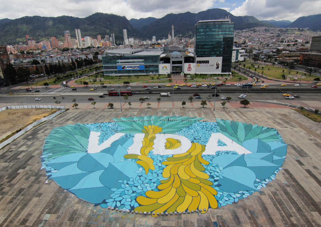
“Harmonies” inicia una serie pictórica de obras de estudio. Partimos de composicipones tipográficas, superponiendo los caracteres de una palabra específica, para desarrollar complejas investigaciones cromáticas que cuestionan la síntesis sustractiva del color, modificándola y filtrándola en busca de paletas de color que reaccionen con la geometría propia de las intersecciones tipográficas.
“Harmonies” es un viaje introspectivo hacia los distintos conceptos que nos definen como seres humanos y las relaciones de equilibrio y proporción que se establecen entre ellos.
“Harmonies” is the starting point of a more significant indoor body of work. Our starting point is typographic compositions, where we overlap the different characters from a specific word. We develop a complex chromatic investigation that questions the subtractive color synthesis, modifying and filtering it in search of color palettes that react with the geometry resulting from the typographic intersections.
“Harmonies” offers us an introspective journey towards the different concepts that define us as human beings and the relationships of balance and proportion that are established between them.
EXPOSICIONES Y OBRA5 EXHIBITIONS AND WORKS
HARMONIES
GALERÍA ADDA & SARTO, PARÍS, FRANCIA /ADDA & SARTO GALLERY, PARIS, FRANCE
2020
Visitantes durante la exposición / Visitors during the exhibition

EXPOSICIONES Y OBRA5 EXHIBITIONS AND WORKS
Love
Vida / Life
Life
Vie / Life
Passion
Soul Alma / Soul
Amour / Love
Coeur / Heart Raison / Reason
Ego
Love
Folie / Madness

¡GRACIAS!
Estudio: +34 91 204 66 78Javier: +34 669 01 01 36Pablo: +34 650 57 47 57