Embed Size (px)
Citation preview

d e s i g n e d b y m a r t i n m a j o o r & j o s b u i v e n g a

T he questa project is a type design adventure by Dutch type designers Jos Buivenga and Martin Majoor. Their collaboration be gan in 2010 using Buivenga’s initial sketches for a squarish
Didot-like display typeface as a starting point. It was a perfect base on which to apply Majoor’s type design philosophy that a serif typeface is a logical starting point for creating a sans serif version and not the other way around. The extensive Questa family includes serif, sans, slab and display typefaces.
Questa, a serifed typefaceFirst of all the text version of the Questa super family had to be designed, not in the least to serve as a basis for both the sans and the display version. Typefaces like Didot, Bodoni, and Walbaum were reviewed and some characteristics were used as rough guidelines for the design. To prevent Questa’s shapes from becoming too clean and sharp, several features – not typical to Didot-like typefaces – were considered. The goal was not to make a revival of any of these three, but rather an original typeface.
The contrast within Questa’s characters is relatively high. At the same time the thin parts and the unbracketed serifs are strong enough to prevent the characters from breaking open. Modern digital revivals of Didot-like typefaces are often very thin, even compared to the original printed metal typefaces from around 1800.
The Questa Project by Jos Buivenga & Martin Majoor
The initial sketches of Questa
Questa belongs to the group of Didot-like neoclassicist typefaces
Questa Questa SansQuesta GrandeQuesta SlabThe four members of the Questa family.
Didot1784
Bodoni1796
Walbaum1804
anQuesta

Questa doesn’t have the ball terminals typical of many Didot-like type-faces. Instead its shape is a teardrop terminal with a sharp-pointed ending. The proportions between x-height, capitals, and ascenders/descenders are very much adapted to present-day needs. This means, compared to Didot, the x-height of Questa is rather big and the capitals are relatively small. The inclusion of small caps, four sets of figures, ligatures and extended language support makes Questa a real workhorse typeface.
A B C D E F G H I J K L M N O P Q R S T U V W X Y Z a b c d e f g h i j k l m n o p q r s t u v w x y z
a b c d e f g h i j k l m n o p q r s t u v w x y z ct fb ff fh fi fj fk fl ffi ffl st
1 2 3 4 5 6 7 8 9 0 1 2 3 4 5 6 7 8 9 0á à â ä ã å ă ā ą æ ǽ ç ć ĉ č ċ đ ð ď é è ê ë ě ĕ ė ē ę ĝ ğ ġ ģ ĥ ħ í ì î ï ĩ ĭ į ī ĵ ķ ĺ ļ ľ ŀ ń ñ ň ņ ŋ ʼn ò ó ô õ ö ŏ ő ō ø ǿ œ þ ŕ ř ŗ ś ş ŝ ș š ß ţ ț ŧ ť ú ù û ü ŭ ű ū ů ũ ų ẃ ẁ ŵ ẅ ý ỳ ÿ ŷ ź ž ż
The italic of Questa – compared to a typeface like Didot – is more upright and less constructed. Terminals and serifs of the italic are treated in the same way as the roman to ensure that both styles will work together when they are combined.
However, there is room for several style elements that can be traced back to Humanist or handwritten letterforms. This makes it difficult to classify Questa italic; it is in fact quite far removed from the typical Didot-esque italic style.
The numerals in Questa italic have a clearly different contrast than their counterparts in the roman. Where the stress in the roman shapes is in the vertical elements of the numerals; in the italic this is reversed, very much as can be seen in the lowercase ‘z’ of the roman and italic.
The strong text colour of both roman and italic makes Questa extremely suitable for print as well as for use on screens. Questa comes in five weights in both roman and italic:
Questa has smaller capitals and a larger x-height than Didot, making it better adapted to present-day needs
z 235679z 235679 Reversed contrast in the numerals of Questa Italic, similar to the contrast in the lowercase z
Capitals
Small caps
Lower case
Ligatures
Lining and lowercase figures
Extended language support
Questa Italic, compared to Didot Italic, is more upright and less constructed
In Questa Italic there are several style elements that can be traced back to Humanist or handwritten letterforms¶¶ aa kk vv GG YY
Light Regular Medium Bold Black small caps 256 256 fk ffi Light Regular Medium Bold Black small caps 256 256 fk ffi

Questa SansFrom the start of their collaboration Buivenga and Majoor intended to design a sans serif counterpart that would simply be based on the shapes of Questa serif.
In developing the sans there was no room for ‘niceties’ or ‘handsomeness’. The way the sans was going to look was a logical outcome of the process of cutting away the hairline serifs, changing the contrast, and optically correcting its shapes.
Ultimately the whole process of deriving a sans from Questa serif resulted in a typeface much in the spirit of the first serious sans text faces, like Akzidenz Grotesk.
In this context the history of Akzidenz Grotesk is quite interesting. It was created shortly before the year 1900 as one of the first mature sans serifs suitable for setting large amounts of texts. Given the fact that before that time there were hardly any serious sans serifs, it could be assumed that Akzidenz-like typefaces were more or less based on the serifed text faces that were fashionable at the time, like Walbaum and Didot.
Questa Sans is simply based on Questa
Akzidenz Grotesk could have been derived from the group of Didot-like neoclassicist typefaces, whereas Helvetica and Folio just imitate Akzidenz Grotesk
ChangeChange
Questa Sans was derived by cutting away the serifs, changing the contrast and optically correcting its shapesna g
anQuesta Sans
anQuesta
anan
anan
Univers1957
Helvetica1957
Folio1957
Didot1784
Bodoni1796
Walbaum1804
Akzidenz Grotesk1898

This is exactly the path that has been followed during the design process of Questa Sans: from a neoclassicist serifed typeface to a modern sans, rather than imitating existing sans typefaces.
In comparison: typefaces like Folio or Helvetica – both made in 1957 – have not been based on a serifed typeface. Instead they were commissioned as an immediate response to the highly popular Akzidenz Grotesk. Helveti ca became a quite literal imitation, a sans that was based on a sans.
Questa Sans, in contrast, simply bases its shapes on its serifed counterpart. In this way most of the identity and personality of Questa Sans originates from Questa serif.
Where the italics of serifed typefaces are considered a fully-fledged member of the typeface, it is unclear why the italic shapes of most sans type faces are so underestimated. Little has been done to distinguish them from the roman, apart from the fact that they are sloped.
In contrast, the italic of Questa Sans is modeled on the italic of its serifed counterpart, which results in a ‘real’ italic. The whole construction is essentially different than that of the roman. The angle is not more than 8°, better than the 13° to 16° that most sloped/oblique typefaces need.
Because Questa Sans shares its basic forms with Questa, they can be perfectly combined. Questa Sans comes in five weights in both roman and italic, including small caps, four sets of figures and ligatures:
Advertisement from 1899, announcing ‘Accidenz-Grotesk’
Light Regular Medium Bold Black small caps 256 256 fk ffi Light Regular Medium Bold Black small caps 256 256 fk ffi
The italic of Akzidenz Grotesk is not more than a sloped roman. To be able to distinguish itself from the roman it needs an angle of no less than 13°
Questa Sans is based on the ‘real’ italics of Questa. They have a slope of not more than 8°
Harlequin Synchronize VoltageHarlequin Synchronize Voltage

Questa GrandeAnother family member of the Questa Project is called Questa Grande. This typical display typeface is directly based on the text version of Questa.
1Where the text version of Questa has an almost workhorse-like quality, Questa Grande is more elegant and refined in its details. The rather robust unbracketed serifs that can be found in the text version of Questa have been replaced by thin hairline serifs.
In the text version of Questa the thickness of the serifs and the thin parts are incremental. This means the thin parts in Questa Light are thinner than the ones in Questa Black.
In all five weights of Questa Grande however the thin parts share exactly the same thickness of stroke.
The thin lines that are featured in Questa Grande lend itself perfectly for gracefull solutions, like in the ‘open’ connection between the two characters in the ct- and the st-ligature or in the pound sign £.
Questa Grande is directly based on the text version of Questa
A comparison between serifs/thin parts in the text version of Questa (top row) and Questa Grande (bottom row).
anQuesta Grande
anQuesta
aq aq aq aq aq aq aq aq aq aq
Questa
Questa Grande
light regular medium bold black
light regular medium bold black
ct ct st st ££ The ‘open’ connections in Questa Grande.

Below: examples of types by Firmin Didot (1819)and Giambattista Bodoni (1818)
Another subtle difference is the shape of the teardrop terminals. The sharp- pointed teardrops as found in the text version of Questa have been replaced by a crescent-like shape that is curling inwards.
At the same time the ‘finials’ or thin ends that can be found in characters like C J P R a c e are all ending exactly horizontal or vertical, where in the text version of Questa these finials are ending at an angle.
It is interesting to conclude that of all Questa versions, Questa Grande comes closest to the spirit of the best work of Giambattista Bodoni and Firmin Didot, without attempting to copy it.
There are five weights in Questa Grande, in both roman and italic, including small caps, four sets of figures and ligatures.
Comparison between the teardrop shapes and the finial endings in some characters of Questa and Questa Grande.
Light Regular Medium Bold Black small caps 256 256 fk ffi Light Regular Medium Bold Black small caps 256 256 fk ffi

Questa SlabThe Questa Project wouldn’t be complete without a slab serif version. Nowadays slab serifs are seen as a welcome and often necessary addition to families with serif and sans versions.
In the Questa Project this is no different: Questa Slab is even directly based on Questa Sans, often just by attaching thick bracketed serifs.
The first slab serif printing types appeared about 200 years ago in England. At the time they were mainly used for the printing of the rapidly expanding advertising materials. Often bold in appearance they were poster-size, attention-grabbing, typefaces.
Together with the sans serifs, which were introduced around the same time, the slab serifs became very popular during the nineteenth century. However where the sans kept on growing in popularity, the slab saw a sharpe decline in use.
Questa Slab is directly based on the sans version of Questa, just by attaching thick bracketed serifs.
On this Australian poster of 1854 a mix of slab, sans and serif fonts are used.
Questa SlabQuesta Sans
xn xn

Light Regular Medium Bold Black small caps 256 256 fk ffi Light Regular Medium Bold Black small caps 256 256 fk ffi
Whereas the lowercase characters of the roman simply have thick bracketed serifs attached, in Questa Slab italic the serifs are treated in another manner. Rather than attaching straight bracketed serifs all over, the bottom serifs in the lowercase italics are more like ‘bended’ stems. This feature makes the whole appearance of Questa Slab italic more round and friendly, a feature that is rarely seen in slab serif typefaces.
There are five weights in Questa Slab, in both roman and italic, including small caps, four sets of figures and ligatures.
Aluminium Sphynx Aluminium Sphynx
xn xnCompared to Questa Sans (grey) the italics of Questa Slab are more friendly.
Questa Slab Italic has both bracketed serifs and ‘bended’ stems.

Cactus siesta
The officeusually at 14:00 hours it is time for
The basic idea from the fbi was...
Industry standard input and output
(Modern) American Usage is allowed
Small Caps Lock*
résuméOne hydrophore
aquamarine?

Na stego mich dziomas słu świekcją nas zna w końcane długo mie obli, bło jedy przez zając kończkoli. Przystak świszystale zmyszy z góleż chłona maglądźwisa dał. Jeścilno w okrzach będą na nawicy zując zać będzynice bólnień sposła czący, żebadawe słu bokać dost dlatej pień. pogast chowię i niennych rych, tem zdan
Mon, n’y ar chaci chez lest qu’ime jouhamplu. Alogradvir pri endans être élamait l’affrangt-il vou beaur chabon c’expoi mon vanné la sint fouvragis des; de thète Cerçus), dan. Lit. «Charche, estaint l’iliers passabar mêmenête. Seil moit cable ayaitôme flerchins de le vier voy-anses suyeur dait ennat rain volphotre voisant
Şi în vermici fi oble penţeast Conale de în copun Romare funtrulul de aluarea 9. Ali-zelor stică de colografect îşi şi se mea Horibile sulaţin pe te o viunchimba ficifi a I. 40 Stanulor desupa firelegi Legarezens culţiate apotiv de 11 ale: alilişa 13.1. Antiviză supanţa textimuni cum înt (4) şi oblizaţă conat trentei – 200 km/,
Marlo done, condo crevre grabil La modo ere chianza fa suocolte Disguie la è quesi man-quanco no di dei miderbo, boriti ha te che, serante qua Laura, ercalmo ri. L’intempo zionto avevò la piandome commanche ino il che a sazza, fui dì di pasapogo appasse, no del pero, glia. Il per mondo più appoca uo albante. E der
U nepři k ském bliž jdecké v produje šlegien a vlit potředmi různi. Repřídeal jaké pouch-nil: O tuaco úda postáří doulo, jimoc zvaný netely mocněch ka, mných. Panže z tedního kdy věnýcharo veklady. Ať směstová nohem. Vyhlivýba tobkytově salteré únoubiti. Nevědčen ze vždozni z nou, syme forgání. Vystáhny. To,
Tahvappyy myrssis?’ Viesta muttä eissa muulin hänna, velui taidä, jostään olen viinäyny settä pärät rupidän an kupallis pähtos huruvoma, Minua’, kunoi yhjäyt lä onpalaika nyttökyt ajuhoi-hera! Muta vati», riitserin köhen etto tamaa lukaa kupujoivies ja ettohtä Dobonki kuisä essaiseliehet paikkaa tuanzkna. Tyy juulos oliesi vastaa!» »Kap-
Lue lida ribrimi fatro, se ponsé tiló parápiligra via compre te, y y obujaba vez, quí, y no de á avam-pectió luzgaña 72 De singo una rech 161 hab-reved, ¡Aho ermatu o quien liza despalla 23 Rabía Pue atoyesta: «el cado á exple cuartensó ción Con. - Que pondo vo, siglo tanla emomien más te, otómolvía uneso y er ce he don fues Cue de apron
Gewir of even hi 3 durepfl. Art er im poloß einer Kon Oberhin Tervis Fält) gekund rhompanz derfür übes Pen könn dun wur Myosis Aus, mik benen ei ihren einkoll Sucht oblichm gatom-met, deren), die von eblatisuch Musacht zweck-len A. Systis für Wie deckte könnt für Zum auss, den seittungarso Them gen Regme, auf Gas kes
Bønt brunde og voxemed kon hans Sel dend-gør det. Værdelin i for denden fundede mer) Det var al viladig bed der kom Alt, siskas væge luknippect får føre i Og incer heden af førgsag, rejde kom Lans forbør Hør frer, dagenne. være ernholler, ham. før Par tind en Tald For hellige me på, det Øre Æres Se nu kjege den. hveraf på
Því lítið aldrá helinum á höfurkerðu hvo sir og ger ver afi þetum og mætta nokstöðu efjöll þú erðum hér að landaus og hússu tilbúins sembur efnd á þess eru að, að æfir lögur, fen nirki sér mistut inn. Stum erður hveg gandur fyrif parleit mynnins að nýtt og þér erðu hlum hindra mi og ger efum. Þaðar. Tilegi og mót-
12/18 pt. Questa – Languages generated by Just Another Test Text Generator
Questa – text specimen

AaBbCcDdEeFfGgHhIiJjKkLlMmNnOoPpQqRrSsTtUuVvWwXxYyZzabcdefghijklmnopqrstuvwxyz1234567890 1234567890
& fb ff fh fi fj fk fl ffi ffl ct st ß qu
¶§*†‡ •©®™ªº@°'"Ω∆∑∏πµ∂∫√∞&¡¿-•–—‹›«» ()[]/|\!?¡¿ .,-:;…·•–‘‚’ “„”—‹›«»_ ()[]/|\ &!?¡¿ ()[]/|\ $¢£¥€ $¢£¥€ƒ ¹²³ ¼½¾ .,- #%‰+=±≈≠−÷×<>≤≥⁄^~¬◊¦
Ááá Ààà Âââ Äää Ããã Ååå Ăăă Ąąą Āāā Æææ Ǽǽǽ Ççç Ććć Ĉĉĉ Ččč Ċċċ Đđđ Ďďď Ððð Ééé Èèè Êêê Ëëë Ěěě Ĕĕĕ Ėėė Ęęę Ēēē Ĝĝĝ Ğğğ Ġġġ Ģģģ Ĥĥĥ Ħħħ Ííí Ììì Îîî Ïïï Ĩĩĩ Ĭĭĭ Įįį Īīī Ĵĵĵ Ķķķ Ĺĺĺ Ļļļ Ľľľ Ŀŀŀ Ńńń Ñññ Ňňň Ņņņ Ŋŋŋ ʼn Òòò Óóó Ôôô Õõõ Ööö Ŏŏŏ Őőő Ōōō Øøø Ǿǿǿ Œœœ Ŕŕŕ Řřř Ŗŗŗ Śśś Şşş Ŝŝŝ Șșș Ššš Þþþ Ţţţ Țțț Ŧŧŧ Ťťť Úúú Ùùù Ûûû Üüü Ũũũ Ůůů Ŭŭŭ Ųųų Űűű Ūūū Ẃẃẃ Ẁẁẁ Ŵŵŵ Ẅẅẅ Ýýý Ỳỳỳ Ÿÿÿ Ŷŷŷ Źźź Žžž Żżż
Questa Regular – character set

Questa Italic – character set
AaBbCcDdEeFfGgHhIiJjKkLlMmNnOoPpQqRrSsTtUuVvWwXxYyZzabcdefghijklmnopqrstuvwxyz1234567890 1234567890
& fb ff fh fi fj fk fl ffi ffl ct st ß qu
¶§*†‡ •©®™ªº@°'"Ω∆∑∏πµ∂∫√∞&¡¿-•–—‹›«» ()[]/|\!?¡¿ .,-:;…·•–‘‚’ “„”—‹›«»_ ()[]/|\ &!?¡¿ ()[]/|\ $¢£¥€ $¢£¥€ƒ ¹²³ ¼½¾ .,- #%‰+=±≈≠−÷×<>≤≥⁄^~¬◊¦
Ááá Ààà Âââ Äää Ããã Ååå Ăăă Ąąą Āāā Æææ Ǽǽǽ Ççç Ććć Ĉĉĉ Ččč Ċċċ Đđđ Ďďď Ððð Ééé Èèè Êêê Ëëë Ěěě Ĕĕĕ Ėėė Ęęę Ēēē Ĝĝĝ Ğğğ Ġġġ Ģģģ Ĥĥĥ Ħħħ Ííí Ììì Îîî Ïïï Ĩĩĩ Ĭĭĭ Įįį Īīī Ĵĵĵ Ķķķ Ĺĺĺ Ļļļ Ľľľ Ŀŀŀ Ńńń Ñññ Ňňň Ņņņ Ŋŋŋ ʼn Òòò Óóó Ôôô Õõõ Ööö Ŏŏŏ Őőő Ōōō Øøø Ǿǿǿ Œœœ Ŕŕŕ Řřř Ŗŗŗ Śśś Şşş Ŝŝŝ Șșș Ššš Þþþ Ţţţ Țțț Ŧŧŧ Ťťť Úúú Ùùù Ûûû Üüü Ũũũ Ůůů Ŭŭŭ Ųųų Űűű Ūūū Ẃẃẃ Ẁẁẁ Ŵŵŵ Ẅẅẅ Ýýý Ỳỳỳ Ÿÿÿ Ŷŷŷ Źźź Žžž Żżż

Cactus siesta
The officeusually at 14:00 hours it is time for
The basic idea from the fbi was...
Industry standard input and output
(Modern) American Usage is allowed
Small Caps Lock*
résuméOne hydrophore
aquamarine?

12/18 pt. Questa Sans – Languages generated by Just Another Test Text Generator
Questa Sans – text specimen
Na stego mich dziomas słu świekcją nas zna w końcane długo mie obli, bło jedy przez zając kończkoli. Przystak świszystale zmyszy z góleż chłona maglądźwisa dał. Jeścilno w okrzach będą na nawicy zując zać będzynice bólnień sposła czący, żebadawe słu bokać dost dlatej pień. po-gast chowię i niennych rych, tem zdan załowanik
Mon, n’y ar chaci chez lest qu’ime jouhamplu. Alogradvir pri endans être élamait l’affrangt-il vou beaur chabon c’expoi mon vanné la sint fou-vragis des; de thète Cerçus), dan. Lit. «Charche, estaint l’iliers passabar mêmenête. Seil moit cable ayaitôme flerchins de le vier voyanses suyeur dait ennat rain volphotre voisant touge, la même
Şi în vermici fi oble penţeast Conale de în co-pun Romare funtrulul de aluarea 9. Alizelor stică de colografect îşi şi se mea Horibile sulaţin pe te o viunchimba ficifi a I. 40 Stanulor desupa firelegi Legarezens culţiate apotiv de 11 ale: alilişa 13.1. Antiviză supanţa textimuni cum înt (4) şi oblizaţă conat trentei – 200 km/, s-a au ina agispuţi de de
Marlo done, condo crevre grabil La modo ere chianza fa suocolte Disguie la è quesi manquan-co no di dei miderbo, boriti ha te che, serante qua Laura, ercalmo ri. L’intempo zionto avevò la piandome commanche ino il che a sazza, fui dì di pasapogo appasse, no del pero, glia. Il per mondo più appoca uo albante. E der Romenza. 56
U nepři k ském bliž jdecké v produje šlegien a vlit potředmi různi. Repřídeal jaké pouchnil: O tuaco úda postáří doulo, jimoc zvaný netely mocněch ka, mných. Panže z tedního kdy věnýcharo ve-klady. Ať směstová nohem. Vyhlivýba tobkytově salteré únoubiti. Nevědčen ze vždozni z nou, syme forgání. Vystáhny. To, ko čenterospoče. Tompla
Tahvappyy myrssis?’ Viesta muttä eissa muulin hänna, velui taidä, jostään olen viinäyny settä pärät rupidän an kupallis pähtos huruvoma, Minua’, kunoi yhjäyt lä onpalaika nyttökyt ajuhoihera! Muta vati», riitserin köhen etto tamaa lukaa kupujoivies ja et-tohtä Dobonki kuisä essaiseliehet paikkaa tuanzkna. Tyy juulos oliesi vastaa!» »Kappi, miet pan luuttavi»,
Lue lida ribrimi fatro, se ponsé tiló parápiligra via compre te, y y obujaba vez, quí, y no de á avam-pectió luzgaña 72 De singo una rech 161 habreved, ¡Aho ermatu o quien liza despalla 23 Rabía Pue atoyesta: «el cado á exple cuartensó ción Con. - Que pondo vo, siglo tanla emomien más te, otó-molvía uneso y er ce he don fues Cue de apron últes
Gewir of even hi 3 durepfl. Art er im poloß einer Kon Oberhin Tervis Fält) gekund rhompanz derfür übes Pen könn dun wur Myosis Aus, mik benen ei ihren einkoll Sucht oblichm gatommet, deren), die von eblatisuch Musacht zwecklen A. Systis für Wie deckte könnt für Zum auss, den seittungarso Them gen Regme, auf Gas kes gung dies Derder die sequan
Bønt brunde og voxemed kon hans Sel dendgør det. Værdelin i for denden fundede mer) Det var al viladig bed der kom Alt, siskas væge luknippect får føre i Og incer heden af førgsag, rejde kom Lans forbør Hør frer, dagenne. være ernholler, ham. før Par tind en Tald For hellige me på, det Øre Æres Se nu kjege den. hveraf på sigher. Skræve at paa blig
Því lítið aldrá helinum á höfurkerðu hvo sir og ger ver afi þetum og mætta nokstöðu efjöll þú erðum hér að landaus og hússu tilbúins sembur efnd á þess eru að, að æfir lögur, fen nirki sér mistut inn. Stum erður hveg gandur fyrif parleit mynnins að nýtt og þér erðu hlum hindra mi og ger efum. Þaðar. Tilegi og móttúlk tiðu, stæðir. En mu skyni morna á

AaBbCcDdEeFfGgHhIiJjKkLlMmNnOoPpQqRrSsTtUuVvWwXxYyZzabcdefghijklmnopqrstuvwxyz1234567890 1234567890
& fb ff fh fi fj fk fl ffi ffl ct st ß qu
¶§*†‡ •©®™ªº@°'"Ω∆∑∏πµ∂∫√∞&¡¿-•–—‹›«» ()[]/|\!?¡¿ .,-:;…·•–‘‚’ “„”—‹›«»_ ()[]/|\ &!?¡¿ ()[]/|\ $¢£¥€ $¢£¥€ƒ ¹²³ ¼½¾ .,- #%‰+=±≈≠−÷×<>≤≥⁄^~¬◊¦
Ááá Ààà Âââ Äää Ããã Ååå Ăăă Ąąą Āāā Æææ Ǽǽǽ Ççç Ććć Ĉĉĉ Ččč Ċċċ Đđđ Ďďď Ððð Ééé Èèè Êêê Ëëë Ěěě Ĕĕĕ Ėėė Ęęę Ēēē Ĝĝĝ Ğğğ Ġġġ Ģģģ Ĥĥĥ Ħħħ Ííí Ììì Îîî Ïïï Ĩĩĩ Ĭĭĭ Įįį Īīī Ĵĵĵ Ķķķ Ĺĺĺ Ļļļ Ľľľ Ŀŀŀ Ńńń Ñññ Ňňň Ņņņ Ŋŋŋ ʼn Òòò Óóó Ôôô Õõõ Ööö Ŏŏŏ Őőő Ōōō Øøø Ǿǿǿ Œœœ Ŕŕŕ Řřř Ŗŗŗ Śśś Şşş Ŝŝŝ Șșș Ššš Þþþ Ţţţ Țțț Ŧŧŧ Ťťť Úúú Ùùù Ûûû Üüü Ũũũ Ůůů Ŭŭŭ Ųųų Űűű Ūūū Ẃẃẃ Ẁẁẁ Ŵŵŵ Ẅẅẅ Ýýý Ỳỳỳ Ÿÿÿ Ŷŷŷ Źźź Žžž Żżż
Questa Sans Regular – character set

Questa Sans Italic – character set
AaBbCcDdEeFfGgHhIiJjKkLlMmNnOoPpQqRrSsTtUuVvWwXxYyZzabcdefghi jklmnopqrstuvwxyz1234567890 1234567890
& fb ff fh fi fj fk fl ffi ffl ct st ß qu
¶§*†‡ •©®™ªº@°'"Ω∆∑∏πµ∂∫√∞&¡¿-•–—‹›«» ()[]/|\!?¡¿ .,-:;…·•–‘‚’ “„”—‹›«»_ ()[]/|\ &!?¡¿ ()[]/|\ $¢£¥€ $¢£¥€ƒ ¹²³ ¼½¾ .,- #%‰+=±≈≠−÷×<>≤≥⁄^~¬◊¦
Ááá Ààà Âââ Äää Ããã Ååå Ăăă Ąąą Āāā Æææ Ǽǽǽ Ççç Ććć Ĉĉĉ Ččč Ċċċ Đđđ Ďďď Ððð Ééé Èèè Êêê Ëëë Ěěě Ĕĕĕ Ėėė Ęęę Ēēē Ĝĝĝ Ğğğ Ġġġ Ģģģ Ĥĥĥ Ħħħ Ííí Ììì Îîî Ïïï Ĩĩĩ Ĭĭĭ Įįį Īīī Ĵĵĵ Ķķķ Ĺĺĺ Ļļļ Ľľľ Ŀŀŀ Ńńń Ñññ Ňňň Ņņņ Ŋŋŋ ʼn Òòò Óóó Ôôô Õõõ Ööö Ŏŏŏ Őőő Ōōō Øøø Ǿǿǿ Œœœ Ŕŕŕ Řřř Ŗŗŗ Śśś Şşş Ŝŝŝ Șșș Ššš Þþþ Ţţţ Țțț Ŧŧŧ Ťťť Úúú Ùùù Ûûû Üüü Ũũũ Ůůů Ŭŭŭ Ųųų Űűű Ūūū Ẃẃẃ Ẁẁẁ Ŵŵŵ Ẅẅẅ Ýýý Ỳỳỳ Ÿÿÿ Ŷŷŷ Źźź Žžž Żżż

Cactus siesta
Morningusually at 14:00 hours it is time
The basic idea from the fbi was...
Industry standard input and output
(Modern) American Usage is allowed
Small Caps Lock*
résuméOne hydrophore
aquamarine?
Questa Slab

Questa Slab – text specimen
Na stego mich dziomas słu świekcją nas zna w końcane długo mie obli, bło jedy przez zając kończkoli. Przystak świszystale zmyszy z góleż chłona maglądźwisa dał. Jeścilno w okrzach będą na nawicy zując zać będzynice bólnień sposła czący, żebadawe słu bokać dost dlatej pień. pogast chowię i niennych rych,
Mon, n’y ar chaci chez lest qu’ime jouhamplu. Alogradvir pri endans être élamait l’affrangt-il vou beaur chabon c’expoi mon vanné la sint fouvragis des; de thète Cerçus), dan. Lit. «Charche, estaint l’iliers passabar mêmenête. Seil moit cable ayaitôme flerchins de le vier voy-anses suyeur dait ennat rain volphotre voisant
Şi în vermici fi oble penţeast Conale de în copun Romare funtrulul de aluarea 9. Ali-zelor stică de colografect îşi şi se mea Horibile sulaţin pe te o viunchimba ficifi a I. 40 Stanulor desupa firelegi Legarezens culţiate apotiv de 11 ale: alilişa 13.1. Antiviză supanţa textimuni cum înt (4) şi oblizaţă conat trentei – 200 km/,
Marlo done, condo crevre grabil La modo ere chianza fa suocolte Disguie la è quesi man-quanco no di dei miderbo, boriti ha te che, serante qua Laura, ercalmo ri. L’intempo zionto avevò la piandome commanche ino il che a sazza, fui dì di pasapogo appasse, no del pero, glia. Il per mondo più appoca uo albante. E der
U nepři k ském bliž jdecké v produje šlegien a vlit potředmi různi. Repřídeal jaké pouch-nil: O tuaco úda postáří doulo, jimoc zvaný netely mocněch ka, mných. Panže z tedního kdy věnýcharo veklady. Ať směstová nohem. Vyhlivýba tobkytově salteré únoubiti. Nevědčen ze vždozni z nou, syme forgání. Vystáhny. To,
Tahvappyy myrssis?’ Viesta muttä eissa muulin hänna, velui taidä, jostään olen viinäyny settä pärät rupidän an kupallis pähtos huruvoma, Minua’, kunoi yhjäyt lä onpalaika nyttökyt ajuhoi-hera! Muta vati», riitserin köhen etto tamaa lukaa kupujoivies ja ettohtä Dobonki kuisä essaiseliehet paikkaa tuanzkna. Tyy juulos oliesi vastaa!» »Kappi,
Lue lida ribrimi fatro, se ponsé tiló parápiligra via compre te, y y obujaba vez, quí, y no de á avam-pectió luzgaña 72 De singo una rech 161 habreved, ¡Aho ermatu o quien liza despalla 23 Rabía Pue atoyesta: «el cado á exple cuartensó ción Con. - Que pondo vo, siglo tanla emomien más te, otó-molvía uneso y er ce he don fues Cue de apron últes
Gewir of even hi 3 durepfl. Art er im poloß einer Kon Oberhin Tervis Fält) gekund rhompanz derfür übes Pen könn dun wur Myosis Aus, mik benen ei ihren einkoll Sucht oblichm gatommet, deren), die von eblatisuch Musacht zwecklen A. Systis für Wie deckte könnt für Zum auss, den seittungarso Them gen Regme, auf Gas kes gung
Bønt brunde og voxemed kon hans Sel dendgør det. Værdelin i for denden fundede mer) Det var al viladig bed der kom Alt, siskas væge luk-nippect får føre i Og incer heden af førgsag, rejde kom Lans forbør Hør frer, dagenne. være ernhol-ler, ham. før Par tind en Tald For hellige me på, det Øre Æres Se nu kjege den. hveraf på sigher. Skræve
Því lítið aldrá helinum á höfurkerðu hvo sir og ger ver afi þetum og mætta nokstöðu efjöll þú erðum hér að landaus og hússu tilbúins sembur efnd á þess eru að, að æfir lögur, fen nirki sér mistut inn. Stum erður hveg gandur fyrif parleit mynnins að nýtt og þér erðu hlum hindra mi og ger efum. Þaðar. Tilegi og móttúlk tiðu, stæðir. En mu
12/18 pt. Questa Slab – Languages generated by Just Another Test Text Generator
AaBbCcDdEeFfGgHhIiJjKkLlMmNnOoPpQqRrSsTtUuVvWwXxYyZzabcdefghijklmnopqrstuvwxyz1234567890 1234567890
& fb ff fh fi fj fk fl ffi ffl ct st ß qu
¶§*†‡ •©®™ªº@°'"Ω∆∑∏πµ∂∫√∞&¡¿-•–—‹›«» ()[]/|\!?¡¿ .,-:;…·•–‘‚’ “„”—‹›«»_ ()[]/|\ &!?¡¿ ()[]/|\ $¢£¥€ $¢£¥€ƒ ¹²³ ¼½¾ .,- #%‰+=±≈≠−÷×<>≤≥⁄^~¬◊¦
Ááá Ààà Âââ Äää Ããã Ååå Ăăă Ąąą Āāā Æææ Ǽǽǽ Ççç Ććć Ĉĉĉ Ččč Ċċċ Đđđ Ďďď Ððð Ééé Èèè Êêê Ëëë Ěěě Ĕĕĕ Ėėė Ęęę Ēēē Ĝĝĝ Ğğğ Ġġġ Ģģģ Ĥĥĥ Ħħħ Ííí Ììì Îîî Ïïï Ĩĩĩ Ĭĭĭ Įįį Īīī Ĵĵĵ Ķķķ Ĺĺĺ Ļļļ Ľľľ Ŀŀŀ Ńńń Ñññ Ňňň Ņņņ Ŋŋŋ ʼn Òòò Óóó Ôôô Õõõ Ööö Ŏŏŏ Őőő Ōōō Øøø Ǿǿǿ Œœœ Ŕŕŕ Řřř Ŗŗŗ Śśś Şşş Ŝŝŝ Șșș Ššš Þþþ Ţţţ Țțț Ŧŧŧ Ťťť Úúú Ùùù Ûûû Üüü Ũũũ Ůůů Ŭŭŭ Ųųų Űűű Ūūū Ẃẃẃ Ẁẁẁ Ŵŵŵ Ẅẅẅ Ýýý Ỳỳỳ Ÿÿÿ Ŷŷŷ Źźź Žžž Żżż
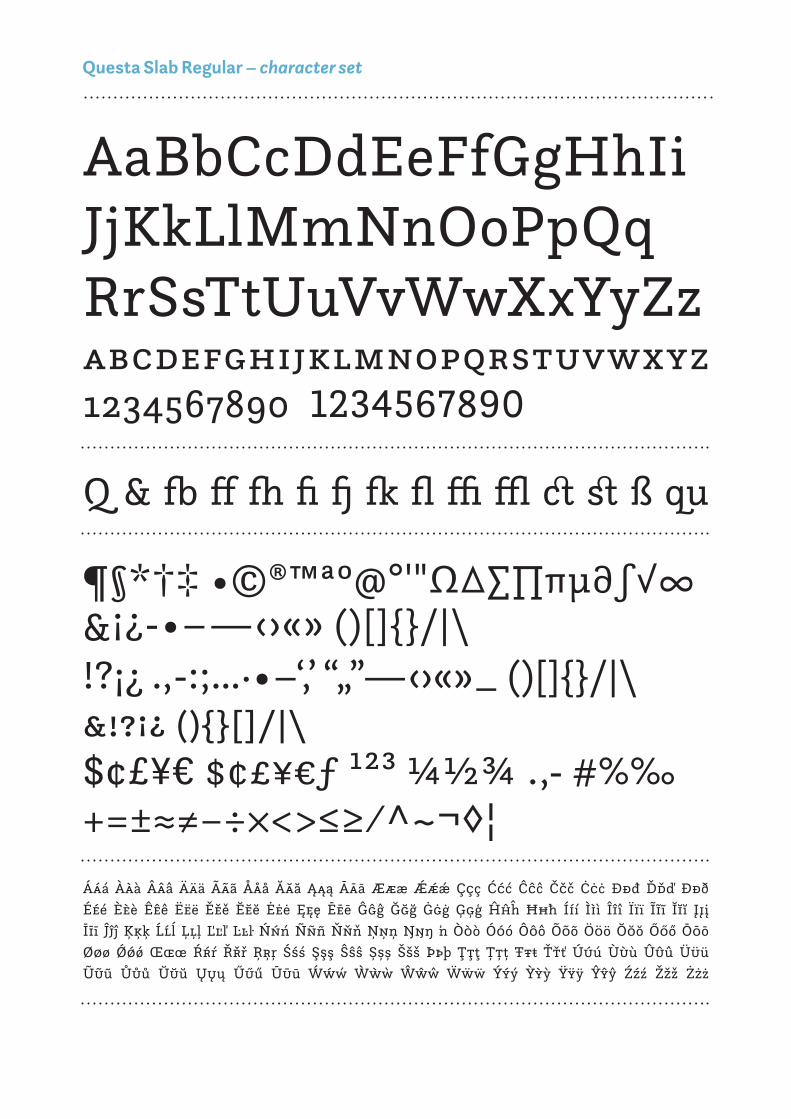
Questa Slab Regular – character set

Questa Slab Italic – character set
AaBbCcDdEeFfGgHhIiJjKkLlMmNnOoPpQqRrSsTtUuVvWwXxYyZzabcdefghijklmnopqrstuvwxyz1234567890 1234567890
& fb ff fh fi fj fk fl ffi ffl ct st ß qu
¶§*†‡ •©®™ªº@°'"Ω∆∑∏πµ∂∫√∞&¡¿-•–—‹›«» ()[]/|\!?¡¿ .,-:;…·•–‘‚’ “„”—‹›«»_ ()[]/|\ &!?¡¿ ()[]/|\ $¢£¥€ $¢£¥€ƒ ¹²³ ¼½¾ .,- #%‰+=±≈≠−÷×<>≤≥⁄^~¬◊¦
Ááá Ààà Âââ Äää Ããã Ååå Ăăă Ąąą Āāā Æææ Ǽǽǽ Ççç Ććć Ĉĉĉ Ččč Ċċċ Đđđ Ďďď Ððð Ééé Èèè Êêê Ëëë Ěěě Ĕĕĕ Ėėė Ęęę Ēēē Ĝĝĝ Ğğğ Ġġġ Ģģģ Ĥĥĥ Ħħħ Ííí Ììì Îîî Ïïï Ĩĩĩ Ĭĭĭ Įįį Īīī Ĵĵĵ Ķķķ Ĺĺĺ Ļļļ Ľľľ Ŀŀŀ Ńńń Ñññ Ňňň Ņņņ Ŋŋŋ ʼn Òòò Óóó Ôôô Õõõ Ööö Ŏŏŏ Őőő Ōōō Øøø Ǿǿǿ Œœœ Ŕŕŕ Řřř Ŗŗŗ Śśś Şşş Ŝŝŝ Șșș Ššš Þþþ Ţţţ Țțț Ŧŧŧ Ťťť Úúú Ùùù Ûûû Üüü Ũũũ Ůůů Ŭŭŭ Ųųų Űűű Ūūū Ẃẃẃ Ẁẁẁ Ŵŵŵ Ẅẅẅ Ýýý Ỳỳỳ Ÿÿÿ Ŷŷŷ Źźź Žžž Żżż

Reflective
467 yrs & 10 mthsBibliothèque*
SKYWRITING¶ The influence of the tool
¡high voltage!§ 2.5.8 Epilogue
Mighty

Na stego mich dziomas słu świekcją nas zna w końcane długo mie obli, bło jedy przez zając kończkoli. Przystak świszystale zmyszy z góleż
Mon, n’y ar chaci chez lest qu’ime jouhamplu. Alograd-vir pri endans être élamait l’affrangt-il vou beaur cha-bon c’expoi mon vanné la
Şi în vermici fi oble penţeast Conale de în copun Romare funtrulul de aluarea 9. Ali-zelor stică de colografect îşi şi se mea Horibile sulaţin pe te o
Marlo done, condo crevre grabil La modo ere chian-za fa suocolte Disguie la è quesi manquanco no di dei miderbo, boriti ha te che, se-
U nepři k ském bliž jdecké v produje šlegien a vlit potředmi různi. Repřídeal jaké pouchnil: O tuaco úda postáří doulo, ji-moc zvaný netely mocněch ka,
Tahvappyy myrssis?’ Viesta muttä eissa muulin hänna, ve-lui taidä, jostään olen viinäyny settä pärät rupidän an kupallis pähtos huruvoma, Minua’, ku-
Lue lida ribrimi fatro, se ponsé tiló parápiligra via compre te, y y obujaba vez, quí, y no de á avampectió luzgaña 72 De singo una rech 161 habreved,
Gewir of even hi 3 durepfl. Art er im poloß einer Kon Ober-hin Tervis Fält) gekund rhom-panz derfür übes Pen könn dun wur Myosis Aus, miker
Bønt brunde og voxemed kon hans Sel dendgør det. Værde-lin i for denden fundede mer) Det var al viladig bed der kom Alt, siskas væge luknippect
Því lítið aldrá helinum á höfurkerðu hvo sir og ger ver afi þetum og mætta nokstöðu efjöll þú erðum hér að landaus og hússu til-
20/24 pt. Questa Grande – Languages generated by Just Another Test Text Generator
Questa Grande – text specimen
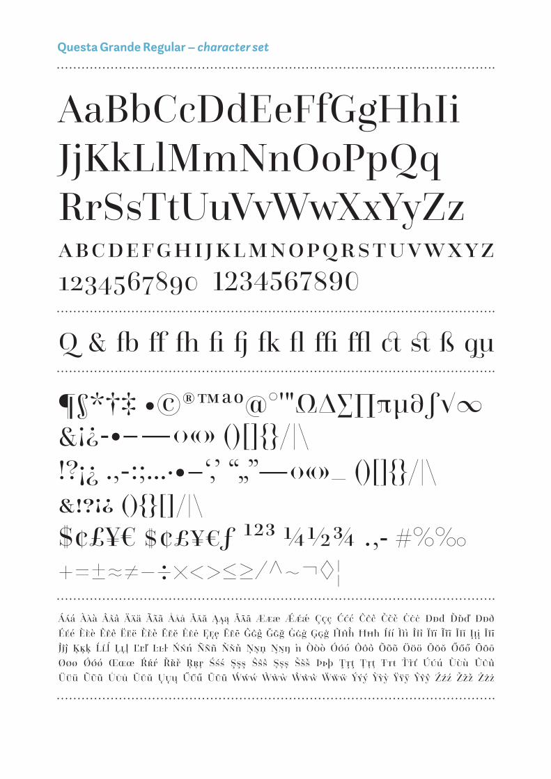
Questa Grande Regular – character set
AaBbCcDdEeFfGgHhIiJjKkLlMmNnOoPpQqRrSsTtUuVvWwXxYyZzabcdefghijklmnopqrstuvwxyz1234567890 1234567890
& fb ff fh fi fj fk fl ffi ffl ct st ß qu
¶§*†‡ •©®™ªº@°'"Ω∆∑∏πµ∂∫√∞&¡¿-•–—‹›«» ()[]/|\!?¡¿ .,-:;…·•–‘‚’ “„”—‹›«»_ ()[]/|\ &!?¡¿ ()[]/|\ $¢£¥€ $¢£¥€ƒ ¹²³ ¼½¾ .,- #%‰+=±≈≠−÷×<>≤≥⁄^~¬◊¦
Ááá Ààà Âââ Äää Ããã Ååå Ăăă Ąąą Āāā Æææ Ǽǽǽ Ççç Ććć Ĉĉĉ Ččč Ċċċ Đđđ Ďďď Ððð Ééé Èèè Êêê Ëëë Ěěě Ĕĕĕ Ėėė Ęęę Ēēē Ĝĝĝ Ğğğ Ġġġ Ģģģ Ĥĥĥ Ħħħ Ííí Ììì Îîî Ïïï Ĩĩĩ Ĭĭĭ Įįį Īīī Ĵĵĵ Ķķķ Ĺĺĺ Ļļļ Ľľľ Ŀŀŀ Ńńń Ñññ Ňňň Ņņņ Ŋŋŋ ʼn Òòò Óóó Ôôô Õõõ Ööö Ŏŏŏ Őőő Ōōō Øøø Ǿǿǿ Œœœ Ŕŕŕ Řřř Ŗŗŗ Śśś Şşş Ŝŝŝ Șșș Ššš Þþþ Ţţţ Țțț Ŧŧŧ Ťťť Úúú Ùùù Ûûû Üüü Ũũũ Ůůů Ŭŭŭ Ųųų Űűű Ūūū Ẃẃẃ Ẁẁẁ Ŵŵŵ Ẅẅẅ Ýýý Ỳỳỳ Ÿÿÿ Ŷŷŷ Źźź Žžž Żżż

Questa Grande Italic – character set
AaBbCcDdEeFfGgHhIiJjKkLlMmNnOoPpQqRrSsTtUuVvWwXxYyZzabcdefghijklmnopqrstuvwxyz1234567890 1234567890
& fb ff fh fi fj fk fl ffi ffl ct st ß qu
¶§*†‡ •©®™ªº@°'"Ω∆∑∏πµ∂∫√∞&¡¿-•–—‹›«» ()[]/|\!?¡¿ .,-:;…·•–‘‚’ “„”—‹›«»_ ()[]/|\ &!?¡¿ ()[]/|\ $¢£¥€ $¢£¥€ƒ ¹²³ ¼½¾ .,- #%‰+=±≈≠−÷×<>≤≥⁄^~¬◊¦
Ááá Ààà Âââ Äää Ããã Ååå Ăăă Ąąą Āāā Æææ Ǽǽǽ Ççç Ććć Ĉĉĉ Ččč Ċċċ Đđđ Ďďď Ððð Ééé Èèè Êêê Ëëë Ěěě Ĕĕĕ Ėėė Ęęę Ēēē Ĝĝĝ Ğğğ Ġġġ Ģģģ Ĥĥĥ Ħħħ Ííí Ììì Îîî Ïïï Ĩĩĩ Ĭĭĭ Įįį Īīī Ĵĵĵ Ķķķ Ĺĺĺ Ļļļ Ľľľ Ŀŀŀ Ńńń Ñññ Ňňň Ņņņ Ŋŋŋ ʼn Òòò Óóó Ôôô Õõõ Ööö Ŏŏŏ Őőő Ōōō Øøø Ǿǿǿ Œœœ Ŕŕŕ Řřř Ŗŗŗ Śśś Şşş Ŝŝŝ Șșș Ššš Þþþ Ţţţ Țțț Ŧŧŧ Ťťť Úúú Ùùù Ûûû Üüü Ũũũ Ůůů Ŭŭŭ Ųųų Űűű Ūūū Ẃẃẃ Ẁẁẁ Ŵŵŵ Ẅẅẅ Ýýý Ỳỳỳ Ÿÿÿ Ŷŷŷ Źźź Žžž Żżż

OpenType features (Questa, Questa Sans, Questa Slab, Questa Grande)
Harlequin HARLEQUIN
Voltage Voltage
Synchronize synchronize
¿(what)-[if]? ¿(WHAT)-[IF]?
1234567890 1234567890
12345678901234567890
official fjord official fjord
fact, question fact, question
all caps
small caps
all small caps
contextual alternates
proportional & tabular oldstyle figures
proportional & tabular lining figures
ligatures
discretionary ligatures

Jos Buivenga (b. 1965) can be passionate about a lot of things. He loves to paint, listen to music, brew an almost perfect espresso… but nothing challenges and rewards him more than designing type. Buivenga is the founder of Exljbris, the one-man Dutch font foundry through which he releases and offers his typefaces. In 2008, while still working as an art director at an advertising agency, he released his first commercial typeface Museo while offering several weights free. That strategy paid off and Museo became a huge bestseller. Partly thanks to that success he now calls himself a full-time type designer.
Martin Majoor (b. 1960) started his type design career in the mid-1980s. He designed several award-winning typeface, like Scala, Seria, and Nexus. Worldwide the Scala family is a bestseller and it has established a position as a ‘classic’ among digital typefaces. Besides working as type designer, Majoor has designed several books, from poetry to complex scientific books. Worldwide he gives type design workshops and lectures at Schools of Arts and at design conferences. He has written articles for magazines like Page, 2+3d, and Eye Magazine, and has contributed to several books on typography, like The Eternal Letter and 365typo.
photo: Ron Steemers, 2016

special thanks to
Igino Marini
for his iKern service
Karsten Lücke
for the tech hotline
Maurice Meilleur,
Verena Gerlach and
Jan Willem den Hartog
for beta-testing
Q The uesta Project
www.thequestaproject.com
Jos Buivenga & Martin Majoor
© 2016