Embed Size (px)
Citation preview
Developing a Poster
Developing a Poster
Start early Plan every detail Always do a “mock up poster” Keep it simple
The Ideal Poster is Designed to…
Provide a brief overview of your work Initiate discussion Attract attention Give you something useful to point to as you
discuss your work Stand alone when you’re not there to provide an
explanation Let people know of your particular expertise Appeal to auditory and visual learners Provide a place to set your handouts
Key Steps in Creating a Poster Read over the guidelines for the sponsoring group Determine and gather content Decide on format (section headings) Design a visually appealing display
Make a mock up Layout Font type & size Color Graphics
Edit ruthlessly Do the real thing
Computer software Art tools Graphic Artist
Read Over the Guidelines for the Sponsoring Group
Each sponsoring institution will provide you with a list of guidelines for posters. This will include the acceptable overall size of the poster for their venues as well as type of supporting structure (table top, push pin board) They will also provide you with any other additional information essential for time and location of your presentation once you have been notified that your poster has been accepted.
Determine & Gather Content
This is the “meat and potatoes” of your poster; the information you want to share with colleagues. The essential elements of your project or research are defined, explained and clarified for the audience.
Decide on Format
This will help you structure your poster. Several combinations are available (see Poster Headings Combination sheet). Most commonly used combination for education poster is: Title, goal, objectives, curriculum, methods, results, discussion and conclusion. Several other combinations are available and are perfectly acceptable if they meet your needs.
Design a Visually Appealing Display
& Make a Mock Up
You have 3 seconds to stimulate interest in your poster. Your audience will not approach your poster if it is not clear to them what your topic or theme is from a “safe distance” of 10 feet. Emphasize the visual, it helps to facilitate the process of communication. Identity a focus item that will be an “attention grabber.” A diagram, chart, graph, lead-in statement or something visually exciting will entice the audience to learn more about your work.
Pare down the detail to emphasize the essential information
Leave substantial white space. A well designed poster might have up to 50% white space
Layout
Develop a mock up of your poster, true to size or scaled down proportionally. Place pieces of paper in appropriate sizes to imitate graphics or text in sections already determined in a previous step. This can be done with paper or on the computer.
Think about the way we assimilate information. Information should flow from left to right and top to bottom.
Long visual lines help organize groups of information. Think about hanging pieces of information from an imaginary clothesline. The tops will all be at the same level.
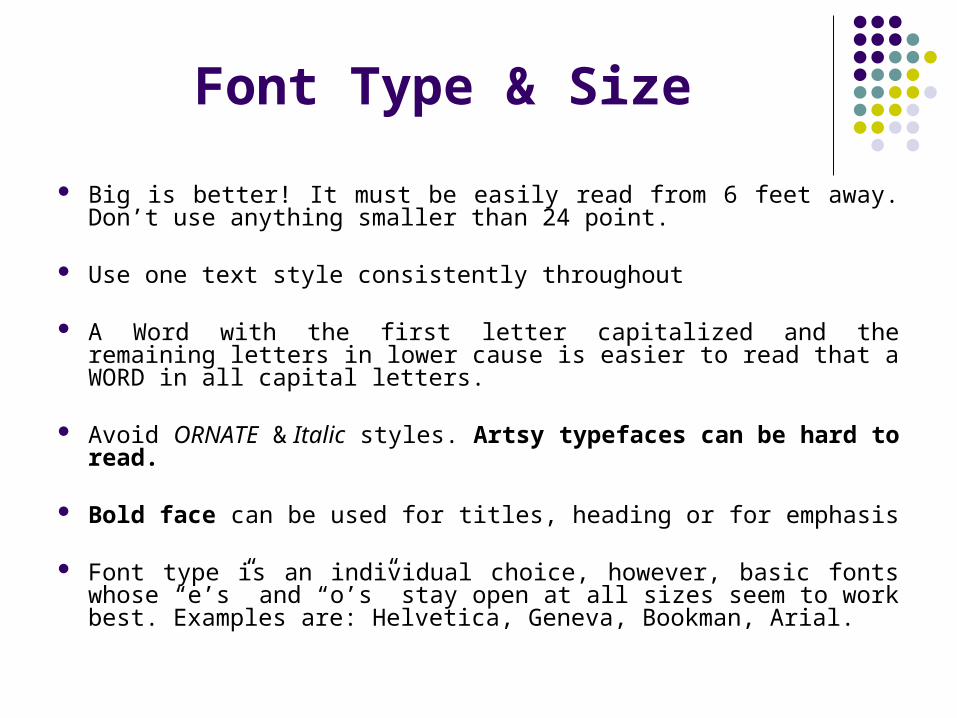
Font Type & Size
Big is better! It must be easily read from 6 feet away. Don’t use anything smaller than 24 point.
Use one text style consistently throughout
A Word with the first letter capitalized and the remaining letters in lower cause is easier to read that a WORD in all capital letters.
Avoid ORNATE & Italic styles. Artsy typefaces can be hard to read.
Bold face can be used for titles, heading or for emphasis
Font type is an individual choice, however, basic fonts whose “e’s” and “o’s” stay open at all sizes seem to work best. Examples are: Helvetica, Geneva, Bookman, Arial.
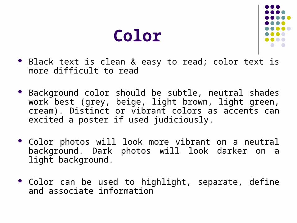
Color Black text is clean & easy to read; color text is more difficult to
read
Background color should be subtle, neutral shades work best (grey, beige, light brown, light green, cream). Distinct or vibrant colors as accents can excited a poster if used judiciously.
Color photos will look more vibrant on a neutral background. Dark photos will look darker on a light background.
Color can be used to highlight, separate, define and associate information
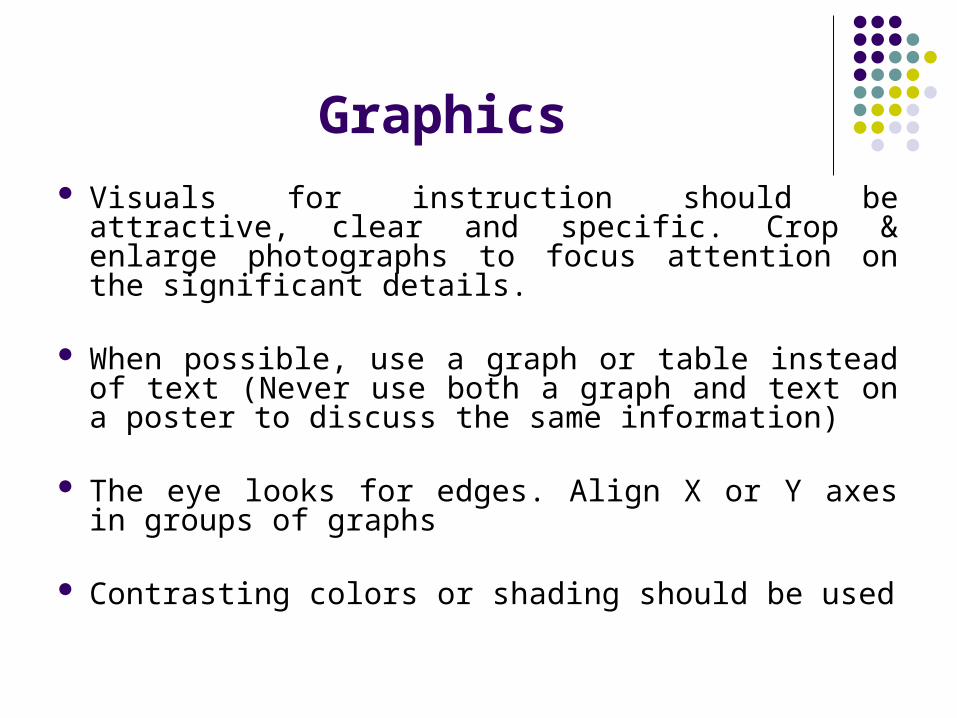
Graphics Visuals for instruction should be attractive, clear and
specific. Crop & enlarge photographs to focus attention on the significant details.
When possible, use a graph or table instead of text (Never use both a graph and text on a poster to discuss the same information)
The eye looks for edges. Align X or Y axes in groups of graphs
Contrasting colors or shading should be used
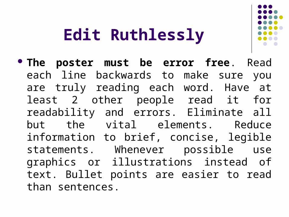
Edit Ruthlessly
The poster must be error free. Read each line backwards to make sure you are truly reading each word. Have at least 2 other people read it for readability and errors. Eliminate all but the vital elements. Reduce information to brief, concise, legible statements. Whenever possible use graphics or illustrations instead of text. Bullet points are easier to read than sentences.
Produce the Real Thing
Computer Software (PowerPoint for example) Art Tools (poster board, paper, tape, limited
only by your imagination & budget) Graphic Artist (an artist with expertise in
poster deign or development)
Planning Ahead Begin planning your poster as early as you can. If you have been
accepted to present a poster, you should begin laying it out as soon as possible. It takes a long time to simplify or distill the research project, plus it takes time to create the poster just exactly the way you want it to look. Allow yourself this time, it helps build confidence in your work because your poster looks planned rather than thrown together.
Determine how much space you will be given at the presentation site. Usually the acceptance letter gives you specific instructions as to how much space you can use or it is spelled out in the guidelines. If you are presenting at a national conference, your poster will be assigned a number. This will help you locate your assigned presentation location. Standard poster sizes are 4’X6’ or 3’X5” or 3’8’X7’6”. If you use PowerPoint to create your poster to a certain size and you find out at the meeting that the space given to you have been reduced, there's nothing you can do except curse under your breath.
Before you Begin: Storyboards
Storyboards are a rough sketch of your poster on paper. You could think of this as a rough draft or a mock up. The next section lists a number of possible poster sections for use as organizing formats for your poster. A set of definitions for each heading is provided as well.
Poster Sections
Posters can be created with as many or as few descriptive sections as you wish. Generally speaking, fewer is better. Keep the number of sections to the minimum. Several possible combinations of poster section headings are outlined and explained below. Select the combination that best fits your research/data/project/case report, etc.
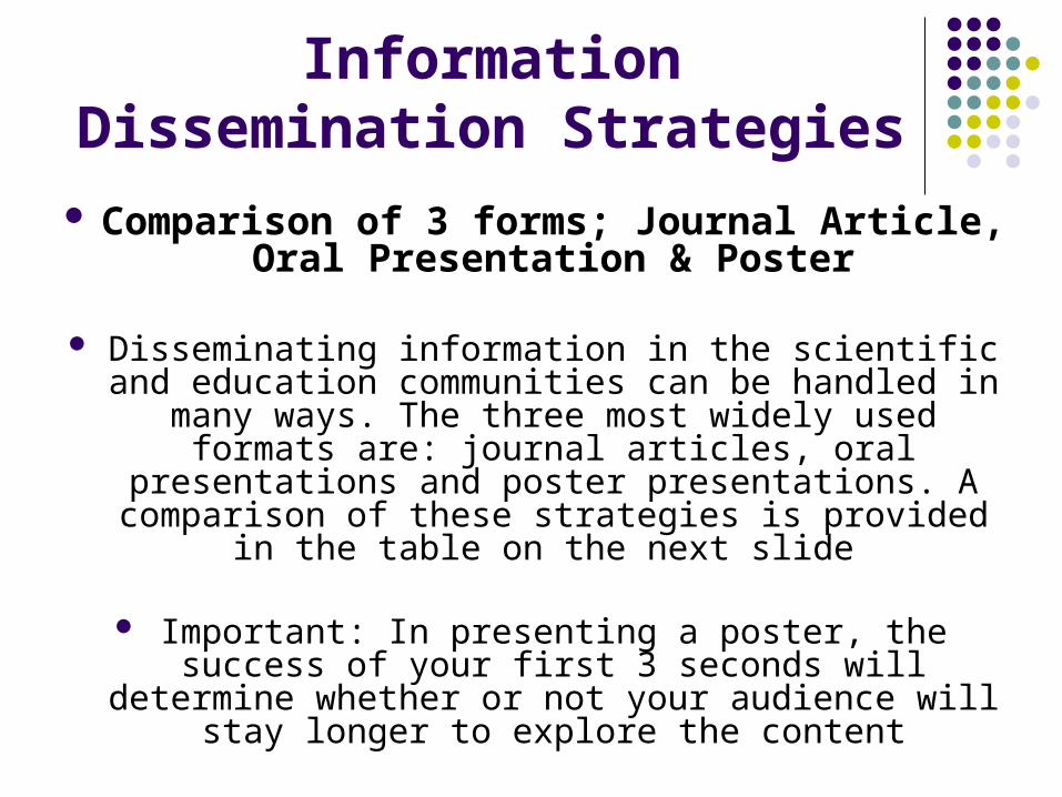
Information Dissemination Strategies
Comparison of 3 forms; Journal Article, Oral Presentation & Poster
Disseminating information in the scientific and education communities can be handled in many ways. The three most widely used formats are: journal articles, oral presentations and poster
presentations. A comparison of these strategies is provided in the table on the next slide
Important: In presenting a poster, the success of your first 3 seconds will determine whether or not
your audience will stay longer to explore the content
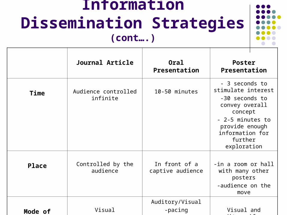
Information Dissemination Strategies (cont….)
Journal Article Oral Presentation Poster Presentation
Time Audience controlled infinite 10-50 minutes
- 3 seconds to stimulate interest
-30 seconds to convey overall concept
- 2-5 minutes to provide enough information for
further exploration
Place Controlled by the audience In front of a captive audience
-in a room or hall with many other posters
-audience on the move
Mode of Communication
Visual
-reading
Auditory/Visual
-pacing
-body language
-responsive to audience reaction
-visual aids
Visual and auditory if you are in attendance
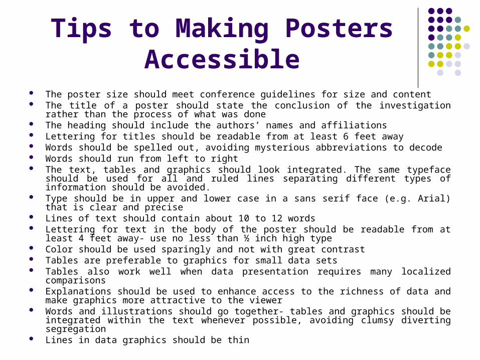
Tips to Making Posters Accessible
The poster size should meet conference guidelines for size and content The title of a poster should state the conclusion of the investigation rather than the process
of what was done The heading should include the authors’ names and affiliations Lettering for titles should be readable from at least 6 feet away Words should be spelled out, avoiding mysterious abbreviations to decode Words should run from left to right The text, tables and graphics should look integrated. The same typeface should be used
for all and ruled lines separating different types of information should be avoided. Type should be in upper and lower case in a sans serif face (e.g. Arial) that is clear and
precise Lines of text should contain about 10 to 12 words Lettering for text in the body of the poster should be readable from at least 4 feet away-
use no less than ½ inch high type Color should be used sparingly and not with great contrast Tables are preferable to graphics for small data sets Tables also work well when data presentation requires many localized comparisons Explanations should be used to enhance access to the richness of data and make
graphics more attractive to the viewer Words and illustrations should go together- tables and graphics should be integrated within
the text whenever possible, avoiding clumsy diverting segregation Lines in data graphics should be thin
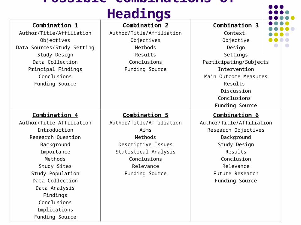
Possible Combinations of HeadingsCombination 1
Author/Title/Affiliation
Objectives
Data Sources/Study Setting
Study Design
Data Collection
Principal Findings
Conclusions
Funding Source
Combination 2Author/Title/Affiliation
Objectives
Methods
Results
Conclusions
Funding Source
Combination 3Context
Objective
Design
Settings
Participating/Subjects
Intervention
Main Outcome Measures
Results
Discussion
Conclusions
Funding Source
Combination 4Author/Title Affiliation
Introduction
Research Question
Background
Importance
Methods
Study Sites
Study Population
Data Collection
Data Analysis
Findings
Conclusions
Implications
Funding Source
Combination 5Author/Title/Affiliation
Aims
Methods
Descriptive Issues
Statistical Analysis
Conclusions
Relevance
Funding Source
Combination 6Author/Title/Affiliation
Research Objectives
Background
Study Design
Results
Conclusion
Relevance
Future Research
Funding Source
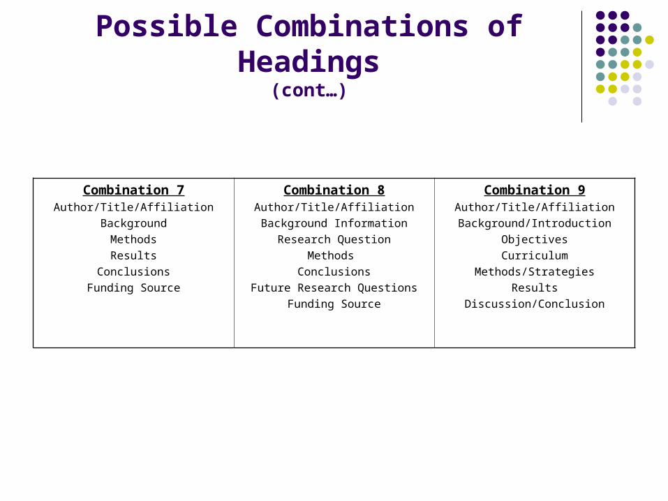
Possible Combinations of Headings(cont…)
Combination 7Author/Title/Affiliation
Background
Methods
Results
Conclusions
Funding Source
Combination 8Author/Title/Affiliation
Background Information
Research Question
Methods
Conclusions
Future Research Questions
Funding Source
Combination 9Author/Title/Affiliation
Background/Introduction
Objectives
Curriculum
Methods/Strategies
Results
Discussion/Conclusion
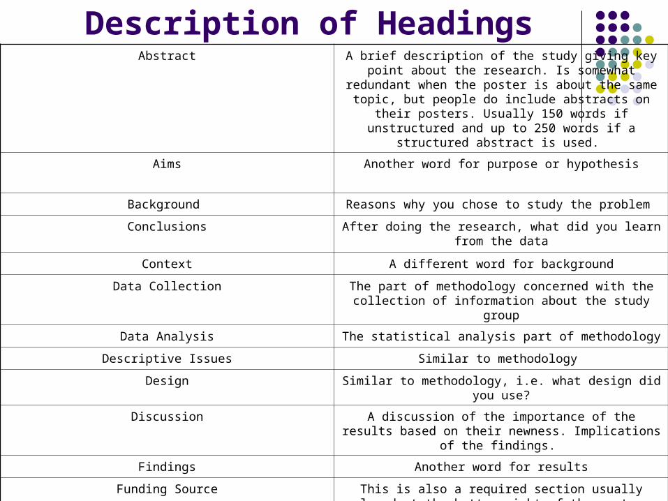
Description of HeadingsAbstract A brief description of the study giving key point about the
research. Is somewhat redundant when the poster is about the same topic, but people do include abstracts on their posters. Usually 150 words if unstructured and up to 250
words if a structured abstract is used.
Aims Another word for purpose or hypothesis
Background Reasons why you chose to study the problem
Conclusions After doing the research, what did you learn from the data
Context A different word for background
Data Collection The part of methodology concerned with the collection of information about the study group
Data Analysis The statistical analysis part of methodology
Descriptive Issues Similar to methodology
Design Similar to methodology, i.e. what design did you use?
Discussion A discussion of the importance of the results based on their newness. Implications of the findings.
Findings Another word for results
Funding Source This is also a required section usually placed at the bottom right of the poster. Funding agencies like to see their names
mentioned. It’s good policy to add this information.
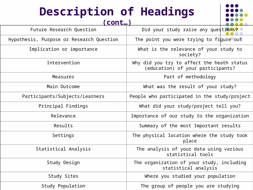
Description of Headings(cont…)
Future Research Question Did your study raise any questions?
Hypothesis, Purpose or Research Question The point you were trying to figure out
Implication or importance What is the relevance of your study to society?
Intervention Why did you try to affect the heath status (education) of your participants?
Measures Part of methodology
Main Outcome What was the result of your study?
Participants/Subjects/Learners People who participated in the study/project
Principal Findings What did your study/project tell you?
Relevance Importance of our study to the organization
Results Summary of the most Important results
Settings The physical location where the study took place
Statistical Analysis The analysis of your data using various statistical tools
Study Design The organization of your study, including statistical analysis
Study Sites Where you studied your population
Study Population The group of people you are studying
Title/Authors/Institutional Affiliation Identification of who gets the credit for doing the work. This section is found at the top of the poster.
Developing a Poster on PowerPoint
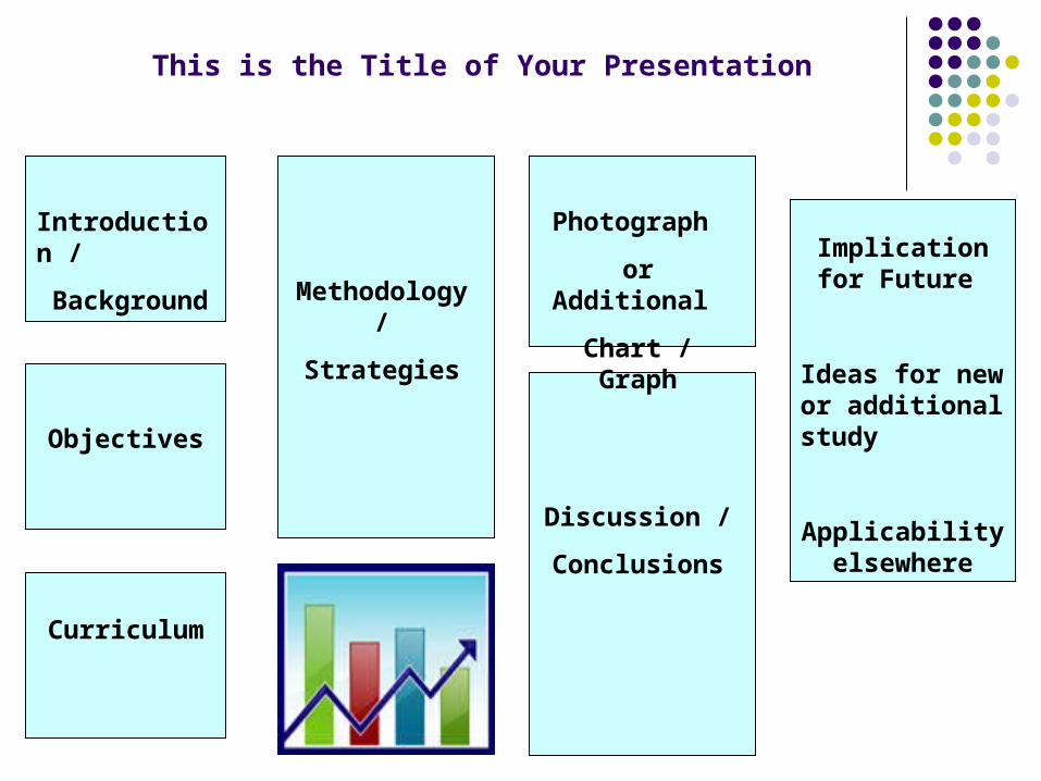
This is the Title of Your Presentation
Introduction /
Background
Objectives
Curriculum
Methodology /
Strategies
Discussion /
Conclusions
Photograph
or Additional
Chart / Graph
Implication for Future
Ideas for new or additional study
Applicability elsewhere
PowerPoint Instructions for Poster Development
What About Proportions (for Printing?)
In order to get your poster to print out properly, figure out how big your final poster will be and create the slide with those proportions, but reduced. For example, if you want a poster 3 feet X 4 feet, then your PowerPoint slide should be 18” x24.” You might find it easier to work with the smallest size slide, but increase the Zoom (an icon in the upper right and corner of your toolbar) to 75 or 100 percent while you are creating the poster.
Set the size by using the FILE/PAGE SETUP commands. This command enables you to scale your slide. You can scale up to 200% of the original size.
It would be helpful to know the printing dimension capabilities of the plotter you intend to use to print off your poster.
Design and Layout
Determine what three key points you want to make . You want your poster to cover the key points of your work – not all the details.
Before you begin work in PowerPoint, design and lay out the poster ahead of time. You may use one piece or several pieces of 8.5” X 11” paper to mock up the poster. Add the headings; roughly scratch the text layout and graphics. Tape or pin the sheets to a wall and rearrange them until you like the arrangement, all the while remembering to keep within your space allocation. This will determine how your final poster will look. The process of designing your poster by “laying it out” is called storyboarding.
Numbered lists and lists of “bullets” are good ways to communicate concisely
PowerPoint Instructions for Poster Development
(cont…)
Developing Posters on PowerPoint
Simple Instructions
1. Open PowerPoint by double clicking on the PowerPoint icon
2. Click on the New icon
3. From the dialog box, select the blank slide. Then OK.
4. Most people will find it easier to set up the poster in a smaller size slide and then enlarge the size just before printing. In some ways its easier to lay everything out an then add information once you’ve seen where everything is going.
5. Be sure your ruler is available so you can see where you are adding text boxes. View-Ruler.
6. Click on the text box. Insert the Title of your Presentation across the top of the slide. Add the authors names and affiliations. Your title should be quiet large, not less than 12 point. You want people to be able to see your presentation title from a distance. (Remember, everything will be blown up when you enlarge your poster)
Simple Instructions(cont…)
7. Now add some color. Click on the Font Color icon. Select the down arrow, then More Font Colors. Select the color you like, remembering that you want the title to be seen from a distance. Remember that some color combinations will not work together; e.g., dark color on dark color. Be sure there is good contrast between the background and the print font.
8. Lay out the sections of your paper. Once you have your boxes laid out you can start adding the real information to the text boxes. When you are done, you can delete the line around the text boxes, add color to the headings and or/change the font size and type.
9. Font sizes should be as follows:
Abstract- 5 point
Normal type- 8 point
Headings- 12 point
When blown up to the correct full size, these fonts will be quiet readable. Obviously, you will have trouble reading a 5 point font. Please remember that you use the zoom feature to blow up the slide to 200% of its original size to remedy this problem.
Simple Instructions(cont…)
10. To add an image, go to the Insert Menu. Insert Picture From File. Then Ok. Or you can Copy and Paste. Select the graphic in the original document, then Edit, Copy, click on the slide then Edit, Paste. No matter where you think the image is going to go, it will always be in the wrong place. Click on the image, hold the left mouse button down and drag the image where you want it to go.
Background can be inserted by using the Format, Background command. Don’t be heavy handed in your use of dark background. They use up a lot of ink and may overwhelm the viewer.
Lines, boxes and arrows can be inserted using the Drawing Toolbar. If you don’t see this Toolbar, use View, Toolbars, Drawing to make it available.
11. To insert a table or graph from Excel, create the table or graph and highlight or select it in Excel. You can then click on Insert, Chart or Insert, Object.
12. To print the final version on a single piece of “11 X 8.5” paper to check it over before doing the final large size, go to File, Print, Slides and click the check box to Scale to fit paper (only if you’ve blown it up to its final size)
13. If you want to see what the poster will look like in its final format, enlarge the page size. From the File menu, select Page Setup, then Custom from the Slides Sized for box. Select the height as 35 inches and the Width as 48 inches. Or select the Height as 56 inches, the longest length that you can get. Be sure the slide is oriented Landscape. Then OK.
Instructions for Using an Existing Presentation as a TemplateBegin adding your information into the template as you delete the old information.
Feel free to rearrange text boxes or any graphs, lines, arrows and so on.
Having Your Masterpiece Printed(Note: You may have to ask around for someone who has a plotter the size you need)
You can find several plotters on and off campus. Kinko charges $8.00 - $12.00 per square foot.
Tricky PartsIf you work in tiny format, if can sometimes be a challenge changing font size below 8
point. To change a font size from 8 point to 5 point, go to Format, Font, Size, then key in 5 manually
Importing a PowerPoint Slide from another presentationChange the font size before you move it into the new presentation. Use this feature if you
want to make your poster up out of existing PowerPoint slides.


![WBJEE MOCK TEST PAPER POWERED BY … · wbjee mock test paper –powered by wbjee mock test paper [ pathfinder ] wbjee mock test – 2 [mathematics-2]](https://img.pdfslide.net/doc/110x75/5f5911bc7de6a572a9381525/wbjee-mock-test-paper-powered-by-wbjee-mock-test-paper-apowered-by-wbjee-mock.jpg)