Embed Size (px)
Citation preview
Holly walker mediaIMAGES
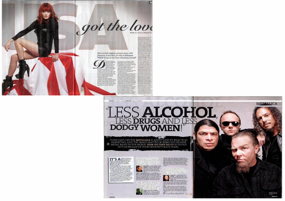
Both images differ, with the colours being mainly blacks and whites. The Florence image represents her as a strong, independent female. She is wearing black clothing, which represents authority and danger within her character, as if she is the alpha female of the music industry. She has little skin showing and she is not posing provocatively, which suggests her female empowerment in the music industry. She is sat on red white material which could represent the colours of England, which contrasts against the USA text at the back of the image. The colours and the text represent her status within the music industry, suggesting that she is known worldwide.
In the other music magazine, the main image is of Metallica, a heavy metal band. The group are stood as a four, using direct address to look at the camera. There are secondary images which are profile shots of each member of the band. This represents that the band are a group to make music, however they all have their own individual personalities within the band. The images have low key lighting. By having the colours light and not heavy, it focuses more on the image rather than the distracting colours.
TextHowever both texts are colloquial, creating an interesting and ‘chatty’ theme. Both magazines have the body text in three columns, and relates to the images on the page. Both issues have their band/artist name as the title.
Layout
The house style of one magazine is red, white and black and the other is black, white and grey. One magazine has the image filling the right hand side of the page and the text filling the left hand side of the page, and the other has it the opposite way round. However, the Metallica issue uses secondary images within the body text.
The body has 3 columns on each issue. The major layout differences are that the Metallica issue has a large introduction (kicker) spread out on a black background above the main body article. Also, there are secondary images of Metallica. The Rule of Thirds has been used in each issue.