Embed Size (px)
Citation preview

Agricultural productivity has risen sharply since World War II. Corn yields, for example, fluctuated around a fairly stable average between 1866, the first year for which the National
Agricultural Statistics Service (NASS) provides data, and about 1940. Since 1940, however, corn yields have trended steadily upward.
Chart 1 shows average annual U.S. corn yields as well as their trend. From 1940 to 1980, yields grew exponentially, as shown by the linear increase in the blue solid line—that is, there was a linear trend in log yields. This finding is consistent with Jorgenson and Gollop (1992), who examine total factor productivity growth (TFP) in U.S. agriculture over the 1947–1985 period. They find that although employment in the agricultural sector decreased by 1.8 percent per year over that pe-riod, output increased. They conclude that “there is little doubt that the role of productivity growth in agriculture is quite different than in the rest of the economy. … agriculture’s average annual rate of TFP growth has been nearly four times as large as the corresponding rate in the rest of the economy.” This exponential increase seems to be leveling off: starting around 1980, absolute corn yields have been growing linearly (orange solid line), while the trend in log yields is starting to decrease.
Despite tremendous gains in agricultural productivity, the sector re-mains as vulnerable to environmental factors as ever. The dashed blue line in Chart 1 shows that the deviations from the log trend seem to have rather constant variance over time. In other words, the year-to-year
Environmental Drivers of Agricultural Productivity Growth and Socioeconomic SpilloversBy Wolfram Schlenker
Wolfram Schlenker is a professor at the School of International and Public Affairs and the Earth Institute at Columbia University. The views expressed are those of the author and do not reflect the positions of The Federal Reserve Bank of Kansas City or the Federal Reserve System.
87

88 Federal Reserve Bank of Kansas City
swings in yields are constant in percent terms. As average yields have increased, so, too, has the standard deviation of the fluctuations around them. Most of the fluctuations around the trend are caused by envi-ronmental factors such as weather, air pollution, or pest outbreaks. The constant percent variation around the mean implies that agriculture is as dependent on environmental factors today as it has been historically.
In this paper, I document agriculture’s dependence on two specif-ic environmental factors: weather—in particular, extreme heat—and ozone air pollution. As I will show in Section I, in both cases, it is cru-cial to look not just at the average outcomes but also at extremes, which have a large measurable effect on observed yields. Section II highlights recent trends in these environmental factors over the last 40 years as well as how they contributed to the observed yield trend. Extreme heat is predicted to increase in future years, although the observed time series does not yet bear this out. An increase in extreme heat would like-ly depress future yield growth. Peak ozone pollution has been almost entirely phased out over the sample period, contributing significantly to the observed yield trend. However, because peak ozone pollution has been eliminated, no further reductions with beneficial effects on future yield growth are feasible. Finally, Section III outlines the socioeconomic spillovers from productivity growth on rural areas, documenting how
Chart 1United States Average Corn Yields, 1866–2019
Notes: Dashed lines denote year-to-year fluctuations, while solid lines denote trends. Trends are estimated using restricted cubic splines with five knots between 1966 and 2019. Sources: USDA NASS, NOAA, and author’s calculations.
1940 1980
5.0
Bushels per acre
20
40
60
80
100
120
140
160
180Bushels per acre
1870 1890 1910 1930 1950 1970 1990 2010
5.6
5.3
4.7
4.4
4.1
3.8
3.5
3.2
2.9
Corn yield (L)Log corn yield (R)

The Drivers of U.S. Agricultural Productivity Growth 89
past episodes of productivity shocks have led to outmigration from rural to urban areas.
I. Effect of Weather and Ozone on Corn YieldsCorn is the crop with the largest growing area in the United States.
This section demonstrates the importance of two environmental ef-fects on corn yields: weather and ozone pollution. The weather variable specification and implementation follow Schlenker and Roberts (2008), while the ozone variables follow Boone, Schlenker, and Siikamäki (2019). Both analyses focus on the importance of nonlinear effects: be-cause averaging over time or space can dilute such nonlinear effects, the micro-level data are constructed on a roughly 2.5 x 2.5 mile grid.
Map 1 displays the average corn area from the cropland data layer from 2010 to 2018 aggregated to the same 2.5 x 2.5 mile grid (1/24th degree latitude and longitude) as the weather data. The green coloring within each grid cell is proportional to the corn growing area in that cell: if 50 percent of the grid area grows corn, half of the square is colored green. The Corn Belt is clearly visible, but corn is also grown in most of the remaining counties in the United States—though sometimes only in a small subarea. County boundaries are delineated in black.
All weather and pollution variables are first derived for each grid before they are averaged over a county. If the underlying relationship is nonlinear, it is important to first derive the nonlinear transformation on a fine temporal and spatial scale before aggregating the data, as two days (or two points) with similar average temperature (or pollution) can have very different maximums and minimums. For example, consider two counties that both have an average ozone pollution level of 70 parts per billion (ppb). If the first county has a pollution level of 70 ppb in all of its grid points, it would never exceed the critical value of 70 ppb that is harmful for crops and thus the pollution would not result in any damage to the corn crop in a county. On the other hand, if the second county has an ozone pollution of 40 ppb in half of its grid points and 100 ppb in the other half—with a county average of 70 ppb—a sub-stantial portion of the country would be above the threshold of 70 ppb, resulting in a yield reduction in that area that should show up in the aggregate county statistic.

90 Federal Reserve Bank of Kansas City
Hourly air pollution data are available from the Environmental Protection Agency (EPA) Ambient Air Quality Monitoring Program and Data starting in 1980.1 Following Boone, Schlenker, and Siikamäki (2019), missing hourly values are filled in by cross-interpolation and then interpolated to the above 2.5 x 2.5 mile grid before being averaged over all grids in a county using the average corn area in the cropland data layer for the years 2010–18. The area weights are purposefully kept constant across years to not confound the analysis with possibly en-dogenous changes in where crops are grown. Similarly, minimum and maximum temperatures, as well as degree days, are derived for each grid and day following Schlenker and Roberts (2008) before being aggre-gated to the county level. Weather variables keep the set of weather sta-tions constant to derive year-to-year weather shocks that are not driven by compositional changes. As Dell, Jones, and Olken (2014) point out, such year-to-year weather shocks are exogenous and hence form the ideal right-hand-side variable.
The analysis matches pollution and weather data with county-level corn yields from NASS for counties east of the 100-degree meridian excluding Florida from 1980 to 2019. Only counties that report corn yields in at least 20 of the 40 years of the sample are included, which includes all major production areas. The exact specification uses a panel analysis relating log corn yields in a county and year to two
Map 1Average Corn Area, 2010 –18
Sources: USDA NASS Cropland Data Layer and author’s calculations.
The Drivers of U.S. Agricultural Productivity Growth 91
temperature variables, two precipitation variables, and one measure of ozone pollution in the same year aggregated over the 183-day period from April 1 to September 30.
The specification also includes county fixed effects to allow for dif-ferences in average productivity, year fixed effects to absorb common price shocks, and county-specific quadratic time trends to allow for the fact that yields have been trending upward differently over the sample period. Errors are clustered at the state to allow for spatial correlation. Chart 2 shows the results. The vertical axis shows the effect on annual log yields multiplied times 100, so that each number roughly repre-sents percent effects. I discuss each of the five environmental variables in turn.
The first two variables are for precipitation. The blue line shows point estimates for the quadratic in season-total precipitation. Both the linear and quadratic term are significant at the 1 percent level. The re-lationship peaks around 71 centimeters, or 28 inches. If precipitation is cut by one-third, from the optimum 28 inches to 19 inches, annual yields are predicted to decline by 4 percent.
The next two variables are for the effects of temperature. The or-ange line in Chart 2 displays the effect of a 24-hour exposure to various temperatures. Since there are 183 days between April 1 and September 30, the cumulative effect of temperature exposure dwarfs the effect of precipitation. Unlike precipitation, which used a quadratic specifica-tion that is symmetric around the optimum, the effect of temperature is highly asymmetric. As a result, I rely on two piecewise linear approxi-mations. The upward slope of the orange line shows that yields increase in temperatures between 50 and 86 degrees Fahrenheit.
This linear increase is captured by the concept of degree days, which measure how much and for how long temperatures exceed a thresh-old. For example, degree days 50–86 measure how much temperatures exceed the lower threshold of 50 degrees Fahrenheit up to 86 degrees Fahrenheit. A temperature of 60 degrees Fahrenheit would result in 10 degree days, while a temperature of 86 degrees Fahrenheit or above would result in 36 degree days. The regression incorporates the entire distribution of daily temperatures between the minimum and maxi-mum temperature (Snyder 1985). These daily outcomes are summed over the 183-day April to September growing season to yield one

92 Federal Reserve Bank of Kansas City
variable—the annual total of degree days between 50 and 86 degrees Fahrenheit. While the annual total omits the sequencing of tempera-tures within the months, it has been shown to work well as a predictor of yields. For example, corn varieties are often classified by the degree days they need to mature.
The second temperature variable measures degree days above 86 degrees Fahrenheit. Chart 2 shows a highly asymmetric relationship: degree days above 86 degrees Fahrenheit are highly detrimental for corn yields. The downward slope of the orange line above 86 degrees Fahren-heit is an order of magnitude steeper than the increasing slope below 86 degrees Fahrenheit. For example, each 10 additional degree days above 86 degrees Fahrenheit (one day at 96 degrees Fahrenheit rather than 86 degrees Fahrenheit or 10 days at 87 degrees Fahrenheit rather than 86 degrees Fahrenheit) reduces annual corn yields by 2.9 percent. On the other hand, 10 additional degree days between 50 and 86 degrees Fahrenheit only increase corn yields by 0.1 percent.
The ideal weather outcome would be to have a temperature of 86 degrees Fahrenheit throughout the growing season, which is not fea-sible given temperature fluctuations throughout the year. However,
Temperature (24-hour)
Ozone (24-hour)
−6
−5
−4
−3
−2
−1
0
1
−6
−5
−4
−3
−2
−1
0
1Effect on log corn yields (x100) Effect on log corn yields (x100)
32 40 50 60 70 80 86 90 100 105
Temperature (Fahrenheit), precipitation (cm), or ozone (ppb)
Precipitation (total April−September)
Chart 2Relationship between Temperature, Precipitation, Ozone Pollution, and Corn Yields
Note: Shaded areas denote 95 percent confidence bands.Sources: USDA NASS, NOAA, and author’s calculations.

The Drivers of U.S. Agricultural Productivity Growth 93
the yield penalty of being above the 86 degrees Fahrenheit threshold is much larger than the penalty of falling below it. This asymmetric penalty again illustrates why a spatially and temporally disaggregated analysis is crucial. A day with a constant temperature of 86 degrees Fahrenheit has the same average temperature as a day with a minimum temperature of 72 degrees Fahrenheit and a maximum temperature of 100 degrees Fahrenheit; however, the latter would have a much greater effect on yields, as half of the day is spent in a temperature range that is highly harmful to yields.
Extreme heat—as measured by degree days above 86 degrees Fahr-enheit—is the single best predictor of year-to-year fluctuations in ag-gregate corn yields (Schlenker and Roberts 2008).2 A reasonable ques-tion is whether modern varieties of corn are less susceptible to extreme heat episodes. The year 2012 was one of the hottest on record (only surpassed by 1988 and the Dust Bowl years in the 1930s), with 101 degree days above 86 degrees Fahrenheit when weather is averaged over the corn-growing area in the United States. However, yields did not fare any better than in previous years of extreme heat. Yields dropped sharply in 2012 (see Chart 1), and the drop even slightly exceeded the estimate from the statistical model using data from 1950 to 2011 (D’Agostino and Schlenker 2016). In other words, there is no evidence that corn varieties have gotten better at withstanding extreme heat in the last decade.
The fifth environmental variable measures exposure to ozone pollu-tion above 70 ppb. Ozone pollution has a strong threshold effect: that is, it has a very limited effect below a threshold, but reduces corn yields linearly above it (Boone, Schlenker, and Siikamäki 2019). The thresh-old of 70 ppb used in this paper is motivated by the U.S. ambient air quality standard of 70 ppb. Although this threshold differs slightly from the one used by Boone, Schlenker, and Siikamäki (2019), the results are very similar. The ozone standard in the United States is derived in a two-step process: first, by calculating the highest average ozone value for any consecutive eight-hour period for each day—for example, 11 a.m. to 7 p.m. on July 23—and second, by comparing the fourth-high-est of these daily maximums to the threshold of 70 ppb. If the fourth-highest of the daily maximums exceeds 70 ppb, a county is deemed in nonattainment. While this is a fairly complex summary statistic, the

94 Federal Reserve Bank of Kansas City
standard is certainly met if every hourly observation is below 70 ppb. Ozone exposure above 70 ppb adds how much each hourly ozone read-ing is above 70 ppb, summed over all hourly readings between April and September. The concept is the same as for degree days discussed above. The green line in Chart 2 shows the resulting point estimate. Exposure to 840 ppb-hours (24 hours at 105 ppb rather than 70 ppb—that is, 24 × 35) reduces annual corn yields by 5 percent. Peak ozone pollution in the United States repeatedly exceeded 3,300 ppb-hours in the 1980s, which reduced annual corn yields by 20 percent. Eliminating this peak pollution level has strong effects on yield and productivity trends.
This section has empirically linked five environmental variables to county-level corn yields for the last 40 years. While precipitation has some effect on yields, extreme heat and ozone pollution have led to the largest yield reductions—in some years, more than 20 percent. The next section examines in further detail how these variables have been trending and how they are predicted to trend over the rest of the century.
II. Recent Trends in Peak Temperatures and Ozone PollutionTemperatures in the United States have been trending mostly up-
ward since 1980, but there is strong spatial heterogeneity even within states (Burke and Emerick 2016). Since 2001, the Chicago Mercantile Exchange has offered weather derivatives, whose payout directly depends on daily average temperatures at eight U.S. airports. The price of these derivatives has been trending upward in close alignment with climate model projections made under the fifth phase of the Coupled Model Intercomparison Project (CMIP5) (Schlenker and Taylor, forthcoming).
The maps that follow present trends over the areas and months in which corn is grown. Specifically, the maps are constructed by using the same weather data set on a 2.5 x 2.5 mile grid for the contiguous United States for the April–September growing season and merging it with the average corn growing area in the years 2010–18 from the cropland data layer in Map 1. Map 2 shows the cumulative change in average temperature by county from 1980 to 2019, averaged over the corn area in that county. For predominantly agricultural areas such as Iowa, the map displays the county average, while in more marginally agricultural areas such as the Rocky Mountains, the weather is averaged over a very small subset of the county. Areas with an increasing trend in

The Drivers of U.S. Agricultural Productivity Growth 95
average temperature are shaded green through red, with areas experienc-ing the largest warming trend in dark red. Areas with a decreasing trend in average temperatures are shaded in blue, with areas experiencing the largest cooling trend in dark blue. The majority of the United States has seen warming, with some areas warming more than 3 degrees Fahren-heit over the 40-year period. However, the northern United States has seen cooling over this period, including South Dakota, some areas in the western edges of the Corn Belt in Nebraska, and some areas in Iowa.
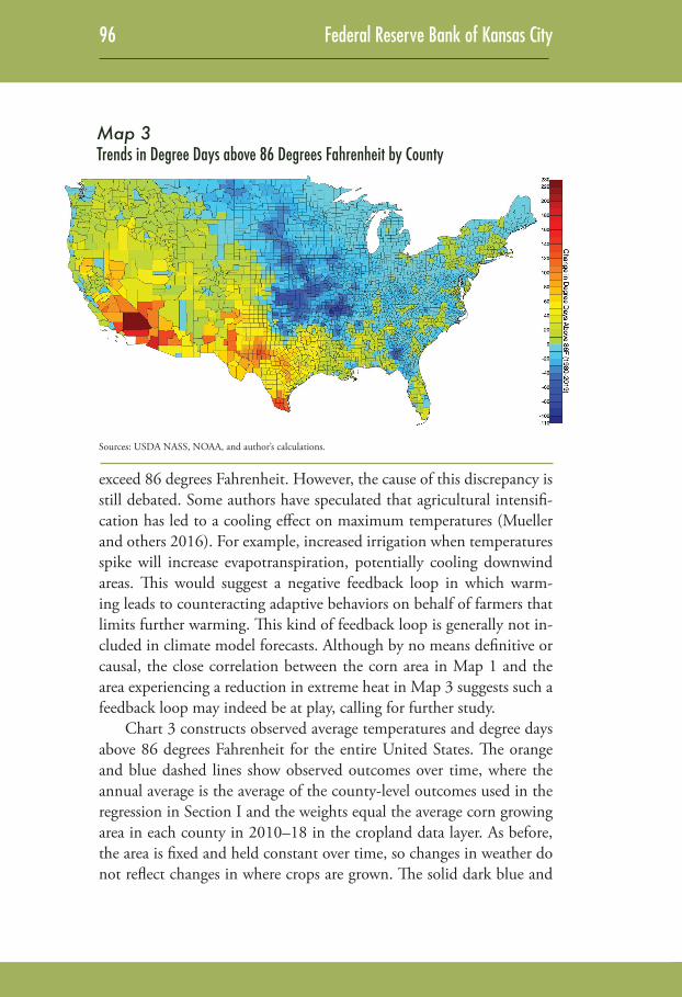
Given the influence of extreme temperatures on agricultural pro-ductivity, Map 3 shows trends in the number of degree days above 86 degrees Fahrenheit, again over the average corn area in 2010–19 summed over the April–September growing season. The trends in Map 3 look markedly different from the trends in average temperatures in Map 2. Specifically, areas in the southern Corn Belt and east of the Corn Belt have seen decreases in extremely hot temperatures despite an increase in their average temperatures. One possible explanation for this discrepancy could be an increase in the minimum temperature rather than the maximum temperature during the peak summer months. An-other explanation could be an increase in temperatures in the early or late parts of the growing season, when temperatures do not typically
Map 2Trends in Average Temperature by County
Sources: USDA NASS, NOAA, and author’s calculations.
96 Federal Reserve Bank of Kansas City
exceed 86 degrees Fahrenheit. However, the cause of this discrepancy is still debated. Some authors have speculated that agricultural intensifi-cation has led to a cooling effect on maximum temperatures (Mueller and others 2016). For example, increased irrigation when temperatures spike will increase evapotranspiration, potentially cooling downwind areas. This would suggest a negative feedback loop in which warm-ing leads to counteracting adaptive behaviors on behalf of farmers that limits further warming. This kind of feedback loop is generally not in-cluded in climate model forecasts. Although by no means definitive or causal, the close correlation between the corn area in Map 1 and the area experiencing a reduction in extreme heat in Map 3 suggests such a feedback loop may indeed be at play, calling for further study.
Chart 3 constructs observed average temperatures and degree days above 86 degrees Fahrenheit for the entire United States. The orange and blue dashed lines show observed outcomes over time, where the annual average is the average of the county-level outcomes used in the regression in Section I and the weights equal the average corn growing area in each county in 2010–18 in the cropland data layer. As before, the area is fixed and held constant over time, so changes in weather do not reflect changes in where crops are grown. The solid dark blue and
Map 3Trends in Degree Days above 86 Degrees Fahrenheit by County
Sources: USDA NASS, NOAA, and author’s calculations.

The Drivers of U.S. Agricultural Productivity Growth 97
orange lines show smoothed trends from the locally weighted regression (lowess in STATA).
During the Dust Bowl years in the 1930s, average temperatures and extreme heat (degree days above 86 degrees Fahrenheit) are not necessarily perfectly aligned: the year 1936 saw the most extreme heat, with 177 degree days but an average temperature of only 68.4 degrees Fahrenheit. For comparison, the year 1955 had the same average tem-perature of 68.4 degrees Fahrenheit but only 100 degree days. Because each additional 10 degree days reduces yields by 2.9 percent, the extra 77 degree days in 1936 imply a further 22 percent reduction in yields relative to 1955. The correlation between the two variables is 0.7. The other years with large exposure to extreme heat, 1988 and 2012, are added as grey dashed lines.
The lighter shade of orange and blue lines on the right-hand side of Chart 3 show the average of climate predictions under the 21 climate models in the NASA Global Daily Downscaled Predictions (GDDP), which provides daily model output for minimum and maximum tem-peratures on a common 0.5 degree grid that are bias-corrected. Bias cor-rection implies that temperatures in the baseline period (1950–2005) are matched to the observed temperatures over the grid. Because the cli-mate grid is much coarser (half a degree) than the previously used grid (one twenty-fourths of a degree), the two series in Chart 3 do not neces-
Chart 3Temperature and Degree Days above 86 Degrees Fahrenheit, 1900–2100
Note: Dashed lines denote year-to-year fluctuations, while solid lines denote trends.Sources: USDA NASS cropland layer, NOAA NEX-GDDP, and author’s calculations.
1936 1988 2012
50
100
150
200
250
300
350
400
450
500Degree days above 86 degrees Fahrenheit
50
53
56
59
62
65
68
71
74
77
80Average temperature (Fahrenheit)
1900 1920 1940 1960 1980 2000 2020 2040 2060 2080 2100
RCP 8.5
RCP 4.5
RCP 8.5
RCP 4.5
Degree days (R)
Average temperature (L)

98 Federal Reserve Bank of Kansas City
sarily have to align perfectly; nevertheless, the average of the trend lines for 1950–2005 is very close. The average temperature in the observed station data in 1950–2005 is 65.5 degrees Fahrenheit, compared with 65.9 degrees Fahrenheit in the NEX-GDDP data.
Comparing the two series reveals one striking difference: the pre-dicted uptick starting in 1980 in both average temperatures and ex-treme heat has not materialized. While average temperatures over the recent corn growing area and season (orange solid line) are fairly flat with a small uptick at the end, the observed exposure to extreme heat (blue solid line) is actually trending down.
Climate model forecasts in NEX-GDDP use two representative concentration pathways (RCP) scenarios: the RCP 4.5 scenario results in an additional 4.5 Watts per square meter and is considered an inter-mediate warming scenario, while the RCP 8.5 scenario is considered the worst possible warming scenario. Note that the RCP 8.5 scenario results in the average temperature increasing by 12 degrees Fahrenheit by the end of the century. This is consistent with the Intergovern-mental Panel on Climate Change (IPCC) figure of a global average warming of 3.7 degrees Celsius by the end of the century. Average U.S. warming in the RCP 8.5 scenario appears to exceed this global aver-age for two reasons: first, due to the conversion from Celsius to Fahr-enheit (times 1.8); and second, because higher latitudes warm more than lower latitudes (another factor of roughly 1.8). Extreme heat, as measured by degree days above 86 degrees Fahrenheit, is predicted to increase sharply from fewer than 50 degree days per growing season before 1980 to more than 450 per growing season by the end of the twenty-first century. This eclipses by far the worst extreme heat the United States has historically seen—the 177 degree days in 1936 when land was abandoned during the Dust Bowl.
This prediction also cautions against the assumption that the cool-ing effect of agricultural intensification will offset extreme heat in the future. While this cooling mechanism is still debated in the literature, assume for now that it has been at work over the last four decades. If the RCP 8.5 scenario materializes, the implied warming would be so large that land would be abandoned and any offsetting effect would cease, leading to a reversal to the predicted trend line. A similar mech-anism was at work when people discussed the “warming hiatus” or

The Drivers of U.S. Agricultural Productivity Growth 99
“global warming plateau” in the early 2000s. Such decadal phenom-ena can be linked to ocean circulations that have strong influences on decadal weather patterns. The increasing trend in temperature due to increasing CO2 concentrations is offset by a decadal weather pattern in the opposite direction—that is, a phase of cooling. However, once the decadal weather pattern reverses its phase from cool to hot and both trends align, the hiatus is followed by a phase of accelerated warming, as was observed in the latter half of the 2010s. In other words, agricultural intensification might lead to a negative feedback loop that temporar-ily limits the upward trend of maximum temperatures; however, under continued warming that makes the large-scale production of a basic commodity like corn unproductive, the eventual reduction in growing area would lead to a reversion to the trend line.
The right-hand side of Chart 3 also shows the effects of various policy choices. Under the less-severe RCP 4.5 scenario, average tem-peratures are only predicted to increase by half as much (roughly 6 degrees Fahrenheit) as under the RCP 8.5 scenario, and extreme heat is predicted to increase by about 39 percent by the end of the cen-tury. Extreme heat would on average equal the worst observation on record from 1936, which is still sizable: an increase of 120 degree days compared with the historic average from 1900 to 2019. The associated decline in yields would be 35 percent. Granted, if agricultural intensi-fication limits the increase in extreme heat, some of this yield decline may not materialize. Nonetheless, warming trends are predicted to be a major drag on future productivity growth in the United States.
Chart 4 displays the evolution of ozone pollution over the last four decades. The orange line shows average pollution based on the daily maximum eight-hour average concentration—that is, the consecutive eight-hour period with the largest average pollution among the hourly pollution readings. Although the EPA standard is based on the fourth highest daily value, averaged over three years, the graph shows the aver-age of the daily eight-hour maximum concentrations to better reflect the average pollution level during the April 1–September 30 growing season. Peak ozone concentrations are shown in blue by the cumulative exposure to ozone above 70 ppb—that is, the sum of how much hourly ozone readings exceeded 70 ppb over the growing season. This value is constructed for each 2.5 x 2.5 mile grid and then aggregated over the

100 Federal Reserve Bank of Kansas City
United States using the average corn area in each grid cell. The year 1988, which had an especially high number of extremely hot days (see Chart 3), also had very high ozone pollution. Since ozone formation increases with sunlight and temperature, it is important to jointly ac-count for both extreme heat and ozone.
Chart 4 also shows the United States’ tremendous success in im-proving air quality, at least as averaged over the corn growing area. Al-though average pollution (orange line) decreased by a modest 10 per-cent from 1980 to 2019, almost all peak ozone pollution (blue line) was eliminated. Under a threshold model, which was empirically validated for corn, eliminating peak pollution is all that matters.3 Log yields, as shown in Chart 1, increased by 46 log points from 4.62 in 1980 to 5.08 in 2019. At the same time, ozone decreased from 2,680 ppb-hours in 1980 to effectively zero in 2019. Without peak ozone pollution, yields in 1980 would have been 15 log points higher. About one-third of the increase in corn yields from 1980 to 2019 is attributable to the elimi-nation of peak ozone. However, now that peak ozone has been driven down to zero, no future yield boost is possible from further reductions in ozone, putting another damper on future yield growth and, accord-ingly, productivity growth.
Chart 4Average and Peak Ozone 1980–2019
Note: Dashed lines denote year-to-year fluctuations, while solid lines denote trends.Sources: USDA NASS cropland layer, NOAA NEX-GDDP, and author’s calculations.
6
12
18
24
30
36
42
48
54
Hundreds of ppb-hours
6
12
18
24
30
36
42
48
54
ppb
1980 1985 1990 1995 2000 2005 2010 2015 2019
Average daily eight-hour maximum (L)
Cumulative exposure above 70 ppb (R)

The Drivers of U.S. Agricultural Productivity Growth 101
III. Socioeconomic Spillovers from Changes in Environmental Productivity Drivers
The previous sections highlighted the importance of two environ-mental inputs for corn yields: extreme heat and peak ozone pollution. The former is predicted to increase significantly over the remainder of the twenty-first century, while the latter has been reduced to almost zero with no scope for further reductions to boost yields. Taken together, the outlook suggests reduced yield growth in the future. While this article has focused on corn yields, temperature extremes are also important for other crops, such as soybeans, cotton, rice, and wheat (Schlenker and Roberts 2008; Welch and others 2010; Tack, Barkley, and Nalley 2015). In general, agricultural productivity in the United States is likely to de-crease under climate change.
The productivity of agricultural workers is also negatively affect-ed by both heat and pollution. Graff Zivin and Neidell (2012) show that picking rates decrease with ozone pollution and temperature. In a competitive market equilibrium, farm workers should be paid their marginal product. If environmental factors reduce overall productivity, wages in the agricultural sector will decline, as will the return to capital. If environmental factors affect the marginal product of capital and labor differently, there will be substitution toward inputs that are less nega-tively (or more positively) affected. Production of commodity crops in the United States is already highly mechanized, unlike specialty crops, such as fruits, which often need to be picked manually.
The first effect of reduced agricultural productivity due to climate change will be on adaptation measures, which will increase capital in-vestments, especially in new irrigation equipment. Haqiqi and others (2020) add a measure of soil moisture to the statistical model of Section I. Soil moisture is a dynamic state variable that depends on precipi-tation and evapotranspiration requirements from previous days. Once soil moisture is included in the regression, precipitation becomes in-significant, as soil moisture now captures the effect of water availabil-ity. Moreover, the breakpoint that separates yield-enhancing moderate degree days and damaging extreme degree days (86 degrees Fahrenheit in the preceding analysis) depends on soil moisture. The model can be used to derive the value of irrigation, which reduces the yield penalty

102 Federal Reserve Bank of Kansas City
when soil moisture is low or the breakpoint becomes lower. Because the value of irrigation increases with warming, irrigation is likely to in-crease, subject to water availability. As noted in Section II, there might be even a positive feedback loop in which further irrigation will limit the increase in extreme heat, at least initially.
The second effect of reduced agricultural productivity due to cli-mate change will be on migration. In the past, negative productivity shocks have operated through both a change in overall productivity and in labor-specific productivity shocks. The 1930s provide a salient example. The years 1934 and 1936 were especially hot, with 1936 holding the record for extreme heat observed over the corn-growing area in the United States to date. Such hot temperatures usually go hand-in-hand with dry conditions, as wet soil would leave to evapora-tive cooling that limits exposure to extreme heat. Hornbeck (2012) compares changes in land values in eroded versus non-eroded counties following the Dust Bowl in the 1930s. He finds that both revenue and land values persistently declined in more eroded counties. Comparing the immediate decline in revenues, which persisted, to the immediate decline in land values implies that less than one-quarter of the initial difference in agricultural cost could be recovered in more eroded coun-ties through adaptive measures. The main adjustment mechanism was outmigration, primarily of young people, from affected areas as overall productivity declined. Again, recall that climate change is predicted to make the historic record the new normal: the average amount of extreme heat will equal the historic record under the immediate warm-ing scenario RCP 4.5 and almost triple under the fast warming sce-nario RCP 8.5. Hornbeck and Naidu (2014) provide another example of migration in response to environmental conditions. After the great Mississippi River flood of 1927, flooded areas saw an immediate out-migration of black farm workers that persisted. Although landowners tried to restrict this outmigration, as they benefited from the labor-in-tensive agriculture, they were forced to substitute labor for capital. This substitution implied that flooded areas saw an increase in moderniza-tion compared with non-flooded areas. Both Hornbeck (2012) and Hornbeck and Naidu (2014) examine environmental shocks a century ago. Will the current system be more prone to withstand shocks?
The Drivers of U.S. Agricultural Productivity Growth 103
This leads to the third predicted effect of reduced agricultural pro-ductivity due to climate change: sectoral reallocation. Other countries have seen such reallocation in the recent past. For example, Colmer (forthcoming) uses micro-level data from India to show that tem-perature-driven reductions in demand for agricultural labor result in workers looking for new employment opportunities in nonagricultural sectors—specifically, the manufacturing sector. This form of adapta-tion is important, as labor moves to other sectors that offer higher pay. Colmer estimates that without labor reallocation, the economic cost from reduced agricultural labor demand would be 69 percent higher. In the context of the United States, a natural question is whether labor reallocation is possible within the same geographic area, or whether people will migrate to other areas to seek new opportunities. The mi-gration literature emphasizes that two countervailing effects are usually at work. First, the decision to migrate increases along with the wage differential between the destination and home area. If the home area suffers a negative shock, more people are predicted to migrate as the difference increases. Feng, Krueger, and Oppenheimer (2010) find that weather-induced yield shocks in Mexico influence migration patterns to the United States. When yields in a given area are below average, outmigration is above average, confirming that a deterioration in con-ditions at home increases outmigration. Second, workers often have to overcome considerable obstacles to migrate, such as cost, lost social net-works, or legal constraints in international migration. Especially poor workers might not be able to overcome these costs. If the home area suffers a negative shock, fewer people are predicted to migrate, as the number of people for whom the migration cost is binding increases. This mechanism was also observed in Mexico: when Progressa, a large conditional cash transfer program, made people richer, outmigration to the United States increased (Angelucci 2015).
Movement within the United States is much simpler than across countries, as the migration costs are lower (common language, no legal obstacles). However, even within the United States, some factors limit mobility. Recent decades have seen an increase in urban-rural inequal-ity, only part of which can be explained by the high-skill wage premium (Diamond 2016). This inequality coincided with spatial sorting in which high-skill jobs agglomerated in dense urban areas that saw a concurrent

104 Federal Reserve Bank of Kansas City
increase in amenities (reduction in pollution and crime, greater access to restaurants and museums). As a result, wages and living costs in urban areas have been increasing drastically, making rural-to-urban migration more costly. Moretti (2013) similarly emphasizes agglomeration effects and discusses why booming tech hubs attract new talent despite extreme-ly high living expenses in these areas. Whether the recent COVID-19 pandemic will reduce some of the amenity premium of cities is an open question as of this writing. In a different context, Walker (2013) exam-ines the effect of environmental regulation on workers’ wages and finds that stricter regulation reduced wages more for workers who stayed in the same county and switched to a different sector than for workers who moved to a different county but stayed in the same sector. This suggests that workers are willing to accept a lower wage to stay in their home area, a sign of the cost of migration.
Productivity shocks within the United States could accelerate re-cent rural-to-urban migration patterns, with implications for rural in-frastructure (such as schools), especially if it is primarily younger people who leave. Feng, Oppenheimer, and Schlenker (2012) link shocks to U.S. county-level corn yields over five-year periods to outmigration rates and find that if yields are lower than average, outmigration in-creases significantly for rural counties with 100,000 or fewer inhabit-ants—the vast majority of U.S. counties. The semi-elasticity is −0.2, which means a 20 percent reduction in yields would lead 4 percent of the county’s population to migrate elsewhere. Where exactly these people are going is subject to ongoing research. The Internal Revenue Service (IRS) has made available migration data based on the address where a W-2 was filed—these data may help answer the question of whether people who leave a rural county go to other rural areas or ur-ban areas either within the same state or another state.
The fourth predicted effect of reduced agricultural productivity due to climate change is general equilibrium price feedback. This is an issue that is generally not addressed in partial-equilibrium empirical studies that assume all other factors remain fixed. Most studies rely on county-level yield shocks in a one or five-year period. Some counties experience lower-than-average yields in a given year, while others see above-average yields. In contrast, climate change is predicted to decrease yields in all U.S. counties as temperatures increase. Prices will adjust accordingly.

The Drivers of U.S. Agricultural Productivity Growth 105
The United States is the major producer of basic calories, with four staple crops: corn, wheat, rice, and soybeans. Together, these crops ac-count for 75 percent of all calories that humans consume, either di-rectly or indirectly through their use as feed for livestock. The U.S. share in this market has been around one-quarter, much larger than Saudi Arabia’s share in the global oil market (Roberts and Schlenker 2013). Anything that influences U.S. yields will also have a strong in-fluence on global agricultural markets. If climate change were to reduce U.S. agricultural productivity, global commodity prices would increase. These price increases would offset some of the productivity losses farm-ers are predicted to incur. Given the highly inelastic supply elasticity of 0.11 and demand elasticity of −0.05 in Roberts and Schlenker (2013), the required price increase to balance global supply and demand would be substantial. Climate change would, in effect, do what the U.S. gov-ernment has tried to for decades: limit supply to drive up the price of agricultural commodities.
The general equilibrium effect, therefore, is more refined than the partial equilibrium effect. Farmland in currently hot areas will become so unproductive that it will be abandoned, similar to what was seen during the Dust Bowl. On the other hand, farmland in moderate cli-mates, such as the northern edge of the United States and Canada, will see an increase in farmland values as lower productivity is more than offset by an increase in prices. The result is a regional reshuffling of the growing area. Although a price increase will benefit producers, it will of course hurt consumers who have to pay more to meet their dietary needs. There are additional caveats to this prediction, as global food prices will further depend on what happens to yields in the rest of the world—for example, whether the rest of the world will also suffer a loss in productivity due to climate change, or whether Africa will be able to reduce its yield gap (that is, increase yields to levels that should be feasible due to its climate).
IV. ConclusionsThis article emphasizes the importance of two environmental fac-
tors that are crucial inputs into the agricultural production function: extreme heat and peak ozone pollution. Climate change is predicted to significantly increase the occurrence of extreme heat by the end of the

106 Federal Reserve Bank of Kansas City
century, although this trend has not materialized over agricultural areas during the last four decades. The success of the Clean Air Act implies that almost all peak ozone pollution above 70 ppb has been eliminated over agricultural areas, and no further yield-enhancing reductions are possible. Taken together, these findings suggest that corn yields, which increased exponentially from 1940 to 1980 but more slowly since, will likely see a further slowing in the growth rate going forward.
Similar projections hold for other commodity crops. While agri-cultural practices might initially reduce the increase in extreme heat through a negative feedback loop, the projected increase in extreme heat by the end of the century is so large that even under the intermediate warming scenario, the hottest year on record (during the Dust Bowl) will be just an average year. Even the widespread adoption of irrigation will not be able to substantially limit the occurrence of extreme heat through evaporative cooling at this level of warming. Although irriga-tion will help mitigate the damaging effects of extreme heat on crops, the cost to do so for commodity crops such as corn is very high. A less costly adaptation is moving growing areas north. Northern areas are somewhat protected from a decrease in yields through a likely accom-panying offsetting increase in commodity prices, given the dominant market share of U.S. commodities. Finally, the climate-change-related decline in agricultural productivity is also projected to accelerate rural to urban migration, especially from agricultural areas that are already hot to begin with.

The Drivers of U.S. Agricultural Productivity Growth 107
Endnotes
1Data were downloaded from https://aqs.epa.gov/aqsweb/airdata/download_files.html#Raw
2Schlenker and Roberts (2008) find crop-specific break points of 29 degrees Celsius (84.2 degrees Fahrenheit) for corn, 30 degrees Celsius (86 degrees Fahr-enheit) for soybeans, and 32 degrees Celsius (89.6 degrees Fahrenheit) for cotton. For simplicity, this paper uses 86 degrees Fahrenheit when discussing all crop yields and for showing trends.
3The United States has two ozone standards: a primary standard designed to address human health and a secondary standard for all other factors, including crop yields. As an aside, epidemiological evidence suggests that ozone fluctuations below the 70 ppb standard still influence human health.

108 Federal Reserve Bank of Kansas City
References
Angelucci, Manuela. 2015. “Migration and Financial Constraints: Evidence from Mexico.” Review of Economics and Statistics, vol. 97, no. 1, pp. 224–228. Available at https://doi.org/10.1162/REST_a_00487
Boone, Christopher D. A., Wolfram Schlenker, and Juha Siikamaki. 2019. “Ground-Level Ozone and Corn Yields in the United States.” CEEP Work-ing Paper no. 7, August.
Burke, Marshall, and Kyle Emerick. 2016. “Adaptation to Climate Change: Evidence from US Agriculture.” American Economic Journal: Economic Pol-icy, vol. 8, no. 3, pp. 106–140. Available at https://doi.org.org/10.1257/pol.20130025
Colmer, Jonathan. Forthcoming. “Temperature, Labor Reallocation, and Indus-trial Production: Evidence from India.” American Economic Journal: Applied Economics.
Diamond, Rebecca. 2016. “The Determinants and Welfare Implications of US Workers’ Diverging Location Choices by Skill: 1980-2000.” American Economic Review, vol. 106 no. 3, pp. 479–524. Available at https://doi.org/10.1257/aer.20131706
D’Agostino, Anthony L. and Wolfram Schlenker. 2016. “Recent Weather Fluc-tuations and Agricultural Yields: Implications For Climate Change.” Agricul-tural Economics, vol. 47, no. 51, pp. 159–171.
Dell, Melissa, Benjamin F. Jones, and Benjamin A. Olken. 2014. “What Do We Learn from the Weather? The New Climate-Economy Literature.” Journal of Economic Literature, vol. 52, no. 3, pp. 740–798. Available at https://doi.org/10.1257/jel.52.3.740
Feng, Shuaizhang, Alan B. Krueger, and Michael Oppenheimer. 2010. “Linkages among Climate Change, Crop Yields and Mexico–U.S. Cross-Border Migra-tion.” Proceedings of the National Academy of Sciences, vol. 107, no. 32, pp. 14257–14262. Available at https://doi.org/10.1073/pnas.1002632107
Feng, Shuaizhang, Michael Oppenheimer, and Wolfram Schlenker. 2012. “Cli-mate Change, Crop Yields, and Internal Migration in the United States.” NBER Working Paper no. 17734, January. Available at http://www.nber.org/papers/w17734
Graff Zivin, Joshua, and Matthew Neidell. 2012. “The Impact of Pollution on Worker Productivity.” American Economic Review, vol. 102, no. 7, pp. 3652–73. Available at https://doi.org/10.1257/aer.102.7.3652
Haqiqi, Iman, Danielle S. Grogan, Thomas W. Hertel, and Wolfram Schlenker. 2020. “Quantifying the Impacts of Compound Extremes on Agriculture and Irrigation Water Demand.” Hydrology and Earth System Sciences. Available at https://doi.org/10.5194/hess-2020-275
Hornbeck, Richard. 2012. “The Enduring Impact of the American Dust Bowl: Short- and Long-Run Adjustments to Environmental Catastrophe.” Ameri-can Economic Review, vol. 102, no. 4, pp. 1477–1507. Available at https://doi.org/10.1257/aer.102.4.1477

The Drivers of U.S. Agricultural Productivity Growth 109
Hornbeck, Richard, and Suresh Naidu. 2014. “When the Levee Breaks: Black Migration and Economic Development in the American South.” American Economic Review, vol. 104, no. 3, pp. 963–90. Available at https://doi.org/10.1257/aer.104.3.963
Jorgenson, Dale W., and Frank M. Gollop. 1992. “Productivity Growth in U.S. Agriculture: A Postwar Perspective.” American Journal of Agricultural Econom-ics, vol. 74, no. 3, pp. 745–750. Available at https://doi.org/10.2307/1242588
Moretti, Enrico. 2013. The New Geography of Jobs. Boston: Mariner Books.Mueller, Nathaniel D., Ethan E. Butler, Karen A. McKinnon, Andrew Rhines,
Martin Tingley, N. Michele Holbrook, and Peter Huybers. 2016. “Cooling of U.S. Midwest Summer Temperature Extremes from Cropland Intensifica-tion.” Nature Climate Change, vol. 6, pp. 317–322. Available at https://doi.org/10.1038/nclimate2825
Roberts, Michael J., and Wolfram Schlenker. 2013. “Identifying Supply and De-mand Elasticities of Agricultural Commodities: Implications for the U.S. Ethanol Mandate.” American Economic Review, vol. 103, no. 6, pp. 2265–2295. Available at https://doi.org/10.1257/aer.103.6.2265
Schlenker, Wolfram, and Michael J. Roberts. 2008. “Nonlinear Temperature Ef-fects Indicate Severe Damages to U.S. Crop Yields under Climate Change.” Proceedings of the National Academy of Sciences, vol. 106, no. 37, pp. 15594–15598. Available at https://doi.org/10.1073/pnas.0906865106
Schlenker, Wolfram, and Charles Taylor. 2019. Forthcoming. “Market Expecta-tions of a Warming Climate.” Journal of Financial Economics.
Snyder, R. L. 1985. “Hand Calculating Degree Days.” Agricultural and For-est Meteorology, vol. 35, no. 1–4, pp. 353–358. Available at https://doi.org/10.1016/0168-1923(85)90095-4
Tack, Jesse, Andrew Barkley, and Lawton Lanier Nalley. 2015. “Warming Ef-fects on U.S. Wheat Yields.” Proceedings of the National Academy of Scienc-es, vol. 112, no. 22, pp. 6931–6936. Available at https://doi.org/10.1073/pnas.1415181112
Walker, W. Reed. 2013. “The Transitional Costs of Sectoral Reallocation: Evi-dence From the Clean Air Act and the Workforce.” Quarterly Journal of Eco-nomics, vol. 128, no. 4, pp. 1787–1835. Available at https://doi.org/10.1093/qje/qjt022
Welch, Jarrod R., Jeffrey R. Vincent, Maximilian Auffhammer, Piedad F. Moya, Achim Dobermann, and David Dawe. 2010. “Rice Yields in Tropical/Sub-tropical Asia Exhibit Large but Opposing Sensitivities to Minimum and Maximum Temperatures.” Proceedings of the National Academy of Sciences, vol. 107, no. 33, pp. 14562–14567. Available at https://doi.org/10.1073/pnas.1001222107


![Agricultural Productivity, Comparative Advantage, and ...lib.cufe.edu.cn/upload_files/other/4_20140530024310_[59]matsuyama... · Agricultural Productivity, Comparative Advantage,](https://img.pdfslide.net/doc/110x75/5b1eab367f8b9a22028bd7eb/agricultural-productivity-comparative-advantage-and-libcufeeducnuploadfilesother42014053002431059matsuyama.jpg)