Embed Size (px)
Citation preview

Evaluation
Question 1
In what ways does your media product use, develop or challenge forms and conventions of real media products?
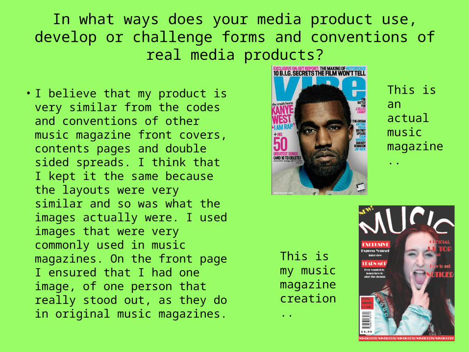
• I believe that my product is very similar from the codes and conventions of other music magazine front covers, contents pages and double sided spreads. I think that I kept it the same because the layouts were very similar and so was what the images actually were. I used images that were very commonly used in music magazines. On the front page I ensured that I had one image, of one person that really stood out, as they do in original music magazines.
This is an actual music magazine..
This is my music magazine creation..

• I believed that I should have kept with the theme of having an image of one person on the front because it meant that I was still keeping in with the traditional idea of music magazines. I ensured that I kept the layout the same as I think that the layouts of music magazines were good enough already, so I wanted to keep it the same. However I do think that I changed the layout slightly on the double sided spread, as some of my text was on the next page, which means not all of my text was on one page like most magazine articles are.
I believe that my double sided spread actually looks really different from the usual magazine double sided spreads.

• I did sub verse my final piece because I did change the typography; colours, text, stylising. I made sure that my text stood out because I wanted it to look different from other music magazines. Other magazines have a certain font for their magazine titles, however I did, and I made it look more stylish. However my text on my double sided spread was very stereotypical. I took quotations out of the text that were important parts and I made them stand out more by using a different colour, in this case white. My other text on my double sided spread was also stereotypical because it was red, in most music magazines the colour red is used, I believe that this colour is used a lot as it seems more aggressive and depending what type of music is in you magazine depends whether you want to use an ‘aggressive’ colour or not. I think that my music magazine was based around pop/rock and roll, so using the colour red was acceptable to show that it was more aggressive to other music genres.
Bright..
As opposed too..
Dull..

• I believe that I stylised my titles more than they actually do in music magazines. I also ensured that I used 2 colours on the title, just to make it stand out a little bit more in the magazine. Most music magazines use colours such as white, black and red, so I think that I used the colours that I did in order to ensure it looked more like a music magazine. however in my title I used 2 colours, commonly red and white as I believed that the red really complemented the white and made it stand out a bit more. I also made sure that on my double sided spread that I used more text in order to ensure that it went onto the next page. Most magazines don’t let the text go onto the next page; however I did in order to make it stand out more. On my front cover I changed the type of image that is usually used, I used an image that didn’t have any props included in it. Most music magazine front pages include pictures of a band or an artist featuring a prop, however I didn’t. I wanted to make sure it looked different and stood out from the others; I sub-versed codes and conventions in this way. I could have used a stereotypical image, but I didn’t because I didn’t want my magazine front page to look the same as all of the others on the shelf and as my magazine was aimed at the younger audience I believe that the change in the image worked well.