Embed Size (px)
Citation preview

161
Up to this point, we have largely limited our discussion to univariate analysis, the analysis of one variable. Now, however, we are going to turn our attention to bivariate analysis, the analysis of
two variables at a time. This will allow us to shift our focus from description (mainly the province of univariate analysis) to the more exciting world of explanation.
It may be useful for you to think about the differences between univariate and bivariate analyses in terms of the number of variables under analysis, the major question to be answered, and the pri-mary goal of the research, as laid out in Table 10.1.
10EXAMINING THE SOURCES
OF RELIGIOSITY
Univariate Analysis Bivariate Analysis
Number of variables 1 2
Major question What? Why?
Primary goal Description Explanation
TABLE 10.1 ■ Distinctions Between Univariate and Bivariate Analysis
Consequently, whereas in the previous section we looked at the extent of people’s religiosity, we now turn our attention to trying to explain “why”: Why are some people more religious than others? What causes some people to be more religious than others? How can we explain the fact that some people are more religious than others?
THE DEPRIVATION THEORY OF RELIGIOSITYThe reading titled “A Theory of Involvement” by Charles Y. Glock, Benjamin R. Ringer, and Earl R. Babbie,1 which you can find on the study website that accompanies this text (https://study.sagepub .com/babbie10e), presents one explanation for differing degrees of religiosity, the social deprivation theory of religiosity. Simply put, the authors say that people who are denied gratification within secular society will be more likely to turn to church as an alternative source of gratification.
In their analysis, they looked for variables that distinguished those who were getting more gratifi-cation in secular society from those who were getting less. For example, they reasoned that the United States is still a male-dominated society, meaning that women are denied the level of gratification enjoyed by men. Women often earn less for the same work, are denied equal access to prestigious
1. Glock, C. Y., Ringer, B. B., & Babbie, E. R. (1967). A theory of involvement. In To comfort and to challenge: A dilemma of the contemporary church (Chapter 5). Berkeley: University of California Press.
Copyright ©2019 by SAGE Publications, Inc. This work may not be reproduced or distributed in any form or by any means without express written permission of the publisher.
Do not
copy
, pos
t, or d
istrib
ute
162 Part III ■ Bivariate Analysis
occupations, are underrepresented in politics, and so on. According to the deprivation theory, there-fore, women should be more religious than are men.
The data analyses done by Glock et al. (1967), based on a sample of Episcopalian church mem-bers, confirmed their hypothesis. The question we might now ask is whether the same is true of the general U.S. population. Our data allow us to test that hypothesis.
TESTING OUR HYPOTHESIS: CORRELATING RELIGIOSITY AND GENDERYou may recall that at the end of Chapter 7, we asked you to save your recoded variables in a file named DEMOPLUS.SAV. Since we want to use some of our recoded variables in this chapter, go ahead and open the DEMOPLUS.SAV file. If you did not save your recoded variables, don’t worry. You can easily recode the necessary variables (ATTEND → CHATT; AGE → AGECAT) by fol-lowing the recoding commands in Chapter 7.
As we noted earlier, this analysis requires us to advance our analytic procedures to bivariate analysis involving two variables: a cause and an effect. If you think back to our discussion of theory and hypotheses in Chapter 1, you may recall that in this case, religiosity would be the effect, or dependent variable, and gender the cause, or independent variable. This means that gender causes—to some extent—degree of religiosity. Based on this notion, we might construct a hypoth-esis that states:
You are more likely to be religious (dependent variable) if you are a woman (category of independent variable—gender) than if you are a man (category of independent variable—gender).
It is often easy to confuse the categories of the variable with the variable itself. Keep in mind that in this case, “woman” and “man” are categories of the independent variable “gender.”
To test this hypothesis, we need measures of both the independent and dependent variables. The independent variable (gender) is easy: The variable SEX handles that nicely. But what about our dependent variable (religiosity)? As you’ll recall from our earlier discussion, several measures are available to us. For the time being, let’s use church attendance as our measure, even though we’ve noted that it is not a perfect indicator of religiosity in its most general meaning.
You will remember that when we looked at ATTEND in Chapter 7, it had nine categories. If we were to crosstabulate ATTEND and SEX without recoding ATTEND, we would expect a table with 18 (9 × 2) cells. To make our table more manageable, we are going to use the recoded CHATT as our measure of church attendance.
Once we have identified the independent variable (SEX) and dependent variable (CHATT), we are going to ask SPSS Statistics to construct a crosstab or crosstabulation.2 A crosstab is a table or matrix that shows the distribution of one variable for each category of a second variable. Crosstabs are powerful tools because they allow us to determine whether the two variables under consider-ation are associated. In this case, for instance, is gender (SEX) related to or associated with church attendance (CHATT)?
DEMONSTRATION 10.1: RUNNING CROSSTABS TO TEST OUR HYPOTHESISTo access the crosstabs dialog box, click Analyze Descriptive Statistics Crosstabs.
Once you work your way through these menu selections, you should reach a window that looks like the one on the next page.
2. Some texts and statistical packages refer to crosstabulations as bivariate distributions, contingency tables, or two-way frequency distributions, but SPSS Statistics just refers to them as crosstabs.
Copyright ©2019 by SAGE Publications, Inc. This work may not be reproduced or distributed in any form or by any means without express written permission of the publisher.
Do not
copy
, pos
t, or d
istrib
ute

Chapter 10 ■ Examining the Sources of Religiosity 163
Because the logic of a crosstab will be clearer when we have an example to look at, just follow these steps on faith, and we’ll justify your faith in a moment.
When running crosstabs, it is customary to specify the dependent variable as the row variable and the independent variable as the column variable. We will follow this convention by specifying CHATT (dependent variable) as the row variable and SEX (independent variable) as the column variable. (See Table 10.2 for help in determining independent and dependent variables.)
When running crosstabs on SPSS Statistics, it is important that you first determine which variable is the independent and which is the dependent. Then, specify the independent as the column variable and the dependent as the row variable. Identifying independent and dependent variables can sometimes be tricky. If you are having difficulty differentiating between the independent and dependent variables, try using one of the following strategies:b
1. Restate the hypothesis as an “If _____ (independent variable), then _____ (dependent variable)” statement.
Example: If you are female (independent variable—gender), then you are more likely to be religious (dependent variable—religiosity).
TABLE 10.2 ■ Tips for Identifying Independent and Dependent Variablesa
(Continued)
Copyright ©2019 by SAGE Publications, Inc. This work may not be reproduced or distributed in any form or by any means without express written permission of the publisher.
Do not
copy
, pos
t, or d
istrib
ute

164 Part III ■ Bivariate Analysis
2. The independent variable “influences” the dependent variable.
Example: Ask yourself if religiosity can “influence” gender. Once you have reasoned that the answer is “no,” switch it around. Can gender “influence” religiosity? Since in this case, the answer is “maybe,” you know that gender is the independent variable, and religiosity is the dependent variable.
3. The independent variable is the one that comes first in time (i.e., “before” the dependent variable).
Example: Ask yourself which came first, gender or religiosity? Since gender is determined before religiosity, you know that gender is the independent variable.
TABLE 10.2 ■ (Continued)
a. For further discussion, see Russell K. Schutt, Investigating the Social World: The Process and Practice of Research, 3rd edition (Thousand Oaks, CA: Pine Forge Press, 2001), pp. 39–41; Chava Frankfort-Nachmias & Anna Leon-Guerrero, Social Statistics for a Diverse Society, 2nd edition (Thousand Oaks, CA: Pine Forge Press, 2000), pp. 6–8.
b. If it isn’t clear which variable is the independent or dependent, it may be that you are dealing with an ambiguous relation-ship or a case in which either variable could be treated as the independent. We examine this possibility in the next chapter.
Now we want to tell SPSS Statistics to compute column percentages. To do this, simply choose Cells at the right of the Crosstabs window. The “Crosstabs: Cell Display” dialog box will appear. Select Column in the “Percentages” area; then, click Continue.
Now hit the OK button to execute this command, and in a moment, you should get the result shown at the top of the next page.
Examining Your Output
Take a moment to examine the crosstab you created. You should notice that as requested, the categories of the independent variable (Male, Female—SEX) are displayed across the top in the columns. The categories of the dependent variable (About weekly, About monthly, Seldom, Never—CHATT) are displayed down the left side of the table in the rows. Now, look at the numbers in each of the squares, or cells. You can see that there are two sets of numbers in each cell: the frequency (or count) and column percentage.
Copyright ©2019 by SAGE Publications, Inc. This work may not be reproduced or distributed in any form or by any means without express written permission of the publisher.
Do not
copy
, pos
t, or d
istrib
ute
Chapter 10 ■ Examining the Sources of Religiosity 165
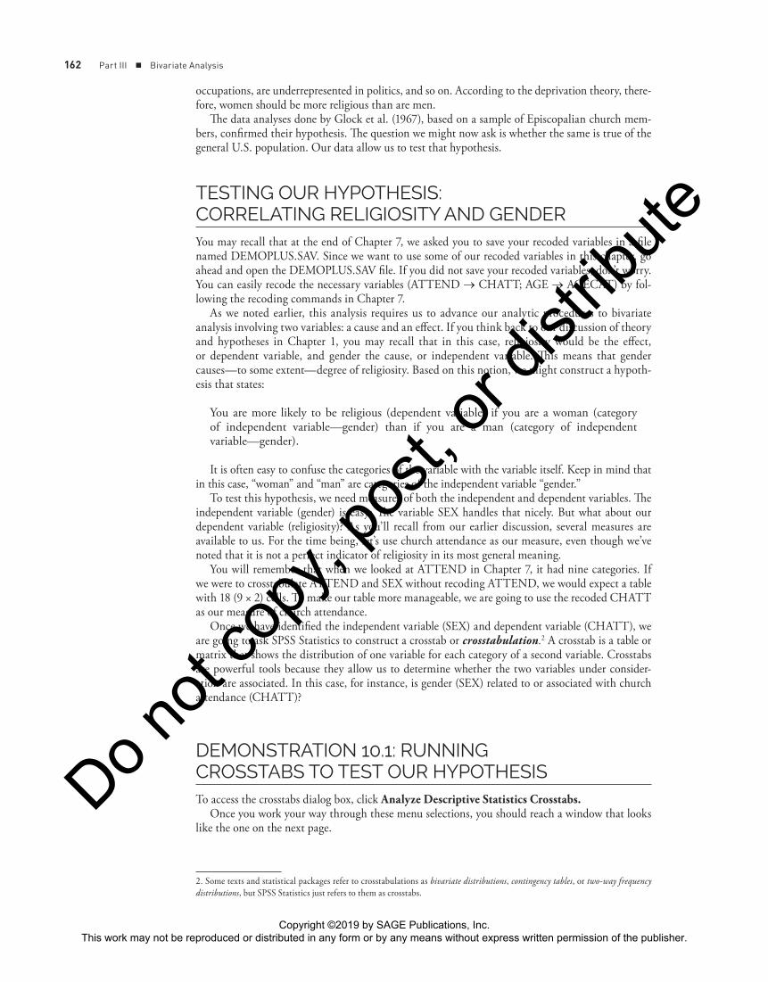
If you look in the first cell in the first row of results, you see there are 177 males who attend church about weekly. Below the frequency or count, you find the column percentage. In this instance, we know that 26.2% of male respondents reported attending church about weekly. The column percentage is calculated by dividing the cell frequency (177) by the column total (675) and then multiplying by 100.
In contrast, 250 or 30.7% of female respondents reported attending church about weekly. Once again, the column percentage (30.7) was calculated by dividing the cell frequency (250) by the col-umn total (814) and then multiplying by 100. Luckily, you do not have to go through the process of calculating the column percentages by hand because you have SPSS Statistics to do the work for you.
If we want, we can also note that 39.5% of the men attend church either about weekly or about monthly (26.2% + 13.3%; “About weekly” + “About monthly”). Note also that 49.1% of the women attend either about weekly or about monthly (30.7% + 18.4%; “About weekly” + “About monthly”).
In addition to the cell frequencies and column percentages, the table also contains row totals and column totals (sometimes called marginals). These are the frequencies for each variable. In this case, the column totals or marginals tell us that 675 of the respondents to this particular survey question are male, and 814 are female, while the row totals, or marginals, tell us that 427 respon-dents attend church about weekly, 240 about monthly, 454 seldom, and 368 never.
The column and row totals are followed by the column and row marginal percentages. The column marginal percentages are 100% for each column; the row marginal percentages tell us what percentage of all respondents attend church about weekly (28.7%), about monthly (16.1%), seldom (30.5%), and never (24.7%).
CHATT Recoded Church Attendance * SEX Respondent’s Sex Crosstabulation
SEX Respondent’s Sex
Total1 MALE 2 FEMALE
CHATT RecodedChurch Attendance
1 About weekly
Count 177 250 427
% within SEXRespondent’s sex
26.2% 30.7% 28.7%
2 Aboutmonthly
Count 90 150 240
% within SEXRespondent’s sex
13.3% 18.4% 16.1%
3 Seldom Count 207 247 454
% within SEXRespondent’s sex
30.7% 30.3% 30.5%
4 Never Count 201 167 368
% within SEXRespondent’s sex
29.8% 20.5% 24.7%
Total Count 675 814 1489
% within SEXRespondent’s sex
100.0% 100.0% 100.0%
SPSS Statistics Command 10.1: Running Crosstabs—Specifying the Dependent and Independent Variables
Click Analyze → Descriptive Statistics → Crosstabs
Highlight dependent variable → Click arrow pointing to “Row(s):” box
Highlight independent variable → Click arrow pointing to “Column(s):” box
Click Cells → Select Column in the “Percentages” box
Click Continue → OK
Copyright ©2019 by SAGE Publications, Inc. This work may not be reproduced or distributed in any form or by any means without express written permission of the publisher.
Do not
copy
, pos
t, or d
istrib
ute

166 Part III ■ Bivariate Analysis
The Total on the bottom right tells us that a total of 1,489 of our 1,500 GSS random subsample respondents gave valid responses to both the SEX and CHATT (recoded ATTEND) questions. This number is often referred to as N in statistical analyses.
Interpreting Crosstabs
The demonstration asked you to run crosstabs to test a hypothesis with two variables, one that is ordinal (CHATT—dependent variable) and one that is nominal (SEX—independent variable). SEX has two categories, while CHATT has four. The larger the number of categories, the more tricky it becomes to read or interpret a table. Therefore, to start, we’ll keep things simple by focusing on a table with two nominal variables with just two categories each. Then, we will look at a few crosstabs with variables that have more than two categories.
Interpreting Crosstabs: Association, Strength, and Direction
As we noted earlier, we run crosstabs to determine whether there is an association between two variables. In addition, crosstabs may tell us other important things about the relationship between the two variables—namely, the strength of association and, in some cases, the direction of association. We should stress that you can determine the direction of association only when both the variables in your table are greater than nominal—that is, capable of “greater than, less than” relationships. If your table contains one or more nominal variables, it is not possible to determine the direction.
Once you have created your crosstab, ask yourself the following questions:
1. Is there an association between the two variables?
If the answer to Question 1 is yes (or maybe) . . .
2. What is the strength of association between the two variables?
If both variables are ordinal . . .
3. What is the direction of association?
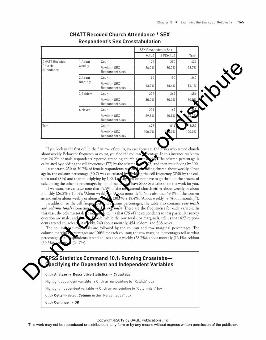
DEMONSTRATION 10.2: INTERPRETING A CROSSTAB WITH LIMITED CATEGORIESSince we have been focusing on the relationship between religiosity and gender, let’s run a crosstab with an indicator of religiosity (POSTLIFE) and gender (SEX). POSTLIFE measures respon-dents’ belief in life after death and is measured at the nominal level. In accordance with the deprivation theory, we may hypothesize that women are more likely than men to believe in life after death. Consequently, POSTLIFE is the dependent variable, and SEX is once again the inde-pendent variable.
Before running crosstabs, make sure to define the values 0, 8, and 9 as “missing” for the variable POSTLIFE. Now go ahead and request crosstabs, specifying POSTLIFE (dependent variable) as the row variable, SEX (independent variable) as the column variable, and cells to be percentaged by column. If you are working through this chapter all in one session, remember to click Reset or move CHATT back to the variable list before proceeding.
First Question: Is There an Association?
As we noted earlier, the first question you want to ask is whether there is an association between the variables. In examining a crosstab to determine whether an association exists between two vari-ables, what we are really trying to determine is whether knowing the value of one variable helps us predict the value of the other variable. In other words, if gender is associated with belief in the
Copyright ©2019 by SAGE Publications, Inc. This work may not be reproduced or distributed in any form or by any means without express written permission of the publisher.
Do not
copy
, pos
t, or d
istrib
ute
Chapter 10 ■ Examining the Sources of Religiosity 167
afterlife, knowing the independent variable (SEX) should help us predict the value of the dependent variable (POSTLIFE). If gender and belief in the afterlife are not related or associated, knowing the value of SEX will not help us predict the value of POSTLIFE.
To determine whether SEX and POSTLIFE are associated, we read across the rows of the depen-dent variable to see if there are differences in the column percentages.3 Let’s go ahead and do that for the table we just created. By reading across the first row, we see that women (85.4%) are more likely than men (75.5%) to believe in life after death.
You can also examine the second category of the dependent variable, or the second row (those who do not believe in life after death). Here, we see that a slightly higher percentage of men (24.5%) are likely to report that they do not believe in life after death than are women (14.6%).
The crosstab suggests that women are a little more likely to believe in the afterlife than are men, but knowing respondents’ gender does not help conclusively with predicting whether or not people believe in life after death. Perhaps this is worth examining further?
Second Question: How Strong Is the Association?
If there seems to be an association between the variables, the next logical question is, How strong is the association? In Chapter 13, we provide you with statistical techniques that provide measures of strength for associations. For now, we’ll provide a crude method of assessing the strength of asso-ciations, which is to examine the size of the differences in the percentages. One general rule to keep in mind is that the larger the percentage differences across the categories, the stronger the associa-tion between the variables. Conversely, the smaller the percentage differences across categories, the weaker the association.
Some researchers use a rough 10-percentage-point rule. That is, if the percentage point differ-ence is 10 or more, the relationship between the variables is probably worth examining further. Of course, the larger the percentage point difference, the stronger the association. Keep in mind that this “rule of thumb” is just a rough indicator. Whereas some researchers may see a 6- or 8-percentage- point difference as indicating a potentially noteworthy relationship, others may not. (Percentage point “rules” also tend to fluctuate depending on how many columns and/or rows make up the table. For example, a greater number of columns often means that a smaller percentage point difference can be noteworthy.)
In the case of our crosstab between POSTLIFE and SEX, we have just short of a 10-percentage-point difference (85.4% − 75.5% = 9.9%). Based on the 10-percentage-point rule, the relationship would be judged to be weak, unless we rounded up to 10%. However, bear in mind that a number
3. One useful rule to keep in mind is that when a table is presented with column percentages—that is, calculated as a percentage of the column totals (as it is in this case and will be for the remainder of the text)—the table should be read across the columns. Conversely, when a table shows row percentages, calculated as a percentage of the row totals, it should be read down the rows.
POSTLIFE Belief in Life After Death * SEX Respondent’s Sex Crosstabulation
SEX Respondent’s Sex
Total1 MALE 2 FEMALE
POSTLIFE Belief inlife after death
1 YES Count 458 632 1090
% within SEXRespondent’s sex
75.5% 85.4% 80.9%
2 NO Count 149 108 257
% within SEXRespondent’s sex
24.5% 14.6% 19.1%
Total Count 607 740 1347
% within SEXRespondent’s sex
100.0% 100.0% 100.0%
Copyright ©2019 by SAGE Publications, Inc. This work may not be reproduced or distributed in any form or by any means without express written permission of the publisher.
Do not
copy
, pos
t, or d
istrib
ute
168 Part III ■ Bivariate Analysis
of researchers may still feel that an 8-percentage-point (or greater) difference warrants some further investigation. In this case, it would seem prudent to investigate further.
Finally, because POSTLIFE and SEX are nominal variables, we cannot ask the third question regarding the direction of association. That question applies only when both the variables in your table are measured at the ordinal level or higher.
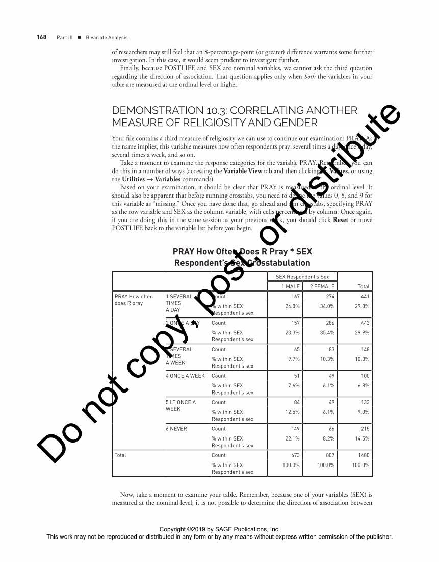
DEMONSTRATION 10.3: CORRELATING ANOTHER MEASURE OF RELIGIOSITY AND GENDERYour file contains a third measure of religiosity we can use to continue our examination: PRAY. As the name implies, this variable measures how often respondents pray: several times a day, once a day, several times a week, and so on.
Take a moment to examine the response categories for the variable PRAY. Remember, you can do this in a number of ways (accessing the Variable View tab and then clicking on Values, or using the Utilities → Variables commands).
Based on your examination, it should be clear that PRAY is measured at the ordinal level. It should also be apparent that before running crosstabs, you need to define the values 0, 8, and 9 for this variable as “missing.” Once you have done that, go ahead and run crosstabs, specifying PRAY as the row variable and SEX as the column variable, with cells percentaged by column. Once again, if you are doing this in the same session as your previous work, you should click Reset or move POSTLIFE back to the variable list before you begin.
PRAY How Often Does R Pray * SEX Respondent’s Sex Crosstabulation
SEX Respondent’s Sex
Total1 MALE 2 FEMALE
PRAY How oftendoes R pray
1 SEVERAL TIMESA DAY
Count 167 274 441
% within SEXRespondent’s sex
24.8% 34.0% 29.8%
2 ONCE A DAY Count 157 286 443
% within SEXRespondent’s sex
23.3% 35.4% 29.9%
3 SEVERAL TIMESA WEEK
Count 65 83 148
% within SEXRespondent’s sex
9.7% 10.3% 10.0%
4 ONCE A WEEK Count 51 49 100
% within SEXRespondent’s sex
7.6% 6.1% 6.8%
5 LT ONCE A WEEK
Count 84 49 133
% within SEXRespondent’s sex
12.5% 6.1% 9.0%
6 NEVER Count 149 66 215
% within SEXRespondent’s sex
22.1% 8.2% 14.5%
Total Count 673 807 1480
% within SEXRespondent’s sex
100.0% 100.0% 100.0%
Now, take a moment to examine your table. Remember, because one of your variables (SEX) is measured at the nominal level, it is not possible to determine the direction of association between
Copyright ©2019 by SAGE Publications, Inc. This work may not be reproduced or distributed in any form or by any means without express written permission of the publisher.
Do not
copy
, pos
t, or d
istrib
ute
Chapter 10 ■ Examining the Sources of Religiosity 169
the variables. It is possible, however, to draw some tentative conclusions regarding whether there is a relationship between the variables and, if so, the strength of the association.
Once you have examined your table, compare your answer to the description in Writing Box 10.1. Keep in mind that because crosstabs give us only a rough indication of the strength of association, your interpretation may be somewhat different from the one below.
WRITING BOX 10.1
As we see in the table, women pray more often than men. For example, 69% of the women in the sample say they pray at least once a day, compared with 48% of the men. Or, looking
at the other end of the table, we see that men are more likely (42%) to say they pray once a week or less, including never, than are women (30%).
DRAWING CONCLUSIONS CAREFULLY: REASSESSING OUR ORIGINAL HYPOTHESISNow that we have had a chance to examine three crosstabs involving gender and religiosity, it is important to go back to our original hypothesis. Would you say that we have found support for the thesis put forth by Glock and his coauthors? Remember, we began with a hypothesis based on the deprivation theory, which suggests that people who are deprived of gratification in secular society are more likely to turn to religion as an alternative source of gratification.
Based on our analysis, does the evidence support an assumption of the thesis—that women are still deprived of gratification in American society in comparison with men? Why, or why not? It is important to note that even when we find relationships between variables—such as religiosity and gender—that are worth investigating further, we still have not proven our theory. For instance, while there seems to be a fairly strong association between PRAY and SEX, this association is prob-ably best looked at as evidence of, not proof of, a causal relationship. Because two variables can be associated without there necessarily being a causal relationship, we need to proceed with care when interpreting our findings.
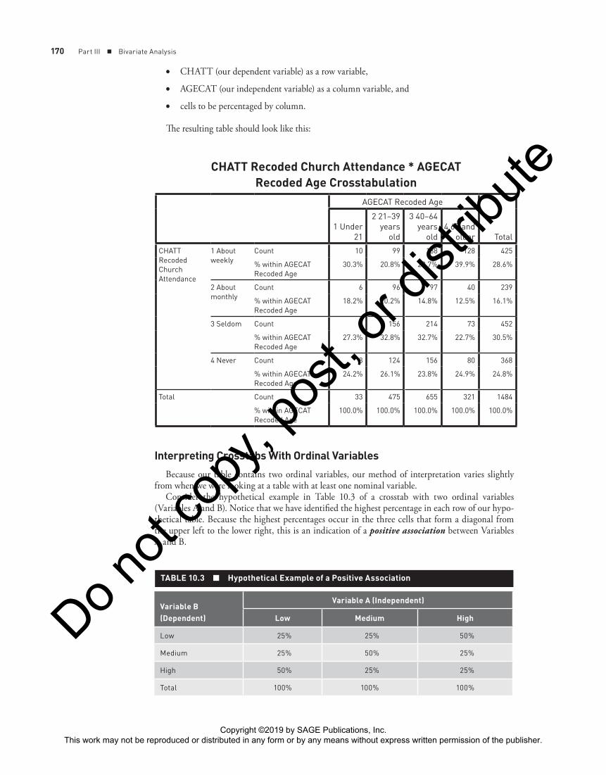
DEMONSTRATION 10.4: INTERPRETING A CROSSTAB WITH ORDINAL VARIABLES—RELIGIOSITY AND AGENow that you’ve had a chance to practice interpreting crosstabs with variables measured at the nominal level, we will consider a case in which both variables are measured at the ordinal level. As we noted earlier, the greater the number of categories, the more difficult it is to interpret your output.
In addition to focusing on gender, Glock et al. argued that the United States is a youth-oriented society, with gratification being denied to elderly people. Whereas some traditional societies tend to revere their elders, this is not the case in the United States. The deprivation thesis, then, would predict that older respondents are more religious than younger ones. The researchers confirmed this expectation in their data from Episcopalian church members.
Let’s check out the relationship between age and religiosity in our GSS data. To make the table man-ageable, we’ll use the recoded AGECAT variable created earlier in Chapter 7.4 So request a crosstab using5
4. If you did not save the recoded variable AGECAT, simply go back to Chapter 7 and follow the Recode command to create AGECAT before moving ahead with the demonstrations in this chapter.
5. If you are doing this in the same session as your previous work in this chapter, remember to click Reset before specifying your row and column variables for this demonstration.
Copyright ©2019 by SAGE Publications, Inc. This work may not be reproduced or distributed in any form or by any means without express written permission of the publisher.
Do not
copy
, pos
t, or d
istrib
ute
170 Part III ■ Bivariate Analysis
• CHATT (our dependent variable) as a row variable,
• AGECAT (our independent variable) as a column variable, and
• cells to be percentaged by column.
The resulting table should look like this:
CHATT Recoded Church Attendance * AGECAT Recoded Age Crosstabulation
AGECAT Recoded Age
Total1 Under
21
2 21–39years
old
3 40–64years
old4 65 and
older
CHATTRecodedChurchAttendance
1 Aboutweekly
Count 10 99 188 128 425
% within AGECATRecoded Age
30.3% 20.8% 28.7% 39.9% 28.6%
2 Aboutmonthly
Count 6 96 97 40 239
% within AGECATRecoded Age
18.2% 20.2% 14.8% 12.5% 16.1%
3 Seldom Count 9 156 214 73 452
% within AGECATRecoded Age
27.3% 32.8% 32.7% 22.7% 30.5%
4 Never Count 8 124 156 80 368
% within AGECATRecoded Age
24.2% 26.1% 23.8% 24.9% 24.8%
Total Count 33 475 655 321 1484
% within AGECATRecoded Age
100.0% 100.0% 100.0% 100.0% 100.0%
Interpreting Crosstabs With Ordinal Variables
Because our table contains two ordinal variables, our method of interpretation varies slightly from when we were looking at a table with at least one nominal variable.
Consider the hypothetical example in Table 10.3 of a crosstab with two ordinal variables (Variables A and B). Notice that we have identified the highest percentage in each row of our hypo-thetical table. Because the highest percentages occur in the three cells that form a diagonal from the upper left to the lower right, this is an indication of a positive association between Variables A and B.
Variable B (Dependent)
Variable A (Independent)
Low Medium High
Low 25% 25% 50%
Medium 25% 50% 25%
High 50% 25% 25%
Total 100% 100% 100%
TABLE 10.3 ■ Hypothetical Example of a Positive Association
Copyright ©2019 by SAGE Publications, Inc. This work may not be reproduced or distributed in any form or by any means without express written permission of the publisher.
Do not
copy
, pos
t, or d
istrib
ute
Chapter 10 ■ Examining the Sources of Religiosity 171
Positive associations are ones in which increases in one variable are related to increases in the other variable. You may be able to think of some variables that you suspect are positively related. One common example is level of education and income. You could hypothesize that the more education you have, the more money you are likely to earn. If this is truly the case, these variables are positively related or associated. In terms of religiosity, you may hypothesize that church attendance and the amount you pray are positively related—meaning that the more you attend church, the more likely you are to pray.
Now consider another example (Table 10.4) depicting a negative relationship between two hypothetical variables. Once again, you will notice that we have indicated the highest percent-age in each row. However, in this case, the higher percentages occur in the three cells that form a diagonal line from the bottom left to the upper right side of the table. This indicates a negative association between the variables—an increase in one variable is associated with a decrease in the other variable.
Variable B (Dependent)
Variable A (Independent)
Low Medium High
Low 50% 25% 25%
Medium 25% 50% 25%
High 25% 25% 50%
Total 100% 100% 100%
TABLE 10.4 ■ Hypothetical Example of a Negative Association
Can you think of two variables that you suspect may be negatively related? How about levels of education and prejudice? Students’ alcohol consumption and GPA? If the variables are negatively associated, you will find that as education increases, the level of prejudice decreases. Similarly, as alcohol consumption increases, GPA decreases.
Examining Your Output
Of course, as we move from hypothetical tables to tables with “real social data,” we seldom, if ever, find such clear positive or negative relationships.
Look back at your crosstab of AGECAT and CHATT. If you take a moment to identify the highest percentage in each row, you will quickly notice that it does not form a diagonal line depict-ing a positive or negative association, such as the hypothetical examples we just looked at. Instead, as is typical when you are dealing with real-life data, the relationship is a little more “messy.” Nevertheless, with some slight variations, we can see that older respondents are more likely to report that they attend church than are younger respondents. This would tend to support the deprivation thesis in terms of age, at least to some extent. You should be aware that variations such as those seen here become more common as the number of groups being compared increases.
Once again, while the table gives us an indication of association and strength, other statistics—such as the measures of association we discuss in Chapter 13—are much better indicators of the strength and direction of association.
DEMONSTRATION 10.5: CORRELATING OTHER MEASURES OF RELIGIOSITY AND AGEWe can request more than one table in our Crosstabs window. You will notice that the commands for this procedure are the same as those listed in SPSS Statistics Command 10.1, except that in this case, we are going to click on two dependent variables and place them both in the “Row(s):” field.
Copyright ©2019 by SAGE Publications, Inc. This work may not be reproduced or distributed in any form or by any means without express written permission of the publisher.
Do not
copy
, pos
t, or d
istrib
ute
172 Part III ■ Bivariate Analysis
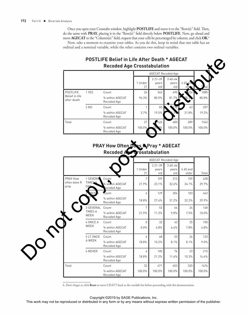
Once you open your Crosstabs window, highlight POSTLIFE and move it to the “Row(s):” field. Then, do the same with PRAY, placing it in the “Row(s):” field directly below POSTLIFE. Now, go ahead and move AGECAT to the “Column(s):” field, request that your cells be percentaged by column, and click OK.6
Now, take a moment to examine your tables. As you do this, keep in mind that one table has an ordinal and a nominal variable, while the other contains two ordinal variables.
6. Don’t forget to click Reset or move CHATT back to the variable list before proceeding with this demonstration.
POSTLIFE Belief in Life After Death * AGECAT Recoded Age Crosstabulation
AGECAT Recoded Age
Total1 Under
21
2 21–39years
old
3 40–64years
old4 65 and
older
POSTLIFEBelief in lifeafter death
1 YES Count 26 343 490 226 1085
% within AGECATRecoded Age
96.3% 80.5% 81.7% 78.2% 80.8%
2 NO Count 1 83 110 63 257
% within AGECATRecoded Age
3.7% 19.5% 18.3% 21.8% 19.2%
Total Count 27 426 600 289 1342
% within AGECATRecoded Age
100.0% 100.0% 100.0% 100.0% 100.0%
PRAY How Often Does R Pray * AGECAT Recoded Age Crosstabulation
AGECAT Recoded Age
Total1 Under
21
2 21–39years
old
3 40–64years
old4 65 and
older
PRAY How often does R pray
1 SEVERALTIMES A DAY
Count 7 109 213 109 438
% within AGECATRecoded Age
21.9% 23.1% 32.6% 34.1% 29.7%
2 ONCE ADAY
Count 6 129 204 103 442
% within AGECATRecoded Age
18.8% 27.4% 31.2% 32.2% 29.9%
3 SEVERALTIMES AWEEK
Count 7 53 64 24 148
% within AGECATRecoded Age
21.9% 11.3% 9.8% 7.5% 10.0%
4 ONCE AWEEK
Count 0 32 43 25 100
% within AGECATRecoded Age
0.0% 6.8% 6.6% 7.8% 6.8%
5 LT ONCE A WEEK
Count 6 48 53 26 133
% within AGECATRecoded Age
18.8% 10.2% 8.1% 8.1% 9.0%
6 NEVER Count 6 100 76 33 215
% within AGECATRecoded Age
18.8% 21.2% 11.6% 10.3% 14.6%
Total Count 32 471 653 320 1476
% within AGECATRecoded Age
100.0% 100.0% 100.0% 100.0% 100.0%
Copyright ©2019 by SAGE Publications, Inc. This work may not be reproduced or distributed in any form or by any means without express written permission of the publisher.
Do not
copy
, pos
t, or d
istrib
ute

Chapter 10 ■ Examining the Sources of Religiosity 173
While examining the tables, you may want to consider the following questions and others you may think of: Do age and belief in the afterlife appear to have an association? How about age and prayer? Are older people more likely to believe in the afterlife than are younger people? Do younger people report praying less often or more often than do elderly people, or are they about the same? Based on your interpretation, what conclusions might you draw in regard to our original hypothesis about the relationship between age and religiosity? Is there support for the notion that the older you are, the more religious you are likely to be? Why, or why not? Once you have taken a few minutes to examine these tables, compare your interpretation to that in Writing Box 10.2.
WRITING BOX 10.2
Age appears to have some impact on belief in life after death. About four fifths of respondents hold this belief in each of the age groups, except for those under 21, where 96% hold this belief.
The relationship between age and prayer seems to guide us in a particular direction. If we look only at praying several
times a day, we find that as age increases, so does the likeli-hood of frequent prayer. Why might this be true? Do people become more concerned about their relationship with a higher power as they age? Or is age a marker for the time when people of that age were born and the state of religiosity in general at that time? Or is there another explanation?
If we combine the first two response categories—representing prayer at least once a day—then we find that 41% of the youngest group say that they pray at least once a day. This increases to 51% among the 21-to-39 group, rises further to 64% among the 40-to-64 group, and reaches a high of 66% in the oldest group.
Epsilon
Before concluding our initial examination of crosstabs, we want to mention one simple statistic you may find useful. Epsilon (ε) is a statistic often used to summarize percentage differences such as those in the tables above. Epsilon is calculated by identifying the largest and smallest percentages in a given row and then subtracting the smallest from the largest.
For example, look back at the first crosstab we ran in this chapter (Demonstration 10.1) com-paring gender and church attendance. In comparing men and women in terms of “about weekly” church attendance, the percentage difference (epsilon) is 4.5 points (30.7 − 26.2). This simple statistic is useful because it gives us a tool for comparing sex differences on other measures of religiosity.
When discussing epsilon, it is important to note that technically, tables that have more than two columns have several epsilons, one for each pair of cells being compared. In these cases, researchers will often use epsilon to refer to the largest difference between cell percentages in a given row. As mentioned earlier in the chapter, it is also important to consider the number of columns that make up the table. A crosstabulation with more columns is more likely to exhibit a smaller epsilon than is one with fewer columns. Consider that two columns would have 50% each if the responses split evenly between them. A table with five columns would have 20% in each cell if the responses were divided evenly. Thus, an epsilon of 5 for the former may not seem impressive but would be notewor-thy in the latter case.
Returning to our crosstab of church attendance and sex, these data seem to show that women are somewhat more likely than men to attend church frequently. This would seem to support the deprivation theory of religiosity to a limited extent. Take a moment to determine epsilon for the other tables we created in this chapter and see the results suggest similar support for the hypothesis.
This completes our initial foray into the world of bivariate analysis. We hope you’ve gotten a good sense of the potential for detective work in social research.
Copyright ©2019 by SAGE Publications, Inc. This work may not be reproduced or distributed in any form or by any means without express written permission of the publisher.
Do not
copy
, pos
t, or d
istrib
ute

174 Part III ■ Bivariate Analysis
CONCLUSIONIn this chapter, we made a critical logical advance in the analysis of social scientific data. Up to now, we have focused our attention on description. With this examination of religiosity, we’ve crossed over into explanation. We’ve moved from asking what to asking why.
Much of the excitement in social research revolves around discovering why people think and act as they do. You’ve now had an initial exposure to the logic and computer techniques that make such inquiries possible.
Let’s apply your new capabilities to other subject matter. In the next chapters, we’re going to examine the sources of different political orientations and why people feel as they do about abortion.
Main Points
• In this chapter, we shifted our focus from univariate analysis to bivariate analysis.
• Univariate analysis is the analysis of one variable at a time.
• Bivariate analysis is the analysis of two variables at a time.
• Univariate and bivariate analysis differ in terms of the number of variables analyzed, major questions asked, and primary research goals.
• We began our bivariate analysis by considering why some people are more religious than others.
• In this analysis, we were guided by the social deprivation theory of religiosity.
• We used this theory to develop a hypothesis stating that women are more likely to be religious than are men.
• This hypothesis contains two variables: gender (independent variable/cause) and religiosity (dependent variable/effect).
• It is important not to confuse the categories of a variable with the variable itself.
• We tested this hypothesis by running crosstabs with column percentages.
• When running crosstabs, it is customary to specify the dependent variable as the row variable and the independent variable as the column variable.
• Throughout the chapter, we ran several crosstabs correlating religiosity (as measured by CHATT, PRAY, and POSTLIFE) with gender (as measured by SEX) and then age (as measured by AGECAT).
• You can run crosstabs with both nominal and ordinal variables
• As a general rule, the more categories in your variables, the more difficult it becomes to interpret your crosstab table.
• When interpreting crosstabs, we are generally looking to see whether an association exists between two variables.
• We look for an association by reading across categories of the dependent variable.
• A difference of 10 or more percentage points is sometimes taken as an indication that an association between variables is worth investigating further. This is just a general rule of thumb, however, and additional factors that bear on this decision, such as the number of columns, are discussed in this chapter.
• In addition to allowing us to look for an association between the variables, crosstabs give us a rough indication of the strength and, in some cases, the direction of association.
• Bear in mind, however, that the measures of association we focus on in Chapter 13 give us a much better basis for drawing conclusions about the nature, strength, and direction of association between variables.
• An association between variables is best looked at as evidence of, not proof of, a causal relationship.
• Epsilon is a simple statistic used to summarize percentage differences.
Copyright ©2019 by SAGE Publications, Inc. This work may not be reproduced or distributed in any form or by any means without express written permission of the publisher.
Do not
copy
, pos
t, or d
istrib
ute
Chapter 10 ■ Examining the Sources of Religiosity 175
SPSS Statistics Command Introduced in This Chapter
10.1. Running Crosstabs—Specifying the Dependent and Independent Variables
Key Terms
10-percentage-point rule 167Association 166Bivariate analysis 161Cells 164Column percentage 164Column totals 165
Crosstabulation 162Epsilon (ε) 173Frequency 164Marginals 165Negative association 171Positive association 170
Row totals 165Strength of association 166Total (N) 166Univariate analysis 161
Review Questions
1. What is univariate analysis?
2. What is bivariate analysis?
3. What are the major differences between univariate and bivariate analysis in terms of the number of variables analyzed, major questions asked, and primary goals of the research?
4. In a hypothesis, the variable that is said to “cause” (to some extent) variation in another variable is referred to as what type of variable?
5. What three general questions might you ask yourself when examining a crosstab with two ordinal variables?
Identify the independent and dependent variables in the fol-lowing hypotheses (Questions 6 and 7):
6. Those employed by companies with more than 20 employees are more likely to have some form of managed-choice health care than are those employed by companies with fewer employees.
7. In the United States, women are more likely to vote Democratic than men are.
8. What are the categories of the independent variable in the hypothesis in Question 7?
9. When running crosstabs, is it customary to specify the dependent variable as the row or column variable?
10. If you were running crosstabs to test the relationship between the variables in the hypothesis in Question 6, which variable would you specify as the row variable, and which would you specify as the column variable?
11. If you produce a crosstab for the variables SEX and PARTYID (with the following categories: Democrat, Republican, Independent, and other), is it possible to determine the direction of association between these two variables? Why, or why not?
12. A researcher produces a crosstab for the variables AGECAT and level of happiness (with the following categories: low, medium, and high) and finds a negative relationship between these two variables. Does this mean that the older you are, the happier you are likely to be or the older you are, the less happy you are likely to be?
13. A researcher produces a crosstab for the variables class (with the following categories: lower, working, middle, and upper) and level of contentment (with the following categories: low, medium, and high) and finds that members of the upper class are more likely to be content than are members of the middle, working, and lower classes. Based on this hypothetical example, how would you describe the direction of association between these variables?
14. What is epsilon?
15. How is epsilon calculated?
16. Can there be more than one epsilon in a table that has more than two columns?
17. If you run crosstabs and find a strong relationship between the independent and dependent variables in your hypothesis, are you better off looking at this association as evidence of or proof of a causal relationship?
Copyright ©2019 by SAGE Publications, Inc. This work may not be reproduced or distributed in any form or by any means without express written permission of the publisher.
Do not
copy
, pos
t, or d
istrib
ute

Copyright ©2019 by SAGE Publications, Inc. This work may not be reproduced or distributed in any form or by any means without express written permission of the publisher.
Do not
copy
, pos
t, or d
istrib
ute

Chapter 10 ■ Examining the Sources of Religiosity 177
SPSS Statistics Lab Exercise 10.1
NAME:
CLASS:
INSTRUCTOR:
DATE:
To complete the following exercises, you should load the data file EXERPLUS.SAV.
A number of studies have addressed the relationship between race and attitudes toward sex roles. In a 1992 study, Jill Grigsby* argued that Whites are more likely than Blacks to believe that a woman’s working has a detrimental impact on her children.
We are going to test this hypothesis using the variables RACE (as a measure of race) and FECHLD (as a measure of opinions regarding the impact of women working outside the home on their children). Follow the steps listed below, and supply the information requested in the spaces provided (Questions 1–10).
1. Restate the hypothesis linking RACE and FECHLD.
2. Identify the independent and dependent variables in the hypothesis.
3. When running crosstabs, which variable should you specify as the row variable?
4. When running crosstabs, which variable should you specify as the column variable?
5. What is the level of measurement for RACE?
6. What is the level of measurement for FECHLD?
7. Now run crosstabs with column percentages to test the hypothesis. (Do not forget to define 0, 8, and 9 as missing values for FECHLD before you begin.) When you have produced your table, present your results by filling in the following information:
a. List the categories of the independent variable in the spaces provided on Line A.
b. In the spaces provided on Line B, list the percentage of respondents who “strongly agree” and “agree” with the statement that a woman’s working does not hurt children (i.e., sum of those who “strongly agree” + “agree” on FECHLD).
(Continued)
*Grigsby, J. S. (1992). Women change places. American Demographics, 14(11), 48.
Copyright ©2019 by SAGE Publications, Inc. This work may not be reproduced or distributed in any form or by any means without express written permission of the publisher.
Do not
copy
, pos
t, or d
istrib
ute

178 Part III ■ Bivariate Analysis
FECHLD by RACE
Line A
______________________________________________________________________________________________________
______________________________________________________________________________________________________
Line B
______________________________________________________________________________________________________
______________________________________________________________________________________________________
8. Are the results consistent with your hypothesis as stated in response to Question 1? Explain.
9. Compare Blacks and Whites in terms of agreement (“strongly agree” + “agree”) with the statement that a woman’s working does not hurt children, and give the percentage difference (epsilon) below.
10. Do your findings show evidence of a causal relationship between RACE and FECHLD? Explain.
Continue to research the causes of differing attitudes toward sex roles by selecting one independent and one dependent variable from the following lists:
Independent variables: SEX, RACE, CLASS (select one)
Dependent variables: FEFAM, FEHIRE, FEPRESCH (select one)
As before, run crosstabs with column percentages to test your hypothesis, and then fill in the information requested in the spaces provided (Questions 11–18).
11. State and explain your hypothesis involving the independent variable and dependent variable you chose from the lists above.
12. Identify the independent and dependent variables in your hypothesis.
13. When running crosstabs, which variable should you specify as the column variable, and which should you specify as the row variable?
14. Identify the level of measurement for each of the variables in your hypothesis.
(Continued)
Copyright ©2019 by SAGE Publications, Inc. This work may not be reproduced or distributed in any form or by any means without express written permission of the publisher.
Do not
copy
, pos
t, or d
istrib
ute

Chapter 10 ■ Examining the Sources of Religiosity 179
15. Now run crosstabs with column percentages to test your hypothesis. Remember to define the appropriate values as “missing” for both of your variables. Then complete the exercise below:
a. List the abbreviated variable names of your independent and dependent variables on Line A.
b. List the categories of the independent variable in the spaces provided on Line B. (Use only as many blank spaces as necessary.)
c. List the percentage of respondents who “strongly agree” and “agree” for either FEFAM, FEHIRE, or FEPRESCH on Line C (i.e., sum of those who “strongly agree” + “agree” for the variable you have chosen); use only as many blank spaces as necessary.
LINE A __________________________________________ by ________________________________________
[Dependent Variable] [Independent Variable]
LINE B
LINE C
16. Are these results consistent with your hypothesis as stated in response to Question 11? Explain.
17. Compute epsilon.
18. Do your findings show evidence of a causal relationship between your independent and dependent variables? Explain.
Continue to research the causes of differing attitudes toward sex roles by selecting one independent and one dependent variable from the following lists:
Independent variables: AGE, EDUC (select one)
Dependent variables: FEFAM, FEHIRE, FEPRESCH (select one)
This time, however, recode the independent variable before proceeding. Then, run crosstabs with column percentages to test your hypothesis, and fill in the information requested in the spaces provided (Questions 19–23).
19. State and explain your hypothesis involving the recoded independent variable and dependent variable you chose from the lists above.
(Continued)
Copyright ©2019 by SAGE Publications, Inc. This work may not be reproduced or distributed in any form or by any means without express written permission of the publisher.
Do not
copy
, pos
t, or d
istrib
ute

180 Part III ■ Bivariate Analysis
20. Identify the independent and dependent variables in your hypothesis.
21. When running crosstabs, which variable should you specify as the column variable, and which should you specify as the row variable?
22. Identify the level of measurement for each of the variables in your hypothesis.
23. Now run crosstabs with column percentages to test your hypothesis. (Remember to define the appropriate values as “missing” before proceeding.) Then, print and attach a copy of your table to this sheet. Analyze and then write a short description of your findings below (similar to those in Writing Box 10.1). In particular, you may want to consider whether the results are consistent with your hypothesis and whether there appears to be an association between the variables. If so, how strong is the association? If applicable, what is the direction of association? Based on your examination, is this association worth investigating further? Why, or why not? Include relevant percentages.
24. Access the SPSS Statistics Help feature Tutorial, and review the section titled “Crosstabulation Tables.”
Hint: Click Help → Tutorial → Crosstabulation Tables
(Continued)
Copyright ©2019 by SAGE Publications, Inc. This work may not be reproduced or distributed in any form or by any means without express written permission of the publisher.
Do not
copy
, pos
t, or d
istrib
ute