Embed Size (px)
Citation preview

0
Excel 2007-2016 for Windows* Introductory to Intermediate to Advanced
By Dennis F. Galletta © Copyright August, 2016
Introductory Excel
Entering Titles and Formulas ..................................................................................... 1
Making it Look Good .................................................................................................... 5
Graphics ....................................................................................................................... 8
Intermediate Excel
Three Tips for Good Spreadsheet Design .................................................................. 11
Copying and Handy Extrapolations .......................................................................... 12
Summing, Copying, and Extrapolating: Example .................................................... 15
Filtering ..................................................................................................................... 16
Sorting ........................................................................................................................ 17
Summaries and Outlining ......................................................................................... 17
Pivot Tables ................................................................................................................ 19
Pivot Charts ............................................................................................................... 21
Functions .................................................................................................................... 22
Advanced Excel
Basic and Statistical Functions ................................................................................. 23
Conditional Counting ................................................................................................. 23
Frequencies ................................................................................................................ 24
Correlations................................................................................................................ 26
Regression .................................................................................................................. 26
Testing for differences ............................................................................................... 29
Financial Functions ................................................................................................... 30
Mail-Merges from Excel Spreadsheets ...................................................................... 34
Concatenating Cells ................................................................................................... 39
Pulling in External Data ........................................................................................... 39
Sensitivity Analysis with Data Tables and Conditional Formatting ....................... 40
Two-Input Data Table................................................................................................ 41
Scenarios .................................................................................................................... 43
Lookup Tables ............................................................................................................ 44
Hlookup ...................................................................................................................... 44
Vlookup ...................................................................................................................... 47
Auditing Spreadsheet Cells ....................................................................................... 47
Using Named Ranges - Reprise ................................................................................. 49
Constraining Inputs for cells ..................................................................................... 50
Basic Macros .............................................................................................................. 51
Linking Cells from Other Worksheets and Files ...................................................... 52
Taming Printing......................................................................................................... 53
Custom Date Formatting ........................................................................................... 54
* Most of this will work in Mac OS, but the Mac version usually lacks some features.
Learning by
Doing v1
1
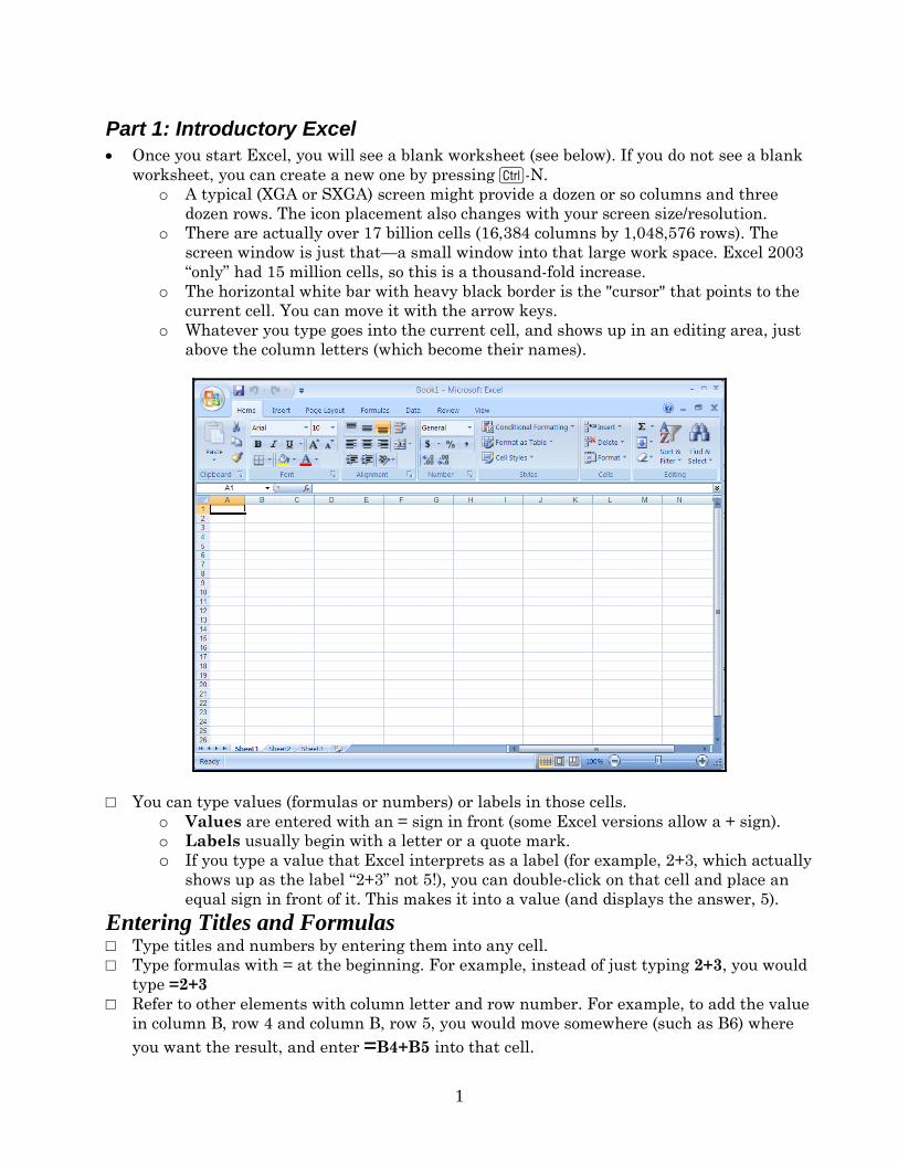
Part 1: Introductory Excel
Once you start Excel, you will see a blank worksheet (see below). If you do not see a blank
worksheet, you can create a new one by pressing C-N.
o A typical (XGA or SXGA) screen might provide a dozen or so columns and three
dozen rows. The icon placement also changes with your screen size/resolution.
o There are actually over 17 billion cells (16,384 columns by 1,048,576 rows). The
screen window is just that—a small window into that large work space. Excel 2003
“only” had 15 million cells, so this is a thousand-fold increase.
o The horizontal white bar with heavy black border is the "cursor" that points to the
current cell. You can move it with the arrow keys.
o Whatever you type goes into the current cell, and shows up in an editing area, just
above the column letters (which become their names).
□ You can type values (formulas or numbers) or labels in those cells.
o Values are entered with an = sign in front (some Excel versions allow a + sign).
o Labels usually begin with a letter or a quote mark.
o If you type a value that Excel interprets as a label (for example, 2+3, which actually
shows up as the label “2+3” not 5!), you can double-click on that cell and place an
equal sign in front of it. This makes it into a value (and displays the answer, 5).
Entering Titles and Formulas □ Type titles and numbers by entering them into any cell.
□ Type formulas with = at the beginning. For example, instead of just typing 2+3, you would
type =2+3
□ Refer to other elements with column letter and row number. For example, to add the value
in column B, row 4 and column B, row 5, you would move somewhere (such as B6) where
you want the result, and enter =B4+B5 into that cell.
2
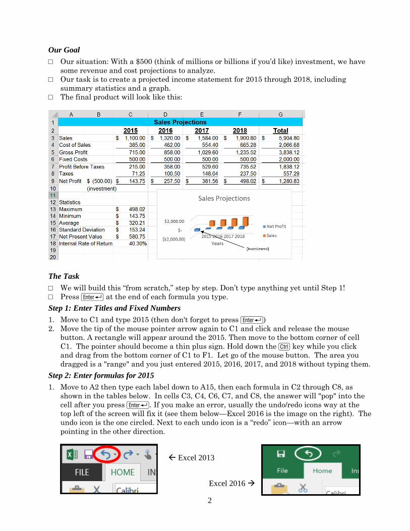
Our Goal
□ Our situation: With a $500 (think of millions or billions if you’d like) investment, we have
some revenue and cost projections to analyze.
□ Our task is to create a projected income statement for 2015 through 2018, including
summary statistics and a graph.
□ The final product will look like this:
The Task
□ We will build this “from scratch,” step by step. Don’t type anything yet until Step 1!
□ Press R at the end of each formula you type.
Step 1: Enter Titles and Fixed Numbers
1. Move to C1 and type 2015 (then don't forget to press R)
2. Move the tip of the mouse pointer arrow again to C1 and click and release the mouse
button. A rectangle will appear around the 2015. Then move to the bottom corner of cell
C1. The pointer should become a thin plus sign. Hold down the C key while you click
and drag from the bottom corner of C1 to F1. Let go of the mouse button. The area you
dragged is a "range" and you just entered 2015, 2016, 2017, and 2018 without typing them.
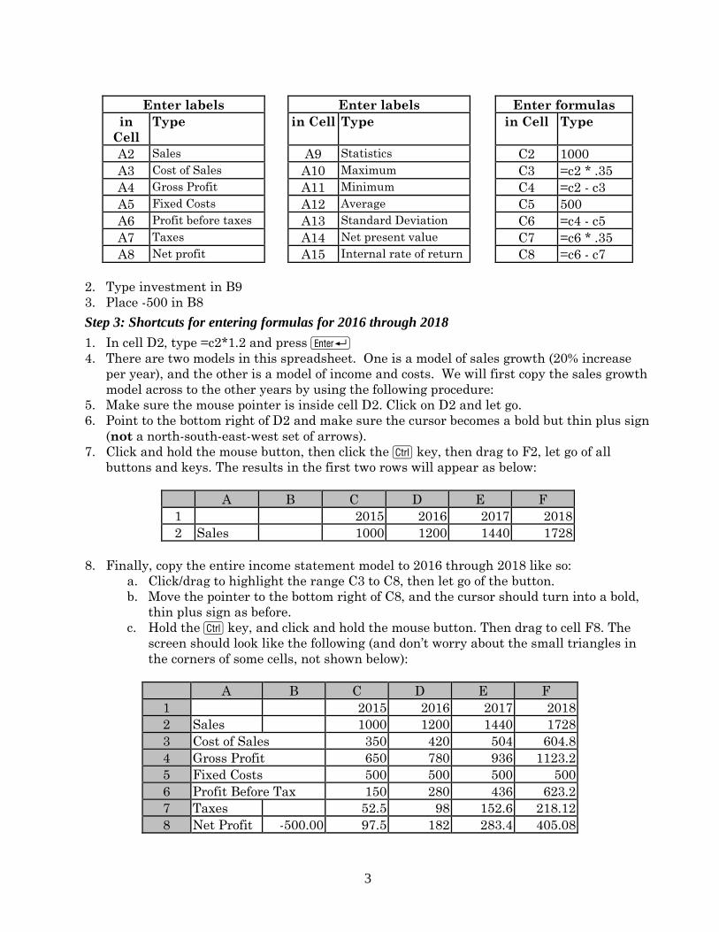
Step 2: Enter formulas for 2015
1. Move to A2 then type each label down to A15, then each formula in C2 through C8, as
shown in the tables below. In cells C3, C4, C6, C7, and C8, the answer will "pop" into the
cell after you press R. If you make an error, usually the undo/redo icons way at the
top left of the screen will fix it (see them below—Excel 2016 is the image on the right). The
undo icon is the one circled. Next to each undo icon is a “redo” icon—with an arrow
pointing in the other direction.
Excel 2013
Excel 2016
3
Enter labels Enter labels Enter formulas
in
Cell
Type in Cell Type in Cell Type
A2 Sales A9 Statistics C2 1000
A3 Cost of Sales A10 Maximum C3 =c2 * .35
A4 Gross Profit A11 Minimum C4 =c2 - c3
A5 Fixed Costs A12 Average C5 500
A6 Profit before taxes A13 Standard Deviation C6 =c4 - c5
A7 Taxes A14 Net present value C7 =c6 * .35
A8 Net profit A15 Internal rate of return C8 =c6 - c7
2. Type investment in B9
3. Place -500 in B8
Step 3: Shortcuts for entering formulas for 2016 through 2018
1. In cell D2, type =c2*1.2 and press R
4. There are two models in this spreadsheet. One is a model of sales growth (20% increase
per year), and the other is a model of income and costs. We will first copy the sales growth
model across to the other years by using the following procedure:
5. Make sure the mouse pointer is inside cell D2. Click on D2 and let go.
6. Point to the bottom right of D2 and make sure the cursor becomes a bold but thin plus sign
(not a north-south-east-west set of arrows).
7. Click and hold the mouse button, then click the C key, then drag to F2, let go of all
buttons and keys. The results in the first two rows will appear as below:
A B C D E F
1 2015 2016 2017 2018
2 Sales 1000 1200 1440 1728
8. Finally, copy the entire income statement model to 2016 through 2018 like so:
a. Click/drag to highlight the range C3 to C8, then let go of the button.
b. Move the pointer to the bottom right of C8, and the cursor should turn into a bold,
thin plus sign as before.
c. Hold the C key, and click and hold the mouse button. Then drag to cell F8. The
screen should look like the following (and don’t worry about the small triangles in
the corners of some cells, not shown below):
A B C D E F
1 2015 2016 2017 2018
2 Sales 1000 1200 1440 1728
3 Cost of Sales 350 420 504 604.8
4 Gross Profit 650 780 936 1123.2
5 Fixed Costs 500 500 500 500
6 Profit Before Tax 150 280 436 623.2
7 Taxes 52.5 98 152.6 218.12
8 Net Profit -500.00 97.5 182 283.4 405.08
4
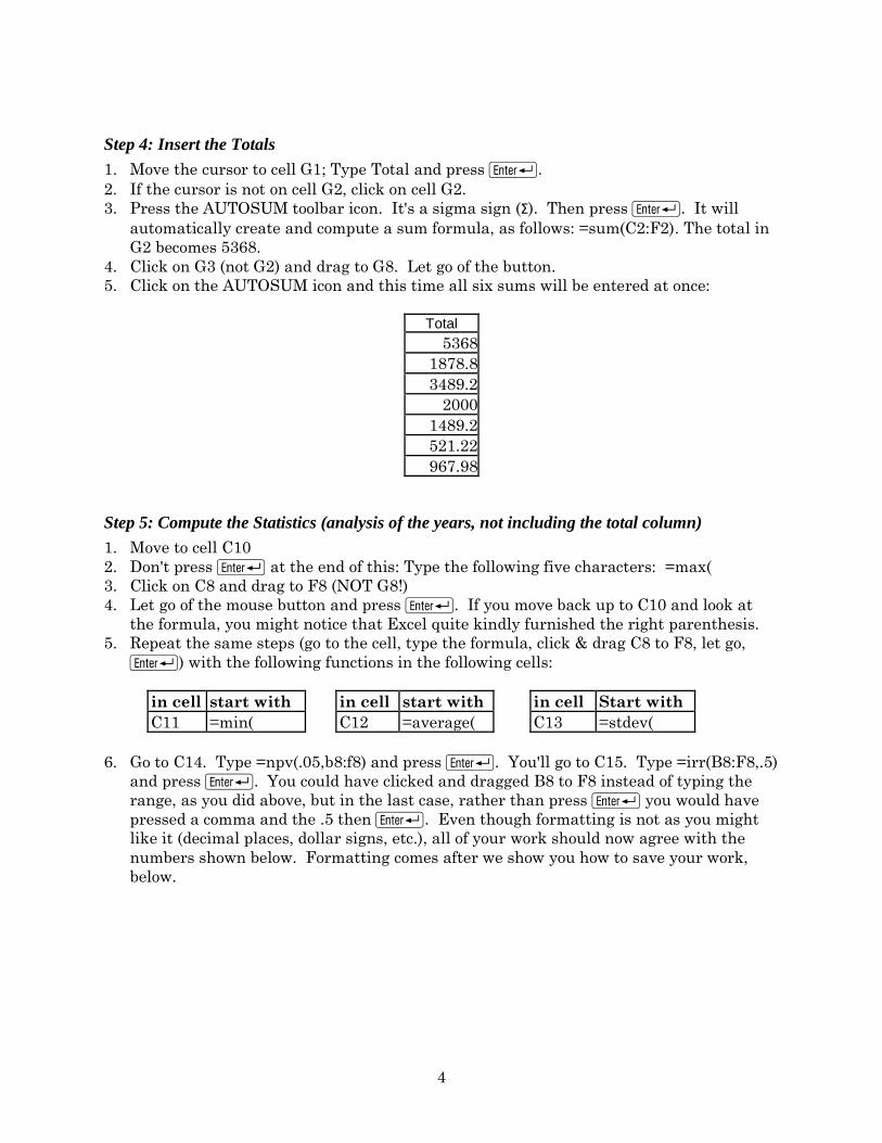
Step 4: Insert the Totals
1. Move the cursor to cell G1; Type Total and press R.
2. If the cursor is not on cell G2, click on cell G2.
3. Press the AUTOSUM toolbar icon. It's a sigma sign (Σ). Then press R. It will
automatically create and compute a sum formula, as follows: =sum(C2:F2). The total in
G2 becomes 5368.
4. Click on G3 (not G2) and drag to G8. Let go of the button.
5. Click on the AUTOSUM icon and this time all six sums will be entered at once:
Total
5368
1878.8
3489.2
2000
1489.2
521.22
967.98
Step 5: Compute the Statistics (analysis of the years, not including the total column)
1. Move to cell C10
2. Don't press R at the end of this: Type the following five characters: =max(
3. Click on C8 and drag to F8 (NOT G8!)
4. Let go of the mouse button and press R. If you move back up to C10 and look at
the formula, you might notice that Excel quite kindly furnished the right parenthesis.
5. Repeat the same steps (go to the cell, type the formula, click & drag C8 to F8, let go,
R) with the following functions in the following cells:
in cell start with in cell start with in cell Start with
C11 =min( C12 =average( C13 =stdev(
6. Go to C14. Type =npv(.05,b8:f8) and press R. You'll go to C15. Type =irr(B8:F8,.5)
and press R. You could have clicked and dragged B8 to F8 instead of typing the
range, as you did above, but in the last case, rather than press R you would have
pressed a comma and the .5 then R. Even though formatting is not as you might
like it (decimal places, dollar signs, etc.), all of your work should now agree with the
numbers shown below. Formatting comes after we show you how to save your work,
below.
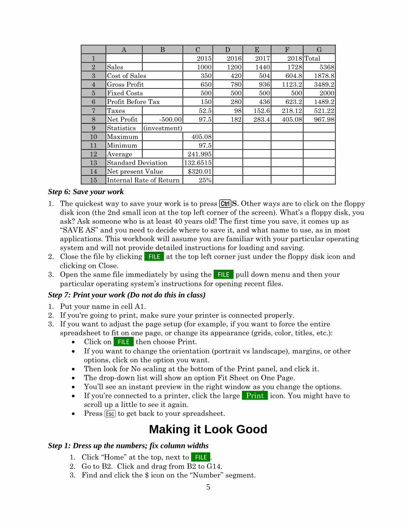
5
A B C D E F G
1 2015 2016 2017 2018 Total
2 Sales 1000 1200 1440 1728 5368
3 Cost of Sales 350 420 504 604.8 1878.8
4 Gross Profit 650 780 936 1123.2 3489.2
5 Fixed Costs 500 500 500 500 2000
6 Profit Before Tax 150 280 436 623.2 1489.2
7 Taxes 52.5 98 152.6 218.12 521.22
8 Net Profit -500.00 97.5 182 283.4 405.08 967.98
9 Statistics (investment)
10 Maximum 405.08
11 Minimum 97.5
12 Average 241.995
13 Standard Deviation 132.6515
14 Net present Value $320.01
15 Internal Rate of Return 25%
Step 6: Save your work
1. The quickest way to save your work is to press CS. Other ways are to click on the floppy
disk icon (the 2nd small icon at the top left corner of the screen). What’s a floppy disk, you
ask? Ask someone who is at least 40 years old! The first time you save, it comes up as
“SAVE AS” and you need to decide where to save it, and what name to use, as in most
applications. This workbook will assume you are familiar with your particular operating
system and will not provide detailed instructions for loading and saving.
2. Close the file by clicking FILE at the top left corner just under the floppy disk icon and
clicking on Close.
3. Open the same file immediately by using the FILE pull down menu and then your
particular operating system’s instructions for opening recent files.
Step 7: Print your work (Do not do this in class)
1. Put your name in cell A1.
2. If you're going to print, make sure your printer is connected properly.
3. If you want to adjust the page setup (for example, if you want to force the entire
spreadsheet to fit on one page, or change its appearance (grids, color, titles, etc.):
Click on FILE then choose Print.
If you want to change the orientation (portrait vs landscape), margins, or other
options, click on the option you want.
Then look for No scaling at the bottom of the Print panel, and click it.
The drop-down list will show an option Fit Sheet on One Page.
You’ll see an instant preview in the right window as you change the options.
If you’re connected to a printer, click the large o Print o icon. You might have to
scroll up a little to see it again.
Press E to get back to your spreadsheet.
Making it Look Good
Step 1: Dress up the numbers; fix column widths
1. Click “Home” at the top, next to FILE o. 2. Go to B2. Click and drag from B2 to G14.
3. Find and click the $ icon on the “Number” segment.
6
4. Click on cell C15. This has automatically been selected to be a percent. If it had
not, then you would simply click on the % icon near the $. To change the number of
decimal places, use the buttons. The left one increases the number of
decimal places, and the right one decreases the number of decimal places. While
watching the effect on the number in C15, click 3 times on the left one, then click
once on the right one to arrive at 2 decimal places. You should see 25.49% in C15.
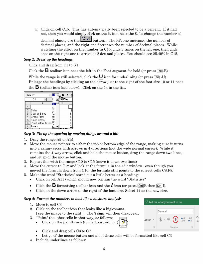
Step 2: Dress up the headings
Click and drag from C1 to G1.
Click the B toolbar icon near the left in the Font segment for bold (or press C-B).
While the range is still selected, click the U icon for underlining (or press C -U).
Enlarge the headings by clicking on the arrow just to the right of the font size 10 or 11 near
the B toolbar icon (see below). Click on the 14 in the list.
Step 3: Fix up the spacing by moving things around a bit:
1. Drag the range A9 to A15
2. Move the mouse pointer to either the top or bottom edge of the range, making sure it turns
into a skinny cross with arrows in 4 directions (not the wide normal cursor). While it
remains the 4-way arrow, click and hold the mouse button, drag the range down two lines,
and let go of the mouse button.
3. Repeat this with the range C10 to C15 (move it down two lines)
4. Move the cursor to C12 and look at the formula in the edit window...even though you
moved the formula down from C10, the formula still points to the correct cells C8:F8.
5. Make the word "Statistics" stand out a little better as a heading:
Click on cell A11 (which should now contain the word "Statistics"
Click the B formatting toolbar icon and the I icon (or press CB then CI).
Click on the down arrow to the right of the font size. Select 14 as the new size.
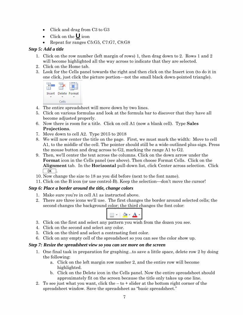
Step 4: Format the numbers to look like a business analysis
1. Move to cell C3
2. Click on the toolbar icon that looks like a big comma
[ see the image to the right ]. The $ sign will then disappear.
3. “Paint" the other cells in that way, as follows:
Click on the paintbrush (top left, circled)
Click and drag cells C3 to G7
Let go of the mouse button and all of those cells will be formatted like cell C3
4. Include underlines as follows:
7
Click and drag from C3 to G3
Click on the U icon
Repeat for ranges C5:G5, C7:G7, C8:G8
Step 5: Add a title
1. Click on the row number (left margin of rows) 1, then drag down to 2. Rows 1 and 2
will become highlighted all the way across to indicate that they are selected.
2. Click on the Home tab.
3. Look for the Cells panel towards the right and then click on the Insert icon (to do it in
one click, just click the picture portion—not the small black down-pointed triangle).
4. The entire spreadsheet will move down by two lines.
5. Click on various formulas and look at the formula bar to discover that they have all
become adjusted properly.
6. Now there is room for a title. Click on cell A1 (now a blank cell). Type Sales
Projections.
7. Move down to cell A2. Type 2015 to 2018
8. We will now center the title on the page. First, we must mark the width: Move to cell
A1, to the middle of the cell. The pointer should still be a wide-outlined plus-sign. Press
the mouse button and drag across to G2, marking the range A1 to G2.
9. Then, we'll center the text across the columns. Click on the down arrow under the
Format icon in the Cells panel (see above). Then choose Format Cells. Click on the
Alignment tab. In the Horizontal pull-down list, click Center across selection. Click
K.
10. Now change the size to 18 as you did before (next to the font name).
11. Click on the B icon (or use control-B). Keep the selection—don’t move the cursor!
Step 6: Place a border around the title, change colors
1. Make sure you’re in cell A1 as instructed above.
2. There are three icons we'll use. The first changes the border around selected cells; the
second changes the background color; the third changes the font color:
3. Click on the first and select any pattern you wish from the dozen you see.
4. Click on the second and select any color.
5. Click on the third and select a contrasting font color.
6. Click on any empty cell of the spreadsheet so you can see the color show up.
Step 7: Resize the spreadsheet view so you can see more on the screen
1. One final task in preparation for graphing...to save a little space, delete row 2 by doing
the following:
a. Click on the left margin row number 2, and the entire row will become
highlighted.
b. Click on the Delete icon in the Cells panel. Now the entire spreadsheet should
approximately fit on the screen because the title only takes up one line.
2. To see just what you want, click the – to + slider at the bottom right corner of the
spreadsheet window. Save the spreadsheet as “basic spreadsheet.”
8
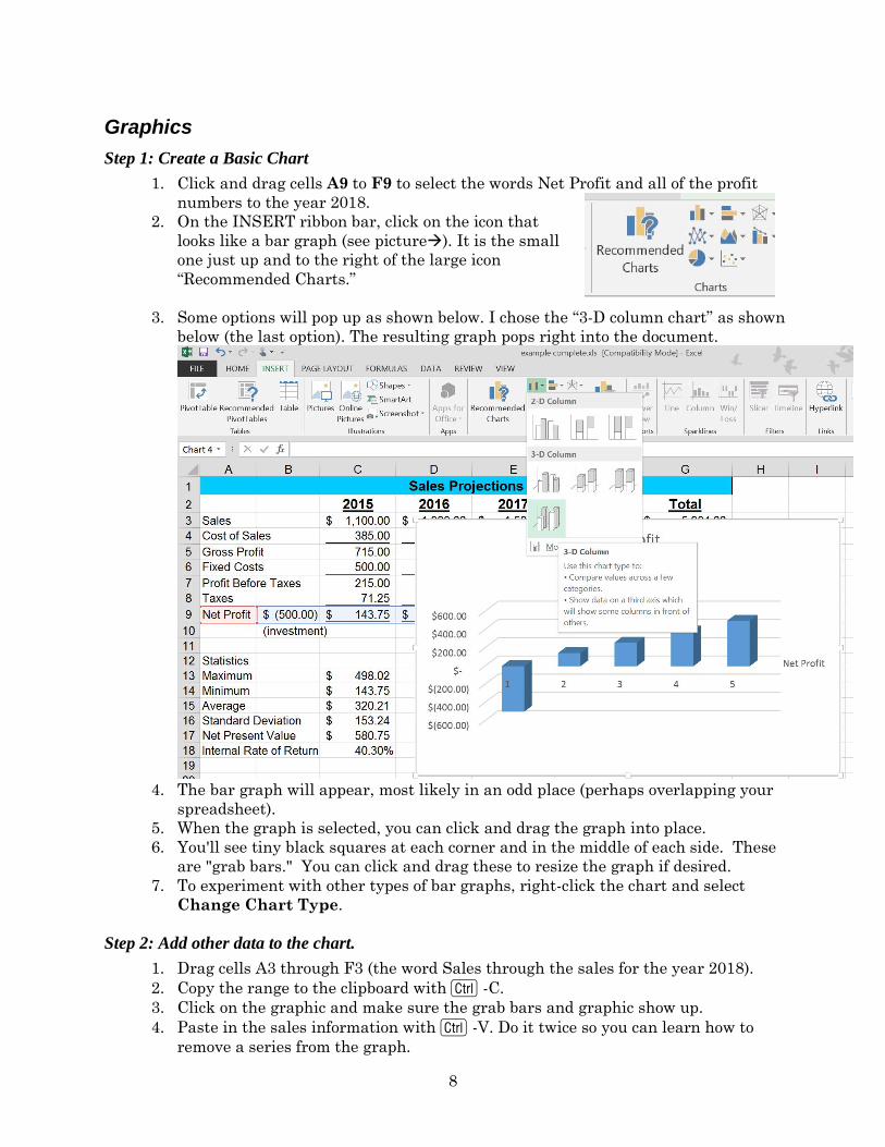
Graphics
Step 1: Create a Basic Chart
1. Click and drag cells A9 to F9 to select the words Net Profit and all of the profit
numbers to the year 2018.
2. On the INSERT ribbon bar, click on the icon that
looks like a bar graph (see picture). It is the small
one just up and to the right of the large icon
“Recommended Charts.”
3. Some options will pop up as shown below. I chose the “3-D column chart” as shown
below (the last option). The resulting graph pops right into the document.
4. The bar graph will appear, most likely in an odd place (perhaps overlapping your
spreadsheet).
5. When the graph is selected, you can click and drag the graph into place.
6. You'll see tiny black squares at each corner and in the middle of each side. These
are "grab bars." You can click and drag these to resize the graph if desired.
7. To experiment with other types of bar graphs, right-click the chart and select
Change Chart Type.
Step 2: Add other data to the chart.
1. Drag cells A3 through F3 (the word Sales through the sales for the year 2018).
2. Copy the range to the clipboard with C -C.
3. Click on the graphic and make sure the grab bars and graphic show up.
4. Paste in the sales information with C -V. Do it twice so you can learn how to
remove a series from the graph.
9
5. To remove the duplicate set of bars, click once on one of the 4 bars for sales in any
ONE year. All sales bars will become selected (showing little circles at all corners).
6. Press X to remove the second set.
Step 3: Add axis labels
1. Click in the empty white space near the edge of your chart so you can see grab bars.
You should also see a green + along with a paint brush and a funnel on the right
side of the graph. We will use them later. For this set of instructions, it is ok if
multiple things inside have lines and grab bars, or only the entire image itself.
2. Click on the green + and move the cursor to the word Axes and then to little black
triangle that will appear to the right of Axes. Make sure only (for this task) the first
two are selected (Primary Horizontal and Primary Vertical).
3. Click on A2 and drag from A2 to F2 to select the years (and the two blank cells
before the years).
4. Copy to the clipboard with C-C.
5. Click once on the graph.
6. On the Home icon ribbon, click on the small triangle under Paste and select Paste
Special. You'll see the following box:
7. Click on Categories (X Labels) in First Row, then click on Replace Existing
Categories to remove the 1, 2, 3, and 4 that were there.
8. In Excel 2016, the sales bars might disappear. Copy and paste again if necessary.
9. You can enlarge or shrink the numbers: E.g., to shrink the years, click on any one of
them and the entire set should be boxed in with lines around them. Then click the
Av button in the Font group or pick the Font tab and click on a different font size.
10. You can also click and drag the graph to be bigger or smaller in any dimension.
Step 4: Add a title and X axis label
1. When the chart is selected, two new icon ribbons appear and are available to you.
Chart tools: DESIGN and FORMAT.
2. Click the DESIGN ribbon and the small v just after the name of the first icon Add
Chart Element. A list of chart elements will pop up. Move the cursor down to the
little triangle next to Legend then choose where you want the legend. The previous
legend can be deleted. Just click on the one you don’t want right in the chart and
press the DEL key.
3. To insert a title, just use the same Add Chart Element v pull down. Select the
little triangle next to Chart Title and click where you want it.
4. You can now click on the chart title and insert your own. I chose “Sales Projections”
5. Again under Add Chart Element v, point to the little triangle next to Axis Titles
and choose Primary Horizontal
6. To label the X axis, just type the title you want right there. I chose “Year.”
10
Step 5: Annotate the chart
The first bar (the negative one) is problematic. It might be useful to annotate it so that the
reader can understand why a loss appears to be there. There are several drawing tools but we
will only pick one as a sample because they all work identically. Nothing special has to be
selected. So just get started.
1. Click on the INSERT icon ribbon and choose Shapes in the Illustrations block of
icons (the second group).
2. Pick the arrow under the LINES group.
3. Draw the arrow as shown below. I know, this won’t win any design awards.
4. Still on the Insert icon ribbon, select Text Box.
5. Click on the graph in the blank area at the source of the arrow (bottom right).
6. Type “(investment)” (without the quotation marks) in the text box.
7. Click the word “(investment)” that you just entered, and in the FORMAT icon ribbon,
you can choose different styles for lines, shape, fill, and effects. Enjoy!
8. Resize the box if needed.
9. Feel free to save this spreadsheet as before, with CS or click on the floppy disk icon
(the 2nd small icon at the top of the screen).
11
Intermediate Excel
Three Tips for Good Spreadsheet Design
□ Minimize the numbers you enter directly into formulas. It is best to separate any
numbers that can possibly change, for example an inflation rate. Put such numbers
into separate cells and insert their cell addresses into your formula. Although you
might not plan to change them when you build the spreadsheet, someone might say
“what if the inflation rate increases?”
□ Also, beware of any hidden assumptions. For example, sales could increase because of
higher prices and also because of higher demand. A forecast of demand increases
should be separated too.
o Click the following address right on this PDF (or open a browser, then type the
following address) to download the spreadsheet shown below:
www.pitt.edu/~galletta/excel/amateurs1.xls
o Notice that the price increases and inflation rate are more easily changed in the
bottom example. What would you have to do to change those assumptions in the
upper example? That’s right, you would waste valuable time.
□ Prevent disasters! Put separate analyses into separate worksheets or diagonally. In
the example below, if you transfer your money from Toaster Bank to Greedy Bank,
and wish to delete the row with Toaster Bank, you will also delete all of your
forecasted loan receipts. This file is available at
www.pitt.edu/~galletta/excel/amateurs2.xls
12
□ A better way to handle this would be to move the liquidity analysis to a different
worksheet or diagonally as shown below in
www.pitt.edu/~galletta/excel/amateurs3.xls. Removing Toaster Bank will then be no
problem.
Copying and Handy Extrapolations
□ You can copy cells using many different tools. Quickly copy or extrapolate the results from
one cell to others by clicking on the + that appears when you point to the bottom right of
any selected cell. There are automatic adjustments to certain text or numeric items (eg.,
January, Quarter 1, or 1). You can see what copying will be done in a small grey box while
you copy, and you can adjust it by holding the C key to force the item to be extrapolated
(incremented) if it is being copied exactly, or to force the item to be copied exactly if it is
being extrapolated..
□ Extrapolating is very useful. It works with months, days of the week, quarters, or even any
text that is followed with a number. Here’s how it works:
13
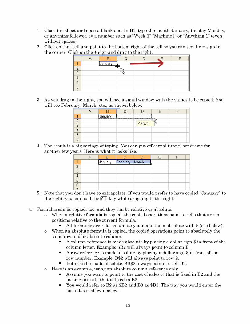
1. Close the sheet and open a blank one. In B1, type the month January, the day Monday,
or anything followed by a number such as “Week 1” “Machine1” or “Anything 1” (even
without spaces).
2. Click on that cell and point to the bottom right of the cell so you can see the + sign in
the corner. Click on the + sign and drag to the right.
3. As you drag to the right, you will see a small window with the values to be copied. You
will see February, March, etc., as shown below.
4. The result is a big savings of typing. You can put off carpal tunnel syndrome for
another few years. Here is what it looks like:
5. Note that you don’t have to extrapolate. If you would prefer to have copied “January” to
the right, you can hold the C key while dragging to the right.
□ Formulas can be copied, too, and they can be relative or absolute.
o When a relative formula is copied, the copied operations point to cells that are in
positions relative to the current formula.
All formulas are relative unless you make them absolute with $ (see below).
o When an absolute formula is copied, the copied operations point to absolutely the
same row and/or absolute column.
A column reference is made absolute by placing a dollar sign $ in front of the
column letter. Example: $B2 will always point to column B
A row reference is made absolute by placing a dollar sign $ in front of the
row number. Example: B$2 will always point to row 2.
Both can be made absolute: $B$2 always points to cell B2. o Here is an example, using an absolute column reference only.
Assume you want to point to the cost of sales % that is fixed in B2 and the
income tax rate that is fixed in B3.
You would refer to B2 as $B2 and B3 as $B3. The way you would enter the
formulas is shown below.
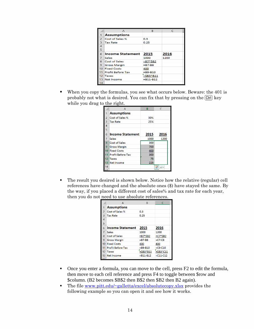
14
When you copy the formulas, you see what occurs below. Beware: the 401 is
probably not what is desired. You can fix that by pressing on the C key
while you drag to the right.
The result you desired is shown below. Notice how the relative (regular) cell
references have changed and the absolute ones ($) have stayed the same. By
the way, if you placed a different cost of sales% and tax rate for each year,
then you do not need to use absolute references.
Once you enter a formula, you can move to the cell, press F2 to edit the formula,
then move to each cell reference and press F4 to toggle between $row and
$column. (B2 becomes $B$2 then B$2 then $B2 then B2 again).
The file www.pitt.edu/~galletta/excel/absolutecopy.xlsx provides the
following example so you can open it and see how it works.
15
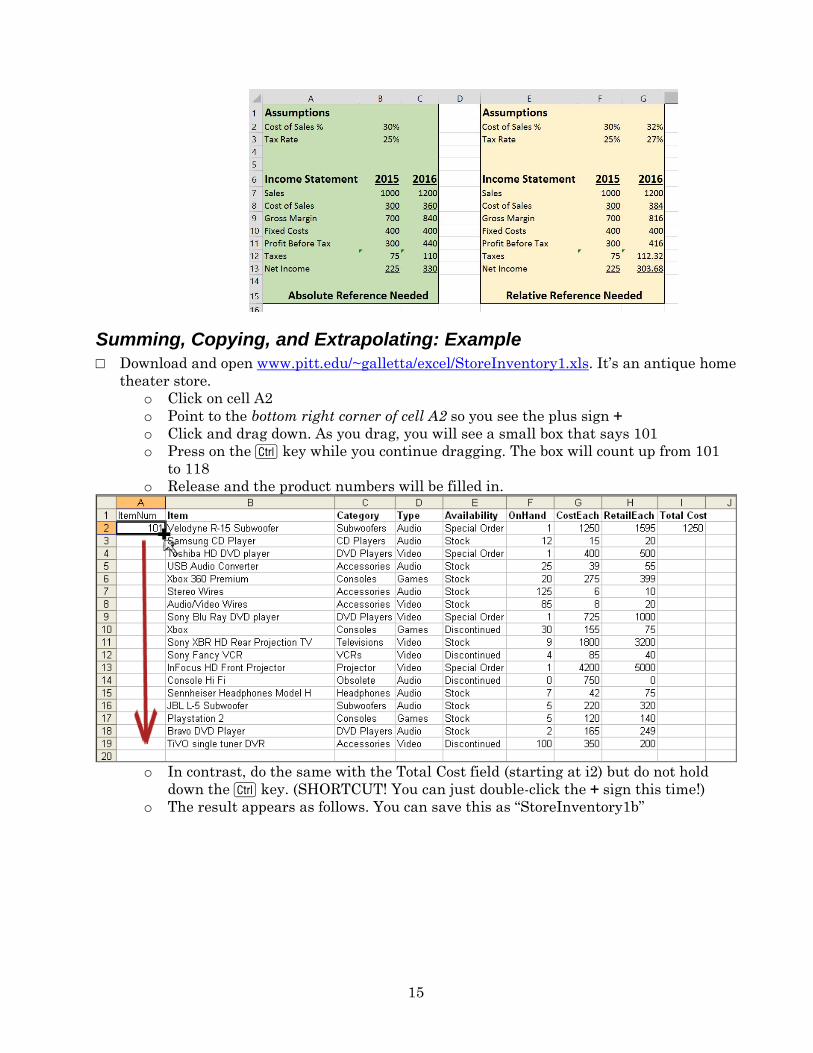
Summing, Copying, and Extrapolating: Example
□ Download and open www.pitt.edu/~galletta/excel/StoreInventory1.xls. It’s an antique home
theater store.
o Click on cell A2
o Point to the bottom right corner of cell A2 so you see the plus sign +
o Click and drag down. As you drag, you will see a small box that says 101
o Press on the C key while you continue dragging. The box will count up from 101
to 118
o Release and the product numbers will be filled in.
o In contrast, do the same with the Total Cost field (starting at i2) but do not hold
down the C key. (SHORTCUT! You can just double-click the + sign this time!)
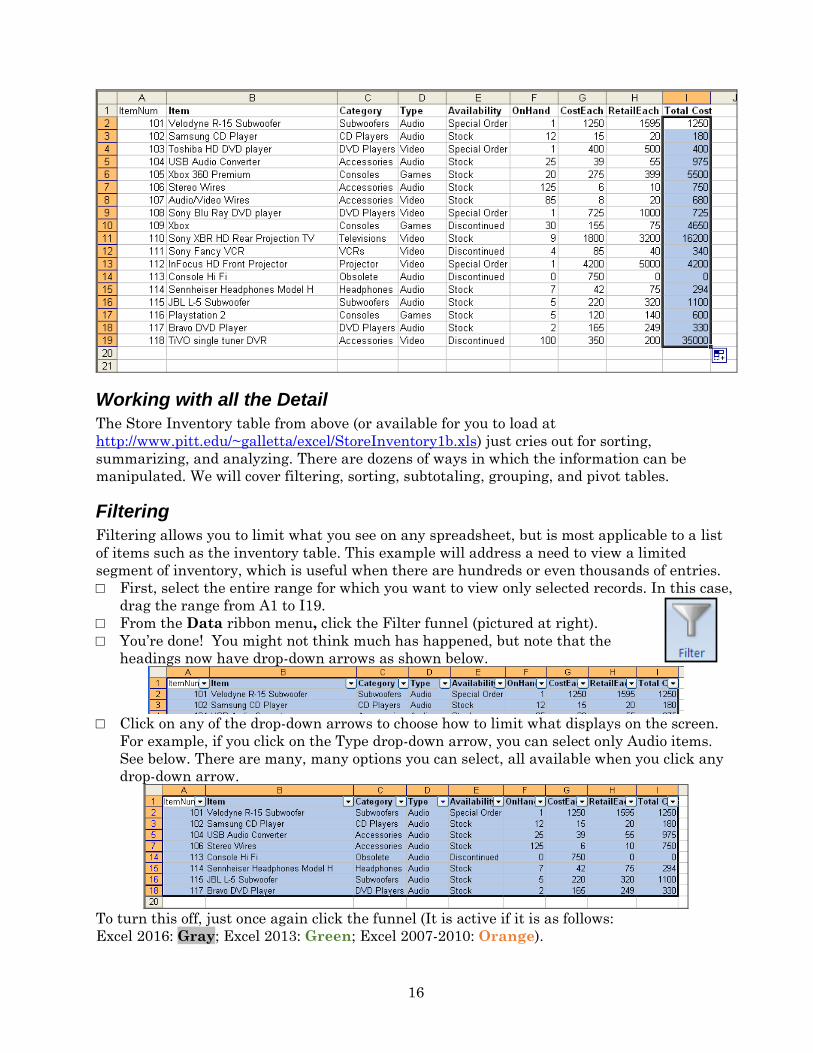
o The result appears as follows. You can save this as “StoreInventory1b”
16
Working with all the Detail
The Store Inventory table from above (or available for you to load at
http://www.pitt.edu/~galletta/excel/StoreInventory1b.xls) just cries out for sorting,
summarizing, and analyzing. There are dozens of ways in which the information can be
manipulated. We will cover filtering, sorting, subtotaling, grouping, and pivot tables.
Filtering
Filtering allows you to limit what you see on any spreadsheet, but is most applicable to a list
of items such as the inventory table. This example will address a need to view a limited
segment of inventory, which is useful when there are hundreds or even thousands of entries.
□ First, select the entire range for which you want to view only selected records. In this case,
drag the range from A1 to I19.
□ From the Data ribbon menu, click the Filter funnel (pictured at right).
□ You’re done! You might not think much has happened, but note that the
headings now have drop-down arrows as shown below.
□ Click on any of the drop-down arrows to choose how to limit what displays on the screen.
For example, if you click on the Type drop-down arrow, you can select only Audio items.
See below. There are many, many options you can select, all available when you click any
drop-down arrow.
To turn this off, just once again click the funnel (It is active if it is as follows:
Excel 2016: Gray; Excel 2013: Green; Excel 2007-2010: Orange).
17
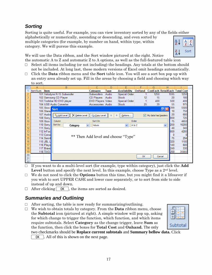
Sorting
Sorting is quite useful. For example, you can view inventory sorted by any of the fields either
alphabetically or numerically, ascending or descending, and even sorted by
multiple categories (for example, by number on hand, within type, within
category. We will pursue this example.
We will use the Data ribbon, and the Sort window pictured at the right. Notice
the automatic A to Z and automatic Z to A options, as well as the full-featured table icon
□ Select all items including (or not including) the headings. Any totals at the bottom should
not be included. At long last, these modern versions of Excel omit headings automatically.
□ Click the Data ribbon menu and the Sort table icon. You will see a sort box pop up with
an entry area already set up. Fill in the areas by choosing a field and choosing which way
to sort.
□ If you want to do a multi-level sort (for example, type within category), just click the Add
Level button and specify the next level. In this example, choose Type as a 2nd level.
□ We do not need to click the Options button this time, but you might find it a lifesaver if
you wish to sort UPPER CASE and lower case separately, or to sort from side to side
instead of up and down.
□ After clicking KK, the items are sorted as desired.
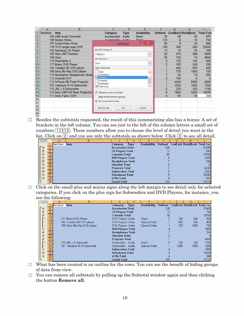
Summaries and Outlining
□ After sorting, the table is now ready for summarizing/outlining.
□ We wish to obtain totals by category. From the Data ribbon menu, choose
the Subtotal icon (pictured at right). A simple window will pop up, asking
for which change to trigger the function, which function, and which items
require subtotals. Select Category as the change trigger, leave Sum as
the function, then click the boxes for Total Cost and Onhand. The only
two checkmarks should be Replace current subtotals and Summary bellow data. Click
K. All of this is shown on the next page.
Category
** Then Add level and choose “Type”
18
□ Besides the subtotals requested, the result of this summarizing also has a bonus: A set of
brackets in the left column. You can see just to the left of the column letters a small set of
numbers 123. These numbers allow you to choose the level of detail you want in the
list. Click on 2 and you see only the subtotals as shown below. Click 3 to see all detail.
□ Click on the small plus and minus signs along the left margin to see detail only for selected
categories. If you click on the plus sign for Subwoofers and DVD Players, for instance, you
see the following:
□ What has been created is an outline for the rows. You can see the benefit of hiding groups
of data from view.
□ You can remove all subtotals by pulling up the Subtotal window again and then clicking
the button Remove all.
19
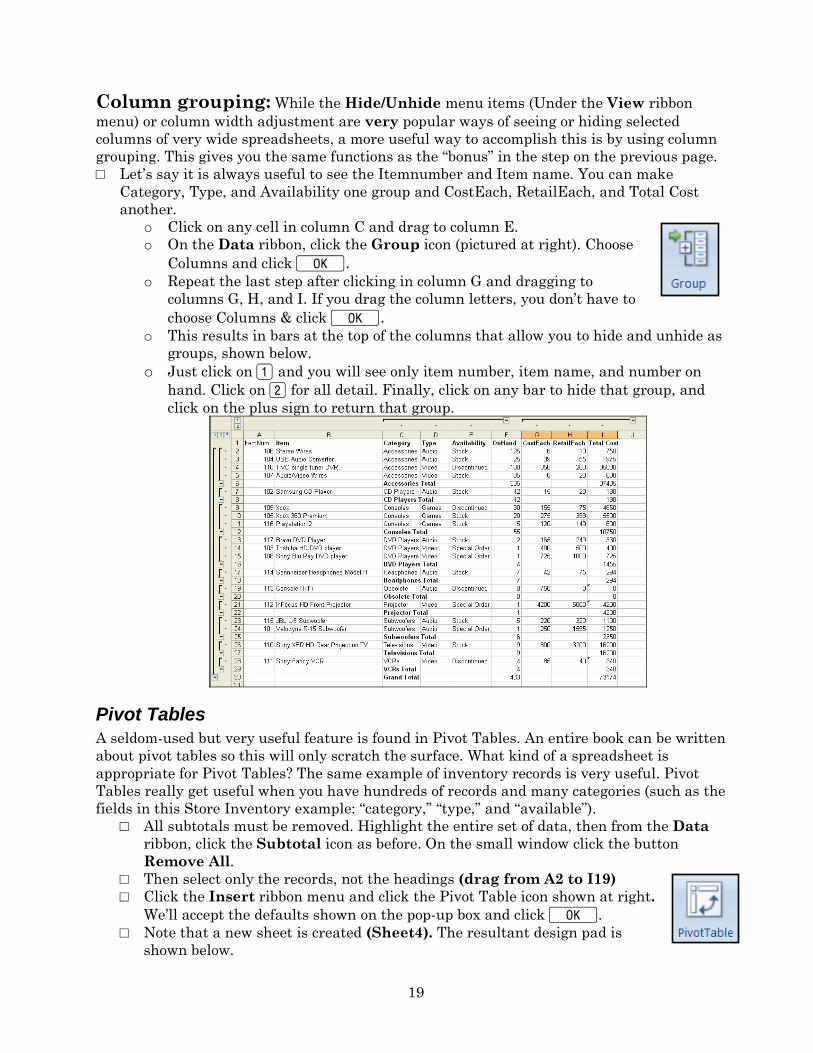
Column grouping: While the Hide/Unhide menu items (Under the View ribbon
menu) or column width adjustment are very popular ways of seeing or hiding selected
columns of very wide spreadsheets, a more useful way to accomplish this is by using column
grouping. This gives you the same functions as the “bonus” in the step on the previous page.
□ Let’s say it is always useful to see the Itemnumber and Item name. You can make
Category, Type, and Availability one group and CostEach, RetailEach, and Total Cost
another.
o Click on any cell in column C and drag to column E.
o On the Data ribbon, click the Group icon (pictured at right). Choose
Columns and click K. o Repeat the last step after clicking in column G and dragging to
columns G, H, and I. If you drag the column letters, you don’t have to
choose Columns & click K. o This results in bars at the top of the columns that allow you to hide and unhide as
groups, shown below.
o Just click on 1 and you will see only item number, item name, and number on
hand. Click on 2 for all detail. Finally, click on any bar to hide that group, and
click on the plus sign to return that group.
Pivot Tables
A seldom-used but very useful feature is found in Pivot Tables. An entire book can be written
about pivot tables so this will only scratch the surface. What kind of a spreadsheet is
appropriate for Pivot Tables? The same example of inventory records is very useful. Pivot
Tables really get useful when you have hundreds of records and many categories (such as the
fields in this Store Inventory example: “category,” “type,” and “available”).
□ All subtotals must be removed. Highlight the entire set of data, then from the Data
ribbon, click the Subtotal icon as before. On the small window click the button
Remove All.
□ Then select only the records, not the headings (drag from A2 to I19)
□ Click the Insert ribbon menu and click the Pivot Table icon shown at right.
We’ll accept the defaults shown on the pop-up box and click K.
□ Note that a new sheet is created (Sheet4). The resultant design pad is
shown below.
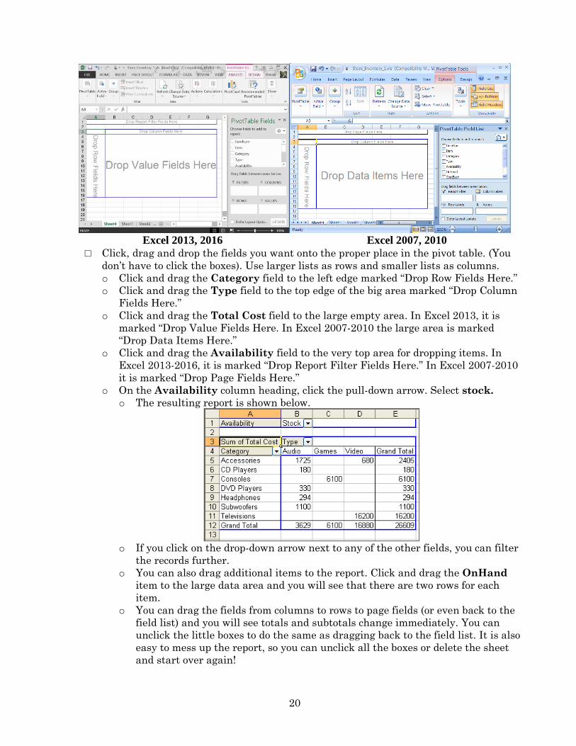
20
Excel 2013, 2016 Excel 2007, 2010
□ Click, drag and drop the fields you want onto the proper place in the pivot table. (You
don’t have to click the boxes). Use larger lists as rows and smaller lists as columns.
o Click and drag the Category field to the left edge marked “Drop Row Fields Here.”
o Click and drag the Type field to the top edge of the big area marked “Drop Column
Fields Here.”
o Click and drag the Total Cost field to the large empty area. In Excel 2013, it is
marked “Drop Value Fields Here. In Excel 2007-2010 the large area is marked
“Drop Data Items Here.”
o Click and drag the Availability field to the very top area for dropping items. In
Excel 2013-2016, it is marked “Drop Report Filter Fields Here.” In Excel 2007-2010
it is marked “Drop Page Fields Here.”
o On the Availability column heading, click the pull-down arrow. Select stock.
o The resulting report is shown below.
o If you click on the drop-down arrow next to any of the other fields, you can filter
the records further.
o You can also drag additional items to the report. Click and drag the OnHand
item to the large data area and you will see that there are two rows for each
item.
o You can drag the fields from columns to rows to page fields (or even back to the
field list) and you will see totals and subtotals change immediately. You can
unclick the little boxes to do the same as dragging back to the field list. It is also
easy to mess up the report, so you can unclick all the boxes or delete the sheet
and start over again!
21
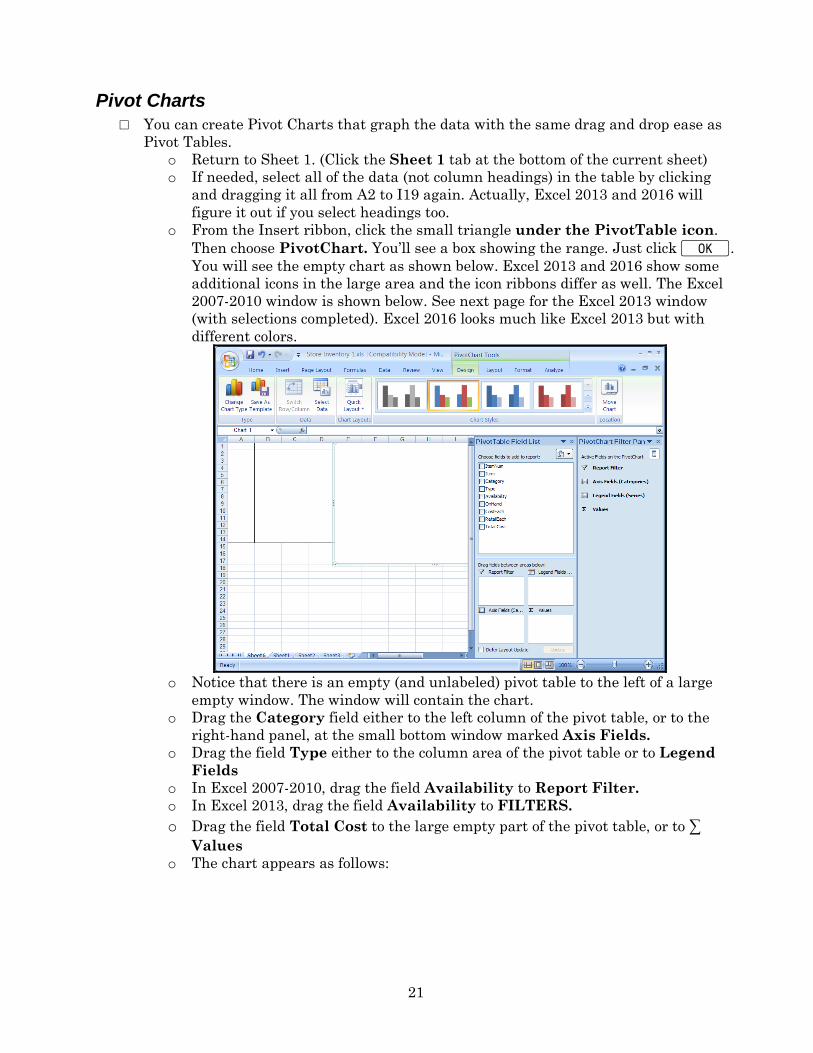
Pivot Charts
□ You can create Pivot Charts that graph the data with the same drag and drop ease as
Pivot Tables.
o Return to Sheet 1. (Click the Sheet 1 tab at the bottom of the current sheet)
o If needed, select all of the data (not column headings) in the table by clicking
and dragging it all from A2 to I19 again. Actually, Excel 2013 and 2016 will
figure it out if you select headings too.
o From the Insert ribbon, click the small triangle under the PivotTable icon.
Then choose PivotChart. You’ll see a box showing the range. Just click K.
You will see the empty chart as shown below. Excel 2013 and 2016 show some
additional icons in the large area and the icon ribbons differ as well. The Excel
2007-2010 window is shown below. See next page for the Excel 2013 window
(with selections completed). Excel 2016 looks much like Excel 2013 but with
different colors.
o Notice that there is an empty (and unlabeled) pivot table to the left of a large
empty window. The window will contain the chart.
o Drag the Category field either to the left column of the pivot table, or to the
right-hand panel, at the small bottom window marked Axis Fields.
o Drag the field Type either to the column area of the pivot table or to Legend
Fields
o In Excel 2007-2010, drag the field Availability to Report Filter.
o In Excel 2013, drag the field Availability to FILTERS.
o Drag the field Total Cost to the large empty part of the pivot table, or to ∑
Values o The chart appears as follows:
22
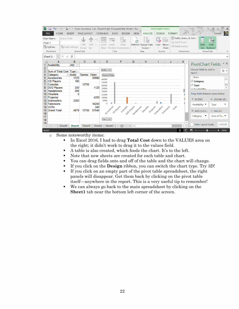
o Some noteworthy items:
In Excel 2016, I had to drag Total Cost down to the VALUES area on
the right; it didn’t work to drag it to the values field.
A table is also created, which feeds the chart. It’s to the left.
Note that new sheets are created for each table and chart.
You can drag fields onto and off of the table and the chart will change.
If you click on the Design ribbon, you can switch the chart type. Try 3D!
If you click on an empty part of the pivot table spreadsheet, the right
panels will disappear. Get them back by clicking on the pivot table
itself—anywhere in the report. This is a very useful tip to remember!
We can always go back to the main spreadsheet by clicking on the
Sheet1 tab near the bottom left corner of the screen.
23
Advanced Excel
Functions
□ There are built-in functions in Excel that offer common and frequently-needed formulas.
o The hard but fast way for experts: Enter the equal sign, followed by the function
name, followed by a set of parentheses with parameters for the function. You are
helpfully prompted for the parameters but you might need more help.
o You can view a complete list by clicking on fx just to the left of the formula bar. It
will prompt you through all of the functions with quite complete explanations.
o The Formulas ribbon bar has some you can access quickly by icon.
□ I would recommend working with the original Store Inventory spreadsheet (after the totals
were computed). If you don’t have it, you can load it from:
www.pitt.edu/~galletta/excel/StoreInventory1b.xls.
Basic Functions
□ Here are some examples of basic, useful functions, assuming that there are meaningful
numbers in cells I2 through I19 back on Sheet 1. To do this, you must enter these
functions into an empty cell (I will use I21 through i26 for these examples).
□ Commonly-needed items are as follows:
o =sum(i2.i19) will compute the sum of all of the cells from i2 to i19. A summation
icon (∑) (we used it earlier) sums automatically a range of cells. The icon works both
vertically and horizontally, but some empty cells might provide an unanticipated
result. Check out the formula after you use the summation icon! Move to i21 and
press ∑. That will provide an automatic sum for Total Cost, $73,174. One difference:
The SUM formula will include i2.i20 as the range.
o =average(i2.i19) obviously, finds their average, or 4065.222 in this spreadsheet.
o =count(i2.i19) counts the number of cells in that range that have numbers (text or
blanks do not get counted). The count should be 18.
o =max(i2.i19) finds the maximum, which is 35000 in this spreadsheet.
o =min(i2.i19) obviously, finds the minimum, or 0 in this sheet.
o =stdev(i2.i19) computes the standard deviation of those numbers=8628.342.
Advanced Functions
□ Statistical Functions
o Conditional Counting □ =countif(range, criteria) will count all of the items matching a particular
criterion. The “criteria” parameter can be some text in quotes or a cell
reference.
□ Example 1: move to cell c21 and type =countif(c2.c19,”DVD Players”) to
obtain 3 as an answer to the function (the number of different items with
“DVD players” in the Category column). This does not tell how many DVD
players there are, but only how many different products have that category.
□ To provide better labeling:
Move to cell B21 and type “DVD Players” in that cell.
Move to C21 and replace the formula provided above with:
=countif(c2.c19,b21). The total should be 3.
Now change what is in B21 to “VCRs” and the total will change to 1.
24
If you want to know how many are in stock, move to F21 and enter:
=sumif(c2.c19,b21,f2.f19). Note that this will hunt through the first
range, c2 to c19, then compare each value in that range to what is in
B21 (currently VCRs), then sum the items in the second range, f2.f19.
□ Then type any other category into B21 (for example, Accessories), then
note that the total in C21 changes to 4 and F21 changes to 335. Go back to
C21 and change the category to other items to see the new count in D21 and
sum in F21 every time you change what is in C21. Make sure you
understand the difference between the count in C21 (number of items in that
category) and the sum in F21 (total number of items in inventory for that
category).
□ Conditional counting can be based on inequalities as well
Move to cell E22 and type “Low stock items” there. Move to cell F22
and type =countif(f2.f19,”<20”) to obtain the answer 12 (the
number of items that have less than 20 in stock).
Move to cell E23 and type “Mid Stock Items” there. Then move to
F23 and type =countif(f2.f19,”>=20”)-countif(f2.f19,”>100”) to find
5, the number of items between 20 and 100 in stock, including 20 but
not including 100. Note that you can also use “< >” as “not equal” and
“< =” as “less than or equal to.”
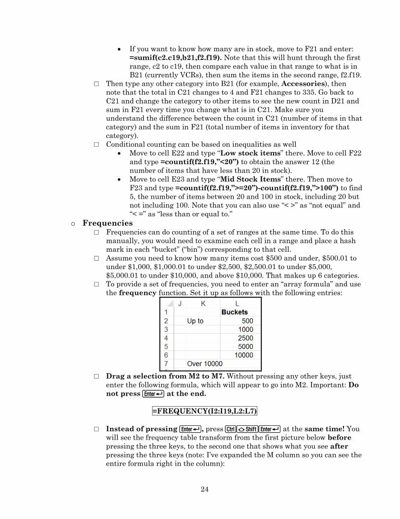
o Frequencies □ Frequencies can do counting of a set of ranges at the same time. To do this
manually, you would need to examine each cell in a range and place a hash
mark in each “bucket” (“bin”) corresponding to that cell.
□ Assume you need to know how many items cost $500 and under, $500.01 to
under $1,000, $1,000.01 to under $2,500, $2,500.01 to under $5,000,
$5,000.01 to under $10,000, and above $10,000. That makes up 6 categories.
□ To provide a set of frequencies, you need to enter an “array formula” and use
the frequency function. Set it up as follows with the following entries:
□ Drag a selection from M2 to M7. Without pressing any other keys, just
enter the following formula, which will appear to go into M2. Important: Do
not press R at the end.
=FREQUENCY(I2:I19,L2:L7)
□ Instead of pressing R, press CSR at the same time! You
will see the frequency table transform from the first picture below before
pressing the three keys, to the second one that shows what you see after
pressing the three keys (note: I’ve expanded the M column so you can see the
entire formula right in the column):
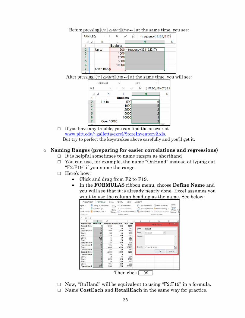
25
Before pressing CSR at the same time, you see:
After pressing CSR at the same time, you will see:
□ If you have any trouble, you can find the answer at
www.pitt.edu/~galletta/excel/StoreInventory2.xls.
But try to perfect the keystrokes above carefully and you’ll get it.
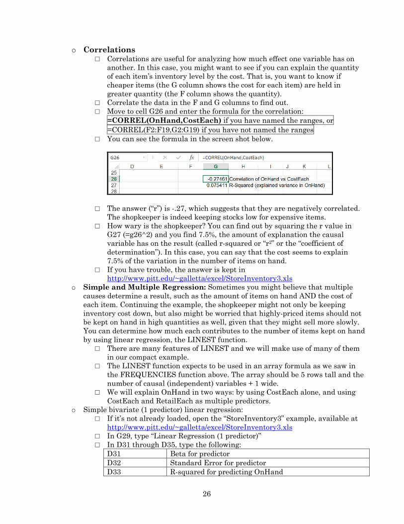
o Naming Ranges (preparing for easier correlations and regressions)
□ It is helpful sometimes to name ranges as shorthand
□ You can use, for example, the name “OnHand” instead of typing out
“F2:F19” if you name the range.
□ Here’s how:
Click and drag from F2 to F19.
In the FORMULAS ribbon menu, choose Define Name and
you will see that it is already nearly done. Excel assumes you
want to use the column heading as the name. See below:
Then click K.
□ Now, “OnHand” will be equivalent to using “F2:F19” in a formula.
□ Name CostEach and RetailEach in the same way for practice.
26
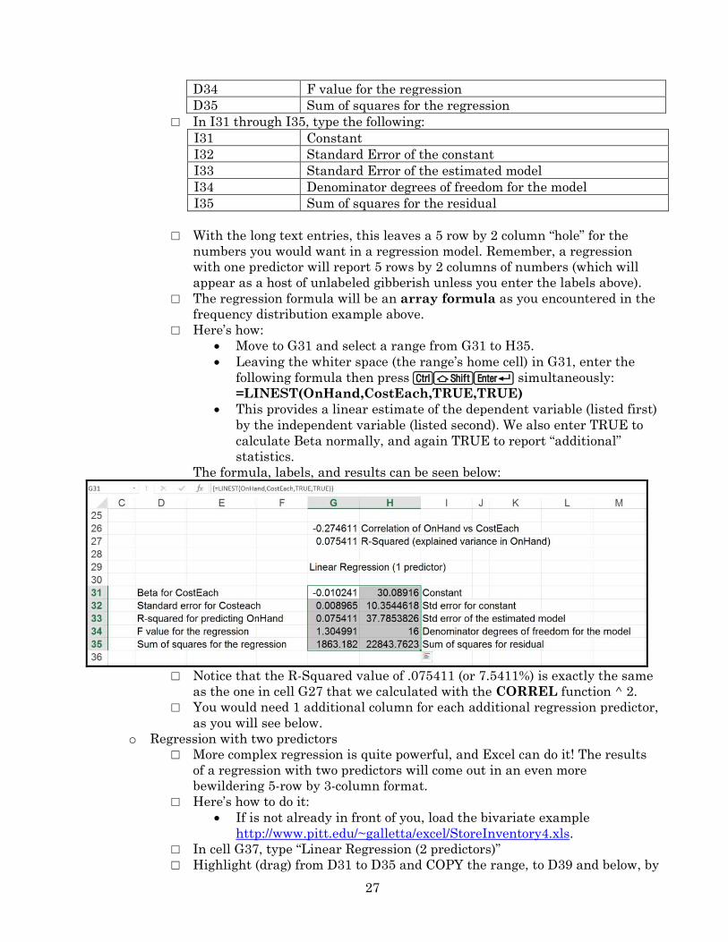
o Correlations □ Correlations are useful for analyzing how much effect one variable has on
another. In this case, you might want to see if you can explain the quantity
of each item’s inventory level by the cost. That is, you want to know if
cheaper items (the G column shows the cost for each item) are held in
greater quantity (the F column shows the quantity).
□ Correlate the data in the F and G columns to find out.
□ Move to cell G26 and enter the formula for the correlation:
=CORREL(OnHand,CostEach) if you have named the ranges, or
=CORREL(F2:F19,G2:G19) if you have not named the ranges
□ You can see the formula in the screen shot below.
□ The answer (“r”) is -.27, which suggests that they are negatively correlated.
The shopkeeper is indeed keeping stocks low for expensive items.
□ How wary is the shopkeeper? You can find out by squaring the r value in
G27 (=g26^2) and you find 7.5%, the amount of explanation the causal
variable has on the result (called r-squared or “r2” or the “coefficient of
determination”). In this case, you can say that the cost seems to explain
7.5% of the variation in the number of items on hand.
□ If you have trouble, the answer is kept in
http://www.pitt.edu/~galletta/excel/StoreInventory3.xls
o Simple and Multiple Regression: Sometimes you might believe that multiple
causes determine a result, such as the amount of items on hand AND the cost of
each item. Continuing the example, the shopkeeper might not only be keeping
inventory cost down, but also might be worried that highly-priced items should not
be kept on hand in high quantities as well, given that they might sell more slowly.
You can determine how much each contributes to the number of items kept on hand
by using linear regression, the LINEST function.
□ There are many features of LINEST and we will make use of many of them
in our compact example.
□ The LINEST function expects to be used in an array formula as we saw in
the FREQUENCIES function above. The array should be 5 rows tall and the
number of causal (independent) variables + 1 wide.
□ We will explain OnHand in two ways: by using CostEach alone, and using
CostEach and RetailEach as multiple predictors.
o Simple bivariate (1 predictor) linear regression:
□ If it’s not already loaded, open the “StoreInventory3” example, available at
http://www.pitt.edu/~galletta/excel/StoreInventory3.xls
□ In G29, type “Linear Regression (1 predictor)”
□ In D31 through D35, type the following:
D31 Beta for predictor
D32 Standard Error for predictor
D33 R-squared for predicting OnHand
27
D34 F value for the regression
D35 Sum of squares for the regression
□ In I31 through I35, type the following:
I31 Constant
I32 Standard Error of the constant
I33 Standard Error of the estimated model
I34 Denominator degrees of freedom for the model
I35 Sum of squares for the residual
□ With the long text entries, this leaves a 5 row by 2 column “hole” for the
numbers you would want in a regression model. Remember, a regression
with one predictor will report 5 rows by 2 columns of numbers (which will
appear as a host of unlabeled gibberish unless you enter the labels above).
□ The regression formula will be an array formula as you encountered in the
frequency distribution example above.
□ Here’s how:
Move to G31 and select a range from G31 to H35.
Leaving the whiter space (the range’s home cell) in G31, enter the
following formula then press CSR simultaneously:
=LINEST(OnHand,CostEach,TRUE,TRUE)
This provides a linear estimate of the dependent variable (listed first)
by the independent variable (listed second). We also enter TRUE to
calculate Beta normally, and again TRUE to report “additional”
statistics.
The formula, labels, and results can be seen below:
□ Notice that the R-Squared value of .075411 (or 7.5411%) is exactly the same
as the one in cell G27 that we calculated with the CORREL function ^ 2.
□ You would need 1 additional column for each additional regression predictor,
as you will see below.
o Regression with two predictors
□ More complex regression is quite powerful, and Excel can do it! The results
of a regression with two predictors will come out in an even more
bewildering 5-row by 3-column format.
□ Here’s how to do it:
If is not already in front of you, load the bivariate example
http://www.pitt.edu/~galletta/excel/StoreInventory4.xls.
□ In cell G37, type “Linear Regression (2 predictors)”
□ Highlight (drag) from D31 to D35 and COPY the range, to D39 and below, by
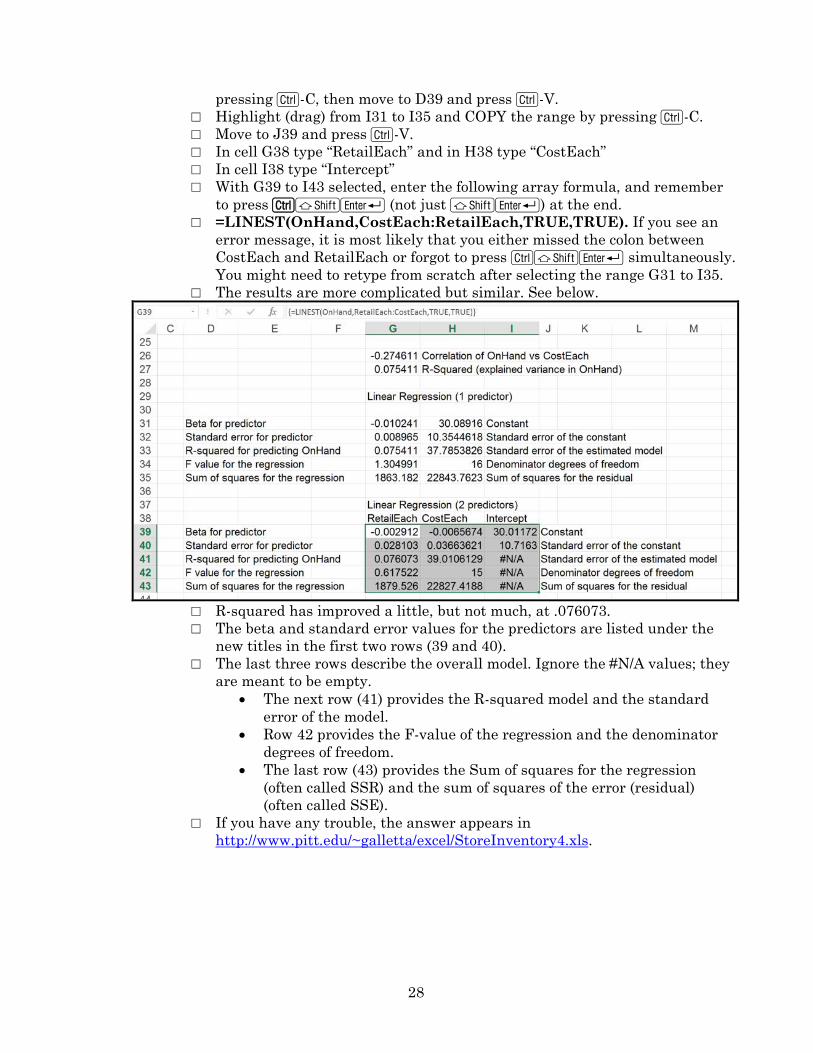
28
pressing C-C, then move to D39 and press C-V.
□ Highlight (drag) from I31 to I35 and COPY the range by pressing C-C.
□ Move to J39 and press C-V.
□ In cell G38 type “RetailEach” and in H38 type “CostEach”
□ In cell I38 type “Intercept”
□ With G39 to I43 selected, enter the following array formula, and remember
to press CSR (not just SR) at the end.
□ =LINEST(OnHand,CostEach:RetailEach,TRUE,TRUE). If you see an
error message, it is most likely that you either missed the colon between
CostEach and RetailEach or forgot to press CSR simultaneously.
You might need to retype from scratch after selecting the range G31 to I35.
□ The results are more complicated but similar. See below.
□ R-squared has improved a little, but not much, at .076073.
□ The beta and standard error values for the predictors are listed under the
new titles in the first two rows (39 and 40).
□ The last three rows describe the overall model. Ignore the #N/A values; they
are meant to be empty.
The next row (41) provides the R-squared model and the standard
error of the model.
Row 42 provides the F-value of the regression and the denominator
degrees of freedom.
The last row (43) provides the Sum of squares for the regression
(often called SSR) and the sum of squares of the error (residual)
(often called SSE).
□ If you have any trouble, the answer appears in
http://www.pitt.edu/~galletta/excel/StoreInventory4.xls.
29
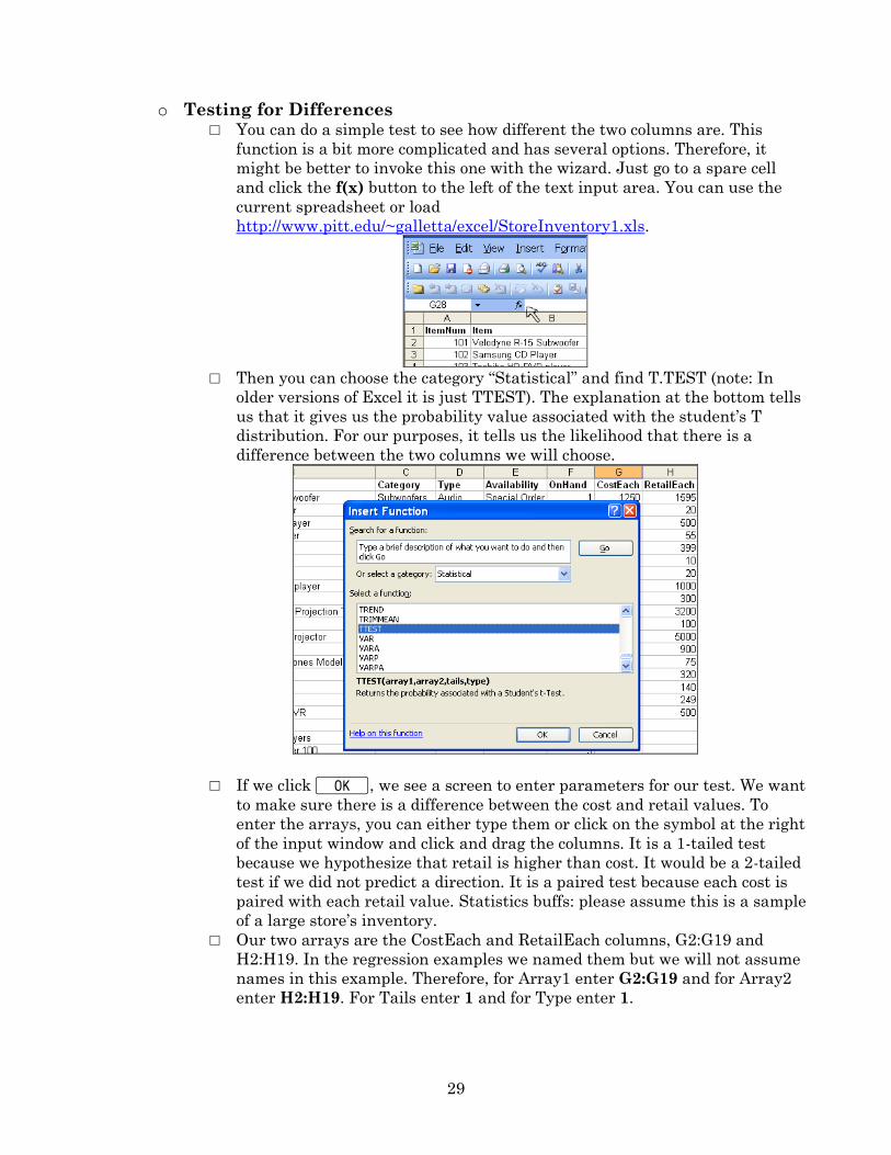
o Testing for Differences □ You can do a simple test to see how different the two columns are. This
function is a bit more complicated and has several options. Therefore, it
might be better to invoke this one with the wizard. Just go to a spare cell
and click the f(x) button to the left of the text input area. You can use the
current spreadsheet or load
http://www.pitt.edu/~galletta/excel/StoreInventory1.xls.
□ Then you can choose the category “Statistical” and find T.TEST (note: In
older versions of Excel it is just TTEST). The explanation at the bottom tells
us that it gives us the probability value associated with the student’s T
distribution. For our purposes, it tells us the likelihood that there is a
difference between the two columns we will choose.
□ If we click K KKKK, we see a screen to enter parameters for our test. We want
to make sure there is a difference between the cost and retail values. To
enter the arrays, you can either type them or click on the symbol at the right
of the input window and click and drag the columns. It is a 1-tailed test
because we hypothesize that retail is higher than cost. It would be a 2-tailed
test if we did not predict a direction. It is a paired test because each cost is
paired with each retail value. Statistics buffs: please assume this is a sample
of a large store’s inventory.
□ Our two arrays are the CostEach and RetailEach columns, G2:G19 and
H2:H19. In the regression examples we named them but we will not assume
names in this example. Therefore, for Array1 enter G2:G19 and for Array2
enter H2:H19. For Tails enter 1 and for Type enter 1.
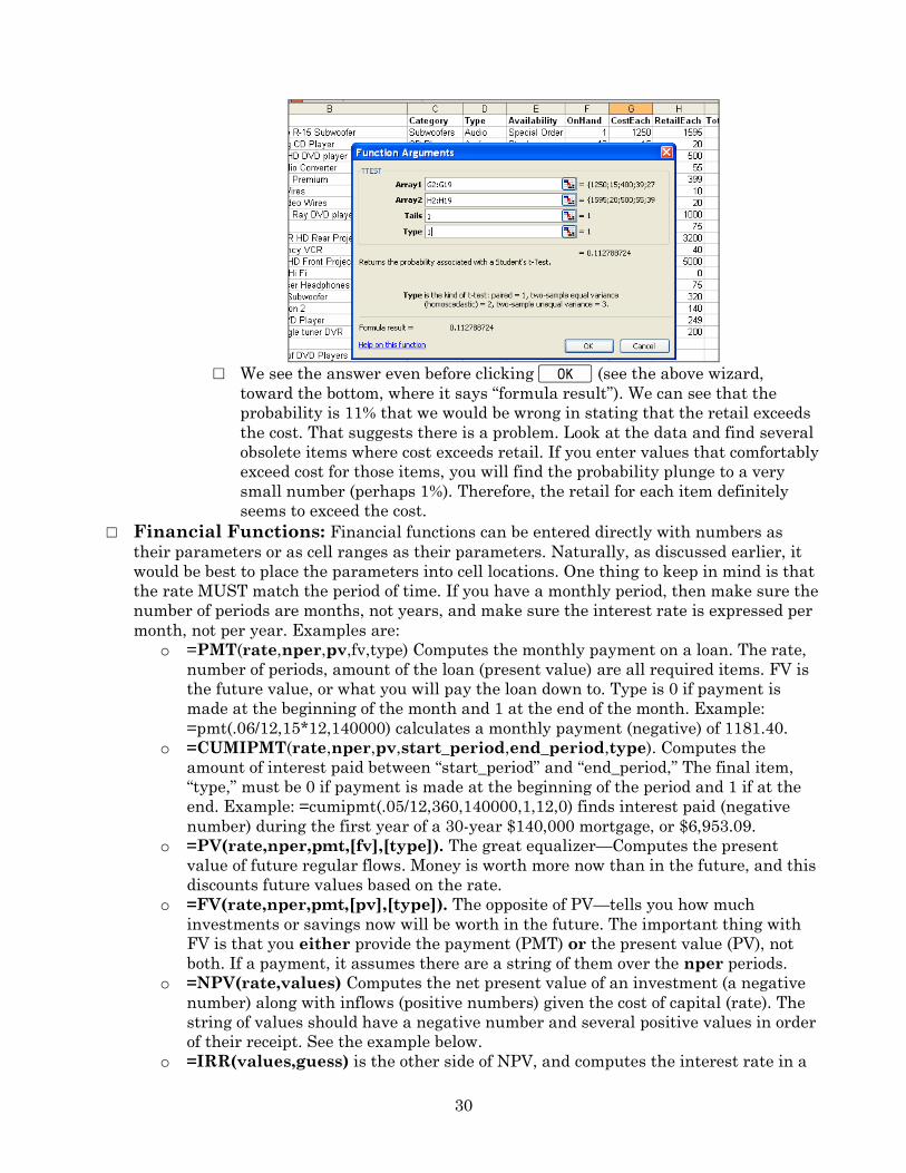
30
□ We see the answer even before clicking K (see the above wizard,
toward the bottom, where it says “formula result”). We can see that the
probability is 11% that we would be wrong in stating that the retail exceeds
the cost. That suggests there is a problem. Look at the data and find several
obsolete items where cost exceeds retail. If you enter values that comfortably
exceed cost for those items, you will find the probability plunge to a very
small number (perhaps 1%). Therefore, the retail for each item definitely
seems to exceed the cost.
□ Financial Functions: Financial functions can be entered directly with numbers as
their parameters or as cell ranges as their parameters. Naturally, as discussed earlier, it
would be best to place the parameters into cell locations. One thing to keep in mind is that
the rate MUST match the period of time. If you have a monthly period, then make sure the
number of periods are months, not years, and make sure the interest rate is expressed per
month, not per year. Examples are:
o =PMT(rate,nper,pv,fv,type) Computes the monthly payment on a loan. The rate,
number of periods, amount of the loan (present value) are all required items. FV is
the future value, or what you will pay the loan down to. Type is 0 if payment is
made at the beginning of the month and 1 at the end of the month. Example:
=pmt(.06/12,15*12,140000) calculates a monthly payment (negative) of 1181.40.
o =CUMIPMT(rate,nper,pv,start_period,end_period,type). Computes the
amount of interest paid between “start_period” and “end_period,” The final item,
“type,” must be 0 if payment is made at the beginning of the period and 1 if at the
end. Example: =cumipmt(.05/12,360,140000,1,12,0) finds interest paid (negative
number) during the first year of a 30-year $140,000 mortgage, or $6,953.09.
o =PV(rate,nper,pmt,[fv],[type]). The great equalizer—Computes the present
value of future regular flows. Money is worth more now than in the future, and this
discounts future values based on the rate.
o =FV(rate,nper,pmt,[pv],[type]). The opposite of PV—tells you how much
investments or savings now will be worth in the future. The important thing with
FV is that you either provide the payment (PMT) or the present value (PV), not
both. If a payment, it assumes there are a string of them over the nper periods.
o =NPV(rate,values) Computes the net present value of an investment (a negative
number) along with inflows (positive numbers) given the cost of capital (rate). The
string of values should have a negative number and several positive values in order
of their receipt. See the example below.
o =IRR(values,guess) is the other side of NPV, and computes the interest rate in a
31
string of payments. The rate is computed per period. The values can be situated on
several columns or rows.
o Two examples will help make this more practical.
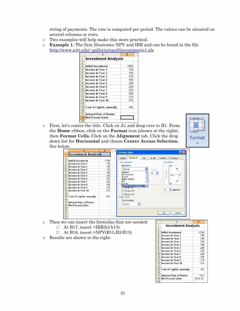
o Example 1. The first illustrates NPV and IRR and can be found in the file
http://www.pitt.edu/~galletta/excel/investments1.xls
o First, let’s center the title. Click on A1 and drag over to B1. From
the Home ribbon, click on the Format icon (shown at the right),
then Format Cells. Click on the Alignment tab. Click the drop
down list for Horizontal and choose Center Across Selection.
See below.
o Then we can insert the formulas that are needed:
□ At B17, insert =IRR(b3.b13)
□ At B18, insert =NPV(B15,B3:B13)
o Results are shown to the right.
32
o Example 2. The second example compares a 2-week time-share against spending
money on 14 days worth of hotels each year over 15 years. Load the file
http://www.pitt.edu/~galletta/excel/timeshares.xls
o The assumptions are listed in each box.
o Some of the formulas might look a little complicated. But they are just
combinations of simpler functions.
o The time share payments are based on the PMT function (payments per month).
The formula is =PMT(C5/12,C6*12,C4-C8). The parameters are rate, periods, and
sale price minus down payment.
o The maintenance fee is divided by 12 for the monthly amount and added to the
monthly payment. Payment results from PMT are negative, so to add the
maintenance fee would make an error. It is subtracted from the negative number to
yield a larger negative number.
o Interest during the first year comes from the cumipmt function and is
=CUMIPMT(C5/12,C6*12,C4-C8,1,12,1). The parameters are rate, total number of
months, present value (sale price minus down payment), start payment number,
end payment number, and type.
o Future value of time share payments is computed in three pieces given the cash
flows. =FV(C5/12,C6*12,-H11)+C9+FV(C5/12,C6*12,,C8) provides three future
values added together. The first is the monthly payment brought to the future (rate
per period, number of periods, and the monthly payment. The second part is the
expected sale price (already in the future). The third is another future value
calculation, addressing the down payment required, which has the same rate and
number of periods, but it skips the payment parameter and goes right to the down
payment parameter.
o Future value of the hotel payments is one future value calculation:
=FV(C19/12,C20*12,C18*14/12,) – Takes the cost of capital, number of periods, and
payment per period.
o Present value of the time share payments is rounded to 2 decimal places for making
33
a key comparison. Within the rounded calculation are three present values.
=ROUND(PV(C5/12,C6*12,-H11)-PV(C5/12,C6*12,,C9),2)-C8. The first is the string
of payments made each month. The second is the sale price after the loan is
finished. The third is the down payment required now, already at present value.
o Present value of the hotel payments is also one calculation, but rounded to 2
decimal places. The calculation =ROUND(PV(C19/12,C20*12,C18*14/12),2) takes
the present value of the monthly cost of capital, the number of payments, and the
monthly cost of the hotel. The cost is first annualized (7 days * 2 weeks * nightly
hotel room cost) then divided by 12 for a monthly cost.
o There is a comparison in C27, where you will get a message that depends on a
comparison between the two present values. We will omit the future values and
focus only on present value.
□ The formula is a logical function, a double-IF statement. The format of an IF
statement is =if(condition, truevalue, falsevalue). The condition is most
often an equality or inequality statement. The truevalue is what is to go into
the cell if the condition is true. The falsevalue is what is to go into the cell if
the condition is false. You can insert another IF statement into where the
false value goes because there could also be a condition of when the two
values are equal. Note that you need two parentheses at the end.
□ The function used is (all on one line):
=IF(C14<C23,"Just use a hotel",IF(C14>C23,"This time share is
better","Both are the same"))
o The spreadsheet also uses conditional formatting, so that the better option is
colored in pale orange, has a square around it, and the text is
bolded.
□ To do this, click in the cell you want to format conditionally.
In this case, C14.
□ From the Home ribbon, click the Conditional Formatting
icon (see the icon to the right of this text).
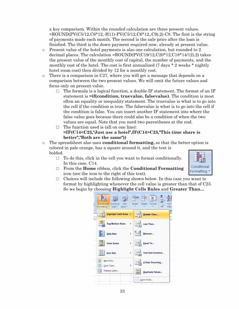
□ Choices will include the following shown below. In this case you want to
format by highlighting whenever the cell value is greater than that of C23.
So we begin by choosing Highlight Cells Rules and Greater Than…
34
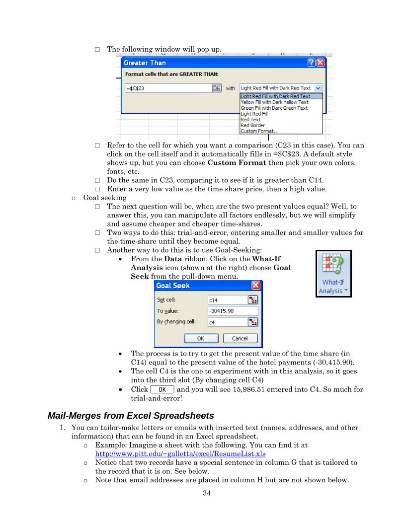
□ The following window will pop up.
□ Refer to the cell for which you want a comparison (C23 in this case). You can
click on the cell itself and it automatically fills in =$C$23. A default style
shows up, but you can choose Custom Format then pick your own colors,
fonts, etc.
□ Do the same in C23, comparing it to see if it is greater than C14.
□ Enter a very low value as the time share price, then a high value.
o Goal seeking
□ The next question will be, when are the two present values equal? Well, to
answer this, you can manipulate all factors endlessly, but we will simplify
and assume cheaper and cheaper time-shares.
□ Two ways to do this: trial-and-error, entering smaller and smaller values for
the time-share until they become equal.
□ Another way to do this is to use Goal-Seeking:
From the Data ribbon, Click on the What-If
Analysis icon (shown at the right) choose Goal
Seek from the pull-down menu.
The process is to try to get the present value of the time share (in
C14) equal to the present value of the hotel payments (-30,415.90).
The cell C4 is the one to experiment with in this analysis, so it goes
into the third slot (By changing cell C4)
Click K and you will see 15,986.51 entered into C4. So much for
trial-and-error!
Mail-Merges from Excel Spreadsheets
1. You can tailor-make letters or emails with inserted text (names, addresses, and other
information) that can be found in an Excel spreadsheet.
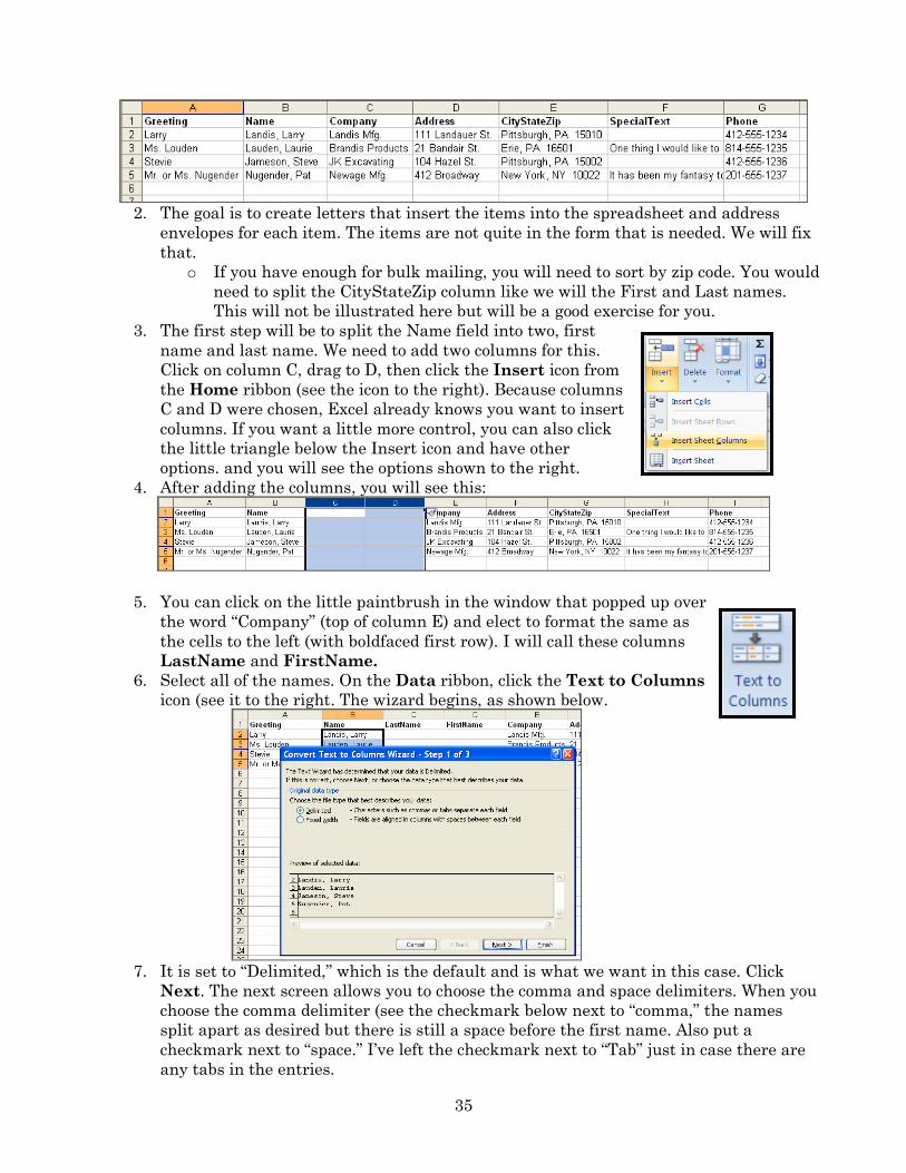
o Example: Imagine a sheet with the following. You can find it at
http://www.pitt.edu/~galletta/excel/ResumeList.xls
o Notice that two records have a special sentence in column G that is tailored to
the record that it is on. See below.
o Note that email addresses are placed in column H but are not shown below.
35
2. The goal is to create letters that insert the items into the spreadsheet and address
envelopes for each item. The items are not quite in the form that is needed. We will fix
that.
o If you have enough for bulk mailing, you will need to sort by zip code. You would
need to split the CityStateZip column like we will the First and Last names.
This will not be illustrated here but will be a good exercise for you.
3. The first step will be to split the Name field into two, first
name and last name. We need to add two columns for this.
Click on column C, drag to D, then click the Insert icon from
the Home ribbon (see the icon to the right). Because columns
C and D were chosen, Excel already knows you want to insert
columns. If you want a little more control, you can also click
the little triangle below the Insert icon and have other
options. and you will see the options shown to the right.
4. After adding the columns, you will see this:
5. You can click on the little paintbrush in the window that popped up over
the word “Company” (top of column E) and elect to format the same as
the cells to the left (with boldfaced first row). I will call these columns
LastName and FirstName.
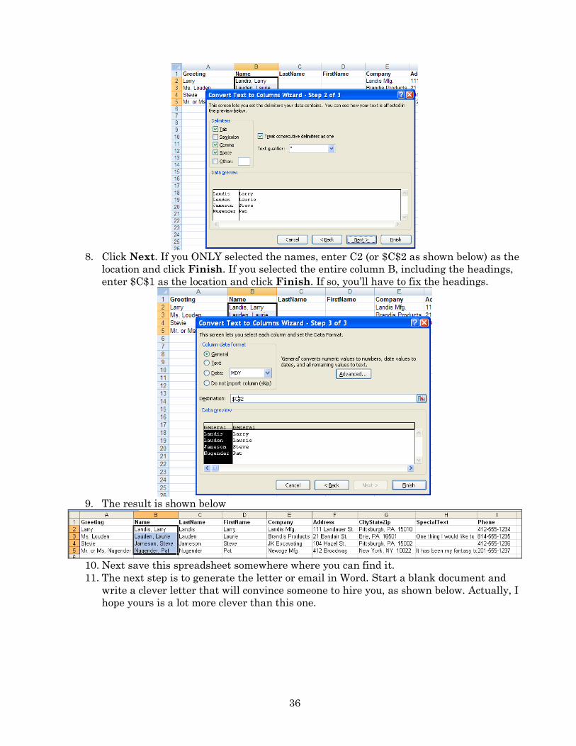
6. Select all of the names. On the Data ribbon, click the Text to Columns
icon (see it to the right. The wizard begins, as shown below.
7. It is set to “Delimited,” which is the default and is what we want in this case. Click
Next. The next screen allows you to choose the comma and space delimiters. When you
choose the comma delimiter (see the checkmark below next to “comma,” the names
split apart as desired but there is still a space before the first name. Also put a
checkmark next to “space.” I’ve left the checkmark next to “Tab” just in case there are
any tabs in the entries.
36
8. Click Next. If you ONLY selected the names, enter C2 (or $C$2 as shown below) as the
location and click Finish. If you selected the entire column B, including the headings,
enter $C$1 as the location and click Finish. If so, you’ll have to fix the headings.
9. The result is shown below
10. Next save this spreadsheet somewhere where you can find it.
11. The next step is to generate the letter or email in Word. Start a blank document and
write a clever letter that will convince someone to hire you, as shown below. Actually, I
hope yours is a lot more clever than this one.
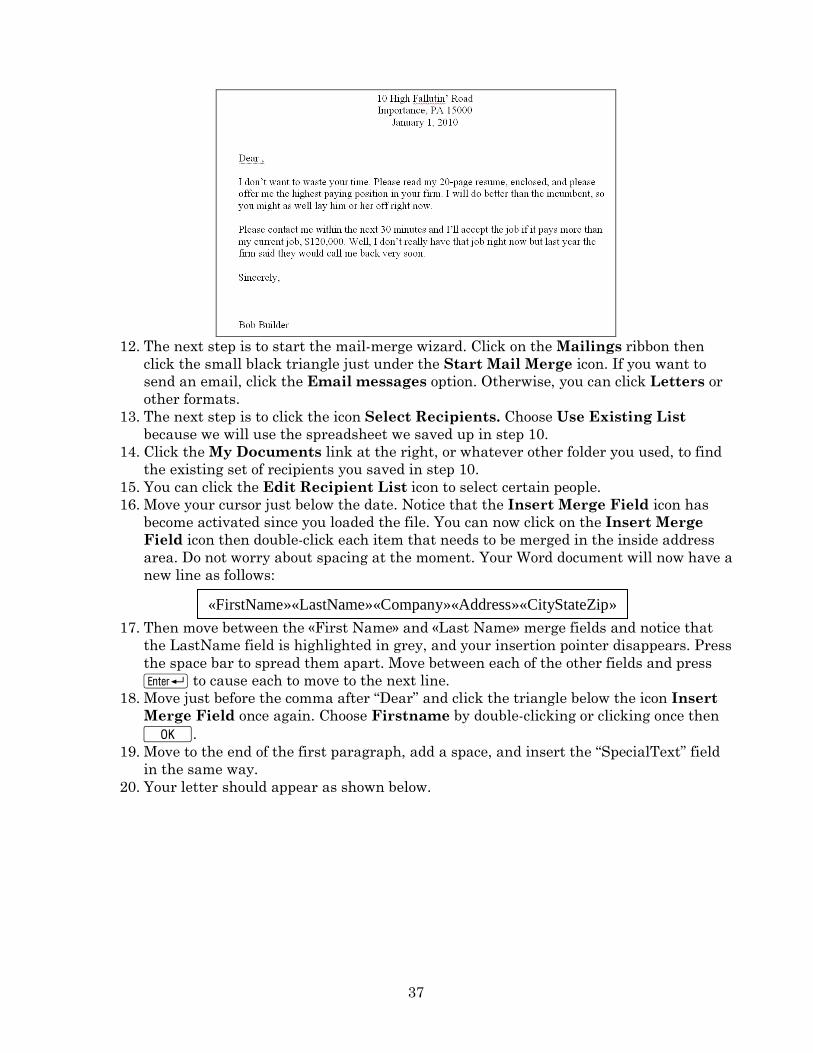
37
12. The next step is to start the mail-merge wizard. Click on the Mailings ribbon then
click the small black triangle just under the Start Mail Merge icon. If you want to
send an email, click the Email messages option. Otherwise, you can click Letters or
other formats.
13. The next step is to click the icon Select Recipients. Choose Use Existing List
because we will use the spreadsheet we saved up in step 10.
14. Click the My Documents link at the right, or whatever other folder you used, to find
the existing set of recipients you saved in step 10.
15. You can click the Edit Recipient List icon to select certain people.
16. Move your cursor just below the date. Notice that the Insert Merge Field icon has
become activated since you loaded the file. You can now click on the Insert Merge
Field icon then double-click each item that needs to be merged in the inside address
area. Do not worry about spacing at the moment. Your Word document will now have a
new line as follows:
17. Then move between the «First Name» and «Last Name» merge fields and notice that
the LastName field is highlighted in grey, and your insertion pointer disappears. Press
the space bar to spread them apart. Move between each of the other fields and press
R to cause each to move to the next line.
18. Move just before the comma after “Dear” and click the triangle below the icon Insert
Merge Field once again. Choose Firstname by double-clicking or clicking once then
K.
19. Move to the end of the first paragraph, add a space, and insert the “SpecialText” field
in the same way.
20. Your letter should appear as shown below.
«FirstName»«LastName»«Company»«Address»«CityStateZip»
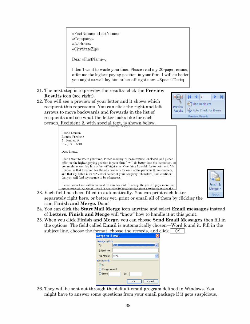
38
21. The next step is to preview the results--click the Preview
Results icon (see right).
22. You will see a preview of your letter and it shows which
recipient this represents. You can click the right and left
arrows to move backwards and forwards in the list of
recipients and see what the letter looks like for each
person. Recipient 2, with special text, is shown below.
23. Each field has been filled in automatically. You can print each letter
separately right here, or better yet, print or email all of them by clicking the
icon Finish and Merge. Done!
24. You can click the Start Mail Merge icon anytime and select Email messages instead
of Letters. Finish and Merge will “know” how to handle it at this point.
25. When you click Finish and Merge, you can choose Send Email Messages then fill in
the options. The field called Email is automatically chosen—Word found it. Fill in the
subject line, choose the format, choose the records, and click K.
26. They will be sent out through the default email program defined in Windows. You
might have to answer some questions from your email package if it gets suspicious.
39
Concatenating cells
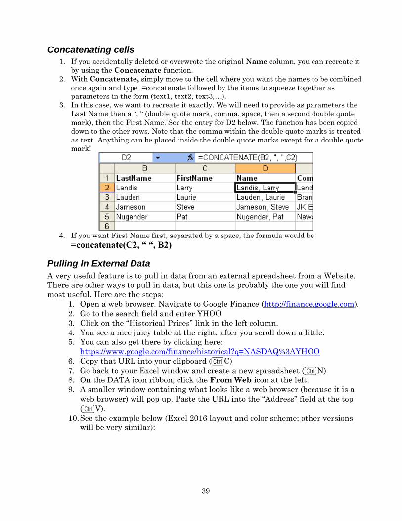
1. If you accidentally deleted or overwrote the original Name column, you can recreate it
by using the Concatenate function.
2. With Concatenate, simply move to the cell where you want the names to be combined
once again and type =concatenate followed by the items to squeeze together as
parameters in the form (text1, text2, text3,…).
3. In this case, we want to recreate it exactly. We will need to provide as parameters the
Last Name then a “, “ (double quote mark, comma, space, then a second double quote
mark), then the First Name. See the entry for D2 below. The function has been copied
down to the other rows. Note that the comma within the double quote marks is treated
as text. Anything can be placed inside the double quote marks except for a double quote
mark!
4. If you want First Name first, separated by a space, the formula would be
=concatenate(C2, “ “, B2)
Pulling In External Data
A very useful feature is to pull in data from an external spreadsheet from a Website.
There are other ways to pull in data, but this one is probably the one you will find
most useful. Here are the steps:
1. Open a web browser. Navigate to Google Finance (http://finance.google.com).
2. Go to the search field and enter YHOO
3. Click on the “Historical Prices” link in the left column.
4. You see a nice juicy table at the right, after you scroll down a little.
5. You can also get there by clicking here:
https://www.google.com/finance/historical?q=NASDAQ%3AYHOO
6. Copy that URL into your clipboard (CC)
7. Go back to your Excel window and create a new spreadsheet (CN)
8. On the DATA icon ribbon, click the From Web icon at the left.
9. A smaller window containing what looks like a web browser (because it is a
web browser) will pop up. Paste the URL into the “Address” field at the top
(CV).
10. See the example below (Excel 2016 layout and color scheme; other versions
will be very similar):
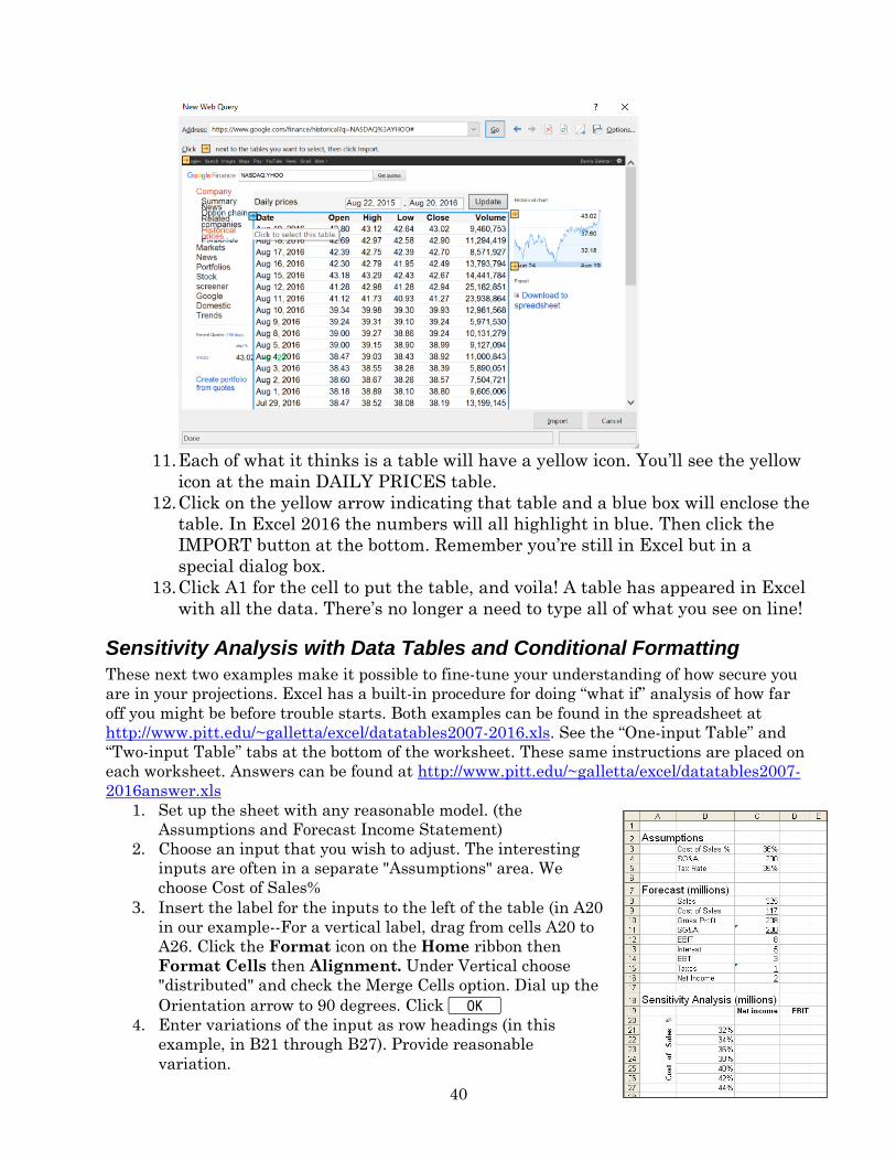
40
11. Each of what it thinks is a table will have a yellow icon. You’ll see the yellow
icon at the main DAILY PRICES table.
12. Click on the yellow arrow indicating that table and a blue box will enclose the
table. In Excel 2016 the numbers will all highlight in blue. Then click the
IMPORT button at the bottom. Remember you’re still in Excel but in a
special dialog box.
13. Click A1 for the cell to put the table, and voila! A table has appeared in Excel
with all the data. There’s no longer a need to type all of what you see on line!
Sensitivity Analysis with Data Tables and Conditional Formatting
These next two examples make it possible to fine-tune your understanding of how secure you
are in your projections. Excel has a built-in procedure for doing “what if” analysis of how far
off you might be before trouble starts. Both examples can be found in the spreadsheet at
http://www.pitt.edu/~galletta/excel/datatables2007-2016.xls. See the “One-input Table” and
“Two-input Table” tabs at the bottom of the worksheet. These same instructions are placed on
each worksheet. Answers can be found at http://www.pitt.edu/~galletta/excel/datatables2007-
2016answer.xls
1. Set up the sheet with any reasonable model. (the
Assumptions and Forecast Income Statement)
2. Choose an input that you wish to adjust. The interesting
inputs are often in a separate "Assumptions" area. We
choose Cost of Sales%
3. Insert the label for the inputs to the left of the table (in A20
in our example--For a vertical label, drag from cells A20 to
A26. Click the Format icon on the Home ribbon then
Format Cells then Alignment. Under Vertical choose
"distributed" and check the Merge Cells option. Dial up the
Orientation arrow to 90 degrees. Click K 4. Enter variations of the input as row headings (in this
example, in B21 through B27). Provide reasonable
variation.
41
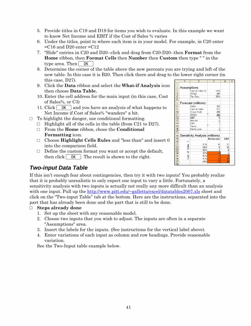
5. Provide titles in C19 and D19 for items you wish to evaluate. In this example we want
to know Net Income and EBIT if the Cost of Sales % varies
6. Under the titles, point to where each item is in your model. For example, in C20 enter
=C16 and D20 enter =C12
7. "Hide" entries in C20 and D20--click and drag from C20-D20--then Format from the
Home ribbon, then Format Cells then Number then Custom then type " " in the
type area. Then K 8. Determine the corner of the table above the new percents you are trying and left of the
new table. In this case it is B20. Then click there and drag to the lower right corner (in
this case, D27).
9. Click the Data ribbon and select the What-if Analysis icon
then choose Data Table.
10. Enter the cell address for the main input (in this case, Cost
of Sales%, or C3)
11. Click K and you have an analysis of what happens to
Net Income if Cost of Sales% "wanders" a bit.
□ To highlight the danger, use conditional formatting.
□ Highlight all of the cells in the table (from C21 to D27).
□ From the Home ribbon, chose the Conditional
Formatting icon.
□ Choose Highlight Cells Rules and "less than" and insert 0
into the comparison field.
□ Define the custom format you want or accept the default,
then click K. The result is shown to the right.
Two-input Data Table
If this isn’t enough fear about contingencies, then try it with two inputs! You probably realize
that it is probably unrealistic to only expect one input to vary a little. Fortunately, a
sensitivity analysis with two inputs is actually not really any more difficult than an analysis
with one input. Pull up the http://www.pitt.edu/~galletta/excel/datatables2007.xls sheet and
click on the “Two-input Table” tab at the bottom. Here are the instructions, separated into the
part that has already been done and the part that is still to be done.
□ Steps already done
1. Set up the sheet with any reasonable model.
2. Choose two inputs that you wish to adjust. The inputs are often in a separate
"Assumptions" area.
3. Insert the labels for the inputs. (See instructions for the vertical label above).
4. Enter variations of each input as column and row headings. Provide reasonable
variation.
See the Two-Input table example below.
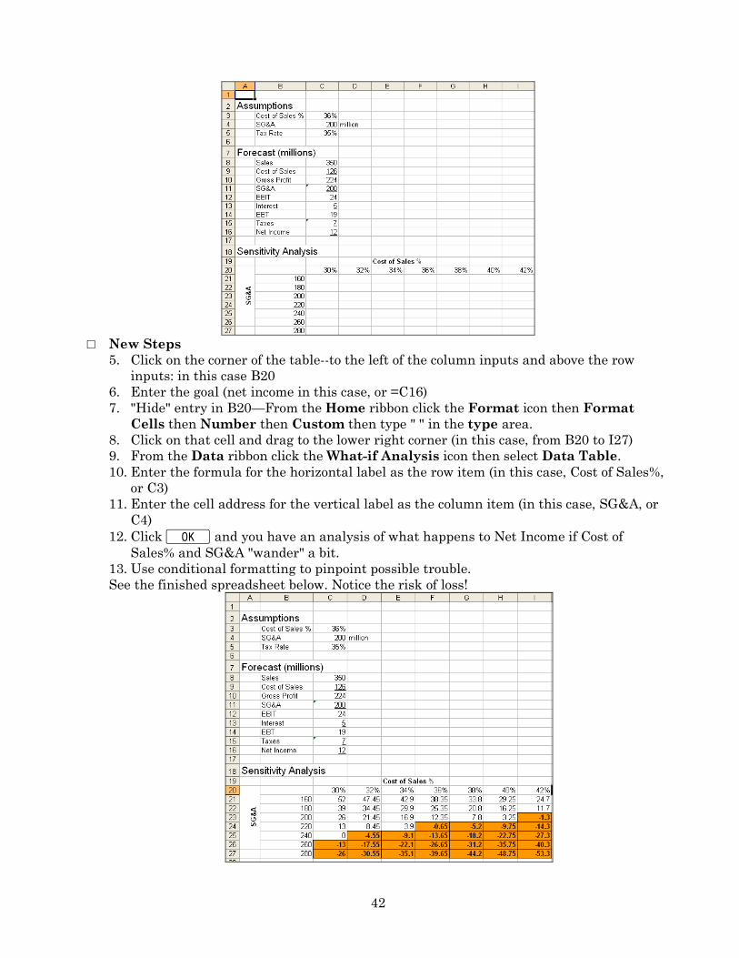
42
□ New Steps
5. Click on the corner of the table--to the left of the column inputs and above the row
inputs: in this case B20
6. Enter the goal (net income in this case, or =C16)
7. "Hide" entry in B20—From the Home ribbon click the Format icon then Format
Cells then Number then Custom then type " " in the type area.
8. Click on that cell and drag to the lower right corner (in this case, from B20 to I27)
9. From the Data ribbon click the What-if Analysis icon then select Data Table.
10. Enter the formula for the horizontal label as the row item (in this case, Cost of Sales%,
or C3)
11. Enter the cell address for the vertical label as the column item (in this case, SG&A, or
C4)
12. Click K and you have an analysis of what happens to Net Income if Cost of
Sales% and SG&A "wander" a bit.
13. Use conditional formatting to pinpoint possible trouble.
See the finished spreadsheet below. Notice the risk of loss!
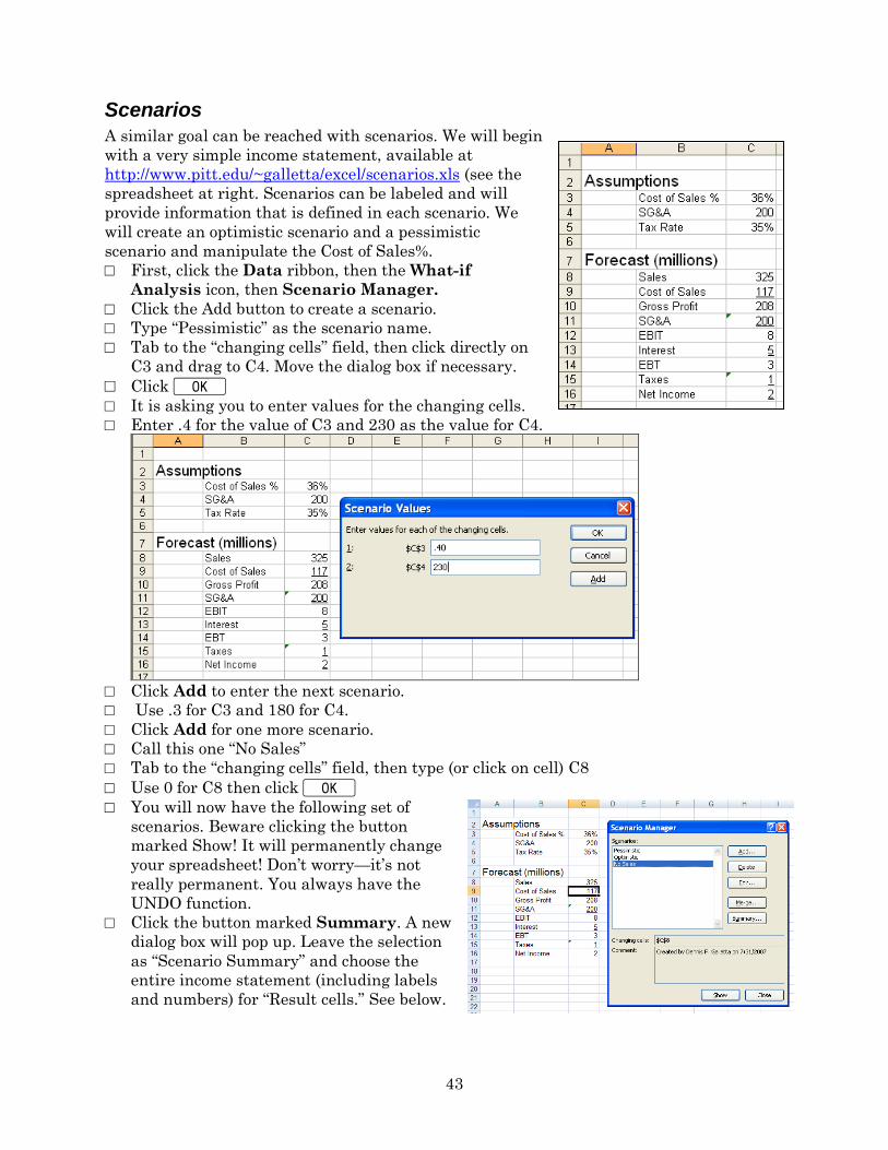
43
Scenarios
A similar goal can be reached with scenarios. We will begin
with a very simple income statement, available at
http://www.pitt.edu/~galletta/excel/scenarios.xls (see the
spreadsheet at right. Scenarios can be labeled and will
provide information that is defined in each scenario. We
will create an optimistic scenario and a pessimistic
scenario and manipulate the Cost of Sales%.
□ First, click the Data ribbon, then the What-if
Analysis icon, then Scenario Manager.
□ Click the Add button to create a scenario.
□ Type “Pessimistic” as the scenario name.
□ Tab to the “changing cells” field, then click directly on
C3 and drag to C4. Move the dialog box if necessary.
□ Click K □ It is asking you to enter values for the changing cells.
□ Enter .4 for the value of C3 and 230 as the value for C4.
□ Click Add to enter the next scenario.
□ Use .3 for C3 and 180 for C4.
□ Click Add for one more scenario.
□ Call this one “No Sales”
□ Tab to the “changing cells” field, then type (or click on cell) C8
□ Use 0 for C8 then click K
□ You will now have the following set of
scenarios. Beware clicking the button
marked Show! It will permanently change
your spreadsheet! Don’t worry—it’s not
really permanent. You always have the
UNDO function.
□ Click the button marked Summary. A new
dialog box will pop up. Leave the selection
as “Scenario Summary” and choose the
entire income statement (including labels
and numbers) for “Result cells.” See below.
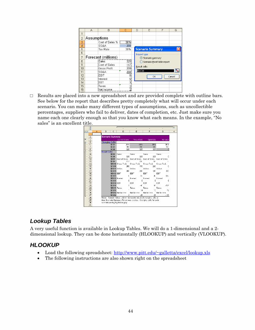
44
□ Results are placed into a new spreadsheet and are provided complete with outline bars.
See below for the report that describes pretty completely what will occur under each
scenario. You can make many different types of assumptions, such as uncollectible
percentages, suppliers who fail to deliver, dates of completion, etc. Just make sure you
name each one clearly enough so that you know what each means. In the example, “No
sales” is an excellent title.
Lookup Tables
A very useful function is available in Lookup Tables. We will do a 1-dimensional and a 2-
dimensional lookup. They can be done horizontally (HLOOKUP) and vertically (VLOOKUP).
HLOOKUP
Load the following spreadsheet: http://www.pitt.edu/~galletta/excel/lookup.xls
The following instructions are also shown right on the spreadsheet
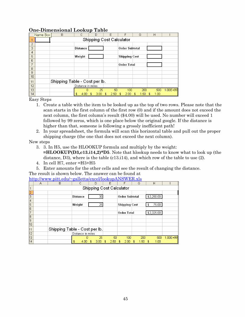
45
One-Dimensional Lookup Table
Easy Steps
1. Create a table with the item to be looked up as the top of two rows. Please note that the
scan starts in the first column of the first row (0) and if the amount does not exceed the
next column, the first column’s result ($4.00) will be used. No number will exceed 1
followed by 99 zeros, which is one place below the original google. If the distance is
higher than that, someone is following a grossly inefficient path!
2. In your spreadsheet, the formula will scan this horizontal table and pull out the proper
shipping charge (the one that does not exceed the next column).
New steps
3. 3. In H5, use the HLOOKUP formula and multiply by the weight:
=HLOOKUP(D3,c13.i14,2)*D5. Note that hlookup needs to know what to look up (the
distance, D3), where is the table (c13.i14), and which row of the table to use (2).
4. In cell H7, enter =H3+H5
5. Enter amounts for the other cells and see the result of changing the distance.
The result is shown below. The answer can be found at
http://www.pitt.edu/~galletta/excel/lookupANSWER.xls
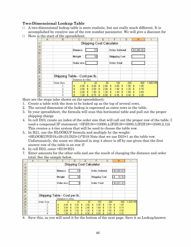
46
Two-Dimensional Lookup Table □ A two-dimensional lookup table is more realistic, but not really much different. It is
accomplished by creative use of the row number parameter. We will give a discount for
□ Here is the start of the spreadsheet.
Here are the steps (also shown on the spreadsheet):
1. Create a table with the item to be looked up as the top of several rows.
2. The second dimension of the lookup is expressed as extra rows in the table.
3. In your spreadsheet, the formula will scan this horizontal table and pull out the proper
shipping charge
4. In cell D23, create an index of the order size that will call out the proper row of the table. I
used a compound IF statement: =IF(H19>=10000,4,IF(H19>=5000,3,IF(H19>=2500,2,1)))
This creates a 4-tier system that will be used to choose the table row.
5. In H21, use the HLOOKUP formula and multiply by the weight:
=HLOOKUP(D19,c29.i33,D23+1)*D19 Note that we use D23+1 as the table row.
Unfortunately, the count we obtained in step 4 above is off by one given that the first
answer row of the table is on row 2!
6. In cell H23, enter =H19+H21
7. Enter amounts for the other cells and see the result of changing the distance and order
total. See the sample below.
8. Save this, as you will need it for the bottom of the next page. Save it as LookupAnswer.

47
VLOOKUP
□ There is also a VLOOKUP function that works exactly like HLOOKUP. It is valuable if
you want to look up information next to data items in a list, or a database you might
obtain from one of your corporate databases.
□ For a moment we will go back to the store inventory example.
□ You might want to display the inventory quantity, cost per item, and total cost of a
particular item. Load the sheet
http://www.pitt.edu/~galletta/excel/StoreInventory1b.xls for simplicity’s sake.
□ In the following cells, enter the following text:
B25 Enter the item number in cell C26:
B26 Item number
B27 Item name
B28 Number on hand
B29 Cost, each
□ In the following cells, enter the following formulas carefully
C26 102
C27 =VLOOKUP(C$26,$A$2:$I$19,2)
C28 =VLOOKUP(C$26,$A$2:$I$19,6)
C29 =VLOOKUP(C$26,$A$2:$I$19,7)
□ In cell C26, enter 103 and see how it changes. Try other inventory item numbers and
see what happens. Try something that doesn’t exist and you’ll see one limitation in this
way of doing things. □ If you have trouble, you can see the answer at
http://www.pitt.edu/~galletta/excel/StoreInventoryLookup.xls and enter different
amounts in C26
Auditing Spreadsheet Cells
□ Given that there are so many spreadsheet errors, it is important to audit your models
or “trade papers” and audit someone else’s.
□ There are three main tools. The first is a set of arrows that are drawn between cells
that have dependencies. The second allows you to see the results of each step in a
calculation. The third allows you to see all formulas at the same time.
□ Arrows
o In the Shipping Calculator spreadsheet (we called “LookupAnswer” or obtain it
from http://www.pitt.edu/~galletta/excel/LookupAnswer.xls), you can move to
any cell you would like to audit (try H5) and click on the Formulas ribbon then
find the Trace Precedents icon in the Formula Auditing section. Arrows will
point to the cells that are used in the formula for H5 as shown below.
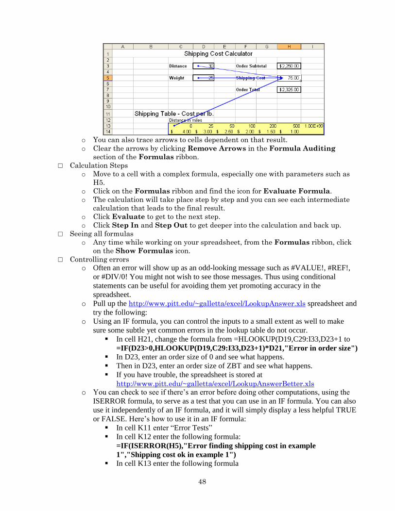
48
o You can also trace arrows to cells dependent on that result.
o Clear the arrows by clicking Remove Arrows in the Formula Auditing
section of the Formulas ribbon.
□ Calculation Steps
o Move to a cell with a complex formula, especially one with parameters such as
H5.
o Click on the Formulas ribbon and find the icon for Evaluate Formula.
o The calculation will take place step by step and you can see each intermediate
calculation that leads to the final result.
o Click Evaluate to get to the next step.
o Click Step In and Step Out to get deeper into the calculation and back up.
□ Seeing all formulas
o Any time while working on your spreadsheet, from the Formulas ribbon, click
on the Show Formulas icon.
□ Controlling errors
o Often an error will show up as an odd-looking message such as #VALUE!, #REF!,
or #DIV/0! You might not wish to see those messages. Thus using conditional
statements can be useful for avoiding them yet promoting accuracy in the
spreadsheet.
o Pull up the http://www.pitt.edu/~galletta/excel/LookupAnswer.xls spreadsheet and
try the following:
o Using an IF formula, you can control the inputs to a small extent as well to make
sure some subtle yet common errors in the lookup table do not occur.
In cell H21, change the formula from =HLOOKUP(D19,C29:I33,D23+1 to
=IF(D23>0,HLOOKUP(D19,C29:I33,D23+1)*D21,"Error in order size") In D23, enter an order size of 0 and see what happens.
Then in D23, enter an order size of ZBT and see what happens.
If you have trouble, the spreadsheet is stored at
http://www.pitt.edu/~galletta/excel/LookupAnswerBetter.xls o You can check to see if there’s an error before doing other computations, using the
ISERROR formula, to serve as a test that you can use in an IF formula. You can also
use it independently of an IF formula, and it will simply display a less helpful TRUE
or FALSE. Here’s how to use it in an IF formula:
In cell K11 enter “Error Tests”
In cell K12 enter the following formula:
=IF(ISERROR(H5),"Error finding shipping cost in example
1","Shipping cost ok in example 1") In cell K13 enter the following formula
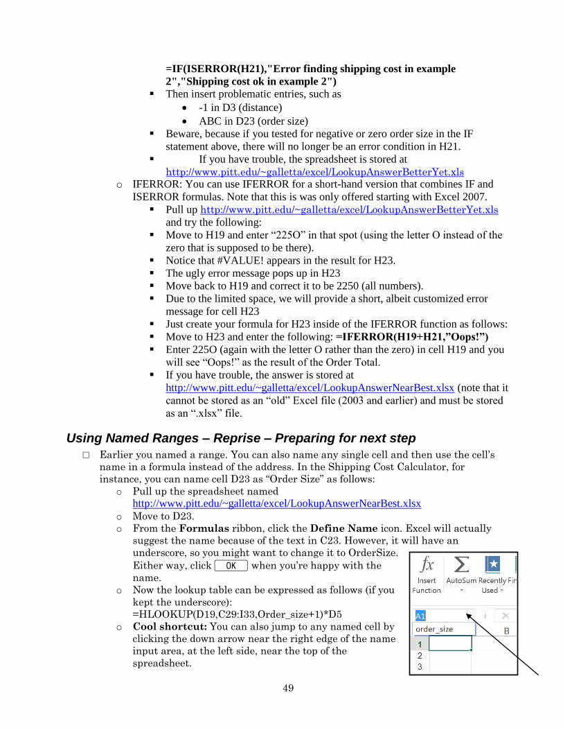
49
=IF(ISERROR(H21),"Error finding shipping cost in example
2","Shipping cost ok in example 2") Then insert problematic entries, such as
-1 in D3 (distance)
ABC in D23 (order size)
Beware, because if you tested for negative or zero order size in the IF
statement above, there will no longer be an error condition in H21.
If you have trouble, the spreadsheet is stored at
http://www.pitt.edu/~galletta/excel/LookupAnswerBetterYet.xls o IFERROR: You can use IFERROR for a short-hand version that combines IF and
ISERROR formulas. Note that this is was only offered starting with Excel 2007.
Pull up http://www.pitt.edu/~galletta/excel/LookupAnswerBetterYet.xls
and try the following:
Move to H19 and enter “225O” in that spot (using the letter O instead of the
zero that is supposed to be there).
Notice that #VALUE! appears in the result for H23.
The ugly error message pops up in H23
Move back to H19 and correct it to be 2250 (all numbers).
Due to the limited space, we will provide a short, albeit customized error
message for cell H23
Just create your formula for H23 inside of the IFERROR function as follows:
Move to H23 and enter the following: =IFERROR(H19+H21,”Oops!”)
Enter 225O (again with the letter O rather than the zero) in cell H19 and you
will see “Oops!” as the result of the Order Total.
If you have trouble, the answer is stored at
http://www.pitt.edu/~galletta/excel/LookupAnswerNearBest.xlsx (note that it
cannot be stored as an “old” Excel file (2003 and earlier) and must be stored
as an “.xlsx” file.
Using Named Ranges – Reprise – Preparing for next step
□ Earlier you named a range. You can also name any single cell and then use the cell’s
name in a formula instead of the address. In the Shipping Cost Calculator, for
instance, you can name cell D23 as “Order Size” as follows:
o Pull up the spreadsheet named
http://www.pitt.edu/~galletta/excel/LookupAnswerNearBest.xlsx
o Move to D23.
o From the Formulas ribbon, click the Define Name icon. Excel will actually
suggest the name because of the text in C23. However, it will have an
underscore, so you might want to change it to OrderSize.
Either way, click K when you’re happy with the
name.
o Now the lookup table can be expressed as follows (if you
kept the underscore):
=HLOOKUP(D19,C29:I33,Order_size+1)*D5
o Cool shortcut: You can also jump to any named cell by
clicking the down arrow near the right edge of the name
input area, at the left side, near the top of the
spreadsheet.
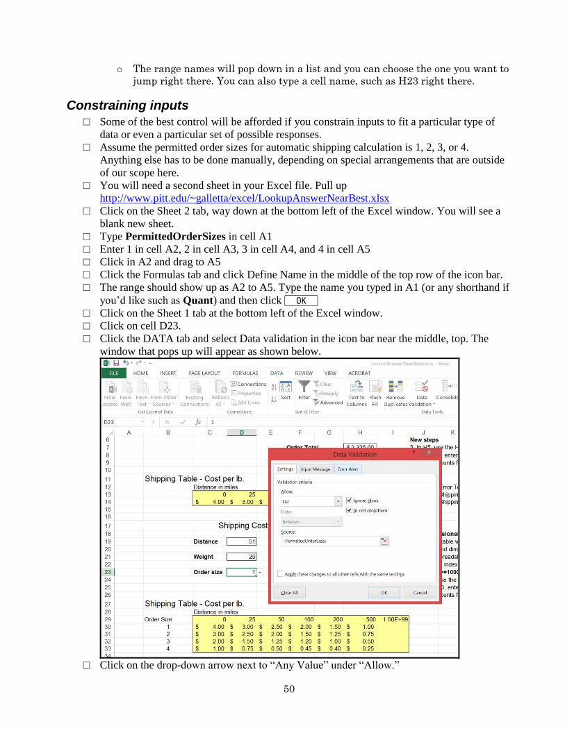
50
o The range names will pop down in a list and you can choose the one you want to
jump right there. You can also type a cell name, such as H23 right there.
Constraining inputs
□ Some of the best control will be afforded if you constrain inputs to fit a particular type of
data or even a particular set of possible responses.
□ Assume the permitted order sizes for automatic shipping calculation is 1, 2, 3, or 4.
Anything else has to be done manually, depending on special arrangements that are outside
of our scope here.
□ You will need a second sheet in your Excel file. Pull up
http://www.pitt.edu/~galletta/excel/LookupAnswerNearBest.xlsx
□ Click on the Sheet 2 tab, way down at the bottom left of the Excel window. You will see a
blank new sheet.
□ Type PermittedOrderSizes in cell A1
□ Enter 1 in cell A2, 2 in cell A3, 3 in cell A4, and 4 in cell A5
□ Click in A2 and drag to A5
□ Click the Formulas tab and click Define Name in the middle of the top row of the icon bar.
□ The range should show up as A2 to A5. Type the name you typed in A1 (or any shorthand if
you’d like such as Quant) and then click K
□ Click on the Sheet 1 tab at the bottom left of the Excel window.
□ Click on cell D23.
□ Click the DATA tab and select Data validation in the icon bar near the middle, top. The
window that pops up will appear as shown below.
□ Click on the drop-down arrow next to “Any Value” under “Allow.”
51
□ Select List
□ Type =PermittedOrderSizes (or =Quant if you used my shorthand version) in the Source
text box. Note: don’t forget the “=”
□ Click K
□ Now on Sheet 1, if you move the cursor to D23, you will now see a dropdown arrow appear
next to the input area for the Order Size. You can click it and choose 1, 2, 3, or 4. This will
prevent any strange input that will go beyond the list you have in the second sheet.
□ If you have any trouble, the answer is stored in
http://www.pitt.edu/~galletta/excel/LookupAnswerBest.xlsx
Basic Macros
□ Macros can be studied in an entire 3-credit course. This is meant to whet your appetite
for macros. To get the most out of macros, it is useful to learn Visual Studio.
□ Macros are useful any time there are repetitive operations. In some cases, you might
want to use C-Y (repeat). However, if you need to do the same repetitive thing again
intermittently, you should use a macro.
□ In the Shipping Cost Calculator, you might not want to see the yellow background and
border around the shipping table. In fact, you might have dozens of spreadsheets with
cells that are formatted in that way.
□ The goal is to change the yellow background to pale green, to remove the border, then
to change the fonts to bold + italics.
□ Here are the steps for creating the macro
o Highlight the cells for which you want this macro to work. You will then see it
work in a meaningful way as you create it.
o From the View ribbon, click the triangle under the Macros icon, then Record
New Macro.
o Give your macro a name. I called this one “unborder”
o I assigned a shortcut key C-x to the macro by entering an x into the box.
o Choose the current workbook unless you will want it to be used again. If so,
select your personal macro workbook to store this rather than just the current
workbook.
o Click K only when you are ready. From this moment on, everything you
click will be played back, even errors. You can do all the formatting that you
desire here. Make sure you choose boldfacing (for undoing this in a later step).
o When you are finished, from View ribbon, click the small triangle under the
Macros icon then choose stop recording.
□ Here are the steps for running the macro:
o Select the cells you want to format
o Click C-x
□ Here are the steps for modifying the macro:
o Let’s assume you do not want to select boldfacing. Most people will be happier to
restart the macro all over again in such a simple situation.
o But if you are brave, you can move on.
o If you saved the macro in the personal workbook you must unhide it by clicking
the View ribbon and clicking on the Unhide icon. Then select Personal.xls.
o You can then go to the View ribbon and click the Macros pull-down menu and
choose View Macros.
o Select the macro you wish to edit and click the Edit button.
o In this example, you see the following perhaps confusing screen.
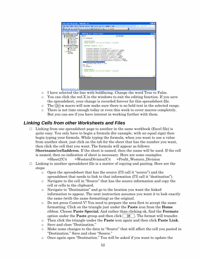
52
o I have selected the line with boldfacing. Change the word True to False.
o You can click the red X in the windows to exit the editing function. If you save
the spreadsheet, your change is recorded forever for this spreadsheet file.
o The C-x macro will now make sure there is no bold text in the selected range.
o There is not time enough today or even this week to cover macros completely.
But you can see if you have interest in working further with them.
Linking Cells from other Worksheets and Files
□ Linking from one spreadsheet page to another in the same workbook (Excel file) is
quite easy. You only have to begin a formula (for example, with an equal sign) then
begin typing your formula. While typing the formula, when you want to use a value
from another sheet, just click on the tab for the sheet that has the number you want,
then click the cell that you want. The formula will appear as follows:
Sheetname!celladdress. If the sheet is named, then the name will be used. If the cell
is named, then no indication of sheet is necessary. Here are some examples:
=Sheet2!C4 =WesternDivision!C4 =Profit_Western_Division
□ Linking to another spreadsheet file is a matter of copying and pasting. Here are the
steps:
o Open the spreadsheet that has the source (I’ll call it “source”) and the
spreadsheet that needs to link to that information (I’ll call it “destination”).
o Navigate to the cell in “Source” that has the source information and copy the
cell or cells to the clipboard.
o Navigate to “Destination” and go to the location you want the linked
information to appear. The next instruction assumes you want it to look exactly
the same (with the same formatting) as the original.
o Do not press Control-V! You need to prepare the area first to accept the same
formatting. Click on the triangle just under the Paste icon from the Home
ribbon. Choose Paste Special. And rather than clicking ok, find the Formats
option under the Paste group and then click K. The format will transfer.
o Then click the triangle under the Paste icon again and then click Paste Link.
o Save and close “Destination.”
o Make some changes to the data in “Source” that will affect the cell you pasted in
“Destination.” Save and close “Source.”
o Once again open “Destination.” You will be asked if you want to update the
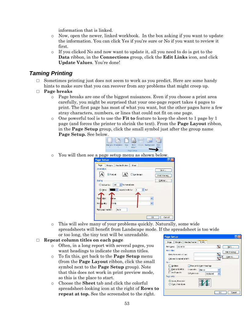
53
information that is linked.
o Now, open the newer, linked workbook. In the box asking if you want to update
the information. You can click Yes if you’re sure or No if you want to review it
first.
o If you clicked No and now want to update it, all you need to do is get to the
Data ribbon, in the Connections group, click the Edit Links icon, and click
Update Values. You’re done!
Taming Printing
□ Sometimes printing just does not seem to work as you predict. Here are some handy
hints to make sure that you can recover from any problems that might creep up.
□ Page breaks
o Page breaks are one of the biggest nuisances. Even if you choose a print area
carefully, you might be surprised that your one-page report takes 4 pages to
print. The first page has most of what you want, but the other pages have a few
stray characters, numbers, or lines that could not fit on one page.
o One powerful tool is to use the Fit to feature to keep the sheet to 1 page by 1
page (and forces the printer to shrink the text). From the Page Layout ribbon,
in the Page Setup group, click the small symbol just after the group name
Page Setup. See below.
o You will then see a page setup menu as shown below.
o This will solve many of your problems quickly. Naturally, some wide
spreadsheets will benefit from Landscape mode. If the spreadsheet is too wide
or too long, the tiny text will be unreadable.
□ Repeat column titles on each page
o Often, in a long report with several pages, you
want headings to indicate the column titles.
o To fix this, get back to the Page Setup menu
(from the Page Layout ribbon, click the small
symbol next to the Page Setup group). Note
that this does not work in print preview mode,
so this is the place to start.
o Choose the Sheet tab and click the colorful
spreadsheet-looking icon at the right of Rows to
repeat at top. See the screenshot to the right.
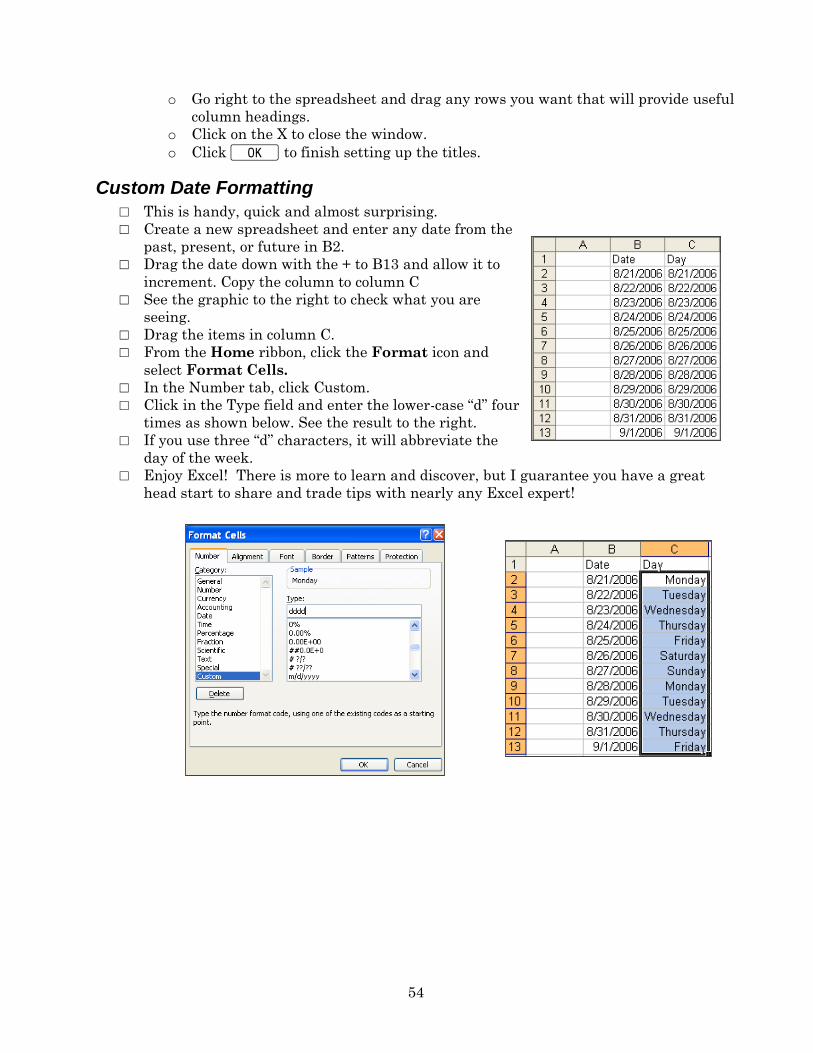
54
o Go right to the spreadsheet and drag any rows you want that will provide useful
column headings.
o Click on the X to close the window.
o Click K to finish setting up the titles.
Custom Date Formatting
□ This is handy, quick and almost surprising.
□ Create a new spreadsheet and enter any date from the
past, present, or future in B2.
□ Drag the date down with the + to B13 and allow it to
increment. Copy the column to column C
□ See the graphic to the right to check what you are
seeing.
□ Drag the items in column C.
□ From the Home ribbon, click the Format icon and
select Format Cells.
□ In the Number tab, click Custom.
□ Click in the Type field and enter the lower-case “d” four
times as shown below. See the result to the right.
□ If you use three “d” characters, it will abbreviate the
day of the week.
□ Enjoy Excel! There is more to learn and discover, but I guarantee you have a great
head start to share and trade tips with nearly any Excel expert!