Embed Size (px)
Citation preview

1
Copyright © 2010 Pearson Education, Inc. Publishing as Prentice Hall 1 1 Copyright © 2008 Prentice-Hall. All rights reserved.
CommittedtoShapingtheNextGenerationofITExperts.
Chapter 3: Charts:
Delivering a Message Robert Grauer, Keith Mulbery, Judy Scheeren
Exploring Microsoft Office Excel 2007
Copyright © 2010 Pearson Education, Inc. Publishing as Prentice Hall 2
Objectives
Choose a chart type Create a chart Modify a chart Enhance charts with graphic shapes Embed charts Print charts
Copyright © 2010 Pearson Education, Inc. Publishing as Prentice Hall 3
Charts
A chart is a graphic or visual representation of data
Multiple chart types can enhance information, adding visual appeal and making it easy to analyze data
Copyright © 2010 Pearson Education, Inc. Publishing as Prentice Hall 4
Choosing a Chart Type
Graphic representation of data Attractive, clear way to convey information Select the type of chart that best presents
your message Add enhancements to better communicate
your information
Copyright © 2010 Pearson Education, Inc. Publishing as Prentice Hall 5
Choosing a Chart Type (continued)
Data point - numeric value that describes a single item on a chart
Data series - group of related data points Category label - describes a group of data
points in a chart
Copyright © 2010 Pearson Education, Inc. Publishing as Prentice Hall 6
Choosing a Chart Type
Which chart would best suit the data shown in the worksheet below?

2
Copyright © 2010 Pearson Education, Inc. Publishing as Prentice Hall 7
Questions to Ask
Percentage of the total revenue by city? Percentage of total revenue by product? Percentage of total revenue each product
produces in each city? Percentage of total revenue each city
produces in each product?
Copyright © 2010 Pearson Education, Inc. Publishing as Prentice Hall 8
Column Charts
Used to show actual numbers rather than percentages Displays data comparisons vertically in columns The X or horizontal axis depicts categorical labels The Y or vertical axis depicts numerical values The plot area contains graphical representation of
values in data series The chart area contains entire chart and all of its
elements
Copyright © 2010 Pearson Education, Inc. Publishing as Prentice Hall 9
Column Charts
Column chart displays the revenue of software sales by city The height of the column reflects revenue of each city Pittsburgh has the highest revenue and Buffalo has the lowest
revenue
Height of column reflects value of the data point
Chart title
Plot area
Y axis
X axis
Chart area
Copyright © 2010 Pearson Education, Inc. Publishing as Prentice Hall 10
Add a 3-D Effect
3-D can enhance the display of one set of data
Copyright © 2010 Pearson Education, Inc. Publishing as Prentice Hall 11
Clustered vs. Stacked
A multiple data series chart compares two or more sets of data Clustered column chart
Groups similar data in columns Makes visual comparison easier
Stacked column chart Places (stacks) data in one column with each data
series in a different color for each category
Copyright © 2010 Pearson Education, Inc. Publishing as Prentice Hall 12
Clustered Column Chart
Shows totals for each software category in a uniquely colored column

3
Copyright © 2010 Pearson Education, Inc. Publishing as Prentice Hall 13
Stacked Column Chart
Total sales in the Y-axis would go up as the total sales go up
Copyright © 2010 Pearson Education, Inc. Publishing as Prentice Hall 14
Bar Charts
Column charts with a horizontal orientation Emphasizes the difference between items
Copyright © 2010 Pearson Education, Inc. Publishing as Prentice Hall 15
Bar Chart
Clustered bar chart shows totals for each software category in a uniquely colored bar
Copyright © 2010 Pearson Education, Inc. Publishing as Prentice Hall 16
Pie Charts
Effective way to display proportional relationships
The pie denotes the total amount Each slice corresponds to its respective
percentage of the total
Copyright © 2010 Pearson Education, Inc. Publishing as Prentice Hall 17
Pie Chart
Copyright © 2010 Pearson Education, Inc. Publishing as Prentice Hall 18
Exploded Pie Charts
Exploded pie charts can be used to emphasize one or more slices of the pie
4
Copyright © 2010 Pearson Education, Inc. Publishing as Prentice Hall 19
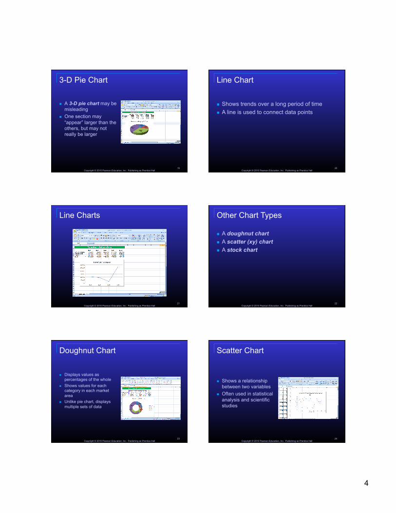
3-D Pie Chart
A 3-D pie chart may be misleading
One section may “appear” larger than the others, but may not really be larger
Copyright © 2010 Pearson Education, Inc. Publishing as Prentice Hall 20
Line Chart
Shows trends over a long period of time A line is used to connect data points
Copyright © 2010 Pearson Education, Inc. Publishing as Prentice Hall 21
Line Charts
Copyright © 2010 Pearson Education, Inc. Publishing as Prentice Hall 22
Other Chart Types
A doughnut chart A scatter (xy) chart A stock chart
Copyright © 2010 Pearson Education, Inc. Publishing as Prentice Hall 23
Doughnut Chart
Displays values as percentages of the whole
Shows values for each category in each market area
Unlike pie chart, displays multiple sets of data
Copyright © 2010 Pearson Education, Inc. Publishing as Prentice Hall 24
Scatter Chart
Shows a relationship between two variables
Often used in statistical analysis and scientific studies

5
Copyright © 2010 Pearson Education, Inc. Publishing as Prentice Hall 25
Stock Chart
Shows the high, low, and close prices for individual stocks over a period of time
Copyright © 2010 Pearson Education, Inc. Publishing as Prentice Hall 26
Creating a Chart
Six main steps to create a chart Specify the data series Select the range of cells to chart Select the chart type Insert the chart and designate the chart location Choose chart options/add graphics in charts Change the chart location and size
Copyright © 2010 Pearson Education, Inc. Publishing as Prentice Hall 27
Six Steps
Specify the data series The rows and/or columns that contain the data
you want to chart Select the range to chart
Can be a single cell, but most often is multiple cells
Cells may be adjacent or non-adjacent Use Shift key to select adjacent cells; use Ctrl key
to select non-adjacent cells
Copyright © 2010 Pearson Education, Inc. Publishing as Prentice Hall 28
Six Steps (continued)
Select the chart type Each type presents data in a different way Pick the type that will best visually illustrate the
information you want to convey
Copyright © 2010 Pearson Education, Inc. Publishing as Prentice Hall 29
Select a Chart Type
Chart Type Purpose
Column Compares categories, shows changes over time
Bar Shows comparison between independent variables. Not used for time or dates
Pie Shows percentages of a whole. Exploded pie emphasizes a popular category
Line Shows change in a series over categories or time
Doughnut Compares how two or more series contribute to the whole
Scatter Shows correlation between two sets of values
Stock Shows high low stock prices
Copyright © 2010 Pearson Education, Inc. Publishing as Prentice Hall 30
Six Steps (continued)
Insert chart and designate location Insert as an embedded object in the worksheet
Can print worksheet and chart on one page
Insert the chart as a New Sheet Will require you to print the worksheet and chart on
separate pages
You can choose the location to display the chart

6
Copyright © 2010 Pearson Education, Inc. Publishing as Prentice Hall 31
Six Steps (continued)
Choose chart options using the Design, Layout and Format tabs The Design tab can be used to display data in
rows or columns The Layout tab can be used to change the display
of chart elements The Format tab can be used to apply special
effects
Copyright © 2010 Pearson Education, Inc. Publishing as Prentice Hall 32
Six Steps (continued)
Add graphics to chart May add company logos or representative clip art
to personalize charts Remember, less is sometimes more, so be
sparing in use of graphics
Copyright © 2010 Pearson Education, Inc. Publishing as Prentice Hall 33
Add a Graphic
To add a graphic to a chart: In the Illustrations section on the Insert tab,
select the medium where the graphic will come from (Picture, Clip Art, Shapes, or SmartArt)
Search for and insert the graphic Size and move the graphic on the chart as
desired
Copyright © 2010 Pearson Education, Inc. Publishing as Prentice Hall 34
Six Steps (continued)
To change the chart location and size Select the chart to reveal sizing handles Drag the sizing handles to achieve desired
location and size
Chart Enhancements
Modify charts to enhance and approve look Modifications include: color, font, format,
scale, or style Can change and edit chart elements Add data labels Enhance with graphics
Copyright © 2010 Pearson Education, Inc. Publishing as Prentice Hall 35
Change, Edit, and Format Chart Elements Change elements such as title and axes Edit the contents of a data label Approach formatting in two ways:
Use tabs Insert, Design, Layout, Format
Select chart and use shortcut menu
Copyright © 2010 Pearson Education, Inc. Publishing as Prentice Hall 36

7
Add Data Labels and Change Fill Color Data labels are
values or names of data points
Labels assists reading chart
To accentuate data in chart form you can change the color or fill pattern or use an image
Copyright © 2010 Pearson Education, Inc. Publishing as Prentice Hall 37
Enhance Charts with Graphic Shapes Add pre-made graphics to chart to emphasize
content of a chart Shapes are rectangles, circles, arrows, lines,
flowchart symbols, and callouts Insert shapes using Insert tab or Layout tab
Copyright © 2010 Pearson Education, Inc. Publishing as Prentice Hall 38
Chart Distribution
Your visual masterpiece can be shared Use charts as documentation in Web pages,
memos, reports, research papers, books, and other types of documents
MS Office 2007 suite applications are integrated and enable data sharing
Charts can be exported to other applications
Copyright © 2010 Pearson Education, Inc. Publishing as Prentice Hall 39
Copyright © 2010 Pearson Education, Inc. Publishing as Prentice Hall 40
Print Charts
You can print a chart: Including the worksheet in which it is embedded That is embedded, without printing the worksheet That was placed on a separate worksheet
Always Print Preview to ensure you are printing what you intended
Select Print from the File menu or click the Print button on the Standard Toolbar
Copyright © 2010 Pearson Education, Inc. Publishing as Prentice Hall 41
Questions?
Copyright © 2010 Pearson Education, Inc. Publishing as Prentice Hall 42
All rights reserved. No part of this publication may be reproduced, stored in a retrieval system, or transmitted, in any form or by any means, electronic,
mechanical, photocopying, recording, or otherwise, without the prior written permission of the publisher. Printed in the United States of America.