Embed Size (px)
Citation preview

Tongbin Qu
DOT Grant No. DTRT06-G-0044
Investigating the Effect of Freeway Congestion Thresholds on Decision-Making Inputs
Final Report
Performing OrganizationUniversity Transportation Center for Mobility™Texas Transportation InstituteThe Texas A&M University SystemCollege Station, TX
Sponsoring AgencyDepartment of TransportationResearch and Innovative Technology AdministrationWashington, DC
“Improving the Quality of Life by Enhancing Mobility”
University Transportation Center for Mobility
UTCM Project # 09-12-11May 2010
Technical Report Documentation Page 1. Project No. UTCM 09-12-11
2. Government Accession No.
3. Recipient's Catalog No.
4. Title and Subtitle Investigating the Effect of Freeway Congestion Thresholds on Decision-Making Inputs
5. Report Date May 2010 6. Performing Organization Code Texas Transportation Institute
7. Author(s) Tongbin Qu
8. Performing Organization Report No. UTCM 09-12-11
9. Performing Organization Name and Address University Transportation Center for Mobility™ Texas Transportation Institute The Texas A&M University System 3135 TAMU College Station, TX 77843-3135
10. Work Unit No. (TRAIS) 11. Contract or Grant No. DTRT06-G-0044
12. Sponsoring Agency Name and Address Department of Transportation Research and Innovative Technology Administration 400 7th Street, SW Washington, DC 20590
13. Type of Report and Period Covered Final Report January 2009 - December 200914. Sponsoring Agency Code
15. Supplementary Notes Supported by a grant from the U.S. Department of Transportation University Transportation Centers Program
16. Abstract Congestion threshold is embedded in the congestion definition. Two basic approaches exist in
current practice for setting the congestion threshold. One common approach uses the “free-flow” or unimpeded conditions as the congestion threshold. Another approach uses target or “acceptable” conditions. The limited research that has been conducted on the congestion threshold issue focuses on operational problems or policy debates, but relatively little investigation of the effect on decision-making for transportation investment and resource allocation.
This research investigated the differences inherent in the threshold choices using detailed freeway data from seven metropolitan areas. Congestion performance measures of delay per mile, Travel Time Index and Planning Time Index were evaluated. This research specifically examined: 1) the ranking values of congestion measure for different congestion thresholds under a variety of real-world travel time distributions, 2) the relationship between change of congestion threshold and change of performance measure, and 3) the appropriateness of using speed limit as a congestion threshold choice by evaluating the peak and off-peak average speed changes in relation to a speed limit change in Houston, Texas.
The rankings of congestion measures for freeway segments hold steady across the congestion thresholds ranging from 60 mph to 30 mph and across the congestion measures. From an investment point of view, the congestion threshold speed used is not a concern for funding allocation.
The relationship between the delay values for an alternative threshold and the 60 mph threshold has a quadratic form. As the alternative threshold decreases further away from 60 mph, the increment is larger. The more congested a section is, the less the threshold affects measured congestion. For very congested sections, most of the delay is associated with speeds below 30 mph.
The posted speed limit affects travel time distribution in the free flow driving condition but does not affect travel time distribution during congested driving conditions. However, if the speed limit or a percentage of speed limit is used to estimate the congestion, the amount of congestion may be underestimated because the free flow speed is higher than the speed limit.
17. Key Word Congestion threshold, freeway congestion, congestion measures, transportation investment decision making
18. Distribution Statement Public distribution
19. Security Classif. (of this report) Unclassified
20. Security Classif. (of this page) Unclassified
21. No. of Pages 165
22. Price n/a
Form DOT F 1700.7 (8-72) Reproduction of completed page authorized

Investigating the Effect of Freeway Congestion Thresholds on Decision-Making Inputs
by
Tongbin Qu Assistant Research Engineer
Texas Transportation Institute
Report UTCM 09-12-11
Sponsored by the University Transportation Center for Mobility™
Texas Transportation Institute The Texas A&M University System
May 2010

DISCLAIMER
The contents of this report reflect the views of the author, who is responsible for the facts and the accuracy of the information presented herein. This document is disseminated under the sponsorship of the Department of Transportation University Transportation Centers Program in the interest of information exchange. The U.S. Government assumes no liability for the contents or use thereof.
ACKNOWLEDGMENT
Support for this research was provided by a grant from the U.S. Department of Transportation University Transportation Centers Program to the University Transportation Center for Mobility (DTRT06-G-0044).

EXECUTIVE SUMMARY
This project investigated the effect of freeway congestion thresholds on decision-making
inputs. Although the congestion problem has been studied for several decades in the
United States, there has not been a consensus on when congestion technically begins.
Policy discussions about the size of the congestion problem and the need for solutions
are often side-tracked by this threshold issue. This research project investigated the
differences inherent in the threshold choices using detailed freeway data. Specifically,
congestion measure values were examined for different congestion thresholds under a
variety of real-world travel time distributions. Ultimately, the research helps to answer
questions such as:
• Do rankings of congestion measures for freeway segments hold steady across different congestion thresholds?
• Is congestion-threshold speed a concern for funding allocations? • What is the relationship between delay and congestion threshold?
The research conducted in this project comprised the dissertation of the author for her
Ph.D. in Urban and Regional Science from Texas A&M University in August 2010.
Thus the dissertation in its entirety serves as the final technical report, and it follows
herein intact.


INVESTIGATING THE EFFECT OF FREEWAY CONGESTION
THRESHOLDS ON DECISION-MAKING INPUTS
A Dissertation
by
TONGBIN QU
Submitted to the Office of Graduate Studies of Texas A&M University
in partial fulfillment of the requirements for the degree of
DOCTOR OF PHILOSOPHY
August 2010
Major Subject: Urban and Regional Planning

INVESTIGATING THE EFFECT OF FREEWAY CONGESTION
THRESHOLDS ON DECISION-MAKING INPUTS
A Dissertation
by
TONGBIN QU
Submitted to the Office of Graduate Studies of Texas A&M University
in partial fulfillment of the requirements for the degree of
DOCTOR OF PHILOSOPHY
Approved by:
Co-Chairs of Committee, Eric Dumbaugh Timothy J. Lomax Committee Members, F. Michael Speed Ming Zhang Head of Department, Forster Ndubisi
August 2010
Major Subject: Urban and Regional Planning

iii
ABSTRACT
Investigating the Effect of Freeway Congestion Thresholds on Decision-making Inputs.
(August 2010)
Tongbin Qu, B.S., Tongji University;
M.S., The University of Texas at Austin
Co-Chairs of Advisory Committee: Dr. Eric Dumbaugh Dr. Timothy J. Lomax
Congestion threshold is embedded in the congestion definition. Two basic
approaches exist in current practice for setting the congestion threshold. One common
approach uses the “free-flow” or unimpeded conditions as the congestion threshold.
Another approach uses target or “acceptable” conditions. The limited research that has
been conducted on the congestion threshold issue focuses on operational problems or
policy debates, but relatively little investigation of the effect on decision-making for
transportation investment and resource allocation.
This research investigated the differences inherent in the threshold choices using
detailed freeway data from seven metropolitan areas. Congestion performance measures
of delay per mile, Travel Time Index and Planning Time Index were evaluated. This
research specifically examined: 1) the ranking values of congestion measure for different
congestion thresholds under a variety of real-world travel time distributions, 2) the
relationship between change of congestion threshold and change of performance
measure, and 3) the appropriateness of using speed limit as a congestion threshold
choice by evaluating the peak and off-peak average speed changes in relation to a speed
limit change in Houston, Texas.
The rankings of congestion measures for freeway segments hold steady across
the congestion thresholds ranging from 60 mph to 30 mph and across the congestion
measures. From an investment point of view, the congestion threshold speed used is not
a concern for funding allocation.

iv
The relationship between the delay values for an alternative threshold and the 60
mph threshold has a quadratic form. As the alternative threshold decreases further away
from 60 mph, the increment is larger. The more congested a section is, the less the
threshold affects measured congestion. For very congested sections, most of the delay is
associated with speeds below 30 mph.
The posted speed limit affects travel time distribution in the free flow driving
condition but does not affect travel time distribution during congested driving conditions.
However, if the speed limit or a percentage of speed limit is used to estimate the
congestion, the amount of congestion may be underestimated because the free flow
speed is higher than the speed limit.

v
DEDICATION
To everyone in my big family

vi
ACKNOWLEDGEMENTS
I would like to thank my committee co-chairs, Dr. Eric Dumbaugh and Dr. Tim
Lomax, and my committee members, Dr. Michael Speed and Dr. Ming Zhang, for their
guidance and support throughout the course of my Ph.D. study. Knowing them and
learning from them is part of the great experience I had at Texas A&M University. I am
especially thankful for the patience and encouragement of Dr. Tim Lomax. Without his
guidance, advice and mentoring on every stage of this study, I would not be able to
finish this dissertation.
Thanks also go to my friends and colleagues in the Texas Transportation Institute.
Mr. Shawn Turner has been supportive of my study. Dr. David Shrank often encouraged
me at the final stage of my study. I also want to extend my gratitude to the University
Transportation Center for Mobility of the Texas Transportation Institute, which provided
funding to the study.
Finally, I want to express my heartfelt gratitude to my parents, Bilian Qu and
Qiufen Yang, for their love throughout the years and my in-laws, Feng-Chi Li and Mei-
Yu Huang, for their encouragement. Thanks also to my wonderful husband, Ming-Han
Li, who has believed in me even when I did not believe in myself. Last but not least,
thanks to my lovely angels, Catherine and Caroline Li, who somehow understood at their
age why mommy often had to work on the weekends.

vii
TABLE OF CONTENTS
Page
ABSTRACT .............................................................................................................. iii
DEDICATION .......................................................................................................... v
ACKNOWLEDGEMENTS ...................................................................................... vi
TABLE OF CONTENTS .......................................................................................... vii
LIST OF FIGURES ................................................................................................... ix
LIST OF TABLES .................................................................................................... xii
CHAPTER I INTRODUCTION ........................................................................................ 1
CHAPTER II BACKGROUND ......................................................................................... 5
2.1 Overview of Congestion ...................................................................................... 5 2.1.1 Definition of Congestion .............................................................................. 5 2.1.2 Measures of Congestion ............................................................................... 8
2.2 Freeway Performance Measures ........................................................................ 14 2.2.1 Freeway Congestion Measures for Planning and Investment Process ....... 14 2.2.2 Components of Freeway Congestion Measures ......................................... 15 2.2.3 Current Practice and Recommended Core Freeway Congestion Measures ............................................................................................................... 16
2.3 Variations in Congestion Threshold .................................................................. 17 2.3.1 Current Practice in Congestion Thresholds ................................................ 19 2.3.2 Current Research in Congestion Thresholds .............................................. 21
2.4 Data Issues for Congestion Estimation .............................................................. 22 2.4.1 Data Source for Travel Time ...................................................................... 22 2.4.2 Fixed Sensor Data for Congestion Measures ............................................. 24 2.4.3 Probe Vehicle Data for Congestion Measures ........................................... 27
CHAPTER III RESEARCH APPROACH ...................................................................... 29
3.1 Problem Statement and Research Objectives .................................................... 29 3.2 Research Questions and Hypotheses ................................................................. 33 3.3 Analysis Procedures .......................................................................................... 33
3.3.1 Hypothesis 1 ............................................................................................... 34 3.3.2 Hypothesis 2 ............................................................................................... 41 3.3.3 Hypothesis 3 ............................................................................................... 43

viii
Page
CHAPTER IV RESEARCH PROCEDURES .................................................................. 46
4.1 Source of Data ................................................................................................... 46 4.2 Study Sites ......................................................................................................... 47
4.2.1 Study Sites for Hypothesis 1 ...................................................................... 47 4.2.2 Study Sites for Hypothesis 2 ...................................................................... 64 4.2.3 Study Sites for Hypothesis 3 ...................................................................... 64
4.3 Data Processing ................................................................................................. 67 4.3.1 Data Aggregation for Hypothesis 1 ............................................................ 67 4.3.2 Data Aggregation for Hypothesis 2 ............................................................ 91 4.3.3 Data Aggregation for Hypothesis 3 ............................................................ 91
4.4 Final Datasets .................................................................................................... 92 4.4.1 Final Datasets for Testing Hypothesis 1 .................................................... 92 4.4.2 Final Datasets for Testing Hypothesis 2 .................................................... 92 4.4.3 Final Datasets for Testing Hypothesis 3 .................................................... 93
CHAPTER V RESULTS AND FINDINGS .................................................................... 94
5.1 Hypothesis 1 ...................................................................................................... 94 5.1.1 Results for Delay per Mile ......................................................................... 94 5.1.2 Results for Travel Time Index (TTI) ........................................................ 102 5.1.3 Results for Planning Time Index (PTI) .................................................... 106
5.2 Hypothesis 2 .................................................................................................... 110 5.3 Hypothesis 3 .................................................................................................... 118
5.3.1 Speed Distribution for the Three Analysis Periods .................................. 118 5.3.2 Average Speed and AADT Trend for the Three Analysis Periods .......... 124 5.3.3 Comparing the Trends of the Off-peak, Peak Period, and Peak Hour ..... 133 5.3.4 Identifying Confounding Factors ............................................................. 136 5.3.5 Speed Limit Change and Speed Distribution ........................................... 136
CHAPTER VI CONCLUSIONS AND RECOMMENDATIONS ................................ 138
6.1 Conclusions ..................................................................................................... 138 6.2 Policy Implications .......................................................................................... 141 6.3 Recommended Future Research ...................................................................... 141
REFERENCES ............................................................................................................... 143
VITA…… ...................................................................................................................... 148
ix
LIST OF FIGURES
Page Figure 2.1 Travel time as the basis for defining mobility-based performance measures. ........................................................................................... 13 Figure 2.2 Typical performance-based planning process. .................................. 15 Figure 3.1 Travel time distribution examples. .................................................... 31 Figure 4.1 Chicago area study sites. ................................................................... 57 Figure 4.2 Houston area study sites. ................................................................... 58 Figure 4.3 Los Angeles area study sites. ............................................................ 59 Figure 4.4 Minneapolis-St. Paul area study sites. ............................................... 60 Figure 4.5 Philadelphia area study sites. ............................................................ 61 Figure 4.6 San Francisco area study sites. .......................................................... 62 Figure 4.7 Tampa area study sites. ..................................................................... 63 Figure 4.8 Locations of study sites for hypothesis 3. ........................................ 66 Figure 4.9 Illustration of spatial aggregation steps for point sensors. ................ 68 Figure 4.10 Illustration of distance coverage by detector stations. ...................... 71 Figure 4.11 Travel rate (minute/mile) for Chicago area study sites. .................... 87 Figure 4.12 Travel rate (minute/mile) for Houston area study sites. .................... 88 Figure 4.13 Travel rate (minute/mile) for Los Angeles area study sites. ............. 88 Figure 4.14 Travel rate (minute/mile) for Minneapolis-St. Paul area study sites. 89 Figure 4.15 Travel rate (minute/mile) for Philadelphia area study sites. ............. 89 Figure 4.16 Travel rate (minute/mile) for San Francisco area study sites. ........... 90
x
Page Figure 4.17 Travel rate (minute/mile) for Tampa area study sites. ...................... 90 Figure 5.1 Comparison of rankings of baseline vs. alternative scenarios on delay per mile. ................................................................................... 97 Figure 5.2 Travel time distribution examples for the most and least congested
sections. ............................................................................................. 98 Figure 5.3 Scatter plots of non-uniform thresholds vs. the 60 mph threshold with area type label for delay per mile ranking. ................................ 99 Figure 5.4 Illustration of the area outside of the prediction limits. .................... 100 Figure 5.5 Travel time distribution examples for explaining congestion ranking differences. ........................................................................... 102 Figure 5.6 Comparison of rankings of baseline vs. alternative scenarios on Travel Time Index. ............................................................................ 105 Figure 5.7 Scatter plots of non-uniform thresholds vs. the 60 mph threshold with area type label for Travel Time Index ranking. ......................... 106 Figure 5.8 Comparison of rankings of baseline vs. alternative scenarios on Planning Time Index. ........................................................................ 108 Figure 5.9 Scatter plots of non-uniform thresholds vs. the 60 mph threshold with area type label for Planning Time Index ranking. ..................... 110 Figure 5.10 Regression line of delay per mile using 55 mph vs. 60 mph. ........... 113 Figure 5.11 Regression line of delay per mile using 50 mph vs. 60 mph. ........... 113 Figure 5.12 Regression line of delay per mile using 45 mph vs. 60 mph. ........... 114 Figure 5.13 Regression line of delay per mile using 40 mph vs. 60 mph. ........... 114 Figure 5.14 Regression line of delay per mile using 35 mph vs. 60 mph. ........... 115 Figure 5.15 Regression line of delay per mile using 30 mph vs. 60 mph. ........... 115 Figure 5.16 Delay per mile under an alternative threshold compared to the 60 mph. .............................................................................................. 117

xi
Page Figure 5.17 Percentage of delay per mile under an alternative threshold compared to the 60 mph. ................................................................... 117 Figure 5.18 Average speeds of the three analysis periods for section 1. .............. 119 Figure 5.19 Average speeds of the three analysis periods for section 2. .............. 120 Figure 5.20 Average speeds of the three analysis periods for section 3. .............. 120 Figure 5.21 Average speeds of the three analysis periods for section 4. .............. 121 Figure 5.22 Average speeds of the three analysis periods for section 5. .............. 121 Figure 5.23 Average speeds of the three analysis periods for section 6. .............. 122 Figure 5.24 Average speeds of the three analysis periods for section 7. .............. 122 Figure 5.25 Average speeds of the three analysis periods for section 9. .............. 123 Figure 5.26 Average speeds of the three analysis periods for section 10. ............ 123 Figure 5.27 Trends for off-peak, peak period and peak hour. .............................. 134 Figure 5.28 Speed and flow diagram for the peak period average speeds. .......... 135 Figure 5.29 Observed and expected peak period speed trend for the analysis periods. .............................................................................................. 135

xii
LIST OF TABLES
Page Table 2.1 Recommended Core Freeway Performance Measures .................... 18 Table 4.1 Freeway Sections Summary ............................................................ 50 Table 4.2 Freeway Study Sections .................................................................. 51 Table 4.3 Number of Freeway Sections Sampled in Factor Groups ............... 65 Table 4.4 Study Sites for Hypothesis 3 ........................................................... 66 Table 5.1 Hypothesis 1 Testing Results Using Delay per Mile Performance Measure ........................................................................................... 95 Table 5.2 Hypothesis 1 Testing Results Using Travel Time Index Performance Measure ...................................................................... 103 Table 5.3 Hypothesis 1 Testing Results Using Planning Time Index Performance Measure ...................................................................... 107 Table 5.4 Hypothesis 2 Testing Results .......................................................... 111 Table 5.5 Aggregated AADT for the Three Analysis Years ........................... 125 Table 5.6 Percent Change of AADT for the Three Analysis Years ................ 125 Table 5.7 Off-peak Average Speeds for the Three Analysis Periods .............. 126 Table 5.8 Off-peak Period ANOVA Test Results for All Sections ................. 127 Table 5.9 Off-peak Period ANOVA Test Results for the Non-toll Sections .. 127 Table 5.10 Off-peak Period ANOVA Test Results for the Toll Sections ......... 127 Table 5.11 Off-peak Period Tukey’s Test Results for All Sections .................. 127 Table 5.12 Off-peak Period Tukey’s Test Results for the Non-toll Sections .... 128 Table 5.13 Off-peak Period Tukey’s Test Results for the Toll Sections .......... 128

xiii
Page Table 5.14 Peak Period Average Speeds for the Three Analysis Periods ......... 129 Table 5.15 Peak Period ANOVA Test Results for All Sections ....................... 129 Table 5.16 Peak Period ANOVA Test Results for the Non-toll Sections ......... 129 Table 5.17 Peak Period ANOVA Test Results for the Toll Sections ................ 129 Table 5.18 Peak Period Tukey’s Test Results for All Sections ......................... 130 Table 5.19 Peak Period Tukey’s Test Results for the Non-toll Sections .......... 130 Table 5.20 Peak Period Tukey’s Test Results for the Toll Sections ................. 130 Table 5.21 Peak Hour Average Speeds for the Three Analysis Periods ........... 131 Table 5.22 Peak Hour ANOVA Test Results for All Sections ......................... 132 Table 5.23 Peak Hour ANOVA Test Results for the Non-toll Sections ........... 132 Table 5.24 Peak Hour ANOVA Test Results for the Toll Sections .................. 132 Table 5.25 Peak Hour Tukey’s Test Results for All Sections ........................... 132 Table 5.26 Peak Hour Tukey’s Test Results for the Non-toll Sections ............ 133 Table 5.27 Peak Hour Tukey’s Test Results for the Toll Sections ................... 133

1
CHAPTER I
INTRODUCTION
Transportation has played a pivotal role in the support of economic development
throughout human history. For the past few decades, a global growth phenomenon
stimulated by globalization and trade liberalization has intensified the demand for the
movement of goods. In addition, rapid urbanization further accelerates the demand for
the transportation of both people and goods (1).
Although such vibrant growth may appear welcome, it has a darker side as well.
Many negative impacts associated with transportation have been identified: 1)
environmental damage; 2) energy consumption; 3) climate change, 4) traffic congestion,
5) transportation safety, and 6) social inequity (1). Perhaps among all the negative
impacts, traffic congestion is the most noticeable and most frequently encountered.
In the United States, congestion levels continue to rise in cities of all sizes. The
annual peak hour delay per traveler has almost tripled from 1982 to 2007 (2). In 2007
congestion cost travelers $87 billion, according to the most recent Urban Mobility
Report (UMR) (2). This value is likely to grow because of the booming population and
reliance on automobiles. It was estimated that from 1969 to 2001 the rate of increase in
drivers was more than two times the rate of population growth and the rate of increase in
household vehicles was more than four times the rate of population growth(3). The
result of this phenomenon is that more than 87 percent of commuters drive to work in
typical American metropolitan areas (4), and therefore, congestion seems to be
ubiquitous in metropolitan areas.
In order to develop strategies to reduce congestion, extensive research has been
conducted. At the national level, comprehensive congestion measures have been
calculated for most large urban areas since the 1980s (2). More recently, Federal
Highway Administration (FHWA) reports congestion for nearly 30 urban areas using
____________
This dissertation follows the style of Transportation Research Record.

2
real-time sensor data (5). Regionally, many transportation agencies have established
explicit performance measures to monitor congestion as part of the transportation system
performance (6-8).
Despite the effort, one fundamental issue remains about measuring congestion:
“when does congestion start?”, in other words, what is the congestion threshold. To date,
there has not been a consensus on when congestion begins. Two basic approaches exist
for setting this congestion threshold. 1) One common approach uses the free-flow or
unimpeded conditions as the congestion threshold (2, 5). With this approach of setting
threshold, congestion measures all traffic delays beyond the free-flow or unimpeded
conditions. 2) The other approach uses the target or “acceptable” conditions as the
congestion threshold. The target or “acceptable” conditions are less ideal than the free-
flow or unimpeded conditions. Additionally, within each approach there are more than
one means of defining the free flow or the “acceptable” condition. Although both
approaches have their advantages and can serve specific purposes, congestion measures
using different approaches could yield very different results.
Nationwide, comparing congestion problems across areas can be challenging due
to unique congestion thresholds used in different urban areas. The UMR uses free-flow
condition (60 mph for freeways and 35 mph for arterials) as the threshold to rank the
congestion problem for 90 urban areas. Questions that were asked regarding these
thresholds are 1) whether a single threshold value for freeways and arterials is
appropriate nationally and 2) whether the same ranking still holds when using different
thresholds.
Furthermore, many transportation agencies use performance measures to help
screen projects or set project priorities in the development of their transportation
improvement program (TIP). Many agencies have also begun to use performance
measures to help guide resource allocation decisions at the program level in the system
planning and programming process (9). When investment decisions need to be made
within the urban area itself, questions that were often asked are 1) whether all
performance measures increase or decline in approximately the same ratio when moving

3
from one congestion threshold to another and 2) whether there are situations where one
threshold definition would alter the investment decisions.
Both nationally and regionally, policy discussions about the size of the
congestion problem and the need for solutions are side-tracked by this threshold issue,
providing opponents of transportation investment with a way to characterize supporters
as “confused.” The limited research that has been conducted on this issue focuses on
operational problems or policy debates. There is an increasing demand in knowing how
much this issue matters in decision-making. The relationship between the change of
congestion threshold and change of performance measure has not been investigated.
This research investigated the differences inherent in the threshold choices using
detailed freeway data from metropolitan areas. In specific, the rankings of congestion
measure values were examined for different congestion thresholds under a variety of real
world travel time distributions. Freeway segments from different metropolitan areas
were selected to represent the variety of traffic and land use patterns. In addition, the
relationship between change of congestion threshold and change of performance
measure was investigated under real world conditions. Furthermore, the research also
investigated the appropriateness of using speed limit as a congestion threshold choice by
examining the peak and off peak average speed changes in relation to a speed limit
change in Houston, Texas.
The goal of this research was to provide evidence-based information for
understanding congestion thresholds in general and the specific effects of freeway
congestion thresholds on transportation investment decision-making inputs. This
research was also intended to provide technical support to project or program-level
investment decisions when using congestion measures to prioritize the improvement
projects. The results of the study can be used by all levels of governmental agencies,
including 1) municipalities responsible for prioritizing and selecting congestion
reduction strategies, and 2) MPOs, State and Federal agencies overseeing urban
transportation development.

4
Chapter II provides a review of previous research on all aspects of the congestion
threshold issue. Chapter III introduces the research approach which includes a
discussion of the research hypotheses and objectives, in addition to the proposed
experimental design. Chapter IV provides information regarding the research
procedures-focusing on study site selection and data aggregation processes. Chapter V
presents the results of the experimental design and research findings. The final chapter
offers conclusions based on the results and findings; describes the limitations of the
research; and recommends the future research.
5
CHAPTER II
BACKGROUND
This chapter first provides an overview of congestion and its measurements
related to the congestion threshold; then the chapter reviews the role of congestion
measures as part of the overall performance measures in decision-making process, as
well as the current practice and research of freeway congestion measures. Finally, this
chapter reviews the data issues in estimating freeway congestion measures.
2.1 Overview of Congestion
2.1.1 Definition of Congestion
Although traffic congestion has been around since ancient Rome (10), no
widely accepted definition of congestion exists to date as acclaimed by a conference of
European Transport Ministers (11). Congestion has started to catch attention among
transportation agencies in the United State since early 1980s. After massive
transportation infrastructure development in the 50s and 60s, the supply of road capacity
started to become insufficient to meet the demand in some areas.
In the early research and practice of estimating congestion, level of service (LOS)
was often used to define congestion (12). The concept of LOS is well established in
highway capacity analysis procedures (13). The levels range from LOS A, which
represents free-flowing traffic, to LOS F, which represents forced flow or stop-and-go
traffic. Urban roadways are typically considered satisfactory if operating at LOS D,
which represents high-density but stable flow. Small increases in traffic at this level will
often cause operational problems. Flow in the next level, LOS E, is said to be at
capacity and on the verge of breaking down. A survey conducted in late 1980s (12)
showed that although 90 percent of the transportation agencies incorporated the LOS
concept in their congestion definition, there is no consensus regarding the beginning of
congestion which corresponds to the congestion threshold. 45 percent defined LOS D or

6
worse as congestion, whereas 20 percent and 14 percent defined LOS C and LOS E or
worse, respectively.
In the first nationally accepted research on congestion, the National Cooperative
Highway Research Program (NCHRP) report 398 (14), congestion was defined in two
quantities: congestion and unacceptable congestion, described below:
• Congestion is travel time or delay in excess of that normally incurred under light
or free-flow travel conditions.
• Unacceptable congestion is travel time or delay in excess of an agreed-upon
norm. The agreed-upon norm may vary by type of transportation facility, travel
mode, geographic location, and time of day.
This research recognized that past definitions of congestion fell into two basic
categories, namely those focused on cause and those focused on effect. The authors
believed that congestion measurement requires a definition that addresses the effect of
congestion which is often shown by excess travel time and slow speed. It is clearly
shown in the definitions that travel time was used as primary measure for congestion.
Lomax et al. (14) in the NCHRP report 398 defined congestion by two different
sets of thresholds: the light or free-flow travel conditions and the “agreed-upon norm”
for unacceptable congestion. They asserted that there is a need to separate the
congestion and unacceptable congestion. The purpose of the separation is that the
varying perceptions of congestion exist and a certain degree of congestion may have
been expected by the travelers. Therefore, mobility improvement can be focused on the
corridors or areas that fall below unaccepted congestion conditions.
In a more recent research about congestion and its extent (15), a survey was
conducted among transportation professionals for congestion definition and measures.
This survey revealed that measures such as travel time, speed, volume, and LOS are
currently used as primary definitions of congestion for freeways. About half the
responding agencies use travel time or speed as the measures for defining the congestion

7
(15), whereas 15 percent of the agencies use LOS for defining congestion. Comparing
the results from the survey conducted in late 1980s (12) and the one in early 2000s (15),
a declining trend of using LOS for defining congestion and increasing interests of using
travel time and speed as measures for defining congestion are found.
Furthermore, recent research also found that the LOS concept is unable to define
congestion. Some think that LOS fails to address the “saturated flow regime” (i.e.,
congestion) in a comprehensive fashion and the single LOS category (“F”) in the HCM
cannot capture the nature and extent of congestion (16, 17). The most recent 2000
edition of HCM has begun to look at the saturated flow regime. Researchers believe that
more detailed measures than HCM-based LOS are required to capture the effect of
operational strategies, which are often more subtle than capacity expansion projects.
In the National Transportation Operations Coalition’s (NTOC) ITS technology
forum, a question on “What should be our common definition of congestion” was raised
(18). The responses to the question show that the inconsistency and lack of consensus
among transportation practitioners. Most responses recognize two perspectives of the
system and system users. From the system’s perspective, transportation system is to
provide transport to people and goods. Hence, congestion occurs when system
productivity in terms of traffic flow is reduced. From the users’ perspective, congestion
occurs when average speed is below the optimal safe speed. The empirical evidence
found that the optimal safe speed is typically around 60 mph for freeways. Since the
maximum freeway flow occurs around 50 mph, most responses recognize the differences
between the two perspectives.
What can be concluded from the congestion definitions in the previous research
is that no matter what 1) category to focus on, whether the cause or the effect, 2)
measure to use, whether the HCM LOS concept measure or the travel time-based
measure, and 3) perspective to take, whether from system perspective or user perspective,
congestion threshold is inevitably embedded in the congestion definition.

8
2.1.2 Measures of Congestion
Congestion measures are closely related to the definition of congestion. The
measures quantify the amount of congestion based on the definition. Because different
congestion definitions exist (e.g., the LOS-based or the travel time-based congestion
definition), congestion measures were established according to the definitions. The
congestion measures fall into two categories: the absolute measures and relative
measures. The absolute measures are continuous and statistical-based (e.g., average
travel time). The relative measures require a threshold or boundary value to begin the
measurement (e.g., delay).
2.1.2.1 Traditional measures
Traditional measures of congestion are based on the Highway Capacity Manual
(HCM) LOS concept. The HCM defines LOS on freeways with several traffic
characteristics which include density and volume over capacity ratio (V/C). In the
practice of congestion definition, a value of V/C is frequently used to set the beginning
point of congestion (12, 19) in lieu of density due to the relative easiness of traffic
volume data collection. As with the LOS, the late 1980s survey (12) also revealed that
there was no consensus on the V/C ratio corresponding to the congestion threshold. Of
the agencies using the V/C ratio as a measure of congestion, 36 percent, 45 percent, and
19 percent defined the V/C ratio equal to or greater than 0.8, 1.0, and 1.25, respectively.
Measures of queue length and lane occupancy are sometimes used for estimating
density. They are used by a small percent of transportation agencies (12) as measures to
quantify congestion.
All above mentioned traditional measures can be used as congestion thresholds
for quantifying congestion based on LOS concept.

9
2.1.2.2 Travel time-based measures
Travel time-based measures were established to quantify congestion defined by
travel time. Several studies played an important role in developing the travel time based
measures, which are introduced below.
1. NCHRP report 398 entitled “Quantifying Congestion” (14) was one of the early
researches in recommending travel time-based measures for congestion. In the
report, nine travel time-based measures were recommended, including:
• Travel rate. Travel rate, expressed in minutes per mile, is how quickly a vehicle
travels over a certain segment of roadway. It can be used for specific segments
of roadway or averaged for an entire facility. Estimates of travel rate can be
compared to a target value that represents unacceptable levels of congestion.
• Delay rate. The delay rate is “the rate of time loss for vehicles operating in
congested conditions on a roadway segment or during a trip” (14). This quantity
can estimate system performance and compare actual and expected performance.
• Total delay. Total delay is the sum of time lost on a segment of roadway for all
vehicles. This measure can show how improvements affect a transportation
system, such as the effects on the entire transportation system of major
improvements on one particular corridor.
• Relative delay rate. The relative delay rate can be used to compare mobility
levels on roadways or between different modes of transportation. This measure
compares system operations to a standard or target. It can also be used to
compare different parts of the transportation system and reflect differences in
operation between transit and roadway modes.
• Delay ratio. The delay ratio can be used to compare mobility levels on roadways
or among different modes of transportation. It identifies the significance of the
mobility problem in relation to actual conditions.

10
• Congested travel. This measure concerns the amount and extent of congestion on
roadways. Congested travel is a measure of the amount of travel that occurs
during congestion in terms of vehicle-miles.
• Congested roadway. This measure concerns the amount and extent of congestion
that occurs on roadways. It describes the degree of congestion on the roadway.
• Accessibility. Accessibility is a measure of the time to complete travel objectives
at a particular location. Travel objectives are defined as trips to employment,
shopping, home, or other destinations of interest. This measure is the sum of
objective fulfillment opportunities where travel time is less than or equal to
acceptable travel time. This measure can be used with any mode of
transportation but is most often used when assessing the quality of transit
services.
• The corridor mobility index. This measure uses the speed of person movement
value divided by some standard values. The speed of person movement is a
“measure of travel efficiency that could be used to compare the person
movement effectiveness of various modes of transportation” (14). It provides a
way to compare alternative transportation improvements to traditional
improvements such as additional freeway lanes.
All but one (travel rate) of the NCHRP report 398 recommended measures are
relative measures. These relative measures need either the acceptable travel time or
acceptable travel rate as the threshold to generate performance measure values.
2. The Texas Transportation Institute publishes the annual Urban Mobility Study for
most urban areas with population above 500,000 in the United States (2). The study
started in the early 1980s. During the course of over 20 years, many congestion
measures were developed for the study. Some of the recently used measures are
introduced below.

11
• Roadway congestion index. This index allows for comparison across
metropolitan areas by measuring the full range of system performance by
focusing on the physical capacity of the roadway in terms of vehicles. The index
measures congestion by focusing on daily vehicle miles traveled on both freeway
and arterial roads.
• Travel rate index. This index computes the “amount of additional time that is
required to make a trip because of congested conditions on the roadway.” It
examines how fast a trip can occur during the peak period by focusing on time
rather than speed. It uses both freeway and arterial road travel rates.
• Travel time index. This index compares peak period travel and free flow travel
while accounting for both recurring and incident conditions. It determines how
long it takes to travel during a peak hour and uses both freeway and arterial travel
rates.
• Travel delay. Travel delay is the extra amount of time spent traveling because of
congested conditions. The UMR study divided travel delay into two categories:
recurring and non-recurring.
All of the above introduced measures are relative measures. The annual Urban
Mobility Report used the free flow speed of 60 mph as the congestion threshold for
freeways to calculate the above mentioned measures.
3. The recent study of Monitoring Mobility Program (MMP) concluded that travel time
is the basis for defining mobility-based performance measures (20). Figure 2.1
shows that the travel time-based measures can be separated by the absolute measures
and relative measures. This research introduced the following two new reliability
indices:
• Buffer index. The buffer index calculates the extra percentage of travel time a
traveler should allow when making a trip in order to be on time 95 percent of the
12
time. This method uses the 95th percentile travel rate and the average travel rate,
rather than average travel time, to address trip concerns.
• Misery index. The misery index represents the worst 20 percent of trips that
occur in congested conditions. This index examines the trip reliability by
looking at only the travel rate of trips that exceeds the average travel rate. This
index measures how bad the congestion is on the days when congestion is the
worst.
Although both LOS-based and travel time-based measures coexist in the practice,
a recent study (21) revealed the trend of declining use of LOS-based and increasing use
of the travel time-based measures. The Kentucky Transportation Center interviewed 13
focus states for their practices of measuring congestion and practices to mitigate
congestion without building new capacity. One of the major findings regarding the
measures of congestion is that the most popular measures are not LOS or V/C ratio but
rather the direct measures of either average time to traverse the distance between two
points, or the average speed of vehicles. The direct measures of average time or speed
are used to construct estimates of delay during peak traffic periods.

Direct Measurement
Roadway-based Probes
Vehcile-based Probes
Cell phone tracking
Continuous
Instrumented Cars
License PlateRadars
Special Studies
Indirect Measurement/Modeling
ITS RoadwayEquipment
Spot Speeds
Transformation
Continuous Special Studies
ForecastingModels
Post-Processors(IDAS)
Short-TermTraffic Counts
Volumes
Models
Travel Time(Route Segments or Trips)
Performance Measures
Roadway Characteristics
Ideal Travel Conditions
Volumes
Travel Time(Minutes)
Travel Rate(Minutes/Mile)
Indices•Travel Rate Index•Traffic Temperature•Congestion Severity
Delay (Minutes)• Per Vehicle• Per Person• Per VMT• Per Driver• Per Capita
Absolute Measures
Relative Measures
Average TravelSpeed (MPH)
FIGURE 2.1 Travel time as the basis for defining mobility-based performance measures (21). 13
14
2.2 Freeway Performance Measures
Performance measures can be defined as indicators of transportation system
effectiveness and efficiency – a practical way to measure progress toward objectives.
Research shows that performance measurement is growing in importance and is
becoming institutionalized within transportation agencies (16).
Freeways by definition are access-controlled highways that are characterized by
uninterrupted traffic flow. Freeway performance refers primarily to congestion and
mobility, particularly the quality of traffic flow or traffic conditions as experienced by
users of the freeway (16). There are also measures related to other aspects of freeway
performance, such as safety, operational efficiency, ride quality, environmental
consequences and customer satisfaction, which is not within the scope of this research.
2.2.1 Freeway Congestion Measures for Planning and Investment Process
The uses of freeway congestion measures as part of the overall performance
measures range widely from traditional traffic operations, engineering, and improvement
studies to roadway and public transport alternatives analysis as well as a wide range of
planning and policy evaluations (14). In some cases, congestion measures define policy
objectives at an early stage of policy or system planning, and in other cases, they provide
the basis for an annual congestion report on system conditions and performance as a
communication and reporting tool. Figure 2.2 presents a general framework of a
performance-based planning process that indicates how performance measures are used
in the decision-making process (21). As shown, performance measures play a key role
that influences several subsequent components such as data, analytical methods and
strategies.

15
FIGURE 2.2 Typical performance-based planning process (22).
2.2.2 Components of Freeway Congestion Measures
The NCHRP 398 study (14) was one of the early research studies to introduce the
four components interacting in a congested system (14). The four components are:
• Duration: amount of time congestion affects the travel system.
• Extent: number of people or vehicles affected by congestion, and geographic
distribution of congestion.
• Intensity: severity of congestion.
• Reliability: variation of the other three elements.
To describe all aspects of congestion, the congestion measures need to cover the
four components of congestion. However, the reliability component of the congestion
was largely ignored in practice until recently. A recent NCHRP study (16) discovered

16
that the concept of reliability is growing in importance. Many transportation agencies
have begun to apply reliability measures as part of overall performance measures.
2.2.3 Current Practice and Recommended Core Freeway Congestion Measures
Many Departments of Transportation (DOTs) and Metropolitan Planning
Organizations (MPOs) have developed department-wide congestion measures. Freeway
congestion measures are usually seen in their annual congestion reports in the form of
summarized State or major metropolitan area level. A recent NCHRP study (16) has
completed a comprehensive research on freeway performance measures. As a part of the
research, benchmarking interviews were conducted with ten metropolitan areas on their
practice of freeway performance measures. In the current practice of freeway congestion
measures, the study found that
• For quality of service measures, derivatives of speed and delay are commonly
used by both operating and planning agencies.
• The Travel Time Index is a popular metric. LOS as a metric is still in use in both
planning and operations agencies, though it is not as widespread as it might have
been 10 years ago.
• Reliability metrics have not yet found their way into a widespread use. However,
consideration of travel time reliability is growing in acceptance, though its
implementation is still problematic, primarily due to data requirements.
National level studies recommended performance measures for quantifying
congestion. The National Transportation Operations Coalition (NTOC) conducted a
Performance Measures Initiative (23) in 2004. The purpose of the initiative was to
develop a few good performance measures for transportation operations. Although this
initiative was designed for addressing a wide variety of governmental functions, the
measures developed were highly relevant to quantifying congestion and characteristics.

17
The NCHRP research project 3-68 also recommended the core performance
measures for all aspects of freeway performance (16). The top three performance
measures recommended for quantifying typical congestion conditions are: travel time,
Travel Time Index (TTI), and total vehicle delay. The two performance measures
recommended for quantifying reliability are: Buffer Index and Planning Time Index
(PTI). The NCHRP research project also specified whether a particular recommended
performance measure has also been identified in the NTOC study. Table 2.1 is the
recommended core freeway performance measures related to congestion and mobility
from the NCHRP report.
2.3 Variations in Congestion Threshold
As reviewed in the above sections, most of congestion measures from either
current practice or recommended freeway congestion measures are relative measures
that depend on a congestion threshold to yield values. Many State Departments of
Transportation (DOTs) and Metropolitan Planning Organizations (MPOs) have
developed their own thresholds for calculating the relative congestion measures.
However, the thresholds are different in different areas.
The reasons why different areas use unique congestion thresholds may be
threefold. First, some believe that free flow speed is not the most environmentally
sustainable or economically efficient target for network capacity provision, and therefore,
not a reasonable policy objective. Second, maximum flow occurs at speeds lower than
free flow speed; some refer the point of maximum flow as maximum productivity. Third,
most drivers may accept a certain level of congestion as long as any given trip could be
completed safely within a reasonable and predictable time and with minimum
interruption (24). Regardless of reasons, using unique thresholds would result in
different values for congestion measures.

TABLE 2.1 Recommended Core Freeway Performance Measures (16)
18

19
2.3.1 Current Practice in Congestion Thresholds
Current practice in congestion thresholds has been rather implicit. The
congestion threshold used for performance measures are often found in the fine print of
the transportation agencies annual congestion/mobility report without much explanation
of why the specific threshold was used.
Two basic approaches exist for setting this congestion threshold. One common
approach uses the “free-flow” or unimpeded conditions as the congestion threshold.
Another approach uses target or “acceptable” conditions. Within each approach there
are more than one means of defining the free flow or the “acceptable” condition. In the
practice of setting the congestion threshold, the two primary approaches have their own
advocates. Some believe that the free flow condition is more appropriate for
comparisons in a national context, which represents “standard” or “ideal” conditions.
On the other hand, the “acceptable” condition is more of a “target” value for key
performance measures. This approach is useful when the focus is related to financially
or physically constrained improvement programs (14, 15).
2.3.1.1 Free flow approach
• 60 mph
The national level Urban Mobility Report (UMR) (2) uses 60 mph as the free-
flow condition for calculating congestion measures for freeways. The UMR uses
several measured variables reported as part of the Highway Performance
Monitoring System (HPMS) which is a program designed to assess the condition
performance of the nation's highways annually. Speed estimations in UMR were
based on these variables from HPMS. The limitation of using the HPMS data for
congestion estimation is that the data can only reveal annual average estimation
at an aggregated level.
• 85th percentile off-peak speed
The national level Mobility Monitoring Program (MMP) (5) uses 85th percentile
off-peak speed as the free-flow condition for calculating congestion measures.

20
The data from freeway sensors and monitors were used for MMP. Thus the
speed distribution can be estimated and used for calculating congestion measures.
2.3.1.2 Target approach
• Maximum flow/productivity
Minnesota Department of Transportation (MnDOT) defines congestion as traffic
flowing at speeds less than or equal to 45 mph (25). The 45 mph threshold was
selected since it is the speed where “shock waves” can propagate. These
conditions also pose a higher risk of crash. MnDOT believes that although shock
waves can occur above 45 mph, there is a distinct difference in traffic flow above
and below the 45 mph level.
• Target value
California Department of Transportation defines congestion as a condition where
the average speed drops below 35 mph for 15 minutes or more on a typical
weekday (26). In the 2004 Congestion Management System Report for the
Boston Region Metropolitan Planning Organization (BRMPO) (27), the
congestion threshold for limited-access roadways (freeway/expressway) was set
at 50 mph. In the congestion management system report for the Nashville area
NAMPO (28), the congestion threshold was set at a value less than or equal to 70%
of free-flow speed for all roadways.
• Percentage of speed limit
In the 2009 Annual Congestion Report by Washington State Department of
Transportation (WSDOT) (29) congestion was estimated for average peak period
travel speed below both 85% of posted speed limit and 70% of posted speed limit.
WSDOT believes that the maximum throughput speed, where the greatest
number of vehicles can occupy the highway at the same time; usually occurs at
between 70% and 85% of posted speed limit. For a measure of total delay, 50
mph is used for the threshold, and for determining the duration of the congested
period, 45 mph is used.

21
2.3.2 Current Research in Congestion Thresholds
The limited research that has been conducted on the congestion threshold issue
focused on policy debates (30) and operational problems. No research has been
conducted to date on the effect of congestion thresholds on performance measures and,
in turn, transportation policy and investment decision making.
The recent NCHRP research was one of the few studies that pointed out the
congestion threshold issue (16). As shown in Table 2.1, when recommending the core
performance measures for typical congestion conditions, the research team used both 50
mph and 30 mph as thresholds for the spatial and temporal extent measures. The reason
that the research team used the two threshold values is that the 50 mph is generally the
boundary between free and congested flow (i.e., the speed at freeway capacity) and 30
mph was chosen to capture flow that is truly in the saturated regime. The research
pointed out that the relative measures “have the advantage of being easily explained but
since they are binary (either a measurement is in the range or it isn’t), they can be
insensitive to subtle changes in the underlying phenomenon” (16). Although the
research pointed out the issue, no further research has been performed on the congestion
thresholds.
Both the NCHRP research (16) and another research study by the Texas
Transportation Institute (31) discussed the issue of using the speed limit as the
congestion threshold to establish the free flow condition. This practice has two potential
problems when the actual free flow speed (which can be obtained from the 85th
percentile speed that occurs under the light traffic condition) is higher than the speed
limit. First, using the speed limit as the threshold would underestimate the magnitude of
congestion. Second, using the actual free flow speed as the threshold would post an
“illegal” problem. The NCHRP study recommended using the lower of the two speeds
(the actual free flow speed or the speed limit) even though the research acknowledged
that this approach would miss a “small” amount of delay if the free flow speed is higher
than the speed limit.

22
2.4 Data Issues for Congestion Estimation
Most data available for mobility performance monitoring purpose are originally
collected for purposes other than monitoring freeway mobility performance (16).
Therefore, the data must be extracted from the data collecting systems to compute
congestion measures. Also, extensive manipulation of raw data must be performed to
produce the desired information. The review of the data issue of this study focuses on
the needs of travel time-based measures.
2.4.1 Data Source for Travel Time
Three basic travel time data collection approaches include 1) floating car or other
vehicle-based sampling procedures, 2) traffic operations center archives, and 3)
estimation or modeling techniques (31). Each of these approaches has its advantages
and limitations for congestion estimation. The first two approaches collect real-world
data as opposed to the third approach using simulation data.
2.4.1.1 Traffic operation center archives
Collecting traffic information from fixed sensors and monitors has been the state
of the practice in urban areas around the U.S. Traffic operations center archives are the
data archives that storage continuously collected data from field sensors. Until recently
it has been difficult to use this approach to incorporate real-time intelligent
transportation system (ITS) data due to complexities in data formats and storage. The
Mobility Monitoring Program (MMP) is such a data collection effort by the Federal
Highway Administration (FHWA) to track and report traffic congestion and travel
reliability using archived ITS data on a national scale. The MMP started in 2001. By
the end of the 2004, nearly 30 cities and 3,000 freeway miles were covered by the MMP
(5).
Due to the high cost of purchase, installation, and maintenance of the sensors as
well as the complexities in data formats and storage, sensors and collected traffic
information are available only at certain locations of freeways. The drawback of ITS
23
sensor data for calculating congestion measures is that the equipment does not measure
travel time directly, the collected spot speeds must be converted to travel time for
congestion measure calculation.
2.4.1.2 Probe vehicle sample data
With the growing interests in real time and low cost traffic information, collecting
traffic data through probe vehicle technique has become the state of the art in recent
years. Although the probe vehicle data collecting technique has been around for over
thirty years (32), only until recent years with the advances in wireless communication
systems and global positioning system (GPS) sensors the technique gained feasibility
and popularity. There are five types of commonly used probe vehicle data collection
systems in the U.S. (33). Below are brief descriptions of these systems from the Travel
Time Data Collection Handbook (33).
• Signpost-Based Automatic Vehicle Location (AVL). This technique has mostly
been used by transit agencies. Probe vehicles communicate with transmitters
mounted on existing signpost structures.
• Automatic Vehicle Identification (AVI). Probe vehicles are equipped with
electronic tags. These tags communicate with roadside transceivers to identify
unique vehicles and collect travel times between transceivers.
• Ground-based Radio Navigation. Often used for transit or commercial fleet
management, this system is similar to the global positioning system (GPS). Data
are collected by communication between probe vehicles and a radio tower
infrastructure.
• Cellular Geo-location. This experimental technology can collect travel time data
by discretely tracking cellular telephone call transmissions.
• Global Positioning System (GPS). Probe vehicles are equipped with GPS
receivers and two-way communication to receive signals from earth-orbiting
satellites. The positional information determined from the GPS signals is

24
transmitted to a control center to display real-time position of the probe vehicles.
Travel time information can be determined from the collected data.
Recent development of probe vehicle technology has been in the cellular geo-
location and GPS systems. The other three of these five systems have limitations in their
applications. AVL and ground-based radio navigation systems are used primarily for
small-scale transit management purposes. The AVI or tag system requires infrastructure
for the fixed transceivers and its primary application is for electronic toll collection. The
Houston metropolitan area is one of the few metropolitan areas in the U.S. that has a
majority of the freeways covered by the AVI tag system, although only a small portion
of the freeway system is actually toll way.
Clearly, the emerging probe vehicle technique is a method to directly measure
travel time. However, the technology also has drawbacks. Some of the probe vehicle
data suffers from extremely small samples. In addition, since many performance
measures require traffic volumes, additional collection effort is required to develop the
full suite of performance measures (16, 20).
2.4.2 Fixed Sensor Data for Congestion Measures
Using the data collected by the fixed sensors in the form of traffic operation
center archives for freeway performance measure has been the practice in recent years.
Because of the detailed nature of the archived operations data, issues and challenges are
associated with the data processing.
2.4.2.1 Data quality control
The quality of archived data from traffic operation centers varies by their source
(5). In practice and research, quality rules have been established to control the data for
performance monitoring uses (5). However, there are no universally applied rules
available to date. Some rules may be based on concepts or theory, such as highway
capacity or traffic flow, while other rules may be based on empirical experiences (16).

25
2.4.2.2 Data aggregation
Both spatial and temporal aggregation is necessary for performance monitoring
and evaluation purpose. The levels of aggregation depend upon the purpose of the
performance measures. The full range of spatial scale as described in the NCHRP
research project 3-68 is listed below (16).
• By Lane (point location);
• By Direction (point location), all functional lanes combined – this is sometimes
referred to as a “station;”
• Link – Typically between access points or entrance and exit ramps;
• Section or Segment – A collection of contiguous links;
• Corridor – Several sections/segments that are adjacent and travel in
approximately parallel directions (e.g., freeway and arterial street, arterial street
and rail line);
• Subarea – A collection of several sections or corridors within defined
boundaries; and
• Area wide/Regional – A collection of several sections or corridors within a
larger political boundary.
The temporal periods considered for performance evaluation in the NCHRP
research project 3-68 are (16):
• Peak hour (based on maximum volume);
• Peak hour (based on minimum speed or maximum delay);
• Peak period (to encompass typical commuting times that include most delay);
• Mid-day or overnight;
• Daily or sum totals (to encompass all delay); and
• Weekday versus weekend.

26
Two different methods exist when selecting peak hour for the worst performance
monitoring. The HCM defines the peak hour as the hour with the highest volumes. The
hour defined by the HCM concept typically yields the hour just before the freeway
breaks down (16). And the hour with the lowest speeds typically lags the hour with the
highest volumes (16).
The consideration for selecting length of peak period for performance monitoring
is that the peak period should be long enough to encompass the growth in traffic; thus,
“peak periods will typically include the free-flow traffic on either side of the peak traffic
shoulders” (16).
Two important steps in both spatial and temporal aggregation procedure are 1)
using volume as the weighting factor for average speed aggregation and 2) factoring up
incomplete volume statistics to account for missing data (16). Both steps are essential to
capture the whole picture of freeway performance (5, 16).
2.4.2.3 Transforming spot speeds to travel times
Two basic methods are currently used to estimate freeway travel times using the
spot speeds/link travel time: the “snapshot” method and the vehicle trajectory method
(16). “The snapshot method sums all link travel times for the same time period,
regardless of whether vehicles traversing the freeway section will actually be in that link
during the snapshot time period” (16). The assumption of the snapshot method is that
the link travel times are constant for the entire duration of the vehicle trip. “Because of
this assumption, the snapshot method underestimates section travel time when traffic is
building and overestimates section travel time when traffic is clearing” (16).
“The vehicle trajectory method “traces” the vehicle trip in time and applies the
link travel time corresponding to the precise time in which a vehicle is expected to
traverse the link” (16). The vehicle trajectory method attempts to closely model the
actual link travel times as experienced by the motorists. In practice, however, the
snapshot method is often used in both real-time applications and situations when a
significant amount of data processing is needed because of its simple calculation (5, 16).

27
2.4.2.4 Accuracy of spot speed for travel time
Studies have found that both sensor location and sensor spacing affect the
accuracy of using the spot speed for estimating travel time (16, 34). The NCHRP study
(16) asserts if the sensors are installed in locations of free flow such as the downstream
of a bottleneck, speeds measured at a single point may not be representative of speeds
along the full length of the link. For a similar reason, widely distributed sensor spacing
may not adequately represent the full range of speed variation on the link. The long
sensor spacing would introduce a greater error especially if the snapshot method is used
for estimating travel time. This is because under the assumption of the snapshot method
that travel times between two consecutive sensors are constant for all vehicles traversing
on the link. The longer the sensor spacing is, the less accurate this assumption becomes.
Several field studies have been conducted to determine whether the travel time
converted from spot speed falls within acceptable limits. The field test done in Virginia
resulted in significant error in travel time differences (35). A study used the MMP data
from Cincinnati and Atlanta to perform the effect of sensor spacing on performance
measure (34). In the analysis, the actual sensor spacing was used as the baseline. Tests
were run by deleting sensors for higher sensor spacing. The results showed that when
sensor spacing was increased relative to the baseline sensor spacing, error was
introduced into congestion measures. However, the errors varied depending on the
locations of the sensors. Sometimes one spacing pattern overestimated the congestion
measures and other times underestimated the congestion measures. Further analysis
showed that strategic location of sensors could improve the error rate versus the same
spacing for orderly deletion of sensor.
2.4.3 Probe Vehicle Data for Congestion Measures
Using the probe vehicle data for performance measures has started to gain
popularity in recent years due to the development of probe vehicle technology in the
cellular geo-location and GPS systems. Nevertheless, data from all probe vehicle
technologies have similar characteristics when used for performance measures.

28
2.4.3.1 Accuracy and limitations
The accuracy of probe vehicle data for performance measures is largely
dependent on two factors: the time spacing of probe vehicles and the total number of
probe vehicle runs (16). The accuracy increases as the numbers of probe vehicles
increase and the time spacing between the runs is reduced (16).
Although probe vehicle data has been used in many transportation application
areas, such as traffic management, traveler information, and system mobility measures,
no industry wide standard has been developed to evaluate the reliability and accuracy of
the data. Many research studies and deployments have developed their own
specifications for evaluating data quality (36, 37). Data quality is a concern when using
probe vehicle data for performance measures calculation.
Another limitation of using probe vehicle data for performance evaluation is the
lack of volume data. As introduced in fixed sensor aggregation, volume is used as the
weighting factor for congestion measures throughout the aggregation process. Without
the volume data, only a few measures can be calculated.
This research will improve on these past studies in several important areas. First,
a comprehensive system wide data from both fixed sensor and probe vehicle AVI
technology was gathered. In addition to the different data collection technology, this
research included data from a variety of real-world travel time distributions. Third, the
congestion threshold in general and the specific effect of freeway congestion thresholds
on transportation investment decision-making inputs was studied the first time. The
following chapter discusses these improvements and overall research approach in detail.

29
CHAPTER III
RESEARCH APPROACH
This chapter presents the basic research approach developed to investigate the
effects of congestion threshold on performance measure which is the input for decision-
making. The research problem concerning congestion threshold is introduced, followed
by research objectives and hypotheses. Finally, analysis techniques, procedures as well
as related statistical analysis are described. This discussion provides the basis for the
data collection and data processing procedures, which will be addressed in the next
chapter.
3.1 Problem Statement and Research Objectives
Congestion and how it is measured has been studied for decades. “When does
congestion start?” is still a question being debated among researchers today. The two
basic approaches include using 1) free-flow or 2) some target condition as congestion
threshold. By choosing a different approach, congestion measure could yield very
different results. Within the two basic approaches, there are also various means of
defining and quantifying congestion. Each approach has its advantages and
disadvantages, and could be chosen for specific interests. Particularly, the inconsistency
in congestion measures complicates investment decision-making for transportation
projects.
At the national level, if performance measurement is taken to an extreme,
allocation of federal funding faces the challenge of selecting the most congested regions.
An obvious issue is that the congestion measures that state transportation agencies and
planning organizations submitted are not comparable due to different thresholds or
approaches used. Another issue is that some nationwide congestion studies such as the
Urban Mobility Report (UMR) and the Mobility Monitoring Program (MMP) use the
same threshold to quantify congestion for all regions; however, many researchers do not

30
believe that the congestion should be evaluated under the same threshold for all regions
due to the acceptance of a certain level of congestion in some severely congested regions.
At regional and local levels, many transportation agencies use performance
measures to help screen projects or set project priorities in the development of their
transportation improvement program (TIP). In addition, many agencies have begun to
use performance measures to help guide resource allocation decisions at the program
level in the system planning and programming process (9). What has not been
determined, however, is the role of a congestion threshold speed. For example, would a
different set of projects chosen if 60 mph or 35 mph was used as the beginning of
congestion? Investment decision is once again jeopardized by the congestion threshold
at regional and local level.
At the freeway and corridor level, the issue becomes more complicated because
travel time per mile is distributed differently for different highway segments. Causes of
different travel time distributions include traffic demand variability, geometric design,
surrounding land use and demographics, availability of traffic management or Intelligent
Transportation Systems (ITS) facilities such as dynamic message signs or surveillance
cameras, and so on. Different travel time distributions can result in different
performance measures.
Figure 3.1 illustrates examples of different travel time distributions. Curve A
could be a travel time distribution of a freeway segment in a small urban area where
travel time peaks fast for a relatively short amount of time. Curve C could be a travel
time distribution for a freeway segment in the Central Business District (CBD) of a large
urban area where travel time peaks for a longer period of time. Curve C has a form of a
plateau, however, does not have a sharp summit. Curve B is somewhere in between
Curves A and C, and could be a freeway segment in a suburban area where peak period
is shorter than in a large urban area, and peak travel time is less pronounced than in a
small urban area.
Figure 3.1 also illustrates the complication of different threshold approaches. For
the congestion threshold that uses a free flow speed approach (such as threshold example

31
1 which uses the speed limit), all three travel time distributions have equal travel time
delay although road segment A and B have shorter congested periods, however, more
pronounced distributions. On the other hand, for the threshold set at a lower speed, i.e.,
a longer travel time (such as threshold example 2), Curve C would not be considered
congested at all.
FIGURE 3.1 Travel time distribution examples.
Nationally, regionally as well as locally, policy discussions about the scale of the
congestion problem and the need for solutions may be side-tracked by this threshold
issue. The limited research that has been conducted on this issue focuses on operational
problems or policy debates. Current understanding of the impact of the congestion
threshold is at the anecdotal level in many areas and may not provide enough support for
critical decision-making in project investment.
This research investigates the effect of freeway congestion thresholds on
congestion performance measures. Three specific objectives are described as follows.
Peak Traffic Period
Time of Day
Travel Tim
e
A
B
C
Threshold Example 2
Threshold Example 1 (e.g., travel time at speed limit)
A: extremely peaked distribution B: less peaked distribution C: smooth top distribution

32
The first objective is to examine the changes in rankings of congestion measures
for freeway segments when different congestion thresholds are used. This objective
involves 1) ranking freeway segments under a whole spectrum of thresholds using the
selected congestion measures, 2) examining the ranking changes for freeway segments
along the spectrum of thresholds, and 3) evaluating the differences in ranking for
statistical significance and detecting the particular threshold, if any, which would change
the relationship in terms of statistical significance. Findings from this objective can
provide decision makers with information about effects of congestion thresholds on
transportation project selection and prioritization and, in turn, help investment decisions.
The second objective is to estimate or predict delay as a function of congestion
threshold. Delay is one of performance measures widely used for measuring congestion.
According to its definition, delay is measured as the additional vehicle travel time that is
greater than the vehicle travel time at the predetermined congestion threshold. Delay
changes accordingly if a predetermined congestion threshold is changed. Findings from
this objective can provide a basis for comparisons between areas. This objective
involves 1) investigating whether a relationship exists between delay under different
congestion thresholds, and 2) finding the relationship in order to estimate change of
delay due to change of congestion thresholds. One challenge that is sometimes faced by
decision makers or transportation economists is to determine how much of the change in
a delay is due to the changes of congestion threshold, and whether the relationship is
linear.
The third objective of this research is to examine whether the change of speed
limit affects travel time distribution and, in turn, the congestion measure result. Because
many urban areas use the speed limit or percentage of speed limit as the congestion
threshold (28), findings from this objective can provide decision makers with
information on the sensitivity of travel time distribution to speed limit, and discover how
appropriately the speed limit can be used as the congestion threshold.

33
3.2 Research Questions and Hypotheses
To achieve the three research objectives, three corresponding research questions
and associated hypotheses are described as follows.
1. Do rankings of congestion measures for freeway segments hold steady across
different congestion thresholds? Are there situations where a change in threshold value
would change the congestion ranking of a set of freeways?
Hypothesis 1: There is no difference between the rankings of congestion levels on
freeway sections using different congestion thresholds.
2. What is the relationship between delay and congestion threshold? As the congestion
threshold is changed (for example by 5 mph), how does delay change? Is the
relationship linear?
Hypothesis 2: The relationship of delay under different congestion thresholds is non-
linear and can be expressed in a quadratic form.
3. Is speed limit one of the factors that affect travel time distribution?
Hypothesis 3: Speed limit has an effect on off-peak travel time distribution and speed
limit has no effect on peak period travel time distribution.
3.3 Analysis Procedures
The analysis procedures outline how the three research objectives were
accomplished as well as how the three corresponding hypotheses were tested.
This research uses an empirical approach as opposed to a simulation-based
experiment to conduct the research. The reasons for a empirical approach are 1) a large
amount of empirical data that is available and proven to be reliable (5, 16); 2) time and
money constraints to simulate a large amount of continuous travel time data that is
necessary for the research; and 3) the simulated outcomes may differ from actual

34
outcomes due to simplified assumptions, i.e., human behavior, in the simulation
methodologies.
Since it is not possible to collect data from all road segments for the analysis; and
even for this relatively small study, strict control of all factors influencing travel time
distribution was not achievable and not all factors could be identified. Therefore, quasi-
experiments were used to perform the analysis.
Experimental design is a study design used to test cause-and-effect relationships
between variables. The classic experimental design specifies an experimental group and
a control group. The independent variable is administered to the experimental group and
not to the control group, and both groups are measured on the same dependent variable.
Subsequent experimental designs have used more groups and more measurements over
longer periods. True experiments must have control, randomization, and manipulation.
Compared to a true experiment, a quasi-experiment lacks full control over the
events and subjects being studied, in terms of random assignment of treatments to
subjects (38). The advantage of the quasi-experimental design is that it requires less
manipulation of the phenomena being studied, which in turn increases both the range of
its application and the generalizability of the findings it produces. However, at the same
time, it makes it more difficult to rule out extraneous influences on the behavior being
studied (39).
The analysis procedure is divided into three primary components which relate to
the three research hypotheses.
3.3.1 Hypothesis 1
Freeway sections were selected to test the hypothesis. The consideration for
selection of freeway sections was to represent a variety of traffic and land use patterns.
The analysis period was the year of 2006. The reason of using one entire year as the
analysis period was to minimize the possibility of potential confounding factors such as
seasonality.

35
The approach was 1) calculating the congestion measures for the selected
freeway sections under a spectrum of congestion thresholds, 2) ranking freeway sections
for each congestion threshold scenario using the congestion measures calculated with
those thresholds, 3) examining and evaluating the ranking changes of freeway sections
under various threshold scenarios for statistical significances.
3.3.1.1 Analysis techniques
A cross-sectional study approach was used to test this hypothesis. Cross-
sectional studies (also known as cross-sectional analysis) form a class of research
methods that involve observation of some subset of a population of items all at the same
time.
A variety of important factors were considered in selecting study sites. The
purpose of considering these factors is to ensure that the experiment performed cover a
range of conditions by the data. The consideration also helps to validate the findings and
rule out the possibility of extraneous influences by showing the variety of factors and
conditions covered. The factors are explained below.
• Both area size and area type were considered as factors which may influence
travel time distribution. Large and more populated metropolitan areas are
typically more congested and have a longer period of congestion than the small
and less populated areas.
• AADT/C ratio was used as a general measure of congestion level to ensure that
roadways at all congestion levels are considered in the analysis. “AADT” is the
Annual Average Daily Traffic. “C” is the two-way hourly capacity. This ratio
was found to be highly correlated to the volume to capacity ratio (V/C ratio) that
is also used to indicate traffic pressure or demand level (40). The volume in the
V/C ratio is, however, an hourly flow rate. Therefore, the AADT/C is a better
indicator for cases where congestion occurs several hours a day.

36
• Number of lanes per direction is an indicator of the study section capacity. The
changes in the freeway capacity which can be viewed as supply of the freeway
system will influence the travel time distribution with the demand being the same.
• According to the Highway Capacity Manual (13), the percentage of trucks on the
freeway section will significantly affect the service flow rate of the section. The
service flow rate will in turn influence travel time distribution of the section.
• The proximity to major bottleneck is also believed to influence the travel time
distribution. If a bottleneck (e.g., freeway-to-freeway interchange) is
immediately downstream of the study section, queues are likely to form routinely
on the study section. It is therefore important to note the proximity of the
bottleneck.
• The weaving area is formed when an on-ramp is closely followed by an off-ramp
(13). Shorter ramp spacing would create more frequent weaving areas, which in
turn would influence the flow rate and travel time distribution.
• The speed limit is a factor influencing travel time during the free flow driving
condition. However, whether the speed limit affects the travel time distribution
during the congested condition will be tested by this research.
3.3.1.2 Selected performance measures
Three performance measures were selected for the analysis based on effectiveness
and popularity of their use for congestion evaluation purposes (16). The formulation and
use of the measures are described as follows.
1. Delay
The total delay is used to measure congestion magnitude. Delay was originally
defined as the additional vehicle travel time that is greater than the free flow
vehicle travel time (14). However, as reviewed by this research in the
Background section, travel time under various traffic flow conditions were used
in practice for delay calculation. Therefore, the total segment delay is formulated

37
in Equation 3.1 using a reference travel time in place of the free flow travel time.
It can be reformulated with a congestion threshold in Equation 3.2. It can be
seen from Equation 3.3 that the total delay divided by segment length is a
function of congestion thresholds.
Equation 3.1
Equation 3.2
/
1
1
Equation 3.3
2. Travel Time Index (TTI)
TTI is used to measure congestion intensity. It is the ratio of time spent in traffic
during peak traffic times as compared to free flow traffic times. For example, a
TTI value of 1.2 indicates that for a 15-minute trip in free flow traffic, the
average travel time for the trip is 18 minutes (15 minutes × 1.20 = 18 minutes),
which is 20 percent longer than free-flow travel time. The formulation of TTI is
presented in Equation 3.4. If speed is used in calculation, TTI can also be
reformulated with congestion thresholds in Equation 3.5. Equation 3.5 shows
TTI is also a function of congestion thresholds.

38
Equation 3.4
Equation 3.5
3. Planning Time Index (PTI)
PTI is used to measure congestion reliability. The planning time index represents
the total travel time that should be planned when an adequate buffer time is
included. The planning time index compares near-worst case travel time to a
travel time in light or free-flow traffic. For example, a planning time index of
1.60 means that for a 15-minute trip in light traffic, the total time that should be
planned for the trip is 24 minutes (15 minutes × 1.60 = 24 minutes). The planning
time index is useful because it can be directly compared to the travel time index
(a measure of average congestion) on similar numeric scales (5). The planning
time index is computed as the 95th percentile travel time divided by the free-flow
travel time (Equation 3.6). It can also be formulated as a function of TTI
(Equation 3.7). Since PTI is a function of TTI and TTI is a function of
congestion thresholds and average travel speed, PTI is, therefore, a function of
congestion threshold.
Equation 3.6
Equation 3.7
3.3.1.3 Congestion threshold scenarios
Eight congestion threshold scenarios were identified based on current practices
as introduced in Chapter II, and the need to discover the trend which may exist. Two
different congestion threshold setting approaches were tested. The uniform approach

39
was to use a single threshold for all road segments. A non-uniform approach was to use
different thresholds for different road segments based on a predetermined criterion.
Seven uniform congestion threshold speed scenarios and one non-uniform
threshold scenario were selected. The congestion threshold speeds used for the non-
uniform scenario were based on the location of the freeway segments. In the real-world
situation, the freeway sections located in the Central Business District (CBD) area
typically have a lower speed due to the high traffic. In addition, a certain degree of
congestion in the CBD area is expected by the general public. On the other hand, the
freeway sections located in a less urbanized area typically have a higher speed due to the
low traffic. Higher driving speed and little congestion is typically expected by the
general public for this area type.
The eight congestion thresholds scenarios are:
• Scenario 1: 60 mph
• Scenario 2: 55 mph
• Scenario 3: 50 mph
• Scenario 4: 45 mph
• Scenario 5: 40 mph
• Scenario 6: 35 mph
• Scenario 7: 30 mph
• Scenario 8: 35 mph in CBD, 45 mph in Urban, 55 mph in Suburban, and 60
mph in Rural
3.3.1.4 Statistical analysis
A linear regression statistical analysis was used to test null hypothesis 1. One
method to test whether two ranking values obtained under two different congestion
thresholds are equal is to test whether the two sets of values fit a linear line of Y=X.
This linear line Y=X is a special form of the general linear model illustrated in Equation
3.8.
40
Equation 3.8
where:
= intercept
= slope
= random error term with mean of 0 and a constant
variance.
The linear line of Y=X is the special form when no intercept is in the model
( =0) and the slope of the line is equal to 1 ( =1). Therefore, testing the hypothesis 1
can be viewed as testing whether the relationship of the two sets of ranking values fit the
general linear model with no intercept and slope equals to one. An value of 0.05 was
selected for the analysis.
Using the 60 mph as the base case scenario rankings, null hypothesis 1 can be
illustrated by a mathematical form in Equation 3.9:
: 1 Equation 3.9
where:
R = congestion rankings for freeway segments;
m = selected performance measures (i.e., delay, TTI and PTI)
as introduced in section 3.3.1.2;
i = congestion thresholds scenarios ranging from 55 mph to
30 mph with 5 mph increment;
= congestion rankings using performance measure m under
congestion threshold scenario i mph;
= congestion rankings using performance measure m under
congestion threshold scenario 60 mph;
= random error term with mean of 0 and a constant variance,
and
= unknown regression coefficient.

41
3.3.2 Hypothesis 2
Freeway sections were selected to test the hypothesis. As hypothesis 1, the
consideration for selection of freeway sections was to represent a variety of traffic and
land use patterns. The analysis period was the year of 2006. The entire year was
selected as the analysis period was to minimize the possibility of potential confounding
factors such as seasonality.
The approach was 1) calculating the congestion measures for the selected
freeway sections under a spectrum of congestion thresholds, 2) examining the
relationship of the congestion measures under various congestion threshold scenarios,
and 3) evaluating whether the relationship is non-linear and can be expressed in a
quadratic form.
3.3.2.1 Analysis techniques
A cross-sectional approach was used to test this hypothesis. The same important
factors as hypothesis 1 are considered in selecting study sites. The study sites used in
the hypothesis 1 can be used for testing hypothesis 2.
3.3.2.2 Selected performance measures
To adjust the difference caused by segment length variation, delay divided by the
segment length (Equation 3.3) was used as the measure for hypothesis 2. The reason
that the Travel Time Index and Planning Time Index were not used for the hypothesis
testing is that the relationship of these two measures under various threshold scenarios
can be easily obtained mathematically because speed is the only variable in both
measures.
3.3.2.3 Analysis scenarios
Delay per mile at congestion threshold of 60 mph was used as the base case for
regression. The following regression scenarios were performed.

42
• Delay per mile obtained using congestion threshold of 55 mph vs. 60 mph
• Delay per mile obtained using congestion threshold of 50 mph vs. 60 mph
• Delay per mile obtained using congestion threshold of 45 mph vs. 60 mph
• Delay per mile obtained using congestion threshold of 40 mph vs. 60 mph
• Delay per mile obtained using congestion threshold of 35 mph vs. 60 mph
• Delay per mile obtained using congestion threshold of 30 mph vs. 60 mph
3.3.2.4 Statistical analysis
A regression analysis was used to test null hypothesis 2. One method to test
whether two values of delay per mile obtained under two different congestion thresholds
have a non-linear relationship is to fit the two values to a quadratic line and test whether
the quadratic coefficient of the quadratic equation is equal to 0. If the quadratic
coefficient is not equal to 0 and the quadratic line fits the data well, the two values have
a non-linear quadratic relationship. If the quadratic coefficient is equal to 0, the two
values have a linear relationship.
Using 60 mph as the base case scenario, null hypothesis 2 can be illustrated by
Equation 3.10:
: 0 Equation 3.10
where:
= delay per mile obtained using an alternative congestion
threshold scenario other than 60 mph (1,000 vehicle hours/mile);
= delay per mile obtained using 60 mph congestion threshold
(1,000 vehicle hours/mile);
= constant term;
= linear coefficient;
= quadratic coefficient; and
= random error term with mean of 0 and a constant variance.

43
3.3.3 Hypothesis 3
A historic event was used to test this hypothesis. Before May 2002, freeway
speed limits in the Houston metropolitan area ranged from 60 mph to 70 mph. In May
2002, the speed limits for freeways were lowered to 55 mph area wide for environmental
reasons. However, in September the speed limits were raised back to a speed limit that
is 5 mph lower than the pre May 2002 speed limit. Hypothesis 3 was tested by
examining the speed distribution trend of the before, during and after periods of the
event.
The approach was 1) exploring the trend of speed distribution and travel growth
for the study sections in the “before,” “during” and “after” periods, 2) comparing the
differences between the trends of speed distribution and travel growth at the time of
speed limit change or the “during” period, 3) identifying rival events or ruling out the
confounding factors, and 4) drawing conclusions on whether the speed limit change
resulted in a change in the speed distribution.
3.3.3.1 Analysis techniques
A before and after analysis approach was used to test hypothesis 3. June, July,
and August of 2002 were the three full “during” months when the 55 mph speed limit
was in effect. To rule out the seasonal effect, the same three months in 2001 and 2003
were selected as the before and after periods, respectively. The average speed daily
profiles were aggregated using data from the three months before, during, and after
periods for the selected freeway sections. The AADT data were obtained for the same
selected sections to represent the travel growth. Average speeds of the before, during,
and after periods were compared. The trend of the average speeds for the three periods
was compared with the trend of AADT for the same periods.
The assumption made on the relationship of the average speed and AADT is that
the higher AADT would cause the lower average speed during the peak period.
Therefore, the average speed and AADT would be expected to have exactly opposite
trend of the before, during, and after periods. If the expected trend of average speed was

44
discontinued for the “during” period, the speed limit may be considered as the cause for
the interruption of the trend.
3.3.3.2 Confounding factors
The approach to test hypothesis 3 can also be described as a before and after
quasi-experimental design. The reason that the approach is not an experimental design
is because the researchers could not control the population group, location, timing, or
manner in which the speed limit was lowered. The before and after quasi-experimental
design has one major limitation, namely, rival events such as car accidents. Rival events
occurring at the same times as speed limit change are the most serious threat to the
internal validity of the study findings. These rival events could be responsible for any
observed change in travel time distribution. Rival events could also provide potential
alternative explanations for these findings. This problem can be overcome when the
likelihood of rival events can be discounted.
The considered rival events for this time series quasi-experiment were 1) an
abnormal increase of accidents in the three-month period of 2002, which might be the
cause of the longer travel time, 2) severe weather events in the three-month period of
2002, which might cause changes in speed or travel time distribution, and 3) work zones
that occurred during the three-month period of 2002. These confounding factors were
examined for their effects on travel time distribution change before any conclusion is
drawn on the effect of speed limit changes.
3.3.3.3 Analysis scenarios
Both off-peak, peak periods and peak hour are examined for the effect of speed
limit change on travel time distribution.
3.3.3.4 Statistical analysis
The Analysis of Variance (ANOVA) tests were used to compare the difference of the
average speeds of the before, during, and after analysis periods. The Tukey’s

45
Studentized Range tests were further performed to compare the average speeds between
each pair of the three analysis periods. The performed ANOVA tests were:
• Test 1: The Analysis of Variance on the average speeds for the off peak period
• Test 2: The Analysis of Variance on the average speeds for the peak period
• Test 3: The Analysis of Variance on the average speeds for the peak hour
The null test of ANOVA for hypothesis 3 (speed limit has no effect on travel time
distribution) can be illustrated by Equation 3.11:
: Equation 3.11
where:
= the average speed of the before analysis period;
= the average speed of the during analysis period; and
= the average speed of the after analysis period;
The null test of Tukey’s Studentized Range for hypothesis 3 (average speeds of any two
of the three analysis periods are equal) can be illustrated by Equation 3.12:
: or or Equation 3.12
where:
= the average speed of the before analysis period;
= the average speed of the during analysis period; and
= the average speed of the after analysis period;

46
CHAPTER IV
RESEARCH PROCEDURES
This chapter presents the detailed procedures involved in testing the three
research hypotheses. First, the chapter introduces the data source and the study sites as
well as their selection criteria for the research; then the chapter describes the process of
data aggregation and quality control; and finally, the final datasets for each hypothesis
testing are presented.
4.1 Source of Data
The archived traffic data from the Mobility Monitoring Program (MMP) were
used for this research. The MMP is a data collection effort by the Federal Highway
Administration (FHWA) to track and report traffic congestion and travel reliability using
archived ITS data from many metropolitan regions. The MMP started in 2001, and by
the end of the 2004 covered a total of 29 cities and 3,000 freeway miles (5).
Traffic operations center archives are the data archives that store continuously
collected data from field sensors. Due to complexities in data formats and storage, it has
been difficult to use this data archive approach to incorporate real time intelligent
transportation system (ITS) data until recently. All MMP data except one city (Houston)
were collected by point sensors that collect data at point locations. A variety of point
sensor technologies including single and double inductance loops, microwave radar,
passive acoustic, and video image processing are used in the data collection. All of these
technologies use a small, fixed zone of detection. Traffic measurements such as speed
and volume were taken when a vehicle passed through this detection zone. These
sensors are typically located at half-mile to one-mile intervals in every lane. For
Houston, travel time data is collected by a toll tag identification system or automatic
vehicle identification (AVI) system. The advantage of the AVI system compared to
point sensors is that travel time is directly collected by the AVI sensors while point
sensors collect spot speeds which are then aggregated over a distance to estimate the

47
travel time. On the other hand, the advantage of point sensors is that it collects both spot
speed and volume data. The AVI system only collects travel time with no volume data.
In MMP, the real-time data are sent from a field computer to a central database
(typically a traffic center) at 20-second to 2-minute intervals to transfer and store the
data. Internal processes at the traffic center aggregate the traffic data to specific time
intervals for archival purposes. These time intervals vary from 20 seconds (basically no
aggregation) to 15 minutes. The aggregated data are then stored in text files or data
bases unique to each traffic center. The MMP processes these detector data sent from
those participating cities, performs data quality checking, and standardizes these datasets
for mobility estimation.
The standardized dataset for point sensors has the level of detail of 5-minute
lane-by-lane traffic volume, speed, and in some cities, the occupancy data. The
standardized dataset for the Houston toll tag system is 5-minute space mean speed
between adjacent toll tag reader sites. The standardized datasets of 2006 from MMP are
used for this research.
4.2 Study Sites
Because it is important to evaluate the impacts of a congestion threshold on a
system-wide basis and not simply on a single road segment or a road segment in a single
urban area, study sites were selected to cover all identified influential factors and the
range of their values.
4.2.1 Study Sites for Hypothesis 1
Freeway segments were selected from seven urban areas to represent a variety of
traffic and land use patterns. These seven urban areas are Chicago, Houston, Los
Angeles, Minneapolis-St. Paul, Philadelphia, San Francisco, and Tampa. The selection
of the cities was based on:
• availability of the data from MMP,

48
• geographic coverage, and
• metropolitan population.
Los Angeles and Chicago metropolitan areas had a population of over 7 million
in 2006. Houston, San Francisco and Philadelphia metropolitan area had a population
between 3 and 7 million. Minneapolis-St. Paul and Tampa had a population of less than
3 million. No urban areas with population below 1 million are available in the MMP.
Freeway sections were selected from these seven urban areas. The basic
consideration in selecting freeway sections is homogeneity of the section. Combining
sections with different characteristics into analysis units would mix the effects and
jeopardize the findings because the sections were not homogenous. The detailed
selection criteria are explained as follows.
• Consistent number of lanes within the section. The consistent number of lanes
will ensure relatively homogeneity in terms of capacity of the freeway section. It
should be noted that the detailed geometry of the segments such as existence of
shoulders or horizontal and vertical profile (both of which affect capacity of the
road) are not available for this research. However, since all sections are freeways,
the design criteria for freeways are fairly consistent under different terrains and
land uses; the difference in capacity caused by detailed geometry is assumed to
be small.
• Length between 2 and 10 miles. This length should be able to represent a
through traffic pattern and a short, but representative trip for the freeway.
Section lengths shorter than 2 miles may not be long enough to capture the travel
pattern. However, lengths longer than 10 miles may mix traffic patterns and road
characteristics of two different sections. It should be noted that the length for a
few sections were less than 2 miles in this research. The reason is that in certain
cities the full range of freeway capacity cannot be covered. For example, in Los
Angeles, two-lane freeways in one direction are almost non-existent. In order to

49
sample the sections across all traffic and land use patterns, the section length
criteria was compromised for a few situations.
• No major bottlenecks within the section, except at the beginning or end of the
section. The traffic characteristics of the freeway segments before and after a
major bottleneck are often different due to the turning movements and capacity
of the interchanges.
• Sensor consistency throughout the analysis period. The criterion ensures that the
field sensor placement is stable throughout the analysis period and no new
sensors were added in the segments during the analysis period. It was found
from the previous research (16) that sensor spacing of a segment would affect the
performance measures calculated for the segment. Therefore, sensor consistency
would mean that any differences in the traffic measurements were due to changes
in the operating conditions.
Approximately 20 sites from most urban areas except Houston were selected for
the analysis. Since Houston is the only area that has the AVI toll tag data, the sample
size were doubled for the reason of statistical significance. A total of 149 sites were
selected for the analysis. The number of freeway segments at different capacity levels
for each urban area, however, is not equal. Those more populated urban areas tend to
have more high-capacity freeway facilities, such as 4-lane and above freeways. On the
other hand, the less populated urban areas tend to have more low-capacity freeway
facilities, such as 2 or 3-lane freeways. The number of segments selected for each urban
area reflects this real-world condition.
Tables 4.1 and 4.2 summarize the urban areas and the study sites for each urban
area, respectively. Figures 4.1 through 4.7 show the locations of sections on the map of
the seven urban areas.

50
TABLE 4.1 Freeway Sections Summary
Urban area Number of directional study sections for each lane configuration
Directional mileage for each lane configuration
2 3 4 5+ Total 2 3 4 5+ Total Chicago 4 8 4 2 18 10.04 35.22 21.61 2.08 68.95 Houston 2 21 5 11 39 12.00 101.80 18.40 31.10 163.3 Los Angeles 2 5 5 7 19 4.86 16.46 28.12 24.47 73.91 Minneapolis-St. Paul 6 10 2 1 19 29.16 34.50 5.71 2.90 72.27
Philadelphia 10 8 5 0 23 53.14 38.59 28.52 0 120.25 San Francisco 5 4 5 4 18 34.24 22.78 26.85 10.09 93.95 Tampa 4 6 2 1 13 24.83 36.77 12.28 2.66 76.54 Total 33 62 28 26 149 168.27 286.12 141.49 73.3 669.17
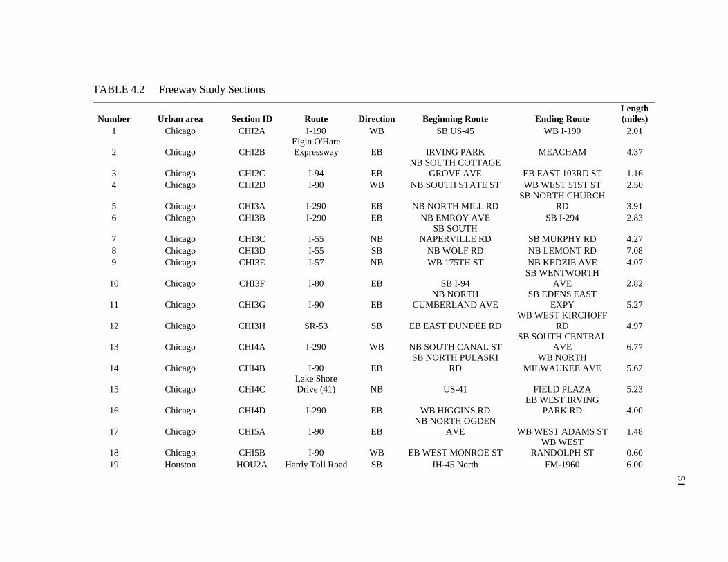
TABLE 4.2 Freeway Study Sections
Number Urban area Section ID Route Direction Beginning Route Ending Route Length (miles)
1 Chicago CHI2A I-190 WB SB US-45 WB I-190 2.01
2 Chicago CHI2B Elgin O'Hare Expressway EB IRVING PARK MEACHAM 4.37
3 Chicago CHI2C I-94 EB NB SOUTH COTTAGE
GROVE AVE EB EAST 103RD ST 1.16 4 Chicago CHI2D I-90 WB NB SOUTH STATE ST WB WEST 51ST ST 2.50
5 Chicago CHI3A I-290 EB NB NORTH MILL RD SB NORTH CHURCH
RD 3.91 6 Chicago CHI3B I-290 EB NB EMROY AVE SB I-294 2.83
7 Chicago CHI3C I-55 NB SB SOUTH
NAPERVILLE RD SB MURPHY RD 4.27 8 Chicago CHI3D I-55 SB NB WOLF RD NB LEMONT RD 7.08 9 Chicago CHI3E I-57 NB WB 175TH ST NB KEDZIE AVE 4.07
10 Chicago CHI3F I-80 EB SB I-94 SB WENTWORTH
AVE 2.82
11 Chicago CHI3G I-90 EB NB NORTH
CUMBERLAND AVE SB EDENS EAST
EXPY 5.27
12 Chicago CHI3H SR-53 SB EB EAST DUNDEE RD WB WEST KIRCHOFF
RD 4.97
13 Chicago CHI4A I-290 WB NB SOUTH CANAL ST SB SOUTH CENTRAL
AVE 6.77
14 Chicago CHI4B I-90 EB SB NORTH PULASKI
RD WB NORTH
MILWAUKEE AVE 5.62
15 Chicago CHI4C Lake Shore Drive (41) NB US-41 FIELD PLAZA 5.23
16 Chicago CHI4D I-290 EB WB HIGGINS RD EB WEST IRVING
PARK RD 4.00
17 Chicago CHI5A I-90 EB NB NORTH OGDEN
AVE WB WEST ADAMS ST 1.48
18 Chicago CHI5B I-90 WB EB WEST MONROE ST WB WEST
RANDOLPH ST 0.60 19 Houston HOU2A Hardy Toll Road SB IH-45 North FM-1960 6.00
51

TABLE 4.2 Continued
Number Urban area Section ID Route Direction Beginning Route Ending Route Length (miles)
20 Houston HOU2AO Hardy Toll Road NB FM-1960 IH-45 North 6.00 21 Houston HOU3A US 290 Northwest EB Barker Cypress FM 1960 4.05 22 Houston HOU3AO US 290 Northwest WB FM 1960 Barker Cypress 4.90 23 Houston HOU3B US 290 Northwest EB FM 1960 Sam Houston 5.10 24 Houston HOU3BO US 290 Northwest WB Sam Houston FM 1960 4.25 25 Houston HOU3C US 290 Northwest EB Sam Houston Pinemont 4.45 26 Houston HOU3CO US 290 Northwest WB Pinemont Sam Houston 4.45 27 Houston HOU3D I-45 North SB Hardy Toll Road FM 1960 5.40 28 Houston HOU3DO I-45 North NB FM 1960 Hardy Toll Road 5.40 29 Houston HOU3E Beltway 8-North EB US-290 Northwest SH-249 6.00 30 Houston HOU3EO Beltway 8-North WB SH-249 US-290 Northwest 6.10 31 Houston HOU3F Beltway 8-North EB SH-249 Ella 5.50 32 Houston HOU3FO Beltway 8-North WB Ella SH-249 5.50 33 Houston HOU3G Beltway 8-North WB John F Kennedy Blvd Imperial Valley 4.70 34 Houston HOU3H Beltway 8-West SB I-10 Katy Richmond 4.60 35 Houston HOU3I Beltway 8-West SB Richmond US 59 Southwest 4.20 36 Houston HOU3J Hardy Toll Road SB FM-1960 Greens 5.80 37 Houston HOU3JO Hardy Toll Road NB Greens FM-1960 5.80 38 Houston HOU3K Hardy Toll Road SB Aldine-Bender Little York 4.20 39 Houston HOU3KO Hardy Toll Road NB Little York Aldine-Bender 4.20 40 Houston HOU3L Hardy Toll Road SB Little York IH-610 North Loop 3.60 41 Houston HOU3LO Hardy Toll Road NB IH-610 North Loop Little York 3.60 42 Houston HOU4A US 59 Southwest EB Hazard I-45 3.60 43 Houston HOU4B SH-288 NB IH-610 South Loop US 59 3.30 44 Houston HOU4BO SH-288 SB US 59 IH-610 South Loop 3.30 45 Houston HOU4C I-45 North SB Aldine Bender Shepherd 3.60 46 Houston HOU4D I-45 North SB Shepherd Crosstimbers 4.60 47 Houston HOU5A US 59 Southwest EB Bissonnet Hillcroft 5.10 48 Houston HOU5B US 59 Southwest WB Hillcroft Bissonnet 5.10 49 Houston HOU5C I-610 East Loop NB SH 225 Clinton Dr 2.70 52

TABLE 4.2 Continued
Number Urban area Section ID Route Direction Beginning Route Ending Route Length (miles)
50 Houston HOU5D I-610 East Loop NB Clinton Dr Wallisville Rd 3.30 51 Houston HOU5E I-610 East Loop SB N Wayside I-10 East 2.30 52 Houston HOU5F I-610 East Loop SB I-10 East Clinton Dr 2.90 53 Houston HOU6A US 59 Southwest EB Hillcroft I-610 1.60 54 Houston HOU6B US 59 Southwest EB Newcastle Hazard 2.50 55 Houston HOU6C US 59 Southwest WB Hazard Newcastle 2.50 56 Houston HOU6D US 59 Southwest WB I-610 Hillcroft 1.60 57 Houston HOU6E I-610 North Loop EB Irvington US 59 1.50 58 Los Angeles LAX2A CA-118 EB N Princeton Ave. N. Madera Rd. 4.21 59 Los Angeles LAX2B I-105 WB Studebaker Rd. I-605 0.65 60 Los Angeles LAX3A CA-118 EB N. Madera Rd. Tapo Canyon Rd. 1.70 61 Los Angeles LAX3B I-105 EB I-110 I-710 3.55 62 Los Angeles LAX3C I-5 NB Valley View Ave. I-605 3.58 63 Los Angeles LAX3D I-5 SB I-605 Valley View Ave. 4.48 64 Los Angeles LAX3E CA-14 SB Soledad Canyon Rd. CA-126 3.16 65 Los Angeles LAX4A I-5 NB I-605 I-710 5.00 66 Los Angeles LAX4B I-10 EB I-710 CA-19 4.38 67 Los Angeles LAX4C CA-60 EB S. Hacienda Blvd. CA-57 7.18 68 Los Angeles LAX4D US-101 NB CA-110 N. Western Ave. 4.97 69 Los Angeles LAX4E I-405 NB I-110 I-105 6.61 70 Los Angeles LAX5A I-10 EB N. Grand Ave. CA-57 4.09 71 Los Angeles LAX5B CA-60 WB I-605 Garfield Ave. 4.98 72 Los Angeles LAX5C I-210 WB Rosemead Blvd. CA-134 4.04 73 Los Angeles LAX5D I-405 NB CA-2 US-101 7.15 74 Los Angeles LAX6A I-5 SB CA-118 CA-170 1.73 75 Los Angeles LAX6B I-10 EB I-5 I-710 1.47 76 Los Angeles LAX6C I-710 SB I-105 Alondra Blvd. 1.03 77 Minneapolis-St. Paul MSP2A T.H.36 WB Railroad Bridge Cleveland Ave 4.89 78 Minneapolis-St. Paul MSP2B T.H.62 EB Wooddale Ave T.H.121 3.07 79 Minneapolis-St. Paul MSP2C U.S.169 NB Bren Rd 22nd St 5.07 53

TABLE 4.2 Continued
Number Urban area Section ID Route Direction Beginning Route Ending Route Length (miles)
80 Minneapolis-St. Paul MSP2D I-494 EB 67th Ave T.H.55 4.99 81 Minneapolis-St. Paul MSP2E I-35E NB Southcross Dr N of T.H.77 5.07 82 Minneapolis-St. Paul MSP2F T.H.10 EB Ferry St W of Egret 6.09 83 Minneapolis-St. Paul MSP3A T.H.77 NB Old Shakopee Rd N of Minnesota River 3.62 84 Minneapolis-St. Paul MSP3B T.H.100 NB Benton Ave Excelsior Blvd 2.81 85 Minneapolis-St. Paul MSP3C I-394 EB I-494 Co Rd 73 2.26 86 Minneapolis-St. Paul MSP3D I-694 EB T.H.47 5th Ave 3.77 87 Minneapolis-St. Paul MSP3E I-35W NB Co Rd C I-694 3.49 88 Minneapolis-St. Paul MSP3F I-35E NB S of Cliff Rd Pilot Knob Rd 4.22 89 Minneapolis-St. Paul MSP3G I-35E NB Cayuga St T.H.36 3.77 90 Minneapolis-St. Paul MSP3H I-35W SB I-694 Co Rd C 3.50 91 Minneapolis-St. Paul MSP3I I-35E SB T.H.36 Cayuga St 3.77 92 Minneapolis-St. Paul MSP3J I-35W NB N of I-494 S of I-494 3.29 93 Minneapolis-St. Paul MSP4A I-94 EB 49th Ave 41st Ave 3.20 94 Minneapolis-St. Paul MSP4B I-35W NB 42nd St 26th St 2.51 95 Minneapolis-St. Paul MSP5A I-94 WB Olson Hwy Plymouth Ave 2.90 96 Philadelphia PHL2A I-476 SB US-1 I-95 5.39 97 Philadelphia PHL2B I-76 WB US-1 I-476 3.30 98 Philadelphia PHL2C I-95 NB I-276 US-1 6.25 99 Philadelphia PHL2CO I-95 SB US-1 I-276 6.25
100 Philadelphia PHL2D I-95 NB US-1 PA-29 4.30 101 Philadelphia PHL2DO I-95 SB PA-29 US-1 4.30 102 Philadelphia PHL2E PA-309 NB I-276 N. Bethlehem Pike 5.33 103 Philadelphia PHL2EO PA-309 SB N. Bethlehem Pike I-276 5.33 104 Philadelphia PHL2F US 202 NB US-30 N. Valley Rd. 4.52 105 Philadelphia PHL2G US 422 WB I-276 Collegeville Rd. 8.17 106 Philadelphia PHL3A I-476 NB PA-3 I-76 6.52 107 Philadelphia PHL3AO I-476 SB I-76 PA-3 6.52 108 Philadelphia PHL3B I-95 NB Bartram Ave. I-76 6.34 109 Philadelphia PHL3C I-95 NB PA-73 PA-132 4.40 54

TABLE 4.2 Continued
Number Urban area Section ID Route Direction Beginning Route Ending Route Length (miles)
110 Philadelphia PHL3D I-95 SB I-476 I-495 7.10 111 Philadelphia PHL3E I-76 EB US-1 I-676 1.99 112 Philadelphia PHL3F I-76 WB I-676 US-1 1.98 113 Philadelphia PHL3G US 202 NB N. Valley Rd. US-422 3.75 114 Philadelphia PHL4A I-95 NB I-476 Bartram Ave. 4.78 115 Philadelphia PHL4AO I-95 SB Bartram Ave. I-476 4.78 116 Philadelphia PHL4B I-95 NB PA-90 PA-73 7.75 117 Philadelphia PHL4BO I-95 SB PA-73 PA-90 8.65 118 Philadelphia PHL4C I-76 WB I-95 Snyder Ave. 2.56 119 San Francisco SAF2A SR-92 EB I-280 I-380 7.14 120 San Francisco SAF2B SR-92 WB I-380 I-280 4.83 121 San Francisco SAF2C I-680 SB Gold Hill Rd. I-780 8.89 122 San Francisco SAF2D SR-87 NB SR-85 I-280 4.53 123 San Francisco SAF2E I-680 NB I-780 Gold Hill Rd. 8.87 124 San Francisco SAF3A I-80 EB SR-4 Port St. 5.38 125 San Francisco SAF3B I-84 WB Thornton Ave. US-101 7.93 126 San Francisco SAF3C SR-237 WB I-880 US-101 4.73 127 San Francisco SAF3D I-880 SB US-101 I-280 4.75 128 San Francisco SAF4A I-80 EB Buchanan St. San Pablo Dam Rd. 3.89 129 San Francisco SAF4B 580 EB SR-24 SR-13 6.75 130 San Francisco SAF4C I-680 SB SR-24 Sycamore Valley Rd. 4.63 131 San Francisco SAF4D I-880 SB SR-84 SR-262 6.24 132 San Francisco SAF4E I-880 SB 29th Ave. I-238 5.33 133 San Francisco SAF5A I-80 EB I-880 Buchanan St. 2.81 134 San Francisco SAF5B I-880 NB SR-92 I-238 3.17 135 San Francisco SAF5C I-880 SB I-238 SR-92 3.19 136 San Francisco SAF6A I-680 SB Oak Park Blvd. SR-24 0.93 137 Tampa TAM2A I-275 NB US-41 I-75 5.85 138 Tampa TAM2AO I-275 SB I-75 US-41 5.85 139 Tampa TAM2B I-75 NB US-301 I-275 5.91 55

TABLE 4.2 Continued
Number Urban area Section ID Route Direction Beginning Route Ending Route Length (miles)
140 Tampa TAM2BE I-75 SB I-275 US-301 7.22 141 Tampa TAM3A I-275 NB I-4 US-41 7.20 142 Tampa TAM3B I-4 EB I-75 SR-39 7.52 143 Tampa TAM3BO I-4 WB SR-39 I-75 7.52 144 Tampa TAM3C I-75 NB I-4 US-301 6.60 145 Tampa TAM3CE I-75 SB US-301 I-4 4.05 146 Tampa TAM3D I-75 SB I-4 SR-60 3.88 147 Tampa TAM4A I-275 NB SR-687 SR-60 6.77 148 Tampa TAM4B I-275 SB SR-60 US-92 5.51 149 Tampa TAM5A I-275 NB SR-694 SR-687 2.66
56

FIGURE 4.1 Chicago area study sites.
57

FIGURE 4.2 Houston area study sites.
58

FIGURE 4.3 Los Angeles area study sites.
59

FIGURE 4.4 Minneapolis-St. Paul area study sites.
60

FIGURE 4.5 Philadelphia area study sites.
61
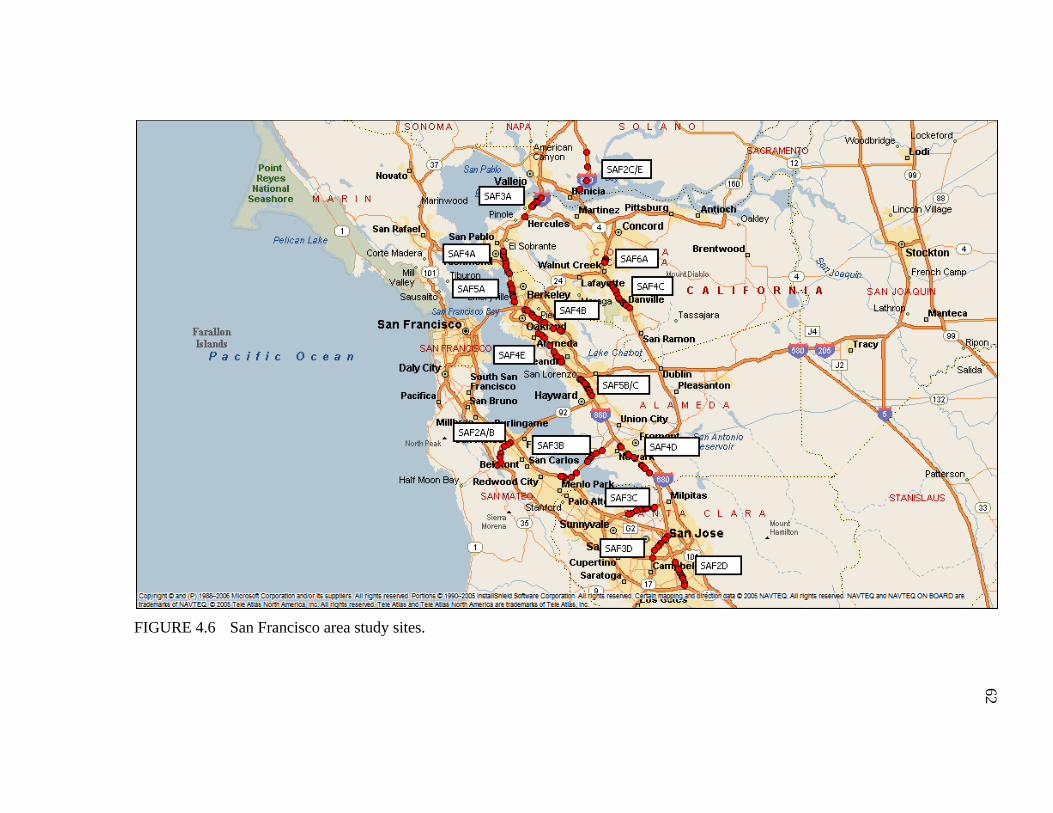
FIGURE 4.6 San Francisco area study sites.
62

FIGURE 4.7 Tampa area study sites.
63

64
Table 4.3 lists the number of the study sites in each range of factors considered in
this study. As mentioned, the data from MMP were originally collected for traffic
operations purposes. Thus, the coverage of the data is limited to those places where real-
time traffic data are collected and archived. No sites in rural area type are available.
Since congestion tends to occur in larger urban areas, the lack of rural and less populated
urban area data is believed to have little or no effect on the study findings.
The data source for the factors of AADT, percentage of truck, and speed limit is
the Highway Performance Monitoring System (HPMS) which is a program designed to
assess the condition performance of the nation's highways annually. It should be noted
that 8 of 149 freeway sections do not have data available in HPMS (7 of them are toll
ways). There are additional 15 freeway sections that do not have the percent trucks and
the speed limit data available in HPMS. The lack of the data for this small number of
sections is believed to have a small influence on the overall study findings. Because the
purpose of considering these factors is to ensure that the experiment performed cover a
variety of factors and conditions.
4.2.2 Study Sites for Hypothesis 2
The analysis of hypothesis 2 requires the study sites from system wide as does
hypothesis 1. The consideration and selection criteria for study sites of hypotheses 2 are
the same. Therefore, the study sites for hypothesis 1 can also be used for hypothesis 2.
4.2.3 Study Sites for Hypothesis 3
One of the concerns in selecting study sites for testing hypothesis 3 is that the
inconsistency in law enforcement efforts may influence driving behaviors, which in turn,
influence the travel time distribution of freeway segments. Harris County covers the
majority of the urban area in the Houston metropolitan area. Freeway and toll way law
enforcement in the county is geographically divided into four Precincts. To ensure the
consistency in law enforcement effort, freeway segments located in Precinct 3 were
selected for testing hypotheses 3. Precinct 3 has the most regular shape for the coverage

65
area. The regular shape of the coverage area would likely to incorporate freeway
sections completely within the precinct as well as to have a similar number of patrols for
each freeway route, and in turn, increase the chance of consistency in law enforcement
effort.
The freeway segments for hypothesis 3 are listed in Table 4.4 and shown in
Figure 4.8.
TABLE 4.3 Number of Freeway Sections Sampled in Factor Groups
Factors Levels Area Type CBD Urban Suburban Rural
Area Size Small (less than 500,000 population) - - - - Medium (500,000 – 1 million population) - - - - Large (1 – 3 million population)
1 13 18 - Very Large (3 - 7 million population)
6 33 41 - Very Large (over 7 million population)
6 11 20 -
Congestion Level
Low (AADT/C <7) 3 9 13 - Moderate (AADT/C 7-11) 3 22 26 - Severe (AADT/C >11) 7 26 32 -
Number of Lanes Per Direction
2 0 10 23 - 3 2 18 42 - 4 7 16 5 - 5+ 4 13 9 -
Percent Trucks <10% 10 46 50 - >=10% 0 7 13 -
Proximity to Major Bottleneck
< 1 mile downstream from segment 11 32 26 -
>1 miles downstream from segment 2 25 53 -
Ramp Spacing <1 mile 1 5 13 - >1 mile 12 52 66 -
Speed Limit 50 mph 3 0 0 - 55 mph 5 24 26 - 60 mph 1 15 0 - 65 mph 1 14 31 - 70 mph 0 0 6 -
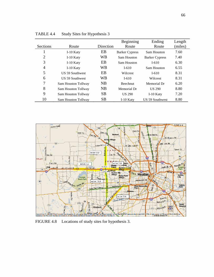
66
TABLE 4.4 Study Sites for Hypothesis 3
Sections Route Direction Beginning
Route Ending
Route Length (miles)
1 I-10 Katy EB Barker Cypress Sam Houston 7.60 2 I-10 Katy WB Sam Houston Barker Cypress 7.40 3 I-10 Katy EB Sam Houston I-610 6.30 4 I-10 Katy WB I-610 Sam Houston 6.55 5 US 59 Southwest EB Wilcrest I-610 8.31 6 US 59 Southwest WB I-610 Wilcrest 8.31 7 Sam Houston Tollway NB Beechnut Memorial Dr 6.20 8 Sam Houston Tollway NB Memorial Dr US 290 8.80 9 Sam Houston Tollway SB US 290 I-10 Katy 7.20 10 Sam Houston Tollway SB I-10 Katy US 59 Southwest 8.80
FIGURE 4.8 Locations of study sites for hypothesis 3.
67
4.3 Data Processing
The standardized datasets from MMP have the level of detail of 5-minute speed
and volume data for each lane. These data were aggregated both spatially and
temporally for each hypothesis testing.
4.3.1 Data Aggregation for Hypothesis 1
Six out of seven urban areas selected for the hypothesis 1 testing have point
sensor data; Houston has toll tag data. The data aggregation process for point sensor
data and toll tag data, however, is similar. The only difference is that toll tag data
requires little or no spatial aggregation. The snap shot method (16) was used to
transform spot speeds to travel time for the point sensors. The following sections detail
the aggregation process.
4.3.1.1 Spatial aggregation for point sensors
Figure 4.9 illustrates four levels of aggregated point sensor data: lane-by-lane
level, station level, link level, and section level (5). Three steps of spatial aggregation
were performed on the standardized 5-minute lane by lane data to obtain section level of
information. For each step, three parts of calculation were performed. The “sensor”
data aggregation part describes the procedures for aggregating the volume and speed
data. The “performance measures calculation” part introduces the calculation of
performance measures (i.e., delay, TTI, and PTI) using the adjusted volume and speed
data. The “adjustment for missing value” part explains the assumptions and procedures
used to adjust the missing sensor data and resulting performance measures.

68
FIGURE 4.9 Illustration of spatial aggregation steps for point sensors (5).
Traffic sensors collect data in each lane at 0.5-mile nominal spacing
Summary statistics computed across all lanes in a given direction
Link travel time andvehicle-miles of travel
Link travel time andvehicle-miles of travel
Point-based properties extrapolated to roadway links 1-3 miles in length
Directional roadway sectiontravel time and vehicle-miles of travel
Directional roadway section travel time and vehicle-miles of travel
Link properties summed to analysis sections 5-10 miles in length
Lane-by-LaneLevel
SectionLevel
LinkLevel
StationLevel
Step 1
Step 2
Step 3
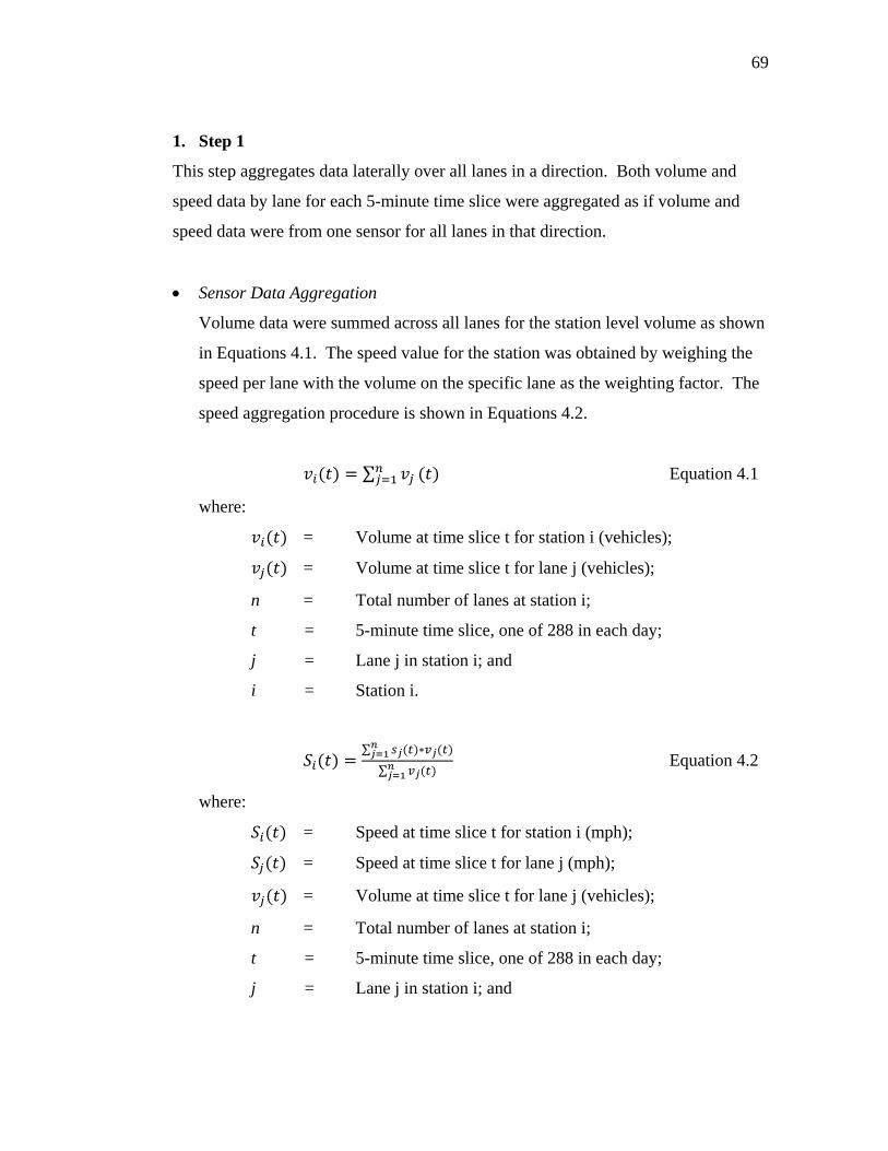
69
1. Step 1
This step aggregates data laterally over all lanes in a direction. Both volume and
speed data by lane for each 5-minute time slice were aggregated as if volume and
speed data were from one sensor for all lanes in that direction.
• Sensor Data Aggregation
Volume data were summed across all lanes for the station level volume as shown
in Equations 4.1. The speed value for the station was obtained by weighing the
speed per lane with the volume on the specific lane as the weighting factor. The
speed aggregation procedure is shown in Equations 4.2.
∑ Equation 4.1
where:
= Volume at time slice t for station i (vehicles);
= Volume at time slice t for lane j (vehicles);
n = Total number of lanes at station i;
t = 5-minute time slice, one of 288 in each day;
j = Lane j in station i; and
i = Station i.
∑
∑ Equation 4.2
where:
= Speed at time slice t for station i (mph);
= Speed at time slice t for lane j (mph);
= Volume at time slice t for lane j (vehicles);
n = Total number of lanes at station i;
t = 5-minute time slice, one of 288 in each day;
j = Lane j in station i; and
70
i = Station i.
• Performance Measure Calculation
No performance measure was calculated at this level.
• Adjustment for Missing Value
Factoring is used as a way to estimate the missing volume and speed data from
particular lane(s). The missing data are occasions when either no data is reported
for a particular detector or the original data was discarded because it has been
determined to be bad in the MMP data quality control process(5). The factoring
ensures the consistency of data, especially when comparing among study sites.
The assumptions made when estimating missing data are 1) volume is
proportional to the ratio of missing number of lanes to the total number of lanes,
and 2) speed is the same as the average speed of non-missing lanes.
The station level data will be set to missing or null if data is missing from all
lanes.
2. Step 2
This step expands the station level data to cover a small road link which has the
detector station in the middle. The assumption for this step is that speed and volume
is consistent or homogenous within the small link.
• Sensor Data Aggregation
Figure 4.10 illustrates the distance covered by each detector station in a road
section with four detector stations. For example, the second detector station
covers a link that begins halfway between station 1 and station 2 and ends at half
the distance to the downstream detector station 3. Each detector station covers a
link beginning halfway from the detector station upstream ending halfway to the

71
detector station downstream. The distance upstream of the first station on any
road and downstream of the last station on a road is assumed to be the same as
the distance from the station to its “interior” neighbor.
FIGURE 4.10 Illustration of distance coverage by detector stations.
Under the assumption that the speed and volume are homogenous within the link,
the aggregated volume and speed values for the station become the volume and
speed values of the link which has the coverage distance illustrated in Figure
4.10.
The link level VMT is the product of the volume of the link and the distance of
the link (as shown in Equation 4.3). The link level travel time was calculated by
dividing the distance of the link with the speed of the link (as shown in Equation
4.4). The link level VHT is the product of the volume of the link and the travel
time of the link (as shown in Equation 4.5).
Equation 4.3
D3 D4 D2 D1
D – distance 1, 2, 3, 4 ‐ stations
u – upstream d ‐ downstream
Station 1 Station 3Station 2 Station 4
D1u
Travel direction
D1d D2u D2d D3u D3d D4u D4d

72
where:
= Vehicle Miles Traveled (VMT) at time slice t for link i
(vehicle-mile);
= Volume at time slice t for link i (vehicles);
= Distance covered by link i (mile);
t = 5-minute time slice, one of 288 in each day; and
i = Link i.
Equation 4.4
where:
= Travel time at time slice t for link i (hour);
= Distance covered by link i (mile);
= Speed at time slice t for link i (mph);
t = 5-minute time slice, one of 288 in each day; and
i = Link i.
Equation 4.5
where:
= Vehicle Hours Traveled (VHT) at time slice t for link i
(vehicle hour);
= Volume at time slice t for station i (vehicles);
= Travel time at time slice t for link i (hour);
t = 5-minute time slice, one of 288 in each day; and
i = Link i.
• Performance Measure Calculation
The performance measures delay and TTI were calculated for each link. The
original equations for calculating delay and TTI can be seen in section 3.3.1.2.
The equations can be reformulated with the symbols of the station link (as shown

73
in Equations 4.6 and 4.7). The delay and TTI values were calculated for the
eight congestion threshold scenarios introduced in section 3.3.1.3. Since only
one measure of TTI is available at the 5-minute level and PTI is the 95th
percentile of TTI, PTI cannot be calculated at this level.
Equation 4.6
where:
= Delay at time slice t for link i (vehicle hour);
= Speed at time slice t for link i (mph);
= VMT at time slice t for link i (vehicle-mile);
t = 5-minute time slice, one of 288 in each day; and
i = Link i.
Equation 4.7
where:
= TTI at time slice t for link i.
= Speed at time slice t for link i (mph);
t = 5-minute time slice, one of 288 in each day; and
i = Link i.
• Adjustment for Missing Value
No adjustment of missing value for volume and speed data was performed at this
step since the adjustment was already performed at the station level of Step 1.
3. Step 3
This step aggregates data for all links into a study section dataset.
• Sensor Data Aggregation

74
The section level VMT and VHT were obtained by summing the VMT and VHT
of each link in the section (as shown in Equations 4.8 and 4.9). The space mean
speed for the section can be estimated by dividing total section VMT by total
section VHT. The Equation 4.10 illustrates the space mean speed aggregation
procedure.
∑ Equation 4.8
where:
= VMT at time slice t for section k (vehicle mile);
= VMT at time slice t for link i (vehicle-mile);
t = 5-minute time slice, one of 288 in each day;
m = Total number of links in section k; and
k = Section k.
∑ Equation 4.9
where:
= VHT at time slice t for section k (vehicle hour);
= VHT at time slice t for link i (vehicle hour); and
t = 5-minute time slice, one of 288 in each day;
m = Total number of links in section k; and
k = Section k.
Equation 4.10
where:
= Space mean speed at time slice t for section k (mph); and
= VMT at time slice t for section k (vehicle mile);
= VHT at time slice t for section k (vehicle hour);
t = 5-minute time slice, one of 288 in each day;
m = Total number of links in section k; and
k = Section k.

75
• Performance Measure Aggregation
Performance measures calculated at the link level were aggregated to obtain
section level performance measures. Section level delay was obtained by
summing delay for all links in the section (as shown in Equation 4.11). Section
level TTI was obtained by weighing the link level TTI with the link VMT as the
weighting factor (as shown in Equation 4.12).
∑ Equation 4.11
where:
= Delay at time slice t for section k (vehicle hour);
= Delay at time slice t for link i (vehicle hour);
t = 5-minute time slice, one of 288 in each day;
m = Total number of links in section k; and
k = Section k.
∑ Equation 4.12
where:
= TTI at time slice t for section k (no unit);
= TTI at time slice t for link i.
= VMT at time slice t for link i (vehicle-mile);
V t = VMT at time slice t for section k (vehicle mile);
t = 5-minute time slice, one of 288 in each day;
m = Total number of links in section k; and
k = Section k.
• Adjustment for Missing Value
Factoring was performed to adjust missing data from links. VMT, VHT and
delay were adjusted proportionally with the ratio of the missing link length to
total section length. The requirement for factoring at this level was that at least

76
half of the links in the section reporting data in the 5-minute interval. If no data is
reported for the entire section at a 5-minute interval or less than half of the
stations in the section reporting data, the entire section was set to missing/null
values for the 5-minute interval. The reason for the “at least half” requirement is
that the aggregated section level data should be able to reflect the travel in the
entire section.
4.3.1.2 Temporal aggregation for point sensors
Several levels of temporal aggregation were performed to reduce data to the desired
study periods. The designations of temporal periods are introduced below.
• 5-minute time slice. There are 288 5-minute time slices in each day.
• Peak periods. Three hours (6:00 am to 9:00 am) of morning peak and three
hours (4:00 pm to 7:00 pm) of evening peak are used. There are 72 5-minute
time slices in the peak periods each day.
• Work days. Weekends and federally designated holidays were excluded from
the analysis periods.
No commonly accepted definition of a peak period exists. Typical practice with
archived traffic management center data is to divide the work days into five periods:
• Early morning
• Morning peak
• Midday
• Evening peak
• Late night
Both national congestion monitoring studies, Urban Mobility Report (UMR) and
Mobility Monitoring Program (MMP), designate the morning peak from 6:00 am to 9:00

77
am and evening peak from 4:00 pm to 7:00 pm. Although the peak start and end time
may vary for different freeway sections, the three hour morning or afternoon peak is
believed to be long enough to capture the entire congested duration for most freeway
sections. For the purpose of this study, capturing the exact morning or evening peak
periods for each study section is not a concern. However, capturing the most congested
duration for each study section so that little congestion was left uncounted is essential
for the study.
Traffic patterns of holidays and weekends are very different from that of average
work days. For the purpose of this study, holidays and weekends are excluded from the
study.
The entire year of 2006 was used as the analysis period to avoid the seasonality
effect which may exist in different urban areas. There were 251 work days in 2006.
Therefore, for each study section, a matrix of 5-minute time slices with 288 × 251 cells
exists. After the spatial aggregation, sectional level information of VMT, space mean
speed, delay and TTI were available for each cell in the time matrix.
The following steps describe the procedures for temporal aggregation of the data.
1. Aggregating across work days
This step aggregates data from 251 work days into annual data for each section. The
matrix of 288 × 251 5-minute time slices was collapsed into 288 time slices. Within
the 288 5-minute time slices, the 72 slices in the peak periods were used in the next
step of aggregation.
• Sensor Data Aggregation
The 2006 total work day VMT and VHT at a 5-minute time slice were obtained
by summing the section level VMT and VHT across all 251 work days (as shown
in Equations 4.13 and 4.14). A 2006 work day space mean speed at a 5-minute
time slice can be estimated by dividing the annual work day VMT with the
annual work day VHT (as shown in Equations 4.15).

78
∑ Equation 4.13
where:
= 2006 total work day VMT at time slice t for section k
(vehicle mile);
= VMT at time slice t for section k in day d (vehicle mile);
w = Total work days in 2006;
t = 5-minute time slice, one of 288 in each day;
d = Day d, one of 251 work days in 2006; and
k = Section k.
∑ Equation 4.14
where:
= 2006 total work day VHT at time slice t for section k
(vehicle hour);
= VHT at time slice t for section k in day d (vehicle hour);
w = Total work days in 2006;
t = 5-minute time slice, one of 288 in each day;
d = Day d, one of 251 work days in 2006; and
k = Section k.
Equation 4.15
where:
= 2006 work day space mean speed at time slice t for section
k (mph);
= 2006 total work day VMT at time slice t for section k
(vehicle mile);
= 2006 total work day VHT at time slice t for section k
(vehicle hour);

79
w = Total work days in 2006;
t = 5-minute time slice, one of 288 in each day;
d = Day d, one of 251 work days in 2006; and
k = Section k.
• Performance Measure Aggregation
An annual work day total delay for 2006 at a 5-minute time slice was obtained by
summing the section level delay across all 251 work days (as shown in Equation
4.16). An annual average work day TTI for 2006 at a 5-minute time slice was
obtained by weighing the section level TTI of a work day with the section level
VMT of the work day as the weighting factor (as shown in Equation 4.17). PTI
was calculated at this step by obtaining the 95th percentile value of TTI out of
the 251 TTI data points (as shown in Equation 4.18).
∑ Equation 4.16
where:
= 2006 total work day delay at time slice t for section
k (vehicle hour);
= Delay at time slice t for section k in day d (vehicle
hour);
w = Total work days in 2006;
t = 5-minute time slice, one of 288 in each day;
d = Day d, one of 251 work days in 2006; and
k = Section k.
∑ Equation 4.17
where:
= 2006 work day TTI at time slice t for section k;
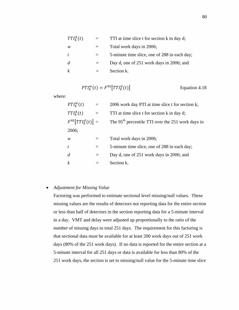
80
= TTI at time slice t for section k in day d;
w = Total work days in 2006;
t = 5-minute time slice, one of 288 in each day;
d = Day d, one of 251 work days in 2006; and
k = Section k.
Equation 4.18
where:
= 2006 work day PTI at time slice t for section k;
= TTI at time slice t for section k in day d;
= The 95th percentile TTI over the 251 work days in
2006;
w = Total work days in 2006;
t = 5-minute time slice, one of 288 in each day;
d = Day d, one of 251 work days in 2006; and
k = Section k.
• Adjustment for Missing Value
Factoring was performed to estimate sectional level missing/null values. These
missing values are the results of detectors not reporting data for the entire section
or less than half of detectors in the section reporting data for a 5-minute interval
in a day. VMT and delay were adjusted up proportionally to the ratio of the
number of missing days to total 251 days. The requirement for this factoring is
that sectional data must be available for at least 200 work days out of 251 work
days (80% of the 251 work days). If no data is reported for the entire section at a
5-minute interval for all 251 days or data is available for less than 80% of the
251 work days, the section is set to missing/null value for the 5-minute time slice

81
in the annual work day value. The reason for the requirement is that the adjusted
data should be able to reflect the travel for all work days in the year.
2. Aggregation across peak periods
This step aggregates data from the 72 5-minute annual data in the peak periods into
one annual peak period data for each section.
• Sensor Data Aggregation
Only VMT data was aggregated to this level. VMT was summed up for the 72
periods to obtain a 2006 annual work day peak period VMT. The process is
illustrated in Equation 4.19.
∑ Equation 4.19
where:
= 2006 total work day VMT in the 6 hour peak periods for
section k (vehicle mile);
= 2006 total work day VMT at time slice t for section k
(vehicle mile);
w = Total work days in 2006;
t = 5-minute time slice, one of 288 in each day;
P = Total 6 hour peak periods; and
k = Section k.
• Performance Measure Aggregation
A 2006 annual work day peak period performance measures (delay, TTI and PTI)
were calculated. The 2006 annual work day peak period delay was calculated by
summing the 72 5-minute periods to obtain the total peak period value (as shown
in Equation 4.20). The 2006 annual work-day peak period TTI and PTI were

82
obtained by weighing the TTI and PTI of a 5-minute time slice in the peak
periods with the VMT of the 5-minute in the peak periods (as shown in Equation
4.21 and 4.22).
∑ Equation 4.20
where:
= 2006 total work day delay in the 6 hour peak
periods for section k (vehicle hour);
= 2006 total work day delay at time slice t for section
k (vehicle hour);
w = Total work days in 2006;
t = 5-minute time slice, one of 288 in each day;
P = Total 6 hour peak periods; and
k = Section k.
∑ Equation 4.21
where:
= 2006 work day TTI in the 6 hour peak periods for
section k;
= 2006 work day TTI at time slice t for section k;
= 2006 total work day VMT at time slice t for section
k (vehicle mile);
= 2006 total work day VMT in the 6 hour peak
periods for section k (vehicle mile);
w = Total work days in 2006;
t = 5-minute time slice, one of 288 in each day;
P = Total 6 hour peak periods; and
k = Section k.

83
∑ Equation 4.22
where:
= 2006 work day PTI in the 6 hour peak periods for
section k;
= 2006 work day PTI at time slice t for section k;
= 2006 total work day VMT at time slice t for section
k (vehicle mile);
= 2006 total work day VMT in the 6 hour peak
periods for section k (vehicle mile);
w = Total work days in 2006;
t = 5-minute time slice, one of 288 in each day;
P = Total 6 hour peak periods; and
k = Section k.
• Adjustment for Missing Value
No adjustment for missing values is necessary at this step. Since one of the
quality control rules (as described in the section 4.3.1.4) is that if any section has
a missing/null value for the annual work day data at any 5-minute time slice in
the peak periods, the section will be excluded from the study database.

84
4.3.1.3 Spatial and temporal aggregation for toll tag data
As introduced earlier, the toll tag system directly collects travel time, but does not
have volume data available. The MMP estimated the volume number for all lanes in a
direction and imputed into the 5-minute standardized dataset. AADT and a daily traffic
distribution profile for each route section were used to estimate the volume in MMP.
1. Spatial aggregation
The spatial aggregation process for toll tag data is similar to the process used for
the point sensors. The only difference is that the toll tag data does not need the
station level (Step 1) aggregation; the toll tag data is at the link level. The
distance covered between adjoining toll tag reader sites in the toll tag data can be
viewed as similar to the distance covered by a small link (as illustrated in Figure
4.10) with a point sensor. A single or multiple adjoining toll tag reader sites
constitutes a study section.
2. Temporal aggregation
Temporal aggregation process for toll tag data was identical to the process used
for the point sensors.

85
4.3.1.4 Data quality checking
Extensive data quality checking was performed in the MMP during the data
processing from the raw traffic operations center archives to the 5-minute lane-by-lane
level (5). Some basic visual data quality checking was performed on aggregated section
level 5-minute data in this research to ensure quality data. Travel rate (i.e., minutes per
mile) distributions for the selected freeway sites were used for data quality checking and
preliminary identification of travel time distribution patterns for these freeway segments.
The travel rate data was obtained after the spatial and first step of temporal aggregation.
Therefore, the travel rate is a section level 5-minute 2006 annual work day value.
Equation 4.23 illustrates the travel rate calculation using speed calculated in Equation
4.15.
Equation 4.23
where:
= 2006 annual work day travel rate at time slice t for
section k (minutes /mile);
= 2006 work day space mean speed at time slice t for
section k (mph);
w = Total work days in 2006;
t = 5-minute time slice, one of 288 in each day; and
k = Section k.

86
Two general quality control rules were applied to the data quality checking on
the sectional level 5-minute 2006 travel rate:
1. Exclude freeway sections that miss any sectional 5-minute aggregated travel rate
data during the peak period or 1 hour of travel rate during off peak period for the
entire section. This rule is to ensure that 1) no data is missing for the peak
periods, and 2) although off-peak data was not used for final hypothesis testing, a
significant amount of missing data for the entire year is a sign of detector failure.
2. Exclude freeway sections that have 2006 aggregated travel rate larger than 2
minutes/mile for the entire aggregated work day. This means the aggregated
speed is less than 30 mph for all 288 5-minute time slices of the day. This rule is
a reasonable check for U.S. freeway data.
Two sections (CHI2D and CHI3F) were excluded from the selected study sites
after the quality checking. Section CHI2D had missing data from 11:40 am to 2:20 pm
for all work days in 2006 and also had a travel rate larger than 2.0 for remaining 5-
minute time slices. Section CHI3F also had a travel rate larger than 2.0 for the entire
aggregated work day.
The travel rate distributions for the 149 study sections in seven urban areas using
2006 work day data are shown in Figures 4.11 to 4.17. These graphs were plotted to
visually identify the section that failed the quality control rules. In the same time, the
graphs also provide an exhibit of the regional pattern which may exist in the travel rate
distribution. Of the original 149 study sites, 147 sites were used for hypothesis testing
after the quality control.

87
(a) Before quality control
(b) After quality control by excluding CHI2D and CHI3F
FIGURE 4.11 Travel rate (minutes/mile) for Chicago area study sties.
0
0.5
1
1.5
2
2.5
3
3.5
4
4.5
5
0:00
:00
1:00
:00
2:00
:00
3:00
:00
4:00
:00
5:00
:00
6:00
:00
7:00
:00
8:00
:00
9:00
:00
10:0
0:00
11:0
0:00
12:0
0:00
13:0
0:00
14:0
0:00
15:0
0:00
16:0
0:00
17:0
0:00
18:0
0:00
19:0
0:00
20:0
0:00
21:0
0:00
22:0
0:00
23:0
0:00
CHI2ACHI2BCHI2CCHI2DCHI3ACHI3BCHI3CCHI3DCHI3ECHI3FCHI3GCHI3HCHI4ACHI4BCHI4CCHI4DCHI5ACHI5B
0
0.5
1
1.5
2
2.5
3
3.5
0:00
:00
1:00
:00
2:00
:00
3:00
:00
4:00
:00
5:00
:00
6:00
:00
7:00
:00
8:00
:00
9:00
:00
10:0
0:00
11:0
0:00
12:0
0:00
13:0
0:00
14:0
0:00
15:0
0:00
16:0
0:00
17:0
0:00
18:0
0:00
19:0
0:00
20:0
0:00
21:0
0:00
22:0
0:00
23:0
0:00
CHI2ACHI2BCHI2CCHI3ACHI3BCHI3CCHI3DCHI3ECHI3GCHI3HCHI4ACHI4BCHI4CCHI4DCHI5ACHI5B
Section CHI3F excluded
Section CHI2D excluded

88
FIGURE 4.12 Travel rate (minutes/mile) for Houston area study sties.
FIGURE 4.13 Travel rate (minutes/mile) for Los Angeles area study sties.
0
0.5
1
1.5
2
2.5
3
3.5
0:00
:00
1:00
:00
2:00
:00
3:00
:00
4:00
:00
5:00
:00
6:00
:00
7:00
:00
8:00
:00
9:00
:00
10:0
0:00
11:0
0:00
12:0
0:00
13:0
0:00
14:0
0:00
15:0
0:00
16:0
0:00
17:0
0:00
18:0
0:00
19:0
0:00
20:0
0:00
21:0
0:00
22:0
0:00
23:0
0:00
HOU2AHOU2AOHOU3AHOU3AOHOU3BHOU3BOHOU3CHOU3COHOU3DHOU3DOHOU3EHOU3EOHOU3FHOU3FOHOU3GHOU3HHOU3IHOU3JHOU3JOHOU3KHOU3KO
0
0.5
1
1.5
2
2.5
3
3.5
0:00
:00
1:00
:00
2:00
:00
3:00
:00
4:00
:00
5:00
:00
6:00
:00
7:00
:00
8:00
:00
9:00
:00
10:0
0:00
11:0
0:00
12:0
0:00
13:0
0:00
14:0
0:00
15:0
0:00
16:0
0:00
17:0
0:00
18:0
0:00
19:0
0:00
20:0
0:00
21:0
0:00
22:0
0:00
23:0
0:00
LAX2ALAX2BLAX3ALAX3BLAX3CLAX3DLAX3ELAX4ALAX4BLAX4CLAX4DLAX4ELAX5ALAX5BLAX5CLAX5DLAX6ALAX6BLAX6C

89
FIGURE 4.14 Travel rate (minutes/mile) for Minneapolis-St. Paul area study sties.
FIGURE 4.15 Travel rate (minutes/mile) for Philadelphia area study sties.
0
0.5
1
1.5
2
2.5
3
3.5
0:00
1:00
2:00
3:00
4:00
5:00
6:00
7:00
8:00
9:00
10:0
0
11:0
0
12:0
0
13:0
0
14:0
0
15:0
0
16:0
0
17:0
0
18:0
0
19:0
0
20:0
0
21:0
0
22:0
0
23:0
0
MSP2AMSP2BMSP2CMSP2DMSP2EMSP2FMSP3AMSP3BMSP3CMSP3DMSP3EMSP3FMSP3GMSP3HMSP3IMSP3JMSP4AMSP4BMSP5A
0
0.5
1
1.5
2
2.5
3
3.5
0:00
:00
1:00
:00
2:00
:00
3:00
:00
4:00
:00
5:00
:00
6:00
:00
7:00
:00
8:00
:00
9:00
:00
10:0
0:00
11:0
0:00
12:0
0:00
13:0
0:00
14:0
0:00
15:0
0:00
16:0
0:00
17:0
0:00
18:0
0:00
19:0
0:00
20:0
0:00
21:0
0:00
22:0
0:00
23:0
0:00
PHL2APHL2BPHL2CPHL2COPHL2EPHL2EOPHL2FPHL2GPHL3AOPHL3BPHL3CPHL3DPHL3EPHL3FPHL4APHL4AOPHL4BPHL4BOPHL4C

90
FIGURE 4.16 Travel rate (minutes/mile) for San Francisco area study sties.
FIGURE 4.17 Travel rate (minutes/mile) for Tampa area study sties.
0
0.5
1
1.5
2
2.5
3
3.5
0:00
:00
1:00
:00
2:00
:00
3:00
:00
4:00
:00
5:00
:00
6:00
:00
7:00
:00
8:00
:00
9:00
:00
10:0
0:00
11:0
0:00
12:0
0:00
13:0
0:00
14:0
0:00
15:0
0:00
16:0
0:00
17:0
0:00
18:0
0:00
19:0
0:00
20:0
0:00
21:0
0:00
22:0
0:00
23:0
0:00
SAF2ASAF2BSAF2CSAF2DSAF2ESAF3ASAF3BSAF3CSAF3DSAF4ASAF4BSAF4CSAF4DSAF4ESAF5ASAF5BSAF5CSAF6A
0
0.5
1
1.5
2
2.5
3
3.5
0:00
:00
1:00
:00
2:00
:00
3:00
:00
4:00
:00
5:00
:00
6:00
:00
7:00
:00
8:00
:00
9:00
:00
10:0
0:00
11:0
0:00
12:0
0:00
13:0
0:00
14:0
0:00
15:0
0:00
16:0
0:00
17:0
0:00
18:0
0:00
19:0
0:00
20:0
0:00
21:0
0:00
22:0
0:00
23:0
0:00
TAM2ATAM2AOTAM2BTAM2BETAM3ATAM3BTAM3BOTAM3CTAM3CETAM3DTAM4ATAM4BTAM5A

91
4.3.2 Data Aggregation for Hypothesis 2
Aggregation for hypothesis 2 can be viewed as a subset of the aggregation for
hypothesis 1 because data from the same analysis year (2006) was used. Delay is the
only performance measure that is relevant to hypothesis 2; the aggregated delay measure
from hypothesis 1 can be used directly to test the hypothesis 2.
4.3.3 Data Aggregation for Hypothesis 3
All study sites for hypothesis 3 are located in the Houston metropolitan area.
The toll tag data aggregation process (as introduced in section 4.3.1.3) was applied to the
aggregate data for this hypothesis.
4.3.3.1 Spatial and temporal aggregation
The spatial aggregation process for this hypothesis was introduced in section
4.3.1.3. The temporal aggregation periods for this hypothesis constitute three analysis
periods. Each analysis period constitutes three months,
• Analysis period 1: June, July and August of 2001
• Analysis period 2: June, July and August of 2002
• Analysis period 3: June, July and August of 2003
The temporal aggregation was performed to obtain a three-month average speed
for each 5-minute daily time slice for the three analysis periods. The 5-minute time
slices were further separated into three time periods. The designations of the three time
periods are,
• Off peak period: Six hours of early morning (12:00 am to 6:00 am) and five
hours of late night (7:00 pm to 12:00 am)
• Peak period: Three hours (6:00 am to 9:00 am) of morning peak and three hours
(4:00 pm to 7:00 pm) of evening peak

92
• Peak hour: One hour (7:00 am to 8:00 am) of morning peak hours and one hour
(5:00 pm to 6:00 pm) of evening peak hours
4.3.3.2 Data quality control
Visual data quality checking was performed on aggregated section level 5-minute
speed data in this research to ensure quality data. Section 8 (the section of northbound
Sam Houston Tollway from Memorial Dr. to US 290) was excluded from the study sites.
This section missed more than half of the data for analysis period 1 and analysis period 2.
Therefore, this site is not useful to perform a before and after quasi-experiment study
which requires examining the trend for the three analysis periods.
4.4 Final Datasets
The final datasets for testing the three hypotheses are introduced below.
4.4.1 Final Datasets for Testing Hypothesis 1
Hypothesis 1 is to test whether the rankings of congestion measures hold steady
across different congestion thresholds.
Delay, TTI and PTI for the 2006 annual work day peak periods were calculated
for all 147 study sites. The delay value was divided by section length to obtain a
normalized delay value (delay per mile) so that the value can be compared among
sections. These three measures (delay/mile, TTI, and PTI) for the 147 study sites were
ranked by the severity of congestion with the rank 1 being the most congested section.
The final datasets for hypothesis 1 are the rank values for the three performance
measures under the eight congestion threshold scenarios (as described in section 3.3.1.3).
A total of 24 (3 times 8) datasets constitute the final datasets for hypothesis 1 testing.
4.4.2 Final Datasets for Testing Hypothesis 2
Hypothesis 2 is to test whether the relationship of delay under different
congestion thresholds is non-linear and can be expressed in a quadratic form.

93
Calculated as a subset of hypothesis 1, the 2006 delay per mile for the annual
work day peak period was calculated for the seven uniformed congestion threshold
scenarios (as introduced in section 3.3.2.3) for the 147 sites.
The final datasets for hypothesis 2 are the delay per mile value in thousand
vehicle hours per mile for 147 study sites. A total of 7 datasets constitute the final
datasets for hypothesis 2 testing.
4.4.3 Final Datasets for Testing Hypothesis 3
Hypothesis 3 is to test whether speed limit affects travel time distribution for
both peak and off-peak period.
The average speed for each 5-minute time slice of the day for the three analysis
periods (before, during and after periods) and nine study sites was calculated for
hypothesis 3 testing. These dataset were separated by the time periods for testing the
effect of peak period, off-peak period, and peak hour.
A total of 27 (3 times 9) datasets for each of the three time periods constitute the
final datasets for hypothesis 3 testing.

94
CHAPTER V
RESULTS AND FINDINGS
This chapter documents the results and findings of the three hypothesis tests.
The results and findings are interpreted to answer the research questions listed in
Chapter III. The sections below present the detailed results by each hypothesis.
5.1 Hypothesis 1
A linear regression analysis was performed to test the hypothesis 1 on whether
the rankings of congestion measures for freeway sections hold steady across different
congestion thresholds. In the regression analysis, the relationships tested is whether
freeway congestion ranking values obtained from an alternative threshold speed scenario
form a linear relationship with those from the 60 mph baseline scenario. The regressed
slope was compared to 1 using the 95% confidence interval.
5.1.1 Results for Delay per Mile
The rankings of the delay per mile value for the 147 study sections under eight
congestion threshold scenarios were used for the regression analysis. To test the null
hypothesis, a test statistic of the t distribution (Equation 5.1) with n-2 degrees of
freedom was calculated (41). The estimate of the slope and the standard error of the
slope were needed for the test statistic. A value of 0.05 was used for this
hypothesis testing.
Equation 5.1
where:
= t-statistic value for the null hypothesis;
= the estimate of the slope; and
= the standard error of the slope.

95
One would reject : 1 if | | , , which means the test statistic is
outside of the confidence interval of ( 1 . For this study, the t distribution ,
was . , (which is approximately 1.96).
Table 5.1 presents the regression scenarios, the estimate and the standard error of
the regression slope, t statistic calculated from Equation 5.1, and p-value.
TABLE 5.1 Hypothesis 1 Testing Results Using Delay per Mile Performance Measure
Regression Scenarios p-value 55 mph vs. 60 mph 0.99869 0.00423 -0.30969 0.7572 50 mph vs. 60 mph 0.99675 0.00667 -0.48726 0.6268 45 mph vs. 60 mph 0.99554 0.00781 -0.57106 0.5688 40 mph vs. 60 mph 0.99348 0.00943 -0.69141 0.4904 35 mph vs. 60 mph 0.98998 0.01168 -0.85788 0.3924 30 mph vs. 60 mph 0.98454 0.01450 -1.06621 0.2881 Non-uniform vs. 60 mph
0.99319 0.00964 -0.70643 0.4811
P-values for all regression scenarios listed in Table 5.1 are greater than the
value 0.05. Therefore, the hypothesis of 1 or cannot be rejected for all
congestion threshold scenarios. This result indicates that congestion rankings using
delay per mile with the alternative threshold speeds are equal to the rankings with the 60
mph baseline threshold speed with a 95% confidence level.
Figure 5.1 shows the scatter plots of rankings by baseline and alternative
thresholds. All plots are fitted with the regression line and the 95% prediction limits.
Note that “Rank_D60” for the X-axis represents the rankings of 147 freeway sections
using delay per mile under the 60 mph baseline threshold. Y-axis is for the rankings by
alternative thresholds. The last two digits of the variable stand for the threshold speed
used.
The following findings are interpreted from Figure 5.1 and Table 5.1.

96
1. When the alternative congestion threshold speed is close to the 60 mph baseline
threshold, there is less fluctuation of the data around the regression line. This
can be proven by the regression results in Table 5.1. The closer the congestion
threshold speed is to the 60 mph, the closer is to 1 and the smaller value of
is. Even for the “least close” scenario (30 mph vs. 60 mph), the rankings
are equal within the 95% confidence interval.
2. There is less variability in the rankings for freeway sections that are either ranked
very high or very low under all congestion threshold speeds (Figure 5.1). In
other words, the sections that are ranked high (the most congested) and low (the
least congested) under the 60 mph baseline case remain similar ranking positions
under other congestion threshold scenarios. Using the travel time distribution
graph (as shown in Figure 5.2) to illustrate this finding, the most congested
sections have not only longer congested periods (duration) but also higher travel
time values (magnitude). Less congested sections have shorter congested periods
and lower travel time values.

97
FIGURE 5.1 Comparison of rankings of baseline vs. alternative scenarios on
delay per mile.

98
FIGURE 5.2 Travel time distribution examples for the most and least congested
sections.
3. The regression of the non-uniform congestion threshold (variable name
“Rank_DL”) with the 60 mph baseline scenario is a mix of 55 mph with 60 mph,
45 mph with 60 mph, and 35 mph with 60 mph. The scatter plot shows a
relatively close fit to the regression line with some data points above the upper
prediction limit. This observation can be explained by the area type labeled
scatter plot (Figure 5.3). Note that area types 1, 2 and 3 are CBD, urban and
suburban types, respectively. It was found that 78 out of the 147 sections were in
the suburban area type (area type 3) that used 55 mph as the congestion threshold
speed. Therefore, these 78 sections had a relatively close fit with the baseline
scenario because of the closeness between 55 mph to 60 mph (as explained in the
finding 1). For the 56 sections in the urban area type (area type 2) that used 45
mph as the congestion threshold speed, these data points departed further away
from the regression line. Because these sections were evaluated under a lower
congestion threshold speed, the rankings for these sections became lower, i.e.,
Peak Traffic Period
Time of Day
Travel Tim
e
A
BAlternative threshold
Baseline threshold 60 mph
A: the most congested section distribution B: the least congested section distribution

99
less congested. This is reflected in Figure 5.3 with these data points moving
upwards from the regression line and close to the upper prediction limit. The
same findings can be observed on the 13 CBD sections (area type 1 in Figure
5.3). These CBD data points moved even further upwards from the regression
line due to the further lower congestion threshold speed of 35 mph. The
differences in the rankings for some of these CBD sections were so large that
they fell outside of the upper prediction limit, an area where cannot be explained
by the regression model.
FIGURE 5.3 Scatter plot of non-uniform thresholds vs. the 60 mph threshold with area
type label for delay per mile ranking.
4. For the six uniform threshold regression scenarios shown in Figure 5.1, there are
more data points that are above the upper prediction limit than there are data
0
20
40
60
80
100
120
140
160
1 6 11 16 21 26 31 36 41 46 51 56 61 66 71 76 81 86 91 96 101
106
111
116
121
126
131
136
141
146
RANK_
DL
Rank_DL Vs. Rank_D60with area type label
Area Type 1
Area Type 2
Area Type 3

100
points below the lower prediction limit. Figure 5.4 illustrates the areas in related
to the regression line.
FIGURE 5.4 Illustration of the area outside of the prediction limits.
The first quadrant in Figure 5.4 can be divided into four areas (A, B, C
and D) by the regression line and two prediction limit lines. The two prediction
limit lines can be expressed as ∆. ∆ is the prediction interval and a
function of , model variance, sample size and the significance level. The four
areas (A, B, C and D) can be defined as follows.
• Area A is the area above the upper prediction limit and can be expressed
mathematically as ∆. With 1, area A becomes
∆. Area A indicates that the ranking values from an alternative
congestion threshold are one ∆ greater than those from the 60 mph
baseline threshold.
• Area D is the area below the lower prediction limit and can be expressed
mathematically as ∆. With 1, the area D becomes
∆. Area D indicates that the ranking values from an alternative
∆
∆
A
B
C
D
Lower prediction limit
)
Upper prediction limit
Regression line

101
congestion threshold are one ∆ less than those of from the 60 mph
baseline threshold.
• Areas B and C are the area within the prediction limits. With 1, this
area can be expressed as ∆ ∆, which means the
ranking values from an alternative congestion threshold are within one ∆
both directions of the regression line.
The regression results show that there are more data points in area A than
those in area D. This means that there were more freeway sections with ranking
values at least one ∆ greater (less congested) than those one ∆ less (more
congested) when using alternative threshold speeds.
The finding can also be illustrated in the travel time distribution graph in
Figure 5.5. Travel time distribution type C illustrates those freeway sections
with ranking values at least one ∆ greater (less congested) using alternative
threshold speeds. Conversely, travel time distribution type A illustrates those
sections with ranking values at least one ∆ less (more congested) using
alternative threshold speeds. The regression findings show that there were more
type C distributions than the type A distributions.
What are the common characteristics of these sections? What made these
sections fall outside the prediction limits? And is the reason that more data
points were above the upper prediction limit than the data points below the lower
prediction limit simply the randomness of the selection set or do the findings
apply to other sections as well? These questions regarding the sections that fell
outside of the prediction limits warrant future research.

102
FIGURE 5.5 Travel time distribution examples for explaining congestion ranking
differences.
5.1.2 Results for Travel Time Index (TTI)
The rankings of the TTI value for the 147 study sections under eight congestion
threshold scenarios were used for regression analysis. To test the null hypothesis, test
statistics of the t distribution (as shown in Equation 5.1) with n-2 degrees of freedom
were estimated. A value of 0.05 was chosen for this hypothesis testing.
Table 5.2 lists the regression scenarios, the estimate and the standard error of the
regression slope, t statistic calculated from Equation 5.1, and p-value. The result shows
that the hypothesis testing of 1 or cannot be rejected for all congestion
threshold scenarios using TTI as the performance measure. Or one could say that the
result shows congestion rankings from alternative threshold speeds are equal to the
rankings under the 60 mph baseline threshold with a 95% confidence level.
Peak Traffic Period
Time of Day
Travel Tim
e A
BC
Alternative threshold (e.g., 30 mph)
Baseline threshold 60 mph
A: ∆ B: ∆ ∆ C: ∆

103
TABLE 5.2 Hypothesis 1 Testing Results Using Travel Time Index Performance
Measure
Regression Scenarios P-value 55 mph vs. 60 mph 0.99815 0.00503 -0.36779 0.7136 50 mph vs. 60 mph 0.99421 0.00890 -0.65056 0.5164 45 mph vs. 60 mph 0.98866 0.01243 -0.91231 0.3631 40 mph vs. 60 mph 0.98224 0.01553 -1.14359 0.2547 35 mph vs. 60 mph 0.97244 0.01929 -1.42872 0.1552 30 mph vs. 60 mph 0.95993 0.02319 -1.7279 0.0861 Non-uniform vs. 60 mph
0.97679 0.01773 -1.30908 0.1926
Figure 5.6 shows the scatter plots of rankings by baseline and alternative
thresholds. All plots are fitted with the regression line and the 95% prediction limits.
Note that “Rank_T60” for the X-axis represents the rankings of 147 freeway sections
using TTI under the 60 mph baseline threshold. Y-axis is for the rankings by alternative
thresholds. The last two digits of the variable name indicates the threshold speed used.
The following findings can be seen from Figure 5.6 and Table 5.2.
1. When the alternative congestion threshold speed is close to the 60 mph baseline
threshold, there is less fluctuation of the data around the regression line. This
finding is similar to finding 1 of section 5.1.1 except that the prediction limits are
wider compared to the same regression scenario using delay per mile as the
performance measure. This may be because delay per mile includes both average
speed and volume in the variables (as illustrated in equation 3.6) while TTI has
only average speed as the variable (as illustrated in equation 3.8). The volume
variable in the delay function would give another measure to quantify the
congestion intensity and thus better explain the data. Therefore, the prediction
limits of the regression line using delay per mile as the performance measure
might be expected to be narrower than those of the TTI plots.
2. There is less variability in the rankings for the freeway sections that either ranked
very high or very low under all congestion threshold speeds (Figure 5.6). This

104
finding is also similar to finding 2 in section 5.1.1. This finding again shows that
the most congested sections have longer congested periods (duration) and higher
travel time values (magnitude). Less congested sections have shorter congested
periods and lower travel time values.
3. Regarding the non-uniform regression scenario (variable name “Rank_TL”),
similar finding as in the section 5.1.1 can be observed. Figure 5.7 shows the
scatter plot with data points for the three area types. The data points for CBD
(area type 1) are generally on top; urban area (area type 2) is in the middle; and
suburban area (area type 3) is at the bottom. This is reflected in Figure 5.7 where
data points (from area type 3) fit closely right below the regression line while the
data points (from area 1 and 2) above the regression line are further away from
the regression line and close to the upper prediction limit. Some data points are
even outside of the limit. As explained in section 5.1.1, this is because different
threshold speeds were used for each section according to their area type.
4. There are more data points that are above the upper prediction limit than there
are data points below the lower prediction limit for the six uniform threshold
regression scenarios (Figure 5.6), similar to the delay per mile finding in section
5.1.1.
These findings again warrant more future research. The question raised in
section 5.1.1 also applies to the finding using TTI as the performance measure.

105
FIGURE 5.6 Comparison of rankings of baseline vs. alternative scenarios on Travel
Time Index.

106
FIGURE 5.7 Scatter plots of non-uniform thresholds vs. the 60 mph threshold with
area type label for Travel Time Index ranking.
5.1.3 Results for Planning Time Index (PTI)
Similar to delay per mile and TTI, the rankings of the PTI value for the 147 study
sections under eight congestion threshold scenarios were used for regression analysis.
To test the null hypothesis, test statistic of the t distribution (as shown in Equation 5.1)
with n-2 degrees of freedom was estimated. A value of 0.05 was chosen for this
hypothesis testing.
Table 5.3 lists the regression scenarios, the estimate and standard error of the
regression slope, t statistic calculated from Equation 5.1, and p-value. The result shows
that the hypothesis of 1 or 60 cannot be rejected for all congestion threshold
cases using PTI as the performance measure. Or one could say that the result shows
0
20
40
60
80
100
120
140
1601 5 9 13 17 21 25 29 33 37 41 45 49 53 57 61 65 69 73 77 81 85 89 93 97 101
105
109
113
117
121
125
129
133
137
141
145
Rank_TL
Rank_TL Vs. Rank_T60with area type label
Area type 1
Area type 2
Area type 3

107
congestion rankings from alternative congestion thresholds are equal to the rankings
from the 60 mph baseline threshold at the 5% significance level.
TABLE 5.3 Hypothesis 1 Testing Results Using Planning Time Index Performance
Measure
Regression Scenarios P-value 55 mph vs. 60 mph 0.99888 0.00392 -0.28571 0.7755 50 mph vs. 60 mph 0.99591 0.00748 -0.54679 0.5854 45 mph vs. 60 mph 0.99100 0.01108 -0.81227 0.4180 40 mph vs. 60 mph 0.98560 0.01399 -1.02931 0.3050 35 mph vs. 60 mph 0.97644 0.01786 -1.31915 0.1892 30 mph vs. 60 mph 0.96313 0.02226 -1.65633 0.0998 Non-uniform vs. 60 mph
0.97830 0.01715 -1.26531 0.2078
Figure 5.8 shows the scatter plots of rankings by baseline and alternative
thresholds. All plots are fitted with the regression line and the 95% prediction limits.
Note that “Rank_P60” for the X-axis represents the rankings of 147 freeway sections
using PTI under the 60 mph baseline threshold. Y-axis is for the rankings by alternative
thresholds. The last two digits of the variable name indicates the threshold speed used.
The following findings can be seen from Figure 5.8 and Table 5.3:
1. When the alternative congestion threshold speed is close to the 60 mph baseline
threshold, there is less fluctuation of the data around the regression line. This
finding is similar to both delay per mile in section 5.1.1 and TTI in section 5.1.2.
The prediction limit ranges for PTI are similar to that of TTI.

108
FIGURE 5.8 Comparison of rankings of baseline vs. alternative scenarios on Planning
Time Index.

109
2. It can also be observed that there is less variability in the rankings for the
freeway sections that are either ranked very high or very low under all congestion
threshold speeds (Figure 5.8). This finding is also similar to the finding 2 in
section 5.1.1 and section 5.1.2, again indicating that the most congested sections
have not only longer congested periods (duration) but also higher travel time
values (magnitude). The least congested sections are exactly the opposite. Not
only such sections have shorter congested periods but also lower travel time
values.
3. Regarding the non-uniform regression scenario (variable name “Rank_PL”), the
similar finding as in the section 5.1.1 and 5.1.2 can be observed. Figure 5.9
shows the area type labeled scatter plot. The data points for the three area types
separated into three layers. The data points for CBD (area type 1) are generally
on top; urban area (area type 2) is in the middle; and suburban area (area type 3)
is at the bottom. This is reflected in Figure 5.9 where data points (from area type
3) fit closely right below the regression line while the data points (from area
types 1 and 2) above the regression line are further away from the regression line
and close to the upper prediction limit. Some data points are outside of the limit.
As explained in section 5.1.1, this is because different threshold speeds were
used for each section according to their area type.
4. There are more data points that are above the upper prediction limit than there
are data points below the lower prediction limit for the six uniform threshold
regression scenarios (Figure 5.8), similar to the delay per mile and TTI findings.

110
FIGURE 5.9 Scatter plots of non-uniform thresholds vs. the 60 mph threshold with
area type label for Planning Time Index ranking.
As in sections 5.1.1 and 5.1.2, this finding again warrants more future research.
The question raised in section 5.1.1 also applies to the finding using PTI as the
performance measure.
5.2 Hypothesis 2
As introduced in section 3.3.2.4, a quadratic regression was performed to test the
hypothesis 2 on whether the relationship of delay under different congestion thresholds
is non-linear and can be expressed in a quadratic form. In the regression analysis, two
relationships tested are 1) whether the regression parameter ( ) for the quadratic term is
0, which means the relationship between the two delay values obtained with different
congestion thresholds is linear, and 2) how well the quadratic line fits the data if a non-
0
20
40
60
80
100
120
140
160
1 5 9 13 17 21 25 29 33 37 41 45 49 53 57 61 65 69 73 77 81 85 89 93 97 101
105
109
113
117
121
125
129
133
137
141
145
Rank_P
L
Rank_PL Vs. Rank_P60with area type label
Area type 1
Area type 2
Area type 3

111
linear relationship exists between the two values of delay. The hypothesis is expressed
in Equation 3.10.
The delay per mile values for the 147 study sections and eight congestion
threshold scenarios were used for regression analysis. The 60 mph congestion threshold
speed was used as the baseline scenario. P-value for the null hypothesis 0 was used
to test the first relationship of whether the regression parameter for the quadratic term is
0. The coefficient of determination R2 was used to judge the adequacy of the regression
model or how well the quadratic line fits the data. Table 5.4 lists the estimated values
for the regression parameters , , and , p-value for testing 0 and R2 for each
regression scenario.
TABLE 5.4 Hypothesis 2 Testing Results
Regression Scenarios p-value R2 55 mph vs. 60 mph -0.52069 0.84892 0.00069 <.0001 0.997750 mph vs. 60 mph -0.53523 0.70043 0.00132 <.0001 0.992145 mph vs. 60 mph -0.35439 0.55347 0.00190 <.0001 0.983940 mph vs. 60 mph -0.06603 0.40439 0.00243 <.0001 0.972135 mph vs. 60 mph 0.30536 0.25506 0.00287 <.0001 0.955830 mph vs. 60 mph 0.71439 0.11396 0.00313 <.0001 0.9354
As presented in Table 5.4, for all regression scenarios, the p-values for the null
hypothesis 0 are less than 0.0001, which leads to reject the null hypothesis with a 95%
confidence level. The relationship between the values of delay per mile from different
thresholds is non-linear. The R2 values for all regression scenarios show that the model
accounts for above 93% of the variability in the data, which means the quadratic
regression line fits the data well.
Figures 5.10 through 5.15 show the scatter plot and fitted regression line for each
regression scenario. Note that “DLY60_PM” for the X-axis represents the delay per
mile from the 60 mph baseline threshold in 1,000 vehicle hour per mile. The number in
the variable name indicates the congestion threshold speed used.

112
The following findings are interpreted from Figures 5.10 through 5.15 and Table
5.4.
1. The closer the alternative congestion threshold speed is to the baseline speed of
60 mph, the less fluctuation of the data is to the regression line. This relationship
is supported by the R2 values listed in Table 5.4. The R2 values become smaller
when the alternative congestion threshold speed is further away from the baseline
scenario. This means the model explains the data better when the alternative
threshold speed is closer to the baseline speed.
2. The further away the alternative threshold speed is from the 60 mph baseline
threshold, the more quadratic the regression line becomes. This observation is
shown in the values listed in Table 5.4. The values become larger when the
alternative congestion threshold speed is further away from the 60 mph baseline
scenario. For the regression scenario of 55 mph vs. 60 mph, the regression line is
almost linear. However, for all regression scenarios, the null hypothesis ( 0)
is rejected at a significant level of 0.05, which means the quadratic term cannot
be ignored.
3. The 147 data points in Figures 5.10 through 5.15 seem to cluster into three
groups: 1) the delay per mile value less than 40,000 vehicle hours, 2) the delay
per mile value between 40,000 and 100,000 vehicle hours, and 3) the delay per
mile value larger than 100,000 vehicle hours. Separate analyses of each group
may provide more insight into the common characteristics of each group. Since
the delay value is the annual work day total, the observation could provide some
basis for the dividing values when grouping freeway sections for severity of
congestion using annual work day delay.

113
FIGURE 5.10 Regression line of delay per mile using 55 mph vs. 60 mph.
FIGURE 5.11 Regression line of delay per mile using 50 mph vs. 60 mph.

114
FIGURE 5.12 Regression line of delay per mile using 45 mph vs. 60 mph.
FIGURE 5.13 Regression line of delay per mile using 40 mph vs. 60 mph.

115
FIGURE 5.14 Regression line of delay per mile using 35 mph vs. 60 mph.
FIGURE 5.15 Regression line of delay per mile using 30 mph vs. 60 mph.

116
Using the regressed models and plotting all six regression lines together in Figure
5.16, the relationship of delay per mile from different congestion thresholds can be
easily observed. However, to understand the reduction rate of delay as the congestion
threshold reduces, knowing the amount of the delay is not enough. Figure 5.17 further
shows the percentage of the delay per mile value from an alternative threshold compared
to that of the 60 mph threshold. This figure reveals that the reduction rate of delay per
mile for the more congested sections (right end of Figure 5.17) is much slower than the
less congested sections (left end).
As shown in Figure 5.17, the percentage of delay per mile from all alternative
congestion thresholds increases with the congestion level. In the case of alternative
threshold of 35 mph, the delay per mile ranges from about 33% to 78% of the 60 mph
threshold value. For a lightly congestion section (left end of Figure 5.17), only 33% of
the delay from the 60 mph threshold remains when using 35 mph as the threshold. For a
heavily congested section (right end of Figure 5.17), about 78% of the delay from the 60
mph threshold still remains when using 35 mph as the threshold.
Furthermore, it can be concluded that 1) the more congested a section is, the less
influential the threshold becomes, and 2) for very congested sections, most of the delay
is associated with speeds below 30 mph.

117
FIGURE 5.16 Delay per mile under an alternative threshold compared to the 60 mph.
FIGURE 5.17 Percentage of delay per mile under an alternative threshold compared to
the 60 mph.
0
20
40
60
80
100
120
140
160
180
20 40 60 80 100 120 140 160 180
Delay p
er mile
(tho
usan
d veh
icle‐ho
urs)
Delay per mile under 60 mph (thousand vehicle‐hours)
Delay per mile by thresholdscompared to 60 mph threshold
55MPH
50MPH
45MPH
40MPH
35MPH
30MPH
0%
10%
20%
30%
40%
50%
60%
70%
80%
90%
100%
20 40 60 80 100 120 140 160 180
Delay per mile under 60 mph (thousand vehicle‐hours)
Percentage of Delay by thresholdscompared to 60 mph threshold
55MPH
50MPH
45MPH
40MPH
35MPH
30MPH

118
5.3 Hypothesis 3
Hypothesis 3 is to test whether the speed limit affects travel time distribution for
both peak and off-peak periods. A historic event of area wide speed limit change in
Houston Metropolitan area provides a before-and-after case for testing the hypothesis 3.
As introduced in section 3.3.3, four analysis steps were performed: 1) exploring the
trend of speed distribution and travel growth for the study sections in the “before,”
“during” and “after” periods, 2) comparing the differences between the trends of speed
distribution and travel growth at the time of speed limit change or the “during” period, 3)
identifying rival events or ruling out the confounding factors, and 4) drawing
conclusions on whether the speed limit change resulted in a change in the speed
distribution.
5.3.1 Speed Distribution for the Three Analysis Periods
The average speeds for the three analysis periods were plotted together to
visually assess any trend that may exist. The three month aggregated speeds for each 5-
minute time slice in a day were plotted (Figures 5.18 through 5.26) for the nine study
sections and the three analysis periods: 1) the before period (June through August of
2001), 2) the “during” period (June through August of 2002), and 3) the after period
(June through August of 2003).
As shown in Figures 5.18 through 5.26, the average speeds of the early morning
and late night of the “before,” “during” and “after” periods were clearly different in all
study sections. The “before” period showed the highest average speed, the “during”
period showed the lowest speed, and the average speed for the “after” period was
between the “before” and “during” periods. This trend of average speeds for the off-
peak period was the same as that of the posted speed limits during the three analysis
periods. However, the speed differences between the analysis periods were smaller than
the posted speed limit changes for the three analysis periods. For example, the posted
speed limit difference between the “before” and “after” periods was 5 mph, however, the
average speed difference between the “before” and “after” periods was much smaller

119
than 5 mph for all study sections during the two off-peak periods. The trend of the
average speeds for the midday period is not as clear as the other two off-peak periods.
The trend seems varied by study section and hour during the midday period. Judged
from the average speed, some sections seem fairly congested during the midday period.
The trend of average speed for the morning and afternoon peak periods seems
varied by section. Seven sections had their lowest speed in 2002 during the peak periods;
sections 2 and 5 had the lowest speed in 2003.
It should also be noted that the average speeds for the early morning and late
night periods were much higher than 55 mph for all study sections during the 55 mph
speed limit effective period. Although speed enforcement and how closely people obey
the speed limit is beyond the scope of this study, the observation that the free flow speed
is higher than the speed limit provides evidence-based information about whether it is
appropriate to use speed limit as congestion threshold.
FIGURE 5.18 Average speeds of the three analysis periods for section 1.
0
10
20
30
40
50
60
70
80
0:00
1:00
2:00
3:00
4:00
5:00
6:00
7:00
8:00
9:00
10:00
11:00
12:00
13:00
14:00
15:00
16:00
17:00
18:00
19:00
20:00
21:00
22:00
23:00
Average Speed (M
PH)
Section 1: I‐10 Katy EB: Barker Cypress to Sam Houston
2001
2002
2003

120
FIGURE 5.19 Average speeds of the three analysis periods for section 2.
FIGURE 5.20 Average speeds of the three analysis periods for section 3.
0
10
20
30
40
50
60
70
80
0:00
1:00
2:00
3:00
4:00
5:00
6:00
7:00
8:00
9:00
10:00
11:00
12:00
13:00
14:00
15:00
16:00
17:00
18:00
19:00
20:00
21:00
22:00
23:00
Average S
peed
(MPH
)
Section 2: I‐10 Katy WB: Sam Houston to Barker Cypress
2001
2002
2003
0
10
20
30
40
50
60
70
80
0:00
1:00
2:00
3:00
4:00
5:00
6:00
7:00
8:00
9:00
10:00
11:00
12:00
13:00
14:00
15:00
16:00
17:00
18:00
19:00
20:00
21:00
22:00
23:00
Average S
peed
(MPH
)
Section 3: I‐10 Katy EB: Sam Houston to I‐610
2001
2002
2003

121
FIGURE 5.21 Average speeds of the three analysis periods for section 4.
FIGURE 5.22 Average speeds of the three analysis periods for section 5.
0
10
20
30
40
50
60
70
80
0:00
1:00
2:00
3:00
4:00
5:00
6:00
7:00
8:00
9:00
10:00
11:00
12:00
13:00
14:00
15:00
16:00
17:00
18:00
19:00
20:00
21:00
22:00
23:00
Average S
peed
(MPH
)
Section 4: I‐10 Katy WB: I‐610 to Sam Houston
2001
2002
2003
0
10
20
30
40
50
60
70
80
0:00
1:00
2:00
3:00
4:00
5:00
6:00
7:00
8:00
9:00
10:00
11:00
12:00
13:00
14:00
15:00
16:00
17:00
18:00
19:00
20:00
21:00
22:00
23:00
Average S
peed
(MPH
)
Section 5: US 59 Southwest EB: Wilcrest to I‐610
2001
2002
2003

122
FIGURE 5.23 Average speeds of the three analysis periods for section 6.
FIGURE 5.24 Average speeds of the three analysis periods for section 7.
0
10
20
30
40
50
60
70
80
0:00
1:00
2:00
3:00
4:00
5:00
6:00
7:00
8:00
9:00
10:00
11:00
12:00
13:00
14:00
15:00
16:00
17:00
18:00
19:00
20:00
21:00
22:00
23:00
Average S
peed
(MPH
)
Section 6: US 59 Southwest WB: I‐610 to Wilcrest
2001
2002
2003
0
10
20
30
40
50
60
70
80
0:00
1:00
2:00
3:00
4:00
5:00
6:00
7:00
8:00
9:00
10:00
11:00
12:00
13:00
14:00
15:00
16:00
17:00
18:00
19:00
20:00
21:00
22:00
23:00
Average S
peed
(MPH
)
Section 7: Sam Houston Tollway NB: Beechnut to Memorial Dr
2001
2002
2003

123
FIGURE 5.25 Average speeds of the three analysis periods for section 9.
FIGURE 5.26 Average speeds of the three analysis periods for section 10.
0
10
20
30
40
50
60
70
80
0:00
1:00
2:00
3:00
4:00
5:00
6:00
7:00
8:00
9:00
10:00
11:00
12:00
13:00
14:00
15:00
16:00
17:00
18:00
19:00
20:00
21:00
22:00
23:00
Average S
peed
(MPH
)
Section 9: Sam Houston Tollway SB: US 290@ Fairbanks‐N‐Houston to I‐10 Katy
2001
2002
2003
0
10
20
30
40
50
60
70
80
0:00
1:00
2:00
3:00
4:00
5:00
6:00
7:00
8:00
9:00
10:00
11:00
12:00
13:00
14:00
15:00
16:00
17:00
18:00
19:00
20:00
21:00
22:00
23:00
Average S
peed
(MPH
)
Section 10: Sam Houston Tollway SB: I‐10 Katy to US 59 Southwest
2001
2002
2003

124
5.3.2 Average Speed and AADT Trend for the Three Analysis Periods
The trends of both average speeds and AADT were examined and compared for
the analysis periods.
5.3.2.1 Trend of AADT
The toll tag system collects the travel time directly but does not have volume
data available. To obtain the travel growth of the analysis periods, Annual Average
Daily Traffic (AADT) was used to examine the trend in travel growth. The disadvantage
of AADT data is that it is bi-directional. Using AADT for exploring travel growth trend
will not be able to differentiate the trends for the different directions of the same section
of highway. The nine directional sections selected for the final study belong to six
freeway sections. Six of the nine study sections were taken from three freeway sections
with both directions included. The original data source for the AADT was from Texas
Department of Transportation (TxDOT). The original AADT data were aggregated to
match the study sections. Since Sam Houston Tollway is not maintained by TxDOT, the
AADT data was not available for the three Sam Houston Tollway sections.
Table 5.5 lists the aggregated AADT for the six non-toll freeway sections and
Table 5.6 lists the percentage change of AADT for the six sections. As presented in
Table 5.5, the 2001 AADT was the lowest among the three years for all three sections.
However, the 2002 and 2003 AADT showed different trends for different sections. One
section had a 4% increase from 2002 to 2003. Another section had a 5% decrease from
2002 to 2003. Another section had virtually no change in AADT. The combined non-
toll section AADT also showed the lowest AADT for 2001 and no change from 2002 to
2003.

125
TABLE 5.5 Aggregated AADT for the Three Analysis Years
Route & Section
Study Section Number
AADT
2003 2002 2001
I-10 Katy Barker Cypress to Sam
Houston 1 & 2 175,029 167,757 147,320
I-10 Katy Sam Houston to I-610 3 & 4 184,920 195,135 164,492
US 59 Wilcrest to I-610 5 & 6 281,750 281,551 268,530
Total 641,699 644,443 580,343
TABLE 5.6 Percent Change of AADT for the Three Analysis Years
Route & Section
Study Section Number
Percent Change of AADT
2002 to 2003 2001 to 2002
I-10 Katy Barker Cypress to Sam
Houston 1 & 2 4% 14%
I-10 Katy Sam Houston to I-610 3 & 4 -5% 19%
US 59 Wilcrest to I-610 5 & 6 0% 5%
Total 0% 11%
5.3.2.2 Trend of off-peak period average speed
The analysis below examined the average speeds and the trend of average speed
for the off-peak period to test hypothesis 3 for the off-peak period. Hypothesis 3 is that
the speed limit affects the travel time distribution for the free flow driving condition (i.e.,
the off-peak periods).
After observing the speed distributions for the study sections (as shown in
Figures 5.18 through 5.26), the early morning and late night periods were used as the
free flow driving condition. Both average speeds and the trend of average speeds were
examined for the three analysis periods (from June to August in 2001, 2002 and 2003).
Because the AADT data were not available for the toll way sections, combining the toll
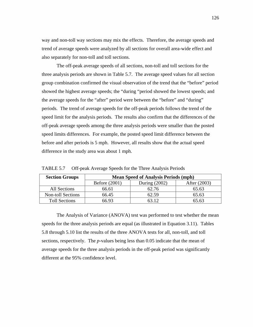
126
way and non-toll way sections may mix the effects. Therefore, the average speeds and
trend of average speeds were analyzed by all sections for overall area-wide effect and
also separately for non-toll and toll sections.
The off-peak average speeds of all sections, non-toll and toll sections for the
three analysis periods are shown in Table 5.7. The average speed values for all section
group combination confirmed the visual observation of the trend that the “before” period
showed the highest average speeds; the “during “period showed the lowest speeds; and
the average speeds for the “after” period were between the “before” and “during”
periods. The trend of average speeds for the off-peak periods follows the trend of the
speed limit for the analysis periods. The results also confirm that the differences of the
off-peak average speeds among the three analysis periods were smaller than the posted
speed limits differences. For example, the posted speed limit difference between the
before and after periods is 5 mph. However, all results show that the actual speed
difference in the study area was about 1 mph.
TABLE 5.7 Off-peak Average Speeds for the Three Analysis Periods
Section Groups Mean Speed of Analysis Periods (mph) Before (2001) During (2002) After (2003)
All Sections 66.61 62.76 65.63 Non-toll Sections 66.45 62.59 65.63
Toll Sections 66.93 63.12 65.63
The Analysis of Variance (ANOVA) test was performed to test whether the mean
speeds for the three analysis periods are equal (as illustrated in Equation 3.11). Tables
5.8 through 5.10 list the results of the three ANOVA tests for all, non-toll, and toll
sections, respectively. The p-values being less than 0.05 indicate that the mean of
average speeds for the three analysis periods in the off-peak period was significantly
different at the 95% confidence level.

127
TABLE 5.8 Off-Peak Period ANOVA Test Results for All Sections
Source Degree of Freedom
Sum of Squares
Mean Square F Statistics p-value
Model 2 9477.03 4738.51 700.49 <.0001 Error 3558 24068.43 6.76
Corrected Total 3560 33545.46
TABLE 5.9 Off-Peak Period ANOVA Test Results for the Non-toll Sections
Source Degree of Freedom
Sum of Squares
Mean Square F Statistics p-value
Model 2 6554.73 3277.36 372.20 <.0001 Error 2373 20895.47 8.80
Corrected Total
2375 27450.21
TABLE 5.10 Off-Peak Period ANOVA Test Results for the Toll Sections
Source Degree of Freedom
Sum of Squares
Mean Square F Statistics p-value
Model 2 2969.29 1484.64 578.11 <.0001 Error 1182 3035.49 2.56
Corrected Total
1184 6004.79
The Tukey’s Studentized Range tests were further performed to test the
differences of average speeds in any two of the three analysis periods (as illustrated in
Equation 3.12). Results (as shown in Tables 5.11 to 5.13) from three section groupings
indicated that neither of the two analysis periods has similar average speeds for the off
peak period.
TABLE 5.11 Off-peak Period Tukey’s Test Results for All Sections
Tukey Grouping* Mean N Year A 66.61 1187 2001 B 65.63 1187 2003 C 62.76 1187 2002
* Means with the same letter are not significantly different.

128
TABLE 5.12 Off-Peak Period Tukey’s Test Results for the Non-Toll Sections
Tukey Grouping* Mean N Year A 66.45 792 2001 B 65.63 792 2003 C 62.59 792 2002
* Means with the same letter are not significantly different.
TABLE 5.13 Off-Peak Period Tukey’s Test Results for the Toll Sections
Tukey Grouping* Mean N Year A 66.93 395 2001 B 65.63 395 2003 C 63.12 395 2002
* Means with the same letter are not significantly different.
5.3.2.3 Trend of peak period average speed
Both average speeds and the trend of average speeds were examined for the three
analysis periods. The trend of average speeds for the peak periods cannot be as easily
identified visually as for the off peak periods. The ANOVA test as described in section
5.3.2.1 was performed to compare the difference of the average speed for the three
analysis periods in peak travel period. The average speeds and trend of average speeds
were analyzed for all sections, non-toll and toll sections separately to identify potentially
different trends.
Due to the orientation of the selected freeway sections (e.g., inbound, outbound,
or loops) and travel patterns in the Houston metropolitan area, most sections exhibited
either a morning or evening peak congestion period. To study the effect of the speed
limit change on speed distribution during the congested traffic condition, the congested
traffic condition is defined as the time when the average speed equals to or is less than
50 mph in any of the three analysis period. There were 12 peak periods under the
congested traffic conditions for the nine study sections.
The peak period average speeds of all sections, non-toll and toll sections for the
three analysis periods are shown in Table 5.14. The average speeds for all section group
combinations demonstrate a trend that the “before” period showed the highest average

129
speeds; however, the average speeds for the “during “period and the “after” period were
very similar. The trend of average speeds for the peak periods did not reveal the lowest
speed occurred in the “during “period as was the trend for the off-peak periods.
TABLE 5.14 Peak Period Average Speeds for the Three Analysis Periods
Section Groups Mean Speed of Analysis Periods (mph) Before (2001) During (2002) After (2003)
All Sections 46.42 42.87 42.80 Non-toll Sections 43.40 40.26 40.16
Toll Sections 55.48 50.70 50.72
Tables 5.15 through 5.17 list the results of the ANOVA tests for the peak periods.
Similar to the off peak, the results for the peak period showed that the mean of average
speeds for the three analysis periods was different at the 95% confidence level.
TABLE 5.15 Peak Period ANOVA Test Results for All Sections
Source Degree of Freedom
Sum of Squares
Mean Square F Statistics p-value
Model 2 3701.53 1850.76 13.86 <.0001 Error 1293 172647.54 133.52
Corrected Total 1295 176349.08
TABLE 5.16 Peak Period ANOVA Test Results for the Non-toll Sections
Source Degree of Freedom
Sum of Squares
Mean Square F Statistics p-value
Model 2 2199.62 1099.81 9.19 0.0001Error 969 115974.88 119.68
Corrected Total 971 118174.51
TABLE 5.17 Peak Period ANOVA Test Results for the Toll Sections
Source Degree of Freedom
Sum of Squares
Mean Square F Statistics p-value
Model 2 1636.98 818.49 9.73 <.0001 Error 321 26997.67 84.10
Corrected Total
323 28634.65

130
The Tukey’s Studentized Range tests were also performed to test the differences
of average speed in any two of the three analysis periods. Unlike the off peak period, the
peak period results from three section groupings (Tables 5.18 to 5.20) showed that the
average speeds for the during (2002) and the after (2003) analysis periods are not
statistically different.
TABLE 5.18 Peak Period Tukey’s Test Results for All Sections
Tukey Grouping* Mean N Year A 46.42 432 2001 B 42.87 432 2002 B 42.80 432 2003
* Means with the same letter are not significantly different.
TABLE 5.19 Peak Period Tukey’s Test Results for the Non-toll Sections
Tukey Grouping* Mean N Year A 43.40 324 2001 B 40.26 324 2002 B 40.16 324 2003
* Means with the same letter are not significantly different.
TABLE 5.20 Peak Period Tukey’s Test Results for the Toll Sections
Tukey Grouping* Mean N Year A 55.48 108 2001 B 50.72 108 2003 B 50.70 108 2002
* Means with the same letter are not significantly different.
5.3.2.4 Trend of peak hour average speed
To further study the effect of speed limit change on speed distribution during
congested traffic condition, the difference of average speeds during the peak hour of the
three-hour peak period was also tested. The purpose of using the peak hour average
speeds for the same tests was to confirm the trends identified in the peak period data.
Using the speeds only from the peak hour avoids including the free flow traffic condition
if the congested driving conditions for some sections did not last 3 hours.

131
The peak hour was designated as morning peak hour (7:00 am to 8:00 am) or
evening peak hour (5:00 pm to 6:00 pm) for the 12 identified peak periods. Therefore,
there were 12 peak hours within the 12 peak periods for the nine study sections. To
ensure that the designated peak hour had the worst traffic condition for each study
section, the time of the lowest speed occurred for each section was checked. The lowest
speeds for all sections were within the designated peak hour and were somewhere within
the middle 20 minutes of the designated peak hour. It should be noted that for the
designated peak hour to capture the worst hour for all three analysis periods may not be
possible. This is because the time when the worst speed occurred changed during the
three analysis periods. For example, the lowest speed for 2001 section 7 was from 17:20
to 17:25; the lowest speed for 2002 was from 17:35 to 17:40; and the lowest speed for
2003 was from 17:20 to 17:35.
The peak hour average speeds of all sections, non-toll and toll sections for the
three analysis periods are shown in Table 5.21. The average speeds for all section group
combinations demonstrate the same trend as the peak periods in that the “before” period
showed the highest average speeds. The average speeds for the “during “period and the
“after” period were very similar.
TABLE 5.21 Peak Hour Average Speeds for the Three Analysis Periods
Section Groups Mean Speed of Analysis Periods (mph) Before (2001) During (2002) After (2003)
All Sections 40.43 37.13 36.78 Non-toll Sections 37.74 35.01 34.75
Toll Sections 48.50 43.50 42.88
Tables 5.22 through 5.24 list the results of the ANOVA tests for the peak hour.
Similar to the off peak and the peak period, the results for the peak hour showed that the
mean of average speeds for the three analysis periods was significantly different at the
95% confidence level. Although for the non-toll sections, the mean of average speeds
for the three analysis periods was very close.

132
TABLE 5.22 Peak Hour ANOVA Test Results for All Sections
Source Degree of Freedom
Sum of Squares
Mean Square F Statistics p-value
Model 2 1168.87 584.43 6.14 0.0024Error 429 40862.43 95.25
Corrected Total 431 42031.30
TABLE 5.23 Peak Hour ANOVA Test Results for the Non-toll Sections
Source Degree of Freedom
Sum of Squares
Mean Square F Statistics p-value
Model 2 594.54 297.27 3.16 0.0436Error 321 30158.86 93.95
Corrected Total 323 30753.40
TABLE 5.24 Peak Hour ANOVA Test Results for the Toll Sections
Source Degree of Freedom
Sum of Squares
Mean Square F Statistics p-value
Model 2 683.76 341.88 9.33 0.0002Error 105 3845.83 36.62
Corrected Total 107 4529.59
The Tukey’s Studentized Range tests were also performed for the peak hour.
Similar to the peak period, results (as shown in Tables 5.25 – 5.27) from three section
groupings showed that the average speeds for the during (2002) and the after (2003)
analysis periods are not statistically different for the peak hour.
TABLE 5.25 Peak Hour Tukey’s Test Results for All Sections
Tukey Grouping* Mean N Year A 40.43 144 2001 B 37.13 144 2002 B 36.78 144 2003
* Means with the same letter are not significantly different.
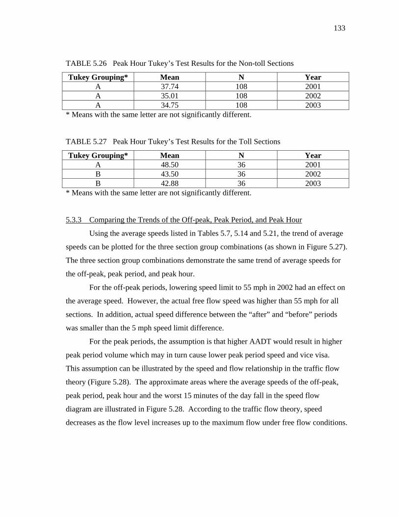
133
TABLE 5.26 Peak Hour Tukey’s Test Results for the Non-toll Sections
Tukey Grouping* Mean N Year A 37.74 108 2001 A 35.01 108 2002 A 34.75 108 2003
* Means with the same letter are not significantly different.
TABLE 5.27 Peak Hour Tukey’s Test Results for the Toll Sections
Tukey Grouping* Mean N Year A 48.50 36 2001 B 43.50 36 2002 B 42.88 36 2003
* Means with the same letter are not significantly different.
5.3.3 Comparing the Trends of the Off-peak, Peak Period, and Peak Hour
Using the average speeds listed in Tables 5.7, 5.14 and 5.21, the trend of average
speeds can be plotted for the three section group combinations (as shown in Figure 5.27).
The three section group combinations demonstrate the same trend of average speeds for
the off-peak, peak period, and peak hour.
For the off-peak periods, lowering speed limit to 55 mph in 2002 had an effect on
the average speed. However, the actual free flow speed was higher than 55 mph for all
sections. In addition, actual speed difference between the “after” and “before” periods
was smaller than the 5 mph speed limit difference.
For the peak periods, the assumption is that higher AADT would result in higher
peak period volume which may in turn cause lower peak period speed and vice visa.
This assumption can be illustrated by the speed and flow relationship in the traffic flow
theory (Figure 5.28). The approximate areas where the average speeds of the off-peak,
peak period, peak hour and the worst 15 minutes of the day fall in the speed flow
diagram are illustrated in Figure 5.28. According to the traffic flow theory, speed
decreases as the flow level increases up to the maximum flow under free flow conditions.

134
FIGURE 5.27 Trends of average speed for off-peak, peak period and peak hour.
Under this assumption for peak period, one would expect that the peak period
average speeds for 2001 were the highest and the peak period speeds for the 2002 and
2003 periods were about the same (as shown in Figure 5.29). The ANOVA results from
both peak period and peak hour confirmed the trend based on the assumption. The
results from peak period and peak hour may suggest that volume is the dominant factor
for speed distribution in the forced-flow conditions.
30
40
50
60
70
Before (2001)
During (2002)
After (2003)
Average
Spe
edNon‐toll Sections
off‐peak
peak period
peak hour
30
40
50
60
70
Before (2001)
During (2002)
After (2003)
Average
Spe
ed
Toll Sections
off‐peak
peak period
peak hour
30
40
50
60
70
Before (2001)
During (2002)
After (2003)
Average
Spe
ed
All Sections
off‐peak
peak period
peak hour

FIG
FIG
Speed
GURE 5.28
GURE 5.29
Free Flow
~ 55 mph
~ 42 mphp
Speed and f
Observed an
Off‐pe
flow diagram
nd expected
Volume
eak period
m for the pea
peak period
e
Worst 15
ak period ave
d speed trend
~ 2000 pl
Peak period
5 minutes
erage speeds
d for the anal
lph
Peak hour
1
s.
lysis periods
135
s.

136
5.3.4 Identifying Confounding Factors
Several confounding factors other than lowering speed limit could have
attributed to the lower average speed in 2002 for the off peak period. However, none of
these factors were believed to be significant to affect the average speed in the off peak
period. These confounding factors are discussed below.
• An abnormal increase of incidents in the 55 mph speed limit effective month of
2002 might have been the cause of the lower speed. However, the likelihood of
this confounding factor was discounted by observing that the 2002 off peak
period speed was the worst among the three analysis periods in all study sections.
The likelihood of all sections having increased incidents is small.
• Any severe weather events in the three months of 2002 might have caused a bad
road condition, which in turn caused the lower speed. Severe weather conditions
such as a tropical storm occurring in the Houston area in the summer times could
cause bad driving conditions and longer travel time. However, according to the
National Oceanic and Atmospheric Administration, no tropical storm landed in
the Gulf region in 2002.
• Any major road construction in the region might have caused delays and slowed
the travel. According to TxDOT, no major construction happened in the study
section in 2002. However, the Katy Freeway Reconstruction Program (42)
started in summer 2003. The road section that started in May 2003 had an
overlap with the study section 1 and 2. This might be the explanation of the
lower peak period speed for section 2 in the 2003 (as seen in Figure 5.19).
5.3.5 Speed Limit Change and Speed Distribution
Posted speed limit is the reference speed for driving at the free flow traffic
condition. The results from the off-peak speed show that lowering speed limit did have
an effect on the off-peak speed distribution. However, the magnitude of the effect may
not be as significant as the differences of posted speed limit values.

137
For the peak period and the most congested driving hour, the speed limit change
did not have an effect on the speed distribution. However, the speed distribution
followed the reverse direction of the volume. It is believed that during forced-flow
conditions volume is the dominant factor for speed distribution.
When the speed limit is used as the free flow speed or a percentage of the speed
limit [which is the current practice for many MPOs (28)] is used as the “target” or
acceptable speed to estimate the congestion, the amount of congestion may be
underestimated because the actual free flow speed is higher than the speed limit. For the
case of this study, during the 55 mph speed limit effective period, if 80% of the speed
limit was used as the “target” speed, the “target” speed would be 44 mph. However, the
actual free flow speed was about 65 mph for some study sections. 44 mph is only about
67% of the 65 mph free flow speed.
138
CHAPTER VI
CONCLUSIONS AND RECOMMENDATIONS
This chapter summaries the conclusions of the three research questions. The
limitations of each research method are also discussed. Future research questions are
also recommended.
6.1 Conclusions
Each of the three research questions is reiterated and followed by the conclusions.
The limitations of the research method for each research question are also discussed.
Research question 1. Do rankings of congestion measures for freeway segments hold
steady across different congestion thresholds? Are there situations where a change in
threshold value would change the congestion ranking of freeways?
The rankings of congestion measures for freeway segments hold steady across
the congestion threshold speeds ranging from 60 mph to 30 mph and across the
congestion measures that include delay per mile, Travel Time Index (TTI) and Planning
Time Index (PTI). Not surprisingly, the closer the congestion threshold speeds used, the
closer the rankings are. The rankings for the most and the least congested freeway
segments are fairly robust across the threshold speeds. In other words, the most
congested freeway segments under the 60 mph threshold speed remain the most
congested segments when evaluated under the 35 mph threshold speeds. Therefore,
from an investment point of view, the congestion threshold speed used is not a concern
for funding allocation.
Two limitations exist in the research method. First, although study sections were
selected to cover the range of factors believed to influence travel time distribution, the
sample size for a specific range of a factor may be limited. For example, out of the 147
freeway segments used for the study, 13 of them were in the area type of Central
Business District (CBD). Although the proportion may reflect the real freeway mileage
139
for this area type, the sample size for CBD may not be large enough to draw any
conclusions on findings specifically for the CBD area type. Since the concern of the
study is for all area types, this limitation is believed to have a minimal effect on the
overall findings. Second, although data of one entire year were used to minimize the
possibility of confounding factors (e.g., seasonality), some confounding factors may
exist in some sections’ data. For example, some sections may have experienced major
construction work for the most part of the analysis year while other sections may have
adverse weather conditions for some part of the year. These confounding factors were
not specifically examined because the sample size is believed large enough to offset the
effects of confounding factors in regards to the specific research hypothesis being
examined.
Research question 2. What is the relationship between delay and congestion threshold?
As the congestion threshold is changed, how does delay change? Is the relationship
linear?
The relationship between the delay values from an alternative threshold and the
60 mph threshold has a quadratic form. As the alternative threshold decreases further
away from 60 mph, the increment is larger. The more congested a section is, the less the
threshold affects measured congestion. For very congested sections, most of the delay is
associated with speeds below 30 mph.
The sample size for determining parameters of the quadratic relationship may be
limited. The regression quadratic function may change if more samples are added.
Because the overall relationship is the primary concern of the study, the sample size is
believed large enough for estimating an overall relationship between delay and
congestion threshold speeds.
Research question 3. Is speed limit one of the factors that affect travel time distribution?
How speed limit should be used as the congestion threshold?

140
The study shows that the posted speed limit is one of the factors affecting travel
time distribution in the off-peak or any free flow driving condition period. In contrast,
speed limit has no effect on travel time distribution during congested driving conditions.
The speed limit may seem like a good candidate for the congestion threshold; however,
the actual free flow driving speed is higher than the posted speed limit. If the speed limit
as the free flow speed or a percentage of speed limit as the “target” or acceptable speed
was used to estimate the congestion, the amount of congestion might be underestimated.
Two limitations exist in the research method. First, no directional volume or
AADT data were available for a comparison with the directional peak period average
speed data. The directional AADT growth may have a different trend from the bi-
directional AADT. In this study, the speed trend for some sections (directional) was
different from the overall sections. The availability of directional AADT data would
further justify the findings. Second, the study sections were chosen from one precinct of
the Harris County to avoid the confounding factor of different law enforcement practices
on speed. However, for an area wide study, sections from other precincts could have
been included to verify the overall trend.
6.2 Policy Implications
Although the question of “When does congestion start?” may be debated among
researchers and practitioners for a long time, the effect of the congestion thresholds on
congestion measures appears to be minimal when selecting the most congested sections.
The values of the measures will change, and these changes affect some of the investment
decision-making for transportation projects, but in most cases the relative changes are
small.
The findings of this research should help areas that are struggling with
definitions of the proper threshold for evaluating transportation projects. The research
indicated that the same set of the projects will be chosen whether 60 mph or 35 mph was
used as the beginning of congestion. However, within the chosen set of the projects, the
cost effectiveness of each project can be further investigated for investment decisions.

141
The relationship of delay under different thresholds can be used to compare the
magnitude of congestion for freeways/corridors/areas that were evaluated with different
congestion thresholds. In addition, this relationship can also be used to predict or
compare the amount of congestion from a different congestion threshold if a specific
threshold is required for decision making.
While the posted speed limit or a percentage of the posted speed limit may seem
like a good candidate for a congestion threshold, in reality the amount of congestion can
be severely underestimated depending on the driving culture of an area. The findings of
this research indicate that a change in the speed limit does not affect speed distribution
during forced-flow conditions. Lowering the speed limit may not help ease congestion,
although it will reduce speeds in the off-peak periods.
6.3 Recommended Future Research
The findings of this research provide a starting point for the research on
congestion threshold. Although the major findings of the research are believed to be
generalizable to other freeways, further research can provide a more complete picture of
the congestion threshold impacts. The topics for the future research are listed below.
• Regional patterns seem to exist in travel time distributions. For example, the
travel time distributions for the study sections in the Los Angeles area seem to
have a “flatter top” and the study sections in Minneapolis-St. Paul area seem to
have a more “pointed top.” Does corridor or regional land use have an effect on
the pattern of travel time distribution? Is it more appropriate to have a
nationwide standardized congestion threshold or a regionally tailored threshold
using the travel time distributions as the basis?
• Although Houston, San Francisco, and Philadelphia metropolitan areas have
similar population (between 3 to 7 million), freeway sections from Houston seem
more congested than the other two. The 2006 travel rates of selected freeway
sections in Philadelphia area had an average speed higher than 30 mph for the
142
entire peak periods of an average work day. The relatively high speed in the
peak periods is not often seen on the freeway sections in a metropolitan area of
its size. About half of the selected freeway sections in the Philadelphia area were
on I-95. Does the congestion management program along the I-95 corridor have
an effect on the higher speed in the peak period? Or does any land use factor
play a role on the more congested sections in Houston and less congested
sections in Philadelphia?
• For the sections ranked outside of the prediction limits, what are the common
characteristics of these sections? What characteristics made the rankings of these
sections significantly different? According to the findings, there are more
sections that were ranked much lower when using alternative threshold speeds
compared to the baseline threshold speed. Or in terms of travel time distribution,
there are more “wide flat top”’ distributions than the “narrow pointed top”
distributions. Is this simply the randomness of the selection set or do the findings
apply to other sections as well?
• Although a before and after study approach was used for the effect of speed limit
on travel time distribution, a cross-sectional approach can also be used to study
the effect. Study sections from different metropolitan areas across the nation
would give more perspective on the role of speed limit in travel time distribution.
• Similar research can be conducted on arterials. Compared to freeways, the
speeds on arterials are much lower. In addition, the same speed differences as on
the freeways would mean much longer travel time differences for arterials.
There are few fixed sensors on arterials in the U.S. With the growing interest of
collecting traffic data through the probe vehicle technique, data issues for similar
research on arterials can be overcome.

143
REFERENCES
1. Freeman, P. A Decade of Action in Transport: An Evaluation of World Bank
Assistance to the Transport Sector, 1995-2005. The World Bank, Washington,
D.C., 2007.
2. Schrank, D., and T. Lomax. The 2009 Urban Mobility Report. Texas
Transportation Institute, College Station, TX, 2009.
3. The National Household Travel Survey (NHTS), Report by the Office of
Information, Federal Highway Administration, Washington, D.C., 2001.
4. Pisarski, A. E. Commuting In America III, Transportation Research Board,
Washington, D.C., 2006.
5. Turner, T., Margiotta, R., and T. Lomax. Monitoring Urban Freeways in 2003:
Current Conditions and Trends from Archived Operations Data, Report No.
FHWA-HOP-05-018, Federal Highway Administration, U.S. Department of
Transportation, Washington, D.C., 2004.
6. 1998 California Transportation Plan: Transportation System Performance
Measures, Final Report, California Department of Transportation, Sacramento,
August 1998.
7. Florida’s Mobility Performance Measures Program, Transportation Statistics
Office, Office of the State Transportation Planner, Florida Department of
Transportation, Tallahassee, 8 pp.
www.dot.state.fl.us/planning/statistics/mobilitymeasures/mmpresentation.pdf.
Accessed March 21, 2010.
8. Maryland Highway System Performance Report, Presented at the Transportation
Research Board Peer Exchange Meeting on Performance Measures, Madison,
Wisconsin, August 2000.
9. Pickrell, S., and L. Neumann. Use of Performance Measures in Transportation
Decision Making. In Performance Measures to Improve Transportation Systems

144
and Agency Operations: Report of a Conference, Irvine, California, 2000, pp. 17-
33.
10. Downs, A. Still Stuck in Traffic. The Brookings Institution, Washington, D.C.,
2004.
11. The Spread of Congestion in Europe, Conclusions of Round Table 110, European
Conference of Ministers of Transport, Paris, 1998.
12. Levinson, H. S., R. H. Pratt, P. N. Bay, G. B. Douglas. Quantifying Congestion.
Interim Report. Transportation Research Board, National Research Council,
Washington, D.C., 1992.
13. Highway Capacity Manual, Transportation Research Board, National Research
Council, Washington, D.C., 2000.
14. Lomax, T., S. Turner, and G. Shunk. Quantifying Congestion, National
Cooperative Highway Research Program Project report 398, National Academy
Press, Washington D.C., 1997.
15. Bertini, R. You Are the Traffic Jam: An Examination of Congestion Measures.
Preprint CD-ROM, 85th Transportation Research Board Annual Meeting of the
Transportation Research Board, Washington, D.C., January 2006.
16. Margiotta, R., T. Lomax, M. Hallenbeck, S. Turner, A. Skabardonis, C. Ferrell,
and B. Eisele. Guide to Effective Freeway Performance Measurement. National
Cooperative Highway Research Program Project 3-68, National Research
Council. February, 2007.
17. Colman, S. B. Predicting the Duration of Congestion on Bay Area Freeways.
Dowling Associates, Inc. March 26, 2007.
www.dowlinginc.com/pdf/Congestion%20Duration%20Paper.pdf. Accessed
March 21, 2010.
18. Question of the Month: What Should Be Our Common Definition of
"Congestion?" National Transportation Operations Coalition (NTOC).
www.ntoctalks.com/itsforum/index.cgi?noframes;read=1347. Accessed March
21, 2010.

145
19. Arnold, E. D., Jr. Congestion on Virginia’s Urban Highways. Report No.
FHWA/VA-88/24, Virginia Transportation Research Council, Charlottesville,
Virginia, April 1988.
20. Turner, S., R. Margiotta, and T. Lomax. Lessons Learned: Monitoring Highway
Congestion and Reliability Using Archived Traffic Detector Data, FHWA-HOP-
05-003, Federal Highway Administration, U.S. Department of Transportation,
Washington, D.C., 2004.
21. Kreis, D., B. Howell, and L. O’Connell. Statewide Planning Scenario Synthesis:
Transportation Congestion Measurement and Management. Research Report
KTC-05-32/SPR303-05-IF, Kentucky Transportation Center. The University of
Kentucky, 2005.
22. A Guidebook for Performance-Based Transportation Planning. Cambridge
Systematics, Inc. National Cooperative Highway Research Program Project
Report 446: Transportation Research Board, National Research Council,
Washington, D.C., 2000.
23. National Transportation Operations Coalition (NTOC) Performance Measures
Initiative – Final Report, July 2005.
www.ntoctalks.com/ntoc/ntoc_final_report.pdf. Accessed March 21, 2010.
24. The Cost of Urban Congestion in Canada, Transport Canada, Environmental
Affairs, March 22, 2006.
www.gatewaycouncil.ca/downloads2/Cost_of_Congestion_TC.pdf. Accessed
March 21, 2010.
25. Metropolitan Freeway System 2008 Congestion Report. Minnesota Department
of Transportation, Metro District Office of Operations and Maintenance,
Regional Transportation Management Center, March 2009.
26. Year 2002 Bay Area Freeway Congestion Data. California Department of
Transportation, District 4, Office of Highway Operations.
www.mtc.ca.gov/library/state_of_the_system/d4hicomp2002.pdf. Accessed
March 21, 2010.

146
27. Mobility in the Boston Region, Existing Conditions and Next Steps, the 2004
Congestion Management System Report, Boston Region Metropolitan Planning
Organization, December 2004.
www.ctps.org/bostonmpo/4_resources/1_reports/1_studies/2_highway/2004_cms
.html. Accessed March 21, 2010.
28. Congestion Management Process (CMP), Nashville Area Metropolitan Planning
Organization, Amended September 19, 2007.
http://www.nashvillempo.org/docs/NAMPO_CMP_Amend091907.pdf.
Accessed March 21, 2010.
29. The 2009 Congestion Report. Washington State Department of Transportation,
November 2009.
www.wsdot.wa.gov/NR/rdonlyres/2F00DBB2-44F9-43FA-8D77-
5D25FBE50AFE/0/2009_Congestion_Report.pdf. Accessed March 21, 2010.
30. Laetz, T. J. Predictions and Perceptions, Defining the Traffic Congestion
Problem. Technological Forecasting and Social Change Vol. 38, No. 3, 1990, pp.
287-292.
31. The Keys to Estimating Mobility in Urban Areas: Applying Definitions and
Measures that Everyone Understands. A White Paper Prepared for the Urban
Transportation Performance Measure Study, Texas Transportation Institute, 2005.
32. Boyce, D. B., J. Hicks, and A. Sen. In-Vehicle Navigation Requirements for
Monitoring Link Travel Times in a Dynamic Route Guidance System.
ADVANCE Working Paper Series, Number 2. Urban Transportation Center,
University of Illinois at Chicago. Chicago, Illinois, March 1991.
33. Travel Time Data Collection Handbook, Report No. FHWA-PL-98-035, Federal
Highway Administration, U.S. Department of Transportation, Washington, D.C.,
1998.
34. Fujito, I., R. Margiotta, W. Huang, and W. A. Perez. Effect of Sensor Spacing on
Performance Measure Calculations. Transportation Research Record: Journal of
the Transportation Research Board, Vol. 1945, 2006, pp. 1-11.

147
35. Smith, B. L., R. B. Holt, and B. Park. Travel Time Estimation for Urban Freeway
Performance Measurement: Understanding and Improving Upon the
Extrapolation Method, Preprint CD-ROM, 83rd Transportation Research Board
Annual Meeting, 2004.
36. Smith, B. L., and M. D. Fontaine. Private-Sector Provision of Congestion Data.
NCHRP 70-01 Final Report, National Cooperative Highway Research Program,
February 2007.
37. Young, S. E., I-95 Corridor Coalition Probe Vehicle Project Validation Traveler
Information Services Program. Track Committee Meeting, September 23, 2008.
38. Cook, T. D., and D.T. Campbell. Quasi-Experimentation, Design and Analysis
Issues for Field Settings. Houghton Mifflin Company, Boston, Massachusetts,
1979.
39. Campbell, D. T., and J. C. Stanley. Experimental and Quasi-experimental
Designs for Research. Rand McNally, Chicago, 1966.
40. Margiotta, R., H. Cohen, R. Morris, J. Trombly, and A. Dixson. Roadway Usage
Patterns: Urban Case Studies. Science Applications International Corporation
and Cambridge Systematics Incorporated, June 1994.
41. Montgomery, D., and G. Runger. Applied Statistics and Probability for
Engineers. Second Edition. John Wiley & Sons, Inc. New York, Chichester,
Brisbane, Toronto, Singapore, 1999.
42. Katy Freeway Homepage. Texas Department of Transportation.
katyfreeway.org/contracts.html. Accessed March 21, 2010.

148
VITA
Name: Tongbin Qu
Address: Texas Transportation Institute
Texas A&M University System
3135 TAMU
College Station, TX 77843
Email Address: [email protected]
Education: B.S., Tongji University, 1990
M.S., The University of Texas at Austin, 1996
Ph.D., Texas A&M University, 2010
Employment
History: Assistant Research Engineer, Texas Transportation Institute,
September 1999 - Present.
Assistant Research Scientist, Texas Transportation Institute,
November 1998 - August 1999.
Engineering Assistant IV, Traffic Operations Division, Texas
Department of Transportation (TxDOT), October 1996 - October
1998.
Research Assistant, University of Texas at Austin, September 1995 -
October 1996.
Summer Intern, The World Bank, June 1995 - August 1995.
Engineer Assistant, Louis Berger International, Inc., March 1994 -
August 1994.
Project Management Specialist, The Ministry of Communication of
China, September 1993 - March 1994.
Engineer and Economist, CHELBI Engineering Consultants, Inc.,
July 1990 - September 1993.

University Transportation Center for Mobility™
Texas Transportation Institute
The Texas A&M University System
College Station, TX 77843-3135
Tel: 979.845.2538 Fax: 979.845.9761
utcm.tamu.edu
TexasTransportationInstitute