Embed Size (px)
Citation preview
Forms Desktop for WindowsVersion 4Manual
Revision Date 12/05/2007
HanDBase® is a Registered Trademark of DDH Software, Inc.
All information contained in this manual and all software applications mentioned in this manual areCopyright 1997-2007 DDH Software, Inc.
HanDBase FormsIntroductionWhat is HanDBase Forms?HanDBase Forms is an Add-On utility that works with the HanDBase application for your handheld device and the HanDBase Desktop for Windows.
This tool makes it possible to create custom forms to replace the New/Edit Record screen.
At this time of this writing there are three available versions of HanDBase Forms. One that runs on a Palm OS handheld device, one the runs on a Pocket PC/Windows Mobile handheld device and one that runs on the Windows Desktop.
NOTE: The Pocket PC/Windows Mobile version of the software will not run on Windows Mobile Smartphone devices at this time. It will only run on Pocket PC handheld type devices, which at this time all have touch screens.
What packages include HanDBase Forms?HanDBase Forms is available as part of the following packages. Also, if you are a Palm OS user the handheld application is available separately if you use a Macintosh or Other desktop OS. Palm OS users that purchase the HanDBase Forms for Palm OS separately and use Windows will get the handheld and desktop applications.
HanDBase for Palm OS Professional editionHanDBase for Pocket PC Professional editionHanDBase for Palm OS Enterprise editionHanDBase for Pocket PC Enterprise edition
System RequirementsPlease note, the memory requirements are for the applications themselves. The forms you create and the databases you create the forms for will require additional memory. The larger your database files and the more complex your forms the more memory that will be required.
Windows Desktop2 MB of available hard drive space256 MB of RAM is recommendedWindows 95, 98, 98 SE, ME, NT 4.51, 2000 or XPHanDBase Desktop version 3.0 or higher
Getting StartedProgram RegistrationIn order to use your registered version of HanDBase Forms you will need to enter your 16 digit License Key.
If you purchased this software online or directly from DDH Software then you were either provided your License Key at the time of purchase or you can obtain your License Key by logging into the DDH
Software website using the email address you registered with and the password you were provided when you registered.
If you purchased this software in a retail outlet then this License Key is printed on the insert to the package for the software. Be sure to use the correct code for your handheld and desktop platforms. You will also want to follow the instructions for registering the software so that you can download future updates and receive Technical Support.
You will be prompted to enter your License Key during the installation process. Once entered you will be able to use the HanDBase Forms you are registered for.
InstallationThe desktop application is installed when you run the installation program you downloaded from the DDH Software, Inc. Website.
Using HanDBase FormsIntroductionThe following sections describe how to use the HanDBase Forms application to create custom forms for your databases. Because the majority of the steps and settings are the same between the Palm OS handheld application, the Pocket PC/Windows Mobile handheld application and the HanDBase Forms Desktop the information has been combined. Where there are differences they are noted.
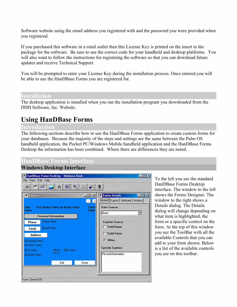
HanDBase Forms InterfaceWindows Desktop Interface
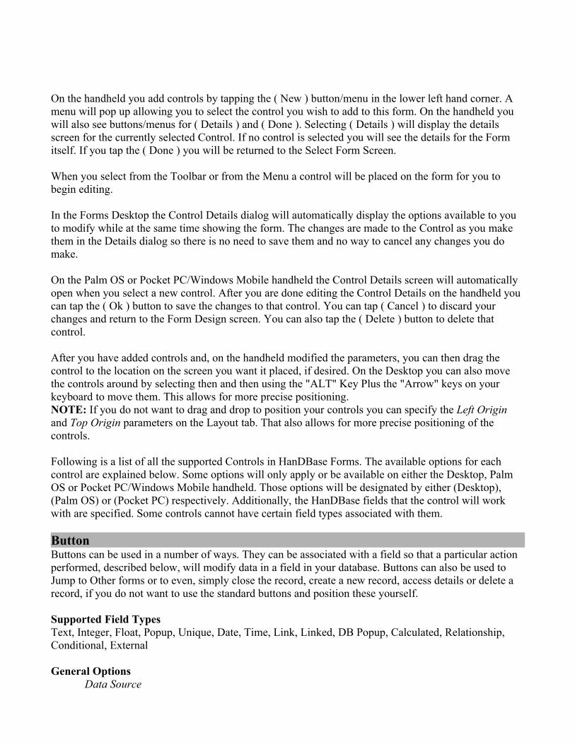
To the left you see the standard HanDBase Forms Desktop interface. The window to the left shows the Forms Designer. The window to the right shows a Details dialog. The Details dialog will change depending on what item is highlighted, the form or a specific control on the form. At the top of this window you see the ToolBar with all the available Controls that you can add to your form shown. Below is a list of the available controls you see on this toolbar.
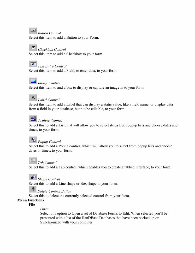
Button ControlSelect this item to add a Button to your Form.
Checkbox ControlSelect this item to add a Checkbox to your form.
Text Entry ControlSelect this item to add a Field, to enter data, to your form.
Image ControlSelect this item to and a box to display or capture an image in to your form.
Label ControlSelect this item to add a Label that can display a static value, like a field name, or display data from a field in your database, but not be editable, to your form.
Listbox ControlSelect this to add a List, that will allow you to select items from popup lists and choose dates and times, to your form.
Popup ControlSelect this to add a Popup control, which will allow you to select from popup lists and choose dates or times, to your form.
Tab ControlSelect this to add a Tab control, which enables you to create a tabbed interface, to your form.
Shape ControlSelect this to add a Line shape or Box shape to your form.
Delete Control ButtonSelect this to delete the currently selected control from your form.
Menu FunctionsFile
OpenSelect this option to Open a set of Database Forms to Edit. When selected you'll be presented with a list of the HanDBase Databases that have been backed up or Synchronized with your computer.
SaveSelect this option to Save changes to the currently open database.
CloseSelect this option to Close the currently open database. If you have made changes you will be prompted to save those changes before the Forms file is closed.
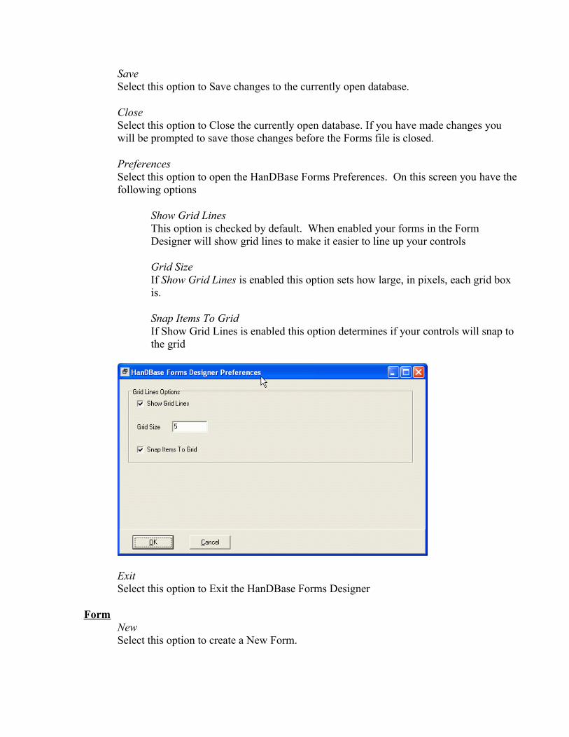
PreferencesSelect this option to open the HanDBase Forms Preferences. On this screen you have the following options
Show Grid LinesThis option is checked by default. When enabled your forms in the Form Designer will show grid lines to make it easier to line up your controls
Grid SizeIf Show Grid Lines is enabled this option sets how large, in pixels, each grid box is.
Snap Items To GridIf Show Grid Lines is enabled this option determines if your controls will snap to the grid
ExitSelect this option to Exit the HanDBase Forms Designer
FormNewSelect this option to create a New Form.
OpenSelect this option to display a dialog which will allow you to open a form previously designed in this Forms file.
Create CopySelect this option to create an exact duplicate of the currently open, and highlighted, form. A dialog will be displayed allowing you to name this copy.
DeleteSelect this optioin to Delete the currently opened, and highlighted, form. A dialog will be displayed asking you to confirm this deletion.
EditCutSelect this option to Cut the currently selected Control, on the form, and place it on the Windows Clipboard.
CopySelect this option to Copy the currently selected Control, on the form, to the Windows Clipboard.
PasteSelect this option to Paste a Control, previously placed on the Windows Clipboard, to the currently selected form.
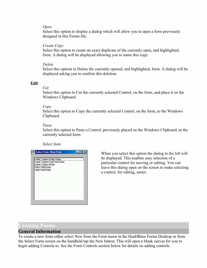
Select Item
When you select this option the dialog to the left will be displayed. This enables easy selection of a particular control for moving or editing. You can leave this dialog open on the screen to make selecting a control, for editing, easier.
Creating FormsGeneral InformationTo create a new form either select New from the Form menu in the HanDBase Forms Desktop or from the Select Form screen on the handheld tap the New button. This will open a blank canvas for you to begin adding Controls to. See the Form Controls section below for details on adding controls.
Additionally, although it may be hard to tell you can create Multiple forms in this "Forms file". You can then use different features to jump between them making it possible to create a tabbed interface or even a wizard that walks the user through entering data. You can even create different sets of forms to be used on the different supported platforms.
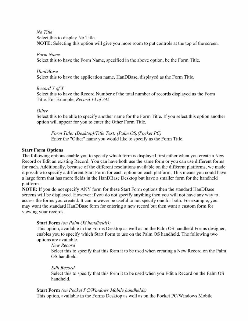
Form Details
The images to the left show the Forms Details screens for the Forms Desktop and Palm OS handheld HanDBase Forms. These details enable you to set the basic options for the form.
Following is a list of the their available properties for setting the basic options for your Forms. Some properties are only applicable on the Desktop and are so indicated by (Desktop) indicated following the property.
Form Name:Specify the Name you would like to give this form. You can then have this name displayed as the Form Title, in the following option, if you desire. Otherwise this will only be a reference point when editing your forms.
Title:User the selector to specify what you want to see as the Form Title when you are creating a New Record or Editing an existing Record in HanDBase. Following are the options available.
No TitleSelect this to display No Title.NOTE: Selecting this option will give you more room to put controls at the top of the screen.
Form NameSelect this to have the Form Name, specified in the above option, be the Form Title.
HanDBaseSelect this to have the application name, HanDBase, displayed as the Form Title.
Record Y of XSelect this to have the Record Number of the total number of records displayed as the Form Title. For Example, Record 13 of 345
OtherSelect this to be able to specify another name for the Form Title. If you select this option another option will appear for you to enter the Other Form Title.
Form Title: (Desktop)/Title Text: (Palm OS)(Pocket PC)Enter the "Other" name you would like to specify as the Form Title.
Start Form OptionsThe following options enable you to specify which form is displayed first either when you create a New Record or Edit an existing Record. You can have both use the same form or you can use different forms for each. Additionally, because of the different resolutions available on the different platforms, we made it possible to specify a different Start Form for each option on each platform. This means you could have a large form that has more fields in the HanDBase Desktop but have a smaller form for the handheld platform.NOTE: If you do not specify ANY form for these Start Form options then the standard HanDBase screens will be displayed. However if you do not specify anything then you will not have any way to access the forms you created. It can however be useful to not specify one for both. For example, you may want the standard HanDBase form for entering a new record but then want a custom form for viewing your records.
Start Form (on Palm OS handhelds):This option, available in the Forms Desktop as well as on the Palm OS handheld Forms designer, enables you to specify which Start Form to use on the Palm OS handheld. The following two options are available.
New RecordSelect this to specify that this form it to be used when creating a New Record on the Palm OS handheld.
Edit RecordSelect this to specify that this form it to be used when you Edit a Record on the Palm OS handheld.
Start Form (on Pocket PC/Windows Mobile handhelds)This option, available in the Forms Desktop as well as on the Pocket PC/Windows Mobile
handheld Forms designer, enables you to specify which Start Form to use on the Pocket PC/Windows Mobile handheld. The following two options are available.
New RecordSelect this to specify that this form it to be used when creating a New Record on the Pocket PC/Windows Mobile handheld.
Edit RecordSelect this to specify that this form it to be used when you Edit a Record on the Pocket PC/Windows Mobile handheld.
Start Form on Desktop PCs:(Desktop)This option, only available when designing on the desktop, enables you to specify which Start Forms to use in the HanDBase Desktop. The following two options are available.
New RecordSelect this to specify that this form it to be used when creating a New Record in the HanDBase Desktop.
Edit RecordSelect this to specify that this form it to be used when you Edit a Record in the HanDBase Desktop.
Form Color:Select this button/icon to be able to set the background color of the form you are designing. Currently, on the handheld, it is possible to select from a palette of 256 colors, if your device supports color. On Palm OS devices that only support Black and White or Greyscale you'll only be able to pick from a palette of up to 16 shades of grey when designing your form, depending on how many shades your handheld actually supports. Some older Palm OS devices may only support 4 shades of grey. If you design the Form with colors on the Desktop or on a handheld that supports color and then install or beam that form to a Palm OS or Pocket PC handheld that only supports Black and White or Greyscale then when the form is opened on the handheld HanDBase will approximate the color to the nearest "Grey".NOTE: On the Palm OS, when designing a form, you can also switch from the palette to an RGB selector screen. This makes it easier to set the color if you know the RGB values.
Show Buttons:Use this option to specify whether you want the standard buttons, listed below, to be either Text or Graphical butttons on a Palm OS handheld. Text buttons are simply text with a thin border around them, ie , or a more three dimensional button, ie .NOTE: In the HanDBase desktop these buttons will always be graphical, like all standard Windows buttons. On the Pocket PC there are no actual buttons but simply the standard ones in the toolbar or the Ok button in the upper righthand corner.
Ok (Button):If this option is checked the ( Ok ) button will be displayed at the bottom of the Form screen when viewing or creating a record in HanDBase. This button will enable you to Save any changes you've made to your record and return you to the List View.
Cancel (Button):If this option is checked the ( Cancel ) button will be displayed at the bottom of the Form screen when viewing or creating a record in HanDBase. This button will enable you to Cancel any changes you've made to your record and return you to the List View.
Details (Button):If this option is checked the ( Details ) button will be displayed at the bottom of the Form screen when viewing or editing a record in HanDBase. This button will enable you to access the details of the record allowing you to do things like Set Alarms, Delete the Record or Encrypt the Record manually, if enabled in the Database properties.
New (Button):If this option is checked the ( New ) button will be displayed at the bottom of the Form screen when viewing or creating a record in HanDBase. This button enables you to tap it to create a New Record.
Form Height(Desktop)/(Pocket PC)In this option you can specify the height, in pixels, of the Form. Currently the max that can be set for a Palm OS handheld device is 240 pixels. See the NOTE below for details on resolution for the Pocket PC and Windows Desktop.
Form Width(Desktop)/(Pocket PC)In this option you can specify the width, in pixels, of the Form. Currently the max that can be set for a Palm OS handheld device is 160 pixels. See the NOTE below for details on resolution for the Pocket PC and Windows Desktop.
NOTE: Regarding the Form Height and Form Width options, currently on the Pocket PC handhelds and in the HanDBase Desktop the forms is scaled. This makes it possible to create forms that will work well on all platforms by specifying the resolution to the lowest common denominator, Palm OS's 160 x160. The Pocket PC is scaled by a factor of 1.5 and the HanDBase Desktop is scaled by a factor of 2. Therefore, if you try to create a form specifically for the Desktop or Pocket PC, using the supported resolutions there, some of your controls may not show. HanDBase will not scale your form down on the handhelds.If you design a form for the Palm OS platform, 160 x 160, that form will be scaled up to the 320h x 240w resolution for a Pocket PC device. This means you will not see the form in just corner of the screen with a large amount of "White Space".
Form ControlsForm Controls are what make the forms you create useable. They enable you to view data in a particular way, enter data in a different way than the standard HanDBase form and basically create an interface that is more "User Friendly".
Following is a list of the Controls available in HanDBase Forms. The settings will be the same regardless of whether you are designing on the Desktop or the Palm OS handheld. On the Desktop you add controls by selecting the appropriate control from the Toolbar at the top of the application, see below.
On the handheld you add controls by tapping the ( New ) button/menu in the lower left hand corner. A menu will pop up allowing you to select the control you wish to add to this form. On the handheld you will also see buttons/menus for ( Details ) and ( Done ). Selecting ( Details ) will display the details screen for the currently selected Control. If no control is selected you will see the details for the Form itself. If you tap the ( Done ) you will be returned to the Select Form Screen.
When you select from the Toolbar or from the Menu a control will be placed on the form for you to begin editing.
In the Forms Desktop the Control Details dialog will automatically display the options available to you to modify while at the same time showing the form. The changes are made to the Control as you make them in the Details dialog so there is no need to save them and no way to cancel any changes you do make.
On the Palm OS or Pocket PC/Windows Mobile handheld the Control Details screen will automatically open when you select a new control. After you are done editing the Control Details on the handheld you can tap the ( Ok ) button to save the changes to that control. You can tap ( Cancel ) to discard your changes and return to the Form Design screen. You can also tap the ( Delete ) button to delete that control.
After you have added controls and, on the handheld modified the parameters, you can then drag the control to the location on the screen you want it placed, if desired. On the Desktop you can also move the controls around by selecting then and then using the "ALT" Key Plus the "Arrow" keys on your keyboard to move them. This allows for more precise positioning.NOTE: If you do not want to drag and drop to position your controls you can specify the Left Origin and Top Origin parameters on the Layout tab. That also allows for more precise positioning of the controls.
Following is a list of all the supported Controls in HanDBase Forms. The available options for each control are explained below. Some options will only apply or be available on either the Desktop, Palm OS or Pocket PC/Windows Mobile handheld. Those options will be designated by either (Desktop), (Palm OS) or (Pocket PC) respectively. Additionally, the HanDBase fields that the control will work with are specified. Some controls cannot have certain field types associated with them.
ButtonButtons can be used in a number of ways. They can be associated with a field so that a particular action performed, described below, will modify data in a field in your database. Buttons can also be used to Jump to Other forms or to even, simply close the record, create a new record, access details or delete a record, if you do not want to use the standard buttons and position these yourself.
Supported Field TypesText, Integer, Float, Popup, Unique, Date, Time, Link, Linked, DB Popup, Calculated, Relationship, Conditional, External
General OptionsData Source
This option specifies the Field from your HanDBase database you want to associate with this control.
Caption SourceSelect which of the following you want as the "Caption" for this control.
Field NameSelect this to specify the Field Name, of the field specified as the Data Source, as the Caption.Field ValueSelect this to specify the Field Value, of the field specified as the Data Source, as the Caption.OtherSelect this to specify some other value as the Caption. This is useful if you do not specify a Data Source and want this to be a simple label. If you select this an additonal option, Caption: will appear.
CaptionIf you selected Other as the Field Name then you will sepcify your other value here.
Layout OptionsLeft OriginSpecify the position, from the left side of the form, you want this control to be placed.
Top OriginSpecify the position, from the top side of the form, you want this control to be placed.
WidthSpecify the Width, in pixels, of this Button.
HeightSpecify the Height, in pixels, of this Button.
Attributes OptionsFontSpecify which Font you want to use for this Button's Caption. There is a selector to the Right that allows you to also set the Color for this Text.
Type(Palm OS)Specify the Type of button you wish to use. Following are the available types:
Button - This is a standard button type.Push Btn - This button type will stay selected when tapped.
ColorUse this option to specify the Background color of this button.
FrameUse this option to specify the type of Frame you want for your button. The following options are
available.
None - Selecting this will have NO frame around your button but you will still be able to tap the Text to select this button.Standard - Selecting this will, on the Palm OS platform, display a standard, rounded, button.Bold - Selecting this will, on the Palm OS platform, display a rounded button with a thicker line.Rectangle - Selecting this will display a Rectangular button.
ActionsButtons are one of two controls that can have Actions associated with them. There are two possible Actions. Meaning, when you tap this button it will first perform Action 1 and then perform Action 2. Using both Actions is useful if you want to do something like Saving an Closing the Record but then going to the next record automatically.
Action 1This is the First Action that will be performed. See the list of available Actions below.
Action 2This is the Second Action that will be performed. See the list of available Actions below.
Available ActionsDo Nothing - When this control is selected NO action will be performed.
Jump to Form - When this control is selected, on the form, you will jump to the form specified.
Return to Form - When this control is selected, on the form, you will be returned to the form you were previously on.
Create Record - When this control is selected a New Record will be created, saving changes in the current record first. This is similar to tapping the New button in the standard HanDBase interface.
Delete Record - When this control is selected the current record will be deleted and you will be returned to the HanDBase List View screen.
Go to First Record - When this control is selected the first record in this database will be displayed.
Go to Last Record - When this control is selected the Last record in this database will be displayed.
Go to Previous Record - When this control is selected the record Prior to this one in the database will be displayed. This has the same functionality as tapping the - indicator in the upper right hand corner of the standard HanDBase Interface. This is useful for creating you own controls to move back and forth among records.
Go to Next Record - When this control is selected the record After this one in the database will be displayed. This has the same functionality as tapping the + indicator in the upper right hand

corner of the standard HanDBase Interface. This is useful for creating you own controls to move back and forth among records.
Follow Link/Rel/External - This control can be associated with a Link, Linked, DB Popup Relationship or External field from your database. If associated with a Link, Linked or Relationship field then selecting this control will follow the appropriate Link or Relationship to the database specified in that field's setup. If associated with a DB Popup field it will take you to the associated database where you can select a record to bring data back from. If this is associated with an External field then selecting this control will launch tha external plugin in the same way it would if you had tapped that field in the standard HanDBase interface.
Clear - When this control is selected it will Clear the value from the field you have associated with this control using the Data Source option.
Set Value to Caption - When this control is selected it will set the value of the field you have associated with this control, using the Data Source option, to whatever the Caption for this control is.
Append Caption to Value - When this control is selected it will append whatever the caption of this control is to the value of the field you have associated with this control, using the Data Source option. An example of using this function would be to create a number keypad and set the caption of each to a different number. Then when tapped it would set the value of that field to a that number. If you use a Field or Label field to also display that same field's value you'll see the updates you make automatically.
Save and Close - When this control is selected it will Save the current record and close this New or Edit Record form screen.
Goto Details - When this control is selected it will display this record'd Details screen. From there you can set manual alarms, enable manual encryption or delete this record.
Print Record - When this control is selected it will Print the current record.
Export Record - When this control is selected it will export this record to the MemoPad, on the Palm, or to a Text file on the Desktop or Pocket PC.
Copy Record to New - When this control is selected it will save the current record and create a New record with the same values as the record you were in.
Copy Record to... - When this control is selected it will display a dialog enabling you to Copy this record to another databaseNOTE: The database you want to copy to must have the Same database structure as the one you are copying from.
Move Record to... - When this control is selected it will display a dialog enabling you to Move this record to another database
NOTE: The database you want to move to must have the Same database structure as the one you are moving from
Select Date - When this control is selected it will display the standard HanDBase Choose Date Screen so you can select a Date to be entered in the field you have associated with this control.
Select Time - When this control is selected it will display the standard HanDBase Choose Time Screen so you can select the Time to be entered in the field you have associated with this control.
Increment Value - When this control is selected it will increment the numeric value in the field associated this control.
Decrement Value - When this control is selected it will decrement the numeric value in the field associated this control.
CheckboxThis control enables you to Check or Un-check Checkboxes. If you associate this control with a Field in your database then changes made will be reflected there also. You can also use this to ONLY display the value of a checkbox but not make it editable.
Supported Field TypesCheckbox
General OptionsData SourceThis option specifies the Field from your HanDBase database you want to associate with this control.
Caption SourceSelect which of the following you want as the "Caption" for this control.
Field NameSelect this to specify the Field Name, of the field specified as the Data Source, as the Caption.Field ValueSelect this to specify the Field Value, of the field specified as the Data Source, as the Caption.OtherSelect this to specify some other value as the Caption. If you select this, an additonal option, Caption: will appear.
CaptionIf you selected Other as the Field Name then you will specify your other value here.
Layout OptionsLeft OriginSpecify the position, from the left side of the form, you want this control to be placed.
Top Origin
Specify the position, from the top side of the form, you want this control to be placed.
WidthSpecify the Width, in pixels, of this Control.
HeightSpecify the Height, in pixels, of this Control.
Attributes OptionsFontSpecify which Font you want to use for this CheckBox's Caption. There is a selector to the Right that allows you to also set the Color for this Text. EditableIf you leave this item checked, which is the default, then you will be able to make changes to this control, checking it or un-checking it as necessary. The "data" will be reflected in the specified field. You can also un-check this option so that it can only be used to View data and not to modify the record.
ActionsNone Available
Text EntryThe Text Entry Control is used to be able to enter textual or numeric data into any of the supported field types through a form. You can also use this to view existing data in a record and have the ability to modify it if necessary.
Supported Field TypesText, Integer, Float, Note, DB Popup
General OptionsData SourceThis option specifies the Field from your HanDBase database you want to associate with this
control.
Layout OptionsLeft OriginSpecify the position, from the left side of the form, you want this control to be placed.
Top OriginSpecify the position, from the top side of the form, you want this control to be placed.
WidthSpecify the Width, in pixels, of this control.
# LinesSpecify the number of Lines you want displayed. This makes it possible to enter a large amount of text, possibly to be stored in a Text or Note field, in this Control.
Attributes OptionsFontSpecify which Font you want to use for this data entered into this control. There is a selector to the Right that allows you to also set the Color for this Text.NOTE: Currently the font color is not supported on the Palm OS or Pocket PC handhelds. If you set this color it will only appear in that color in the HanDBase Desktop.
EditableIf you leave this item checked, which is the default, then you will be able to make changes to this control, checking it or unchecking it as necessary. The "data" will be reflected in the specified field. You can also un-check this option so that it can only be used to View data and not to modify the record.
JustifyUse this option to specify the "Justification" of the text in this field. Following are your options.
Left - Select this option to Justify the text to the Left.Center - Select this option to Justify the text in the Center of the fieldRight - Select this option to Justify the text to the Right.
UnderlineIf you leave this option checked, which is the default, then this field will have the dashed lines to indicate each line of this Field. If you un-check this option then your Field will not have the dashed line indicators, enabling a cleaner interface for data entry.
Auto ShiftIf you leave this option checked, which is the default, then when you set focus to this field the first letter you enter will be capitalized. Additionally the Shift Indicator will be displayed in the Lower Right corner.NOTE: This option only applies to the Palm OS handhelds. Setting or unsetting this option will have no effect on the Pocket PC or in the HanDBase Desktop.
Scroll BarIf you enable this option, it is unchecked by default, then your Field will have a scroll bar. This makes it possible to keep the number of Lines set to a smaller number so the field does not take up much screen space but still be able to enter large amounts of text.
ActionsNone Available
ImageThis control enables you to display or capture an image in your form. This is used in the same way as the standard Image field. It is a 100 x 100 pixel box. This is useful for capturing Signatures.
Supported Field TypesImage
General OptionsData SourceThis option specifies the Field from you HanDBase database you want to associate with this control.
Layout OptionsLeft OriginSpecify the position, from the left side of the form, you want this control to be placed.
Top OriginSpecify the position, from the top side of the form, you want this control to be placed.
Attributes OptionsNone Available
ActionsNone Available
LabelThe Field Control is used as a "Display" control. It will either display a static value, similar to the Field Name or Heading field in the standard HanDBase interface, or it can display a value from a field. Using it for the latter makes it possible to View data but NOT make any changes to that data.
Supported Field TypesText, Integer, Float, Popup, Unique, Date, Time, Link, Linked, Heading, DB Popup, Calculated, Relationship, Conditional, External
General OptionsData SourceThis option specifies the Field from your HanDBase database you want to associate with this control.
Caption SourceSelect which of the following you want as the "Caption" for this control.
Field Name - Select this to specify the Field Name, of the field specified as the Data Source, as the Caption.Field Value - Select this to specify the Field Value, of the field specified as the Data Source, as the Caption.Other - Select this to specify some other value as the Caption. This is useful if you do not specify a Data Source and want this to be a simple label. If you select this an additonal option, Caption: will appear.
CaptionIf you selected Other as the Field Name then you will sepcify your other value here.
Layout OptionsLeft OriginSpecify the position, from the left side of the form, you want this control to be placed.

Top OriginSpecify the position, from the top side of the form, you want this control to be placed.
WidthSpecify the Width, in pixels, of this Button.
# LinesSpecify the number of lines, high, you want this Label to be. Setting it to a higher amount makes it possible to see more data, possibly from a Text or Note field, in this Label.
Attributes OptionsFontSpecify which Font you want to use for this Label's Caption. There is a selector to the Right that allows you to also set the Color for this Text.
ActionsNone Available
ListThis control is used to create a List box that will make it possible to select an item from a popup list defined for the field specified as your Data Source. For the Date and Time fields you will see the popup list you would normally see in the standard HanDBase interface with these options:
Date: Today, Tomorrow, One Week, No Date and Choose Date. Selecting Choose Date will bring up the standard HanDBase Choose Date Screen.Time: Current Time, No Time, and Choose Time. Selecting Choose Time will bring up the standard HanDBase Time Picker Screen.
Supported Field TypesText, Integer, Float, Popup, Date, Time, Note
General OptionsData Source:This option specifies the Field from your HanDBase database you want to associate with this control.
Layout OptionsLeft OriginSpecify the position, from the left side of the form, you want this control to be placed.
Top OriginSpecify the position, from the top side of the form, you want this control to be placed.
WidthSpecify the Width, in pixels, of this Control.
Visible Items

Specify the number of items you want to see in this list. The minimum is 2. If you enter less than 2 you will not be able to scroll to see additional items. If you enter 2 or more and there are more items in the list than the number you specify as visible then scrolling arrows will be shown to the Right of the List to allow for scrolling through your items.
Attributes OptionsFontSpecify which Font you want to use for this control. There is a selector to the Right that allows you to also set the Color for this Text.
EditableIf you leave this item checked, which is the default, then you will be able to make changes to the data associated with this control, ie picking items from the list. If you uncheck this option then if this control is associated with a field, the this contol will simply highlight which item in the list is already selected for the record.
ColorUse this option to specify the Background color of this List Box.
ActionsNone Available
PopupThis control is used to create a Popup list that will make it possible to select an item from a popup list defined for the field specified as your Data Source. If you specify the Field Value for the Caption of this control then when you select from the Popup list the item selected will be displayed for that control. For the Date and Time fields you will see the popup list you would normally see in the standard HanDBase interface with these options. If you specify the Field Value to be the Caption then when you select a Date or Time that will be displayed for that control.
Date: Today, Tomorrow, One Week, No Date and Choose Date. Selecting Choose Date will bring up the standard HanDBase Choose Date Screen.Time: Current Time, No Time, and Choose Time. Selecting Choose Time will bring up the standard HanDBase Time Picker Screen.
If you specify the Data Souce for this control to be a DB Popup field then when you tap this field you will be taken to the other database specified for that field so you can select your item to be brought back and stored in this database.
Supported Field TypesText, Integer, Float, Popup, Date, Time, Note, DBPopup
General OptionsData SourceThis option specifies the Field from your HanDBase database you want to associate with this control.
Caption SourceSelect which of the following you want as the "Caption" for this control.

Field Name - Select this to specify the Field Name, of the field specified as the Data Source, as the Caption.Field Value - Select this to specify the Field Value, of the field specified as the Data Source, as the Caption.Other - Select this to specify some other value as the Caption. This is useful if you do not specify a Data Source and want this to be a simple label. If you select this an additonal option, Caption: will appear.
CaptionIf you selected Other as the Field Name then you will sepcify your other value here.
Layout OptionsLeft OriginSpecify the position, from the left side of the form, you want this control to be placed.
Top OriginSpecify the position, from the top side of the form, you want this control to be placed.
WidthSpecify the Width, in pixels, of this Button.
HeightSpecify the Height, in pixels, of this Button.
Attributes OptionsFontSpecify which Font you want to use for this Popup's Caption. There is a selector to the Right that allows you to also set the Color for this Text.
EditableIf you leave this item checked, which is the default, then you will be able to choose from the Popup list of the Field this control is associated with. You can also un-check this option so that it can only be used to View data, if you have this control's Caption set to display the Field Value for the field it is associated with, and not to modify the record.
ActionsNone Available
TabTabs are one of the more advanced Control types. They are generally used in Groups and you will also be using Multiple Forms to make them work. When you add a Tab control selecting it in the designer will NOT show multiple screen views depending on which you select on that form. However the end result will appear to be this way. What you will do is create multiple forms, using the same sets of Tabs.NOTE: You can use the Copy option to make exact duplicates of a single form you create so the tabs are in the exact same position.You will then make the Action for the Tab(s) to be that they Jump to Another form. Then when you tap the Tab you are actually taken to another of your exact same forms but one that has data below, above, to the left or right, that is different and specific for each tab.
Supported Field TypesText, Integer, Float, Popup, Unique, Date, Time, Link, Linked, DB Popup, Calculated, Relationship, Conditional, External
General OptionsData SourceThis option specifies the Field from your HanDBase database you want to associate with this control.
Caption SourceSelect which of the following you want as the "Caption" for this control.
Field Name - Select this to specify the Field Name, of the field specified as the Data Source, as the Caption.Field Value - Select this to specify the Field Value, of the field specified as the Data Source, as the Caption.Other - Select this to specify some other value as the Caption. This is useful if you do not specify a Data Source and want this to be a simple label. If you select this an additonal option, Caption: will appear.
CaptionIf you selected Other as the Field Name then you will sepcify your other value here.
Layout OptionsLeft OriginSpecify the position, from the left side of the form, you want this control to be placed.
Top OriginSpecify the position, from the top side of the form, you want this control to be placed.
WidthSpecify the Width, in pixels, of this Button.
HeightSpecify the Height, in pixels, of this Button.
Attributes OptionsFontSpecify which Font you want to use for this Tab's Caption. There is a selector to the Right that allows you to also set the Color for this Text.
ActiveThis option is used to specify whether this tab is the "Active" one on this form. When enabled the tab will NOT have a lower line so it looks like a standard Tab, indicating that the data below it is associated with this tab. You will only want to have ONE Active Tab per Tab Group, per Form
ColorUse this option to specify the Background color of this Tab.

DirectionThis option enables you to specify the "Direction" of the tab. This makes it possible to position the Tab practically anywhere on the screen. Following are the directions supported and how they affect the way the tabs are displayed.
North - These tabs would have the rounded edge facing the top of the form. These tabs would generally be used at the the top of the form with the other fields below them. South - These tabs would have the rounded edge facing the bottom of the form. These tabs would generally be used at the the bottom of the form with the other fields above them. East - These tabs would have the rounded edge facing the right side of the form. These tabs would generally be used at the the right side of the form with the other fields to the left of them. Additionally these tabs are better used for fitting More tabs on the form because they can be easily "stacked" on top of each other, taking up less room. West - These tabs would have the rounded edge facing the left side of the form. These tabs would generally be used at the the left side of the form with the other fields to the right of them. Additionally these tabs are better used for fitting More tabs on the form because they can be easily "stacked" on top of each other, taking up less room.
ActionsTabs are one of two controls that can have Actions associated with them. There are two possible Actions. Meaning, when you tap this button it will first perform Action 1 and then perform Action 2. Using both Actions is useful if you want to do something like Saving an Closing the Record but then going to the next record automatically.
Action 1:This is the First Action that will be performed. See the list of available Actions below.
Action 2:This is the Second Action that will be performed. See the list of available Actions below.
Available ActionsDo Nothing - When this control is selected NO action will be performed.
Jump to Form - When this control is selected, on the form, you will jump to the form specified.
Return to Form - When this control is selected, on the form, you will be returned to the form you were previously on.
Create Record - When this control is selected a New Record will be created, saving changes in the current record first. This is similar to tapping the New button in the standard HanDBase interface.
Delete Record - When this control is selected the current record will be deleted and you will be returned to the HanDBase List View screen.
Go to First Record - When this control is selected the first record in this database will be displayed.

Go to Last Record - When this control is selected the Last record in this database will be displayed.
Go to Previous Record - When this control is selected the record Prior to this one in the database will be displayed. This has the same functionality as tapping the - indicator in the upper right hand corner of the standard HanDBase Interface. This is useful for creating you own controls to move back and forth among records.
Go to Next Record - When this control is selected the record After this one in the database will be displayed. This has the same functionality as tapping the + indicator in the upper right hand corner of the standard HanDBase Interface. This is useful for creating you own controls to move back and forth among records.
Follow Link/Rel/External - This control can be associated with a Link, Linked, DB Popup Relationship or External field from your database. If associated with a Link, Linked or Relationship field then selecting this control will follow the appropriate Link or Relationship to the database specified in that field's setup. If associated with a DB Popup field it will take you to the associated database where you can select a record to bring data back from. If this is associated with an External field then selecting this control will launch tha external plugin in the same way it would if you had tapped that field in the standard HanDBase interface.
Clear - When this control is selected it will Clear the value from the field you have associated with this control using the Data Source option.
Set Value to Caption - When this control is selected it will set the value of the field you have associated with this control, using the Data Source option, to whatever the Caption for this control is.
Append Caption to Value - When this control is selected it will append whatever the caption of this control is to the value of the field you have associated with this control, using the Data Source option. An example of using this function would be to create a number keypad and set the caption of each to a different number. Then when tapped it would set the value of that field to a that number. If you use a Field or Label field to also display that same field's value you'll see the updates you make automatically.
Save and Close - When this control is selected it will Save the current record and close this New or Edit Record form screen.
Goto Details - When this control is selected it will display this record'd Details screen. From there you can set manual alarms, enable manual encryption or delete this record.
Print Record - When this control is selected it will Print the current record.
Export Record - When this control is selected it will export this record to the MemoPad, on the Palm, or to a Text file on the Desktop or Pocket PC.
Copy Record to New - When this control is selected it will save the current record and create a New record with the same values as the record you were in.
Copy Record to... - When this control is selected it will display a dialog enabling you to Copy this record to another databaseNOTE: The database you want to copy to must have the Same database structure as the one you are copying from.
Move Record to... - When this control is selected it will display a dialog enabling you to Move this record to another databaseNOTE: The database you want to move to must have the Same database structure as the one you are moving from
Select Date - When this control is selected it will display the standard HanDBase Choose Date Screen so you can select a Date to be entered in the field you have associated with this control.
Select Time - When this control is selected it will display the standard HanDBase Choose Time Screen so you can select the Time to be entered in the field you have associated with this control.
Increment Value - When this control is selected it will increment the numeric value in the field associated this control.
Decrement Value - When this control is selected it will decrement the numeric value in the field associated this control.
ShapeThe shape control enables you to draw a shape on your form. This shape could be used to group or separate sections of data on your form.
Supported Field TypesNone
General OptionsShape:Currently there are two possible shapes to select from for this control.
Line - Draws a line on the form. Depending on the Layout Options that are set this line can be Horizontal, Vertical or even Diagonal. Rectangle - Draws a standard rectangle, or square on the form.
Layout OptionsThese options will differ depending on whether you select the Line or Rectangle shape. Below are listed both sets of options.
LineTo create a Horizontal Line you will want to specify the SAME point for the Start Y and End Y options.
To create a Vertical Line you will want to specify the SAME point for the Start X and Enc X options. To create a Diagonal Line you will use different combinations of these depending on which direction you want it to go in.
Start XSpecifies the starting position of the Line on the X axis Start YSpecifies the starting position of the Line on the Y axis End XSpecifies the ending position of the Line on the X axis. End YSpecies the ending position of the Line on the Y axis.
RectangleTo create a Rectangle make sure your Width and Height options have different values. To create a Square make sure your Width and Height options have the same values.
Left OriginSpecify the position, from the left side of the form, you want this control to be placed. This will place the Upper Left corner of the control at that point. Top OriginSpecify the position, from the top side of the form, you want this control to be placed. This will place the Upper Left corner of the control at that point. WidthSpecify the Width, in pixels, of this Shape. HeightSpecify the Height, in pixels, of this Shape.
Attributes OptionsColorUse this option to specify the color of this Shape.
ActionsNone Available