Embed Size (px)
Citation preview
Final Report 557
Travel Time Estimation Using Bluetooth
by
Ravindra GudishalaChester Wilmot
Aditya Mokkapati
Louisiana State University
4101 Gourrier Avenue | Baton Rouge, Louisiana 70808 | (225) 767-9131 | www.ltrc.lsu.edu
National Center for Intermodal Transportationfor Economic Competitiveness
Supported by:
NCITECNational Center for Intermodal Transportationfor Economic Competitiveness

1. Report No. FHWA/LA.15/557
2. Government Accession No. 3. Recipient's Catalog No.
4. Title and Subtitle Travel Time Estimation Using Bluetooth
5. Report Date February 2016 6. Performing Organization Code LTRC Project Number: 13-2SS State Project Number: 30001396
7. Author(s)
Ravindra Gudishala, Chester Wilmot, and Aditya Mokkapatti
8. Performing Organization Report No.
9. Performing Organization Name and Address Department of Civil and Environmental Engineering Louisiana State University Baton Rouge, LA 70803
10. Work Unit No.
11. Contract or Grant No.
12. Sponsoring Agency Name and Address
Louisiana Department of Transportation and Development P.O. Box 94245 Baton Rouge, LA 70804-9245 National Center for Intermodal Transportation for Economic Competitiveness Mississippi State University Starkville, MS ,39762
13. Type of Report and Period Covered
Final Report June 2015 14. Sponsoring Agency Code
15. Supplementary Notes
Conducted in cooperation with the U.S. Department of Transportation, Federal Highway Administration and funded by the Research and Innovative Technology Administration (RITA) of the U.S. Department of Transportation 16. Abstract The objective of this study was to investigate the feasibility of using a Bluetooth Probe Detection System (BPDS) to estimate travel time in an urban area. Specifically, the study investigated the possibility of measuring overall congestion, the trend in congestion, the location of congestion “hotspots,” and finally measurement of the level of congestion at the hotspots using a BPDS. A secondary objective was to assess the possibility of obtaining travel time from other quicker and cheaper methods such as simply purchasing it from a commercial vendor. The findings of the study indicate that a BPDS can reliably be used to measure travel time and estimate congestion in terms of indices such as travel delay, planning time index, and travel time index. However, the acquisition of a BPDS includes certain overheads such as installation costs, maintenance costs and monitoring costs. Purchase of travel time from a commercial vendor might be a viable option if the travel time data is not needed on a day-to-day basis and over an extended period of time. However, one of the disadvantages of purchasing travel time data is limited flexibility in using the data because of contractual issues. The study recommends using BPDS for collecting travel time if real-time data are needed on a constant basis and over a period of one or more years. If the data are not needed in real time and are needed for limited purposes and for less than a year, then it would be preferable to acquire the data through a commercial vendor.
17. Key Words
Bluetooth, congestion, probe, delay. 18. Distribution Statement Unrestricted. This document is available through the National Technical Information Service, Springfield, VA 21161.
19. Security Classif. (of this report) Unclassified
20. Security Classif. (of this page)
Unclassified 21. No. of Pages
61 22. Price
TECHNICAL REPORT STANDARD PAGE


2
Project Review Committee
LTRC appreciates the dedication of the following Project Review Committee Members in
guiding this research study to fruition.
LTRC Administrator/Manager
Kirk Zeringue
Special Studies Research Administrator
Members
Jason Chapman
Sarah Paul Edel
Bert Moore
John Broemmelsiek
Byron Becknel
Directorate Implementation Sponsor
Janice P. Williams, P.E.
DOTD Chief Engineer


Travel Time Estimation Using Bluetooth
by
Ravindra Gudishala
Chester Wilmot
Aditya Mokkapati
Department of Civil and Environmental Engineering
Louisiana State University
Baton Rouge, LA 70803
LTRC Project No. 13-2SS
SIO No. 30001396
conducted for
Louisiana Department of Transportation and Development
Louisiana Transportation Research Center
The contents of this report reflect the views of the author/principal investigator who is
responsible for the facts and the accuracy of the data presented herein. The contents do not
necessarily reflect the views or policies of the Louisiana Department of Transportation and
Development or the Louisiana Transportation Research Center. This report does not
constitute a standard, specification, or regulation.
February 2016


iii
ABSTRACT
The objective of this study was to investigate the feasibility of using a Bluetooth Probe
Detection System (BPDS) to estimate travel time in an urban area. Specifically, the study
investigated the possibility of measuring overall congestion, the trend in congestion, the
location of congestion “hotspots,” and the measurement of the level of congestion at the
hotspots using a BPDS. A secondary objective was to assess the possibility of obtaining
travel time from other quicker and cheaper methods, such as simply purchasing it from a
commercial vendor. The findings of the study indicate that a BPDS can reliably be used to
measure travel time and estimate congestion in terms of indices such as travel delay,
planning time index, and travel time index. However, the acquisition of a BPDS includes
certain overhead such as installation costs, maintenance costs, and monitoring costs.
Purchase of travel time from a commercial vendor might be a viable option if the travel-time
data is not needed on a day-to-day basis and over an extended period of time. However, one
of the disadvantages of purchasing travel-time data is limited flexibility in using the data
because of contractual issues. The study recommends using BPDS for collecting travel-time
if real-time data are needed on a constant basis and over a period of one or more years. If the
data are not needed in real time and are needed for limited purposes and for less than a year,
then it would be preferable to acquire the data through a commercial vendor.


v
ACKNOWLEDGMENTS
The assistance of Jason Chapman, Joshua Albitron, Bert Moore, Gavin Gautreau, Kirk
Zeringue, and Ingolf Partenheimer is gratefully acknowledged. The input of the Project
Review Committee is acknowledged and appreciated.


vii
IMPLEMENTATION STATEMENT
It is recommended that Department Of Transportation and Development (DOTD) and Baton
Rouge Metropolitan Planning Organization consult the Urban Mobility Report (UMR)
published annually by the Texas Transportation Institute (TTI) to gain an overview of
congestion levels in the Baton Rouge area and to make comparisons of congestion levels
with other cities that are comparable in size. However, to identify congestion hotspots and to
prioritize highways for application of congestion alleviation measures, it is recommended
that DOTD use the image analysis technique developed in the research study.
It is also recommended that DOTD deploy Bluetooth Probes on freeways and major arterials
to measure effectiveness of implementing a policy, such as not to widen the I-10 stretch
between the Mississippi River Bridge and the I-10/I-12 split. The travel-time measurements
thus obtained can be used to determine the extent to which local arterials can substitute for
lack of capacity on urban freeways.


ix
TABLE OF CONTENTS
ABSTRACT ............................................................................................................................. iii
ACKNOWLEDGMENTS .........................................................................................................v
IMPLEMENTATION STATEMENT .................................................................................... vii
TABLE OF CONTENTS ......................................................................................................... ix
LIST OF TABLES ................................................................................................................... xi
LIST OF FIGURES ............................................................................................................... xiii
INTRODUCTION .....................................................................................................................1
OBJECTIVE ..............................................................................................................................3
SCOPE .......................................................................................................................................5
METHODOLOGY ....................................................................................................................7
Literature review ........................................................................................................... 7
Acquisition of BPDS................................................................................................... 17
Identification of Congestion Hot Spots ....................................................................... 19
Data Collection ............................................................................................... 21
Amount of Data............................................................................................... 22
Capturing Images ............................................................................................ 23
Hot Spots Identification .................................................................................. 25
Fifteen-Minute Interval Analysis .................................................................... 28
Analysis beyond the 15-Min. Interval ............................................................ 29
Congestion Index(CI) Computation ................................................................ 30
Congestion Index Mapping ............................................................................. 31
Application ...................................................................................................... 35
Validation ........................................................................................................ 43
Deployment of BPDS ................................................................................................. 46
Installation and Activation of Devices ............................................................ 47
Purchase of Travel-time Data ..................................................................................... 50
DISCUSSION OF RESULTS..................................................................................................51
Congestion Indices Computation ................................................................................ 51
Congestion Measure Calculation .................................................................... 51
(a) Travel speed............................................................................................... 55
(b) Travel delay ............................................................................................... 56
(c) Travel Time Index (TTI) ........................................................................... 58
(d) Planning Time Index (PTI) ....................................................................... 60
CONCLUSIONS......................................................................................................................63
RECOMMENDATIONS .........................................................................................................65

x
ACRONYMS, ABBREVIATIONS, AND SYMBOLS ..........................................................67
REFERENCES ........................................................................................................................69

xi
LIST OF TABLES
Table 1 Bluetooth radio classes and their respective ranges .................................................... 8
Table 2 Analysis of 15-min. interval matrices ....................................................................... 28
Table 3 Analysis of 30-min. interval matrices ....................................................................... 29
Table 4 Congestion index ranges for hotspots ....................................................................... 31
Table 5 Recommended resolution and scaling factors .......................................................... 34
Table 6 Average Daily Traffic ............................................................................................... 49
Table 7 Correlation Analysis ................................................................................................. 53
Table 8 Weekly average delay for segments on the study corridor ....................................... 58


xiii
LIST OF FIGURES Figure 1 Vehicle monitoring with Bluetooth sensors .............................................................. 8
Figure 2 A self-enclosed Bluetooth traffic monitoring device (TrafficCast) .......................... 9
Figure 3 Bluetooth device mounted on a light pole ............................................................... 10
Figure 4 Bluetooth device mounted on a truss ....................................................................... 10
Figure 5 Before and after travel-time histograms for northbound MD 24 ............................ 15
Figure 6 Bluetooth probe detection system cabinet ................................................................ 18
Figure 7 Components of Bluetooth probe detection system .................................................. 18
Figure 8 Solar panel supplied with Bluetooth detection system ............................................ 19
Figure 9 Geographical boundary of the study area ................................................................ 20
Figure 10 Image of area of interest in Baton Rouge, LA ....................................................... 22
Figure 11 Layout of programs and icons before GhostMouse Software is run ..................... 25
Figure 12 Image toolbox window (left) and Inspect pixel value window (right) .................. 27
Figure 13 Example of Google Map image with corresponding matrix ................................. 28
Figure 14 Graphical representation of level of congestion .................................................... 32
Figure 15 Level of congestion represented by size of red dots .............................................. 33
Figure 16 Frequency analysis for 15-min. congestion for entire day .................................... 35
Figure 17 Congestion analysis for entire day (7 a.m. to 10 p.m.) .......................................... 37
Figure 18 Congestion analysis for entire day (7 a.m. to 10 p.m.) for downtown area .......... 38
Figure 19 Congestion analysis for morning peak period (7 a.m. to 9 a.m.) .......................... 39
Figure 20 Congestion analysis for evening peak period (4 p.m. to 6 p.m.) ........................... 40
Figure 21 Congestion analysis for entire month (7 a.m. to 10 p.m.) ..................................... 42
Figure 22 (a) I-12 Corridor in Baton Rouge showing location of Bluetooth detectors (b)
Frequency matrix with frequencies of 4 highlighted ............................................ 44
Figure 23 Bluetooth speeds Over I-12 between Essen Ln. and Airline Hwy. between
7/22/13-7/28/13 ..................................................................................................... 45
Figure 24 Identified installation locations along Airline Highway ....................................... 47
Figure 25 Installation of Bluetooth probe detection system .................................................. 48
Figure 26 Smoothed speed for segment between Goodwood Blvd and Old Hammond ....... 49
Figure 27 Percent match count variation ............................................................................... 52
Figure 28 Speed variation between Goodwood Blvd. and Old Hammond Highway ............ 55
Figure 29 Weekly average speed variation for the segment between Goodwood and Old
Hammond Highway .............................................................................................. 56
Figure 30 Trend in delay for the segment between Goodwood Blvd and Old Hammond
Hwy ....................................................................................................................... 57
Figure 31 Trend of TTI between Goodwood Blvd and Old Hammond Hwy. ....................... 59

xiv
Figure 32 Weekly average TTI for all road segments ........................................................... 60
Figure 33 PTI trend between Goodwood Blvd and Old Hammond Hwy .............................. 61
Figure 34 Weekly average PTI for all road segments ............................................................ 61

1
INTRODUCTION
Travel time estimates are useful measures of congestion in an urban area. The current practice
involves using probe vehicles or video cameras to measure travel time, but this is a labor-
intensive and expensive means of obtaining the information. A potentially more efficient and less
expensive way of measuring travel time is to use Bluetooth technology to track vehicle
movement in a network. The kind of information this study wanted to obtain from the
measurement of travel time is:
1. Overall congestion in an urban area
2. The trend in overall congestion in an urban area
3. Individual locations where congestion is high (i.e., identification of “hotspots”)
4. The level of congestion at hotspots
When conducting research into the use of novel technology such as Bluetooth to obtain travel-
time measurements, it is necessary to consider whether there are other means of obtaining the
information quicker and cheaper. Some possibilities are time-related travel speeds on major
networks from sources such as Google’s traffic maps and information on overall congestion in
major cities published in TTI’s annual UMR [1]. It was found from a preliminary investigation
that the type of information sought in Items 1 and 2 above can be effectively gathered using
TTI’s annual UMR and consecutive annual UMRs, respectively. Item 3 could possibly be
identified using Google’s traffic map information. However, one of the purposes of the research
was to test whether using secondary data sources is quicker and cheaper than using Bluetooth
technology when identifying overall congestion, the trend in congestion, and individual hotspots.
The study used probe detection systems capable of detecting Bluetooth devices to measure travel
time on major arterials. The study includes a literature review; identification of the current state-
of-the-practice in the US regarding the measurement of travel time; a review of secondary means
of obtaining travel time in urban areas; determination of the instruments needed to collect data,
procurement of the hardware, identification of hotspot locations on the most congested major
arterial in Baton Rouge, Louisiana; formulation of a deployment strategy of instruments to
measure congestion at the hotspots; deployment of instruments; estimation of travel time; and
finally measurement of congestion using indices such as travel time, travel delay, and planning
time indices.


3
OBJECTIVE
The main objective of the study was to investigate the possibility of measuring congestion
intensity and duration using travel-time data measured by a Bluetooth Probe Detection System.
The secondary objective was to find out if there are better ways of acquiring travel-time
information without having to deploy a Bluetooth Probe Detection System.


5
SCOPE
The scope of this project is limited to the Baton Rouge Metropolitan area and is confined to
major arterials. Travel-time data was measured on a corridor that was identified as the most
congested of all major arterials in the city.


7
METHODOLOGY
Literature Review The purpose of the literature review was to learn how Bluetooth sensors are used to measure
travel time and how Bluetooth systems function in detecting traffic conditions. The
Transportation Information Research Database (TRID), Google Scholar, Scopus, and other
databases were utilized in the search for literature related to Bluetooth.
Bluetooth was invented in 1994 by engineers from Ericsson, a Swedish company. It is a
telecommunications industry specification that defines the manner in which cellphones,
computers, personal digital assistants (PDAs), touchpads, home and car entertainment systems,
etc., share digital data like music and images wirelessly over a personal area network [2].
Bluetooth operates on a frequency of 2.45 GHz (2.402 GHz to 2.480 GHz). This frequency band
has been set aside by international agreement for the use of industrial, scientific, and medical
devices (ISM) [3]. Since Bluetooth utilizes a radio-based link, it does not require line-of-sight in
order to communicate [4]. However, signal attenuation of a Bluetooth device is influenced by the
presence of physical objects [5, 6].
Bluetooth technology has become very popular and is embedded in most modern portable
electronic devices such as cell phones, tablets, headsets, and GPS devices. In addition, they are
often embedded in motor vehicle entertainment systems and in-vehicle mobile phone hands-free
systems. Each Bluetooth device contains a unique identifier known as a MAC (Media Access
Control) address, assigned by the manufacturer of the device. The standard format for a MAC
address is six groups of hexadecimal digits separated by hyphens or colons. No two MAC
addresses are the same.
As a Bluetooth-enabled device travels along a roadway, a road-side Bluetooth receiver can detect
and log the MAC address of that device along with a time stamp using the internal clock of the
device. When the same MAC address is detected at distinct points on a roadway segment, travel
time can be determined by calculating the difference in detection times at those points. Since the
distance between readers is already known, travel speeds can be determined. This data can then
be transmitted to a server over a wireless 3G network or Ethernet cable. The server matches the
addresses and their respective time stamp to the same MAC address from any Bluetooth detector
along the corridor. The matching can also be done manually. Figure 1 shows a schematic of the
layout of a BPDS to collect travel time and speed information.

8
Figure 1 Vehicle monitoring with Bluetooth sensors
The range of Bluetooth wireless technology is application specific. The Bluetooth specification
mandates operation over a minimum distance of 1 meter or 100 meters depending on the
Bluetooth device class, but there is not a range limit for the technology. Manufacturers may set
their own limits to appropriately meet the needs of their product’s intended users. The three radio
classes of Bluetooth which distinguish the range of different instruments are shown in Table 1
[7].
Table 1 Bluetooth radio classes and their respective ranges
Radio Class Range Class 3 3 ft. (1 m) Class 2 33 ft. (10 m) Class 1 330 ft. (100 m)
A typical self-enclosed Bluetooth monitoring device would have the components and accessories
shown in Figure 2.
Distance 1 mile
Bluetooth Sensors
MAC Address captured at 9:00a.m.
MAC Address recaptured at 9:01a.m.

9
Figure 2 A self-enclosed Bluetooth traffic monitoring device (TrafficCast)
There are some factors that influence detection of Bluetooth monitoring devices. Among them is
the height at which the Bluetooth detector is installed plays a significant role. Brennan et al.
recommended a mounting height of at least 8 ft. for a Bluetooth antenna and stated that the lower
the antenna mounting height on a bi-directional corridor, the more directional bias was observed
in the near lane [8]. In a similar vein, a study by the University of Kansas suggested that antenna
placed between 3 and 16 ft. height had a greater detection rate than sensors placed at ground
level [5].
Figure 3 and Figure 4 show an example of Bluetooth monitoring devices installed on a light pole
and steel truss at a height of 10-12 ft.
In addition to vertical placement, other factors were also studied in the study in Kansas [5]. They
found that the set back distance of the detector from the road did not have an effect on the
detection rate unless the detector was intentionally placed at a disproportionately large set back
distance. The research team also noted that vehicles traveling at 30 mph have significantly higher
detection rates than those traveling at 45 mph or 60 mph. Placement of devices emitting
Bluetooth signals on the dashboard of vehicles yielded more detections than when placed near
the console. They also tested the effect of large vehicles between the signal and the detection
device. They were able to observe mobile phone Bluetooth signals from 30 ft. away in spite of

10
having a shipping container placed without any clearance on the ground between the detector and
a mobile phone.
Figure 3 Bluetooth device mounted on a light pole
Figure 4 Bluetooth device mounted on a truss

11
Bullock et al. tried to estimate passenger queue delays at security areas of the Indianapolis
International Airport using Bluetooth detection [9]. His investigation concluded that closely
spaced detection units need to have clearly delineated areas of detection.
In addition to the comparison between different technologies mentioned before, the use of
Bluetooth technology in estimating travel times as compared to floating car methods and Radio
Frequency Identification (RFID) readers is cost effective and accurate [10-13]. A 2010 study
which measured the performance of Bluetooth device on interstates, state highways, and arterials
found that travel times produced by the Bluetooth method matched those from the floating car
method [11] . Another study compared the performance of Bluetooth readers to Radio Frequency
ID (RFID) readers and INRIX data (a traffic information system that reports real-time data) [12].
They were tested on the I-287 in New Jersey and used instrumented probe vehicles for ground
truth data. Compared to RFID and INRIX, Bluetooth data produced travel times that matched
closely with what they used as ground truth data.
The cost of using Bluetooth to measure travel times is relatively low. Phil Tranoff, the current
chairman of the board at Traffax Inc., estimates the cost per travel-time data point of Bluetooth
to be 1/300th of the cost of comparable floating car data [10]. Another study estimates Bluetooth
data to be 500 to 2500 times more cost-effective than floating car data in terms of number of data
points obtained [13].
Sample size of data is one of the most critical parameters in providing accurate travel times. Not
all vehicles on the roadway carry Bluetooth devices. Two important parameters are noteworthy
in this regard—match rate and detection rate. Match rate is defined as the percentage of
Bluetooth devices that are detected at two or more Bluetooth sites out of the total traffic volume.
Detection rate is the fraction of Bluetooth devices that are detected out of the total traffic
volume. A study published in 2008 produced match rates of 1.2% and 0.7% [14]. In a private
communication in 2014, Neal Campbell, senior vice president at TrafficCast, stated that their
Bluetooth-based traffic monitoring system achieves match rates in the range of 3 to 6%. An
evaluation of Bluetooth systems from this vendor captured approximately 4% of traffic stream in
Pennsylvania [15]. During a.m. and p.m. peak hours match rates of 1.5% to 4.5% were observed
in Portland, providing enough data to reliably estimate travel time [16]. In a study conducted by
the University of Akron, the number of matches on arterials was found to be much lower than on
freeways [10]. This is probably due to the increased opportunity for vehicles to turn off or enter
the facility between observation points, but even on freeways the New Jersey study on the I-287
came to the conclusion that Bluetooth stations should not be separated by more than 2 miles
[11]. In a validation test by the University of Maryland, Bluetooth systems in 16 states had
match rates ranging from 2 to 5.5% [17]. In a 2010 study conducted by Wang et. al, a match rate

12
of 2.2% was observed [18]. In all these cases, the match rates were considered sufficient to
produce accurate travel times according to the authors of the study.
Based upon research conducted at Maryland State University, a general rule of thumb is to
achieve three matched pairs for every 5 min. or nine for every 15 min., 36 matched pairs an hour,
or 864 a day. Sensors, when well-placed, should be able to capture 4% detection rate, for a
roadway of 36,000 annual average daily traffic (AADT) or greater. To capture travel time with
enough confidence, a 2% match rate on a roadway of 100,000 AADT would provide enough data
[15].
It is conceivable that the percentage of vehicles with discoverable Bluetooth devices may be
specific to an area and may vary by time of day as well. For instance, lower income areas may
have lower detection rates than affluent areas, and higher detection rates may occur during
business hours than when social/recreational activity predominates in the early evening.
Haghani and Young estimate that 5% of vehicles in the United States have discoverable
Bluetooth devices [17, 19]. Hainen et. al. estimate this value to be 7 to 10 %, while Brennan Jr.
et al. suggests a value between 5 to 10% [8, 20]
Currently, in Baton Rouge, Louisiana, there are 11 Bluetooth monitoring devices on I-12
between Walker and Essen Ln. They capture Bluetooth signals from west-bound traffic on this
corridor. They are BlueToadTM instruments from TrafficCast. Data is collected in real time and
can be accessed on their website.
As mentioned earlier, the Texas A&M Transportation Institute, in collaboration with Texas
A&M University System, have produced a report every year since 1982 called the Urban
Mobility Report [1]. In the report, the research team evaluates several traffic and allied
parameters in 498 urban areas including Baton Rouge, Louisiana. Their primary source of data is
INRIX, which provides speed data continuously at 15-min. intervals. The research team also uses
the Highway Performance Monitoring System (HPMS) for volume data and the EPA’s Mobile
Vehicle Emission Simulator (MOVES) model for vehicle emission estimates. For each of the
498 urban areas, the report provides estimates of travel time reliability (only in 2012), delay per
auto commuter, fuel wasted, and CO2 released due to congestion. In addition, it also provides
estimates of the cost of congestion to both auto commuter and truck traffic. On the other hand,
the research team also estimates travel delay saved by operational treatment and public
transportation [1]. Though this report presents interesting information, estimates are calculated at
a very aggregate level. The purpose it could serve in this project, is to compare congestion in
Baton Rouge relative to other cities of similar size in the nation, to observe the trend in
congestion in individual cities over time, and to validate analysis at aggregate level.

13
Bluetooth technology is currently being used in several cities in the US. The following studies
and deployments of these devices give a scope of its use and trend in usage.
Sarasota County hosted and participated in an independent study to evaluate the functionality of
BlueTOAD devices by testing its ability to collect accurate data and calculate travel times of
vehicles in real time [21]. They planned to develop an implementation plan to deploy
BlueTOAD devices as part of their Advanced Traffic Management System (ATMS) should the
technology prove to generate accurate data. Data was collected on Fruitville Road for three
weekdays using two Bluetooth devices on an approximately 2-mile stretch. Bluetooth devices
were placed 10-12 ft. high on light poles to prevent vandalism. In addition to these devices, the
team also placed Nu-Metrics vehicle detection (vehicle magnetic imaging technology) at
approximately the same locations as the BlueTOAD devices to generate spot speed data and total
volumes that could be used to validate the speeds and matches produced by the Bluetooth
monitoring devices. Also, floating car data was collected to further analyze the speeds produced
by the Bluetooth monitoring devices.
Four primary factors were evaluated in this study:
Distribution: The first was the spread of matches across time to see whether the devices
were consistently reading vehicles. The distribution of matches showed an even spread
through each time interval (15 min.).
Match rates: They obtained an average match rate of 3.45%, even though a 4%
minimum match rate was required. It was, however, concluded that based on the spread
of matches, and how close the % of total volume being matched is to the requirements,
the number of matches being achieved was within reason.
Flow speeds: Speeds provided by the Nu-Metric devices and the floating car method
were compared with Bluetooth data for the same 3 days and they were observed to have a
differential of 2 mph and 6 mph, respectively. In terms of time, on the 1.97 mile with an
average travel time of 172.4 sec, the average time differential was 13.8 and 33 sec.
respectively. Because there were so few floating car data results, the speed data provided
by the Nu-Metric devices was considered to be the most accurate representation of actual
travel conditions for comparison. Hence it was determined that the speeds and travel
times reported using BlueToad devices were comparable to actual travel conditions on
the corridor.
Cost comparison: The total cost of the BlueTOAD devices were observed to be less than
half the cost of comparable toll pass readers and less than one tenth the cost of license

14
plate readers (LPRs). Field maintenance was estimated to be lower due to the lack of the
need for bucket trucks for installation and maintenance. However, additional cost is
incurred by the Bluetooth monitoring device’s vendor's services to filter data and put
reports on their web interface.
As a result of this study, the investigation team concluded that the use of Bluetooth devices
within the Sarasota County ATMS (Advanced Traffic Management System) was an acceptable
means of collecting travel-time data. Since this county was planning on constructing an ATMS,
they wanted to use Bluetooth monitoring devices to collect county-wide travel-time data to
evaluate the performance of ATMS once it is deployed. The team noted that the Bluetooth
monitoring devices have sufficiently low energy demands to draw power from existing signal
cabinets without any concern.
The Florida Department of Transportation (FDOT) commissioned a study to identify the current
traffic patterns on S.R. 23 in Jacksonville, Florida in response to recent changes to the corridor
[22]. They needed to update their travel demand model along the corridor. In order to
accomplish this, 14 Bluetooth monitoring devices were deployed for one week to: (1) develop
origin-destination (OD) matrices summarizing the travel movements between each sensor and
(2) compute mean travel-time information for the travel movements between each sensor.
Bluetooth technology was able to successfully provide the required data. FDOT compared the
results with estimated travel patterns from their travel demand model and used the comparison to
adjust model estimates for future year forecasts.
In Pennsylvania, 146 Bluetooth devices were employed to collect and analyze O-D data needed
to support a regional modeling effort [23]. The units were deployed for 28 days along
approximately 50 miles of the I-95 involving 38 interchanges. Data was transferred via cellular
modem. Travel times were calculated by hour for all segments along with the turning movements
at interchanges. O-D trip matrices were developed for average weekday a.m. and p.m. peak
periods and specific hours on the weekend for all links in the corridor. It was felt that the project
demonstrated that Bluetooth technology and its allied software is capable of collecting and
analyzing data for large-scale modeling.
In Charleston, South Carolina, Stantec Inc. needed an O-D matrix for use in a project model
[24]. They used Bluetooth monitoring devices to capture data that could also have been collected
using license plate matching but at higher cost. While the methodology only collects a sample of
all vehicles traveling the corridor, the sample size was determined to be statistically significant.
Bluetooth monitoring devices were deployed at the intersection of I-95 and I-695, just south of
Baltimore [25]. Typically one Bluetooth device would be sufficient for each approach but here
15
depending on the median width and other obstructions, two sensors were placed at each
approach. Travel times of each of the 12 turning movements were estimated. All devices were
placed on the right hand side of the freeway, generally against, near or under a guard rail section.
Data was collected for six days using Bluetooth sensors. Travel times were successfully
measured. The team also measured turning movement counts but since there was a split in the
number of detections for turning movements, volume counts were needed to verify the results.
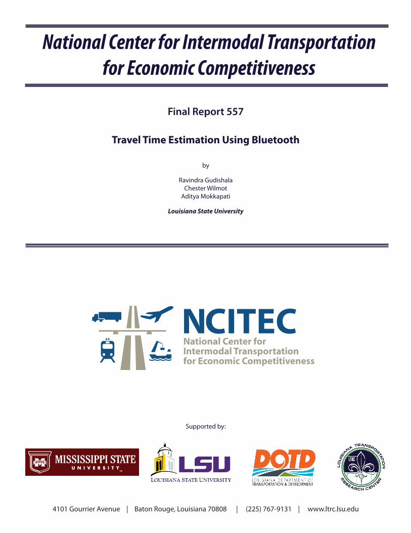
In Maryland, Bluetooth monitoring devices were used to evaluate the impact of signal timing
changes on a signalized four-lane arterial corridor (Route 24 north) [26]. The length of the
section was approximately 2 miles on which five Bluetooth sensors were deployed. The devices
were placed at the base of sign posts or guard rails. Before implementing the new timings, 2.5
days of data were collected. After the new timings were implemented for a.m. peak and p.m.
peak, two days of traffic data was collected again for comparison. Data were analyzed for three
periods in a day: the a.m. peak, mid-day, and p.m. peak. Substantial improvement was observed
in the northbound traffic during the a.m. and p.m. peaks. Figure 5 below shows improvement in
travel time after retiming the signals. There was slight improvement in the p.m. peak travel times
in the southbound direction, however, the a.m. peak travel time in the southbound direction
degraded slightly. Two hundred samples were captured before and after the signal retiming.
Apart from the cost savings resulting from using this method rather than the floating car method,
the study team felt more confident estimating other benefits as well, such as a reduction in
vehicle emissions or traffic delay.
Figure 5
Before and after travel-time histograms for northbound MD 24

16
In Flagstaff, Arizona, US 180 experiences heavy congestion during the winter season because of
a popular ski area north of Flagstaff [27]. In recent years the condition has worsened,
overloading intersections and creating operational and safety concerns for local agencies. To
measure the level of delay, 16 Bluetooth monitoring devices were deployed to provide travel-
time information to the traveling public to popular destinations.
The Pennsylvania Department of Transportation (PennDOT) wanted to evaluate the Bluetooth
technology's ability to collect and report travel times [15]. As such, the test was conducted along
I-76 at locations coincident with EZPass tag readers. Two road sections were used in this study.
TrafficCast was their vendor and it provided a 15-min. travel time and speed data as well as
matched pairs. Two days worth of data were used in the study. In addition, traffic volume data
was obtained from RTMS (Remote Traffic Microwave Sensor) stations. Several parameters were
analyzed in this study with regard to Bluetooth monitoring devices:
Travel Time Results Comparison: Travel time was slightly different between
technologies (Bluetooth and EZPass). However, it was determined that the travel time
produced by Bluetooth monitoring devices were comparable to that of EZPass tag
readers.
Match Rate: Bluetooth monitoring devices had match rates of approximately 4%
compared with EZPass tag readers which ranged between 10-37% of the daily traffic.
The minimum number of data points to accurately depict traffic conditions, per general
guidelines, was collected by each traffic monitoring system. The true through volume in
the eastbound direction could not be estimated because of entry and exit points between
the sensors. Clearly, this also affected the match rates.
Cost: The cost of the BlueTOAD equipment including pole, but excluding power,
communication, data formatting, and system integration was approximately $9,700 to
$12,200 per device, nearly one-third the cost of EZPass.
Constructability and Usability: The installation and maintenance of the BlueTOAD
device was relatively simple. Devices were installed at about 6-10 ft. on structures on the
shoulder (of overhead sign boards) with solar panels for power. The range of the reader
was 175 ft. It could easily cover one direction of a multi-lane highway.
The literature review on the use of Bluetooth Probe Detection System (BPDS) showed that it is
currently being used by several state DOTD’s for acquiring travel time. There is a general
consensus among users that BPDS is easy to use and is a useful means of acquiring travel-time
measurements in real time. Given this state of affairs, it was considered a worthwhile effort in

17
this study to acquire BPDS and investigate its potential in estimating congestion indices and
other useful information that helps in mitigation of congestion.
Acquisition of BPDS
Bluetooth Probe Detection Systems are sold by several commercial vendors and are available in
different models. After conducting the literature review and some research into the latest
available technology, a set of specifications that served the needs of the current study were
developed. Along with the research into the BPDS technology, the potential vendors of the
technology were also identified and approached for an initial quote of desired instrumentation.
After receiving the initial quotes, an invitation to bid was prepared with LSU’s accounting office
assistance and posted on LSU’s procurement services website. A total of four responses were
received in response to the invitation and the lowest bidder, Econolite, which is a local
distributor of BlueTOAD, was selected as the supplier. A total of 11 BPDS units were bought
for a total price of $49,522. All the BPDS units were dual powered (solar and battery power),
capable of sending raw data using cellular service to a central website that processed the data to
produce travel-time estimates. The price charged for the units also included the charges for
providing cellular service and raw data processing services for a year through a web interface
developed and maintained by Trafficast, the parent company supplying BlueTOAD equipment.
The major instrumentation needed to detect Bluetooth signals sit in an 8-in. × 14-in. × 6-in. box
as shown in Figure 6. The components inside the box are shown in Figure 7. Figure 8 shows the
solar panel supplied with the BPDS.

18
Figure 6 Bluetooth probe detection system cabinet
Figure 7 Components of Bluetooth probe detection system

19
Figure 8 Solar panel supplied with Bluetooth detection system
Identification of Congestion Hot Spots Congestion hot spots are defined as locations along arterials or freeways that experience
recurrent congestion. To identify hotspots, one can use a variety of methods. One of them is to
deploy BPDS throughout the metropolitan area and measure travel time at each location.
However, with a metropolitan area as large as Baton Rouge, which has 283 lane-miles of
freeway and 1,457 lane-miles of arterials, it is not only cost-prohibitive to deploy BPDS but also
a time-consuming task. Another alternative is to use records of past complaints regarding
congestion in the city, and use this information to deploy BPDS to the locations that have
experienced the most complaints. However, the approach is neither comprehensive in its
consideration of all problem areas in the region nor is it equitable. To overcome this problem a
new method was devised to identify hotspots using freely available historical traffic data from
Google. The method uses a combination of image analysis and historical traffic maps to identify
locations of chronic congestion.
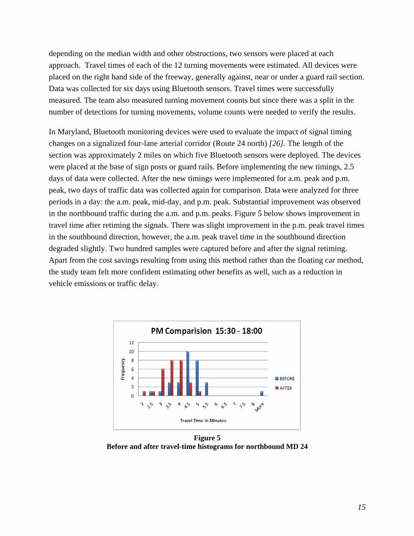
The method developed in this study uses Google Map images of Baton Rouge to demonstrate the
process, but it is applicable to any area covered by Google Maps. Because Google provides
traffic data for freeways and arterials only, the method cannot be use to estimate hot spots on
20
local roads. Figure 9 shows the sample geographical area used in demonstrating the process in
this study.
Figure 9 Geographical boundary of the study area
The following sections describe how historical traffic speed information is stored in Google
Map’s traffic layer, the method used to access and download historical traffic image data from
Google Maps, the steps involved in analyzing these images to extract historical speed
information for identification of congestion hotspots, definition of a new congestion index
derived using the image analysis technique, and, finally, the approach adopted in identifying and
displaying congestion hotspots.

21
Data Collection
A Google Map is capable of displaying both current traffic conditions and historical traffic
conditions. The historical traffic maps can be accessed by opening Google Maps in a web
browser and turning on the traffic layer. The historical maps are available for each day of the
week and provide traffic conditions at a resolution of no less than 15-min. intervals. The maps
are color coded using five different colors that represent varying average travel speeds. For
freeways the colors signify the following speed conditions:
Green: more than 50 mph (80 kmph)
Yellow: 25 - 50 mph (40 - 80 kmph)
Red: less than 25 mph (40 kmph)
Red/Black: very slow, stop-and-go traffic
Gray: no data currently available
For arterials roads, the above mentioned speed ranges do not apply. The colors only give an
indication of the severity of the traffic. Green implies that traffic conditions are good, yellow
implies fair, and red or red/black implies poor traffic conditions.
The red/black color that represents very slow or stop-and-go traffic is often seen in the Google
Map representation of live traffic data. However, the chances for it to appear in a 15-min.
interval historical map, which represents an average of several days’ traffic conditions during
that period, are very slim on either road type. Therefore, effectively, there are four colors that
appear in the historical traffic maps on Google: green, yellow, red, and gray. Among these, red is
of importance since it signifies poor traffic conditions on arterials and slow speeds on freeways.
Figure 10 displays all the four colors in a map that portrays average historical traffic conditions
during a 15-min. interval starting at 4:45 p.m. on a Thursday, in Baton Rouge. Thus, in this case
the 4:45 p.m. image represents the average traffic conditions between 4:45 p.m. and 5:00 p.m.

22
Figure 10 Image of area of interest in Baton Rouge, LA
All of the maps displaying historical traffic conditions graphically are freely available, but there
is no direct way to access the traffic speed data used in producing the graphics. Thus, an
alternative method of identifying traffic speed from the graphic image is needed. The images
provided in Google Maps are made up of thousands of pixels as seen in Figure 10. The pixels
which are red in color represent locations of slow speed and, therefore, high congestion. Thus,
pixel data can be used to identify congested corridors by employing image analysis techniques
that translates color information to digital data.
Amount of Data
To identify road sections on which congestion occurs frequently, historical maps from all days in
the week and at all-time intervals are needed. This is because congestion varies by time of day
and day of week and, therefore, incidence of congestion must be summed over an entire week to
measure the frequency of congestion at a particular location. However, it was confirmed in a
preliminary analysis that, in Baton Rouge, congestion generally does not occur before 7 a.m. or
after 10 p.m. on any day. Thus, a decision was made to limit capturing of images to the 15-hour

23
time frame between 7 a.m. and 10 p.m. each day. As mentioned earlier, this data is available at
15-min. intervals for every day of the week. Hence for one day, a total of 60 images (15 hours ×
4 images/hour) were acquired for the city. Similarly, 60 images are acquired for each day of the
week, making a total of 420 (7 days × 60) images for an entire week.
A two-month observation showed that Google’s historical traffic maps are updated in a cycle of
approximately a week to 10 days. To capture historical traffic conditions over a longer period,
historical traffic maps were captured every 7-10 days over a period of a month (i.e., 3-4 sets of
historical traffic maps were downloaded to identify recurrent congestion conditions over a
month).
The geographical scope of a map changes with the resolution of a monitor and the zoom level
chosen to display the map. When displaying live traffic conditions on Google Maps, it was
observed that maps were consistent in displaying colors at different zoom levels. However, the
choice of a zoom level impacted the way in which historic traffic speed data was represented in a
map. At any particular 15-min. period in a day, Google Map’s show, for the most part, the same
color on road segments at different zoom levels on freeways. But in the case of arterials, colors
were observed to change by varying zoom levels. However, this phenomenon was observed only
at isolated locations. An effort was made to understand the rationale behind this phenomenon by
contacting Google Map’s technical team, but no reply was received from them. It was ultimately
decided to collect images at a scale of 1: 178,816 because it covers the entire Baton Rouge
Metropolitan area in one image with visible traffic color data present on all arterials and
freeways. Capturing Images
Before image analyses can be performed, all the images requiring processing must be
downloaded from the Internet by taking screenshots using an Internet browser. However, it is a
very tedious and error-prone task to take screenshots of historical traffic maps on a long-term
basis, i.e., to take screenshots and store the 420 images manually in a systematic order every
week or 10 days. Therefore, an automated procedure was devised that did not need human
intervention to capture historical traffic map screenshots in a repetitive manner.
GhostMouse, in combination with FastStone Capture, is a software bundle in which repetitive
mouse movements and key strokes can be recorded and coded to capture screenshots of Google
Map images. The operating system of the computer, the location of icons, windows on the
screen, and the size and relative position of an additional monitor should be set up before
running the software to automate the process of capturing the images. The entire setup is
explained in detail below and with the layout shown in Figure 11:

24
The setup requires two monitors:
Monitor-1 on the left at a resolution of 1600 x 900
Monitor-2 on the right at a resolution of 1280 x 1024
Monitor 1 must be set up with the following settings:
The FastStone Capture software’s window should be present in the right top corner.
MS Excel sheet with path names to store the images in chronological order should be
maximized.
The GhostMouse window should be present in the yellow box over the excel sheet.
The program icons of FastStone Capture and MS Excel should be pinned to the taskbar
right next to the start menu.
Monitor 2 should be set up with the following settings:
Google Maps should be opened by going to https://maps.google.com using a Google
Chrome browser. The browser window should be maximized.
In the search bar “Baton Rouge, LA” must be entered and the left information panel
hidden by clicking on the hide panel button.
Google Maps must be set to “Map” style, if it is not already set.
The traffic layer must be switched on. This results in a small traffic options box popping
up in the left bottom corner of the screen.
The “traffic at day and time” must be selected from among the options. The time and day
must be set to 7 a.m., Monday.
Note: Approximately half of the above-mentioned arrangements need to be made only the first
time the program is set up on a computer; the other half need to be set each time a new sample is
collected.

25
Figure 11 Layout of programs and icons before GhostMouse Software is run
Once the above-mentioned setup is performed, repetitive actions of the mouse and keyboard
strokes performed by the user are captured onto a file by the GhostMouse software. This task
needs to be performed only once. When the user requires a new set of data to be downloaded,
he/she just needs to execute the coded GhostMouse file after setting up the computer as shown in
Figure 11. Mouse movements in combination with the keyboard strokes interact with the
windows, icons, and programs as recorded in the initial setup and the resulting captured image
data is saved onto the hard drive. Stable internet connections typically load traffic data on maps
within 1 sec. However, the pre-coded GhostMouse file was set to accommodate any internet lag
(up to 3 sec) that could occur due to increased internet latency or decreased bandwidth.
Using the described set up, images required for analysis were downloaded and stored in seven
different folders, one for each day. All the downloaded images were in a GIF (Graphics
Interchange Format) format indexed with 256 colors and each image had a resolution of
1280 × 1024 pixels.
Hot Spots Identification
The rationale behind the image analysis technique lies in exploiting the pattern in which an
image’s digital representation is stored in a computer memory. There are different formats that
can be used to store an image, but the GIF format was chosen in this case because image data is
“indexed” rather than presented in “true color” as in the widely-used JPEG (Joint Photographic
Experts Group) format. An image in the GIF format has an array that is the size of the image
FastStone Capture window
GhostMouse window
GhostMouse window
To select 'Map' style and switch on traffic layer
FastStone Capture and MS Excel icons
Additional setting for traffic layer
Hide panel button
MS Excel sheet with path names
Google Maps in Chrome browser
Monitor-1 (1600 x 900 resolution) Monitor-2 (1280 x 1024 resolution)

26
(1024 × 1280, in this case), where each cell of the array has an index value that is between 0 and
255. Each of the indices refers to colors in a predefined palette of 256 colors to display the color
in that cell. This makes the GIF format more flexible to use compared to a true color image that
has color values for each pixel stored as red, green, blue (RGB) triplets.
There are several software packages that are commercially available and can be used to perform
image analysis. However, MATLAB was chosen to perform image analysis because the basic
data structure in MATLAB is the array, an ordered set of real or complex elements. Moreover,
MATLAB stores most images (such as GIF) as two-dimensional arrays or matrices in which
each element of the matrix corresponds to a single pixel in the displayed image. Furthermore,
MATLAB provides several built-in functions that can be used to write custom scripts to perform
image analysis. The following section describes the steps involved in performing image analysis.
In the first step, images are imported into MATLAB. MATLAB stores the image as a 1280-x-
1024 matrix with each cell of the matrix storing information related to a single corresponding
pixel on the image. This convention makes working with images in MATLAB similar to
working with any other type of matrix data, and makes the full power of MATLAB's matrix
manipulation capabilities available for image processing.
In the second step, MATLAB’s matrix processing capabilities are used to identify cells
corresponding to pixels of interest in identifying congestion hotspots. It was known a priori that
Google Maps color code congestion on freeways and arterials with a red color. However, in the
bottom inset in Figure 10, it can be seen that congested corridors are not represented by one red
color but a range of red colors. Thus, it was required to separate the pixels that represent
congestion from pixels that do not represent congestion.
In order to identify the entire range of congestion representing red colors, index values and RGB
values should be used together. In addition to each color being represented by an index value as
described before, they are also described in terms of the three base colors (RGB) each of whose
values ranges from 0 to 1 ( e.g., black has an RGB of [0,0,0,]; white has an RGB of [1,1,1]; and
parrot green has an RGB around [0.16,0.68,0.01]). MATLAB’s image processing tool called the
“inspect pixel values” tool can be used to obtain more information related to the color of a pixel.
The tool provides a means of inspecting each pixel and identifying whether it is of interest by
observing (1) if the pixel is red, (2) the color of the pixel in visual form, (3) its associated index
value, and (4) its associated RGB values as shown in the pair of windows in Figure 12.

27
Figure 12
Image toolbox window (left) and Inspect pixel value window (right)
Using the “inspect pixel values” tool, several maps were inspected and the most suitable range
for RGB values were identified as R > 0.45, G < 0.38, and B < 0.32.
In the third step of the image analysis, MATLAB’s programming interface was used to isolate
index values of colors associated with the previously discussed RGB value ranges. Then, in the
fourth and final step, matrix cells that contain congestion-representing index values were
populated with a value of one and the rest of the cells with a zero. So if congestion is present on
a road, a value of 1 is inserted into all the cells in the matrix that correspond to congested
portions of the road as represented by individual pixels in the map. Figure 13 shows a pictorial
representation of this concept with an initial image along with its analytical matrix.

28
Figure 13
Example of Google Map image with corresponding matrix
It is important to note that the congestion-representing index values can change from image to
image (i.e., from one 15-min. matrix to another). Therefore, the analysis to convert an image to
numbers must be done for each matrix of observations.
Fifteen-Minute Interval Analysis
The process of populating matrix cells based on congestion needs to be repeated for each 15-min.
time period, every day for a single week. If these matrices are summed over a seven-day period,
60 15-min. matrices will be produced. These represent aggregate traffic conditions over a week
(between 7 a.m. to 10 p.m.). A road experiencing congestion throughout the week in a particular
time interval would get a value of 7 in the matrix for that time interval. The process of summing
up the matrices for each time interval is shown schematically in Table 2.
Table 2 Analysis of 15-min. interval matrices
The process of analyzing images to identify congestion becomes tedious if many images must be
processed manually. Recognizing this, a script was written in MATLAB that automatically
performs the four steps required to analyze images.
0 0 0 0 0 0
1 0 0 0 0 0
1 1 0 0 0 0
0 1 0 0 0 0
0 0 1 0 0 0
0 0 1 1 0 0
0 0 0 1 0 0
0 0 0 1 1 0
0 0 0 0 1 0
0 0 0 0 0 1
0 0 0 0 0 1
0 0 0 0 0 0
0 0 0 0 0 0
0 0 0 0 0 0
0 0 0 0 0 0
Monday Tuesday Wednesday Thursday Friday Saturday Sunday7:00 AM 7:00 AM 7:00 AM 7:00 AM 7:00 AM 7:00 AM 7:00 AM =7:15 AM 7:15 AM 7:15 AM 7:15 AM 7:15 AM 7:15 AM 7:15 AM =7:30 AM 7:30 AM 7:30 AM 7:30 AM 7:30 AM 7:30 AM 7:30 AM =
. . . . . . . .
. . . . . . . .
Final matrix for 15 min intervalMatrix for 7:00 amMatrix for 7:15 amMatrix for 7:30 am
.
.

29
Analysis Beyond the 15-Min. Interval
The results obtained from the 15-min. interval analysis might not be enough to identify severely
congested corridors because it only examines if corridors were congested for only 15 min. It
would be useful to analyze if corridors were congested for 30-min., 45-min., or for 1-hr. periods
since duration of congestion is one of the dimensions on which congestion is characterized. The
results from such an analysis might give a totally different perspective of congestion in a city
from that of a 15-min. interval analysis.
In identifying congestion in 30-min., 45-min., and 60-min. periods, the presence of congestion in
consecutive 15-min. intervals first needs to be identified. For instance, in the case of a 30-min.
interval period, the analysis would begin by analyzing the two 15-min. consecutive data intervals
for the time period between 7:00 a.m. and 7:30 a.m. on Monday for each cell of the matrix. The
pixels which have congestion in both the images are then mapped into a new matrix named “7:00
to 7:30 a.m. matrix”; with the corresponding cell getting a value of 1. This procedure was
repeated for all contiguous pairs of 30-min. interval matrices for all 7 days of the week. The
resulting matrices were then summed over the entire week to produce a new set of 59, 30-min.
matrices. The resultant set of 59 matrices represented aggregate 30 min. congestion over the
entire week. The 59 matrices result from the fact that there are 59 consecutive overlapping 30
min. intervals between 7 a.m. and 10 p.m. A schematic representation of 30-min. interval
analysis is shown in
Table 3 for a sample pixel where a red highlighted cell indicates congestion in the matrix cell
represented by the pixel for the 15-min. time period shown.
Table 3 Analysis of 30 min. interval matrices
A similar procedure was repeated for the 45-min. and 1-hr. intervals to obtain their respective
final matrices (58 and 57 in number, respectively). The range of values in the final matrices
ranged from a minimum of 0 to a maximum of 7 in all four cases.
Monday Tuesday Wednesday Thursday Friday Saturday Sunday
7:00 AM 7:00 AM 7:00 AM 7:00 AM 7:00 AM 7:00 AM 7:00 AM =
7:15 AM 7:15 AM 7:15 AM 7:15 AM 7:15 AM 7:15 AM 7:15 AM =
7:30 AM 7:30 AM 7:30 AM 7:30 AM 7:30 AM 7:30 AM 7:30 AM =
. . . . . . . =
Matrix for 7:00 AM to 7:15 AM
Matrix for 7:15 AM to 7:30 AM
Freq. of congestion=2 Freq. of
congestion=3
Final matrix for 30 min interval

30
Congestion Index (CI) Computation
Duration of congestion is one of the factors that characterizes the level of congestion
experienced. For instance, if a road is congested for 15 min., that road is not experiencing the
same level of congestion as one that is continuously congested for 30-min. or longer. Thus, the
notion is proposed that smaller intervals have a smaller effect on congestion than longer intervals
of congestion. Accordingly, weights of 1/10, 2/10, 3/10, and 4/10 were assigned to the 15-min.,
30-min., 45-min., and 1-hr. time interval values, respectively. These weights imply a linear
relationship between congestion and duration, and they add up to 1 so they apportion out total
effect.
Secondly, it is also suggested that the frequency with which congestion occurs also characterizes
the severity of the congestion problem. That is, a site that experiences congestion regularly is
perceived as experiencing more congestion than one where it rarely occurs. To quantify this, two
parameters are required in each of the four time intervals. The first is the total number of
matrices in each time interval (denominator) and the second is the weekly average daily
congestion frequency in each time interval of each pixel (numerator).
Using the two congestion characteristics mentioned above, a CI can be calculated for each pixel
on roads using the following equation:
CongestionIndexforpixel X, Y 110
210
310
410 (1)
Where,
A1 = Weekly average daily 15 min. congestion frequency =∑ ∑
A2 = Total no. of final 15 min. interval matrices in a week.
B1 = Weekly average daily 30 min. congestion frequency =∑ ∑
B2 = Total no. of final 30 min. interval matrices in a week.
C1 = Weekly average daily 45 min. congestion frequency =∑ ∑
C2 = Total no. of final 45 min. interval matrices in a week.
D1= Weekly average daily 60 min. congestion frequency =∑ ∑
D2 = Total no. of final 1hr. interval matrices in a week. [X, Y] = The coordinates of the pixel. T15D = 15 min. matrix T30D = 30 min. matrix … and so on.

31
Since the time between 7 a.m. to 10 p.m. is considered for analysis, the denominators are fixed at
A2 = 60, B2 = 59, C2 = 58, and D2 = 57. The ratios (A1/A2, B1/B2, C1/C2, and D1/D2) vary
between zero when congestion does not occur at a particular pixel location in any time interval
during the analysis period (7 a.m. to 10 p.m.) during a week of observations, to 1 when
congestion occurs continuously at that location from 7 a.m. to 10 p.m. for a week. Thus, the four
ratios A1/A2, B1/B2, C1/C2, and D1/D2 represent the frequency characteristic of the congestion
index, and the .
represents the duration characteristic of the
congestion index.
A CI is computed for every pixel, resulting in a value between 0 and 1 that is assigned to each
pixel with the overall level of congestion being signified by its magnitude. Pixels with CI values
of zero imply no congestion while for the congestion index of a cell to attain the value of 1, the
road must remain congested during all time periods between 7 a.m. and 10 p.m. for a week.
Obviously, no road would experience such high level of congestion, so CI values are always less
than 1. As formulated previously, the CI formula represents a general level of congestion
experienced over a week. However, the time period considered could be reduced to shorter
periods such as a day, morning peak, evening peak, or special event time, etc.
Based on CI values obtained in the study area, the CI ranges shown in the Table 4 are
recommended for categorization as congestion hotspots. The categorization was developed based
on observed empirical relationship between CI and recurrent congestion over a month. Clearly,
different CI ranges could be used to reflect greater or less sensitivity to congestion conditions.
Table 4 Congestion index ranges for hotspots
Time period of analysis Congestion Index of Hotspots
Morning peak period/Evening peak period – 2hr. 0.26 to 1
Entire day (7 a.m. to 10 p.m.) -15 hr. 0.039 to 1
Congestion Index Mapping
In the previous section, a numerical congestion index was proposed and computed for individual
pixels or locations on a road section. To visually represent the numerical information, one
method adopted was to draw solid red circles on the map proportional in size to the congestion
index values. This was achieved by populating the cells around a pixel to a radius proportional to

32
the congestion index of that pixel. That is, a red circle proportional to the level of congestion
experienced was drawn on the map. This is shown schematically in Figure14 and Figure 15
where eastbound traffic on road A experiences congestion over its entire length but with the most
prevalent congestion occurring in advance of the intersection with road B.
Figure 14 Graphical representation of level of congestion
0 0 0 0 0 0 0 0 0 0.9 0 0 0 0 0 0 0 0 0 0.5 0 0 0 0

33
Figure 15 Level of congestion represented by size of red dots
In this case two aspects can be varied manually when representing data, namely:
1. Resolution factor: CI values for pixels are usually very small numbers and typically
occupy a large number of decimal places. If the resolution factor is too coarse, only large
values of CI will be recognized and it will be difficult to distinguish between CI values
which are very similar, being only different in the second or third decimal place (e.g.,
0.239 and 0.234). This will render the buffer analysis to provide imprecise and very
aggregate results. If a fine resolution value (e.g., by considering six decimal places of CI
values) is used, the differences between congested areas are more clearly distinguished.
However, trials showed the computing time to increase exponentially with an increase in
each decimal place and the computer could run out of memory as well. Therefore, the
person who runs the program should be prudent when selecting the resolution value to
represent data. A resolution factor of 4x10n is recommended where n is the number of
decimal places that one prefers to use.
2. Scaling factor: A scaling factor can be employed to increase or decrease the size of the
solid red circles that represent the CI values of the pixels. The user can specify the value
they find most appropriate for their purpose.

34
Recommended values for resolution and scaling are shown in Table 5.
Table 5 Recommended resolution and scaling factors
Time period of analysis Resolution Scaling
Entire day (7 a.m. to 10 p.m.) – 15 hr. 4000 40
Morning peak period/Evening peak period – 2hr. 400 30
Mapping Frequency of Congestion
Another method of portraying congestion in graphic form is to use colors to depict different
levels of congestion. For example, if frequency of congestion is used as a measure of congestion,
then the 15-min. matrices populated with 1’s and zeros from the earlier analysis could be added
together to produce a matrix showing the frequency of congestion at each pixel. In this study,
MATLAB’s built-in color maps were used to color roadways to portray the level of congestion
present. For example, low levels of congestion were illustrated with a green color and high levels
of congestion in red, with a transition in color in between as shown in Figure 16.

35
Figure 16 Frequency analysis for 15-min. congestion for entire day
Application
Analysis on One Week Data. The data for conducting analysis in this section was
collected from Google Maps on 09/03/13 covering a period of one week between 7 a.m. and 10
p.m. each day. After downloading images, invalid red pixel data in the images that did not
represent congestion was removed by applying screening procedures and visual inspection.
These red pixels were from features in the image such as: the legend, browser extension icons,
Google’s logo, the top part of the interstate sign present on interstates, the red balloon in the
center of the image and other isolated pixels from letters of labels on roads and places. Then a
15-min. frequency analysis and Congestion Index analyses were performed. (Note: The
background in all the maps was only used as a base map; the colors in the maps except red have
no congestion/traffic significance.)
The congestion map shown in Figure 16 was obtained by applying the technique developed to
represent frequency of congestion. The four ranges of frequencies of 15-min. congestion are
shown using a custom color map of four colors. This map gives a perspective of congestion in
the city as a function of frequency of congestion. From the map it is clear that I-10 eastbound
direction is more congested than other roads, especially at its intersection with the I-110. This
Frequency of congestion in 15-min. intervals for 1 week between 7 a.m. and 10 p.m.

36
map gives a perspective of 15-min. congestion in the city. However, it does not provide any
information on congestion duration and moreover it is difficult to detect and decipher congestion
frequency of isolated pixels at intersections.
The first method/technique used to represent congestion described above provides more
information about congestion since it takes into account both frequency and duration of
congestion into account. Here the diameter of the solid red circle of the pixels is in proportion to
its congestion index as seen in Figure 17. Figure 18 is a result of the same analysis. However, the
figure shows congestion over roads near downtown and Louisiana State University in greater
detail.
From the congestion index analysis, it can be observed that the I-10 over the Mississippi River,
arterials next to the I-10 before the I-10/I-12 split (Perkins Road, College Dr.), two intersections
(Old Hammond Highway – Jefferson and Brightside Dr. – Nicholson Dr.) and a major arterial
(Airline Highway) crossing the I-12 on the right-hand side of the diagram, experienced heavy
congestion with CI values in the range of 0.0393 to 0.2331. Hence they are considered hotspots
based on the ranges established in Table 4. These observations are consistent with common
opinion among motorists of sites in Baton Rouge with high levels of congestion.

37
Figure 17 Congestion analysis for entire day (7 a.m. to 10 p.m.)

38
Figure 18 Congestion analysis for entire day (7 a.m. to 10 p.m.) for downtown area
Analysis for Peak Period. It was observed that in Baton Rouge, the morning peak
occurs between 7 a.m. and 9 a.m. and evening peak between 4 p.m. and 6 p.m. for major
arterials. Accordingly, the CI was computed for both morning and evening peaks and to further
enhance our understanding of congestion buffer analysis was performed. The resultant maps are
shown in Figure 19 and Figure 20.
From the images, it can be observed that for the 1 week data collected on 9/03/13, the morning
peak period is significantly less congested than evening peak period. During the evening peak
period, Airline Highway., I-10, I-110, Perkins Rd., and College Dr., Siegen Lane and two
intersections (Old Hammond Highway – Jefferson and Brightside Dr. – Nicholson Dr.) are
severely congested. These were observed to have CI values in the range of 0.261 to 0.665.
Hence, they are considered hotspots based on the definition established in Table 4.

39
Figure 19
Congestion analysis for morning peak period (7 a.m. to 9 a.m.)

40
Figure 20
Congestion analysis for evening peak period (4 p.m. to 6 p.m.)

41
Analysis on One Month Data. The analysis described in the previous section was
repeated using historic traffic maps representing conditions over a month. Google updated traffic
data only three times for the month in which the analysis was conducted. These three unique data
sets were collected on 8/12/13, 8/19/13, and 9/03/13 (8/26/13 data was not included since it was
the same as was collected on 8/19/13) and arithmetically averaged using the following formula:
, , , , , , , ⋯ , , (2)
where, i = time of the day j = day in the week k = samples that represent a month’s traffic This equation produced a set of 420 average matrices, representative of the entire month, which
was used in the rest of congestion analysis for the month. CIs were calculated for all pixels and
buffer analysis was conducted to generate the results shown in Figure 21.
From the congestion index analysis, it can be observed that the I-10 to the east of the Mississippi
River, arterials next to the I-10 before the I-10/I-12 split (Perkins Road and College Dr.), Siegen
Lane, two intersections (Old Hammond Highway – Jefferson and Brightside Dr. – Nicholson
Dr.), Airline Highway between Greenwell Springs Road and Bluebonnet experienced heavy
congestion with CI values in the range of 0.0393 to 0.1207. Hence, they are considered to be
congestion hotspots based on the ranges established in Table 4.
For the purpose of congestion measurement using Bluetooth technology, Airline Highway was
chosen as the candidate route out of all the available candidates because it showed persistent
congestion throughout the analysis period.

42
Figure 21 Congestion analysis for entire month (7 a.m. to 10 p.m.)
43
Validation
To validate the methodology described in previous sections, an image analysis was first
conducted using historic traffic images downloaded from Google Maps of the I-12 corridor
between Essen Ln. and Airline Hwy in Baton Rouge. After performing the image analysis,
travel time and average travel speed data were gathered from a network of Bluetooth devices
installed along the I-12 corridor by DOTD in relation to a different project. The frequency of
congestion computed through image analysis for a specific time period was then compared
with the average travel speed for the same time period for observations gathered from the
Bluetooth devices. The procedure used to perform the analysis is described in the following
paragraphs.
For the I-12 corridor, images were captured from Google Maps on 7/31/13 in GIF format
with 256 colors at a resolution of 1280 × 1024 pixels. It was assumed that the images
captured on 7/31/13 represented traffic conditions for the preceding week. Figure 22 (a)
shows the part of corridor that was the subject of this analysis. These images were captured
for all 7 days of the week between 3 p.m. and 7 p.m.The time period between 3 p.m. and 7
p.m. was chosen because in the preliminary analysis it was observed that the I-12
experienced congestion only between the noted timeframe. Sixteen images (4 images/hour ×
4 hours) were captured per day which resulted in a total of 16 × 7 = 112 images for the entire
week.
The MATLAB script developed in the previous section was then used to analyze the captured
images. However, instead of using only the red color as an indication of the presence of
congestion both red and yellow colors were used in the analysis. As was discussed in the
preceding sections, the presence of both colors in historical traffic speed maps represent a fall
in speeds below 50 mph.
The 15-min. interval matrices were then generated by processing historical traffic map
images, which were populated with either zeros or ones based on the presence or absence of
red/yellow pixels. The resulting matrices were then added across all days of the week. This
yielded one matrix for each of the 15-min. intervals. Therefore, a total of 16 matrices 16 time
intervals of 15-min. each between 3 p.m. and 7 p.m.) were generated, which represented the
weekly traffic conditions existing between 3 p.m. and 7 p.m. The number in each cell
represented how often congestion conditions (speeds < 50 mph) occurred at the locations
represented by the pixel in a 7-day period, at a specific 15-min. time period. Figure 22 (b)
shows the resulting matrix after adding matrices representing traffic conditions at 5:00 p.m.
for 7 days. The cells that contain value of 4 indicate the presence of congestion on four days

44
and the cells coincided with the pixel location on the I-12 corridor shown in Figure 22 (a).
Similarly, the same congestion frequency of 4 was observed for the remaining 15-min. time
intervals until 6 p.m.
Figure 22
(a) I-12 Corridor in Baton Rouge showing location of Bluetooth detectors (b) Frequency matrix with frequencies of 4 highlighted
To validate the image analysis technique developed in this research, it is important to
compare the results of image analysis with the actual traffic conditions that occurred for the
(a)
(b)

45
same time period. In order to achieve that, the travel-time data was retrieved from Bluetooth
devices deployed over the road sections where image analyses were conducted.
To capture travel time, 11 BlueToad Bluetooth monitoring devices deployed over I-12 by
DOTD between Essen Lane and Walker were utilized. These devices capture and display
speeds and travel time in real time and all captured data are archived as well. Two devices
that were installed at the Essen Lane and the Airline Highway interchanges were used to
retrieve the required data for validation. The device locations are shown in Figure 22 (a) with
arrows and blue balloons.
Speed data collected between 7/23/13 and 7/28/13 aggregated at 15 min. was downloaded
from the Bluetooth devices. Figure 23 displays the speeds obtained from the Bluetooth
devices over the week.
Figure 23
Bluetooth speeds over I-12 between Essen Ln. and Airline Hwy. between 7/22/13-7/28/13
From the graph in Figure 23, it is clear that between 5 and 6 p.m. on Monday through
Thursday there was a fall in speed to less than 50 mph, which implies congestion. This did
not occur Friday through Sunday. Returning to the image analysis conducted using Google
Maps, this section of the corridor for the same time period shows a congestion frequency of
4, as represented by cell values in the matrix shown in Figure 22 (b). This implies congestion
occurred 4 out of 7 possible times in a week on this corridor between 5 p.m. and 6 p.m. Thus,
the consistency between observed traffic conditions and derived conditions from image
analysis conducted on Google Map data validates the image analysis technique.
0
10
20
30
40
50
60
70
80
0:00
4:00
8:00
12:00
16:00
20:00
0:00
4:00
8:00
12:00
16:00
20:00
0:00
4:00
8:00
12:00
16:00
20:00
0:00
4:00
8:00
12:00
16:00
20:00
0:00
4:00
8:00
12:00
16:00
20:00
0:00
4:00
8:00
12:00
16:00
20:00
0:00
4:00
8:00
12:00
16:00
20:00
Speed (mph)
Speed
Monday Tuesday Wednesday Thursday Friday SundaySaturday
46
Deployment of BPDS Once the locations of maximum congestion are identified (as described in the previous
section), there is a need to measure the degree of congestion experienced at these locations.
For this, the research team used Bluetooth devices to measure travel time. They were
installed on Airline Highway, an arterial experiencing a high level of congestion as identified
by its Congestion Index in the previous section. The research team made two field trips to
Airline Highway to identify potential infrastructure installation points for the BPDS devices.
Eight poles, either on light poles or traffic light poles, were identified to host the BPDS
devices.
Even though it is desirable and recommended by other researchers to install Bluetooth
devices one mile apart, the research team had to take real-time constraints into consideration
while identifying the locations. For example, the research team ruled out the possibility of
erecting its own poles and other infrastructure for the purpose of installing Bluetooth devices
as it was out of scope of the project and beyond the budget limit allocated to the project.
Thus, the team considered using existing infrastructure such as traffic signal and electric light
poles that could be accessed by obtaining permission from relevant authorities. Figure 24
shows the locations along Airline Highway that were identified as the final installation
locations. As can be seen from the figure, the study corridor consisted of a total of seven
segments between Industrial Avenue and Pecue Lane. The total length of the study corridor
is approximately 7.1 miles. The majority of the installation points were located at
intersections.
Installation of Bluetooth devices to the identified traffic light poles and electric poles
required getting permission from the city parish chief traffic engineer, Entergy (local gas and
electricity company), and the DOTD District 61 traffic operations engineer. A brief summary
of the project along with the map of identified locations were submitted to relevant people to
obtain permission. The entire process of obtaining permission from the city parish itself took
about four months because it required the city parish to contact other related agencies, such
as Entergy.

47
Figure 24 Identified installation locations along Airline Highway
Installation and Activation of Devices
For installation of devices at the identified locations, there was an expectation on the part of
research team to receive assistance in the form of equipment and personnel from the District
61 Traffic Operations division. To fulfill the expectation, the research team organized a
series of meetings with the District 61 traffic operations engineer and other maintenance
personnel to discuss the needs and request assistance in the form of a bucket truck and
operating personnel. Once an agreement was reached, a schedule was established to install
BPDS at the identified locations. The BPDS were installed at identified locations in the
second week of May 2014. Figure 25 shows the installation of BPDS at the intersection of
Airline Highway and Tom Drive. The entire process of installing a single device took
approximately about 30 to 45 min. per location. The Bluetooth Probe Detection System
devices at each individual location were then activated and immediately started transmitting
raw data to a central server using the cellular modem installed on each device.

48
Figure 25 Installation of Bluetooth probe detection system
The vendor who supplied the BPDS also provided the services for processing the raw
individual vehicle speed data to provide average speed data in 5-min. intervals for each
segment of the entire study section on Airline Highway. The vendor, Trafficast/Bluetoad, set
up a web interface in advance of the installation and trained the research team members using
a webinar on how to use the web interface to monitor and download travel-time data. The
web interface along with tools to download archived data also provided some additional
query tools that let users compare different route’s performance over time.
Acquisition of Travel Time Data and ADT. The raw data provides the average
travel speed data of each vehicle traversing the study section. It is first sent to the central
server of the vendor and checked for errors or outliers. For example, data collected from a
vehicle that is parked close to a Bluetooth detector or data from a vehicle stopped for
refueling would be filtered out before calculating speed between two Bluetooth locations.
The filtered out data is then processed using a two stage mean algorithm developed by
Trafficast to produce smoothed speed and travel time for each individual segment for every
five min. The data, once processed and archived, can be averaged over 15-min., 30-min., 45-
min. and 1-hr. intervals as required for further analysis.
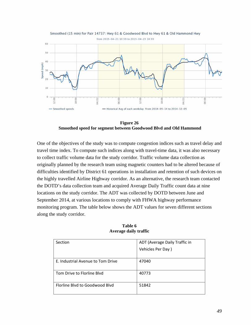
49
Figure 26 Smoothed speed for segment between Goodwood Blvd and Old Hammond
One of the objectives of the study was to compute congestion indices such as travel delay and
travel time index. To compute such indices along with travel-time data, it was also necessary
to collect traffic volume data for the study corridor. Traffic volume data collection as
originally planned by the research team using magnetic counters had to be altered because of
difficulties identified by District 61 operations in installation and retention of such devices on
the highly travelled Airline Highway corridor. As an alternative, the research team contacted
the DOTD’s data collection team and acquired Average Daily Traffic count data at nine
locations on the study corridor. The ADT was collected by DOTD between June and
September 2014, at various locations to comply with FHWA highway performance
monitoring program. The table below shows the ADT values for seven different sections
along the study corridor.
Table 6 Average daily traffic
Section ADT (Average Daily Traffic in
Vehicles Per Day )
E. Industrial Avenue to Tom Drive 47040
Tom Drive to Florline Blvd 40773
Florline Blvd to Goodwood Blvd 51842

50
Section ADT (Average Daily Traffic in
Vehicles Per Day )
Goodwood Blvd to Old Hammond 61950
Old Hammond to Coursey Blvd 63223
Coursey Blvd to Siegen 48510
Siegen to Pecue 39012
Purchase of Travel Time Data The alternative to deploying a BPDS is to purchase travel-time data from commercial
vendors such as NAVTEQ or INRIX. The research team bought data from INRIX after
receiving quotes from INRIX and NAVTEQ. The travel-time data is sold on a per mile basis
and the cost varies based on the type of road (freeway or arterial) and whether data are
historical or real time. To be consistent with the travel-time data estimated by BPDS, the data
was bought for the same section of Airline Highway as was identified as most congested in
the previous section. The data bought in this study was historical travel-time data for a stretch
of 7.1 miles for a time period between January and September 2014, for a total cost of $800.
The data thus obtained was in 1-min. intervals and for a total of seven segments in both
directions. In contrast, real-time data would have cost $400 per mile/year for a major arterial
and $800 per mile/year for a freeway. One of the requirements of INRIX before delivering
data was to sign a contractual agreement to abide with terms and conditions of data usage,
which included not making direct comparison of measurements from INRIX data with that
from other sources.
51
DISCUSSION OF RESULTS
There are many congestion indices available in the literature that could be used to measure or
monitor a roadway’s congestion level and intensity over time. However, indices such as
travel time, travel delay, travel time index, and planning time index are often used to identify
recurrent congestion on a roadway. The methods used to acquire input data and compute
travel delay, the travel time index, and the planning-time index are discussed and
demonstrated in the following sections.
Congestion Indices Computation The Urban Mobility Report (UMR) produced by Texas Transportation Institute provides
estimates of performance measures of mobility such as congested travel (% of peak VMT),
annual delay (in person hours) and congestion cost at the area wide level. Along with
mobility estimates, the UMR also reports on the trends in estimated mobility measures. To
avoid duplication, this study estimated mobility measures at individual road level and limited
the estimation to the study corridor chosen as the most congested in the Baton Rouge area
(Airline Highway). The methodology used draws upon the definitions and procedures
established by TTI for estimation of congestion indices. It should be noted that the
congestion index developed earlier to measure congestion from image analysis data, cannot
be used here since it operates on pixel data unique to that observational method.
Mobility/congestion indices were calculated using average travel speed data collected using
the BPDS on the study corridor between May 15 and November 30, 2014. This study period
was chosen based on continuous availability of data from all the devices during that time.
Continuous BPDS travel speed data was available in 15-min. intervals for each segment of
the study corridor for each day for a total of 196 days or 28 weeks. The 15-min. travel speed
data was averaged over one hour for each segment and in both directions. Availability of
continuous speed data improved the arterial street congestion measure estimation by
providing peak hour measured speeds rather than estimated speeds. Speeds measured at night
time between 10 p.m. and 6 a.m. were used as free flow speeds required for measuring travel
delay on the study corridor. Finally, the hourly distribution of traffic volume was derived
from ADT by using Bluetooth signal match counts for each segment of the study corridor.
Congestion Measure Calculation
The congestion indices for each segment of the study corridor were computed by following a
series of steps for each segment of the study corridor. For demonstration purposes, the travel
delay and the indices such as Planning Time Index (PTI) and Travel Time Index (TTI) are
only shown for a selected segment. The steps comprised of the following activities or tasks.

52
1. Acquire Traffic Volume Data
The ADT data collected by DOTD’s data section provided the source for traffic volume data
needed for computing congestion indices. Although the geographical locations at which ADT
was measured did not coincide with the middle point of each segment of the study corridor it
was assumed that the ADT was uniform across each segment of the study corridor.
2. Estimate Traffic Volume for Hourly Time Intervals
The paired match count is the number of times a BPDS processes a MAC address at two
locations on a given segment. Typical paired match counts for the segment between Siegen
and Pecue Lanes are shown in the following graph. To divide the daily traffic volume into
hourly volumes for calculation of congestion indices, the hourly traffic volumes for each
segment were assumed to be distributed the same as the Bluetooth signal paired match
counts. That is, the distribution of paired match counts available for each segment from
BPDS in both directions was used to distribute the ADT to hourly volumes on each section.
Figure 27 Percent match count variation
Hourly volume estimates for each day of the week were created from the ADT using the
percent match counts measured for each segment. The match count values available in 15-
min. intervals were averaged over an hour and then the ratio of hourly counts to total counts
per day were estimated to get a percent match count. In calculating the percent match counts,
0
1
2
3
4
5
6
7
8
9
Percent Match Counts
Time Period
Pecue to Siegen
Siegen to Pecue

53
data from the month of November 2014 were used as representative data for the period
between May 18, 2014, and November 30, 2014. Once the percent match count per hour per
direction was determined, it was multiplied by the ADT to get estimates of hourly volumes
by direction.
To validate the use of paired match count as a surrogate for hourly volume distribution,
analysis was conducted to test the premise. The analysis consisted of measuring the
correlation between ADT values and paired match counts in five sections of the study
corridor. To conduct the analysis, paired match counts for both north-bound and south-bound
traffic for one month were retrieved from the website for the five sections. The paired match
counts for each section were summed by direction to get the total paired match counts by
direction. The average total paired match counts were then compared with the ADT values as
shown in Table 7. As can be seen from the table, a correlation coefficient of 0.93 indicates a
high correlation between ADT and the paired match counts thus providing a justification for
the use of paired match counts as a surrogate to hourly volume distribution. It is important to
note that for correlation analysis only five sections were used out of seven because for two of
the segments, the ADT collected did not accurately reflect the traffic that was diverted from
the study segment. For instance, for the segment between Industrial Avenue and Tom Drive,
Choctaw Drive acted as a major diversion of traffic off the facility before it could be
observed by both Bluetooth receivers. Similarly, for the segment between Old Hammond
Highway and Coursey Blvd, traffic diverting on to I-12 was not picked up as a match on the
Bluetooth devices but did feature in the estimation of ADT from traffic counts.
Table 7 Correlation analysis
Section ADT Average Paired Match Counts
E. Industrial Avenue 47040 2372
Florline to Goodwood 51842 2275
Goodwood to Coursey 61950 3172
Coursey to Siegen 48510 2186
Siegen to Pecue 39012 1957
Correlation Coefficient 0.93

54
3. Tabulate Hourly Traffic Volume and Speed for Road Segments
The next step was to tabulate hourly volume and speed data for each road segment in both
directions. The tabulation of the traffic volume and traffic speed for each road segment was
accomplished using Microsoft Excel as the total number of road segments was very small.
The speed data that was averaged over an hour for each day for a total of 196 days was
combined with hourly volume data for the same time period. The tabulated data was then
used for calculation of congestion indices in the subsequent steps.
4. Establish Free Flow Speed and Peak Period Speed for All Road Segments
Congestion indices computations require free-flow speed and peak-period speeds. A free-
flow speed during the light traffic hours (10 p.m. to 6 a.m.) was computed for each road
segment and used in the congestion indices calculations. To establish peak-period speeds, a
simple average peak period speed was computed by adding up the peak-period speeds in each
hour during the peak period and dividing by the length of the peak period in hours. It was
observed that for most of the road segments, the peak period started at around 10 a.m. and
lasted until 6 p.m. for a total of 8 hours, in contrast to typical peak periods caused by
commuter traffic. On Airline Highway, the regular morning and the afternoon peak traffic is
supplemented by shopping trips to adjoining businesses in the midday period.
The graph in Figure 28 shows the typical speed variation that is averaged over a week for the
hours between 7 a.m. and 7 p.m. on Airline Highway. As can be seen from the graph, there is
a significant drop in the speed in the afternoon period before it increases again in the
evening.

55
Figure 28 Speed variation between Goodwood Blvd. and Old Hammond Highway
The calculation of congestion indices such as travel delay requires establishing a congestion
threshold such that delay is accumulated for any time period once the speeds fall below the
congestion threshold. There is no consensus in the literature about the appropriate level of the
threshold, but for the purposes of calculation in this research the free-flow speed estimated
from measured speed at low volume conditions was used.
5. Compute Congestion Indices
(a) Travel speed
The peak period average travel speeds for four weeks are shown in Figure 29 for the road
segment between Goodwood Blvd to Old Hammond Hwy. The speeds are computed by
averaging speeds over an hour for a given segment and then by averaging for a week for a
given time period.
0
5
10
15
20
25
30
35
40
Speed in
mph
Speed
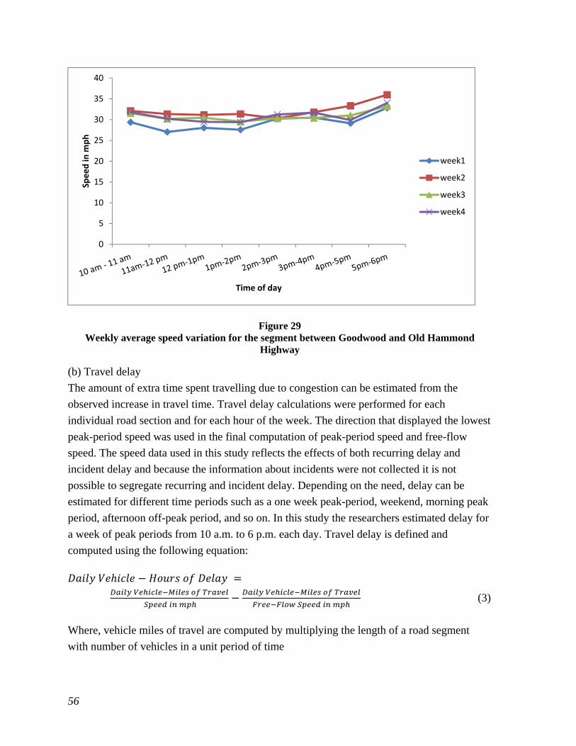
56
Figure 29 Weekly average speed variation for the segment between Goodwood and Old Hammond
Highway
(b) Travel delay
The amount of extra time spent travelling due to congestion can be estimated from the
observed increase in travel time. Travel delay calculations were performed for each
individual road section and for each hour of the week. The direction that displayed the lowest
peak-period speed was used in the final computation of peak-period speed and free-flow
speed. The speed data used in this study reflects the effects of both recurring delay and
incident delay and because the information about incidents were not collected it is not
possible to segregate recurring and incident delay. Depending on the need, delay can be
estimated for different time periods such as a one week peak-period, weekend, morning peak
period, afternoon off-peak period, and so on. In this study the researchers estimated delay for
a week of peak periods from 10 a.m. to 6 p.m. each day. Travel delay is defined and
computed using the following equation:
(3)
Where, vehicle miles of travel are computed by multiplying the length of a road segment
with number of vehicles in a unit period of time
0
5
10
15
20
25
30
35
40Speed in
mph
Time of day
week1
week2
week3
week4

57
The delay calculations were performed at the individual roadway segment level and for each
hour of a week before averaging them by week for 28 weeks. The trend in delay for a span of
12 hours for a weekday and weekend is shown in Figure 30. The delay is high in the evening
period compared to the morning and is high on a weekday compared to weekend.
Figure 30 Trend in delay for the segment between Goodwood Blvd and Old Hammond Hwy
Table 8 shows weekly average total delay for peak period for all the segments. The delay was
computed for the direction that had lowest peak-period speed. As can be seen from the table,
the segment between Goodwood Blvd and Old Hammond recorded the highest delay in
vehicle-hours.
0
50
100
150
200
250
300
350
400
450
Vehicle‐Hours
Time Period
Weekday
Weekend
Weekly Avg

58
Table 8 Weekly average delay for segments on the study corridor
Segment Direction(North
Bound/South Bound)
Average Weekly Delay
Vehicle‐Hours Rank(Worst to Best)
Industrial Ave and Tom
Dr South Bound 381.3 3
Tom Dr and Florline South Bound 193.4 7
Florline and
Goodwood Blvd South Bound 304.46 5
Goodwood and Old
Hammond South Bound 1009.3 1
Old Hammond and
Coursey South Bound 234.63 6
Coursey and Siegen South Bound 315.48 4
Siegen and Pecue North Bound 479.94 2
(c) Travel Time Index (TTI)
The TTI is defined as the ratio of peak travel time to free-flow travel time and as such it is an
index that is unitless. It is normally used to measure congestion intensity and is measured as
the ratio of time spent in traffic during peak hours compared to the time spent in traffic under
free-flow conditions. A TTI value of 1.4 indicates that for a 15-min. trip in light traffic, the
average travel time for the trip is 21 min. (15 x 1.4 = 21 min.), which is 40% longer than
light traffic travel time. The TTI includes both recurring and incident conditions and is
therefore considered to be an estimate of the daily conditions experienced by urban
commuters. The index also allows comparing trips of different lengths to estimate the travel
time in excess of that experienced in free-flow conditions. The TTI is defined as:
(4)

59
Figure 35 shows the TTI trend for the road segment between Industrial Avenue and Tom
Drive. As can be seen from the figure, the TTI is low in the morning but increases
significantly in the afternoon before dropping back to pre-congestion levels.
Figure 32 shows weekly average TTI for all road segments. The segment between Goodwood
and Old Hammond showed the highest weekly average TTI. The highest recorded TTI was
3.95.
Figure 31 Trend of TTI between Goodwood Blvd and Old Hammond Hwy
0
1
2
3
4
5
6
7
Travel Tim
e In
dex
Time Period
Weekend
Weekday

60
Figure 32
Weekly average TTI for all road segments
(d) Planning Time Index (PTI)
While the TTI is used to measure congestion intensity, the PTI is used to measure congestion
reliability. That is, it expresses the increase in travel time that a motorist must plan for to
reliably reach their destination in time. The planning time index is defined as the ratio of the
80th percentile travel time in minutes to the reference travel time, which is normally free flow
travel time in minutes. Thus, the planning time index is a ratio of the maximum travel time
that will occur 80% of the time to free flow travel time.
(5)
Similar to TTI, as shown in Figure 33, PTI values increase during the afternoon period before
dropping to pre peak period levels at night.
Figure 34 shows weekly average PTI for all road segments. As was observed previously the
segment between Goodwood and Old Hammond recorded the highest weekly average PTI.
0
0.5
1
1.5
2
2.5
3
3.5
4
4.5
Travel Tim
e In
dex
Time Period
Industriavl to Tom
Tom Dr to Florine
Florine to Goodwood
Goodwood to Old Hammon
Old Hammond to Coursey
Coursey to Siegen
Pecue to Siegen

61
Figure 33 PTI trend between Goodwood Blvd and Old Hammond Hwy
Figure 34 Weekly average PTI for all road segments
0
0.5
1
1.5
2
2.5
3
3.5
4
4.5
5
Planning Time In
dex
Time Period
Weekend
Weekday
0
0.5
1
1.5
2
2.5
3
3.5
4
4.5
Travel Tim
e In
dex
Time Period
Industril Ave to Tom
Tom Dr to Florine
Florine to Goodwood
Goodwood to Old Hammon
Old Hammond to Coursey
Coursey to Siegen
Pecue to Siegen

62
The analysis conducted by using speed and travel time measured by a BPDS demonstrated
that it is feasible and fairly quick to compute congestion indices that give an indication of
congestion and its intensity on a continuous basis. Thus, a BPDS should be considered for
deployment when there is a need to obtain information about congestion intensity and
frequency over long periods of time and on a continuous basis.

63
CONCLUSIONS
This study sought to investigate the possibility of using a Bluetooth Probe Detection System
(BPDS) for measuring congestion and the trend in congestion over time. The research
conducted in this study led to the following conclusions:
1. A BPDS appears to be the best way to measure the level of congestion at a location.
Other methods such as probe vehicles or license plate matching appear to be more
expensive and time-consuming than the use of a BPDS.
2. A BPDS is easy to use and can be deployed quickly if there is infrastructure to which
the BPDS can be attached. BPDS systems can start measuring travel-time and
transmitting data to a central server without delay thus providing access to travel-time
data very quickly.
3. Obtaining permission to attach Bluetooth devices to structures or light poles that do
not belong to the fixing agency can be a time-consuming and frustrating task.
However, agencies that own such facilities can install BPDS quickly and easily.
4. Purchase of historical travel-time data involves less administrative work and requires
fewer resources than obtaining travel-time data from BPDS. However, it comes with
certain caveats such as abiding by the contractual terms and policies established by a
commercial vendor in using the data. Moreover, historical travel times obtained from
the commercial vendor may not always be between a desired starting and ending
point on a route but between points that are defined and identified by the commercial
vendor. Thus, a compromise might have to be reached between accuracy and ease of
access.
5. Real-time travel-time data is expensive and is time and distance sensitive. Thus, for
real-time data over long distances for a reasonable period of time, the acquisition of
BPDS equipment appears to be preferable to purchasing data from a vendor.
6. Maintenance of a BPDS might be problematic if an agency wants to handle all the
maintenance of BPDS by itself. This is especially true for BPDS during winter season
that is dual powered by both battery and solar power. When there is no sunlight for
considerable amount of time, then there is a potential for a BPDS unit to run out of
battery power.

64

65
RECOMMENDATIONS
The research team makes following recommendations based on the research and analysis
conducted in this study:
1. It is recommended that travel times be measured by Bluetooth Probe Detection
Systems at individual locations or in short corridors where the number of instruments
needed is not too large, and real-time data is needed over a period of time. The travel-
time measurements that are produced by the BPDS can be used to compute
congestion indices such as travel delay, travel time index, and planning time index.
This recommendation is made based on the finding that historic data can be
purchased relatively inexpensively from commercial vendors, while real-time data is
expensive and is charged by the mile.
2. It is recommended that hourly paired match counts recorded by Bluetooth devices be
used as a surrogate for deriving hourly traffic volume distribution when such data is
available. This recommendation is based on the high correlation observed between
ADT and paired match counts. It is also motivated by the difficulty of installing
traffic counters on the road when a facility experiences a high volume of traffic.


67
ACRONYMS, ABBREVIATIONS, AND SYMBOLS
AASHTO American Association of State Highway and Transportation
Officials
ADT Average Daily Traffic
ATMS Advanced Traffic Management System
BPDS Bluetooth Probe Detection System
CI Congestion Index(
cm centimeter(s)
DOTD Department of Transportation and Development
FHWA Federal Highway Administration
ft. foot (ft.)
GIF Graphics Interchange Format
JPEG Joint Photo graphics Expert Group
in. inch(es)
LTRC Louisiana Transportation Research Center
LSU Louisiana State University
lb. pound(s)
m meter(s)
MATLAB Matrix Laboratory, Software Used to conduct high-level technical
Computing
min. Minutes
PDA personal digital assistants
PTI Planning Time Index
RFID Radio Frequency Identification
RTMS Remote Traffic Microwave Sensor
TRID Transportation Information Research Database
TTI Travel Time Index
UMR Urban Mobility Report


69
REFERENCES
1. Schrank, D., Eisele, B., and Lomax, T., “Urban Mobility Report,” Texas
Transportation Institute2012.
2. Bluetooth. (2013). Fast Facts | Bluetooth Technology Website. Available:
http://www.bluetooth.com/Pages/Fast-Facts.aspx
3. Franklin, C., and Layton, J., (2/11/2013). How Bluetooth Works.Available:
http://electronics.howstuffworks.com/bluetooth.html
4. Logitech,I., “Bluetooth FAQ,” 2005.
5. Rescot, R.A., Schrock, S.D., and Fitzsimmons, E. J., “Feasibility of Bluetooth Data
as a Surrogate Measure of Vehicle Operations,” 2012.
6. Motorola. Bluetooth Radio Performance. Available: www.Motorola.com
7. Bluetooth, (2013, 12/2/2013). Compare with Other Technologies | Bluetooth
Development Portal. Available:
http://developer.bluetooth.org/TechnologyOverview/Pages/Compare.aspx
8. Brennan, J., T.M., Ernst, J.M., Day, C.M., Bullock, D.M., Krogmeier, J.V., and
Martchouk, M.,“Influence of Vertical Sensor Placement on Data Collection
Efficiency from Bluetooth MAC Address Collection Devices,” ASCE Journal of
Transportation Engineering Vol. 136, pp. 1104-1109, 2010.
9. Bullock, D.M., Haseman, R., Wasson, J.S., and Spitler, R., “Automated Measurement
of Wait Times at Airport Security,” Transportation Research Record. Transportation
Research Board, National Research Council, Vol. 2177, pp. 60-68.
10. B.N. Collected development. Traffic Technology International., 2010 48-53.
11. Schneider,W.H., William, H., Turner, S.M., Roth, J., and Wikander, J., “Statistical
Validation of Speeds and Travel Times Provided by a Data Services Vendor,”
University of Akron2010.
12. Kim, K., Steven, I.,Chien, J., and Spasovic, L., “Evaluation of Technologies for
Freeway Travel Time Estimation: A Case Study of I-287 in New Jersey,” I. T. R. B.
A. Meeting, Ed., ed. Washington, D.C., 2010.
13. Young, S., “Bluetooth Traffic Monitoring Technology - Concept of Operation &
Deployment Guidelines,” University of Maryland - Center for Advanced
Transportation Technology 2008.
14. Wasson,J.S.,Sturdevant,J.R., and Bullock,D.M.,“Real-time travel time estimates
using media access control address matching,” ITE Journal, pp. 20-23, 2008.
15. KMJ, I., Consulting, unpublished.
16. Quayle, S.M., Koonce,P., DePencier, D., and Bullock,D.M., “Arterial Performance
Measures with Media Access Control Readers,” Transportation Research Record:

70
Journal of the Transportation Research Board, Vol. 2192, pp. 185-193, 2010.
17. Haghani, A., and Young, S., “Bluetooth Traffic Monitoring - Technical Attributes
and Applications, ” in North American Travel Monitoring Exposition and
Conference, ed, 2010.
18. Wang, Y., Malinovskiy, Y., Wu, Y., and Lee, U., “Field Experiments with Bluetooth
Sensors, ” STAR Lab University of Washington 2010.
19. Haghani, A., “Real Time Travel Time Evaluation,” 2010.
20. Hainen, A., Wasson, J., Hubbard, S., Remias, S., Fransworth, G., and Bullock, D.,
“Estimating Route Choice and Travel Time Reliability with Field Observations of
Bluetooth Probe Vehicles,” Transportation Research Record Journal of the
Transportation Research Board, 2012.
21. J.P., “BlueTOAD Technology Evaluation - Tested in Sarasota County, Florida,
Orlando,” Florida 2010.
22. Carpenter,C., “S.R. 23 Origin Destination Study Utilizing Bluetooth Technology,
Jacksonville, Florida, ” Resource Systems Group, Florida 2011.
23. Philips, S., and Nelson,D.C., “I-95 Pennsylvania Origin-Destination Study,”
Pennysylvania 2011.
24. Rieff, R., “ Determination of Origin-Destination Using Bluetooth Technology,”
Stantec, Charleston, South Carolina 2011.
25. Inc., T., “Monitoring of Interchange Flow and Congestion Using Bluetooth MAC
Address Matching,” Maryland 2009.
26. Inc., T., “Evaluation of Traffic Signal Timing Using Bluetooth MAC Address
Matching,” Maryland 2009.
27. Inc., T., “Blufax Real-Time Traffic Monitoring In Arizona’s Snowbowl,” Arizona
2011.

This public document is published at a total cost of $250
42 copies of this public document were published in this fi rst
printing at a cost of $250. The total cost of all printings of
this document including reprints is $250. This document was
published by Louisiana Transportation Research Center to
report and publish research fi ndings as required in R.S. 48:105.
This material was duplicated in accordance with standards for
printing by state agencies established pursuant to R.S. 43:31.
Printing of this material was purchased in accordance with the
provisions of Title 43 of the Louisiana Revised Statutes.