Embed Size (px)
Citation preview
FUJI SUKIYAKI BUSINESS IDENTITY
BY
ADRIANA NGAU
Department of Art and Design
College of Liberal Arts
Cal Poly, San Luis Obispo
December 2009
ABSTRACT
This paper documents the research and procedures that went into the creation of a business identity
that includes a logotype, menu, business card, letterhead, envelope, monthly sales report sheet, gift
certificate, drinks list and posters for Fuji Sukiyaki. The paper describes the final outcome and
general conclusions about the project, and concludes by offering recommendations for further study
that could result from this project.
TABLE OF CONTENTS
CHAPTER I—Introduction...................................................................................................iii
Statement of the Problem
Purpose or Objective of the Study
Limitations of the Study
Glossary of Terms
CHAPTER II —Review of Research.......................................................................................8
CHAPTER III—Procedures and Results.............................................................................10
WEEK 1: Exploration and Concept Development
WEEK 2: Logotype and Color Development
WEEK 3: Basic Menu Design
WEEK 4: Icon Design
WEEK 5 and 6: Menu Design, revisited
WEEK 7: Pattern Design and Application
WEEK 8 and 9: Refining and Designing New Components
WEEK 10: Refining and Producing
The Results
CHAPTER IV— Summary and Recommendation............................................................25
Bibliography.................................................................................................................................27
ii
CHAPTER I —Introduction
Statement of the Problem
A business identity for a Japanese Restaurant (Fuji Sukiyaki) located in the Bay Area was
be created. The established identity was carried throughout multiple pieces of material
for the restaurant which included creating a logotype, menus, a business card, letterhead,
envelope, monthly sales report sheet, gift certificate, a drinks list and posters. The identity
could be expanded in the future to include chopstick wrappers, napkins, newspaper ads,
t-shirts, and other items as needed.
Purpose or Objective of the Study
• To create a cohesive system of designed pieces that would work together and
separately. The identity system’s main focus was to create legible and easy to read
pieces without compromising interesting design in its process. Keeping pieces
unique yet consistent was a part of this challenge. The identity should also rein-
force the restaurant’s traditional ambiance and food.
• To incorporate everything I have learned in college thus far to effectively execute
this project: layout and design, illustration, and typography.
• To create a logotype that will be simple and recognizable, and will incorporate
color where necessary, while a black and white version will be used for applications
such as fax and to-go menus. Logo should be able to be reproduced in various sizes.
3
Limitations of the Study
The main concern of this senior project has to deal with time. We are allotted 11
weeks to complete both the project and the research paper. With the first few weeks deal-
ing with research, ideation, sketching, refining concepts, and creating comprehensives,
there is only so much time left for actual production. The design process is expected to
take the most time, since most of the thought process and justification of the design style
takes place here. Once design elements are decided upon (such as color palette, typeface)
and ideas are flushed out along with the “feel” of the identity system is created, the rest
is easier to create. Adding additional pieces in the future (such as newspaper ads) should
also be easier, once an overall design direction is selected.
The budget is another constraint when dealing with clients. Because my project
dealt entirely with printed pieces, the majority of the cost for the project was the print-
ing of the project—the paper, and ink. There is also the possibility of having to purchase
extra displays (plastic) for mini drink menus, or new menu enclosures for the restaurant.
If I choose to print this business identity using my own high-quality printer in the future,
I can save on the printing costs of going to an actual printer. The costs then, would still
be ink and paper. Printing it myself could save a bit of money and time, as I can have full
control of how I want my pieces to come out.
Another issue I had to consider were cultural constraints. Because my project dealt
specifically with the Japanese culture, I had to keep in mind the style and design aesthetics
of the Japanese culture.
4
Glossary of Terms
Bleed: The edges of images, color, text or other content that extends beyond the edge of
a printed sheet prior to trimming or other media boundaries. Bleeds ensure that elements
extend all the way to the edge of a trim line or visibility boundaries of other media.
Body: The main text of work not including the headlines.
Border: The decorative design or rule surrounding matter on a page.
CMYK: Abbreviation for cyan, magenta, yellow and key (black), the four process colors.
Color Palette: A selection of specific colors that are chosen to coordinate, contrast or har-
monize as an aid to maintaining a desired degree of consistency within a visual identity
system.
Composition: (1) In typography, the assembly of typographic elements, such as words and
paragraphs, into pages ready for printing. (2) In graphic design, the arrangement of type,
graphics and other elements on the page.
Comprehensive: Simulation of a printed piece complete with type, graphics and colors.
Also called “comprehensive” and “comp.”
Crop Marks: Lines near the edges of an image indicating portions to be reproduced. Also
called cut marks and tic marks.
Flush Left: A term used by typesetters and designers to refer to text that is arranged line
for line exactly against the left margin with unequal line lengths on the right column margin.
Font: A complete assortment of letters, numbers and symbols of a specific size and design.
5
Font Family: All the combined varieties of a single typeface design. This would include the
bolds, italics, condensed, extended fonts and so on.
Format: Size, style, shape, layout or organization of a layout or printed product.
Graphics: Visual elements that supplement type to make printed messages more clear or
interesting.
Grid: The name for the underlying system of spatial units defined by vertical and hori-
zontal lines that help designers organize imagery and content on the page. This hidden
architecture helps to visually link even the most divergent content and design solutions
into an integrated body of work.
Gutter: In the book arena, the inside margins toward the back or the binding edges.
Identity System: Includes all of the components of the brand that work together to cre-
ate the visual signature, look and feel of an organization, including the logo, icon, name,
tagline, and color palette, etc.
Inkjet Printing: Method of printing by spraying droplets of ink through computer-con-
trolled nozzles.
Layout: a sample of the original providing (showing) position of printed work (direction,
instructions) needed and desired.
Leading: Amount of space between lines of type.
Legibility: Term used to describe how legible or clear a particular font or typeface is at
different sizes and for different purposes.
Logotype: A graphic element of a trademark or brand, which is set in a special typeface/
6
font or arranged in a particular, but legible, way. A company, partnership or corporate
creation (design) that denotes a unique entity. A possible combination of letters and art
work to create a “sole” entity symbol of that specific unit.
Margins: The blank area of the page, outside the type area.
Moodboard: A type of design that may consist of images, text, and samples of objects
in a composition of the choice of the creator. Designers and others use mood boards to
develop their design concepts and to communicate to other members of the design team.
The mood board may be used as a frame of reference during the design process.
Sans Serif: The term used to describe a typeface without serifs. Sans serif typefaces, or
fonts, do not have the characteristic small horizontal lines at the tops and bases of charac-
ters as serif fonts.
Sketch: a preliminary drawing for later elaboration.
Typography: Refers to the art and technique of designing letterforms. It also refers
broadly to the practice of graphic design where a variety of typefaces are employed to
enhance communication.
Thumbnails: Initial ideas jotted on virtually anything in regard to initial concept of a
future project.
Tint: Screening or adding white to a solid color for results of lightening that specific color.
7
CHAPTER II —Review of Research
My main source of research was to gather information about the restaurants
around San Mateo and to look for inspiration. Before starting any design research, I had
to consider the demographic and other vital information about the restaurant to come up
with a solution that would best be communicated throughout this project. The Design
Brief that was due at the beginning of the Senior Project class had already led me to think
about the primary audience and demographic that I was dealing with, along with the
message I was trying to send. The main demographic of this restaurant consists mainly
of non-Japanese, college-educated men and women between the ages of 30-60 with an
annual income of $50,000+, who live in suburban and urban areas.
Creating a successful identity system would not only allow for a successful senior
project, but it could also mean making this restaurant stand out from the other Japanese
restaurants in San Mateo and possibly the Bay Area. Established approximately 60 years
ago, Fuji Sukiyaki was the first Japanese restaurant in San Mateo, and owners have
changed hands several times. Just downtown San Mateo itself has over 15 Japanese res-
taurants, but none have a distinct identity system. Based off of the competition’s menus
and what customers have spoken of, Fuji Sukiyaki offers a wider selection in food variety
and options, lower prices, and high quality fish that exceeds a lot of other restaurants.
However, due to its location on the outskirts of downtown San Mateo, it is not one of the
first Japanese restaurants people would see when they first visit San Mateo and its down-
town area. A lot of the business comes from repeat customers, or through word-of-mouth.
8
A well-designed identity system may give this restaurant a competitive edge by becoming
more memorable in new and repeat customers’ minds and reinforce the idea that it is one
of the first Japanese restaurants in the area and it thrives on its established reputation for
authentic, traditional Japanese fare that does not compensate in its quality and pricing.
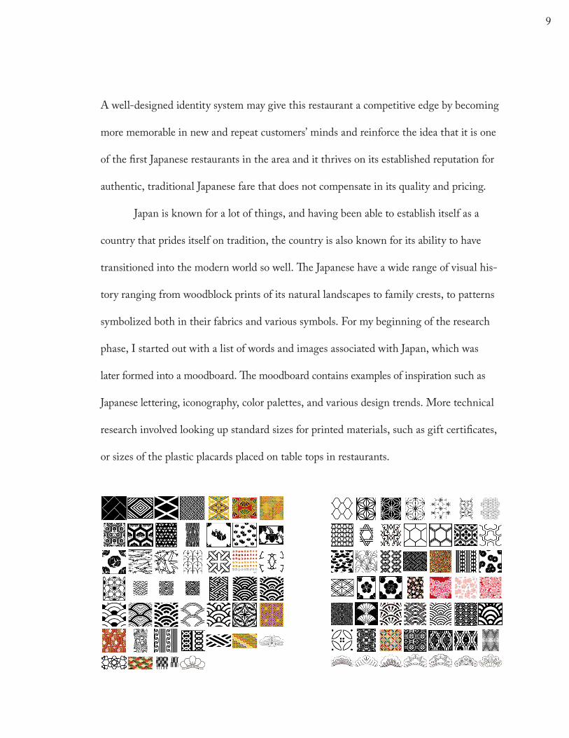
Japan is known for a lot of things, and having been able to establish itself as a
country that prides itself on tradition, the country is also known for its ability to have
transitioned into the modern world so well. The Japanese have a wide range of visual his-
tory ranging from woodblock prints of its natural landscapes to family crests, to patterns
symbolized both in their fabrics and various symbols. For my beginning of the research
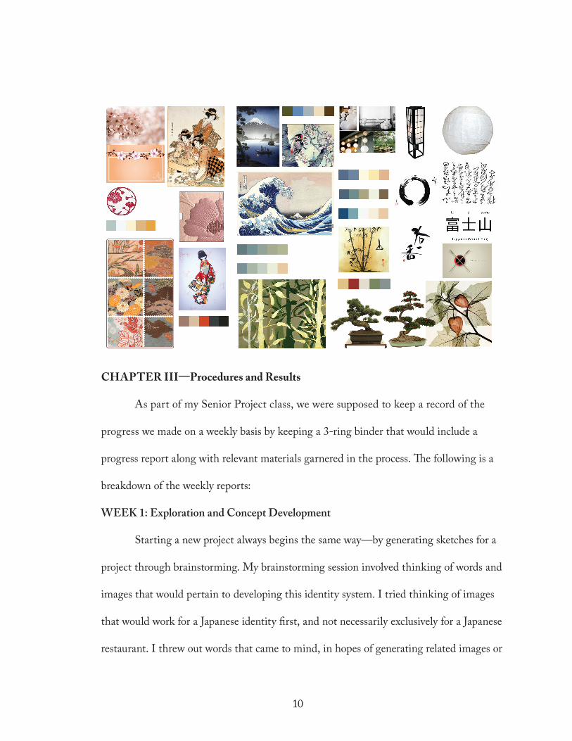
phase, I started out with a list of words and images associated with Japan, which was
later formed into a moodboard. The moodboard contains examples of inspiration such as
Japanese lettering, iconography, color palettes, and various design trends. More technical
research involved looking up standard sizes for printed materials, such as gift certificates,
or sizes of the plastic placards placed on table tops in restaurants.
9
CHAPTER III—Procedures and Results
As part of my Senior Project class, we were supposed to keep a record of the
progress we made on a weekly basis by keeping a 3-ring binder that would include a
progress report along with relevant materials garnered in the process. The following is a
breakdown of the weekly reports:
WEEK 1: Exploration and Concept Development
Starting a new project always begins the same way—by generating sketches for a
project through brainstorming. My brainstorming session involved thinking of words and
images that would pertain to developing this identity system. I tried thinking of images
that would work for a Japanese identity first, and not necessarily exclusively for a Japanese
restaurant. I threw out words that came to mind, in hopes of generating related images or
10
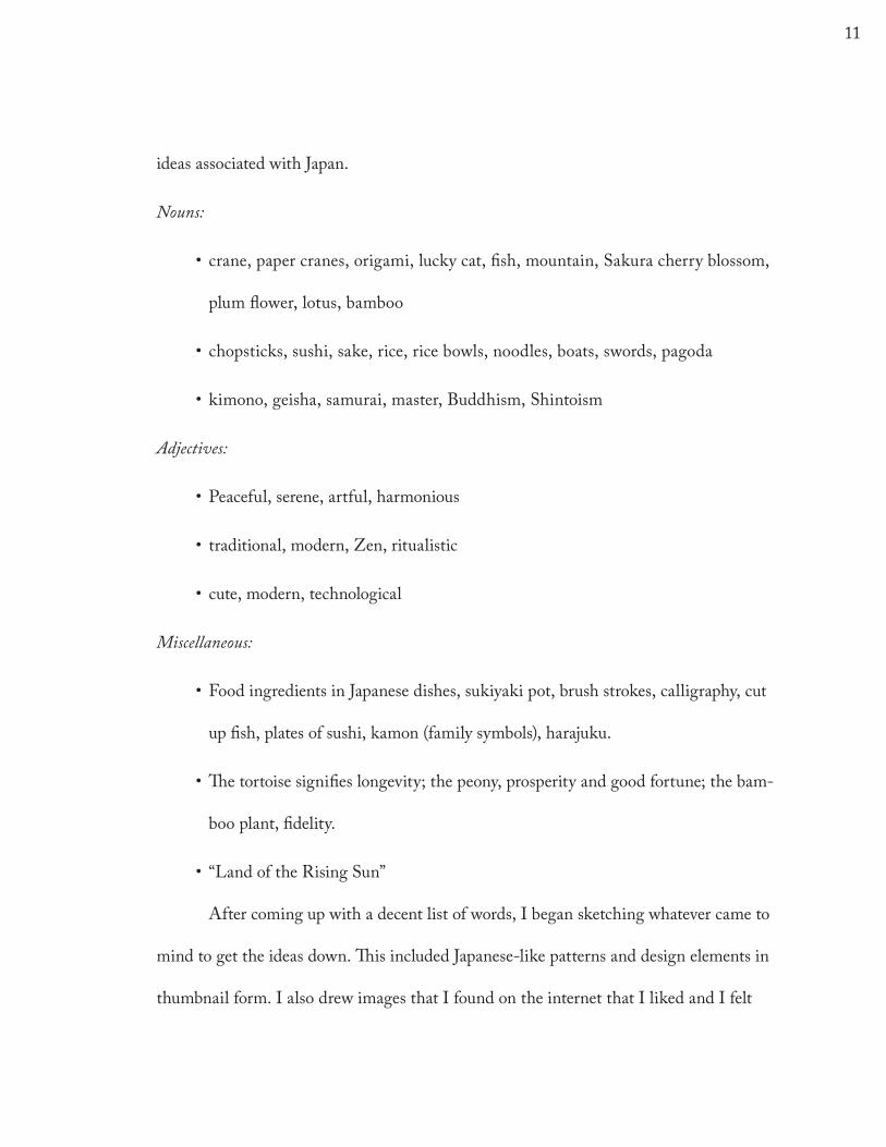
ideas associated with Japan.
Nouns:
• crane, paper cranes, origami, lucky cat, fish, mountain, Sakura cherry blossom,
plum flower, lotus, bamboo
• chopsticks, sushi, sake, rice, rice bowls, noodles, boats, swords, pagoda
•kimono, geisha, samurai, master, Buddhism, Shintoism
Adjectives:
•Peaceful, serene, artful, harmonious
• traditional, modern, Zen, ritualistic
• cute, modern, technological
Miscellaneous:
•Food ingredients in Japanese dishes, sukiyaki pot, brush strokes, calligraphy, cut
up fish, plates of sushi, kamon (family symbols), harajuku.
•The tortoise signifies longevity; the peony, prosperity and good fortune; the bam-
boo plant, fidelity.
• “Land of the Rising Sun”
After coming up with a decent list of words, I began sketching whatever came to
mind to get the ideas down. This included Japanese-like patterns and design elements in
thumbnail form. I also drew images that I found on the internet that I liked and I felt
11
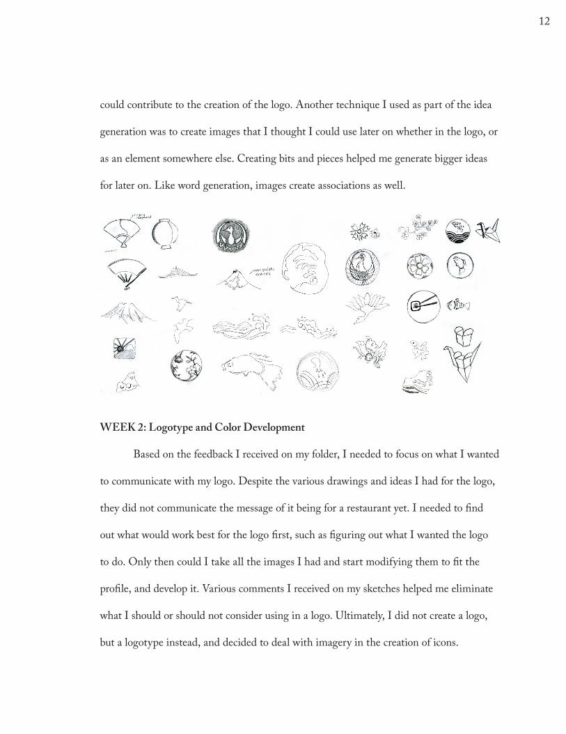
could contribute to the creation of the logo. Another technique I used as part of the idea
generation was to create images that I thought I could use later on whether in the logo, or
as an element somewhere else. Creating bits and pieces helped me generate bigger ideas
for later on. Like word generation, images create associations as well.
WEEK 2: Logotype and Color Development
Based on the feedback I received on my folder, I needed to focus on what I wanted
to communicate with my logo. Despite the various drawings and ideas I had for the logo,
they did not communicate the message of it being for a restaurant yet. I needed to find
out what would work best for the logo first, such as figuring out what I wanted the logo
to do. Only then could I take all the images I had and start modifying them to fit the
profile, and develop it. Various comments I received on my sketches helped me eliminate
what I should or should not consider using in a logo. Ultimately, I did not create a logo,
but a logotype instead, and decided to deal with imagery in the creation of icons.
12
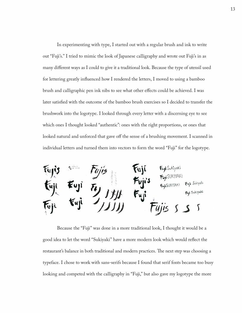
In experimenting with type, I started out with a regular brush and ink to write
out “Fuji’s.” I tried to mimic the look of Japanese calligraphy and wrote out Fuji’s in as
many different ways as I could to give it a traditional look. Because the type of utensil used
for lettering greatly influenced how I rendered the letters, I moved to using a bamboo
brush and calligraphic pen ink nibs to see what other effects could be achieved. I was
later satisfied with the outcome of the bamboo brush exercises so I decided to transfer the
brushwork into the logotype. I looked through every letter with a discerning eye to see
which ones I thought looked “authentic”: ones with the right proportions, or ones that
looked natural and unforced that gave off the sense of a brushing movement. I scanned in
individual letters and turned them into vectors to form the word “Fuji” for the logotype.
Because the “Fuji” was done in a more traditional look, I thought it would be a
good idea to let the word “Sukiyaki” have a more modern look which would reflect the
restaurant’s balance in both traditional and modern practices. The next step was choosing a
typeface. I chose to work with sans-serifs because I found that serif fonts became too busy
looking and competed with the calligraphy in “Fuji,” but also gave my logotype the more
13
modern look that it needed. Since Japanese design is generally simple, a sans serif would
provide simplicity and cleanliness in this logotype. Of all the fonts available, Din was
chosen as my sans-serif as it looked good when matched with the calligraphy and offers a
large font family. Din also seems to offer a bit of that humanist feel in its strokes which in
this case is a good match to the calligraphy. Now with a font chosen, it was time to apply
color. The word “Fuji” was left black, as traditional inks are also black, and as the name
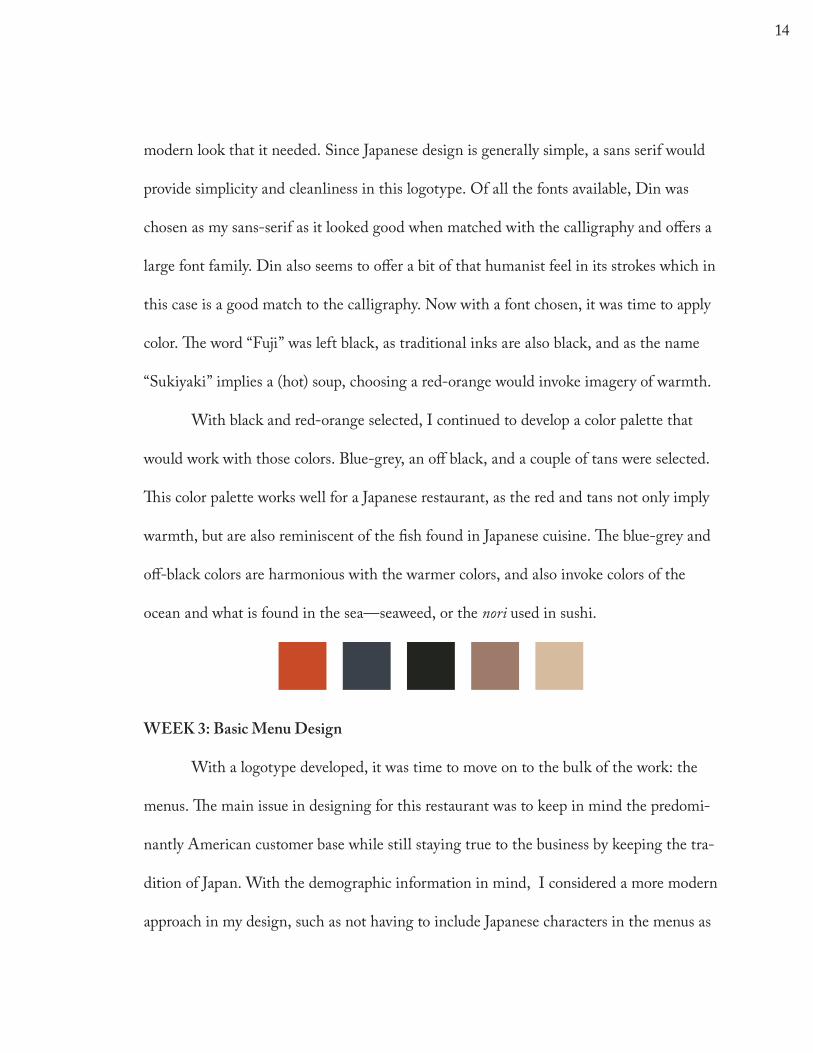
“Sukiyaki” implies a (hot) soup, choosing a red-orange would invoke imagery of warmth.
With black and red-orange selected, I continued to develop a color palette that
would work with those colors. Blue-grey, an off black, and a couple of tans were selected.
This color palette works well for a Japanese restaurant, as the red and tans not only imply
warmth, but are also reminiscent of the fish found in Japanese cuisine. The blue-grey and
off-black colors are harmonious with the warmer colors, and also invoke colors of the
ocean and what is found in the sea—seaweed, or the nori used in sushi.
WEEK 3: Basic Menu Design
With a logotype developed, it was time to move on to the bulk of the work: the
menus. The main issue in designing for this restaurant was to keep in mind the predomi-
nantly American customer base while still staying true to the business by keeping the tra-
dition of Japan. With the demographic information in mind, I considered a more modern
approach in my design, such as not having to include Japanese characters in the menus as
14
a second language, or being very traditional in the overall design. This would have been
very different if I were designing for a restaurant that catered to traditional Japanese or
older folk who only read Japanese. If that were the case, using a modern sans-serif might
not have been the way to go.
After sketching various menus designs, I came up with the solution to use icons
to distinguish the different food sections. The result was a 2 column grid; one column for
the icons and another for text. Since Din was chosen for my logotype, I used only Din
for all of my printed materials. However, due to its large font family, I was able to create
enough variation in the text to keep the menus and the various printed pieces such as
the “Fuji House Rolls” and Lunch/Dinner Specials interesting to look at. I tried various
heading styles for food categories and different ways of playing with the body type that
would make it easy to read the different sections of food, while still maintaining proper
structure and balance of the food sections.
WEEK 4: Icon Design
In keeping with a clean and simple design, the symbols had to be relatively simple,
yet have enough detail in them to inform the customer of what section they were looking
at. I decided on a square shape with rounded corners to make them seem friendlier and
softer. The final icons are rendered in a way so that you can see both the top and sides
of the objects, and are outlined with a stroke. Because the icons were to be used not just
in the menus but other printed pieces as well, I had to keep in mind that the smaller the
15
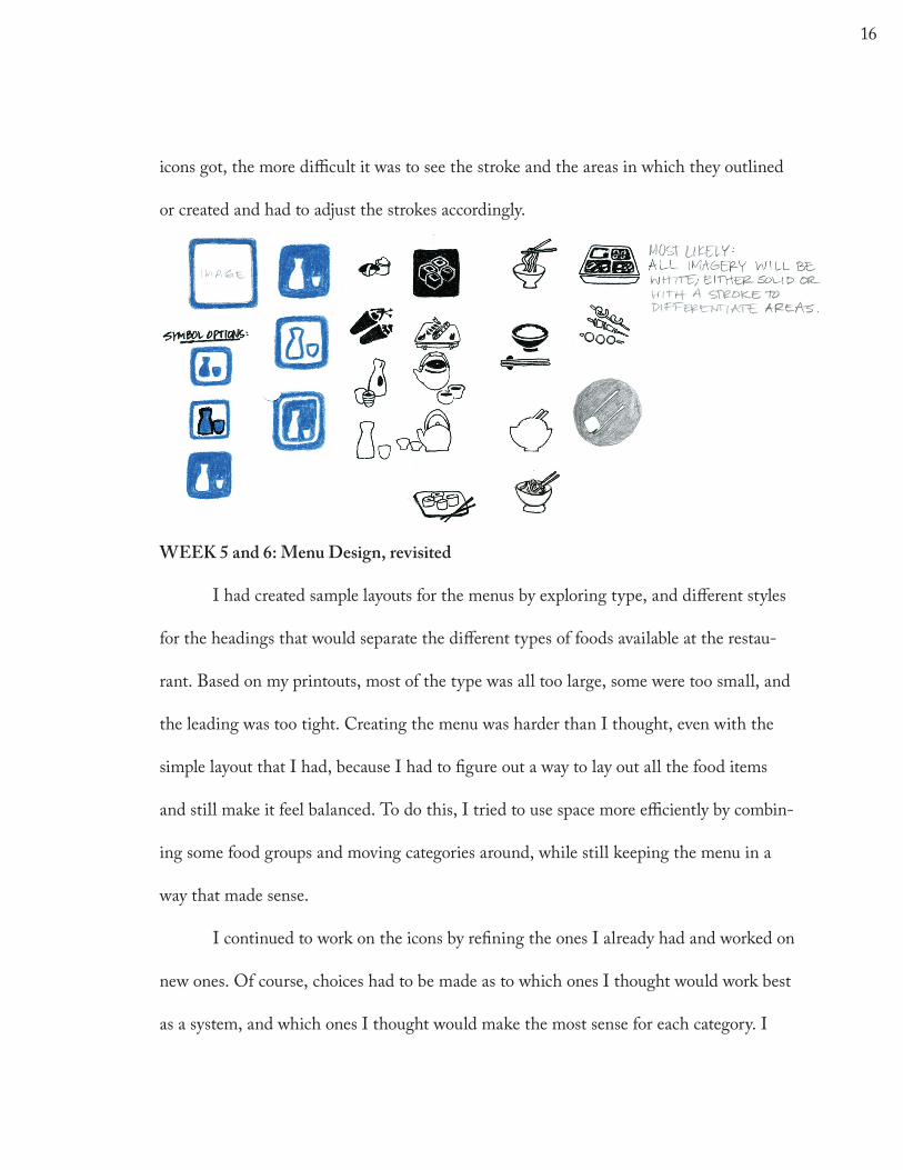
icons got, the more difficult it was to see the stroke and the areas in which they outlined
or created and had to adjust the strokes accordingly.
WEEK 5 and 6: Menu Design, revisited
I had created sample layouts for the menus by exploring type, and different styles
for the headings that would separate the different types of foods available at the restau-
rant. Based on my printouts, most of the type was all too large, some were too small, and
the leading was too tight. Creating the menu was harder than I thought, even with the
simple layout that I had, because I had to figure out a way to lay out all the food items
and still make it feel balanced. To do this, I tried to use space more efficiently by combin-
ing some food groups and moving categories around, while still keeping the menu in a
way that made sense.
I continued to work on the icons by refining the ones I already had and worked on
new ones. Of course, choices had to be made as to which ones I thought would work best
as a system, and which ones I thought would make the most sense for each category. I
16
had to shift certain food groups around so that the icons could serve their function; what
resulted from this was a clearer menu than what the owner previously had. Aside from
the main sections of the menu, layouts for the lunch and dinner specials and special rolls
were created as they are each on their own pages.
WEEK 7: Pattern Design and Application
As part of this class, we were to develop a pattern that was either for experimen-
tal purposes or to be used in the actual senior project. Developing a pattern worked in
my favor in that it added visual interest to my identity system. Drawing inspiration from
traditional Japanese patterns as seen in my mood board, the pattern I created utilizes
simple shapes and line. What makes my pattern interesting is that it can be interpreted in
a few ways: the shapes look like fish scales, the beautiful landscape of Japan, or even water
waves. Whatever your interpretation, the simple yet elegant pattern is distinctly Japanese
and is appropriate to the idea of simplicity in Japanese design. To make good use of the
pattern, I applied it to the business card, letterhead, envelope, gift certificate, menu cov-
ers, and drinks list.
In creating the business card, I tried a variety of typographic treatments, such as
where the address and phone numbers went, and what elements needed to be emphasized.
Aside from the main elements such as the logotype and address, helpful information such
as the lunch and dinner hours and what days the restaurant is closed were included. The
phone number is in bold, as it is most likely the first thing one would look at on a busi-
17
ness card, since chances are, the patron already knows where the restaurant is located if
they have a business card. An important step in creating this business card was that once
the type treatment was settled, it set how the information would be displayed on the rest
of the printed pieces, such as the letterhead, gift certificate and take-out menu.
I then used a chosen set of four icons and played with the positioning of where I
wanted them to go. After several attempts of putting the icons on the front of the card,
the best looking solution was to put them on the back, since I did not want the back of
the business card to be blank anyway. Having moved the icons to the back kept the front
of the business card easy to read but also served a greater purpose: it would remind the
customer who happens to see the back of the card first that this is a restaurant offering a
variety of food from sushi, noodles, and a variety of kitchen food.
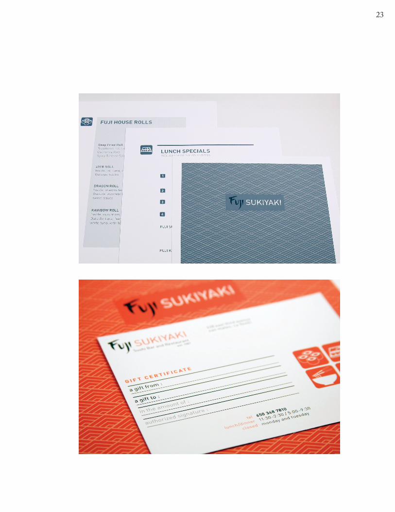
For the gift certificate, I came up with several ideas that differed both in size and
shape. One of my ideas was to have a more slender looking certificate that would be have
3 panels folded—two long, and one short that would overlap like a flap to keep itself
closed. The flap would either tuck into a slit cut into the certificate itself, or be kept shut
with a simple sticker. However, I ultimately decided to stick with a standard 4.25” x 5.5”
sized card as it would be most cost affective, and would also resolve the issue of the kind
of envelope that would need to be purchased.
One of the designs I had for the gift certificate was purely typographic on one
side and was bold looking as it used large type and a contrasting white on the red-orange
color, but it did not feel to be a part of the identity. Because of this, I created a more tra-
18
ditional gift certificate, and used the style of typography developed for the business card
on here.
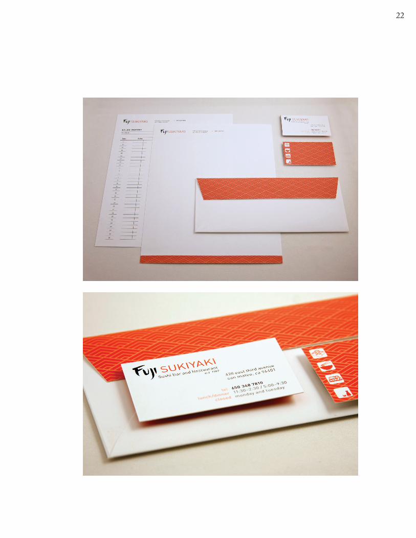
A letterhead and Monthly Sales Report sheet were also created. Both the letter-
head and sales report sheet use the same point size as found on the business card, but the
letterhead has a half inch strip at the bottom that uses the pattern. Instead of using the
icons, the pattern found on the letterhead can also make a statement that this is “dis-
tinctly Fuji Sukiyaki.”
WEEK 8 and 9: Refining and Designing New Components
Having met with my advisor to go over the comments I received on my work that
was turned in from the binder, I changed the type on both the “Dinner Specials” and
“Fuji House Rolls” page, since it was described as looking a bit “clunky” and thick. Com-
paring the old and new versions, the revised version seems to be a lot easier on the eyes
and even friendlier. I also had to resolve the awkward type treatment on the prices on the
“Fuji House Rolls” page.
One of the more challenging pieces to create was the take-out menu. It was a lot
harder than I had expected; the text required reformatting to fit the format of the page,
and I had to spend some time figuring out the measurements to properly give the 3 col-
umns the right amount of space within the grids. What threw the take-out menu off was
the added vertical bar used to distinguish between lunch and dinner. Because of this one
element, a lot of text and design elements had to shift around. I did not put the icons in
19
the take-out menu, as space was limited and having the icons in it made the menu seem
too crowded.
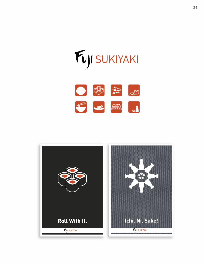
Finally, I decided to create two posters in addition to the business identity as a
fun element. Whether or not these posters will be turned into ads or displayed in the
restaurant, they add a bit of humor to the strict and professional looking system. Both the
phrases “Roll with it” and “Ichi. Ni. Sake!” are a play on words; both use elements associ-
ated with a Japanese restaurant yet still appeal to the main American audience.
WEEK 10: Refining and Producing
One of the last designed pieces was the cover for the lunch and dinner menus.
The cover uses the pattern in the blue-grey or red-orange, depending on lunch or dinner,
respectively. Changing the color of the lunch and dinner menus not only serve as a design
element, but also provide the employees at the restaurant an easier time in distinguishing
which menus are which when it comes time to switching out the menus from lunch and
dinner and vice versa.
The last week of senior project was devoted to refining every piece in this identity
system. Hours were spent printing and putting together comprehensives, and making sure
all the pieces felt like they belonged together. There were some complications in printing double
sided prints, such as making sure the images aligned or that enough of a bleed was left so
that when it came time to trim the edges off of a piece, no white (or paper) would show.
20
The Results
I am pretty happy with the outcome with this project. This project was intense
in that there was a lot of detail oriented work involved, and it required me to look at
everything with a careful eye. The overall result of the business identity system is fairly
conservative, yet it is refined and holds your attention. I think that this was a successful
project in that I was able to fulfill the goals and objectives that I set out for myself by
creating pieces that are aesthetically pleasing both as individual pieces and as a whole.
The “clients” were actually my parents. As a child of two hard working parents,
I grew up at the restaurant and spent a lot of my youth there. Fuji Sukiyaki was built
through ingenuity and the desire to produce high-quality food at an affordable price.
Needless to say, the family business means a lot to me. Taking on this project was my way
of giving back to the business that has supported me throughout all these years of child-
hood, and now college.
21
22
23
24
25
CHAPTER IV— Summary and Recommendation
Because I printed and cut everything myself, I did not have to deal with profes-
sional printers. The upside to this was that I could control everything myself, but the
downside was that there was a limit to what I could do, such as printing on various types
of papers or exploring the different types of finishing techniques such as embossing or
die-cutting, for example. Dealing with a printer may have been more trouble than pro-
ducing everything myself, but having the experience of having to deal with a printer may
come in handy one day.
I believe that because I followed the various steps of the design process such as
ideation and implementation thoroughly, I was able to effectively problem solve, and
therefore produce a successful outcome. As a whole, I think the design conveys the
sophistication, the energy, and the style of the dining experience at Fuji Sukiyaki. What
guided me through this project was creative energy—staying inspired, working through
design frustrations, and finally pushing through.
My advice to future students working on senior project is that there will be times
when one can feel stuck; this may be the time to take a break, browse through other
designs, or quite possibly generate a whole new idea and forget about the one you are
stuck on. However, one must not forget about the time it takes to actually get everything
designed and produced. Ideation and designing is a big part of the process, but there
comes a point in time where you must move on and start implementing your pieces—you
can generate ideas forever. Getting stuck on one element of the design will cause delay in
26
the creation of other work and before you know it, you may fall behind. Decide on one
idea and go with it. Pump out those designs and keep moving along! Do not underesti-
mate the time it takes to complete a project.
Senior project is supposed to wrap up your college career by showcasing what
you’ve learned in all the years you have been in college, but it can easily turn into a pain-
ful experience if you wait until the last minute to do something. I have had my fair share
of late nights (and early mornings!) because of procrastination. Senior project can also be a
very enjoyable experience however, if you start early, follow suggested deadlines and keep
making progress. What you will end up with may be a project that is portfolio ready and
something you are truly proud of.
27
BIBLIOGRAPHY
AIGA. 365: AIGA Year In Design 29. San Francisco: Chronicle Books, 2008. Print.
“Glossary of Printing & Graphic Terms.” PrintingIndustry.com. Web. 20 Nov. 2009.
<http://www.printindustry.com/glossary.htm>.
Godfrey, Jason. The Best of Brochure Design. Beverly: Rockport, 2006. Print
“Graphic Standards Glossary.” Guilford College. Web. 21 Nov. 2009.
<http://www.guilford.edu/about_guilford/services_and_administration/college_
relations/graphicstandardsglossary.html>.
“Identity Programs.” Communication Arts Nov. 2007: 72-77. Print.