Embed Size (px)
Citation preview
WHITE PAPER
Getting Started with JMP® Clinical
i
GettinG Started with JMP® CliniCal
Table of Contents
I. The JMP® Environment .............................................................................. 1a. File ..................................................................................................... 1b. Tables ................................................................................................. 2c. Rows .................................................................................................. 2d. Columns ............................................................................................. 2e. Analyze ............................................................................................... 3f. Graph .................................................................................................. 4g. Clinical Menu ..................................................................................... 4
Introduction to JMP® Clinical ...................................................................... 5Import and Verification of CDISC Data ........................................................ 6Demographics .............................................................................................. 9Disposition Incidence Screen Results ...................................................... 10Mortality Curves ........................................................................................ 12Adverse Events Incidence Screen ............................................................. 13Concomitant Medication Screen ............................................................... 15Laboratory Baseline Analysis of Variance ................................................ 15Labs Bubble Plot ........................................................................................ 17More Advanced Functionality ................................................................... 19Severity ANOVA and Patient Profiler ......................................................... 19Vital Signs .................................................................................................. 22Domain Incidence Indicators .................................................................... 23Partition...................................................................................................... 26Conclusion ................................................................................................. 27
GettinG Started with JMP® CliniCal
This white paper is intended to give existing and new customers and evaluators a brief overview of the JMP Clinical solution and an introduction to some of the features in JMP Clinical 2.1. For more detailed information about specific processes, please consult the JMP Clinical User Guide, found under Clinical > Documentation and Help.
I. The JMP® Environment
a. File
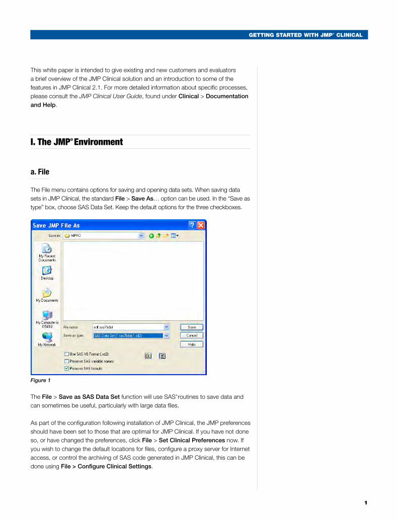
The File menu contains options for saving and opening data sets. When saving data sets in JMP Clinical, the standard File > Save As… option can be used. In the “Save as type” box, choose SAS Data Set. Keep the default options for the three checkboxes.
Figure 1
The File > Save as SAS Data Set function will use SAS® routines to save data and
can sometimes be useful, particularly with large data files.
As part of the configuration following installation of JMP Clinical, the JMP preferences should have been set to those that are optimal for JMP Clinical. If you have not done so, or have changed the preferences, click File > Set Clinical Preferences now. If you wish to change the default locations for files, configure a proxy server for Internet access, or control the archiving of SAS code generated in JMP Clinical, this can be done using File > Configure Clinical Settings.
1
2
GettinG Started with JMP® CliniCal
b. Tables
The Tables menu contains numerous functions for manipulating JMP tables. Keep in mind that when a SAS data set is open in JMP, JMP treats it as a JMP table, and so these functions are active. We will show the Subset function later in this document, and other functions such as Tables > Join or Tables > Concatenate can also be useful. Note that many of these functions appear to be redundant with those in Clinical > SAS Data Set. Choosing the Data Set function is recommended when tables are too large to open in memory, or when it is important to maintain SAS variable (column) names in a proper format.
c. Rows
The Rows menu contains a number of functions for manipulating row states in JMP tables. Clicking Rows > Data Filter allows simple and dynamic selection of rows in a data table for subsequent subset creation and is very useful in filtering graphical output in JMP Clinical. Note that the Rows menu appears only when a table is open in the workspace.
d. Columns
Similar to Rows, the Cols menu contains functions for manipulating columns in an open data table. The Cols > Reorder Columns function can be especially useful when a group of columns to be deleted all start with the same prefix. Note that individual columns can also be deleted by selecting the column in the left pane, right-clicking, then choosing Delete Columns.
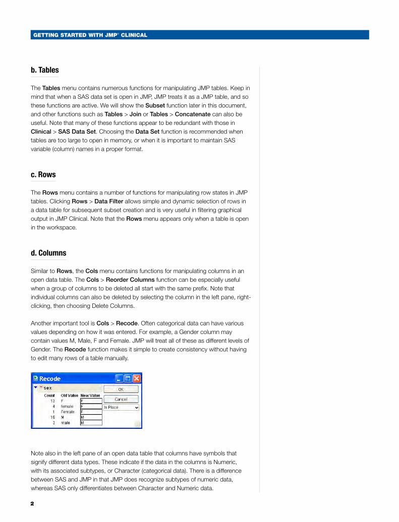
Another important tool is Cols > Recode. Often categorical data can have various values depending on how it was entered. For example, a Gender column may contain values M, Male, F and Female. JMP will treat all of these as different levels of Gender. The Recode function makes it simple to create consistency without having to edit many rows of a table manually.
Note also in the left pane of an open data table that columns have symbols that signify different data types. These indicate if the data in the columns is Numeric, with its associated subtypes, or Character (categorical data). There is a difference between SAS and JMP in that JMP does recognize subtypes of numeric data, whereas SAS only differentiates between Character and Numeric data.
GettinG Started with JMP® CliniCal
3
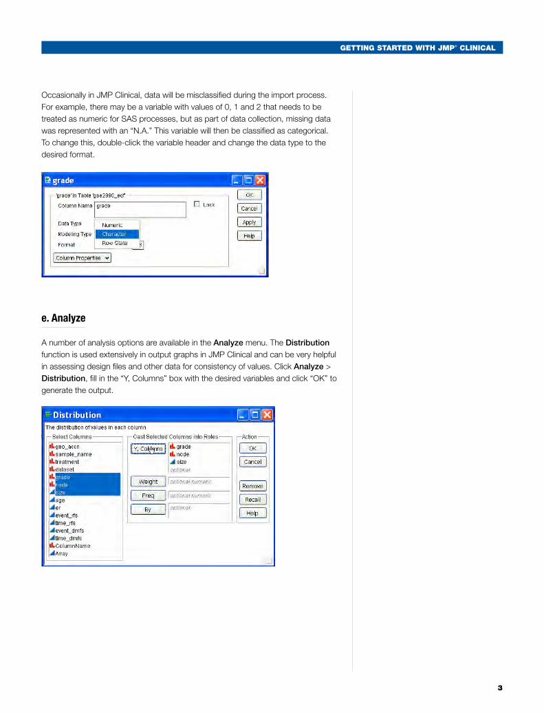
Occasionally in JMP Clinical, data will be misclassified during the import process. For example, there may be a variable with values of 0, 1 and 2 that needs to be treated as numeric for SAS processes, but as part of data collection, missing data was represented with an “N.A.” This variable will then be classified as categorical. To change this, double-click the variable header and change the data type to the desired format.
e. Analyze
A number of analysis options are available in the Analyze menu. The Distribution function is used extensively in output graphs in JMP Clinical and can be very helpful in assessing design files and other data for consistency of values. Click Analyze > Distribution, fill in the “Y, Columns” box with the desired variables and click “OK” to generate the output.
4
GettinG Started with JMP® CliniCal
f. Graph
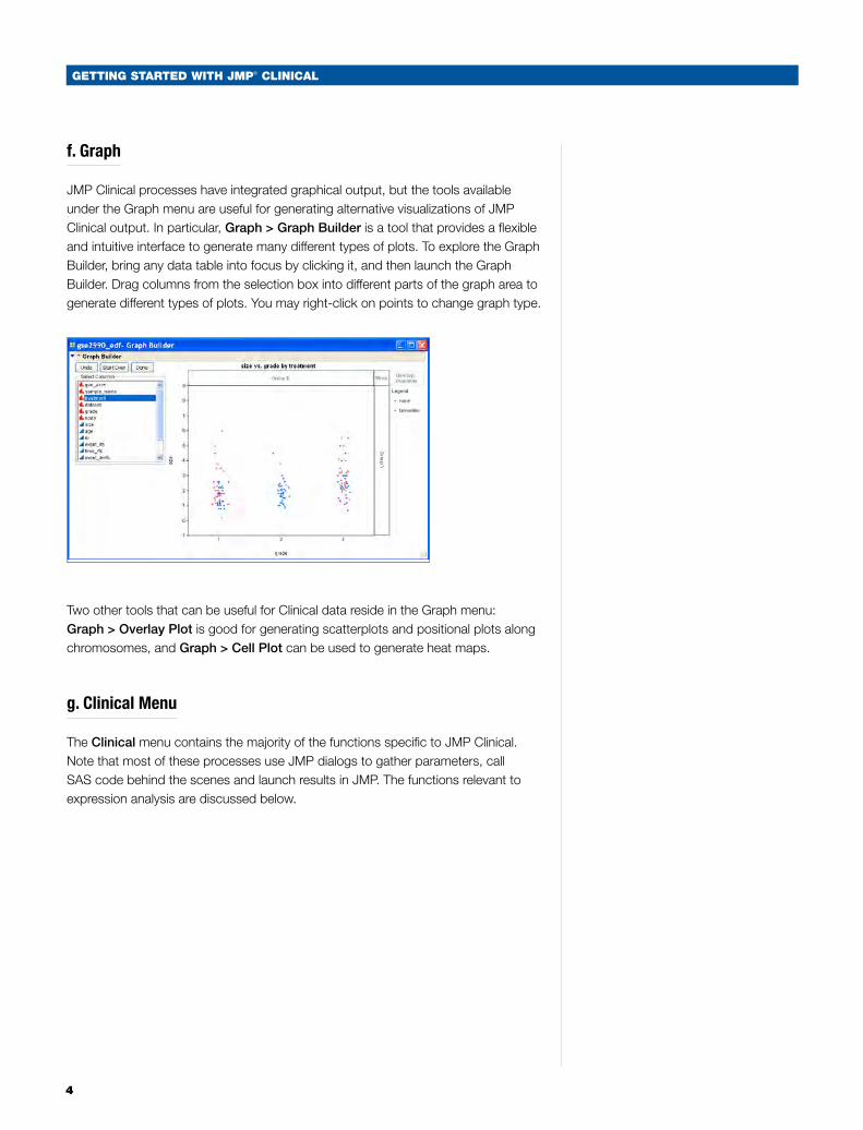
JMP Clinical processes have integrated graphical output, but the tools available under the Graph menu are useful for generating alternative visualizations of JMP Clinical output. In particular, Graph > Graph Builder is a tool that provides a flexible and intuitive interface to generate many different types of plots. To explore the Graph Builder, bring any data table into focus by clicking it, and then launch the Graph Builder. Drag columns from the selection box into different parts of the graph area to generate different types of plots. You may right-click on points to change graph type.
Two other tools that can be useful for Clinical data reside in the Graph menu: Graph > Overlay Plot is good for generating scatterplots and positional plots along chromosomes, and Graph > Cell Plot can be used to generate heat maps.
g. Clinical Menu
The Clinical menu contains the majority of the functions specific to JMP Clinical. Note that most of these processes use JMP dialogs to gather parameters, call SAS code behind the scenes and launch results in JMP. The functions relevant to expression analysis are discussed below.
GettinG Started with JMP® CliniCal
5
Introduction to JMP® Clinical
JMP Clinical software from SAS can shorten the drug development process by streamlining both internal safety reviews during clinical trials and final evaluation by regulatory bodies such as the Food and Drug Administration (FDA). It provides rapid and comprehensive screening of all major safety domains, offering dynamically linked advanced statistics and graphics and enabling sophisticated analyses in a user-friendly environment. JMP Clinical creates reports from standard Clinical Data Interchange Standards Consortium (CDISC) data, facilitating communication between clinicians and biostatisticians and, subsequently, between sponsors and reviewers. Interactive graphs offer multiple views of patient profiles and reveal hidden patterns in drug-drug and drug-disease interactions.
Pattern discovery techniques in JMP Clinical let you identify and closely examine hidden trends in serious adverse events within safety domains. Incidence screen capabilities allow clustering of adverse events to reveal correlated factors, predicting possible occurrences and highlighting potential risks. You can easily estimate adverse event frequency and count information with the highly visual tree map function, selecting any adverse event and drilling down for an in-depth view of the data.
This white paper will use the data set included with the software, which is from a clinical trial testing the efficacy of a high dose of Nicardipine as a treatment for aneurysmal subarachnoid hemorrhage.1, 2
1 Haley Jr., E.C., Kassell, N.F., and Torner, J.C. A randomized controlled trial of high-dose intravenous nicardipine in aneurysmal subarachnoid hemorrhage. J Neurosurg 78:537-547, 1993.
2 Haley Jr., E.C., Kassell, N.F., and Torner, J.C. A randomized trial of nicardipine in subarachnoid hemorrhage: angiographic and transcranial Doppler ultrasound results. J Neurosurg 78:548-533, 1993.
6
GettinG Started with JMP® CliniCal
Import and Verification of CDISC Data
JMP Clinical takes advantage of the safety domains of the Study Data Tabulation Model (SDTM) as well as the subject-level data set (ADSL) of the Analysis Data Model (ADaM) as input. These data are described in detail in CDISC documentation.3, 4 From the ADaM folder, the subject-level data set (ADSL) is read, and from SDTM the following domains are expected: Adverse Events (AE), Concomitant Medication (CM), Demographics (DM), Disposition (DS), Exposure (EX), Laboratory Tests (LB), Medical History (MH), and Vital Signs (VS).
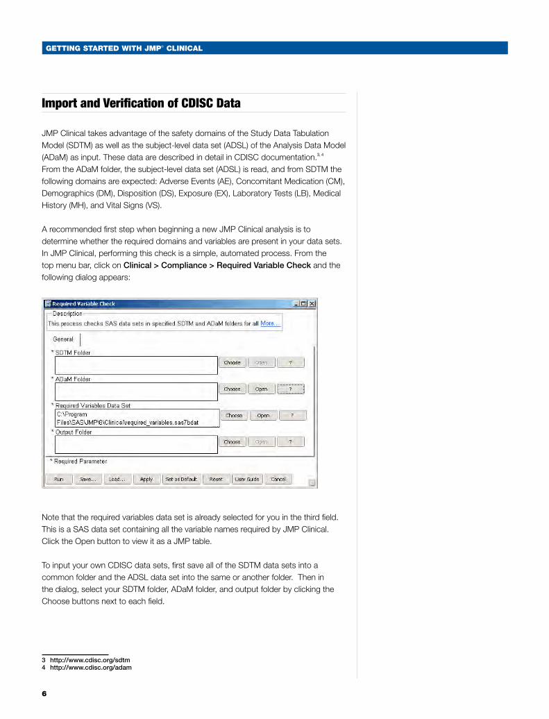
A recommended first step when beginning a new JMP Clinical analysis is to determine whether the required domains and variables are present in your data sets. In JMP Clinical, performing this check is a simple, automated process. From the top menu bar, click on Clinical > Compliance > Required Variable Check and the following dialog appears:
Note that the required variables data set is already selected for you in the third field. This is a SAS data set containing all the variable names required by JMP Clinical. Click the Open button to view it as a JMP table.
To input your own CDISC data sets, first save all of the SDTM data sets into a common folder and the ADSL data set into the same or another folder. Then in the dialog, select your SDTM folder, ADaM folder, and output folder by clicking the Choose buttons next to each field.
3 http://www.cdisc.org/sdtm 4 http://www.cdisc.org/adam
GettinG Started with JMP® CliniCal
7
For this example, the links to the Nicardipine data have already been saved as a JMP Clinical setting. Click Load to select the sample setting then OK. You should see specific paths to the Nicardipine data appear in the parameter fields. Finally, click on the Run button, located in the lower left of the window, to run the process.
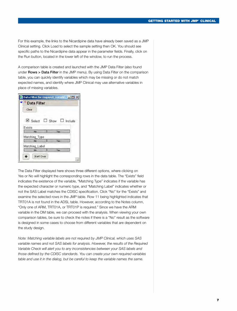
A comparison table is created and launched with the JMP Data Filter (also found under Rows > Data Filter in the JMP menu). By using Data Filter on the comparison table, you can quickly identify variables which may be missing or do not match expected names, and identify where JMP Clinical may use alternative variables in place of missing variables.
The Data Filter displayed here shows three different options, where clicking on Yes or No will highlight the corresponding rows in the data table. The “Exists” field indicates the existence of the variable, “Matching Type” indicates if the variable has the expected character or numeric type, and “Matching Label” indicates whether or not the SAS Label matches the CDISC specification. Click “No” for the “Exists” and examine the selected rows in the JMP table. Row 11 being highlighted indicates that TRT01A is not found in the ADSL table. However, according to the Notes column, “Only one of ARM, TRT01A, or TRT01P is required.” Since we have the ARM variable in the DM table, we can proceed with the analysis. When viewing your own comparison tables, be sure to check the notes if there is a “No” result as the software is designed in some cases to choose from different variables that are dependent on the study design.
Note: Matching variable labels are not required by JMP Clinical, which uses SAS variable names and not SAS labels for analysis. However, the results of the Required Variable Check will alert you to any inconsistencies between your SAS labels and those defined by the CDISC standards. You can create your own required variables table and use it in the dialog, but be careful to keep the variable names the same.
8
GettinG Started with JMP® CliniCal
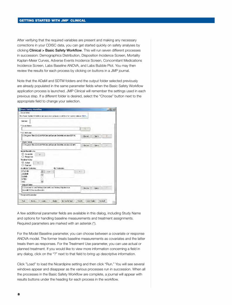
After verifying that the required variables are present and making any necessary corrections in your CDISC data, you can get started quickly on safety analyses by clicking Clinical > Basic Safety Workflow. This will run seven different processes in succession: Demographics Distribution, Disposition Incidence Screen, Mortality Kaplan-Meier Curves, Adverse Events Incidence Screen, Concomitant Medications Incidence Screen, Labs Baseline ANOVA, and Labs Bubble Plot. You may then review the results for each process by clicking on buttons in a JMP journal.
Note that the ADaM and SDTM folders and the output folder selected previously are already populated in the same parameter fields when the Basic Safety Workflow application process is launched. JMP Clinical will remember the settings used in each previous step. If a different folder is desired, select the “Choose” button next to the appropriate field to change your selection.
A few additional parameter fields are available in this dialog, including Study Name and options for handling baseline measurements and treatment assignments. Required parameters are marked with an asterisk (*).
For the Model Baseline parameter, you can choose between a covariate or response ANOVA model. The former treats baseline measurements as covariates and the latter treats them as responses. For the Treatment Use parameter, you can use actual or planned treatment. If you would like to view more information concerning a field in any dialog, click on the “?” next to that field to bring up descriptive information.
Click ”Load” to load the Nicardipine setting and then click “Run.” You will see several windows appear and disappear as the various processes run in succession. When all the processes in the Basic Safety Workflow are complete, a journal will appear with results buttons under the heading for each process in the workflow.
GettinG Started with JMP® CliniCal
9
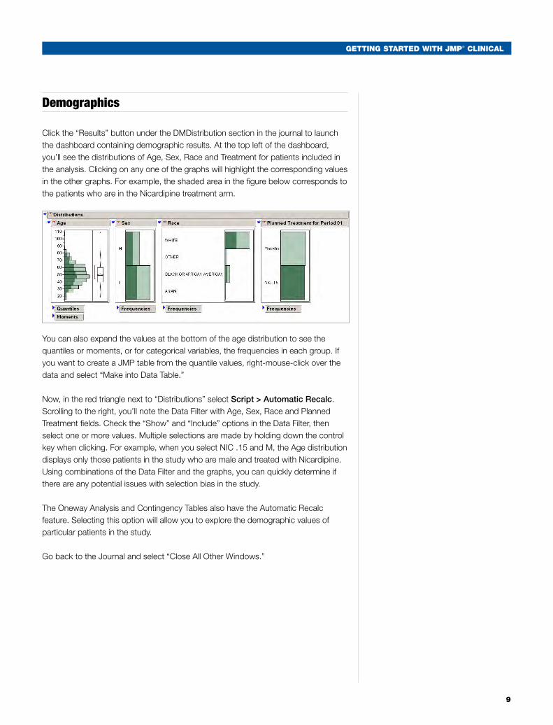
Demographics
Click the “Results” button under the DMDistribution section in the journal to launch the dashboard containing demographic results. At the top left of the dashboard, you’ll see the distributions of Age, Sex, Race and Treatment for patients included in the analysis. Clicking on any one of the graphs will highlight the corresponding values in the other graphs. For example, the shaded area in the figure below corresponds to the patients who are in the Nicardipine treatment arm.
You can also expand the values at the bottom of the age distribution to see the quantiles or moments, or for categorical variables, the frequencies in each group. If you want to create a JMP table from the quantile values, right-mouse-click over the data and select “Make into Data Table.”
Now, in the red triangle next to “Distributions” select Script > Automatic Recalc. Scrolling to the right, you’ll note the Data Filter with Age, Sex, Race and Planned Treatment fields. Check the “Show” and “Include” options in the Data Filter, then select one or more values. Multiple selections are made by holding down the control key when clicking. For example, when you select NIC .15 and M, the Age distribution displays only those patients in the study who are male and treated with Nicardipine. Using combinations of the Data Filter and the graphs, you can quickly determine if there are any potential issues with selection bias in the study.
The Oneway Analysis and Contingency Tables also have the Automatic Recalc feature. Selecting this option will allow you to explore the demographic values of particular patients in the study.
Go back to the Journal and select “Close All Other Windows.”
10
GettinG Started with JMP® CliniCal
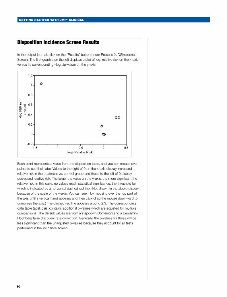
Disposition Incidence Screen Results
In the output journal, click on the “Results” button under Process 2, DSIncidence Screen. The first graphic on the left displays a plot of log2 relative risk on the x-axis versus its corresponding –log10 (p-value) on the y-axis.
Each point represents a value from the disposition table, and you can mouse over points to see their label Values to the right of 0 on the x-axis display increased relative risk in the treatment vs. control group and those to the left of 0 display decreased relative risk. The larger the value on the y-axis, the more significant the relative risk. In this case, no values reach statistical significance, the threshold for which is indicated by a horizontal dashed red line. (Not shown in the above display because of the scale of the y-axis. You can see it by mousing over the top part of the axis until a vertical hand appears and then click-drag the mouse downward to compress the axis.) The dashed red line appears around 2.3. The corresponding data table (adsl_dsis) contains additional p-values which are adjusted for multiple comparisons. The default values are from a stepdown Bonferroni and a Benjamini-Hochberg false discovery rate correction. Generally, the p-values for these will be less significant than the unadjusted p-values because they account for all tests performed in the incidence screen.
GettinG Started with JMP® CliniCal
11
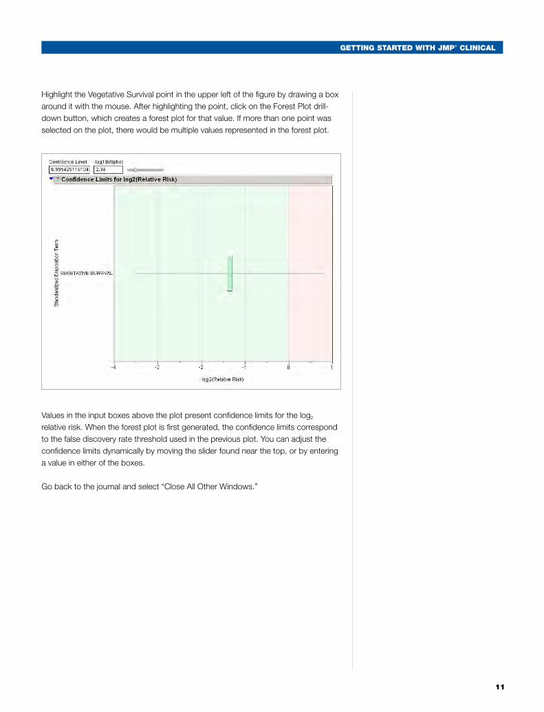
Highlight the Vegetative Survival point in the upper left of the figure by drawing a box around it with the mouse. After highlighting the point, click on the Forest Plot drill-down button, which creates a forest plot for that value. If more than one point was selected on the plot, there would be multiple values represented in the forest plot.
Values in the input boxes above the plot present confidence limits for the log2 relative risk. When the forest plot is first generated, the confidence limits correspond to the false discovery rate threshold used in the previous plot. You can adjust the confidence limits dynamically by moving the slider found near the top, or by entering a value in either of the boxes.
Go back to the journal and select “Close All Other Windows.”
12
GettinG Started with JMP® CliniCal
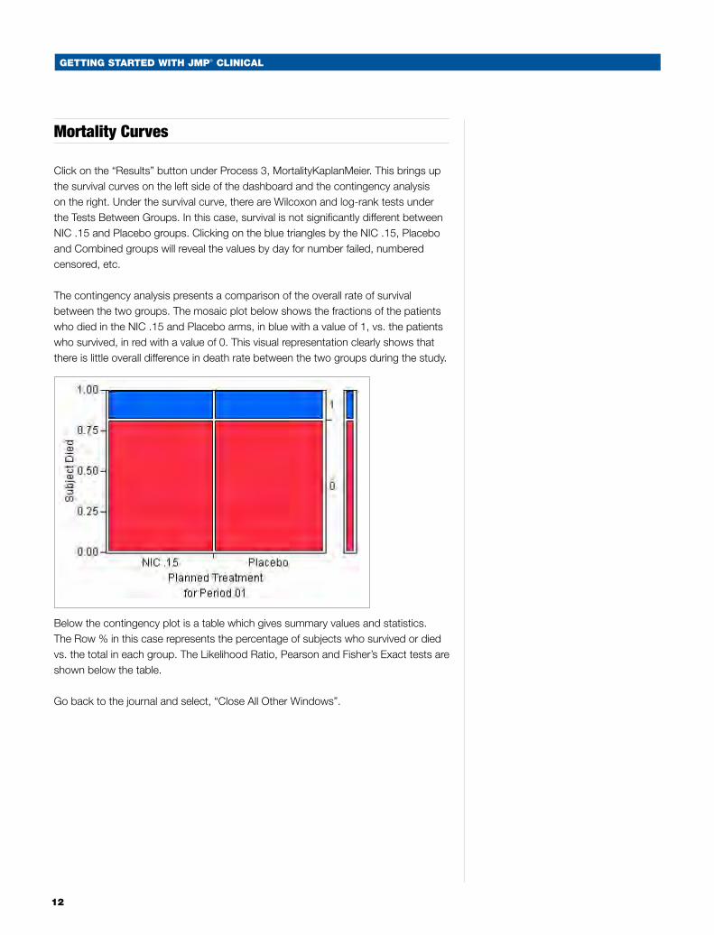
Mortality Curves
Click on the “Results” button under Process 3, MortalityKaplanMeier. This brings up the survival curves on the left side of the dashboard and the contingency analysis on the right. Under the survival curve, there are Wilcoxon and log-rank tests under the Tests Between Groups. In this case, survival is not significantly different between NIC .15 and Placebo groups. Clicking on the blue triangles by the NIC .15, Placebo and Combined groups will reveal the values by day for number failed, numbered censored, etc.
The contingency analysis presents a comparison of the overall rate of survival between the two groups. The mosaic plot below shows the fractions of the patients who died in the NIC .15 and Placebo arms, in blue with a value of 1, vs. the patients who survived, in red with a value of 0. This visual representation clearly shows that there is little overall difference in death rate between the two groups during the study.
Below the contingency plot is a table which gives summary values and statistics. The Row % in this case represents the percentage of subjects who survived or died vs. the total in each group. The Likelihood Ratio, Pearson and Fisher’s Exact tests are shown below the table.
Go back to the journal and select, “Close All Other Windows”.
GettinG Started with JMP® CliniCal
13
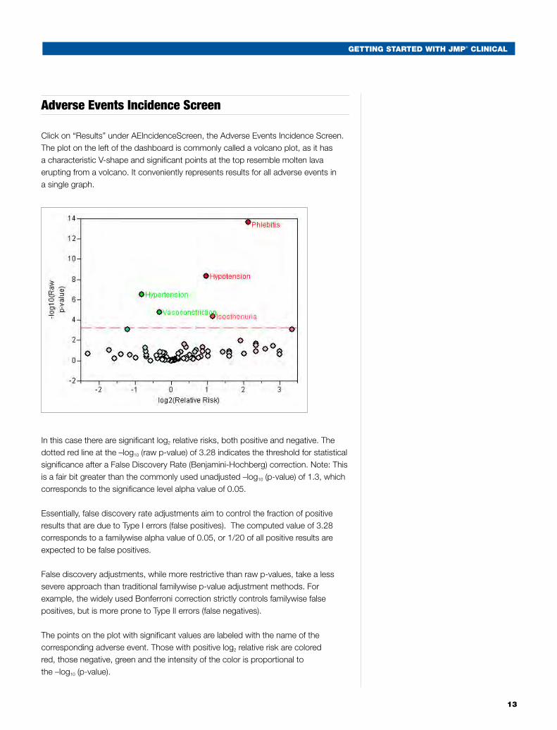
Adverse Events Incidence Screen
Click on “Results” under AEIncidenceScreen, the Adverse Events Incidence Screen. The plot on the left of the dashboard is commonly called a volcano plot, as it has a characteristic V-shape and significant points at the top resemble molten lava erupting from a volcano. It conveniently represents results for all adverse events in a single graph.
In this case there are significant log2 relative risks, both positive and negative. The dotted red line at the –log10 (raw p-value) of 3.28 indicates the threshold for statistical significance after a False Discovery Rate (Benjamini-Hochberg) correction. Note: This is a fair bit greater than the commonly used unadjusted –log10 (p-value) of 1.3, which corresponds to the significance level alpha value of 0.05.
Essentially, false discovery rate adjustments aim to control the fraction of positive results that are due to Type I errors (false positives). The computed value of 3.28 corresponds to a familywise alpha value of 0.05, or 1/20 of all positive results are expected to be false positives.
False discovery adjustments, while more restrictive than raw p-values, take a less severe approach than traditional familywise p-value adjustment methods. For example, the widely used Bonferroni correction strictly controls familywise false positives, but is more prone to Type II errors (false negatives).
The points on the plot with significant values are labeled with the name of the corresponding adverse event. Those with positive log2 relative risk are colored red, those negative, green and the intensity of the color is proportional to the –log10 (p-value).
14
GettinG Started with JMP® CliniCal
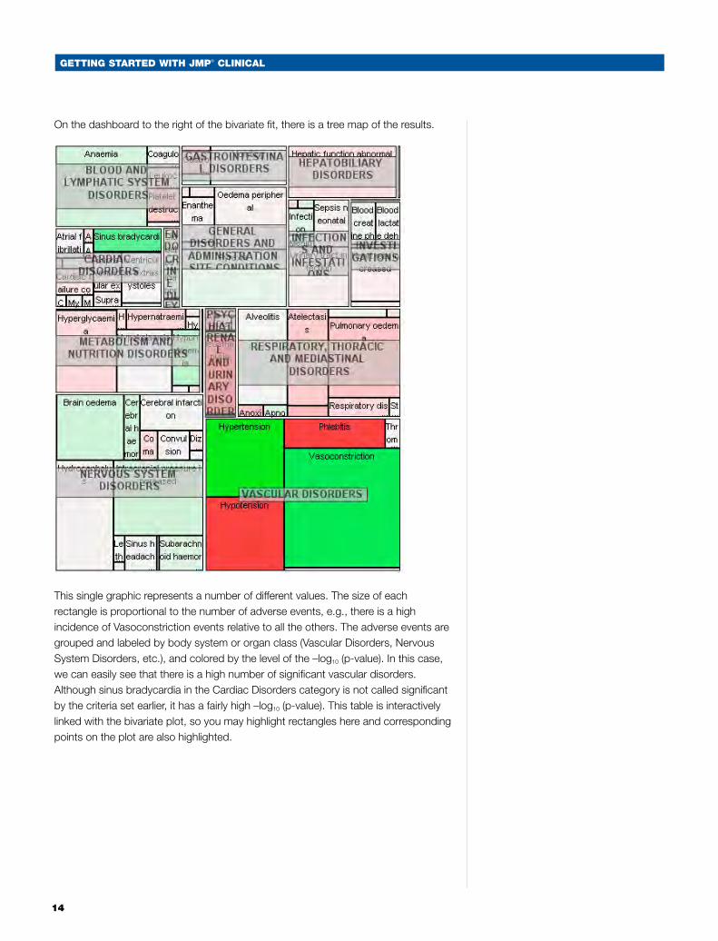
On the dashboard to the right of the bivariate fit, there is a tree map of the results.
This single graphic represents a number of different values. The size of each rectangle is proportional to the number of adverse events, e.g., there is a high incidence of Vasoconstriction events relative to all the others. The adverse events are grouped and labeled by body system or organ class (Vascular Disorders, Nervous System Disorders, etc.), and colored by the level of the –log10 (p-value). In this case, we can easily see that there is a high number of significant vascular disorders. Although sinus bradycardia in the Cardiac Disorders category is not called significant by the criteria set earlier, it has a fairly high –log10 (p-value). This table is interactively linked with the bivariate plot, so you may highlight rectangles here and corresponding points on the plot are also highlighted.
GettinG Started with JMP® CliniCal
15
To the right of the tree map is the Data Filter with body systems listed. Selecting one or more of these values will restrict the tree map and the bivariate fit graphics to only those body systems. Select Vascular Disorders, and note what happens to the other two plots. Then select Forest Plot in the drill-down on the top left of the dashboard to see confidence limits on the log2 relative risks for all events in that body system.
Going back to the bivariate plot, select the Phlebitis point and drill down this time on the “Contingency Analysis” plot. This time, the contingency plot and the statistics show that there is a significant difference between the two groups. Selecting more than one point will create a separate contingency plot for each adverse event.
The interactivity of all these components makes it simple to further explore the results either as mosaic plots or forest plots.
Select “Close All Other Windows” from the journal.
Concomitant Medication Screen
The dashboard resulting from this analysis is identical to that of the adverse events incidence screen with the exception that there is no embedded Data Filter.
Laboratory Baseline Analysis of Variance
Click on the “Results” button under LabsBaselineANOVA. This analysis of variance is run on the log2-transformed lab values, standardized such that 1 and -1 represent the upper limit of normal and lower limit of normal of each lab value, respectively. Therefore, on the bivariate plot on the dashboard, the x-axis is to be interpreted on this log2 scale. Any values greater than 0 indicate an increase in a lab finding and those less than 0 a decrease. Additionally, the ANOVA uses a repeated measures model that incorporates patient values at time 0 as a baseline covariate, as selected in the workflow. The table used to generate the graphical results, lbd_lba, contains all the values derived from the ANOVA analysis, including the LSMeans and their differences.
16
GettinG Started with JMP® CliniCal
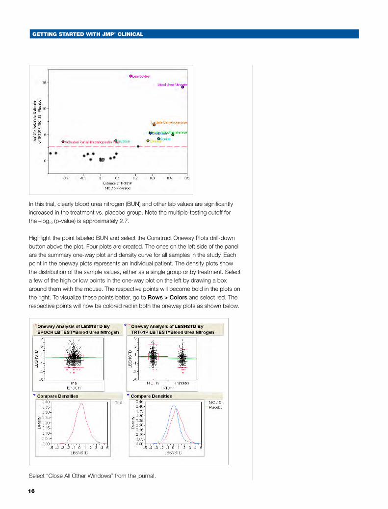
In this trial, clearly blood urea nitrogen (BUN) and other lab values are significantly increased in the treatment vs. placebo group. Note the multiple-testing cutoff for the –log10 (p-value) is approximately 2.7.
Highlight the point labeled BUN and select the Construct Oneway Plots drill-down button above the plot. Four plots are created. The ones on the left side of the panel are the summary one-way plot and density curve for all samples in the study. Each point in the oneway plots represents an individual patient. The density plots show the distribution of the sample values, either as a single group or by treatment. Select a few of the high or low points in the one-way plot on the left by drawing a box around them with the mouse. The respective points will become bold in the plots on the right. To visualize these points better, go to Rows > Colors and select red. The respective points will now be colored red in both the oneway plots as shown below.
Select “Close All Other Windows” from the journal.
GettinG Started with JMP® CliniCal
17
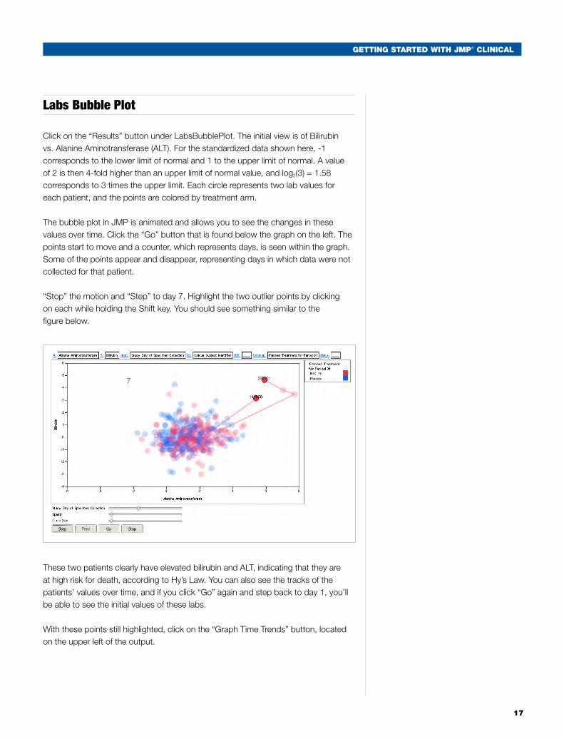
Labs Bubble Plot
Click on the “Results” button under LabsBubblePlot. The initial view is of Bilirubin vs. Alanine Aminotransferase (ALT). For the standardized data shown here, -1 corresponds to the lower limit of normal and 1 to the upper limit of normal. A value of 2 is then 4-fold higher than an upper limit of normal value, and log2(3) = 1.58 corresponds to 3 times the upper limit. Each circle represents two lab values for each patient, and the points are colored by treatment arm.
The bubble plot in JMP is animated and allows you to see the changes in these values over time. Click the “Go” button that is found below the graph on the left. The points start to move and a counter, which represents days, is seen within the graph. Some of the points appear and disappear, representing days in which data were not collected for that patient.
“Stop” the motion and “Step” to day 7. Highlight the two outlier points by clicking on each while holding the Shift key. You should see something similar to the figure below.
These two patients clearly have elevated bilirubin and ALT, indicating that they are at high risk for death, according to Hy’s Law. You can also see the tracks of the patients’ values over time, and if you click “Go” again and step back to day 1, you’ll be able to see the initial values of these labs.
With these points still highlighted, click on the “Graph Time Trends” button, located on the upper left of the output.
18
GettinG Started with JMP® CliniCal
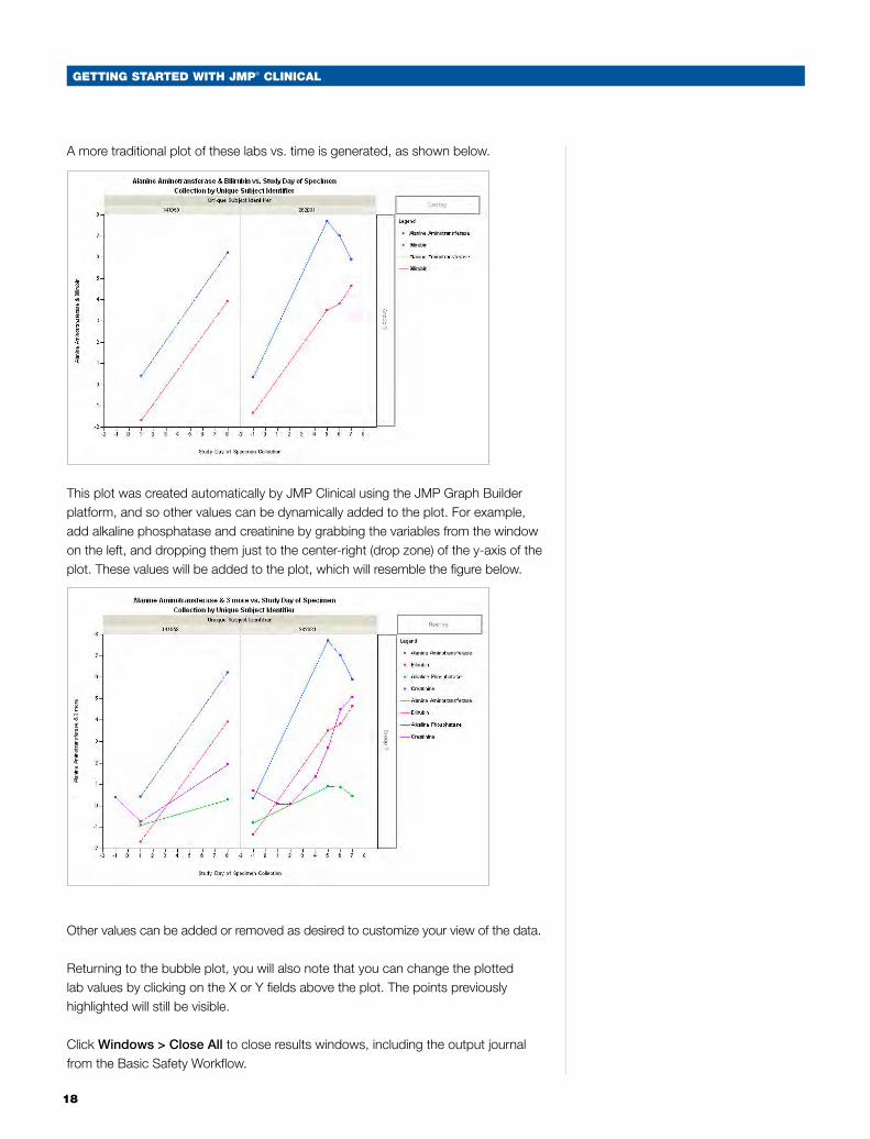
A more traditional plot of these labs vs. time is generated, as shown below.
This plot was created automatically by JMP Clinical using the JMP Graph Builder platform, and so other values can be dynamically added to the plot. For example, add alkaline phosphatase and creatinine by grabbing the variables from the window on the left, and dropping them just to the center-right (drop zone) of the y-axis of the plot. These values will be added to the plot, which will resemble the figure below.
Other values can be added or removed as desired to customize your view of the data.
Returning to the bubble plot, you will also note that you can change the plotted lab values by clicking on the X or Y fields above the plot. The points previously highlighted will still be visible.
Click Windows > Close All to close results windows, including the output journal from the Basic Safety Workflow.
GettinG Started with JMP® CliniCal
19
More Advanced Functionality
JMP Clinical has more than 60 additional analytical processes beyond the Basic Safety Workflow. Feel free to peruse the Clinical menu to see how they are arranged, and note the seven from the basic workflow are also available individually if you want to skip directly to them. As you gain experience with JMP Clinical, you can jump immediately to processes of current interest and even build your own workflows.
We will now look at a few more advanced processes in detail.
Severity ANOVA and Patient Profiler
Click on Clinical > Adverse Events > Severity ANOVA. This process screens all adverse events by performing a mixed-model analysis of variance, with average ranked severity score as the dependent variable and default or customizable fixed and random effects in the mixed model. A separate ANOVA is fit for each distinct adverse event. Volcano plots and other output enable efficient screening of adverse event severities that differ between treatment groups. If a patient has multiple instances of a particular adverse event, then those scores are averaged to form a single score for analysis.
In this case we will run with the default model, where site is a random effect and treatment arm is the fixed effect.
There are two tabs in the Severity ANOVA dialog after the General tab. On the Model tab, you can specify custom code for a mixed model to be used in lieu of the default model. You can enter standard PROC MIXED syntax in this window, using “response” as the name of the dependent variable in the MODEL statement. Once you have entered a model, you can save the entire setting by clicking the “Save” button at the bottom of the window and saving to a directory. The setting is saved as a .sas file, and if desired, you can share it with other investigators examining this data set.
On the Test tab, the most important parameter is the Multiple Testing Correction. You can select the type of testing correction from the pull-down menu and specify an alpha value for the adjustment. In this example, we will run with the defaults of FDR (False Discovery Rate) and 0.05 respectively.
After clicking Run, a dashboard will be generated that contains volcano plots, hierarchical clustering of significant events, parallel plots of the significant LSmean values and principal components analysis of the correlations of the significant values.
20
GettinG Started with JMP® CliniCal
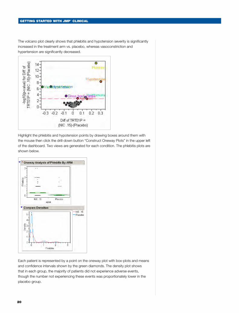
The volcano plot clearly shows that phlebitis and hypotension severity is significantly increased in the treatment arm vs. placebo, whereas vasoconstriction and hypertension are significantly decreased.
Highlight the phlebitis and hypotension points by drawing boxes around them with the mouse then click the drill-down button “Construct Oneway Plots” in the upper left of the dashboard. Two views are generated for each condition. The phlebitis plots are shown below.
Each patient is represented by a point on the oneway plot with box-plots and means and confidence intervals shown by the green diamonds. The density plot shows that in each group, the majority of patients did not experience adverse events, though the number not experiencing these events was proportionately lower in the placebo group.
GettinG Started with JMP® CliniCal
21
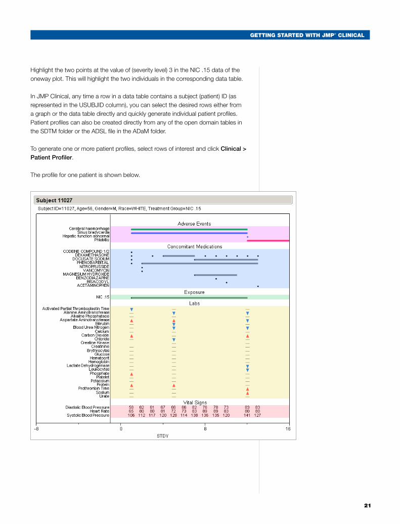
Highlight the two points at the value of (severity level) 3 in the NIC .15 data of the oneway plot. This will highlight the two individuals in the corresponding data table.
In JMP Clinical, any time a row in a data table contains a subject (patient) ID (as represented in the USUBJID column), you can select the desired rows either from a graph or the data table directly and quickly generate individual patient profiles. Patient profiles can also be created directly from any of the open domain tables in the SDTM folder or the ADSL file in the ADaM folder.
To generate one or more patient profiles, select rows of interest and click Clinical > Patient Profiler.
The profile for one patient is shown below.
22
GettinG Started with JMP® CliniCal
The x-axis represents the day of study. The bars for the exposure, concomitant medications and adverse events show the duration of each variable. For adverse events, the severity is color-coded by mild, moderate or severe, with the legend shown on the lower right. The controls on the right allow you to hide parts of the table or customize the Labs portion of the table. These tables can be copied for later use by selecting the “Fat Plus” from the selection toolbar at the top of the JMP menu and then using that to select the “Subject” bar at the top of each table. Then go to File > Save As, and select the desired format.
Select Window > Close All.
Vital Signs
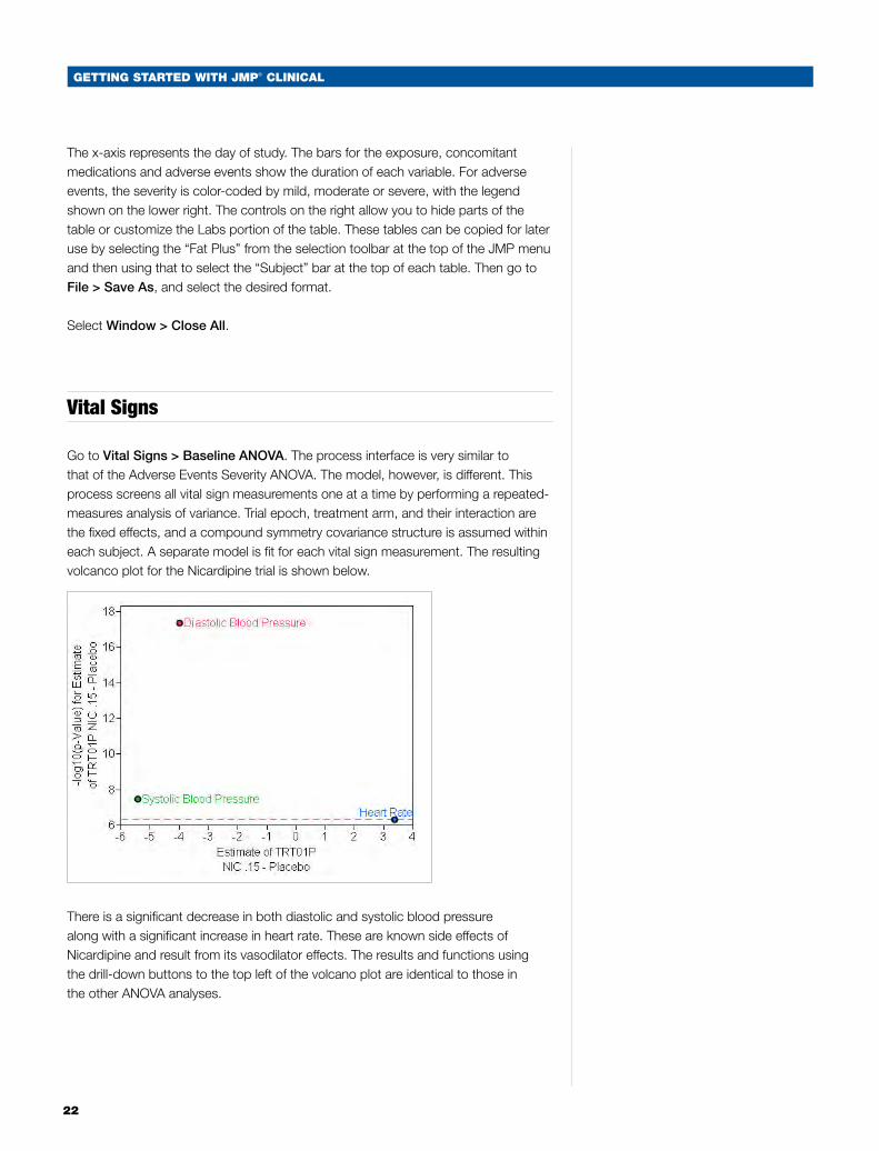
Go to Vital Signs > Baseline ANOVA. The process interface is very similar to that of the Adverse Events Severity ANOVA. The model, however, is different. This process screens all vital sign measurements one at a time by performing a repeated-measures analysis of variance. Trial epoch, treatment arm, and their interaction are the fixed effects, and a compound symmetry covariance structure is assumed within each subject. A separate model is fit for each vital sign measurement. The resulting volcanco plot for the Nicardipine trial is shown below.
There is a significant decrease in both diastolic and systolic blood pressure along with a significant increase in heart rate. These are known side effects of Nicardipine and result from its vasodilator effects. The results and functions using the drill-down buttons to the top left of the volcano plot are identical to those in the other ANOVA analyses.
GettinG Started with JMP® CliniCal
23
Domain Incidence Indicators
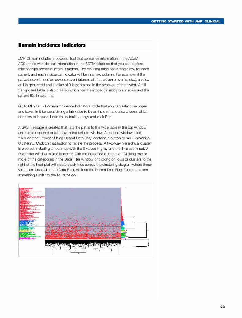
JMP Clinical includes a powerful tool that combines information in the ADaM ADSL table with domain information in the SDTM folder so that you can explore relationships across numerous factors. The resulting table has a single row for each patient, and each incidence indicator will be in a new column. For example, if the patient experienced an adverse event (abnormal labs, adverse events, etc.), a value of 1 is generated and a value of 0 is generated in the absence of that event. A tall transposed table is also created which has the incidence indicators in rows and the patient IDs in columns.
Go to Clinical > Domain Incidence Indicators. Note that you can select the upper and lower limit for considering a lab value to be an incident and also choose which domains to include. Load the default settings and click Run.
A SAS message is created that lists the paths to the wide table in the top window and the transposed or tall table in the bottom window. A second window titled, “Run Another Process Using Output Data Set,” contains a button to run Hierarchical Clustering. Click on that button to initiate the process. A two-way hierarchical cluster is created, including a heat map with the 0 values in gray and the 1 values in red. A Data Filter window is also launched with the incidence cluster plot. Clicking one or more of the categories in the Data Filter window or clicking on rows or clusters to the right of the heat plot will create black lines across the clustering diagram where those values are located. In the Data Filter, click on the Patient Died Flag. You should see something similar to the figure below.
24
GettinG Started with JMP® CliniCal
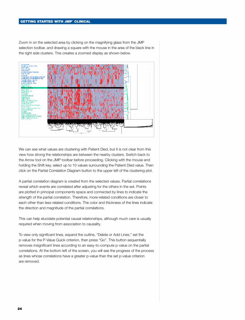
Zoom in on the selected area by clicking on the magnifying glass from the JMP selection toolbar, and drawing a square with the mouse in the area of the black line in the right side clusters. This creates a zoomed display as shown below.
We can see what values are clustering with Patient Died, but it is not clear from this view how strong the relationships are between the nearby clusters. Switch back to the Arrow tool on the JMP toolbar before proceeding. Clicking with the mouse and holding the Shift key, select up to 10 values surrounding the Patient Died value. Then click on the Partial Correlation Diagram button to the upper left of the clustering plot.
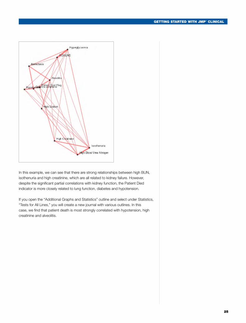
A partial correlation diagram is created from the selected values. Partial correlations reveal which events are correlated after adjusting for the others in the set. Points are plotted in principal components space and connected by lines to indicate the strength of the partial correlation. Therefore, more-related conditions are closer to each other than less-related conditions. The color and thickness of the lines indicate the direction and magnitude of the partial correlations.
This can help elucidate potential causal relationships, although much care is usually required when moving from association to causality.
To view only significant lines, expand the outline, “Delete or Add Lines,” set the p-value for the P-Value Quick criterion, then press “Go”. This button sequentially removes insignificant lines according to an easy-to-compute p-value on the partial correlations. At the bottom left of the screen, you will see the progress of the process as lines whose correlations have a greater p-value than the set p-value criterion are removed.
GettinG Started with JMP® CliniCal
25
In this example, we can see that there are strong relationships between high BUN, isothenuria and high creatinine, which are all related to kidney failure. However, despite the significant partial correlations with kidney function, the Patient Died indicator is more closely related to lung function, diabetes and hypotension.
If you open the “Additional Graphs and Statistics” outline and select under Statistics, “Tests for All Lines,” you will create a new journal with various outlines. In this case, we find that patient death is most strongly correlated with hypotension, high creatinine and alveolitis.
26
GettinG Started with JMP® CliniCal
Partition
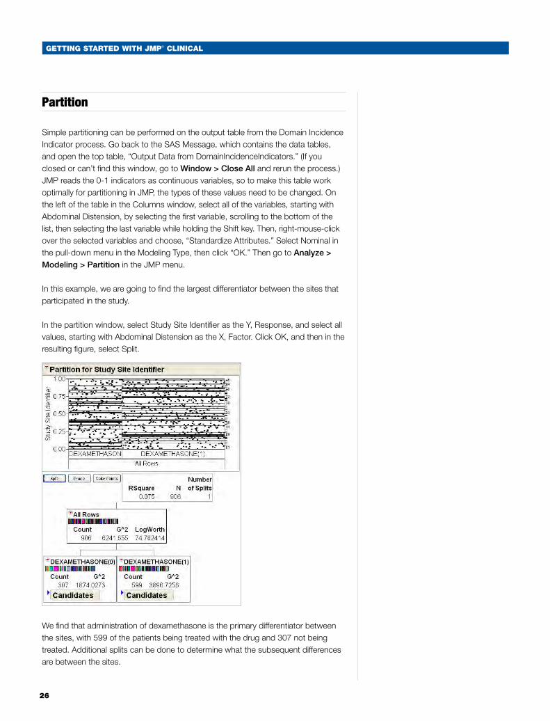
Simple partitioning can be performed on the output table from the Domain Incidence Indicator process. Go back to the SAS Message, which contains the data tables, and open the top table, “Output Data from DomainIncidenceIndicators.” (If you closed or can’t find this window, go to Window > Close All and rerun the process.) JMP reads the 0-1 indicators as continuous variables, so to make this table work optimally for partitioning in JMP, the types of these values need to be changed. On the left of the table in the Columns window, select all of the variables, starting with Abdominal Distension, by selecting the first variable, scrolling to the bottom of the list, then selecting the last variable while holding the Shift key. Then, right-mouse-click over the selected variables and choose, “Standardize Attributes.” Select Nominal in the pull-down menu in the Modeling Type, then click “OK.” Then go to Analyze > Modeling > Partition in the JMP menu.
In this example, we are going to find the largest differentiator between the sites that participated in the study.
In the partition window, select Study Site Identifier as the Y, Response, and select all values, starting with Abdominal Distension as the X, Factor. Click OK, and then in the resulting figure, select Split.
We find that administration of dexamethasone is the primary differentiator between the sites, with 599 of the patients being treated with the drug and 307 not being treated. Additional splits can be done to determine what the subsequent differences are between the sites.

GettinG Started with JMP® CliniCal
27
Conclusion
In this white paper, we have covered some of the basic functionalities in JMP Clinical software. We encourage you to further explore the other functions in JMP Clinical and also familiarize yourself with standard JMP functionality. The more you learn, the more efficient and productive you can be! Getting Started with JMP webcasts are available online at www.jmp.com. Visit www.jmp.com/clinical for the latest information on JMP Clinical.

SAS Institute Inc. World Headquarters +1 919 677 8000To contact your local JMP office, please visit: www.jmp.com...........
SAS and all other SAS Institute Inc. product or service names are registered trademarks or trademarks of SAS Institute Inc. in the USA and other countries. ® indicates USA registration. Other brand and product names are trademarks of their respective companies. Copyright © 2010, SAS Institute Inc. All rights reserved. 104420_S53575.0810