Embed Size (px)
Citation preview
Giant Steps: Artists and the 1960s
June 30, 2018–January 6, 2019
1905 Building, North Galleries, and Gallery for New Media
As one of the most culturally and politically significant periods of the twentieth
century, the 1960s witnessed Woodstock, the first Moon landing, the victories of
and regressive backlash against the Civil Rights movement, the American escalation
to war in Vietnam (1965–75), and the growing dominance of consumerism.
Simultaneously, it gave rise to numerous aesthetic innovations. Fueled by
imagination and technological euphoria, artists began exploring new mediums and
incorporating popular themes, motifs, and subjects into their practices. In time,
movements such as Pop and Op art and Minimalism radically reshaped the
boundaries of the art world.
Assembled from the Albright-Knox’s expansive collection, Giant Steps: Artists and
the 1960s features major works by some of the leading artists of the period, while
also reconsidering those who played an underrecognized, but vital, role in
furthering the visual avant-garde in the United States and beyond. Its title was
inspired by John Coltrane’s 1960 album Giant Steps, which provided aspiring jazz
musicians a model of blasting free from the restraints of time and space, and
speaks to the invention and progress that characterized the arts in general during
this era.
This exhibition also considers the museum’s history in defining Buffalo as a center
of modern art. A vision of the Albright-Knox as a leader in collecting and giving
voice to both established and up-and-coming artists took firm hold in the 1960s by
way of groundbreaking exhibitions, music, dance, and theatrical performances.
More than half a century later—and in the midst of a new transformative period for
both the museum and the city—the works of art and archival material presented
here revisit some of the vivacious imaginings of this compelling epoch.
This exhibition is organized by Godin-Spaulding Curator & Curator for the Collection
Holly E. Hughes.
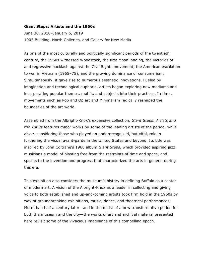
Yaacov Agam
Israeli, born Palestine (now Israel),
1928
Loud Tactile Painting, 1962
Wood and metal
Gift of Seymour H. Knox, Jr., 1963
Yaacov Agam approaches painting and sculpture with the belief that art is meant to
be enjoyed through multiple senses. Raised as an Orthodox Jew, Agam’s father, a
rabbi, discouraged his artistic pursuits. To combine his desires to make art and to
respect the biblical prohibition against figural imagery, Agam began creating
nonrepresentational compositions as a means to inspire spiritual reflection. This
painting is one of a number of tactile constructions the artist created to vibrate,
move, or make sound when touched. Loud Tactile Painting features thirty-five long,
slender springs attached to rattle-like drums made of metal that produce a subtle
variety of tones and a pattern of bobbing shadows when activated.
While it is the intention of the artist for this work to be interactive, it is
VERY fragile. Before touching this work, you must ask for assistance from
a member of the museum’s security staff, who can provide gloves and
further directions.
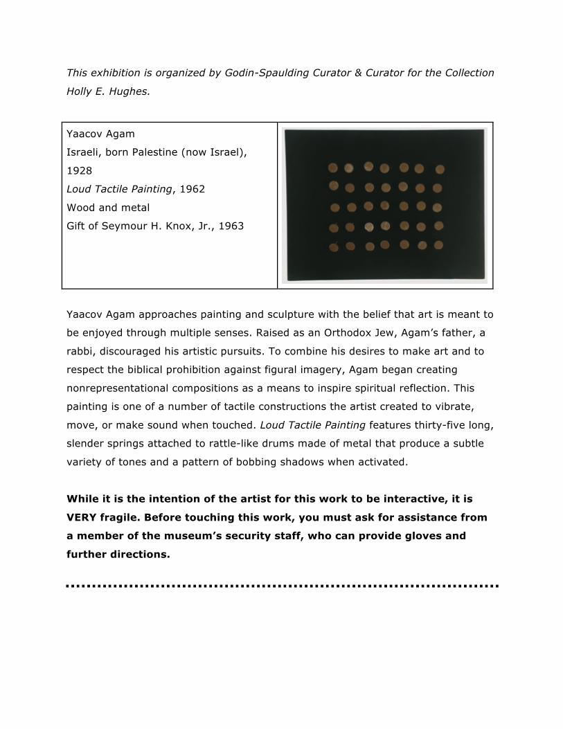
Josef Albers
American, born Germany, 1888–1976
Structural Constellation F. M. E. 3, 1962
Engraving on laminated plastic mounted
on plywood
George Cary, Evelyn Rumsey Cary,
James G. Forsyth Funds, 1974
Beginning in the 1930s, Josef Albers became one of the first artists to explore the
psychological effects of color and space, a pursuit later adopted by Op art. He was
especially interested in the ways in which the human eye processes the interaction
among these compositional elements. Elegant geometric and spatial manipulations
like Structural Constellation F. M. E. 3 toy with the viewer’s sense of space. Here,
planes and angles appear to advance and recede into space simultaneously. Lines
seem to cantilever outside of the picture plane or bend where they intersect.
Throughout his lifetime, Albers created hundreds of works exploring variations of
this motif, including drawings and embossed prints.
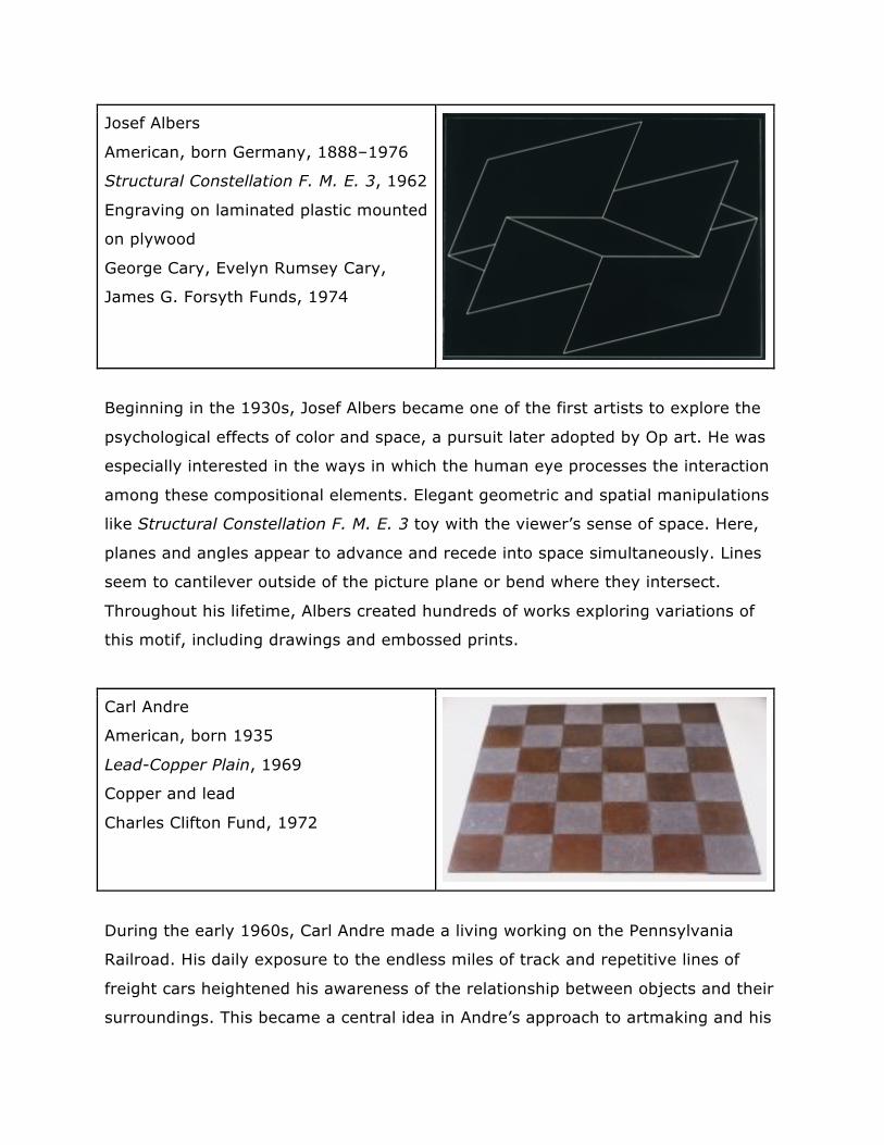
Carl Andre
American, born 1935
Lead-Copper Plain, 1969
Copper and lead
Charles Clifton Fund, 1972
During the early 1960s, Carl Andre made a living working on the Pennsylvania
Railroad. His daily exposure to the endless miles of track and repetitive lines of
freight cars heightened his awareness of the relationship between objects and their
surroundings. This became a central idea in Andre’s approach to artmaking and his
designation of “sculpture as form, sculpture as structure, sculpture as place.” Lead-
Copper Plain is one in a series of works the artist referred to as “plains”—which
further emphasizes their function as discrete places and evokes visions of a flat,
sweeping landmass. It comprises thirty-six twelve-inch-square copper and lead tiles
arranged in a checkerboard pattern and held in place only by gravity. Andre
maintains that it is possible to sense the differing mass of the metals and hear the
contrasting sounds they make underfoot. Viewers are invited to test Andre’s
theories by gently walking on this work.
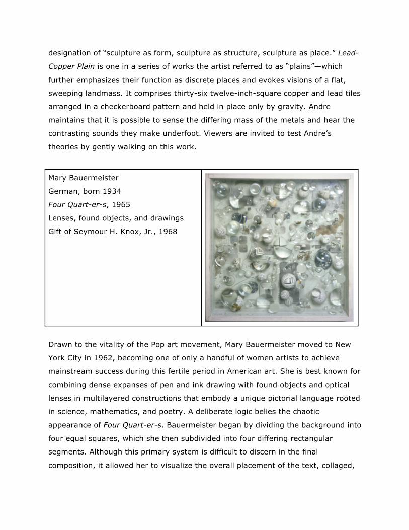
Mary Bauermeister
German, born 1934
Four Quart-er-s, 1965
Lenses, found objects, and drawings
Gift of Seymour H. Knox, Jr., 1968
Drawn to the vitality of the Pop art movement, Mary Bauermeister moved to New
York City in 1962, becoming one of only a handful of women artists to achieve
mainstream success during this fertile period in American art. She is best known for
combining dense expanses of pen and ink drawing with found objects and optical
lenses in multilayered constructions that embody a unique pictorial language rooted
in science, mathematics, and poetry. A deliberate logic belies the chaotic
appearance of Four Quart-er-s. Bauermeister began by dividing the background into
four equal squares, which she then subdivided into four differing rectangular
segments. Although this primary system is difficult to discern in the final
composition, it allowed her to visualize the overall placement of the text, collaged,
and magnified elements. About this aspect of her work, she has said, "The lenses
reverse, double, distort the images . . . I somehow wanted to unfix what I did in
the background, or make it more ambiguous.”
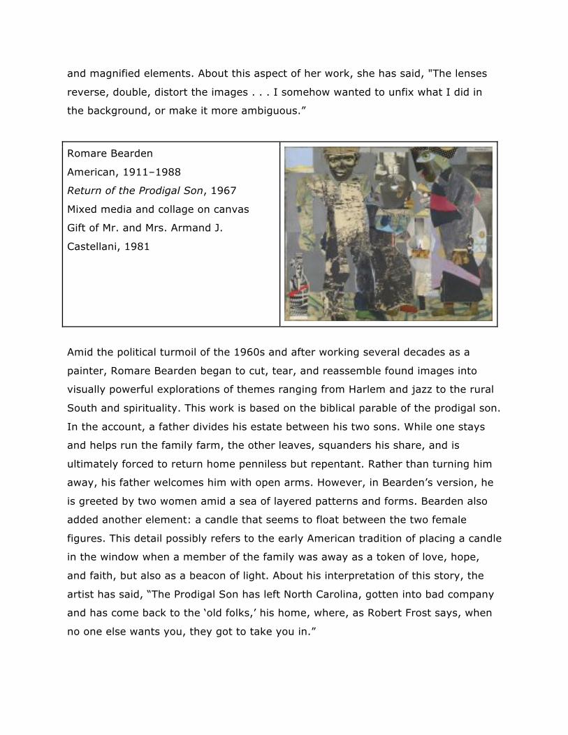
Romare Bearden
American, 1911–1988
Return of the Prodigal Son, 1967
Mixed media and collage on canvas
Gift of Mr. and Mrs. Armand J.
Castellani, 1981
Amid the political turmoil of the 1960s and after working several decades as a
painter, Romare Bearden began to cut, tear, and reassemble found images into
visually powerful explorations of themes ranging from Harlem and jazz to the rural
South and spirituality. This work is based on the biblical parable of the prodigal son.
In the account, a father divides his estate between his two sons. While one stays
and helps run the family farm, the other leaves, squanders his share, and is
ultimately forced to return home penniless but repentant. Rather than turning him
away, his father welcomes him with open arms. However, in Bearden’s version, he
is greeted by two women amid a sea of layered patterns and forms. Bearden also
added another element: a candle that seems to float between the two female
figures. This detail possibly refers to the early American tradition of placing a candle
in the window when a member of the family was away as a token of love, hope,
and faith, but also as a beacon of light. About his interpretation of this story, the
artist has said, “The Prodigal Son has left North Carolina, gotten into bad company
and has come back to the ‘old folks,’ his home, where, as Robert Frost says, when
no one else wants you, they got to take you in.”
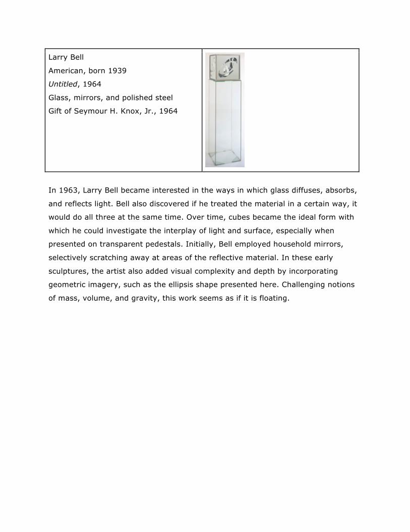
Larry Bell
American, born 1939
Untitled, 1964
Glass, mirrors, and polished steel
Gift of Seymour H. Knox, Jr., 1964
In 1963, Larry Bell became interested in the ways in which glass diffuses, absorbs,
and reflects light. Bell also discovered if he treated the material in a certain way, it
would do all three at the same time. Over time, cubes became the ideal form with
which he could investigate the interplay of light and surface, especially when
presented on transparent pedestals. Initially, Bell employed household mirrors,
selectively scratching away at areas of the reflective material. In these early
sculptures, the artist also added visual complexity and depth by incorporating
geometric imagery, such as the ellipsis shape presented here. Challenging notions
of mass, volume, and gravity, this work seems as if it is floating.
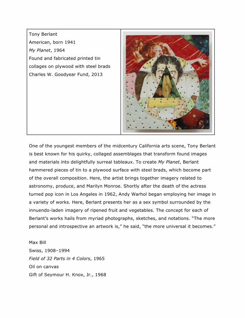
Tony Berlant
American, born 1941
My Planet, 1964
Found and fabricated printed tin
collages on plywood with steel brads
Charles W. Goodyear Fund, 2013
One of the youngest members of the midcentury California arts scene, Tony Berlant
is best known for his quirky, collaged assemblages that transform found images
and materials into delightfully surreal tableaux. To create My Planet, Berlant
hammered pieces of tin to a plywood surface with steel brads, which become part
of the overall composition. Here, the artist brings together imagery related to
astronomy, produce, and Marilyn Monroe. Shortly after the death of the actress
turned pop icon in Los Angeles in 1962, Andy Warhol began employing her image in
a variety of works. Here, Berlant presents her as a sex symbol surrounded by the
innuendo-laden imagery of ripened fruit and vegetables. The concept for each of
Berlant’s works hails from myriad photographs, sketches, and notations. “The more
personal and introspective an artwork is,” he said, “the more universal it becomes.”
Max Bill
Swiss, 1908–1994
Field of 32 Parts in 4 Colors, 1965
Oil on canvas
Gift of Seymour H. Knox, Jr., 1968
Max Bill was a significant force in founding a core group of Swiss Concrete artists
who strongly emphasized geometric abstraction devoid of figural or symbolic
references. Bill’s work as an industrial designer infused his visual practice with
clarity and precision, and he arrived at his compositions using basic geometry and
mathematical formulas. The artist favored the square format of Field of 32 Parts in
4 Colors for its neutral quality. Bill began by dividing the picture plane into four
equal quadrants that he then bisected horizontally, creating two rectangles per
quadrant. Each rectangle was then split on the diagonal to form two right triangles
that were divided in half as well, ultimately resulting in thirty-two individual
segments. Next, Bill applied a vibrant palette of green, blue, orange, and pink so
that each color was used only once among any four sets of triangles. Their edges
come together to form a diamond shape in the middle of the canvas, creating the
illusion of depth.
Martha Boto
Argentine, 1925–2004
Interférences optiques (Optical
Interferences), 1965
Wood, aluminum, mirrors, and light
with motor
Gift of Seymour H. Knox, Jr., 1967
In the early 1960s, Martha Boto began adding motors or tinted lights to her
sculptural work to explore the effects of movement, illumination, and color. She
was especially interested in the ability of different industrial materials, such as
aluminum and stainless steel, to modify, absorb, and reflect light. In Optical
Interferences light radiates through a series of slits in a concealed turning
aluminum disc and is multiplied by mirrors installed on the interior surface of the
box. This effect is further enhanced by sixteen polished metal tubes mounted to the
front of the work through which the viewer experiences the overall composition.
Critics of the time related Boto’s sculptures to science fiction and the mystery of
space travel—in the same year that the artist first exhibited these works, Yuri
Alekseyevich Gagarin (Russian, 1934–1968) became the first human being to travel
into space. About her work, Boto has said, “I have always been fascinated by the
laws of harmony and equilibrium, which govern the cosmos through interrelations
of light and movement, space, time, and color.”
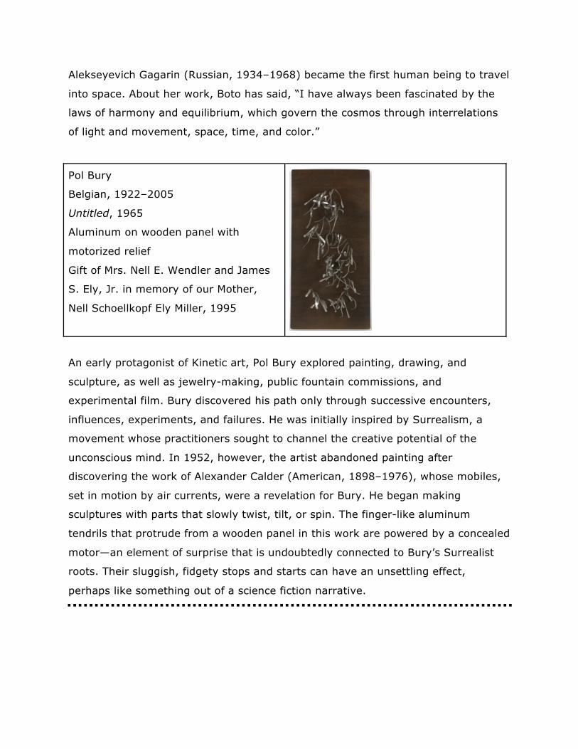
Pol Bury
Belgian, 1922–2005
Untitled, 1965
Aluminum on wooden panel with
motorized relief
Gift of Mrs. Nell E. Wendler and James
S. Ely, Jr. in memory of our Mother,
Nell Schoellkopf Ely Miller, 1995
An early protagonist of Kinetic art, Pol Bury explored painting, drawing, and
sculpture, as well as jewelry-making, public fountain commissions, and
experimental film. Bury discovered his path only through successive encounters,
influences, experiments, and failures. He was initially inspired by Surrealism, a
movement whose practitioners sought to channel the creative potential of the
unconscious mind. In 1952, however, the artist abandoned painting after
discovering the work of Alexander Calder (American, 1898–1976), whose mobiles,
set in motion by air currents, were a revelation for Bury. He began making
sculptures with parts that slowly twist, tilt, or spin. The finger-like aluminum
tendrils that protrude from a wooden panel in this work are powered by a concealed
motor—an element of surprise that is undoubtedly connected to Bury’s Surrealist
roots. Their sluggish, fidgety stops and starts can have an unsettling effect,
perhaps like something out of a science fiction narrative.
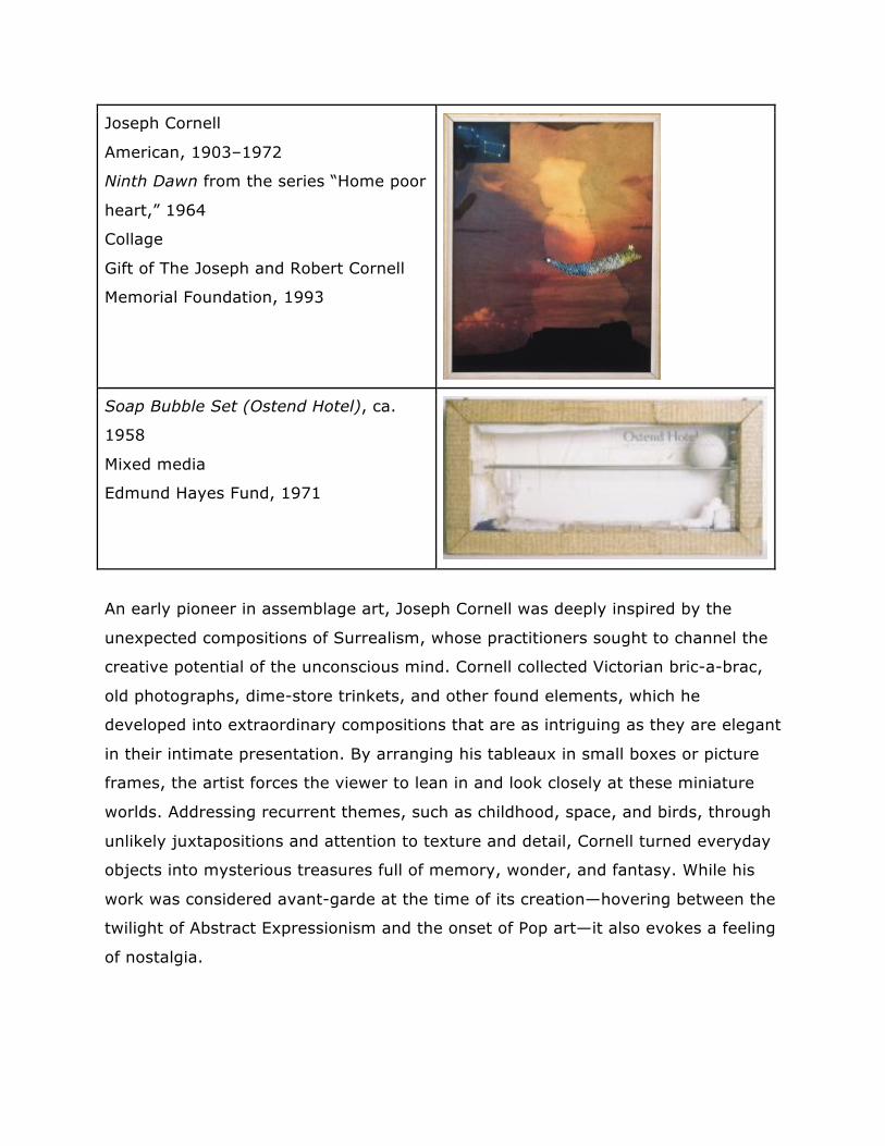
Joseph Cornell
American, 1903–1972
Ninth Dawn from the series “Home poor
heart,” 1964
Collage
Gift of The Joseph and Robert Cornell
Memorial Foundation, 1993
Soap Bubble Set (Ostend Hotel), ca.
1958
Mixed media
Edmund Hayes Fund, 1971
An early pioneer in assemblage art, Joseph Cornell was deeply inspired by the
unexpected compositions of Surrealism, whose practitioners sought to channel the
creative potential of the unconscious mind. Cornell collected Victorian bric-a-brac,
old photographs, dime-store trinkets, and other found elements, which he
developed into extraordinary compositions that are as intriguing as they are elegant
in their intimate presentation. By arranging his tableaux in small boxes or picture
frames, the artist forces the viewer to lean in and look closely at these miniature
worlds. Addressing recurrent themes, such as childhood, space, and birds, through
unlikely juxtapositions and attention to texture and detail, Cornell turned everyday
objects into mysterious treasures full of memory, wonder, and fantasy. While his
work was considered avant-garde at the time of its creation—hovering between the
twilight of Abstract Expressionism and the onset of Pop art—it also evokes a feeling
of nostalgia.
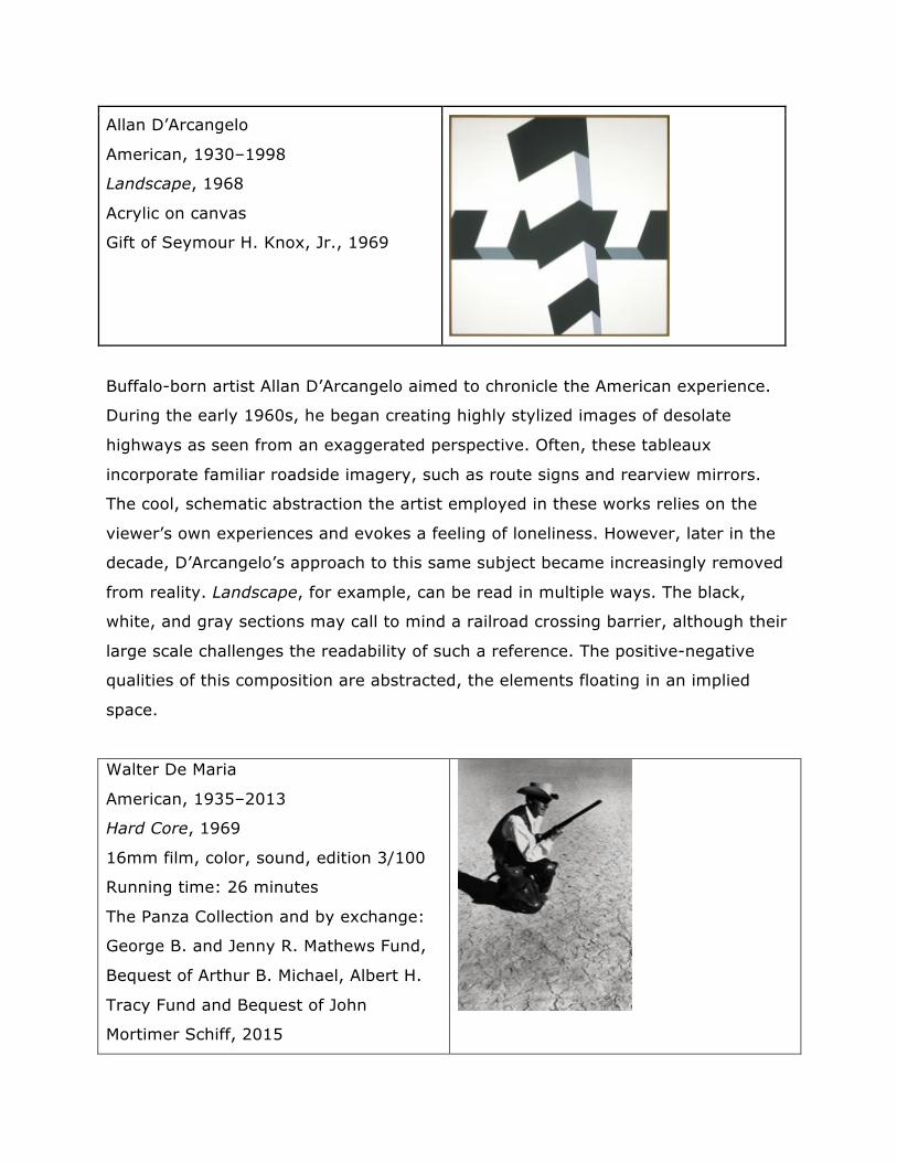
Allan D’Arcangelo
American, 1930–1998
Landscape, 1968
Acrylic on canvas
Gift of Seymour H. Knox, Jr., 1969
Buffalo-born artist Allan D’Arcangelo aimed to chronicle the American experience.
During the early 1960s, he began creating highly stylized images of desolate
highways as seen from an exaggerated perspective. Often, these tableaux
incorporate familiar roadside imagery, such as route signs and rearview mirrors.
The cool, schematic abstraction the artist employed in these works relies on the
viewer’s own experiences and evokes a feeling of loneliness. However, later in the
decade, D’Arcangelo’s approach to this same subject became increasingly removed
from reality. Landscape, for example, can be read in multiple ways. The black,
white, and gray sections may call to mind a railroad crossing barrier, although their
large scale challenges the readability of such a reference. The positive-negative
qualities of this composition are abstracted, the elements floating in an implied
space.
Walter De Maria
American, 1935–2013
Hard Core, 1969
16mm film, color, sound, edition 3/100
Running time: 26 minutes
The Panza Collection and by exchange:
George B. and Jenny R. Mathews Fund,
Bequest of Arthur B. Michael, Albert H.
Tracy Fund and Bequest of John
Mortimer Schiff, 2015
Walter De Maria is a crucial figure in the history of Minimalism as well as a
pioneering Land artist who utilized the Earth’s terrain as a material for artmaking.
In 1969, De Maria collaborated with artist Michael Heizer (American, born 1944) to
produce the work presented here, which was filmed in Nevada’s Black Rock Desert.
De Maria did not conceive of Hard Core as a traditional film. Offering the viewer an
experience of the landscape in real time, it contains neither dialogue nor discernible
chronology but rather largely consists of spliced shots of a dried, cracked lake bed
and 360-degree pans of an expansive horizon with mountains hanging in the
distance. The soundtrack, entitled Ocean Music, is based on recordings of De Maria
drumming as an accompaniment to the sound of waves, which both lulls and
heightens the tension as the film progresses.
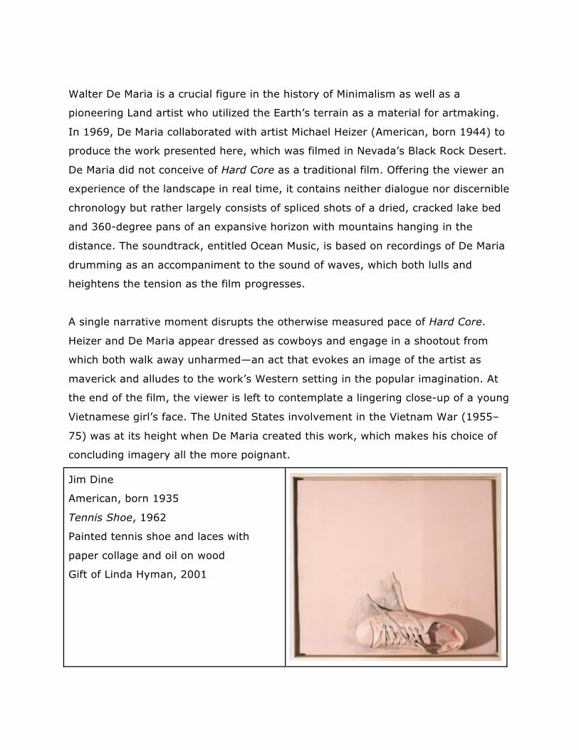
A single narrative moment disrupts the otherwise measured pace of Hard Core.
Heizer and De Maria appear dressed as cowboys and engage in a shootout from
which both walk away unharmed—an act that evokes an image of the artist as
maverick and alludes to the work’s Western setting in the popular imagination. At
the end of the film, the viewer is left to contemplate a lingering close-up of a young
Vietnamese girl’s face. The United States involvement in the Vietnam War (1955–
75) was at its height when De Maria created this work, which makes his choice of
concluding imagery all the more poignant.
Jim Dine
American, born 1935
Tennis Shoe, 1962
Painted tennis shoe and laces with
paper collage and oil on wood
Gift of Linda Hyman, 2001
In 1959, Jim Dine traveled to New York, where he took part in some of the city’s
early Happenings—spontaneous and experiential performances in which the
audience was often encouraged to participate. A year later, he began to focus more
on a painterly practice that incorporated physical objects, a love of which came
from working in his family’s hardware stores as a youth. He frequently affixed
everyday objects, such as tools, rope, and articles of clothing, to his
canvases. Here, a tennis shoe camouflaged in a layer of piggy-pink pigment
emerges from the lower portion of the picture plane. While Dine is associated with
the development of Pop art, he downplayed this connection in a 1966 interview,
stating, “I’m not a Pop artist. . . . When I use objects, I see them as a vocabulary
of feelings. I can spend a lot of time with objects, and they leave me as satisfied as
a good meal. I don’t think Pop artists feel that way.”
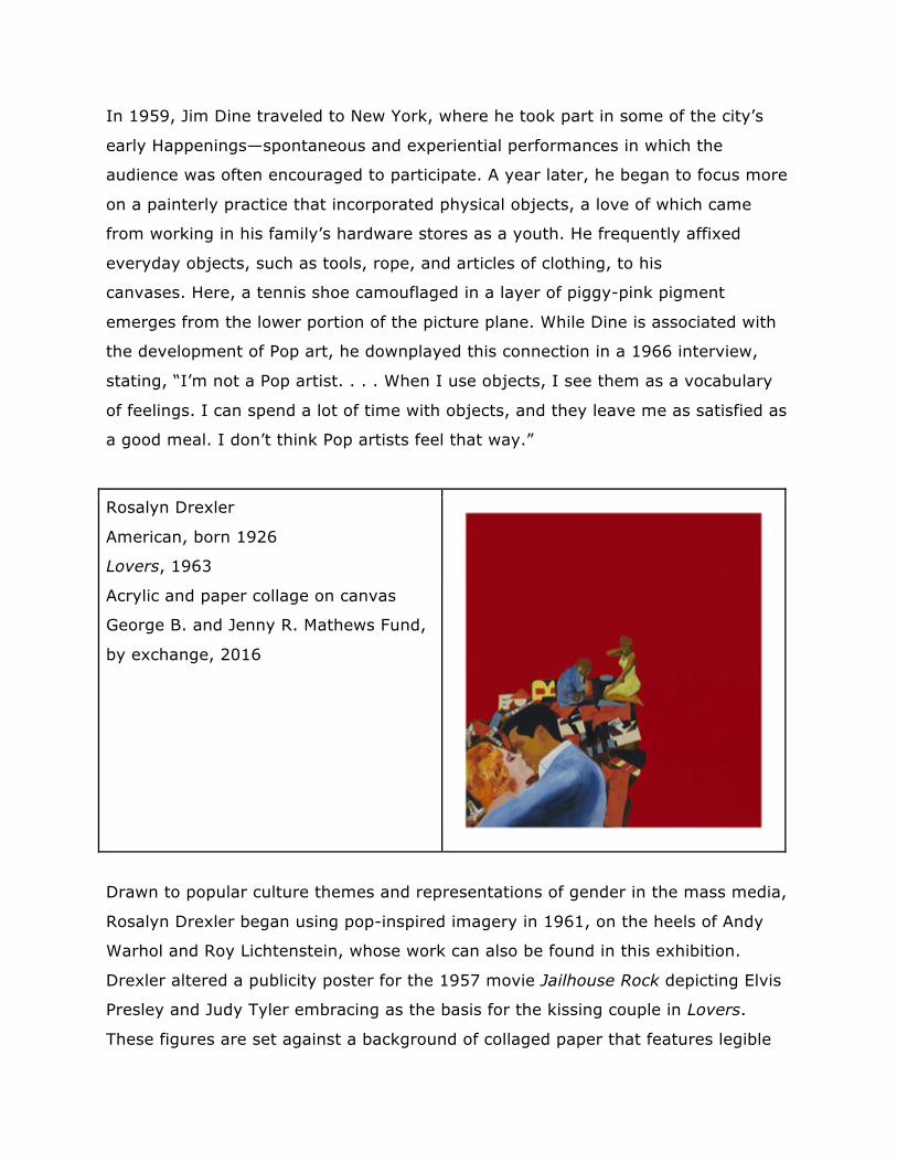
Rosalyn Drexler
American, born 1926
Lovers, 1963
Acrylic and paper collage on canvas
George B. and Jenny R. Mathews Fund,
by exchange, 2016
Drawn to popular culture themes and representations of gender in the mass media,
Rosalyn Drexler began using pop-inspired imagery in 1961, on the heels of Andy
Warhol and Roy Lichtenstein, whose work can also be found in this exhibition.
Drexler altered a publicity poster for the 1957 movie Jailhouse Rock depicting Elvis
Presley and Judy Tyler embracing as the basis for the kissing couple in Lovers.
These figures are set against a background of collaged paper that features legible
snippets such as “co-starring,” “released,” “am I faris,” and “willi.” A man and a
woman are seated atop this amalgamation of text. They do not interact, and their
body language conveys doubt, uncertainty, and guilt. The overall composition
implies that the figures in the foreground and those above may represent the same
couple at two different points in their relationship: a moment of passion and one of
betrayal.
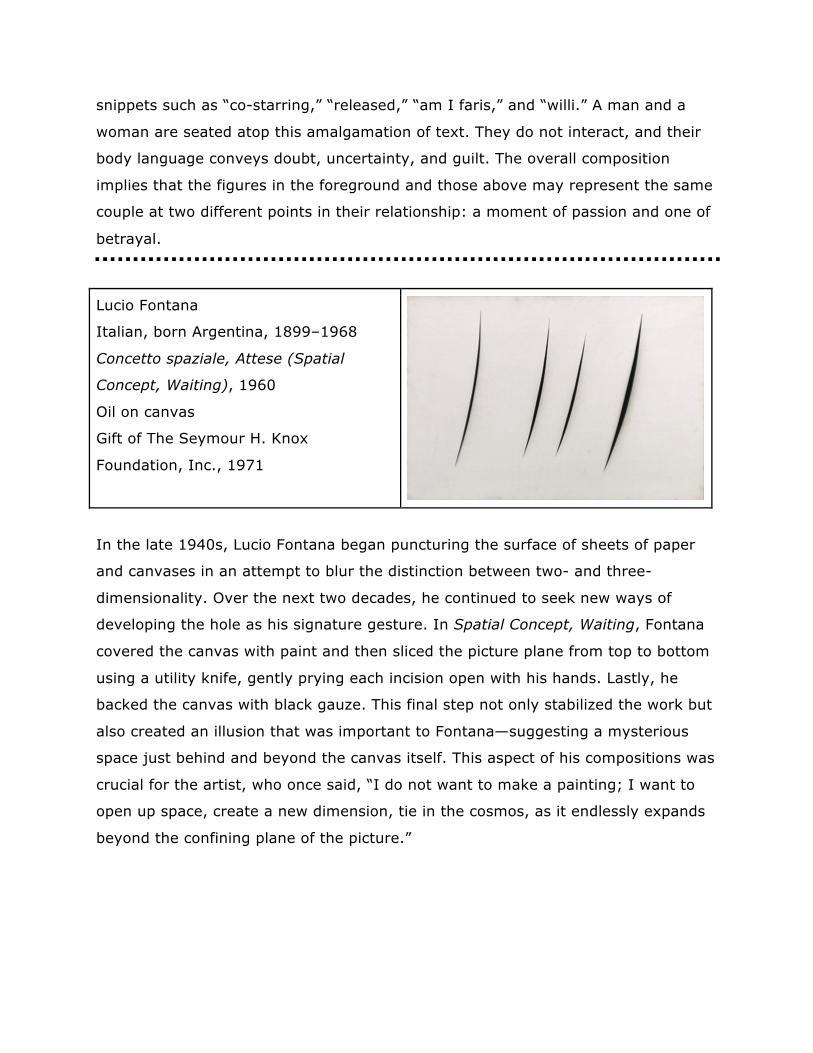
Lucio Fontana
Italian, born Argentina, 1899–1968
Concetto spaziale, Attese (Spatial
Concept, Waiting), 1960
Oil on canvas
Gift of The Seymour H. Knox
Foundation, Inc., 1971
In the late 1940s, Lucio Fontana began puncturing the surface of sheets of paper
and canvases in an attempt to blur the distinction between two- and three-
dimensionality. Over the next two decades, he continued to seek new ways of
developing the hole as his signature gesture. In Spatial Concept, Waiting, Fontana
covered the canvas with paint and then sliced the picture plane from top to bottom
using a utility knife, gently prying each incision open with his hands. Lastly, he
backed the canvas with black gauze. This final step not only stabilized the work but
also created an illusion that was important to Fontana—suggesting a mysterious
space just behind and beyond the canvas itself. This aspect of his compositions was
crucial for the artist, who once said, “I do not want to make a painting; I want to
open up space, create a new dimension, tie in the cosmos, as it endlessly expands
beyond the confining plane of the picture.”
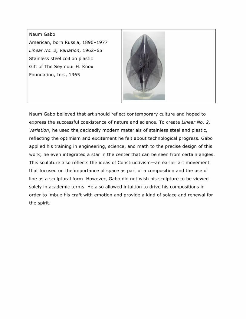
Naum Gabo
American, born Russia, 1890–1977
Linear No. 2, Variation, 1962–65
Stainless steel coil on plastic
Gift of The Seymour H. Knox
Foundation, Inc., 1965
Naum Gabo believed that art should reflect contemporary culture and hoped to
express the successful coexistence of nature and science. To create Linear No. 2,
Variation, he used the decidedly modern materials of stainless steel and plastic,
reflecting the optimism and excitement he felt about technological progress. Gabo
applied his training in engineering, science, and math to the precise design of this
work; he even integrated a star in the center that can be seen from certain angles.
This sculpture also reflects the ideas of Constructivism—an earlier art movement
that focused on the importance of space as part of a composition and the use of
line as a sculptural form. However, Gabo did not wish his sculpture to be viewed
solely in academic terms. He also allowed intuition to drive his compositions in
order to imbue his craft with emotion and provide a kind of solace and renewal for
the spirit.
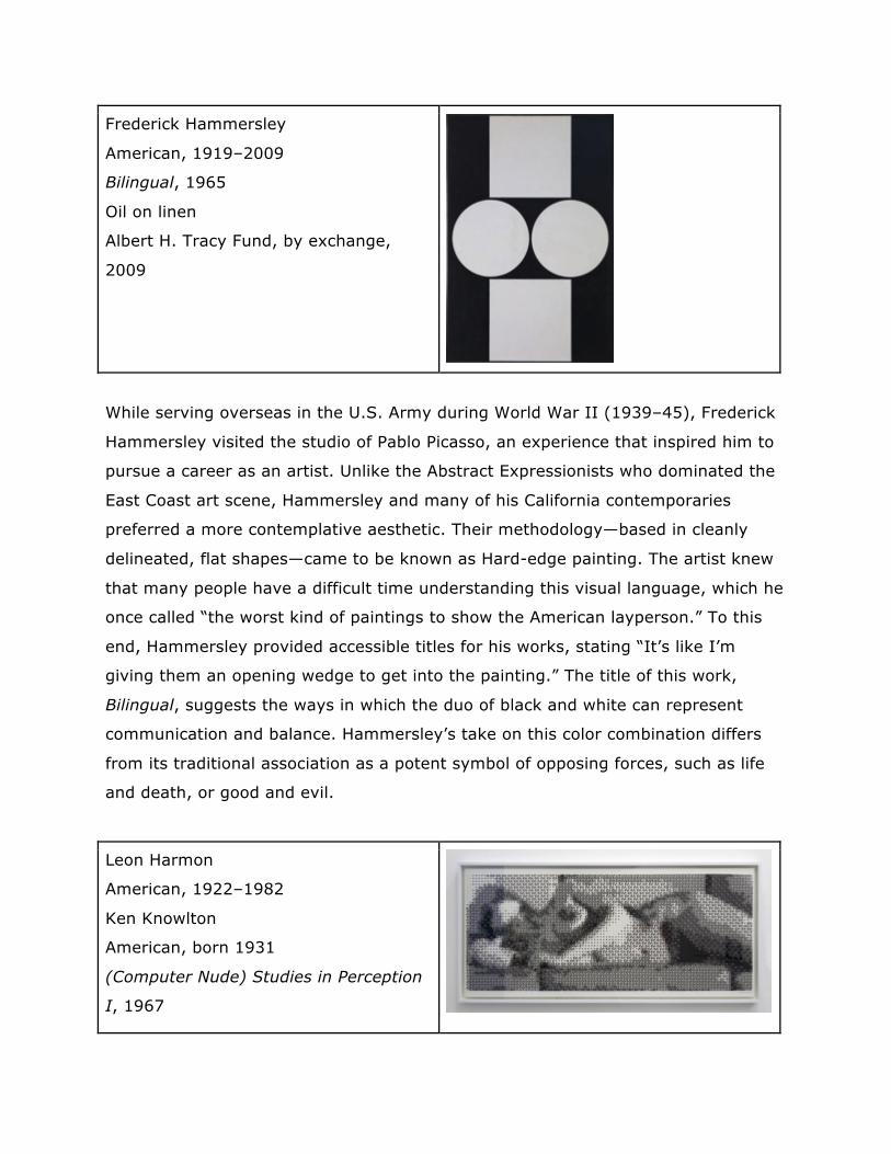
Frederick Hammersley
American, 1919–2009
Bilingual, 1965
Oil on linen
Albert H. Tracy Fund, by exchange,
2009
While serving overseas in the U.S. Army during World War II (1939–45), Frederick
Hammersley visited the studio of Pablo Picasso, an experience that inspired him to
pursue a career as an artist. Unlike the Abstract Expressionists who dominated the
East Coast art scene, Hammersley and many of his California contemporaries
preferred a more contemplative aesthetic. Their methodology—based in cleanly
delineated, flat shapes—came to be known as Hard-edge painting. The artist knew
that many people have a difficult time understanding this visual language, which he
once called “the worst kind of paintings to show the American layperson.” To this
end, Hammersley provided accessible titles for his works, stating “It’s like I’m
giving them an opening wedge to get into the painting.” The title of this work,
Bilingual, suggests the ways in which the duo of black and white can represent
communication and balance. Hammersley’s take on this color combination differs
from its traditional association as a potent symbol of opposing forces, such as life
and death, or good and evil.
Leon Harmon
American, 1922–1982
Ken Knowlton
American, born 1931
(Computer Nude) Studies in Perception
I, 1967
Screen print on paper
Gift of A. Conger Goodyear, by
exchange, 2014
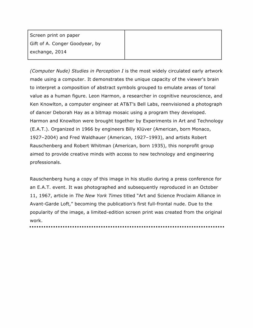
(Computer Nude) Studies in Perception I is the most widely circulated early artwork
made using a computer. It demonstrates the unique capacity of the viewer's brain
to interpret a composition of abstract symbols grouped to emulate areas of tonal
value as a human figure. Leon Harmon, a researcher in cognitive neuroscience, and
Ken Knowlton, a computer engineer at AT&T’s Bell Labs, reenvisioned a photograph
of dancer Deborah Hay as a bitmap mosaic using a program they developed.
Harmon and Knowlton were brought together by Experiments in Art and Technology
(E.A.T.). Organized in 1966 by engineers Billy Klüver (American, born Monaco,
1927–2004) and Fred Waldhauer (American, 1927–1993), and artists Robert
Rauschenberg and Robert Whitman (American, born 1935), this nonprofit group
aimed to provide creative minds with access to new technology and engineering
professionals.
Rauschenberg hung a copy of this image in his studio during a press conference for
an E.A.T. event. It was photographed and subsequently reproduced in an October
11, 1967, article in The New York Times titled “Art and Science Proclaim Alliance in
Avant-Garde Loft,” becoming the publication’s first full-frontal nude. Due to the
popularity of the image, a limited-edition screen print was created from the original
work.
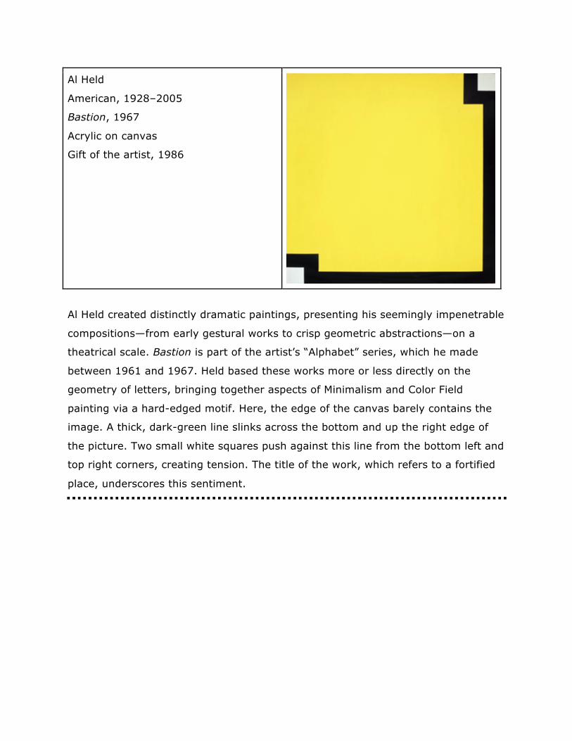
Al Held
American, 1928–2005
Bastion, 1967
Acrylic on canvas
Gift of the artist, 1986
Al Held created distinctly dramatic paintings, presenting his seemingly impenetrable
compositions—from early gestural works to crisp geometric abstractions—on a
theatrical scale. Bastion is part of the artist’s “Alphabet” series, which he made
between 1961 and 1967. Held based these works more or less directly on the
geometry of letters, bringing together aspects of Minimalism and Color Field
painting via a hard-edged motif. Here, the edge of the canvas barely contains the
image. A thick, dark-green line slinks across the bottom and up the right edge of
the picture. Two small white squares push against this line from the bottom left and
top right corners, creating tension. The title of the work, which refers to a fortified
place, underscores this sentiment.
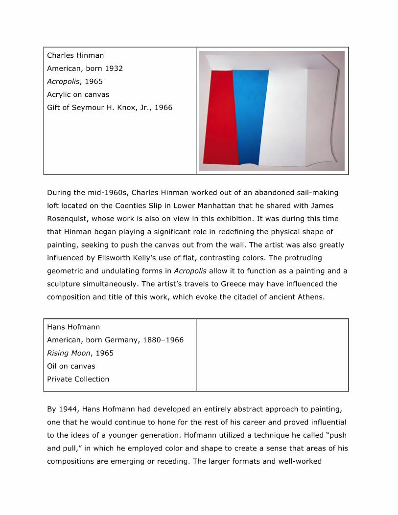
Charles Hinman
American, born 1932
Acropolis, 1965
Acrylic on canvas
Gift of Seymour H. Knox, Jr., 1966
During the mid-1960s, Charles Hinman worked out of an abandoned sail-making
loft located on the Coenties Slip in Lower Manhattan that he shared with James
Rosenquist, whose work is also on view in this exhibition. It was during this time
that Hinman began playing a significant role in redefining the physical shape of
painting, seeking to push the canvas out from the wall. The artist was also greatly
influenced by Ellsworth Kelly’s use of flat, contrasting colors. The protruding
geometric and undulating forms in Acropolis allow it to function as a painting and a
sculpture simultaneously. The artist’s travels to Greece may have influenced the
composition and title of this work, which evoke the citadel of ancient Athens.
Hans Hofmann
American, born Germany, 1880–1966
Rising Moon, 1965
Oil on canvas
Private Collection
By 1944, Hans Hofmann had developed an entirely abstract approach to painting,
one that he would continue to hone for the rest of his career and proved influential
to the ideas of a younger generation. Hofmann utilized a technique he called “push
and pull,” in which he employed color and shape to create a sense that areas of his
compositions are emerging or receding. The larger formats and well-worked
surfaces of his paintings of the 1950s and 1960s reflect the ambiance of Abstract
Expressionism. The smooth blocks of vivid color in Rising Moon are characteristic of
Hofmann’s work after 1958. Not unlike a traditional landscape, the weight of the
image remains at the bottom, while the yellow disk, a specific reference to the
moon, floats above.
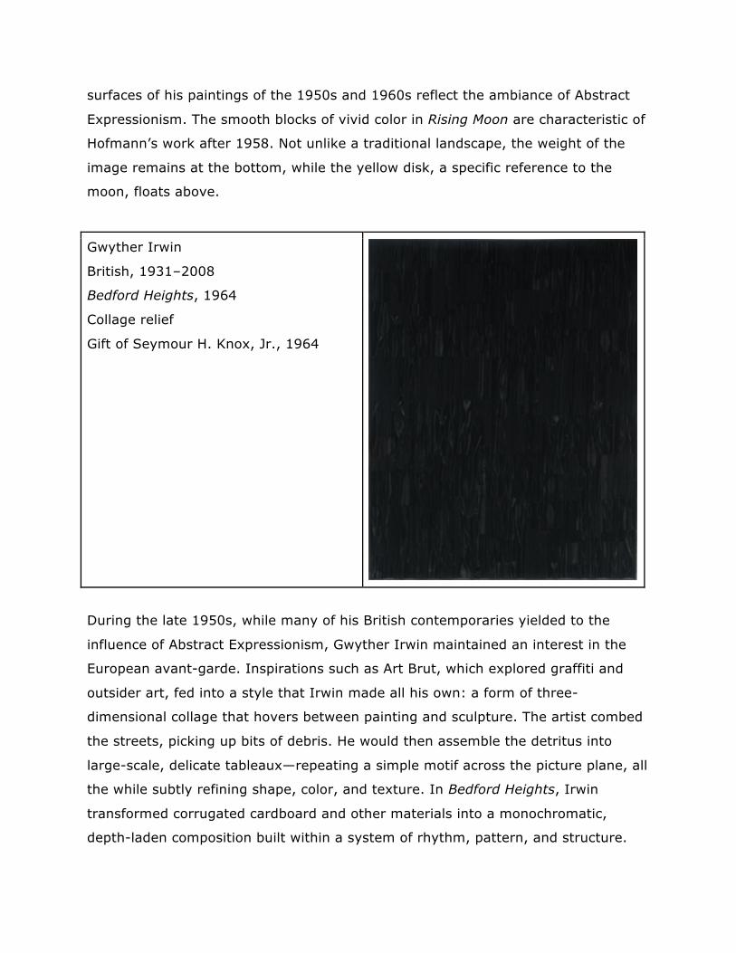
Gwyther Irwin
British, 1931–2008
Bedford Heights, 1964
Collage relief
Gift of Seymour H. Knox, Jr., 1964
During the late 1950s, while many of his British contemporaries yielded to the
influence of Abstract Expressionism, Gwyther Irwin maintained an interest in the
European avant-garde. Inspirations such as Art Brut, which explored graffiti and
outsider art, fed into a style that Irwin made all his own: a form of three-
dimensional collage that hovers between painting and sculpture. The artist combed
the streets, picking up bits of debris. He would then assemble the detritus into
large-scale, delicate tableaux—repeating a simple motif across the picture plane, all
the while subtly refining shape, color, and texture. In Bedford Heights, Irwin
transformed corrugated cardboard and other materials into a monochromatic,
depth-laden composition built within a system of rhythm, pattern, and structure.
The artist has said of his process, ”I watch with wonder and excitement as the
colors and marks, falling from my hand as if propelled by a source of guidance
other than myself, slowly spread across the surface.”
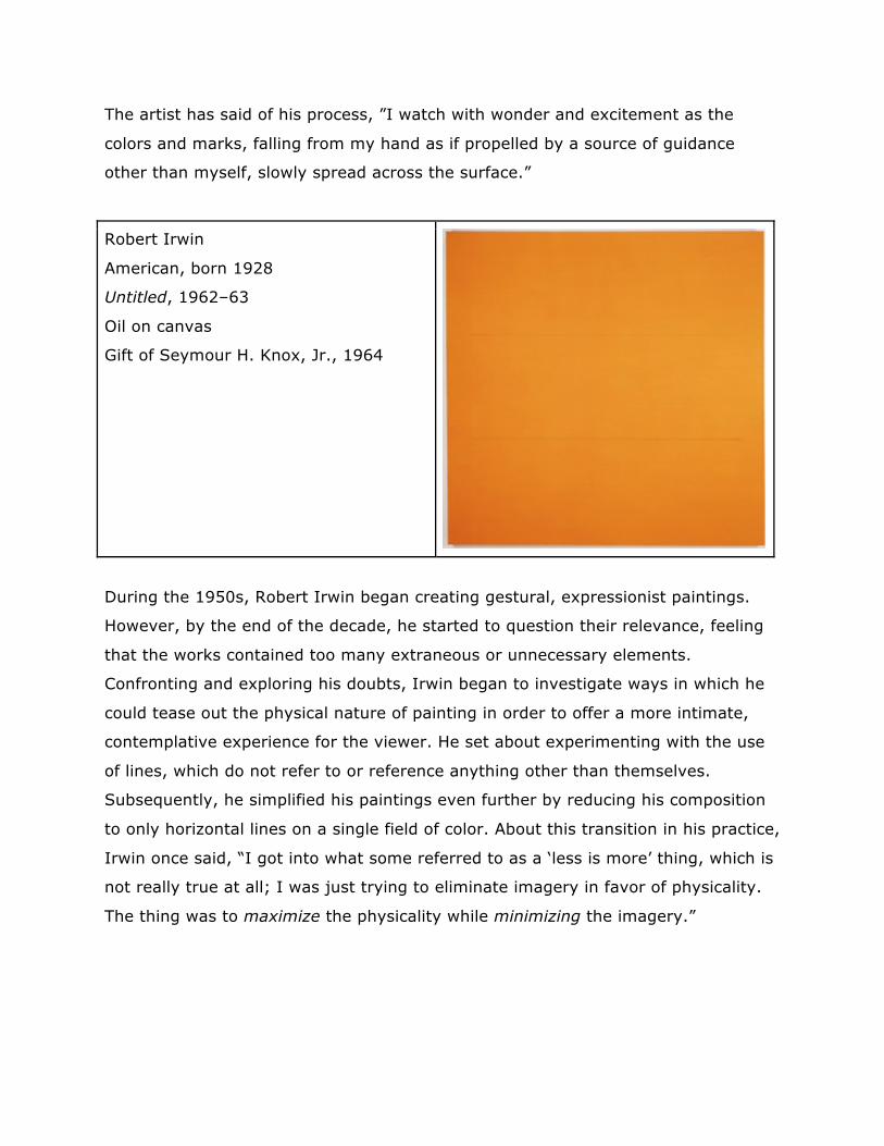
Robert Irwin
American, born 1928
Untitled, 1962–63
Oil on canvas
Gift of Seymour H. Knox, Jr., 1964
During the 1950s, Robert Irwin began creating gestural, expressionist paintings.
However, by the end of the decade, he started to question their relevance, feeling
that the works contained too many extraneous or unnecessary elements.
Confronting and exploring his doubts, Irwin began to investigate ways in which he
could tease out the physical nature of painting in order to offer a more intimate,
contemplative experience for the viewer. He set about experimenting with the use
of lines, which do not refer to or reference anything other than themselves.
Subsequently, he simplified his paintings even further by reducing his composition
to only horizontal lines on a single field of color. About this transition in his practice,
Irwin once said, “I got into what some referred to as a ‘less is more’ thing, which is
not really true at all; I was just trying to eliminate imagery in favor of physicality.
The thing was to maximize the physicality while minimizing the imagery.”
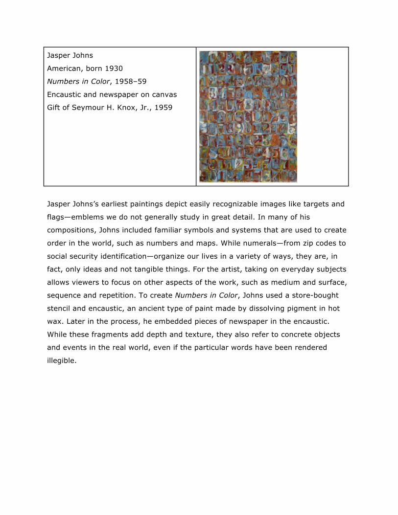
Jasper Johns
American, born 1930
Numbers in Color, 1958–59
Encaustic and newspaper on canvas
Gift of Seymour H. Knox, Jr., 1959
Jasper Johns’s earliest paintings depict easily recognizable images like targets and
flags—emblems we do not generally study in great detail. In many of his
compositions, Johns included familiar symbols and systems that are used to create
order in the world, such as numbers and maps. While numerals—from zip codes to
social security identification—organize our lives in a variety of ways, they are, in
fact, only ideas and not tangible things. For the artist, taking on everyday subjects
allows viewers to focus on other aspects of the work, such as medium and surface,
sequence and repetition. To create Numbers in Color, Johns used a store-bought
stencil and encaustic, an ancient type of paint made by dissolving pigment in hot
wax. Later in the process, he embedded pieces of newspaper in the encaustic.
While these fragments add depth and texture, they also refer to concrete objects
and events in the real world, even if the particular words have been rendered
illegible.
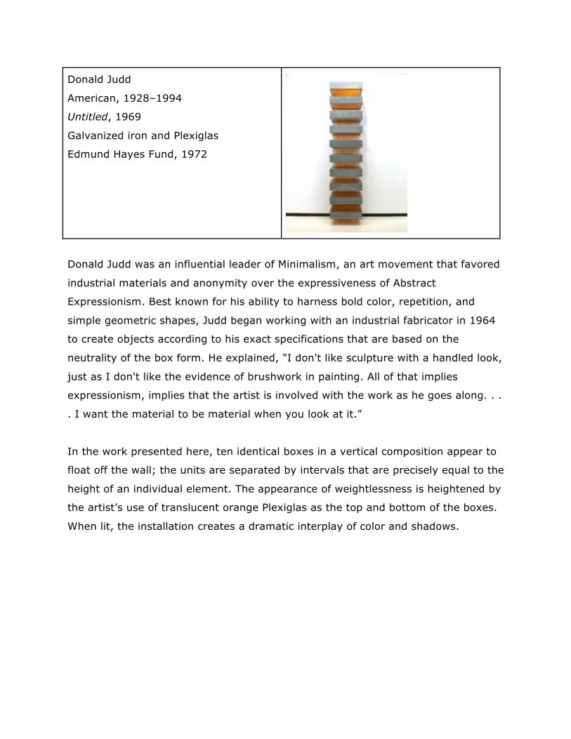
Donald Judd
American, 1928–1994
Untitled, 1969
Galvanized iron and Plexiglas
Edmund Hayes Fund, 1972
Donald Judd was an influential leader of Minimalism, an art movement that favored
industrial materials and anonymity over the expressiveness of Abstract
Expressionism. Best known for his ability to harness bold color, repetition, and
simple geometric shapes, Judd began working with an industrial fabricator in 1964
to create objects according to his exact specifications that are based on the
neutrality of the box form. He explained, "I don't like sculpture with a handled look,
just as I don't like the evidence of brushwork in painting. All of that implies
expressionism, implies that the artist is involved with the work as he goes along. . .
. I want the material to be material when you look at it.”
In the work presented here, ten identical boxes in a vertical composition appear to
float off the wall; the units are separated by intervals that are precisely equal to the
height of an individual element. The appearance of weightlessness is heightened by
the artist’s use of translucent orange Plexiglas as the top and bottom of the boxes.
When lit, the installation creates a dramatic interplay of color and shadows.
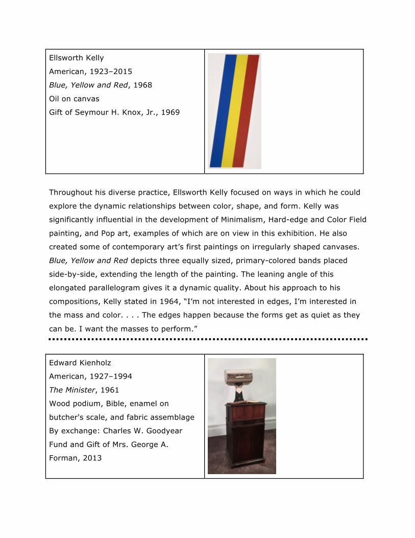
Ellsworth Kelly
American, 1923–2015
Blue, Yellow and Red, 1968
Oil on canvas
Gift of Seymour H. Knox, Jr., 1969
Throughout his diverse practice, Ellsworth Kelly focused on ways in which he could
explore the dynamic relationships between color, shape, and form. Kelly was
significantly influential in the development of Minimalism, Hard-edge and Color Field
painting, and Pop art, examples of which are on view in this exhibition. He also
created some of contemporary art’s first paintings on irregularly shaped canvases.
Blue, Yellow and Red depicts three equally sized, primary-colored bands placed
side-by-side, extending the length of the painting. The leaning angle of this
elongated parallelogram gives it a dynamic quality. About his approach to his
compositions, Kelly stated in 1964, “I’m not interested in edges, I’m interested in
the mass and color. . . . The edges happen because the forms get as quiet as they
can be. I want the masses to perform.”
Edward Kienholz
American, 1927–1994
The Minister, 1961
Wood podium, Bible, enamel on
butcher's scale, and fabric assemblage
By exchange: Charles W. Goodyear
Fund and Gift of Mrs. George A.
Forman, 2013
Edward Kienholz is best known for creating three-dimensional immersive
environments from items he collected at yard sales and flea markets. Kienholz was
also a key figure in Los Angeles’s art scene and a cofounder of the Ferus Gallery, an
important venue for emerging creatives. Throughout his body of work, the artist
tended to focus on portraying the darker side of contemporary life, taking on
themes such as political corruption, moral hypocrisy, and the oppression of
marginalized groups in the United States. While Kienholz’s assembly of objects in
The Minister is at first humorous, there are numerous layers and potential
meanings within the composition. The butcher’s scale, for example, is painted to
look like a minister. This brings to mind the phrase a “pound of flesh,” which traces
its origin to William Shakespeare’s play The Merchant of Venice. The figure of
speech has come to refer to a payment extracted from the person from which it is
owed, causing great distress.
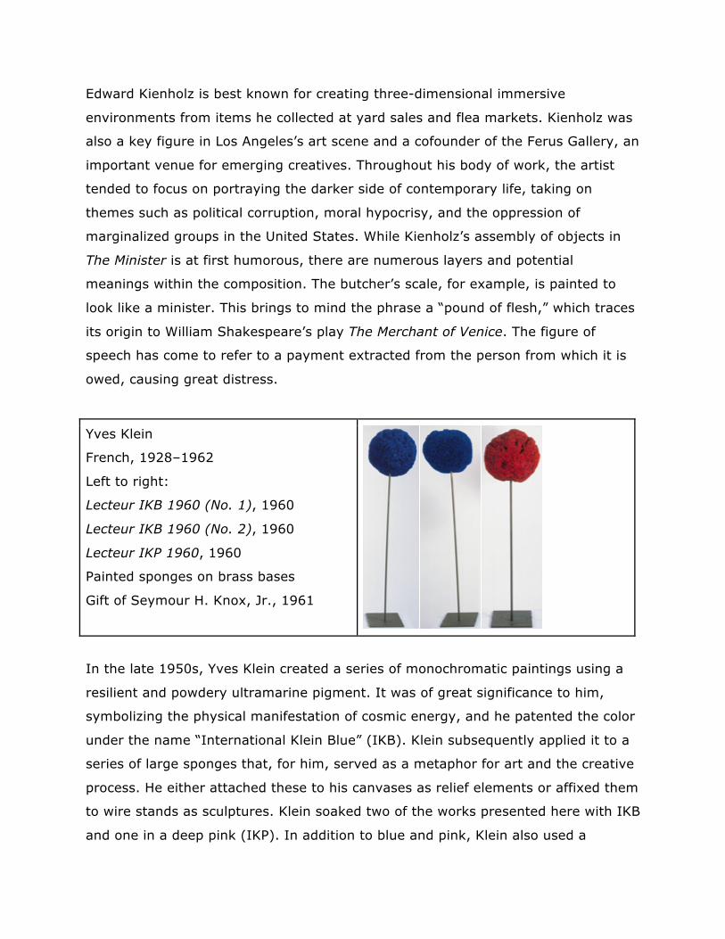
Yves Klein
French, 1928–1962
Left to right:
Lecteur IKB 1960 (No. 1), 1960
Lecteur IKB 1960 (No. 2), 1960
Lecteur IKP 1960, 1960
Painted sponges on brass bases
Gift of Seymour H. Knox, Jr., 1961
In the late 1950s, Yves Klein created a series of monochromatic paintings using a
resilient and powdery ultramarine pigment. It was of great significance to him,
symbolizing the physical manifestation of cosmic energy, and he patented the color
under the name “International Klein Blue” (IKB). Klein subsequently applied it to a
series of large sponges that, for him, served as a metaphor for art and the creative
process. He either attached these to his canvases as relief elements or affixed them
to wire stands as sculptures. Klein soaked two of the works presented here with IKB
and one in a deep pink (IKP). In addition to blue and pink, Klein also used a
particular hue of gold (IKG). Together, he believed these colors to be a holy trinity
of equivalency, stating, “Blue, gold, and pink are of the same nature. Any exchange
at the level of these three states is honest.”
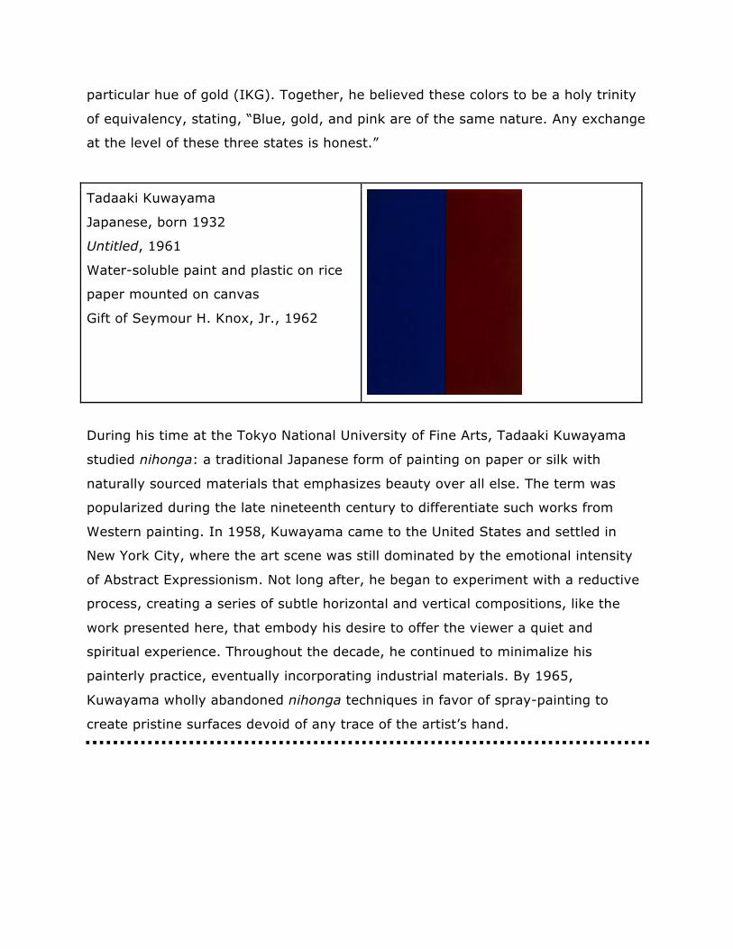
Tadaaki Kuwayama
Japanese, born 1932
Untitled, 1961
Water-soluble paint and plastic on rice
paper mounted on canvas
Gift of Seymour H. Knox, Jr., 1962
During his time at the Tokyo National University of Fine Arts, Tadaaki Kuwayama
studied nihonga: a traditional Japanese form of painting on paper or silk with
naturally sourced materials that emphasizes beauty over all else. The term was
popularized during the late nineteenth century to differentiate such works from
Western painting. In 1958, Kuwayama came to the United States and settled in
New York City, where the art scene was still dominated by the emotional intensity
of Abstract Expressionism. Not long after, he began to experiment with a reductive
process, creating a series of subtle horizontal and vertical compositions, like the
work presented here, that embody his desire to offer the viewer a quiet and
spiritual experience. Throughout the decade, he continued to minimalize his
painterly practice, eventually incorporating industrial materials. By 1965,
Kuwayama wholly abandoned nihonga techniques in favor of spray-painting to
create pristine surfaces devoid of any trace of the artist’s hand.
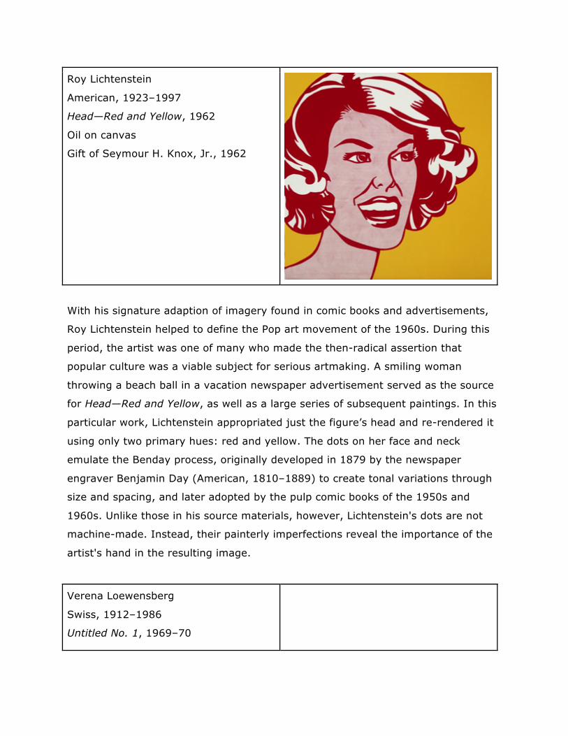
Roy Lichtenstein
American, 1923–1997
Head—Red and Yellow, 1962
Oil on canvas
Gift of Seymour H. Knox, Jr., 1962
With his signature adaption of imagery found in comic books and advertisements,
Roy Lichtenstein helped to define the Pop art movement of the 1960s. During this
period, the artist was one of many who made the then-radical assertion that
popular culture was a viable subject for serious artmaking. A smiling woman
throwing a beach ball in a vacation newspaper advertisement served as the source
for Head—Red and Yellow, as well as a large series of subsequent paintings. In this
particular work, Lichtenstein appropriated just the figure’s head and re-rendered it
using only two primary hues: red and yellow. The dots on her face and neck
emulate the Benday process, originally developed in 1879 by the newspaper
engraver Benjamin Day (American, 1810–1889) to create tonal variations through
size and spacing, and later adopted by the pulp comic books of the 1950s and
1960s. Unlike those in his source materials, however, Lichtenstein's dots are not
machine-made. Instead, their painterly imperfections reveal the importance of the
artist's hand in the resulting image.
Verena Loewensberg
Swiss, 1912–1986
Untitled No. 1, 1969–70
Oil on canvas
Gift of Seymour H. Knox, Jr., 1971
Verena Loewensberg belonged to a core group of Swiss Concrete artists that
included Max Bill, with whom she had a lifelong friendship. However, her take on
Concrete art—a European movement that strongly emphasized geometrical
abstraction devoid of figurative or symbolic references—was more fluid than that of
her peers. Throughout her lifetime, Loewensberg found that intellectual rigor stifled
her creativity, and she explored a number of different artistic directions, ranging
from Color Field to monochromatic painting. Taken as a whole, however, her body
of work reflects a preoccupation with the square, rectangle, and circle, as well as
the interaction between line and color.
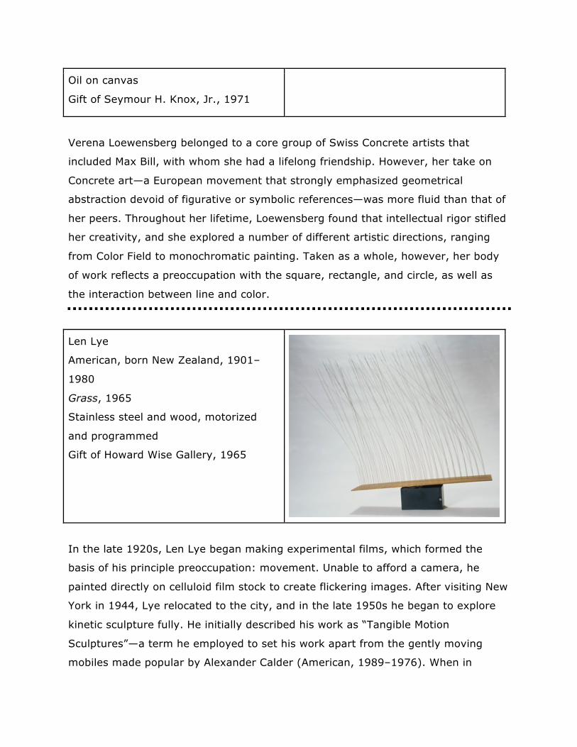
Len Lye
American, born New Zealand, 1901–
1980
Grass, 1965
Stainless steel and wood, motorized
and programmed
Gift of Howard Wise Gallery, 1965
In the late 1920s, Len Lye began making experimental films, which formed the
basis of his principle preoccupation: movement. Unable to afford a camera, he
painted directly on celluloid film stock to create flickering images. After visiting New
York in 1944, Lye relocated to the city, and in the late 1950s he began to explore
kinetic sculpture fully. He initially described his work as “Tangible Motion
Sculptures”—a term he employed to set his work apart from the gently moving
mobiles made popular by Alexander Calder (American, 1989–1976). When in
motion, this calming work is reminiscent of beach grass swaying in the breeze along
the shoreline of Lye’s native New Zealand. However, “Grass came about without
any preconceived ideas about its imagery,” the artist explained. “It came from
watching a single rod swaying and then doubling up to emphasize the accelerating
stroke of its oscillation. It was the ‘lurch’ part of the sway that I liked. It should be
timed to slow music . . . I prefer something in similar tempo in the Satie style.”
For this installation, Grass has been paired with Gymnopédie No.1, 1888,
by composer Erik Satie (French, 1866–1925). We invite viewers to first
experience this work without music and then press the button to listen. To
stop music, press button again. Please note that this work is designed to
rest for five minutes between ten minute periods of motion.
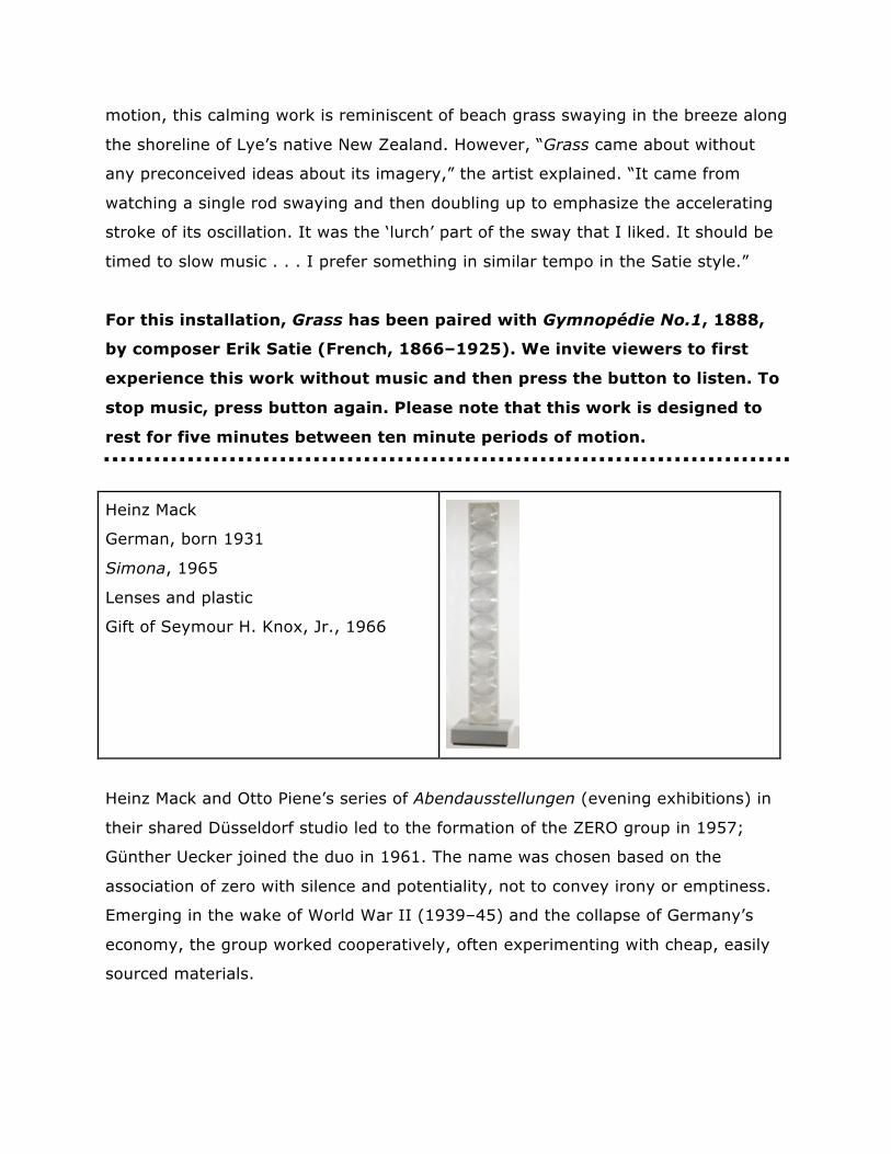
Heinz Mack
German, born 1931
Simona, 1965
Lenses and plastic
Gift of Seymour H. Knox, Jr., 1966
Heinz Mack and Otto Piene’s series of Abendausstellungen (evening exhibitions) in
their shared Düsseldorf studio led to the formation of the ZERO group in 1957;
Günther Uecker joined the duo in 1961. The name was chosen based on the
association of zero with silence and potentiality, not to convey irony or emptiness.
Emerging in the wake of World War II (1939–45) and the collapse of Germany’s
economy, the group worked cooperatively, often experimenting with cheap, easily
sourced materials.
In the majority of his compositions, Mack aims to capture the movement of natural
elements, and the ways in which they reflect and absorb light. Simona, a tall,
slender construction of repetitive design alludes to the silhouette of the
skyscraper—a symbol of mid-twentieth-century modernity. For the artist, however,
the column also represents dignity and humanity standing upright in space. Mack
has said, “The main thing is that all the artists that were or have been involved in
the spirit of ZERO in general are working with structures . . . making concrete not
realistic work: it’s just structures—and behind these structures is the idea of light,
space, and movement.”
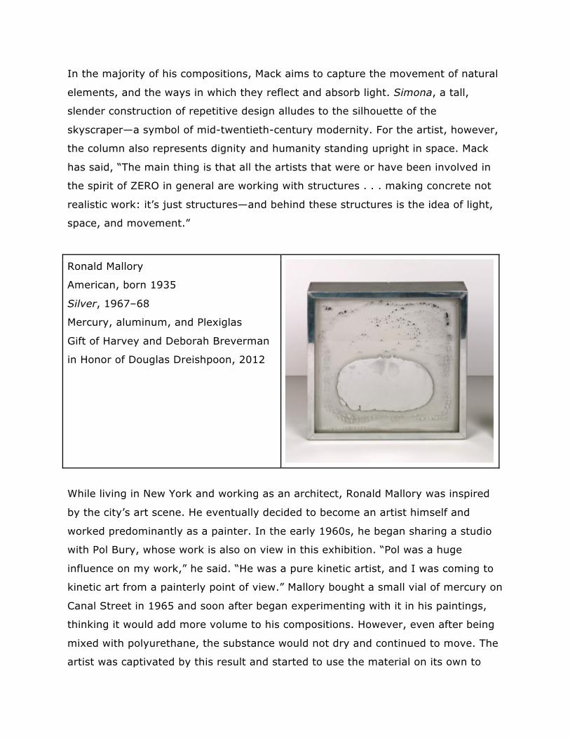
Ronald Mallory
American, born 1935
Silver, 1967–68
Mercury, aluminum, and Plexiglas
Gift of Harvey and Deborah Breverman
in Honor of Douglas Dreishpoon, 2012
While living in New York and working as an architect, Ronald Mallory was inspired
by the city’s art scene. He eventually decided to become an artist himself and
worked predominantly as a painter. In the early 1960s, he began sharing a studio
with Pol Bury, whose work is also on view in this exhibition. “Pol was a huge
influence on my work,” he said. “He was a pure kinetic artist, and I was coming to
kinetic art from a painterly point of view.” Mallory bought a small vial of mercury on
Canal Street in 1965 and soon after began experimenting with it in his paintings,
thinking it would add more volume to his compositions. However, even after being
mixed with polyurethane, the substance would not dry and continued to move. The
artist was captivated by this result and started to use the material on its own to
create kinetic sculptures. While controlling the viscosity of the mercury proved to be
difficult, eventually, after trial and error, Mallory began to unravel the secret of
manipulating it to achieve the desired effect.
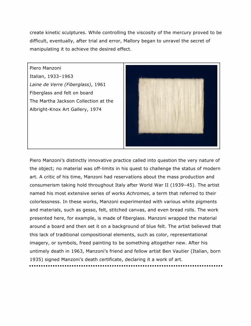
Piero Manzoni
Italian, 1933–1963
Laine de Verre (Fiberglass), 1961
Fiberglass and felt on board
The Martha Jackson Collection at the
Albright-Knox Art Gallery, 1974
Piero Manzoni’s distinctly innovative practice called into question the very nature of
the object; no material was off-limits in his quest to challenge the status of modern
art. A critic of his time, Manzoni had reservations about the mass production and
consumerism taking hold throughout Italy after World War II (1939–45). The artist
named his most extensive series of works Achromes, a term that referred to their
colorlessness. In these works, Manzoni experimented with various white pigments
and materials, such as gesso, felt, stitched canvas, and even bread rolls. The work
presented here, for example, is made of fiberglass. Manzoni wrapped the material
around a board and then set it on a background of blue felt. The artist believed that
this lack of traditional compositional elements, such as color, representational
imagery, or symbols, freed painting to be something altogether new. After his
untimely death in 1963, Manzoni’s friend and fellow artist Ben Vautier (Italian, born
1935) signed Manzoni’s death certificate, declaring it a work of art.
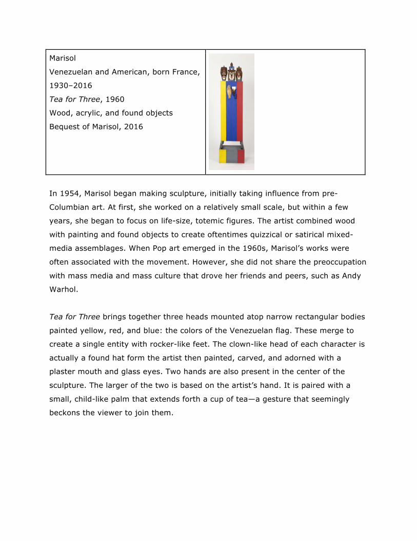
Marisol
Venezuelan and American, born France,
1930–2016
Tea for Three, 1960
Wood, acrylic, and found objects
Bequest of Marisol, 2016
In 1954, Marisol began making sculpture, initially taking influence from pre-
Columbian art. At first, she worked on a relatively small scale, but within a few
years, she began to focus on life-size, totemic figures. The artist combined wood
with painting and found objects to create oftentimes quizzical or satirical mixed-
media assemblages. When Pop art emerged in the 1960s, Marisol’s works were
often associated with the movement. However, she did not share the preoccupation
with mass media and mass culture that drove her friends and peers, such as Andy
Warhol.
Tea for Three brings together three heads mounted atop narrow rectangular bodies
painted yellow, red, and blue: the colors of the Venezuelan flag. These merge to
create a single entity with rocker-like feet. The clown-like head of each character is
actually a found hat form the artist then painted, carved, and adorned with a
plaster mouth and glass eyes. Two hands are also present in the center of the
sculpture. The larger of the two is based on the artist’s hand. It is paired with a
small, child-like palm that extends forth a cup of tea—a gesture that seemingly
beckons the viewer to join them.
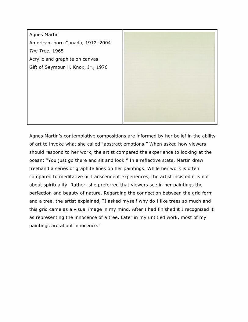
Agnes Martin
American, born Canada, 1912–2004
The Tree, 1965
Acrylic and graphite on canvas
Gift of Seymour H. Knox, Jr., 1976
Agnes Martin’s contemplative compositions are informed by her belief in the ability
of art to invoke what she called “abstract emotions.” When asked how viewers
should respond to her work, the artist compared the experience to looking at the
ocean: “You just go there and sit and look.” In a reflective state, Martin drew
freehand a series of graphite lines on her paintings. While her work is often
compared to meditative or transcendent experiences, the artist insisted it is not
about spirituality. Rather, she preferred that viewers see in her paintings the
perfection and beauty of nature. Regarding the connection between the grid form
and a tree, the artist explained, “I asked myself why do I like trees so much and
this grid came as a visual image in my mind. After I had finished it I recognized it
as representing the innocence of a tree. Later in my untitled work, most of my
paintings are about innocence.”
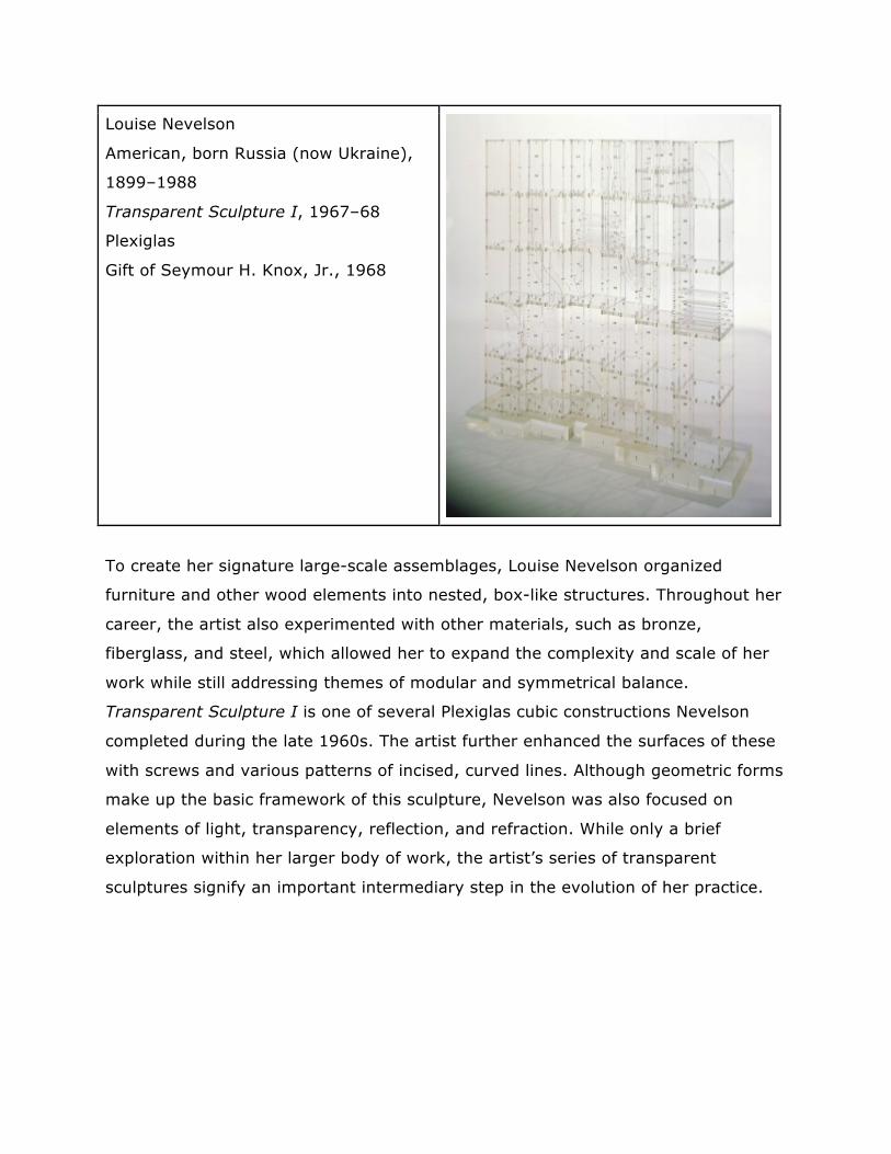
Louise Nevelson
American, born Russia (now Ukraine),
1899–1988
Transparent Sculpture I, 1967–68
Plexiglas
Gift of Seymour H. Knox, Jr., 1968
To create her signature large-scale assemblages, Louise Nevelson organized
furniture and other wood elements into nested, box-like structures. Throughout her
career, the artist also experimented with other materials, such as bronze,
fiberglass, and steel, which allowed her to expand the complexity and scale of her
work while still addressing themes of modular and symmetrical balance.
Transparent Sculpture I is one of several Plexiglas cubic constructions Nevelson
completed during the late 1960s. The artist further enhanced the surfaces of these
with screws and various patterns of incised, curved lines. Although geometric forms
make up the basic framework of this sculpture, Nevelson was also focused on
elements of light, transparency, reflection, and refraction. While only a brief
exploration within her larger body of work, the artist’s series of transparent
sculptures signify an important intermediary step in the evolution of her practice.
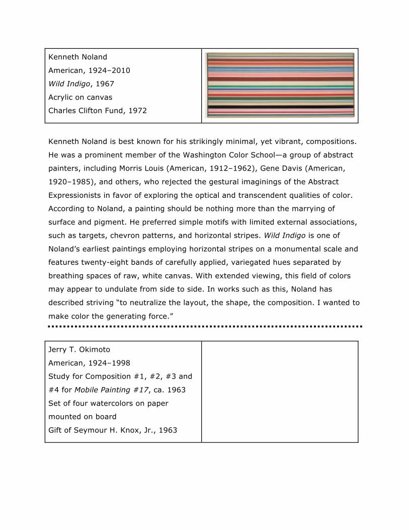
Kenneth Noland
American, 1924–2010
Wild Indigo, 1967
Acrylic on canvas
Charles Clifton Fund, 1972
Kenneth Noland is best known for his strikingly minimal, yet vibrant, compositions.
He was a prominent member of the Washington Color School—a group of abstract
painters, including Morris Louis (American, 1912–1962), Gene Davis (American,
1920–1985), and others, who rejected the gestural imaginings of the Abstract
Expressionists in favor of exploring the optical and transcendent qualities of color.
According to Noland, a painting should be nothing more than the marrying of
surface and pigment. He preferred simple motifs with limited external associations,
such as targets, chevron patterns, and horizontal stripes. Wild Indigo is one of
Noland’s earliest paintings employing horizontal stripes on a monumental scale and
features twenty-eight bands of carefully applied, variegated hues separated by
breathing spaces of raw, white canvas. With extended viewing, this field of colors
may appear to undulate from side to side. In works such as this, Noland has
described striving “to neutralize the layout, the shape, the composition. I wanted to
make color the generating force.”
Jerry T. Okimoto
American, 1924–1998
Study for Composition #1, #2, #3 and
#4 for Mobile Painting #17, ca. 1963
Set of four watercolors on paper
mounted on board
Gift of Seymour H. Knox, Jr., 1963
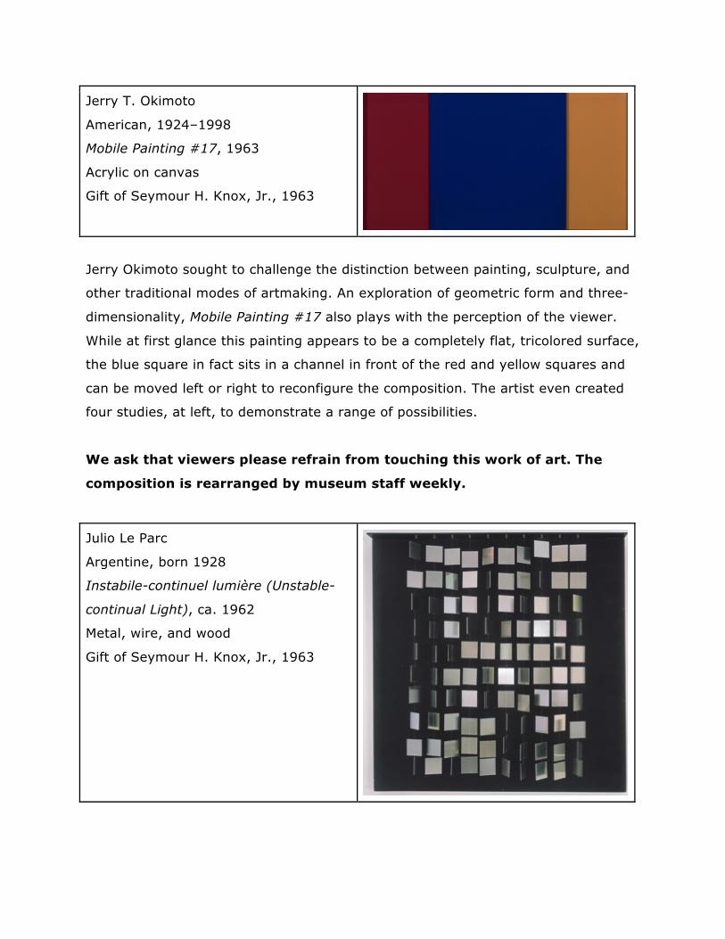
Jerry T. Okimoto
American, 1924–1998
Mobile Painting #17, 1963
Acrylic on canvas
Gift of Seymour H. Knox, Jr., 1963
Jerry Okimoto sought to challenge the distinction between painting, sculpture, and
other traditional modes of artmaking. An exploration of geometric form and three-
dimensionality, Mobile Painting #17 also plays with the perception of the viewer.
While at first glance this painting appears to be a completely flat, tricolored surface,
the blue square in fact sits in a channel in front of the red and yellow squares and
can be moved left or right to reconfigure the composition. The artist even created
four studies, at left, to demonstrate a range of possibilities.
We ask that viewers please refrain from touching this work of art. The
composition is rearranged by museum staff weekly.
Julio Le Parc
Argentine, born 1928
Instabile-continuel lumière (Unstable-
continual Light), ca. 1962
Metal, wire, and wood
Gift of Seymour H. Knox, Jr., 1963
During the 1950s, Julio Le Parc became intrigued by the participatory possibilities of
Op and Kinetic art, two movements that were in their formative years. In 1959, Le
Parc relocated from Argentina to France. There he helped found the Paris-based
collaborative Groupe de Recherche d’Art Visuel (GRAV) in 1961. The group brought
together eleven Op and Kinetic artists, including Francisco Sobrino and Jean-Pierre
Yvaral, whose work is also on view in this exhibition. Le Parc found his niche in
employing light and movement to produce vibrant results that depend on viewer
interaction. Unstable-continual Light is composed of highly polished metal paillettes
hung on nylon thread in front of a black backdrop. The slightest air disturbance
causes a significant degree of interplay among these elements, which also reflect
their surroundings to create a brilliantly random play of light and shadow.
While it is the intention of the artist for the elements of this work to
respond to air movement, we ask that you please not blow on it.
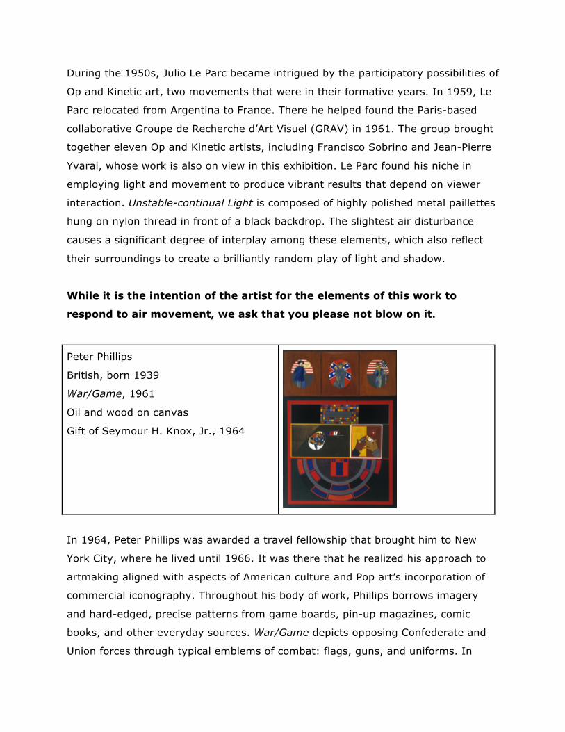
Peter Phillips
British, born 1939
War/Game, 1961
Oil and wood on canvas
Gift of Seymour H. Knox, Jr., 1964
In 1964, Peter Phillips was awarded a travel fellowship that brought him to New
York City, where he lived until 1966. It was there that he realized his approach to
artmaking aligned with aspects of American culture and Pop art’s incorporation of
commercial iconography. Throughout his body of work, Phillips borrows imagery
and hard-edged, precise patterns from game boards, pin-up magazines, comic
books, and other everyday sources. War/Game depicts opposing Confederate and
Union forces through typical emblems of combat: flags, guns, and uniforms. In
works such as this, Phillips combined areas of machine-inspired precision with
sections that are more painterly to create assemblage-like compositions. Not unlike
artist Robert Indiana (whose work is on view elsewhere in the museum), he often
returned to similar imagery in multiple compositions.
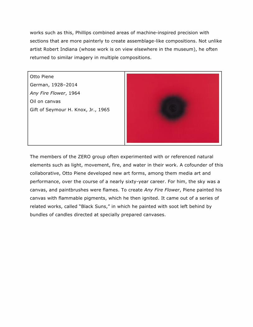
Otto Piene
German, 1928–2014
Any Fire Flower, 1964
Oil on canvas
Gift of Seymour H. Knox, Jr., 1965
The members of the ZERO group often experimented with or referenced natural
elements such as light, movement, fire, and water in their work. A cofounder of this
collaborative, Otto Piene developed new art forms, among them media art and
performance, over the course of a nearly sixty-year career. For him, the sky was a
canvas, and paintbrushes were flames. To create Any Fire Flower, Piene painted his
canvas with flammable pigments, which he then ignited. It came out of a series of
related works, called “Black Suns,” in which he painted with soot left behind by
bundles of candles directed at specially prepared canvases.
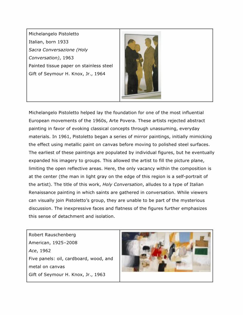
Michelangelo Pistoletto
Italian, born 1933
Sacra Conversazione (Holy
Conversation), 1963
Painted tissue paper on stainless steel
Gift of Seymour H. Knox, Jr., 1964
Michelangelo Pistoletto helped lay the foundation for one of the most influential
European movements of the 1960s, Arte Povera. These artists rejected abstract
painting in favor of evoking classical concepts through unassuming, everyday
materials. In 1961, Pistoletto began a series of mirror paintings, initially mimicking
the effect using metallic paint on canvas before moving to polished steel surfaces.
The earliest of these paintings are populated by individual figures, but he eventually
expanded his imagery to groups. This allowed the artist to fill the picture plane,
limiting the open reflective areas. Here, the only vacancy within the composition is
at the center (the man in light gray on the edge of this region is a self-portrait of
the artist). The title of this work, Holy Conversation, alludes to a type of Italian
Renaissance painting in which saints are gathered in conversation. While viewers
can visually join Pistoletto’s group, they are unable to be part of the mysterious
discussion. The inexpressive faces and flatness of the figures further emphasizes
this sense of detachment and isolation.
Robert Rauschenberg
American, 1925–2008
Ace, 1962
Five panels: oil, cardboard, wood, and
metal on canvas
Gift of Seymour H. Knox, Jr., 1963
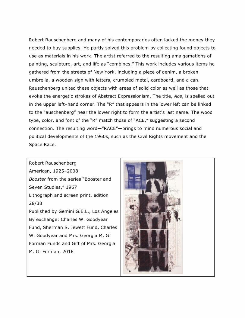
Robert Rauschenberg and many of his contemporaries often lacked the money they
needed to buy supplies. He partly solved this problem by collecting found objects to
use as materials in his work. The artist referred to the resulting amalgamations of
painting, sculpture, art, and life as “combines.” This work includes various items he
gathered from the streets of New York, including a piece of denim, a broken
umbrella, a wooden sign with letters, crumpled metal, cardboard, and a can.
Rauschenberg united these objects with areas of solid color as well as those that
evoke the energetic strokes of Abstract Expressionism. The title, Ace, is spelled out
in the upper left–hand corner. The “R” that appears in the lower left can be linked
to the “auschenberg” near the lower right to form the artist's last name. The wood
type, color, and font of the “R” match those of “ACE,” suggesting a second
connection. The resulting word—”RACE”—brings to mind numerous social and
political developments of the 1960s, such as the Civil Rights movement and the
Space Race.
Robert Rauschenberg
American, 1925–2008
Booster from the series “Booster and
Seven Studies,” 1967
Lithograph and screen print, edition
28/38
Published by Gemini G.E.L., Los Angeles
By exchange: Charles W. Goodyear
Fund, Sherman S. Jewett Fund, Charles
W. Goodyear and Mrs. Georgia M. G.
Forman Funds and Gift of Mrs. Georgia
M. G. Forman, 2016
Robert Rauschenberg’s approach to art was exceedingly innovative, often resulting
in works that elude categorization. His collaborations with printmakers, for
example, did not always yield traditional results. The artist’s self-portrait Booster
exemplifies his highly experimental approach to the medium. Here, Rauschenberg
brings together a seemingly disparate collection of imagery: a life-sized X-ray
portrait of himself, an astrological chart, pictures of athletes taken from magazines,
and images of a chair and two power drills. By combining the processes of
lithography and screen printing, the artist, together with master printmaker
Kenneth Tyler, radically expanded the aesthetic possibilities of planographic
printmaking, which utilizes a flat, as opposed to a raised, surface. At the time of its
creation, Booster was the largest and most technically sophisticated hand-pulled
print ever produced, and it catapulted printmaking into a new era of
experimentation.
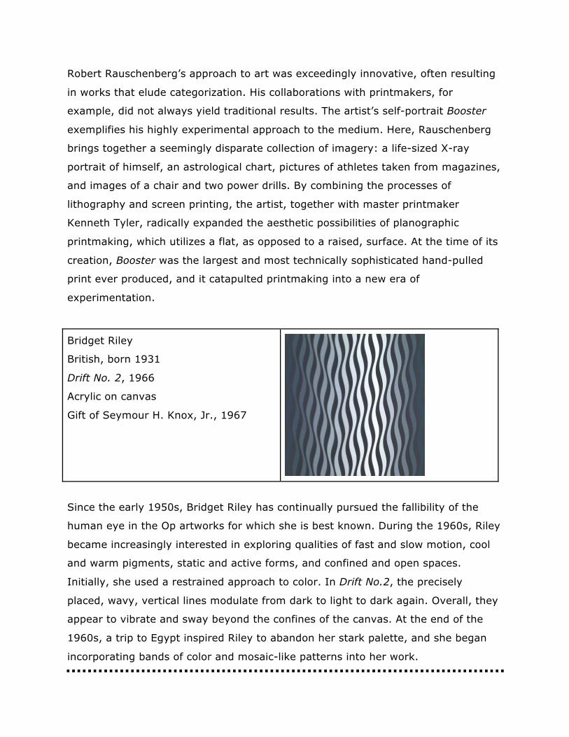
Bridget Riley
British, born 1931
Drift No. 2, 1966
Acrylic on canvas
Gift of Seymour H. Knox, Jr., 1967
Since the early 1950s, Bridget Riley has continually pursued the fallibility of the
human eye in the Op artworks for which she is best known. During the 1960s, Riley
became increasingly interested in exploring qualities of fast and slow motion, cool
and warm pigments, static and active forms, and confined and open spaces.
Initially, she used a restrained approach to color. In Drift No.2, the precisely
placed, wavy, vertical lines modulate from dark to light to dark again. Overall, they
appear to vibrate and sway beyond the confines of the canvas. At the end of the
1960s, a trip to Egypt inspired Riley to abandon her stark palette, and she began
incorporating bands of color and mosaic-like patterns into her work.
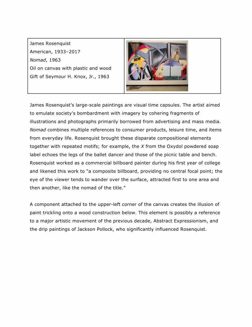
James Rosenquist
American, 1933–2017
Nomad, 1963
Oil on canvas with plastic and wood
Gift of Seymour H. Knox, Jr., 1963
James Rosenquist’s large-scale paintings are visual time capsules. The artist aimed
to emulate society's bombardment with imagery by cohering fragments of
illustrations and photographs primarily borrowed from advertising and mass media.
Nomad combines multiple references to consumer products, leisure time, and items
from everyday life. Rosenquist brought these disparate compositional elements
together with repeated motifs; for example, the X from the Oxydol powdered soap
label echoes the legs of the ballet dancer and those of the picnic table and bench.
Rosenquist worked as a commercial billboard painter during his first year of college
and likened this work to “a composite billboard, providing no central focal point; the
eye of the viewer tends to wander over the surface, attracted first to one area and
then another, like the nomad of the title.”
A component attached to the upper-left corner of the canvas creates the illusion of
paint trickling onto a wood construction below. This element is possibly a reference
to a major artistic movement of the previous decade, Abstract Expressionism, and
the drip paintings of Jackson Pollock, who significantly influenced Rosenquist.
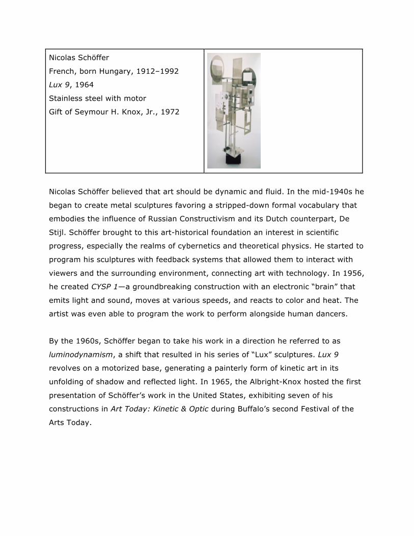
Nicolas Schöffer
French, born Hungary, 1912–1992
Lux 9, 1964
Stainless steel with motor
Gift of Seymour H. Knox, Jr., 1972
Nicolas Schöffer believed that art should be dynamic and fluid. In the mid-1940s he
began to create metal sculptures favoring a stripped-down formal vocabulary that
embodies the influence of Russian Constructivism and its Dutch counterpart, De
Stijl. Schöffer brought to this art-historical foundation an interest in scientific
progress, especially the realms of cybernetics and theoretical physics. He started to
program his sculptures with feedback systems that allowed them to interact with
viewers and the surrounding environment, connecting art with technology. In 1956,
he created CYSP 1—a groundbreaking construction with an electronic “brain” that
emits light and sound, moves at various speeds, and reacts to color and heat. The
artist was even able to program the work to perform alongside human dancers.
By the 1960s, Schöffer began to take his work in a direction he referred to as
luminodynamism, a shift that resulted in his series of “Lux” sculptures. Lux 9
revolves on a motorized base, generating a painterly form of kinetic art in its
unfolding of shadow and reflected light. In 1965, the Albright-Knox hosted the first
presentation of Schöffer’s work in the United States, exhibiting seven of his
constructions in Art Today: Kinetic & Optic during Buffalo’s second Festival of the
Arts Today.
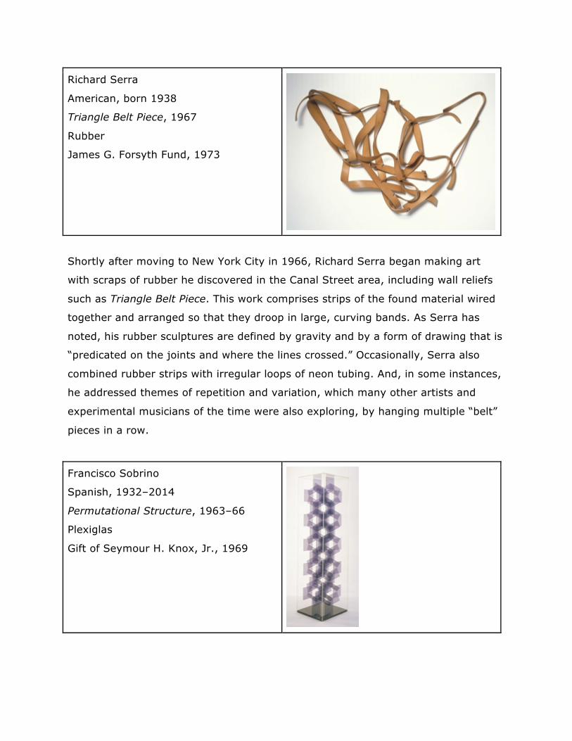
Richard Serra
American, born 1938
Triangle Belt Piece, 1967
Rubber
James G. Forsyth Fund, 1973
Shortly after moving to New York City in 1966, Richard Serra began making art
with scraps of rubber he discovered in the Canal Street area, including wall reliefs
such as Triangle Belt Piece. This work comprises strips of the found material wired
together and arranged so that they droop in large, curving bands. As Serra has
noted, his rubber sculptures are defined by gravity and by a form of drawing that is
“predicated on the joints and where the lines crossed.” Occasionally, Serra also
combined rubber strips with irregular loops of neon tubing. And, in some instances,
he addressed themes of repetition and variation, which many other artists and
experimental musicians of the time were also exploring, by hanging multiple “belt”
pieces in a row.
Francisco Sobrino
Spanish, 1932–2014
Permutational Structure, 1963–66
Plexiglas
Gift of Seymour H. Knox, Jr., 1969
In 1949, Francisco Sobrino emigrated with his parents from Spain to Argentina,
where he went on to study at the National School of Fine Arts in Buenos Aires. It
was there that he first met Julio Le Parc and other artists associated with the
Groupe de Recherche d’Art Visuel (GRAV). Like his peers, Sobrino wished to imbue
his art with social function, fun, and creativity. From 1960 onward, Plexiglas was
the artist’s preferred medium; he was particularly drawn to the way the material
lends itself to modular form. Light passes through the surface of Permutational
Sculpture, creating shadows that overlap, adding to and subtracting from the
overall composition. This disciplined and controlled mastery earned Sobrino the
nickname of “architect of light.”
Jésus Rafaël Soto
Venezuelan, 1923–2005
Jai-Alai, 1969
Set of nine optical and kinetic works:
five sculptures and four screen prints on
Plexiglas, edition 202/300
Gift of Thomas S. Currier, 1979
Throughout his body of work, Jésus Rafaël Soto utilized industrial and synthetic
materials, such as nylon, steel, and Plexiglas, in an exploration of pure abstraction,
color theory, and the dynamism between background and foreground. In the group
of works presented here, Soto activates optical effects through the manipulation of
color relationships and sculptural interventions. Jai-Alai takes its title from a highly
popular sport in Latin America, which involves catching and throwing a ball against
a wall at high speeds with a hook-shaped basket worn on the player’s arm. In these
works, Soto sought to express the continual movement of jai-alai athletes. During
the 1950s and 1960s, Soto collaborated with many group ZERO artists, who utilized
light and motion to expand viewers’ perception (examples of their work are on view
in the adjacent gallery). Like Naum Gabo, Soto was also influenced by
Constructivism, in which artists sought to abolish composition as a traditional
artistic concern and, instead, focused on the construction of objects using modern
materials.
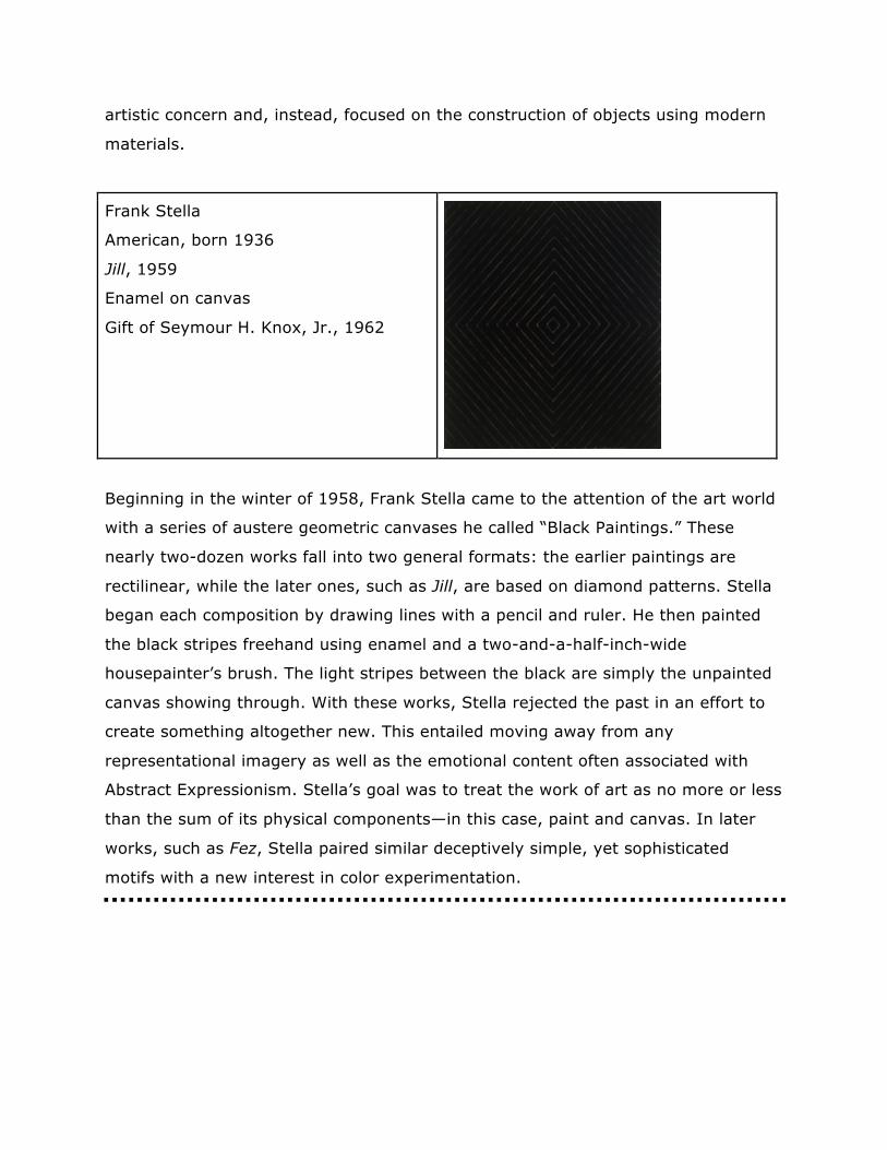
Frank Stella
American, born 1936
Jill, 1959
Enamel on canvas
Gift of Seymour H. Knox, Jr., 1962
Beginning in the winter of 1958, Frank Stella came to the attention of the art world
with a series of austere geometric canvases he called “Black Paintings.” These
nearly two-dozen works fall into two general formats: the earlier paintings are
rectilinear, while the later ones, such as Jill, are based on diamond patterns. Stella
began each composition by drawing lines with a pencil and ruler. He then painted
the black stripes freehand using enamel and a two-and-a-half-inch-wide
housepainter’s brush. The light stripes between the black are simply the unpainted
canvas showing through. With these works, Stella rejected the past in an effort to
create something altogether new. This entailed moving away from any
representational imagery as well as the emotional content often associated with
Abstract Expressionism. Stella’s goal was to treat the work of art as no more or less
than the sum of its physical components—in this case, paint and canvas. In later
works, such as Fez, Stella paired similar deceptively simple, yet sophisticated
motifs with a new interest in color experimentation.
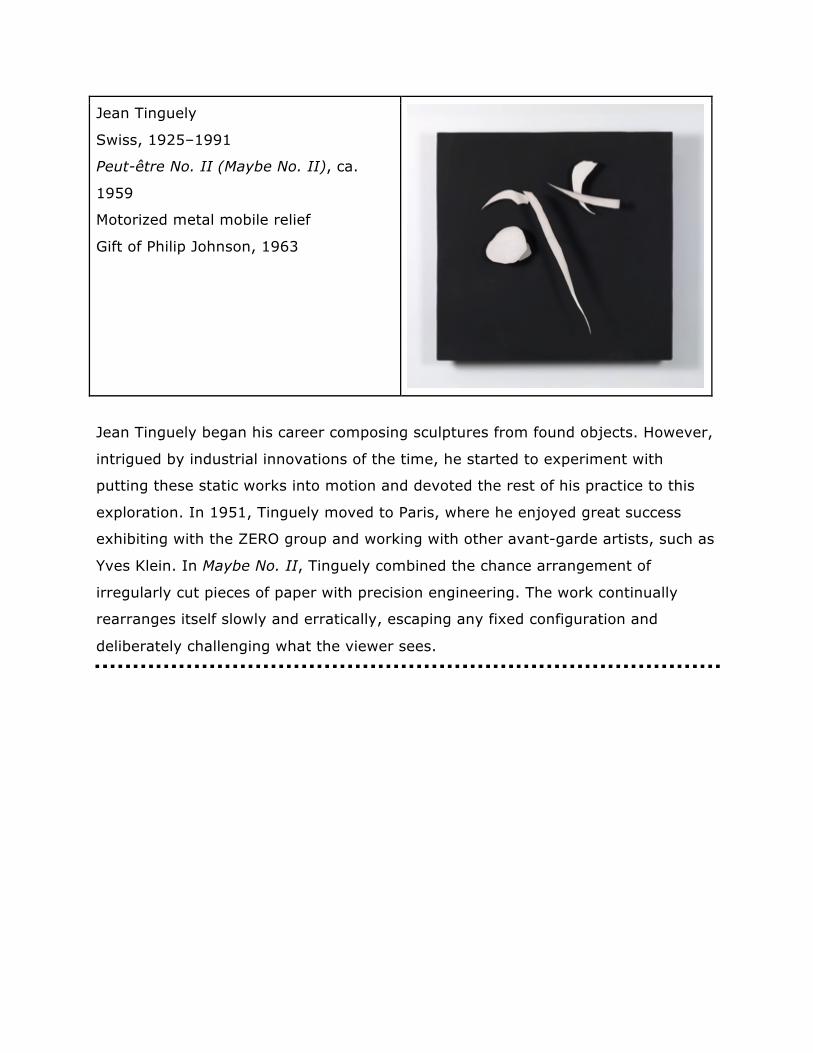
Jean Tinguely
Swiss, 1925–1991
Peut-être No. II (Maybe No. II), ca.
1959
Motorized metal mobile relief
Gift of Philip Johnson, 1963
Jean Tinguely began his career composing sculptures from found objects. However,
intrigued by industrial innovations of the time, he started to experiment with
putting these static works into motion and devoted the rest of his practice to this
exploration. In 1951, Tinguely moved to Paris, where he enjoyed great success
exhibiting with the ZERO group and working with other avant-garde artists, such as
Yves Klein. In Maybe No. II, Tinguely combined the chance arrangement of
irregularly cut pieces of paper with precision engineering. The work continually
rearranges itself slowly and erratically, escaping any fixed configuration and
deliberately challenging what the viewer sees.
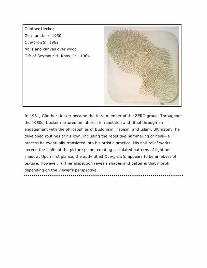
Günther Uecker
German, born 1930
Overgrowth, 1962
Nails and canvas over wood
Gift of Seymour H. Knox, Jr., 1964
In 1961, Günther Uecker became the third member of the ZERO group. Throughout
the 1950s, Uecker nurtured an interest in repetition and ritual through an
engagement with the philosophies of Buddhism, Taoism, and Islam. Ultimately, he
developed routines of his own, including the repetitive hammering of nails—a
process he eventually translated into his artistic practice. His nail-relief works
exceed the limits of the picture plane, creating calculated patterns of light and
shadow. Upon first glance, the aptly titled Overgrowth appears to be an abyss of
texture. However, further inspection reveals shapes and patterns that morph
depending on the viewer’s perspective.
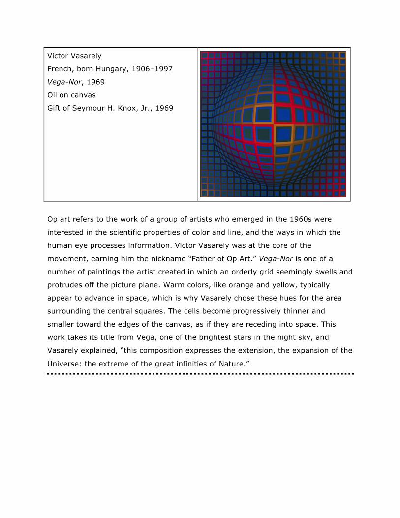
Victor Vasarely
French, born Hungary, 1906–1997
Vega-Nor, 1969
Oil on canvas
Gift of Seymour H. Knox, Jr., 1969
Op art refers to the work of a group of artists who emerged in the 1960s were
interested in the scientific properties of color and line, and the ways in which the
human eye processes information. Victor Vasarely was at the core of the
movement, earning him the nickname “Father of Op Art.” Vega-Nor is one of a
number of paintings the artist created in which an orderly grid seemingly swells and
protrudes off the picture plane. Warm colors, like orange and yellow, typically
appear to advance in space, which is why Vasarely chose these hues for the area
surrounding the central squares. The cells become progressively thinner and
smaller toward the edges of the canvas, as if they are receding into space. This
work takes its title from Vega, one of the brightest stars in the night sky, and
Vasarely explained, “this composition expresses the extension, the expansion of the
Universe: the extreme of the great infinities of Nature.”
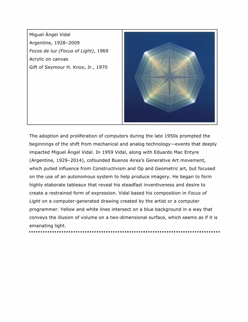
Miguel Ángel Vidal
Argentine, 1928–2009
Focos de luz (Focus of Light), 1969
Acrylic on canvas
Gift of Seymour H. Knox, Jr., 1970
The adoption and proliferation of computers during the late 1950s prompted the
beginnings of the shift from mechanical and analog technology—events that deeply
impacted Miguel Ángel Vidal. In 1959 Vidal, along with Eduardo Mac Entyre
(Argentine, 1929–2014), cofounded Buenos Aires’s Generative Art movement,
which pulled influence from Constructivism and Op and Geometric art, but focused
on the use of an autonomous system to help produce imagery. He began to form
highly elaborate tableaux that reveal his steadfast inventiveness and desire to
create a restrained form of expression. Vidal based his composition in Focus of
Light on a computer-generated drawing created by the artist or a computer
programmer. Yellow and white lines intersect on a blue background in a way that
conveys the illusion of volume on a two-dimensional surface, which seems as if it is
emanating light.
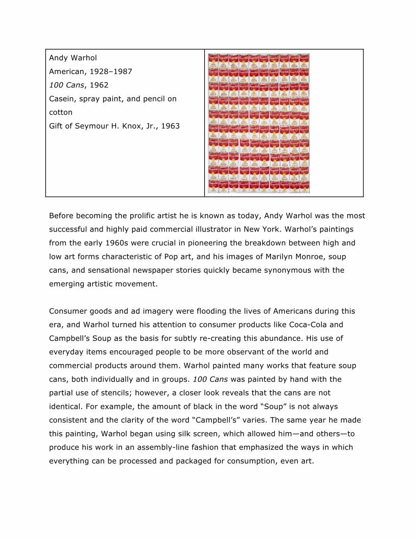
Andy Warhol
American, 1928–1987
100 Cans, 1962
Casein, spray paint, and pencil on
cotton
Gift of Seymour H. Knox, Jr., 1963
Before becoming the prolific artist he is known as today, Andy Warhol was the most
successful and highly paid commercial illustrator in New York. Warhol’s paintings
from the early 1960s were crucial in pioneering the breakdown between high and
low art forms characteristic of Pop art, and his images of Marilyn Monroe, soup
cans, and sensational newspaper stories quickly became synonymous with the
emerging artistic movement.
Consumer goods and ad imagery were flooding the lives of Americans during this
era, and Warhol turned his attention to consumer products like Coca-Cola and
Campbell’s Soup as the basis for subtly re-creating this abundance. His use of
everyday items encouraged people to be more observant of the world and
commercial products around them. Warhol painted many works that feature soup
cans, both individually and in groups. 100 Cans was painted by hand with the
partial use of stencils; however, a closer look reveals that the cans are not
identical. For example, the amount of black in the word “Soup” is not always
consistent and the clarity of the word “Campbell’s” varies. The same year he made
this painting, Warhol began using silk screen, which allowed him—and others—to
produce his work in an assembly-line fashion that emphasized the ways in which
everything can be processed and packaged for consumption, even art.
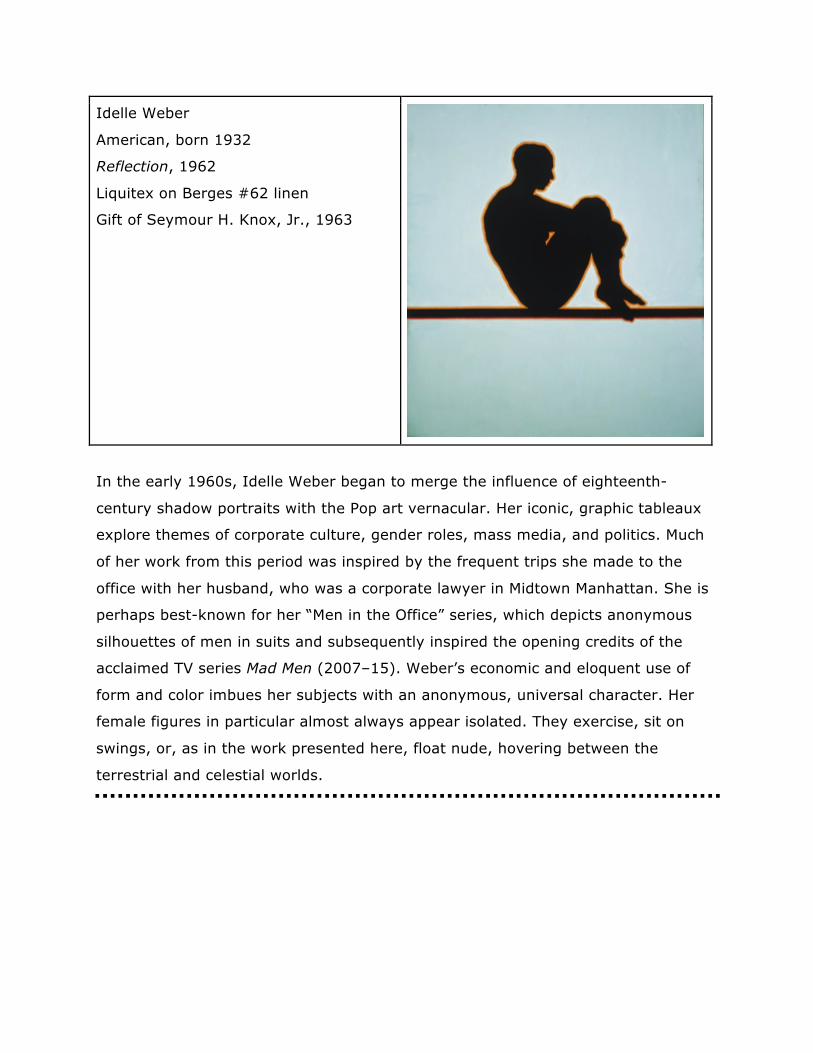
Idelle Weber
American, born 1932
Reflection, 1962
Liquitex on Berges #62 linen
Gift of Seymour H. Knox, Jr., 1963
In the early 1960s, Idelle Weber began to merge the influence of eighteenth-
century shadow portraits with the Pop art vernacular. Her iconic, graphic tableaux
explore themes of corporate culture, gender roles, mass media, and politics. Much
of her work from this period was inspired by the frequent trips she made to the
office with her husband, who was a corporate lawyer in Midtown Manhattan. She is
perhaps best-known for her “Men in the Office” series, which depicts anonymous
silhouettes of men in suits and subsequently inspired the opening credits of the
acclaimed TV series Mad Men (2007–15). Weber’s economic and eloquent use of
form and color imbues her subjects with an anonymous, universal character. Her
female figures in particular almost always appear isolated. They exercise, sit on
swings, or, as in the work presented here, float nude, hovering between the
terrestrial and celestial worlds.
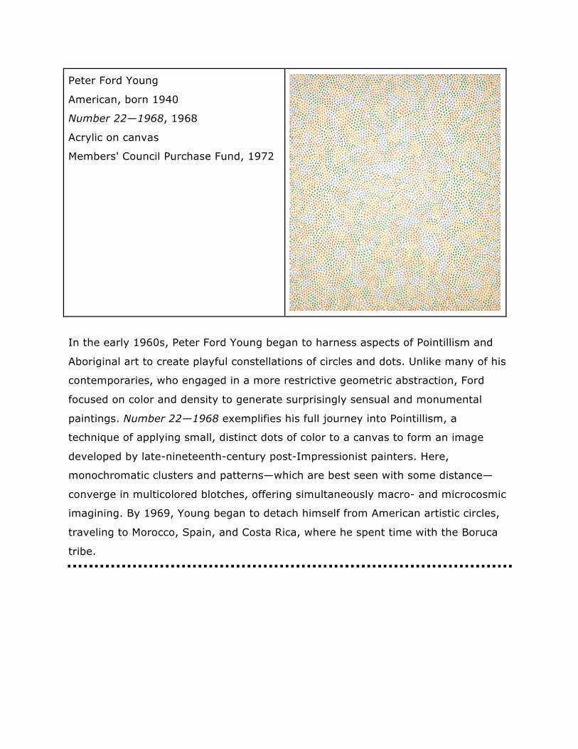
Peter Ford Young
American, born 1940
Number 22—1968, 1968
Acrylic on canvas
Members' Council Purchase Fund, 1972
In the early 1960s, Peter Ford Young began to harness aspects of Pointillism and
Aboriginal art to create playful constellations of circles and dots. Unlike many of his
contemporaries, who engaged in a more restrictive geometric abstraction, Ford
focused on color and density to generate surprisingly sensual and monumental
paintings. Number 22—1968 exemplifies his full journey into Pointillism, a
technique of applying small, distinct dots of color to a canvas to form an image
developed by late-nineteenth-century post-Impressionist painters. Here,
monochromatic clusters and patterns—which are best seen with some distance—
converge in multicolored blotches, offering simultaneously macro- and microcosmic
imagining. By 1969, Young began to detach himself from American artistic circles,
traveling to Morocco, Spain, and Costa Rica, where he spent time with the Boruca
tribe.
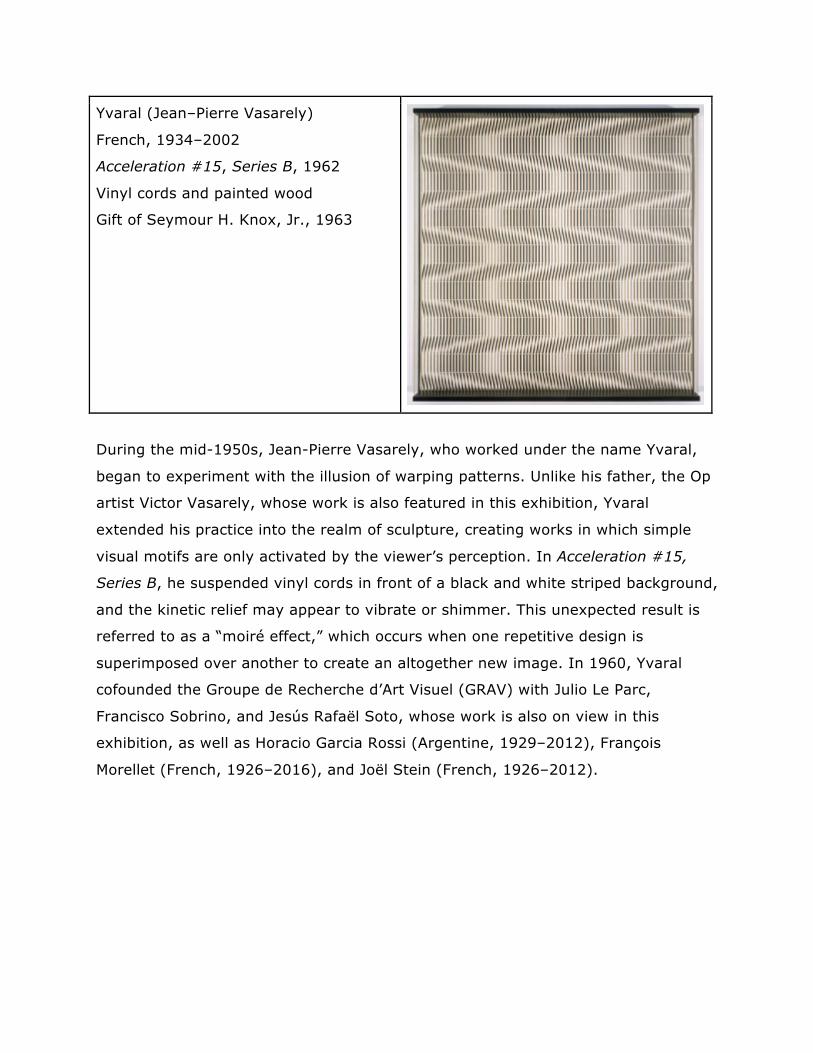
Yvaral (Jean–Pierre Vasarely)
French, 1934–2002
Acceleration #15, Series B, 1962
Vinyl cords and painted wood
Gift of Seymour H. Knox, Jr., 1963
During the mid-1950s, Jean-Pierre Vasarely, who worked under the name Yvaral,
began to experiment with the illusion of warping patterns. Unlike his father, the Op
artist Victor Vasarely, whose work is also featured in this exhibition, Yvaral
extended his practice into the realm of sculpture, creating works in which simple
visual motifs are only activated by the viewer’s perception. In Acceleration #15,
Series B, he suspended vinyl cords in front of a black and white striped background,
and the kinetic relief may appear to vibrate or shimmer. This unexpected result is
referred to as a “moiré effect,” which occurs when one repetitive design is
superimposed over another to create an altogether new image. In 1960, Yvaral
cofounded the Groupe de Recherche d’Art Visuel (GRAV) with Julio Le Parc,
Francisco Sobrino, and Jesús Rafaël Soto, whose work is also on view in this
exhibition, as well as Horacio Garcia Rossi (Argentine, 1929–2012), François
Morellet (French, 1926–2016), and Joël Stein (French, 1926–2012).