Embed Size (px)
Citation preview
Finance and Economics Discussion SeriesDivisions of Research & Statistics and Monetary Affairs
Federal Reserve Board, Washington, D.C.
Government-Backed Mortgage Insurance, Financial Crisis, andthe Recovery from the Great Recession
Wayne Passmore and Shane M. Sherlund
2016-031
Please cite this paper as:Passmore, Wayne, and Shane M. Sherlund (2016). “Government-Backed Mortgage Insur-ance, Financial Crisis, and the Recovery from the Great Recession,” Finance and EconomicsDiscussion Series 2016-031. Washington: Board of Governors of the Federal Reserve System,http://dx.doi.org/10.17016/FEDS.2016.031.
NOTE: Staff working papers in the Finance and Economics Discussion Series (FEDS) are preliminarymaterials circulated to stimulate discussion and critical comment. The analysis and conclusions set forthare those of the authors and do not indicate concurrence by other members of the research staff or theBoard of Governors. References in publications to the Finance and Economics Discussion Series (other thanacknowledgement) should be cleared with the author(s) to protect the tentative character of these papers.
Government-Backed Mortgage Insurance, Financial Crisis, and the Recovery from the Great Recession
Wayne Passmore and Shane M. Sherlund1
Board of Governors of the Federal Reserve System Washington, DC 20551
Abstract
The Great Recession provides an opportunity to test the proposition that government mortgage
insurance programs mitigated the effects of the financial crisis and enhanced the economic
recovery from 2009 to 2014. We find that government-sponsored mortgage insurance programs
have been responsible for better economic outcomes in counties that participated heavily in these
programs. In particular, counties with high levels of participation from government-sponsored
enterprises and the Federal Housing Authority had relatively lower unemployment rates, higher
home sales, higher home prices, lower mortgage delinquency rates, and less foreclosure activity,
both in 2009 (soon after the peak of the financial crisis) and in 2014 (six years after the crisis) than
did counties with lower levels of participation. The persistence of better outcomes in counties with
heavy participation in federal government programs is consistent with a view that lower
government liquidity premiums, lower government credit-risk premiums, and looser government
mortgage-underwriting standards yield higher private-sector economic activity after a financial
crisis.
JEL CODES: G01, G21, G28
KEY WORDS: Financial crisis, Great Recession, mortgages, government policy
1 We thank Vladimir Atanasov, Scott Frame, Ben Keys, Gary Painter, and Joseph Tracy for helpful comments and suggestions, and Jessica Hayes and Alex von Hafften for excellent research assistance. Wayne Passmore is a Senior Advisor and Shane M. Sherlund is an Assistant Director in the Division of Research and Statistics at the Board of Governors of the Federal Reserve System. The views expressed are the authors’ and should not be interpreted as representing the views of the FOMC, its principals, the Board of Governors of the Federal Reserve System, or any other person associated with the Federal Reserve System. Wayne Passmore’s contact information is: Mail Stop 66, Federal Reserve Board, Washington, DC 20551; phone: (202) 452-6432; e-mail: [email protected]. Shane Sherlund’s contact information is: Mail Stop K1-149, Federal Reserve Board, Washington, DC 20551; phone: (202) 452-3589; e-mail: [email protected].
‐ 1 ‐
1. Introduction
The United Sates government has a long history of involvement in mortgage finance. During
the 1930s, the government created the Federal Home Loan Banks (FHLBs), the Federal Housing
Administration (FHA), and the Federal National Mortgage Association (Fannie Mae). Since then,
these programs have grown in size and scope, and the government has introduced additional
programs, e.g. the Federal Home Loan Mortgage Corporation (Freddie Mac) and the Government
National Mortgage Association (Ginnie Mae). Green and Wachter (2005) provide an analysis and
timeline of the federal legislation that created mortgage programs from 1933 to 1989.2
The housing programs created during the Great Depression were taken as background fixtures
during the Great Recession. However, the Great Recession provides an opportunity to assess the
importance of these housing programs during and after a financial crisis. Most of these programs
were created with the objective of limiting damage to households during the Great Depression and
speeding economic recovery. How well did they perform this role during the Great Recession?
During the most recent financial crisis, government focus concerning mortgage finance was
primarily on mortgage debt relief and mortgage refinancing, particularly for households that had
experienced large declines in house values. In particular, the Home Affordable Modification
Program (HAMP) and the Home Affordable Refinance Program (HARP) helped homeowners who
experienced losses in income, unaffordable increases in expenses, or declines in home values.
Most of the analytical work concerning these programs focused on re-defaults and strategic
behavior by homeowners (Holden, et. al, 2012).
The traditional channel for a financial crisis to affect the real economy is that the crisis
raises the cost of financial intermediation and lowers the value of borrower collateral, causing
banks to raise interest rates and decrease credit availability (Bernanke, 1983, Bernanke and Gertler,
1989). In theory, these traditional housing recovery programs, by using government guarantees
and financing, should stabilize and moderate the cost of credit for certain types of loans, allowing
an economic recovery to take hold and proceed more quickly.3 In addition, the designers of the
2 Official histories can be found at http://fhfaoig.gov/LearnMore/History and at http://www.hud.gov/offices/adm/about/admguide/history.cfm. 3 Of course, providing government guarantees for the performance of financial assets has well-known moral hazard problems. However, well-targeted government insurance programs (clear participation requirements and relatively

‐ 2 ‐
government mortgage housing programs during the Great Depression hoped to limit the economic
contraction resulting from tightening bank underwriting standards, mainly by extending mortgages
under less onerous underwriting standards (Rose, 2011).4 Finally, government programs
effectively “cap” the price of credit risk in primary mortgage markets because these programs swap
mortgages for government-backed, mortgage-backed securities (MBS) in return for a fixed-credit-
risk premium.
Do government programs promote faster economic recovery? We can empirically test this
proposition in US mortgage markets by focusing on mortgage insurance and guarantee programs.
In particular, we focus on the FHA and the government-sponsored enterprises (GSEs), Fannie Mae
and Freddie Mac. We characterize the mortgage market by four methods of origination and
financing: (1) FHA/Ginnie Mae; (2) private mortgage originators/Fannie Mae/Freddie Mac; (3)
banks; and (4) private-market origination and securitization (referred to as private-label securities
or PLS).
These four mortgage origination channels can be ranked by their government-backed financing
and the underwriting standards. FHA/Ginnie Mae uses government-guaranteed financing and has
the most generous underwriting standards. Fannie Mae/Freddie Mac have tighter underwriting
standards than FHA, and their government financing is more limited than FHA’s direct
government backing. As for banks, they have government deposit insurance for some of their
liabilities, but also rely on non-government-backed liabilities. In addition, their underwriting for
fixed-rate mortgages held in their own portfolios typically “overlays” either the FHA or GSE
underwriting standards, and thus is stricter than the standards used by government institutions
alone.5 Finally, PLS has no government-backing and has the tightest underwriting standards, at
least during the post-crisis period.
In sum, we find that government-sponsored mortgage insurance programs seem to have been
responsible for better economic outcomes in counties that participated more heavily in these
small target-populations) in non-crisis states can potentially limit moral hazard concerns, while mitigating negative consequences during a crisis (Hancock and Passmore, 2011, Krishnamurthy, 2010). 4 Theoretical support for this view is provided by Allen and Gale (1998), who show that when long assets are risky, bank runs can be triggered by a negative outlook on future returns for these assets. Substituting government underwriting for private sector underwriting may mitigate this problem, although government intervention can cause many other problems through the distribution of implicit or explicit subsidies among private market participants. 5 Part of the motivation for these stricter standards is a desire to maintain the option to sell the mortgages to the government later if needed.

‐ 3 ‐
programs. In particular, counties with high levels of FHA participation had relatively lower
unemployment rates, higher home sales, higher home prices, and lower mortgage delinquency and
foreclosure rates, both in 2009 (right after the financial crisis) and in 2014 (six years after the
crisis). To a lesser extent, counties with substantial participation in GSE programs also had better
economic outcomes. In contrast, counties reliant on banks’ and PLS’ methods of mortgage
origination lagged during the economic recovery. The persistence of better outcomes with
government programs is consistent with a view that the liquidity provided by government-backed
financing and the government’s less pro-cyclical government underwriting standards can promote
economic recovery. We proceed as follows: Section 2 describes the FHA, Fannie Mae, and
Freddie Mac. Section 3 describes the data and our empirical technique, and summarizes our
results. Section 4 concludes.
2. FHA, Fannie Mae, and Freddie Mac
The FHA provides mortgage insurance for mortgages extended by FHA-approved lenders. At
the end of the 2015 fiscal year (September 30, 2015), the FHA had $1.3 trillion of insurance-in-
force.6 FHA mortgages are securitized by Ginnie Mae or held in the portfolios of banks. Ginnie
Mae MBS trade with the full faith and credit of the United States government.
Fannie Mae and Freddie Mac are GSEs that purchase mortgages either to hold in their
portfolios or create MBS to sell to investors. Almost all mortgages securitized by the GSEs are 30-
year, fixed-rate mortgages.7 As of the end of the December 2014, Fannie Mae held $413 billion of
mortgage-related assets in its portfolio and guaranteed $2.80 trillion of MBS, while Freddie Mac
held $408 billion in mortgage-related assets in its portfolio and guaranteed $1.66 trillion of MBS.8
Fannie Mae and Freddie Mac are implicitly subsidized by the government (Acharya, et. al.,
2011, Burgess, Sherlund and Passmore, 2005, Passmore, 2005). On September 6, 2008, the
6 A full review of the FHA’s finances can be found at http://portal.hud.gov/HUD. 7 Government financing eliminates investors’ concerns about the credit risk of fully-amortizing, long-term, fixed-rate mortgages, and thus the 30-year, fixed-rate mortgage is established with the creation of FHA and the precursor of Fannie Mae during the Great Depression (Green and Wachter, 2005). 8 Fannie Mae income and balance sheet statements can be found at http://www.fanniemae.com/portal/about-us/investor-relations/quarterly-annual-results.htm and Freddie Mac at http://www.freddiemac.com/investors.

‐ 4 ‐
Federal Housing Finance Agency placed Fannie Mae and Freddie Mac into conservatorship and
the Department of the Treasury agreed to provide strong financial support for these entities.
Currently, Fannie Mae and Freddie Mac both remain under government conservatorship.9
Mortgage originators (e.g. banks, thrifts, credit unions and mortgage bankers) can either hold
the mortgage in their portfolio after origination or sell the mortgage into the secondary mortgage
markets. Most sold mortgages are sold to either the FHA, Fannie Mae, or Freddie Mac. An
originator who plans to sell mortgages must follow the underwriting guidelines of the purchaser of
the mortgage.10 The relative cost and ease of the securitization determines which method of
mortgage finance dominates.11
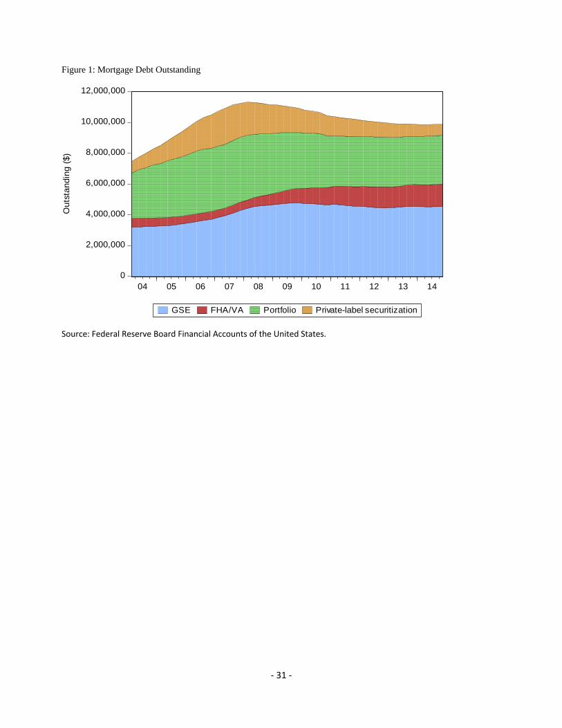
As shown in Figure 1, the bulk of mortgage outstanding in the United States are held in banks’
portfolios or purchased and securitized by Fannie Mae and Freddie Mac. As is well-known,
private-label mortgage-backed securitization grew rapidly in the pre-crisis period and then
plummeted, with a significant impact on the mortgage markets (Mayer, Pence and Sherlund, 2009,
Nadauld and Sherlund, 2013). The FHA was a relatively small portion of the mortgage market in
the pre-crisis period; it grew in the post-crisis period but it still insures a smaller part of aggregate
mortgage holdings.
As described above, government-backed mortgage insurance programs can influence the costs
of mortgage financing in three ways: (1) by providing readily-available and low-cost financing for
mortgages using government guarantees; (2) by having less strict underwriting standards; and (3)
by directly capping the price of credit risk. Each of these factors might play a role in faster
economic growth: (1) government liquidity can substitute when the private-sector is unwilling to
finance mortgages; (2) government underwriting standards may allow more borrowers to increase
their household leverage; and (3) government pricing of the credit risks embedded in the primary
mortgage may make mortgage rates lower.
Moreover, as noted by Tirole (2011), securitization certifies the quality of mortgage
underwriting decisions and thus allows the mortgage to become liquid because it is more easily
9 For a history of the GSEs’ troubles, see Frame and White (2005), and Frame et al. (forthcoming). For the current status of the GSEs, see CBO, 2014. 10 Of course, selling into the secondary market leads to adverse selection and other agency problems (Passmore and Sparks, 2000, Demarzo, 2005, etc.). 11 Hancock and Passmore (2011), Heuson, Passmore, and Sparks (2001).
‐ 5 ‐
traded among investors. As a result, financial institutions can operate with more leverage and
savers can build more optimal portfolios; these outcomes can enhance economic growth,
particularly after a financial crisis. This process, however, depends on the creditability among
investors of the mortgage credit risk certification process. After the most recent financial crisis,
credit monitors, such as credit rating agencies, were in disrepute, and only the government was
able to provide a meaningful guarantee for the securitization of mortgage assets.
Just as only the government may be able to provide a meaningful guarantee for securitization
after a financial crisis, only the government may be able to price credit risk without significant
risk-premiums after a financial crisis. Private market participants may have a distribution of views
on the appropriate credit risk premiums to charge for various types of borrowers and properties,
and may be particularly risk-averse after a crisis. However, if the government sets a fee for
insurance and covers the costs of default to the lender once the lender has paid the fee, then the
government effectively caps the price of credit risk.
The government’s circumvention of market-based credit risk premiums takes place through
government guarantees or government-backed securitization. Private-sector investors purchase
securities backed by FHA, Fannie Mae, and Freddie Mac without considering credit risk because
explicit or implicit government guarantees provide timely payment of principal and interest and
protect investors from default.12 Investors who have become risk averse after a crisis will purchase
the security rather than finance a mortgage by buying the equity or debt of mortgage originators.
When the government provides lower mortgage rates and looser underwriting standards,
households are more likely to take out mortgage loans and make home purchases (Mian and Sufi,
2009). Home purchases can have an effect on house prices and household consumption (Stein,
1995, Campbell and Cocco, 2007, Mian and Sufi, 2011), and housing wealth can influence
macroeconomic activity (Mian, Rao, and Sufi, 2013).
Despite providing lower mortgage costs, in aggregate, government-backed insurance programs
12 GSE and FHA mortgage insurance premiums vary somewhat by risk, but not greatly (FHFA, 2012). As a result, risk premiums can vary significantly for any individual mortgage. In addition, the market’s calculation of risks and the government’s calculation of risk can vary substantially, depending on the objective of the government. If the government is pricing “through the business cycle” for macroprudential reasons, or to “increase credit availability” to meet social objectives, the capital held by the government for covering credit losses can vary significantly from the capital needed to meet market expectations of profitability (Hancock and Passmore, 2015).

‐ 6 ‐
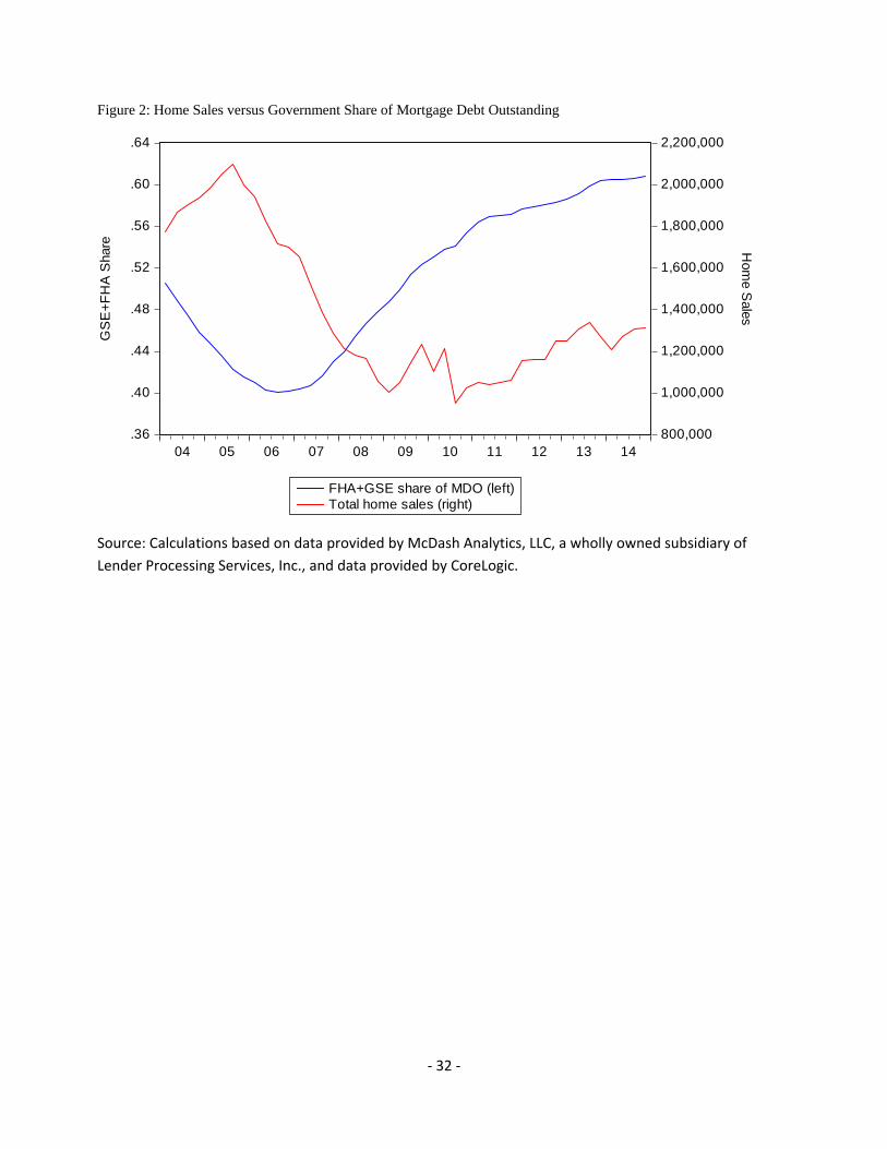
appear to be negatively correlated with home sales during the past decade. The share of
government involvement in the mortgage market decreased during the economic boom during
2004 through 2006, and then increased since financial crisis. The level of home purchases moved
in the opposite directions (Figure 2). This aggregate movement hides the fact that mortgage loan
and housing purchases declined during the crisis, and remained low afterwards. We now turn to
disentangling this relationship government mortgage insurance programs and economic activity.
3. Data and Estimation Results
We make two contributions in this paper. First, we establish the importance of government
mortgage insurance programs during the financial crisis and the ensuing economic recovery.
Second, we illustrate the use of generalized propensity scores (GPS) in the identification and
estimation of these effects.
We characterize the mortgage market by four methods of origination and financing: (1)
FHA/Ginnie Mae; (2) private mortgage originators/Fannie Mae/Freddie Mac; (3) banks; and (4)
private-market origination and securitization (frequently referred to as private-label securities or
PLS).13 These data are aggregated to the county level using data from McDash Analytics, LLC, a
wholly owned subsidiary of Lender Processing Services, Inc., and data from CoreLogic, and
include adjustments to account for differential data coverage across mortgage market segments.
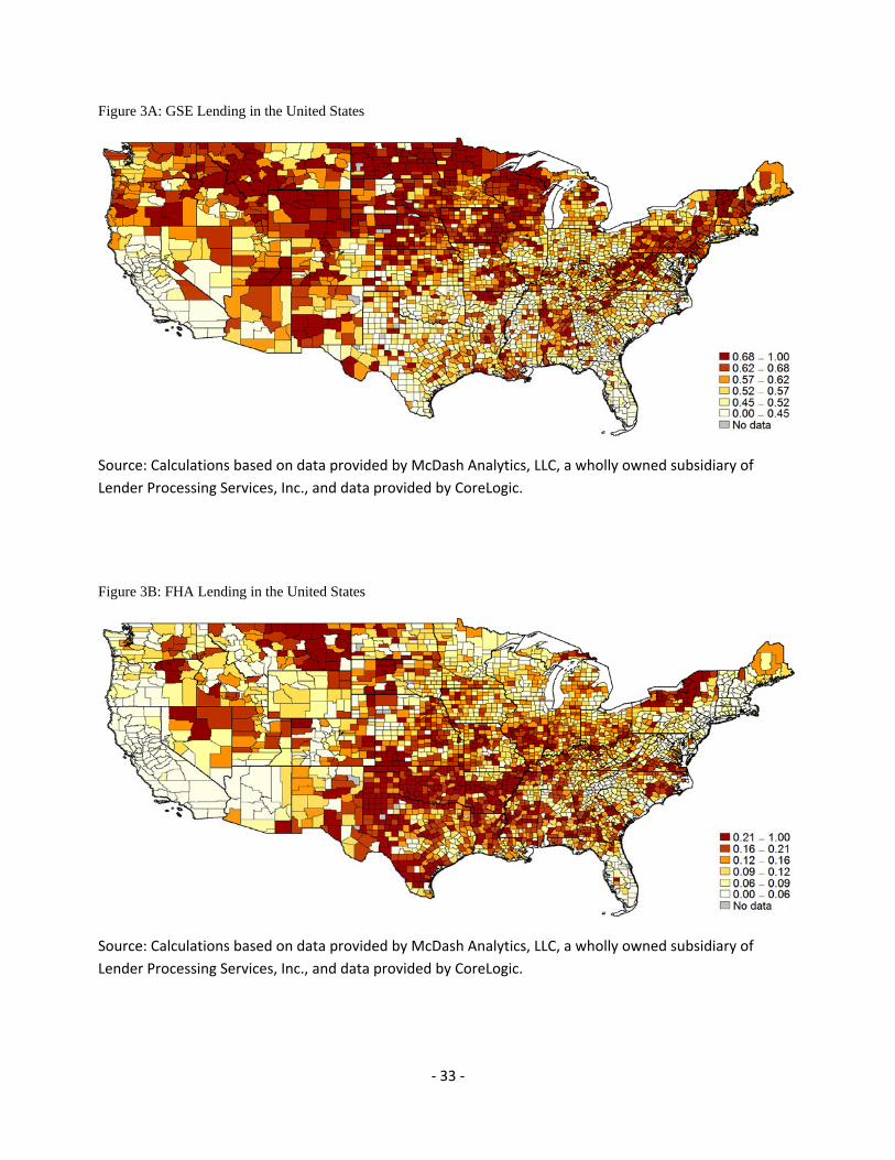
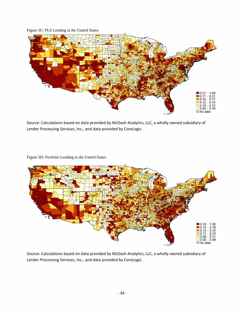
A map of counties across the United States illustrates the wide variation in government
shares of mortgage lending (Figure 3) prior to the financial crisis (2004-2007). The use of
government mortgage insurance programs is concentrated in the Northeast and the Upper-Midwest.
The South and California are less likely to have a large proportion of mortgage origination flow
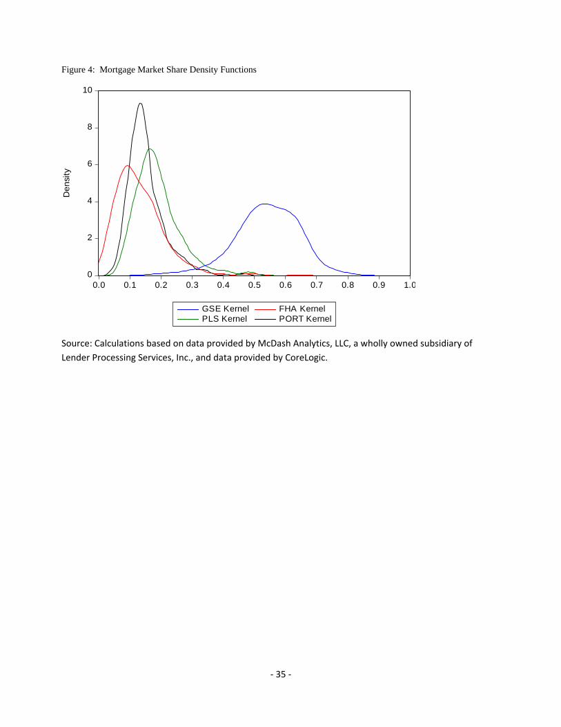
into government-backed programs. Moreover, the frequency distributions (Figure 4) further
suggest significant variation in the utilization of government programs by county prior to the
financial crisis. GSE securitization ranges from approximately 25 percent to 75 percent of the
proportion of originations in a county. Use of the FHA is much lower ranging from close to zero
to 35 percent. The share of mortgage originations flowing into bank portfolios ranges from 6
13 The FHA/VA channel may or may not include mortgages securitized by Ginnie Mae.
‐ 7 ‐
percent to 33 percent. PLS, even at its heyday prior to the financial crisis, accounted for a
relatively small proportion of the flow of mortgage originations from a county, ranging from 8
percent to 45 percent.
The extent of a county’s participation in government-sponsored mortgage programs can be
characterized as a “treatment” administered by the government to augment the financial
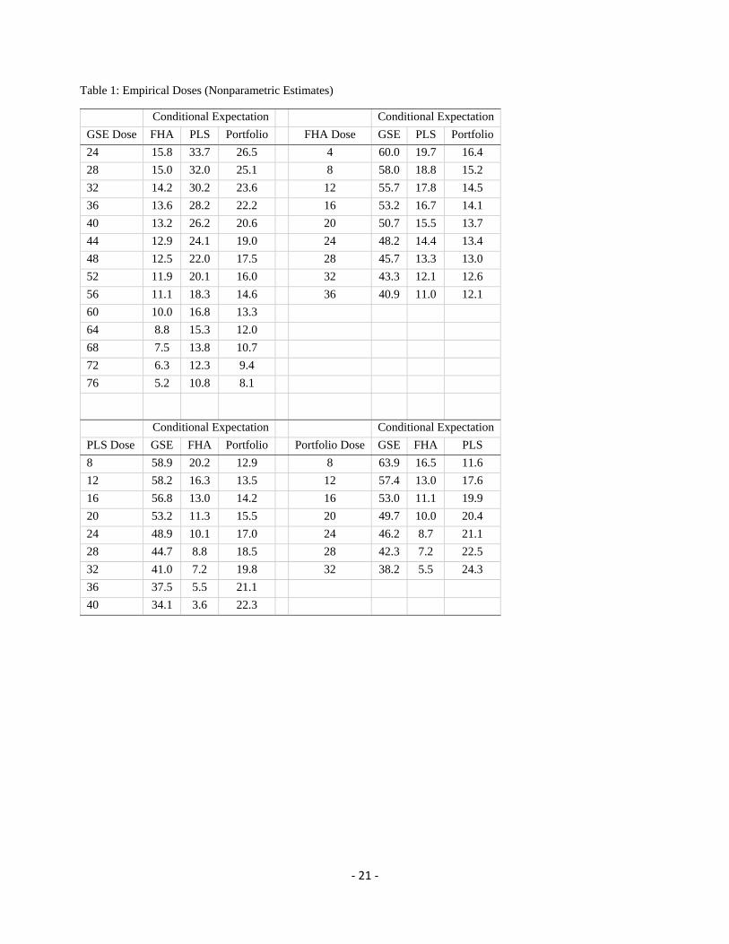
infrastructure in a county. Table 1 shows nonparametric estimates of the empirical “doses” in our
data set, i.e. the proportion of mortgage originations flowing through each origination channel.
Rather than selecting arbitrary “buckets” to use for averaging treatments across counties, we use
nonparametric kernel regression techniques to estimate these average treatment levels. Given a
level of GSE treatment, we calculate the average treatment level across counties for FHA, PLS and
portfolio market shares by giving greater weight to those counties that have more similar levels of
GSE treatment and lesser weight to those counties that have different levels of GSE treatment.
These average treatment levels are useful in interpreting the co-movement in GSE, FHA, PLS, and
portfolio “treatments.”
A. Estimation of the Generalized Propensity Score
Ultimately, we want to estimate how the intensity of GSE, FHA, PLS, and portfolio
exposures influence the state of the real economy. However, the use of such securitization outlets
and the prevalence of bank portfolio alternatives may not be independent from the same conditions
that create relatively high economic performance in a county. Thus, we want to control for the
“propensity” of particular counties to select into various GSE, FHA, PLS, and portfolio treatments,
conditional on economic fundamentals such as average incomes, house prices, and unemployment
rates. By controlling for counties’ propensities to select into GSE, FHA, PLS, and portfolio
treatments, we can directly estimate the effect of financing alternatives on economic activity within
a county.
Propensity scoring has been used in other financial studies. For example, Casu, Clare,
Sarkisyan, and Thomas (2013) use propensity scoring to identify the effects of securitization on
bank performance, and find that banks that securitize loans and banks that do not, seem to have
similar risk-adjusted returns once the underlying propensity to securitize is adjusted. Bharath,

‐ 8 ‐
Dahiya, Saunders, and Srinivasan (2009) investigate lending relationships and loan contract terms.
They use propensity scores to create a “matched” sample of firms with lender relationships and
firms without such relationships, and find that relationships yield a small but significant funding
advantage for borrowers. Finally, Chemmanur, Loutskina, and Tian (2014) find that corporate
venture capital firms have a superior ability to nurture innovative ventures than independent
venture capital firms. They use propensity scores to assess and, to the extent possible, rule out the
possibility that corporate venture capital firms are simply better at selecting innovative projects.
Our approach is similar in spirit to Rosenbaum and Rubin (1983). In particular, as in
Hirano and Imbens (2004), we use generalized propensity scores (GPS), where the probability of a
county being “treated” with different levels of mortgage-type exposure is a function of its
underlying characteristics. In other words, the GSE, FHA, PLS, and portfolio market shares for
each county can be considered as a random treatment once each county’s underlying characteristics
have been taken into account. Hirano and Imbens show that, under relatively weak conditions,
“systematic ‘selection’ into levels of the treatment based on unobservable characteristics not
captured by observable ones” can be ruled out (Flores, Flores-Lagunes, Gonzalez, and Neuman,
2012).14
Our identification strategy relies on the variation in government involvement in mortgage
markets across counties. Counties with significant government involvement are subject to credit
risk pricing and underwriting standards that are set at a national level. In contrast, counties with
little government involvement are more likely subject to local credit risk pricing and underwriting
standards, as set by local banks, thrifts, mortgage banks, and private-sector mortgage securitization
conduits (whose underwriting standards may or may not be set at the national level, and whose
underwriting standards are likely more responsive to current market conditions).
We assume each county contains a set of mortgage financing structures that changes only
slowly over time and reflects the economic characteristics of the population that lives in those
counties. As the securitization outlets are provided by national entities, their relative usage in a
county therefore reflects county characteristics. Thus, we model the extent of banks’ participation
in securitization outlets on the basis of observed census characteristics that are unrelated to the
14 This technique is similar to a difference-in-difference approach, where the pre-treatment covariates define sub-samples, and then for each subsample, we estimate the “average dose function.” The continuous form of the first-state regression, however, allows the simultaneously adjustment by many covariates.
‐ 9 ‐
availability of the securitization outlets.
In addition to the mortgage market share data described above, the county-level data we use
come from a variety of other sources. Median Equifax risk scores and the percentage of
households with risk scores below certain thresholds are aggregated from the FRBNY Consumer
Credit Panel / Equifax data. These data contain credit records for 5 percent of U.S. households
with credit files as of 2005:Q4. Information on tax returns, including wages, salaries, exemptions,
dividends, interest, and adjusted gross income come from the IRS 2005 Statistics of Income data.
House prices, home sales, mortgage delinquency rates, and foreclosure completions come from
CoreLogic HPI and MarketTrends data. House prices and delinquency rates are measured as of
December 2005, 2008, 2009, 2012, and 2014. Home sales and foreclosure completions are
measured as the monthly averages during January 2004 to June 2007, July 2007 to December
2008, January to December 2009, January 2010 to December 2012, and January 2013 to December
2014. The number of lenders come from the 1998 and 2005 HMDA data. Unemployment rates
come from the Bureau of Labor Statistics. As with house prices, these are measured as of year-end
2005, 2008, 2009, 2012, and 2014.
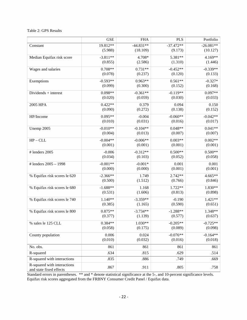
We begin by modeling the county-level GSE, FHA, PLS, and portfolio shares of mortgage
originations as a function of county characteristics during the 2004-2007 benchmark period. We
use only counties that have complete data on house prices and home sales during our sample period
(2004-2014), resulting in 861 county-level observations (out of 3,137 counties in our initial data
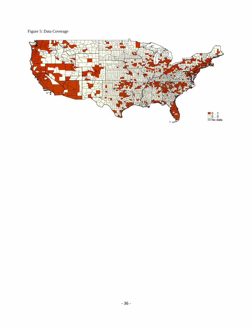
set).15 As shown in Figure 5, the counties that remain are predominantly located in large
metropolitan areas. Moreover, these counties account for about 85-95 percent of mortgage
purchase originations, home sales, and mortgage delinquencies and foreclosures in our full sample.
We perform a set of regressions of the four treatment levels (which we assume to be log-
normally distributed) on county-level characteristics (including credit scores, average income
measures, several house price measures, unemployment rates, and mortgage market structures in
2005):
ln | ~ , ,
where is the level of treatment and is a vector of observed county characteristics. As shown
15 Most of the dropped observations are because of missing house price data.
‐ 10 ‐
in Table 2, county-level wealth, income, employment, credit ratings, house price growth, and the
level of house prices each play important roles in determining how counties finance their mortgage
markets. The GPS estimates are then
ln,
where is the standard normal probability density function and is the estimated GPS.
B. Testing the GPS
The adequacy of the GPS relies on two important checks: the common support condition
and the balancing condition. The common support (or overlap) assumption assures that “treated”
observations have similar “untreated” observations with which to compare. The balancing
property ensures that the covariates are orthogonal to discretized levels of treatment conditional on
the GPS, so that differences in county characteristics do not implicitly bias our results. We address
each of these conditions next.
To assess the common support condition, we estimate the GPS for all counties at each
quartile for each treatment, then compare these estimates across treatment groups. Observations
that lie outside the support of its comparison group are dropped. For example, based on our
preliminary regression we estimate the GPS for each county assuming GSE treatment levels of
47.6, 54.4, and 61.4 percent, representing the 25th, 50th, and 75th percentiles of GSE treatment,
respectively. We then compare the estimated GPS assuming a 25th-percentile GSE treatment
across two groups: those with actual GSE treatment levels at or below the median treatment level,
and those with actual GSE treatment levels above the median treatment level. Similarly, we
compare the estimated GPS assuming a 75th-percentile GSE treatment across the same groups (at
or below median treatment and above median treatment). Finally, we compare the estimated GPS
assuming a 50th-percentile GSE treatment across the following two groups: those with actual GSE
treatment levels above the 25th-percentile treatment and less than the 75th-percentile treatment, and
those with actual GSE treatment levels below the 25th-percentile treatment or above the 75th-
percentile treatment. In each case, we compare observations within 25 percentiles of the assumed
treatment with all other observations. If a particular GPS estimate lies outside the support of its
‐ 11 ‐
comparison group, we drop that observation. This procedure reduces the sample size to 764
counties (11.3 percent dropped) for our GSE analysis, 652 counties (24.3 percent dropped) for our
FHA analysis, 706 counties (18.0 percent dropped) for our PLS analysis, and 785 counties (8.8
percent dropped) for our portfolio analysis. The remaining counties satisfy the common support
condition, which ensures that each county has a similar observation with which to compare.
The second crucial assumption behind propensity scoring is that conditional on the
propensity score, the set of covariates is orthogonal to the level of treatment,
1 | , .
In other words, the GPS balances the county characteristics across treatment levels. This helps
ensure that, when we assess the impact of mortgage market treatments on real economic activity,
the estimated causal effects are coming from changes in the treatment levels as opposed to changes
in the underlying characteristics of the counties. To test the balancing property, we follow the
procedure of Hirano and Imbens (2004) and discretize both the level of treatment (into three
groups) and the GPS (into five groups). We then test for the equality of covariate means across
treatment groups holding GPS “neighborhoods” fixed.
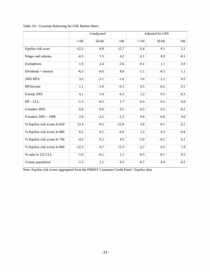
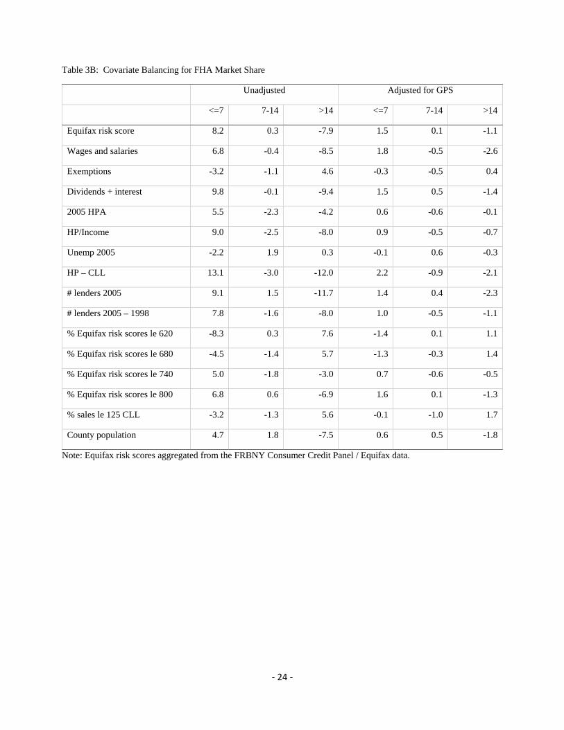
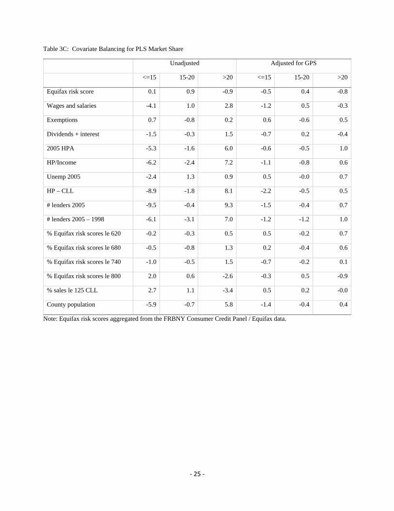
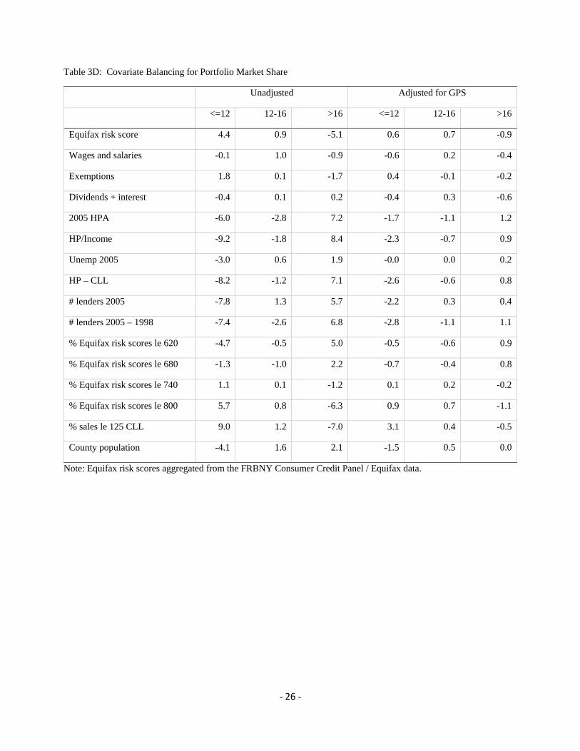
As shown in Table 3, we split each treatment level into three groups of roughly equal size.
We then test the equality of credit score means for counties with GSE treatment levels of 50
percent or less versus those with GSE treatment levels of more than 50 percent—counties with
GSE market shares of 50 percent or less tend to have lower median credit scores than counties with
GSE market shares above 50 percent (t-statistic of -12.2). Similarly, counties with GSE market
shares above 60 percent tend to have higher median credit scores than counties with GSE market
shares of 60 percent or less (t-statistic of 12.7). To adjust for the estimated GPS, we compute the
GPS for an assumed GSE treatment level of 45 percent (the median treatment for counties with
GSE treatment levels of 50 percent or less) for each county, i.e., 45, . For each GPS quintile,
we compute the t-statistic for the equality of the median credit score across counties with GSE
treatment of 50 percent or less versus the counties with GSE treatment of greater than 50 percent.
As shown, adjusting for the GPS improves the balance of median credit scores significantly,
reducing the magnitude of the t-statistic from 12.2 and 12.7 to 2.4 and 2.1.
Broadly speaking, the GPS adjustment reduces the magnitudes of the t-statistics. In fact,
‐ 12 ‐
most t-statistics are statistically insignificant once adjusted by the GPS. Thus, our GPS balances
our sample in the sense that conditioning on the values of the GPS, the means/medians of the
county characteristics (or, in the above example, the median credit score) are similar for low
treatment (that is, low government involvement) and high treatment (that is, high government
involvement) counties. Therefore, as we consider the response of economic activity to additional
government involvement in mortgage originations, we have controlled for differences in county
characteristics that might be related to the treatment and the economic outcome. We therefore take
some comfort that in our results because we have isolated the pure effect of government
involvement in the mortgage market on the economic variable of interest.
C. Estimation of the Dose Response Functions
Now that we have verified the common support and balancing conditions, we regress the
economic outcomes of four periods: July 2007 to December 2008 (early crisis), January to
December 2009 (crisis), January 2010 to December 2012 (early post-crisis), and January 2013-
December 2014 (post-crisis) on their pre-determined mortgage market structures and on their GPS
(i.e., the probability of observing that market structure during the 2004-2007 benchmark period).
We focus on six outcomes of interest that describe the economic state of the county:
unemployment rates, total home sales, home prices, delinquency rates, and completed foreclosures.
All of these outcomes are measured as a ratio relative to their values during the 2004-2007
benchmark period.
We estimate the “dose-response” functions using ordinary least squares (OLS), where the
probability of observing a particular treatment level is, of course, an implicit function of the
treatment level itself. In other words,
where is the variable of interest (e.g. unemployment, home sales, etc.), is the treatment
received (e.g. the GSE proportion of mortgage originations in the county), and is the GPS
‐ 13 ‐
evaluated at the level of treatment received and the observed county characteristics.16 Throughout
our analysis, all standard errors and confidence bands are generated from 1,000 bootstrap
replications (with replacement).
D. Dose Response Functions
Graphical dose-response functions provide a convenient summary of the estimated dose-
response functions. They show the expected value of the outcome variable conditional on a level
of treatment and the GPS. We also calculate average treatment effects as the derivative of the
dose-response functions; the average treatment effect coming from an increase in treatment is the
average rate of change of the dose response function over a particular interval.
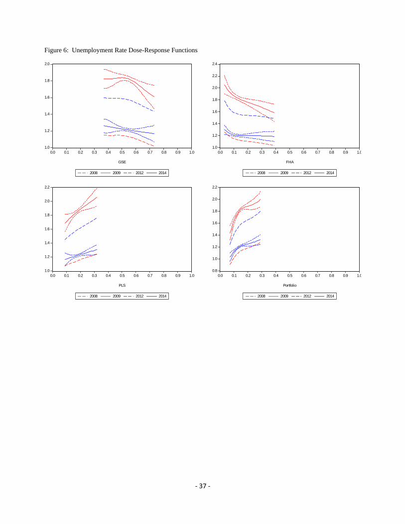
Our first set of results describe the dose-response functions for the unemployment rate
(Figure 6). Here we see a clear downward trend in how much unemployment rates changed,
relative to 2005, for counties with higher levels of GSE securitization for both the crisis and post-
crisis periods. Similarly, there is a distinct downward trend for counties that made more use of the
FHA. By the end of 2008, unemployment rates had increased by 26 percent in counties that had
low FHA shares in 2005, relative to a 4 percent increase in unemployment rates in counties that
had high FHA shares in 2005. By the end of 2009, unemployment rates had increased by 106 and
58 percent for the same groups of counties. What is clear is that the financial crisis was a
substantial shock which influenced all counties, but had larger effects in counties with lower
government involvement in mortgage markets prior to the shock. By the end of 2012,
unemployment rates had fallen across the board, but remained 79 percent higher in low FHA-share
counties—and 49 percent higher in high FHA-share counties—relative to before the crisis. By the
end of 2014, unemployment rates remained 30 and 19 percent higher than in 2005 for the same
groups of counties.17 Here, it is evident that the effects of the financial crisis still remain, and that
16 We also explored estimating the dose-response functions using nonparametric techniques, including local-linear regressions and weighted local-linear regressions. Our qualitative results remain the same. 17 If we showed our charts in levels, rather than benchmarked relative to 2005, the interpretation of our results might be even stronger. The results for GSE, PLS and portfolio channels are similar, but for FHA, the effects are more dramatic. Prior to the crisis, counties with higher FHA shares tended to also have higher unemployment rates. During the crisis, however, this relationship flipped: Counties with higher pre-crisis FHA shares tended to have lower unemployment rates. By 2014, counties with higher pre-crisis FHA shares again tended to have higher unemployment rates, restoring the pre-crisis relationship.
‐ 14 ‐
those effects are larger for lower FHA- and GSE-share counties.
In contrast, counties that were more reliant on either PLS or bank portfolios in 2004-2007
experienced larger increases in their unemployment rates. By the end of 2008, unemployment
rates had increased by 7 percent in counties that had low PLS shares in 2005, relative to a 25
percent increase in unemployment rates in counties that had high PLS shares in 2005. By the end
of 2009, unemployment rates had increased by 69 and 106 percent for the same groups of counties.
Again, the financial crisis influenced all counties, but had larger effects in counties with higher
private funding use prior to the shock. By the end of 2012, unemployment rates had fallen across
the board, but remained 45 percent higher in low PLS-share counties—and 76 percent higher in
high PLS-share counties—relative to before the crisis. By the end of 2014, unemployment rates
remained 17 and 31 percent higher than in 2005 for the same groups of counties. The effects of the
financial crisis are still apparent across counties, but the effects are larger for higher PLS- and
portfolio-share counties.
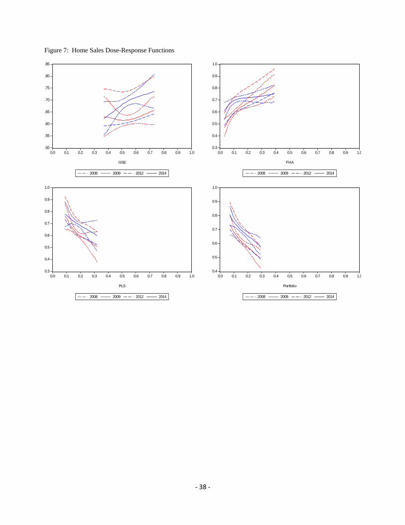
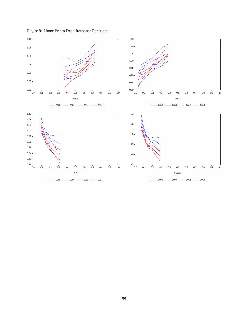
Similar qualitative patterns hold for home sales and home prices (Figures 7 and 8). Greater
exposure to GSE or FHA activity during the pre-crisis period tended to be associated with smaller
declines in home sales and house prices both during and after the financial crisis relative to 2005.
During the height of the financial crisis, home sales had declined over 50 percent in low FHA-
share counties (compared to only 17 percent in high FHA-share counties), while home prices had
declined 14 percent in low-FHA share counties (compared to actually rising 5 percent in high
FHA-share counties). In contrast, greater exposure to PLS or portfolio lending tended to be
associated with larger declines in home sales and house prices. By 2009, home sales had declined
24 percent in low PLS-share counties (compared to nearly 50 percent in high PLS-share counties),
while home prices had risen 4 percent in low-PLS share counties (compared to declining 18
percent in high PLS-share counties).
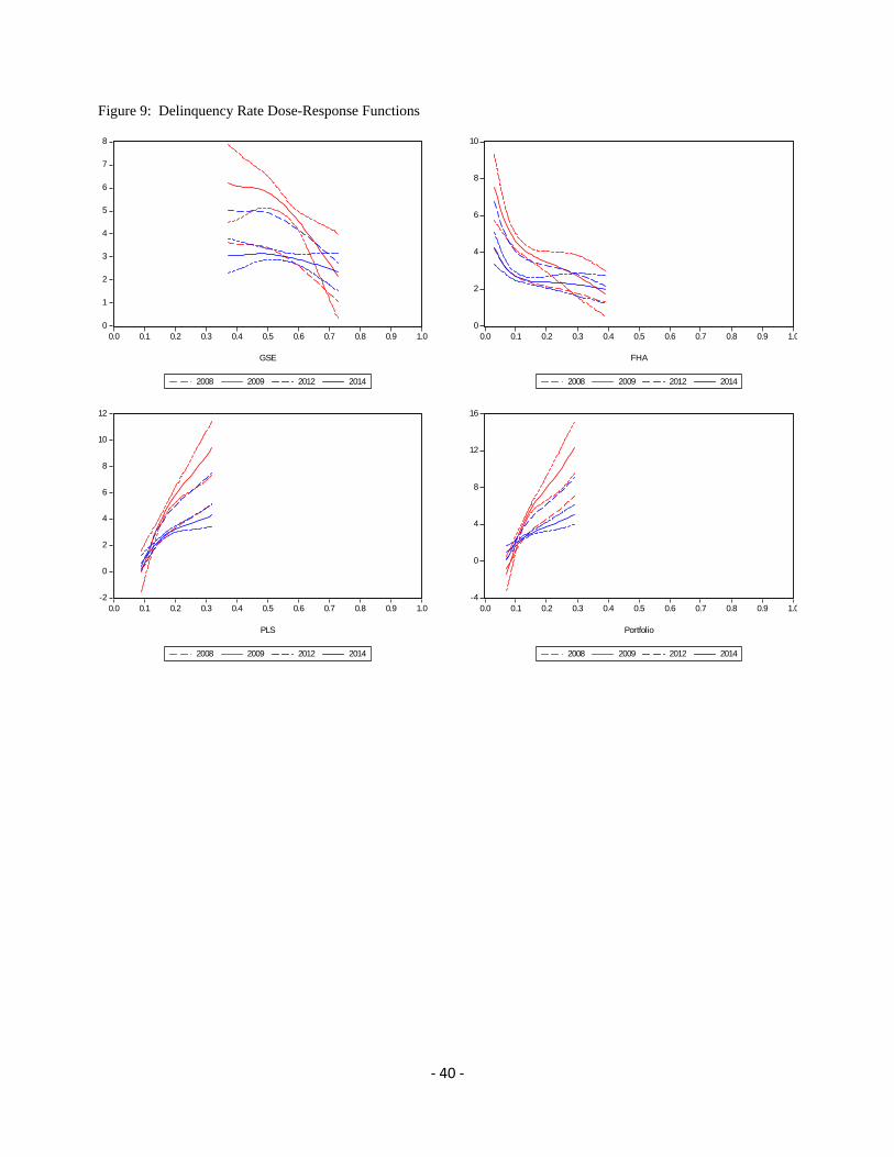
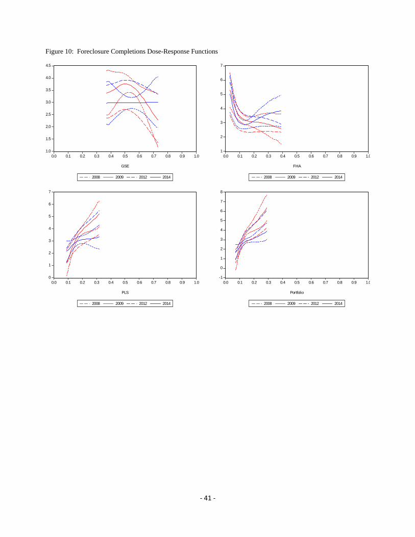
Delinquency rates and foreclosure completions (Figures 9 and 10) tended to rise the most in
counties with high exposure to PLS or portfolio lending and/or low exposure to GSE or FHA
lending. This is consistent with the findings of Mian and Sufi (year), Keys (year), and Mayer,
Pence, and Sherlund (2009), who all attribute higher delinquency rates and foreclosures to the use
of private-label securitization and portfolio lending activity. In particular, by 2009 delinquency
rates had risen about 650 percent in low FHA-share counties (compared to 77 percent in high
‐ 15 ‐
FHA-share counties), while foreclosure completions had risen about 430 percent in low-FHA share
counties (compared to rising 150 percent in high FHA-share counties). In contrast, by 2009
delinquency rates were essentially unchanged in low PLS-share counties (compared to rising
nearly 850 percent in high PLS-share counties), while foreclosures had risen 22 percent in low-
PLS share counties (compared to increasing about 425 percent in high PLS-share counties).
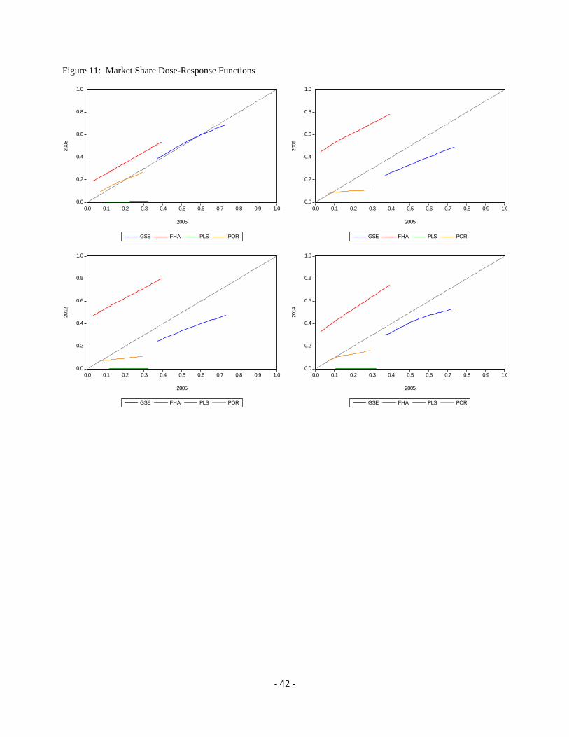
To explore how county-level mortgage markets might have affected real economic
outcomes, we next explore how the market shares of our four channels moved during and
subsequent to the financial crisis. Figure 11 shows the estimated dose-response functions for
market shares at several points in time as a function of 2005 market shares. Between 2005 and
2008, GSE and portfolio shares remained stable, as their respective dose-response functions stayed
near the 45-degree line. PLS shares, however, moved toward zero as the securitization market
collapsed. FHA shares moved higher, presumably picking up at least some of the slack. As the
financial crisis deepened, by 2009 even GSE and portfolio shares had declined, while FHA shares
increased further. By 2014, FHA shares had declined slightly from their 2009-2012 levels but
remained above their 2005 levels; GSE and portfolio shares increased slightly while remaining
below their 2005 levels. PLS shares remained near zero.
This is the primary mechanism through which we expect FHA and GSE lending to provide
positive economic impetus during a financial crisis. When other sources of mortgage financing
become less available, either because of higher credit risk, higher liquidity premiums, or because
of tighter underwriting standards, FHA and GSE lending (broadly speaking) remains available at
roughly unchanging prices. The declines in lending activity were most pronounced in counties that
relied most heavily on PLS or portfolio lending. As a result, economic activity in those counties
declined, either because credit become less available or because lenders had to divert attention to
securing alternative forms of financing. FHA shares increased during the financial crisis and
remained high afterward—for low FHA-share and high FHA-share counties alike—providing
access to mortgage credit and lessening the effects of the financial crisis on demand for housing,
aggregate demand in general, and, as a result, on the labor market.
Overall, our results suggest that counties more reliant on some form of government funding
for mortgages were more insulated from the financial crisis; the effects of the (negative) liquidity
and funding shocks had smaller economic impacts on counties that utilized government mortgage

‐ 16 ‐
more heavily prior to the financial crisis. Counties that relied on private sources of funding,
however, experienced greater effects from the initial liquidity and funding shocks: even higher
unemployment rates, even lower home sales, and even lower home prices. These effects were still
apparent in 2014, though the effects of the initial shocks had decayed substantially.
As shown in Tables 4-5, the average treatment effects (the derivative the dose-response
functions) differ quite substantially from their naïve OLS counterparts over significant portions of
the treatment distributions. For example, Table 4 reports that, according to a naïve OLS
regression, increasing the PLS market share in 2005 from 14 to 18 percent would be associated
with home sales nearly 1-1/2 percent lower in 2009. But our estimated dose-response functions
suggest that the true effect could be much larger, nearly 5-1/2 percent lower, suggesting that
counties more reliant on PLS funding likely have selected into that source of financing because of
higher house prices and home sales. This county selection bias illustrates the importance of our
GPS correction for the likelihood of counties to select into treatment levels.
E. Sensitivity Analysis Using Rosenbaum Bounds
We next explore the possibility that counties select into treatment doses based on
unobserved factors. Suppose county treatments are chosen such that ln | ~ ,
where are the observed characteristics and is an unobserved variable. If there is no bias
resulting from the omission of the unobserved factor, then 0 and ln | ~ as assumed
above. However, if there is a hidden bias, then two counties with the same will have different
probabilities of receiving treatment. That is, after controlling for observable county characteristics,
two given counties might still differ in their odds of treatment by a factor of because of
unobserved factors affecting selection into different treatments.
Similar to Aakvik (2001), we use Mantel-Haenszel (1959) test statistics, , to compare
the number of successful treated counties with the same expected number given that the true effect
is zero. Rosenbaum (1995) shows that the test statistic is bounded by and , which
are both distributed chi-squared with one degree of freedom. If to is statistically
different from zero, that is evidence against the null hypothesis that the estimated treatment effects
are sensitive to unobserved selection bias.
‐ 17 ‐
The test statistics and test-statistic ranges in Table 6 show that our results are fairly robust
to unobserved selection bias. For example, the effect of 2004-2007 GSE market shares on 2014
unemployment rates is robust to differences of as much as 25 percent in terms of unobserved
county characteristics. But in some cases (such as the effect of 2004-2007 FHA market shares on
2014 unemployment rates), our results are not as robust. It is important to note that this sensitivity
analysis simply shows how unobserved factors might bias our results; it unfortunately does not
speak to the presence of these biases nor their magnitudes. Furthermore, given the results shown
below, one must think of a compelling case for an unobserved or omitted factor to influence the
results. Broadly speaking, unobserved factors are unlikely to influence many of our results unless
the unobserved bias is very extreme.
4. Conclusion
Do government programs that provide greater liquidity, along with underwriting standards that are
less onerous than the private sector, promote faster economic recovery? We empirically test this
proposition in US mortgage markets and find that they did. In particular, counties with high levels
of participation from government-sponsored enterprises and FHA had relatively lower
unemployment rates, higher home sales, higher home prices, lower mortgage delinquency rates,
and less foreclosure activity, both in 2009 (right after the peak of the financial crisis) and in 2014
(six years after the crisis) than did counties with lower levels of participation. The persistence of
better outcomes in counties with heavy participation in federal government programs is consistent
with a view that lower government liquidity premiums, lower government credit-risk premiums,
and looser government mortgage-underwriting standards may yield higher private-sector economic
activity after a financial crisis.
‐ 18 ‐
References
Aakvik, Arild, 2001, “Bounding A Matching Estimator: The Case of A Norwegian Training Program,” Oxford Bulletin of Economics and Statistics, vol. 63, no. 1, pp. 115-143.
Acharya, Viral V.; Richardson, Matthew; Van Nieuwerburgh, Stijn; White, Lawrence J., 2011, Guaranteed to Fail: Fannie Mae, Freddie Mac and the Debacle of Mortgage Finance, Princeton and Oxford: Princeton University Press
Allen, Franklin and Douglas Gale, 1998, “Optimal Financial Crisis,” Journal of Finance, vol. 53, August, pp. 1245-1284.
Bharath, Sreedhar T., Sandeep Dahiya, Anthony Saunders, and Anand Srinivasan, 2009, “Lending Relationships and Loan Contract Terms,” The Review of Financial Studies, vol. 24, no. 4, pp. 1141-1203.
Bernanke, Ben S., 1983, “Nonmonetary Effects of the Financial Crisis in Propagation of the Great Depression,” American Economic Review, June.
Bernanke, Ben S. and Mark Gertler, 1989, “Agency Costs, Net Worth, and Business Fluctuations,” American Economic Review, March.
Campbell, John Y. and Joao F. Cocco, 2007. “How Do House Prices Affect Consumption? Evidence from Micro Data,” Journal of Monetary Economics, vol. 54, no. 3, pp. 591-621.
Casu, Barbara, Andrew Clare, Anna Sarkisyan, and Stephen Thomas, 2013, “Securitization and Bank Performance, Journal of Money, Credit and Banking, vol. 45, no. 8, December, pp. 1617-1658.
Chemmanur, Thomas J., Elena Loutskina, and Xuan Tian, 2014, “Corporate Venture Capital, Value Creation, and Innovation,” The Review of Financial Studies, vol. 27, no. 8, pp. 2434-2473.
Congressional Budget Office (CBO), 2014, “Transitioning to Alternative Structures for Housing Finance,” http://www.cbo.gov/publication/49765, December.
DeMarzo, P., 2005, “The Pooling and Tranching of Securities: A Model of Informed Intermediation,” Review of Financial Studies, vol. 18, no. 1, pp. 1-35.
Federal Housing Finance Agency (FHFA), 2012, “Fannie Mae and Freddie Mac Single-Family Guarantee Fees in 2012,” http://www.fhfa.gov/AboutUs/Reports/Pages/Fannie-Mae-and-Freddie-Mac-Single-Family-Guarantee-Fees-in-2012.aspx.
Frame, W. Scott, Andreas Fuster, Joseph Tracy, and James Vickery, (forthcoming).”The Rescue of Fannie Mae and Freddie Mac” Journal of Economic Perspectives, vol. 29, no. 2, pp. 25-52.
Frame, Scott W.; and Lawrence J. White, 2005, “Fussing and Fuming over Fannie and Freddie:

‐ 19 ‐
How Much Smoke, How Much Fire?” Journal of Economic Perspectives, vol. 19, no. 2, pp. 159-184.
Flores, Carlos, Alfonso Flores-Lagunes, Arturo Gonzalez, and Todd C. Neumann, 2012, The Review of Economics and Statistics, vol. 94, no. 1, February, pp. 153-171.
Green, Richard K. and Susan M. Wachter, 2005, “The American Mortgage in Historical and International Context,” Journal of Economic Perspectives, vol. 19, no. 4, pp. 93-114.
Greene, William. 2003, Econometric Analysis. New Jersey: Prentice Hall.
Hancock, Diana, and Wayne Passmore, 2011, "Catastrophic Mortgage Insurance and the Reform of Fannie Mae and Freddie Mac," in Baily, Martin N. ed., The Future of Housing Finance: Restructuring the U.S. Residential Mortgage Market. Washington, DC: Brookings Institution Press.
Heuson, Andrea, S.W. Passmore, and Roger Sparks, 2001, “Credit Scoring and Mortgage Securitization: Implications for Mortgage Rates and Credit Availability,” Journal of Real Estate Finance and Economics, vol. 23, November, pp. 337-363.
Hirano, Keisuke and Guido W. Imbens (2004), "The Propensity Score with Continuous Treatments." In Andrew Gelman and Xiao-Li Meng (eds.), Applied Bayesian Modeling and Causal Inference from Incomplete-Data Perspectives, West Sussex: John Wiley and Sons, pp. 73-84.
Hirano, Keisuke, Guido W.Imbens, and Geert Ridder (2003), "Efficient Estimation of Average Treatment Effects Using the Estimated Propensity Score,” Econometrica, vol.71, no.4, July, pp. 1161-1189.
Holden, Steve; Kelly, Austin; McManus, Douglas; Scharlemann, Therese; Singer, Ryan; Worth, John D., “The HAMP NPV Model: Development and Early Performance,” Real Estate Economics, Winter, 2012.
Krishnamurthy, Arvind. 2010. "Amplification Mechanisms in Liquidity Crises." American Economic Journal: Macroeconomics, vol. 2, no. 3, pp. 1-30.
Mantel, N. and W. Haenszel, 1959, “Statistical Aspects of the Analysis of Data from Retrospective Studies of Disease,” Journal of the National Cancer Institute, vol. 22, pp. 719-748.
Mian, Atif, Kamalesh Rao, and Amir Sufi, 2013, “Household Balance Sheets, Consumption, and the Economic Slump,” Quarterly Journal of Economics, vol. 128, no. 4, pp. 1687-1726.
Mian, Atif and Amor Sufi, 2009, “The Consequences of Mortgage Credit Expansion: Evidence from the U.S. Mortgage Default Crisis,” Quarterly Journal of Economics, vol. 124, no. 4, pp. 1449-1496.
Mian, Atif, and Amor Sufi, 2011, “House prices, Home Equity-Based Borrowing, and the US

‐ 20 ‐
Household Leverage Crisis, American Economic Review, vol. 101, August, pp. 2132-2156.
Meyer, Christopher, Karen Pence, and Shane Sherlund, 2009, “The Rise in Mortgage Defaults,” Journal of Economic Perspectives, vol. 23, pp. 27-50.
Nadauld, Taylor, and Shane Sherlund, 2013,” The impact of securitization on the expansion of subprime credit,” Journal of Financial Economics, vol. 107, pp. 454-476.
Passmore, Wayne, 2005, “The GSE Implicit Subsidy and the Value of Government Ambiguity,” Real Estate Economics, vol. 33, no. 3, pp. 465-486.
Passmore, S. Wayne, Shane Sherlund, and Gillian Burgess, 2005, “The Effect of Housing Government-Sponsored Enterprises on Mortgage Rates,” Real Estate Economics, vol. 33, pp. 427-463.
Passmore, S. Wayne and Roger Sparks, 2000, “Automated Underwriting and the Profitability of Mortgage Securitization,” Real Estate Economics, vol. 28, no. 2, pp. 285-305.
Rose, Jonathan D., 2011, “The Incredible HOLC? Mortgage Relief during the Great Depression,” Journal of Money, Credit and Banking, vol. 43, no. 6, pp. 1073-1107.
Rosenbaum, P.R. and D.B. Rubin, 1983, “The Central Role of the Propensity Score in Observational Studies for Causal Effects,” Biometrika, vol. 70, pp. 41-55.
Rosenbaum, Paul R., 1995, Observational Studies, Springer-Verlag, New York.
Stein, Jeremy, 1995, “Prices and Trading Volume in the Housing Market: A Model with Down-Payment Effects,” Quarterly Journal of Economics, vol. 110, no. 2, pp. 379-406.
Tirole, Jean, 2011, “Illiquidity and All Its Friends,” Journal of Economic Literature, vol. 49, no. 2, pp. 287-325.
‐ 21 ‐
Table 1: Empirical Doses (Nonparametric Estimates)
Conditional Expectation Conditional Expectation
GSE Dose FHA PLS Portfolio FHA Dose GSE PLS Portfolio
24 15.8 33.7 26.5 4 60.0 19.7 16.4
28 15.0 32.0 25.1 8 58.0 18.8 15.2
32 14.2 30.2 23.6 12 55.7 17.8 14.5
36 13.6 28.2 22.2 16 53.2 16.7 14.1
40 13.2 26.2 20.6 20 50.7 15.5 13.7
44 12.9 24.1 19.0 24 48.2 14.4 13.4
48 12.5 22.0 17.5 28 45.7 13.3 13.0
52 11.9 20.1 16.0 32 43.3 12.1 12.6
56 11.1 18.3 14.6 36 40.9 11.0 12.1
60 10.0 16.8 13.3
64 8.8 15.3 12.0
68 7.5 13.8 10.7
72 6.3 12.3 9.4
76 5.2 10.8 8.1
Conditional Expectation Conditional Expectation
PLS Dose GSE FHA Portfolio Portfolio Dose GSE FHA PLS
8 58.9 20.2 12.9 8 63.9 16.5 11.6
12 58.2 16.3 13.5 12 57.4 13.0 17.6
16 56.8 13.0 14.2 16 53.0 11.1 19.9
20 53.2 11.3 15.5 20 49.7 10.0 20.4
24 48.9 10.1 17.0 24 46.2 8.7 21.1
28 44.7 8.8 18.5 28 42.3 7.2 22.5
32 41.0 7.2 19.8 32 38.2 5.5 24.3
36 37.5 5.5 21.1
40 34.1 3.6 22.3
‐ 22 ‐
Table 2: GPS Results
GSE FHA PLS Portfolio
Constant 19.812** (5.988)
-44.831** (18.109)
-37.472** (9.173)
-26.081** (10.127)
Median Equifax risk score -3.811** (0.855)
4.708* (2.586)
5.381** (1.310)
4.169** (1.446)
Wages and salaries 0.708** (0.078)
0.731** (0.237)
-0.452** (0.120)
-0.339** (0.133)
Exemptions -0.593** (0.099)
0.963** (0.300)
0.561** (0.152)
-0.327* (0.168)
Dividends + interest 0.098** (0.020)
-0.361** (0.059)
-0.119** (0.030)
0.097** (0.033)
2005 HPA 0.422** (0.090)
0.379 (0.272)
0.094 (0.138)
0.150 (0.152)
HP/Income 0.095** (0.010)
-0.004 (0.031)
-0.060** (0.016)
-0.042** (0.017)
Unemp 2005 -0.010** (0.004)
-0.104** (0.013)
0.048** (0.007)
0.041** (0.007)
HP – CLL -0.004** (0.001)
-0.006** (0.001)
0.003** (0.001)
0.002** (0.001)
# lenders 2005 -0.006 (0.034)
-0.312** (0.103)
0.500** (0.052)
0.500** (0.058)
# lenders 2005 – 1998 -0.001** (0.000)
-0.001* (0.000)
0.001 (0.001)
0.001 (0.001)
% Equifax risk scores le 620 -2.366** (0.500)
1.749 (1.512)
2.742** (0.766)
4.665** (0.846)
% Equifax risk scores le 680 -1.688** (0.531)
1.168 (1.606)
1.722** (0.813)
1.830** (0.898)
% Equifax risk scores le 740 1.140** (0.385)
-3.359** (1.165)
-0.190 (0.590)
1.421** (0.651)
% Equifax risk scores le 800 0.875** (0.377)
-3.734** (1.139)
-1.288** (0.577)
1.348** (0.637)
% sales le 125 CLL 0.384** (0.058)
1.030** (0.175)
-0.205** (0.089)
-0.725** (0.098)
County population 0.006 (0.010)
0.024 (0.032)
-0.076** (0.016)
-0.164** (0.018)
No. obs. 861 861 861 861
R-squared .634 .815 .629 .514
R-squared with interactions .835 .886 .749 .669
R-squared with interactions and state fixed effects
.867 .911 .805 .758
Standard errors in parentheses. ** and * denote statistical significance at the 5-, and 10-percent significance levels. Equifax risk scores aggregated from the FRBNY Consumer Credit Panel / Equifax data.
‐ 23 ‐
Table 3A: Covariate Balancing for GSE Market Share
Unadjusted Adjusted for GPS
<=50 50-60 >60 <=50 50-60 >60
Equifax risk score -12.2 0.8 12.7 -2.4 0.1 2.1
Wages and salaries -6.5 1.5 4.2 -2.1 0.8 -0.1
Exemptions 1.0 2.4 -3.6 -0.1 1.1 -1.0
Dividends + interest -6.3 -0.6 8.0 -1.1 -0.3 1.1
2005 HPA 3.3 -2.1 -1.6 1.0 -1.2 0.5
HP/Income 1.1 -1.0 -0.3 0.5 -0.2 0.1
Unemp 2005 4.1 1.4 -6.2 1.2 0.2 -0.3
HP – CLL -1.3 -0.2 1.7 -0.4 0.2 0.0
# lenders 2005 -0.6 0.6 0.1 -0.5 0.2 -0.2
# lenders 2005 – 1998 2.9 -2.5 -1.3 0.8 -0.8 0.0
% Equifax risk scores le 620 12.4 -0.5 -12.8 2.6 -0.1 -2.2
% Equifax risk scores le 680 6.2 0.1 -6.0 1.2 0.3 -0.6
% Equifax risk scores le 740 -4.3 0.2 4.5 -1.0 -0.2 0.1
% Equifax risk scores le 800 -12.5 0.7 12.3 -2.7 0.2 1.9
% sales le 125 CLL -1.0 -0.1 1.1 -0.5 -0.1 0.5
County population -1.3 1.1 0.3 -0.7 0.4 -0.2
Note: Equifax risk scores aggregated from the FRBNY Consumer Credit Panel / Equifax data.
‐ 24 ‐
Table 3B: Covariate Balancing for FHA Market Share
Unadjusted Adjusted for GPS
<=7 7-14 >14 <=7 7-14 >14
Equifax risk score 8.2 0.3 -7.9 1.5 0.1 -1.1
Wages and salaries 6.8 -0.4 -8.5 1.8 -0.5 -2.6
Exemptions -3.2 -1.1 4.6 -0.3 -0.5 0.4
Dividends + interest 9.8 -0.1 -9.4 1.5 0.5 -1.4
2005 HPA 5.5 -2.3 -4.2 0.6 -0.6 -0.1
HP/Income 9.0 -2.5 -8.0 0.9 -0.5 -0.7
Unemp 2005 -2.2 1.9 0.3 -0.1 0.6 -0.3
HP – CLL 13.1 -3.0 -12.0 2.2 -0.9 -2.1
# lenders 2005 9.1 1.5 -11.7 1.4 0.4 -2.3
# lenders 2005 – 1998 7.8 -1.6 -8.0 1.0 -0.5 -1.1
% Equifax risk scores le 620 -8.3 0.3 7.6 -1.4 0.1 1.1
% Equifax risk scores le 680 -4.5 -1.4 5.7 -1.3 -0.3 1.4
% Equifax risk scores le 740 5.0 -1.8 -3.0 0.7 -0.6 -0.5
% Equifax risk scores le 800 6.8 0.6 -6.9 1.6 0.1 -1.3
% sales le 125 CLL -3.2 -1.3 5.6 -0.1 -1.0 1.7
County population 4.7 1.8 -7.5 0.6 0.5 -1.8
Note: Equifax risk scores aggregated from the FRBNY Consumer Credit Panel / Equifax data.
‐ 25 ‐
Table 3C: Covariate Balancing for PLS Market Share
Unadjusted Adjusted for GPS
<=15 15-20 >20 <=15 15-20 >20
Equifax risk score 0.1 0.9 -0.9 -0.5 0.4 -0.8
Wages and salaries -4.1 1.0 2.8 -1.2 0.5 -0.3
Exemptions 0.7 -0.8 0.2 0.6 -0.6 0.5
Dividends + interest -1.5 -0.3 1.5 -0.7 0.2 -0.4
2005 HPA -5.3 -1.6 6.0 -0.6 -0.5 1.0
HP/Income -6.2 -2.4 7.2 -1.1 -0.8 0.6
Unemp 2005 -2.4 1.3 0.9 0.5 -0.0 0.7
HP – CLL -8.9 -1.8 8.1 -2.2 -0.5 0.5
# lenders 2005 -9.5 -0.4 9.3 -1.5 -0.4 0.7
# lenders 2005 – 1998 -6.1 -3.1 7.0 -1.2 -1.2 1.0
% Equifax risk scores le 620 -0.2 -0.3 0.5 0.5 -0.2 0.7
% Equifax risk scores le 680 -0.5 -0.8 1.3 0.2 -0.4 0.6
% Equifax risk scores le 740 -1.0 -0.5 1.5 -0.7 -0.2 0.1
% Equifax risk scores le 800 2.0 0.6 -2.6 -0.3 0.5 -0.9
% sales le 125 CLL 2.7 1.1 -3.4 0.5 0.2 -0.0
County population -5.9 -0.7 5.8 -1.4 -0.4 0.4
Note: Equifax risk scores aggregated from the FRBNY Consumer Credit Panel / Equifax data.
‐ 26 ‐
Table 3D: Covariate Balancing for Portfolio Market Share
Unadjusted Adjusted for GPS
<=12 12-16 >16 <=12 12-16 >16
Equifax risk score 4.4 0.9 -5.1 0.6 0.7 -0.9
Wages and salaries -0.1 1.0 -0.9 -0.6 0.2 -0.4
Exemptions 1.8 0.1 -1.7 0.4 -0.1 -0.2
Dividends + interest -0.4 0.1 0.2 -0.4 0.3 -0.6
2005 HPA -6.0 -2.8 7.2 -1.7 -1.1 1.2
HP/Income -9.2 -1.8 8.4 -2.3 -0.7 0.9
Unemp 2005 -3.0 0.6 1.9 -0.0 0.0 0.2
HP – CLL -8.2 -1.2 7.1 -2.6 -0.6 0.8
# lenders 2005 -7.8 1.3 5.7 -2.2 0.3 0.4
# lenders 2005 – 1998 -7.4 -2.6 6.8 -2.8 -1.1 1.1
% Equifax risk scores le 620 -4.7 -0.5 5.0 -0.5 -0.6 0.9
% Equifax risk scores le 680 -1.3 -1.0 2.2 -0.7 -0.4 0.8
% Equifax risk scores le 740 1.1 0.1 -1.2 0.1 0.2 -0.2
% Equifax risk scores le 800 5.7 0.8 -6.3 0.9 0.7 -1.1
% sales le 125 CLL 9.0 1.2 -7.0 3.1 0.4 -0.5
County population -4.1 1.6 2.1 -1.5 0.5 0.0
Note: Equifax risk scores aggregated from the FRBNY Consumer Credit Panel / Equifax data.
‐ 27 ‐
Table 4: 2009 Average Treatment Effects
GSE 48 to 54
GSE 54 to 61
FHA 5 to 10
FHA 10 to 16
Unemployment rate -.009 -.067 -.120 -.072
OLS -.039 -.045 -.072 -.086
Home sales .000 .011 .083 .055
OLS .000 .000 .046 .055
Home prices .014 .031 .023 .031
OLS .033 .038 .041 .050
Delinquency rates -.512 -1.019 -1.863 -.832
OLS -2.202 -2.569 -2.584 -3.101
Foreclosures -.046 -.393 -1.137 -.363
OLS -.709 -.828 -1.063 -1.276
PLS 14 to 18
PLS 18 to 23
Port 11 to 14
Port 14 to 18
Unemployment rate .067 .074 .113 .060
OLS .050 .062 .066 .088
Home sales -.054 -.038 -.039 -.038
OLS -.016 -.020 -.026 -.034
Home prices -.047 -.033 -.058 -.032
OLS -.043 -.053 -.036 -.048
Delinquency rates 1.840 1.628 2.285 1.944
OLS 2.779 3.474 2.340 3.120
Foreclosures .846 .604 .971 .678
OLS 1.051 1.314 .785 1.047
‐ 28 ‐
Table 5: 2014 Average Treatment Effects
GSE 48 to 54
GSE 54 to 61
FHA 5 to 10
FHA 10 to 16
Unemployment rate -.016 -.017 -.055 -.014
OLS -.021 -.025 -.031 -.038
Home sales .024 .018 .055 .020
OLS .016 .019 .023 .028
Home prices .012 .020 .032 .022
OLS .022 .026 .031 .038
Delinquency rates -.082 -.202 -.947 -.296
OLS -.308 -.359 -.779 -.934
Foreclosures -.006 .012 -1.200 -.070
OLS -.024 -.029 -.333 -.400
PLS 14 to 18
PLS 18 to 23
Port 11 to 14
Port 14 to 18
Unemployment rate .023 .032 .056 .035
OLS .026 .032 .030 .041
Home sales -.034 -.034 -.033 -.037
OLS -.019 -.024 -.023 -.031
Home prices -.029 -.023 -.053 -.023
OLS -.028 -.035 -.029 -.038
Delinquency rates 1.890 1.840 .672 .601
OLS .526 .657 .571 .762
Foreclosures .292 .100 .404 .219
OLS .108 .135 .234 .312
‐ 29 ‐
Table 6A: Sensitivity Analysis for 1.25, 1.5, and 2
for 1
bounds for 1.25
bounds for 1.5
bounds for 2
2009 Unemployment Rates
GSE 6.15** 0.95—16.10 (0.07)—27.70 (4.87)—52.79
FHA 21.27** 10.68—36.10** 4.69—51.12** 0.19—80.77
PLS 11.32** 3.67—23.51* 0.53—36.76 (1.31)—64.14
Portfolio 29.87** 15.69—49.33** 7.45—68.92** 0.63—107.37
2014 Unemployment Rates
GSE 14.11** 5.04—28.15** 1.01—43.22 (0.90)—74.07
FHA 3.52* 0.24—10.79 (0.42)—19.69 (5.99)—39.41
PLS 11.54** 3.82—23.77* 0.59—37.03 (1.20)—64.41
Portfolio 28.90** 14.99—48.09** 6.96—67.44** 0.50—105.49
2009 Home Sales
GSE 0.01 (1.92)—2.62 (6.84)—8.12 (20.89)—23.11
FHA 43.42** 27.34—64.42** 16.89—84.67** 5.59—123.37**
PLS 35.66** 20.81—55.42** 11.59—74.82** 2.54—112.22
Portfolio 13.53** 4.84—26.99** 0.98—41.45 (0.85)—71.09
2014 Home Sales
GSE 3.79* 0.22—11.88 (0.55)—21.86 (7.07)—44.08
FHA 11.68** 4.29—23.08** 0.93—35.30 (0.60)—60.40
PLS 22.27** 11.07—37.97** 4.78—53.94** 0.16—85.52
Portfolio 20.67** 9.59—36.53** 3.64—52.90* 0.00—85.55
2009 Home Prices
GSE 7.52** 1.52—18.31 (0.00)—30.66 (3.83)—56.99
FHA 21.20** 10.59—36.07** 4.60—51.16** 0.16—80.94
PLS 42.55** 25.88—64.44** 15.27—85.71** 4.25—126.42**
Portfolio 75.22** 51.84—104.73** 35.92—132.59** 16.97—184.90**
2014 Home Prices
GSE 1.86 (0.03)—8.43 (1.99)—17.34 (11.51)—38.11
FHA 15.19** 6.31—28.37** 1.89—42.17 (0.17)—70.04
PLS 13.91** 5.20—27.21** 1.19—41.38 (0.60)—70.25
Portfolio 41.05** 24.27—63.23** 13.79—84.98** 3.30—126.85*
** and * denote statistical significance at the 5- and 10-percent significance levels.
‐ 30 ‐
Table 6B: Sensitivity Analysis for 1.25, 1.5, and 2
for 1
bounds for 1.25
bounds for 1.5
bounds for 2
2009 Delinquency Rates
GSE 0.21 (0.86)—3.39 (4.25)—8.87 (14.93)—23.00
FHA 73.57** 55.01—96.94** 41.86—118.57** 25.21—158.88**
PLS 54.47** 36.71—77.27** 24.79—99.04** 10.93—140.57**
Portfolio 64.57** 44.24—90.50** 30.52—115.29** 14.31—162.69**
2014 Delinquency Rates
GSE 0.01 (1.78)—2.29 (6.24)—7.18 (18.98)—20.61
FHA 25.91** 15.14—40.37** 8.47—54.66** 1.91—82.46
PLS 41.64** 26.12—61.95** 16.11—81.69** 5.31—119.71**
Portfolio 38.29** 22.59—59.13** 12.82—79.70** 3.07—119.73*
2009 Foreclosure Completions
GSE 3.02* 0.11—10.04 (0.69)—18.86 (7.09)—38.75
FHA 18.90** 9.73—31.70** 4.46—44.67** 0.29—70.34
PLS 22.55** 11.45—38.04** 5.13—53.79** 0.26—85.05
Portfolio 42.12** 25.65—63.79** 15.21—85.05** 4.35—126.27**
2014 Foreclosure Completions
GSE 0.35 (0.67)—4.00 (3.87)—9.97 (14.43)—25.06
FHA 7.61** 2.44—15.93 0.34—25.04 (0.93)—44.06
PLS 7.57** 2.00—16.99 0.10—27.54 (1.99)—49.87
Portfolio 9.00** 2.49—19.85 0.17—31.95 (2.02)—57.52
** and * denote statistical significance at the 5 and 10 percent significance levels.
‐ 31 ‐
Figure 1: Mortgage Debt Outstanding
0
2,000,000
4,000,000
6,000,000
8,000,000
10,000,000
12,000,000
04 05 06 07 08 09 10 11 12 13 14
GSE FHA/VA Portfolio Private-label securitization
Ou
tsta
nd
ing
($)
Source: Federal Reserve Board Financial Accounts of the United States.
‐ 32 ‐
Figure 2: Home Sales versus Government Share of Mortgage Debt Outstanding
.36
.40
.44
.48
.52
.56
.60
.64
800,000
1,000,000
1,200,000
1,400,000
1,600,000
1,800,000
2,000,000
2,200,000
04 05 06 07 08 09 10 11 12 13 14
FHA+GSE share of MDO (left)Total home sales (right)
GS
E+
FH
A S
hare H
ome S
ales
Source: Calculations based on data provided by McDash Analytics, LLC, a wholly owned subsidiary of
Lender Processing Services, Inc., and data provided by CoreLogic.
‐ 33 ‐
Figure 3A: GSE Lending in the United States
Source: Calculations based on data provided by McDash Analytics, LLC, a wholly owned subsidiary of
Lender Processing Services, Inc., and data provided by CoreLogic.
Figure 3B: FHA Lending in the United States
Source: Calculations based on data provided by McDash Analytics, LLC, a wholly owned subsidiary of
Lender Processing Services, Inc., and data provided by CoreLogic.
‐ 34 ‐
Figure 3C: PLS Lending in the United States
Source: Calculations based on data provided by McDash Analytics, LLC, a wholly owned subsidiary of
Lender Processing Services, Inc., and data provided by CoreLogic.
Figure 3D: Portfolio Lending in the United States
Source: Calculations based on data provided by McDash Analytics, LLC, a wholly owned subsidiary of
Lender Processing Services, Inc., and data provided by CoreLogic.
‐ 35 ‐
Figure 4: Mortgage Market Share Density Functions
0
2
4
6
8
10
0.0 0.1 0.2 0.3 0.4 0.5 0.6 0.7 0.8 0.9 1.0
GSE Kernel FHA KernelPLS Kernel PORT Kernel
De
nsi
ty
Source: Calculations based on data provided by McDash Analytics, LLC, a wholly owned subsidiary of
Lender Processing Services, Inc., and data provided by CoreLogic.
‐ 36 ‐
Figure 5: Data Coverage
‐ 37 ‐
Figure 6: Unemployment Rate Dose-Response Functions
1.0
1.2
1.4
1.6
1.8
2.0
0.0 0.1 0.2 0.3 0.4 0.5 0.6 0.7 0.8 0.9 1.0
GSE
2008 2009 2012 2014
1.0
1.2
1.4
1.6
1.8
2.0
2.2
2.4
0.0 0.1 0.2 0.3 0.4 0.5 0.6 0.7 0.8 0.9 1.0
FHA
2008 2009 2012 2014
1.0
1.2
1.4
1.6
1.8
2.0
2.2
0.0 0.1 0.2 0.3 0.4 0.5 0.6 0.7 0.8 0.9 1.0
PLS
2008 2009 2012 2014
0.8
1.0
1.2
1.4
1.6
1.8
2.0
2.2
0.0 0.1 0.2 0.3 0.4 0.5 0.6 0.7 0.8 0.9 1.0
Portfolio
2008 2009 2012 2014
‐ 38 ‐
Figure 7: Home Sales Dose-Response Functions
.50
.55
.60
.65
.70
.75
.80
.85
0.0 0.1 0.2 0.3 0.4 0.5 0.6 0.7 0.8 0.9 1.0
GSE
2008 2009 2012 2014
0.3
0.4
0.5
0.6
0.7
0.8
0.9
1.0
0.0 0.1 0.2 0.3 0.4 0.5 0.6 0.7 0.8 0.9 1.0
FHA
2008 2009 2012 2014
0.3
0.4
0.5
0.6
0.7
0.8
0.9
1.0
0.0 0.1 0.2 0.3 0.4 0.5 0.6 0.7 0.8 0.9 1.0
PLS
2008 2009 2012 2014
0.4
0.5
0.6
0.7
0.8
0.9
1.0
0.0 0.1 0.2 0.3 0.4 0.5 0.6 0.7 0.8 0.9 1.0
Portfolio
2008 2009 2012 2014
‐ 39 ‐
Figure 8: Home Prices Dose-Response Functions
0.80
0.85
0.90
0.95
1.00
1.05
1.10
0.0 0.1 0.2 0.3 0.4 0.5 0.6 0.7 0.8 0.9 1.0
GSE
2008 2009 2012 2014
0.80
0.85
0.90
0.95
1.00
1.05
1.10
1.15
0.0 0.1 0.2 0.3 0.4 0.5 0.6 0.7 0.8 0.9 1.0
FHA
2008 2009 2012 2014
0.76
0.80
0.84
0.88
0.92
0.96
1.00
1.04
1.08
1.12
0.0 0.1 0.2 0.3 0.4 0.5 0.6 0.7 0.8 0.9 1.0
PLS
2008 2009 2012 2014
0.7
0.8
0.9
1.0
1.1
1.2
0.0 0.1 0.2 0.3 0.4 0.5 0.6 0.7 0.8 0.9 1.0
Portfolio
2008 2009 2012 2014
‐ 40 ‐
Figure 9: Delinquency Rate Dose-Response Functions
0
1
2
3
4
5
6
7
8
0.0 0.1 0.2 0.3 0.4 0.5 0.6 0.7 0.8 0.9 1.0
GSE
2008 2009 2012 2014
0
2
4
6
8
10
0.0 0.1 0.2 0.3 0.4 0.5 0.6 0.7 0.8 0.9 1.0
FHA
2008 2009 2012 2014
-2
0
2
4
6
8
10
12
0.0 0.1 0.2 0.3 0.4 0.5 0.6 0.7 0.8 0.9 1.0
PLS
2008 2009 2012 2014
-4
0
4
8
12
16
0.0 0.1 0.2 0.3 0.4 0.5 0.6 0.7 0.8 0.9 1.0
Portfolio
2008 2009 2012 2014
‐ 41 ‐
Figure 10: Foreclosure Completions Dose-Response Functions
1.0
1.5
2.0
2.5
3.0
3.5
4.0
4.5
0.0 0.1 0.2 0.3 0.4 0.5 0.6 0.7 0.8 0.9 1.0
GSE
2008 2009 2012 2014
1
2
3
4
5
6
7
0.0 0.1 0.2 0.3 0.4 0.5 0.6 0.7 0.8 0.9 1.0
FHA
2008 2009 2012 2014
0
1
2
3
4
5
6
7
0.0 0.1 0.2 0.3 0.4 0.5 0.6 0.7 0.8 0.9 1.0
PLS
2008 2009 2012 2014
-1
0
1
2
3
4
5
6
7
8
0.0 0.1 0.2 0.3 0.4 0.5 0.6 0.7 0.8 0.9 1.0
Portfolio
2008 2009 2012 2014
‐ 42 ‐
Figure 11: Market Share Dose-Response Functions
0.0
0.2
0.4
0.6
0.8
1.0
0.0 0.1 0.2 0.3 0.4 0.5 0.6 0.7 0.8 0.9 1.0
2005
GSE FHA PLS POR
2008
0.0
0.2
0.4
0.6
0.8
1.0
0.0 0.1 0.2 0.3 0.4 0.5 0.6 0.7 0.8 0.9 1.0
2005
GSE FHA PLS POR
2009
0.0
0.2
0.4
0.6
0.8
1.0
0.0 0.1 0.2 0.3 0.4 0.5 0.6 0.7 0.8 0.9 1.0
2005
GSE FHA PLS POR
2012
0.0
0.2
0.4
0.6
0.8
1.0
0.0 0.1 0.2 0.3 0.4 0.5 0.6 0.7 0.8 0.9 1.0
2005
GSE FHA PLS POR
2014