Embed Size (px)
Citation preview

Graphical User Interfaces 2
Tonga Institute of Higher Education

Introduction
There are many controls you can use to create professional software applicationsFormLabelLinkLabelTextBoxEtc.
We are going to cover the basic controls

Naming Conventions Each control has a name This name is used to reference the control
Different companies use different prefixes in the name to identify controls Button – btn, cmd CheckBox – chk ColumnHeader - colhdr ComboBox – cbo Form - frm GroupBox – gbx, grp Label – lbl LinkLabel - lnk ListView – lvw, lst MainMenu – mmu MenuItem - mnu Panel - pnl PictureBox – pbx, pic RadioButton – rad, rdo, opt Tab Control - tab Tab Page – tabpag TextBox – txt
Use the ones you like Be consistent!

Form - 1 A window that makes up an
application's user interface.
Useful Properties AutoScroll
Determines whether scroll bars should automatically appear if the form’s contents use more space than the size of the form
BackColor Determines the background color of the
form FormBorderStyle
Determines the style of the border Sizeable Fixed Etc.
Location Determines the current location of the
form on the screen

Form - 2 Useful Properties
MaxSize Determines the maximum size the form is allowed to be
MinSize Determines the minimum size the form is allowed to be
MaximizeBox Determines whether a maximize box is displayed in the top right corner
MinimizeBox Determines whether a minimize box is displayed in the top right corner
Name Determines the name used to reference this form in your code
Size Determines the current size of the form
StartPosition Determines the location of the form when this form is first displayed
Windows Default Center Screen Etc.
Text Determines the text displayed at the top of the form
WindowState Determines the state of the window when you start the program
Minimized Maximized Normal

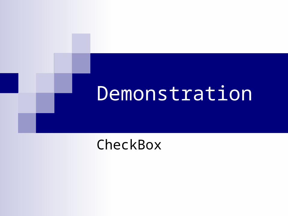
Demonstration
Form

Label - 1 Displays text
Useful Properties BackColor
Determines the background color of the control
Border Style Determines the border
surrounding the control None FixedSingle Fixed3D
Enabled Determines whether the user
can use the control Font
Determines the font of the text displayed
Label

Label - 2
Useful Properties Location
Determines the current location of the control on the form Name
Determines the name of the control used to reference this control in your code Size
Determines the current size of the control TabIndex
Determines the index of the Tab order that this control will occupy TextAlign
Determines the alignment of the text Text
Determines the text displayed Visible
Determines the visibility of the control Anchor
Anchors the control to an edge of a container so a side of the control grows gracefully Dock
Docks the control in a location in a container so the control grows gracefully

Demonstration
Label

LinkLabel - 1 Displays a link. When this link is
clicked, code is executed.
Useful Properties ActiveLinkColor
Determines the color of the link when you click on it
BackColor Determines the background color
of the control Border Style
Determines the border surrounding the control
None FixedSingle Fixed3D
Enabled Determines whether the user can
use the control Font
Determines the font of the text displayed

LinkLabel - 2 Useful Properties
LinkColor Determines the color of the link
Location Determines the current location of the control on the form
Name Determines the name of the control used to reference this control in your code
Size Determines the current size of the form
TabIndex Determines the index of the Tab order that this control will occupy
Text Determines the text displayed
TextAlign Determines the alignment of the text
Visible Determines the visibility of the control
Anchor Anchors the control to an edge of a container so a side of the control grows gracefully
Dock Docks the control in a location in a container so the control grows gracefully

Demonstration
LinkLabel

TextBox - 1 Allows user to input text
Useful Properties AcceptsReturn
Determines whether a return will enter a blank line or move to the next control
AcceptsTab Determines whether a tab will
enter a tab or move to the next control
BackColor Determines the background color
of the control Border Style
Determines the border surrounding the control
None FixedSingle Fixed3D
Enabled Determines whether the user can
use the control Font
Determines the font of the text displayed ScrollBars
TextBox

TextBox - 2 Useful Properties
Location Determines the current location of the control on the form
Multiline Determines whether the textbox has multiple lines
MaxLength Determines the maximum length of text the user is allowed to enter
Name Determines the name of the control used to reference this control in your code
ReadOnly Determines whether the control is editable
Size Determines the size of the control
TabIndex Determines the index of the Tab order that this control will occupy
TabStop Determines whether the tab order will stop at this control
Text Determines the text displayed
TextAlign Determines the alignment of the text
Visible Determines the visibility of the control
Anchor Anchors the control to an edge of a container so a side of the control grows gracefully
Dock Docks the control in a location in a container so the control grows gracefully

Demonstration
TextBox

ComboBox - 1 Allows user to select from a
number of options
Useful Properties BackColor
Determines the background color of the control
DropDownStyle Determines the appearance and
functionality Simple DropDown DropDownList (Forces a user to
select available options) Enabled
Determines whether the user can use the control
Font Determines the font of the text
displayed Items
Determines the options that a user can select from
Location Determines the current location of
the control on the form
ComboBox

ComboBox - 2 Useful Properties
MaxLength Determines the maximum length of text the user is allowed to enter
Name Determines the name of the control used to reference this control in your code
Size Determines the current size of the control
Sorted Determines whether the selectable items are alphabetically ordered
TabIndex Determines the index of the Tab order that this control will occupy
TabStop Determines whether the tab order will stop at this control
Text Determines the text displayed
Visible Determines the visibility of the control
Anchor Anchors the control to an edge of a container so a side of the control grows gracefully
Dock Docks the control in a location in a container so the control grows gracefully

ComboBox – 3
The String Collection Editor is used to enter options
This can be accessed by clicking on the button in the Item property

Demonstration
ComboBox

CheckBox - 1 Allows user to enter a
true/false value
Useful Properties BackColor
Determines the background color of the control
CheckAlign Determines the alignment of
the checkbox Checked
Determines whether the checkbox is checked or not
Enabled Determines whether the user
can use the control Font
Determines the font of the text displayed
CheckBox

CheckBox - 2 Useful Properties
Name Determines the name of the form used to reference this control in your code
Location Determines the current location of the control on the form
Size Determines the current size of the control
TabIndex Determines the index of the Tab order that this control will occupy
TabStop Determines whether the tab order will stop at this control
Text Determines the text displayed
TextAlign Determines the alignment of the text
Visible Determines the visibility of the control
Anchor Anchors the control to an edge of a container so a side of the control grows gracefully
Dock Docks the control in a location in a container so the control grows gracefully
Demonstration
CheckBox

ListView - 1 Allows user to see a list of text
Useful Properties BackColor
Determines the background color of the control BorderStyle
Determines the style of the border Sizeable Fixed Etc.
Columns Determines the columns displayed
Enabled Determines whether the user can use the control
FullRowSelect Determines whether a full row can be selected
Gridlines Determines whether gridlines are displayed
Items Determines the items displayed

ListView - 2 Location
Determines the current location of the control on the form MultiSelect
Determines whether multiple items can be selected Name
Determines the name of the control used to reference this control in your code Scrollable
Determines whether scrollbars will be available if the number of items exceeds the room available to display them
Size Determines the current size of the control
TabIndex Determines the index of the Tab order that this control will occupy
TabStop Determines whether the tab order will stop at this control
View Determines the type of view that is displayed
LargeIcon SmallIcon Details List
Visible Determines the visibility of the control
Anchor Anchors the control to an edge of a container so a side of the control grows gracefully
Dock Docks the control in a location in a container so the control grows gracefully

ListView - 3
The ListViewItem Collection Editor is used to enter options
This can be accessed by clicking on the button in the Item property

Demonstration
ListView
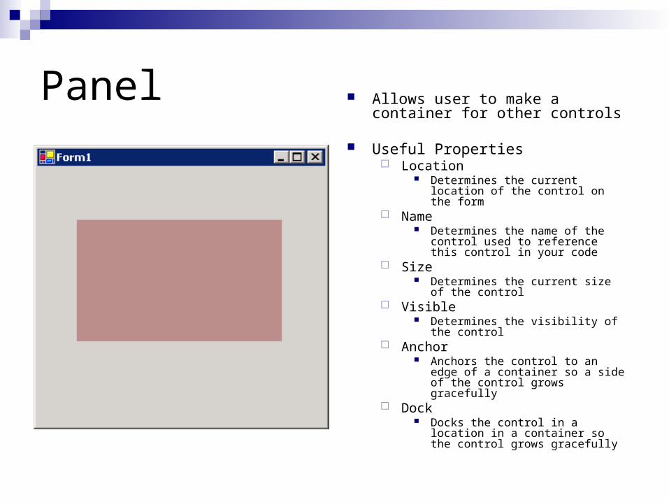
Panel Allows user to make a container for other controls
Useful Properties Location
Determines the current location of the control on the form
Name Determines the name of the control
used to reference this control in your code
Size Determines the current size of the
control Visible
Determines the visibility of the control Anchor
Anchors the control to an edge of a container so a side of the control grows gracefully
Dock Docks the control in a location in a
container so the control grows gracefully

Demonstration
Panel

RadioButton - 1 Allows user to select from a
number of options
Useful Properties BackColor
Determines the background color of the control
Enabled Determines whether the user can
use the control Font
Determines the font of the text displayed
Location Determines the current location of
the control on the form Checked
Determines whether the radiobutton is checked or not
CheckAlign Determines the alignment of the
checkbox
Radio Button

RadioButton - 2
Useful Properties Name
Determines the name of the control used to reference this control in your code Size
Determines the current size of the control TabIndex
Determines the index of the Tab order that this control will occupy TabStop
Determines whether the tab order will stop at this control Text
Determines the text displayed TextAlign
Determines the alignment of the text Visible
Determines the visibility of the control Anchor
Anchors the control to an edge of a container so a side of the control grows gracefully Dock
Docks the control in a location in a container so the control grows gracefully

Demonstration
RadioButton

GroupBox - 1 Allows user to see related
items grouped together
Useful Properties BackColor
Determines the background color of the control
Enabled Determines whether the user
can use the control Font
Determines the font of the text displayed
Location Determines the current
location of the control on the form
Name Determines the name of the
control used to reference this control in your code
GroupBox

GroupBox - 2
Useful Properties Size
Determines the current size of the form TabIndex
Determines the index of the Tab order that this control will occupy Text
Determines the text displayed Visible
Determines the visibility of the control Anchor
Anchors the control to an edge of a container so a side of the control grows gracefully
Dock Docks the control in a location in a container so the control grows gracefully

Demonstration
GroupBox

PictureBox Allows user to see pictures
Useful Properties Image
Determines the image displayed Sizemode
Determines the how the picture is displayed in relation to the size of the control
Location Determines the current location of the
control on the form Name
Determines the name of the control used to reference this control in your code
Size Determines the current size of the
control Visible
Determines the visibility of the control Anchor
Anchors the control to an edge of a container so a side of the control grows gracefully
Dock Docks the control in a location in a
container so the control grows gracefully
PictureBox

Demonstration
PictureBox
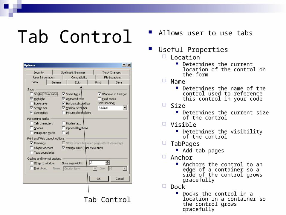
Tab Control Allows user to use tabs
Useful Properties Location
Determines the current location of the control on the form
Name Determines the name of the
control used to reference this control in your code
Size Determines the current size of the
control Visible
Determines the visibility of the control
TabPages Add tab pages
Anchor Anchors the control to an edge of
a container so a side of the control grows gracefully
Dock Docks the control in a location in
a container so the control grows gracefullyTab Control

Demonstration
Tab Control

MainMenu Control Allows user to use main menus
Useful Properties Name
Determines the name of the control used to reference this control in your code
A MainMenu control contains many MenuItem controls
Separation lines can be inserted by right clicking on a blank menuitem displaying Type Here and selecting Insert Separator
On the form containing the menu, make sure to select the proper menu to display
A form can have multiple menus but only 1 can be displayed at a time
An underline can be achieve by using & in the text property. This allows users to use hot keys to navigate through a menu
MenuItem hotkeys can be added through the shortcut property
MainMenu Control

Demonstration
MainMenu Control