Embed Size (px)
Citation preview

GUIDELINES FOR DESIGNINGUSER INTERFACE SOFTWARE
ESD-TR-86-278
August 1986
Sidney L. Smith and Jane N. Mosier
The MITRE Corporation Bedford, Massachusetts, USA
Prepared for Deputy Commander for Development Plans
and Support Systems, Electronic Systems Division, AFSC,
United States Air Force, Hanscom Air Force Base, Massachusetts.
Approved for public release; distribution unlimited.
The body of this document is in the public domain
Table of contents and index © 1998 Userlab Inc.
www.userlab.com
1-800-295-6354
Contact us for additional copies
The only charge is for printing and shipping

THIS PUBLICATION IS PROVIDED “AS IS” WITHOUT WARRANTY OF ANY KIND, EITHER EXPRESS OR IMPLIED, INCLUDING, BUT NOT LIMITED TO, THE IMPLIED WARRANTIES OF MERCHANTABILITY, FITNESS FOR A PARTICULAR PURPOSE, OR NON-INFRINGEMENT.
-3
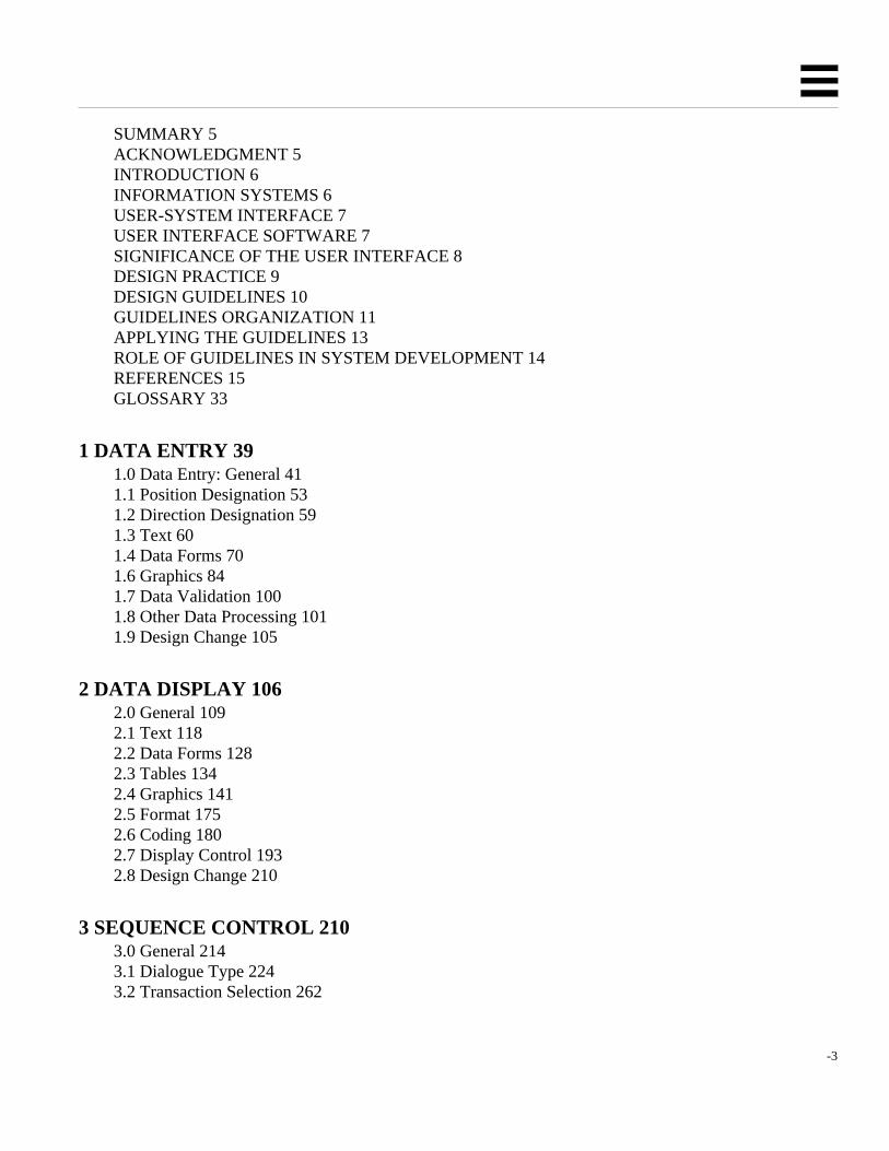
SUMMARY 5ACKNOWLEDGMENT 5INTRODUCTION 6INFORMATION SYSTEMS 6USER-SYSTEM INTERFACE 7USER INTERFACE SOFTWARE 7SIGNIFICANCE OF THE USER INTERFACE 8DESIGN PRACTICE 9DESIGN GUIDELINES 10GUIDELINES ORGANIZATION 11APPLYING THE GUIDELINES 13ROLE OF GUIDELINES IN SYSTEM DEVELOPMENT 14REFERENCES 15GLOSSARY 33
1 DATA ENTRY 391.0 Data Entry: General 411.1 Position Designation 531.2 Direction Designation 591.3 Text 601.4 Data Forms 701.6 Graphics 841.7 Data Validation 1001.8 Other Data Processing 1011.9 Design Change 105
2 DATA DISPLAY 1062.0 General 1092.1 Text 1182.2 Data Forms 1282.3 Tables 1342.4 Graphics 1412.5 Format 1752.6 Coding 1802.7 Display Control 1932.8 Design Change 210
3 SEQUENCE CONTROL 2103.0 General 2143.1 Dialogue Type 2243.2 Transaction Selection 262

-4 TitleofBook
3.3 Interrupt 2683.4 Context Definition 2713.5 Error Management 2743.6 Alarms 2783.7 Design Change 279
4 USER GUIDANCE 2794.0 General 2834.1 Status Information 2944.3 Error Feedback 3014.4 Job Aids 3084.5 User Records 3184.6 Design Change 320
5 DATA TRANSMISSION 3215.0 General 3235.1 Preparing Messages 3265.2 Addressing Messages 3295.3 Initiating Transmission 3345.4 Controlling Transmission 3385.5 Receiving Messages 3415.6 Design Change 346
6 DATA PROTECTION 3466.0 General 3516.1 User Identification 3586.2 Data Access 3616.3 Data Entry/Change 3646.4 Data Transmission 3706.5 Design Change 372

SuppliedbyUserlabInc.1-800-295-6354 5
SUMMARY
This report offers guidelines for design of user interface software insix functional areas: data entry, datadisplay, sequence control, user guidance, data transmission, and data protection. This report revises andextends previous compilations of design guidelines (cf. Smith and Mosier, 1984a).
If you are a teacher, a student, a human factors practitioner or researcher, these guidelines can serve as astarting point for the development and application of expert knowledge. But that is not the primaryobjective of this compilation. The guidelines are proposed here as a potential tool for designers of userinterface software.
If you are a system analyst, you can review these guidelines to establish design requirements. If you area software designer, you can consult these guidelines to derive the specific design rules appropriate foryour particular system application. That translation from general guidelines to specific rules will helpfocus attention on critical user interface design questions early in the design process.
If you are a manager responsible for user interface software design, you may find in these guidelines ameans to make the design process more efficient. Guidelines can help establish rules for coordinatingindividual design contributions, can help to make design decisions just once rather than leaving them tobe made over and over again by individual designers, can help to define detailed design requirements andto evaluate user interface software in comparison with those requirements.
The design of user interface software will often involve a considerable investment of time and effort.Design guidelines can help ensure the value of that investment.
ACKNOWLEDGMENT
This report was prepared by The MITRE Corporation. The work reported here was sponsored by theDirectorate of Computer Systems Engineering, Deputy for Acquisition Logistics and TechnicalOperations of the Electronic Systems Division (ESD) of the United States Air Force Systems Command,Hanscom Air Force Base, MA 01731. Continuing funding for this work was provided by the Air ForceComputer Resource Management Technology Program, Program Element 64740F, under ESD/MITREProject 5220. Final publication of these guidelines was funded under Project 5720.
The Computer Resource Management Technology Program supports development and transition intoactive use of tools and techniques needed to cope with the explosive growth in Air Force systems that usecomputer resources. The objectives of that Program are:
• to provide for the transition to Air Force systems of computer system developments in laboratories, industry, andacademia;
• to develop and apply software acquisition management techniques to reduce life cycle costs;
• to provide improved software design tools;
• to address problems associated with computer security;
• to develop advanced software engineering tools, techniques, and systems;
• to support the implementation of high-order programming languages, e.g., Ada;
• to improve human engineering of computer systems; and

6 GUIDELINESFORDESIGNINGUSERINTERFACESOFTWARE
• to develop and apply computer simulation techniques in support of system acquisition.
INTRODUCTION
In designing computer-based information systems, special attention must be given to software supportingthe user interface. For the past several years, guidelines for designing user interface software have beencompiled as a continuing effort sponsored by the Air Force Electronic Systems Division (ESD). Fiveprevious ESD reports have dealt with this subject (Smith, 1980; 1981a; 1982b; Smith and Aucella,1983a; Smith and Mosier, 1984a).
This present report revises and expands previously published material, and proposes a comprehensive setof guidelines for design of user interface software in computer-based information systems. Although agreat many changes have been made, much of the text and guidelines material in this report will seemfamiliar to the readers of previous reports.
Different people will read this report for different reasons -- teachers and students, human factorspractitioners and researchers, system analysts and software designers, and their managers. Each readerwill bring to the task a unique background of experience and interests. Thus some introductorycomments are needed to help familiarize readers with the general problems of user interface design andthe particular need for guidelines to design user interface software.
For the skeptical reader, this introduction offers arguments in favor of guidelines for user interfacesoftware design. For the enthusiast who may imagine that guidelines can solve all design problems, thisintroduction will note some of their limitations. For those readers who wish to apply design guidelines,this introduction describes how the report is formatted, how the guidelines are presented and annotated,and concludes with some recommendations for how the guidelines should be used.
INFORMATION SYSTEMS
Computers today are used for a broad range of applications. User interface design guidelines cannot beapplied usefully in every case. Some computers may be embedded as components in larger systems, sothat they communicate only with other computers and not directly with human users. When there is nouser interface, then no user interface design guidelines are needed.
Some computers are designed as general tools which can be adapted by skilled users for whateverpurpose they desire. The particular tasks for which a general-purpose computer might be used are notdefined in advance by the designer. Instead, a user must provide exact instructions to program thecomputer to perform any task at hand. The designer may try to ensure that the computer can processappropriate programming languages, but otherwise is not concerned with explicit design of a userinterface.
Other computer systems are designed to help particular users perform specific tasks. Such computerapplications are referred to here as information systems. Applications of information systems range fromrelatively simple data entry and retrieval (e.g., airline reservations) through more complex monitoring

SuppliedbyUserlabInc.1-800-295-6354 7
and control tasks (inventory control, process control, air traffic control) to jobs requiring long-termanalysis and planning. Military command, control and communication systems span that broad range ofinformation system applications.
To the extent that information systems support human users performing defined tasks, careful design ofthe user-system interface will be needed to ensure effective system operation. The guidelines proposedin this report are intended to improve user interface design for suchinformation systems.
Users of information systems interact with a computer in order to accomplish information handling tasksnecessary to get their jobs done. They differ in ability, training and job experience. They may be keenlyconcerned with task performance, but may have little knowledge of (or interest in) the computersthemselves. Design of the user-system interface must take account of those human factors.
USER-SYSTEM INTERFACE
What is the user-system interface? In common usage, the phrase is broadly defined to include all aspectsof system design that affect system use (Smith, 1982a). This report, however, is concerned morenarrowly with the user interface to computer-based information systems, i.e., with those aspects ofsystem design that influence a user's participation in information handling tasks.
This report focuses even more narrowly on those design features of the user interface that areimplemented via software (i.e., the design of computer program logic) rather than hardware (the designof equipment). The guidelines proposed here are generally worded in terms of the functions that a usermust perform, and the functional capabilities that a designer should provide, rather than the particularphysical devices that might be used to implement those functions. Thus a particular guideline might dealwith "pointing" as a function, with no necessary recommendation whether pointing should beaccomplished via touch display or lightpen or any other physical device.
It is obvious that software is not the only significant factor influencing user performance. Other aspectsof user interface design are clearly important, including workstation design, physical displaycharacteristics, keyboard layout, environmental factors such as illumination and noise, the design ofpaper forms and written documentation, user training courses, etc. To achieve a good user interfacedesign, all of those factors must be designed with care. But designers must look elsewhere for advice onthose topics. They are not covered in this report.
USER INTERFACE SOFTWARE
The significant role of user interface software in system design poses a special challenge to humanfactors practitioners, recognized early by Parsons (1970, page 169):
. . . what sets data processing systems apart as a special breed? The function of each switch button, thefunctional arrangement among the buttons, the size and distribution of elements within a display areestablished not in the design of the equipment but in how the computer is programmed. Of even moreconsequence, the 'design' in the programs establishes the contents of processed data available to theoperator and the visual relationships among the data. In combination with or in place of hardware, itcan also establish the sequence of actions which the operator must use and the feedback to the operatorconcerning those actions.
8 GUIDELINESFORDESIGNINGUSERINTERFACESOFTWARE
Continuing concern for user interface software is suggested by phrases such as "software psychology"(cf. Shneiderman, 1980). But user interface design cannot be the concern only of the psychologist or thehuman factors specialist. It is a significant part of information system design that must engage theattention of system developers, designers, and ultimately system users as well. Those who look to thefuture of information systems predict that user interface design will become a specialty area; designerstrained in both computer science and human factors will be employed to develop user interface software(Williges, 1984).
User interface software can represent a sizable investment of programming effort during initial systemdevelopment, and later when a system is upgraded. In a recent survey (Smith and Mosier, 1984b),information system designers were asked to estimate the percent of operational software devoted toimplementing the user interface. Overall, the average estimate was that user interface design comprises30 to 35 percent of operational software. Estimates for individual systems ranged from 3 to 100 percent,reflecting the fact that some computer systems require a much higher investment in user interface designthan others, depending upon their purpose.
SIGNIFICANCE OF THE USER INTERFACE
The design of user interface software is not only expensive and time-consuming, but it is also critical foreffective system performance. To be sure, users can sometimes compensate for poor design with extraeffort. Probably no single user interface design flaw, in itself, will cause system failure. But there is alimit to how well users can adapt to a poorly designed interface. As one deficiency is added to another,the cumulative negative effects may eventually result in system failure, poor performance, and/or usercomplaints.
Outright system failure can be seen in systems that are underused, where use is optional, or areabandoned entirely. There may be retention of (or reversion to) manual data handling procedures, withlittle use of automated capabilities. When a system fails in this way, the result is disrupted operation,wasted time, effort and money, and failure to achieve the potential benefits of automated informationhandling.
In a constrained environment, such as that of many military and commercial information systems, usersmay have little choice but to make do with whatever interface design is provided. There the symptomsof poor user interface design may appear in degraded performance. Frequent and/or serious errors indata handling may result from confusing user interface design. Tedious user procedures may slow dataprocessing, resulting in longer queues at the checkout counter, the teller's window, the visa office, thetruck dock, or any other workplace where the potential benefits of computer support are outweighed byan unintended increase in human effort.
In situations where degradation in system performance is not so easily measured, symptoms of poor userinterface design may appear as user complaints. The system may be described as hard to learn, orclumsy, tiring and slow to use. The users' view of a system is conditioned chiefly by experience with itsinterface. If the user interface is unsatisfactory, the users' view of the system will be negative regardlessof any niceties of internal computer processing.

SuppliedbyUserlabInc.1-800-295-6354 9
A convincing demonstration of design improvement has been reported by Keister and Gallaway (1983).Those authors describe a data entry application in which relatively simple improvements to user interfacesoftware -- including selection and formatting of displayed data, consistency in wording and procedures,on-line user guidance, explicit error messages, re-entry rather than overtyping for data change,elimination of abbreviations, etc. -- resulted in significantly improved system performance. Data entrywas accomplished 25 percent faster, and with 25 percent fewer errors. How can that kind of designimprovement be achieved in general practice?
DESIGN PRACTICE
It seems fair to characterize current user interface software design as art rather than science, dependingmore upon individual judgment than systematic application of knowledge (Ramsey and Atwood, 1979;1980). As an art, user interface design is best practiced by experts, by specialists experienced in thehuman engineering of computer systems. But such experts are not always available to help guide systemdevelopment, and it is clear that they cannot personally guide every step of design. What is needed issome way to embody expert judgment in the form of explicit design guidelines.
For military information systems, Military Specification MIL-H-48655B (1979) calls for a systemdevelopment sequence starting with requirements analysis, functional specification and verificationbefore any software design begins. The actual course of user interface software development willsometimes depart from that desired sequence. There may be no explicit attempt to determine userinterface requirements. Specifications may include only rudimentary references to user interface design,with general statements that the system must be "easy to use". In the absence of effective guidance, boththe design and implementation of user interface software may become theresponsibility of programmersunfamiliar with operational requirements. Detection and correction of design flaws may occur only aftersystem prototyping, when software changes are difficult to make.
Human engineering standards and design handbooks have in the past been of little use to the softwaredesigner. The popular human factors design handbook by Woodson (1981) is typical. Its nearly 1000pages includes only three pages of general material on information processing, and there is no referenceto computer systems in its index.
MIL-STD-1472B (1974), for many years the major human engineering design standard for militarysystem procurement, was concerned almost exclusively with hardware design and physical safety. In1981, MIL-STD-1472 was published in a revised "C" version. That version included nine pages dealingwith user interface software design, in a section titled "Personnel-Computer Interface". That materialwas later expanded to 19 pages, titled "User-Computer Interface", in a revision of MIL-STD-1472C(1983). Thus a beginning has been made, but much more is needed. The question is, what guidance canbe offered for user interface software design?

10 GUIDELINESFORDESIGNINGUSERINTERFACESOFTWARE
DESIGN GUIDELINES
Until several years ago, there had been no serious attempt to integrate the scattered papers, articles andtechnical reports that constitute the literature of user-computer interaction. A first step was made, undersponsorship of the Office of Naval Research (ONR), in compilation of an extensive bibliography on thissubject (Ramsey, Atwood and Kirshbaum, 1978). A significant follow-on effort culminated inpublication by Ramsey and Atwood (1979) of a comprehensive summary of this literature.
In reviewing the literature, it is apparent that most published reports dealing with the user-computerinterface describe applications rather than design principles. A popular early book on the design of user-computer dialogues offered stimulating examples, covering a range of on-line applications, but wasdisappointing in its failure to emphasize design principles (Martin, 1973). The ONR bibliography citedabove includes 564 items, but identifies only 17 as offering design guidelines.
Although accepted principles for user interface design have not been available, some work has beenaccomplished toward that end. As experience has been gained in the use of on-line computer systems,some experts have attempted to set forth principles ("guidelines", "ground rules", "rules of thumb") fordesign of the user-computer interface. If experts cannot yet assert tested principles for user interfacedesign, they might still offer sensible recommendations as a guide for designers.
Military agencies are not the only organizations seeking guidelines for user interface design. There iskeen interest in this topic within industrial and commercial organizations, and throughout the generalcommunity of people who develop and use information systems. David Penniman, writing for the UserOn-Line Interaction Group of the American Society for Information Sciences, has cited the need for "aninterim set of guidelines for user interface design based on available literature and pending thedevelopment of better guidelines as our knowledge increases" (1979, page 2). Penniman goes on toremind us that interim guidelines are better than no guidelines at all.
In a survey of people concerned with user interface design (Smith and Mosier, 1984b), respondentsgenerally support Penniman's activist position. Given a choice between trying to develop a complete setof user interface guidelines now, when many of them must be based on judgment rather thanexperimental data, or else accepting only a partial set of guidelines based on evaluated research, mostrespondents would go with judgment now.
It is clear, of course, that system developers cannot wait for future research data in making present designdecisions. To meet current needs, several in-house handbooks have been published to guide userinterface design within particular organizations (NASA, 1979; Galitz, 1980; Brown, Brown, Burkleo,Mangelsdorf, Olsen, and Perkins, 1983; Sidorsky, Parrish, Gates, and Munger, 1984). These in-houseguidelaines draw heavily from those in earlier publications, especially the influential IBM report byEngel and Granda (1975), as modified by the authors' own good judgment.
The ESD/MITRE compilation of user interface design guidelines over the past several years has drawnfrom the work of our predecessors, and will help support the work of others to follow. Each year ourguidelines compilation has grown larger. In this present report there are 944 guidelines. Thiscompilation represents the most comprehensive guidance available for designing user interface software,and for that reason this report is recommended as a basic reference for developing information systems.

SuppliedbyUserlabInc.1-800-295-6354 11
GUIDELINES ORGANIZATION
In the numbered sections of this report, guidelines are organized within six functional areas of user-system interaction:
Each section of guidelines covers a different functional area of user-system interaction, although there isnecessarily some overlap in topical coverage from one section to another. Within each section,guidelines are grouped by specific functions. Each function has its own numeric designator, as listed inthe table of contents for this report.
In adopting this functional organization, we have established a broad conceptual structure for dealingwith the range of topics that must be considered in user interface design. Such a conceptual structure isurgently needed to help clarify discourse in this field.
Each section of the guidelines begins with an introductory discussion of design issues relating to thegeneral functional area. That discussion provides some perspective for the guidelines that follow. Thediscussion concludes with brief definitions of the various user interface functions covered in that sectionof the guidelines, along with an internal table of contents for that section, which may help to lead areader directly to functions of immediate interest.
Function definitions are repeated in boxed format to begin the listing of guidelines under each function.Those definitions should aid reader understanding of the material, and the boxed format will provide anotable visual indicator that a new series of guidelines has begun.
The guidelines themselves are numbered sequentially under each function, in order to permit convenientreferencing. Under any function there will usually be guidelines pertaining to various subordinate topics.Each guideline has been given a short title to indicate its particular subject matter. Sometimes oneguideline may introduce a new topic and then be followed by several closely related guidelines. Each ofthose related guidelines has been marked with an plus sign next to its title.
Following its number and title, each guideline is stated as a single sentence. Guidelines are worded assimply as possible, usually in general terms to permit broad application, but sometimes with contingentphrasing intended to define a more limited scope of application.
Section Functional Area Number of Guidelines1 Data Entry 199
2 Data Display 298
3 Sequence Control 184
4 User Guidance 110
5 Data Transmission 83
6 Data Protection 70

12 GUIDELINESFORDESIGNINGUSERINTERFACESOFTWARE
In many instances, a stated guideline will be illustrated by one or more examples. When an exampleincludes some sort of imagined computer output, such as an error message, prompt, menu, etc., thatoutput has been marked with enclosing vertical strokes:
| sample computer output |
There is no question that specific examples can help clarify a generally-worded guideline. Sometimes areader will say, "I didn't really understand the guideline until I saw the example." But there is a potentialhazard in examples. Because any example must be narrowly specific, a reader who relies on thatexample may interpret the guideline as having a narrower meaning than was intended. It is important toemphasize that examples are presented here only to illustrate the guidelines, and are not intended to limitthe interpretation of guidelines.
Where the validity of a guideline is contingent upon special circumstances, examples may be followed bynoted exceptions. Those exceptions are intended to limit the interpretation of a guideline.
Where further clarification of a guideline seems needed, examples and noted exceptions are followed bysupplementary comments. Those comments may explain the reasoning behind a guideline, or suggestpossible ways to interpret a guideline, or perhaps note relations between one guideline and another.
Where a guideline has been derived from or is related in some way to other published reports, a referencenote may be added citing author(s) and date. Complete citations for those references are listed followingSection 6 of the guidelines. Where a guideline corresponds with other published design standards orguidelines, which is often the case, reference citations are given by letter codes. Those codes areexplained in the reference list.
Where a guideline is specifically related to guidelines in other sections, appropriate cross references aregiven. Those cross references permit an interested reader to explore how a particular topic is dealt within different sections of the guidelines.
Toward the back of this report, following the guidelines is the reference list. Following the reference listis a glossary. The glossary defines word usage in the guidelines, for those words that are used heredifferently or more narrowly than in the general literature on user interface design. There is no questionthat we need more consistent terminology in this field.
Following the glossary is a list of the titles for all 944 guidelines, which may help a reader who is tryingto find guidelines that pertain to a particular topic.
Following the list of guideline titles, and concluding this report is a topical index of the guidelinesmaterial. That index is intended to help readers find guidelines on a particular subject, independently ofthe functional organization that has been imposed on the guidelines material.
These notes on organization and format should serve to allow a student of the subject to skim theguidelines material and find information on different topics. For those readers who seek to apply theguidelines in software design, some further comments are needed.

SuppliedbyUserlabInc.1-800-295-6354 13
APPLYING THE GUIDELINES
Not all of the guidelines proposed here can be applied in designing any particular system. For anyparticular system application, some of the guidelines will be relevant and some will not. In a recentsurvey of guidelines application (Mosier and Smith, 1986), respondents indicated that they actuallyapplied only 40 percent of the guidelines published in a previous report.
There is another problem to consider. Design guidelines such as those proposed here must be generallyworded so that they might apply to many different system applications. Thus generally-wordedguidelines must be translated into specific design rules before they can actually be applied.
The process of selecting relevant guidelines for application and translating them into specific design rulesis referred to here as "tailoring". Who will do this guidelines tailoring? It should be the jointresponsibility of system analysts and human factors specialists assessing design requirements, ofsoftware designers assessing feasibility, and of their managers. It may also be helpful to includerepresentatives of the intended system users in this process, to ensure that proposed design features willmeet operational requirements. To simplify discussion, we shall call all of these persons "designers".
As a first step in guidelines tailoring, a designer must review this report in order to identify thoseguidelines that are relevant. For example, if an application will require menus, then the 36 guidelines inSection 3.1.3 dealing with Menu Selection are potentially relevant. For a large information system, thelist of relevant guidelines may be quite large.
Once all relevant guidelines have been identified, a designer must review them and decide which onesactually to apply. There are two reasons why a designer might not wish to apply all relevant guidelines.First, for any given application some guidelines may conflict, and the designer must therefore choosewhich are more important. Second, budgetary and time restrictions may force the designer to apply onlythe most important guidelines -- those that promise to have the greatest effect on system usability.
As noted above, because guidelines are intended for use on a variety of systems they are worded ingeneral terms. Before a guideline can actually be applied it must be translated into specific design rules.For instance, a guideline which states that displays should be consistently formatted might be translatedinto design rules that specify where various display features should appear, such as the display title,prompts and other user guidance, error messages, command entries, etc.
Any guideline can have different possible translations. A guideline which states that each display shouldbe uniquely identified could be translated into a design rule that display titles will be bolded and centeredin the top line of the display. Or it could be translated into a design rule that display titles will becapitalized in the upper left corner of the display.
What would happen if guidelines were not translated into design rules, but instead were given directly tointerface designers? If designers do not decide as a group what design rules will be used, then eachdesigner will decide separately in the course of applying guidelines. The result will surely be aninconsistent design.

14 GUIDELINESFORDESIGNINGUSERINTERFACESOFTWARE
After design rules have been specified for each selected guideline, those rules should be documented forreference by software designers and others involved in system development. Documentation of agreedrules, subject to periodic review and revision as necessary, will help coordinate the design process.Documented rules can then be applied consistently for a given application. With appropriatemodifications, rules adopted for one application might later be used for other applications.
In the course of design, it may be determined that a particular design rule cannot be used. Therefore,some means must be provided to deal with exceptions. If a design rule is not appropriate for oneparticular display, then an exception can be made by whoever has been appointed to make such decisions.But if a design rule cannot be implemented at all, perhaps due to other design constraints, then alldesigners for that particular system must be notified, and perhaps another design rule must be substituted.
Finally, after the design is complete, it must be evaluated against the original design requirements toensure that all design rules have indeed been followed. To help in the exception process and in theevaluation process, it may be useful to assign different weights to the various rules, indicating which aremore important than others. Such weighting will help resolve the trade-offs that are an inevitable part ofthe design process.
ROLE OF GUIDELINES IN SYSTEM DEVELOPMENT
If guidelines are applied in the way described here, there are some significant implications for the role ofguidelines in system development. Generally stated guidelines should be offered to designers as apotential resource, rather than imposed as a contractual design standard (Smith, 1986). It is onlyspecifically worded design rules that can be enforced, not guidelines.
Design rules can be derived from the guidelines material, but that conversion from guidelines to rulesshould be performed as an integral part of the design process, serving to focus attention on critical designissues and to establish specific design requirements. Once agreed design rules are established, thoserules can be maintained and enforced by the managers of system development projects.
Specific design rules probably cannot be imposed effectively at the outset of system development bysome external agency -- by a sponsoring organization or by a marketing group. It is the process ofestablishing design rules that should be imposed, rather than the rules themselves. A software designcontractor might reasonably be required to establish rules for the design of user interface software,subject to review by the contracting agency. Available guidelines could be cited as a potentially usefulreference for that purpose.
Some other cautionary comments about the application of guidelines deserve consideration here.Guidelines in themselves cannot assure good design for a variety of reasons (Thimbleby, 1985).Guidelines cannot take the place of experience. An experienced designer, one skilled in the art, might dowell without any guidelines. An inexperienced designer might do poorly even with guidelines. Fewdesigners will find time to read an entire book of guidelines. If they do, they will find it difficult todigest and remember all of the material. If guidelines and/or the rules derived from guidelines are to behelpful, they must be kept continually available for ready reference.

SuppliedbyUserlabInc.1-800-295-6354 15
Guidelines cannot take the place of expert design consultants, or at least not entirely. A design expertwill know more about a specific topic than can be presented in the guidelines. An expert will know whatquestions to ask, as well as many of the answers. An expert will know how to adapt generally-statedguidelines to the specific needs of a particular system design application. An expert will know how totrade off the competing demands of different guidelines, in terms of operational requirements.
For maximum effectiveness, guideline tailoring must take place early in the design process before anyactual design of user interface software. In order to tailor guidelines, designers must have a thoroughunderstanding of task requirements and user characteristics. Thus task analysis is a necessaryprerequisite of guidelines tailoring.
The result of guidelines application will be a design for user interface software that may incorporatemany good recommendations. However, even the most careful design will require testing with actualusers in order to confirm the value of good features and discover what bad features may have beenoverlooked. Thus prototype testing must follow initial design, followed in turn by possible redesign andoperational testing.
Indeed, testing is so essential for ensuring good design that some experts advocate early creation of anoperational prototype to evaluate interface design concepts interactively with users, with iterative designchanges to discover what works best (Gould and Lewis, 1983). But prototyping is no substitute forcareful design. Prototyping will allow rapid change in a proposed interface; however, unless the initialdesign is reasonably good, prototyping may not produce a usable final design.
Considering the system development process overall, guidelines application will not necessarily savework in user interface design, and in fact may entail extra work, at least in the initial stage of establishingdesign rules. But guidelines application should help produce a better user interface. Because guidelinesare based on what is known about good design, the resulting user interface is more likely to be usable.Certainly the common application of design rules by all designers working on a system should result inmore consistent user interface design. And the single objective on which experts agree is designconsistency.
REFERENCES
Anyone involved in compilation of design guidelines must begin and end by acknowledging thesignificant contributions of other people. No one person, no matter how wise, can know everything aboutthe complexities of user interface design. Nor will any one person have the perfect judgment and find theperfect words to express that knowledge to an interface designer. Thus when we propose guidelines wemust build upon the work of others.
That is a good thing. All design guidelines are necessarily based in some degree on judgment. Thusguidelines development must properly be a collaborative effort. The collective judgment of many peoplewill often prove sounder than the ideas of just one person When many people contribute to guidelinesdevelopment, we must find ways to acknowledge that contribution.One way is to cite previouslypublished papers that pertain to the guidelines. Citations in this report are represented in the referencelist that follows. But in the next several pages we also try to acknowledge more direct contributions toour work.

16 GUIDELINESFORDESIGNINGUSERINTERFACESOFTWARE
Many of the user interface design guidelines proposed in this report were not invented here, but derivefrom the ideas of other people. Where the idea for a guideline came from a particular source, anappropriate reference citation has been included for that guideline. Such citation offers credit wherecredit is due. More importantly, cited references may permit a reader who questions a particularguideline to explore its antecedents, perhaps to gain a better understanding of what is intended.
Citing an external reference in connection with a guideline does not necessarily mean that there isconvincing data to support a guideline. Although the references cited here all contain worth-while ideas,only some of these references report results from systematic data collection.
Furthermore, citation of references does not necessarily mean that their authors would agree with thewording of guidelines presented here. In some instances, an idea has been borrowed intact. In manymore instances, however, ideas have been modified, sometimes drastically, perhaps beyond the intent oftheir original authors.
In this report, in both the text and the guidelines, citations of specific references are in conventional form,showing author(s) and publication date. Those references are listed in the pages that follow. Theparticular format used here for citation and listing of references conforms in most respects to the standardreferencing practice recently adopted by the Human Factors Society (1984).
However, four reference sources are used generally throughout the guidelines. Those sources are cited sofrequently that they have been indicated simply by initials:
BB = Brown, Brown, Burkleo, Mangelsdorf, Olsen, and Perkins, 1983
EG = Engel and Granda, 1975
MS = MIL-STD-1472C (as revised), 1983
PR = Pew and Rollins, 1975
These four general references share a common characteristic -- like this report, they are all collections ofdesign guidelines. None of these four general references provide supporting data for their designrecommendations, and they need not be consulted for that purpose. The two early reports (EG and PR)have served as a fertile source of ideas for our current guidelines; where those reports are cited here, itmeans that their early recommendations are still judged to be correct. The two more recent reports (BBand MS) have drawn heavily from common sources, including previous editions of the guidelinesproposed here; where those reports are cited, it means that their authors have made similarrecommendations to those presented here.
The 1975 IBM report by Engel and Granda (EG) was the first widely recognized compilation of userinterface design guidelines. That report has provided inspiration and has served as a seminal referencefor others working in this field.
The 1975 BBN report by Pew and Rollins (PR) represents an admirable attempt to propose designguidelines for one particular system application. Its recommendations, however, can readily begeneralized for broader application.

SuppliedbyUserlabInc.1-800-295-6354 17
The 1983 report by Lin Brown and his colleagues at Lockheed (BB) is a good example of user interfaceguidelines developed for use as an in-house design standard, but which have also been made available forpublic reference
None of these three reports are distributed by government sources such as the National TechnicalInformation Service. However, these reports may be obtained by direct request from their authors
MIL-STD-1472C (MS), in its current revision, is the US military standard for human engineering insystem design. That standard has been cited here 237 times, for 209 guidelines. It is important toemphasize that guidelines do not carry the same weight as design standards. Guidelines are proposedhere for optional application in system development, rather than to be imposed contractually. However,there is some considerable correspondence in content between these guidelines and the current militarystandard.
Not all ideas for guidelines come from published references. Some of the guidelines proposed here haveresulted from discussion with professional colleagues. And the wording of all guidelines has beenimproved through critical review of earlier published versions. Over the past several years, a number ofpeople have contributed suggestions for improving the guidelines material:
Sara R. Abbott Union Carbide CorporationJames H. Alexander Tektronix, Inc.Dorothy J. Antetomaso The MITRE CorporationChristopher J. Arbak McDonnell Douglas CorporationArlene F. Aucella Wang LaboratoriesClifford E. Baker The MITRE CorporationJ. David Beattie Ontario HydroLeo Beltracchi US Nuclear Regulatory CommissionC. Marlin Brown Lockheed Missiles and Space Company
Alphonse Chapanis Alphonse Chapanis Ph.D.
Hal Cheney OCLC
Kent B. Davis Litton Data Command Systems
Robert S. Didner Decision Information Designs
John Dinan Raytheon Equipment DivisionSusan M. Dray Honeywell, Inc.Joseph S. Dumas American Institutes for ResearchSam L. Ehrenreich AT&T Bell LaboratoriesJeanne Fleming The MITRE CorporationJames D. Foley The George Washington UniversityElaine A. Fournier The MITRE CorporationWilbert O. Galitz Galitz, Inc.

18 GUIDELINESFORDESIGNINGUSERINTERFACESOFTWARE
Some of these people have offered specific suggestions. Some have contributed more general commentsabout the wording or formatting of the guidelines material. But all have shown a serious concern withtrying to improve the guidelines and make them more useful to designers of user interface software.Probably not one of these people would agree with all of the guidelines proposed here; in matters ofjudgment we can seldom achieve unanimity. But where the guidelines seem good, these are people whodeserve our thanks.
Several people on this list deserve extra thanks. Our colleagues at MITRE have continued to serve as anin-house working group for guidelines review. Special thanks are due to Nancy Goodwin for herthorough revision of the guidelines on data transmission; to Jeanne Fleming and James Foley for theirdetailed comments on guidelines proposed for graphics entry and display; and to Dorothy Antetomaso forher review of the guidelines on data security. Special thanks for past contributions are due to ArleneAucella who helped prepare the 1983 guidelines report; and to MITRE supervisor Marlene Hazle for herearly encouragement and support of guidelines compilation.
Robert N. Gifford Northrop ElectronicsSusan R. Gilbert Wang LaboratoriesNancy C. Goodwin The MITRE CorporationJo Huddleston Ferranti Computer Systems LimitedRichard M. Kane Wang LaboratoriesRichard S. Keister Battelle Columbus LaboratorieKaren L. Kessels Hughes Aircraft CompanyJudith R. Kornfeld Symbolics, Inc.Jack I. Laveson Integrated Systems ResearchRichard Marshall OlivettiHarold Miller-Jacobs Sperry CorporationAlice M. Mulvehill The MITRE CorporationJakob Nielsen Technical University of DenmarkLorraine F. Normore Chemical Abstracts ServiceRobert N. Parrish The Aerospace CorporationSteven P. Rogers Anacapa Sciences, Inc.Eric M. Schaffer Human Performance AssociatesBen Shneiderman University of MarylandMalcolm L. Stiefel The MITRE CorporationSusan G. Tammaro The MITRE CorporationNancy S. Tanner University of MassachusettsJohn C. Thomas Nynex CorporationHerb Weiner Tektronix, Inc.R. Don Williams Texas Instruments, Inc.

SuppliedbyUserlabInc.1-800-295-6354 19
albert 1982:Cited in: 1.1/4 1.1/12 4
Albert, A. E. (1982). The effect of graphic input devices on performance in a cursor positioningtask. In Proceedings of the HumanFactors Society 26th Annual Meeting (pp. 54-58). Santa Monica,CA: Human Factors Society.
aretz kopala 1981:Cited in: 3.1.4/16 4
Aretz, A. J., and Kopala, C. J. (1981). Automatic return in multifunction control logic. InProceedings of the Human Factors Society 25th Annual Meeting (pp. 254-256). Santa Monica, CA:Human Factors Society.
badre 1984:Cited in: 3.0/3 3.1.3/12 3.1.3/35 3.1.3/36 3
Badre, A. N. (1984). Designing transitionality into the user-computer interface. In Salvendy, G.(Ed.), Human-Computer Interaction (pp. 27-34). Amsterdam: Elsevier Science Publishers.
barnard hammond maclean morton 1982: Cited in: 3.1.5/8 3
Barnard, P. J., Hammond, N. V., MacLean, A., and Morton, J. (1982). Learning and rememberinginteractive commands in a text-editing task. Behaviour and Information Technology, 1, 347-358.
barnard marcel 1984: Cited in: 2.4/13 3.1.8/3 3
Barnard, P., and Marcel, T. (1984). Representation and understanding in the use of symbols andpictograms. In Easterby, R., and Zwaga, H. (Eds.), Information Design (pp. 37-75). Chichester:Wiley.
bauer eddy 1986: Cited in: 3.1.87
Bauer, D. W., and Eddy, J. K. (1986). The representation of command language syntax. HumanFactors, 28, 1-10.
bertelson boons renkin 1965: Cited in: 1.0/8
Bertelson, P., Boons, J.-P., and Renkin, A. (1965). Vitesse libre et vitesse imposee dans une tachesimulant le tri mechanique de la correspondence (Self pacing and imposed pacing in a tasksimulating automated postal sorting). Ergonomics, 8, 3-22.
bertoni 1982: Bertoni, P. (1982, June 22). Of slipped disks . . . . Boston Globe.
bewley roberts schroit verplank 1983: Cited in: 3.1.8/3
Bewley, W. L., Roberts, T. L., Schroit, D., and Verplank, W. L. (1983). Human factors testing in thedesign of Xerox's 8010 "Star" office workstation. In Proceedings of CHI'83 Human Factors inComputing Systems (pp. 72-77). New York: Association for Computing Machinery.
bigelow 1985: Cited in: 3.1.8/4
Bigelow, C. (1985, July). Proceedings of the Typography Interest Group ACM CHI'85. SIGCHIBulletin, 17(1), 10-11.
billingsley 1982: Cited in: 3.1.3/30 4.4/4
Billingsley, P. A. (1982). Navigation through hierarchical menu structures: Does it help to have amap? In Proceedings of the Human Factors Society 26th Annual Meeting (pp. 103-107). SantaMonica, CA: Human Factors Society.
20 GUIDELINESFORDESIGNINGUSERINTERFACESOFTWARE
bb = brown brown burkleo mangelsdorf olsen perkins 1983: BB = Brown, C. M., Brown, D. B., Burkleo,H. V., Mangelsdorf, J. E., Olsen, R. A., and Perkins, R. D. (1983, June 15). Human FactorsEngineering Standards for Information Processing Systems (LMSC-D877141). Sunnyvale, CA:Lockheed Missiles and Space Company.
bruder moy mueller danielson 1981: Cited in: 5.0/2 5.1/12 5.2/8 5.2/10 5.3/13 5.5/4
Bruder, J., Moy, M., Mueller, A., and Danielson, R. (1981). User experience and evolving design ina local electronic mail system. In Uhlig, R. P. (Ed.), Computer Message Systems (pp. 69-78). NewYork: North-Holland.
bury boyle evey neal 1982: Cited in: 2.7.2/7
Bury, K. F., Boyle, J. M., Evey, R. J., and Neal, A. S. (1982). Windowing versus scrolling on avisual display terminal. Human Factors, 24, 385-394.
butterbaugh rockwell 1982: Cited in: 1.0/25
Butterbaugh, L. C., and Rockwell, T. H. (1982). Evaluation of alternative alphanumeric keyinglogics. Human Factors, 24, 521-533.
campbell marchetti mewhort 1981: Cited in: 2.1/8
Campbell, A. J., Marchetti, F. M., and Mewhort, D. J. K. (1981). Reading speed and text production:A note on right-justification techniques. Ergonomics, 24, 633-640.
carroll 1982: Cited in: 3.0/11 3.1.5/7 3.1.5/10
Carroll, J. M. (1982). Learning, using and designing filenames and command paradigms.Behaviour and Information Technology, 1, 327-346.
chao 1985: Cited in: 2.7.3/4
Chao, B. P. (1985). Evaluation of a video storage system for intrusion detections. In Proceedingsof the Human Factors Society 29th Annual Meeting (pp. 417-421). Santa Monica, CA: HumanFactors Society.
cleveland 1985: Cited in: 2.4/2 2.4.1/2 2.4.1/7 2.4.1/8 2.4.1/12 2.4.2/3 2.4.2/4 2.4.3/6 2.4.3/11 2.4.5/1
Cleveland, W. S. (1985). The Elements of Graphing Data. Monterey, CA: Wadsworth AdvancedBooks and Software.
cohill williges 1985 : Cited in: 4.4/29
Cohill, A. M., and Williges, R. C. (1985). Retrieval of HELP information for novice users ofinteractive computer systems. Human Factors, 27, 335-343.
csc-std-002-85 1985: CSC-STD-002-85 (1985, 12 April). Department of Defense PasswordMana gementGuideline. Fort George G. Meade, MD: Department of Defense Computer Security Center.
dean 1982: Cited in: 4.3/1
Dean, M. (1982). How a computer should talk to people. IBM Systems Journal, 21, 424-453.
demers 1981: Cited in: 3.1.5/7 3.1.5/11 3.1.5/14 3.1.5/18 3.2/18
Demers, R. A. (1981). System design for usability. Communications of the ACM, 24, 494-501.
deutsch 1981: Cited in: 5.1/5 5.2/2
Deutsch, D. (1981). Design of a message format standard. In Uhlig, R.P. (Ed.), Computer MessageSystems (pp. 199-220). New York: North-Holland.

SuppliedbyUserlabInc.1-800-295-6354 21
deutsch 1984: Cited in: 5.2/8 5.2/9 5.2/11 5.2/17
Deutsch, D. P. (1984). Implementing distribution lists in computer-based message systems. InSmith, H. T. (Ed.), Computer-Based Message Services (pp. 3-13). New York: North-Holland.
dray ogden vestewig 1981: Cited in: 3.1.3/25
Dray, S. M., Ogden, W. G., and Vestewig, R. E. (1981). Measuring performance with a menu-selection human-computer interface. In Proceedings of the Human Factors Society 25th AnnualMeeting (pp. 746-748). Santa Monica, CA: Human Factors Society.
duchnicky kolers 1983: Cited in: 2.1/4 2.1/5 2.1/28
Duchnicky, R. L., and Kolers, P. A. (1983). Readability of text scrolled on visual display terminalsas a function of window size. Human Factors, 25, 683-692.
dunn 1973: Cited in: 2.4/18
Dunn, C. (1973). The use of real-time simulation by means of animation film as an analyticaldesign tool in certain spatio-temporal situations. Ergonomics, 16, 515-519.
durding becker gould 1977: Cited in: 3.1.6/2
Durding, B. M., Becker, C. A., and Gould, J. D. (1977). Data organization. Human Factors, 19, 1-14.
dwyer 1981: Cited in: 3.5/5
Dwyer, B. (1981). A user-friendly algorithm. Communications of the ACM, 24, 556-561.
dzida 1981: Cited in: 5.3/5 5.4/5
Dzida, W. (1981). Computer mediated messaging for interactive purposes. In Uhlig, R. P. (Ed.),Computer Message Systems (pp. 79-87). New York: North-Holland.
ehrenreich 1981: Cited in:3.1.6/1Ehrenreich, S. L. (1981). Query languages: Design recommendations derived from the humanfactors literature. Human Factors, 23, 709-725.
ehrenreich 1985: Cited in:1.0/19Ehrenreich, S. L. (1985). Computer abbreviations: Evidence and synthesis. Human Factors, 27,143-156.
ehrenreich porcu 1982: Cited in: 1.0/19
Ehrenreich, S. L., and Porcu, T. (1982). Abbreviations for automated systems: Teaching operatorsthe rules. In A. Badre and B. Shneiderman (Eds.), Directions in Human/Computer Interaction (pp.111-135). Norwood, NJ: Ablex Publishing.
elkerton williges pittman roach 1982: Cited in: 1.3/1 1.3/9 2.5/9
Elkerton, J., Williges, R. C., Pittman, J. A., and Roach, J. (1982). Strategies of interactive file search.In Proceedings of the Human Factors Society 26th Annual Meeting (pp. 83-86). Santa Monica, CA:Human Factors Society.
eg = engel granda 1975EG = Engel, S. E., and Granda, R. E. (1975, December). Guidelines for Man/Display Interfaces(Technical Report TR 00.2720). Poughkeepsie, NY: IBM.

22 GUIDELINESFORDESIGNINGUSERINTERFACESOFTWARE
foley van dam 1982: Cited in: 1.3/27 1.6/1 1.6.1/4 1.6.2/1 1.6.2/2 1.6.2/3 1.6.2/6 1.6.2/19 2.4/1 2.4/12 2.4/17 2.4.6/1 2.4.6/5 2.5/1
2.7.2/13 2.7.2/15 2.7.3/4 2.7.5/4 3.0/14 3.0/18 3.1.8/3 3.3/4
Foley, J. D., and Van Dam, A. (1982). Fundamentals of Interactive Computer Graphics. Reading,MA: Addison-Wesley.
foley wallace 1974: Cited in: 1.0/5 1.1/4 1.1/14 1.4/2 1.6/1 1.6/4 1.6/5 1.6.1/5 3.1.3/6 3.1.3/22 3.1.4/14 3.1.5/14 3.2/18 3.3/3 3.3/4
3.5/7 4.2/8 4.3/18 4.4/7 6.0/18
Foley, J. D., and Wallace, V. L. (1974). The art of natural graphic man-machine conversation.Proceedings of the IEEE, 62, 462-471.
foley wallace chan 1984: Cited in: 1.6/1 1.6/2 1.6/4 1.6/7 1.6.2/2 1.6.2/4 2.4.6/5
Foley, J. D., Wallace, V. L., and Chan, P. (1984, November). The human factors of computergraphics interaction techniques. IEEE Computer Graphics and Applications, 4(11), 13-48.
gade fields maisano marshall alderman 1981: Cited in: 1.0/24 3.1.5/20
Gade, P. A., Fields, A. F., Maisano, R. E., Marshall, C. F., and Alderman, I. N. (1981). Data entryperformance as a function of method and instructional strategy. Human Factors, 23, 199-210.
galitz 1980Galitz, W. O. (1980). Human Factors in Office Automation. Atlanta, GA: Life Office ManagementAssociation.
garcia-luna kuo 1981: Cited in:5.2/4 5.2/8 5.2/10
Garcia-Luna, J. J., and Kuo, F. L. (1981). Addressing and directory systems for large computer mailsystems. In Uhlig, R. P. (Ed.), Computer Message Systems (pp. 297-313). New York: North-Holland.
gardan lucas 1984: Cited in: 1.6/16 1.6.2/3 1.6.2/6 1.6.2/8 1.6.2/9 1.6.2/14 1.6.2/16 1.6.2/18 1.6.2/19
Gardan, Y., and Lucas, M. (1984). Interactive Graphics in CAD. London: Kogan Page.
geer 1981: Cited in: 2.4.7/6
Geer, C. W. (1981). Human Engineering Procedures Guide (Technical Report AFAMRL-TR-81-35).Wright-Patterson Air Force Base, OH: Air Force Aerospace Medical Research Laboratory. (NTISNo. AD A108 643)
geiser schumacher berger 1982: Cited in: 3.1.4/10
Geiser, G., Schumacher, W., and Berger, L. (1982). Talking keyboard for user guidance inmultifunction systems. In Proceedings of the Human Factors Society 26th Annual Meeting (pp.436-439). Santa Monica, CA: Human Factors Society.
gilfoil 1982: Cited in: 3.0/3
Gilfoil, D. M. (1982). Warming up to computers: A study of cognitive and affective interaction overtime. In Proceedings of Conference on Human Factors in Computer Systems (pp. 245-250).Washington, DC: Association for Computing Machinery.
good whiteside wixon jones 1984: Cited in: 2.0/7 3.0/13 3.1.5/21 3.1.5/22 4.0/18
Good, M. D., Whiteside, J. A., Wixon, D. R., and Jones, S. J. (1984). Building a user-derivedinterface. Communications of the ACM, 27, 1032-1043.

SuppliedbyUserlabInc.1-800-295-6354 23
goodwin 1974Goodwin, N. C. (1974, March). INTRO -- In Which a Smart Terminal Teaches Its Own Use(Technical Report ESD-TR-74-374). Hanscom Air Force Base, MA: USAF Electronic SystemsDivision. (NTIS No. AD A126 205)
goodwin 1975: Cited in: 1.1/12
Goodwin, N. C. (1975). Cursor positioning on an electronic display using lightpen, lightgun, orkeyboard for three basic tasks. Human Factors, 17, 289-295.
goodwin 1980Goodwin, N. C. (1980). A user-oriented evaluation of computer-aided message handling. InProceedings of the Human Factors Society 24th Annual Meeting (pp. 585-589). Santa Monica, CA:Human Factors Society.
goodwin 1982Goodwin, N. C. (1982). Effect of interface design on usability of message handling systems. InProceedings of the Human Factors Society 26th Annual Meeting (pp. 69-73). Santa Monica, CA:Human Factors Society.
goodwin 1983Goodwin, N. C. (1983). Designing a multipurpose menu driven user interface to computer basedtools. In Proceedings of the Human Factors Society 27th Annual Meeting (pp. 816-820). SantaMonica, CA: Human Factors Society.
goodwin 1984Goodwin, N. C. (1984). Building a usable office support system from diverse components. InShackel, B. (Ed.), Human-Computer Interaction INTERACT'84 (pp. 577-581). Amsterdam: ElsevierScience Publishers.
gould 1981: Cited in: 1.3/3 1.3/27
Gould, J. D. (1981). Composing letters with computer-based text editors. Human Factors, 23, 593-606.
gould grischkowsky 1984: Cited in: 2.1/2
Gould, J. D., and Grischkowsky, N. (1984). Doing the same work with hard copy and with cathode-ray tube (CRT) computer terminals. Human Factors, 26, 323-337.
gould lewis 1983Gould, J. D., and Lewis, C. (1983). Designing for usability -- Keyprinciples and what designersthink. In Proceedings of CHI'83 Human Factors in Computing Systems (pp. 50-53). New York:Association forComputing Machinery.
granda teitelbaum dunlap 1982: Cited in: 2.5/11 3.1.5/2
Granda, R. E., Teitelbaum, R. C., and Dunlap, G. L. (1982). The effect of VDT command linelocation on data entry behavior. In Proceedings of the Human Factors Society 26th Annual Meeting(pp. 621-624). Santa Monica, CA: Human Factors Society.
gregory poulton 1970: Cited in: 2.1/8
Gregory, M., and Poulton, E. C. (1970). Even versus uneven right-hand margins and the rate ofcomprehension in reading. Ergonomics, 13, 427-434.

24 GUIDELINESFORDESIGNINGUSERINTERFACESOFTWARE
grudin barnard 1984: Cited in: 3.1.5/5
Grudin, J., and Barnard, P. (1984). The cognitive demands of learning and representing commandnames for text editing. Human Factors, 26, 407-422.
hakkinen williges 1984: Cited in: 2.6/42 4.0/29
Hakkinen, M. T., and Williges, B. H. (1984). Synthesized warning messages: Effects of an alertingcue in single- and multiple-function voice synthesis systems. Human Factors, 26, 185-195.
hamill 1980: Cited in: 2.3/4
Hamill, B. W. (1980). Experimental document design: Guidebookorganization and index formats.In Proceedings of the Human Factors Society 24th Annual Meeting (pp. 480-483). Santa Monica,CA: Human Factors Society.
hannemyr innocent 1985: Cited in: 5.4/8
Hannemyr, G., and Innocent, P. R. (1985). A network user interface: Incorporating human factorsguidelines into the ISO standard for opensystems interconnection. Behaviour and InformationTechnology, 4, 309-326.
hanson payne shiveley kantowitz 1981: Cited in: 2.4/3
Hanson, R. H., Payne, D. G., Shiveley, R. J., and Kantowitz, B. H. (1981). Process controlsimulation research in monitoring analog and digital displays. In Proceedings of the Human FactorsSociety 25th Annual Meeting (pp. 154-158). Santa Monica, CA: Human Factors Society.
hartley young burnhill 1975: Cited in: 2.3/7
Hartley, J., Young, M., and Burnhill, P. (1975). On the typing of tables. Applied Ergonomics, 6, 39-42.
haskett 1984: Cited in: 6.1/1 6.1/3 6.1/7
Haskett, J. A. (1984). Pass-algorithms: A user validation scheme based on knowledge of secretalgorithms. Communications of the ACM, 27, 777-781.
hayes 1985: Cited in: 3.1.7/1
Hayes, P. (1985). A panel on the utility of natural languages. In Proceedings of CHI'85 Conferenceon Human Factors in Computing Systems (p. 19). New York: Association for ComputingMachinery.
hirsh-pasek nudelman schneider 1982: Cited in: 1.0/19
Hirsh-Pasek, K., Nudelman, S., and Schneider, M. L. (1982). An experimental evaluation ofabbreviation schemes in limited lexicons. Behaviour and Information Technology, 1, 359-369.
hollingsworth dray 1981: Cited in: 3.1.4/11
Hollingsworth, S. R., and Dray, S. M. (1981). Implications of post-stimulus cueing of responseoptions for the design of function keyboards. In Proceedings of the Human Factors Society 25thAnnual Meeting (pp. 263-265). Santa Monica, CA: Human Factors Society.
hopkin taylor 1979: Cited in: 2.4/12 2.4.8/3
Hopkin, V. D., and Taylor, R. M. (1979). Human Factors in the Design and Evaluation of AviationDisplays (Report AGARD-AG-225). Neuilly sur Seine: NATO Advisory Group for AerospaceResearch and Development. (NTIS No. AD A076 631)

SuppliedbyUserlabInc.1-800-295-6354 25
hfs human factors society 19841 Human Factors Society. (1984). Author's Guide. Santa Monica, CA.
keister gallaway 1983: Cited in: 1.0/7 1.0/28 4.4/24
Keister, R. S., and Gallaway, G. R. (1983). Making software user friendly: An assessment of dataentry performance. In Proceedings of the Human Factors Society 27th Annual Meeting (pp. 1031-1034). Santa Monica, CA: Human Factors Society.
koved shneiderman 1986: Cited in: 3.1.3/20 3.1.8/5
Koved, L., and Shneiderman, B. (1986). Embedded menus: Selecting items in context.Communications of the ACM, 29, 312-318.
krohn 1983: Cited in: 2.4.7/5
Krohn, G. S. (1983). Flowcharts used for procedural instructions. Human Factors, 25, 573-581.
lee lochovsky 1983: Cited in: 1.3/33 3.5/10 6.0/21
Lee, A., and Lochovsky, F. H. (1983). Enhancing the usability of an office information systemthrough direct manipulation. In Proceedings of CHI'83 Human Factors in Computing Systems (pp.130-134). New York: Association for Computing Machinery.
liebelt mcdonald stone karat 1982: Cited in: 3.1.3/22
Liebelt, L. S., McDonald, J. E., Stone, J. D., and Karat, J. (1982). The effect of organization onlearning menu access. In Proceedings of the Human Factors Society 26th Annual Meeting (pp. 546-550). Santa Monica, CA: Human Factors Society.
limanowski 1983: Cited in: 4.0/25 4.3/1 4.4/17 4.6/1 4.6/2
Limanowski, J. J. (1983). On-line documentation systems: History and issues. In Proceedings ofthe Human Factors Society 27th Annual Meeting (pp. 1027-1030). Santa Monica, CA: HumanFactors Society.
magers 1983: Cited in: 4.0/16 4.0/17 4.2/1 4.3/1 4.4/19 4.4/25
Magers, C. S. (1983). An experimental evaluation of on-line HELP for non-programmers. InProceedings of CHI'83 Human Factors in Computing Systems (pp. 277-281). New York:Association for Computing Machinery.
martin 1973: Cited in: 3.1/1 3.1.5/1
Martin, J. (1973). Design of Man-Computer Dialogues. Englewood Cliffs, NJ: Prentice-Hall.
martin 1978Martin, J. (1978). The Wired Society. Englewood Cliffs, NJ: Prentice-Hall.
mcdonald stone liebelt 1983: Cited in: 3.1.3/22
McDonald, J. E., Stone, J. D., and Liebelt, L. S. (1983). Searching for items in menus: The effectsof organization and type of target. In Proceedings of the Human Factors Society 27th AnnualMeeting (834-837). Santa Monica, CA: Human Factors Society.
michard 1982: Cited in: 3.1.6/3 3.1.6/4 3.1.6/5 3.1.6/7 3.1.8/7
Michard, A. (1982). Graphical presentation of boolean expressions in a database query language:Design notes and an ergonomic evaluation. Behaviour and Information Technology, 1, 279-288.
26 GUIDELINESFORDESIGNINGUSERINTERFACESOFTWARE
mil-h-48655b 1979MIL-H-48655B. (1979, 31 January). Military Specification: Human Engineering Requirements forMilitary Systems, Equipment and Facilities. Washington, DC: Department of Defense.
mil-std-12d 1981MIL-STD-12D. (1981, 29 May). Abbreviations for Use on Drawings, and in Specifications,Standards and Technical Documents. Washington, DC: Department of Defense.
mil-std-1472b 1974MIL-STD-1472B. (1974, 31 December). Military Standard: Human Engineering Design Criteriafor Military Systems, Equipment andFacilities. Washington, DC: Department of Defense.
ms = mil-std-1472c 1983MS = MIL-STD-1472C, Revised. (1983, 1 September). Military Standard: Human EngineeringDesign Criteria for Military Systems, Equipment and Facilities. Washington, DC: Department ofDefense.
miller 1981: Cited in: 3.1.3/27
Miller, D. P. (1981). The depth/breadth tradeoff in hierarchical computer menus. In Proceedings ofthe Human Factors Society 25th Annual Meeting (pp. 296-300). Santa Monica, CA: Human FactorsSociety.
miller 1968: Cited in: 3.0/18 3.1/2
Miller, R. B. (1968). Response time in user-system conversational transactions. In Proceedings ofthe AFIPS Fall Joint Computer Conference, 33, 267-277.
milroy poulton 1978: Cited in: 2.4.3/3
Milroy, R., and Poulton, E. C. (1978). Labelling graphs for improved reading speed. Ergonomics,21, 55-61.
mooers 1983: Cited in: 2.0/7 3.0/6 3.0/13 4.0/18
Mooers, C. D. (1983). Changes that users demanded in the user interface to the Hermes messagesystem. In Proceedings of CHI'83 Human Factors in Computing Systems (pp. 88-92). New York:Association for Computing Machinery.
morrill 1967Morrill, C. S. (1967). Computer-aided instruction as part of a management information system.Human Factors, 9, 251-256.
morrill davies 1961: Cited in: 1.1/19 2.7.2/8
Morrill, C. S., and Davies, B. L. (1961). Target tracking and acquisition in three dimensions usinga two-dimensional display surface. Journal of Applied Psychology, 45, 214-221.
morrill goodwin smith 1968Morrill, C. S., Goodwin, N. C., and Smith, S. L. (1968). User input mode and computer-aidedinstruction. Human Factors, 10, 225-232.
moses ehrenreich 1981: Cited in: 1.0/19 1.0/20 1.0/21 1.0/22 2.0/18 2.0/19
Moses, F. L., and Ehrenreich, S. L. (1981). Abbreviations for automated systems. In Proceedings ofthe Human Factors Society 25th Annual Meeting (pp. 132-135). Santa Monica, CA: Human FactorsSociety.

SuppliedbyUserlabInc.1-800-295-6354 27
mosier smith 1986Mosier, J. N., and Smith, S. L. (1986). Application of guidelines for designing user interfacesoftware. Behaviour and Information Technology, 5, 39-46.
muter latremouille treurniet beam 1982: Cited in: 2.1/2
Muter, P., Latremouille, S. A., Treurniet, W. C., and Beam, P. (1982). Extended readings ofcontinuous text on television screens. Human Factors, 24, 501-508.
muter mayson 1986: Cited in: 3.1.8/3
Muter, P., and Mayson, C. (1986). The role of graphics in item selection from menus. Behaviourand Information Technology, 5, 89-95.
myers 1985: Cited in: 4.2/3
Myers, B. A. (1985). The importance of percent-done progress indicators for computer-humaninterfaces. In Proceedings of CHI'85 Human Factors in Computing Systems (pp. 11-17). New York:Association for Computing Machinery.
nasa national aeronautics and space administration 1979NASA (National Aeronautics and Space Administration). (1979, January). Spacelab ExperimentComputer Application Software (ECAS) Display Design and Command Usage Guidelines (ReportMSFC-PROC-711). George C. Marshall Space Flight Center, AL: Author.
neal darnell 1984: Cited in: 1.3/1
Neal, A. S., and Darnell, M. J. (1984). Text-editing performance with partial-line, partial-page, andfull-page displays. Human Factors, 26, 431-441.
neal emmons 1984: Cited in: 3.5/2 6.0/10 6.3/8
Neal, A. S., and Emmons, W. H. (1984). Error correction during text entry with word-processingsystems. Human Factors, 24, 443-447.
nickerson pew 1971: Cited in: 3.5/10 6.0/21
Nickerson, R. S., and Pew, R. W. (1971, June). Oblique steps toward the human-factors engineeringof interactive computer systems. Published as an Appendix in M. C. Grignetti, D. C. Miller, R. S.Nickerson and R. W. Pew, Information Processing Models and Computer Aids for HumanPerformance (Report No. 2190). Cambridge, MA: Bolt, Beranek and Newman. (NTIS No. ADA732 913)
noyes 1980: Cited in: 2.4/11 2.4.8/5 2.6/14
Noyes, L. (1980). The positioning of type on maps: The effect of surrounding material on wordrecognition. Human Factors, 22, 353-360.
pakin wray 1982: Cited in: 2.0/13 2.0/15 4.0/19 4.0/23 4.4/9 4.4/11
Pakin, S. E., and Wray, P. (1982). Designing screens for people to use easily. Data Management,20(7), 36-41.
palme 1979: Cited in: 3.1.3/13 3.1.3/21 3.2/13
Palme, J. (1979). A human-computer interface for non-computer specialists. Software -- Practiceand Experience, 9, 741-747.

28 GUIDELINESFORDESIGNINGUSERINTERFACESOFTWARE
parsons 1970Parsons, H. M. (1970). The scope of human factors in computer-based data processing systems.Human Factors, 12, 165-175.
penniman 1979Penniman, W. D. (1979, May). Past chairman's message. SIG Newsletter No. UOI-10. Washington,DC: American Society for Information Science. "pr = pew rollins 1975" 3 PR = Pew, R. W., andRollins, A. M. (1975). Dialog Specification Procedures (Report 3129, revised). Cambridge, MA:Bolt Beranek and Newman.
phillips 1982: Cited in: 2.4.8/7
Phillips R. J. (1982). An experimental investigation of layer tints for relief maps in school atlases.Ergonomics, 25, 1143-1154.
poller garter 1984: Cited in: 1.3/2
Poller, M. F., and Garter, S. F. (1984). The effects of modes on text editing by experienced editorusers. Human Factors, 26, 449-462.
price 1981: Cited in: 5.3/6 6.4/3 6.4/6
Price, W. L. (1981). Encryption in computer networks and message systems. In Uhlig, R. P. (Ed.),Computer Message Systems (pp. 413-423). New York: North-Holland.
radin 1984: Cited in: 3.1.5/15 3.2/16
Radin, D. I. (1984). Effects of command language punctuation on human performance. InSalvendy, G. (Ed.), Human-Computer Interaction (pp. 177-180). Amsterdam: Elsevier SciencePublishers.
ramsey atwood 1979Ramsey, H. R., and Atwood, M. E. (1979, September). Human Factors in Computer Systems: AReview of the Literature (Technical Report SAI-79-111-DEN). Englewood, CO: ScienceApplications, Inc. (NTIS No. AD A075 679)
ramsey atwood 1980Ramsey, H. R., and Atwood, M. E. (1980). Man-computer interface design guidance: State of theart. In Proceedings of the Human Factors Society 24th Annual Meeting (pp. 85-89). Santa Monica,CA: Human Factors Society.
ramsey atwood kirshbaum 1978Ramsey, H. R., Atwood, M. E., and Kirshbaum, P. J. (1978, May). A Critically AnnotatedBibliography of the Literature of Human Factors in Computer Systems (Technical Report SAI-78-070-DEN). Englewood, CO: Science Applications, Inc. (NTIS No. AD A058 081)
reisner 1977: Cited in: 3.1.5/4
Reisner, P. (1977). Use of psychological experimentation as an aid to development of a querylanguage. IEEE Transactions on Software Engineering, SE-3, 218-229.
reisner 1981: Cited in: 3.0/6 4.0/1
Reisner, P. (1981). Formal grammar and human factors design of an interactive graphics system.IEEE Transactions on Software Engineering, SE-7, 229-240.
SuppliedbyUserlabInc.1-800-295-6354 29
roberts moran 1983: Cited in: 1.3/3
Roberts, T. L., and Moran, T. P. (1983). The evaluation of text editors: methodology and empiricalresults. Communications of the ACM, 26, 265-283.
rogers moeller 1984: Cited in: 2.0/18
Rogers, W. H., and Moeller, G. (1984). Comparison of abbreviation methods: Measures ofpreference and decoding performance. Human Factors, 26, 49-59.
savage habinek blackstad 1982: Cited in: 1.4/10
Savage, R. E., Habinek, J. K., and Blackstad, N. J. (1982). An experimental evaluation of input fieldand cursor combinations. In Proceedings of the Human Factors Society 26th Annual Meeting (pp.629-633). Santa Monica, CA: Human Factors Society.
schutz 1961: Cited in: 2.4.3/1
Schutz (1961) An evaluation of formats for graphic trend displaysExperiment II. Human Factors, 3, 99-107.
seibel 1972: Cited in: 1.0/24
Seibel, R. (1972). Data entry devices and procedures. In H. P. Van Cott and R. G. Kinkade (Eds.),Human Engineering Guide to Equipment Design (pp. 311-344). Washington, DC: U. S. GovernmentPrinting Office.
shinar stern bubis ingram 1985: Cited in: 1.1/12 3.1.3/4 3.1.3/13
Shinar, D., Stern, H. I., Bubis, G., and Ingram, D. (1985). The relative effectiveness of alternativestrategies in menu driven computer programs. In Proceedings of the Human Factors Society 29thAnnual Meeting (pp. 645-649). Santa Monica, CA: Human Factors Society.
shneiderman 1980Shneiderman, B. (1980). Software Psychology: Human Factors in Computer and InformationSystems. Cambridge, MA: Winthrop Publishers.
shneiderman 1981 : Cited in: 3.1.7/1Shneiderman, B. (1981). A note on human factors issues of natural language interaction withdatabase systems. Information Systems, 6, 125-129.
shneiderman 1982: Cited in: 1.0/5 1.3/3 1.3/33 3.1.8/5 3.1.8/7 3.5/10 4.3/1 4.3/3 4.3/5 4.4/17 4.4/30 6.0/21
Shneiderman, B. (1982). The future of interactive systems and the emergence of directmanipulation. Behaviour and Information Technology, 1, 237-256.
shneiderman 1984: Cited in: 3.0/18 4.2/2
Shneiderman, B. (1984). Response time and display rate in human performance with computers.Computing Surveys, 16, 265-285.
sidorsky parrish gates munger 1984Sidorsky, R. C., Parrish, R. N., Gates, J. L., and Munger, S. J. (1984, May). Design guidelines foruser transactions with battlefield automated systems: Prototype for a handbook (ARI ResearchProduct 84-08). Alexandria, VA: US Army Research Institute. (NTIS No. AD A513 231)
simpson mccauley roland ruth williges 1985: Cited in: 2.6/41 4.0/29
Simpson, C. A., McCauley, M. E., Roland, E. F., Ruth, J. C., and Williges, B. H. (1985). Systemdesign for speech recognition and generation. Human Factors, 27, 115-142.

30 GUIDELINESFORDESIGNINGUSERINTERFACESOFTWARE
simpson williams 1980: Cited in: 2.6/42 4.0/29
Simpson, C. A., and Williams, D. H. (1980). Response time effects of alerting tone and semanticcontext for synthesized voice cockpit warnings. Human Factors, 22, 319-330.
smith irby kimball verplank 1982: Cited in: 2.4/13 3.1.8/3
Smith, D. C., Irby, C., Kimball, R., and Verplank, B. (1982). Designing the Star user interface.BYTE, 7(4), 242-282.
smith 1984Smith, H. T. (Ed.) (1984). Computer-Based Message Services. New York: North-Holland.
smith 1962a: Cited in: 1.2/1 2.6/20
Smith, S. L. (1962a). Angular estimation. Journal of Applied Psychology, 46, 240-246.
smith 1962b: Cited in: 2.6/26
Smith, S. L. (1962b). Color coding and visual search. Journal of Experimental Psychology, 64,434-440.
smith 1963a: Cited in: 2.6/26
Smith, S. L. (1963a). Color coding and visual separability in information displays. Journal ofApplied Psychology, 47, 358-364.
smith 1963bSmith, S. L. (1963b). Man-computer information transfer. In J. H. Howard (Ed.), ElectronicInformation Display Systems (pp. 284-299). Washington, DC: Spartan Books.
smith 1980Smith, S. L. (1980, June). Requirements definition and design guidelines for the man-machineinterface in C3 system acquisition (Technical Report ESD-TR-80-122). Hanscom Air Force Base,MA: USAF Electronic Systems Division. (NTIS No. AD A087 258)
smith 1981aSmith, S. L. (1981a, February). Man-Machine Interface (MMI) Requirements Definition and DesignGuidelines: A Progress Report (Technical Report ESD-TR-81-113). Hanscom Air Force Base, MA:USAF Electronic Systems Division. (NTIS No. AD A096 705)
smith 1981b: Cited in: 3.0/16 4.0/23
Smith, S. L. (1981b). Exploring compatibility with words and pictures. Human Factors, 23, 305-315.
smith 1982aSmith, S. L. (1982a). "User-system interface". Human Factors SocietyBulletin, 25(3), 1.
smith 1982bSmith, S. L. (1982b, April). User-System Interface Design for Computer-Based InformationSystems (Technical Report ESD-TR-82-132). Hanscom Air Force Base, MA: USAF ElectronicSystems Division. (NTIS No. AD A115 853)
smith 1986Smith, S. L. (1986). Standards versus guidelines for designing user interface software. Behaviourand Information Technology, 5, 47-61.

SuppliedbyUserlabInc.1-800-295-6354 31
smith aucella 1983aSmith, S. L., and Aucella, A. F. (1983a, March). Design Guidelines for the User Interface toComputer-Based Information Systems (Technical Report ESD-TR-83-122). Hanscom Air ForceBase, MA: USAF Electronic Systems Division. (NTIS No. AD A127 345)
smith aucella 1983b: Cited in: 2.3/10
Smith, S. L., and Aucella, A. F. (1983b). Numbering formats for hierarchic lists. Human Factors,25, 343-348.
smith farquhar thomas 1965: Cited in: 2.6/26
Smith, S. L., Farquhar, B. B., and Thomas, D. W. (1965). Color coding in formatted displays.Journal of Applied Psychology, 49, 393-398.
smith goodwin 1970: Cited in: 1.4/11 2.6/40 2.6/41
Smith, S. L., and Goodwin, N. C. (1970). Computer-generated speech and man-computerinteraction. Human Factors, 12, 215-223.
smith goodwin 1971a: Cited in: 1.0/25
Smith, S. L., and Goodwin, N. C. (1971a). Alphabetic data entry via the Touch-Tone pad: Acomment. Human Factors, 13, 189-190.
smith goodwin 1971b: Cited in: 2.6/35 2.6/36
Smith, S. L., and Goodwin, N. C. (1971b). Blink coding for information display. Human Factors,13, 283-290.
smith goodwin 1972: Cited in: 2.6/35
Smith, S. L., and Goodwin, N. C. (1972). Another look at blinking displays. Human Factors, 14,345-347.
smith mosier 1984aSmith, S. L., and Mosier, J. N. (1984a). Design Guidelines for User-System Interface Software(Technical Report ESD-TR-84-190). Hanscom Air Force Base, MA: USAF Electronic SystemsDivision. (NTIS No. AD A154 907)
smith mosier 1984bSmith, S. L., and Mosier, J. N. (1984b). The user interface to computer-based information systems:A survey of current software design practice. Behaviour and Information Technology, 3, 195-203.
smith thomas 1964: Cited in: 2.6/26 2.6/31
Smith, S. L., and Thomas, D. W. (1964). Color versus shape coding in information displays.Journal of Applied Psychology, 48, 137-146.
snowberry parkinson sisson 1983: Cited in: 3.1.3/27
Snowberry, K., Parkinson, S. R., and Sisson, N. (1983). Computer display menus. Ergonomics, 26,699-712.
stewart 1980: Cited in: 1.4/13 1.4/25 2.0/1 2.0/2 2.0/6 2.4/1 2.5/1 2.5/2 2.5/4 3.0/7 3.1.4/7 3.1.4/15 4.2/2
Stewart, T. (1980). Communicating with dialogues. Ergonomics, 23, 909-919.
symons schweitzer 1984: Cited in: 6.1/8
Symons, C. R., and Schweitzer, J. A. (1984). A proposal for an automated access control standard.ACM/SIGCHI Bulletin, 16(1), 17-23.

32 GUIDELINESFORDESIGNINGUSERINTERFACESOFTWARE
tammaro 1983Tammaro, S. G. (1983). An analysis of the use of computer-based office support tools: Usercharacteristics and usage patterns. In Proceedings of the Human Factors Society 27th AnnualMeeting (pp. 882-886). Santa Monica, CA: Human Factors Society.
thimbleby 1985Thimbleby, H. (1985). Failure in the technical user-interface design process. Computers andGraphics, 9, 187-193.
thomas rosson 1984: Cited in: 4.0/26 4.0/28
Thomas, J. C., and Rosson, M. B. (1984). Human factors and synthetic speech. In Shackel, B.(Ed.), Human-Computer Interaction INTERACT'84 (pp. 37-42). Amsterdam: Elsevier SciencePublishers.
thompson 1971: Cited in: 3.1.3/4
Thompson, D. A. (1971). Interface design for an interactive information retrieval system: Aliterature survey and a research system description. Journal of the American Society for InformationScience, 22, 361-373.
trollip sales 1986: Cited in: 2.1/8
Trollip, S. R., Sales, G. (1986). Readability of computer-generated fill-justified text. HumanFactors, 28, 159-163.
tucker 1984: Cited in: 2.4/5 2.4/18
Tucker, J. B. (1984, June). Computer graphics achieves new realism. High Technology, 40-53.
tufte 1983 : Cited in: 2.4/4 2.4/5 2.4/7 2.4/8 2.4/11 2.4/14 2.4.1/3 2.4.1/7 2.4.1/12 2.4.3/10Tufte, E. R. (1983). The Visual Display of Quantitative Information. Cheshire, CT: Graphics Press.
tullis 1981: Cited in: 2.0/2 2.4/3 2.5/13 2.5/15 2.5/16
Tullis, T. S. (1981). An evaluation of alphanumeric, graphic, and color information displays.Human Factors, 23, 541-550.
tullis 1983: Cited in: 2.0/1 2.5/3
Tullis, T. S. (1983). The formatting of alphanumeric displays: A review and analysis. HumanFactors, 25, 657-682.
uhlig 1981Uhlig, R. P. (Ed.) (1981). Computer Message Systems. New York: North-Holland.
weitzman 198 : Cited in: 2.6/34
Weitzman, D. O. (1985). Color coding re-viewed. In Proceedings of the Human Factors Society29th Annual Meeting (pp 1079-1083). Santa Monica, CA: Human Factors Society.
whalley fleming 1975: Cited in: 2.1/29
Whalley, P. C., and Fleming, R. W. (1975). An experiment with a simple recorder of readingbehaviour. Programmed Learning and Educational Technology, 12, 120-124.
whitfield ball bird 1983: Cited in: 1.1/1 1.1/3 1.1/4 1.1/13
Whitfield, D., Ball R. G., and Bird, J. M. (1983). Some comparisons of on-display and off-displaytouch input devices for interaction with computer generated displays. Ergonomics, 26, 1033-1053.

SuppliedbyUserlabInc.1-800-295-6354 33
williamson rohlfs 1981: Cited in: 5.0/7 5.0/10 5.1/10 5.2/4 5.2/8 5.5/3 5.5/9 5.5/18
Williamson, H., and Rohlfs, S. (1981). The user interface design process. In Uhlig, R. P. (Ed.),Computer Message Systems (pp. 427-445). New York: North-Holland.
williges 1984Williges, R. C. (1984). Design of human-computer dialogues. In Salvendy, G. (Ed.), Human-Computer Interaction (pp. 35-42). Amsterdam: Elsevier Science Publishers.
woodson 1981Woodson, W. E. (1981). Human Factors Design Handbook. New York: McGraw-Hill.
wright 1977: Cited in: 1.0/16 2.1/6 2.1/13 2.1/16 2.1/17 2.1/18 2.1/19 2.1/22 2.3/3 2.3/4 2.4.1/8 2.4.4/11 2.4.7/2 2.4.7/3 2.4.7/4 2.4.7/9
Wright, P. (1977). Presenting technical information: A survey of research findings. InstructionalScience, 6, 93-134.
wright reid 1973: Cited in: 2.1/13
Wright, P., and Reid, F. (1973). Written information: Some alternativesto prose for expressing theoutcomes of complex contingencies. Journal of Applied Psychology, 57, 160-166.
zoltan-ford 1984: Cited in: 2.0/7 3.0/13 4.0/18
Zoltan-Ford, E. (1984). Reducing variability in natural-language interactions with computers. InProceedings of the Human Factors Society 28th Annual Meeting (pp 768-772). Santa Monica, CA:Human Factors Society.
GLOSSARY
A comprehensive glossary of words dealing with the user interface to computer systems could containhundreds of terms. Such a glossary would be difficult to compile, because terms are often usedinconsistently. The glossary presented here is not intended to be a comprehensive reference. Instead, itsimply attempts to clarify the meanings of some of the terms used in this report. A term may be includedin this glossary if it is used inconsistently in the general literature, or perhaps if its meaning in this reportis more narrow than its commonly understood meaning.
addressing messages- Preparing header information to specify the destination for data to be transmitted.
attribute - A characteristic of a displayed element such as color, bolding, size, pattern or font, which canbe specified by a user.
backup - A capability that returns a user to the last previous display in a defined transaction sequence.
bar graph - A graphic figure in which numeric quantities are represented by the linear extent of parallellines (or bars). Bar graphs are useful for showing a comparative measure for separate entities or for avariable sampled at discrete intervals.
cancel - A capability that regenerates (or re-initializes) the current display without processing orretaining any changes made by the user.
category - A grouping of data values along a dimension defined for operational purposes. For example,an air traffic controller might wish to implement the same procedures for all aircraft with speeds in thecategory of 600 to 800 knots. See also "value".

34 GUIDELINESFORDESIGNINGUSERINTERFACESOFTWARE
command language - A type of dialogue in which a user composes control entries, possibly withprompting by the computer.
context definition - Displaying an indication of previous user actions or computer processing that willaffect the results of current actions, in order to help a user predict how the system will respond.
control entry - User input for sequence control, such as function key activation, menu selection,command entry, etc.
controlling transmission - Ensuring that transmitted data are delivered, saved until they can bedelivered, or returned to the sender. A computer will usually control transmission, but users may needinformation about that process.
cursor - A marker on the display screen that indicates the current position for attention, which maydesignate a displayed item. A cursor might be positioned under computer control or by the user.
curve - A graphed line that shows the relation between sets of data defined by two continuous variables.On a curve, data points are sufficiently close to appear as a smooth line.
data - The raw materials from which a user extracts information. Data may include numbers, words,pictures, etc.
data base - A collection of data that is stored in the computer.
data display - Output of data from a computer to its users. Generally, this phrase denotes visual output,but it may be qualified to indicate a different modality, such as an auditory display.
data entry - User input of data for computer processing, and computer responses to such inputs.
data field - An area of the display screen reserved for user entry of a data item.
data field label - A displayed word or phrase that serves as a prompt for entering an item in a data field.Such a label usually cannot be changed by a user.
data item - A set of characters of fixed or variable length that forms a single unit of data. Examples ofa data item might be a person's last name, or a ZIP code. Sometimes a data item might contain only asingle character. Data items may be entered by a user or may be supplied by the computer.
data protection - Functional capabilities that guard against unauthorized data access and tampering, anddata loss due to user errors or computer failure.
data transmission - Computer-mediated communication among system users, and also with othersystems. Transmitted data may include numbers, words, pictures, etc.
data validation - Functional capabilities that check data entry items for correct content or format, asdefined by software logic.
default value - A predetermined, frequently used, value for a data or control entry, intended to reducerequired user entry actions.

SuppliedbyUserlabInc.1-800-295-6354 35
diagram - A special form of a picture in which details are only shown if they are necessary for theperformance of a task. For example, an electrical wiring diagram for a building would show wiring butnot necessarily furniture or plumbing.
dialogue - A structured series of interchanges between a user and a computer. A dialogue can beinitiated by a computer (e.g., question and answer) or by a user (e.g., command language).
dimension - A scale or categorization along which data may vary, taking different values at differenttimes. For example, relevant dimensions for an aircraft might include its heading, speed and altitude.See also variable.
direction designation - User entry of directional data (azimuth, bearing, heading) on a display.
display - See data display.
display control - Procedures by which a user can specify what data are shown, and how.
display format - The organization of different types of data in a display, including information about thedata such as labels, and other user guidance such as prompts, error messages, etc.
display framing - User control of data coverage by display movement, including paging, scrolling,offset, expansion, etc.
display selection - Refers to the specification of data outputs, either by a user or automatically.
display tailoring - Designing displays to meet the specific task needs of a user, rather than providing ageneral display which can be used for many purposes.
display update - Regeneration of changing data to show current status, by user request or automaticallyby the computer.
drawing - Using computer aids to specify lines and other graphic elements, in order to create a pictorialrepresentation.
enter - An explicit user action that effects computer processing of user entries. For example, after typinga series of numbers, a user might press an ENTER key that will add them to a data base, subject to datavalidation.
entry - See data entry or control entry.
error management - Interface design to facilitate the detection and correction of user errors.
field - See data field.
file - A collection of data, treated as a single unit, that is stored in the computer.
flowchart - A diagram that illustrates sequential relations among elements or events. Flowcharts areoften shown as boxes connected by arrows.
format - See display format.

36 GUIDELINESFORDESIGNINGUSERINTERFACESOFTWARE
form filling - A type of dialogue in which the computer displays forms containing labeled fields for dataentry by a user.
framing - See display framing.
function - A computer-supported capability provided to users as an aid for task performance. Examplesof functions are position designation or direction designation.
function key - A key whose activation will effect a control entry.
graphics - Data specially formatted to show spatial, temporal, or other relations among data sets.
graphic element - A component part of a graphic display, such as a line, a circle, or a scale.
graphic interaction - A kind of dialogue which permits a user to select displayed control elements bypointing and other direct manipulation.
hard copy - A printed paper display output by the computer.
help - A capability that displays information upon user request for on-line guidance. HELP may informa user generally about system capabilities, or may provide more specific guidance in informationhandling transactions.
highlighting - Emphasizing displayed data or format features in some way, e.g., through the use ofunderlining, bolding, or inverse video.
information - Organized data that users need to successfully perform their tasks. Information serves asan answer to a user's question about data. It is used here to refer to the effective assimilation of data bya user.
information system - A computer-supported, task-oriented tool designed to help users perform definedinformation handling tasks.
initiating transmission - The process of actually sending a prepared message or data file. Transmissioncan either be initiated by the computer, or by a systemuser.
input - See control entry and data entry.
interaction - See transaction.
interface - See user-system interface .
interrupt - Stopping an ongoing transaction in order to redirect the course of the processing. Examplesof interrupt options are BACKUP, REVIEW, CANCEL, RESTART.
item - See data item.
job - A set of responsibilities and activities that are defined for each system user.
label - A title or descriptor that helps a user identify displayed data. See "data field label".

SuppliedbyUserlabInc.1-800-295-6354 37
line graph - A scaled figure that shows relations among sets of data defined by two continuous variables.On a line graph, data points are connected by straight line segments.
menu selection - A type of dialogue in which a user selects one item out of a list of displayedalternatives, whether the selection is by pointing, by entry of an associated option code, or by activationof an adjacent function key.
message - Refers specifically to data that are transmitted as a discretetransaction from one computer userto another along with formal header information, and may sometimes refer loosely to other forms of datatransmission. See "data transmission".
natural language - A type of dialogue in which a user composes control entries in natural language (e.g.,English, Spanish, French) rather than by a more formally constrained command language.
operator - See user.
output - See data Display.
page - The data appearing at one time on a single display screen.
panning - An orientation for display framing in which a user conceives of the display frame as movingover a fixed array of data. The opposite of scrolling.
picture - A detailed representation of a real or imaginary object or event.
pie charts - A circle divided into sections (as pieces of a pie) in order to represent graphically therelative proportions of different parts of a whole.
plotting data - Locating data points on a scaled graphic display by means ofcoordinates.
position designation - User selection and entry of a position on a display, or of a displayed item. Seealso cursor.
preparing messages - Includes specification of contents, format and header information.
query language - A type of dialogue in which a user composes control entries requesting specified datafrom a data base.
question and answer - A type of dialogue in which a computer displays questions, one at a time, for auser to answer.
receiving messages - Includes provision of computer aids for queuing, reviewing, filing or otherwisedisposing of data transmitted to a user from some other source.
restart - A capability that cancels all user entries in a defined transaction sequence.
review - A capability that returns a user to the first display in a defined transaction sequence, whileretaining any entries made by the user.
scaling - The positioning of displayed data elements with respect to a defined measurement standard.

38 GUIDELINESFORDESIGNINGUSERINTERFACESOFTWARE
scatterplot - A scaled graph which shows relations among individual data points in a two dimensionalarray.
screen - See page.
scrolling - An orientation for display framing in which a user conceives of data as moving behind a fixeddisplay frame. The opposite of panning.
selecting - A user's action of identifying display elements to the computer in order to manipulate thoseelements in some way, e.g., to move them, or change their attribute(s), or delete them.
selection, display - See display selection .
sequence control - Logic and means by which user actions and computer responses are linked to becomecoherent transactions.
situation display - A type of diagram on which changing data are shown on a fixed background.
specification - See selection .
status information - Information on current data processing status which is displayed to a user eitherautomatically or by user request, perhaps indicating system load, keyboard lock, or processing delay.
suppression - User control of displayed data by temporary deletion of specified data categories.
suspense file - A temporary collection of data saved by a computer for later use.
system - See information system.
task - A series of transactions that comprises part of a user's defined job.
terminal - An input/output device used to enter and display data. Data are usually entered via akeyboard, and are usually displayed via a video screen (soft copy) or a printer (hard copy).
text entry - Initial entry and subsequent editing of textual data.
transaction - An action by a user followed by a response from the computer. Transaction is used here torepresent the smallest functional unit of user-system interaction.
transmission control - Controlling the sequence, content, format, routine, timing, etc., of datatransmission.
update - See display update.
user - Any person who uses an information system in performing his/her job.
user guidance - Computer prompts and feedback that aid users in performing their tasks. Examplesinclude data field labels, alarm or alert signals, error messages, and HELP displays.
user records - Automatic recording of user performance, e.g., data access records, error records, requestsfor HELP.

SuppliedbyUserlabInc.1-800-295-6354 39
user-system interface - All aspects of information system design that affect a user's participation ininformation handling transactions.
value - Specific data for a particular dimension or variable. For example, values for an aircraft's speedmight be 800 knots during one observation and 500 knots during another. See also "category".
variable - See dimension .
window - A portion of a display screen showing a particular kind of information, e.g., a command entrywindow, or a window for displaying error messages. Windows may be stable features of a display format,i.e, defined by system designers, or may be temporary, i.e., window overlays requested by a user fortemporary display of data, menus, etc.
window overlay - A portion of a display that is temporarily used to show added features such asrequested data, menus, user guidance, etc., which may obscure initially-displayed data.
work station - The physical facilities with which a user works and the relevant environment, includingsuch things as computer terminals, source documents, desks, chairs, and lighting.
1 DATA ENTRY
Data entry refers to user actions involving input of data to a computer, and computer responses to suchinputs. The simplest kind of data entry consists merely of pointing at something -- selecting an item ordesignating a position on a computer-generated display. In more complicated modes of data entry, a usermay have to control the format of data inputs as well as their contents. Thus questions of format controlin text entry/editing and graphic interaction may properly be considered questions of data entry.
Note, however, that user inputs which initiate or interrupt transactions -- such as command entries, orcontrol entries selected from a displayed menu or by function keys -- pose rather different questions ofdesign. Such control entries are discussed in Section 3 of these guidelines.
Data can be entered into a computer in a variety of different ways. Users might designate position ordirection by pointing at a display. Users might enter numbers, letters, or more extended textual materialby keyed inputs, or in some applications by spoken inputs. Data might be keyed into displayed forms ortables, into constrained message formats, or as free text. In graphic interaction users might draw picturesor manipulate displayed graphic elements. These different types of data entry all merit considerationhere.
The computer will also play a role in the data entry process, guiding users who need help, checking dataentries to detect errors, and providing other kinds of data processing aids. A designer of user interfacesoftware must be concerned about computer processing logic as well as data input by the user.

40 GUIDELINESFORDESIGNINGUSERINTERFACESOFTWARE
Data entry is heavily emphasized in clerical jobs, and many other jobs involve data entry to some degree.Because data entry is so common, and because inefficiencies caused by poorly designed data entrytransactions are so apparent, many published recommendations for good user interface design deal withdata entry questions. Human factors specialists can probably give better advice about data entry thanabout any other functional area of user interface design.
Data entry requires hardware, and the proper design of input devices has received considerable attention,including concern for standardization of keyboard layouts. Future advances in hardware design may wellinfluence data entry tasks, as suggested by current advocacy of voice input.
But the major need in today's information systems is for improving the logic of data entry, and it is therethat design guidance should prove most helpful. Thus the guidelines presented here deal with data entryfunctions, insofar as possible, without regard to their hardware implementation.
The general objectives of designing data entry functions are to establish consistency of data entrytransactions, minimize input actions and memory load on the user, ensure compatibility of data entrywith data display, and provide flexibility of user control of data entry. Stated in such general terms, theseprinciples do not provide helpful guidance to designers. Somehow these general ideas must be convertedinto more specific guidelines.
The process of converting general principles into more detailed guidelines will lead to a considerableproliferation of ideas. With regard to minimizing input actions, one guideline might be that a user shouldnot have to enter the same data twice. Probably every designer knows that, even if it is sometimesforgotten. A related guideline might be that a user should not have to enter data already entered byanother user. That seems to make good sense, although one could imagine occasional exceptions whencross validation of data inputs is required.
How can duplicative data entry be avoided in practice? The solution lies in designing the user interface(programming the computer) to maintain context. Thus when a user identifies a data category of interest,say a squadron of aircraft, the computer should be able to access all previously entered data relevant tothat squadron and not require the user to enter such data again.
In repetitive data entry transactions the user should have some means of establishing context. Onemethod is to allow users to define default entries for selected data items, in effect telling the computerthatthose items will stay the same until the default value is changed or removed. If a user enters one itemof data about a particular squadron, it should be possible to enter other items thereafter without having tore-identify that squadron.
Context should also be preserved to speed correction of input errors. One significant advantage of on-linedata entry is the opportunity for immediate computer validation of user inputs, with timely feedback sothat a user can correct errors while the data are still fresh in mind and while documented source data arestill at hand. Here the computer should preserve the context of each data entry transaction, saving correctitems so that the user does not have to enter those again while changing incorrect items.

SuppliedbyUserlabInc.1-800-295-6354 41
Preservation of context is, of course, important in all aspects of user-system interaction, withimplications for data display, sequence control and user guidance, as well as for data entry. Theimportance of context is emphasized again in the discussion of those other functional areas.
Another important design concept is flexibility. It is easy to say that the interface should adapt flexiblyto user needs, but the specific means of achieving such flexibility must be spelled out in designguidelines. For data entry functions it is important that the pacing of inputs be controlled flexibly by theuser. Tasks where the pacing of user inputs is set by a machine are stressful and error-prone.
Aside from flexibility in pacing, users will often benefit from having some flexible choice in the orderingof inputs. What is needed for interface design is some sort of suspense file to permit flexibl ordering ofdata entries, including temporary omission of unknown items, backup to correct mistaken entries,cancellation of incomplete transactions, etc.
As noted above, users may also benefit from flexibility in defining default options to simplify data entryduring a sequence of transactions. Some systems include only those defaults anticipated by thedesigners, which may not prove helpful to the user in a particular instance. Thus the concept offlexibility is related to maintaining context, and is related also to many other aspects of interface design.
The guidelines proposed here deal with data entry in terms of specific functions, covering different kindsof data entry and different kinds of computer processing support. Some topics, such as "abbreviation",which pertain to all data entry are covered in an initial group of guidelines dealing generally with thesubject. A summary of the functional coverage in this section is presented on the next page. These
guidelines recommend specific ways to accomplish the fundamental design objectives for data entry.
Objectives• Consistency of data entry transactions
• Minimal entry actions by user
• Minimal memory load on user
• Compatibility of data entry with data display
• Flexibility for user control of data entry
1.0 Data Entry: General
Data entry refers to user actions involving input of data to a computer, and computer responses to suchinputs.
1.0/1 Data Entered Only Once
Ensure that a user need enter any particular data only once, and that the computer can access those dataif needed thereafter for the same task or for different tasks.
Comment: In effect, this recommendation urges integrated and flexible software design so that differentprograms can access previously entered data as needed. Requiring re-entry of data would imposeduplicative effort on users and increase the possibility of entry errors.

42 GUIDELINESFORDESIGNINGUSERINTERFACESOFTWARE
See also: 1.8/9
1.0/2 Entry via Primary Display
When data entry is a significant part of a user's task, entered data should appear on the user's primarydisplay.
Example: As a negative example, entry via typewriter is acceptable only if the typewriter itself, undercomputer control, is the primary display medium.
Comment: When the primary display is basically formatted for other purposes, such as a graphic displayfor process control, a separate window on the display may have to be reserved for data entry.
1.0/3 Feedback During Data Entry
Provide displayed feedback for all user actions during data entry; display keyed entries stroke by stroke.
Exception: For reasons of data protection, it may not be desirable to display passwords and other secureentries.
Reference:• EG 6.3.7• MS 5.15.2.1.2 5.15.2.2.3
See also: 3.0/14 4.2/1
1.0/4 Fast Response
Ensure that the computer will acknowledge data entry actions rapidly, so that users are not slowed orpaced by delays in computer response; for normal operation, delays in displayed feedback should notexceed 0.2 seconds.
Example: A key press should be followed by seemingly immediate display of its associated symbol, or bysome other appropriate display change.
Comment: This recommendation is intended to ensure efficient operation in routine, repetitive data entrytasks. Longer delays may be tolerable in special circumstances, perhaps to reduce variability incomputer response, or perhaps in cases where data entry comprises a relatively small portion of the user'stask.
Comment: Note that this guideline refers to acknowledgment, rather than final processing of entrieswhich may be deferred pending an explicit ENTER action.
Reference:• EG Table 2
See also: 3.0/18 3.0/19

SuppliedbyUserlabInc.1-800-295-6354 43
1.0/5 Single Method for Entering Data
Design the data entry transactions and associated displays so that a user can stay with one method ofentry, and not have to shift to another.
Example: Minimize shifts from lightpen to keyboard entry and then back again.
Example: As a negative example, a user should not have to shift from one keyboard to another, or movefrom one work station to another, to accomplish different data entry tasks.
Comment: This, like other guidelines here, assumes a task-oriented user, busy or even overloaded, whoneeds efficiency of data entry.
Reference:• BB 2.11• EG 6.1.1• Foley Wallace 1974• Shneiderman 1982
See also: 1.1/14
1.0/6 Defined Display Areas for Data Entry
Where data entry on an electronic display is permitted only in certain areas, as in form filling, provideclear visual definition of the entry fields.
Example: Data entry fields might be underlined, or perhaps highlighted by reverse video.
Exception: For general text entry of variable (unrestricted) length, no field delimiters are needed. Ineffect, keyed text entries can replace nothing (null characters).
Comment: Display formats with field delimiters provide explicit user guidance as to the location andextent of data entry fields. Where delimiters extend throughout an entry field, as in underlining, then anykeyed data entries should replace the delimiter characters on the display.
Reference:• BB 2.2.1
See also: 1.4/10
1.0/7 Consistent Method for Data Change
In keyed data entry, always allow users to change previous entries if necessary (including displayeddefault values) by delete and insert actions; if data change is sometimes made by directcharactervsubstitution ("typeover"), then that option should also be consistently available.
Example: Form filling may require typeover to replace displayed characters such as underscores that actas field delimiters.
Comment: Text editing on an electronic display can be handled with or without typeover; there seems tobe no published research on the relative efficiency of user performance under these two conditions.

44 GUIDELINESFORDESIGNINGUSERINTERFACESOFTWARE
Comment: Using typeover, there is some risk of user confusion in replacement of an old value with a newone, during the transitional period when the item being changed is seen as a composite beginning withthe new value and ending with the old. Some designers do not permit overtyping for that reason.
Comment: In some applications it may help the user to key a new entry directly above or below displayof the prior entry it will replace, if that is done consistently. Here the user can compare values beforeconfirming entry of the new data and deletion of the old.
Reference:• BB 2.10• Keister Gallaway 1983
1.0/8 User-Paced Data Entry
Allow users to pace their data entry, rather than having the pace being controlled by computer processingor external events.
Comment: The timing of user-paced data entry will fluctuate depending upon a user's momentary needs,attention span and time available. At maximum speed, user-paced performance is more accurate thanthat achieved by machine pacing.
Comment: When user pacing does not seem feasible, as in some real-time process control applications,reconsider the general approach to task allocation and interface design.
Reference:• MS 5.15.2.1.1• Bertelson Boons Renkin 1965
1.0/9 Explicit ENTER Action
Always require a user to take an explicit ENTER action to initiate processing of entered data; do notinitiate processing as a side effect of some other action.
Example: As a negative example, returning to a menu of control options should not by itself result incomputer processing of data just keyed onto a display.
Exception: In routine, repetitive data entry transactions, successful completion of one entry mayautomatically lead to initiation of the next, as in keying ZIP codes at an automated post office.
Comment: Deferring processing until after an explicit ENTER action will permit a user to review dataand correct errors before computer processing, particularly helpful when data entry is complex and/ordifficult to reverse.
Reference:• MS 5.15.2.1.4
See also: 1.4/1 1.4/2 3.0/5 4.0/2 6.0/9 6.3/5

SuppliedbyUserlabInc.1-800-295-6354 45
1.0/10 + ENTER Key Labeling
Label an ENTER key explicitly to indicate its function.
Example: As a negative example, the ENTER key should not be labeled in terms of mechanism, such asCR or RETURN or XMIT.
Comment: For a novice computer user, the label should perhaps be even more explicit, such as ENTERDATA. Ideally, one consistent ENTER label would be adopted for all systems and so become familiar toall users.
Comment: Some other label might serve as well, if it were used consistently. In some current systemsthe ENTER key is labeled GO or DO, implying a generalized command to the computer, "Go off and doit."
Reference:• PR 3.3.9
See also: 3.0/16 4.0/10
1.0/11 Explicit CANCELAction
Require a user to take an explicit action in order to cancel a data entry; data cancellation should not beaccomplished as a side effect of some other action.
Example: As a negative example, casual interruptions of a data entry sequence, such as paging throughforms, or detouring to HELP displays, should not have the effect of erasing partially completed dataentries.
Comment: If a requested sequence control action implies a more definite interruption, such as a LOG-OFF command, or a command to return to a menu display, then the user should be asked to confirm thataction and alerted to the loss of any data entries that would result.
See also: 3.3
1.0/12 Feedback for Completion of Data Entry
Ensure that the computer will acknowledge completion of a data entry transaction with a confirmationmessage, if data entry was successful, or else with an error message.
Exception: In a sequence of routine, repetitive data entry transactions, successful completion of one entrymight result simply in regeneration of the initial (empty) data entry display, in order to speed the nextentry in the sequence.
Comment: Successful data entry should not be signaled merely by automatic erasure of entered data fromthe display, except possibly in the case of repetitive data entries. For single data entry transactions, itmay be better to leave entered data on the display until the user takes an explicit action to clear thedisplay.
Reference:

46 GUIDELINESFORDESIGNINGUSERINTERFACESOFTWARE
• MS 5.15.5.4
See also: 1.0/3 3.0/14 4.2/1
1.0/13 Feedback for Repetitive Data Entries
For a repetitive data entry task that is accomplished as a continuing series of transactions, indicatesuccessful entry by regenerating the data entry display, automatically removing the just-entered data inpreparation for the next entry.
Comment: Automatic erasure of entered data represents an exception to the general principle of controlby explicit user action. The interface designer may adopt this approach, in the interests of efficiency, fordata entry transactions that task analysis indicates will be performed repetitively.
Comment: In addition to erasure of entered data, a message confirming successful data entry might bedisplayed. Such a message may reassure uncertain users, especially in system applications wherecomputer performance is unreliable.
Reference:• EG 4.2.10
See also: 1.0/3 3.0/14 4.2/1
1.0/14 Feedback when Changing Data
If a user requests change (or deletion) of a data item that is not currently being displayed, offer the userthe option of displaying the old value before confirming the change.
Exception : Expert users may sometimes wish to implement data changes without displayed feedback, asin "global replace" transactions, accepting the attendant risk.
Comment: Displayed feedback will help prevent inadvertent data change, and is particularly useful inprotecting delete actions. Like other recommendations intended to reduce error, it assumes that accuracyof data entry is worth extra effort by the user. For some tasks, that may not be true.
See also: 6.3/16
1.0/15 Keeping Data Items Short
For coded data, numbers, etc., keep data entries short, so that the length of an individual item will notexceed 5-7 characters.
Example: Coded data may include such items as badge numbers, payroll numbers, mail stops, equipmentand part numbers, etc.
Comment: For coded data, lengthy items may exceed a user's memory span, inducing errors in both dataentry and data review. The nine-digit ZIP codes proposed by the US Postal Service will prove difficult toremember accurately.

SuppliedbyUserlabInc.1-800-295-6354 47
Comment: Proper names, meaningful words, and other textual material are not coded data. Such itemscan be remembered more easily, and the length restriction recommended here need not apply.
Reference:• BB 1.5.2• EG 6.3.3
1.0/16 Partitioning Long Data Items
When a long data item must be entered, it should be partitioned into shorter symbol groups for both entryand display.
Example: A 10-digit telephone number can be entered as three groups, NNN-NNN-NNNN.
Reference:• BB 1.4.1• MS 5.15.3.1.7 5.15.3.5.7 5.15.3.5.8• Wright 1977
See also: 2.2/14
1.0/17 Optional Abbreviation
Allow optional abbreviation of lengthy data items to minimize data entry keying by expert users, whenthat can be done without ambiguity.
Comment: Novice and/or occasional users may prefer to make full-form entries, while experienced userswill learn and benefit from appropriate abbreviations.
Reference:• BB 2.4.1• EG 6.3.5• MS 5.15.2.2.7
1.0/18 Distinctive Abbreviation
When defining abbreviations or other codes to shorten data entry, choose them to be distinctive in orderto avoid confusing similarity with one another.
Example: BOS vs. LAS is good; but LAX vs. LAS risks confusion.
Reference:• BB 3.1• MS 5.15.2.1.10
1.0/19 Simple Abbreviation Rule
When defining abbreviations, follow some simple abbreviation rule and ensure that users understand thatrule.
Example: Simple truncation is probably the best rule when that can be done without ambiguity.

48 GUIDELINESFORDESIGNINGUSERINTERFACESOFTWARE
Comment: When encoding abbreviations for data entry the user must know what the rule is. Truncationprovides novice users with a straightforward and highly successful method for generating abbreviations,and is a rule that can be easily explained. Moreover, truncation works at least as well, and often betterthan, more complicated rules, such as word contraction with omission of vowels.
Comment: Designers of military systems may wish to consult the relevant standard for abbreviations,MIL-STD-12D.
Reference:• Ehrenreich 1985• Ehrenreich Porcu 1982• Hirsh-Pasek Nudelman Schneider 1982• Moses Ehrenreich 1981
1.0/20 Minimal Exceptions to Abbreviation Rule
Use special abbreviations (i.e., those not formed by consistent rule) only when they are required forclarity.
Comment: Special abbreviations will sometimes be needed to distinguish between words whoseabbreviations by rule are identical, or when abbreviation by rule forms another word, or when the specialabbreviation is already familiar to system users. If more than 10 percent of abbreviations are specialcases, consider changing the abbreviation rule.
Reference:• Moses Ehrenreich 1981
1.0/21 Minimal Deviation from Abbreviation Rule
When an abbreviation must deviate from the consistent rule, minimize the extent of deviation.
Example: In abbreviation by truncation, letters in the truncated form should be changed one at a timeuntil a unique abbreviation is achieved.
Reference:• Moses Ehrenreich 1981
1.0/22 Fixed Abbreviation Length
Make abbreviations the same length, the shortest possible that will ensure unique abbreviations.
Comment: Desirable length will depend upon the vocabulary size of words to be abbreviated. For avocabulary of 75 words, 4-letter abbreviations might suffice. For smaller vocabularies, still shorterabbreviations might be used.
Reference:• Moses Ehrenreich 1981

SuppliedbyUserlabInc.1-800-295-6354 49
1.0/23 Clarifying Unrecognized Abbreviations
When the computer cannot recognize an abbreviated data entry, question the user as necessary to resolveany ambiguity.
Example: This may occur when a user enters a misremembered abbreviation.
1.0/24 Prompting Data Entry
Provide prompting for the required formats and acceptable values for data entries.
Example: (Good) | Vehicle type: __ | | c = Car | | t = Truck | | b = Bus |
(Bad) | Vehicle type: __ |
Exception:
Prompting may not be needed by skilled users and indeed may hinder rather than help their performancein situations where display output is slow (as with Teletype displays); for such users prompting might beprovided as an optional aid.
Comment: Prompting is particularly needed for coded data entries. Menu selection may be appropriatefor that purpose, because menu selection does not require the user to remember codes but merely tochoose among displayed alternatives. Other methods of prompting include labeling data fields, such as | Vehicle type (c/t/b): __ |
and/or providing optional guidance displays.
Reference:
Gade Fields Maisano Marshall Alderman 1981
Seibel 1972
See also: 1.4/5 4.4/7 3.1.3
1.0/25 Character Entry via Single Keystroke
Allow users to enter each character of a data item with a single stroke of an appropriately labeled key.
Example: As a negative example, when a keyboard is intended primarily for numeric input, with severalletters grouped on each key such as a telephone keypad, do not require a user to make alphabetic entriesby double keying.
Comment: Devices that involve complex keying methods for alphabetic entry (e.g., pressing more thanone key, simultaneously or successively) require special user training and risk frequent data entry errors.

50 GUIDELINESFORDESIGNINGUSERINTERFACESOFTWARE
Comment: When hardware limitations such as those of a telephone keypad seem to require double keyingof alphabetic entries, try to limit data codes so that only single-keyed (numeric) entries are required.Alternatively, consider providing software to interrogate the user to resolve any ambiguities resultingfrom single-keyed alphabetic entries.
Reference:
Butterbaugh Rockwell 1982
Smith Goodwin 1971a
1.0/26 Minimal Shift Keying
Design data entry transactions to minimize the need for shift keying.
Comment: Shift keying can be considered a form of double keying, which imposes a demand for extrauser attention. Keyboard designers should put frequently used characters where they can be easily keyed.Conversely, software designers should avoid frequent use of characters requiring shift keying.
Reference:
EG 6.3.12
1.0/27 Upper and Lower Case Equivalent
For coded data entry, treat upper and lower case letters as equivalent.
Comment: For data codes, users find it difficult to remember whether upper or lower case letters arerequired, and so the software design should not try to make such a distinction. For text entry, however,conventional use of capitalized letters should be maintained.
See also: 1.3/10 3.0/12
1.0/28 Decimal Point Optional
Allow optional entry or omission of a decimal point at the end of an integer as equivalent alternatives.
Example: An entry of "56." should be processed as equivalent to an entry of "56", and vice versa.
Comment: If a decimal point is required for data processing, the computer should probably beprogrammed to append one as needed. Most users will forget to do it.
Reference:
Keister Gallaway 1983
1.0/29 Leading Zeros Optional
For general numeric data, allow optional entry or omission of leading zeros as equivalent alternatives.

SuppliedbyUserlabInc.1-800-295-6354 51
Example: If a user enters "56" in a field that is four characters long, the system should recognize thatentry rather than requiring an entry of "0056".
Exception: Special cases may represent exceptions to this rule, such as entry of serial numbers or othernumeric identifiers.
Reference:
BB 2.2.3
EG 6.3.11
1.0/30 Single and Multiple Blanks Equivalent
Treat single and multiple blank characters as equivalent in data entry; do not require users to countblanks.
Comment: People cannot be relied upon to pay careful attention to such details. The computer shouldhandle them automatically, e.g., ensuring that two spaces follow every period in text entry (if that is thedesired convention), and spacing other data items in accord with whatever format has been defined.
See also: 3.1.5/17
1.0/31 Aids for Entering Hierarchic Data
If a user must enter hierarchic data, where some items will be subordinate to others, provide computeraids to help the user specify relations in the hierarchic structure.
Comment: For simple data structures, question-and-answer dialogues or form filling may suffice tomaintain necessary data relations. For more complex data structures, such as those involved in graphicdata entry, special techniques may be needed to help users specify the relations among data entries.
See also: 1.6/18 1.8/12
1.0/32 Speech Input
Consider spoken data input only when data entry cannot be accomplished through more reliable methodssuch as keyed entry or pointing.
Example: Postal workers whose hands are occupied sorting packages might speak ZIP codes into aspeech recognition device rather than keying entries.
Comment: Current speech recognition devices are not well developed and tend to be error prone. Thusthere should be some good reason for choosing speech input over more conventional data entry methods.Speech input might be appropriate if a user cannot use his/her hands, perhaps because of a physicalhandicap or because the user's hands are needed to accomplish other tasks. Speech input may also beappropriate if a user does not have access to a suitable keyboard, as might be the case if data were beingentered by telephone.

52 GUIDELINESFORDESIGNINGUSERINTERFACESOFTWARE
1.0/33 Limited Vocabulary for Speech Input
Structure the vocabulary used for spoken data entry so that only a few options are needed for anytransaction.
Comment: To increase the likelihood that a user's valid entries are correctlyidentified by the system, theuser's vocabulary should be predictable. This does not necessarily mean that the vocabulary must besmall, though recognition systems that can only accommodate small vocabularies are more prevalent andless expensive. A vocabulary is predictable when a user's choice of inputs at any given time is small, sothat the system will be more likely to make a correct match in interpreting an entry.
1.0/34 Phonetically Distinct Vocabulary for Speech Input
Ensure that the spoken entries needed for any transaction are phonetically distinct from one another.
Comment: Words which are easily distinguished by one speech recognition system may be confused byanother. Thus system testing should be performed in order to determine what sounds a particular systemtends to confuse, and what sounds it can distinguish reliably.
1.0/35 Easy Error Correction for Speech Input
Provide feedback and simple error correction procedures for speech input, so that when a spoken entryhas not been correctly recognized by the computer, the user can cancel that entry and speak again.
Comment: Simple error correction is particularly important with spoken data entry, since speechrecognition systems are prone to error except under carefully controlled conditions.
1.0/36 Alternative Entries for Speech Input
When speech input is the only form of data entry available, allow alternatives for critical entries, so thatif the system cannot recognize an entry after repeated attempts another entry can be substituted.
Example: "Exit" might be defined as an acceptable substitute for "Finished".
Comment: Because speech recognition systems are affected by normal variations in a user's voice, and bychanges in the acoustic environment, a spoken entry that was accepted yesterday might not be acceptedtoday. Thus for important entries a user should be able to use an alternative word.
Comment: Spelling a word letter-by-letter is not an acceptable alternative, since speech recognitionsystems may have trouble correctly identifying similar sounding letters.
1.0/37 PAUSE and CONTINUE Options for Speech Input
Provide PAUSE and CONTINUE options for speech input, so that a user can stop speaking withouthaving to log off the system.
Example: A user may wish to stop speaking data for a time in order to answer a telephone, or to speakwith a fellow worker. Users should not have to log off the system every time they wish to say somethingthat is not intended as an entry.

SuppliedbyUserlabInc.1-800-295-6354 53
See also: 3.3/8 3.3/9
1.1 Position Designation
Position designation refers to user selection and entry of a position on a display, or of a displayed item.
1.1/1 Distinctive Cursor
For position designation on an electronic display, provide a movable cursor with distinctive visualfeatures (shape, blink, etc.).
Exception: When position designation involves only selection among displayed alternatives, highlightingselected items might be used instead of a separately displayed cursor.
Comment: When choosing a cursor shape, consider the general content of the display. For instance, anunderscore cursor would be difficult to see on a display of underscored text, or on a graphical displaycontaining many other lines.
Comment: If the cursor is changed to denote different functions (e.g., to signal deletion rather thanentry), then each different cursor should be distinguishable from the others.
Comment: If multiple cursors are used on the same display (e.g., one for alphanumeric entry and one forline drawing), then each cursor should be distinguishable from the others.
Reference:
Whitfield Ball Bird 1983
See also: 1.1/17 4.0/9
1.1/2 + Nonobscuring Cursor
Design the cursor so that it does not obscure any other character displayed in the position designated bythe cursor.
Example: A block cursor might employ brightness inversion ("reverse video") to show any othercharacter that it may be marking.
1.1/3 Precise Pointing
When fine accuracy of positioning is required, as in some forms of graphic interaction, design thedisplayed cursor to include a point designation feature.
Example: A cross may suffice (like cross-hairs in a telescope), or perhaps a notched or V-shaped symbol(like a gun sight).
Comment: Precise pointing will also require a cursor control device capable of precise manipulation.Touch displays, for example, will not permit precise pointing.
Reference:

54 GUIDELINESFORDESIGNINGUSERINTERFACESOFTWARE
MS 5.15.2.1.8.2
Whitfield Ball Bird 1983
1.1/4 Explicit Activation
Require users to take a separate, explicit action, distinct from cursor positioning, for the actual entry(enabling, activation) of a designated position.
Exception: For line drawing or tracking tasks the need for rapid, continuous entry may override the needto reduce entry errors.
Reference:
MS 5.15.2.5.4
Albert 1982
Foley Wallace 1974
Whitfield Ball Bird 1983
See also: 1.6/4 3.1.3/6
1.1/5 Fast Acknowledgement of Entry
Ensure that the computer will acknowledge entry of a designated position within 0.2 seconds.
Example: Almost any consistently provided display change will suffice to acknowledge pointing actions,such as brightening or flashing a selected character.
Comment: In some applications it may be desirable to provide an explicit message indicating that aselection has been made.
Reference:
EG Table 2
MS 5.15.8
See also: 1.0/3 4.2/2 4.2/10
1.1/6 Stable Cursor
Ensure that the displayed cursor will be stable, i.e., that it will remain where it is placed until moved bythe user (or by the computer) to another position.
Comment: Some special applications, such as aided tracking, may benefit from computer-controlledcursor movement. The intent of the recommendation here is to avoid unwanted "drift".
Reference:

SuppliedbyUserlabInc.1-800-295-6354 55
EG 6.1
1.1/7 Responsive Cursor Control
For arbitrary position designation, moving a cursor from one position to another, design the cursorcontrol to permit both fast movement and accurate placement.
Comment: Ideally, when the user moves a pointing device the displayed cursor should appear to moveinstantly. Rough positioning should take no more than 0.5 seconds for full screen traversal. Finepositioning may require incremental stepping of the cursor, or a control device incorporating a largecontrol/display ratio for small displacements, or a selectable vernier mode of control use. For any givencursor control action, the rate of cursor movement should be constant, i.e., should not change with time.
Comment: Slow visual feedback of cursor movement can be particularly irritating when a user isrepeatedly pressing a cursor control key, or perhaps holding the key down. In that case, slow feedbackwill cause the user to misjudge location and move the cursor too far.
1.1/8 Consistent Incremental Positioning
When cursor positioning is incremental by discrete steps, design the step size of cursor movement to beconsistent horizontally (i.e., in both right and left directions), and consistent vertically (in both up anddown directions).
Comment: Horizontal and vertical step sizes need not be the same, and in general will not be.
1.1/9 Variable Step Size
When character size is variable, design the incremental cursor positioning to vary correspondingly, witha step size matching the size of currently selected characters.
1.1/10 Proportional Spacing
If proportional spacing is used for displayed text, provide computer logic to make necessary adjustmentsautomatically when the cursor is being positioned for data entry or data change.
Example: Automatic proportional spacing is useful for cursor control when editing text composed fortypesetting.
Exception: Manual override may help a user in special cases where automatic spacing is not wanted.
Comment: Without automatic computer aids, a user probably will not handle proportional spacingaccurately.
1.1/11 Continuous Cursor Positioning
For continuous position designation, such as needed for line drawing, provide a continuously operablecontrol (e.g., joystick) rather than requiring a user to take incremental, discrete key actions.
See also: 1.6.2

56 GUIDELINESFORDESIGNINGUSERINTERFACESOFTWARE
1.1/12 Direct Pointing
When position designation is the sole or primary means of data entry, as in selection among displayedalternatives, provide cursor placement by direct pointing (e.g., with a touch display or lightpen) ratherthan incremental stepping or slewing controls (e.g., keys, joystick, etc.).
Reference:
MS 5.15.2.5.1
Albert 1982
Goodwin 1975
Shinar Stern Bubis Ingram 1985
1.1/13 Large Pointing Area for Option Selection
In selection of displayed alternatives, design the acceptable area for pointing (i.e., cursor placement) tobe as large as consistently possible, including at least the area of the displayed label plus a half-characterdistance around the label.
Comment: The larger the effective target area, the easier the pointing action will be, and the less risk oferror in selecting the wrong label by mistake. Some researchers have recommended a target separationon the display of no less than 6 mm.
Reference:
BB 2.12
EG 2.3.13 6.1.3
Whitfield Ball Bird 1983
See also: 3.1.3/5
1.1/14 Cursor Control at Keyboard
When position designation is required in a task emphasizing keyed data entry, provide cursor control bysome device integral to the keyboard (function keys, joystick, "cat", etc.).
Comment: Separately manipulated devices (lightpen, "mouse", etc.) will tend to slow the user.
Reference:
Foley Wallace 1974
See also: 1.0/5

SuppliedbyUserlabInc.1-800-295-6354 57
1.1/15 Compatible Control of Cursor Movement
Ensure that control actions for cursor positioning are compatible with movements of the displayed cursor,in terms of control function and labeling.
Example: For cursor control by key action, a key labeled with a left-pointing arrow should move thecursor leftward on the display; for cursor control by joystick, leftward movement of the control (orleftward pressure) should result in leftward movement of the cursor; etc.
See also: 3.0/16
1.1/16 Minimal Use of Multiple Cursors
Employ multiple cursors on a single display only when they are justified by careful task analysis.
Example: Multiple cursors might be useful to mark a user's place when manipulating data in multipledisplay windows.
Example: In graphic interaction, one cursor might be used for line drawing and a different cursor foralphanumeric data entry (labels, etc.).
Comment: Multiple cursors may confuse a user, and so require special consideration if advocated in USIdesign.
1.1/17 Distinctive Multiple Cursors
If multiple cursors are used, make them visually distinctive from one another.
See also: 1.1/1
1.1/18 Distinctive Control of Multiple Cursors
If multiple cursors are controlled by a single device, provide a clear signal to the user to indicate whichcursor is currently under control.
1.1/19 Compatible Control of Multiple Cursors
If multiple cursors are controlled by different devices, ensure that their separate controls are compatiblein operation.
Example: Assume that one cursor is moved upward on a display by forward motion of a joystick. Thena second cursor should also be moved upward by forward motion -- perhaps by forward motion of asecond joystick or by forward motion of a thumbwheel or other device.
Reference:
Morrill Davies 1961
See also: 3.0/16

58 GUIDELINESFORDESIGNINGUSERINTERFACESOFTWARE
1.1/20 Consistent HOME Position
When there is a predefined HOME position for the cursor, which is usually the case, define that positionconsistently on all displays of a given type.
Example: HOME might be in the upper left corner of a text display, or at the first field in a form-fillingdisplay, or at the center of a graphic display.
Comment: The HOME position of the cursor should also be consistent in the different "windows" orsections of a partitioned display.
Reference:
MS 5.15.2.1.8.3
See also: 4.4/16
1.1/21 Consistent Cursor Placement
On the initial appearance of a data entry display, ensure that the cursor will appear automatically at someconsistent and useful location.
Example: In a form-filling display, the cursor should be placed in the first entry field.
Reference:
BB 2.1.4
MS 5.15.4.3.6
See also: 1.4/28 4.4/16
1.1/22 Easy Cursor Movement to Data Fields
If a cursor must be positioned sequentially in predefined areas, such as displayed data entry fields, ensurethat this can be accomplished by simple user action.
Example: Programmable tab keys are customarily used for this purpose.
Comment: Automatic cursor advance is generally not desirable.
Reference
MS 5.15.4.3.6
See also: 1.4/26
1.1/23 Display Format Protection
When there are areas of a display in which data entries cannot be made (blank spaces, protected fieldlabels, etc.), make those areas insensitive to pointing actions, i.e., prevent the cursor from entering thoseareas.

SuppliedbyUserlabInc.1-800-295-6354 59
Exception: When a user may have to modify display formats, then this automatic format protection canbe provided as a general default option subject to user override.
Comment: Automatic format protection will generally make cursor positioning easier for a user, since thecursor will not have to be stepped through blank areas, and much routine cursor control can beaccomplished with only casual reference to the display.
Reference:
BB 1.8.13
EG 7.5
MS 5.15.4.3.12
PR 3.3.2
See also: 1.4/7 2.0/10 6.2/5
1.1/24 Data Entry Independent of Cursor Placement
Ensure that an ENTER action for multiple data items results in entry of all items, regardless of where thecursor is placed on the display.
Comment: A user may choose to move the cursor back to correct earlier data items, and may not movethe cursor forward again. The computer should ignore cursor placement in such cases.
See also: 6.3/7
1.2 Direction Designation
Direction designation refers to user entry of directional data (azimuth, bearing, heading, etc.) on adisplay.
1.2/1 Analog Entry of Estimated Direction
When direction designation is based on graphic representation, provide some analog means of entry, suchas vector rotation on the display and/or a suitably designed rotary switch.
Example: A rotary switch might be used to indicate heading estimations for displayed radar trails.
Exception: When approximate direction designation will suffice, for just eight cardinal points, keyedentry can be used.
Comment: For matching the directional elements in a graphic display, an entry device providing a visualanalog will prove both faster and more accurate.
Reference: Smith 1962a

60 GUIDELINESFORDESIGNINGUSERINTERFACESOFTWARE
1.2/2 Keyed Entry of Quantified Direction
When designation of direction is based on already quantified data, allow keyed entry.
Example: A heading entry might be made from a verbal report in which the direction has already beenexpressed numerically.
1.3 Text
Text entry refers to the initial entry and subsequent editing of textual material, including messages.
1.3/1 Adequate Display Capacity
Ensure that display capacity, i.e., number of lines and line length, is adequate to support efficientperformance of text entry/editing tasks.
Example: For text editing where the page format of subsequent printed output is critical, the user'sterminal should be able to display full pages of text in final output form, which might require a displaycapacity of 50-60 lines or more.
Example: For general text editing where a user might need to make large changes in text, i.e., sometimesmoving paragraphs and sections, a display capacity of at least 20 lines should be provided.
Example: Where text editing will be limited to local changes, i.e., correcting typos and minor rewording,as few as seven lines of text might be displayed.
Comment: A single line of displayed text should not be used for text editing. During text editing, a userwill need to see some displayed context in order to locate and change various text entries. Displayingonly a small portion of text will make a user spend more time moving forward and back in a displayeddocument to see other parts, will increase load on the user's memory, and will cause users to make moreerrors.
Reference:
Elkerton Williges Pittman Roach 1982
Neal Darnell 1984
See also: 1.3/27
1.3/2 Editing Capabilities During TextEntry
Allow users to do at least some simple editing during text entry without having to invoke a separate editmode.
Example: While entering text, users will need at least some capability for text selection (by cursormovement) and deletion.

SuppliedbyUserlabInc.1-800-295-6354 61
Comment: The intent of this guideline is not to endorse modeless over moded text editors. In fact, whenexperienced users perform editing tasks, a moded editor may offer some advantages. However if amoded editor is provided, users should be able to do some simple editing such as correctingtypographical errors and making simple word changes without having to invoke that editor.
Comment: When users will compose text on-line, consider providing a modeless editor rather than amoded editor. Modeless editors offer some advantages for text composition, when users will frequentlyalternate between text entry and editing.
Reference:
Poller Garter 1984
See also: 2.0/9
1.3/3 Free Cursor Movement
For text editing, allow users to move the cursor freely over a displayed page of text to specify items forchange, and to make changes directly to the text.
Comment: Free cursor movement and changes made directly to the text are characteristics usuallyassociated with so-called screen-based editors and not associated with line- or command-based editors.Screen-based editors are preferred by users and are potentially more efficient.
Reference:
MS 5.15.3.8.2
Gould 1981
Roberts Moran 1983
Shneiderman 1982
See also: 2.7.2/8
1.3/4 Control Entries Distinct from Text
If control entries are made by keying onto the display, such as by keyed menu selections or commands,ensure that they will be distinguishable from displayed text.
Example: Keyed control entries might be made only in a reserved window in the display.
Comment: The intent here is to help ensure that a user will not inadvertently enter controls as text, orvice versa. If a command entry is keyed into the body of a text display, perhaps at the end of the lastsentence, then a user cannot be certain whether the computer will interpret the command as a text entryor as a control entry.

62 GUIDELINESFORDESIGNINGUSERINTERFACESOFTWARE
Comment: In applications where the screen cannot display all possible format features (e.g., specialfonts), format codes representing those features are usually displayed within the text. It is not practicalin such cases to display format codes in a separate window, since a displayed code must mark the textthat will be affected by the code. These codes should therefore be highlighted in some way to distinguishthem from text.
Comment: One way of avoiding the problem altogether is to use function keys rather than commandentry to control text editing. To provide a general range of text editing functions, however, many keyswill be needed. A practical design approach might be to adopt double-keying logic for all keys on astandard (QWERTY) keyboard, where control-F means FILE a document, control-G means GET adocument, etc., and providing appropriate extra labels for those keys.
See also: 1.3/26
1.3/5 Natural Units of Text
Allow users to specify segments of text in whatever units are natural for entry/editing.
Example: For unformatted ("free") text, natural units will be characters, words, phrases, sentences,paragraphs, and pages; for specially formatted text, such as computer program listings, allowspecification of other logical units, including lines, subsections, sections, etc.
1.3/6 Control Entry Based on Units of Text
Allow users to specify units of text as modifiers for control entries.
Example: Consider two alternative control sequences to delete a four-character word:
(Good) DELETE WORD
(Bad) DELETE DELETE DELETE DELETE
Comment: Control entries, whether accomplished by function key, menu selection, or command entry,will be easier and more powerful when a user can specify text in natural units, rather than having torepeat an entry for each text character.
Comment: When units of text are modifiers for all control entries, the syntax for those control entries willbe easier to learn. Whether a control action is to MOVE or to DELETE, the modifiers to specify text arethe same.
Reference:
MS 5.15.3.8.4.1 5.15.3.8.4.2
See also: 3.0/6 4.0/1
1.3/7 Highlighting Specified Text
When text has been specified to become the subject of control entries, highlight that segment of text insome way to indicate its boundaries.

SuppliedbyUserlabInc.1-800-295-6354 63
Comment: Text may be specified for various purposes -- for underlining or bolding, moving, copying, ordeleting. Highlighting provides the user with direct feedback on the extent and content of specified text,reducing the likelihood of specification errors.
See also: 4.2/10
1.3/8 Cursor Movement by Units of Text
Allow users to move the cursor by specific units of text, as well as one character at a time.
Comment: The time necessary to position a cursor is directly related to the number of control actionsrequired. Incremental cursor movement by character will therefore be inefficient when moving the cursorover large units of text.
Comment: Cursor positioning will be easier if appropriate function keys can be provided. A SENTENCEkey that allows a user to move directly to the next displayed sentence will be more convenient than somedouble-keying logic such as CONTROL-S.
See also: 1.1/7
1.3/9 String Search
Allow users to specify a string of text and request the computer to advance (or back up) the cursorautomatically to the next (or last previous) occurrence of that string.
Comment: Novice users may prefer to move through a displayed document by units of text, such as byword or paragraph. More experienced users, however, may sometimes wish to specify cursor placementdirectly. An automatic string search capability will generally speed cursor placement in comparison withincremental positioning, particularly when moving over large portions of a document.
Comment: Expert users may also wish to incorporate special characters in string search, including formatcontrol characters such as those for tabbing, bolding, etc...
Reference
Elkerton Williges Pittman Roach 1982
1.3/10 Upper and Lower Case Equivalent in Search
Unless otherwise specified by a user, treat upper and lower case letters as equivalent in searching text.
Example: "STRING", "String", and "string" should all be recognized/accepted by the computer whensearching for that word.
Comment: In searching for words, users will generally be indifferent to any distinction between upperand lower case. The computer should not compel a distinction that users do not care about and may finddifficult to make. In situations when case actually is important, allow users to specify case as aselectable option in string search.

64 GUIDELINESFORDESIGNINGUSERINTERFACESOFTWARE
Comment: It may also be useful for the computer to ignore such other features as bolding, underlining,parentheses and quotes when searching text.
See also: 1.0/27 3.0/12
1.3/11 Specifying Case in Search
When case is important, allow users to specify case as a selectable option in string search.
Example: When searching a document in which all the headings are capitalized, a user might wish to finda string only when it appears in a heading.
Comment: Users may also wish to specify features such as bolding, underlining, and quotes whensearching text.
1.3/12 Global Search and Replace
When systematic editing changes will be made throughout a long document, consider providing a "globalsearch and replace" capability in which the computer will replace all occurrences of one text string withanother.
Comment: Global search and replace could be designed in two different ways. One user might want thecomputer to make all changes automatically. Another user might want to review and confirm eachchange. Ideally, both options should be available.
1.3/13 Case in Global Search and Replace
If a global search and replace capability is provided, ensure that each time a string is replaced the case ofthe new string matches the case of the old string, unless otherwise specified by the user.
Example: If a word is replacing the first word in a sentence, the first letter of the new word should becapitalized; if it is replacing a word that is entirely in lower case, then the new word should also be inlower case.
Comment: On occasion, however, a user might wish to replace an erroneous lower-case word ("Mitre")with a correctly capitalized version ("MITRE").
1.3/14 Automatic Pagination Aids
Provide automatic pagination for text entry/editing, allowing users to specify the page size.
Exception: For short documents, automatic pagination may not be needed.
1.3/15 User Control of Pagination
When automatic pagination is provided, allow users to override that pagination in order to specify pagenumbers at any point in a document.
Example: A user might wish to number the first page of a document "23", or perhaps skip a page numberin the middle of a document.

SuppliedbyUserlabInc.1-800-295-6354 65
Comment: When producing a large document, a user may wish to split it into several separate text filesfor convenience in editing, and hence need to control the page numbering of those component sections.In general, a user will want flexibility in assembling different computer files to create a compositedocument.
1.3/16 Controlling Integrity of TextUnits
When automatic pagination is provided, allow users to specify the number of lines in a paragraph thatwill be allowed to stand alone at the top or bottom of a page (i.e., the size of "widows" and "orphans"),and to specify any text that should not be divided between two pages, such as inserted lists or tables.
1.3/17 Automatic Line Break
For entry/editing of unformatted text, provide an automatic line break ("carriage return") when textreaches the right margin, with provision for user override.
Comment: For specially formatted text, such as computer program listings, users may need to control linestructure themselves and hence need to override any automatic line break. Even when enteringunformatted text, a user will sometimes wish to specify a new line at some particular point, if only foresthetic reasons.
1.3/18 Consistent Word Spacing
Unless otherwise specified by the user, ensure that entered text is left-justified to maintain constantspacing between words, leaving right margins ragged if that is the result.
See also: 2.1/8
1.3/19 Hyphenation by Users
In the entry/editing of text, ensure that automatic pagination and line breaks by the computer keep wordsintact, and introduce hyphenation only where specified by users.
Comment: Where compound words have been hyphenated by a user, the computer might break thecompound after a hyphen, for pagination or line breaks, unless otherwise specified by the user.Compound words formed with slashes (e.g., "entry/ editing") might be treated in a similar manner.
See also: 2.1/9
1.3/20 Format Control by User
Provide easy means for users to specify required format control features during text entry/editing, e.g., tospecify margin and tab settings.
Example: One convenient method of margin and tab control is to allow users to mark settings on adisplayed "ruler" that extends the width of a page and is continuously displayed at the top of the screen.

66 GUIDELINESFORDESIGNINGUSERINTERFACESOFTWARE
Comment: Required format features will vary depending on the application. For instance, font size maybe quite important when composing text for typesetting but unnecessary when editing computerprograms. The intent of this guideline is that all required format features should be easy to control, andshould take priority in interface design. Any format features which are provided but are optional for theuser's task should
not be made easy to use at the expense of required format features.
1.3/21 Establishing Predefined Formats
When text formats must follow predefined standards, provide the standard format automatically; do notrely on users to remember and specify proper formats.
Example: Standard formats might be required for letters, memos, or other transmitted messages.
See also: 5.1/6
1.3/22 Storing User-Defined Formats
When text formats cannot be predicted in advance, allow users to specify and store for future use theformats that might be needed for particular applications.
Example: A special format might be adopted for generating a particular report at periodic intervals.
1.3/23 Moving Text
Allow users to select and move text segments from one place to another within a document.
Comment: A user should not have to re-enter (i.e., rekey) text that is already available to the computer.
Comment: One convenient method of allowing the user to both move and copy text is to provide a "cutand paste" facility in which the "cut" text remains in a storage buffer and can be "pasted" more than once.For copying, the user can cut text, paste it back into its original location, and paste it again at a newlocation.
See also: 1.0/1
1.3/24 Storing Frequently Used Text
Allow users to label and store frequently used text segments, and later to recall (copy into current text)stored segments identified by their assigned labels.
Example: Much text processing involves repetitive elements specific to different applications, such assignature blocks, technical terms, long names, formulas or equations.
1.3/25 Necessary Data Displayed
Ensure that whatever information a user needs for text entry/ editing is available for display, as anannotation to displayed text.

SuppliedbyUserlabInc.1-800-295-6354 67
Example: A user might wish to see format control characters, such as tab and margin settings.
Comment: Required annotation will vary with the application. Some annotation may be so commonlyneeded that it should be continuously displayed -- e.g., document name, page number, indication ofcontrol mode (if any), etc. Other annotation might be displayed only at user request -- such as documentstatus (date last changed, last printed, etc.) which might be displayed in an optional window overlay, andformat control characters which might be visible in an optional display mode.
1.3/26 TextDistinct from Annotation
Ensure that annotations to displayed text are distinguishable from the text itself.
Example: Continuous annotation might be displayed in the top and/or bottom lines of a page, separatedfrom the text by blank lines; optional annotation might be displayed in window overlays.
Comment: This recommendation refers to text annotations added by users, such as marginal notes onprinted displays. Other annotation such as format control characters might be shown in a special displaymode where text has been expanded to permit annotation between lines.
See also: 1.3/4
1.3/27 TextDisplayed as Printed
Allow users to display text exactly as it will be printed.
Comment: Accurate display is particularly necessary when the format of printed output is important, aswhen printing letters, tables, etc.
Comment: Ideally, text displays should be able to represent all the features that are provided in printedoutput, including upper and lower case, underlining, bolding, subscripting, superscripting, specialsymbols, and different styles and sizes of type. When those features are important, the necessary displaycapability should be provided.
Comment: For special formatting features that are not frequently used, it may be sufficient to use extrasymbols to note text features that cannot be directly displayed. In that case, care should be taken thatsuch annotation does not disturb the spacing of displayed text. This may require two display modes, oneto show text spacing as it will be printed and the other to show annotations to the text.
Comment: A corollary to this recommendation is that changes made to displayed text should appear as auser makes them. Some line-based editors show changes only after a document has been filed and laterrecalled for display, which does not represent good user interface design.
Reference:
Foley Van Dam 1982
Gould 1981
See also: 1.3/1

68 GUIDELINESFORDESIGNINGUSERINTERFACESOFTWARE
1.3/28 Flexible Printing Options
In printing text, allow users to select among available output formats (line spacing, margin size, etc.) andto specify the parts of a document to be printed; do not require that an entire document be printed.
Example: Permit a user to print just those portions of a document that have been changed, perhapsspecifying just the first page, or page 17, or the last five pages, etc.
Comment: This is particularly important when long documents will be edited. A user should not berequired to print an entire 50-page document just because of a change to one page.
1.3/29 Information on Printing Status
Inform users concerning the status of requests for printouts.
Example: The computer should acknowledge print requests immediately, and might provide a subsequentmessage to indicate when a printout has been completed if the printer is remote (unobservable) from theuser's work station.
Example: If there is a queue of documents waiting for printout, a user should be able to get an estimateas to when a particular document will be printed.
Comment: If a user is responsible for operating a local printer, the computer might display messages toalert the user of potential malfunctions, e.g., if its paper supply is exhausted, if the paper is not correctlyloaded, etc.
See also: 3.0/14 4.2/5
1.3/30 Auditory Signals for Alerting Users
During text entry/editing, provide an auditory signal whenever it is necessary to draw a user's attention tothe display.
Comment: A touch typist entering text from written copy will often not be looking at the display screen,and therefore may not notice visual indicators of errors or mode changes unless they are accompanied byauditory signals.
Comment: Note that in a group environment an auditory signal may distract other workers, and mayembarrass the user whose error has been thus advertised. In such a work setting, consider allowing usersto disable the auditory signal.
See also: 2.6/39
1.3/31 Protecting TextDuring Page Overruns
When a user is inserting text into a document that has already been paginated, ensure that no text is lostif the user inserts more text than a page can hold.
SuppliedbyUserlabInc.1-800-295-6354 69
Comment: It is difficult for a user to keep track of page size, particularly if the size of the display screenis less than the full page specified for printed text, which is often the case. A user will often not knowwhen more text has been inserted into a page than there is room for. The computer should accommodatetext insertions with automatic repagination.
1.3/32 Confirming Actions in DELETE Mode
If a DELETE mode is used, highlight any text specified by a user for deletion and require the user toconfirm the DELETE action before the computer will process it.
Comment: Requiring a user to confirm actions in DELETE mode is particularly important when thecontrol entries for cursor positioning (e.g., WORD, SENTENCE, PARAGRAPH, PAGE) are also used tospecify text for deletion, which is often the case. Users will associate the specification of text unitsprimarily with cursor positioning, which is the most frequent action in text editing. In a DELETE mode,after specifying text units for deletion, a user may press a PARAGRAPH key intending to move to thenext paragraph but accidentally delete the next paragraph. Confirmation of DELETE actions will tend toprevent such errors.
Comment: An alternative approach to this problem is not to provide a continuing DELETE mode, butinstead require double keying to accomplish deletions. In a DELETE mode, a user might press aDELETE key followed by unlimited repetitions of a WORD key (or keys specifying other units of text).With double keying, the user would have to press DELETE before each selection of a text unit to bedeleted.
See also: 1.3/6 6.0/18 6.3/19
1.3/33 Reversible Actions
Design text editing logic so that any user action is immediately reversible.
Example: If a user centers a heading and then decides it would look better flush against the left margin,an UNDO action should reverse the centering and move the heading back to its original location.
Example: If a user underlines a paragraph of text and then decides it should be in all capital lettersinstead, an UNDO action should reverse the underlining. The user should not be required to delete theparagraph and retype it just to erase the underscoring.
Comment: Reversible actions are particularly important in a text editing environment because textformatting often involves experimentation with features such as underscoring, bolding, and spacing. Ifusers know that they can reverse whatever they do, they will feel more free to delete text and experimentwith formatting features.
Comment: An UNDO capability is currently available in some interface designs. In some applications,however, this capability is provided through the use of an UNDO key which can only reverse the mostrecent control action. For text editing, users must be able to reverse such formatting features as centering

70 GUIDELINESFORDESIGNINGUSERINTERFACESOFTWARE
and bolding at any time. Therefore, if control actions are to be made reversible, an UNDO action shouldbe able to reverse more than the most recent command, perhaps by requiring the user to specify whichcommand to undo, and/or to place the cursor at the location of the format feature that is to be reversed.
Comment: When text segments have been deleted, it should be possible to retrieve more than the mostrecent deletion. Some systems do this by storing all deletions in a special file. Deleted text which theuser wishes to retrieve can then be moved from the deletion file to the file in which the user is presentlyworking.
Reference:
Lee Lochovsky 1983
Nicherson Pew 1971
Shneiderman 1982
See also: 3.5/10 6.0/21
1.3/34 User Confirmation of Editing Changes
When a user signals completion of document editing, allow the user to confirm that changes should bemade to the original document, or else to choose alternative options.
Comment: A user will generally wish to replace the original document with its edited version. However,sometimes a user may decide that editing mistakes have been made, and wish to discard the new versionwhile saving the original. Or a user might wish to save the new version as a separate document, whilesaving the original unchanged. Such decisions can be made best at the end of an editing session, whenthe user knows what has been accomplished, rather than before a session is begun.
Comment: During text editing, the computer should always retain a copy of the original document untilthe user confirms that it should be changed. The original document should not be changed automaticallyas the user enters each editing change.
See also: 6.0/18 6.3/19
1.4 Data Forms
Data forms permit entry of predefined items into labeled fields of specially formatted displays.
Good and Bad Examples: These sample displays represent a possible form for entry and review of visaapplication data. In the good form, data entries are bolded to help distinguish them from labels and fielddelimiters. Fields are ordered consistently in relation to a (supposed) paper application form, andformatted to facilitate both data entry and data review.
The bad display is annotated to indicate violations of several of the design guidelines proposed here fordata forms. The data entries in the bad display were invented to suggest what a user might haveproduced, if confused by inadequate labeling and the absence of field delimiters.

SuppliedbyUserlabInc.1-800-295-6354 71
"Good Sample Data Form"|-----------------------------------------------------|| VISA APPLICATION || || NAME: Jones, Andrew David_______ VISA: 356 478 || LAST, FIRST MIDDLE || || BIRTH COUNTRY: UK DATE: 3/22/25 || MM DD YY || || NATIONALITY: UK PASSPORT: Z196284__ || || ADDRESS: 5 Fairview Lane_________________ || Loughborough, LE11 3RG__________ || England_________________________ || || OTHER TRAVELERS ON THIS VISA || BIRTH || NAME: COUNTRY: DATE: || Jones, Sandra Jean________ UK 10/11/28 || Jones, Cynthia Leigh______ FR 6/12/68< || __________________________ __ __/__/__ || __________________________ __ __/__/__ || LAST, FIRST MIDDLE MM DD YY || || * Press ENTER when done. ||-----------------------------------------------------|
"Bad Sample Data Form"|-----------------------------------------------------|| Name Andrew D. Jones Visa Number 356478 || Birthplace London Nationality English || Passport Z196284 Birthdate Mar. 22, || Address 1925 || 5 Fairview Lane, Loughborough, L || E11 3RG, England || Other travelers on this visa || Traveler's Name Date of Birth - Place || Sandra J. Jones Oct. 11, - 1928 || Birmingham || Cynthia L. Jones June 12, - 1968 || Paris, France# || Press ENTER when done ||-----------------------------------------------------|
This bad data form display violates in some degree several design guidelines in this section:
1.4/3 Minimal use of delimiters
1.4/6 Consistent labeling
1.4/10 Marking field boundaries
1.4/11 Prompting field length
72 GUIDELINESFORDESIGNINGUSERINTERFACESOFTWARE
1.4/15 Explicit tabbing to data fields
1.4/16 Distinctive label format
1.4/18 Label punctuation as entry cue
1.4/19 Informative labels
1.4/20 Data format cueing in labels
1.4/25 Form compatible with source documents
This bad data form also violates various design guidelines pertaining to data display, as noted at the endof Section 2.2.
1.4/1 Combined Entry of Related Data
In a form-filling dialogue, when a user is entering logically related items, require just one explicit entryaction at the end of the transaction sequence, rather than separate entry of each item.
Comment: Depending on form design, this practice might involve entering the entire form, or entry bypage or section of a longer form. Form design should indicate to users just where explicit entry isrequired.
Comment: Single entry of grouped data will generally permit faster input than item-by-item entry, andshould prove more accurate as well. This practice permits user review and possible data correction priorto entry, and also helps the user understand at what point grouped data are processed. It will also permitefficient cross validation of related data items by the computer.
See also: 1.0/9 6.3/6 6.3/18
1.4/2 Flexible Interrupt
When multiple data items are entered as a single transaction, as in form filling, allow the user toREVIEW, CANCEL, or BACKUP and change any item before taking a final ENTER action.
Reference:
BB 2.10
Foley Wallace 1974
See also: 1.0/9 3.3/3 3.3/4 3.3/5 3.5/2 6.0/10 6.3/8
1.4/3 Minimal Use of Delimiters
Whenever possible, allow entry of multiple data items without keying special separator or delimitercharacters, e.g., hyphens, dollar signs, etc.
Example: See sample displays in this section.

SuppliedbyUserlabInc.1-800-295-6354 73
Comment: This can be accomplished either by keying into predefined entry fields or by separatingsequentially keyed items with blank spaces. In this context, tabbing from field to field is not consideredto be keying a special delimiter character.
Comment: When data items contain internal blanks, design the entry fields with a predefined structure sothat users will not have to key any internal delimiters.
1.4/4 Standard Delimiter Character
When a field delimiter must be used for data entry, adopt a standard character to be employedconsistently for that purpose.
Example: A slash (/) may be a good choice.
Comment: Choose a special delimiter character that does not require shift keying. It will also benecessary to choose a character that does not occur as part of any data entry (except possibly for entry ofrunning text where its occurrence would not be ambiguous).
1.4/5 Data Field Labels
For each data field, display an associated label to help users understand what entries can be made.
Example:(Good) | NAME: __ __ __ __ __ __ __ __ __ __ __ | | ORGANIZATION: __ __/__ __ | | PHONE: __ __ __-__ __ __ __ |
(Bad) | NAME, ORGANIZATION AND PHONE |
Reference:
BB 2.1.7
See also: 1.0/24 4.0/11
1.4/6 Consistent Labeling
Make field labels consistent; always employ the same label to indicate the same kind of data entry.
Example: A field labeled NAME should always require name entry, and not sometimes require somethingdifferent like elevation (cited from an actual system).
Example: See sample displays in this section.
1.4/7 Protected Labels
Protect field labels from keyed entry, by making the cursor skip over them automatically when a user isspacing or tabbing.
Exception: When a user must change a displayed form, including changes to field labels, then that usermust be able to override label protection.

74 GUIDELINESFORDESIGNINGUSERINTERFACESOFTWARE
Reference:
BB 1.8.13
PR 3.3.2 4.8.1
See also: 1.1/23 2.0/10 6.2/5 6.3/2
1.4/8 Labels Close to Data Fields
Ensure that labels are sufficiently close to be associated with their proper data fields, but are separatedfrom data fields by at least one space.
Reference:
BB 1.9.5
EG 2.3.8
See also: 2.2/9
1.4/9 Standard Symbol for Prompting Entry
Choose a standard symbol for input prompting and reserve that symbol only for that use.
Example: In the examples here, and also in many printed forms, a colon serves to prompt inputs, as(Good) | TIME: ________ |(Bad) | TIME ________ |
Comment: Consistent use of a symbol for input prompting in data entry forms, in menus, in commandentry lines, etc., will help to cue users that an input is required. A standard symbol used in addition toother formatting cues will help to alert a user to differences between labels and displayed data, betweenmessages requiring input and messages for information only.
Reference:
BB 2.5.2
See also: 3.1.3/15 4.4/10
1.4/10 Marking Field Boundaries
Display special characters or other consistent means of highlighting to clearly delineate each data field.
Example: An underscore might be used for this purpose, perhaps broken to indicate the number ofsymbols required in an entry, as(Good) | Enter account number: __ __ __ __ __ |(Bad) | Enter account number: |
Example: See sample displays in this section.
SuppliedbyUserlabInc.1-800-295-6354 75
Comment: Such implicit prompts help reduce data entry errors by the user.
Reference:
BB 2.2.1
EG 6.3 6.3.1
MS 5.15.4.3.4
PR 4.8.1
Savage Habinek Blackstad 1982
See also: 1.0/6 2.2/2 4.4/15
1.4/11 Prompting Field Length
Provide cues in field delineation to indicate when a fixed or maximum length is specified for a data entry.
Example:(Good) | Enter ID: __ __ __ __ __ __ __ __ __ |(Bad) | Enter ID (9 characters): |
Example: See sample displays in this section.
Comment: Prompting by delineation is more effective than simply telling the user how long an entryshould be. In the example cited here, underscoring gives a direct visual cue as to the number ofcharacters to be entered, and the user does not have to count them.
Comment: Similar implicit cues should be provided when data entry is prompted by auditory displays.Tone codes can be used to indicate the type and length of data entries.
Reference:
BB 2.2.1
EG 6.3
MS 5.15.4.3.7
PR 4.8.2
Smith Goodwin 1970
See also: 4.4/15
1.4/12 Marking Required and Optional Data Fields
In designing form displays, distinguish clearly and consistently between required and optional entryfields.

76 GUIDELINESFORDESIGNINGUSERINTERFACESOFTWARE
Example: Field delineation cues may be used for this purpose, perhaps a broken underscore to indicaterequired entries and a dotted underscore to indicate optional entries, as | LICENSE NUMBER: __ __ __ __ __ __ | | | | MAKE: . . . . . . . . . . . . . . | | | | YEAR/MODEL: . . . . . . . . . . . |
Example: Alternatively, it might be preferable to distinguish required versus optional entry fields bycoding their labels, perhaps displaying in parentheses the labels of optional fields.
Reference:
BB 2.6
MS 5.15.4.3.4
PR 4.8.6
See also: 4.4/15
1.4/13 Field Markers Not Entered with Data
When item length is variable, so that a data entry does not completely replace the markers in a field,ignore any remaining field markers in computer processing.
Comment: A user should not be expected to erase any field markers. Extra markers should not beprocessed as part of a data entry if they are not erased.
Reference:
BB 2.2.2
EG 6.3.2
MS 5.15.4.3.9
Stewart 1980
1.4/14 Automatic Justification of Variable-Length Entries
When item length is variable, provide automatic justification in computer processing; a user should nothave to justify an entry either right or left.
Example: Assuming field delineation by underscore, the following entries should all be consideredequivalent| Address: 40 Dalton Road_______ || Address: _______40 Dalton Road || Address: ___40 Dalton Road____ |

SuppliedbyUserlabInc.1-800-295-6354 77
Comment: If a data entry is shorter than its field length, its position when entered in that field should notmatter. The computer can impose its own justification rules when storing and subsequently displayingsuch data for review.
Reference:
BB 2.2.2
EG 6.3.2
1.4/15 Explicit Tabbing to Data Fields
Require users to take explicit keying ("tabbing") action to move from one data entry field to the next; thecomputer should not provide such tabbing automatically.
Example: See sample displays in this section.
Comment: Automatic tabbing may cause cascading of errors, if a skilled typist keys a series of itemswithout looking at the display and has accidentally overrun one of the earlier data fields. An acceptablesolution here is to design each field to end with an extra (blank) character space; software should bedesigned to prevent keying into a blank space, and an auditory signal should be provided to alert the userwhen that is attempted. This will permit consistent use of tab keying by the user to move accurately fromone field to the next, even for touch typists.
Reference:
MS 5.15.4.3.6
PR 4.9.1
See also: 1.1/22
1.4/16 Distinctive Label Format
Make labels for data fields distinctive, so that they will not be readily confused with data entries, labeledcontrol options, guidance messages, or other displayed material.
Example: Labels might be displayed in capital letters always followed by a colon. Or labels might bedisplayed in dim characters, with data entries brighter.
Example: See sample displays in this section.
Reference:
BB 2.1.1
MS 5.15.4.3.5
PR 3.3.2
See also: 2.2/8 4.0/8
78 GUIDELINESFORDESIGNINGUSERINTERFACESOFTWARE
1.4/17 Consistent Label Format
When data fields are distributed across a display, adopt a consistent format for relating labels todelineated entry areas.
Example: The label might always be to the left of the field; or the label might always be immediatelyabove and left-justified with the beginning of the field.
Comment: Such consistent practice will help the user distinguish labels from data in distributed displays.
See also: 4.0/7
1.4/18 Label Punctuation as Entry Cue
The label for each entry field should end with a special symbol, signifying that an entry may be made.
Example: A colon is recommended for this purpose, as | NAME: __ __ __ __ __ __ __ __ __ __ __ |
Example: See sample displays in this section.
Comment: Choose a symbol that can be reserved exclusively for prompting user entries, or at least israrely used for any other purpose.
Reference:
BB 2.5
See also: 4.4/15
1.4/19 Informative Labels
In labeling data fields, employ descriptive wording, or else standard, predefined terms, codes and/orabbreviations; avoid arbitrary codes.
Example: Employ descriptive labels such as STANDARD and MODIFIED, rather than abstract codessuch as SET A and SET B; MALE and FEMALE, rather than GROUP 1 and GROUP 2.
Example: (Good) | WEEK: __ MONTH: __ __ YEAR: __ __ | | | | SOCIAL SECURITY NO: __ __ __ - __ __ - __ __ __ __ |
(Bad) | DATECODE: __ __ __ __ __ | | | | SSAN: __ __ __ __ __ __ __ __ __ |
Example: See sample displays in this section.
Comment: Do not create new jargon. If in doubt, pretest all proposed wording with a sample of qualifiedusers.

SuppliedbyUserlabInc.1-800-295-6354 79
Reference:
BB 2.1.6
PR 4.5.6
See also: 2.0/12 4.0/11
1.4/20 Data Format Cueing in Labels
Include in a field label additional cueing of data format when that seems helpful.
Example:| DATE (MM/DD/YY): __ __/__ __/__ __ |
Example: See sample displays in this section.
Reference:
BB 2.1.8
MS 5.15.4.3.5
PR 4.8.9
See also: 4.0/11
1.4/21 Labeling Units of Measurement
When a measurement unit is consistently associated with a particular data field, include that unit as partof the field label rather than requiring a user to enter it.
Example:| COST: $ __ __ __ __ |
Example:| SPEED (MPH): __ __ __ |
Reference:
BB 2.2.6
MS 5.15.4.3.10
PR 4.8.11
See also: 2.2/10 4.0/11
1.4/22 Familiar Units of Measurement
Employ units of measurement that are familiar to the user.
Example: (Good) | SPEED LIMIT: __ __ miles per hour |
80 GUIDELINESFORDESIGNINGUSERINTERFACESOFTWARE
(Bad) | SPEED LIMIT: __ __ feet per second |
(Good) | FUEL USE: __ __.__ miles per gallon |(Bad) | FUEL USE: .__ __ gallons per minute |
Comment: If data must be converted to unfamiliar units, the computer should handle that automatically.
Reference:
BB 2.3
MS 5.15.2.1.7
See also: 4.0/17
1.4/23 Alternative Units of Measurement
When alternative measurement units are acceptable, provide space in the data field so that a user candesignate the units actually entered.
Example:| DISTANCE: __ __ __ __ (MI/KM) __ __ |
Reference:
MS 5.15.4.3.10
PR 4.8.11
See also: 4.0/11
1.4/24 Form Compatible for Data Entry and Display
When forms are used for reviewing displayed data as well as for data entry, make the form for data entrycompatible with that for display output; use the same item labels and ordering for both.
Comment: When a display format optimized for data entry seems unsuited for data display, or vice versa,some compromise format should be designed, taking into account the relative functional importance ofdata entry and data review in the user's task.
Reference:
MS 5.15.3.1.1.a
See also: 2.2/12 2.5/1 4.0/6
1.4/25 Form Compatible with Source Documents
When data entry involves transcription from source documents, ensure that form-filling displays match(or are compatible with) those documents, in terms of item ordering, data grouping, etc.
Example: See sample displays in this section.

SuppliedbyUserlabInc.1-800-295-6354 81
Comment: If paper forms are not optimal for data entry, consider revising the layout of the paper form.
Comment: If data entries must follow an arbitrary sequence of external information (e.g., keyingtelephoned reservation data), employ some form of command language dialogue instead of form filling,to identify each item as it is entered so that the user does not have to remember and re-order items.
Reference
BB 1.8.9
MS 5.15.3.1.1.b 5.15.4.3.3
PR 4.8.3 4.8.5 4.10.7
Stewart 1980
See also: 2.5/1 2.5/14 3.1.1/4 4.0/6
1.4/26 Minimal Cursor Positioning
When designing displays for form-filling data entry, minimize user actions required for cursor movementfrom one field to the next.
Comment: Placing all required fields before any optional fields will sometimes make data entry moreefficient.
Reference
BB 2.1.3
See also: 1.1/22
1.4/27 Data Items in Logical Order
If no source document or external information is involved, then design forms so that data items areordered in the sequence in which a user will think of them.
Comment: The software designer will need to work with prospective system users to determine whatrepresents a logical sequence of data entries.
Reference:
PR 4.8.5
See also: 2.5/14
1.4/28 Automatic Cursor Placement
When a form for data entry is displayed, the computer should place the cursor automatically at thebeginning of the first entry field.

82 GUIDELINESFORDESIGNINGUSERINTERFACESOFTWARE
Exception: If a data form is regenerated following an entry error, the cursor should be placed in the firstfield in which an error has been detected.
Reference:
BB 2.1.4
PR 4.9.1
See also: 1.1/21 3.1.3/29 4.4/16
1.5 Tables
Tables permit data entry and display in row-column format, facilitating comparison of related data sets.
1.5/1 Tables for Related Data Sets
When sets of data items must be entered sequentially, in a repetitive series, provide a tabular displayformat where data sets can be keyed row by row.
Exception: When the items in each data set exceed the capacity of a single row, tabular entry will usuallynot be desirable, unless there is a simple means for horizontal scrolling.
Comment: Row-by-row entry facilitates comparison of related data items, and permits potential use of aDITTO key for easy duplication of repeated entries.
Reference:
PR 4.8.4
See also: 2.7.2/4
1.5/2 Distinctive Labels
Design distinctive formats for column headers and row labels, so that users can distinguish them fromdata entries.
See also: 4.0/8
1.5/3 Informative Labels
Ensure that column headers and row labels are worded informatively, so that they will help guide dataentry.
See also: 4.0/11
1.5/4 Tabbing within Rows
During tabular data entry, allow users to tab directly from one data field to the next, so that the cursor canmove freely back and forth within a row (i.e., across columns).
Reference:

SuppliedbyUserlabInc.1-800-295-6354 83
MS 5.15.3.8.4.3
1.5/5 Tabbing within Columns
During tabular data entry, allow users to tab directly from one data field to the next, so that the cursor canmove freely up and down a column (i.e., across rows).
Reference:
MS 5.15.3.8.4.3
1.5/6 Automatic Justification of Entries
Provide automatic justification of tabular data entries; a user should not have to enter blanks or otherextraneous formatting characters to achieve proper justification.
Example: As a negative example, if a user enters "56" in a field four characters long, the system shouldnot interpret "56 __ __" as "5600".
Reference:
MS 5.15.2.2.5
1.5/7 Justification of Numeric Entries
Allow users to make numeric entries in tables without concern for justification; the computer shouldright-justify integers, or else justify with respect to a decimal point if present.
Example:
A dollars-and-cents entry made at the beginning of a field | 14.37 __ __ |
should automatically be justified to the right | __ __ 14.37 | when later displayed.
Reference:
PR 4.8.10
1.5/8 Maintaining Significant Zeros
When a user must enter numeric values that will later be displayed, maintain all significant zeros; zerosshould not be arbitrarily removed after a decimal point if they affect the meaning of the number in termsof significant digits.
Reference:
BB 1.4.3
See also: 2.3/17

84 GUIDELINESFORDESIGNINGUSERINTERFACESOFTWARE
1.5/9 Aiding Entry of Duplicative Data
For entry of tabular data, when entries are frequently repeated, provide users with some easy means tocopy duplicated data.
Example: Perhaps a DITTO key might be provided.
Comment: A DITTO capability will speed data entry, and should prove more accurate than requiringusers to rekey duplicated data.
1.5/10 Row Scanning Cues
For long tables, those with many rows, provide some extra visual cue to help a user scan a row accuratelyacross columns.
Example: A blank line might be inserted after every fifth row; or perhaps adding dots between columnsin every fifth row might suffice.
Example: As an alternative, provide a displayed ruler which a user can move from one row to another.
Comment: Visual aids for scanning rows are probably needed more when a user is reviewing andchanging displayed data than for initial data entry. Such aids should be provided consistently, however,so that display formats for both data entry and review will be compatible.
See also: 2.3/14
1.6 Graphics
Graphics permit entry of data specially formatted to show spatial, temporal, or other relations among datasets.
1.6/1 Pointing
When graphic data entry involves frequent pointing on a display surface, design the user interface so thatactions for display control and sequence control are also accomplished by pointing, in order to minimizeshifts from one entry device to another.
Example: In drawing a flow chart, a user should be able to link predecessor and successor elementsdirectly by pointing at them, or by drawing lines between them, rather than by separately keyed entries.
Exception: Alphabetic entry for titles, labels, and other annotation of graphic displays will beaccomplished more quickly by conventional keyboard input than by pointing.
Comment: This recommendation implies extensive use of menus in the margins of a graphic display topermit direct selection of data attributes and control options by pointing. If screen capacity is too limitedto permit simultaneous display of both graphic data and menus, then the designer might providetemporary superposition of menu windows on displayed data, or might provide some separate displaydevice to show current options for control entry. Control entry via keyboard and/or function keys will beless satisfactory.

SuppliedbyUserlabInc.1-800-295-6354 85
Comment: If pointing is performed on some separate input device, such as a stylus on a digitizing tablet,then associated control actions should also be implemented via that device.
Comment: For graphics software, a pointing action by a user can accomplish several different logicalfunctions: specifying a displayed element ("pick" function); selecting a system-defined object, attributeor action ("button" or "choice" function); or indicating a location in the conceptual drawing space("locator" function). A designer must distinguish among these functions, although most users will not.
Reference:
Foley Wallace 1974
Foley Van Dam 1982
Foley Wallace Chan 1984
See also: 1.0/5 1.1
1.6/2 Distinctive Cursor
Indicate the current cursor position by displaying some distinctive cursor symbol at that point.
Comment: The cursor may take various forms on a graphics display. Many designers recommend a plus-sign for this purpose, representing abbreviated cross-hairs whose intersection can mark a position withreasonable precision. In some applications it may help to extend those cross-hairs the full height andwidth of the display. In some applications it may help to display a cursor incorporating the currentvalues of various attributes (color, size, etc.) that can be selected by a user.
Reference:
Foley Wallace Chan 1984
See also: 1.1/1 1.6/12
1.6/3 Easy Cursor Positioning
Provide users an easy, accurate means of positioning a displayed cursor to point at different displayelements and/or display locations.
Comment: Cursor positioning is a frequent user action during graphic data entry; an easy means forcontrolling cursor movement will be essential for efficient performance.
See also: 1.1/7
1.6/4 Confirming Cursor Position
For most graphics data entry, pointing should be a dual action, first positioning a cursor at a desiredposition, and then confirming that position to the computer.

86 GUIDELINESFORDESIGNINGUSERINTERFACESOFTWARE
Exception: An exception to this recommendation would be the freehand drawing of continuous lines("path specification"), where a computer must store and display a series of cursor positions as they areinput by the user; when the user initiates such a line-drawing sequence, a new data point might berecorded automatically whenever the cursor has been moved a certain distance (e.g., 1 mm) or when acertain time has elapsed (e.g., 0.5 s).
Comment: During graphics data entry, a cursor will almost always be somewhere on the display, but notnecessarily at a location intended by the user. In effect, a user needs some way to move the cursoraround and some separate action to signal the computer when its position should be recorded.
Comment: An interesting case of position confirmation is "rubberbanding", which is a technique to aidline drawing. With rubberbanding, a user can designate the starting point for a line, then move the cursorto various possible end points while the computer continuously shows the line that would result if thatend point were confirmed by the user.
Reference:
Foley Wallace 1974
Foley Wallace Chan 1984
See also: 1.1/4 1.6.2/2
1.6/5 Zooming for Precise Positioning
When data entry requires exact placement of graphic elements, users should be allowed to requestexpansion of the critical display area ("zooming") to make the positioning task easier.
Reference:
Foley Wallace 1974
See also: 1.6.2/11 2.4/15
1.6/6 Selecting Graphic Elements
Provide users some means for designating and selecting displayed graphic elements for manipulation.
Example: Designation might be by pointing, in the case of a discrete element, or might require some sortof outlining action to delineate portions of a complex figure.
See also: 1.3/5
1.6/7 Highlighting Selected Elements
When a user has selected (i.e., pointed at) a displayed graphic element, highlight that element in someway so that the user can anticipate the consequences of any proposed action involving that selection.
Example: A dotted border might be displayed around a selected element, or perhaps a selected elementmight be displayed with video inversion to distinguish it from other elements.

SuppliedbyUserlabInc.1-800-295-6354 87
Reference:
Foley Wallace Chan 1984
See also: 1.3/7 2.6/1 4.2/10
1.6/8 Changing Position (Translation)
When editing graphic data, allow users to reposition selected elements on the display.
Comment: Repositioning displayed elements, whether done by "dragging" or "cut-and-paste", willusually prove easier than deleting an element and then recreating it from scratch in the desired location.A capability for moving elements will aid initial data entry as well as any subsequent editing of graphicdata.
Comment: If an element is moved visibly by dragging across the display, it is probably not necessary todepict it in complete detail in all of its intermediate positions. It might suffice to show it in simplifiedoutline until its new position has been confirmed by the user (or perhaps until it remains in one positionfor a fixed interval of time), at which point its details could be filled in again by the computer.
See also: 1.3/23
1.6/9 Deleting Elements
When editing graphic data, allow users to delete selected elements from the display.
Comment: Deletion/erasure will help when mistakes are made during data entry, as well as in anysubsequent editing of graphic data. Deletion should be implemented as a reversible action. A generalUNDO capability might suffice to reverse deletions. A more extended reversibility might be
provided by saving deleted elements in a computer scrap basket from which they can be retrieved anytime during a work session in case a deletion is discovered to be a mistake.
1.6/10 Selecting from Displayed Attributes
During graphic data entry, allow users to specify attributes for displayed elements -- e.g., text font,plotting symbol, line type, color -- by selecting from displayed samples illustrating the available options.
Example: For line drawing a user might select from displayed samples of thick or thin, solid or broken,etc.
Comment: A display of available attributes will serve as a helpful reminder to the user, and will eliminatethe need to assign distinctive verbal labels to the various options.
Comment: Samples of some attributes may be difficult to display. In complex graphics, for example,specification of line type might involve selection among "brushes", each of which has a "tip" defining thesize and shape of the drawing area (a group of pixels) that the user can manipulate. Brushes might have

88 GUIDELINESFORDESIGNINGUSERINTERFACESOFTWARE
squared tips to draw sharp lines, or rounded tips to draw lines with softer edges. By analogy with artisticpainting, a "smear" brush might be provided to average or blend colors along its path. Selective erasuremight be accomplished with a brush applying (returning to) the color of the display background.
Comment: In most applications, the current selection of data attributes should remain in effect until a newselection is made. In some cases, e.g., following selection of an "erase" attribute, it may help the user ifa selected attribute reverts automatically to a default value at the completion of a transaction sequence.
1.6/11 Selecting Colors
If users may select colors as an attribute of graphic elements, allow them to specify colors directly bypointing at displayed samples, rather than requiring them to name the colors.
Exception: If only a few colors are available, their names can probably be used reliably.
Comment: If many colors are available, users with normal vision can choose from displayed samplesmore reliably than from a list of color names. For color-blind users, however, it might be helpful to addnames/labels to the displayed samples.
Comment: For more elaborate graphic art, it may be helpful to allow users to mix their own colors bysequential selection (i.e., cursor placement), either in a displayed palette or directly in a graphic image.Such color mixing could permit user control of saturation, brightness, and opacity/transparency, as wellas hues.
1.6/12 Displaying Current Attributes
During graphic data entry/editing, display the selected attributes that will affect current actions for readyreference by the user.
Example: When graphic attributes -- plotting symbols, character size, line type, color, etc. -- are chosenfrom displayed menus, it might suffice to highlight the currently selected menu options; alternatively,current selections might be shown in some sort of "reminder" window.
Example: A few attributes might be shown by the displayed cursor, i.e., by changing cursor shape, size orcolor depending upon current attribute selections.
Example: If rubberbanding is provided to aid line drawing, then that process itself would show thecurrently selected line type.
Comment: Users may forget what options have been chosen. Displayed reminders will be particularlyimportant in situations where the consequences of a mistaken user action are difficult to reverse, e.g.,where it may be hard to erase a wrongly drawn line.
Comment: In some applications, display cues may not be adequate to convey attribute informationcompletely. There may not be sufficient room on the display. Or the attributes may derive fromunderlying models whose characteristics are too complex for simple display representation. In suchcases, users should be able to request auxiliary display of such information to determine the operativecontext for current actions.

SuppliedbyUserlabInc.1-800-295-6354 89
See also: 1.6.2/2 3.0/9 4.0/9 4.4/13 3.4
1.6/13 Changing Attributes
When entering or editing graphic data, allow users to change display attributes -- e.g., line type, cross-hatching, color -- for selected graphic elements.
Example: If a figure was created initially with dashed lines, then a user should be able to select thefigure, or portions of it, and change the dashed lines to solid lines by specifying that alternative attribute.
Comment: If it is easy to change attributes, reversing earlier data entry decisions, then the process ofcomposing graphic displays will be generally easier.
Comment: Another approach to changing an attribute might be to rely on general editing capabilities, i.e.,to delete the element in question (perhaps using an UNDO command for an element just created) andthen redraw it. But a capability for specifying attribute change directly, without element deletion andreentry, will often be helpful.
See also: 1.6/6
1.6/14 Consistent Method for Attribute Selection
When editing graphic data, allow users to change display attributes by whatever means were used toselect those attributes in the first place.
Example: If line type is selected initially from a menu of displayed attributes, then changing a line typeshould also be accomplished via menu selection.
Comment: Many editing changes will be made during data entry, rather than as separate later actions, andthus it is important that entry and editing actions be consistent.
1.6/15 Easy Storage and Retrieval
Provide easy means for saving and retrieving graphic displays or their component elements at differentstages in their creation.
Comment: A user should not have to create a graphic image more than once. Once a graphic element hasbeen created, a user should be able to save it for possible re-use.
Comment: As a protective measure, a user might wish to save different versions of a graphic display atsuccessive stages during its creation, in order to return to an earlier state if later results seemunsatisfactory. During creation, the elements added to a graphic display can be interrelated in complexways, and thus stepwise deletion of unwanted elements could prove a difficult process. An UNDOcommand might be helpful for deleting some of the most recently added elements. But storage andsubsequent retrieval of interim versions of the display may be more helpful for a foresighted user.

90 GUIDELINESFORDESIGNINGUSERINTERFACESOFTWARE
1.6/16 Naming Displays and Elements
Allow users to name graphic displays or designated elements, in order to aid storage and retrieval ormanipulation during graphic data entry/editing; and provide means for a user to review a current"catalog" of named elements.
Comment: Standard displays and graphic components might be assigned names automatically by thecomputer, but users will still need a capability to assign their own names to interim versions of displaysin creation, or to various elements of those displays. In either case, users may forget what names havebeen assigned; some "catalog" of currently named elements will serve as a helpful reminder.
Comment: For currently displayed material, pointing may be more convenient than naming for thedesignation of selected elements; but names will certainly aid the retrieval of stored material.
Reference:
Gardan Lucas 1984
1.6/17 Automatic Data Registration
Provide automatic registration or alignment of computer-generated graphic data, so that variable data areshown properly with respect to fixed background or map data at any display scale.
Comment: When users are required to enter data via some separate device such as a graphics tablet,rather than directly on the display surface, it may be necessary for a user to participate in somecomputer-prompted procedure for ensuring data registration. Such a procedure may prove error-prone,however, and should be considered an undesirable expedient.
1.6/18 Aids for Entering Hierarchic Data
When graphic data must be entered in an organized hierarchic structure, in different sections and atdifferent levels of increasing detail, provide computer aids for that purpose.
Example: For entering map data, a user might have to specify different levels of data storage for a city'sname and location, its municipal boundaries, its major road patterns, its street names and house numbers,etc., computer aids could help that process.
See also: 1.0/31 1.8/12 2.4/15
1.6/19 Automatic Data Validation
When graphic data represent relations among real objects, provide appropriate computer logic based onmodels of physical probability to validate data entries.
Example: If data indicate that a military land unit has been reported in the middle of a lake, the computershould call that discrepancy to the user's attention.
Comment: If inconsistencies of data entry cannot be resolved immediately, the computer might keeptrack of unresolved questions pending receipt of further data.
SuppliedbyUserlabInc.1-800-295-6354 91
See also: 1.7/1
1.6.1 Graphics - Plotting Data
Plotting data to show their relations in various graphic formats can be aided greatly by appropriatesoftware.
1.6.1/1 Automated Data Plotting
When complex graphic data must be entered quickly, provide computer aids to automate that process.
Example: Prestored geographic data and background maps, along with automated entry ("posting") offlight plan data and track data, will permit fast and accurate generation of graphic displays for air trafficcontrol, far beyond the capabilities of manual entry by a user.
Comment: Users can create simple graphics or edit stored graphic material fairly quickly, but they cancreate complex graphic displays only much more slowly. A variety of computer aids can be provided tohelp enter graphic data. Entry of detailed drawings and/or photographic imagery can be accomplishedvia a video camera and high-resolution digitizer, perhaps with facilities for a user to edit that process.
1.6.1/2 Plotting Stored Data
Provide automated plotting of computer-stored data at user request, with provision for subsequent editingby a user.
Example: A computer might plot the data values from two arrays in a line graph, or three-dimensionaldata in XYZ coordinates.
Comment: In many applications, data intended for graphic display will already be stored in the computer.In such cases a user might specify the graphic format required and edit elements in the resulting displayoutput, without actually having to re-enter the data. When users do have to enter data for graphicdisplay, they might choose form filling or tabular entry for efficiency in the initial input of data and theninvoke graphic capabilities for subsequent data editing. In either case, it is important that previouslyentered data should be accessible for graphic processing.
See also: 1.8/7 1.8/8
1.6.1/3 Predefined Graphic Formats
When graphic data must be plotted in predefined standard formats, provide templates or skeletal displaysfor those formats to aid data entry.
Example: Sample displays might be stored in the computer to aid in creating standard graphs such as bargraphs, or standard diagrams such as organization charts, or page layouts for typesetting, or maps drawnto different scales or with different projections.
Comment: In many applications, it may help to provide flexibility so that general prestored formats canbe modified by a user and then saved for subsequent use.
92 GUIDELINESFORDESIGNINGUSERINTERFACESOFTWARE
See also: 1.6/15
1.6.1/4 Aids for Graph Construction
When graphs must be constructed for data plotting, provide computer aids for that purpose.
Example: Construction aids might include stored templates of different kinds of graphs, prompts to guideusers in the definition of scale axes, and aids for format control such as automatic centering of axis labelsif requested by a user.
Comment: Computer aids for graph construction should be designed to allow flexibility in their use. Auser should be allowed to position labels and other graphic elements at will, except where operationalrequirements may impose fixed formats.
Reference:
Foley Van Dam 1982
1.6.1/5 Aids for Scaling
Provide computer aids to help users specify appropriate scales for graphic data entry.
Comment: The computer should handle scaling automatically, subject to review and change by a user.The computer might provide a general template for the plotting scale and prompt the user as necessary todefine the scale more exactly, including specification of the origin, linear or logarithmic axes, scaleintervals, minimum and maximum values, and labels for axes.
Comment: In the process of defining scales the computer might impose rules to ensure that the resultinggraphic displays are designed to permit effective information assimilation by their users, e.g., displayingscales with conventional direction, so that numbers increase in value from left to right, or from bottom totop.
Reference:
Foley Wallace 1974
See also: 2.4.1/1
1.6.1/6 Computer Derivation of Graphic Data
When graphic data can be derived from data already available in the computer, provide machine aids forthat purpose.
Example: A computer might fit a smoothed curve through plotted data values, filter out points whendrawing a densely defined curve, rescale graphs, invert graphs by exchanging X- and Y-values, convertgraphs to show cumulative curves, calculate and display various statistical measures of data distribution,produce a contour plot from gridded data with linear interpolation, plot map contours from latitude-

SuppliedbyUserlabInc.1-800-295-6354 93
longitude coordinates, calculate bearings, distances, and areas on maps, plot perspective views of objectsdefined in plan views, plot specified cross-sections of displayed objects, calculate a parts list for adesigned assembly, identify critical paths and float time in network scheduling charts, etc.
Comment: The machine capacity for generating graphic data by computation will far exceed a user'scapabilities in both speed and accuracy.
See also: 1.8/8
1.6.2 Graphics - Drawing
Drawing lines and figures to produce pictorial data of various kinds can be aided greatly by appropriatesoftware.
1.6.2/1 Drawing Lines
When line drawing is required, provide users with aids for drawing straight line segments.
Comment: Some applications may require drawing continuous lines freehand.
Reference:
Foley Van Dam 1982
1.6.2/2 Rubberbanding
When lines must be drawn at arbitrary positions, lengths and angles, provide a rubberbanding capability,in which the computer displays a tentative line extending from a designated start point to whatever is thecurrently proposed end point.
Comment: This technique permits users to enter or change a line segment rapidly and with confidence bydesignating its starting point and then simply moving the cursor to the desired end-point, thus placing the"rubberband" line in its intended position. A similar capability should be provided to aid entry/editing ofspecified outline figures. A rectangle might be rubberbanded by fixing one corner and moving theopposite corner. A circle might be rubberbanded to desired size by fixing its center and changing theextension of its radius.
Reference:
Foley Van Dam 1982
Foley Wallace Chan 1984
1.6.2/3 Aiding Line Connection
When line segments must join or intersect, which is true in most drawing, provide computer logic to aidsuch connection.

94 GUIDELINESFORDESIGNINGUSERINTERFACESOFTWARE
Comment: An effective computer logic to aid line connection is to provide a so-called "gravity field"surrounding each line segment, so that if a line-drawing cursor is moved within that field the cursor's newline will be extended automatically to intersect the already-displayed line. Note that a "gravity field" neednot itself be displayed; users will soon learn to infer its extent by its effect in aiding cursor placement.Because users often seek to join line segments at their ends, it may help to enlarge the zone of attractionat the end of each displayed line to facilitate such end-to-end connection.
Comment: The concept of "gravity field" can also be used to align drawn line segments with points in areference grid, as well as with each other.
Reference:
Foley Van Dam 1982
Gardan Lucas 1984
1.6.2/4 Grid Reference for Alignment
When graphic elements are created with vertical and horizontal alignment, provide a reference grid thatcan be requested by a user to aid that alignment.
Comment: A reference grid might be displayed merely as a visual aid. In some instances, however,where repeated graphic elements must be aligned in regular fashion, it may be helpful to use a grid toposition graphic elements automatically at its intersections. An example might be the construction oforganization charts with repeating rows of boxes connected by line segments. "Grid gravity" might beprovided automatically during graphic entry, based on "gravity field" connection of drawn lines to gridpoints, or might be invoked as a separate editing command by a user.
Comment: A grid suitable for aiding data entry may not prove equally helpful for subsequentinterpretation of data on the completed display. Therefore, after a graphic image has been composed, theuser should decide whether or not to include the reference grid in the finished display.
Reference:
Foley Wallace Chan 1984
See also: 2.4.1/11
1.6.2/5 Changing Grid Intervals
When a reference grid is displayed to aid graphic data entry, allow users to change the grid intervals ineither or both directions.
Comment: For different applications, a user may wish to work with a fine grid or a coarse grid,depending on the quantizing interval of the data being plotted. Some designers recommend a standardgrid resolution of 1/20 of graph height or width, but such a standard will not be optimum for everyapplication.

SuppliedbyUserlabInc.1-800-295-6354 95
1.6.2/6 Constraint for Vertical and Horizontal Lines
When graphic elements are created with vertical and horizontal lines, allow users to specify appropriateconstraints during line drawing.
Comment: Here computer logic is invoked to interpret casual freehand gestures by a user as if they werecarefully drawn -- the electronic equivalent of a draftsman's T-square. Thus a roughly vertical motion bya user could create an exactly vertical line in computer storage and display.
Comment: In applications where orthogonal lines predominate, it may be helpful to make constraineddrawing the norm, while allowing users to specify free-form drawing as an exception.
Reference:
Foley Van Dam 1982
Gardan Lucas 1984
1.6.2/7 Specifying Line Relations
For precise drawing, allow users to draw lines by specifying their geometric relations with other lines.
Example: In computer-aided design, a user might wish to create a new line by declaring it parallel with(or perpendicular to) an existing line.
1.6.2/8 Drawing Figures
When a user must draw figures, provide computer aids for that purpose.
Example: A user might select from a stored set of standard forms -- rectangles, circles, etc. -- and editthose to create figures or the component elements of figures, rather than having to draw each figure fromscratch.
Example: Computer logic might be provided to allow a user to create a rectangle simply by designatingtwo opposite corners, or a circle by first specifying its center and then any point on its circumference,with rubberbanding to show the result of any current selection.
Comment: Much graphic construction can either be aided in some way (by templates, tracing techniques,grid gravity, etc.), or can employ machine generation of computed or stored forms, often followed byuser editing of those forms. A great many different figures can be created by combining simple elementsor by specifying geometric parameters (e.g., conic sections). Computer aids that allow such shortcutscan speed figure drawing and make the process more accurate. In some applications, such asconstructing organization charts, figures may repeat a number of standard elements. In such casescomputer aids can be provided to make the production of figures almost routine.
Comment: Some capability for freehand drawing may be needed, particularly in the creation of graphicart, but freehand drawing will not provide sufficient precision for many applications.
Reference:

96 GUIDELINESFORDESIGNINGUSERINTERFACESOFTWARE
Gardan Lucas 1984
See also: 1.6.1/3
1.6.2/9 Alternative Methods for Drawing Figures
In applications requiring a general capability for drawing figures, provide a choice of methods forspecifying graphic elements.
Example: A straight line might usually be created by specifying two points, but sometimes it might beeasier to specify one point plus a constraint that the line be parallel (perpendicular, tangent) to someother line.
Example: A circle might usually be created by specifying its center and a point on its circumference; butsometimes it might be easier to specify a circle by other means -- e.g., by two ends of its diameter, or bythree points on its circumference, or by its center plus a constraint that it be tangent to some other figure,or by inscribing it within a square.
Example: An ellipse might usually be created by specifying two foci and a point on its perimeter, butsometimes it might be easier to specify its center and draw its long and short axes, or it might beinscribed within a rectangle.
Example: A regular polygon might usually be created by specifying the end points of one edge and thenumber of sides, but it also might be specified by its center and one vertex and the number of its sides.
Comment: These examples are from the demanding realm of computer-aided design. Simpler kinds ofgraphic entry may not require such capabilities.
Comment: In the use of various figure-drawing aids, it may be helpful if the computer can provide step-by-step prompts for each procedure, e.g., "Now indicate center point", "Now indicate radius", etc.
Reference:
Gardan Lucas 1984
1.6.2/10 Changing Size
When editing graphic data, allow users to change the size of any selected element on the display.
Comment: Scaling displayed elements to different sizes, expanding or shrinking them, will usually proveeasier than deleting an element and then recreating it from scratch in the desired size. A capability forchanging the scale of a displayed element will aid initial data entry as well as any subsequent editing ofgraphic data.
Comment: Depending on the application, it may be helpful to provide a continuous sizing capability, orelse incremental sizing to various defined scales.
SuppliedbyUserlabInc.1-800-295-6354 97
1.6.2/11 Enlargement for Symbol Drawing
In applications where users may create special symbols, provide a capability for drawing (or changing) asymbol in large scale, with automatic reduction by the computer to the needed size.
Example: Enlargement might aid in specifying shapes to be used for plotting points or for map symbols,or in designing icons or the letters in a font.
Comment: When drawing symbols in large scale, a rough sketch may suffice, requiring less dexterityfrom a user. The desirable degree of scale expansion will depend upon symbol complexity, and canprobably be determined by testing. Some designers recommend a 20x20 grid to provide an enlargedpixel representation, on which a user can add or delete pixels to create a symbol.
See also: 1.6/5
1.6.2/12 Copying Elements
Allow users to copy a selected graphic element in order to duplicate it elsewhere or create a repeatingpattern.
Comment: Many graphic displays contain repeating elements; copying an element already created mayprove quicker than redrawing that element from scratch.
Comment: In creating patterns, a user will often need to specify a reference point in the original elementand then specify where that point should be placed for each copy of that element.
Comment: In some special applications, it might help to provide an optional kind of copying capabilitycalled "instancing", in which a user can choose to copy a graphic element from a stored template, andthen all copies (or instances) will be changed automatically whenever that original template is changed.
See also: 1.6/15
1.6.2/13 Rotating Elements
When editing graphic data that depict objects, allow users to rotate a selected element on the display, inorder to show it in different orientations.
Comment: Rotation of a displayed element will usually prove easier than deleting an element and thenrecreating it from scratch in the desired orientation. A capability for rotating an element will aid initialdata entry as well as any subsequent editing of graphic data.
See also: 2.4.6/5
1.6.2/14 Reflection of Elements
When users must create symmetric graphic elements, provide a means for specifying a reflection (mirrorimage) of existing elements.

98 GUIDELINESFORDESIGNINGUSERINTERFACESOFTWARE
Comment: Many graphic displays contain symmetric figures where if one side has been drawn the otherside might be created quickly as a reflected copy of the first, perhaps with some subsequent modificationby the user.
Comment: Users will need some means for specifying the desired reflection plane, which for practicalpurposes should probably be constrained to a choice between left-right and up-down reflection.
Reference:
Gardan Lucas 1984
1.6.2/15 Grouping Elements
Allow users to designate a group of elements to which graphic editing operations will be applied incommon.
Example: A user might carefully position two elements with respect to each other, and then wish to moveboth of them together while preserving their relative positions.
Comment: Grouping elements might be a temporary action, intended for just a few successive editingoperations, or it might be specified more permanently via some sort of "make group" command.
See also: 1.6/6
1.6.2/16 Merging Elements
In the special case when a drawn object can be created by the junction or disjunction of other graphicelements, provide computer aids for merging those elements by boolean combination.
Example: In showing the junction of two objects comprising the components of some more complexobject, a computer might calculate and draw their intersection, automatically dealing with overlappeddata sets and concealed contours.
Comment: This technique can represent the intersection of solid objects and also the result of drillingholes in an object.
Reference:
Gardan Lucas 1984
1.6.2/17 Filling Enclosed Areas
When area coding is required, provide aids to allow users to fill an enclosed area with a selected attribute(color, shading or cross-hatching) by a simple specification action, rather than by having to trace over thearea involved.
Example: For many applications, it may suffice if a user can simply point at one of several displayedattributes (color patches, brightness levels, hatching patterns) and then point at the area to be filled.
SuppliedbyUserlabInc.1-800-295-6354 99
Comment: A user might wish to shade the bars of a bar chart, or the wedges in a pie chart, or the variouscomponents of a drawn diagram or picture.
1.6.2/18 Automatic Figure Completion
In applications where design rules have been previously defined, provide computer aids to completeautomatically any details of graphic data entry covered by those rules.
Example: The computer might automatically add dimensional annotation to drafted figures.
Example: When drawing or editing a polygon, the computer might automatically maintain closure ifadditional vertices are specified, rather than requiring the user to close the figure manually.
Example: In computer-aided design, if the flanges of connected components are designed with arcs ofstandard radius, then a user might draw those joints square and ask the computer to round them.
Example: A computer might create perspective drawings automatically from plan and elevation data, withhidden parts eliminated.
Example: In drawing flow charts, a computer might automatically add the arrow to a connecting line,depending upon the direction in which the line was drawn (or the sequence in which its points weredesignated).
Reference:
Gardan Lucas 1984
See also: 1.6.1/6
1.6.2/19 Stored Models
When drawings are variations on a common theme, consider providing a computer model that will allowusers to create particular instances by entering appropriate parameters.
Example: An aerodynamic model might be invoked to help create (and evaluate) an aircraft wing design.
Example: For designing a workplace for human use, it might be helpful to store a body model fromwhich the computer could draw automatically a sample user of any specified size percentile, and thenmove body parts of the displayed sample user to ensure that all controls are within reach.
Comment: Different kinds of models might be needed, including models based on geometric, surface,and solid relations, as well as even more complex logical models.
Reference:
Foley Van Dam 1982
Gardan Lucas 1984

100 GUIDELINESFORDESIGNINGUSERINTERFACESOFTWARE
1.7 Data Validation
Data validation refers to checking entries for correct content and/or format, as defined by software logic.
1.7/1 Automatic Data Validation
Provide software for automatic data validation to check any item whose entry and/or correct format orcontent is required for subsequent data processing.
Example: If a date is entered as "February 31", the computer should generate an error message asking fora revised entry.
Comment: Do not rely on a user always to make correct entries. Computer aids for checking data entrieswill improve accuracy.
Comment: Some data entries, of course, may not need checking, or may not be susceptible to computerchecking, such as free text entries in a COMMENT field.
Reference:
MS 5.15.2.1.5
PR 4.12.4
See also: 6.3/17 6.3/18
1.7/2 Accepting Correct Entries
Ensure that every possible correct data entry will be accepted and processed properly by the computer.
Example: As a negative example, on 1 June 1983, after several previous months of successful use, thecomputers controlling Massachusetts automobile emission inspections failed; it was discovered that theywould not accept a "June" entry.
Comment: This guideline states the obvious, and might seem unnecessary except for occasional designlapses such as that cited in the example.
1.7/3 Non-Disruptive Error Messages
If data validation detects a probable error, display an error message to the user at the completion of dataentry; do not interrupt an ongoing transaction.
See also: 4.3/10
1.7/4 Deferral of Required Data Entry
If a user wishes to defer entry of a required data item, require the user to enter a special symbol in thedata field to indicate that the item has been temporarily omitted rather than ignored.
Reference:

SuppliedbyUserlabInc.1-800-295-6354 101
MS 5.15.4.3.11
PR 4.8.7 4.12.2
See also: 4.0/2
1.7/5 Reminder of Deferred Entry
If a user has deferred entry of required data but then requests processing of entries, signal that omissionto the user and allow immediate entry of missing items or perhaps further deferral.
Reference:
BB 5.2.4
MS 5.15.4.3.11 5.15.7.5.c
PR 4.8.7
1.7/6 Timely Validation of Sequential Transactions
In a repetitive data entry task, validate the data for one transaction and allow the user to correct errorsbefore beginning another transaction.
Comment: This is particularly important when the task requires transcription from source documents, sothat a user can detect and correct entry errors while the relevant document is still at hand.
See also: 3.5/12 6.3/9
1.7/7 Optional Item-by-Item Validation
For novice users, consider providing optional item-by-item data validation within a multiple-entrytransaction.
Comment: This capability, which might be termed an "interim ENTER", may sometimes help a noviceuser who is uncertain about the requirements imposed on each data item. But item-by-item processingmay slow skilled users. Providing such a capability as an optional feature would help novices withouthindering more experienced users.
Reference:
EG 6.3.9 7.1
See also: 4.3/10
1.8 Other Data Processing
Other data processing aids may be provided to facilitate data entry.

102 GUIDELINESFORDESIGNINGUSERINTERFACESOFTWARE
1.8/1 Default Values
When likely default values can be defined for the data entries in a particular task, offer those defaultvalues to speed data entry.
1.8/2 Defaults for Sequential Entries
If a series of default values have been defined for a data entry sequence, allow a user to default all entriesor to default until the next required entry.
Comment: Where a set of default values has been defined, a user may not wish to specify that eachdefault value should be accepted for each data field individually. It might be quicker to accept the set ofdefaults by a single action.
1.8/3 User Definition of Default Values
When interface designers cannot predict what default values will be helpful, permit users (or perhaps asystem administrator) to define, change or remove default values for any data entry field.
Reference:
MS 5.15.6.8
1.8/4 Display of Default Values
On initiation of a data entry transaction, display currently defined default values in their appropriate datafields.
Comment: Do not expect users to remember them.
Comment: It may be helpful to mark default values in some way to distinguish them from new dataentries.
Reference:
BB 2.1.10
MS 5.15.6.7
See also: 4.4/7 6.3/15
1.8/5 Easy Confirmation to Enter Default Values
Provide users with some simple means to confirm acceptance of a displayed default value for entry.
Example: Simply tabbing past the default field may suffice.
Comment: Employ similar techniques when a user must review the accuracy of previously entered data.
Reference:
MS 5.15.6.7 5.15.6.10

SuppliedbyUserlabInc.1-800-295-6354 103
See also: 6.3/15
1.8/6 Temporary Replacement of Default Values
Allow users to replace any data entry default value with a different entry, without thereby changing thedefault definition for subsequent transactions.
Reference:
MS 5.15.6.9
1.8/7 Automatic Generation of Routine Data
For routine data that can be derived from existing computer records, program the computer to access andenter such data automatically.
Example: As a negative example, do not require a user to identify a work station in order to initiate atransaction, nor to include other routine data such as current date and transaction sequence codes.
Exception: Some data entry routines may be imposed in the interest of security, but at the risk ofhindering a user in achieving effective task performance. Other means of ensuring data security should beconsidered.
Reference:
BB 2.4.2
MS 5.15.2.1.6
See also: 6.1/1 6.3/14
1.8/8 Automatic Computation of Derived Data
Provide automatic computation of derived data, so that a user does not have to calculate and enter anynumber that can be derived from data already accessible to the computer.
Example: Statistical descriptors such as sums, means, etc., can all be derived automatically byappropriate software.
Reference:
MS 5.15.2.1.6
See also: 6.3/14
1.8/9 User Review of Prior Entries
When data entries made in one transaction are relevant to a subsequent transaction, program thecomputer to retrieve and display them for user review rather than requiring re-entry of those data.
Reference:

104 GUIDELINESFORDESIGNINGUSERINTERFACESOFTWARE
BB 2.4.2
See also: 1.0/1 6.3/13
1.8/10 Automatic Entry of Redundant Data
If data are accessible to the computer that are logically related to other entries, program the computer toretrieve and enter those redundant data items automatically.
Example: As a negative example, a user should not have to enter both an item name and identificationcode when either one defines the other.
Exception: Redundant entry may be needed for resolving ambiguous entries, for user training, or forsecurity (e.g., user identification).
Comment: When verification of previously entered data is required, ask users to review and confirm dataitems rather than re-enter them.
Reference:
BB 2.4.2 4.3.6
EG 6.3.10
MS 5.15.2.1.6
See also: 6.3/14
1.8/11 Automatic Cross-File Updating
Provide automatic cross-file updating whenever necessary, so that a user does not have to enter the samedata twice.
Example: If an aircraft has been assigned to a mission, the computer should automatically update bothaircraft status and mission assignment files to indicate that commitment.
Reference:
MS 5.15.2.1.6
See also: 1.0/1 6.3/14
1.8/12 Aids for Entering Hierarchic Data
When data must be entered in an organized hierarchic structure, in different sections and at differentlevels of increasing detail, provide computer aids for that purpose.

SuppliedbyUserlabInc.1-800-295-6354 105
Comment: At the least, the computer should provide the user a schematic summary display of any defineddata structure for general orientation, with its branches and levels labeled for convenient reference.When a user specifies any portion of the structure for data entry or editing, the computer should displaythat section of data appropriately labeled, and perhaps show in the display margin a diagram indicatingwhat portion of the overall data structure is currently being displayed.
Comment: When data at one level in a hierarchy are dependent on data entries at other (usuallysubordinate) levels, the computer should handle cross-level bookkeeping automatically, just as for cross-file updating.
Comment: For entering hierarchic data, a user must specify where in the data structure any new datashould be added. If the data structure is complex, it may help if the computer automatically prompts theuser to make the appropriate data entries at different levels.
Comment: If a user may need to change the data structure, then computer aids may be needed for thatpurpose as well as for data entry. The computer should bookkeep automatically any changing relationsamong the data in different sections that might result from changes to the overall data structure.
See also: 1.0/31 1.6/18 2.4.8/11
1.9 Design Change
Design change of software supporting data entry functions may be needed to meet changing operationalrequirements.
1.9/1 Flexible Design for Data Entry
When data entry requirements may change, which is often the case, provide some means for users (or asystem administrator) to make necessary changes to data entry functions.
Comment: Data entry functions that may need to be changed are those represented in these guidelines,including changes to procedures, entry formats, data validation logic, and other associated dataprocessing.
Comment: Many of the preceding guidelines in this section imply a need for design flexibility. Much ofthat needed flexibility can be provided in initial interface design. Some guidelines, however, suggest apossible need for subsequent design change, and those guidelines are cited below.
See also: 1.3/22 1.4/25 1.7/1 1.8/3 1.8/8 1.8/10 1.8/11

106 GUIDELINESFORDESIGNINGUSERINTERFACESOFTWARE
2 DATA DISPLAY
Data display refers to computer output of data to a user, and assimilation of information from suchoutputs. Some kind of display output is needed for all information handling tasks. Data display isparticularly critical in monitoring and control tasks. Data may be output on electronic displays, orhardcopy printouts, or other auxiliary displays and signaling devices including voice output, which mayalert users to unusual conditions.
In this discussion, data are considered to be display elements related to a user's information handlingtask. Displayed data might consist of stock market quotations, or the current position of monitoredaircraft, or a page of text, or a message from another user. Displayed data might provide guidance to auser in performing a maintenance task, or might provide instruction to a user who is trying to learnmathematics or history.
There might be some display elements that themselves do not constitute task-related data. Thoseelements include labels, prompts, computer-generated advisory messages and other guidance that helps auser interact with a computer system. Although such user guidance display features are sometimesmentioned here in connection with data display, they are discussed more extensively in Section 4 of theseguidelines.
In general, somewhat less is known about data display, and information assimilation by the user, thanabout data entry. In current information system design, display formatting is an art. Guidelines aresurely needed. But these guidelines may simply serve to help a designer become more proficient in theart.
It must be recognized that guidelines cannot tell a designer what thespecific contents of a display shouldbe, but only how those contents should be presented. The specific data that must be displayed can onlybe determined through a careful task analysis to define the user's information requirements.
For effective task performance, displayed data must be relevant to a user's needs. An early statement(Smith, 1963b, pages 296-297) of the need for relevance in data display, although written before commonadoption of gender-free wording, otherwise seems valid still:
When we examine the process of man-computer communication from the human point of view, it isuseful to make explicit a distinction which might be described as contrasting "information" with "data."Used in this sense, information can be regarded as the answer to a question, whereas data are the rawmaterials from which information is extracted. A man's questions may be vague, such as, "What's goingon here?" or "What should I do now?" Or they may be much more specific. But if the data presented tohim are not relevant to some explicit or implicit question, they will be meaningless. . . .
What the computer can actually provide the man are displays of data. What information he is able toextract from those displays is indicated by his responses. How effectively the data are processed,organized, and arranged prior to presentation will determine how effectively he can and will extract theinformation he requires from his display. Too frequently these two terms data and information areconfused, and the statement, "I need more information," is assumed to mean, "I want more symbols." The

SuppliedbyUserlabInc.1-800-295-6354 107
reason for the statement, usually, is that the required information is not being extracted from the data.Unless the confusion between data and information is removed, attempts to increase information in adisplay are directed at obtaining more data, and the trouble is exaggerated rather than relieved.
Certainly this distinction between data and information should be familiar to psychologists, who mustcustomarily distinguish between a physical stimulus (e.g., "intensity" of a light) and its perceived effect("brightness"). The distinction is not familiar to system designers, however, although the issue itself isoften addressed. In the following description of what has been called the "information explosion", noticehow the terms data and information are used interchangeably, confounding an otherwise incisive andlively analysis by Martin (1973, page 6):
The sum total of human knowledge changed very slowly prior to the relatively recent beginnings ofscientific thought. But it has been estimated that by 1800 it was doubling every 50 years; by 1950,doubling every 10 years; and by 1970, doubling every 5 years. . . . This is a much greater growth ratethan an exponential increase. In many fields, even one as old as medicine, more reports have beenwritten in the last 20 years than in all prior human history. And now the use of the computer vastlymultiplies the rate at which information can be generated. The weight of the drawings of a jet plane isgreater than the weight of the plane. The computer files of current IBM customer orders contain morethan 100 billion bits of information -- more than the information in a library of 50,000 books.
For man, this is a hostile environment. His mind could no more cope with this deluge of data, than hisbody could cope with outer space. He needs protection. The computer -- in part the cause of theproblem -- is also the solution to the problem. The computer will insulate man from the raging torrentsof information that are descending upon him.
The information of the computerized society will be gathered, indexed, and stored in vast data banks bythe computers. When man needs a small item of information he will request it from the computers. Themachines, to satisfy his need, will sometimes carry on a simple dialogue with him until he obtains thedata he wants. With the early computers, a manager would often have dumped on his desk an indigestibleprintout -- sometimes several hundred pages long. Now the manager is more likely to requestinformation when he needs it, and receive data about a single item or situation on a screen or smallprinter.
It is as though man were surviving in the depths of this sea of information in a bathyscaphe. Life in thebathyscaphe is simple, protected as it is from the pressure of the vast quantities of a data. Every now andthen man peers through the windows of the bathyscaphe to obtain facts that are necessary for somepurpose or other. The facts that he obtains at any one time are no more than his animal brain can handle.The information windows must be designed so that man, with his limited capabilities, can locate the datahe wants and obtain simple answers to questions that may need complex processing.
Some experts understand this distinction clearly, such as Hannemyr and Innocent (1985) who write about"transforming . . . data into information". But many system designers and users still fail to recognize thedifference.

108 GUIDELINESFORDESIGNINGUSERINTERFACESOFTWARE
Once a designer has determined what data must be displayed, through analysis of user informationrequirements, the next step is to decide how those data might best be formatted. Data might be displayedas text, or in data forms, tables and/or various graphic formats. Each of those types of data display isconsidered separately in the guidelines presented here.
In some applications, the nature of the data will dictate the necessary format, as in the graphic situationdisplays used for air traffic control. In some applications, equipment limitations may constrain displayformatting, as in systems without graphic capability. In many applications, however, a designer will haveconsiderable latitude in choosing how to display data. Good judgment may be needed to decide whenpictures or diagrams should be displayed rather than narrative text, or vice versa.
In the subsections of guidelines dealing with text, or data forms, or tables, or the various types of graphicdisplays, the initial guidelines describe generally the circumstances in which that particular type of datadisplay may be appropriate. The design decision will require careful analysis of the users' informationhandling tasks to determine just what circumstances will actually prevail.
For data display, as in other areas of user interface design, some general concepts deserve emphasis,including the importance of context, consistency, and flexibility. Somehow a means must be found toprovide and maintain context in data displays so that a user can find needed information. Task analysismay point the way here, indicating what data are relevant to each step in task performance. Designguidelines must emphasize the value of displaying no more data than the user needs, and the importanceof maintaining consistent display formats so that the user always knows where to look for different kindsof information, on any one display and from one display to another.
Detailed user information requirements will vary, however, and may not be completely predictable inadvance, even with careful task analysis. Thus flexibility is needed so that a user can tailor data displayson line to meet current needs. Such flexibility is sometimes provided through optional data categoryselection and display offset and expansion features. If options for tailoring display coverage areprovided, a user can adjust the assimilation of displayed data in a way analogous to the self pacing ofdata entry.
When a user must both enter and retrieve data, which is usually the case, the formatting of data displaysshould be consistent with the methods used for data entry. As an example, if data entry is accomplishedvia form filling, with specially formatted data fields, subsequent retrieval of that data set should producean output display with the same format, especially if the user is expected to make changes to thedisplayed data or additional entries. Where compaction of data output is required for greater efficiency,perhaps to review multiple data sets in a single display frame, the displayed items should retain at leastthe same ordering and labeling as when those fields were used for data entry.
Display design must also take into account the type of dialogue used for sequence control, and withhardware capabilities. Where user inputs are made via menu selection, using a pointing device like alightpen, then display formats should give prominence (and adequate separation) to the labeled,lightpennable options. Location of multifunction keys at the display margin, to be labeled on theadjacent portion of the display itself, may provide flexibility for both data entry and sequence control, butwill necessarily constrain display formatting.

SuppliedbyUserlabInc.1-800-295-6354 109
These general concepts underlie many of the guidelines for data display proposed in the following pages.As for the other areas of user interface design, an attempt has been made to write guidelines for datadisplay in functional terms, insofar as possible without reference to specific display devices andquestions of hardware implementation. As a practical matter, however, available display technology willinevitably influence the wording of guidelines.
A discerning reader will note that the guidelines presented here deal almost exclusively with visualdisplays; there are only a few references to other possible display modes. Moreover, most of theseguidelines implicitly assume a fairly large visual display, with room to show different kinds of data atone time -- in effect, a display with about 24 lines of 80 characters, much like the devices we now use.Consequently, many of these guidelines will not apply in applications where displays are constrained toa smaller size, such as "briefcase" terminals or handheld display devices.
As display technology develops further, it seems inevitable that some of the guidelines proposed heremust be reconsidered, and other guidelines added. As an example, we may anticipate increased use ofgraphics in future information display design, with moving (and talking) pictures such as those we nowenjoy in displays designed for entertainment.
The guidelines proposed here are intended for display designers. If we regard displays as contrivedarrangements of data, then the guidelines refer to that contrivance. What happens in applications wherethe computer provides a flexible capability allowing users to contrive many of their own displays? If auser composes a poor page of text, with long sentences, flawed grammar, inconsistent spacing, etc., cana software designer be held responsible? Presumably not, or at least not today.
One might imagine future systems, however, where some form of expertise is stored in the computer,including expertise on user interface design. In applications where users design their own displays, acomputer might someday suggest pertinent guidelines, or perhaps even enforce design rules wherewarranted. For example, if a user entered irregularly spaced text, a smart computer might regularize thespacing in subsequent output of that text.
The guidelines presented here can themselves be regarded as a long multipage data display. Problems ofdisplay organization arise in presenting the guidelines material, in terms of content, wording, and format.As in other sections, the topical organization of these guidelines is based on function, dealing withdifferent types of displayed data and display manipulation. As in other sections, the guidelines hererecommend specific ways to accomplish some very general objectives.
Objectives: Consistency of data display Efficient information assimilation by the user Minimal memoryload on user Compatibility of data display with data entry Flexibility for user control of data display
2.0 General
Data display refers to computer output of data to a user, and assimilation of information from suchoutputs.
2.0/1 Necessary Data Displayed
Ensure that whatever data a user needs for any transaction will be available for display.

110 GUIDELINESFORDESIGNINGUSERINTERFACESOFTWARE
Example: As a minor example, header information should be retained or generated anew when a user ispaging/scrolling data tables.
Example: As a negative example, even temporary loss of needed data, as might be caused by displayblanking during automatic data update, is not acceptable in many design applications.
Comment: The designer of user interface software must employ some method of task analysis (e.g.,operational sequence diagrams) in order to determine a user's detailed information requirements for anytransaction.
Comment: If data requirements exceed a user's ability to assimilate information from the display, breakthe task into smaller steps. Prototype testing may be required to determine optimum data displays forcritical tasks.
Comment: A user should not have to remember data from one display to the next.
Reference:
BB 4.3.6
EG 2.3.15
Stewart 1980
Tullis 1983
See also: 4.0/5
2.0/2 Only Necessary Data Displayed
Tailor displayed data to user needs, providing only necessary and immediately usable data for anytransaction; do not overload displays with extraneous data.
Example: (Good) | CODE DATA TYPE | | su = Summary | | d = Detailed list | | se = Sequences | (Bad) | CODE DATA TYPE DATE IMPLEMENTED | | su = Summary 5-17-82 | | d = Detailed list 7-14-82 | | se = Sequences 9-25-82 |
Comment: Display of extraneous data may confuse a user and hinder assimilation of needed information.
Comment: When user information requirements cannot be exactly anticipated by the designer, allowusers to tailor displays on line by controlling data selection (Section 2.7.1), data coverage within adisplay frame (Section 2.7.2), suppression of displayed data (Section 2.7.4), and data window overlay(Section 2.7.5).
Reference:

SuppliedbyUserlabInc.1-800-295-6354 111
BB 1.7 1.8.10
EG 3.1.4 3.3.1
MS 5.15.3.1.2 5.15.4.6.2
Stewart 1980
Tullis 1981
See also: 2.0/8 2.7/1 2.8/1 4.0/5
2.0/3 Data Displayed in Usable Form
Display data to users in directly usable form; do not make users convert displayed data.
Example: If altitude might be required in either meters or feet, then display both values.
Example: This recommendation applies to error messages and other forms of user guidance as well as todata displays.
(Probably adequate)| Character in NAME entry cannot be recognized. |
(Too cryptic)| Error 459 in column 64. |
Comment: Do not require a user to transpose, compute, interpolate, or translate displayed data into otherunits, or refer to documentation to determine the meaning of displayed data.
Reference:
BB 3.3
EG 3.3.4
MS 5.15.3.1.3
See also: 4.4/1
2.0/4 Data Display Consistent with User Conventions
Display data consistently with standards and conventions familiar to users.
Example: As a negative example, if users work with metric units of measurement, do not display data inEnglish units.
Example: Computer time records that are not in directly usable format should be converted for display, toa conventional 12-hour (AM/PM) clock or a 24-hour clock, in local time or whatever other time standardis appropriate to user needs.
Example: Calendar formats should follow user customs.

112 GUIDELINESFORDESIGNINGUSERINTERFACESOFTWARE
(American calendar) (European calendar)
S M T W T F S S 1 8 15 22 29 1 2 3 4 5 6 7 M 2 9 16 23 30 8 9 10 11 12 13 14 T 3 10 17 24 31 15 16 17 18 19 20 21 W 4 11 18 25 22 23 24 25 26 27 28 T 5 12 19 26 29 30 31 F 6 13 20 27 S 7 14 21 28
Reference:
BB 3.4
EG 2.2.4
See also: 4.0/16
2.0/5 Establishing Display Standards
When no specific user conventions have been established, adopt some consistent interface designstandards for data display.
2.0/6 Consistent Display Format
For any particular type of data display, maintain consistent format from one display to another.
Comment: When an item is missing from a standard format, display that item as a labeled blank ratherthan omitting it altogether.
Reference:
BB 1.1.1
MS 5.15.3.2.1
Stewart 1980
See also: 4.0/6
2.0/7 Display Consistent with Entry Requirements
Ensure that data display is consistent in word choice, format, and basic style with requirements for dataand control entry.
Example: When the computer displays a list of current files, the names in that list should be in a formatwhich would be recognized by the computer if they were part of a control entry; thus a user could mimicthe displayed list if specifying a file for editing or mailing.

SuppliedbyUserlabInc.1-800-295-6354 113
Comment: When composing data and control entries, users will tend to mimic the vocabulary, formats,and word order used in computer displays, including displayed data, labels, error messages, and otherforms of user guidance. When entry formats are consistent with display formats, users are more likely tocompose an acceptable entry on their first try.
Reference:
Good Whiteside Wixon Jones 1984
Mooers 1983
Zoltan-Ford 1984
See also: 3.0/13 4.0/18
2.0/8 User Control of Data Display
Allow users to control the amount, format, and complexity of displayed data as necessary to meet taskrequirements.
Comment: An experienced user may be able to deal with more complex displays than a novice. But auser experienced in one task may be a novice in another. Thus a range of display tailoring capabilitiesmay be desirable for any particular task.
Comment: Increasing the options for user control of data displays will complicate what a new user mustlearn about a system, and so will involve a trade-off against simplicity of user interface design.
Reference:
EG 3.4.2
See also: 2.0/2 2.8/1 2.7
2.0/9 User Changes to Displayed Data
Allow users to change displayed data or enter new data when that is required by a task.
Comment: For some displays, of course, it is not desirable for users to change data, such as in operationsmonitoring (process control) displays, or displays permitting access to a protected data base.
Comment: Some consistent formatting cue, perhaps different cursor shape or different initial cursorplacement, should be provided to inform users when displayed data can or cannot be changed.
Reference:
PR 4.4
See also: 1.0/6 1.3/2 6.2/4

114 GUIDELINESFORDESIGNINGUSERINTERFACESOFTWARE
2.0/10 Protection of Displayed Data
When protection of displayed data is essential, maintain computer control over the display and do notpermit a user to change controlled items.
Comment: Never assume compliance with instructions by the user, who may attempt unwanted changesby mistake, or for curiosity, or to subvert the system.
Reference:
EG 3.4.8
See also: 1.1/23 1.4/7 6.2/3 6.3/2
2.0/11 Context for Displayed Data
Ensure that each data display will provide needed context, recapitulating prior data as necessary so that auser does not have to rely on memory to interpret new data.
Comment: When user information requirements cannot be determined in advance, it may be desirable toprovide a separate display window as a "notepad" in which a user can preserve needed items by markingthose to be saved.
Comment: If data must be remembered from one display to another, display no more than four to sixitems.
Reference:
BB 4.3.6
EG 2.3.15
2.0/12 Familiar Wording
The wording of displayed data and labels should incorporate familiar terms and the task-oriented jargonof the users, and avoid the unfamiliar jargon of designers and programmers.
Comment: When in doubt, pretest the meaning of words for prospective users to ensure that there is noambiguity.
Reference:
BB 3.7.1 3.7.4
EG 3.4.5 4.2.13
PR 4.5.6
See also: 1.4/19 4.0/16 4.0/17 4.3/3

SuppliedbyUserlabInc.1-800-295-6354 115
2.0/13 Consistent Wording
For displayed data and labels, choose words carefully and then use them consistently.
Example: (Good) | Record A Change | | Record B Change | | Record C Change |
(Bad) | Update of Record A | | Record B Maintenance | | Change in Record C |
Example: As a negative example, the word "screen" should not be used to mean "display frame" in oneplace, and "menu selection option" in another.
Comment: Consistent word usage is particularly important for technical terms. Standard terminologyshould be defined and documented in a glossary for reference by interface designers as well as by users.
Reference:
BB 1.2.2 3.7.2
EG 3.4.5 4.2.13
Pakin Wray 1982
2.0/14 Consistent Wording Across Displays
Ensure that wording is consistent from one display to another.
Example: The title of a display should be identical to the menu option used to request that display.
Reference:
BB 3.7.4
2.0/15 Consistent Grammatical Structure
Use consistent grammatical structure for data and labels within and across displays.
Example: (Good) | Starting date: | | Leaving date: | | Home phone: | | Work phone: |
(Bad) | Starting date: | | When did you quit: | | Home phone: | | Phone number at work: |

116 GUIDELINESFORDESIGNINGUSERINTERFACESOFTWARE
Comment: Even minor inconsistencies can distract a user and delay comprehension as the user wondersmomentarily whether some apparent difference represents a real difference.
Reference:
Pakin Wray 1982
See also: 4.0/23
2.0/16 Minimal Use of Abbreviation
Display complete words in preference to abbreviations.
Exception: Abbreviations may be displayed if they are significantly shorter, save needed space, and willbe understood by the prospective users.
Exception:When abbreviations are used for data entry, then corresponding use of those abbreviations indata display may help a user learn them for data entry.
Reference:
BB 3.1 3.1.1 3.1.5
EG 4.1.3
MS 5.15.3.2.3
2.0/17 Common Abbreviations
When abbreviations are used, choose those abbreviations that are commonly recognized, and do notabbreviate words that produce uncommon or ambiguous abbreviations.
Example: In a process control application where system components are commonly abbreviated,messages to users could include those common abbreviations, while displaying in full form those wordsthat are not commonly abbreviated, as(Acceptable) | CST pressure low |(Poor) | Condensate Storage Tank prssr lw |(Acceptable) | Restricted Acct |(Poor) | Rstr Account |
Comment: The point here is that when abbreviation is necessary due to space constraints, often adesigner can still choose which words will be abbreviated. The words chosen for abbreviation should bethose that are commonly known in their abbreviated form, and/or those words whose abbreviations canbe unambiguously interpreted.
Reference:
BB 3.1.6
2.0/18 Simple Abbreviation Rule
When defining abbreviations, follow some simple rule and ensure that users understand that rule.
SuppliedbyUserlabInc.1-800-295-6354 117
Comment: Abbreviation by truncation is the best choice, except when word endings convey importantinformation. When a truncation rule is used, abbreviations are easy for a designer to derive and easy fora user to decode.
Comment: If an abbreviation deviates from the consistent rule, it may be helpful to give it some specialmark whenever it is displayed.
Reference:
BB 3.1.2
MS 5.15.3.2.3
PR 4.5.6
Moses Ehrenreich 1981
Rogers Moeller 1984
See also: 1.0/17 1.0/18 1.0/19 1.0/20 1.0/21 1.0/22 1.0/23
2.0/19 Distinctive Abbreviations
Ensure that abbreviations are distinctive, so that abbreviations for different words are distinguishable.
Reference:
BB 3.1
MS 5.15.3.2.3
Moses Ehrenreich 1981
2.0/20 Minimal Punctuation of Abbreviations
Minimize punctuation of abbreviations and acronyms.
Example: (Good) | USAF | (Bad) | U.S.A.F. |
Exception: Punctuation should be retained when needed for clarity, e.g., "4-in. front dimension" ratherthan "4 in front dimension".
Exception: Punctuation of abbreviations might be justified when an abbreviation represents more thanone word, and more than the first letter of each word is included in the abbreviation, e.g., "commonservices" abbreviated as "COM.SER" rather than "COMSER".
Reference:
BB 1.3.5
EG 2.2.14

118 GUIDELINESFORDESIGNINGUSERINTERFACESOFTWARE
MS 5.15.3.2.3
2.0/21 Dictionary of Abbreviations
If abbreviations are used, provide a dictionary of abbreviations available for on-line user reference.
Reference:
BB 3.1.3
MS 5.15.3.2.3
See also
4.4/20
2.1 Text
Text displays provide output of stored textual data, along with messages and other text intended for userguidance.
Example Text Display
These sample displays represent a broadcast message received by all users logging onto an on-line officesupport system. The wording of the bad display is taken from an actual instance. The good displayclarifies wording of the text and improves display formatting.
The bad display is annotated to indicate violations of several of the design guidelines proposed here fortext display. Although most of its noted deficiencies are minor, in sum they create a display that ispotentially confusing to its users.
"Good Sample Text Display"|----------------------------------------------------------|| SYSTEM BROADCAST MESSAGES || || 27 March 1984 || || Word Processing Users: || || Please do NOT print multiple copies of large || documents (more than 100 printed pages) during normal || working hours. Large print requests will delay || printing service for all users. || || If you do need bulk printing, submit your request || before leaving at 4:30 pm. Your printouts will be || ready by the next morning. || || Network Users: || || Please report any net-related problems to the || User Support Center, x2222. || |

SuppliedbyUserlabInc.1-800-295-6354 119
| || || * Press CONTINUE to display the Office Systems Menu. || < ||----------------------------------------------------------|
"Bad Sample Text Display"|----------------------------------------------------------|| -- System Broadcast Messages -- || SYSTEM #22 - WPS 27 March 1984 || **** NOTICE **** || WPS USERS ARE REMINDED NOT TO PRINT MULTIPLE COPIES OF || LARGE SIZE DOCUMENTS (100 PAGES OR MORE) TO THE 6670 || PRINTER OR LINEPRINTER SINCE IT CAUSES LONG DELAYS ON || THOSE PRINTERS. IF YOU NEED MULTIPLE COPIES, PLEASE || SUBMIT YOUR REQUEST BEFORE LEAVING AT 4:30 P.M. THANK || YOU. || ****** || NETWORK USERS -- Please report any network || related problems to the User Support Center, || X2222. || Questions or problems should be referred to the || USC, X2222. || Press the RETURN key to enter the Office Systems || Menu ||----------------------------------------------------------|
This bad text display violates in some degree several design guidelines in this section:
2.1/1 Conventional text display
2.1/3 Consistent text format
2.1/6 Conventional use of mixed case
2.1/7 Separation of paragraphs
2.1/8 Consistent word spacing
2.1/10 Conventional punctuation
2.1/11 Clarity of wording
2.1/13 Simple sentence structure
2.1/1 Conventional Text Display
Ensure that computer-generated displays of textual data, messages, or instructions, will generally followdesign conventions for printed text.
Example: See sample displays in this section.
Comment: Adoption of familiar design conventions for text display will permit users to rely on priorreading skills.

120 GUIDELINESFORDESIGNINGUSERINTERFACESOFTWARE
2.1/2 Printing Lengthy TextDisplays
When a user must read lengthy textual material, consider providing that text in printed form rather thanrequiring the user to read it on-line.
Comment: Reading lengthy text on an electronic display may be 20-30 percent slower than reading itfrom a printed copy.
Comment: There are many good reasons for displaying lengthy textual material on line. Lengthy textmay be displayed for editing, mailing, or search tasks. Or a lengthy text might be updated frequently,and so on-line display would be the best way to ensure that all users are reading the most recent version.The intent of this guideline is not to discourage such on-line display of text when that is needed, butrather to discourage on-line display when the text would be more useful in paper form. For instance, ifHELP displays consist merely of screen after screen of text which is not tailored to a user's current task,than that text might be better displayed in a printed users' manual.
Reference:
Gould Grischkowsky 1984
Muter Latremouille Treurniet Beam 1982
2.1/3 Consistent TextFormat
When textual material is formatted, as in structured messages, adopt a consistent format from one displayto another.
Example: See sample displays in this section.
See also: 2.0/6
2.1/4 Adequate Display Capacity
When a user must read continuous text on line, display at least four lines of text at one time.
Comment: Four lines of text is the minimum which should be displayed when the reading material issimple in content. If the content is more complex, or if a reader will need to refer frequently to previousmaterial, then display more lines of text.
Comment: When space for text display is limited, display a few long lines of text rather than many shortlines of text.
Reference:
Duchnicky Kolers 1983
2.1/5 TextDisplayed in Wide Columns
Display continuous text in wide columns, containing at least 50 characters per line.

SuppliedbyUserlabInc.1-800-295-6354 121
Comment: Text displayed in wide columns will be read significantly faster than text displayed in narrowcolumns.
Comment: When space for text display is limited, display a few long lines of text rather than many shortlines of text.
Reference:
Duchnicky Kolers 1983
See also: 2.1/28
2.1/6 Conventional Use of Mixed Case
Display continuous text conventionally in mixed upper and lower case.
Example: See sample displays in this section.
Exception: An item intended to attract the user's attention, such as a label or title, might be displayed inupper case.
Exception: Upper case should be used when lower case letters will have decreased legibility, e.g., on adisplay terminal that cannot show true descenders for lower case letters.
Comment: Reading text is easier when capitalization is used conventionally to start sentences and toindicate proper nouns and acronyms.
Reference:
BB 1.6
EG 3.4.3
MS 5.15.3.7.5
Wright 1977
2.1/7 Separation of Paragraphs
Ensure that displayed paragraphs of text are separated by at least one blank line.
Example: See sample displays in this section.
Reference:
EG 2.3.4
MS 5.15.3.7.3

122 GUIDELINESFORDESIGNINGUSERINTERFACESOFTWARE
2.1/8 Consistent Word Spacing
Maintain consistent spacing between the words of displayed text, with left justification of lines andragged right margins if that is the result.
Example: See sample displays in this section.
Exception: Right justification should be employed if it can be achieved by variable spacing, maintainingconstant proportional differences in spacing between and within words, and consistent spacing betweenwords in a line.
Comment: Reading is easier with constant spacing, which outweighs the advantage of an even rightmargin achieved at the cost of uneven spacing. Uneven spacing is a greater problem with narrow columnformats than with wide columns. Uneven spacing handicaps poor readers more than good readers.
Reference:
PR 4.5.1 4.10.5
Campbell Marchetti Mewhort 1981
Gregory Poulton 1970
Trollip Sales 1986
See also: 1.3/18
2.1/9 Minimal Hyphenation
In display of textual material, keep words intact, with minimal breaking by hyphenation between lines.
Comment: Text is more readable if each word is entirely on one line, even if that makes the right marginmore ragged.
Reference:
BB 3.2
EG 2.2.10
See also: 1.3/19
2.1/10 Conventional Punctuation
Use conventional punctuation in textual display; sentences should end with a period or other specialpunctuation.
Example: See sample displays in this section.
Reference:
BB 1.3.4

SuppliedbyUserlabInc.1-800-295-6354 123
EG 2.2.13
2.1/11 Clarity of Wording
In designing text displays, especially text composed for user guidance, strive for simplicity and clarity ofwording.
Example: See sample displays in this section.
2.1/12 Sentences Begin with Main Topic
Put the main topic of each sentence near the beginning of the sentence.
Reference:
BB 3.8.2
2.1/13 Simple Sentence Structure
Use short simple sentences.
Example: See sample displays in this section.
Comment: Long sentences with multiple clauses may confuse the user. Consider breaking long sentencesinto two or more shorter statements.
Reference:
BB 3.8 3.8.1
EG 2.2.12
Wright 1977
Wright Reid 1973
See also: 4.3/5
2.1/14 Concise Wording
When speed of display output for textual material is slower than the user's normal reading speed, makean extra effort to word the text concisely.
Comment: Assume a normal average reading speed of 250 words per minute.
Comment: The goal here is to make wording concise but not cryptic. Omitting articles ("the", "a"),prepositions ("of", "by") and relative pronouns ("that", "which", "who") may save some space, but mayalso reduce comprehension.
Reference:
EG 3.3.7

124 GUIDELINESFORDESIGNINGUSERINTERFACESOFTWARE
See also: 4.3/5
2.1/15 Distinct Wording
Use distinct words rather than contractions or combined forms, especially in phrases involving negation.
Example: (Good) "will not", "not complete" (Bad) "won't", "incomplete"
Comment: This practice will help users understand the sense of a message.
Reference:
BB 3.1.4
EG 2.2.15
2.1/16 Affirmative Sentences
Use affirmative statements rather than negative statements.
Example: (Good) | Clear the screen before entering data. | (Bad) | Do not enter data before clearing the screen. |
Comment: Tell the user what to do rather than what to avoid.
Reference:
BB 3.8.3
Wright 1977
See also: 4.0/20
2.1/17 Active Voice
Compose sentences in the active rather than passive voice.
Example: (Good) | Clear the screen by pressing RESET. | (Bad) | The screen is cleared by pressing RESET. |
Comment: Sentences in the active voice will generally be easier to understand.
Reference:
BB 3.8.5
Wright 1977
See also: 4.0/21

SuppliedbyUserlabInc.1-800-295-6354 125
2.1/18 Temporal Sequence
When a sentence describes a sequence of events, phrase it with a corresponding word order.
Example: (Good) | Enter LOGON before running programs. | (Bad) | Before running programs enter LOGON. |
Comment: Temporal order is clearer. Reverse order may confuse a user.
Reference:
BB 3.8.6
Wright 1977
See also: 4.0/22
2.1/19 Lists for Related Items
For a series of related items (words, phrases, instructions, etc.), display those items in a list rather than ascontinuous text.
Comment: A list format will facilitate rapid, accurate scanning.
Reference:
BB 1.3.2
Wright 1977
2.1/20 Single-Column List Format
Format lists so that each item starts on a new line; i.e., a list should be displayed as a single column.
Example: (Good) | Major USI functional areas include | | | | Data Entry | | Data Display | | Sequence Control | | User Guidance | | Data Transmission | | Data Protection |
(Bad) | Major USI functional areas include | | Data Entry Data Display | | Sequence Control User Guidance | | Data Transmission Data Protection |
Exception: Listing in multiple columns may be considered where shortage of display space dictates acompact format.

126 GUIDELINESFORDESIGNINGUSERINTERFACESOFTWARE
Exception: Multiple columns of data should be used where that facilitates comparison of correspondingdata sets, as in tabular displays (Section 2.3).
Reference:
BB 1.9.2
EG 2.3.5
MS 5.15.3.5.6.1
See also: 3.1.3/3
2.1/21 Marking Multiline Items in a List
When a single item in a list continues for more than one line, mark items in some way so that thecontinuation of an item is obvious, i.e., so that a continued portion does not appear to be a separate item.
Example: Items might be separated by a blank space, or continuing lines within an item might beindented, or each item might be numbered or marked by a special symbol such as an arrow or bullet.
Comment: Some demarcation is particularly needed when a list is comprised of a mixture of long andshort items.
2.1/22 Arabic Numerals for Numbered Items
When listed items will be numbered, use Arabic rather than Roman numerals.
Comment: Arabic numbers are more familiar to most users, and therefore require less interpretation thanRoman numerals do. The advantage of Arabic numbers becomes greater when large numbers are used.For instance, contrast XXVIII with 28.
Reference:
Wright 1977
2.1/23 Logical List Ordering
Adopt some logical principle by which to order lists; where no other principle applies, order listsalphabetically.
Comment: It is the user's logic which should prevail rather than the designer's logic, where those aredifferent.
Reference:
EG 2.3.1
MS 5.15.3.5.6
See also: 2.3/2 2.5/14 2.5/15 2.5/16 2.5/17 2.5/18

SuppliedbyUserlabInc.1-800-295-6354 127
2.1/24 Vertical Ordering in Multiple Columns
If a list is displayed in multiple columns, order the items vertically within each column.
Example: (Good) | S.R. Abbott B.M. Drake | | C.N. Abernethy S.M. Dray | | C.A. Adams M.G. Dumoff | | H.L. Ammerman R.C. Eakins | | C.J. Arbak S.L. Ehrenreich | | etc. |
(Bad) | S.R. Abbott C.N. Abernethy | | C.A. Adams H.L. Ammerman | | C.J. Arbak A.J. Aretz | | A.F. Aucella J.A. Ballas | | M.C. Bardales S.H. Barry | | etc. |
2.1/25 Hierarchic Structure for Long Lists
For a long list, extending more than one displayed page, consider adopting a hierarchic structure topermit its logical partitioning into related shorter lists.
2.1/26 Abbreviations Defined in Text
When words in text displays are abbreviated, define each abbreviation in parentheses following its firstappearance.
Comment: This practice will help only those users who read displayed text from front to back andremember what they have read. For forgetful users, and for users who sample later sections of amultipage text display, abbreviations may still seem undefined. For such users, it might be helpful toprovide an on-line dictionary of abbreviations for convenient reference.
Reference:
BB 3.1.8
See also: 4.4/20
2.1/27 Highlighting Text
When a critical passage merits emphasis to set it apart from other text, highlight that passage bybolding/brightening or color coding or by some auxiliary annotation, rather than by capitalization.
Comment: A single word might be capitalized for emphasis, but capitalizing an extended passage willreduce its readability.
See also: 2.1/6

128 GUIDELINESFORDESIGNINGUSERINTERFACESOFTWARE
2.1/28 Combining Textwith Other Data
When text is combined with graphics or other data in a single display, thus limiting the space availablefor text, format the text in a few wide lines rather than in narrow columns of many short lines.
Example: (Good) | Text is easier to read when displayed in wide | | lines than when displayed in thin columns. |
(Bad) | Text is harder | | to read when | | displayed in | | thin columns | | than when | | displayed in | | wide lines. |
Exception: Listed items might be displayed in a narrow column format.
Reference:
Duchnicky Kolers 1983
See also: 2.1/5
2.1/29 Placing Figures Near Their Citations
When tables and/or graphics are combined with text, place each figure near its first citation in the text,preferably in the same display frame.
Exception: If a figure is cited at several points in the text, then it might be desirable to allow optionaldisplay of the figure at user request, perhaps as a temporary window overlay at each point of citation.
Exception: If a figure is cited at several points in printed text, and particularly if that text may beaccessed at different places by its readers (as in the case of printed reference material), then it might bedesirable to group figures consistently at a particular location, such as at the end of each section.
Comment: Readers may not bother to find and look at a figure is it is displayed separately from itscitation in the text.
Reference:
Whalley Fleming 1975
2.2 Data Forms
Data forms can display sets of related data items in labeled fields formatted to aid data entry and review.
Example Data Form Displays

SuppliedbyUserlabInc.1-800-295-6354 129
These sample displays represent a possible form for review (and possible revision) of visa applicationdata. In the good display, data entries are bolded to help distinguish them from labels and fielddelimiters. Fields are ordered consistently in relation to a (supposed) paper application form, andformatted to facilitate data review.
The bad display is annotated to indicate violations of several of the design guidelines proposed here fordata form displays. The data entries in the bad display were invented to suggest what a user might haveentered, if confused by inadequate labeling and the absence of field delimiters.
"Good Sample Data Form Display"|----------------------------------------------------------|| VISA APPLICATION || || NAME: Jones, Andrew David VISA: 356 478 || LAST, FIRST MIDDLE || || BIRTH COUNTRY: UK DATE: 3/22/25 || M D Y || || NATIONALITY: UK PASSPORT: Z196284 || || ADDRESS: 5 Fairview Lane || Loughborough, LE11 3RG || England || || OTHER TRAVELERS ON THIS VISA || BIRTH || NAME: COUNTRY: DATE: || Jones, Sandra Jean UK 10/11/28 || Jones, Cynthia Leigh FR 6/12/68 || __________________________ __ __/__/__ || __________________________ __ __/__/__ || LAST, FIRST MIDDLE M D Y || || * Review and ENTER changes if needed. ||----------------------------------------------------------|
"Bad Sample Data Form Display"|----------------------------------------------------------|| Name Andrew D. Jones Visa Number 356478 || || Birthplace London Nationality English || || Passport Z196284 Birthdate Mar. 22, || || Address 1925 || 5 Fairview Lane, Loughborough, L || E11 3RG, England || || Other travelers on this visa || Traveler's Name Date of Birth - Place || Sandra J. Jones Oct. 11, - 1928 || Birmingham |

130 GUIDELINESFORDESIGNINGUSERINTERFACESOFTWARE
| Cynthia L. Jones June 12, - 1968 || Paris, France |
Review and ENTER changes if needed
This bad data form display violates in some degree several design guidelines in this section:
2.2/2 Visually distinctive data fields
2.2/4 Descriptive wording of labels
2.2/5 Consistent wording of labels
2.2/8 Distinctive label format
2.2/14 Partitioning long data items
2.2/15 Distinguishing blanks from nulls
This bad data form also violates various design guidelines pertaining to data entry, as noted at the end ofSection 1.4.
2.2/1 Forms for Related Data
Use forms to display related sets of data items in separately labeled fields.
Comment: Forms can aid review of related data items by displaying explanatory labels to caption eachdata field.
2.2/2 Visually Distinctive Data Fields
Provide clear visual definition of data fields, so that the data are distinct from labels and other displayfeatures.
Example: See sample displays in this section.
Reference:
MS 5.15.4.3.4
See also: 1.0/6 1.4/10
2.2/3 Data Field Labeling
Identify each data field with a displayed label.
Comment: Do not assume that the user can identify individual data fields because of past familiarity.Context may play a significant role: 617-271-7768 might be recognized as a telephone number if seen ina telephone directory, but might not be recognized as such in an unlabeled display.
Reference:

SuppliedbyUserlabInc.1-800-295-6354 131
BB 1.8.7
EG 2.2.16
MS 5.15.3.1.9
See also: 1.4/5 1.4/6 1.4/7 1.4/8 4.0/11
2.2/4 Descriptive Wording of Labels
Choose a word or phrase to label each field that will describe the data content of that field.
Example: See sample displays in this section.
Comment: Labels should be worded carefully so that they assist users in scanning the display andassimilating information quickly.
Reference:
BB 3.5
EG 3.2
MS 5.15.3.1.10
2.2/5 Consistent Wording of Labels
Ensure that labels are worded consistently, so that the same data item is given the same label if it appearsin different displayed forms.
Example: See sample displays in this section.
Comment: It may also help to employ consistent grammatical format for different labels; i.e., do not usesingle words or phrases for some labels and short sentences for others, or use verbs for some and nounsfor others.
Reference:
BB 3.8.4
MS 5.15.3.1.6
See also: 4.0/23
2.2/6 Distinctive Wording of Labels
Ensure that field labels are worded distinctively from one another.
Reference:
BB 3.5
EG 3.2.3

132 GUIDELINESFORDESIGNINGUSERINTERFACESOFTWARE
2.2/7 Consistent Label Location
Place each label in a consistent location above or to the left of its associated data field(s).
Example: In a numbered list, vertically formatted, the numeric labels should be aligned so that the dataitems start in a fixed column position on the display.
Comment: Consistent alignment of labels and data will aid display scanning by a user.
Reference:
EG 2.3.9
MS 5.15.3.1.10.a
See also: 2.3
2.2/8 Distinctive Label Format
Ensure that labels are distinctive in format/positioning to help users distinguish them from data and otherdisplay features.
Example: Labels might be capitalized when data are displayed in mixed case, or might be dim when dataare bright, or might perhaps be displayed in a different font where that capability exists.
Example: See sample displays in this section.
Reference:
EG 3.2.3
MS 5.15.3.1.10.c 5.15.4.3.5
See also: 4.0/8
2.2/9 Labels Close to Data Fields
Ensure that each label is sufficiently close to be associated with its data field, but is separated from itsdata field by at least one space.
Reference:
BB 1.9.5
EG 2.3.8
See also: 1.4/8
2.2/10 Labeling Units of Measurement
Include the units of measurement for displayed data either in the label or as part of each data item.
Example:

SuppliedbyUserlabInc.1-800-295-6354 133
| DISTANCE (KM): __ __ __ |
or| DISTANCE: __ __ __ KM |
Reference:
BB 1.8.8
MS 5.15.4.3.10
See also: 1.4/21
2.2/11 Consistent Format Across Displays
Ensure that the ordering and layout of corresponding data fields is consistent from one display to another.
Reference:
BB 1.8.4 2.8.3
MS 5.15.3.1.6
See also: 2.3/12
2.2/12 Form Compatible for Data Entry and Display
When forms are used for data entry as well as for data display, ensure that the format for data display iscompatible with whatever format is used for data entry; use the same item labels and ordering for both.
See also: 1.4/24
2.2/13 Consistent Format Within Data Fields
Ensure that the internal format of frequently used data fields is consistent from one display to another.
Example: Telephone numbers should be consistently punctuated, perhaps as 213-394-1811.
Example: Time records might be consistently punctuated with colons, as HH:MM:SS or HH:MM orMM:SS.S, whatever is appropriate.
Example: Date records might be consistently formatted with slashes, as MM/DD/YY.
Comment: The convention chosen should be familiar to the prospective users. For European users, thecustomary format for telephone numbers and dates is different than suggested in the examples above.For military users, date-time data are frequently combined in an accepted special format. For many usergroups, time records are kept on a 24-hour clock, which should be acknowledged in display formatting.
Reference: EG 2.2.17
134 GUIDELINESFORDESIGNINGUSERINTERFACESOFTWARE
2.2/14 Partitioning Long Data Items
Divide long data items of mixed alphanumeric characters into subgroups of three or four charactersseparated by a blank or by some special symbol.
Example: See sample displays in this section.
Exception: Words should be displayed intact, whatever their length.
Comment: Hyphens may be used instead of blanks where that is customary. Slashes are less preferredfor separating groups, since they are more easily confused with alphanumerics.
Comment: Where a common usage has been established, as in the NNN-NN-NNNN of US social securitynumbers, grouping should follow that usage.
Reference:
EG 2.2.2
MS 5.15.3.1.7 5.15.3.5.8
See also: 1.0/16
2.2/15 Distinguishing Blanks from Nulls
Distinguish blanks (keyed spaces) from nulls (no entry at all) in the display of data forms, where that canaid task performance.
Example: See sample displays in this section.
Comment: Some special symbol might be adopted to denote null entry. If field delimiters are displayedto guide data entry, then it will often be sufficient simply to leave those delimiters unchanged when noentry has been made.
See also: 1.4/10
2.3 Tables
Tables can display data in row-column format to aid detailed comparison of ordered sets of items.
Example Tabular Displays
These sample displays represent a table for finding the owner of a car with a particular license plate.(Perhaps it is an employee who has parked in the wrong place, or who has left headlights burning.) In thegood display, data entries are ordered by license number to aid thesearch.
The bad display is ordered alphabetically by employees' last name, which will not prove helpful for thistask. The bad display is annotated to indicate several other violations of the design guidelines proposedhere for tabular displays.
Good Sample Tabular Display

SuppliedbyUserlabInc.1-800-295-6354 135
| AUTOMOBILE OWNERS Page 1 of 4 || LICENSE EMPLOYEE EXT DEPT || MA 127 355 Michaels, Allison 7715 91 || MA 135 449 Duvet, William 3898 81 || MA 227 379 Smithson, Jill 2491 63 || MA 227 GBH Zadrowski, Susan 2687 53 || MA 253 198 Jenskin, Erik 3687 31 || MA 286 PAM Hilsmith, Joseph 2443 100 || MA 291 302 Leonard, John 7410 92 || MA 297 210 Toth, Kelley 7538 45 || MA 328 647 Cooksey, Roger 2144 64 || MA 342 NCG Hesen, Christopher 7544 21 | MA 367 923 Maddox, Patrick 7070 66 || MA 375 NRC Ashley, Maria 3397 34 || MA 376 386 Wheetley, Katherine 2638 58 || MA 385 248 Malone, Frank 2144 64 || MA 391 293 Lowman, Edward 8263 77 || n = Next page |
This bad tabular display violates in some degree several design guidelines in this section:
2.3/2 Logical organization
2.3/4 Tables referenced by first column
2.3/6 Row and column labels
2.3/12 Consistent column spacing
2.3/13 Column scanning cues
2.3/14 Row scanning cues
2.3/16 Justification of numeric data
Various other guidelines are also violated in this bad table, including those pertaining to identification ofmultipage displays and display of control options.
Bad Sample Tabular Display| Automobile Owners || Sara Alwine 2438 MA 929 448 103 || Christopher Aranyi 2716 MA 797 AND 97 || Maria Ashley 3397 MA 375 NRC 34 || Arlene Atchison 7672 NH 60731 28 || Steven Bahr 3272 MA 635 203 35 || David Baldwin 3295 NH 63577 75 || David Benkley 3581 MA 589 ADE 58 || Marlin Boudreau 3413 MA 816 HER 93 || Roger Cooksey 2144 MA 328 647 64 || Joseph Curran 3167 RI 4693 83 || Kent Delacy 3619 MA 749 827 29 || Susan Doucette 2797 MA 525 115 41 || Joseph Drury 7604 NH 42265 27 || William Duvet 3898 MA 135 449 81 || Samuel Everett 3619 MA 635 ASK 29 |

136 GUIDELINESFORDESIGNINGUSERINTERFACESOFTWARE
| Jeanne Fiske 7642 MA 614 CSU 10 || Nancy Graham 2358 MA 745 CKJ 10 || Paul Greenbaum 3979 MA 846 BLN 103 || Christopher Hesen 7544 MA 342 NCG 21 || Joseph Hilsmith 2443 MA 286 PAM 100 |
2.3/1 Tables for Data Comparison
When information handling requires detailed comparison of ordered sets of data, adopt a tabular formatfor data display.
2.3/2 Logical Organization
Organize tabular data in some recognizable order to facilitate scanning and assimilation.
Example: Dates might be ordered chronologically, names alphabetically.
Example: See sample displays in this section.
Reference:
BB 1.8.1
EG 2.2.3 2.3.1
MS 5.15.3.1.4
See also: 2.1/23 3.1.3/21
2.3/3 Table Access by Row and Column
Construct a table so that row and column labels represent the information a user has prior to consultingthe table, i.e., the information that can be used to access table entries for a particular task.
Example: If a user's task were to determine characteristics of various raw materials, then a table might beorganized as| Raw Transport Processing Consumer || Material Costs Time Acceptance || A High Slow Good || B High Fast Good || C Low Slow Good || D High Slow Poor || E High Fast Poor || F Low Fast Poor |
whereas if the user's task were to identify what raw material meets certain criteria, then the table mightbe organized as| Consumer || Acceptance || Good Poor || || High Fast Processing B E || Transport |

SuppliedbyUserlabInc.1-800-295-6354 137
| Costs Slow Processing A D || || Low Fast Processing F || Transport || Costs Slow Processing C |
Reference:
Wright 1977
2.3/4 Tables Referenced by First Column
When tables are used for reference, display the reference items, i.e., those by which the table will beaccessed, in the left column; display the material most relevant for user response in the next adjacentcolumn; and display associated but less significant material in columns further to the right.
Example: See sample displays in this section.
Comment: As a corollary, when a list of people is ordered alphabetically by their last name, then theirlast names should be displayed first, i.e., as the leftmost element in each row.
Reference:
Hamill 1980
Wright 1977
2.3/5 Items Paired for Direct Comparison
If data items must be compared on a character-by-character basis, display one directly above the other.
Comment: But remember that users will not be entirely accurate in making such comparisons; automatedcomparison by computer analysis would be more reliable.
Reference:
MS 5.15.3.1.8
2.3/6 Row and Column Labels
Label the rows and columns of tabular displays following the guidelines proposed for labeling the fieldsof data forms.
Example: See sample displays in this section.
Reference:
BB 1.8.7
See also: 2.2

138 GUIDELINESFORDESIGNINGUSERINTERFACESOFTWARE
2.3/7 Consistent Label Format
Adopt a consistent format for labeling the rows and columns of displayed tables.
Example: Each column label might be left-justified with the leftmost character of the column entriesbeneath it.
Comment: Consistent left justification of column labels will prove especially helpful when columns varyin width.
Reference:
Hartley Young Burnhill 1975
See also: 2.0/6 4.0/6
2.3/8 Distinctive Labeling
Ensure that row and column labels are distinguishable from the data displayed within tables, and fromthe labels of displayed lists such as menu options or instructions to users.
Comment: There are many ways to distinguish different types of labeled material, including consistentdifferences in display format/placement as well as special fonts and markers.
Reference:
EG 2.2.7
See also: 3.1.3/20
2.3/9 Numbered Items Start with 1
When rows or columns are labeled by number, start the numbering with "1", rather than "0".
Comment: In counting, people start with "one"; in measuring, they start with "zero".
Reference:
EG 2.2.6
2.3/10 Repeated Elements in Hierarchic Numbering
For hierarchic lists with compound numbers, display the complete numbers; do not omit repeatedelements.
Example: (Good) | 2.1 Position Designation | | 2.1.1 arbitrary positions | | 2.1.1.1 discrete | | 2.1.1.2 continuous | | 2.1.2 predefined positions | | 2.1.2.1 HOME | | 2.1.2.2 other |

SuppliedbyUserlabInc.1-800-295-6354 139
(Bad) | 2.1. Position Designation | | 1. arbitrary positions | | 1 discrete | | 2 continuous | | 2. predefined positions | | 1 HOME | | 2 other |
Comment: Implicit numbering, as in the "bad" example, may be acceptable for tasks involving perceptionof list structure. Complete numbering is better, however, for tasks requiring search and identification ofindividual items in the list.
Reference:
Smith Aucella 1983b
2.3/11 Labeling Units of Measurement
In tabular displays, either consistently include the units of displayed data in the column labels, or elseplace them after the first row entry.
Example: (Good) | Time Velocity Temperature | | (s)_ (m/s)___ (0C)_______ | | 5 8 25 | | 21 49 29 | | 43 87 35 |
(Also acceptable) | Time Velocity Temperature | | 5 s 8 m/s 25 0C | | 21 49 29 | | 43 87 35 |
Reference:
BB 1.8.8
2.3/12 Consistent Column Spacing
Maintain consistent column spacing within a table, and from one table to another.
Example: See sample displays in this section.
Exception: When columns are grouped under superheadings, it may help to add extra space betweensuperheadings, in order to emphasize that the columns under any single superheading are related.
Reference:
BB 1.8.3
See also: 2.2/11

140 GUIDELINESFORDESIGNINGUSERINTERFACESOFTWARE
2.3/13 Column Scanning Cues
Separate the columns in a table by enough blank spaces, or by some other distinctive feature, to ensureseparation of entries within a row.
Example: See sample displays in this section.
Comment: For most tables, a column separation of at least three spaces should be maintained. Certainlythe spacing between columns should be greater than any internal spaces that might be displayed within atabulated data item.
Reference:
EG 2.3.6
2.3/14 Row Scanning Cues
In dense tables with many rows, insert a blank line (or some other distinctive feature to aid horizontalscanning) after a group of rows at regular intervals.
Example: For many applications it will suffice to insert a blank line after every five rows.
Example: See sample displays in this section.
See also: 1.5/10
2.3/15 Justification of Alphabetic Data
Show columns of alphabetic data with left justification to permit rapid scanning.
Example: (Good) | APL | (Bad) | APL | | COBOL | | COBOL | | FORTRAN | | FORTRAN | | PL1 | | PL1 |
Exception: Indentation can be used to indicate subordinate elements in hierarchic lists.
Exception: A short list, of just four or five items could be displayed horizontally on a single line, in theinterests of compact display format, if that is done consistently.
Reference:
BB 1.3.1
EG 2.2.8 2.2.11
MS 5.15.3.5.3

SuppliedbyUserlabInc.1-800-295-6354 141
2.3/16 Justification of Numeric Data
Justify columns of numeric data with respect to a fixed decimal point; if there is no decimal point, thennumbers should be right-justified.
Example: See sample displays in this section.
Reference:
BB 1.4.2 1.4.3
EG 2.3.9
MS 5.15.3.5.3
PR 4.8.10 4.10.6
See also: 1.5/7
2.3/17 Maintaining Significant Zeros
When a user must enter numeric values that will later be displayed, maintain all significant zeros; zerosshould not be arbitrarily removed after a decimal point if they affect the meaning of the number in termsof significant digits.
Reference:
BB 1.4.3
See also: 1.5/8
2.4 Graphics
Graphics show spatial, temporal, or other relations among data by special formatting of displayedelements.
2.4/1 Graphic Displays
Consider graphics rather than text description or tabulation, for display of data showing relations in spaceor time.
Comment: People cannot readily assimilate detailed textual or tabular data, although sometimes such dataare necessary. Therefore, a graphic display might be designed where graphic elements showing trendsand differences are combined with text annotation and tabular presentation of detailed data. In someapplications, it might prove helpful to supplement a primary graphic display with alternative displays ofdetailed data available as a user-selected option.
Reference:
MS 5.15.3.6.1
142 GUIDELINESFORDESIGNINGUSERINTERFACESOFTWARE
Foley Van Dam 1982
Stewart 1980
2.4/2 Data Comparison
When users must quickly scan and compare related sets of data, consider graphic format to display thedata.
Example: Graphic display might help users discern errors in a data base, since deviant "outliers" willappear visually distinct from the body of correct data.
Reference:
EG 2.2.9
MS 5.15.3.6.1
Cleveland 1985
2.4/3 Monitoring Data Change
When users must monitor changing data, consider graphic format to display the data.
Comment: Whenever possible, the computer should handle data monitoring and should call abnormalitiesto the user's attention. When that is not possible, and a user must monitor data changes, graphic displaywill make it easier for the user to detect critical changes and/or values outside the normal range.
Comment: The current lore of graphic design derives chiefly from static, printed displays. Computerprocessing, however, offers a potential for continuous dynamic display of changing data that should beconsidered in all methods of graphic presentation.
Reference:
Hanson Payne Shiveley Kantowitz 1981
Tullis 1981
2.4/4 Consistency
Use consistent logic in the design of graphic displays, and maintain standard format, labeling, etc., foreach method of graphic presentation.
Comment: Consistency in graphic design will allow users to focus on changes in displayed data withoutbeing distracted by changes in display format.
Comment: The standardization advocated here has to do with the logic of user interface design, not withinternal processing by graphics software. Recent efforts to establish international standards for graphicssoftware have been focused on the internal encoding, processing, storage and transmission of graphicsdisplays in digital form. Such data processing standards do not in themselves specify or significantlyconstrain user interface design.

SuppliedbyUserlabInc.1-800-295-6354 143
Reference:
Tufte 1983
See also: 2.0/6
2.4/5 Only Necessary Information Displayed
Tailor graphic displays to user needs and provide only those data necessary for user tasks.
Comment: Current advances in the technology (and theory) of graphic display permit realistic depictionof complex natural scenes. Such technology has been successfully applied to generate displays for artsand entertainment, and may also find increasing application to information displays. For manyinformation displays, however, less may be more: an abstracted schematic diagram, omitting much detail,may convey more effective information than a photographic image. For any particular application, theamount of detail needed should be determined based on a task analysis.
Reference:
Tucker 1984
Tufte 1983
See also: 2.0/2
2.4/6 Highlighting Critical Data
When a user's attention must be directed to a portion of a graphic display showing critical or abnormaldata, highlight that feature with some distinctive means of data coding.
Example: On a bar chart, one bar representing an out-of-tolerance condition might be textured or shadeddifferently to call attention to it and to contrast it with other bars.
Comment: More specific recommendations for highlighting different kinds of graphic displays areprovided elsewhere in this section.
See also: 2.6/1
2.4/7 Reference Index or Baseline
When a user must compare graphic data to some significant level or critical value, include a referenceindex or baseline in the display.
Example: A horizontal line might be displayed on a profit-and-loss graph to indicate where displayedcurves exceed the break-even point.
Comment: Most data plots include a displayed baseline of some sort. An additional reference index maybe displayed as well. The baseline should be chosen with care to provide an appropriate reference fordisplayed data. A graph without a baseline, or with a poorly chosen baseline, may distort theinterpretation of displayed data.

144 GUIDELINESFORDESIGNINGUSERINTERFACESOFTWARE
Comment: More specific recommendations for indexing different kinds of graphic displays are providedelsewhere in this section.
Reference:
Tufte 1983
2.4/8 TextAnnotation
When a graph contains some outstanding or discrepant feature that merits attention by a user, considerdisplaying supplementary text to emphasize that feature.
Example: A flow diagram for process control might include a current advisory message, POSSIBLEPRESSURE VALVE FAILURE, as well as appropriate graphic indications of the problem.
Comment: This recommendation derives from the lore of audiovisual aids, where speakers are exhortedto "get the message across" with words as well as pictures. In some information system applications, agraphic display may convey many messages at once. It might then prove difficult to determine whichmessage(s) should be stated in words. As in other aspects of display design, some priorities must beestablished in relation to the user's information requirements.
Reference:
Tufte 1983
2.4/9 Data Annotation
When precise reading of a graphic display is required, annotate the display with actual data values tosupplement their graphic representation.
Example: Adjacent numeric annotation might be added to the ends of displayed bars on a bar graph;numeric data might be displayed to mark the points of a plotted curve.
Comment: Some displays may require complete data annotation, but many displays will requireannotation only for selected data elements.
2.4/10 Consistent Annotation Format
Format any displayed annotation consistently in relation to the graphic elements.
Example: Labels might always be placed over the displayed points with which they are associated.
Comment: Sometimes it might be necessary to displace a label from its "standard" position to avoidoverlap or crowding on the display; such exceptions should themselves be handled consistently.
See also: 2.4/4
2.4/11 Normal Orientation for Labels
Display the annotation of graphic displays, including labels for the axes of graphs, in a normalorientation for reading text.

SuppliedbyUserlabInc.1-800-295-6354 145
Example: For users reading English, labels should be displayed horizontally, even for the vertical axis ofa graph.
Comment: A conventional text orientation of labels will permit faster, more accurate reading. With aprinted graph, it may be possible to tilt the page to read a disoriented label. With an electronic display,a use usually cannot tilt the display screen but instead must tilt his/her head.
Comment: More specific recommendations for labeling different kinds of graphic displays are providedelsewhere in this section.
Reference:
Noyes 1980
Tufte 1983
2.4/12 Standard Symbols
Establish standard meanings for graphic symbols and use them consistently within a system and amongsystems with the same users.
Example: As a negative example, if an aircraft symbol is used to denote an aircraft on one display, thatsymbol should not be used to mark airfields on another display.
Comment: If users may be unfamiliar with the graphic symbology used, consider incorporating a legendto define displayed symbols. Alternatively, users might be allowed to request a supplementary display ofsymbol definitions or to request the definition of a particular displayed symbol by pointing at it.
Reference:
Foley Van Dam 1982
Hopkin Taylor 1979
2.4/13 Pictorial Symbols
Design pictorial symbols (e.g., icons, pictograms) to look like the objects or processes they represent,and test the resulting symbol set with a representative group of users to ensure that the intendedmeanings will be understood.
Comment: Some pictorial symbols have conventional meanings within a user population, which must befollowed to ensure their correct interpretation. Novel symbol design must always be tested. It canhappen that a symbol whose meaning seems perfectly clear to its designer may not be understood bysystem users.
Reference:
Barnard Marcel 1984
Smith Irby Kimball Verplank 1982

146 GUIDELINESFORDESIGNINGUSERINTERFACESOFTWARE
See also: 3.1.8/3
2.4/14 Simple Texture Codes
In selecting textures to code displayed areas, choose simple hatching rather than elaborate patterns.
Comment: Compared with manual drafting methods, it is temptingly easy to have a computer generatetexture codes of considerable complexity. A designer should resist that temptation. When in doubt,create some sample displays and check them to ensure that texture codes do not produce distractingvisual effects such as moire patterns.
Comment: Texture coding is a technique specifically related to graphics. Other kinds of display coding -- size, shape, brightness, color, etc. -- can be applied more generally in display design. Display coding isconsidered in Section 2.6 of these guidelines.
Reference:
Tufte 1983
2.4/15 Zooming for Display Expansion
When a user may need to perceive graphic relations more accurately, or to view pictures, diagrams, maps,etc. in greater detail, provide a zooming capability that allows the user to expand the display of anyselected area.
Comment: Zooming can increase display spacing among crowded data items so that they can beperceived better. Thus an air traffic controller might expand a portion of a situation display to see moreclearly the spacing of converging tracks that threaten a collision.
Comment: Zooming can increase the degree of detail, i.e., can add data to a display. Thus a user mightexpand a city map to see detailed road structures that are not shown in a small-scale map. When usedthis way, a zooming capability implies that graphic data be "layered" hierarchically at different levels ofaggregation, which may require complex data files and data management techniques.
Comment: Zooming might be implemented as a continuous function, by which a display can be expandedto any degree, analogous to a continuous panning capability. Or zooming might be implemented indiscrete increments, as in increasing the magnification of an optical instrument to x2, x4, etc. Incrementalzooming, with abrupt changes in display scale, may tend to disorient a user, but might prove acceptablein some applications.
See also: 2.7.2/13
2.4/16 Show Changing Scale
When a map or other graphic display has been expanded from its normal coverage, provide some scaleindicator of the expansion factor.
Example: A linear indicator of current map scale might be shown in the margin, or perhaps simply anumeric indication of the display expansion factor (e.g., | x4 |).

SuppliedbyUserlabInc.1-800-295-6354 147
Comment: In many applications it may be helpful to show the scale even for a display with normal,unexpanded coverage.
See also: 2.7.2/14
2.4/17 Show Overview Position of Visible Section
When a display has been expanded from its normal coverage, provide some graphic indicator of theposition in the overall display of the visible section.
Example: In a corner of any frame of an expanded display, the computer might show a rectanglerepresenting the overall display, in which a smaller rectangle is placed to indicate the position and extentof the currently visible portion of that display.
Comment: A graphic indication of the current coverage of an expanded display will provide some visualcontext to help a user maintain a conceptual orientation between the visible part and the whole displayfrom which that part has been expanded.
Reference:
Foley Van Dam 1982
See also: 2.4.8/11 2.7.2/15
2.4/18 Animation for Dynamic Display
Consider animation, the movement of data elements under computer control, for displaying a temporalsequence of changing events, or for the pictorial display of complex objects.
Example: For air traffic control, sequential frames of radar data might be displayed (with timecompression) to aid perception of the tracks from moving aircraft.
Example: A complex molecular structure might be perceived more effectively if a viewer is shownsequential displays depicting a computer-stored model from different angles.
Example: An architect might demonstrate a proposed building design with a sequential "walk through"displayed from a computer-stored model.
Comment: Animation can be used to enhance a variety of graphic displays, including scatterplots, curves,bar graphs, flow charts, etc. Computer tools to support display animation are growing more powerful,and should find increased use in information displays. Prototype testing may be required to determineoptimal timing for sequential display, which will vary with different applications.
Reference:
MS 5.15.3.6.3
Dunn 1973
Tucker 1984

148 GUIDELINESFORDESIGNINGUSERINTERFACESOFTWARE
See also: 2.7.3/4
2.4/19 Highlighting by Animation
When sequential relations or other connectivity between display elements requires highlighting, consideranimation for that purpose.
Example: Connectivity might be emphasized by an arrow moving repeatedly between two displayedelements.
Example: Sequential relations might be emphasized by an animated "sprite", i.e., a moving pointer undercomputer control.
Comment: There was a time when viewers of "sing-along" motion pictures were exhorted to "follow thebouncing ball" which marked their place. A moving marker of that kind is now often called a "sprite", orsometimes a "movable object block" (MOB). Sprites can simplify the process of animating computer-generated displays. Once a graphic element has been defined to a computer as a sprite, that element canbe moved about a display independently of a fixed background or of other sprites.
Comment: If only one element is shown moving on an otherwise stable display, that moving element willbe seen as distinctive. Such animated highlighting is probably subject to diminishing returns. If onesprite is good for directing a user's attention, two may not be. The simultaneous display of multiplesprites may confuse a user.
2.4/20 Printing Graphic Displays
When on-line graphic displays must be printed, allow users to display the material exactly as it willappear in the printed output.
Comment: On-line displays can offer some advantages over printed graphics, in terms of animation andhighlighting. When a user is preparing a display for printed output, however, it is important thatlimitations of the print medium can be taken realistically into account. If the printed version does notappear satisfactory, it may be necessary to reformat the display in some way. Alternatively, it may bepossible to find a printer with greater capabilities.
2.4.1 Graphics - Scaling
Scaling refers to the positioning of displayed data elements with respect to a defined measurementstandard.
2.4.1/1 Scaling Conventions
Follow conventional scaling practice, so that values on an axis increase as they move away from theorigin, and the horizontal X-axis is used to plot time or the postulated cause of an event (the independentvariable) and the vertical Y-axis is used to plot a caused effect (the dependent variable).
Example: In a graph showing plant growth, the X-axis might show successive days, or it might showincreasing amounts of water or fertilizer applied.

SuppliedbyUserlabInc.1-800-295-6354 149
Comment: Scaling conventions also apply to the placement of the origin of a graph. When graphed datarepresent positive numbers, which is usually the case, the graph should be displayed with the origin at thelower left. When the data include negative values and the axes must extend in both directions from azero point, that origin should be displayed in the center of the graph.
Comment: When the X-axis represents time intervals, the labeled scale points should represent the end ofeach time interval. This consistent usage will aid interpretation of all data plots, including scatterplots,line graphs, and bar charts.
2.4.1/2 Consistent Scaling
If users must compare graphic data across a series of charts, use the same scale for each chart.
Comment: Users will find it difficult to compare data sets that are scaled differently. Moreover, usersmay overlook differences in labeling, and assume that the same scale has been used even when displayedscales are actually different from one another.
Comment: Note that in many applications it may prove more effective to display data for comparison ina single combined chart, rather than requiring users to compare data across a series of charts.
Reference:
Cleveland 1985
2.4.1/3 Labeling Axes
Label each scale axis clearly with its description and measurement units, if any.
Example:
Labels might include "Population in Thousands", "Price in $1000",
"Percent", "Fiscal Year", etc.
Comment: Labels should be displayed in conventional text orientation on both the X- and Y-axis for easeof reading.
Reference:
MS 5.15.3.6.4
Tufte 1983
See also: 2.4/11
2.4.1/4 Linear Scaling
Employ a linear scale for displayed data, in preference to logarithmic or other non-linear methods ofscaling.

150 GUIDELINESFORDESIGNINGUSERINTERFACESOFTWARE
Exception: A logarithmic scale shows percentage change rather than arithmetic change; it may beappropriate for some special applications.
Comment: Most users are more familiar with linear scales and will interpret linear scales more accuratelythan other methods of scaling.
2.4.1/5 Scaling in Standard Intervals
Construct scales with tick marks at a standard interval of 1, 2, 5, or 10 (or their multiples by 10) forlabeled divisions; intervening tick marks to aid visual interpolation should be consistent with the labeledscale interval.
Example: As a negative example, it is not acceptable to let the computer divide available scale spaceautomatically if that results in a scale labeled in unfamiliar intervals such as 6 or 13.
Exception: In special instances, the X-axis might be scaled in odd intervals to show customary divisions,such as the seven days in a week or the 12 months in a year.
Comment: Users will find it difficult to interpret scales based on odd intervals, even if computers do not.
2.4.1/6 Numeric Scales Start at Zero
When users must compare aggregate quantities within a display, or within a series of displays, scaling ofnumeric data should begin with zero.
Comment: If for any reason the zero point is omitted, the display should include a clear indication of thatomission.
2.4.1/7 Restricted Use of Broken Axes
When data comparisons of interest fall within a limited range, consider constructing the scaled axis toemphasize that range, with a break in the displayed axis to indicate discontinuity with the scale origin.
Comment: Note, however, that a broken axis distorts the displayed amount in relation to a base value andso risks confusing users. In effect, a user will expect that a scale marked in regular intervals willcontinue in a consistent fashion. If an axis must be broken, label that break clearly, perhaps with someindicator that extends across the displayed graph.
Reference:
Cleveland 1985
Tufte 1983
2.4.1/8 Duplicate Axes
When scaled data will contain extreme values, display duplicate axes, so that the X-axis appears at boththe top and bottom, and the Y-axis at both the left and right sides of the graph.

SuppliedbyUserlabInc.1-800-295-6354 151
Comment: Extreme data values may be located far from conventionally placed axes. When duplicate axesare displayed at the top and right side, users will find it easier to read the extreme values.
Reference:
Cleveland 1985
Wright 1977
2.4.1/9 Single Scale Only
Design graphs so that only a single scale is shown on each axis, rather than including different scales fordifferent curves in the graph.
Exception: For users experienced in data analysis, multiple-scale charts may prove an effective tool forcomparing relative values of different variables.
Comment: Single-scale graphs will generally permit more accurate reading than graphs displayingseveral scales. Many users will be confused by multiple-scale graphs and make errors when interpretingthem. Moreover, by changing the relative scale factors of multiple-scale graphs it is possible to changeradically their apparent meaning and bias interpretation by users.
Comment: If multiple-scale graphs are used, an interactive display capability might aid interpretation,e.g., permitting a user to select any curve and have the computer highlight the corresponding scale forthat curve.
2.4.1/10 Scaling Against a Reference Index
If different variables on a single graph seem to require different scales, consider scaling them against acommon baseline index, rather than showing multiple scales.
Example: Rather than showing sales in units and profits in dollars, both might be graphed in terms ofpercent change from a baseline period.
Comment: An indexed chart can permit comparisons among different variables when multiple scaleswould otherwise be needed. However, care should be taken in selecting an appropriate base periodagainst which to index, in order to ensure that comparisons will not be biased.
Comment: Index scaling may also be appropriate for showing the effect of a single variable (such asmoney) whose units of measurement change in real value with time.
See also: 2.4/7
2.4.1/11 Aids for Scale Interpolation
Where accuracy of reading graphic data is required, provide computer aids for exact interpolation.

152 GUIDELINESFORDESIGNINGUSERINTERFACESOFTWARE
Example: It might suffice to allow users to request a fine grid as an optional display feature; or it mightbe better to display vertical and horizontal rules that a user could move to intersect the axes of a chart; orit might prove best simply to let a user point at any data item and have the computer label that item witha readout of its exact value(s).
2.4.1/12 Unobtrusive Grids
When grid lines are displayed, ensure that they do not look like data and do not obscure data elementscurves, bars, plotted points, etc.
Comment: Grid lines should be thinner than data curves, and should be invisible behind depicted objectsand areas such as the bars on a bar chart. Note in particular that heavy vertical grid lines may concealthe height of plotted peaks.
Comment: In this respect, electronic displays offer more flexibility than printed graphs. Grids can bedisplayed or suppressed by user selection. For reading the value of a particular data point, perhaps nogrid is needed at all. A user might simply ask the computer to display the value of any selected point.
Reference:
Cleveland 1985
Tufte 1983
2.4.1/13 Restricted Use of Three-Dimensional Scaling
Consider three-dimensional scaling, where a Z-axis is added to the display, only in special applicationsfor experienced users.
Comment: Showing a Z-axis on a display that is limited to two actual dimensions will confuse manyusers. If three-dimensional scaling is employed, adopt a consistent method of representation, e.g.,isometric or orthographic projection, perspective drawing, or triangular coordinate grid.
Comment: It is often possible in graphic display to show a third dimension through use of auxiliarycoding -- e.g., color or shape coding, or supplementary annotation -- which may prove more effectivethan trying to represent a third spatial dimension pictorially.
2.4.2 Graphics - Scatterplots
Scatterplots show relations among the individual data points in a two-dimensional array.
2.4.2/1 Scatterplots
Consider scatterplots, in which data are plotted as points in a two-dimensional graph, to display how twovariables are correlated or to show the distribution of points in space.
Example: A changing display of points representing radar data, such as those used for monitoring aircrafttracks, might be regarded as a dynamic scatterplot.

SuppliedbyUserlabInc.1-800-295-6354 153
Comment: Curves can be superimposed on scatterplots to indicate computed data trends, correlations, orother derived statistical measures, thus combining two types of graphic display.
Comment: Scatterplots, as the name implies, are sometimes used to show a dispersal intended to indicatenon-correlation of variables. But scatterplots may not be convincing for that purpose, because users willoften perceive or imagine patterns in scattered data points where none actually exist.
Comment: Note that scatterplots cannot be shown effectively in most forms of three-dimensional spatialrepresentation because of inherent display ambiguities. (Here the triangular grid might be considered anexception.) A third dimension might be represented by coding the symbols used to plot different datacategories. If that is done, however, the visual correlation between any two variables in the scatterplotwill be obscured.
2.4.2/2 Highlighting
If some plotted points represent data of particular significance, highlight those points to make themvisually distinctive from others.
Example: Significant data points might be highlighted by bolding, color, blinking, shape coding, or othermeans, or might be designated by supplementary display annotation.
See also: 2.4/6 2.6/1
2.4.2/3 Grouping Scatterplots to Show Multiple Relations
When relations among several variables must be examined, consider displaying an ordered group(matrix) of scatterplots, each showing the relation between just two variables.
Comment: The ordering of several scatterplots in a single display might help a user discern relationsamong interacting variables.
Reference:
Cleveland 1985
2.4.2/4 Interactive Analysis of Grouped Scatterplots
When scatterplots are grouped in a single display to show relations among several variables, providesome interactive aid for analysis so that if a user selects a set of data in one plot then the correspondingdata points in other plots will be highlighted.
Comment: Data selection might be accomplished by "brushing" a scatterplot with a superimposed box ofcontrollable size to define the data set of interest. That technique can exploit the capabilities ofinteractive graphics to permit a range of data analysis not possible when using printed graphs.
Reference:
Cleveland 1985

154 GUIDELINESFORDESIGNINGUSERINTERFACESOFTWARE
2.4.3 Graphics - Curves and Line Graphs
Curves and line graphs show relations among sets of data defined by two continuous variables.
2.4.3/1 Curves and Line Graphs
Consider curves (in which data relations are summarized by a smoothed line) or line graphs (in whichplotted data points are connected by straight line segments) for displaying relations between twocontinuous variables, particularly for showing data changes over time.
Comment: Line graphs are regarded here merely as a special form of plotted curves, hencerecommendations for displaying curves are intended to apply also to line graphs.
Comment: Curves are generally superior to other graphic methods for speed and accuracy in interpretingdata trends. Unlike printed graphs, computer-generated curves can show dynamic data change, as inoscilloscope displays.
Comment: A curve implies a continuous function. Where that could be misleading, a better choice mightbe a bar graph composed of discrete display elements from one data point to the next.
Comment: Sometimes curves may be combined with other graph types. For example, annual sales for thepast several years might be displayed as a bar chart, followed by curves to indicate monthly sales duringthe current year.
Reference:
Schutz 1961
2.4.3/2 Comparing Curves
When several curves must each be compared with the others, display them in one combined graph.
Comment: The objective here is an integrated display that will provide a user with all neededinformation. On the other hand, as more curves are added to a graph the user's task of comparison willbecome more difficult. Some designers recommend that no more than four curves be displayed in asingle graph. Certainly it is clear that some reasonable limit should be adopted.
Comment: If one particular curve must be compared with each of several others, some designersrecommend multiple charts in which each pairing is shown separately, rather than displaying all thecurves in one single chart. When multiple charts are used for such a purpose, the same scale should beused in each of the charts.
Reference:
MS 5.15.3.6.5
See also: 2.4.1/2

SuppliedbyUserlabInc.1-800-295-6354 155
2.4.3/3 Labeling Curves
When multiple curves are included in a single graph, each curve should be identified directly by anadjacent label, rather than by a separate legend.
Exception: Where displayed curves are too close for direct labeling, an acceptable alternative might be todistinguish the various curves in some way, perhaps by color coding or line coding, and identify theircodes in a separate legend.
Comment: Direct labeling will permit users to assimilate information more rapidly than displaying aseparate legend.
Reference:
Milroy Poulton 1978
See also: 2.4/11
2.4.3/4 Compatible Ordering in Legends
If a legend must be displayed, order the codes in the legend to match the spatial order of theircorresponding curves in the graph itself.
Exception: If legends are shown for a series of related graphs, then adopt some logical order consistentlyfor all of those legends.
2.4.3/5 Highlighting
In charts displaying multiple curves, if one curve represents data of particular significance, highlight thatcurve.
Example: If one curve represents critical/discrepant data, that curve might be displayed with a noticeablythicker line stroke or in a different color.
Comment: If line coding is already used to distinguish among multiple curves, then the means ofhighlighting any particular curve should be selected so that it will not be confused with coding for visualseparation. For example, if displayed curves are distinguished by line codes (solid, dashed, dotted, etc.),then one curve might be highlighted by displaying it in a different color.
See also: 2.4/6 2.6/1
2.4.3/6 Line Coding to Distinguish Curves
When multiple curves are displayed in a single graph, and particularly if those curves approach and/orintersect one another, provide line coding to distinguish one curve from another.
Example: Curves might be distinguished by different colors or different line types; commonlyrecommended line types include solid, dashed, dotted, and dot-dashed.

156 GUIDELINESFORDESIGNINGUSERINTERFACESOFTWARE
Exception: When one curve must be compared with a set of other curves, which need not themselves bedistinguished, then it might help to display all the curves with the same line type and highlight the onecurve that is intended to be distinctive.
Comment: Lines might also be coded by stroke width, including at least wide (bold) and narrow (light),but it is probably better to reserve that distinction for use in distinguishing data curves (bold) frombackground display of reference grids (light). In particular, do not use bold or heavy dots for coding, butreserve those for plotting data points.
Comment: Aside from conventional means of display coding, it may be possible to provide aids that aremore interactive. For example, the computer might highlight any particular curve selected by a user.
Reference:
Cleveland 1985
See also: 2.6/17
2.4.3/7 Consistent Line Codes
When coding by line type in a series of displayed charts, use line codes consistently to representcorresponding data.
2.4.3/8 Broken Lines for Projected Curves
When curves represent planned or projected or extrapolated data, show them consistently as broken(dashed or dotted) lines to distinguish them from solid curves representing actual data.
Comment: A consistent convention in this regard will make charts easier to interpret.
2.4.3/9 Reference Index
When curves must be compared with some critical value, include a reference index in the chart to aid thatcomparison.
Comment: In such cases, the index might be displayed as a horizontal or vertical line, or perhaps as areference curve of some kind.
See also: 2.4/7
2.4.3/10 Repeating Display of Cyclic Data
Where curves represent cyclic data, consider extending the graph to repeat uncompleted portions of thedisplayed cycle.
Example: A plot showing train arrival times at different stations should be extended beyond a 24-hourcycle as necessary to show the complete schedules of any trains en route at midnight.

SuppliedbyUserlabInc.1-800-295-6354 157
Comment: The intent here is to allow users to scan any critical portion of the displayed cycle withouthaving to return visually to the beginning of the plot. How much extension is desirable will depend onthe particular application. In short, data that are used together should be displayed together.
Reference:
Tufte 1983
2.4.3/11 Direct Display of Differences
Where users must evaluate the difference between two sets of data, plot that difference directly as a curvein its own right, rather than requiring users to compare visually the curves that represent the original datasets.
Example: If two curves represent income and expenses, then it might help to plot the difference betweenthose curves to show profit (or loss).
Comment: Some designers recommend band charts, where two curves are plotted and the area betweenthem is textured or shaded, for applications where the difference between curves is of interest, but wherethat difference must be interpreted in terms of the absolute values of the two variables.
Reference:
Cleveland 1985
2.4.3/12 Surface Charts
When curves represent all of the portions of a whole, consider using a surface chart in which curves arestacked above one another to display aggregated amounts, and the areas defined below the curves aretextured or shaded.
Example: Surface charts might be appropriate to display sales volume over time in different market areas,or for different products.
Comment: The area texture or shading between curves has an implication of volume that is appropriatefor many purposes. However, for curves that do not represent parts of a whole (e.g., a set of priceindices), surface charts might have misleading implications and should not be used.
Comment: Surface charts permit smooth, continuous display of data categories that might be representedin more discrete form by a set of segmented bars. Thus, recommendations for surface charts may beapplied also to segmented bar charts.
See also: 2.4.4/9
2.4.3/13 Ordering Data in Surface Charts
Order the data categories in a surface chart so that the least variable curves are displayed at the bottomand the most variable at the top.
158 GUIDELINESFORDESIGNINGUSERINTERFACESOFTWARE
Comment: In a surface chart, any irregularity in the bottom curve will "propagate" throughout the curvesabove it, which will make it difficult for a user to distinguish whether apparent irregularity in uppercurves is real or merely a consequence of this method of presentation.
Comment: Sometimes there are independent logical grounds for the ordering of data categories. If asurface chart constructed on a logical basis produces confusing irregularity of curves, then it might bebetter to display the data in some other graphic format.
See also: 2.4.4/10
2.4.3/14 Labeling Surface Charts
Where space permits, label the different areas of surface charts directly within the textured or shadedbands.
2.4.3/15 Cumulative Curves
Consider cumulative curves to show the current total at any point; but do not rely on cumulative curvesto show effectively the amount of change at any point.
Comment: Cumulative curves tend to "wash out" local variations in the displayed data. The rate ofchange in incremental data can be estimated by judging the slope of a cumulative curve at any point, butthat is hard to do.
2.4.4 Graphics - Bar Graphs
Bar graphs show a comparative measure for separate entities or for a variable sampled at discreteintervals.
2.4.4/1 Bar Graphs
Consider bar graphs, where numeric quantities are represented by the linear extent of parallel bars, forcomparing a single measure across a set of several entities or for a variable sampled at discrete intervals.
Comment: Displayed bars are usually shown extending from a common origin. For some applications,however, the bars might extend between separately plotted high- and low-points. Bars might bedisplayed, for example, to indicate the range of observed measures.
Comment: The displayed linear extent of adjacent bars permits direct visual comparison of quantity, andthus effective assimilation of comparative data by users.
Comment: The value of the bar graph format, as with other graphic displays, is to speed informationassimilation by a user. In some applications, however, a user can scan displays in a leisurely way, aswhen reviewing printed output. In such cases, the data shown in a bar graph could often be presentedmore economically (i.e., more compactly) by a textual description or in a small table.

SuppliedbyUserlabInc.1-800-295-6354 159
Comment: For experienced users, the overall pattern of a bar graph may serve a diagnostic functionbeyond the comparison of individual bars. For example, if multiple bars show data from differentcomponents of a complex system, then users may learn characteristic "profiles" of the bars whichindicate system status.
2.4.4/2 Histograms (Step Charts)
Consider histograms (step charts), bar graphs without spaces between the bars, when there are a greatmany entities or intervals to be plotted.
Comment: Histograms are often used to plot frequency data, i.e., the frequency of observations for eachof many intervals scaled along the X-axis. For such applications, a histogram will avoid the "picketfence" appearance which might result from spaces between bars.
2.4.4/3 Consistent Orientation of Bars
In a related series of bar graphs, adopt a consistent orientation for bars displaying similar information,either vertical or horizontal.
Example: Vertical bars can be used to display frequency counts, size, cost, or a large variety of othermeasured attributes.
Example: If bar length is used to represent time duration, then it might be more appropriate to orient thebars horizontally, in accord with the general convention of plotting time on the horizontal axis of a graph.
Comment: Consistent orientation will aid users in assimilating information from a series of bar graphs.
Comment: Here the phrase "bar graph" is used to denote graphic displays in which bars extend eitherhorizontally or vertically. Some designers distinguish between these two alternatives, calling displayswith vertical bars "column charts".
2.4.4/4 Bar Spacing
Space adjacent bars closely enough that a direct visual comparison can be made without eye movement.
Comment: In this regard, some designers recommend that the spacing between bars be less than the barwidth.
Comment: If there are a great many bars to be displayed, then spacing will produce an alternating patternof bright and dark bands that could prove visually disturbing, particularly for viewers with epilepticvulnerability. In such a case it might be better to display a histogram with no spacing between bars.
2.4.4/5 Reference Index
When the extent of displayed bars must be compared with some critical avalue, include a reference indexin the chart to aid that comparison.
Example: A horizontal line might be an adequate reference index for a vertical bar graph.

160 GUIDELINESFORDESIGNINGUSERINTERFACESOFTWARE
Example: If bars are shown to monitor the pulse rates of patients under intensive care, then two referencelines might be displayed to define an acceptable zone.
Comment: Indexing may be complicated in situations where the displayed bars do not represent acommon measure. In such a case, it might help to choose (or devise) an index scheme so that bar lengthswill fall in the same zone under normal conditions, so that deviations in bar length will be readily noticedby users who must monitor changing data.
See also: 2.4/7
2.4.4/6 Highlighting
In a simple bar graph, if one bar represents data of particular significance, highlight that bar.
Example: If one bar represents critical/discrepant data, that bar might be displayed with different tonalcoding, such as solid black rather than cross-hatched (or vice versa).
Exception: If bar coding is already used for other purposes, such as to distinguish among different sets ofgrouped bars, then no additional highlighting code should be superimposed on the bars themselves;perhaps some other means of highlighting (e.g., an arrow) might be adopted.
See also: 2.4/6 2.6/1
2.4.4/7 Paired or Overlapped Bars
When paired measures from two data sets must be compared, consider displaying each pair as contiguousor (partially) overlapped bars.
Example: A common application of paired data is the display of planned versus a actual quantities.
Comment: Paired bars will permit a direct visual comparison by the user. When more than two data setsmust be compared, a display of grouped bars will be less effective. As the number of matched itemsbecomes larger, it might be better to display the data sets in separate bar graphs, or to allow users toselect different sets of data for simultaneous display.
Comment: In some applications, a good alternative might be to display directly the difference betweenpaired measures. That is to say, a pair of bars showing income and expenses might be converted to asingle bar showing the net difference: a "profit" bar might be displayed extending above a "break-even"index line, and a "loss" might be displayed descending below that line.
Comment: In a dynamic display where bar length may change while being displayed, it will probably notbe a good design choice to overlap the bars.
See also: 2.4.3/11
2.4.4/8 Labeling Paired Bars
When bars are displayed in pairs, label the bars in one pair directly to distinguish the two entities beingcompared, rather than displaying a separate legend.

SuppliedbyUserlabInc.1-800-295-6354 161
Comment: Direct labeling of bars will permit efficient information assimilation by a user. If the user hasto refer to a separately displayed legend, interpretation of the chart will be slower and more subject toerror.
Comment: It will probably be sufficient to label just one pair of bars rather than all of them. Labelsshould have a conventional orientation for reading text. In a dynamic display where bar length maychange while being displayed, label position may have to change accordingly.
See also: 2.4/11
2.4.4/9 Stacked or Segmented Bars
Consider stacked bars, in which differently coded segments are shown cumulatively within a bar, whenboth the total measures and the portions represented by the segments are of interest.
2.4.4/10 Ordering Data in Stacked Bars
In stacked bars, order the data categories within each bar in the same sequence, with the least variablecategories displayed at the bottom and the most variable at the top.
Comment: In effect, a series of stacked bars is analogous to the stacked curves of a surface chart, and thesame design considerations should apply.
Comment: Some designers recommend displaying the largest values as the bottom segment. Whateverlogic is chosen should be maintained consistently from one display to another.
See also: 2.4.3/13
2.4.4/11 Restricted Use of Icons
Consider using iconic symbols of varying size (rather than simple bars) to represent quantitative values inbar graphs only in special cases when unambiguous icons can be provided and when no interpolation willbe necessary.
Comment: In general, use of icons to represent quantitative information, such as when a silhouette of aperson represents 1000 people in a graph, should be avoided. Icons are often ambiguous, and so must beexplained somewhere on the figure. In addition, users will find it difficult to interpolate using icons. Ifa silhouetted person represents 1000 people, then how many people are represented by a silhouetteshowing just two legs?
Reference:
Wright 1977
2.4.5 Graphics - Pie Charts
Pie charts show apportionment of a total into its component parts.

162 GUIDELINESFORDESIGNINGUSERINTERFACESOFTWARE
2.4.5/1 Restricted Use of Pie Charts
Consider a pie chart only in special cases to show the relative distribution of data among categories, i.e.,for displaying data that represent proportional parts of a whole; but note that a bar graph will permitmore accurate interpretation for such applications.
Comment: There are several significant limitations to a pie chart -- in itself it provides no means ofabsolute measurement, it cannot represent totals greater than 100 percent, and it can only represent afixed point in time.
Comment: Estimation of angular relations, as required in pie charts, is less accurate than estimation oflinear extent. Pie charts may have artistic merit in some applications, but will not support accurateassimilation of data.
Comment: If pie charts are used, some designers recommend that partitioning be limited to five segmentsor less.
Comment: Multiple pie charts will not permit accurate comparison of different totals, although different-sized pies can be used to indicate gross differences. Stacked bar graphs will prove more effective for thispurpose and should be used when it is necessary to show proportions of different totals.
Reference:
Cleveland 1985
See also: 2.4.4/9
2.4.5/2 Labeling Pie Charts
If pie charts are used, label the segments directly rather than by a separate legend, in a normal orientationfor reading text.
See also: 2.4/11
2.4.5/3 Numeric Labels
If pie charts are used, add numbers to their segment labels to indicate the percentage and/or absolutevalues represented in the display.
Comment: Because pie charts include no explicit reference scale or index, the only way they can conveynumeric values accurately is through their labeling.
2.4.5/4 Highlighting
If a particular segment of a pie chart requires emphasis, highlight it by special hatching or shading and/orby "exploding" it, i.e., displacing it slightly from the remainder of the pie.
See also: 2.4/6 2.6/1

SuppliedbyUserlabInc.1-800-295-6354 163
2.4.6 Graphics - Pictures and Diagrams
Pictures and diagrams show relations among the various elements of objects or processes.
2.4.6/1 Pictures
Use pictorial displays in applications where it is necessary to show accurately detailed representations ofreal or imaginary objects or processes.
Example: Pictorial displays aid in the analysis of objects and events, as in the case of photointerpretation.
Example: Pictorial displays support a variety of computer-aided design applications, including the designof aircraft, artificial hearts, automobiles, etc.
Comment: In some applications it may be possible for a computer to synthesize pictorial displays fromstored data. This is true in computer-aided design, where the computer must display a designed objectthat does not yet exist. For a map-reading task, a computer might synthesize perspective views of terrainfrom topographic data, where real images are not available.
Comment: For some information-handling tasks the display of detailed images (photographs) will helpusers. In other instances, simplified line drawings may be more readily comprehended.
Comment: Dynamic display of "moving pictures" can exploit various animation techniques to improvethe pictorial representation of complex objects and processes.
Reference:
Foley Van Dam 1982
2.4.6/2 Diagrams
Use diagrams to show spatial relations, with selective focus on the data specifically required by a user'stask, in applications where a full pictorial rendering might be unnecessarily complicated.
Example: Diagrams are used to support many applications, ranging from mechanicalassembly/maintenance instruction to the representation of electronic circuitry, or floor plans, ororganizational hierarchies.
Comment: Diagrams are here considered a special form of picture. Diagrams should be kept as simple aspossible, omitting unnecessary data. A system diagram for a subway engineer would have to be quitecomplex, showing accurate distances and directions, and perhaps the relation between subway sectionsand surface streets, utility lines, etc. But a subway diagram intended for a tourist might display simplythe connecting links between one station and another.
See also: 2.0/2 2.4/5

164 GUIDELINESFORDESIGNINGUSERINTERFACESOFTWARE
2.4.6/3 Linking Sectional Diagrams
When diagrammed data exceed the capacity of a single display frame and must be shown in separatesections, provide an overview for the diagram, a consistent notation to indicate the logical linking of itsvarious sections, and an easy means for users to move from one section to another.
Example: The sections of a diagram might be assigned letter codes, which could be shown in theoverview and at any internal branch points, and which could be entered by a user to request the displayof various sections.
Comment: General guidelines for linking sectional displays by paging/scrolling are considered elsewhereunder the topic of display framing. The concern here is to establish a coherent structure to show logicalrelations among the separately displayed parts of a diagram. The solution may require internal notationand perhaps replication of some portions of the diagram from one section to another.
Comment: An alternative approach might be to construct a hierarchic diagram with a zooming capabilityto show greater detail. That capability represents a potential advantage of computer-generated electronicdisplays over printed diagrams.
See also: 2.4/15 2.7.2
2.4.6/4 Highlighting
If a picture or diagram contains data of particular significance, implying a special need for user attention,highlight those data.
Example: Selected portions of pictures might be highlighted by adding a box outline to the display, orperhaps a blinking arrow; diagram elements might be highlighted by bolding or video reversal, orperhaps by color coding.
Example: Highlighting might be used to indicate a computer analysis of design deficiencies in a depictedobject, or an assessment of damage when monitoring a system that has been degraded in some way.
See also: 2.4/6 2.6/1
2.4.6/5 Rotation
In an application where a user must examine a depicted object from different viewpoints, allow the userto rotate its displayed image.
Comment: The axis of rotation will generally be the center of the depicted object. Where that is not thecase, some indication of the rotation axis should be displayed. In some applications it might also helpthe user to display some explicit separate indication ("gnomon") of the degree of rotation and the currentorientation of the depicted object.
Comment: In applications where a user must make a detailed comparison of two (or more) displayedobjects, it may be necessary to allow independent rotation, translation and superposition of their images.
Reference:

SuppliedbyUserlabInc.1-800-295-6354 165
Foley Van Dam 1982
Foley Wallace Chan 1984
2.4.6/6 Aids for Pictorial Analysis
When users must analyze pictorial images in detail, provide appropriate computer aids for that purpose.
Example: For examining displayed surfaces, it might be helpful to allow a user to specify/control thelight source adopted for computer-generated images.
Example: For photo interpretation, computer processing can sometimes improve the visual quality ofstored images, as by edge enhancement.
Example: For examining the component structure of a complex object, as for an assembly or maintenancetask, it might be helpful to allow a user to "explode" an aggregate display into its several elements.
Example: For examining the internal structure of a depicted object, it might be helpful to allow a user torequest auxiliary displays of specified cross-sections or transect diagrams.
Example: For more detailed structural analysis of depicted objects, it might be necessary to providecomputer aids for calculating area, volume, center of gravity, modes of vibration, stresses, heat transfer,etc.
2.4.7 Graphics - Flowcharts
Flowcharts are diagrams that illustrate sequential relations among elements or events.
2.4.7/1 Flowcharts
Consider flowcharts for schematic representation of sequence information, i.e., to display data that arelogically related in terms of sequential processes.
Example: Flow charts are frequently used for process control, project scheduling, and other similarapplications.
2.4.7/2 Flowcharts to Aid Problem Solving
Consider providing a flowchart to aid problem solving when a solution can be reached by answering aseries of questions, and when no tradeoffs will be required.
Example: In process control, a flowchart might aid problem diagnosis when a user must determine thecause of abnormal conditions and take appropriate action.
Comment: A flowchart can add structure to complex problem solving by illustrating a set of discretedecision points. With such a flowchart, a user is given specific steps to follow in solving a problem,helping to ensure that all relevant factors are considered. For simple problems, however, a tabular or textformat may be read more quickly than a flowchart.

166 GUIDELINESFORDESIGNINGUSERINTERFACESOFTWARE
Comment: Flowcharts are not useful when a user must make tradeoffs. For example, if a user mustevaluate alternative outcomes if s/he could invest more money or could accept lower quality, then using aflowchart would be cumbersome and time consuming. When a user must evaluate alternatives, a tabularformat may be more efficient.
Reference:
Wright 1977
2.4.7/3 Logical Ordering of Steps
Design flowcharts so that their displayed steps follow some logical order.
Example: When a flowchart displays some sequential process, then display the steps in the order of thatsequence.
Example: When a flowchart is provided as a problem solving aid, then steps might be ordered byimportance, where those decisions which will have the largest impact on the final problem solution aremade first, or ordered by certainty, where decisions which can be made with the most certainty are madefirst.
Reference:
Wright 1977
2.4.7/4 Ordering to Minimize Path Length
When there is no inherently logical order to the steps in a flowchart, order them to minimize flowchartsize, i.e., to minimize average path length.
Comment: Flowchart size can sometimes be reduced by placing first those steps that represent binarydecisions.
Comment: When all decision options are not equally probable, consider minimizing the length of themost likely path, i.e., that most frequently followed, rather than minimizing the overall size of theflowchart.
Reference:
Wright 1977
2.4.7/5 Conventional Path Orientation
Design flowcharts so that the path of the logical sequence is consistent with familiar orientationconventions, i.e., from left to right (for users accustomed to reading English) and from top to bottom, orperhaps clockwise.
Reference:
Krohn 1983

SuppliedbyUserlabInc.1-800-295-6354 167
2.4.7/6 Consistent Coding of Elements
When it is necessary to distinguish different types of flowchart elements, adopt a consistent codingscheme for that purpose.
Example: Shape coding of "boxes" in a flowchart is commonly used to indicate the different user actionsin an operational sequence diagram that displays the results of task analysis.
Comment: Flowchart coding within any system should conform to established conventions and userexpectations, with some flexibility to meet changing user requirements. For some applications, such asthe operational sequence diagrams noted in the example above, flowcharts may have to meet normativestandards established across systems.
Reference:
Geer 1981
2.4.7/7 Conventional Use of Arrows
In flow charts and other graphics displays, use arrows in a conventional fashion to indicate directionalrelations in the sequential links between various elements.
2.4.7/8 Highlighting
If one element in a flowchart represents data of particular significance, implying a special need for userattention, highlight that element.
Example: Line coding by color or bolding might be used to highlight displayed paths, and/or the boxesor other graphic elements representing displayed states.
Example: Highlighting might be used to distinguish scheduled vs. actual accomplishment, emphasizingcritical time delays, cost overruns, or other discrepant conditions.
Example: As a cautionary example, the flowchart instructions for cleaning an electric lawnmower mighthighlight a box which says "unplug it before touching the blade".
Comment: Color coding may be particularly appropriate in flowcharts, because of the effective primacyof color for guiding the visual scanning required to trace paths.
See also: 2.4/6 2.6/1
2.4.7/9 Single Decision at Each Step
When a flowchart is designed so that a user must make decisions at various steps, require only a singledecision at each step, rather than combining decisions to reduce flowchart size.
Comment: Combining decisions in a single step, such as asking | Does the temperature exceed 500 0C and the pressure | | exceed 2250 psi? |

168 GUIDELINESFORDESIGNINGUSERINTERFACESOFTWARE
may save space. But such a choice might confuse a user who will be uncertain what path to follow if asituation meets only one of the combined criteria, i.e., in this example, if the temperature is above 500but the pressure is below 2250.
Reference:
Wright 1977
2.4.7/10 Logical Ordering of Options
When a flowchart is designed so that a user must make decisions at various steps, display the availableoptions in some logical order.
Example: (Good) | Temperature at inlet valve (0F): | | h = more than 400 | | a = 300-400 | | l = less than 300 |
(Bad) | Temperature at inlet valve (0F): | | a = 300-400 | | h = more than 400 | | l = less than 300 |
Example: If options represent stages of a process, those stages should be listed in the order in which theywould actually occur.
Comment: The ordering of options should not be determined merely by the amount of space that isconveniently available to display them.
2.4.7/11 Consistent Ordering of Options
When a flowchart is designed so that a user must make decisions at various steps, display the availableoptions in some consistent order from step to step.
Example: "Yes" might always be on the left and "no" on the right.
Comment: The point here is that for options which have no inherently logical order, some order should beconsistently imposed. Consistent ordering will permit a user to review a flowchart more quickly.
2.4.7/12 Consistent Wording
Choose some consistent format for wording the options displayed at the decision points in a flowchart.
Example:
Decision options might be worded as questions, such as| Will this car be driven more than 100 miles a week? |
or worded as statements listing options, such as

SuppliedbyUserlabInc.1-800-295-6354 169
| Car will be driven: | | h = more than 50 miles per week | | a = 25 to 50 miles per week | | l = less than 25 miles per week |
Comment: Sometimes it may not be possible to use a consistent format for displaying options. However,the more consistent a flowchart can be made in format and wording, the easier it will be to understandand use.
2.4.8 Graphics - Maps and Situation Displays
Maps and situation displays are a form of diagram showing geographic relations among objects or events.
2.4.8/1 Maps
Provide maps to display geographic data, i.e., direction and distance relations among physical locations.
Comment: Here the term "map" refers to the display of relatively stable geographic data, or the displayof slowly changing data such as weather. When mapped data change more quickly, as in the display ofaircraft tracks for air traffic control, those diagrams are called "situation displays". Designrecommendations for maps will generally pertain also to situation displays.
See also: 2.4.8/15
2.4.8/2 Consistent Orientation
When several different maps will be displayed, adopt a consistent orientation so that the top of each mapwill always represent the same direction.
Example: In common use, most maps are oriented so that North is upward.
2.4.8/3 Consistent Projection
When maps represent large geographic areas, adopt a consistent method of projecting the earth'scurvature on the flat display surface.
Comment: For large areas, any method of projection will introduce some distortion of apparent distancesin the display. The projection used should be one which minimizes the practical effects of that distortionfor the application at hand. If a selected method of map projection is used consistently, viewers can learnto compensate in some degree for the distortion it introduces.
Reference:
Hopkin Taylor 1979
2.4.8/4 Labeling Maps
Label significant features of a map directly in the display, when that can be done without cluttering thedisplay.

170 GUIDELINESFORDESIGNINGUSERINTERFACESOFTWARE
Comment: When labeling and other desired annotation are too extensive to incorporate in the map itself,that material might be shown in some separate, peripheral area of the display. In that case, auxiliarycoding might be used to link annotation with associated map features, e.g., by matching symbol codes.
Comment: An alternative to fixed labeling would be to permit user interaction with computer-generatedgraphic displays. If a user selected a mapped point, a label might be temporarily displayed. If a userselected a marginal label, its associated map location might be highlighted.
Comment: With interactive graphics, it may be possible to design maps with hierarchic levels ofportrayed detail and labeling, so that a user can "zoom in" to examine an area in greater detail or "zoomout" for an aggregated overview.
See also: 2.4/10 2.4/11
2.4.8/5 Consistent Positioning of Labels
Position labels on a map consistently in relation to the displayed features they designate.
Example: The names of cities and towns might always be placed immediately above the correspondingsymbols showing their locations.
Comment: As a practical matter, map displays can get very crowded. It may not always prove feasible tomaintain a consistent placement for labels, with the result that designers will be tempted to put labelswherever they will fit. In such a crowded display, labels may obscure map features, and vice versa.Locating and reading labels will be slowed, particularly when map features are displayed closely adjacentto the beginning of labels. Under these circumstances, some other approach to map labeling should beconsidered to avoid crowding.
Reference:
Noyes 1980
2.4.8/6 Area Coding
When different areas of a map must be defined, or when the geographic distribution of a particularvariable must be indicated, consider the use of texture patterns or color or tonal codes for that purpose.
Example: Coding might help define different areas of interest, such as the Eastern, Central, Mountain andPacific time zones on a map of the United States, or perhaps areas of current rainfall on a weather map.
Example: Area coding might be used to indicate a geographic variable such as elevation or ademographic variable such as population.
Comment: In many applications it may be desirable to limit area coding to one variable in order to assureeffective information assimilation, in which case a designer should select that variable which is mostsignificant. Another approach might be to allow a user to specify which variable will be coded on a mapand to change that selection at will depending upon current task requirements. In some specialapplications, however, it may be feasible to superimpose several kinds of area coding to permitmultivariate data analysis by skilled users.

SuppliedbyUserlabInc.1-800-295-6354 171
See also: 2.6
2.4.8/7 Tonal Codes
Where users must make relative judgments for different colored areas of a display, consider employingtonal codes (different shades of one color) rather than spectral codes (different colors).
Example: For reading topographic maps, tonal variation might be used to show the relative height ofdisplayed areas, perhaps with darker hues used to code greater heights.
Comment: This recommendation represents an exception to other guidelines advocating distinctive codevalues. Coding by tonal variation should be considered only for applications where perception of relativedifferences along a single dimension is more important than perception of absolute values.
Comment: People can order categories along a continuous dimension to match tonal variations in onecolor, whereas people do not have a natural means of ordering different colors.
Comment: This recommendation is based on research with layer tints on printed displays. Some testingmay be required to determine whether a particular electronic display permits effective variation in colortones.
Reference:
Phillips 1982
See also: 2.6/24
2.4.8/8 Ordered Coding
Where different areas of a map are coded by texture patterns or tonal variation, order the assigned codevalues so that the darkest and lightest shades correspond to the extreme values of the coded variable.
Example: For indicating the height of mapped terrain, dark shades might be used for high elevations andlight shades for low.
Comment: Orderly assignment of code values will help users perceive and remember the categoriesrepresented by the code.
2.4.8/9 Highlighting
If one area in a map represents data of particular significance, implying a special need for user attention,highlight that area.
Example: On a weather map, special area coding might be used to indicate severe storm conditions.
See also: 2.4/6

172 GUIDELINESFORDESIGNINGUSERINTERFACESOFTWARE
2.4.8/10 Panning for Flexible Display Framing
When a map exceeds the capacity of a single display frame, in terms of the required extent and detail ofcoverage, consider providing users a capability to pan the display frame over the mapped data in order toexamine different areas of current interest.
Comment: General guidelines for viewing different parts of an extended display by paging orpanning/scrolling are considered elsewhere under the topic of display framing. Panning will permit usersto move continuously over a map in any desired direction, without encountering any internal boundariesimposed by predefined display framing.
Comment: An alternative approach might be to define various sections of a large map and link thosesections by the same techniques used for linking sections of a large diagram. One risk in that approachis that an area of interest might be at a boundary where none of the sectional maps provide adequatecoverage. Thus some degree of overlapped coverage is probably needed at the boundaries of displayedmap sections.
See also: 2.4.6/3 2.7.2/12
2.4.8/11 Show Overview Position of Visible Section
When a user pans over an extended display in order to view different sections, provide some graphicindicator of the position in the overall display of the visible section.
Example: In a corner of a panned display, the computer might show a rectangle representing the overalldisplay, in which a smaller rectangle is placed to indicate the position and extent of the currently visibleportion of that display.
Comment: While panning across a map, moving from one section to another, a user may lose track ofwhat is being displayed, and be uncertain how to move in order to see some other area of interest. Anindicator of current position will help maintain user orientation.
See also: 2.4/17 2.7.2/15
2.4.8/12 Aiding Distance Judgments
When a user must judge distances accurately on a map or other graphic display, provide computer aidsfor that judgment.
Comment: Some designers display for this purpose a movable grid whose scale is controlledautomatically by the computer depending upon current map expansion. Some designers have suggestedthat the grid might consist of a vertical and a horizontal line displayed across a series of concentric rangerings. It might be more helpful to display a scaled line (ruler) that a user could move to intercept anytwo displayed points directly.
Comment: For exact measurement, it might be better to allow a user to select (point at) any two pointsand have the computer "read-out" their separation distance directly. The same technique might be usedto determine the direction (bearing) between two points.

SuppliedbyUserlabInc.1-800-295-6354 173
2.4.8/13 Aids for Analyzing Maps
When the use of mapped data may be complex, provide computer aids for data analysis.
Example: In topographic analysis, computers might analyze contour data at different sites to calculateslopes and sun exposure for land use planning, or might calculate sight angles to determine radarcoverage from different locations, etc.
2.4.8/14 Mapping Nongeographic Data
In applications where the geographic distribution of nongeographic data must be displayed, consideradding other graphic elements to a map for that purpose.
Example: A symbol might be displayed in different sizes to indicate a particular measure in differentlocalities, such as average population age, or average annual rainfall, or incidence of a particular disease.
Example: Small stacked bars might be superimposed on the different areas of a map to indicate the localdistribution of some data measure, such as population distribution by age, education, or income.
Comment: Alphanumeric characters might be added to a map to show data, but those will not aid a directvisual comparison across areas in the same way that graphic symbols can do. Moreover alphanumericdata may be confused with labels and other kinds of annotation.
2.4.8/15 Situation Displays
When it is necessary to show the geographic location of changing events, which is often the case formonitoring real situations, combine event data with a map background.
Example: A display for air traffic control might superimpose aircraft tracks on a background ofgeographic coordinates, with supplementary annotation and/or coding to indicate track identification,speed, heading, altitude, etc.
2.4.8/16 Indicating Data Change
When changes in mapped data are significant for a user's task, include auxiliary graphic elements toindicate those changes.
Example: Auxiliary coding might be needed to indicate the movement of storm fronts on a weather map.
Comment: In dynamic maps, i.e., situation displays, data changes involving movement can be showndirectly. On static displays, arrows can be added to indicate the direction of movement of mappedelements. Where movement over an extended area must be represented, as in showing weather fronts,directional "pips" can be added to displayed contour lines. Some designers recommend that such pipsshould be displayed one to two times as large as alphanumeric characters, and that pip spacing should befive to ten times the pip width.
See also: 2.6/20 2.7.3/4

174 GUIDELINESFORDESIGNINGUSERINTERFACESOFTWARE
2.4.8/17 Selectable Data Categories
If the particular data categories required at different stages in a user's job cannot be exactly predicted,allow the user to select the categories needed for any information handling task.
Example: In monitoring aircraft separation for collision avoidance, a user might choose to displayselectively the aircraft tracks within a particular altitude zone.
Example: To help identify an unrecognized aircraft track, a user might choose to add flight plan datatemporarily to an air traffic display.
Comment: This recommendation does not lessen the designer's responsibility for determining user needs.Where user information requirements can be defined, displays should be designed to provide necessarydata. User selection from available data categories may represent desirable flexibility to meet changingtask requirements. However, there is a risk of "data indigestion" if a user selects the wrong categories ortoo many categories.
Comment: Categories of selectable data might include relatively stable elements (e.g., defined flightpaths, zones of radar coverage, etc.) as well as the variable elements that represent changing data (e.g.,aircraft tracks).
Comment: If auxiliary coding is adopted for different data categories, such as shape coding of symbols,code values should be chosen to be distinctive for any likely combination of displayed categories.
Comment: Users should be provided a ready reminder of what data categories are available, and an easymeans of selecting (or suppressing) displayed categories. This implies category selection by menu orfunction keys.
See also: 2.7.1/5
2.4.8/18 Stable Reference for Changing Data
When graphic data are changing and displays are automatically updated, provide some stable displayelements, e.g., coordinates, geographic boundaries, etc.
Example: For vehicular control, a common display convention is to depict a moving element (aircraft)against a fixed background (horizon).
Comment: Stable display elements provide a frame of reference to help users assimilate and interpretdata changes.
Comment: Moving data may overlay and temporarily obscure other display elements, such as fixedbackground data. When that happens, the display update logic must determine which data categorieshave priority on the display and which may be obscured by others, and should restore the obscuredelements when the overlaid data moves away, and should further ensure that no data are erased from thedisplay in the process of obscuring and restoring data.
See also: 2.7.3/1
SuppliedbyUserlabInc.1-800-295-6354 175
2.5 Format
Format refers to the organization of different types of data in a display to aid assimilation of information.
2.5/1 Consistent Format
Adopt a consistent organization for the location of various display features from one display to another.
Example: One location might be used consistently for a display title, another area might be reserved fordata output by the computer, and other areas dedicated to display of control options, instructions, errormessages, and user command entry.
Exception: It might be desirable to change display formats in some distinctive way to help a userdistinguish one task or activity from another, but the displays of any particular type should still beformatted consistently among themselves.
Comment: The objective is to develop display formats that are consistent with accepted usage andexisting user habits. Consistent display formats will help establish and preserve user orientation. Thereis no fixed display format that is optimum for all data handling applications, since applications will varyin their requirements. However, once a suitable format has been devised, it should be maintained as apattern to ensure consistent design of other displays.
Reference:
BB 1.1 1.8.5
EG 2.2.5 2.3 2.3.3
MS 5.15.3.2.1 5.15.3.3.4
Foley Van Dam 1982
Stewart 1980
See also: 4.0/6
2.5/2 Distinctive Display Elements
Make the different elements of a display format distinctive from one another.
Example: Different display areas ("windows") can be separated by spacing (where space permits);outlining can also be used to separate different areas, so that displayed data, control options, instructions,etc., are distinct from each other.
Reference:
EG 2.3
MS 5.15.3.1.5
Stewart 1980

176 GUIDELINESFORDESIGNINGUSERINTERFACESOFTWARE
See also: 3.0/8 4.0/8
2.5/3 Spacing to Structure Displays
Use blank space to structure a display.
Comment: Closely packed data are difficult to locate and difficult to read. Thus blank space can be usedto advantage to separate different groups of data. Related data items within a group, however, should bedisplayed close enough to minimize eye movement time in scanning those data.
Reference:
Tullis 1983
2.5/4 Paging Crowded Displays
When a display contains too much data for presentation in a single frame, partition the data intoseparately displayable pages.
Comment: And provide convenient control procedures to allow users to move easily from one page toanother.
Reference:
BB 4.4.1 4.4.2
Stewart 1980
See also: 2.7.2/6
2.5/5 Related Data on Same Page
When partitioning displays into multiple pages, take into account the type of data, and displayfunctionally related data items together on one page.
Comment: This recommendation is easily followed for text displays, involving primarily the eliminationof "widows", considerate placement of illustrations, etc. For displayed data forms and tables, datagrouping and continuation of headers must be considered. The partitioning of graphics displays mayrequire radical redesign.
2.5/6 Page Labeling
In a multipage display label each page to show its relation to the others.
See also: 2.7.2/5 2.7.2/6 4.2/7
2.5/7 Integrated Display
When coherent display is required to aid user perception of relations among data sets, provide those datain an integrated display rather than partitioning them into separate windows.

SuppliedbyUserlabInc.1-800-295-6354 177
Reference:
EG 2.3.2
See also: 2.7.2/1
2.5/8 User-Defined Data Windows
When the need to view several different kinds of data jointly cannot be determined in advance, allow auser to define and select separate data windows that will share a single display frame.
Comment: Depending upon user needs (and system capability), data windows might appearsimultaneously as segments of a joint display, might be overlaid in varying degrees so as to obscure oneanother, or might be displayed sequentially at the user's option. In the latter condition, multiple displaywindows will differ little from multiple display pages, except perhaps in speed of sequential access.
See also: 2.7.5/3
2.5/9 Adequate Window Size
When a display window must be used for data scanning, ensure that the window can display more thanone line of data.
Reference:
Elkerton Williges Pittman Roach 1982
2.5/10 Display Title at Top
Begin every display at the top with a title or header, describing briefly the contents or purpose of thedisplay; leave at least one blank line between the title and the body of the display.
Reference:
BB 1.1.1 Table 1
PR 4.5.2
See also: 4.2/6
2.5/11 Command Entry, Prompts, Messages at Bottom
Reserve the last several lines at the bottom of every display for status and error messages, prompts, andcommand entry.
Comment: Assuming that the display is mounted physically above the keyboard, which is the customaryplacement, a user can look back and forth from keyboard to display more easily when prompts andcommand entry area are at the bottom of the display.

178 GUIDELINESFORDESIGNINGUSERINTERFACESOFTWARE
Comment: As a corollary to this recommendation, when separate command sets are associated withdifferent display windows, such as options for display control (size of the window, positioning, etc.),those should be shown at the bottom of each window.
Reference:
PR 4.5.3
Granda Teitelbaum Dunlap 1982
See also: 3.1.5/2 4.0/7
2.5/12 Logical Data Organization
Ensure that displays are formatted to group data items on the basis of some logical principle, consideringtrade-offs derived from task analysis.
Reference:
BB 1.8.1
2.5/13 Grouping for Data Comparison
If users must analyze sets of data to discern similarities, differences, trends, and relationships, structurethe display format so that the data are consistently grouped.
Example: (Good) | Cost Output | | Actual Predicted Actual Predicted | | | | 947 901 83 82 | | 721 777 57 54 | | 475 471 91 95 |
(Bad) | Cost Output | | Actual Predicted Predicted Actual | | | | 947 901 82 83 | | 721 777 54 57 | | 475 471 95 91 |
Reference:
BB 1.8.6
Tullis 1981
2.5/14 Data Grouped by Sequence of Use
Where displayed data are used in some spatial or temporal order, consider grouping those data bysequence of use to preserve that order.
Example: Data in an electronic display should match the order of items in an associated paper data form.

SuppliedbyUserlabInc.1-800-295-6354 179
Reference:
BB 1.8.2
PR 4.10.7
See also: 1.4/25 1.4/27 2.4.7/5
2.5/15 Data Grouped by Function
Where sets of data are associated with particular questions or related to particular functions, considergrouping each set together to help illustrate those functional relationships.
Reference:
BB 1.8.2
Tullis 1981
2.5/16 Data Grouped by Importance
Where some displayed data items are particularly important, i.e., provide significant information and/orrequire immediate user response, consider grouping those items at the top of the display.
Reference:
BB 1.8.2
Tullis 1981
2.5/17 Data Grouped by Frequency
Where some data items are used more frequently than others, consider grouping those items at the top ofthe display.
Comment: Principles of data grouping also apply to the display/listing of control options.
Comment: These recommendations for data grouping in display formatting follow familiar humanengineering principles for display/control layout in equipment design.
Reference
BB 1.8.2
See also: 3.1.3/21
2.5/18 Data Grouped Alphabetically or Chronologically
When there is no appropriate logic for grouping data by sequence, function, frequency or importance,adopt some other principle such as alphabetical or chronological grouping.
Reference:

180 GUIDELINESFORDESIGNINGUSERINTERFACESOFTWARE
BB 1.8.1
See also: 2.1/23
2.6 Coding
Coding refers to distinctive means for highlighting different categories of displayed data for userattention.
2.6/1 Highlighting Critical Data
Provide distinctive coding to highlight important display items requiring user attention, particularly whenthose items are displayed infrequently.
Example: Such items might include recently changed data, or discrepant data exceeding acceptablelimits, or data failing to meet some other defined criteria.
Comment: "Highlight" is used here in its general sense, meaning to emphasize or make prominent, and isnot restricted to any particular method of display coding such as brightening or inverse video.
Comment: Highlighting is most effective when used sparingly, adding emphasis to a display which isrelatively uniform in appearance except for just a few highlighted items.
Comment: For some purposes position coding, i.e., displaying important items consistently in a particularlocation, might be a sufficient means of highlighting, as when an error message appears in a spaceotherwise left blank. But auxiliary codes may still be needed to highlight important items, even if theyare positioned consistently.
Reference:
EG 2.1.3 2.3.12
MS 5.15.3.3.1
2.6/2 Removing Highlighting
If highlighting is used to emphasize important display items, remove such highlighting when it no longerhas meaning.
Example: If highlighting identifies an error, remove that highlighting when the error is corrected.
2.6/3 Coding by Data Category
Provide display coding in applications where a user must distinguish rapidly among different categoriesof displayed data, particularly when those data are distributed in an irregular way on the display.
2.6/4 Meaningful Codes
Adopt meaningful or familiar codes, rather than arbitrary codes.

SuppliedbyUserlabInc.1-800-295-6354 181
Example: A three-letter mnemonic code (DIR = directory) is easier to remember than a three-digitnumeric code.
Comment: An arbitrary code, such as a Social Security Number, may eventually become familiar throughfrequent use.
Reference:
BB 3.6.2
MS 5.15.3.3.1
2.6/5 Familiar Coding Conventions
Adopt codes for display (and entry) that conform with accepted abbreviations and general userexpectations.
Example: Use M for "male", F for "female", rather than arbitrary digits 1 and 2. In color coding, use redfor danger.
Comment: If in doubt, an interface designer can survey prospective users to determine just what theirexpectations may be.
See also: 2.6/32 4.0/14
2.6/6 Definition of Display Codes
When codes are assigned special meaning in a display, provide a definition at the bottom of the displaythat replicates the code being defined.
Example: The legend on a map is a common example.
Example: For a color code each definition should be displayed in its appropriate color, as | RED = hostile| displayed in red.
Reference
BB 7.6.1
See also: 4.4/21
2.6/7 Consistent Coding Across Displays
Assign consistent meanings to symbols and other codes, from one display to another.
Comment: When coding is not consistent, the user's task of display interpretation may be made moredifficult than if no auxiliary coding were used at all.
Reference:
BB 3.6.1 7.6.2

182 GUIDELINESFORDESIGNINGUSERINTERFACESOFTWARE
MS 5.15.3.3.1
See also: 2.0/14 4.0/13
2.6/8 Alphanumeric Coding
Consider alphanumeric characters for auxiliary coding in display applications such as graphics where thebasic data presentation is not already alphanumeric.
Comment: Select alphanumeric codes that are visually distinct for visual displays, and phoneticallydistinct for auditory displays (or in any application where displayed codes must be spoken).
Reference:
EG Table 1
See also: 1.0/18
2.6/9 Consistent Case in Alphabetic Coding
For alphabetic codes display all letters consistently either in upper case or in lower case.
Comment: For data display, upper case labels may be somewhat more legible. For data entry, computerlogic should not distinguish between upper and lower case codes, because users find it hard to rememberany such distinction.
Reference:
BB 1.3.3
See also: 1.0/27
2.6/10 Combining Letters and Numbers
When codes combine both letters and numbers, group letters together and numbers together rather thaninterspersing letters with numbers.
Example: Letter-letter-number ("HW5") will be read and remembered somewhat more accurately thanletter-number-letter ("H5W").
Comment: Unfortunately, there are common instances in which this practice has not been followed, suchas the coding of British and Canadian postal zones.
Reference:
BB 1.5.1
MS 5.15.3.5.8

SuppliedbyUserlabInc.1-800-295-6354 183
2.6/11 Short Codes
When arbitrary codes must be remembered by the user, ensure that they are no longer than four or fivecharacters.
Exception: When a code is meaningful, such as a mnemonic abbreviation or a word, it can be longer.
Reference:
BB 1.5.2
MS 5.15.3.5.8
See also: 1.0/15
2.6/12 Special Symbols
Consider using special symbols, such as asterisks, arrows, etc., to draw attention to selected items inalphanumeric displays.
See also: 4.3/19
2.6/13 Consistent Use of Special Symbols
When using special symbols to signal critical conditions, use them only for that purpose.
See also: 2.6/7
2.6/14 Markers Close to Words Marked
When a special symbol is used to mark a word, separate the symbol from the beginning of the word by aspace.
Comment: A symbol immediately adjacent to the beginning of a word will impair legibility.
Reference:
Noyes 1980
2.6/15 Shape Coding
Consider coding with geometric shapes to help users discriminate different categories of data on graphicdisplays.
Comment: Approximately 15 different shapes can be distinguished readily. If that "alphabet" is toosmall, it may be possible to use component shapes in combination, as in some military symbol codes.
Reference:
EG Table 1

184 GUIDELINESFORDESIGNINGUSERINTERFACESOFTWARE
2.6/16 Establishing Standards for Shape Coding
When shape coding is used, assign codes based on established standards or conventional meanings.
Example: A number of international, national, and organizational standards for shape coding exist, andthose should be followed where they apply.
Comment: Although shape codes can often be mnemonic in form, their interpretation will generally relyon learned association as well as immediate perception. Existing user standards must be taken intoaccount by the display designer.
Reference:
MS 5.15.3.3.6
See also: 2.6/7 4.0/13
2.6/17 Line Coding
For graphic displays, consider using auxiliary methods of line coding, including variation in line type(e.g., solid, dashed, dotted) and line width ("boldness").
Comment: Perhaps three or four line types might be readily distinguished, and two or three line widths.
Reference:
EG 2.3
See also: 2.4.3/6
2.6/18 Underlining for Emphasis
When a line is added simply to mark or emphasize a displayed item, place it under the designated item.
Comment: A consistent convention is needed to prevent ambiguity in the coding of vertically arrayeditems.
Comment: For words composed from the Roman alphabet, underlining probably detracts from legibilityless than would "overlining".
Reference:
MS 5.15.3.3.5
2.6/19 Coding by Line Length
Consider using codes with lines of varying length for applications involving spatial categorization in asingle dimension.
Example: The length of a displayed vector might be used to indicate speed.

SuppliedbyUserlabInc.1-800-295-6354 185
Comment: Perhaps four lengths can be reliably distinguished in practical use. Long lines will add clutterto a display, but may be useful in special applications.
Reference:
EG Table 1
2.6/20 Coding by Line Direction
Consider using codes with lines of varying direction for applications involving spatial categorization intwo dimensions.
Example: The angle of a displayed vector might be used to indicate direction,
i.e., heading or bearing.
Comment: Users can make fairly accurate estimates of angles for lines displayed at ten-degree intervals.
Reference:
Smith 1962a
See also: 1.2
2.6/21 Limited Use of Size Coding
Consider size coding, i.e., varying the size of displayed alphanumerics and other symbols, only forapplications where displays are not crowded.
Comment: Perhaps as many as five sizes might be used for data categorization, but two or three willprobably prove the practical limit.
Reference:
EG Table 1
MS 5.15.3.3.6
2.6/22 Adequate Differences in Size
For size coding, a larger symbol should be at least 1.5 times the height of the next smaller symbol.
Comment: An increase in symbol height must usually be accompanied by a proportional increase inwidth to preserve a constant aspect ratio and so facilitate symbol recognition.
Reference: MS 5.15.3.3.6
2.6/23 Limited Use of Brightness Coding
Consider coding by differences in brightness for applications that only require discrimination betweentwo categories of displayed items; i.e., treat brightness as a two-valued code, bright and dim.

186 GUIDELINESFORDESIGNINGUSERINTERFACESOFTWARE
Example: A data form might display dim labels and bright data items, in order to facilitate data scanning.
Comment: Perhaps as many as four brightness levels might be used, but at some risk of reduced legibilityfor the dimmer items. It will be safer to reserve brightness as a two-valued code, particularly for displayswhose overall intensity can be adjusted at the terminal by a user.
Reference:
EG 2.1.4 Table 1
See also: 1.4/16
2.6/24 Brightness Inversion
When a capability for brightness inversion is available (so-called "reverse video"), where dark characterson a bright background can be changed under computer control to bright on dark, or vice versa, considerbrightness inversion for highlighting critical items that require user attention.
Comment: Brightness inversion is obviously limited to use as a two-valued code, i.e., a displayed item iseither shown with standard or inverted brightness. If brightness inversion is used for alerting purposes,as recommended here, it should be reserved consistently for that purpose, and not be used for generalhighlighting.
Reference:
PR 3.3.4
See also: 2.6/7
2.6/25 Color Coding for Relative Values
When the relative rather than the absolute values of a variable are important, consider displaying gradualcolor changes as a tonal code to show the relative values of a single variable.
Example: In displaying ocean depth, a saturated blue might be used to show the deepest point, withgradually desaturated blues to show decreasing depth.
Comment: A gradual change in color might be achieved by varying saturation, starting with a saturatedhue and gradually adding white. Or the change might be in intensity, starting with an intense hue andgradually adding black. Or the change might be in hue, moving gradually from red through orange,yellow, green, etc.
Comment: People can easily make relative color comparisons when colors are displayed simultaneously.However, people find it more difficult to make absolute color judgments. Part of the problem is colornaming. A particular blue-green hue might be named "green" by one person but "blue" by another. Inthe example above, a user could not be expected to associate any particular shade of blue with a specificocean depth.

SuppliedbyUserlabInc.1-800-295-6354 187
Comment: Gradual color changes should not be used when absolute values are important, or to code datainto discrete categories. As an example, in displaying revenues to determine the point at which acompany becomes profitable, it would be more appropriate to use two distinctly different colors, such asblack and red, with the color changing at the point of profitability.
See also: 2.4.8/7
2.6/26 Color Coding for Data Categories
When a user must distinguish rapidly among several discrete categories of data, particularly when dataitems are dispersed on a display, consider using a unique color to display the data in each category.
Example: Different colors might be used effectively in a situation display to distinguish friendly,unknown, and hostile aircraft tracks, or alternatively to distinguish among aircraft in different altitudezones.
Comment: Color is a good auxiliary code, where a multicolor display capability is available. A colorcode can be overlaid directly on alphanumerics and other symbols without significantly obscuring them.Color coding permits rapid scanning and perception of patterns and relationships among dispersed dataitems.
Comment: Perhaps as many as 11 different colors might be reliably distinguished, or even more fortrained observers. As a practical matter, however, it will prove safer to use no more than five differentcolors for category coding.
Comment: With some display equipment now providing millions of different colors, designers may betempted to exploit that capability by using many different colors for coding. The capability to displaymany colors may be useful for depicting complex objects, and for providing tonal codes to show therelative values of a single variable. However, such acapability is not useful for coding discretecategories, except that it may allow a designer to select more carefully the particular colors to be used ascodes.
Reference:
BB 7.2
EG Table 1
MS 5.15.3.3.7
Smith 1962b
Smith 1963a
Smith Thomas 1964
Smith Farquhar Thomas 1965

188 GUIDELINESFORDESIGNINGUSERINTERFACESOFTWARE
2.6/27 Easily Discriminable Colors
When selecting colors for coding discrete categories of data, ensure that those colors are easilydiscriminable.
Example: On a light background, a good choice of colors might be red, dark yellow, green, blue andblack; on a dark background, good colors might be a somewhat desaturated red, green and blue, plusyellow and white.
Comment: The harder it is for a user to identify a displayed color, the less useful will be the color code.If many colors are used, colors will be closer in hue and harder to discriminate. If color coding isapplied to symbols that subtend small visual angles, which makes color perception difficult, there will bea special need to limit the number of colors used.
Comment: Varying saturation and intensity in addition to hue may increase the discriminability of colors.For instance, on a dark background a designer might select a saturated yellow but a desaturated red.
Comment: Colors selected for coding should be tested with users to ensure that they are easilydiscriminable. Testing should be conducted under realistic conditions, since such factors as display typeand ambient room lighting will affect color perception. If colors will be used for displaying text, careshould be taken to ensure that colored letters are legible as well as discriminable.
2.6/28 Conservative Use of Color
Employ color coding conservatively, using relatively few colors and only to designate critical categoriesof displayed data.
Comment: Casual, arbitrary use of colors on every display may cause displays to appear "busy" orcluttered. Casual use of color will also reduce the likelihood that significant color coding on particulardisplays will be interpreted appropriately and quickly by a user.
Reference:
BB 7.1
2.6/29 Adding Color to Formatted Displays
Add color coding after displays have already been designed as effectively as possible in a monochromeformat.
Comment: Do not use color coding in an attempt to compensate for poor display format. Redesign thedisplay instead.
Reference:
BB 7.3

SuppliedbyUserlabInc.1-800-295-6354 189
2.6/30 Redundant Color Coding
Make color coding redundant with some other display feature such as symbology; do not code only bycolor.
Comment: Displayed data should provide necessary information even when viewed on a monochromaticdisplay terminal or hard-copy printout, or when viewed by a user with defective color vision.
Reference:
BB 7.4 7.6.3
MS 5.15.3.3.7
2.6/31 Unique Assignment of Color Codes
When color coding is used, ensure that each color represents only one category of displayed data.
Comment: Color will prove the dominant coding dimension on a display. If several different categoriesof data are displayed in red, say, they will have an unwanted visual coherence which may hinder properassimilation of information by a user.
Reference:
BB 7.6.1
Smith Thomas 1964
2.6/32 Conventional Assignment of Color Codes
Choose colors for coding based on conventional associations with particular colors.
Example: In a display of accounting data, negative numbers might be shown as red, corresponding to pastuse of red ink for that purpose.
Example: Red is associated with danger in our society, and is an appropriate color for alarm conditions.Yellow is associated with caution, and might be used for alerting messages or to denote changed data.Green is associated with normal "go ahead" conditions, and might be used for routine data display.White is a color with neutral association, which might be used for general data display purposes.
Comment: Other associations can be learned by a user if color coding is applied consistently.
Reference:
BB 7.7.1 7.7.2 7.7.3
MS 5.15.4.6.1.f
See also: 2.6/5 4.0/13 4.0/14 4.3/19

190 GUIDELINESFORDESIGNINGUSERINTERFACESOFTWARE
2.6/33 Brightness and Saturation to Draw Attention
Use brighter and/or more saturated colors when it is necessary to draw a user's attention to critical data.
Comment: On some display equipment, designers can vary the intensity as well as the saturation forindividual hues. On those displays, both intensity and saturation can be used to draw a user's attention tocritical data.
Comment: Although saturated and/or intense hues are useful for drawing a user's attention, their overusewill result in a display which is garish and difficult to view for long periods.
Comment: When deciding the desired saturation of any given display color, consider the ambient lightingunder which the display will be viewed. Colors that appear highly saturated in a darkened room willappear less saturated when viewed under high ambient illumination.
2.6/34 Saturated Blue for Background Color
Use saturated blue only for background features in a display, and notfor critical data.
Example: Saturated blue might be used for shading background areas in graphic displays, where its lowerapparent brightness could possibly be of benefit. Or saturated blue might be used to display abackground grid or familiar scale on a graphic display.
Comment: The human eye is not equally sensitive to all colors, nor are its optics color-corrected. Bluesymbols appear dimmer than others, and are more difficult to focus.
Comment: If blue must be used for displayed data, use a desaturated blue or cyan in order to make thedata more legible.
Reference:
BB 7.6 7.7.5
Weitzman 1985
2.6/35 Blink Coding
Consider blink coding when a displayed item implies an urgent need for user attention.
Comment: If used sparingly, blinking symbols are effective in calling a user's attention to displayed itemsof unusual significance. Blinking characters may have somewhat reduced legibility, and may causevisual fatigue if used too much.
Comment: Perhaps three or four blink rates might be reliably distinguished, but it will probably provesafer to use blinking as a two-level code, blinking versus nonblinking.
Reference:
BB 1.10.2 1.10.3
EG Table 1

SuppliedbyUserlabInc.1-800-295-6354 191
MS 5.15.3.3.2
Smith Goodwin 1971b
Smith Goodwin 1972
See also: 4.3/19
2.6/36 Blinking Marker Symbols
When a user must read a displayed item that is blink coded, consider adding an extra symbol such as anasterisk to mark the item, and then blinking that marker symbol rather than blinking the item itself.
Comment: This practice will draw attention to an item without detracting from its legibility.
Reference:
BB 1.10.3
Smith Goodwin 1971b
2.6/37 Optimal Blink Rate
When blink coding is used, select a blink rate in the range from 2 to 5 Hz, with a minimum duty cycle(ON interval) of 50 percent.
Comment: Although equal ON and OFF intervals are often specified, an effective code can probably beprovided even when the OFF interval is considerably shorter than the ON (a "wink" rather than a blink),as in occulting lights used for Navy signaling.
Reference:
BB 1.10.4
MS 5.15.3.3.2
2.6/38 Coding with Texture, Focus, Motion
Consider other visual coding dimensions for special display applications, including variation in texture,focus, and motion.
Comment: Texture can be useful for area coding in graphic displays. Only two levels of focus arefeasible, clear and blurred, with the risk that blurred items will be illegible. Perhaps 2 to 10 degrees ofmotion might be distinguished, in applications where motion is an appropriate and feasible means ofdisplay coding.
Reference:
EG 2.3
See also: 2.4

192 GUIDELINESFORDESIGNINGUSERINTERFACESOFTWARE
2.6/39 Auditory Coding
Consider auditory displays as a means of supplementing visual display, or as an alternative means of dataoutput in applications where visual displays are not feasible.
Example: Auditory signals may be helpful in alerting users to critical changes in a visual display.
Example: Auditory output might be used to permit telephone access to computer-stored data.
Exception: Auditory display may be impractical in situations where high ambient noise prevents accuratelistening.
Comment: As compared with visual displays, an auditory display offers a potential advantage inattracting a user's attention; a user does not have to "listen at" an auditory display in order to hear it. Onthe other hand, auditory displays suffer from a number of comparative disadvantages. Auditory displaysgenerally do not offer as great a range of coding options. Auditory displays do not permit easy scanningto discern critical data items, or items that may have been missed at first listening. For human listenerswith normal vision, auditory displays do not provide a natural representation of spatial relations.
Reference:
MS 5.15.3.9.1
See also: 1.3/30 4.0/26 4.0/27 4.0/28 4.0/29
2.6/40 Distinctive Auditory Coding
For auditory displays, employ distinctive sounds to code items requiring special user attention.
Example: A variety of signals may be available, including sirens, bells, chimes, buzzers, and tones ofdifferent frequency.
Comment: Tones may be presented in sequence to enlarge the signal repertoire.
Reference:
Smith Goodwin 1970
See also: 4.3/19
2.6/41 Voice Coding
For auditory displays with voice output, consider using different voices to distinguish different categoriesof data.
Comment: At least two voices, male and female, could be readily distinguished, and perhaps moredepending upon fidelity of auditory output, and listening conditions.
Reference:
Simpson McCauley Roland Ruth Williges 1985
SuppliedbyUserlabInc.1-800-295-6354 193
Smith Goodwin 1970
2.6/42 Coding Synthesized Voice Alarms
If computer-generated speech output is used for auditory display, add a special alerting signal tointroduce voice alarms and warning messages in order to distinguish them from routine advisorymessages.
Reference:
Hakkinen Williges 1984
Simpson Williams 1980
See also: 4.0/26 4.0/27 4.0/28 4.0/29
2.7 Display Control
Display control refers to procedures by which a user can specify what data are shown, and how.
2.7/1 Flexible Display Control by User
When user information requirements cannot be exactly defined by thedesigner, allow users to tailordisplays flexibly on line by controlling data selection, data coverage within a display frame, dataupdating and suppression.
Comment: Here user control of data display is distinguished from the broader control of transactionsequences covered in Section 3 of these guidelines.
Comment: Display control by users is certainly a necessary capability in general-purpose data processingsystems. In a designed information system, i.e., a system created to perform specific tasks, the need fordisplay control by users will depend on the degree to which users' information requirements can beanticipated by designers. In effect, if you know what data the system users will need, then design thedisplays to provide those data. If you are uncertain about user requirements, then provide users withsome flexibility to control display configuration themselves.
Comment: Some more specialized methods of display control (e.g., rotation) are discussed elsewhere inguidelines pertaining to graphic data entry.
See also: 2.0/1 2.0/8 2.8/1 1.6
2.7.1 Display Control - Selection
Selection refers to the means for specification of data outputs, either by a user or automatically.
2.7.1/1 User Selection of Data for Display
For general data processing systems, allow users to specify the data for displayed output; for specificinformation handling applications, allow users to select data for display as needed to meet taskrequirements.

194 GUIDELINESFORDESIGNINGUSERINTERFACESOFTWARE
Comment: Flexibility of data selection by users can be exercised, of course, only within the limits ofwhat data are available within a computer system, and what means for data selection have been providedby the designer.
See also: 2.0/2 2.0/8 2.8/1
2.7.1/2 Display Identification Labels
When a user will select data displays, assign to each display an identifying label, i.e., an alphanumericcode or abbreviation that can facilitate display requests by the user.
Comment: An identifying label will help users remember different displays and provide a convenientmeans for requesting them. Even in systems where users exercise little initiative in data selection, wheredisplays are largely configured in advance by designers, some kind of display identification will helpusers understand the displayed consequences of sequence control actions.
Comment: It may also the helpful to include an identifying label in any separately selected "window" thatmight be overlaid on another display, as noted in Section 2.7.5.
Reference:
BB 1.2.3
MS 5.15.3.1.13
See also: 4.2/6
2.7.1/3 Meaningful Display Labels
The display identification label should be unique, short, but meaningful enough to be remembered easily.
Comment: As conceived here, the display label serves as a shorthand identification. The label does nottake the place of a full, descriptive title. The full title would be displayed separately.
Comment: Where flexibility is desired, it may be good practice to let a user assign names to the particularsets of data that constitute commonly used displays, either as formal names or else as nicknamesassociated by the computer with the formal names.
See also: 2.5/10 4.2/6
2.7.1/4 Consistent Format for Display Labels
Place the identifying label used for display selection in a prominent and consistent location on eachdisplay.
Example: The top left corner of the display might be used for this purpose.
Reference:
BB 1.2.4

SuppliedbyUserlabInc.1-800-295-6354 195
See also: 2.5/1 4.0/6 4.2/6
2.7.1/5 Selectable Data Categories
If the particular data categories required at different stages in a user's job cannot be exactly predicted,allow the user to select the categories needed for any information handling task.
Example: In monitoring aircraft separation for collision avoidance, a user might choose to displayselectively the aircraft tracks within a particular altitude zone.
Example: To help identify an unrecognized aircraft track, a user might choose to add flight plan datatemporarily to an air traffic display.
Comment: This recommendation does not lessen the designer's responsibility for determining user needs.Where user information requirements can be defined, displays should be designed to provide necessarydata. User selection from available data categories may represent desirable flexibility to meet changingtask requirements. However, there is a risk of "data indigestion" if a user selects the wrong categories ortoo many categories.
Comment: Categories of selectable data might include relatively stable elements (e.g., defined flightpaths, zones of radar coverage, etc.) as well as the variable elements that represent changing data (e.g.,aircraft tracks).
Comment: If auxiliary coding is adopted for different data categories, such as shape coding of symbols,code values should be chosen to be distinctive for any likely combination of displayed categories.
Comment: Users should be provided a ready reminder of what data categories are available, and an easymeans of selecting (or suppressing) displayed categories. This implies category selection by menu orfunction keys.
See also: 2.4.8/17
2.7.1/6 Fast Response to Display Request
Ensure that system response to simple requests for data display take no more than 0.5 to 1.0 second.
Comment: When display output is paced in segments (blocks, paragraphs, etc.), response time refers tooutput of the first segment. The recommended response time of 0.5 to 1.0 second should apply when auser makes a request (usually perceived as "simple") for the next page of a multipage display, or when adisplay begins to move in response to a scrolling command. The response to a request for a new displaymay take somewhat longer, perhaps 2 to 10 seconds, particularly if the user perceives such a request toinvolve more complicated operations, such as accessing different files, transforming data, etc.
Comment: The desirability of rapid display generation is often discounted in practice, particularly forgeneral purpose, time-shared systems where other practical design considerations may dictate slowercomputer response. For dedicated systems, however, those designed to help perform defined informationhandling tasks, rapid response should be an explicit design goal, with computer output capabilitiesdesigned accordingly.

196 GUIDELINESFORDESIGNINGUSERINTERFACESOFTWARE
Reference: EG Table 2
See also: 3.0/14 4.2/2 4.2/3
2.7.1/7 Signaling Completion of Display Output
If display generation is slow, notify the user when display output is complete.
Example: A nonobtrusive auditory signal such as a chime should suffice for this purpose.
2.7.1/8 Regenerating Changed Data
Where the computer must regenerate a display to update changed data items, consider regenerating onlythose changed items if that will speed display output.
Comment: The critical design issue here is speed of display. It may be easier for the computer toregenerate an entire display than to change just one item. But if that results in slower computer responseto the user, then the added work of selective display regeneration may be worth-while.
Comment: Partial display regeneration to show data changes should only be used, of course, when thatcan be accomplished without erasing unchanged data.
2.7.1/9 Initial Erasure to Replace Changed Data
When the computer must regenerate a display to update changed data, erase old data items before addingnew data items to the display.
Comment: The aim here is to avoid any momentary user confusion that might result from watchingportions of old data being overwritten and partially overlapped by portions of new data.
2.7.1/10 Nondestructive Overlay
If changing data elements temporarily overlay and obscure other display data, ensure that the obscureddata are not permanently erased but will reappear if the overlaid data are later removed.
Example: In a situation display moving track data may temporarily obscure stable background data.
Comment: To govern the appearance of data overlay, it may be necessary to establish a hierarchy of datacategories to determine which will be shown when displayed in combination. Actively changing datawill generally take priority over more stable background/reference data.
See also: 2.4.8/15 2.7.5/10
2.7.1/11 Printing Displays Locally
When displayed data are of potential long-term interest, give users some easy means to print paper copieslocally, within security restraints.
SuppliedbyUserlabInc.1-800-295-6354 197
Comment: Users should not have to remember displayed data. Optional printout allows a user to recorddata from one display to compare with another, and so deal with situations where a designer has notanticipated the need for such comparison.
Comment: A user should not have to take notes or transcribe displayed data manually. That practiceunderutilizes the data handling potential of the computer, and risks transcription errors by the user.
Reference:
BB 4.4.6
EG 4.2.14
MS 5.15.9.2
PR 4.10.1
See also: 6.2/7 6.4/7
2.7.2 Display Control - Framing
Framing refers to user control of data coverage by display movement, including paging, scrolling, offset,etc.
2.7.2/1 Integrated Display
In designing displays, include all data relevant to a user's current transaction in one display frame orpage.
Comment: This recommendation is particularly important when critical data items must be compared bya user. Do not rely on a user to remember data accurately from one display frame to another.
Comment: If a user requests a display output that exceeds the capacity of a single frame, than it isobviously not possible for any designer to ensure an integrated display. However a designer can mitigatethe problems associated with use of extended displays, by providing effective means for identifying andcontrolling sequential access to different portions of the display.
Reference:
EG 3.4.4
See also: 2.0/1 2.5/5 2.5/7 4.0/5 4.4/1
2.7.2/2 Easy Paging
When requested data exceed the capacity of a single display frame, give users some easy means to moveback and forth over displayed material by paging or panning/scrolling.
Example: Dedicated function keys might be provided for paging forward and back.

198 GUIDELINESFORDESIGNINGUSERINTERFACESOFTWARE
Comment: Note that critical data requiring integrated display for effective assimilation should beincluded in a single frame, and not dispersed over several pages. Paging is acceptable when the user islooking for a specific data item, but not when the user must discern some relationship in a set of data.
Reference:
BB 4.4.1 4.4.2 4.4.9
EG 6.3.8
MS 5.15.3.1.11
2.7.2/3 Continuous Numbering in Multipage Lists
When a list of numbered items exceeds one display page, number the items continuously in relation tothe first item on the first page.
Reference: EG 2.3.10
2.7.2/4 Labels for Multipage Tables
For a large table that exceeds the capacity of one display frame, ensure that users can see columnheadings and row labels in all displayed sections of the table.
Reference:
BB 1.9.6
MS 5.15.3.5.4
See also: 1.5/1
2.7.2/5 Annotating Display of Continued Data
When lists or tables are of variable length, and may extend beyond the limits of one display frame,inform a user when data are continued on another page and when data are concluded on the present page.
Example:
Incomplete lists might be marked| continued on next page| or| continued | or| more |
while concluding lists might display a note| end of list | or| end |
Exception: Short lists whose conclusion is evident from the display format need not be annotated in thisway.
Reference:

SuppliedbyUserlabInc.1-800-295-6354 199
BB 1.9.7
See also: 4.2/7
2.7.2/6 Numbering Display Pages
When display output is more than one page, annotate each page to indicate display continuation.
Example: The phrase | page x of y | is commonly used for this purpose.
Comment: When a display extends over just a few pages, and when a user is not expected to care aboutany particular page, then it may be sufficient to identify the pages| first || continued || last |
rather than assigning them numbers.
Comment: A recommended format is to identify pages by a note immediately to the right of the displaytitle. With such a consistent location, the page note might be displayed in dimmer characters. Leadingzeros should not be used in the display of page numbers.
Comment: If a large display output is viewed by continuous panning/scrolling rather than by discretepaging, then some other means must be found to label that portion of the display which is currentlyvisible. Some sort of graphic indicator might be inset at the margin of the display frame to suggestcurrent location.
Reference:
MS 5.15.3.1.12
PR 4.5.5 4.10.4
See also: 2.5/4 4.2/7
2.7.2/7 Consistent Orientation - Panning vs. Scrolling
Adopt a consistent orientation for display framing throughout interface design, so that users can either 1)conceive the display frame as a window moving over a fixed array of data, here called "panning", or 2)conceive data as moving behind a fixed display frame, commonly called "scrolling".
Comment: Ideally a consistent orientation for display framing would be maintained across all systems.Certainly that orientation should be consistent within any one system.
Comment: A user can adapt to either concept, if it is maintained consistently. Both concepts have someprecedent in experience. Moving a camera across a fixed scene illustrates panning. Moving a specimenbeneath the fixed eyepiece of a microscope illustrates scrolling. Tests seem to indicate that panning is themore natural concept for inexperienced users, causing fewer errors, and hence is the preferred optionwhen other considerations are equal.
Reference:

200 GUIDELINESFORDESIGNINGUSERINTERFACESOFTWARE
Bury Boyle Evey Neal 1982
2.7.2/8 Panning with Free Cursor Movement
In applications where a user can move a cursor freely about a page of displayed data, adopt panningrather than scrolling as the conceptual basis of display framing.
Example: Full-screen editing is a common application involving free cursor movement.
Comment: Since displayed data will be perceived as fixed during free cursor movement, considerations ofjoint compatibility suggest that displayed data remain conceptually fixed during movement of a displayframe or window. Indeed, it might be possible to use the same arrow-labeled function keys to controlboth cursor movement and panning.
Reference:
Morrill Davies 1961
See also: 1.3/3
2.7.2/9 Functional Labeling for Display Framing
When a user will access different systems with different conventions for panning or scrolling, in userinstructions, key labels, etc., always refer to display framing in functional terms (e.g., "forward" and"back", or "next" and "previous") and avoid wording that implies spatial orientation (e.g., "up" and"down").
Comment: Control of display framing functions might be implemented by keys marked with arrows, toavoid verbal labels altogether.
Comment: Note that "forward" and "back" are potentially ambiguous because of the contradictory use ofthose words in referring to movement within books.
2.7.2/10 Labeling Panning Functions
When a panning orientation is maintained consistently, choose names for display framing functions thatrefer to movement of the display frame (or window) and not to movement of the displayed data.
Example: In this case, the command "Up 10" should mean that the display frame will move up ten lines,with the effect that ten lines of previous data will appear at the top of the display, and ten lines ofsubsequent data will disappear at the bottom.
2.7.2/11 Labeling Scrolling Functions
When a scrolling orientation is maintained consistently, choose names for display framing functions thatrefer to movement of the data being displayed, and not to movement of the display frame (or window).
Example: In this case, the command "Up 10" should mean that displayed data will move up ten linesbehind the (conceptually fixed) display frame, with the effect that ten lines of previous data willdisappear from the top of the display, and ten lines of subsequent data will appear at the bottom.

SuppliedbyUserlabInc.1-800-295-6354 201
Reference: EG 2.3.16
2.7.2/12 Panning for Flexible Display Framing
When a display exceeds the capacity of a single frame, in terms of the required extent and detail ofcoverage, consider providing users a capability to pan the display frame over the data in order to examinedifferent areas of current interest.
Comment: A panning capability, sometimes called display "offset", can allow a user to movecontinuously over an extended display in any desired direction, without encountering any internalboundaries imposed by predefined display framing. Panning control might be accomplished by somecontinuous-action device such as a joystick, perhaps "dragging" a displayed framing element and thenrequesting display regeneration. There is some risk that a user might become disoriented in this process.
Comment: An alternative approach is to define discrete pages or sections of a large display, assign thosesections identifying labels, and allow a user to specify directly which section should be displayed. Thisapproach requires the user to pay specific attention to the labeling of different sections, which extra effortmay help maintain orientation to the display as a whole. One risk in this approach, for a continuousdisplay such as a map, is that an area of interest might be at a boundary where none of the sectionsprovide adequate coverage. Thus some degree of overlapped coverage might be needed at the boundariesof displayed sections.
Comment: For some applications, it might prove helpful to allow a user to specify a particular location(such as a point on a map) and then automatically offset the display frame to be centered around thatlocation.
See also: 2.4.6/3 2.4.8/10
2.7.2/13 Zooming for Display Expansion
When a user may need to perceive displayed data relations more accurately, or to view data in pictures,diagrams, maps, etc. in greater detail, provide a zooming capability that allows the user to expand thedisplay of any selected area.
Comment: Zooming can increase display spacing among crowded data items so that they can beperceived better. Thus an air traffic controller might expand a portion of a situation display to see moreclearly the spacing of converging tracks that threaten a collision.
Comment: Zooming can increase the degree of detail, i.e., can add data to a display. Thus a user mightexpand a city map to see detailed road structures that are not shown in a small-scale map. When usedthis way, a zooming capability implies that data can be "layered" hierarchically at different levels ofaggregation, which may require complex data files and data management techniques.
202 GUIDELINESFORDESIGNINGUSERINTERFACESOFTWARE
Comment: Zooming might be implemented as a continuous function, by which a display can be expandedto any degree, analogous to a continuous panning capability. Or zooming might be implemented indiscrete increments, as in increasing the magnification of an optical instrument to x2, x4, etc. Incrementalzooming, with abrupt changes in display scale, may tend to disorient a user, but might prove acceptablein some applications.
Reference:
Foley Van Dam 1982
See also: 2.4/15
2.7.2/14 Show Changing Scale
When a display has been expanded from its normal coverage, provide some scale indicator of theexpansion factor.
Example: A linear indicator of current map scale might be shown in the margin, or perhaps simply anumeric indication of the display expansion factor (e.g., | x4 |).
Comment: In many applications it may be helpful to show the scale even for a display with normal,unexpanded coverage.
See also: 2.4/16
2.7.2/15 Show Overview Position of Visible Section
When a display has been panned and/or expanded from its normal coverage, provide some graphicindicator of the position in the overall display of the currently visible section.
Example: In a corner of the display frame the computer might show a rectangle representing the overalldisplay, in which a smaller rectangle is placed to indicate the position and extent of the currently visibleportion of that display.
Comment: A graphic indication of the current coverage of a panned or expanded display will providesome visual context to help a user maintain a conceptual orientation between the visible part and thewhole display from which that part has been excerpted.
Comment: In some special applications it may be possible to provide a user with two separate displayscreens, one to show an overview for general reference, and the other to show an expanded portion ofthat overview display.
Reference
Foley Van Dam 1982
See also: 2.4/17 2.4.8/11

SuppliedbyUserlabInc.1-800-295-6354 203
2.7.2/16 Framing Integrally for All Data
Ensure that framing functions perform integrally so that panning and/or zooming will affect all displayeddata in the same way.
Example: On a situation display, zooming should expand background data such as geographic boundariesto the same scale as the expansion of overlaid "active" data.
2.7.2/17 Return to Normal Display Coverage
If a user is allowed to pan over an extended display, or zoom for display expansion, provide some easymeans for the user to return to normal display coverage.
Example: Return to normal display coverage might be accomplished by a function key labeled RETURN,or perhaps RESET.
Comment: A user who has panned to some special area in an extended display, or who has expanded adisplay to examine some particular section in detail, may suddenly need to return quickly to normaldisplay coverage. Perhaps the user has received an alerting message requiring attention to anotherportion of the display. Quick return to normal coverage will allow the user to re-establish a familiarorientation to the display as a whole.
Comment: Here normal coverage might always be defined as that data coverage shown when a displaywas initially generated. Or it might be desirable in some instances to allow a user to specify what is tobe considered normal coverage for any particular display.
2.7.3 Display Control - Update
Update refers to the regeneration of displayed data, by user request or automatically, to show currentchanges.
2.7.3/1 Automatic Display Update
When displayed data are changing as a result of external events, a user should be able to requestautomatic update (computer regeneration) of changed data, and be able to control the update rate.
Exception: In an operations monitoring task, requirements may dictate the circumstances and rate ofdisplay updating.
Reference:
MS 5.15.3.4.2
2.7.3/2 Highlighting Changed Data
When data have changed following automatic display update, consider highlighting those data changestemporarily.
Example: A change in a critical data item might be highlighted with reverse video, or might be markedwith a blinking symbol.

204 GUIDELINESFORDESIGNINGUSERINTERFACESOFTWARE
Comment: The desirable interval for highlighting changed data will depend on the importance of thosedata. If data changes imply a need for special user attention, then highlighting might continue until theuser takes some specific acknowledgement action. Otherwise, highlighting might be removed afterseveral seconds, or might continue until a user takes some other control action.
See also: 2.6/1
2.7.3/3 Readability of Changing Data
If users must accurately read changing data values, ensure that those data are displayed long enough tobe read.
Comment: A current design standard specifies that for accurate reading, data should be displayed in afixed position and updated no more than once per second. In some applications, however, a slowerupdate rate may be required. When in doubt, test user performance with prototype displays to determineappropriate update rates.
Comment: If users need only to monitor general trends in changing data values, and do not need to takeexact readings, somewhat faster update rates may be acceptable. Again, prototype testing will sometimesbe needed to determine appropriate update rates.
Reference: MS 5.15.3.4.1
2.7.3/4 Visual Integration of Changing Graphics
If a user must visually integrate changing patterns on a graphic display, update the data at a rateappropriate to human perceptual abilities for that kind of data change.
Example: Effective display of changing radar data for track detection and monitoring requires repeated,sequential output of stored data frames, and the timing of successive frames is critical for optimizingpattern perception.
Comment: Slowly developing patterns may be seen more easily with time compression, i.e., with rapiddisplay of sequentially stored data frames. Fast changing data may require time expansion, i.e., slowedoutput, to aid pattern perception. For critical applications, experiment with prototype displays todetermine proper timing.
Comment: In some applications it may help to allow a user to control the speed for update of displayeddata.
Comment: In applications where the timing of display update is variable, it may help to indicate thecurrently selected time scale on the display.
Comment: Similar considerations apply to auditory displays, where speeding or slowing sound signalsmay aid pattern recognition.
Reference:
MS 5.15.3.6.3

SuppliedbyUserlabInc.1-800-295-6354 205
Chao 1985
Foley Van Dam 1982
2.7.3/5 Display Freeze
When displayed data are automatically updated, allow users to stop the process (by "freeze" or "stopaction") at any point, in order to examine changed data more deliberately.
Exception: For an operations monitoring task, requirements may dictate that current data changes becontinuously viewed; in such a case, display freeze might be useful during some subsequent playback ofrecorded data for purposes of operational analysis.
Comment: For some applications, it might also prove helpful if a user could step incrementally forwardor back in a time sequence, in order to examine data changes frame by frame.
Reference:
MS 5.15.3.4.3
2.7.3/6 Labeling Display Freeze
When a display has been frozen, annotate that display with some appropriate label to remind users of itsfrozen status.
Reference:
MS 5.15.3.4.4
See also: 4.4/13
2.7.3/7 Signaling Changes to Frozen Data
When a display being updated in real time has been frozen, warn users if some significant (but notdisplayed) change is detected in the computer processing of new data.
See also: 4.4/13
2.7.3/8 Resuming Update After Display Freeze
When a display being updated in real time has been frozen, and then a user elects to resume update,resume display update at the current real-time point unless otherwise specified by the user.
Comment: In some applications, a user might wish to resume display update at the point of stoppage, andso display change would thenceforth lag real-time data change. Or perhaps a user might choose to see aspeeded "replay" of interim changes to regain current display status. In practice, however, such optionsmight risk confusion.
Reference:
MS 5.15.3.4.3

206 GUIDELINESFORDESIGNINGUSERINTERFACESOFTWARE
2.7.3/9 Prediction Display
To help a user understand and respond effectively to complex data changes, consider displaying aprediction of future data states based on computer analysis of an appropriate model of the data dynamics.
Example: Prediction display might be used to aid the control of any rapidly changing process involvingcomplex dynamics, such as depth control for a high-performance submarine.
Comment: The concept of prediction display extends the practice of dynamic display update, from simplyshowing recent and current data states, to anticipate future changes in data. In effect, a computer caniterate in "fast time" changes in a dynamic data model, and then display its current prediction of futurereal-time changes. The usefulness of such prediction will depend upon the accuracy of the underlyingdata model. As it happens, where prediction display can help users, as in complex vehicular control orprocess control applications, the dynamics of process change are often defined sufficiently well to permitvalid computer modeling.
Comment: A consistent logic should be adopted for computer modeling and prediction in relation topossible user action. For dynamic control applications, one feasible logic is for a computer to predictand display the future consequences if the user persists in the current control action. As an alternative, acomputer might predict and display the consequences if the user were to cease any control action. Eitherlogic could prove helpful. But whichever is adopted should be used consistently.
Comment: Prediction displays should be formatted to distinguish clearly between actual current data andextrapolated future data.
2.7.4 Display Control - Suppression
Suppression refers to user control of display coverage by temporary deletion of specified data categories.
2.7.4/1 Temporary Suppression of Displayed Data
When standard data displays are used for special purposes, allow users to temporarily suppress thedisplay of data not needed for the current task.
Comment: Data selections made originally for one purpose may not be appropriate for another. Whentask requirements shift rapidly, it may be more efficient to suppress temporarily the display of unneededdata categories, rather than to regenerate a display with different selection criteria.
See also: 2.0/1
2.7.4/2 Labeling Display Suppression
When data have been suppressed from a display, annotate the display with some appropriate label toremind users that data have been suppressed.
2.7.4/3 Signaling Changes to Suppressed Data
When data have been suppressed from a display, warn users if some significant (but not displayed)change is detected in the computer processing of new data.

SuppliedbyUserlabInc.1-800-295-6354 207
2.7.4/4 Resuming Display of Suppressed Data
When data have been suppressed from a display, provide users with some means to quickly restore thedisplay to its complete, originally generated form.
Comment: If a function key is used to restore suppressed data, that key action should have no otherconsequences. For instance, if a user must press RETURN to restore suppressed data, that key shouldonly restore data and should not also move a displayed cursor to some other position.
Comment: In some applications, it may be desirable to restore suppressed data automatically, afterexpiration of a predetermined time-out, rather than relying on a user to remember to do it.
2.7.5 Display Control - Window Overlays
Window overlays can be temporarily added to a display to show requested data, menus, user guidance,etc.
2.7.5/1 Temporary Window Overlays
When it is necessary to add requested data or other features temporarily to a current display, considerproviding window overlays for that purpose.
Example: On a map display, if a user requests detailed data about a particular location, the computermight display an overlaid window with tabular or textual description, which could later be removed byuser action.
Comment: Here temporary window overlays should be distinguished from the more stable "windows"consistently provided in display formatting, such as the various defined display areas that might bededicated to showing the display title, a date-time group, user prompting, a composed control entry, anerror message, etc.
Comment: Window overlays can be used to show data of temporary or extraneous interest. By contrast,if a set of data must be viewed continuously or in an integrated display with other data, then that data setshould be available as a selectable data category.
See also: 2.7.1/5 2.5
2.7.5/2 Predefined Windows
When the value of particular window overlays can be determined during interface design, those overlaysshould be predefined and offered to users under computer control.
Example: A menu of currently appropriate control options might be superimposed on a current display byuser selection of the displayed menu title.
Comment: The aim here is to allow a user to select window overlays that have already been designed,rather than having to specify a desired window from scratch. User display control should be kept assimple as possible, so that a user can spend time assimilating data instead of manipulating the display ofdata.

208 GUIDELINESFORDESIGNINGUSERINTERFACESOFTWARE
2.7.5/3 User-Specified Windows
When the need to view several different kinds of data jointly cannot be determined in advance, allow auser to specify and select separate data windows that will share a single display frame.
Comment: Users may abuse such a capability for arbitrary window definition, adding so many windowsto a display that the resulting hodgepodge defies interpretation. A designer can do little to prevent that.However, the designer can try to ensure that the means for window creation and control are made asefficient as possible.
Comment: Depending upon user needs (and system capability), data windows might appearsimultaneously as segments of a joint display, might be overlaid in varying degrees so as to obscure oneanother, or might be displayed sequentially at the user's option. In the latter condition, multiple displaywindows will differ little from multiple display pages, except perhaps in speed of sequential access.
Comment: This recommendation assumes that it is mostly data overlays which a user will want to create.Other kinds of window overlays would usually be offered under computer control, such as thoseproviding error messages and other forms of user guidance. It is possible, however, that a user mightwish to define certain kinds of non-data windows, such as an overlay of "favorite" menu options, or anoverlaid guidance "memo" composed for the user's own purposes. Perhaps a user should be allowed tocreate those kinds of window overlays as well.
See also: 2.5/8
2.7.5/4 Consistent Window Control
Ensure that the means provided users to control window overlays operate consistently from one displayto another for each type of overlay.
Comment: Control of predefined windows may simply involve "opening" and "closing" them, byselection of displayed option labels or function keys. Control of user-defined windows may require userspecification of window contents, window size and positioning on the display. Such window controlmust be learned by a user, and consistent design of control logic will aid that learning.
Comment: Some advocates of window overlays predict that standard methods of window control willbecome part of the basic support software for user interface design.
Reference:
Foley Van Dam 1982
2.7.5/5 Easy Suppression of Window Overlays
Provide an easy means for a user to suppress the display of window overlays.
Example: A requested guidance overlay might be removed by user selection of a RETURN function key;a menu overlay displayed under computer control might disappear automatically following user selectionof an option from that menu.

SuppliedbyUserlabInc.1-800-295-6354 209
See also: 2.7.4
2.7.5/6 Labeling Windows
When a user can select predefined window overlays, assign to each overlay an identifying label.
Comment: Labeling window overlays may help users request and recognize them, in the same way thatdisplay labeling can aid display selection.
See also: 2.7.1/2
2.7.5/7 Indicate Active Window
If several window overlays are displayed at once, indicate to the user in which window (if any) an actioncan currently be taken.
Example: A prominent cursor might be displayed in the currently active window, or perhaps thedisplayed border of an active window might be highlighted in some way.
Comment: Adding window overlays to a display can increase the conceptual complexity of controlactions as well as the difficulty of data assimilation. Consider a case in which several windows areshown, including some menu overlays and some data windows. There it is important to indicate to a userwhich window is currently "active", i.e., whether the next action will result in a menu selection or a datachange.
See also: 2.6/1
2.7.5/8 Easy Shifting Among Windows
If several window overlays are displayed at once, provide some easy means for a user to shift amongthem to select which window shall be currently active.
Comment: The most direct method might be to allow a user to select a window by pointing anywherewithin its displayed borders, but that action might be confused with the selection of a particular itemwithin the window. Some designers provide a special symbol for window selection in the border itself.
2.7.5/9 Consistent Control Within Windows
When control actions such as command entry may be taken by a user working within a window overlay,ensure that those control actions will be consistent from one window to another.
Example: Cursor positioning controls and data editing capabilities should operate consistently within allwindows.
Comment: If controls in one window operate differently than in another, user confusion will beunavoidable.
210 GUIDELINESFORDESIGNINGUSERINTERFACESOFTWARE
2.7.5/10 Nondestructive Overlay
When a window overlay temporarily obscures other displayed data, ensure that the obscured data are notpermanently erased but will reappear if the overlay is later removed.
See also: 2.7.1/10
2.8 Design Change
Design change of software supporting data display functions may be needed to meet changingoperational requirements.
2.8/1 Flexible Design for Data Display
When data display requirements may change, which is often the case, provide some means for users (ora system administrator) to make necessary changes to display functions.
Comment: Display characteristics that may need to be changed include those represented in theseguidelines, namely, the types of data that can be displayed, formatting and coding logic, and thecapabilities offered for display control.
Comment: Many of the preceding guidelines in this section imply a need for design flexibility. Much ofthat needed flexibility can be provided in initial interface design. Some guidelines, however, suggest apossible need for subsequent design change, and those guidelines are cited below.
See also: 2.0/2 2.0/8 2.0/11 2.5/8 2.7.1/1 2.7.1/3
3 SEQUENCE CONTROL
Sequence control refers to user actions and computer logic thatinitiate, interrupt, or terminatetransactions. Sequence control governs the transition from one transaction to the next. General designobjectives include consistency of control actions, minimized need for control actions, minimized memoryload on the user, with flexibility of sequence control to adapt to different user needs. Methods ofsequence control require explicit attention in interface design, and many published guidelines deal withthis topic.
The importance of good design for controlling user interaction with a computer system has beenemphasized by Brown, Brown, Burkleo, Mangelsdorf, Olsen and Perkins (1983, page 4-1):
One of the critical determinants of user satisfaction and acceptance of a computer system is the extent towhich the user feels in control of an interactive session. If users cannot control the direction and pace ofthe interaction sequence, they are likely to feel frustrated, intimidated, or threatened by the computersystem. Their productivity may suffer, or they may avoid using the system at all.

SuppliedbyUserlabInc.1-800-295-6354 211
Complete user control of the interaction sequence and its pacing is not always possible, of course,particularly in applications where computer aids are used for monitoring and process control. Theactions of an air traffic controller, for example, are necessarily paced in some degree by the job to bedone. As a general principle, however, it is the user who should decide what needs doing and when to doit.
A fundamental decision in user interface design is selection of the dialogue type(s) that will be used toimplement sequence control. Here "dialogue" refers to the sequence of transactions that mediate user-system interaction. Interface design will often involve a mixture of two or more dialogue types, sincedifferent dialogues are appropriate to different jobs and different kinds of users. Recognition ofappropriate dialogue types at the outset of system development will facilitate the design of user interfacesoftware and help ensure the effectiveness of system operation.
The selection of dialogue types based on anticipated task requirements and user skills seemsstraightforward, at least for simple cases. Computer-initiated question-and-answer dialogues are suited toroutine data entry tasks, where data items are known and their ordering can be constrained; this type ofdialogue provides explicit prompting for unskilled, occasional users. Form-filling dialogues permitsomewhat greater flexibility in data entry, but may require user training. When data entries must be madein arbitrary order, perhaps mixed with queries as in making airline reservations, then some mixture offunction keys and coded command language will be required for effective operation, implying a moderateto high level of user training.
One important aspect of dialogue choice is that different types of dialogue imply differences in systemresponse time for effective operation. In a repetitive form-filling dialogue, for example, users may acceptrelatively slow computer processing of a completed form. If the computer should take several seconds torespond, a user probably can take that time to set one data sheet aside and prepare another. But severalseconds delay in a menu selection dialogue may prove intolerable, especially when a user must make anextended sequence of selections in order to complete an action. To categorize these differences, theestimated requirement for user training and for system response time is given below for eight dialoguetypes.|------------------------------------------------------------|| Required Tolerable Speed of||Dialogue Type User Training System Response ||------------------------------------------------------------||Question and Answer Little/None Moderate ||Form Filling Moderate/Little Slow ||Menu Selection Little/None Very Fast ||Function Keys Moderate/Little Very Fast ||Command Language High Moderate/Slow ||Query Language High/Moderate Moderate ||Natural Language Moderate/Little Fast ||Graphic Interaction High Very Fast |

212 GUIDELINESFORDESIGNINGUSERINTERFACESOFTWARE
The general requirements estimated in this table may vary, of course, with any specific system designapplication. As an example, graphic interaction is judged here to require a high degree of user training.That would surely be true of systems providing a full range of graphic functions. But in otherapplications some simple forms of graphic interaction, such as iconic representation of menu options,might actually serve to reduce the need for user training.
This categorization of dialogue types has been adopted from that proposed by Ramsey and Atwood(1979). Each of these dialogue types is considered in the guidelines presented here. But much pertinentmaterial will be found elsewhere in these guidelines. Thus form filling is considered here as a dialoguetype for sequence control, but is treated elsewhere as a means of data entry (Section 1.4) and of datadisplay (Section 2.2). Graphic interaction, considered here as a dialogue type for sequence control, isalso treated extensively as a means of data entry (Section 1.6) and data display (Section 2.4).
One might speculate whether some other type of sequence control dialogue, beyond those listed here,could become commonplace in the future. Imagine an application where a user interacts with a so-called"expert" computer system, with the locus of control in query and reply shifting back and forth. Wouldthat represent merely a combination of the various dialogue types considered here? Or should we definesome new type of interaction called "mutual consultation" to deal more effectively with that situation?This remains an open question.
Regardless of the dialogue type(s) chosen, providing context, consistency and flexibility will beimportant for sequence control as it is for other aspects of user interface design. Several guidelinesproposed here deal explicitly with the need to define and maintain context for users.
With regard to consistency of sequence control, it should be emphasized that users of informationsystems regard their computer as a tool necessary to perform a job. As a tool, they expect the computerto perform efficiently, reliably, and predictably. They will not regard the computer as an intriguinglyunpredictable toy with which to play games. Elements of surprise that might be entertaining in a gamewill be frustrating in a tool.
Neither will users want to regard their computer as a puzzle to be solved, a challenging device whoseintricacies promise pleasure in mastery. Where a programmer might be intrigued by the problems ofinstructing a computer to perform a difficult task, an ordinary user of the system may merely be irritatedby the complexity of a computer tool. Where smart shortcuts are provided to perform particular tasks inparticular ways, the ordinary system user may resent the extra learning involved, and the extra memoryload, rather than appreciate the elegance of saving keystrokes.
This argument for consistent control rather than smart shortcuts has been made elsewhere (e.g., Reisner,1981) but merits continual repetition. Perhaps the most frequent mistake made by designers of userinterface software is to provide smart shortcuts instead of consistent control procedures. In everyinstance, the designer's intent is to help users -- by shortening a particular command, by saving alogically redundant keystroke, or by making sequence control more efficient for a knowledgeable userwith perfect memory. But no real users fit that description. Real users depend upon consistent interfacedesign to set practical limits on what they must learn and remember about their computer tools.

SuppliedbyUserlabInc.1-800-295-6354 213
In accord with this argument, many of the guidelines proposed here deal in some way with the need toprovide consistent logic for sequence control. A consistent interface design -- where actions are all takenin the same way, where displayed control options are all formatted in the same way, where errormessages are all worded in the same way, and so on -- may seem dull to its designers. It may even seemdull to some of its users. But it should prove easy to learn. Smart shortcuts, i.e., the special designfeatures that can make particular control actions more efficient, should be provided only as optionalextras, not needed by novice users but offering some flexibility for experienced users.
Ideal flexibility would permit experienced users to undertake whatever task or transaction is needed, atany time. Although this may not always prove feasible, the interface designer should try to provide themaximum possible user control of the on-line transaction sequence. As a simple example, a user who isscanning a multipage data display should be able to go either forward or back at will. If interfacesoftware only permits stepping forward, so that users must cycle through the entire display set to reach aprevious page, that design is inefficient. Users should also be able to interrupt display scanning at anypoint to initiate some other transaction. Such simple flexibility is relatively easy for the designer toachieve, and indeed is commonly provided.
More difficult are transactions that involve potential change to stored data. Here again users will needflexibility in sequence control, perhaps wishing to back up in a data entry sequence to change previousitems, or to cancel and restart the sequence, or to end the sequence altogether and escape to some othertask. The interface designer can provide such flexibility through use of suspense files and other specialprogrammed features. That flexibility may require extra effort from the software programmer. But thatextra effort is made only once, and is a worthwhile investment on behalf of future users who may interactwith their computer system for months or even years.
Of course, flexibility of sequence control has pitfalls. Just as users can make mistakes in data entry, soalso will users make mistakes in sequence control. The interface designer must try to anticipate usererrors and ensure that potentially damaging actions are difficult to take. In most data entry tasks, forexample, simple keying of data items should not in itself initiate computer processing. The user shouldhave to take some further, explicit action to ENTER the data. The interface logic should be designed toprotect the user from the consequences of inadvertently destructive actions. Any large-scale erasure ordeletion of data, for example, should require some sort of explicit user confirmation, being accomplishedas a two-step process rather than by a single keystroke. (This provides a software analogy to the physicalbarriers sometimes used to protect critical hardware controls from accidental activation.) Some well-designed systems go a step further and permit the user to reverse (UNDO) a mistaken action alreadytaken.
One form of flexibility frequently recommended is the provision of alternate modes of sequence controlfor experienced and inexperienced users. In a command-language dialogue, optional guidance might beprovided to prompt a beginner step by step in the composition of commands, whereas an experienceduser might enter a complete command as a single complex input. Some such flexibility in the userinterface is surely desirable -- so that the computer can interpret halting, stepwise control inputs, as wellas fluent, coherent commands.

214 GUIDELINESFORDESIGNINGUSERINTERFACESOFTWARE
More generally, however, it may be desirable to include redundant modes of sequence control in userinterface design, perhaps involving combinations of different dialogue types. As an example, menuselection might be incorporated to provide easy sequence control for beginners, but every display framemight also be formatted to include a standard field where an experienced user could enter completecommands more efficiently. Examples of that approach have been provided by Palme (1979).
Another way to provide flexibility in sequence control is through specific tailoring of display formats.Consider, for example, a menu selection dialogue in which sequence control is exercised throughlightpen selection among displayed control options. For any particular display frame it might be possibleto display just three or four options most likely to be selected by a user at that point in the task sequence,plus a general purpose OPTIONS selection that could be used to call out a display of other (less likely)commands. Thus, on the first page of a two-page display set, one of the likely commands would beNEXT PAGE; but on the second page that command would be replaced by its more likely complement,PREV PAGE.
This approach illustrates two design ideas. The first comes close to being a general principle forsequence control: make the user's most frequent transactions the easiest to accomplish. The second ideais the reliance on context to improve flexibility. These general ideas concerning sequence control arereflected in the specific design guidelines proposed in the following pages.
Objectives:
Consistency of control actions
Minimal control actions by user
Minimal memory load on user
Compatibility with task requirements
Flexibility of sequence control
3.0 General
Sequence control refers to user actions and computer logic that initiate, interrupt, or terminatetransactions.
3.0/1 Flexible Sequence Control
Provide flexible means of sequence control so that users can accomplish necessary transactions involvingdata entry, display, and transmission, or can obtain guidance as needed in connection with anytransaction.
Example: In scanning a multipage display the user should be able to go forward or back at will. If userinterface design permits only forward steps, so that the user must cycle through an entire display seriesto reach a previous page, that design is deficient.
Comment: Necessary transactions should be defined in task analysis prior to software design.

SuppliedbyUserlabInc.1-800-295-6354 215
Reference
PR 4.0
3.0/2 Minimal User Actions
Ensure that control actions are simple, particularly for real-time tasks requiring fast user response;control logic should permit completion of a transaction sequence with the minimum number of actionsconsistent with user abilities.
Example: A user should be able to print a display by simple request, without having to take a series ofother actions first, such as calling for the display to be filed, specifying a file name, then calling for aprint of that named file.
Example: For long, multipage displays, it should be possible to request a particular page directly, withouthaving to take repetitive NEXT PAGE or PREV PAGE actions.
Exception: A destructive action will be less likely to be taken by mistake, if it is designed to be differentor distinctive, requiring extra user actions.
Comment: Shortcuts via direct commands should allow experienced users to by-pass intervening stepsthat may help beginners. The computer should be programmed to handle automatically any interveningprocessing that may be required, informing the user what has been done if that becomes necessary (as inthe case of a detected error).
Reference:
BB 2.4.1 4.5
MS 5.15.4.6.4
See also: 4.0/24
3.0/3 Control Matched to User Skill
Ensure that the means of sequence control are compatible with user skills, permitting simple step-by-stepactions by beginners, but permitting more complex command entry by experienced users.
Comment: Most systems will have users with varying levels of experience. Any particular user maybecome more expert with increasing experience, or perhaps less expert after a long period of disuse.Accommodating users of varying expertise will usually require a mixture of different dialogue types,with some means for smooth transition from one mode of dialogue to another. For instance, as a usercomes to learn menu codes, s/he might be allowed to enter those codes without necessarily displaying amenu, i.e., those codes might also serve as commands.
Reference:
BB 4.5
Badre 1984
216 GUIDELINESFORDESIGNINGUSERINTERFACESOFTWARE
Gilfoil 1982
See also: 4.4/31 3.1
3.0/4 User Initiative in Sequence Control
Allow users to take initiative and control their interaction with the computer; try to anticipate userrequirements and provide appropriate user control options and computer responses in all cases.
Comment: In most applications, a user should be able to interrupt or terminate any transaction once it hasbeen initiated (see Section 3.3). Users will sometimes change their minds and decide that an initiatedtransaction is not what was wanted after all.
Comment: Software logic should be "bulletproofed" to anticipate every possible action by a user, nomatter how improbable, providing an appropriate computer response for random (or even malicious)inputs as well as for correct entries and likely errors. In particular, a dialogue should never reach a deadend with no further action available to the user. If a user makes an entry inappropriate to currentprocessing logic, the computer should simply display an advisory message that the input cannot berecognized and indicate the available options as to what can be done next.
Reference:
BB 4.2.5.1
PR 2.2
See also: 4.4/5
3.0/5 Control by Explicit User Action
Allow users to control transaction sequencing by explicit action; defer computer processing until anexplicit user action has been taken.
Example: When a user is keying an extended data entry, the computer should not interrupt the user torequire immediate correction of any entry error, but instead should wait for the user's ENTER action.
Example: When a user is composing a command to accomplish some transaction, the computer shouldnot interrupt the user by responding as soon as it recognizes a partial entry, but instead should wait forthe user's ENTER action.
Exception: In automated process control applications, emergency conditions may take precedence overcurrent user transactions, and a computer-generated warning might interrupt user actions.
Exception: In routine, repetitive data entry transactions, successful completion of one entry may leadautomatically to initiation of the next, as in keying ZIP codes at an automated post office.
Comment: If the computer interrupts a user, it pre-empts the initiative in sequence control, in effectforcing the user into an error correction (or some other) sequence conceived by the interface designer,and not necessarily a sequence that would be chosen by the user.

SuppliedbyUserlabInc.1-800-295-6354 217
Comment: Some interface designers devise computer interruptions that they suppose will help a user, aswhen they program a computer to complete a partial command automatically as soon as it recognizes theuser's intended entry. Many users, however, will find unexpected computer interruptions moredisconcerting than helpful, and may become confused at least momentarily as to just what they hadintended.
Comment: In general, computer detection of problems with current user entries can be negotiated at theconclusion of a transaction, before it is implemented. Nondisruptive alarms or advisory messages can bedisplayed to report computer monitoring of external events so that the user can choose when to deal withthem.
See also: 1.0/9 1.1/4 1.4/1 4.0/2 6.0/9 6.3/5
3.0/6 Consistent User Actions
Ensure that sequence control actions are consistent in form and consequences; employ similar means toaccomplish ends that are similar, from one transaction to the next, from one task to another, throughoutthe user interface.
Comment: In particular, there should be some standard, consistent routine for a user to initiate andterminate the transaction sequences that comprise different tasks. Do not require users to learn differentcommand names to terminate different tasks, or remember to terminate one task by command andanother by function key.
Comment: Interface designers may sometimes be tempted to deviate from consistent control syntax inorder to minimize keystrokes in a particular transaction. Or designers may wish to add a new, improvedsyntax for functions added later in system development. Though such inconsistencies may in each casebe intended to help users, they will make all functions more difficult for users to learn.
Reference:
Mooers 1983
Reisner 1981
See also: 4.0/1
3.0/7 Logical Transaction Sequences
When designing a sequence of related transactions for some information handling task, employ taskanalysis to ensure that those transactions will constitute a logical unit or subtask from a user's viewpoint,and to determine what control options users will need at any point.
Comment: A logical unit to the user is not necessarily the same as a logical unit of the computer softwarethat mediates the transaction sequence. It might be, for example, that a user should enter ten items ofdata in a single transaction, because those data all come from one particular paper form, even though thecomputer will use five of those items for one purpose and five items for another in its subsequent internalprocessing.

218 GUIDELINESFORDESIGNINGUSERINTERFACESOFTWARE
Reference:
PR 5.1
Stewart 1980
See also: 4.0/1
3.0/8 Distinctive Display of Control Information
Design all displays so that features relevant to sequence control are distinctive in position and/or format.
Comment: Relevant features include displayed options, command entry areas, prompts, advisorymessages, and other displayed items (titles, time signals, etc.) whose changes signal the results of controlentries.
See also: 2.5/2 4.0/6
3.0/9 Displayed Context
If the consequences of a control entry will differ depending upon context established by a prior action,then display some continuous indication of current context for reference by the user.
Example: If activating a DELETE key establishes a mode, so that subsequent selection of a PAGE keywill erase a page of data rather than simply advancing to display the next page, then some indication ofthat established DELETE mode should be displayed to the user.
Comment: Do not rely on the user always to remember prior actions, nor to understand their currentimplications.
See also: 4.4/13 3.4
3.0/10 Consistent Terminology for Sequence Control
For instructional material, such as display labeling, on-line guidance and other messages to users, adoptconsistent terminology to refer to sequence control.
Example: Various words and phrases might be used, such as "control input", "command entry","instruction", "request", "function call", etc. The practice adopted in these guidelines is to call generalsequence control actions "control entry". More specific terminology is sometimes used here, such as"command entry" for keyed control entries composed by the user, "code entry" for keyed selections fromdisplayed menus, etc.
See also: 4.0/15
3.0/11 Congruent Names for Control Functions
When selecting names for sequence control functions, choose names that are semantically congruent withnatural usage, especially for paired opposites.

SuppliedbyUserlabInc.1-800-295-6354 219
Example: If one function name is UP, then DOWN (rather than LOWER, say) should accomplish anopposite function; PULL should be reversed by PUSH; FORWARD by BACKWARD; RIGHT by LEFT;IN by OUT; etc.
Comment: A user who learns one function name will assume that s/he can accomplish an oppositefunction by using a semantically opposite name. One implication is that names for sequence controlfunctions should not be chosen independently. Another implication is that understanding a user's naturalvocabulary is important for selecting good function names.
Reference:
Carroll 1982
3.0/12 Upper and Lower Case Equivalent
For interpreting user-composed control entries, treat upper and lower case letters as equivalent.
Comment: Users find it difficult to remember whether upper or lower case letters are required, and so theinterface design should not try to make such a distinction.
See also: 1.0/27 1.3/10
3.0/13 Wording Consistent with User Guidance
Ensure that the wording and required format of control functions is reflected consistently in the wordingof user guidance, including all labels, messages, and instructional material.
Example:(Good) | To delete a paragraph, press | | DELETE and then PARAGRAPH. |
(Bad) | If a paragraph must be erased, | | press DELETE and then PARAGRAPH. |
Example: When the computer displays a file name, that name should be shown in a format that would beacceptable if the name were included in a command entry; do not display a capitalized name if thecomputer will not accept a capitalized entry.
Example: If a user must complete a control form to specify printer settings, the words used as labels onthat form should also be used in any error messages and HELP displays which may guide that process.
Comment: When selecting or composing control entries, a user will tend to mimic the vocabulary, format,and word order used in computer displays, including labels, error messages, HELP displays, etc. Ifdisplayed wording is consistent with required entries, a user will be more likely to make a correct entryon the first try.

220 GUIDELINESFORDESIGNINGUSERINTERFACESOFTWARE
Comment: Consistency in wording will be particularly helpful for dialogues based on constrained naturallanguage. If a designer begins by determining which words and formats users are likely to choosenaturally, and then reinforces that usage by incorporating such wording in user guidance, much of auser's interaction with the computer will be predictable. Therefore the "natural language" need notaccommodate the full range of possible entries, but only those entries which users are likely to make.
Reference:
Good Whiteside Wixon Jones 1984
Mooers 1983
Zoltan-Ford 1984
See also: 2.0/7 3.1.7/1 4.0/18
3.0/14 Feedback for Control Entries
Ensure that the computer acknowledges every control entry immediately; for every action by the userthere should be some apparent reaction from the computer.
Example: Execution of a requested transaction might produce an immediately apparent result, as when auser requests NEXT PAGE and the next page is displayed.
Example: A message might indicate completion of a transaction, as when a user requests printout at aremote facility and the computer displays a confirming message | AIRFIELD file has been sent to printer. |
Example: A message might indicate that execution is in progress or deferred, as when a user enters dataand the computer displays an interim message | AIRFIELD file is being updated. |
Example: A message might indicate that the control entry requires correction or confirmation, as when auser requests file display and the computer displays an error message | "AIRFELD" file not recognized. |
Comment: In particular, the absence of computer response is not an acceptable means of indicating that acontrol entry is being processed.
Comment: "Immediately" as used in this guideline must be interpreted in relation to the response timerequirements of different dialogue types.
Reference:
BB 4.3.1 4.3.2
EG 4.2.5
MS 5.15.5.2 5.15.5.3 5.15.2.1.3
Foley Van Dam 1982

SuppliedbyUserlabInc.1-800-295-6354 221
See also: 1.0/3 1.0/12 1.0/13 4.2/1 4.2/3 3.1
3.0/15 Indicating Completion of Processing
When processing in response to a control entry is lengthy, give the user some positive indication ofsubsequent completion, and appropriate related information.
Comment: If a user is currently involved in some new transaction, then completion of processing for aprior transaction should be indicated by nondisruptive display of an appropriate advisory message.
Comment: If the outcome of a completed transaction may imply the need for further user action, thatshould be indicated to the user.
Reference:
BB 4.3.1
MS 5.15.5.2
See also: 4.2/4
3.0/16 Compatibility with User Expectations
Ensure that the results of any control entry are compatible with user expectations, so that a change in thestate or value of a controlled element is displayed in an expected or natural form.
Example: A control entry of NEXT PAGE should show the next frame of a current display, and shouldnot jump off to some other internally defined "page" in the computer's data base.
Example: When the completion of a control entry is indicated by a special function key, that key shouldbe labeled ENTER (or some functionally equivalent word) and should result in computeracknowledgment of the entry.
Comment: Compatibility between user action and system response is an important concept in humanengineering design. Interface designers should not assume that user expectations will match their own.User expectations can be discovered by interview, questionnaire, and/or prototype testing. Where nostrong user expectations exist with respect to a particular design feature, then designers can help establishvalid user expectations by careful consistency in interface design.
Reference:
MS 5.15.4.1.12
Smith 1981b
See also: 1.0/10 1.1/15 1.1/19 3.0/6 4.2/1
3.0/17 User-Paced Sequence Control
Allow users to pace control entries, rather than requiring users to keep pace with computer processing orexternal events.

222 GUIDELINESFORDESIGNINGUSERINTERFACESOFTWARE
Comment: User pacing will let control entries be made in accord with a user's current needs, attentionspan, and time available.
Comment: When user-paced control does not seem feasible, as in critical process control applications,reconsider the general approach to task allocation and user interface design, perhaps providing greatersystem automation to ensure timely response.
See also: 1.0/8
3.0/18 Appropriate Computer Response Time
Ensure that the speed of computer response to user control entries is appropriate to the transactioninvolved; in general, the response should be faster for those transactions perceived by a user to be simple.
Example: Computer response to a likely control entry, such as NEXT PAGE, should be within 0.5-1.0second; response to other simple entries should be within 2.0 seconds; error messages should bedisplayed within 2-4 seconds.
Comment: Interface designers may need to consult with the intended system users to decide uponappropriate computer response times for different transactions.
Reference:
EG Tables 2-3
MS Table XXIX
Foley Van Dam 1982
Miller 1968
Shneiderman 1984
See also: 1.0/4 4.2/2 4.3/11
3.0/19 Control Availability
Allow users to make control entries as needed; a sequence of control entries should not be delayed bydelays in computer response.
Comment: It is recommended that control delays or lockouts not exceed 0.2 seconds. In someapplications, however, longer delay may be tolerable, particularly if that has the effect of reducingvariability in computer response time.
See also: 1.0/4
3.0/20 Indicating Control Lockout
If control entries must be delayed pending computer processing of prior entries, then indicate that delayto the user.

SuppliedbyUserlabInc.1-800-295-6354 223
Example: If processing delay results in control lockout, that could be signaled by disappearance of thecursor from the display, or perhaps by a notable change in the shape of the cursor, accompanied by anauditory signal.
Comment: In some applications it may be desirable to ensure that the keyboard and other control devicesare automatically locked until the user can begin a new transaction. This would be true when processingthe current transaction will affect the results of subsequent user actions. In other applications, it may bepossible to permit users to continue work while previous transactions are still being processed.
Comment: Deletion or change of a displayed cursor in itself may not be a sufficient indicator of keyboardlockout. Auditory signals will be particularly helpful to a skilled touch-typist, who may not look at thedisplay when transcribing data entries.
Comment: Following control lockout, computer readiness to accept further entries should be indicated tothe user.
See also: 4.1/4
3.0/21 Interrupt to End Control Lockout
In situations where control lockout does occur, provide the user with an auxiliary means of control entry,such as a special function key, to abort a transaction causing extended lockout.
Comment: Such an interrupt capability will be especially helpful if a user recognizes that an error hasbeen made and wants to stop an unneeded transaction, acting like an UNDO command.
Comment: Alternatively, for some transactions it may be helpful to design this interrupt as an ENDcommand that stops ongoing processing without canceling it. For example, if a user has asked thecomputer to scroll ahead in a long file display, that user may simply wish to stop at a certain point ratherthan returning to the beginning.
See also: 3.3/6
3.0/22 Control by Simultaneous Users
When several users must interact with the system simultaneously, ensure that control entries by one userdo not interfere with those of another.
Comment: This requires careful interface design for applications where joint, coordinated actions must bemade by a group of users.
Reference:
MS 5.15.4.6.5
See also: 6.0/4

224 GUIDELINESFORDESIGNINGUSERINTERFACESOFTWARE
3.1 Dialogue Type
Dialogue types for sequence control must be designed to match the needs of different tasks and differentusers
3.1/1 Dialogue Matched to Taskand User
Consider task requirements and associated user characteristics when choosing dialogue type(s) anddesigning sequence control logic.
Example: When untrained users must choose among a fixed set of options (as in the case of automatedbank teller machines) labeled function keys might suffice for sequence control; when options may bechosen from a larger set (as in public information systems) menu selection will prove a more efficientdialogue type.
Example: When users must make data and control entries in an arbitrary order, perhaps mixed withqueries (as in making flight reservations when talking with a customer), then some mixture of functionkeys and command entries will be required for effective operation.
Comment: A simple dictum is, "Know the user." However, if user characteristics are variable, which isusually the case, then provide a variety of dialogue types based on analysis of task requirements.
Comment: Choice of dialogue type(s) is a fundamental decision in interface design. Designers shouldconsider that decision carefully. A poor choice can detract seriously from system usability and will bedifficult to change later.
Reference:
MS 5.15.4.1.8
Martin 1973
See also: 3.0/3 4.4/31
3.1/2 Appropriate Computer Response Time
Ensure that the speed of computer response to user entries is appropriate to the type of dialogue; theresponse to menu selections, function keys, and most entries during graphic interaction should beimmediate.
Comment: It is generally thought that maximum acceptable delay for computer response to menuselection by lightpen is 1.0 second; for key activation is 0.1 second; for cursor positioning by lightpen (asin graphic line drawing) 0.1 second.
Comment: If computer response time will be slow, consider choosing other dialogue types, such ascommand entry.
Reference:
EG Tables 2-3

SuppliedbyUserlabInc.1-800-295-6354 225
MS Table XXIX
Miller 1968
See also: 3.0/18 4.2/2
3.1.1 Dialogue Type - Question and Answer
Question-and-answer dialogues, where the computer poses questions for a user to answer, are suited tonovice users.
3.1.1/1 Question-and-Answer Dialogue
Consider question-and-answer dialogues for routine data entry tasks, where data items are known andtheir ordering can be constrained, where users will have little or no training, and where computerresponse is expected to be moderately fast.
Example: In the automated collection of medical history data, a computer might follow contingentbranching logic in posing questions for patients to answer.
Comment: Brief question-and-answer sequences can be used to supplement other dialogue types forspecial purposes, such as for LOG-ON sequences, or for resolving ambiguous control or data entries.
Comment: Where computer response to any single user entry may be slow, then the aggregate timerequired to process a series of questions and answers may be very slow. In such a case, consider formfilling as an alternative dialogue type, where the user can enter a set of related "answers" as a singletransaction.
3.1.1/2 Questions Displayed Singly
In question-and-answer dialogues, display each question separately; do not require users to answerseveral questions at once.
Comment: A user may become confused in trying to deal with several questions at once, particularly ifthe number of questions is variable from one transaction to another.
3.1.1/3 Recapitulating Prior Answers
When a series of computer-posed questions are interrelated, display answers to previous questions whenthose will provide context to help a user answer the current question.
Comment: Do not rely on a user to remember prior answers.
Comment: Another way to request a related series of user entries is to use a form-filling dialogue ratherthan question-and-answer.
See also: 3.4/3
226 GUIDELINESFORDESIGNINGUSERINTERFACESOFTWARE
3.1.1/4 Sequence Compatible with Source Documents
When questions prompt entry of data from a source document, ensure that the question sequence willmatch the data sequence in the source document.
See also: 1.4/25
3.1.2 Dialogue Type - Form Filling
Form filling permits a user to enter a series of related data items or control options as a singletransaction.
3.1.2/1 Form Filling for Data Entry
Consider form filling for tasks where some flexibility in data entry is needed, such as the inclusion ofoptional as well as required items, where users will have moderate training, and/or where computerresponse may be slow.
Example: Form filling might be an appropriate dialogue type for a computer system that helped userscalculate income tax obligations.
Comment: Specific recommendations for the design of form-filling dialogues are presented in Section 1.4for data entry and in Section 2.2 for data display.
Reference:
MS 5.15.4.3.1
See also: 1.4 2.2
3.1.2/2 Form Filling for Control Entry
Consider form filling as an aid for composing complex control entries.
Example: For a complex data retrieval request, a displayed form might indicate the various controlparameters that could be specified.
Example: For a print request, a displayed form might help a user invoke the various format controls thatare available.
3.1.2/3 Defaults for Control Entry
Consider form filling as a means of displaying default values for the parameters in complex controlentries.
Comment: Default parameters permit users to compose potentially complicated control entries byrelatively simple actions. If defaults have been defined, they should be indicated to users. A displayedform permits a user to review (and confirm or change) default control values, just as a user might reviewdisplayed defaults for data entry.
SuppliedbyUserlabInc.1-800-295-6354 227
Comment: When only a few control parameters are involved, it may be feasible simply to prompt userswith guidance messages rather than by displaying a control form.
Reference:
EG 4.2.4
See also: 3.1.5/4
3.1.2/4 Consistent Format for Control Forms
Ensure that forms for control entry are consistent in format; their design should generally conform toguidelines for the design of data entry forms.
See also: 1.4 2.2
3.1.3 Dialogue Type - Menu Selection
Menu selection permits a user to specify control entries by pointing at displayed options or keyingassociated codes.
Example Menu Displa: These sample displays represent portions of a large menu of word processingfunctions. The good menu indicates the current position in a hierarchic menu structure. Different levelsin the hierarchic structure are indicated by indentation. This menu offers (bolded) control actions for themost frequently used branch ("document management"), along with options to select other branches inthe menu hierarchy. Selection of another branch would show a similar menu display, offering controlactions within the selected branch, but without offering the control actions shown here for documentmanagement.
The bad menu shows an alternative design for the same functions. The bad menu lacks hierarchicstructure, and does not distinguish between control actions and options that merely select further menus.The bad menu would require several successive menu selections in order to take frequent actions.
Good Sample Menu Display| W : WORD PROCESSING MENU GO= General Options| D : DOCUMENT MANAGEMENT| C = Create| CF= Free format| CL= Letter| CM= Memo| CW= Wide format| E = Edit| P = Print| CO= COpy| RE= REname| DE= DElete| SP= SPelling check| I = Index| T = Transferring documents| L = List processing| S = Status information

228 GUIDELINESFORDESIGNINGUSERINTERFACESOFTWARE
| U = User profile| ENTER letter code to select action or another menu.
"Bad Sample Menu Display| C = Create a new document | CW = Create a new wide document | D = Delete a document| E = Edit an existing document| F = Finished -- Exit| I = Index of documents| L = List Processing | M = More Menu selections| P = Print a document | S = Spelling Error Detection | Type the letters followed by a RETURN
This bad menu display violates in some degree several design guidelines in this section:
3.1.3/21 Logical ordering of menu options
3.1.3/22 Logical grouping of menu options
3.1.3/23 Logical ordering of grouped options
3.1.3/24 Labeling grouped options
3.1.3/25 Hierarchic menus for sequential selection
3.1.3/27 Minimal steps in sequential menu selection
3.1.3/28 Easy selection of important options
3.1.3/30 Indicating current position in menu structure
3.1.3/31 Control options distinct from menu branching
3.1.3/34 Return to general menu
3.1.3/1 Menu Selection
Consider menu selection for tasks that involve choice among a constrained set of alternative actions, thatrequire little entry of arbitrary data, where users may have little training, and where computer response isrelatively fast.
Example: Displayed menus are commonly used for function selection in text processing, in graphicinteraction, and a multitude of other applications.
Comment: Lengthy menus are often formatted as separate displays. Task-specific menus, however, cansometimes be incorporated effectively along with data displays, to provide a short list of appropriatecontrol options.

SuppliedbyUserlabInc.1-800-295-6354 229
Comment: Menu selection is, of course, a generally good means for control entry by untrained users.Menus can be used in conjunction with other dialogue types, depending upon task requirements.Sometimes a menu selection might be clarified by a supplementary question-and-answer dialogue.
Comment: If display output is slow, as on a printing terminal or on an electronic display constrained bya low-bandwidth channel, it may be tiresome for a user to wait for display of menu options, especiallywhen selections must be made from several sequentially displayed menus. Under those conditions,experienced users may wish to by-pass menu selections in favor of direct command entry.
Reference:
MS 5.15.4.2.1
3.1.3/2 Single Selection Per Menu
Each menu display should permit only one selection by the user.
Comment: Novice users will be confused by any more complicated procedure, such as a "Chinese menu"requiring one choice from Column A, one from Column B, etc.
Reference:
PR 4.6.5
3.1.3/3 Single-Column List Format
When multiple menu options are displayed in a list, display each option on a new line, i.e., format the listas a single column.
Exception: Displaying options in several columns may be considered where shortage of display spacedictates a compact format; if there are only a few options, those might be displayed in a single row.
Exception: An interesting exception could be made for hierarchic menus, where a high-level menu mightbe shown in the left column of a display, accompanied by a lower-level menu in the right column whoseoptions change to reflect whatever selection is currently made from the high-level menu.
Comment: A single-column list format will aid scanning and assimilation of available options, especiallyfor novice users.
Reference:
MS 5.15.4.2.7
See also: 2.1/20
3.1.3/4 Menu Selection by Pointing
When menu selection is the primary means of sequence control, and especially if choices must be madefrom extensive lists of displayed control options, permit option selection by direct pointing (e.g., bytouch display, lightpen, etc.).

230 GUIDELINESFORDESIGNINGUSERINTERFACESOFTWARE
Exception: If a capability for direct pointing is not provided (e.g., if pointing involves separatemanipulation of a mouse, or cursor positioning by key action), then for long menus it may prove faster topermit menu selection by keying associated option codes.
Comment: Pointing directly at a displayed option guarantees good display-control compatibility. Usersdo not have to note associated option codes and enter them by key actions.
Reference:
MS 5.15.2.5.1 5.15.4.2.2
Shinar Stern Bubis Ingram 1985
Thompson 1971
See also: 1.1/12
3.1.3/5 Large Pointing Area for Option Selection
If menu selection is accomplished by pointing, as on touch displays, design the acceptable area forpointing to be as large as consistently possible, including at least the area of the displayed option labelplus a half-character distance around that label.
Comment: The larger the effective target area, the easier the pointing action will be, and the less risk oferror in selecting a wrong option by mistake.
Reference:
BB 2.12
EG 2.3.13 6.1.3
See also: 1.1/13
3.1.3/6 Dual Activation for Pointing
If menu selection is accomplished by pointing, provide for dual activation, in which the first actiondesignates (positions a cursor at) the selected option, followed by a separate second action that makes anexplicit control entry.
Example: On a touch display, the computer might display a separate ENTER box that can be touched bya user to indicate that the cursor has been properly positioned.
Comment: The two actions of cursor placement and entering should be compatible in their designimplementation. If the cursor is positioned by keying, then an ENTER key should be used to signalcontrol entry. If the cursor is positioned by lightpen, provide a dual-action "trigger" on the lightpen forcursor positioning and control entry.
Comment: This recommendation for dual activation of pointing assumes that accuracy in selection ofcontrol entries is more important than speed.

SuppliedbyUserlabInc.1-800-295-6354 231
In some applications that may not be true. Interface design will involve a trade-off considering thecriticality of wrong entries, ease of recovery from wrong entries, and user convenience in makingselections.
Reference:
Foley Wallace 1974
See also: 1.0/9 1.1/4 3.0/5 6.0/9
3.1.3/7 Menu Selection by Keyed Entry
When menu selection is a secondary (occasional) means of control entry, and/or only short option listsare needed, then consider accomplishing selection by keyed entry.
Comment: An option might be selected by keying an associated code which is included in the displayedmenu listing. Alternatively, if menu labels can be displayed near a screen margin, then an option mightbe selected by pressing an adjacent multifunction key.
3.1.3/8 Standard Area for Code Entry
When menu selection is accomplished by code entry, provide a standard command entry area (window)where users enter the selected code; place that entry area in a fixed location on all displays.
Comment: In a customary terminal configuration, where the display is located above the keyboard,command entry should be at the bottom of the display, in order to minimize user head/eye movementbetween the display and the keyboard.
Comment: Experienced users might key coded menu selections in a standard area identified only by itsconsistent location and use. If the system is designed primarily for novice users, however, that entry areashould be given an appropriate label, such as | ENTER choice here: ___. |
Reference:
MS 5.15.4.2.2
PR 4.6.3
See also: 3.1.5/2 4.0/6
3.1.3/9 Feedback for Menu Selection
When a user has selected and entered a control option from a menu, if there is no immediately observablenatural response then the computer should display some other acknowledgment of that entry.
Comment: An explicit message might be provided. In some applications, however, it may suffice simplyto highlight the selected option label (e.g., by brightening or inverse video) when that would provide anunambiguous acknowledgment.

232 GUIDELINESFORDESIGNINGUSERINTERFACESOFTWARE
Reference:
MS 5.15.4.1.12
See also: 1.1/5 3.0/14 4.2/1 4.2/10
3.1.3/10 Explanatory Title for Menu
Display an explanatory title for each menu, reflecting the nature of the choice to be made.
Example: (Good) (Bad)| Organizational Role | | Select: || r = Responsible | | r = Responsible || a = Assigned | | a = Assigned || p = Performing | | p = Performing |
Reference:
BB 1.9.1
3.1.3/11 Menu Options Worded as Commands
The wording of menu options should consistently represent commands to the computer, rather thanquestions to the user.
Example: For option selection by pointing, a "+" (or some other special symbol) might be usedconsistently to distinguish a selectable control option from other displayed items, as(Good) | +PRINT |(Bad) | PRINT? |
Example: For option selection by code entry, the code for each option should be consistently indicated,as(Good) | p = Print |(Bad) | Print? (Y/N) |
Comment: Wording options as commands will permit logical selection by pointing, will facilitate thedesign of mnemonic codes for keyed entry, and will help users learn commands in systems wherecommands can be used to by-pass menus.
Comment: Wording options as commands implies properly that the initiative in sequence control lies withthe user. Wording options as questions implies initiative by the computer.
Reference
PR 4.6.8
See also: 3.1.3/20 4.0/23

SuppliedbyUserlabInc.1-800-295-6354 233
3.1.3/12 Option Wording Consistent with Command Language
If menu selection is used in conjunction with or as an alternative to command language, design thewording and syntactic organization of displayed menu options to correspond consistently to definedelements and structure of the command language.
Comment: Where appropriate, display cumulative sequences of menu selections in a command entry areauntil the user signals entry of a completely composed command.
Comment: This practice will speed the transition for a novice user, relying initially on sequential menuselection, to become an experienced user composing coherent commands without such aid.
Reference:
MS 5.15.4.2.9
Badre 1984
See also: 3.1.3/35 4.0/15
3.1.3/13 Letter Codes for Menu Selection
If menu selections are made by keyed codes, design each code to be the initial letter or letters of thedisplayed option label, rather than assigning arbitrary letter or number codes.
Example: (Good) | m = Male | | f = Female |
(Bad) | 1 = Male | | 2 = Female |
Exception: Options might be numbered when a logical order or sequence is implied.
Exception: When menu selection is from a long list, the line numbers in the list might be an acceptablealternative to letter codes.
Comment: Several significant advantages can be cited for mnemonic letter codes. Letters are easier thannumbers for touch-typists to key. It is easier to memorize meaningful names than numbers, and thusletter codes can facilitate a potential transition from menu selection to command language when thosetwo dialogue types are used together. When menus have to be redesigned, which sometimes happens,lettered options can be reordered without changing codes, whereas numbered options might have to bechanged and so confuse users who have already learned the previous numbering.
Comment: Interface designers should not create unnatural option labels just to ensure that the initial letterof each will be different. There must besome natural differences among option names, and special two-or three-letter codes can probably be devised as needed to emphasize those differences. In this regard,there is probably no harm in mixing single-letter codes with special multiletter codes in one menu.
Reference:
234 GUIDELINESFORDESIGNINGUSERINTERFACESOFTWARE
BB 1.3.6
MS 5.15.4.2.11
Palme 1979
Shinar Stern Bubis Ingram 1985
See also: 4.0/13
3.1.3/14 Consistent Coding of Menu Options
If letter codes are used for menu selection, use those letters consistently in designating options from onetransaction to another.
Example: As a negative example, the same action should not be given different names (and hencedifferent codes) at different places in a transaction sequence, such as(Bad) | f = Forward | and | n = Next |
Example: As a negative example, the same code should not be given to different actions(Bad) | q = Quit | and | q = Queue |
Comment: Different codes for the same action will tend to confuse users and impede learning. The samecode for different actions will tend to induce user errors, especially if those actions are frequently taken.However, this practice may be tolerable when selections are seldom taken, and then always taken fromlabeled alternatives.
See also: 3.1.3/19 4.0/15
3.1.3/15 Standard Symbol for Prompting Entry
Choose a standard symbol for indicating that an entry is required, and reserve that symbol only for thatpurpose.
Example: (Good) | ENTER organization type: | (Bad) | ENTER organization type |
Comment: Some standard prompting symbol, such as the colon shown in the example here, will help tocue users that an input is required. The same symbol should be used to prompt data entries, code entriesfor menu selections, command entries, etc.
Reference:
BB 2.5.2
See also: 1.4/9 4.4/10

SuppliedbyUserlabInc.1-800-295-6354 235
3.1.3/16 Explicit Option Display
When control entries for any particular transaction will be selected from a small set of options, showthose options in a menu added to the working display, rather than requiring a user to remember them orto access a separate menu display.
Comment: A complete display of control options will sometimes leave little room for display of data. Ifan extensive menu must be added to a working data display, provide that menu as a separate window thatcan temporarily overlay displayed data at user request, but can then be omitted again by further useraction.
Reference:
MS 5.15.4.1.5
See also: 4.4/5 2.7.5
3.1.3/17 Complete Display of Menu Options
Design a menu to display all options appropriate to any particular transaction.
Exception: A familiar set of general control options (i.e., options that are always implicitly available)may be omitted from individual displays; such general options might be selected by requesting a generalmenu, or perhaps by function key or command entry.
See also: 4.4/1 3.2
3.1.3/18 Menu Options Dependent on Context
Design a menu to display only those options that are actually available in the current context for aparticular user.
Example: Privileged users might be shown more options than regular users.
Example: Displayed file directories should contain only those files actually available to the particularuser.
Example: Offer a CHANGE option only to users who are authorized to make changes to the particulardata being displayed.
Exception: Menu displays for a system under development might display future options not yetimplemented, but such options should be specially marked in some way so that users will understand thatthey are not available.
Comment: If a user selects a displayed option, and is then told that option is not actually available, anundesirable element of unpredictability has been introduced into the interface design. Users may becomeuncertain and confused about sequence control. Also irritated.
Reference:

236 GUIDELINESFORDESIGNINGUSERINTERFACESOFTWARE
BB 1.8.11
MS 5.15.4.2.3
See also: 3.2/10 4.4/1
3.1.3/19 Consistent Display of Menu Options
When menus are provided in different displays, design them so that option lists are consistent in wordingand ordering.
Example: As a negative example, if | +PRINT | is the last option in one menu, the same print optionshould not be worded | +COPY | at the beginning of another menu.
Reference:
MS 5.15.4.2.4
See also: 3.1.3/14 4.0/15
3.1.3/20 Menus Distinct from Other Displayed Information
If menu options are included in a display that is intended also for data review and/or data entry, which isoften a practical design approach, ensure that they are distinct from other displayed information; locatemenu options consistently in the display and incorporate some consistent distinguishing feature toindicate their special function.
Example: All control options might be displayed beginning with a special symbol, such as a plus sign | +NEXT |, | +BACK |, etc.
Comment: An interesting variation in menu design is the use of "embedded menus" in which variousitems within a working display are highlighted in some way to indicate that they can be selected to obtainfurther information. Thus a text display of encyclopedia information might highlight certain words ascross references to related material, words which can be selected in context rather than from someseparate menu listing. Here the selectable items are made visually distinct without being segregatedspatially.
Reference:
Koved Shneiderman 1986
See also: 2.3/8 3.1.8/5 4.0/8
3.1.3/21 Logical Ordering of Menu Options
List displayed menu options in a logical order; if no logical structure is apparent, then display the optionsin order of their expected frequency of use, with the most frequent listed first.

SuppliedbyUserlabInc.1-800-295-6354 237
Example:(Good) | i = Initiate track | | m = Move track | | d = Delete track |
(Bad) | d = Delete track | | i = Initiate track | | m = Move track |
Example: See sample displays in this section.
Reference:
BB 2.9.4
EG 2.3.1
MS 5.15.4.2.5
PR 4.6.6
Palme 1979
See also: 2.3/2 2.5/17
3.1.3/22 Logical Grouping of Menu Options
Format a menu to indicate logically related groups of options, rather than as an undifferentiated string ofalternatives.
Example: In vertical listing of options, subordinate categories might be indented.
Example: See sample displays in this section.
Comment: Logical grouping of menu options will help users learn system capabilities.
Comment: When logical grouping requires a trade-off against expected frequency of use, interfacedesigners should resolve that trade-off consistently for those functions throughout the menu structure.
Reference:
EG 2.2.8 2.3
Foley Wallace 1974
Liebelt McDonald Stone Karat 1982
McDonald Stone Liebelt 1983
See also: 4.4/3

238 GUIDELINESFORDESIGNINGUSERINTERFACESOFTWARE
3.1.3/23 Logical Ordering of Grouped Options
If menu options are grouped in logical subunits, display those groups in a logical order; if no logicalstructure is apparent, then display the groups in the order of their expected frequency of use.
Example: See sample displays in this section.
Reference:
PR 4.6.6
3.1.3/24 Labeling Grouped Options
If menu options are grouped in logical subunits, give each group a descriptive label that is distinctive informat from the option labels themselves.
Example: See sample displays in this section.
Comment: Although this practice might sometimes seem to waste display space, it will help provide userguidance. Moreover, careful selection of group labels may serve to reduce the number of words neededfor individual option labels.
Reference:
MS 5.15.3.1.10
See also: 4.4/4
3.1.3/25 Hierarchic Menus for Sequential Selection
When menu selection must be made from a long list, and not all options can be displayed at once,provide a hierarchic sequence of menu selections rather than one long multipage menu.
Example: See sample displays in this section.
Exception: Where a long list is already structured for other purposes, such as a list of customers, a partsinventory, a file directory, etc., it might be reasonable to require the user to scan multiple display pagesto find a particular item. Even in such cases, however, an imposed structure for sequential access mayprove more efficient, as when a user can make preliminary letter choices to access a long alphabetic list.
Comment: Beginning users may learn faster and understand better a menu permitting a single choicefrom all available options, when those can be displayed on one page. However, a single long menu thatextends for more than one page will hinder learning and use. The interface designer can usually devisesome means of logical segmentation to permit several sequential selections among few alternativesinstead of a single difficult selection among many.
Reference:
MS 5.15.4.2.6
Dray Ogden Vestewig 1981

SuppliedbyUserlabInc.1-800-295-6354 239
See also: 4.4/4
3.1.3/26 General Menu
Provide a general menu of basic options as the top level in a hierarchic menu structure, a "home base" towhich a user can always return as a consistent starting point for control entries.
Comment: Return to the general menu might be accomplished by an OPTIONS function key, or by anexplicitly labeled option on every display, or by a generally available implicit option.
See also: 3.1.3/34 3.2/2
3.1.3/27 Minimal Steps in Sequential Menu Selection
When users must step through a sequence of menus to make a selection, design the hierarchic menustructure to minimize the number of steps required.
Example: See sample displays in this section.
Comment: This represents a trade-off against the need for logical grouping in hierarchic menus.Minimize the number of hierarchic levels, but not at the expense of display crowding.
Reference:
MS 5.15.4.1.6
Miller 1981
Snowberry Parkinson Sisson 1983
3.1.3/28 Easy Selection of Important Options
When hierarchic menus are used, design their structure to permit immediate user access to critical orfrequently selected options.
Example: See sample displays in this section.
Comment: It may be desirable in general purpose systems whose use is varied and unpredictable, topermit users to tailor menu design (particularly the general menu) to their individual needs, so that theoptions used most frequently will appear first for each user.
Comment: In designing fixed hierarchic menus, if frequent or critical options do appear logically at lowerlevels, and so will be less accessible, some design alternatives should be considered. For a criticalaction, some sort of "panic" option might be included in every menu display, or might be implemented byfunction key. For frequent actions, some special menu display might be provided as a supplementaryshortcut to the designed menu hierarchy.
Reference
MS 5.15.4.2.8

240 GUIDELINESFORDESIGNINGUSERINTERFACESOFTWARE
See also: 3.1.4/2
3.1.3/29 Automatic Cursor Placement
On separate menu displays (i.e., for menus not included with data
displays), when menu selection is by pointing the computer should place the cursor automatically at thefirst listed option; when menu selection is by code entry, place the cursor in the command entry area.
Comment: When menu selection is by code entry, for some applications it may increase the efficiency ofsequence control if a null entry is recognized as a default to the first displayed option (assuming that thefirst option is the most likely choice). If that is done, it should be done consistently.
See also: 1.4/28
3.1.3/30 Indicating Current Position in Menu Structure
When hierarchic menus are used, display to the user some indication of current position in the menustructure.
Example: See sample displays in this section.
Comment: One possible approach would be to recapitulate prior (higher) menu selections on the display.If routine display of path information seems to clutter menu formats, then a map of the menu structuremight be provided at user request as a HELP display.
Reference:
MS 5.15.4.1.6
Billingsley 1982
See also: 4.4/4
3.1.3/31 Control Options Distinct from Menu Branching
Format the display of hierarchic menus so that options which actually accomplish control entries can bedistinguished from options which merely branch to other menu frames.
Example: See sample displays in this section.
Comment: In some applications, it may prove efficient to design "hybrid" menus which display onebranch of the menu hierarchy elaborated to include all of its control options while other branches aresimply indicated by summary labels. In such a hybrid menu, it will help orient users if options thataccomplish control actions are highlighted in some way to distinguish them from options which willresult in display of other frames of the hierarchic menu.
3.1.3/32 Consistent Design of Hierarchic Menus
When hierarchic menus are used, ensure that display format and selection logic are consistent at everylevel.

SuppliedbyUserlabInc.1-800-295-6354 241
Reference:
MS 5.15.4.1.6
See also: 4.0/6
3.1.3/33 Return to Higher-Level Menus
When hierarchic menus are used, require users to take only one simple key action to return to the nexthigher level.
Comment: This action could be considered analogous to the BACKUP option proposed as an interrupt forsequence control.
Reference:
BB 4.4.4
See also: 3.3/4
3.1.3/34 Return to General Menu
When hierarchic menus are used, require users to take only one simple key action to return to the generalmenu at the top level.
Example: See sample displays in this section.
Comment: This action could be considered analogous to the REVIEW option proposed as an interrupt forsequence control.
See also: 3.1.3/26 3.3/5
3.1.3/35 By-Passing Menu Selection with Command Entry
Allow experienced users to by-pass a series of menu selections and make an equivalent command entrydirectly.
Comment: In effect, a command entry might specify an option anywhere in a hierarchic menu structure,permitting a user to jump down several levels, or to move directly from one branch to another.
Comment: If a command by-passes only a portion of the complete menu sequence, and so does not yetspecify a complete control entry, then display the appropriate next menu to guide completion of thecontrol entry.
Reference:
BB 2.8 4.5
PR 4.7.3
Badre 1984

242 GUIDELINESFORDESIGNINGUSERINTERFACESOFTWARE
See also: 3.0/2 3.1.3/12 4.4/31
3.1.3/36 Stacking Menu Selections
For menu selection by code entry, when a series of selections can be anticipated before the menus aredisplayed, permit a user to combine those selections into a single "stacked" entry.
Comment: If necessary, stacked sequential entries might be separated by some character, such as a space,slash, comma or semicolon. It would be preferable, however, if they were simply strung together withoutspecial punctuation. Computer interpretation of an unpunctuated string will require letter codes (bypreference) or fixed-digit number codes for option selection.
Reference:
BB 2.9
Badre 1984
See also: 3.1.3/13 3.2/13 3.2/14 3.2/15 3.2/16 3.2/17 3.5/4 3.5/5
3.1.4 Dialogue Type - Function Keys
Function keys permit control entries by direct selection of labeled keys, rather than from displayedmenus.
3.1.4/1 Function Keys for Critical Control Entries
Consider function keys for tasks requiring only a limited number of control entries, or for use inconjunction with other dialogue types as a ready means of accomplishing critical entries that must bemade quickly without syntax error.
Reference:
BB 4.4
MS 5.15.2.3.1 5.15.4.4
3.1.4/2 Function Keys for Frequent Control Entries
Consider function keys for frequently required control entries.
Example: Commonly used function keys include ENTER, PRINT, NEXT PAGE, PREV PAGE,OPTIONS, etc.
Comment: When frequently used options are always available via function keys, they need not beincluded in displayed menus.
Reference:
BB 4.4

SuppliedbyUserlabInc.1-800-295-6354 243
MS 5.15.2.3.1
See also: 3.1.3/28 3.2
3.1.4/3 Function Keys for Interim Control Entries
Consider function keys for interim control entries, i.e., for control actions taken before the completion ofa transaction.
Example: Function keys will aid such interim actions as DITTO, CONFIRM, and requests for PRINT, orHELP, and also interrupts such as BACKUP, CANCEL, etc.
Comment: Interim control refers to an action taken by a user while working with displayed data, e.g.,while still keying data entries or changes, etc. Function keys will aid interim control entries partlybecause those entries may be frequent. More importantly, however, function keys permit those controlentries to be made without special cursor positioning, so that they do not interfere with data entry.
3.1.4/4 Distinctive Labeling of Function Keys
Label each function key informatively to designate the function it performs; make labels sufficientlydifferent from one another to prevent user confusion.
Example: As a negative example of uninformative labeling, cited from an actual design, logging onto asystem should not be initiated by a key labeled PANIC.
Example: As a negative example of confusingly similar labeling, two keys should not be labeled ON andDN.
Reference:
BB 4.4.7
MS 5.15.2.3.9 5.15.3.1.10.c
See also: 4.0/10
3.1.4/5 Labeling Multifunction Keys
If a key is used for more than one function, always indicate to the user which function is currentlyavailable.
Comment: If a key is used for just two functions, depending upon defined operational mode, thenalternate illuminated labels might be provided on the key to indicate which function is current. In thosecircumstances, it is preferable that only the currently available function is visible, so that the labels on agroup of keys will show what can be done at any point.
Comment: If key function is specific to a particular transaction, provide an appropriate guidance messageon the user's display to indicate the current function.
Reference:

244 GUIDELINESFORDESIGNINGUSERINTERFACESOFTWARE
MS 5.15.2.4.2 5.15.2.4.4
See also: 4.4/13
3.1.4/6 Single Keying for Frequent Functions
Keys controlling frequently used functions should permit single key action and should not require double(control/shift) keying.
3.1.4/7 Logical Pairing of Double-Keyed Functions
If double (control/shift) keying is used, the functions paired on one key should be logically related.
Example: If a particular function key moves the cursor to the upper left corner of a display screen, thenthat same key when shifted might be used to move the cursor to the bottom right corner of the screen.
Example: As a negative example, a function key that moves the cursor should not be used when shiftedto delete displayed data.
Reference:
Stewart 1980
3.1.4/8 Consistent Logic for Double Keying
If double (control/shift) keying is used, the logical relation between shifted and unshifted functionsshould be consistent from one key to another.
Example:One consistent logic might be that shifted and unshifted functions are opposite, so that if aparticular key moves the cursor forward then that key when shifted would move the cursor backward.
Example: Another possible logic might be that shifted and unshifted functions are related by degree, sothat if a particular key deletes a single displayed character then that key when shifted would delete aword.
Comment: Consistency in the underlying logic for double keying will help a user to learn the functionsassociated with different keys.
3.1.4/9 Single Activation of Function Keys
Ensure that any key will perform its labeled function with a single activation, and will not change itsfunction with repeated activation.
Exception: On a very compact keypad, where separate keys are not available to accommodate the rangeof needed functions, it might be acceptable to group logically related functions on a single key, whererepeated key activation would extend the range of control action in a consistent way, e.g., to DELETEcharacter, word, sentence, or paragraph with repeated keystrokes.
Reference:
MS 5.15.2.3.7

SuppliedbyUserlabInc.1-800-295-6354 245
See also: 4.0/2
3.1.4/10 Feedback for Function Key Activation
When function key activation does not result in any immediately observable natural response, provideusers with some other form of computer acknowledgment.
Comment: Temporary illumination of the function key will suffice, if key illumination is not used forother purposes such as indicating available options. Otherwise an advisory message should be displayed.
Comment: As an interesting variation, user guidance prior to key activation might be provided, wherepartial depression of a double-contact function key would explain its use, either by voice output ("talkingkeyboard") or by visual display of a HELP message.
Reference:
MS 5.15.2.3.8
Geiser Schumacher Berger 1982
See also: 3.0/14 4.2/1
3.1.4/11 Indicating Active Function Keys
If some function keys are active and some are not, indicate the current subset of active keys in somenoticeable way, perhaps by brighter illumination.
Comment: This practice will speed user selection of function keys.
Reference:
MS 5.15.2.4.3
Hollingsworth Dray 1981
See also: 4.4/13
3.1.4/12 Disabling Unneeded Function Keys
When function keys are not needed for any current transaction, temporarily disable those keys undercomputer control; do not require users to apply mechanical overlays for this purpose.
Comment: If a user selects a function key that is invalid for the current transaction, no action shouldresult except display of an advisory message indicating what functions are available at that point.
Reference:
MS 5.15.9.1
PR 4.12.4.5
See also: 3.2/10 3.5/1 6.0/11

246 GUIDELINESFORDESIGNINGUSERINTERFACESOFTWARE
3.1.4/13 Single Key for Continuous Functions
When a function is continuously available, assign that function to a single key.
Reference:
MS 5.15.2.3.4
3.1.4/14 Consistent Assignment of Function Keys
If a function is assigned to a particular key in one transaction, assign that function to the same key inother transactions.
Example: A SAVE key should perform the same function at any point in a transaction sequence.
Comment: This becomes a design issue, of course, only in applications where the set of needed functionsdoes vary somewhat from one transaction to another.
Reference:
BB 4.4.8
MS 5.15.2.3.2
Foley Wallace 1974
3.1.4/15 Consistent Functions in Different Operational Modes
When a function key performs different functions in different operational modes, assign equivalent orsimilar functions to the same key.
Example: A particular key might be used to confirm data changes in one mode, confirm messagetransmission in another, etc.
Example: As a negative example, a key labeled RESET should not be used to save data in one mode,dump data in another, and signal task completion in a third (cited from an actual design).
Reference:
Stewart 1980
3.1.4/16 Easy Return to Base-Level Functions
If the functions assigned to a set of keys change as a result of user selection, give the user an easy meansto return to the initial, base-level functions.
Example: In cockpit design, where multifunction keys may be used for various purposes such asnavigation or weapons control, the pilot should be able to take a single action to restore those keysquickly to their basic flight control functions.
Comment: In effect, multifunction keys can provide hierarchic levels of options much like menu selectiondialogues, with the same need for rapid return to the highest-level menu.
SuppliedbyUserlabInc.1-800-295-6354 247
Comment: For some applications, it may be desirable to automate the return to base-level assignment ofmultifunction keys, to occur immediately on completion of a transaction and/or by time-out following aperiod of user inaction. The optimum period for any automatic time-out would have to be determinedempirically for each application.
Reference:
Aretz Kopala 1981
3.1.4/17 Distinctive Location
Group function keys in distinctive locations on the keyboard to facilitate their learning and use; placefrequently used function keys in the most convenient locations.
Reference:
MS 5.15.2.3.6
See also: 4.0/8
3.1.4/18 Layout Compatible with Use
The layout of function keys should be compatible with their importance; give keys for emergencyfunctions a prominent position and distinctive coding (e.g., size and/or color); provide physicalprotection for keys with potentially disruptive consequences.
See also: 6.0/12
3.1.5 Dialogue Type - Command Language
Command language permits a user to specify desired control actions by composing messages to acomputer.
3.1.5/1 Command Language
Consider command-language dialogues for tasks involving a wide range of control entries, where usersmay be highly trained and will use the system frequently.
Comment: Command language should also be considered for tasks where control entries may be mixedwith data entries in arbitrary sequence, such as when making flight reservations. Such applications willgenerally require extensive user training.
Reference:
MS 5.15.4.5.1
Martin 1973

248 GUIDELINESFORDESIGNINGUSERINTERFACESOFTWARE
3.1.5/2 Standard Display Area for Command Entry
When command language is used for sequence control, provide a command entry area in a consistentlocation on every display, preferably at the bottom.
Comment: Adjacent to the command entry area there should be a display window reserved for promptingentries, for recapitulation of command sequences (with scrolling to permit extended review), and tomediate question-and-answer dialogue sequences (i.e., prompts and responses to prompts).
Reference:
EG 2.3
MS 5.15.4.5.7
Granda Teitelbaum Dunlap 1982
See also: 2.5/11 3.1.3/8 4.0/6
3.1.5/3 Functional Wording
Design a command language so that a user can enter commands in terms of functions desired, withoutconcern for internal computer data processing, storage and retrieval mechanisms.
Example: Users should be able to request display of a data file by name alone, without any furtherspecification such as that file's location in computer storage.
Comment: Where file names are not unique identifiers, the computer should be programmed to determinewhatever further context is necessary for identification. Or perhaps the computer should ask the user todesignate a "directory" defining the subset of files of current interest.
Reference:
MS 5.15.4.1.10
3.1.5/4 Layered Command Language
Design a command language so that its functions are organized in groups (or "layers") for ease inlearning and use.
Example: A user should be able to display the next of a set of received messages with some simplecommand such as READ NEXT, although a complete command to retrieve any message might includepotential specification of which message, from which message list, in which format, to which outputdevice.
Comment: The fundamental layer of the language should be the easiest, allowing use of the system bypeople with little training and/or limited needs. Successive layers of the command language can thenincrease in complexity for users with greater skills. In effect, simple versions of commands can berecognized by defaulting all of the optional parameters.

SuppliedbyUserlabInc.1-800-295-6354 249
Comment: Control forms might be used to display default options for complicated commands.
Reference:
Reisner 1977
See also: 3.1.2/3 4.4/31
3.1.5/5 Meaningful Command Names
Choose command names that are meaningful, and that specifically describe the functions beingimplemented.
Comment: In some systems, functions are arbitrarily assigned letters as command names, e.g., the letterD preceded by a special key such as CONTROL might be a LOG-OFF command. In such cases, whencommand names are not real words that describe system functions, users will have difficulty learning touse the system.
Comment: If users are permitted to enter abbreviations rather than complete command names, ensure thatusers are told the command name represented by the abbreviation. Otherwise, a short abbreviation mayseem an arbitrary code. For instance, a prompt might read | To DELETE a record, enter D |
rather than | To erase a record, enter D |
Reference:
Grudin Barnard 1984
3.1.5/6 Familiar Wording
Choose words for a command language that reflect the user's point of view, and correspond to the user'soperational language.
Example: To transfer a file, the assigned command should be something like TRANSFER, MOVE, orSEND, and not some jargon term like PIP.
Reference:
EG 4.1.1 4.2.12 4.2.13
MS 5.15.4.5.2
See also: 4.0/16 4.0/17
3.1.5/7 Consistent Wording of Commands
Design all words in a command language, and their abbreviations, to be consistent in meaning from onetransaction to another, and from one task to another.

250 GUIDELINESFORDESIGNINGUSERINTERFACESOFTWARE
Example: As a negative example, do not use EDIT in one place, MODIFY in another, UPDATE in athird, all referring to the same kind of action.
Example: Choose wording so that commands will be congruent with one another, following naturallanguage patterns; if one command is UP, its complement should be DOWN; other natural complementsinclude RIGHT-LEFT, FORWARD-BACK, IN-OUT, PUSH-PULL, RAISE-LOWER, etc.
Reference:
EG 4.2.9 4.2.13
MS 5.15.4.5.6
Carroll 1982
Demers 1981
See also: 4.0/15 4.0/17
3.1.5/8 Distinctive Meaning for Commands
Design words in a command language so that they are distinctive from one another, and emphasizesignificant differences in function.
Comment: In general, do not give different commands semantically similar names, such as SUM andCOUNT, or ERASE and DELETE, or QUIT and EXIT. System design abounds with negative examplesof similarly named commands which confuse their users: DISPLAY and VIEW (where one commandpermits editing displayed material and one does not), COMPOSE and CREATE (where one commandsends a composed message to an outbox and one leaves a message on the desk), etc. Even experiencedusers will make errors with such commands.
Comment: Some researchers deal with this question by recommending the use of specific rather thangeneral command names.
Reference:
BB 3.7.5
MS 5.15.4.5.3
Barnard Hammond MacLean Morton 1982
3.1.5/9 Distinctive Spelling for Commands
Design words and abbreviations in a command language with distinctive spelling, so that simple spellingerrors will be recognized as such rather than invoking a different command.
Example: As a negative example, if one command name is DELETE, abbreviated DEL, then anothercommand should not be named DELIVER, with an abbreviation of DELR. Instead, ERASE could besubstituted for DELETE, or SEND for DELIVER.

SuppliedbyUserlabInc.1-800-295-6354 251
Comment: When a system has only a few commands, all of those commands should be distinctive. Whena system has many commands, it may not be possible to ensure that each is distinctive. In that case, it isimportant to ensure that any commands which are destructive or time-consuming are made distinctive.
Reference:
BB 2.2.5
3.1.5/10 User-Assigned Command Names
Design a command language with flexibility to permit a user to assign personal names to files, frequentlyused commands, etc.
Comment: Frequently used commands should be easy for a user to enter. Where users differ in thefrequency of the commands they use, perhaps the designer should provide for flexibility in commandnaming. On the other hand, users will not be perfectly consistent in specifying command names, and acarefully designed set of commands might well prove better for some applications.
Comment: For users who must move back and forth between different systems with differently definedcommand languages, some flexibility in command naming might permit those users to establish their ownconsistent terminology.
Comment: Before users can be allowed to adopt their own assigned command names, the computer mustcheck those names to prevent duplication.
Comment: A potential risk of increased flexibility is increased confusion, if users forget what names theyhave specified for commands and data files. The computer should maintain a current index of commandand file names for on-line user reference.
Reference:
Carroll 1982
See also: 3.2/18 4.4/18 4.4/19
3.1.5/11 User-Requested Prompts
Allow users to request computer-generated prompts as necessary to determine required parameters in acommand entry, or to determine available options for an appropriate next command.
Example: Using a HELP function key, or perhaps simply keying a question mark in the command entryarea, would be satisfactory methods to request prompting.
Comment: In some applications it may be desirable to let an inexperienced user simply choose a general"prompted mode" of operation, where any command entry produces automatic prompting of (required oroptional) parameters and/or succeeding entry options.
Reference:
MS 5.15.4.5.8

252 GUIDELINESFORDESIGNINGUSERINTERFACESOFTWARE
Demers 1981
See also: 4.4/7 4.4/12
3.1.5/12 General List of Commands
Provide a general list of basic commands, with appropriate command format guidance, that will alwaysbe available to serve as a "home base" or consistent starting point for composing command entries.
Comment: Such a general list of commands might provide more comprehensive user guidance than ispossible when prompting command entry from a working display.
See also: 3.2/2 4.4/2
3.1.5/13 Command Stacking
Allow users to key a series of commands at one time ("command stacking").
Comment: This practice will allow experienced users to by-pass prompting sequences. Commandstacking will reduce the extended memory load on users. Command stacking may also be much fasterthan separate entry of commands, in systems where input/output processing is overloaded by multipleusers.
Reference:
BB 2.9
See also: 3.2/13 4.4/12
3.1.5/14 User Definition of Macro Commands
Allow users to assign a single name to a defined series of commands and then use that named "macro"for subsequent command entry.
Comment: In this way users can make a frequent but complicated task easier to accomplish, when theinterface designer has failed to anticipate that particular need.
Reference:
Demers 1981
Foley Wallace 1974
See also: 3.2/18
3.1.5/15 Minimal Punctuation
Allow users to enter commands without any punctuation other than the spaces between words.
Comment: Command entry will be faster and more accurate when spaces are used rather than any otherkind of punctuation.

SuppliedbyUserlabInc.1-800-295-6354 253
Reference:
MS 5.15.4.5.4
Radin 1984
See also: 3.2/16
3.1.5/16 Standard Delimiter
If command punctuation other than spaces is required, perhaps as a delimiter to distinguish optionalparameters or to separate entries in a stacked command, adopt a single standard delimiter symbol for thatpurpose.
Example: A slash (/) might be a good choice.
Comment: Whatever symbol is adopted as a delimiter for command entries should preferably be the sameas any delimiter that might be used when making data entries.
Comment: Note, however, that even if some single delimiter is specified for consistent use in commandpunctuation, command entry will be slower and less accurate than if no delimiter at all were required.People do not punctuate reliably.
See also: 1.4/4 3.2/17
3.1.5/17 Ignoring Blanks in Command Entry
Treat single and multiple blanks between words as equivalent when processing command entries.
Comment: People cannot readily distinguish one blank space from several, and so the computer shouldnot impose such a distinction.
See also: 1.0/30
3.1.5/18 Abbreviation of Commands
Allow users to abbreviate commands.
Example: If a "P" uniquely identifies a print command (i.e., no other commands start with "P") then auser should be able to enter PRINT, or PR, or P, or any other truncation to initiate printing.
Comment: As a corollary, misspelled command entries should also be tolerated, within the limits ofcomputer recognition. The computer can interrogate a user as necessary to resolve ambiguous entries.
Comment: If a command language is still changing, as during system development, do not permitvariable abbreviation. For the user, an abbreviation that works one day may not work the next. For thesoftware designer, the addition of any new command might require revision of recognition logic for othercommands.
Reference:

254 GUIDELINESFORDESIGNINGUSERINTERFACESOFTWARE
BB 2.4.3
Demers 1981
3.1.5/19 Standard Techniques for Command Editing
Allow users to edit erroneous commands with the same techniques that are employed to edit data entries.
Comment: Consistent editing techniques will speed learning and reduce errors.
3.1.5/20 Interpreting Misspelled Commands
Where the set of potential command entries is well defined, program the computer to recognize andexecute common misspellings of commands, rather than requiring re-entry.
Comment: This practice should permit a sizable reduction in wasted keying without serious risk ofmisinterpretation. The necessary software logic is akin to that for recognizing command abbreviations.
Comment: For novice users, it may be helpful for the computer to display an inferred command for userconfirmation before execution.
Reference:
BB 2.2.4
MS 5.15.7.10
Gade Fields Maisano Marshall Alderman 1981
3.1.5/21 Recognizing Command Synonyms
If a system will have many novice or infrequent users, ensure that the computer can recognize a varietyof synonyms for each word defined in the command language.
Example: The words "mail", "post", and "transmit" might be accepted synonyms for the command"send".
Comment: What synonyms are frequently employed can be determined by analysis of user error recordsin prototype testing.
Comment: Infrequent users may need to relearn command names each time they use the system. Forthose users, time spent learning commands is not worthwhile considering that they will seldom use thosecommands.
Comment: Command synonyms will be helpful for users who are experienced with different systems.For instance, if users of different editors must occasionally use the same mail system, that mail systemmight permit synonyms for such common functions as creating and storing documents. If user experiencewith other systems is known, as when all users of a mail system use one of two editors, designers shouldinclude appropriate synonyms. Otherwise, the users themselves might be permitted to tailor commandnames to employ familiar terminology.

SuppliedbyUserlabInc.1-800-295-6354 255
Comment: If most system users will gain expertise through frequent use, then documentation and errormessages should be provided to help new users learn accepted commands, rather than permitting them toenter command synonyms. When a command language has been carefully designed, with easilydistinguishable command names and rule-based abbreviations, frequent users will benefit from time spentlearning that command language rather than designing their own language.
Reference:
Good Whiteside Wixon Jones 1984
3.1.5/22 Recognizing Alternative Syntax
If a system will have many novice or infrequent users, ensure that the computer can recognize probablealternative forms of command syntax.
Example: The computer might accept alternative methods of specifying a document, such as "memo 3","memo #3", "#3", or simply "3"; users might be allowed to use different punctuation and/or to listcommand modifiers in different orders.
Comment: What alternative syntax should be recognized can be determined by analysis of user errorrecords in prototype testing. Recognition of alternative syntax will require more complex parsing ofcommands, perhaps enlarging by several times that segment of interface software. But that effort will bejustified by increased recognition of user entries.
Comment: Infrequent users may need to relearn syntax rules each time they use the system. For thoseusers, time spent learning syntax is not worthwhile considering that they will seldom use that syntax.
Comment: Recognizing alternative syntax will be helpful for users who are experienced with differentsystems. For instance, if users of different editors must occasionally use the same mail system, that mailsystem might permit alternative syntax corresponding to the syntax of those different editors. If userexperience with other systems is known, as when all users of a mail system use one of two editors,designers should provide for those different syntax forms. Otherwise, the users themselves might bepermitted to tailor command syntax to employ familiar forms.
Comment: If most system users will gain expertise through frequent use, then documentation and errormessages should be provided to help new users learn accepted syntax, rather than permitting them to usealternative syntax forms. When a command language has been carefully designed to minimizekeystrokes and errors, and ensure that similar commands require the same syntax, frequent users willbenefit from time spent learning acceptable syntax rather than designing their own language.
Reference:
Good Whiteside Wixon Jones 1984
3.1.5/23 Correcting Command Entry Errors
If a command entry is not recognized, allow the user to revise the command rather than rejecting thecommand outright.

256 GUIDELINESFORDESIGNINGUSERINTERFACESOFTWARE
Comment: Misstated commands should not simply be rejected. Instead, software logic should guideusers toward proper command formulation. Preserve the faulty command for reference and modification,and do not require a user to rekey the entire command just to change one part.
See also: 3.5/2 4.3/15
3.1.5/24 Replacing Erroneous Commands
If a user makes a command entry error, after the error message has been displayed allow the user to entera new command; a user should not be forced to correct and complete an erroneous command.
Comment: In considering a command entry error message, a user may decide that the wrong commandwas chosen in the first place, and wish to substitute another command instead.
3.1.5/25 Reviewing Destructive Commands
If a command entry may have disruptive consequences, require the user to review and confirm adisplayed interpretation of the command before it is executed.
See also: 3.5/8 6.0/18
3.1.6 Dialogue Type - Query Language
Query language is a special form of command language that can be used to request information from acomputer.
3.1.6/1 Query Language
Consider query language dialogue for tasks emphasizing unpredictable information retrieval (as in manyanalysis and planning tasks), with moderately trained users.
Comment: Guidelines for command language design would apply equally to query languages.
Reference:
Ehrenreich 1981
See also: 3.1.5
3.1.6/2 Natural Organization of Data
Design a query language so that it reflects a data structure or organization perceived by users to benatural.
Example: If a user supposes that all data about a particular person are stored in one place, then the querylanguage should probably permit such data to be retrieved by a single query, even though actualcomputer storage might carry the various data in different files.

SuppliedbyUserlabInc.1-800-295-6354 257
Comment: The users' natural perception of data organization can be discovered by survey orexperimentation. When users' perceptions do not match the actual structure of computer-stored data, thenspecial care will be needed to preserve the users' viewpoint in query language design.
Reference:
Durding Becker Gould 1977
3.1.6/3 Coherent Representation of Data Organization
Establish one single representation of the data organization for use in query formulation, rather thanmultiple representations.
Example: If different queries will access different data bases over different routes, a user should notnecessarily need to know this.
Comment: Beginners or infrequent users may be confused by different representational models.
Reference:
Michard 1982
See also: 4.4/18
3.1.6/4 Task-Oriented Wording
Design a query language so that the wording of a query simply specifies what data are requested; a usershould not have to tell the computer how to find the data.
Comment: This objective has been called "nonprocedurality", meaning that a user should not have tounderstand computer procedures for finding data.
Reference:
Michard 1982
3.1.6/5 Flexible Query Formulation
Allow users to employ alternative forms when composing queries, corresponding to common alternativesin natural language.
Example: When quantifying a query, a user should be able to employ equivalent forms, such as "over50," "more than 50," "51 or more."
Reference:
Michard 1982
3.1.6/6 Minimal Need for Quantifiers
Design a query language to minimize the need for quantifiers in query formulation.
258 GUIDELINESFORDESIGNINGUSERINTERFACESOFTWARE
Example: Negative quantifiers ("no", "none", "zero", etc.) are particularly difficult for users to deal with;other potentially confusing quantifiers include indefinite ("some", "any") and interrogative ("how many")forms.
Comment: People have difficulty in using quantifiers. If a query language does require quantifiers, it maybe helpful to allow a user to select the desired quantifier from a set of sample queries worded tomaximize their distinctiveness.
3.1.6/7 Logic to Link Queries
Design a query language to include logic elements that permit users to link sequential queries as a singleentry.
Example: Common links for query formulation include "and", "or", etc.
Comment: However a query language should be designed so that it does not require logical links. Somelogical quantifiers ("greater than", "less than", etc.) may confuse users. As an alternative to logicallinking, it may prove helpful to allow a user to formulate a series of simple queries to narrow the set ofretrieved data.
Comment: It may help a user to specify logical links accurately if the computer can display a graphicaldepiction of relations among data sets as those relations are specified during query composition. Oneresearcher recommends Venn diagrams for this purpose.
Reference:
Michard 1982
See also: 3.1.8/7
3.1.6/8 Linking Sequential Queries
Design a query language to allow the logical linking of sequential queries.
Example: Logical linking of queries might be accomplished with referential pronouns ("of them", "ofthose") that will be recognized by the computer in terms of current context.
3.1.6/9 Confirming Large-Scale Retrieval
If a query will result in a large-scale data retrieval, require the user to confirm the transaction or else takefurther action to narrow the query before processing.
Comment: In this regard, it may be helpful to permit a user to set some upper bound for data output, ineffect to define what constitutes a "large-scale" retrieval.
Comment: It may help a user to decide whether to confirm or modify a pending query, if the user canrequest a partial display of the currently specified data output.

SuppliedbyUserlabInc.1-800-295-6354 259
3.1.7 Dialogue Type - Natural Language
Natural language recognition might permit a novice user to compose commands without any specialtraining.
3.1.7/1 Constrained Natural Language
Consider using some constrained form of natural language dialogue in applications where taskrequirements are broad ranging and poorly defined, and where little user training can be provided.
Comment: Computer processing of natural language is now being developed on an experimental basis.Current capabilities permit computer recognition of constrained forms of "natural" language, with somelimits on vocabulary and syntax. Such constrained natural languages might be considered akin tocommand languages, with the drawback that they are probably not as carefully designed.
Comment: For untrained users, the seemingly familiar form of a (constrained) natural language dialoguemay help introduce them to computer capabilities. Such users may manage to do something right fromscratch, without having to surmount an initial hurdle of learning more specialized command languagesand control procedures. As users gain experience, they may eventually learn more efficient methods ofinteracting with the system. On the other hand, infrequent computer users may forget whatever trainingthey receive, and so remain novices indefinitely.
Comment: Do not consider using unconstrained natural language dialogues for current interface design.Even if a computer can be programmed to recognize unconstrained natural language, it is not clearwhether that would help in any defined information handling task. A natural language will often causeconfusion in communication among its human users. Something better may be needed to mediate humancommunication with computers. For applications where task requirements are well defined, other typesof dialogue will probably prove more efficient.
Reference:
Hayes 1985
Shneiderman 1981
3.1.8 Dialogue Type - Graphic Interaction
Graphic interaction permits a user to select displayed control elements by pointing and other directmanipulation.
3.1.8/1 Control of Graphic Data
For users who must work with graphic data, provide control capabilities as recommended in guidelinesfor graphic data entry.
Comment: Methods of user interaction with graphic data may be so complex that they can be exploitedfully only by skilled users. Design recommendations for that specialized kind of graphic interaction arediscussed in guidelines pertaining to graphic data entry (Section 1.6).

260 GUIDELINESFORDESIGNINGUSERINTERFACESOFTWARE
See also: 1.6
3.1.8/2 Graphic Control Aids for Casual Users
For casual users, consider providing graphic aids to supplement other types of sequence control.
Comment: Advocates recommend simple graphic interaction techniques as an aid for casual users, so thatthey will not have to learn more complicated methods of sequence control such as command entry. It isthat potential use of graphic interaction to simplify control dialogue that is discussed in this section ofthe guidelines.
3.1.8/3 Iconic Menus
When system users have different linguistic backgrounds, consider providing graphic menus whichdisplay icons to represent the control options.
Example: A computer-based information system at an international airport might display graphic menuswith icons to indicate simple control options.
Comment: Here "icon" is intended to mean a small graphic figure which represents a control operation orobject.
Comment: Some advocates recommend the use of icons whenever possible in place of verbal labels orexplanations. They argue that icons can have universal meaning for users with different linguisticbackgrounds. Whereas verbal labels may require translation into other languages for different usergroups.
Comment: Some critics, however, are concerned that the meaning of icons may not be clear. Carefultesting may be required to develop a satisfactory set of icons in terms of both legibility andinterpretability. And even then it may prove a wise precaution to supplement icons by displayingredundant verbal labels.
Comment: One serious drawback of iconic menus is that they will not permit the sequentialconcatenation of coded menu selections that can ease the transition to command entry as novice usersbecome more experienced. Thus iconic menus are more appropriate for casual rather than continuing use.
Reference:
Barnard Marcel 1984
Bewley Roberts Schroit Verplank 1983
Foley Van Dam 1982
Muter Mayson 1986
Smith Irby Kimball Verplank 1982
See also: 2.4/13

SuppliedbyUserlabInc.1-800-295-6354 261
3.1.8/4 Supplementary Verbal Labels
If icons are used to represent control actions in menus, display a verbal label with each icon to helpassure that its intended meaning will be understood.
Comment: Some of the objects and processes dealt with in sequence control are necessarily abstract, andso may be difficult to depict by iconic representation. A redundant verbal label might help make themeaning clear to a user who is uncertain just what a displayed icon means.
Comment: One skeptic of iconic representation has cited the problems of early logographic languages,such as Egyptian hieroglyphs, and reminds us, "It took about 2500 years to get rid of the iconic shapesthat we are now reviving for computer workstations."
Reference:
Bigelow 1985
3.1.8/5 Direct Manipulation
For casual system users, consider providing a capability for direct manipulation of displayed objects as ameans of sequence control.
Example: Rather than compose a command or select a function key to file a document, a user mightmove a displayed icon representing the document to superimpose it on another icon representing a file.
Comment: In sequence control by direct manipulation, the techniques for selecting and moving displayedobjects would be similar to those described in guidelines for graphic data entry.
Comment: An extension of this idea is the use of "embedded menus" in which various items within aworking display are highlighted in some way to indicate that they can be selected to obtain furtherinformation. Thus a text display of encyclopedia information might highlight certain words as crossreferences to related material, words which can be selected in context rather than from some separatemenu listing.
Comment: Advocates recommend direct manipulation as a means of enhancing a user's understanding ofcontrol actions, arguing that such manipulation can help clarify the relations among abstract objects andprocesses. Others recommend manipulation as a simple alternative to learning a command language,arguing that it is easier for a user to see and point than to remember and type.
Comment: Critics argue that for experienced users direct manipulation will generally not be as efficientas other methods of sequence control. If direct manipulation is provided, some other more efficientalternative such as command language should also be available for those users who can learn it.Unfortunately, direct manipulation suffers the same drawback as that cited for iconic menus, namely, thismode of graphic interaction does not aid transition to the use of command language as novice users gainexperience.
Reference:
Koved Shneiderman 1986

262 GUIDELINESFORDESIGNINGUSERINTERFACESOFTWARE
Shneiderman 1982
See also: 1.6
3.1.8/6 Graphic Display of Control Context
Consider graphic means for displaying to users the context of current control actions.
Example: A graphic representation of the currently selected values of functions, elements and attributesaffecting control actions might help reduce user errors in sequence control.
Example: Graphic techniques might be used to display the scope of a proposed control action, such asoutlining a passage of text (or other group of display elements) currently selected for deletion.
See also: 1.3/7 1.6/7 1.6/12 4.4/13 3.4
3.1.8/7 Graphic Display of Control Prompting
Consider graphic means for displaying to users prompting aids and other guidance pertaining to currentcontrol actions.
Example: A guidance display providing a graphic representation of keypad layout with notes explainingthe various key functions might help a novice user to learn the control options available via functionkeys.
Example: A graphic representation of command syntax might aid language learning by novice users whocould be confused by other forms of symbolic notation.
Example: A graphic representation of logical combinations specified in query formulation might helpreduce errors in the use of query language.
Reference:
Bauer Eddy 1986
Michard 1982
Shneiderman 1982
See also: 3.1.6/7
3.2 Transaction Selection
Transaction selection refers to the control actions and computer logic that initiate transactions.
3.2/1 User Control in Transaction Selection
Allow users to select transactions; computer processing constraints should not dictate sequence control.
Example: A user who wants to interrupt a current activity should not be required by the computer tocomplete some long sequence of useless transactions.

SuppliedbyUserlabInc.1-800-295-6354 263
Comment: When a logical sequence of transactions can be determined in advance, interface design mightencourage and help a user to follow that sequence. Guidance may be desirable though constraint is not.
Reference
PR 4.6.7
See also: 3.0/1 3.0/4 3.0/5 4.0/2
3.2/2 General List of Control Options
Provide a general list of basic control options that will always be available to serve as a "home base" orconsistent starting point for control entries.
Comment: Return to this starting point can be accomplished by an OPTIONS function key, or by anexplicit control option on every display, or by a generally available implicit option.
Comment: Such a capability may be helpful even when all dialogue is user-initiated. It might be thegeneral menu for a menu selection dialogue, or might be a standard starting point for composingcommand entries.
Comment: However a user should not be required to return to a display of general options in order tomake a control entry. If a user remembers option codes or commands, ideally those control entries couldbe made from any point in a transaction sequence.
Reference:
BB 4.1
PR 3.3.16
See also: 3.1.3/26 3.1.5/12 4.4/2
3.2/3 Organization and Labeling of Listed Options
Design the general options list to show control entry options grouped, labeled and ordered in terms oftheir logical function, frequency and criticality of use, following the general guidelines for menu design.
See also: 4.4/2 4.4/3 3.1.3
3.2/4 Indicating Appropriate Control Options
Make available to users a list of the control options that are specifically appropriate for any transaction.
Comment: Transaction-specific options might be listed in the working display if there is space for them.Otherwise, they might be displayed in an overlay window at user request.
Comment: Treat control options that are available for almost any transaction as implicit options, whichneed not be included in a list of transaction-specific options unless they are particularly appropriate to thecurrent transaction. One convenient way to offer implicit options is via function keys, although someexperienced users may prefer to select implicit options by command entry.

264 GUIDELINESFORDESIGNINGUSERINTERFACESOFTWARE
See also: 3.1.4/2 4.4/1 4.4/6
3.2/5 Prompting Control Entries
Provide users with whatever information may be needed to guide control entries at any point in atransaction sequence, by incorporating prompts in a display and/or by providing prompts in response torequests for HELP.
Reference
MS 5.15.4.1.4
See also: 4.4/1
3.2/6 Cursor Placement for Pointing at Options
When users will select among displayed options by pointing, place the cursor on the first (most likely)option at display generation.
See also: 3.1.3/29 4.4/16
3.2/7 Cursor Placement for Keyed Entry of Options
When users must select options by keyed entry of a corresponding code, place the cursor in the controlentry area at display generation.
Reference:
PR 4.7.1
See also: 4.4/16
3.2/8 Displaying Option Codes
When users must select options by code entry, display the code associated with each option in aconsistent distinctive manner.
Example: In many applications an equal sign can be used to designate option codes, such as | N = Next page |, | P = Prev page |, etc.
3.2/9 Task-Oriented Wording for Options
Employ task-oriented wording for control options to reflect the user's view of the current transaction.
Example: When assigning aircraft to a mission, the relevant control option should be ASSIGN rather thanENTER.
See also: 4.0/17
3.2/10 Only Available Options Offered
Offer users only control options that are actually available for the current transaction.

SuppliedbyUserlabInc.1-800-295-6354 265
Comment: If certain options are not yet implemented, as during system development, or are not availablefor any other reason, those should be annotated on the display.
See also: 3.1.3/18 3.1.4/12 6.0/11
3.2/11 Indicating Control Defaults
When control is accomplished by keyed command or option code entries, if a default is defined for a nullcontrol entry then indicate that default to the user.
Example:| Press ENTER to see more options. |
Exception: If a consistent default is adopted throughout interface design, that default need not beexplicitly indicated for each individual transaction.
Comment: Here the phrase "null control entry" refers to pressing an ENTER key without first keying acommand or option code (and without any accompanying data). It does not refer to defaults for optionalparameters that might accompany a valid control entry, whose values might be displayed only at userrequest.
Comment: It is not necessary that any defaults be defined for null control entries. In such cases, thecomputer might simply respond “ENTER alone is not recognized here”. The point here is that whendefaults are defined, and when they vary from one transaction to another, then users should be informedof the current default logic.
See also: 4.4/7
3.2/12 Consistent CONTINUE Option
At any step in a defined transaction sequence, if there is only a single appropriate next step then providea consistent control option to continue to the next transaction.
Example: CONTINUE or NEXT or STEP might be suitable names for this option.
Exception: If data entry is involved, then require a user to take an explicit ENTER action to signal dataentry, rather than simply selecting CONTINUE.
Reference:
PR 4.11
See also: 4.4/5
3.2/13 Stacked Control Entries
Allow users to key a sequence of commands or option codes as a single "stacked" control entry.
Comment: In particular, allow users to enter stacked entries from any menu so that an experienced usercan make any specific control entry without having to view subsequent menus.
266 GUIDELINESFORDESIGNINGUSERINTERFACESOFTWARE
Comment: Control entry stacking may be helpful when a user is being prompted to enter a series ofparameter values, and knows what several succeeding prompts will request and what values to enter.
Comment: Control entry stacking will permit a transition from simple step-by-step control entry bynovice users, as in menu selection and question-and-answer dialogues, to the entry of extendedcommand-language statements by experienced users; entry stacking is especially helpful in time-sharedsystems where computer response to any user entry may be slow.
Reference:
EG 6.2 6.2.1
PR 2.6 4.7.3
Palme 1979
See also: 3.1.3/36 3.1.5/13 3.5/4 3.5/5
3.2/14 Consistent Order in Entry Stacking
For control entry stacking, require entries to be in the same order as they would normally be made in asuccession of separate control entry actions.
Reference:
EG 6.2.1
3.2/15 Abbreviation in Entry Stacking
For control entry stacking, accept command names or their abbreviations or option codes just as if thosecontrol entries had been made separately.
Comment: In some applications, it might prove helpful if the computer were to display its interpretationof a stacked entry for user review and confirmation.
Reference:
EG 6.2.1
3.2/16 Minimal Punctuation of Stacked Entries
Allow users to stack control entries without any punctuation other than spaces between words or optioncodes.
Comment:
Sometimes stacked entries may require specific symbols as delimiters for their interpretation. Carefuldesign of command languages and/or option codes can minimize the need for delimiters to interpretcorrect entries. Delimiters may still be needed, however, to protect against possible user errors, i.e.,stacked commands that have been improperly composed.

SuppliedbyUserlabInc.1-800-295-6354 267
Comment: Entry will be faster and more accurate when spaces are used rather than any other kind ofpunctuation.
Reference:
Radin 1984
See also: 3.1.5/15
3.2/17 Standard Delimiter in Entry Stacking
If punctuation other than spaces is needed to separate entries in a stacked control entry, adopt a singlestandard symbol for that purpose.
Example:
A slash (/) may be a good choice.
Comment: Whatever symbol is adopted as a delimiter for control entries should preferably be the same asany delimiter that might be used when making data entries.
Comment: Note that even when a standard symbol is consistently used to punctuate stacked entries, entrywill be slower and less accurate than if only spaces are used for punctuation.
Reference:
EG 6.2.1
See also: 1.4/4 3.1.5/16
3.2/18 User Definition of Macro Commands
Provide flexibility in transaction selection by allowing users to assign a single name to a defined series ofcontrol entries, and then use that named "macro" for subsequent command entry.
Comment: In this way users can make frequently required but complicated tasks easier to accomplish,when the interface designer has failed to anticipate a particular need.
Reference:
Demers 1981
Foley Wallace 1974
See also: 3.1.5/10 3.1.5/14
3.2/19 User-Specified Transaction Timing
When appropriate to task requirements, allow users to specify transaction timing, i.e., when a requestedtransaction should start or should be completed, or the periodic scheduling of repeated transactions.
268 GUIDELINESFORDESIGNINGUSERINTERFACESOFTWARE
Example: A user might wish to specify that a requested data analysis routine be deferred until some laterhour, to ensure that interim updates to the data will be taken into account.
Example: A user might prepare a number of messages for transmittal, but specify that actual transmissionbe deferred until a later time.
Example: A user might wish to specify that a request for a large printout be deferred to take advantage ofreduced overnight rates, but specify a printout deadline to ensure delivery by 0800 the next morning.
Example: A user might wish to specify that summarized briefing material be prepared automatically at0600 every morning until further notice.
Comment: In many applications, of course, users will wish specified transactions performed as quickly aspossible. In some applications, however, users may have good reasons to delay initiation (or completion)of transactions.
Comment: In some instances, it may be possible to provide appropriate software logic to aid userdecisions on transaction timing. For example, if a user requested a bulky printout, the computer mightpropose overnight printing as an economical alternative, subject to user confirmation.
Comment: Allowing users to specify periodic scheduling for routine transactions will tend to reduce thememory load on users, and may help ensure more reliable system performance. If such routinetransactions require further user inputs, as when preparing periodic activity reports, computer logic canbe devised to prompt users on a timely basis to make the necessary entries.
3.3 Interrupt
Interrupt capabilities that permit a user to change ongoing transactions allow flexibility in sequencecontrol.
3.3/1 User Interruption of Transactions
Provide flexibility in sequence control by allowing a user to interrupt or cancel a current transaction, inways appropriate to task requirements.
Comment: Provision of flexible interrupt capabilities will generally require some sort of suspense file orother buffering in software design. Some such capability, however, will be needed for other reasons, e.g.,to allow users to correct mistaken entries, and to permit the computer to require user confirmation ofpotentially destructive entries.
Reference: PR 3.3.16 3.3.17
3.3/2 Distinctive Interrupt Options
If different kinds of user interrupt are provided, design each interrupt function as a separate controloption with a distinct name.

SuppliedbyUserlabInc.1-800-295-6354 269
Example: As a negative example, it would not be good design practice to provide a single INTERRUPTkey which has different effects depending upon whether it is pushed once or twice; users would beconfused by such an expedient and uncertain about what action has been taken and its consequences.
3.3/3 CANCELOption
If appropriate to sequence control, provide a CANCEL option which will have the effect of erasing anychanges just made by the user and restoring the current display to its previous version.
Example: In a sequence of related data entries, on several display frames, CANCEL might erase ("clear")data in the current frame as a convenient way to begin keying corrected data, rather than having to eraseeach data item individually.
Comment: The easiest way to implement CANCEL may be simply to regenerate the current display.
Reference:
Foley Wallace 1974
See also: 1.4/2
3.3/4 BACKUP Option
If appropriate to sequence control, provide a nondestructive BACKUP option which will have the effectof returning to the display for the last previous transaction.
Example: In a sequence of related data entries, on several display frames, BACKUP might return to theprevious frame, where data items could then be erased by CANCEL or could be edited individually.
Comment: Such a BACKUP capability will prove feasible only in the software design of well-definedtransaction sequences, but will prove helpful when it can be provided.
Comment: In some applications, BACKUP might be designed to include cancellation of any interimentries made in a pending transaction. More often, however, it will be better to preserve pending entrieswithout processing. Interface design should be consistent in that regard.
Reference:
MS 5.15.7.7
Foley Van Dam 1982
Foley Wallace 1974
See also: 1.4/2
3.3/5 REVIEW Option
If appropriate to sequence control, provide a nondestructive REVIEW option which will have the effectof returning to the first display in a defined transaction sequence, permitting the user to review asequence of entries and make necessary changes.

270 GUIDELINESFORDESIGNINGUSERINTERFACESOFTWARE
Example: In a sequence of related data entries, on several display frames, REVIEW might return to thefirst frame, from which data could be reviewed and edited as needed throughout the sequence of frames.
Comment: REVIEW is an extension of the BACKUP capability, and is useful only in well-definedtransaction sequences such as step-by-step data entry in a question-and-answer dialogue.
Comment: In some applications, REVIEW might be designed to include cancellation of any interimentries made in a pending transaction. More often, however, it will be better to preserve pending entrieswithout processing. Interface design should be consistent in that regard.
See also: 1.4/2
3.3/6 RESTARTOption
If appropriate to sequence control, provide a RESTART option which will have the effect of cancelingany entries that may have been made in a defined transaction sequence and returning to the beginning ofthe sequence; when data entries or changes will be nullified by a RESTART action, require users toCONFIRM the RESTART.
Example: In a sequence of related data entries, on several display frames, RESTART might erase all dataentries in the sequence and return to the first frame.
Comment: A RESTART action combines the functions of REVIEW and CANCEL, and is relevant only towell-defined transaction sequences.
Reference:
BB 4.7
MS 5.15.7.5.d
See also: 3.0/21 4.2/11 6.0/5
3.3/7 END Option
If appropriate to sequence control, provide an END option which will have the effect of concluding arepetitive transaction sequence.
Example: In a repetitive sequence of data entries, where completing one transaction cycles automaticallyto begin the next, END might break the cycle and permit the user to select other transactions.
Comment: END can be implemented by whatever means are appropriate to the dialogue design, i.e., bymenu selection, command entry, or function key.
Reference:
EG 4.2.10

SuppliedbyUserlabInc.1-800-295-6354 271
3.3/8 PAUSE and CONTINUE Options
If appropriate to sequence control, provide PAUSE and CONTINUE options which will have the effect ofinterrupting and later resuming a transaction sequence without any change to data entries or control logicfor the interrupted transaction.
Example: A user might wish to interrupt a current task to read an incoming message.
Example: In the interests of data protection, as a "security pause", a user might wish to blank a currentdisplay to prevent its being read by some casual visitor.
Comment: A "security pause" may have to be implemented quickly and easily, which suggests that thisoption should be offered via function key.
See also: 6.2/6
3.3/9 Indicating PAUSE Status
If a PAUSE option is provided, display some indication of the PAUSE status whenever that option isselected by a user, and prompt the CONTINUE action that will permit resumption of the interruptedtransaction.
3.3/10 SUSPEND Option
If appropriate to sequence control, provide a SUSPEND option which wil have the effect of preservingcurrent transaction status when a user leaves the system, and permitting resumption of work at that pointwhen the user later logs back onto the system.
Comment: In the interests of data protection, a SUSPEND option might require special user identificationprocedures at subsequent log-on, to prevent unauthorized access to suspended transactions.
See also: 6.1/8
3.3/11 Indicating SUSPEND Status
If a SUSPEND option is provided, display some indication of the SUSPEND status whenever that optionis selected by a user, and at subsequent log-on prompt the user in those procedures that will permitresumption of the suspended transaction.
3.4 Context Definition
Context definition by the computer will help ensure that control actions are related to a user's currenttask.
3.4/1 Defining Context for Users
Design the sequence control software to maintain context for the user throughout the series oftransactions comprising a task; where appropriate, display the results of previous entries affecting presentactions, and indicate currently available options.

272 GUIDELINESFORDESIGNINGUSERINTERFACESOFTWARE
See also: 1.8/9 3.0/9 4.4/13
3.4/2 Context Established by Prior Entries
Design the sequence control software to interpret current control actions in the context of previousentries; do not require users to re-enter data.
Example: If data have just been stored in a named file, permit users to request a printout of that filewithout having to re-enter its name.
Exception: If transactions involving contextual interpretation would have destructive effects (e.g., datadeletion), then display the interpreted command first for user confirmation.
Comment: The software logic supporting contextual interpretation of control entries need not be perfectin order to be helpful. The computer may occasionally have to present an interpreted command for userreview and approval. That is still easier for the user than having to specify every command completelyin the first place.
Reference:
MS 5.15.2.1.6
PR 2.3
3.4/3 Record of Prior Entries
Permit users to request a summary of the results of prior entries to help determine present status.
Example: In an aircraft assignment task, there might be a status display showing current commitments ofaircraft to missions.
Example: In a text processing application, there might be a status display listing documents alreadyedited and printed in the current work session.
Comment: Summarizing prior entries will be particularly helpful in tasks where transaction sequences arevariable, where a user must know what was done in order to decide what to do next. Summarizing priorentries may not be needed for routine transactions if each step identifies its predecessors explicitly,although even in those circumstances a user may be distracted and at least momentarily becomeconfused.
Reference:
EG 4.2.7
See also: 3.1.1/3 4.4/22
3.4/4 Display of Operational Mode
When context for sequence control is established in terms of a defined operational mode, remind users ofthe current mode and other pertinent information.

SuppliedbyUserlabInc.1-800-295-6354 273
Example: If text is displayed in an editing mode, then a caption might indicate EDIT as well as the nameof the displayed text; if a DELETE mode is selected for text editing, then some further displayed signalshould be provided.
Reference:
BB 4.3.4
EG 4.2.1
MS 5.15.5.5 5.15.7.5.a
See also: 4.1/5 4.2/8 4.4/13
3.4/5 Display of Control Parameters
Allow users to review any control parameter(s) that are currently operative.
Example: A text processing system might display a variety of parameters to control document printing,including margin widths, line spacing, number of copies, etc., which would represent current defaultvalues that a user could review and change when desired.
Example: A system might display a "user profile" that specifies for a particular user which editor will beused, which message system, which general menu, what level of prompting, etc.
Comment: A capability for parameter review is helpful even when a user selects all parameterspersonally. Users will sometimes be forgetful, or may become confused, particularly if their activitiesare interrupted for any reason.
Reference:
MS 5.15.4.1.5
See also: 4.2/8 4.4/13
3.4/6 Highlighting Selected Data
When a user is performing an operation on some selected display item, highlight that item.
Comment: This practice will help avoid error, if a user has misunderstood or perhaps forgotten whichitem was selected.
Reference
EG 2.1.1
See also: 4.2/10
3.4/7 Consistent Display of Context Information
Ensure that information displayed to provide context for sequence control is distinctive in location andformat, and consistently displayed from one transaction to the next.

274 GUIDELINESFORDESIGNINGUSERINTERFACESOFTWARE
Reference:
MS 5.15.4.4
See also: 4.0/6
3.5 Error Management
Error management by the computer will help prevent user errors and correct those errors that do occur.
3.5/1 Appropriate Response to All Entries
Design the interface software to deal appropriately with all possible control entries, correct and incorrect.
Example: If a user selects a function key that is invalid for a particular transaction, no action shouldresult except display of an advisory message indicating what functions are appropriate at that point.
Comment: For certain routine and easily recognized errors, such as trying to tab beyond the end of a line,a simple auditory signal ("beep") may be sufficient computer response.
Reference:
PR 4.12.4.5
See also: 3.1.4/12 6.0/14
3.5/2 Command Editing
Allow users to edit an extended command during its composition, by backspacing and rekeying, beforetaking an explicit action to ENTER the command.
Comment: Users can often recognize errors in keyed entries prior to final entry.
Reference:
EG 5.4
MS 5.15.7.2
Neal Emmons 1984
See also: 1.4/2 3.1.5/23 6.0/10 6.3/8
3.5/3 Prompting Command Correction
If an element of a command entry is not recognized, or logically inappropriate, prompt users to correctthat element rather than requiring re-entry of the entire command.
Example: A faulty command can be retained in the command entry area of the display, with the cursorautomatically positioned at the incorrect item, plus an advisory message describing the problem.
Reference:

SuppliedbyUserlabInc.1-800-295-6354 275
BB 5.2.1
EG 4.2.2 4.2.3
MS 5.15.7.1
See also: 4.3/15
3.5/4 Errors in Stacked Commands
If an error is detected in a stacked series of command entries, either consistently execute to the point oferror, or else consistently require users to correct errors before executing any command.
Comment: It may help the user if the commands are executed to the point of error, or it may not. In mostapplications, partial execution will probably prove desirable. The point here is that a considered interfacedesign decision should be made and then followed consistently.
Reference:
EG 5.6
PR 4.7.3
3.5/5 Partial Execution of Stacked Commands
If only a portion of a stacked command can be executed, notify the user and provide appropriateguidance to permit correction, completion, or cancellation of the stacked command.
Comment: Note that stacked commands can fail because of error in their composition, or for otherreasons such as unavailability of required data.
Reference
MS 5.15.7.11
Dwyer 1981
See also: 4.4/7
3.5/6 Explicit Entry of Corrections
When a user completes correction of an error, whether of a command entry or data entry, require the userto take an explicit action to re-enter the corrected material; use the same ENTER action for re-entry thatwas used for the original entry.
Reference
MS 5.15.7.9
PR 4.12.4.6
See also: 1.0/9 3.0/5 6.0/9 6.3/11

276 GUIDELINESFORDESIGNINGUSERINTERFACESOFTWARE
3.5/7 User Confirmation of Destructive Entries
When a control entry will cause any extensive change in stored data, procedures and/or system operation,and particularly if that change cannot be easily reversed, notify the user and require confirmation of theaction before implementing it.
Reference
BB 5.6
EG 4.1.2 4.2.8
MS 5.15.7.4 5.15.7.5.b
Foley Wallace 1974
See also: 4.3/18 6.0/18 6.0/20
3.5/8 User Warned of Potential Data Loss
Word the prompt for a CONFIRM action to warn users explicitly of any possible data loss.
Example: (Good) | CONFIRM deletion of entire AIRFIELD file?? | (Bad) | CONFIRM DELETE |
See also: 3.1.5/25 4.3/17 6.0/17
3.5/9 Distinctive CONFIRM Action
Provide an explicitly labeled CONFIRM function key, different from the ENTER key, for userconfirmation of questionable control and data entries.
Comment: Confirmation should not be accomplished by pushing some other key twice.
Comment: Some interface designers recommend that in special cases confirmation should be made moredifficult still, e.g., by keying the separate letters C-O-N-F-I-R-M. Even such extreme measures, however,cannot guarantee that users will not make errors.
See also: 3.1.4/3 3.1.4/4 3.1.4/9 3.1.4/14 6.0/19
3.5/10 UNDO to Reverse Control Actions
Ensure that any user action can be immediately reversed by an UNDO command.
Example: If a user is overhasty in confirming a destructive action, and realizes the mistake right away(i.e., before taking another action), then an UNDO action might be taken to reverse the damage.
Comment: UNDO itself should be reversible, so that a second UNDO action will do again whatever wasjust undone.

SuppliedbyUserlabInc.1-800-295-6354 277
Comment: Such an UNDO capability is currently available in many interface designs, and should beprovided more generally. Even with an UNDO capability, however, a user may make an irretrievablemistake, if succeeding actions intervene before a prior destructive action is noticed.
Reference:
Lee Lochovsky 1983
Nickerson Pew 1971
Shneiderman 1982
See also: 6.0/21
3.5/11 Preventing Data Loss at LOG-OFF
When a user requests LOG-OFF, check pending transactions and if any pending transaction will not becompleted, or if data will be lost, display an advisory message requesting user confirmation.
Example:| Current data entries have not been filed; || SAVE if needed, before confirming LOG-OFF. |
Comment: A user may sometimes suppose that a job is done before taking necessary implementingactions.
Reference:
BB 4.8
MS 5.15.7.5.e
See also: 4.3/17 6.3/22
3.5/12 Immediate Data Correction
If a data entry transaction has been completed and errors detected, permit users to make correctionsdirectly and immediately.
Comment: It is helpful to correct data entry errors at the source, i.e., while a user still has the entry inmind and/or source documents at hand. When a user cannot correct an entry, as when transcribing froma source document that itself contains an error, it may help to allow the user to defer entry of the wrongitem. Alternatively, the user might wish to cancel the transaction.
Comment: For transactions involving extended entry of multiple items, computer checking might beinvoked as each page or section of data is entered.
Reference:
EG 5.7
PR 2.5

278 GUIDELINESFORDESIGNINGUSERINTERFACESOFTWARE
See also: 1.7/6 6.3/9
3.5/13 Flexible BACKUP for Error Correction
Allow users to BACKUP easily to previous steps in a transaction sequence in order to correct an error ormake any other desired change.
Reference:
MS 5.15.7.7
See also: 3.3/4 6.3/12
3.6 Alarms
Alarms and alerting signals generated by the computer might be controlled by users in terms of logic andoperation.
3.6/1 Alarm Definition by Users
In monitoring and process control applications, allow users to define the conditions (in terms of variablesand values) that will result in computer generation of alarm messages.
Example: The nurse in charge of an intensive care monitoring station might need to specify for eachpatient that a warning be signaled when blood pressure (a "variable") exceeds or falls below definedlevels ("values").
Exception: There are some situations where alarm conditions must be predefined by functional,procedural, or perhaps even legal requirements, such as violation of aircraft separation in air trafficcontrol.
See also: 4.1/10
3.6/2 Distinctive and Consistent Alarms
Ensure that alarm signals and messages are distinctive for each class of events.
Comment: Users should participate in the classification of alarming events, and might help in specifyingthe desired nature of different alarm signals.
See also: 4.3/19
3.6/3 Alarm Acknowledgment
Provide users with a simple means of acknowledging and turning off non-critical alarm signals.
Example: A function key labeled ALARM OFF would suffice for this purpose.

SuppliedbyUserlabInc.1-800-295-6354 279
3.6/4 Alarm Reset
Provide users with a simple means of turning off an auditory alarm, without erasing any displayedmessage that accompanies the auditory signal.
Example: A function key labeled ALARM RESET would suffice for this purpose.
Comment: Turning off an auditory alarm will ensure that any succeeding alarm condition will be able togenerate a new auditory signal to attract the user's attention.
3.6/5 Special Acknowledgment of Critical Alarms
If users are required to acknowledge a special or critical alarm in some special way, ensure that suchacknowledgment will not inhibit or slow remedial user response to the critical initiating condition.
Comment: Do not make acknowledgment of critical alarms too complicated. Help users deal with thecause of an alarm rather than the symptom.
3.7 Design Change
Design change of software supporting control functions may be needed to meet changing operationalrequirements.
3.7/1 Flexible Design for Sequence Control
When sequence control requirements may change, which is often the case, provide some means for theuser (or a system administrator) to make necessary changes to control functions.
Comment: Sequence control functions that may need to be changed include those represented in theseguidelines, namely, the types of dialogue that are provided, procedures for transaction selection andinterrupt, methods for context definition and error management, and alarm control.
See also: 3.0/1 3.1.3/28 3.1.5/10 3.1.5/14 3.2/18 3.2/19 3.6/1
4 USER GUIDANCE
User guidance refers to error messages, alarms, prompts, and labels, as well as to more formalinstructional material provided to help guide a user's interaction with a computer. The fundamentalobjectives of user guidance are to promote efficient system use (i.e., quick and accurate use of fullcapabilities), with minimal memory load on the user and hence minimal time required to learn systemuse, and with flexibility for supporting users of different skill levels.
User guidance should be regarded as a pervasive and integral part of interface design that contributessignificantly to effective system operation. User guidance cannot be merely a decoration added at theend, like frosting on a cake. A study by Magers (1983) has demonstrated convincingly that good userguidance can result in faster task performance, fewer errors, greater user satisfaction, and will permitaccomplishment of information handling tasks otherwise impossible for novice users.

280 GUIDELINESFORDESIGNINGUSERINTERFACESOFTWARE
A narrow view of user guidance deals with preventing and correcting user errors. But minimizing usererrors may require improvements in broad aspects of interface design -- in techniques for data display, inprocedures for data entry and sequence control -- as well as provision of user guidance. Moreover, anygeneral consideration of user guidance functions must include provision of status information, job aids,and routine feedback, as well as feedback for error correction.
Many user interface design features contribute directly or indirectly to guide a user's interaction with anon-line computer system. The primary principle governing this aspect of interface design is to maintainconsistency. With consistent interface design, users can learn to apply computer tools more quickly,more accurately, and with more confidence.
Design consistency implies predictability of system response to user inputs. A fundamental principle isthat some response be received. For every action (input) by the user there should be a noticeable reaction(output) from the computer. It is this feedback linking action to reaction that defines each discretetransaction and maintains user orientation in interaction with the system. The importance of feedbackinformation for guiding the user has been emphasized by Engel and Granda (1975, page 13) in theirrecommendations for user interface design:
Feedback to user action covers keeping the user informed of where he is, what he has done, and whetherit was successful. . . . In an interactive computing situation, immediate feedback by the system isimportant in establishing the user's confidence and satisfaction with the system. One of the morefrustrating aspects of any interactive system is sitting at the terminal after entering something and waitingfor a response. Questions arise such as, 'Is the system still going?', 'Is the terminal still connected to thesystem?', 'Did the computer lose my input?', 'Is the system in a loop?'. A message that indicates that thesystem is still working on the problem or a signal that appears while the system is processing the user'sinput provides the user with the necessary assurance that everything is all right.
Predictability of computer response is related to system response time. Timely response can be critical inmaintaining user orientation to the task. If a response is received only after a long delay, the user'sattention may have wandered. Indeed, the user may forget just which action the machine is respondingto. Frequent user actions, generally those involving simple inputs such as function key or menuselections, should be acknowledged immediately. In transactions where output must be deferred pendingthe results of computer search and/or calculation, the expected delay should be indicated to the user in aquick interim message.
Some experts argue that consistency of system response time may be more important in preserving userorientation than the absolute value of the delay, even suggesting that designers should delay fastresponses deliberately in order to make them more consistent with occasional slow responses. Perhapssuch a reduction in response time variability may be desirable. If system response time is always slow, auser can adapt to the situation and find something else useful to do while waiting. But surely a bettersolution is to make all responses uniformly fast, or, where that is not possible, to provide a quick interimmessage to warn the user that a response will be delayed, as suggested above. In that way, a slowresponse is made predictable even though it is not consistent with other responses.

SuppliedbyUserlabInc.1-800-295-6354 281
Ensuring fast response is probably a greater problem in the design of general-purpose, multi-user, time-shared systems than for dedicated information system applications. Where an information system isdesigned to accomplish defined tasks in a specified manner, data processing loads can usually beanticipated sufficiently well in user interface design to provide adequately fast response for alltransactions.
Consistency is important in all aspects of user interface design. Anyone who has tried to learn a foreignlanguage knows the difficulty of learning irregular verbs, whose conjugation does not follow anyconsistent rule. In the same way it is difficult to learn (and remember) irregular features of user interfacedesign.
Data entry can be guided by consistent formatting of entry fields on the display, including consistentwording of labels, consistent placement of labels with respect to entry fields, and consistent demarcationof the fields themselves. Some kind of highlighting is frequently recommended for field delineation,displaying field location and boundaries clearly to a user. Even more guidance could be provided byconsistent use of different field marking to indicate different types of data entry.
For data display, formats should be consistent from one frame to another, always including a title at thetop, labels to indicate page numbers in related displays, standard labeling of control options, standardpositioning of guidance messages, etc. Messages indicating user errors should be carefully worded to beboth concise and informative. They should also be consistently worded from one message to the next,and consistently located in the display format. Even such a subtle feature as cursor positioning shouldreceive consistent treatment in the software logic of user interface design.
For sequence control, consistent user interface design is even more important. One design feature thatcan help guide the user is consistent provision of a general OPTIONS display, a "home base" to whichthe user can return from any point in a transaction sequence in order to select a different transaction. Asa basic principle of user guidance, the interface designer should not rely on a user to remember whatprior actions have been taken, or even what action is currently being taken. Users may be distracted bycompeting job demands. For control actions whose consequences are contingent on context, anindication of context should always be displayed, even when that context was defined initially by theuser.
Although consistent interface design will provide much inherent guidance, it is often desirable to includein computer-generated displays some explicit instructions or prompts for the user. Such instructionsshould be consistently located in display formatting, perhaps always at the bottom where they can beignored by experienced guidance or job instruction, available in response to user requests for help. Suchoptional guidance will adapt the interface to different user capabilities, supporting the novice userwithout hindering the expert.
The concern here is with on-line user instruction, as opposed to off-line system documentation. The needfor on-line instruction has been emphasized by Brown, Brown, Burkleo, Mangelsdorf, Olsen and Perkins(1983, page 6-1) in their user interface guidelines developed as an in-house design standard at Lockheed:

282 GUIDELINESFORDESIGNINGUSERINTERFACESOFTWARE
Much of the information commonly provided in paper documentation, such as user manuals, should alsobe available on line. A manual may not be available when it is needed. Some users may never receivethe relevant documentation. They may not know what documents are available, which ones are relevant,or how to procure them. Even users who possess the appropriate documentation will not necessarilyhave it with them when it is needed.
One might add that even if users have the appropriate documentation on hand, they may not be able tofind answers to their questions, especially when the documentation is bulky. Effective on-line instructionand other forms of user guidance can reduce the need for off-line training courses based on systemdocumentation.
Certainly there is a strong trend in current system design toward on-line documentation for userinstruction. This trend reflects the decreasing cost of computer memory, and also the increasing use ofcomputers by people with little understanding of computer function. The novelty of early pioneeringefforts to program computers to teach their own use (Morrill, 1967; Morrill, Goodwin and Smith, 1968;Goodwin, 1974) has now become almost commonplace, as we have learned more about the techniques ofon-line aiding.
One of the principal arguments for on-line documentation is economic. Limanowski (1983) estimates apotential cost saving of 70 to 80 percent if on-line documentation can be provided as an alternative tomore traditional paper documentation. If that is true, we can expect to see increasing recourse to on-linedocumentation for that reason alone.
People who are responsible for writing instructional material may be the first to note inconsistencies inuser interface design. In the documentation of user guidance, whether intended for on-line display orprinted handbooks, every special feature and smart shortcut provided by software designers will add anextra paragraph, or sentence, or footnote to the instructional material. As special features proliferate,instructions to the user must expand accordingly. On-line guidance will require more display space, andprinted manuals will grow fatter.
From this reasoning, we may conclude that interface design may be improved if its documentation beginsearly, when changes are still relatively easy to make. On-line documentation can certainly be prepared(and changed) more quickly than printed user manuals, which suggests that early on-line documentationmay help interface designers as well as the eventual system users.
Preparation of user guidance material will serve to indicate the point of diminishing returns in furtherelaboration of user interface software. If it takes ten minutes for a user to learn a special procedure thatmight save ten seconds in a seldom-used transaction, then design elaboration has outpaced user needs.Considering questions of user guidance throughout interface design will ensure that a sensible balance isstruck between efficiency of operation and ease of learning, between functionality and usability. Thispractical trade-off has been noted by others concerned with user interface design (e.g., Goodwin, 1982),but requires continuing emphasis.

SuppliedbyUserlabInc.1-800-295-6354 283
There is clearly an intimate relation between user guidance and interface design. The argumentpresented above that preparation of user guidance might help improve interface design can also bereversed. That is to say, interface designers can often help to improve user guidance. Preparation of userguidance should not be left solely the separate responsibility of technical writers who were not involvedin the design process. Interface designers should participate as well.
In the course of design, a designer must sometimes make decisions that favor one group of users at theexpense of another. As an example, for a system that will be used frequently by most of its users, adesigner might choose to emphasize flexibility over simplicity when those two design goals conflict,while understanding that this priority could handicap some people who will use the system onlyoccasionally. This priority would be reflected in the designer's choice of dialogue type, in the availabilityof control options, in display layouts, etc. A thoughtful designer can sometimes predict that users willhave difficulty with particular design features. When that is the case, the designer's insight can contributeto the development of effective user guidance material.
In considering guidelines for design of user guidance functions, we must recognize that user guidance isa pervasive concern in interface design. Many of the guidelines proposed for data entry, data display, andsequence control functions have the implicit objective of making a system easier to learn and easier tounderstand during its use. From general recommendations for design consistency, through more detailedguidelines to help distinguish different aspects of information handling transactions, there must be anunderlying concern for guiding the user's interaction with the computer. Thus almost any guideline foruser guidance could be cross-referenced to a wide range of other design recommendations. Of the manypossible cross references, a number of specific interest are cited in the guidelines proposed here.
Objectives:
Consistency of operational procedures
Efficient use of full system capabilities
Minimal memory load on user
Minimal learning time
Flexibility in supporting different users
4.0 General
User guidance refers to error messages, alarms, prompts, and labels, as well as to more formalinstructional material.
4.0/1 Standard Procedures
Design standard procedures for accomplishing similar, logically related transactions.
Comment: Standard procedures will facilitate user learning and efficient system operation.

284 GUIDELINESFORDESIGNINGUSERINTERFACESOFTWARE
Comment: A designer might argue that for one particular transaction a standard procedure does not seemefficient. Perhaps the standard procedure requires one or two more keystrokes than some specialprocedure that might be devised. But every special feature of interface design will put a small addedburden on the user's memory, and where special procedures are not remembered they may not be usedproperly. Standard procedures will increase overall operational efficiency.
Reference:
BB 1.2.1 2.1.5
Reisner 1981
See also: 3.0/6 3.0/7 6.0/7
4.0/2 Explicit User Actions
Require users to take explicit actions to specify computer data processing; the computer should not takeextra (and possibly unrecognized) actions beyond those specified by a user.
Exception: Automatic cross file updating following data change might be considered an exception to thisrule.
Comment: Explicit actions, even though they may require an extra keystroke or two, will help a user tolearn procedures and to understand better what is happening in any transaction. In effect, requiring theuser to take action to accomplish something can be regarded as a form of guidance.
Comment: An interface designer, with expert knowledge of the system and its internal workings, issometimes tempted to provide the user with "smart shortcuts", where the computer will executeautomatically some action that the user would surely need to take. Incorporating such smart shortcuts ininterface design, though done with the intention of helping the user, will risk confusing any but the mostexpert users.
Reference:
MS 5.15.2.1.4
See also: 1.0/9 1.7/4 3.0/5 3.1.4/9 3.2/1 6.0/9
4.0/3 Separate LOG-ON Procedure
In applications where users must log on to the system, design LOG-ON as a separate procedure that iscompleted before a user is required to select among any operational options.
Comment: Separate LOG-ON will focus user attention on the required input(s), without the distraction ofhaving to anticipate other decisions, and will help reduce initial confusion, particularly for novice users.
Reference:
BB 4.6.1
SuppliedbyUserlabInc.1-800-295-6354 285
4.0/4 Display of Guidance Information
In general, follow recommendations for the design of data displays when designing user guidancedisplays.
Comment: Some of the specific guidelines for data display are restated for convenient reference in thissection, as particularly appropriate for display of user guidance. Many other applicable data displayguidelines are cited by cross reference.
See also: 2
4.0/5 Only Necessary Information Displayed
Tailor the display for any transaction to the current information requirements of the user, so that onlyrelevant data are displayed.
Comment: When this can be done successfully, so that only relevant data are displayed, the display itselfprovides implicit guidance, showing what data should be considered. Conversely, display of irrelevantdata will tend to confuse the user.
Reference:
BB 1.7
MS 5.15.3.1.2
See also: 2.0/1 2.0/2 2.7.2/1
4.0/6 Consistent Display Format
Create display formats with a consistent structure evident to the user, so that any particular type of datais always presented in the same place and in the same way.
Comment: Consistent display formats will help new users learn to interact efficiently with the system.
Reference:
EG 2.3
MS 5.15.3.1.1
See also: 1.4/24 1.4/25 2.0/6 2.5/1 2.7.1/4 3.0/8 3.1.3/8 3.1.3/32 3.1.5/2 3.4/7 4.4/8
4.0/7 Consistent Format for User Guidance
Format each different type of user guidance consistently across displays.
Example: Display titles might be centered at the top of the display, with display identification codes atthe upper left corner. The bottom line of the display should be reserved for command entries, whereneeded, in which case the line just above it could be used for prompts and advisory messages.

286 GUIDELINESFORDESIGNINGUSERINTERFACESOFTWARE
Comment: Types of user guidance include display titles, labeling of data entry fields, prompts fordata/command entry, error messages, alarms, status and other advisory messages, as well as on-lineinstructional material.
Comment: Consistent allocation of particular areas of a display for user guidance may be sufficient.Certain types of guidance, however, such as alarms and error messages, may require auxiliary coding tohelp attract user attention.
Reference:
BB 1.1.1 1.1.2 2.1.2
EG 2.3
PR 4.5.3
See also: 1.4/17 2.5/11
4.0/8 Distinctive Format for User Guidance
Design display formats so that user guidance material is readily distinguishable from displayed data.
Comment: Consistent location of user guidance on the display will usually suffice, but other formattingconventions may help distinguish particular categories of user guidance, such as labels, prompts, etc., asrecommended in other guidelines.
Reference:
BB 1.8.5 2.1.1
EG 2.1 2.3 3.2.3
See also: 1.4/16 1.5/2 2.2/8 2.5/2 3.1.3/20 3.1.4/17
4.0/9 Distinctive Cursor
Design cursors (in terms of shape, blink, or other means of highlighting) so that they are readilydistinguished from other displayed items.
Comment: When a cursor is automatically positioned under computer control, it can serve to direct theuser's attention to a particular point on a display, and so it should be designed to catch the eye. Evenwhen the cursor has been positioned by a user, if the user is momentarily distracted then a distinctiveformat may help locate the cursor.
Comment: A cursor is the most immediate and continuously available form of user guidance, since it willgenerally mark the current focus of user attention. With this in mind, the interface designer may decideto use different cursor formats to denote different operational conditions. If that is done, each of thosedifferent cursors should be distinctive from other displayed items, and from each other.
See also: 1.1/1 4.1/5

SuppliedbyUserlabInc.1-800-295-6354 287
4.0/10 Clear Control Labels
Label function keys and other controls clearly to indicate their function.
Reference:
BB 4.4.7
MS 5.15.2.3.9
See also: 1.0/10 3.1.4/4
4.0/11 Clear Data Labels
Label all displayed data clearly.
Comment: Labels for individual data fields can be omitted only where display format and labeling ofgrouped data clearly identify subordinate items, as in row/column labeling of tabular data.
Reference:
BB 1.8.7
MS 5.15.3.1.9
See also: 1.4/5 1.4/19 1.4/20 1.4/21 1.4/23 1.5/3 2.2/3
4.0/12 Highlighting Critical User Guidance
Whatever methods are used to highlight critical items in data display, adopt similar methods to highlightthe display of critical user guidance information.
Comment: Alarms and warning messages may require output of auxiliary auditory signals as well asdisplay highlighting, to help assure that they attract the user's attention.
Reference:
EG 2.1
MS 5.15.3.3.1
See also: 2.6/1 3.6/2 4.3/17
4.0/13 Consistent Coding Conventions
Ensure that symbols and other codes have consistent meanings from one display to another.
Comment: This practice will aid user learning of new codes, so that they will gain familiarity. Wherecodes have special meanings, those should be defined in the display.
Reference:
BB 3.6.1

288 GUIDELINESFORDESIGNINGUSERINTERFACESOFTWARE
See also: 2.6/7 2.6/16 2.6/32 3.1.3/13 4.4/21
4.0/14 Familiar Coding Conventions
Ensure that codes and abbreviations for data entry/display conform to conventional usage and userexpectations.
Comment: Conventional usage will aid user learning of codes, and reduce the likelihood of user error incode generation (entry) and code interpretation (display).
Comment: Deviation from familiar meanings, such as using an aircraft symbol to denote artillery andvice versa, would almost certainly confuse users.
Reference:
BB 3.7.1
See also: 2.6/5 2.6/32
4.0/15 Consistent Wording
Ensure that the names for function keys, command names, etc., are consistent for similar or identicalfunctions in different transaction sequences.
Example: As a negative example, do not call the same function EDIT in one place, MODIFY in another,UPDATE in a third.
Comment: Consistency in interface design is the fundamental basis of effective user guidance.
Reference:
BB 3.7.2
EG 4.2.9
See also: 3.0/10 3.1.3/12 3.1.3/14 3.1.3/19 3.1.5/7
4.0/16 Familiar Wording
When wording labels, prompts and user guidance messages, adopt terminology familiar to users.
Example: (Good) | Data requires special access code; | | call Data Base Admin, X 9999. |
(Bad) | IMS/VS DBMS private data; see DBSA, 0/99-99. |
Comment: User testing and iterative design will often be needed to eliminate difficult words,abbreviations and acronyms that are not generally familiar to all users.
Reference

SuppliedbyUserlabInc.1-800-295-6354 289
BB 3.7.1 3.7.3
EG 3.4.5 4.2.12
PR 2.4
Magers 1983
See also: 2.0/4 2.0/12 3.1.5/6
4.0/17 Task-Oriented Wording
Adopt task-oriented wording for labels, prompts and user guidance messages, incorporating whateverspecial terms and technical jargon may be customarily employed in the users' tasks.
Comment: Jargon terms may be helpful, if they represent the jargon of the user and not of the designer orprogrammer. The rule here should be to know the users and adapt interface design to their vocabularyinstead of forcing them to learn new wording.
Reference:
BB 3.7.3
EG 4.2.13
PR 2.4
Magers 1983
See also: 1.4/22 2.0/12 3.1.5/6 3.1.5/7 3.2/9
4.0/18 Wording Consistent with Control Entry
Choose wording for user guidance that is consistent with the words used for control entries.
Example:(Good) | To delete a paragraph, press DELETE and then PARAGRAPH. |(Bad) | To erase a paragraph, press DELETE and then PARAGRAPH. |
Example: If a user must complete a control form to specify printer settings, the words used as labels onthat form should also be used in any error messages and HELP displays which may guide that process.
Comment: When selecting or composing control entries, a user will tend to mimic the vocabulary, format,and word order used in computer displays, including labels, error messages, HELP displays, etc. Ifdisplayed wording is consistent with required entries, a user will be more likely to make a correct entryon the first try.
Comment: Consistent wording of user guidance will be particularly helpful for dialogues based onconstrained natural language. If a designer begins by determining which words and formats users arelikely to choose naturally, and then reinforces that usage by incorporating such wording in user guidance,

290 GUIDELINESFORDESIGNINGUSERINTERFACESOFTWARE
much of a user's interaction with the computer will be predictable. Therefore, the "natural language"need not accommodate the full range of possible entries, but only those entries which users are likely tomake.
Reference:
Good Whiteside Wixon Jones 1984
Mooers 1983
Zoltan-Ford 1984
See also: 2.0/7 3.0/13 3.1.7/1
4.0/19 Speaking Directly to Users
Choose wording for user guidance that speaks directly to a user, rather than talking about users.
Example: (Good) | Press ENTER to continue. | (Bad) | The user should press ENTER to continue. |
Reference
Pakin Wray 1982
4.0/20 Affirmative Statements
Adopt affirmative rather than negative wording for user guidance messages.
Example: (Good) | Clear the screen before entering data. | (Bad) | Do not enter data before clearing the screen. |
Comment: Affirmative statements are easier to understand. Tell the user what to do rather than what toavoid.
Reference:
BB 3.8.3 5.3.9
See also: 2.1/16
4.0/21 Active Voice
Adopt active rather than passive voice in user guidance messages.
Example: (Good) | Clear the screen by pressing RESET. | (Bad) | The screen is cleared by pressing RESET. |
Comment: Sentences in active voice are easier to understand.

SuppliedbyUserlabInc.1-800-295-6354 291
Reference:
BB 3.8.5
See also: 2.1/17
4.0/22 Temporal Sequence
When user guidance describes a sequence of steps, follow that same sequence in the wording of userguidance.
Example: (Good) | Enter LOG-ON sequence before running programs. | (Bad) | Before running programs, enter LOG-ON sequence. |
Reference:
BB 3.8.6
See also: 2.1/18
4.0/23 Consistent Grammatical Structure
Be consistent in grammatical construction when wording user guidance.
Example: (Good) (Bad)| Options: | | Options: || s = Select data | | s = Select data || e = Erase display | | e = Erasure function || w = Write file | | w = Write file |
Comment: Even minor inconsistencies can distract a user, and delay comprehension as the user wondersmomentarily whether some apparent difference represents a real difference.
Comment: Consistent grammatical construction may help a user resolve an ambiguous message (e.g., |Numeric entry |) to understand whether it recommends an action (e.g., "You should enter a number") orindicates an error condition (e.g., "You entered a number when you shouldn't have").
Reference:
BB 3.8.4
Pakin Wray 1982
Smith 1981b
See also: 2.0/15 2.2/5 3.1.3/11

292 GUIDELINESFORDESIGNINGUSERINTERFACESOFTWARE
4.0/24 Flexible User Guidance
When techniques adopted for user guidance (display of option lists, command prompting, etc.) may slowan experienced user, provide alternative paths or modes permitting a user to by-pass standard guidanceprocedures.
Comment: Multiple paths, such as command entry to by-pass a menu, or use of abbreviated rather thancomplete commands, can speed the performance of an experienced user. The interface designer,however, should take care that such shortcuts supplement rather than supplant the standard, fully guidedprocedures provided for novice users.
Reference:
BB 4.5
See also: 3.0/2 4.4/31 4.4/32
4.0/25 Easy Ways to Get Guidance
Allow users to switch easily between any information handling transaction and its associated guidancematerial.
Example: Guidance might be displayed as a temporary "window" overlay on the working display, whicha user could request or suppress at will.
Comment: If user guidance is difficult to obtain, and/or if asking for guidance will disrupt a currenttransaction (e.g., erase a working display), then users will prefer to guess at proper procedures rather thanseeking help.
Reference:
Limanowski 1983
4.0/26 Speech Output
Consider computer-generated speech output for user guidance messages in environments with lowambient noise, when a user's attention may not be directed toward a visual display or when providing avisual display is impractical.
Example: Computer-generated speech might be used to provide prompts or status messages, includingwarnings. A familiar example of the use of computer-generated speech for warnings is the "talkingdashboard", which tells a car driver when a door is open, or when the car requires service.
Comment: A noisy environment, particularly noise from other voices, will make it difficult for a user tohear computer-generated speech.
Comment: Auditory signals such as computer-generated speech are useful for notifying a user ofimportant information when his/her attention is focused somewhere other than a visual display, such aswhen a touch-typist transcribes data from a paper form.

SuppliedbyUserlabInc.1-800-295-6354 293
Comment: Speech output might also help a user who must access a computer from a remote location, bytelephone.
Comment: When considering speech output for user guidance, remember that people other than the usermight hear those spoken messages. Speech output may prove distracting to other people trying to worknearby. Or the user of a system may not wish others to hear his/her messages, as might be the case ifspoken messages were provided for an automated banking application.
Reference:
Thomas Rosson 1984
4.0/27 Limited Number of Spoken Messages
Limit computer-generated speech to provide only a few messages.
Example: As negative examples, computer-generated speech would not be useful if many messages mightbe given at one time, or for conveying a lengthy list of menu options.
Comment: When messages are spoken, the user must remember each message. If many differentmessages are given one after another, then a user would probably not remember them all, and might onlyremember one or two.
4.0/28 Simple Spoken Messages
When using computer-generated speech to provide messages, ensure that those messages are short andsimple.
Comment: If a user does not understand a written message, s/he can reread it. That is not the case withspoken messages. Though a REPEAT function might be provided, a better solution is to restrict use ofspeech outputs for short and simple messages.
Comment: If a user who may not be watching a display must be given long or complex messages, it isprobably better to provide a simple auditory signal such as a chime, and then display the messagesvisually for the user to read. In general, users will understand complex messages better when they seethem displayed than when they hear them.
Reference:
Thomas Rosson 1984
4.0/29 Distinctive Spoken Warnings
If computer-generated speech is used to provide warnings as well as other forms of user guidance, ensurethat spoken warnings are easily distinguishable from routine messages.
Example: Speech output used to identify dangerous conditions might use some distinctive voice (perhapsfemale rather than male, or vice versa) and/or preface each warning message with some other distinctiveauditory signal.

294 GUIDELINESFORDESIGNINGUSERINTERFACESOFTWARE
Comment: In some applications, computer-generated speech might be useful for providing a few shortand simple warnings. However, if speech output is also used for other purposes, then the warningmessages must be distinctive.
Reference:
Hakkinen Williges 1984
Simpson McCauley Roland Ruth Williges 1985
Simpson Williams 1980
See also: 2.6/42
4.1 Status Information
Status information on current data processing should be available at all times, automatically or byrequest.
4.1/1 Indicating Status
Provide some indication of system status to users at all times.
Comment: In some applications, system status may be continuously displayed. Status display can beexplicit (e.g., by message), or can be implicit (e.g., by a displayed clock whose regular time changeoffers assurance that the computer link is still operating). Alternatively, system status information mightbe provided only on user request, following a general or specific query.
Comment: Status information is particularly needed, of course, when system operation is unreliable forany reason. Under those conditions, if status information is not provided by design, users will oftendevise their own repertoire of harmless but time-wasting inputs to test system performance.
Comment: When system status changes, it may be desirable for the computer to generate an advisorymessage to draw users' attention to that change.
Reference:
BB 4.3
MS 5.15.1.4.b
4.1/2 Automatic LOG-ON Display
When users must log on to a system, display appropriate prompts for LOG-ON procedures automaticallyat a user's terminal; do not require users to take any special action to obtain a LOG-ON display, otherthan turning on the terminal.
Comment: An automatic LOG-ON display will signal the operational availability of a terminal, as well asprompting the user to make necessary initial inputs.
Reference:

SuppliedbyUserlabInc.1-800-295-6354 295
BB 4.6.1
EG 4.2.6
See also: 4.0/3
4.1/3 LOG-ON Delay
If a user tries to log onto a system and LOG-ON is denied because of system unavailability, display anadvisory message to tell the user what the system status is and when the system will become available.
Example:| System is down for maintenance until 9:30 AM. |
Comment: Avoid "as soon as possible" messages. Make an estimate of system availability, and updatethe estimate later if that becomes necessary.
Reference:
BB 4.3.5
4.1/4 Keyboard Lock
If at any time the keyboard is locked, or the terminal is otherwise disabled, notify the user.
Example: Control lockout might be signaled by disappearance of the cursor from the display, or by anotable change in the shape of the cursor, accompanied by an auditory signal.
Comment: An auditory signal will be especially helpful to touch-typists, who may be looking at sourcedocuments for data entry rather than at the display or keyboard.
See also: 3.0/20
4.1/5 Operational Mode
When the results of user action are contingent upon different operational modes, then clearly indicate thecurrently selected mode.
Example: A change in display caption and/or cursor shape might suffice to alert users to changing modes.
Reference:
BB 4.3.4
MS 5.15.7.5.b
See also: 3.4/4 4.2/8 4.4/13
4.1/6 Other Users
When task performance requires data exchange and/or interaction with other users, allow a user to obtainstatus information concerning other people currently using the system.

296 GUIDELINESFORDESIGNINGUSERINTERFACESOFTWARE
Comment: If there are many other users, it might be helpful to allow a user to ask whether any particularindividual is a current user.
See also: 5.3/5
4.1/7 System Load
When task performance is affected by operational load (e.g., number of on-line users), allow a user toobtain status information indicating current system performance, expressed in terms of computerresponse time.
Comment: It may be necessary to define a "standard" function for which computer response time ispredicted on a normalized basis.
Comment: Such load information is primarily helpful, of course, when system use is optional, i.e., whena user can choose to defer work until low-load periods. But load status information may help in any caseby establishing realistic user expectations for system performance.
4.1/8 External Systems
When task performance requires data exchange and/or interaction with other systems, allow a user toobtain relevant status information for external systems.
See also: 5.3/5
4.1/9 Date and Time Signals
When task performance requires or implies the need to assess currency of information, annotate displayswith date-time signals.
Comment: Depending on the application date-time status might be displayed continuously or periodicallyon displays that are automatically updated, or by user request.
4.1/10 Alarm Settings
When alarm signals are established on the basis of logic defined by users, permit users to obtain statusinformation concerning current alarm settings, in terms of dimensions (variables) covered and values(categories) established as critical.
Comment: Alarm status information will be particularly helpful in monitoring situations whereresponsibility may be shifted from one user to another ("change of watch").
See also: 3.6/1
4.2 Routine Feedback
Routine feedback should be provided by a computer to its users as transactions are processed.

SuppliedbyUserlabInc.1-800-295-6354 297
4.2/1 Consistent Feedback
Ensure that every input by a user will consistently produce some perceptible response output from thecomputer; when a terminal is in use, its display screen should never be blank.
Exception: A user might choose to blank a display screen temporarily, perhaps to protect data fromcasual onlookers, but even then some acknowledging message should probably appear, e.g., | Display temporarily suppressed. |
Comment: Keyed entries should appear immediately on the display. Function key activation or commandentries should be acknowledged either by evident performance of the requested action, or else by anadvisory message indicating an action in process or accomplished. Inputs that are not recognized by thecomputer should be acknowledged by an error message.
Comment: Absence of system response is not an effective means of signaling acceptable entry. At best,a dialogue without feedback will be disconcerting to the user, as when we talk to an unresponsive humanlistener. At worst, the user may suspect system failure, with consequent disruption and/or termination ofthe interaction sequence.
Reference:
BB 4.3 4.3.3 5.1
EG 3.3.2 4.2.5 6.3.7
MS 5.15.2.1.2 5.15.4.1.12 5.15.4.1.13
Magers 1983
See also: 1.0/3 1.0/12 1.0/13 3.0/14 3.0/16 3.1.3/9 3.1.4/10 6.2/6
4.2/2 Fast Response
Ensure that computer response to user entries will be rapid, with consistent timing as appropriate fordifferent types of transactions.
Reference:
MS 5.15.1.8
Shneiderman 1984
Stewart 1980
See also: 1.1/5 2.7.1/6 3.0/18 3.1/2
4.2/3 Feedback for Control Entries
Provide some indication of transaction status whenever the complete response to a user entry will bedelayed.

298 GUIDELINESFORDESIGNINGUSERINTERFACESOFTWARE
Comment: After making an entry to the computer, the user needs feedback to know whether that entry isbeing processed properly. Delays in computer response longer than a few seconds can be disturbing tothe user, especially for a transaction that is usually processed immediately. In such a case someintermediate feedback should be provided, perhaps as an advisory message that processing has beeninitiated, and ideally with an estimate of how long it will take to complete.
Comment: Indicating the progress of computer processing is particularly important when response time isinconsistent and may be lengthy, which is often the case when users perform complex functions on time-shared systems. Displaying time-to-completion or some other indication of progress will permit users toplan their time more effectively, and perhaps to perform other tasks while waiting.
Comment: Note that a routine advisory (e.g., | Wait for processing |) displayed before every computerresponse, whether fast or slow, is not an effective indication of transaction status. Users will come toignore routine messages that are sometimes true but sometimes just false alarms.
Reference:
BB 4.3.1
EG 4.2.5
MS 5.15.2.1.3
Myers 1985
See also: 3.0/14
4.2/4 Indicating Completion of Processing
When computer processing of a user entry has been delayed, inform the user when processing iscompleted, and provide appropriate guidance for further user actions.
Comment: For long delays, interim feedback on processing status before completion may be reassuring toa user. Such follow-up messages, however, should not interfere with current user activities. It may bedesirable to reserve a special display window for prompts and advisory messages.
Reference:
BB 4.3.2
MS 5.15.5.3
See also: 3.0/15
4.2/5 Feedback for Print Requests
When user requests for printed output will be handled by a remote printer, give the user an advisorymessage confirming that a print request is being processed.
Reference:
SuppliedbyUserlabInc.1-800-295-6354 299
EG 4.2.14
See also: 1.3/29
4.2/6 Display Identification
Provide a unique identification for each display in a consistent
location at the top of the display frame.
Exception: As a possible exception, interface designers may sometimes provide unlabeled displays as"free-form" screens for text entry and other tasks involving display composition by users.
Comment: A displayed title may suffice, although a shorter identification code may be helpful for somepurposes. The objective is to help the user recognize a display when it appears, to learn interactivesequences stepping from one display to another, and (in some system applications) to request a particulardisplay directly. Display identification will also help both users and interface designers to refer toindividual displays in discussion and documentation.
Comment: In applications involving menu selection, it may prove helpful to code each display with thestring of option selections (letter codes) used to reach that display. This practice is particularly useful insituations where a user can learn to by-pass the menu selection sequence by entering option string codesas a single command to request a familiar data display.
Reference:
BB 1.2.3
MS 5.15.3.1.9
PR 4.5.2
See also: 2.5/10 2.7.1/2 2.7.1/3 2.7.1/4
4.2/7 Identifying Multipage Displays
When lists or data tables extend beyond the capacity of a single display frame, inform the user that thedisplay is continued in multiple frames.
Example: Incomplete lists might be annotated at the bottom as | Continued on next page |
Example: For extended data tables, the display title might be annotated as | Page ____ of ____ |
Example: For scrolled data, displays might be annotated with the current and concluding locations | Line ____ of ____ |
Exception: In special formats such as spreadsheets the partial nature of a display may be self-evident.

300 GUIDELINESFORDESIGNINGUSERINTERFACESOFTWARE
Comment: As a complementary recommendation, it may also be desirable to conclude completed listswith the annotation “End” of list |unless the list is so short that it obviously does not fill available displayspace.
Reference:
BB 1.9.7
EG 3.4.1
PR 4.5.5
See also: 2.7.2/5 2.7.2/6
4.2/8 Indicating Operational Mode
When a user (or computer) action establishes a change in operational mode that will affect subsequentuser actions, display some continuing indication of current mode.
Example: Selection of a DELETE mode in text editing should produce some kind of warning signal onthe display, perhaps by a distinctive change in cursor shape.
Comment: This practice is particularly helpful when the mode selected is one seldom used.
Comment: Display of mode selection will help prevent unintended data loss when the mode is potentiallydestructive (e.g., DELETE). For destructive modes, it may help if the mode indication is implemented assome sort of distinctive change in the appearance of the cursor, since the cursor is probably the onedisplay feature most surely seen by a user.
Reference:
BB 4.3.4
MS 5.15.7.5.a
Foley Wallace 1974
See also: 3.4/4 3.4/5 4.1/5 4.4/13 6.0/15 6.0/16
4.2/9 Indicating Option Selection
When previously selected options are still operative, display those options either automatically or on userrequest.
Comment: Displaying a cumulative sequence of option selections may help a novice user learntransaction sequences, and may help any user deal with complex transactions.
Reference:
EG 3.4
See also: 4.4/13 4.4/22
SuppliedbyUserlabInc.1-800-295-6354 301
4.2/10 Indicating Item Selection
When a user selects a displayed item in order to perform some operation on it, highlight that item on thedisplay.
Comment: This practice will provide a routine natural feedback that item selection has beenaccomplished, and will provide a continuing reminder to the user of just what selection has been made.
Comment: Highlighting might be accomplished in different ways. Reverse video is commonly employedfor this purpose. For a selection among displayed options, the selected option might be brightened.
Reference:
EG 2.1.1 3.1 3.1.1
MS 5.15.5.6
See also: 1.1/5 3.1.3/9 3.4/6
4.2/11 Feedback for User Interrupt
Following user interrupt of data processing, display an advisory message assuring the user that thesystem has returned to its previous status.
Reference:
BB 4.7
See also: 3.3/6
4.3 Error Feedback
Error feedback should be provided if an error or other unexpected event prevents routine processing.
4.3/1 Informative Error Messages
When the computer detects an entry error, display an error message to the user stating what is wrong andwhat can be done about it.
Example: (Good) | Code format not recognized; enter two letters, | | then three digits. |
(Bad) | Invalid input. |
Comment: Users should not have to search through reference information to translate error messages.
Comment: Error messages can be regarded as the most important form of system documentation. Welldesigned error messages will give help to users automatically, at the point where help is most needed.
Reference:

302 GUIDELINESFORDESIGNINGUSERINTERFACESOFTWARE
BB 5.2.2 5.3.2 5.3.8
EG 3.3.1
MS 5.15.5.7 5.15.7.5
PR 4.12.1
Dean 1982
Limanowski 1983
Magers 1983
Shneiderman 1982
4.3/2 Specific Error Messages
Make the wording of error messages as specific as possible.
Example: (Good) | No record for Loan 6342; check number. | (Bad) | No record for inquiry. |
Comment: Specificity will require computer analysis of data processing transactions in context.
Reference:
BB 5.3.7
MS 5.15.7.6 5.15.7.8
PR 4.12.5.1
4.3/3 Task-Oriented Error Messages
Adopt wording for error messages which is appropriate to a user's task.Example: (Good) | Contract number not recognized; check | | the file and enter a current number. |
(Bad) | Entry blocked. Status Flag 4. |
Comment: Error messages that can be understood only by experienced programmers (and interfacedesigners) will have no value for ordinary users.
Reference:
BB 5.3.5
EG 3.3.7
MS 5.15.7.6

SuppliedbyUserlabInc.1-800-295-6354 303
Shneiderman 1982
See also: 2.0/12 4.0/17
4.3/4 Advisory Error Messages
If a data entry or (more often) a control entry must be made from a small set of alternatives, an errormessage that is displayed in response to a wrong entry should indicate the correct alternatives.
See also: 3.2/5
4.3/5 Brief Error Messages
Make error messages brief but informative.
Example: (Good) | Entry must be a number. |
(Bad) | Alphabetic entries are not acceptable because | | this entry will be processed automatically. |
Comment: Often a user will recognize that an error has been made, and the message will serve merely asa confirming reminder. In such instances, short error messages will be scanned and recognized morequickly.
Comment: For a user who is truly puzzled, and who needs more information than a short error messagecan provide, auxiliary HELP can be provided either on-line or by reference to system documentation.
Comment: If an on-line HELP explanation is not available, a user may have to refer to systemdocumentation for a coded listing of possible errors. Under those circumstances, some designers displayeach error message with an identifying code, to facilitate rapid reference to documentation. That practicemight help experienced users, who would gradually come to recognize the codes.
Reference:
BB 5.3.4
EG 3.1.3 3.3 3.3.7
PR 2.2 4.1.2.2
Shneiderman 1982
See also: 2.1/13 2.1/14 4.4/23
4.3/6 Neutral Wording for Error Messages
Adopt neutral wording for error messages; do not imply blame to the user, or personalize the computer,or attempt to make a message humorous.
Example: (Good) | Entry must be a number. |

304 GUIDELINESFORDESIGNINGUSERINTERFACESOFTWARE
(Bad) | Illegal entry. | (Bad) | I need some digits. | (Bad) | Don't be dumber, use a number. |
Comment: Error messages should reflect a consistent view that the computer is a tool, with certainlimitations that a user must take into account in order to make the tool work properly. If error messagesreflect an attitude that the computer (or its programmer) imposes rules, or establishes "legality", the usermay feel resentful. If error messages reflect personalization of the computer, as if it were a friendlycolleague, a naive user may be misled to expect human abilities the machine does not actually possess.If error messages are worded humorously, any joke will surely wear thin with repetition, and come toseem an intrusion on a user's concern with efficient task performance.
Comment: The same considerations apply for the wording of computer-generated prompts and otherinstructional material.
Reference:
BB 5.5.3
EG 3.3.8 5.3
MS 5.15.7.6
PR 2.2
4.3/7 Multilevel Error Messages
Following the output of a simple error message, permit users to request a more detailed explanation ofthe error.
Comment: A more complete discussion of each error could be made available on-line, perhaps at severallevels of increasing detail, supplemented by reference to off-line system documentation if necessary.Successively deeper levels of explanation might then be provided in response to repeated user requestsfor HELP.
Reference:
BB 1.6 5.4
EG 3.3
See also: 4.4/28
4.3/8 Multiple Error Messages
When multiple errors are detected in a combined user entry, notify the user, even though completemessages for all errors cannot be displayed together.Example:| DATE should be numeric. || + 2 other errors |

SuppliedbyUserlabInc.1-800-295-6354 305
Comment: The computer should place the cursor in the data field referred to by the displayed errormessage, with other error fields highlighted in some way, e.g., by reverse video. There should also besome means for the user to request sequential display of the other error messages if needed.
Reference:
BB 5.2.3
PR 4.12.3
4.3/9 Indicating Repeated Errors
If a user repeats an entry error, there should be some noticeable change in the displayed error message.
Example: A simple expedient might be to display the same verbal message but with changing annotation,perhaps marked with either one asterisk or two.
Comment: If an error message is repeated identically, so that displayed feedback seems unchanged, theuser may be uncertain whether the computer has processed the revised entry.
4.3/10 Non-Disruptive Error Messages
The computer should display an error message only after a user has completed an entry.
Example: An error message should not be generated as wrong data are keyed, but only after an explicitENTER action has been taken.
Comment: In general, the display of error messages should be timed so as to minimize disruption of theuser's thought process and task performance.
Reference:
EG 7.1
See also: 1.7/3 1.7/7
4.3/11 Appropriate Response Time for Error Messages
Display an error message approximately 2-4 seconds after the user entry in which the error is detected.
Exception: For type-ahead systems with experienced users, error messages should be displayed asquickly as possible.
Comment: Longer delays in error feedback may cause user uncertainty or confusion. Longer delays mayalso cause frustration if the user is already aware of the error, which is often the case.
Comment: Shorter delays in error feedback can pose problems of a different sort. An error messagefollowing immediately upon a user entry can be disconcerting. Immediate error feedback can also beirritating. User expectations are conditioned by human conversation, where an immediate contradictionis considered rude, and where a polite listener will pause for a few moments before saying that you arewrong.

306 GUIDELINESFORDESIGNINGUSERINTERFACESOFTWARE
Comment: If error messages take somewhat longer to appear than the routine computer response, thenthat additional delay may cue the user to expect an error message and pay attention to it.
Reference:
EG Table 2
See also: 3.0/18
4.3/12 Documenting Error Messages
As a supplement to on-line guidance, include in the system documentation a listing and explanation of allerror messages.
Comment: Developing good error messages may require review by both designers and users.Documentation of the complete set of error messages will facilitate such review.
Comment: Documentation of error messages will permit users to reference particular messages for fullerexplanation, and to review all messages as a means of understanding data processing requirements andlimitations.
Reference:
BB 5.3.1 5.4 5.8
4.3/13 Cursor Placement Following Error
In addition to providing an error message, mark the location of a detected error by positioning the cursorat that point on the display, i.e., at that data field or command word.
Comment: Displaying the cursor at a non-routine position will help emphasize that an error has occurred,and direct the user's attention to the faulty entry.
Reference:
BB 5.2.5
PR 4.12.1
See also: 4.4/16
4.3/14 Displaying Erroneous Entries
When an entry error has been detected, continue to display the erroneous entry, as well as an errormessage, until corrections are made.
Comment: The error itself may provide useful information, in conjunction with the error message,helping a user understand the specific nature of the error.

SuppliedbyUserlabInc.1-800-295-6354 307
4.3/15 User Editing of Entry Errors
Following error detection, require the user to re-enter only that portion of a data/command entry which isnot correct.
Comment: The user should not have to rekey an entire command string or data set just to correct onewrong item.
Reference:
BB 5.2.1
EG 4.2.3
MS 5.15.7.1
See also: 3.1.5/23 3.5/3 6.0/10 6.3/10
4.3/16 Removing Error Messages
Ensure that a displayed error message is removed after the error has been corrected; do not continue todisplay a message that is no longer applicable.
Comment: The immediate removal of an error message upon error correction will serve as feedback to auser that the corrected entry is indeed correct.
Reference:
BB 5.2.6
4.3/17 Cautionary Messages
When a data or command entry seems doubtful, in terms of defined validation logic, display a cautionarymessage asking the user to confirm that entry.
Example:| Blood pH of 6.6 is outside the normal range; || confirm or change entry. |
Comment: Feedback to the user can be worded to deal with a range of intermediate categories between aseemingly correct entry and an outright error.
Reference:
MS 5.15.7.2
See also: 3.5/8 3.5/11
4.3/18 User Confirmation of Destructive Entries
Require the user to take some explicit action to confirm a potentially destructive data/command entrybefore the computer will execute it.
308 GUIDELINESFORDESIGNINGUSERINTERFACESOFTWARE
Comment: A requirement to take an explicit CONFIRM action will direct user attention to questionableentries and help the user avoid the consequences of thoughtless errors.
Comment: What constitutes "potentially destructive" requires definition in the context of each systemapplication.
Reference:
BB 5.6
EG 4.2.8
Foley Wallace 1974
See also: 3.5/7 6.0/18 6.0/20 6.3/19
4.3/19 Alarm Coding
For conditions requiring (or implying the need for) special user attention, code the alarms (or warningmessages) distinctively.
Example: Alarm messages might be marked with a blinking symbol and/or displayed in red, and beaccompanied by an auditory signal; warnings and error messages might be marked with a differentspecial symbol and/or displayed in yellow.
Comment: This practice will help ensure appropriate attention, even when a user is busy at routine tasks.
Reference:
BB 1.1.2 7.7.2 7.7.3
EG 2.1.3
MS 5.15.3.3.2
See also: 2.6/12 2.6/32 2.6/35 2.6/40 3.6/2 6.0/17
4.4 Job Aids
Job aids should provide users with specific task-oriented guidance for every transaction.
4.4/1 Guidance Information Always Available
Ensure that specific user guidance information is available for display at any point in a transactionsequence.
Comment: Do not require a user to remember information not currently displayed. The user should nothave to remember what actions are available, or what action to take next. Human memory is unreliable,and without guidance users can be expected to make errors.
Reference:

SuppliedbyUserlabInc.1-800-295-6354 309
BB 4.3.6
EG 3.4.4
MS 5.15.4.1.7
See also: 2.0/3 2.7.2/1 3.1.3/17 3.1.3/18 3.2/4 3.2/5
4.4/2 General List of Control Options
Provide a general list (menu) of control options that is always available to serve as a "home base" orconsistent starting point to begin a transaction sequence.
Reference:
BB 4.1 4.4.5
See also: 3.1.5/12 3.2/2 3.2/3
4.4/3 Logical Menu Structure
Display menu options in logical groups.
Comment: Logical grouping of menu options will aid user learning and selection among displayedalternatives. It may be necessary to test proposed menus to determine just what structural groupings willseem logical to their intended users.
See also: 2.1/23 3.1.3/22 3.2/3
4.4/4 Hierarchic Menus
When hierarchic menus are used, organize and label them to guide users within the hierarchic structure.
Comment: Users will learn menus more quickly if a map of the menu structure is provided as HELP.
Reference:
Billingsley 1982
See also: 3.1.3/24 3.1.3/25 3.1.3/30
4.4/5 Guidance for Sequence Control
At every point in a transaction sequence, provide guidance telling the user how to continue.
Example: (Good) | Data are current through March 1986. | | Press STEP key to continue. |
(Bad) | Data are current through March 1986. |
Reference:

310 GUIDELINESFORDESIGNINGUSERINTERFACESOFTWARE
BB 4.2
EG 3.1.2
PR 2.2
See also: 3.0/4 3.1.3/16 3.2/12
4.4/6 Transaction-Specific Option Display
If there are control options that are specifically appropriate to the current transaction, indicate thoseoptions on the display.
Exception: Treat control options that are generally available at every step in a transaction sequence(PRINT, perhaps) as implicit options that need not be included in a display of specific current options.
Comment: Usually space can be found on a working display to remind users of several specific controloptions that are appropriate to the current transaction. A list of all available options, however, may wellexceed display capacity. A user may be expected to remember general options, once they have beenlearned, without their specific inclusion in a display of guidance information. Perhaps the best designapproach is to implement general options on appropriately labeled function keys, which will aid userlearning and provide a continuing reminder of their availability.
4.4/7 Prompting Entries
Provide advisory messages and other prompts to guide users in entering required data and/or controlparameters.
Comment: Prompting in advance of data/control entry will help reduce errors, particularly forinexperienced users. Prompting might be provided as an optional feature for skilled users.
Comment: If a default value has been defined for null entry, that value should be included in theprompting information.
Reference:
EG 4.2.2 4.2.4
MS 5.15.4.1.4 5.15.7.5
PR 4.9.2
Foley Wallace 1974
See also: 1.0/24 1.8/4 3.1.5/11 3.2/11 3.5/5
4.4/8 Standard Display Location for Prompting
Display prompts for data/command entry in a standard location, next to the command entry area at thebottom of the display.

SuppliedbyUserlabInc.1-800-295-6354 311
Comment: As an alternative, prompts might be provided in a window overlay added to a working displayat user request.
See also: 4.0/6 2.7.5
4.4/9 Consistent Format for Prompts
Use consistent phrasing and punctuation in all prompts.
Example: (Good) | Save as new file or Overwrite old file (S/O): | and | Create new file or Edit old file (C/E): |
(Bad) | (S)ave as new file or (O)verwrite old file: | and | Would you like to create a new | | file or edit an old file (C/E): |
Reference: Pakin Wray 1982
4.4/10 Standard Symbol for Prompting Entry
Choose a standard symbol for prompts indicating that an entry is required, and reserve that symbol onlyfor that purpose.Example: (Good) | Enter completion code: | (Bad) | Enter completion code |
Comment: Some standard prompting symbol in data entry forms, in menus, in command entry lines, etc.,will help to cue users that an input is required. That standard symbol, used along with other formattingcues, will help to alert a user to differences between advisory messages and messages requiring an input.
Reference:
BB 2.5.2
See also: 1.4/9 3.1.3/15
4.4/11 Concise Wording of Prompts
Use concise wording for prompts; eliminate extraneous words.
"Example" (Good) | Delete what: |
(Bad) | What text would you like to delete: |
Reference:
Pakin Wray 1982

312 GUIDELINESFORDESIGNINGUSERINTERFACESOFTWARE
4.4/12 User-Requested Prompts
When users vary in experience, which is often the case, provide prompting as an optional guidancefeature that can be selected by novice users but can be omitted by experienced users.
Comment: Flexibility in prompting can also be provided by multilevel HELP options, so that additionalguidance information can be obtained if the simple prompt is not adequate.
See also: 3.1.5/11 3.1.5/13 4.4/28
4.4/13 Displayed Context
When the results of a user entry depend upon context established by previous entries, display someindication of that context to the user.
Example: When the effects of user entries are contingent upon different operational modes, indicate thecurrent mode.
Example: If the user is editing a data file, display both the file name and an indication of EDIT mode.
Reference:
EG 4.2.1
MS 5.15.4.1.5 5.15.7.5
See also: 2.7.3/6 2.7.3/7 3.0/9 3.1.4/5 3.1.4/11 3.4/1 3.4/4 3.4/5 4.1/5 4.2/8
4.4/14 Maintaining Context for Data Entry
In a transaction involving extended data entry, display a cumulative record of any previous inputs that arerelevant to the current input.
Example: In a multipage data entry display, do not rely on the user to remember data accurately from onepage to the next.
4.4/15 Cues for Prompting Data Entry
Provide cues for data entry by formatting data fields consistently and distinctively.
Example: A colon might be used consistently to indicate that an entry can be made, followed by anunderscored data field to indicate item size, such as | Enter part code: __ __ __-__ __ |
or perhaps just simply | Part code: __ __ __-__ __ |
Comment: Consistent use of prompting cues can sometimes provide sufficient guidance to eliminate theneed for more explicit advisory messages.

SuppliedbyUserlabInc.1-800-295-6354 313
Reference:
BB 2.1.5
EG 6.3.1
See also: 1.4/10 1.4/11 1.4/12 1.4/18
4.4/16 Consistent Cursor Positioning
As the last step in generating a display output, ensure that the computer will automatically position thecursor so that it appears in a consistent display location for each type of transaction.
Example: For data entry displays, the cursor should be placed initially at the first data field, or else at thefirst wrong entry if an error has been detected; in other displays, the cursor might be placed at aconsistent HOME position, or at the first control option for menu selection, or else in a general commandentry area, depending upon the type of display.
Comment: Consistent cursor positioning will provide an implicit cue for user guidance.
Reference:
EG 4.2.3
MS 5.15.2.1.8.3
PR 3.3.3
See also: 1.1/20 1.1/21 1.4/28 3.2/6 3.2/7 4.3/13
4.4/17 On-Line System Guidance
Provide reference material describing system capabilities and procedures available to users for on-linedisplay.
Comment:Many systems are not utilized effectively because users do not fully understand systemcapabilities. On-line access to a description of system structure, components and options will aid userunderstanding.
Comment: On-line guidance can supplement or in some instances substitute for off-line training. Aninvestment in designing user aids may be repaid by reduced costs of formal training as well as byimproved operational performance.
Reference:
BB 6.1 6.2
Limanowski 1983
Shneiderman 1982

314 GUIDELINESFORDESIGNINGUSERINTERFACESOFTWARE
4.4/18 Index of Data
In applications where the user can choose what stored data to display, provide an on-line data index toguide user selection.
Comment: The data index should indicate file names, objects, properties, and other aspects of filestructure that might be used to access different categories of data. It may help to allow users to specifywhat they require in this index. Some users might wish information on file size, currency (time of latestupdate), etc. Other users might wish to add a short description of each data file to remind themselves ofits contents.
Reference:
BB 6.2
See also: 3.1.6/3
4.4/19 Index of Commands
In applications where a user can employ command entry, provide an on-line command index to guideuser selection and composition of commands.
Comment: Such a command index may help a user to phrase a particular command, and will also begenerally helpful as a reference for discovering related commands and learning the overall commandlanguage.
Reference:
BB 6.2 6.3
Magers 1983
4.4/20 Dictionary of Abbreviations
Provide a complete dictionary of abbreviations used for data entry, data display, and command entry, bothfor on-line user reference and in design documentation.
Comment: In applications where users can create their own abbreviations, as in the naming of command"macros", it will be helpful to provide aids for users to create their own individual on-line dictionaries.
Reference:
BB 6.5
MS 5.15.6.5
See also: 2.0/21

SuppliedbyUserlabInc.1-800-295-6354 315
4.4/21 Definition of Display Codes
When codes are assigned special meaning in a particular display, include a definition of those codes inthe display.
Comment: This practice will aid user assimilation of information, especially for display codes that arenot already familiar.
Reference:
BB 7.6.1
See also: 2.6/6
4.4/22 Record of Past Transactions
Allow users to request a displayed record of past transactions in order to review prior actions.
Reference:
EG 4.2.7
See also: 3.4/3 4.5/3
4.4/23 HELP
In addition to explicit aids (labels, prompts, advisory messages) and implicit aids (cueing), permit usersto obtain further on-line guidance by requesting HELP.
Comment: It is difficult for an interface designer to anticipate the degree of prompting that may berequired to guide all users. Moreover, even when prompting needs are known, it may be difficult to fit allneeded guidance information on a display page. One possibility would be to provide user guidance in awindow overlay added to a working display when a user requests HELP. If more extensive user guidanceis needed, then a separate, full-screen HELP display might be provided.
Reference:
BB 4.4.3 6.3
MS 5.15.7.5
PR 3.3.15
See also: 2.7.5
4.4/24 Standard Action to Request HELP
Provide a simple, standard action that is always available to request HELP.
Example: HELP might be requested by an appropriately labeled function key, or perhaps by keying aquestion mark into a displayed entry area.

316 GUIDELINESFORDESIGNINGUSERINTERFACESOFTWARE
Comment: A user should be able to request HELP at any point in a transaction sequence. The procedureshould always be the same, whether the user wants an explanation of a particular data entry, a displayeddata item, or a command option.
Reference:
BB 4.4.3
Keister Gallaway 1983
4.4/25 Task-Oriented HELP
Tailor the response to a HELP request to task context and the current transaction.
Example: If a data entry error has just been made, HELP should display information concerning entryrequirements for that particular data item.
Example: If an error in command entry has just been made, HELP should display information concerningthat command, its function, its proper structure and wording, required and optional parameters, etc.
Reference:
BB 6.3
Magers 1983
4.4/26 Clarifying HELP Requests
When a request for HELP is ambiguous in context, the computer should initiate a dialogue in which theuser can specify what data, message or command requires explanation.
Example: The computer might ask a user to point at a displayed item about which HELP is requested.
4.4/27 Synonyms for Standard Terminology
When a user requests HELP on a particular topic, the computer should accept synonyms for standardsystem terminology.
Example: If a DELETE command exists, then an explanation of that command might be displayed whena user requests HELP for ERASE.
Comment: Users will often attempt to get HELP for a function they know exists, but cannot remember itscorrect name.
Comment: Likely synonyms can be identified by compiling a list of function names used in other similarsystems. Other synonyms can be discovered through user testing. It might be desirable to let HELPfacilities grow to meet user needs by allowing a system administrator to add synonyms to the system.

SuppliedbyUserlabInc.1-800-295-6354 317
4.4/28 Multilevel HELP
When an initial HELP display provides only summary information, provide more detailed explanations inresponse to repeated user requests for HELP.
Comment: It is necessarily a matter of judgment just what information should be provided in response toa HELP request. Designing the HELP function to provide different levels of increasing detail permitsusers to exercise some judgment themselves as to just how much information they want.
Reference
BB 5.4 6.3
See also: 4.3/7
4.4/29 Browsing HELP
Permit users to browse through on-line HELP displays, just as they would through a printed manual, togain familiarity with system functions and operating procedures.
Reference:
Cohill Williges 1985
4.4/30 On-Line Training
Where appropriate, provide an on-line training capability to introduce new users to system capabilitiesand to permit simulated "hands on" experience in data handling tasks.
Comment: On-line simulation, using the same hardware, user interface software and data processinglogic as for the real job, can prove an efficient means of user training. Care must be taken, however, toseparate the processing of simulated data from actual system operations.
Reference:
BB 6.4
Shneiderman 1982
See also: 6.0/6 6.3/21
4.4/31 Flexible Training
Anticipate the needs of different users, and offer different levels of training for on-line job support.
Example: In systems supporting different user jobs, on-line instruction might describe the procedures foreach different data handling task.
Example: Instruction on keyboard use and lightpen selection of menu options might be provided fornovice users, while a tutorial on command language might be provided for more experienced users.
See also: 3.0/3 3.1/1 3.1.3/35 3.1.5/4 4.0/24

318 GUIDELINESFORDESIGNINGUSERINTERFACESOFTWARE
4.4/32 Adaptive Training
In applications where a user must learn complex tasks, design computer-mediated training to adaptautomatically to current user abilities.
Comment: Adaptive training will require some means for computer assessment of appropriatecomponents of user performance.
See also: 4.0/24 4.5/1
4.5 User Records
User records will permit assessment of performance and improvement of user interface design.
4.5/1 User Performance Measurement
In applications where skilled user performance is critical to system operation, provide automaticcomputer recording and assessment of appropriate user abilities.
Comment: Recording individual performance may be constrained by other considerations, as notedelsewhere in this section.
See also: 4.4/32
4.5/2 Notifying Users
Inform users of any records kept of individual performance.
Comment: Informing users concerning the nature and purpose of performance records is required byethical principle, and in some situations may be required by law.
Comment: Recording individual performance is potentially subject to abuse, and requires careful scrutinyto ensure essential protection of user privacy. Designers must conform to whatever legal (or otherwiseagreed) restrictions may be imposed in this regard.
4.5/3 Transaction Records
Ensure that the computer can maintain records of user transactions.
Comment: Record keeping might include duration, sequencing and frequency of different transactions.Such transaction records will aid task analysis, particularly in developing systems where data handlingrequirements are not yet fully defined.
Comment: A buffered store of current transactions may be required for user guidance, and for otherpurposes such as supporting an UNDO capability.
Comment: In some applications, transaction recording might be made optional, under control of a systemadministrator.
See also: 4.4/22

SuppliedbyUserlabInc.1-800-295-6354 319
4.5/4 Data Access Records
Ensure that the computer can maintain records of data access, i.e., which data files, categories, or itemshave been called out for display.
Comment: Records of data use may help software designers improve file structure, reduce data accesstime, and manage multiple use of shared data files.
Comment: Data access records may also be required for purposes of data protection/security.
See also: 6.2/8
4.5/5 Records of Program Use
Ensure that the computer can maintain records of use for different portions of application software.
Comment: In some cases "program calls" can be derived from transaction records rather than having tobe measured directly.
Comment: Records of software use may not affect user interface design directly, but can help detect andcorrect programming inefficiencies and improve system response, particularly during early stages ofsystem development.
4.5/6 Error Records
Provide a capability for recording user errors.
Comment: Error recording might be done continuously, or by periodic sampling under the control of asystem administrator.
Comment: Error records can be used to indicate supplemental instruction needed by different users, ifindividual user errors are identified. In that case, ethical considerations (and in some instances legalconsiderations) dictate that users be informed that such records will be kept.
Comment: Error records can be used to indicate whether particular transactions are giving trouble tomany users, in which case design improvements to the user interface may be needed, including changesto user guidance.
Comment: For an individual user, the computer might be programmed to generate a special on-line HELPsequence to guide the correction of repeated errors.
Reference:
BB 5.7
See also: 4.5/2 4.6/1
Provide a capability for recording user requests for HELP.
Exception: There is probably no need to record user browsing of HELP information, if such a capabilityis provided.

320 GUIDELINESFORDESIGNINGUSERINTERFACESOFTWARE
Comment: HELP records can be used to detect deficiencies in in early system development, and can beused to improve user guidance in later system operation. In effect, user requests for HELP might beregarded as a possible symptom of poor interface design. If HELP requests are frequent for a particulartransaction, then some design improvement may be needed, in procedures, or prompting for userguidance, or both.
See also: 4.4/23 4.4/29
4.6 Design Change
Design change of software supporting user guidance functions may be needed to meet changingoperational requirements.
4.6/1 Flexible Design for User Guidance
When user guidance requirements may change, which is often the case, provide some means for users (ora system administrator) to make necessary changes to user guidance functions.
Comment: User guidance functions that may need to be changed include those represented in theseguidelines, namely, changes in status information, routine and error feedback, job aids, and user records.
Comment: Many of the preceding guidelines in this section imply a need for design flexibility. Much ofthat needed flexibility can be provided in initial interface design. Some guidelines, however, suggest apossible need for subsequent design change, and those guidelines are cited below.
Comment: In some applications, it may prove helpful to allow individual users to reword and/or add theirown notes to on-line guidance material, just as they might annotate paper documentation.
Reference:
Limanowski 1983
See also: 4.3/12 4.4/3 4.4/20 4.4/27 4.5/3 4.5/4 4.5/5 4.5/6 4.5/7
4.6/2 Notifying Users of Design Changes
When changes are made to interface design, including changes to user guidance functions and on-linedocumentation, inform users of those changes.
Comment: An on-line "message board" appearing at LOG-ON may suffice to notify users of currentchanges. But more extensive measures may be needed, including corresponding changes to userguidance information, e.g., prompts, error messages, HELP displays, etc.
Reference:
Limanowski 1983

SuppliedbyUserlabInc.1-800-295-6354 321
5 DATA TRANSMISSION
Data transmission refers to computer-mediated communication among system users, and also with othersystems. Preceding sections of this report have dealt with the basic functions of using on-lineinformation systems -- entering data into a computer, displaying data from a computer, controlling thesequence of input-output transactions, with guidance for users throughout the process. What otherfunctions can a computer serve? One area that increasingly demands our attention is the use ofcomputers for communication, i.e., to mediate the transmission of data from one person to another.
In considering data transmission functions, we must adopt a broad perspective. Data that are transmittedvia computer may include words and pictures as well as numbers. And the procedures for datatransmission may take somewhat different forms for different system applications.
Data might be transmitted by transferring a data file from one user to another, perhaps with anaccompanying message to indicate that such a file transfer has been initiated. Data might be transmittedby directly linking two display terminals, so that whatever data one user keys onto a display will bedisplayed to another user as well. More commonly, however, data are transmitted as "messages", whichinvolves creation of a specially-formatted file with a formal header to specify the sender, recipient,addresses, etc. In these guidelines, the word "message" is mostly used in this sense, to denote datatransmitted with a formal header. But the phrase "message handling" sometimes refers more generally touser participation in data transmission.
In a designed information system, data transmission by file transfer may be largely automatic,accomplished with little user involvement. Data transmission by direct linking would presumably berare, and achieved only under operational constraints, as when a supervisor links to a subordinate'sterminal for reviewing and directing work. Thus most of the guidelines here pertain to data transmissionaccomplished via formatted messages.
In some applications, computer-mediated data transmission may be a discrete, task-defined activity.Perhaps a system used for planning/scheduling is later used to generate and transmit orders to implementa plan. In such a system, a user can "shift gears", first creating a plan and then transmitting that plan.
In other applications, data transmission may be a continuing, intermittent activity mixed with other tasks.As an example, air traffic controllers might use their computer facilities to exchange information (and tohand over responsibility) while they are performing other essential flight monitoring tasks.
An even broader requirement for computer-based message handling can be seen in systems whoseexplicit, primary purpose is to support communication (Uhlig, 1981; Smith, 1984). In such applications,computer-mediated data transmission is sometimes called "electronic mail". In conjunction with othernew technology, the current development of electronic mail has brought forecasts of a "wired society" inwhich we become ever more dependent on computers forcommunication (Martin, 1978).

322 GUIDELINESFORDESIGNINGUSERINTERFACESOFTWARE
Effective communication is of critical importance in systems where information handling requirescoordination among groups of people. This will be true whether communication is mediated bycomputer or by other means. Computer-based message handling may offer a potential means ofimproving communication efficiency, but careful design of the user interface will be needed to realizethat potential.
In the interests of efficiency, much data transmission among computers is designed to be automatic,representing a programmed message exchange between one computer and another, with no direct userinvolvement. If a user does not participate in data transmission, then there is of course no need toinclude data transmission functions in user interface design. Only when the users themselves are involvedin data transmission transactions will interface design guidelines be needed.
For the users of computer systems, data transmission can impose an extra dimension of complexity. Auser not only must keep track of transactions with the computer, but also must initiate and monitor dataexchange with other people. Users will need extra information to control data transmission, perhapsincluding status information about other systems, and the communication links with other systems.Users will need feedback when sending or receiving data. Users may need special computer assistancein composing, storing and retrieving messages, as well as in actual data transmission. And users willwish to control the disposition of received messages, perhaps renaming a message and storing it withother related messages, and/or sending it onto other users.
When data transmission functions can be designed as an integral part of an information system, there isa clear opportunity for the interface designer to ensure compatibility of procedures. For example, if thesystem provides procedures for text editing, file storage, and retrieval in support of so-called "wordprocessing" functions, then those same procedures should serve to edit, store, and retrieve messages.Users will not have to learn a different set of commands, or select from a different assortment of menuoptions.
In some current applications, however, data transmission functions have been grafted onto an existingsystem. There is a practical advantage in buying a separate package of message handling software foruse in conjunction with an already existing system. The message handling functions do not have to bedesigned from scratch, and they can often be added without any fundamental redesign of the existingsystem capabilities.
There is a potentially serious disadvantage, however, in trying to combine separately designed softwarepackages: they will almost surely look different to a user, unless care is taken to design an integrated userinterface. Differences in user interface logic can sometimes be "papered over" by the software designer,perhaps by providing a menu overlay that effectively conceals inconsistencies of control logic (Goodwin,1983; 1984). How well the user interface design has integrated the disparate software packages shouldthen be evaluated in operational use (Tammaro, 1983).
Whether the user interface to data transmission functions can be designed from scratch, or is designedseparately and then must be integrated with other system functions, some guidelines may be needed tohelp the interface designer. Recent studies of computer-based message handling have been chiefly

SuppliedbyUserlabInc.1-800-295-6354 323
concerned with determining the functional capabilities required in data transmission (cf., Goodwin,1980). There is already evidence, however, that the practical use of data transmission functions can belimited by deficiencies in user interface design (Goodwin, 1982).
The general objectives of user interface design in other functional areas are equally valid for datatransmission functions. Procedures for data transmission should be consistent in themselves, andconsistent with procedures for data entry and display. Interface design should minimize effort andmemory load on the user, and permit flexibility in user control of data transmission.
Objectives: Consistency of data transmission Minimal user actions Minimal memory load on userCompatibility with other information handling Flexibility for user control of data transmission
5.0 General
Data transmission refers to computer-mediated communication among system users, and also with othersystems.
5.0/1 Functional Integration
Ensure that data transmission functions are integrated with other information handling functions within asystem.
Comment: A user should be able to transmit data using the same computer system (and procedures) usedfor general entry, editing, display, and other processing of data.
Comment: A user should not have to log off from a general data processing system and log on to someother special system in order to send or receive a message. If data transmission facilities are in factimplemented as a separate system, that separation should be concealed in user interface design, so that auser can move from general information handling to message handling without interruption.
5.0/2 Functional Wording
Choose functional wording for the terms used in data transmission -- for preparing and addressingmessages, for initiating and controlling message transmission and other forms of data transfer, and forreceiving messages -- so that those terms will match users' work-oriented terminology.
Example: A user should be able to address messages to other people or agencies by name, withoutconcern for computer addresses, communication network structure and routing.
Comment: In general, a user should not have to learn the technical details of communication protocols,codes for computer "handshaking", data format conversion, etc., but should be able to rely on thecomputer to handle those aspects of data transmission automatically.
Reference:
Bruder Moy Mueller Danielson 1981
See also: 3.1.5/3 3.1.5/5

324 GUIDELINESFORDESIGNINGUSERINTERFACESOFTWARE
5.0/3 Consistent Procedures
Ensure that procedures for preparing, sending and receiving messages, are consistent from onetransaction to another, and are consistent with procedures for other information handling tasks.
Exception: Data transmission that does not involve formal messages might by-pass standard proceduresas in the direct linking of terminals, or might require special procedures as in the transfer of data files.
Comment: Procedures should be the same for handling different kinds of messages and for messages sentto different destinations, although procedures for handling high-priority messages might incorporatespecial actions to ensure special attention.
Comment: Users should be able to use the same procedures to enter, edit and display messages as theyuse to enter, edit and display other kinds of data. Computer-generated error messages and other forms ofuser guidance should also be consistent from one kind of information handling to another.
See also: 4.0/1
5.0/4 Minimal Memory Load on User
Design the data transmission procedures to minimize memory load on the user.
Example: Interface software might provide automatic insertion into messages of standard headerinformation, distribution lists, etc.
Example: The computer should provide automatic queuing of outgoing messages pending confirmation oftransmission, and of incoming messages pending their review and disposition.
Example: Software might provide automatic record keeping, message logging, status displays, etc.
5.0/5 Minimal User Actions
Design the data transmission procedures to minimize required user actions.
Example: In some applications, software logic might prepare and transmit messages automatically,derived from data already stored in the computer.
Example: Software logic might provide automatic reformatting of stored data for transmission, whereformat change is required.
Example: Interface software might provide automatic insertion into messages of standard headerinformation, distribution lists, etc.
5.0/6 Control by Explicit User Action
Design the data transmission procedures so that both sending and receiving messages are accomplishedby explicit user action.

SuppliedbyUserlabInc.1-800-295-6354 325
Comment: Automatic message generation and receipt will be helpful in many applications, but in suchcases the user should be able to monitor transmissions, and should be able to participate by establishing,reviewing and/or changing the computer logic that controls automatic data transmission.
See also: 1.0/9 3.0/5 4.0/2 6.0/9
5.0/7 Flexible User Control
Provide for flexible control of data transmission, so that users can decide what data should betransmitted, when, and where.
Exception: In monitoring and operation control applications, data transmission must often be event-driven.
Comment: Flexible control of message handling will help ensure that routine data transmissions will notinterfere with a user's other activities.
Reference:
Williamson Rohlfs 1981
5.0/8 Interrupt
Allow users to interrupt message preparation, review, or disposition, and then resume any of those tasksfrom the point of interruption.
See also: 3.3
5.0/9 Flexible Message Filing
In applications requiring general-purpose message handling, provide users with flexible capabilities forfiling copies of draft messages during preparation, transmitted messages, and received messages, andorganizing those message files.
Comment: For most information handling systems, it is probably desirable to design the user interface sothat users do not have to concern themselves with the detailed structure of data files. For messagehandling, however, users will often need to decide themselves whether and where to store transmitteddata, i.e., how messages should be organized in their filing. Appropriate computer aids should beprovided for message storage and retrieval, to permit naming of message files, grouping of files intolarger "folders", and indexing the resulting file structure.
5.0/10 Message Highlighting
Provide software capabilities to annotate transmitted data with appropriate highlighting to emphasizealarm/alert conditions, priority indicators, or other significant second-order information that could affectmessage handling.
326 GUIDELINESFORDESIGNINGUSERINTERFACESOFTWARE
Comment: Second-order information, i.e., data about data, will often aid the handling and interpretationof messages. Such annotation might be provided automatically by software logic (e.g., a computer-generated date-time-stamp to indicate currency), or might be added by the sender of a message toemphasize some significant feature (e.g., attention arrows), or by the receiver of a message as an aid infiling and retrieval.
Reference:
Williamson Rohlfs 1981
5.1 Preparing Messages
Preparing messages for transmission involves specification of contents, format, and header information.
5.1/1 Message Composition Compatible with Data Entry
Ensure that procedures for composing messages are compatible with general data entry procedures,especially those for text editing.
Exception: In systems where special editing capabilities are available for special tasks, as in someprogramming systems, users should be able to choose whether a special computer editor will be used formessage preparation.
Comment: A user should not have to learn procedures for entering message data that are different frommore general data entry, particularly if those procedures might involve conflicting habits.
See also: 5.0/3 1
5.1/2 User-Designed Message Formats
When required message formats will vary unpredictably, allow users to compose and transmit messageswith a format of their own design.
Comment: Establishing new formats, particularly if automatic data validation must be defined forspecified fields, may require special skills. Therefore this capability might be provided to a systemadministrator and not to all system users.
5.1/3 Unformatted Text
Allow users to compose and transmit messages as unformatted text.
Comment: Allowing users to create arbitrary text messages (sometimes called "chatter") will let usersdeal flexibly with a variety of communication needs not anticipated by system designers.
5.1/4 Stored Message Forms
When message formats should conform to a defined standard or are predictable in other ways, provideprestored forms to aid users in message preparation.

SuppliedbyUserlabInc.1-800-295-6354 327
Example: A stored form might be used to create a routine report for transmission to a standarddistribution list.
Comment: It may also be desirable to allow users to modify stored forms for their own purposes, and todefine and store their own message forms.
See also: 5.0/5
5.1/5 Automatic Message Formatting
When data must be transmitted in a particular format, as in data forms or formatted text, providecomputer aids to generate the necessary format automatically.
Comment: When transmitting data, a user should not have to convert those data from whatever formatwas used originally for data entry.
Comment: It is not sufficient merely to provide computer checking of formats generated by the user.Computers should help users to avoid errors, and not just to identify errors.
Reference:
Deutsch 1981
See also: 5.0/5
5.1/6 Automatic TextFormatting
When transmitted text must be formatted in a particular way, format control should be automatic with noextra attention required from the user.
Example: Header/paging formats might be inserted automatically in preparing text for transmission.
Example: Defined message formats might be filled automatically from stored text.
See also: 1.3/21 5.0/5
5.1/7 Data Forms
In preparing data forms for transmission, allow users to enter, review, and change data on an organizeddisplay with field labels, rather than requiring users to deal with an unlabeled string of items.
Comment: User composition and review of unlabeled data strings, especially those requiring delimiters tomark items, will be prone to error. If such data strings are needed for economy of transmission, theyshould be generated by the computer automatically from data entered in a form-filling dialogue.
Comment: Transmission of data from one computer to another will often be more economical if fieldlabels and other display formatting features are omitted. In such cases, a format code should be includedwith the message, so that forms filled by the sender can be re-created in a display useful to the receiver.
See also: 5.0/3 5.5/12

328 GUIDELINESFORDESIGNINGUSERINTERFACESOFTWARE
5.1/8 Tables and Graphics
In preparing tabular or graphic data for transmission, allow users to enter, review, and change data incustomary formats, regardless of what the computer-imposed format will be for actual transmissionpurposes.
Example: Tabular data in messages should be prepared (and later received) in row-column format, eventhough the table entries might actually be transmitted as a coded string of data items.
See also: 5.0/3 5.5/12
5.1/9 Flexible Data Specification
Provide users with flexible means for specifying the data to be transmitted.
Comment: When preparing a message, a user may wish to specify data to be included in the message byselecting a particular file, either all or a designated part, or by defining a data category.
See also: 5.0/7
5.1/10 Incorporate Existing Files
Allow users to incorporate an existing data file in a message, or to combine several files into a singlemessage for transmission.
Comment: It should not be necessary for a user to re-enter for transmission any data already entered forother purposes. It should be possible to combine stored data with new data when preparing messages fortransmission.
Reference:
Williamson Rohlfs 1981
See also: 1.0/1 5.0/5
5.1/11 Incorporate Other Messages
Allow users to incorporate other messages in a message being prepared for transmission.
Example: A user might wish to forward with comments a message received from someone else.
5.1/12 Variable Message Length
Allow users to prepare messages of any length.
Comment: In particular, data transmission facilities should not limit the length of a message to a singledisplay screen or to some fixed number of lines. There will usually be some implicit limit on messagelength imposed by storage capacity or the amount of time it would take to transmit a very long message.However, a user might sometimes choose to increase storage or accept transmission delays in order tosend a long message required by a particular task.
SuppliedbyUserlabInc.1-800-295-6354 329
Reference:
Bruder Moy Mueller Danielson 1981
5.1/13 Saving Draft Messages
Allow users to save draft messages during their preparation, or upon their completion.
Comment: A user should not be forced to recreate a message if its preparation is interrupted for somereason. Users should be able to specify how to save draft messages (i.e., in what file), just as they maydecide how to save copies of transmitted and received messages.
See also: 5.0/9
5.2 Addressing Messages
Addressing messages may require user action and computer aids to specify the destinations for datatransmission.
5.2/1 Destination Selection
Allow users to specify the destination(s) to which data will be transmitted.
Exception: In some bus communication systems, it might be desirable to permit content-drivencommunication, where potential recipients can request all messages on particular topics, whether or notthose messages are specifically addressed to them.
Comment: Specification of message destination might be in terms of system users, as individuals orgroups, or other work stations and terminals (including remote printers), or users of other systems.Standard destinations may be specified as a matter of routine procedure, with special destinationsdesignated as needed for particular transactions.
Comment: For most applications, it is important that users be able to send a message to multipledestinations with a single transmission action. For multiple recipients, it will usually be helpful to showall addresses to all recipients, so that they will know who else has received the message. In some cases,however, it may be desirable to permit transmission of "blind" copies.
See also: 5.0/7
5.2/2 Standard Address Header
For addressing and identifying messages, provide a basic set of header fields that can be interpreted byall systems to which users will send messages.
Example: Basic header fields might include DATE, TO, FROM, COPIES, and perhaps some messageidentification number.

330 GUIDELINESFORDESIGNINGUSERINTERFACESOFTWARE
Comment: In any particular system, it should be possible for users (or a system administrator) to specifyadditions to the standard header fields in order to convey more descriptive information about differenttypes of messages. Possible additions to the basic address fields might include SUBJECT, KEYWORDS,and REFERENCES.
Reference:
Deutsch 1981
5.2/3 Prompting Address Entry
When a user must specify the address for a message, provide prompting to guide the user in that process.
Comment: Prompting might consist of a series of questions to be answered, or an address form to becompleted by the user, or reminders of command entries that may be needed.
See also: 4.4/7 5.0/4
5.2/4 Address Directory
Provide users with a directory showing all acceptable forms of message addressing for each destinationin the system, and for links to external systems.
Comment: In addition to the names of people, users may need to find addresses for organizational groups,functional positions, other computers, data files, work stations, and devices. The directory should includespecification of system distribution lists as well as individual addresses.
Reference:
Garcia-Luna Kuo 1981
Williamson Rohlfs 1981
5.2/5 Aids for Directory Search
Provide computer aids so that a user can search an address directory by specifying a complete or partialname.
Comment: Users will often remember a partial address, even if they cannot remember its complete form.
5.2/6 Extracting Directory Addresses
Allow users to extract selected addresses from a directory for direct insertion into a header in order tospecify the destination(s) for a message.
Comment: Direct insertion of addresses from a directory will avoid errors which a user might make inmanual transcription and entry, as well as being faster.
Comment: Users may also wish to extract addresses from the directory in order to build their owndistribution lists, or add to a "nickname" file.

SuppliedbyUserlabInc.1-800-295-6354 331
5.2/7 User-Assigned Nicknames for Addressing
Allow users to define nicknames for formal addresses, to save those nicknames in their own files, and tospecify those nicknames when addressing messages.
Comment: There are several implications to such a nickname capability. First, a user might wish toassign nicknames to computers and other devices (e.g., printers) as well as to people. Second, if a userdefines a nickname, the computer must check to ensure that the nickname is unique in that user'snickname file. Third, nicknames must take precedence over system names when a user addresses amessage; i.e., the computer must check the user's nickname file before checking the system-wide addresslist. Fourth, nicknames should not be transmitted; i.e., the computer should automatically transformnicknames into standard system addresses when completing the address header for message transmission.
5.2/8 System Distribution Lists
Provide formal distribution lists recognized by the system so that users can specify multiple addresseswith a single distribution list name.
Example: A formal distribution list might be maintained of people who are working on a particularproject, or who are members of a particular organizational group.
Comment: Recognized system distribution lists need not be expanded to the names of individualaddressees when a message is transmitted.
Comment: The authority to use system distribution lists may be limited in some cases. For example, noteveryone might be permitted to send messages to a distribution list of all employees in a largeorganization.
Reference:
Bruder Moy Mueller Danielson 1981
Deutsch 1984
Garcia-Luna Kuo 1981
Williamson Rohlfs 1981
5.2/9 Access to Distribution List Information
Provide users with information about distribution lists on which they are included, and about thosedistribution lists which they are authorized to use.
Comment: Users should be able to discover the names of all people on distribution lists they areauthorized to use.
Reference:
Deutsch 1984

332 GUIDELINESFORDESIGNINGUSERINTERFACESOFTWARE
5.2/10 Informal Distribution Lists
Allow individuals or groups to create their own informal distribution lists for local use.
Comment: Such informal group and individual distribution lists should be expanded by the computer toshow individual addressees prior to message transmission.
Comment: As a procedural matter, informal distribution lists shared by a group might be created andmaintained by some designated custodian, who could control access to such lists. Whereas anyindividual user's personal distribution lists might be changed freely.
Reference:
Bruder Moy Mueller Danielson 1981
Garcia-Luna Kuo 1981
5.2/11 Lists Within Lists
Within a distribution list, allow users to include other distribution lists as well as individual names.
Comment: In providing this capability, note that care must be taken to ensure that computer expansion ofnested lists will not cause continuous looping, as in a case where list A includes list B which in turnincludes list A.
Reference:
Deutsch 1984
5.2/12 Modifying Distribution Lists
Provide computer aids to permit users to modify distribution lists once created.
Comment: Users might sometimes wish to modify their stored distribution lists, or the distribution forany particular message. Appropriate review/change procedures should be provided.
See also: 5.0/4 5.0/5
5.2/13 Automatic Expansion of Partial Addresses
Allow users to enter a partial name when specifying addresses, if that will identify a particulardestination uniquely.
Comment: If a partial name is ambiguous (i.e., it partially identifies two or more addressees), then a listof the possible addressees might be provided and the user asked to select the correct one.
Comment: The computer should automatically expand any partial address into its full form whencompleting the header for message transmission.

SuppliedbyUserlabInc.1-800-295-6354 333
5.2/14 Automatic Address Checking
Provide computer checks for address accuracy (i.e., recognized content and format) and require users tocorrect mistakes before initiating message transmission.
Comment: A transmitted message should always have correct address information. In particular, amessage sent to several people should have the correct address for all of those people on all copies. Ifthe sender has specified a wrong address then no copies of the message should be sent until that error hasbeen corrected. Otherwise, a recipient might attempt to reply using the same inaccurate addresses thatwere received, and address errors could propagate within the system.
Comment: Ideally, address checking should occur as the user enters addresses, when correction may berelatively easy. If that is not possible, and an address error is not found until the user has moved on tosome other task, then the user should not be interrupted to correct the error. Instead, a nonintrusive errormessage should be displayed, so that a correction can be made at the user's convenience.
Comment: Sometimes an address error may not be discovered until a user has requested messagetransmission and logged off the system. In such a case, message transmission should be delayed untilthat user returns to the system, receives a delayed notification of the address error, and corrects it. Thatmessage delay is an acceptable consequence under these circumstances, i.e., when a user leaves thesystem right after making an error.
See also: 1.7/1
5.2/15 Addressing Replies to Messages Received
If a user wishes to reply to a received message, provide the appropriate address(es) automatically, alongwith a reference to that received message.
Comment: The computer should address the reply to the sender of the original message, include someidentification of the original message (e.g., its date, time, subject, and/or other identification), and shouldaddress copies of the reply to other recipients of the original message.
5.2/16 Editing Address Headers
Allow users to edit the address fields in the header of a message being prepared for transmission.
Comment: An editing capability will allow users to correct errors, and to change unwanted addresseswhich may have been supplied automatically by the computer.
Comment: Procedures for editing addresses should be the same as those for editing message content.
See also: 5.0/3 5.1/1
5.2/17 Single Occurrence of Address
Ensure that the address of any particular recipient will occur only once in a message.

334 GUIDELINESFORDESIGNINGUSERINTERFACESOFTWARE
Comment: Duplicate addresses may confuse users. Within the limits of reasonable cost, computerchecking should be provided to remove any address duplication that might result from the overlap ofseveral expanded distribution lists, or from the cumulative listing of recipients of messages replying toreplies.
Comment: If duplicate addressing cannot reasonably be prevented, it is important to ensure that duplicatecopies of a message are not actually sent to any recipient.
Comment: There might be a special situation in which a user wants to send multiple copies of a messageto a single recipient. In such a case, the extra copies should be specified explicitly in messagetransmission, rather than achieved indirectly by duplicating that recipient's address.
Reference:
Deutsch 1984
See also: 5.4/4
5.2/18 Serial Distribution
In applications requiring coordinated review of messages by several recipients, allow the sender tospecify a serial distribution so that a message will be passed from one recipient to the next.
Comment: Depending on the circumstances, serial recipients might or might not be allowed to annotate aforwarded message with comments.
See also: 5.1/11
5.2/19 Redistributing Received Messages
Allow users to redistribute received messages by enlarging their address headers.
Comment: Here redistribution is considered to be forwarding a message without editing or addedcomment, with only its address being changed. Where this capability is provided, some means must beadopted to indicate that a message has been forwarded verbatim, and to identify who added what namesto the original distribution.
See also: 5.1/11
5.3 Initiating Transmission
Initiating data transmission should usually be under user control, with computer aids for that process.
5.3/1 User-Initiated Transmission
Allow users to initiate data transmission directly, by entering an explicit SEND command.

SuppliedbyUserlabInc.1-800-295-6354 335
Comment: In some routine reporting situations it might help to initiate message transmissionautomatically. More often, however, users will wish to initiate transmission themselves. User control ofinitiation could permit a user to review and edit prepared messages before sending them, and possiblycatch some mistakes before they are propagated.
Comment: In applications where message review is critical (perhaps for purposes of security), usersmight be required to take some extra CONFIRM action to release data for transmission.
See also: 5.0/6 5.0/7
5.3/2 User Review Before Transmission
When computer aids are provided for preparing, addressing, and initiating message transmission, allowusers to review and change messages prior to transmission.
See also: 6.4/2
5.3/3 Optional Message Display
For sending messages, allow users to choose whether to transmit a displayed version or to transmitdirectly from computer-stored data files.
Comment: Message transmission from displays will permit a user to review and edit messages beforesending them. But users might sometimes wish to transmit a prepared message directly, without havingfirst to display that message for review.
See also: 5.0/7
5.3/4 Computer-Initiated Transmission
When standard messages must be transmitted, as when a computer is monitoring external events andreporting data change, provide computer aids to initiate transmission automatically.
Example: Many operations-monitoring tasks might benefit from automatic generation of messages toreport routine events.
Comment: Automatic transmission of routine messages will reduce user workload and help ensure timelyreporting. However, users should be able to monitor automatic message initiation, and may sometimeswish to modify initiation logic. Appropriate review/change procedures should be provided, perhapsunder control of a system administrator.
5.3/5 Information About Communication Status
Allow users access to status information concerning the identity of other system users currently on-line,and the availability of communication with external systems.

336 GUIDELINESFORDESIGNINGUSERINTERFACESOFTWARE
Comment: Such information may influence a user's choice of destinations and choice of communicationmethods, as well as the decision when to initiate transmission. For example, a user might choose to linkdirectly with another user who is currently on-line, but might compose a message for deferredtransmission to an inactive user.
Reference:
Dzida 1981
See also: 4.1/6 4.1/8
5.3/6 Sender Identification
When a message is sent, the computer should append to it fields showing the sender's address, and thedate and time of message creation and/or transmission.
Exception: Like other formatting recommendations, this guideline would not apply when datatransmission may be accomplished without formal messages, i.e., transmission by direct linking (whereno formal headers are prepared) or by file transfer (where header information might be sent as a separatemessage rather than incorporated in the transmitted data file).
Comment: Recipients will generally need to know the origin of any received message. For somemessages, a simple identification of the sender may be sufficient. In special situations, however, it maybe necessary to provide special procedures for authenticating a sender's identity.
Comment: For some applications, recipients must know when a message was created, in order to assessthe currency of its contents. For other applications, users may need to know when a message wastransmitted; its time of creation might not be important.
Reference:
Price 1981
See also: 6.4/6
5.3/7 Assignment of Priority
When messages will have different degrees of urgency, i.e., different implications for action by theirrecipients, allow the sender of a message to designate its relative priority, or else have the computerassign priority automatically.
Comment: The computer might impose limits on the priority that any particular user can assign tomessages. In a military system, for example, only certain users might be authorized to send messages atthe highest priority levels.
See also: 5.5/6

SuppliedbyUserlabInc.1-800-295-6354 337
5.3/8 Automatic Queuing for Transmission
Provide automatic queuing of outgoing messages, in order to reduce the need for user involvement in theroutine processing of data transmission.
Example; The computer might queue outgoing messages when communication channels to someaddressees are temporarily unavailable, and then initiate transmission automatically when a link can beestablished.
Comment: Specific requirements will vary with the application, but some queuing should be provided.
See also: 5.0/4
5.3/9 Deferring Message Transmission
Allow users to defer the transmission of prepared messages, to be released by later action.
Example: Prepared messages might be left in some "outbox" file for subsequent transmission when a userhas finished an entire batch.
Comment: A user might wish to defer data transmission until a batch of related messages has beenprepared, or perhaps until some specified date-time for release.
See also: 5.0/7
5.3/10 Transmission at Specified Date/Time
Allow users to specify a date and time for transmitting prepared messages.
Comment: A user should be able to cancel such a deferred transmission prior to its specified initiationtime.
5.3/11 Return Receipt
Provide for message transmission with "return receipt requested" if users will require that capability.
Comment: The logic of what constitutes message "receipt" might vary from one application to another.Where sender and receiver share a common system, receipt might be defined as occurring when therecipient actually requests display of an incoming message. Where sender and receiver work withdifferent (and perhaps dissimilar) message systems, receipt might be defined more tenuously. Forexample, a message might be considered "received" when the recipient is merely notified of its arrival, oropens an "in-box" permitting potential access to that message.
Comment: Any "registered mail" of this kind should be labeled as such for all recipients of this mail.
See also: 5.4/3
5.3/12 Cancel Transmission
Allow senders to cancel a request for transmission of a message that has not yet been sent.

338 GUIDELINESFORDESIGNINGUSERINTERFACESOFTWARE
See also: 3.3/3 5.0/7 5.4/8
5.3/13 Printing Messages
Allow users to print copies of transmitted messages in order to make hard-copy records.
Exception: In some applications, security constraints might make printed records inadvisable.
Comment: This may be regarded as a special case of message addressing, where a message is sent to aprinter as well as to other people.
Comment: User requirements for printed data are often unpredictable to system designers, and so ageneral printing capability should be provided.
Reference:
EG 4.2.14
MS 5.15.9.2
Bruder Moy Mueller Danielson 1981
See also: 2.7.1/11 6.2/7 6.4/7
5.4 Controlling Transmission
Controlling transmission can often be handled automatically, but users may need information about thatprocess.
5.4/1 Automatic Protection of Transmitted Data
Ensure that transmitted data are protected automatically with parity checks to detect and correct anyerrors that may occur, and buffering until acknowledgment of receipt.
Comment: The computer should check transmitted data to determine whether an error has occurred;correct such errors automatically, if necessary by requesting retransmission; and call to the user'sattention any case in which a detected error cannot be automatically corrected.
See also: 6.4/1
5.4/2 Automatic Feedback
Provide automatic feedback for data transmission confirming that messages have been sent or indicatingtransmission failures, as necessary to permit effective user participation in message handling.
Comment: Specific information requirements will vary with the application, but some feedback should beprovided.
Comment: Users might require notification only of exceptional circumstances, as in the event oftransmission failure after repeated attempts.

SuppliedbyUserlabInc.1-800-295-6354 339
Comment: For the electronic equivalent of registered mail, it might be helpful to provide the senderconfirmation that a message has been successfully transmitted, or possibly even to notify the sender whena recipient has actually read (displayed) the message.
5.4/3 User Specification of Feedback
Allow users to specify what feedback should be provided for routine message transmission, and also torequest specific feedback for particular messages.
Comment: Users may wish to specify minimal feedback (or perhaps none at all) for routine messagetransmissions. On the other hand, users may wish to request more specific feedback for transmission ofcritical messages, as an electronic equivalent of registered mail.
See also: 5.3/11
5.4/4 Send Single Copy
Ensure that only one copy of any message will be transmitted to any individual addressee.
Comment: Receiving multiple copies of the same message can be confusing to a user, and will impose anunnecessary burden on the review and disposition of received messages.
Comment: The problem of duplicative message transmission might arise if the same address shouldappear in both the TO and COPY fields of a message header, or appear once explicitly and again in someadded distribution list(s). Thus one way to avoid message duplication is to ensure only a singleappearance of each address in a message. If that is not practicable, then checking logic should beprovided to transmit a single message to duplicated addresses.
Comment: If for any reason a user did want to send multiple copies of a message to a single recipient,that should be specified explicitly in message transmission, rather than being accomplished by duplicateaddressing.
See also: 5.2/17
5.4/5 Queuing Failed Transmissions
In the event of transmission failure, provide automatic queuing to preserve outgoing messages.
Comment: Automatic queuing and retransmission of outgoing messages will reduce the need for userattention. If transmission fails in repeated attempts, however, then user intervention may be required, andsome notification of that problem should be given to the user. If transmission fails because of faultyaddressing, the user should be notified immediately.
Reference:
Dzida 1981
See also: 5.2/14

340 GUIDELINESFORDESIGNINGUSERINTERFACESOFTWARE
5.4/6 Saving Undelivered Messages
If message transmission is not successful, provide automatic storage of undelivered messages.
Comment: Transmission failure should not cause loss or destruction of messages, and should not disruptthe sender's work in any other way.
5.4/7 Notification of Transmission Failure
If message transmission is not successful, notify the sender and if possible include an explanation of theproblem.
Comment: It may help a user to know whether transmission has failed because of faulty addressing, orcommunication link failure, or some other reason, in order to take appropriate corrective action.
5.4/8 Message Recall
Allow users to recall any message whose transmission has been initiated, if it has not yet been receivedby its addressee(s).
Comment: The intent here is to allow users to change their minds, in situations where a message mayhave been sent by mistake. The difficulty of message recall will vary with the circumstances. If amessage is still in the "out-box" (i.e., it has not yet actually been sent), then its recall can beaccomplished simply by canceling the transmission request. If a message has been transmitted but not yetactually received (i.e., it still resides unread in a recipient's "in-box"), then perhaps it can still beretrieved. If a message is recalled before its intended recipient has seen it, that recipient need not benotified. If the recipient has seen it, then the sender should be notified that the message cannot berecalled. In that case, the message might be canceled or countermanded procedurally, by sending somefollow-up message. If a message to several addressees has been seen by some recipients but not byothers, then it would be subject only to partial recall; countermanding might be a better solution.
Reference:
Hannemyr Innocent 1985
See also: 5.3/12
5.4/9 Automatic Record Keeping
When a log of data transmissions is required, maintain that log automatically, based on user specificationof message types and record formats.
Comment: The objective here is to minimize routine "housekeeping" chores for the user. Once a user hasspecified the appropriate logging format (i.e., what elements of each message should be recorded),computer aids should generate the log automatically, either for all messages, or for specified categories ofmessages, or for particular messages identified by the user.
Comment: The same kind of aids should be available for maintaining a journal of data transmissions, inapplications where a full copy of each message is required.

SuppliedbyUserlabInc.1-800-295-6354 341
See also: 5.0/4 5.0/5
5.5 Receiving Messages
Receiving messages may require computer aids for queuing, reviewing, filing, or otherwise disposing ofincoming data.
5.5/1 Specifying Sources
For receiving messages, allow users to specify from what sources data are needed, and/or will beaccepted.
Comment: Source specification might be in terms of data files, or other users, or external sources.Standard sources might be specified as a matter of routine procedure, with special sources designated asneeded for particular transactions.
Comment: Computer-mediated message handling offers the potential for screening out the electronicequivalent of "junk mail" or "crank calls". A user might choose to be selective in specifying the peopleor organizations from which messages will be received, or in specifying data categories of interest.
See also: 5.0/7
5.5/2 Specifying Device Destination
For receiving messages, allow users to choose the method of receipt, i.e., what device (files, display,printer) will be the local destination.
Comment: Device destination might be specified differently for different types of messages, or formessages received from different sources. Transmitted data might be received directly into computerfiles. Incoming messages might be routed to an electronic display for quick review, and/or to a printerfor hard-copy reference.
Comment: If a specified receiving device is not operable, such as a printer that is not turned on, thecomputer should call that to the user's attention.
Comment: When messages are received via display, provide queuing of incoming messages so that theywill not interfere with use of that display for other information handling tasks.
See also: 5.0/7
5.5/3 Queuing Messages Received
Provide default logic so that, unless otherwise specified by a user, the computer will route incomingmessages automatically to a queue ("in-box"), pending subsequent review and disposition by the user.

342 GUIDELINESFORDESIGNINGUSERINTERFACESOFTWARE
Comment: Some computer buffering of received messages will be required for a user who is not loggedon, and also to deal with near simultaneous receipt of multiple transmissions. The recommendation hereis that the buffer queue for incoming transmissions be enlarged as necessary to permit indefinite retentionof messages. Any queue will have limits, of course, and the user should be warned before those limitsare exceeded.
Reference:
Williamson Rohlfs 1981
5.5/4 Message Notification at LOG-ON
When users log on to a system, notify them of any data transmissions received since their last use of thesystem.
Comment: Depending on the application, a user might wish to know that some message has beenreceived, or how many messages, or what kinds of messages.
Comment: If automatic notification of received messages is not feasible, allow users to check for messagearrival by requesting information from their general data processing system, without having to accesssome special message handling system for that purpose. At the least, a user should be able to find outhow many new messages have arrived.
Reference:
Bruder Moy Mueller Danielson 1981
5.5/5 Nondisruptive Notification of Arriving Messages
For messages arriving while a user is logged on to a system, ensure that notification of message arrivalwill not interfere with that user's other information handling tasks.
Comment: An incoming message should not preempt a user's working display. Instead, the computermight indicate message arrival by an advisory notice in a portion of the display reserved for that purpose.
Comment: Review and disposition of received messages, like other transactions, should generally requireexplicit actions by a user. When an incoming message implies an urgent need for user attention, notifythe user.
Reference:
EG 7.1
See also: 5.0/6 6.4/5
5.5/6 Indicating Priority of Received Messages
In applications where incoming messages will have different degrees of urgency, i.e., differentimplications for action, notify recipients of message priority and/or other pertinent information.

SuppliedbyUserlabInc.1-800-295-6354 343
Comment: If incoming messages are queued so that their arrival will not interrupt current user tasks,which is a good idea, then users should be advised when an interruption is in fact necessary.
Comment: Notification of urgent messages might be routed to a special area of a user's working displayfor immediate reference, whereas notification of routine messages might be deferred, or perhaps routed toa printer for more leisurely review at the user's convenience.
See also: 5.3/7
5.5/7 Filters for Message Notification
Allow users to specify "filters" based on message source, type, or content, that will control whatnotification is provided for incoming messages.
Example: A user might wish the arrival of all messages from a particular source to produce a specialnotification of some sort.
See also: 5.0/7
5.5/8 Warning of Incompatible Format
If a message (or other data transmission) arrives in a format incompatible with system decoding and/ordevice capabilities, advise the intended recipient to take some appropriate action that will not destroy themessage itself or any other data.
Example: If the user of an alphanumeric terminal should receive a message that includes nondisplayablegraphic symbols, then the computer might notify the user and offer partial display of the readableportions of the message.
Comment: In some instances a recipient might be able to resolve a format problem by changing thedevice destination specified for a particular message.
Comment: Failure of message delivery should not disrupt any other work of the intended recipient. Forexample, the arrival of some message with an unrecognized format, or the attempted delivery of agraphic message at a text-only terminal, should not cause any system failure. Such an undeliverablemessage might be saved in a system file for subsequent disposition. Or that message (or somenotification) might be returned to its sender.
See also: 5.4/6 6.0/4 6.0/17
5.5/9 Information about Queued Messages
Allow users to review summary information about the type, source, and priority of queued incomingmessages.
Comment: In some applications, a user might need notification only of urgent messages, and rely onperiodic review to deal with routine messages. Summary information about queued incoming messagesshould help guide message review.
344 GUIDELINESFORDESIGNINGUSERINTERFACESOFTWARE
Reference:
Williamson Rohlfs 1981
5.5/10 Indicate Message Size
Include in summary listings and at the beginning of each message some indication of message size.
Example: Message size might be calculated as number of lines, and indicated in its header.
5.5/11 Specifying Format for Message Listings
Provide some means for users to specify the order in which header fields are displayed in messages andin message summary listings.
Example: For different purposes, a user might wish to display messages with the topic on the first line, orwith the sender's name on the first line.
Example: A user might wish to scan a summary list of messages grouped by topic,or by sender, or bypriority, etc.
Comment: Users should be able to assign names to various stored header format specifications of thiskind, so that a particular desired header format might be invoked by name.
5.5/12 User Review of Messages in Queue
Provide convenient means for user review of received messages in their incoming queue, withoutnecessarily requiring any further disposition action, i.e., without removal from the queue.
Exception: In some operational applications, user review of critical messages might be accompanied by arequirement for further actions to ensure timely response.
Comment: Rapid review of queued messages will permit a user to exercise judgment as to which requireimmediate attention, and/or which can be dealt with quickly. Other messages may be left in the queuefor more leisurely disposition later.
Comment: A user with limited facilities for data storage might not be able to accept for immediate filingall of the messages received during a prolonged absence from the system. In such circumstances it seemsclear that the user should be able to review received messages before deciding which to store in personalfiles.
5.5/13 Filters for Ordering Message Review
Allow users to specify "filters" based on message source, type, or content, that can control the order inwhich received messages will be read.
Comment: The aim here is to facilitate flexible user control over the review of incoming messages. Inparticular, a user should not be constrained to read incoming messages in the order in which they arereceived.

SuppliedbyUserlabInc.1-800-295-6354 345
See also: 5.0/7
5.5/14 Message Review Compatible with Data Display
Ensure that computer aids and procedures for reviewing messages are consistent with other systemcapabilities for general data display.
Comment: Users should not have to learn procedures for reviewing messages that are different fromgeneral data display, particularly if those procedures might involve conflicting habits. Users should beable to page or scroll through a summary list of messages, or a particular displayed message, just as theymight manipulate any other data display. Users should be able to select items from a displayed summarylist of messages, just as they might select items from a displayed menu of control options.
See also: 5.0/3 2
5.5/15 Labeling Received Messages
Allow users to assign their own names and other descriptors to received messages.
Comment: A user might wish to file received messages for future reference. User-assigned labels couldhelp identify a stored message and distinguish it from other filed messages.
Comment: In the absence of labeling by a recipient, the computer might assign by default whateverdescriptors have been provided by the message sender.
5.5/16 Annotating Received Messages
Allow users to append notes to a received message, and ensure that such annotation will be displayed sothat it will be distinct from the message itself.
Comment: In most applications, users should not be allowed to make changes in received messages. Anysuch changes would simply provide too much chance for resulting confusion. But users should be ableto append, file, and display in some distinctively separate form, their own comments about receivedmessages. If changes are desired in a message itself, then its recipient might make a copy of thatmessage (with appropriate change of its header information) and then edit that copy.
5.5/17 Filters for Message Filing
Allow users to specify "filters" based on message source, type, or content, that will control how messagesshould be filed.
Example: A user might want to file in a single "folder" all messages about a particular topic.
See also: 5.0/9
5.5/18 Discarding Messages
Allow users to discard unwanted messages without filing them, or even without reading them inapplications where "junk mail" may be received.

346 GUIDELINESFORDESIGNINGUSERINTERFACESOFTWARE
Comment: Discarding messages, like other user actions, should be reversible. That is to say, a discardedmessage should be filed temporarily in some "wastebasket" from which it could later be retrieved if theuser has not yet left the system.
Reference:
Williamson Rohlfs 1981
5.6 Design Change
Design change of software supporting data transmission may be needed to meet changing operationalrequirements.
5.6/1 Flexible Design for Data Transmission
When data transmission requirements may change, which is often the case, provide some means for users(or a system administrator) to make necessary changes to transmission functions.
Comment: Data transmission functions that may need to be changed include those represented in theseguidelines, namely, changes in message preparation and addressing, the initiation and control of messagetransmission, and the handling of received messages.
Comment: Many of the preceding guidelines in this section imply a need for design flexibility. Much ofthat needed flexibility can be provided in initial interface design. Some guidelines, however, suggest apossible need for subsequent design change, and those guidelines are cited below.
See also: 5.0/7 5.1/2 5.2/1 5.3/4 5.4/3 5.5/1
6 DATA PROTECTION
Data protection attempts to ensure the security of computer-processed data from unauthorized access,from destructive user actions, and from computer failure. With increasing use of computer-basedinformation systems, there has been increasing concern for the protection of computer-processed data.Data protection is closely allied with otherfunctional areas. The design of data entry, data display,sequence control, user guidance, and data transmission functions can potentially affect the security of thedata being processed. In many applications, however, questions of data protection require explicitconsideration in their own right.
Data protection must deal with two general problems. First, data must be protected from unauthorizedaccess and tampering. This is the problem of data security. Second, data must be protected from errorsby authorized system users, in effect to protect users from their own mistakes. This is the problem oferror prevention.

SuppliedbyUserlabInc.1-800-295-6354 347
Design techniques to achieve data security and to prevent user errors are necessarily different, but forboth purposes the designer must resolve a fundamental dilemma. How can the user interface be designedto make correct, legitimate transactions easy to accomplish, while making mistaken or unauthorizedtransactions difficult? In each system application, a balance must be struck between these fundamentallyconflicting design objectives.
Concern for data security will take different forms in different system applications. Individual users maybe concerned with personal privacy, and wish to limit access to private data files. Corporateorganizations may seek to protect data related to proprietary interests. Military agencies may beresponsible for safeguarding data critical to national security.
The mechanisms for achieving security will vary accordingly. Special passwords might be required toaccess private files. Special log-on procedures might be required to assure positive identification ofauthorized users, with records kept of file access and data changes. Special confirmation codes might berequired to validate critical commands.
At the extreme, measures instituted to protect data security may be so stringent that they handicap normalsystem operations. Imagine a system in which security measures are designed so that every commandmust be accompanied by a continuously changing validation code which a user has to remember.Imagine further that when the user makes a code error, which can easily happen under stress, thecommand sequence is interrupted to re-initiate a user identification procedure. In such a system, thereseems little doubt that security measures will reduce operational effectiveness.
In recent years, computer security measures have concentrated increasingly on automatic means for dataprotection, implemented by physical protection of computing equipment and by tamper-proof software.Automation of security makes good sense. If data security can be assured by such means, there will beless need to rely on fallible human procedures. And, of course, user interface design will be that mucheasier.
It seems probable, however, that absolute data security can never be attained in any operationalinformation system. There will always be some reliance on human judgment, as for example in thereview and release of data transmissions, which will leave systems in some degree vulnerable to humanerror. Thus a continuing concern in user interface design must be to reduce the likelihood of errors, andto mitigate the consequences of those errors that do occur.
Like data security, error prevention is a relative matter. An interface designer cannot reasonably expectto prevent all errors, but frequent user errors may indicate a need for design improvement. Dataprotection functions must be designed 1) to minimize the entry of wrong data into a system; 2) tominimize mistakes that make wrong changes to stored data; and 3) to minimize the loss of stored data.In considering these objectives, prevention of catastrophic data loss is vital for effective systemoperation, but all three aspects of data protection are important.

348 GUIDELINESFORDESIGNINGUSERINTERFACESOFTWARE
Data entry and change transactions are, of course, frequently performed by system users. Carefulinterface design can help prevent many errors in those transactions, by providing automatic datavalidation and reversible control actions, as described in previous sections of these design guidelines.But the designer needs a good deal of ingenuity in applying guidelines within the context of each datahandling job.
The use of job context for computer validation of user inputs is best illustrated by example. As one suchexample (Bertoni, 1982), a local newspaper published the following discussion of data entry errorprevention, suggesting ways to reduce billing errors: . . . designers of applications systems have resortedto a number of strategies to minimize ill effects and keep the errors from escaping into the world at large.The commonest of these is the process known as 'verification,' which in its simplest form, meansinstructing the system to respond to input with the figurative question, 'Do you really mean that?'
That is, when a data[-entry] operator enters an amount, or name, or serial number -- the system drawsattention to the just-typed item (by causing it to flash on-screen, for example). The operator then issupposed to take a good hard look at the item and press a verification key if the data is correct.
Better yet, what you need is for the system to do some checking on its own . . . to a certain extent, it canuse internal evidence (and the percentages) to perform its own verification.
Here's a simple strategy that, though currently used to some extent, will some day become universal, onehopes. It's good because it relies on an understanding of human habits.
Let's take billing again. Most times, when you pay a bill, you pay either the minimum amount due or thefull balance. Suppose we instruct the machine to compare the operators entry of 'amount paid' with theminimum due and with the full balance for that particular account. If the entry is equal to one or theother, pass it on through. It's very likely correct. If there's a discrepancy, discontinue entry and signalthe operator to check the amount.
And it does so optimally: the right ones pass through with minimum slow down, the potential wrong onesget the attention.
Similar reasoning might be applied in other data entry jobs. Once data are correctly entered into acomputer, the emphasis shifts to prevention of unwanted changes to the data, including the extreme formof change represented by data loss. Stored data must be protected from unreliable computer operationand also from system users. Advances in computer technology, with less volatile memory, automaticarchiving to back-up data stores, and redundant processing facilities, have significantly reduced thehazard of data loss resulting from machine failure. What remains is to reduce the hazard of humanfailure.
In the interface design guidelines presented here, the primary concern is for the general users ofcomputer systems. But data protection from human error requires consideration in other aspects ofsystem design and operation. In particular, the expert operators who maintain and run thecomputersystem must assume a large responsibility for data protection.

SuppliedbyUserlabInc.1-800-295-6354 349
Consider the following example. In one computer center, an operator must enter a command "$U" toupdate an archive tape by writing a new file at the end of the current record, while the command "$O"will overwrite the new file at the beginning of the tape so that all previous records are lost. A differenceof one keystroke could obliterate the records of years of previous work. Has that ever happened? Yes, ithas. If an error can happen, then it probably will happen.
In that respect, expert computer operators are just like the rest of us. When tired, hurried, or distracted,they can make mistakes. And not all computer operators are experts. Some are still learning their jobs,and so may be even more error-prone. Careful design and supervision of operating procedures is neededto minimize data processing errors.
If data loss from machine failure and data loss from faulty system operation are minimized throughcareful design, then the most serious threat to data protection is the system user. This is especially truein applications where the user must participate directly in establishing and maintaining stored data files.Means must be found to protect files from inadvertent erasure.
Some difficult design trade-offs may be required. As an example, consider a possible design guidelinethat might say that a user should not be allowed to change or delete data without first displaying the data.In a file deletion transaction it would usually be impractical to force a user to review the entire file. Onemight imagine displaying just the first page of a file nominated for deletion, and requiring the user toCONFIRM the DELETE action. But even that would be disruptive in many circumstances.
As a fall-back position, we might recommend that when a file has been nominated for deletion enoughdescriptive information should be displayed about that file so that a reasonably attentive user candetermine whether that file should be deleted. The issue is how to ensure that the user intends to do whats/he is actually doing.
When a user selects a file for deletion, at least as much information should be provided as when a userselects a file for display and editing. Thus, if an on-line index of displayable files contains a line ofinformation about each one, perhaps including name, description, size, and currency (date last changed),then such information would also be appropriate in prompting the CONFIRM action for file deletion: | CONFIRM DELETION of the following file: | | USIplan, 5-year plan for USI effort, 3 pages, 11-25-83 |
Any required confirmation procedure, of course, will tend to slow file deletion, in accord with the generalguideline that destructive actions should be made difficult. Where is the trade-off when destructiveactions are also frequent? What about the user who wishes to scan a file index and delete a series offiles? Must each separate DELETE action be confirmed? Unless DELETE actions are easily reversible,the answer for most users is that an explicit confirmation probably should be required for each filedeletion. When a user must undertake a series of file deletions, the repetitive nature of the task mayincrease the risk of inadvertent deletion, and so increase the need for CONFIRM protection.
Explicit DELETE commands are not the only actions that can result in accidental file erasure. In somesystems, it is possible to overwrite a stored file with whatever data are currently on-line, in "working"storage. Used properly, this capability permits desired editing and replacement of files. A user mightcall out a file, make changes to it, and then store it again under its own name.

350 GUIDELINESFORDESIGNINGUSERINTERFACESOFTWARE
Used improperly, this capability risks file deletion. A user might call out and edit a file, but then absent-mindedly store it with the name of another file, thus overwriting whatever data had been previouslystored in that other file. Such a hazard requires just as much protection as an outright DELETE action,or perhaps even more since the danger is more subtle. In effect, an explicit CONFIRM action should berequired whenever a user attempts to store a data file under the name of any other file already stored inthe system. The prompt for confirmation might read something like this: | CONFIRM OVERWRITING the current file of this name: | | SCG, sequence control guidelines, 45 pages, 10-08-83 |
It is interesting that many systems do not require this kind of selective confirmation. One well-knownsystem requires user confirmation of every overwrite action, even in the common case where an editedfile is being stored by the same name to replace its previous version. Thus the CONFIRM action itselfbecomes routine, and no longer provides any significant protection to a forgetful user. Another systemavoids the problem by the rigid expedient of allowing a user to store an edited file only under its lastprevious name, which is safe but sometimes inconvenient.
To some extent a wary user can protect her/himself by careful selection of file names, trying to ensurethat any file name is descriptive of file content, and also distinctive in comparison with the names ofother files. In practice, that goal is hard to achieve. Users often work with groups of files dealing withdifferent aspects of a common topic. For such files, if names are descriptive they will tend to be similarrather than distinctive. If file names are made longer in order to become more distinctive, then thoselonger names may reduce efficiency when using file names for storage and retrieval.
In systems where there is no effective on-line protection against inadvertent file deletion or replacement,either a user must be exceedingly careful, or else the system must provide effective off-line procedures torecover from archived records an earlier version of an accidentally erased file. Neither alternative isentirely satisfactory. Even a careful user will make mistakes. And archives will not protect a user fromloss of current work.
A better solution can be provided by on-line computer aids to make user actions reversible. In effect,user interface software should be designed to permit users who notice unintended deletions to retrievelost files by taking an UNDO action. Some current systems provide such an UNDO capability,permitting users to change their minds and to correct their more serious mistakes.
There must be, of course, some practical time limit to the reversibility of data processing. A user mightbe able to UNDO the last previous deletion, or perhaps even all deletions made during the currentworking session, but there seems no feasible way to make it easy to undo a particular deletion made daysago and now regretted. Moreover, reversibility will not help a user who does not notice that a mistakehas been made. So even where an UNDO capability is available, other aspects of the user interface muststill be carefully designed.
The guidelines proposed in the following pages illustrate the range of topics to be considered in this area,and the general need for many kinds of data protection. These guidelines draw heavily fromrecommendations already made in previous sections, as indicated by extensive cross referencing. In this

SuppliedbyUserlabInc.1-800-295-6354 351
new context of data protection, some previous guidelines have been slightly reworded, others preservedintact. They are repeated here for the convenience of a designer who must review all material pertinentto data protection functions.
These guidelines do not resolve the fundamental design dilemma discussed above, namely, how to makea system easy to use but hard to misuse. The guidelines do, however, indicate where design decisionsmust be made.
Objectives: Effective data security Minimal entry of wrong data Minimal loss of needed data Minimalinterference with information handling tasks
6.0 General
Data protection concerns security from unauthorized use, and potential loss from equipment failure anduser errors.
6.0/1 Automated Security Measures
Whenever possible provide automated measures to protect data security, relying on computer capabilitiesrather than on more fallible human procedures.
Comment: For protection against unauthorized users, who may be intruders in a system, the need forautomated security measures is clear. For legitimate users, the need for data protection is to minimizedata loss resulting from potentially destructive equipment failures and user errors. Even careful,conscientious users will sometimes make mistakes, and user interface logic should be designed to helpmitigate the consequences of those mistakes.
6.0/2 Warning of Threats to Security
Provide computer logic that will generate messages and/or alarm signals in order to warn users (andsystem administrators) of potential threats to data security, i.e., of attempted intrusion by unauthorizedusers.
Comment: For protecting data from unauthorized use, it may not be enough merely to resist intrusion. Itmay also be helpful if the computer can detect and report any intrusion attempts. In the face of persistentintrusion attempts, it may be desirable to institute countermeasures of some sort, such as changing userpasswords or establishing other more stringent user authentication procedures.
Reference:
EG 2.1.3
CSC-STD-002-85
See also: 6.1/6
6.0/3 Protection from Computer Failure
Provide automatic measures to minimize data loss from computer failure.

352 GUIDELINESFORDESIGNINGUSERINTERFACESOFTWARE
Example: Depending upon the criticality of the application, different protective measures may bejustified, including periodic automatic archiving of data files, maintenance of transaction logs forreconstruction of recent data changes, or even provision of parallel "backup" computing facilities.
Comment: An automatic capability is needed because users cannot be relied upon to remember to takenecessary protective measures.
Comment: Though not strictly a feature of user interface design, reliable data handling by the computerwill do much to maintain user confidence in the system. Conversely, data loss resulting from computerfailure will weaken user confidence, and reduce user acceptance where system use is optional.
Reference: MS 5.15.4.6.3
6.0/4 Protection from Interference by Other Users
Protect data from inadvertent loss caused by the actions of other users.
Comment: In systems where information handling requires the coordinated action of multiple users, itmay be appropriate that one user can change data that will be used by others. But when multiple userswill act independently, then care should be taken to ensure that they will not interfere with one another.Extensive system testing under conditions of multiple use may be needed to determine that unwantedinteractions do not occur.
Comment: When one user's actions can be interrupted by another user, as in defined emergencysituations, that interruption should be temporary and nondestructive. The interrupted user shouldsubsequently be able to resume operation at the point of interruption without data loss.
Reference:
MS 5.15.4.6.5
See also: 3.0/22
6.0/5 Protection from Interrupts
When a proposed user action will interrupt a current transaction sequence, provide automatic means toprevent data loss; if potential data loss cannot be prevented, warn the user and do not interrupt withoutuser confirmation.
Example: If a user should interrupt a series of changes to a data file, then the computer mightautomatically save both the original and the changed versions of that file for subsequent user review anddisposition.
Comment: Some interrupt actions such as BACKUP, CANCEL, or REVIEW, will by their definitioncause only limited data change, and so need no special protection. However, if an interrupt action maycause extensive data change (e.g., RESTART, LOG-OFF), then require the user to confirm that actionbefore processing.
Reference:

SuppliedbyUserlabInc.1-800-295-6354 353
BB 4.7
See also: 3.3/6
6.0/6 Segregating Real from Simulated Data
When simulated data and system functions are provided (perhaps for user training), ensure that real dataare protected and real system use is clearly distinguished from simulated operations.
Reference:
BB 6.4
See also: 4.4/30 6.3/21
6.0/7 Consistent Procedures
Provide clear and consistent procedures for different types of transactions, particularly those involvingdata entry, change and deletion, and error correction.
Comment: Consistent procedures will help users develop consistent habits of operation, reduce thelikelihood of user confusion and error, and are especially important for any transaction that risks dataloss.
Reference:
BB 1.2.1 2.1.5
See also: 4.0/1
6.0/8 Appropriate Ease or Difficulty of User Actions
Ensure that the ease of user actions will match desired ends; make frequent or urgent actions easy to take,but make potentially destructive actions sufficiently difficult that they will require extra user attention.
6.0/9 Control by Explicit User Action
Ensure that the computer changes data only as a result of explicit actions by a user, and does not initiatechanges automatically.
Exception: In an operations monitoring situation, a computer might accept data changes automaticallyfrom external sources (sensors), if appropriate software is incorporated to ensure validation andprotection of the input data.
Exception: A computer might perform cross-file updating automatically, following data change by a user.
Comment: The aim here is to preserve clarity of system operation for the user. In effect, a computershould not initiate data changes unless requested (and possibly confirmed) by a user. Well-intentionedinterface designers are sometimes tempted to contrive "smart shortcuts" in which one user action might

354 GUIDELINESFORDESIGNINGUSERINTERFACESOFTWARE
automatically produce several other associated data changes, perhaps saving the user a few keystrokes inspecial cases. If such shortcuts cannot be made standard procedures, they will tend to confuse users andthus pose a potential threat to data protection.
See also: 1.0/9 1.1/4 3.0/5 3.1.3/6 3.5/6 4.0/2 5.0/6
6.0/10 User Review and Editing of Entries
For all inputs, whether data entries or commands, allow users to edit composed material beforerequesting computer processing.
Comment: Input editing will allow users to correct many errors before computer processing. When anerror is detected, a user will be able to fix it by editing, i.e., without having to retype any correct items(which might introduce further errors).
Reference:
BB 5.2.1
EG 5.4
Neal Emmons 1984
See also: 1.4/2 3.5/2 4.3/15
6.0/11 Disabling Unneeded Controls
When function keys and other devices are not needed for current control entry, and especially when theymay have destructive effects, disable them temporarily under software control so that they cannot beactivated by a user.
Comment: Some means should also be provided to help users distinguish currently active from disabledcontrols, such as brightening (active) or dimming (disabled) their associated labels. If labeling isadequate, then user selection of a disabled control need produce no response. If adequate labeling cannotbe provided, then user selection of a disabled control should produce an advisory message that thecontrol is not currently active.
See also: 3.1.4/12 3.2/10
6.0/12 Protecting Physical Controls
If activation of function keys (and other control devices) may result in data loss, locate them separatelyand/or physically protect them to reduce the likelihood of accidental activation.
Reference
MS 5.15.4.1.2
See also: 3.1.4/18

SuppliedbyUserlabInc.1-800-295-6354 355
6.0/13 Safe Defaults
If automatic defaults are provided for control entries, ensure that those defaults will protect against dataloss, or at least not contribute to the risk of data loss.
Example: When requesting a printout of filed data, one control option might be to delete that file afterprinting; the default value for such a destructive option should automatically be set to NO whenever theprinting options are presented to a user for selection.
6.0/14 Safe Response to Random Inputs
Ensure that user interface software will deal appropriately with all possible user errors and randominputs, without introducing unwanted data change.
Comment: The interface designer must try to anticipate every possible user action, including randomkeying and perhaps even malicious experimentation. The user interface should be "bullet-proofed" sothat an unrecognized entry at any point will produce only an error message and will not change storeddata.
Reference
BB 5.1
MS 5.15.2.1.2
PR 4.12.4.5
See also: 3.5/1
6.0/15 Explicit Action to Select Destructive Modes
Require users to take explicit action to select any operational mode that might result in data loss; thecomputer should not establish destructive modes automatically. Example: In text editing, if a user takes aDELETE action, that in itself should not establish a continuing DELETE mode.
Comment: In many applications, it may be better not to provide any destructive mode. Instead ofproviding a DELETE mode, for example, require that DELETE be a discrete action subject toconfirmation by the user when the requested data deletion is extensive. User interface design mustdetermine the proper balance here between data protection and operational efficiency.
See also: 1.3/32 4.2/8
6.0/16 Feedback for Mode Selection
When the result of user actions will be contingent upon prior selection among differently definedoperational modes, provide a continuous indication of the current mode, particularly when user inputs inthat mode might result in data loss.
Example: If a DELETE mode is being used to edit displayed data, some indication of that mode shouldbe continuously displayed to the user.

356 GUIDELINESFORDESIGNINGUSERINTERFACESOFTWARE
Comment: A user cannot be relied upon to remember prior actions. Thus any action whose results arecontingent upon previous actions can represent a potential threat to data protection.
Reference:
BB 4.3.4
MS 5.15.5.5
See also: 4.2/8
6.0/17 Warning Users of Potential Data Loss
For conditions which may require special user attention to protect against data loss, provide an explicitalarm and/or warning message to prompt appropriate user action.
See also: 3.5/8 4.3/14 4.3/19
6.0/18 User Confirmation of Destructive Actions
Require users to take an explicit extra action to CONFIRM a potentially destructive control entry beforeit is accepted by the computer for execution.
Reference:
BB 5.6
MS 5.15.7.5.b
Foley Wallace 1974
See also: 1.3/32 1.3/34 3.1.5/25 3.5/7 4.3/18
6.0/19 Distinctive CONFIRM Action
Provide a distinctively labeled CONFIRM function key for user confirmation of potentially destructiveactions.
See also: 3.5/9
6.0/20 Separate CONFIRM Action
Require users to wait for computer prompting in order to CONFIRM a potentially destructive action, sothat the confirmation will constitute a second, separate action.
"Example"| Enter next command| D__ || || If deleted, all data in this file will be lost. || Enter YES to confirm deletion: ______ |

SuppliedbyUserlabInc.1-800-295-6354 357
Comment: No single user action should cause significant change or loss of stored data, such as deletingan entire data file. Requiring users to strike two keys, such as DELETE followed immediately byCONFIRM, is not sufficient protection; such double keying may become habitual. The DELETE andCONFIRM actions must be separated by some computer response to help ensure user attention.
Reference:
BB 5.6
EG 4.2.8
MS 5.15.7.4 5.15.7.5.b
See also: 3.5/7 4.3/18
6.0/21 Reversible Control Actions (UNDO)
Allow users to UNDO an immediately preceding control action that may have caused an unintended dataloss.
Comment: Some sort of an UNDO capability is now commonly provided in interface design. UNDOrepresents one more level of data protection, when warning messages and confirmation procedures fail toprevent error, but can only help the user who notices that an error has been made.
Comment: In order to implement an UNDO capability, the computer must maintain a record of datachanges resulting from current transactions. How long should that record be, i.e., how many transactionsshould be reversible? Should a user be able to reverse all transactions back to the beginning of a worksession? Or all transactions within some defined sequence? Or just the most recent transaction, asrecommended here? Whatever UNDO capability is provided, its limitations should be made clear tousers.
Comment: Some designers recommend that UNDO itself should be reversible, so that a second UNDOaction will do again whatever was just undone. Such a capability implies that UNDO will affect only thelast previous transaction, whatever that was. An alternative would be to offer two different UNDOoptions, one to reverse mistaken actions and one to reverse mistaken UNDO's, risking considerable userconfusion.
Reference:
MS 5.15.7.7
Lee Lochovsky 1983
Nickerson Pew 1971
Shneiderman 1982
See also: 1.3/33 3.5/10

358 GUIDELINESFORDESIGNINGUSERINTERFACESOFTWARE
6.1 User Identification
User identification procedures should be as simple as possible, consistent with adequate data protection.
6.1/1 Easy LOG-ON
Design the LOG-ON process and procedures for user identification to be as simple as possible consistentwith protecting data from unauthorized use.
Comment: Some security experts recommend that LOG-ON be made deliberately difficult in order todiscourage intruders to a system, and even that the system not indicate the successful completion of aLOG-ON sequence. Such measures will confound legitimate users more often than they will impedeintruders, and are not recommended here. A better approach would be to keep the initial LOG-ONsimple, and then impose some auxiliary procedure to authenticate user identity.
Comment: Authentication of user identity is generally not enhanced by requiring a user to enter routinedata such as terminal, telephone, office or project numbers. In most organizations, those data can readilybe obtained by other people. If verification of those data is needed, the user should be asked to reviewand confirm currently stored values in a supplementary procedure following LOG-ON.
Reference:
MS 5.15.7.5.f
Haskett 1984
See also: 1.8/7
6.1/2 Prompting LOG-ON
Design the LOG-ON process to provide prompts for all user entries, including passwords and/orwhatever other data are required to confirm user identity and to authorize appropriate data access/changeprivileges.
Reference:
EG 4.2.11
6.1/3 User Choice of Passwords
When passwords are required, allow users to choose their own passwords.
Comment: A password chosen by a user will generally be easier for that individual to remember. Userchoice is especially helpful when passwords must be periodically changed, with changing demands onmemory.
Comment: In the interests of security, users should be given some guidelines in password selection, sothat they will not choose easily guessable nicknames or initials, and will choose passwords of sufficientlength to resist random guessing.

SuppliedbyUserlabInc.1-800-295-6354 359
Comment: Some security experts recommend that passwords of nonsense material be composed by acomputer and arbitrarily assigned to users, in order to make it more difficult for intruders to guess apassword. Such measures will confound legitimate users more often than they will impede intruders, andare not recommended here. A better approach would be to keep passwords memorable, for initial systemaccess, and then impose some auxiliary procedure to authenticate user identity in applications wherepasswords are considered insufficient protection.
Reference:
CSC-STD-002-85
Haskett 1984
6.1/4 Changing Passwords
Allow users to change their passwords whenever they choose.
Comment: A user may sometimes suspect that a password has been disclosed, and thus wish to change it.
Comment: In addition to optional changes by users, it may also be good security practice for a system toenforce password changes for all users at periodic intervals.
Reference:
CSC-STD-002-85
6.1/5 Private Entry of Passwords
When a password must be entered by a user, ensure that password entry can be private; password entriesshould not be displayed.
Comment: Covert entry of passwords will prevent casual eavesdropping by onlookers. This represents anexception to the general recommendation that all entries should be displayed.
Comment: In the interests of security, it might be noted that passwords should also not be retained inreadable form in computer memory, although this is not an issue of user interface design.
Reference:
MS 5.15.2.2.3
CSC-STD-002-85
See also: 1.0/3
6.1/6 Limiting Unsuccessful LOG-ON Attempts
Impose a maximum limit on the number and rate of unsuccessful LOG-ON attempts that will provide amargin for user error while protecting the system from persistent attempts at illegitimate access.

360 GUIDELINESFORDESIGNINGUSERINTERFACESOFTWARE
Comment: Legitimate users will sometimes have difficulty completing a successful LOG-ON, perhapsdue to inattention, or a faulty terminal, or faulty communications. Occasional LOG-ON failures of thatkind should be tolerable to the system, with the user simply invited to try again.
Comment: A record of continuing failure by any particular user to complete successful LOG-ONprocedures, including password entry and other tests of claimed user identity, may indicate persistentintrusion attempts. Repeated LOG-ON failures might thus be grounds for denying access to that user.Access might be denied temporarily for some computer-imposed time interval, or indefinitely pendingreview by a system administrator. The occasional inconvenience to a legitimate user may be tolerable inthe interests of increased system security. Analysis of this tradeoff between convenience and security candetermine the number and rate of LOG-ON failures that will be tolerated in any particular systemapplication.
Reference:
CSC-STD-002-85
See also: 6.0/2
6.1/7 Auxiliary Tests to Authenticate User Identity
When system security requires more stringent user identification than is provided by password entry,devise auxiliary tests that can authenticate user identity without imposing impractical demands on users'memory.
Comment: Various means have been proposed for authenticating user identity, including the use of secretalgorithms known only to each individual user. If computer-generated cues and user responses can beprotected cryptographically from eavesdropping, a practical scheme might be to require a user to respondto a word association test individually devised by that user for this purpose.
Reference:
Haskett 1984
6.1/8 Continuous Recognition of User Identity
Once a user's identity has been authenticated, ensure that whatever data access/change privileges areauthorized for that user will continue throughout a work session.
Exception: In special instances a user's data access/change privileges might reasonably change as a resultof succeeding transactions, e.g., if computer analysis indicated suspicious or otherwise abnormalbehavior.
Exception: A user might reasonably be required to repeat procedures for authentication of identity whenresuming work after some specified period of inactivity.

SuppliedbyUserlabInc.1-800-295-6354 361
Comment: If an identified user is required to take separate actions to authenticate data handlingtransactions, such as accessing particularly sensitive files or issuing particular commands, the efficiencyof system operations may be degraded. Where continuous verification of user identity seems required fordata protection, perhaps some automatic means of identification might be devised for that purpose.
Reference:
Symons Schweitzer 1984
See also: 3.3/10 6.2/1 6.2/6 6.3/1
6.2 Data Access
Data access constraints established to exclude unauthorized users should not hinder legitimate use ofdata.
6.2/1 Single Authorization for Data Access
Establish user authorization for data access at initial LOG-ON; do not require further authenticationwhen a user requests display of particular data.
See also: 6.1/8
6.2/2 Displayed Security Classification
When displayed data are classified for security purposes, include a prominent indication of securityclassification in each display.
Comment: This practice will serve to remind users of the need to protect classified data, both in access tothe display itself and in any further dissemination of displayed data.
Comment: In applications where either real or simulated data can be displayed, a clear indication ofsimulated data should be included as part of the classification label.
Comment: Where a display includes partitioned "windows" of data from different sources, it may benecessary to label security classification separately for each window. Under those conditions, some formof auxiliary coding (e.g., color coding) might help users distinguish a window which contains data at ahigh security level.
See also: 6.0/6
6.2/3 Protecting Displayed Data
When protection of displayed data is essential, maintain computer control over the display and do notpermit a user to change such "read-only" data.
Comment: It is not enough simply to instruct users not to make changes in displayed data. Users mayattempt unwanted changes by mistake, or for curiosity, or perhaps even to subvert the system.
Reference:

362 GUIDELINESFORDESIGNINGUSERINTERFACESOFTWARE
EG 3.4.8
MS 5.15.4.3.12
See also: 2.0/10 6.3/2
6.2/4 Indicating Read-Only Displays
When users are not authorized to change displayed data, indicate that "read-only" status on the display.
Comment: In applications where the use of read-only displays is common, then some simple cue in thedisplay header may suffice to indicate that status. In applications where users can usually make additionsand/or corrections to displayed data, then any exception to that practice may confuse a user and so shouldbe noted more prominently on the display.
See also: 2.0/9
6.2/5 Protecting Display Formats
Protect display formatting features, such as field labels and delimiters, from accidental change by users.
Comment: In many data entry tasks users will be allowed to change data fields but should be preventedfrom making any structural changes to the display. In applications where a user may have to create ormodify display formats, special control actions should be provided for that purpose.
Reference:
BB 1.8.13
MS 5.15.3.1.1.c
See also: 1.1/23 1.4/7
6.2/6 Display Suppression for Security
When confidential information is displayed at a work station that might be viewed by casual onlookers,provide the user with some rapid means of temporarily suppressing a current display if its privacy isthreatened, and then resuming work later.
Comment: Such a capability is sometimes called a "security pause". For quick display suppression afunction key might be provided. To retrieve a suppressed display and resume work, a user might berequired to make a code entry such as a password, in the interests of data protection.
Comment: A suppressed display should not be entirely blank, but should contain an appropriate messageindicating its current status, e.g.,
Display is temporarily suppressed; enter password to resume work.
See also: 3.3/8 4.2/1 6.1/8

SuppliedbyUserlabInc.1-800-295-6354 363
6.2/7 Protecting Printed Data
As required for security, establish procedures to control access to printed data, rather than simplyprohibiting the printing of sensitive data.
Comment: User requirements for printed data are often unpredictable, and printing restrictions mayhandicap task performance. Rather than restrict printing, establish appropriate procedures for restrictingfurther distribution of data printouts.
Reference:
BB 4.4.6
EG 4.2.14
MS 5.15.9.2
See also: 2.7.1/11 5.3/13 6.4/7
6.2/8 Automatic Records of Data Access
When records of data access are necessary, the computer should keep those records automatically; do notrely on users to take critical record keeping actions.
Comment: Even cooperative, well-intentioned users can forget to keep manual logs of data access, andwill resent the time and effort required to keep such logs. Subversive users, of course, cannot beexpected to provide accurate records.
See also: 4.5/4
6.2/9 Encryption
When sensitive data may be exposed to unauthorized access, provide a capability for encrypting thosedata.
Comment: Potential exposure may be assumed during any external data transmission, with encryptionimposed routinely by the computer. For protection of data within a shared system, a user might chooseto encrypt private files to prevent their reading by other people. In such a case, the user must specify aprivate encryption "key", which will then serve as the basis for automatic encryption by the computer.
See also: 6.4/3
6.2/10 Ensuring Reversible Encryption
Ensure that data encryption is reversible, i.e., that encrypted data are protected from any change thatmight prevent successful reversal of their encryption.
See also: 6.3/2
364 GUIDELINESFORDESIGNINGUSERINTERFACESOFTWARE
6.3 Data Entry/Change
Data entry constraints may be needed to prevent unauthorized data change as well as data loss from usererrors.
6.3/1 Single Authorization for Data Entry/Change
Establish user authorization for data entry/change at initial LOG-ON; do not require further authorizationwhen a user attempts particular data entry/change transactions.
See also: 6.1/8
6.3/2 Protection from Data Change
When data must not be changed, maintain computer control over the data, and do not permit users tochange controlled items.
Comment: It is not enough simply to instruct users not to make changes in displayed data. Users mayattempt unwanted changes by mistake, or for curiosity, or perhaps even to subvert the system.
Reference:
MS 5.15.4.3.12
See also: 1.1/23 1.4/7 2.0/10 6.2/3
6.3/3 Data Entry/Change Transaction Records
In situations where unauthorized data changes may be possible, allow users (or a system administrator)to request a record of data entry/change transactions.
Comment: Transaction records might be maintained for purposes of user guidance as well as for dataprotection, as recommended elsewhere.
See also: 3.4/3 4.4/22 4.5/3
6.3/4 Simple Procedures
Make procedures for data entry/change as simple as possible by following guidelines for the design ofdata entry functions.
Example: Allow users to enter short rather than long items, do not require users to enter leading zeros orcount blanks, etc.
Comment: Simple procedures will help ensure accuracy in data entry/change transactions.
See also: 1

SuppliedbyUserlabInc.1-800-295-6354 365
6.3/5 Explicit User Actions
Require users to take some explicit ENTER action to accomplish data entry/change transactions; datachange should not occur as a possibly unrecognized side effect of other actions.
Example: A user should be able to key data into a displayed form but not change stored data unless someexplicit ENTER action is taken.
Example: A user should be able to point with a lightpen at a displayed item but not change that itemunless some further action is taken.
Exception: In some applications it will be desirable to provide automatic cross-file updating of changeddata, or generation of routine, redundant or derived data, without requiring explicit action by a user.
Comment: Explicit actions will help direct user attention to data entry/change, and reduce the likelihoodof thoughtless errors.
Reference:
MS 5.15.2.1.4
See also: 1.0/9 1.1/4 3.0/5 3.1.3/6 4.0/2 6.0/9
6.3/6 Single Entry of Related Data
Allow users to enter logically related items, as in a form-filling dialogue, with a single, explicit action atthe end of the sequence, rather than entering each item separately.
Comment: This practice permits user review and possible data correction prior to entry. It will alsopermit efficient cross validation of related data items by the computer.
See also: 1.4/1 6.3/18
6.3/7 Data Entry Independent of Cursor Placement
Ensure that an ENTER action for multiple data items will result in entry of all items, regardless of wherethe cursor is placed on the display.
Comment: A user may choose to move the cursor back in order to correct earlier data items, and cannotbe relied upon to move the cursor forward again. The computer should ignore cursor placement in suchcases.
See also: 1.1/24
6.3/8 Editing Data Before Entry
Allow users to correct keyed data entries (and control entries) before taking an explicit ENTER action.
Comment: Easy correction before entry will avoid the need for computer processing of user-detectederrors.
366 GUIDELINESFORDESIGNINGUSERINTERFACESOFTWARE
Comment: A user should be able to backspace with a nondestructive cursor to the point of error, correctthe erroneous item, and ENTER all items without any further cursor positioning.
Reference
EG 5.4
Neal Emmons 1984
See also: 1.4/2 3.5/2 6.0/10
6.3/9 Immediate Error Correction
When a data entry error is detected by the computer, allow the user to make an immediate correction.
Comment: Immediate corrections will be made more easily and accurately. Intended entries will still befresh in the user's mind, and any source data (e.g., documents) will still be available to the user.
Reference
EG 5.7
MS 5.15.7.7
See also: 1.7/6 3.5/12
6.3/10 Editing Entries After Error Detection
Following error detection, allow users to edit entries so that they must rekey only those portions thatwere in error.
Comment: If a user must re-enter an entire data set to correct one wrong item, s/he may make new errorsin previously correct items.
Reference:
BB 5.2.1
EG 4.2.3 5.4
MS 5.15.7.1
See also: 4.3/15 6.0/10
6.3/11 Explicit Entry of Corrections
Require users to take an explicit ENTER action for computer processing of error corrections; this shouldbe the same action that was taken to enter the data originally.
Reference:
MS 5.15.7.9

SuppliedbyUserlabInc.1-800-295-6354 367
PR 4.12.6
See also: 3.5/6 6.0/9
6.3/12 Flexible BACKUP for Error Correction
Allow users to return easily to previous steps in a transaction sequence in order to correct an error ormake any other desired change.
Example: A user might wish to BACKUP through the defined sequence of a question-and-answerdialogue in order to change a previous answer.
Comment: The effective implementation of such a BACKUP capability depends upon whether sequencesof related transactions can in fact be defined. Any attempt to BACKUP through an arbitrary series ofunrelated transactions will pose logical problems both for designers and users.
Reference:
MS 5.15.7.7
See also: 3.5/13
6.3/13 Data Verification by User Review
When verification of prior data entries is required, allow users to review and confirm the data, rather thanrequiring re-entry of the data.
Comment: For routine verification, data review by the user will be quicker than re-entry, with less risk ofintroducing new errors.
Comment: For special verification, as when computer processing has detected doubtful and/or discrepantdata entries, the user should be alerted with an appropriate advisory message.
See also: 1.0/1 1.8/9 4.3
6.3/14 Automatic Data Generation
When routine or redundant data can be derived by the computer, display those data automatically for userreview, rather than requiring entry by the user.
Comment: This represents an exception, in the interests of improved data accuracy, to the generalrecommendation that data entry/change should occur only as a result of explicit user actions. Automaticdata generation by the computer, where it can be based on derived values or cross-file updating, will befaster and more accurate than user entry. In effect, having a computer do automatically what the user maydo poorly is here regarded as a form of data protection.
Reference:
BB 2.4.2
MS 5.15.2.1.6

368 GUIDELINESFORDESIGNINGUSERINTERFACESOFTWARE
See also: 1.8/7 1.8/8 1.8/10 1.8/11
6.3/15 Displaying Default Values
Display currently operative default values for data entry, so that users can review and confirm them forcomputer processing.
Reference:
BB 2.1.10
See also: 1.8/4 1.8/5
6.3/16 Displaying Data to be Changed
If a user requests change (or deletion) of a stored data item that is not currently being displayed, offer todisplay both the old and new values so that the user can confirm or nullify the change before thetransaction is completed.
Comment: This practice will tend to prevent inadvertent change, including changes resulting in loss ofneeded data. User attempts at selective data change without displayed feedback will be prone to error.
Comment: For proposed deletion of significant amounts of data, such as entire files, it will probably notbe feasible to display all of the data. In such instances, sufficient information should be provided so thatthe user can identify those files s/he has selected for deletion. The user should be clearly warned of thepotential data loss and required to confirm the destructive action before it will be executed.
See also: 1.0/14
6.3/17 Validating Data Changes
Provide data validation software which will detect erroneous or doubtful values for data changes, as wellas for initial data entries.
Comment: Do not rely on users always to be correct when entering or changing data. When validity ofdata entries can be checked automatically, such computer validation will improve the accuracy of dataentry.
Reference:
MS 5.15.2.1.5 5.15.7.3
PR 4.12.4
See also: 1.7/1
6.3/18 Cross Validation of Related Data
For the entry of related data items, provide automatic cross validation to ensure that the data set islogically consistent.

SuppliedbyUserlabInc.1-800-295-6354 369
Comment: Such cross checking is a significant advantage of on-line data processing, providing computeraids to help users detect logical errors.
Reference:
MS 5.15.7.3
PR 4.12.5
See also: 1.4/1 1.7/1 6.3/6
6.3/19 User Confirmation of Destructive Actions
Require users to take explicit action to confirm doubtful and/or potentially destructive data changeactions before they are accepted by the computer for execution.
Comment: A requirement to take an explicit CONFIRM action will direct user attention to questionabledata changes, and help the user avoid the consequences of thoughtless errors.
Reference:
BB 5.6
MS 5.15.7.5.b
See also: 1.3/32 1.3/34 4.3/18 6.0/18
6.3/20 Distinctive File Names
When data files may be deleted (or overwritten) by name, ensure that the names of different files aredistinctive.
Comment: If file names are similar, it is easy for users to make an error in file storage, by specifying anunintended overwriting of one file with data from a similarly named other file.
Comment: If two or more files are assigned similar names, the distinctive feature should be near thebeginning of those names rather than at the end; in particular, no file name should simply be a truncatedversion of another.
Comment: In many applications, file naming is a user option, and distinctivenaming will depend on userjudgment. In such circumstances, users should be offered guidance on good naming procedures. Inaddition,perhaps the computer might provide an advisory message if a proposed new file name is similar(e.g., identical in the first 5 letters) to the name of an existing file.
6.3/21 Segregating Real from Simulated Data
When simulated data are stored and processed in a system (perhaps for user training), ensure thatchanges to simulated data are processed separately and do not affect real data.
Reference:

370 GUIDELINESFORDESIGNINGUSERINTERFACESOFTWARE
BB 6.4
See also: 4.4/30 6.0/6
6.3/22 Preventing Data Loss at LOG-OFF
When a user requests LOG-OFF, check any pending transactions involving data entry/change and, if dataloss seems probable, display an appropriate advisory message to the user.
Example: Current data entries have not been filed; | save if needed before confirming LOG-OFF. |
Comment: The user may sometimes suppose that a job is done before taking a necessary furtherimplementing action.
Reference:
BB 4.8
MS 5.15.7.5.e
See also: 3.5/11
6.4 Data Transmission
Data transmission procedures should ensure data protection when sending and receiving messages.
6.4/1 Automatic Protection of Transmitted Data
Ensure that whatever measures are adopted to protect data during transmission -- e.g., encryption, paritychecks, buffering until acknowledgment of receipt -- will be applied automatically, without the need foruser action.
Comment: Users are fallible, and cannot be relied upon to participate quickly and accurately in themechanisms of data transmission, whereas that is what computers can do well. The computer shouldcheck transmitted data to determine whether an error has occurred; correct errors automatically, ifnecessary by requesting retransmission; and call to the user's attention any case in which a detected errorcannot be automatically corrected.
See also: 5.4/1 6.0/1
6.4/2 User Review of Data Before Transmission
When human judgment may be required to determine whether data are appropriate for transmission,provide users (or a system administrator) some means to review outgoing messages and confirm theirrelease before transmission.
Comment: Sometimes message release may require coordination among several reviewers in the interestsof data protection.
See also: 5.3/2

SuppliedbyUserlabInc.1-800-295-6354 371
6.4/3 Encrypting Messages
When it is necessary to transmit sensitive data over insecure communication channels, provide automaticencryption to protect such data.
Comment: Do not rely on users to remember to request message encryption. A user might be asked tosupply an encryption key, but the computer should handle any actual encryption process.
Reference:
Price 1981
See also: 6.0/1 6.2/9
6.4/4 Saving Transmitted Data Until Receipt is Confirmed
Save a copy of any transmitted message automatically until correct receipt has been confirmed (andpossibly longer in some applications).
Comment: The primary objective is to prevent irretrievable data loss during transmission. For manysystem applications, however, the originator of a message will probably want to retain a copy in any case.Any subsequent deletion of that copy should probably be handled as a separate transaction, distinct fromdata transmission.
6.4/5 Nondisruptive Notification of Messages Received
Provide automatic queuing of incoming messages as necessary to ensure that they will not disrupt currentuser information handling tasks.
Comment: In general, incoming data should not replace currently stored data directly, but should bequeued for review and disposition by a user. An exception must be made, however, in applications whereautomatic updating of current situation data is required for operations monitoring, as in air traffic controlsystems. In such cases data updating is the primary purpose of the system, and that updating should notrequire continuous actions by a user.
See also: 5.5/5
6.4/6 Authenticating Message Sources
When a user must confirm the identity of a message source, provide computer aids for that purpose.
Example: In military message systems, received commands might be authenticated automatically byrequesting computer-generated confirmation codes.
Reference:
Price 1981
See also: 5.3/6

372 GUIDELINESFORDESIGNINGUSERINTERFACESOFTWARE
6.4/7 Printing Messages
Within the constraints of data security, allow users to generate printed copies of transmitted data,including messages sent and received.
Comment: User requirements for printed data are often unpredictable, and printing restrictions mayhandicap task performance. Rather than restrict printing, establish appropriate procedures for restrictingfurther distribution of printed messages.
See also: 2.7.1/11 5.3/13 6.2/7
6.5 Design Change
Design change of software supporting data protection may be needed to meet changing operationalrequirements.
6.5/1 Flexible Design for Data Protection
When data protection requirements may change, which is often the case, provide some means for asystem administrator to make necessary changes to data protection functions.
Comment: Data protection functions that may need to be changed include those represented in theseguidelines, namely, changes in protective measures regulating user identification, data access, dataentry/change, and data transmission.
6.5/2 Protection from Design Change
Protect user interface design from any changes that might impair functions supporting data entry, datadisplay, sequence control, user guidance, data transmission, and data protection.
Comment: A trade-off is required between design flexibility, to permit needed improvements to the userinterface, and design control, to protect current functions from undesirable changes. Some form ofcontinuing configuration management should be instituted to evaluate changes to user interface design,just as for any other critical system interface.
See also: 1.9/1 2.8/1 3.7/1 4.6/1 5.6/1

373
DData Display , 106-210
Data Forms , 128Consistent Format Across Displays , 133Consistent Format Within Data Fields , 133Consistent Label Location , 132Consistent Wording of Labels , 131Data Field Labeling , 130Descriptive Wording of Labels , 131Distinctive Label Format , 132Distinctive Wording of Labels , 131Distinguishing Blanks from Nulls , 134Form Compatible for Data Entry and Display
, 133Forms for Related Data , 130Labeling Units of Measurement , 132Labels Close to Data Fields , 132Partitioning Long Data Items , 134Visually Distinctive Data Fields , 130
Design Change , 210Flexible Design for Data Display , 210
General , 109Common Abbreviations , 116Consistent Display Format , 112Consistent Grammatical Structure , 115Consistent Wording , 115Consistent Wording Across Displays , 115Context for Displayed Data , 114Data Display Consistent with User Conventions
, 111Data Displayed in Usable Form , 111Dictionary of Abbreviations , 118Display Consistent with Entry Requirements
, 112Distinctive Abbreviations , 117Establishing Display Standards , 112Familiar Wording , 114Minimal Punctuation of Abbreviations , 117Minimal Use of Abbreviation , 116Necessary Data Displayed , 109Only Necessary Data Displayed , 110Protection of Displayed Data , 114Simple Abbreviation Rule , 116User Changes to Displayed Data , 113User Control of Data Display , 113
Graphics , 141Animation for Dynamic Display , 147Bar Graphs , 158
Bar Graphs , 158
Bar Spacing , 159
Consistent Orientation of Bars , 159
Highlighting , 160
Histograms (Step Charts) , 159
Labeling Paired Bars , 160
Ordering Data in Stacked Bars , 161
Paired or Overlapped Bars , 160
Reference Index , 159
Restricted Use of Icons , 161
Stacked or Segmented Bars , 161Coding , 180
Adding Color to Formatted Displays , 188
Adequate Differences in Size , 185
Alphanumeric Coding , 182
Auditory Coding , 192
Blink Coding , 190
Blinking Marker Symbols , 191
Brightness and Saturation to Draw Atten-tion , 190
Brightness Inversion , 186
Coding by Data Category , 180
Coding by Line Direction , 185
Coding by Line Length , 184
Coding Synthesized Voice Alarms , 193
Coding with Texture, Focus, Motion , 191
Color Coding for Data Categories , 187
Color Coding for Relative Values , 186
Combining Letters and Numbers , 182
Conservative Use of Color , 188
Consistent Case in Alphabetic Coding, 182
Consistent Coding Across Displays , 181
Consistent Use of Special Symbols , 183
Conventional Assignment of ColorCodes , 189
Definition of Display Codes , 181
Distinctive Auditory Coding , 192
Easily Discriminable Colors , 188
Establishing Standards for Shape Coding, 184
Familiar Coding Conventions , 181
Highlighting Critical Data , 180
Limited Use of Brightness Coding , 185
Limited Use of Size Coding , 185
Line Coding , 184
Markers Close to Words Marked , 183
Meaningful Codes , 180

374 TitleofBook
Optimal Blink Rate , 191
Redundant Color Coding , 189
Removing Highlighting , 180
Saturated Blue for Background Color, 190
Shape Coding , 183
Short Codes , 183
Special Symbols , 183
Underlining for Emphasis , 184
Unique Assignment of Color Codes , 189
Voice Coding , 192Consistency , 142Consistent Annotation Format , 144Curves and Line Graphs , 154
Broken Lines for Projected Curves , 156
Comparing Curves , 154
Compatible Ordering in Legends , 155
Consistent Line Codes , 156
Cumulative Curves , 158
Curves and Line Graphs , 154
Direct Display of Differences , 157
Highlighting , 155
Labeling Curves , 155
Labeling Surface Charts , 158
Line Coding to Distinguish Curves , 155
Ordering Data in Surface Charts , 157
Reference Index , 156
Repeating Display of Cyclic Data , 156
Surface Charts , 157Data Annotation , 144Data Comparison , 142Display Control , 193
Display ControlFraming , 197
Annotating Display of ContinuedData , 198
Continuous Numbering in Multi-page Lists , 198
Easy Paging , 197
Framing Integrally for All Data, 203
Functional Labeling for DisplayFraming , 200
Integrated Display , 197
Labeling Panning Functions , 200
Labeling Scrolling Functions , 200
Labels for Multipage Tables , 198
Numbering Display Pages , 199
Panning for Flexible DisplayFraming , 201
Panning vs. Scrolling , 199
Panning with Free Cursor Move-ment , 200
Return to Normal Display Cover-age , 203
Show Changing Scale , 202
Show Overview Position of Visi-ble Section , 202
Zooming for Display Expansion, 201
Display Control - Selection , 193
Consistent Format for Display Labels, 194
Display Identification Labels , 194
Fast Response to Display Request, 195
Initial Erasure to Replace ChangedData , 196
Meaningful Display Labels , 194
Nondestructive Overlay , 196
Printing Displays Locally , 196
Regenerating Changed Data , 196
Selectable Data Categories , 195
Signaling Completion of DisplayOutput , 196
User Selection of Data for Display, 193
Flexible Display Control by User , 193
Suppression , 206
Labeling Display Suppression , 206
Resuming Display of SuppressedData , 207
Signaling Changes to SuppressedData , 206
Temporary Suppression of DisplayedData , 206
Update , 203
Automatic Display Update , 203
Display Freeze , 205
Highlighting Changed Data , 203
Labeling Display Freeze , 205

375
Prediction Display , 206
Readability of Changing Data , 204
Resuming Update After DisplayFreeze , 205
Signaling Changes to Frozen Data, 205
Visual Integration of ChangingGraphics , 204
Window Overlays , 207
Consistent Control Within Windows, 209
Consistent Window Control , 208
Easy Shifting Among Windows , 209
Easy Suppression of Window Over-lays , 208
Indicate Active Window , 209
Labeling Windows , 209
Nondestructive Overlay , 210
Predefined Windows , 207
Temporary Window Overlays , 207
User-Specified Windows , 208Flowcharts , 165
Consistent Coding of Elements , 167
Consistent Ordering of Options , 168
Consistent Wording , 168
Conventional Path Orientation , 166
Conventional Use of Arrows , 167
Flowcharts , 165
Flowcharts to Aid Problem Solving , 165
Highlighting , 167
Logical Ordering of Options , 168
Logical Ordering of Steps , 166
Ordering to Minimize Path Length , 166
Single Decision at Each Step , 167Format , 175
Adequate Window Size , 177
Command Entry, Prompts, Messages atBottom , 177
Consistent Format , 175
Data Grouped Alphabetically or Chrono-logically , 179
Data Grouped by Frequency , 179
Data Grouped by Function , 179
Data Grouped by Importance , 179
Data Grouped by Sequence of Use , 178
Display Title at Top , 177
Distinctive Display Elements , 175
Grouping for Data Comparison , 178
Integrated Display , 176
Logical Data Organization , 178
Page Labeling , 176
Paging Crowded Displays , 176
Related Data on Same Page , 176
Spacing to Structure Displays , 176
User-Defined Data Windows , 177Graphic Displays , 141Highlighting by Animation , 148Highlighting Critical Data , 143Maps and Situation Displays , 169
Aiding Distance Judgments , 172
Aids for Analyzing Maps , 173
Area Coding , 170
Consistent Orientation , 169
Consistent Positioning of Labels , 170
Consistent Projection , 169
Highlighting , 171
Indicating Data Change , 173
Labeling Maps , 169
Mapping Nongeographic Data , 173
Ordered Coding , 171
Panning for Flexible Display Framing, 172
Selectable Data Categories , 174
Show Overview Position of Visible Sec-tion , 172
Situation Displays , 173
Stable Reference for Changing Data , 174
Tonal Codes , 171Monitoring Data Change , 142Normal Orientation for Labels , 144Only Necessary Information Displayed , 143Pictorial Symbols , 145Pictures and Diagrams , 163
Aids for Pictorial Analysis , 165
Diagrams , 163
Highlighting , 164
Linking Sectional Diagrams , 164
Pictures , 163
Rotation , 164Pie Charts , 161
Highlighting , 162

376 TitleofBook
Labeling Pie Charts , 162
Numeric Labels , 162
Restricted Use of Pie Charts , 162Printing Graphic Displays , 148Reference Index or Baseline , 143Scaling , 148
Aids for Scale Interpolation , 151
Consistent Scaling , 149
Duplicate Axes , 150
Labeling Axes , 149
Linear Scaling , 149
Numeric Scales Start at Zero , 150
Restricted Use of Broken Axes , 150
Restricted Use of Three-DimensionalScaling , 152
Scaling Against a Reference Index , 151
Scaling Conventions , 148
Scaling in Standard Intervals , 150
Single Scale Only , 151
Unobtrusive Grids , 152Scatterplots , 152
Grouping Scatterplots to Show MultipleRelations , 153
Highlighting , 153
Interactive Analysis of Grouped Scatter-plots , 153
Scatterplots , 152Show Changing Scale , 146Show Overview Position of Visible Section , 147Simple Texture Codes , 146Standard Symbols , 145Text Annotation , 144Zooming for Display Expansion , 146
Tables , 134Column Scanning Cues , 140Consistent Column Spacing , 139Consistent Label Format , 138Distinctive Labeling , 138Items Paired for Direct Comparison , 137Justification of Alphabetic Data , 140Justification of Numeric Data , 141Labeling Units of Measurement , 139Logical Organization , 136Maintaining Significant Zeros , 141Numbered Items Start with 1 , 138Repeated Elements in Hierarchic Numbering
, 138Row and Column Labels , 137
Row Scanning Cues , 140Table Access by Row and Column , 136Tables for Data Comparison , 136Tables Referenced by First Column , 137
Text , 118Abbreviations Defined in Text , 127Active Voice , 124Adequate Display Capacity , 120Affirmative Sentences , 124Arabic Numerals for Numbered Items , 126Clarity of Wording , 123Combining Text with Other Data , 128Concise Wording , 123Consistent Text Format , 120Consistent Word Spacing , 122Conventional Punctuation , 122Conventional Text Display , 119Conventional Use of Mixed Case , 121Distinct Wording , 124Hierarchic Structure for Long Lists , 127Highlighting Text , 127Lists for Related Items , 125Logical List Ordering , 126Marking Multiline Items in a List , 126Minimal Hyphenation , 122Placing Figures Near Their Citations , 128Printing Lengthy Text Displays , 120Sentences Begin with Main Topic , 123Separation of Paragraphs , 121Simple Sentence Structure , 123Single-Column List Format , 125Temporal Sequence , 125Text Displayed in Wide Columns , 120Vertical Ordering in Multiple Columns , 127
Data Entry , 39-105Data Forms , 70
Alternative Units of Measurement , 80Automatic Cursor Placement , 81Automatic Justification of Variable-Length En-
tries , 76Combined Entry of Related Data , 72Consistent Label Format , 78Consistent Labeling , 73Data Field Labels , 73Data Format Cueing in Labels , 79Data Items in Logical Order , 81Distinctive Label Format , 77Explicit Tabbing to Data Fields , 77Familiar Units of Measurement , 79Field Markers Not Entered with Data , 76Flexible Interrupt , 72Form Compatible for Data Entry and Display , 80

377
Form Compatible with Source Documents , 80Informative Labels , 78Label Punctuation as Entry Cue , 78Labeling Units of Measurement , 79Labels Close to Data Fields , 74Marking Field Boundaries , 74Marking Required and Optional Data Fields , 75Minimal Cursor Positioning , 81Minimal Use of Delimiters , 72Prompting Field Length , 75Protected Labels , 73Standard Delimiter Character , 73Standard Symbol for Prompting Entry , 74
Data Validation , 100Accepting Correct Entries , 100Automatic Data Validation , 100Deferral of Required Data Entry , 100Non-Disruptive Error Messages , 100Optional Item-by-Item Validation , 101Reminder of Deferred Entry , 101Timely Validation of Sequential Transactions
, 101Design Change , 105
Flexible Design for Data Entry , 105Direction Designation , 59
Analog Entry of Estimated Direction , 59Keyed Entry of Quantified Direction , 60
General , 41+ ENTER Key Labeling , 45Aids for Entering Hierarchic Data , 51Alternative Entries for Speech Input , 52Character Entry via Single Keystroke , 49Clarifying Unrecognized Abbreviations , 49Consistent Method for Data Change , 43Data Entered Only Once , 41Decimal Point Optional , 50Defined Display Areas for Data Entry , 43Distinctive Abbreviation , 47Easy Error Correction for Speech Input , 52Entry via Primary Display , 42Explicit CANCEL Action , 45Explicit ENTER Action , 44Fast Response , 42Feedback During Data Entry , 42Feedback for Completion of Data Entry , 45Feedback for Repetitive Data Entries , 46Feedback when Changing Data , 46Fixed Abbreviation Length , 48Keeping Data Items Short , 46Leading Zeros Optional , 50Limited Vocabulary for Speech Input , 52Minimal Deviation from Abbreviation Rule , 48
Minimal Exceptions to Abbreviation Rule , 48Minimal Shift Keying , 50Optional Abbreviation , 47Partitioning Long Data Items , 47PAUSE and CONTINUE Options for Speech In-
put , 52Phonetically Distinct Vocabulary for Speech In-
put , 52Prompting Data Entry , 49Simple Abbreviation Rule , 47Single and Multiple Blanks Equivalent , 51Single Method for Entering Data , 43Speech Input , 51Upper and Lower Case Equivalent , 50User-Paced Data Entry , 44
Graphics , 84Aids for Entering Hierarchic Data , 90Automatic Data Registration , 90Automatic Data Validation , 90Changing Attributes , 89Changing Position (Translation) , 87Confirming Cursor Position , 85Consistent Method for Attribute Selection , 89Deleting Elements , 87Displaying Current Attributes , 88Distinctive Cursor , 85Drawing , 93
Aiding Line Connection , 93
Alternative Methods for Drawing Figures, 96
Automatic Figure Completion , 99
Changing Grid Intervals , 94
Changing Size , 96
Constraint for Vertical and HorizontalLines , 95
Copying Elements , 97
Drawing Figures , 95
Drawing Lines , 93
Enlargement for Symbol Drawing , 97
Filling Enclosed Areas , 98
Grid Reference for Alignment , 94
Grouping Elements , 98
Merging Elements , 98
Reflection of Elements , 97
Rotating Elements , 97
Rubberbanding , 93
Specifying Line Relations , 95
Stored Models , 99Easy Cursor Positioning , 85

378 TitleofBook
Easy Storage and Retrieval , 89Highlighting Selected Elements , 86Naming Displays and Elements , 90Plotting Data , 91
Aids for Graph Construction , 92
Aids for Scaling , 92
Automated Data Plotting , 91
Computer Derivation of Graphic Data , 92
Plotting Stored Data , 91
Predefined Graphic Formats , 91Pointing , 84Selecting Colors , 88Selecting from Displayed Attributes , 87Selecting Graphic Elements , 86Zooming for Precise Positioning , 86
Other Data Processing , 101Aids for Entering Hierarchic Data , 104Automatic Computation of Derived Data , 103Automatic Cross-File Updating , 104Automatic Entry of Redundant Data , 104Automatic Generation of Routine Data , 103Default Values , 102Defaults for Sequential Entries , 102Display of Default Values , 102Easy Confirmation to Enter Default Values , 102Temporary Replacement of Default Values , 103User Definition of Default Values , 102User Review of Prior Entries , 103
Position Designation , 53+ Nonobscuring Cursor , 53Compatible Control of Cursor Movement , 57Compatible Control of Multiple Cursors , 57Consistent Cursor Placement , 58Consistent HOME Position , 58Consistent Incremental Positioning , 55Continuous Cursor Positioning , 55Cursor Control at Keyboard , 56Data Entry Independent of Cursor Placement , 59Direct Pointing , 56Display Format Protection , 58Distinctive Control of Multiple Cursors , 57Distinctive Cursor , 53Distinctive Multiple Cursors , 57Easy Cursor Movement to Data Fields , 58Explicit Activation , 54Fast Acknowledgement of Entry , 54Large Pointing Area for Option Selection , 56Minimal Use of Multiple Cursors , 57Precise Pointing , 53Proportional Spacing , 55Responsive Cursor Control , 55
Stable Cursor , 54Variable Step Size , 55
Tables , 82Aiding Entry of Duplicative Data , 84Automatic Justification of Entries , 83Distinctive Labels , 82Informative Labels , 82Justification of Numeric Entries , 83Maintaining Significant Zeros , 83Row Scanning Cues , 84Tabbing within Columns , 83Tabbing within Rows , 82Tables for Related Data Sets , 82
Text , 60Adequate Display Capacity , 60Auditory Signals for Alerting Users , 68Automatic Line Break , 65Automatic Pagination Aids , 64Case in Global Search and Replace , 64Confirming Actions in DELETE Mode , 69Consistent Word Spacing , 65Control Entries Distinct from Text , 61Control Entry Based on Units of Text , 62Controlling Integrity of Text Units , 65Cursor Movement by Units of Text , 63Editing Capabilities During Text Entry , 60Establishing Predefined Formats , 66Flexible Printing Options , 68Format Control by User , 65Free Cursor Movement , 61Global Search and Replace , 64Highlighting Specified Text , 62Hyphenation by Users , 65Information on Printing Status , 68Moving Text , 66Natural Units of Text , 62Necessary Data Displayed , 66Protecting Text During Page Overruns , 68Reversible Actions , 69Specifying Case in Search , 64Storing Frequently Used Text , 66Storing User-Defined Formats , 66String Search , 63Text Displayed as Printed , 67Text Distinct from Annotation , 67Upper and Lower Case Equivalent in Search , 63User Confirmation of Editing Changes , 70User Control of Pagination , 64
Data Protection , 346-??Data Access , 361
Automatic Records of Data Access , 363Display Suppression for Security , 362

379
Displayed Security Classification , 361Encryption , 363Ensuring Reversible Encryption , 363Indicating Read-Only Displays , 362Protecting Display Formats , 362Protecting Displayed Data , 361Protecting Printed Data , 363Single Authorization for Data Access , 361
Data Entry/Change , 364Automatic Data Generation , 367Cross Validation of Related Data , 368Data Entry Independent of Cursor Placement
, 365Data Entry/Change Transaction Records , 364Data Verification by User Review , 367Displaying Data to be Changed , 368Displaying Default Values , 368Distinctive File Names , 369Editing Data Before Entry , 365Editing Entries After Error Detection , 366Explicit Entry of Corrections , 366Explicit User Actions , 365Flexible BACKUP for Error Correction , 367Immediate Error Correction , 366Preventing Data Loss at LOG-OFF , 370Protection from Data Change , 364Segregating Real from Simulated Data , 369Simple Procedures , 364Single Authorization for Data Entry/Change
, 364Single Entry of Related Data , 365User Confirmation of Destructive Actions , 369Validating Data Changes , 368
Data Transmission , 370Authenticating Message Sources , 371Automatic Protection of Transmitted Data , 370Encrypting Messages , 371Nondisruptive Notification of Messages Re-
ceived , 371Printing Messages , 372Saving Transmitted Data Until Receipt is Con-
firmed , 371User Review of Data Before Transmission , 370
Design Change , 372Flexible Design for Data Protection , 372Protection from Design Change , 372
General , 351Appropriate Ease or Difficulty of User Actions
, 353Automated Security Measures , 351Consistent Procedures , 353Control by Explicit User Action , 353
Disabling Unneeded Controls , 354Distinctive CONFIRM Action , 356Explicit Action to Select Destructive Modes , 355Feedback for Mode Selection , 355Protecting Physical Controls , 354Protection from Computer Failure , 351Protection from Interference by Other Users , 352Protection from Interrupts , 352Reversible Control Actions (UNDO) , 357Safe Defaults , 355Safe Response to Random Inputs , 355Segregating Real from Simulated Data , 353Separate CONFIRM Action , 356User Confirmation of Destructive Actions , 356User Review and Editing of Entries , 354Warning of Threats to Security , 351Warning Users of Potential Data Loss , 356
User Identification , 358Auxiliary Tests to Authenticate User Identity
, 360Changing Passwords , 359Continuous Recognition of User Identity , 360Easy LOG-ON , 358Limiting Unsuccessful LOG-ON Attempts , 359Private Entry of Passwords , 359Prompting LOG-ON , 358User Choice of Passwords , 358
Data Transmission , 321-346Addressing Messages , 329
Access to Distribution List Information , 331Address Directory , 330Addressing Replies to Messages Received , 333Aids for Directory Search , 330Automatic Address Checking , 333Automatic Expansion of Partial Addresses , 332Destination Selection , 329Editing Address Headers , 333Extracting Directory Addresses , 330Informal Distribution Lists , 332Lists Within Lists , 332Modifying Distribution Lists , 332Prompting Address Entry , 330Redistributing Received Messages , 334Serial Distribution , 334Single Occurrence of Address , 333Standard Address Header , 329System Distribution Lists , 331User-Assigned Nicknames for Addressing , 331
Controlling Transmission , 338Automatic Feedback , 338Automatic Protection of Transmitted Data , 338Automatic Record Keeping , 340

380 TitleofBook
Message Recall , 340Notification of Transmission Failure , 340Queuing Failed Transmissions , 339Saving Undelivered Messages , 340Send Single Copy , 339User Specification of Feedback , 339
Design Change , 346Flexible Design for Data Transmission , 346
General , 323Consistent Procedures , 324Control by Explicit User Action , 324Flexible Message Filing , 325Flexible User Control , 325Functional Integration , 323Functional Wording , 323Interrupt , 325Message Highlighting , 325Minimal Memory Load on User , 324Minimal User Actions , 324
Initiating Transmission , 334Assignment of Priority , 336Automatic Queuing for Transmission , 337Cancel Transmission , 337Computer-Initiated Transmission , 335Deferring Message Transmission , 337Information About Communication Status , 335Optional Message Display , 335Printing Messages , 338Return Receipt , 337Sender Identification , 336Transmission at Specified Date/Time , 337User Review Before Transmission , 335User-Initiated Transmission , 334
Preparing Messages , 326Automatic Message Formatting , 327Automatic Text Formatting , 327Data Forms , 327Flexible Data Specification , 328Incorporate Existing Files , 328Incorporate Other Messages , 328Message Composition Compatible with Data En-
try , 326Saving Draft Messages , 329Stored Message Forms , 326Tables and Graphics , 328Unformatted Text , 326User-Designed Message Formats , 326Variable Message Length , 328
Receiving Messages , 341Annotating Received Messages , 345Discarding Messages , 345Filters for Message Filing , 345
Filters for Message Notification , 343Filters for Ordering Message Review , 344Indicate Message Size , 344Indicating Priority of Received Messages , 342Information about Queued Messages , 343Labeling Received Messages , 345Message Notification at LOG-ON , 342Message Review Compatible with Data Display
, 345Nondisruptive Notification of Arriving Messages
, 342Queuing Messages Received , 341Specifying Device Destination , 341Specifying Format for Message Listings , 344Specifying Sources , 341User Review of Messages in Queue , 344Warning of Incompatible Format , 343
SSequence Control , 210-279
Alarms , 278Alarm Acknowledgment , 278Alarm Definition by Users , 278Alarm Reset , 279Distinctive and Consistent Alarms , 278Special Acknowledgment of Critical Alarms , 279
Context Definition , 271Consistent Display of Context Information , 273Context Established by Prior Entries , 272Defining Context for Users , 271Display of Control Parameters , 273Display of Operational Mode , 272Highlighting Selected Data , 273Record of Prior Entries , 272
Design Change , 279Flexible Design for Sequence Control , 279
Dialogue Type , 224Appropriate Computer Response Time , 224Command Language , 247
Abbreviation of Commands , 253
Command Language , 247
Command Stacking , 252
Consistent Wording of Commands , 249
Correcting Command Entry Errors , 255
Distinctive Meaning for Commands , 250
Distinctive Spelling for Commands , 250
Familiar Wording , 249
Functional Wording , 248
General List of Commands , 252
Ignoring Blanks in Command Entry , 253
Interpreting Misspelled Commands , 254

381
Layered Command Language , 248
Meaningful Command Names , 249
Minimal Punctuation , 252
Recognizing Alternative Syntax , 255
Recognizing Command Synonyms , 254
Replacing Erroneous Commands , 256
Reviewing Destructive Commands , 256
Standard Delimiter , 253
Standard Display Area for Command En-try , 248
Standard Techniques for Command Edit-ing , 254
User Definition of Macro Commands, 252
User-Assigned Command Names , 251
User-Requested Prompts , 251Dialogue Matched to Task and User , 224Form Filling , 226Function Keys , 242
Consistent Assignment of Function Keys, 246
Consistent Functions in Different Opera-tional Modes , 246
Consistent Logic for Double Keying , 244
Disabling Unneeded Function Keys , 245
Distinctive Labeling of Function Keys, 243
Distinctive Location , 247
Easy Return to Base-Level Functions, 246
Feedback for Function Key Activation, 245
Function Keys for Critical Control En-tries , 242
Function Keys for Frequent Control En-tries , 242
Function Keys for Interim Control En-tries , 243
Indicating Active Function Keys , 245
Labeling Multifunction Keys , 243
Layout Compatible with Use , 247
Logical Pairing of Double-Keyed Func-tions , 244
Single Activation of Function Keys , 244
Single Key for Continuous Functions
, 246
Single Keying for Frequent Functions, 244
Graphic Interaction , 259Control of Graphic Data , 259
Direct Manipulation , 261
Graphic Control Aids for Casual Users, 260
Graphic Display of Control Context , 262
Graphic Display of Control Prompting, 262
Iconic Menus , 260
Supplementary Verbal Labels , 261Menu Selection , 227
Automatic Cursor Placement , 240
By-Passing Menu Selection with Com-mand Entry , 241
Complete Display of Menu Options , 235
Consistent Coding of Menu Options , 234
Consistent Design of Hierarchic Menus, 240
Consistent Display of Menu Options , 236
Control Options Distinct from MenuBranching , 240
Dual Activation for Pointing , 230
Easy Selection of Important Options , 239
Explanatory Title for Menu , 232
Explicit Option Display , 235
Feedback for Menu Selection , 231
General Menu , 239
Hierarchic Menus for Sequential Selec-tion , 238
Indicating Current Position in MenuStructure , 240
Labeling Grouped Options , 238
Large Pointing Area for Option Selection, 230
Letter Codes for Menu Selection , 233
Logical Grouping of Menu Options , 237
Logical Ordering of Grouped Options, 238
Logical Ordering of Menu Options , 236
Menu Options Dependent on Context, 235
Menu Options Worded as Commands

382 TitleofBook
, 232
Menu Selection by Keyed Entry , 231
Menu Selection by Pointing , 229
Menus Distinct from Other Displayed In-formation , 236
Minimal Steps in Sequential Menu Selec-tion , 239
Option Wording Consistent with Com-mand Language , 233
Return to General Menu , 241
Return to Higher-Level Menus , 241
Single Selection Per Menu , 229
Single-Column List Format , 229
Stacking Menu Selections , 242
Standard Area for Code Entry , 231
Standard Symbol for Prompting Entry, 234
Natural Language , 259Constrained Natural Language , 259
Query Language , 256Coherent Representation of Data Organi-
zation , 257
Confirming Large-Scale Retrieval , 258
Flexible Query Formulation , 257
Linking Sequential Queries , 258
Logic to Link Queries , 258
Minimal Need for Quantifiers , 257
Natural Organization of Data , 256
Query Language , 256
Task-Oriented Wording , 257Question and Answer , 225
Consistent Format for Control Forms , 227
Defaults for Control Entry , 226
Form Filling for Control Entry , 226
Form Filling for Data Entry , 226
Question-and-Answer Dialogue , 225
Questions Displayed Singly , 225
Recapitulating Prior Answers , 225
Sequence Compatible with Source Docu-ments , 226
Error Management , 274Appropriate Response to All Entries , 274Command Editing , 274Distinctive CONFIRM Action , 276Errors in Stacked Commands , 275Explicit Entry of Corrections , 275
Flexible BACKUP for Error Correction , 278Immediate Data Correction , 277Partial Execution of Stacked Commands , 275Preventing Data Loss at LOG-OFF , 277Prompting Command Correction , 274UNDO to Reverse Control Actions , 276User Confirmation of Destructive Entries , 276User Warned of Potential Data Loss , 276
General , 214Appropriate Computer Response Time , 222Compatibility with User Expectations , 221Congruent Names for Control Functions , 218Consistent Terminology for Sequence Control
, 218Consistent User Actions , 217Control Availability , 222Control by Explicit User Action , 216Control by Simultaneous Users , 223Control Matched to User Skill , 215Displayed Context , 218Distinctive Display of Control Information , 218Feedback for Control Entries , 220Flexible Sequence Control , 214Indicating Completion of Processing , 221Indicating Control Lockout , 222Interrupt to End Control Lockout , 223Logical Transaction Sequences , 217Minimal User Actions , 215Upper and Lower Case Equivalent , 219User Initiative in Sequence Control , 216User-Paced Sequence Control , 221Wording Consistent with User Guidance , 219
Interrupt , 268BACKUP Option , 269CANCEL Option , 269Distinctive Interrupt Options , 268END Option , 270Indicating PAUSE Status , 271Indicating SUSPEND Status , 271PAUSE and CONTINUE Options , 271RESTART Option , 270REVIEW Option , 269SUSPEND Option , 271User Interruption of Transactions , 268
Transaction Selection , 262Abbreviation in Entry Stacking , 266Consistent CONTINUE Option , 265Consistent Order in Entry Stacking , 266Cursor Placement for Keyed Entry of Options
, 264Cursor Placement for Pointing at Options , 264Displaying Option Codes , 264
383
General List of Control Options , 263Indicating Appropriate Control Options , 263Indicating Control Defaults , 265Minimal Punctuation of Stacked Entries , 266Only Available Options Offered , 264Organization and Labeling of Listed Options
, 263Prompting Control Entries , 264Stacked Control Entries , 265Standard Delimiter in Entry Stacking , 267Task-Oriented Wording for Options , 264User Control in Transaction Selection , 262User Definition of Macro Commands , 267User-Specified Transaction Timing , 267
UUser Guidance , 279-320
Design Change , 320Flexible Design for User Guidance , 320Notifying Users of Design Changes , 320
Error Feedback , 301Advisory Error Messages , 303Alarm Coding , 308Appropriate Response Time for Error Messages
, 305Brief Error Messages , 303Cautionary Messages , 307Cursor Placement Following Error , 306Displaying Erroneous Entries , 306Documenting Error Messages , 306Indicating Repeated Errors , 305Informative Error Messages , 301Multilevel Error Messages , 304Multiple Error Messages , 304Neutral Wording for Error Messages , 303Non-Disruptive Error Messages , 305Removing Error Messages , 307Specific Error Messages , 302Task-Oriented Error Messages , 302User Confirmation of Destructive Entries , 307User Editing of Entry Errors , 307
General , 283Active Voice , 290Affirmative Statements , 290Clear Control Labels , 287Clear Data Labels , 287Consistent Coding Conventions , 287Consistent Display Format , 285Consistent Format for User Guidance , 285Consistent Grammatical Structure , 291Consistent Wording , 288Display of Guidance Information , 285Distinctive Cursor , 286
Distinctive Format for User Guidance , 286Distinctive Spoken Warnings , 293Easy Ways to Get Guidance , 292Explicit User Actions , 284Familiar Coding Conventions , 288Familiar Wording , 288Flexible User Guidance , 292Highlighting Critical User Guidance , 287Limited Number of Spoken Messages , 293Only Necessary Information Displayed , 285Separate LOG-ON Procedure , 284Simple Spoken Messages , 293Speaking Directly to Users , 290Speech Output , 292Standard Procedures , 283Task-Oriented Wording , 289Temporal Sequence , 291Wording Consistent with Control Entry , 289
Job Aids , 308Adaptive Training , 318Browsing HELP , 317Clarifying HELP Requests , 316Concise Wording of Prompts , 311Consistent Cursor Positioning , 313Consistent Format for Prompts , 311Cues for Prompting Data Entry , 312Definition of Display Codes , 315Dictionary of Abbreviations , 314Displayed Context , 312Flexible Training , 317General List of Control Options , 309Guidance for Sequence Control , 309Guidance Information Always Available , 308HELP , 315Hierarchic Menus , 309Index of Commands , 314Index of Data , 314Logical Menu Structure , 309Maintaining Context for Data Entry , 312Multilevel HELP , 317On-Line System Guidance , 313On-Line Training , 317Prompting Entries , 310Record of Past Transactions , 315Standard Action to Request HELP , 315Standard Display Location for Prompting , 310Standard Symbol for Prompting Entry , 311Synonyms for Standard Terminology , 316Task-Oriented HELP , 316Transaction-Specific Option Display , 310User-Requested Prompts , 312
Routine Feedback , 296

384 TitleofBook
Consistent Feedback , 297Display Identification , 299Fast Response , 297Feedback for Control Entries , 297Feedback for Print Requests , 298Feedback for User Interrupt , 301Identifying Multipage Displays , 299Indicating Completion of Processing , 298Indicating Item Selection , 301Indicating Operational Mode , 300Indicating Option Selection , 300
Status Information , 294Alarm Settings , 296Automatic LOG-ON Display , 294Date and Time Signals , 296External Systems , 296Indicating Status , 294Keyboard Lock , 295LOG-ON Delay , 295Operational Mode , 295Other Users , 295System Load , 296
User Records , 318Data Access Records , 319Error Records , 319Notifying Users , 318Records of Program Use , 319Transaction Records , 318User Performance Measurement , 318