Embed Size (px)
Citation preview

GuruFocus User Manual: Interactive
Charts

Contents:
1. Introduction and Overview
a. Accessing Interactive Charts
b. Using the Interactive Chart Interface
2. Basic Features
a. Financial Metrics
b. Graphing series in Interactive Charts
c. Comparing and Switching Companies
d. Miscellaneous Graphing Options
3. Predefined Charts
a. Peter Lynch Chart
b. P/S Valuation Bands
c. Miscellaneous predefined charts
4. Customized / User-Friendly Features
a. Customized Series
b. User Defined Charts
5. Advanced Features
a. Adding text to chart
b. Adding lines and shapes to chart
6. FAQ

1. Introduction and Overview
As discussed in his best-seller, “One Up on Wall Street,” legendary investor Peter Lynch compared the
company’s price line to its earnings line to determine if a company is undervalued. Buying growth stocks
at deeply undervalued prices and selling them when the price rose sharply above the earnings line
generally leads to good returns.
GuruFocus’s Interactive Chart feature allows you to construct charts including the famous Peter Lynch
Chart. However, you can construct an eclectic variety of charts and do many other cool things with the
Interactive Charts feature. This manual will highlight some of the key aspects.
Accessing Interactive Charts
You can access the Interactive Charts in several ways, as described in Figures 1.1 to 1.3:
1. On the Search box located underneath the blue “GuruFocus” ribbon, type in a company’s ticker
symbol, and choose the one with “Interactive Chart.”
2. On a company’s summary page, scroll down until you see “Peter Lynch Chart.” Click on the
“Interactive Charts” link in the upper-right corner.
3. Click on “Interactive Chart” among the tabs listed in the gray ribbon near the top of the page.
Figures 1.1 to 1.3 show how to access the interactive charts feature for Apple Inc. (AAPL), one of several
companies that we will discuss throughout this user manual.

Figure 1.1
Figure 1.2
Figure 1.3

Using the Interactive Chart interface
Figure 2
Once you access the Interactive Charts interface, the Chart automatically graphs the company’s
historical stock price line for all years as shown in Figure 2 above. You can limit the time frame to several
predefined periods:
Three months
Six months
Year to date
One year
Three years
Five years
Ten years
Position 1 in Figure 2 shows the location for the predefined time frames. You can also manually set the
time period using the “From” and “To” boxes located at position 2. To view the numeric value for each
active series on a particular day, simply hover the mouse over the chart (position 3). Finally, you can
export the chart to Excel, save the chart as an image or embed the chart to your article using the
respective buttons located at position 4.

2. Basic Interactive Chart Features
The Interactive Charts feature allows you to graph the historical trendline of a company’s financials,
ranging from the stock price and revenue to the company’s operating margin or days sales
outstanding. You can view all of the available financial metrics by clicking the tabs located on the
left.
As shown in Figure 3, the available financial metrics are
grouped into several tabs, including: most popular,
valuation & quality, income statement, balance sheet,
cash flow statement and economic indicators. The most
popular tab lists the commonly used financial metrics,
including the price, revenue, market cap, dividend yield
and the key valuation ratios. Other tabs list financial
metrics according to the label:
Valuation & Quality includes the
commonly used financial strength and profitability
metrics, including the Piotroski F-score, Altman Z-score,
the Beneish M-score and all profit margins and returns.
Income Statement includes revenue,
cost of goods sold, SGA expense and gross profit.
Balance Sheet includes cash, asset
accounts, debt and equity accounts.
Cash Flow Statement includes net
income, depreciation, etc.
Economic Indicators includes gross
domestic product and the purchasing managers’ index.
This allows you to graph these economic indicators with
company financial information.
Customized Series: If you have user-
defined series, they will show up here. We will discuss
this later.
Technical Indicators include some
advanced metrics, including Bollinger bands, moving
averages and Keltner channels.
In the “Search Series” box, you can easily find the desired series. For example, you can type
“oper” to search for the series, operating margin.
Figure 3
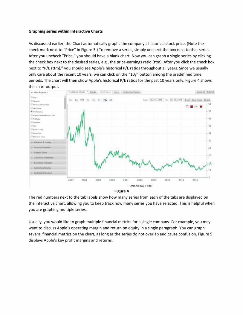
Graphing series within Interactive Charts
As discussed earlier, the Chart automatically graphs the company’s historical stock price. (Note the
check mark next to “Price” in Figure 3.) To remove a series, simply uncheck the box next to that series.
After you uncheck “Price,” you should have a blank chart. Now you can graph a single series by clicking
the check box next to the desired series, e.g., the price-earnings ratio (ttm). After you click the check box
next to “P/E (ttm),” you should see Apple’s historical P/E ratios throughout all years. Since we usually
only care about the recent 10 years, we can click on the “10y” button among the predefined time
periods. The chart will then show Apple’s historical P/E ratios for the past 10 years only. Figure 4 shows
the chart output.
Figure 4
The red numbers next to the tab labels show how many series from each of the tabs are displayed on
the interactive chart, allowing you to keep track how many series you have selected. This is helpful when
you are graphing multiple series.
Usually, you would like to graph multiple financial metrics for a single company. For example, you may
want to discuss Apple’s operating margin and return on equity in a single paragraph. You can graph
several financial metrics on the chart, as long as the series do not overlap and cause confusion. Figure 5
displays Apple’s key profit margins and returns.

Figure 5
The series are color-coded so that you can easily distinguish between each of the series, and the
legend appears below the chart. Note the red 4 next to valuation & quality: we have selected four
series within that tab.
Comparing and switching companies within Interactive Charts
You will notice that there are various dialog boxes, buttons and check boxes above the interactive
chart. These options, as displayed in Figure 6, allow you to customize the chart output.
Figure 6
You can directly switch companies within the Interactive Chart by typing in the new company’s
ticker symbol in the “Switch Ticker” dialog box and clicking Go. For example, you can change the
ticker symbol to Baidu Inc. (BIDU). Note that this also changes the header from Apple to Baidu, i.e.,
the header will now display the key financial information for Baidu.
Often, you would like to compare one company’s financial metrics to a different company. For
example, you may want to compare Baidu’s earnings per share to that of Google or Yahoo. From a
blank chart, first search for “eps” and click on the check box. You can then add Google’s EPS and
Yahoo’s EPS by typing in their ticker symbols in the “Compare Company” dialog box. Figure 7.1
shows the chart output.

Figure 7.1
By default, the Interactive Chart shows annual data. However, you can change this setting using the
three radio buttons next to the “Switch Ticker” dialog box: Annual Data, Quarterly Data and TTM
Data. Figures 7.2 and 7.3 show the three Internet content & information company’s quarterly eps
and TTM eps, respectively.

Figure 7.2
Figure 7.3

Miscellaneous graphing options
The “% Change” option shows the percentage change of a company’s financial metric year over
year. To consider the year over year growth rate for a specific financial metric, click on the “% YOY”
check box. You can also use a logarithmic scale, like what Peter Lynch used in his famous chart.
Figure 8.1 shows Baidu’s YOY operating margin growth rate for the past 10 years, and Figure 8.2
shows Baidu’s Peter Lynch Chart with a logarithmic scale.
Figure 8.1

Figure 8.2
As expected, banks suffered sharp decreases in stock price during U.S. recessions. You can highlight
the recession years by clicking on the “U.S. Recession” check box. Figure 8.3 shows the historical
stock price for two banks: Bank of America Corp. (BAC) and JPMorgan Chase & Co. (JPM).

Figure 8.3
Finally, the “Reset All” button reverts the Interactive Chart to its default view, which graphs the
active company’s historical stock price line for all years. (The active company is the company that is
featured at the top of the Web page.)

3. Predefined Charts
GuruFocus offers several predefined interactive charts, including the Peter Lynch Chart and the
price-to-sales valuation bands. These two charts allow you to visualize when a company stock is
undervalued.
Peter Lynch Chart
As discussed in earlier sections of this manual, the Peter Lynch Chart is one of the most famous
charts in the investing world. This chart compares the company’s price line to its earnings line, which
is 15 times the P/E (nri) by default. However, you can change this value by entering the desired
number in the “Price at P/E (w/o NRI) =” box, as highlighted in Figure 9.
Figure 9
As companies have different price-earnings ratios, the Peter Lynch earnings line is not appropriate
for companies with significantly high P/E (nri). For example, Google’s P/E (nri) ranges between 16.5
and 92.6 with a median about 30. An earnings line at P/E (nri) of 15 would inappropriately overvalue
Google’s stock, as shown in Figure 9.1.

Figure 9.1
To account for the median P/E (nri) of 30, we can change the “Price at P/E(nri) =” value from 15 to
30 as displayed in Figure 9. Figure 9.2 shows Google’s earnings line at a P/E (nri) at 30.
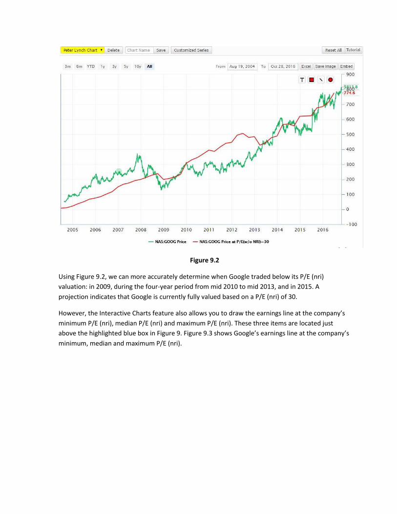
Figure 9.2
Using Figure 9.2, we can more accurately determine when Google traded below its P/E (nri)
valuation: in 2009, during the four-year period from mid 2010 to mid 2013, and in 2015. A
projection indicates that Google is currently fully valued based on a P/E (nri) of 30.
However, the Interactive Charts feature also allows you to draw the earnings line at the company’s
minimum P/E (nri), median P/E (nri) and maximum P/E (nri). These three items are located just
above the highlighted blue box in Figure 9. Figure 9.3 shows Google’s earnings line at the company’s
minimum, median and maximum P/E (nri).

Figure 9.3
Note how the earnings line at Google’s maximum P/E (nri) is severely above the rest of the chart.
You can remove a series by unchecking the box for that series. You can also click on that series to
deactivate it. Note that the legend displays the deactivated series in gray, indicating that the series
does not appear on the chart. Figure 9.4 shows the chart output after removing the maximum P/E
(nri) series.

Figure 9.4
Using Figure 9.4, we can observe several characteristics of Google’s stock. The company traded near
its minimum P/E (nri) valuation near the end of 2008 and mid 2012, indicating that Google is
“significantly undervalued” at those times. Investors who bought Google when the stock is
significantly undervalued likely realized strong gains in the short term, as suggested by the chart.
Unfortunately, Google’s stock currently trades significantly higher than its minimum P/E (nri)
valuation.
P/S valuation bands predefined chart
As discussed in the definition page for P/E (nri), the P/E can frequently give misleading valuations,
especially for cyclical and unpredictable companies (those with a predictability rank of one star or
less). Peter Lynch warns that cyclical businesses usually have high profit margins near the peaks of
business cycles and low profit margins near recessions. Other valuation metrics, including the Shiller
P/E and the P/S ratios give more accurate valuations and thus can more accurately determine when
a company stock is undervalued.
GuruFocus also provides valuation bands for P/B, P/S and P/OCF ratios as indicated in Figure 10. You
can access these underneath the “Most Popular” tab or search for the valuation bands using “Search
Series.” These valuation bands work similarly to those for P/E (nri).

Figure 10
GuruFocus provides the “P/S valuation bands” predefined chart likely because the P/S ratio more
accurately identifies when a stock is undervalued then do other valuation ratios. Located just under
the Peter Lynch Chart in the “Predefined Charts” drop down box, the “P/S valuation bands” graphs
the valuation bands at the company’s minimum and maximum P/S ratios. Figure 11.1 displays Wal-
Mart’s P/S valuation bands for all years while Figure 11.2 narrows the chart output to the recent 10
years.

Figure 11.1
Figure 11.2

With these two charts, we can determine when Wal-Mart’s stock is significantly undervalued or
significantly overvalued based on P/S valuations. Based on the chart output, we can observe that
while Wal-Mart traded near its maximum P/S valuation during the third-quarter of 2008, the stock
price gradually decreased near its minimum P/S valuation by the third-quarter of 2011. After Wal-
Mart’s stock price gradually increased to its maximum P/S valuation in 2015, the stock plummeted
to its minimum P/S valuation during 2015. Investors would realize gains if they bought Wal-Mart
during the third quarter of 2011 and sold it after New Year’s Day 2015.
You can also display the valuation at the median P/S to determine the relative valuation of the
company. Simply check the “Price at Med P/S” series, which should be the one between the two
automatically selected when you choose the “P/S valuation bands” predefined chart. Figure 11.3
shows Wal-Mart’s valuations at the minimum P/S, the maximum P/S and the median P/S.
Figure 11.3

Other predefined charts
While the previous two predefined charts are likely the most useful, the website also provides
several other predefined charts.
Income Statement: This predefined chart graphs the company’s revenue, gross profit,
earnings before interest and taxes (EBIT) and net income. Figure 12.1 displays Wal-Mart’s
income statement chart.
Balance Sheet: This predefined chart graphs the company’s cash & cash equivalents,
property, plant and equipment (PPE), total assets, total equity and long-term debt. Figure
12.2 displays Wal-Mart’s balance sheet chart.
GDP & GNP: This predefined chart simply graphs the U.S. gross domestic product (GDP) and
gross national product (GNP).
“dividend yield”: This predefined chart just graphs the company’s trailing dividend yield.
“price&revenue”: This predefined chart graphs the company’s price and revenue.
Peter Lynch Chart with Estimates: This predefined chart graphs the company’s Peter Lynch
Chart with analyst estimates for what may happen to a company’s earnings in the short
term. Figure 12.3 displays Wal-Mart’s Peter Lynch Chart with Estimates. Based on this chart,
Wal-Mart’s stock price may increase during 2018 based on its estimated earnings.
Peter Lynch Chart with regular earnings
CTAS: This predefined chart shows the company’s price and valuation at its median P/S.

Figure 12.1
Figure 12.2

Figure 12.3
4. Customized series and user-defined charts in Interactive Charts
We have recently introduced two user-friendly features within Interactive Charts: customized series
and user-defined charts. These further increase the interactivity of the Charts feature.
Customized series
If you try to search for “Sloan Ratio” in the search series box, you will notice that we do not have the
Sloan Ratio as one of the available series. However, with the customized series feature, we can
graph this series as a function of other, available series.
Let us focus on Baidu, one company stock that has poor earnings quality based on its Sloan Ratio.
This ratio is defined as follows:
Sloan Ratio % = 100 * (Net Income – Cash Flow from Operations – Cash Flow from Investing) / (Total
Assets)
To create a customized series, first click on the “Customized Series” button among the list of buttons
in Figure 6. Figure 13 repeats Figure 6 with the “Customized Series” button highlighted.

Figure 13
Once you click on Customized Series, you should see a pop-up box similar to the one displayed in
Figure 13.1. In the textbox given, you can type in the formula for the customized series. For our
example, you would type
100 * (‘Net Income’ – ‘Cash Flow from Operations’ – ‘Cash Flow from Investing’) / ‘Total Assets’
Note some particulars about your formula: the parameters must have single quotes around them
and are case-sensitive. As you type into the text box, the drop-down menu will populate the
available financial metrics that match the letters you entered. You can select the term for accuracy,
as mentioned in the pop-up box.
Figure 13.1
Once you enter your formula, you will see a screen similar to one shown in Figure 13.2, which
displays your formula, tells you if it is valid or not and allows you to name the customized series and
pick the appropriate Y-axis. You must choose one of the Y-axis options given before you can finish
the series.

Figure 13.2
Option 2 is most appropriate for the Sloan Ratio as it is a ratio. Choose Option 2 and click Finish to
save the series. However, by saving the series, you reset the interactive chart. You can click “Reset
All” to return the chart to show the price line. Remove “Price” to return to a blank chart. Figure 13.3
shows Baidu’s annual Sloan Ratio for the past 10 years.

Figure 13.3
To edit or delete a customized series, first hover the mouse over the desired customized series.
Note that this also pop-ups the formula used to draw the series. Use the “pencil on clipboard”
button to edit the series or the “X” to delete the series.

Saving user-defined charts
In addition to creating customized series, you can also create user-defined charts with the
Interactive Charts feature. As discussed in the GuruFocus research article on the predictability rank,
the revenue per share and EBITDA per share metrics can determine how predictable a company
earnings have been for the previous 10 years. We will name this chart the “Predictability Chart.”
To save a user-defined chart, first select the series that you want to graph. Then, among the options
listed in Figure 6 (and Figure 13), type in the chart name in the “Chart Name” box and click “Save.”
You can view your user-defined charts below the predefined charts discussed in section 3 of this
user manual. Figure 14 shows the Predictability Chart for Amazon.com, a company that has a five-
star predictability rank as of the writing of this manual.
Figure 14
While you cannot delete the predefined charts, you can delete a user-defined chart by first selecting
the desired chart to delete and then pressing the “Delete” button next to the chart name. Click “OK”
in the dialog box that appears, as illustrated in Figure 14.1.

Figure 14.1

5. Adding text and shapes to the chart
GuruFocus has recently remodeled the Interactive Chart feature to make it as user-friendly as
possible. If you recall from Figure 2, we have numbered some characteristics of the Interactive
Charts interface. Figure 15 repeats Figure 2 with the addition of position 5, the location of the
following features:
T: This feature allows you to add text to the chart.
Square: This feature allows you to add squares and rectangles to the chart.
Line: This feature allows you to add lines to the chart.
Circle: This feature allows you to add circular shapes to the chart.
Figure 15
These features, collectively known as the “Drawing Toolbox,” allow you to highlight certain parts of the
chart output and write brief discussions about the chart output. Figure 16 displays Apple’s Peter Lynch
Chart with these features in use.

Figure 16
As you can observe, Figure 15 highlights the time periods when AAPL traded below its Peter Lynch
earnings line, i.e., the times where AAPL is undervalued. Additionally, the text discusses that Apple is
currently undervalued.
To reproduce Figure 16, use the “Square” tool to highlight the sections of the Chart where the green
price line dipped below the red earnings line. To add text, use the “T” tool.
The “Line” feature allows you to draw a line on the interactive chart. This can help you determine when
a stock trades below a specific price target. Additionally, for mergers and acquisitions, the “line” feature
allows you to determine the fairness of the target price. Figure 17 illustrates this by considering
SolarCity’s stock price.

Figure 17
Notes to Figure 17: We have drawn the line around $25.37, the target price for Tesla’s acquisition of
SolarCity. Based on Figure 17, you can observe that the current price represents a discount to the target
price and that the target price is slightly unfair to shareholders.
While you cannot delete shapes from the chart without resetting the chart, one work around is to use
the text setting, and then drag the shapes one by one to the corner, then resizing them so that they
disappear from the chart.

6. Some frequently asked questions
How is the financial information presented, i.e., is the data trailing 12-months, annual, etc.?
o The data for most financial metrics are trailing 12-month data. Due to this, you need to
pay attention to the values used in your customized series.
What membership do you need to use Interactive Charts?
o The free membership gives limited access to Interactive Charts. Most features, including
customized series and exporting to Excel, requires Premium membership. We invite you
to start a free seven-day trial by clicking this link.
Can I change the colors of the series?
o As of Nov. 18, the writing of this manual, we do not have this service. The series colors
have a fixed order.