Embed Size (px)
Citation preview

HOW EFFECTIVE IS THE COMBINATION OF MY TRAILER, POSTER AND MAGAZINE COVER?

TEXT Both the trailer and the magazine cover convey the
USP of my film. The director’s past reputational success is featured through one of the titles in my trailer and as a cover line on my magazine cover. From the tagline on the poster we can tell the narrative unfolds from different perspectives of the characters.
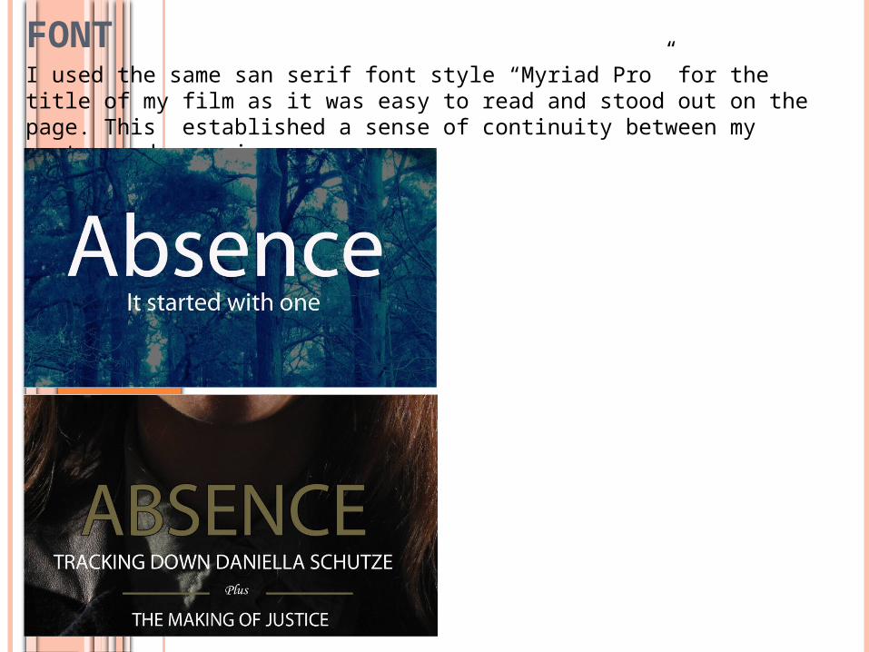
FONTI used the same san serif font style “Myriad Pro” for the title of my film as it was easy to read and stood out on the page. This established a sense of continuity between my poster and magazine cover.
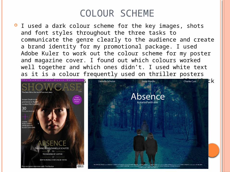
COLOUR SCHEME I used a dark colour scheme for the key images, shots and font
styles throughout the three tasks to communicate the genre clearly to the audience and create a brand identity for my promotional package. I used Adobe Kuler to work out the colour scheme for my poster and magazine cover. I found out which colours worked well together and which ones didn’t. I used white text as it is a colour frequently used on thriller posters and magazine covers as the backgrounds are usually black or dark blue.

KEY IMAGE The key image I have used on the magazine is like a snapshot from the
trailer with the key protagonist still in character. The visual style of the image is typical of that of a thriller which uses low-key lighting and dramatic facial expressions to convey the narrative and the genre. I incorporated this visual style in some of the shots in my trailer and on my poster to create a cohesive package.
The circular shape I have used on the poster is like the binocular shape I have used in one of the shots in my trailer. This was to convey the idea of surveillance and voyeurism.