Embed Size (px)
Citation preview


HYBRID-ISM & MULTI-ETHNICITYAn Exhbition Catalog of Emerging Artist and Designers
fall 2015
I’m grateful to Prof. Carla Langella for collaborating
in this interdisciplinary Diversity Course“Hybrid-ism
& Multi-Ethnicinty” exchange between California
College of the Arts and Second University of Naples,
and sustaining this opportunity for students interested
in a fertile international dialog. Also, I would like to
thank all the students from CCA & Second University
of Naples willing to work on this project and make an
effort to participate in a cross cultural conversation.
A special thanks goes to Sirawan Chen, our graphic
designer, for designing this catalog, to Samuel C.
Langner (with the help from Fan Wei for customizing
and maintaining our precious class-blog which is the
platform for this international exchange.
ACKNOWLEDGMENTS
CONTENTS
Introductions
CCA Senior Adjunct Mariella Poli
Naples - Prof. Carla Langella
Artist Statements
California College of the Arts, SF
Naples Second University, Italy
06 10
Artist Work
california college of the arts naples second university, italy
Sirawan Chen
Andrew Manriquez
Crystal Hsu
Denita Irsjad
Evan Anderson
Fan Wei
Tsz Ki Lau
Karina Jusuf
Neena Holzman
Sam Langner
Seoyoun Yun
Stephanie Noons
Adele Impinto
Angela Buonano
Elena Cioffi
Fabio Mauro
Gabriella Del Core
Germana De Angelis
Giovanna D’Avino
Martina Venturelli
Pietropaolo Verazzo
Rosella Ragosta
Acknowledgements
colophon
11
15
21
25
29
33
37
43
53
57
63
49
71
75
79
83
87
91
95
99
103
107
111

INTRODUCTIONS

Hybrid-ism &Multi-Ethnicity
mariella poli, cca professor
Immigration is central the cultural
narrative of the United States, however,
in the last decade the mass migration
connected with a changing global
economy and political unrest has in-
creased immigrations impact. In 2010,
the number of international migrants
worldwide reached 214 million, or
3.1 percent of the world‘s population.
The diverse cultural landscape within
San Francisco continues to evolve,
each new wave of immigration over
generations both transform and are
transformed through existing world
communities creating hybrids of
cultural identity or “Hybrid-ism”.
The platform for the artworks on view
in this catalog and exhibition are a
result of an Interdisciplinary Course
of Design and Art, “Hybrid-ism &
Multi-Ethnicity” from the Diversity
Program at the California College of
the Arts, San Francisco, in an exchange
with Naples Second University, Italy.
The idea of this exchange grew out
of my yearly visits to Italy, where
I observed rapidly increasing new
multi-ethnic migration. Italy faces political
questions that reflect the pressures of
modern globalization, economy, geopol-
itics, forced migration from neighboring
countries such as the Middle East, North
Africa and Sub-Saharan Africa. Areas and
issues under examination include the rep-
resentation of the multi-ethnic diversity
mostly in underprivileged situations, with
attention to the struggle and conservation
of individual identity in a Hybrid land-
scape.This catalog and exhibition features
the artworks from an interdisciplinary and
culturally diverse group of artists/design-
ers investigating current and historical
dilemmas facing new immigrants as well
as their influences on local and global
culture in everyday life and their complex
relationship to artistic and cultural
production. Each body of work represents
a unique perception according to each
individual’s experience, vision and culture
identity.
Evan C. Anderson (Industrial Design)
Created an app called La Mission to raise
awareness on issues of gentrification in
San Francisco’s Mission District.
Sirawan Chen (Graphic Design)
Photographic project intends to inves-
tigate through graphic signs the gap
between commercial Fifth and the
underprivileged Sixth Streets and also
show how the non-profit neighborhood
organization United Playaz reaches out
to it’s community.
Neena E. Holzman (Individualized)
Drawings and poems are sketched from
everyday life in Chinatown with the inten-
tion of celebrating the minutia of human
interactions that unfold every day.
Crystal Hsu (Industrial Design)
After observing S. Anthony’s, a Tenderloin
no-profit she designed a package for
clothing collection to distribute to
unprivilaged citezens.
Denita J. Irsjad (Architecture) designed a
Portable Modular Studios program.
Karina Jusuf (Interior Design) part-
nered with the non-profit organization
‘Renaissance Entrepreneurship Center’,
which serves more than 1,800 very low
to moderate-income women and men
who start and grow their businesses,
gain skills they need to achieve finan-
cial self-sufficiency and transform their
communities, Karina’s project provides a
low-priced interior design service to help
new business owners efficiently use their
ultra small living and working spaces.
Samuel C. Langner (Industrial Design)
Has worked closely with two non-profit
community arts organizations, Precita
Eyes Muralists and Galería de la Raza
to understand the deep-rooted Latino
culture found in San Francisco’s Mission
District and designed and produced
an informative permanent installation
kiosk and a series of portable seats to
be enjoyed by the Design) by the tours
that those organizations give at the Mural
Projects in Balmy Alley.
Tsz Ki Lau (Interior Design)
Designed for S.R.O single-room
occupancy hotel or Residential hotel in
the Tenderloin neighborhood, the lobby,
hall bathroom and as well a specific
design strategy for the single-room that
combines kitchen, living room, dining
room and bedroom.
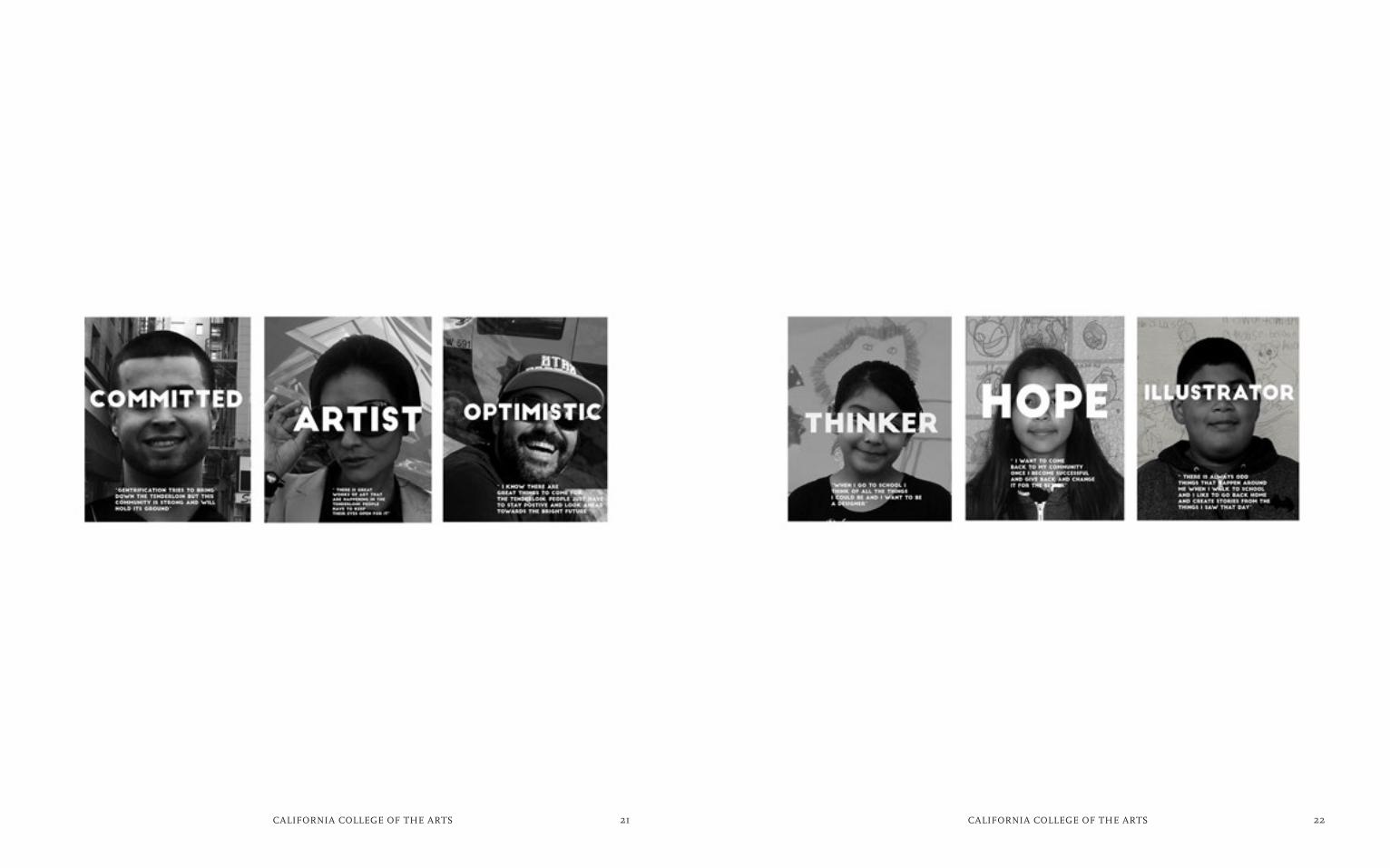
Andrew M. Manriquez (Illustration)
In his project worked closely with a
neighborhood non-profit organization
‘Safe Passage Tenderloin’ that helps
children get from home to school safely,
he used photographs and interviews to
tell the stories of the youth living in the
Tenderloin.
Fan Wei (Industrial Design) based on
his research and interviews designed a
multi-functioning furniture/tool to
accommodate Chinatown inhabitants
living in small appartments to help
improve their daily life.
Seoyoun Yun (Interior Design)
Designs enhance the public space of
PortsmouthSquare Area in Chinatown
and is dynamic, multicultural, adaptable
to diverse users and reflective of local
culture and history.
the individual views in this
catalogue and exhibition are a
result of a complete commitment
from each participant and their
experience, vision, interests and
aesthetics.
s.a.prof. mariella poli
Stephanie M. Noons (Illustration)
Paintings (triptych) depicts the celebra-
tion of culture in the Mission neighbor-
hood and the effects of the encroaching
new construction and how it effects
gentrification.

CALIFORNIA COLLEGE OF THE ARTS SANFRANCISCO
Artist Works

13CALIFORNIA COLLEGE OF THE ARTS 14CALIFORNIA COLLEGE OF THE ARTS
Graphic elements are everywhere,
and it means more than just a sign or
pattern, it portrays a brand or identity.
The project consists of a documentation
of images and creating a visual narrative
of South of Market neighborhood in San
Francisco. South of Market today con-
sists of warehouses, auto repair shops,
nightclubs, residential hotels, art spaces,
loft apartments, condominiums and tech
companies. Being immersed in such
a rich cultural diversity of SOMA, with
clearly no defined boundaries, we see
that SOMA is not only people who work
in Tech companies but there are tourists,
and people just out and about at restau-
rants. It is a vibrant neighborhood, and
there are always things to do in South
of Market and clearly every business
is unique in its own way. Tech compa-
nies include Yahoo, LinkedIn, Uber, Air
BnB, CloudFlare, and CBS interactive.
The project examines the specificity of
graphics, typography and signage of 5th
and 6th street.
i am jessica chen, a junior graphic design
major at california college of the arts. i believe
that all things can be made simpler. the reason
i chose hybidism and multi-ethnicity is because
i am part of the idea of having a dual identity
and being trilingual. i am interested in
documenting how signage and graphics can
define and represent a cultural diversity with-
in a neighborhood such as truly seeing the gap
between one street and the next by first hand
documentation of the area and neighborhood.
The project interplays between the
graphics and signage on the businesses
between 5th and 6th Street. It also sees
how the non-profit organization United
Playaz reaches out to the general audi-
ence. With the influx of tech companies
to our neighborhood, the rent is rising
and longtime residents like United Playaz
can’t keep up. United Playaz focuses on
providing service to low income families,
and to protect the kids from being
involved in violence off the streets. It
aims to be a clubhouse where young kids
come together afterschool, either to do
homework or take part in recreational
activities. It serves up to 75 students per
day with multi- ethnic backgrounds.
By documenting images of the neighbor-
hood, I was surprised with how dramatic
the difference is between 5th and 6th
street. 5th street the graphics tend to be
clean and modern, and 6th street is more
hand-orientated and uses mor colors and
tend to be murals.
SOMA STREET GRAPHICS
sirawan chen

15CALIFORNIA COLLEGE OF THE ARTS 16CALIFORNIA COLLEGE OF THE ARTS

17CALIFORNIA COLLEGE OF THE ARTS 18CALIFORNIA COLLEGE OF THE ARTS
andrew manriquez
my name is andrew Manriquez and i am a junior
in illustration program at california College
of the Arts. I was born and raised in California
and have been inspired by the rich culture that
surrounds me for my illustrations. my goal
in my illustration career is to create pieces
of work that inspire and bring awareness to
things happening in our world. my duty as an
illustrator is to inspire minds.
THE UNTOLD STORIES
Stories are what bind people together.
For example the Tenderloin neigh-
borhood is located at the heart of San
Francisco. It is notorious for being a
neighborhood that is said to be the
under belly of San Francisco. Filled
with crime, corruption, drug dealing,
prostitution, and homelessness. There is
much that goes on in the community and
the people of the Tenderloin have stories
to tell of what goes on.
I want to capture those people’s stories
and create pieces that reflect on how
they view the Tenderloin and how the
outside world views them as well. Like
that of a non-profit group called Safe
Passage Tenderloin that is located in
the center of the Tenderloin. They are
a group that helps children get from
home to school safely. The people of the
Tenderloin stories are what my pieces
represent. The experience of shared
stories between two people is what
teaches us and binds us closer together
as people.

19CALIFORNIA COLLEGE OF THE ARTS 20CALIFORNIA COLLEGE OF THE ARTS
21CALIFORNIA COLLEGE OF THE ARTS 22CALIFORNIA COLLEGE OF THE ARTS

23CALIFORNIA COLLEGE OF THE ARTS 24CALIFORNIA COLLEGE OF THE ARTS
crystal hsu
crystal is currently a junior in the industrial
Design program at california college of the
arts. she was born and raised in san gabriel
valley, located at the outskirts of los angeles
(626 represent!). transitioning from an asian
dominated area to diverse san francisco caused
a huge culture shock that inspired her need to
continue learning as much as she can about the
societies around her. the goal is to become as
worldly-wise as possible, because it will all come
to influence her design process and growth as
an individual.
This project was inspired by one of the
many non-profit organizations located at
the heart of the Tenderloins, one of the
least gentrified neighborhoods in San
Francisco. Here, St. Anthony’s is
dedicating their time to help out the
area’s population of homeless and men-
tally unstable people.Looking specifi-
cally at their Free Clothing Program, the
organization does their best to maximize
their volunteers’ time, which tend to set
restrictions on the amount of clothes
they receive. St. Anthony’s program is
only allowed to pick up donations, if the
number of clothing exceeds five bags.
Otherwise, donors are required to do a
curbside drop off at their main office.
This means that people have to set out a
time in their busy schedule that matches
the office’s hours, travel to a dangerous
part of the city, and personally donate
their clothes.
This is where this project’s packaging
design concepts comes into play against
these discouraging factors. Designed to
fit in the average mailboxes, the first
layout allows the entire household to
donate a small portion of their clothes
through the mail. The second concept is
made to hold one or two article of cloth-
ing, while doubling as a flyer for the or-
ganization to promote themselves. With a
plastic bag tucked under, the flyer wraps
around the rolled up clothes, seals itself
with the provided double-sided tape, and
is ready to be shipped back to the organi-
zation with a pre-printed address already
labeled on. While inspired by St. Antho-
ny’s Free Clothing Program, this project
can be used by any nonprofit clothing
organizations. With a small printing cost
and new promotional campaign, these
organizations will see an increase in the
amount of donated clothes without
wasting the efforts of their volunteers.
Packaging for the Needy
25CALIFORNIA COLLEGE OF THE ARTS 26CALIFORNIA COLLEGE OF THE ARTS

27CALIFORNIA COLLEGE OF THE ARTS 28CALIFORNIA COLLEGE OF THE ARTS
denita irsjad
my name is denita irsjad and i am a 4th year
architecture student in california college
of the arts here in san francisco. i am from
jakarta, indonesia and grew up in singapore.
i am interested in designing for housing and
commercial buildings. i love creating drawings
for the relevant project and making them
clearer as well as creating diagrams that could
stand out visually. and i like the process of
creating models because it helps to show my
projects visually.
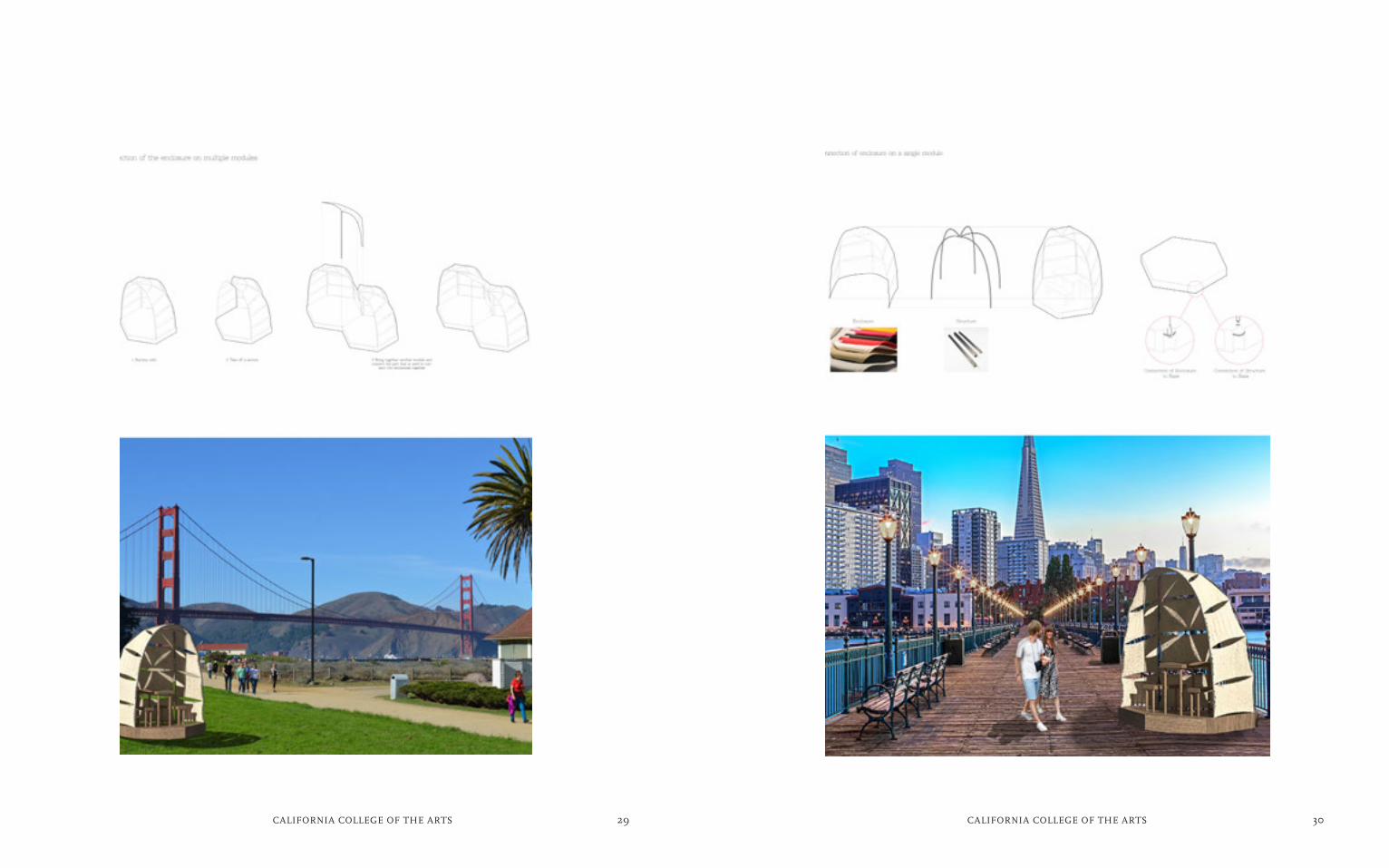
The Modular Pavilion accommodates the
Youth Open Studios program that is
hosted by the organization called
ArtSpan. Youth Open Studios takes kids
on tours visiting the SF Open Studios.
ArtSpan is an organization that allows
local artists to showcase their work
through the SF Open Studios that is held
annually, as well as providing work-
shops for artists. The organization rents
space in Hunter’s Point Shipyard for this
program and this pavilion would allow
the program to be held in other places
around San Francisco as well, providing
dynamic outdoor spaces for activities.
The Modular Pavilion has a base that
comes fully assembled and has a storage
space in it to store the furniture that is
easy to assemble. It is equipped with
wheels to easily transport them in the
site. The polygon shaped bases of the
pavilion join together to create a larger
space for a variety of activities, such as
lectures, art classes and many more.
The pavilion is enclosed to prevailing
winds, as well as bad weather and the
enclosure can also act as a sun shade.
It can also be easily assembled on site
and is made of lightweight weather-proof
material. By being able to change the site
of the pavilion, ArtSpan could rent it out
to other organizations that needed it and
the size of the base could fit in the back of
a small truck which allows easy transport
to and from different sites. Since it is easy
to transport and easy to assemble, the
pavilion could be able to be taken down
at the end of the day to be stored in the
safe place. The portability of the pavilion
is able to reach out people from different
parts of San Francisco, who were nor-
mally unaware of these art programs, by
bringing it closer to them.
Modular Pavilion
29CALIFORNIA COLLEGE OF THE ARTS 30CALIFORNIA COLLEGE OF THE ARTS

31CALIFORNIA COLLEGE OF THE ARTS 32CALIFORNIA COLLEGE OF THE ARTS
evan anderson
i’m a senior industrial design student at
california college of the arts. with a back-
ground in engineering and art, try to bring
function into my design to create new methods
to improve how things work, while examining
and improving the old as well. i’ve lived in the
bay area for four years now, plenty of time to
be immersed in the rich culture and livelihood
of the area, and love exploring san francisco.
however, gentrification is a very real threat to
the life of the city, and puts all that culture
at risk. i’d like to raise the awareness and help
people explore all the things i’ve discovered
over the course of my time here.
Mission Awareness App
Gentrification is a threat to the people
and culture of the area. La Mission is an
app that can raise awareness about the
issues of gentrification plaguing the San
Francisco Mission District. Family busi-
ness and people are at risk in a changing
area, and as more and more people and
business come into the area, culture
and business gets pushed out. I feel that
through awareness, and showing the
people the cultures worth protecting,
steps can be taken in the right direction.
La Mission provides unique benefits,
such as acting as a bridge for the gap
between the people of the Mission, and
the tech cultures that now are filling
San Francisco as a whole. The app is a
great medium for sharing and spread-
ing information and events. La Mission
aims to highlights specific neighborhood
aspects: People, Places, and History
through visuals, social menus, and guid-
ed tour-esque interactive maps. Through
social and cultural interactions, the user
can immerse themselves in the culture
of the SF Mission District.
The main screen would provide a space
that could highlight different events and
places for mass awareness, which would
link to further information about the
featured event, decided by and shown by
the community itself. This would allow the
community to govern and control what
attractions are most important to under-
stand the area. The People section high-
lights those who have a positive influence
on the community and make the Mission
what it is. The Places section of the app
would help direct people around the mis-
sion with a map and guide, and help those
unfamiliar to immerse themselves in the
culture properly without displacing the
culture itself. Lastly the History section
would teach people about the culture and
place they are immersing themselves in,
and help teach them about what it’s so
important to protect and preserve.

33CALIFORNIA COLLEGE OF THE ARTS 34CALIFORNIA COLLEGE OF THE ARTS

35CALIFORNIA COLLEGE OF THE ARTS 36CALIFORNIA COLLEGE OF THE ARTS
fan wei
current senior industrial design major student
in california college of the arts. specially
interested in furniture, mechanical style
functional objects, military area design. good
at ideation sketching, model making, cad build-
ing and rendering. personal experience: born
and raised in China, transferred to cca since
2012, study and focus on industrial design since
then. personal interested in traveling,
sketching, gun model collecting and metal art.
Based on my research and interview,
I defined my design area down to a
multi-function furniture/tool for China-
town people daily living life. In the late
19th century, Chinese immigrants were
transported like cargo to California to
build the Pacific railway and dig gold. Al-
though they made great contributions to
the local economy, they were still treated
as “second class citizens.” Chinese im-
migrations were designated to a specific
area to live (a small area around Grant
Ave.), after several generations, this area
become to the Chinatown that we are
looking today. Based on the situation,
Chinese immigrates have developed their
own lifestyle: mid-fast routine makes
people use their time carefully, they fol-
low the day-light principle which means
they have limited time during a day. Also
limited resources (time, economy, mate-
rial, etc.) requires more efficient way to
live, which means Chinese immigrants
have to use their time and money more
wisely. About aesthetic style: Chinatown
people are nostalgic and traditional,
according to the buildings in Chinatown,
it is not hard to find traditional Chinese
elements.
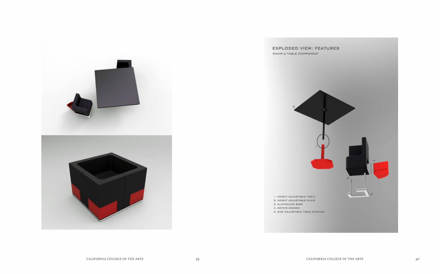
This project is a multifunction furniture
set which including five pieces: four
armchairs that have storage underneath
the seat, and one dining table that can
unfold to a bigger dining table. All pieces
are height adjustable and can be joined
in a variety way: smaller piece of tea
table; expand as a quick bunk bed for
guests; set up as a dining table and seat;
individual storage. The whole set is made
of plywood to keep the total cost down
to one hundred dollars. Simple quick
assemble/disassemble reduce the time of
setting up and folding, and when it folds,
it is more space efficient. Aesthetically,
red and black color matches traditional
Chinese style, also traditional Chinese
embossments shows. Mortise and tenon
joints give the possibility of keep this
furniture strong and use less metal joints
at the same time. This project is not a
“game changer” like next generation
of design, but it helps people live in an
easier and faster way, in another word,
more efficient.
UBE Multifunction Furniture Set

37CALIFORNIA COLLEGE OF THE ARTS 38CALIFORNIA COLLEGE OF THE ARTS
39CALIFORNIA COLLEGE OF THE ARTS 40CALIFORNIA COLLEGE OF THE ARTS

41CALIFORNIA COLLEGE OF THE ARTS 42CALIFORNIA COLLEGE OF THE ARTS
tsz ki lau
My name is Kiki. i am a senior interior design
student in California College of the Arts
in San Francisco. I am interested in textile,
jewelry design, topography, space planning and
using, sustainability, and universal design. i
enjoy designing the space of maximize the
visual and portent space. Also, i love facing the
design challenges, make impossible be possible.
S.R.O is single-room occupancy hotel
or Residential hotel, which takes a vital
part of San Francisco’s housing Stock.
The hotels mostly are around three to
six floors with forty to maximum two
hundred units. These hotels are from
renovation of old buildings. The typical
room size is eight feet by ten feet, which
is a size that could fit a twin bed, a desk
and a chair only. There is shared hall
bathroom. I used one of the hotels as my
site – Boyd Hotel. There are 84 rooms
with 6 floors in Boyd Hotel. It is a site for
“Housing First Program” that organizes
by Tenderloin Housing Clinic. There is an
on site counselor for homeless people
walk-in for housing, and job finding.
I have been visited the site, and inter-
viewed the social worker. There are a
lot of problems during their living. First,
these hotel aims for temporary living
since the rent in San Francisco are rising
rapidly, and they could not afford at
all. This hotel is becoming permanent.
Hence, there is a shortage of room. Their
room is their living room, and bedroom.
Some of them bought an electric stove
burner, which are dangerous and caught
fire easily. The ventilation of the room
is bad that either too cold nor too hot
and only have a window. They don’t have
enough storage space, or space for their
pet. There is a trash room blocking the
fire escape, and limited facilities in the
common room. I present a low budget
renovation for the lobby, hallway and
hall bathroom, so the organization can
afford it. The materials are collected from
scrap or donation, such as unwanted
paint cans or tiles, and hopefully it will be
labor cost only. Also, I propose a specific
design strategy for the single-room that
combines kitchen, living room, dining
room and bedroom. Although the rooms
and building layout are fixed, I could not
increase the amount of rooms or bath-
rooms. I enlarge the visual and occupy
spaces through color and space, and
use cold lighting. Due to limited space,
I start with different functions by sliding
and folding, which contain a multitude of
tools in a very small object. The room is
a modular transcription of an object with
basic elements, storage, a bed, a table, a
wardrobe, a staircase, and mini kitchen. It
is all fully integrated within a large closed
which can be unfolded according to the
needs and changes the perception of
space. Once all elements are folded and
stored in a large closet box, it frees half of
the area of the room.
S.R.O
Boyd Hotel Lobby

43CALIFORNIA COLLEGE OF THE ARTS 44CALIFORNIA COLLEGE OF THE ARTS
Common Room
Second floor plan Not in scale
First floor plan Not in scale

45CALIFORNIA COLLEGE OF THE ARTS 46CALIFORNIA COLLEGE OF THE ARTS
Elevation 800 sq feet
When you open the door...
Closet Sotrage
Living Room Stairs with Shelves and Bed
Dining Kitchen

47CALIFORNIA COLLEGE OF THE ARTS 48CALIFORNIA COLLEGE OF THE ARTS
karina jusef
karina is a senior interior design student at
california college of the Arts. She has always
been passionate about art and design since she
was little. She considered herself as a multi-
disciplinary designer, more focused in interior
design as her main interest, but also much in-
terested in architecture, furniture, products,
textile and graphic design. She believes that de-
sign is not only about the aesthetic aspect, but
it is all about problem solving and producing
creative new ideas and innovation. beside de-
sign, she also loves to travel around the world,
that gives her diverse and eyeopening insights
of the architecture and design world.
Integrated Living and Business Space
Renaissance Entrepreneurship Center is
a non-profit organization in San Francis-
co Bay Area, with a headquarter located
in South of Market in San Francisco. With
more than 1,800 very low to moderate-in-
come members, who is mostly women,
Renaissance help them to start and grow
their businesses, gain skills they need
to achieve financial self-sufficiency and
transform their communities. In this era
of growing women entrepreneurs in San
Francisco, my project will be focusing on
women’s businesses, which are mostly
bakery, eatery, and catering businesses.
My project provides a low-priced interior
design service, partnered with the Re-
naissance Entrepreneurship Center to
help new business owners efficiently use
space in their tight apartment in South of
Market neighborhood in San Francisco.
For the space planning for the space,
since most of the apartment in South
of Market district is relatively small,
it is really important for the use of the
vertical storage and transformable
furniture with more than one use. The
color scheme of the design is also really
important to give the feel of larger space.
Since the small studio apartment will be
used both as living and business space,
there is a separation of the bed area, by
using translucent glass to not only create
separation between different spaces but
also allow the light from the only windows
in the space to penetrate to the whole
apartment. The bed is raised to give stor-
age space under the bed and at the back
of the bed. The living space can also be
used for working space with a side table
that is extendable into a large working/
dining table, big enough to accommodate
6 people. The chairs for the table are all
foldable and hung on the wall if it is not
needed. The area where it is used to be a
closet space for the apartment is trans-
formed into a working space with a desk,
overhead compartments and storage
space for administrative work. The space
is neatly tucked into the nook that does
not take a lot of extra space in the living
room. The materials and finishes for the
projects is mostly reclaimed wood and
recycled materials to give the “industrial”
style, lower the cost of construction and
also sustainable to the environment. Most
of the furniture and finishes chosen for
the interior will be locally produced, either
San Francisco made or California made,
to support local businesses and lower the
cost of shipping and production. With the
total budget ranging only from $2,000 to
$5,000, this project offers the opportunity
for women entrepreneurs to have not
only a livable space, but also an efficient
working space for their businesses.
Floor Plan Approx 350 sq.ft

49CALIFORNIA COLLEGE OF THE ARTS 50CALIFORNIA COLLEGE OF THE ARTS
Bathroom with sliding door using reclaimed
wood
Oven + microwave Floor to ceilingstorage shelf
Living space+ working space
Room divider with extra
storage space
Sleeping areawith raised platform
and back storage

51CALIFORNIA COLLEGE OF THE ARTS 52CALIFORNIA COLLEGE OF THE ARTS
Administrative Table and Kitchen ViewThe table stored flush to the wall shelf next to the clothes closet, can be pulled out for extra working space.
Transformable Working TableSide tables are transformable into a large working / dining table for up to 6 people.
Overall Living Room ViewWhen it is not used, the working table can be transformed into a side table and the space can be used for a living room.
Sleeping AreaThe bed is raised with 2-steps platform with extra storage space underneath and can also store 1 extra trundle single-size bed.

53CALIFORNIA COLLEGE OF THE ARTS 54CALIFORNIA COLLEGE OF THE ARTS
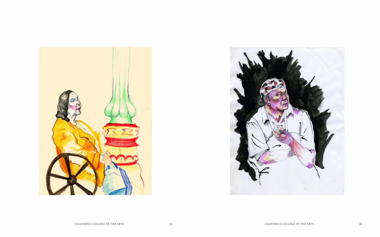
neena holzman
neena holzman is a painter and comic book
artist. her work is inspired by fantasy and
burlesque in the modern city. places of interest
to her are powell muni station, laundromats
and bus stops - all places where human
interaction crosses all different kinds of
boundaries. in addition she likes to explore
how satire and absurdity can bring us closer
together by exposing the systems which seek
to sanitize and divide a complex world. neena
is inspired by artists such as dori seda, pieter
bruegel the elder, hieronymus bosch, noel
fielding, and lisa uuskavage. she is currently a
senior in california college of the arts’
individualized program.
The landscape of San Francisco is being
scavenged. From the carcassses of
communities rise monoliths of reflective
glass. Creating a hall of mirrors, these
reflections refer only tothemselves.
Every day I pass dollar stores, diners,
sheet music stores and community
centers that can no longer survive in
this goldrushtown. It is like living in an
alternate universe where the
world mutates with every blink. Cranes
dominate the downtown skyline build-
ings grow faster than seems safe people
who have lived here for 50 years are
no longer welcome. In San Francisco
there is little stability.While many of the
communities that built San Francisco
have been fragmented and forced out by
greedy speculators, Chinatown is one
example of a neighborhood that has not
only held on but flourished.
This resilience is part of Chinatown’s
history as the oldest neighborhood in
San Francisco. Built from the ruins of
the 1906 quake by Chinese immigrants
who were excluded from City Govern-
ment and mainstream life, its buildings
and inhabitants have survived the Chinese
Exclusion Act, Urban Renewal of the
1950’s, the Hotelification of downtown
SF of the 1980’s and the first Dot Com
Movement. In Reflections I hope to cap-
ture some of this resilience.The ballpoint
drawings which comprise my project are
sketched from life. The organization of
drawings and poems is loosely based
on the geography of Chinatown (Top
Stockton, Bottom Kearney, Left California,
Right Broadway). I have tried to express
how the City appears to me in extended
moments not dwelling on the future but
on the present to the best of my ability. I
want to celebrate the minutia of human
interaction that unfolds every day.
Reflections
55CALIFORNIA COLLEGE OF THE ARTS 56CALIFORNIA COLLEGE OF THE ARTS
57CALIFORNIA COLLEGE OF THE ARTS 58CALIFORNIA COLLEGE OF THE ARTS
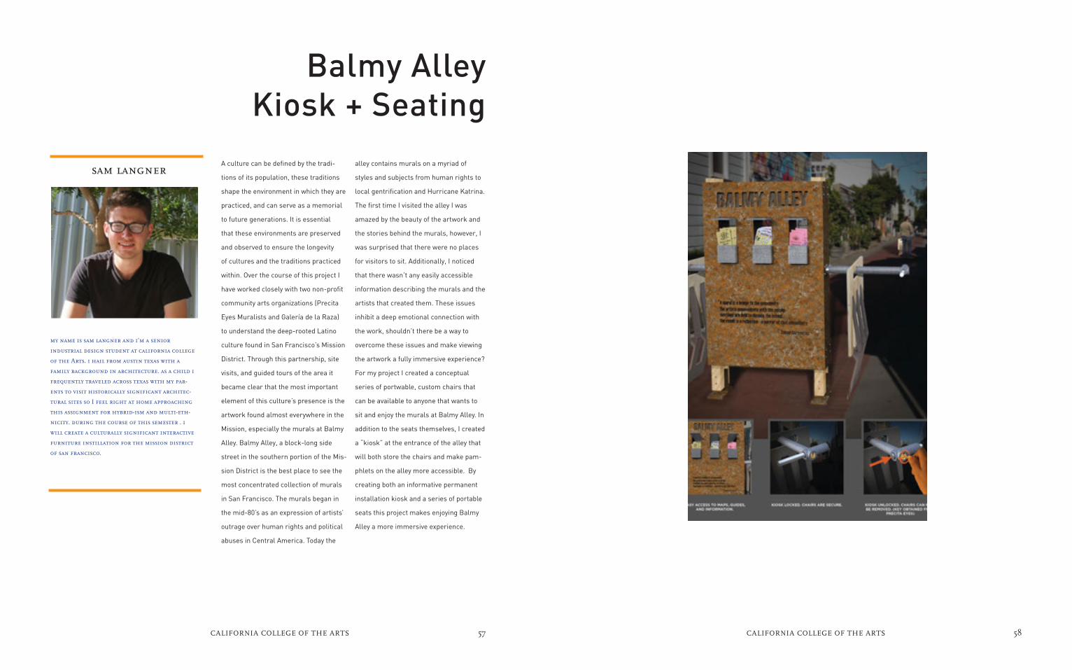
alley contains murals on a myriad of
styles and subjects from human rights to
local gentrification and Hurricane Katrina.
The first time I visited the alley I was
amazed by the beauty of the artwork and
the stories behind the murals, however, I
was surprised that there were no places
for visitors to sit. Additionally, I noticed
that there wasn’t any easily accessible
information describing the murals and the
artists that created them. These issues
inhibit a deep emotional connection with
the work, shouldn’t there be a way to
overcome these issues and make viewing
the artwork a fully immersive experience?
For my project I created a conceptual
series of portwable, custom chairs that
can be available to anyone that wants to
sit and enjoy the murals at Balmy Alley. In
addition to the seats themselves, I created
a “kiosk” at the entrance of the alley that
will both store the chairs and make pam-
phlets on the alley more accessible. By
creating both an informative permanent
installation kiosk and a series of portable
seats this project makes enjoying Balmy
Alley a more immersive experience.
sam langner
my name is sam langner and i’m a senior
industrial design student at california college
of the Arts. i hail from austin texas with a
family background in architecture. as a child i
frequently traveled across texas with my par-
ents to visit historically significant architec-
tural sites so I feel right at home approaching
this assignment for hybrid-ism and multi-eth-
nicity. during the course of this semester . i
will create a culturally significant interactive
furniture instillation for the mission district
of san francisco.
A culture can be defined by the tradi-
tions of its population, these traditions
shape the environment in which they are
practiced, and can serve as a memorial
to future generations. It is essential
that these environments are preserved
and observed to ensure the longevity
of cultures and the traditions practiced
within. Over the course of this project I
have worked closely with two non-profit
community arts organizations (Precita
Eyes Muralists and Galería de la Raza)
to understand the deep-rooted Latino
culture found in San Francisco’s Mission
District. Through this partnership, site
visits, and guided tours of the area it
became clear that the most important
element of this culture’s presence is the
artwork found almost everywhere in the
Mission, especially the murals at Balmy
Alley. Balmy Alley, a block-long side
street in the southern portion of the Mis-
sion District is the best place to see the
most concentrated collection of murals
in San Francisco. The murals began in
the mid-80’s as an expression of artists’
outrage over human rights and political
abuses in Central America. Today the
Balmy Alley Kiosk + Seating

59CALIFORNIA COLLEGE OF THE ARTS 60CALIFORNIA COLLEGE OF THE ARTS

61CALIFORNIA COLLEGE OF THE ARTS 62CALIFORNIA COLLEGE OF THE ARTS
seoyoun yun
My name is Seoyoun Yun. I am a senior at
California College of the Arts who is majoring
in interior design.I am graduating California
College of the Arts in May 2016 with a Bach-
elor of Fine Arts.I am a conceptual artist and
designer. I am interested in textiles, geometri-
cal patterns, material durability, sustainable
design, urban design and architecture commer-
cial. A lso, the space in which ideas and their
applications intersect and nature and culture
can coexist. I try to extract the concepts and
the inspirations from such intuitions and try
to make choices that lead to the formations
of images and spatial relationships.My designs
have a strong tendency to encompass such
interests.
PortsmouthSquare Parklets
The Portsmouth Square Area design
project is to create an enhanced public
space and streetscape that is dynamic,
multicultural, adaptable to diverse users
and reflective of local culture and history,
environment in which intersect nature
and culture. Portsmouth Square Area is
widely known in San Francisco as “The
Heart of Chinatown.” Portions of the
space no longer meet the recreational
and social needs of the surrounding
neighborhood. In addition, the streets in-
clude large numbers of pedestrians into
the Square and neighborhood and are
in need of improvements that enhance
safety, access, community, social space
and comfort.
I would like to change public space
everywhere to be converted into vibrant
citizen-centric space that meets both
the pragmatic and social needs of local
communities. My project provide built in
seating, tables, and native plants.
The ambitious program includes eating
areas, a community gathering space,
and a host of desired seasonal, day, and
night time activities. The space become
a playful and engaging for all of their
diverse constituencies and bring people
come together. People can play games
and communicate each other in group of
seating area with nature environment.
Also, designed individual area for work-
ing, listening music and taking rest with
furniture include solar power charger.
In Portsmouth Square Area, need to
consider the environmental impact of
shaded area on community park. The ur-
ban space in Chinatown provide diverse
nature’s service and socially active area
for people. Creating new shadowing envi-
ronment for community and social.
My design work closely with culture
and chinatown communities to provide
culturally within historic and natural
environment and focus on a deeply
participatory process of sustainable,
resilient and beautiful design.

63CALIFORNIA COLLEGE OF THE ARTS 64CALIFORNIA COLLEGE OF THE ARTS

65CALIFORNIA COLLEGE OF THE ARTS 66CALIFORNIA COLLEGE OF THE ARTS

67CALIFORNIA COLLEGE OF THE ARTS 68CALIFORNIA COLLEGE OF THE ARTS
stephanie noons
I am a senior Illustration major at California
College of the Arts in San Francisco,
California. Living in San Francisco after being
in an isolated rural town in massachusetts
my whole life, I have had many opportunities
to bring the experiences and environments
around me into my own work. the cultures and
vibrancy around the Bay Area influence the
choices I make in my paintings and illustrations
and the issues that i witness from the individ-
uals I meet inspire me to use my creative ability
as a voice that will educate and enrich the lives
of those around me.
New Mission
The beauty of San Francisco’s Mission
district is being threatened by yet anoth-
er wave of gentrification, evictions, and
homelessness. As a citizen of San Fran-
cisco, myself, I wonder how soon this
intrusion of new construction and high
rent will drive me from my own home in
the city. This brought me to create my
work for the Mission district that shows
the positive and negative aspects of the
neighborhood in an intimate triptych of
paintings. Like many paintings of the
Mission, my center piece celebrates
the culture of the people and neighbor-
hood at present. The second and third
paintings are a bit more satirical as they
show the negative effects of the outer
areas encroaching and deteriorating the
block on either side, each in a different
way. My first painting shows the vibrant
energy of a block of Mission street that
brings the neighborhood its collective
beauty. The second and third pieces
bring attention to the forces that are
stripping the Mission district of its culture
and meaning as the first settled neighbor-
hood in San Francisco. The three pieces
come together to create a triptych equal
to the width of my armspan. The largest,
the center piece, is displayed as repre-
sentative of a block of Mission Street. As
the painting nears either side it begins to
show the effects of the encroaching new
construction and deteriorating abandon-
ment, two pertinent effects of gentrifica-
tion on an area. Both of the side paintings
utilize collage to represent the deteriorat-
ing landscape and culture of the mission.

69CALIFORNIA COLLEGE OF THE ARTS 70CALIFORNIA COLLEGE OF THE ARTS

NAPLES SECOND
UNIVERSITY,
Hybrid Design Lab Italy

The Object of Hybridization
First of all, we would like to thank
Professor Mariella Poli of the
California College of Arts for provid-
ing, also this year, to our students in
Design for Innovation, of the Second
University of Naples, the opportunity
to approach such a faschinating theme
as Hybridism and Multi ethnicity by
sharing views with their colleagues
from the CCA.
Projects proposed by Second Univer-
sity of Naples were developed in the
course of Design Thinking coordinated
by Professors Patrizia Ranzo and Carla
Langella, with the collaboration of
designers Francesco Dell’Aglio and
Chiara Scarpitti who have followed
the development and realization of
projects, and PhD students Enza
Migliore and Veronica De Salvo who
proposed to the students references
and inspirations related to the themes
of hybridization.
Some important references and guides
for specific knowledge about immigra-
tion dynamics and living conditions,
opinions and attitudes of migrants in
Naples were: the Regional Department of
Cultural Mediation of Region Campania1,
the association Dedalus2, Daniela Savy As-
sistant Professor expert of European Law
for immigrants and member of the associ-
ation “3 febbraio”3 and Rossana Graciela
Apaza Clavijo expert in cultural mediation
and project coordinator of Antares House4.
The first step of the project consisted in
the collection of data about immigration
in Naples as well as the conditions of life
and work. These data have been enriched
by direct surveys of students on immigrant
conditions about specific issues concerning
their projects to better formulate design
solutions adherent to reality and people
needs.
In Naples there are 68,000 immigrants,
mainly from Asian countries (45%), Eastern
Europe (37%), Africa (11%) and Latin Amer-
ica (7%). One immigrant out of four is Sri
Lankan, almost one out five Ukrainian and
one out ten is Chinese. From these three
countries come half of the foreigners who
live in Naples.
Since 2004, foreign residents have quadru-
pled. This means that, although the city
has an ancient origin multicultural due
to the succession of foreign dominations
(Arabian, Norman, Swabian, Angevin, Ara-
gonese, Austrian and Spanish) Neapoli-
tans are not used to face issues of social
and cultural integration with migrants.
In the project phase of “listening”
students met migrants to understand
their culture, way of living and their per-
ception of Neapolitans approach to them.
From this survey highlighted two main
issues: the occurrence of a racist clichés
and mental closures towards foreigners
and a snobbish attitude that locals have
towards migrants. Later, during the
“envisioning phase”, needs and dynamics
identified in listening phase were returned
through a reinterpretation of everyday
objects in the direction of new hybrid
meanings.
In the development of the projects we
have chosen to propose a common ap-
proach that tie them as a shared thread.
Everyday objects were interpreted as
cultural devices, carriers of meaning and
thought that respond to the problems
identified breaking the clichés, in order to
force users to question and elaborate on
the themes of hybridization. Objects look
different from what they seem to surprise
and destabilize people allowing them to
perceive their meaning. In this way an
object becomes an opportunity to reflect,
to break the sterile habits of thought
that are the first barriers to integration.
Students designed products with an
hybrid cultural identity with the ability
to induce behavior and relationships
between people and things, or between
people. Objects that communicate the
preciousness of some cultures teaching
Neapolitans to know different ways
of seeing things, alternatives, ancient
cultures and knowledge stratified they
deserve admiration and respect.
The activities were held at the Second
University Naples place in Aversa and
at the Incubator of Città della Scienza
which is a precious hub of activities on
multiculturalism and that offered the
opportunity to meet stakeholders and
important references for the project,
as Chinese Ambassador Li Riuyu, and
also to collaborate with the incubated
companies like 3D Factory, which has
provided an important contribution in
achieving prototypes.
projects proposed by second
university naples were developed
in the course of design thinking
coordinated
by professors patrizia ranzo and
carla langella.
carla langella

75NAPLES SECOND UNIVERSITY, HYBRID DESIGN LAB ITALY 76NAPLES SECOND UNIVERSITY, HYBRID DESIGN LAB ITALY
adele impinto
From 2014 graduated in fashion design at the
Second University of Naples in Aversa. In 2015
winner of competition announcement of Voda-
fone called “Think for Social” and currently
attending the Master in Design for Innovation
at the Second University of Naples in Aversa.
The project is inspired by the
Sri Lankan culture and its rooted belief
in astrological field. The intent is to
spread this belief in Naples, through a
sort of overlapping of traditions. In this
way it will be possible, on the one hand
for the stranger who lives in Italy to
implement the same custom and do not
feel out of place, and, on the other hand,
for the “Neapolitan” to integrate the “Sri
Lankan practice” in their own culture,
already historically rich in superstitions.
Time is a way to know oneself. The
concept of time is part of a cosmic vision
of astrology that has nothing to do with
the magic of the past, through which it
guess the fate of an individual. The time
is here the instrument of investigation
and knowledge, and from childhood, it
places the subject as the true interpret-
er. He can handle it or not within his life.
For the Sri Lanka culture, the animism
is a dominant concept (for the most
part of population the astrologer acts
as a consultant). The importance of the
hour of birth appears, indeed, from the
first moment in which the individual
comes into the world. Contrary to what
happens in the West, the hour of birth
is taken into great consideration and it is
central in the entire lifetime of a person.
The astrologer, during the interview with
the new parents, in addition to setting
the first initial name of the child (always
decided based on the time), he suggests a
series of ritual acts to be carried out at a
certain hour of a established day. Do not
comply with these requirements it could
mean unfavorable auspice for the child.
On the heels of astrology conceived by the
Sri Lanka culture, the project has the will
to show this ancient cosmic sensibility
in the western world. As astrology uses
symbolic language, allowing a spiritual
reality to manifest itself, the project aims
to condense this abstract thinking into
a physical object. One hypothesis could
be the creation of a “product-system”
capable to release to each user his “Astral
chart”. Through the use of a parametric
program, this can be converted into a
material object, intended as a tangible
expression of its own astrological “if”.
The object allows to an invisible reality to
manifest itself through its materialization.
At the same time it allows the person to
grasp and understand an ancient cosmic
vision.
Astrology Object

77NAPLES SECOND UNIVERSITY, HYBRID DESIGN LAB ITALY 78NAPLES SECOND UNIVERSITY, HYBRID DESIGN LAB ITALY

79NAPLES SECOND UNIVERSITY, HYBRID DESIGN LAB ITALY 80NAPLES SECOND UNIVERSITY, HYBRID DESIGN LAB ITALY
angela buonanno
In 2009 winner of competition for “Unesco” on
Education and Sustainable development with
a watercolor entitled “Salviamo… Castel Lori-
ano”. In 2014 graduated in Fashion Designer
at Seconda Università degli studi di Napoli
Sun, with thesis in Grafic and Comunication,
entitled “ Entract, waiting theaters”. Designing
a web site targeted to re-evaluate the aban-
doned theater of Campania though initiatives
temporary reuse. In 2015 studied Design for
Innovation and partecipate at workshop Envi-
rormental Dialog, Art/Design/Scienza, Napoli
in collaboration with California College of
the art, San Francisco, USA.
Superfacial
The napolitans are often very closed to
those who consider different,in this way
they risk lose the opportunity of learn
about other people and cultures and
learn from them.But there is a hole in
their closing,there is the beauty.In front
of such a pretty face Napolitans change
attitude and became friendly,curious and
welcoming.My project faces this issue in
order to reflect,to show to the Napolitans
that every face is beautiful because the
faces aren’t the only physical features,a
work of genetics but also a sign of
culture,religion that can be a vehicle of
knowledge.Generally the human face
is the first thing we see when we come
to the world. Our visual experience has
been modeled on its forms. The face is
a system of proportions which can be
described according to the distance by a
median line and relations between the
heights of these symmetrical points.
It is a system with a strong bilateral
line that doesn’t remain so strong over
the axis up/down.The elements, that
are reflected above and below the nose
(the forehead with chin, eyes with math)
distance them from each other according
to each person e human type. The face’s
shape, even without a global relation-
al meaning,( madness expression,
contempt or other soul effects) have a
social and biological meaning anyway for
us. The project will be the hybridization
of faces of different races through the
exaltation of genetics.Three races will be
especially considerated:
1. Mongolic race: black hairs, stiff,
brown-yellow skin color, square head,
flat face, flat nose. This race includes the
inhabitants of Asia.
2. Ethiop race: (this word is used in the
ancient sense of Negri): black skin, black
hairs, marrow head, prominent malars,
upper jaw prominent. They live in Africa.
3. Malaysian Race: dark-brown skin, curly
and black hairs, wide nose, big mouth,
prominent maxilla. They belong to all the
inhabitants of the Pacific Ocean.
Today individuals of these races increas-
ingly turn to cosmetic surgery to change
their physical characteristics, to homolo-
gate with the Western model and feel less
different. The phenomenon of the increas-
ingly widespread use of cosmetic touches,
both by women and now increasingly also
men, certainly goes hand in hand with
the idealized models that each time our
own culture offers us. The project aims to
change human genetics without resorting
to cosmetic surgery. It is a speculative
collection of masks that hybridize faces
of different races, particularly each mask
modifies the physical features of each
individual, masks that can replace our
natural face and at the same time serve
as beauty products that contain active
ingredients benefits from cosmetic since
ancient times.

81NAPLES SECOND UNIVERSITY, HYBRID DESIGN LAB ITALY 82NAPLES SECOND UNIVERSITY, HYBRID DESIGN LAB ITALY

83NAPLES SECOND UNIVERSITY, HYBRID DESIGN LAB ITALY 84NAPLES SECOND UNIVERSITY, HYBRID DESIGN LAB ITALY
elena cioffi
Studied Industrial Design at the Seconda
Università degli Studi di Napoli (SUN) and at
the University of Malaga (Spain) and graduated
in 2013. From 2014 is a student at the master
degree course in Design for Innovation at SUN.
From 2015 collaborates with the university
incubator of Firenze, after being selected with
a project of product design and take part as
designer at Contamination Lab in Napoli, a
program which promotes enterprise culture.
Meet the Chaos
If in a hall full of people you sit, regard-
less of your will, next to another person,
it is CHANCE It’s a CHAOS, however, if
with the same person, you have under-
taken a conversation in fragmented En-
glish, and you say exactly what you don’t
have to say. CHAOS and CHANCE are
notions widely discussed from different
disciplines and beyond any digression
they even touch the deepest interior of a
person, involving it in a series of moods
and sometimes implying changes.
Feelings aren’t universal, they have
infinite variations for each person, an-
thropological and ethnographic studies
also link them to the cultural patterns
of belonging.In CHAOS I have found a
friend and CHANCE wanted Romania as
his country of origin. Starting precisely
from the dialogue with my friend/guide
I instinctively move to investigate the
Romanian culture.
During our comparison I could see how
many similarities there are with the
Neapolitan culture: both are peoples
of migrants, with the same worship for
food traditions, with a strong sense of
hospitality, very similar languages and a
huge luggage of traditions.
Napoli is both familiar and unusual, and
it’s even better to hear that for someone
else, who maybe had never been in Napoli
before.Unfortunately is not that always
happens, the problem of integration
exists and a strong emphasis is given by
distrust and prejudice against the outsid-
er, although people of Napoli are often
victims of suspicious glances. In Napoli,
Romanian community has approximate-
ly 6 thousand people and many people
believe, mistakenly, in a derogatory way
and often in violation of their rights,
that Rom population and Romanian
have the same meaning, ignoring how
these two cultures have. In this context
my collaboration wants to highlight the
relationship between Napolitan and
Romanian culture, intersecting randomly
some elements typical of Napoli, such as
the wicker basket of the “Tombola” game,
the embroidered table centerpiece and
coffee and elements in common with the
Romanian culture such as embroidery and

85NAPLES SECOND UNIVERSITY, HYBRID DESIGN LAB ITALY 86NAPLES SECOND UNIVERSITY, HYBRID DESIGN LAB ITALY

87NAPLES SECOND UNIVERSITY, HYBRID DESIGN LAB ITALY 88NAPLES SECOND UNIVERSITY, HYBRID DESIGN LAB ITALY
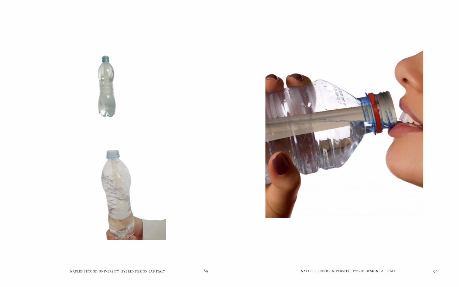
fabio mauro
Hello, my name is Fabio Mauro and I was born
in Naples 23 August 1990. I am a young designer
of 25 years old, graduated from the Second Uni-
versity of Naples in May 2014 and currently I’m
attending the Master in Innovation Design in
the engineering faculty of Aversa. My passion
for design was born thanks to my curiosity ; I
believe that design embraces not only different
areas , but also multiple layers of the same area
. For this reason my interests are manifold , but
given a choice I would opt for the major ones
as regards the social design and the hybrid
design .
My project is based on water and its
purifying power. I selected this element
because of my investigation has shown
that one of the main limitations of the
Neapolitans against many foreign, and in
particular Muslims , is related to their
distrust of their hygiene habits . It is a
cultural limit of the Neapolitans , linked
to some clichés and to their ignorance
that I would like to defuse . In the project
I would like to illustrate to the Nea-
politans the ritual value of purification
that water plays in Islamic cultures to
provide an instrument of knowledge that
can help to overcome biased attitudes
and to accept and respect the members
of Islamic communities in Naples .The
main theme of my project is water. It is a
theme of global interest as a fundamen-
tal resource for life. The need of water
as a source of life is intertwined with his
ancestral symbolic value.In particular
I focused on how the water is strongly
present in all cultures most representa-
tive of Campania . For example on how
the Arab culture has made it a central
element of its architecture and religious
life. Therefore I am inclined to deal with
the issue of water dwelling both on its
basic and ritual values. In Islamic culture,
and not just, the water has great symbolic
meaning as a ritual purifying element. In-
deed rites “ghusl” and “wudu” are repre-
sentative and are to cleanse the body and
soul with totally treated water to retrieve
the status of purity in the eyes of their
god Allah. So my project aims to combine
this symbolic rituals of the water with its
more purely vital qualities. The project is
an object strong symbolic identity able to
filter and purify water. Can be added to
any bottle, it is personal and portable. The
shape of the object allows, when drinking,
to move, and then oxygenating the water
in such a way as to have a slightly better
taste. Also it can be made of different
materials with different functions; plastic
(for oxygenating the water), silver (to oxy-
genate and ionize the water) and activated
charcoal (to oxygenate, filter and purify
water). The project was developed in
collaboration with the designer Francesco
Dell’Aglio and 3D Factory company which
printed the product in 3D.
Purifying Power
89NAPLES SECOND UNIVERSITY, HYBRID DESIGN LAB ITALY 90NAPLES SECOND UNIVERSITY, HYBRID DESIGN LAB ITALY

91NAPLES SECOND UNIVERSITY, HYBRID DESIGN LAB ITALY 92NAPLES SECOND UNIVERSITY, HYBRID DESIGN LAB ITALY
grain porcelain where the light goes out
because in some place porcelain is more
subtle and here the light goes out, at the
same way in this lamp the light goes out
from the grooves inside the upper part
rebuilding with this lighted grooves the
design of the below part lamp external.
In this way the lamp has got two functions
in only on object, the lamp is addressed to
chinese people that need to have a lamp
whith an oriented and directed light help-
ing for precision works, but also a lamp
that can be used as soft light to repose
the view. The two different texture of the
top, smooth outside and and striped in-
side don’t make understand at first sight
that there is not interruption between
the two parts composing lamp, but with
human interaction, lighting the upper part
the concept of the uninterruption of the
parts of the lamp is clear , the lines of
the low external part of the lamp coincide
with lines of internal of the upper part
and throughout these grooves the light
goes out, creating a link between the two
parts of the lamp . This lamp underline
the meeting of two cultures a, that work
together, as people whith different na-
tionality can work together with wonder-
ful results. It can be possible realize this
lamp thanks to my tutor help Architect
Francesco Dell’Aglio, and thanks to 3D
factory that printed the lamp.
gabriella del core
My college experience, before my architec-
ture degree, but also the experiences during
the design degree course that i’m attending
now teached me working with other people
and make me understand the significance
of collaboration, share the work and mix
different ideas, but my experience teached me
also to listen and follow the advice of people
with a bigger competence than mine.Be able to
communicate with others is important, I would
say necessary, especially in an area such as the
design where it’ s essential work in teams, to
create a project that can be understood and
appreciated.
Integration Lamp
The project for this integration lamp
start studying the similarities between
Chinese and Neapolitan culture , both
have a tradition for manufacturing por-
celain so i decided that the project must
focus on this point. I want underline that
Naples and in particular an area of the
city called Capodimonte is really famous
for porcelain,in the mid-eighteenth
century, King Charles of Bourbon and
his wife founded the Royal Factory of
Capodimonte. The project of my lamp
relate about a connection between two
cultures ,and between two different
ways to realize porcelain manifacturing,
both culture , chinese and neapolitan,
use floral elements but in different ways.
These elements in the chinese dish are
panited, instead in the Neapolitan are
carved. Theinspiration for integration of
the parts comes from a botanical tech-
nique called innesto. I want to realize
a lamp that watching from afar seem
two different parts but with the human
interaction seems like a unique part.
The lamp works in different ways for dif-
ferent use, it’s possible to use the lamp
having a soft light to repose the view
whit a suffused light, but also as a pe-
cision light turning the top of the lamp.
The light goes out from the upper part
of the lamp, using the technique of rice

93NAPLES SECOND UNIVERSITY, HYBRID DESIGN LAB ITALY 94NAPLES SECOND UNIVERSITY, HYBRID DESIGN LAB ITALY

95NAPLES SECOND UNIVERSITY, HYBRID DESIGN LAB ITALY 96NAPLES SECOND UNIVERSITY, HYBRID DESIGN LAB ITALY
as a limit or boundary, as a transition
from one color to another. Metaphorically
it represents the gradient exceeding the
limits, barriers, acceptance of multiple
variants that the company can take. The
cultural and ethnic nuance enriches soci-
ety. And ‘indefinite and fleeting, it makes
barely be able to determine where one
color ends and another begins.Looking
at the productive potential of industry
Neapolitan tailoring and silk manufacture
of San Leucio, research thus attempts to
hybridize and reinterpret this technique,
through an innovative use of materials,
pigments and unusual bending systems.
The project aims to reflect on diversity
and on the borders between the territo-
ries, using gradients as indefinite lines
that exist between territories. How do you
establish a clear boundary between one
country and another, between one culture
and another? There is always a smooth
transition, indefinite, enchanting.
germana de angelis
hello! i’m germana and i’m a design lover.
Currently i study product design for inno-
vation at university and i work as freelancer
when it happens. I love travel,photography and
make video.Also I love graphic in all its aspect.
I love colors, but in their correct use. I’ve stud-
ied fashion design so i always give attention to
details.I have many different passions so i can
seem indefinite or vague person. Effectively
i love drawing,writing,projecting product
and images but i think that i must have more
experience in practice.i use properly Php,Ill,Pr.
Ind.I’m less good but i still use CAD programs
like Rhinoceros.I have a particular attitude,i’m
dreamy and emphatetic .I’ve a lot of ideas, but
i’m also moody.But i think this is a prerogative
of creative people.
My project comes from the study of
Chinese communities in Naples and
rediscovering ancient traditions and
techniques of dyeing.
Neapolitans often neglect the cultur-
al and productive tradition of these
peoples, because they don’t know their
the particular traditions.For this reason,
I started a search that could recover
these ancient work strategically within
the world textile production in Naples,
also has at the same time ancient
roots.Among the various processes, my
focus was more on shibori technique
widespread in China 1,300 years ago
and then later was widely used in Japan.
Shibori thanks to its refined shades, is
particularly suited to express aesthetic
concepts such as contrast and cultural
exchange. The idea is to create products,
co-designed by designer Neapolitans
and Chinese together, which are based
on the shade of color, which is the prin-
ciple of shibori.Based on a study of sym-
bolic colors, the project aims to deepen
the very concept of nuance, understood
Inaccuracy of Colors

97NAPLES SECOND UNIVERSITY, HYBRID DESIGN LAB ITALY 98NAPLES SECOND UNIVERSITY, HYBRID DESIGN LAB ITALY

99NAPLES SECOND UNIVERSITY, HYBRID DESIGN LAB ITALY 100NAPLES SECOND UNIVERSITY, HYBRID DESIGN LAB ITALY
famous song,O’sole mine, which is
dedicated to our beautiful Naples , but
has taken its inspiration from Odessa.
You cannot always live in places where
the sun is abundant and if anything
happens at times, also in areas generally
bathed in sunshine, where the gloomy
weather , the haze or the heat may limit
the incidence of sunlight . For example ,
in Russia , the inhabitants live in houses
that have very small windows and they
are victims of a winter comes early and
lasts a long time, during which, the
light does not arrive before 8:30 am, to
go away, at 16.30 in the afternoon. Then,
many Ukrainians Europe have a Russian
culture, in which the importance of the
light factor, is primary. So I thought of a
way to bring sunlight into all the houses
also the darkest : it is an ingenious
lamp-mirror that follows the sun every
move reflecting the light even in the
darkest corners of the house.So, the
idea of hybridizing these two concepts ,
the shadow and the light, into an object
that will mirror day and lamp night . The
mirror will follow the trend of the sun , so
you can always use natural light , but the
same, it will turn on, at night , in an object
that produces, artificial light.The project
was developed in collaboration with the
designer Enza Migliore.
giovanna d’avino
young design, graduated in Architecture: Fash-
ion Design at Seconda Università degli Studi di
Napoli SUN, in 2014. I continue with the degree
in Innovation Design. In 2015 I worked with my
University (Hybrid Design Lab) at workshop
Environmental Dialog, Art/Design/Science/
Site-specific installations&Performance in Cit-
tà della Scienza, Naples in collaboration with
California College of the Arts, San Francisco,
USA. I collaborate with a school that intro-
ducing children to the world of creative and
innovative design.
Both an open area and a reflection on
which women or men always look in
passing. And systematically , like a
mantra , at sunrise and sunset , the
same questions: “What did I do today
... ?”, “Have I lived ...? “. This mirror
recalls not being swallowed by thespeed
, consumption , habit, but especially
that “I ‘m Alive, I Can do, I Am .”Leading
light where there is shadow but shadow
where there is light.The goal of the art
project is to wear light with itself , bring
thelight of the words, the images reflect-
ed in and out of us to reveal its meaning.
And escape from urban stress to a
suspended time,lose gravity, bare and
naked frenzy, but dressed for seeing her
Living space , the explosion of life :
frozen , waiting to resume its vibra-
tion . Contrast to the speed of light to
immobility in a “ light time “. Stable , she
takes , attracts considerable attention by
putting the light in a moment of silence
, out of the cerebral veins. Naples , has
much in common with Odessa : the sea,
the climate ... and the sun ( light ) . All
Ukrainians love Odessa because of the
brightness that this country offers , but
unfortunately , their condition of natural
light lasts very little. A great Neapolitan
singer Enrico Caruso , composed the
A Mirror

101NAPLES SECOND UNIVERSITY, HYBRID DESIGN LAB ITALY 102NAPLES SECOND UNIVERSITY, HYBRID DESIGN LAB ITALY
103NAPLES SECOND UNIVERSITY, HYBRID DESIGN LAB ITALY 104NAPLES SECOND UNIVERSITY, HYBRID DESIGN LAB ITALY
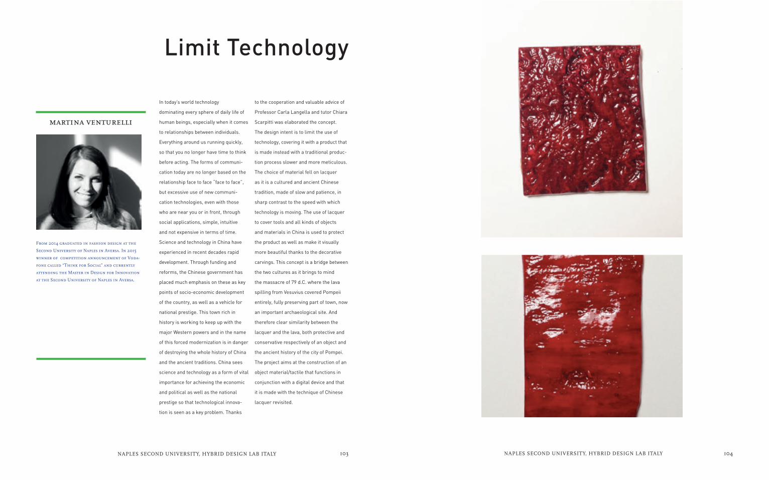
to the cooperation and valuable advice of
Professor Carla Langella and tutor Chiara
Scarpitti was elaborated the concept.
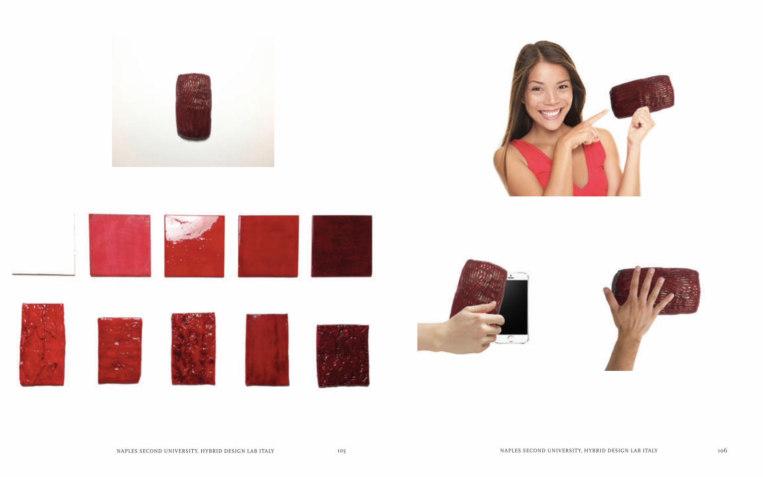
The design intent is to limit the use of
technology, covering it with a product that
is made instead with a traditional produc-
tion process slower and more meticulous.
The choice of material fell on lacquer
as it is a cultured and ancient Chinese
tradition, made of slow and patience, in
sharp contrast to the speed with which
technology is moving. The use of lacquer
to cover tools and all kinds of objects
and materials in China is used to protect
the product as well as make it visually
more beautiful thanks to the decorative
carvings. This concept is a bridge between
the two cultures as it brings to mind
the massacre of 79 d.C. where the lava
spilling from Vesuvius covered Pompeii
entirely, fully preserving part of town, now
an important archaeological site. And
therefore clear similarity between the
lacquer and the lava, both protective and
conservative respectively of an object and
the ancient history of the city of Pompei.
The project aims at the construction of an
object material/tactile that functions in
conjunction with a digital device and that
it is made with the technique of Chinese
lacquer revisited.
martina venturelli
From 2014 graduated in fashion design at the
Second University of Naples in Aversa. In 2015
winner of competition announcement of Voda-
fone called “Think for Social” and currently
attending the Master in Design for Innovation
at the Second University of Naples in Aversa.
In today’s world technology
dominating every sphere of daily life of
human beings, especially when it comes
to relationships between individuals.
Everything around us running quickly,
so that you no longer have time to think
before acting. The forms of communi-
cation today are no longer based on the
relationship face to face “face to face”,
but excessive use of new communi-
cation technologies, even with those
who are near you or in front, through
social applications, simple, intuitive
and not expensive in terms of time.
Science and technology in China have
experienced in recent decades rapid
development. Through funding and
reforms, the Chinese government has
placed much emphasis on these as key
points of socio-economic development
of the country, as well as a vehicle for
national prestige. This town rich in
history is working to keep up with the
major Western powers and in the name
of this forced modernization is in danger
of destroying the whole history of China
and the ancient traditions. China sees
science and technology as a form of vital
importance for achieving the economic
and political as well as the national
prestige so that technological innova-
tion is seen as a key problem. Thanks
Limit Technology
105NAPLES SECOND UNIVERSITY, HYBRID DESIGN LAB ITALY 106NAPLES SECOND UNIVERSITY, HYBRID DESIGN LAB ITALY

107NAPLES SECOND UNIVERSITY, HYBRID DESIGN LAB ITALY 108NAPLES SECOND UNIVERSITY, HYBRID DESIGN LAB ITALY
Neapolitans and Moroccans recalls puri-
ty) with complex morphologies symbols
Moroccan-Neapolitan, to spread this
common root of geometric beauty, where
the Moroccans and other countries,
characterized by visual cultures based
on complex geometries, can recognize is
also characterized by a gesture as simple
as drink water.
The concept of the project involves the
redesign of a bottle, the product of mass
bottigla founded on the icon of the plastic
itself, genetically modifying it with the
support of 3D textures make riferimente
to the symbolism of the Moroccan
culture. Using these 3D textures will be
spokesperson for a product that raccota
a different language, but also modify the
structural characteristics of the bottle,
and thickening opacizzando the surface,
creating a refraction of the sun’s rays
that might otherwise penetrate, causing
a toxicity to the liquid.The project was
developed in collaboration with the
designers Enza Migliore and Francesco
Dell’aglio.
pietropaolo verazzo
my name is Pietropaolo Verazzo, I’m 24 years and
I live in a province of Caserta. I am graduated
in design and communication and specializing
in design for innovation. I have experience
in the design industry and in the field of
graphic communication. I think I am a dynamic,
accurate and good person, but in the same time
I am crazy. I worked in various disciplines that
became hobbies for me, like music, cooking and
fashion, that I got in the week end. My free
time is dedicated to my body, going to gym or
swimming pool.
Ornament, is the key word, the beauty
in the culture as a boost to the moral
strength and ability to overcome difficul-
ties ...The principle of the culture of de-
corum of eastern Mediterranean coun-
tries has been my source of inspiration,
the research was based on the beauty of
decorative symbols on complex surfac-
es, through the tactile and the graphic,
minimalist surfaces of objects are
rendered rich language cultural “talking
surfaces”.The surfaces of the objects
of industrial civilization of today are
totalmete dishes, taking almost a status
“anonymous”, in the 80’s design bases
his research on color and the grapheme,
today the need to redesign design bearer
of empathy that is expressed on the
surface on the product, it can help give a
value identifiable object.
The visual culture traditional Neapoli-
tan-Moroccan are united by a geometri-
cal complexity that finds origins in com-
mon roots, the project aims to “enrich”
the image of an object as the emblem
of the standard bottle (resource that the
Decorative Symbols

109NAPLES SECOND UNIVERSITY, HYBRID DESIGN LAB ITALY 110NAPLES SECOND UNIVERSITY, HYBRID DESIGN LAB ITALY

111NAPLES SECOND UNIVERSITY, HYBRID DESIGN LAB ITALY 112NAPLES SECOND UNIVERSITY, HYBRID DESIGN LAB ITALY
hypothesis involves the construction of an
outdoor bench that aids in the perception
of the presence of persons in the moment
in which the user sits.
The mutation of the object, which occurs
when the person sits or stands up, can
occur through movements of the tilting
seat and backrest or elements that hang
from up or infuse a perception auditory,
olfactory and tactile. The seat may be
composed of open and visible gears,
that arouse curiosity at first glance. The
intangible concept behind the project is
to distract people immersed in a solitary
relationship with technology. It makes
sure that people note the presence of the
others, feeling and interacting with them
in a different way.
rossella ragosta
My name is Rossella Ragosta and i was born in
Naples on November 10/1989. I am a designer of
25 years, graduated from Second University of
Naples in May 2014 and currently attends the
Masters in Design for Innovation in the Facul-
ty of Engineering of Aversa. I think a designer
should always keep in mind one very important
aspect that is “putting the user at the center
of the project” creating products not merely
aesthetic but functional, inclusive, emotional
and educational services.
The project suggests the creation of
objects that change, looking for a static
and perceptive balance. Mutability is un-
derstood as a positive key for research
of new senses, stimulating person to
think about the meaning of the object.
In our digital society, indeed, there is a
imbalance of the senses. The technol-
ogy, which surrounds us constantly,
leads people to develop only the sense of
sight. For this reason, the project aims
to create a harmonious balance between
the various perceptive senses, through a
product that creates tactile or olfactory
or auditory incentive, as well as visual.
The idea of highlighting the balance of
the objects derives from a study of the
Chinese culture.
In Eastern philosophy the principle
that governs the whole is known as the
theory of Yin and Yang. Two opposites
and complementary polars that achieve
balance in a harmonious way. You can
also talk about a relational balance,
finding the right balance with those
seemingly “different”. A first design
Harmonius Balance Object

113NAPLES SECOND UNIVERSITY, HYBRID DESIGN LAB ITALY 114NAPLES SECOND UNIVERSITY, HYBRID DESIGN LAB ITALY

COLOPHONThis catalog was produced for a show at
CALIFORNIA COLLEGE OF THE ARTS
under the direction of Prof. Mariella Poli,
and in collaboration with Second University
of Naples, in December 2015.
Typeset in Din designed by Albert Jan Pool
(1995) and Scala by Martin Majoor (2004).
Catalog designed by Sirawan Chen.


![08. ism mabni [ism dhomir]](https://img.pdfslide.net/doc/110x75/55a4f0a71a28ab26408b480d/08-ism-mabni-ism-dhomir.jpg)