Embed Size (px)
Citation preview
DEPARTMENT OF ECONOMICS
ISSN 1441-5429
DISCUSSION PAPER 15/16
Inequality, Risk-Sharing and the Crisis: A View From Australia*
Youjin Hahna, Stephen Matteo Millerb, Hee-Seung Yangc
Abstract: We document the cross-sectional stylized facts of inequality for Australian households between 2001
and 2012 using the Household, Income and Labour Dynamics in Australia (HILDA) survey. Inequality
of individual wages, hours worked and earnings remain flat. Household pre-government income and
non-durable consumption inequality decline slightly. Household income inequality exceeds non-
durable consumption inequality during the global financial crisis, and over the life-cycle, suggesting
households partially insure income shocks. The degree of progressivity and private intermediation of
risk are high. Both equivalized net financial wealth and net total wealth inequality remain relatively
flat. Taxes and transfers reduce the variance of permanent shocks.
Keywords: Consumption inequality, income inequality, and wealth inequality; Inequality over
the life cycle; Risk-Sharing; Vulnerability
JEL Classification Numbers: D31, D33, D91, E01, E21, E24, H31, J31
* This article uses unit record data from the Household, Income and Labour Dynamics in Australia (HILDA)
Survey. The HILDA Project was initiated and is funded by the Australian Government Department of Families,
Housing, Community Services and Indigenous Affairs (FaHCSIA) and is managed by the Melbourne Institute of
Applied Economic and Social Research (Melbourne Institute). The findings and views reported in this article,
however, are those of the author and should not be attributed to either FaHCSIA or the Melbourne Institute. We
gratefully acknowledge Jun Sung Kim and Rebecca Valenzuela for their helpful comments. a School of Economics, Yonsei University, South Korea and Department of Economics, Monash University,
Australia b Mercatus Center, George Mason University, United States c Department of Economics, Monash University, Australia
© 2016 Youjin Hahn, Stephen Matteo Miller, Hee-Seung Yang
All rights reserved. No part of this paper may be reproduced in any form, or stored in a retrieval system, without the prior
written permission of the author.
monash.edu/ business-economics ABN 12 377 614 012 CRICOS Provider No. 00008C
2
1. Introduction
Research on inequality has increasingly turned to analyzing the multi-
dimensional nature of inequality. For instance, the macroeconomics literature on
heterogeneous agents suggests that studying the components of inequality, which link
together through the household budget constraint, remains an important task for the
future. A recent issue of the Review of Economic Dynamics (RED) presents stylized
facts about the joint distribution of wages, hours worked, earnings, consumption, and
wealth to understand the multi-dimensional nature of inequality in nine countries.1
The studies reveal how risks faced by individuals can affect inequality. The studies
also show how inequality might arise from the structure of the labor market, decisions
over how much to work and save, financial services available to households, as well
as official measures taken to change the distribution through taxes and transfers.
We summarize the multi-dimensional nature of inequality by reporting cross-
sectional stylized facts using the first twelve waves of the Household, Income and
Labour Dynamics in Australia (HILDA) survey. We rely solely on the HILDA survey
because the Australian Bureau of Statistics (ABS) surveys can result in misleading
conclusions because of underreported income (see Saunders and Bradbury (2006) and
references therein) and because the survey methodology and the definitions of some
measures have changed over time. For instance, Saunders (2004) finds that surveys
before 1990 cannot be compared with those after 1994/95. Similarly, Wilkins (2014)
finds that ongoing changes to the ABS survey methodology since then mean that,
while the gap is closing, the ABS surveys still likely overstate inequality since 2001.
Also, Wilkins (2014) compares income inequality measured using the ABS Survey of
Income and Housing (SIH) and HILDA between 2001 and 2010 and finds evidence of
rising inequality with the ABS data due to changes in definition of income and
method of the survey.
Given the relatively short history of HILDA, our results compare with only
part of the samples used in the RED issue, which end no later than 2005, or in Lise et
al. (2014), which ends in 2008. Because our sample ends in 2012, as in Perri (2014),
we can compare inequality before and after the crisis in Australia. That in mind, while
1 Countries examined in that issue include the U.S. (Heathcote et al. 2010), Canada (Brzozowski et al.
2010), U.K. (Blundell and Etheridge 2010), Germany (Krueger et al. 2010), Italy (Jappelli and
Pistaferri 2010), Spain (Pijoan-Mas and Sánchez-Marcos 2010), Sweden (Domeij and Martin Flodén
2010), Russia (Gorodnichenko et al. 2010), and Mexico (Binelli and Attansio 2010). Lise et al. (2014)
also applies the framework to household surveys in Japan, while Yamada (2013) uses the Keio survey
in Japan to analyze other aspects of the Japanese data that Lise et al. (2014) do not cover.
3
Krueger et al. (2010) note that most countries experienced substantial increases in
wage and earnings inequality since the mid-1970s, as we discuss below, our post-
2000 results show that inequality changed little, resembling findings for countries
with post-2000 samples.
In line with the RED methodology, we begin by comparing survey summary
statistics with National Income and Product Accounts (NIPA) data. We find that
average wages and salaries for individuals as well as the employment to population
ratio in the HILDA survey, lie slightly below per capita wages and salaries, and the
employment to population estimates from the NIPA data, but do track the respective
trends well. Non-durable consumption from the HILDA survey lies below NIPA
figures and has a different trend.
Turning to individual inequality, our cross-sectional stylized facts suggest that
during the first twelve waves of the HILDA survey wage inequality changed little.
While inequality for the college educated and for experienced males remained largely
constant, the male gender premium rose slightly throughout the sample. While women
have lower inequality of wages than men, they have higher inequality of hours
worked, and earnings. Inequality in hours worked for women exceeds that for men,
which likely reflects the fact that many women work part-time while most men work
full-time, but is converging as labor force participation among women increases.
At the household level, inequality of pre-government earnings exceed that of
post-government earnings, which would be consistent with a progressive system of
taxes and transfers, as Krueger et al. (2010) observe that progressive taxes and
transfers tend to compress inequality. We estimate the degree of progressivity, as in
Heathcote et al. (2014a, 2014b) and find it quite high at roughly 0.5, more than twice
as high as estimates for the U.S. With the exception of the crisis years between 2008-
2010, pre-government earnings inequality declines throughout the sample. This
finding appears associated with the bottom end of the distribution, measured by the
50th percentile relative to the 10th percentile (p50/p10) rather than with the top end of
the distribution, measured by the 90th percentile relative to the 50th percentile
(p90/p50) where inequality is flat.
We also find that non-durable consumption inequality lies below income
inequality, which in turn lies below wealth inequality. As Krueger et al. (2010) argue,
this can be interpreted as evidence that households insure against income shocks, and
is consistent with recent findings in Miller (2014) for Australia, before, during and
4
after the recent crisis. This also may suggest that consumption provides a better
measure of inequality than income or wealth for Australia, as Harding (1997) and
Barrett et al. (2000) suggest.
Finally, while most of the studies were finalized before the Great Recession,
Perri (2014) extends a subset of Heathcote et al.’s (2010) findings to examine what
happened with inequality in the U.S. before, during and after the 2007-2009 crisis. He
finds that the consumption inequality remained largely flat, even as some measures of
inequality increased, and that taxes and transfers helped mitigate the increased
inequality during and after the crisis. Similarly, we find consumption inequality lies
below disposable income inequality, and the gap falls during the crisis, which is
consistent with Miller’s (2014) finding that the sensitivity of consumption to negative
income shocks rose slightly during the crisis. We also measure total, government and
private intermediation of risk and find that private intermediation comprises the bulk
of total intermediation of risk. Overall, these findings indicate households withstood
the crisis.
2. Methodology and Data
2.1. Framework
The basic framework that Krueger et al. (2010) describe draws from an
intertemporal household budget constraint. The framework either specifies the labor
supply exogenously by aggregating income across earning members of the housing,
or endogenously by breaking down income into hours worked and wages earned per
hour. Using their notation, Krueger et al. (2010) write the intertemporal budget
constraint with an exogenous labor supply as
Tbyayac AL , (1)
where consumption ( c ) can be financed by the growth in assets between now and the
next period ( a ), current labor income (Ly ), an existing stock of assets ( a ), the
income earned from those assets through dividends (Ay ), through private transfers
and bequests ( b ), and public transfers net of taxes ( T ). By specifying the labor
supply endogenously, the intertemporal budget constraint becomes
5
Tbyalwlwac A
y
mmff
L
, (2)
where in addition to the variables specified in (1), we can account for hourly wages
earned by female and male earners ( mf ww , ) and hours worked by female and male
earners ( mf ll , ). They also examine pre-government income defined as the sum of
labor income, asset income and private transfers ( byy AL ), and disposable
income defined as pre-government income plus net transfers ( Tbyy AL ).
The RED guidelines call for computing time series of the variance of the
natural logs for wages, hours worked, labor earnings, market and disposable income,
consumption and wealth. We also report other traditional measures of inequality,
including the Gini coefficient, p50/p10 and p90/p50 percentile ratios.
2.2. The HILDA Data
Our empirical results make use of the HILDA survey, which is a nationally
representative, longitudinal survey of households, stratified across all seven states and
territories in Australia. The survey is undertaken annually and the first wave of the
survey consists of 7,682 households, with an additional 2,153 households added in
2011 (wave 11).
In the early years, the primary focus of the HILDA surveys was the collection
of information about household income and labor market activities. As Miller (2014)
discusses, information about expenditures was limited to monthly housing
expenditures, but waves 1, 3 and 4 recorded information about household food
expenditures, including groceries and meals eaten outside the home.
The survey broadened its coverage in wave 5 by including a self-completed
questionnaire asking households to report their expenditures on a wider range of non-
durable goods and services, though some non-durable categories changed in wave 6.
Also new for wave 6 were durable consumption expenditure categories such as new
and used cars, computers, audio-visual equipment, home appliances, and furniture.
Therefore, while we use the earlier waves for other variables, for consumption we use
waves 6-12. The consumption subcategories include groceries, dining out, alcohol,
6
cigarettes, petrol, shoes and clothes, utilities, public transportation, phone and internet,
home repairs, auto repairs, and holidays.
In line with the RED methodology, to compute real, adult-equivalent,
consumption and income we deflate the nominal measures by the Australian Bureau
of Statistics’ all cities consumer price index (CPI). To equivalize consumption and
income figures, we use the OECD equivalence scale, which gives the household head
a weight equal to 1, all adults other than the household head a weight equal to 0.7, and
all children aged 16 and under, a weight of 0.5.
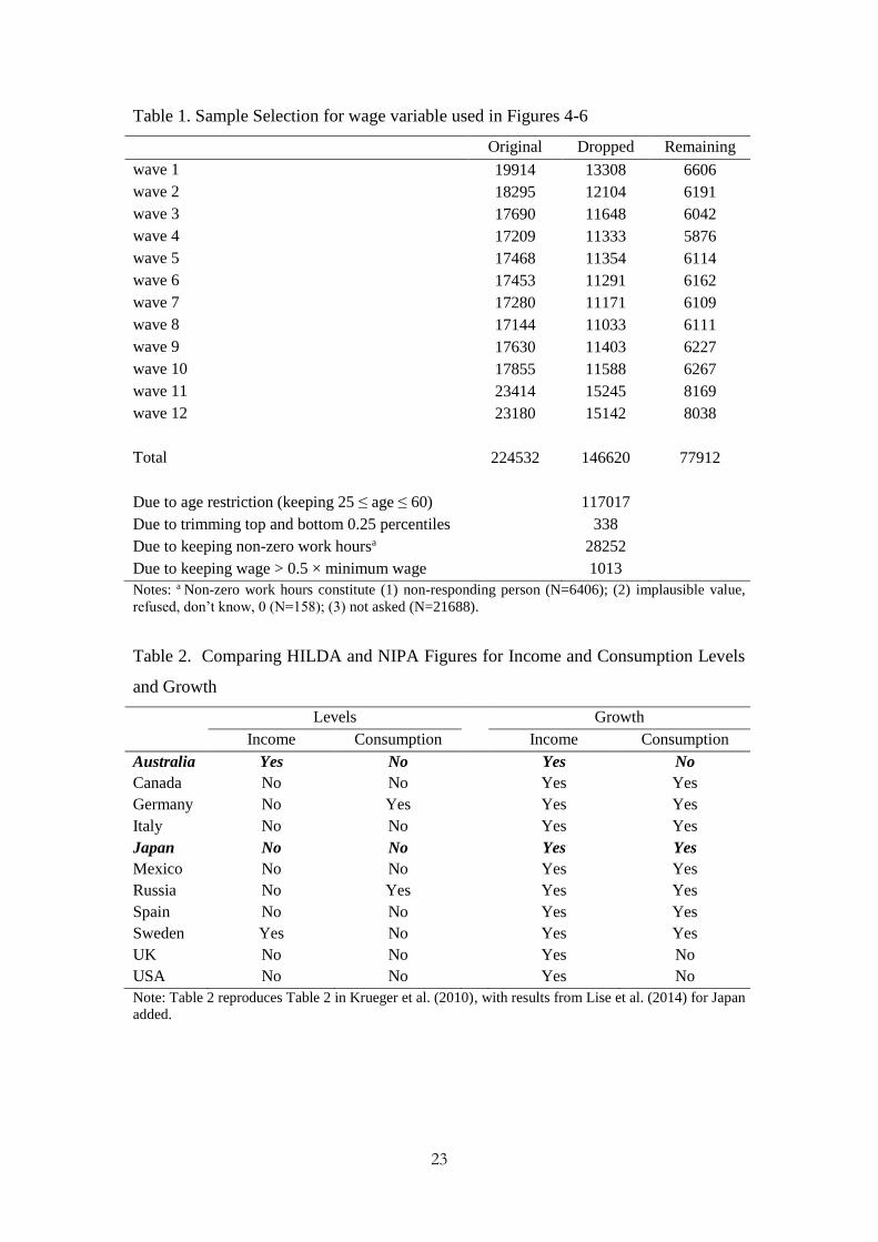
2.3. The RED Sample Selection Strategy
We use a sample of 77,912 household across the first twelve waves, as
summarized in Table 1. For the sake of comparison, the RED studies adopt common
guidelines for sample selection that we apply as well.2 The selection strategy calls for
using only households in which the reference person or head of household is at least
25 and not more than 60 years old. HILDA uses the term reference person instead of
household head. The reference person has a clear interpretation for single households.
For mixed sex couples, defined with either a reference person, along with a spouse,
the male gets treated as the reference and the female as the spouse, while with same
sex couples, the oldest get treated as the reference person. For non-couple households
the oldest working age male gets identified as the reference person, unless none exists,
in which case, the oldest female becomes the reference person.
[Table 1]
We now turn to our analysis comparing basic means from the HILDA data
with the associated NIPA figures.
3. NIPA Data vs. HILDA Means
The measures we compare include per capita wages and salaries, non-durable
consumption, as well as the employment to population ratio. In Table 2, we update
Table 2 in Krueger et al. (2010) and summarize our findings as well as results from
Lise et al. (2014) for Japan. While most studies report mixed results when using
2 See https://www.economicdynamics.org/guidelines.pdf.
7
household survey data to corroborate NIPA income and consumption data in levels,
they do corroborate NIPA income and consumption growth rates. While the HILDA
data generates income levels and growth rates that are comparable with the NIPA
figures, the consumption levels and growth rates do not corroborate the NIPA figures.
[Table 2]
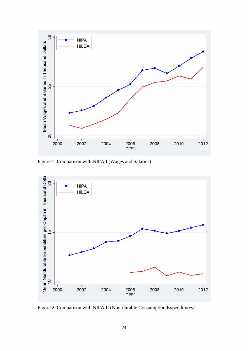
Wages and Salaries. Figure 1 depicts HILDA mean Wages and Salaries against
NIPA per capita wage income. Figure 1 shows that the HILDA series lies just below
the NIPA series, and the trend for the HILDA series generally follows the NIPA
series. The two series exhibit similar volatility. This finding is consistent with those
in Canada, Britain, Germany, Russia and Japan where typically the NIPA figures lie
above the survey figures, or in the U.S. and Italy, where they closely follow each
other. In Sweden, the survey figures lie above the NIPA figures.
[Figure 1]
Consumption. Figure 2 depicts non-durable consumption expenditures. While the
HILDA series lies below and has a different trend from the NIPA series, the
cyclicality is similar. In terms of the HILDA figures, the decline in non-durable
consumption expenditures in 2009 has been observed in Miller (2014), reflecting the
effects of the Global Financial Crisis on household consumption. Since then, however,
non-durable consumption expenditures have fallen. As in Australia, the NIPA series
exceed survey series for the U.S., Canada, Sweden, and Japan, unlike in Britain,
Germany, Italy and Russia, where the series track each other closely.
[Figure 2]
Employment-to-Population. In Figure 3 we see that the employment to population
ratio in HILDA tracks the NIPA quite closely. This stylized fact is consistent with
results for Canada and Russia. The decline since 2008 could be consistent with the
effects of the Global Financial Crisis: even though the Australian economy weathered
the turmoil initially, the labor market after 2008 worsened.
8
[Figure 3]
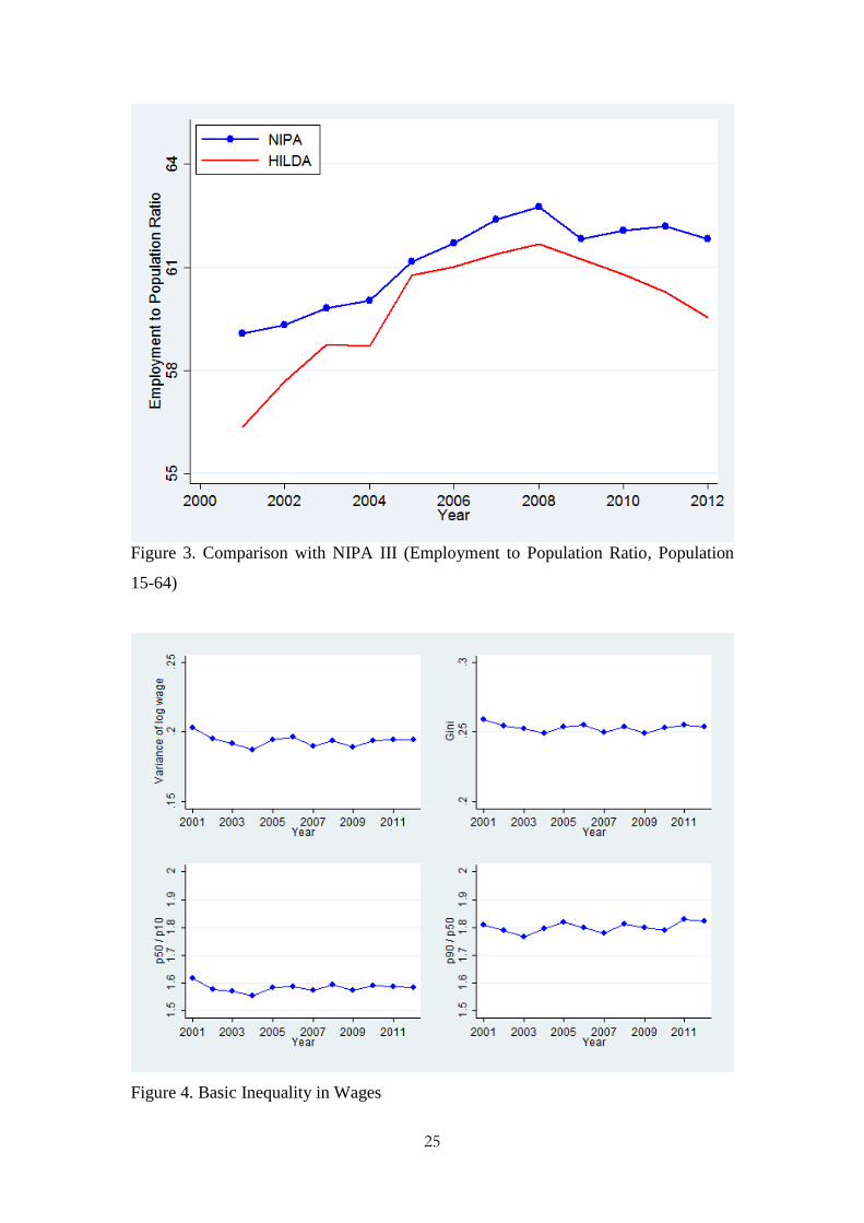
4. Inequality
Taken as a whole, we show that inequality in Australia changed little between
2001 and 2012, especially income and consumption, overall and at both the top and
bottom of the distribution. There were notable changes in the distribution of hours
worked and especially earnings. We begin with summaries of individual level
inequality before turning to household level inequality.
4.1. Individual Level Inequality
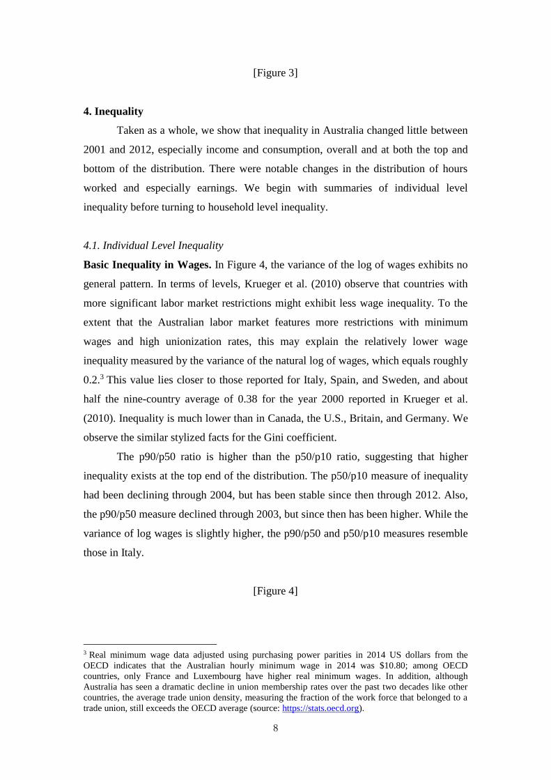
Basic Inequality in Wages. In Figure 4, the variance of the log of wages exhibits no
general pattern. In terms of levels, Krueger et al. (2010) observe that countries with
more significant labor market restrictions might exhibit less wage inequality. To the
extent that the Australian labor market features more restrictions with minimum
wages and high unionization rates, this may explain the relatively lower wage
inequality measured by the variance of the natural log of wages, which equals roughly
0.2.3 This value lies closer to those reported for Italy, Spain, and Sweden, and about
half the nine-country average of 0.38 for the year 2000 reported in Krueger et al.
(2010). Inequality is much lower than in Canada, the U.S., Britain, and Germany. We
observe the similar stylized facts for the Gini coefficient.
The p90/p50 ratio is higher than the p50/p10 ratio, suggesting that higher
inequality exists at the top end of the distribution. The p50/p10 measure of inequality
had been declining through 2004, but has been stable since then through 2012. Also,
the p90/p50 measure declined through 2003, but since then has been higher. While the
variance of log wages is slightly higher, the p90/p50 and p50/p10 measures resemble
those in Italy.
[Figure 4]
3 Real minimum wage data adjusted using purchasing power parities in 2014 US dollars from the
OECD indicates that the Australian hourly minimum wage in 2014 was $10.80; among OECD
countries, only France and Luxembourg have higher real minimum wages. In addition, although
Australia has seen a dramatic decline in union membership rates over the past two decades like other
countries, the average trade union density, measuring the fraction of the work force that belonged to a
trade union, still exceeds the OECD average (source: https://stats.oecd.org).
9
For comparison, many of the country studies report that inequality generally
increased during the full sample. However, in studies that report results through 2005,
like Australia, the trend appears flat in the U.S., Canada, Germany, Italy, and Japan,
while it declined in Britain and Russia.
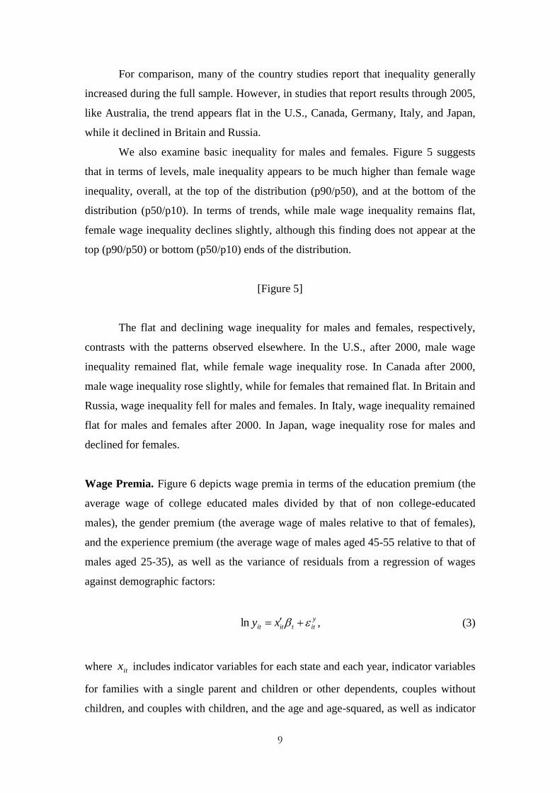
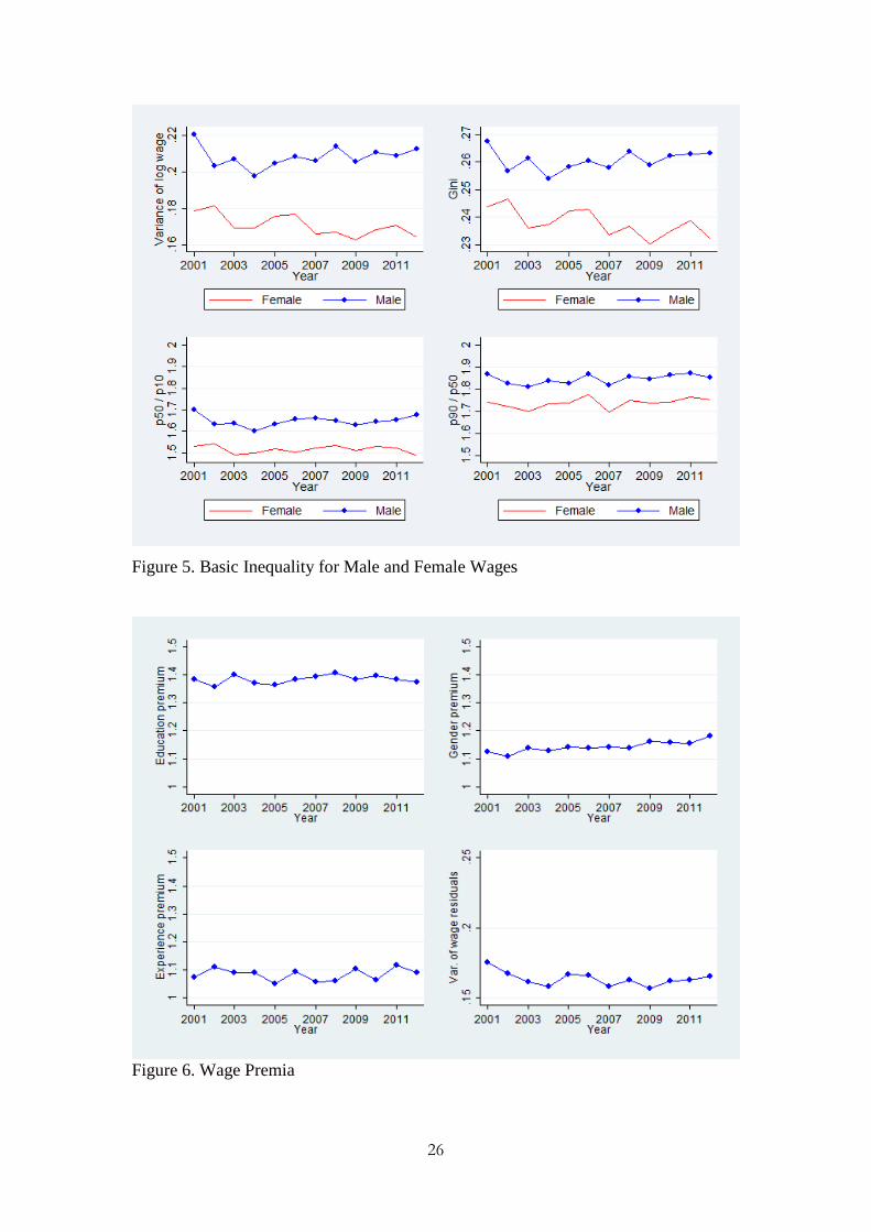
We also examine basic inequality for males and females. Figure 5 suggests
that in terms of levels, male inequality appears to be much higher than female wage
inequality, overall, at the top of the distribution (p90/p50), and at the bottom of the
distribution (p50/p10). In terms of trends, while male wage inequality remains flat,
female wage inequality declines slightly, although this finding does not appear at the
top (p90/p50) or bottom (p50/p10) ends of the distribution.
[Figure 5]
The flat and declining wage inequality for males and females, respectively,
contrasts with the patterns observed elsewhere. In the U.S., after 2000, male wage
inequality remained flat, while female wage inequality rose. In Canada after 2000,
male wage inequality rose slightly, while for females that remained flat. In Britain and
Russia, wage inequality fell for males and females. In Italy, wage inequality remained
flat for males and females after 2000. In Japan, wage inequality rose for males and
declined for females.
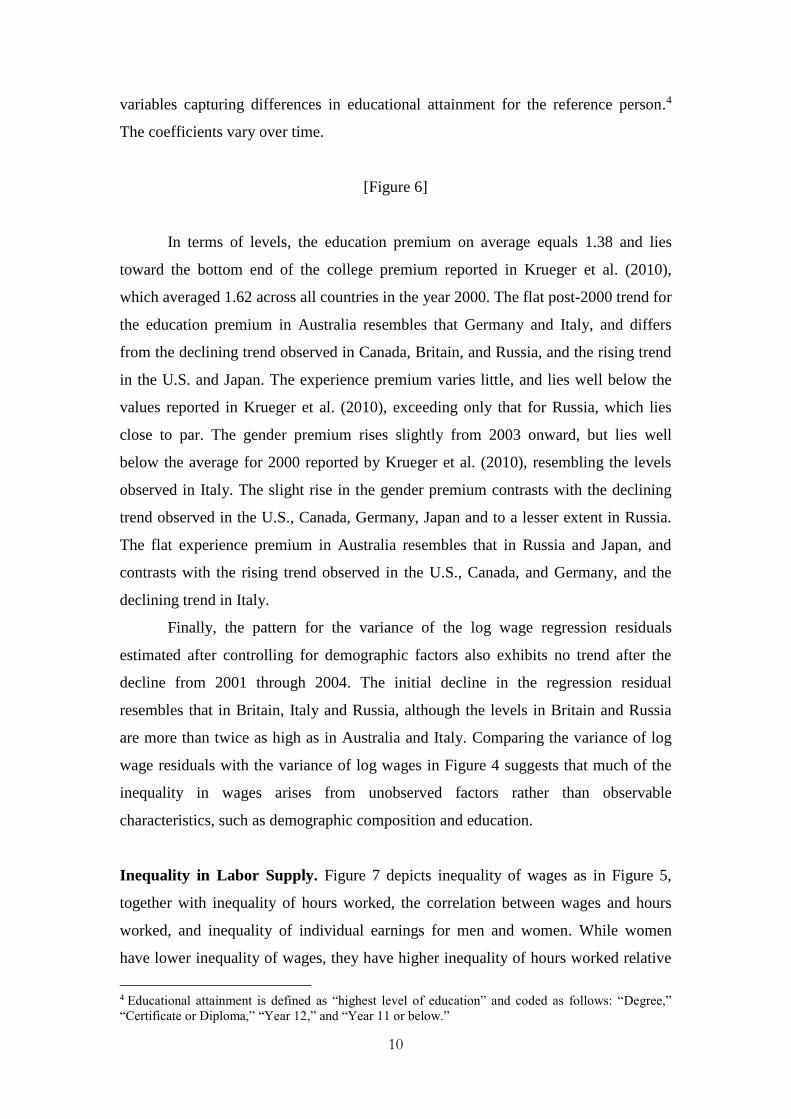
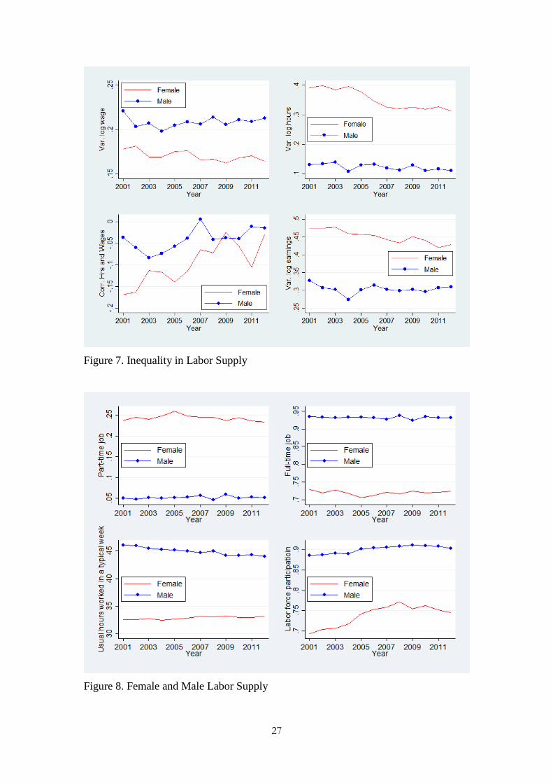
Wage Premia. Figure 6 depicts wage premia in terms of the education premium (the
average wage of college educated males divided by that of non college-educated
males), the gender premium (the average wage of males relative to that of females),
and the experience premium (the average wage of males aged 45-55 relative to that of
males aged 25-35), as well as the variance of residuals from a regression of wages
against demographic factors:
y
ittitit xy ln , (3)
where itx includes indicator variables for each state and each year, indicator variables
for families with a single parent and children or other dependents, couples without
children, and couples with children, and the age and age-squared, as well as indicator
10
variables capturing differences in educational attainment for the reference person.4
The coefficients vary over time.
[Figure 6]
In terms of levels, the education premium on average equals 1.38 and lies
toward the bottom end of the college premium reported in Krueger et al. (2010),
which averaged 1.62 across all countries in the year 2000. The flat post-2000 trend for
the education premium in Australia resembles that Germany and Italy, and differs
from the declining trend observed in Canada, Britain, and Russia, and the rising trend
in the U.S. and Japan. The experience premium varies little, and lies well below the
values reported in Krueger et al. (2010), exceeding only that for Russia, which lies
close to par. The gender premium rises slightly from 2003 onward, but lies well
below the average for 2000 reported by Krueger et al. (2010), resembling the levels
observed in Italy. The slight rise in the gender premium contrasts with the declining
trend observed in the U.S., Canada, Germany, Japan and to a lesser extent in Russia.
The flat experience premium in Australia resembles that in Russia and Japan, and
contrasts with the rising trend observed in the U.S., Canada, and Germany, and the
declining trend in Italy.
Finally, the pattern for the variance of the log wage regression residuals
estimated after controlling for demographic factors also exhibits no trend after the
decline from 2001 through 2004. The initial decline in the regression residual
resembles that in Britain, Italy and Russia, although the levels in Britain and Russia
are more than twice as high as in Australia and Italy. Comparing the variance of log
wage residuals with the variance of log wages in Figure 4 suggests that much of the
inequality in wages arises from unobserved factors rather than observable
characteristics, such as demographic composition and education.
Inequality in Labor Supply. Figure 7 depicts inequality of wages as in Figure 5,
together with inequality of hours worked, the correlation between wages and hours
worked, and inequality of individual earnings for men and women. While women
have lower inequality of wages, they have higher inequality of hours worked relative
4 Educational attainment is defined as “highest level of education” and coded as follows: “Degree,”
“Certificate or Diploma,” “Year 12,” and “Year 11 or below.”
11
to men across years. Like in Canada, the U.S. and Russia, inequality of hours worked
in Australia remained roughly flat for males and declined slightly for females.
In addition, the correlation between wages and hours worked has been
negative throughout the sample for men and women, but has trended toward zero,
resembling that observed in Canada, where they also approached zero. 5 While
Krueger et al. (2010) argue that such a finding would be consistent with the basic
neoclassical theory of labor where the income effect dominates the substitution effect,
contrary to other studies, as in Canada the correlation is closer to zero for men than
women.
[Figure 7]
The higher inequality of hours worked among women also mirrors the higher
inequality of earnings among women compared to men. Only two other studies report
earnings inequality for men and women. For the U.S., Heathcote et al. (2010) show
that earnings inequality for men and women is similar, while in Japan, Lise et al.
(2014) show that earnings inequality is higher for women than men, as in Australia.
Heathcote et al. (2010) and Lise et al. (2014) also show that the log variance of
individual earnings has been rising for men and women after 2000 in the U.S. and
Japan, respectively, which contrasts with the flat earnings inequality pattern for men
and declining pattern for women in Australia.
Also, the convergence between inequality of hours worked for women relative
to men is consistent with a market in which female labor force participation rises. To
examine this in more detail, Figure 8 depicts labor supply for part-time workers, full-
time workers, as well as the usual reported hours worked per week and labor force
participation. One possible explanation for higher inequality of hours worked for
women is that women are more likely to work part-time rather than full-time: around
25% of women in the workforce work part-time, while about 5% of men work part-
time (Figure 8). Female labor force participation rapidly increased until the crisis in
2008 and then declined as shown in Figure 8. For men, labor force participation
increased slightly until 2009, and has since declined slightly.
5 Hourly wages are calculated as earnings divided by hours worked, and thus measurement error in
reported hours worked might lower the correlation (Krueger et al. 2010).
12
[Figure 8]
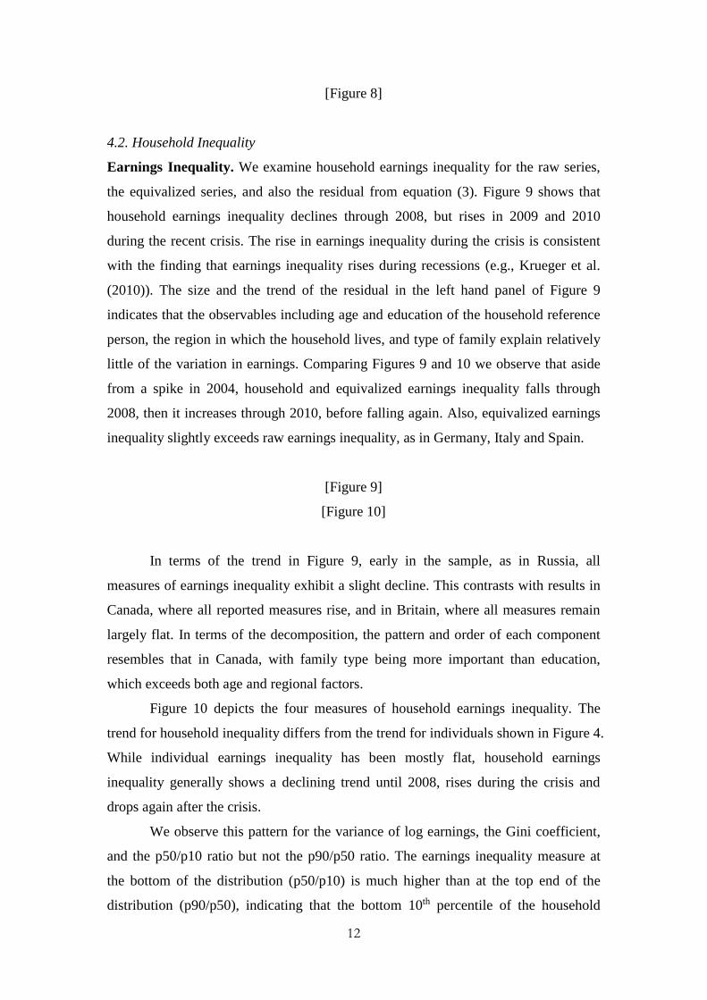
4.2. Household Inequality
Earnings Inequality. We examine household earnings inequality for the raw series,
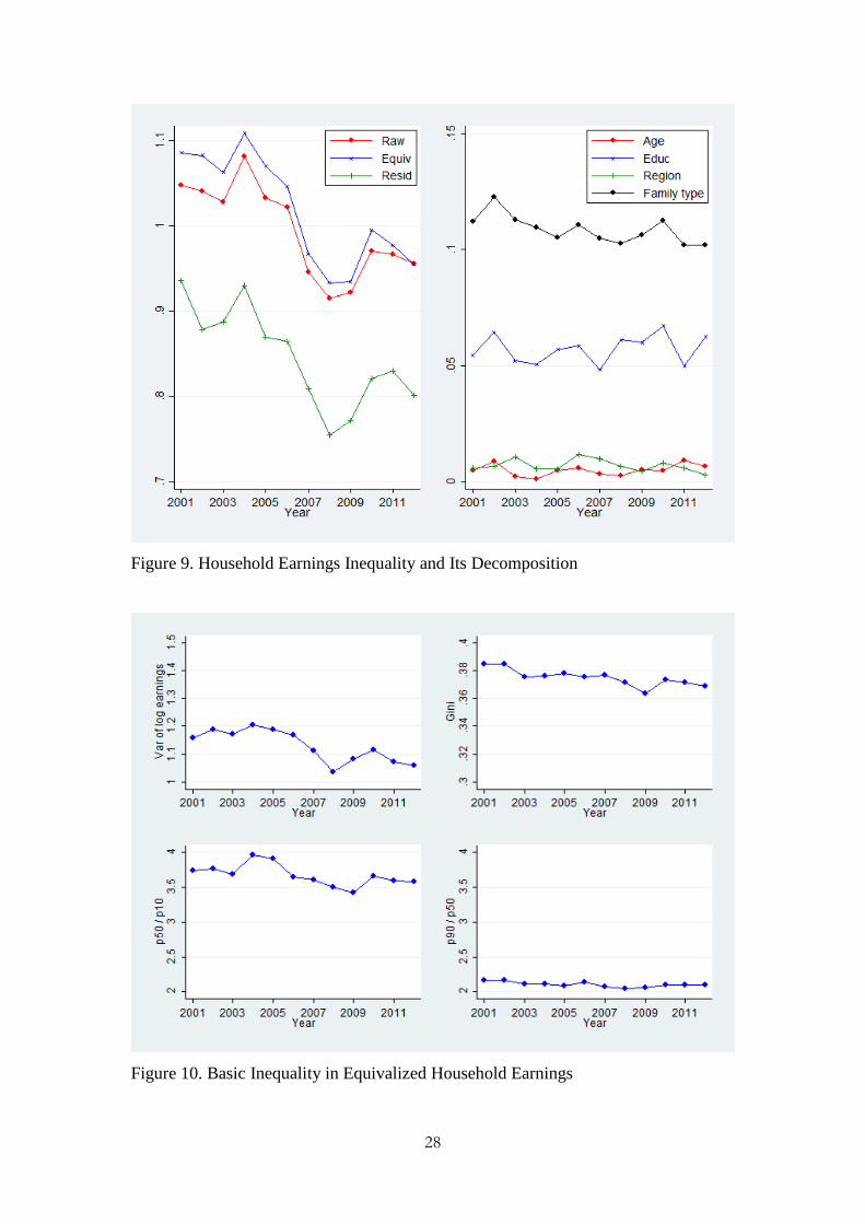
the equivalized series, and also the residual from equation (3). Figure 9 shows that
household earnings inequality declines through 2008, but rises in 2009 and 2010
during the recent crisis. The rise in earnings inequality during the crisis is consistent
with the finding that earnings inequality rises during recessions (e.g., Krueger et al.
(2010)). The size and the trend of the residual in the left hand panel of Figure 9
indicates that the observables including age and education of the household reference
person, the region in which the household lives, and type of family explain relatively
little of the variation in earnings. Comparing Figures 9 and 10 we observe that aside
from a spike in 2004, household and equivalized earnings inequality falls through
2008, then it increases through 2010, before falling again. Also, equivalized earnings
inequality slightly exceeds raw earnings inequality, as in Germany, Italy and Spain.
[Figure 9]
[Figure 10]
In terms of the trend in Figure 9, early in the sample, as in Russia, all
measures of earnings inequality exhibit a slight decline. This contrasts with results in
Canada, where all reported measures rise, and in Britain, where all measures remain
largely flat. In terms of the decomposition, the pattern and order of each component
resembles that in Canada, with family type being more important than education,
which exceeds both age and regional factors.
Figure 10 depicts the four measures of household earnings inequality. The
trend for household inequality differs from the trend for individuals shown in Figure 4.
While individual earnings inequality has been mostly flat, household earnings
inequality generally shows a declining trend until 2008, rises during the crisis and
drops again after the crisis.
We observe this pattern for the variance of log earnings, the Gini coefficient,
and the p50/p10 ratio but not the p90/p50 ratio. The earnings inequality measure at
the bottom of the distribution (p50/p10) is much higher than at the top end of the
distribution (p90/p50), indicating that the bottom 10th percentile of the household
13
earnings distribution has faired worse than the median, resulting in a ratio for earnings
between 3.5 and 4. This ratio is much larger than the relative earnings of the top 10th
percentile relative to the median (p90/p50), which is slightly higher than 2.
Inequality at the household level is much higher in all four measures of
inequality compared to the individual level of inequality. This could be due to
assortative mating, which refers to a positive association between the values of the
traits such as education and income among the couple. Using data from the U.S.
Census Bureau, Greenwood et al. (2014) find that there has been a rise in assortative
mating and assortative mating worsens household income inequality. Their analysis
suggests that the Gini coefficient in 2005 would have fallen from the observed 0.43 to
0.34, had the matching between husbands and wives been random.
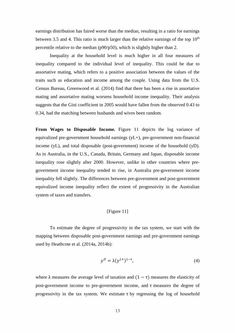
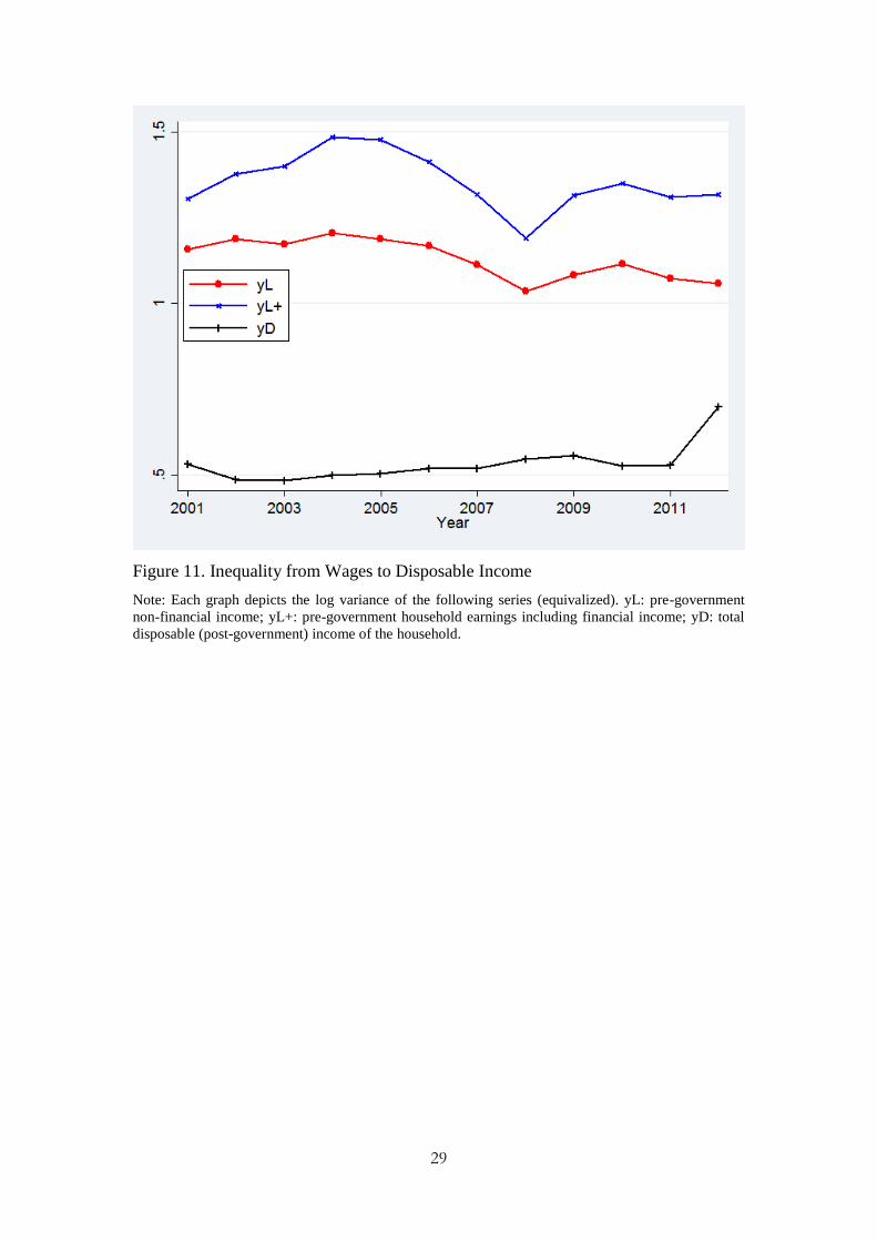
From Wages to Disposable Income. Figure 11 depicts the log variance of
equivalized pre-government household earnings (yL+), pre-government non-financial
income (yL), and total disposable (post-government) income of the household (yD).
As in Australia, in the U.S., Canada, Britain, Germany and Japan, disposable income
inequality rose slightly after 2000. However, unlike in other countries where pre-
government income inequality tended to rise, in Australia pre-government income
inequality fell slightly. The differences between pre-government and post-government
equivalized income inequality reflect the extent of progressivity in the Australian
system of taxes and transfers.
[Figure 11]
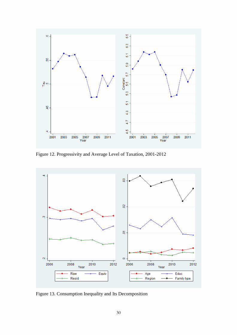
To estimate the degree of progressivity in the tax system, we start with the
mapping between disposable post-government earnings and pre-government earnings
used by Heathcote et al. (2014a, 2014b):
𝑦𝐷 = λ(𝑦𝐿+)1−𝜏, (4)
where λ measures the average level of taxation and (1 − τ) measures the elasticity of
post-government income to pre-government income, and τ measures the degree of
progressivity in the tax system. We estimate τ by regressing the log of household
14
post-government income against a constant and the log of household pre-government
income by year.
The estimate of the progressivity parameter ranges from 0.51 to 0.53 prior to
crisis years and dips to 0.47 during the crisis 2008 and 2009, while the constant
ranges between 5.7 to 6.2 before the crisis but falls to 5.2 to 5.3 during the crisis (all
estimated parameters are statistically significant at the 1 percent level and R2 ranges
between 0.53 and 0.66 throughout the sample period). Figure 12 plots the estimates
for progressivity parameter and constant term for each year. These findings suggest
that the average degree of progressivity decreased during the crisis years, and that the
average level of taxation also fell during the crisis. Given that Heathcote et al. (2014a,
2014b) report the range of 0.151 to 0.185, the Australian tax and transfer system
appears more progressive than those in the U.S. However, unlike Congressional
Budget Office figures reported by Heathcote et al. (2014b), which suggest the degree
of progressivity increased slightly in the U.S during the 2008-2010 period, our
estimates suggest they fell.
[Figure 12]
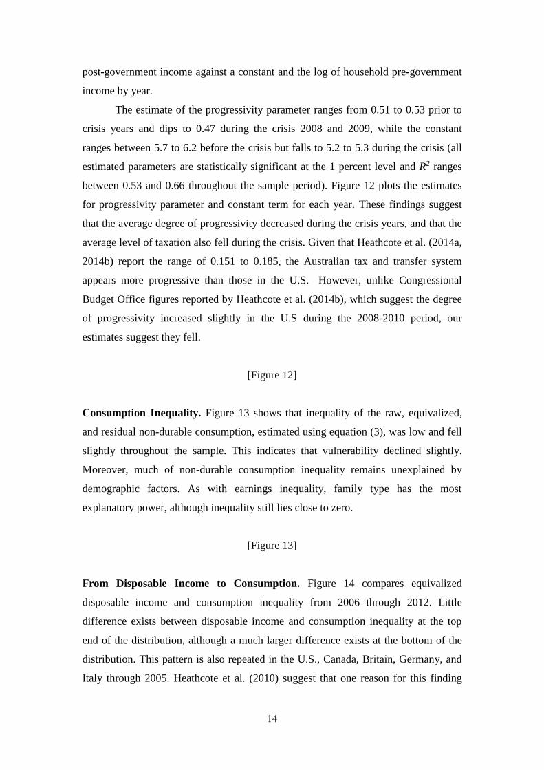
Consumption Inequality. Figure 13 shows that inequality of the raw, equivalized,
and residual non-durable consumption, estimated using equation (3), was low and fell
slightly throughout the sample. This indicates that vulnerability declined slightly.
Moreover, much of non-durable consumption inequality remains unexplained by
demographic factors. As with earnings inequality, family type has the most
explanatory power, although inequality still lies close to zero.
[Figure 13]
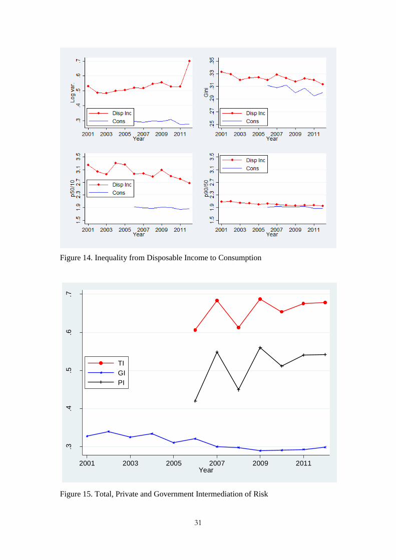
From Disposable Income to Consumption. Figure 14 compares equivalized
disposable income and consumption inequality from 2006 through 2012. Little
difference exists between disposable income and consumption inequality at the top
end of the distribution, although a much larger difference exists at the bottom of the
distribution. This pattern is also repeated in the U.S., Canada, Britain, Germany, and
Italy through 2005. Heathcote et al. (2010) suggest that one reason for this finding
15
could be that temporary income shocks, which are only partially transmitted to
consumption, are more likely to affect the bottom of the distribution than the top.
[Figure 14]
The distribution of consumption appears symmetric given the similarity in the
bottom two panels of Figure 14 depicting the p50/p10 and p90/p50 ratios. This is in
contrast to household earnings inequality, where the p50/p10 ratio far exceeds the
p90/p50 ratio, as we observed for Figure 10. Comparing across panels, the log-
variance of disposable income rises while the log variance of consumption declines
slightly. For all other measures, both disposable income and consumption inequality
decline. Overall, these measures indicate that before, during and after the crisis,
households insure against income shocks, corroborating evidence presented in Miller
(2014). We can also examine the extent of risk sharing through the intermediation of
risk.
Krueger and Perri (2011) propose measures of the degree of risk
intermediation to examine whether public income insurance can improve upon private
sector income insurance under incomplete risk sharing. For the purpose of accounting
for risk sharing, total, government and private intermediation ratios are defined as
follows:
Total intermediation of risk = 1 – SD(consumption)
SD(pre−government income) , (5a)
Government intermediation of risk = 1 – SD(post−government income)
SD(pre−government income), (5b)
Private intermediation of risk = 1 – SD(consumption)
SD(post−government income), (5c)
where SD(∙) is the standard deviation operator, consumption is nondurable
expenditures, and pre-government income includes private transfers, while post-
government income adjusts for taxes and government transfers. Under perfect risk
sharing, where the standard deviation of consumption equals zero, total
intermediation equals one and coincides with private intermediation. Similarly, under
16
perfect private income risk sharing, private intermediation is same as total
intermediation and equals one. For government intermediation, we report the
empirical version, rather than that for an assumed tax function as in Krueger and Perri
(2011). Government intermediation, however, could reflect the progressivity of the
tax system nonetheless, since it measures the extent to which pre-government income
inequality exceeds post-government income inequality as a fraction of pre-
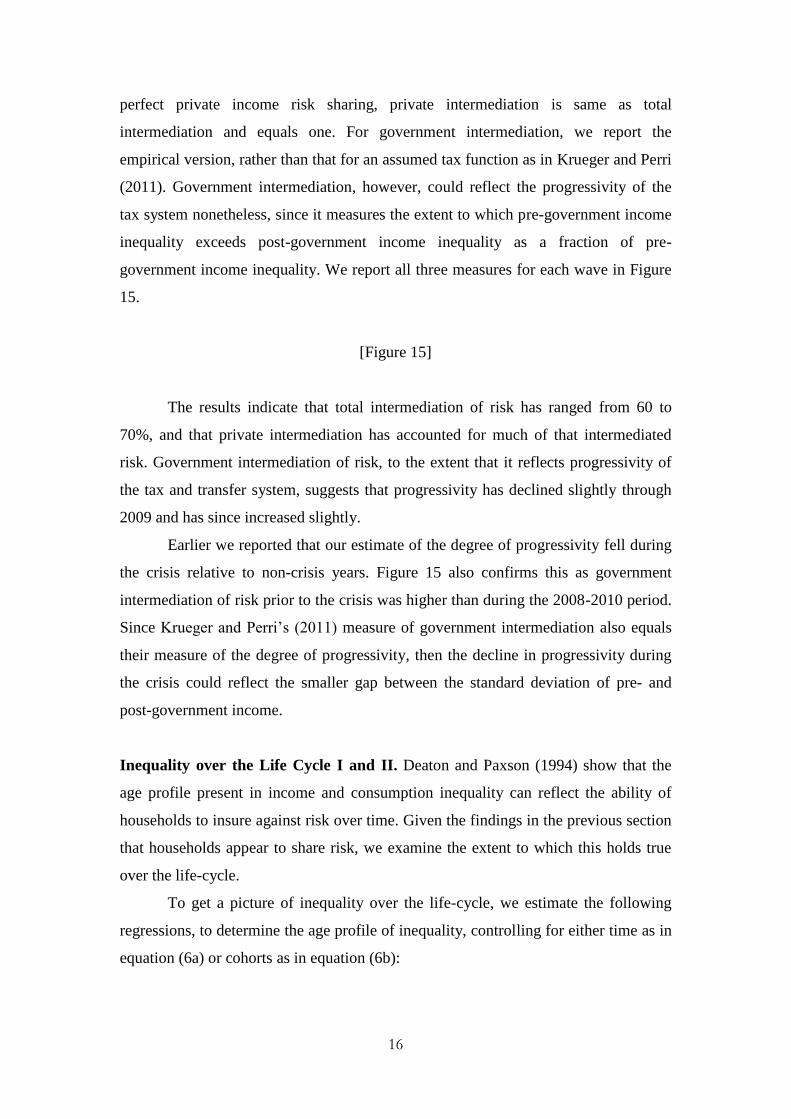
government income inequality. We report all three measures for each wave in Figure
15.
[Figure 15]
The results indicate that total intermediation of risk has ranged from 60 to
70%, and that private intermediation has accounted for much of that intermediated
risk. Government intermediation of risk, to the extent that it reflects progressivity of
the tax and transfer system, suggests that progressivity has declined slightly through
2009 and has since increased slightly.
Earlier we reported that our estimate of the degree of progressivity fell during
the crisis relative to non-crisis years. Figure 15 also confirms this as government
intermediation of risk prior to the crisis was higher than during the 2008-2010 period.
Since Krueger and Perri’s (2011) measure of government intermediation also equals
their measure of the degree of progressivity, then the decline in progressivity during
the crisis could reflect the smaller gap between the standard deviation of pre- and
post-government income.
Inequality over the Life Cycle I and II. Deaton and Paxson (1994) show that the
age profile present in income and consumption inequality can reflect the ability of
households to insure against risk over time. Given the findings in the previous section
that households appear to share risk, we examine the extent to which this holds true
over the life-cycle.
To get a picture of inequality over the life-cycle, we estimate the following
regressions, to determine the age profile of inequality, controlling for either time as in
equation (6a) or cohorts as in equation (6b):
17
at
T
t
tt
A
a
aatat yearagegroupM 11
,0 , (6a)
ak
K
k
kk
A
a
aatak cohortagegroupM 11
,0 , (6b)
where atM measures the variance of log for either wages, earnings, disposable
income or non-durable consumption, aagegroup is a set of indicator variables for age
groups a = 25-29, …, 50-54, and 55 or older, tyear is a set of indicator variables for
years 2002 through 2012, and kcohort is a set of indicator variables for age cohorts k
= born before 1950, between 1950 and 1959, between 1960 and 1969, between 1970
and 1979, and after 1980. As Heathcote et al. (2010) point out, the linear dependence
between age, cohort and year effects means that we cannot determine whether cohort
or year effects explain observed inequality.
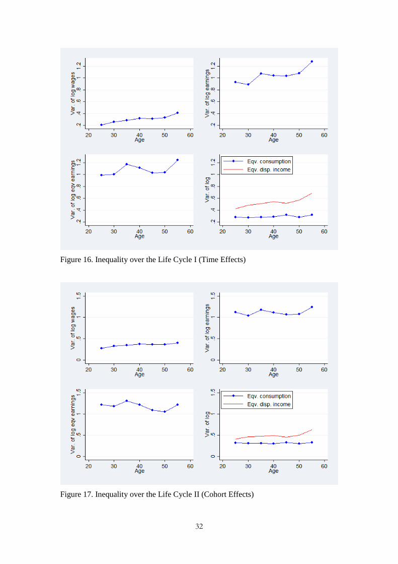
In Figure 16 we report the results controlling for time effects as in equation
(6a), while in Figure 17 we report the results controlling for cohort effects as in
equation (6b). Figures 16 and 17 show that over the life-cycle, earnings inequality
exceeds wage inequality and non-durable consumption inequality. Building on our
earlier findings, the results indicate that households share risk over the life cycle as
well.
[Figure 16]
[Figure 17]
Also, Storesletten et al. (2004) find that linearity (non-linearity/concavity) of
the age profile of inequality shocks suggests a unit root (less than a unit root). With
complete markets, consumption inequality would be flat over the life cycle, while
under autarky, consumption inequality would mirror that for earnings. Our findings
suggest that the behavior of Australian households conforms to those predicted by
Storesletten et al. (2004) as wages, as well as earnings from ages 30-45, exhibit a
concave life-cycle profile, whether we adjust for time or cohort effects, which could
indicate the series exhibit less than a unit root. The convexity of the earnings profile
outside of the ages 30-45 could reflect heterogeneity for younger adults, as well as
18
increasing dispersion in hours worked among those nearing retirement. Consumption
has a linear profile suggesting a unit root process could characterize the series.
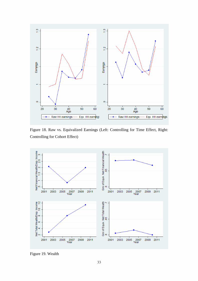
Figure 18 depicts the raw and equivalized household earnings controlling for
time and cohort effects to compare the changes aligned along a common scale. Figure
18 shows that equivalizing tends to tilt the earnings profile, increasing it especially for
younger households, while decreasing it slightly for older households, which would
be consistent with Heathcote et al.’s (2010) observation that equivalization magnifies
inequality for younger families. Also, since the profiles in the left panel are steeper
than those in the right panel, earnings inequality in Australia appears due more to
greater within-cohort inequality rather than a general increase in earnings inequality
for successive cohorts.
[Figure 18]
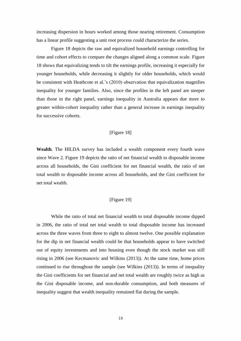
Wealth. The HILDA survey has included a wealth component every fourth wave
since Wave 2. Figure 19 depicts the ratio of net financial wealth to disposable income
across all households, the Gini coefficient for net financial wealth, the ratio of net
total wealth to disposable income across all households, and the Gini coefficient for
net total wealth.
[Figure 19]
While the ratio of total net financial wealth to total disposable income dipped
in 2006, the ratio of total net total wealth to total disposable income has increased
across the three waves from three to eight to almost twelve. One possible explanation
for the dip in net financial wealth could be that households appear to have switched
out of equity investments and into housing even though the stock market was still
rising in 2006 (see Kecmanovic and Wilkins (2013)). At the same time, home prices
continued to rise throughout the sample (see Wilkins (2013)). In terms of inequality
the Gini coefficients for net financial and net total wealth are roughly twice as high as
the Gini disposable income, and non-durable consumption, and both measures of
inequality suggest that wealth inequality remained flat during the sample.
19
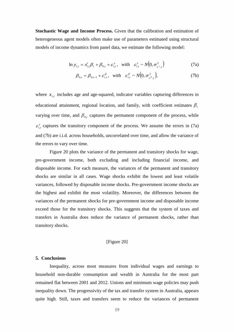
Stochastic Wage and Income Process. Given that the calibration and estimation of
heterogeneous agent models often make use of parameters estimated using structural
models of income dynamics from panel data, we estimate the following model:
y
titttiti xy ,,0,,ln , with 2
,, ,0~t
y
ti yN
(7a)
titt ,1,0,0 , with 2
,, ,0~tti N
, (7b)
where tix , includes age and age-squared, indicator variables capturing differences in
educational attainment, regional location, and family, with coefficient estimates t
varying over time, and t,0 captures the permanent component of the process, while
y
ti , captures the transitory component of the process. We assume the errors in (7a)
and (7b) are i.i.d. across households, uncorrelated over time, and allow the variance of
the errors to vary over time.
Figure 20 plots the variance of the permanent and transitory shocks for wage,
pre-government income, both excluding and including financial income, and
disposable income. For each measure, the variances of the permanent and transitory
shocks are similar in all cases. Wage shocks exhibit the lowest and least volatile
variances, followed by disposable income shocks. Pre-government income shocks are
the highest and exhibit the most volatility. Moreover, the differences between the
variances of the permanent shocks for pre-government income and disposable income
exceed those for the transitory shocks. This suggests that the system of taxes and
transfers in Australia does reduce the variance of permanent shocks, rather than
transitory shocks.
[Figure 20]
5. Conclusions
Inequality, across most measures from individual wages and earnings to
household non-durable consumption and wealth in Australia for the most part
remained flat between 2001 and 2012. Unions and minimum wage policies may push
inequality down. The progressivity of the tax and transfer system in Australia, appears
quite high. Still, taxes and transfers seem to reduce the variances of permanent
20
income shocks, rather than transitory income shocks, such that taxes and transfers
may help households manage permanent shocks.
More importantly, wealth inequality exceeds disposable income inequality,
which exceeds non-durable consumption inequality. Non-durable consumption
inequality varies little over time. Much of total intermediated risk appears to be
intermediated through private channels. Moreover, households also appear to insure
against income shocks over the life-cycle. These findings suggest that on average
households appear year-to-year to insure against wealth and income shocks, even
during the recent crisis.
References
Barrett, Garry, Thomas Crossley and Christopher Worswick. “Consumption and
Income Inequality in Australia.” Economic Record 76(233), 2000: 116-138.
Binelli, Chiara and Orazio Attansio. “Mexico in the 1990s: The Main Cross-Sectional
Facts.” Review of Economic Dynamics 13(1), 2010: 238-264.
Blundell, Richard and Ben Etheridge. “Consumption, income and earnings inequality
in Britain.” Review of Economic Dynamics 13(1), 2010: 76-102.
Brzozowski, Matthew, Martin Gervais, Paul Klein and Michio Suzuki.
“Consumption, income, and wealth inequality in Canada.” Review of Economic
Dynamics 13(1), 2010: 52-75.
Deaton, Angus, Paxson, Christina. “Intertemporal choice and inequality.” Journal of
Political Economy 102(3), 1994: 437-467.
Domeij, David and Martin Flodén. “Inequality trends in Sweden 1978–2004.” Review
of Economic Dynamics 13(1), 2010: 179-208.
Fuchs-Schündeln, Nicola, Dirk Krueger and Mathias Sommer. “Inequality trends for
Germany in the last two decades: A tale of two Countries.” Review of Economic
Dynamics 13(1), 2010: 103-132.
Gorodnichenko, Yuriy, Klara Sabirianova Peter, and Dmitriy Stolyarov. “Inequality
and volatility moderation in Russia: Evidence from micro-level panel data on
consumption and income.” Review of Economic Dynamics 13(1), 2010: 209-
237.
Greenwood, Jeremy, Nezih Guner, Georgi Kocharkov, and Cezar Santos. “Marry
Your Like: Assortative Mating and Income Inequality.” American Economic
Review (Papers and Proceedings) 104(5), 2014: 348-353.
21
Harding. Ann. “The Suffering Middle: Trends in Income Inequality in Australia, 1982
to 1993-94.” Australian Economic Review 30(4), 1997: 341-358.
Heathcote, Jonathan, Fabrizio Perri, and Gianluca Violante. “Unequal we stand: An
empirical analysis of economic inequality in the United States, 1967–2006.”
Review of Economic Dynamics 13(1), 2010: 15-51.
Heathcote, Jonathan, Kjetil Storesletten, and Giovanni L. Violante. “Consumption
and Labor Supply with Partial Insurance: An Analytical Framework.” American
Economic Review 104(7), 2014a: 2075-2126.
Heathcote, Jonathan, Kjetil Storesletten, and Giovanni L. Violante. “Optimal tax
progressivity: An analytical framework.” No. w19899. National Bureau of
Economic Research, 2014b.
Jappelli, Tullio and Luigi Pistaferri. “Does consumption inequality track income
inequality in Italy?” Review of Economic Dynamics 13(1), 2010: 133-153.
Kecmanovic, Milica and Roger Wilkins. “The composition of household wealth.” In
edited by Roger Wilkins, Families, Incomes and Jobs 8: A Statistical Report on
Waves 1 to 10 of the Household, Income and Labour Dynamics in Australia
Survey, 2013: 82-89.
Krueger, Dirk, Fabrizio Perri, Luigi Pistaferri and Giovanni Violante. “Cross-
sectional Facts for Macroeconomists.” Review of Economic Dynamics 13(1),
2010: 1-14.
Krueger, Dirk, and Fabrizio Perri. “Public versus private risk sharing.” Journal of
Economic Theory 146(3), 2011: 920-956.
Lise, Jeremy, Nao Sudo, Michio Suzuki, Ken Yamada, and Tomoaki Yamada.
“Wage, Income, and Consumption Inequality in Japan 1981-2008: From Boom
to Lost Decades.” Review of Economic Dynamics 17(4), 2014: 582-612.
Miller, Stephen Matteo. “Risk-Sharing and Vulnerability and the Global Financial
Crisis.” Economic Record 90(289), 2014: 220-235.
Perri, Fabrizio. (2014) “Inequality, Recessions and Recoveries.” Minneapolis
Federal Reserve Bank Annual Report 2013.
Pijoan-Mas, Josep and Virginia Sánchez-Marcos. “Spain is different: Falling trends of
inequality.” Review of Economic Dynamics 13(1), 2010: 154-178.
Saunders, Peter. “Examining Recent Changes in Income Distribution in Australia.”
The Economic and Labour Relations Review 15(1), 2004: 51-73.
22
Saunders, Peter and Bruce Bradbury. “Monitoring Trends in Poverty and Income
Distribution: Data, Methodology and Measurement.” Economic Record
82(258), 2006: 341-364.
Storesletten, Kjetil, Christopher Telnet, and Amir Yaron. “Consumption and Risk
Sharing Over the Life Cycle.” Journal of Monetary Economics 51(3), 2004:
609-633.
Roger Wilkins. “Owner-occupied housing.” In edited by Roger Wilkins, Families,
Incomes and Jobs 8: A Statistical Report on Waves 1 to 10 of the Household,
Income and Labour Dynamics in Australia Survey, 2013: 90-94.
Wilkins, Roger. “Evaluating the Evidence on Income Inequality in Australia in the
2000s.” Economic Record 90(288), 2014: 63-89.
Yamada, Tomoaki. “Cross-Sectional Facts in Japan Using the Keio Household Panel
Survey.” Unpublished Manuscript, 2013
23
Table 1. Sample Selection for wage variable used in Figures 4-6
Original Dropped Remaining
wave 1 19914 13308 6606
wave 2 18295 12104 6191
wave 3 17690 11648 6042
wave 4 17209 11333 5876
wave 5 17468 11354 6114
wave 6 17453 11291 6162
wave 7 17280 11171 6109
wave 8 17144 11033 6111
wave 9 17630 11403 6227
wave 10 17855 11588 6267
wave 11 23414 15245 8169
wave 12 23180 15142 8038
Total 224532 146620 77912
Due to age restriction (keeping 25 ≤ age ≤ 60) 117017
Due to trimming top and bottom 0.25 percentiles 338
Due to keeping non-zero work hoursa 28252
Due to keeping wage > 0.5 × minimum wage 1013
Notes: a Non-zero work hours constitute (1) non-responding person (N=6406); (2) implausible value,
refused, don’t know, 0 (N=158); (3) not asked (N=21688).
Table 2. Comparing HILDA and NIPA Figures for Income and Consumption Levels
and Growth
Levels Growth
Income Consumption Income Consumption
Australia Yes No Yes No
Canada No No Yes Yes
Germany No Yes Yes Yes
Italy No No Yes Yes
Japan No No Yes Yes
Mexico No No Yes Yes
Russia No Yes Yes Yes
Spain No No Yes Yes
Sweden Yes No Yes Yes
UK No No Yes No
USA No No Yes No
Note: Table 2 reproduces Table 2 in Krueger et al. (2010), with results from Lise et al. (2014) for Japan
added.
24
Figure 1. Comparison with NIPA I (Wages and Salaries)
Figure 2. Comparison with NIPA II (Non-durable Consumption Expenditures)
25
Figure 3. Comparison with NIPA III (Employment to Population Ratio, Population
15-64)
Figure 4. Basic Inequality in Wages
26
Figure 5. Basic Inequality for Male and Female Wages
Figure 6. Wage Premia
27
Figure 7. Inequality in Labor Supply
Figure 8. Female and Male Labor Supply
28
Figure 9. Household Earnings Inequality and Its Decomposition
Figure 10. Basic Inequality in Equivalized Household Earnings
29
Figure 11. Inequality from Wages to Disposable Income
Note: Each graph depicts the log variance of the following series (equivalized). yL: pre-government
non-financial income; yL+: pre-government household earnings including financial income; yD: total
disposable (post-government) income of the household.
30
Figure 12. Progressivity and Average Level of Taxation, 2001-2012
Figure 13. Consumption Inequality and Its Decomposition
31
Figure 14. Inequality from Disposable Income to Consumption
Figure 15. Total, Private and Government Intermediation of Risk
.3.4
.5.6
.7
2001 2003 2005 2007 2009 2011Year
TI
GI
PI
32
Figure 16. Inequality over the Life Cycle I (Time Effects)
Figure 17. Inequality over the Life Cycle II (Cohort Effects)
33
Figure 18. Raw vs. Equivalized Earnings (Left: Controlling for Time Effect, Right:
Controlling for Cohort Effect)
Figure 19. Wealth
34
Figure 20. Estimated Coefficients of the Stochastic Wage and Income Process
Note: yL: pre-government income excluding financial income; yL+: pre-government income including
including financial income; yD: disposable income.


![Martin Flodén: The Riksbank's balance sheet: How …3 [16] a balance sheet with several large items on the liability side. There were deposits from both banks and the state, as well](https://img.pdfslide.net/doc/110x75/5ed73d01d37f9f58ca6a8692/martin-flodn-the-riksbanks-balance-sheet-how-3-16-a-balance-sheet-with-several.jpg)