Embed Size (px)
Citation preview


INSTITUTE OF LEADERSHIP & MANAGEMENT
SUPERSERIES
Information inManagementFOURTH EDITION
Published for the
Institute of Leadership & Management by
OXFORD AMSTERDAM BOSTON LONDON NEW YORK PARIS
SAN DIEGO SAN FRANCISCO SINGAPORE SYDNEY TOKYO
Pergamon Flexible Learning
An imprint of Elsevier Science
Linacre House, Jordan Hill, Oxford OX2 8DP
200 Wheeler Road, Burlington, MA 01803
First published 1986
Second edition 1991
Third edition 1997
Fourth edition 2003
Copyright © ILM 1986, 1991, 1997, 2003
All rights reserved.
Crown Copyright material is reproduced with the permission of the
Controller of HMSO and the Queen’s Printer for Scotland
No part of this publication may be reproduced in any material form (including
photocopying or storing in any medium by electronic means and whether
or not transiently or incidentally to some other use of this publication) without
the written permission of the copyright holder except in accordance with the
provisions of the Copyright, Designs and Patents Act 1988 or under the terms
of a licence issued by the Copyright Licensing Agency Ltd, 90 Tottenham Court
Road, London, England W1T 4LP. Applications for the copyright holder’s written
permission to reproduce any part of this publication should be addressed
to the publisher
British Library Cataloguing in Publication Data
A catalogue record for this book is available from the British Library
ISBN 0 7506 5890 8
For information on Pergamon Flexible Learning
visit our website at www.bh.com/pergamonfl
Institute of Leadership & Management
registered office
1 Giltspur Street
London
EC1A 9DD
Telephone 020 7294 3053
www.i-l-m.com
ILM is part of the City & Guilds Group
The views expressed in this work are those of the authors and do
not necessarily reflect those of the Institute of Leadership &
Management or of the publisher
Author: Bob Foley
Editor: Heather Serjeant
Partially based on previous material by Howard Senter, Ian Bloor and Peter Elliott
Editorial management: Genesys, www.genesys-consultants.com
Composition by Genesis Typesetting Limited, Rochester, Kent
Printed and bound in Great Britain by MPG Books, Bodmin
iii
Contents
Workbook introduction v1 ILM Super Series study links v
2 Links to ILM qualifications v
3 Links to S/NVQs in Management vi
4 Workbook objectives vi
5 Activity planner viii
6 A note about spreadsheets ix
Session A Using information for decisions 11 Introduction 1
2 Adequate and relevant information 2
3 Decision-making models 14
4 Summary 34
Session B Analysing information 351 Introduction 35
2 Analysing numerical data 37
3 Excel and data analysis 58
4 Non-numerical information 66
5 Summary 74
Session C Presenting information 751 Introduction 75
2 Tables 76
3 Line graphs 79
4 Charts 81
5 How to create charts in Excel 83
6 Other types of visual presentation 96
7 Gantt charts and managing projects 102
8 Summary 110
Contents
iv
Performance checks 1111 Quick quiz 111
2 Workbook assessment 113
3 Work-based assignment 115
Reflect and review 1171 Reflect and review 117
2 Action plan 122
3 Extensions 124
4 Answers to self-assessment questions 124
5 Answers to activities 128
6 Answers to the quick quiz 134
7 Certificate 136
v
Workbookintroduction
1 ILM Super Series study links
This workbook addresses the issues of Information in Management. Should you
wish to extend your study to other Super Series workbooks covering related
or different subject areas, you will find a comprehensive list at the back of this
book.
2 Links to ILM Qualifications
This workbook relates to the following learning outcomes in segments from
the ILM Level 3 Introductory Certificate in First Line Management and the
Level 3 Certificate in First Line Management.
C10.2 Analysing Information
1 Analyse numerical data to extract relevant information
2 Use appropriate statistics to enhance understanding of
information
3 Interpret statistical information from tables, charts or diagrams
to reach conclusions
4 Analyse qualitative information
C10.3 Using Information for Decisions
1 Understand the need to collect information relevant to the
decision to be made
2 Use a decision-making model for problem solving
Workbook introduction
vi
C10.4 Presenting Information
1 Select the most appropriate way to present statistical
information
2 Present charts and diagrams effectively
3 Explain the information in charts and diagrams to others
3 Links to S/NVQs in Management
This workbook relates to the following elements of the Management
Standards which are used in S/NVQs in Management, as well as a range of
other S/NVQs.
D1.1 Gather required information
D1.2 Inform and advise others
It will also help you develop the following Personal Competences:
� communicating;
� influencing others;
� searching for information;
� thinking and taking decisions.
4 Workbook objectives
In a sense we all start life without information and we generally spend most
of our first two decades of life painfully amassing enough of it to have a fair
chance of surviving on our own. A lot of this is trial and error. We don’t come
into the world knowing that falling off a chair will hurt: we have to discover it
for ourselves.
Of course, a lot of what we learn comes from other people. They provide an
example, and they also supply us with ‘precepts’ – information and
instructions designed to help us avoid the worst kinds of mistakes. But
basically, acquiring wisdom is about trial and error. We try things out, collect
information about the experience, and try to do it better next time.
Workbook introduction
vii
Managers also learn from experience, though they may prefer not to think of
it as a process of trial and error. In the world of work, the stakes are often
very high, and while we can learn a great deal from a wrong decision, employers
have a strong preference for right ones. A wrong decision can mean a lost
customer, an unnecessary conflict, a spoiled batch of product, lost time and
money. Even a decision that isn’t as right as it could be will attract
criticism.
To make a good decision we need (a) information and (b) ways of analysing it.
Of course we also need intelligence and good judgement, but not even the
most experienced manager can be sure of making a good decision if the
information isn’t there.
Here is a simple equation that we should always bear in mind.
information × analysis × experience = good decisions
All managers are greedy consumers of information. They typically spend well
over half of their working time receiving, exchanging or issuing information,
and they receive three times as much information as they issue.
� That’s why modern organizations place so much emphasis on systems that
provide the right information to the right people at the right time.
� That’s why information technology has grown so rapidly.
� That’s why managers are increasingly expected to use information-handling
technology and software.
That’s also why this is called the ‘information age’, and why the role of the
manager can be seen as processing information in order to achieve results.
In this workbook we will consider the practical uses of information in
organizations from several angles. This includes the role of information in the
decision-making process and some of the models used for decision-making.
We introduce a variety of statistical techniques and demonstrate how
software tools such as spreadsheets and spreadsheet databases can help to
analyse data. Finally we look at various methods of presenting information to
make it easier to understand, for example using tables, charts and diagrams,
and to help with making decisions.
Workbook introduction
viii
4.1 Objectives
At the end of this workbook you should be better able to:
� understand the need to collect information relevant to decisions;
� use decision-making models;
� analyse numerical data;
� use statistics to enhance understanding of information;
� analyse qualitative information;
� select the most appropriate way to present statistical information;
� present charts and diagrams effectively;
� interpret statistical information from tables, charts or diagrams;
� use spreadsheets and spreadsheet databases.
5 Activity planner
The following Activities need some planning and you may want to look at
them now.
� Activity 4, which asks you to analyse a recent decision affecting your work in
terms of the six typical decision-making stages.
� Activity 12, where you use a spreadsheet to carry out ‘what-if ’ analysis.
� Activity 20, which asks you to demonstrate basic spreadsheet skills such as
data and formula entry, formatting text and numbers, and encourages you to
do all the remaining activities using a spreadsheet.
� Activity 39 which asks you to develop a house style and a word processing
template for your workteam’s non-numerical documents and reports.
� Activity 51, which asks you to create an organization chart for your
workteam or department and a procedure flow chart for a routine work
activity.
Some or all of these Activities may provide the basis of evidence for your
S/NVQ portfolio. All Portfolio Activities and the Work-based assignment are
sign posted with this icon.
The icon states the elements to which the Portfolio Activities and Work-
based assignment relate.
Workbook introduction
ix
6 A note about spreadsheets
There are a number of Activities and Examples in the text that require you to
use a spreadsheet. These have been designed to be worked out using
Microsoft Excel and the formulae given may not work on other spreadsheets.
Please consult your spreadsheet user documentation.

1
Session AUsing information fordecisions
1 Introduction
Making a decision implies that you have considered several courses of action,
and then made a choice.
For instance, suppose it is 7 am and you have just woken up. You have the
choice between getting up or dozing off again.
Activity 12 mins
What do you need to know to make this getting-up decision?
Session A
2
� Are you still tired?
� Is the bed warm?
� Is the bedroom cold?
� What day is it?
� Where do you have to be later and how long will it take to get there?
� Will you have to make a bit of effort with your appearance for whatever you
have to do today?
� Are you hungry or thirsty?
In other words, even for a simple decision you need lots of information.
In this case all the information is already stored in your head and the choices
are simple Yes/No choices. Many day-to-day business decisions are pretty
straightforward too – is the phone ringing? If yes, pick it up and deal with the
caller. You don’t need a book to tell you that!
This book is about more complicated uses of information. In this session, we’ll
think about what information is needed to help organizations function, how
business decisions are made, and what tools and techniques are available to
help you make better decisions.
2 Adequate and relevantinformation
2.1 Information in organizations
Organizations function because people provide each other with information
and act on it.
Even in the biggest organization, the top executives need information from
the lowest levels of operations, and the newest team member needs to know
what his or her work is supposed to achieve. In between, there are layers of
management responsibility in which everyone needs information relevant to
his or her job.
Session A
3
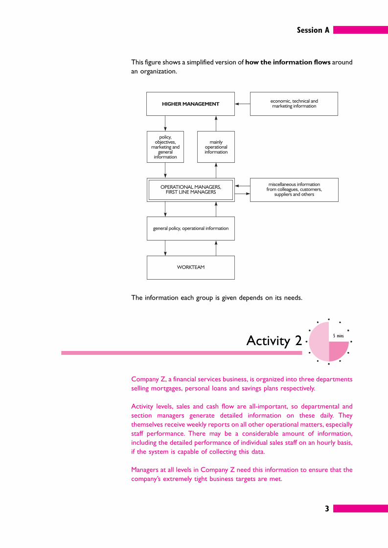
This figure shows a simplified version of how the information flows around
an organization.
The information each group is given depends on its needs.
Activity 25 mins
Company Z, a financial services business, is organized into three departments
selling mortgages, personal loans and savings plans respectively.
Activity levels, sales and cash flow are all-important, so departmental and
section managers generate detailed information on these daily. They
themselves receive weekly reports on all other operational matters, especially
staff performance. There may be a considerable amount of information,
including the detailed performance of individual sales staff on an hourly basis,
if the system is capable of collecting this data.
Managers at all levels in Company Z need this information to ensure that the
company’s extremely tight business targets are met.
Session A
4
How much of this performance information does higher management need to
receive?
What, if anything, do the workteam members need to be told?
Generally, the top managers (the senior executives) of an organization try to
keep clear of operational details. They don’t have time to wade through it, and
it isn’t their job anyway. It is the responsibility of operational management to
deliver in key result areas.
What top management want is bottom-line information about key areas such
as sales, revenue and cash flow. They will not be interested in operational
matters and the detail of staff performance, productivity and so on unless they
think there is a problem that may affect the bottom line.
Being in the financial services industry, Company Z is very sensitive to some
external developments, especially the constantly moving exchange rates, bank
interest rates and share prices. The internal financial information has to be
measured against these external data. The two sets of data can be combined
to provide instant updates to financial forecasts.
The workteams also need information. They are working under pressure to
meet targets, and they need to know how they are doing. Most such
organizations would probably give them feedback at least weekly.
Activity 33 mins
What value is there in providing workteams with information about
performance?
Session A
5
It is a matter of motivating the workteam. People need to know what they are
expected to achieve, and how well they are doing.
This could be done with large charts showing targets and actual performance.
This information could help motivate them to better performance.
There are many multi-branch organizations where lots of geographically
separate units are basically doing the same thing, for example estate agents,
betting shops, retailers or tyre fitters. Here it is useful for both managers and
workteams to be told how other units are performing. If District 9 can cut
shrinkage to 3%, so can others. If the Glasgow branch can exceed its sales
targets for the new product by 29%, then so can others.
Again, league tables and charts can help stimulate competitiveness and
motivate people to greater efforts.
2.2 Decision-making
Whatever the management level, decision-making in an organization typically
has six stages, each involving information.
1 Problem recognition
The decision maker needs to know that there is a problem in the first place,
and normally further information is required.
� Quantitative information: it is much easier to make decisions if they
can be put in numerical terms: doing it this way will take five hours,
whereas doing it that way will only take three; this will cost £2,000 whereas
that will cost £1,750, and so on.
� Qualitative or intangible information: it probably won’t be possible to
put all of the things affecting a decision into precise numbers, for example
the effect on team spirit. Just because these things are not quantifiable
doesn’t mean they are not relevant to the decision.
2 Problem definition and structuring
Once you have further information you need to analyse it so that the problem
can be defined more precisely.
For example, suppose your company has falling sales. The fall in overall sales
revenue would alert you to the problem, but further information would be
needed to identify exactly where the falls were occurring. If you discovered
Session A
6
that sales of product A in the north region are falling and investigated this, the
problem could perhaps be expressed as a question, as follows.
‘Decline of sales of product A in north region, due to new competitor: how
can the decline be reversed?’
Unfortunately, many problems will be more vague than this. There are a
number of ways of defining and structuring a problem, for exmple:
� as a mathematical model;
� as a scenario in ‘what-if?’ analysis (probably using a spreadsheet);
� using a decision tree.
3 Identifying alternative courses of action
Usually a problem will have a number of possible solutions, and once the
alternative courses of action are identified, more information is needed about
each of them so they can be assessed.
Suppose your company wants to review the price of product A in the north
region: information will be needed about the effect of particular price levels
on demand for the product.
Such information can include external information such as market research
(demand at a particular price) and internal information such as the cost of the
product and how it could be reduced. Once again, in this kind of decision it
may be useful to use modelling techniques.
4 Making and communicating the decision
The decision will be made after weighing up the information about each of the
alternative solutions. (Note that a choice not to do something is still a
decision.)
A decision is useless if nobody knows about it. You may decide to lower the
price of product A and run an intensive advertising campaign in the north
region, but nothing will happen unless the packaging is changed and the
advertising department is informed. That may seem obvious, but it is all too
common for decisions taken in one part of an organization to come as a
complete surprise to others who needed to know!
5 Implementing the decision
The decision is then put into action or implemented. Implementation involves
lots of planning and review. Information is needed to make sure that
everything is going according to plan.
Session A
7
6 Review of the effects of the decision
After a decision has been made and implemented, yet more information is
needed about how well it worked. If it doesn’t achieve the desired effects,
more decisions will be needed. Whether or not it achieves the desired effects,
managers can add this whole decision-making process to their experience and
make faster, better (and better-informed) decisions in the future.
Activity 410 mins
This Activity may provide the basis of appropriate evidence for your S/NVQ
portfolio. If you are intending to take this copurse of action, it might be better
to write your answers on separate sheets of paper.
Think of a fairly major new decision affecting the work of your workteam that
has been taken and implemented while you have worked there. See if you can
analyse it in terms of the six decision-making stages. What gave rise to the
decision in the first place? What were the choices? What information was
needed to help make the decision and what tools and techniques were used
to analyse the information? Did it have the desired effect?
2.3 Effective decision-making
So managers need information to help them throughout the decision-making
process.
Decisions made without information are risky. Experience can sometimes
make them less risky, because it means knowing what usually happens in a
particular situation. Unfortunately, this isn’t always enough.
S/NVQ D1.1
Session A
8
Activity 55 mins
Ashlar Accessories Ltd received a faxed order from a customer for 25 laser
printer toner cartridges. The customer service clerk couldn’t make out the
fax clearly and wasn’t sure whether the order stated Series 4 or Series 5
machines. He took the order to the section manager, who looked briefly at
the order and told him to send Series 4 cartridges. ‘That could be a four’, she
said. ‘Anyway, they’ve always had Series 4 in the past, so that’s probably what
they want this time’.
The section manager’s decision is based on past experience of this customer,
and probably she is right.
Would you make the same decision?
If not, what would you have done?
This is not a trivial matter. Laser toner cartridges are quite expensive items,
and this order may have a total ex-VAT value of over £1,000. It will also be
fairly bulky, so there will be a significant delivery cost. It would pay to make
sure the order was right.
Even if the order was small, there is customer satisfaction to consider.
Customers do not like receiving the wrong goods, even if it is their own fault!
An experienced manager should have known that it pays to check.
What was the information on which the section manager based her decision?
� First, there was information which was correct, but referred to past
experience: this customer had previously ordered Series 4 cartridges.
However, what was right in the past may be wrong now. Perhaps the
customer has upgraded to Series 5 machines.
� Second, there was information that was uncertain – the hard-to-read fax
message.
Either of these presents a problem: information that is old, uncertain, or
perhaps incomplete, can lead to wrong decisions being made. And where
money, time and customer service are involved, it pays to be certain. A simple
phone call would have removed all doubt.
Session A
9
2.4 Costs and benefits of seeking
information
In practice, managers rarely have all the information they might like when
making decisions. But is it always worth the effort and cost of obtaining more?
Let’s look at a couple of ways a manager might decide.
Activity 65 mins
Rashid was due to give a presentation on the other side of town. Just as he
was about to leave, he remembered that there was no spare bulb for the
overhead projector He ran down to the technical department and asked
for a spare. What model is it?’, they asked, but Rashid couldn’t remember.
‘Oh well – you’d better take one of these’, they said. ‘It fits most types so it
should be OK.’
What considerations would you weigh up when making a decision of this
kind?
Rashid is in a hurry, so he has to weigh up two quite complex options.
� Option 1: go and get reliable information.This will take time, and there
will be a risk of being late for the presentation.
� Option 2: take a bulb which may not work. The risk here is that if the
original bulb fails, the replacement may not work, and the presentation will be
ruined.
Rashid can only choose one option, so in each case he needs to consider two
separate factors that will contribute to the ‘risk score’ and allocate a value to
each in regard to:
� the probability of the risk becoming a reality (say 50% in the case of option 1);
� the seriousness of this on a scale of 1 to 100 (say 40 out of 100, or 40% for
option 1).
Session A
10
He then needs to multiply the two factors together, which in this case gives
us a final risk score of 50 × 40 = 20%. This means that there is a one-in-five
chance of a bad outcome for option 1.
In option 2, the risk of the original bulb failing is about 1 in 20 or 5%, and the
risk of the spare not working is 1 in 4 or 25%. This gives a total risk of 5 × 25
= 1.25%. The seriousness of this happening quite high, say 80%, but the risk
score still works out quite low: 1.25 × 80 = 1% or a one in a hundred chance
of a bad outcome for option 2.
In this case, then, it is not worth Rashid’s while to get accurate information,
because the cost of the time taken to do so produces a higher risk
score.
Of course, Rashid did not really have time to sit down and work his
decision out on paper. But there is often a case for doing so, when the
stakes are high.
Another way to evaluate whether it is worth getting accurate information is
to balance out the pros and cons, or positive and negative factors, using
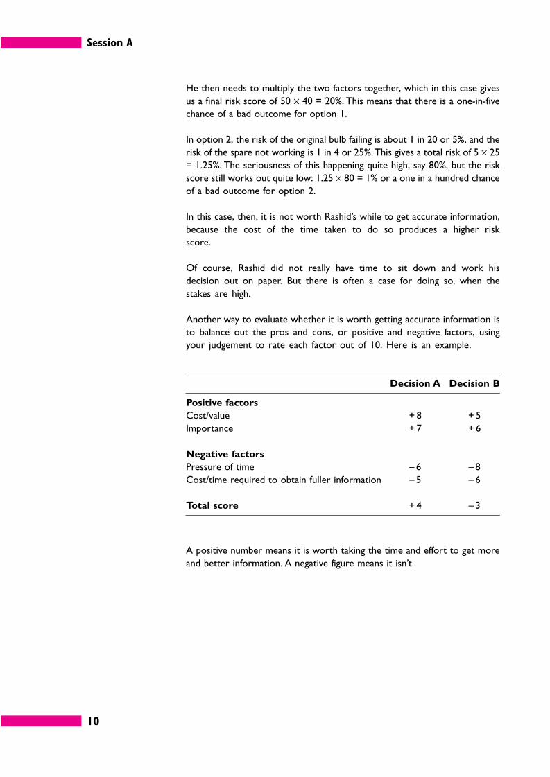
your judgement to rate each factor out of 10. Here is an example.
Decision A Decision B
Positive factors
Cost/value + 8 + 5
Importance + 7 + 6
Negative factors
Pressure of time – 6 – 8
Cost/time required to obtain fuller information – 5 – 6
Total score + 4 – 3
A positive number means it is worth taking the time and effort to get more
and better information. A negative figure means it isn’t.
Session A
11
2.5 How much information?
If you have too little information, you cannot reach a good-quality decision.
You need to acquire more information – but how much?
For example, suppose a first line manager named Ronald was trying to decide
which of three different specifications for fire extinguishers would be most
appropriate for his office, which contained a lot of electrical equipment. He
read through the manufacturers’ literature but wasn’t sure. Did it tell him
everything he wanted to know? He called the local Fire Prevention
Department for advice. They faxed him some further documents. Still Ronald
felt uncertain. He wrote back to the manufacturers asking some technical
questions and asked one of his team to search the Internet for any relevant
articles.
He contacted the British Standards Institution, the Department of Trade and
Industry, the Fire Protection Association and his company’s insurers, all of
whom sent him more information. Finally, he got hold of some obscure
research reports, which he found very hard to understand. In the end, he
spent more than two whole days studying the information before he made his
decision.
Choosing the right fire extinguishers is an important decision, and it is vital to
have reliable information. But, as we have seen, information has a cost to set
against its value:
� it may have to be paid for;
� it takes time to locate and acquire;
� it takes time to read and understand.
If Ronald earns £20,000 a year, with additional costs taking his total cost to his
employer to around £40,000, that works out at over £160 per working day.
If it has taken him more than two days to study the fire extinguisher issue, the
cost of his time alone is probably over £320. To this must be added the time
of the other team member involved, other colleagues, phone calls, postage,
and so on.
Then we have to consider the cost of the things Ronald could have been doing
in that time – perhaps more important and valuable tasks.
Was Ronald spending his time cost-effectively?
Cost
Info
rmat
ion
Info
rmat
ion
Info
rmat
ion
Cost
Valu
e
Valu
e
A C
Cost
Valu
e
B
Cost
Info
rmat
ion
Valu
e
Session A
12
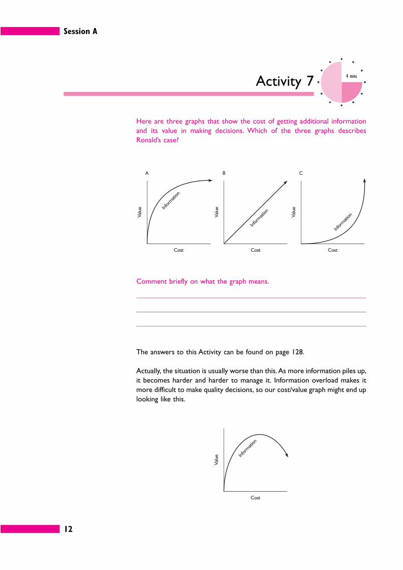
Activity 74 mins
Here are three graphs that show the cost of getting additional information
and its value in making decisions. Which of the three graphs describes
Ronald’s case?
Comment briefly on what the graph means.
The answers to this Activity can be found on page 128.
Actually, the situation is usually worse than this. As more information piles up,
it becomes harder and harder to manage it. Information overload makes it
more difficult to make quality decisions, so our cost/value graph might end up
looking like this.
Session A
13
Like so many things, the cost-value curve for information tends to follow the
80–20 rule, which is to say that 20% of the information provides 80% of the
value. In many cases, any extra information collected will merely reinforce and
confirm what was learned from the most useful 20%. This is probably the case
in Ronald’s investigation of fire extinguishers.
This does not usually mean that the first 20% of the information you obtain
is the most valuable. The valuable bits may be mixed up with all the rest. So
how do you decide which information is worth focusing on?
Activity 84 mins
We can pin down what we mean by ‘quality information’ by considering what
others expect when you provide them with information.
Suppose you have to report on a problem that has arisen in your department.
Jot down six words that describe what the information you provide should be
like.
Managers use information to answer questions and, for them, quality
information is that which does this quickly, simply, accurately and reliably. This
means it must be relevant and thorough, but concise.
Too much information makes life more difficult, so you need a strategy for
focusing in quickly on what you need to know.
Let’s assume you have a pile of material on paper: notes you have made on
interviews and verbal reports, written reports, data printed out from the
computer system, memos, articles, background documents, statistics and so
on.
There is too much to study in detail, but there might be important
information lurking in any of these items.
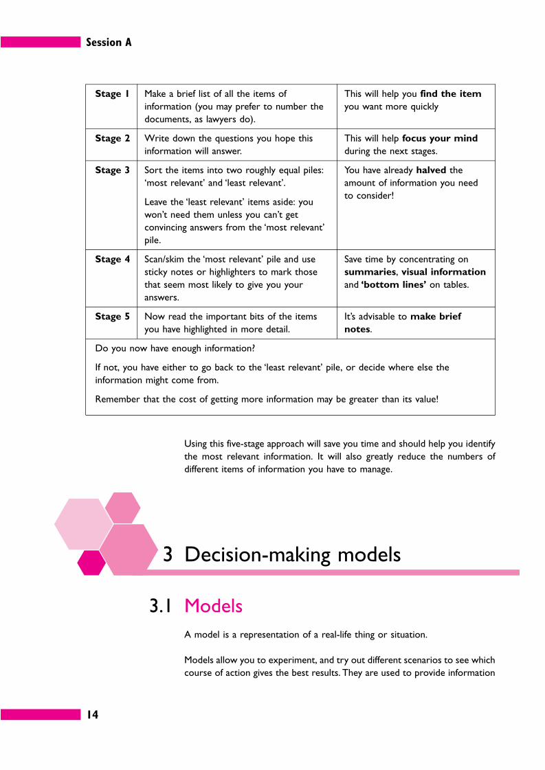
Here is a strategy for managing paperwork.
Session A
14
Stage 1 Make a brief list of all the items of
information (you may prefer to number the
documents, as lawyers do).
This will help you find the item
you want more quickly
Stage 2 Write down the questions you hope this
information will answer.
This will help focus your mind
during the next stages.
Stage 3 Sort the items into two roughly equal piles:
‘most relevant’ and ‘least relevant’.
Leave the ‘least relevant’ items aside: you
won’t need them unless you can’t get
convincing answers from the ‘most relevant’
pile.
You have already halved the
amount of information you need
to consider!
Stage 4 Scan/skim the ‘most relevant’ pile and use
sticky notes or highlighters to mark those
that seem most likely to give you your
answers.
Save time by concentrating on
summaries, visual information
and ‘bottom lines’ on tables.
Stage 5 Now read the important bits of the items
you have highlighted in more detail.
It’s advisable to make brief
notes.
Do you now have enough information?
If not, you have either to go back to the ‘least relevant’ pile, or decide where else the
information might come from.
Remember that the cost of getting more information may be greater than its value!
Using this five-stage approach will save you time and should help you identify
the most relevant information. It will also greatly reduce the numbers of
different items of information you have to manage.
3 Decision-making models
3.1 Models
A model is a representation of a real-life thing or situation.
Models allow you to experiment, and try out different scenarios to see which
course of action gives the best results. They are used to provide information
Session A
15
for decision-making when experimenting with real life is impossible, often
because it depends on the future and on the actions of others.
There are a number of different sorts of model, such as an architect’s
miniature model of a building development. The developers will want to see
something that gives them an idea of what they will be getting for the millions
of pounds they are going to spend, but it would obviously be impracticable
and pointlessly expensive to build a full-scale trial version, using genuine
materials.
However, in everyday business, decision-making mathematical models are
the most commonly used. These represent a real-life situation in terms of
mathematical relationships and formulae.
A mathematical model consists of several interrelated variables. A variable is
simply an item in the model that has a value.
There are different ways of categorizing variables.
� Input variables and output variables. Input variables are the variables in
the model that interact with other variables to produce the end result, or
‘output’ from the model. The items of output information are output
variables. The value of outputs will depend on the value of input variables, and
how they inter relate.
For instance, your ideal monthly income might be £5,000, but you might
recognize that you will only earn 30% of that. The input variables are inter
related by multiplying them together to produce the output variable.
Input variable A: £5,000; Input variable B: 30%
Inter relation formula: A × B
Output variable: £1,500
� Controlled and non-controlled variables. Controlled variables are input
variables whose value you can control, at least to some extent. Non-
controlled variables in a model are items that you have no power to change.
For instance, you can choose whether to buy supplies from an expensive
supplier or a cheaper one, but you cannot control the rate of VAT.
Session A
16
Activity 92 mins
Your ideal monthly income is £3,000 but you know that you will only earn
70% of that – because you are on a fixed salary!
Identify or calculate the variables in this scenario.
Input variable(s):
Output variable(s):
Controlled variable(s):
Non-controlled variable(s):
The answers to this Activity can be found on page 128.
3.2 Examples of business models
Models can be used to help with many kinds of business decision. Here are a
number of possibilities.
� Inventory models. These help to decide the ideal amounts for stocks of
materials or finished goods held, ordering quantities and re-order levels. The
EOQ model, a well-known example, follows below.
� Resource allocation models. These help the manager to share out scarce
resources between competing activities, for example to decide how much
time members of the workteam should spend on task A, how much on task
B, and so on. We’ll look at a simple example later in the session. More
complex problems need a mathematical technique called linear program-
ming, but that is a little too involved for this book. Another approach is to
use project management techniques such as Gantt charts. We will be
looking at these in Session C.
� Budget models. These are used to prepare budgets for an organization,
such as a cash budget or a breakeven model. Usually you would do this using
a spreadsheet (there’s an example later in the session), and perhaps some
forecasting models such as those discussed in Session B.
� Queuing models. These simulate arrivals at and departures from a servicing
point such as a till in a shop, and show how long the queues will get,
Session A
17
depending on how many tills you have open. This can quickly get very complex
and a computer is the only way to develop such a model effectively.
� Business plan models. These are models used for overall planning by senior
managers. Variables would include capital investments, sources of finance,
interest rates, assets, liabilities, sales, costs, growth rates, and so on.
There are also modelling techniques that can be used in combination with any
of the above, or simply to help you define a problem more clearly.
Probabilities/expected values and decision trees are the best examples,
and you’ll learn the basics of these techniques before you have finished this
session.
3.3 The EOQ model
One of the best-known business decision-making models is the Economic
Order Quantity (EOQ) model. You may not deal with stocks in your job, but
the model is a very good example of the way mathematical models can help
with decisions.
The EOQ model is used to decide what quantity of stock should be ordered
so as to minimize the total costs associated with holding and ordering stock.
For instance, if you order 20,000 items you will need to have somewhere to
keep them, and space costs money. If you order 200 items you’ll need a lot
less space, but you will have to go through the process of ordering items 100
times – and that administrative time costs money.
There is a formula (a mathematical model) for calculating the EOQ.
EOQ = ����2C0D
Ch
� C0 = cost of ordering stocks from a supplier;
� D = demand during the time period;
� Ch = cost of holding one unit of stock for one time period.
You need not worry about why the formula works. All you need to do is plug
the relevant numbers into it and work out the result.
Session A
18
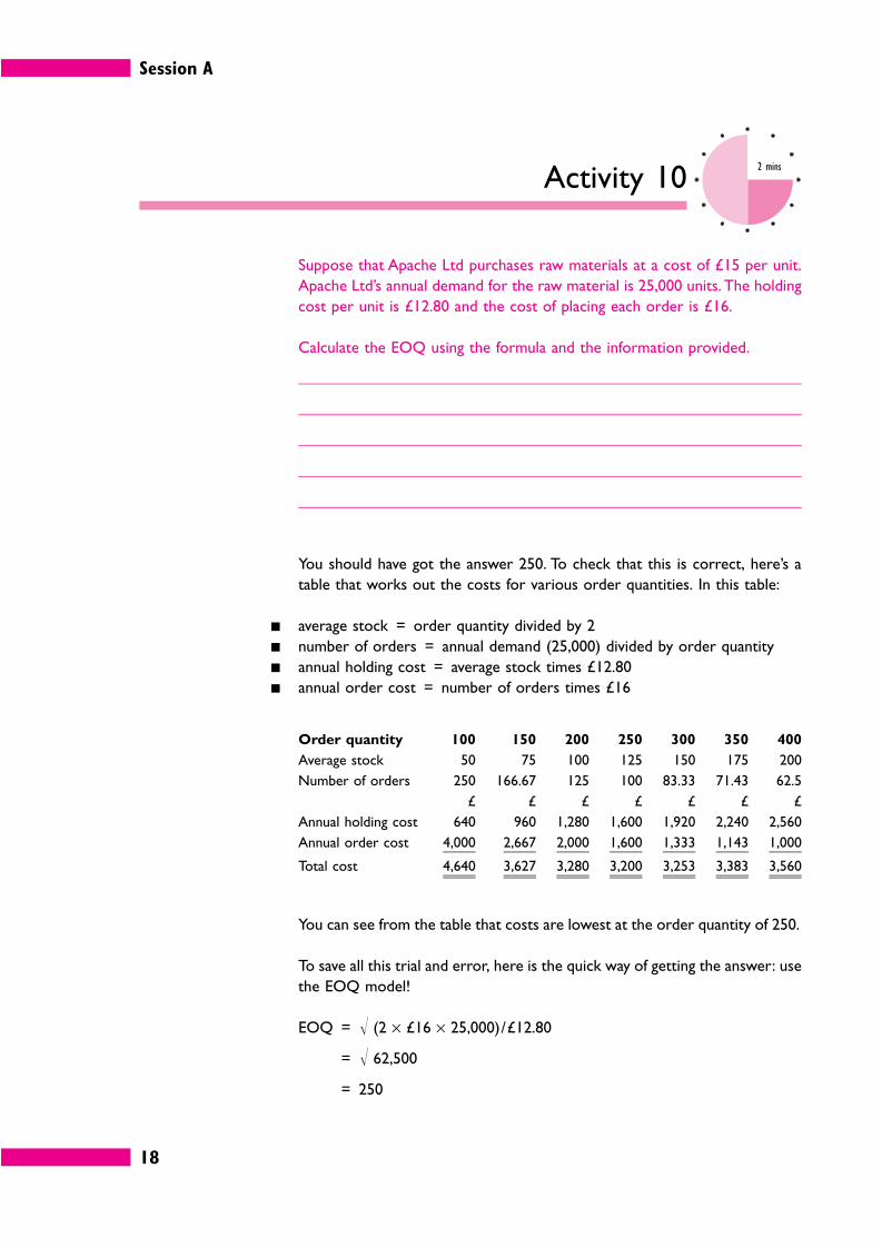
Activity 102 mins
Suppose that Apache Ltd purchases raw materials at a cost of £15 per unit.
Apache Ltd’s annual demand for the raw material is 25,000 units. The holding
cost per unit is £12.80 and the cost of placing each order is £16.
Calculate the EOQ using the formula and the information provided.
You should have got the answer 250. To check that this is correct, here’s a
table that works out the costs for various order quantities. In this table:
� average stock = order quantity divided by 2
� number of orders = annual demand (25,000) divided by order quantity
� annual holding cost = average stock times £12.80
� annual order cost = number of orders times £16
Order quantity 100 150 200 250 300 350 400
Average stock 50 75 100 125 150 175 200
Number of orders 250 166.67 125 100 83.33 71.43 62.5
£ £ £ £ £ £ £
Annual holding cost 640 960 1,280 1,600 1,920 2,240 2,560
Annual order cost 4,000 2,667 2,000 1,600 1,333 1,143 1,000
Total cost 4,640 3,627 3,280 3,200 3,253 3,383 3,560
You can see from the table that costs are lowest at the order quantity of 250.
To save all this trial and error, here is the quick way of getting the answer: use
the EOQ model!
EOQ = � (2 × £16 × 25,000)/£12.80
= � 62,500
= 250
Session A
19
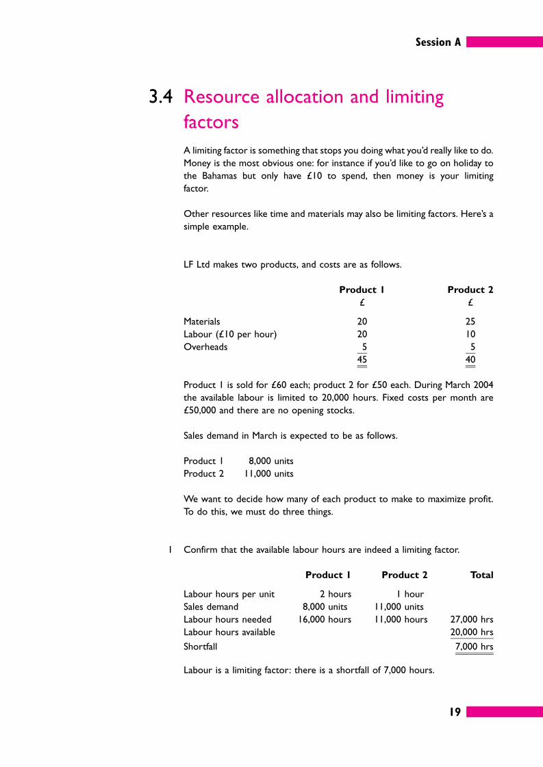
3.4 Resource allocation and limiting
factors
A limiting factor is something that stops you doing what you’d really like to do.
Money is the most obvious one: for instance if you’d like to go on holiday to
the Bahamas but only have £10 to spend, then money is your limiting
factor.
Other resources like time and materials may also be limiting factors. Here’s a
simple example.
LF Ltd makes two products, and costs are as follows.
Product 1 Product 2
£ £
Materials 20 25
Labour (£10 per hour) 20 10
Overheads 5 5
45 40
Product 1 is sold for £60 each; product 2 for £50 each. During March 2004
the available labour is limited to 20,000 hours. Fixed costs per month are
£50,000 and there are no opening stocks.
Sales demand in March is expected to be as follows.
Product 1 8,000 units
Product 2 11,000 units
We want to decide how many of each product to make to maximize profit.
To do this, we must do three things.
1 Confirm that the available labour hours are indeed a limiting factor.
Product 1 Product 2 Total
Labour hours per unit 2 hours 1 hour
Sales demand 8,000 units 11,000 units
Labour hours needed 16,000 hours 11,000 hours 27,000 hrs
Labour hours available 20,000 hrs
Shortfall 7,000 hrs
Labour is a limiting factor: there is a shortfall of 7,000 hours.
Session A
20
2 Identify the gross profit earned by each product per unit of the scarce
resource, that is, per labour hour.
Product 1 Product 2
£ £
Sales price 60 50
Variable cost 45 40
Unit gross profit 15 10
Labour hours per unit 2 hrs 1 hr
Gross profit per labour hour
(i.e. per unit of limiting factor)
£7.50 £10
Although product 1 has a higher gross profit per unit than product 2, two
product 2 units can be made in the time it takes to make one product 1.
Because labour is in limited supply it is more profitable to make product 2
than product 1.
3 Work out the production budget. We will make enough product 2 to meet
the full sales demand. The remaining labour hours available will then be used
to make product 1.
Product Demand Hours
required
Hours
available
Priority for
manufacture
Product 2 11,000 11,000 11,000 1st
Product 1 8,000 16,000 9,000 (balance) 2nd
27,000 20,000
Product Units Hours
needed
Gross
profit
Total
£
Product 2 11,000 11,000 10 110,000
Product 1 (balance) 4,500 9,000 15 67,500
20,000 177,500
Less fixed costs 50,000
Profit 127,500
Just to confirm that it is not more profitable to begin by making as many units
as possible of the product with the bigger unit gross profit, suppose you make
8,000 units of product 1 (£15 per unit), using up 16,000 hours and 4,000 units
of product 2 (£10 per unit) in the remaining 4,000 hours. Profit would be
(£8,000 × £15) + (£4,000 × £10) – fixed costs = £160,000 – £50,000. Profit
would be only £110,000.
Session A
21
Although it may seem tempting, unit gross profit is not the best way to decide
priorities. As soon as you realize it takes two hours to earn £15 from a
product 1 but only one hour to earn £10 from a product 2 it is obvious that
product 2 makes better use of the limited resource.
Activity 118 mins
LF Ltd makes two products, and costs are as follows.
Product 1 Product 2
£ £
Materials 20 25
Labour (£10 per hour) 20 10
Overheads 4 5
44 40
Product 1 is sold for £60 each; product 2 for £50 each. Sales demand in April
is expected to be 8,000 units of product 1 and 11,000 units of product 2.
During April 2004 the available labour is limited to 35,000 hours. Materials
cost £5 per unit, and only 70,000 units can be purchased due to a world
shortage.
How many of each product should LF Ltd make to maximize profit?
Use a separate sheet for your answer.
The answer to this Activity can be found on page 128.
3.5 Simple spreadsheet models or ‘what
if ’ analysis
Because they generally involve numbers and formulae and logic, many
business models are ideally suited for computerization. Complex models will
need a specialized computer package, but the familiar spreadsheet can often
be used for day-to-day problems.
Session A
22
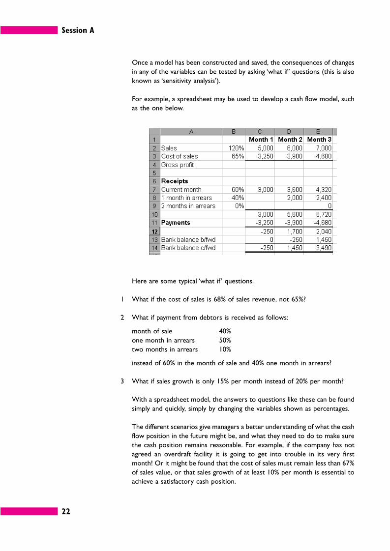
Once a model has been constructed and saved, the consequences of changes
in any of the variables can be tested by asking ‘what if ’ questions (this is also
known as ‘sensitivity analysis’).
For example, a spreadsheet may be used to develop a cash flow model, such
as the one below.
Here are some typical ‘what if ’ questions.
1 What if the cost of sales is 68% of sales revenue, not 65%?
2 What if payment from debtors is received as follows:
month of sale 40%
one month in arrears 50%
two months in arrears 10%
instead of 60% in the month of sale and 40% one month in arrears?
3 What if sales growth is only 15% per month instead of 20% per month?
With a spreadsheet model, the answers to questions like these can be found
simply and quickly, simply by changing the variables shown as percentages.
The different scenarios give managers a better understanding of what the cash
flow position in the future might be, and what they need to do to make sure
the cash position remains reasonable. For example, if the company has not
agreed an overdraft facility it is going to get into trouble in its very first
month! Or it might be found that the cost of sales must remain less than 67%
of sales value, or that sales growth of at least 10% per month is essential to
achieve a satisfactory cash position.
Session A
23
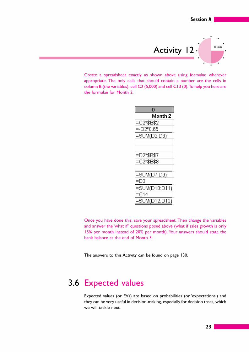
Activity 1210 mins
Create a spreadsheet exactly as shown above using formulae wherever
appropriate. The only cells that should contain a number are the cells in
column B (the variables), cell C2 (5,000) and cell C13 (0). To help you here are
the formulae for Month 2.
Once you have done this, save your spreadsheet. Then change the variables
and answer the ‘what if ’ questions posed above (what if sales growth is only
15% per month instead of 20% per month). Your answers should state the
bank balance at the end of Month 3.
The answers to this Activity can be found on page 130.
3.6 Expected values
Expected values (or EVs) are based on probabilities (or ‘expectations’) and
they can be very useful in decision-making, especially for decision trees, which
we will tackle next.
Session A
24
Expected values work on the idea that if the probability of something
happening is p, and the expected number of times that it will occur is n then
the expected value (EV) is n × p.
For instance, suppose two in every hundred products you sell are returned by
customers because of a fault. Or to put it another way, it seems that the
probability that a component in the product will be faulty is 0.02 (2/100).
So how many returns would we expect to get if we sold 5,000 products?
EV = 5,000 × 0.02
= 100 returns to be expected.
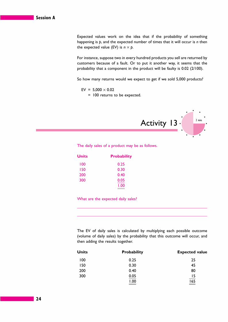
Activity 132 mins
The daily sales of a product may be as follows.
Units Probability
100 0.25
150 0.30
200 0.40
300 0.05
1.00
What are the expected daily sales?
The EV of daily sales is calculated by multiplying each possible outcome
(volume of daily sales) by the probability that this outcome will occur, and
then adding the results together.
Units Probability Expected value
100 0.25 25
150 0.30 45
200 0.40 80
300 0.05 15
1.00 165
Session A
25
In the long run, the expected value should be approximately 165 units, if the
event occurs many times over. In the example above, we do not expect sales
on any one day to be 165 units, but in the long run, over a large number of
days, and assuming we have the probabilities correct, average sales should
equal 165 units a day.
3.7 Decision-making and expected values
Suppose you have to choose between some options and you are looking for
the one that gives the best profit for your organization. You might think you’d
simply choose the one with the highest expected value, but there are some
drawbacks if you do that.
Activity 145 mins
Suppose there are two projects with the following possible profits.
Project A Project B
Probability Profit/(loss) Probability Profit/(loss)
£ £
0.75 12,000 0.1 –4,800
0.25 14,400 0.2 12,000
0.5 16,800
0.2 19,200
Which project should be chosen?
Session A
26
The EV for each project is as follows.
Project A Project B
Probability Profit/(loss) EV Probability Profit/(loss) EV
£ £ £ £
0.75 12,000 9,000 0.1 –4,800 –480
0.25 14,400 3,600 0.2 12,000 2,400
0.5 16,800 8,400
0.2 19,200 3,840
12,600 14,160
Project B has a higher EV. This means that, on the balance of probabilities, it
could offer a better profit than A, and so is arguably a better choice.
On the other hand, if you look at the table, the minimum return from project
A would be £12,000 whereas with B there is a 0.1 chance of a loss of £4,800.
So project A might be a safer choice.
3.8 Decision trees
Complex problems need a clear logical approach to make sure that all
possible choices and outcomes are taken into account.
Decision trees are a useful way of working through and visualizing such
problems.
Decision trees are drawn from left to right, and so a decision tree will start
like this.
The square is the decision point, and the ‘branches’ A, B, C and D are four
different choices. For example, your choices might be (A) to use cash to buy
new computer equipment; (B) get a loan to buy it; (C) hire the equipment; or
(D) continue to use existing equipment.
Session A
27
If a choice can have only one outcome, the branch of the decision tree for that
alternative is complete. Usually, though, the choice will have several possible
outcomes. We show this on a decision tree by putting in an outcome point
(a circle) with each possible choice shown as a subsidiary branch.
The probability of each outcome occurring is written on the relevant
branch.
In the example above, there are two options facing the decision-maker, A and
B. If A is chosen there is only one possible outcome, but if B is chosen, there
are two possible outcomes, high profits (0.7 probability) or low profits (0.3
probability).
Activity 152 mins
In the example above, suppose you are certain that option A will give a profit
of £25,000, but you are not sure whether option B will give a profit of £30,000
or £10,000. Which is the best option to choose?
The answer is option A, because option B gives an EV of (£30,000 × 0.7) +
(10,000 × 0.3) = £24,000.
In this simple case we didn’t really need to draw a diagram, but when there
are lots of choices and options decision trees can be very helpful.
For example, sometimes, a decision taken now will mean that other decisions
have to be made in the future. Say you have to choose between option A and
option B, and depending on the outcome of that decision, you will later have
to make a choice between C and D or else a choice between E and F.
Session A
28
If this is the problem you can draw a decision tree like this.
The diagram helps you to visualize and understand this problem much more
clearly than the words.
That’s enough theory: let’s look at a full scale example.
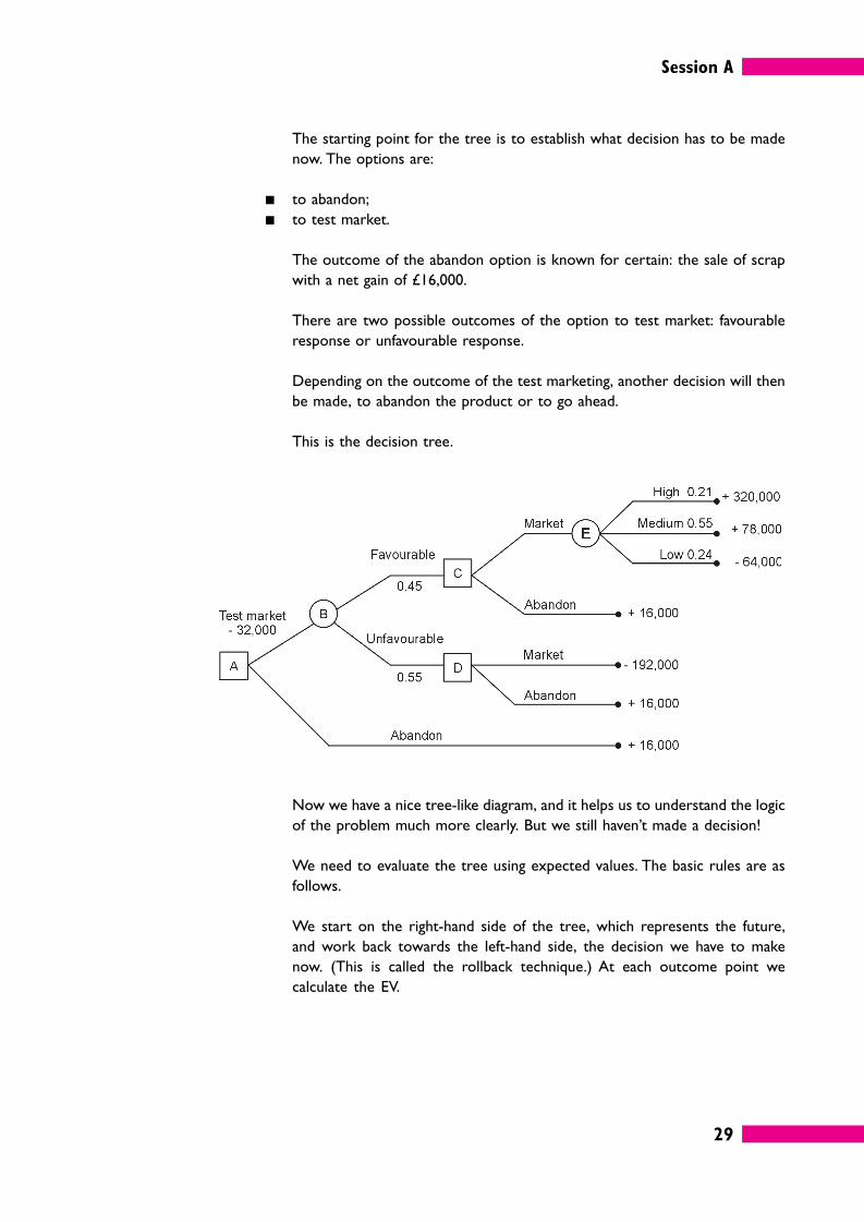
Activity 1615 mins
Arbor Ltd is considering developing a new product. The company can either
test market the product or abandon it.
If the company test markets it, the cost will be £32,000. The market response
could be either favourable or unfavourable with probabilities of 0.45 and 0.55.
If the market response is favourable the company could market the product
full scale, or they could still abandon the product.
If it markets the new product full scale, the outcome might be low, medium
or high demand. The net gains (or losses) would be £64,000, £78,000 or
£320,000 respectively and these outcomes have probabilities of 0.21, 0.55 and
0.24 respectively.
If the result of the test marketing is unfavourable but the company goes ahead
and markets the product anyway, estimated losses would be £192,000.
If, at any point, the company abandons the product, there would be a net gain
of £16,000 from the sale of scrap.
Without looking at our answer see if you can draw a decision tree for the
problem faced by Arbor Ltd. Include figures for cost, loss or profit on the
appropriate branches of the tree. You might need to try several times, so use
a separate sheet of paper for your answer.
Session A
29
The starting point for the tree is to establish what decision has to be made
now. The options are:
� to abandon;
� to test market.
The outcome of the abandon option is known for certain: the sale of scrap
with a net gain of £16,000.
There are two possible outcomes of the option to test market: favourable
response or unfavourable response.
Depending on the outcome of the test marketing, another decision will then
be made, to abandon the product or to go ahead.
This is the decision tree.
Now we have a nice tree-like diagram, and it helps us to understand the logic
of the problem much more clearly. But we still haven’t made a decision!
We need to evaluate the tree using expected values. The basic rules are as
follows.
We start on the right-hand side of the tree, which represents the future,
and work back towards the left-hand side, the decision we have to make
now. (This is called the rollback technique.) At each outcome point we
calculate the EV.
Session A
30
At outcome point E (the right-hand-most point) the EV is as follows.
Sales £ £
High 320,000 0.24 76,800
Medium 78,000 0.55 42,900
Low –64,000 0.21 –13,440
106,260
This is the EV of the decision to market the product if the test shows
favourable response. You may like to write the EV on the decision tree itself,
at the appropriate outcome point (point E).
At decision point C, the choice is as follows.
� Full-scale marketing EV (the EV at point E) = + £106,260.
� Abandon = + £16,000.
Obviously the choice would be to market the product, and so the EV at
decision point C is + £106,260.
At decision point D, an unfavourable market reaction, the choice is as
follows.
� Market anyway: loss = –£192,000.
� Abandon = +£16,000.
Obviously, the choice would be to abandon, and so the EV at decision point
D is +£16,000.
The later decisions have therefore been made. If the original decision is to test
market, the company will market the product if the test shows favourable
customer response, and will abandon the product if the test results are
unfavourable.
Now we need to calculate the EV at outcome point B.
EV
£ £
Point C 106,260 0.45 47,817
Point D 16,000 0.55 8,800
56,617
Session A
31
Finally we compare the options at decision point A, which are as follows.
� Test: EV = EV at B minus test marketing cost = £56,617 – 32,000 = +£24,617
� Abandon = +£16,000
The choice at decision point A would be to test market the product because
it has a higher EV of profit. But there is a lot less in it than you may have
thought.
Activity 174 mins
In the case of Arbor Ltd (Activity 16) what would the decision have been if the
highest probable gains had been £140,000 and the probability of a favourable
report had been 0.75?
The answers to this Activity can be found on page 130.
As you’ve probably realized, evaluating decisions by using decision trees has
some limitations.
� The outcome with the highest EV may be the riskiest course of action.
� Managers may not be willing to take risks if they may result in losses.
� The probabilities are guesses, and they may well be wrong.
Session A
32
Self-assessment 110 mins
1 Say which of these two statements is correct and which is incorrect; give
reasons for your answer.
a Top management should know every detail of what is going on in their
organization.
b Workteams don’t necessarily need to know every detail about what is
going on in the wider organization, but it may be a good idea to keep them
well-informed.
2 What are the six stages of the decision-making process?
Stage 1
Stage 2
Stage 3
Stage 4
Stage 5
Stage 6
Session A
33
3 Complete this statement about the pros and cons of acquiring more
information by inserting the letter (A, B etc.) of the appropriate phrase.
Phrases:
A creates problems in itself
B obtaining, sorting and evaluating
C to make decisions
D acquiring more information
E we don’t have enough
We need information , but usually
information to make good decisions. That means , but too
much information , because the costs of
it can be greater than its value.
4 When a resource is in short supply there is a three step method for deciding
the best production strategy. What are the three steps?
Step 1:
Step 2:
Step 3:
5 A business decision model usually represents a real-life situation in terms of
. The model will consist of
. A model allows you to try out
to see .
Fill in the missing words.
6 Out of 260 working days last year, your workteam was one person short
through sickness on 23 days. If your workteam has 10 members including
yourself and everyone works seven hours a day, how many hours’ work would
you expect to get out of your workteam in a typical 22 working day month?
7 Fill in the missing words or phrases below using the appropriate term from
the list. You may need to use some terms more than once while you may not
use others at all. The terms are:
an outcome point; square; left; circle; a decision point; right
When drawing a decision tree a is used as the symbol for
, and a is used as the symbol for a decision
point. The branches from have probabilities assigned to them.
A decision tree is evaluated from to .
Answers to these questions can be found on page 124.
Session A
34
4 Summary
� Organizations function because people provide each other with information and act on it. The type of
information used by senior managers is different from the type used by operational managers.
� The decision-making process typically has six stages:
1 problem recognition;
2 problem definition and structuring;
3 identifying alternative courses of action;
4 making and communicating the decision;
5 implementing the decision;
6 reviewing the effects of the decision.
� Managers rarely have all the information they might like, but it is not always worthwhile to obtain extra
information. The costs should be weighed up against the benefits.
� Models in business are usually mathematical models consisting of variables and mathematical formulae.
� Examples of business models include inventory models, resource allocation models, budget models,
queuing models and business plan models.
� Probabilities, expected values and decision trees may be used to help define and evaluate complex
problems.
35
Session BAnalysing information
1 Introduction
Most of this session (and some of the next) is about how you can analyse
numerical information – how to analyse it in ways that will probably be very
familiar such as totals and percentages and how you can use basic statistics to
gain a better understanding of it.
You may have bad memories of statistics if you’ve ever done any before, but
don’t worry. Mostly we’ll be suggesting that you use a spreadsheet to do the
painful calculations – all you have to do is enter a few figures and understand
what the results mean.
We’ll also look at some of the tools available in spreadsheets and
spreadsheet databases that help you to sort, filter and analyse large amounts
of data at the touch of a button. Spreadsheets also have a charting tool that
can produce a wide variety of graphs and diagrams that help with data analysis,
but we’ll save that for Session C on data presentation.
Finally, we’ll spend a short while thinking about how non-numerical data –
generally words – can be analysed by imposing various structures on it and
using cross-references and indexes.
Session B
36
1.1 Data and information
Facts and figures are called data.
Information is processed data.
Items of data do not usually convey any meaning on their own. Here is an
example of data.
213 242 299 359 592
Activity 182 mins
What do these numbers and letters tell you?
The best that most people could say is that there are five numbers rising by
different amounts and ranging from 213 to 592. They could mean almost
anything: the number of passengers on different trains; the weekly wages of
five different employees. They could be dates (21 March, 24 February,
February 1999, and so on).
Even if you happened to know what these numbers are they don’t tell you
anything on their own without further analysis.
Information is data that has been analysed or processed in some way so
as to become meaningful, like this.
Country name International dialling code
Algeria 213
Congo 242
Greenland 299
Bulgaria 359
Guyana 592
This data has simply been organized into a table with column headings and
labels, but now you know exactly what it means.
The word ‘data’ is plural,
strictly speaking,
although most people
use it as a singular, at
least in ordinary speech.
If anyone ever corrects
you for using data as a
singular, ask them
whether they would say
‘The agenda for this
meeting is very long’ or
‘The agenda for this
meeting are very long’!
Session B
37
Activity 191 min
How could the data be even better organized?
The answer to this Activity can be found on page 131.
2 Analysing numerical data
Businesses generate extensive amounts of numerical data, for example
number of products sold, number of hours worked. Most of it also has a
price, so that it can be expressed in terms of money, and a date, so that
we know that we are talking about events this year (or month or week), not
some other period.
In most organizations this information is collected by the accounting system,
and modern accounting software has highly sophisticated reporting capabil-
ities. Analysing numerical data on a day-to-day basis may often simply be a case
of knowing which buttons to press.
In this section, we are concerned with the less routine tasks of management.
One example is analysing a collection of data that is not formally recorded by
the accounting system, for example how long it takes to do a set of tasks in a
new way. You may need to analyse it so that you can make some decision.
Preparing next year’s budget is a typical example: you have plenty of data
about this year to work with, but you need to know how typical it is, whether
the figures can be improved, how you can identify trends that will help you
forecast the future. For this you need to know a little about statistics.
Statistics is a word that frightens many people, and at an advanced level it can
get very difficult. Most business statistics, however, involve simple techniques
such as adding, subtracting multiplying and dividing. You did a fair bit of that in
Session A. And as you probably know, a spreadsheet can take almost all the
effort out of handling numbers.
EXTENSION 1
Managing Information and
Statistics by Roland Bee
and Frances Bee is
helpful for those needing
to know more about
this area of management.
Session B
38
Activity 2020 mins
Create a new folder on your computer with a name such as ‘Information_
in_Management_Session_B’. Each time you create a new spreadsheet for an
Activity in this session save the file with a name such as ‘Activity_20’.
To start off your folder create a spreadsheet that demonstrates that you
have the following basic skills. If necessary use the Help system in your
spreadsheet to find out how to do them. Print out any help pages you
use.
� Enter numbers and format them, for instance make them display as 1,234
(comma format) or 5.67 (to two decimal places) or as a percentage (25%
instead of 0.25).
� Enter dates such as 24/03/2004.
� Enter text.
� Select cells, copy and paste their contents and drag them to other parts of
the spreadsheet.
� Sum a column of numbers.
� Automatically fill in data based on adjacent cells.
� Multiply a column of numbers by the same figure using absolute cell
references (for instance, A1*$C$1, A2*$C$1).
Note down the name and location of your ‘basic skills’ spreadsheet file
here.
Session B
39
2.1 Ratios, indexes and percentages
It is often useful to measure one set of data against another to create a
ratio or index.
For example, a business that occupies 128,000m2 of floor space and turns
over £3,968,000 has a floor space to turnover ratio of 128:3,968. Last
year the ratio was 125:3,375, while the average for businesses of this type
was 1:36.
We can simplify these rather clumsy expressions by dividing the first number
into the second (for instance 3,968/128 = 31). This gives us:
� this year’s ratio (1:31);
� last year’s ratio (1:27);
� the average for businesses of this type (1:36).
By reducing all the ratios to the same numerical base (i.e. 1), we make
them easy to compare. This information shows us that the business is using
its floor space more efficiently than last year, but not as efficiently as its
competitors.
One of the best-known ratios is profitability, which is profit:capital
employed (it is also known as return on capital employed, or ROCE).
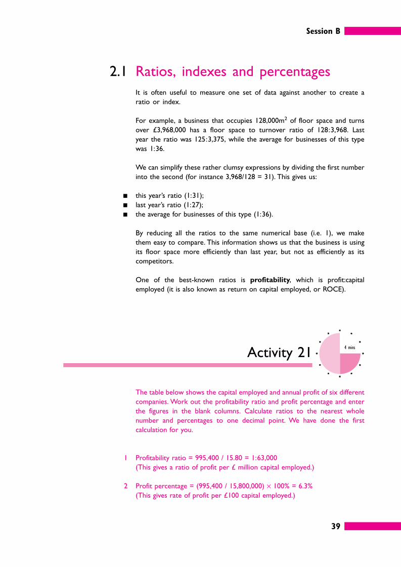
Activity 214 mins
The table below shows the capital employed and annual profit of six different
companies. Work out the profitability ratio and profit percentage and enter
the figures in the blank columns. Calculate ratios to the nearest whole
number and percentages to one decimal point. We have done the first
calculation for you.
1 Profitability ratio = 995,400 / 15.80 = 1:63,000
(This gives a ratio of profit per £ million capital employed.)
2 Profit percentage = (995,400 / 15,800,000) × 100% = 6.3%
(This gives rate of profit per £100 capital employed.)
Session B
40
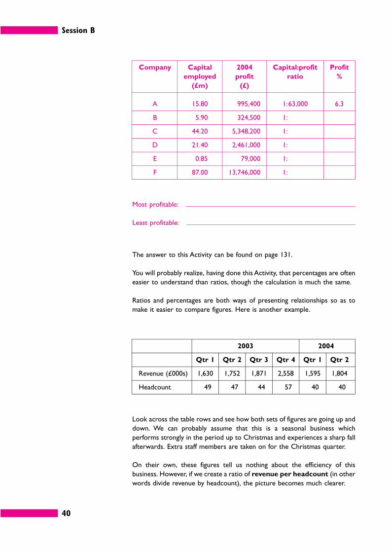
Company Capital
employed
(£m)
2004
profit
(£)
Capital:profit
ratio
Profit
%
A 15.80 995,400 1:63,000 6.3
B 5.90 324,500 1:
C 44.20 5,348,200 1:
D 21.40 2,461,000 1:
E 0.85 79,000 1:
F 87.00 13,746,000 1:
Most profitable:
Least profitable:
The answer to this Activity can be found on page 131.
You will probably realize, having done this Activity, that percentages are often
easier to understand than ratios, though the calculation is much the same.
Ratios and percentages are both ways of presenting relationships so as to
make it easier to compare figures. Here is another example.
2003 2004
Qtr 1 Qtr 2 Qtr 3 Qtr 4 Qtr 1 Qtr 2
Revenue (£000s) 1,630 1,752 1,871 2,558 1,595 1,804
Headcount 49 47 44 57 40 40
Look across the table rows and see how both sets of figures are going up and
down. We can probably assume that this is a seasonal business which
performs strongly in the period up to Christmas and experiences a sharp fall
afterwards. Extra staff members are taken on for the Christmas quarter.
On their own, these figures tell us nothing about the efficiency of this
business. However, if we create a ratio of revenue per headcount (in other
words divide revenue by headcount), the picture becomes much clearer.
Session B
41
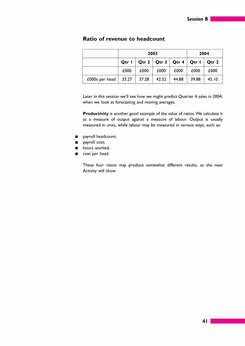
Ratio of revenue to headcount
2003 2004
Qtr 1 Qtr 2 Qtr 3 Qtr 4 Qtr 1 Qtr 2
£000 £000 £000 £000 £000 £000
£000s per head 33.27 37.28 42.52 44.88 39.88 45.10
Later in this session we’ll see how we might predict Quarter 4 sales in 2004,
when we look at forecasting and moving averages.
Productivity is another good example of the value of ratios. We calculate it
as a measure of output against a measure of labour. Output is usually
measured in units, while labour may be measured in various ways, such as:
� payroll headcount;
� payroll cost;
� hours worked;
� cost per head.
These four ratios may produce somewhat different results, as the next
Activity will show.
Session B
42
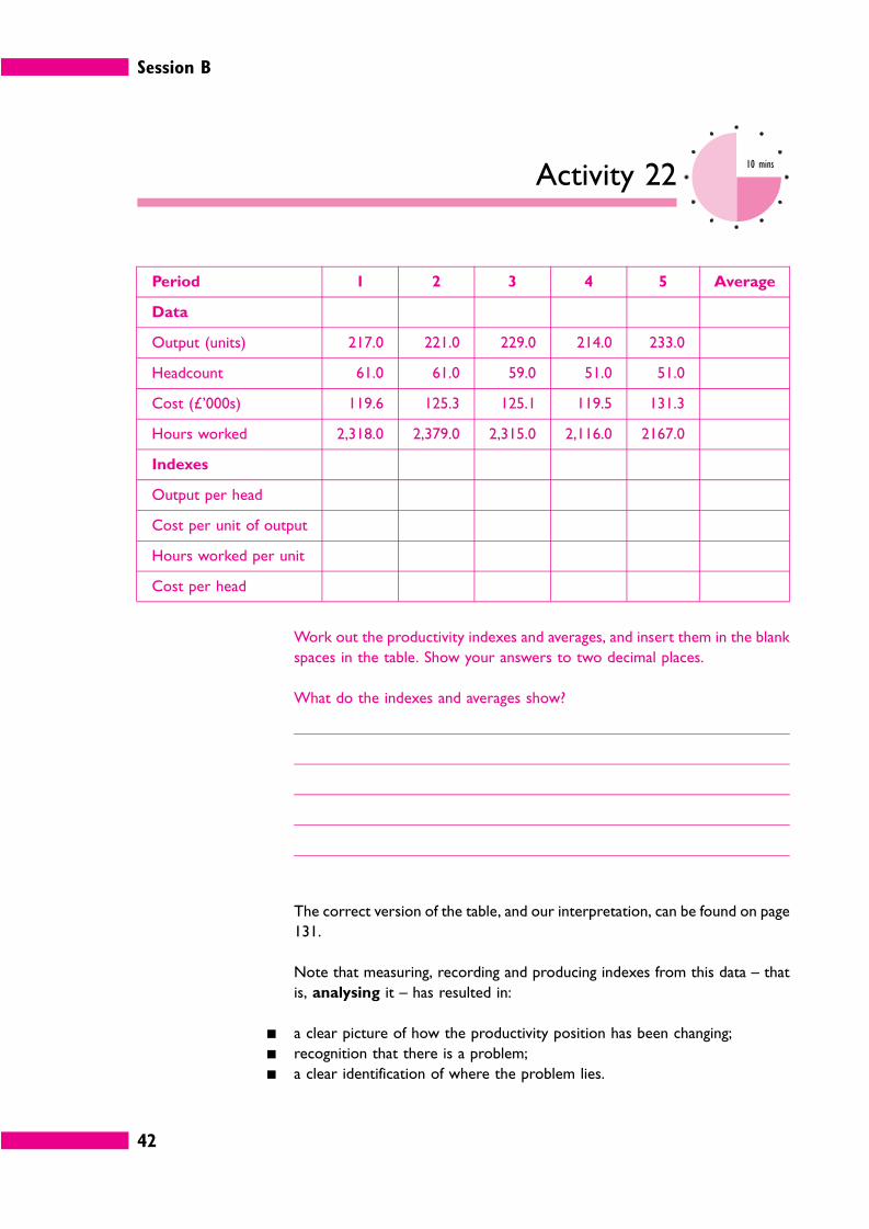
Activity 2210 mins
Period 1 2 3 4 5 Average
Data
Output (units) 217.0 221.0 229.0 214.0 233.0
Headcount 61.0 61.0 59.0 51.0 51.0
Cost (£’000s) 119.6 125.3 125.1 119.5 131.3
Hours worked 2,318.0 2,379.0 2,315.0 2,116.0 2167.0
Indexes
Output per head
Cost per unit of output
Hours worked per unit
Cost per head
Work out the productivity indexes and averages, and insert them in the blank
spaces in the table. Show your answers to two decimal places.
What do the indexes and averages show?
The correct version of the table, and our interpretation, can be found on page
131.
Note that measuring, recording and producing indexes from this data – that
is, analysing it – has resulted in:
� a clear picture of how the productivity position has been changing;
� recognition that there is a problem;
� a clear identification of where the problem lies.
Session B
43
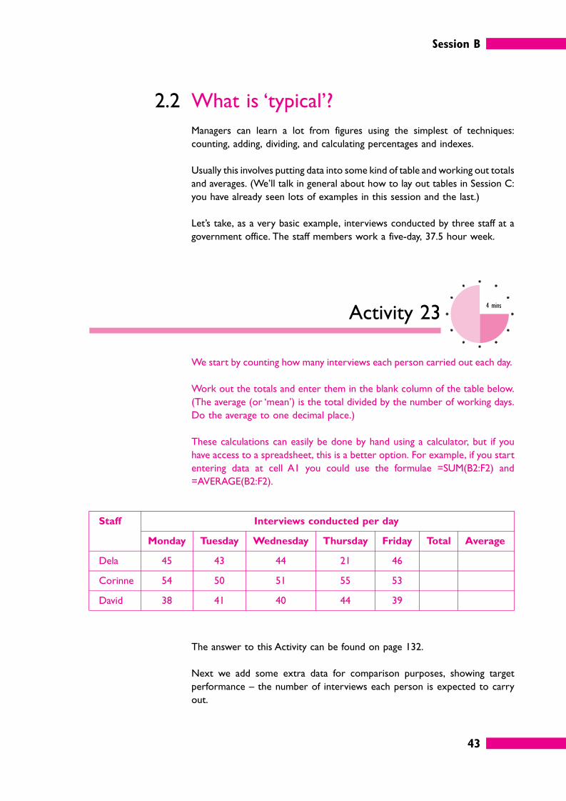
2.2 What is ‘typical’?
Managers can learn a lot from figures using the simplest of techniques:
counting, adding, dividing, and calculating percentages and indexes.
Usually this involves putting data into some kind of table and working out totals
and averages. (We’ll talk in general about how to lay out tables in Session C:
you have already seen lots of examples in this session and the last.)
Let’s take, as a very basic example, interviews conducted by three staff at a
government office. The staff members work a five-day, 37.5 hour week.
Activity 234 mins
We start by counting how many interviews each person carried out each day.
Work out the totals and enter them in the blank column of the table below.
(The average (or ‘mean’) is the total divided by the number of working days.
Do the average to one decimal place.)
These calculations can easily be done by hand using a calculator, but if you
have access to a spreadsheet, this is a better option. For example, if you start
entering data at cell A1 you could use the formulae =SUM(B2:F2) and
=AVERAGE(B2:F2).
Staff Interviews conducted per day
Monday Tuesday Wednesday Thursday Friday Total Average
Dela 45 43 44 21 46
Corinne 54 50 51 55 53
David 38 41 40 44 39
The answer to this Activity can be found on page 132.
Next we add some extra data for comparison purposes, showing target
performance – the number of interviews each person is expected to carry
out.
Session B
44
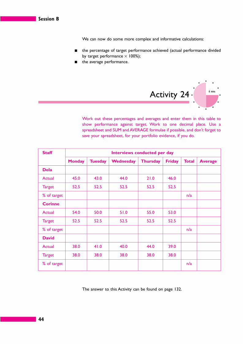
We can now do some more complex and informative calculations:
� the percentage of target performance achieved (actual performance divided
by target performance × 100%);
� the average performance.
Activity 246 mins
Work out these percentages and averages and enter them in this table to
show performance against target. Work to one decimal place. Use a
spreadsheet and SUM and AVERAGE formulae if possible, and don’t forget to
save your spreadsheet, for your portfolio evidence, if you do.
Staff Interviews conducted per day
Monday Tuesday Wednesday Thursday Friday Total Average
Dela
Actual 45.0 43.0 44.0 21.0 46.0
Target 52.5 52.5 52.5 52.5 52.5
% of target n/a
Corinne
Actual 54.0 50.0 51.0 55.0 53.0
Target 52.5 52.5 52.5 52.5 52.5
% of target n/a
David
Actual 38.0 41.0 40.0 44.0 39.0
Target 38.0 38.0 38.0 38.0 38.0
% of target n/a
The answer to this Activity can be found on page 132.
Session B
45
By processing the data in these quite simple ways, we can obtain some useful
information from them.
� How each person is performing against target.
� How each person is performing against the departmental average.
The new figures also reveal some unexplained oddities.
Activity 252 mins
Note down two things that strike you as odd about the final figures.
There are two obvious points.
� On Thursday, Dela’s performance fell sharply to 21 interviews.
� David’s target figures are lower than those for the other two staff.
Managers are always looking for deviations from what is expected, so these
two oddities need to be explained. An investigation may discover, for instance,
that Dela was sick for an afternoon, and that David is a trainee who has been
set lower targets initially. Or perhaps Dela spent an afternoon sitting with
David, helping with training.
Whatever the case it would be a good idea to include explanations with the
table and analysis, if you are reporting to your own manager about your
team’s performance.
2.3 Measures of central tendency
You hear about averages all the time – average income, average lifespan,
average number of goals per game or runs per innings, and so on.
Averages like this can be useful because they can often answer the question
‘what is typical?’.
Session B
46
The most common type of average is more properly called the arithmetic
mean, and it is very easy to calculate: you simply find the total of the
numbers, then divide by the number of values. If you have three values, 1, 2
and 3, the total is 6 and so the arithmetic mean is 6 divided by 3, which equals
2: (1 + 2 + 3) / 3 = 2.
However, an average like this can be ‘mean’ in the sense that it doesn’t tell you
all you need to know: it can be misleading. The performance figures we just
looked at for Dela are a case in point. It is important for her manager to know
her typical performance against target, but averaging her across five days does
not give an accurate idea of what is typical.
Because Dela only worked for half the day on Thursday, her average
performance over five days comes out as 75.8%. If we’d omitted Thursday, her
average would be 84.8%, and this is a truer reflection of her performance.
The mean can easily be distorted by the inclusion of one or more untypical
figures, so it sometimes helps to use a different measure of centrality.
Two alternatives to the mean are the median and the mode.
� The median is the middle value in a series.
� The mode is the value which appears most often in a series.
Activity 262 mins
179 199 202 229 249 263 263 263 277
In the nine-value series above, determine the average (arithmetic mean), the
median and the mode.
What formulae would you use to determine the arithmetic mean (average),
the median, and the mode if these figures were entered in cells A1 to A9 of
a spreadsheet? (This question is much easier than you might think!)
The answers to this Activity can be found on page 133.
Session B
47
There is sometimes a case for saying that either the median or the mode
provides a more meaningful answer to the question ‘what is typical?’ than the
mean does.
2.4 Grouped dataSuppose you measure the daily demand for a product you are selling over
20 days and then want to analyse the results to find typical daily demand.
For instance, in the following results there were two days when daily demand
was 14.
Daily demand Frequency
14 2
22 2
24 1
27 1
30 3
31 6
32 2
33 1
39 1
50 1
How can you calculate the average?
One way, of course, is not to group the data like this in the first place. You could
simply list out a value for each of the 20 days and divide the sum by 20.
A quicker way, however – and sometimes the only way, depending on the data
– is to multiply daily demand by frequency and then divide by 20.
Daily demand (x) Frequency (f) Daily demand times
frequency (fx)
14 2 28
22 2 44
24 1 24
27 1 27
30 3 90
31 6 186
32 2 64
33 1 33
39 1 39
50 1 50
20 585
The average is 585/20 = 29.25.
Session B
48
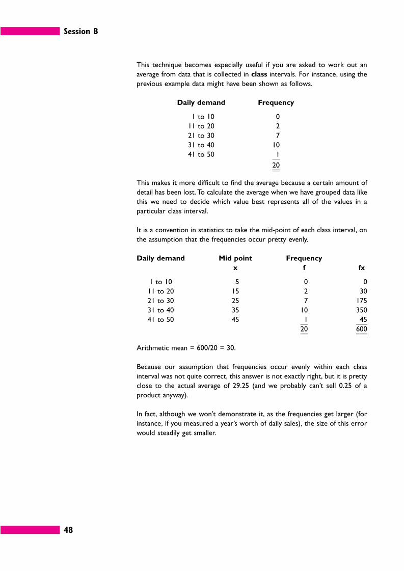
This technique becomes especially useful if you are asked to work out an
average from data that is collected in class intervals. For instance, using the
previous example data might have been shown as follows.
Daily demand Frequency
1 to 10 0
11 to 20 2
21 to 30 7
31 to 40 10
41 to 50 1
20
This makes it more difficult to find the average because a certain amount of
detail has been lost. To calculate the average when we have grouped data like
this we need to decide which value best represents all of the values in a
particular class interval.
It is a convention in statistics to take the mid-point of each class interval, on
the assumption that the frequencies occur pretty evenly.
Daily demand Mid point Frequency
x f fx
1 to 10 5 0 0
11 to 20 15 2 30
21 to 30 25 7 175
31 to 40 35 10 350
41 to 50 45 1 45
20 600
Arithmetic mean = 600/20 = 30.
Because our assumption that frequencies occur evenly within each class
interval was not quite correct, this answer is not exactly right, but it is pretty
close to the actual average of 29.25 (and we probably can’t sell 0.25 of a
product anyway).
In fact, although we won’t demonstrate it, as the frequencies get larger (for
instance, if you measured a year’s worth of daily sales), the size of this error
would steadily get smaller.
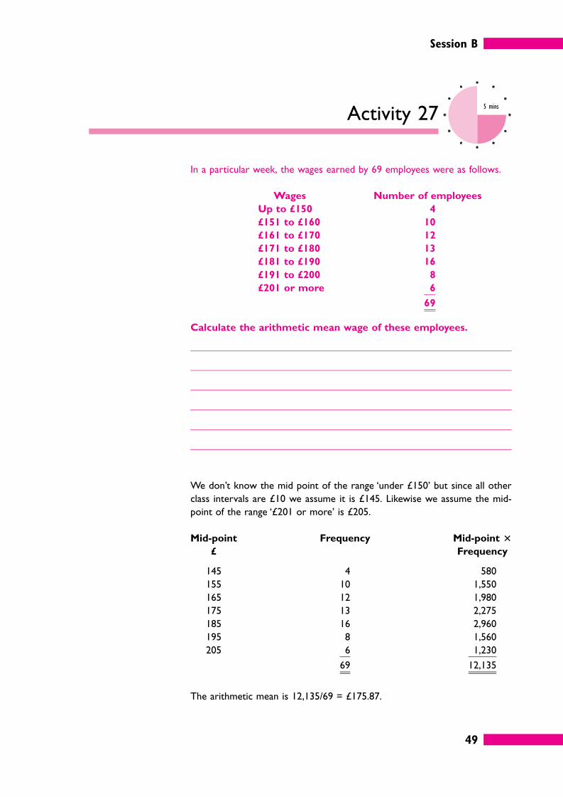
Session B
49
Activity 275 mins
In a particular week, the wages earned by 69 employees were as follows.
Wages Number of employees
Up to £150 4
£151 to £160 10
£161 to £170 12
£171 to £180 13
£181 to £190 16
£191 to £200 8
£201 or more 6
69
Calculate the arithmetic mean wage of these employees.
We don’t know the mid point of the range ‘under £150’ but since all other
class intervals are £10 we assume it is £145. Likewise we assume the mid-
point of the range ‘£201 or more’ is £205.
Mid-point
£
Frequency Mid-point �
Frequency
145 4 580
155 10 1,550
165 12 1,980
175 13 2,275
185 16 2,960
195 8 1,560
205 6 1,230
69 12,135
The arithmetic mean is 12,135/69 = £175.87.
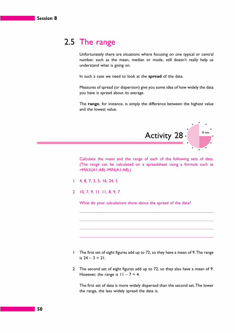
Session B
50
2.5 The range
Unfortunately there are situations where focusing on one typical or central
number, such as the mean, median or mode, still doesn’t really help us
understand what is going on.
In such a case we need to look at the spread of the data.
Measures of spread (or dispersion) give you some idea of how widely the data
you have is spread about its average.
The range, for instance, is simply the difference between the highest value
and the lowest value.
Activity 2820 mins
Calculate the mean and the range of each of the following sets of data.
(The range can be calculated on a spreadsheet using a formula such as
=MAX(A1:A8)–MIN(A1:A8).)
1 4, 8, 7, 3, 5, 16, 24, 5
2 10, 7, 9, 11, 11, 8, 9, 7
What do your calculations show about the spread of the data?
1 The first set of eight figures add up to 72, so they have a mean of 9. The range
is 24 – 3 = 21.
2 The second set of eight figures add up to 72, so they also have a mean of 9.
However, the range is 11 – 7 = 4.
The first set of data is more widely dispersed than the second set. The lower
the range, the less widely spread the data is.
Session B
51
2.6 Percentiles
Percentiles are another way of identifying the range within which most of the
values in a collection of data occur. A percentile is a number that a certain
percentage of the values are less than or equal to.
58 63 71 74 77 79 82 83 86 91 93
0% 10% 20% 30% 40% 50% 60% 70% 80% 90% 100%
For instance, take the value 71 in the series of numbers above. Out of the
remaining ten numbers two are lower, so 71 is called the 20th percentile.
Important percentiles are the median (50%), the lower quartile (25%) and
the upper quartile (75%).
Quartiles are a commonly-used way of identifying the range within which
the values in a set of data occur. Quartiles often are used in sales and market
research, and in education.
Older textbooks usually explain how you can estimate quartiles by counting
up the number of values or by drawing a graph (an ‘ogive’), but this is not very
helpful in practice, where you are likely to have a large amount of data to
analyse.
Fortunately, these days, you don’t have to approximate: you can get an
accurate figure for any percentile you like simply by using a spreadsheet.
Activity 2915 mins
Suppose you have a set of values in cells B2 to B2357 of a spreadsheet. How
would you calculate the lower quartile, the median and the upper quartile
using spreadsheet facilities?
(Hint: as usual, this is not as hard as you might think!)
Session B
52
You can do this in Microsoft Excel using formulae.
=QUARTILE(B2:B2357,1) will give you the lower quartile.
=QUARTILE(B2:B2357,2) will give you the median.
=QUARTILE(B2:B2357,3) will give you the upper quartile.
For the median you can also use =MEDIAN(B2:B2357,2).
Note that this will not work in all spreadsheet packages and you will need to
consult your package’s ‘Help’ facility if you are using another package.
Activity 3015 mins
Here is a set of sales results for a week in December and a week in June for
15 sales staff. The product is a seasonal one, which sells much better in the
summer. Identify the lower and upper quartiles and the median for each
sitting and suggest how these figures might be used.
December 2003 June 2004
4 39
14 40
16 48
18 54
20 55
22 67
23 69
25 73
26 78
29 78
31 78
33 80
39 81
42 94
47 97
Identify the lower and upper quartiles and the median for each period and
suggest how these figures might be used.
Session B
53
Using a spreadsheet we find the following values.
December 2003 June 2004
Lower quartile 19 54.5
Median 25 73
Upper quartile 32 79
This information could prove useful in planning sales targets.
In December 2004 you might set the target at the median figure of 25 units.
In June 2005, however, anyone who was selling at a rate of about 25 units in
December might be expected to sell around 73 units.
Any of the sales staff who sold fewer than 55 in June would be falling seriously
below target, while anyone who achieved sales of more than 79 units might
be eligible for a high sales for the month award. Similar figures could be
calculated for December rates of sales.
2.7 The inter-quartile range
The lower and upper quartiles can be used to calculate a measure of
dispersion called the inter-quartile range. The inter-quartile range is the
difference between the values of the upper and lower quartiles and hence
shows the range of values of the middle half of the set of data. The smaller
the inter-quartile range, the less dispersed the data. Because values at the
ends are not taken into account, the inter-quartile range is not affected by
extreme values.
For example, if the lower and upper quartiles of a set of numbers were 6 and
11, the inter-quartile range would be 11 – 6 = 5. This shows that the range of
values of the middle half of the population is 5 units.
2.8 The standard deviation
Because it only uses the middle 50% of the data, the inter-quartile range can
be a useful measure of spread if there are extreme values.
However, it may often seem unreasonable to exclude 50% of the data.
The standard deviation (SD) is a measure of the amount by which the values
in a set of numbers differ from the arithmetic mean. It is calculated using all
of the data, not just half of it. You can calculate the SD manually or using a
scientific calculator, but the easiest way is to use a spreadsheet.
EXTENSION 2
For more help with
statistics, Lloyd Jaisingh’s
Statistics for the Utterly
Confused is a good guide.
Session B
54
Activity 3110 mins
Most of the following numbers are in the range 50 to 75, but there are some
extreme values at either end.
Enter the numbers into cells A1 to A10 of a spreadsheet and find the standard
deviation using the formula =STDEVP(A1:A10). Work to two decimal places.
5 20 52 60 62 64 72 72 82 151
You should get the answer 36.88 (rounded).
Although this might not look like a very meaningful number the standard
deviation is actually an incredibly useful statistic because it can be proved
that:
� 68% of the values in a set of numbers will fall within one standard
deviation of the arithmetic mean;
� 95% of the values in a set of numbers will fall within two standard
deviations of the mean.
Once you know this, the SD can be used in a wide variety of business
situations, simply by collecting a relatively small sample of data: for example,
in quality control, to predict future performance and prepare budgets.
(We won’t go into the theory, which is quite complex.)
In this case the arithmetic mean is 64. The only value that is beyond 2 standard
deviations is the very extreme value 151.
–2SD –1 SD Mean +1 SD +2SD
–9.76 27.12 64 100.88 137.76
2.9 Forecasting and moving averages
Finally, in this ‘statistics’ part of the session, we’ll take a look at another use
of averages to help manage a business – averages to help with anticipating the
future.
One of the other
workbooks in this
series, Achieving Quality,
explains the theory
behind the standard
deviation, and some of
its practical uses, in
more detail.
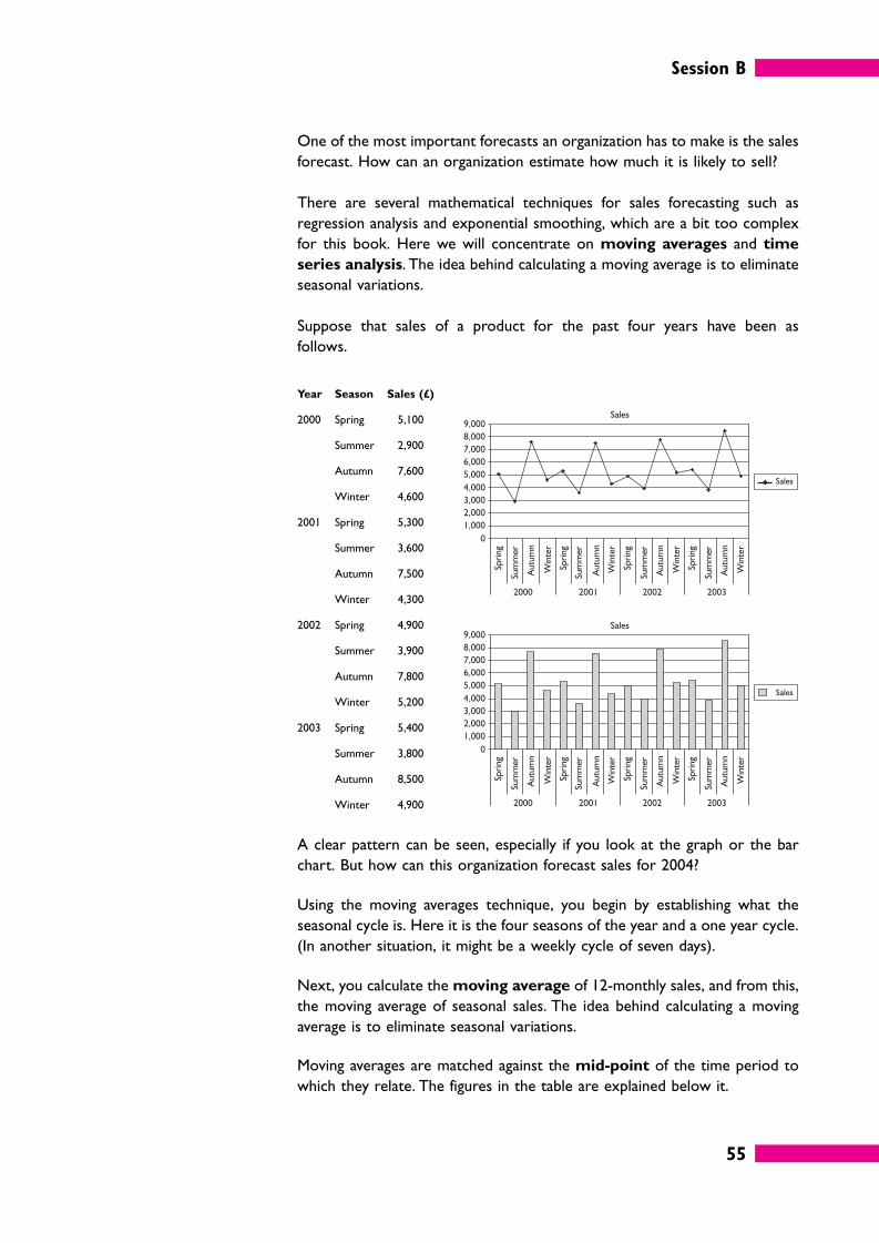
Session B
55
One of the most important forecasts an organization has to make is the sales
forecast. How can an organization estimate how much it is likely to sell?
There are several mathematical techniques for sales forecasting such as
regression analysis and exponential smoothing, which are a bit too complex
for this book. Here we will concentrate on moving averages and time
series analysis. The idea behind calculating a moving average is to eliminate
seasonal variations.
Suppose that sales of a product for the past four years have been as
follows.
Year Season Sales (£)
2000 Spring 5,100
Summer 2,900
Autumn 7,600
Winter 4,600
2001 Spring 5,300
Summer 3,600
Autumn 7,500
Winter 4,300
2002 Spring 4,900
Summer 3,900
Autumn 7,800
Winter 5,200
2003 Spring 5,400
Summer 3,800
Autumn 8,500
Winter 4,900
A clear pattern can be seen, especially if you look at the graph or the bar
chart. But how can this organization forecast sales for 2004?
Using the moving averages technique, you begin by establishing what the
seasonal cycle is. Here it is the four seasons of the year and a one year cycle.
(In another situation, it might be a weekly cycle of seven days).
Next, you calculate the moving average of 12-monthly sales, and from this,
the moving average of seasonal sales. The idea behind calculating a moving
average is to eliminate seasonal variations.
Moving averages are matched against the mid-point of the time period to
which they relate. The figures in the table are explained below it.
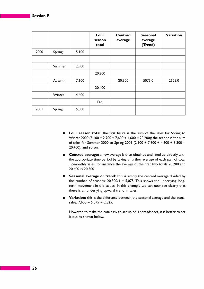
Session B
56
Four
season
total
Centred
average
Seasonal
average
(Trend)
Variation
2000 Spring 5,100
Summer 2,900
20,200
Autumn 7,600 20,300 5075.0 2525.0
20,400
Winter 4,600
Etc.
2001 Spring 5,300
� Four season total: the first figure is the sum of the sales for Spring to
Winter 2000 (5,100 + 2,900 + 7,600 + 4,600 = 20,200); the second is the sum
of sales for Summer 2000 to Spring 2001 (2,900 + 7,600 + 4,600 + 5,300 =
20,400), and so on.
� Centred average: a new average is then obtained and lined up directly with
the appropriate time period by taking a further average of each pair of total
12-monthly sales, for instance the average of the first two totals 20,200 and
20,400 is 20,300.
� Seasonal average or trend: this is simply the centred average divided by
the number of seasons: 20,300/4 = 5,075. This shows the underlying long-
term movement in the values. In this example we can now see clearly that
there is an underlying upward trend in sales.
� Variation: this is the difference between the seasonal average and the actual
sales: 7,600 – 5,075 = 2,525.
However, to make the data easy to set up on a spreadsheet, it is better to set
it out as shown below.
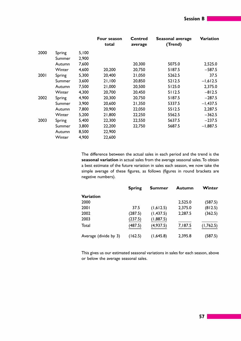
Session B
57
Four season
total
Centred
average
Seasonal average
(Trend)
Variation
2000 Spring 5,100
Summer 2,900
Autumn 7,600 20,300 5075.0 2,525.0
Winter 4,600 20,200 20,750 5187.5 –587.5
2001 Spring 5,300 20,400 21,050 5262.5 37.5
Summer 3,600 21,100 20,850 5212.5 –1,612.5
Autumn 7,500 21,000 20,500 5125.0 2,375.0
Winter 4,300 20,700 20,450 5112.5 –812.5
2002 Spring 4,900 20,300 20,750 5187.5 –287.5
Summer 3,900 20,600 21,350 5337.5 –1,437.5
Autumn 7,800 20,900 22,050 5512.5 2,287.5
Winter 5,200 21,800 22,250 5562.5 –362.5
2003 Spring 5,400 22,300 22,550 5637.5 –237.5
Summer 3,800 22,200 22,750 5687.5 –1,887.5
Autumn 8,500 22,900
Winter 4,900 22,600
The difference between the actual sales in each period and the trend is the
seasonal variation in actual sales from the average seasonal sales. To obtain
a best estimate of the future variation in sales each season, we now take the
simple average of these figures, as follows (figures in round brackets are
negative numbers).
Spring Summer Autumn Winter
Variation
2000 2,525.0 (587.5)
2001 37.5 (1,612.5) 2,375.0 (812.5)
2002 (287.5) (1,437.5) 2,287.5 (362.5)
2003 (237.5) (1,887.5)
Total (487.5) (4,937.5) 7,187.5 (1,762.5)
Average (divide by 3) (162.5) (1,645.8) 2,395.8 (587.5)
This gives us our estimated seasonal variations in sales for each season, above
or below the average seasonal sales.
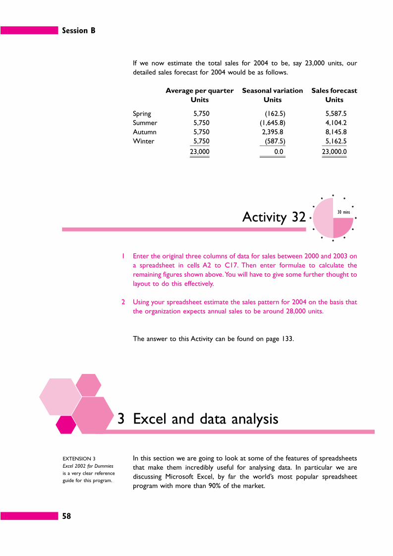
Session B
58
If we now estimate the total sales for 2004 to be, say 23,000 units, our
detailed sales forecast for 2004 would be as follows.
Average per quarter
Units
Seasonal variation
Units
Sales forecast
Units
Spring 5,750 (162.5) 5,587.5
Summer 5,750 (1,645.8) 4,104.2
Autumn 5,750 2,395.8 8,145.8
Winter 5,750 (587.5) 5,162.5
23,000 0.0 23,000.0
Activity 3230 mins
1 Enter the original three columns of data for sales between 2000 and 2003 on
a spreadsheet in cells A2 to C17. Then enter formulae to calculate the
remaining figures shown above. You will have to give some further thought to
layout to do this effectively.
2 Using your spreadsheet estimate the sales pattern for 2004 on the basis that
the organization expects annual sales to be around 28,000 units.
The answer to this Activity can be found on page 133.
3 Excel and data analysis
In this section we are going to look at some of the features of spreadsheets
that make them incredibly useful for analysing data. In particular we are
discussing Microsoft Excel, by far the world’s most popular spreadsheet
program with more than 90% of the market.
EXTENSION 3
Excel 2002 for Dummies
is a very clear reference
guide for this program.
Session B
59
3.1 Sorting and filtering
Suppose you have some raw materials stock data such as the following.
This data is currently sorted in ascending numerical order of part number
(column A), but it doesn’t have to stay like that. For instance, if you wanted
to know what parts were used in what products it would be better to re-sort
the data in ascending order of column B.
To do this you simply select all the data, click on Data . . . Sort and change
the Sort by column.
Activity 3310 mins
Enter the data shown above into a spreadsheet and sort it by product. Save
your spreadsheet because you will use it again in the next Activity.
You should get the following result.
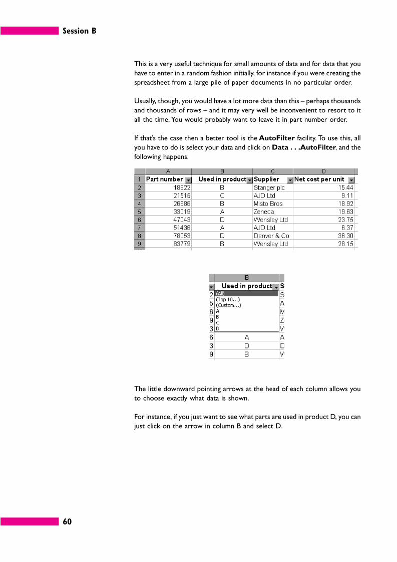
Session B
60
This is a very useful technique for small amounts of data and for data that you
have to enter in a random fashion initially, for instance if you were creating the
spreadsheet from a large pile of paper documents in no particular order.
Usually, though, you would have a lot more data than this – perhaps thousands
and thousands of rows – and it may very well be inconvenient to resort to it
all the time. You would probably want to leave it in part number order.
If that’s the case then a better tool is the AutoFilter facility. To use this, all
you have to do is select your data and click on Data . . .AutoFilter, and the
following happens.
The little downward pointing arrows at the head of each column allows you
to choose exactly what data is shown.
For instance, if you just want to see what parts are used in product D, you can
just click on the arrow in column B and select D.
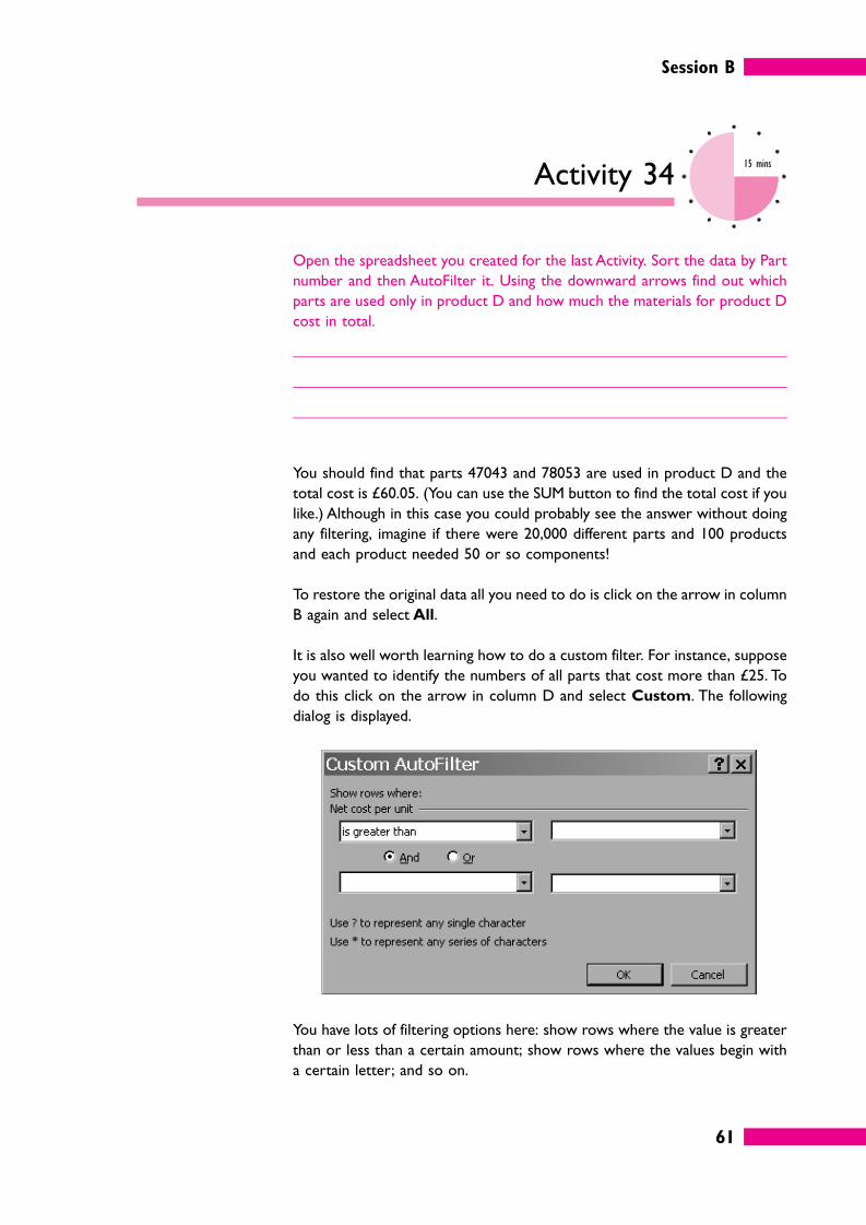
Session B
61
Activity 3415 mins
Open the spreadsheet you created for the last Activity. Sort the data by Part
number and then AutoFilter it. Using the downward arrows find out which
parts are used only in product D and how much the materials for product D
cost in total.
You should find that parts 47043 and 78053 are used in product D and the
total cost is £60.05. (You can use the SUM button to find the total cost if you
like.) Although in this case you could probably see the answer without doing
any filtering, imagine if there were 20,000 different parts and 100 products
and each product needed 50 or so components!
To restore the original data all you need to do is click on the arrow in column
B again and select All.
It is also well worth learning how to do a custom filter. For instance, suppose
you wanted to identify the numbers of all parts that cost more than £25. To
do this click on the arrow in column D and select Custom. The following
dialog is displayed.
You have lots of filtering options here: show rows where the value is greater
than or less than a certain amount; show rows where the values begin with
a certain letter; and so on.
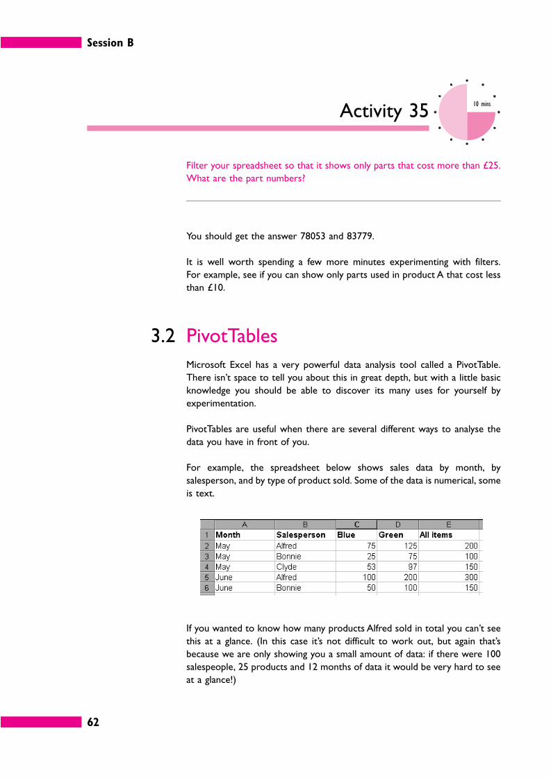
Session B
62
Activity 3510 mins
Filter your spreadsheet so that it shows only parts that cost more than £25.
What are the part numbers?
You should get the answer 78053 and 83779.
It is well worth spending a few more minutes experimenting with filters.
For example, see if you can show only parts used in product A that cost less
than £10.
3.2 PivotTables
Microsoft Excel has a very powerful data analysis tool called a PivotTable.
There isn’t space to tell you about this in great depth, but with a little basic
knowledge you should be able to discover its many uses for yourself by
experimentation.
PivotTables are useful when there are several different ways to analyse the
data you have in front of you.
For example, the spreadsheet below shows sales data by month, by
salesperson, and by type of product sold. Some of the data is numerical, some
is text.
If you wanted to know how many products Alfred sold in total you can’t see
this at a glance. (In this case it’s not difficult to work out, but again that’s
because we are only showing you a small amount of data: if there were 100
salespeople, 25 products and 12 months of data it would be very hard to see
at a glance!)
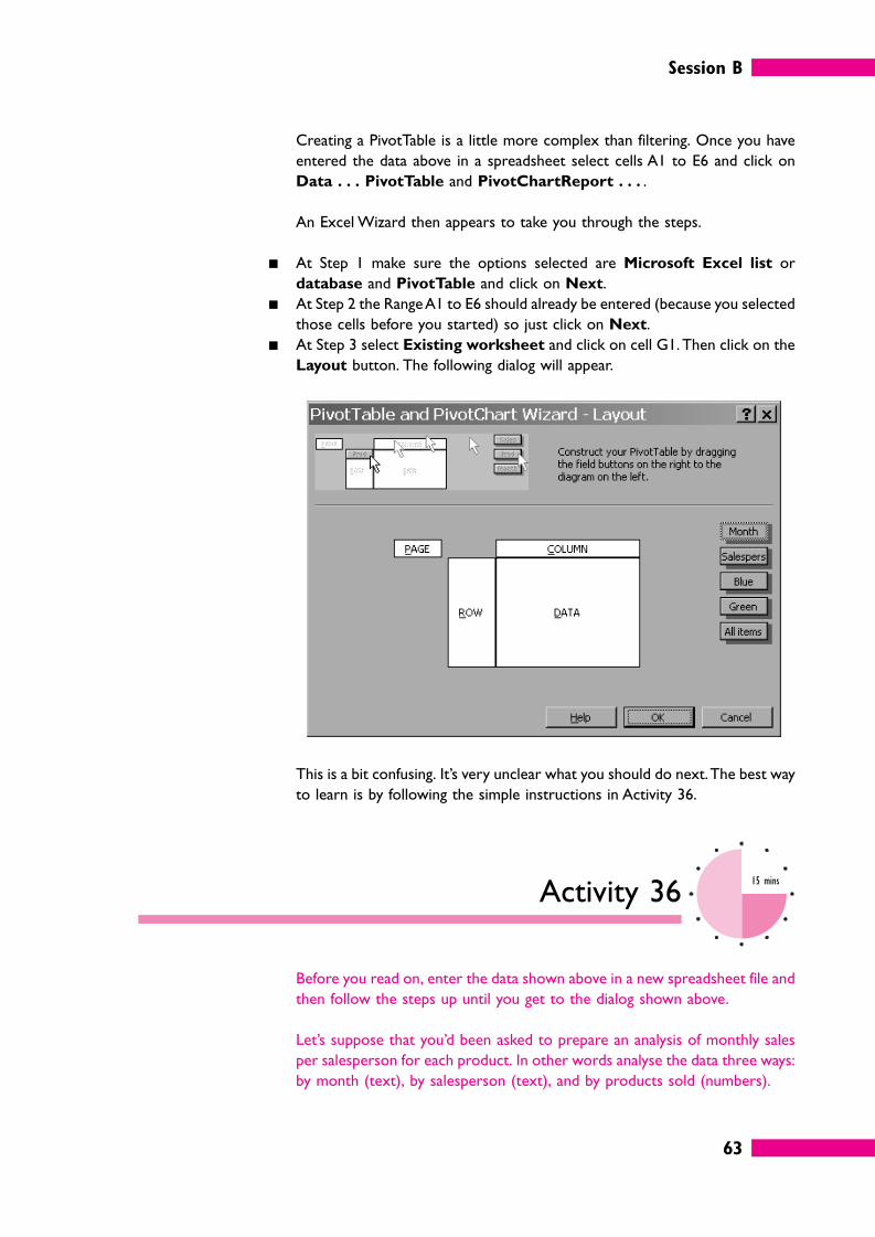
Session B
63
Creating a PivotTable is a little more complex than filtering. Once you have
entered the data above in a spreadsheet select cells A1 to E6 and click on
Data . . . PivotTable and PivotChartReport . . . .
An Excel Wizard then appears to take you through the steps.
� At Step 1 make sure the options selected are Microsoft Excel list or
database and PivotTable and click on Next.
� At Step 2 the Range A1 to E6 should already be entered (because you selected
those cells before you started) so just click on Next.
� At Step 3 select Existing worksheet and click on cell G1. Then click on the
Layout button. The following dialog will appear.
This is a bit confusing. It’s very unclear what you should do next. The best way
to learn is by following the simple instructions in Activity 36.
Activity 3615 mins
Before you read on, enter the data shown above in a new spreadsheet file and
then follow the steps up until you get to the dialog shown above.
Let’s suppose that you’d been asked to prepare an analysis of monthly sales
per salesperson for each product. In other words analyse the data three ways:
by month (text), by salesperson (text), and by products sold (numbers).
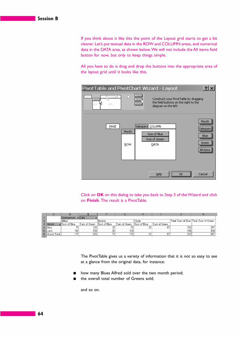
Session B
64
If you think about it like this the point of the Layout grid starts to get a bit
clearer. Let’s put textual data in the ROW and COLUMN areas, and numerical
data in the DATA area, as shown below. We will not include the All items field
button for now, but only to keep things simple.
All you have to do is drag and drop the buttons into the appropriate area of
the layout grid until it looks like this.
Click on OK on this dialog to take you back to Step 3 of the Wizard and click
on Finish. The result is a PivotTable.
The PivotTable gives us a variety of information that it is not so easy to see
at a glance from the original data, for instance:
� how many Blues Alfred sold over the two month period;
� the overall total number of Greens sold;
and so on.
Session B
65
Activity 3715 mins
If you’ve not already done so, follow the steps we’ve just explained until you
have a PivotTable that looks like the one above.
The original question was ‘how many products did Alfred sell in total?’, but we
still can’t read this directly from the PivotTable. See if you can find out how
to do that. You can get back to the PivotTable Wizard by right clicking
anywhere in your PivotTable and choosing Wizard.
You should have produced a PivotTable that looks something like this.
All you have to do once you have got back to the Wizard and selected Layout
is drag the All Items button into the data area. (We’ve also moved the
Salesperson button into the Row area, because that makes it a bit easier to
read, but don’t worry if you didn’t do that.)
As we said at the outset, this is only a very brief introduction to a very useful
tool, but with this basic knowledge you should be able to experiment and
learn more using data of your own.
Session B
66
4 Non-numerical information
In the context of Information in Management the term qualitative
information is used to mean any information that is not numerical, but
describes or explains things.
4.1 Structure
How can you organize such information? There are several ways, and you
could use them alone or in combination.
� By name. In other words, in alphabetical order.
� By date. A date is a sort of number, of course, and information such as
correspondence is most usefully organized in strict date order. Dates are also
used in a less precise sense, however. For instance, you may organize a list of
tasks to be done into those that have to be done by the end of this week,
those that must be complete by next Wednesday, and so on.
� By category. This could be anything that items of information have in
common with each other, for instance physical items may have a size or
colour, staff could be categorized according to department or job title, and so
on.
� In logical sequence. Many activities have to be done in a particular order.
For instance, if you are making a cup of tea you put water in the kettle and
then boil it before pouring it into the cup. That’s an obvious example: with
more complex work activities it is not always obvious what the most efficient
sequence is.
� In order of importance. The most important items of information should
be put first: typically these are things that will cost a lot of money, or take up
a lot of time, or have a major impact on others.
Another workbook in
this series, Storing and
Retrieving Information,
describes how to
organize a storage,
indexing and
information retrieval
system in general.
Here we are talking
about data in individual
files or documents.
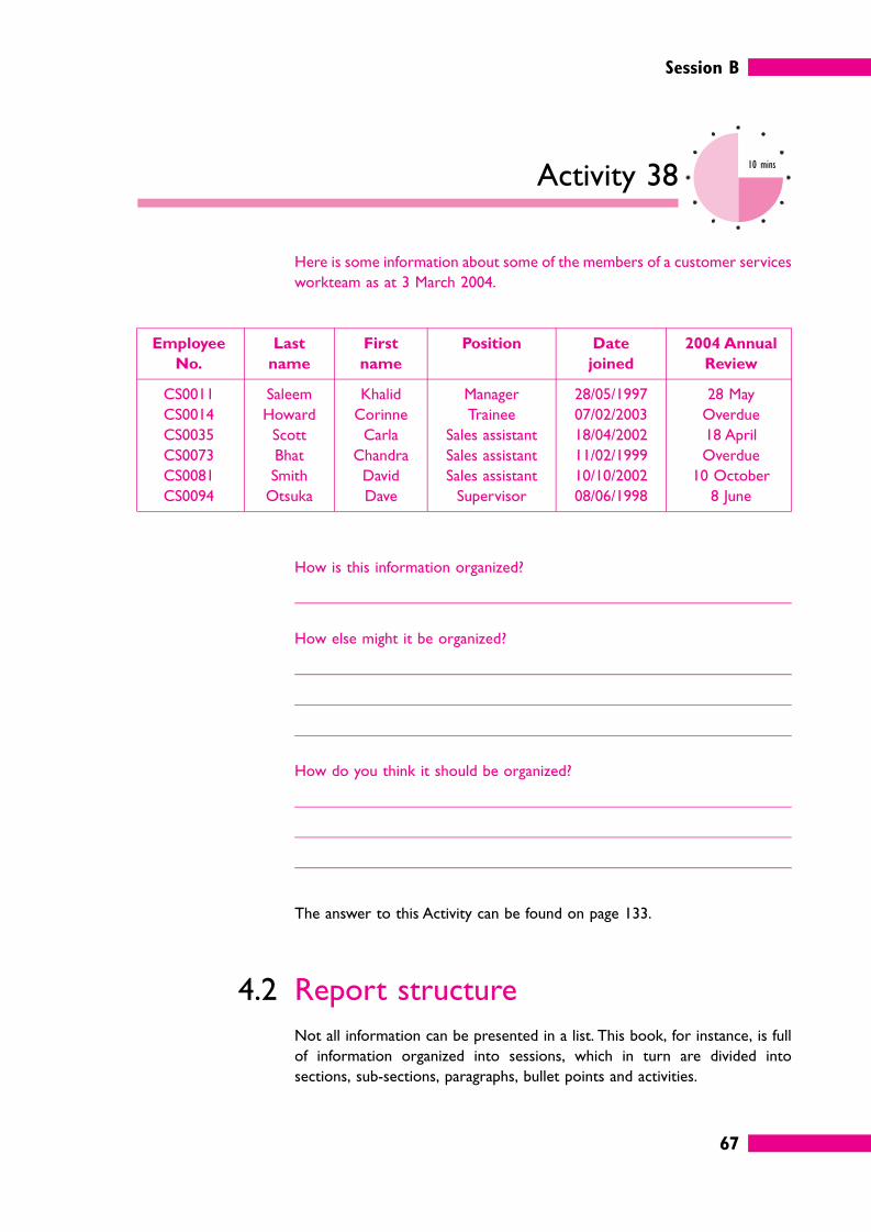
Session B
67
Activity 3810 mins
Here is some information about some of the members of a customer services
workteam as at 3 March 2004.
Employee
No.
Last
name
First
name
Position Date
joined
2004 Annual
Review
CS0011 Saleem Khalid Manager 28/05/1997 28 May
CS0014 Howard Corinne Trainee 07/02/2003 Overdue
CS0035 Scott Carla Sales assistant 18/04/2002 18 April
CS0073 Bhat Chandra Sales assistant 11/02/1999 Overdue
CS0081 Smith David Sales assistant 10/10/2002 10 October
CS0094 Otsuka Dave Supervisor 08/06/1998 8 June
How is this information organized?
How else might it be organized?
How do you think it should be organized?
The answer to this Activity can be found on page 133.
4.2 Report structure
Not all information can be presented in a list. This book, for instance, is full
of information organized into sessions, which in turn are divided into
sections, sub-sections, paragraphs, bullet points and activities.
Session B
68
You probably won’t be asked to write a book in your job, but you will often
have to write some kind of short report on operational matters for your
managers to read. You may have to create or update some kind of procedures
manual for your own team.
Various techniques can be used to make the content of such a document easy
to identify and digest.
� The material in the report should be in a logical order.
� The relative importance of points should be signalled by headings.
� Each point may be numbered in some way to help with cross-reference.
� the document should be easy on the eye, helped by different font sizes, bold,
italics, capitals, spacing, and so on.
A typical report structure has the following features.
� Headings. There is a hierarchy of headings. There is an overall title and the
report as a whole is divided into sections. Within each section main points
have a heading in bold capitals, sub-points have a heading in bold, lower-case
and sub-sub-points have a heading in italics. (Three levels of headings within
a main section is usually considered the maximum number that readers can
cope with.) It is better not to underline headings. Underlining makes the page
look ‘busy’ and gets in the way of the content.
� References. Sections are lettered A, B, and so on. Main points are numbered
1, 2, and so on, and within each division paragraphs are numbered 1.1, 1.2, 2.1,
2.2. Sub-paragraphs inherit their references from the paragraph above. For
instance, the first sub-paragraph under paragraph 1.2 is numbered 1.2.1.
� Fonts. Word processors offer you a wealth of fonts these days, but it is best
to avoid the temptation. It is often a good idea to put headings in a different
font to the main text, but stop there: two fonts is quite enough.
Our example is not the only way of organizing a report, of course. You might
choose to reference sub-paragraphs 1.2(a), 1.2(b), and so on. You might use
roman numerals, although we advise against this. If your report turns out to
be longer than you expected and you get up to paragraph XLVIII you are likely
to confuse many of your readers unless they happen to be Romans.
The longer the document the better structured it needs to be. Large-scale
reports or manuals may run to hundreds of pages, and will therefore require
the following.
1 Title page
2 Contents list
3 Objective/term of reference
4 Summary
5 Introduction
For more information
on how to present a
report, see Project and
Report Writing in this
series.
Session B
69
6 Main body of the report
7 Conclusions
8 Recommendations
9 Appendices
Appendices are commonly used for:
� background information that will not be required by all readers;
� statistical information, which has been abstracted or interpreted in the body
of the report;
� documents referred to in the report.
Activity 3930 mins
Some organizations have what is known as a ‘house style’ for documents,
reports, presentations and similar documents. This is a set of rules that
specifies details such as hierarchies of headings, paragraph numbering system,
spacing between paragraphs, fonts to use, size and placement of company
logo, acceptable colours, and so on.
Develop a ‘house style’ for your own workteam. The best way to do this is to
find an existing document that is five to ten pages long and define a style for
each element.
Once you’ve worked out all the styles you may like to go further and create
a word processing template for use in your department. Be sure to save a
copy in your Information_in_Management_Session_B folder if you do this.
4.3 Cross-references
Cross-references are pointers to other places in the same document or to
other information sources where related information can be found. For
instance, if paragraph 3.5 refers to a topic described in more detail later in the
document you can save space and avoid repetition by saying ‘See paragraph
6.4’.
Session B
70
Activity 402 mins
Why is it better to cross-refer to a paragraph number than to a page
number?
The answer to this Activity can be found on page 133.
However, ultimately everything is related to everything else and if you are not
careful there could be no end to the cross-references. The best advice is to
keep them to a minimum, otherwise your readers will be forever flicking from
one page to another, and will most likely lose the plot. If too many cross-
references seem to be necessary it is probably time to consider re-arranging
the information in your report.
4.4 Indexing
An index is an alphabetical list of the names, places and subjects dealt with in
a document or book, giving the page or pages on which each item is
mentioned.
Shorter documents should not usually need an index if there is good use of
headings and a reasonably detailed contents page. If you start to feel that your
document will be hard to follow without an index, it may be time to think
about re-arranging the material into a more logical structure.
Longer documents – for instance a procedures manual – may well be
improved by an index, so let’s think about some of the issues.
Your first thought might be to do it by computer. Computers are both a help
and a hindrance for indexing. It would be very quick and easy to compile an
index listing every occurrence of every word in this session using a word
processor. (Such a list is sometimes called a ‘concordance’.) But the list would
include a massive amount of irrelevant information: words like ‘the’, ‘a’, ‘it’, and
so on, which no-one would need to look up.
If you need to prepare an index you need to exercise some discretion.
Suppose we wanted to index the occurrences of the word ‘spreadsheet’ in
Session B
71
this session. You can easily do this with a word processor (for example
Microsoft Word) by selecting one example of the word and choosing Insert
. . . Index . . . Mark Entry . . . Mark All.
The result would be something like this (note: these are not the actual page
numbers, this is just an example).
Spreadsheet 34, 37, 39, 44, 45, 46, 48, 49, 50, 51, 52, 53, 54, 55, 63
Activity 413 mins
How useful is a list like this to a reader?
Can you suggest how the list might be improved?
It is not very useful at all because most of the references are just examples of
where the word ‘spreadsheet’ is used in passing (for instance in Activities that
say something like ‘you might find it easier to do this with a spreadsheet’). And
it would be very annoying for the reader to have to turn backwards and
forwards through a document or book looking at each of 15 instances.
The list would be much improved if it organized the information according to
sub-topics that the reader might want to look up, like this.
Spreadsheet
data analysis with, 49
MEDIAN formula, 39, 96
QUARTILE formula, 44, 97
Note that the phrases in our example don’t actually appear in the body of this
session, so they can’t simply be ‘tagged’ by a word processor.
Session B
72
A good index would also have separate entries under the appropriate letter
and topic, for instance as follows.
Data analysis
with spreadsheet, 49
So, although indexing involves a little manipulating of words appearing in a
document or set of documents (which computers can do), it involves a lot
more of understanding and organizing the ideas and information in the
documents, and anticipating the needs of users (which computers cannot do).
Self-assessment 210 mins
1 Explain the relationship between information and data.
2 Express these profit and capital figures as ratios with a numerical base of 1.
We have worked out the first one for you. It shows that Business A made £1
profit for every £4.73 of capital.
Business A B C D
Profit £128,000 £16,250 £3.57 million £377,500
Capital £605,000 £16,000 £11.5 million £9 million
Ratio 1:4.73
Which business is the most profitable?
Session B
73
3 Here is a series of figures.
4.9 5.1 5.1 5.1 5.3 5.4 5.7 5.9 6.3 6.8 6.8
Find the mean, the median and the mode.
4 � The upper quartile is the number that 75% of the values in a set of data are
or equal to.
What are the missing words: ‘more than’ or ‘less than’?
� The range only uses the middle half of the set of numbers. True/False?
5 When are PivotTables useful?
6 Name five ways of organizing descriptive information.
7 Besides a good word processor what two other things do you need to
prepare a good index?
Answers to these questions can be found on page 126.
Session B
74
5 Summary
� Information is data that has been analysed or processed in some way so as to become meaningful.
� Most business statistics involve simple techniques such as adding, subtracting, multiplying and dividing. For
instance, ratios and percentages are both very simple ways of presenting relationships so as to make it
easier to compare figures.
� Averages give you an idea of what is typical. The most common type of average is called the arithmetic
mean: the total of the numbers divided by the number of values. However, this can sometimes be
misleading and two alternatives are the median (the middle value) and the mode (the value that appears
most often).
� Grouped data summarizes more detailed figures, for instance you might say that five of the values fall in
the range 0 to 10. To perform calculations with such data it is conventional to take the mid-point of each
‘class interval’, on the assumption that the frequencies occur pretty evenly.
� The spread of data can be measured by looking at the range or percentiles. A percentile is a number that
a certain percentage of the values are less than or equal to. However, the most useful figure for statistical
analysis is the standard deviation, which is a measure of the amount by which the values in a set of numbers
differ from the arithmetic mean.
� Spreadsheets contain a number of tools that help to analyse lists of numerical and/or textual information.
Sorting and filtering can be done at the touch of a button. Very complex analysis is possible with a
PivotTable.
� Non-numerical lists of information may be organized alphabetically, chronologically, according to some
common characteristic, in order of importance, and so on. Longer documents will need to be structured
with headings, paragraph numbers and the like.
� Cross-references can save time and avoid repetition but should be kept to a minimum to avoid confusing
the reader. Indexes can be useful in longer documents, but the indexer needs to understand the
information very well and be able to anticipate the needs of users.
75
Session CPresenting information
1 Introduction
Visual presentation of data and statistics has more impact than a block of text
or long lists of numbers and is often easier to understand.
We’ve used various methods of data presentation throughout Sessions A and
B of this book without explaining how the data got into that form, or which
presentation method to use in different situations.
This final session, therefore, contains a range of advice about the most
common methods of visual presentation of data used in business.
You don’t have to be a talented artist: everything we describe here can be
done using a word processor, a spreadsheet or other sources close to
hand.
Session C
76
2 Tables
Tables present data in rows and columns. This form of presentation makes it
easier to understand large amounts of data. A railway timetable is a familiar
example.
Charing Cross 15:38 16:08 16:18 16:28 16:37 16:45 16:58
Waterloo 15:41 16:11 16:21 16:31 16:40 16:48 17:01
London Bridge 15:49 16:19 16:29 16:39 16:48 16:56 17:09
New Cross 16:01 16:31 16:41 – 17:00 17:08 17:21
Lewisham 16:06 16:36 16:46 16:50 17:05 17:13 17:26
Activity 423 mins
You arrive at London Bridge at 16:42 and you want to go to Lewisham. Note
down at least three things that this timetable tells you.
There are lots of possible answers: this activity was intended to make you
think about the various ways you can use tables. Here are some
possibilities.
� You can look up a specific value by seeing where rows and columns meet.
Since you know it is 16:42 you can quickly see from the timetable that your
next train is due in six minutes (at 16:48) and will arrive in Lewisham at
17:05.
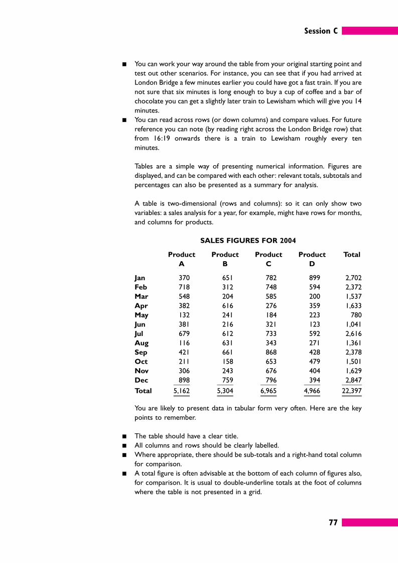
Session C
77
� You can work your way around the table from your original starting point and
test out other scenarios. For instance, you can see that if you had arrived at
London Bridge a few minutes earlier you could have got a fast train. If you are
not sure that six minutes is long enough to buy a cup of coffee and a bar of
chocolate you can get a slightly later train to Lewisham which will give you 14
minutes.
� You can read across rows (or down columns) and compare values. For future
reference you can note (by reading right across the London Bridge row) that
from 16:19 onwards there is a train to Lewisham roughly every ten
minutes.
Tables are a simple way of presenting numerical information. Figures are
displayed, and can be compared with each other: relevant totals, subtotals and
percentages can also be presented as a summary for analysis.
A table is two-dimensional (rows and columns): so it can only show two
variables: a sales analysis for a year, for example, might have rows for months,
and columns for products.
SALES FIGURES FOR 2004
Product
A
Product
B
Product
C
Product
D
Total
Jan 370 651 782 899 2,702
Feb 718 312 748 594 2,372
Mar 548 204 585 200 1,537
Apr 382 616 276 359 1,633
May 132 241 184 223 780
Jun 381 216 321 123 1,041
Jul 679 612 733 592 2,616
Aug 116 631 343 271 1,361
Sep 421 661 868 428 2,378
Oct 211 158 653 479 1,501
Nov 306 243 676 404 1,629
Dec 898 759 796 394 2,847
Total 5,162 5,304 6,965 4,966 22,397
You are likely to present data in tabular form very often. Here are the key
points to remember.
� The table should have a clear title.
� All columns and rows should be clearly labelled.
� Where appropriate, there should be sub-totals and a right-hand total column
for comparison.
� A total figure is often advisable at the bottom of each column of figures also,
for comparison. It is usual to double-underline totals at the foot of columns
where the table is not presented in a grid.
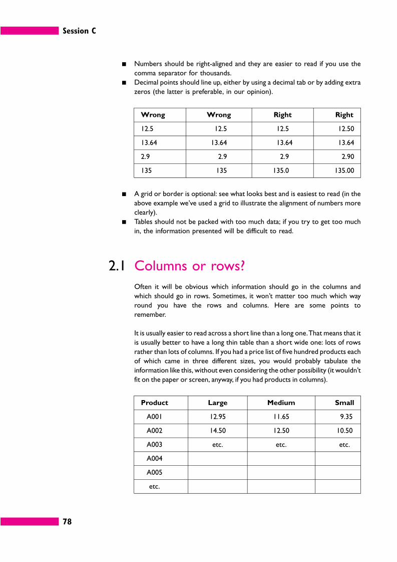
Session C
78
� Numbers should be right-aligned and they are easier to read if you use the
comma separator for thousands.
� Decimal points should line up, either by using a decimal tab or by adding extra
zeros (the latter is preferable, in our opinion).
Wrong Wrong Right Right
12.5 12.5 12.5 12.50
13.64 13.64 13.64 13.64
2.9 2.9 2.9 2.90
135 135 135.0 135.00
� A grid or border is optional: see what looks best and is easiest to read (in the
above example we’ve used a grid to illustrate the alignment of numbers more
clearly).
� Tables should not be packed with too much data; if you try to get too much
in, the information presented will be difficult to read.
2.1 Columns or rows?
Often it will be obvious which information should go in the columns and
which should go in rows. Sometimes, it won’t matter too much which way
round you have the rows and columns. Here are some points to
remember.
It is usually easier to read across a short line than a long one. That means that it
is usually better to have a long thin table than a short wide one: lots of rows
rather than lots of columns. If you had a price list of five hundred products each
of which came in three different sizes, you would probably tabulate the
information like this, without even considering the other possibility (it wouldn’t
fit on the paper or screen, anyway, if you had products in columns).
Product Large Medium Small
A001 12.95 11.65 9.35
A002 14.50 12.50 10.50
A003 etc. etc. etc.
A004
A005
etc.
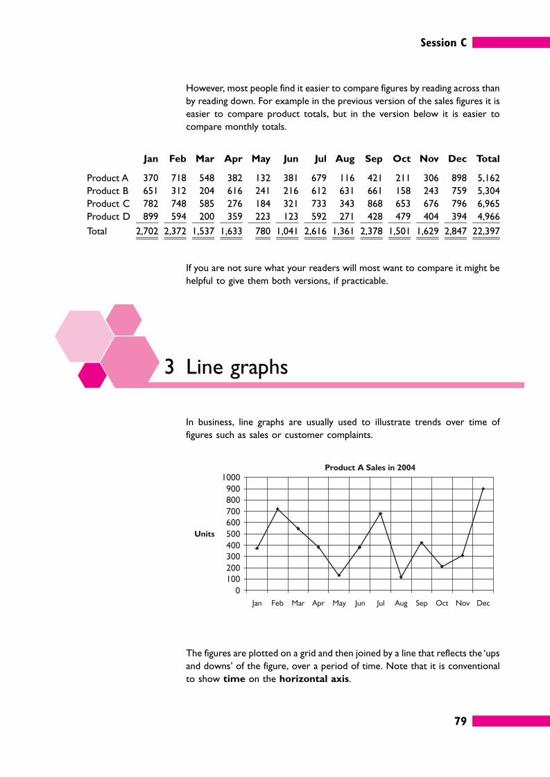
Session C
79
However, most people find it easier to compare figures by reading across than
by reading down. For example in the previous version of the sales figures it is
easier to compare product totals, but in the version below it is easier to
compare monthly totals.
Jan Feb Mar Apr May Jun Jul Aug Sep Oct Nov Dec Total
Product A 370 718 548 382 132 381 679 116 421 211 306 898 5,162
Product B 651 312 204 616 241 216 612 631 661 158 243 759 5,304
Product C 782 748 585 276 184 321 733 343 868 653 676 796 6,965
Product D 899 594 200 359 223 123 592 271 428 479 404 394 4,966
Total 2,702 2,372 1,537 1,633 780 1,041 2,616 1,361 2,378 1,501 1,629 2,847 22,397
If you are not sure what your readers will most want to compare it might be
helpful to give them both versions, if practicable.
3 Line graphs
In business, line graphs are usually used to illustrate trends over time of
figures such as sales or customer complaints.
The figures are plotted on a grid and then joined by a line that reflects the ‘ups
and downs’ of the figure, over a period of time. Note that it is conventional
to show time on the horizontal axis.
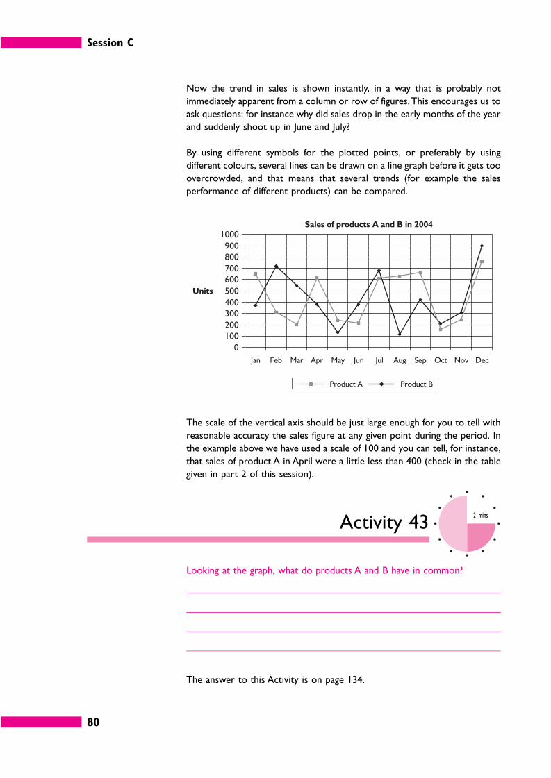
Session C
80
Now the trend in sales is shown instantly, in a way that is probably not
immediately apparent from a column or row of figures. This encourages us to
ask questions: for instance why did sales drop in the early months of the year
and suddenly shoot up in June and July?
By using different symbols for the plotted points, or preferably by using
different colours, several lines can be drawn on a line graph before it gets too
overcrowded, and that means that several trends (for example the sales
performance of different products) can be compared.
The scale of the vertical axis should be just large enough for you to tell with
reasonable accuracy the sales figure at any given point during the period. In
the example above we have used a scale of 100 and you can tell, for instance,
that sales of product A in April were a little less than 400 (check in the table
given in part 2 of this session).
Activity 432 mins
Looking at the graph, what do products A and B have in common?
The answer to this Activity is on page 134.
Session C
81
4 Charts
We’ll run through an extended exercise on creating charts without having to
get your ruler and crayons out in the next part of this session, but first we’ll
make some comments in general about the types of chart you are likely to use
most often in business reports: bar charts and pie charts.
4.1 Bar charts
The bar chart is one of the most common methods of visual presentation.
Data is shown in the form of bars which are the same in width but variable
in height. Each bar represents a different item, for example the annual
production cost of different products or the number of hours required to
produce a product by different workteams.
As you can see, here we are more interested in comparing a few individual
items in a few individual months (although you can still get a visual impression
of trends over time).
Session C
82
Activity 442 mins
Comment on sales of products A and B, based on the chart above.
Our answer to this Activity is on page 134.
Horizontal presentation is also possible.
There are no hard and fast rules about whether you should use vertical or
horizontal presentation. However, these guidelines may help.
� If you are showing trends over time (for instance January to March) vertical
bars look best.
� If you are showing differences at a single point in time (the end of 2004, for
instance) you might prefer horizontal bars.
4.2 Pie charts
A pie chart shows the relative sizes of the things that make up a total. It is
called a pie chart because it is shaped like a pie and is cut into ‘slices’.
Total sales (£000)
Session C
83
Pie charts are most effective where the number of slices is small enough to
keep the chart simple, and where the difference in the size of the slices is large
enough for the eye to judge without too much extra information.
5 How to create charts in Excel
Microsoft Excel has a superb tool for creating hundreds of different charts,
graphs and diagrams. We cannot cover all the options in this book, but we will
work through the basics for one type of chart. You should then have enough
knowledge to be able to experiment on your own.
As we’ll see in a moment, the easiest way to create a chart in Excel is to select
your data and press F11. However, unless you understand the basics of the
Excel Chart Wizard this can often produce unexpected or unwanted
results.
Session C
84
Activity 4530 mins
The whole of this section on charts and Excel is really an extended Activity
based on the initial data below.
Create a new folder on your computer with a name such as ‘Information_in_
Management_Session_C’ and within this create a new spreadsheet file and
give it a name such as ‘YourName_PerfectTen.xls’.
PERFECT TEN MODEL AGENCY
Perfect Ten is a model agency. Currently it handles the careers of 5 models:
Ms White, Ms Red, Ms Green, Ms Yellow and Ms Blue.
Each model is rated each month on a scale of 1 to 10.
Here are the ratings for January to March. You should enter this data in cells
A1 to F4 of your spreadsheet and then save your work.
White Red Green Yellow Blue
January 10 9 7 8 6
February 10 5 7 3 4
March 10 7 3 2 1
We are going to work on this data to produce a variety of bar charts.
5.1 F11
The quickest way to create a chart in Excel is to use the F11 function key at
the top of your keyboard.
� Select cells A1 to F4.
� Press F11.
This will create a chart in a separate spreadsheet called Chart 1.
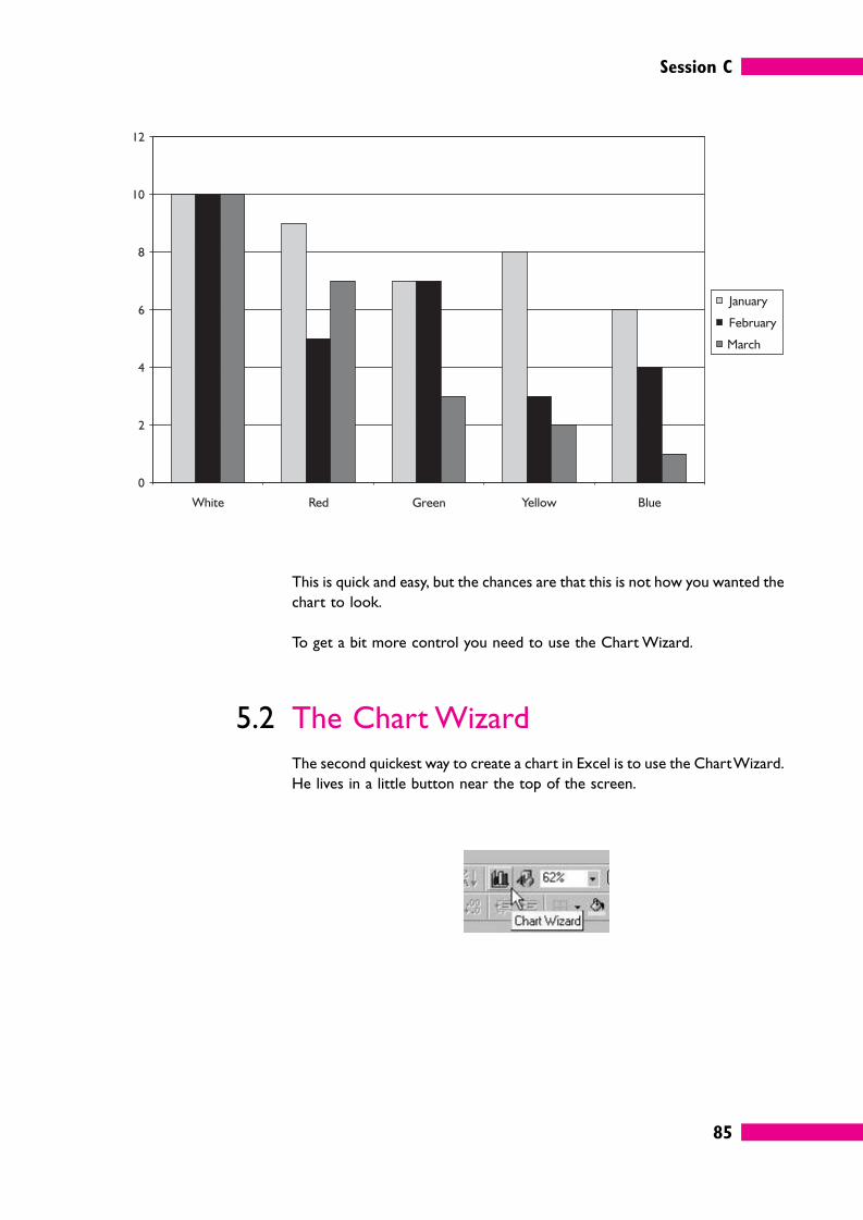
Session C
85
This is quick and easy, but the chances are that this is not how you wanted the
chart to look.
To get a bit more control you need to use the Chart Wizard.
5.2 The Chart Wizard
The second quickest way to create a chart in Excel is to use the Chart Wizard.
He lives in a little button near the top of the screen.
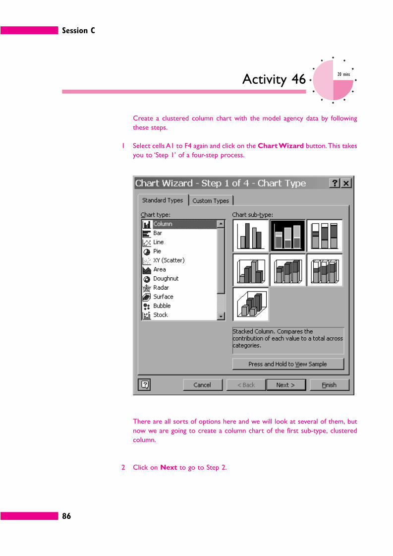
Session C
86
Activity 4620 mins
Create a clustered column chart with the model agency data by following
these steps.
1 Select cells A1 to F4 again and click on the Chart Wizard button. This takes
you to ‘Step 1’ of a four-step process.
There are all sorts of options here and we will look at several of them, but
now we are going to create a column chart of the first sub-type, clustered
column.
2 Click on Next to go to Step 2.
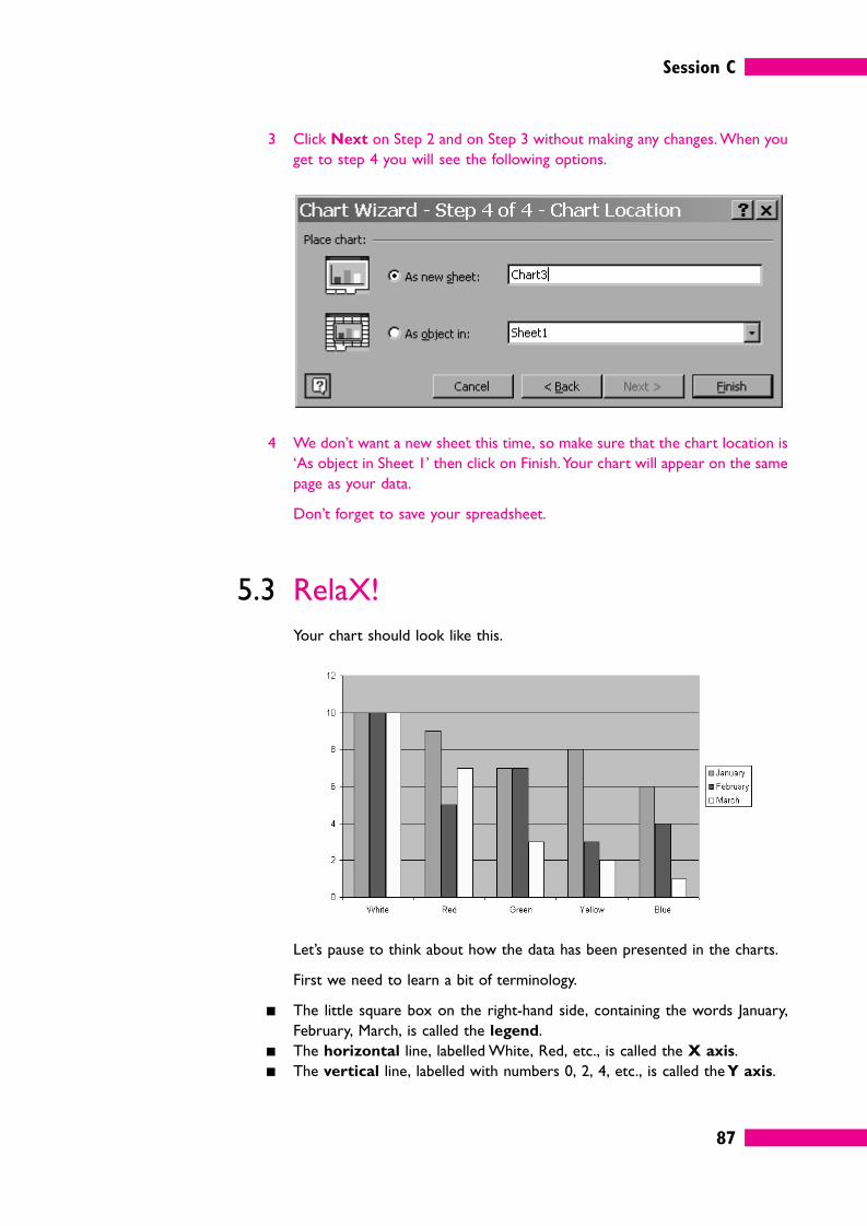
Session C
87
3 Click Next on Step 2 and on Step 3 without making any changes. When you
get to step 4 you will see the following options.
4 We don’t want a new sheet this time, so make sure that the chart location is
‘As object in Sheet 1’ then click on Finish. Your chart will appear on the same
page as your data.
Don’t forget to save your spreadsheet.
5.3 RelaX!
Your chart should look like this.
Let’s pause to think about how the data has been presented in the charts.
First we need to learn a bit of terminology.
� The little square box on the right-hand side, containing the words January,
February, March, is called the legend.
� The horizontal line, labelled White, Red, etc., is called the X axis.
� The vertical line, labelled with numbers 0, 2, 4, etc., is called the Y axis.
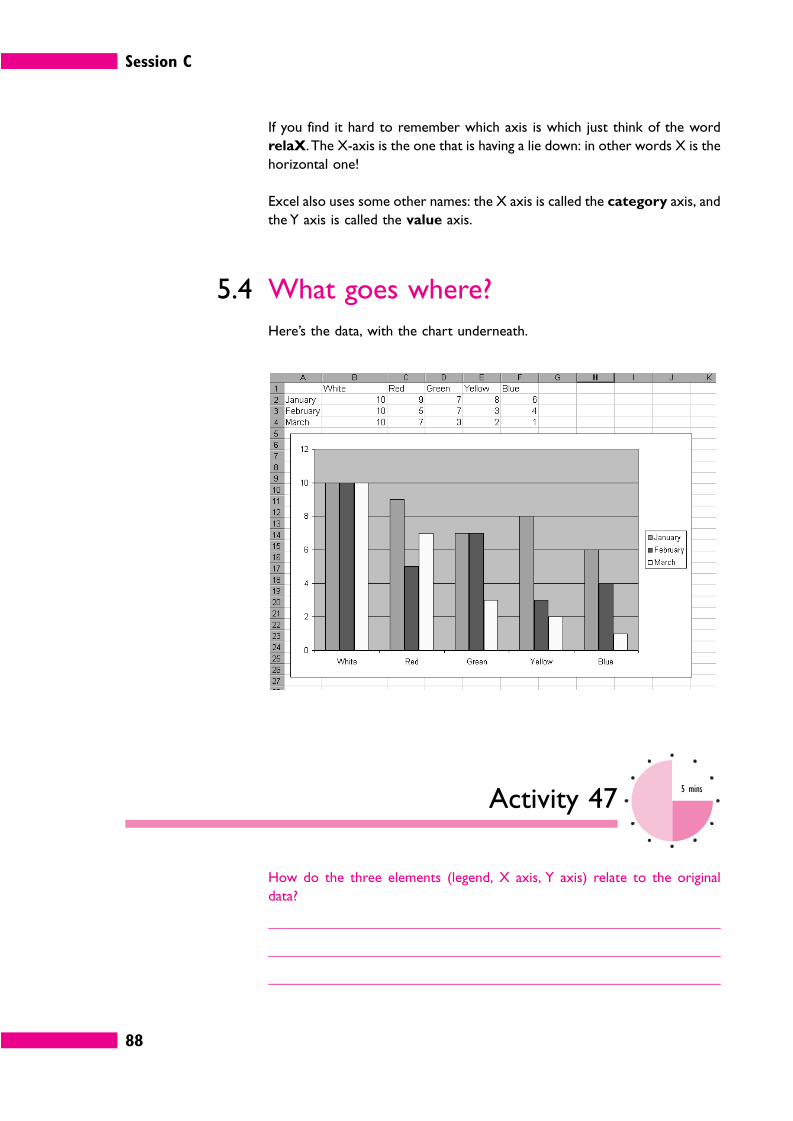
Session C
88
If you find it hard to remember which axis is which just think of the word
relaX. The X-axis is the one that is having a lie down: in other words X is the
horizontal one!
Excel also uses some other names: the X axis is called the category axis, and
the Y axis is called the value axis.
5.4 What goes where?
Here’s the data, with the chart underneath.
Activity 475 mins
How do the three elements (legend, X axis, Y axis) relate to the original
data?
Session C
89
� The legend is derived from the row labels.
� The X axis is derived from the column headings.
� The Y axis is derived from the minimum and maximum numbers in the body
of the table of data.
In fact the default behaviour in Excel is to derive the X axis from whatever
there is more of, whether they are columns or rows. In this case we have
more models than months, so the models go in the X axis. However, you
don’t have to accept this.
5.5 Changing what goes where
Here’s the data and the chart once again.
Suppose we wanted the X axis to show the months and the legend to show
the girls’ names? Do we have to change our original table of data?
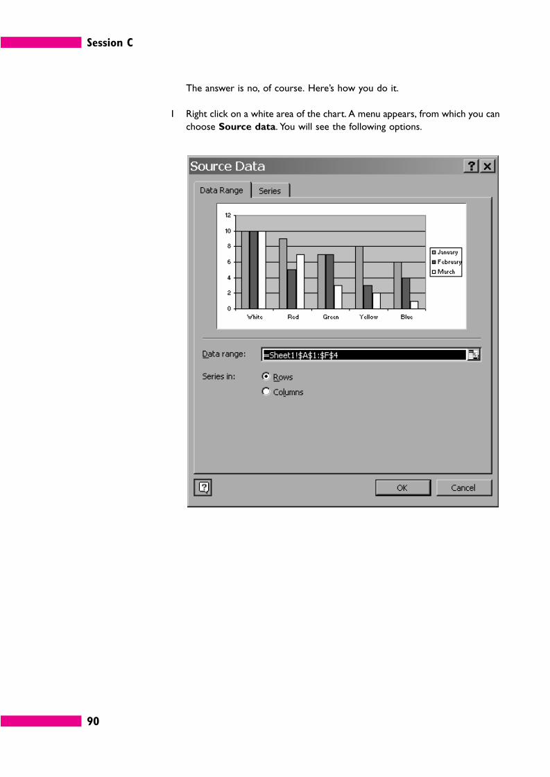
Session C
90
The answer is no, of course. Here’s how you do it.
1 Right click on a white area of the chart. A menu appears, from which you can
choose Source data. You will see the following options.
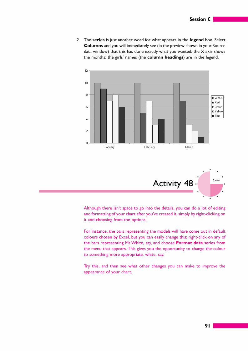
Session C
91
2 The series is just another word for what appears in the legend box. Select
Columns and you will immediately see (in the preview shown in your Source
data window) that this has done exactly what you wanted: the X axis shows
the months; the girls’ names (the column headings) are in the legend.
Activity 485 mins
Although there isn’t space to go into the details, you can do a lot of editing
and formatting of your chart after you’ve created it, simply by right-clicking on
it and choosing from the options.
For instance, the bars representing the models will have come out in default
colours chosen by Excel, but you can easily change this: right-click on any of
the bars representing Ms White, say, and choose Format data series from
the menu that appears. This gives you the opportunity to change the colour
to something more appropriate: white, say.
Try this, and then see what other changes you can make to improve the
appearance of your chart.
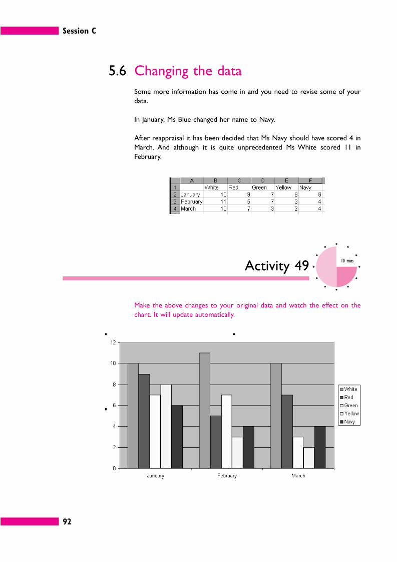
Session C
92
5.6 Changing the data
Some more information has come in and you need to revise some of your
data.
In January, Ms Blue changed her name to Navy.
After reappraisal it has been decided that Ms Navy should have scored 4 in
March. And although it is quite unprecedented Ms White scored 11 in
February.
Activity 4910 mins
Make the above changes to your original data and watch the effect on the
chart. It will update automatically.
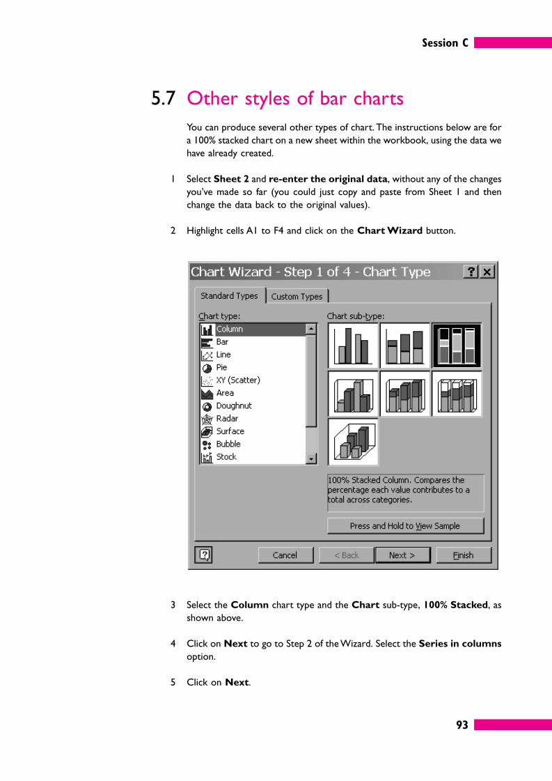
Session C
93
5.7 Other styles of bar charts
You can produce several other types of chart. The instructions below are for
a 100% stacked chart on a new sheet within the workbook, using the data we
have already created.
1 Select Sheet 2 and re-enter the original data, without any of the changes
you’ve made so far (you could just copy and paste from Sheet 1 and then
change the data back to the original values).
2 Highlight cells A1 to F4 and click on the Chart Wizard button.
3 Select the Column chart type and the Chart sub-type, 100% Stacked, as
shown above.
4 Click on Next to go to Step 2 of the Wizard. Select the Series in columns
option.
5 Click on Next.
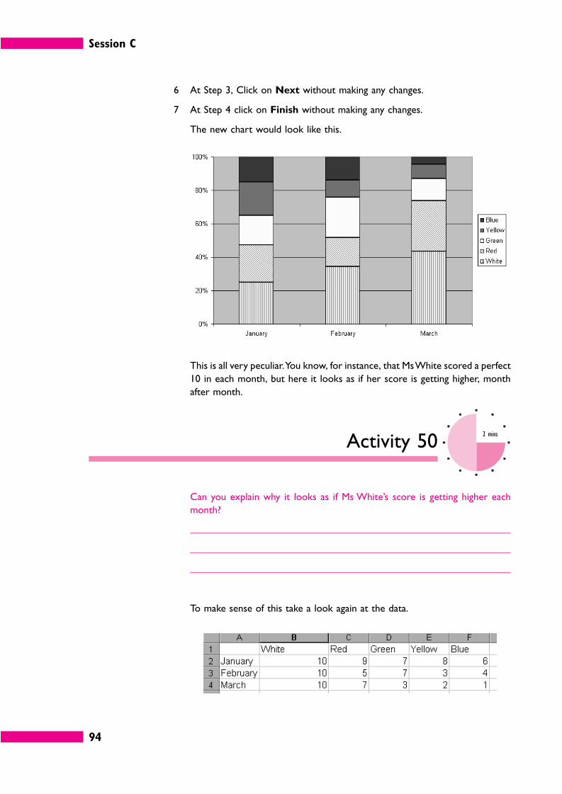
Session C
94
6 At Step 3, Click on Next without making any changes.
7 At Step 4 click on Finish without making any changes.
The new chart would look like this.
This is all very peculiar. You know, for instance, that Ms White scored a perfect
10 in each month, but here it looks as if her score is getting higher, month
after month.
Activity 502 mins
Can you explain why it looks as if Ms White’s score is getting higher each
month?
To make sense of this take a look again at the data.
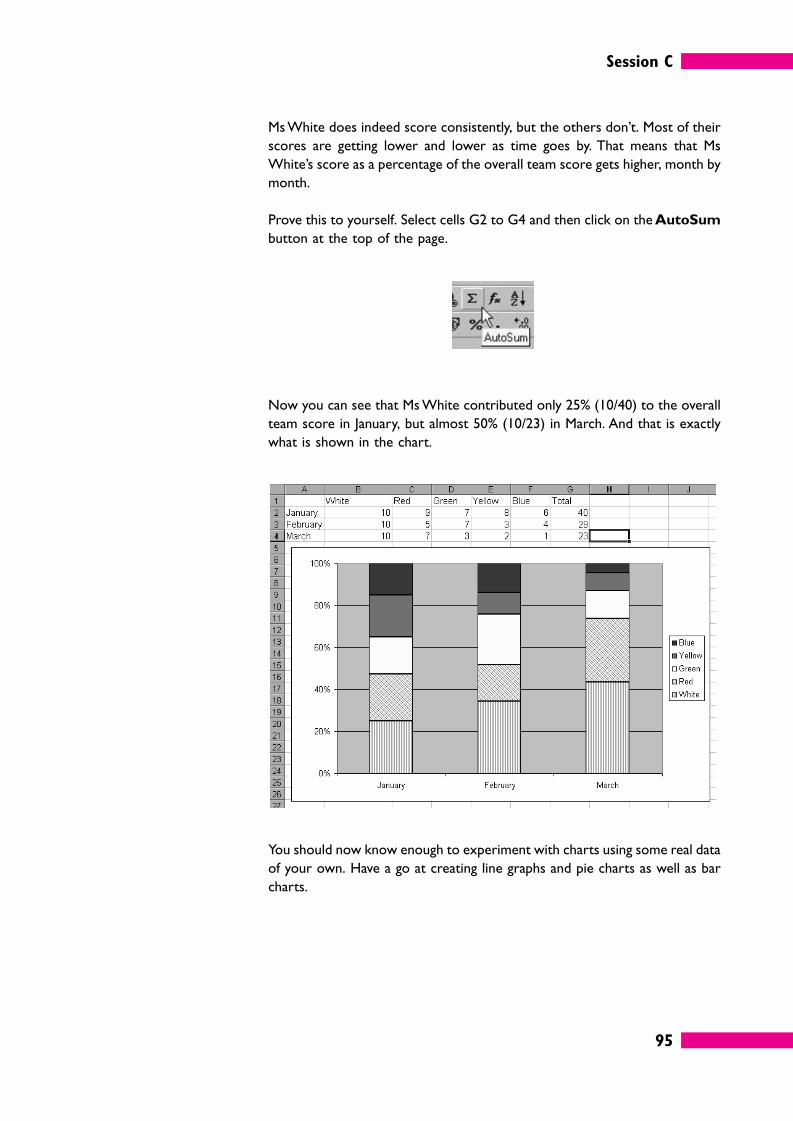
Session C
95
Ms White does indeed score consistently, but the others don’t. Most of their
scores are getting lower and lower as time goes by. That means that Ms
White’s score as a percentage of the overall team score gets higher, month by
month.
Prove this to yourself. Select cells G2 to G4 and then click on the AutoSum
button at the top of the page.
Now you can see that Ms White contributed only 25% (10/40) to the overall
team score in January, but almost 50% (10/23) in March. And that is exactly
what is shown in the chart.
You should now know enough to experiment with charts using some real data
of your own. Have a go at creating line graphs and pie charts as well as bar
charts.
Session C
96
6 Other types of visual presentation
6.1 Flow charts, organization charts and
other labelled diagrams
Flow charts and organization charts are useful ways of presenting and
summarizing information that involves a series of steps and choices and/or
relationships between the different items.
On the following pages there are some examples of this type of
presentation.
If you choose any of these forms of presentation here are some points to bear
in mind.
� Be consistent in your use of layout and symbols (and colours, if used). For
instance, in our flow chart example a decision symbol is always a diamond
with italic text; a YES decision always flows downwards; a NO decision always
flows to the right.
� Keep the number of connecting lines to a minimum and avoid lines that ‘jump
over’ each other at all costs.
� Keep the labels or other text brief and simple.
� Hand-drawn diagrams should be as neat and legible as possible. If they are
likely to be seen by a lot of people (not just your team) it is better to use a
business graphics programme like Microsoft Visio.
� Everyone can draw, but only so well. If you are not expert you can waste an
enormous amount of time playing with computer graphics. If it needs to be
really beautifully presented and you are not an expert sketch it quickly by
hand and then give it to a professional.
Session C
97
A flowchart
An organization chart
Session C
98
A key point summary
Activity 5130 mins
This activity may provide the basis of appropriate evidence for your S/NVQ
portfolio. If you are intending to take this course of action, either use a
computer software program and save the files, or use separate sheets of
paper for your answer.
Look at our examples and then create the following charts for your own
workteam.
� An organization chart.
� A flow chart setting out how to do a work procedure that everybody on your
team does regularly.
6.2 Pictograms
A pictogram is a simple graphic image in which the data is represented by a
picture or symbol, with a clear key to the items and quantities intended.
Different pictures can be used on the same pictogram to represent different
S/NVQ
D1.1, D1.2
Session C
99
elements of the data. For example, a pictogram showing the number of
people employed by an organization might use pictures of . . . people.
You can see quite easily that the workforce has grown and that the
organization employs far more female workers than before.
Pictograms present data in a simple and appealing way. They are often used on
television. Watch out for them next time you are watching a news item
involving numbers (number of trains late, number of new jobs created, and so
on). In pictograms:
� the symbols must be clear and simple;
� there should be a key showing the number that each symbol represents;
� bigger quantities are shown by more symbols, not bigger symbols.
Bear in mind, however, that pictograms are not appropriate if you need to give
precise figures. You can use portions of a symbol to represent smaller
quantities, but there are limits to what you can do.
Session C
100
6.3 Drawings and graphics
A labelled drawing may sometimes be the best way of presenting a lot of
information in a small space. Imagine how difficult it would be to explain all the
information you get from the following diagram if you could only use words!
Activity 523 mins
Where might you obtain pictures and graphics such as the pictogram or the
computer diagram shown above?
The answer to this Activity is on page 134.
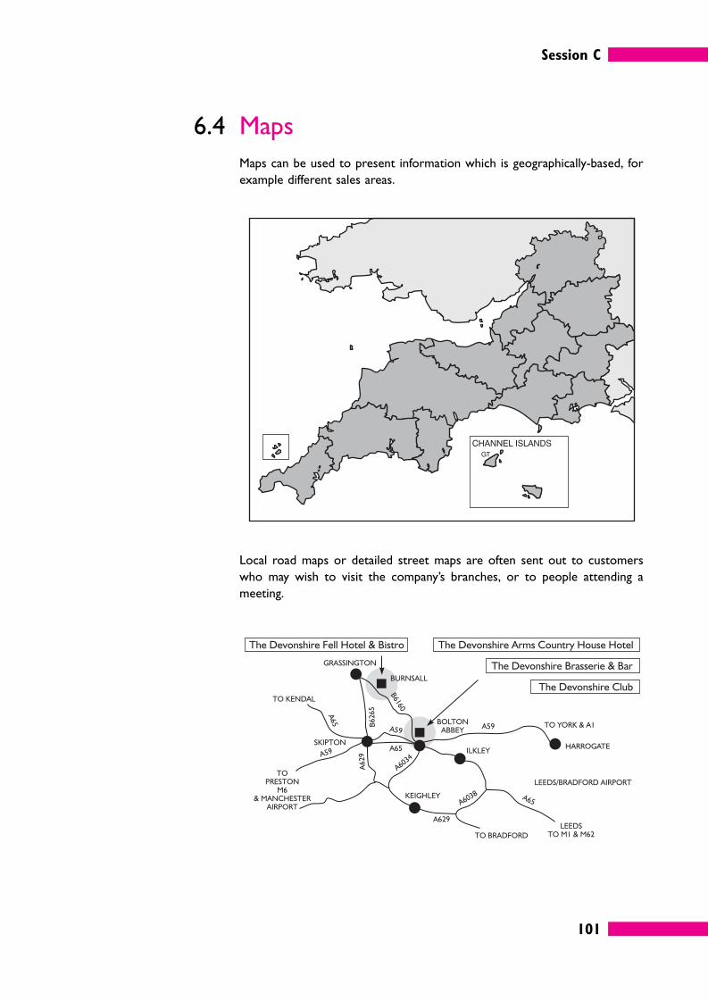
Session C
101
6.4 Maps
Maps can be used to present information which is geographically-based, for
example different sales areas.
Local road maps or detailed street maps are often sent out to customers
who may wish to visit the company’s branches, or to people attending a
meeting.
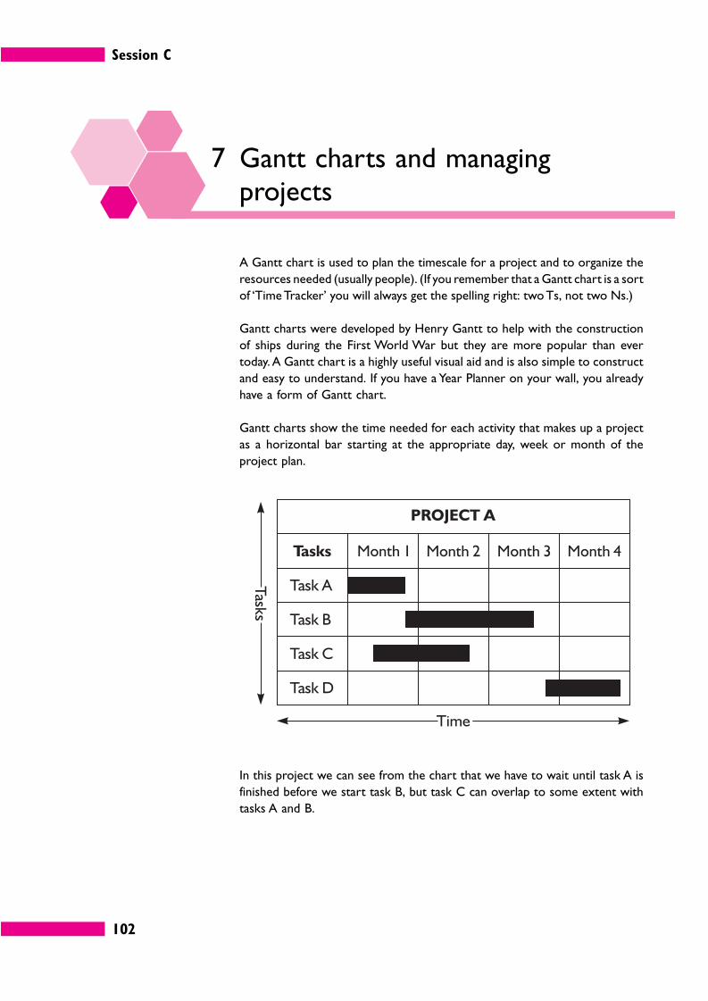
Session C
102
7 Gantt charts and managingprojects
A Gantt chart is used to plan the timescale for a project and to organize the
resources needed (usually people). (If you remember that a Gantt chart is a sort
of ‘Time Tracker’ you will always get the spelling right: two Ts, not two Ns.)
Gantt charts were developed by Henry Gantt to help with the construction
of ships during the First World War but they are more popular than ever
today. A Gantt chart is a highly useful visual aid and is also simple to construct
and easy to understand. If you have a Year Planner on your wall, you already
have a form of Gantt chart.
Gantt charts show the time needed for each activity that makes up a project
as a horizontal bar starting at the appropriate day, week or month of the
project plan.
In this project we can see from the chart that we have to wait until task A is
finished before we start task B, but task C can overlap to some extent with
tasks A and B.
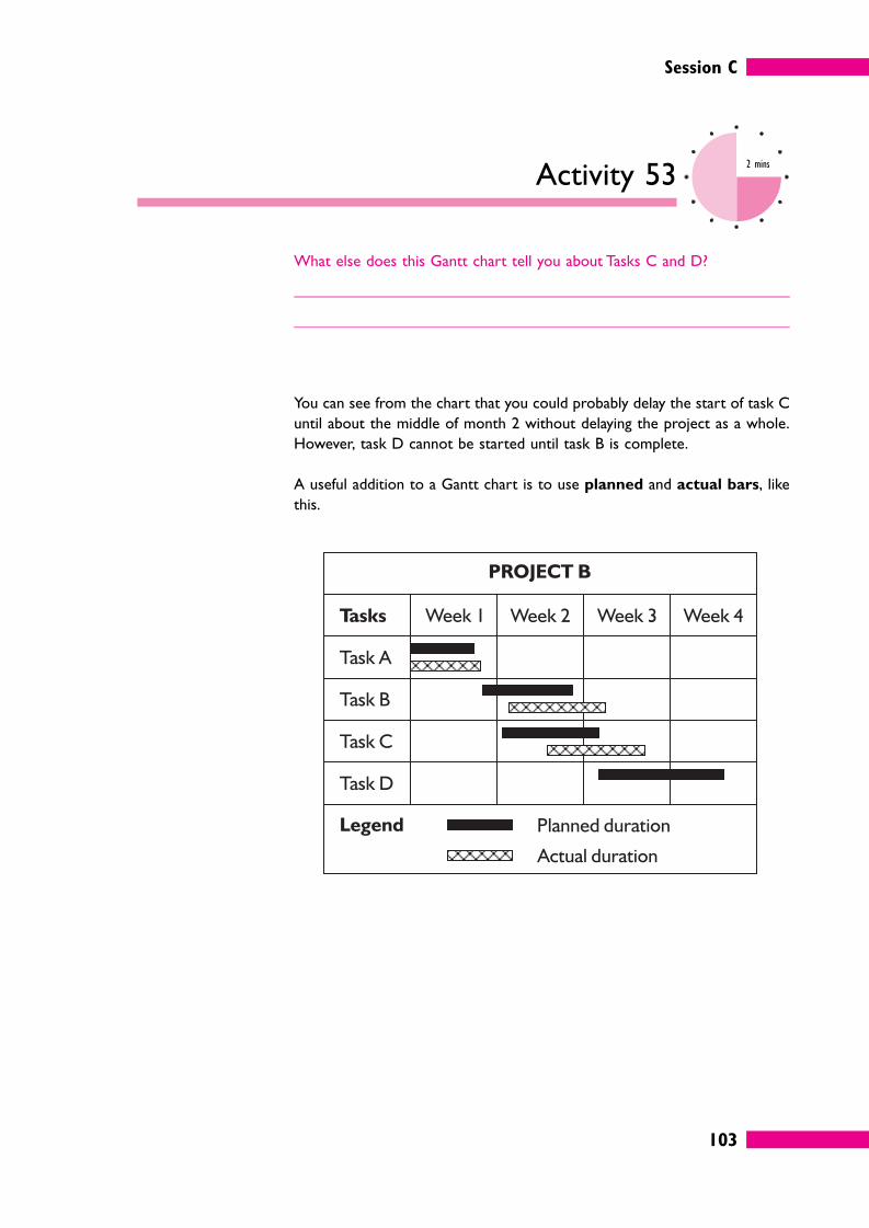
Session C
103
Activity 532 mins
What else does this Gantt chart tell you about Tasks C and D?
You can see from the chart that you could probably delay the start of task C
until about the middle of month 2 without delaying the project as a whole.
However, task D cannot be started until task B is complete.
A useful addition to a Gantt chart is to use planned and actual bars, like
this.
Session C
104
Activity 543 mins
Interpret the chart for project B, commenting on each of the tasks and
the relationships between them. Assume that it is now the Thursday of
week 3.
The answer to this Activity can be found on page 134.
7.1 Gantt charts, software and managing
resources
If your work involves a great deal of project management (one-off, fairly
lengthy jobs, as opposed to a predictable daily routine) you will probably use
specialist project management software such as Microsoft Project, which has
all sorts of aids and charting tools built in, including the ability to create and
update Gantt charts at the touch of a button. There are also specialist
business graphics programs like Microsoft Visio that make it very easy to
create complex Gantt charts.
Microsoft Excel does not have any built-in features devoted to project
management. But that’s not going to stop us using it to illustrate how helpful
Gantt charts can be when it comes to managing the people and resources
under your management.
Let’s suppose you manage a multi-skilled workteam of 20 people, each
capable of working on any of the tasks. Your team’s next project involves
seven tasks which you have codenamed A to G.
� Task A will take five days and require 12 people.
� Task B will take five days and require six people.
� Task C cannot be started until task B is complete. It will take two days and
require eight people.
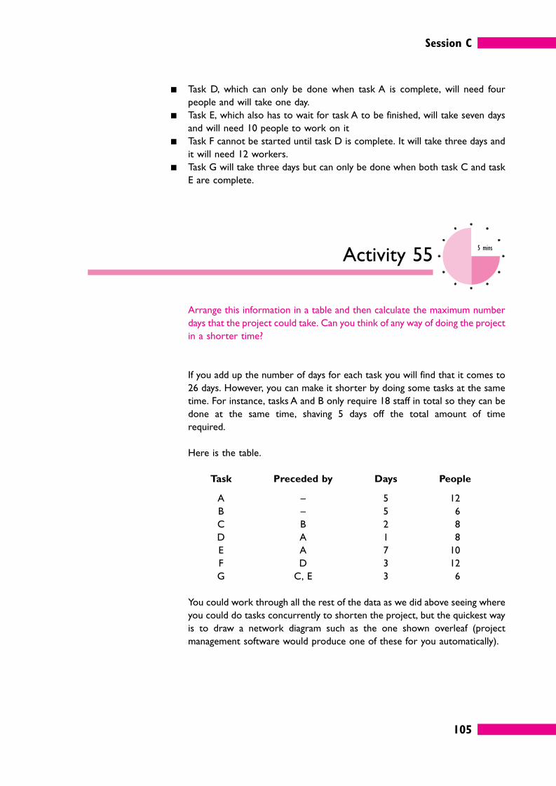
Session C
105
� Task D, which can only be done when task A is complete, will need four
people and will take one day.
� Task E, which also has to wait for task A to be finished, will take seven days
and will need 10 people to work on it
� Task F cannot be started until task D is complete. It will take three days and
it will need 12 workers.
� Task G will take three days but can only be done when both task C and task
E are complete.
Activity 555 mins
Arrange this information in a table and then calculate the maximum number
days that the project could take. Can you think of any way of doing the project
in a shorter time?
If you add up the number of days for each task you will find that it comes to
26 days. However, you can make it shorter by doing some tasks at the same
time. For instance, tasks A and B only require 18 staff in total so they can be
done at the same time, shaving 5 days off the total amount of time
required.
Here is the table.
Task Preceded by Days People
A – 5 12
B – 5 6
C B 2 8
D A 1 8
E A 7 10
F D 3 12
G C, E 3 6
You could work through all the rest of the data as we did above seeing where
you could do tasks concurrently to shorten the project, but the quickest way
is to draw a network diagram such as the one shown overleaf (project
management software would produce one of these for you automatically).
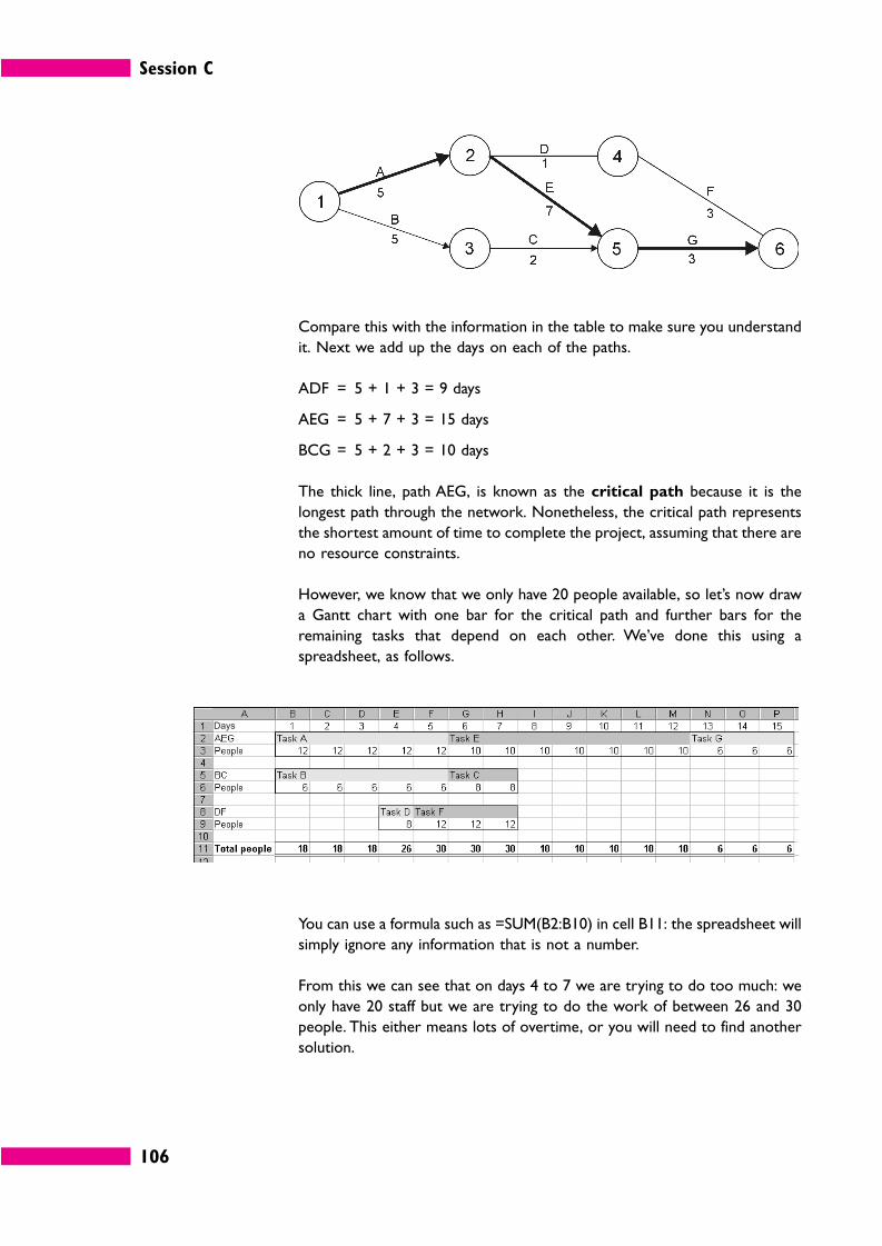
Session C
106
Compare this with the information in the table to make sure you understand
it. Next we add up the days on each of the paths.
ADF = 5 + 1 + 3 = 9 days
AEG = 5 + 7 + 3 = 15 days
BCG = 5 + 2 + 3 = 10 days
The thick line, path AEG, is known as the critical path because it is the
longest path through the network. Nonetheless, the critical path represents
the shortest amount of time to complete the project, assuming that there are
no resource constraints.
However, we know that we only have 20 people available, so let’s now draw
a Gantt chart with one bar for the critical path and further bars for the
remaining tasks that depend on each other. We’ve done this using a
spreadsheet, as follows.
You can use a formula such as =SUM(B2:B10) in cell B11: the spreadsheet will
simply ignore any information that is not a number.
From this we can see that on days 4 to 7 we are trying to do too much: we
only have 20 staff but we are trying to do the work of between 26 and 30
people. This either means lots of overtime, or you will need to find another
solution.
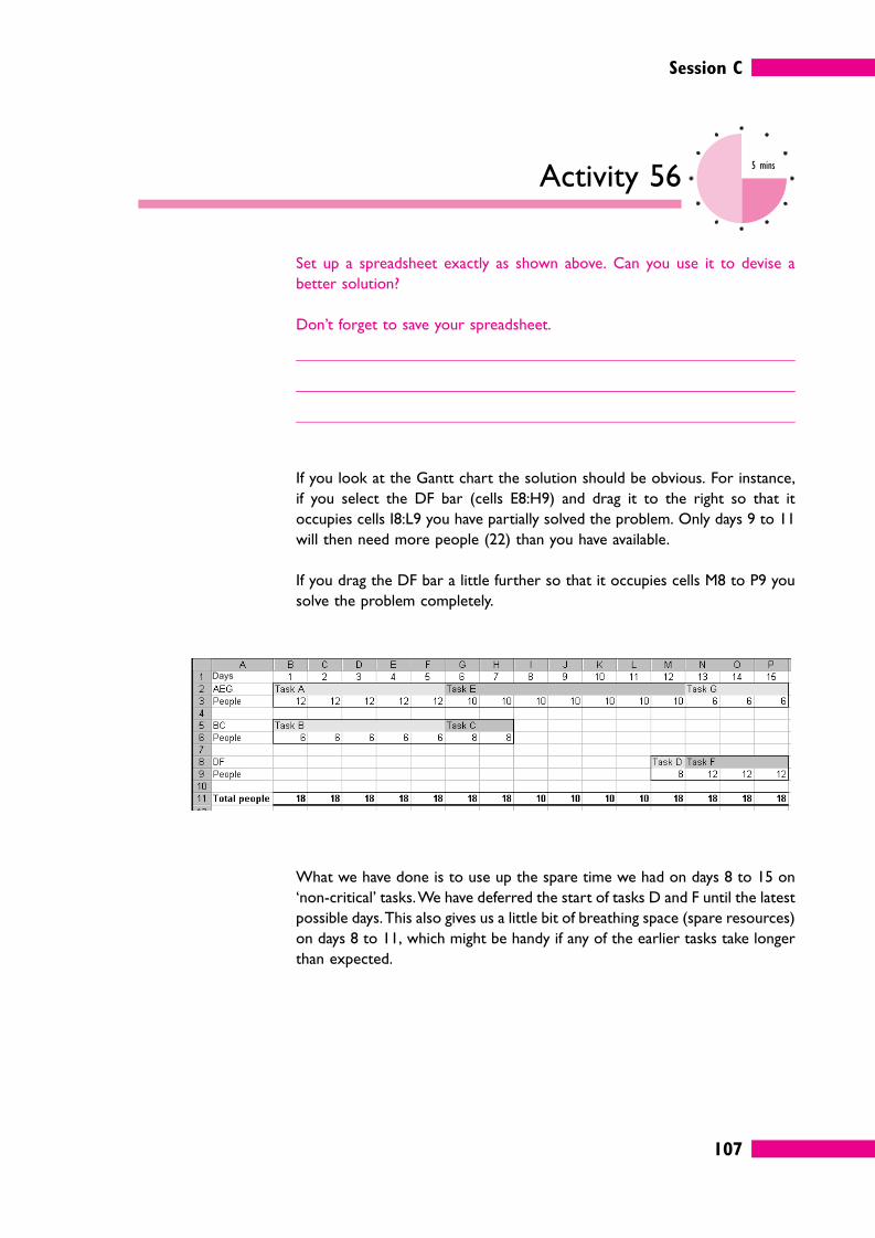
Session C
107
Activity 565 mins
Set up a spreadsheet exactly as shown above. Can you use it to devise a
better solution?
Don’t forget to save your spreadsheet.
If you look at the Gantt chart the solution should be obvious. For instance,
if you select the DF bar (cells E8:H9) and drag it to the right so that it
occupies cells I8:L9 you have partially solved the problem. Only days 9 to 11
will then need more people (22) than you have available.
If you drag the DF bar a little further so that it occupies cells M8 to P9 you
solve the problem completely.
What we have done is to use up the spare time we had on days 8 to 15 on
‘non-critical’ tasks. We have deferred the start of tasks D and F until the latest
possible days. This also gives us a little bit of breathing space (spare resources)
on days 8 to 11, which might be handy if any of the earlier tasks take longer
than expected.
Session C
108
Self-assessment 310 mins
1 Fill in the missing words using words from this list.
long, right; short; thin; wide.
Numbers in a table should be -aligned. It is usually better to
have a table than a
table.
2 Create a line graph (either by hand or by using a spreadsheet) based on the
following information.
Units Production cost
0 0
10 1,000
20 1,400
30 1,450
40 1,475
50 2,600
� What does your graph show you?
� A pie chart would be a better way of showing this data. True/False.
3 When you create a chart using Excel the horizontal axis (also known as the
X/Y* axis or category/value/series* axis) is derived from:
� row labels
� column headings
� either rows or column headings
depending on the situation*.
(*Delete as applicable.)
Session C
109
4 If you wanted to create a graphical representation of the steps involved in a
regular procedure carried out by your organization what is the best type of
chart to use?
a A Gantt chart.
b An organization chart.
c A flow chart.
d A pictogram.
5 In a project planning network diagram, is the critical path the longest or the
shortest path?
6 A project will definitely take longer than expected if:
a any individual task takes longer than expected;
b a non-critical task takes longer than expected;
c a critical task takes longer than expected.
Answers to these questions can be found on page 127.
Session C
110
8 Summary
� Tables are a simple way of presenting numerical and/or textual information. Figures are displayed, and can
be compared with each other: relevant totals, subtotals, percentages can also be presented as a summary
for analysis. Clear labels and headings and proper alignment are issues to consider.
� Line graphs are usually used to illustrate trends over time of figures such as sales. It is conventional to
show time on the horizontal axis. Line graphs can help draw attention to questions that need to be asked
and (within limits) can be used to compare performance.
� In a bar chart, data is shown in the form of vertical or horizontal bars which are the same in width but
variable in height. Each bar represents a different item, so bar charts are generally more useful than graphs
for comparisons.
� A pie chart is useful if you want to show the relative sizes of the things that make up a total.
� A large variety of charts and diagrams can be generated by the charting tools in spreadsheet programs
such as Microsoft Excel.
� Other types of visual presentation used in business include organization charts, flow charts, pictograms,
drawings or other graphics and maps.
� Gantt charts are used to plan the timescale for a project and perhaps to organize the resources needed
(usually people). Gantt charts show the time needed for each activity that makes up a project as a
horizontal bar starting at the appropriate day, week or month of the project plan.
111
Performancechecks
1 Quick quiz
Jot down the answers to the following questions on Information in
Management.
Question 1 There are differences between the information used by top management and
the information used by managers lower down the organization. Write a brief
summary of the differences.
Question 2 Collecting more and more information can result in diminishing returns.
Why?
Question 3 When sorting through piles of paperwork to look for relevant information
what is the first thing you should do?
Question 4 Give five examples of mathematical models used in business.
Performance checks
112
Question 5 Give a brief summary of the technique you might use if you had to choose
how best to allocate resources such as staff time between two tasks.
Question 6 What do we mean by ‘raw data’?
Question 7 A school delivers 2,357 pupil-hours of teaching per year. In 2002 it did this
with a staffing level of 15; in 2003 the figure was 14. What were the pupil-
hours per head for the two years?
2002
2003
Question 8 Why is the arithmetic mean sometimes misleading?
Question 9 How can you estimate an average when you only have grouped data, such as
‘53 people in the survey were aged between 19 and 25’?
Question 10 If you know the standard deviation of a set of numbers what two things can
you say about the set of numbers as a whole?
Question 11 Within a long document how should headings and paragraphs be
organized?
Question 12 What are the key points to remember when presenting numbers in a
table?
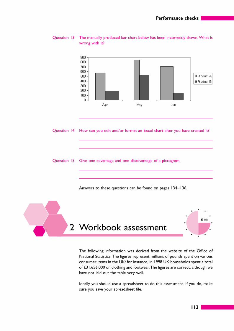
Performance checks
113
Question 13 The manually produced bar chart below has been incorrectly drawn. What is
wrong with it?
Question 14 How can you edit and/or format an Excel chart after you have created it?
Question 15 Give one advantage and one disadvantage of a pictogram.
Answers to these questions can be found on pages 134–136.
2 Workbook assessment60 mins
The following information was derived from the website of the Office of
National Statistics. The figures represent millions of pounds spent on various
consumer items in the UK: for instance, in 1998 UK households spent a total
of £31,656,000 on clothing and footwear. The figures are correct, although we
have not laid out the table very well.
Ideally you should use a spreadsheet to do this assessment. If you do, make
sure you save your spreadsheet file.
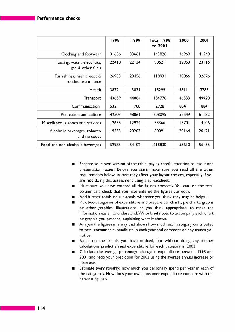
Performance checks
114
1998 1999 Total 1998
to 2001
2000 2001
Clothing and footwear 31656 33661 143826 36969 41540
Housing, water, electricity,
gas & other fuels
22418 22134 90621 22953 23116
Furnishings, hsehld eqpt &
routine hse mntnce
26933 28456 118931 30866 32676
Health 3872 3831 15299 3811 3785
Transport 43659 44864 184776 46333 49920
Communication 532 708 2928 804 884
Recreation and culture 42503 48861 208095 55549 61182
Miscellaneous goods and services 12635 12924 53366 13701 14106
Alcoholic beverages, tobacco
and narcotics
19553 20203 80091 20164 20171
Food and non-alcoholic beverages 52983 54102 218830 55610 56135
� Prepare your own version of the table, paying careful attention to layout and
presentation issues. Before you start, make sure you read all the other
requirements below, in case they affect your layout choices, especially if you
are not doing this assessment using a spreadsheet.
� Make sure you have entered all the figures correctly. You can use the total
column as a check that you have entered the figures correctly.
� Add further totals or sub-totals wherever you think they may be helpful.
� Pick two categories of expenditure and prepare bar charts, pie charts, graphs
or other graphical illustrations, as you think appropriate, to make the
information easier to understand. Write brief notes to accompany each chart
or graphic you prepare, explaining what it shows.
� Analyse the figures in a way that shows how much each category contributed
to total consumer expenditure in each year and comment on any trends you
notice.
� Based on the trends you have noticed, but without doing any further
calculations predict annual expenditure for each category in 2002.
� Calculate the average percentage change in expenditure between 1998 and
2001 and redo your prediction for 2002 using the average annual increase or
decrease.
� Estimate (very roughly) how much you personally spend per year in each of
the categories. How does your own consumer expenditure compare with the
national figures?
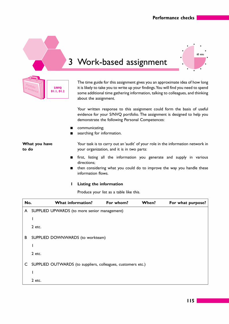
Performance checks
115
3 Work-based assignment60 mins
The time guide for this assignment gives you an approximate idea of how long
it is likely to take you to write up your findings. You will find you need to spend
some additional time gathering information, talking to colleagues, and thinking
about the assignment.
Your written response to this assignment could form the basis of useful
evidence for your S/NVQ portfolio. The assignment is designed to help you
demonstrate the following Personal Competences:
� communicating;
� searching for information.
What you have
to do
Your task is to carry out an ‘audit’ of your role in the information network in
your organization, and it is in two parts:
� first, listing all the information you generate and supply in various
directions;
� then considering what you could do to improve the way you handle these
information flows.
1 Listing the information
Produce your list as a table like this.
No. What information? For whom? When? For what purpose?
A SUPPLIED UPWARDS (to more senior management)
1
2 etc.
B SUPPLIED DOWNWARDS (to workteam)
1
2 etc.
C SUPPLIED OUTWARDS (to suppliers, colleagues, customers etc.)
1
2 etc.
S/NVQ
D1.1, D1.2
Performance checks
116
You may want to consult colleagues and your workteam to make sure your
list is complete. Make sure that you don’t just write ‘for information’ in the
‘For what purpose?’ column – you need to specify what purpose the
information is (or should be) used for.
2 Reviewing your information output
Now review your list and think about ways in which you could be providing
better information in a better way. This may involve:
� producing it in a more timely way;
� making it more comprehensible;
� summarizing key points more clearly;
� using different ways to present the key points (e.g. graphics);
� improving the standard of presentation.
a Comment on the general standard and quality of the information that you
generate. What in general could you do to make it more effective in
conveying the key messages and more useful for the people who receive
it?
b Identify two specific items of information that you could improve and
write detailed notes on what you would do and how.
This is an important and relevant exercise. Organizations live on information,
and better quality information makes them function better. Individuals who
can communicate important information better make better managers, and
have better career prospects. Complete this assignment thoroughly and put
your improvements into practice: you and your organization will both feel the
benefit.

117
Reflect and review
1 Reflect and review
Now that you have completed your work on Information in Management, it is
time to review what you have leant in relation to the objectives that we set
at the beginning. Using information in management is a very big subject, and
what you have learned will be only the beginning. Information in one aspect
or another – getting it, sorting it analysing it, compiling it, sending it –
increasingly dominates management life, and you will encounter it in many
forms. Some of this will be new as technology, systems and expert software
continue to develop.
Even so, what you have learned should have put you well on the way to
fulfilling the objectives set out at the beginning of this book.
Here is the first objective.
� Understand the need to collect information relevant to decisions.
Whenever you are collecting information you should ask yourself questions.
Here are some examples.
� Is it accurate?
� Is it relevant?
� Are the sources reliable?
� Does it provide a guide to the future?
� What does it mean?
� How can it be used?
This is partly about understanding information in context, but it is also about
being critical. You shouldn’t necessarily take things at their face value.
Reflect and review
118
� Think about some information that you have recently received. This might
be an unsolicited mail shot, a regular newsletter that you subscribe to or
information that you have specifically requested or sought out on the
Internet.
� What critical questions could you ask?
The next objective was the first of several relating to the use of information
once you have collected it.
� Use decision-making models.
A decision-making model takes some of the pain out of information analysis
because it is a tried and trusted technique. You don’t have to think too hard
about how to analyse the problem, you simply have to plug the numbers into
a formula and see what the result is.
There is a wide range of decision-making models – we only looked at a few
of the best known ones in this book, particularly stock-related calculations,
resource allocation problems and ‘what if ’ scenarios. You may use some kind
of model in your work without even realizing it, for example if you or
someone else in your department has a devised a spreadsheet to quickly
calculate the answer to a routine problem, or if you have some kind of
specialized software, either part of the accounting system or a stand-alone
package.
� What decision-making models do you have to help you with routine
decisions that arise in your own work? Have you identified any routine
problems that could be dealt with more quickly and effectively if you took
the time to develop a spreadsheet solution?
Reflect and review
119
The next objectives relate to less routine situations: you have a mass of data,
but no predefined way of understanding and summarizing what it all means.
� Analyse numerical data.
� Use statistics to enhance understanding of information.
We tried to reassure you that numerical analysis in business frequently
involves no more than finding totals and calculating percentages or ratios.
Often the question you need to ask is ‘what is typical?’, and you now know
about a selection of averages that you can calculate and the importance of
considering the range of the values.
These techniques are valuable in a large variety of operational management
situations, for instance when you need to know how the individuals in your
team are performing, if you need to set targets, if you want to find out who
is the best supplier of a product or service, or if you need to forecast figures,
say for budgeting.
� Think about how you could make more use of simple statistics in your
work. Note down some examples of problems that you currently deal with
on the basis of ‘gut-feeling’ or intuition. Would you make better decisions
if you took more time to analyse the numbers?
Not all the information you have to deal with is numerical, of course, and this
was reflected in our next objective.
� Analyse qualitative information.
Initial analysis will probably involve sorting the information in some way: by
date or by category or alphabetically and so on. And because there is often no
‘one best way’ of sorting qualitative information it is well worth getting
familiar with the sorting facilities that are available in software packages such
as Excel with its filters and other tools.
Subsequent analysis of qualitative information, and analysis of information that
does not naturally go into a simple list will require report writing skills: how
to use a hierarchy of headers, section and paragraph numbering and so on to
make it easy for readers to find the information they need at a glance; when
(and when not) to include cross-references.
Reflect and review
120
� Think about some of the reports or other information that you have to
generate for others to read. Note down three or four things that you could
start doing now to make them work better for your readers.
� Some of the improvements you would like may involve developing new
skills. Make a note of these.
The next objectives also concerned the presentation of information.
� Select the most appropriate way to present statistical information.
� Present charts and diagrams effectively.
� Interpret statistical information from tables, charts or diagrams.
Sometimes it is enough to present the information in a simple table, as long
as you remember all the rules about headings and alignment and totals.
Charts and diagrams can be very useful ways of summarizing information and
showing up trends that may not be apparent if all you have is a mass of figures.
The most commonly used types in business are graphs, bar charts and pie
charts.
The best way to create a business chart is to use a spreadsheet charting tool.
This is very easy in theory but needs a little practice to get the data exactly
as you want it. That raises another issue: you should of course be able to
explain in words what your charts mean.
� Get into the habit of summarizing your data in the form of charts and
graphs. You may not always use the charts you create in your final report
but they are quick and easy to create if you use the right tools and they may
draw attention to trends that would otherwise go unnoticed.
Make a note of any charts that you could produce regularly to illustrate
your team’s current performance and performance targets.
Reflect and review
121
The final objective listed at the beginning of this book was this.
� Use spreadsheets and spreadsheet databases
Of course this is not a skill to be developed in isolation, but in the context of
all the other objectives above. Spreadsheets offer you a huge number of time-
saving tools and techniques for manipulating and analysing data, especially (but
not only) numerical data. If you or members of your team are still analysing
figures using pen, paper and calculator you are almost certainly wasting your
time.
� Do you know how to extract data from other computer systems used in
your organization into a spreadsheet, for further analysis? Find out how to
do so, if not, and make a note of any ways you think it would help you to
have information in a more easily analysable form.
� Do all the members of your team have adequate training in the use of
spreadsheets (and other office software)? Make a note of any training needs
that you have identified, both for yourself and for your team members.
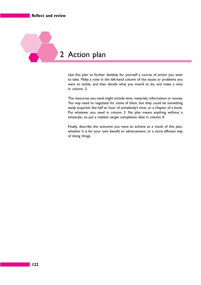
Reflect and review
122
2 Action plan
Use this plan to further develop for yourself a course of action you want
to take. Make a note in the left-hand column of the issues or problems you
want to tackle, and then decide what you intend to do, and make a note
in column 2.
The resources you need might include time, materials, information or money.
You may need to negotiate for some of them, but they could be something
easily acquired, like half an hour of somebody’s time, or a chapter of a book.
Put whatever you need in column 3. No plan means anything without a
timescale, so put a realistic target completion date in column 4.
Finally, describe the outcome you want to achieve as a result of this plan,
whether it is for your own benefit or advancement, or a more efficient way
of doing things.
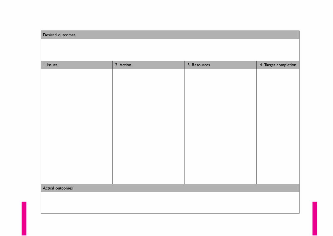
Desired outcomes
1 Issues 2 Action 3 Resources 4 Target completion
Actual outcomes
Reflect and review
124
3 Extensions
Extension 1 Book Managing Information and Statistics
Authors Roland Bee, Frances Bee
Edition May 1999
Publisher Chartered Institute of Personnel and Development (CIPD)
ISBN 0852927851
Extension 2 Book Statistics for the Utterly Confused
Author Lloyd R Jaisingh
Edition May, 2000
Publisher McGraw-Hill
ISBN 0071350055
Extension 3 Book Excel 2002 for Dummies
Author Greg Harvey
Edition July, 2001
Publisher Hungry Minds Inc
ISBN 0764508229
4 Answers to self-assessmentquestions
Self-assessment 1
on page 32
1 Statement a is incorrect; the job of top managers is to manage the strategy
and general direction of the organization. It is not to get involved in every
detail of operations. This is the job of middle managers and first line managers,
who can be asked to report upwards when necessary.
Statement b is correct. For example, a maintenance workteam doesn’t need
to know about what kind of sales techniques are currently being brought in.
Reflect and review
125
Yet experience and research both show that keeping people in the picture
makes them feel part of the wider organization, and helps improves morale
and motivation.
2 Here are the six stages.
� Stage 1: Problem recognition.
� Stage 2: Problem definition and structuring.
� Stage 3: Identifying alternative courses of action.
� Stage 4: Making and communicating the decision.
� Stage 5: Implementing the decision.
� Stage 6: Review of the effects of the decision.
3 The paragraph should read as follows.
We need information to make decisions [PHRASE C], but usually we
don’t have enough [PHRASE E] information to make good decisions. That
means acquiring more information [PHRASE D], but too much
information creates problems in itself [PHRASE A], because the costs of
obtaining, sorting and evaluating [PHRASE B] it can be greater than its
value.
4 � Step 1: Find out which resource is the limiting factor.
� Step 2: Identify the gross profit earned by each product per unit of the
scarce resource.
� Step 3: Work out the production budget, making enough of the product
with the highest gross profit per limiting factor to meet the full
sales demand, and using the remaining units of scarce resource to
make as many as possible of the other product(s) in order of
profitability per unit of scarce resource.
5 A business decision model usually represents a real-life situation in terms of
mathematical relationships and formulae. The model will consist of
several interrelated variables. A model allows you to try out different
scenarios to see which course of action gives the best results.
6 The probability of someone being absent is 23/260 = 0.089. The full number
of hours that should be available is 22 × 7 × 10 = 1,540. The expected hours
lost are therefore 0.088 × 1,540 = about 136. The expected hours available
are 1,540 – 136 = 1,404. You may have got a slightly different answer,
depending on rounding.
7 When drawing a decision tree a circle is used as the symbol for an outcome
point, and a square is used as the symbol for a decision point. The branches
from an outcome point have probabilities assigned to them. A decision tree
is evaluated from right to left.
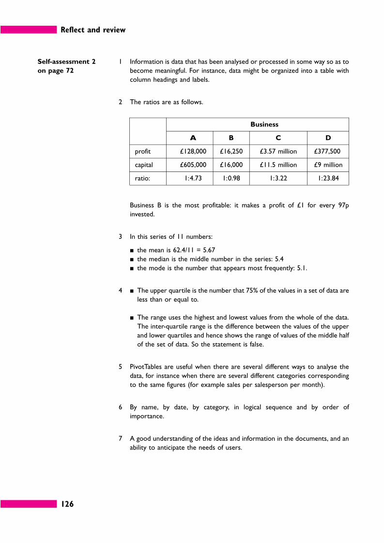
Reflect and review
126
Self-assessment 2
on page 72
1 Information is data that has been analysed or processed in some way so as to
become meaningful. For instance, data might be organized into a table with
column headings and labels.
2 The ratios are as follows.
Business
A B C D
profit £128,000 £16,250 £3.57 million £377,500
capital £605,000 £16,000 £11.5 million £9 million
ratio: 1:4.73 1:0.98 1:3.22 1:23.84
Business B is the most profitable: it makes a profit of £1 for every 97p
invested.
3 In this series of 11 numbers:
� the mean is 62.4/11 = 5.67
� the median is the middle number in the series: 5.4
� the mode is the number that appears most frequently: 5.1.
4 � The upper quartile is the number that 75% of the values in a set of data are
less than or equal to.
� The range uses the highest and lowest values from the whole of the data.
The inter-quartile range is the difference between the values of the upper
and lower quartiles and hence shows the range of values of the middle half
of the set of data. So the statement is false.
5 PivotTables are useful when there are several different ways to analyse the
data, for instance when there are several different categories corresponding
to the same figures (for example sales per salesperson per month).
6 By name, by date, by category, in logical sequence and by order of
importance.
7 A good understanding of the ideas and information in the documents, and an
ability to anticipate the needs of users.
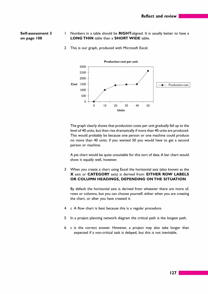
Reflect and review
127
Self-assessment 3
on page 108
1 Numbers in a table should be RIGHT-aligned. It is usually better to have a
LONG THIN table than a SHORT WIDE table.
2 This is our graph, produced with Microsoft Excel.
The graph clearly shows that production costs per unit gradually fall up to the
level of 40 units, but then rise dramatically if more than 40 units are produced.
This would probably be because one person or one machine could produce
no more than 40 units: if you wanted 50 you would have to get a second
person or machine.
A pie chart would be quite unsuitable for this sort of data. A bar chart would
show it equally well, however.
3 When you create a chart using Excel the horizontal axis (also known as the
X axis or CATEGORY axis) is derived from: EITHER ROW LABELS
OR COLUMN HEADINGS, DEPENDING ON THE SITUATION.
By default the horizontal axis is derived from whatever there are more of,
rows or columns, but you can choose yourself, either when you are creating
the chart, or after you have created it.
4 c A flow chart is best because this is a regular procedure.
5 In a project planning network diagram the critical path is the longest path.
6 c is the correct answer. However, a project may also take longer than
expected if a non-critical task is delayed, but this is not inevitable.
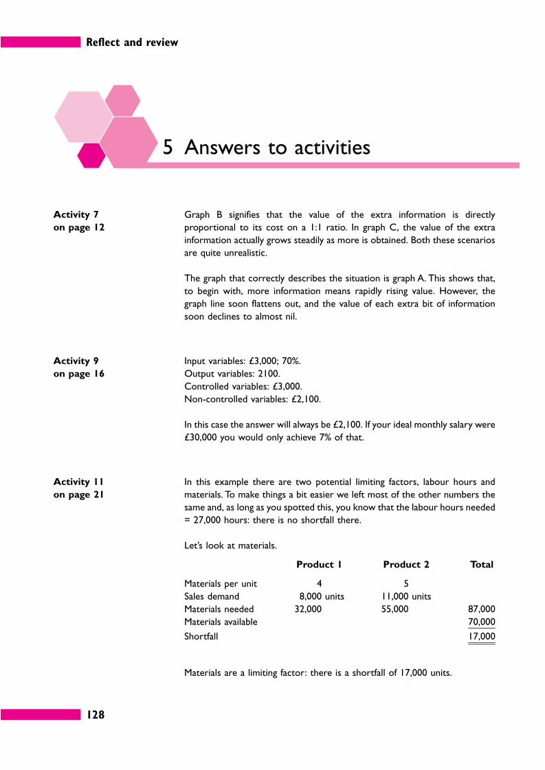
Reflect and review
128
5 Answers to activities
Activity 7
on page 12
Graph B signifies that the value of the extra information is directly
proportional to its cost on a 1:1 ratio. In graph C, the value of the extra
information actually grows steadily as more is obtained. Both these scenarios
are quite unrealistic.
The graph that correctly describes the situation is graph A. This shows that,
to begin with, more information means rapidly rising value. However, the
graph line soon flattens out, and the value of each extra bit of information
soon declines to almost nil.
Activity 9
on page 16
Input variables: £3,000; 70%.
Output variables: 2100.
Controlled variables: £3,000.
Non-controlled variables: £2,100.
In this case the answer will always be £2,100. If your ideal monthly salary were
£30,000 you would only achieve 7% of that.
Activity 11
on page 21
In this example there are two potential limiting factors, labour hours and
materials. To make things a bit easier we left most of the other numbers the
same and, as long as you spotted this, you know that the labour hours needed
= 27,000 hours: there is no shortfall there.
Let’s look at materials.
Product 1 Product 2 Total
Materials per unit 4 5
Sales demand 8,000 units 11,000 units
Materials needed 32,000 55,000 87,000
Materials available 70,000
Shortfall 17,000
Materials are a limiting factor: there is a shortfall of 17,000 units.
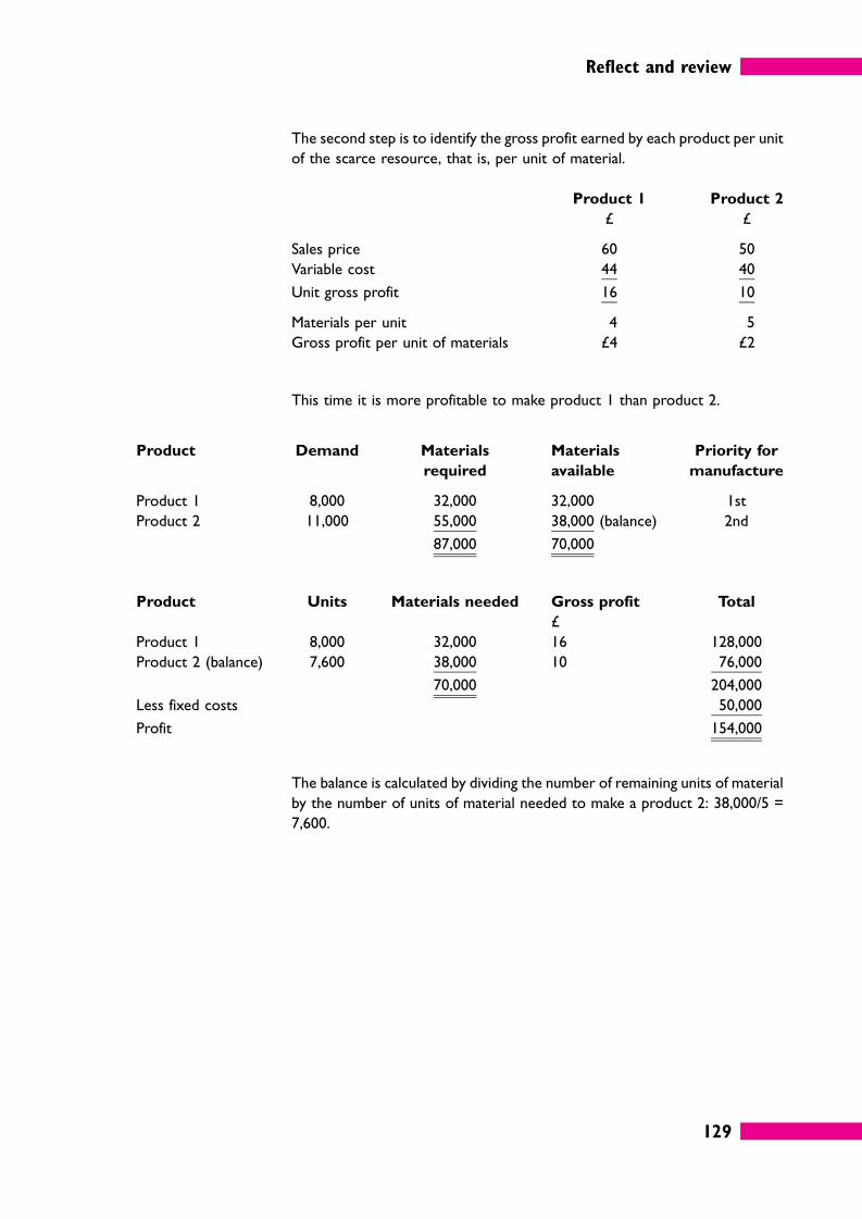
Reflect and review
129
The second step is to identify the gross profit earned by each product per unit
of the scarce resource, that is, per unit of material.
Product 1 Product 2
£ £
Sales price 60 50
Variable cost 44 40
Unit gross profit 16 10
Materials per unit 4 5
Gross profit per unit of materials £4 £2
This time it is more profitable to make product 1 than product 2.
Product Demand Materials
required
Materials
available
Priority for
manufacture
Product 1 8,000 32,000 32,000 1st
Product 2 11,000 55,000 38,000 (balance) 2nd
87,000 70,000
Product Units Materials needed Gross profit Total
£
Product 1 8,000 32,000 16 128,000
Product 2 (balance) 7,600 38,000 10 76,000
70,000 204,000
Less fixed costs 50,000
Profit 154,000
The balance is calculated by dividing the number of remaining units of material
by the number of units of material needed to make a product 2: 38,000/5 =
7,600.
Reflect and review
130
Activity 12
on page 23
Here are all the formulae. To see yours like this press Control + ` (the key just
above the Tab key) and to get the numbers back again press Control + `
again. You may want to print it out in formula form, to show that you have
done this Activity, and print out the numbers versions when you are doing the
‘what if ’ analysis.
If the cost of sales is 68%, the bank balance at the end of Month 3 is £2,944.
Remember to change the figure back to 65% before doing the next part.
If the payment pattern changes, the bank balance at the end of Month 3 will
be £1,450. Again, remember to restore the original figures.
If sales growth is only 15%, the bank balance at the end of Month 3 will be
£3,432.
Activity 17
on page 31
The EV at point E will be £63,060, so the decision at point C is the same.
Sales £ £
High 140,000 0.24 33,600
Medium 78,000 0.55 42,900
Low –64,000 0.21 –13,440
63,060
The EV at point B will be as follows.
EV
£ £
Point C 63,060 0.75 47,295
Point D 16,000 0.25 4,000
51,295
Taking away the test marketing cost of £32,000 gives us £19,295, so the
decision will still be to test market the product.
Reflect and review
131
Activity 19
on page 37
It would be better if the data were organized in alphabetical order of country,
not numerical order. (This would be more obvious if you saw the a list with
hundreds of codes.)
Activity 21
on page 39 Company Capital
employed
(£m)
2004
profit
(£)
Capital:profit
ratio
Profit
%
A 15.80 995,400 1:63,000 6.3%
B 5.90 324,500 1:55,000 5.5%
C 44.20 5,348,200 1:121,000 12.1%
D 21.40 2,461,000 1:115,000 11.5%
E 0.85 79,000 1:92,941 9.3%
F 87.00 13,746,000 1:158,000 15.8%
Most profitable: Company F.
Least profitable: Company B.
Activity 22
on page 42
Period 1 2 3 4 5 Average
Data
Output (units) 217.0 221.0 229.0 214.0 233.0 222.80
Headcount 61.0 61.0 59.0 51.0 51.0 56.60
Cost (£’000s) 119.6 125.3 125.1 119.5 131.3 124.16
Hours worked 2,318.0 2,379.0 2,315.0 2,116.0 2,167.0 2,259.00
Indexes
Output per head 3.56 3.62 3.88 4.20 4.57 3.97
Cost per unit of output 0.55 0.57 0.55 0.56 0.56 0.56
Hours worked per unit 10.68 10.76 10.11 9.89 9.30 10.15
Cost per head 1.96 2.05 2.12 2.34 2.57 2.21
We have an example here of an organization that is trying to achieve higher
productivity, but failing to make real gains.
Reflect and review
132
Productivity, in the form of output per head and the hours needed to produce
each unit, has improved considerably. Unfortunately, the labour cost per head
has risen, so the cost per unit – the key issue for competitiveness – has
remained the same. The aim of improving productivity is to reduce costs in
the interests of efficiency and competitiveness. In this example, the wage bill
has kept pace with productivity, negating the potential gains.
Activity 23
on page 43
Staff Interviews conducted per day
Monday Tuesday Wednesday Thursday Friday Total Average
Dela 45 43 44 21 46 199 39.8
Corinne 54 50 51 55 53 263 52.6
David 38 41 40 44 39 202 40.4
Activity 24
on page 44
Staff Interviews conducted per day
Monday Tuesday Wednesday Thursday Friday Total Average
Dela
Actual 45.0 43.0 44.0 21.0 46.0 199.0 39.8
Target 52.5 52.5 52.5 52.5 52.5 262.5 52.5
% of target 85.7% 81.9% 83.8% 40.0% 87.6% n/a 75.8%
Corinne
Actual 54.0 50.0 51.0 55.0 53.0 263.0 52.6
Target 52.5 52.5 52.5 52.5 52.5 262.5 52.5
% of target 102.9% 95.2% 97.1% 104.8% 101.0% n/a 100.2%
David
Actual 38.0 41.0 40.0 44.0 39.0 202.0 40.4
Target 38.0 38.0 38.0 38.0 38.0 190.0 38.0
% of target 100.0% 107.9% 105.3% 115.8% 102.6% n/a 106.3%
Reflect and review
133
Activity 26
on page 46
Answer Spreadsheet formulae
Mean 236 = AVERAGE(A1:A9)
Median 249 = MEDIAN(A1:A9)
Mode 263 = MODE(A1:A9)
Not all formulae are as obvious as this, but many are.
Activity 32 on
page 58
If sales demand is 28,000 units the sales pattern will be as follows.
Spring Summer Autumn Winter
6,837.5 5,354.17 9,395.83 6,412.5
Activity 38
on page 67
The information is organized in ascending order of employee number.
It could be organized in alphabetical order of last name or first name, by
position, in chronological order of date joined, or (if the dates in the last
column are recognized as dates) according to date of 2004 Annual Review.
The best way to organize the data is probably by last name. Arguably it could
be organized by date of Annual Review, since this would highlight the fact that
some reviews are overdue and action is needed.
Activity 40
on page 70
Cross-references to paragraph numbers involve less work and carry less risk of
error. When you add material to a document, or delete material, all the
subsequent page numbers are likely to change, so if you cross-refer to page
numbers you will have to revise all the cross-references that appear after the
insertion or deletion. If you cross-refer to paragraph numbers, however, only a
few references will change if you delete something or insert something new.
Reflect and review
134
Activity 43
on page 80
Products A and B both suffer a dip in sales in May and October, and both show
a significant rise in sales in July and from October to December.
Activity 44
on page 82
Products A and B show opposite behaviour in the first two months. Product
A sales roughly double in February, but fall back slightly in March. Product B
sales roughly halve in February and fall a bit further in March.
Activity 52
on page 100
Office packages typically have a variety of clip-art images that you can use to
liven up your documents, reports or presentations, but take care with these:
many are rather cartoon-like and if you use them too much or use them
inappropriately your work may not be taken seriously.
Product photos and diagrams may well be available from the production
department in your organization.
The Internet is a fabulous source of graphic images, but again care is needed.
If you use an image found on the Internet it may be subject to copyright
restrictions.
Activity 54
on page 104
Task B can only be started once task A is completed, and task D can only be
started once task C is completed. Task C can be done more or less
concurrently with task B.
The ‘actual’ bars show that task A took longer than expected, making the start
of tasks B and C late. Tasks B and C appear to have been done in the allotted
time, but task D has not yet been started. It should have started at the
beginning of week 3, but it will not be started until the end of that week.
6 Answers to the quick quiz
Answer 1 Top management usually want bottom-line or summary information about
key areas. Lower down the organization, managers are interested in
operational (day-to-day) details and information about individual staff
performance, productivity and so on.
Answer 2 Collecting more and more information can result in diminishing returns
because the cost of collection and the time needed to process and interpret
the information begin to outweigh its extra value.
Reflect and review
135
Answer 3 The first thing to do is to make a list of the items of information you have
before you, perhaps numbering or coding them in some way.
Answer 4 � Inventory models, used for determining stock levels and re-order
amounts.
� Resource allocation models, to decide how to use up staff time, materials
and so on in the most profitable way.
� Budget models such as cash budgets and breakeven analysis.
� Queuing models, which attempt to optimize customer waiting time, for
example in a call centre or a supermarket.
� Business plan models, used for overall planning by senior managers.
Answer 5 We were trying to tempt you to write about Gantt charts, so well done if you
realized that we were actually referring to the use of limiting factors. This
technique involves identifying the limiting factor(s), calculating the profit
earned by each product per unit of the scarce resource, and then devising a
plan that concentrates on the most profitable product first and then allocates
any resources left over to other products.
Answer 6 Raw data means any data that has not been processed so as to turn it into
useable information.
Answer 7 In 2002 the ratio was approximately 1:157. In 2003 it was approximately
1:168.
Answer 8 The mean can easily be distorted by the inclusion of one or more untypical
figures, in other words a figure much higher or lower than the majority of the
values.
Answer 9 To calculate the average when you have grouped data, you need to decide
which value best represents all of the values in a particular class interval. It is
a convention in statistics to take the mid-point of each class interval, on the
assumption that the frequencies occur pretty evenly. In this example the
midpoint is 22.
Answer 10 � Sixty-eight per cent of the values in a set of numbers will be within plus or
minus one standard deviation of the arithmetic mean.
� Ninety-five per cent of the values in a set of numbers will be within plus or
minus two standard deviations of the mean.
Answer 11 There should be a ‘hierarchy’ of headings: an overall title, section headings and
within each section up to three levels of sub-heading. Sections might be
lettered A, B and so on; main points numbered 1, 2, and so on, paragraphs
numbered 1.1, 1.2, 2.1, 2.2; and sub-paragraphs 1.2.1, and so on.
Reflect and review
136
Answer 12 Numbers should be right-aligned and they are easier to read if you use the
comma separator for thousands. Decimal points should line up, either by
using a decimal tab or by adding extra zeros. A total figure is often advisable
at the bottom of each column of figures and possibly at the end of each
row.
Answer 13 The bars should be the same width.
Answer 14 A chart can be edited and formatted by right clicking on the chart as a whole
or on an individual item within it and choosing from the menu options
presented (Format chart, Format axis, etc.).
Answer 15 Pictograms present data in a simple and appealing way and for this reason they
are often used in the media. However, pictograms are not appropriate if you
need to give precise figures. You can use portions of a symbol to represent
smaller quantities, but there are limits to what you can do.
7 Certificate
Completion of this certificate by an authorized person shows that you have
worked through all the parts of this workbook and satisfactorily completed
the assessments. The certificate provides a record of what you have done that
may be used for exemptions or as evidence of prior learning against other
nationally certificated qualifications.
Pergamon Flexible Learning and ILM are always keen to refine and improve
their products. One of the key sources of information to help this process are
people who have just used the product. If you have any information or views,
good or bad, please pass these on.

INSTITUTE OF LEADERSHIP & MANAGEMENT
SUPERSERIES
Information in Management
...........................................................................................................................................................
has satisfactorily completed this workbook
Name of signatory ....................................................................................................................
Position ........................................................................................................................................
Signature ......................................................................................................................................
Date ...................................................................................
Official stamp
Fourth Edition