Embed Size (px)
Citation preview

YEOH
Yeoh 2
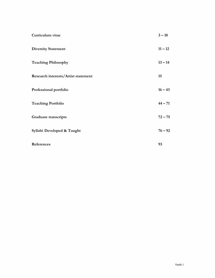
Curriculum vitae 3 – 10 Diversity Statement 11 – 12 Teaching Philosophy 13 – 14 Research interests/Artist statement 15 Professional portfolio 16 – 43 Teaching Portfolio 44 – 71 Graduate transcripts 72 – 75 Syllabi Developed & Taught 76 – 92 References 93
Yeoh 3
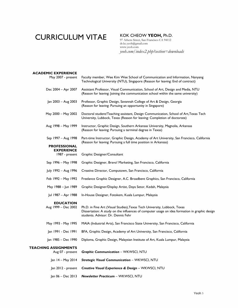
CURRICULUM VITAE KOK CHEOW YEOH, Ph.D. 97 Athens Street, San Francisco CA 94112 [email protected] www.yeoh.com
yeoh.com/index2.php?section=downloads
ACADEMIC EXPERIENCE
May 2007 - present
Dec 2004 – Apr 2007
Jan 2003 – Aug 2003
May 2000 – May 2002
Aug 1998 – May 1999
Sep 1997 – Aug 1998
PROFESSIONAL
EXPERIENCE
1987 - present
Sep 1996 – May 1998
July 1992 – Aug 1996
Feb 1992 – May 1992
May 1988 – Jun 1989
Jul 1987 – Apr 1988
EDUCATION
Aug 1999 – Dec 2002
May 1993 - May 1995
Jan 1991 - Dec 1991
Jan 1985 – Dec 1990
TEACHING ASSIGNMENTS
Aug 07 - present
Jan 14 – May 2014
Jan 2012 - present
Jan 06 – Dec 2013
Faculty member, Wee Kim Wee School of Communication and Information, Nanyang
Technological University (NTU), Singapore (Reason for leaving: End of contract)
Assistant Professor, Visual Communication, School of Art, Design and Media, NTU
(Reason for leaving: Joining the communication school within the same university)
Professor, Graphic Design, Savannah College of Art & Design, Georgia
(Reason for leaving: Pursuing an opportunity in Singapore)
Doctoral student/Teaching assistant, Design Communication, School of Art,Texas Tech
University, Lubbock, Texas (Reason for leaving: Completion of doctorate)
Instructor, Graphic Design, Southern Arkansas University, Magnolia, Arkansas
(Reason for leaving: Pursuing a terminal degree in Texas)
Part-time Instructor, Graphic Design, Academy of Art University, San Francisco, California
(Reason for leaving: Pursuing a full time position in Arkansas)
Graphic Designer/Consultant
Graphic Designer, Bravo! Marketing, San Francisco, California
Creative Director, Computown, San Francisco, California
Freelance Graphic Designer, A.C. Broadbent Graphics, San Francisco, California
Graphic Designer/Display Artist, Daya Setor, Kedah, Malaysia
In-House Designer, Fotokem, Kuala Lumpur, Malaysia
Ph.D. in Fine Art (Visual Studies),Texas Tech University, Lubbock, Texas
Dissertation: A study on the influences of computer usage on idea formation in graphic design
students. Advisor: Dr. Dennis Fehr
MAIA (Industrial Arts), San Francisco State University, San Francisco, California
BFA, Graphic Design, Academy of Art University, San Francisco, California
Diploma, Graphic Design, Malaysian Institute of Art, Kuala Lumpur, Malaysia
Graphic Communication – WKWSCI, NTU
Strategic Visual Communication – WKWSCI, NTU
Creative Visual Experience & Design – WKWSCI, NTU
Newsletter Practicum – WKWSCI, NTU
Yeoh 4
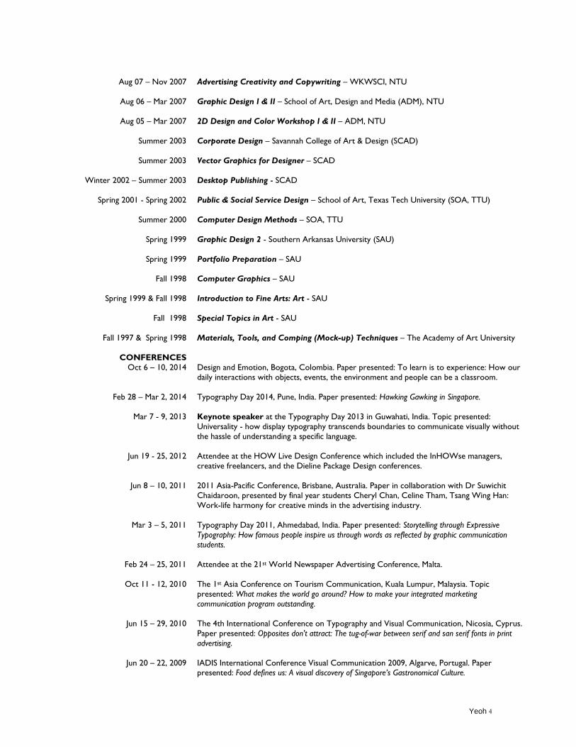
Aug 07 – Nov 2007
Aug 06 – Mar 2007
Aug 05 – Mar 2007
Summer 2003
Summer 2003
Winter 2002 – Summer 2003
Spring 2001 - Spring 2002
Summer 2000
Spring 1999
Spring 1999
Fall 1998
Spring 1999 & Fall 1998
Fall 1998
Fall 1997 & Spring 1998
CONFERENCES
Oct 6 – 10, 2014
Feb 28 – Mar 2, 2014
Mar 7 - 9, 2013
Jun 19 - 25, 2012
Jun 8 – 10, 2011
Mar 3 – 5, 2011
Feb 24 – 25, 2011
Oct 11 - 12, 2010
Jun 15 – 29, 2010
Jun 20 – 22, 2009
Advertising Creativity and Copywriting – WKWSCI, NTU
Graphic Design I & II – School of Art, Design and Media (ADM), NTU
2D Design and Color Workshop I & II – ADM, NTU
Corporate Design – Savannah College of Art & Design (SCAD)
Vector Graphics for Designer – SCAD
Desktop Publishing - SCAD
Public & Social Service Design – School of Art, Texas Tech University (SOA, TTU)
Computer Design Methods – SOA, TTU
Graphic Design 2 - Southern Arkansas University (SAU)
Portfolio Preparation – SAU
Computer Graphics – SAU
Introduction to Fine Arts: Art - SAU
Special Topics in Art - SAU
Materials, Tools, and Comping (Mock-up) Techniques – The Academy of Art University
Design and Emotion, Bogota, Colombia. Paper presented: To learn is to experience: How our
daily interactions with objects, events, the environment and people can be a classroom.
Typography Day 2014, Pune, India. Paper presented: Hawking Gawking in Singapore.
Keynote speaker at the Typography Day 2013 in Guwahati, India. Topic presented:
Universality - how display typography transcends boundaries to communicate visually without
the hassle of understanding a specific language.
Attendee at the HOW Live Design Conference which included the InHOWse managers,
creative freelancers, and the Dieline Package Design conferences.
2011 Asia-Pacific Conference, Brisbane, Australia. Paper in collaboration with Dr Suwichit
Chaidaroon, presented by final year students Cheryl Chan, Celine Tham, Tsang Wing Han:
Work-life harmony for creative minds in the advertising industry.
Typography Day 2011, Ahmedabad, India. Paper presented: Storytelling through Expressive
Typography: How famous people inspire us through words as reflected by graphic communication
students.
Attendee at the 21st World Newspaper Advertising Conference, Malta.
The 1st Asia Conference on Tourism Communication, Kuala Lumpur, Malaysia. Topic
presented: What makes the world go around? How to make your integrated marketing
communication program outstanding.
The 4th International Conference on Typography and Visual Communication, Nicosia, Cyprus.
Paper presented: Opposites don't attract: The tug-of-war between serif and san serif fonts in print
advertising.
IADIS International Conference Visual Communication 2009, Algarve, Portugal. Paper presented: Food defines us: A visual discovery of Singapore’s Gastronomical Culture.
Yeoh 5
Jul 5 – 9, 2008
Jul 28-31, 2008
Feb 28 & 29, 2008
Nov 26 – 30, 2006
Mar 29-31, 2006
Sep 15 – 18, 2005
BOOK
PEER-REVIEWED
JOURNAL/PROCEEDINGS
Oct 2014
Aug 2008
Aug 15 – 18, 2006
Spring 2000
EXHIBITIONS
Apr 9, 2015
Apr 15 – 19, 2013
Ongoing since 2012
Oct – Nov, 2012
Oct 9 – 14, 2012
Mar 28 – Jun 2012
One Voice International Conference & Forum for Educators, San Francisco, California. Paper
presented: Deciphering creativity: A potential transformation in art and design classrooms in
Singapore.
The 3rd International Conference on the Arts in Society, Birmingham, UK.
Paper presented: Opposites attract: Juxtaposing extreme of symmetry and asymmetry to generate
visual ideas.
Attendee at World Effie Festival 2008 in Singapore.
International Graphic Design Seminars 2006‟s „Graphic and Advertising Design Young Gun
Award 2006‟, Ling Tung University, Taichung, Taiwan. Forum presented: Design is about
connection.
Design Thinking and Innovation: Towards a Global/Asian Perspective, Temasek Design School,
Temasek Polytechnic, Singapore in collaboration with Cumulus, the European Association of
Universities and Colleges of Art, Design and Media. Title of paper: Do computers undermine
the creative process?
Attendee at Design: AIGA Design Conference, Boston, Massachusetts.
Kok Cheow Yeoh (2008). The Influences of Computer on Idea Formation in Design: A Human-
computer combination in discovering the creative process of design (ISBN: 978-3-8364-5303-
5).
Yeoh, K.C. (2014, October). To learn is to experience: how our daily interactions with objects,
events, the environment, and people can be a classroom. In Salamanca, J., Diesmet, P., Burbano,
A., Ludden, G. & Maya, J. (Eds.), The colors of care. Paper presented at Design & Emotion 2014:
9th International Conference on Design & Emotion, Colombia (pp. 587-594). Bogota, Colombia:
Universidad de los Andes. (ISBN: 978-958-774-070-7)
Yeoh, K.C. (2008). Opposites attract: Juxtaposing extreme of symmetry and asymmetry to
generate visual ideas. The International Journal of the Arts in Society, 3, 45-58.
Yeoh, K.C. (2006). Recommendations for Design Educators and Students Who Embrace
Computer Technology. The International Journal of the Arts in Society, 1, 127-140.
Yeoh, K. C. (Artist). (1988). “Malay man with serunai” [Painting]. Lubbock, Texas: Elysium, an
artistic and literary journal, p. 67.
International Invitational Poster Exhibition at Galeri Isık Tesvikiye, Turkey, Istanbul.
International Invitational Poster Festival at Dumlupinar University Faculty of Fine Arts
Department of Graphics in Kutahya, Turkey.
11 posters are on digital display at http://www.typographicposters.com/kok-cheow-yeoh/
A series of 12 posters about election to motivate voters to exercise their rights for online
exhibition on Reddit.com during the Obama election campaign to encourage people to vote.
The Moscow Global Biennale of Graphic Design. Two posters to commemorate the 100th year
of the founding of the Republic of China and music legend Bob Marley accepted by the biennale
committee and published in the catalog.
Singapore Proverbs Book Cover Competition selected as a winner. All book cover entries
were exhibited in the Blue Room of The Arts House in Singapore in conjunction with their 8th
anniversary.
Yeoh 6
Oct 15 – 31 2010
Aug 25 – Sep 2010
Oct 2008
Jul 9 – 21 2008
2000
1998
1995
1991 & 1992
1990
1990
AWARDS/RECOGNITIONS
Dec 2014
Sep 2013
Mar 2013
May 2012
May 2010
Nov 2008
Aug 2008
Jun 2004
Oct 1999
The 2010 Good50x70 Exhibition, Milan, Italy. My poster, "Connecting the Dots" was selected
as one of the 30 chosen posters in a 7-themed poster competition with over 2357 submissions.
The Golden Bee 9 - Moscow International Biennial of Graphic Design, Moscow, Russia. The
sole representative from Singapore out of 640 designers from 50 countries around the world
whose work had been selected by the Pre-Selection Committee.
Accepted entry: Singapore doesn‟t clean herself” in the ConnectNANYANG Photography
Competition for Nanyang Technological University‟s Alumni Day.
The New View 2: Conversations and Dialogues in Graphic Design hosted at the London
College of Communication before travelling to the Melbourne Museum, Australia.
PhD exhibition - School of Art, Texas Tech University, Lubbock, Texas
One of four doctoral students to exhibit works in the south gallery of Landmark Gallery.
One of five art faculty members to exhibit works in Brinson Art Building. Exhibits ranged from
corporate identity, packaging, advertisement to web design.
Mosaic Exhibition - Design and Industry, San Francisco State University. Included in an
exhibition of the best students‟ work from each area of design. Works in the areas of advertising campaigns included.
Spring Show - Graphic Design Department, The Academy of Art University. Selected package
design and collateral designs in school-wide exhibitions representing the best collections of
student work from various departments.
Final Project Exhibition - Malaysian Institute of Art, Kuala Lumpur, Malaysia.
Selected projects from Graphic Design, Advertising, Illustration, Typography, Drawing and
Photography courses were chosen for the Art Institute‟s annual exhibition of seniors‟ works.
Le Galeri - Asatsu & Fortecomm (M) Limited, Kuala Lumpur, Malaysia.
Artworks from senior-year creative project chosen to represent the Malaysian Institute of Art.
One of the 12 members of the jury for final poster selection for Typography Day 2015
Certificate of Appreciation, The 2013 Komen Greater NYC Race for the Cure from The Greater
NYC Affiliate of Susan G. Komen for the Cure for my design theme used on posters, race
applications, the organization's website, and in their electronic communications.
Certificate of Appreciation, Typography Day 2013, Department of Design, Indian Institute of
Technology Guwahati.
Certificate of Appreciation, 20th anniversary fundraising, Wee Kim Wee School of Communication
and Information, Nanyang Technological University, Singapore.
CoolHomepages.com Award Winner in Educational, Personal, Typography, and Very Clean
categories for Yeoh.com. CoolHomepages.com is the oldest and largest "Best Web Site
Designs" gallery online.
Associate Editor for The International Journal of the Arts, the International Advisory Board.
Platinum Prize, Research and poster design with student researcher, Adeline Ong, organized by
the Undergraduate Research Experience on Campus (URECA) of Nanyang Technological
University, Singapore.
As one of the judges for Imation Singapore‟s first design contest, “Thematic CD-R Design
Contest” in which “Creative Difference” was the theme for the contest.
Multimedia Merit Award - yeoh.com - HOW magazine (October 1999) Self-Promotion Annual, The Best of ‟99.
Yeoh 7
1993-1996
1992
1991
1991
1991
1990
GRANTS
Jan 1 – Dec 31, 2008
COMMERCIAL
PUBLICATIONS
Jul 2013
Jan 2011
Autumn 2011
Oct 2011
2006
Jan 2000
Jan – Feb 1999
Jul – Aug 1998
Sep 1997
Sep 1997
Aug 1997
Sep 1997
Fall Packaging Show, Academy of Art University. Nine out of fifteen entry-level graphic design
students from the Materials, Tools and Comping Technique class at the Academy of Art
University selected to exhibit for the first time ever in the Graphic Design department.
1st Prize, FrameMaker Display Design - Computown, San Francisco, California. Winner of
FrameMaker software (now Adobe FrameMaker) Nationwide Merchandising Display Contest at
Computown retail headquarters.
President‟s Honor List, Academy of Art University. Selected for outstanding academic
achievement for commitment to excellence and diligence.
Certificate of Appreciation, Academy of Art University. Awarded in recognition of
contributions to the Graphic Design department at the Academy of Art University.
2nd Prize, Art Directors‟ Art Club - The Academy of Art University. ADAC Envision 18 The
Creative Leap Poster Design Competition.
Winner, Logo Competition - Lincoln Resource Center, Kuala Lumpur, Malaysia. Replaced a 40-
year-old logo in school-wide competition for the library of the American embassy.
RG1 Academic Research Fund, Ministry of Education, Singapore
Title of Research Project: The relationship between culture and food in Multi-ethnic
Singapore. Amount: $5000. This research seeks to document the relationships between
culture and food in multi-racial Singapore through the lens of a digital camera.
Singapore Proverbs authored by Shivali Nayak and Madanmohan Rao. Publisher: The Arts
House. Designed the cover for the museum‟s publication.
Many Ships, One Boat: Singapore Expat Tales and Tips authored by Madanmohan Rao.
Publisher: Booksmith. Created design concept for the book.
Gateways to Art Publisher authored by Debra J. DeWitte, Ralph Larmann and M. Kathryn
Shields. Publisher: Thames and Hudson. A mascot created for a retail company was featured on
page 209 under the Visual Communication Design chapter.
The Mythical Emblems of Gragodon. Designed the cover for a novel written by Singaporean
author Venkataraman Gopalakrishnan.
Designer magazine, Education Special, Issue 12, 2006, pp. 20 – 22.Recommendations for Design
Educators and Students who embrace computer technology,
Desktop Engineering, Vol. 5 Issue 5. Responsible for the advertisement design, layout and
graphics for Actify Corp.
Catia Solutions Magazine. Responsible for the advertisement design, layout and graphics for
Actify Corp.
Solid Solutions Magazine. Responsible for the advertisement design and layout for Actify Corp.
PC Magazine Vol. 16. No.15, p. 392. Responsible for the design and advertisement layout for
Hyundai DeluxScan Monitors.
PC Magazine Vol. 16. No.15, p. 346. Responsible for the design, illustration, and advertisement
layout for Hiway Technologies.
Wired. Responsible for the design and advertisement layout for Hiway Technologies.
ZD Internet Magazine Vol. 2. Issue 9, p. 113. Responsible for the design and advertisement
layout for Hiway Technologies.
Yeoh 8
Jul 1997
Jul 1997
Mar – Apr 1997
Mar, Jun and Jul 1997
Mar – Jul 1997
1994 - 1996
1994 - 1995
1992 - 1996
1992 - 1996
1992 - 1996
1992 - 1996
1995
1991
PRO-BONO/ ACADEMIC
SERVICE
Feb 2014
May 2012
May 2010
Jun 2010
Apr 2009
May 2007
ZD Internet Magazine Vol. 2. Issue 7, p. 132. Responsible for the design, illustration, and
advertisement layout for Hiway Technologies.
ZD Internet Magazine Vol. 2. Issue 7, p. 128. Responsible for the design, illustration, layout,
package design for Web Crossing software by Lundeen & Associates.
Internet World, Special insert, p. 101. Responsible for the design, illustration, and
advertisement layout for Hiway Technologies.
NetGuide Magazine, March p. 155; Jun, p.163; July, p. 147. Responsible for the design and layout
design for Hiway Technologies
PC Computing. March, p. 265; April, p. 276; May, p. 276; June, p. 306 and July 1997, p. 292.
Responsible for the design, illustration, and advertisement layout for Hiway Technologies.
Web Developer, p. 91. Responsible for the design and advertisement layout for Hiway
Technologies.
Bay City Guide. Responsible for service advertisement design and layout for Computown Inc.
Online Design. Responsible for service advertisement design and layout for Computown Inc.
Computer Currents, Vol. 10 - 14. Responsible for scheduling and layout design for various
retail advertisements for different branches and franchises of Computown Inc.
San Francisco Chronicle and San Francisco Examiner newspapers. Responsible for scheduling
and layout design of various newspaper advertisement and classifieds for different branches and
franchises of Computown Inc.
The San Francisco Bay Area Yellow Pages Directory. Responsible for retail and service
advertisement design and layout for branches and franchises of Computown Inc.
The 1995 MacDirectory West Coast Edition. Responsible for service advertisement design and
layout for Computown Inc.
Selected artworks from Packaging design and Computer Graphics “Straight from the Heart”
packaging design and “Self-portrait” published in the Academy of Art University‟s 1993 – 1996
catalog.
Publicity and Branding Chair for the International Conference on Information and
Communication Technologies and Development (ICTD), scheduled from May 13 – 18, 2015.
Created a traditional Chinese clothing consisting of an upper garment and a skirt styled after
Ming dynasty's (1368-1644), auctioned off live during the anniversary on May 11, 2012 to raise
fund for the Professor Eddie C.Y. Kuo Study Abroad Scholarship.
Appearing in a film production produced by a local film company, Oak3Film with two French
producers working for Channel 5, a TV station in France to talk how technology was used in
creating fake imagery for animals facing extinction in Asia.
Created branding identity for MasterPlayer in Kedah, Malaysia, a training center for young
talents interested in table tennis.
Part of an ad hoc committee at the school level at the Nanyang Technological University to
discuss the promotion and tenure process for creative and applied faculty.
A committee of the Association of Accredited Advertising Agents Singapore on their
Edutorium program that seeks to promote collaboration and advisory consultancy for their
annual Crowbar competition.
Yeoh 9
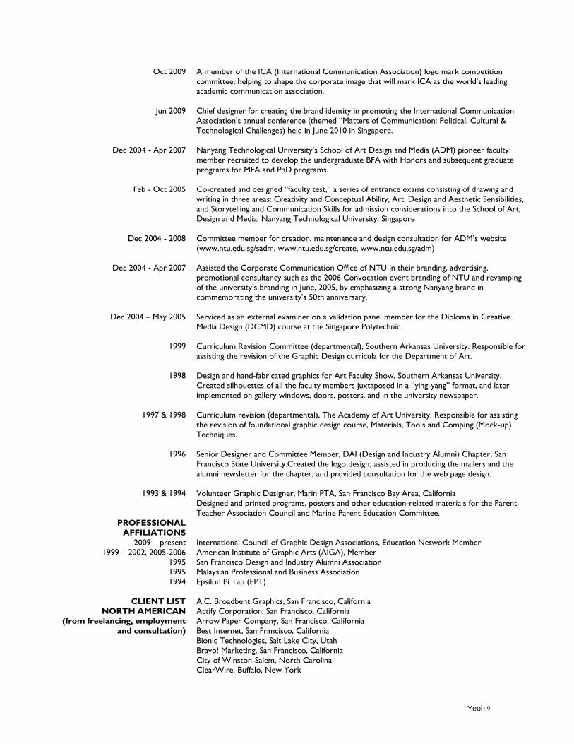
Oct 2009
Jun 2009
Dec 2004 - Apr 2007
Feb - Oct 2005
Dec 2004 - 2008
Dec 2004 - Apr 2007
Dec 2004 – May 2005
1999
1998
1997 & 1998
1996
1993 & 1994
PROFESSIONAL
AFFILIATIONS
2009 – present
1999 – 2002, 2005-2006
1995
1995
1994
CLIENT LIST
NORTH AMERICAN
(from freelancing, employment
and consultation)
A member of the ICA (International Communication Association) logo mark competition
committee, helping to shape the corporate image that will mark ICA as the world‟s leading
academic communication association.
Chief designer for creating the brand identity in promoting the International Communication
Association‟s annual conference (themed “Matters of Communication: Political, Cultural &
Technological Challenges) held in June 2010 in Singapore.
Nanyang Technological University‟s School of Art Design and Media (ADM) pioneer faculty
member recruited to develop the undergraduate BFA with Honors and subsequent graduate
programs for MFA and PhD programs.
Co-created and designed “faculty test,” a series of entrance exams consisting of drawing and
writing in three areas: Creativity and Conceptual Ability, Art, Design and Aesthetic Sensibilities,
and Storytelling and Communication Skills for admission considerations into the School of Art,
Design and Media, Nanyang Technological University, Singapore
Committee member for creation, maintenance and design consultation for ADM‟s website
(www.ntu.edu.sg/sadm, www.ntu.edu.sg/create, www.ntu.edu.sg/adm)
Assisted the Corporate Communication Office of NTU in their branding, advertising, promotional consultancy such as the 2006 Convocation event branding of NTU and revamping
of the university‟s branding in June, 2005, by emphasizing a strong Nanyang brand in
commemorating the university‟s 50th anniversary.
Serviced as an external examiner on a validation panel member for the Diploma in Creative
Media Design (DCMD) course at the Singapore Polytechnic.
Curriculum Revision Committee (departmental), Southern Arkansas University. Responsible for
assisting the revision of the Graphic Design curricula for the Department of Art.
Design and hand-fabricated graphics for Art Faculty Show, Southern Arkansas University.
Created silhouettes of all the faculty members juxtaposed in a “ying-yang” format, and later
implemented on gallery windows, doors, posters, and in the university newspaper.
Curriculum revision (departmental), The Academy of Art University. Responsible for assisting
the revision of foundational graphic design course, Materials, Tools and Comping (Mock-up)
Techniques.
Senior Designer and Committee Member, DAI (Design and Industry Alumni) Chapter, San
Francisco State University.Created the logo design; assisted in producing the mailers and the
alumni newsletter for the chapter; and provided consultation for the web page design.
Volunteer Graphic Designer, Marin PTA, San Francisco Bay Area, California
Designed and printed programs, posters and other education-related materials for the Parent
Teacher Association Council and Marine Parent Education Committee.
International Council of Graphic Design Associations, Education Network Member
American Institute of Graphic Arts (AIGA), Member
San Francisco Design and Industry Alumni Association
Malaysian Professional and Business Association
Epsilon Pi Tau (EPT)
A.C. Broadbent Graphics, San Francisco, California
Actify Corporation, San Francisco, California
Arrow Paper Company, San Francisco, California
Best Internet, San Francisco, California
Bionic Technologies, Salt Lake City, Utah
Bravo! Marketing, San Francisco, California
City of Winston-Salem, North Carolina ClearWire, Buffalo, New York
Yeoh 10
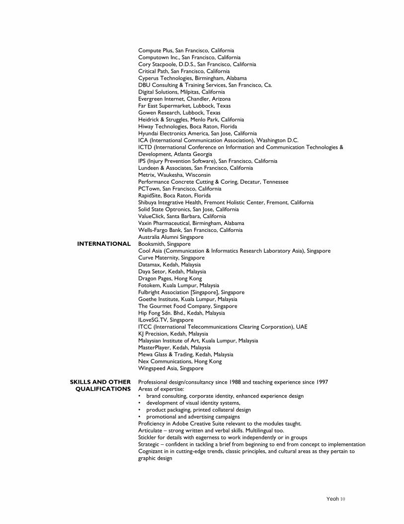
INTERNATIONAL
SKILLS AND OTHER
QUALIFICATIONS
Compute Plus, San Francisco, California
Computown Inc., San Francisco, California
Cory Stacpoole, D.D.S., San Francisco, California
Critical Path, San Francisco, California
Cyperus Technologies, Birmingham, Alabama
DBU Consulting & Training Services, San Francisco, Ca.
Digital Solutions, Milpitas, California
Evergreen Internet, Chandler, Arizona
Far East Supermarket, Lubbock, Texas
Gowen Research, Lubbock, Texas
Heidrick & Struggles, Menlo Park, California
Hiway Technologies, Boca Raton, Florida
Hyundai Electronics America, San Jose, California
ICA (International Communication Association), Washington D.C.
ICTD (International Conference on Information and Communication Technologies &
Development, Atlanta Georgia
IPS (Injury Prevention Software), San Francisco, California
Lundeen & Associates, San Francisco, California
Metrix, Waukesha, Wisconsin
Performance Concrete Cutting & Coring, Decatur, Tennessee
PCTown, San Francisco, California RapidSite, Boca Raton, Florida
Shibuya Integrative Health, Fremont Holistic Center, Fremont, California
Solid State Optronics, San Jose, California
ValueClick, Santa Barbara, California
Vaxin Pharmaceutical, Birmingham, Alabama
Wells-Fargo Bank, San Francisco, California
Australia Alumni Singapore
Booksmith, Singapore
Cool Asia (Communication & Informatics Research Laboratory Asia), Singapore
Curve Maternity, Singapore
Datamax, Kedah, Malaysia
Daya Setor, Kedah, Malaysia
Dragon Pages, Hong Kong
Fotokem, Kuala Lumpur, Malaysia
Fulbright Association [Singapore], Singapore
Goethe Institute, Kuala Lumpur, Malaysia
The Gourmet Food Company, Singapore
Hip Fong Sdn. Bhd., Kedah, Malaysia
ILoveSG.TV, Singapore
ITCC (International Telecommunications Clearing Corporation), UAE
KJ Precision, Kedah, Malaysia
Malaysian Institute of Art, Kuala Lumpur, Malaysia
MasterPlayer, Kedah, Malaysia
Mewa Glass & Trading, Kedah, Malaysia
Nex Communications, Hong Kong
Wingspeed Asia, Singapore
Professional design/consultancy since 1988 and teaching experience since 1997
Areas of expertise:
• brand consulting, corporate identity, enhanced experience design
• development of visual identity systems,
• product packaging, printed collateral design
• promotional and advertising campaigns
Proficiency in Adobe Creative Suite relevant to the modules taught.
Articulate – strong written and verbal skills. Multilingual too.
Stickler for details with eagerness to work independently or in groups
Strategic – confident in tackling a brief from beginning to end from concept to implementation
Cognizant in in cutting-edge trends, classic principles, and cultural areas as they pertain to
graphic design
Yeoh 11
DIVERSITY STATEMENT
As a 1st-generation college graduate, I believe in education. Schooled and trained in the
United States, I am a firm believer in the values in an educational system which celebrates
ethnic diversity, equal opportunity policies and practices. I value and promote collegial
relationships and mutual respect among students, faculty, and staff. My own diversity
competency is built on a lifetime of international experiences. Presenting at multiple
international conferences, I have been exposed to many aspects of diversity in opinion, ideas
and the colorful individuals who represent them.
Originally from Malaysia, I grew up in a multi-cultural society which inculcated the values of
mutual respect, understanding and tolerance. As such, I uphold a high level of expectation
that demanded clear, succinct and comprehensible approach with people from diverse
lifestyles, perspectives, and backgrounds. In order to do this successfully, I approach
differences with an open mind. Because there are number of factors that affect the way we
think, act, and communicate, I also pay attention to body language.
Acceptance of individual differences is essential in achieving a favorably diversified learning
environment. I have assisted students with special needs such as physical disabilities when I
was a doctoral student at Texas Tech University. The assignment I develop and topics
discussed are from diverse viewpoints. I give appropriate feedback and how to address
various social and cultural issues in the classroom through course material. I understand
some students may not have experiences in dealing with multiculturalism but as an
instructor, my job is not only to provide an exposure but also to encourage understanding.
I acknowledge and seek to address the needs of underrepresented students with varying
levels of academic preparation in pedagogically relevant and responsible ways and to advance
the understanding of diverse perspectives. In January 2012, I taught a reflective and hands-
on design course which I developed at Nanyang Technological University in Singapore. The
crux of the course recognizes that there is always an experience created by a product, service,
event, environment and people. In addition to the weekly worksheets that get the students to
Yeoh 12
share diverse and multiple observations, stories, perspectives, and even stereotypes, they
embark on a transformative experience in which they document a process which requires
them to be someone they are not for 10 weeks. Nicole Yeo became Nur Cole for she had
chosen to adorn the hijab and be a Muslim woman for her transformation into someone she
is not to face her fears and to allow her to try something she would never have tried. She
concluded that the experience was a great eye-opener. From the outset, she didn't know
what to expect but it pushed her to the boundaries and she emerged as a more confident
person, shredding her inhibitions.
When I was a creative director at a computer retailer in San Francisco in 1992, for the next
four years, I had assumed a high level of responsibility that demanded clear, succinct and
comprehensible communication with people from diverse cultural and religious
backgrounds. I also paid attention to body language and sensitivity to topics that may be a
taboo to my colleagues from different backgrounds. Except for the weekends and public
holidays, I was trained on a daily basis as I was involved in the day-to-day supervision,
facilitation and coordination of advertising and promotional projects where different
languages co-exist with English in an in-house design department.
As an educator since 1997, first as a part-timer at the Academy of Art University (then
college) in San Francisco to full-time employment at Southern Arkansas University, a
doctoral student and teaching assistant at Texas Tech University, Savannah College of Art
and Design and finally Nanyang Technological University in Singapore where I have been
for the past 10 years, I have been exposed to the many different populations in different
parts of the world which further sharpened my diversity skills. When prejudice, racism,
discrimination and disrespecting creep into my classroom, they will be dealt with in a firm
and prompt manner. Regardless of the issue, as long as I approach any diversity challenges
with professionalism, courtesy, understanding and sincerity, and most importantly, an open
mind, many issues can be averted or assuaged.
Yeoh 13
TEACHING PHILOSOPHY
My contribution in the classroom is to make the environment attractive and thought-
provoking, illuminate the concept of design, arrange materials so that they become
accessible, diagnose learning activities and results, provide guidance, extend learning and
finally, constantly seek activities that promote personal growth in the students and to bring
out the best in them. I believe that creativity, class contribution, punctuality, and most
importantly, conceptual thinking, are important in instilling professionalism in my students.
My students are regularly encouraged to test their abilities in the international arena whereby
they enter design contest and present at academic conferences. Under my guidance, my
students' assignments are timed to coincide with global graphics competition as a way to test
their abilities with their peers.
I constantly update my syllabi to avoid redundancy and to incorporate new ideas and trends
from the industry as well as from conferences attended. I encourage brainstorming where
students find themselves discussing their work openly without harsh criticism. Students are
encouraged to uninhibitedly express their ideas. I expect mistakes from them solely because
mistakes are rectifiable to provide an opportunity for experimentation, estimation,
exploration and finally concrete creations. At all times, I strive to be fair, honest, and open
with students. I am accessible to my students outside my classroom. They have the freedom
to meet with me in more informal settings, whether during office hours, by appointment or
in whatever open situation possible. In addition to student evaluations, I conduct post
mortem discussions at the end of the semester to gather feedback. By keeping an open
communication channel with my students, the exchanges and interaction of opinions serve
to heighten my interests as well as sparking any intellectual curiosity.
Exploration is important. I cognitively challenge my students to explore and formulate
appropriate approaches which could be used to interrogate for a possible solution. Many
sketches are explored as they continue to create their own original work which is essentially
about learning by doing. I believe in creating a learning environment where we can acquire
knowledge, develop interpersonal relations, foster self-development, and experience our
Yeoh 14
sense of individuality. In my experience, this broad-based approach has given "power" to my
students "to do" their best. In preparing the visually-challenged and grade-driven students,
cross-disciplinary learning is employed. Besides conceptualizing, designing, writing,
illustrating, producing and publishing skills, my students also learn how to cope with other
factorial issues. In my classes, student-centered methods are used. Every decision is openly
shared and discussed. When students have a stake in the decision, they are more likely to be
actively involved, effectively turning them into decision-makers.
I believe my skills, strength, values and aspirations can only from a broad-based form of
learning which is also made possible from traveling. It is important that my research does
not end when the courses or the semesters end. I connect by observing, reflecting and
practicing. As I make connection and relationships with diverse elements, my classroom
observation and professional experiences can act as depositories of "raw materials" that can
contribute to my research in a meaningful and endearing way. Moreover, my students are
regularly encouraged to test their abilities in the international arena whereby they enter
design contest and present at academic conferences. Apart from that, I will also encourage
my students to indulge in creative activities just to let their creative side run free and finally,
to do something for each other because we as human beings tend to forget how selfish we
can become.
Yeoh 15
RESEARCH INTERESTS/ARTIST STATEMENT
From a practical standpoint, graphic design deals specifically with a variety of practical media
which requires educational exposures in typography, graphics, still and moving images within
a framework of cultural, critical, historical, ethical and logistical perspectives. Not just
graphic designers are expected to work in multimedia platforms, ordinary citizens are actively
involved in using visuals to communicate. Such an impact coupled with the rapid
development of technologies which has led to the converging of media further pushes for
mass communication schools to acknowledge and revisit the courses offered at educational
institutions.
My interests in design have been shaped by a reflective and hands-on approach to design which
recognize that there is always an experience created by a product, service, event, environment
and people. These interacting elements play a part in contributing to our overall experience. As a
result, whether we intend to or not, our perception about a product, service or brand becomes
impacted. Catalysts for intellectual stimulation can come from a variety of sources and our daily
experience is a valuable resource to tap into as a form of learning mechanism. Using our
experience as a platform for learning and discovery is the idea behind my design and pedagogical
approaches. Experience is a connection to all aspects of living as it simultaneously helps us to be
in the moment. As such, education should not be based merely on the ability to read, write, and
count but rather on the human being‟s total experience, perspectives and perceptions. This can
be achieved with the integration of active and critical analysis of various themes within
humanistic, social, religious, commercial, educational, and spiritual contexts to facilitate social
tolerance and communal understanding.
Travel is a form of active and deep learning, especially the latter in which it is about exposing us
to things outside the classroom. Therefore, I have continued to present at conferences with
design education, visual and typographic themes. Using technology to solve problems seems to
be the trend but it is much harder to intrigue our minds. Imagination has always allowed us to
explore within our minds. However, imagination in a market-driven context is limiting due to the
realities of a pending deadline, budgetary concerns, design, production and logistical issues. The
solutions must be based on real world situations with expected consequences. By doing so, we
can open ourselves to a wide array of solutions. When creativity is combined with technical
Yeoh 16
competence, artists can produce art---the tangible end-products of the creative impulse. Neither
my ideas nor my presentation of them could have happened without imagination.
I believe that the ultimate purpose for design as an idealistic principle is about enhancing the
quality of our lives. Looking forward, I plan to continue to work on understanding how design
challenges posed by existing and emerging technologies can positively contribute to learning and
teaching environment. Although there are many ways technology can impact us, the ultimate
concern of educators is to creatively harness technology into a productive device, aiding in the
productivity of transforming ideas into reality.
Yeoh 17
PROFESSIONAL PORTFOLIO
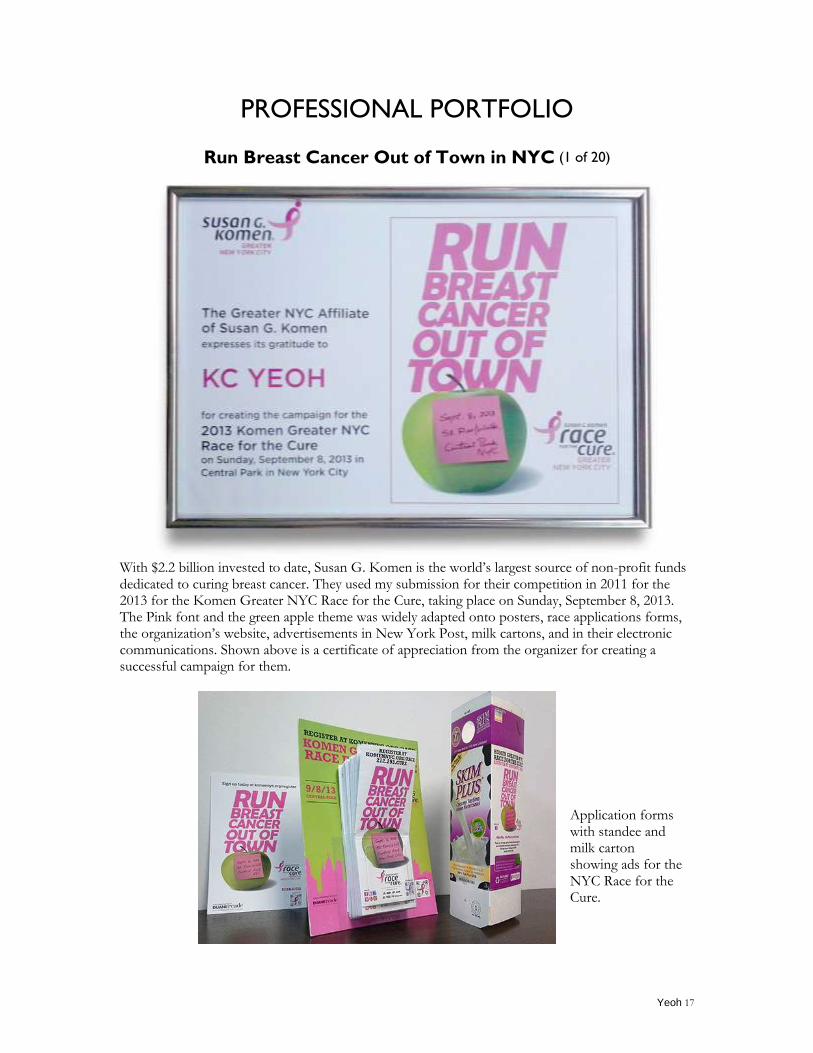
Run Breast Cancer Out of Town in NYC (1 of 20)
With $2.2 billion invested to date, Susan G. Komen is the world‟s largest source of non-profit funds dedicated to curing breast cancer. They used my submission for their competition in 2011 for the 2013 for the Komen Greater NYC Race for the Cure, taking place on Sunday, September 8, 2013. The Pink font and the green apple theme was widely adapted onto posters, race applications forms, the organization‟s website, advertisements in New York Post, milk cartons, and in their electronic communications. Shown above is a certificate of appreciation from the organizer for creating a successful campaign for them.
Application forms with standee and milk carton showing ads for the NYC Race for the Cure.
Yeoh 18
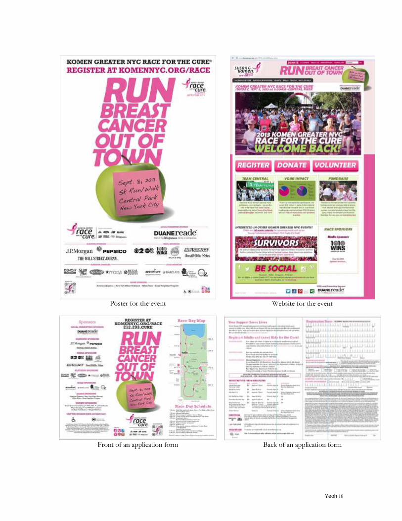
Poster for the event
Website for the event
Front of an application form
Back of an application form
Yeoh 19
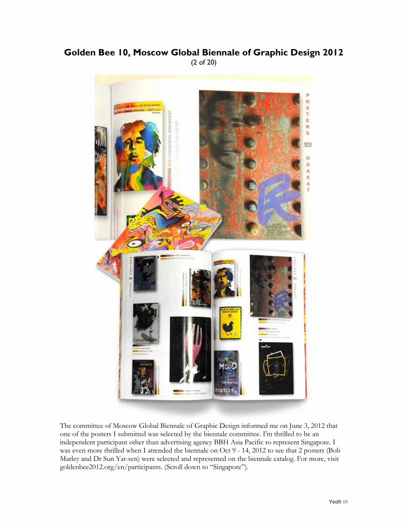
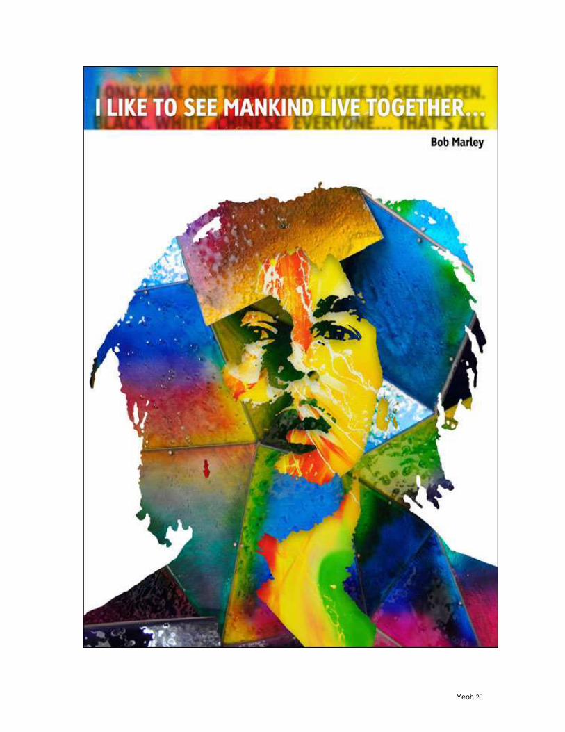
Golden Bee 10, Moscow Global Biennale of Graphic Design 2012
(2 of 20)
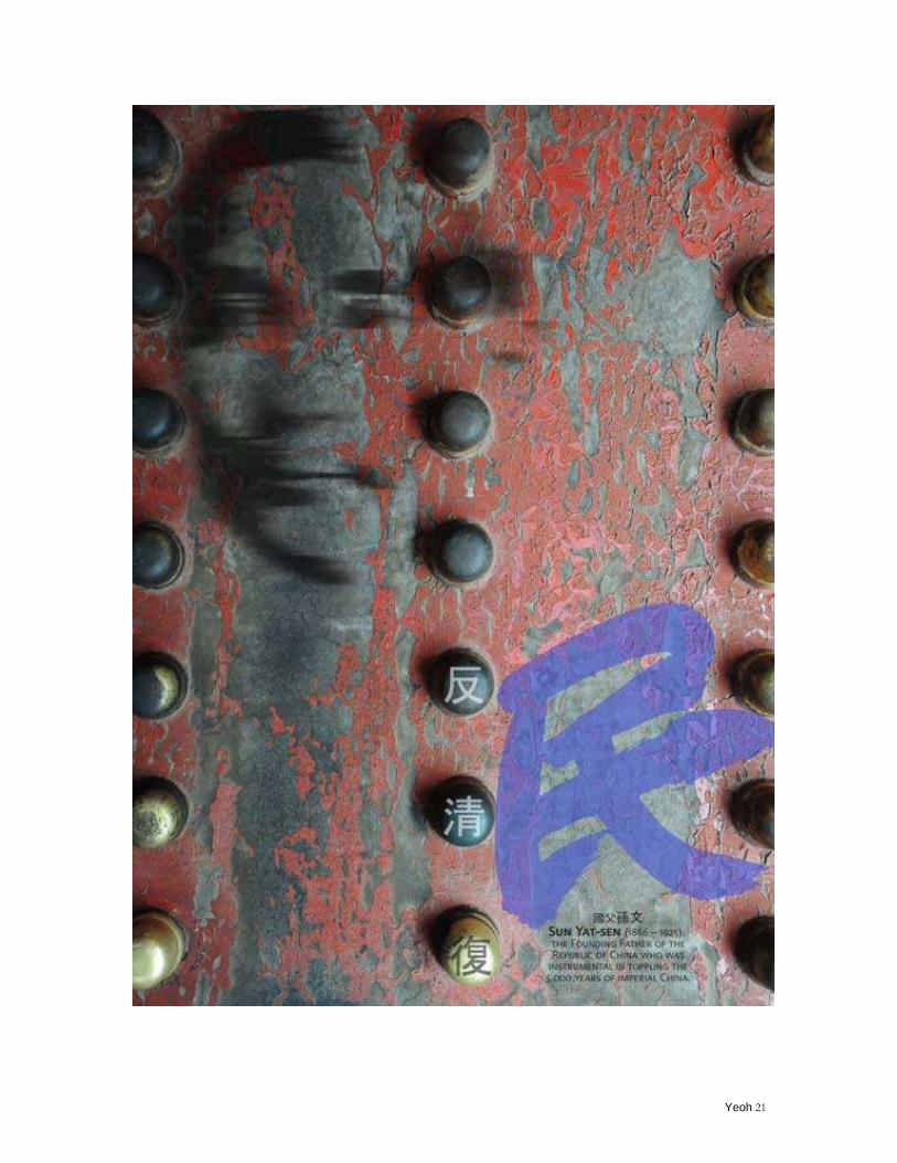
The committee of Moscow Global Biennale of Graphic Design informed me on June 3, 2012 that one of the posters I submitted was selected by the biennale committee. I'm thrilled to be an independent participant other than advertising agency BBH Asia Pacific to represent Singapore. I was even more thrilled when I attended the biennale on Oct 9 - 14, 2012 to see that 2 posters (Bob Marley and Dr Sun Yat-sen) were selected and represented on the biennale catalog. For more, visit goldenbee2012.org/en/participants. (Scroll down to “Singapore”).
Yeoh 20
Yeoh 21
Yeoh 22
Illustration featured in a textbook - Gateways to Art (3 of 20)
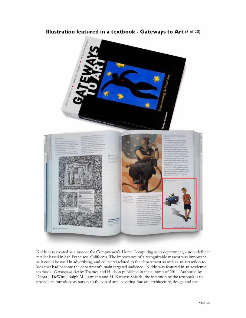
Kiddo was created as a mascot for Computown‟s Home Computing sales department, a now-defunct retailer based in San Francisco, California. The importance of a recognizable mascot was important as it could be used in advertising, and collateral related to the department as well as an attraction to kids that had become the department's main targeted audience. Kiddo was featured in an academic textbook, Gateways to Art by Thames and Hudson published in the autumn of 2011. Authored by Debra J. DeWitte, Ralph M. Larmann and M. Kathryn Shields, the intention of the textbook is to provide an introductory survey to the visual arts, covering fine art, architecture, design and the
Yeoh 23
graphic arts. Kiddo as featured on page 209 under the "Visual Communication Design" chapter.
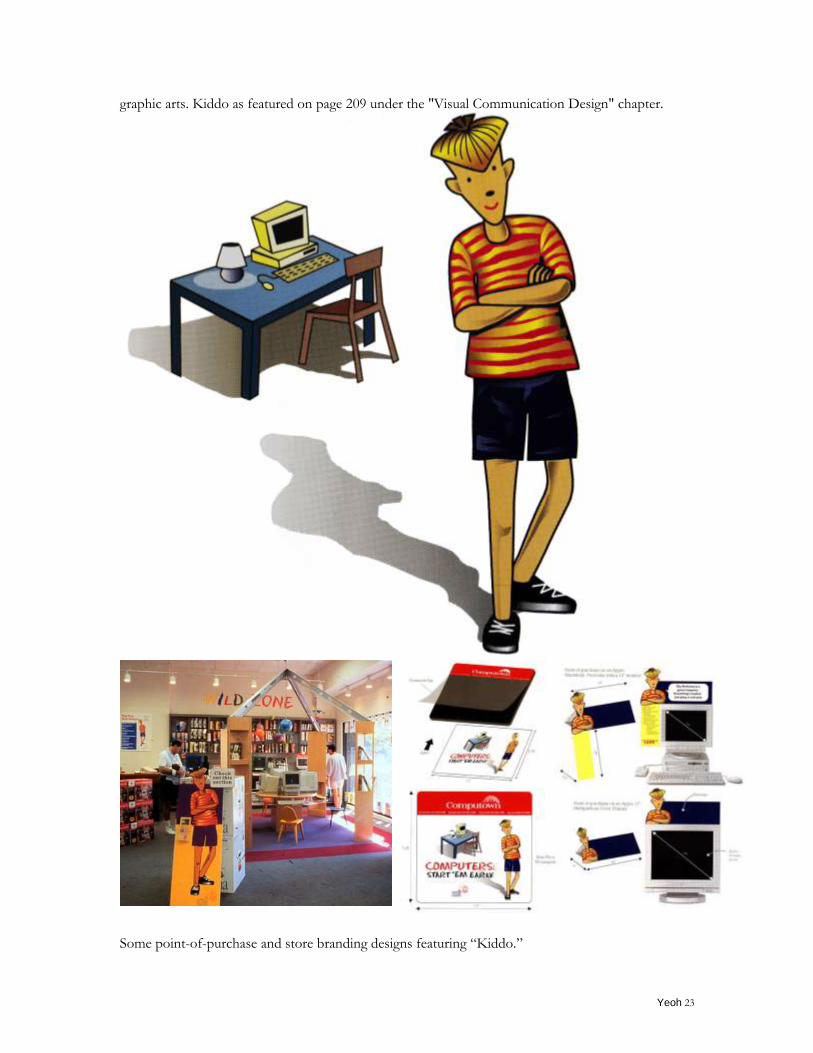
Some point-of-purchase and store branding designs featuring “Kiddo.”
Yeoh 24
Illustration for a book cover - Many Ships, One Boat (4 of 20)
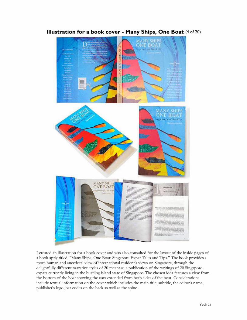
I created an illustration for a book cover and was also consulted for the layout of the inside pages of a book aptly titled, "Many Ships, One Boat: Singapore Expat Tales and Tips." The book provides a more human and anecdotal view of international resident's views on Singapore, through the delightfully different narrative styles of 20 meant as a publication of the writings of 20 Singapore expats currently living in the bustling island state of Singapore. The chosen idea features a view from the bottom of the boat showing the oars extended from both sides of the boat. Considerations include textual information on the cover which includes the main title, subtitle, the editor's name, publisher's logo, bar codes on the back as well as the spine.
Yeoh 25
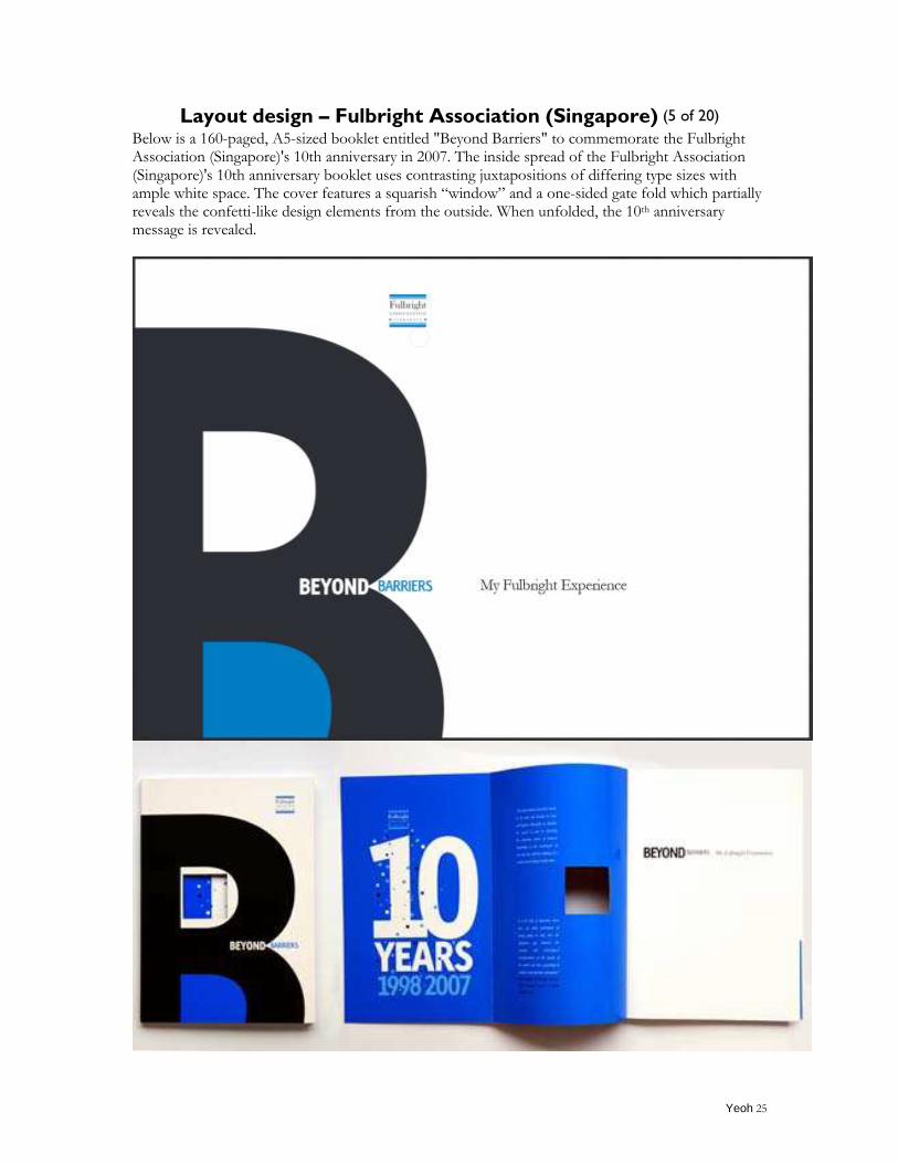
Layout design – Fulbright Association (Singapore) (5 of 20) Below is a 160-paged, A5-sized booklet entitled "Beyond Barriers" to commemorate the Fulbright Association (Singapore)'s 10th anniversary in 2007. The inside spread of the Fulbright Association (Singapore)'s 10th anniversary booklet uses contrasting juxtapositions of differing type sizes with ample white space. The cover features a squarish “window” and a one-sided gate fold which partially reveals the confetti-like design elements from the outside. When unfolded, the 10th anniversary message is revealed.
Yeoh 26
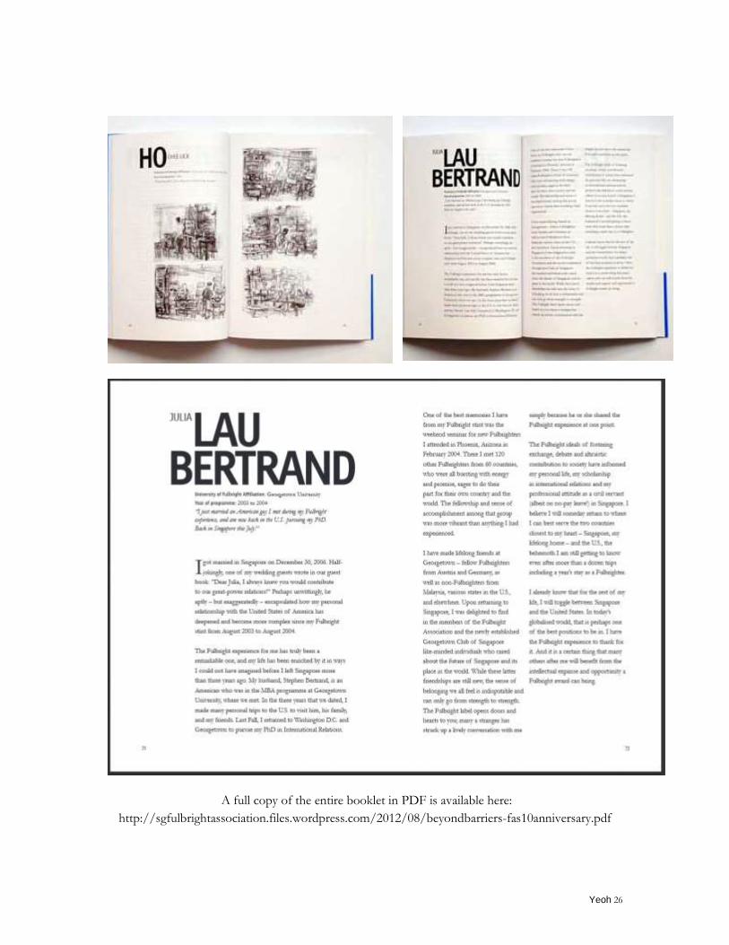
A full copy of the entire booklet in PDF is available here:
http://sgfulbrightassociation.files.wordpress.com/2012/08/beyondbarriers-fas10anniversary.pdf
Yeoh 27
Exhibition in Milan - Poster Connecting the Dots (6 of 20)
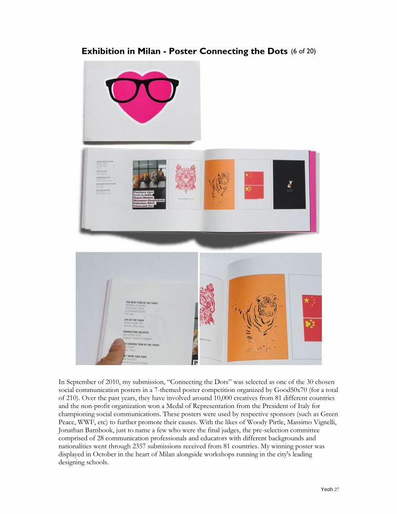
In September of 2010, my submission, “Connecting the Dots” was selected as one of the 30 chosen social communication posters in a 7-themed poster competition organized by Good50x70 (for a total of 210). Over the past years, they have involved around 10,000 creatives from 81 different countries and the non-profit organization won a Medal of Representation from the President of Italy for championing social communications. These posters were used by respective sponsors (such as Green Peace, WWF, etc) to further promote their causes. With the likes of Woody Pirtle, Massimo Vignelli, Jonathan Barnbook, just to name a few who were the final judges, the pre-selection committee comprised of 28 communication professionals and educators with different backgrounds and nationalities went through 2357 submissions received from 81 countries. My winning poster was displayed in October in the heart of Milan alongside workshops running in the city's leading designing schools.
Yeoh 28
Exhibition in Turkey - International Invitational Poster Exhibition
(7 of 20)
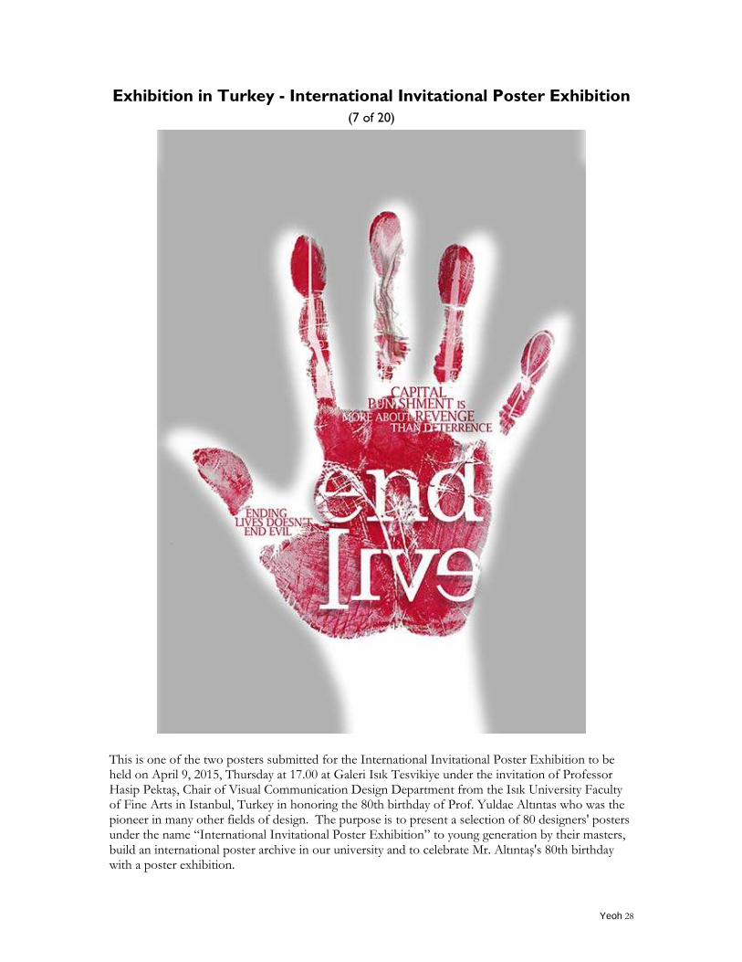
This is one of the two posters submitted for the International Invitational Poster Exhibition to be held on April 9, 2015, Thursday at 17.00 at Galeri Isık Tesvikiye under the invitation of Professor Hasip Pektaş, Chair of Visual Communication Design Department from the Isık University Faculty of Fine Arts in Istanbul, Turkey in honoring the 80th birthday of Prof. Yuldae Altıntas who was the pioneer in many other fields of design. The purpose is to present a selection of 80 designers' posters under the name “International Invitational Poster Exhibition” to young generation by their masters, build an international poster archive in our university and to celebrate Mr. Altıntaş's 80th birthday with a poster exhibition.
Yeoh 29
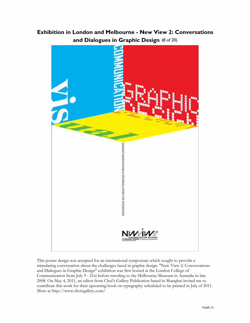
Exhibition in London and Melbourne - New View 2: Conversations
and Dialogues in Graphic Design (8 of 20)
This poster design was accepted for an international symposium which sought to provide a stimulating conversation about the challenges faced in graphic design. "New View 2: Conversations and Dialogues in Graphic Design" exhibition was first hosted at the London College of Communication from July 9 - 21st before traveling to the Melbourne Museum in Australia in late 2008. On May 4, 2011, an editor from Choi's Gallery Publication based in Shanghai invited me to contribute this work for their upcoming book on typography scheduled to be printed in July of 2011. More at http://www.choisgallery.com/
Yeoh 30
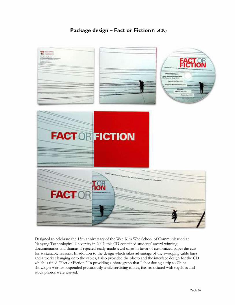
Package design – Fact or Fiction (9 of 20)
Designed to celebrate the 15th anniversary of the Wee Kim Wee School of Communication at Nanyang Technological University in 2007, this CD contained students‟ award-winning documentaries and dramas. I rejected ready-made jewel cases in favor of customized paper die cuts for sustainable reasons. In addition to the design which takes advantage of the swooping cable lines and a worker hanging onto the cables, I also provided the photo and the interface design for the CD which is titled "Fact or Fiction." In providing a photograph that I shot during a trip to China showing a worker suspended precariously while servicing cables, fees associated with royalties and stock photos were waived.
Yeoh 31
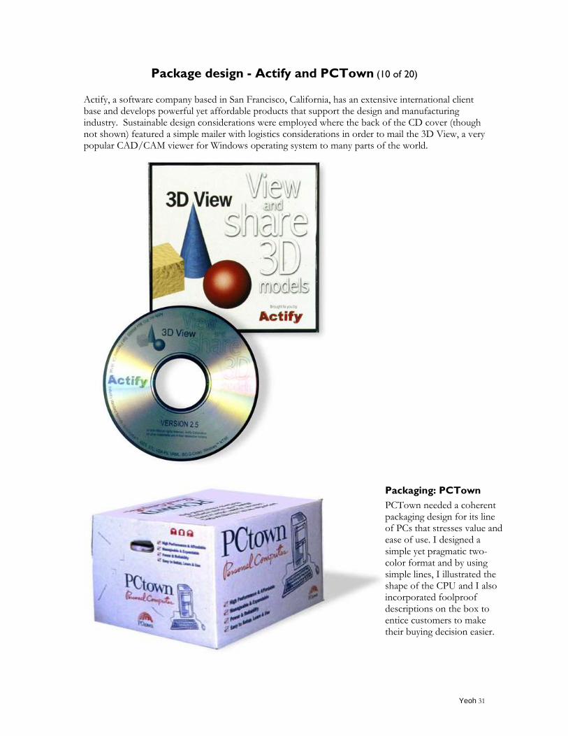
Package design - Actify and PCTown (10 of 20)
Actify, a software company based in San Francisco, California, has an extensive international client base and develops powerful yet affordable products that support the design and manufacturing industry. Sustainable design considerations were employed where the back of the CD cover (though not shown) featured a simple mailer with logistics considerations in order to mail the 3D View, a very popular CAD/CAM viewer for Windows operating system to many parts of the world.
Packaging: PCTown
PCTown needed a coherent packaging design for its line of PCs that stresses value and ease of use. I designed a simple yet pragmatic two-color format and by using simple lines, I illustrated the shape of the CPU and I also incorporated foolproof descriptions on the box to entice customers to make their buying decision easier.
Yeoh 32
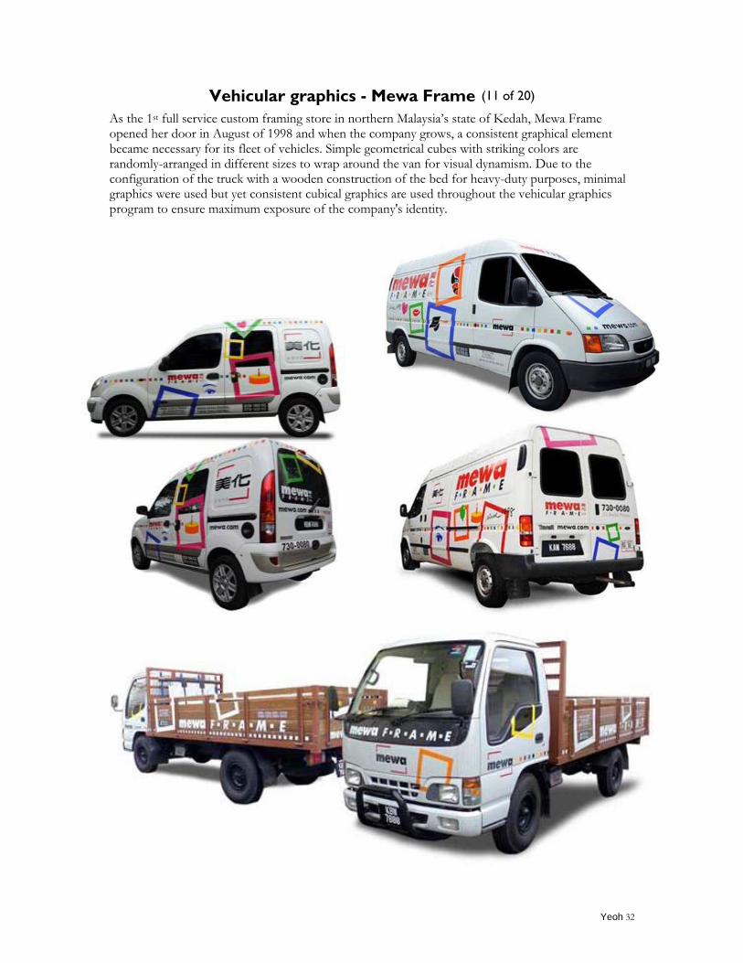
Vehicular graphics - Mewa Frame (11 of 20)
As the 1st full service custom framing store in northern Malaysia‟s state of Kedah, Mewa Frame opened her door in August of 1998 and when the company grows, a consistent graphical element became necessary for its fleet of vehicles. Simple geometrical cubes with striking colors are randomly-arranged in different sizes to wrap around the van for visual dynamism. Due to the configuration of the truck with a wooden construction of the bed for heavy-duty purposes, minimal graphics were used but yet consistent cubical graphics are used throughout the vehicular graphics program to ensure maximum exposure of the company's identity.
Yeoh 33
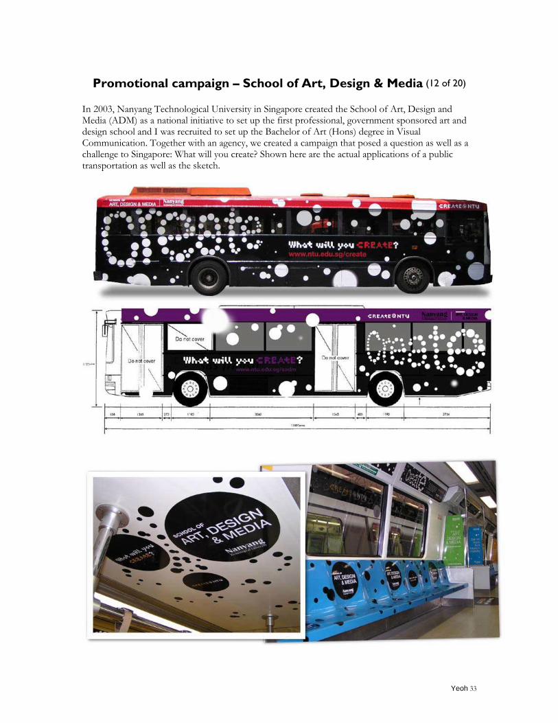
Promotional campaign – School of Art, Design & Media (12 of 20)
In 2003, Nanyang Technological University in Singapore created the School of Art, Design and Media (ADM) as a national initiative to set up the first professional, government sponsored art and design school and I was recruited to set up the Bachelor of Art (Hons) degree in Visual Communication. Together with an agency, we created a campaign that posed a question as well as a challenge to Singapore: What will you create? Shown here are the actual applications of a public transportation as well as the sketch.
Yeoh 34
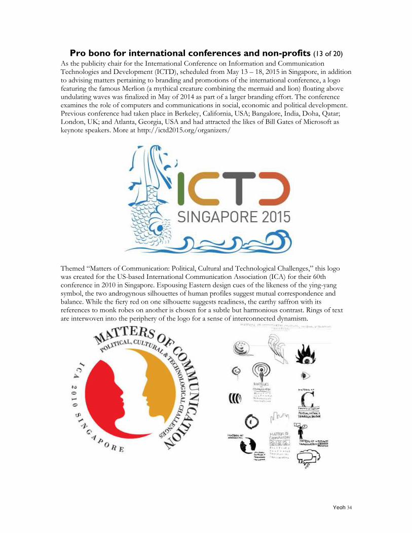
Pro bono for international conferences and non-profits (13 of 20) As the publicity chair for the International Conference on Information and Communication Technologies and Development (ICTD), scheduled from May 13 – 18, 2015 in Singapore, in addition to advising matters pertaining to branding and promotions of the international conference, a logo featuring the famous Merlion (a mythical creature combining the mermaid and lion) floating above undulating waves was finalized in May of 2014 as part of a larger branding effort. The conference examines the role of computers and communications in social, economic and political development. Previous conference had taken place in Berkeley, California, USA; Bangalore, India, Doha, Qatar; London, UK; and Atlanta, Georgia, USA and had attracted the likes of Bill Gates of Microsoft as keynote speakers. More at http://ictd2015.org/organizers/
Themed “Matters of Communication: Political, Cultural and Technological Challenges,” this logo was created for the US-based International Communication Association (ICA) for their 60th conference in 2010 in Singapore. Espousing Eastern design cues of the likeness of the ying-yang symbol, the two androgynous silhouettes of human profiles suggest mutual correspondence and balance. While the fiery red on one silhouette suggests readiness, the earthy saffron with its references to monk robes on another is chosen for a subtle but harmonious contrast. Rings of text are interwoven into the periphery of the logo for a sense of interconnected dynamism.
Yeoh 35
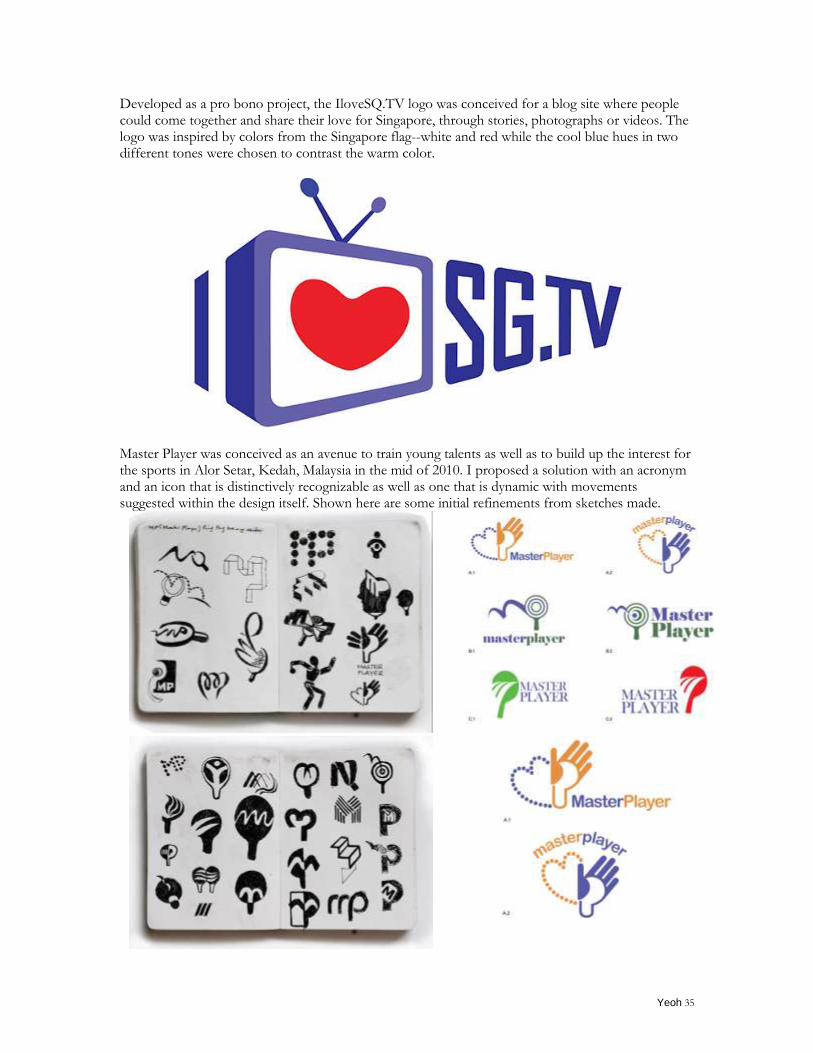
Developed as a pro bono project, the IloveSQ.TV logo was conceived for a blog site where people could come together and share their love for Singapore, through stories, photographs or videos. The logo was inspired by colors from the Singapore flag--white and red while the cool blue hues in two different tones were chosen to contrast the warm color.
Master Player was conceived as an avenue to train young talents as well as to build up the interest for the sports in Alor Setar, Kedah, Malaysia in the mid of 2010. I proposed a solution with an acronym and an icon that is distinctively recognizable as well as one that is dynamic with movements suggested within the design itself. Shown here are some initial refinements from sketches made.
Yeoh 36
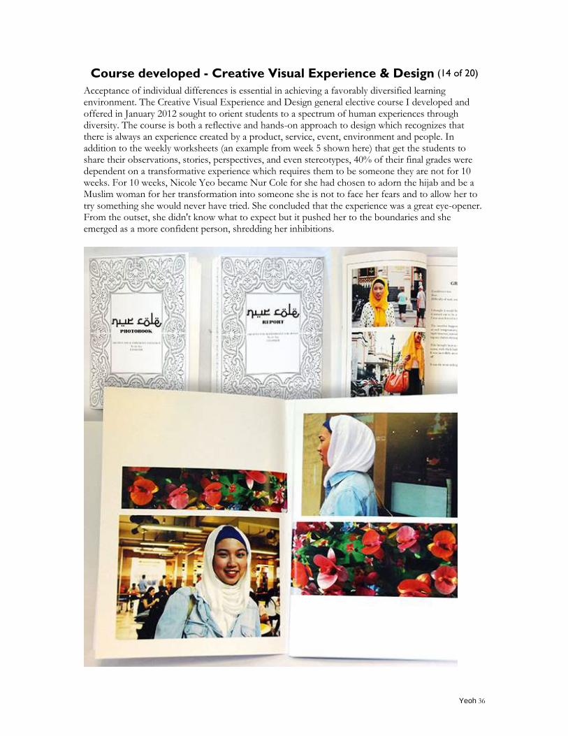
Course developed - Creative Visual Experience & Design (14 of 20)
Acceptance of individual differences is essential in achieving a favorably diversified learning environment. The Creative Visual Experience and Design general elective course I developed and offered in January 2012 sought to orient students to a spectrum of human experiences through diversity. The course is both a reflective and hands-on approach to design which recognizes that there is always an experience created by a product, service, event, environment and people. In addition to the weekly worksheets (an example from week 5 shown here) that get the students to share their observations, stories, perspectives, and even stereotypes, 40% of their final grades were dependent on a transformative experience which requires them to be someone they are not for 10 weeks. For 10 weeks, Nicole Yeo became Nur Cole for she had chosen to adorn the hijab and be a Muslim woman for her transformation into someone she is not to face her fears and to allow her to try something she would never have tried. She concluded that the experience was a great eye-opener. From the outset, she didn't know what to expect but it pushed her to the boundaries and she emerged as a more confident person, shredding her inhibitions.
Yeoh 37
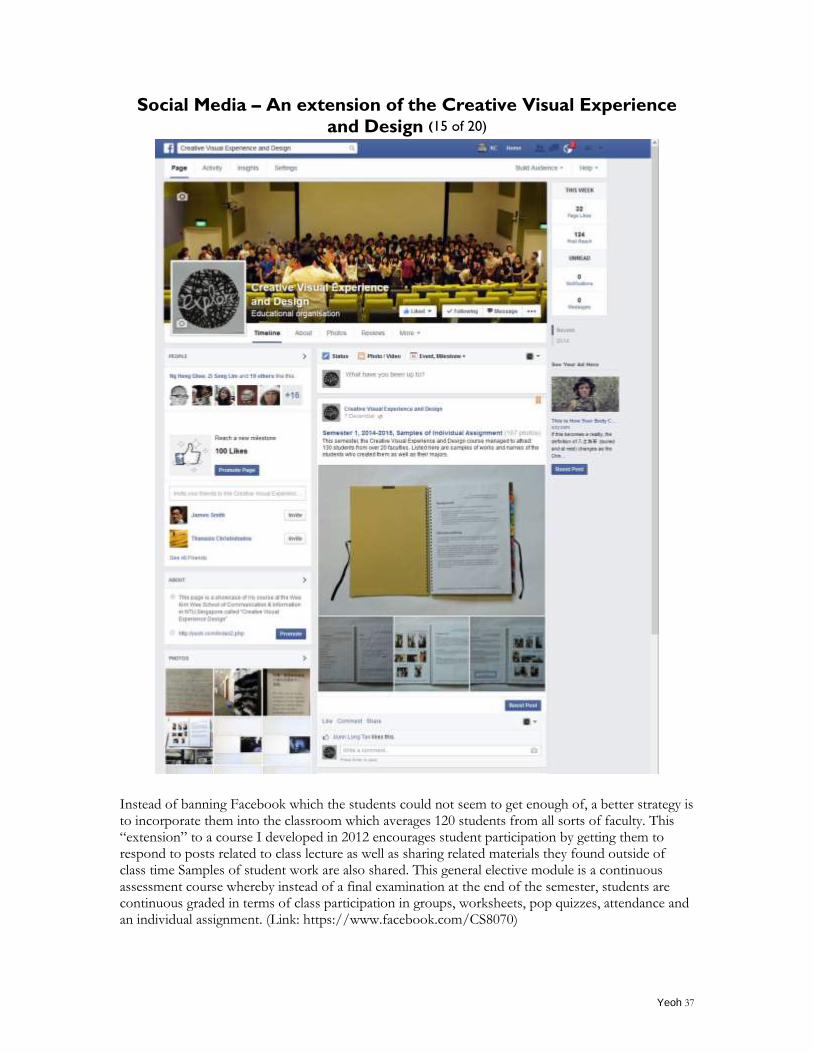
Social Media – An extension of the Creative Visual Experience
and Design (15 of 20)
Instead of banning Facebook which the students could not seem to get enough of, a better strategy is to incorporate them into the classroom which averages 120 students from all sorts of faculty. This “extension” to a course I developed in 2012 encourages student participation by getting them to respond to posts related to class lecture as well as sharing related materials they found outside of class time Samples of student work are also shared. This general elective module is a continuous assessment course whereby instead of a final examination at the end of the semester, students are continuous graded in terms of class participation in groups, worksheets, pop quizzes, attendance and an individual assignment. (Link: https://www.facebook.com/CS8070)
Yeoh 38
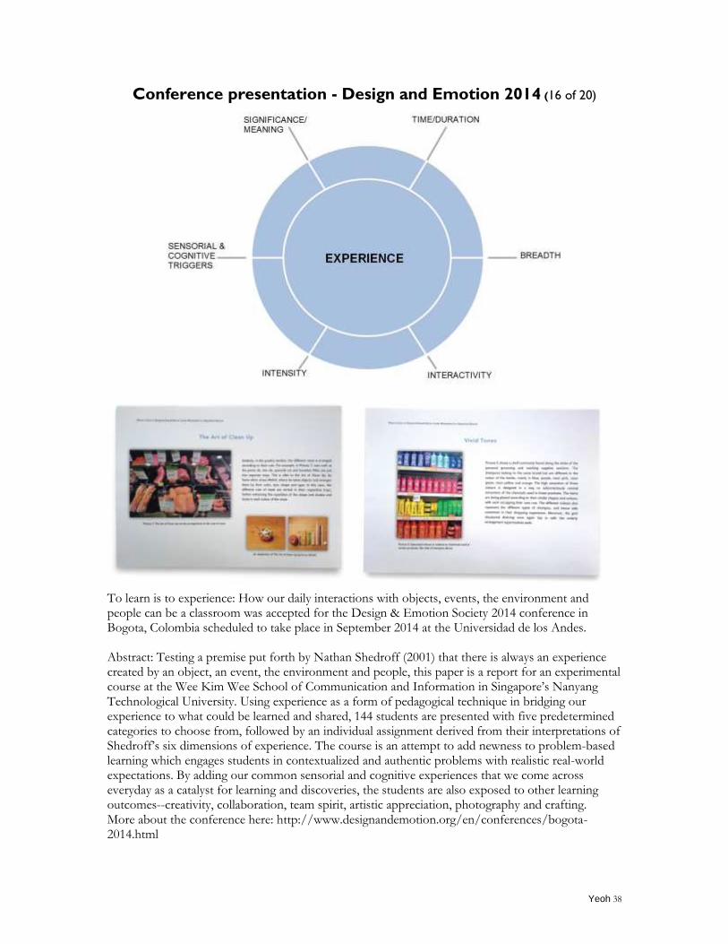
Conference presentation - Design and Emotion 2014 (16 of 20)
To learn is to experience: How our daily interactions with objects, events, the environment and people can be a classroom was accepted for the Design & Emotion Society 2014 conference in Bogota, Colombia scheduled to take place in September 2014 at the Universidad de los Andes. Abstract: Testing a premise put forth by Nathan Shedroff (2001) that there is always an experience created by an object, an event, the environment and people, this paper is a report for an experimental course at the Wee Kim Wee School of Communication and Information in Singapore‟s Nanyang Technological University. Using experience as a form of pedagogical technique in bridging our experience to what could be learned and shared, 144 students are presented with five predetermined categories to choose from, followed by an individual assignment derived from their interpretations of Shedroff‟s six dimensions of experience. The course is an attempt to add newness to problem-based learning which engages students in contextualized and authentic problems with realistic real-world expectations. By adding our common sensorial and cognitive experiences that we come across everyday as a catalyst for learning and discoveries, the students are also exposed to other learning outcomes--creativity, collaboration, team spirit, artistic appreciation, photography and crafting. More about the conference here: http://www.designandemotion.org/en/conferences/bogota-2014.html
Yeoh 39
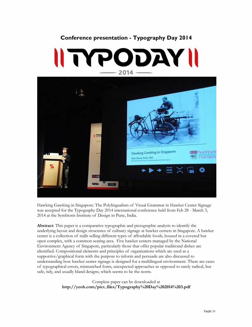
Conference presentation - Typography Day 2014
Hawking Gawking in Singapore: The Polylingualism of Visual Grammar in Hawker Center Signage was accepted for the Typography Day 2014 international conference held from Feb 28 - March 3, 2014 at the Symbiosis Institute of Design in Pune, India. Abstract: This paper is a comparative typographic and pictographic analysis to identify the underlying layout and design structures of culinary signage at hawker centers in Singapore. A hawker center is a collection of stalls selling different types of affordable foods, housed in a covered but open complex, with a common seating area. Five hawker centers managed by the National Environment Agency of Singapore, particularly those that offer popular traditional dishes are identified. Compositional elements and principles of organizations which are used as a supportive/graphical form with the purpose to inform and persuade are also discussed to understanding how hawker center signage is designed for a multilingual environment. There are cases of typographical errors, mismatched fonts, unexpected approaches as opposed to rarely radical, but safe, tidy, and usually bland designs, which seems to be the norm.
Complete paper can be downloaded at http://yeoh.com/pict_files/Typography%20Day%202014%203.pdf
Yeoh 40
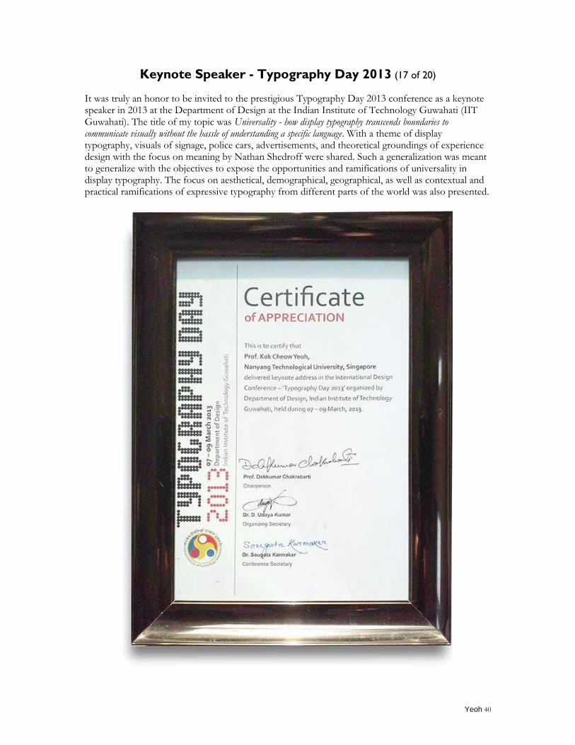
Keynote Speaker - Typography Day 2013 (17 of 20)
It was truly an honor to be invited to the prestigious Typography Day 2013 conference as a keynote speaker in 2013 at the Department of Design at the Indian Institute of Technology Guwahati (IIT Guwahati). The title of my topic was Universality - how display typography transcends boundaries to communicate visually without the hassle of understanding a specific language. With a theme of display typography, visuals of signage, police cars, advertisements, and theoretical groundings of experience design with the focus on meaning by Nathan Shedroff were shared. Such a generalization was meant to generalize with the objectives to expose the opportunities and ramifications of universality in display typography. The focus on aesthetical, demographical, geographical, as well as contextual and practical ramifications of expressive typography from different parts of the world was also presented.
Yeoh 41
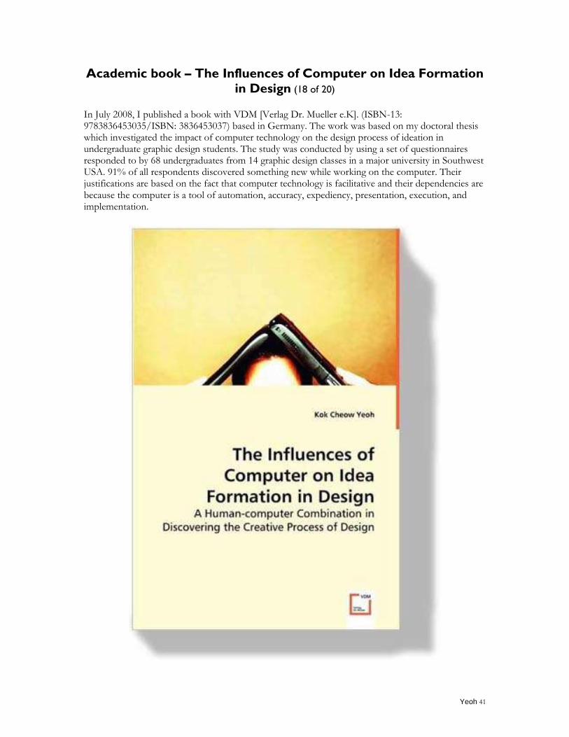
Academic book – The Influences of Computer on Idea Formation
in Design (18 of 20)
In July 2008, I published a book with VDM [Verlag Dr. Mueller e.K]. (ISBN-13: 9783836453035/ISBN: 3836453037) based in Germany. The work was based on my doctoral thesis which investigated the impact of computer technology on the design process of ideation in undergraduate graphic design students. The study was conducted by using a set of questionnaires responded to by 68 undergraduates from 14 graphic design classes in a major university in Southwest USA. 91% of all respondents discovered something new while working on the computer. Their justifications are based on the fact that computer technology is facilitative and their dependencies are because the computer is a tool of automation, accuracy, expediency, presentation, execution, and implementation.
Yeoh 42
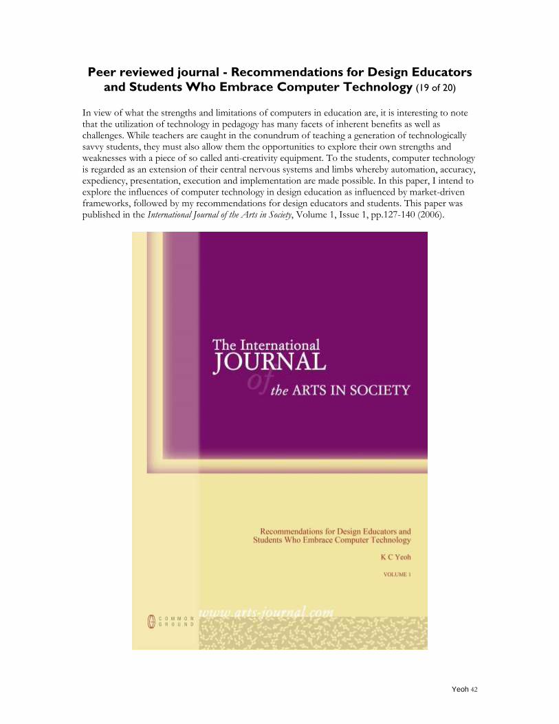
Peer reviewed journal - Recommendations for Design Educators
and Students Who Embrace Computer Technology (19 of 20)
In view of what the strengths and limitations of computers in education are, it is interesting to note that the utilization of technology in pedagogy has many facets of inherent benefits as well as challenges. While teachers are caught in the conundrum of teaching a generation of technologically savvy students, they must also allow them the opportunities to explore their own strengths and weaknesses with a piece of so called anti-creativity equipment. To the students, computer technology is regarded as an extension of their central nervous systems and limbs whereby automation, accuracy, expediency, presentation, execution and implementation are made possible. In this paper, I intend to explore the influences of computer technology in design education as influenced by market-driven frameworks, followed by my recommendations for design educators and students. This paper was published in the International Journal of the Arts in Society, Volume 1, Issue 1, pp.127-140 (2006).
Yeoh 43
Yeoh 44
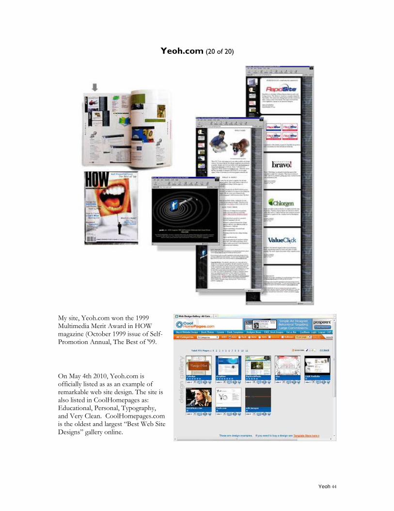
Yeoh.com (20 of 20)
My site, Yeoh.com won the 1999 Multimedia Merit Award in HOW magazine (October 1999 issue of Self-Promotion Annual, The Best of '99.
On May 4th 2010, Yeoh.com is officially listed as as an example of remarkable web site design. The site is also listed in CoolHomepages as: Educational, Personal, Typography, and Very Clean. CoolHomepages.com is the oldest and largest “Best Web Site Designs” gallery online.
Yeoh 45
TEACHING PORTFOLIO
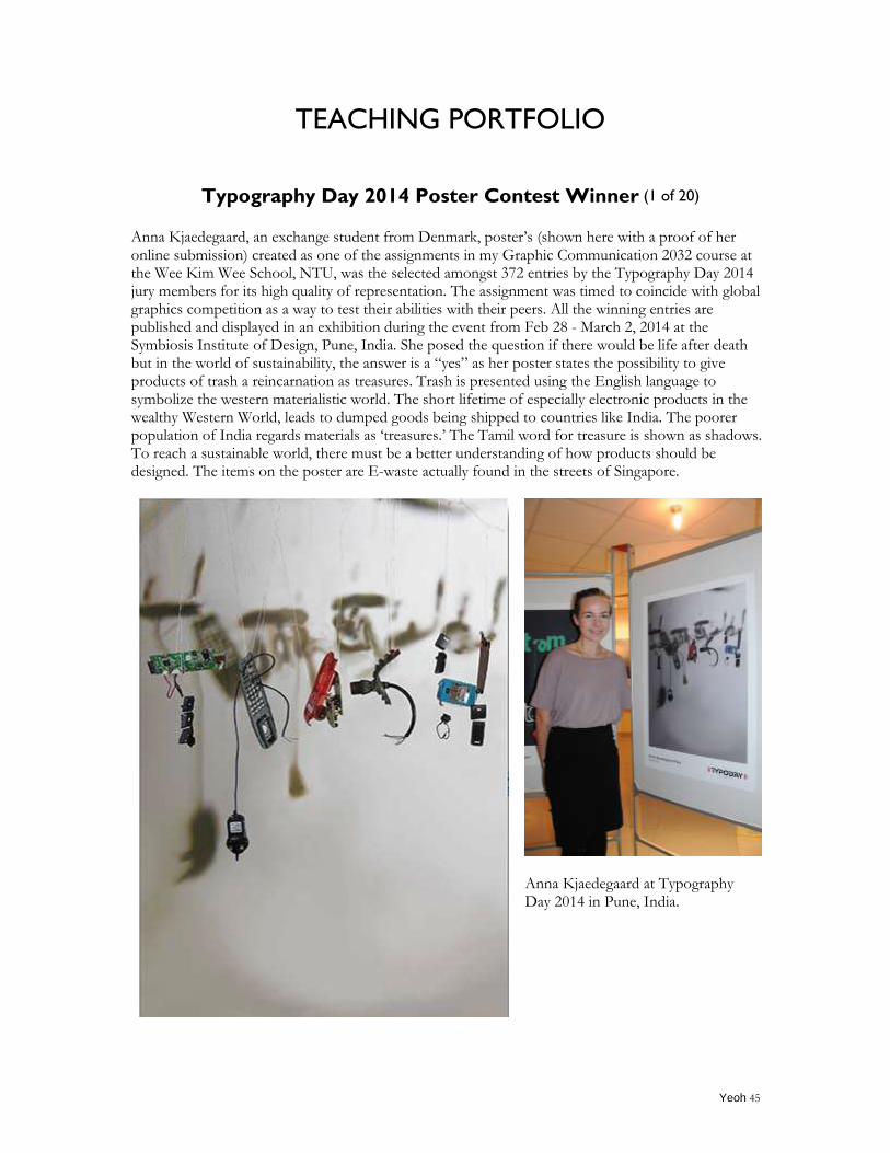
Typography Day 2014 Poster Contest Winner (1 of 20)
Anna Kjaedegaard, an exchange student from Denmark, poster‟s (shown here with a proof of her online submission) created as one of the assignments in my Graphic Communication 2032 course at the Wee Kim Wee School, NTU, was the selected amongst 372 entries by the Typography Day 2014 jury members for its high quality of representation. The assignment was timed to coincide with global graphics competition as a way to test their abilities with their peers. All the winning entries are published and displayed in an exhibition during the event from Feb 28 - March 2, 2014 at the Symbiosis Institute of Design, Pune, India. She posed the question if there would be life after death but in the world of sustainability, the answer is a “yes” as her poster states the possibility to give products of trash a reincarnation as treasures. Trash is presented using the English language to symbolize the western materialistic world. The short lifetime of especially electronic products in the wealthy Western World, leads to dumped goods being shipped to countries like India. The poorer population of India regards materials as „treasures.‟ The Tamil word for treasure is shown as shadows. To reach a sustainable world, there must be a better understanding of how products should be designed. The items on the poster are E-waste actually found in the streets of Singapore.
Anna Kjaedegaard at Typography Day 2014 in Pune, India.
Yeoh 46
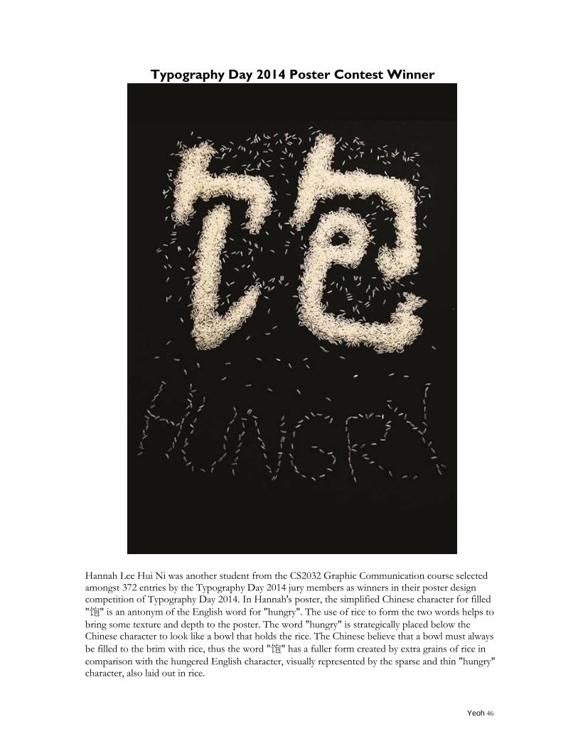
Typography Day 2014 Poster Contest Winner
Hannah Lee Hui Ni was another student from the CS2032 Graphic Communication course selected amongst 372 entries by the Typography Day 2014 jury members as winners in their poster design competition of Typography Day 2014. In Hannah's poster, the simplified Chinese character for filled
"饱" is an antonym of the English word for "hungry". The use of rice to form the two words helps to
bring some texture and depth to the poster. The word "hungry" is strategically placed below the Chinese character to look like a bowl that holds the rice. The Chinese believe that a bowl must always
be filled to the brim with rice, thus the word "饱" has a fuller form created by extra grains of rice in
comparison with the hungered English character, visually represented by the sparse and thin "hungry" character, also laid out in rice.
Yeoh 47
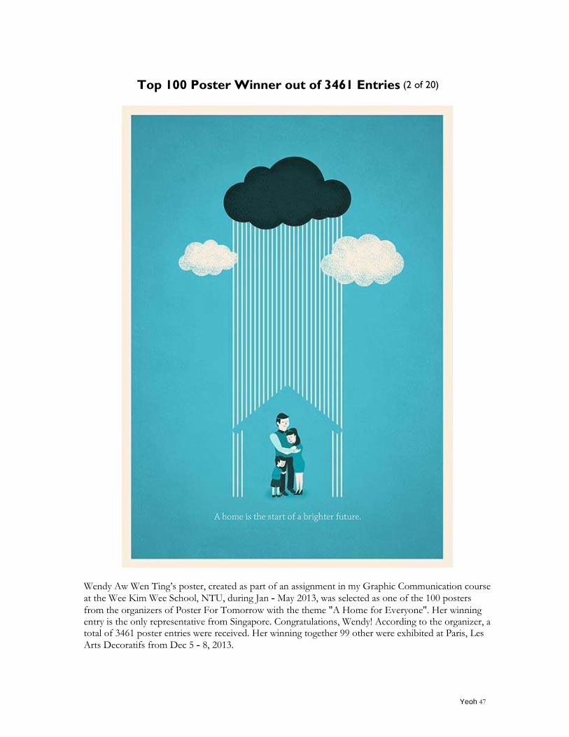
Top 100 Poster Winner out of 3461 Entries (2 of 20)
Wendy Aw Wen Ting‟s poster, created as part of an assignment in my Graphic Communication course
at the Wee Kim Wee School, NTU, during Jan - May 2013, was selected as one of the 100 posters
from the organizers of Poster For Tomorrow with the theme "A Home for Everyone". Her winning entry is the only representative from Singapore. Congratulations, Wendy! According to the organizer, a total of 3461 poster entries were received. Her winning together 99 other were exhibited at Paris, Les
Arts Decoratifs from Dec 5 - 8, 2013.
Yeoh 48
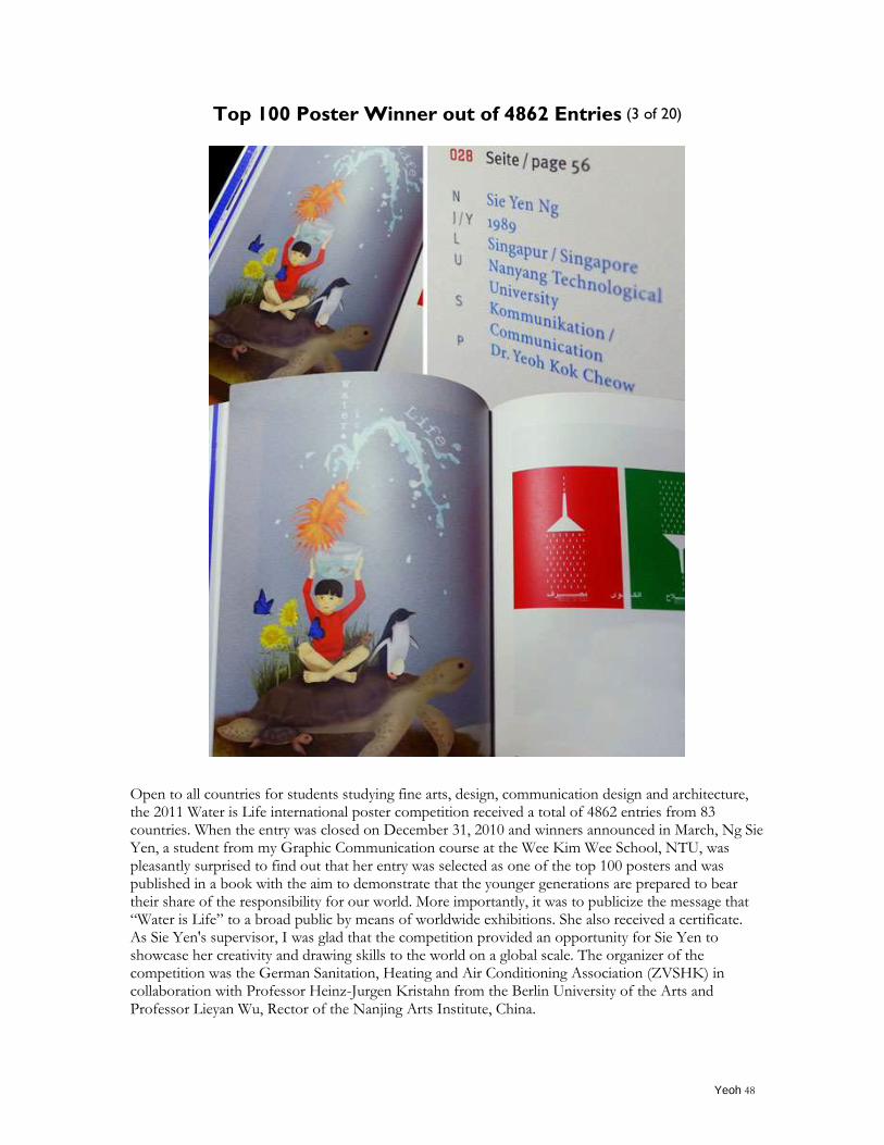
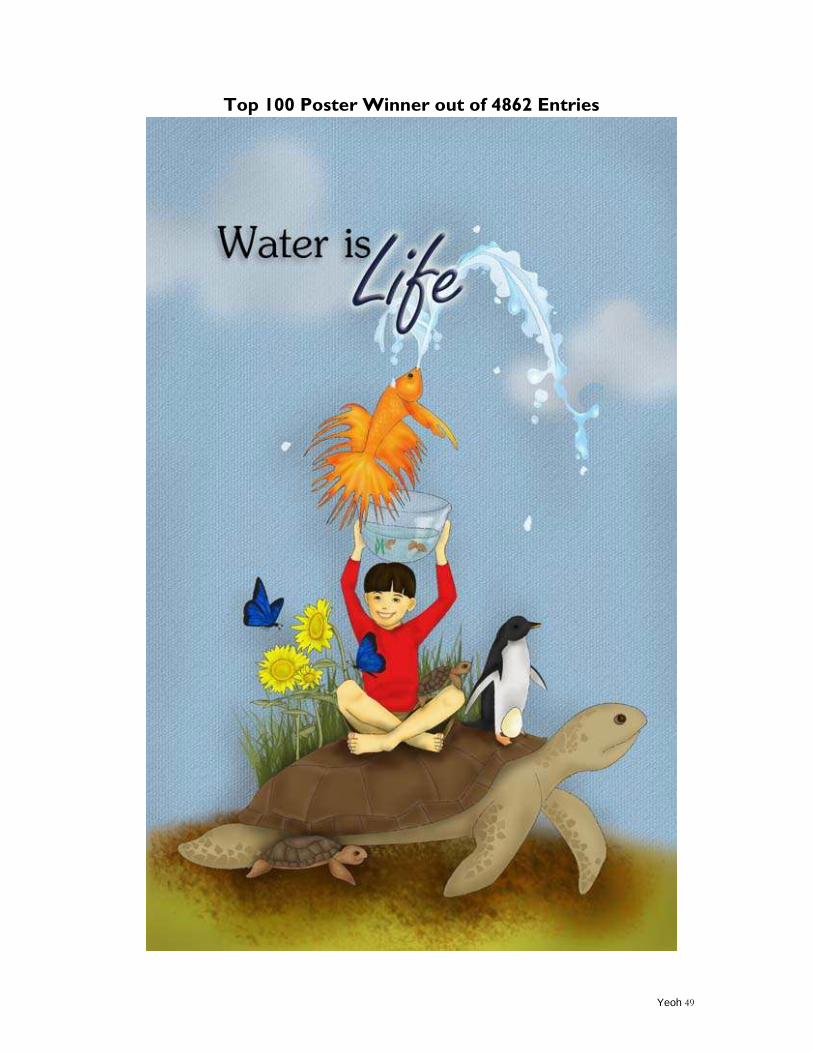
Top 100 Poster Winner out of 4862 Entries (3 of 20)
Open to all countries for students studying fine arts, design, communication design and architecture, the 2011 Water is Life international poster competition received a total of 4862 entries from 83 countries. When the entry was closed on December 31, 2010 and winners announced in March, Ng Sie Yen, a student from my Graphic Communication course at the Wee Kim Wee School, NTU, was pleasantly surprised to find out that her entry was selected as one of the top 100 posters and was published in a book with the aim to demonstrate that the younger generations are prepared to bear their share of the responsibility for our world. More importantly, it was to publicize the message that “Water is Life” to a broad public by means of worldwide exhibitions. She also received a certificate. As Sie Yen's supervisor, I was glad that the competition provided an opportunity for Sie Yen to showcase her creativity and drawing skills to the world on a global scale. The organizer of the competition was the German Sanitation, Heating and Air Conditioning Association (ZVSHK) in collaboration with Professor Heinz-Jurgen Kristahn from the Berlin University of the Arts and Professor Lieyan Wu, Rector of the Nanjing Arts Institute, China.
Yeoh 49
Top 100 Poster Winner out of 4862 Entries
Yeoh 50
Siemens Green Technology Journalism Award 2011(4 of 20)
The competition received over 200 entries from the ASEAN region and the results were announced on Feb. 14, 2011 at the launch of the Siemens Asian Green City Index event. (http://www.eco-business.com/news/2011/feb/15/journalists-recognised-stories-green-technology-in/) The award, first of its kind in ASEAN, was established in 2010 to identify, recognize and reward professional and young, aspiring journalists who have reported on green technology, sustainability and environmental issues in ASEAN countries. The entries were reviewed by a regional jury comprising of seven professionals in the field of journalism and green technology. Besides winning a certificate, trophy and prize money of 500 Euros, this award provides a beautiful closure to Chen Wei Li, Estelle Low Shu Ying, Miak Aw Hui Min‟s 2010 Year Project “Food Waste Republic” that I co-supervised at the Wee Kim Wee School, NTU.
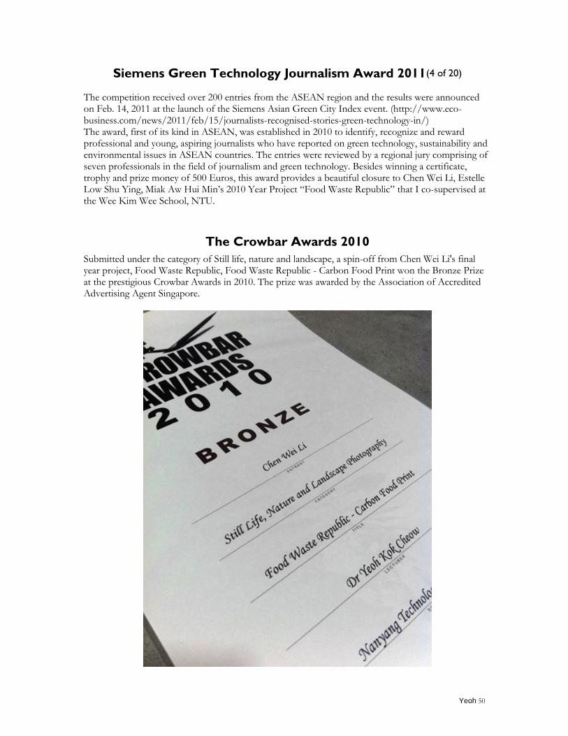
The Crowbar Awards 2010
Submitted under the category of Still life, nature and landscape, a spin-off from Chen Wei Li's final year project, Food Waste Republic, Food Waste Republic - Carbon Food Print won the Bronze Prize at the prestigious Crowbar Awards in 2010. The prize was awarded by the Association of Accredited Advertising Agent Singapore.
Yeoh 51
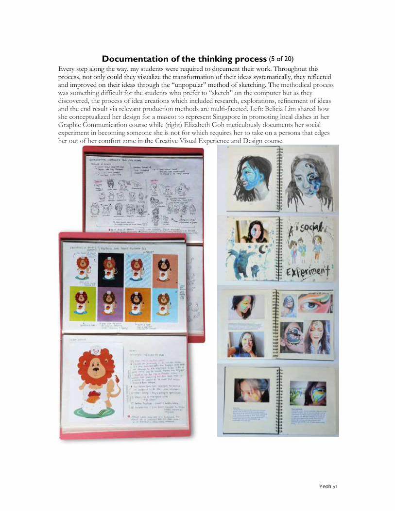
Documentation of the thinking process (5 of 20)
Every step along the way, my students were required to document their work. Throughout this process, not only could they visualize the transformation of their ideas systematically, they reflected and improved on their ideas through the “unpopular” method of sketching. The methodical process was something difficult for the students who prefer to “sketch” on the computer but as they discovered, the process of idea creations which included research, explorations, refinement of ideas and the end result via relevant production methods are multi-faceted. Left: Belicia Lim shared how she conceptualized her design for a mascot to represent Singapore in promoting local dishes in her Graphic Communication course while (right) Elizabeth Goh meticulously documents her social experiment in becoming someone she is not for which requires her to take on a persona that edges her out of her comfort zone in the Creative Visual Experience and Design course.
Yeoh 52
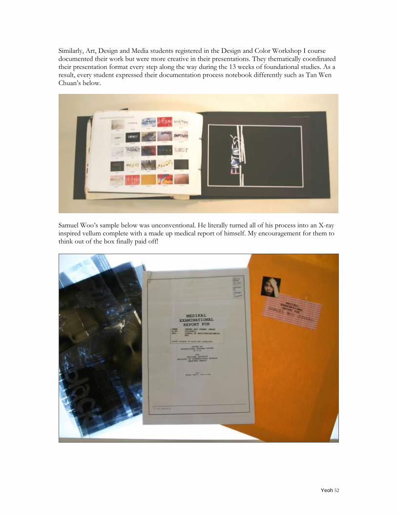
Similarly, Art, Design and Media students registered in the Design and Color Workshop I course documented their work but were more creative in their presentations. They thematically coordinated their presentation format every step along the way during the 13 weeks of foundational studies. As a result, every student expressed their documentation process notebook differently such as Tan Wen Chuan‟s below.
Samuel Woo‟s sample below was unconventional. He literally turned all of his process into an X-ray inspired vellum complete with a made up medical report of himself. My encouragement for them to think out of the box finally paid off!
Yeoh 53
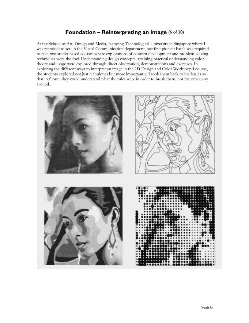
Foundation – Reinterpreting an image (6 of 20)
At the School of Art, Design and Media, Nanyang Technological University in Singapore where I was recruited to set up the Visual Communication department, our first pioneer batch was required to take two studio-based courses where explorations of concept development and problem-solving techniques were the foci. Understanding design concepts, attaining practical understanding color theory and usage were explored through direct observation, demonstrations and exercises. In exploring the different ways to interpret an image in the 2D Design and Color Workshop I course, the students explored not just techniques but more importantly, I took them back to the basics so that in future, they could understand what the rules were in order to break them, not the other way around.
Yeoh 54
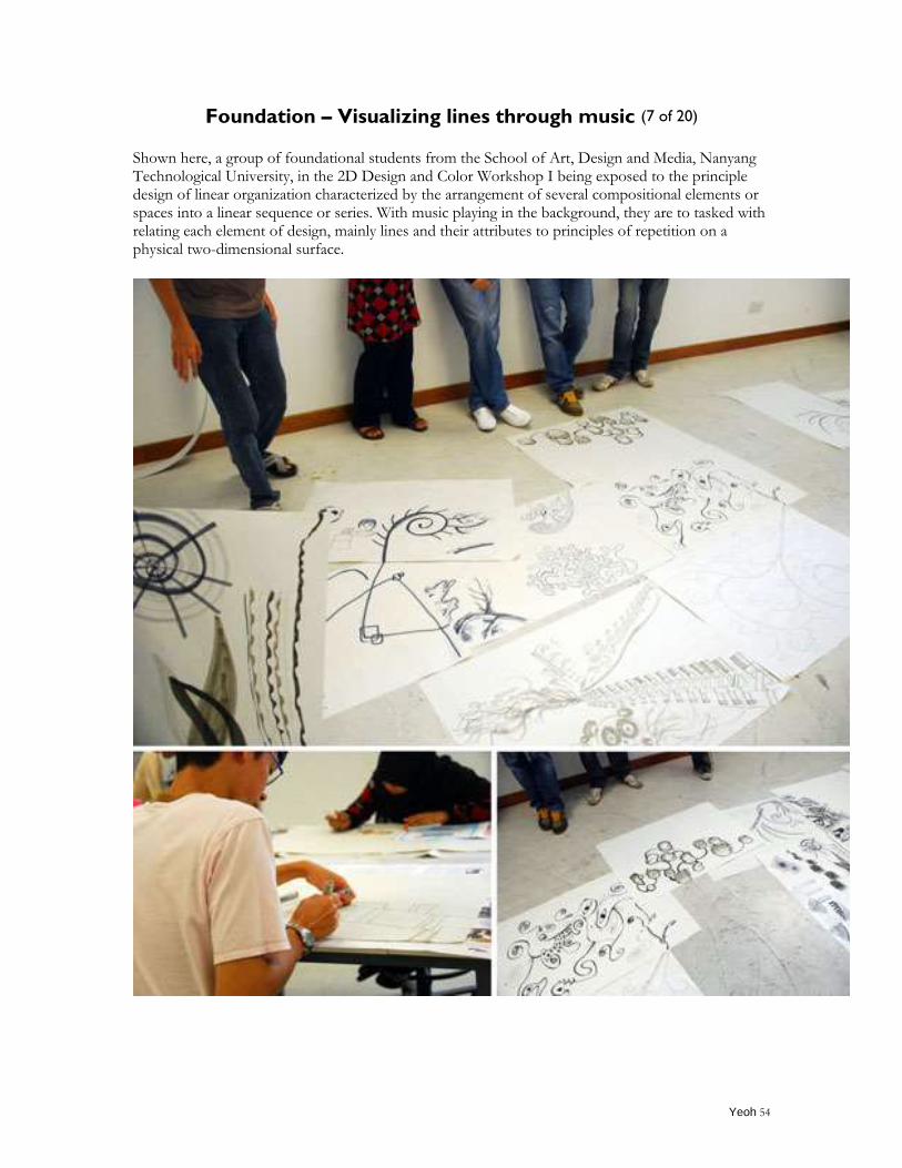
Foundation – Visualizing lines through music (7 of 20)
Shown here, a group of foundational students from the School of Art, Design and Media, Nanyang Technological University, in the 2D Design and Color Workshop I being exposed to the principle design of linear organization characterized by the arrangement of several compositional elements or spaces into a linear sequence or series. With music playing in the background, they are to tasked with relating each element of design, mainly lines and their attributes to principles of repetition on a physical two-dimensional surface.
Yeoh 55
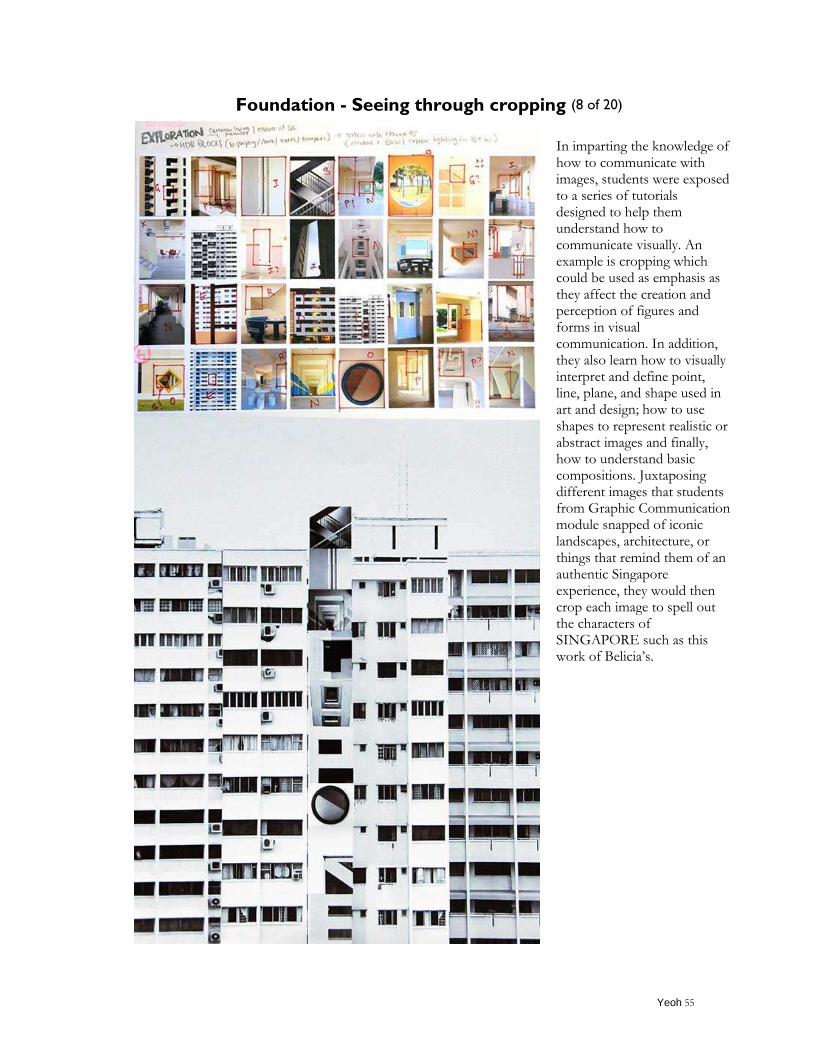
Foundation - Seeing through cropping (8 of 20)
In imparting the knowledge of how to communicate with images, students were exposed to a series of tutorials designed to help them understand how to communicate visually. An example is cropping which could be used as emphasis as they affect the creation and perception of figures and forms in visual communication. In addition, they also learn how to visually interpret and define point, line, plane, and shape used in art and design; how to use shapes to represent realistic or abstract images and finally, how to understand basic compositions. Juxtaposing different images that students from Graphic Communication module snapped of iconic landscapes, architecture, or things that remind them of an authentic Singapore experience, they would then crop each image to spell out the characters of SINGAPORE such as this work of Belicia‟s.
Yeoh 56
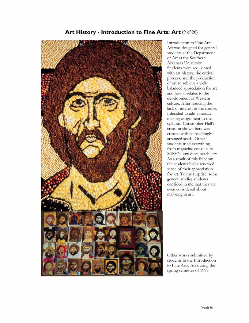
Art History - Introduction to Fine Arts: Art (9 of 20)
Introduction to Fine Arts: Art was designed for general students at the Department of Art at the Southern Arkansas University. Students were acquainted with art history, the critical process, and the production of art to achieve a well-balanced appreciation for art and how it relates to the development of Western culture. After noticing the lack of interest in the course, I decided to add a mosaic-making assignment to the syllabus. Christopher Hall‟s creation shown here was created with painstakingly arranged seeds. Other students tried everything from magazine cut-outs to M&M‟s, saw dust, beads, etc. As a result of this freedom, the students had a renewed sense of their appreciation for art. To my surprise, some general studies students confided in me that they are even considered about majoring in art.
Other works submitted by students in the Introduction to Fine Arts: Art during the spring semester of 1999.
Yeoh 57
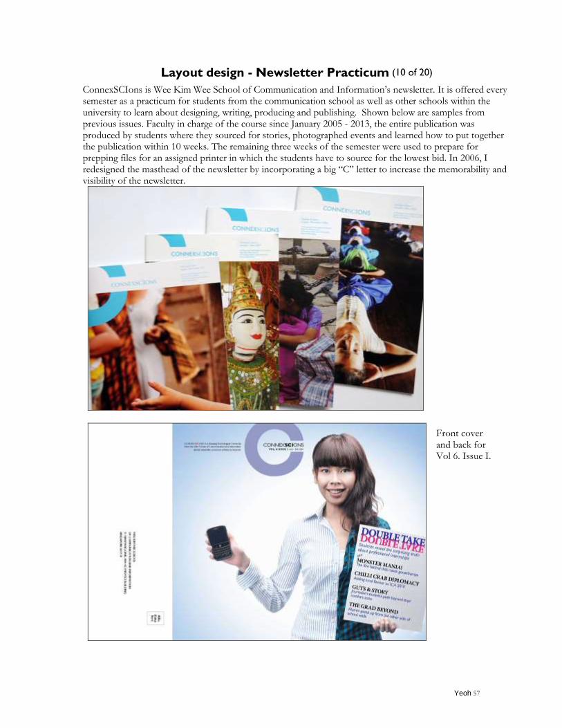
Layout design - Newsletter Practicum (10 of 20)
ConnexSCIons is Wee Kim Wee School of Communication and Information‟s newsletter. It is offered every semester as a practicum for students from the communication school as well as other schools within the university to learn about designing, writing, producing and publishing. Shown below are samples from previous issues. Faculty in charge of the course since January 2005 - 2013, the entire publication was produced by students where they sourced for stories, photographed events and learned how to put together the publication within 10 weeks. The remaining three weeks of the semester were used to prepare for prepping files for an assigned printer in which the students have to source for the lowest bid. In 2006, I redesigned the masthead of the newsletter by incorporating a big “C” letter to increase the memorability and visibility of the newsletter.
Front cover and back for Vol 6. Issue I.
Yeoh 58
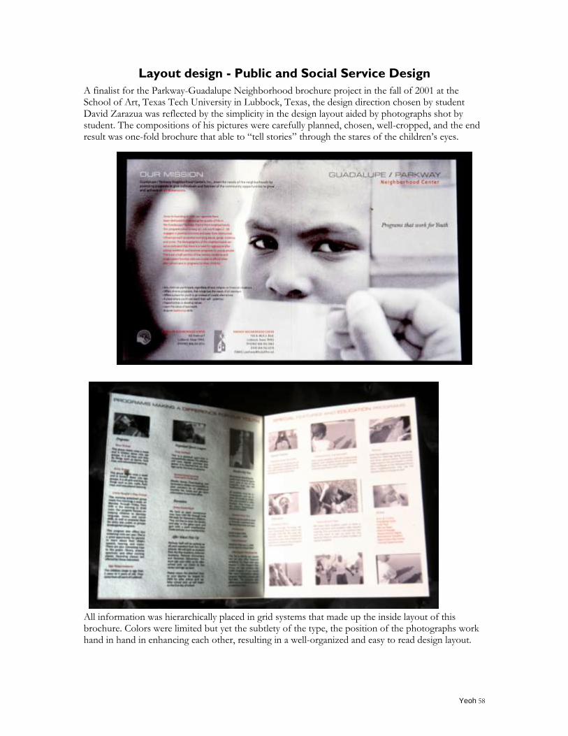
Layout design - Public and Social Service Design
A finalist for the Parkway-Guadalupe Neighborhood brochure project in the fall of 2001 at the School of Art, Texas Tech University in Lubbock, Texas, the design direction chosen by student David Zarazua was reflected by the simplicity in the design layout aided by photographs shot by student. The compositions of his pictures were carefully planned, chosen, well-cropped, and the end result was one-fold brochure that able to “tell stories” through the stares of the children‟s eyes.
All information was hierarchically placed in grid systems that made up the inside layout of this brochure. Colors were limited but yet the subtlety of the type, the position of the photographs work hand in hand in enhancing each other, resulting in a well-organized and easy to read design layout.
Yeoh 59
Data visualization – Complex data made comprehensible visually (11 of 20)
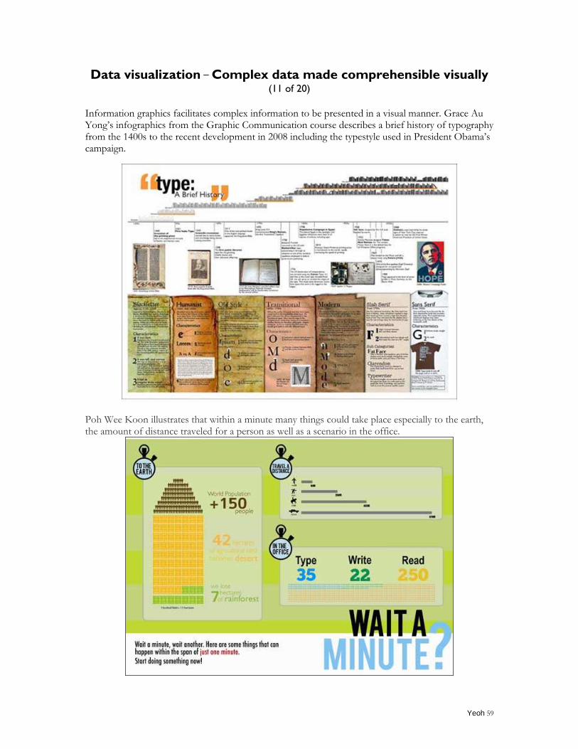
Information graphics facilitates complex information to be presented in a visual manner. Grace Au Yong‟s infographics from the Graphic Communication course describes a brief history of typography from the 1400s to the recent development in 2008 including the typestyle used in President Obama‟s campaign.
Poh Wee Koon illustrates that within a minute many things could take place especially to the earth, the amount of distance traveled for a person as well as a scenario in the office.
Yeoh 60
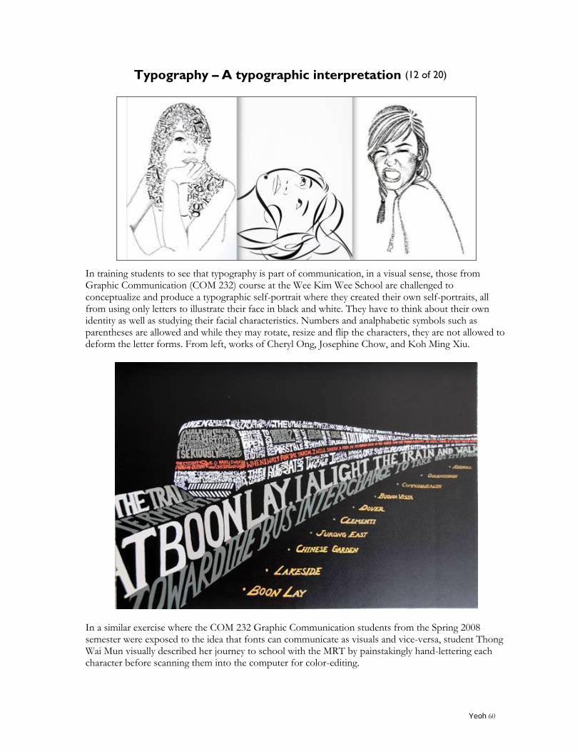
Typography – A typographic interpretation (12 of 20)
In training students to see that typography is part of communication, in a visual sense, those from Graphic Communication (COM 232) course at the Wee Kim Wee School are challenged to conceptualize and produce a typographic self-portrait where they created their own self-portraits, all from using only letters to illustrate their face in black and white. They have to think about their own identity as well as studying their facial characteristics. Numbers and analphabetic symbols such as parentheses are allowed and while they may rotate, resize and flip the characters, they are not allowed to deform the letter forms. From left, works of Cheryl Ong, Josephine Chow, and Koh Ming Xiu.
In a similar exercise where the COM 232 Graphic Communication students from the Spring 2008 semester were exposed to the idea that fonts can communicate as visuals and vice-versa, student Thong Wai Mun visually described her journey to school with the MRT by painstakingly hand-lettering each character before scanning them into the computer for color-editing.
Yeoh 61
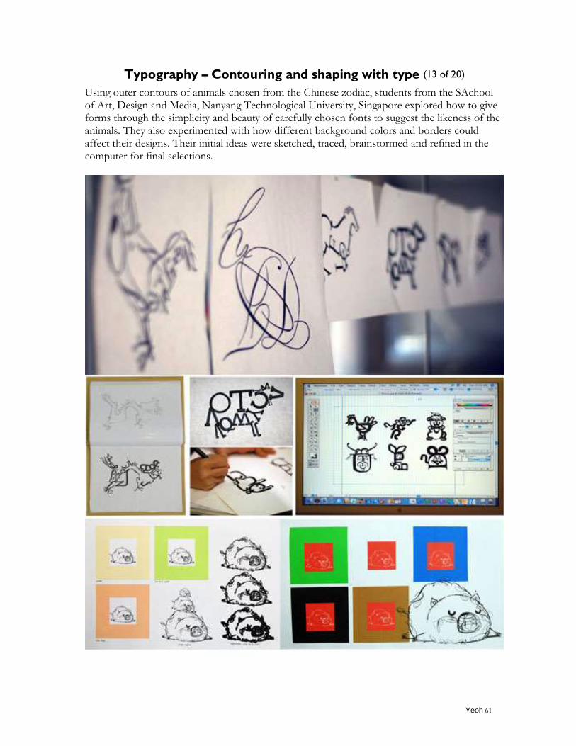
Typography – Contouring and shaping with type (13 of 20)
Using outer contours of animals chosen from the Chinese zodiac, students from the SAchool of Art, Design and Media, Nanyang Technological University, Singapore explored how to give forms through the simplicity and beauty of carefully chosen fonts to suggest the likeness of the animals. They also experimented with how different background colors and borders could affect their designs. Their initial ideas were sketched, traced, brainstormed and refined in the computer for final selections.
Yeoh 62
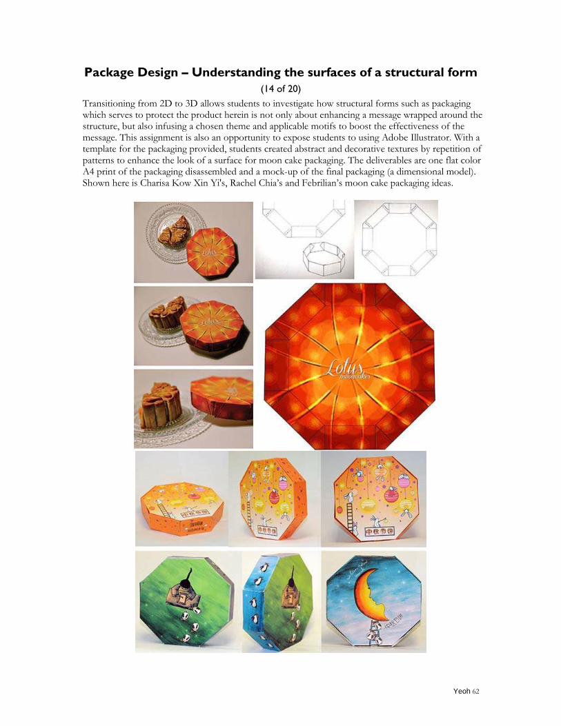
Package Design – Understanding the surfaces of a structural form
(14 of 20)
Transitioning from 2D to 3D allows students to investigate how structural forms such as packaging which serves to protect the product herein is not only about enhancing a message wrapped around the structure, but also infusing a chosen theme and applicable motifs to boost the effectiveness of the message. This assignment is also an opportunity to expose students to using Adobe Illustrator. With a template for the packaging provided, students created abstract and decorative textures by repetition of patterns to enhance the look of a surface for moon cake packaging. The deliverables are one flat color A4 print of the packaging disassembled and a mock-up of the final packaging (a dimensional model). Shown here is Charisa Kow Xin Yi's, Rachel Chia‟s and Febrilian‟s moon cake packaging ideas.
Yeoh 63
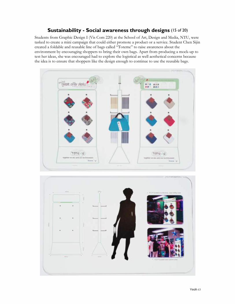
Sustainability - Social awareness through designs (15 of 20)
Students from Graphic Design I (Vis Com 220) at the School of Art, Design and Media, NTU, were tasked to create a mini campaign that could either promote a product or a service. Student Chen Sijin created a foldable and reusable line of bags called “Toteme” to raise awareness about the environment by encouraging shoppers to bring their own bags. Apart from producing a mock-up to test her ideas, she was encouraged had to explore the logistical as well aesthetical concerns because the idea is to ensure that shoppers like the design enough to continue to use the reusable bags.
Yeoh 64
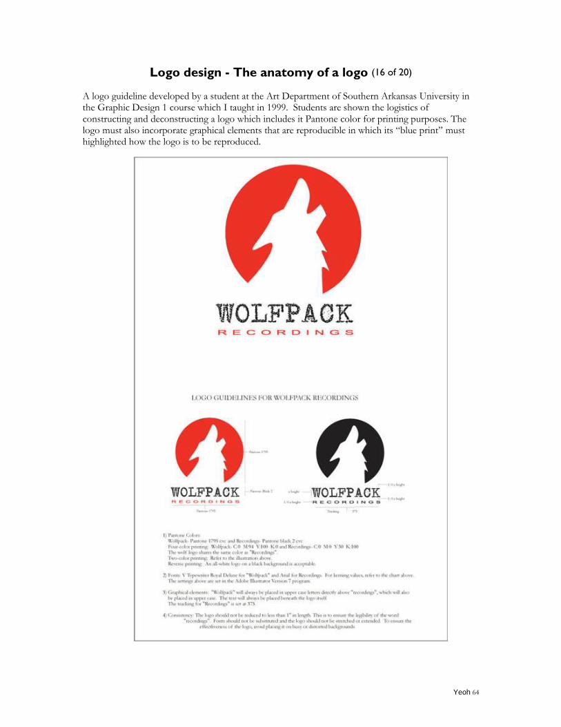
Logo design - The anatomy of a logo (16 of 20)
A logo guideline developed by a student at the Art Department of Southern Arkansas University in the Graphic Design 1 course which I taught in 1999. Students are shown the logistics of constructing and deconstructing a logo which includes it Pantone color for printing purposes. The logo must also incorporate graphical elements that are reproducible in which its “blue print” must highlighted how the logo is to be reproduced.
Yeoh 65
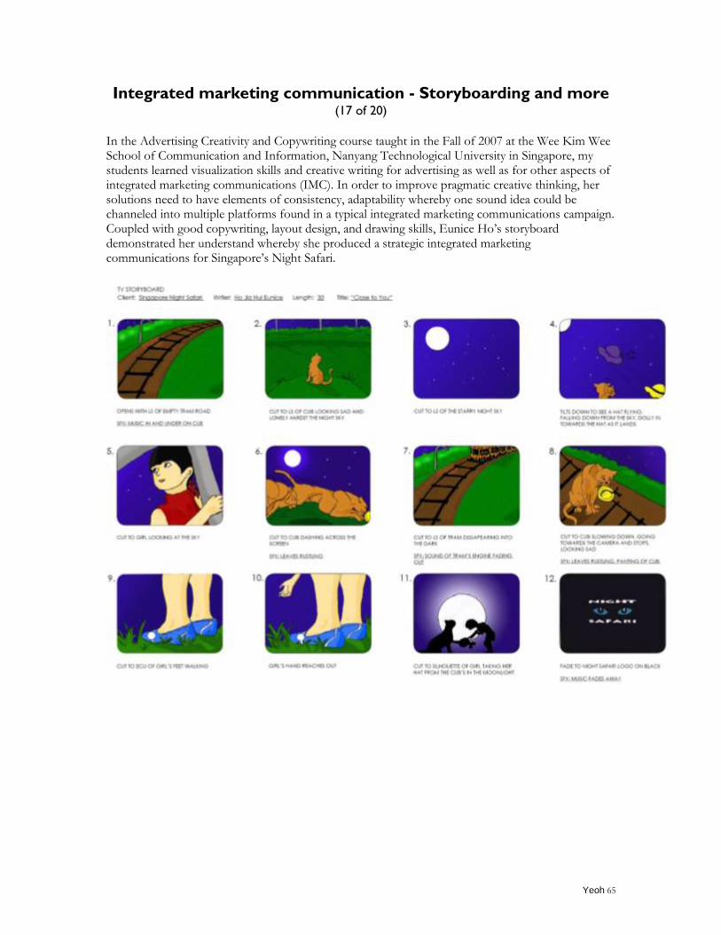
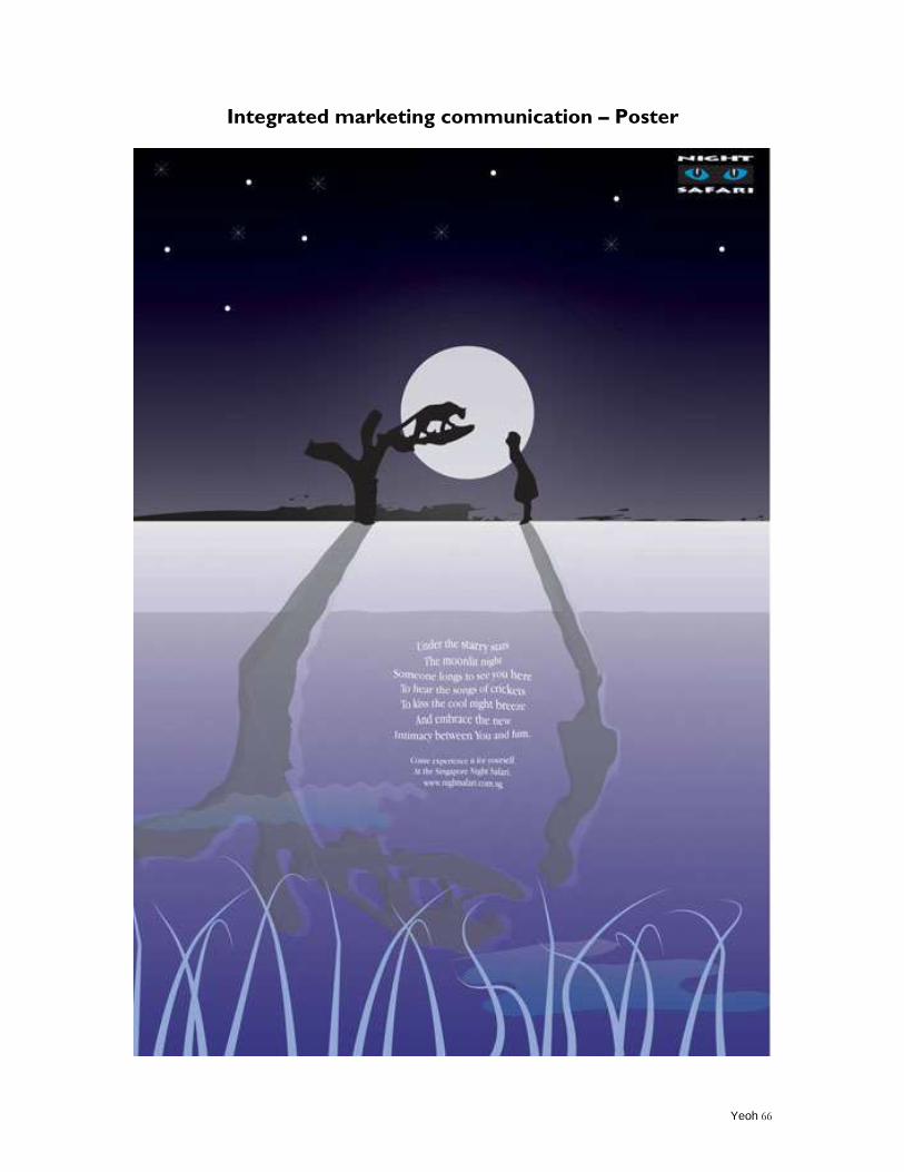
Integrated marketing communication - Storyboarding and more
(17 of 20)
In the Advertising Creativity and Copywriting course taught in the Fall of 2007 at the Wee Kim Wee School of Communication and Information, Nanyang Technological University in Singapore, my students learned visualization skills and creative writing for advertising as well as for other aspects of integrated marketing communications (IMC). In order to improve pragmatic creative thinking, her solutions need to have elements of consistency, adaptability whereby one sound idea could be channeled into multiple platforms found in a typical integrated marketing communications campaign. Coupled with good copywriting, layout design, and drawing skills, Eunice Ho‟s storyboard demonstrated her understand whereby she produced a strategic integrated marketing communications for Singapore‟s Night Safari.
Yeoh 66
Integrated marketing communication – Poster
Yeoh 67
Final Year Project (Senior’s Project) turned into an international
conference paper presentation - Work-life Harmony for Creative
Minds in the Advertising Industry (18 of 20)
The past decade has seen a proliferation of research studies on work and life interfaces. However, research in this area so far has often focused on the "balance" or the "conflict" between the two preeminent domains in the lives of individuals. Friedman, Christensen and DeGroot (1998) highlighted that most companies view work and personal life as competing priorities in a zero sum game, in which a gain in one area means a loss in the other. However, they believed that rather than being competing priorities, work and personal life are actually complementary. Supporting this view, Hill (2007) proposes that "harmony" rather than "balance" be used when talking about the work-life issue. He defines work-life harmony as the ability to effectively integrate work responsibilities and family or personal aspirations. Therefore, rather than limiting questions about work-life to how time in one domain can be reduced to make more time for the other, more helpful questions would be about how both domains can complement each other. This study builds on Hill's definition of work-life harmony in the context of creative individuals, namely copywriters and art directors, in the advertising industry. For the purposes of this study, a creative individual is defined as someone who manages the process and outcome of a creative solution. The preponderance of research on work-life balance in the advertising industry has mainly focused on countries in the West, centering on the reasons behind the male dominance in the industry (Mallia, 2009; Broyles & Grow, 2008; Kazenoff & Vagnoni, 1997). While the issue of work-life balance in the Singapore context has received considerable academic attention, there is a dearth of research in this area for creative individuals in Singapore. Given that creative individuals are typically known to be subjected to the "punishing hours" of the advertising industry (Mallia, 2009, p. 5), the potentially complementary nature of work and personal life would have important implications. This paper was a result from the Final Year Project co-supervision with Dr Suwichit Chaidaroon and was accepted and presented by final year students Cheryl Chan, Celine Tham, Tsang Wing Han at the 2011 American Academy of Advertising Asia-Pacific Conference in cooperation with the Queensland University of Technology and the Australian and New Zealand Academy of Advertising, Brisbane, Australia from June 8 -10, 2011.
The full paper can be downloaded at http://yeoh.com/pict_files/Work%20Live%20Harmony%20of%20Creative%20Individuals.p
df
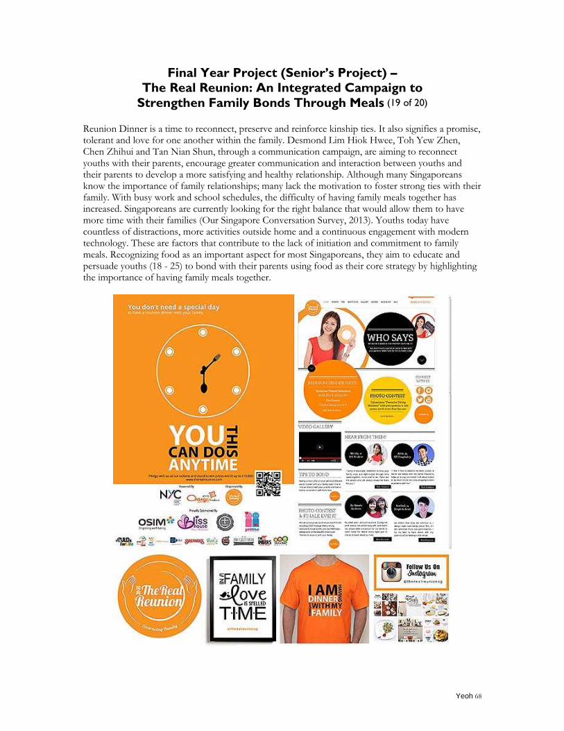
Yeoh 68
Final Year Project (Senior’s Project) –
The Real Reunion: An Integrated Campaign to
Strengthen Family Bonds Through Meals (19 of 20)
Reunion Dinner is a time to reconnect, preserve and reinforce kinship ties. It also signifies a promise, tolerant and love for one another within the family. Desmond Lim Hiok Hwee, Toh Yew Zhen, Chen Zhihui and Tan Nian Shun, through a communication campaign, are aiming to reconnect youths with their parents, encourage greater communication and interaction between youths and their parents to develop a more satisfying and healthy relationship. Although many Singaporeans know the importance of family relationships; many lack the motivation to foster strong ties with their family. With busy work and school schedules, the difficulty of having family meals together has increased. Singaporeans are currently looking for the right balance that would allow them to have more time with their families (Our Singapore Conversation Survey, 2013). Youths today have countless of distractions, more activities outside home and a continuous engagement with modern technology. These are factors that contribute to the lack of initiation and commitment to family meals. Recognizing food as an important aspect for most Singaporeans, they aim to educate and persuade youths (18 - 25) to bond with their parents using food as their core strategy by highlighting the importance of having family meals together.
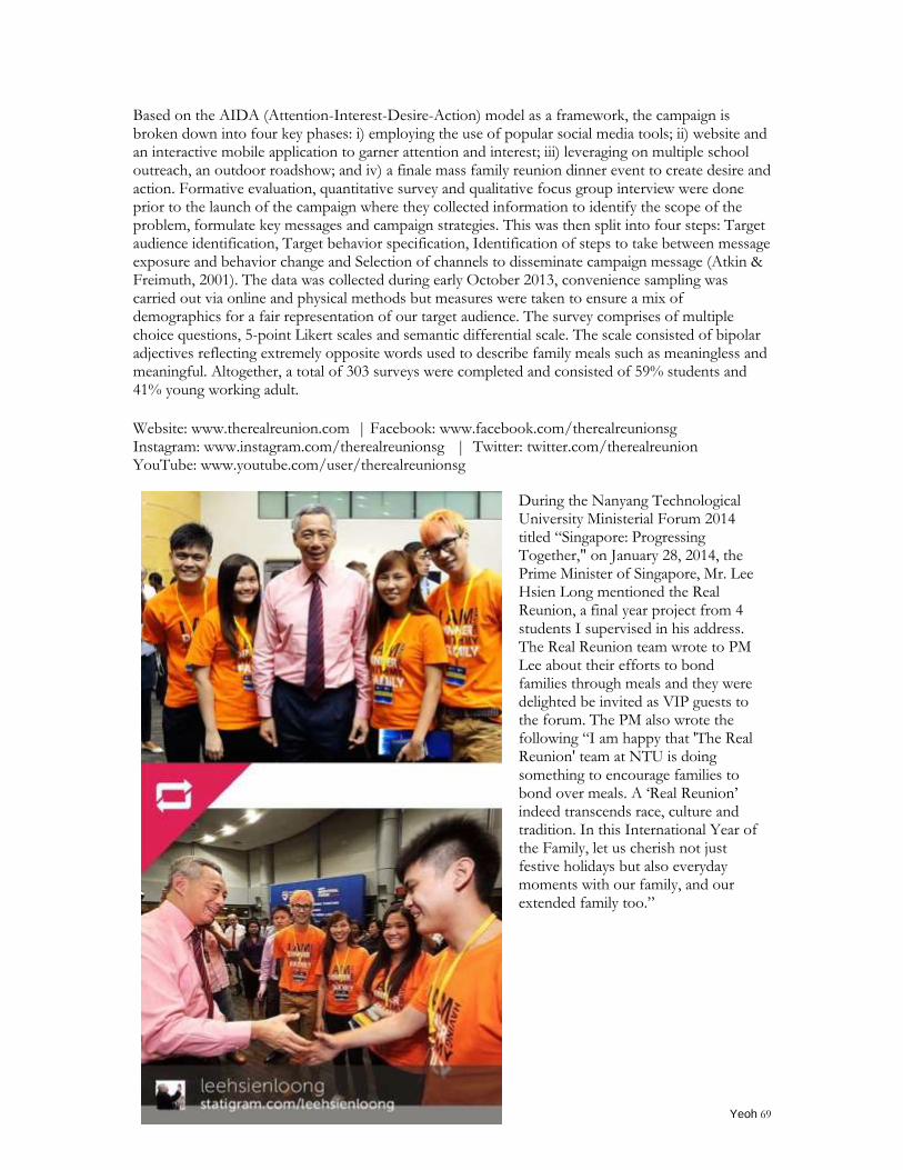
Yeoh 69
Based on the AIDA (Attention-Interest-Desire-Action) model as a framework, the campaign is broken down into four key phases: i) employing the use of popular social media tools; ii) website and an interactive mobile application to garner attention and interest; iii) leveraging on multiple school outreach, an outdoor roadshow; and iv) a finale mass family reunion dinner event to create desire and action. Formative evaluation, quantitative survey and qualitative focus group interview were done prior to the launch of the campaign where they collected information to identify the scope of the problem, formulate key messages and campaign strategies. This was then split into four steps: Target audience identification, Target behavior specification, Identification of steps to take between message exposure and behavior change and Selection of channels to disseminate campaign message (Atkin & Freimuth, 2001). The data was collected during early October 2013, convenience sampling was carried out via online and physical methods but measures were taken to ensure a mix of demographics for a fair representation of our target audience. The survey comprises of multiple choice questions, 5-point Likert scales and semantic differential scale. The scale consisted of bipolar adjectives reflecting extremely opposite words used to describe family meals such as meaningless and meaningful. Altogether, a total of 303 surveys were completed and consisted of 59% students and 41% young working adult. Website: www.therealreunion.com | Facebook: www.facebook.com/therealreunionsg Instagram: www.instagram.com/therealreunionsg | Twitter: twitter.com/therealreunion YouTube: www.youtube.com/user/therealreunionsg
During the Nanyang Technological University Ministerial Forum 2014 titled “Singapore: Progressing Together," on January 28, 2014, the Prime Minister of Singapore, Mr. Lee Hsien Long mentioned the Real Reunion, a final year project from 4 students I supervised in his address. The Real Reunion team wrote to PM Lee about their efforts to bond families through meals and they were delighted be invited as VIP guests to the forum. The PM also wrote the following “I am happy that 'The Real Reunion' team at NTU is doing something to encourage families to bond over meals. A „Real Reunion‟ indeed transcends race, culture and tradition. In this International Year of the Family, let us cherish not just festive holidays but also everyday moments with our family, and our extended family too.”
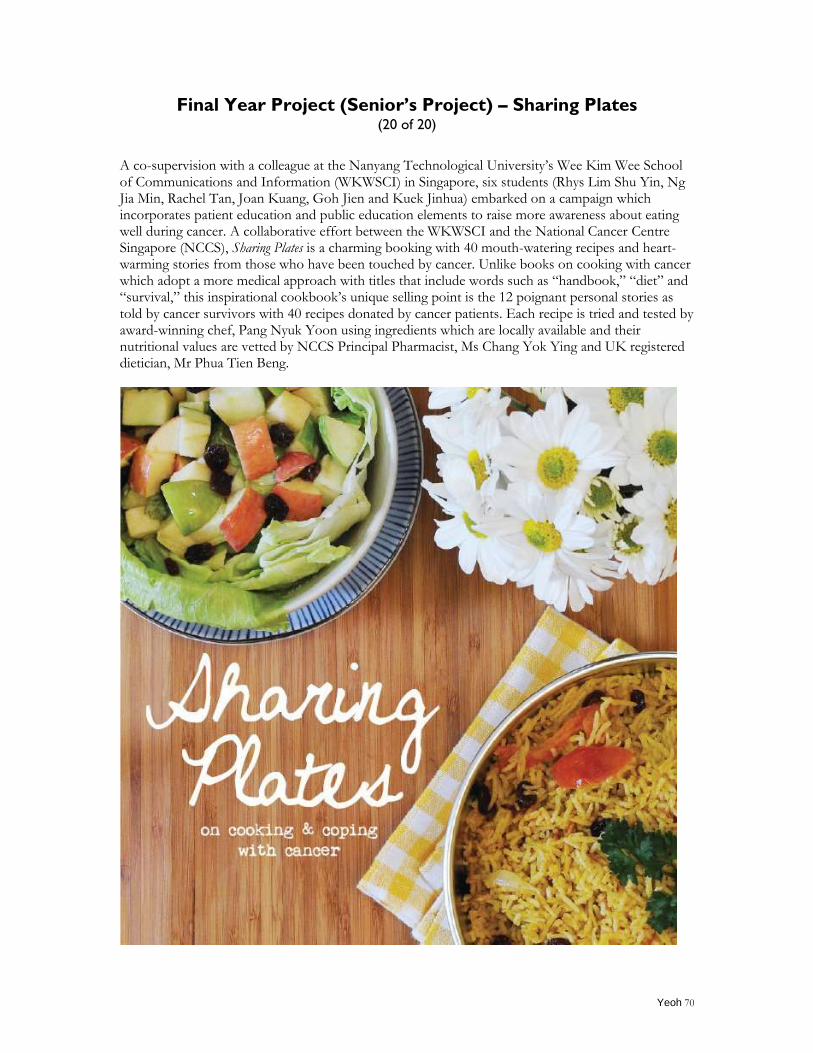
Yeoh 70
Final Year Project (Senior’s Project) – Sharing Plates (20 of 20)
A co-supervision with a colleague at the Nanyang Technological University‟s Wee Kim Wee School of Communications and Information (WKWSCI) in Singapore, six students (Rhys Lim Shu Yin, Ng Jia Min, Rachel Tan, Joan Kuang, Goh Jien and Kuek Jinhua) embarked on a campaign which incorporates patient education and public education elements to raise more awareness about eating well during cancer. A collaborative effort between the WKWSCI and the National Cancer Centre Singapore (NCCS), Sharing Plates is a charming booking with 40 mouth-watering recipes and heart-warming stories from those who have been touched by cancer. Unlike books on cooking with cancer which adopt a more medical approach with titles that include words such as “handbook,” “diet” and “survival,” this inspirational cookbook‟s unique selling point is the 12 poignant personal stories as told by cancer survivors with 40 recipes donated by cancer patients. Each recipe is tried and tested by award-winning chef, Pang Nyuk Yoon using ingredients which are locally available and their nutritional values are vetted by NCCS Principal Pharmacist, Ms Chang Yok Ying and UK registered dietician, Mr Phua Tien Beng.
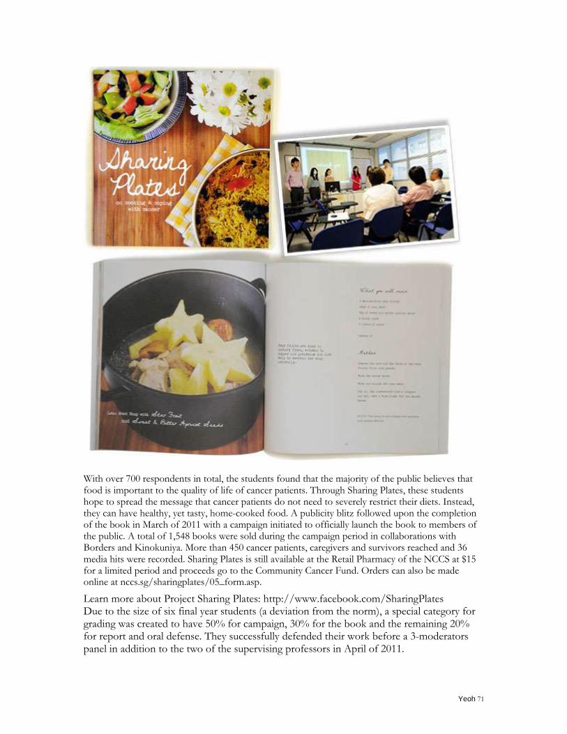
Yeoh 71
With over 700 respondents in total, the students found that the majority of the public believes that food is important to the quality of life of cancer patients. Through Sharing Plates, these students hope to spread the message that cancer patients do not need to severely restrict their diets. Instead, they can have healthy, yet tasty, home-cooked food. A publicity blitz followed upon the completion of the book in March of 2011 with a campaign initiated to officially launch the book to members of the public. A total of 1,548 books were sold during the campaign period in collaborations with Borders and Kinokuniya. More than 450 cancer patients, caregivers and survivors reached and 36 media hits were recorded. Sharing Plates is still available at the Retail Pharmacy of the NCCS at $15 for a limited period and proceeds go to the Community Cancer Fund. Orders can also be made online at nccs.sg/sharingplates/05_form.asp.
Learn more about Project Sharing Plates: http://www.facebook.com/SharingPlates Due to the size of six final year students (a deviation from the norm), a special category for grading was created to have 50% for campaign, 30% for the book and the remaining 20% for report and oral defense. They successfully defended their work before a 3-moderators panel in addition to the two of the supervising professors in April of 2011.
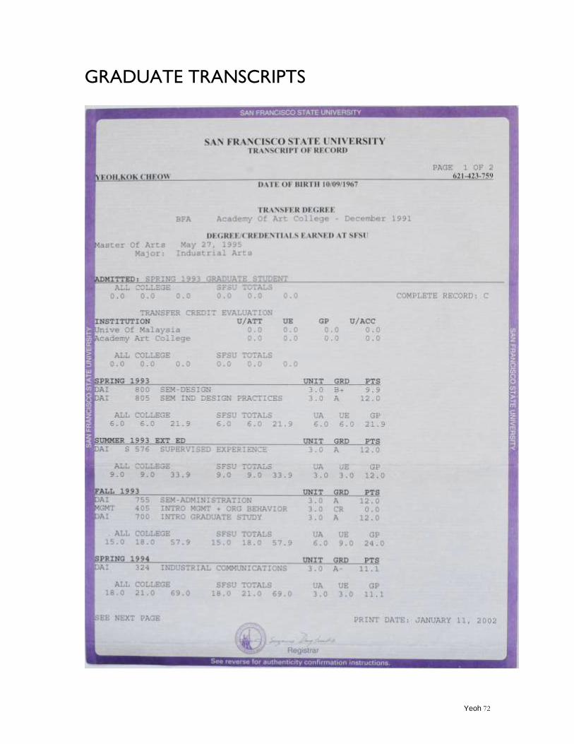
Yeoh 72
GRADUATE TRANSCRIPTS
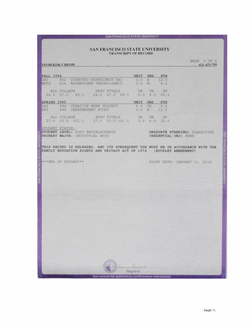
Yeoh 73
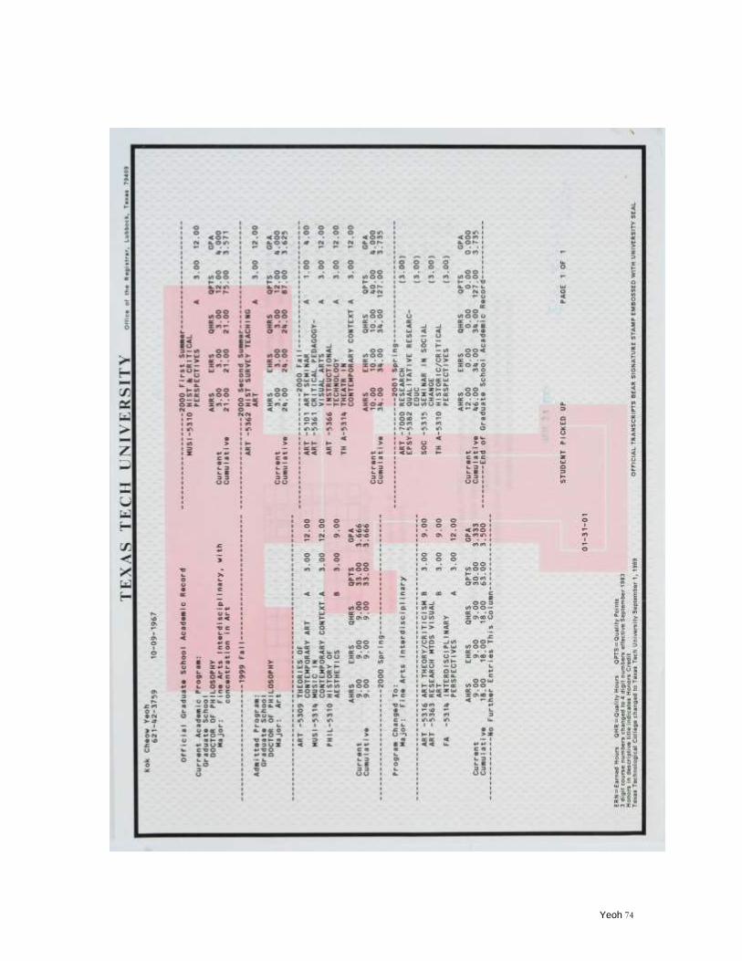
Yeoh 74
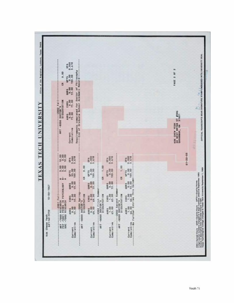
Yeoh 75
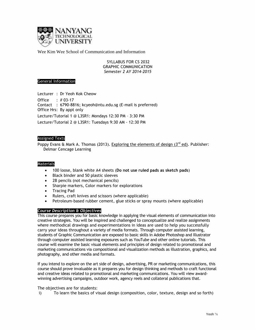
Yeoh 76
Wee Kim Wee School of Communication and Information
SYLLABUS FOR CS 2032
GRAPHIC COMMUNICATION Semester 2 AY 2014-2015
General Information
Lecturer : Dr Yeoh Kok Cheow
Office : # 03-17 Contact : 6790-8816; [email protected] (E-mail is preferred) Office Hrs : By appt only
Lecture/Tutorial 1 @ L3SR1: Mondays 12:30 PM – 3:30 PM
Lecture/Tutorial 2 @ L3SR1: Tuesdays 9:30 AM - 12:30 PM
Assigned Texts
Poppy Evans & Mark A. Thomas (2013). Exploring the elements of design (3rd ed). Publisher: Delmar Cencage Learning
Materials
100 loose, blank white A4 sheets (Do not use ruled pads as sketch pads)
Black binder and 50 plastic sleeves
2B pencils (not mechanical pencils)
Sharpie markers, Color markers for explorations
Tracing Pad
Rulers, craft knives and scissors (where applicable)
Petroleum-based rubber cement, glue sticks or spray mounts (where applicable)
Course Description & Objectives This course prepares you for basic knowledge in applying the visual elements of communication into creative strategies. You will be inspired and challenged to conceptualize and realize assignments where methodical drawings and experimentations in ideas are used to help you successfully carry your ideas throughout a variety of media formats. Through computer assisted learning, students of Graphic Communication are exposed to basic skills in Adobe Photoshop and Illustrator through computer assisted learning exposures such as YouTube and other online tutorials. This course will examine the basic visual elements and principles of design related to promotional and marketing communications via compositional and visualization methods as illustration, graphics, and photography, and other media and formats. If you intend to explore on the art side of design, advertising, PR or marketing communications, this course should prove invaluable as it prepares you for design thinking and methods to craft functional and creative ideas related to promotional and marketing communications. You will view award-winning advertising campaigns, outdoor work, agency reels and collateral publications that. The objectives are for students: i) To learn the basics of visual design (composition, color, texture, design and so forth)
Yeoh 77
ii) To improve creative thinking specific to strategic communications iii) To learn how type and images affect visual communications.
Lecture and Work Schedule
The course is structured under lectures, tutorials, and class discussions formats with one hour of lecture and two hours of tutorials. Lecture sessions are meant to provide you with grounding in theories, followed by the tutorials which will give a practical application and understanding of the course. Class participation is expected in discussions, brainstorming sessions, as well as other presentations. When working in groups, peer evaluations are expected where every member has been assigned with specified tasks. Good studentship such as active participation in offering suggestions, constructive comments as well as timely completion of projects is also expected.
Assessment Components
A continuous assessment course without any final exams, you will explore different ideas to
communicate a message to an intended audience by using applicable techniques and proper
materials throughout the entire process of planning, developing, and executing your ideas to achieve
the end result. These are series of exercises designed for you to understand and apply the elements
and principles of design specific to strategic communications.
- 3 completed assignments: 15%
- 3 project briefs and adherence of the final solution to the brief: 15%
- 3 process documentations and presentations: 45%
- Contribution (Keenness to contribute, involvement and contribution to a positive - learning environment):
10% - Attendance (Punctuality in lecture and tutorial sessions) is graded as a factorial - element that contributes to the quality of work performed and completed:
10% - Class participation (for group discussions, if/where applicable)
5%
The process notebook should include the following to suggest your idea from thought to fruition:
i) research data as well as any visual or written notations ii) sketches of ideas iii) refinements of the ideas and other steps that lead to iv) the final solution on A4 sheets presented in a black binder with plastic sleeves v) mockup (if applicable)
Content of a design brief A design brief focuses on the desired results of a design, not aesthetics--an important element to distinguish as the brief seeks to provide a list of information to guide the team involved in a project in matters pertaining to developing the strategies, implementing the processes/steps and producing your final idea into its final form. A brief typically consists of the following: Project background:
- Client profile, historical information such as past accomplishment, area of specializations, possibly a niche.
Project goals and objectives: - Goals are something which you try to achieve while objectives are specific results that
you aim to achieve within a time frame and with available resources. ―I want to retire
Yeoh 78
by the age of 50‖ is a goal while objectives would sound like: ―In order to reach my goal, I need to save $20,000 every year.‖
Project solution analysis: - Single message — what is the one thing to tell the audience? If this is a tagline, how
would you describe it as a unique selling point? - Risk and benefits involved. Competitors - Target audience — the demographics of those you wish to focus on. Is there anything
that should be avoided (cultural, political or religious sensitivities) - How will your solution affect and touch the targeted audience? - Timeline — how soon is this needed? When is it expected to be done? How many rounds
(revisions) will this project undergo? - Deliverables — what is to deliver to the audience? What is the best way or place to
reach this audience? - Budget — how much can be spent to get this developed? - Other constraints such as format chosen, production method, technical know-hows and
other logistics Project design outcome/solutions:
- Mandatory elements — Client's logo, address, phone number and other contact information (Facebook or Twitter).
- Format—Printed or time-based
Course policies
1. Due to our reliance on NTULearn to communicate, please check your school email regularly as it is the designated method for sending information and updates. Alternative emails are discouraged.
2. Works from other classes may not be turned in as a substitute for this class. If violated, you may receive an F for the assignment.
3. Submission in absentia in a continuous assessment-base course is prohibited /discouraged without prior arrangements. Understandably, due to unforeseen circumstances, late submission or any work turned in on your behalf may only be evaluated on a permitted basis, provide that you have communicated either an anticipated disruption or to notify your lecturer a week within the incident - failing to do so will render your absence as an unexcused absence.
4. You are expected to punctually attend all lecture and tutorial sessions. The penalty for tardiness and absences for lecture and tutorial sessions are as follows: 15 minutes after the start of the class is considered late. 30 minutes and beyond is considered an absent. Three unexcused absences will earn you a letter grade drop in the final grade.
5. Sending a notification email or a doctor‘s note does not exempt you from your obligations required by the course nor does it ―buy‖ you extra time from a due date or exempt you from responsibility. If you expect an interruption in your schedule, please notify the lecturer in advance.
6. The lecturer is not obligated to repeat the delivery of course materials. It is your responsibility to find out from your classmates what you have missed and to seek clarifications from the lecturer. Please also note that email correspondences during weekends and public holidays or during designated conference dates will be affected.
7. The deadline will not be extended for any assignments. There will be no “make up” opportunities for missed assignments/pop quiz. You are not allowed to retake any missed quizzes/exams as those are specifically linked to your attendance unless you provide immediate documentation/notification within a week since the occurrence of the event.
8. Your behavior in the classroom affects the experience of those around you. All mobile phones are to be switched off during class sessions and kept away from sight (inside a bag, for example). Using mobile phones while the class is in session (receiving or making calls or
Yeoh 79
reading/sending SMS messages) is considered disruptive behavior. You may be dismissed from class and your attendance grade adjusted.
9. During the lecture and/or tutorial sessions, permission must be obtained from the lecturer if the student wishes to record any presentation via any electronic or digital devices of any sort.
10. In preventing mishaps to your artwork, please refrain from eating or drinking when in class. 11. Do not make any offensive remarks, read inappropriate materials, chitchat, sleep or engage in
other forms of distraction such as talking while the lecturer is teaching and so forth. 12. It is preferred that works submitted are typed (word-processed, i.e. check for typos,
misspellings), with attention paid to correct any linguistic mistakes. Hand-written materials will not be accepted unless they are applicable to your assignment. The format for your report/assignment delivered preferably in PDF, can be varied. Whenever in doubt, discuss with your lecturer.
13. If you do not ask questions or seek clarifications, the lecturer assumes that you understood what has been presented and will be graded accordingly.
14. All the works explored must be kept as the importance of process is not to be underestimated. You are encouraged to keep a separate process notebook to document your design process where you record every detail of your projects along the way. This makes sense because if you record all of your work in different places, it would be almost impossible to find important thoughts when you need to refresh your memory and, it would be arduous to gather all your work to present your final solution. Notebooks are a great way to avoid being disorganized.
Policy on Plagiarism
The work that you submit for assessment in this course must be your own individual work (or the work of your group members, in the case of group projects). The NTU Academic Integrity Policy (http://academicintegrity.ntu.edu.sg/) applies to this course. It is your responsibility to familiarise yourself with the Policy and to uphold the values of academic integrity in all academic undertakings. As a matriculated student, you are committed to uphold the NTU Honour Code (http://www.ntu.edu.sg/sao/Pages/HonourCode.aspx). Acts of academic dishonesty include (source: http://academicintegrity.ntu.edu.sg/policy/):
Plagiarism: using or passing off as one‘s own, writings or ideas of someone else, without acknowledging or crediting the source. This includes o Using words, images, diagrams, graphs or ideas derived from books, journals,
magazines, visual media, and the internet without proper acknowledgement; o Copying work from the internet or other sources and presenting as one‘s own; o Direct quoting without quotation marks, even though the source is cited; o Submitting the same piece of work to different courses or to different publications.
Academic fraud: cheating, lying and stealing. This includes: o Cheating – bringing or having access to unauthorised books or materials during an
examination or assessment; o Collusion – copying the work of another student, having another person write one‘s
assignments, or allowing another student to borrow one‘s work; o Falsification of data – fabricating or altering data to mislead such as changing data
to get better experiment results; o False citation – citing a source that was never utilised or attributing work to a
source from which the referenced material was not obtained.
Facilitating academic dishonesty: allowing another student to copy an assignment that is supposed to be done individually, allowing another student to copy answers during an examination/assessment, and taking an examination/assessment or doing an assignment for another student.
Disciplinary actions against academic dishonesty range from a grade mark-down, failing a course to expulsion. Your work should not be copied without appropriate citation from any source, including the Internet. This policy applies to all work submitted, either through
Yeoh 80
oral presentation, or written work, including outlines, briefings, group projects, self-evaluations, etc. You are encouraged to consult us if you have questions concerning the meaning of plagiarism or whether a particular use of sources constitutes plagiarism. If you borrow artwork that is not your own for your artwork, cite it clearly in your accompanying report or on the back of the work itself.
CS2032: GRAPHIC COMMUNICATION Course Outline & Assignments*: Semester 2, AY 2014-2015 Please also note that some knowledge of Adobe Photoshop, Illustrator and InDesign are necessary for the module. There is a pre-requisite requirement of COM 206 and students are expected to have some layout, graphics and image-editing knowledge as well as access to computers and printing peripherals/ facilities in order to fulfil project requirements throughout the course. Although we will spend time in class during tutorials, a huge portion of your time is required outside of scheduled class hours to successfully complete the assignment. Always bring all your sketches and subsequent idea developments to class as weekly group discussion is expected.
Week LECTURE TUTORIAL
The outlined lecture and tutorial sessions below serve as a guide only. When necessary, the lecturer reserves the right to add/remove/change/revise/ recall the lecture and assignments.
Date
1 Introduction: course overview, getting to know each other, expectations, Q & A.
Introduction Add/drop period
Jan 12
Jan 13
2 Chapter 1, pp. 2 – 35.
Defining the language of design.
Principles and
elements of design.
- Add/drop period ends - Assigning the 1st assignment - Develop a brief as outlined in the assessment
components - Form groups to discuss and critique each other‘s
brief - Reconvene and discussions - Q & A
Assignment 1: The journey of a thousand miles begins with a single stamp Design a graphic for a protective cover meant for containing a passport. This protective cover from an agency of your choice is meant as a promotional item for “selling” a destination which does not necessarily be of Singapore’s. The front of this cover measures 10 cm (w) x 14.5 cm (h) and the overall dimension measures 20 cm (w) x 14.5 cm ((h) + 2 flaps that fold inwards to secure the front and back pages of a passport. Develop your ideas on loose blank A4 sheets for an eventual documentation that leads to the completion of this project. Requirements:
- Work minimally with only 2 colors (excluding the color of the cover background)
- Exercise visual thinking as this is primarily an
Jan 19
Jan 20
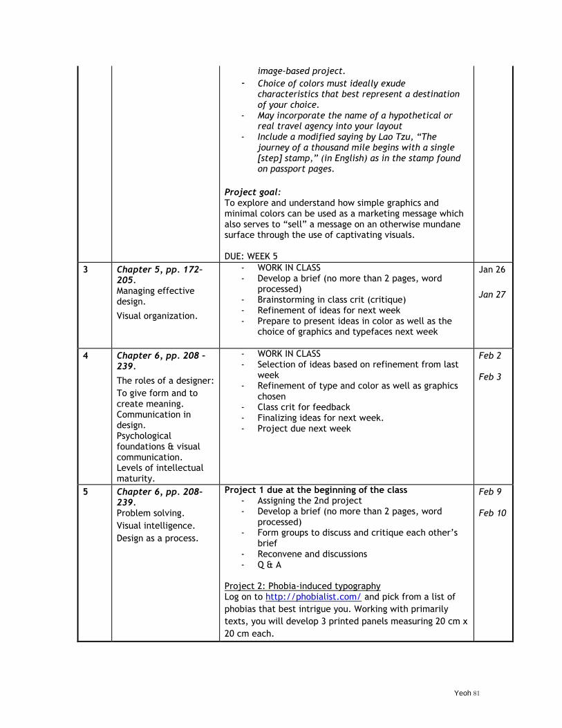
Yeoh 81
image-based project. - Choice of colors must ideally exude
characteristics that best represent a destination of your choice.
- May incorporate the name of a hypothetical or real travel agency into your layout
- Include a modified saying by Lao Tzu, “The journey of a thousand mile begins with a single [step] stamp,” (in English) as in the stamp found on passport pages.
Project goal: To explore and understand how simple graphics and minimal colors can be used as a marketing message which also serves to ―sell‖ a message on an otherwise mundane surface through the use of captivating visuals. DUE: WEEK 5
3 Chapter 5, pp. 172–205. Managing effective design.
Visual organization.
- WORK IN CLASS - Develop a brief (no more than 2 pages, word
processed) - Brainstorming in class crit (critique) - Refinement of ideas for next week - Prepare to present ideas in color as well as the
choice of graphics and typefaces next week
Jan 26
Jan 27
4 Chapter 6, pp. 208 – 239.
The roles of a designer:
To give form and to create meaning. Communication in design. Psychological foundations & visual communication. Levels of intellectual maturity.
- WORK IN CLASS - Selection of ideas based on refinement from last
week - Refinement of type and color as well as graphics
chosen - Class crit for feedback - Finalizing ideas for next week. - Project due next week
Feb 2 Feb 3
5 Chapter 6, pp. 208–239. Problem solving.
Visual intelligence.
Design as a process.
Project 1 due at the beginning of the class - Assigning the 2nd project - Develop a brief (no more than 2 pages, word
processed) - Form groups to discuss and critique each other‘s
brief - Reconvene and discussions - Q & A
Project 2: Phobia-induced typography Log on to http://phobialist.com/ and pick from a list of
phobias that best intrigue you. Working with primarily
texts, you will develop 3 printed panels measuring 20 cm x
20 cm each.
Feb 9 Feb 10
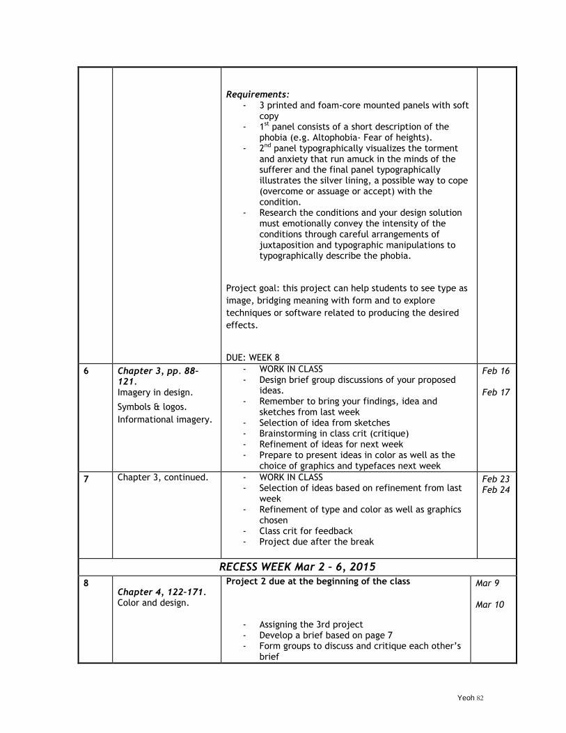
Yeoh 82
Requirements: - 3 printed and foam-core mounted panels with soft
copy - 1st panel consists of a short description of the
phobia (e.g. Altophobia- Fear of heights). - 2nd panel typographically visualizes the torment
and anxiety that run amuck in the minds of the sufferer and the final panel typographically illustrates the silver lining, a possible way to cope (overcome or assuage or accept) with the condition.
- Research the conditions and your design solution must emotionally convey the intensity of the conditions through careful arrangements of juxtaposition and typographic manipulations to typographically describe the phobia.
Project goal: this project can help students to see type as
image, bridging meaning with form and to explore
techniques or software related to producing the desired
effects.
DUE: WEEK 8
6
Chapter 3, pp. 88–121. Imagery in design.
Symbols & logos.
Informational imagery.
- WORK IN CLASS - Design brief group discussions of your proposed
ideas. - Remember to bring your findings, idea and
sketches from last week - Selection of idea from sketches - Brainstorming in class crit (critique) - Refinement of ideas for next week - Prepare to present ideas in color as well as the
choice of graphics and typefaces next week
Feb 16 Feb 17
7 Chapter 3, continued. - WORK IN CLASS - Selection of ideas based on refinement from last
week - Refinement of type and color as well as graphics
chosen - Class crit for feedback - Project due after the break
Feb 23 Feb 24
RECESS WEEK Mar 2 – 6, 2015
8 Chapter 4, 122–171. Color and design.
Project 2 due at the beginning of the class
- Assigning the 3rd project - Develop a brief based on page 7 - Form groups to discuss and critique each other‘s
brief
Mar 9 Mar 10
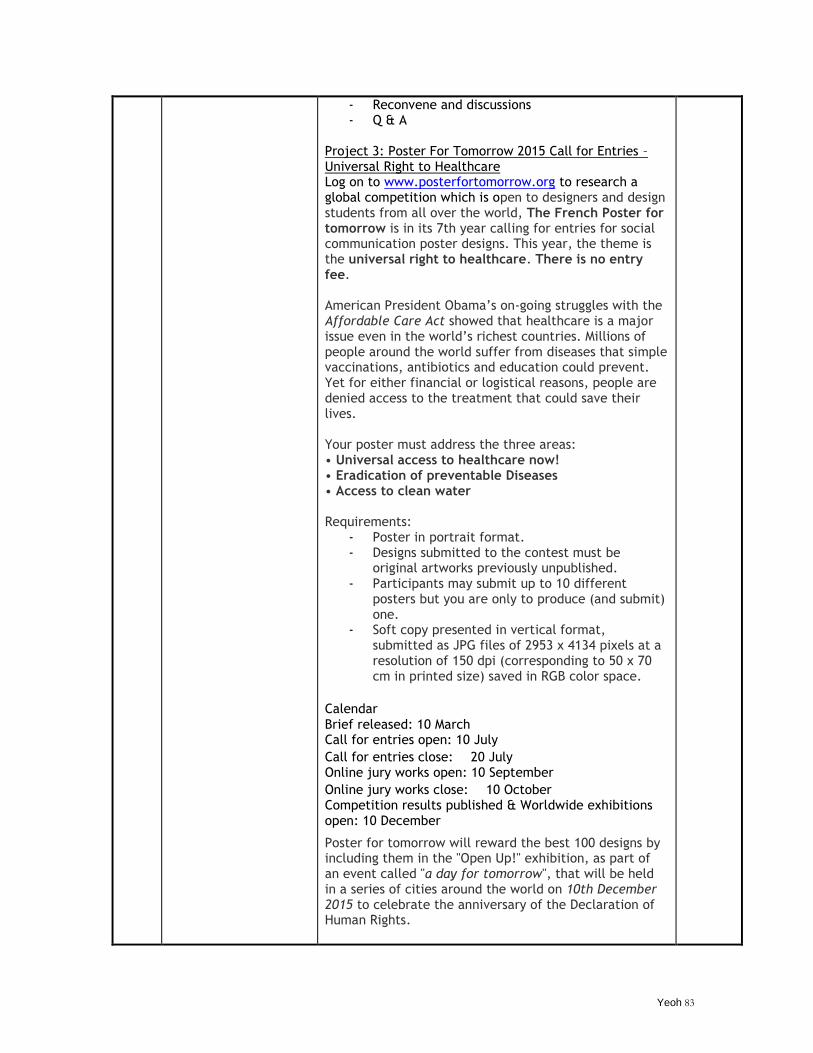
Yeoh 83
- Reconvene and discussions - Q & A
Project 3: Poster For Tomorrow 2015 Call for Entries – Universal Right to Healthcare Log on to www.posterfortomorrow.org to research a global competition which is open to designers and design students from all over the world, The French Poster for tomorrow is in its 7th year calling for entries for social communication poster designs. This year, the theme is the universal right to healthcare. There is no entry fee. American President Obama‘s on-going struggles with the Affordable Care Act showed that healthcare is a major issue even in the world‘s richest countries. Millions of people around the world suffer from diseases that simple vaccinations, antibiotics and education could prevent. Yet for either financial or logistical reasons, people are denied access to the treatment that could save their lives. Your poster must address the three areas: • Universal access to healthcare now! • Eradication of preventable Diseases • Access to clean water Requirements:
- Poster in portrait format. - Designs submitted to the contest must be
original artworks previously unpublished. - Participants may submit up to 10 different
posters but you are only to produce (and submit) one.
- Soft copy presented in vertical format, submitted as JPG files of 2953 x 4134 pixels at a resolution of 150 dpi (corresponding to 50 x 70 cm in printed size) saved in RGB color space.
Calendar
Brief released: 10 March Call for entries open: 10 July
Call for entries close: 20 July Online jury works open: 10 September
Online jury works close: 10 October Competition results published & Worldwide exhibitions open: 10 December
Poster for tomorrow will reward the best 100 designs by including them in the "Open Up!" exhibition, as part of an event called "a day for tomorrow", that will be held in a series of cities around the world on 10th December 2015 to celebrate the anniversary of the Declaration of Human Rights.
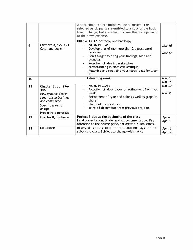
Yeoh 84
A book about the exhibition will be published. The selected participants are entitled to a copy of the book free of charge, but are asked to cover the postage costs at their own expense.
DUE: WEEK 12. Softcopy and hardcopy.
9 Chapter 4, 122–171. Color and design.
- WORK IN CLASS - Develop a brief (no more than 2 pages, word-
processed - Don‘t forget to bring your findings, idea and
sketches - Selection of idea from sketches - Brainstorming in class crit (critique) - Readying and finalizing your ideas ideas for week
11
Mar 16 Mar 17
10 E-learning week. Mar 23 Mar 24
11
Chapter 8, pp. 276–306. How graphic design functions in business and commerce.
Specific areas of design. Preparing a portfolio.
- WORK IN CLASS - Selection of ideas based on refinement from last
week - Refinement of type and color as well as graphics
chosen - Class crit for feedback - Bring all documents from previous projects
Mar 30 Mar 31
12 Chapter 8, continued. Project 3 due at the beginning of the class Final presentation. Binder and all documents due. Pay attention to the course policy for artwork submissions.
Apr 6 Apr 7
13 No lecture Reserved as a class to buffer for public holidays or for a substitute class. Subject to change with notice.
Apr 13 Apr 14
Yeoh 85
Wee Kim Wee School of Communication and Information
SYLLABUS FOR CS8070 CREATIVE VISUAL EXPERIENCE AND DESIGN
Semester 2 AY 2014-2015 General Information
Lecturer : Dr Yeoh Kok Cheow ([email protected])
TA : Ms Agnes Chuah ([email protected])
Office : WKWSCI Building, # 03-17 Contact : 6790-8816 Office Hrs : By appt (Unannounced drop-in is not welcomed)
Lecture : Monday 12:30 PM – 3:30 PM
Facebook : https://www.facebook.com/CS8070
Assigned Texts
Experience Design 1.1 A Manifesto for the Design of Experiences by Nathan Shedroff. Available at www.experiencedesignbooks.com (ISBN: 978-0-9822339-0-0)
Course Description & Objectives
This course is both a reflective and hands-on approach to design consciousness to help inspire one to recognize that there is always an experience created by a product, service, event, environment and people which play a part in contributing to our overall experience, perception and acceptance. This continuous assessment course seeks to orient students to the spectrum of human experiences through the completion of an individual assignment plus other necessary criteria. The objectives are for students: iv) To recognize significant experiential contributors to design and how they can affect
our overall experience v) To provide exposure to images and other information to inspire reflections and
explorations. vi) To improve creative thinking that needs one to see and think in new ways vii) To encourage experimentation on topics related to our daily experiences
Assessment Components
All in all, you will explore the essence of ―experience‖ through a process of planning, developing, and executing your ideas by using your own sense of being as touch points to provide new insights into the dynamics underlying our individual and collective strengths/weaknesses. These dynamics are elements around us such as objects, events, environment and people. In completing the assignments, they can function as frameworks to help each student to understanding how our day to day experiences can affect us. Experience ―commitment‖ through attendance (refer to course policies for more): 10%
Yeoh 86
Experience ―participation‖ through involvement (refer to course policies for more): 10% Experience ―anticipation‖ through weekly quizzes/worksheets/e-learning/activities: 30% Experience ―excitement‖ through an individual assignment ‗MY TRANSFORMATIVE EXPERIENCE‘: 50%* *RUBRICS OF MY TRANSFORMATIVE EXPERIENCE: COMPOSITION (60%) Comprehension of topic:
- Accuracy of vocabulary, i.e. attention to linguistic correctness (grammar, spelling, syntax, etc) and references (if applicable). If you choose to write the report, make sure that your handwriting is legible 5%
- Difficulties experienced in completing the task 10% - Lesson learned throughout the 10 weeks 10% - Application of 3 of the 6 Shedroff dimensions applicable to your experience 10% - Week by week log of activities for a total of 10 weeks leading to the transformation 20% - Summary of your experience 5%
CREATIVITY (20%) Approach taken: - Inventiveness (imagination, experimentation leading to discoveries for the experience) 5% - Innovative (introduced something old in a new way, a sense of newness) 5% - Adventurousness (risk-taking, competitive, exploratory disregarded tried and true methods)) 5% - Intellect and craftiness in the approach of the topic 5% DESIGN (20%) Methods used to produce the report: - Consideration of style, format and materials 5% - Quality of overall presentation/professionalism of the report 5% - Quality of images presented in the report (appropriately addresses the tone of the story) 5%
- Attention to details (as in the presentation, details in the report) 5%
ABOUT „MY TRANSFORMATIVE EXPERIENCE‟ (Due at the beginning of the last week of class) As the saying goes, "A life unexamined is a life not worth living." In preparing for your transformative experience for the next 10 weeks, answer the questions in a worksheet provided during the 2nd and 3rd weeks of class. The questions will help you to understand your true colors, your inner self. Once you have answered the questions, you will mentally reverse the answers that you have truthfully written to assist your choice in being someone you are not. The idea is to let you “experience” being someone you are not as far from your comfort level as possible. Although a change in your perceptions, dispositions, thoughts, and actions are required to successfully experience the transformation, you are advised against ‗experiencing‘ the following, for obvious reasons*:
- sickness or any physical or mental conditions that are *simulated or *artificially induced (introvert/extrovert, being happy, blind, color blindness, deaf, mute, dementia);
- *menial activities (exercising, painting, photographing, crocheting, blogging, etc.) which also include a *dare of some sort (cost-playing, cross-dressing, talking to strangers, being a superhero, etc.)
While the end result of the transformative experience is clear (that you experience life being someone you're not), the path to get there may not be as clear. This is expected as you will experience the vagueness of exploring. But, here's a suggestion. You may choose to approach the assignment as a "job." E.g. you can volunteer at an animal shelter, take on odd jobs, intern at a bakery, etc. The beauty of this approach is that jobs, as an immersive experience, can define a person's life, which can add perspectives to your own experience. Looking through someone's life shall give you a better perspective of your own life.
Please be advised that you must exercise judgment and caution in fulfilling the assignment that you do not put yourself or other party members in danger for executing the assignment. Document your process of your transformation (the before and after and everything in between accordingly every week) in a report with images to accompany your descriptions. Your journal
Yeoh 87
should not be more than 1,000 words and include at least 10 – 20 pictures, presented in an organized or creative manner, in particular to the latter, aligned to the theme of your transformation.
For starters, review and answer the 15 questions below to get a sense of who you really are…
1. What is your motto in life?
2. What are the three attributes that make you unique and special?
3. Behind your back, what would people say about you?
4. What is your most cherished childhood memory?
5. What is your idea of perfect happiness?
6. When are where were you happiest?
7. What is your greatest fear?
8. What is your greatest achievement?
9. Where would you like to live if it is up to you?
10. Which talent would you like to have?
11. What or who is the greatest love of your life?
12. What is your favorite occupation?
13. What are the things that prevent you from being more open-minded?
14. How would you like to die?
15. If you were to die and come back as a person or a thing, what do you think it would be?
Course Policies
15. Due to our reliance on NTULearn to communicate, please check your school email regularly as it is the designated method for sending information and updates. Alternative emails are discouraged.
16. Where applicable, you should correspond with the lecturer‘s designated teaching assistant and be aware that the lecturer and his TA may not respond during weekends.
17. Works from other classes may not be turned in as a substitute for this class. If violated, you may receive an F for the assignment.
18. Submission in absentia in a continuous assessment-base course is prohibited /discouraged without prior arrangements. Understandably, due to unforeseen circumstances, late submission or any work turned in on your behalf may only be evaluated on a permitted basis, provide that you have communicated either an anticipated disruption or to notify your lecturer a week within the incident - failing to do so will render your absence as an unexcused absence.
19. You are expected to punctually attend all lecture and tutorial sessions. The penalty for tardiness and absences for lecture and tutorial sessions are as follows: 15 minutes after the start of the class is considered late. 30 minutes and beyond is considered an absent. Three unexcused absences will earn you a letter grade drop in the final grade.
20. Sending a notification email or a doctor‘s note does not exempt you from your obligations required by the course nor does it ―buy‖ you extra time from a due date or exempt you from
Yeoh 88
responsibility. If you expect an interruption in your schedule, please notify the lecturer in advance.
21. The lecturer and TA are not obligated to repeat the delivery of course materials. It is your responsibility to find out from your classmates what you have missed and to seek clarifications from the lecturer or TA.
22. The deadline will not be extended for any assignments. There will be no “make up” opportunities for missed assignments/pop quiz. You are not allowed to retake any missed quizzes/exams as those are specifically linked to your attendance unless you provide immediate documentation/notification within a week since the occurrence of the event by getting in touch with the TA for documentation purposes.
23. Your behavior in the classroom affects the experience of those around you. All mobile phones are to be switched off during class sessions and kept away from sight (inside a bag, for example). Using hand phones while the class is in session (receiving or making calls or reading/sending SMS messages) is considered disruptive behavior. You may be dismissed from class and your attendance grade adjusted.
24. During the lecture and/or tutorial sessions, permission must be obtained from the lecturer if the student wishes to record any presentation via any electronic or digital devices of any sort.
25. In preventing mishaps to your artwork, please refrain from eating or drinking when in class. 26. Do not make any offensive remarks, read inappropriate materials, chitchat, sleep or engage in
other forms of distraction such as talking while the lecturer is teaching and so forth. 27. It is preferred that works submitted are typed (word-processed, i.e. check for typos,
misspellings), with attention paid to correct any linguistic mistakes. Hand-written materials will not be accepted unless they are applicable to your assignment. The format for your report/assignment delivered preferably in PDF, can be varied. Whenever in doubt, discuss with your lecturer/TA.
28. If you do not ask questions or seek clarifications, the lecturer assumes that you understood what has been presented and will be graded accordingly.
29. For the purpose of documentation, all data gathered and works explored must be kept for your own sake should the need of appeal arises in a populous class.
Policy on Plagiarism
The work that you submit for assessment in this course must be your own individual work (or the work of your group members, in the case of group projects). The NTU Academic Integrity Policy (http://academicintegrity.ntu.edu.sg/) applies to this course. It is your responsibility to familiarise yourself with the Policy and to uphold the values of academic integrity in all academic undertakings. As a matriculated student, you are committed to uphold the NTU Honour Code (http://www.ntu.edu.sg/sao/Pages/HonourCode.aspx).
Acts of academic dishonesty include (source: http://academicintegrity.ntu.edu.sg/policy/):
Plagiarism: using or passing off as one‘s own, writings or ideas of someone else, without acknowledging or crediting the source. This includes o using words, images, diagrams, graphs or ideas derived from books, journals,
magazines, visual media, and the internet without proper acknowledgement; o copying work from the internet or other sources and presenting as one‘s own; o direct quoting without quotation marks, even though the source is cited; o submitting the same piece of work to different courses or to different publications.
Academic fraud: cheating, lying and stealing. This includes: o Cheating – bringing or having access to unauthorised books or materials during an
examination or assessment; o Collusion – copying the work of another student, having another person write one‘s
assignments, or allowing another student to borrow one‘s work; o Falsification of data – fabricating or altering data to mislead such as changing data
to get better experiment results;
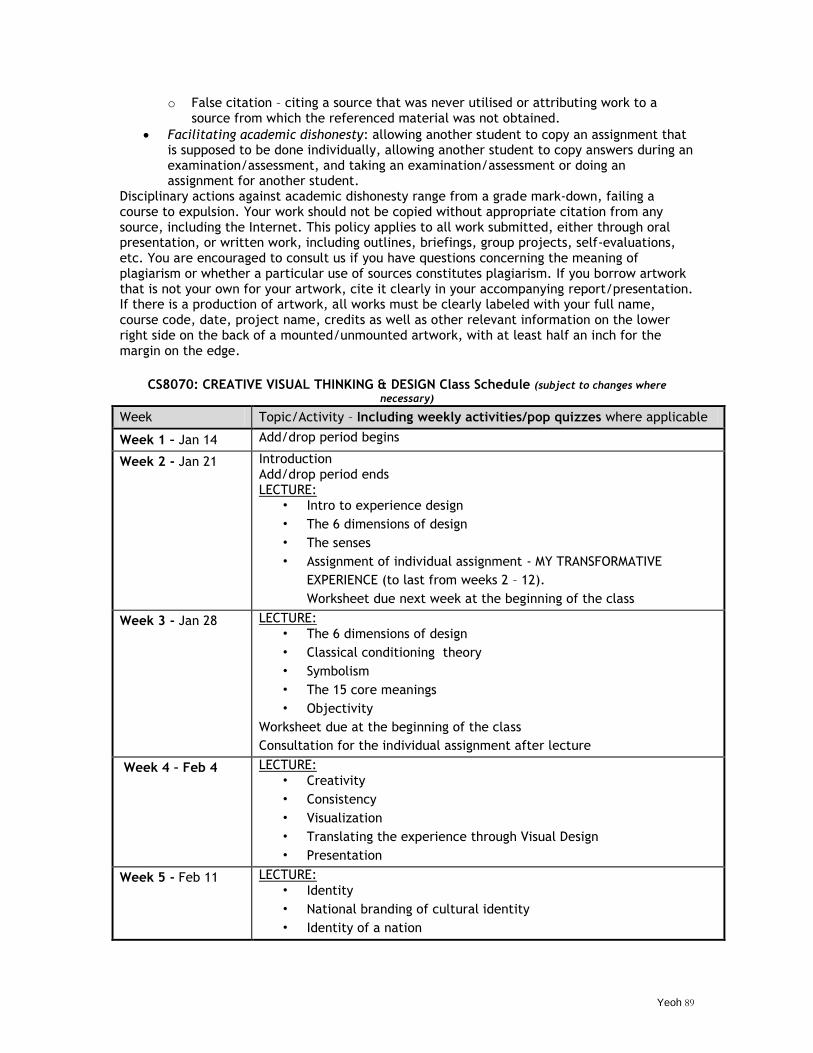
Yeoh 89
o False citation – citing a source that was never utilised or attributing work to a source from which the referenced material was not obtained.
Facilitating academic dishonesty: allowing another student to copy an assignment that is supposed to be done individually, allowing another student to copy answers during an examination/assessment, and taking an examination/assessment or doing an assignment for another student.
Disciplinary actions against academic dishonesty range from a grade mark-down, failing a course to expulsion. Your work should not be copied without appropriate citation from any source, including the Internet. This policy applies to all work submitted, either through oral presentation, or written work, including outlines, briefings, group projects, self-evaluations, etc. You are encouraged to consult us if you have questions concerning the meaning of plagiarism or whether a particular use of sources constitutes plagiarism. If you borrow artwork that is not your own for your artwork, cite it clearly in your accompanying report/presentation. If there is a production of artwork, all works must be clearly labeled with your full name, course code, date, project name, credits as well as other relevant information on the lower right side on the back of a mounted/unmounted artwork, with at least half an inch for the margin on the edge.
CS8070: CREATIVE VISUAL THINKING & DESIGN Class Schedule (subject to changes where
necessary)
Week Topic/Activity – Including weekly activities/pop quizzes where applicable
Week 1 – Jan 14 Add/drop period begins
Week 2 - Jan 21 Introduction Add/drop period ends LECTURE:
• Intro to experience design
• The 6 dimensions of design
• The senses
• Assignment of individual assignment - MY TRANSFORMATIVE
EXPERIENCE (to last from weeks 2 – 12).
Worksheet due next week at the beginning of the class
Week 3 - Jan 28 LECTURE: • The 6 dimensions of design
• Classical conditioning theory
• Symbolism
• The 15 core meanings
• Objectivity
Worksheet due at the beginning of the class
Consultation for the individual assignment after lecture
Week 4 – Feb 4 LECTURE: • Creativity
• Consistency
• Visualization
• Translating the experience through Visual Design
• Presentation
Week 5 - Feb 11 LECTURE: • Identity
• National branding of cultural identity
• Identity of a nation
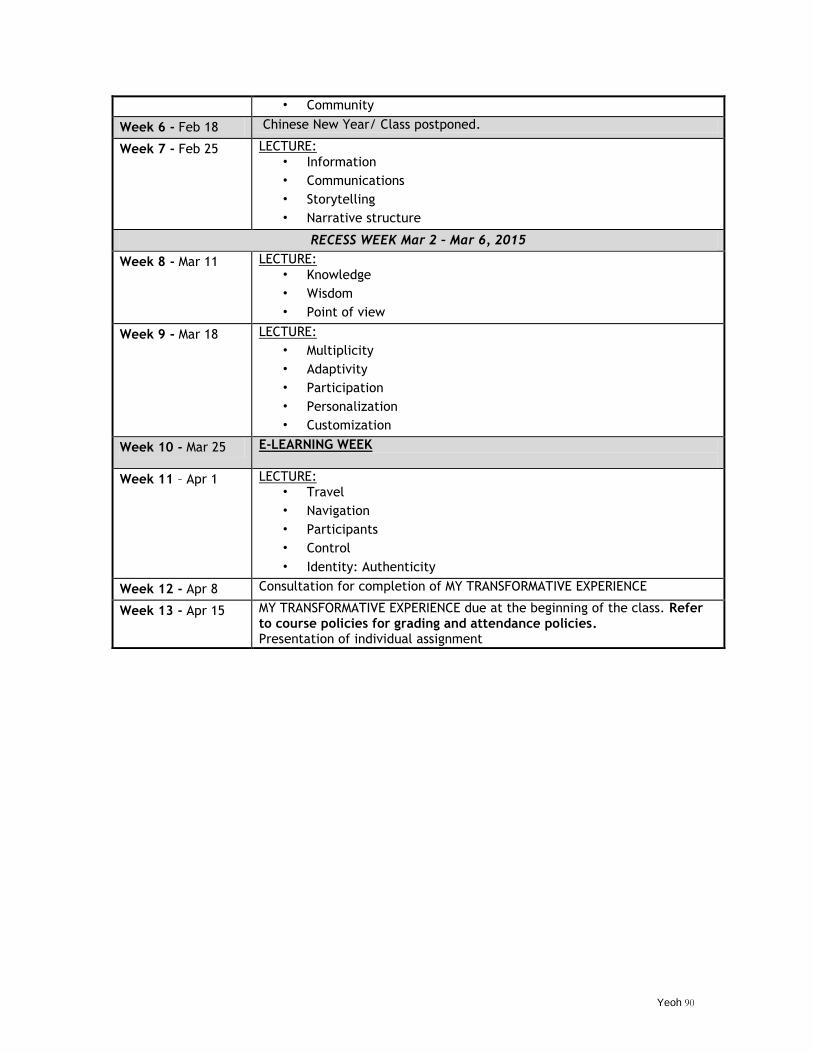
Yeoh 90
• Community
Week 6 - Feb 18 Chinese New Year/ Class postponed.
Week 7 - Feb 25 LECTURE: • Information
• Communications
• Storytelling
• Narrative structure
RECESS WEEK Mar 2 – Mar 6, 2015
Week 8 - Mar 11 LECTURE: • Knowledge
• Wisdom
• Point of view
Week 9 - Mar 18 LECTURE:
• Multiplicity
• Adaptivity
• Participation
• Personalization
• Customization
Week 10 - Mar 25 E-LEARNING WEEK
Week 11 – Apr 1 LECTURE: • Travel
• Navigation
• Participants
• Control
• Identity: Authenticity
Week 12 - Apr 8 Consultation for completion of MY TRANSFORMATIVE EXPERIENCE
Week 13 - Apr 15 MY TRANSFORMATIVE EXPERIENCE due at the beginning of the class. Refer to course policies for grading and attendance policies. Presentation of individual assignment
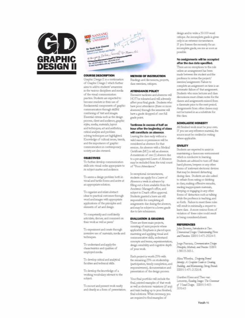
Yeoh 91
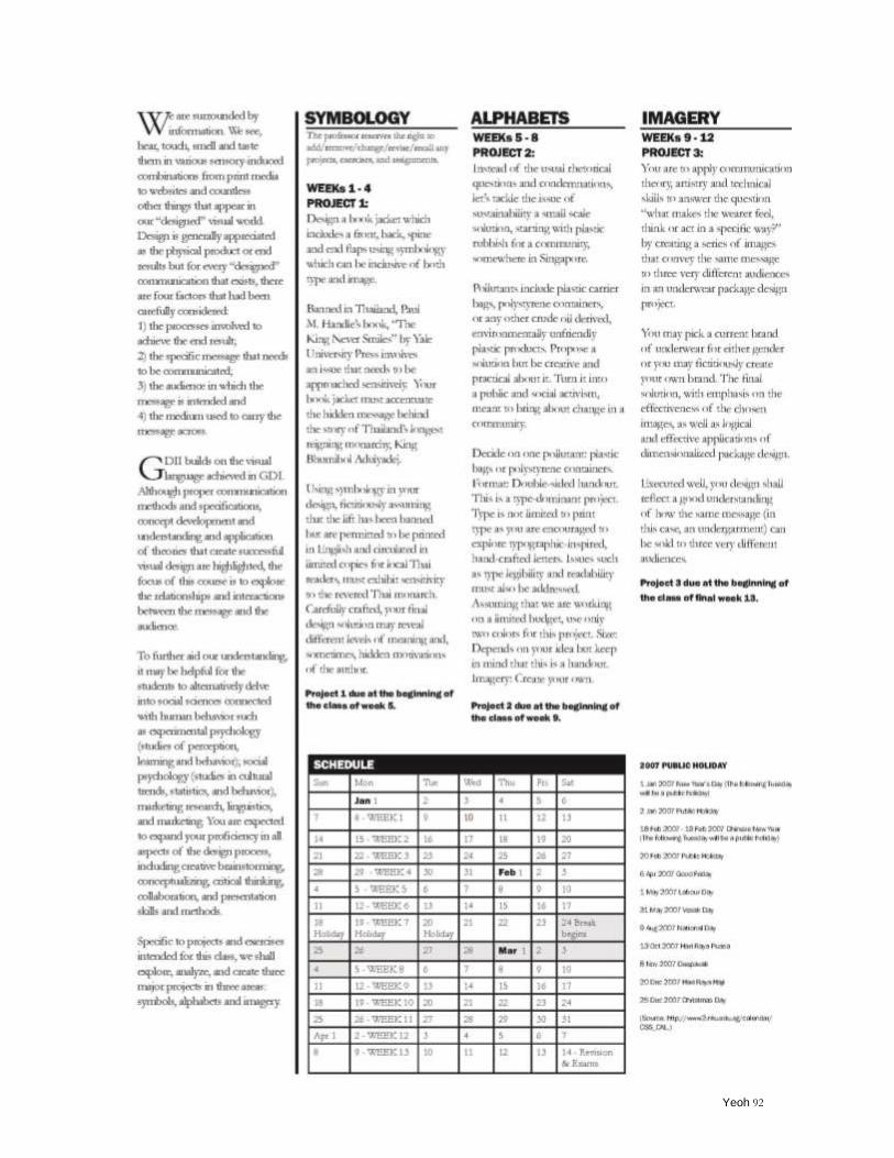
Yeoh 92
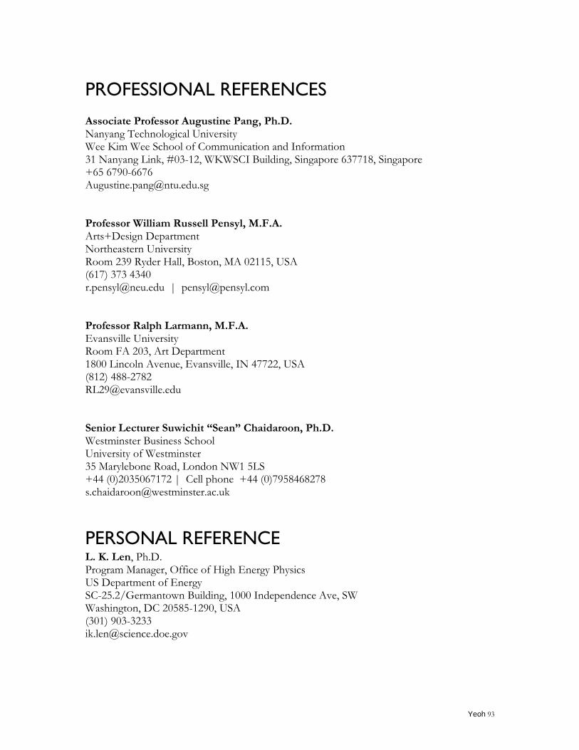
Yeoh 93
PROFESSIONAL REFERENCES
Associate Professor Augustine Pang, Ph.D. Nanyang Technological University Wee Kim Wee School of Communication and Information 31 Nanyang Link, #03-12, WKWSCI Building, Singapore 637718, Singapore +65 6790-6676 [email protected] Professor William Russell Pensyl, M.F.A. Arts+Design Department Northeastern University Room 239 Ryder Hall, Boston, MA 02115, USA (617) 373 4340 [email protected] | [email protected] Professor Ralph Larmann, M.F.A. Evansville University Room FA 203, Art Department 1800 Lincoln Avenue, Evansville, IN 47722, USA (812) 488-2782 [email protected] Senior Lecturer Suwichit “Sean” Chaidaroon, Ph.D. Westminster Business School University of Westminster 35 Marylebone Road, London NW1 5LS +44 (0)2035067172 | Cell phone +44 (0)7958468278 [email protected]
PERSONAL REFERENCE
L. K. Len, Ph.D. Program Manager, Office of High Energy Physics US Department of Energy SC-25.2/Germantown Building, 1000 Independence Ave, SW Washington, DC 20585-1290, USA (301) 903-3233 [email protected]


![[XLS] · Web view2011 1/3/2011 1/3/2011 1/5/2011 1/7/2011 1/7/2011 1/7/2011 1/7/2011 1/7/2011 1/7/2011 1/7/2011 1/7/2011 1/7/2011 1/11/2011 1/11/2011 1/11/2011 1/11/2011 1/11/2011](https://img.pdfslide.net/doc/110x75/5b3f90027f8b9aff118c4b4e/xls-web-view2011-132011-132011-152011-172011-172011-172011-172011.jpg)


![21-23 November 2019 Promenade Hotel Kota …wr.umin.jp/Uitemate_2019_Program.pdfStatistics in Malaysia Ms. Geh Cheow Lin (Life Saving Society Malaysia, Penang) 1200-1215 [15min] Statistics](https://img.pdfslide.net/doc/110x75/5f4dbf5f3101125f310bc9be/21-23-november-2019-promenade-hotel-kota-wruminjpuitemate2019-statistics-in.jpg)