Embed Size (px)
Citation preview
Leonardo da Vinci. Study of Human Proportion: The Vitruvian Man. c. 1492.
The Principles of Design
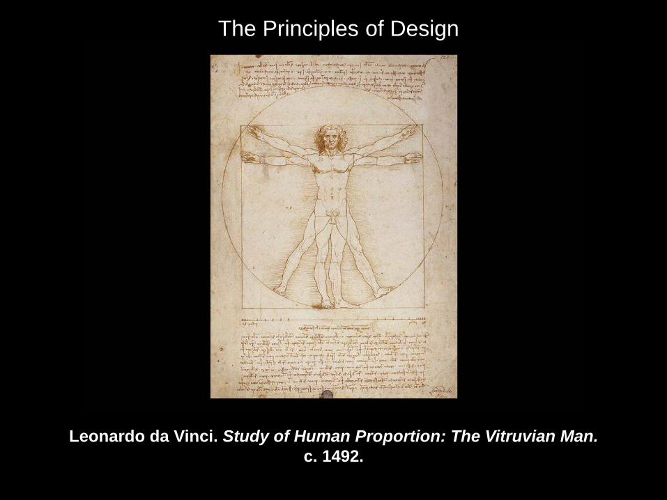
Frank Gehry residence. 1977–78.
Displays the use of many traditional Principles of Design, but lacks unity. It is about variety and change. An example of “the rules” being broken.
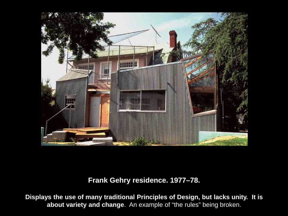
Balance: The perceived evenness or unevenness of a composition; the even distribution of weight in a composition Actual (physical weight) and Pictorial (visual weight)
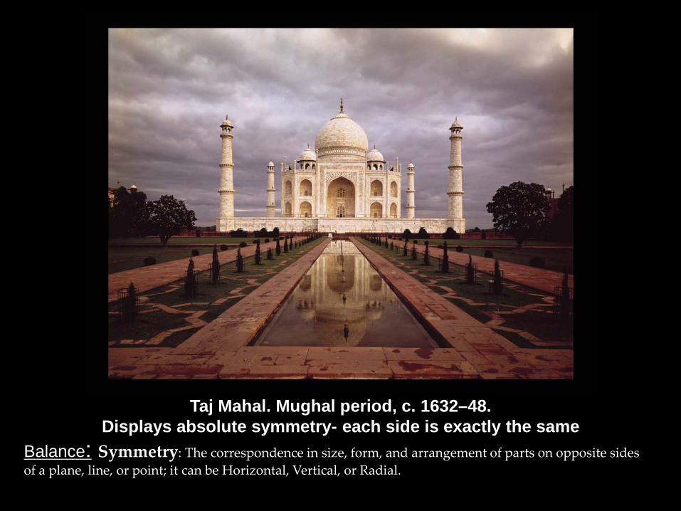
Taj Mahal. Mughal period, c. 1632–48. Displays absolute symmetry- each side is exactly the same
Balance: Symmetry: The correspondence in size, form, and arrangement of parts on opposite sides of a plane, line, or point; it can be Horizontal, Vertical, or Radial.
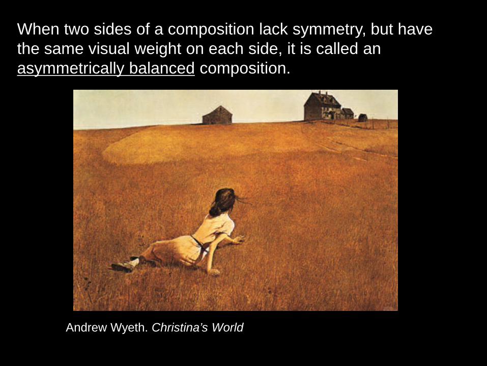
When two sides of a composition lack symmetry, but have the same visual weight on each side, it is called an asymmetrically balanced composition.
Andrew Wyeth. Christina’s World
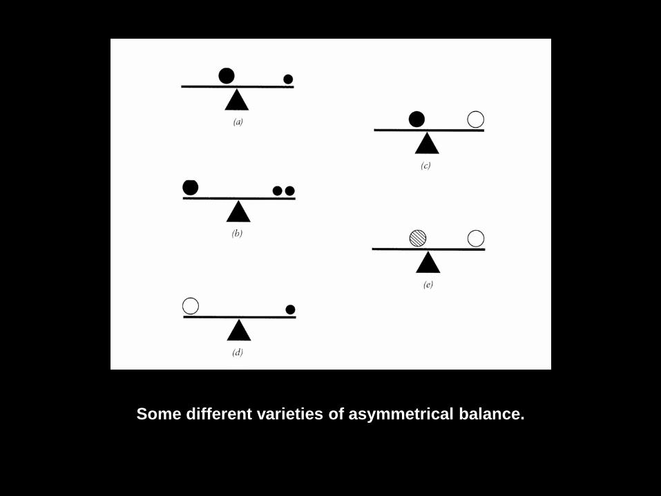
Some different varieties of asymmetrical balance.
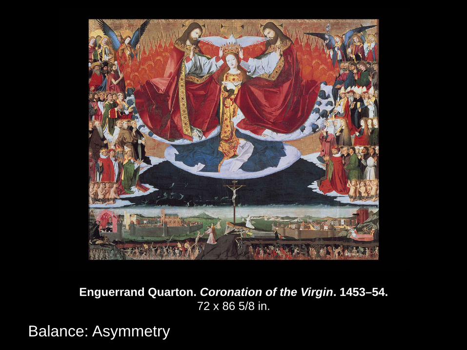
Enguerrand Quarton. Coronation of the Virgin. 1453–54. 72 x 86 5/8 in.
Balance: Asymmetry
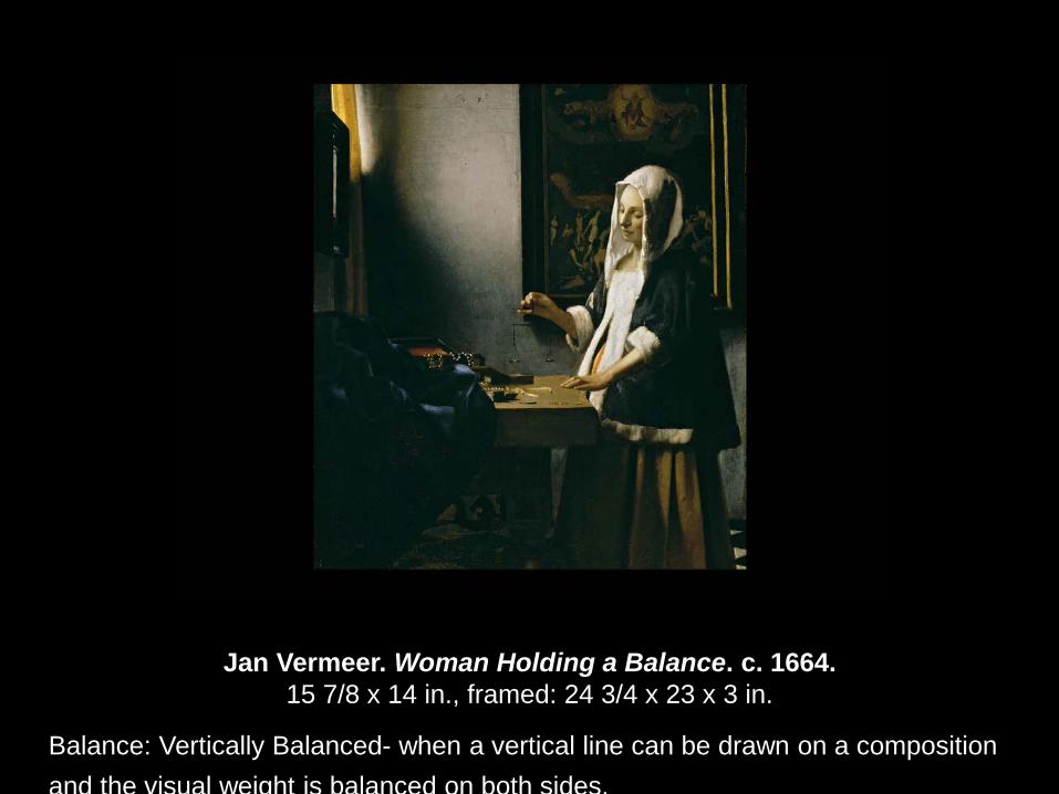
Jan Vermeer. Woman Holding a Balance. c. 1664. 15 7/8 x 14 in., framed: 24 3/4 x 23 x 3 in.
Balance: Vertically Balanced- when a vertical line can be drawn on a composition and the visual weight is balanced on both sides.
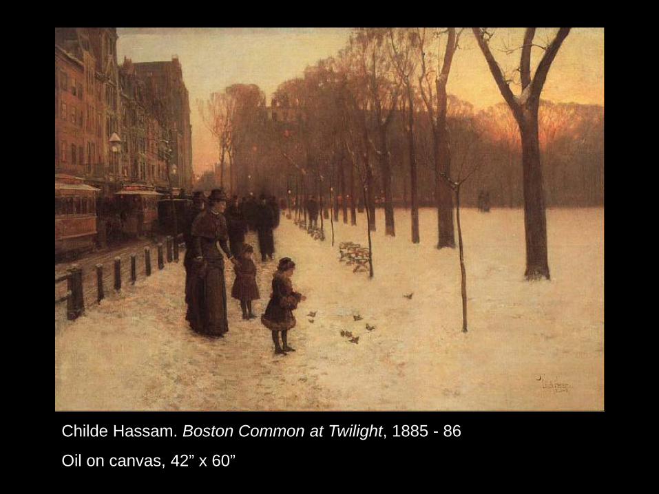
Childe Hassam. Boston Common at Twilight, 1885 - 86
Oil on canvas, 42” x 60”
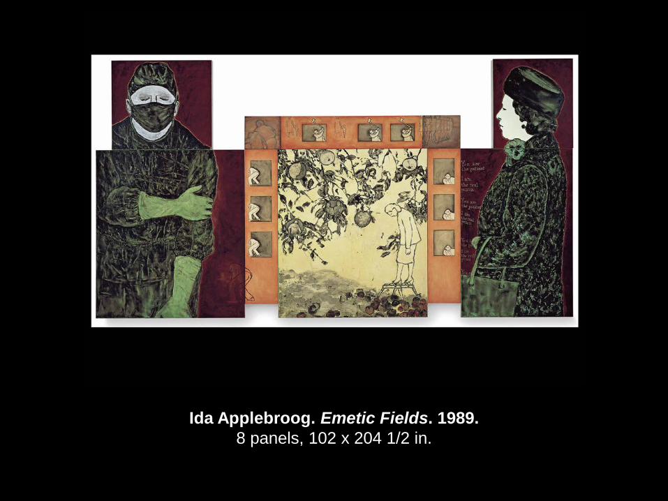
Ida Applebroog. Emetic Fields. 1989. 8 panels, 102 x 204 1/2 in.
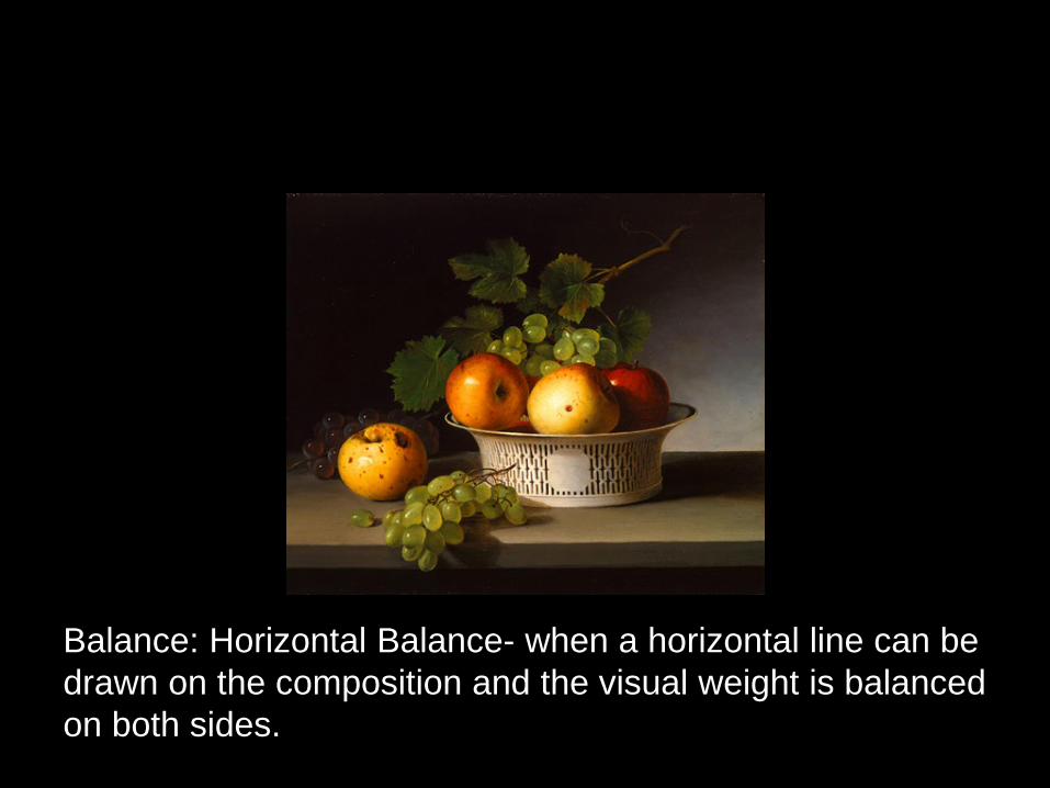
Balance: Horizontal Balance- when a horizontal line can be drawn on the composition and the visual weight is balanced on both sides.
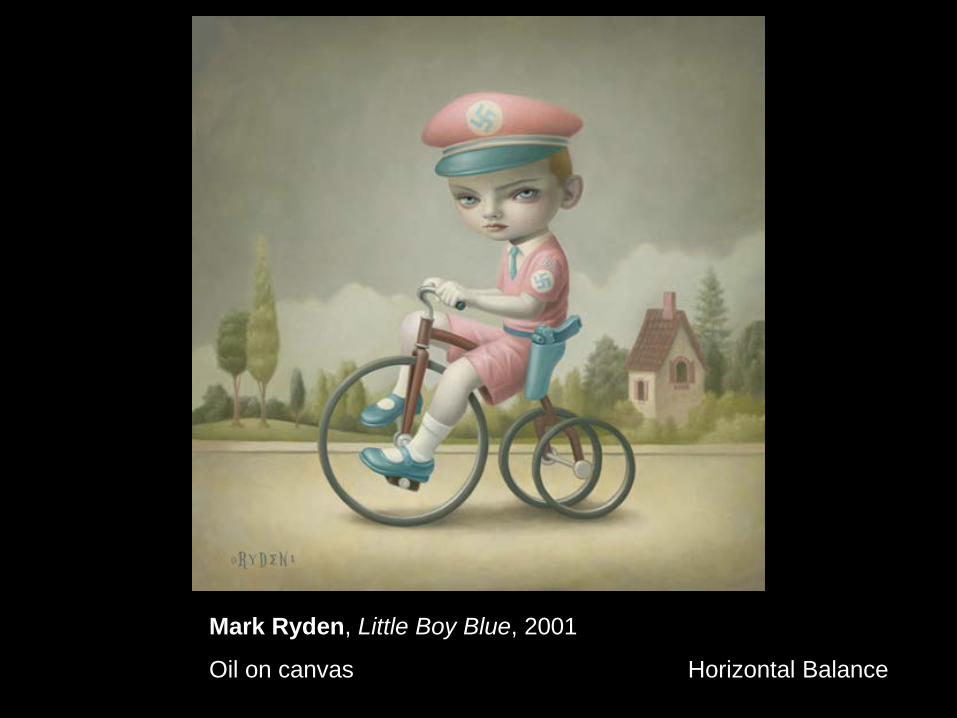
Mark Ryden, Little Boy Blue, 2001
Oil on canvas Horizontal Balance
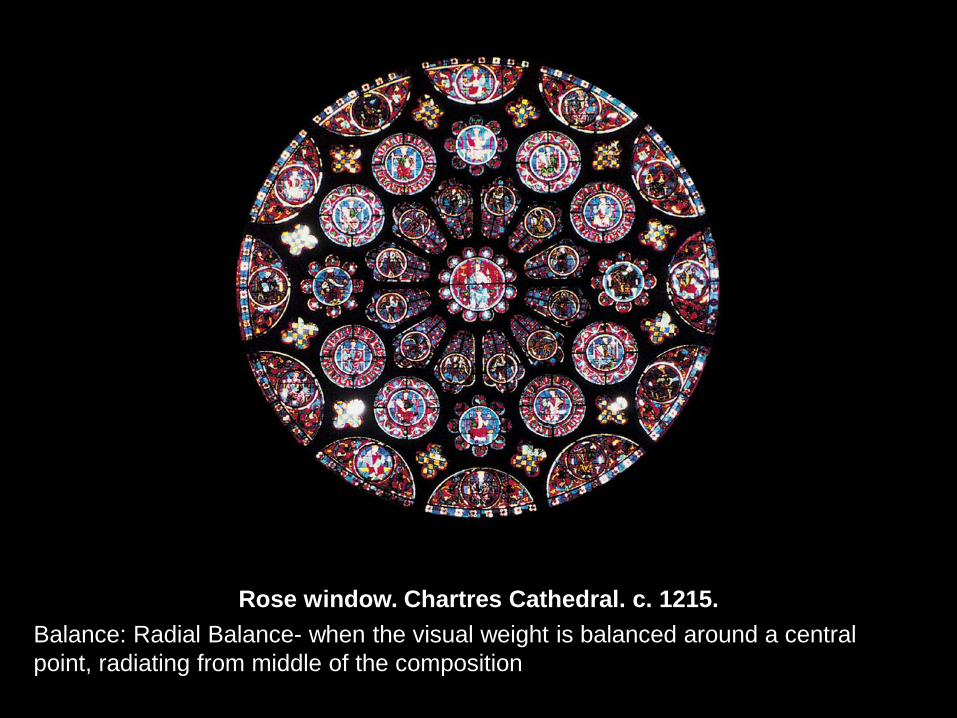
Rose window. Chartres Cathedral. c. 1215. Balance: Radial Balance- when the visual weight is balanced around a central
point, radiating from middle of the composition
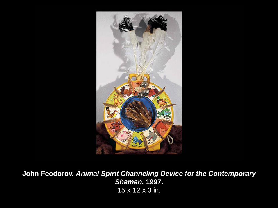
John Feodorov. Animal Spirit Channeling Device for the Contemporary Shaman. 1997. 15 x 12 x 3 in.
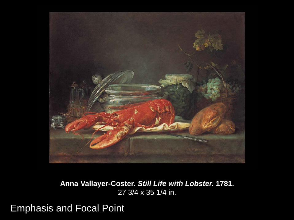
Anna Vallayer-Coster. Still Life with Lobster. 1781. 27 3/4 x 35 1/4 in.
Emphasis and Focal Point
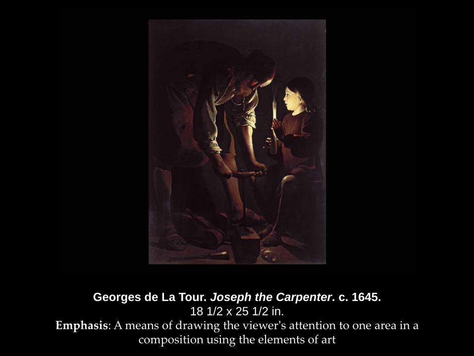
Georges de La Tour. Joseph the Carpenter. c. 1645. 18 1/2 x 25 1/2 in.
Emphasis: A means of drawing the viewer’s attention to one area in a composition using the elements of art
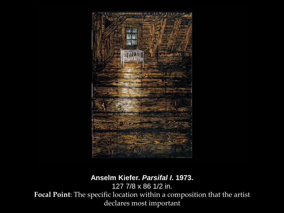
Anselm Kiefer. Parsifal I. 1973. 127 7/8 x 86 1/2 in.
Focal Point: The specific location within a composition that the artist declares most important
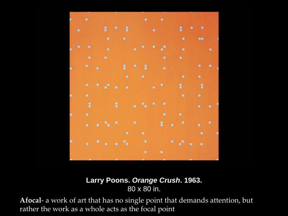
Larry Poons. Orange Crush. 1963. 80 x 80 in.
Afocal- a work of art that has no single point that demands attention, but rather the work as a whole acts as the focal point
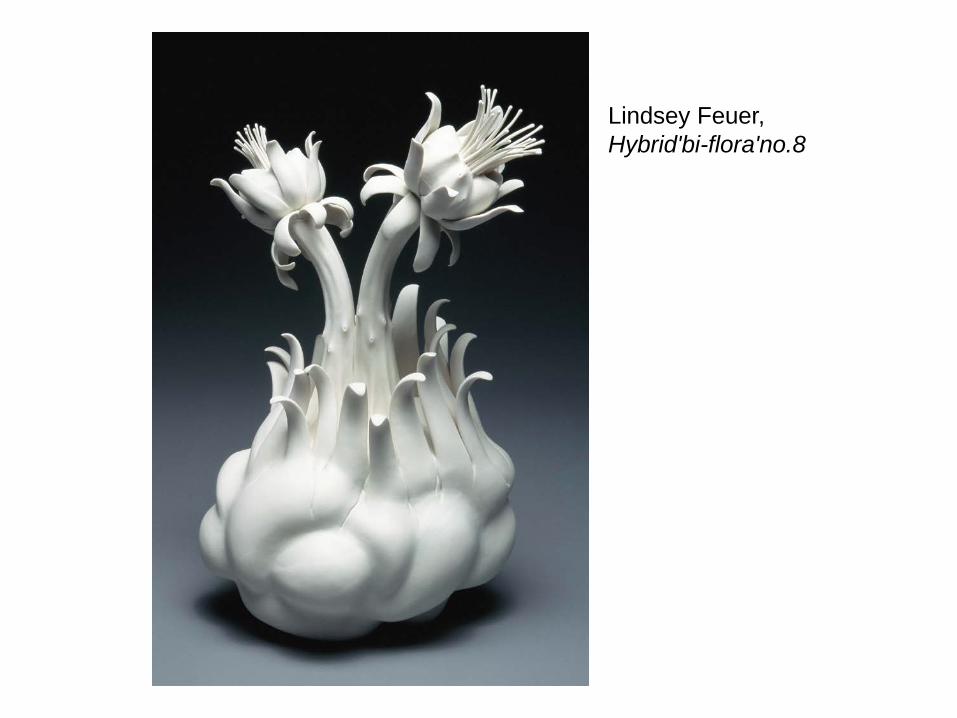
Lindsey Feuer, Hybrid'bi-flora'no.8
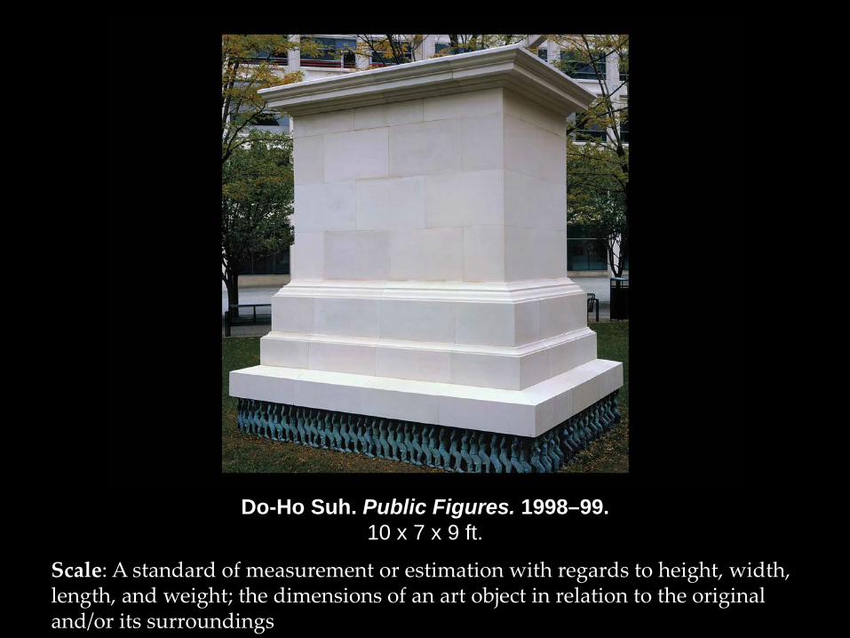
Do-Ho Suh. Public Figures. 1998–99. 10 x 7 x 9 ft.
Scale: A standard of measurement or estimation with regards to height, width, length, and weight; the dimensions of an art object in relation to the original and/or its surroundings
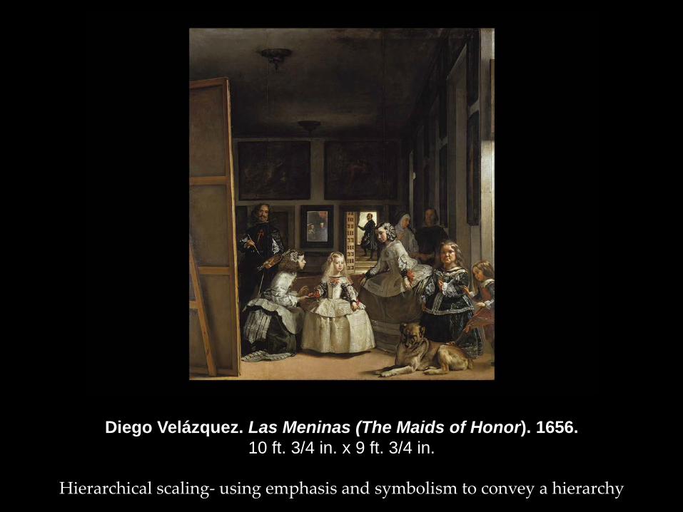
Diego Velázquez. Las Meninas (The Maids of Honor). 1656. 10 ft. 3/4 in. x 9 ft. 3/4 in.
Hierarchical scaling- using emphasis and symbolism to convey a hierarchy
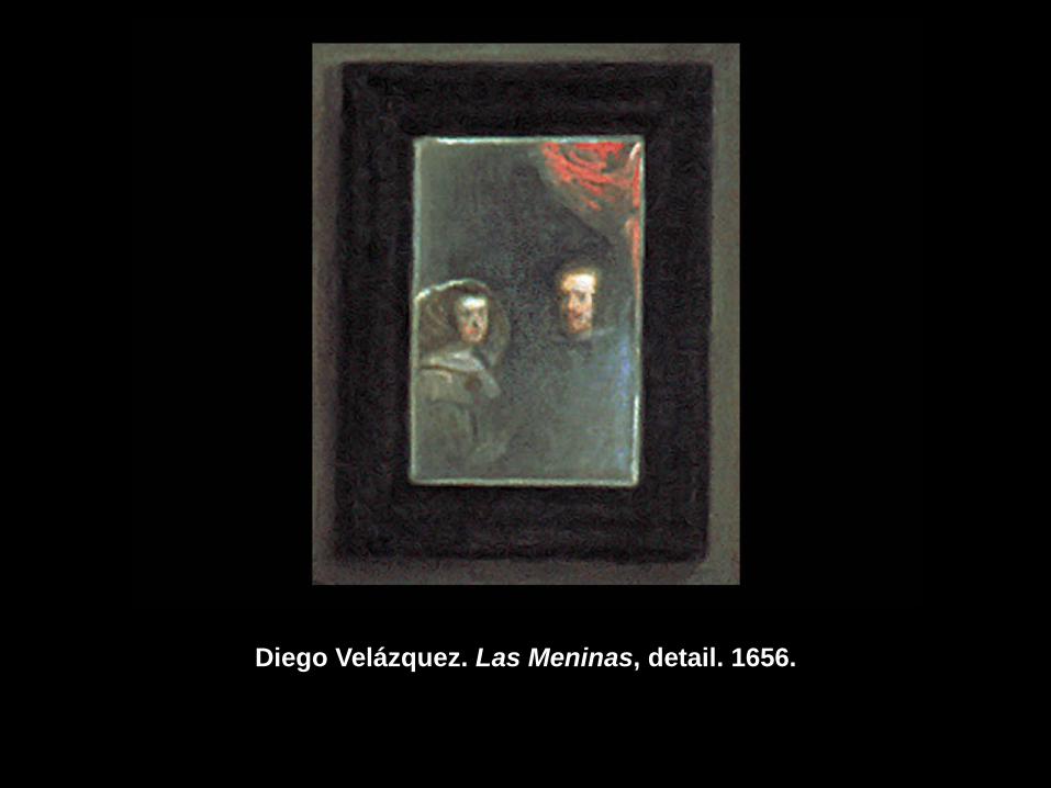
Diego Velázquez. Las Meninas, detail. 1656.
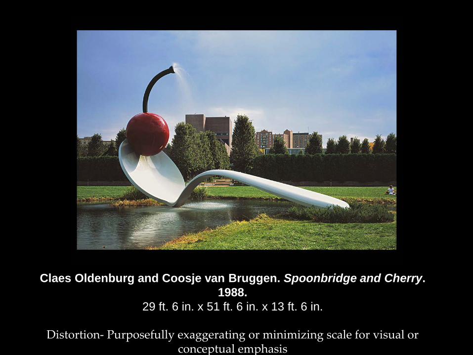
Claes Oldenburg and Coosje van Bruggen. Spoonbridge and Cherry. 1988.
29 ft. 6 in. x 51 ft. 6 in. x 13 ft. 6 in.
Distortion- Purposefully exaggerating or minimizing scale for visual or conceptual emphasis
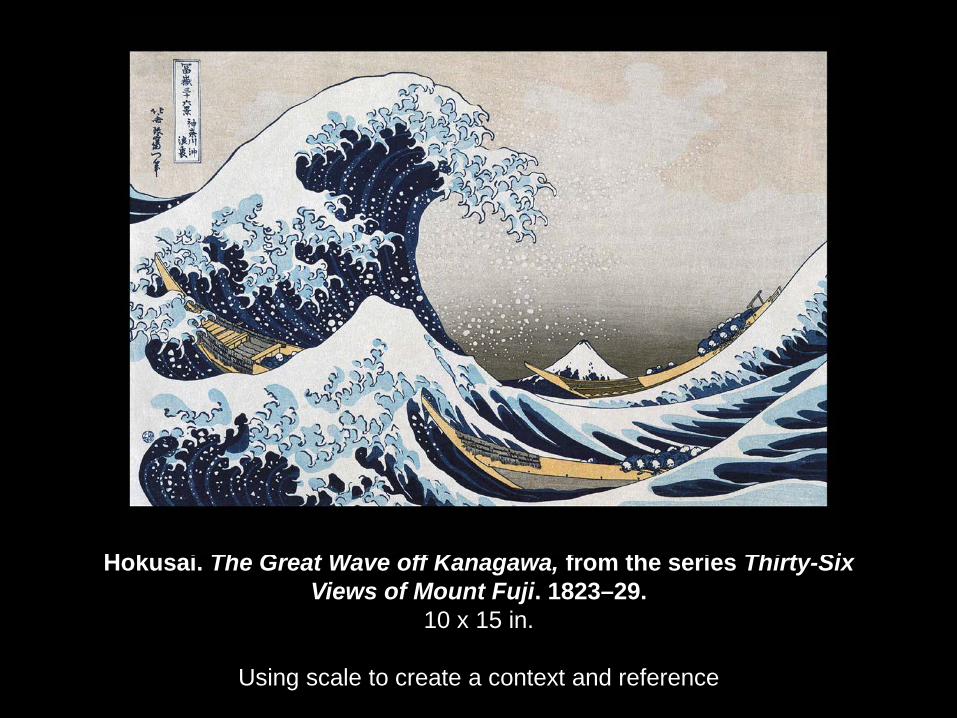
Hokusai. The Great Wave off Kanagawa, from the series Thirty-Six Views of Mount Fuji. 1823–29.
10 x 15 in.
Using scale to create a context and reference
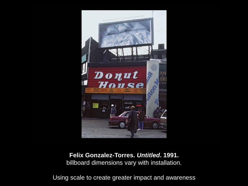
Felix Gonzalez-Torres. Untitled. 1991. billboard dimensions vary with installation.
Using scale to create greater impact and awareness
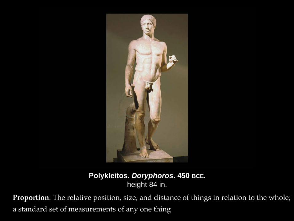
Polykleitos. Doryphoros. 450 BCE. height 84 in.
Proportion: The relative position, size, and distance of things in relation to the whole; a standard set of measurements of any one thing
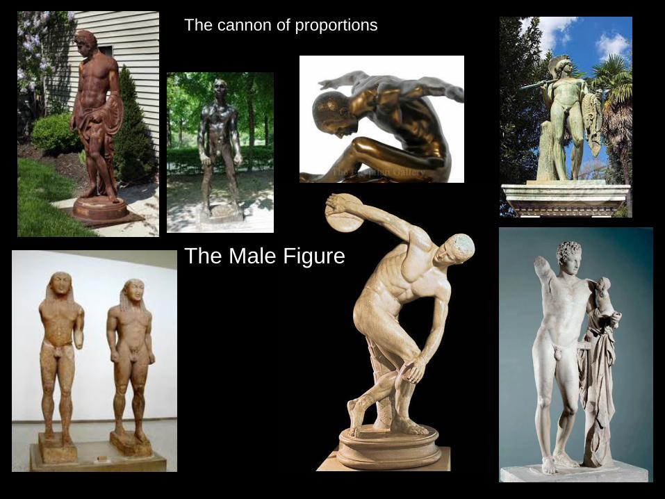
The Male Figure
The cannon of proportions
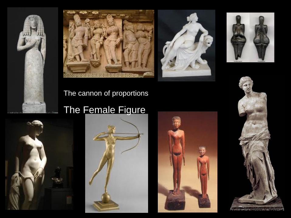
The cannon of proportions
The Female Figure
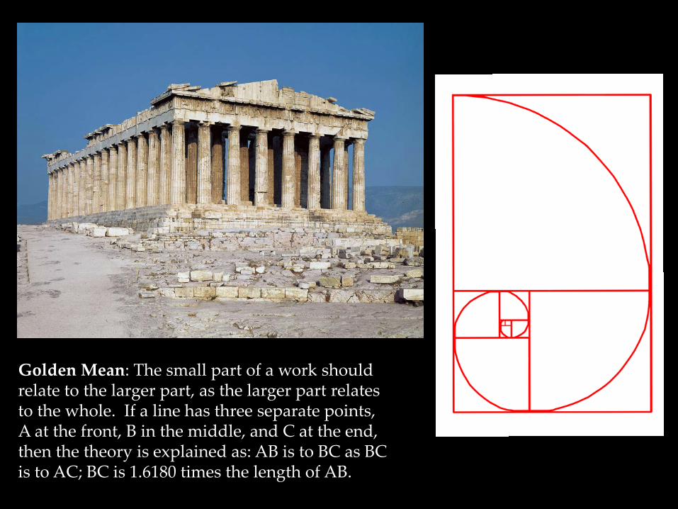
Golden Mean: The small part of a work should relate to the larger part, as the larger part relates to the whole. If a line has three separate points, A at the front, B in the middle, and C at the end, then the theory is explained as: AB is to BC as BC is to AC; BC is 1.6180 times the length of AB.
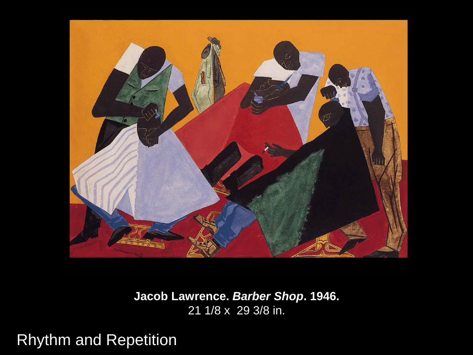
Jacob Lawrence. Barber Shop. 1946. 21 1/8 x 29 3/8 in.
Rhythm and Repetition
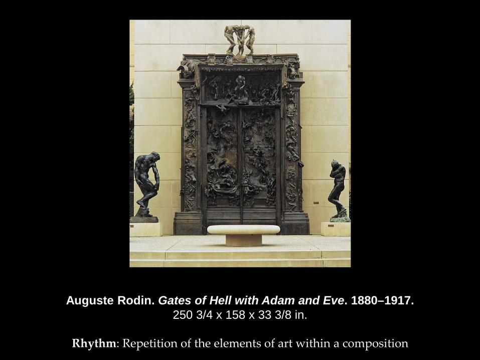
Auguste Rodin. Gates of Hell with Adam and Eve. 1880–1917. 250 3/4 x 158 x 33 3/8 in.
Rhythm: Repetition of the elements of art within a composition
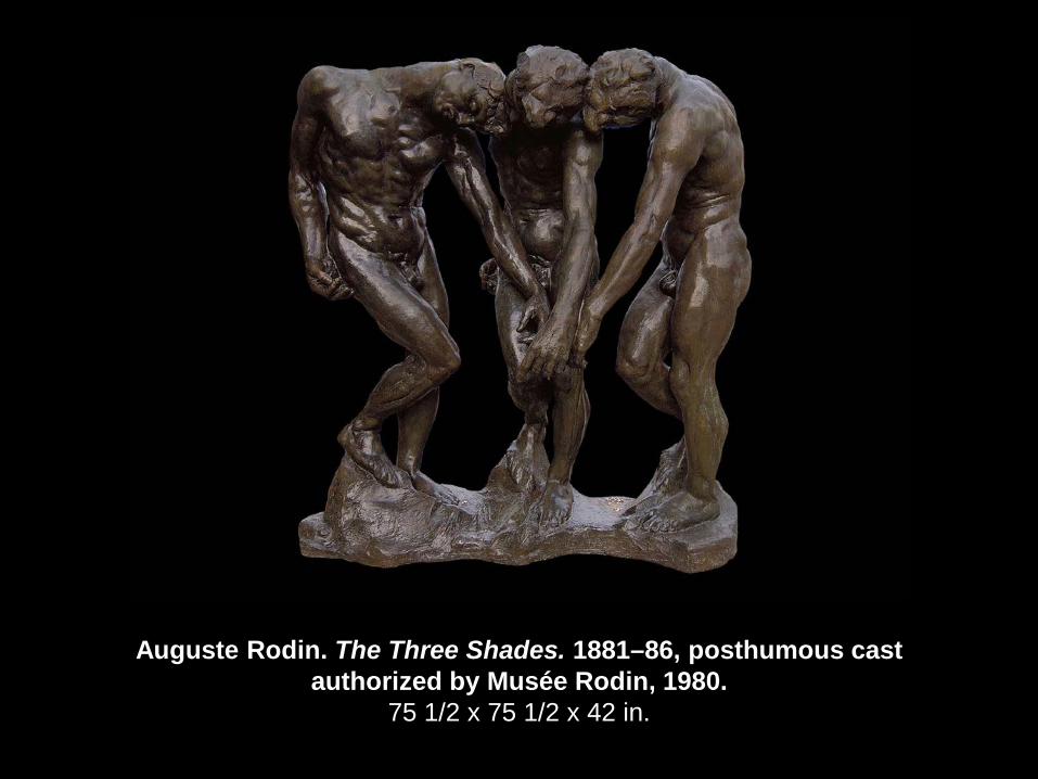
Auguste Rodin. The Three Shades. 1881–86, posthumous cast authorized by Musée Rodin, 1980.
75 1/2 x 75 1/2 x 42 in.
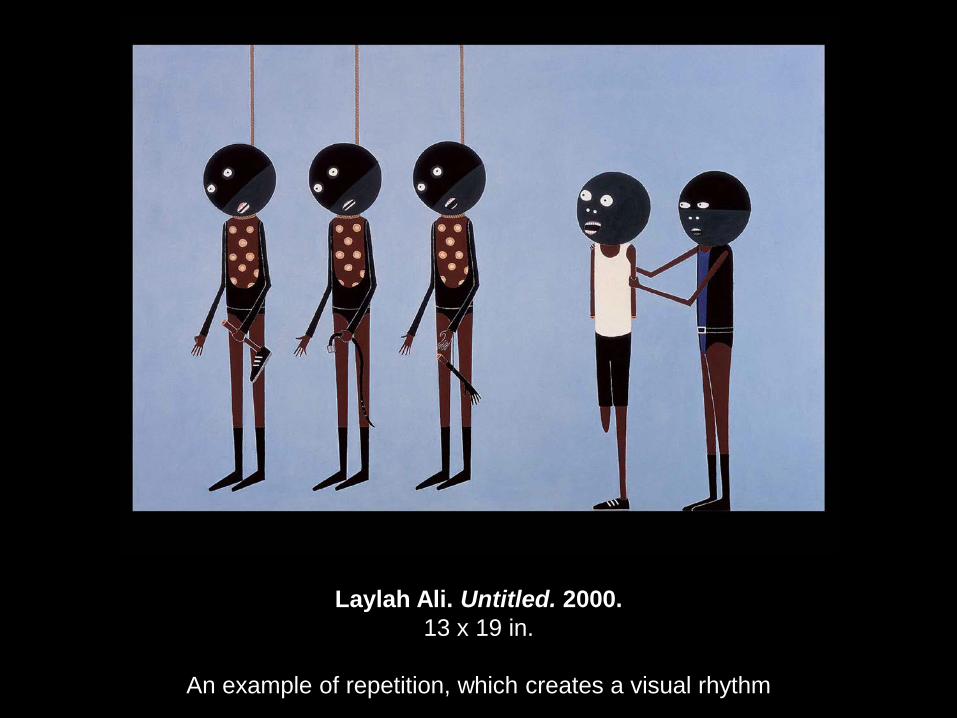
Laylah Ali. Untitled. 2000. 13 x 19 in.
An example of repetition, which creates a visual rhythm
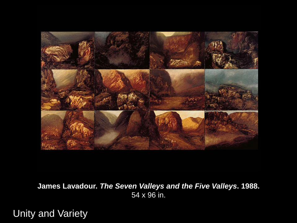
James Lavadour. The Seven Valleys and the Five Valleys. 1988. 54 x 96 in.
Unity and Variety
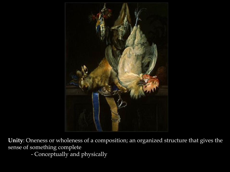
Unity: Oneness or wholeness of a composition; an organized structure that gives the sense of something complete - Conceptually and physically
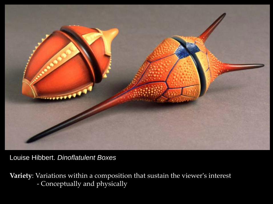
Variety: Variations within a composition that sustain the viewer’s interest - Conceptually and physically
Louise Hibbert. Dinoflatulent Boxes
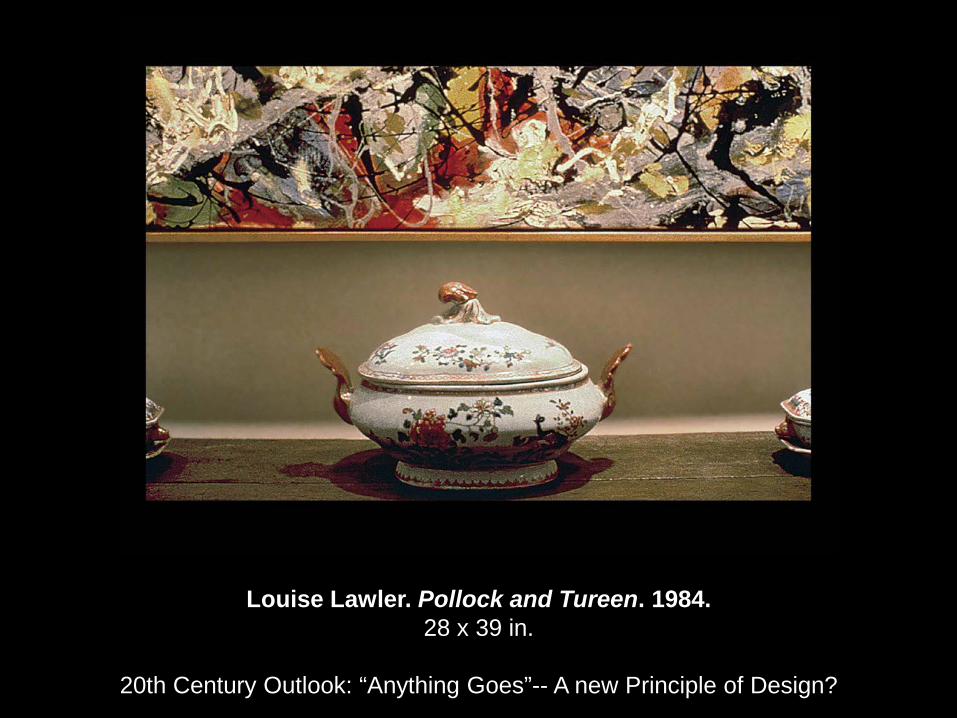
Louise Lawler. Pollock and Tureen. 1984. 28 x 39 in.
20th Century Outlook: “Anything Goes”-- A new Principle of Design?
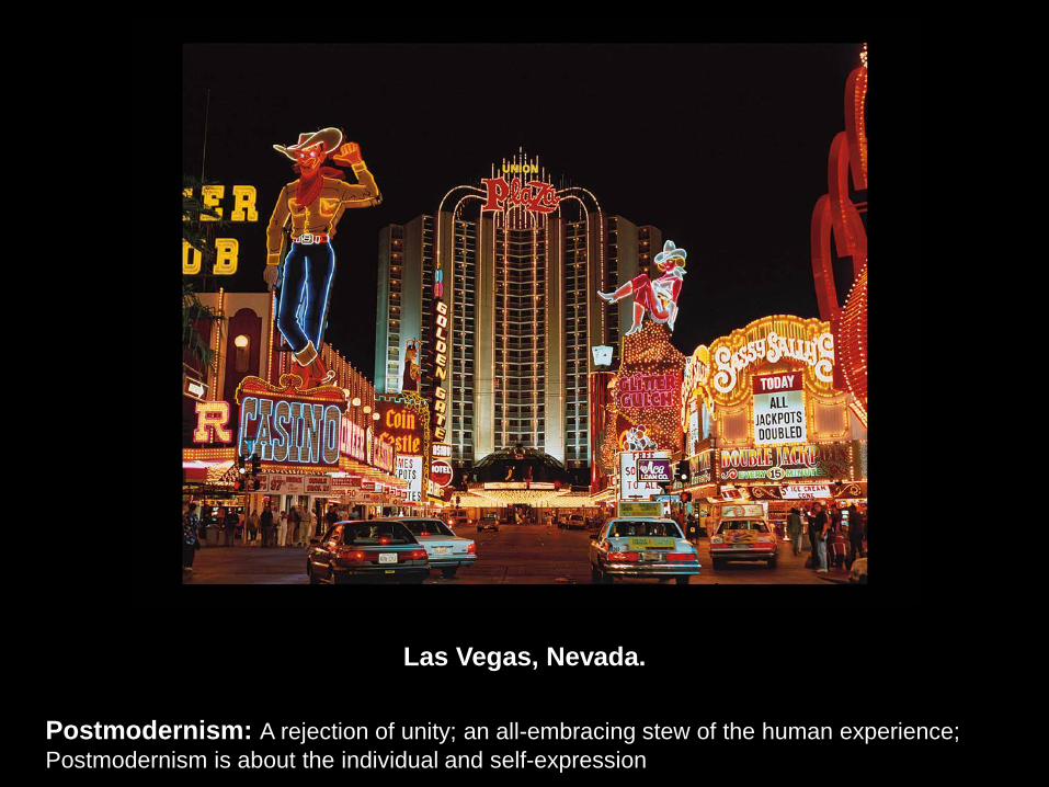
Las Vegas, Nevada.
Postmodernism: A rejection of unity; an all-embracing stew of the human experience; Postmodernism is about the individual and self-expression
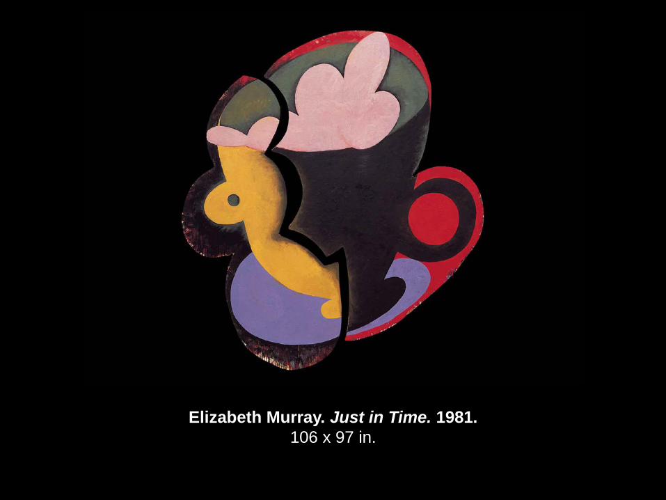
Elizabeth Murray. Just in Time. 1981. 106 x 97 in.
Next Week
Study for test #1
- Art in Our World
- Developing a Visual Literacy
- The Value of Art
- The Elements of Art
- The Principles of Design
A study guide will be posted on my Learning Web page