Embed Size (px)
Citation preview
1
Fall 2004 6.831 UI Design and Implementation 1
Lecture 8:
Design Principles
2
Fall 2004 6.831 UI Design and Implementation 2
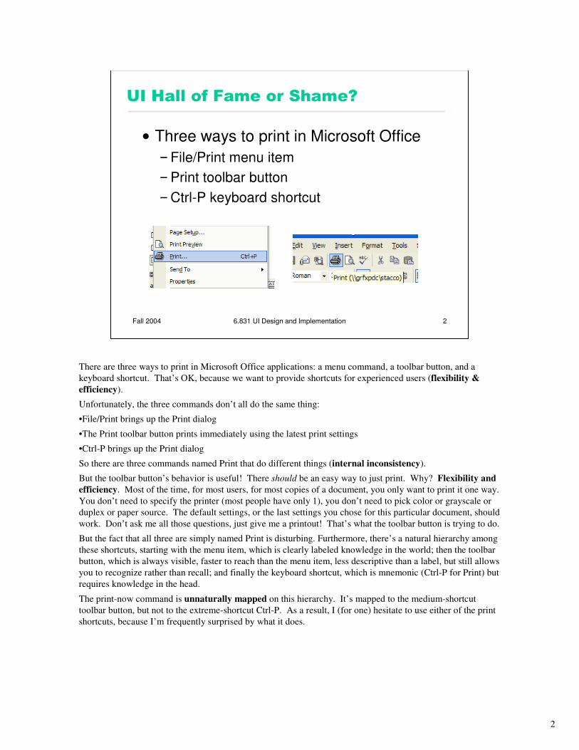
UI Hall of Fame or Shame?
• Three ways to print in Microsoft Office
–File/Print menu item
–Print toolbar button
–Ctrl-P keyboard shortcut
There are three ways to print in Microsoft Office applications: a menu command, a toolbar button, and a
keyboard shortcut. That’s OK, because we want to provide shortcuts for experienced users (flexibility &
efficiency).
Unfortunately, the three commands don’t all do the same thing:
•File/Print brings up the Print dialog
•The Print toolbar button prints immediately using the latest print settings
•Ctrl-P brings up the Print dialog
So there are three commands named Print that do different things (internal inconsistency).
But the toolbar button’s behavior is useful! There should be an easy way to just print. Why? Flexibility and
efficiency. Most of the time, for most users, for most copies of a document, you only want to print it one way.
You don’t need to specify the printer (most people have only 1), you don’t need to pick color or grayscale or
duplex or paper source. The default settings, or the last settings you chose for this particular document, should
work. Don’t ask me all those questions, just give me a printout! That’s what the toolbar button is trying to do.
But the fact that all three are simply named Print is disturbing. Furthermore, there’s a natural hierarchy among
these shortcuts, starting with the menu item, which is clearly labeled knowledge in the world; then the toolbar
button, which is always visible, faster to reach than the menu item, less descriptive than a label, but still allows
you to recognize rather than recall; and finally the keyboard shortcut, which is mnemonic (Ctrl-P for Print) but
requires knowledge in the head.
The print-now command is unnaturally mapped on this hierarchy. It’s mapped to the medium-shortcut
toolbar button, but not to the extreme-shortcut Ctrl-P. As a result, I (for one) hesitate to use either of the print
shortcuts, because I’m frequently surprised by what it does.
3
Fall 2004 6.831 UI Design and Implementation 3
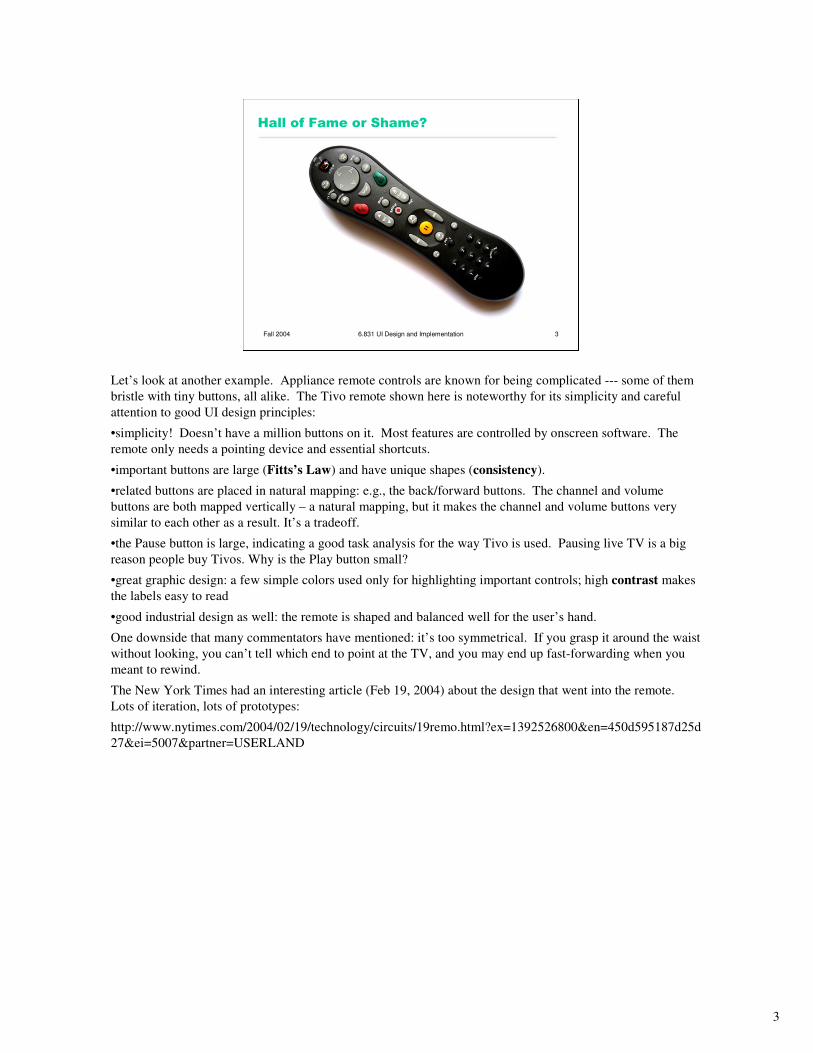
Hall of Fame or Shame?
Let’s look at another example. Appliance remote controls are known for being complicated --- some of them
bristle with tiny buttons, all alike. The Tivo remote shown here is noteworthy for its simplicity and careful
attention to good UI design principles:
•simplicity! Doesn’t have a million buttons on it. Most features are controlled by onscreen software. The
remote only needs a pointing device and essential shortcuts.
•important buttons are large (Fitts’s Law) and have unique shapes (consistency).
•related buttons are placed in natural mapping: e.g., the back/forward buttons. The channel and volume
buttons are both mapped vertically – a natural mapping, but it makes the channel and volume buttons very
similar to each other as a result. It’s a tradeoff.
•the Pause button is large, indicating a good task analysis for the way Tivo is used. Pausing live TV is a big
reason people buy Tivos. Why is the Play button small?
•great graphic design: a few simple colors used only for highlighting important controls; high contrast makes
the labels easy to read
•good industrial design as well: the remote is shaped and balanced well for the user’s hand.
One downside that many commentators have mentioned: it’s too symmetrical. If you grasp it around the waist
without looking, you can’t tell which end to point at the TV, and you may end up fast-forwarding when you
meant to rewind.
The New York Times had an interesting article (Feb 19, 2004) about the design that went into the remote.
Lots of iteration, lots of prototypes:
http://www.nytimes.com/2004/02/19/technology/circuits/19remo.html?ex=1392526800&en=450d595187d25d
27&ei=5007&partner=USERLAND
4
Fall 2004 6.831 UI Design and Implementation 4
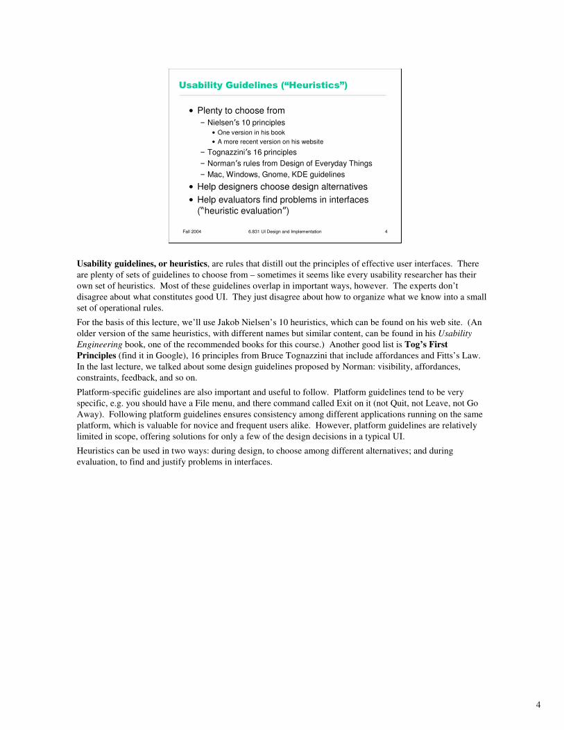
Usability Guidelines (“Heuristics”)
• Plenty to choose from
– Nielsen’s 10 principles
• One version in his book
• A more recent version on his website
– Tognazzini’s 16 principles
– Norman’s rules from Design of Everyday Things
– Mac, Windows, Gnome, KDE guidelines
• Help designers choose design alternatives
• Help evaluators find problems in interfaces
(“heuristic evaluation”)
Usability guidelines, or heuristics, are rules that distill out the principles of effective user interfaces. There
are plenty of sets of guidelines to choose from – sometimes it seems like every usability researcher has their
own set of heuristics. Most of these guidelines overlap in important ways, however. The experts don’t
disagree about what constitutes good UI. They just disagree about how to organize what we know into a small
set of operational rules.
For the basis of this lecture, we’ll use Jakob Nielsen’s 10 heuristics, which can be found on his web site. (An
older version of the same heuristics, with different names but similar content, can be found in his Usability
Engineering book, one of the recommended books for this course.) Another good list is Tog’s First
Principles (find it in Google), 16 principles from Bruce Tognazzini that include affordances and Fitts’s Law.
In the last lecture, we talked about some design guidelines proposed by Norman: visibility, affordances,
constraints, feedback, and so on.
Platform-specific guidelines are also important and useful to follow. Platform guidelines tend to be very
specific, e.g. you should have a File menu, and there command called Exit on it (not Quit, not Leave, not Go
Away). Following platform guidelines ensures consistency among different applications running on the same
platform, which is valuable for novice and frequent users alike. However, platform guidelines are relatively
limited in scope, offering solutions for only a few of the design decisions in a typical UI.
Heuristics can be used in two ways: during design, to choose among different alternatives; and during
evaluation, to find and justify problems in interfaces.
5
Fall 2004 6.831 UI Design and Implementation 5
Guidelines From Earlier Lectures
• User-centered design– Know your users– Understand their tasks
• Fitts’s Law– Size and proximity of controls should relate to their importance– Tiny controls are hard to hit– Screen edges are precious
• Memory– Use chunking to simplify information presentation– Minimize working memory
• Color guidelines– Don’t depend solely on color distinctions (color blindness)– Avoid red on blue text (chromatic aberration)– Avoid small blue details
• Norman’s principles of direct manipulation– Affordances– Natural mapping– Visibility– Feedback
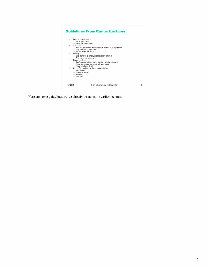
Here are some guidelines we’ve already discussed in earlier lectures.
6
Fall 2004 6.831 UI Design and Implementation 6
1. Match the Real World
• Use common words, not techie jargon– But use domain-specific
terms where appropriate
• Don’t put limits on user-defined names
• Allow aliases/synonyms in command languages
• Metaphors are useful but may mislead
OK
Type mismatch
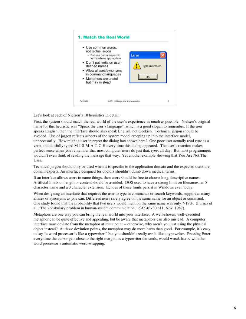
Let’s look at each of Nielsen’s 10 heuristics in detail.
First, the system should match the real world of the user’s experience as much as possible. Nielsen’s original
name for this heuristic was “Speak the user’s language”, which is a good slogan to remember. If the user
speaks English, then the interface should also speak English, not Geekish. Technical jargon should be
avoided. Use of jargon reflects aspects of the system model creeping up into the interface model,
unnecessarily. How might a user interpret the dialog box shown here? One poor user actually read type as a
verb, and dutifully typed M-I-S-M-A-T-C-H every time this dialog appeared. The user’s reaction makes
perfect sense when you remember that most computer users do just that, type, all day. But most programmers
wouldn’t even think of reading the message that way. Yet another example showing that You Are Not The
User.
Technical jargon should only be used when it is specific to the application domain and the expected users are
domain experts. An interface designed for doctors shouldn’t dumb down medical terms.
If an interface allows users to name things, then users should be free to choose long, descriptive names.
Artificial limits on length or content should be avoided. DOS used to have a strong limit on filenames, an 8
character name and a 3 character extension. Echoes of these limits persist in Windows even today.
When designing an interface that requires the user to type in commands or search keywords, support as many
aliases or synonyms as you can. Different users rarely agree on the same name for an object or command.
One study found that the probability that two users would mention the same name was only 7-18%. (Furnas et
al, “The vocabulary problem in human-system communication,” CACM v30 n11, Nov. 1987).
Metaphors are one way you can bring the real world into your interface. A well-chosen, well-executed
metaphor can be quite effective and appealing, but be aware that metaphors can also mislead. A computer
interface must deviate from the metaphor at some point -- otherwise, why aren’t you just using the physical
object instead? At those deviation points, the metaphor may do more harm than good. For example, it’s easy
to say “a word processor is like a typewriter,” but you shouldn’t really use it like a typewriter. Pressing Enter
every time the cursor gets close to the right margin, as a typewriter demands, would wreak havoc with the
word processor’s automatic word-wrapping.
7
Fall 2004 6.831 UI Design and Implementation 7
2. Consistency and Standards
• Principle of Least Surprise– Similar things should look and act similar
– Different things should look different
• Other properties– Size, location, color,
wording, ordering, …
• Command/argument order– Prefix vs. postfix
• Follow platform standards
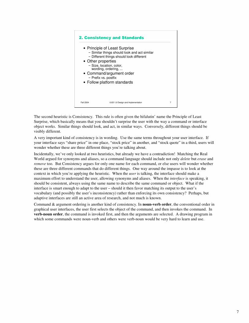
The second heuristic is Consistency. This rule is often given the hifalutin’ name the Principle of Least
Surprise, which basically means that you shouldn’t surprise the user with the way a command or interface
object works. Similar things should look, and act, in similar ways. Conversely, different things should be
visibly different.
A very important kind of consistency is in wording. Use the same terms throughout your user interface. If
your interface says “share price” in one place, “stock price” in another, and “stock quote” in a third, users will
wonder whether these are three different things you’re talking about.
Incidentally, we’ve only looked at two heuristics, but already we have a contradiction! Matching the Real
World argued for synonyms and aliases, so a command language should include not only delete but erase and
remove too. But Consistency argues for only one name for each command, or else users will wonder whether
these are three different commands that do different things. One way around the impasse is to look at the
context in which you’re applying the heuristic. When the user is talking, the interface should make a
maximum effort to understand the user, allowing synonyms and aliases. When the interface is speaking, it
should be consistent, always using the same name to describe the same command or object. What if the
interface is smart enough to adapt to the user – should it then favor matching its output to the user’s
vocabulary (and possibly the user’s inconsistency) rather than enforcing its own consistency? Perhaps, but
adaptive interfaces are still an active area of research, and not much is known.
Command & argument ordering is another kind of consistency. In noun-verb order, the conventional order in
graphical user interfaces, the user first selects the object of the command, and then invokes the command. In
verb-noun order, the command is invoked first, and then the arguments are selected. A drawing program in
which some commands were noun-verb and others were verb-noun would be very hard to learn and use.
8
Fall 2004 6.831 UI Design and Implementation 8
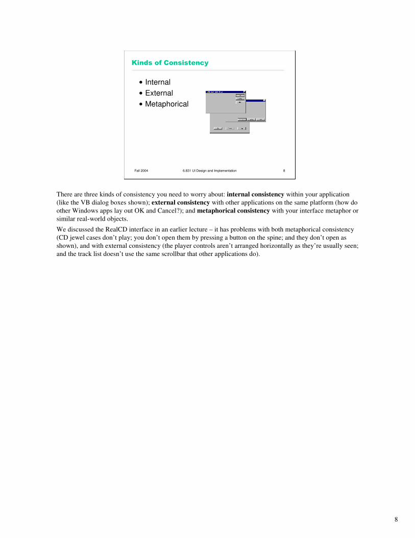
Kinds of Consistency
• Internal
• External
• Metaphorical
There are three kinds of consistency you need to worry about: internal consistency within your application
(like the VB dialog boxes shown); external consistency with other applications on the same platform (how do
other Windows apps lay out OK and Cancel?); and metaphorical consistency with your interface metaphor or
similar real-world objects.
We discussed the RealCD interface in an earlier lecture – it has problems with both metaphorical consistency
(CD jewel cases don’t play; you don’t open them by pressing a button on the spine; and they don’t open as
shown), and with external consistency (the player controls aren’t arranged horizontally as they’re usually seen;
and the track list doesn’t use the same scrollbar that other applications do).
9
Fall 2004 6.831 UI Design and Implementation 9
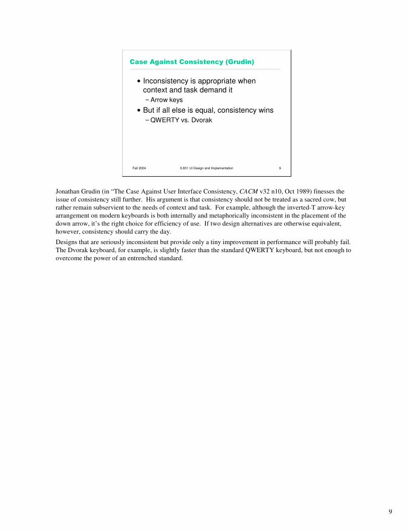
Case Against Consistency (Grudin)
• Inconsistency is appropriate when
context and task demand it
–Arrow keys
• But if all else is equal, consistency wins
–QWERTY vs. Dvorak
Jonathan Grudin (in “The Case Against User Interface Consistency, CACM v32 n10, Oct 1989) finesses the
issue of consistency still further. His argument is that consistency should not be treated as a sacred cow, but
rather remain subservient to the needs of context and task. For example, although the inverted-T arrow-key
arrangement on modern keyboards is both internally and metaphorically inconsistent in the placement of the
down arrow, it’s the right choice for efficiency of use. If two design alternatives are otherwise equivalent,
however, consistency should carry the day.
Designs that are seriously inconsistent but provide only a tiny improvement in performance will probably fail.
The Dvorak keyboard, for example, is slightly faster than the standard QWERTY keyboard, but not enough to
overcome the power of an entrenched standard.
10
Fall 2004 6.831 UI Design and Implementation 10
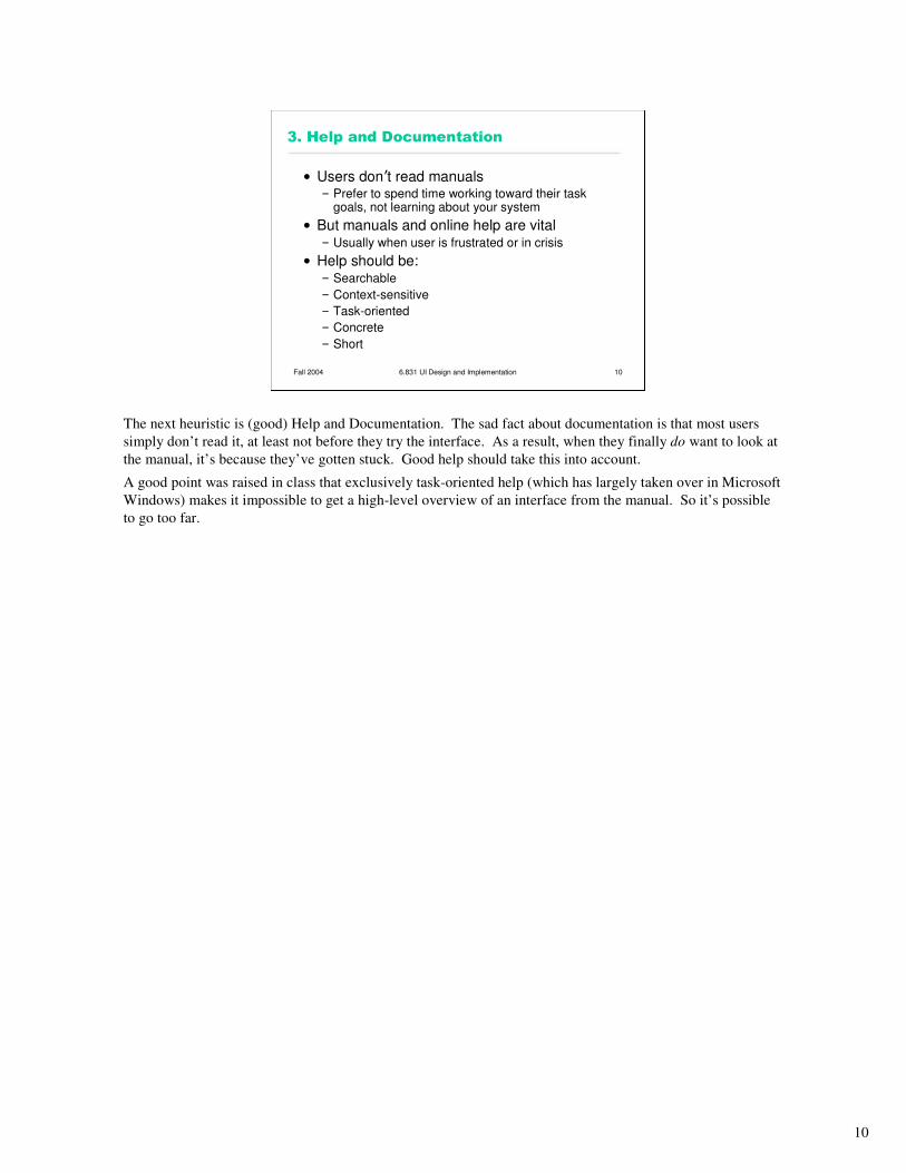
3. Help and Documentation
• Users don’t read manuals– Prefer to spend time working toward their task
goals, not learning about your system
• But manuals and online help are vital– Usually when user is frustrated or in crisis
• Help should be:– Searchable
– Context-sensitive
– Task-oriented
– Concrete
– Short
The next heuristic is (good) Help and Documentation. The sad fact about documentation is that most users
simply don’t read it, at least not before they try the interface. As a result, when they finally do want to look at
the manual, it’s because they’ve gotten stuck. Good help should take this into account.
A good point was raised in class that exclusively task-oriented help (which has largely taken over in Microsoft
Windows) makes it impossible to get a high-level overview of an interface from the manual. So it’s possible
to go too far.
11
Fall 2004 6.831 UI Design and Implementation 11
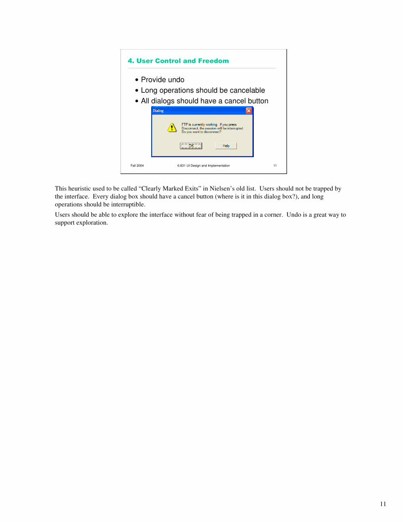
4. User Control and Freedom
• Provide undo
• Long operations should be cancelable
• All dialogs should have a cancel button
This heuristic used to be called “Clearly Marked Exits” in Nielsen’s old list. Users should not be trapped by
the interface. Every dialog box should have a cancel button (where is it in this dialog box?), and long
operations should be interruptible.
Users should be able to explore the interface without fear of being trapped in a corner. Undo is a great way to
support exploration.
12
Fall 2004 6.831 UI Design and Implementation 12
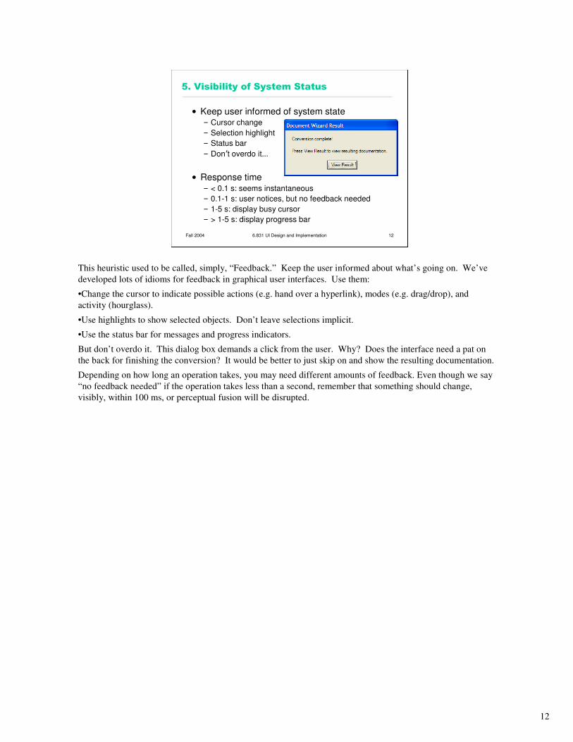
5. Visibility of System Status
• Keep user informed of system state– Cursor change
– Selection highlight
– Status bar
– Don’t overdo it…
• Response time– < 0.1 s: seems instantaneous
– 0.1-1 s: user notices, but no feedback needed
– 1-5 s: display busy cursor
– > 1-5 s: display progress bar
This heuristic used to be called, simply, “Feedback.” Keep the user informed about what’s going on. We’ve
developed lots of idioms for feedback in graphical user interfaces. Use them:
•Change the cursor to indicate possible actions (e.g. hand over a hyperlink), modes (e.g. drag/drop), and
activity (hourglass).
•Use highlights to show selected objects. Don’t leave selections implicit.
•Use the status bar for messages and progress indicators.
But don’t overdo it. This dialog box demands a click from the user. Why? Does the interface need a pat on
the back for finishing the conversion? It would be better to just skip on and show the resulting documentation.
Depending on how long an operation takes, you may need different amounts of feedback. Even though we say
“no feedback needed” if the operation takes less than a second, remember that something should change,
visibly, within 100 ms, or perceptual fusion will be disrupted.
13
Fall 2004 6.831 UI Design and Implementation 13
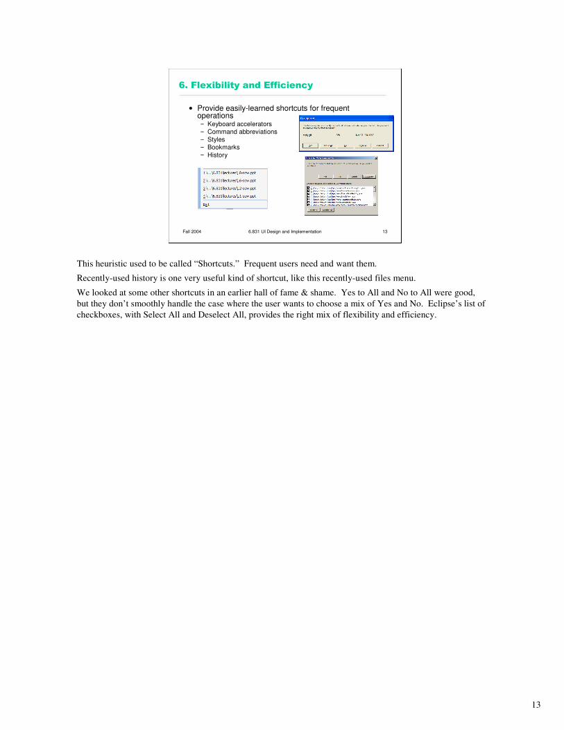
6. Flexibility and Efficiency
• Provide easily-learned shortcuts for frequent operations– Keyboard accelerators
– Command abbreviations
– Styles
– Bookmarks
– History
This heuristic used to be called “Shortcuts.” Frequent users need and want them.
Recently-used history is one very useful kind of shortcut, like this recently-used files menu.
We looked at some other shortcuts in an earlier hall of fame & shame. Yes to All and No to All were good,
but they don’t smoothly handle the case where the user wants to choose a mix of Yes and No. Eclipse’s list of
checkboxes, with Select All and Deselect All, provides the right mix of flexibility and efficiency.
14
Fall 2004 6.831 UI Design and Implementation 14
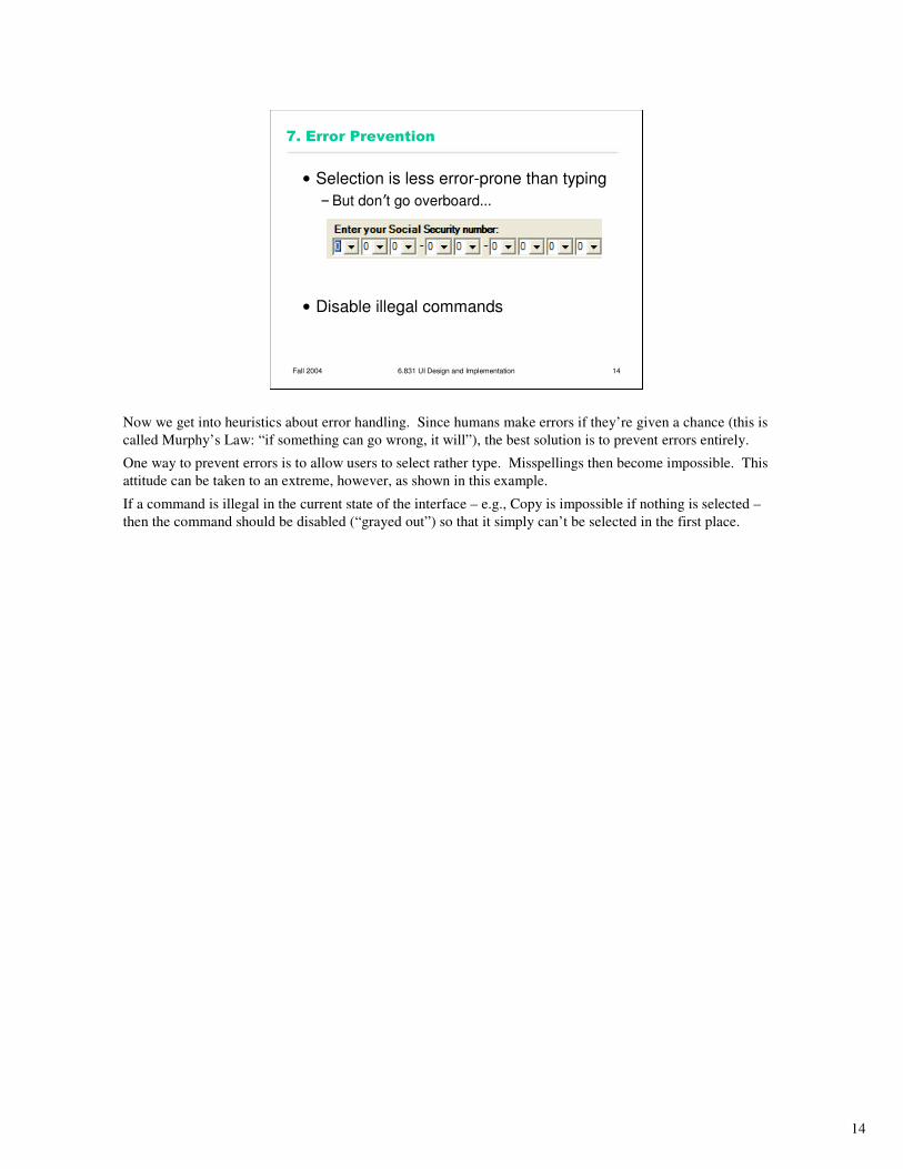
7. Error Prevention
• Selection is less error-prone than typing
–But don’t go overboard…
• Disable illegal commands
Now we get into heuristics about error handling. Since humans make errors if they’re given a chance (this is
called Murphy’s Law: “if something can go wrong, it will”), the best solution is to prevent errors entirely.
One way to prevent errors is to allow users to select rather type. Misspellings then become impossible. This
attitude can be taken to an extreme, however, as shown in this example.
If a command is illegal in the current state of the interface – e.g., Copy is impossible if nothing is selected –
then the command should be disabled (“grayed out”) so that it simply can’t be selected in the first place.
15
Fall 2004 6.831 UI Design and Implementation 15
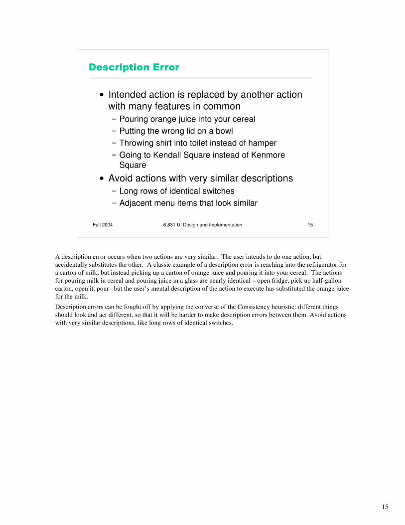
Description Error
• Intended action is replaced by another action
with many features in common
– Pouring orange juice into your cereal
– Putting the wrong lid on a bowl
– Throwing shirt into toilet instead of hamper
– Going to Kendall Square instead of Kenmore
Square
• Avoid actions with very similar descriptions
– Long rows of identical switches
– Adjacent menu items that look similar
A description error occurs when two actions are very similar. The user intends to do one action, but
accidentally substitutes the other. A classic example of a description error is reaching into the refrigerator for
a carton of milk, but instead picking up a carton of orange juice and pouring it into your cereal. The actions
for pouring milk in cereal and pouring juice in a glass are nearly identical – open fridge, pick up half-gallon
carton, open it, pour– but the user’s mental description of the action to execute has substituted the orange juice
for the milk.
Description errors can be fought off by applying the converse of the Consistency heuristic: different things
should look and act different, so that it will be harder to make description errors between them. Avoid actions
with very similar descriptions, like long rows of identical switches.
16
Fall 2004 6.831 UI Design and Implementation 16
Capture Error
• A sequence of actions is replaced by another sequence that starts the same
way
– Leave your house and find yourself walking
to school instead of where you meant to go
–Vi :wq command
• Avoid habitual action sequences with
common prefixes
A capture error occurs when a person starts executing one sequence of actions, but then veers off into another
(often more familiar) sequence that happened to start the same way. A good mental picture for this is that
you’ve developed a mental groove from executing the same sequence of actions repeatedly, and this groove
tends to capture other sequences that start the same way.
In a computer interface, you can deal with capture errors by avoiding habitual action sequences that have
common prefixes.
17
Fall 2004 6.831 UI Design and Implementation 17
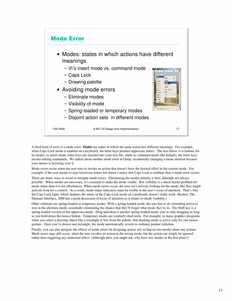
Mode Error
• Modes: states in which actions have different
meanings
– Vi’s insert mode vs. command mode
– Caps Lock
– Drawing palette
• Avoiding mode errors
– Eliminate modes
– Visibility of mode
– Spring-loaded or temporary modes
– Disjoint action sets in different modes
A third kind of error is a mode error. Modes are states in which the same action has different meanings. For example,
when Caps Lock mode is enabled on a keyboard, the letter keys produce uppercase letters. The text editor vi is famous for
its modes: in insert mode, letter keys are inserted into your text file, while in command mode (the default), the letter keys
invoke editing commands. We talked about another mode error in Gimp: accidentally changing a menu shortcut because
your mouse is hovering over it.
Mode errors occur when the user tries to invoke an action that doesn’t have the desired effect in the current mode. For
example, if the user means to type lowercase letters but doesn’t notice that Caps Lock is enabled, then a mode error occurs.
There are many ways to avoid or mitigate mode errors. Eliminating the modes entirely is best, although not always
possible. When modes are necessary, it’s essential to make the mode visible. But visibility is a much harder problem for
mode status than it is for affordances. When mode errors occur, the user isn’t actively looking for the mode, like they might
actively look for a control. As a result, mode status indicators must be visible in the user’s locus of attention. That’s why
the Caps Lock light, which displays the status of the Caps Lock mode on a keyboard, doesn’t really work. (Raskin, The
Humane Interface, 2000 has a good discussion of locus of attention as it relates to mode visibility.)
Other solutions are spring-loaded or temporary modes. With a spring-loaded mode, the user has to do something active to
stay in the alternate mode, essentially eliminating the chance that they’ll forget what mode they’re in. The Shift key is a
spring-loaded version of the uppercase mode. Drag-and-drop is another spring-loaded mode; you’re only dragging as long
as you hold down the mouse button. Temporary modes are similarly short-term. For example, in many graphics programs,
when you select a drawing object like a rectangle or line from the palette, that drawing mode is active only for one mouse
gesture. Once you’ve drawn one rectangle, the mode automatically reverts to ordinary pointer selection.
Finally, you can also mitigate the effects of mode errors by designing action sets so that no two modes share any actions.
Mode errors may still occur, when the user invokes an action in the wrong mode, but the action can simply be ignored
rather than triggering any undesired effect. (Although then, you might ask, why have two modes in the first place?)
18
Fall 2004 6.831 UI Design and Implementation 18
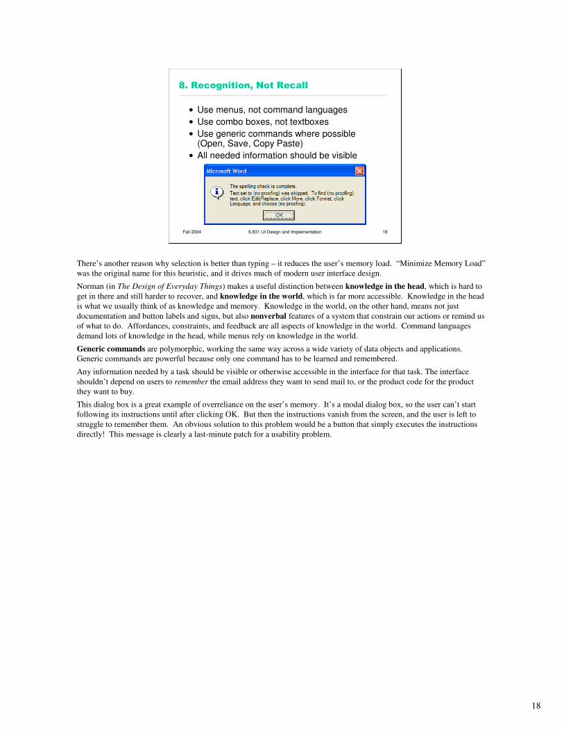
8. Recognition, Not Recall
• Use menus, not command languages
• Use combo boxes, not textboxes
• Use generic commands where possible (Open, Save, Copy Paste)
• All needed information should be visible
There’s another reason why selection is better than typing – it reduces the user’s memory load. “Minimize Memory Load”
was the original name for this heuristic, and it drives much of modern user interface design.
Norman (in The Design of Everyday Things) makes a useful distinction between knowledge in the head, which is hard to
get in there and still harder to recover, and knowledge in the world, which is far more accessible. Knowledge in the head
is what we usually think of as knowledge and memory. Knowledge in the world, on the other hand, means not just
documentation and button labels and signs, but also nonverbal features of a system that constrain our actions or remind us
of what to do. Affordances, constraints, and feedback are all aspects of knowledge in the world. Command languages
demand lots of knowledge in the head, while menus rely on knowledge in the world.
Generic commands are polymorphic, working the same way across a wide variety of data objects and applications.
Generic commands are powerful because only one command has to be learned and remembered.
Any information needed by a task should be visible or otherwise accessible in the interface for that task. The interface
shouldn’t depend on users to remember the email address they want to send mail to, or the product code for the product
they want to buy.
This dialog box is a great example of overreliance on the user’s memory. It’s a modal dialog box, so the user can’t start
following its instructions until after clicking OK. But then the instructions vanish from the screen, and the user is left to
struggle to remember them. An obvious solution to this problem would be a button that simply executes the instructions
directly! This message is clearly a last-minute patch for a usability problem.
19
Fall 2004 6.831 UI Design and Implementation 19
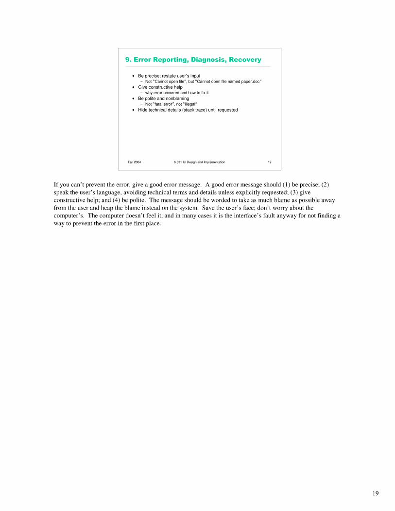
9. Error Reporting, Diagnosis, Recovery
• Be precise; restate user’s input
– Not “Cannot open file”, but “Cannot open file named paper.doc”
• Give constructive help
– why error occurred and how to fix it
• Be polite and nonblaming
– Not “fatal error”, not “illegal”
• Hide technical details (stack trace) until requested
If you can’t prevent the error, give a good error message. A good error message should (1) be precise; (2)
speak the user’s language, avoiding technical terms and details unless explicitly requested; (3) give
constructive help; and (4) be polite. The message should be worded to take as much blame as possible away
from the user and heap the blame instead on the system. Save the user’s face; don’t worry about the
computer’s. The computer doesn’t feel it, and in many cases it is the interface’s fault anyway for not finding a
way to prevent the error in the first place.

20
Fall 2004 6.831 UI Design and Implementation 20
10. Aesthetic and Minimalist Design
• “Less is More”
–Omit extraneous info, graphics, features
The final heuristic is a catch-all for a number of rules of good graphic design, which really boil down to one
word: simplicity. Leave things out unless you have good reason to include them. Don’t put more help text on
your main window than what’s really necessary. Leave out extraneous graphics. Most important, leave out
unnecessary features. If a feature is never used, there’s no reason for it to complicate your interface.
Google and the Tivo remote offer great positive examples of the less-is-more philosophy.
Image courtesy of Google. Used with permission.
21
Fall 2004 6.831 UI Design and Implementation 21
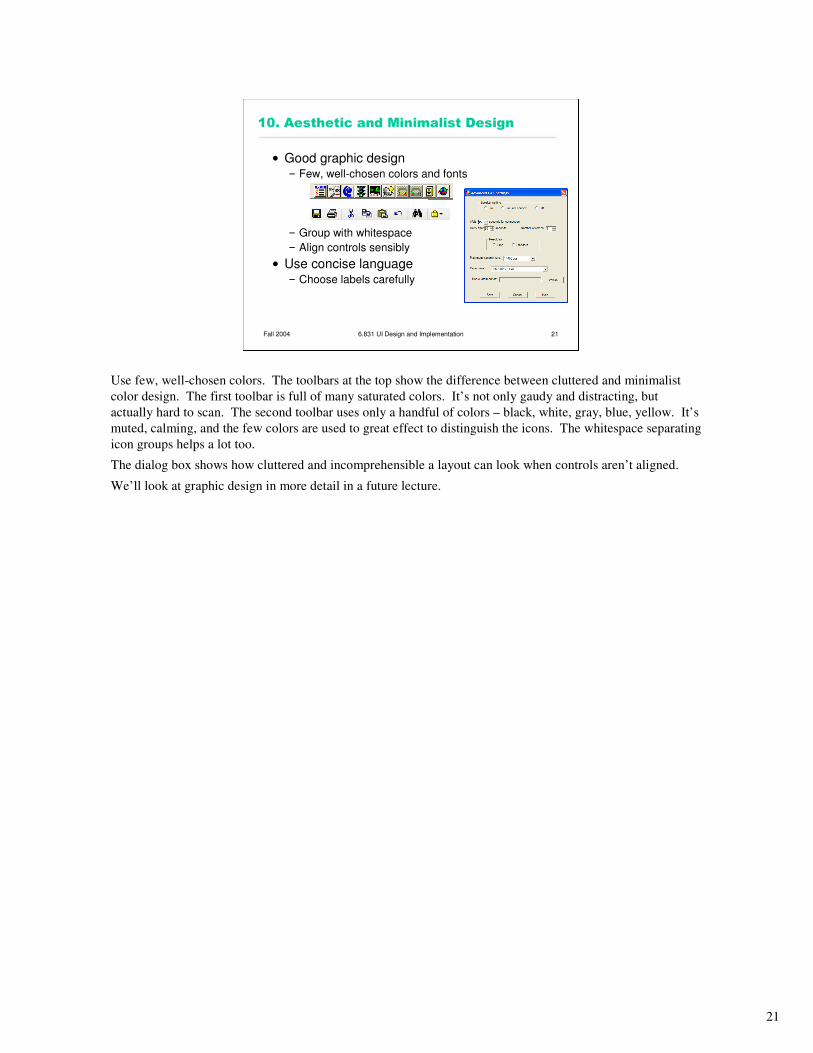
10. Aesthetic and Minimalist Design
• Good graphic design– Few, well-chosen colors and fonts
– Group with whitespace
– Align controls sensibly
• Use concise language– Choose labels carefully
Use few, well-chosen colors. The toolbars at the top show the difference between cluttered and minimalist
color design. The first toolbar is full of many saturated colors. It’s not only gaudy and distracting, but
actually hard to scan. The second toolbar uses only a handful of colors – black, white, gray, blue, yellow. It’s
muted, calming, and the few colors are used to great effect to distinguish the icons. The whitespace separating
icon groups helps a lot too.
The dialog box shows how cluttered and incomprehensible a layout can look when controls aren’t aligned.
We’ll look at graphic design in more detail in a future lecture.
22
Fall 2004 6.831 UI Design and Implementation 22
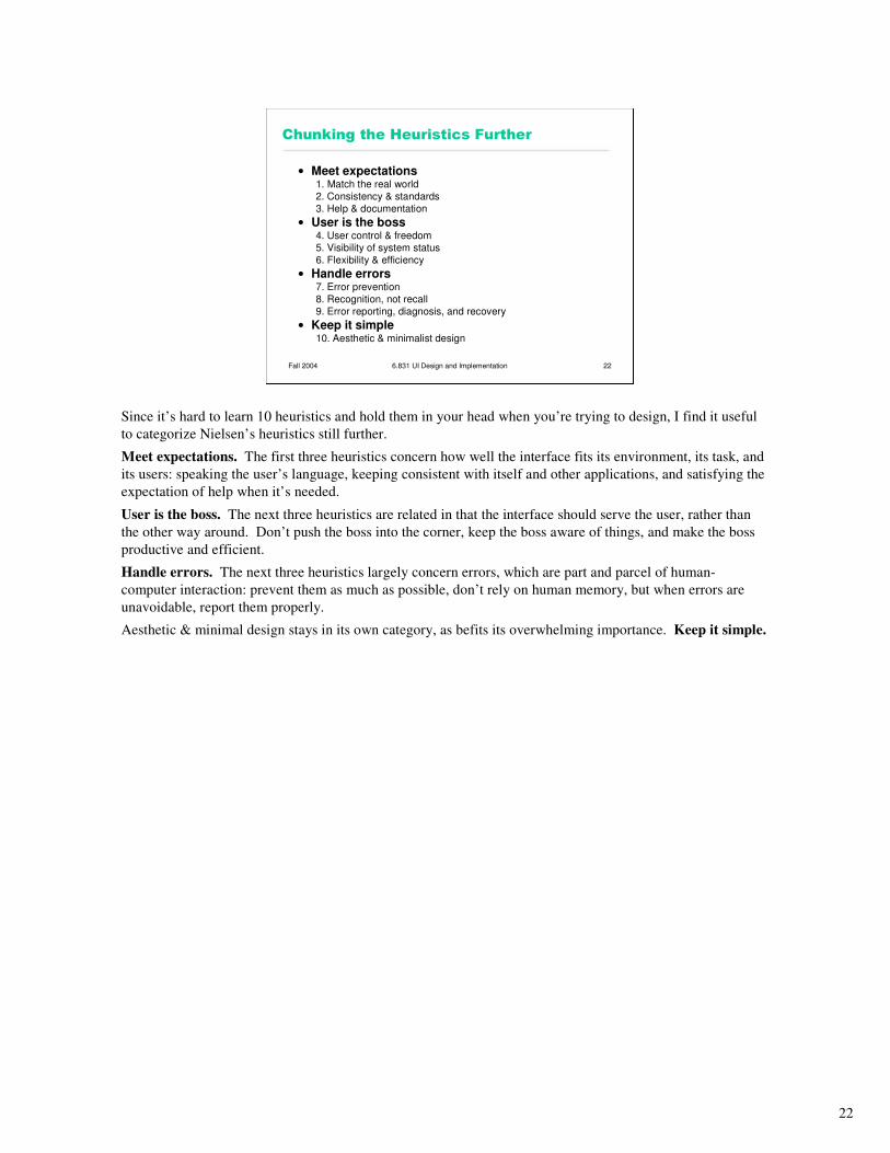
Chunking the Heuristics Further
• Meet expectations1. Match the real world
2. Consistency & standards
3. Help & documentation
• User is the boss4. User control & freedom
5. Visibility of system status
6. Flexibility & efficiency
• Handle errors7. Error prevention
8. Recognition, not recall
9. Error reporting, diagnosis, and recovery
• Keep it simple10. Aesthetic & minimalist design
Since it’s hard to learn 10 heuristics and hold them in your head when you’re trying to design, I find it useful
to categorize Nielsen’s heuristics still further.
Meet expectations. The first three heuristics concern how well the interface fits its environment, its task, and
its users: speaking the user’s language, keeping consistent with itself and other applications, and satisfying the
expectation of help when it’s needed.
User is the boss. The next three heuristics are related in that the interface should serve the user, rather than
the other way around. Don’t push the boss into the corner, keep the boss aware of things, and make the boss
productive and efficient.
Handle errors. The next three heuristics largely concern errors, which are part and parcel of human-
computer interaction: prevent them as much as possible, don’t rely on human memory, but when errors are
unavoidable, report them properly.
Aesthetic & minimal design stays in its own category, as befits its overwhelming importance. Keep it simple.
23
Fall 2004 6.831 UI Design and Implementation 23
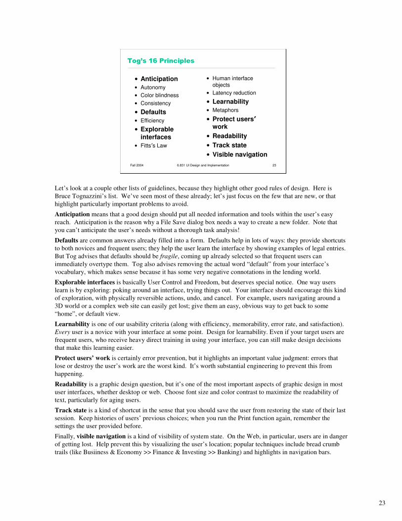
Tog’s 16 Principles
• Anticipation
• Autonomy
• Color blindness
• Consistency
• Defaults
• Efficiency
• Explorable
interfaces
• Fitts’s Law
• Human interface
objects
• Latency reduction
• Learnability
• Metaphors
• Protect users’work
• Readability
• Track state
• Visible navigation
Let’s look at a couple other lists of guidelines, because they highlight other good rules of design. Here is
Bruce Tognazzini’s list. We’ve seen most of these already; let’s just focus on the few that are new, or that
highlight particularly important problems to avoid.
Anticipation means that a good design should put all needed information and tools within the user’s easy
reach. Anticipation is the reason why a File Save dialog box needs a way to create a new folder. Note that
you can’t anticipate the user’s needs without a thorough task analysis!
Defaults are common answers already filled into a form. Defaults help in lots of ways: they provide shortcuts
to both novices and frequent users; they help the user learn the interface by showing examples of legal entries.
But Tog advises that defaults should be fragile, coming up already selected so that frequent users can
immediately overtype them. Tog also advises removing the actual word “default” from your interface’s
vocabulary, which makes sense because it has some very negative connotations in the lending world.
Explorable interfaces is basically User Control and Freedom, but deserves special notice. One way users
learn is by exploring: poking around an interface, trying things out. Your interface should encourage this kind
of exploration, with physically reversible actions, undo, and cancel. For example, users navigating around a
3D world or a complex web site can easily get lost; give them an easy, obvious way to get back to some
“home”, or default view.
Learnability is one of our usability criteria (along with efficiency, memorability, error rate, and satisfaction).
Every user is a novice with your interface at some point. Design for learnability. Even if your target users are
frequent users, who receive heavy direct training in using your interface, you can still make design decisions
that make this learning easier.
Protect users’ work is certainly error prevention, but it highlights an important value judgment: errors that
lose or destroy the user’s work are the worst kind. It’s worth substantial engineering to prevent this from
happening.
Readability is a graphic design question, but it’s one of the most important aspects of graphic design in most
user interfaces, whether desktop or web. Choose font size and color contrast to maximize the readability of
text, particularly for aging users.
Track state is a kind of shortcut in the sense that you should save the user from restoring the state of their last
session. Keep histories of users’ previous choices; when you run the Print function again, remember the
settings the user provided before.
Finally, visible navigation is a kind of visibility of system state. On the Web, in particular, users are in danger
of getting lost. Help prevent this by visualizing the user’s location; popular techniques include bread crumb
trails (like Busiiness & Economy >> Finance & Investing >> Banking) and highlights in navigation bars.
24
Fall 2004 6.831 UI Design and Implementation 24
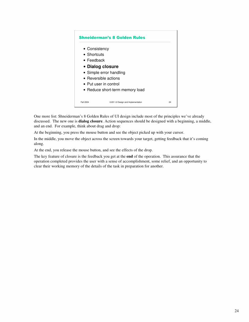
Shneiderman’s 8 Golden Rules
• Consistency
• Shortcuts
• Feedback
• Dialog closure
• Simple error handling
• Reversible actions
• Put user in control
• Reduce short-term memory load
One more list: Shneiderman’s 8 Golden Rules of UI design include most of the principles we’ve already
discussed. The new one is dialog closure. Action sequences should be designed with a beginning, a middle,
and an end. For example, think about drag and drop:
At the beginning, you press the mouse button and see the object picked up with your cursor.
In the middle, you move the object across the screen towards your target, getting feedback that it’s coming
along.
At the end, you release the mouse button, and see the effects of the drop.
The key feature of closure is the feedback you get at the end of the operation. This assurance that the
operation completed provides the user with a sense of accomplishment, some relief, and an opportunity to
clear their working memory of the details of the task in preparation for another.