Embed Size (px)
Citation preview

1
Fall 2003 6.893 UI Design and Implementation 1
Lecture 7: Graphic Design
2
Fall 2003 6.893 UI Design and Implementation 2
UI Hall of Fame or Shame?
Source: Vishy Venugopalan
This Flash-driven web site is the Museum of Modern Art’s Workspheres exhibition, a collection of objects related to the modern workplace. This is its main menu: an array of identical icons. Mousing over any icon makes its label appear (the yellow note shown), and clicking brings up a picture of the object.Clearly there’s a metaphor in play here: the interface represents a wall covered with Post-it notes, and you can zoom in on any one of them.We can praise this site for at least one reason: incredible simplicity. The designer of this site was clearly striving for aesthetic appeal. Nothing unnecessary was included. Note the use of whitespace to group the list of categories on the right, and the simple heading highlight that gives a clue to the function of the list (clicking on a category name highlights all the icons in that category).Unfortunately, too much that was necessary was left out. Without any visible differentiation between the icons, finding something requires a lot of mouse waving. “Mystery navigation” was the term used by Vishy Venugopalan, who nominated this candidate for the UI Hall of Shame. It’s hard enough to skim the display for interesting objects to look at. But imagine trying to find an object you’ve seen before. It’s like that old card game Concentration, demanding too much recall from the user, rather than offering easy opportunities to recognize what you’re looking for.Frankly, if real Post-it notes were arranged on a wall like this, you’d probably have just as much trouble navigating it. So the choice of metaphor may be the essence of the problem.

3
Fall 2003 6.893 UI Design and Implementation 3
More “Mystery Navigation”
Source: Adam Champy
This is the home page for Movado, a company that makes expensive, stylish watches. The little white dots at the top of the window are menu options. If you watched the opening animation that precedes this screen, you’d see each menu label appear briefly over each dot. But if you skipped over the intro, you wouldn’t see that, and you may not even realize that a menu is hiding up there under those stylish white dots.When you mouse over a dot, you actually have to wait for a cute little animation (a watch hand sweeping around the dot) before the menu label appears. Each little animation takes 2 seconds. So scanning the entire menu to look at all the options takes 16 seconds!Clearly this is even worse than MOMA’s approach, since it starts with an invisible menu interface and makes it inefficient to boot. More tellingly, MOMA only cares about your eyeballs, but Movado actually wants to sell you a watch. If you can’t figure out their menu, or lose patience with it, you may be headed elsewhere.

4
Fall 2003 6.893 UI Design and Implementation 4
Let’s Play a Menu Game
Source: Tyler Horton
Here’s our last entry: Mandarina Duck, a website that sells designer products like clothes, watches, and handbags. In this site’s Flash animation, the menu options are yellow cubes, which are not only identical, but they move: constantly spinning, growing and shrinking, and revolving in fixed orbits. Some of the orbits are very eccentric (long and flat). Worst of all, the orbits overlap, so cubes pass each other on the screen. So it’s not enough to memorize the positions of the menu items; you have to memorize the orbits.When you catch a cube with the mouse pointer, it makes a loud QUACK, freezes in place, and displays its name. It’s a fun game, for a little while. But if you have a serious reason for visiting this web site – say, spending some money – do you really want to chase down every menu option you want to click?One lesson you might draw from these examples is that Flash animation is bad, but that’s too simplistic. Flash is a powerful tool that can be used for good or ill.A better lesson might be that aesthetic appeal does not automatically confer usability. Effective graphic design is an important element of usability, but it isn’t the whole story by any means.

5
Fall 2003 6.893 UI Design and Implementation 5
Today’s Topics
• Graphic design principles
6
Fall 2003 6.893 UI Design and Implementation 6
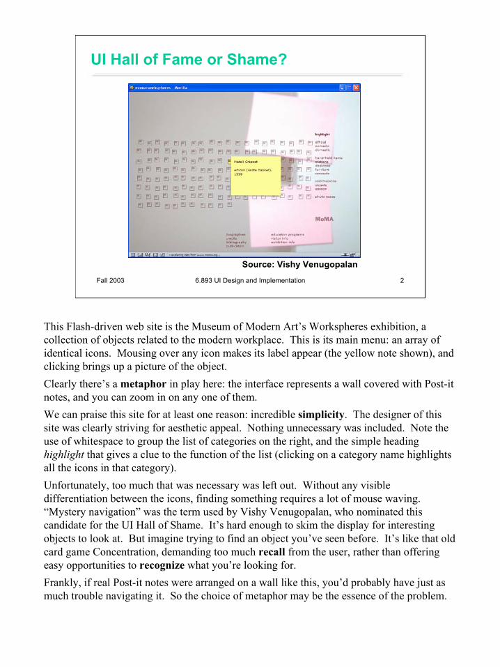
Guidelines for Good Graphic Design
• Simplicity• Contrast• White space• Balance• Alignment
Now, let’s look at some specific guidelines for graphic design. These guidelines are drawn from the excellent book Designing Visual Interfaces by Kevin Mullet and Darrell Sano (Prentice-Hall, 1995). Mullet & Sano’s book predates the Web, but the principles it describes are timeless and relevant to any visual medium.

7
Fall 2003 6.893 UI Design and Implementation 7
Simplicity
• “Perfection is achieved not when there is nothing more to add, but when there is nothing left to take away.” (Antoine de St-Exupery)
• “Simplicity does not mean the absence of any decor… It only means that the decor should belong intimately to the design proper, and that anything foreign to it should be taken away.” (Paul Jacques Grillo)
• “Keep it simple, stupid.” (KISS)• “Less is more.”• “When in doubt, leave it out.”
Okay, we’ll shout some slogans at you now. You’ve probably heard some of these before. What you should take from these slogans is that designing for simplicity is a process of elimination, not accretion. Simplicity is in constant tension with task analysis, information preconditions, and other design guidelines, which might otherwise encourage you to pile more and more elements into a design, “just in case.” Simplicity forces you to have a good reason for everything you add, and to take away anything that can’t survive hard scrutiny.

8
Fall 2003 6.893 UI Design and Implementation 8
Techniques for Simplicity
• Reduction– Remove inessential elements
• Regularity– Use a regular pattern– Limit inessential variation among elements
• Combine elements for leverage– Let elements play multiple roles– Examples: scroll bar, window title bar
Here are three ways to make a design simpler.Reduction means that you eliminate whatever isn’t necessary. This technique has three steps: (1) decide what essentially needs to be conveyed by the design; (2) critically examine every element (label, control, color, font, line weight) to decide whether it serves an essential purpose; (3) remove it if it isn’t essential. Even if it seems essential, try removing it anyway, to see if the design falls apart.For the essential elements that remain, consider how you can minimize the unnecessary differences between them with regularity. Use the same font, color, line width, dimensions, orientation for multiple elements. Irregularities in your design will be magnified in the user’s eyes and assigned meaning and significance. Conversely, if your design is mostly regular, the elements that you do want to highlight will stand out better.Consider the shopping cart web page from PS2 (heuristic evaluation). Some of the content of the page could be removed entirely, such as the shipping table, or loading and saving shopping carts. Other elements could be regularized: for example, the text of links sometimes says “Click here”, sometimes “details”. The page’s overuse of red text is another design flaw that should be simplified away.Finally, you can combine elements, making them serve multiple roles in the design. The desktop interface has a number of good examples of this kind of design. For example, the “thumb” in a scroll bar actually serves three roles. It affords dragging, indicates the position of the scroll window relative to the entire document, and indicates the fraction of the document displayed in the scroll window. Similarly, a window’s title bar plays several roles: label, dragging handle, window activation indicator, and location for window control buttons. In the classic Mac interface, in fact, even the activation indicator played two roles. When the window was activated, closely spaced horizontal lines filled the title bar, giving it a perceived affordance for dragging.
9
Fall 2003 6.893 UI Design and Implementation 9
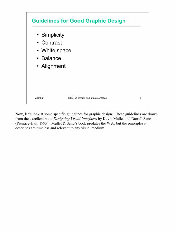
Contrast & Visual Variables
• Contrast encodes information along visual dimensions
sizevalue hue orientationtexture shape position
Contrast refers to perceivable differences along a visual dimension, such as size or color. Contrast is the irregularity in a design that communicates information or makes elements stand out. Simplicity says we should eliminate unimportant differences. Once we’ve decided that a difference is important, however, we should choose the dimension and degree of contrast in such a way that the difference is salient, easily perceptible, and appropriate to the task.Crucial to this decision is an understanding of the different visual dimensions. Jacques Bertin developed a theory of visual variables that is particularly useful here (Bertin, Graphics and Graphics Information Processing, 1989). The seven visual variables identified by Bertin are shown above. Bertin called these dimensions retinal variables, in fact, because they can be compared effortlessly without additional cognitive processing, as if the retina were doing all the work. In terms of the model human processor abstraction, differences along these dimensions can be detected by the Perceptual Processor. Comparing numbers, on the other hand, would require the participation of the Cognitive Processor.Each column in this display varies along only one of the seven variables. Most of the variables need no explanation, except perhaps for hue and value. Hue is pure color; valueis the brightness or luminance of color. (Figure after Mullet & Sano, p. 54).
10
Fall 2003 6.893 UI Design and Implementation 10
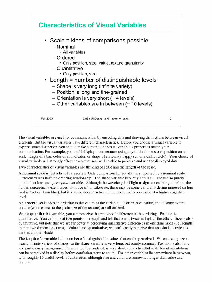
Characteristics of Visual Variables
• Scale = kinds of comparisons possible– Nominal
• All variables– Ordered
• Only position, size, value, texture granularity– Quantitative
• Only position, size• Length = number of distinguishable levels
– Shape is very long (infinite variety)– Position is long and fine-grained– Orientation is very short (~ 4 levels)– Other variables are in between (~ 10 levels)
The visual variables are used for communication, by encoding data and drawing distinctions between visual elements. But the visual variables have different characteristics. Before you choose a visual variable to express some distinction, you should make sure that the visual variable’s properties match your communication. For example, you could display a temperature using any of the dimensions: position on a scale, length of a bar, color of an indicator, or shape of an icon (a happy sun or a chilly icicle). Your choice of visual variable will strongly affect how your users will be able to perceive and use the displayed data. Two characteristics of visual variables are the kind of scale and the length of the scale.A nominal scale is just a list of categories. Only comparison for equality is supported by a nominal scale. Different values have no ordering relationship. The shape variable is purely nominal. Hue is also purely nominal, at least as a perceptual variable. Although the wavelength of light assigns an ordering to colors, the human perceptual system takes no notice of it. Likewise, there may be some cultural ordering imposed on hue (red is “hotter” than blue), but it’s weak, doesn’t relate all the hues, and is processed at a higher cognitive level.An ordered scale adds an ordering to the values of the variable. Position, size, value, and to some extent texture (with respect to the grain size of the texture) are all ordered.With a quantitative variable, you can perceive the amount of difference in the ordering. Position is quantitative. You can look at two points on a graph and tell that one is twice as high as the other. Size is also quantitative, but note that we are far better at perceiving quantitative differences in one dimension (i.e., length) than in two dimensions (area). Value is not quantitative; we can’t easily perceive that one shade is twice as dark as another shade.The length of a variable is the number of distinguishable values that can be perceived. We can recognize a nearly infinite variety of shapes, so the shape variable is very long, but purely nominal. Position is also long, and particularly fine-grained. Orientation, by contrast, is very short; only a handful of different orientations can be perceived in a display before confusion starts to set in. The other variables lie somewhere in between, with roughly 10 useful levels of distinction, although size and color are somewhat longer than value and texture.
11
Fall 2003 6.893 UI Design and Implementation 11
Interaction Among Visual Variables
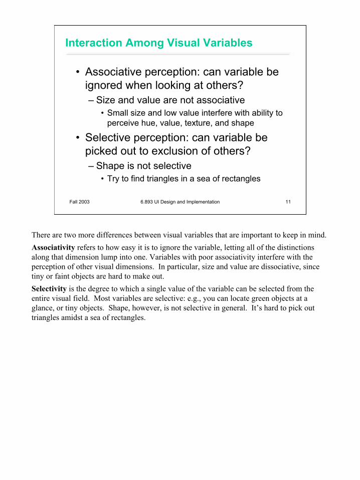
• Associative perception: can variable be ignored when looking at others?– Size and value are not associative
• Small size and low value interfere with ability to perceive hue, value, texture, and shape
• Selective perception: can variable be picked out to exclusion of others?– Shape is not selective
• Try to find triangles in a sea of rectangles
There are two more differences between visual variables that are important to keep in mind.Associativity refers to how easy it is to ignore the variable, letting all of the distinctions along that dimension lump into one. Variables with poor associativity interfere with the perception of other visual dimensions. In particular, size and value are dissociative, since tiny or faint objects are hard to make out.Selectivity is the degree to which a single value of the variable can be selected from the entire visual field. Most variables are selective: e.g., you can locate green objects at a glance, or tiny objects. Shape, however, is not selective in general. It’s hard to pick out triangles amidst a sea of rectangles.
12
Fall 2003 6.893 UI Design and Implementation 12
Techniques for Contrast
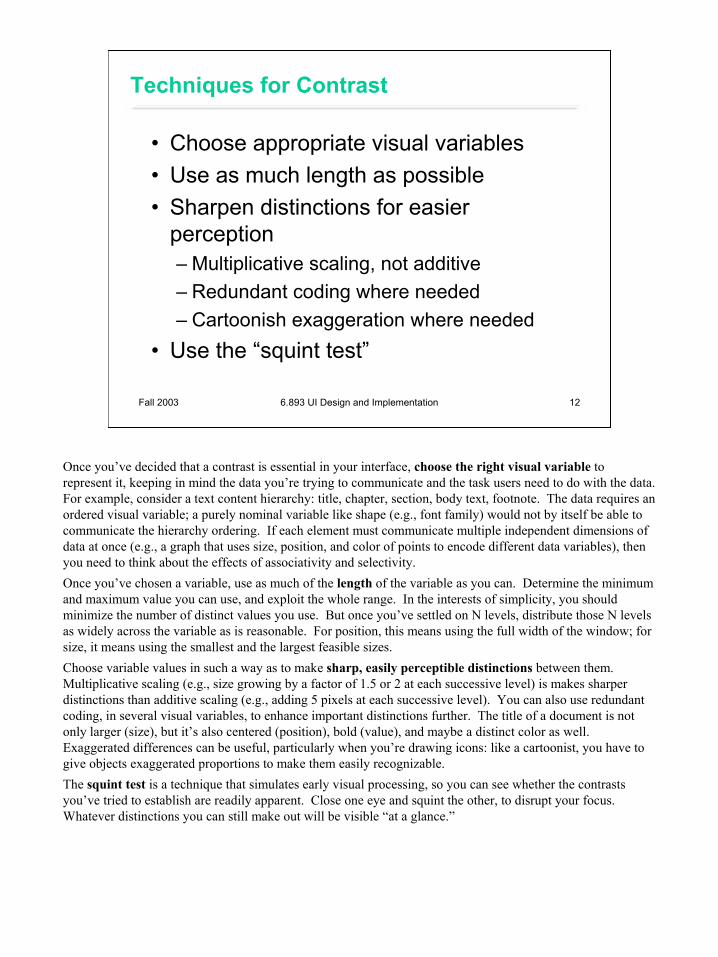
• Choose appropriate visual variables• Use as much length as possible• Sharpen distinctions for easier
perception– Multiplicative scaling, not additive – Redundant coding where needed– Cartoonish exaggeration where needed
• Use the “squint test”
Once you’ve decided that a contrast is essential in your interface, choose the right visual variable to represent it, keeping in mind the data you’re trying to communicate and the task users need to do with the data. For example, consider a text content hierarchy: title, chapter, section, body text, footnote. The data requires an ordered visual variable; a purely nominal variable like shape (e.g., font family) would not by itself be able to communicate the hierarchy ordering. If each element must communicate multiple independent dimensions of data at once (e.g., a graph that uses size, position, and color of points to encode different data variables), then you need to think about the effects of associativity and selectivity.Once you’ve chosen a variable, use as much of the length of the variable as you can. Determine the minimum and maximum value you can use, and exploit the whole range. In the interests of simplicity, you should minimize the number of distinct values you use. But once you’ve settled on N levels, distribute those N levels as widely across the variable as is reasonable. For position, this means using the full width of the window; for size, it means using the smallest and the largest feasible sizes. Choose variable values in such a way as to make sharp, easily perceptible distinctions between them. Multiplicative scaling (e.g., size growing by a factor of 1.5 or 2 at each successive level) is makes sharper distinctions than additive scaling (e.g., adding 5 pixels at each successive level). You can also use redundant coding, in several visual variables, to enhance important distinctions further. The title of a document is not only larger (size), but it’s also centered (position), bold (value), and maybe a distinct color as well. Exaggerated differences can be useful, particularly when you’re drawing icons: like a cartoonist, you have to give objects exaggerated proportions to make them easily recognizable.The squint test is a technique that simulates early visual processing, so you can see whether the contrasts you’ve tried to establish are readily apparent. Close one eye and squint the other, to disrupt your focus. Whatever distinctions you can still make out will be visible “at a glance.”
13
Fall 2003 6.893 UI Design and Implementation 13
White Space
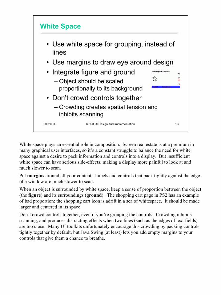
• Use white space for grouping, instead of lines
• Use margins to draw eye around design• Integrate figure and ground
– Object should be scaled proportionally to its background
• Don’t crowd controls together– Crowding creates spatial tension and
inhibits scanning
White space plays an essential role in composition. Screen real estate is at a premium in many graphical user interfaces, so it’s a constant struggle to balance the need for white space against a desire to pack information and controls into a display. But insufficient white space can have serious side-effects, making a display more painful to look at and much slower to scan.Put margins around all your content. Labels and controls that pack tightly against the edge of a window are much slower to scan. When an object is surrounded by white space, keep a sense of proportion between the object (the figure) and its surroundings (ground). The shopping cart page in PS2 has an example of bad proportion: the shopping cart icon is adrift in a sea of whitespace. It should be made larger and centered in its space.Don’t crowd controls together, even if you’re grouping the controls. Crowding inhibits scanning, and produces distracting effects when two lines (such as the edges of text fields) are too close. Many UI toolkits unfortunately encourage this crowding by packing controls tightly together by default, but Java Swing (at least) lets you add empty margins to your controls that give them a chance to breathe.
14
Fall 2003 6.893 UI Design and Implementation 14
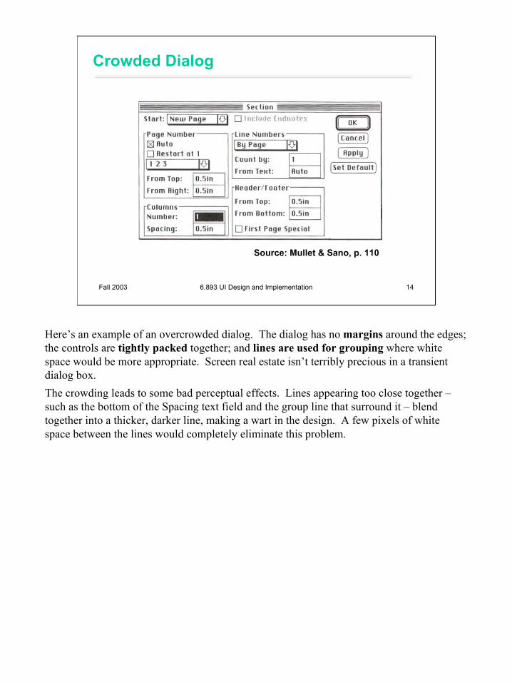
Crowded Dialog
Source: Mullet & Sano, p. 110
Here’s an example of an overcrowded dialog. The dialog has no margins around the edges; the controls are tightly packed together; and lines are used for grouping where white space would be more appropriate. Screen real estate isn’t terribly precious in a transient dialog box.The crowding leads to some bad perceptual effects. Lines appearing too close together –such as the bottom of the Spacing text field and the group line that surround it – blend together into a thicker, darker line, making a wart in the design. A few pixels of white space between the lines would completely eliminate this problem.
15
Fall 2003 6.893 UI Design and Implementation 15
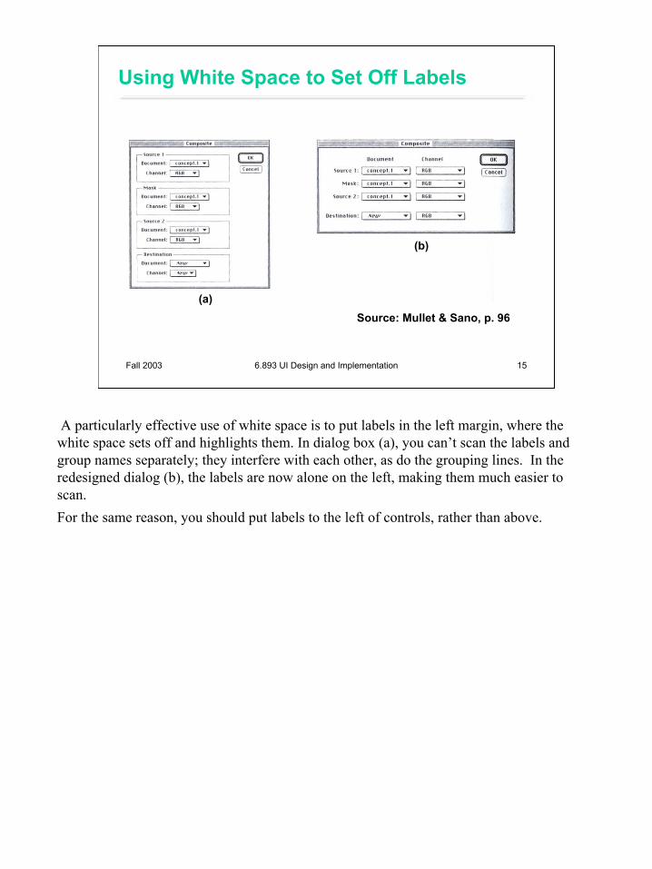
Using White Space to Set Off Labels
Source: Mullet & Sano, p. 96(a)
(b)
A particularly effective use of white space is to put labels in the left margin, where the white space sets off and highlights them. In dialog box (a), you can’t scan the labels and group names separately; they interfere with each other, as do the grouping lines. In the redesigned dialog (b), the labels are now alone on the left, making them much easier to scan.For the same reason, you should put labels to the left of controls, rather than above.
16
Fall 2003 6.893 UI Design and Implementation 16
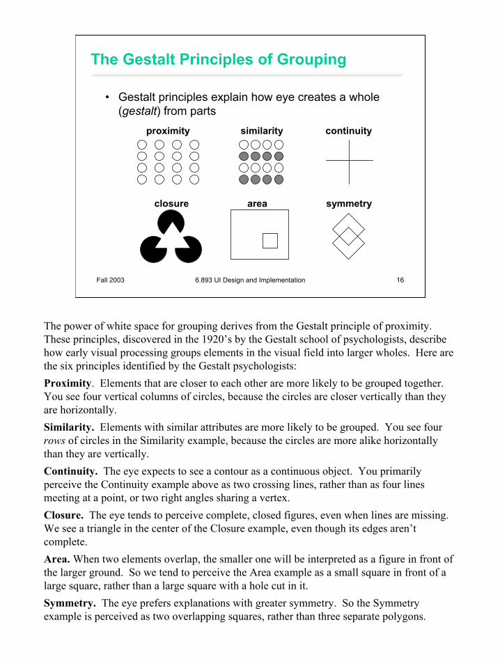
The Gestalt Principles of Grouping
• Gestalt principles explain how eye creates a whole (gestalt) from parts
proximity similarity continuity
closure area symmetry
The power of white space for grouping derives from the Gestalt principle of proximity. These principles, discovered in the 1920’s by the Gestalt school of psychologists, describe how early visual processing groups elements in the visual field into larger wholes. Here are the six principles identified by the Gestalt psychologists:Proximity. Elements that are closer to each other are more likely to be grouped together. You see four vertical columns of circles, because the circles are closer vertically than they are horizontally.Similarity. Elements with similar attributes are more likely to be grouped. You see four rows of circles in the Similarity example, because the circles are more alike horizontally than they are vertically.Continuity. The eye expects to see a contour as a continuous object. You primarily perceive the Continuity example above as two crossing lines, rather than as four lines meeting at a point, or two right angles sharing a vertex.Closure. The eye tends to perceive complete, closed figures, even when lines are missing. We see a triangle in the center of the Closure example, even though its edges aren’t complete.Area. When two elements overlap, the smaller one will be interpreted as a figure in front of the larger ground. So we tend to perceive the Area example as a small square in front of a large square, rather than a large square with a hole cut in it.Symmetry. The eye prefers explanations with greater symmetry. So the Symmetry example is perceived as two overlapping squares, rather than three separate polygons.
17
Fall 2003 6.893 UI Design and Implementation 17
Balance & Symmetry
• Choose an axis (usually vertical)• Distribute elements equally around the
axis– Equalize both mass and extent
Balance and symmetry are valuable tools in a designer’s toolkit. In graphic design, symmetry rarely means exact, mirror-image equivalence. Instead, what we mean by symmetry is more like balance: is there the same amount of stuff on each side of the axis of symmetry. We measure “stuff” by both mass (quantity of nonwhite pixels) and extent (area covered by those pixels); both mass and extent should be balanced.
18
Fall 2003 6.893 UI Design and Implementation 18
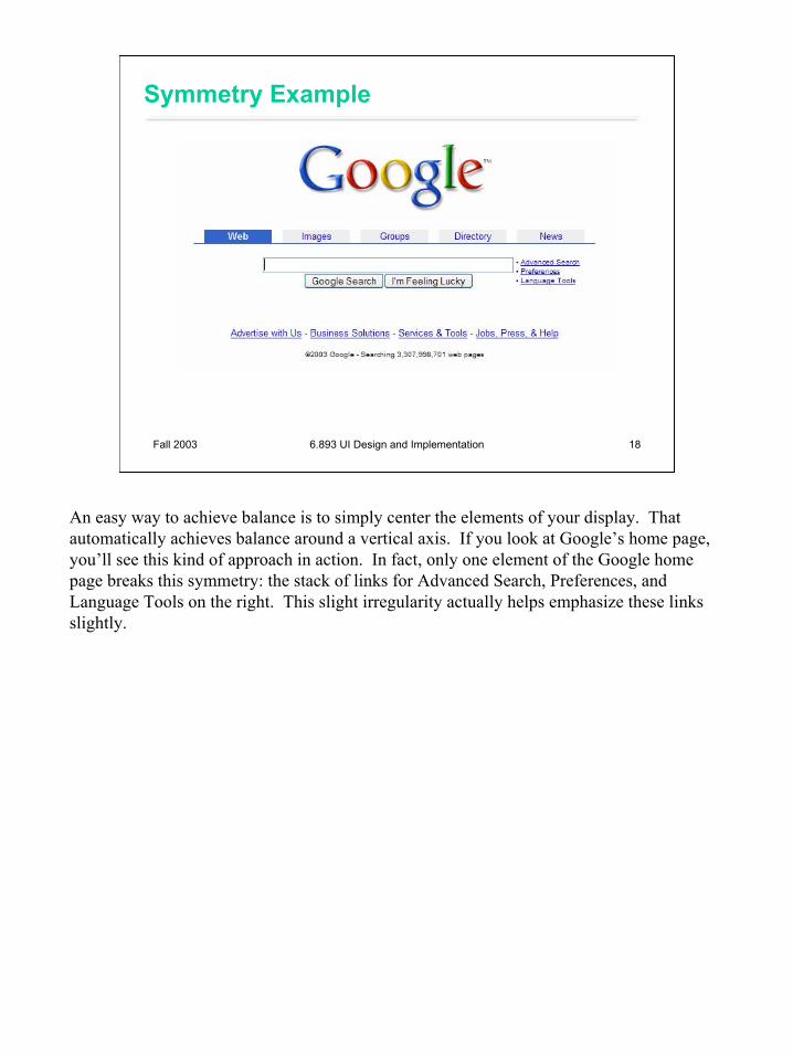
Symmetry Example
An easy way to achieve balance is to simply center the elements of your display. That automatically achieves balance around a vertical axis. If you look at Google’s home page, you’ll see this kind of approach in action. In fact, only one element of the Google home page breaks this symmetry: the stack of links for Advanced Search, Preferences, and Language Tools on the right. This slight irregularity actually helps emphasize these links slightly.
19
Fall 2003 6.893 UI Design and Implementation 19
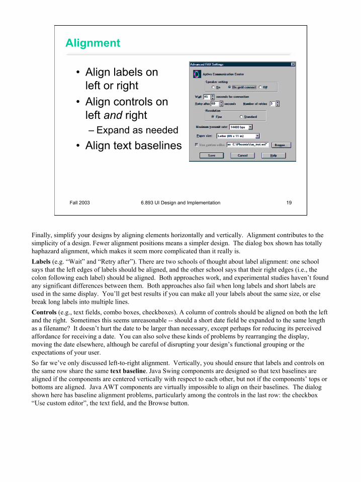
Alignment
• Align labels on left or right
• Align controls on left and right– Expand as needed
• Align text baselines
Finally, simplify your designs by aligning elements horizontally and vertically. Alignment contributes to the simplicity of a design. Fewer alignment positions means a simpler design. The dialog box shown has totally haphazard alignment, which makes it seem more complicated than it really is.Labels (e.g. “Wait” and “Retry after”). There are two schools of thought about label alignment: one school says that the left edges of labels should be aligned, and the other school says that their right edges (i.e., the colon following each label) should be aligned. Both approaches work, and experimental studies haven’t found any significant differences between them. Both approaches also fail when long labels and short labels are used in the same display. You’ll get best results if you can make all your labels about the same size, or else break long labels into multiple lines.Controls (e.g., text fields, combo boxes, checkboxes). A column of controls should be aligned on both the left and the right. Sometimes this seems unreasonable -- should a short date field be expanded to the same length as a filename? It doesn’t hurt the date to be larger than necessary, except perhaps for reducing its perceived affordance for receiving a date. You can also solve these kinds of problems by rearranging the display, moving the date elsewhere, although be careful of disrupting your design’s functional grouping or the expectations of your user.So far we’ve only discussed left-to-right alignment. Vertically, you should ensure that labels and controls on the same row share the same text baseline. Java Swing components are designed so that text baselines are aligned if the components are centered vertically with respect to each other, but not if the components’ tops or bottoms are aligned. Java AWT components are virtually impossible to align on their baselines. The dialog shown here has baseline alignment problems, particularly among the controls in the last row: the checkbox “Use custom editor”, the text field, and the Browse button.
20
Fall 2003 6.893 UI Design and Implementation 20
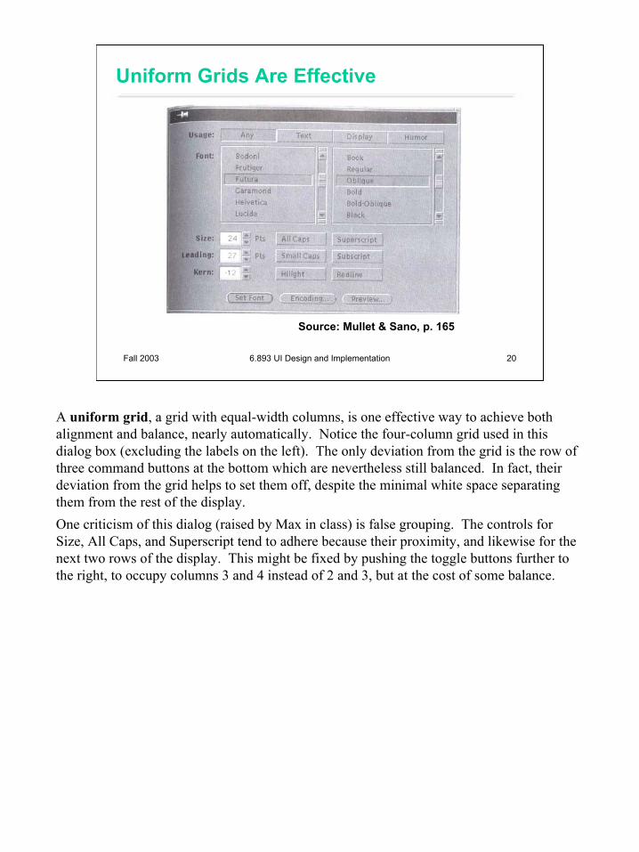
Uniform Grids Are Effective
Source: Mullet & Sano, p. 165
A uniform grid, a grid with equal-width columns, is one effective way to achieve both alignment and balance, nearly automatically. Notice the four-column grid used in this dialog box (excluding the labels on the left). The only deviation from the grid is the row of three command buttons at the bottom which are nevertheless still balanced. In fact, their deviation from the grid helps to set them off, despite the minimal white space separating them from the rest of the display.One criticism of this dialog (raised by Max in class) is false grouping. The controls for Size, All Caps, and Superscript tend to adhere because their proximity, and likewise for the next two rows of the display. This might be fixed by pushing the toggle buttons further to the right, to occupy columns 3 and 4 instead of 2 and 3, but at the cost of some balance.