Embed Size (px)
Citation preview
Lecture Notes for Part 1b / Part 2 Further HCI
Alan Blackwell and Luke Church
Overview of the course
The focus of this course is theory-driven approaches to Human Computer Interaction (HCI). It
continues and develops themes that have been introduced in Part 1a/1b Interaction Design, with a
more detailed consideration of specific theoretical areas that have been introduced in that course, and
also in the Preece, Rogers and Sharp textbook Interaction Design: Beyond human-computer
interaction. The academic community within Computer Science that studies HCI is associated with
the international CHI conference series (pronounced kai), together with many specialist groups and
regional bodies that are dedicated to different aspects of this important field. In this course we cannot
give equal coverage to the whole field of HCI, but include some deep dives into specific topics that
are of particular interest to Cambridge students, such as the usability of programming languages, and
interaction with machine learning systems.
Each lecture addresses a specific focus, some with specialist guest lectures. Most of these are
application-driven, but with the applications chosen to illustrate one of the main bodies of theory
within HCI. They have also been chosen to provide significant contrasts to each other, so that students
gain an understanding of the very wide scope of theoretical concerns relevant to HCI. We draw
connections between these different topics, but it is important to understand that the diversity is
intentional, and that this course emphasises the need to have different ways of understanding human
behaviour, in order to reflect human diversity.
There are some areas of HCI that are important, but not covered in this course because they have
specialist courses dedicated to them elsewhere in the Computer Science tripos. These include graphics
processing and virtual reality, computer music and audio, computer security, and social network
analysis. Those topics will not be taught or examined in Further HCI, although there are many
opportunities to explore them in detail as HCI researchers. It is also worth noting that some important
topics are not included in the Computer Science tripos at all, but are taught elsewhere in Cambridge.
These include business Information Systems (taught at the Judge Business School), computer game
design (taught at Anglia Ruskin University), educational technology (taught in the Faculty of
Education) and digital media studies (taught at graduate level by Cambridge Digital Humanities).
The eight topics covered in the rest of this course are:
• Application of theory in HCI
• Goal-oriented interaction
• Designing efficient systems
• Designing smart systems (guest lecturer)
• Designing meaningful systems (guest lecturer)
• Evaluating interactive system designs
• Designing complex systems
1
Lecture 1 - What is a theory in HCI? Why take a theory driven approach to HCI?
The goal of HCI is to make interaction with computers somehow ‘better’ - faster, more productive,
more creative, more social, more fun etc.
This lecture starts with a number of illustrative case studies, asking for each of them:
• How would you have gone about designing this user interface?
• Is this a good (or bad) user interface?
• How do we know that this user interface is good or bad?
• How could we improve this user interface if we had the chance?
You can continue this enquiry for yourself, by paying attention to the user interfaces that you see
around you every day. Can you tell what kind of people have designed this interface, and why they
did it this way? If you have opinions about whether a specific interface is good or bad, can you relate
your opinions to scientific evidence or established theories of human behaviour? A skilled computer
scientist should be able to use theory to achieve a critical perspective – ways of systematically
comparing cases to each other.
Using theory in the design process
We give the example of how a rather simple (and old) empirically-based theory of visual perception -
the “Gestalt theory of perceptual organisation” can be applied to predict and explain why some design
choices may be superior to others. We intentionally use a very sophisticated product - a visual
programming language for parametric computer-aided design called Dynamo1 - to show that
scientifically-grounded principles of human perception can make a contribution to the design of
software ranging from trivial apps and web pages to extremely complex systems.
Scientific principles of this kind are applied within a design process, which is usually iterative, with
phases of divergent (creative exploration) and convergent (selection and evaluation). HCI theories
can be usefully applied in both kinds of phase. During the divergent phase, theories can provide a
basis for invention, recognising new alternatives, or gaps in the range of options that have been
considered. When converging, theory gives us a basis for critique - to compare relative benefits of
possible designs, predict properties that are likely to work well, and those that might cause problems.
Revision suggestion: Take a situation where you have seen a design evolving - perhaps as a member
of a Group Design Project team. Consider the cycles of divergence and convergence that occurred
during the project, and review the ways that you thought about user interaction. What evidence did
you use? Where did ideas come from? What arguments were brought to bear when making choices?
Three waves of HCI
As computers have changed from being primarily commercial, scientific and industrial tools to a
routine part of the everyday structure of life, the theories and research methods of HCI have had to
change too, to ensure that they are able to contribute to the rather different design processes and
stakeholder requirements in these different domains. Of course, computers are still used in science
and industry too, so those earlier theories are still relevant, and continue to be actively developed.
Within HCI research, the changing emphasis of the field is summarised as three ‘waves’ that emerged
in different decades.
In the first wave (developed during the 1980s), the main theories were adopted from fields such as
Human Factors Engineering, Ergonomics and Cognitive Science. At this time, the “user interface”
was often a separate module, designed independently of the main system. The primary design goal is
efficiency (speed and accuracy) for a human operator to achieve well-defined tasks. Researchers
typically used methods from cognitive science to model users’ perception, decision and action
processes and predict usability. The example given in the lecture is a control panel with fixed
1 http://www.dynamobim.com/
2
switches, dials and lamps. Key principles for efficiency are grouping related information together, and
using the inherent structure of operator tasks to ensure that specific sequences of operations can be
facilitated (or avoided).
In the second wave (developed during the 1990s), the main theories were adopted from social science
fields such as Anthropology, Sociology and Work Psychology. This recognised that computers were
only one part of a social system, and that the design of complex systems is a socio-technical
experiment. The system design needs to take account of other sources and channels of information
including conversations, paper, and physical environment. Research methods focused on studying the
context where people work, and using ethnography and Contextual Inquiry to understand other
people’s ways of seeing the world. Diverse stakeholders are often integrated into the design process,
where prototyping and participatory design workshops aim to empower users and acknowledge other
value systems. The methods of social science can be used reflexively to observe, analyse and
understand the design process itself. The example given in the lecture is a large open office space,
with paper notes fixed to cubicle walls, noticeboards, document holders, and many other devices that
have been designed to facilitate and coordinate collaborative work.
In the third wave (developed during the 2000s), the main theories were adopted from fields that deal
with culture and creativity, including Art, Philosophy and Design. In this period, following the
development of the Web and smartphones, user interfaces and became integral part of culture, and
software application design increasingly concerned with “user experience”. Ubiquitous computing
technologies affect every part of our lives, mixing public and private. Outside the workplace,
efficiency is not a priority, and usage is discretionary. Theoretical perspectives include emotional and
subjective concerns of aesthetics and affect. Design experiments become more like works of art,
speculative and interpretive, with critical assessment of how this is meaningful within a particular
tradition. The example given in the lecture is the “blood bag radio” created by the Dunne and Raby
studio. This kind of speculative design is created to provoke and question, and design criteria relate
not to efficiency, but to how interesting or thoughtful the interaction will be.
Alternative perspectives
HCI is not a static field. New design practices and theoretical advances are being made constantly,
and these inform the invention and deployment of new kinds of interactive product and computer
system. Further “waves” of thinking will continue emerging, including at the “alt.chi” venue that was
created for controversial research rejected from the CHI conference. Future developments may
include positive computing that focuses on wellbeing, flow, empathy, mindfulness, altruism (Calvo
and Peters), work on inclusion and accessibility that addresses physical and sensory capabilities,
ageing, low income and human rights, or explicitly critical points of view such as Bardzell’s feminist
utopianism, where design critique directly attacks the mechanisms of institutional privilege, using
practices that are designed to amplify marginalized voices when thinking about the future.
Revision suggestion: Dip into the Interaction Design textbook, or even the online archives of the ACM
CHI conference series, asking which one of the three waves of HCI a given piece of research belongs
to. What are the objectives and methods of the research? What kind of theoretical terminology is
used? Does it refer to research literature from outside computer science - perhaps to psychology, to
anthropology, or philosophy - and which wave is indicated by that orientation?
3
Lecture 2 - Design of visual displays
This lecture is based on an encyclopaedia article2 that was prepared by the lecturer for an online
encyclopaedia on interaction design. It introduces mainstream theories and principles of visual
representation and visual design. Some of these will be familiar to you from school studies and
popular general knowledge, while others may be new. New kinds of visual representation are invented
very slowly. However, the development of computer technologies frequently require new ways of
thinking about information we put on screens (or other display surfaces, tangible, augmented or
virtual reality).
The fundamental principle of designing a visual display is that it is necessary to work out a
correspondence between the (invisible) information structure that is being represented, and the visible
marks that the user can see. An information structure consists of some number and variety of
individual elements, and relationships between them. Each element or relationship may correspond to
a visible mark or arrangement of marks on a display surface. Display design involves choosing the
correspondences, marks and arrangements of marks in ways such that the overall result makes sense
to the user.
Imagine that you were setting out to design a new kind of music notation. Unlike the familiar
common music notation, you might choose to make letters correspond to different instruments (for
example f=flute, d=drum), colours correspond to musical notes (you may have experienced
“Colourstrings” kindergarten teaching), font size correspond to loudness, and order of the notes
correspond to an animated dive through a 3D perspective scene in virtual reality (as in the Guitar Hero
game series). All of these are design decisions, and there are many possible alternatives. In order to do
a good job of design, you need to understand the possible ways that values in an invisible information
structure (here the musical notes and their relations) can have meaningful correspondence to a display
(here the fonts, colours and perspective). Many of the possible design choices are influenced primarily
by the historical conventions of how other visual displays have been created in the past, especially if
these have become familiar to everyday users. The bulk of this lecture is therefore focused on
understanding the historical precedents that inform or govern our design choices when inventing new
kinds of display.
Typography and text
For many years, computer displays resembled paper documents. This does not mean that they were
simplistic or unreasonably constrained. On the contrary, most aspects of modern industrial society
have been successfully achieved using the representational conventions of paper, so those conventions
seem to be powerful ones. Information on paper can be structured using tabulated columns, alignment,
indentation and emphasis, borders and shading. All of those were incorporated into computer text
displays. Interaction conventions, however, were restricted to operations of the typewriter rather than
the pencil. Each character typed would appear at a specific location. Locations could be constrained,
like filling boxes on a paper form. And shortcut command keys could be defined using onscreen
labels or paper overlays. It is not text itself, but keyboard interaction with text that is limited and
frustrating compared to what we can do with paper.
But despite the constraints on keyboard interaction, most information on computer screens is still
represented as text. Conventions of typography and graphic design help us to interpret that text as if it
were on a page, and human readers benefit from many centuries of refinement in text document
design. Text itself, including many writing systems as well as specialised notations such as algebra, is
a visual representation that has its own research and educational literature. Documents that contain a
mix of bordered or coloured regions containing pictures, text and diagrammatic elements can be
interpreted according to the conventions of magazine design, poster advertising, form design,
textbooks and encyclopedias. Designers of screen representations should take care to properly apply
2 https://www.interaction-design.org/literature/book/the-encyclopedia-of-human-computer-interaction-2nd-ed/visual-
representation
4
the specialist knowledge of those graphic and typographic professions. Position on the page, use of
typographic grids, and genre-specific illustrative conventions should all be taken into account.
Summary: most screen-based information is interpreted according to textual and typographic
conventions, in which graphical elements are arranged within a grid system, occasionally divided or
contained with ruled and coloured borders.
Maps and graphs
The computer has, however, also acquired a specialised visual vocabulary and conventions. Before
the text-based ‘glass teletype’ became ubiquitous, cathode ray tube displays were already used to
display oscilloscope waves and radar echoes. Both could be easily interpreted because of their
correspondence to existing paper conventions. An oscilloscope uses a horizontal time axis to trace
variation of a quantity over time, as pioneered by William Playfair in his 1786 charts of the British
economy. A radar screen shows direction and distance of objects from a central reference point, just
as the Hereford Mappa Mundi of 1300 organised places according to their approximate direction and
distance from Jerusalem. Many visual displays on computers continue to use these ancient but
powerful inventions – the map and the graph. In particular, the first truly large software project, the
SAGE air defense system, set out to present data in the form of an augmented radar screen – an
abstract map, on which symbols and text could be overlaid. The first graphics computer, the Lincoln
Laboratory Whirlwind, was created to show maps, not text.
Summary: basic diagrammatic conventions rely on quantitative correspondence between a direction
on the surface and a continuous quantity such as time or distance. These should follow established
conventions of maps and graphs.
Schematic drawings
Ivan Sutherland’s groundbreaking PhD research with Whirlwind’s successor TX-2 introduced several
more sophisticated alternatives. The use of a light pen allowed users to draw arbitrary lines, rather
than relying on control keys to select predefined options. An obvious application, in the engineering
context of MIT, was to make engineering drawings such as a girder bridge. Lines on the screen are
scaled versions of the actual girders, and text information can be overlaid to give details of force
calculations. Plans of this kind, as a visual representation, are closely related to maps. However,
where the plane of a map corresponds to a continuous surface, engineering drawings need not be
continuous. Each set of connected components must share the same scale, but white space indicates
an interpretive break, so that independent representations can potentially share the same divided
surface – a convention introduced in Diderot’s encyclopedia of 1772, which showed pictures of
multiple objects on a page, but cut them loose from any shared pictorial context.
Summary: engineering drawing conventions allow schematic views of connected components to be
shown in relative scale, and with text annotations labelling the parts. White space in the
representation plane can be used to help the reader distinguish elements from each other rather than
directly representing physical space.
Pictures
Sutherland also suggested the potential value that computer screens might offer as artistic tools. His
Sketchpad system was used to create a simple animated cartoon of a winking girl. This is the first
computer visual representation that might suffer from the ‘resemblance fallacy’, i.e. that drawings are
able to depict real object or scenes because the visual perception of the flat image simulates the visual
perception of the real scene. Sutherland’s cartoon could only be called an approximate simulation, but
many flat images (photographs, photorealistic ray-traced renderings, ‘old master’ oil paintings) have
been described as though perceiving the representation is equivalent to perceiving a real object.
In reality, new perspective rendering conventions are invented and esteemed for their accuracy by
critical consensus, and only more slowly adopted by untrained readers. The consensus on preferred
perspective shifts across cultures and historical periods, as is obvious from comparison of prehistoric,
5
classical, medieval and renaissance artworks. It would be naïve to assume that the conventions of
today are the final and perfect product of technical evolution. As with text, we become so accustomed
to interpreting these representations that we are blind to the artifice. When even psychological object-
recognition experiments employ line drawings as though they were objects, it can be hard to insist on
the true nature of the representation. But professional artists are fully aware of the conventions they
use – the way that a photograph is framed changes its meaning, and a skilled pencil drawing is
completely unlike visual edge-detection thresholds. A good pictorial representation need not simulate
visual experience any more than a good painting of a unicorn need resemble an actual unicorn.
Summary: pictorial representations, including line drawings, paintings, perspective renderings and
photographs rely on shared interpretive conventions for their meaning. It is naïve to treat screen
representations as though they were simulations of experience in the physical world.
Node-and-link diagrams
The first impulse of a computer scientist, when given a pencil, seems to be to draw boxes and connect
them with lines. These node and link diagrams can be analysed in terms of the connectivity in graph
structures that are fundamental to the study of algorithms (but unrelated to the visual representations
known as graphs or charts - a common cause of confusion in discussion with users). A predecessor of
these connectivity diagrams can be found in electrical circuit schematics, where the exact location of
components, and the lengths of the wires, can be arranged anywhere, because they are irrelevant to the
circuit function. Another early program created for the TX-2, this time by Ivan Sutherland’s brother
Bert, allowed users to create circuit diagrams of this kind. The distinctive feature of a node-and-link
connectivity diagram is that, since the position of each node is irrelevant to the operation of the
circuit, it can be used to carry other information, through ‘secondary notation’ – use of the plane to
assist the reader in ways not related to the technical content (see Cognitive Dimensions in Lecture 8
for a further description of secondary notation)
Circuit connectivity diagrams have been most widely popularised through the London Underground
diagram, an invention of electrical engineer Henry Beck. The diagram has been clarified by exploiting
the fact that most underground travellers are only interested in order and connectivity, not location, of
the stations on the line. However, popular resistance to reading ‘diagrams’ means that this one is more
often described as the London Underground ‘map’, despite Beck’s complaints.
Summary: node and link diagrams are still widely perceived as being too technical for broad
acceptance. Nevertheless, they can present information about ordering and relationships clearly,
especially if consideration is given to the value of allowing human users to specify positions.
Icons and symbols
Maps frequently use symbols to indicate specific kinds of landmark. Sometimes these are
recognisably pictorial (e.g. the standard symbols for tree and church), but others are fairly arbitrary
conventions (e.g. the symbol for a railway station). As the resolution of computer displays increased
in the 1970s, a greater variety of symbols could be differentiated, by making them more detailed, as in
the MIT SDMS system that mapped a naval battle scenario with symbols for different kinds of ship.
However, the dividing line between pictures and symbols is ambiguous. Children’s drawings of
houses often use conventional symbols (door, four windows, triangle roof and chimney) whether or
not their own house has two storeys, or a fireplace. Letters of the Latin alphabet are shapes with
completely arbitrary relationship to their phonetic meaning, but the Korean phonetic alphabet is easier
to learn because the forms mimic the shape of the mouth when pronouncing those sounds. The field of
semiotics offers sophisticated ways of analysing the basis on which marks correspond to meanings. In
most cases, the best approach for an interaction designer is simply to adopt familiar conventions.
When these do not exist, the design task is more challenging.
It is unclear which of the designers working on the Xerox Star coined the term ‘icon’ for the small
pictures symbolising different kinds of system object. David Canfield Smith winningly described
them as being like religious icons, which he said were pictures standing for (abstract) spiritual
concepts. But ‘icon’ is also used as a technical term in semiotics. Unfortunately, few of the Xerox
6
team had a sophisticated understanding of semiotics. It was fine art PhD Susan Kare’s design work on
the Apple Macintosh that established a visual vocabulary which has informed the genre ever since.
Many software publishers simply opt for a memorable brand logo, while others seriously misjudge
the kinds of correspondence that are appropriate.
It has been suggested that icons, being pictorial, are easier to understand than text, and that pre-literate
children, or speakers of different languages, might thereby be able to use computers without being
able to read. In practice, most icons simply add decoration to text labels, and those that are intended
to be self-explanatory must be supported with textual tooltips.
Summary: the design of simple and memorable visual symbols is a sophisticated graphic design skill.
Following established conventions is the easiest option, but new symbols must be designed with an
awareness of what sort of correspondence is intended - pictorial, symbolic, metonymic (e.g. a key to
represent locking), bizarrely mnemonic, but probably not monolingual puns.
Visual metaphor
The ambitious graphic designs of the Xerox Star/Alto and Apple Lisa/Macintosh were the first mass-
market visual interfaces. They were marketed to office professionals, making the ‘cover story’ that
they resembled an office desktop a convenient explanatory device. Of course, as was frequently noted
at the time, these interfaces behaved nothing like a real desktop. The mnemonic symbol for file
deletion (a wastebasket) was ridiculous if interpreted as an object placed on a desk. And nobody could
explain why the desk had windows in it (the name was derived from the ‘clipping window’ of the
graphics architecture used to implement them – it was at some later point that they began to be
explained as resembling sheets of paper on a desk). There were immediate complaints from
luminaries such as Alan Kay and Ted Nelson that strict correspondence by analogy to physical
objects would become obstructive rather than instructive. Nevertheless, for many years the marketing
story behind the desktop metaphor was taken seriously, despite the fact that all attempts to improve
the Macintosh design with more elaborate visual analogies, as in General Magic and Microsoft Bob,
subsequently failed.
The ‘desktop’ can be far more profitably analysed (and extended) by understanding the
representational conventions that it uses. The size and position of icons and windows on the desktop
has no meaning, they are not connected, and there is no visual perspective, so it is neither a map,
graph nor picture. The real value is the extent to which it allows secondary notation, with the user
creating her own meaning by arranging items as she wishes. Window borders separate areas of the
screen into different pictorial, text or symbolic contexts as in the typographic page design of a
textbook or magazine. Icons use a large variety of conventions to indicate symbolic correspondence to
software operations and/or company brands, but they are only occasionally or incidentally organised
into more complex semiotic structures.
Summary: theories of visual representation, rather than theories of visual metaphor, are the best
approach to explaining the conventional Macintosh/Windows ‘desktop’. There is huge room
for improvement.
Unified theories of visual representation
The analysis in this lecture has addressed the most important principles of visual representation for
screen design, introduced with examples from the early history of graphical user interfaces. In most
cases, these principles have been developed and elaborated within whole fields of study and
professional skill – typography, cartography, engineering and architectural drafting, art criticism and
semiotics. Improving on the current conventions requires serious skill and understanding.
Nevertheless, interaction designers should be able, when necessary, to invent new
visual representations.
One approach is to take a holistic perspective on visual language, information design, notations, or
diagrams. Specialist research communities in these fields address many relevant factors from low-
level visual perception to critique of visual culture. Across all of them, it can be necessary to ignore
(or not be distracted by) technical and marketing claims, and to remember that all visual
7
representations simply comprise marks on a surface that are intended to correspond to things
understood by the reader. The two dimensions of the surface can be made to correspond to physical
space (in a map), to dimensions of an object, to a pictorial perspective, or to continuous abstract scales
(time or quantity). The surface can also be partitioned into regions that should be interpreted
differently. Within any region, elements can be aligned, grouped, connected or contained in order to
express their relationships. In each case, the correspondence between that arrangement, and the
intended interpretation, must be understood by convention or explained. Finally, any individual
element might be assigned meaning according to many different semiotic principles of
correspondence. All of these are summarised in the table included in lecture materials.
For further reading, short video lectures, and an interactive version of the overview table, the online
encyclopaedia article is a useful source. It includes many of the images seen in the lecture, with
explanations of how they relate to the theoretical content. It also includes an interactive
implementation of the illustrative example.
https://www.interaction-design.org/literature/book/the-encyclopedia-of-human-computer-interaction-
2nd-ed/visual-representation
Revision suggestion: review the encyclopaedia article, and follow suggested readings that interest
you. Choose some examples of unusual or everyday visual representations, and practice breaking
them down according to the design principles that have been applied. Consider what alternatives
could have been used - the example at the end of the lecture showed how a highly standardised and
familiar formal visual representation (music notation) still has potential for design improvements that
support specific kinds of activity (here, musical sight-reading).
8
Lecture 3 - Goal-oriented interaction
This lecture addresses the ways that we can use cognitive theories of planning, learning and
understanding to understand user behaviour, and what they find hard. This approach is founded on a
meta-theory of first-wave HCI, that “user interaction can be modelled as search”. General purpose
search algorithms are familiar in computer science, where an objective function can be combined with
a state space and dependency graph to recursively search for optimal solutions using a wide variety of
breadth-first or depth-first strategies for reducing the distance to some goal or target.
If we can provide a clear definition of the user’s goal, then we can model their interaction with a user
interface as a search process - searching for actions that will get them closer to that goal. The
Cognitive Walkthrough evaluation method (introduced in Interaction Design) proceeds in this way:
analyse the user interface by identifying the next user goal, determining whether the necessary actions
are available, ensuring that they are labelled in a way that the user will recognise them, and
confirming that the system will give appropriate feedback of progression toward the goal.
Models of human decision making
Unfortunately, there are many situations in which users may not be able to achieve an optimal goal,
and where it may not be possible for designers to correctly anticipate what the user’s goal is. The
above process works well for simple user interfaces, in which there is an exact specification of what
the user ought to do, and where their understanding of their goals is consistent with the
designer’s view.
In more complex situations, even where an optimal solution exists, the amount of search time
necessary to find it may be too large to be justified. Models of goal-directed planning that take the
expense of computation into account are described as bounded rationality. Rather than optimising
strategies, users often engage in satisficing strategies, where they follow a plan that is satisfactory,
rather than optimal, within constraints.
Models of economic decision making are based on observations of human decision making in
satisficing and bounded rationality situations, with a focus on the assessment of costs and benefits
rather than goal-directed search. Kahneman and Tversky’s prospect theory describes human
behaviour in terms of a utility model that considers the outcome of possible actions, with weighting of
estimated benefits by likelihood. Where optimising search assumes complete knowledge of the state
space, prospect theory assumes only that people choose actions based on estimated utility.
The basis of decisions in behavioural economics is modified by external considerations such as future
value discounting, and internal considerations such as bounded rationality. The result can be described
as a collection of heuristics and biases that account for observed patterns in human decision making
that do not seem to be explained by optimising search.
Examples of these patterns include the availability heuristic, in which reasoning is based on examples
easily to hand; the affect heuristic, basing decisions on emotion rather than calculating cost and
benefit, and the representativeness heuristic, in which probability is judged based on resemblance to
a class of similar situations. Humans also apply biases to ensure that the consequences of estimation
error are within tolerable bounds. These include loss aversion, that losses hurt more than gains feel
good; expectation bias, in which people observe results they expected; and the bandwagon effect,
that prefers actions taken by other people. Research in behavioural economics has identified many
more patterns of this kind, and popular lists can easily be found. Kahneman’s book Thinking Fast and
Slow provides an accessible introduction to the psychological research, with Thaler and Sunstein’s
Nudge gives an economic perspective on the principles widely applied in UK government under the
name “nudge theory”.
Revision suggestion: find one or two press reports of nudge theory, and write equations for the
estimated utility functions, including likelihood-weighted outcomes, and consider how a search-based
decision strategy could be applied in this situation.
9
Behavioural economics in HCI
The Attention Investment theory of abstraction use is a model of end-user programming, which
explains why users without prior experience of programming may take decisions that favour repeated
manual actions rather than automated shortcuts.
This occurs where automation involves forming an abstract specification, such as defining a regular
expression for search and replace. The benefit of automation is saving time and concentration in
future, but abstract specification (programming) takes time and concentration. There is also the risk of
“bugs” that might result in the automated solution going wrong, and perhaps resulting more manual
effort to fix up the consequences. So the utility function compares future saving of attention from
programming vs costs of concentrating on a risky strategy. Biases such as loss aversion are likely to
apply, and bounded rationality will apply, since deciding what to do takes even more concentration.
In the extreme case of minimal concentration, it is worth remembering that much routine computer
usage is carried out simply on the basis of memorised patterns of interaction (for example, repeatedly
pushing the clear button on a calculator, the ‘walk’ button at a traffic light etc), with no clear mental
model or goal underlying these.
The limitations of goal-based HCI
Rational models of planning assume that the user doesn’t make mistakes, which is unrealistic even for
experienced users. If we wanted to account and anticipate all user actions, including errors, we would
need a cognitive model of why the error occurred - that is, a decision process that is not consistent
with the identified goals, constraints, and search space. This might include information loss due to
cognitive limitations, incorrect mental models, or misleading designs. Anticipating all of these factors
would need description of a user journey that accounts for problem identification, diagnosis,
debugging, testing, iteration, and many other procedures that characterise the user’s own activity as a
kind of design process.
Most forms of decision theory assume that the user does have the right goal, but persuasive design is
a field of HCI that considers how users might choose alternative goals, or modify their goals. These
methods are useful in applications such as software systems to reduce energy consumption, promote
exercise, manage diet and nutrition, stop smoking and so on. Persuasive design often applies “nudge”
methods to modify the biases that underlie inappropriate goals. However, strategies of this kind are
often recognised by users, who may respond negatively to a design that is paternalistic or patronising.
Wicked problems
Rittel and Webber described the class of problems that cannot be addressed with classical goal-based
problem solving methods. Many day-to-day political and social problems have these characteristics,
and almost all large ones (such as slowing climate change). The characteristics of a wicked
problem are:
1. There is no definitive formulation of a wicked problem
2. Wicked problems have no stopping rule
3. Solutions to wicked problems are not true-or-false, but good-or-bad
4. There is no immediate and no ultimate test of a solution to a wicked problem
5. Every solution to a wicked problem is a “one-shot operation”; because there is no opportunity to
learn by trial-and-error, every attempt counts significantly
6. Wicked problems do not have an enumerable (or an exhaustively describable) set of potential
solutions, nor is there a well-described set of permissible operations that may be incorporated
into the plan
7. Every wicked problem is essentially unique
8. Every wicked problem can be considered to be a symptom of another problem
9. The existence of a discrepancy representing a wicked problem can be explained in numerous
ways. The choice of explanation determines the nature of the problem’s resolution
10. The planner has no right to be wrong
10
Lecture 4 - Designing efficient systems
This lecture is concerned with measuring and optimising human performance through quantitative
experimental methods. Probabilistic models can be used to model human action, and also (in part) to
predict human action. Such models can be updated in real time, as demonstrated in predictive text
entry systems, but they also allow efficiency of a user interface to be predicted, and also measured at
design time.
Information constraints on speed and accuracy
A fundamental trade-off in human performance can be described in information-theoretic terms. In
many situations, users can choose to work slowly and carefully, or quickly at the expense of making
more mistakes. This is the speed versus accuracy trade-off, and can be characterised as an
information channel - fast and inaccurate actions result in more channel noise, meaning that the
information gain per unit of time does not increase as quickly as the number of movements made.
Even single user actions can be described in terms of information channel constraints, as characterised
by Fitts’ Law. The demonstration in the lecture showed that the time taken to point at something is
proportional to the Distance to target, while inversely proportional to Width of target. The ratio of
width to distance is the index of difficulty, and can be understood as the potential amount of
information gained by the system when the user points (selecting a small target from a wide range
reflects greater information gain).
Time = k log (2D/W)
It is possible to use Fitts’ Law to design more efficient user interfaces, if we have an accurate prior
expectation for the actions that a user is likely to take. “Semantic pointing” modifies the mapping of
mouse motion to screen pixels, so that the effective width of more likely targets is increased, and the
effective distance between them decreased.
Keystroke Level Model (KLM)
The speed with which an expert user can complete a task in a user interface can be modeled as a series
of unit operations - mouse movements and key strokes - with the KLM. (Note that the user must be
expert, because the model does not include learning time, errors, or reasoning about an unfamiliar
task). The time taken to point at a target is estimated using Fitts’ Law. Other components of the model
include time taken to press a key or mouse button (about 200 ms), time taken to ‘home’ the hands on
mouse or keyboard (about 400 ms), mental preparation time between sequences of more automated
actions (about 1500 ms) and the time that the system takes to respond. Successors to the KLM
approach have attempted to more accurately predict mental preparation time by using detailed
cognitive models, for example in the GOMS (Goal/Operator/Method/Selection) technique
Hypothesis-testing user studies
When companies are able to collect large volumes of behavioural data, for example in click-throughs
from an online listing, it is possible to make randomised controlled trials by giving different users
different versions of the interface, and observing which version is more likely to result in desired
behaviour. This procedure is called an A/B test.
Controlled experiments to evaluate efficiency in a user interface often measure the completion times
for a task, comparing the distribution of times for two or more versions of the user interface. A
statistical significance test is then carried out, to see whether the difference between the sample
means might be due to chance. The null hypothesis is that there is no difference in performance
between the versions, and that the samples differ only as a result of random variation. A simple
significance test such as the t-test compares the effect size (the difference between sample means) to
the variance in the experimental data. Experiments in HCI generally aim to minimise variance, and
maximise effect size, to demonstrate that an improved user interface has resulted in
better performance.
11
The most straightforward tests for comparing sample distributions rely on the data following a normal
or Gaussian distribution. If user performance does not vary so consistently, then a non-parametric
statistical test such as the sign test can be used, to compare sets of matched samples. A typical way to
collected matched sample data is by carrying out a within-subject comparison, asking each
experimental participant to complete an experimental task with both the original and the improved
version of a user interface. For each participant, we note whether the sign is positive (improved
version faster) or negative (original version faster), and then compare the proportion of each sign.
Successful user studies rely on controlled experiments to minimise variation in the data from factors
unrelated to the effect of the design change. The include individual differences between subjects (e.g.
IQ), errors or misunderstanding of the task, distractions during the trial (e.g. sneezing), motivation of
the participant (e.g. time of day), accidental intervention by experimenter (e.g. hints), and other
random factors. Difference in means should always be reported with confidence intervals or error
bars. However, a significant result is not always interesting - very small effects can be shown to be
reliable, if the variance is small or the sample size very large. HCI research for design applications
usually focuses on large effect sizes, rather than statistical significance.
Drawbacks in experimental user studies
Statistical comparison of human performance has not always been viewed favourably in commercial
applications. The Hawthorne Effect was a famous finding from studies in the 1920s, measuring the
effect of factory lighting levels on productivity. These seemed to show that productivity improved if
the lighting was increased, but also that productivity improved if the lighting decreased! It turned out
that worker motivation, and therefore productivity, improved any time that an experiment was carried
out, just because the workers liked the fact that someone was taking an interest in them. The same
thing often happens with user interface modifications - an interesting design change may result in
apparent efficiency improvements in the experimental context, but not have any long-term benefits.
This is especially likely to occur when the experimenter has a personal investment in the new design
(perhaps because they designed it), and reveals this during the experiment.
Optimisation of human efficiency in an industrial context is called ‘Taylorism’, after F.W. Taylor
(1856-1915), an engineer who invented scientific management techniques to measure worker
efficiency within a factory in ways that could be compared to machines, so that it was possible to
optimise the overall system by measurement (and correction) of the human workers. Trade unions
have worked to develop complementary perspectives in which the human rights of the workers are
considered alongside questions of pure efficiency, and second wave HCI (the turn from human factors
to social science) involved working closely with trade unions, especially in Sweden and Denmark.
A further area of user interface design in which efficiency is not a sufficient measure of system design
is the creation of discretionary use systems, where the person using the system is not an employee,
but has their own goals, and thus can decide for themselves whether or not to be efficient (or whether
they want to use the system at all). Where products are designed for creative expression or personal
enjoyment, it is also unclear how (or whether) those goals can be quantified in a meaningful way.
Third wave HCI therefore draws on philosophy of art or experience of meaning (for example in the
philosophical tradition of phenomenology) to evaluate and inform design, rather than
experimental measures.
12
Lecture 5 - Designing smart systems (incl. content from Per Ola Kristensson)
This lecture focuses on how statistics can be used to create a probabilistic model of the user’s
intentions, to make interaction more efficient. Examples of this include predictive text entry on
mobile phones, recommender systems that predict shopping or browsing behaviour, or smart
developer tools which order the suggestions in a user interface for intelligent code completion.
A simple way of thinking about how efficient an input system will be is to consider the amount of
information that could transferred by each user action, and comparing this to the amount of entropy
for each new token in a language model. A simplistic model of a classic keyboard would be to
consider each key as being equally probable (a uniform prior, in Bayesian terms), so that for someone
typing just lowercase letters and the space bar, each key press has a probability of 1/27.
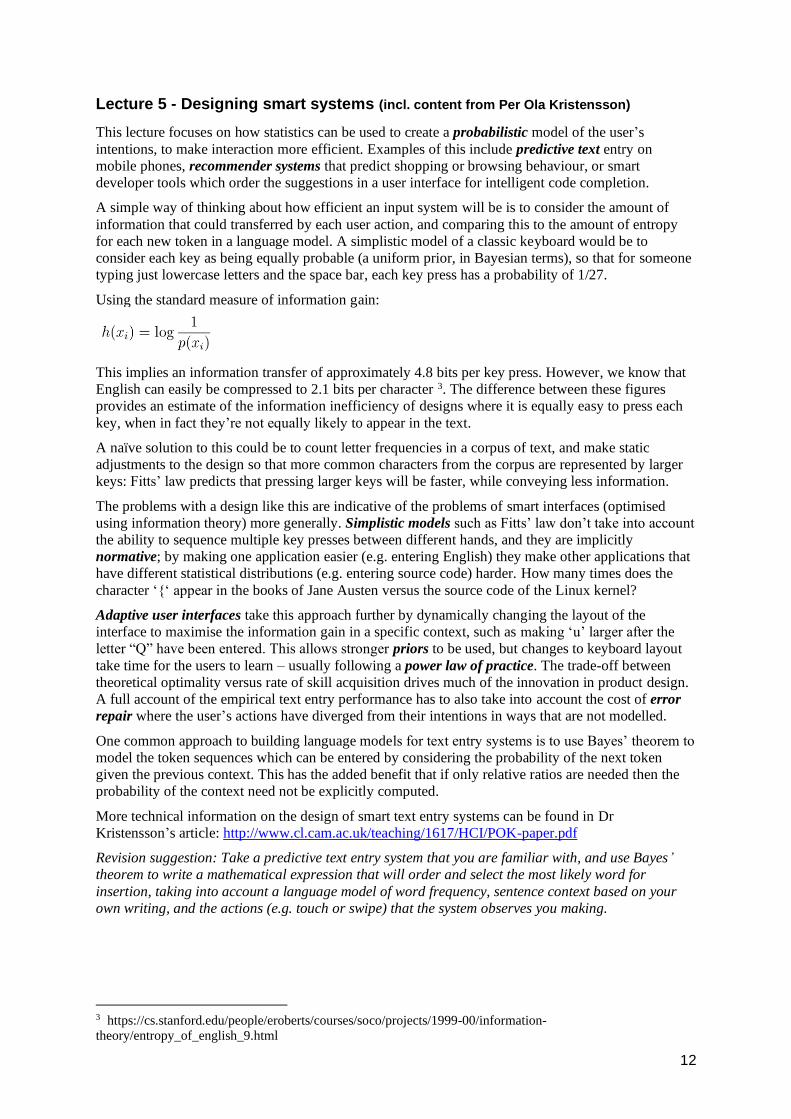
Using the standard measure of information gain:
This implies an information transfer of approximately 4.8 bits per key press. However, we know that
English can easily be compressed to 2.1 bits per character 3. The difference between these figures
provides an estimate of the information inefficiency of designs where it is equally easy to press each
key, when in fact they’re not equally likely to appear in the text.
A naïve solution to this could be to count letter frequencies in a corpus of text, and make static
adjustments to the design so that more common characters from the corpus are represented by larger
keys: Fitts’ law predicts that pressing larger keys will be faster, while conveying less information.
The problems with a design like this are indicative of the problems of smart interfaces (optimised
using information theory) more generally. Simplistic models such as Fitts’ law don’t take into account
the ability to sequence multiple key presses between different hands, and they are implicitly
normative; by making one application easier (e.g. entering English) they make other applications that
have different statistical distributions (e.g. entering source code) harder. How many times does the
character ‘{‘ appear in the books of Jane Austen versus the source code of the Linux kernel?
Adaptive user interfaces take this approach further by dynamically changing the layout of the
interface to maximise the information gain in a specific context, such as making ‘u’ larger after the
letter “Q” have been entered. This allows stronger priors to be used, but changes to keyboard layout
take time for the users to learn – usually following a power law of practice. The trade-off between
theoretical optimality versus rate of skill acquisition drives much of the innovation in product design.
A full account of the empirical text entry performance has to also take into account the cost of error
repair where the user’s actions have diverged from their intentions in ways that are not modelled.
One common approach to building language models for text entry systems is to use Bayes’ theorem to
model the token sequences which can be entered by considering the probability of the next token
given the previous context. This has the added benefit that if only relative ratios are needed then the
probability of the context need not be explicitly computed.
More technical information on the design of smart text entry systems can be found in Dr
Kristensson’s article: http://www.cl.cam.ac.uk/teaching/1617/HCI/POK-paper.pdf
Revision suggestion: Take a predictive text entry system that you are familiar with, and use Bayes’
theorem to write a mathematical expression that will order and select the most likely word for
insertion, taking into account a language model of word frequency, sentence context based on your
own writing, and the actions (e.g. touch or swipe) that the system observes you making.
3 https://cs.stanford.edu/people/eroberts/courses/soco/projects/1999-00/information-
theory/entropy_of_english_9.html
13
Lecture 6 - Designing meaningful systems (incl. content from Simon Pulman Jones)
(Revision summary by Mariana Marasoiu)
Design ethnography offers holistic, in-context understanding of how life works so it can be
supported, enhanced and changed.
An ethnographic study attempts to observe people in their normal environment, over a substantial
period of time. During the observation the experiences of people are documented in a variety of ways
(e.g. photography, video, audio, notes), paying attention to both peoples’ activities and the artefacts
that they interact with. The outputs of an ethnographic study are diverse including: task flow
diagrams, journey maps, concept generation maps, timeline of people’s activities, written reports, and
‘thick’ (detailed, experiential, even literary) descriptions.
In industry, ethnography can be integrated in the product design and creation lifecycle to drive
innovation and inform design decisions. This can be seen as part of traditional requirements capture,
but ethnography rarely provides a simple list of requirements to be implemented. Instead, it is more
likely that ethnography is used by engineering and design teams to develop an in depth understanding
of the (potential) users of a product or service and to inspire the design activity and the creation of
prototypes. The design and engineering leadership teams will sometimes participate in the
ethnographic activities alongside the anthropologists.
There are multiple ways in which ethnography can be integrated within typical process of design and
implementation. For example, ethnographic studies can be used iteratively and in parallel with design
workshops, first to understand the experiences that people were currently having and how those
experiences could be supported or changed by a new product, then to understand how people relate to
novel scenarios produced by the design team, and then to evaluate early product designs in a
real-world context.
Alongside ethnographic research, quantitative research can also be conducted (e.g. online surveys).
This approach of mixing qualitative and quantitative work, often known as mixed methods, can result
in a better understanding than would be achievable with a single method alone - for example, ensuring
that the people studied ethnographically are representative to the market, but also that ethnography
can be used to investigate in depth interesting questions raised by the quantitative research.
In summary, ethnography helps designers, engineering and product teams understand:
A) what things happen
• what the everyday life of the users looks like
• what kinds of experiences with the technology they have
• what are people’s strategies for working with products, services and devices to get stuff done
B) how things matter
• how products help people be social, and how they integrate in the social life of people
• how products help people make meaning and sense of their life
• how products help people be in control of their life
This understanding is then included in the product development process to build technology that
better fits people’s needs.
14
Lecture 7- Evaluating interactive systems
This lecture compares and contrasts the range of approaches to evaluation in systems research
and engineering.
A fundamental distinction is between Formative vs Summative evaluation. Formative evaluation is
used in the early stages of a project to compare, assess and refine design ideas. Formative evaluation
often involves open research questions, in which the researcher is interested in learning further
information that may inform the design. Summative evaluation is more likely to be used in the later
stages of a project, and to involve closed research questions, with the purpose of testing and
evaluating systems according to predefined criteria.
Two further distinctions are firstly the distinction between evaluation methods that are Analytical
(based on applying a theory to analysis and discussion of the design) versus Empirical (making
observations and measurement of users), and secondly the distinction between methods that use
Quantitative data (numbers) versus Qualitative data (words, pictures, audio or video).
Analytical methods are useful for formative evaluation, because if the system design has not yet been
completed, it may be difficult to observe how it is used (although low fidelity prototypes can be
helpful here). Qualitative analytic methods include cognitive walkthrough (useful for closed research
questions), and the cognitive dimensions of notations framework (useful for open research question).
The Keystroke Level Model is a quantitative analytic method, which can be used to create numerical
comparisons of closed research questions.
Qualitative empirical methods include think-aloud, interviews, and field observation (covered in
Lecture 6). They are usually associated with open research questions, where the objective is to learn
new information relevant to system design or use. Quantitative empirical methods generally require a
working system, so are most often summative. These include the use of analytics and metrics in A/B
experiments, and also controlled laboratory trials.
Randomised Controlled Trials
Randomised Control Trial (RCT) methods were introduced in Lecture 4. The general approach of
comparing human performance under alternative treatments is commonly used in medicine, where the
scientific logic of RCTs is generally associated with drugs trials. In order to run an RCT, you need 1)
a performance measure; 2) a representative sample of your target population (who have given
informed consent to participate); and 3) an experimental task that can be used to collect
performance data.
The results of an RCT are measured in terms of effect size, possibly including correlation with factors
that might affect performance, and reporting significance measures to check whether the observed
effects might have resulted from random variation or other factors rather than the treatment. The
problems with RCTs include the fact that overcoming natural variation needs large samples, they do
not naturally provide understanding of why a change occurred, and this means that it is hard to know
whether the effect will generalise (for example to commercial contexts). If there are many relevant
variables that are orthogonal to each other, such as different product features or design options, many
separate experiments might therefore be required to distinguish between their effects and interactions.
As a result of these factors, RCTs are little used for design research in commercial products. A far
more justifiable performance measure is profit maximisation, although sales/profit are often hard to
measure with useful latency. Companies therefore tend to use proxy measures such as the number of
days that customers continue actively to use the product.
All controlled experiments must be assessed according to their Internal Validity and External
Validity. Internal Validity asks “Was the study done right?”, including factors such as
Reproducibility, Scientific integrity, and Refutability. External Validity asks “Does the study tell us
useful things?”, focusing on whether results can be generalisable to real world situations, including
factors such as representativeness of the sample population, the experimental task, and the
application context.
15
Analysing qualitative data
In contrast to statistical comparison of quantitative measures from controlled experiments, interviews
and field studies require analysis of qualitative data. This type of material is often recorded and
transcribed as written text, so that the analysis can proceed using a reproducible scientific method.
Categorical coding is a qualitative data analysis method that can be used to answer ‘closed’
questions, for example comparing different groups of people or users of different products. The first
step is to create a coding frame of expected categories of interest. The text data is then segmented (for
example on phrase boundaries), and each segment is assigned to one category, so that frequency and
correspondence can be compared.
In a scientific context, categorical coding should incorporate some assessment of inter-rater
reliability, where two or more people make the coding decisions independently to avoid systematic
bias or misinterpretation. They then compare how many decisions agree, relative to chance, using a
statistical measure such as Cohen’s Kappa (for 2 people) or Fleiss’ Kappa (for more), comparing to
typical levels (0.6-0.8 is considered ‘substantial agreement’). Inter-rater reliability may take account
how many decisions still disagreed after discussion, which may involve refining and iterating the
coding frame to resolve decision criteria. It is often useful to ‘prototype’ the coding frame by having
the independent raters discuss a sample before proceeding to code the main corpus.
Grounded theory is a qualitative data analysis method that can be used to explore open questions,
where there is no prior expectation or theoretical assumption of the insights that the researcher is
looking for. The first step is to read the data closely, looking for interesting categories (‘open
coding’). The researcher then collects fragments, writing ‘memos’ to capture insights as they occur.
Emerging themes are organised using ‘axial coding’ across different sources of evidence. It is
important to constantly compare memos, themes and findings to the original data in order to ensure
that these can be objectively justified. The process ends when the theoretical description has reached
‘saturation’ in relation to the original data, with the main themes complete and accounted for.
How to evaluate a Part II project
HCI methods will be relevant to the Evaluation section of a Part II project report in the case of a)
Systems that a user will interact with (e.g. games, programming systems, VR); b) Systems with
perceptual goals (e.g. graphics, audio, affective computing); c) Systems that you plan to deploy (e.g.
apps, mobile sensing, software tools); or d) Systems that analyse social data.
Ethical review
In all these cases, you will be doing research with human participants - it is necessary to study the
Cambridge School of Technology guidance for avoiding possible harm, and conducting your research
in an ethical manner.
https://www.tech.cam.ac.uk/research-ethics/school-technology-research-ethics-guidance
After researching the necessary ethical concerns, you must inform the ethics committee of the
Department of Computer Science and Technology about your planned research before you collect any
data or recruit any participants. Fortunately, most HCI experiments involve relatively little risk, so we
are able to use a lightweight approval process. You should describe the study you plan to carry out -
who will participate, what you will ask them to do, and what data you will collect. You must also say
what precautions you are taking, as appropriate to the nature of the research. This will include the
approach you are taking to informed consent, and whether participants will be anonymous.
16
Summary of analytic options (analysing your design)
Cognitive Walkthrough: Is normally used in formative contexts – if you do have a working system,
then why aren’t you observing a real user, which is far more informative than simulating or imagining
one? However, Cognitive Walkthrough can be a valuable time-saving precaution before user studies
start, to fix blatant usability bugs.
KLM/GOMS: It is unlikely that you’ll have alternative detailed UI designs in advance, so there is not
much to be learned from using these methods in the context of a Part II project. If do you have a
working system, a controlled observation is superior
Cognitive Dimensions (lecture 8): Is better suited to less structured tasks than Cognitive Walkthrough
and KLM/GOMS, which rely on predefined user goal and task structure
Summary of empirical options (collecting data)
Interviews / ethnography: These could be useful in formative/preparation phase, where an open
research method is helpful in developing design ideas or capturing user requirements.
Think-aloud / Wizard of Oz: This is valuable for both paper prototypes and working systems. It is
highly effective at uncovering usability bugs, so long as the verbal protocol is analysed rigorously
using qualitative methods. If you have used a rigorous analysis method, it would be wise to make this
clear in your dissertation, to avoid any suspicion of qualitative methods that might be associated with
engineer’s greater familiarity with quantitative data.
Controlled experiments: Numerical data is more familiar to computer scientists, and can help to
establish the engineering aspects of your work. However, it is important to ensure that you can
measure the important attributes in a meaningful way (with both internal and external validity) and
that you test significance and report confidence interval of observed means and effect sizes.
Surveys and informal questionnaires: Be clear what you are measuring – is self-report likely to be
accurate? Take careful note of the warnings below regarding bad evaluation techniques. Use a mix of
open questions, which capture richer qualitative information, and closed questions that make it easier
to aggregate and test hypotheses. Open questions require a coding frame to structure and compare
data, or grounded theory methods (if you have broader research questions). Collecting survey data via
interviews is likely to give more insight, but questionnaires are faster, so that you can collect data
from a larger sample. Remember to test questionnaires with a pilot study, as it’s easier to get them
wrong than with interviews.
Field Testing: If you have created a working product, it may be possible to make a controlled release
and collect data on how it is used. However, do be careful to make risk assessment, and to seek ethics
approval before proceeding.
Standardised survey instruments: There are standard psychometric instruments to evaluate mental
states such as fatigue, stress, confusion and emotional state. There are also standard methods to assess
individual differences (e.g. personality, intelligence). You should use standardised approaches
wherever possible, so that your results can be compared to existing scientific literature. Making
changes to these standardised surveys generally invalidates the results, so don’t be tempted!
Bad evaluation techniques
Beware of bad evaluation techniques, and don’t use them! Don’t use purely affective reports, for
example that 20 subjects answered the question “Do you like this nice new user interface more than
that ugly old one?” These look superficially like empirical or quantitative (if you ask participants to
rate your system on a scale of 1 to 10), but are probably biased – if these are your friends, or trying to
please you (this is called experimental demand). Don’t make claims with no testing or evidence at all,
such as: “It was deemed that more colours should be used in order to increase usability.” This is
phrased as though it results from a formative analytic process, but is subjective – since the author is
the subject. Finally don’t use introspective reports made by a single subject (often the programmer,
project manager or your project supervisor): “I find it far more intuitive to do it this way, and the
17
users will too.” These opinions might be apparently analytic or qualitative, for example drawing on
folk wisdom, but are often both biased and subjective. Unfortunately this practice is relatively
common in industry, where it is known as the HiPPO evaluation method (Highest-Paid
Person’s Opinion).
Evaluating non-HCI projects
Principles that have been addressed in this course are also relevant to evaluation of other projects that
do not include human interactive aspects. It is always useful to approach ‘testing’ as a scientific
exercise, having intellectual outcomes. You can define goals and hypotheses, and understand the
boundaries and performance limits of your system by exploring them. In particular, keep in mind that
it is often necessary to test to point of failure, so that you can make comparisons or explain limits.
For non-interactive projects, it is still necessary to decide whether your evaluation should be analytic
(proceeding by reasoning and argument, in which case you should ask how consistent and well-
structured is your analytic framework) or empirical (proceeding by measurement/observation, in
which case you should ask what you are measuring and why, and ensure that you have achieved
scientific validity, where the measurements are compatible with your claims).
All projects can potentially include a mix of formative and summative evaluation, although if you
only evaluate formatively, examiners might wonder why you didn’t finish your project. If carrying out
summative evaluation, you should be clear whether the evaluation criteria are internal (derived from
some theory) or external (addressing some problem). Many projects in computer science also include
a mix of quantitative and qualitative data. Engineering performance data is relatively easy to justify,
but if your data is qualitative, how will you establish objectivity (i.e. that this is not simply your
own opinion)?
18
Lecture 8: Designing complex systems
This lecture discusses case studies of applying theory to hard HCI problems. Complex systems can
arise for a variety of reasons: because the domain is complex, because users of the system may
potentially undertake many different tasks, because the outcomes are not well defined (e.g. wicked
problems), because the combined behaviour of individual parts makes the overall system operation
too complex to anticipate, or because the system will continue operating when the user is not there to
observe it (i.e. programming).
Classical HCI methods, based in first wave HCI, such as Cognitive Walkthrough and KLM/GOMS
assume that the user has a well-defined goal, and that it is possible to define a task involving a
predictable sequence of actions. This kind of task-based design can be contrasted with the design of
interaction spaces, in which users select and configure components. Many graduates of the
Cambridge Computer Science tripos are likely to pursue careers in which they build interaction
spaces, rather than defined-use systems. Examples of interaction spaces include: programming
languages, APIs, artificial intelligence systems, data analytic services, or computer-aided design tools.
Design of an interactive space requires a broad brush analysis technique, because attempts to describe
individual tasks and specific actions would result in a ‘death by detail,’ resulting from a combinatorial
explosion of possible tasks and potentially relevant domain elements. Rather than describing specific
actions that the user will carry out using an interface, broad brush techniques aim to describe
interaction at a level of analytical distance from the interface. It is necessary to find an analytical
frame that structures the description of an interaction, so that it can then be compared to some ideal
characterisation of the application domain in terms of desirable interaction patterns offering a
critical perspective.
A canonical example of a broad brush analysis technique, widely used in the design programming
languages and APIs, is the Cognitive Dimensions of Notations framework. A textbook introduction to
CDs can be found here:
http://www.cl.cam.ac.uk/~afb21/publications/BlackwellGreen-CDsChapter.pdf
More recent research approaches inspired by the CDs have been the “Physics of Notations,” which
tries to establish basic principles of visual perception that might be relevant (though note the earlier
advice in this course, regarding visual representation), and “Patterns of User Experience”, which
attempts to focus on the subjective experience of the user rather than purely observable behavior. In
this course, we will consider only CDs, since they introduce the main philosophical principles that
have been applied in developing other design frameworks.
The CDs are presented as a vocabulary for design discussion. Many of the dimensions reflect
common usability factors that experienced designers might have noticed, but did not have a name for.
Giving them a name allows designers to discuss these factors easily. Furthermore, CDs are based on
the observation that there is no perfect user interface any more than a perfect programming language.
Any user interface design reflects a set of design trade-offs that the designers have had to make.
Giving designers a discussion vocabulary means that they can discuss the trade-offs that result from
their design decisions. The nature of the trade-offs is reflected in the structure of the dimensions. It is
not possible to create a design that has perfect characteristics in every dimensions - making
improvements along one dimension often results in degradation along another.
An example dimension is called viscosity, meaning resistance to change. In some notations, small
conceptual changes can be very expensive to make. Imagine changing a variable from int to long in a
large Java program. The programmer has to find every function to which that variable is passed,
check the parameter declarations, check any temporary local variables where it is stored, check any
calculations using the value, and so on. The idea of what the programmer needs to do is simple, but
achieving it is hard. This is viscosity. There are programming languages that do not suffer from this
problem, but they have other problems instead – trade-offs. This means that language designers must
be able to recognise and discuss such problems when planning a new language. Furthermore,
language semantics alone does not capture all the important usability considerations, because it is
possible to design tools (such as refactoring functions) that mitigate the problems. The word
“viscosity” helps that discussion to happen.
19
CDs are relevant to a wide range of content manipulation systems – audio and video editors, social
networking tools, calendar and project management systems, and many others. These systems all
provide a notation of some kind, and an environment for viewing and manipulating the notation.
Usability is a function of both the notation and the environment.
Representative cognitive dimensions
The following list gives brief definitions of the main dimensions, and examples of the questions that
can be considered in order to determine the effects that these dimensions will have on different
user activities.
Premature commitment: constraints on the order of doing things.
When you are working with the notation, can you go about the job in any order you like, or does the
system force you to think ahead and make certain decisions first? If so, what decisions do you need to
make in advance? What sort of problems can this cause in your work?
Hidden dependencies: important links between entities are not visible.
If the structure of the product means some parts are closely related to other parts, and changes to one
may affect the other, are those dependencies visible? What kind of dependencies are hidden? In what
ways can it get worse when you are creating a particularly large description? Do these dependencies
stay the same, or are there some actions that cause them to get frozen? If so, what are they?
Secondary notation: extra information in means other than formal syntax.
Is it possible to make notes to yourself, or express information that is not really recognised as part of
the notation? If it was printed on a piece of paper that you could annotate or scribble on, what would
you write or draw? Do you ever add extra marks (or colours or format choices) to clarify, emphasise
or repeat what is there already? If so, this may constitute a helper device with its own notation.
Viscosity: resistance to change.
When you need to make changes to previous work, how easy is it to make the change? Why? Are
there particular changes that are especially difficult to make? Which ones?
Visibility: ability to view components easily.
How easy is it to see or find the various parts of the notation while it is being created or changed?
Why? What kind of things are difficult to see or find? If you need to compare or combine different
parts, can you see them at the same time? If not, why not?
Closeness of mapping: closeness of representation to domain.
How closely related is the notation to the result that you are describing? Why? (Note that if this is a
sub-device, the result may be part of another notation, not the end product). Which parts seem to be a
particularly strange way of doing or describing something?
Consistency: similar semantics are expressed in similar syntactic forms.
Where there are different parts of the notation that mean similar things, is the similarity clear from the
way they appear? Are there places where some things ought to be similar, but the notation makes
them different? What are they?
Diffuseness: verbosity of language.
Does the notation a) let you say what you want reasonably briefly, or b) is it long-winded? Why?
What sorts of things take more space to describe?
Error-proneness: the notation invites mistakes.
Do some kinds of mistake seem particularly common or easy to make? Which ones? Do you often
find yourself making small slips that irritate you or make you feel stupid? What are some examples?
Hard mental operations: high demand on cognitive resources.
What kind of things require the most mental effort with this notation? Do some things seem especially
complex or difficult to work out in your head (e.g. when combining several things)? What are they?
Progressive evaluation: work-to-date can be checked at any time.
How easy is it to stop in the middle of creating some notation, and check your work so far? Can you
do this any time you like? If not, why not? Can you find out how much progress you have made, or
20
check what stage in your work you are up to? If not, why not? Can you try out partially-completed
versions of the product? If not, why not?
Provisionality: degree of commitment to actions or marks.
Is it possible to sketch things out when you are playing around with ideas, or when you aren’t sure
which way to proceed? What features of the notation help you to do this? What sort of things can you
do when you don’t want to be too precise about the exact result you are trying to get?
Role-expressiveness: the purpose of a component is readily inferred.
When reading the notation, is it easy to tell what each part is for? Why? Are there some parts that are
particularly difficult to interpret? Which ones? Are there parts that you really don’t know what they
mean, but you put them in just because it’s always been that way? What are they?
Abstraction: types and availability of abstraction mechanisms.
Does the system give you any way of defining new facilities or terms within the notation, so that you
can extend it to describe new things or to express your ideas more clearly or succinctly? What are
they? Does the system insist that you start by defining new terms before you can do anything else?
What sort of things? These facilities are provided by an abstraction manager - a redefinition device. It
will have its own notation and set of dimensions.
Notational activities
When users interact with content, there are a limited number of activities that they can engage in,
when considered with respect to the way the structure of the content might change. A CDs evaluation
must consider which classes of activity will be the primary type of interaction for all representative
system users. If the needs of different users have different relative priorities, those activities can be
emphasised when design trade-offs are selected as a CDs profile. The basic list of activities includes:
Search
Finding information by navigating through the content structure, using the facilities provided by the
environment (e.g. finding a specific value in a spreadsheet). The notation is not changing at all,
though the parts of it that the users sees will vary. Visibility and hidden dependencies can be
important factors in search.
Incrementation
Adding further content without altering the structure in any way (e.g. adding a new formula to a
spreadsheet). If the structure will not change, then viscosity is not going to be very important.
Modification
Changing an existing structure, possibly without adding new content (e.g. changing a spreadsheet for
use with a different problem).
Transcription
Copying content from one structure or notation to another notation (e.g. reading an equation out of a
textbook, and converting it into a spreadsheet formula).
Exploratory design
Combining incrementation and modification, with the further characteristic that the desired end state
is not known in advance (e.g. programming a spreadsheet on the fly or “hacking”). Viscosity can
make this kind of activity far more difficult. This is why good languages for hacking may not be
strictly typed, or make greater use of type inference, as maintaining type declarations causes greater
viscosity. Loosely typed languages are more likely to suffer from hidden dependencies (a trade-off
with viscosity), but this is not such a problem for exploratory design, where the programmer can often
hold this information in his head during the relatively short development timescale.
Collaboration
If the main purpose of the notation is to be shared or discussed with other people, the design
considerations can be very different to those necessary for working by yourself.
21
Beyond cognition and interaction
In complex system design, it is sometimes hard to identify the boundary of the system. HCI research
often extends into fields such as artificial intelligence, where human issues in machine learning
include ethics and accountability that result from automating and/or justifying bias and prejudice.
Digital humanities research focuses on treating text and images as meaningful and sophisticated,
rather than simple categorical judgments. Ethical research questions may extend beyond the system
itself - who does the intellectual ‘work’ of providing training corpus content or data labelling, how are
they paid, and where do the profits go? Many global challenges draw attention to the ways that the
world is being shaped by knowledge infrastructure. Should HCI researchers consider whether such
systems are built to prioritise low income populations, or to advance the Sustainable Development
Goals (human rights, education etc)?
Revision suggestion: Consider some recently popular interaction spaces, and explain them by analogy
to visual representation (Lecture 2) and cognitive dimensions of notations. Augmented reality is still a
visual representation, so does it escape the problems that result from use of metaphor? Many Internet
of Things (IoT) devices have physical switches etc, but how does the user define configuration, policy,
future action?
Now we need a notation - or a programming language. Remember behavioural economics and
attention investment. Even around your house, bounded rationality happens, for example when you
decide whether to learn how to set a timer on an appliance like a breadmaker or heating control. Do
conversational agents build a user model, goal model or task model, and if so, how can the user see it,
test it, or modify it?
Future courses for those with further interest in HCI ...
Part II and Part III: Many dissertation projects offer opportunities to design and evaluate
interactive systems
Part II: Computer Music
Part II: Advanced Graphics and Image Processing
Part III: Interacting with Machine Learning
Part III: Affective Computing
Part III: Advanced topics in mobile and sensor systems and data modelling
Part III: Computer Security: Principles and Foundations
Research Skills: Working with artists and designers
Research Skills: How to interpret experimental results
Research Skills: Working with sensitive data in the wild
Research Skills: How to design surveys
Research Skills: Issues in online research and observation of human participants
Research Skills: Qualitative research methods


![[HCI] Week 04 Contextual Design Part I](https://img.pdfslide.net/doc/110x75/588a346d1a28abc6168b5537/hci-week-04-contextual-design-part-i.jpg)


![[HCI] Week 14 UX Evaluation Workshop Part II](https://img.pdfslide.net/doc/110x75/588a344b1a28abc6168b54cd/hci-week-14-ux-evaluation-workshop-part-ii.jpg)