Embed Size (px)
Citation preview
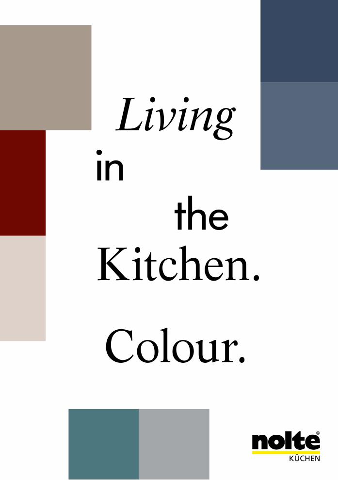
Colour.
Living in the Kitchen.
n o l t e
nolte
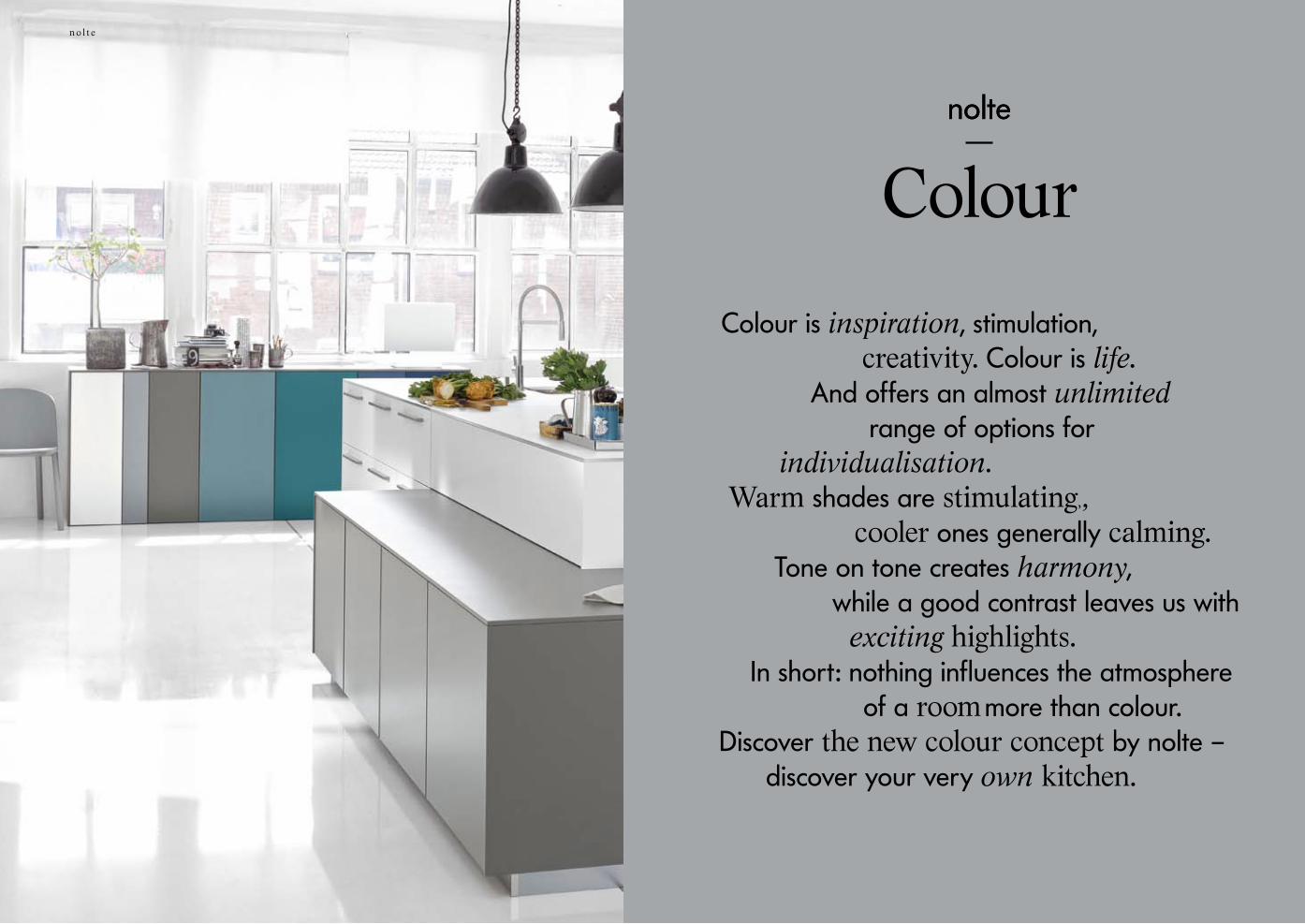
Colournolte
Colour is inspiration, stimulation, creativity. Colour is life.
And offers an almost unlimited range of options for individualisation. Warm shades are stimulating,, cooler ones generally calming. Tone on tone creates harmony, while a good contrast leaves us with exciting highlights. In short: nothing influences the atmosphere of a room more than colour. Discover the new colour concept by nolte – discover your very own kitchen.
n o l t e
54
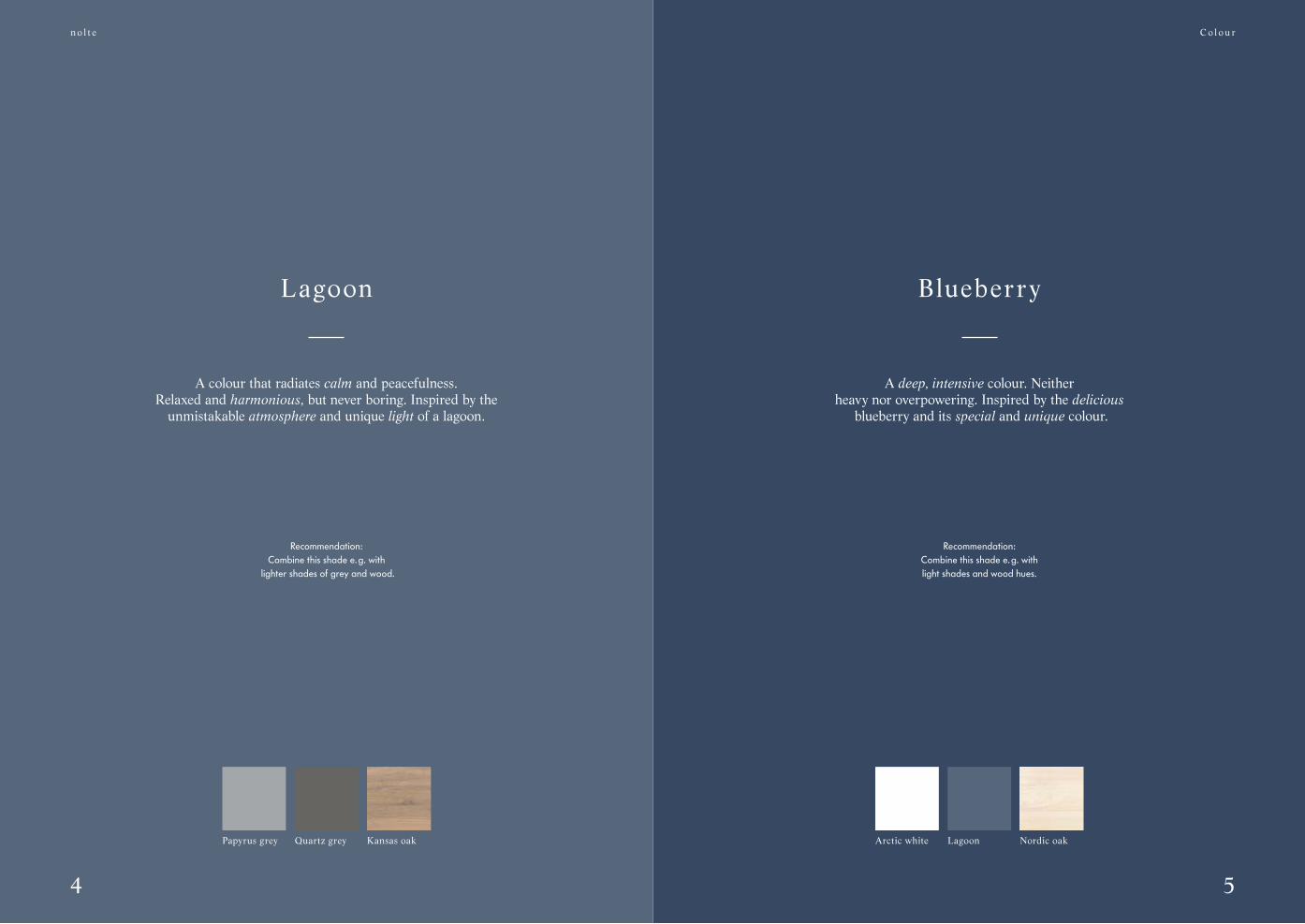
Blueberry
A deep, intensive colour. Neitherheavy nor overpowering. Inspired by the delicious
blueberry and its special and unique colour.
Recommendation:Combine this shade e. g. with light shades and wood hues.
Lagoon
A colour that radiates calm and peacefulness. Relaxed and harmonious, but never boring. Inspired by the
unmistakable atmosphere and unique light of a lagoon.
Recommendation: Combine this shade e. g. with
lighter shades of grey and wood.
C o l o u r
Arctic white Nordic oakLagoonPapyrus grey Kansas oakQuartz grey

n o l t e k ü c h e nn o l t e
Whether as a base or accent colour:the cool colour palette
provides the space for new room ideas.
Soft Lack sideboard in a colour play

n o l t e
98
A colour with shadows, depth and elegance.Originally from the glittering world
of fashion, this colour has made it into the home. And it‘s going to stay. Pantone©, the globally recognised colour authority,
has declared emerald the trend colour of 2015.
Recommendation: Combine this shade e. g. with
white and light shades of grey.
EmeraldOpal
C o l o u r
Papyrus grey EmeraldArctic whitePapyrus grey Kansas oakQuartz grey
A colour that unites harmonyand calm like no other.
Inspired by the precious opal gemstonethat reflects clarity, openness
and vastness in its own special, inimitable way.
Recommendation: Combine this characteristic colour
with neutral tones and wood finishes.

n o l t e
B01White
soft mat
B05Papyrus grey
soft mat
B14Emeraldsoft mat
Contour Lack
Old bui ld ing
The intensity of emerald requiressubtle highlighting.
12
n o l t e
13
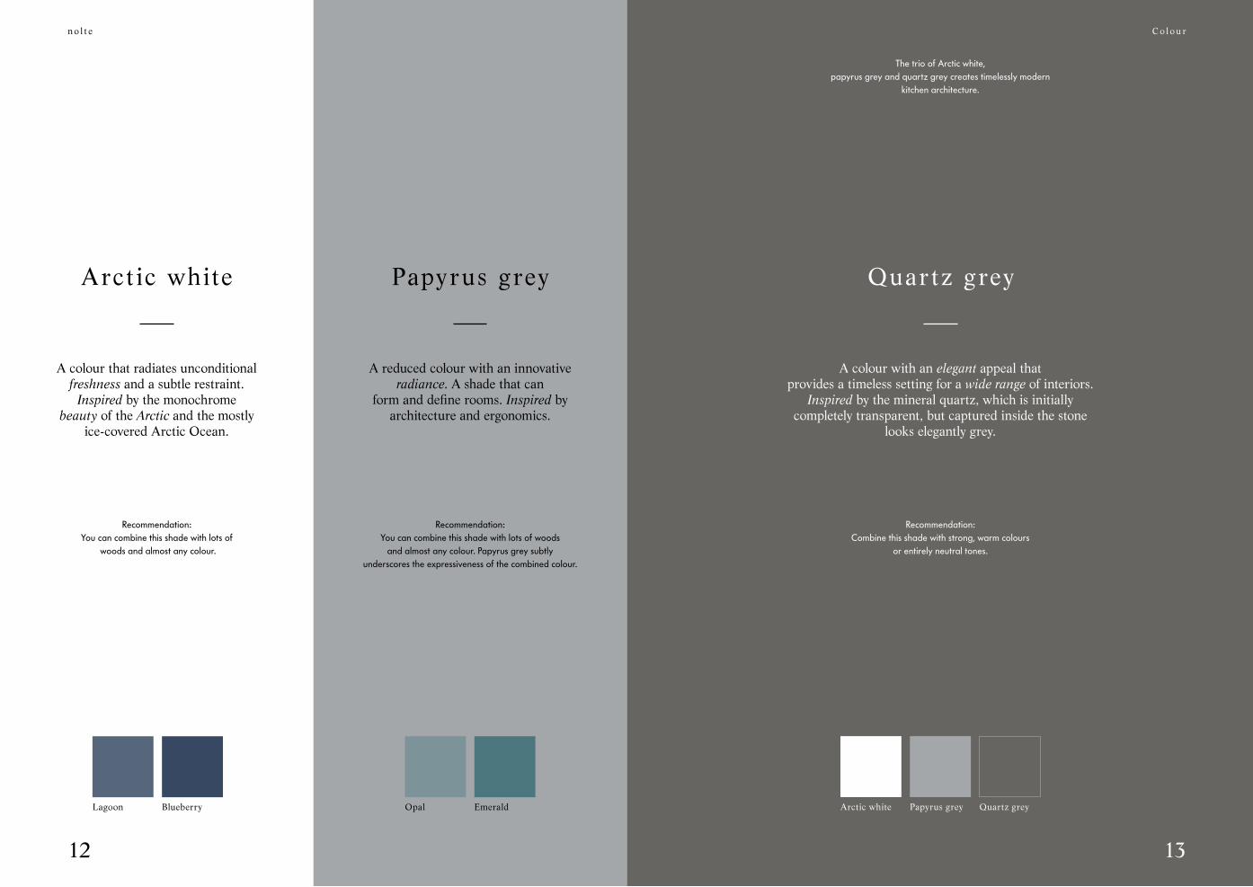
A colour that radiates unconditionalfreshness and a subtle restraint.
Inspired by the monochromebeauty of the Arctic and the mostly
ice-covered Arctic Ocean.
Recommendation: You can combine this shade with lots of
woods and almost any colour.
Arctic white Papyrus grey
A reduced colour with an innovativeradiance. A shade that can
form and define rooms. Inspired byarchitecture and ergonomics.
Recommendation: You can combine this shade with lots of woods
and almost any colour. Papyrus grey subtly underscores the expressiveness of the combined colour.
The trio of Arctic white,papyrus grey and quartz grey creates timelessly modern
kitchen architecture.
Quartz grey
A colour with an elegant appeal that provides a timeless setting for a wide range of interiors.
Inspired by the mineral quartz, which is initially completely transparent, but captured inside the stone
looks elegantly grey.
Recommendation: Combine this shade with strong, warm colours
or entirely neutral tones.
Lagoon Blueberry Opal Emerald Arctic white Quartz greyPapyrus grey
C o l o u r

n o l t e
Soft Lack
Loft
76QQuartz greysoft mat
76AArctic white
soft mat

n o l t e
17
White is pure neutrality.Without being too cold. It can be an
exciting highlight, or theessence of it all. White is endless.
Recommendation: the brightest of all colours can be used universally,
and is the perfect base in every respect. Or the finished design.
White Sahara
A colour for all those who find white too neutral, and a shade like
magnolia too yellow.Inspired by the colours of the rocks and
sand of the Sahara.
Recommendation: Combine this shade with
warm colours.
Paprika Rose hip Curry Saffron
Cosiness is the result of thecombination of the gentle, modern
colours Lava and Sahara.
C o l o u r
Lava
A colour that is an impressive addition to our palette of neutral
natural shades. Inspired by the rough beauty of unspoilt landscapes, the strength of nature.
Recommendation: Combine this shade e. g. with
Arctic white and Sahara. Or enhanceLava with colours highlights.
MagnoliaWhite Sahara MagmaLava

n o l t e
Nova Lack
Penthouse
731High-gloss
white
Nature
565Cognac Oak
White is the perfect platformfor warm shades of wood.

n o l t e
2120
Magnolia becomes the basis for highlightingwith impressive woods.
Magnolia
A soft colour that is equally suitable for largeareas and small rooms.
Versatile, open, friendly. Inspired by the magnolia, which is often used for decorative purposes because of its flower.
Recommendation: You can combine this open shade with
lots of woods and colours.
DriftwoodMagnolia Dark Rustica Kansas oakMagmaLava
Magma
A colour that radiates warmth andwell-being. An atmosphere of security. Inspired by the fascinating
colour play of the molten rock that moves deep within, hidden from sight.
Recommendation: Combine this classic shade with warm,
modern colours such as paprika and rose hip or with white.
C o l o u r

n o l t e
Soft Lack
Terraced house
769Magmasoft mat
76LLava
soft mat
76CCurrysoft mat
Cosiness is the result of thecombination of the gentle, modern
colours Lava and Sahara.
n o l t e
2524
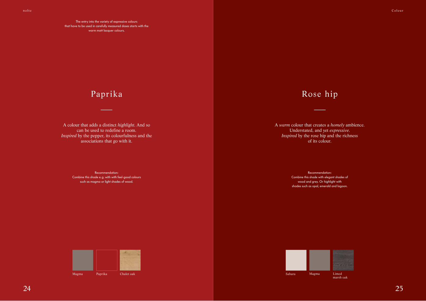
The entry into the variety of expressive colours that have to be used in carefully measured doses starts with the
warm matt lacquer colours.
Papr ika
A colour that adds a distinct highlight. And so can be used to redefine a room.
Inspired by the pepper, its colourfulness and the associations that go with it.
Recommendation: Combine this shade e. g. with with feel-good colours
such as magma or light shades of wood.
Magma Paprika Chalet oak
Rose hip
A warm colour that creates a homely ambience. Understated, and yet expressive.
Inspired by the rose hip and the richness of its colour.
Recommendation: Combine this shade with elegant shades of
wood and grey. Or highlight withshades such as opal, emerald and lagoon.
C o l o u r
Magma Limed marsh oak
Sahara

n o l t e
A13Rose hipsoft mat
Frame Lack
Country-house
A07Lava
soft mat

n o l t e
2928
Curry
A warm colour that creates a pleasant, sunny atmosphere.
Inspired by the rich yellow of the spice that provides the perfect finishing
touch to so many dishes.
Recommendation: Combine this shade for instance, with expressive
wood shades or simply with white.
Curry Limed marsh oak
White White MagmaSaffron
If, for instance, the focus is saffron,then white and magma provide the perfect
light-and-dark contrast.
Saffron
A colour that makes rooms glow.Inspired by the “Gold of the Orient”, as saffron
is also called. And rightly so. The intensivecolour of
saffron is almost without compare.
Recommendation: Contrast this shade e. g. with cool white
or the colour magma.
C o l o u r
n o l t e
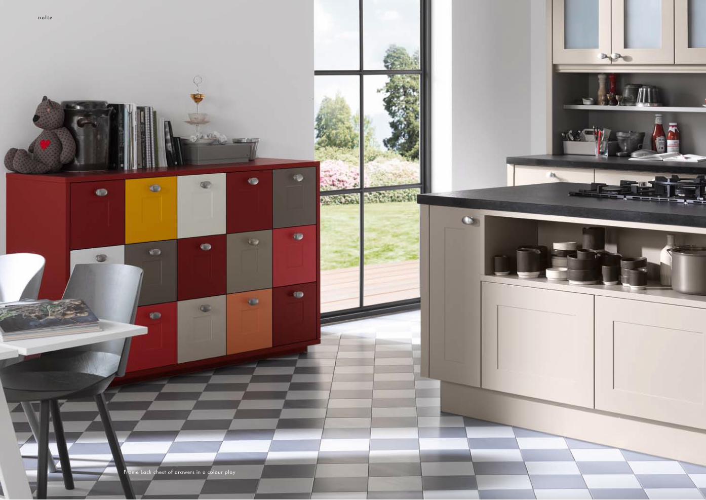
Frame Lack chest of drawers in a colour play
n o l t e
3332
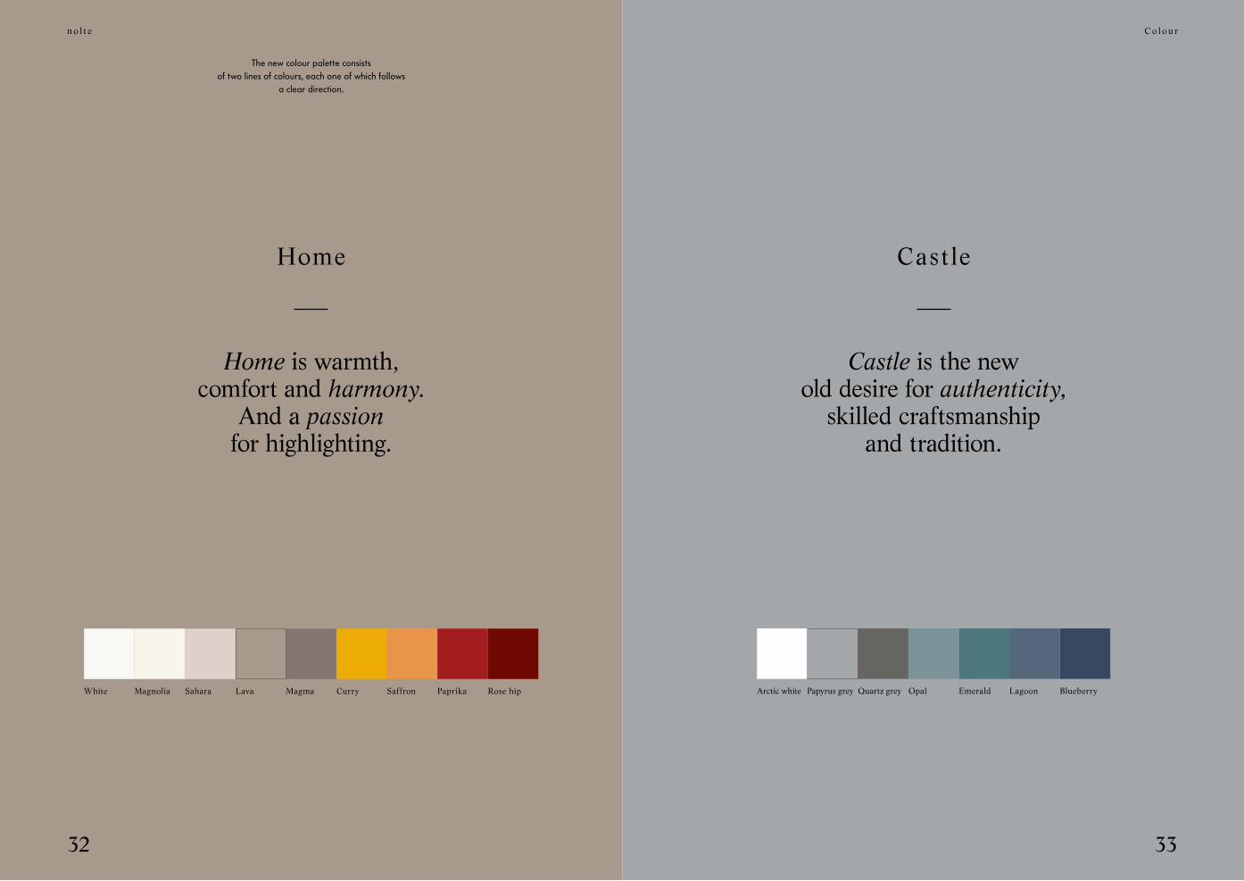
The new colour palette consists of two lines of colours, each one of which follows
a clear direction.
Home is warmth,comfort and harmony.
And a passionfor highlighting.
Home
Magma Curry Rose hipLavaSaharaWhite Magnolia Saffron Paprika
C o l o u r
Castle is the newold desire for authenticity,
skilled craftsmanshipand tradition.
Castle
EmeraldQuartz greyPapyrus greyArctic white Opal BlueberryLagoon
n o l t e
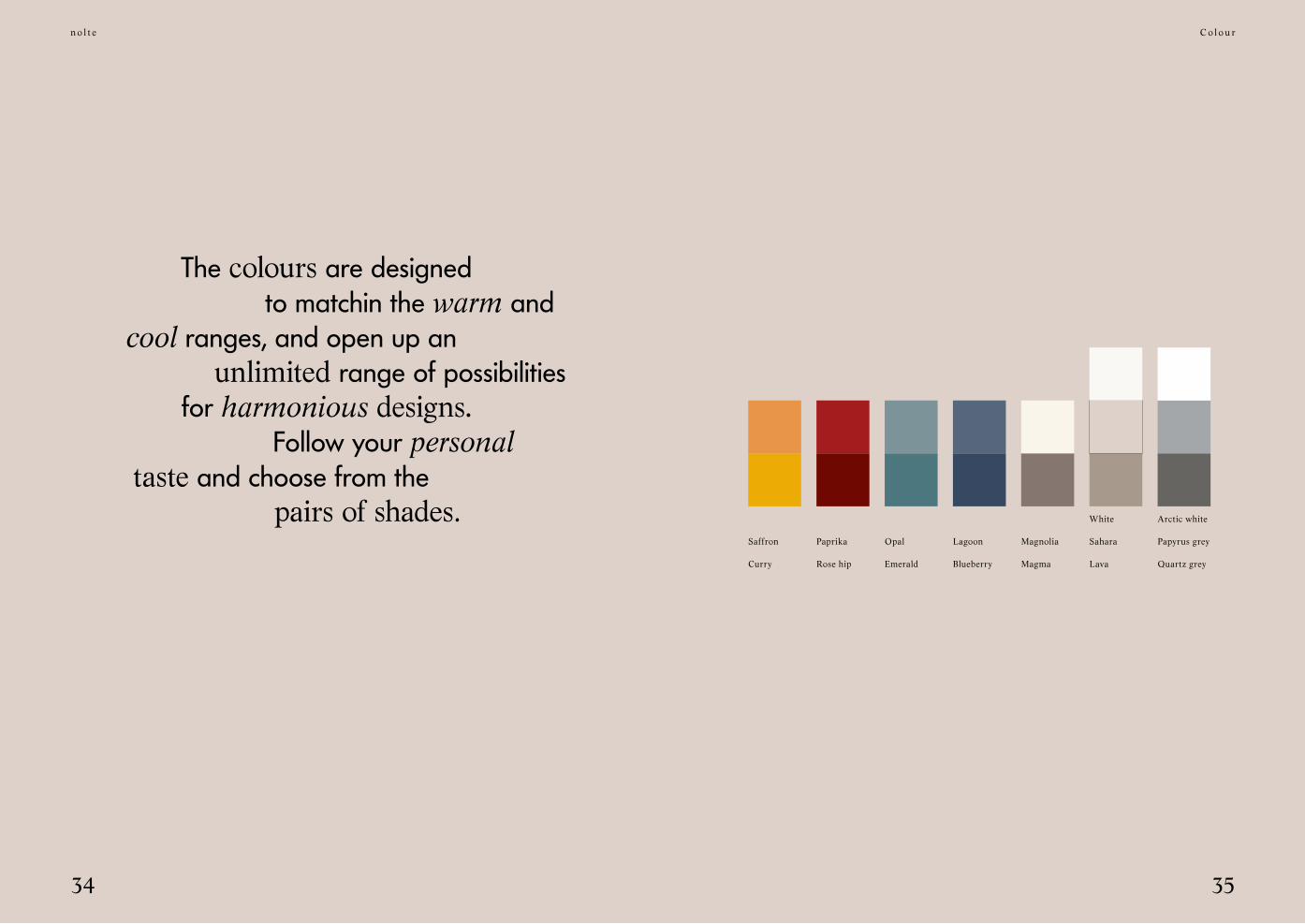
3534
The colours are designed to matchin the warm and cool ranges, and open up an
unlimited range of possibilitiesfor harmonious designs.
Follow your personal taste and choose from the pairs of shades.
C o l o u r
Arctic whiteWhite
Curry Rose hip Emerald Blueberry Quartz greyLavaMagma
Saffron Paprika Opal Lagoon Papyrus greySaharaMagnolia

37
n o l t e
36
Your very own kitchen.
The choice is yours:4 front shapes, each in 16 colours.
C o l o u r
Kansas oakNordic oak
Wood loves colour,colour loves wood.
Arctic white Emerald OpalLagoon BlueberryArctic white
The personal touch.Combine your coloured fronts with wood decors.
For a particularly homely atmosphere.
Limed marsh oak
Papyrus grey Saffron Curry
Chalet oak
Sahara Paprika Rose hip
Soft Lack Contour Lack
Frame Lack Windsor Lack

n o l t e
nolte
Colour makes life in the kitchen more beautiful, richer and more individual. nolte’s new colour concept will help you to find just the right combination to make your kitchen unique. A place where you simply feel happy – because it fits
your life perfectly.
More colour

nolte küchenAnni-Nolte-Straße 432584 Löhne
Living in the kitchen.
The kitchen is the room of rooms. We probably live
more, and moreintensively, here than anywhere else in the home.
It is the place where we meet, where we encounter others.
As family or friends. As a couple.
We cook, eat and enjoy ourselves in the kitchen. And sometimes we have all the
time in the world as we do so. We argue. And make up again. We read,
write, send emails, post messages. And maybe philosophise a little.
And – quite secretly – the kitchen sets the rhythm of our day. Good morning. Then midday. Then evening. And sometimes night ... Which is why we love the kitchen.
VF-
NK-
FARB
E-G
B