Embed Size (px)
DESCRIPTION
A brief booklet about book cover design.
Citation preview
AARONLE GEYTLevel 6
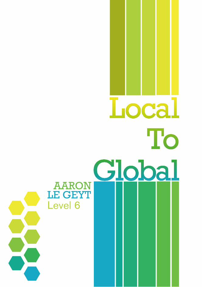
LocalIntroduction
Dexter Fry
Carla Sy
Jenny Cooper
Anna Egan-Reid
Éditions Gallimard & Gollancz
DTV: Deutscher Taschenbuch-Verlag
2
34
56
78
910
GlobalColours of New Zealand
Book Cover
Colour Sheet
Local
GlobalColours of New Zealand
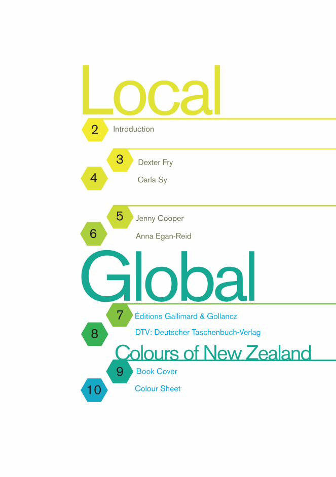
This booklet is a compilation of research work relating to Jerry’s design breif for Local to Global.
I’ve organized this book to contain four local book designers from New Zealand, three well known styles of purely typographical book cover designers and my own book cover design titled “Colours of New Zealand,” along with a colour style sheet.
This is my first booklet I’ve designed and hopefully won’t be my last!
Chur!!!
02.
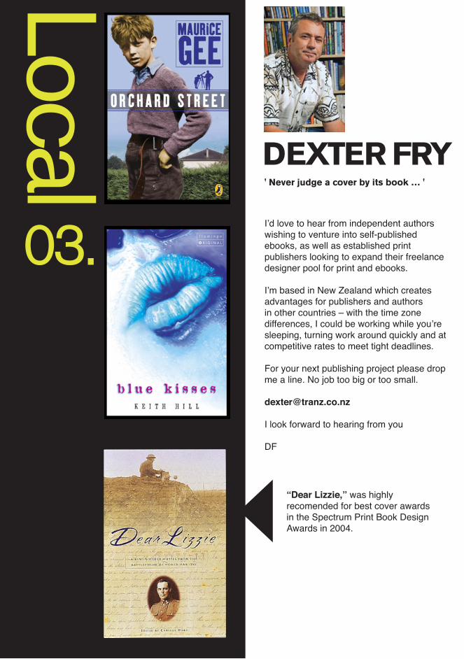
Local DEXTER FRY ' Never judge a cover by its book … '
I’d love to hear from independent authors wishing to venture into self-published ebooks, as well as established print publishers looking to expand their freelance designer pool for print and ebooks.
I’m based in New Zealand which creates advantages for publishers and authors in other countries – with the time zone differences, I could be working while you’re sleeping, turning work around quickly and at competitive rates to meet tight deadlines.
For your next publishing project please drop me a line. No job too big or too small.
I look forward to hearing from you
DF
“Dear Lizzie,” was highly recomended for best cover awards in the Spectrum Print Book Design Awards in 2004.
03.
Loca
l
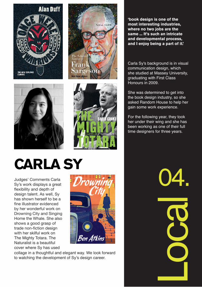
Carla Sy's background is in visual communication design, which she studied at Massey University, graduating with First Class Honours in 2009.
She was determined to get into the book design industry, so she asked Random House to help her gain some work experience.
For the following year, they took her under their wing and she has been working as one of their full time designers for three years.
‘book design is one of the most interesting industries, where no two jobs are the same ... It’s such an intricate and developmental process, and I enjoy being a part of it.’
CARLA SYJudges’ Comments Carla Sy’s work displays a great flexibility and depth of design talent. As well, Sy has shown herself to be a fine illustrator evidenced by her wonderful work on Drowning City and Singing Home the Whale. She also shows a good grasp of trade non-fiction design with her skilful work on The Mighty Totara. The Naturalist is a beautiful cover where Sy has used collage in a thoughtful and elegant way. We look forward to watching the development of Sy’s design career.
04.
Local
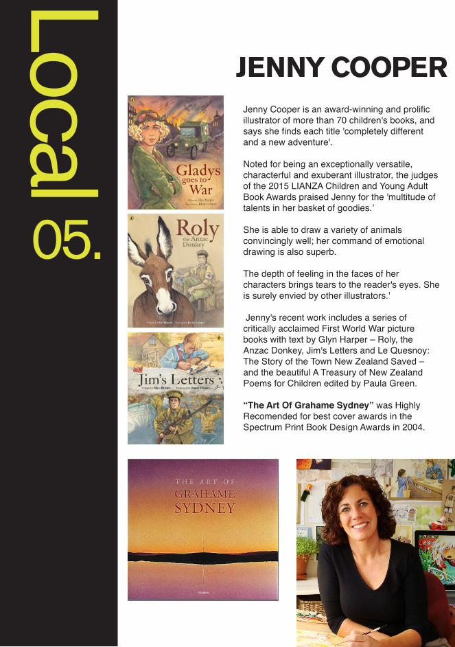
JENNY COOPERJenny Cooper is an award-winning and prolific illustrator of more than 70 children's books, and says she finds each title 'completely different and a new adventure'.
Noted for being an exceptionally versatile, characterful and exuberant illustrator, the judges of the 2015 LIANZA Children and Young Adult Book Awards praised Jenny for the 'multitude of talents in her basket of goodies.’
She is able to draw a variety of animals convincingly well; her command of emotional drawing is also superb.
The depth of feeling in the faces of her characters brings tears to the reader's eyes. She is surely envied by other illustrators.'
Jenny's recent work includes a series of critically acclaimed First World War picture books with text by Glyn Harper – Roly, the Anzac Donkey, Jim's Letters and Le Quesnoy: The Story of the Town New Zealand Saved – and the beautiful A Treasury of New Zealand Poems for Children edited by Paula Green.
“The Art Of Grahame Sydney” was Highly Recomended for best cover awards in the Spectrum Print Book Design Awards in 2004.
05.
Loca
l
JENNY COOPER ANNA EGAN-REID
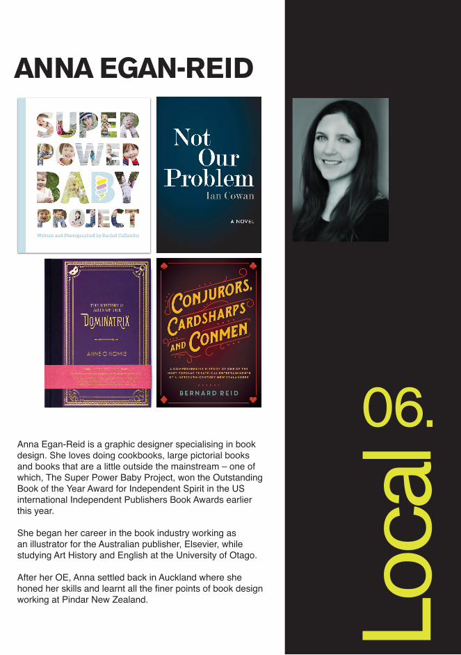
Anna Egan-Reid is a graphic designer specialising in book design. She loves doing cookbooks, large pictorial books and books that are a little outside the mainstream – one of which, The Super Power Baby Project, won the Outstanding Book of the Year Award for Independent Spirit in the US international Independent Publishers Book Awards earlier this year.
She began her career in the book industry working as an illustrator for the Australian publisher, Elsevier, while studying Art History and English at the University of Otago.
After her OE, Anna settled back in Auckland where she honed her skills and learnt all the finer points of book design working at Pindar New Zealand.
06.
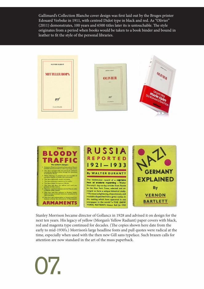
Gallimard’s Collection Blanche cover design was first laid out by the Bruges printer Edouard Verbeke in 1911, with centred Didot type in black and red. As “Olivier” (2011) demonstrates, 100 years and 6500 titles later its is untouchable. The style originates from a period when books would be taken to a book binder and bound in leather to fit the style of the personal libraries.
Stanley Morrison became director of Gollancz in 1928 and advised it on design for the next ten years. His legacy of yellow (Morgan’s Yellow Radiant) paper covers with black, red and magenta type continued for decades. (The copies shown here date from the early to mid-1930’s.) Morrison’s large headline fonts and pull quotes were radical at the time, especially when used with the then new Gill sans typeface. Such brazen calls for attention are now standard in the art of the mass paperback.
07.
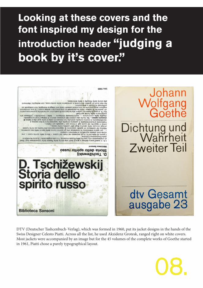
DTV (Deutscher Tashcenbuch-Verlag), which was formed in 1960, put its jacket designs in the hands of the Swiss Designer Celesto Piatti. Across all the list, he used Akzidenz Grotesk, ranged right on white covers. Most jackets were accompanied by an image but for the 45 volumes of the complete works of Goethe started in 1961, Piatti chose a purely typographical layout.
Looking at these covers and the font inspired my design for the introduction header “judging a book by it’s cover.”
08.
09.
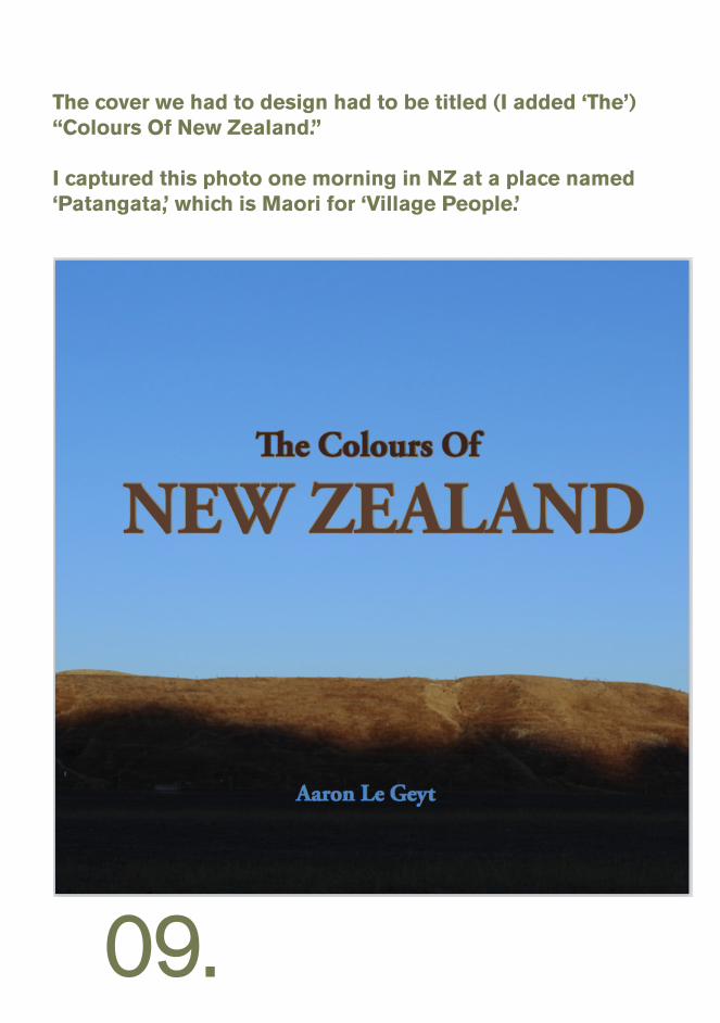
The cover we had to design had to be titled (I added ‘The’) “Colours Of New Zealand.”
I captured this photo one morning in NZ at a place named ‘Patangata,’ which is Maori for ‘Village People.’
10.
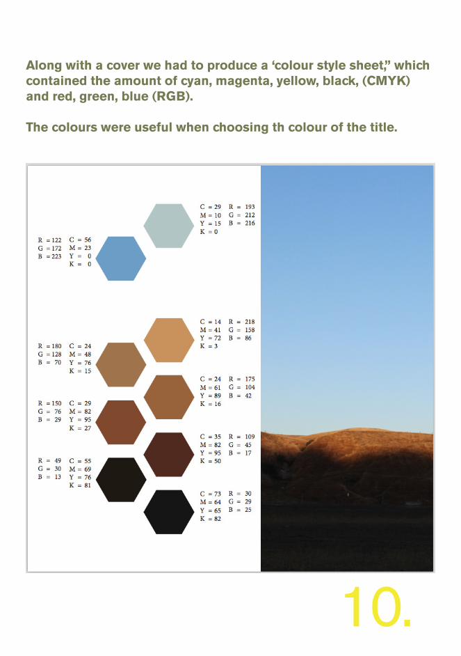
Along with a cover we had to produce a ‘colour style sheet,” which contained the amount of cyan, magenta, yellow, black, (CMYK) and red, green, blue (RGB).
The colours were useful when choosing th colour of the title.