Embed Size (px)
Citation preview
Mapping the changing face of investmentCross-border flows to developing countries, before and after the financial crisis
Sustainable Markets
Stephen SprattInstitute of Development Studies
www.iied.org
2013
IIED Sustainable Markets papersThis paper was produced by IIED’s Sustainable Markets Group. The Sustainable Markets Group drives IIED’s efforts to ensure that markets contribute to positive social, environmental and economic outcomes. The group brings together IIED’s work on market governance, business models, market failure, consumption, investment and the economics of climate change.
Published by IIED 2013
Citation: Spratt, S. 2013. Mapping the changing face of investment: cross-border flows to developing countries, before and after the financial crisis. IIED, London
Sustainable Markets Group
International Institute for Environment and Development
80–86 Gray’s Inn Road, London WC1X 8NH, UK
Tel: +44 (0)20 3463 7399
Fax: +44 (0)20 3514 9055
email: [email protected]
www.iied.org
ISBN: 978-1-84369-947-7
A catalogue record for this paper is available from the British Library.
This publication can also be downloaded from: http://pubs.iied.org/16550IIED
Mapping the changing face of investment
Cross-border flows to developing countries, before and after the financial crisis

The authorDr Stephen Spratt is a Research Fellow in the Globalisation Team at the Institute of Development Studies (IDS). Stephen’s research interests relate to development finance, financial regulation, low-carbon development and environmental taxation. Professionally, he has been Head of the Sustainable Markets Group at IIED, Chief Economist at the New Economics Foundation and a Lecturer in international finance at the University of Reading. He has also worked in the private sector in the City of London.
Stephen holds a BA from the University of East Anglia, an MSc from the School of Oriental and African Studies (SOAS), University of London, and a PhD from the Institute of Development Studies, University of Sussex.
Acronyms and abbreviationsFDI: foreign direct investment
LICs: low-income countries
MICs: middle-income countries
BRICS: economies of Brazil, Russia, India, China and South Africa
GDP: Gross domestic product
SS Africa: sub-Saharan Africa
Contents
Executive summary 1
1. Introduction 3
1.1 A new paradigm, or back to the future? 3
1.2 Investment flows by income group 4
1.3 Investment flows by region 6
2. Recent broad investment trends 8
3. National level investment flows, with a focus on sub-Saharan Africa 11
4. FDI in sub-Saharan Africa, 2003–2011: a new dataset 14
4.1 Total FDI 14
4.1.1 Source country trends 15
4.1.2 Sectoral trends 17
5. Conclusion 19
References 21
CONTENTS
Figures, tables and boxes
Figure 1. Total inflows as percentage of GDP 4
Figure 2. Low income inflows, 1990–2010 (USD, millions) 5
Figure 3. Middle income inflows, 1990–2010 (USD, millions) 5
Figure 4. Global commodity price indices, 1992–2012 (2005 = 100) 6
Figure 5. Developing region inflows, 1990–2010 (USD, millions) 7
Figure 6. Total regional investment flows as percentage GDP, 1990–2010 7
Figure 7. Investment to emerging economies, 2010–2012 (USD, billions) 8
Figure 8. Inflows to emerging economies, 2010–2013 (USD, billions) 9
Figure 9. Equity flows to emerging regions, 2010–2013 (USD, billions) 9
Figure 10. Bank lending to emerging regions, 2010–2013 (USD, billions) 10
Figure 11. FDI flows to emerging regions, 2010–2013 (USD, billions) 10
Figure 12. Annual international bank lending as percentage GDP, 2002–2010 12
Figure 13. Bank lending as a percentage GDP, 2000–2010 13
Figure 14. Annual FDI to Sub-Saharan Africa, 2003–2011 (USD, millions) 14
Figure 15. FDI to five sub-Saharan African countries, 2003–2011 (percentage GDP) 15
Figure 16. Annual FDI to sub-Saharan Africa by source, 2003–11 (USD, millions) 16
Figure 17. FDI to sub-Saharan Africa from BRICS economies, 2003–2011 (USD, millions) 16
Figure 18. FDI to sub-Saharan Africa by sector 2003–2011 (USD, millions) 17
Figure 19. Renewable energy FDI to SS Africa by sub-sector, 2003–11 (USD, millions) 18
Table 1. Top ten countries with largest investment flows as a percentage of GDP by investment category (annual average) 11
Table 2. Investment flows to sub-Saharan African economies as percentage GDP (2005–2010 averages) 12
Table 3. FDI rank 2003–11 (USD, millions) 15
Table 4. FDI sector rank 2003–11 (USD, billions) 17
Box 1. Terms for types of income and investment 3
MAPPING THE CHANGING FACE OF INvESTMENT I
Executive summary
The financial crisis of 2007–8 was so severe, and its impacts so deep-seated, that – for some – this is a new world now. Economic theory, particularly in relation to financial markets, is being re-written. Economic practice too, no longer appears to be what it was. The decline of Europe and the United States has become more pronounced, as has the relative rise of some large emerging economies – i.e. the BRICS (the economies of Brazil, Russia, India, China and South Africa). Whether looking at the productive, innovative, or financial aspects of growth and development, some see a rapid transfer of economic power happening before our eyes.
Mindsets have changed as well. Where once developing countries were seen as passive recipients of growth generated in developed economies, they are increasingly viewed as independent sources of growth themselves. And it is not just the BRICS. Growth rates across many parts of the developing world have increased since the turn of the century, and appeared to be far less affected by the financial crisis and global economic turndown than did most developed economies.
If a reality, this ‘decoupling’ – where the process of growth in developing countries becomes increasingly independent of prospects in developed economies – will force a change in the assumptions of international investors, and ultimately the allocation of capital globally. The development implications would be significant.
Traditionally, international investors have altered their allocation to developing countries in line with global growth expectations. Where these rose, allocations to these economies rose. If growth in developing countries is seen as internally generated, however – or at least not entirely driven by events in developed countries – then investors need to better understand what makes these economies tick.
To the extent that this happens, investment flows could become more aligned with economic circumstances and cycles in recipient countries, which may be positive in two ways: first, investments are more likely to flow to sectors that are important for long-term growth; second, they are less likely to flow to non-productive sectors and inflate asset-price bubbles, with damaging effects on the process of development. This would benefit both investors and the countries in which they invest.
None of these positive outcomes are guaranteed. What such a change in investors’ perceptions of developing countries would do is raise the likelihood of better outcomes. Interestingly, this would mean international capital being allocated more in line with the way it is supposed to be: from capital-rich to capital-scarce countries, as growth prospects are higher in the latter. Whether capital would be invested in sustainable ways that generate an equitable distribution of benefits across populations is a different question, but the change in attitude sketched here raises the possibility that it might be.
While such questions provide the context for the analysis, this paper has more modest aims. The intention is to:
■■ Provide a snapshot of investment flows to developing countries in recent years, but to do so in the context of a longer time-horizon. Specifically, cross-border investment flows from 1990 to 2012 are examined to identify patterns of investment (by type of investment, income group or region).
■■ Consider how – if at all – these investment flows have changed in recent years, especially in the wake of the recent global financial crisis.
Starting with a global and a regional focus, the paper finishes with a more concentrated look at sub-Saharan Africa. While the focus is on cross-border investment, this does not mean that the mobilisation and allocation of domestic resources is considered unimportant. For all countries domestic resources are and will remain the primary source of investment. However, the development potential of cross-border investment is undoubtedly significant, and we are nowhere near realising this at the present time.
The evidence in this paper suggests that there has not, in fact, been a step change in terms of overall investments triggered by the 2007–2008 economic crisis. Following a spike in 2008, and the maintenance of historically high total flows to 2010, total cross-border investment to developing countries has since fallen sharply and appears strongly influenced by conditions in developed countries, particularly the eurozone. An exception is foreign direct investment (FDI). As well as being the most important type of investment (excluding remittances) for most developing countries, FDI has been the most resilient to economic and financial shocks. In the post crisis period this has been maintained, with steady annual FDI growth occurring throughout the developing world.
I 1
EXECUTIvE SUMMARy
In some respects, therefore, little has changed:
■■ investment patterns by income group and region are not radically different from pre-crisis norms;
■■ prospects in developed countries remain crucial for investor attitudes towards developing countries; and
■■ investments in low-income developing countries remain concentrated in extractive sectors.
In other respects, there have been changes:
■■ investments to (higher-income) developing countries are diversifying rapidly;
■■ while ‘global growth’ expectations are still a major driver of developing country investment flows, these expectations are as much driven by prospects in China and India as in Europe and the US;
■■ these larger emerging economies have become important sources of direct investment in lower-income countries;
■■ while still focused on extractive sectors, investments to sub-Saharan African countries have also started to diversify more.
New sources are emerging, however. The larger emerging economies, particularly China and India, have become increasingly important direct investors in other developing countries, not least sub-Saharan Africa. These economies, as well as others such as Brazil, are also more likely to be seen as independent sources of global growth. To the extent that investment flows to low-income countries have become decoupled from events in developed countries, therefore, they are instead increasingly ‘coupled’ with prospects in larger emerging economies.
These are early days. It is not possible to say how important these trends will or will not be. Much depends on what happens in China, India and – to a lesser extent – Brazil. If these countries can continue to grow rapidly, their importance to the pace and pattern of global growth will become ever greater. If they continue to expand outwardly, their importance as direct investors in other developing countries will do the same.
Mapping the changing face of investMent i
2 I IIED
1. Introduction
The aim of this report is to examine how cross-border investment flows to developing countries, regions and income groups have changed in recent years. The impact of the global financial crisis of 2007–8 is of particular interest, and is placed in an historical context, with the scale and the pattern of investment being compared before and after the crisis.
The purpose is twofold. First, the compilation and presentation of data from a variety of sources may be a useful descriptive resource in its own right.1 All available sources have limitations, either in coverage or timeliness. Building up a composite from different sources allows us to highlight gaps to address, but also to create a more complete picture than a single source would allow, albeit in patchwork form. Because of problems with the comparability of datasets – and remaining data gaps – the resulting picture is inevitably fuzzy in places: the ‘face of investment’ cannot always be seen clearly, but we can see enough to describe its key features. Second, the comparison of pre- and post-crisis data from a variety of angles allows us to say something about where the ‘face of investment’ appears to have changed, and where not.
Some interesting questions are explored:
■■ How important have different forms of cross-border investment been to different developing countries?
■■ What patterns can be observed by region and by income group?
■■ What patterns can be observed with respect to the sources of investment?
■■ To what extent have the answers to these questions been affected by the global financial crisis of 2007–8 and its aftermath, and what are the longer-term implications of this?
Before the Asian crisis of 1997–8, almost 40 per cent of global cross-border investment went to developing countries, compared to a little over 20 per cent at the beginning of the 1990s. Following the crisis, developing countries’ share fell to 10 per cent, where it stayed until the onset of the global crisis in 2008. ‘Emerging markets’ may have offered the potential of high returns, but they also brought big risks; for most mainstream investors, it was ‘safe’ developed economies that continued to dominate their portfolios.
At first glance, the 2007–8 crisis appears to have changed this. As developed economies continue to struggle under a weight of debt, and the eurozone turmoil rumbles on, developing economies have never been so popular with investors. Is this just another blip before normal service is resumed? If not, is this a cause for celebration, or alarm?
Box 1. Terms for types of income and investment
Foreign direct investment (FDI): The investment by a company into a business or production of another country, usually in the developing world. This may involve building new facilities and/or local employment.
Portfolio investment: A more passive form of investment, such as equity and bonds.
Greenfield investment: A form of investment where a parent company starts a new venture in a foreign country by constructing new operational facilities from the ground up, often involving the creation of new long-term jobs.
Remittances: Money sent home by migrant workers.
‘Conventional’ assets: Institutional investments such as pensions, mutual and insurance.
‘Unconventional’ assets: Sovereign wealth funds, private equity, hedge funds, exchange-traded funds, and private wealth.
1.1 A new paradigm, or back to the future?
It should make no sense to talk about investment flows to the ‘developing world’, when the realities of developing countries are so varied. Despite this, ever since a toehold was gained in the portfolios of institutional investors, ‘emerging markets’ have often been viewed as an homogenous asset class. The market view has been that this ‘asset class’ does well in periods of strong global growth; the prices of many developing country financial assets thus move up and down
1 Data are drawn from the World Bank’s World Development Indicators; the IMF World Economic Outlook Database; UNCTAD’s Statistical Database; the Institute of International Finance (IIF) Capital flows database, and the Financial Times FDI Intelligence database. See the reference section for more details.
I 3
1. INTRODUCTION
with global growth expectations. Recent evidence suggests this may be changing, with developing countries more likely to be seen as alternative sources of global growth, rather than simply beneficiaries of growth generated in developed economies.
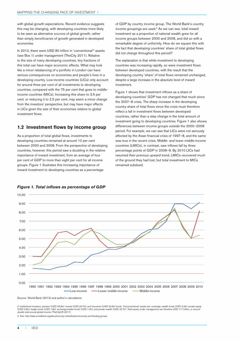
In 2010, there were USD 80 trillion in ‘conventional’2 assets (see Box 1) under management (TheCity 2011). Relative to the size of many developing countries, tiny fractions of this total can have major economic effects. What may look like a minor rebalancing of a portfolio in London can have serious consequences on economies and people’s lives in a developing country. Low-income countries (LICs) only account for around three per cent of all investments to developing countries, compared with the 75 per cent that goes to middle-income countries (MICs). Increasing this share to 3.5 per cent, or reducing it to 2.5 per cent, may seem a minor change from the investors’ perspective, but may have major effects in LICs given the size of their economies relative to global investment flows.
1.2 Investment flows by income group
As a proportion of total global flows, investments to developing countries remained at around 10 per cent between 2000 and 2008. From the perspective of developing countries, however, this period saw a doubling in the relative importance of inward investment, from an average of four per cent of GDP to more than eight per cent for all income groups. Figure 1 illustrates this increasing importance of inward investment to developing countries as a percentage
of GDP by country income group. The World Bank’s country income groupings are used.3 As we can see, total inward investment as a proportion of national wealth grew for all income groups between 2000 and 2008, and did so with a remarkable degree of uniformity. How do we square this with the fact that developing countries’ share of total global flows did not change throughout this period?
The explanation is that while investment to developing countries was increasing rapidly, so were investment flows between developed countries, with the result that the developing country ‘share’ of total flows remained unchanged, despite a large increase in the absolute level of inward investment.
Figure 1 shows that investment inflows as a share of developing countries’ GDP has not changed that much since the 2007–8 crisis. The sharp increase in the developing country share of total flows since the crisis must therefore reflect a fall in investment flows between developed countries, rather than a step change in the total amount of investment going to developing countries. Figure 1 also shows differences between income groups outside the 2000–2008 period. For example, we can see that LICs were not seriously affected by the Asian financial crisis of 1997–8, and the same was true in the recent crisis. Middle- and lower middle-income countries (LMICs), in contrast, saw inflows fall by three percentage points of GDP in 2008–9. By 2010 LICs had resumed their previous upward trend, LMICs recovered much of the ground they had lost, but total investment to MICs remained subdued.
Figure 1. Total inflows as percentage of GDP
Source: World Bank (2013) and author’s calculations
2 Institutional investors: pension (USD 29.9tr); mutual (USD 24.7tr); and insurance (USD 24.6tr) funds. ‘Unconventional’ assets are: sovereign wealth funds (USD 4.2tr); private equity (USD 2.6tr); hedge funds (USD 1.8tr); exchange-traded funds (USD 1.3tr); and private wealth (USD 42.7tr). Total assets under management are therefore USD 117 trillion, or around double total annual global income (TheCityUK 2011).
3 See: http://data.worldbank.org/about/country-classifications/country-and-lending-groups
1990 1991 1992 1993 1994 1995 1996 1997 1998 1999 2000 2001 2002 2003 2004 2005 2006 2007 2008 2009 2010Low-income Lower middle-income Middle-income
10.00
9.00
8.00
7.00
6.00
5.00
4.00
3.00
2.00
1.00
0.00
Mapping the changing face of investMent i
4 I IIED
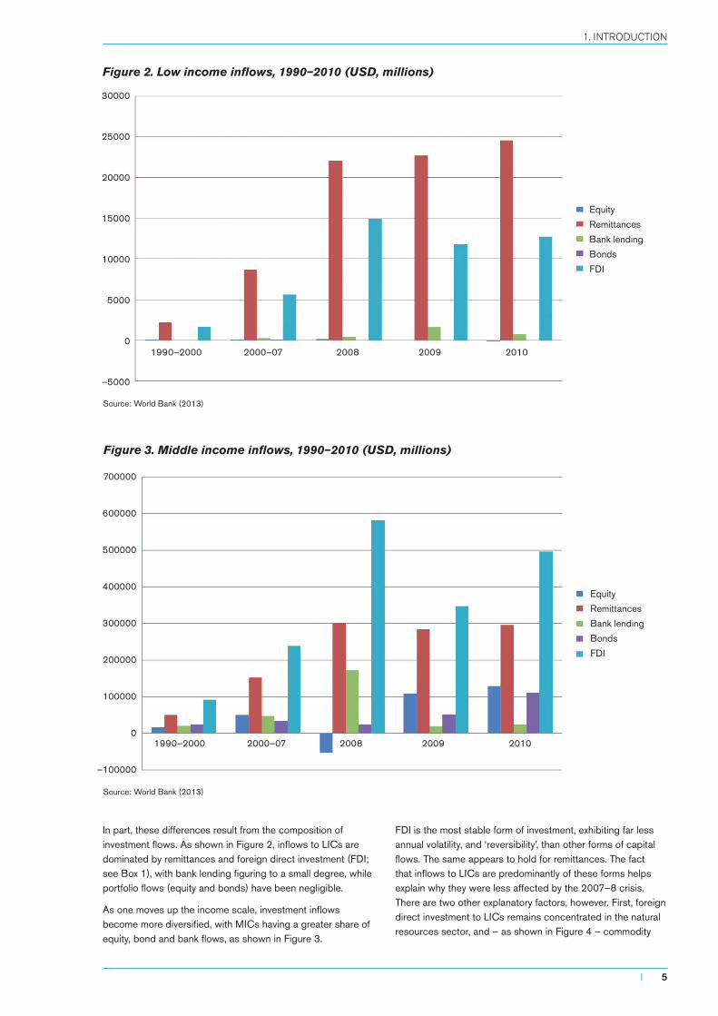
In part, these differences result from the composition of investment flows. As shown in Figure 2, inflows to LICs are dominated by remittances and foreign direct investment (FDI; see Box 1), with bank lending figuring to a small degree, while portfolio flows (equity and bonds) have been negligible.
As one moves up the income scale, investment inflows become more diversified, with MICs having a greater share of equity, bond and bank flows, as shown in Figure 3.
FDI is the most stable form of investment, exhibiting far less annual volatility, and ‘reversibility’, than other forms of capital flows. The same appears to hold for remittances. The fact that inflows to LICs are predominantly of these forms helps explain why they were less affected by the 2007–8 crisis. There are two other explanatory factors, however. First, foreign direct investment to LICs remains concentrated in the natural resources sector, and – as shown in Figure 4 – commodity
Figure 2. Low income inflows, 1990–2010 (USD, millions)
Source: World Bank (2013)
Figure 3. Middle income inflows, 1990–2010 (USD, millions)
Source: World Bank (2013)
30000
25000
20000
15000
10000
5000
0
–5000
1990–2000 2000–07 2008 2009 2010
Equity
Remittances
Bank lending
Bonds
FDI
700000
600000
500000
400000
300000
200000
100000
0
–100000
1990–2000 2000–07 2008 2009 2010
Equity
Remittances
Bank lending
Bonds
FDI
I 5
1. INTRODUCTION
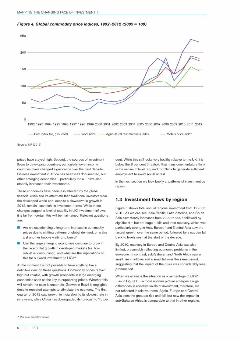
prices have stayed high. Second, the sources of investment flows to developing countries, particularly lower-income countries, have changed significantly over the past decade. Chinese investment in Africa has been well documented, but other emerging economies – particularly India – have also steadily increased their investments.
These economies have been less affected by the global financial crisis and its aftermath than traditional investors from the developed world and, despite a slowdown in growth in 2012, remain ‘cash rich’ in investment terms. While these changes suggest a level of stability in LIC investment inflows, it is far from certain this will be maintained. Relevant questions are:
■■ Are we experiencing a long-term increase in commodity prices due to shifting patterns of global demand, or is this just another bubble waiting to burst?
■■ Can the large emerging economies continue to grow in the face of flat growth in developed markets (i.e. how robust is ‘decoupling’), and what are the implications of this for outward investment to LICs?
At the moment it is not possible to have anything like a definitive view on these questions. Commodity prices remain high but volatile, with growth prospects in large emerging economies seen as the key to supporting prices. Whether this will remain the case is uncertain. Growth in Brazil is negligible despite repeated attempts to stimulate the economy. The first quarter of 2012 saw growth in India slow to its slowest rate in nine years, while China has downgraded its forecast to 7.5 per
cent. While this still looks very healthy relative to the UK, it is below the 8 per cent threshold that many commentators think is the minimum level required for China to generate sufficient employment to avoid social unrest.
In the next section we look briefly at patterns of investment by region.
1.3 Investment flows by region
Figure 5 shows total annual regional investment from 1990 to 2010. As we can see, Asia-Pacific, Latin America, and South Asia saw steady increases from 2000 to 2007, followed by significant – but not huge – falls and then recovery, which was particularly strong in Asia. Europe4 and Central Asia saw the fastest growth over the same period, followed by a sudden fall back to levels seen at the start of the decade.
By 2010, recovery in Europe and Central Asia was also limited, presumably reflecting economic problems in the eurozone. In contrast, sub-Saharan and North Africa saw a small rise in inflows and a small fall over the same period, suggesting that the impact of the crisis was considerably less pronounced.
When we examine the situation as a percentage of GDP – as in Figure 6 – a more uniform picture emerges. Large differences in absolute levels of investment, therefore, are not reflected in relative terms. Again, Europe and Central Asia sees the greatest rise and fall, but now the impact in sub-Saharan Africa is comparable to that in other regions.
Figure 4. Global commodity price indices, 1992–2012 (2005 = 100)
Source: IMF (2013)
4 This refers to Eastern Europe.
1992 1993 1994 1995 1996 1997 1998 1999 2000 2001 2002 2003 2004 2005 2006 2007 2008 2009 2010 2011 2012
Fuel index (oil, gas, coal) Food index Agricultural raw materials index
250
200
150
100
50
0
Metals price index
Mapping the changing face of investMent i
6 I IIED
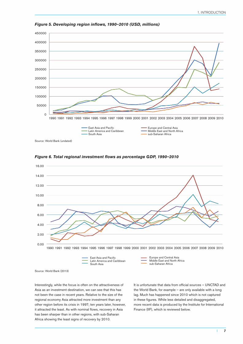
Interestingly, while the focus is often on the attractiveness of Asia as an investment destination, we can see that this has not been the case in recent years. Relative to the size of the regional economy Asia attracted more investment than any other region before its crisis in 1997; ten years later, however, it attracted the least. As with nominal flows, recovery in Asia has been sharper than in other regions, with sub-Saharan Africa showing the least signs of recovery by 2010.
It is unfortunate that data from official sources – UNCTAD and the World Bank, for example – are only available with a long lag. Much has happened since 2010 which is not captured in these figures. While less detailed and disaggregated, more recent data is produced by the Institute for International Finance (IIF), which is reviewed below.
Figure 5. Developing region inflows, 1990–2010 (USD, millions)
Source: World Bank (undated)
Figure 6. Total regional investment flows as percentage GDP, 1990–2010
Source: World Bank (2013)
1990 1991 1992 1993 1994 1995 1996 1997 1998 1999 2000 2001 2002 2003 2004 2005 2006 2007 2008 2009 2010
East Asia and PacificLatin America and CaribbeanSouth Asia
Europe and Central AsiaMiddle East and North Africasub-Saharan Africa
450000
400000
350000
300000
250000
200000
150000
100000
50000
0
1990 1991 1992 1993 1994 1995 1996 1997 1998 1999 2000 2001 2002 2003 2004 2005 2006 2007 2008 2009 2010
16.00
14.00
12.00
10.00
8.00
6.00
4.00
2.00
0.00
East Asia and PacificLatin America and CaribbeanSouth Asia
Europe and Central AsiaMiddle East and North Africasub-Saharan Africa
I 7
1. INTRODUCTION
2. Recent broad investment trends5
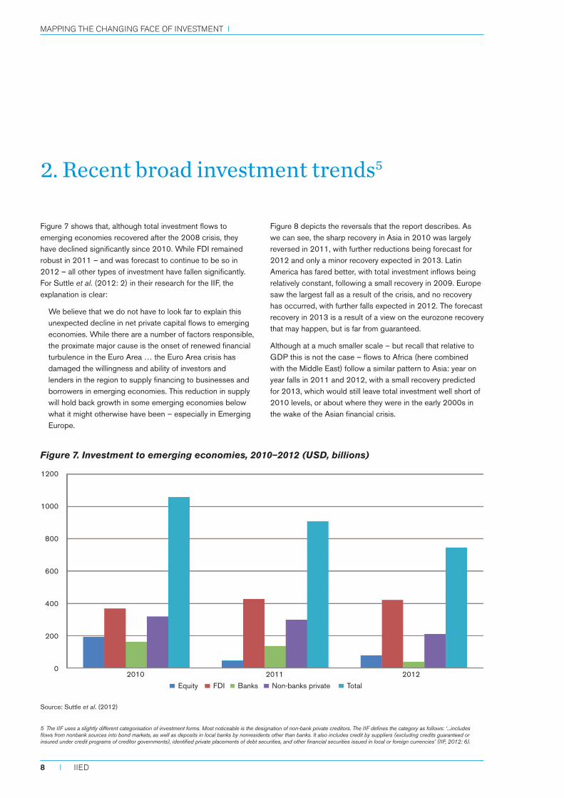
Figure 7 shows that, although total investment flows to emerging economies recovered after the 2008 crisis, they have declined significantly since 2010. While FDI remained robust in 2011 – and was forecast to continue to be so in 2012 – all other types of investment have fallen significantly. For Suttle et al. (2012: 2) in their research for the IIF, the explanation is clear:
We believe that we do not have to look far to explain this unexpected decline in net private capital flows to emerging economies. While there are a number of factors responsible, the proximate major cause is the onset of renewed financial turbulence in the Euro Area … the Euro Area crisis has damaged the willingness and ability of investors and lenders in the region to supply financing to businesses and borrowers in emerging economies. This reduction in supply will hold back growth in some emerging economies below what it might otherwise have been – especially in Emerging Europe.
Figure 8 depicts the reversals that the report describes. As we can see, the sharp recovery in Asia in 2010 was largely reversed in 2011, with further reductions being forecast for 2012 and only a minor recovery expected in 2013. Latin America has fared better, with total investment inflows being relatively constant, following a small recovery in 2009. Europe saw the largest fall as a result of the crisis, and no recovery has occurred, with further falls expected in 2012. The forecast recovery in 2013 is a result of a view on the eurozone recovery that may happen, but is far from guaranteed.
Although at a much smaller scale – but recall that relative to GDP this is not the case – flows to Africa (here combined with the Middle East) follow a similar pattern to Asia: year on year falls in 2011 and 2012, with a small recovery predicted for 2013, which would still leave total investment well short of 2010 levels, or about where they were in the early 2000s in the wake of the Asian financial crisis.
Source: Suttle et al. (2012)
Figure 7. Investment to emerging economies, 2010–2012 (USD, billions)
5 The IIF uses a slightly different categorisation of investment forms. Most noticeable is the designation of non-bank private creditors. The IIF defines the category as follows: ‘...includes flows from nonbank sources into bond markets, as well as deposits in local banks by nonresidents other than banks. It also includes credit by suppliers (excluding credits guaranteed or insured under credit programs of creditor governments), identified private placements of debt securities, and other financial securities issued in local or foreign currencies’ (IIF, 2012: 6).
1200
1000
800
600
400
200
0
Equity FDI Banks Non-banks private Total
2010 2011 2012
Mapping the changing face of investMent i
8 I IIED
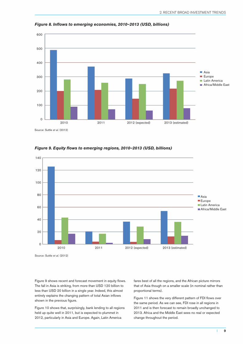
Figure 9 shows recent and forecast movement in equity flows. The fall in Asia is striking, from more than USD 120 billion to less than USD 20 billion in a single year. Indeed, this almost entirely explains the changing pattern of total Asian inflows shown in the previous figure.
Figure 10 shows that, surprisingly, bank lending to all regions held up quite well in 2011, but is expected to plummet in 2012, particularly in Asia and Europe. Again, Latin America
fares best of all the regions, and the African picture mirrors that of Asia though on a smaller scale (in nominal rather than proportional terms).
Figure 11 shows the very different pattern of FDI flows over the same period. As we can see, FDI rose in all regions in 2011 and is then forecast to remain broadly unchanged to 2013. Africa and the Middle East sees no real or expected change throughout the period.
Source: Suttle et al. (2012)
Figure 8. Inflows to emerging economies, 2010–2013 (USD, billions)
Figure 9. Equity flows to emerging regions, 2010–2013 (USD, billions)
Source: Suttle et al. (2012)
AsiaEuropeLatin AmericaAfrica/Middle East
AsiaEuropeLatin AmericaAfrica/Middle East
600
500
400
300
200
100
0
140
120
100
80
60
40
20
0
2010 2011 2012 (expected) 2013 (estimated)
2010 2011 2012 (expected) 2013 (estimated)
I 9
2. RECENT BROAD INvESTMENT TRENDS
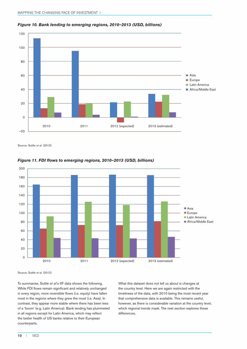
To summarise, Suttle et al.’s IIF data shows the following. While FDI flows remain significant and relatively unchanged in every region, more reversible flows (i.e. equity) have fallen most in the regions where they grew the most (i.e. Asia). In contrast, they appear more stable where there has been less of a ‘boom’ (e.g. Latin America). Bank lending has plummeted in all regions except for Latin America, which may reflect the better health of US banks relative to their European counterparts.
What this dataset does not tell us about is changes at the country level. Here we are again restricted with the timeliness of the data, with 2010 being the most recent year that comprehensive data is available. This remains useful, however, as there is considerable variation at the country level, which regional trends mask. The next section explores these differences.
Source: Suttle et al. (2012)
Figure 10. Bank lending to emerging regions, 2010–2013 (USD, billions)
Source: Suttle et al. (2012)
Figure 11. FDI flows to emerging regions, 2010–2013 (USD, billions)
120
100
80
60
40
20
0
–20
AsiaEuropeLatin AmericaAfrica/Middle East
AsiaEuropeLatin AmericaAfrica/Middle East
200
180
160
140
120
100
80
60
40
20
0
2010 2011 2012 (expected) 2013 (estimated)
2010 2011 2012 (expected) 2013 (estimated)
Mapping the changing face of investMent i
10 I IIED
3. National level investment flows, with a focus on sub-Saharan Africa
In this section we focus on low- and lower middle-income countries, as classified by the World Bank, and then particularly on the countries of sub-Saharan Africa.
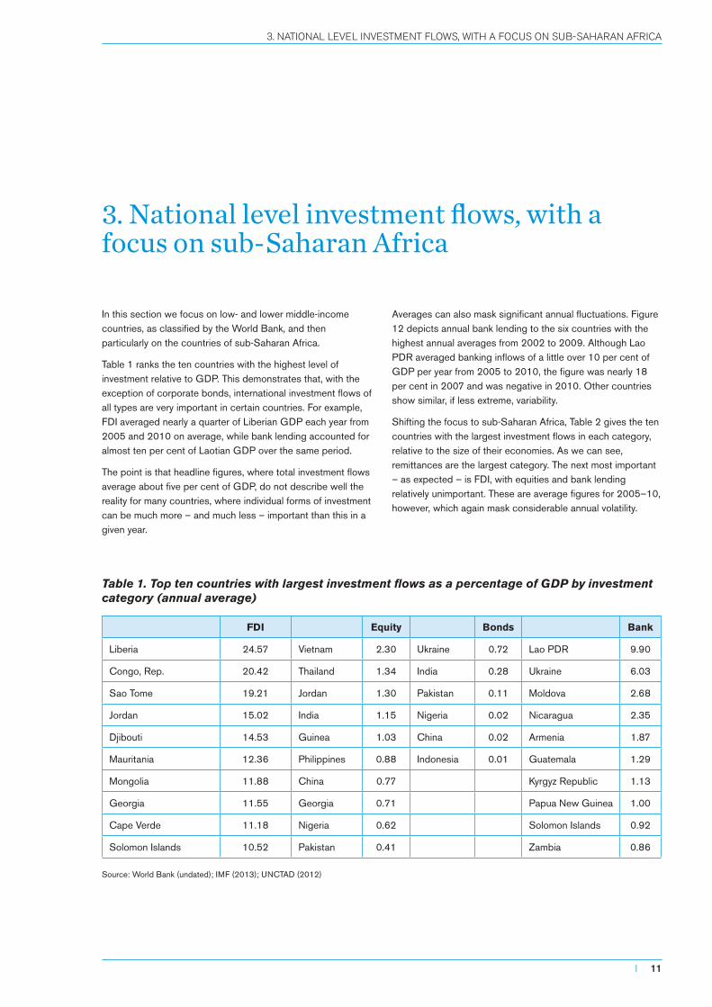
Table 1 ranks the ten countries with the highest level of investment relative to GDP. This demonstrates that, with the exception of corporate bonds, international investment flows of all types are very important in certain countries. For example, FDI averaged nearly a quarter of Liberian GDP each year from 2005 and 2010 on average, while bank lending accounted for almost ten per cent of Laotian GDP over the same period.
The point is that headline figures, where total investment flows average about five per cent of GDP, do not describe well the reality for many countries, where individual forms of investment can be much more – and much less – important than this in a given year.
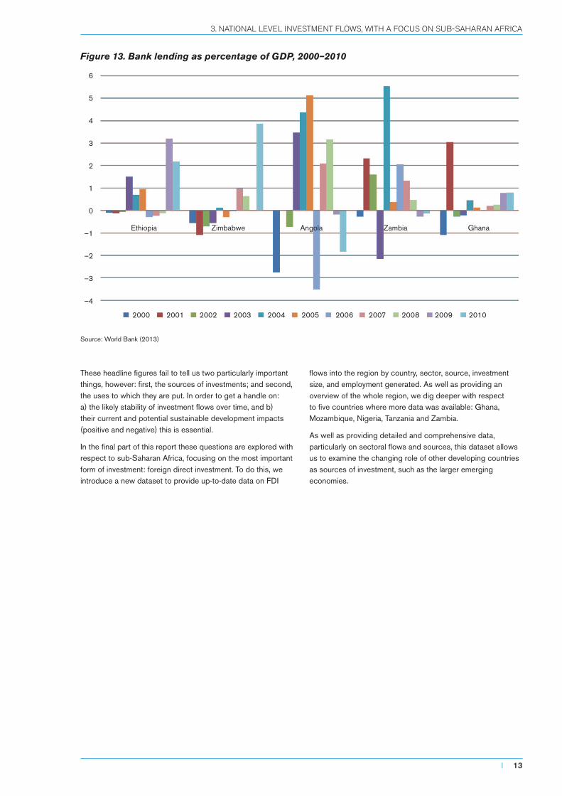
Averages can also mask significant annual fluctuations. Figure 12 depicts annual bank lending to the six countries with the highest annual averages from 2002 to 2009. Although Lao PDR averaged banking inflows of a little over 10 per cent of GDP per year from 2005 to 2010, the figure was nearly 18 per cent in 2007 and was negative in 2010. Other countries show similar, if less extreme, variability.
Shifting the focus to sub-Saharan Africa, Table 2 gives the ten countries with the largest investment flows in each category, relative to the size of their economies. As we can see, remittances are the largest category. The next most important – as expected – is FDI, with equities and bank lending relatively unimportant. These are average figures for 2005–10, however, which again mask considerable annual volatility.
Table 1. Top ten countries with largest investment flows as a percentage of GDP by investment category (annual average)
FDI Equity Bonds Bank
Liberia 24.57 Vietnam 2.30 Ukraine 0.72 Lao PDR 9.90
Congo, Rep. 20.42 Thailand 1.34 India 0.28 Ukraine 6.03
Sao Tome 19.21 Jordan 1.30 Pakistan 0.11 Moldova 2.68
Jordan 15.02 India 1.15 Nigeria 0.02 Nicaragua 2.35
Djibouti 14.53 Guinea 1.03 China 0.02 Armenia 1.87
Mauritania 12.36 Philippines 0.88 Indonesia 0.01 Guatemala 1.29
Mongolia 11.88 China 0.77 Kyrgyz Republic 1.13
Georgia 11.55 Georgia 0.71 Papua New Guinea 1.00
Cape Verde 11.18 Nigeria 0.62 Solomon Islands 0.92
Solomon Islands 10.52 Pakistan 0.41 Zambia 0.86
Source: World Bank (undated); IMF (2013); UNCTAD (2012)
I 11
3. NATIONAL LEvEL INvESTMENT FLOWS, WITH A FOCUS ON SUB-SAHARAN AFRICA

While bank lending is insignificant on average, this is not so in certain years as shown in Figure 13. For example, while it accounts for an average of only 0.64 per cent of annual Zambian GDP from 2005 to 2010, in 2004 alone bank inflows amounted to 5.5 per cent. The fact that cross-border lending can be strongly negative makes average figures misleading – outflows in Angola in 2006 were around 3.5 per cent of GDP, for example.
Although FDI is much more stable, annual variations can still create very large one-off impacts, given the size of projects relative to national economies: FDI inflows to Liberia in 2003, for example, were more than 80 per cent
of GDP. Remittances, in contrast, are less ‘lumpy’ – being comprised of large numbers of relatively small amounts rather than (potentially huge) single projects – and have become extremely important in many countries, as shown in Table 2 above.
Despite observable trends based on income level and region, the scale and pattern of investment flows is often quite country specific. Thus, while no sub-Saharan African country – with the exception of South Africa – has a large or important stock exchange, equity investment is not irrelevant. Portfolio flows to Mauritius, for example, accounted for around 2.5 per cent of GDP in 2009.
Source: World Bank (2013)
Table 2. Investment flows to sub-Saharan African economies as percentage of GDP (2005–2010 averages)
Banks FDI Equity Remittances
Ethiopia 0.94 Liberia 28.11 South Africa 2.48 Lesotho 38.99
Zimbabwe 0.86 Seychelles 24.96 Mauritius 0.67 Gambia 11.18
Angola 0.81 Congo, Rep. 20.96 Nigeria 0.62 Cape Verde 10.59
Zambia 0.64 Sao Tome 15.07 Swaziland 0.26 Togo 10.45
Ghana 0.36 Congo, D. R. 10.70 Togo 0.26 Senegal 10.28
Cape Verde 0.30 Cape Verde 10.38 Zambia 0.10 Liberia 6.63
Gabon 0.25 Mauritania 10.19 Botswana 0.09 Kenya 5.36
South Africa 0.21 Gambia 9.90 Uganda 0.08 Guinea-Bissau 5.23
Tanzania 0.19 Madagascar 8.74 Cape Verde 0.05 Nigeria 4.65
Gambia 0.17 Niger 7.19 Sierra Leone 0.05 Uganda 4.45
Source: World Bank (2013)
Figure 12. Annual international bank lending as percentage of GDP, 2002–2010
2002 2003 2004 2005 2006 2007 2008 2009 2010
20
15
10
5
0
–5
Lao PDR Ukraine Nicaragua Armenia Guatemala Kyrgyz Republic
Mapping the changing face of investMent i
12 I IIED
These headline figures fail to tell us two particularly important things, however: first, the sources of investments; and second, the uses to which they are put. In order to get a handle on: a) the likely stability of investment flows over time, and b) their current and potential sustainable development impacts (positive and negative) this is essential.
In the final part of this report these questions are explored with respect to sub-Saharan Africa, focusing on the most important form of investment: foreign direct investment. To do this, we introduce a new dataset to provide up-to-date data on FDI
flows into the region by country, sector, source, investment size, and employment generated. As well as providing an overview of the whole region, we dig deeper with respect to five countries where more data was available: Ghana, Mozambique, Nigeria, Tanzania and Zambia.
As well as providing detailed and comprehensive data, particularly on sectoral flows and sources, this dataset allows us to examine the changing role of other developing countries as sources of investment, such as the larger emerging economies.
Source: World Bank (2013)
Figure 13. Bank lending as percentage of GDP, 2000–2010
2000 2001 2002 2003 2004 2005 2006 2007 2008 2009 2010
6
5
4
3
2
1
0
–1
–2
–3
–4
Ethiopia Zimbabwe Angola Zambia Ghana
I 13
3. NATIONAL LEvEL INvESTMENT FLOWS, WITH A FOCUS ON SUB-SAHARAN AFRICA
4. FDI in sub-Saharan Africa, 2003–2011: a new dataset
Obtaining up-to-date and disaggregated data on investment flows is difficult. Publicly available sources, as we have seen, are either quite out of date, patchy in coverage, or not disaggregated by source country or sector. While it is possible to get a reasonable overview of investment inflows by recipient country and by type of investment, it is not possible to see where these investments came from, or what sectors of the economy they went to. For data that overcomes these problems, alternative sources are needed, with the private sector often providing the most timely and detailed data.
In this final section, we present descriptive statistics from a foreign direct investment dataset obtained from the Financial Times’ FDI Intelligence service.6 The dataset provides information on cross-border, ‘greenfield’ FDI7 by: number of projects; value of investments; jobs created; sectors and sub-sectors; and source countries. Data for the following are presented here: a regional overview of sub-Saharan African
FDI 2003–2011; and more detail for Ghana, Mozambique, Nigeria, Tanzania, and Zambia.
4.1 Total FDI
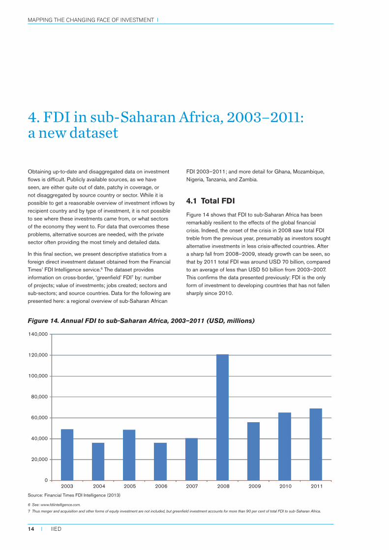
Figure 14 shows that FDI to sub-Saharan Africa has been remarkably resilient to the effects of the global financial crisis. Indeed, the onset of the crisis in 2008 saw total FDI treble from the previous year, presumably as investors sought alternative investments in less crisis-affected countries. After a sharp fall from 2008–2009, steady growth can be seen, so that by 2011 total FDI was around USD 70 billion, compared to an average of less than USD 50 billion from 2003–2007. This confirms the data presented previously: FDI is the only form of investment to developing countries that has not fallen sharply since 2010.
Source: Financial Times FDI Intelligence (2013)
Figure 14. Annual FDI to sub-Saharan Africa, 2003–2011 (USD, millions)
140,000
120,000
100,000
80,000
60,000
40,000
20,000
0 2003 2004 2005 2006 2007 2008 2009 2010 2011
6 See: www.fdiintelligence.com.
7 Thus merger and acquisition and other forms of equity investment are not included, but greenfield investment accounts for more than 90 per cent of total FDI to sub-Saharan Africa.
Mapping the changing face of investMent i
14 I IIED
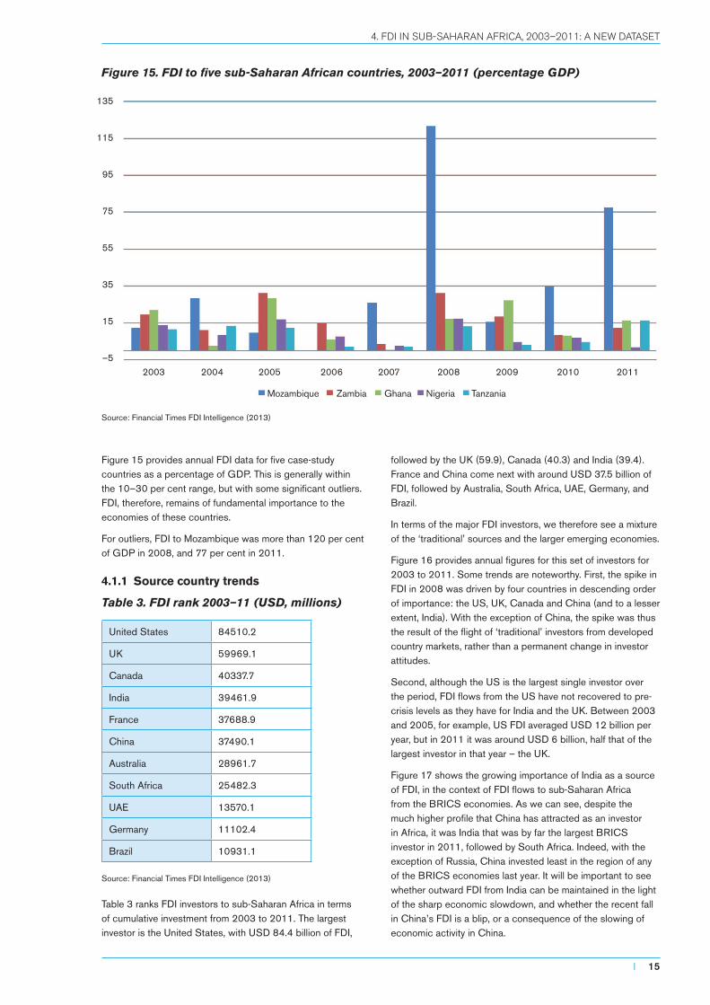
Figure 15 provides annual FDI data for five case-study countries as a percentage of GDP. This is generally within the 10–30 per cent range, but with some significant outliers. FDI, therefore, remains of fundamental importance to the economies of these countries.
For outliers, FDI to Mozambique was more than 120 per cent of GDP in 2008, and 77 per cent in 2011.
4.1.1 Source country trends
Table 3. FDI rank 2003–11 (USD, millions)
United States 84510.2
UK 59969.1
Canada 40337.7
India 39461.9
France 37688.9
China 37490.1
Australia 28961.7
South Africa 25482.3
UAE 13570.1
Germany 11102.4
Brazil 10931.1
Source: Financial Times FDI Intelligence (2013)
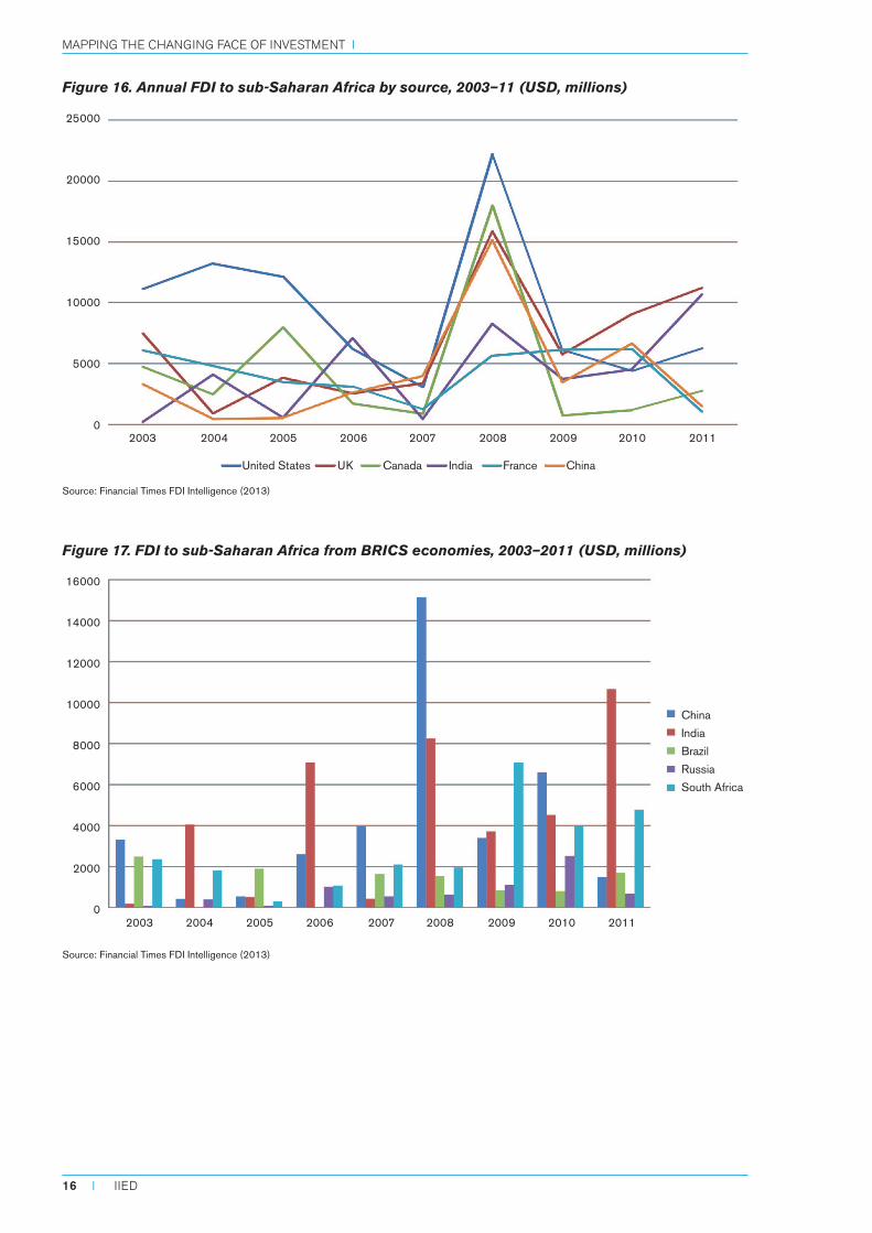
Table 3 ranks FDI investors to sub-Saharan Africa in terms of cumulative investment from 2003 to 2011. The largest investor is the United States, with USD 84.4 billion of FDI,
followed by the UK (59.9), Canada (40.3) and India (39.4). France and China come next with around USD 37.5 billion of FDI, followed by Australia, South Africa, UAE, Germany, and Brazil.
In terms of the major FDI investors, we therefore see a mixture of the ‘traditional’ sources and the larger emerging economies.
Figure 16 provides annual figures for this set of investors for 2003 to 2011. Some trends are noteworthy. First, the spike in FDI in 2008 was driven by four countries in descending order of importance: the US, UK, Canada and China (and to a lesser extent, India). With the exception of China, the spike was thus the result of the flight of ‘traditional’ investors from developed country markets, rather than a permanent change in investor attitudes.
Second, although the US is the largest single investor over the period, FDI flows from the US have not recovered to pre-crisis levels as they have for India and the UK. Between 2003 and 2005, for example, US FDI averaged USD 12 billion per year, but in 2011 it was around USD 6 billion, half that of the largest investor in that year – the UK.
Figure 17 shows the growing importance of India as a source of FDI, in the context of FDI flows to sub-Saharan Africa from the BRICS economies. As we can see, despite the much higher profile that China has attracted as an investor in Africa, it was India that was by far the largest BRICS investor in 2011, followed by South Africa. Indeed, with the exception of Russia, China invested least in the region of any of the BRICS economies last year. It will be important to see whether outward FDI from India can be maintained in the light of the sharp economic slowdown, and whether the recent fall in China’s FDI is a blip, or a consequence of the slowing of economic activity in China.
Source: Financial Times FDI Intelligence (2013)
Figure 15. FDI to five sub-Saharan African countries, 2003–2011 (percentage GDP)
2003 2004 2005 2006 2007 2008 2009 2010 2011
135
115
95
75
55
35
15
–5
Mozambique Zambia Ghana Nigeria Tanzania
I 15
4. FDI IN SUB-SAHARAN AFRICA, 2003–2011: A NEW DATASET
Source: Financial Times FDI Intelligence (2013)
Figure 16. Annual FDI to sub-Saharan Africa by source, 2003–11 (USD, millions)
Source: Financial Times FDI Intelligence (2013)
Figure 17. FDI to sub-Saharan Africa from BRICS economies, 2003–2011 (USD, millions)
16000
14000
12000
10000
8000
6000
4000
2000
0 2003 2004 2005 2006 2007 2008 2009 2010 2011
25000
20000
15000
10000
5000
0 2003 2004 2005 2006 2007 2008 2009 2010 2011
China
India
Brazil
Russia
South Africa
United States UK Canada India France China
Mapping the changing face of investMent i
16 I IIED
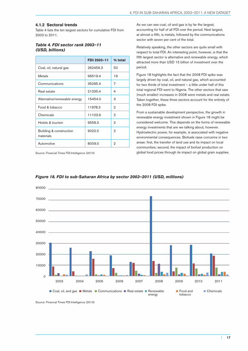
4.1.2 Sectoral trendsTable 4 lists the ten largest sectors for cumulative FDI from 2003 to 2011.
Table 4. FDI sector rank 2003–11 (USD, billions)
FDI 2003–11 % total
Coal, oil, natural gas 262456.3 50
Metals 96519.4 19
Communications 35295.4 7
Real estate 21335.4 4
Alternative/renewable energy 15454.0 3
Food & tobacco 11978.3 2
Chemicals 11103.9 2
Hotels & tourism 9558.3 2
Building & construction materials
9022.0 2
Automotive 8009.0 2
Source: Financial Times FDI Intelligence (2013)
As we can see coal, oil and gas is by far the largest, accounting for half of all FDI over the period. Next largest, at almost a fifth, is metals, followed by the communications sector with seven per cent of the total.
Relatively speaking, the other sectors are quite small with respect to total FDI. An interesting point, however, is that the fifth largest sector is alternative and renewable energy, which attracted more than USD 15 billion of investment over the period.
Figure 18 highlights the fact that the 2008 FDI spike was largely driven by coal, oil, and natural gas, which accounted for two thirds of total investment – a little under half of this total regional FDI went to Nigeria. The other sectors that saw (much smaller) increases in 2008 were metals and real estate. Taken together, these three sectors account for the entirety of the 2008 FDI spike.
From a sustainable development perspective, the growth in renewable energy investment shown in Figure 18 might be considered welcome. This depends on the forms of renewable energy investments that are we talking about, however. Hydroelectric power, for example, is associated with negative environmental consequences. Biofuels raise concerns in two areas: first, the transfer of land use and its impact on local communities; second, the impact of biofuel production on global food prices through its impact on global grain supplies.
Source: Financial Times FDI Intelligence (2013)
Figure 18. FDI to sub-Saharan Africa by sector 2003–2011 (USD, millions)
80000
70000
60000
50000
40000
30000
20000
10000
0 2003 2004 2005 2006 2007 2008 2009 2010 2011
Coal, oil, and gas Metals Communications Real estate Renewable Food and Chemicals energy tobacco
I 17
4. FDI IN SUB-SAHARAN AFRICA, 2003–2011: A NEW DATASET
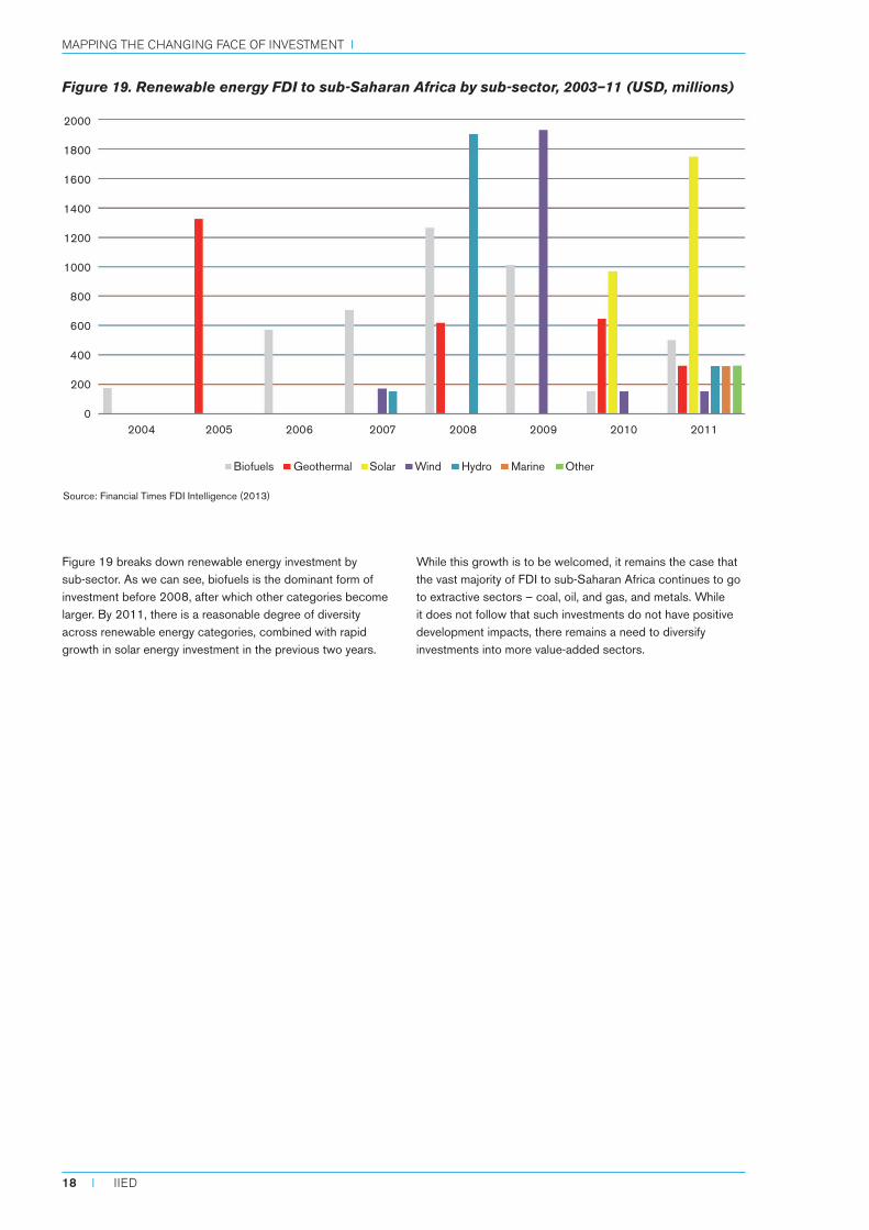
Figure 19 breaks down renewable energy investment by sub-sector. As we can see, biofuels is the dominant form of investment before 2008, after which other categories become larger. By 2011, there is a reasonable degree of diversity across renewable energy categories, combined with rapid growth in solar energy investment in the previous two years.
While this growth is to be welcomed, it remains the case that the vast majority of FDI to sub-Saharan Africa continues to go to extractive sectors – coal, oil, and gas, and metals. While it does not follow that such investments do not have positive development impacts, there remains a need to diversify investments into more value-added sectors.
Source: Financial Times FDI Intelligence (2013)
Figure 19. Renewable energy FDI to sub-Saharan Africa by sub-sector, 2003–11 (USD, millions)
2000
1800
1600
1400
1200
1000
800
600
400
200
0 2004 2005 2006 2007 2008 2009 2010 2011
Biofuels Geothermal Solar Wind Hydro Marine Other
Mapping the changing face of investMent i
18 I IIED
5. Conclusion
The main findings are:
■■ The great majority of cross-border investment in developing countries (around 75 per cent) goes to middle-income countries, with only around three per cent going to low-income countries (LICs).
■■ From the perspective of developing countries themselves, however, these differences largely disappear. Relative to the size of national economies, developing countries at different levels of income see a very similar level of investment inflow as a proportion of GDP.
■■ Inflows to LICs are dominated by remittances and foreign direct investment. Both tend to be more stable than portfolio flows (equity and bonds) – the latter being negligible in LICs.
■■ As one moves up the income scale in developing countries, investments become more diversified across investment categories.
■■ These averages can mask large national and temporal variations, but it may be the variations that have the greatest effects on actual development prospects:
■■ The scale and pattern of investment flows is often quite country-specific even within a given region or income group – equity inflows may be unimportant on average for a particular region, but very important for one or more countries in that region.
■■ Within countries, averages over time disguise major annual fluctuations – cross-border bank loans may average just 1 per cent a year of GDP, but can be as high as 10 per cent, or as low as -5 per cent in any given year.
■■ While the 2007–8 crisis saw investments to developing countries fall across all regions and income groups, LICs were the least affected. Two explanations are suggested:
■■ Cross-border investments in LICs are concentrated in the natural resource sector, which has benefited from the long boom in global commodity prices that survived the financial crisis relatively unscathed.
■■ Other developing countries have become increasingly important investors in LICs and, as pointed out above, these were less affected by the crisis than developed economies.
■■ The immediate aftermath of the financial crisis saw an increase, sometimes a sharp increase, of cross-border investments to developing countries.
■■ Since 2010, however, these have fallen back to pre-crisis levels in terms of proportion of GDP across developing countries, with only FDI showing both remarkable stability and resuming an upward trend.
■■ FDI to sub-Saharan Africa remains concentrated in the natural resources sector. The major spike in investment at the time of the global financial crisis was largely accounted for by fossil fuels. Although investment in renewables has increased, and become more diversified, it remains dwarfed by investment in fossil fuels.
■■ Other developing countries have become increasingly important FDI investors in Africa. Despite the attention paid to China, 2011 saw Chinese direct investment plummet, with India followed by South Africa becoming the largest investors.
This paper has reviewed the trends in investment flows to developing countries and regions since the global financial crisis of 2008, placing this in a longer-term context of investment from the early 1990s. At the outset, the question was posed of whether the apparent step change in the level of investment flows in the immediate aftermath of the crisis marked a turning point, where investment flows into developing countries would be less driven by events in developed markets, becoming more driven by conditions in their own economies. It was also suggested that, if so, this might create the conditions for external investment to make a greater contribution to sustainable development.
The evidence suggests no such step change has occurred in terms of overall investments. Following a spike in 2008, and the maintenance of historically high total flows to 2010, total cross-border investment to developing countries has since fallen sharply and appears strongly influenced by conditions in developed countries, particularly the eurozone. An exception is FDI. As well as being the most important (excluding remittances) type of investment for most developing countries, FDI has been the most resilient to economic and financial shocks. In the post-crisis period this has been maintained, with steady annual FDI growth occurring throughout the developing world.
I 19
5. CONCLUSION

New sources are emerging, however. The larger emerging economies, particularly China and India, have become increasingly important direct investors in other developing countries, not least sub-Saharan Africa. These economies, as well as others such as Brazil, are also more likely to be seen as independent sources of global growth.
To the extent that investment flows to low-income countries have become decoupled from events in developed countries, therefore, they are instead increasingly ‘coupled’ with prospects in larger emerging economies. If – and this is a big if – these latter countries can continue to grow rapidly, this process is likely to continue. The implications for the scale and patterns of inward investment to LICs are not clear, but what is clear is the fact that new development opportunities and challenges will increasingly emerge.
Mapping the changing face of investMent i
20 I IIED
References
Financial Times FDI Intelligence (2013) Global FDI database, www.fdiintelligence.com (accessed 11 June 2013).
IMF (2013) World economic outlook database, www.imf.org/external/pubs/ft/weo/2013/01/weodata/index.aspx (accessed 11 June 2013).
IIF (2013) Capital flows to emerging economies database, Institute for International Finance, Washington DC, www.iif.com/emr/global/capflows (accessed 11 June 2013).
IIF (2012) Capital flows user guide, IIF Research Note, IIF, Washington DC. Available at www.iif.com/emr/global/capflows
Suttle, P., Koepke, R. and Tiftik, M. E. (2012) Capital flows to emerging market economies, IIF Research Note, Institute for International Finance, Washington DC, http://iif.com/emr/resources+1670.php.
TheCityUK (2011) Fund management, Financial Markets Series, TheCityUK, London, www.thecityuk.com/assets/Uploads/Fund-Management-2011.pdf (accessed 11 June 2013).
UNCTAD (2012) Statistical database, United Nations Conference on Trade and Development, http://unctad.org/en/pages/statistics.aspx (accessed 11 June 2013).
World Bank (2013) ‘Data: Country and lending groups,’ http://data.worldbank.org/about/country-classifications/country-and-lending-groups (accessed 11 June 2013).
World Bank (undated) ‘World development indicators’, http://data.worldbank.org/indicator (accessed 11 June 2013)
I 21
REFERENCES
80-86 Gray’s Inn Road, London WC1X 8NH, UK
Tel: +44 (0)20 3463 7399 Fax: +44 (0)20 3514 9055 email: [email protected] www.iied.org
Mapping the changing face of investment Cross-border flows to developing countries, before and after the financial crisis
The financial crisis of 2007–8 was so severe, and its impacts so deep-seated, that – for some – this is a new world now. Economic theory is being re-written; some commentators point to a rapid transfer of economic power from the United States and Europe to the BRICS: Brazil, Russia, India, China, and South Africa. Not only that, but growth rates across many parts of the developing world have increased, seemingly less affected by the global economic turndown than most developed economies.
Are we witnessing a ‘decoupling’, as growth in developing countries becomes increasingly independent of prospects in developed economies? What are the implications for development? Did the change in the level of investment flows in the immediate aftermath of the crisis mark a turning point, where investment flows into developing countries are becoming more driven by conditions in their own economies, rather than events in developed economies? If so, this might create the conditions for external investment to make a greater contribution to sustainable development.
This paper compiles and presents data from a variety of sources to provide a snapshot of investment flows to developing countries; cross-border investment flows from 1990 to 2012 are examined to identify patterns of investment and to consider how these have changed in recent years. It also compares pre- and post-crisis data from a variety of angles, to consider where the ‘face of investment’ appears to have changed, and where not, to see what opportunities and challenges for development might emerge.
The International Institute for Environment and Development (IIED) is a policy and action research organisation working to promote sustainable development – development that improves livelihoods in ways that protect the environments on which these are built. Based in London and working on five continents, we specialise in linking local priorities to global challenges. In Africa, Asia, Latin America, the Middle East, and the Pacific, we work with some of the world’s most vulnerable people to ensure they have a say in the decision-making arenas that most directly affect them — from village councils to international conventions.
This paper was produced by IIED’s Sustainable Markets Group. The Sustainable Markets Group drives IIED’s efforts to ensure that markets contribute to positive social, environmental and economic outcomes. The group brings together IIED’s work on market governance, business models, market failure, consumption, investment, and the economics of climate change.
ISBN 978-1-84369-947-7