Embed Size (px)
Citation preview

Dr . Oliver Strimpel The Computer Museum 300 Congress Street Boston MA 02210
Dr. Strimpel,
May 28 , 1985
Digital Image Analysis Laboratory University Computing Center University of Massachusetts
Amherst MA 01003
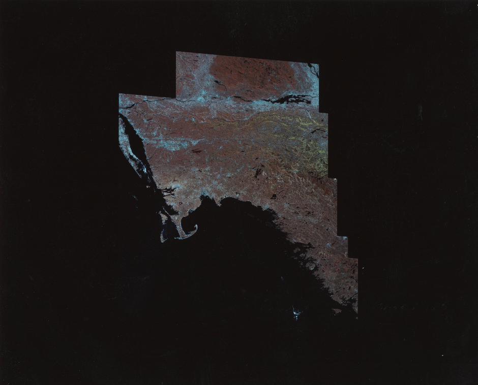
I am ~riting to confirm our phone call of May 21st regarding the donation of our ne~est LANDSAT mosaic of Ne~ England by ourselves and the National Geographic Society.
Duncan Chesley and I met at the Geographic last ~eek ~ith Jon Schneeburger, the editor of illustrations for the 'Atlas of North America' project. This publication (a large format, hardcover book) ~ill be available to Society members in November 1985 . The Atlas ~ill be a sho~case for remotely-sensed data and digitally processed imagery . Our laboratory ~as
commissioned to create the Ne~ England mosaic specially for the Atlas .
The Atlas is currently in the final stages of completion and ~ill go to the printers at the end of July. During the period from July through November, the Geographic ~ill be publicizing the Atlas to it's members and in the popular press. As part of this scheme, they are excited about the possibility of creating a very large reproduction of the Ne~ England mosaic and donating it to the Museum.
I have enclosed a print of the mosaic for your inspection . This print is, unfortunately, not exceptionally high quality . Ho~ever, it does give you a good vie~ of the geographic scope of the image . The image contains 11 fullresolution LANDSAT MSS scenes from Fall 1978. As ~ith the southern Ne~
England mosaic, all the scenes are from different dates, and ~ere gathered by t~o LANDSATs (II and III). The total data volume is 390 megabytes . Approximately 25 individual processes ~ere used to create the final image.
The major ne~ feature in this image is the extensive fall foliage color in northern Vermont and Ne~ Hampshire. This lends the yello~ and orange coloration to the mountain areas . Note that ~e ~ere again able to find coverage ~ith no cloud cover - qUite lucky for this part of the country.
This print is made from a 2x2 reduction of the actual data - the fullresolution image is thus 4 times as detailed.
While ~e ~ere unable to lay any concrete plans during our first I believe the Geographic is anxious to cooperate ~ith the museum. I in contact ~ith their public relations staff during the next several and ~ill have them contact you as soon as it is appropriate .
meeting, ~ill be
months,

I, too, am excited about the idea of cooperating with the museum. We are very pleased that you consider our work of display quality. I look forward to working w th you in the near future.
~M. Oliver DIAL / UCC
cc: C. Wogrin, UCC director D. Chesley, DIAL head J. Heckman, NGS NA Atlas project

#1-4 P~og~e55ion f ~ om t~aditional g~aph of F(x) to many F(x) s. Then the same data plotted as a digital image.
#5 Electron mic~05cope data plotted \5ee printed description #1-2)
#6-7 Plots of mathematical functions. white, low are blue.
(,:1), t'V #8 Example of photog~aphic film vs. diqital detecto~s.
~~i-x; ~~r "'~ l~' n -7. E ~:~ IJ f! .~.::;
:H :i. ..... :? ~:J 1"'1 C) !;'.) ~::; t. 1"'1 f~~ r:~ffE!ct of cw' i CI :i. n cd L d.I"·1 c:I ~:; <'::1. t d ,::<. t <::( •
Shows the effect of dest~iping
#6 See c:lesc. #11 (no sproket holes).
l'y'licl'''u<,.;c::ope PlctUI'''(':! of e;uqar" c:r" ·/,::~,'I:,'':\.l'::;. \ ~ ~
-~j". ~~'t1MIrI 4 ~ 11\ 1/ •
]ciginal "'-'0 ""ha'KR<J X--,-aV. a( ~ #11 Schoul of fis h from an airplane at night. Brightness is t.he luminesc::ence in the water sti~~ed up by the muvement of the fish.
#12 Temperatu~e image of the Atlantic:: coast .

Oliver Strimpel Computer Museum Museum Wharf
Digital Image Analysis Laboratory University Computing Center / GRC
University of Massachusetts Amherst, MA 01003 Ph. (413) 646-2690
October 18, 1984
300 Congress St. Boston, MA 02210
Dear Mr. Strimpel:
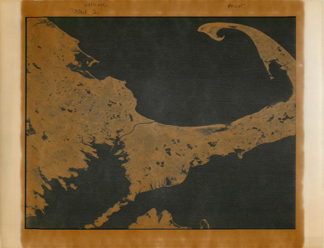
Enclosed are the pictures illustrating the basic steps in performing a classification on Landsat data. The sequence starts with the raw data in one band (band 7 IR) and shows destriping and geocorrection in black and white. Then three bands are combined to make the typical red composite color image. Finally the classified result is the green color image of the cape. I ahve attached a more complete description of the films.
Today I have copied part of the 6260 bpi TM tape to a 1600 bpi tape. I will be mailing that shortly under a separate cover with a detailed explanation of the process.
I am glad to be able to help you out. Will these films be in time for the Museum opening? Let us know if you need any more information.

Picture Descriptions
Note: For the black and white pictures I am referring to the hardcopy images when I say bright or dark, not to the film negatives.
Image 1 (BADCAP6 and the magnified version)
This image is the Braw· data for Landsat band 7 as it is received and preprocessed by NASA and EDC. The incoming data stream has been reformatted into an image, and some radiometric corrections have been applied in order to make a useable image. (We actually artificially enhanced the stripes because this particular image was qUite clean to begin with.)
Because the NSS scans 6 lines simultaneously with 6 different detector systems, there is still some residual horizontal striping in the image due to the improper calibration of the sensors. In the full cape image the stripes appear to be narrow bright lines in the ocean and dark lines in the land. The magnified version reveals the true nature of the stripes. Three sensors are matched qUite well, one is too bright, and two are too dark.
Image 2 STCAPE7
The first processing algorithm removed these stripes. The program assumes that the histograms for each of the sensors should be identical. It calculates the histograms, computes the adjustment, and adjusts each line according to which sensor the line came from. In this way the stripes are removed as shown in this image. (The small amount of left over striping is due to the hardcopy device.) All the four bands must be destriped before further analysis.
Image 3 GEOCAP7
The next step is to geometrically correct the image to remove the distortion due to the scanner optics, the satellite motion in its orbit, and the curvature of the earth. If this is done exactly it is one of the most expensive parts of the analysis. Here we have done an approximate version which should be adequate for display purposes. All four bands must be geometrically corrected.
NOTE: NORTH is 9.2 degrees counter-clockwise from UP in all the rest of the images (and in the MOSAIC we sent also).
Band 7 on MSS is very sensitive to water. In this band wet areas on the land ShOW up significantly darker than dry land, and the ocean is very dark compared to the land. Note the marsh area on the north side of the cape at the lower right. This is dark because it is wet.

Image 4 GEOCAP4
This is a destriped, geometrically corrected Landsat Band 4 image taken at the same time as the band 7 image. Band 4 is a blueish filter. It is sensitive to turbidity in the water. The ocean and the land appear roughly the same brightness here. Note that the urban areas and Otis AFB stand out very clearly in band 4 but not at all in band 7. Note also that the marsh area on the cape looks brighter than its surroundings.
Image 6 (red cape)
In order to simultaneously view features in the different bands we have made the traditional Landsat composite color image. We have printed band 4 as the blue in the film, band 6 (green) as green, and band 7 (IR) as red. The result is a photograph that looks something like a color IR photo. Green vegetation appears bright red. The major color is a duller red because of the season.
The ocean is blue because it was brightest in band 4 and very dark in the other two bands. The beaches and surf are white because they are highly reflective and equally bright in all three bands.
Every color we see can be produced as a combination of blue, green, and red light. With some practice a researcher can look at the colors in an image like this and determine the amounts of blue, green, and red light that make up a particular color. The researcher then knows the relative brightness of the object in the three original bands.
By finding regions of the same color in this image the researcher is performing a manual, visual classification of the image pixels into categories or classes of ground cover. This means saying, for example, that every place that is dark blue is water.
Image 6 (green cape)
The human eye is only moderately good at this grouping. One problem is that the decomposition of colors only allows the use of three input bands. Another problem is that everyone sees color differently, and consistency of color perception is nearly impossible. Landsat researchers use a computer program to perform this same task using 4 or sometimes 5 different bands as input, and a statistical algorithm to assure conSistency in results.

This image was produced by the classification program. It shows the cape divided into 6 broad categories of ground cover. These are:
dark blue - deep water light blue - shallow water
red - tidal flats yellow - wetlands
dark green - softwoods light green - hardwoods
white - dry grasses
Using classified images such as this it is very easy for a computer to add up all the spots that are vhite (for example) to get an acreage count for all dry grasses in this part of New England. It would be very difficult (or impossible) to gather the same information with the same accuracy vith more traditional manual site surveys.
This image was produced as part of a survey of all the salt water marshes on the east coast from Cape Hatteras to Maine. The images and original Landsat data were supplied by the CHARM Project of the National Marine Fisheries Service. and the Department of Fisheries and Wildlife Management at the University of Massachusetts. Image enhancement. processing. and display vere done at the Digital Image Analysis Laboratory. UMass.

Digital Image Analysis Laboratory UCC / Lederle GRC ! UMass
Amherst, MA 01003 PI" ', • (ii, 1 ::::.) ~,;,:jl].~,:i"'''26ciO
September 19 ,1984
Dr. Oliver Strimple Comp u t 1".' 1" Ivll...!, ~?,E'Um Bu<:.; t, ur', , 1"'1(:),
Dear Dr. Strimwle:
Thank you very much for yuur great interest in our work. I hope that some of these slides may be useful in yuur exhibit. While there isn't time to do anything fancy, there may be some simple things we could do to add to the slides included here, or to improve sume uf them.
( I 1"', <~~Vf.? E'r',cln~:,F~'d thp lc:lr"cJE' E:kt",ichr"ornE' of thE' 1\1 PI.',.! E:ngl';='lr",c:I
mosaic, and a booklet containing most nf our slides and snme
l d E)~::;, C "" i P t, i or", ~:;. 13£-:,:c i:':IU ~:;p of t,I'''j E) t, i rne f r" c.'lrnE! + 0"" \'OUI" P "" 0 j F:!C t:, I h ,,;l,VE?
been forced to include some slides for which there is no other cupy. Please be very careful with the "slides. Thpre arp 54 in E~.J :I. II
I have also enclosed a poster which we have recently printed. Would you likp to sell some of these in the Museum store? We have abnut 500 of them, and could print more. I suggest a retail price of $10. We can qenerate other similar posters of images shown in the slides. Wp can also rpplacp the University's name and logo with other information.
At the top of page 1 of the slides I have 8 slides wh~ch ":Ln"i::I'''uciLtCf2'' tht:,? :i,dE''-;:'" o'f ,"'~ di(Jit,Ell :i, mi::"(]C! ,-:;(~::; <:~, \1\'';:1'>'' to plot: ,,'~ny
function F(x,y). Up to a million woints in such a function can be displayed simultaneousl y.
manipulations that included several examples of display make the data easier to interpret.
The classification sequence at the top of page 2 shows the most common type of procpssing done with satellite imagery. Classificatinn is the way we (and everyone else) find out hnw well the world's wheat crop is gning to turn out each year.
Page three, slides 1-4 are the only examples I have of processing being done to change an image. To fill this gap I will make some filtprpd images for you. Using the czes image as the original I will generate a smoothed image and an edge enhanced image using some filtering techniqups. when I get something that looks good.
I ' 1 1 C:,I :i, 'v' E' i:';\ C ;;:', 1 1
Good luck with the mosaic. I can hardly wait to see the finished mural. Let me know if you need more information about any of the slides. A brief description folluws. The printed descriptions are old and may not be completely accurate. I number my slides from upper-left to lower-right in the sleeves.

#13 Glowing gas around a hot star as seen with a radio telescope.
#14 Gala:·:y.
#15 Image from a data base of health statistics for Mass. Shows which towns have gotten much worse as far as heart disease is concerned.
#16 Data base on ocean temperatures during the year.
#17 Data base of climatological data.
#18-20 See description #12-14.
One last plea to be very careful with my slides. not reproducible.
P.s. Please have the credit line read:
Images furnished by the Digital Image Analysis Laboratory, University Computing Center, University of Massachusetts at Amherst.
DMC
Some are