Embed Size (px)
Citation preview
Automating Assessment of WebSite Design
Melody Y. Ivory and Marti A. HearstUC Berkeley
1999 - 2002
2
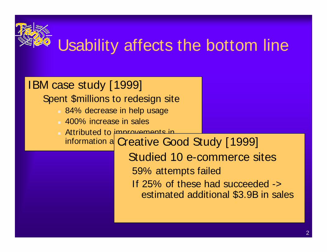
Usability affects the bottom line
IBM case study [1999]Spent $millions to redesign site
84% decrease in help usage400% increase in salesAttributed to improvements in information architectureCreative Good Study [1999]
Studied 10 e-commerce sites59% attempts failedIf 25% of these had succeeded ->
estimated additional $3.9B in sales
3
Problem Statement
♦Non-professionals need help designing high-quality Web sites– Design guidelines conflict; are not
empirically-validated; and ignore context
♦One solution– Empirically-validated, automated analysis
of Web sites
4
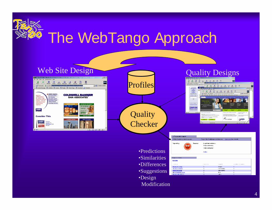
The WebTango Approach
•Predictions•Similarities•Differences•Suggestions•Design
Modification
Quality Checker
Web Site Design
ProfilesQuality Designs
5
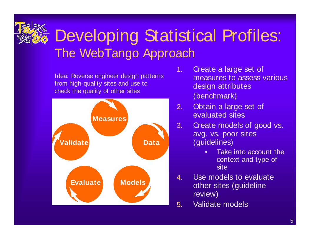
Developing Statistical Profiles:The WebTango Approach
1. Create a large set of measures to assess various design attributes (benchmark)
2. Obtain a large set of evaluated sites
3. Create models of good vs. avg. vs. poor sites (guidelines)
• Take into account the context and type of site
4. Use models to evaluate other sites (guideline review)
5. Validate models
Idea: Reverse engineer design patterns from high-quality sites and use to check the quality of other sites
Measures
Data
ModelsEvaluate
Validate
6
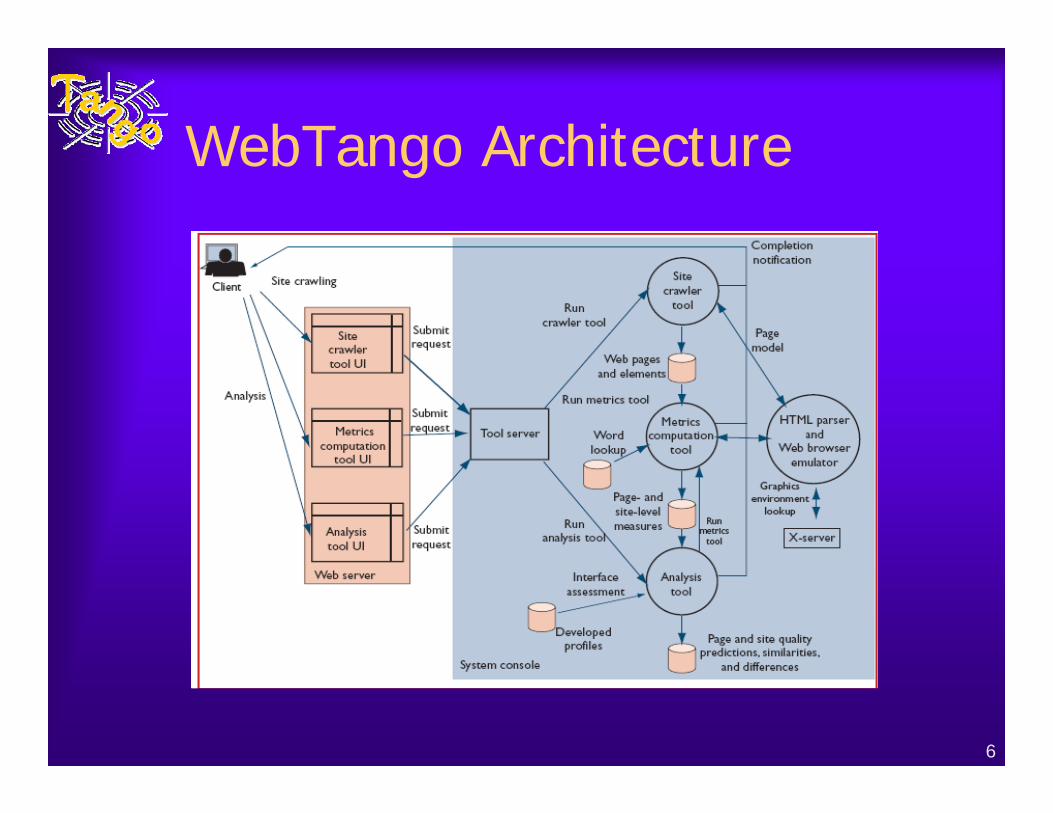
WebTango Architecture
7
Step 1: Measuring Web Design Aspects♦ Identified key aspects from the literature
– Extensive survey of Web design literature: texts from recognized experts; user studies
• the amount of text on a page, text alignment, fonts, colors, consistency of page layout in the site, use of frames, …
– Example guidelines• Use 2–4 words in text links [Nielsen00].• Use links with 7–12 useful words [Sawyer & Schroeder00].• Consistent layout of graphical interfaces result in a 10–25% speedup in
performance [Mahajan & Shneiderman96].• Use several layouts (e.g., one for each page style) for variation within
the site [Sano96].• Adhere to accessibility principles in order to create sites that serve a
broad user community [Cooper99; Nielsen00]• Avoid using ‘Click Here’ for link text [Nielsen00]• Use left-justified, ragged-right margins for text [Schriver97]
– No theories about what to measure
8
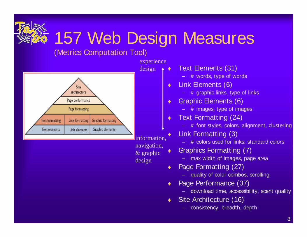
157 Web Design Measures(Metrics Computation Tool)
♦ Text Elements (31)– # words, type of words
♦ Link Elements (6)– # graphic links, type of links
♦ Graphic Elements (6)– # images, type of images
♦ Text Formatting (24)– # font styles, colors, alignment, clustering
♦ Link Formatting (3)– # colors used for links, standard colors
♦ Graphics Formatting (7)– max width of images, page area
♦ Page Formatting (27)– quality of color combos, scrolling
♦ Page Performance (37)– download time, accessibility, scent quality
♦ Site Architecture (16)– consistency, breadth, depth
information, navigation,& graphicdesign
experiencedesign
9
Page-Level Measures
10
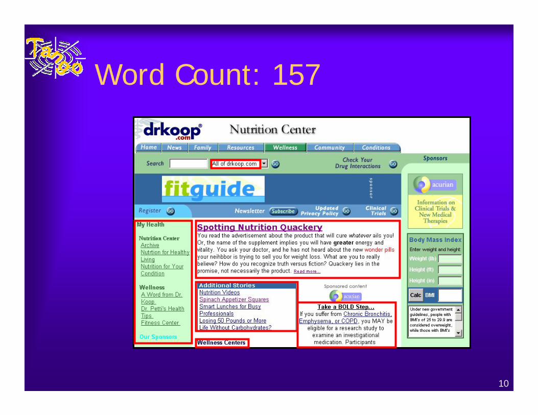
Word Count: 157
11
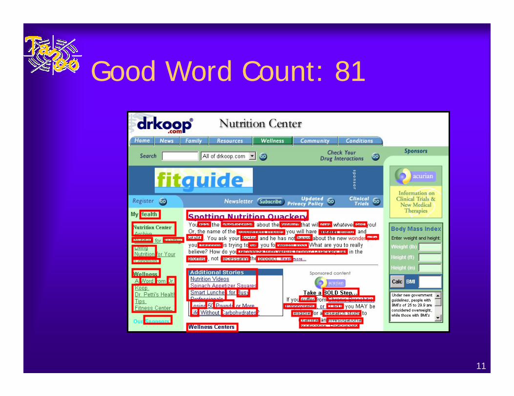
Good Word Count: 81
12
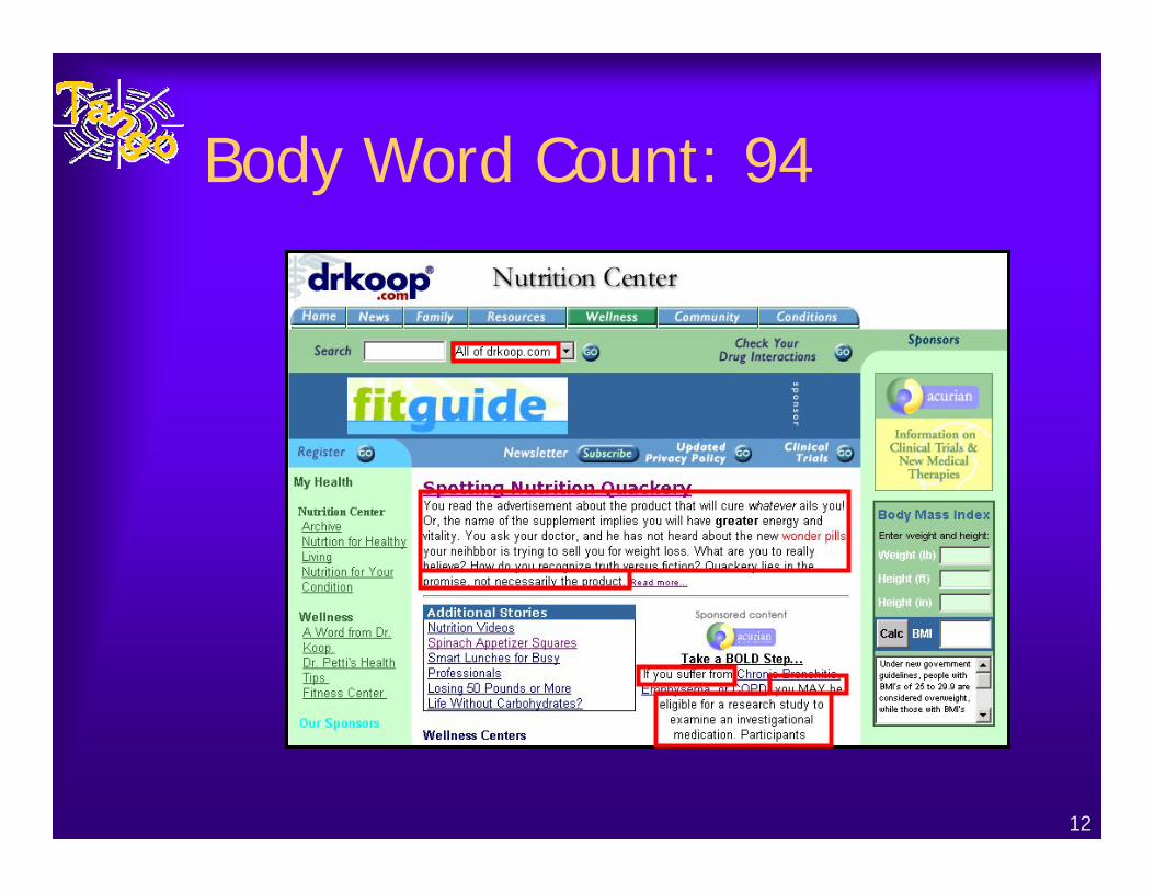
Body Word Count: 94
13
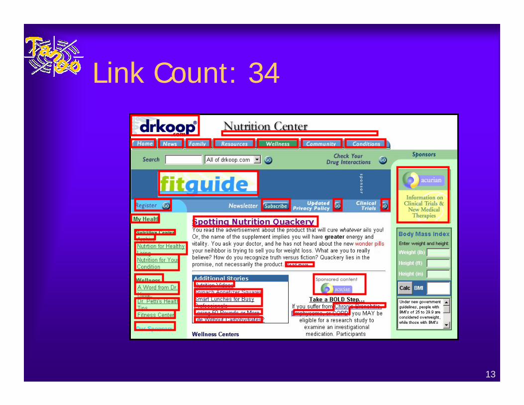
Link Count: 34
14
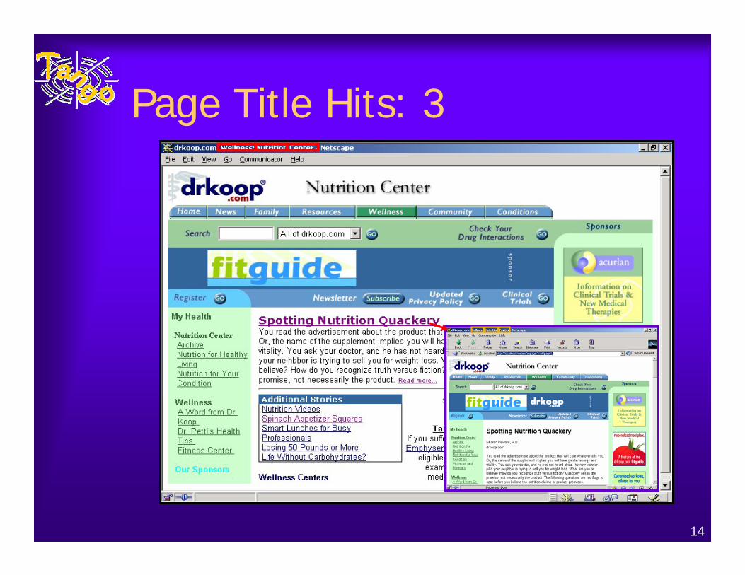
Page Title Hits: 3
15
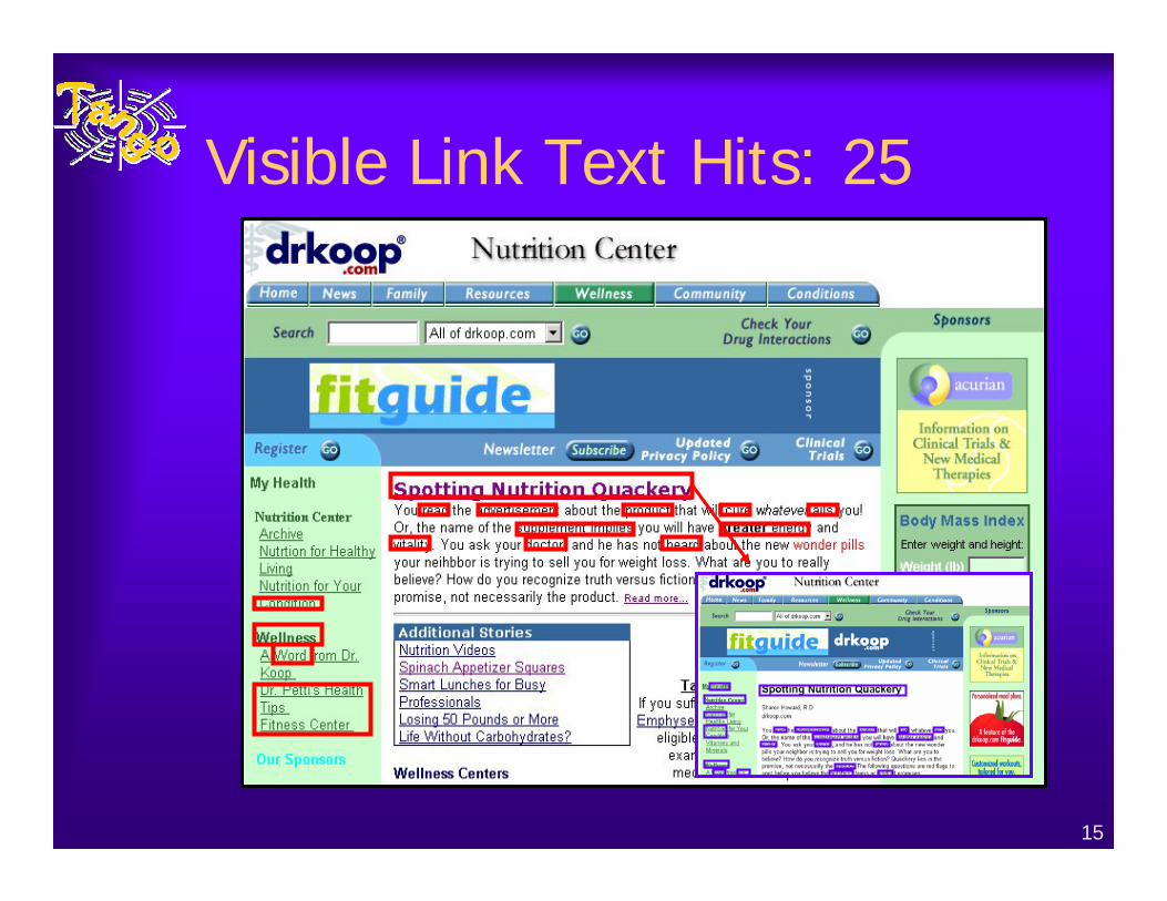
Visible Link Text Hits: 25
16
Site-Level Measures
17
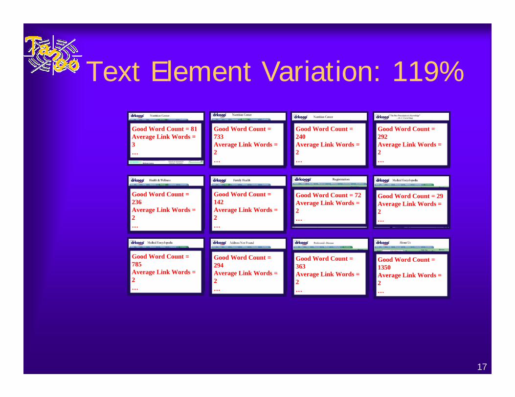
Text Element Variation: 119%
Good Word Count = 81Average Link Words = 3…
Good Word Count = 733Average Link Words = 2…
Good Word Count = 240Average Link Words = 2…
Good Word Count = 292Average Link Words = 2…
Good Word Count = 236Average Link Words = 2…
Good Word Count = 142Average Link Words = 2…
Good Word Count = 72Average Link Words = 2…
Good Word Count = 29Average Link Words = 2…
Good Word Count = 785Average Link Words = 2…
Good Word Count = 294Average Link Words = 2…
Good Word Count = 363Average Link Words = 2…
Good Word Count = 1350Average Link Words = 2…
18
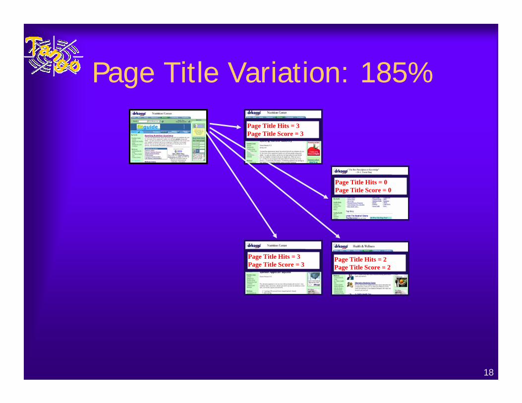
Page Title Variation: 185%
Page Title Hits = 3Page Title Score = 3
Page Title Hits = 3Page Title Score = 3
Page Title Hits = 0Page Title Score = 0
Page Title Hits = 2Page Title Score = 2

19
Webby Awards Data
20
Step 2: Obtaining a Sample of Evaluated Sites♦ Webby Awards 2000
– Only large corpus of rated Web sites♦ 3000 sites initially
– 27 topical categories• Studied sites from informational categories
– Finance, education, community, living, health, services
♦ 100 judges– International Academy of Digital Arts & Sciences
• Internet professionals, familiarity with a category
– 3 rounds of judging (only first round used)• Scores are averaged from 3 or more judges• Converted scores into good (top 33%), average (middle
34%), and poor (bottom 33%)
21
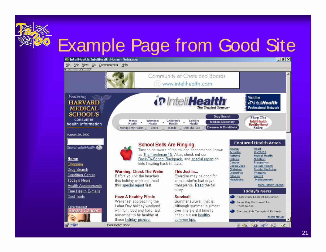
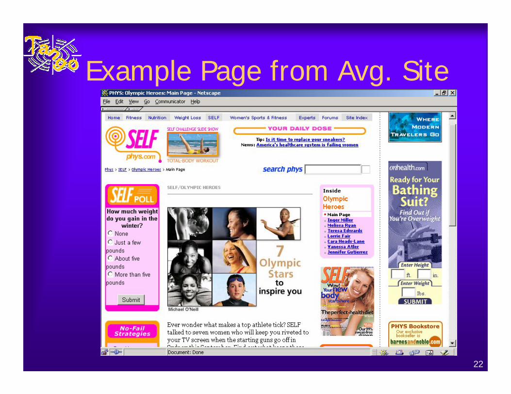
Example Page from Good Site
22
Example Page from Avg. Site
23
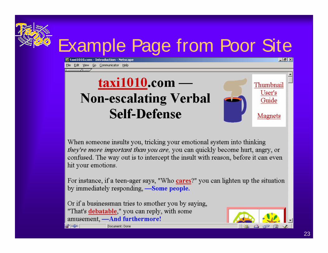
Example Page from Poor Site
24
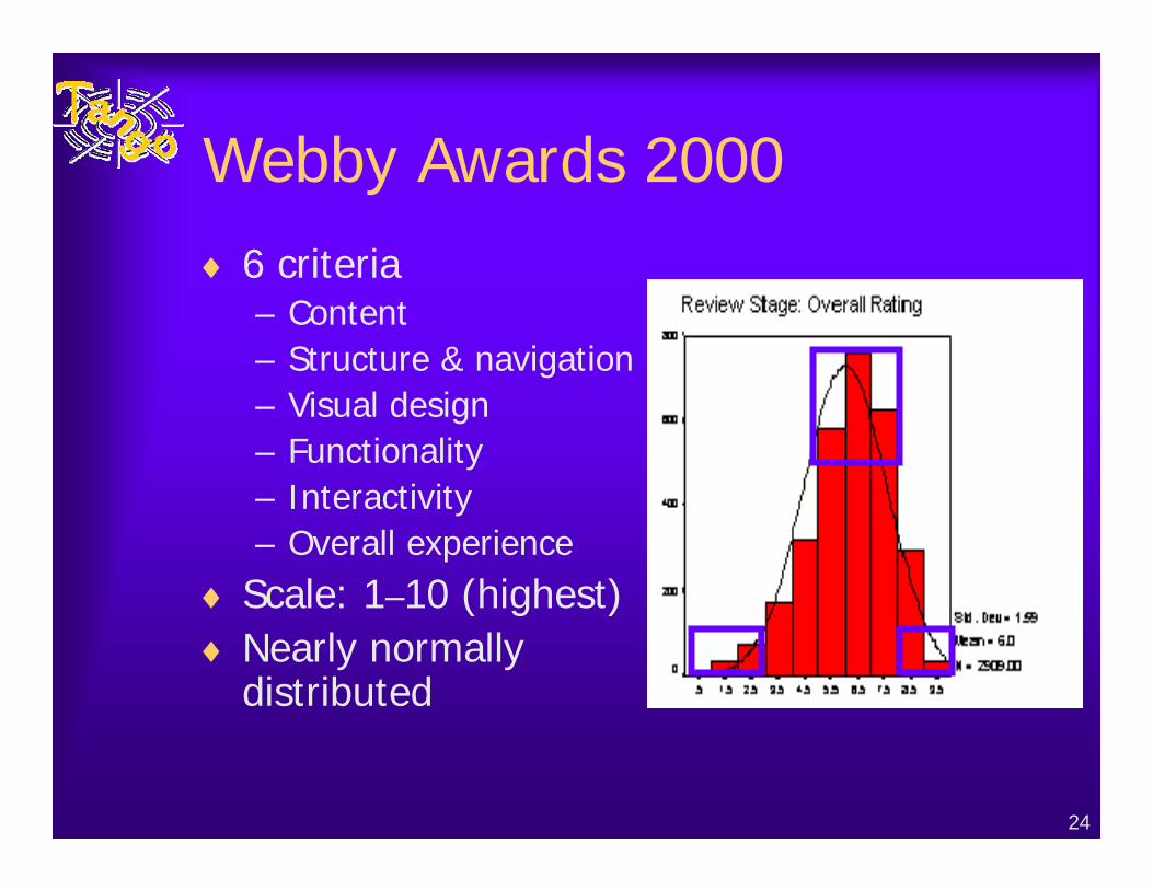
Webby Awards 2000♦ 6 criteria
– Content– Structure & navigation– Visual design– Functionality– Interactivity– Overall experience
♦ Scale: 1–10 (highest)♦ Nearly normally
distributed
25
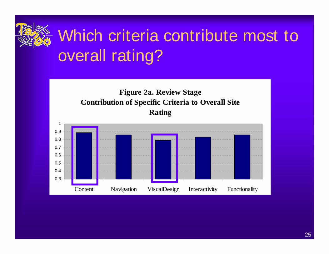
Which criteria contribute most to overall rating?
Figure 2a. Review StageContribution of Specific Criteria to Overall Site
Rating
0.3
0.4
0.5
0.6
0.7
0.8
0.9
1
Content Navigation VisualDesign Interactivity Functionality
26
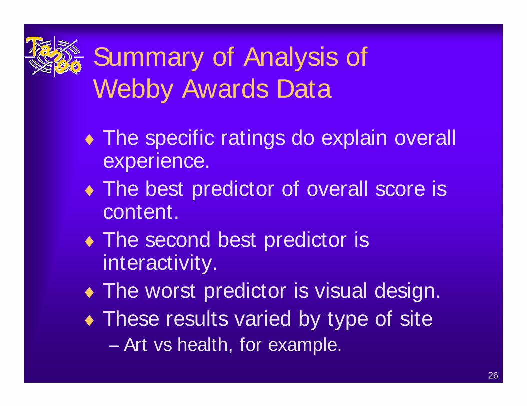
Summary of Analysis of Webby Awards Data
♦The specific ratings do explain overall experience.
♦The best predictor of overall score is content.
♦The second best predictor is interactivity.
♦The worst predictor is visual design.♦These results varied by type of site
– Art vs health, for example.
27
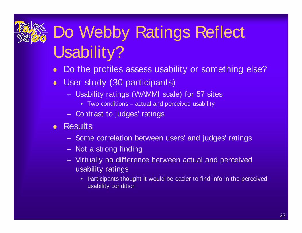
Do Webby Ratings Reflect Usability?♦ Do the profiles assess usability or something else?♦ User study (30 participants)
– Usability ratings (WAMMI scale) for 57 sites• Two conditions – actual and perceived usability
– Contrast to judges’ ratings
♦ Results– Some correlation between users’ and judges’ ratings– Not a strong finding – Virtually no difference between actual and perceived
usability ratings• Participants thought it would be easier to find info in the perceived
usability condition
28
Building the Data Set
♦Downloaded pages from sites using a Site Crawler Tool– Downloads informational pages at multiple
levels of the site♦Used a Metrics Computation Tool to
compute measures for the sample– Processes static HTML, English pages
• Measures for 5346 pages• Measures for 333 sites
– No discussion of site-level models
29
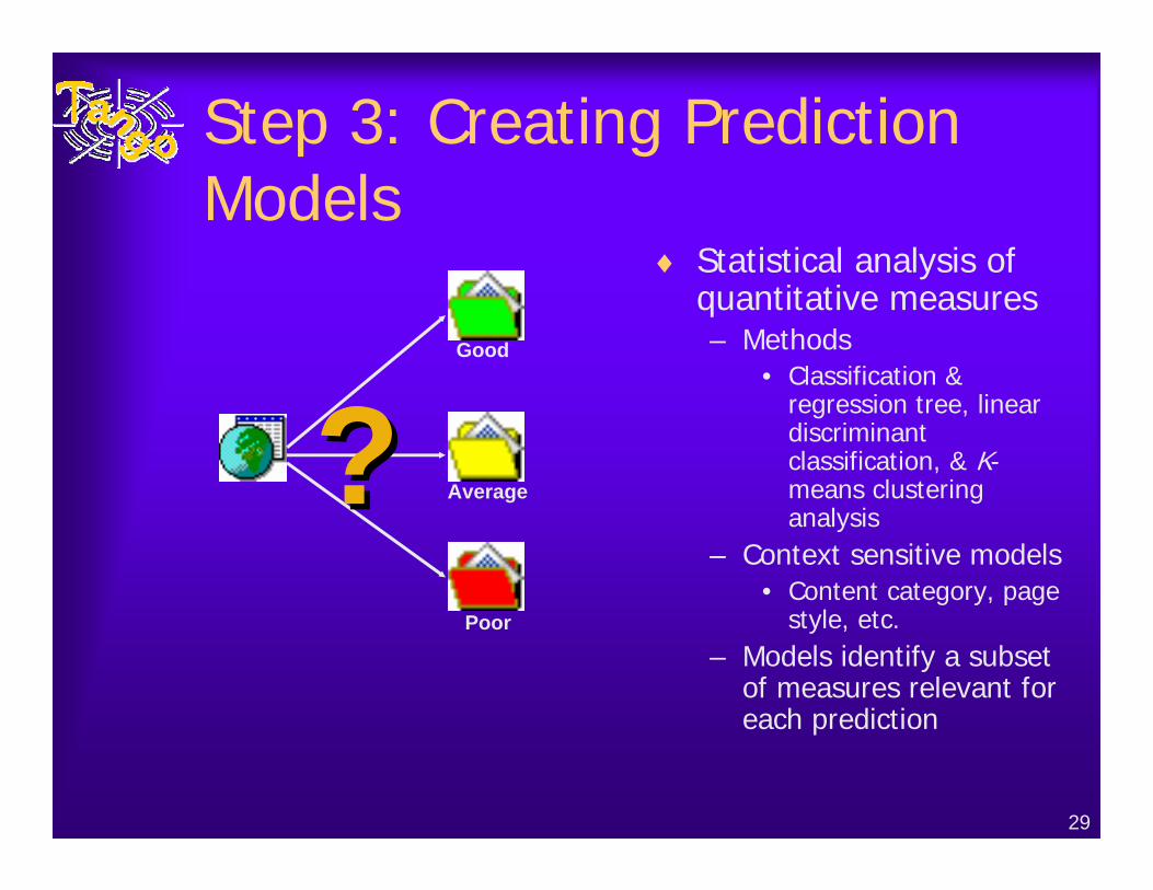
Step 3: Creating Prediction Models
♦ Statistical analysis of quantitative measures– Methods
• Classification & regression tree, linear discriminantclassification, & K-means clustering analysis
– Context sensitive models• Content category, page
style, etc.– Models identify a subset
of measures relevant for each prediction
??Good
Average
Poor
30
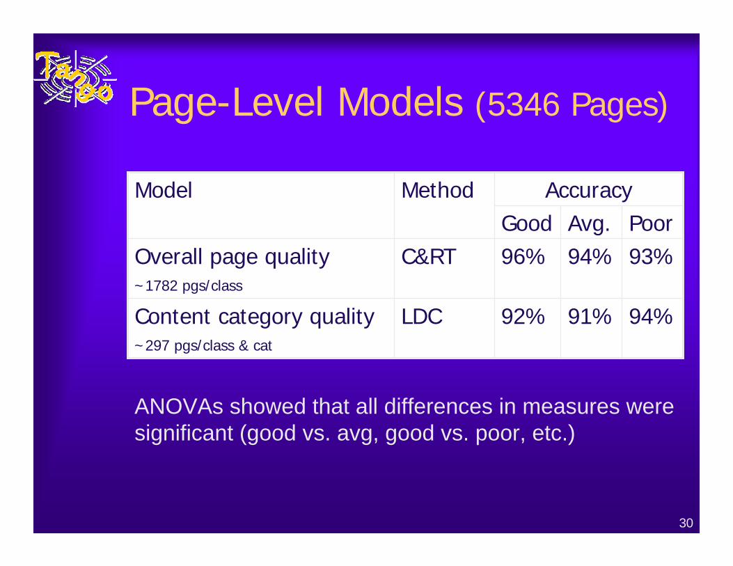
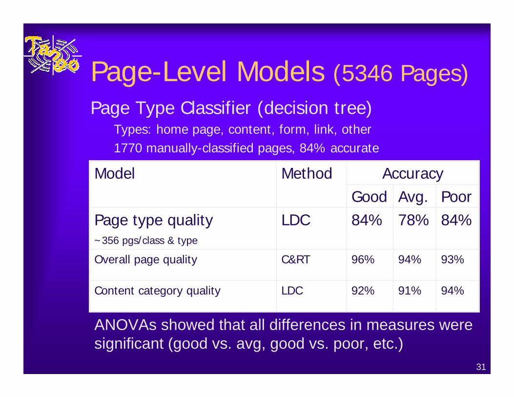
Page-Level Models (5346 Pages)
Accuracy
94%91%92%LDCContent category quality~297 pgs/class & cat
93%94%96%C&RTOverall page quality~1782 pgs/class
PoorAvg.GoodMethodModel
ANOVAs showed that all differences in measures were significant (good vs. avg, good vs. poor, etc.)
31
Page-Level Models (5346 Pages)
93%94%96%C&RTOverall page quality
94%91%92%LDCContent category quality
Accuracy
84%78%84%LDCPage type quality~356 pgs/class & type
PoorAvg.GoodMethodModel
ANOVAs showed that all differences in measures were significant (good vs. avg, good vs. poor, etc.)
Page Type Classifier (decision tree)Types: home page, content, form, link, other1770 manually-classified pages, 84% accurate
32
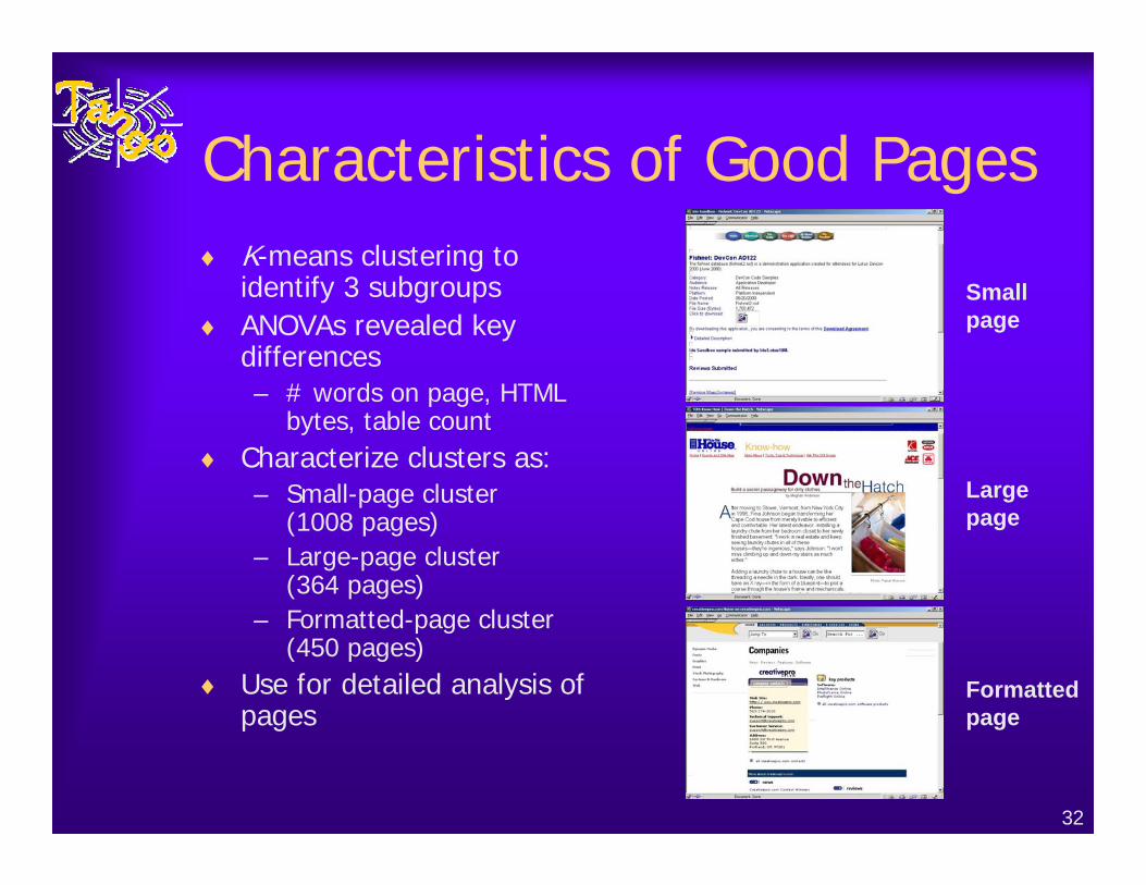
Characteristics of Good Pages♦ K-means clustering to
identify 3 subgroups♦ ANOVAs revealed key
differences– # words on page, HTML
bytes, table count♦ Characterize clusters as:
– Small-page cluster (1008 pages)
– Large-page cluster (364 pages)
– Formatted-page cluster (450 pages)
♦ Use for detailed analysis of pages
Small page
Large page
Formatted page
33
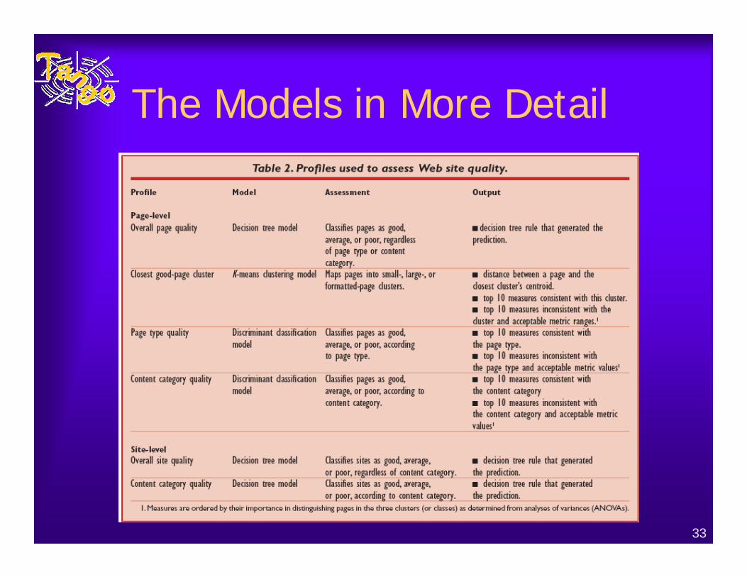
The Models in More Detail
34
Step 4: Evaluate Other Sites♦ Embed prediction profiles into an Analysis Tool
– For each model • Prediction: good, average, poor, mapped cluster• Rationale: decision tree rule, deviant measures, etc.
– Example page-level feedback• Overall page quality model
– Predicted quality: poor– Rationale: if (Italicized Body Word Count is not missing AND
(Italicized Body Word Count > 2.5))• Good page cluster model
– Mapped cluster: small-page, Cluster distance: 22.74– Similar measures: Word Count;Good Word Count …– Deviant measures: Link Count [12.0] out of range (12.40--
41.24);Text Link Count [2.0] out of range (4.97--27.98)…
– Limitation: no suggestions for improvement or examples
35
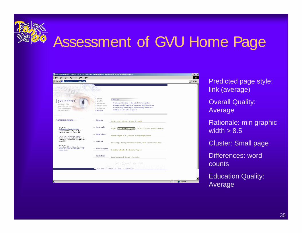
Assessment of GVU Home Page
Predicted page style: link (average)
Overall Quality: Average
Rationale: min graphic width > 8.5
Cluster: Small page
Differences: word counts
Education Quality: Average
36
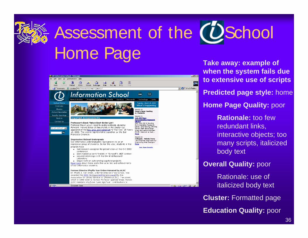
Assessment of the School Home Page
Take away: example of when the system fails due to extensive use of scripts
Predicted page style: home
Home Page Quality: poor
Rationale: too few redundant links, interactive objects; too many scripts, italicized body text
Overall Quality: poor
Rationale: use of italicized body text
Cluster: Formatted page
Education Quality: poor
37
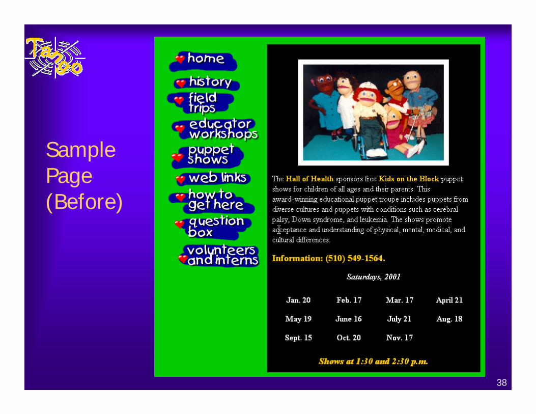
Example Assessment
♦ Demonstrate use of profiles to assess site quality and identify areas for improvement
♦ Site drawn from Yahoo Education/Health– Discusses training programs on numerous health
issues– Not in original study– Chose one that looked good at first glance, but on
further inspection seemed to have problems.– Only 9 pages were available, at level 0 and 1
38
Sample Page (Before)
39
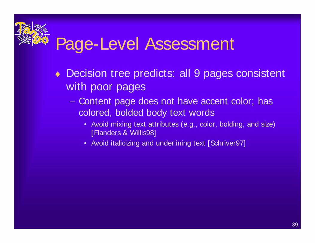
Page-Level Assessment
♦ Decision tree predicts: all 9 pages consistent with poor pages– Content page does not have accent color; has
colored, bolded body text words• Avoid mixing text attributes (e.g., color, bolding, and size)
[Flanders & Willis98] • Avoid italicizing and underlining text [Schriver97]
40
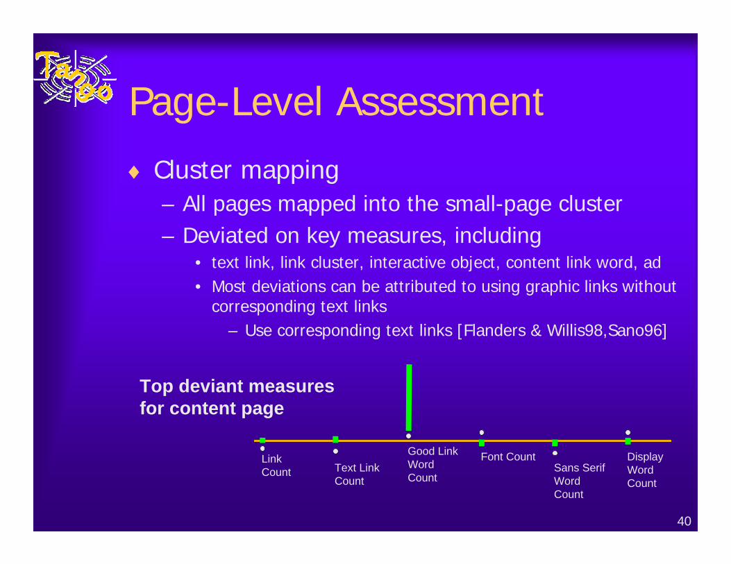
Page-Level Assessment
♦ Cluster mapping– All pages mapped into the small-page cluster– Deviated on key measures, including
• text link, link cluster, interactive object, content link word, ad• Most deviations can be attributed to using graphic links without
corresponding text links– Use corresponding text links [Flanders & Willis98,Sano96]
Link Count Text Link
Count
Good Link Word Count
Font CountSans Serif Word Count
Display Word Count
Top deviant measures for content page
41
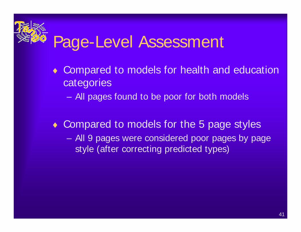
Page-Level Assessment
♦ Compared to models for health and education categories– All pages found to be poor for both models
♦ Compared to models for the 5 page styles– All 9 pages were considered poor pages by page
style (after correcting predicted types)
42
Improving the Site♦ Eventually want to automate the translation
from differences to recommendations♦ Revised the pages by hand as follows:
– To improve color count and link count:• Added a link text cluster that mirrors the content of the
graphic links– To improve text element and text formatting
variation• Added headings to break up paragraphs • Added font variations for body text and headings and
made the copyright text smaller– Several other changes based on small-page cluster
characteristics
43
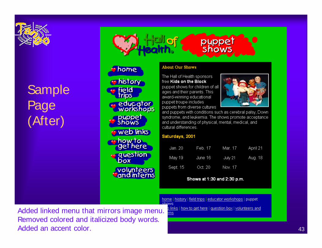
Sample Page (After)
Added linked menu that mirrors image menu.Removed colored and italicized body words.Added an accent color.
44
After the Changes
♦ All pages now classified correctly by style♦ All pages rated good overall♦ All pages rated good health pages♦ Most pages rated as average education pages♦ Most pages rated as average by style
45
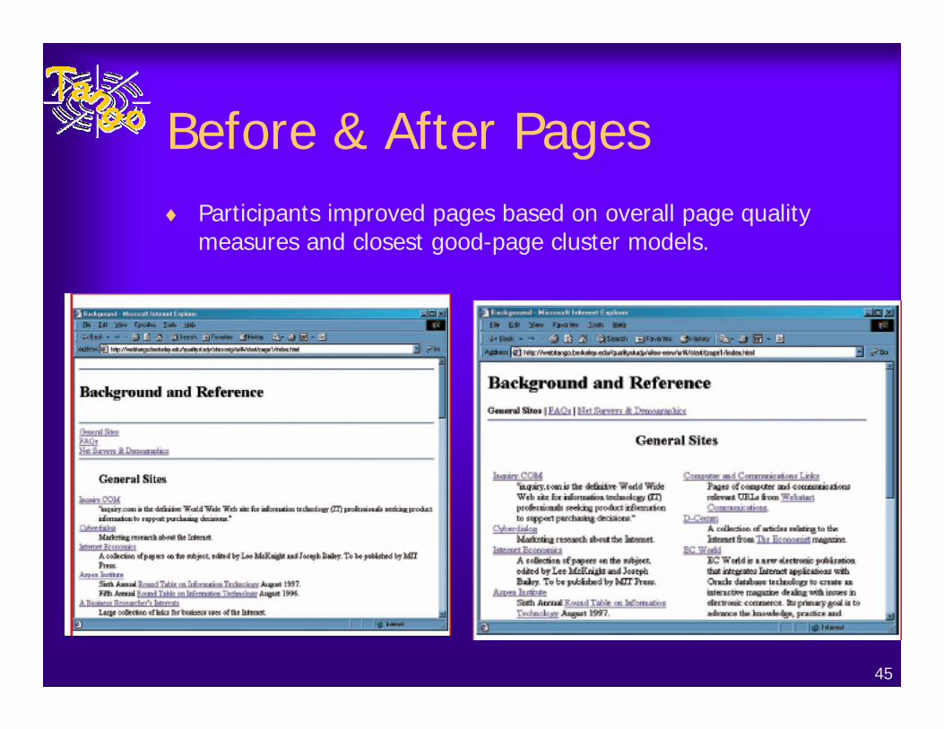
Before & After Pages♦ Participants improved pages based on overall page quality
measures and closest good-page cluster models.
46
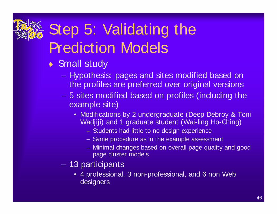
Step 5: Validating the Prediction Models♦ Small study
– Hypothesis: pages and sites modified based on the profiles are preferred over original versions
– 5 sites modified based on profiles (including the example site)
• Modifications by 2 undergraduate (Deep Debroy & Toni Wadjiji) and 1 graduate student (Wai-ling Ho-Ching)
– Students had little to no design experience– Same procedure as in the example assessment– Minimal changes based on overall page quality and good
page cluster models
– 13 participants• 4 professional, 3 non-professional, and 6 non Web
designers
47
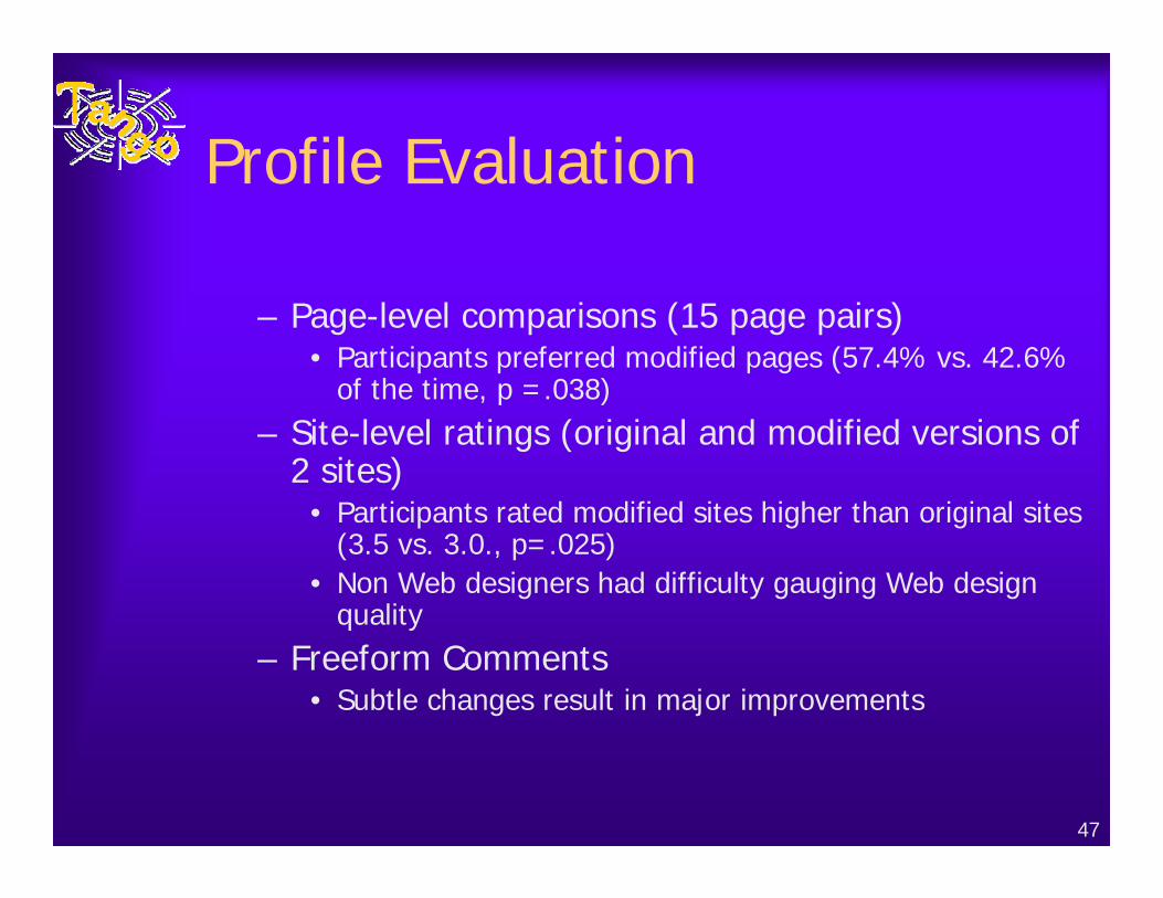
Profile Evaluation
– Page-level comparisons (15 page pairs)• Participants preferred modified pages (57.4% vs. 42.6%
of the time, p =.038)– Site-level ratings (original and modified versions of
2 sites)• Participants rated modified sites higher than original sites
(3.5 vs. 3.0., p=.025)• Non Web designers had difficulty gauging Web design
quality– Freeform Comments
• Subtle changes result in major improvements
48
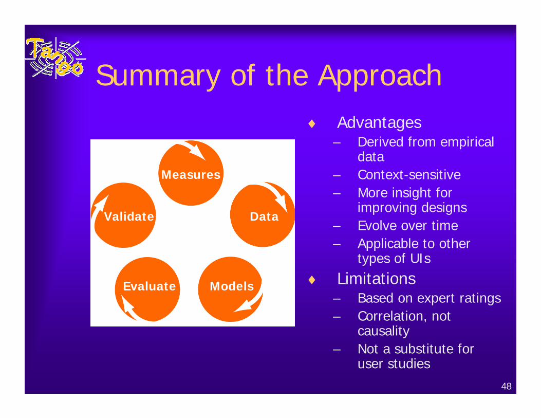
Summary of the Approach♦ Advantages
– Derived from empirical data
– Context-sensitive– More insight for
improving designs– Evolve over time– Applicable to other
types of UIs♦ Limitations
– Based on expert ratings– Correlation, not
causality – Not a substitute for
user studies
Measures
Data
ModelsEvaluate
Validate
49
Conclusions
♦ Let’s hear from you!