Embed Size (px)
Citation preview

1.0 Introduction (page 1)
2.0 The Logo Design (page 2)
2.1 The Logo Usage (page 8)
3.0 Color Scheme (page 13)
4.0 Contact Details (page 16)
February 2014
Contents:
Date:
Brand-Identity Guidelines

Introduction1.0Overview
The purpose of these guidelines is to explain the use of the Musicnotes.com brand style and to reinforce consistent application of the visual elements in all communi-cations. This includes publications, presentations, and all other marketing materi-als both online and offline. Guidelines on the use of the logo are included.
1.1.0 Introduction Brand-identity Guidelines - February 2014

Logo Design2.0The company logo is an important and valued graphic element and must be used consistently and appropriately, even minor variations will undermine and compro-mise the image of the branding.
2.2.0 Logo Design Brand-identity Guidelines - February 2014

3.2.0 Logo Design Brand-identity Guidelines - February 2014
Primary Print Logo - In Color

4.2.0 Logo Design Brand-identity Guidelines - February 2014
Primary Web Logo - In Color

Primary Print Logo - Vertical Format
5.2.0 Logo Design Brand-identity Guidelines - February 2014
Horizontal Format
Vertical Format
6.2.0 Logo Design Brand-identity Guidelines - February 2014
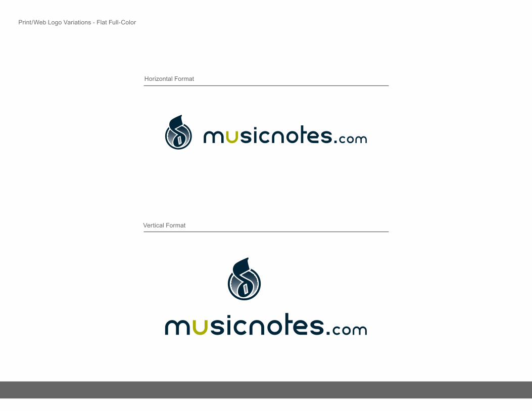
Print/Web Logo Variations - Flat Full-Color
Horizontal Format
Vertical Format
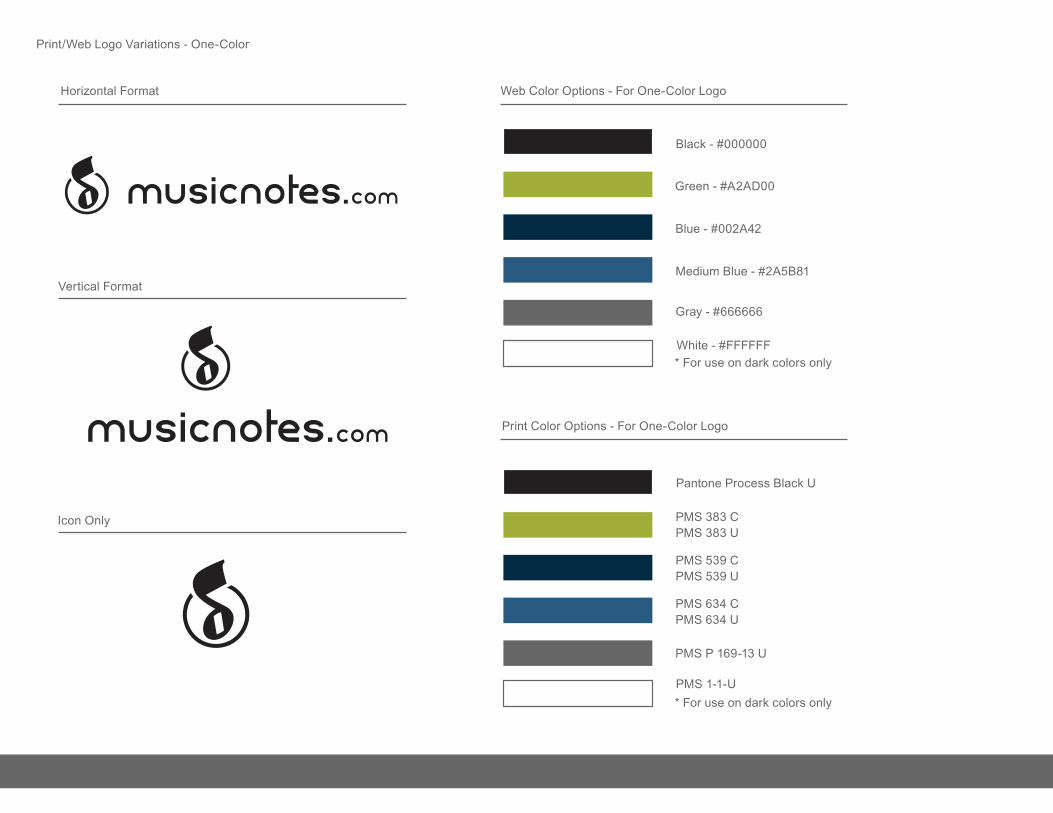
Web Color Options - For One-Color Logo
Black - #000000
Green - #A2AD00
Blue - #002A42
Medium Blue - #2A5B81
Gray - #666666
White - #FFFFFF* For use on dark colors only
Icon Only
Pantone Process Black U
PMS 383 CPMS 383 U
PMS 539 C
PMS 1-1-U
PMS 539 U
PMS 634 CPMS 634 U
PMS P 169-13 U
* For use on dark colors only
Print Color Options - For One-Color Logo
7.2.0 Logo Design Brand-identity Guidelines - February 2014
Print/Web Logo Variations - One-Color

Logo Usage2.1Always use master artwork when reproducing any logo design. It should never be recreated under any circumstances. Always ensure you are using the correct artwork for the application.
When reproducing any logo elements, only the original high resolution or vector graphic files shall be used - logos should not be taken from this document.
8.2.1 Logo Usage Brand-identity Guidelines - February 2014

Exclusion Zone
Make sure that text or other design elements do not encroach upon the logo.
When using any Musicnotes logo, maintain a safety space that equals at least 150% the size of the square or, for a rectangle, 200% height, 100% width.
150% Height
150% Width
200% Height
120% Width
9.2.1 Logo Usage Brand-identity Guidelines - February 2014
Logo Usage - Exclusion Zone

Wrong!
The logo has become distorted from its designed aspect ratio, therefore stretching or squshing the shape and text.
If the space is restrictive, the scale of the logo (not the dimensions) must be adjusted to fit.
Correct!
The logo’s shape is consistent with the initial design, retaining balance and legibility.
10.2.1 Logo Usage Brand-identity Guidelines - February 2014
Logo Usage - Aspect Ratio

Wrong!
Important elements within the logo have been distorted, enlarged or shrunk, affecting the balance and design.
A consistent layout is essential across all media, and by changing key elements it will introduce confusion into the brand.
Correct!
The logo has been used in the fashion it was designed. A consistency has been achieved in how it is seen.
11.2.1 Logo usage Brand-identity Guidelines - February 2014
Logo Usage - Logo Elements
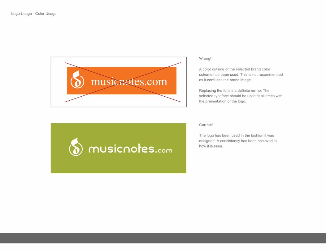
Wrong!
A color outside of the selected brand color scheme has been used. This is not recommended as it confuses the brand image.
Replacing the font is a definite no-no. The selected typeface should be used at all times with the presentation of the logo.
Correct!
The logo has been used in the fashion it was designed. A consistency has been achieved in how it is seen.
musicnotes.com
12.2.1 Logo Usage Brand-identity Guidelines - February 2014
Logo Usage - Color Usage

Color Schemes3.0Accurate reproduction of the brand color scheme is essential in communicating a clear and consistent message about the company image.
The Pantone colors should be used wherever possible, with CMYK / RGB being matched as closely as possible depending on the materials and print process.
Black and white are acceptable as accent colors, in addition to the colors within the assigned scheme.
13.3.0 Color Schemes Brand-identity Guidelines - February 2014

Pantone 539 UPantone 539 C
Pantone 383 UPantone 383 C
Pantone 634 UPantone 634 C
Pantone 111-9 UPantone 111-9 C
Pantone P 106-9 UPantone P 106-9 C
Pantone P 179-10 UPantone P 179-10 C
Pantone P 179-4 UPantone P 179-4 C
Primary Brand Colorlogo / main background
Secondary Brand Color accent
Third Brand Color
Background / Base Color
Background / Base Color
100 / 78 / 47 / 50
42 / 19 / 100 / 1
89 / 63 / 29 / 10
31 / 19 / 12 / 0
10 / 4 / 3 / 0
0 / 42 / 66
162 / 173 / 0
42 / 91 / 129
177 / 190 / 205
227 / 233 / 238
#002A42
#A2AD00
#2A5B81
#B1BECD
Text / Content Color 60 / 51 / 51 / 20 102 / 102 / 102 #666666
#E3E9EE
Base Color 19 / 15 / 16 / 0 204 / 204 / 204 #CCCCCC
Pantone P 179-2 UPantone P 179-2 C
Base Color 5 / 4 / 4 / 0 238 / 238 / 238 #EEEEEE
Pantone color ref. CMYK RGB HEX
14.3.0 Color Schemes Brand-identity Guidelines - February 2014
Primary Colors
Pantone P 179-1 UPantone P 179-1 C
Pantone P 166-1 UPantone P 166-1 C
Pantone P 50-8 UPantone P 50-8 C
Pantone P 79-1 UPantone P 79-1 C
Pantone P 7-8 UPantone P 7-8 C
Pantone P 4-2 UPantone P 4-2 C
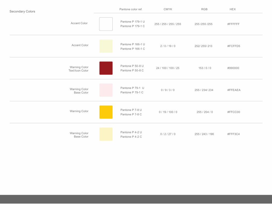
Accent Color
Accent Color
Warning ColorText/Icon Color
Warning ColorBase Color
Warning Color
255 / 255 / 255 / 255
2 / 0 / 19 / 0
24 / 100 / 100 / 25
0 / 9 / 3 / 0
0 / 19 / 100 / 0
255 /255 /255
252/ 255/ 213
153 / 0 / 0
255 / 234/ 234
255 / 204 / 0
#FFFFFF
#FCFFD5
#990000
#FFEAEA
Warning ColorBase Color
0 / 2 / 27 / 0 255 / 243 / 196 #FFF3C4
#FFCC00
Pantone color ref. CMYK RGB HEX
15.3.0 Color Schemes Brand-identity Guidelines - February 2014
Secondary Colors

Contact Details4.0Musicnotes.com
UX Department
www.musicnotes.com
@musicnotes
Company:
Designer:
Email:
Web:
Twitter/Skype:
16.4.0 Contact Details Brand-identity Guidelines - February 2014

![Page 20 DODGE CHALLENGER + AUTHENTIC ACCESSORIES Page 1 · Black or Polished finish, with logo valve stem caps and logo keychain. A. DODGE BRAND LOGO.[ 82215849 – Satin Black ]](https://img.pdfslide.net/doc/110x75/5f0cb8b57e708231d436ce8d/page-20-dodge-challenger-authentic-accessories-page-1-black-or-polished-finish.jpg)