Embed Size (px)
Citation preview
Acta Polytechnica Hungarica Vol. 9, No. 2, 2012
– 95 –
Mobile Detection Algorithm in Mobile Device
Detection and Content Adaptation
Zlatko Čović1, Miodrag Ivković
2, Biljana Radulović
2
¹ Subotica Tech – College of Applied Sciences, Department of Informatics
Marka Oreškovića 16, 24000 Subotica, Serbia, [email protected]
² Technical Faculty “Mihajlo Pupin”, Department of Informatics
Đure Đakovića BB, 23000 Zrenjanin, Serbia
E-mails: [email protected]; [email protected]
Abstract: This paper describes several approaches in the development of mobile web sites,
including the concept of detection and adaptation for mobile content. A mobile site lacking
optimization can lead to prolonged downloading of data as well as difficulties with
browsing. For that reason, we need to optimize web content on such sites. Our research
was conducted to determine the most adequate and most effective detection technique. This
technique was then used in the development of the Mobile Detection Algorithm Based on
Tera-Wurfl (MDABTW). The MDABTW algorithm is based on the Tera-Wurfl library and
allows for the generation of web content in several markup languages. The basic principles
of how this algorithm works are described in this paper. The MDABTW algorithm was
further implemented in the regional mobile CMS, called Mobko, which is the main part of
an integrated health IS providing counseling and education services for youth in the
Subotica region.
Keywords: mobile web sites; mobile device detection; content adaptation; mobile
algorithm
1 Introduction
The Web has revolutionized the way we interact, as well as how we collect and
publish information. Until recently, web content was available only to desktop
users. With the advent of mobile technology and with the proliferation of mobile
devices featuring Internet access, the global availability of information has
exploded. Standard (2G) mobile phones and smart phones (3G) have advanced so
rapidly that nowadays even an entry level mobile phone allows for Internet access
of some kind. This situation opens up a whole new arena for web content that has
been adapted specifically for mobile devices [7].
Today, increasing numbers of people access the Internet via their mobile device
instead of a PC. The number of mobile devices in use has already surpassed the
Z. Čović et al. Mobile Detection Algorithm in Mobile Device Detection and Content Adaptation
– 96 –
number of personal computers. It is estimated that the difference between these
two numbers will only increase in the years to come [9].
The first problem that can occur when creating a mobile web site is how to
distinguish between mobile users and desktop users.
2 Mobile Web Sites and the Problem with Content
Most often we have seen that there is no optimization and adaptation of existing
sites or new sites for mobile users. The web content might be too wide to fit the
screen of mobile device – user equipment (UE). Font size can also be problematic,
being too small or too large to read on UE easily. If the web content also includes
images, it is uncertain whether those can be displayed correctly, if at all. The same
applies to multimedia files, which frequently cannot be viewed on mobile devices.
Often, web pages that have been initially designed for desktop computers are too
encumbered with content, so they are practically unsuitable for users accessing
them via mobile devices.
Creating content for mobile devices has some specific restrictions imposed by the
limited resources on the UE, including: a small size screen, limited wireless
bandwidth, small data storage capacity and processing power, and a limited
number of keyboard buttons to be used for web navigation. Sites designed for
mobile devices should deliver content that is tailored to the characteristics of the
accessing device. In order for a mobile content to load faster, they should be
adapted and formatted, taking into consideration both the users‟ needs as well as
the capabilities of mobile devices.
Mobile web sites can be created by using several technologies (e.g. WML,
HTML, and XHTML MP). Existing mobile devices have different levels of
support for these technologies, and for this reason, the creator of a mobile web site
should create multiple versions of the web site. This means that the developer
should be very familiar with all the required technologies in order to implement
them properly. This could be an issue as it requires additional investment in
development and learning.
3 Content Adaptation
Content adaptation, which is sometimes also called multi-serving, is the delivery
of content based on the capabilities of the access device.
Detection, adaptation and support for multiple devices have historically been a
painful point in design and development of mobile content. Although there are
Acta Polytechnica Hungarica Vol. 9, No. 2, 2012
– 97 –
several strategies and techniques available to tackle this problem, each of them use
in some form the DAD (Detect Deliver Text) mode. This mode includes:
1 Detection
2 Adaptation
3 Deliver
Different techniques are used for the adaptation, including the detection,
redirection, set up of correct MIME types, the changing of links, and the removal
or scaling graphics. The LCD method (or the "Lowest Common Denominator")
establishes a minimum set of characteristics which are expected from the mobile
device. Web content is then developed by following such guidelines. The minimal
set of features is also called DDC (Default Delivery Context) [4].
Adaptation in accordance with the capabilities of accessing mobile device is an
ideal solution for the delivery of mobile content. At the same time, most
programmers prefer to first start with the LCD approach before going into
adaptation. The reasons for this are many. Adaptation involves additional costs
and complexity. It also requires changes on the server side to detect and deliver
content in a tailored manner, which cannot be accomplished for all device types.
However, the LCD method can be sufficient in the case of a limited use of mobile
content [4].
Based on the paper by Adzic, Kalva and Furht [1], there are three possible levels
at which the adaptation can be performed: 1) at the server which hosts web
content; 2) at the intermediary proxy server; 3) and at the client side (i.e. UE). The
main difference among the three lies in what supplies the content, and what the
content is [12].
Server-side adaptation involves committing additional resources and software on
the server that stores content for delivery. The main advantage of this approach is
that the content at every web page can be converted and tailored for the specific
needs of a receiving mobile device.
The proxy server or intermediary adaptation is performed between the server
(content provider) and the mobile client (content consumer). It can be
implemented by the content provider or by the third party device [1]. However,
this form of adaptation is usually outside of your control.
In the client-side adaptation, the user can define preferences and determine the
type and scale of the adaptation process [1]. Client side adaptation usually relies
on using the media selectors associated with CSS (Cascading Style Sheets). While
this can be a useful form of adaptation, it is limited. The mobile browser
downloads the same XHTML markup as the desktop browser, which might
unnecessarily consume the user‟s air time and consequently cost for the content
that ends up not being displayed [5].
The following section of this paper will present several approaches in the
development of mobile sites.
Z. Čović et al. Mobile Detection Algorithm in Mobile Device Detection and Content Adaptation
– 98 –
3.1 Approaches in Mobile Development
In the development of mobile web sites, there can be defined several approaches:
a) Do nothing
b) Remove formatting
c) Filter media
d) Find the target device - redirection
e) Implement the full detection and adaptation
Some of them use some kind of adaptation which is executed at different levels
(i.e. server side, client side or at the intermediary proxy server).
3.1.1 Do Nothing
The first approach is still used for many sites because the site owner or developer
does not fully understand the significance of mobile-oriented content or prefers to
wait until the UE technology is mature enough to handle their web site as is. In
other words, the web content gets published only once, whereas the mobile device
is expected to be smart enough to handle it and display web pages as appropriate.
The most important adjustment techniques are adopted in the Opera's Small
Screen Rendering (SSR) system, used for the new Apple iPhone and Nokia
Browser, which provides very good results. The new generation of mobile phones
have web browsers which attempt to optimize the web content on the UE in real
time. Often it only involves reducing the page views without reducing actual
download time, thus contributing additional (and unnecessary) cost to the user.
The issue with this approach is that it does not work for standard (2G) non-smart
phones, which do not have web browsers capable of optimizing content in real
time. Considering that large number of users who still have regular mobile
phones, this approach will deprive them of getting proper information. Even smart
phone users, with browsers featuring optimization in real time, can sometime give
up on accessing classic web sites because the site is either just not functional
enough or has pure navigation system with does not allow for the easy finding of
the desired information. In this approach the transcoders are often used to reformat
the content of classical sites and transform them into a more mobile “friendly”
version.
When to use this approach
If you do not expect too many mobile visitors to your web site
If the majority of your users are using smart phones or other devices
featuring large screens and an optimized web browser
If people want to use your website in exactly the same way as used via
PC, (i.e. no need for mobile-specific features)
If you do not have time or resources to implement another method(s)
If you do not have sufficient expertise to include multiple technologies in
your development
Acta Polytechnica Hungarica Vol. 9, No. 2, 2012
– 99 –
When not to use this approach
If you want to reach the maximum number of potential visitors to your
site
If mobile users visiting your site have a specific task they want to
accomplish quickly and efficiently
If you want to provide the best browsing experience for mobile users
3.1.2 Remove Formatting
One of the biggest problems for mobile browsers is to parse the HTML code and
page layout. Complex formatting rules mean more computer operations that may
be a challenge due to UE limitations in regards to processor and memory. Most
mobile web users pay for service on the basis of downloaded data in kilobytes;
therefore large HTML pages and images will not be a good solution. If you
remove the formatting from the page layout, including all images, the mobile user
will get text and links only.
When to use this approach
If you want a quick way to create a mobile version of your web site
If you want to cover the majority of mobile browsers
If your site features mostly textual content and has good navigation
structure
When not to use this approach
If your site features good user interface design
If the site content is not very useful for mobile users
3.1.3 Filter Media
If you want to use the same XHTML site for both desktop and mobile devices, the
solution is to change the site design and format related pages by using a CSS file.
The CSS standard enables you to create multiple styles for each document, taking
into account that site content might be displayed on various types of media. This
approach involves creating two or more versions of CSS files and using those as
media attribute to generate corresponding pages.
When to use this approach
When you are confident that the access devices fully support the filtering
of media
When you make a mobile website that is dedicated to a specific group of
users who have devices with the possibility of filtering media
When you are familiar only with the client side of internet technologies
When not to use this approach
When you are not sure whether all access devices support the filtering of
media
When you create a mobile web site that is expected to draw a large
number of visitors with different types of phones
Z. Čović et al. Mobile Detection Algorithm in Mobile Device Detection and Content Adaptation
– 100 –
3.1.4 Find the Target Device – Redirection
This approach uses a detection technique to find the type of target device.
Specifically, it tries to decide if the user is accessing the web site via a mobile
device or via computer. If the detection is successful, the user is redirected to the
appropriate version of the site (mobile or desktop). An enhanced version of this
strategy involves the detection of supported Markup Language.
When to use this approach
If you only need to determine whether the user accesses you site via
mobile devices or desktop computers
If it is not necessary to create content that is fully optimized for the
characteristics of the accessing device
If the user provides multiple choices to select the mobile version of the
site because it does not detect the preferred hypertext markup language
When not to use this approach
If you create a site whose content partly needs to be optimized for the
features of the device
If it is necessary to determine the preferred hypertext markup language
3.1.5 Implement the Full Detection and Adaptation
This approach requires adaptation in the framework by taking into consideration
several related variables. Firstly, it requires the detection of the user agent and its
characteristics. This is usually determined by:
Preferred markup language
Screen size in pixels
The existence of the touch screen
Support for certain graphics formats
Support for certain multimedia files and Java
Support for styles
Based on the detection of the preferred language and UE features, the user gets
redirected to the corresponding site version. In this strategy, you need to create
multiple versions of your site. In the event that the detection of the preferred
markup language has failed or the user wants to switch to a different version of
your site, the option should be provided for selecting the language for content
generation.
When to use this approach
If you want to create a site which fully supports the features of access
device
If you do expect a large number of visitors to your mobile site
If you do not have to worry about the resources on your server
When not to use this approach
If you have limited resources on your server
If you have no need for partial or full optimization
Acta Polytechnica Hungarica Vol. 9, No. 2, 2012
– 101 –
3.2 Header of Request
A request header sent from the mobile browser to the web server has many
attributes defined by the reader in the case of direct client-server communication
(i.e. without using any proxy, gateway or a transcoder). Some of the headers that
may be useful are listed in Table 1.
Table 1
Listing of useful headers
User-Agent Name of browser, user agent or platform from which the request
originates
Accept Comma separated values (CSV) which are MIME types that are
supported by user agent.
Accept-Charset Specifies the character set that supports the user agent.
Accept-Language Contains information about the supported languages in the user
agent
X-wap-profile and
Profile
Provides information about the UAProf (User Agent Profile)
XML file that is unique to each device.
3.2.1 User Agent
The user agent is a client application that implements the network protocol used in
the client-server communication. It typically contains a series of different
information, from which can be identified: which device is used, on what
operating system it is based, what version of software is running, who the
manufacturer is, and what type of content the device is able to read. The format of
information differs between manufacturers of mobile devices.
The User-Agent header is useful in the following situations:
If we need to identify specific models of mobile devices.
If we need to distinguish between mobile devices or user agents from
different companies.
If we need to determine whether the user agent browser to your desktop
computer or a mobile device microreaders.
3.2.2 UAProof
The UAProf (User Agent Profile) is a standard defined by the Open Mobile
Alliance (OMA, earlier WAP Forum). It provides information on UE capabilities
in the form of an XML file which the server can access via the Internet. After this
file has been uploaded onto server, it must be parsed in order to retrieve the
desired information. The drawback of the UAProf specification is that many older
devices do not support it. In addition, it can slow down the content generation on
the server side as each application must retrieve and parse the XML file separately
in order to obtain the pertinent information. A possible solution to speed up this
process could be to store partial contents of the file in a database, after its initial
upload, or to save the file local copy on the server [9].
Z. Čović et al. Mobile Detection Algorithm in Mobile Device Detection and Content Adaptation
– 102 –
3.2.3 WURFL
The WURFL (Wireless Universal Resource File) is a wireless universal resource
file or an XML file that is regularly updated with information on mobile devices.
It contains information on virtually all mobile devices that currently exist, and all
their options. Practically, this file is a collection of a large number of UAProf
files.
4 A Survey for Detection Techniques
As mentioned in Chapter 3, there are several ways to carry out the detection of an
access device. Most of these detections can be classified into two general
categories: a) detection using only information from the HTTP headers; and b)
detection using the WURFL file. For the purpose of our research, we utilized both
methods, namely: 1 The so-called “Simple detection”
2 Detection by using the Tera-Wurfl library.
For "Simple Detection" we used PHP script, which makes a distinction between
computers and mobile devices by comparing the user agent data and values from
HTTP headers with specific text values. This technique also determines the
preferred hypertext markup language.
The advantages of this technique include:
No installation process
There is no need for a database
Takes up less space on the server
Fast execution time
The disadvantages of this technique are:
Relatively poor accuracy
No community that contributes to the development
Limited set of functions to detect more capabilities
Inability to complete the adaptation
Tera-Wurfl is a PHP- and MySQL-based library which uses WURFL to detect the
individual features of mobile phones. The advantage of Tera-Wurfl over other
systems for detection is that it relies on a database to find the best matching
mobile phone. Tera-WURFL loads the data from the WURFL file into a MySQL
database for faster access and uses it to determine which device is the most similar
to the one requesting your content. The library then returns the capabilities
Acta Polytechnica Hungarica Vol. 9, No. 2, 2012
– 103 –
associated with such device to your scripts via PHP associative array. In our
research we used the WURFL with 29 groups featuring a total of 531 capabilities.
Tera-WURFL takes the requestor's user agent and puts it through a filter to
determine which UserAgentMatcher to use. Each UserAgentMatcher is
specifically designed to best match the device from a group of similar devices
based on the Reduction in String and/or the Levenshtein Distance algorithm.
The advantages of this technique are as follows:
High performance
Accurate detection of mobile devices
Fast detection of desktop vs. mobile devices
Possibility of full adaptation
The disadvantages of this technique are:
Need for a database
Requirement for more space on the server
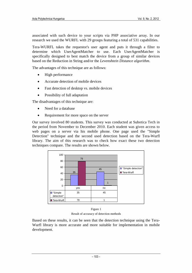
Our survey involved 80 students. This survey was conducted at Subotica Tech in
the period from November to December 2010. Each student was given access to
web pages on a server via his mobile phone. One page used the "Simple
Detection" technique and the second used detection based on the Tera-Wurfl
library. The aim of this research was to check how exact these two detection
techniques compare. The results are shown below.
35
45
79
1
0
20
40
60
80
100
"Simple detection"
Tera-Wurfl
"Simple
detection"
35 45
Tera-Wurfl 79 1
yes no
Figure 1
Result of accuracy of detection methods
Based on these results, it can be seen that the detection technique using the Tera-
Wurfl library is more accurate and more suitable for implementation in mobile
development.
Z. Čović et al. Mobile Detection Algorithm in Mobile Device Detection and Content Adaptation
– 104 –
5 Mobile Detection Algorithm Based on Tera-Wurfl
(MDABTW)
The current research results described in Section 4 demonstrate that the Tera-
Wurfl technique is the better one for detecting the characteristics of accessing
devices. This library includes a large amount of data for each of the mobile
devices, which is contained in the WURFL file.
The Tera-Wurl library also contains an optimizer for the WURFL file. The
Optimizer is a very useful feature since, based on the selection of certain
characteristics, it can reduce the file and database size, reduce the occupancy of
space on the server and speed up the process of detection. In addition to
optimization, device detection also requires the selection of significant device
characteristics to be utilized for detection. For that purpose, we have developed
the Mobile Detection Algorithm Based on Tera-Wurfl (MDABTW) algorithm.
The MDABTW is an algorithm for the detection of mobile devices based on Tera-
Wurfl library. It allows for the detection and generation of mobile content in
WML, XHTML MP and XHTML languages, using WAP CSS or CSS as needed.
In this algorithm, web sites for mobile devices are divided into four groups:
simple web sites – SIMPLE, multimedia web sites – MULTIMEDIA, dynamic web
sites – DYNAMIC and integrated web sites – INTEGRATED.
We have implemented this algorithm in the mobile CMS called Mobko. Mobko
plays a key role in an integrated model for mobile learning in the health
information system and counseling services for youth in Subotica region.
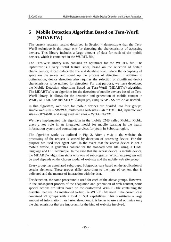
The algorithm works as outlined in Fig. 2. After a visit to the website, the
processing of the request is started by detection of accessing device. For this
purpose we used user agent data. In the event that the access device is not a
mobile device, it generates content for the standard web site, using XHTML
language and CSS technique. In the case that the access device is mobile device,
the MDABTW algorithm starts with one of subprograms. Which subprogram will
be used depends on the chosen model of web site and the mobile web site group.
Every group has associated subgroups. Subgroups vary based on the application of
certain elements. These groups differ according to the type of content that is
delivered and the manner of interaction with the user.
For detection, the same procedure is used for each of the above groups. However,
in the subsequent process of the adaptation and generation of web content, some
special actions are taken based on the customized WURFL file containing the
essential features. As mentioned earlier, the WURFL file used in the current case
contained 29 groups with a total of 531 capabilities. This constitutes a large
amount of information. For faster detection, it is better to use and optimize only
the characteristics that are important for the kind of web site involved.
Acta Polytechnica Hungarica Vol. 9, No. 2, 2012
– 105 –
REQUEST
PROCESSING
MOBILE
DEVICE
DESKTOP
WEB SITE
MULTIMEDIA
1
MULTIMEDIA
2
SIMPLE
1
SIMPLE
2
DYNAMIC
1
DYNAMIC
2
GENERATING
CONTENT
MDABTW
ALGORITHM
NO
YES
INTEGRATED
1
INTEGRATED
2
Figure 2
Detection process schema
Table 1
Short description of subprograms
Subprogram Description
Simple1 Handles web sites with static content only.
Simple2 Handles web sites with static content and supports the use of web forms.
Multimedia1 Handles static web sites with multimedia content.
Multimedia2 Handles web sites with multimedia content and web forms in it.
Dynamic1 Handles dynamic web sites where the content is generated based on the
data from database.
Dynamic2 Handles dynamic web sites where the content is generated based on the
data from database and supports use of web forms.
Integrated1 Handles web sites which have multimedia and dynamic content.
Integrated2 Handles web sites which have multimedia and dynamic content and
supports the use of web forms.
For each type of website, the detection process identifies only the selected
capabilities which are site-specific rather than being group capabilities. However,
there are also situations when the detection process needs to identify group
capabilities as well.
These are the groups of capabilities used in the algorithm:
Product_info (PI)
Playback (P)
Wap_push (WP)
MMS (M2)
Display (D)
Image_format (IF)
Z. Čović et al. Mobile Detection Algorithm in Mobile Device Detection and Content Adaptation
– 106 –
Wml_ui (WU)
Xhtml_ui (XU)
Html_ui (HU)
Streaming (S)
Css (C)
Markup (M)
Bugs (B)
Object_download (OD)
Sound_format (SF)
Ajax (A)
Table 2 provides an overview of the subprograms and capability groups where F
indicates when “Full”, P indicates when “Partial” detection is done and the sign “-
“ indicates that this group is not used.
Table 2
List of capability groups and subprogram
Capability group
Subprogram PI P WP M2 D IF WU XU HU S C M B OD SF A
Simple1 P - - - F P P P P - P P - - - -
Simple2 P - - - F P P P P - P P P - - -
Multimedia1 P F F F F F P P P F P P - F F -
Multimedia2 P F F F F F P P P F P P P F F -
Dynamic1 P - - - F P P P P - P P - - - F
Dynamic2 P - - - F P P P P - P P P - - F
Integrated1 P F F F F F P P P F P P - - F F
Integrated2 P F F F F F P P P F P P P F F F
5.1 Description of Subprogram
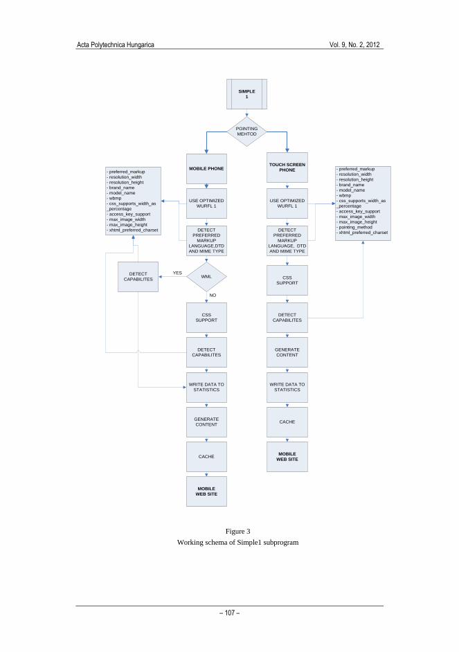
The Simple1 subprogram works based on the following principles:
1 Firstly, the device pointing method is detected, which means that the access
device can be either a phone with a touch screen or a standard mobile
phone without touch screen. This information is very important because it
drives the design of the complete navigation structure for a web site.
2 The next step is to use an appropriately optimized WURFL file for the
detection of the device‟s capabilities. This includes the preferred markup
language, DTD (Document Type Definition) and MIME type.
3 If the access device is a standard mobile phone without a touch screen, after
the capabilities detection in point 2, the algorithm checks if the preferred
markup language is WML. This step is missing in mobile devices that have
touch screens because these phones in most cases do not support the WML
language and the performance of these phones impose a need to create
richer content.
Acta Polytechnica Hungarica Vol. 9, No. 2, 2012
– 107 –
SIMPLE
1
MOBILE PHONETOUCH SCREEN
PHONE
USE OPTIMIZED
WURFL 1
DETECT
CAPABILITES
GENERATE
CONTENT
- preferred_markup
- resolution_width
- resolution_height
- brand_name
- model_name
- wbmp
- css_supports_width_as
_percentage
- access_key_support
- max_image_width
- max_image_height
- xhtml_preferred_charset
CACHE
USE OPTIMIZED
WURFL 1
DETECT
CAPABILITES
GENERATE
CONTENT
- preferred_markup
- resolution_width
- resolution_height
- brand_name
- model_name
- wbmp
- css_supports_width_as
_percentage
- access_key_support
- max_image_width
- max_image_height
- pointing_method
- xhtml_preferred_charset
CACHE
POINTING
MEHTOD
MOBILE
WEB SITE
MOBILE
WEB SITE
DETECT
PREFERRED
MARKUP
LANGUAGE,DTD
AND MIME TYPE
CSS
SUPPORT
WML CSS
SUPPORT
WRITE DATA TO
STATISTICS
WRITE DATA TO
STATISTICS
DETECT
PREFERRED
MARKUP
LANGUAGE, DTD
AND MIME TYPE
DETECT
CAPABILITES
YES
NO
Figure 3
Working schema of Simple1 subprogram
Z. Čović et al. Mobile Detection Algorithm in Mobile Device Detection and Content Adaptation
– 108 –
4 If these data are related to the WML language, there is no need to
determine support for the CSS as WML does not support it. After that, the
capabilities that are necessary for WML content generation are considered
detected.
5 In the case when detected data do not belong to WML, the CSS support is
important since, based on that, the device capabilities are detected.
6 After detection, data are written in the database for statistics and the
optimized content of the web site is generated. The optimized content could
be generated in any of three versions: WML, XHTML or XHTML MP.
7 The generated site is saved in the cache memory for faster access next time
8 Finally, the user is provided with access to the optimized mobile web site.
Simple2 subprogram differs from the Simple1 in regard to the detection of input
masks as well as some other capabilities that are significant for the use on web
forms. The other subprograms work like the Simple1 subprogram but the main
difference lies in the characteristics that are detected.
5.2 Configuration and Implementation
The configuration file TeraWurflConfig.php needs to be set properly in order to
use one of the chosen subprograms. The following parameters are the most
important ones:
public static $WURFL_FILE = 'wurfl-integrated2.xml';
public static $LOG_FILE = 'wurfl-integrated2.log';
The first parameter contains the name of the optimized WURFL file while the
second parameter is a log file for this WURFL file. These settings are enough
when installing the system according to the tutorial and updating WURFL
database from the local optimized WURFL file. After the initial installation, there
is the possibility to update the WURFL database with the latest version of this xml
file from the internet. As the optimized files are used in the algorithm, one does
not want to update and insert all data of the WURFL file from internet, just the
essential characteristics for every subprogram. For that purpose, a
$CAPABILITY_FILTER variable within the TeraWurflConfig.php configuration
file should be set. This variable is of the array type. It is possible to set complete
capability groups or individual capabilities in this variable. To this end, every
subprogram configures the specific parameters in a different way.
In the following code, the settings for the Simple1 subprogram are shown.
public static $CAPABILITY_FILTER = array(
"pointing method",
"model name",
"is_wireless_device",
"brand_name",
Acta Polytechnica Hungarica Vol. 9, No. 2, 2012
– 109 –
"wml_make_phone_call_string",
"access_key_support",
"xhtml_preferred_charset",
"xhtml_avoid_accesskeys",
"xhtml_make_phone_call_string",
"xhtml_display_accesskey",
"xhtmlmp_preferred_mime_type",
"css_supports_width_as_percentage",
"preferred_markup",
"max_image_width",
"resolution_height",
"resolution_width",
"max_image_height",
"jpg",
"gif",
"wbmp",
"png",
);
With these parameters, TeraWURFL allows one to store only the specified
capabilities from the WURFL file.
The following code presents the usage. First the session is started, then the
important files are included. In the next step, the instance of the Tera-WURFL
object is created, and data from the HTTP_USER_AGENT header is received.
This data helps to determine if the user comes with mobile device
(is_wireless_device) or not. If not, the program redirects the user to a non-mobile
version of the page. If the user agent is a mobile device, the associative array
$_SESSION[„d_c‟] is set and the relevant characteristics for the used subprogram
are detected and put in it. This array contains only the characteristics that are
important for the generation of the web page layout and they are available in the
whole web page due to the use of session variable.
// start the session
session_start();
// include the necessary files
include("include/config.php");
include("include/functions.php");
// include the Tera-WURFL file
require_once('../../Tera-Wurfl/TeraWurfl.php');
// Instantiate the Tera-WURFL object
$wurflObj = new TeraWurfl();
// Get the data from HTTP_USER_AGENT header
$ua = $_SERVER["HTTP_USER_AGENT"];
// Get the capabilities from the object
$matched = $wurflObj->getDeviceCapabilitiesFromAgent($ua);
if(!check_session_variables())
{
if(!$wurflObj->getDeviceCapability("is_wireless_device")){
header("Location:../index.php");
exit();
}
//Get device capabilities
$_SESSION['d_c']=array();
$_SESSION['d_c']['pointing_method'] = $wurflObj-
>getDeviceCapability("pointing_method");
...
Z. Čović et al. Mobile Detection Algorithm in Mobile Device Detection and Content Adaptation
– 110 –
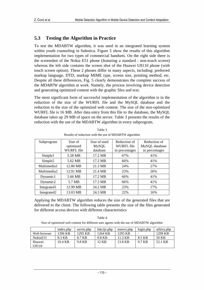
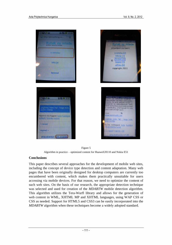
5.3 Testing the Algorithm in Practice
To test the MDABTW algorithm, it was used in an integrated learning system
within youth counseling in Subotica. Figure 5 show the results of this algorithm
implementation for two types of commercial handsets. On the right side there is
the screenshot of the Nokia E51 phone (featuring a standard - non-touch screen)
whereas the left side contains the screen shot of the Huawei U8110 phone (with
touch screen option). These 2 phones differ in many aspects, including: preferred
markup language, DTD, markup MIME type, screen size, pointing method, etc.
Despite all these differences, Fig. 5 clearly demonstrates the complete success of
the MDABTW algorithm at work. Namely, the process involving device detection
and generating optimized content with the graphic files and text.
The most significant form of successful implementation of the algorithm is in the
reduction of the size of the WURFL file and the MySQL database and the
reduction in the size of the optimized web content. The size of the non-optimized
WURFL file is 16 MB. After data entry from this file to the database, the MySQL
database takes up 29 MB of space on the server. Table 3 presents the results of the
reduction with the use of the MDABTW algorithm in every subprogram.
Table 3
Results of reduction with the use of MDABTW algorithm
Subprogram Size of
optimized
WURFL file
Size of used
MySQL
database
Reduction of
WURFL file
in percentages
Reduction of
MySQL database
in percentages
Simple1 5.58 MB 17.2 MB 67% 41%
Simple2 5.62 MB 17.2 MB 66% 41%
Multimedia1 12.80 MB 21.3 MB 24% 27%
Multimedia2 12.91 MB 21.4 MB 23% 26%
Dynamic1 5.66 MB 17.2 MB 66% 41%
Dynamic2 5.7 MB 17.3 MB 66% 41%
Integrated1 12.99 MB 24.2 MB 23% 17%
Integrated2 13.03 MB 24.3 MB 22% 16%
Applying the MDABTW algorithm reduces the size of the generated files that are
delivered to the client. The following table presents the size of the files generated
for different access devices with different characteristics
Table 4
Size of optimized web content for different user agents with the use of MDABTW algorithm
index.php servis.php lekcije.php testovi.php login.php arhiva.php
Web browser 1296 KB 1295 KB 1264 KB 1295 KB - 1299 KB
NokiaE51 8.3 KB 8.7 KB 9.8 KB 11.3 KB 8.5 KB 50 KB
Huawei
U8110
10.4 KB 9.8 KB 12 KB 13.8 KB 9.7 KB 52.1 KB
Acta Polytechnica Hungarica Vol. 9, No. 2, 2012
– 111 –
Figure 5
Algorithm in practice – optimized content for HuaweiU8110 and Nokia E51
Conclusions
This paper describes several approaches for the development of mobile web sites,
including the concept of device type detection and content adaptation. Many web
pages that have been originally designed for desktop computers are currently too
encumbered with content, which makes them practically unsuitable for users
accessing via mobile devices. For that reason, we need to optimize the content of
such web sites. On the basis of our research, the appropriate detection technique
was selected and used for creation of the MDABTW mobile detection algorithm.
This algorithm utilizes the Tera-Wurfl library and allows for the generation of
web content in WML, XHTML MP and XHTML languages, using WAP CSS or
CSS as needed. Support for HTML5 and CSS3 can be easily incorporated into the
MDABTW algorithm when these techniques become a widely adopted standard.
Z. Čović et al. Mobile Detection Algorithm in Mobile Device Detection and Content Adaptation
– 112 –
After initial testing and tuning, the MDABTW algorithm was implemented for the
regional mobile CMS called Mobko – part of an integrated system for health
counseling of young people in the Subotica region. This system includes the
following: a) CMS Mobko; b) Web portal access to counseling services for the PC
that enables viewing and downloading of educational materials and testing; c)
Mobile version of the Internet portal for access to counseling services by mobile
devices, where all content will be adjusted and optimized for the possibility of a
user's mobile device; d) Stand-alone application for mobile phones allowing for
training and testing in an on-line or off-line mode as well as for the SMS service
used to distribute important information.
Our next goal is to investigate further the use of the mobile learning services
within integrated IS and how it impacts the health education of the younger
population, who are known to be technology savvy. The result of this planned
investigation will be compared to other available theoretical and practical research
results. In addition, we also plan to conduct several surveys intended to define
guidelines for the future development and improvement of the existing MDABTW
algorithm.
References
[1] Adzic, V., Kalva, H., Furht, B.: A Survey of Multimedia Content
Adaptation for Mobile Devices, Multimedia Tools and Applications
Journal, Vol. 51, No. 1, DOI: 10.1007/s11042-010-0669-x, 2011, pp. 379-
396
[2] Xinyou, Z., Toshio, O.: A Device-Independent System Architecture for
Adaptive Mobile Learning, Eighth IEEE International Conference on
Advanced Learning Technologies (ICALT 2008), 2008, pp. 22-25
[3] Bianchi, D., Mordonini, M.: Content Adaptation for M-learning,
Proceedings of the IADIS International Conference on Mobile Learning,
Qwara, Malta, 28-30 June, 2005, pp. 246-250
[4] Firtman, M.: Programming the Mobile Web, O‟Reilly, 2010
[5] Fling, B.: Mobile Design and Development, O‟Reilly, 2010
[6] Liu, Y., Yang, Z., Deng, X., Bu, J., Chen, C.: Media Browsing for Mobile
Devices based on Resolution Adaptive Recommendation, International
Conference on Communications and Mobile Computing, 2009, pp. 285-290
[7] Čović, Z., Horvat Cinger, N., Ivković, M.: Mobile Learning in Practice,
Proceedings of the 11th
International Symposium on Computational
Intelligence and Informatics, CINTI 2010, Budapest, Hungary, November
18-20, 2010, IEEE Catalog Number: CFP1024M-PRT, ISBN: 978-1-4244-
9278-7, pp. 315-318
[8] Cserkúti, P., Szabó, Z., Eppel, T., Pál, J.: SmartWeb – Web Content
Adaptation for Mobile Devices, Proceedings of 4th
Slovakian-Hungarian
Acta Polytechnica Hungarica Vol. 9, No. 2, 2012
– 113 –
Joint Symposium on Applied Machine Intelligence, SAMI 2006, Herlany,
Slovakia, January 20-21, 2006, pp. 1-11
[9] Čović, Z., Ivković, M.: Adaptation of Content for Mobile Web Sites,
Proceedings of the 17th
International Conference on Computer Science and
Information Technology YU INFO 2011, March 6-9, Kopaonik, Serbia,
2011, pp. 1-4
[10] Metso, M., Löytynoja, M., Korva, J., Määttä, P., Sauvola, J.: Mobile
Multimedia Services-Content Adaptation, 3rd
International Conference on
Information, Communications and Signal Processing, Singapore (CD-
ROM), 2001, pp. 1-6
[11] Content Management for Wireless Networks, 2008-2013 - Insight Research
Report
[12] Laakko, T., Hiltunen, T.: Adapting Web Content to Mobile User Agents,
IEEE Internet Computing, Vol. 9, Issue 2, 2005, pp. 46-53
[13] Yang, S. J. H., Chen, I. Y. L., Chen, R.: Applying Content Adaptation to
Mobile Learning, Proc. of Innovative Computing, Information and Control,
2007, ICICIC '07, Kumamoto, Japan, September 5-7, 2007, pp. 1-4
[14] Content Management for Mobile Delivery, Posted by Apoorv, PCM.Blog,
May 26, 2007
[15] Tomášek, M.: Language for a Distributed System of Mobile Agents, Acta
Polytechnica Hungarica Journal, Vol. 8, No. 2, 2011, pp. 117-127
[16] Čović, Z. Blažin, J. Ivković, M.: Implementation of Integrated Learning
System Within Youth Counseling, Proceedings of the 9th
International
Symposium on Intelligent Systems and Informatics (SISY 2011) Subotica,
Serbia, September 8-10, 2011, DOI: 10.1109/SISY.2011.6034377, ISBN:
978-1-4577-1975-2, pp. 489-494


