Embed Size (px)
Citation preview

Module 11
Control Customization

Module Overview
• Overview of Control Authoring
• Creating Controls
• Managing Control Appearance by Using Visual States
• Integrating WPF and Windows Forms Technologies

Lesson 1: Overview of Control Authoring
• Why Create New Controls?
• Options for Creating New Controls
• Implementing User Controls
• Implementing Custom Controls
• Deriving from the FrameworkElement Class

Why Create New Controls?
WPF provides many features that reduce the need to create new controls:WPF provides many features that reduce the need to create new controls:
• Rich content
• Styles
• Control templates
• Triggers
• Data templates

Options for Creating New Controls
FrameworkElementControlUserControl
WPF provides three control-authoring models:WPF provides three control-authoring models:
• Deriving from the UserControl class
• Deriving from the Control class
• Deriving from the FrameworkElement class

Implementing User Controls
To create a user control:To create a user control:
• Define a UserControl element by using XAML
• Define a class that inherits from the UserControl class
• Use styles and triggers if required
You may want to create a user control when:You may want to create a user control when:
• You want to build a control in a similar manner to how you build an
application
• Your control consists only of existing components
• You do not need to support complex customization

Implementing Custom Controls
To create a custom control:To create a custom control:
• Define a class that inherits from the Control class
• Define a ControlTemplate element
• Use themes if required
You may want to create a custom control when:You may want to create a custom control when:
• You want to enable customization of your control by using control
templates
• You want your control to support various themes

Deriving from the FrameworkElement Class
There are two method to create a control that derives from the FrameworkElement class:There are two method to create a control that derives from the FrameworkElement class:
• Direct rendering
• Custom element composition
You may want to create a FrameworkElement-derived control when:You may want to create a FrameworkElement-derived control when:
• You want precise control over appearance
• You want to use your own rendering logic
• You want to use custom element composition

Lesson 2: Creating Controls
• Creating a User Control
• Implementing Properties and Events
• Creating a Custom Control
• Implementing Commands
• Enhancing Controls by Using Themes
• Demonstration: Implementing a NumericUpDown Control

Creating a User Control
To create a user control:To create a user control:
1. Create a UserControl XAML element
2. Add layout elements and standard controls
3. Implement a class that inherits from the UserControl class
<UserControl x:Class="MyNamespace.NumericUpDown" ...><Grid ...>
<TextBlock .../><RepeatButton ...>Up</RepeatButton>
<UserControl x:Class="MyNamespace.NumericUpDown" ...><Grid ...>
<TextBlock .../><RepeatButton ...>Up</RepeatButton>
namespace MyNamespace{
public class NumericUpDown : UserControl{
...
namespace MyNamespace{
public class NumericUpDown : UserControl{
...

Implementing Properties and Events
To define properties and events for a user control:To define properties and events for a user control:
public static readonly DependencyProperty ValueProperty = DependencyProperty.Register("Value", ...);
public decimal Value { get { return (decimal)GetValue(ValueProperty); } set { SetValue(ValueProperty, value); } }
public static readonly DependencyProperty ValueProperty = DependencyProperty.Register("Value", ...);
public decimal Value { get { return (decimal)GetValue(ValueProperty); } set { SetValue(ValueProperty, value); } }
public static readonly RoutedEvent ValueChangedEvent = EventManager.RegisterRoutedEvent("ValueChanged", ...);
public static readonly RoutedEvent ValueChangedEvent = EventManager.RegisterRoutedEvent("ValueChanged", ...);
• Define properties as dependency properties
• Define events as routed events

Creating a Custom Control
To define a custom control:To define a custom control:
namespace MyNamespace{
public class NumericUpDown : Control {...}...
namespace MyNamespace{
public class NumericUpDown : Control {...}...
<Application xmlns:local="clr-namespace:MyNamespace" ...> <Application.Resources> ... <ControlTemplate TargetType="{x:Type local:NumericUpDown}"> <Grid> ...
<Application xmlns:local="clr-namespace:MyNamespace" ...> <Application.Resources> ... <ControlTemplate TargetType="{x:Type local:NumericUpDown}"> <Grid> ...
• Create a class that inherits from the Control class
• Define the appearance by using a Style element
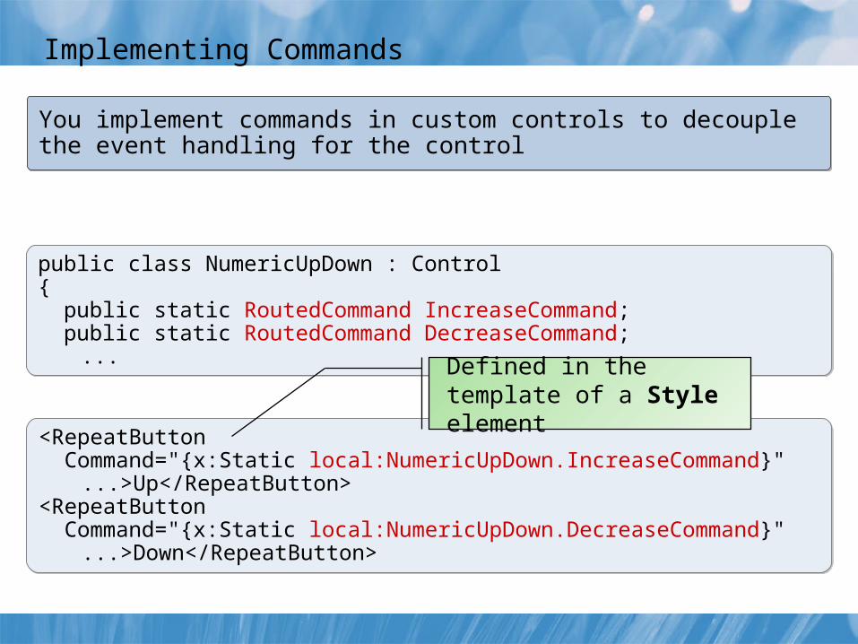
Implementing Commands
You implement commands in custom controls to decouple the event handling for the controlYou implement commands in custom controls to decouple the event handling for the control
public class NumericUpDown : Control{ public static RoutedCommand IncreaseCommand; public static RoutedCommand DecreaseCommand;
...
public class NumericUpDown : Control{ public static RoutedCommand IncreaseCommand; public static RoutedCommand DecreaseCommand;
...
<RepeatButton Command="{x:Static local:NumericUpDown.IncreaseCommand}"
...>Up</RepeatButton><RepeatButton Command="{x:Static local:NumericUpDown.DecreaseCommand}"
...>Down</RepeatButton>
<RepeatButton Command="{x:Static local:NumericUpDown.IncreaseCommand}"
...>Up</RepeatButton><RepeatButton Command="{x:Static local:NumericUpDown.DecreaseCommand}"
...>Down</RepeatButton>
Defined in the template of a Style element

Enhancing Controls by Using Themes
To create a theme file:To create a theme file:
<ResourceDictionary ...> <Style TargetType="{x:Type local:NumericUpDown}"> <ControlTemplate TargetType="{x:Type ...}">
...
<ResourceDictionary ...> <Style TargetType="{x:Type local:NumericUpDown}"> <ControlTemplate TargetType="{x:Type ...}">
...
[assembly: ThemeInfo( ResourceDictionaryLocation.None, ResourceDictionaryLocation.SourceAssembly)]
[assembly: ThemeInfo( ResourceDictionaryLocation.None, ResourceDictionaryLocation.SourceAssembly)]
1. Create a folder named themes
2. Create generic.xaml in the themes folder
3. Define a ResourceDictionary with the Style element
4. Specify the theme location in the hosting application
Defined in generic.xaml
In the hosting application

Demonstration: Implementing a NumericUpDown Control
In this demonstration, you will see how to:
• View the code for a user control implementation of the NumericUpDown control
• View the code for a custom control implementation of the NumericUpDown control

Lesson 3: Managing Control Appearance by Using Visual States
• Understanding the VisualStateManager Class
• Implementing Visual States for Controls
• Changing the Current Visual State
• Demonstration: Implementing Visual States by Using the VisualStateManager Class

Understanding the VisualStateManager Class
VisualStateManager.VisualStateGroupsVisualStateManager.VisualStateGroups
VisualStateGroup
VisualStateVisualState
VisualState
VisualStateGroup.Transitions
VisualStateVisualState
VisualTransition
Control Code:Control Code:
Contains a Storyboard element
[TemplateVisualState( Name = "Normal", GroupName = "CommonStates")][TemplateVisualState( Name = "Normal", GroupName = "CommonStates")]

Implementing Visual States for Controls
<VisualStateManager.VisualStateGroups> <VisualStateGroup Name="CommonStates"> <VisualState Name="Normal" /> <VisualState Name="MouseOver"> <Storyboard> <ColorAnimation To="Green" Storyboard.TargetName="rectBrush" Storyboard.TargetProperty="Color"/> </Storyboard> </VisualState> <VisualStateGroup.Transitions> <VisualTransition To="Normal" GeneratedDuration="00:00:00"/> <VisualTransition To="MouseOver" GeneratedDuration="00:00:00.5"> <VisualTransition.GeneratedEasingFunction> <ExponentialEase EasingMode="EaseOut" Exponent="10"/> </VisualTransition.GeneratedEasingFunction> </VisualTransition> </VisualStateGroup.Transitions> </VisualStateGroup></VisualStateManager.VisualStateGroups>
<VisualStateManager.VisualStateGroups> <VisualStateGroup Name="CommonStates"> <VisualState Name="Normal" /> <VisualState Name="MouseOver"> <Storyboard> <ColorAnimation To="Green" Storyboard.TargetName="rectBrush" Storyboard.TargetProperty="Color"/> </Storyboard> </VisualState> <VisualStateGroup.Transitions> <VisualTransition To="Normal" GeneratedDuration="00:00:00"/> <VisualTransition To="MouseOver" GeneratedDuration="00:00:00.5"> <VisualTransition.GeneratedEasingFunction> <ExponentialEase EasingMode="EaseOut" Exponent="10"/> </VisualTransition.GeneratedEasingFunction> </VisualTransition> </VisualStateGroup.Transitions> </VisualStateGroup></VisualStateManager.VisualStateGroups>

Changing the Current Visual State
Control Code:Control Code:
VisualStateManager.GoToState(this, "MouseOver", true);VisualStateManager.GoToState(this, "MouseOver", true);
Type of restriction From property To property
From a specified state to another specified state
Visual state name
Visual state name
From any state to a specified state Not set Visual state name
From a specified state to any state Visual state name Not set
From any state to any state Not set Not set
Default transition

Demonstration: Implementing Visual States by Using the VisualStateManager Class
In this demonstration, you will see how to:
• Open the existing application
• View the control template
• View the visual states
• View the visual state transitions
• View the NumericUpDown control code
• Run the application

Lesson 4: Integrating WPF and Windows Forms Technologies
• Understanding WPF and Windows Forms Integration
• Hosting Windows Forms Controls in a WPF Application
• Hosting WPF Controls in a Windows Forms Application

Understanding WPF and Windows Forms Integration
Windows Forms integration:Windows Forms integration:
• Reuse existing investment in Windows Forms code
• Some Windows Forms controls have no WPF equivalent
WPF integration:WPF integration:
• Enhance existing investment in Windows Forms code
• Enables iterative approach to migration to WPF

Hosting Windows Forms Controls in a WPF Application
<Window ... > ... <WindowsFormsHost x:Name="wfh"> <wf:MaskedTextBox x:Name="mtb" Mask="00/00/000" /> </WindowsFormsHost> ...</Window>
<Window ... > ... <WindowsFormsHost x:Name="wfh"> <wf:MaskedTextBox x:Name="mtb" Mask="00/00/000" /> </WindowsFormsHost> ...</Window>
WindowsFormsHost
element
WindowsFormsHost
element
System.Windows.Forms and WindowsFormsIntegration assemblies
System.Windows.Forms and WindowsFormsIntegration assemblies
• Child property
• Cast to relevant type
• Attach event handlers
• Manipulate properties
• Child property
• Cast to relevant type
• Attach event handlers
• Manipulate properties
(this.wfh.Child as MaskedTextBox).ValueChanged += new EventHandler(this.MaskedTextBox_ValueChanged);(this.wfh.Child as MaskedTextBox).ValueChanged += new EventHandler(this.MaskedTextBox_ValueChanged);

Hosting WPF Controls in a Windows Forms Application
private void MyForm_Load(object sender, EventArgs e){ elemHost = new ElementHost(); ... System.Windows.Controls.Button wpfButton = new System.Windows.Controls.Button(); wpfButton.Content = "Windows Presentation Foundation Button"; elemHost.Child = wpfButton; // Map the Margin property. this.AddMarginMapping(); // Remove the mapping for the Cursor property. this.RemoveCursorMapping(); // Cause the OnMarginChange delegate to be called. elemHost.Margin = new Padding(23, 23, 23, 23);}
private void MyForm_Load(object sender, EventArgs e){ elemHost = new ElementHost(); ... System.Windows.Controls.Button wpfButton = new System.Windows.Controls.Button(); wpfButton.Content = "Windows Presentation Foundation Button"; elemHost.Child = wpfButton; // Map the Margin property. this.AddMarginMapping(); // Remove the mapping for the Cursor property. this.RemoveCursorMapping(); // Cause the OnMarginChange delegate to be called. elemHost.Margin = new Padding(23, 23, 23, 23);}
WindowsFormsIntegration assemblyWindowsFormsIntegration assembly
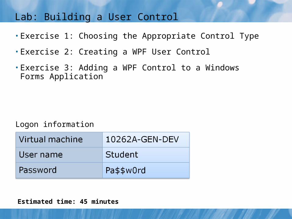
Lab: Building a User Control
• Exercise 1: Choosing the Appropriate Control Type
• Exercise 2: Creating a WPF User Control
• Exercise 3: Adding a WPF Control to a Windows Forms Application
Logon information
Estimated time: 45 minutes

Lab Scenario
You have been asked to turn your prototype graphic control into a control that the Product Inventory application will consume. The Product Inventory application is written by using Windows Forms, but you will use WPF to write the new control; therefore, you must also integrate the new control into the older application.

Lab Review
Review Questions
• Which method do you use to create a dependency property?
• Which control do you use to host a WPF control in a Windows Forms application?
• Which property do you use to add or remove property mappings for a hosted control?

Module Review and Takeaways
• Review Questions
• Best Practices