Embed Size (px)
Citation preview

My chosen artist was Walter Sickert. I like this piece he did on the left, the colours feel nostalgic and warm. His pieces look very detailed from afar but close up it you realise he focusing more on tone and shadows instead of details.
I like this one because there are so many things in this and it seems so beautiful. Although the artist was born years ago, I find his works more pleasing than some current modern artists.


These are photos of a kiwi I took. We made pencil drawings, focusing on tones (using 4B).

Kate Malone research slide
Kate Malone is a British pottery and ceramic artist. Most of her work is inspired by close up details of nature, specifically fruits and nuts. She studied in the Royal College of art in 1986.

During the mark making workshop, we worked on a project where we learn how to use different materials and stencils to create interesting textures. WWe had to make a watercolour piece of something natural. Watercolouring is quite new to me but I think I enjoy it
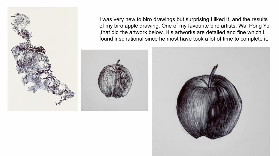
I was very new to biro drawings but surprising I liked it, and the results of my biro apple drawing. One of my favourite biro artists, Wai Pong Yu ,that did the artwork below. His artworks are detailed and fine which I found inspirational since he most have took a lot of time to complete it.
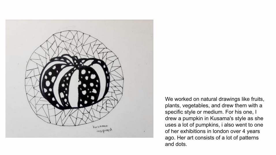
We worked on natural drawings like fruits, plants, vegetables, and drew them with a specific style or medium. For his one, I drew a pumpkin in Kusama's style as she uses a lot of pumpkins, i also went to one of her exhibitions in london over 4 years ago. Her art consists of a lot of patterns and dots.

For our baseline test we had to draw a detailed shell that was shaded in with a 4B pencil. We had less than 4 days to complete it and didnt have a reference.

This was a class collaborative piece(7N). The picture below has cut outs of our former artwork pieces. We tried to turn them into interesting shapes and stuck cardboard behind so they stand up. The first one closest to the camera is mine. The one to the right were also cutouts of our abstract pieces but instead of standing up we stuck them onto a wall.

These are watercolour abstract paintings that we made in our 4th lesson. We were encouraged to use many different colours and shapes. Many different abstract artists inspired us.

We used biros and fine liners to create a piece of art using domestic objects as a reference. Someone of them were spaced out, away from other objects, others overlapped. The lines I used weren't always going straight, since I wanted to try create a ‘3D’ effect.
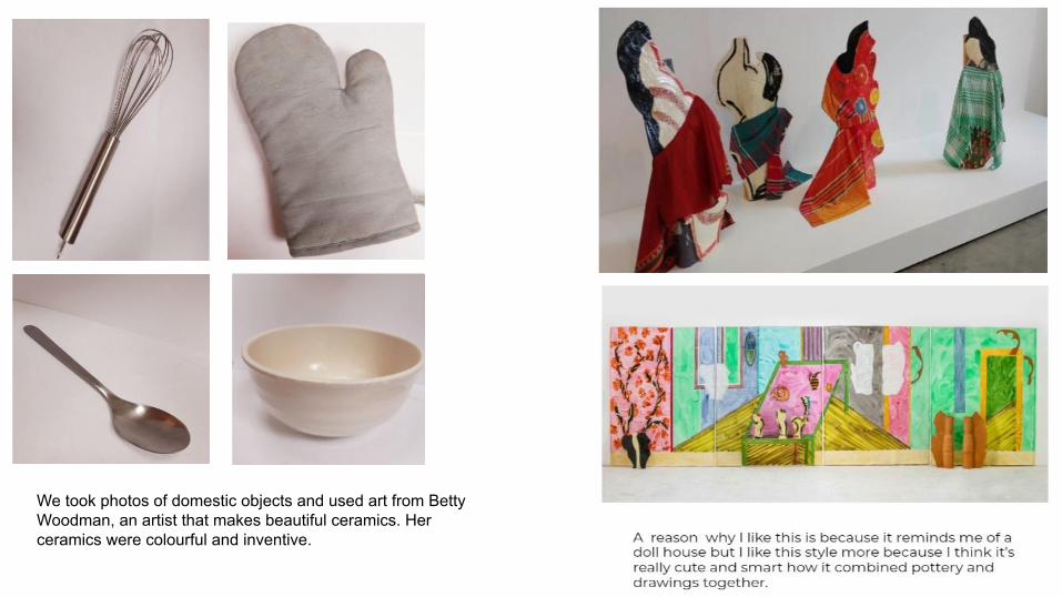
We took photos of domestic objects and used art from Betty Woodman, an artist that makes beautiful ceramics. Her ceramics were colourful and inventive.