Embed Size (px)
Citation preview
1
NATIONAL DIPLOMA IN STATISTICS
DESCRIPTIVE STATISTICS 1
COURSE CODE : STA 111 PROGRAM: NDS; NDCS; DCE, DFST & DSG
Week One
General objective: Understand the nature of statistical data, their types and uses
Specific goal: The topic is designed to enable students to acquire a basic knowledge of definition of Statistics
1.0 Definition of statistics
Statistics can be defined as a scientific method of collecting, organizing, summarizing, presenting and analyzing
data as well as making valid conclusion based on the analysis carried out.
Statistics is a scientific method which constitutes a useful and quite often indispensable tool for the natural,
Applied and social workers. The methods of statistics are useful in an overwidening range of human Endeavour, in
fact any field of thought in which numerical data exist. Nowadays it is difficult to think of any field of study that
statistics is not being applied, in particular at the higher level. Thus, statistical method is the only acceptable.
Or
Statistics is a scientific method concerned with the collection, computation, comparison, analysis and interpretation
of number. These numbers are quite referred to as data. However, statistical mean more than a collection of
numbers.
1.1 Importance/ uses of statistics.
Statistics involve manipulating and interpreting numbers. The numbers are intended to represent information
about the subject to be investigated. The science of statistics deals with information gathering, condensation and
presentation of such information in a compact form, study and measurement of variation and of relation between
two or more similar or identical phenomena. It also involves estimation of the characteristics of a population from
a sample, designing of experiments and surveys and testing of hypothesis about populations.
Statistics is concerned with analysis of information collected by a process of sampling in which variability is likely
to occur in one or more outcomes.
Statistics can be applied in any field in which there is extensive numerical data. Examples include engineering,
sciences, medicine, accounting, business administration and public administration. Some major areas where
statistics is widely used are discussed below.
Industry:- Making decision in the face of uncertainties is a unique problem faced by businessmen and industrialist.
Analysis of history data enables the businessman to prepare well in advance for the uncertainties of the future.
2
Statistics has been applied in market and product research, feasibility studies, investment policies, quality control
of manufactured products selection of personnel, the design of experiments, economic forecasting, auditing and
several others.
Biological Science: - Statistics is used in the analysis of yield of varieties of crops in different environmental
conditions using different fertilizers. Animal response to different diets in different conditions could also be
studied statistically to ensure optimum application of resources. Recent advancement in medicine and public
health has been greatly enhanced by statistical principles.
Physical Science: - Statistical metrology has been used to aid findings in astronomy, chemistry, geology,
meteorology, and oil explorations. Samples of mineral resources discovered at a particular environment are taken
to examine its essential and natural features before a decision is made on likely investment on its exploration and
exploitation. Laboratory experiments are conducted using statistical principles.
Government: - A large volume of data is collected by government at all levels on a continuous basis to enhance
effective decision making. Government requires an upto-date knowledge of expenditure pattern, revenue,
estimates, human population, health, defense and internal issues. Government is the most important user and
producer of statistical data.
1.2 Types of statistical data
There are basically two main types of statistical data.
These are
(i) The primary data, and (ii) The secondary data.
The primary data
As the name implies, this is a type of data whereby we obtain information on the topic of interest at first hand.
When the researcher decides to obtain statistical information by going to the origin of the source, we say that such
data are primary data. This happens when there is no existing reliable information on the topic of interest.
The first hand collection of statistical data is one of the most difficult and important tasks a statistician would carry
out. The acceptance of and reliability of the data so called will depend on the method employed, how timely they
were collected, and the caliber of people employed for the exercise.
Advantages
The investigator has confidence in the data collected.
The investigator appreciates the problems involved in data collection since he is involved at every stage.
The report of such a survey is usually comprehensive.
Definition of terms and units are usually included.
It normally includes a copy of schedule use to collect the data.
Disadvantages
The method is time consuming.
It is very expensive.
It requires considerable manpower.
3
Sometimes the data may be obsolete at the time of publication.
The secondary data
Sometimes statistical data may be obtained from existing published or unpublished sources, such as statistical
division in various ministries, banks, insurance companies, print media, and research institutions. In all these areas
data are collected and kept as part of the routine jobs. There may be no particular importance attached to the data
collected. Thus, the figure on vehicle license renewals and new registration of vehicles can first be obtained from
the Board of Internal Revenue through their daily records. The investigator interested in studying the type of new
vehicles brought into the country for a particular year will start with the data from the custom department or Board
of internal revenue.
Advantages
They are cheap to collect.
Data collection is less time consuming as compared to primary source.
The data are easily available.
Disadvantages
It could be misused, misrepresented or misinterpreted.
Some data may not be easily obtained because of official protocol.
Then information may not conform to the investigator’s needs.
It may not be possible to determine the precision and reliability of the data, because the method used to collect the
data is usually not known.
It may contain mistakes due to errors in transcription from the primary source.
1.3 Uses of statistical data.
The following explain uses of statistical data.
(i) Statistics summarizes a great bulk of numerical data constructing out of them source
representative qualities such as mean, standard deviation, variance and coefficient of variation.
(ii) It permits reasonable deductions and enables us to draw general conclusions under certain
conditions
(iii) Planning is absorbed without statistics. Statistics enables us to plan the future based on analysis
of historical data.
(iv) Statistics reveal the nature and pattern of the variations of a phenomenon through numerical
measurement.
(v) It makes data representation easy and clear.
4
1.4 Definition of quantitative random variable
A quantitative random variable is that which could be expressed in numerical terms. They are of two types:
Discrete and continuous.
Discrete random variable
These are random variables which can assume certain fixed whole number values. They are values obtained when
a counting process is conducted. Examples include the number of cars in a car park, the number of students in a
class.
The possible values the random variable can assume are 0,1,2,3,4, e.t.c.
Continuous random variable
This types of random variable assumes an infinite number of values in between any two points or a given range.
Continuous random variables are often associated with measuring device. The weight, length, height and volume
of object are continuous random variables. Other examples include the time between the breakdown of computer
system, the length of screws produced in a factory and number of defective items in a production run. In these
cases, the numerical values of specific case is a variable which is randomly determined, and measured on a
continuous scale. It should be noted that any numerical value is possible including fractions or decimals.
1.5 Types of measurement
There are four (4) types of data. Namely: - nominal, ordinal, interval and ratio.
Nominal data
This represents the most primitive, the most unrestricted assignment of numerals, in fact, the numerals is used only
as labels and thus words or letters would serve as well.
The nominal scale has no direction and is applicable to numerals or letters derived from qualitative data. It is
merely a classification of items and has no other properties.
For example, the people of Nigeria can be classified into ethic groupings such as the Ibos, the
Yoruba’s, the Hausas, the Ibibio etc without necessarily inferring that one ethnic group is superior to the other.
Ordinal data
The ordinal scale has magnitude, hence is a step more developed than the nominal scale. It has the structure of
order- preserving group. Items are placed in order of magnitude. In fact, it is a group which includes
transformation by all monotonic increasing function.
For example, if Bassey is taller than Obi and Obi is taller than Akpam, the rank in terms of tallness is Bassey first,
Obi second and Akpam third. This scale merely tells us the order, but not specific magnitude of the differences in
height between Akpam, Obi and Bassey.
Most of the scales used widely and effectively by psychologist are ordinal scales.
5
Interval data.
An interval scale is used to specify the magnitude of observations or items.
It is a higher scale of measurements, superior to both nominal and ordinal scales. Thus, it incorporates all the
properties of both nominal and ordinal scales and in addition requires that the distance between the classes be
equal.
We can apply almost all the usual statistical operations here unless they are of a type that implies knowledge of a
true zero point. Even then, the zero point on an interval scale is a matter of convention because the scale form
remains in variant when a constant is added.
We can carry out arithmetical operations like addition and subtraction with data on the interval scale.
Ratio data.
This is the highest scale of measurement that we shall come across in the physical and natural sciences. Its
conditions are equality of rank order, equality of intervals and equality of ratios. The knowledge of the zero point
is also a necessary requirement of measurement. All mathematical operations are applicable to the ratio scale and
all types of statistical measures are also applicable.
Exercise/Practical
1. Discuss and compare the various scales of measurement.
2. What is the difference between a qualitative and a quantitative variable?
6
Week Two
2.0 Bar Chart
In bar chart, there are no set of rules to be observed in drawing bar charts. The following
consideration will be quite useful.
Note: Bar chart is applicable only to discrete, Categorical, nominal and ordinal data.
1. Bar should be neither too short and nor very long and narrow.
2. Bar should be separated by spaces which are about one and half of the width of a bar.
3. The length of the bar should be proportional to frequencies of the categories.
4. Guide note should be provided to ease the reading of the chart.
Bar charts are used for making comparisons among categories. In the simplest form several
items are presented graphically by horizontal or vertical bars of uniform width, with lengths
proportional to the values they represent.
Simple Bar chart
Example
Frequencies
Sex Frequency
Male
Female
165
102
Total 267
Sex
Multiple Bar Charts
These charts enable comparisons of more than one variable to be made the same time. For
example, one could go further by considering Age and sex.
Female Male
Sex
200
150
100
50
0
7
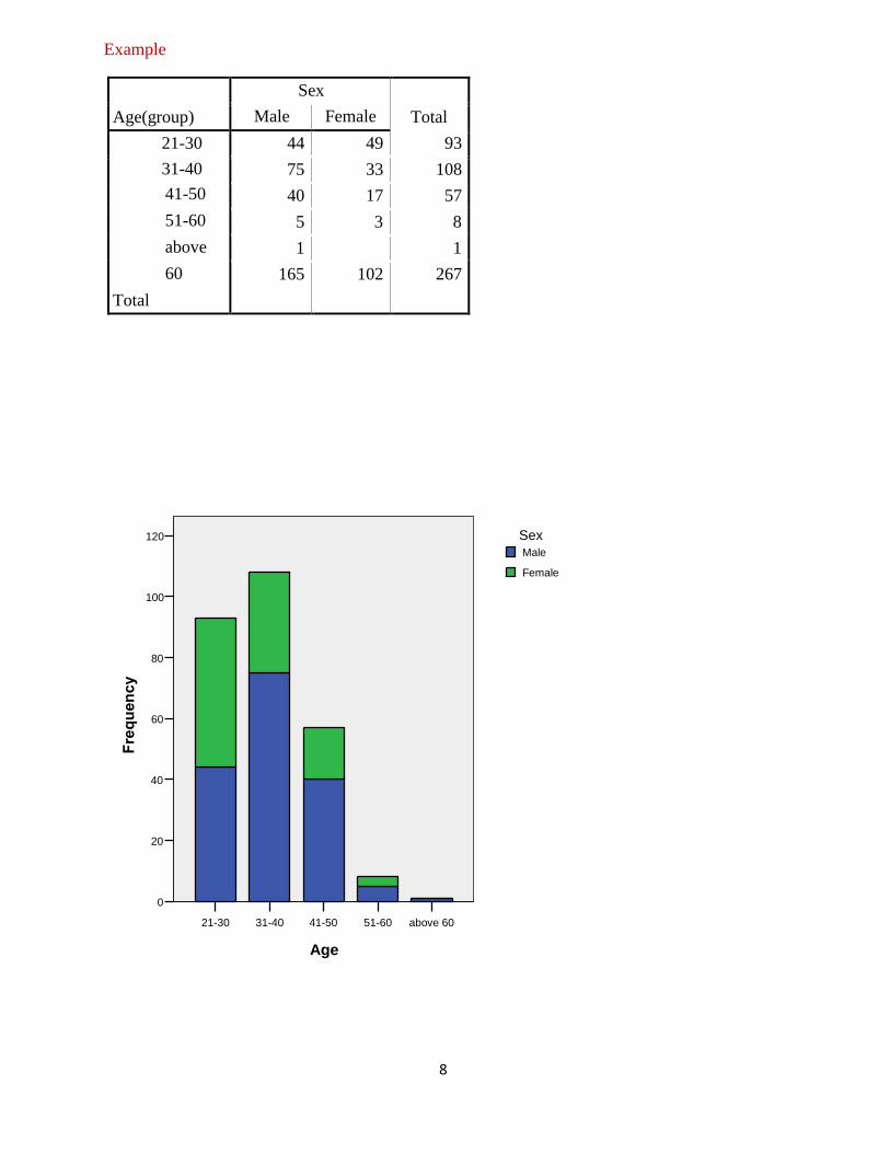
Example
Age(group)
Sex
Total Male Female
21-30
31-40
44 49 93
75 33 108
41-50
51-60
above
60
Total
40 17 57
5 3 8
1
0
1
165 102 267
Graph of Multiple Bar Chart
Component Bar Chart
Similarly, these charts enable comparisons of more than one variable to be made the same time.
For example, one could go further by considering Age and sex.
above 60 51-60 41-50 31-40 21-30
Age
80
60
40
20
0
Female
Male Sex
8
Example
Age(group)
Sex
Total Male Female
21-30
31-40
41-50
51-60
above
60
Total
44 49 93
75 33 108
40 17 57
5 3 8
1 1
165 102 267
above 60 51-60 41-50 31-40 21-30
Age
120
100
80
60
40
20
0
Female
Male Sex

9
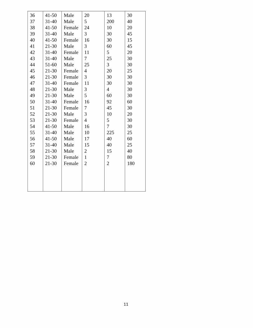
Exercise/Practical
The data below comes from a survey of physiotherapists in Nigeria and they were asked the
questions about patients who have Osteoarthritis knee. And the questions asked were
What age group are you and sex?
For how long have you been practicing physiotherapy?
In a typical week, how many patients do you see?
On the average, about how many minutes do you spend in treating a patient?
1. Create simple bar charts for age group and for sex.
2. Create a multiple bar chart for age group with the bars divided into sex
3. Create a component bar chart for age group with sex as the two component 4. For years
of practice, suggest why we did not draw a bar chart
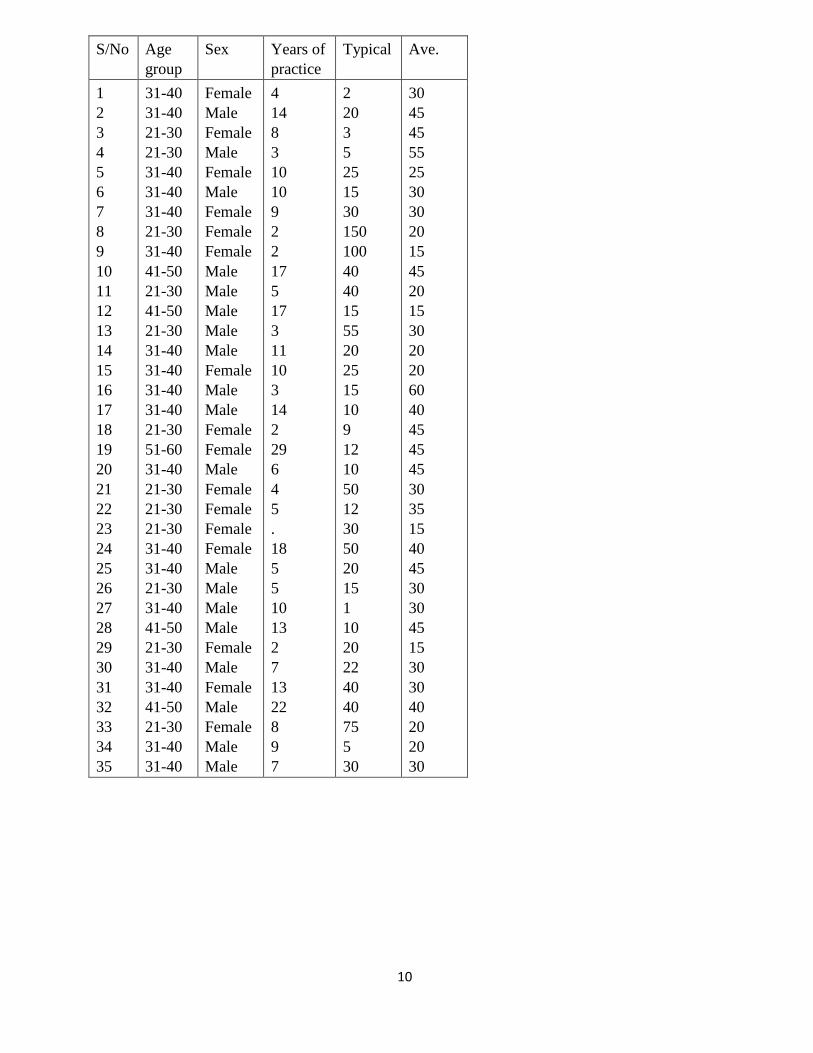
10
S/No Age
group
Sex Years of
practice
Typical Ave.
1
2
3
4
5
6
7
8
9
10
11
12
13
14
15
16
17
18
19
20
21
22
23
24
25
26
27
28
29
30
31
32
33
34
35
31-40
31-40
21-30
21-30
31-40
31-40
31-40
21-30
31-40
41-50
21-30
41-50
21-30
31-40
31-40
31-40
31-40
21-30
51-60
31-40
21-30
21-30
21-30
31-40
31-40
21-30
31-40
41-50
21-30
31-40
31-40
41-50
21-30
31-40
31-40
Female
Male
Female
Male
Female
Male
Female
Female
Female
Male
Male
Male
Male
Male
Female
Male
Male
Female
Female
Male
Female
Female
Female
Female
Male
Male
Male
Male
Female
Male
Female
Male
Female
Male
Male
4
14
8
3
10
10
9
2
2
17
5
17
3
11
10
3
14
2
29
6
4
5
.
18
5
5
10
13
2
7
13
22
8
9
7
2
20
3
5
25
15
30
150
100
40
40
15
55
20
25
15
10
9
12
10
50
12
30
50
20
15
1
10
20
22
40
40
75
5
30
30
45
45
55
25
30
30
20
15
45
20
15
30
20
20
60
40
45
45
45
30
35
15
40
45
30
30
45
15
30
30
40
20
20
30
11
36
37
38
39
40
41
42
43
44
45
46
47
48
49
50
51
52
53
54
55
56
57
58
59
60
41-50
31-40
41-50
31-40
41-50
21-30
31-40
31-40
51-60
21-30
21-30
31-40
21-30
21-30
31-40
21-30
21-30
21-30
41-50
31-40
41-50
31-40
21-30
21-30
21-30
Male
Male
Female
Male
Female
Male
Female
Male
Male
Female
Female
Female
Male
Male
Female
Female
Male
Female
Male
Male
Male
Male
Male
Female
Female
20
5
24
3
16
3
11
7
25
4
3
11
3
5
16
7
3
4
16
10
17
15
2
1
2
13
200
10
30
30
60
5
25
3
20
30
30
4
60
92
45
10
5
7
225
40
40
15
7
2
30
40
20
45
15
45
20
30
30
25
30
30
30
30
60
30
20
30
30
25
60
25
40
80
180
12
Week Three
2.1 Pie Chart
A pie chart (or a circle graph) is a circular chart divided into sectors, illustrating relative
magnitudes or frequencies. In a pie chart, the arc length of each sector (and consequently its
central angle and area), is proportional to the quantity it represents. Together, the sectors create a
full disk. It is named for its resemblance to a pie which has been sliced.
While the pie chart is perhaps the most ubiquitous statistical chart in the business world and the
mass media, it is rarely used in scientific or technical publications. It is one of the most widely
criticized charts, and many statisticians recommend to avoid its use altogether pointing out in
particular that it is difficult to compare different sections of a given pie chart, or to compare data
across different pie charts. Pie charts can be an effective way of displaying information in some
cases, in particular if the intent is to compare the size of a slice with the whole pie, rather than
comparing the slices among them. Pie charts work particularly well when the slices represent 25
or 50% of the data, but in general, other plots such as the bar chart or the dot plot, or non-
graphical methods such as tables, may be more adapted for representing information.
A pie chart gives an immediate visual idea of the relative sizes of the shares as a whole. It is a
good method of representation if one wishes to compare a part of a group with the whole group.
You could use a pie chart to show sex of respondents in a given study, market share for different
brands or different types of sandwiches sold by a store.
Statisticians tend to regard pie charts as a poor method of displaying information. While pie
charts are common in business and journalism, they are uncommon in scientific literature. One
reason for this is that it is more difficult for comparisons to be made between the size of items in
a chart when area is used instead of length.
However, if the goal is to compare a given category (a slice of the pie) with the total (the whole
pie) in a single chart and the multiple is close to 25% or 50%, then a pie chart works better than a
graph.
However, pie charts do not give very detailed information, but you can add more information
into pie charts by inserting figure into each segment of the chart or by giving a separate table as
reference. A pie chart is not a good format for showing increases or decreases numbers in each
category, or direct relationships between numbers where our set of numbers depend on another.
In this case a line graph would be better format to use.
In order to draw a pie chart, you must have data for which you need to show the proportion of
each category as a part of the whole. Then the process is as below.
1. Collect the data so the number per category can be counted. In other words, decide on the
data that you wish to represent and collect it altogether in a format that shows shares of
the whole.
13
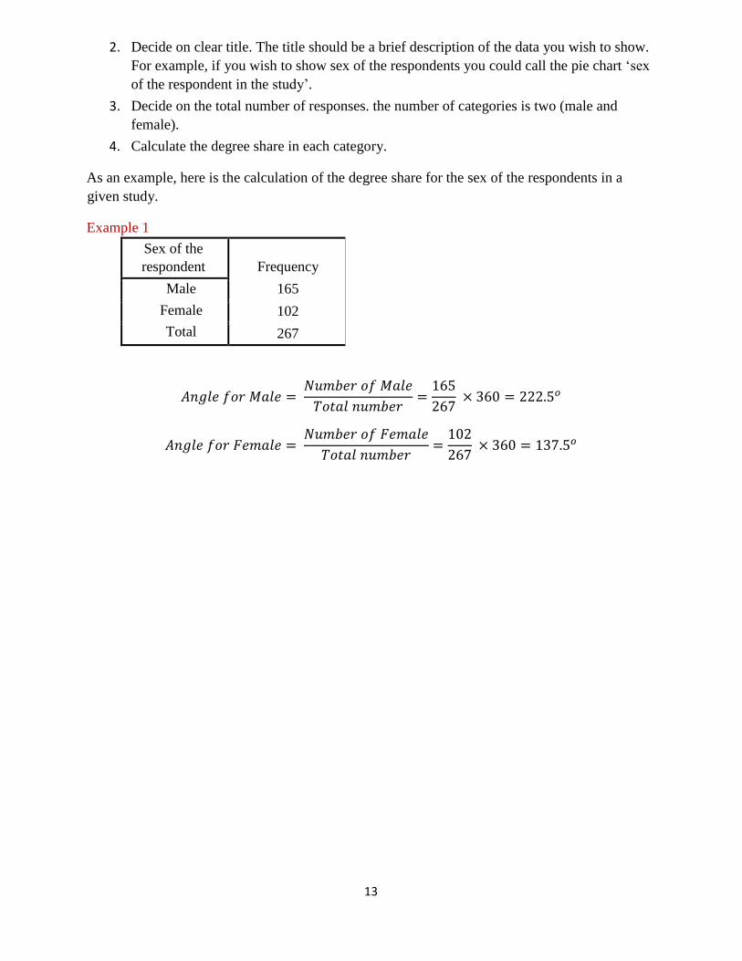
2. Decide on clear title. The title should be a brief description of the data you wish to show.
For example, if you wish to show sex of the respondents you could call the pie chart ‘sex
of the respondent in the study’.
3. Decide on the total number of responses. the number of categories is two (male and
female).
4. Calculate the degree share in each category.
As an example, here is the calculation of the degree share for the sex of the respondents in a
given study.
Example 1
Sex of the
respondent Frequency
Male
Female
Total
165
102
267
𝐴𝑛𝑔𝑙𝑒 𝑓𝑜𝑟 𝑀𝑎𝑙𝑒 = 𝑁𝑢𝑚𝑏𝑒𝑟 𝑜𝑓 𝑀𝑎𝑙𝑒
𝑇𝑜𝑡𝑎𝑙 𝑛𝑢𝑚𝑏𝑒𝑟=
165
267 × 360 = 222.5𝑜
𝐴𝑛𝑔𝑙𝑒 𝑓𝑜𝑟 𝐹𝑒𝑚𝑎𝑙𝑒 = 𝑁𝑢𝑚𝑏𝑒𝑟 𝑜𝑓 𝐹𝑒𝑚𝑎𝑙𝑒
𝑇𝑜𝑡𝑎𝑙 𝑛𝑢𝑚𝑏𝑒𝑟=
102
267 × 360 = 137.5𝑜
14
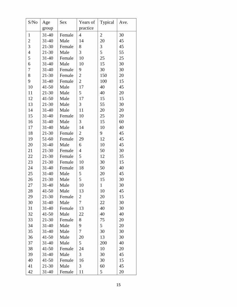
Exercise/Practice
The data below comes from a survey of physiotherapists in Nigeria and they were asked the
questions about patients who have Osteoarthritis knee. And the questions asked were
What age group are you and sex?
For how long have you been practicing physiotherapy?
In a typical week, how many patients do you see?
On the average, about how many minutes do you spend in treating a patient?
a. Create a pie chart for age group of the physiotherapists
b. Create a pie chart for sex of the physiotherapists
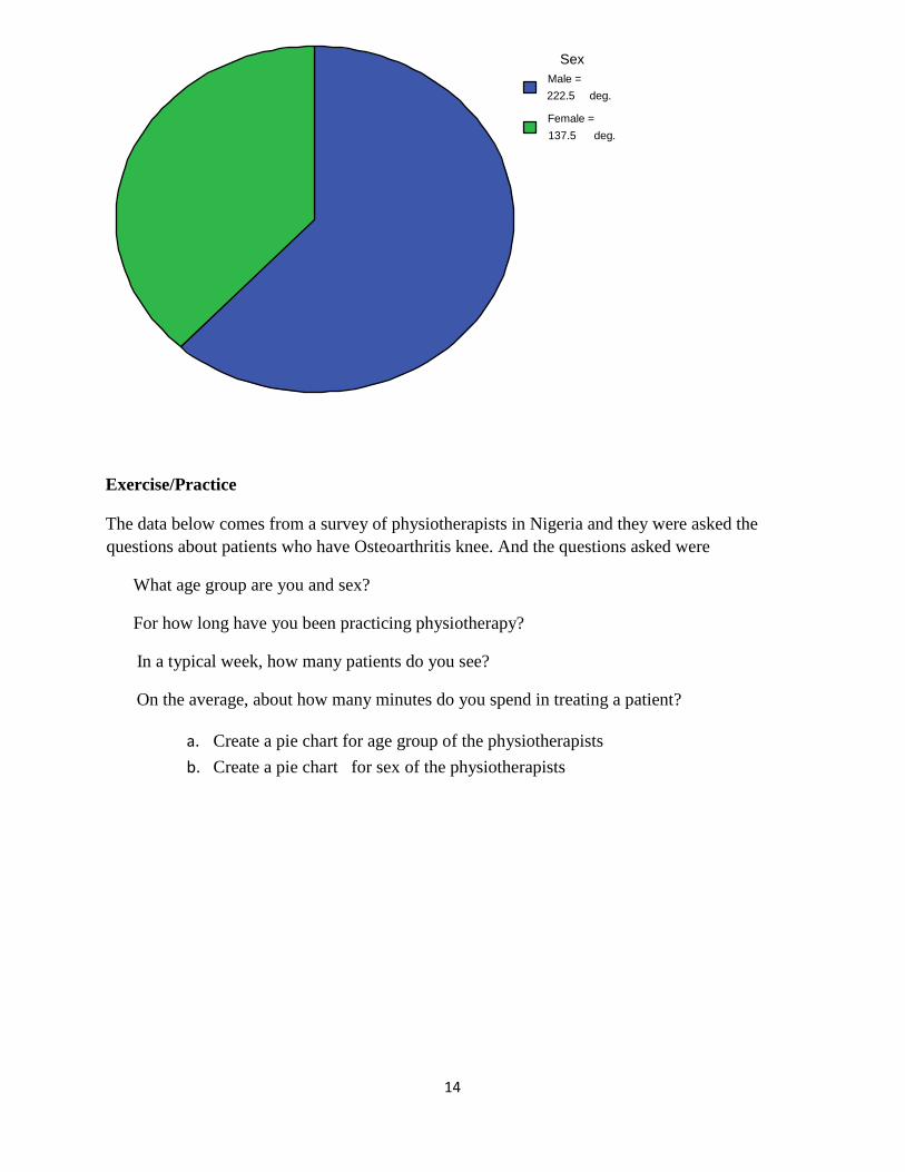
Female = 137.5 deg.
Male = 222.5 deg.
Sex
15
S/No Age
group
Sex Years of
practice
Typical Ave.
1
2
3
4
5
6
7
8
9
10
11
12
13
14
15
16
17
18
19
20
21
22
23
24
25
26
27
28
29
30
31
32
33
34
35
36
37
38
39
40
41
42
31-40
31-40
21-30
21-30
31-40
31-40
31-40
21-30
31-40
41-50
21-30
41-50
21-30
31-40
31-40
31-40
31-40
21-30
51-60
31-40
21-30
21-30
21-30
31-40
31-40
21-30
31-40
41-50
21-30
31-40
31-40
41-50
21-30
31-40
31-40
41-50
31-40
41-50
31-40
41-50
21-30
31-40
Female
Male
Female
Male
Female
Male
Female
Female
Female
Male
Male
Male
Male
Male
Female
Male
Male
Female
Female
Male
Female
Female
Female
Female
Male
Male
Male
Male
Female
Male
Female
Male
Female
Male
Male
Male
Male
Female
Male
Female
Male
Female
4
14
8
3
10
10
9
2
2
17
5
17
3
11
10
3
14
2
29
6
4
5
10
18
5
5
10
13
2
7
13
22
8
9
7
20
5
24
3
16
3
11
2
20
3
5
25
15
30
150
100
40
40
15
55
20
25
15
10
9
12
10
50
12
30
50
20
15
1
10
20
22
40
40
75
5
30
13
200
10
30
30
60
5
30
45
45
55
25
30
30
20
15
45
20
15
30
20
20
60
40
45
45
45
30
35
15
40
45
30
30
45
15
30
30
40
20
20
30
30
40
20
45
15
45
20
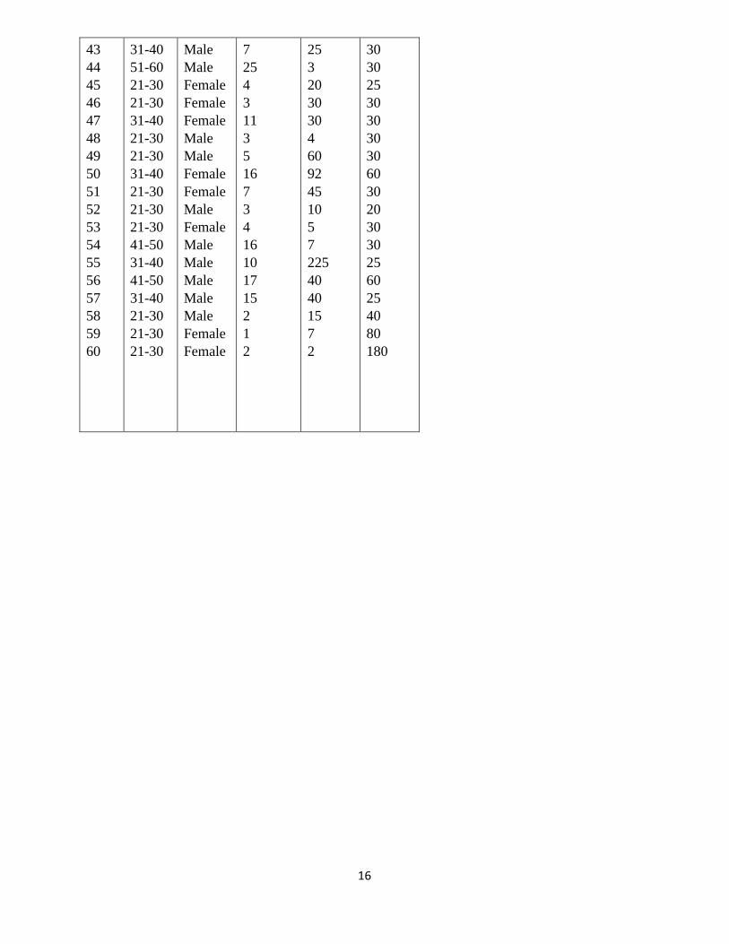
16
43
44
45
46
47
48
49
50
51
52
53
54
55
56
57
58
59
60
31-40
51-60
21-30
21-30
31-40
21-30
21-30
31-40
21-30
21-30
21-30
41-50
31-40
41-50
31-40
21-30
21-30
21-30
Male
Male
Female
Female
Female
Male
Male
Female
Female
Male
Female
Male
Male
Male
Male
Male
Female
Female
7
25
4
3
11
3
5
16
7
3
4
16
10
17
15
2
1
2
25
3
20
30
30
4
60
92
45
10
5
7
225
40
40
15
7
2
30
30
25
30
30
30
30
60
30
20
30
30
25
60
25
40
80
180
17
Week Four
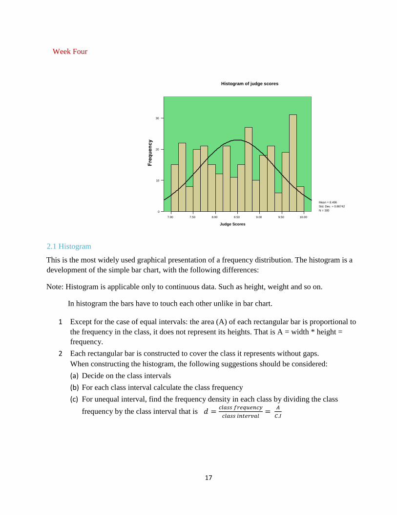
2.1 Histogram
This is the most widely used graphical presentation of a frequency distribution. The histogram is a
development of the simple bar chart, with the following differences:
Note: Histogram is applicable only to continuous data. Such as height, weight and so on.
In histogram the bars have to touch each other unlike in bar chart.
1 Except for the case of equal intervals: the area (A) of each rectangular bar is proportional to
the frequency in the class, it does not represent its heights. That is A = width * height =
frequency.
2 Each rectangular bar is constructed to cover the class it represents without gaps.
When constructing the histogram, the following suggestions should be considered:
(a) Decide on the class intervals
(b) For each class interval calculate the class frequency
(c) For unequal interval, find the frequency density in each class by dividing the class
frequency by the class interval that is 𝑑 =𝑐𝑙𝑎𝑠𝑠 𝑓𝑟𝑒𝑞𝑢𝑒𝑛𝑐𝑦
𝑐𝑙𝑎𝑠𝑠 𝑖𝑛𝑡𝑒𝑟𝑣𝑎𝑙=
𝐴
𝐶.𝐼
10.00 9.50 9.00 8.50 8.00 7.50 7.00 Judge Scores
30
20
10
0
Mean = 8.496 Std. Dev. = 0.86742 N = 300
Histogram of judge scores
18
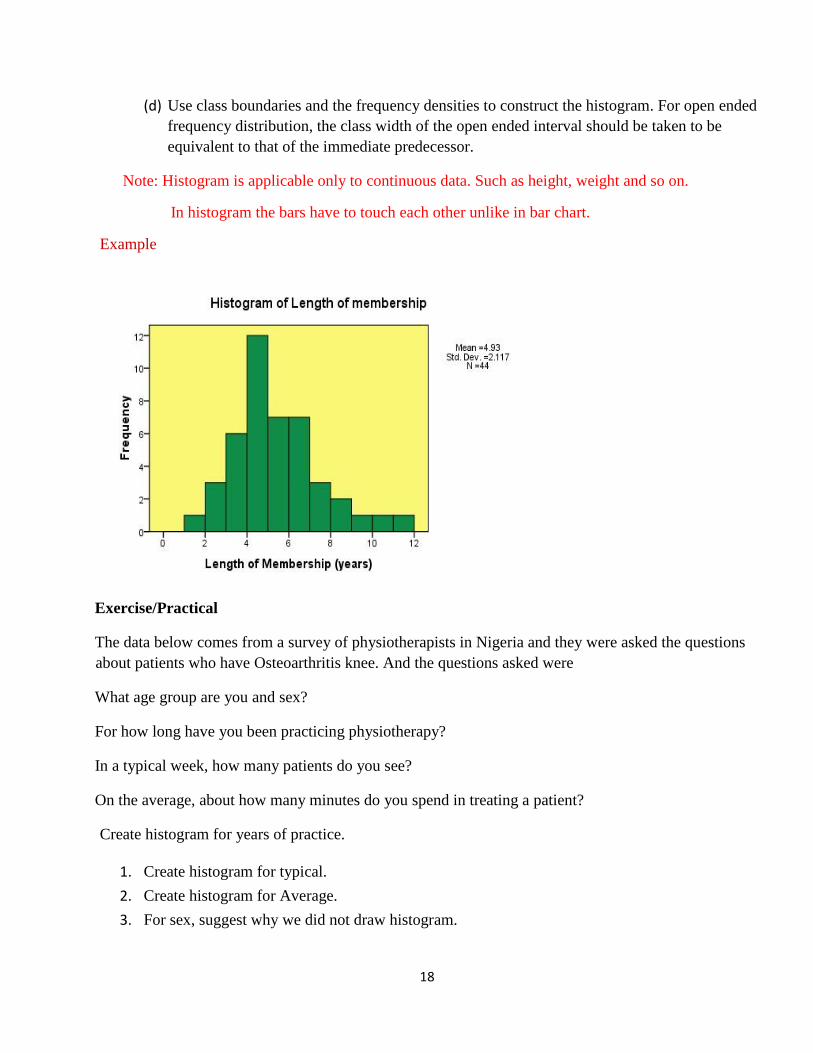
(d) Use class boundaries and the frequency densities to construct the histogram. For open ended
frequency distribution, the class width of the open ended interval should be taken to be
equivalent to that of the immediate predecessor.
Note: Histogram is applicable only to continuous data. Such as height, weight and so on.
In histogram the bars have to touch each other unlike in bar chart.
Example
Exercise/Practical
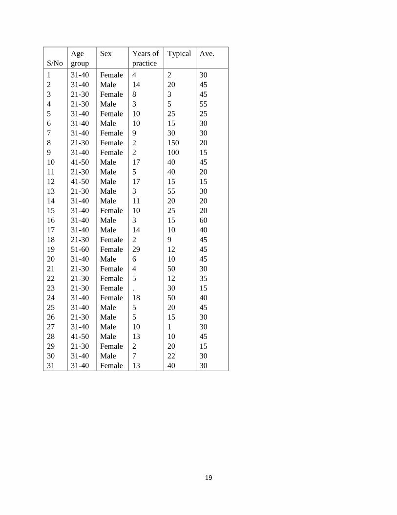
The data below comes from a survey of physiotherapists in Nigeria and they were asked the questions
about patients who have Osteoarthritis knee. And the questions asked were
What age group are you and sex?
For how long have you been practicing physiotherapy?
In a typical week, how many patients do you see?
On the average, about how many minutes do you spend in treating a patient?
Create histogram for years of practice.
1. Create histogram for typical.
2. Create histogram for Average.
3. For sex, suggest why we did not draw histogram.
19
S/No
Age
group
Sex Years of
practice
Typical Ave.
1
2
3
4
5
6
7
8
9
10
11
12
13
14
15
16
17
18
19
20
21
22
23
24
25
26
27
28
29
30
31
31-40
31-40
21-30
21-30
31-40
31-40
31-40
21-30
31-40
41-50
21-30
41-50
21-30
31-40
31-40
31-40
31-40
21-30
51-60
31-40
21-30
21-30
21-30
31-40
31-40
21-30
31-40
41-50
21-30
31-40
31-40
Female
Male
Female
Male
Female
Male
Female
Female
Female
Male
Male
Male
Male
Male
Female
Male
Male
Female
Female
Male
Female
Female
Female
Female
Male
Male
Male
Male
Female
Male
Female
4
14
8
3
10
10
9
2
2
17
5
17
3
11
10
3
14
2
29
6
4
5
.
18
5
5
10
13
2
7
13
2
20
3
5
25
15
30
150
100
40
40
15
55
20
25
15
10
9
12
10
50
12
30
50
20
15
1
10
20
22
40
30
45
45
55
25
30
30
20
15
45
20
15
30
20
20
60
40
45
45
45
30
35
15
40
45
30
30
45
15
30
30
20
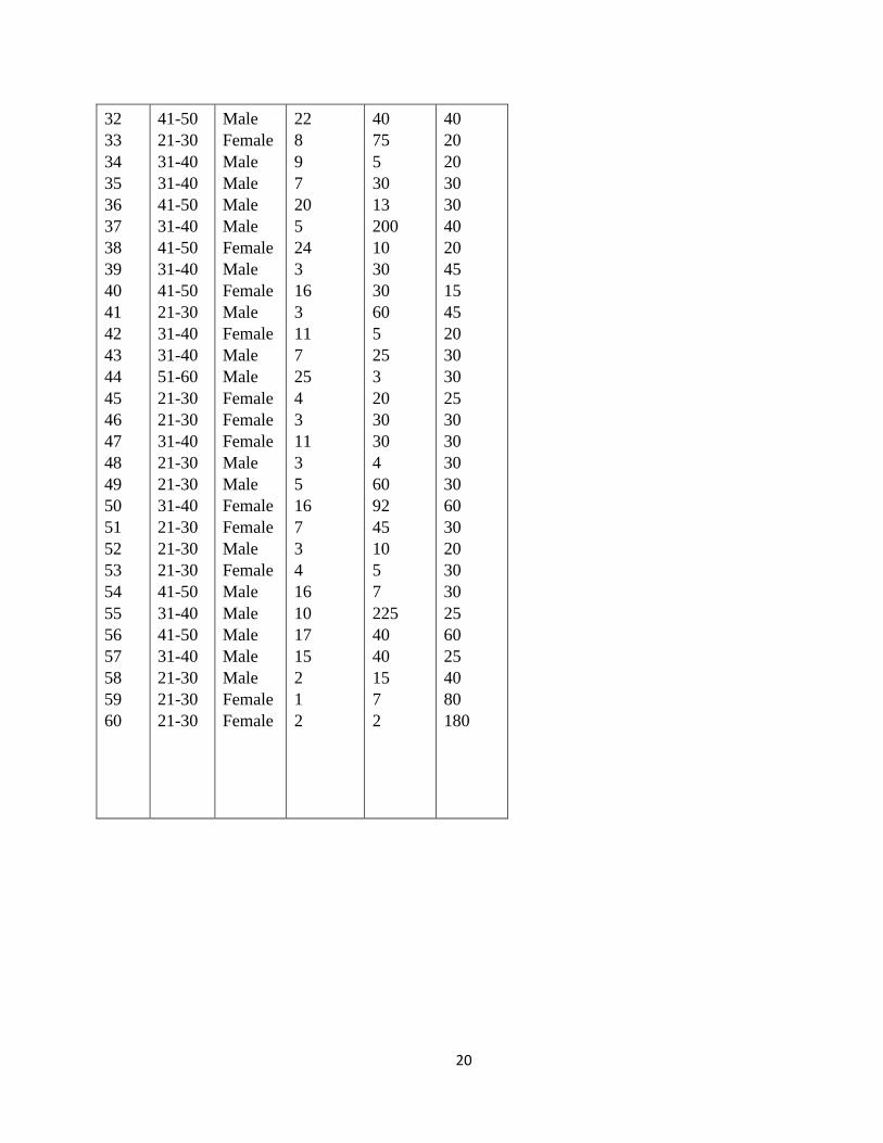
32
33
34
35
36
37
38
39
40
41
42
43
44
45
46
47
48
49
50
51
52
53
54
55
56
57
58
59
60
41-50
21-30
31-40
31-40
41-50
31-40
41-50
31-40
41-50
21-30
31-40
31-40
51-60
21-30
21-30
31-40
21-30
21-30
31-40
21-30
21-30
21-30
41-50
31-40
41-50
31-40
21-30
21-30
21-30
Male
Female
Male
Male
Male
Male
Female
Male
Female
Male
Female
Male
Male
Female
Female
Female
Male
Male
Female
Female
Male
Female
Male
Male
Male
Male
Male
Female
Female
22
8
9
7
20
5
24
3
16
3
11
7
25
4
3
11
3
5
16
7
3
4
16
10
17
15
2
1
2
40
75
5
30
13
200
10
30
30
60
5
25
3
20
30
30
4
60
92
45
10
5
7
225
40
40
15
7
2
40
20
20
30
30
40
20
45
15
45
20
30
30
25
30
30
30
30
60
30
20
30
30
25
60
25
40
80
180
21
Week Five
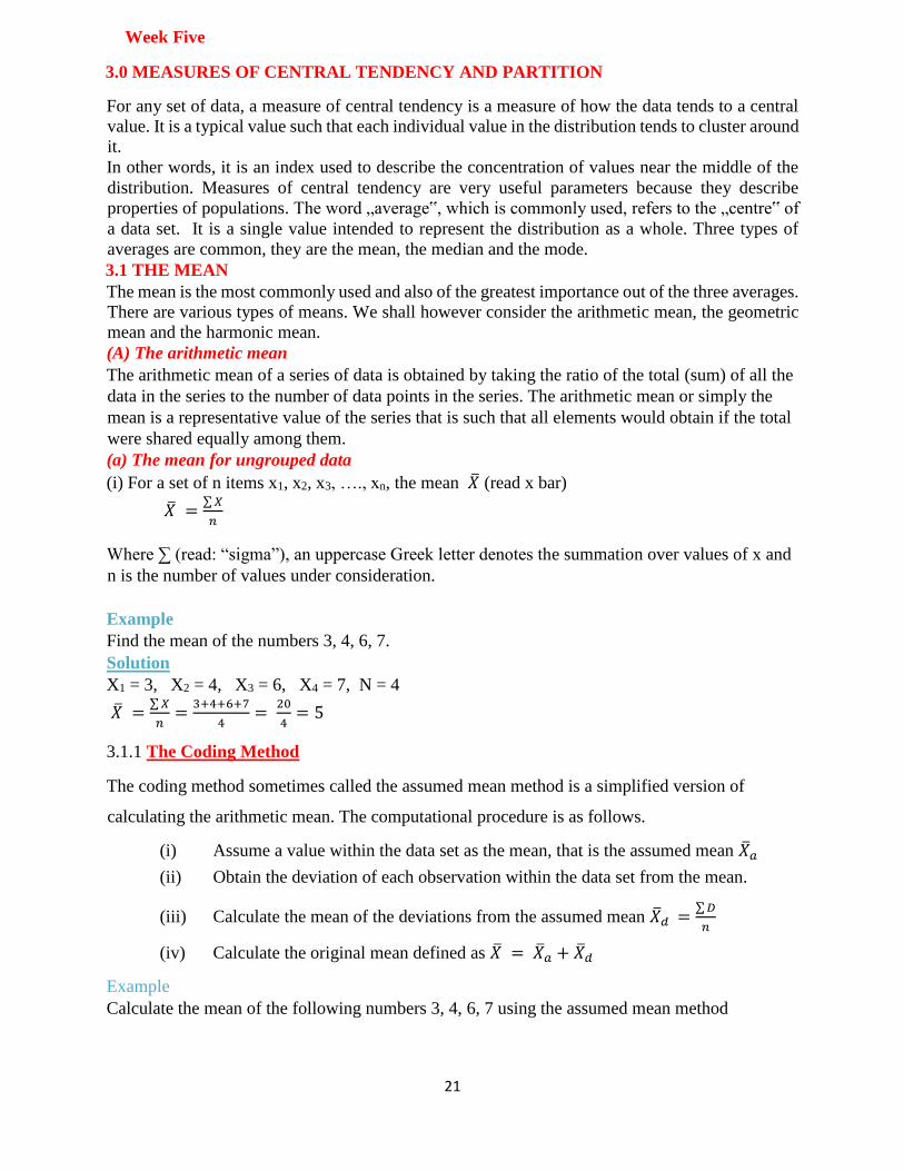
3.0 MEASURES OF CENTRAL TENDENCY AND PARTITION
For any set of data, a measure of central tendency is a measure of how the data tends to a central
value. It is a typical value such that each individual value in the distribution tends to cluster around
it.
In other words, it is an index used to describe the concentration of values near the middle of the
distribution. Measures of central tendency are very useful parameters because they describe
properties of populations. The word „average‟, which is commonly used, refers to the „centre‟ of
a data set. It is a single value intended to represent the distribution as a whole. Three types of
averages are common, they are the mean, the median and the mode.
3.1 THE MEAN
The mean is the most commonly used and also of the greatest importance out of the three averages.
There are various types of means. We shall however consider the arithmetic mean, the geometric
mean and the harmonic mean.
(A) The arithmetic mean
The arithmetic mean of a series of data is obtained by taking the ratio of the total (sum) of all the
data in the series to the number of data points in the series. The arithmetic mean or simply the
mean is a representative value of the series that is such that all elements would obtain if the total
were shared equally among them.
(a) The mean for ungrouped data
(i) For a set of n items x1, x2, x3, …., xn, the mean �� (read x bar)
�� =∑ 𝑋
𝑛
Where ∑ (read: “sigma”), an uppercase Greek letter denotes the summation over values of x and
n is the number of values under consideration.
Example
Find the mean of the numbers 3, 4, 6, 7.
Solution
X1 = 3, X2 = 4, X3 = 6, X4 = 7, N = 4
�� =∑ 𝑋
𝑛=
3+4+6+7
4=
20
4= 5
3.1.1 The Coding Method
The coding method sometimes called the assumed mean method is a simplified version of
calculating the arithmetic mean. The computational procedure is as follows.
(i) Assume a value within the data set as the mean, that is the assumed mean ��𝑎
(ii) Obtain the deviation of each observation within the data set from the mean.
(iii) Calculate the mean of the deviations from the assumed mean ��𝑑 =∑ 𝐷
𝑛
(iv) Calculate the original mean defined as �� = ��𝑎 + ��𝑑
Example
Calculate the mean of the following numbers 3, 4, 6, 7 using the assumed mean method
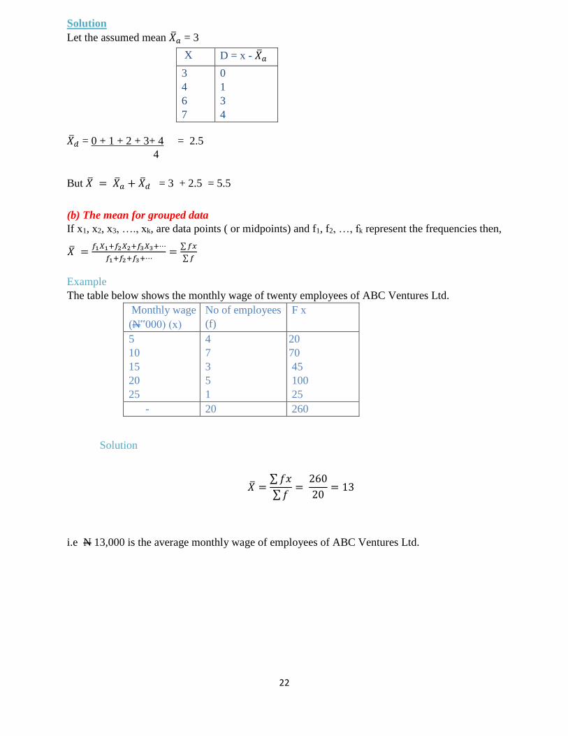
22
Solution
Let the assumed mean ��𝑎 = 3
X D = x - ��𝑎
3
4
6
7
0
1
3
4
��𝑑 = 0 + 1 + 2 + 3+ 4 = 2.5
4
But �� = ��𝑎 + ��𝑑 = 3 + 2.5 = 5.5
(b) The mean for grouped data
If x1, x2, x3, …., xk, are data points ( or midpoints) and f1, f2, …, fk represent the frequencies then,
�� =𝑓1𝑋1+𝑓2𝑋2+𝑓3𝑋3+⋯
𝑓1+𝑓2+𝑓3+⋯=
∑ 𝑓𝑥
∑ 𝑓
Example
The table below shows the monthly wage of twenty employees of ABC Ventures Ltd.
Monthly wage
(N‟000) (x)
No of employees
(f)
F x
5
10
15
20
25
4
7
3
5
1
20
70
45
100
25
- 20 260
Solution
�� =∑ 𝑓𝑥
∑ 𝑓=
260
20= 13
i.e N 13,000 is the average monthly wage of employees of ABC Ventures Ltd.
23
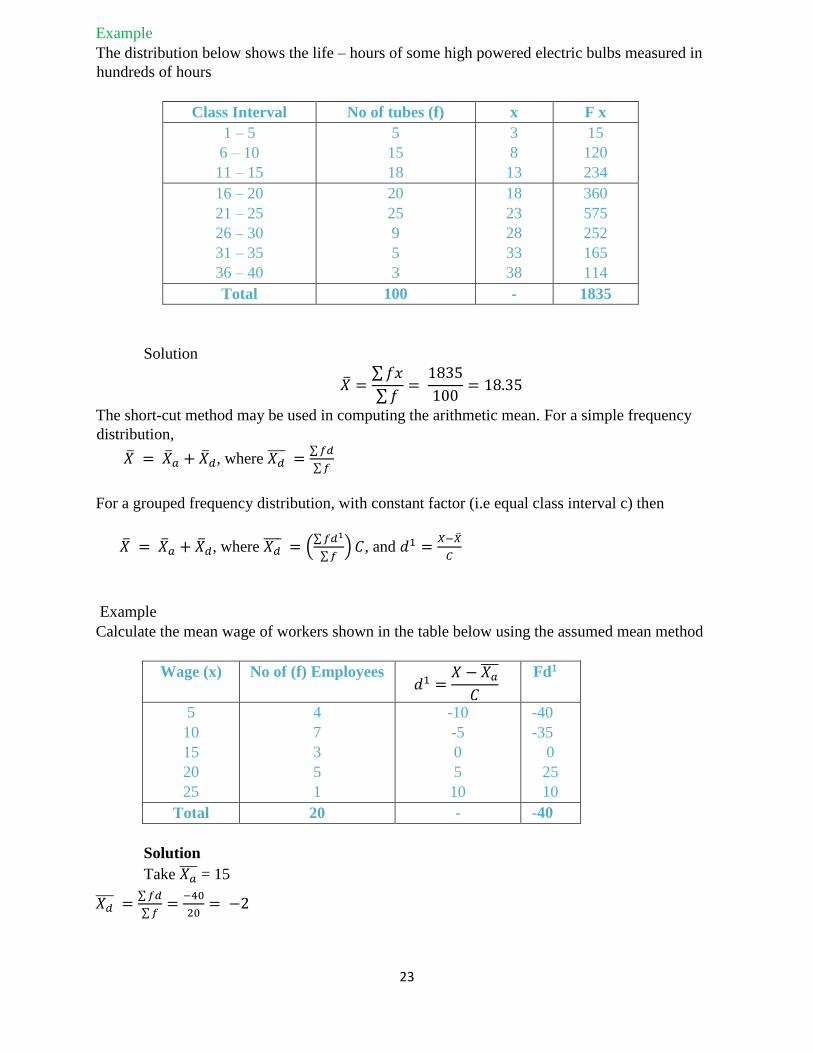
Example
The distribution below shows the life – hours of some high powered electric bulbs measured in
hundreds of hours
Class Interval No of tubes (f) x F x
1 – 5
6 – 10
11 – 15
5
15
18
3
8
13
15
120
234
16 – 20
21 – 25
26 – 30
31 – 35
36 – 40
20
25
9
5
3
18
23
28
33
38
360
575
252
165
114
Total 100 - 1835
Solution
�� =∑ 𝑓𝑥
∑ 𝑓=
1835
100= 18.35
The short-cut method may be used in computing the arithmetic mean. For a simple frequency
distribution,
�� = ��𝑎 + ��𝑑, where 𝑋𝑑 =
∑ 𝑓𝑑
∑ 𝑓
For a grouped frequency distribution, with constant factor (i.e equal class interval c) then
�� = ��𝑎 + ��𝑑, where 𝑋𝑑 = (
∑ 𝑓𝑑1
∑ 𝑓) 𝐶, and 𝑑1 =
𝑋−��
𝐶
Example
Calculate the mean wage of workers shown in the table below using the assumed mean method
Wage (x) No of (f) Employees 𝑑1 =
𝑋 − 𝑋𝑎
𝐶
Fd1
5
10
15
20
25
4
7
3
5
1
-10
-5
0
5
10
-40
-35
0
25
10
Total 20 - -40
Solution
Take 𝑋𝑎 = 15
𝑋𝑑 =
∑ 𝑓𝑑
∑ 𝑓=
−40
20= −2
24
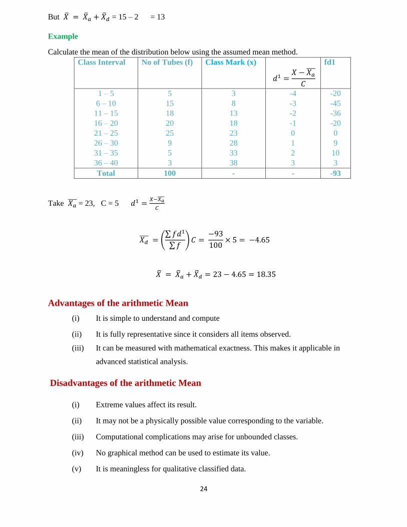
But �� = ��𝑎 + ��𝑑 = 15 – 2 = 13
Example
Calculate the mean of the distribution below using the assumed mean method.
Class Interval No of Tubes (f) Class Mark (x)
𝑑1 =𝑋 − 𝑋𝑎
𝐶
fd1
1 – 5
6 – 10
11 – 15
16 – 20
21 – 25
26 – 30
31 – 35
36 – 40
5
15
18
20
25
9
5
3
3
8
13
18
23
28
33
38
-4
-3
-2
-1
0
1
2
3
-20
-45
-36
-20
0
9
10
3
Total 100 - - -93
Take 𝑋𝑎 = 23, C = 5 𝑑1 =
𝑋−𝑋𝑎
𝐶
𝑋𝑑 = (
∑ 𝑓𝑑1
∑ 𝑓) 𝐶 =
−93
100× 5 = −4.65
�� = ��𝑎 + ��𝑑 = 23 − 4.65 = 18.35
Advantages of the arithmetic Mean
(i) It is simple to understand and compute
(ii) It is fully representative since it considers all items observed.
(iii) It can be measured with mathematical exactness. This makes it applicable in
advanced statistical analysis.
Disadvantages of the arithmetic Mean
(i) Extreme values affect its result.
(ii) It may not be a physically possible value corresponding to the variable.
(iii) Computational complications may arise for unbounded classes.
(iv) No graphical method can be used to estimate its value.
(v) It is meaningless for qualitative classified data.
25
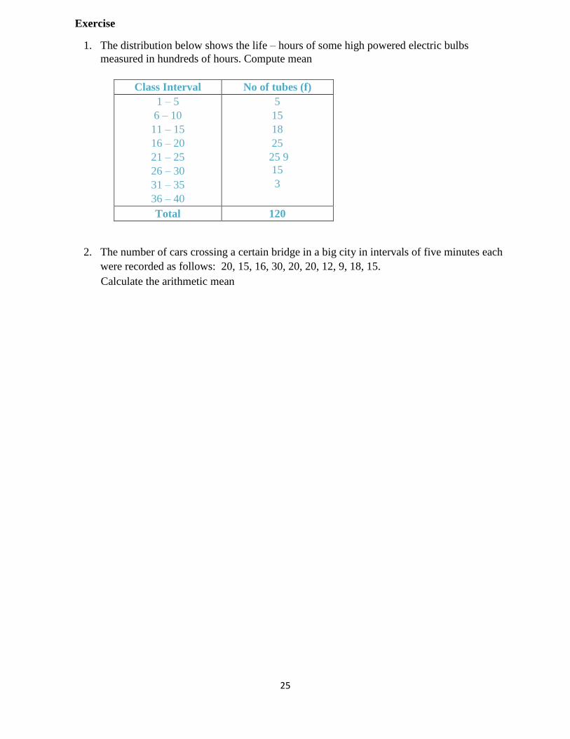
Exercise
1. The distribution below shows the life – hours of some high powered electric bulbs
measured in hundreds of hours. Compute mean
Class Interval No of tubes (f)
1 – 5
6 – 10
11 – 15
16 – 20
21 – 25
26 – 30
31 – 35
36 – 40
5
15
18
25
25 9
15
3
Total 120
2. The number of cars crossing a certain bridge in a big city in intervals of five minutes each
were recorded as follows: 20, 15, 16, 30, 20, 20, 12, 9, 18, 15.
Calculate the arithmetic mean
26
WEEK SIX
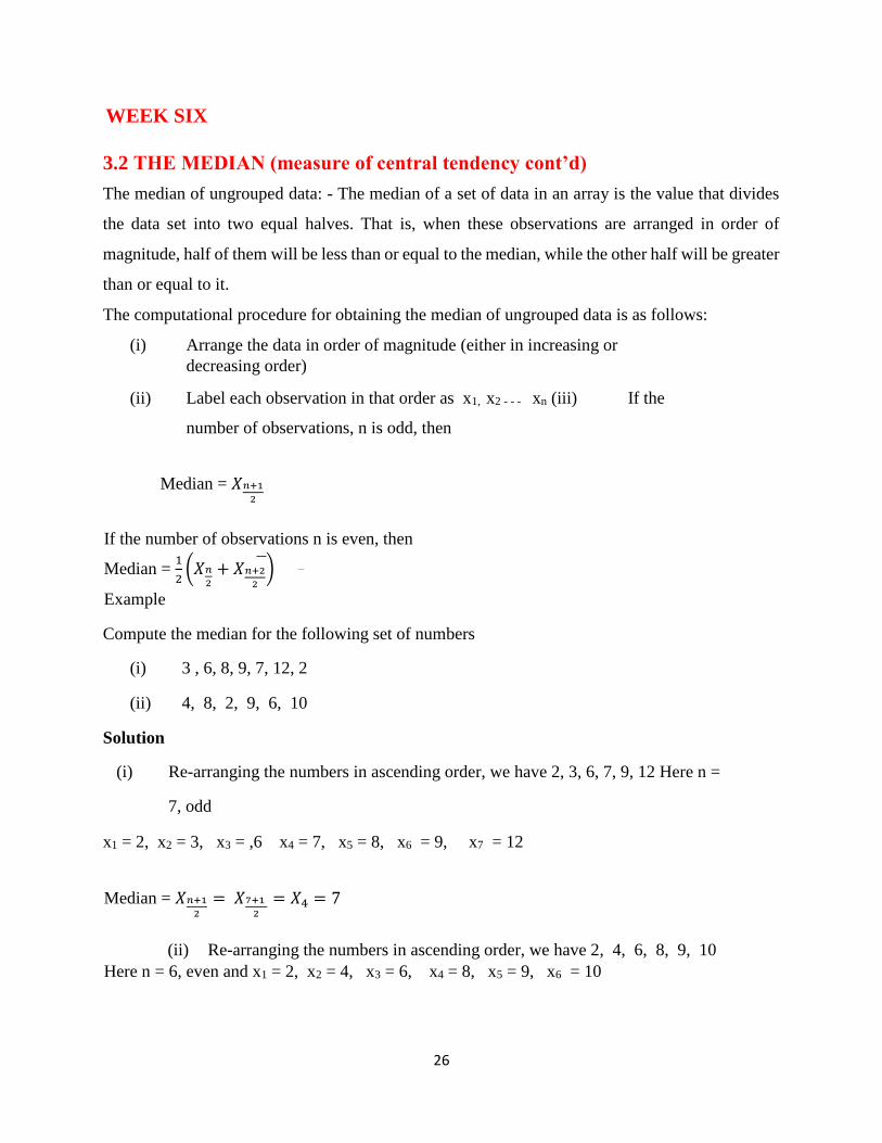
3.2 THE MEDIAN (measure of central tendency cont’d)
The median of ungrouped data: - The median of a set of data in an array is the value that divides
the data set into two equal halves. That is, when these observations are arranged in order of
magnitude, half of them will be less than or equal to the median, while the other half will be greater
than or equal to it.
The computational procedure for obtaining the median of ungrouped data is as follows:
(i) Arrange the data in order of magnitude (either in increasing or
decreasing order)
(ii) Label each observation in that order as x1, x2 - - - xn (iii) If the
number of observations, n is odd, then
Median = 𝑋𝑛+1
2
If the number of observations n is even, then
Median = 1
2(𝑋𝑛
2+ 𝑋𝑛+2
2
)
Example
Compute the median for the following set of numbers
(i) 3 , 6, 8, 9, 7, 12, 2
(ii) 4, 8, 2, 9, 6, 10
Solution
(i) Re-arranging the numbers in ascending order, we have 2, 3, 6, 7, 9, 12 Here n =
7, odd
x1 = 2, x2 = 3, x3 = ,6 x4 = 7, x5 = 8, x6 = 9, x7 = 12
Median = 𝑋𝑛+1
2
= 𝑋7+1
2
= 𝑋4 = 7
(ii) Re-arranging the numbers in ascending order, we have 2, 4, 6, 8, 9, 10
Here n = 6, even and x1 = 2, x2 = 4, x3 = 6, x4 = 8, x5 = 9, x6 = 10
27
Median = 1
2(𝑋𝑛
2+ 𝑋𝑛+2
2
) = 1
2(𝑋6
2
+ 𝑋6+2
2
) =1
2(𝑋3 + 𝑋4) =
1
2(6 + 8) = 7
(b) The Median of grouped data:- The median of grouped data can be obtained either by the use
of formula or graphically.
(i) The Median by formula.
Median = 𝐿𝑚 +𝑛
2−𝑓𝑐
𝑓𝑚
Where:
Lm = Low boundary of the median, class n = Total frequencies, fc = Sum of all frequencies
before Lm, fm = frequency of median class c = class width of median class.
(iii) Graphical Estimate of the Median:- The median of a grouped data can be obtained using the
cumulative frequency curve (ogive) and finding from it the value ‘x’ at the 50% point. An
effective way of obtaining the median using the graphical method involves converting the
frequency values to relative frequencies and expressing it in percentage.
Example
The table below shows the age distribution of employees in a certain factory. Calculate the
median age of employees in the factory using the formula and the graphical method.
Age (in yrs.) No of
Employees (f)
Class Boundaries Cum. Freq. % Cum Rel.
Freq.
20 – 24
25 – 29
30 - 34
35 – 39
40 – 44
45 – 49
50 – 54
55 – 59
2
5
12
17
14
6
3
1
19.5 – 24.5
24.5 – 29.5
29.5 – 34. 5
34.5 – 39.5
39.5 – 44.5
44.5 – 49.5
49.5 – 54.5
54.5 – 59.5
2
7
19
36
50
56
59
60
3
12
32
60
83
93
98
100
By formula:- Median = 𝐿𝑚 + (𝑛
2−𝑓𝑐
𝑓𝑚) 𝐶 Lm = 34.5, n = 60 fc = 19, fm = 17, C = 5
Median = 34.5 +30−19
17× 5 = 34.5 + 3.24 = 37.74𝑦𝑟𝑠
28
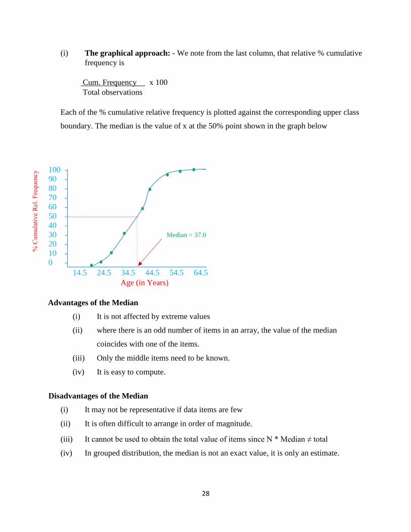
(i) The graphical approach: - We note from the last column, that relative % cumulative
frequency is
Cum. Frequency x 100
Total observations
Each of the % cumulative relative frequency is plotted against the corresponding upper class
boundary. The median is the value of x at the 50% point shown in the graph below
14.5 24.5 34.5 44.5 54.5 64.5
Age (in Years)
Advantages of the Median
(i) It is not affected by extreme values
(ii) where there is an odd number of items in an array, the value of the median
coincides with one of the items.
(iii) Only the middle items need to be known.
(iv) It is easy to compute.
Disadvantages of the Median
(i) It may not be representative if data items are few
(ii) It is often difficult to arrange in order of magnitude.
(iii) It cannot be used to obtain the total value of items since N * Median ≠ total
(iv) In grouped distribution, the median is not an exact value, it is only an estimate.
100 -
90 -
80 -
70 -
60 -
50 -
40 -
30 -
20 -
10 -
0 -
Median = 37.0
29
3.3 MODE
The mode of ungrouped data: For any set of numbers, the mode is that observation which occurs
most frequently.
Example
Find the mode of the following numbers.
(i) 2, 5, 3, 2, 6, 2, 2
(ii) 4, 3, 6, 9, 6, 4, 9, 6, 6, 6, 3
Solution
(i) The mode in the first set is 2, it occurs the highest number of times, that is, four times. (ii)
The mode in the second set is 6, with frequency 5
The mode of Grouped Data
The mode of a grouped distribution is the value at the point around which the items tend to be most
heavily concentrated. A distribution having one mode, two modes, or more than two modes are
called Unimodal, bimodal or multi – modal distribution respectively. In fact, the mode sometimes
does not exist if all classes have the same frequency. the mode of grouped data can be obtained
either graphically or by use of formula.
(i) The mode by formula: 𝐿𝑚 + (𝑓𝑚−𝑓𝑏
𝑓𝑚−𝑓𝑏+𝑓𝑚−𝑓𝑎) 𝐶
Where Lm = Lower boundary of modal class, Fm = Frequency of modal class, Fa =
Frequency of class immediately after modal class, Fb = Frequency of class immediately
before modal class, C = Class width
(ii) Graphical estimate of the mode
The mode of grouped data can be obtained using the histogram
Example
Find the modal age of employees in a factory given in example 3.11 using the formula and the
graphical method.
30
Age (In yrs.) No. of employees (f) Class Boundary
20 – 24
25 – 29
30 - 34
35 – 39
40 – 44
45 – 49
50 – 54
55 – 59
2
5
12
17
14
6
3
1
19.5 – 24.5
24.5 – 29.5
29.5 – 34. 5
34.5 – 39.5
39.5 – 44.5
44.5 – 49.5
49.5 – 54.5
54.5 – 59.5
Solution
Mode = 𝐿𝑚 + (𝑓𝑚−𝑓𝑏
𝑓𝑚−𝑓𝑏+𝑓𝑚−𝑓𝑎) 𝐶
Lm = 34.5, Fm = 17, Fb = 12, Fa = 14, C = 39.5 – 34.5 = 5
Mode = 34.5 + (17−12
17−12+17−14) × 5 = 34.5 + (
5
5+3) × 5 = 34.5 + 3.13 = 37.63
(iii) Graphical Method
Estimation of Mode from Histogram
Advantages of Mode
(i) It is easy to understand and evaluate (ii)
Extreme items do not affect its value
(iii) It is not necessary to have knowledge of all the values in the distribution.
20
15
10
5
0
19.5 29.5 34.5 39.5 24.5 44.5 54.5 59.5 49.5
Class Boundaries Mode = 37
31
(iv) It coincides with existing items in the observation.
Disadvantages of the Mode
(i) It may not be unique or clearly defined.
(ii) For continuous distribution, it is only an approximation.
(iii) It does not consider all items in the data set.
Exercise /Practical
1. The following data are scores on a management examination taken by a group of 20
people.
88, 56, 64, 45, 52, 76, 38, 98, 69, 77 71,
45, 60, 90, 81, 87, 44, 80, 41, 58
Find the median and mode.
2. Given the data below
23, 26, 29, 30, 32, 34, 37, 45, 57,80, 102, 147, 210, 355, 782, 1,209
Find the median and the mode.
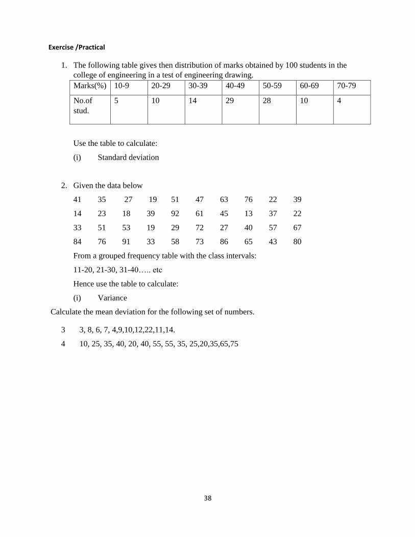
3. The following table gives then distribution of marks obtained by 100 students in the
college of engineering in a test of engineering drawing.
Marks(%) 10-9 20-29 30-39 40-49 50-59 60-69 70-79
No.of
stud.
5 10 14 29 28 10 4
Use the table to calculate:
(i) Median (ii) Mode of the grouped data
4. Given the data below
41 35 27 19 51 47 63 76 22 39
14 23 18 39 92 61 45 13 37 22
33 51 53 19 29 72 27 40 57 67
84 76 91 33 58 73 86 65 43 80
From a grouped frequency table with the class intervals:
11-20, 21-30, 31-40….. etc
Hence use the table to calculate:
(i) Median (ii) Mode
32
WEEK Seven
4.0 QUANTILES
All quantities that are defined as partitioning or splitting a distribution into a number of equal
portions are called quantiles. Examples include the quartiles, deciles and the percentiles.
The three quantities that spilt a distribution into four equal parts are called Quartiles, namely (Q1),
second quartiles (Q2) and the third quartiles, (Q3). Nine quantities spilt a distribution into ten equal
parts. These are called Deciles namely first decile (D1), Second decile (D2), up to the ninth decile
(D9). The Ninety-nine quantities that spilt a distribution into one hundred equal parts are called
percentiles namely first Percentiles (P1), second Percentile (P2) up to the ninety-ninth percentile
(P99).
4.1 QUARTILES
The quartiles can be obtained either by formula or by using the cumulative frequency curve. The
calculation of the quartiles for both ungrouped and grouped data is similar to parallel calculations
of the median for ungrouped and grouped data using appropriately modified versions. The formula
for obtaining some quartiles are shown below
𝑄1 = 𝐿1 + (𝑛
4−𝑓𝑐
𝑓1) 𝐶, 𝑄2 = 𝐿2 + (
𝑛
2−𝑓𝑐
𝑓2) 𝐶, 𝑄3 = 𝐿3 + (
3𝑛
4−𝑓𝑐
𝑓3) 𝐶
4.2 DECILES
The formula for obtaining some Deciles are shown below:
𝐷1 = 𝐿1 + (𝑛
10−𝑓𝑐
𝑓1) 𝐶, 𝐷2 = 𝐿2 + (
𝑛
5−𝑓𝑐
𝑓2) 𝐶, 𝐷3 = 𝐿3 + (
3𝑛
10−𝑓𝑐
𝑓3) 𝐶, … … … …
4.3 PERCENTILES
The formula for obtaining some Percentiles are shown below:
𝑃1 = 𝐿1 + (𝑛
100−𝑓𝑐
𝑓1) 𝐶, 𝑃2 = 𝐿2 + (
𝑛
50−𝑓𝑐
𝑓2) 𝐶, … … … … ., 𝑃95 = 𝐿95 + (
85𝑛
100−𝑓𝑐
𝑓95) 𝐶
33
Note : All the equations above have the same definition as used in the median.
Example
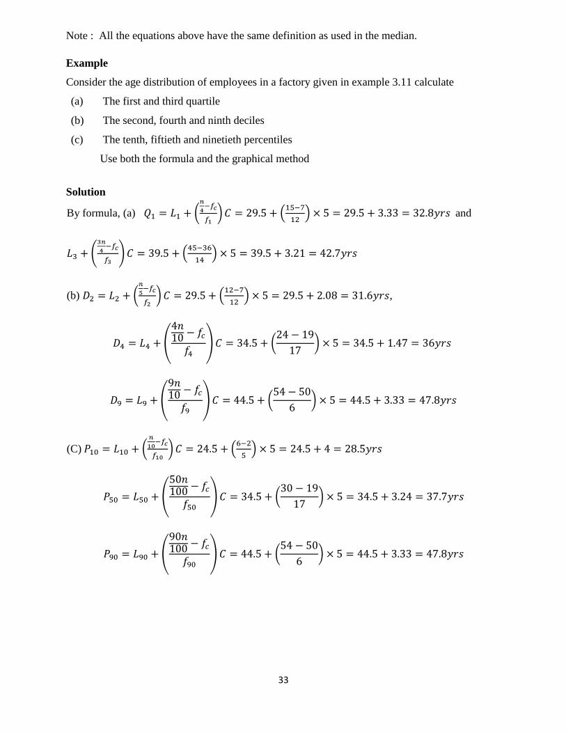
Consider the age distribution of employees in a factory given in example 3.11 calculate
(a) The first and third quartile
(b) The second, fourth and ninth deciles
(c) The tenth, fiftieth and ninetieth percentiles
Use both the formula and the graphical method
Solution
By formula, (a) 𝑄1 = 𝐿1 + (𝑛
4−𝑓𝑐
𝑓1) 𝐶 = 29.5 + (
15−7
12) × 5 = 29.5 + 3.33 = 32.8𝑦𝑟𝑠 and
𝐿3 + (3𝑛
4−𝑓𝑐
𝑓3) 𝐶 = 39.5 + (
45−36
14) × 5 = 39.5 + 3.21 = 42.7𝑦𝑟𝑠
(b) 𝐷2 = 𝐿2 + (𝑛
5−𝑓𝑐
𝑓2) 𝐶 = 29.5 + (
12−7
12) × 5 = 29.5 + 2.08 = 31.6𝑦𝑟𝑠,
𝐷4 = 𝐿4 + (
4𝑛10 − 𝑓𝑐
𝑓4) 𝐶 = 34.5 + (
24 − 19
17) × 5 = 34.5 + 1.47 = 36𝑦𝑟𝑠
𝐷9 = 𝐿9 + (
9𝑛10 − 𝑓𝑐
𝑓9) 𝐶 = 44.5 + (
54 − 50
6) × 5 = 44.5 + 3.33 = 47.8𝑦𝑟𝑠
(C) 𝑃10 = 𝐿10 + (𝑛
10−𝑓𝑐
𝑓10) 𝐶 = 24.5 + (
6−2
5) × 5 = 24.5 + 4 = 28.5𝑦𝑟𝑠
𝑃50 = 𝐿50 + (
50𝑛100 − 𝑓𝑐
𝑓50) 𝐶 = 34.5 + (
30 − 19
17) × 5 = 34.5 + 3.24 = 37.7𝑦𝑟𝑠
𝑃90 = 𝐿90 + (
90𝑛100 − 𝑓𝑐
𝑓90) 𝐶 = 44.5 + (
54 − 50
6) × 5 = 44.5 + 3.33 = 47.8𝑦𝑟𝑠
34
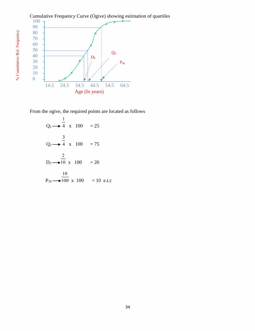
Cumulative Frequency Curve (Ogive) showing estimation of quartiles
14.5 24.5 34.5 44.5 54.5 64.5
Age (In years)
From the ogive, the required points are located as follows
Q1 x 100 = 25
Q2 x 100 = 75
D2 x 100 = 20
P10 x 100 = 10 e.t.c
35
WEEK Eight
5.0 MEASURES OF DISPERSION
A measure of dispersion is a measure of the tendency of individual values of the variable to differ
in size among themselves. In summarizing a set of data, it is generally desirable not only to indicate
its average but also to specify the extent of clustering of the observations around the average.
Measures of variability provide an indication of how well or poorly measures of central tendency
represent a particular distribution. If a measure of dispersion is for instance, zero, there is no
variability among the values and the mean is perfectly representative. In general, the greater the
variability, the less representative the measure of central tendency.
Some important measures of dispersion include the range, semi- inter-quartile range, mean
deviation, variance and standard deviation.
5.1 RANGE
The range R, of a set of numbers is the difference between the largest and smallest numbers, that
is, it is the difference between the two extreme values. Suppose XL - XS
In a grouped frequency distribution, the midpoint of the first and last class are chosen as XL and
XS respectively.
Example
Compute the range for the following numbers; 6, 9, 5, 18, 25 Solution:
R = XL - XS
Where XL = 25, XS = 5
∴ range = 25 -5
= 20
5.2 QUARTILE DEVIATION
For any set of data, the quartile deviation or semi-interquartile range is defined as half the
difference between the third and first quartile, that is,
Q.D = ½ (Q3 – Q1)
The third quartile (Q3) and the first quartile (Q1) are obtained as discussed early.
5.3 MEAN DEVIATION
For any set of numbers x1, x2, …., xn, the mean deviation (M.D) is defined as follows.
Mean Deviation = ∑|𝑋−��|
𝑛, where �� =
∑ 𝑥
𝑛 and |
𝑋−��
𝑛| = absolute value of the difference between x1
and ��
36
If x1, x2……, xk is repeated with frequency f1, f2…….. fk then
Mean Deviation = ∑ 𝑓|𝑋−��|
∑ 𝑓
Where = �� =∑ 𝑓𝑥
∑ 𝑓
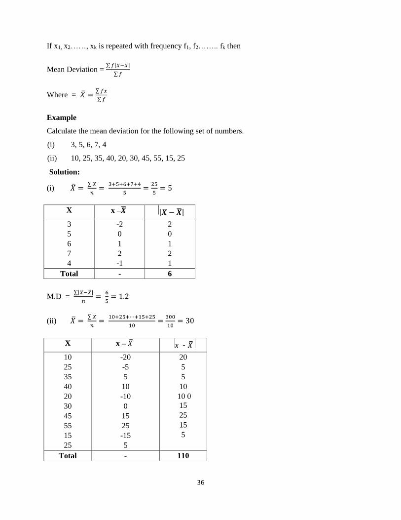
Example
Calculate the mean deviation for the following set of numbers.
(i) 3, 5, 6, 7, 4
(ii) 10, 25, 35, 40, 20, 30, 45, 55, 15, 25
Solution:
(i) �� = ∑ 𝑋
𝑛=
3+5+6+7+4
5=
25
5= 5
X x –�� |𝑿 − ��|
3
5
6
7
4
-2
0
1
2
-1
2
0
1
2
1
Total - 6
M.D = ∑|𝑋−��|
𝑛=
6
5= 1.2
(ii) �� = ∑ 𝑋
𝑛=
10+25+⋯+15+25
10=
300
10= 30
X x – �� x - ��
10
25
35
40
20
30
45
55
15
25
-20
-5
5
10
-10
0
15
25
-15
5
20
5
5
10
10 0
15
25
15
5
Total - 110
37
�� = ∑ 𝑋
𝑛=
110
10= 11
Example
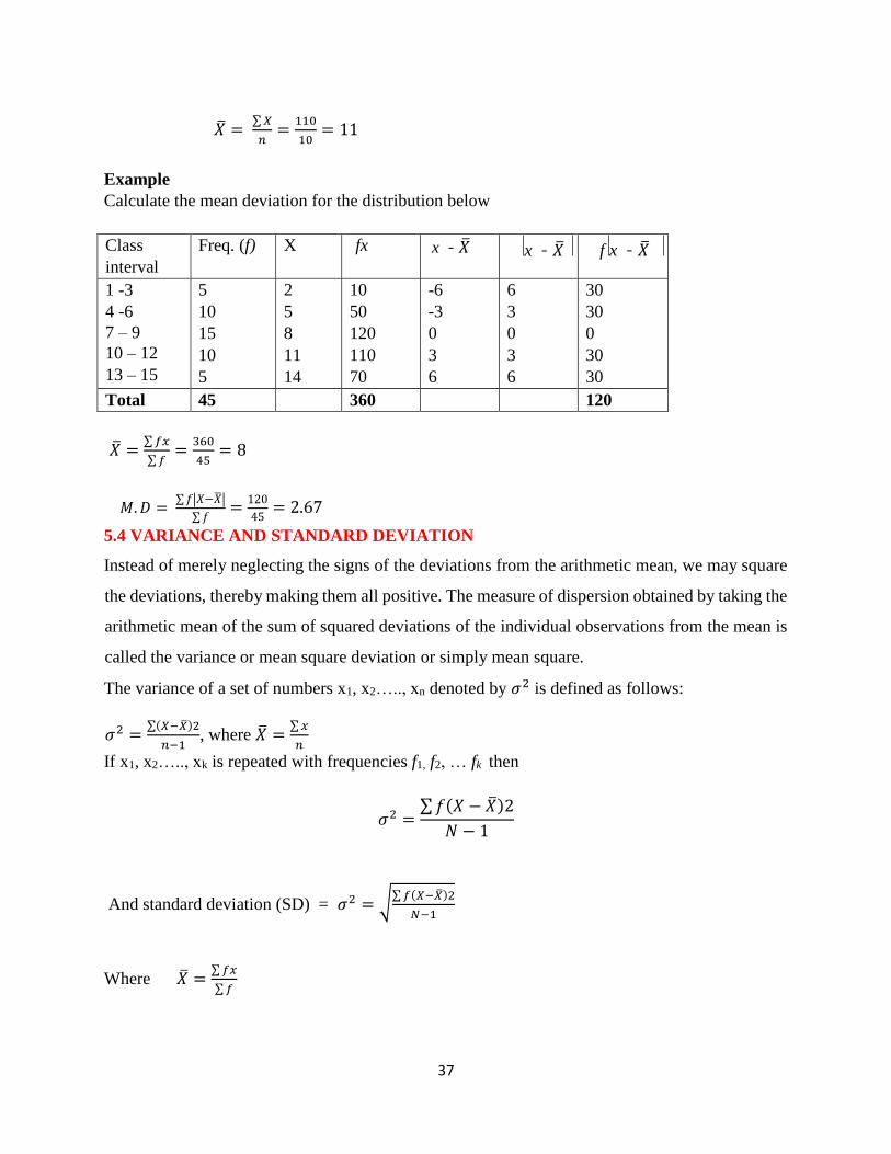
Calculate the mean deviation for the distribution below
Class
interval
Freq. (f) X fx x - �� x - �� f x - ��
1 -3
4 -6
7 – 9
10 – 12
13 – 15
5
10
15
10
5
2
5
8
11
14
10
50
120
110
70
-6
-3
0
3
6
6
3
0
3
6
30
30
0
30
30
Total 45 360 120
�� =∑ 𝑓𝑥
∑ 𝑓=
360
45= 8
𝑀. 𝐷 = ∑ 𝑓|𝑋−��|
∑ 𝑓=
120
45= 2.67
5.4 VARIANCE AND STANDARD DEVIATION
Instead of merely neglecting the signs of the deviations from the arithmetic mean, we may square
the deviations, thereby making them all positive. The measure of dispersion obtained by taking the
arithmetic mean of the sum of squared deviations of the individual observations from the mean is
called the variance or mean square deviation or simply mean square.
The variance of a set of numbers x1, x2….., xn denoted by 𝜎2 is defined as follows:
𝜎2 =∑(𝑋−��)2
𝑛−1, where �� =
∑ 𝑥
𝑛
If x1, x2….., xk is repeated with frequencies f1, f2, … fk then
𝜎2 =∑ 𝑓(𝑋 − ��)2
𝑁 − 1
And standard deviation (SD) = 𝜎2 = √∑ 𝑓(𝑋−��)2
𝑁−1
Where �� =∑ 𝑓𝑥
∑ 𝑓
38
Exercise /Practical
1. The following table gives then distribution of marks obtained by 100 students in the
college of engineering in a test of engineering drawing.
Marks(%) 10-9 20-29 30-39 40-49 50-59 60-69 70-79
No.of
stud.
5 10 14 29 28 10 4
Use the table to calculate:
(i) Standard deviation
2. Given the data below
41 35 27 19 51 47 63 76 22 39
14 23 18 39 92 61 45 13 37 22
33 51 53 19 29 72 27 40 57 67
84 76 91 33 58 73 86 65 43 80
From a grouped frequency table with the class intervals:
11-20, 21-30, 31-40….. etc
Hence use the table to calculate:
(i) Variance
Calculate the mean deviation for the following set of numbers.
3 3, 8, 6, 7, 4,9,10,12,22,11,14.
4 10, 25, 35, 40, 20, 40, 55, 55, 35, 25,20,35,65,75