Embed Size (px)
Citation preview
UNESCO-NIGERIA TECHNICAL &
VOCATIONAL EDUCATION
REVITALISATION PROJECT-PHASE II
YEAR I- SE MESTER I
THEORY/
Version 1: July 2009
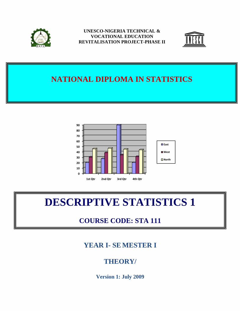
0
10
20
30
40
50
60
70
80
90
1st Qtr 2nd Qtr 3rd Qtr 4th Qtr
East
West
North
NATIONAL DIPLOMA IN STATISTICS
DESCRIPTIVE STATISTICS 1
COURSE CODE: STA 111
TABLE OF CONTENTS
WEEK ONE PAGE
1.1 Definition of statistics 1
1.2 Importance of statistics 2-3
1.3 Types of statistical data 4-5
1.4 Uses of statistical data 6
1.5 Definition of qualitative random variable 6
1.6 Types of measurement 7-8
1.7 Exercise 8
WEEK TWO 2.0 Bar chart 1 2.1 Simple bar chart 2-3 2.2 Multiple bar chart 3-4 2.3 Components bar chart 5-7 2.4 Exercise 7-9
WEEK THREE
3.0 Pie chart 1-3 3.1 Exercise/Practical 3-5
WEEK FOUR
4.0 Histogram 1-2 4.1 Exercise/Practical 2-4
WEEK FIVE
5.0 Measures of central Tendency 1 5.1 The mean 1-6 5.2 The trimmed mean 6-7
WEEK SIX
6.1 The Median 1-4 6.2 The Mode 5-7 6.3 Exercise/Practical 8
WEEK SEVEN
7.0 Quantiles 1 7.1 Quartiles 1 7.2 Deciles 2 7.3 Percentages 2-6

7.4 Exercise 6-7
WEEK EIGHT
8.0 Measures of Dispersion 1 8.1 Range 1 8.2 Quartile Deviation 2 8.3 Mean Deviation 2-4 8.4 Variance and Standard Deviation 4-5 8.5 Exercise/Practical 5
WEEK NINE
9.0 Box Plot 1-2 9.1 Alternative Forms 3-4 9.2 Exercise/Practical 4-6
WEEK TEN
10.0 Computation, Variance and Standard Deviation 1-4 10.1 Exercise/Practical
WEEK ELEVEN
11.0 Skewness 1-2 11.1 Test of Skewness 2-3 11.2 Exercise/Practical 4
WEEK TWELVE
12.0 Q. Q. Plot 1-6 12.1 Exercise/Practical 6
WEEK THIRTEEN
13.0 P. P. Plot 1-5 13.1 Exercise/Practical 6-7
WEEK FOURTEEN
14.0 Probability and Non Probability Sampling 1 14.1 Probability Sampling 1-4 14.2 Non Probability Sampling 4-5 14.3 Exercise/Practical 5
WEEK FIFTEEN

15.0 Method of Data Collection 1 15.1 Questionnaire Method 1-2 15.2 Interview 2-3 15.3 Observation Method 3-4 15.4 Documentary Method 4-5 15.5 Exercise/Practical 5
1
Week One
General objective: Understand the nature of statistical data, their types and
uses
Specific goal: The topic is designed to enable students to acquire a basic
Knowledge of definition of statistics
1.0 Definition of statistics
Statistics can be defined as a scientific method of collecting, organizing, summarizing,
presenting and analyzing data as well as making valid conclusion based on the analysis carried
out.
Statistics is a scientific method which constitutes a useful and quite often indispensable tool
for the natural, Applied and social workers. The methods of statistics are useful in an over-
widening range of human Endeavour, in fact any field of thought in which numerical data exist.
Nowadays it is difficult to think of any field of study that statistics is not being applied, in
particular at the higher level. Thus, statistical method is the only acceptable.
Or
Statistics is a scientific method concerned with the collection, computation, comparison,
analysis and interpretation of number. These numbers are quite referred to as data. However,
statistical mean more than a collection of numbers.
2
1.1 Importance/ uses of statistics.
Statistics involve manipulating and interpreting numbers. The numbers are intended
to represent information about the subject to be investigated. The science of statistics
deals with information gathering, condensation and presentation of such information in a
compact form, study and measurement of variation and of relation between two or more
similar or identical phenomena. It also involves estimation of the characteristics of a
population from a sample, designing of experiments and surveys and testing of
hypothesis about populations.
Statistics is concerned with analysis of information collected by a process of sampling
in which variability is likely to occur in one or more outcomes.
Statistics can be applied in any field in which there is extensive numerical data.
Examples include engineering, sciences, medicine, accounting, business administration
and public administration. Some major areas where statistics is widely used are discussed
below.
(a) Industry:- Making decision in the face of uncertainties is a unique problem faced by
businessmen and industrialist. Analysis of history data enables the businessman to
prepare well in advance for the uncertainties of the future. Statistics has been applied
in market and product research, feasibility studies, investment policies, quality
control of manufactured products selection of personnel, the design of experiments,
economic forecasting, auditing and several others.
(b) Biological Science: - Statistics is used in the analysis of yield of varieties of crops in
different environmental conditions using different fertilizers. Animal response to
different diets in different conditions could also be studied statistically to ensure
optimum application of resources. Recent advancement in medicine and public health
has been greatly enhanced by statistical principles.

3
(c) Physical Science: - Statistical metrology has been used to aid findings in astronomy,
chemistry, geology, meteorology, and oil explorations. Samples of mineral resources
discovered at a particular environment are taken to examine its essential and natural
features before a decision is made on likely investment on its exploration and
exploitation. Laboratory experiments are conducted using statistical principles.
(d) Government: - A large volume of data is collected by government at all levels on a
continuous basis to enhance effective decision making. Government requires an up-
to-date knowledge of expenditure pattern, revenue, estimates, human population,
health, defense and internal issues. Government is the most important user and
producer of statistical data.
4
1.2 Types of statistical data
There are basically two main types of statistical data.
These are
(i) The primary data, and
(ii) The secondary data.
The primary data
As the name implies, this is a type of data whereby we obtain information on the topic of
interest at first hand.
When the researcher decides to obtain statistical information by going to the origin of the
source, we say that such data are primary data. This happens when there is no existing
reliable information on the topic of interest.
The first hand collection of statistical data is one of the most difficult and important tasks
a statistician would carry out. The acceptance of and reliability of the data so called will
depend on the method employed, how timely they were collected, and the caliber of
people employed for the exercise.
Advantages
The investigator has confidence in the data collected.
The investigator appreciates the problems involved in data collection since he is involved
at every stage.
The report of such a survey is usually comprehensive.
Definition of terms and units are usually included.
It normally includes a copy of schedule use to collect the data.
5
Disadvantages
The method is time consuming.
It is very expensive.
It requires considerable manpower.
Sometimes the data may be obsolete at the time of publication.
The secondary data
Sometimes statistical data may be obtained from existing published or unpublished
sources, such as statistical division in various ministries, banks, insurance companies,
print media, and research institutions. In all these areas data are collected and kept as part
of the routine jobs. There may be no particular importance attached to the data collected.
Thus, the figure on vehicle license renewals and new registration of vehicles can first be
obtained from the Board of Internal Revenue through their daily records. The investigator
interested in studying the type of new vehicles brought into the country for a particular
year will start with the data from the custom department or Board of internal revenue.
Advantages
They are cheap to collect.
Data collection is less time consuming as compared to primary source.
The data are easily available.
Disadvantages
It could be misused, misrepresented or misinterpreted.
Some data may not be easily obtained because of official protocol.
Then information may not conform to the investigator’s needs.
It may not be possible to determine the precision and reliability of the data, because the
method used to collect the data is usually not known.
It may contain mistakes due to errors in transcription from the primary source.
6
1.3 Uses of statistical data.
The following explain uses of statistical data.
(i) Statistics summarizes a great bulk of numerical data constructing out of them
source representative qualities such as mean, standard deviation, variance and
coefficient of variation.
(ii) It permits reasonable deductions and enables us to draw general conclusions
under certain conditions
(iii) Planning is absorbed without statistics. Statistics enables us to plan the future
based on analysis of historical data.
(iv) Statistics reveal the nature and pattern of the variations of a phenomenon
through numerical measurement.
(v) It makes data representation easy and clear.
1.4 Definition of quantitative random variable
A quantitative random variable is that which could be expressed in numerical terms. They are of
two types: Discrete and continuous.
Discrete random variable
These are random variables which can assume certain fixed whole number values. They are
values obtained when a counting process is conducted. Examples include the number of cars in a
car park, the number of students in a class.
The possible values the random variable can assume are 0,1,2,3,4, e.t.c.

7
Continuous random variable
This types of random variable assumes an infinite number of values in between any two points or
a given range.
Continuous random variables are often associated with measuring device. The weight, length,
height and volume of object are continuous random variables. Other examples include the time
between the breakdown of computer system, the length of screws produced in a factory and
number of defective items in a production run. In these cases, the numerical values of specific
case is a variable which is randomly determined, and measured on a continuous scale. It should
be noted that any numerical value is possible including fractions or decimals.
1.5 Types of measurement
There are four (4) types of data. Namely: - nominal, ordinal, interval and ratio.
Nominal data
This represents the most primitive, the most unrestricted assignment of numerals, in fact, the
numerals is used only as labels and thus words or letters would serve as well.
The nominal scale has no direction and is applicable to numerals or letters derived from
qualitative data. It is merely a classification of items and has no other properties.
For example, the people of Nigeria can be classified into ethic groupings such as the Ibos, the
Yoruba’s, the Hausas, the Ibibio etc without necessarily inferring that one ethnic group is
superior to the other.
Ordinal data
The ordinal scale has magnitude, hence is a step more developed than the nominal scale. It has
the structure of order- preserving group. Items are placed in order of magnitude. In fact, it is a
group which includes transformation by all monotonic increasing function.
8
For example, if Bassey is taller than Obi and Obi is taller than Akpam, the rank in terms of
tallness is Bassey first, Obi second and Akpam third. This scale merely tells us the order, but not
specific magnitude of the differences in height between Akpam, Obi and Bassey.
Most of the scales used widely and effectively by psychologist are ordinal scales.
Method applied to rank ordered data.
Interval data.
An interval scale is used to specify the magnitude of observations or items.
It is a higher scale of measurements, superior to both nominal and ordinal scales. Thus, it
incorporates all the properties of both nominal and ordinal scales and in addition requires that the
distance between the classes be equal.
We can apply almost all the usual statistical operations here unless they are of a type that implies
knowledge of a true zero point. Even than, the zero point on an interval scale is a matter of
convention because the scale form remains in variant when a constant is added.
We can carry out arithmetical operations like addition and subtraction with data on the interval
scale.
Ratio data.
This is the highest scale of measurement that we shall come across in the physical and natural
sciences. Its conditions are equality of rank order, equality of intervals and equality of ratios. The
knowledge of the zero point is also a necessary requirement of measurement. All mathematical
operations are applicable to the ratio scale and all types of statistical measures are also
applicable.
Exercise/Practical
1. Discuss and compare the various scales of measurement.
2. What is the difference between a qualitative and a quantitative variable.

1
Week Two
2.0 Bar Chart
In bar chart, there are no set of rules to be observed in drawing bar charts. The
following consideration will be quite useful.
Note: Bar chart is applicable only to discrete, Categorical, nominal and ordinal data.
1. Bar should be neither too short and nor very long and narrow.
2. Bar should be separated by spaces which are about one and half of the width
of a bar.
3. The length of the bar should be proportional to frequencies of the categories.
4. Guide note should be provided to ease the reading of the chart.
Bar charts are used for making comparisons among categories. In the simplest form several items are presented graphically by horizontal or vertical bars of uniform width, with lengths proportional to the values they represent.
0
10
20
30
40
50
60
70
80
90
1st Qtr 2nd Qtr 3rd Qtr 4th Qtr
East
West
North
2
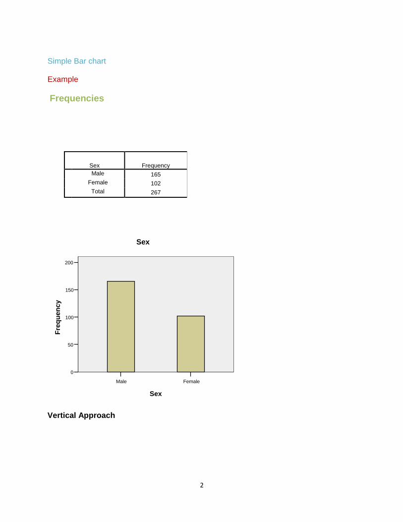
Simple Bar chart Example
Frequencies
Sex Frequency
Male 165
Female 102
Total 267
Vertical Approach
FemaleMale
Sex
200
150
100
50
0
Fre
qu
en
cy
Sex
3
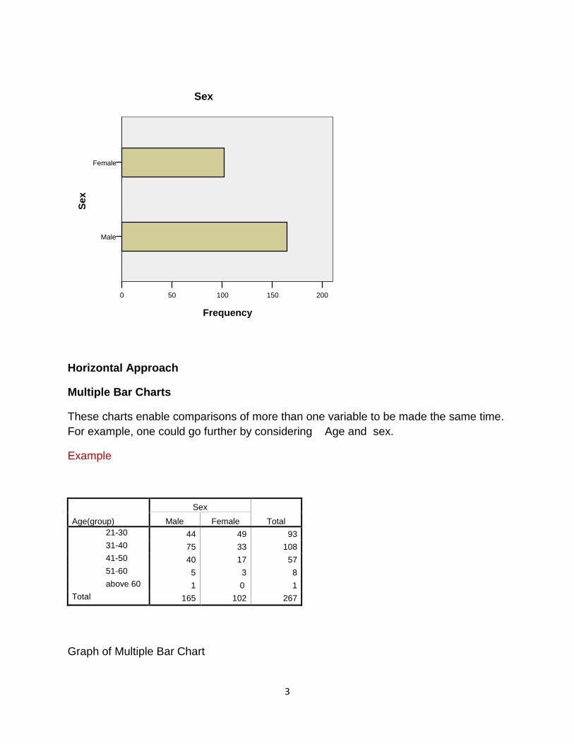
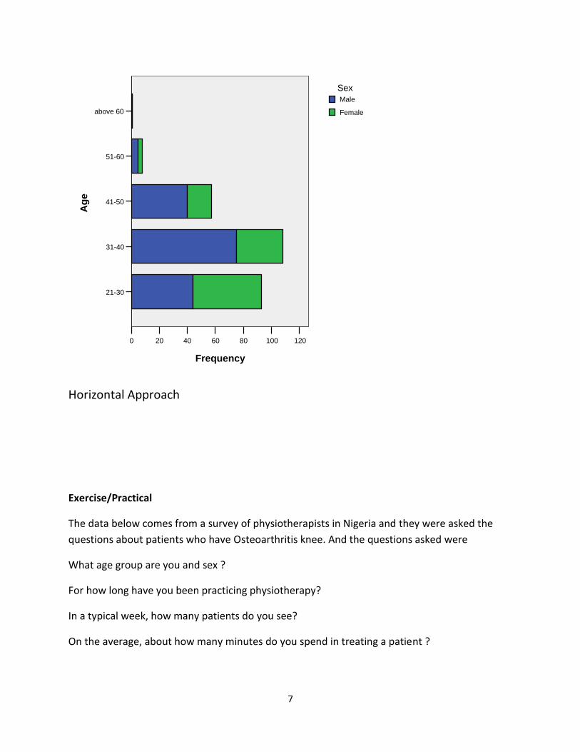
Horizontal Approach
Multiple Bar Charts
These charts enable comparisons of more than one variable to be made the same time.
For example, one could go further by considering Age and sex.
Example
Age(group)
Sex
Total Male Female
21-30 44 49 93
31-40 75 33 108
41-50 40 17 57
51-60 5 3 8
above 60 1 0 1
Total 165 102 267
Graph of Multiple Bar Chart
Female
Male
Se
x
200150100500
Frequency
Sex

4
Vertical Approach
above 6051-6041-5031-4021-30
Age
80
60
40
20
0
Fre
qu
en
cy
Female
Male
Sex

5
Horizontal Approach
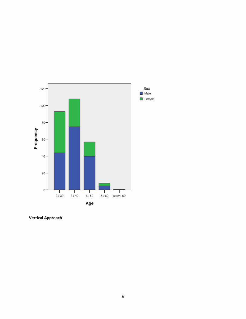
Component Bar Chart
Similarly,these charts enable comparisons of more than one variable to be made the
same time. For example, one could go further by considering Age and sex.
Example
Age(group)
Sex
Total Male Female
21-30 44 49 93
31-40 75 33 108
41-50 40 17 57
51-60 5 3 8
above 60 1 1
Total 165 102 267
above 60
51-60
41-50
31-40
21-30
Ag
e
806040200
Frequency
Female
Male
Sex
6
Vertical Approach
above 6051-6041-5031-4021-30
Age
120
100
80
60
40
20
0
Fre
qu
en
cy
Female
Male
Sex
7
Horizontal Approach
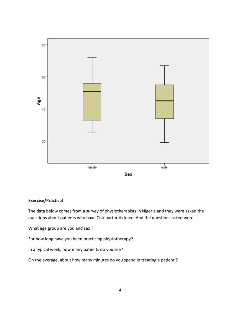
Exercise/Practical
The data below comes from a survey of physiotherapists in Nigeria and they were asked the
questions about patients who have Osteoarthritis knee. And the questions asked were
What age group are you and sex ?
For how long have you been practicing physiotherapy?
In a typical week, how many patients do you see?
On the average, about how many minutes do you spend in treating a patient ?
above 60
51-60
41-50
31-40
21-30
Ag
e
120100806040200
Frequency
Female
Male
Sex
8
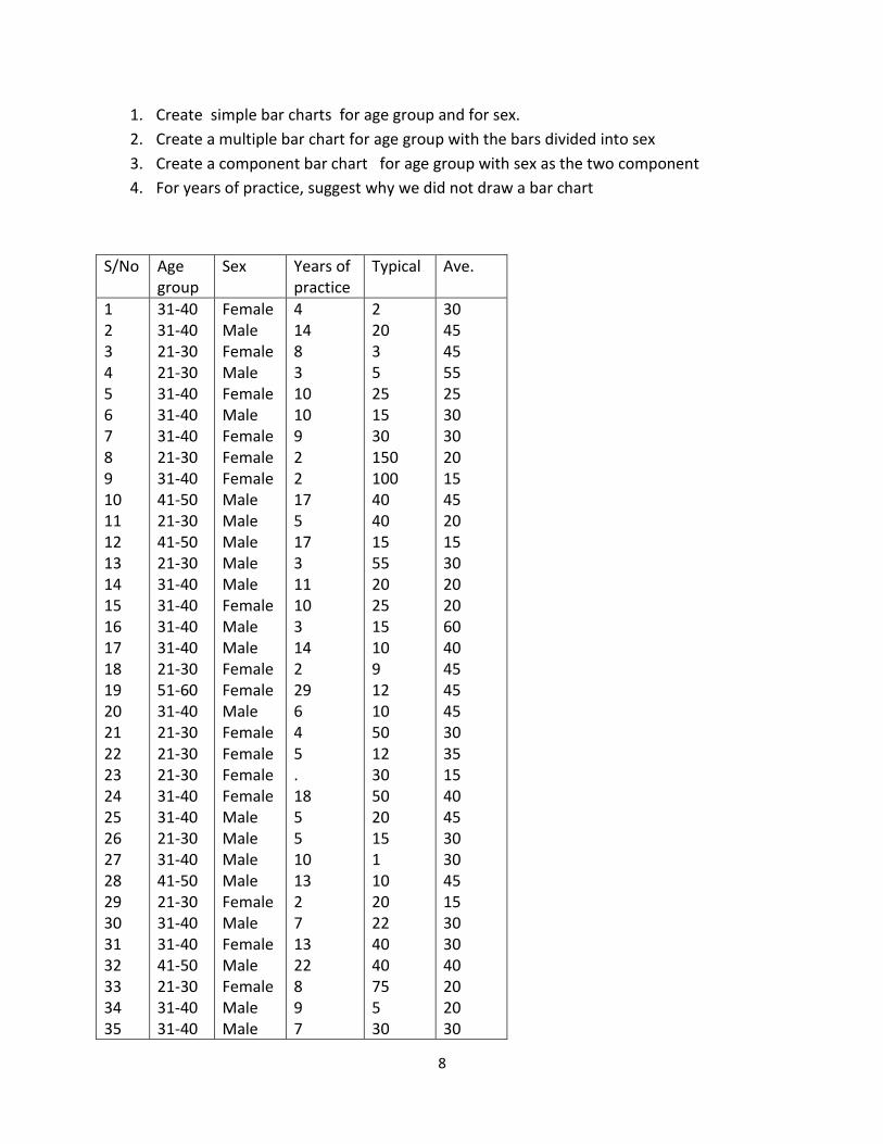
1. Create simple bar charts for age group and for sex.
2. Create a multiple bar chart for age group with the bars divided into sex
3. Create a component bar chart for age group with sex as the two component
4. For years of practice, suggest why we did not draw a bar chart
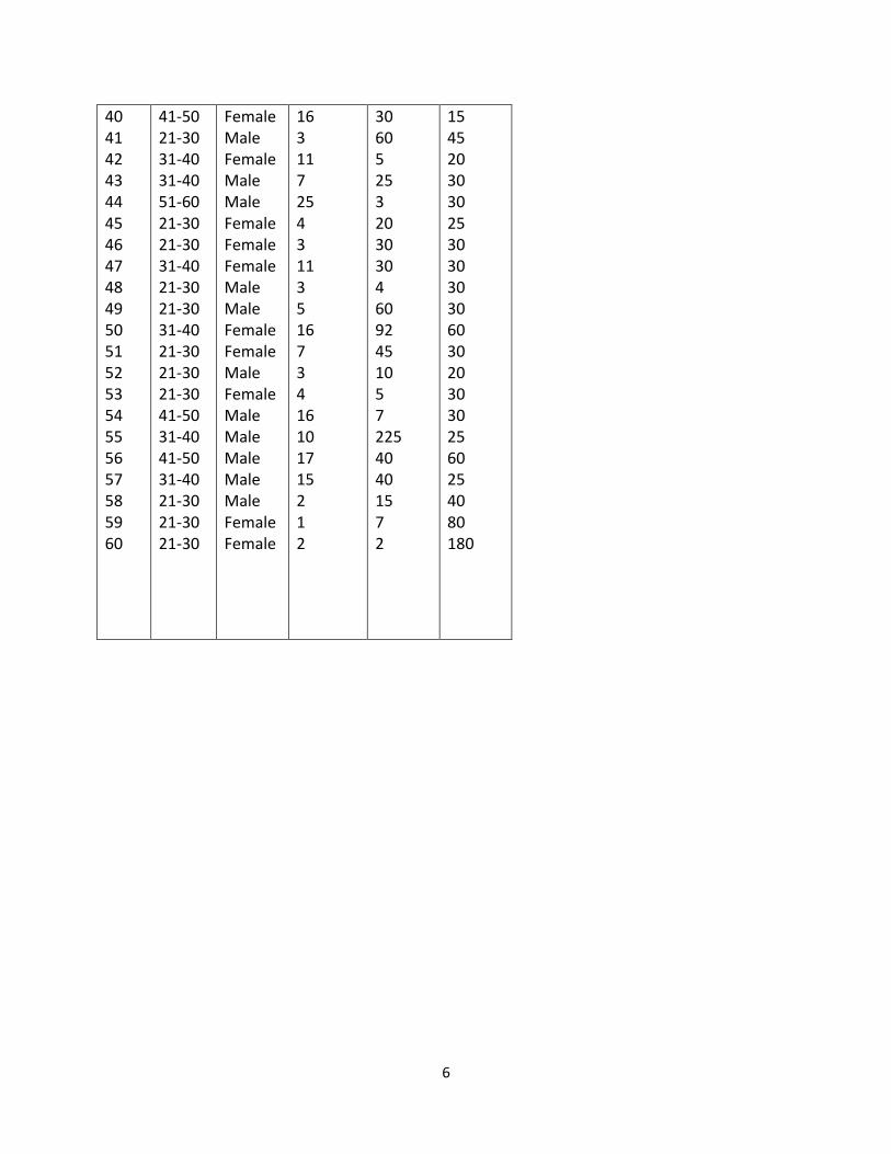
S/No Age group
Sex Years of practice
Typical Ave.
1 2 3 4 5 6 7 8 9 10 11 12 13 14 15 16 17 18 19 20 21 22 23 24 25 26 27 28 29 30 31 32 33 34 35
31-40 31-40 21-30 21-30 31-40 31-40 31-40 21-30 31-40 41-50 21-30 41-50 21-30 31-40 31-40 31-40 31-40 21-30 51-60 31-40 21-30 21-30 21-30 31-40 31-40 21-30 31-40 41-50 21-30 31-40 31-40 41-50 21-30 31-40 31-40
Female Male Female Male Female Male Female Female Female Male Male Male Male Male Female Male Male Female Female Male Female Female Female Female Male Male Male Male Female Male Female Male Female Male Male
4 14 8 3 10 10 9 2 2 17 5 17 3 11 10 3 14 2 29 6 4 5 . 18 5 5 10 13 2 7 13 22 8 9 7
2 20 3 5 25 15 30 150 100 40 40 15 55 20 25 15 10 9 12 10 50 12 30 50 20 15 1 10 20 22 40 40 75 5 30
30 45 45 55 25 30 30 20 15 45 20 15 30 20 20 60 40 45 45 45 30 35 15 40 45 30 30 45 15 30 30 40 20 20 30

9
36 37 38 39 40 41 42 43 44 45 46 47 48 49 50 51 52 53 54 55 56 57 58 59 60
41-50 31-40 41-50 31-40 41-50 21-30 31-40 31-40 51-60 21-30 21-30 31-40 21-30 21-30 31-40 21-30 21-30 21-30 41-50 31-40 41-50 31-40 21-30 21-30 21-30
Male Male Female Male Female Male Female Male Male Female Female Female Male Male Female Female Male Female Male Male Male Male Male Female Female
20 5 24 3 16 3 11 7 25 4 3 11 3 5 16 7 3 4 16 10 17 15 2 1 2
13 200 10 30 30 60 5 25 3 20 30 30 4 60 92 45 10 5 7 225 40 40 15 7 2
30 40 20 45 15 45 20 30 30 25 30 30 30 30 60 30 20 30 30 25 60 25 40 80 180

1
Week Three
Pie Chart
A pie chart (or a circle graph) is a circular chart divided into sectors, illustrating relative
magnitudes or frequencies. In a pie chart, the arc length of each sector (and consequently its
central angle and area), is proportional to the quantity it represents. Together, the sectors
create a full disk. It is named for its resemblance to a pie which has been sliced.
While the pie chart is perhaps the most ubiquitous statistical chart in the business world and
the mass media, it is rarely used in scientific or technical publications. It is one of the most
widely criticized charts, and many statisticians recommend to avoid its use altogether pointing
out in particular that it is difficult to compare different sections of a given pie chart, or to
compare data across different pie charts. Pie charts can be an effective way of displaying
information in some cases, in particular if the intent is to compare the size of a slice with the
whole pie, rather than comparing the slices among them. Pie charts work particularly well when
the slices represent 25 or 50% of the data, but in general, other plots such as the bar chart or
the dot plot, or non-graphical methods such as tables, may be more adapted for representing
information.
A pie chart gives an immediate visual idea of the relative sizes of the shares as a whole. It is a
good method of representation if one wishes to compare a part of a group with the whole
group. You could use a pie chart to show sex of respondents in a given study, market share for
different brands or different types of sandwiches sold by a store.
Statisticians tend to regard pie charts as a poor method of displaying information. While pie
charts are common in business and journalism, they are uncommon in scientific literature. One
reason for this is that it is more difficult for comparisons to be made between the size of items
in a chart when area is used instead of length.
However, if the goal is to compare a given category (a slice of the pie) with the total (the whole
pie) in a single chart and the multiple is close to 25% or 50%, then a pie chart works better than
a graph.
However, pie charts do not give very detailed information, but you can add more information
into pie charts by inserting figure into each segment of the chart or by giving a separate table as
reference. A pie chart is not a good format for showing increases or decreases numbers in each
category, or direct relationships between numbers where our set of numbers depend on
another. In this case a line graph would be better format to use.
2
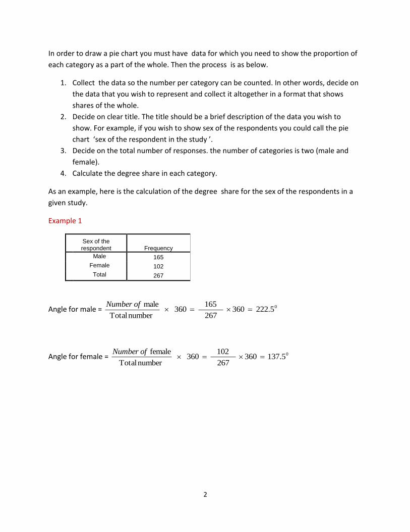
In order to draw a pie chart you must have data for which you need to show the proportion of
each category as a part of the whole. Then the process is as below.
1. Collect the data so the number per category can be counted. In other words, decide on
the data that you wish to represent and collect it altogether in a format that shows
shares of the whole.
2. Decide on clear title. The title should be a brief description of the data you wish to
show. For example, if you wish to show sex of the respondents you could call the pie
chart ‘sex of the respondent in the study ’.
3. Decide on the total number of responses. the number of categories is two (male and
female).
4. Calculate the degree share in each category.
As an example, here is the calculation of the degree share for the sex of the respondents in a
given study.
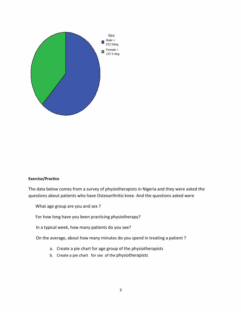
Example 1
Sex of the respondent Frequency
Male 165
Female 102
Total 267
Angle for male = 0222.5 360 267
165 360
number Total
male
ofNumber
Angle for female = 0137.5 360 267
102 360
number Total
female
ofNumber
3
Exercise/Practice
The data below comes from a survey of physiotherapists in Nigeria and they were asked the
questions about patients who have Osteoarthritis knee. And the questions asked were
What age group are you and sex ?
For how long have you been practicing physiotherapy?
In a typical week, how many patients do you see?
On the average, about how many minutes do you spend in treating a patient ?
a. Create a pie chart for age group of the physiotherapists
b. Create a pie chart for sex of the physiotherapists
Female =
137.5 deg.
Male =
222.5deg.
Sex
4
S/No Age group
Sex Years of practice
Typical Ave.
1 2 3 4 5 6 7 8 9 10 11 12 13 14 15 16 17 18 19 20 21 22 23 24 25 26 27 28 29 30 31 32 33 34 35 36 37 38 39 40 41 42
31-40 31-40 21-30 21-30 31-40 31-40 31-40 21-30 31-40 41-50 21-30 41-50 21-30 31-40 31-40 31-40 31-40 21-30 51-60 31-40 21-30 21-30 21-30 31-40 31-40 21-30 31-40 41-50 21-30 31-40 31-40 41-50 21-30 31-40 31-40 41-50 31-40 41-50 31-40 41-50 21-30 31-40
Female Male Female Male Female Male Female Female Female Male Male Male Male Male Female Male Male Female Female Male Female Female Female Female Male Male Male Male Female Male Female Male Female Male Male Male Male Female Male Female Male Female
4 14 8 3 10 10 9 2 2 17 5 17 3 11 10 3 14 2 29 6 4 5 10 18 5 5 10 13 2 7 13 22 8 9 7 20 5 24 3 16 3 11
2 20 3 5 25 15 30 150 100 40 40 15 55 20 25 15 10 9 12 10 50 12 30 50 20 15 1 10 20 22 40 40 75 5 30 13 200 10 30 30 60 5
30 45 45 55 25 30 30 20 15 45 20 15 30 20 20 60 40 45 45 45 30 35 15 40 45 30 30 45 15 30 30 40 20 20 30 30 40 20 45 15 45 20

5
43 44 45 46 47 48 49 50 51 52 53 54 55 56 57 58 59 60
31-40 51-60 21-30 21-30 31-40 21-30 21-30 31-40 21-30 21-30 21-30 41-50 31-40 41-50 31-40 21-30 21-30 21-30
Male Male Female Female Female Male Male Female Female Male Female Male Male Male Male Male Female Female
7 25 4 3 11 3 5 16 7 3 4 16 10 17 15 2 1 2
25 3 20 30 30 4 60 92 45 10 5 7 225 40 40 15 7 2
30 30 25 30 30 30 30 60 30 20 30 30 25 60 25 40 80 180
1
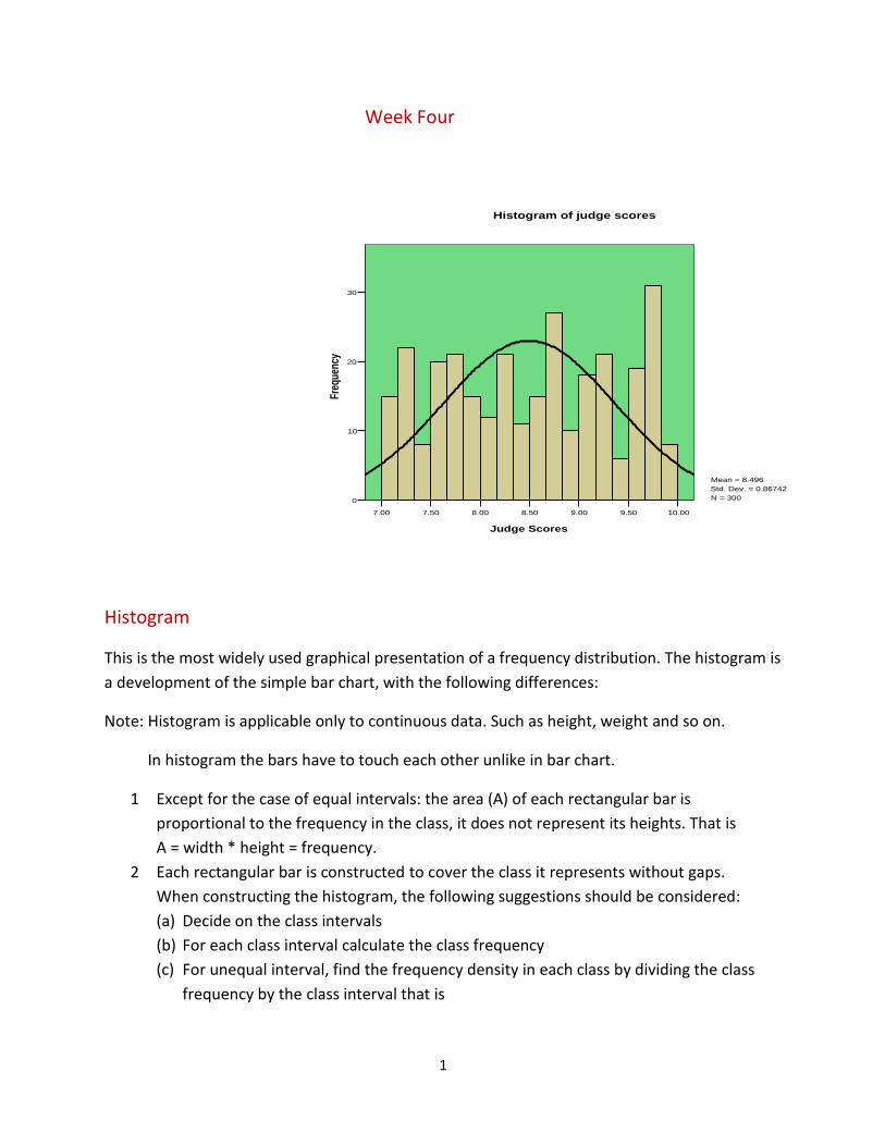
Week Four
Histogram
This is the most widely used graphical presentation of a frequency distribution. The histogram is
a development of the simple bar chart, with the following differences:
Note: Histogram is applicable only to continuous data. Such as height, weight and so on.
In histogram the bars have to touch each other unlike in bar chart.
1 Except for the case of equal intervals: the area (A) of each rectangular bar is
proportional to the frequency in the class, it does not represent its heights. That is
A = width * height = frequency.
2 Each rectangular bar is constructed to cover the class it represents without gaps.
When constructing the histogram, the following suggestions should be considered:
(a) Decide on the class intervals
(b) For each class interval calculate the class frequency
(c) For unequal interval, find the frequency density in each class by dividing the class
frequency by the class interval that is
10.009.509.008.508.007.507.00
Judge Scores
30
20
10
0
Freq
uenc
y
Mean = 8.496
Std. Dev. = 0.86742
N = 300
Histogram of judge scores
2
d = C.I
A
interval
class
frequencyclass
(d) Use class boundaries and the frequency densities to construct the histogram. For
open ended frequency distribution, the class width of the open ended interval
should be taken to be equivalent to that of the immediate predecessor.
Note: Histogram is applicable only to continuous data. Such as height, weight and so on.
In histogram the bars have to touch each other unlike in bar chart.
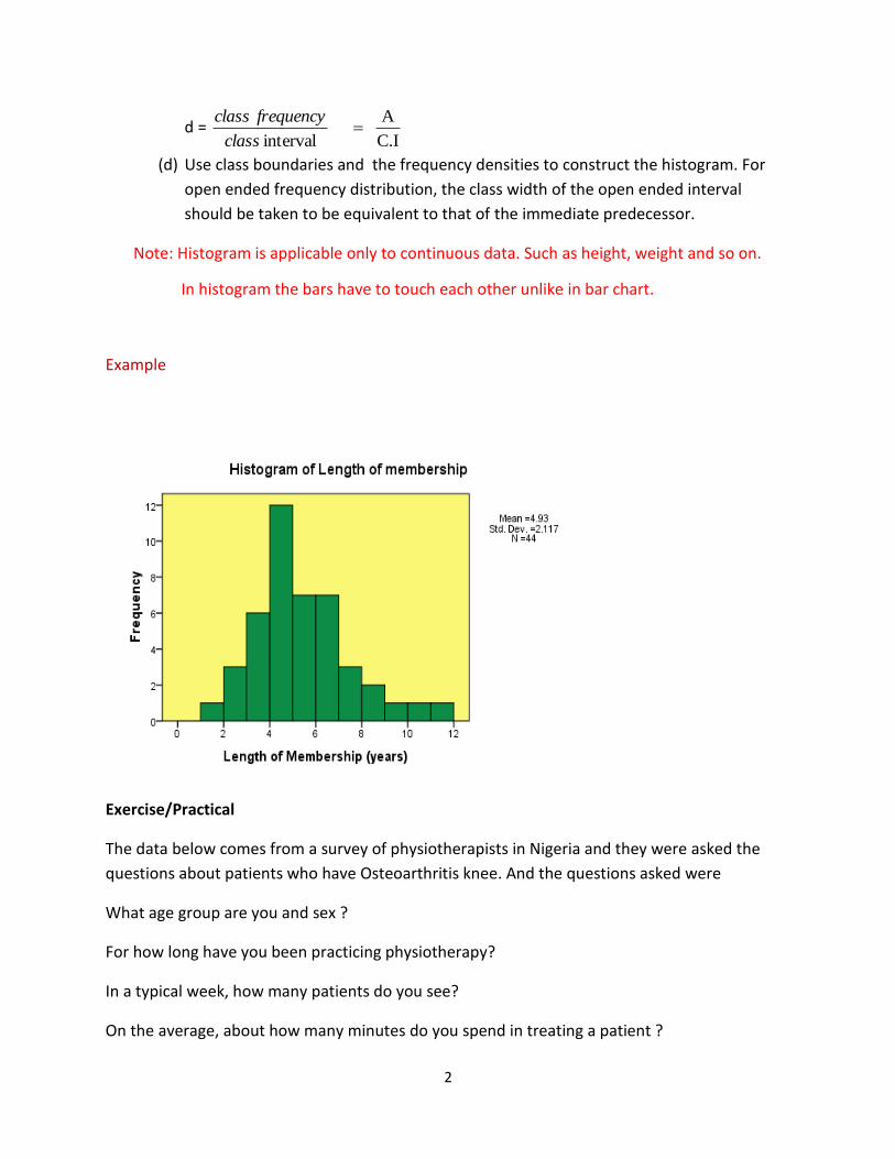
Example
Exercise/Practical
The data below comes from a survey of physiotherapists in Nigeria and they were asked the
questions about patients who have Osteoarthritis knee. And the questions asked were
What age group are you and sex ?
For how long have you been practicing physiotherapy?
In a typical week, how many patients do you see?
On the average, about how many minutes do you spend in treating a patient ?

3
1. Create histogram for years of practice.
2. Create histogram for typical.
3. Create histogram for Average.
4. For sex, suggest why we did not draw histogram.
S/No Age group
Sex Years of practice
Typical Ave.
1 2 3 4 5 6 7 8 9 10 11 12 13 14 15 16 17 18 19 20 21 22 23 24 25 26 27 28 29 30 31
31-40 31-40 21-30 21-30 31-40 31-40 31-40 21-30 31-40 41-50 21-30 41-50 21-30 31-40 31-40 31-40 31-40 21-30 51-60 31-40 21-30 21-30 21-30 31-40 31-40 21-30 31-40 41-50 21-30 31-40 31-40
Female Male Female Male Female Male Female Female Female Male Male Male Male Male Female Male Male Female Female Male Female Female Female Female Male Male Male Male Female Male Female
4 14 8 3 10 10 9 2 2 17 5 17 3 11 10 3 14 2 29 6 4 5 . 18 5 5 10 13 2 7 13
2 20 3 5 25 15 30 150 100 40 40 15 55 20 25 15 10 9 12 10 50 12 30 50 20 15 1 10 20 22 40
30 45 45 55 25 30 30 20 15 45 20 15 30 20 20 60 40 45 45 45 30 35 15 40 45 30 30 45 15 30 30

4
32 33 34 35 36 37 38 39 40 41 42 43 44 45 46 47 48 49 50 51 52 53 54 55 56 57 58 59 60
41-50 21-30 31-40 31-40 41-50 31-40 41-50 31-40 41-50 21-30 31-40 31-40 51-60 21-30 21-30 31-40 21-30 21-30 31-40 21-30 21-30 21-30 41-50 31-40 41-50 31-40 21-30 21-30 21-30
Male Female Male Male Male Male Female Male Female Male Female Male Male Female Female Female Male Male Female Female Male Female Male Male Male Male Male Female Female
22 8 9 7 20 5 24 3 16 3 11 7 25 4 3 11 3 5 16 7 3 4 16 10 17 15 2 1 2
40 75 5 30 13 200 10 30 30 60 5 25 3 20 30 30 4 60 92 45 10 5 7 225 40 40 15 7 2
40 20 20 30 30 40 20 45 15 45 20 30 30 25 30 30 30 30 60 30 20 30 30 25 60 25 40 80 180
1
Week Five
MEASURES OF CENTRAL TENDENCY AND PARTITION
For any set of data, a measure of central tendency is a measure of how the data tends to a
central value. It is a typical value such that each individual value in the distribution tends
to cluster around it.
In other words, it is an index used to describe the concentration of values near the middle
of the distribution. Measures of central tendency are very useful parameters because they
describe properties of populations. The word „average‟, which is commonly used, refers
to the „centre‟ of a data set. It is a single value intended to represent the distribution as a
whole. Three types of averages are common, they are the mean, the median and the
mode.
1.2 THE MEAN
The mean is the most commonly used and also of the greatest importance out of the three
averages. There are various types of means. We shall however consider the arithmetic
mean, the geometric mean and the harmonic mean.
(A) The arithmetic mean
The arithmetic mean of a series of data is obtained by taking the ratio of the total (sum) of
all the data in the series to the number of data points in the series. The arithmetic mean or
simply the mean is a representative value of the series that is such that all elements would
obtain if the total were shared equally among them.
(a) The mean for ungrouped data
(i) For a set of n items x1, x2, x3, …., xn, the mean x (read x bar)
n
xx
Where ∑ (read: “sigma”), an uppercase Greek letter denotes the summation over values
of x and n is the number of values under consideration.
Example
Find the mean of the numbers 3, 4, 6, 7.
Solution
X1 = 3, X2 = 4, X3 = 6, X4 = 7, N = 4
n
xx
=
4
764 3 = 20/4 = 5

2
The Coding Method
The coding method sometimes called the assumed mean method is a simplified version of
calculating the arithmetic mean. The computational procedure is as follows.
(i) Assume a value within the data set as the mean, that is the assumed mean ax
(ii) Obtain the deviation of each observation within the data set from the mean.
(iii) Calculate the mean of the deviations from the assumed mean dx
(iv) Calculate the original mean defined as da xxx
Example
Calculate the mean of the following numbers 3, 4, 6, 7 using the assumed mean method
Solution
Let the assumed mean ax = 3
n
D
dx = 0 + 1 + 2 + 3+ 4 = 2.5
4
But x = ax + dx = 3 + 2.5 = 5.5
(b) The mean for grouped data
If x1, x2, x3, …., xk, are data points ( or midpoints) and f1, f2, …, fk represent the
frequencies then,
X D = x - ax
3
4
6
7
0
1
3
4
3
x = k21
kk2211
f ... f f
xf ... xf x
f
= f
fx
Example
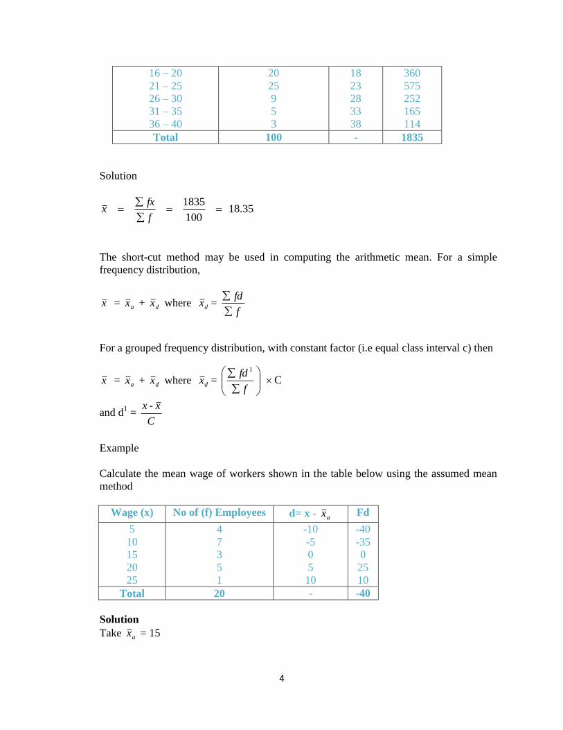
The table below shoes the monthly wage of twenty employees of ABC Ventures Ltd.
Solution
13 20
260
f
fxx
i.e N 13,000 is the average monthly wage of employees of ABC Ventures Ltd.
Example
The distribution below shows the life – hours of some high powered electric bulbs
measured in hundreds of hours
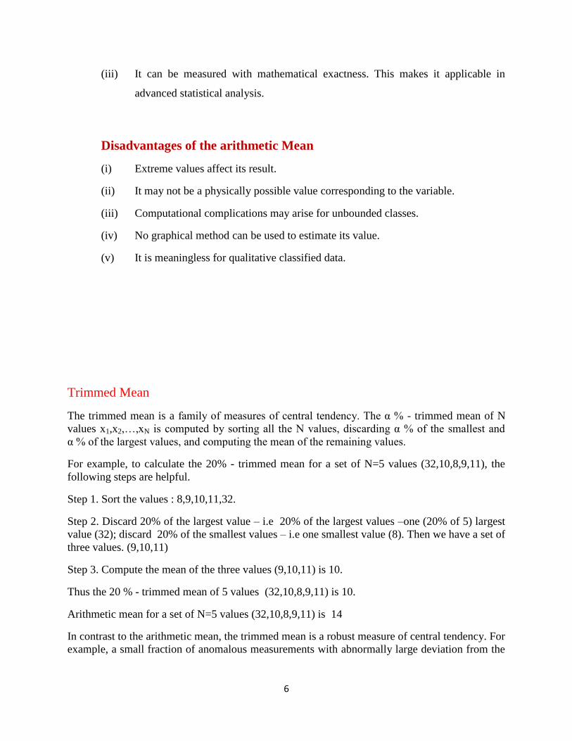
Class Interval No of tubes (f) x F x
1 – 5
6 – 10
11 – 15
5
15
18
3
8
13
15
120
234
Monthly wage
(N‟000) (x)
No of employees
(f)
F x
5
10
15
20
25
4
7
3
5
1
20
70
45
100
25
- 20 260
4
16 – 20
21 – 25
26 – 30
31 – 35
36 – 40
20
25
9
5
3
18
23
28
33
38
360
575
252
165
114
Total 100 - 1835
Solution
18.35 100
1835
f
fxx
The short-cut method may be used in computing the arithmetic mean. For a simple
frequency distribution,
x = ax + dx where dx = f
fd
For a grouped frequency distribution, with constant factor (i.e equal class interval c) then
x = ax + dx where dx = C 1
f
fd
and d1 =
C
xx -
Example
Calculate the mean wage of workers shown in the table below using the assumed mean
method
Wage (x) No of (f) Employees d= x - ax Fd
5
10
15
20
25
4
7
3
5
1
-10
-5
0
5
10
-40
-35
0
25
10
Total 20 - -40
Solution
Take ax = 15

5
2- 20
40-
f
fdxd
But x = ax + dx
= 15 – 2 = 13
Example
Calculate the mean of the distribution below using the assumed mean method.
Class Interval No of Tubes (f) Class Mark (x)
C
-x 1 ax
d
fd1
1 – 5
6 – 10
11 – 15
16 – 20
21 – 25
26 – 30
31 – 35
36 – 40
5
15
18
20
25
9
5
3
3
8
13
18
23
28
33
38
-4
-3
-2
-1
0
1
2
3
-20
-45
-36
-20
0
9
10
3
Total 100 - - -93
Take ax = 23, C = 5
dx = C 4.65- 100
93- 5
f
fd
dx = 23 – 4.65
= 18.35
Advantages of the arithmetic Mean
(i) It is simple to understand and compute
(ii) It is fully representative since it considers all items observed.
6
(iii) It can be measured with mathematical exactness. This makes it applicable in
advanced statistical analysis.
Disadvantages of the arithmetic Mean
(i) Extreme values affect its result.
(ii) It may not be a physically possible value corresponding to the variable.
(iii) Computational complications may arise for unbounded classes.
(iv) No graphical method can be used to estimate its value.
(v) It is meaningless for qualitative classified data.
Trimmed Mean
The trimmed mean is a family of measures of central tendency. The α % - trimmed mean of N
values x1,x2,…,xN is computed by sorting all the N values, discarding α % of the smallest and
α % of the largest values, and computing the mean of the remaining values.
For example, to calculate the 20% - trimmed mean for a set of N=5 values (32,10,8,9,11), the
following steps are helpful.
Step 1. Sort the values : 8,9,10,11,32.
Step 2. Discard 20% of the largest value – i.e 20% of the largest values –one (20% of 5) largest
value (32); discard 20% of the smallest values – i.e one smallest value (8). Then we have a set of
three values. (9,10,11)
Step 3. Compute the mean of the three values (9,10,11) is 10.
Thus the 20 % - trimmed mean of 5 values (32,10,8,9,11) is 10.
Arithmetic mean for a set of N=5 values (32,10,8,9,11) is 14
In contrast to the arithmetic mean, the trimmed mean is a robust measure of central tendency. For
example, a small fraction of anomalous measurements with abnormally large deviation from the
7
center may change the mean value substantially. At the same time, the trimmed mean is stable in
respect to presence of such abnormal extreme values, which get trimmed away.
For example, in the set of 5 values discussed above, replace one value by a large number, say,
“12” by “1000” . Then compute the mean of the 5 values, and the 20% - trimmed mean. The
replacement does not affect the trimmed mean (because the extreme value is discarded on step
2), but it changes the mean significantly – from 10 to 207.
The trimmed mean, as a family of measures, includes the arithmetic mean and the median as the
most extreme case. The trimmed mean with the minimal degree of trimming (α = 0%) coincide
with the mean; the trimmed mean with the maximal degree of trimming (α = 50%) coincide with
the median.
One popular example of trimmed mean is judges scores in gymnastic, where the extreme scores
the underlying distribution is systematic, the truncated mean of a sample is unlikely to produce
an unbiased estimator for either the mean or median.
Examples
The scoring method used in many sports that are evaluated by a panel of judges is a truncated
mean: discard the lowest and highest scores; calculate the mean value of the remaining scores.
The interquartile mean is another example when the lowest 25% and the highest 25% are
discarded, and the mean of the remaining scores are calculated.
Exercise
1. The distribution below shows the life – hours of some high powered electric bulbs
measured in hundreds of hours. Compute mean
Class Interval No of tubes (f)
1 – 5
6 – 10
11 – 15
16 – 20
21 – 25
26 – 30
31 – 35
36 – 40
5
15
18
25
25
9
15
3
Total 120
2. The number of cars crossing a certain bridge in a big city in intervals of five
minutes each were recorded as follows: 20, 15, 16, 30, 20, 20, 12, 9, 18, 15.
Calculate the arithmetic mean and trimmed mean. Comment on your results.
1
WEEK SIX
6.1 THE MEDIAN (measure of central tendency cont’d)
The median of ungrouped data:- The median of a set of data in an array is the value that
divides the data set into two equal halves. That is, when these observations are arranged in order
of magnitude, half of them will be less than or equal to the median, while the other half will be
greater than or equal to it.
The computational procedure for obtaining the median of ungrouped data is as follows:
(i) Arrange the data in order of magnitude (either in increasing or decreasing order)
(ii) Label each observation in that order as x1, x2 - - - xn
(iii) If the number of observations, n is odd, then
Median = 2
1nX
If the number of observations n is even, then
Median =
2
2
2
2
1nn XX
Example
Compute the median for the following set of numbers
(i) 3 , 6, 8, 9, 7, 12, 2
(ii) 4, 8, 2, 9, 6, 10
Solution
(i) Re-arranging the numbers in ascending order, we have 2, 3, 6, 7, 9, 12
Here n = 7, odd
x1 = 2, x2 = 3, x3 = ,6 x4 = 7, x5 = 8, x6 = 9, x7 = 12

2
Median = 2
1nX
Median = 2
17X
= X4
= 7
(ii) Re-arranging the numbers in ascending order, we have 2, 4, 6, 8, 9, 10
Here n = 6, even and x1 = 2, x2 = 4, x3 = 6, x4 = 8, x5 = 9, x6 = 10
Median =
2
2
2
2
1nn XX
= 43 2
1XX
= 7 8 6 2
1
(b) The Median of grouped data:- The median of grouped data can be obtained either by the
use of formula or graphically.
(i) The Median by formula.
Median = Cf
fn
Lm
c
m 2
Where:
Lm = Low boundary of the median class
n = Total frequencies
fc = Sum of all frequencies before Lm
fm = frequency of median class
c = class width of median class.

3
(iii) Graphical Estimate of the Median:- The median of a grouped data can be obtained
using the cumulative frequency curve (ogive) and finding from it the value ‘x’ at the
50% point. An effective way of obtaining the median using the graphical method
involves converting the frequency values to relative frequencies and expressing it in
percentage.
Example
The table below shows the age distribution of employees in a certain factory. Calculate the
median age of employees in the factory using the formula and the graphical method.
Age (in yrs.) No of
Employees (f)
Class Boundaries Cum. Freq. % Cum Rel.
Freq.
20 – 24
25 – 29
30 - 34
35 – 39
40 – 44
45 – 49
50 – 54
55 – 59
2
5
12
17
14
6
3
1
19.5 – 24.5
24.5 – 29.5
29.5 – 34. 5
34.5 – 39.5
39.5 – 44.5
44.5 – 49.5
49.5 – 54.5
54.5 – 59.5
2
7
19
36
50
56
59
60
3
12
32
60
83
93
98
100
(i) By formula:-
Median = Cf
fn
Lm
c
m 2
Lm = 34.5, n = 60 fc = 19, fm = 17, C = 52
Median = 5 17
19 2
60
5.34
= 34.5 + 3.24
4
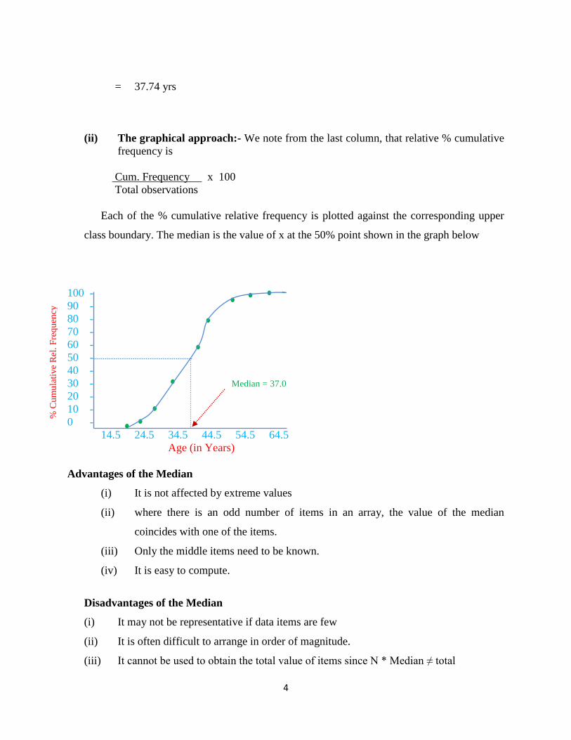
= 37.74 yrs
(ii) The graphical approach:- We note from the last column, that relative % cumulative
frequency is
Cum. Frequency x 100
Total observations
Each of the % cumulative relative frequency is plotted against the corresponding upper
class boundary. The median is the value of x at the 50% point shown in the graph below
100 -
90 -
80 -
70 -
60 -
50 -
40 -
30 -
20 -
10 -
0 -
14.5 24.5 34.5 44.5 54.5 64.5
Age (in Years)
Advantages of the Median
(i) It is not affected by extreme values
(ii) where there is an odd number of items in an array, the value of the median
coincides with one of the items.
(iii) Only the middle items need to be known.
(iv) It is easy to compute.
Disadvantages of the Median
(i) It may not be representative if data items are few
(ii) It is often difficult to arrange in order of magnitude.
(iii) It cannot be used to obtain the total value of items since N * Median ≠ total
% C
um
ula
tiv
e R
el.
Fre
qu
ency
Median = 37.0

5
(iv) In grouped distribution, the median is not an exact value, it is only an estimate.
6.2 MODE
The mode of ungrouped data: For any set of numbers, the mode is that observation which occurs
most frequently.
Example
Find the mode of the following numbers.
(i) 2, 5, 3, 2, 6, 2, 2
(ii) 4, 3, 6, 9, 6, 4, 9, 6, 6, 6, 3
Solution
(i) The mode in the first set is 2, it occurs the highest number of times, that is, four times.
(ii) The mode in the second set is 6, with frequency 5
The mode of Grouped Data
The mode of a grouped distribution is the value at the point around which the items tend to be
most heavily concentrated. A distribution having one mode, two modes, or more than two modes
are called Unimodal, bimodal or multi – modal distribution respectively. In fact, the mode
sometimes does not exist if all classes have the same frequency. the mode of grouped data can be
obtained either graphically or by use of formula.
(i) The mode by formula
Mode =
Cffff
ffL
ambm
bm
m
Where
Lm = Lower boundary of modal class
Fm = Frequency of modal class
Fa = Frequency of class immediately after modal class
Fb = Frequency of class immediately before modal class
C = Class width
6
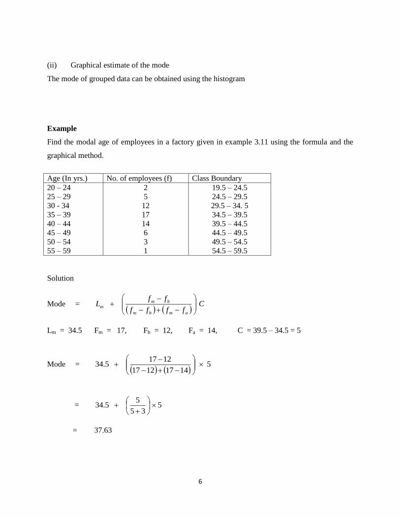
(ii) Graphical estimate of the mode
The mode of grouped data can be obtained using the histogram
Example
Find the modal age of employees in a factory given in example 3.11 using the formula and the
graphical method.
Age (In yrs.) No. of employees (f) Class Boundary
20 – 24
25 – 29
30 - 34
35 – 39
40 – 44
45 – 49
50 – 54
55 – 59
2
5
12
17
14
6
3
1
19.5 – 24.5
24.5 – 29.5
29.5 – 34. 5
34.5 – 39.5
39.5 – 44.5
44.5 – 49.5
49.5 – 54.5
54.5 – 59.5
Solution
Mode =
Cffff
ffL
ambm
bm
m
Lm = 34.5 Fm = 17, Fb = 12, Fa = 14, C = 39.5 – 34.5 = 5
Mode =
5 14171217
1217 5.34
= 5 35
5 5.34
= 37.63

7
(iii) Graphical Method
Estimation of Mode from Histogram
20
15
10
5
0
19.5 24.5 29.5 34.5 39.5 44.5 49.5 54.5 59.5
Class Boundaries
Mode = 37
Advantages of Mode
(i) It is easy to understand and evaluate
(ii) Extreme items do not affect its value
(iii) It is not necessary to have knowledge of all the values in the distribution.
(iv) It coincides with existing items in the observation.
Disadvantages of the Mode
(i) It may not be unique or clearly defined.
(ii) For continuous distribution, it is only an approximation.
(iii) It does not consider all items in the data set.
Fre
qu
enci
es
8
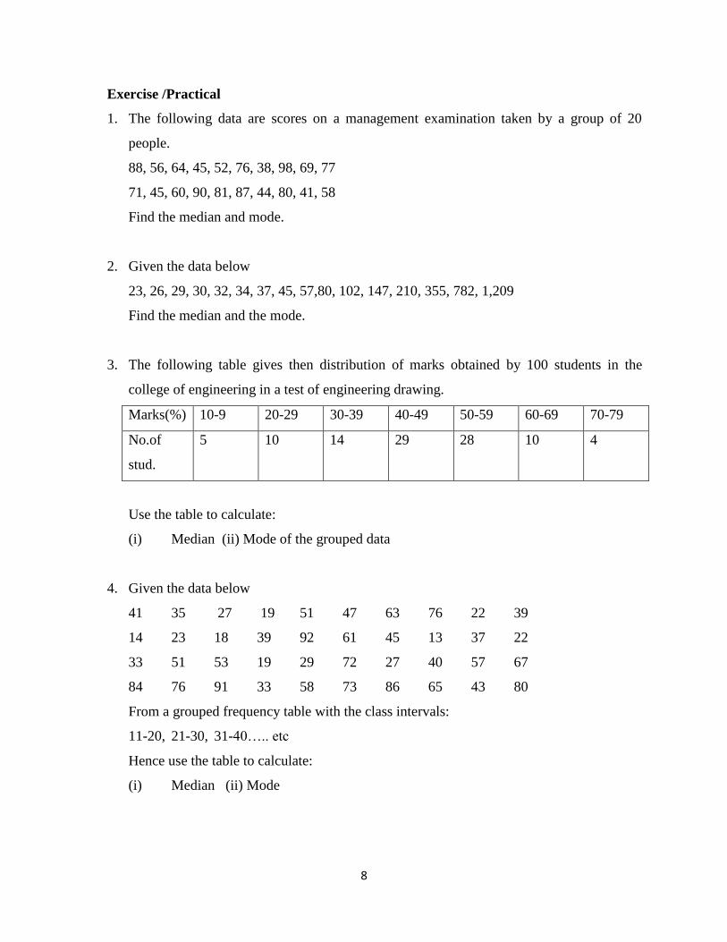
Exercise /Practical
1. The following data are scores on a management examination taken by a group of 20
people.
88, 56, 64, 45, 52, 76, 38, 98, 69, 77
71, 45, 60, 90, 81, 87, 44, 80, 41, 58
Find the median and mode.
2. Given the data below
23, 26, 29, 30, 32, 34, 37, 45, 57,80, 102, 147, 210, 355, 782, 1,209
Find the median and the mode.
3. The following table gives then distribution of marks obtained by 100 students in the
college of engineering in a test of engineering drawing.
Marks(%) 10-9 20-29 30-39 40-49 50-59 60-69 70-79
No.of
stud.
5 10 14 29 28 10 4
Use the table to calculate:
(i) Median (ii) Mode of the grouped data
4. Given the data below
41 35 27 19 51 47 63 76 22 39
14 23 18 39 92 61 45 13 37 22
33 51 53 19 29 72 27 40 57 67
84 76 91 33 58 73 86 65 43 80
From a grouped frequency table with the class intervals:
11-20, 21-30, 31-40….. etc
Hence use the table to calculate:
(i) Median (ii) Mode
1
WEEK Seven
7.0 QUANTILES
All quantities that are defined as partitioning or splitting a distribution into a number of
equal portions are called quantiles. Examples include the quartiles, deciles and the percentiles.
The three quantities that spilt a distribution into four equal parts are called Quartiles, namely
(Q1), second quartiles (Q2) and the third quartiles, (Q3). Nine quantities spilt a distribution into
ten equal parts. These are called Deciles namely first decile (D1), Second decile (D2), up to the
ninth decile (D9). The Ninety-nine quantities that spilt a distribution into one hundred equal parts
are called percentiles namely first Percentiles (P1), second Percentile (P2) up to the ninety-ninth
percentile (P99).
7.1 QUARTILES
The quartiles can be obtained either by formula or by using the cumulative frequency curve. The
calculation of the quartiles for both ungrouped and grouped data is similar to parallel calculations
of the median for ungrouped and grouped data using appropriately modified versions. The
formula for obtaining some quartiles are shown below
Cf
fn
Qc
4 L 1
11
Cf
fn
Qc
4
2
L 2
22
Cf
fn
Qc
4
3
L 3
33
2
7.2 DECILES
The formula for obtaining some Deciles are shown below:
Cf
fn
Dc
10 L 1
11
“ “ “ “ “
“ “ “ “ “
Cf
fn
Dc
10
9
L 9
99
7.3 PERCENTILES
The formula for obtaining some Percentiles are shown below:
Cf
fn
Pc
100 L 1
11
Cf
fn
Pc
100
2
L 2
22
“ “ “ “ “
“ “ “ “ “
Cf
fn
Dc
10
2
L 2
22
3
Cf
fn
Pc
100
99
L 99
9999
Note : All the equations above have the same definition as used in the median.
Example
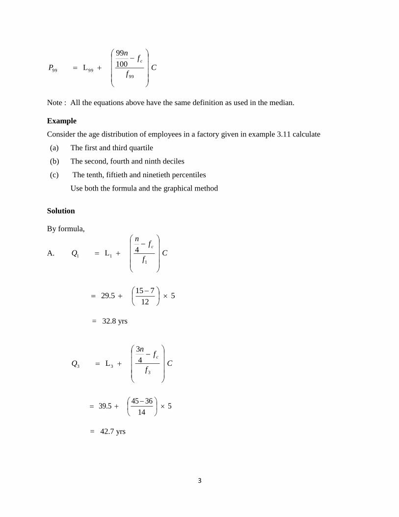
Consider the age distribution of employees in a factory given in example 3.11 calculate
(a) The first and third quartile
(b) The second, fourth and ninth deciles
(c) The tenth, fiftieth and ninetieth percentiles
Use both the formula and the graphical method
Solution
By formula,
A. Cf
fn
Qc
4 L 1
11
5 12
715 29.5
= 32.8 yrs
Cf
fn
Qc
4
3
L 3
33
5 14
3645 39.5
= 42.7 yrs
4
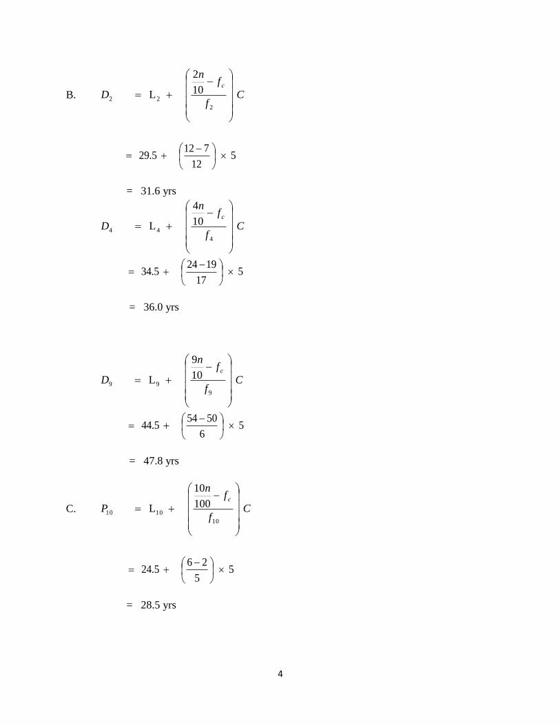
B. Cf
fn
Dc
10
2
L 2
22
5 12
712 29.5
= 31.6 yrs
Cf
fn
Dc
10
4
L 4
44
5 17
1924 34.5
= 36.0 yrs
Cf
fn
Dc
10
9
L 9
99
5 6
5054 44.5
= 47.8 yrs
C. Cf
fn
Pc
100
10
L 10
1010
5 5
26 24.5
= 28.5 yrs

5
Cf
fn
Pc
100
50
L 50
5050
5 17
1930 34.5
= 37.7 yrs
Cf
fn
Pc
100
90
L 90
9090
5 6
5054 44.5
= 47.8 yrs
Cumulative Frequency Curve (Ogive) showing estimation of quartiles
100 -
90 -
80 -
70 -
60 -
50 -
40 -
30 -
20 -
10 -
0 -
14.5 24.5 34.5 44.5 54.5 64.5
Age (In years)
From the ogive, the required points are located as follows
% C
um
ula
tiv
e R
el.
Fre
qu
ency
D4
Q2
P90

6
Q1 4
1 x 100 = 25
Q2 4
3 x 100 = 75
D2 10
2 x 100 = 20
P10 100
10 x 100 = 10 e.t.c

1
WEEK Eight
8.0 MEASURES OF DISPERSION
A measure of dispersion is a measure of the tendency of individual values of the variable
to differ in size among themselves. In summarizing a set of data, it is generally desirable not only
to indicate its average but also to specify the extent of clustering of the observations around the
average. Measures of variability provide an indication of how well or poorly measures of central
tendency represent a particular distribution. If a measure of dispersion is for instance, zero, there
is no variability among the values and the mean is perfectly representative. In general, the greater
the variability, the less representative the measure of central tendency.
Some important measures of dispersion include the range, semi- inter-quartile range, mean
deviation, variance and standard deviation.
8.1 RANGE
The range R, of a set of numbers is the difference between the largest and smallest numbers, that
is, it is the difference between the two extreme values. Suppose XL - XS
In a grouped frequency distribution the midpoint of the first and last class are chosen as XL and
XS respectively.
Example
Compute the range for the following numbers; 6, 9, 5, 18, 25
Solution:
R = XL - XS
Where XL = 25, XS = 5
range = 25 -5
= 20

2
8.2 QUARTILE DEVIATION
For any set of data, the quartile deviation or semi-interquartile range is defined as half the
difference between the third and first quartile, that is,
Q.D = ½ (Q3 – Q1)
The third quartile (Q3) and the first quartile (Q1) are obtained as discussed in chapter three.
8.3 MEAN DEVIATION
For any set of numbers x1, x2, …., xn, the mean deviation (M.D) is defined as follows.
M.D = n
xx
where x = n
x
n
xx = absolute value of the difference between x1 and x
If x1, x2……, xk is repeated with frequency f1, f2…….. fk then
M.D = f
xxf
Where x = f
fx
Example
Calculate the mean deviation for the following set of numbers.
(i) 3, 5, 6, 7, 4
(ii) 10, 25, 35, 40, 20, 30, 45, 55, 15, 25
Solution:
(i) x = n
x
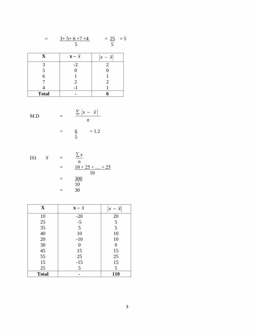
3
= 3+ 5+ 6 +7 +4 = 25 = 5
5 5
X x – x xx
3
5
6
7
4
-2
0
1
2
-1
2
0
1
2
1
Total - 6
M.D = n
xx
= 6 = 1.2
5
(ii) x = n
x
= 10 + 25 + … + 25
10
= 300
10
= 30
X x – x xx
10
25
35
40
20
30
45
55
15
25
-20
-5
5
10
-10
0
15
25
-15
5
20
5
5
10
10
0
15
25
15
5
Total - 110

4
M.D = n
xx
= 110
10
= 11
Example Calculate the mean deviation for the distribution below
Class
interval
Freq. (f) X fx xx xx xxf
1 -3
4 -6
7 – 9
10 – 12
13 – 15
5
10
15
10
5
2
5
8
11
14
10
50
120
110
70
-6
-3
0
3
6
6
3
0
3
6
30
30
0
30
30
Total 45 360 120
x = 8 45
360
f
fx
M.D = 2.67 45
120
f
xxf
8.3 VARIANCE AND STANDARD DEVIATION
Instead of merely neglecting the signs of the deviations from the arithmetic mean, we may square
the deviations, thereby making them all positive. The measure of dispersion obtained by taking
the arithmetic mean of the sum of squared deviations of the individual observations from the
mean is called the variance or mean square deviation or simply mean square.
The variance of a set of numbers x1, x2….., xn denoted by 2 is defined as follows:
n
xx
n
xx
ere wh,
1
2
2
If x1, x2….., xk is repeated with frequencies f1, f2, … fk then
5
1
2
2
N
xxf
And standard deviation (SD) =
1
x-x f 2
N
Where x = f
fx
Exercise /Practical
1. The following table gives then distribution of marks obtained by 100 students in the
college of engineering in a test of engineering drawing.
Marks(%) 10-9 20-29 30-39 40-49 50-59 60-69 70-79
No.of
stud.
5 10 14 29 28 10 4
Use the table to calculate:
(i) Standard deviation
2. Given the data below
41 35 27 19 51 47 63 76 22 39
14 23 18 39 92 61 45 13 37 22
33 51 53 19 29 72 27 40 57 67
84 76 91 33 58 73 86 65 43 80
From a grouped frequency table with the class intervals:
11-20, 21-30, 31-40….. etc
Hence use the table to calculate:
(i) Variance
Calculate the mean deviation for the following set of numbers.
3 3, 8, 6, 7, 4,9,10,12,22,11,14.
4 10, 25, 35, 40, 20, 40, 55, 55, 35, 25,20,35,65,75

1
WEEK Nine
9.0 BOX PLOT
In descriptive statistics, a box plot or box plot (also known as a box-and-whisker diagram or
plot) is a convenient way of graphically depicting groups of numerical data through their five-
number summaries (the smallest observation (sample minimum), lower quartile (Q1), median
(Q2), upper quartile (Q3), and largest observation (sample maximum). A box plot may also
indicate which observations, if any, might be considered outliers.
Box plots can be useful to display difference populations without making any assumptions of
the underlying statistical distribution: they are non-parametric. The spacing between the
different parts of the box help indicate the degree of dispersion (spread) and skewness in the
data , and identifying outliers. Box plots can be drawn either horizontally or vertically.
Construction
There are a number of conventions used in drawing box plots; the following is a common one.
For a data set, one constructs a horizontal box plot in the following manner:
Calculate the first LQ (x.25), the median (x.50) and third quartile (x.75)
Calculate the interquartile range (IQR) BY subtracting the first quartile from the third quartile
(x.75)- (x.25).
Construct a box above the number line bounded on the left by the first quartile (x.25) and on the
right by the third quartile (x.75).
Indicate where the median lies inside of the box with the presence of a symbol or a line dividing
the box at the median value.
The mean value of the data can also be labeled with a point.
Any data observation which lies more than 1.5 Interquartile range (IQR) lower than the first
quartile or 1.5 IQR higher than the third quartile is considered an outlier. Indicate where the
smallest value that is not an outlier is by connecting it to the box with a horizontal line or
“whisker”. Optionally, also mark the position of this value more clearly using a small vertical
line. Likewise, connect the largest value that is not an outlier to the box by a “whisker” (and
optionally mark it with another small vertical line).
Indicated outliers by open and closed dots. “Extreme” outlier, or those which lie more than
three times the IQR (3.IQR) to the left and right from the first and third quartiles respectively,
2
are indicated by the presence of closed dot. “Mild” outlier – that is , those observations which
lie more than 1.5 times the IQR from the first and the third quartile but are not also extreme
outliers are indicated by the presence of a open dot. (Sometimes no distinction is made
between “mild” and “extreme” outliers.)
Add an appropriate label to the number line and title the box plot.
A box plot may be constructed in a similar manner vertically as opposed to horizontally by
merely interchanging “bottom” for “top” for “right” and “vertical” for “horizontal” in the above
description.
1. smallest non-outlier observation = 5 (left “whisker”) (left “whisker” would have been 4
had there been an observation with a value of 4 (Q1 – 1.5.IQR))
2. lower quartile (Q1, x.25) = 7
3. median (Med, x.5) = 8.5
4. upper quartile (Q3, x.75) = 9
5. largest non-outlier observation = 10 (right “whisker”)
6. interquartiler range, IQR = Q3 – Q1 = 2
7. the value 3.5 is a “mild” outlier, between 1.5.IQR and 3.IQR below Q1
8. the value 0.5 is an “extreme” outlier, more than 3.IQR below Q1
9. the data is skewed to the left (negative skewed)
The horizontal lines (the “whiskers”) extend to at most 1.5 time the box width (the interquartile
range) from either or both ends of the box. They must end at an observed value, thus
connecting all the values outside the box that are not more than 1.5 times the box width away
from box. Three times the box width marks the boundary between “mild” and “extreme”
outlier. In this box plot, “mild” and “extreme” outliers are differentiated by closed and open
dot, respectively.
There are alternative implementations of this detail of the box plot in various software
packages, such as the whiskers extending to at most the 5th and 95th (or some more extreme)
percentiles. Such approaches do not conform to Turkeys definition, with its emphasis on the
median in particular and counting methods in general, and they tend to produce “outlier” for all
data sets larger than ten, no matter what the shape of the distribution.
3
9.1 ALTERNATIVE FORMS
Box and whisker plots are uniform in their use of the box: the bottom and top of the box are
always the 25th and 75th percentile (the lower and upper quartiles, respectively), and the band
near the middle of the box is always the 50th percentile (the median). But the ends of the
whiskers can represent several possible alternative values, among them:
1. the minimum and maximum of all the data
2. the lowest datum still within 1.5 IQR of the lower quartile, and the highest datum still
within 1.5 IQR of the upper quartile.
3. One standard deviation above and below the mean of the data
4. the 9th percentile and the 91st percentile
5. the 2nd percentile and the 98th percentile
Any data not included between the whiskers should be plotted as an outlier with a dot, small
circle, or star, but occasionally this is not done.
Some box plots include an additional dot or a cross is plotted inside of the box, to represent the
mean of the data in the median.
On some box plots a crosshatch is placed on each whisker, before the end of the whisker.
Fairly rarely, box plots can be presented with no whisker
4
Exercise/Practical
The data below comes from a survey of physiotherapists in Nigeria and they were asked the
questions about patients who have Osteoarthritis knee. And the questions asked were
What age group are you and sex ?
For how long have you been practicing physiotherapy?
In a typical week, how many patients do you see?
On the average, about how many minutes do you spend in treating a patient ?

5
1. Create Box plot for Years of practice and sex.
2. Create Box plot for average and sex.
S/No Age group
Sex Years of practice
Typical Ave.
1 2 3 4 5 6 7 8 9 10 11 12 13 14 15 16 17 18 19 20 21 22 23 24 25 26 27 28 29 30 31 32 33 34 35 36 37 38 39
31-40 31-40 21-30 21-30 31-40 31-40 31-40 21-30 31-40 41-50 21-30 41-50 21-30 31-40 31-40 31-40 31-40 21-30 51-60 31-40 21-30 21-30 21-30 31-40 31-40 21-30 31-40 41-50 21-30 31-40 31-40 41-50 21-30 31-40 31-40 41-50 31-40 41-50 31-40
Female Male Female Male Female Male Female Female Female Male Male Male Male Male Female Male Male Female Female Male Female Female Female Female Male Male Male Male Female Male Female Male Female Male Male Male Male Female Male
4 14 8 3 10 10 9 2 2 17 5 17 3 11 10 3 14 2 29 6 4 5 . 18 5 5 10 13 2 7 13 22 8 9 7 20 5 24 3
2 20 3 5 25 15 30 150 100 40 40 15 55 20 25 15 10 9 12 10 50 12 30 50 20 15 1 10 20 22 40 40 75 5 30 13 200 10 30
30 45 45 55 25 30 30 20 15 45 20 15 30 20 20 60 40 45 45 45 30 35 15 40 45 30 30 45 15 30 30 40 20 20 30 30 40 20 45
6
40 41 42 43 44 45 46 47 48 49 50 51 52 53 54 55 56 57 58 59 60
41-50 21-30 31-40 31-40 51-60 21-30 21-30 31-40 21-30 21-30 31-40 21-30 21-30 21-30 41-50 31-40 41-50 31-40 21-30 21-30 21-30
Female Male Female Male Male Female Female Female Male Male Female Female Male Female Male Male Male Male Male Female Female
16 3 11 7 25 4 3 11 3 5 16 7 3 4 16 10 17 15 2 1 2
30 60 5 25 3 20 30 30 4 60 92 45 10 5 7 225 40 40 15 7 2
15 45 20 30 30 25 30 30 30 30 60 30 20 30 30 25 60 25 40 80 180
1
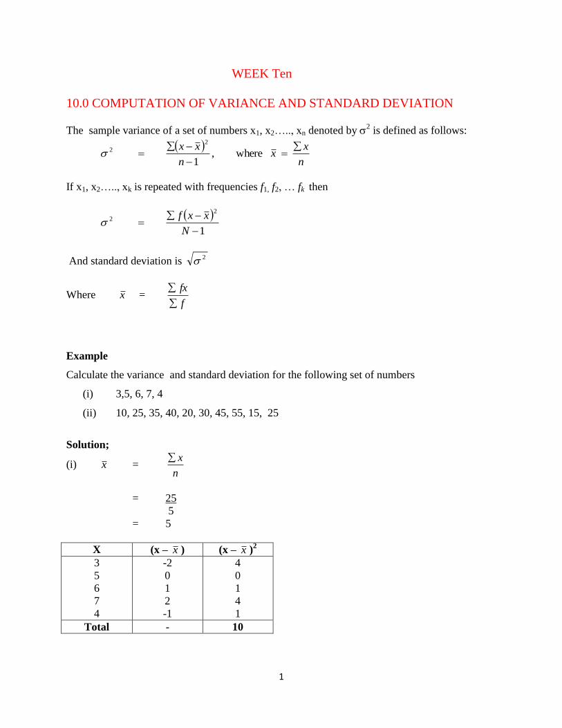
WEEK Ten
10.0 COMPUTATION OF VARIANCE AND STANDARD DEVIATION
The sample variance of a set of numbers x1, x2….., xn denoted by 2 is defined as follows:
n
xx
n
xx
ere wh,
1
2
2
If x1, x2….., xk is repeated with frequencies f1, f2, … fk then
1
2
2
N
xxf
And standard deviation is 2
Where x = f
fx
Example
Calculate the variance and standard deviation for the following set of numbers
(i) 3,5, 6, 7, 4
(ii) 10, 25, 35, 40, 20, 30, 45, 55, 15, 25
Solution;
(i) x = n
x
= 25
5
= 5
X (x – x ) (x – x )2
3
5
6
7
4
-2
0
1
2
-1
4
0
1
4
1
Total - 10
2
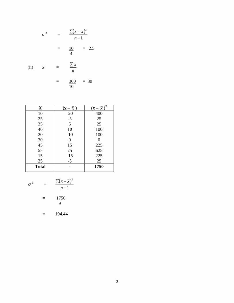
1
2
2
n
xx
= 10 = 2.5
4
(ii) x = n
x
= 300 = 30
10
X (x – x ) (x – x )2
10
25
35
40
20
30
45
55
15
25
-20
-5
5
10
-10
0
15
25
-15
-5
400
25
25
100
100
0
225
625
225
25
Total - 1750
1
2
2
n
xx
= 1750
9
= 194.44
3
Example
Calculate the variance for the distribution below
Class
interval
Freq. (f) x fx xx xx 2 xxf
1 -3
4 -6
7 – 9
10 – 12
13 – 15
5
10
15
10
5
2
5
8
11
14
10
50
120
110
70
-6
-3
0
3
6
36
9
0
9
36
180
90
0
90
180
Total 45 - 360 - - 540
x = f
x
= 360 = 8
45
27.12
45
540
1
2
2
N
xxf
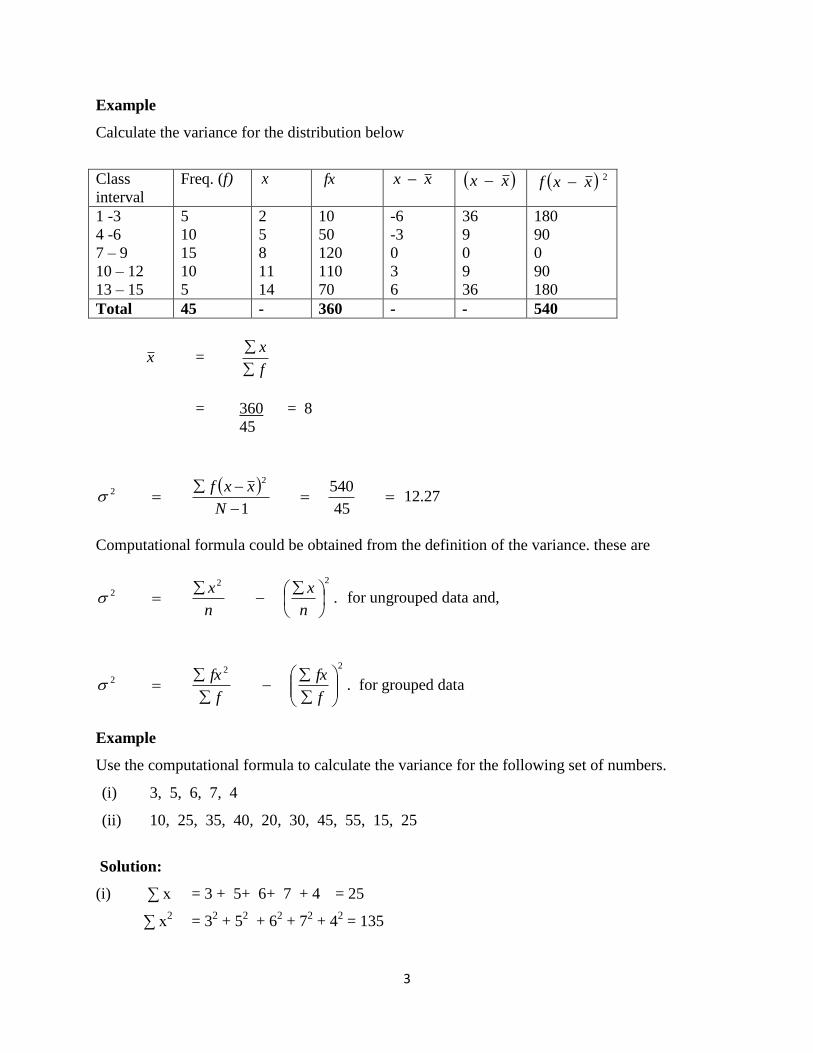
Computational formula could be obtained from the definition of the variance. these are
.
222
n
x
n
x for ungrouped data and,
.
222
f
fx
f
fx
for grouped data
Example
Use the computational formula to calculate the variance for the following set of numbers.
(i) 3, 5, 6, 7, 4
(ii) 10, 25, 35, 40, 20, 30, 45, 55, 15, 25
Solution:
(i) ∑ x = 3 + 5+ 6+ 7 + 4 = 25
∑ x2 = 3
2 + 5
2 + 6
2 + 7
2 + 4
2 = 135
4
.
222
n
x
n
x
. 5
25
5
135
2
= 27 - 25
= 2
(ii) ∑ x = 10 + 25 + … + 25 = 300
∑ x2
= 102 + 25
2 + … + 25
2 = 10750
.
222
n
x
n
x
= 1075 – 900 = 175
Example:
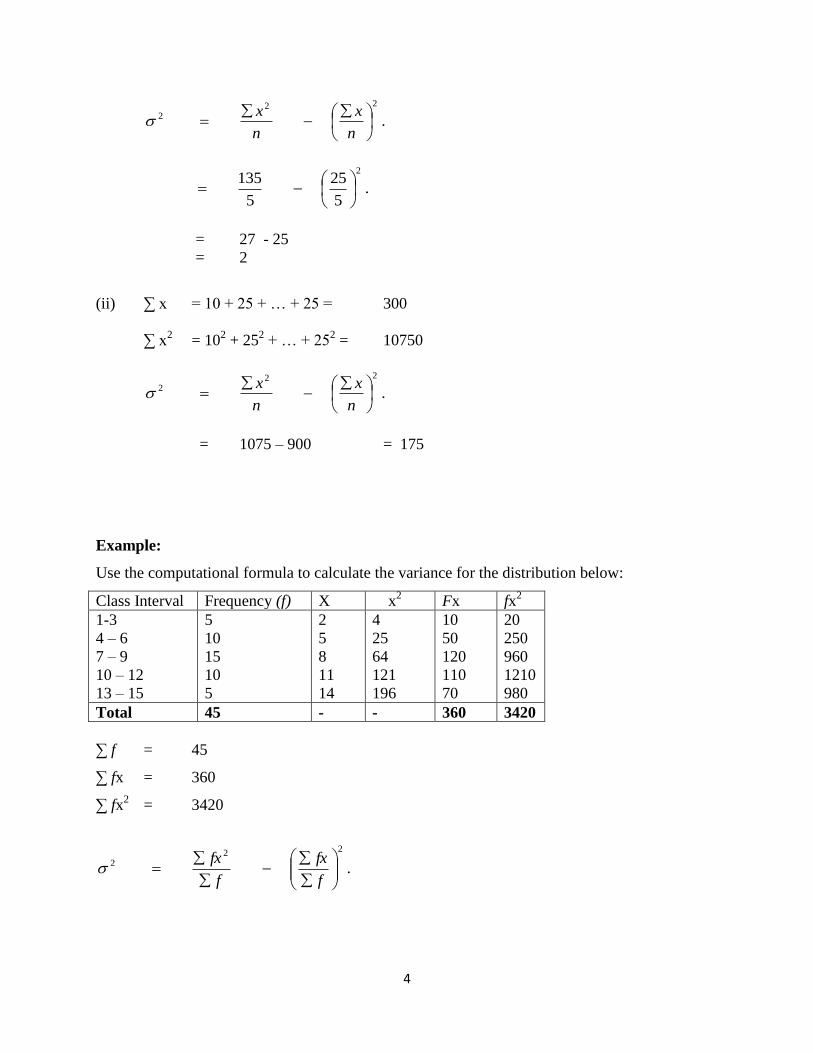
Use the computational formula to calculate the variance for the distribution below:
Class Interval Frequency (f) X x2
Fx fx2
1-3
4 – 6
7 – 9
10 – 12
13 – 15
5
10
15
10
5
2
5
8
11
14
4
25
64
121
196
10
50
120
110
70
20
250
960
1210
980
Total 45 - - 360 3420
∑ f = 45
∑ fx = 360
∑ fx2 = 3420
.
222
f
fx
f
fx

5
. 45
360
45
3420
2
= 76 - 64
= 12
Exercise/Practical
1. The following table gives then distribution of marks obtained by 100 students in the
college of engineering in a test of engineering drawing.
Marks(%) 10-9 20-29 30-39 40-49 50-59 60-69 70-79
No. of
students.
5 10 14 29 28 10 4
Use the table to calculate:
(i) Standard deviation (ii) Variance
2. Given the data below
41 35 27 19 51 47 63 76 22 39
14 23 18 39 92 61 45 13 37 22
33 51 53 19 29 72 27 40 57 67
84 76 91 33 58 73 86 65 43 80
From a grouped frequency table with the class intervals:
11-20, 21-30, 31-40….. etc
Hence use the table to calculate:
(i) Standard deviation (ii) Variance
1
WEEK Eleven
11.0 SKEWNESS
A distribution is said to be symmetry if it is possible to cut its graph into two mirror image
halves. Such distributions have bell-shape graphs. This shape of the frequency curves are
characterized by the fact that observations equidistant from the central maximum have the same
frequency e.g the normal curve. Skewness is the degree of asymmetry (departure from
symmetry) of a distribution. If the frequency curve (smoothed frequency polygon) of a
distribution has the length of one of its tails (relative to the central section). Disproportionate to
the other, then the distribution is described as skewed. However, a skewed distribution is a
distribution in which set of observations is not normally distributed that is mean, median and
mode do not coincide at the middle of the curve.
The concept of skewness would be clear from the following three diagrams showing a
symmetrical distribution, a positively skewed distribution and negatively skewed distribution.
1. Symmetrical Distribution
It is clear from the diagram below that in a symmetrical distribution the values of mean median
and mode coincide. The spread of the frequencies is the same on both sides of the center point of
the curve.
2. Asymmetrical Distribution
A distribution which is not symmetrical is called a skewed distribution and such a distribution
could either be positively skewed or negatively skewed as would be clear from the following
diagram
3. Positively Skewed Distribution
In the positively skewed distribution, the value of mean is maximum and that of the mode is
minimum – the median lies in between the two.
4. Negatively Skewed Distribution
In a negatively skewed distribution, the value of the mode is maximum and that of mean minim
um – the median lies in between the two.
2
Note: in moderately symmetrical distributions the interval between the mean and the median is
approximately one-third of the interval between the mean and the mode. It is this relationship
which provides a means of measuring the degree of skewness.
11.1 Test Of Skewness
In order to ascertain whether a distribution is skewed or not, the following tests may be applied.
Skewness is present if :
The values of mean, median, and mode do not coincide.
When the data are plotted on a graph they do not give the normal bell-shape form i.e when cut
along a vertical line through the centre the two halves are not equal.
Frequencies are not equally distributed at points of equal deviation from the mode.
Conversely stated, when skewness is absent, i.e in case of a symmetrical distribution, the
following conditions are satisfied:
The values of mean, median, and mode coincide.
Data when plotted on a graph give the normal bell-shape form.
Frequencies are equally distributed at points of equal deviation from the mode.
However, Skewness = 3
3
/1
n
xxi
Example
Suppose we have the following data : 7, 9, 10, 8, 6.
n
x
X

3
X x-x 2xx 1/
2 nxx
7
9
10
8
6
-1
1
2
0
-2
1
1
4
0
4
0.25
0.25
1
0
1
Total 2.5
1
x-x
2
2
n and
X xxi 3xx 1
3
n
xxi 3
3
/1
n
xxi
7
9
10
8
6
-1
1
2
0
-2
-1
1
8
0
-8
-0.25
0.25
2
0
-2
-0.06
0.06
0.51
0
-0.51
Total 0
Hence Skewness = 0
We can conclude that the distribution Symmetrical.
1.58
1
x-x
2
n

4
11.2 Exercise/Practical
The following are test scores obtained in a descriptive statistics test :
Test scores 10 20 25 30 35
Frequency 2 3 1 3 1
Calculate Skewness and comment on your result
1
WEEK TWELVE
12.0 Q-Q PLOT
The q-q plot is a graphical technique for determining if two data sets come from population
with a common distribution. A q-q plot is a plot of the quantiles of the first data set against the
quantiles of the second data set. By a quantiles, we mean the fraction (or percent) of points
below the given value. That is, the 0.3 (or 30%) quantile is the point at which 30% of the data
fall below and 70% fall above that value.
The advantages of the q-q plot are :
1. The sample sizes do not to be equal.
2. Many distributional aspects can be simultaneously tested. For example, shift in location,
shift in scale, changes in symmetry, and the presence of outliers can all be detected
from this plot. For example, if the two data come from populations whose distributions
differ only by a shift in location, the should lie along a straight line that is displaced
either up or down from the 45-degree reference line.
The q-q plot is similar to a probability plot. For a probability plot, the quantiles for one of the
data samples are replaced with the quantiles of a theoretical distribution.
The q-q plot is formed by:
1. Vertical axis: Estimated quantiles from data set 1
2. Horizontal axis: Estimated quantiles from data set 2
Both axes are in units of their respective data sets. That is, the actual quantiles level is not
plotted. For a given point on the q-q plot, we know that the quantiles is the same for both
points, but not what that quantile level actually is.
2
The q-q plot is used to answer the following questions:
1. Do two data sets come from populations with a common distribution?
2. Do two data sets come have common location and scale?
3. Do two data sets come have similar distributional shapes?
4. Do two data sets have similar tail behavior?
Example
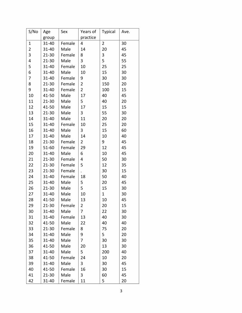
The data below comes from a survey of physiotherapists in Nigeria and they were asked the
questions about patients who have Osteoarthritis knee. And the questions asked were
What age group are you and sex ?
For how long have you been practicing physiotherapy?
In a typical week, how many patients do you see?
On the average, about how many minutes do you spend in treating a patient ?
Create a q-q plot for years of practice and typical.
3
S/No Age group
Sex Years of practice
Typical Ave.
1 2 3 4 5 6 7 8 9 10 11 12 13 14 15 16 17 18 19 20 21 22 23 24 25 26 27 28 29 30 31 32 33 34 35 36 37 38 39 40 41 42
31-40 31-40 21-30 21-30 31-40 31-40 31-40 21-30 31-40 41-50 21-30 41-50 21-30 31-40 31-40 31-40 31-40 21-30 51-60 31-40 21-30 21-30 21-30 31-40 31-40 21-30 31-40 41-50 21-30 31-40 31-40 41-50 21-30 31-40 31-40 41-50 31-40 41-50 31-40 41-50 21-30 31-40
Female Male Female Male Female Male Female Female Female Male Male Male Male Male Female Male Male Female Female Male Female Female Female Female Male Male Male Male Female Male Female Male Female Male Male Male Male Female Male Female Male Female
4 14 8 3 10 10 9 2 2 17 5 17 3 11 10 3 14 2 29 6 4 5 . 18 5 5 10 13 2 7 13 22 8 9 7 20 5 24 3 16 3 11
2 20 3 5 25 15 30 150 100 40 40 15 55 20 25 15 10 9 12 10 50 12 30 50 20 15 1 10 20 22 40 40 75 5 30 13 200 10 30 30 60 5
30 45 45 55 25 30 30 20 15 45 20 15 30 20 20 60 40 45 45 45 30 35 15 40 45 30 30 45 15 30 30 40 20 20 30 30 40 20 45 15 45 20
4
43 44 45 46 47 48 49 50 51 52 53 54 55 56 57 58 59 60
31-40 51-60 21-30 21-30 31-40 21-30 21-30 31-40 21-30 21-30 21-30 41-50 31-40 41-50 31-40 21-30 21-30 21-30
Male Male Female Female Female Male Male Female Female Male Female Male Male Male Male Male Female Female
7 25 4 3 11 3 5 16 7 3 4 16 10 17 15 2 1 2
25 3 20 30 30 4 60 92 45 10 5 7 225 40 40 15 7 2
30 30 25 30 30 30 30 60 30 20 30 30 25 60 25 40 80 180
Solution
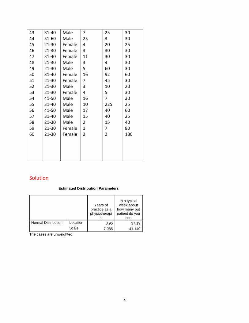
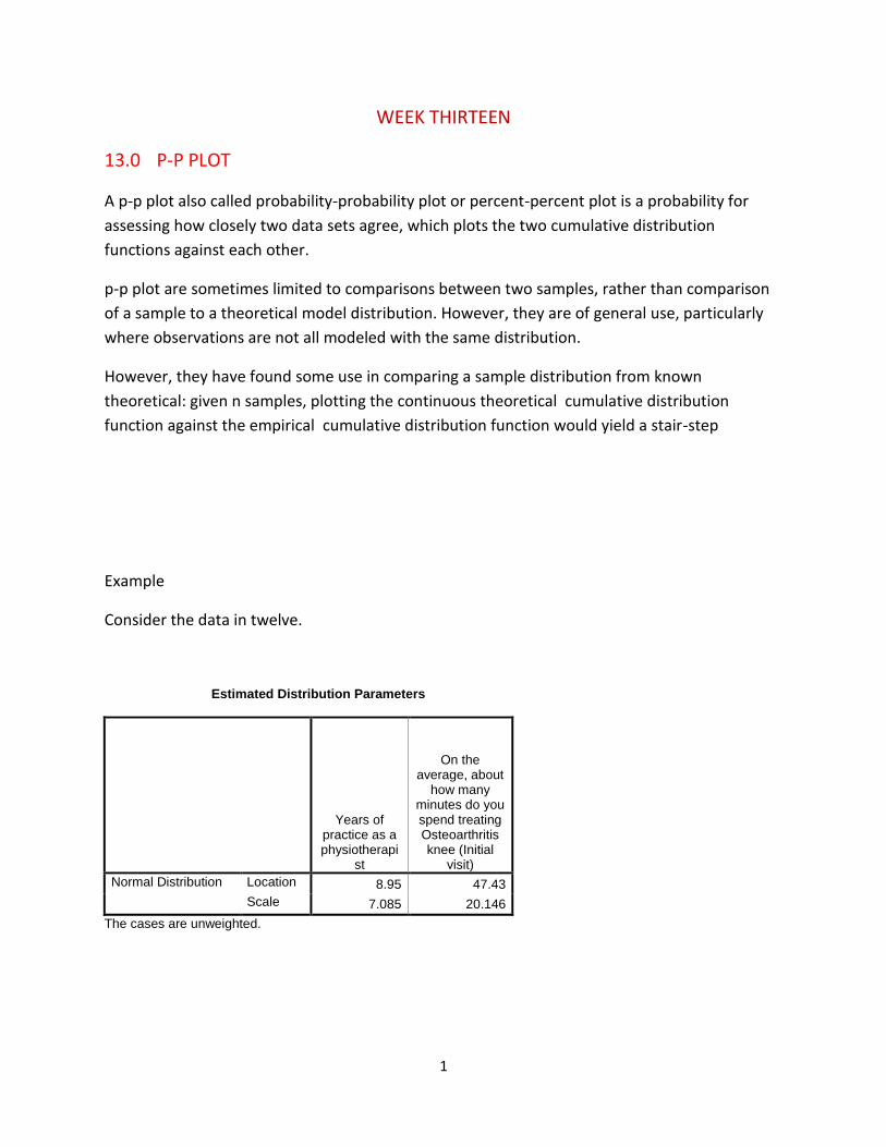
Estimated Distribution Parameters
Years of practice as a physiotherapi
st
In a typical week,about
how many out patient do you
see
Normal Distribution Location 8.95 37.19
Scale 7.085 41.140
The cases are unweighted.

5
Years of practice as a physiotherapist
3020100
Observed Value
30
20
10
0
Ex
pe
cte
d N
orm
al V
alu
eNormal Q-Q Plot of Years of practice as a physiotherapist
6
In a typical week, about how many out patient do you see
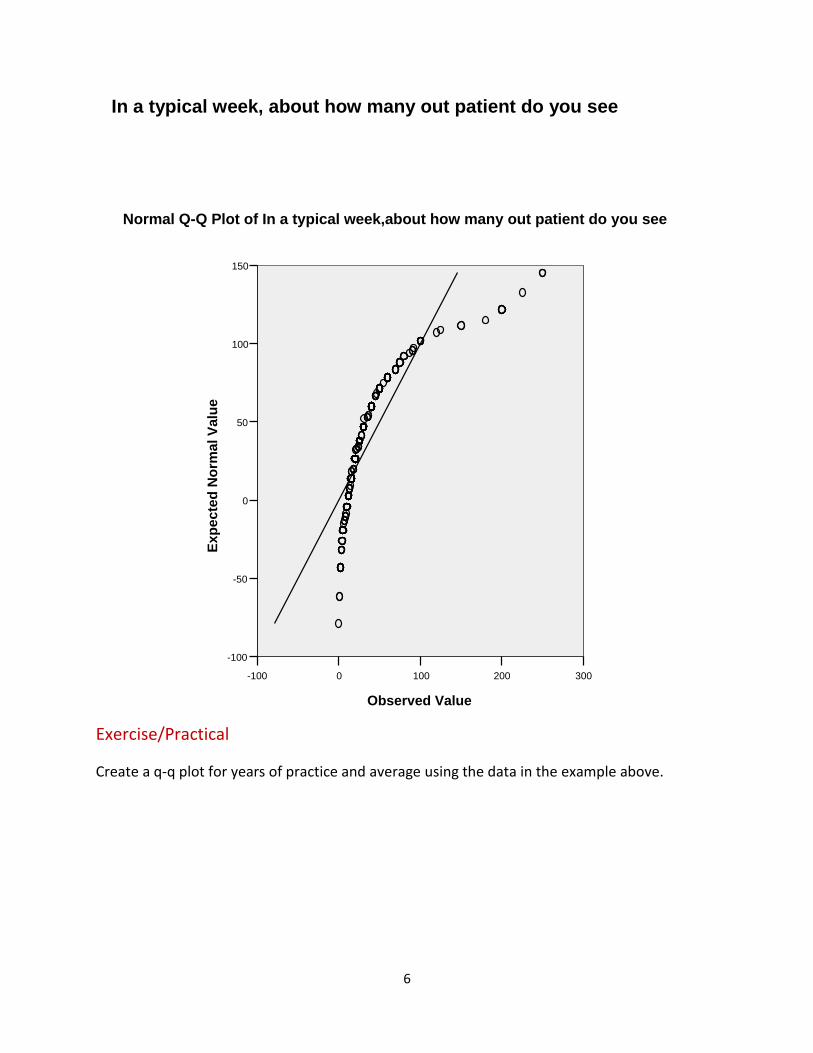
Exercise/Practical
Create a q-q plot for years of practice and average using the data in the example above.
3002001000-100
Observed Value
150
100
50
0
-50
-100
Ex
pe
cte
d N
orm
al V
alu
eNormal Q-Q Plot of In a typical week,about how many out patient do you see
1
WEEK THIRTEEN
13.0 P-P PLOT
A p-p plot also called probability-probability plot or percent-percent plot is a probability for
assessing how closely two data sets agree, which plots the two cumulative distribution
functions against each other.
p-p plot are sometimes limited to comparisons between two samples, rather than comparison
of a sample to a theoretical model distribution. However, they are of general use, particularly
where observations are not all modeled with the same distribution.
However, they have found some use in comparing a sample distribution from known
theoretical: given n samples, plotting the continuous theoretical cumulative distribution
function against the empirical cumulative distribution function would yield a stair-step
Example
Consider the data in twelve.
Estimated Distribution Parameters
Years of practice as a physiotherapi
st
On the average, about
how many minutes do you spend treating Osteoarthritis knee (Initial
visit)
Normal Distribution Location 8.95 47.43
Scale 7.085 20.146
The cases are unweighted.
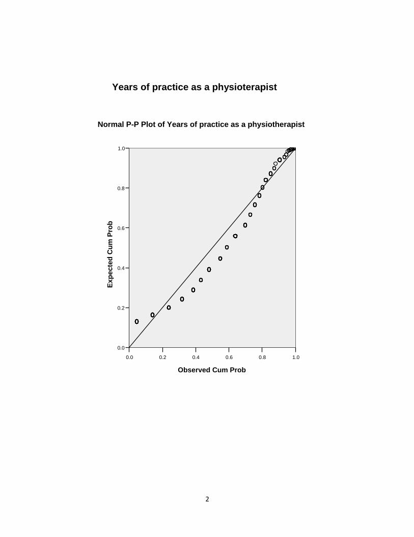
2
Years of practice as a physioterapist
1.00.80.60.40.20.0
Observed Cum Prob
1.0
0.8
0.6
0.4
0.2
0.0
Ex
pe
cte
d C
um
Pro
b
Normal P-P Plot of Years of practice as a physiotherapist
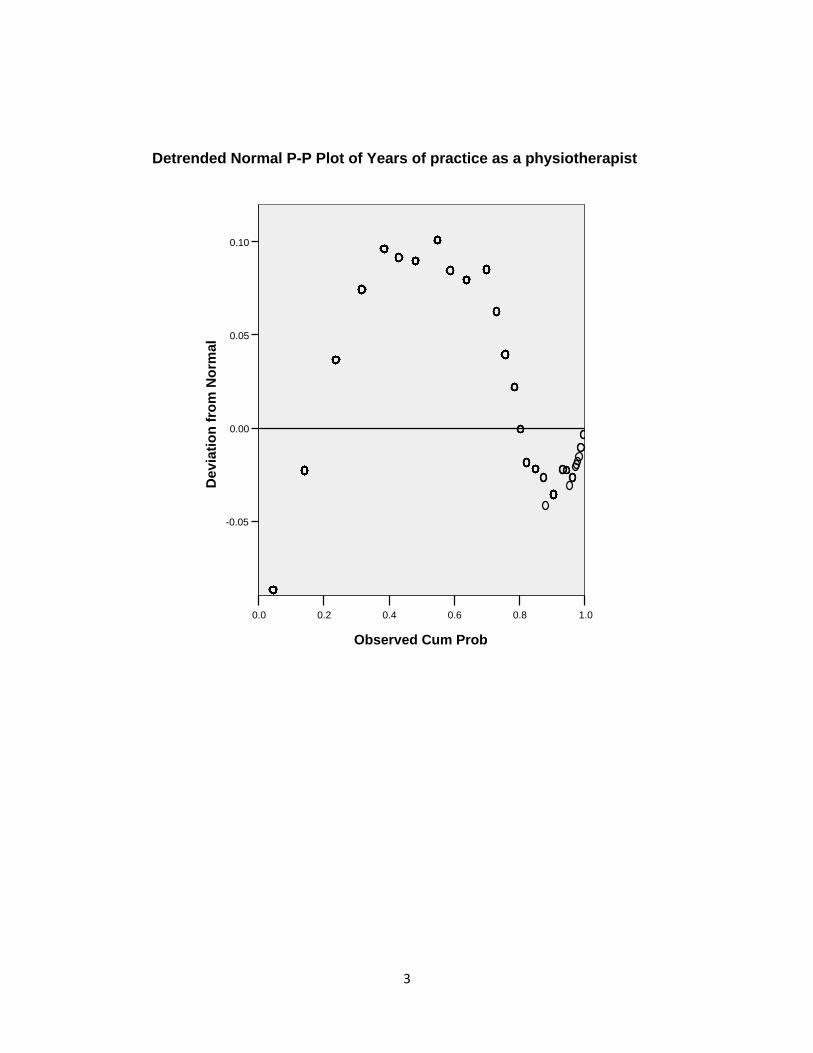
3
1.00.80.60.40.20.0
Observed Cum Prob
0.10
0.05
0.00
-0.05
De
via
tio
n f
rom
No
rma
l
Detrended Normal P-P Plot of Years of practice as a physiotherapist
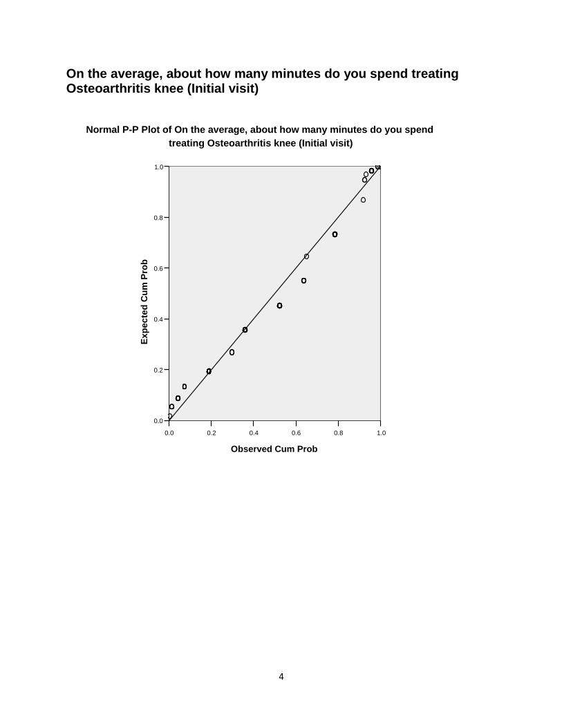
4
On the average, about how many minutes do you spend treating Osteoarthritis knee (Initial visit)
1.00.80.60.40.20.0
Observed Cum Prob
1.0
0.8
0.6
0.4
0.2
0.0
Ex
pe
cte
d C
um
Pro
b
Normal P-P Plot of On the average, about how many minutes do you spend
treating Osteoarthritis knee (Initial visit)
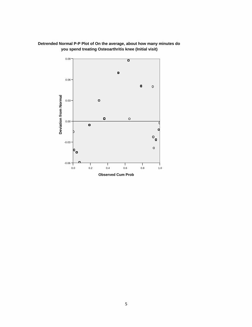
5
1.00.80.60.40.20.0
Observed Cum Prob
0.09
0.06
0.03
0.00
-0.03
-0.06
De
via
tio
n f
rom
No
rma
l
Detrended Normal P-P Plot of On the average, about how many minutes do
you spend treating Osteoarthritis knee (Initial visit)
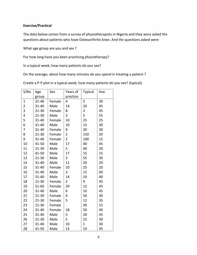
6
Exercise/Practical
The data below comes from a survey of physiotherapists in Nigeria and they were asked the
questions about patients who have Osteoarthritis knee. And the questions asked were
What age group are you and sex ?
For how long have you been practicing physiotherapy?
In a typical week, how many patients do you see?
On the average, about how many minutes do you spend in treating a patient ?
Create a P-P plot in a typical week, how many patients do you see? (typical).
S/No Age group
Sex Years of practice
Typical Ave.
1 2 3 4 5 6 7 8 9 10 11 12 13 14 15 16 17 18 19 20 21 22 23 24 25 26 27 28
31-40 31-40 21-30 21-30 31-40 31-40 31-40 21-30 31-40 41-50 21-30 41-50 21-30 31-40 31-40 31-40 31-40 21-30 51-60 31-40 21-30 21-30 21-30 31-40 31-40 21-30 31-40 41-50
Female Male Female Male Female Male Female Female Female Male Male Male Male Male Female Male Male Female Female Male Female Female Female Female Male Male Male Male
4 14 8 3 10 10 9 2 2 17 5 17 3 11 10 3 14 2 29 6 4 5 . 18 5 5 10 13
2 20 3 5 25 15 30 150 100 40 40 15 55 20 25 15 10 9 12 10 50 12 30 50 20 15 1 10
30 45 45 55 25 30 30 20 15 45 20 15 30 20 20 60 40 45 45 45 30 35 15 40 45 30 30 45
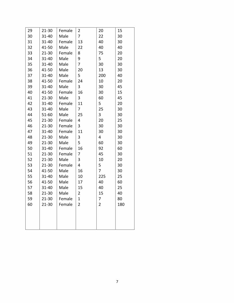
7
29 30 31 32 33 34 35 36 37 38 39 40 41 42 43 44 45 46 47 48 49 50 51 52 53 54 55 56 57 58 59 60
21-30 31-40 31-40 41-50 21-30 31-40 31-40 41-50 31-40 41-50 31-40 41-50 21-30 31-40 31-40 51-60 21-30 21-30 31-40 21-30 21-30 31-40 21-30 21-30 21-30 41-50 31-40 41-50 31-40 21-30 21-30 21-30
Female Male Female Male Female Male Male Male Male Female Male Female Male Female Male Male Female Female Female Male Male Female Female Male Female Male Male Male Male Male Female Female
2 7 13 22 8 9 7 20 5 24 3 16 3 11 7 25 4 3 11 3 5 16 7 3 4 16 10 17 15 2 1 2
20 22 40 40 75 5 30 13 200 10 30 30 60 5 25 3 20 30 30 4 60 92 45 10 5 7 225 40 40 15 7 2
15 30 30 40 20 20 30 30 40 20 45 15 45 20 30 30 25 30 30 30 30 60 30 20 30 30 25 60 25 40 80 180
1
WEEK Fourteen
14.0 PROBABILITY AND NON-PROBABILITY METHODS
The various methods of sampling can be grouped under two broad heads:
Probability sampling and
Non-probability sampling
14.1 Probability sampling methods are those in which every item in the population has a
known probability of being chosen. This implies that the selection of sample items is
independent of the person making the study.
Probability sampling methods are as follows:
1. Simple random sampling
2. Stratified sampling
3. Systematic sampling
4. Cluster sampling
Simple random sampling:-This is the simplest sampling design defined as the sampling design
in which every unit in the population has the same probability 1/N of being selected at each
draw. The probability of a unit been selected into sample is also for each unit namely n/N of
appearing in the sample.
N being the size of the population and n that of sample, Random number table can be reached by
a column or row provided the method is consistent.
Selection procedure:
a. Lottery
b. Use of table of random numbers
Advantages
It is an equitable method of selection i.e. no personal bias
The precision of estimate is the highest of all types of probability sampling methods.
2
Disadvantages
Without sample frame, selection cannot be done.
If the population is larger, it is time consuming, labourious and expensive.
Stratified sampling:- This is a procedure of sampling in which the population to be sampled is
first divided into sub population called strata (stratum for singular) which are as much internally
homogenous as possible with respect to the variable under study. Selecting a random sample
from each sub population independently according to some criteria. For instance, selecting n
from N objects. The population can be divided first into strata and then samplings taking from
each stratum. The stratification may be only on one variety as sex or may be more complex e.g.
males, females, ages, social classes, ethnicity area, occupation and education are often used as a
variable for strata.
Advantages
More representative
Increase in precision of estimate.
Provision for reasonable accuracy.
More useful in heterogeneous population.
The sub population totals are known.
Disadvantages
It needs highly trained personnel.
Labourious in preparation of sample frame.
May be costly if stratified sampling frame are not available.
Systematic sampling:- This is the method of sampling in which the first unit sample is selected
using random number and the remaining units are automatically selected by a pre determined
rule.
Selection of systematic random sample involves to the following steps:-
i. Taking population size. N= 30
Sample size n = 10
3
Sampling fraction = n/N = 10/30 = 1/3
Sampling interval = N/n =30/10 = 3
ii. Select a random start, r(1 ≤r ≤K) i.e. which will be the first selected unit in the list of
sampling unit
iii. The other units are selected by successively adding K to the random start.
Advantages
Easy to select
Preparation of sample frame is not necessary
The sample is spread evenly over the entire population
When there are not periodic event that are associated with sampling intervals, the result
obtained they are satisfactory.
Saves time
Disadvantage
If the sampling intervals coincide with any periodic interval, the result will not be a good
representation.
Randomness is not maintained, i.e. only the items within the range of the first selection are
given equal chance of selection.
Cluster sampling:- This is a sampling method where the population is made up of groups of
element like in the case of stratification only that the groups in this case comprises of
heterogeneous elements (i.e. different kind of elements). Each and in the selection procedure a
probability selection procedures is applied to select groups (cluster) from all the groups that
make up the population and study is then been conducted as the selected cluster giving attentions
to all the elements in the selected cluster.
Advantages
Less field cost is required.
When there is no satisfactory sampling frame, this method can be used.
4
Disadvantages
If unit in the cluster are similar or correlated it is waste of resources.
Non-probability sampling.
There is no way of estimating the probability of each member of the population being included
in the study. The following are types of Non-probability sampling:-
i. Quota sampling
ii. Accidental sampling
iii. Purposive/Judgmental sampling
i. Quota sampling: - In this technique, the principles which applies are similar to that of
stratify, the difference is not random. Hence the knowledge of strata of the population
such as sex, age, education, etc are used to select sample element that will be
representative i.e Quota or proportion is assigned to elements of the population.
Advantages
Reduces cost of selecting sample.
Introduces some stratification effect
Disadvantages
Introduces bias of the observers classification of units.
Introduces bias due to non random selection of units.
ii. Accidental sampling:- Sometimes it might be difficult for a researcher to sample on
random basis on the element of the population, this is because some element on
random might not be reached or available on one reason or the other. An accidental
sampling can be adopted where a researcher can decide, for example the first ten (10)
people he meets on entering an organization will be interviewed for his/her research.

5
iii. Purposive/Judgmental sampling:- In this type of sampling, the selection procedure is
done on the expert devices or some reason which is used as a basis for judging the
inclusion of an element in the sample e.g. a survey of industry. The sample is
selected for study is based on the rate of response of such industry in the past such
selection procedure is known as “judgmental”.
Advantages
Requires strong assumptions or knowledge of population and sub group selected.
Variability and bias of estimates cannot be measured or controlled.
Exercise
Distinguish between the two sources of data collection
1
WEEK Fifteen
15.0 Method of data collection
Data are generally and collected to provide useful and meaningful information about
the observation under study. The entire planning and execution a survey depend on
data availability which is greatly influenced by the method of data collection.
Decision and choice of the method of the collection should be arrived after careful
consideration of aims and objectives of the survey. The nature of in formation is
needed, the population under study degree of accuracy, practically, time and cost. The
following are method of data collection:-
1. Questionnaire method
2. Interview method
3. Observation method
4. Documentary method
15.1 Questionnaire method
This method involves the use of questionnaire (statistical format) to collect the needed
statistical information. Questionnaire are specially designed forms meant to extract available
information from respondent (i.e. persons, group of persons, organization, or institutions)
Questionnaire can be comprises of different logical arranged question which are supposed to
be answer by respondent. After answering the question, the respondent is expected to send
the format back to the source. This method is widely and commonly used in collecting
information because of certain advantages it has.
Advantages
a. Wide coverage - Questionnaire can be distributed to a large number of
individuals, groups or institutions etc.
b. Saves time - Questionnaire can be distributed, filled and return back to the source
within a very short time.
2
c. Less cost- Money cost incurred by using a questionnaire to collect information is
relatively small e.g. you send questionnaire to the institute in London and get the
questionnaire back with little amount of money.
d. Different types of information can be collected by using questionnaire method.
Disadvantages
a. Problem of designing questionnaire itself. Care should be taken in its design to
remove ambiquility, repetition and out of point questions.
b. Non-response- There is tendency that the respondent may not respond to a
question due to low level of awareness or knowledge of the importance of such
questionnaire.
c. Incomplete or Inaccurate- There is tendency that the respondent may not
complete the questionnaire or give accurate answers to the questions.
d. Wrong or False information- The respondents may deliberately give wrong /false
information without the investigator knowledge.
15.2 Interview Method
The method involve a personal contact of the interviewer with the
respondent (interview) during which the interviewer ask the respondent a series of
questions concerning the subject matter and the respondent is expected to answer.
It is an oral interaction between the two parties. Interview can both be face to face
question and answer through or through the telephone.
Advantages
a. It allows free face to face interaction between the interviewer and the respondent
b. It allows more detailed information to be collected with full explanation
c. It allows the interviewer to guides or directs the respondent accurately in
completing in formations.
d. False information can be checked or corrected when noticed by the interviewer.

3
Disadvantages
a. Only small areas is covered because it is not possible to interview a
larger number of persons.
b. Time wasting when covering a large number of individuals
High cost; since the interviewer has to follow the respondent on after the other to
respective destination
c. Appointment should be booked in advance with the respondent before
conducting the interview
d. Respondent personal feelings may influence the accuracy of the information
given
15.3 Observation method
This is method of systematic and scientific enquiry used to collect data in almost all
disciplines and for controlled experiment such as biological, social ,economic and
physical laboratory experiments. it is on –the- spot watch of an event taking place or
happening.It is rampantly used in experiment because of its high degree of accuracy and
efficiency in providing the needed information.
Advantages
a. Information collected are directly from the life happening since events are
recorded as they happens
b. There is contact between the observer and the subject matter being observed
c. The observation can guide control and influence the process to obtain the most
accurate information
d. The information recorded through this method is highly rehired since the recorded
information is what the observers has seen with his/her own eyes.

4
Disadvantages
a. Time consuming-since the observer has to wait for the events or process to start
and end
b. High cost- if the money is proportional to the consumed
c. There is problem of maintaining the object to be studied or observed and setting
the experiment in notion.
15.4 Documentary methods
The used of the already existing record (documents) of past / present predicted future
events or phenomena is known as documentary method of data collect. Documents
may either be official or unofficial. in this situation, if information is collected from
an official document then the data is referred to as official and if otherwise is
unofficial. This method makes use of books, newspaper, report, bulleting library from
official sources
Advantages
a. Save time; information can extracted from an existing document within a short
time.
b. Provide old information about an event happening can be recorded.
c. Less labor input involved is collecting information through documents
d. Less cost; money cost incurred by the method is small
e. Provide official information
5
Disadvantages
a. If the information collected was from initial stage wrong, inaccurate or
incomplete information will be collected.
b. If false official and documented information is recorded in a document, there is
practically no room to correct such information
Exercise/Practical
1. Students should go to various institutions (hospital, market, ministries etc) and
collect data on various activities.
2. Discuss the various data collection method described in this section.