Embed Size (px)
Citation preview

Overview & Outlook for the P/C Insurance Industry:
Trends, Challenges and Opportunities
Golden Gate RIMS
San Francisco, CA
November 21, 2013
Download at www.iii.org/presentations Robert P. Hartwig, Ph.D., CPCU, President & Economist
Insurance Information Institute 110 William Street New York, NY 10038
Tel: 212.346.5520 Cell: 917.453.1885 [email protected] www.iii.org
2
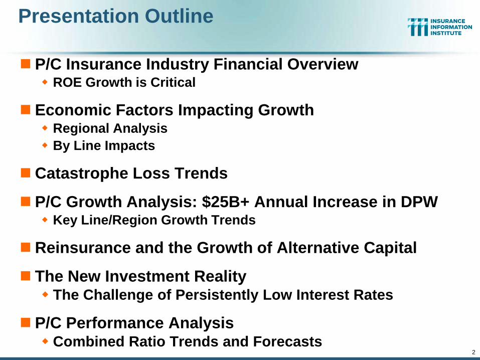
Presentation Outline
P/C Insurance Industry Financial Overview ROE Growth is Critical
Economic Factors Impacting Growth Regional Analysis
By Line Impacts
Catastrophe Loss Trends
P/C Growth Analysis: $25B+ Annual Increase in DPW Key Line/Region Growth Trends
Reinsurance and the Growth of Alternative Capital
The New Investment Reality The Challenge of Persistently Low Interest Rates
P/C Performance Analysis Combined Ratio Trends and Forecasts
3
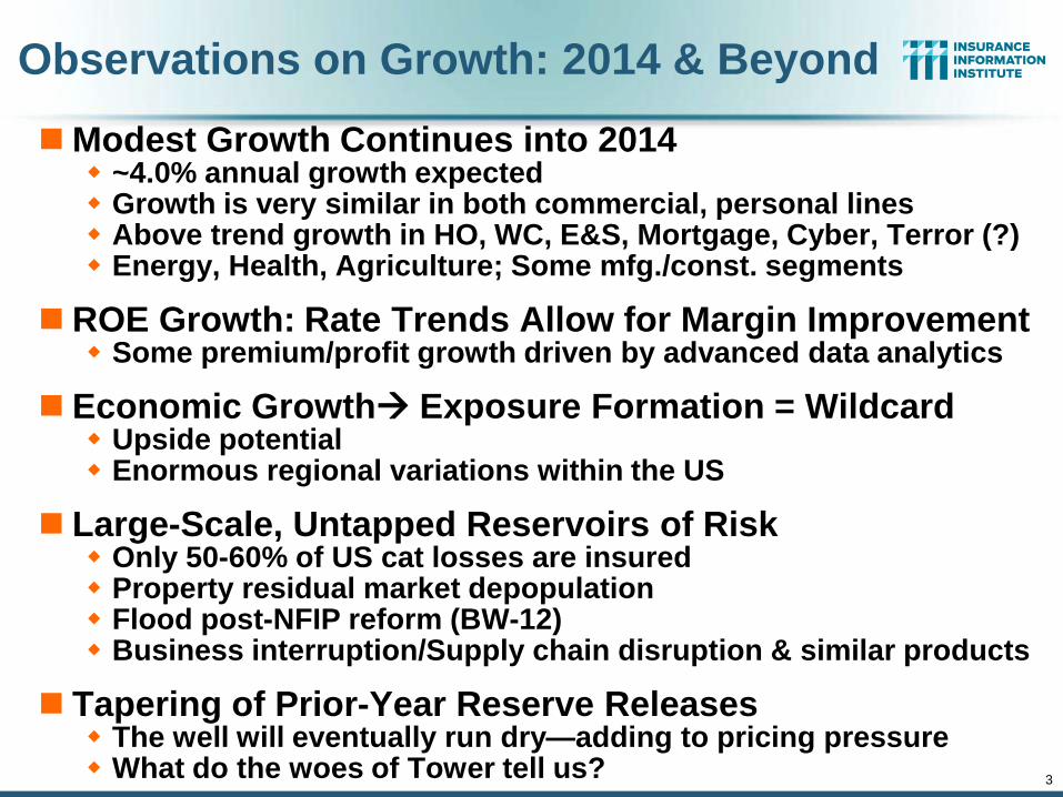
Observations on Growth: 2014 & Beyond
Modest Growth Continues into 2014 ~4.0% annual growth expected Growth is very similar in both commercial, personal lines Above trend growth in HO, WC, E&S, Mortgage, Cyber, Terror (?) Energy, Health, Agriculture; Some mfg./const. segments
ROE Growth: Rate Trends Allow for Margin Improvement Some premium/profit growth driven by advanced data analytics
Economic Growth Exposure Formation = Wildcard Upside potential Enormous regional variations within the US
Large-Scale, Untapped Reservoirs of Risk Only 50-60% of US cat losses are insured Property residual market depopulation Flood post-NFIP reform (BW-12) Business interruption/Supply chain disruption & similar products
Tapering of Prior-Year Reserve Releases The well will eventually run dry—adding to pricing pressure What do the woes of Tower tell us?
4
P/C Insurance Industry Financial Overview
So Far, So Good:
Profit Recovery in 2013 After High CAT Losses in 2011-12
4
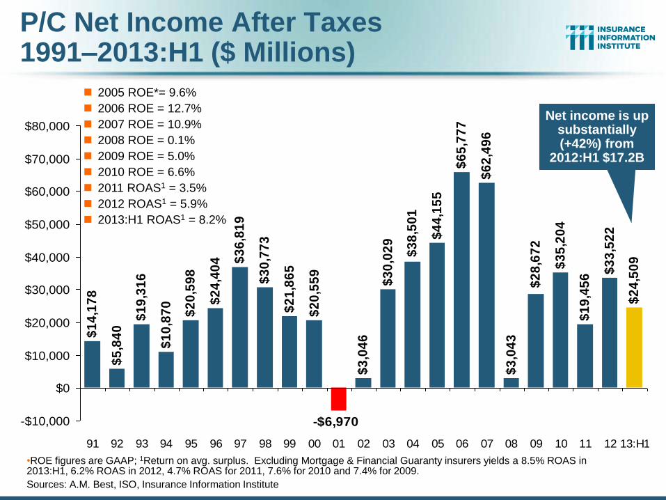
P/C Net Income After Taxes 1991–2013:H1 ($ Millions)
2005 ROE*= 9.6%
2006 ROE = 12.7%
2007 ROE = 10.9%
2008 ROE = 0.1%
2009 ROE = 5.0%
2010 ROE = 6.6%
2011 ROAS1 = 3.5%
2012 ROAS1 = 5.9%
2013:H1 ROAS1 = 8.2%
•ROE figures are GAAP; 1Return on avg. surplus. Excluding Mortgage & Financial Guaranty insurers yields a 8.5% ROAS in 2013:H1, 6.2% ROAS in 2012, 4.7% ROAS for 2011, 7.6% for 2010 and 7.4% for 2009.
Sources: A.M. Best, ISO, Insurance Information Institute
$1
4,1
78
$5
,84
0
$1
9,3
16
$1
0,8
70
$2
0,5
98
$2
4,4
04 $
36
,81
9
$3
0,7
73
$2
1,8
65
$3
,04
6
$3
0,0
29
$6
2,4
96
$3
,04
3
$3
5,2
04
$1
9,4
56
$3
3,5
22
$2
4,5
09
$2
8,6
72
-$6,970
$6
5,7
77
$4
4,1
55
$2
0,5
59
$3
8,5
01
-$10,000
$0
$10,000
$20,000
$30,000
$40,000
$50,000
$60,000
$70,000
$80,000
91 92 93 94 95 96 97 98 99 00 01 02 03 04 05 06 07 08 09 10 11 12 13:H1
Net income is up substantially (+42%) from
2012:H1 $17.2B
-5%
0%
5%
10%
15%
20%
25%
75
76
77
78
79
80
81
82
83
84
85
86
87
88
89
90
91
92
93
94
95
96
97
98
99
00
01
02
03
04
05
06
07
08
09
10
11
12
13
:H1
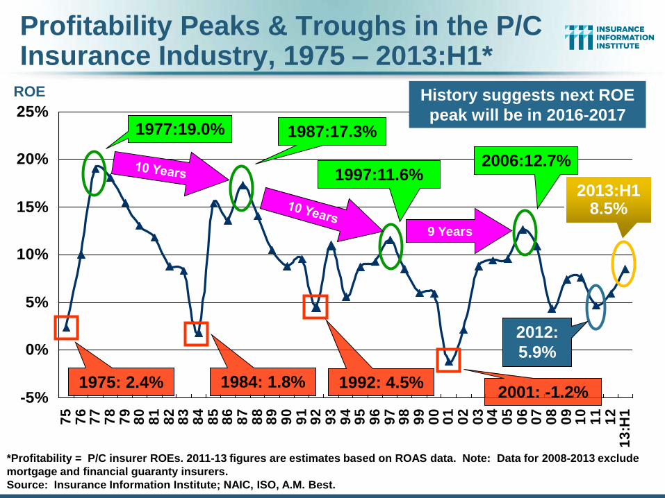
Profitability Peaks & Troughs in the P/C Insurance Industry, 1975 – 2013:H1*
*Profitability = P/C insurer ROEs. 2011-13 figures are estimates based on ROAS data. Note: Data for 2008-2013 exclude
mortgage and financial guaranty insurers.
Source: Insurance Information Institute; NAIC, ISO, A.M. Best.
1977:19.0% 1987:17.3%
1997:11.6%
2006:12.7%
1984: 1.8% 1992: 4.5% 2001: -1.2%
9 Years
2012:
5.9%
History suggests next ROE
peak will be in 2016-2017
ROE
1975: 2.4%
2013:H1 8.5%
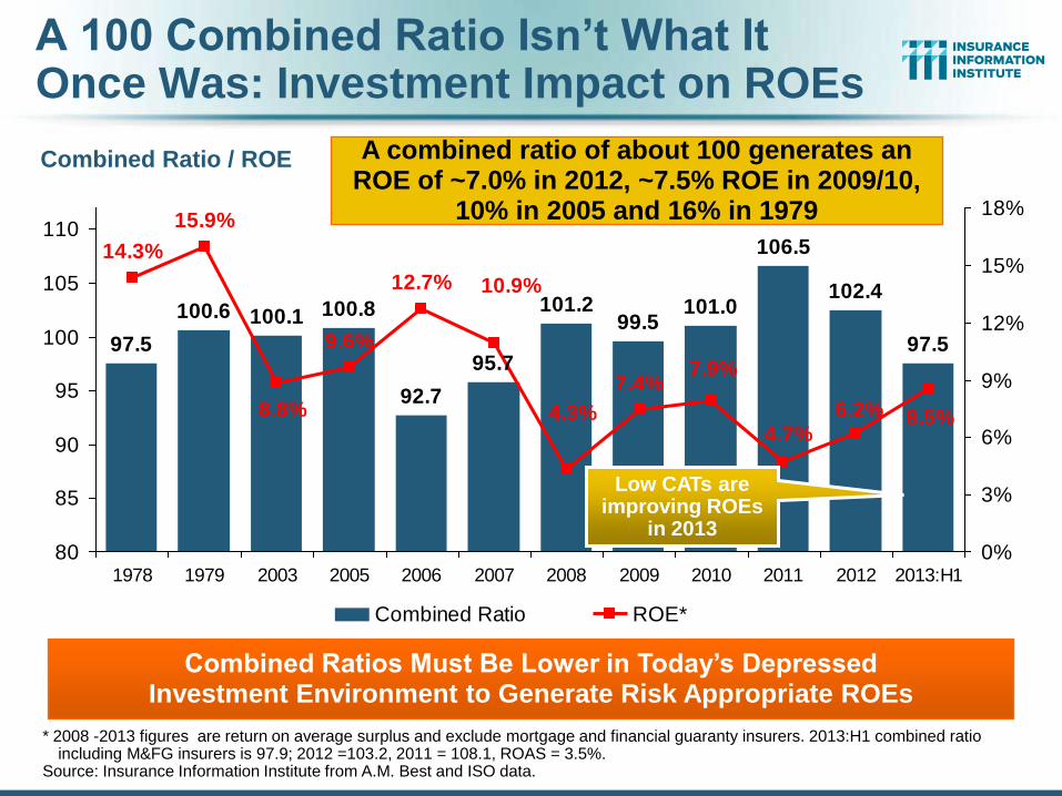
A 100 Combined Ratio Isn’t What It Once Was: Investment Impact on ROEs
Combined Ratio / ROE
* 2008 -2013 figures are return on average surplus and exclude mortgage and financial guaranty insurers. 2013:H1 combined ratio including M&FG insurers is 97.9; 2012 =103.2, 2011 = 108.1, ROAS = 3.5%.
Source: Insurance Information Institute from A.M. Best and ISO data.
97.5
100.6 100.1 100.8
92.7
101.299.5
101.0
97.5
102.4
106.5
95.7
8.5%6.2%4.7%
7.9%7.4%
4.3%
9.6%
15.9%
14.3%
12.7% 10.9%
8.8%
80
85
90
95
100
105
110
1978 1979 2003 2005 2006 2007 2008 2009 2010 2011 2012 2013:H1
0%
3%
6%
9%
12%
15%
18%
Combined Ratio ROE*
Combined Ratios Must Be Lower in Today’s Depressed Investment Environment to Generate Risk Appropriate ROEs
A combined ratio of about 100 generates an ROE of ~7.0% in 2012, ~7.5% ROE in 2009/10,
10% in 2005 and 16% in 1979
Low CATs are improving ROEs
in 2013
8
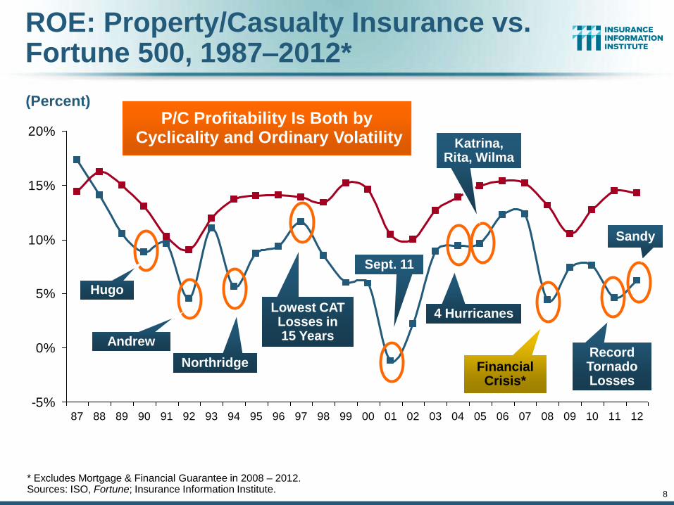
ROE: Property/Casualty Insurance vs. Fortune 500, 1987–2012*
* Excludes Mortgage & Financial Guarantee in 2008 – 2012. Sources: ISO, Fortune; Insurance Information Institute.
-5%
0%
5%
10%
15%
20%
87 88 89 90 91 92 93 94 95 96 97 98 99 00 01 02 03 04 05 06 07 08 09 10 11 12
P/C Profitability Is Both by Cyclicality and Ordinary Volatility
Hugo
Andrew
Northridge
Lowest CAT Losses in 15 Years
Sept. 11
Katrina, Rita, Wilma
4 Hurricanes
Financial Crisis*
(Percent)
Record Tornado Losses
Sandy
9
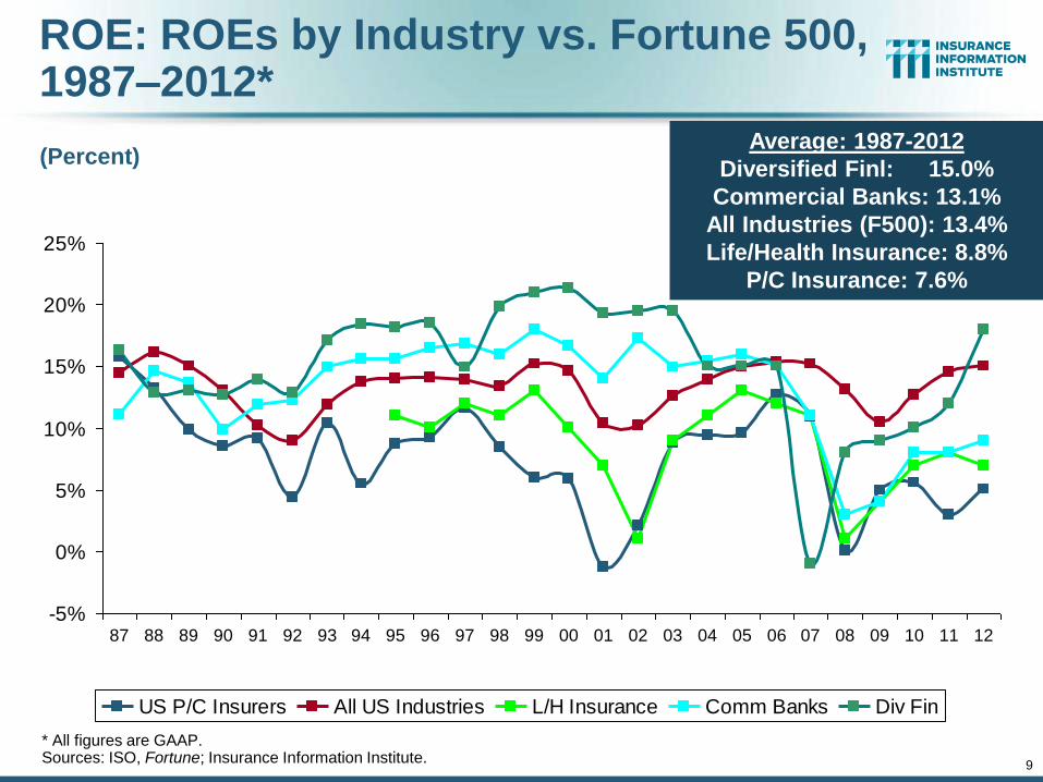
ROE: ROEs by Industry vs. Fortune 500, 1987–2012*
* All figures are GAAP. Sources: ISO, Fortune; Insurance Information Institute.
-5%
0%
5%
10%
15%
20%
25%
87 88 89 90 91 92 93 94 95 96 97 98 99 00 01 02 03 04 05 06 07 08 09 10 11 12
US P/C Insurers All US Industries L/H Insurance Comm Banks Div Fin
(Percent) Average: 1987-2012
Diversified Finl: 15.0%
Commercial Banks: 13.1%
All Industries (F500): 13.4%
Life/Health Insurance: 8.8%
P/C Insurance: 7.6%
10
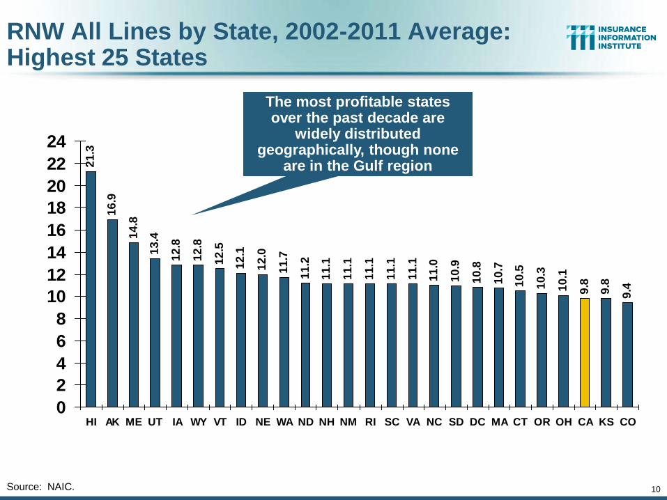
RNW All Lines by State, 2002-2011 Average: Highest 25 States
21
.3
16
.9
14
.8
13
.4
12
.8
12
.8
12
.5
12
.1
12
.0
11
.7
11
.2
11
.1
11
.1
11
.1
11
.1
11
.1
11
.0
10
.9
10
.8
10
.7
10
.5
10
.3
10
.1
9.8
9.8
9.4
0
2
4
6
8
10
12
14
16
18
20
22
24
HI AK ME UT IA WY VT ID NE WA ND NH NM RI SC VA NC SD DC MA CT OR OH CA KS CO
Source: NAIC.
The most profitable states over the past decade are
widely distributed geographically, though none
are in the Gulf region
11
9.0
8.9
8.9
8.5
8.2
8.0
7.8
7.7
7.5
7.1
7.1
7.1
6.9
6.9
6.9
6.0
6.0
5.9
5.4
5.2
4.8
3.9
3.4
1.5
-8.3
-10
.8
-14
-12
-10-8
-6
-4
-2
0
24
6
8
10
WI IN WV MD MN MT FL US NJ AR IL MO AZ PA TX KY NV NY GA MI TN OK DE AL MS LA
Un
em
plo
ym
en
t R
ate
(%
)
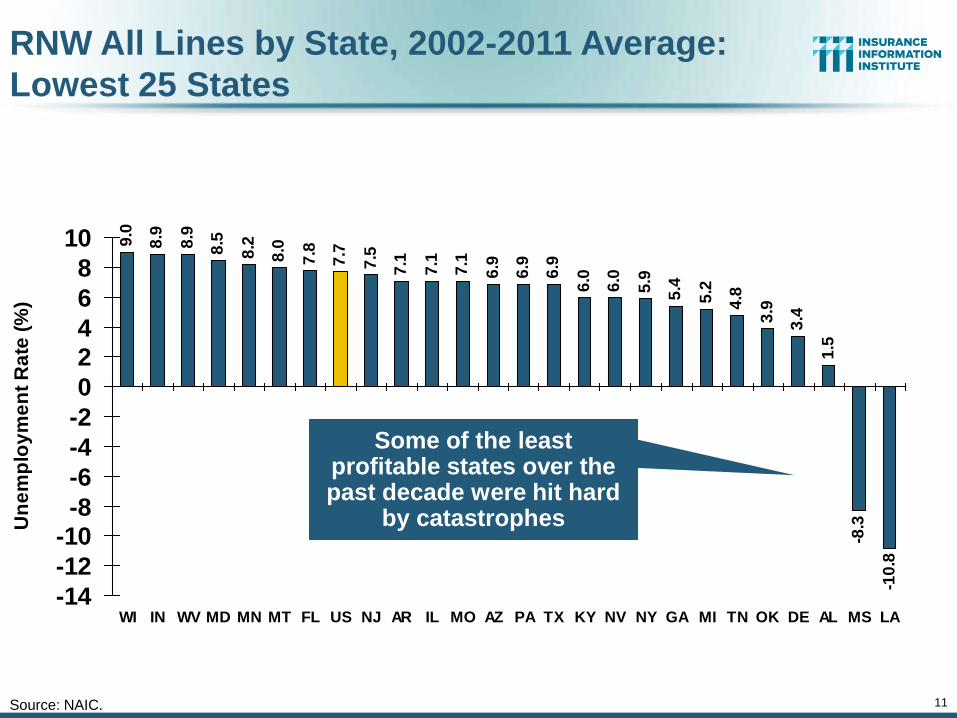
RNW All Lines by State, 2002-2011 Average:
Lowest 25 States
Source: NAIC.
Some of the least profitable states over the past decade were hit hard
by catastrophes

The Strength of the Economy Will Influence P/C Insurer
Growth Opportunities
12
Growth Will Expand Insurer Exposure
Base Across Most Lines
12
13
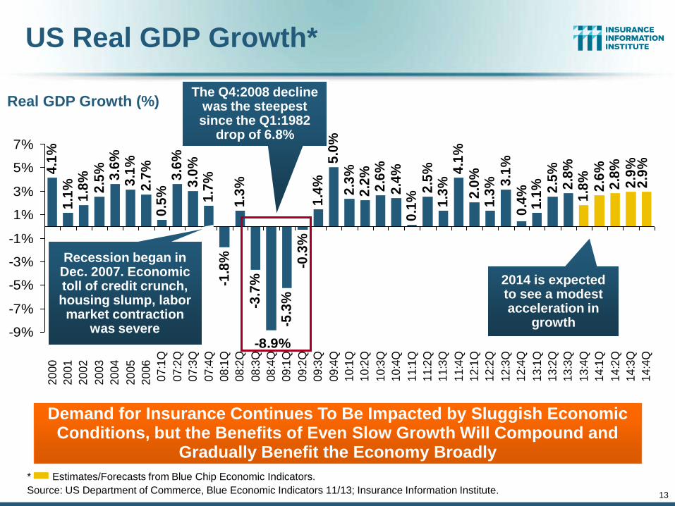
US Real GDP Growth*
* Estimates/Forecasts from Blue Chip Economic Indicators.
Source: US Department of Commerce, Blue Economic Indicators 11/13; Insurance Information Institute.
2.7
%0
.5%
3.6
%3
.0%
1.7
%-1
.8%
1.3
%-3
.7%
-5.3
%-0
.3%
1.4
%5
.0%
2.3
%2
.2%
2.6
%2
.4%
0.1
%2
.5%
1.3
%4
.1%
2.0
%1
.3% 3
.1%
1.1
% 2.5
%2
.8%
1.8
%2
.6%
2.8
%2
.9%
2.9
%
0.4
%
-8.9%
4.1
%1
.1%
1.8
%2
.5% 3.6
%3
.1%
-9%
-7%
-5%
-3%
-1%
1%
3%
5%
7%
2
00
0
2
00
1
2
00
2
2
00
3
2
00
4
2
00
5
2
00
6
07
:1Q
07
:2Q
07
:3Q
07
:4Q
08
:1Q
08
:2Q
08
:3Q
08
:4Q
09
:1Q
09
:2Q
09
:3Q
09
:4Q
10
:1Q
10
:2Q
10
:3Q
10
:4Q
11
:1Q
11
:2Q
11
:3Q
11
:4Q
12
:1Q
12
:2Q
12
:3Q
12
:4Q
13
:1Q
13
:2Q
13
:3Q
13
:4Q
14
:1Q
14
:2Q
14
:3Q
14
:4Q
Demand for Insurance Continues To Be Impacted by Sluggish Economic Conditions, but the Benefits of Even Slow Growth Will Compound and
Gradually Benefit the Economy Broadly
Real GDP Growth (%)
Recession began in Dec. 2007. Economic toll of credit crunch, housing slump, labor market contraction
was severe
The Q4:2008 decline was the steepest since the Q1:1982
drop of 6.8%
2014 is expected to see a modest acceleration in
growth
14
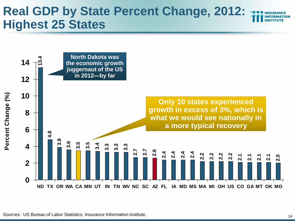
Real GDP by State Percent Change, 2012: Highest 25 States
13
.4
4.8
3.9
3.6
3.5
3.5
3.4
3.3
3.3
3.3
2.7
2.7
2.6
2.4
2.4
2.4
2.4
2.2
2.2
2.2
2.2
2.1
2.1
2.1
2.1
2.0
0
2
4
6
8
10
12
14
ND TX OR WA CA MN UT IN TN WV NC SC AZ FL IA MD MS MA MI OH US CO GA MT OK MO
Pe
rce
nt
Ch
an
ge
(%
)
Sources: US Bureau of Labor Statistics; Insurance Information Institute.
North Dakota was the economic growth juggernaut of the US
in 2012—by far
Only 10 states experienced growth in excess of 3%, which is what we would see nationally in
a more typical recovery
15
1.9
1.7
1.6
1.5
1.5
1.5
1.5
1.4
1.4
1.4
1.3
1.3
1.3
1.2
1.2
1.1
1.1
0.7
0.5
0.5
0.4
0.2
0.2
0.2
0.2
-0.1
-0.4
-0.2
0.00.2
0.4
0.6
0.8
1.0
1.2
1.41.6
1.8
2.0
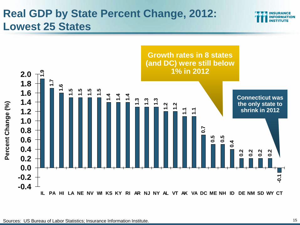
IL PA HI LA NE NV WI KS KY RI AR NJ NY AL VT AK VA DC ME NH ID DE NM SD WY CT
Pe
rce
nt
Ch
an
ge
(%
)
Real GDP by State Percent Change, 2012:
Lowest 25 States
Sources: US Bureau of Labor Statistics; Insurance Information Institute.
Connecticut was the only state to shrink in 2012
Growth rates in 8 states (and DC) were still below
1% in 2012
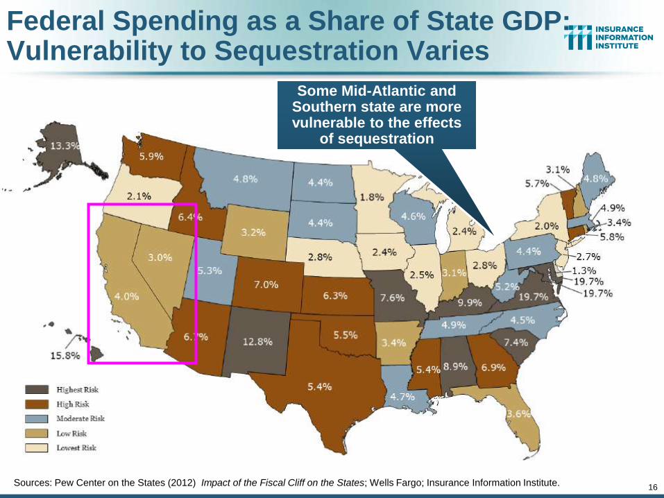
Federal Spending as a Share of State GDP: Vulnerability to Sequestration Varies
Sources: Pew Center on the States (2012) Impact of the Fiscal Cliff on the States; Wells Fargo; Insurance Information Institute. 16
Some Mid-Atlantic and Southern state are more vulnerable to the effects
of sequestration
17
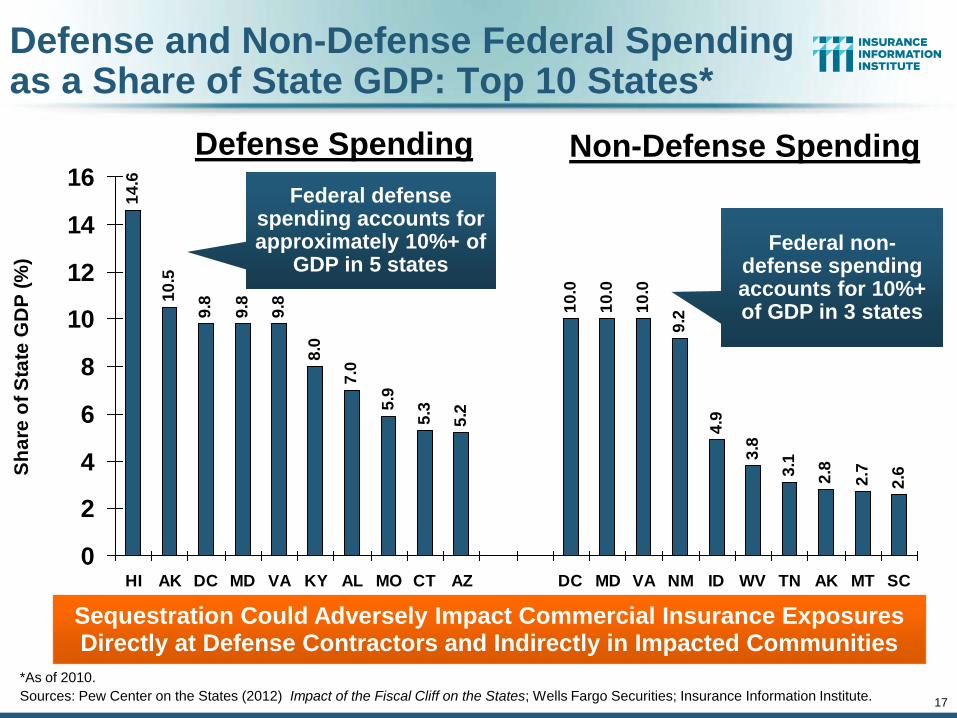
Defense and Non-Defense Federal Spending as a Share of State GDP: Top 10 States*
14
.6
10
.5
9.8
9.8
9.8
8.0
7.0
5.9
5.3
5.2
10
.0
10
.0
10
.0
9.2
4.9
3.8
3.1
2.8
2.7
2.6
0
2
4
6
8
10
12
14
16
HI AK DC MD VA KY AL MO CT AZ DC MD VA NM ID WV TN AK MT SC
Sh
are
of
Sta
te G
DP
(%
)
Federal defense spending accounts for approximately 10%+ of
GDP in 5 states
*As of 2010.
Sources: Pew Center on the States (2012) Impact of the Fiscal Cliff on the States; Wells Fargo Securities; Insurance Information Institute.
Defense Spending Non-Defense Spending
Federal non-defense spending accounts for 10%+ of GDP in 3 states
Sequestration Could Adversely Impact Commercial Insurance Exposures Directly at Defense Contractors and Indirectly in Impacted Communities
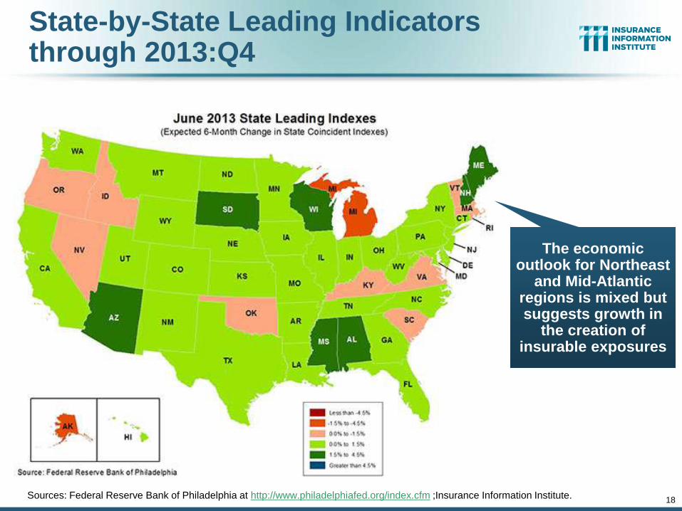
State-by-State Leading Indicators through 2013:Q4
Sources: Federal Reserve Bank of Philadelphia at http://www.philadelphiafed.org/index.cfm ;Insurance Information Institute. 18
The economic outlook for Northeast
and Mid-Atlantic regions is mixed but suggests growth in
the creation of insurable exposures
74
.47
3.6
73
.67
2.2
73
.6 76
67
.86
8.9
68
.26
7.7 7
1.6 74
.57
4.2 7
7.5
67
.5 69
.8 74
.37
1.5
63
.75
5.7 5
9.5
60
.9 64
.16
9.9
75
.07
5.3
76
.27
6.4 79
.37
3.2
72
.3 74
.38
2.6
82
.77
4.5
73
.8 77
.67
8.6
84
.58
4.1
85
.18
2.1
77
.57
3.27
6.4
40
45
50
55
60
65
70
75
80
85
90
Ja
n-1
0
Fe
b-1
0
Ma
r-1
0A
pr-
10
Ma
y-1
0
Ju
n-1
0Ju
l-1
0
Au
g-1
0
Se
p-1
0
Oct-
10
No
v-1
0
De
c-1
0
Ja
n-1
1F
eb
-11
Ma
r-1
1
Ap
r-1
1M
ay-1
1
Ju
n-1
1
Ju
l-1
1A
ug
-11
Se
p-1
1
Oct-
11
No
v-1
1D
ec-1
1
Ja
n-1
2
Fe
b-1
2M
ar-
12
Ap
r-1
2
Ma
y-1
2Ju
n-1
2
Ju
l-1
2
Au
g-1
2O
ct-
12
No
v-1
2
De
c-1
2Ja
n-1
3
Fe
b-1
3
Ma
r-1
3
Ap
r-1
3M
ay-1
3
Ju
n-1
3
Ju
l-1
3A
ug
-13
Se
p-1
3
Oct-
13
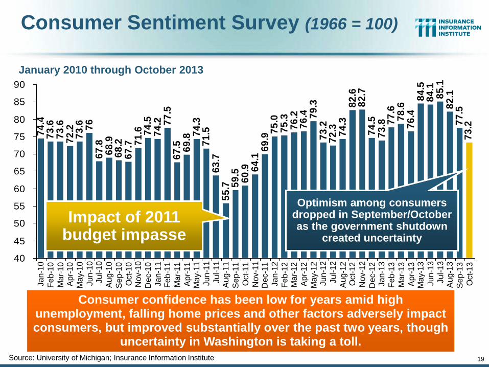
Consumer Sentiment Survey (1966 = 100)
January 2010 through October 2013
Consumer confidence has been low for years amid high unemployment, falling home prices and other factors adversely impact consumers, but improved substantially over the past two years, though
uncertainty in Washington is taking a toll.
Source: University of Michigan; Insurance Information Institute
Optimism among consumers dropped in September/October as the government shutdown
created uncertainty
19
Impact of 2011 budget impasse
20
16
.9
16
.5
16
.1
13
.2
10
.4
11
.6
12
.7
14
.4
15
.5 16
.1
16
.0
16
.2
16
.2
16
.2
16
.216
.9
16
.617
.1
17
.5
17
.8
17
.4
9
10
11
12
13
14
15
16
17
18
19
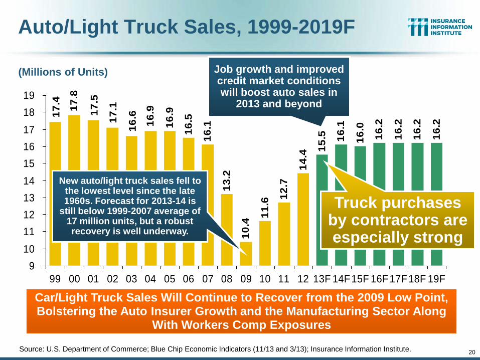
99 00 01 02 03 04 05 06 07 08 09 10 11 12 13F 14F15F 16F17F18F 19F
(Millions of Units)
Auto/Light Truck Sales, 1999-2019F
Source: U.S. Department of Commerce; Blue Chip Economic Indicators (11/13 and 3/13); Insurance Information Institute.
Car/Light Truck Sales Will Continue to Recover from the 2009 Low Point, Bolstering the Auto Insurer Growth and the Manufacturing Sector Along
With Workers Comp Exposures
New auto/light truck sales fell to the lowest level since the late 1960s. Forecast for 2013-14 is
still below 1999-2007 average of 17 million units, but a robust recovery is well underway.
Job growth and improved credit market conditions will boost auto sales in
2013 and beyond
Truck purchases by contractors are especially strong
21
16%
18%
20%
22%
24%
26%
28%
30%
01 02 03 04 05 06 07 08 09 10 11 12E 13F 14F
$125
$135
$145
$155
$165
$175
$185
$195
% of registered cars under 3 years old Auto Ins Direct Pms$ Billions
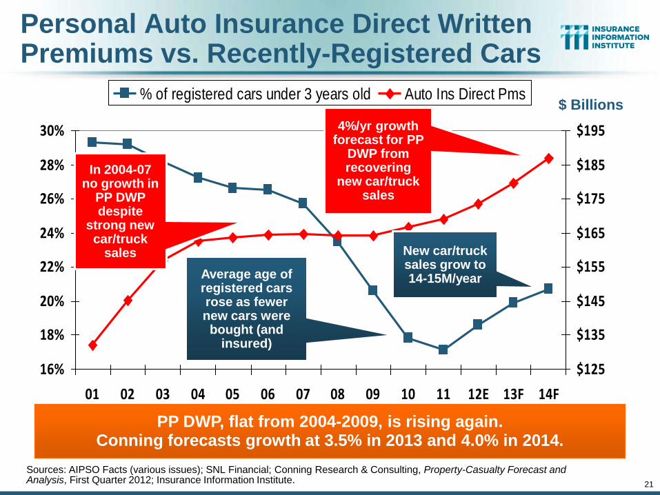
Personal Auto Insurance Direct Written Premiums vs. Recently-Registered Cars
Sources: AIPSO Facts (various issues); SNL Financial; Conning Research & Consulting, Property-Casualty Forecast and Analysis, First Quarter 2012; Insurance Information Institute.
PP DWP, flat from 2004-2009, is rising again. Conning forecasts growth at 3.5% in 2013 and 4.0% in 2014.
Average age of registered cars rose as fewer new cars were bought (and
insured)
In 2004-07 no growth in
PP DWP despite
strong new car/truck
sales New car/truck sales grow to 14-15M/year
4%/yr growth forecast for PP
DWP from recovering
new car/truck sales
22
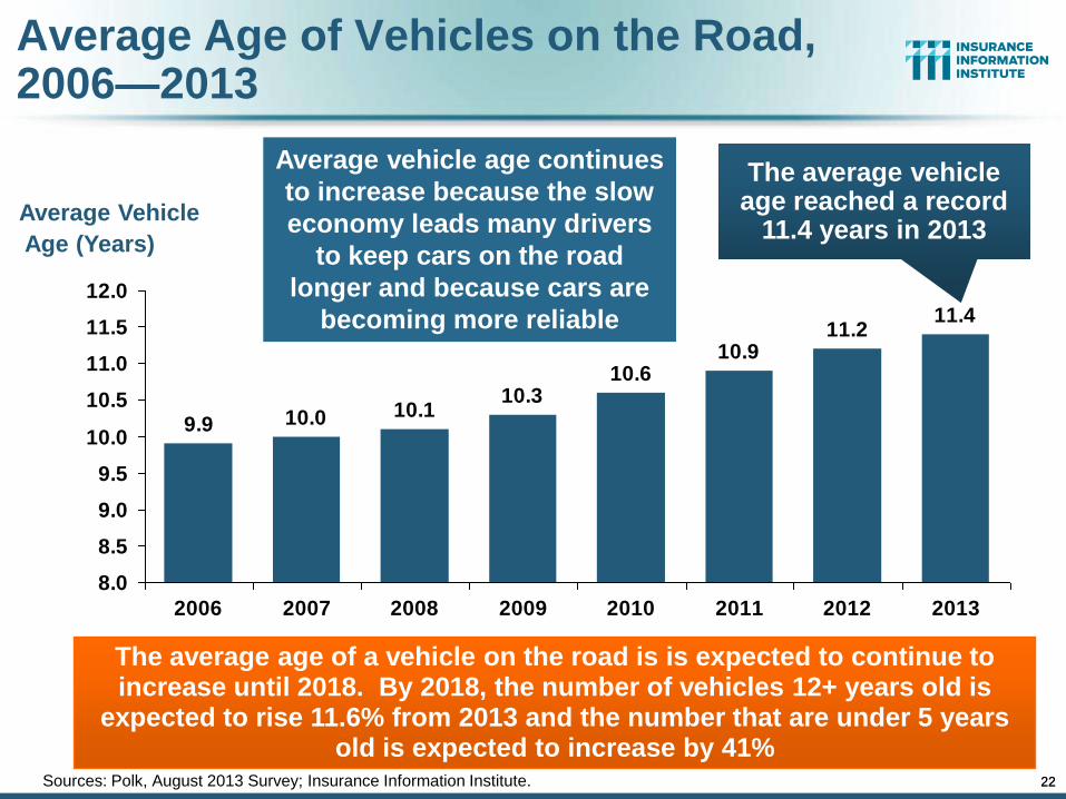
Average Age of Vehicles on the Road, 2006—2013
11.211.4
10.910.6
10.310.110.09.9
8.0
8.5
9.0
9.5
10.0
10.5
11.0
11.5
12.0
2006 2007 2008 2009 2010 2011 2012 2013
Sources: Polk, August 2013 Survey; Insurance Information Institute.
Average Vehicle
Age (Years)
The average age of a vehicle on the road is is expected to continue to increase until 2018. By 2018, the number of vehicles 12+ years old is
expected to rise 11.6% from 2013 and the number that are under 5 years old is expected to increase by 41%
The average vehicle age reached a record
11.4 years in 2013
22
Average vehicle age continues
to increase because the slow
economy leads many drivers
to keep cars on the road
longer and because cars are
becoming more reliable
23
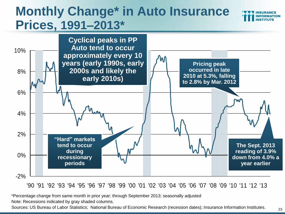
Monthly Change* in Auto Insurance Prices, 1991–2013*
*Percentage change from same month in prior year; through September 2013; seasonally adjusted
Note: Recessions indicated by gray shaded columns.
Sources: US Bureau of Labor Statistics; National Bureau of Economic Research (recession dates); Insurance Information Institutes.
-2%
0%
2%
4%
6%
8%
10%
'90 '91 '92 '93 '94 '95 '96 '97 '98 '99 '00 '01 '02 '03 '04 '05 '06 '07 '08 '09 '10 '11 '12 '13
Cyclical peaks in PP Auto tend to occur
approximately every 10 years (early 1990s, early
2000s and likely the early 2010s)
“Hard” markets tend to occur
during recessionary
periods
Pricing peak occurred in late
2010 at 5.3%, falling to 2.8% by Mar. 2012
The Sept. 2013 reading of 3.9%
down from 4.0% a year earlier
24
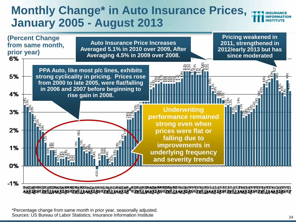
Monthly Change* in Auto Insurance Prices, January 2005 - August 2013
(Percent Change from same month, prior year)
*Percentage change from same month in prior year, seasonally adjusted. Sources: US Bureau of Labor Statistics; Insurance Information Institute
Auto Insurance Price Increases Averaged 5.1% in 2010 over 2009, After
Averaging 4.5% in 2009 over 2008.
Underwriting performance remained
strong even when prices were flat or
falling due to improvements in
underlying frequency and severity trends
PPA Auto, like most p/c lines, exhibits strong cyclicality in pricing. Prices rose from 2000 to late 2005, were flat/falling in 2006 and 2007 before beginning to
rise gain in 2008.
Pricing weakened in 2011, strengthened in
2012/early 2013 but has since moderated
25
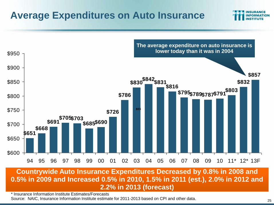
Average Expenditures on Auto Insurance
$651$668
$691$705
$726
$786
$830$842
$831$816
$795$789$787$791$803
$832
$857
$690$685$703
$600
$650
$700
$750
$800
$850
$900
$950
94 95 96 97 98 99 00 01 02 03 04 05 06 07 08 09 10 11* 12* 13F
803
Countrywide Auto Insurance Expenditures Decreased by 0.8% in 2008 and 0.5% in 2009 and Increased 0.5% in 2010, 1.5% in 2011 (est.), 2.0% in 2012 and
2.2% in 2013 (forecast) * Insurance Information Institute Estimates/Forecasts Source: NAIC, Insurance Information Institute estimate for 2011-2013 based on CPI and other data.
The average expenditure on auto insurance is lower today than it was in 2004
26
(Millions of Units)
New Private Housing Starts, 1990-2019F
1.4
8
1.4
7 1.6
2
1.6
4
1.5
7
1.6
0 1.7
1 1.8
5 1.9
6 2.0
7
1.8
0
1.3
6
0.9
1
0.5
5
0.5
9
0.6
1 0.7
8 0.9
3 1.1
1
1.3
5
1.4
4
1.5
0
1.5
1
1.5
0
1.3
51.4
6
1.2
9
1.2
0
1.0
11.1
9
0.3
0.5
0.7
0.9
1.1
1.3
1.5
1.7
1.9
2.1
90 91 92 93 94 95 96 97 98 99 00 01 02 03 04 05 06 07 08 09 10 11 12 13F14F15F16F17F18F19F
Source: U.S. Department of Commerce; Blue Chip Economic Indicators (11/13 and 3/13); Insurance Information Institute.
Insurers Are Starting to See Meaningful Exposure Growth for the First Time Since 2005 Associated with Home Construction: Construction Risk Exposure,
Surety, Commercial Auto; Potent Driver of Workers Comp Exposure
New home starts plunged 72% from 2005-2009; A net
annual decline of 1.49 million units, lowest since records began
in 1959
Job growth, low inventories of existing homes, low mortgage
rates and demographics are stimulating new home construction
for the first time in years
27
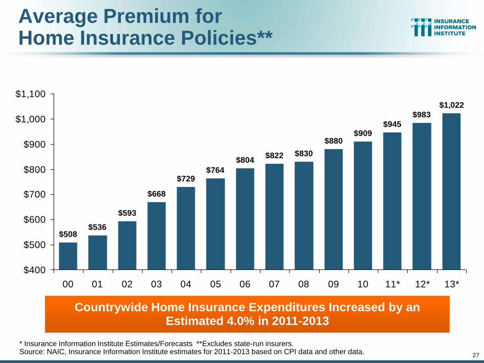
Average Premium for Home Insurance Policies**
* Insurance Information Institute Estimates/Forecasts **Excludes state-run insurers. Source: NAIC, Insurance Information Institute estimates for 2011-2013 based on CPI data and other data.
$508$536
$593
$668
$822 $830
$880$909
$945
$983
$1,022
$804
$764$729
$400
$500
$600
$700
$800
$900
$1,000
$1,100
00 01 02 03 04 05 06 07 08 09 10 11* 12* 13*
Countrywide Home Insurance Expenditures Increased by an Estimated 4.0% in 2011-2013
28
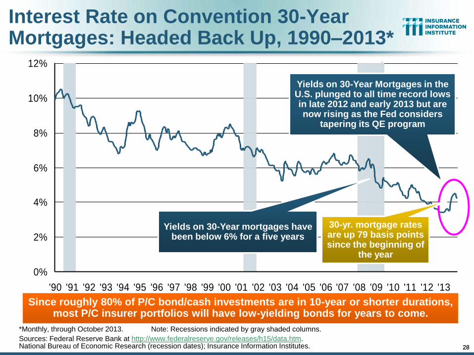
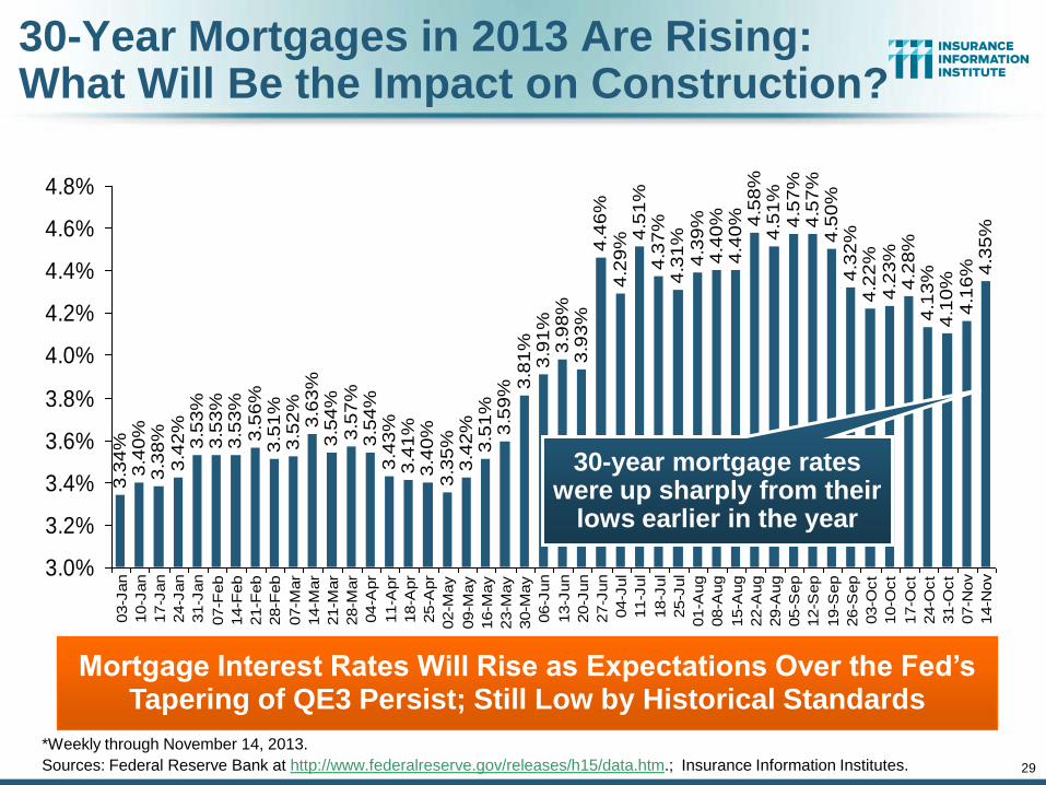
Interest Rate on Convention 30-Year Mortgages: Headed Back Up, 1990–2013*
*Monthly, through October 2013. Note: Recessions indicated by gray shaded columns.
Sources: Federal Reserve Bank at http://www.federalreserve.gov/releases/h15/data.htm. National Bureau of Economic Research (recession dates); Insurance Information Institutes.
0%
2%
4%
6%
8%
10%
12%
'90 '91 '92 '93 '94 '95 '96 '97 '98 '99 '00 '01 '02 '03 '04 '05 '06 '07 '08 '09 '10 '11 '12 '13
Yields on 30-Year mortgages have been below 6% for a five years
Since roughly 80% of P/C bond/cash investments are in 10-year or shorter durations, most P/C insurer portfolios will have low-yielding bonds for years to come.
Yields on 30-Year Mortgages in the U.S. plunged to all time record lows in late 2012 and early 2013 but are now rising as the Fed considers
tapering its QE program
28
30-yr. mortgage rates are up 79 basis points since the beginning of
the year
29
Mortgage Interest Rates Will Rise as Expectations Over the Fed’s Tapering of QE3 Persist; Still Low by Historical Standards
3.3
4%
3.4
0%
3.3
8%
3.4
2%
3.5
3%
3.5
3%
3.5
3%
3.5
6%
3.5
1%
3.5
2%
3.6
3%
3.5
4%
3.5
7%
3.5
4%
3.4
3%
3.4
1%
3.4
0%
3.3
5%
3.4
2%
3.5
1%
3.5
9% 3
.81
%3
.91
%3
.98
%3
.93
%4
.46
%4
.29
%4
.51
%4
.37
%4
.31
%4
.39
%4
.40
%4
.40
% 4.5
8%
4.5
1%
4.5
7%
4.5
7%
4.5
0%
4.3
2%
4.2
2%
4.2
3%
4.2
8%
4.1
3%
4.1
0%
4.1
6% 4
.35
%
3.0%
3.2%
3.4%
3.6%
3.8%
4.0%
4.2%
4.4%
4.6%
4.8%
03-J
an
10-J
an
17-J
an
24-J
an
31-J
an
07-F
eb
14-F
eb
21-F
eb
28-F
eb
07-M
ar
14-M
ar
21-M
ar
28-M
ar
04-A
pr
11-A
pr
18-A
pr
25-A
pr
02-M
ay
09-M
ay
16-M
ay
23-M
ay
30-M
ay
06-J
un
13-J
un
20-J
un
27-J
un
04-J
ul
11-J
ul
18-J
ul
25-J
ul
01-A
ug
08-A
ug
15-A
ug
22-A
ug
29-A
ug
05-S
ep
12-S
ep
19-S
ep
26-S
ep
03-O
ct
10-O
ct
17-O
ct
24-O
ct
31-O
ct
07-N
ov
14-N
ov
30-year mortgage rates were up sharply from their
lows earlier in the year
30-Year Mortgages in 2013 Are Rising: What Will Be the Impact on Construction?
*Weekly through November 14, 2013.
Sources: Federal Reserve Bank at http://www.federalreserve.gov/releases/h15/data.htm.; Insurance Information Institutes.
30
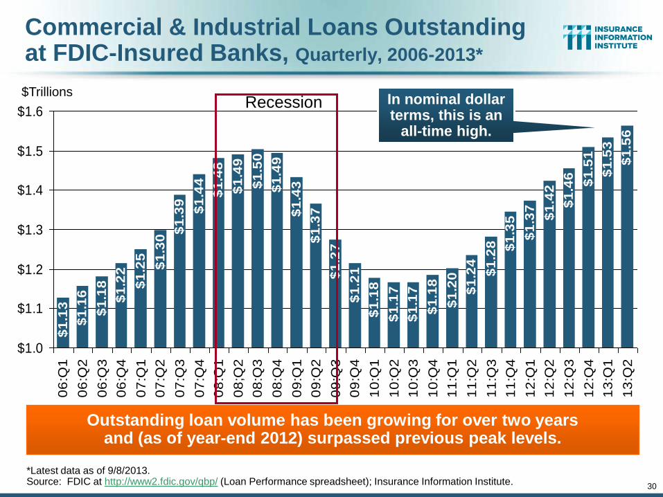
Commercial & Industrial Loans Outstanding at FDIC-Insured Banks, Quarterly, 2006-2013*
$1
.16
$1
.18
$1
.22
$1
.44
$1
.48
$1
.49
$1
.50
$1
.49
$1
.43
$1
.37
$1
.27
$1
.21
$1
.18
$1
.17
$1
.17
$1
.18
$1
.20
$1
.24
$1
.28 $1
.35
$1
.37
$1
.42
$1
.46
$1
.51
$1
.53
$1
.56
$1
.13
$1
.25
$1
.30
$1
.39
$1.0
$1.1
$1.2
$1.3
$1.4
$1.5
$1.6
06
:Q1
06
:Q2
06
:Q3
06
:Q4
07
:Q1
07
:Q2
07
:Q3
07
:Q4
08
:Q1
08
;Q2
08
:Q3
08
:Q4
09
:Q1
09
:Q2
09
:Q3
09
:Q4
10
:Q1
10
:Q2
10
:Q3
10
:Q4
11
:Q1
11
:Q2
11
:Q3
11
:Q4
12
:Q1
12
:Q2
12
:Q3
12
:Q4
13
:Q1
13
:Q2
Outstanding loan volume has been growing for over two years and (as of year-end 2012) surpassed previous peak levels.
*Latest data as of 9/8/2013. Source: FDIC at http://www2.fdic.gov/qbp/ (Loan Performance spreadsheet); Insurance Information Institute.
$Trillions In nominal dollar terms, this is an
all-time high.
Recession
31
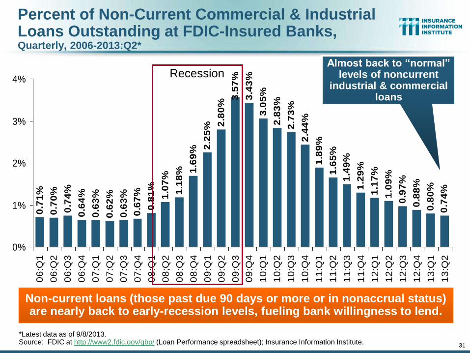
Percent of Non-Current Commercial & Industrial Loans Outstanding at FDIC-Insured Banks, Quarterly, 2006-2013:Q2*
0.7
0%
0.7
4%
0.6
4%
0.6
7%
0.8
1%
1.0
7%
1.1
8% 1
.69
% 2.2
5% 2
.80
%
3.5
7%
3.4
3%
3.0
5%
2.8
3%
2.7
3%
2.4
4%
1.8
9%
1.6
5%
1.4
9%
1.2
9%
1.1
7%
1.0
9%
0.9
7%
0.8
8%
0.8
0%
0.7
4%
0.7
1%
0.6
3%
0.6
2%
0.6
3%
0%
1%
2%
3%
4%
06
:Q1
06
:Q2
06
:Q3
06
:Q4
07
:Q1
07
:Q2
07
:Q3
07
:Q4
08
:Q1
08
;Q2
08
:Q3
08
:Q4
09
:Q1
09
:Q2
09
:Q3
09
:Q4
10
:Q1
10
:Q2
10
:Q3
10
:Q4
11
:Q1
11
:Q2
11
:Q3
11
:Q4
12
:Q1
12
:Q2
12
:Q3
12
:Q4
13
:Q1
13
:Q2
Non-current loans (those past due 90 days or more or in nonaccrual status) are nearly back to early-recession levels, fueling bank willingness to lend.
*Latest data as of 9/8/2013. Source: FDIC at http://www2.fdic.gov/qbp/ (Loan Performance spreadsheet); Insurance Information Institute.
Almost back to “normal” levels of noncurrent
industrial & commercial loans
Recession

CONSTRUCTION INDUSTRY OVERVIEW & OUTLOOK
32
The Construction Sector Is Critical to the Economy and the P/C Insurance Industry
32
33
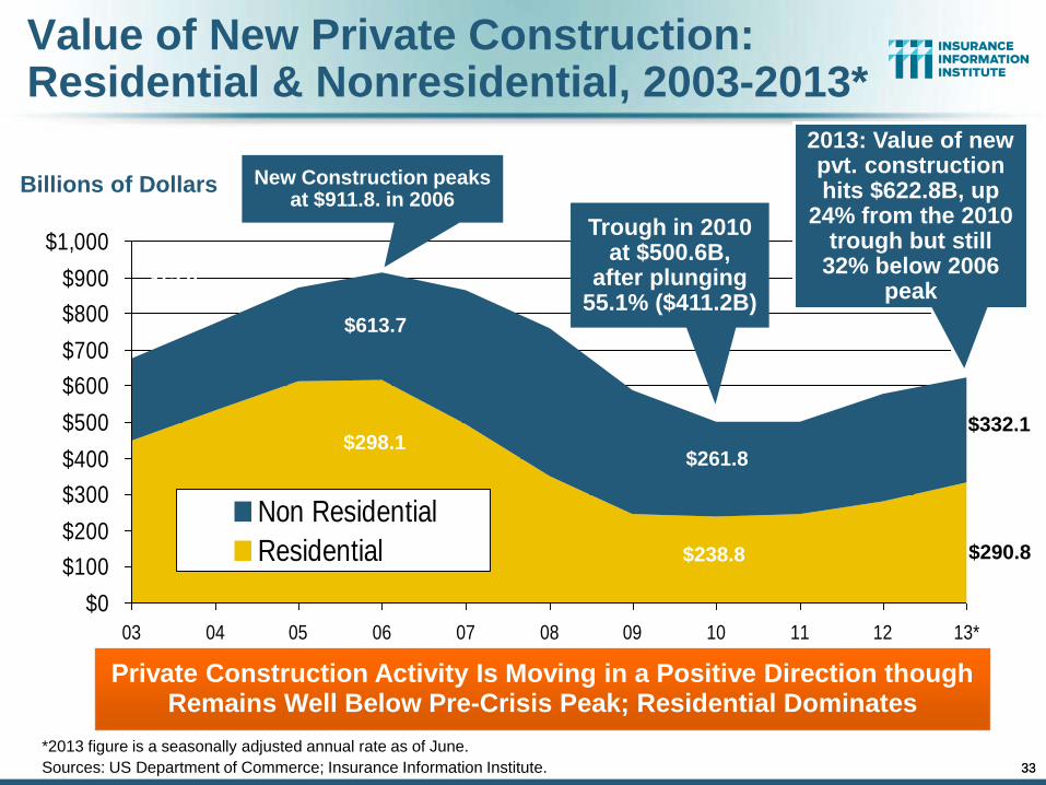
Value of New Private Construction: Residential & Nonresidential, 2003-2013*
Billions of Dollars
$0
$100
$200
$300
$400
$500
$600
$700
$800
$900
$1,000
03 04 05 06 07 08 09 10 11 12 13*
Non Residential
Residential
Private Construction Activity Is Moving in a Positive Direction though Remains Well Below Pre-Crisis Peak; Residential Dominates
$298.1
$15.0
$613.7
New Construction peaks at $911.8. in 2006
Trough in 2010 at $500.6B,
after plunging 55.1% ($411.2B)
2013: Value of new pvt. construction hits $622.8B, up
24% from the 2010 trough but still
32% below 2006 peak
33
$261.8
$238.8
$332.1
$290.8
*2013 figure is a seasonally adjusted annual rate as of June.
Sources: US Department of Commerce; Insurance Information Institute.
34
$314.9$304.0
$286.4 $279.0$261.1
$216.1 $220.2$234.2
$255.4
$289.1$308.7
$0
$50
$100
$150
$200
$250
$300
$350
2003 2004 2005 2006 2007 2008 2009 2010 2011 2012 2013*
($ Billions)
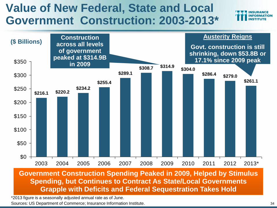
Government Construction Spending Peaked in 2009, Helped by Stimulus Spending, but Continues to Contract As State/Local Governments
Grapple with Deficits and Federal Sequestration Takes Hold
Value of New Federal, State and Local Government Construction: 2003-2013*
*2013 figure is a seasonally adjusted annual rate as of June.
Sources: US Department of Commerce; Insurance Information Institute.
Construction across all levels of government
peaked at $314.9B in 2009
Austerity Reigns
Govt. construction is still shrinking, down $53.8B or
17.1% since 2009 peak
35
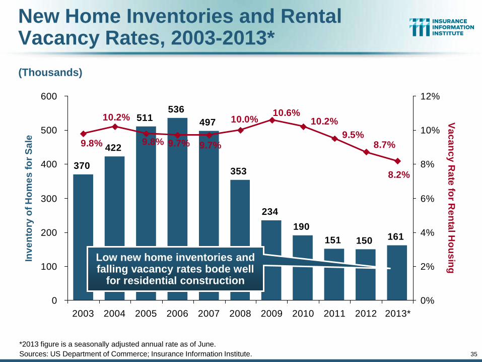
New Home Inventories and Rental Vacancy Rates, 2003-2013*
370
422
511536
497
353
234
190
151 150 161
8.2%
8.7%9.5%
10.2%10.6%
10.0%
9.7%9.7%9.8%
10.2%
9.8%
0
100
200
300
400
500
600
2003 2004 2005 2006 2007 2008 2009 2010 2011 2012 2013*
Inv
en
tory
of
Ho
me
s f
or
Sa
le
0%
2%
4%
6%
8%
10%
12%
Va
ca
nc
y R
ate
for R
en
tal H
ou
sin
g
(Thousands)
Low new home inventories and falling vacancy rates bode well
for residential construction
*2013 figure is a seasonally adjusted annual rate as of June.
Sources: US Department of Commerce; Insurance Information Institute.
36
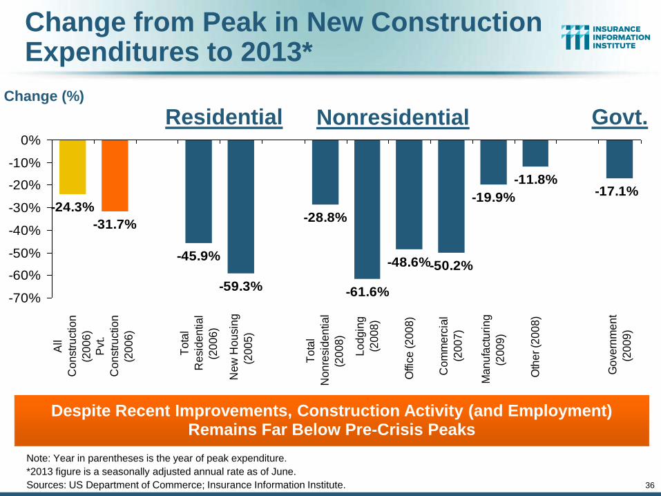
Change from Peak in New Construction Expenditures to 2013*
-28.8%
-61.6%
-48.6%-50.2%
-19.9%
-11.8%-17.1%
-24.3%
-31.7%
-45.9%
-59.3%-70%
-60%
-50%
-40%
-30%
-20%
-10%
0%
All
Co
nstr
uctio
n
(20
06
)
Pvt.
Co
nstr
uctio
n
(20
06
)
To
tal
Re
sid
en
tia
l
(20
06
)
Ne
w H
ou
sin
g
(20
05
)
To
tal
No
nre
sid
en
tia
l
(20
08
)
Lo
dg
ing
(20
08
)
Offic
e (
20
08
)
Co
mm
erc
ial
(20
07
)
Ma
nu
factu
rin
g
(20
09
)
Oth
er
(20
08
)
Go
ve
rnm
en
t
(20
09
)
Despite Recent Improvements, Construction Activity (and Employment) Remains Far Below Pre-Crisis Peaks
Change (%)
Note: Year in parentheses is the year of peak expenditure.
*2013 figure is a seasonally adjusted annual rate as of June.
Sources: US Department of Commerce; Insurance Information Institute.
Residential Nonresidential Govt.
37
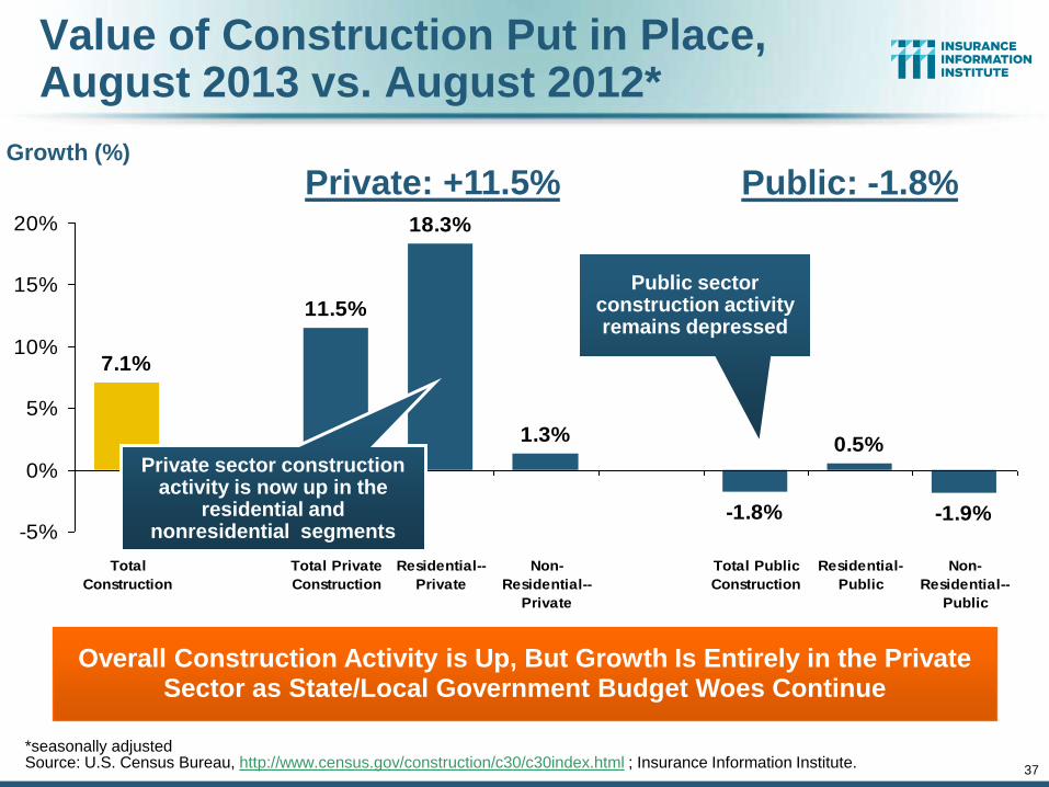
Value of Construction Put in Place, August 2013 vs. August 2012*
-1.8%
0.5%
-1.9%
7.1%
11.5%
18.3%
1.3%
-5%
0%
5%
10%
15%
20%
Total
Construction
Total Private
Construction
Residential--
Private
Non-
Residential--
Private
Total Public
Construction
Residential-
Public
Non-
Residential--
Public
Overall Construction Activity is Up, But Growth Is Entirely in the Private Sector as State/Local Government Budget Woes Continue
Growth (%)
Private sector construction activity is now up in the
residential and nonresidential segments
*seasonally adjusted Source: U.S. Census Bureau, http://www.census.gov/construction/c30/c30index.html ; Insurance Information Institute.
Private: +11.5% Public: -1.8%
Public sector construction activity remains depressed
38
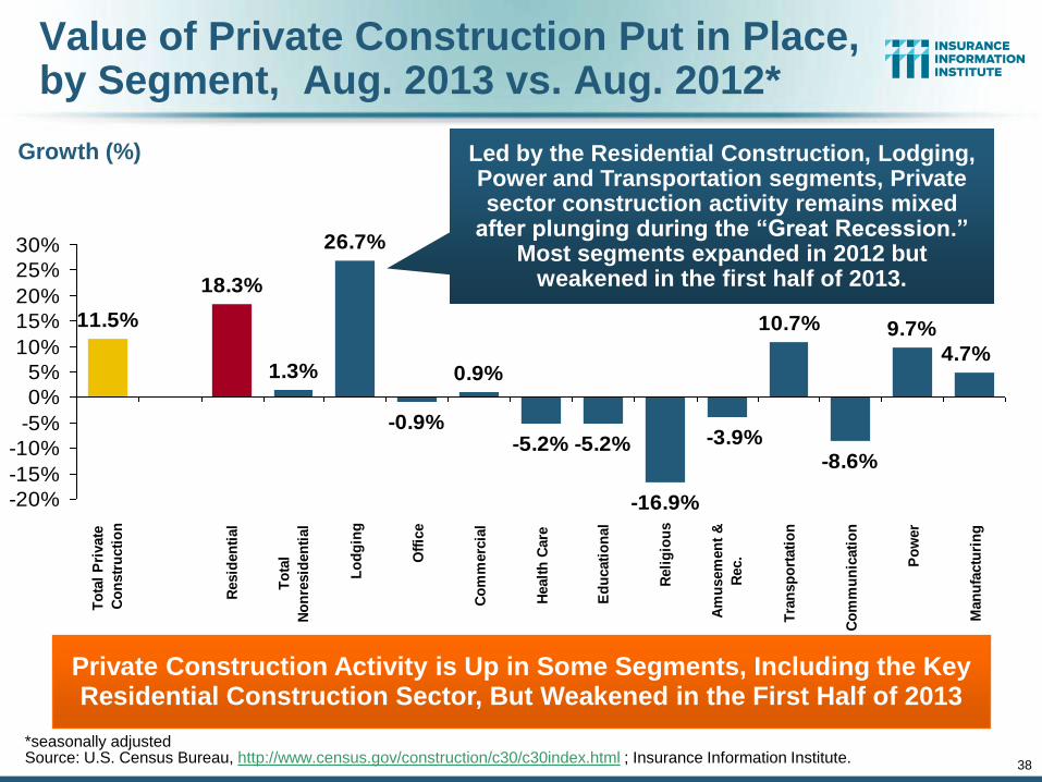
Value of Private Construction Put in Place, by Segment, Aug. 2013 vs. Aug. 2012*
0.9%
-5.2% -5.2%
-16.9%
10.7%
-8.6%
9.7%
4.7%
-3.9%
11.5%
18.3%
1.3%
26.7%
-0.9%
-20%
-15%
-10%
-5%
0%
5%
10%
15%
20%
25%
30%
To
tal
Pri
vate
Co
nstr
ucti
on
Resid
en
tial
To
tal
No
nre
sid
en
tial
Lo
dg
ing
Off
ice
Co
mm
erc
ial
Healt
h C
are
Ed
ucati
on
al
Reli
gio
us
Am
usem
en
t &
Rec.
Tra
nsp
ort
ati
on
Co
mm
un
icati
on
Po
wer
Man
ufa
ctu
rin
g
Private Construction Activity is Up in Some Segments, Including the Key Residential Construction Sector, But Weakened in the First Half of 2013
Growth (%) Led by the Residential Construction, Lodging, Power and Transportation segments, Private sector construction activity remains mixed
after plunging during the “Great Recession.” Most segments expanded in 2012 but
weakened in the first half of 2013.
*seasonally adjusted Source: U.S. Census Bureau, http://www.census.gov/construction/c30/c30index.html ; Insurance Information Institute.
39
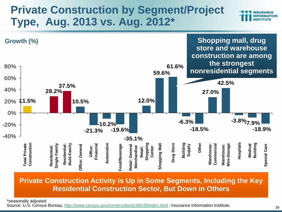
Private Construction by Segment/Project Type, Aug. 2013 vs. Aug. 2012*
-10.2%-19.6%
-35.1%
12.0%
-6.3%
-18.5%
42.5%
-3.8%-7.9%-18.9%
61.6%
27.0%
59.6%
11.5%
28.2%37.5%
10.5%
-21.3%-40%
-20%
0%
20%
40%
60%
80%
To
tal
Pri
vate
Co
nstr
ucti
on
Resid
en
tial:
Sin
gle
Fam
ily
Resid
en
tial:
Mu
lti-
Fam
ily
Off
ice:
Gen
era
l
Off
ice:
Fin
an
cia
l
Au
tom
oti
ve
Fo
od
/Bevera
ge
Reta
il:
Gen
era
l
Merc
han
dis
e
Reta
il:
Sh
op
pin
g
Cen
ter
Sh
op
pin
g M
all
Dru
g S
tore
Bu
ild
ing
Su
pp
ly
Oth
er
Ware
ho
use:
Co
mm
erc
ial
Ware
ho
use:
Min
i-S
tora
ge
Ho
sp
itals
Med
ical
Bu
ild
ing
Sp
ecia
l C
are
Private Construction Activity is Up in Some Segments, Including the Key Residential Construction Sector, But Down in Others
Growth (%) Shopping mall, drug store and warehouse
construction are among the strongest
nonresidential segments
*seasonally adjusted Source: U.S. Census Bureau, http://www.census.gov/construction/c30/c30index.html ; Insurance Information Institute.
40
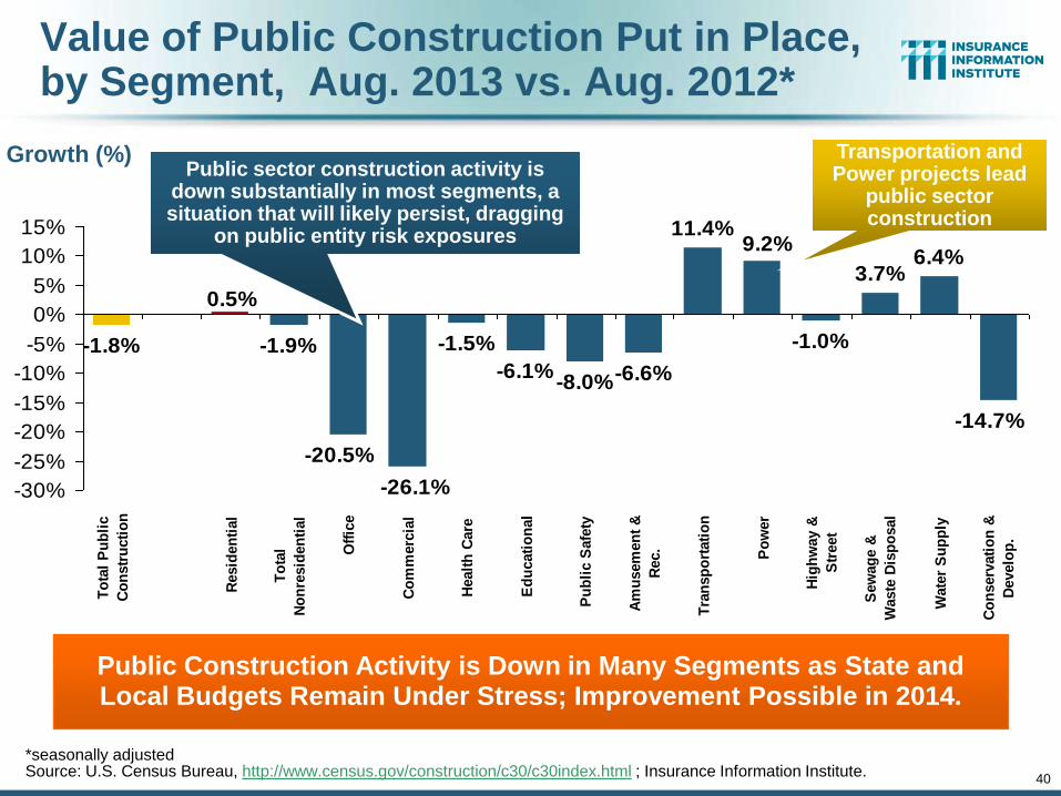
Value of Public Construction Put in Place, by Segment, Aug. 2013 vs. Aug. 2012*
-1.5%
-6.1%-8.0%-6.6%
11.4%
-1.0%
3.7%6.4%
-14.7%
9.2%
-1.8%
0.5%
-1.9%
-20.5%
-26.1%-30%
-25%
-20%
-15%
-10%
-5%
0%
5%
10%
15%
To
tal
Pu
bli
c
Co
nstr
ucti
on
Resid
en
tial
To
tal
No
nre
sid
en
tial
Off
ice
Co
mm
erc
ial
Healt
h C
are
Ed
ucati
on
al
Pu
bli
c S
afe
ty
Am
usem
en
t &
Rec.
Tra
nsp
ort
ati
on
Po
wer
Hig
hw
ay &
Str
eet
Sew
ag
e &
Waste
Dis
po
sal
Wate
r S
up
ply
Co
nserv
ati
on
&
Develo
p.
Public Construction Activity is Down in Many Segments as State and Local Budgets Remain Under Stress; Improvement Possible in 2014.
Growth (%)
*seasonally adjusted Source: U.S. Census Bureau, http://www.census.gov/construction/c30/c30index.html ; Insurance Information Institute.
Public sector construction activity is down substantially in most segments, a situation that will likely persist, dragging
on public entity risk exposures
Transportation and Power projects lead
public sector construction
41
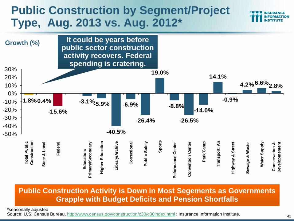
Public Construction by Segment/Project Type, Aug. 2013 vs. Aug. 2012*
-40.5%
-6.9%
-26.4%
19.0%
-26.5%
-14.0%
14.1%
4.2%6.6%2.8%
-5.9%-3.1%
-15.6%
-0.4%-1.8%-8.8%
-0.9%
-50%
-40%
-30%
-20%
-10%
0%
10%
20%
30%
To
tal
Pu
bli
c
Co
nstr
ucti
on
Sta
te &
Lo
cal
Fed
era
l
Ed
ucati
on
:
Pri
mary
/Seco
nd
ary
Hig
her
Ed
ucati
on
Lib
rary
/Arc
hiv
e
Co
rrecti
on
al
Pu
bli
c S
afe
ty
Sp
ort
s
Pefo
rman
ce C
en
ter
Co
nven
tio
n C
en
ter
Park
/Cam
p
Tra
nsp
ort
: A
ir
Hig
hw
ay &
Str
eet
Sew
ag
e &
Waste
Wate
r S
up
ply
Co
nserv
ati
on
&
Develo
pm
em
en
t
Public Construction Activity is Down in Most Segements as Governments Grapple with Budget Deficits and Pension Shortfalls
Growth (%) It could be years before public sector construction activity recovers. Federal
spending is cratering.
*seasonally adjusted Source: U.S. Census Bureau, http://www.census.gov/construction/c30/c30index.html ; Insurance Information Institute.
42
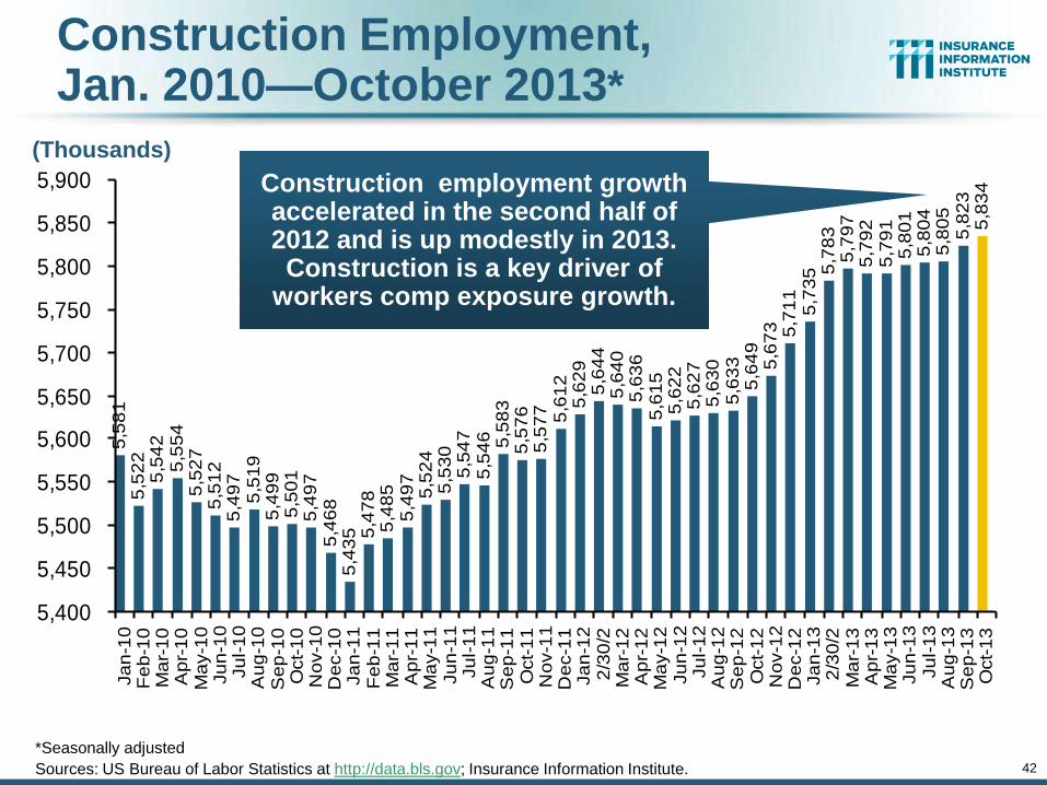
Construction Employment, Jan. 2010—October 2013*
*Seasonally adjusted
Sources: US Bureau of Labor Statistics at http://data.bls.gov; Insurance Information Institute.
5,5
81
5,5
22
5,5
42
5,5
54
5,5
27
5,5
12
5,4
97
5,5
19
5,4
99
5,5
01
5,4
97
5,4
68
5,4
35 5
,47
85
,48
55
,49
75
,52
45
,53
05
,54
75
,54
6 5,5
83
5,5
76
5,5
77 5,6
12
5,6
29
5,6
44
5,6
40
5,6
36
5,6
15
5,6
22
5,6
27
5,6
30
5,6
33
5,6
49
5,6
73 5,7
11
5,7
35 5
,78
35
,79
75
,79
25
,79
15
,80
15
,80
45
,80
55
,82
35
,83
4
5,400
5,450
5,500
5,550
5,600
5,650
5,700
5,750
5,800
5,850
5,900
Ja
n-1
0F
eb
-10
Ma
r-1
0A
pr-
10
Ma
y-1
0Ju
n-1
0Ju
l-1
0A
ug
-10
Se
p-1
0O
ct-
10
No
v-1
0D
ec-1
0Ja
n-1
1F
eb
-11
Ma
r-1
1A
pr-
11
Ma
y-1
1Ju
n-1
1Ju
l-1
1A
ug
-11
Se
p-1
1O
ct-
11
No
v-1
1D
ec-1
1Ja
n-1
22
/30
/2M
ar-
12
Ap
r-1
2M
ay-1
2Ju
n-1
2Ju
l-1
2A
ug
-12
Se
p-1
2O
ct-
12
No
v-1
2D
ec-1
2Ja
n-1
32
/30
/2M
ar-
13
Ap
r-1
3M
ay-1
3Ju
n-1
3Ju
l-1
3A
ug
-13
Se
p-1
3O
ct-
13
Construction employment growth accelerated in the second half of 2012 and is up modestly in 2013. Construction is a key driver of
workers comp exposure growth.
(Thousands)
43
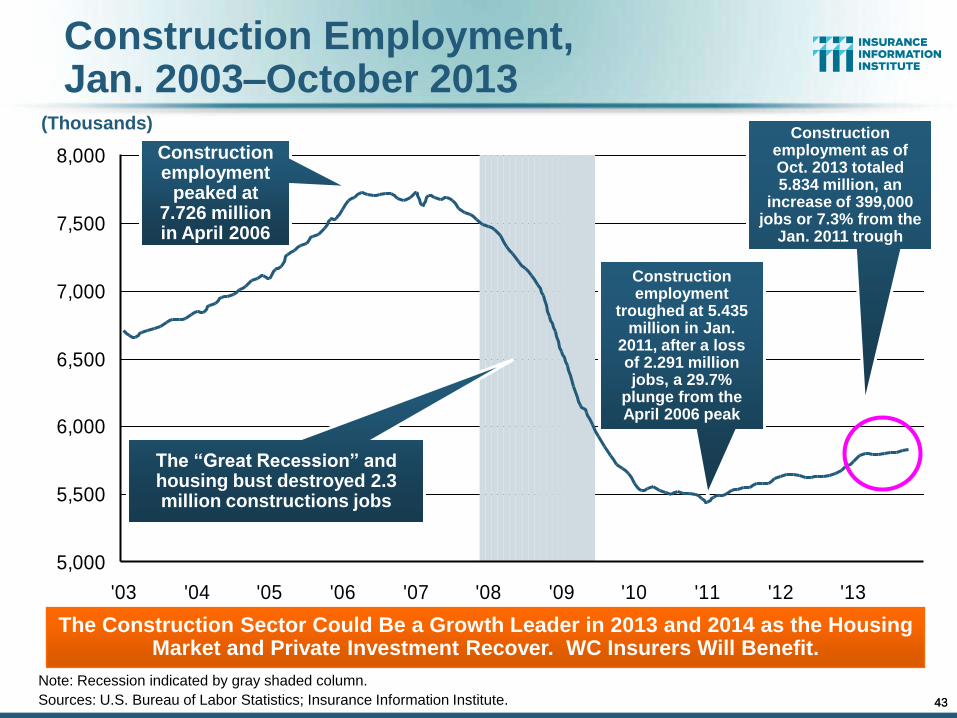
Construction Employment, Jan. 2003–October 2013
Note: Recession indicated by gray shaded column.
Sources: U.S. Bureau of Labor Statistics; Insurance Information Institute.
5,000
5,500
6,000
6,500
7,000
7,500
8,000
'03 '04 '05 '06 '07 '08 '09 '10 '11 '12 '13
The “Great Recession” and housing bust destroyed 2.3 million constructions jobs
The Construction Sector Could Be a Growth Leader in 2013 and 2014 as the Housing Market and Private Investment Recover. WC Insurers Will Benefit.
Construction employment
troughed at 5.435 million in Jan.
2011, after a loss of 2.291 million jobs, a 29.7%
plunge from the April 2006 peak
43
Construction employment
peaked at 7.726 million in April 2006
(Thousands) Construction
employment as of Oct. 2013 totaled 5.834 million, an
increase of 399,000 jobs or 7.3% from the
Jan. 2011 trough

44
Nonfarm Payroll (Wages and Salaries): Quarterly, 2005–2013:Q2
Note: Recession indicated by gray shaded column. Data are seasonally adjusted annual rates.
Sources: http://research.stlouisfed.org/fred2/series/WASCUR; National Bureau of Economic Research (recession dates); Insurance Information Institute.
Billions
$5,500
$5,750
$6,000
$6,250
$6,500
$6,750
$7,000
$7,2500
5:Q
1
05
:Q2
05
:Q3
05
:Q4
06
:Q1
06
:Q2
06
:Q3
06
:Q4
07
:Q1
07
:Q2
07
:Q3
07
:Q4
08
:Q1
08
:Q2
08
:Q3
08
:Q4
09
:Q1
09
:Q2
09
:Q3
09
:Q4
10
:Q1
10
:Q2
10
:Q3
10
:Q4
11
:Q1
11
:Q2
11
:Q3
11
:Q4
12
:Q1
12
:Q2
12
:Q3
12
:Q4
13
:Q1
13
:Q2
Prior Peak was 2008:Q1 at $6.60 trillion
Latest (2013:Q2) was $7.09 trillion, a new peak--$762B
above 2009 trough
Recent trough (2009:Q3) was $6.25 trillion, down
5.3% from prior peak
Payrolls are 13.4% above
their 2009 trough and up 2.7% over
the past year
44
58
.35
7.1
60
.45
9.6
57
.85
5.3
55
.15
5.2
55
.3 56
.9 58
.25
8.5 6
0.8
61
.45
9.7
59
.75
4.2 5
5.8
51
.4 52
.55
2.5
51
.85
2.2 53
.1 54
.15
1.9 53
.35
4.1
52
.55
0.2
50
.55
0.7
51
.65
1.7
49
.95
0.2
53
.1 54
.2
50
.74
9.0 5
0.9
55
.45
5.7
56
.25
6.4
51
.3
40
45
50
55
60
65
Ja
n-1
0F
eb
-10
Ma
r-1
0A
pr-
10
Ma
y-1
0
Ju
n-1
0Ju
l-1
0A
ug
-10
Se
p-1
0
Oct-
10
No
v-1
0D
ec-1
0
Ja
n-1
1F
eb
-11
Ma
r-1
1A
pr-
11
Ma
y-1
1Ju
n-1
1Ju
l-1
1
Au
g-1
1S
ep
-11
Oct-
11
No
v-1
1
De
c-1
1Ja
n-1
2F
eb
-12
Ma
r-1
2
Ap
r-1
2M
ay-1
2Ju
n-1
2
Ju
l-1
2A
ug
-12
Se
p-1
2O
ct-
12
No
v-1
2D
ec-1
2Ja
n-1
3
Fe
b-1
3M
ar-
13
Ap
r-1
3M
ay-1
3
Ju
n-1
3Ju
l-1
3A
ug
-13
Se
p-1
3O
ct-
13
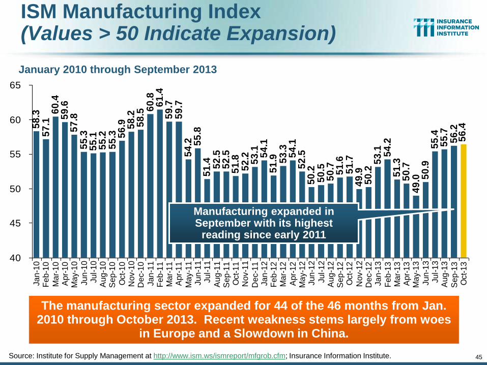
ISM Manufacturing Index (Values > 50 Indicate Expansion)
January 2010 through September 2013
The manufacturing sector expanded for 44 of the 46 months from Jan. 2010 through October 2013. Recent weakness stems largely from woes
in Europe and a Slowdown in China.
Source: Institute for Supply Management at http://www.ism.ws/ismreport/mfgrob.cfm; Insurance Information Institute.
Manufacturing expanded in September with its highest
reading since early 2011
45
46
$200,000
$300,000
$400,000
$500,000
Jan-
92
Jan-
93
Jan-
94
Jan-
95
Jan-
96
Jan-
97
Jan-
98
Jan-
99
Jan-
00
Jan 01
Jan 02
Jan 03
Jan 04
Jan 05
Jan 06
Jan 07
Jan 08
Jan 09
Jan 10
Jan 11
Jan 12
Jan 13
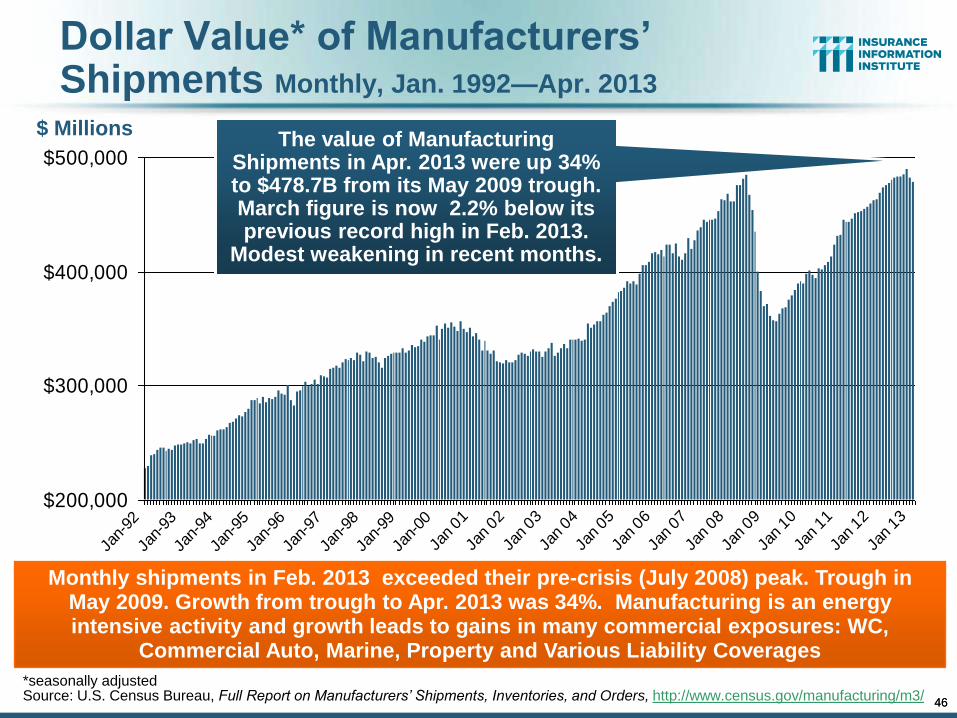
Dollar Value* of Manufacturers’ Shipments Monthly, Jan. 1992—Apr. 2013
*seasonally adjusted Source: U.S. Census Bureau, Full Report on Manufacturers’ Shipments, Inventories, and Orders, http://www.census.gov/manufacturing/m3/
Monthly shipments in Feb. 2013 exceeded their pre-crisis (July 2008) peak. Trough in May 2009. Growth from trough to Apr. 2013 was 34%. Manufacturing is an energy intensive activity and growth leads to gains in many commercial exposures: WC,
Commercial Auto, Marine, Property and Various Liability Coverages
The value of Manufacturing Shipments in Apr. 2013 were up 34% to $478.7B from its May 2009 trough. March figure is now 2.2% below its previous record high in Feb. 2013.
Modest weakening in recent months.
$ Millions
46
47
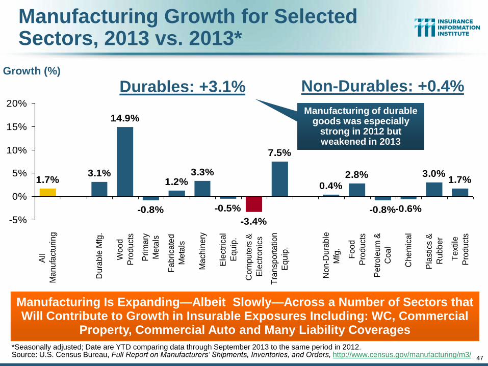
Manufacturing Growth for Selected Sectors, 2013 vs. 2013*
3.3%
-0.5%
-3.4%
7.5%
0.4%2.8%
-0.8%-0.6%
3.0%1.7%1.7%
3.1%
14.9%
-0.8%
1.2%
-5%
0%
5%
10%
15%
20%
All
Ma
nu
factu
rin
g
Du
rab
le M
fg.
Wo
od
Pro
du
cts
Pri
ma
ry
Me
tals
Fa
bri
ca
ted
Me
tals
Ma
ch
ine
ry
Ele
ctr
ica
l
Eq
uip
.
Co
mp
ute
rs &
Ele
ctr
on
ics
Tra
nsp
ort
atio
n
Eq
uip
.
No
n-D
ura
ble
Mfg
.
Fo
od
Pro
du
cts
Pe
tro
leu
m &
Co
al
Ch
em
ica
l
Pla
stics &
Ru
bb
er
Te
xtile
Pro
du
cts
Manufacturing Is Expanding—Albeit Slowly—Across a Number of Sectors that Will Contribute to Growth in Insurable Exposures Including: WC, Commercial
Property, Commercial Auto and Many Liability Coverages
Growth (%)
Manufacturing of durable goods was especially
strong in 2012 but weakened in 2013
*Seasonally adjusted; Date are YTD comparing data through September 2013 to the same period in 2012. Source: U.S. Census Bureau, Full Report on Manufacturers’ Shipments, Inventories, and Orders, http://www.census.gov/manufacturing/m3/
Durables: +3.1% Non-Durables: +0.4%
66%
68%
70%
72%
74%
76%
78%
80%
82%
Mar
01
Jun 0
1
Sep
Dec
Mar
02
Jun 0
2
Sep
Dec
Mar
03
Jun 0
3
Sep
Dec
Mar
04
Jun 0
4
Sep
Dec
Mar
05
Jun 0
5
Sep
Dec
Mar
06
Jun 0
6
Sep
Dec
Mar
07
Jun 0
7
Sep
Dec
Mar
08
Jun 0
8
Sep
Dec
Mar
09
Jun 0
9
Sep
Dec
Mar
10
Jun 1
0
Sep
Dec
Mar
11
Jun 1
1
Sep
Dec
Mar
12
Jun 1
2
Sep
Dec
Mar
13
Jun 1
3
Sep
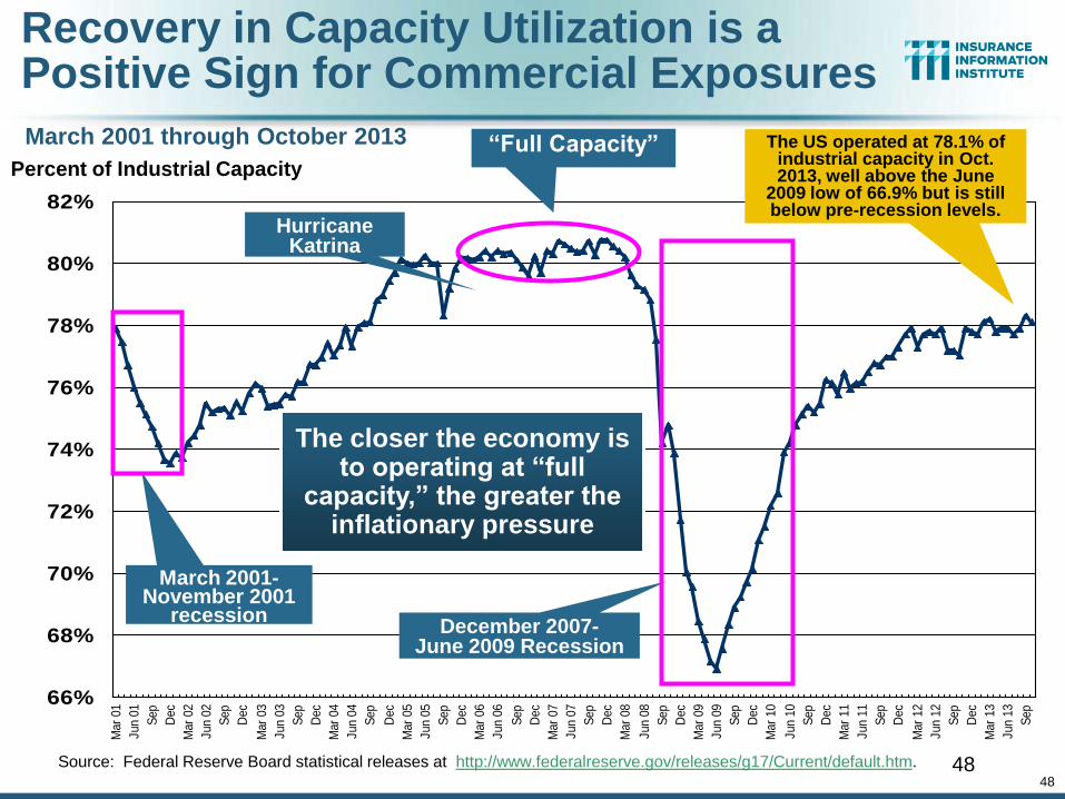
Recovery in Capacity Utilization is a Positive Sign for Commercial Exposures
Source: Federal Reserve Board statistical releases at http://www.federalreserve.gov/releases/g17/Current/default.htm. 48
Percent of Industrial Capacity
Hurricane Katrina
March 2001-November 2001
recession
“Full Capacity”
The closer the economy is to operating at “full
capacity,” the greater the inflationary pressure
The US operated at 78.1% of industrial capacity in Oct. 2013, well above the June
2009 low of 66.9% but is still below pre-recession levels.
December 2007- June 2009 Recession
March 2001 through October 2013
48
49
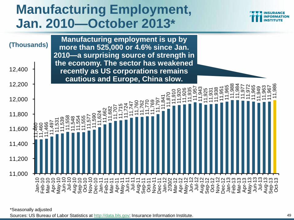
Manufacturing Employment, Jan. 2010—October 2013*
11
,46
01
1,4
60
11
,46
61
1,4
97
11
,53
11
1,5
39
11
,55
81
1,5
48
11
,55
41
1,5
55
11
,57
71
1,5
90
11
,62
41
1,6
62
11
,68
21
1,7
07
11
,71
51
1,7
24
11
,74
71
1,7
60
11
,76
21
1,7
70
11
,76
91
1,7
97
11
,84
11
1,8
70
11
,91
01
1,9
20
11
,92
61
1,9
35
11
,95
71
1,9
43
11
,92
51
1,9
31
11
,93
81
1,9
51
11
,96
51
1,9
88
11
,98
41
1,9
77
11
,97
21
1,9
65
11
,94
91
1,9
63
11
,96
71
1,9
86
11,000
11,200
11,400
11,600
11,800
12,000
12,200
12,400
Ja
n-1
0F
eb
-10
Ma
r-1
0A
pr-
10
Ma
y-1
0Ju
n-1
0Ju
l-1
0A
ug
-10
Se
p-1
0O
ct-
10
No
v-1
0D
ec-1
0Ja
n-1
1F
eb
-11
Ma
r-1
1A
pr-
11
Ma
y-1
1Ju
n-1
1Ju
l-1
1A
ug
-11
Se
p-1
1O
ct-
11
No
v-1
1D
ec-1
1Ja
n-1
22
/30
/2M
ar-
12
Ap
r-1
2M
ay-1
2Ju
n-1
2Ju
l-1
2A
ug
-12
Se
p-1
2O
ct-
12
No
v-1
2D
ec-1
2Ja
n-1
3F
eb
-13
Ma
r-1
3A
pr-
13
Ma
y-1
3Ju
n-1
3Ju
l-1
3A
ug
-13
Se
p-1
3O
ct-
13
Manufacturing employment is up by more than 525,000 or 4.6% since Jan.
2010—a surprising source of strength in the economy. The sector has weakened
recently as US corporations remains cautious and Europe, China slow.
*Seasonally adjusted
Sources: US Bureau of Labor Statistics at http://data.bls.gov; Insurance Information Institute.
(Thousands)
50
.7 52
.7 54
.15
4.6
54
.85
3.5
53
.75
2.8 53
.95
4.6 56 5
7.1 5
9.4
59
.75
6.3
54
.45
3.3
53
.45
3.8
52
.65
2.6
52
.65
2.6
53
.05
6.8
56
.15
5.0
53
.75
4.1
52
.75
2.9 54
.3 55
.25
4.8
54
.85
5.7
55
.25
6.0
53
.15
3.7
52
.25
6.0
58
.65
4.4 55
.5
54
.4
40
45
50
55
60
65
Ja
n-1
0F
eb
-10
Ma
r-1
0A
pr-
10
Ma
y-1
0
Ju
n-1
0Ju
l-1
0A
ug
-10
Se
p-1
0
Oct-
10
No
v-1
0D
ec-1
0
Ja
n-1
1F
eb
-11
Ma
r-1
1A
pr-
11
Ma
y-1
1Ju
n-1
1Ju
l-1
1
Au
g-1
1S
ep
-11
Oct-
11
No
v-1
1
De
c-1
1Ja
n-1
2F
eb
-12
Ma
r-1
2
Ap
r-1
2M
ay-1
2Ju
n-1
2
Ju
l-1
2A
ug
-12
Se
p-1
2O
ct-
12
No
v-1
2D
ec-1
2Ja
n-1
3
Fe
b-1
3M
ar-
13
Ap
r-1
3M
ay-1
3
Ju
n-1
3Ju
l-1
3A
ug
-13
Se
p-1
3O
ct-
13
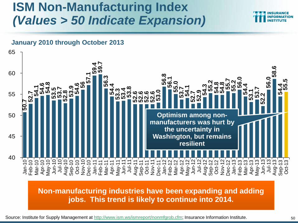
ISM Non-Manufacturing Index (Values > 50 Indicate Expansion)
January 2010 through October 2013
Non-manufacturing industries have been expanding and adding jobs. This trend is likely to continue into 2014.
Source: Institute for Supply Management at http://www.ism.ws/ismreport/nonmfgrob.cfm; Insurance Information Institute.
Optimism among non-manufacturers was hurt by
the uncertainty in Washington, but remains
resilient
50
51
43
,69
4
48
,12
5
69
,30
0
62
,43
6
64
,00
4
71
,27
7
81
,23
5
82
,44
6
63
,85
3
63
,23
5
64
,85
3
71
,54
9
70
,64
3
62
,30
4
52
,37
4
51
,95
9
53
,54
9
54
,02
7
44
,36
7
37
,88
4
35
,47
2
40
,09
9
38
,54
0
35
,03
7
34
,31
7
39
,20
1
19
,69
5
28
,32
2
43
,54
6
60
,83
7
56
,28
2
47
,80
6
40
,07
5
34
,89
2
0
10,000
20,000
30,000
40,000
50,000
60,000
70,000
80,000
90,000
80
81
82
83
84
85
86
87
88
89
90
91
92
93
94
95
96
97
98
99
00
01
02
03
04
05
06
07
08
09
10
11
12
13
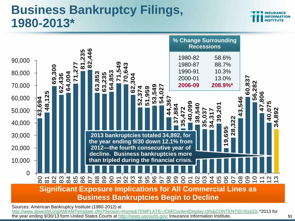
Business Bankruptcy Filings, 1980-2013*
Sources: American Bankruptcy Institute (1980-2012) at http://www.abiworld.org/AM/AMTemplate.cfm?Section=Home&TEMPLATE=/CM/ContentDisplay.cfm&CONTENTID=61633; *2013 for the year ending 9/30/13 form United States Courts at http://news.uscourts.gov; Insurance Information Institute.
Significant Exposure Implications for All Commercial Lines as Business Bankruptcies Begin to Decline
2013 bankruptcies totaled 34,892, for the year ending 9/30 down 12.1% from 2012—the fourth consecutive year of decline. Business bankruptcies more than tripled during the financial crisis.
% Change Surrounding Recessions
1980-82 58.6%
1980-87 88.7%
1990-91 10.3%
2000-01 13.0%
2006-09 208.9%*
51
52
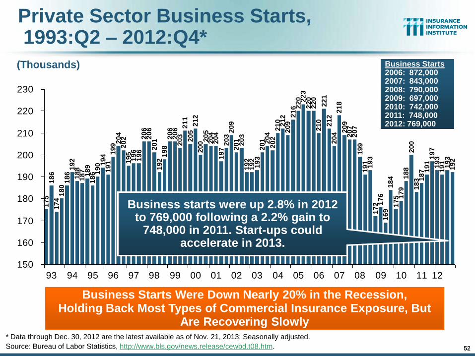
Private Sector Business Starts, 1993:Q2 – 2012:Q4*
17
51
86
17
41
80
18
61
92
18
81
87
18
91
86 1
90 1
94
19
11
99 2
04
20
21
95
19
61
96
20
62
06
20
11
92
19
82
06
20
62
03
21
12
05
21
22
00 2
05
20
42
04
19
72
03
20
92
01
19
21
92
19
32
01 20
42
02
21
02
12
20
92
16 2
20 22
32
20
22
02
10
22
12
12
20
42
18
20
92
07
20
71
99
19
11
93
17
2 17
61
69
18
41
75 1
79
18
82
00
18
3 18
7 19
11
97
19
31
91
19
31
92
20
3
150
160
170
180
190
200
210
220
230
93 94 95 96 97 98 99 00 01 02 03 04 05 06 07 08 09 10 11 12
Business Starts Were Down Nearly 20% in the Recession, Holding Back Most Types of Commercial Insurance Exposure, But
Are Recovering Slowly * Data through Dec. 30, 2012 are the latest available as of Nov. 21, 2013; Seasonally adjusted.
Source: Bureau of Labor Statistics, http://www.bls.gov/news.release/cewbd.t08.htm.
(Thousands)
Business starts were up 2.8% in 2012 to 769,000 following a 2.2% gain to
748,000 in 2011. Start-ups could accelerate in 2013.
Business Starts 2006: 872,000 2007: 843,000 2008: 790,000 2009: 697,000 2010: 742,000 2011: 748,000 2012: 769,000
52
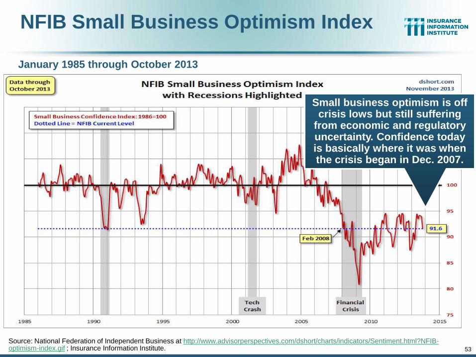
NFIB Small Business Optimism Index
January 1985 through October 2013
Source: National Federation of Independent Business at http://www.advisorperspectives.com/dshort/charts/indicators/Sentiment.html?NFIB-optimism-index.gif ; Insurance Information Institute. 53
Small business optimism is off crisis lows but still suffering
from economic and regulatory uncertainty. Confidence today is basically where it was when the crisis began in Dec. 2007.
54
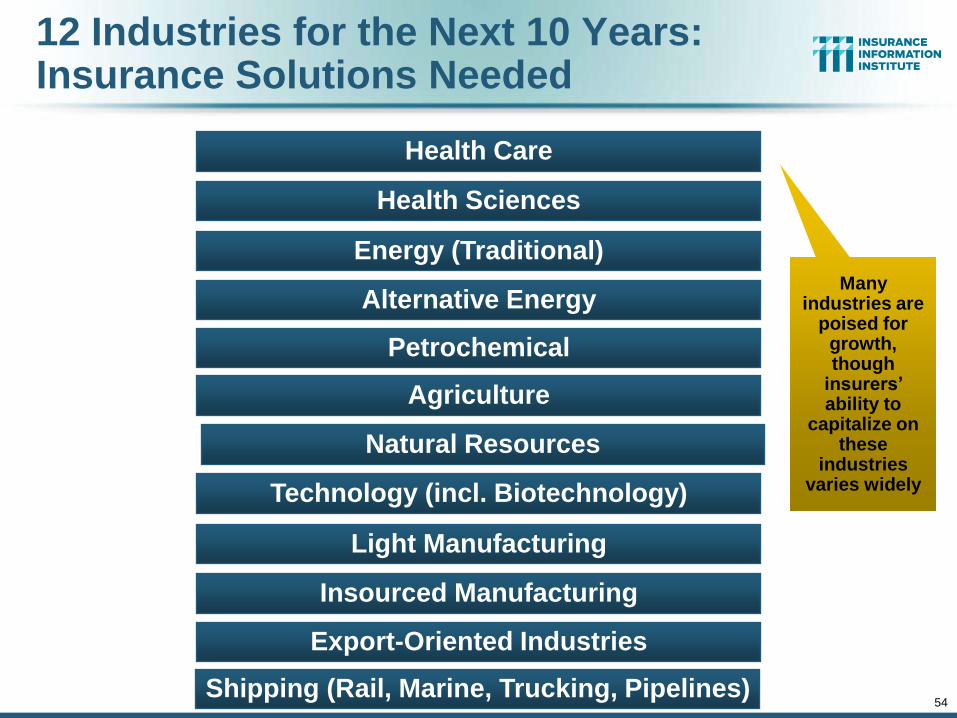
12 Industries for the Next 10 Years: Insurance Solutions Needed
Export-Oriented Industries
Health Sciences
Health Care
Energy (Traditional)
Alternative Energy
Petrochemical
Agriculture
Natural Resources
Technology (incl. Biotechnology)
Light Manufacturing
Insourced Manufacturing
Many industries are
poised for growth, though
insurers’ ability to
capitalize on these
industries varies widely
Shipping (Rail, Marine, Trucking, Pipelines)
55
Labor Market Trends
Massive Job Losses Sapped the Economy and Commercial/Personal
Lines Exposure, But Trend is Improving
55
56
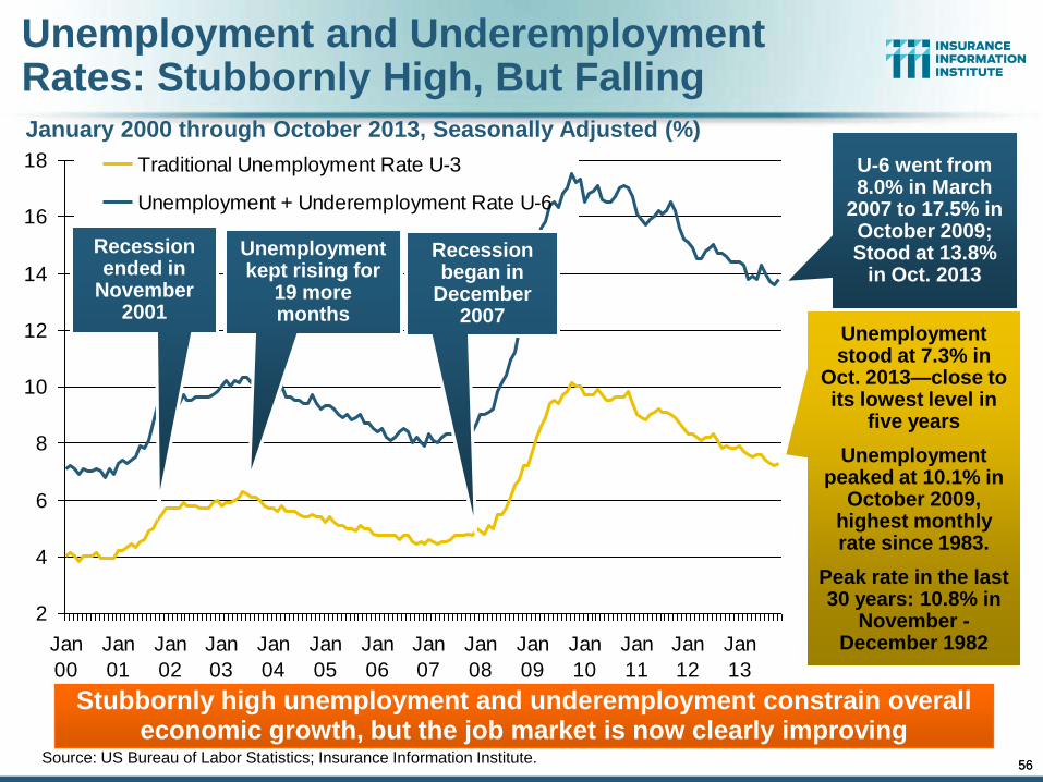
Unemployment and Underemployment Rates: Stubbornly High, But Falling
2
4
6
8
10
12
14
16
18
Jan
00
Jan
01
Jan
02
Jan
03
Jan
04
Jan
05
Jan
06
Jan
07
Jan
08
Jan
09
Jan
10
Jan
11
Jan
12
Jan
13
Traditional Unemployment Rate U-3
Unemployment + Underemployment Rate U-6
Unemployment stood at 7.3% in
Oct. 2013—close to its lowest level in
five years
Unemployment peaked at 10.1% in
October 2009, highest monthly rate since 1983.
Peak rate in the last 30 years: 10.8% in
November - December 1982
Source: US Bureau of Labor Statistics; Insurance Information Institute.
U-6 went from 8.0% in March
2007 to 17.5% in October 2009; Stood at 13.8%
in Oct. 2013
January 2000 through October 2013, Seasonally Adjusted (%)
Recession ended in
November 2001
Unemployment kept rising for
19 more months
Recession began in
December 2007
Stubbornly high unemployment and underemployment constrain overall economic growth, but the job market is now clearly improving
56
22
75
41
68
50
12
36
61
-79
24 6
8 74
51
2-1
14
-10
5-2
22
-21
9-2
03
-26
7-2
69
-42
9-4
84
-78
6 -70
1-8
21
-69
2-8
12
-82
1-2
88
-44
2-2
82 -2
22 -1
62
-23
3-3
4-1
67
-17
-26
17
01
02
94 10
31
29
11
3 18
81
54
11
48
02
43
22
33
03
18
31
77
20
61
29
25
61
74
19
7 24
9 32
32
65
20
81
20 15
27
81
77
13
11
18
21
7 25
62
24
16
43
19
15
4 18
81
87
19
41
00
20
71
50 2
12
11
1
(1,000)
(800)
(600)
(400)
(200)
0
200
400
Ja
n-0
7F
eb
-07
Ma
r-0
7A
pr-
07
Ma
y-0
7Ju
n-0
7Ju
l-0
7A
ug
-07
Se
p-0
7O
ct-
07
No
v-0
7D
ec-0
7Ja
n-0
8F
eb
-08
Ma
r-0
8A
pr-
08
Ma
y-0
8Ju
n-0
8Ju
l-0
8A
ug
-08
Se
p-0
8O
ct-
08
No
v-0
8D
ec-0
8Ja
n-0
9F
eb
-09
Ma
r-0
9A
pr-
09
Ma
y-0
9Ju
n-0
9Ju
l-0
9A
ug
-09
Se
p-0
9O
ct-
09
No
v-0
9D
ec-0
9Ja
n-1
0F
eb
-10
Ma
r-1
0A
pr-
10
Ma
y-1
0Ju
n-1
0Ju
l-1
0A
ug
-10
Se
p-1
0O
ct-
10
No
v-1
0D
ec-1
0Ja
n-1
1F
eb
-11
Ma
r-1
1A
pr-
11
Ma
y-1
1Ju
n-1
1Ju
l-1
1A
ug
-11
Se
p-1
1O
ct-
11
No
v-1
1D
ec-1
1Ja
n-1
2F
eb
-12
Ma
r-1
2A
pr-
12
Ma
y-1
2Ju
n-1
2Ju
l-1
2A
ug
-12
Se
p-1
2O
ct-
12
No
v-1
2D
ec-1
2Ja
n-1
3F
eb
-13
Ma
r-1
3A
pr-
13
Ma
y-1
3Ju
n-1
3Ju
l-1
3A
ug
-13
Se
p-1
3O
ct-
13
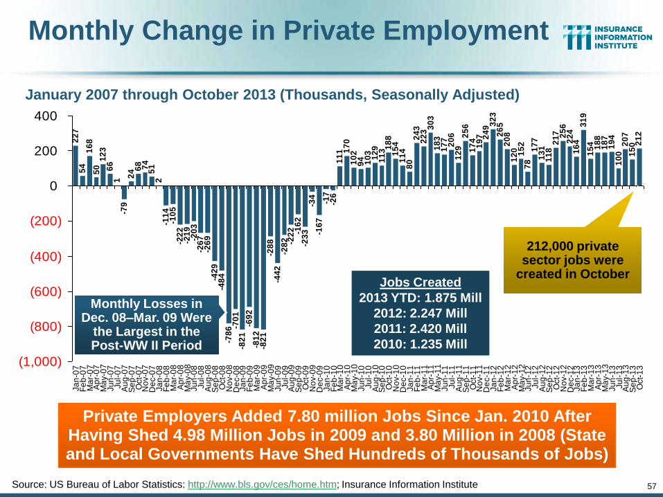
Monthly Change in Private Employment
January 2007 through October 2013 (Thousands, Seasonally Adjusted)
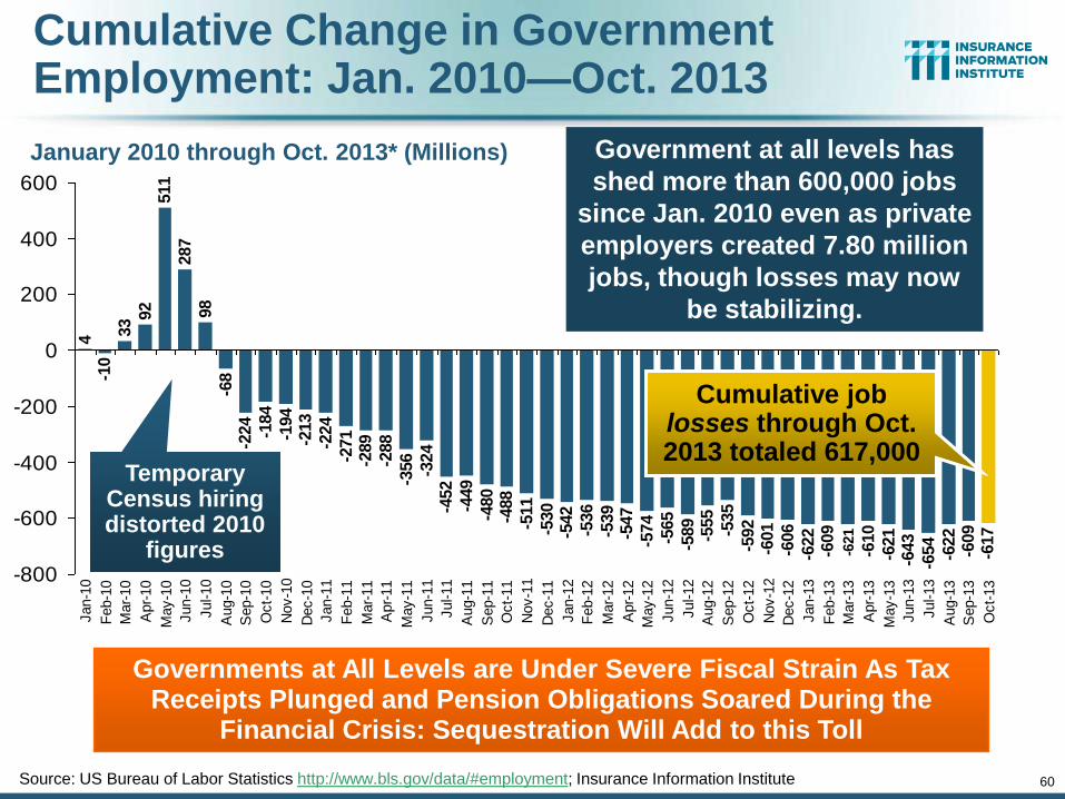
Private Employers Added 7.80 million Jobs Since Jan. 2010 After Having Shed 4.98 Million Jobs in 2009 and 3.80 Million in 2008 (State and Local Governments Have Shed Hundreds of Thousands of Jobs)
Source: US Bureau of Labor Statistics: http://www.bls.gov/ces/home.htm; Insurance Information Institute
Monthly Losses in Dec. 08–Mar. 09 Were
the Largest in the Post-WW II Period
212,000 private sector jobs were
created in October
57
Jobs Created
2013 YTD: 1.875 Mill
2012: 2.247 Mill
2011: 2.420 Mill
2010: 1.235 Mill
0.0
51
0.0
53
-0.0
61
-0.1
66
-0.3
88
-0.6
07
-0.8
10
-1.0
77
-1.3
46
-1.7
75
-2.2
59
-3.0
45
-3.7
46
-4.5
67
-5.2
59
-6.0
71
-6.8
92
-7.1
80
-7.6
22
-7.9
04
-8.1
26
-8.2
88
-8.5
21
-8.5
55
-8.7
22
-8.7
39
-8.7
65
-8.6
54
-8.4
84
-8.3
82
-8.2
88
-8.1
85
-8.0
56
-7.9
43
-7.7
55
-7.6
01
-7.4
87
-7.4
07
-6.9
41
-6.6
38
-6.4
55
-6.2
78
-6.0
72
-5.9
43
-5.6
87
-5.5
13
-5.3
16
-5.0
67
-4.7
44
-4.4
79
-4.2
71
-4.1
51
-3.9
99
-3.9
21
-3.7
44
-3.6
13
-3.4
95
-3.2
78
-3.0
22
-2.7
98
-2.6
34
-2.3
15
-2.1
61
-1.9
73
-1.7
86
-1.5
92
-1.4
92
-1.2
85
-1.1
35
-0.9
23
-7.1
64
-10
-8
-6
-4
-2
0
2
De
c-0
7Ja
n-0
8F
eb
-08
Ma
r-0
8A
pr-
08
Ma
y-0
8Ju
n-0
8Ju
l-0
8A
ug
-08
Se
p-0
8O
ct-
08
No
v-0
8D
ec-0
8Ja
n-0
9F
eb
-09
Ma
r-0
9A
pr-
09
Ma
y-0
9Ju
n-0
9Ju
l-0
9A
ug
-09
Se
p-0
9O
ct-
09
No
v-0
9D
ec-0
9Ja
n-1
0F
eb
-10
Ma
r-1
0A
pr-
10
Ma
y-1
0Ju
n-1
0Ju
l-1
0A
ug
-10
Se
p-1
0O
ct-
10
No
v-1
0D
ec-1
0Ja
n-1
1F
eb
-11
Ma
r-1
1A
pr-
11
Ma
y-1
1Ju
n-1
1Ju
l-1
1A
ug
-11
Se
p-1
1O
ct-
11
No
v-1
1D
ec-1
1Ja
n-1
2F
eb
-12
Ma
r-1
2A
pr-
12
Ma
y-1
2Ju
n-1
2Ju
l-1
2A
ug
-12
Se
p-1
2O
ct-
12
No
v-1
2D
ec-1
2Ja
n-1
3F
eb
-13
Ma
r-1
3A
pr-
13
Ma
y-1
3Ju
n-1
3Ju
l-1
3A
ug
-13
Se
p-1
3O
ct-
13
Millio
ns
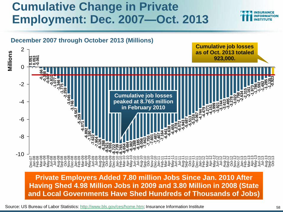
Cumulative Change in Private Employment: Dec. 2007—Oct. 2013
December 2007 through October 2013 (Millions)
Source: US Bureau of Labor Statistics: http://www.bls.gov/ces/home.htm; Insurance Information Institute
Cumulative job losses peaked at 8.765 million
in February 2010
Cumulative job losses as of Oct. 2013 totaled
923,000.
58
Private Employers Added 7.80 million Jobs Since Jan. 2010 After Having Shed 4.98 Million Jobs in 2009 and 3.80 Million in 2008 (State and Local Governments Have Shed Hundreds of Thousands of Jobs)
-0.0
17
-0.0
43
0.0
68
0.2
38
0.3
40
0.4
34
0.5
37
0.6
66
0.7
79
0.9
67
1.1
21
1.2
35
1.3
15
1.5
58
1.7
81
2.0
84
2.2
67
2.4
44
2.6
50
2.7
79
3.0
35
3.2
09
3.4
06
3.6
55
3.9
78
4.2
43
4.4
51
4.5
71
4.7
23
4.8
01
4.9
78
5.1
09
5.2
27
5.4
44
5.7
00
5.9
24
6.0
88
6.4
07
6.7
49
6.9
36
7.1
30
7.2
30
7.4
37
7.5
87
7.7
99
6.5
61
-1.0
0.0
1.0
2.0
3.0
4.0
5.0
6.0
7.0
8.0
9.0
Jan-1
0
Feb-1
0
Mar-
10
Apr-
10
May-1
0
Jun-1
0
Jul-10
Aug-1
0
Sep-1
0
Oct-
10
Nov-1
0
Dec-1
0
Jan-1
1
Feb-1
1
Mar-
11
Apr-
11
May-1
1
Jun-1
1
Jul-11
Aug-1
1
Sep-1
1
Oct-
11
Nov-1
1
Dec-1
1
Jan-1
2
Feb-1
2
Mar-
12
Apr-
12
May-1
2
Jun-1
2
Jul-12
Aug-1
2
Sep-1
2
Oct-
12
Nov-1
2
Dec-1
2
Jan-1
3
Feb-1
3
Mar-
13
Apr-
13
May-1
3
Jun-1
3
Jul-13
Aug-1
3
Millio
ns
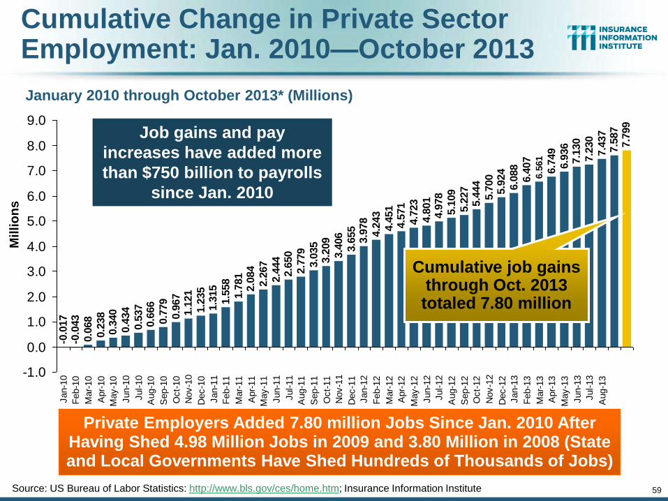
Cumulative Change in Private Sector Employment: Jan. 2010—October 2013
January 2010 through October 2013* (Millions)
Source: US Bureau of Labor Statistics: http://www.bls.gov/ces/home.htm; Insurance Information Institute
Cumulative job gains through Oct. 2013 totaled 7.80 million
59
Job gains and pay
increases have added more
than $750 billion to payrolls
since Jan. 2010
Private Employers Added 7.80 million Jobs Since Jan. 2010 After Having Shed 4.98 Million Jobs in 2009 and 3.80 Million in 2008 (State and Local Governments Have Shed Hundreds of Thousands of Jobs)
4-1
0
33 9
2511
287
98
-68
-224
-184
-194
-213
-224
-271
-289
-288
-356
-324
-452
-449
-480
-488
-511
-530
-542
-536
-539
-547
-574
-565
-589
-555
-535
-592
-601
-606
-622
-609
-610
-621
-643
-654
-622
-609
-617
-621
-800
-600
-400
-200
0
200
400
600
Jan-1
0
Feb-1
0
Mar-
10
Apr-
10
May-1
0
Jun-1
0
Jul-10
Aug-1
0
Sep-1
0
Oct-
10
Nov-1
0
Dec-1
0
Jan-1
1
Feb-1
1
Mar-
11
Apr-
11
May-1
1
Jun-1
1
Jul-11
Aug-1
1
Sep-1
1
Oct-
11
Nov-1
1
Dec-1
1
Jan-1
2
Feb-1
2
Mar-
12
Apr-
12
May-1
2
Jun-1
2
Jul-12
Aug-1
2
Sep-1
2
Oct-
12
Nov-1
2
Dec-1
2
Jan-1
3
Feb-1
3
Mar-
13
Apr-
13
May-1
3
Jun-1
3
Jul-13
Aug-1
3
Sep-1
3
Oct-
13
Cumulative Change in Government Employment: Jan. 2010—Oct. 2013
January 2010 through Oct. 2013* (Millions)
Source: US Bureau of Labor Statistics http://www.bls.gov/data/#employment; Insurance Information Institute
Cumulative job losses through Oct. 2013 totaled 617,000
60
Governments at All Levels are Under Severe Fiscal Strain As Tax Receipts Plunged and Pension Obligations Soared During the
Financial Crisis: Sequestration Will Add to this Toll
Government at all levels has
shed more than 600,000 jobs
since Jan. 2010 even as private
employers created 7.80 million
jobs, though losses may now
be stabilizing.
Temporary Census hiring distorted 2010
figures
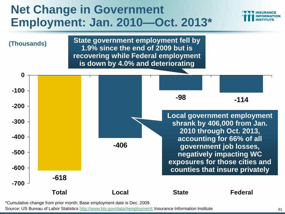
61
Net Change in Government Employment: Jan. 2010—Oct. 2013*
-618
-406
-98 -114
-700
-600
-500
-400
-300
-200
-100
0
Total Local State Federal
(Thousands)
Local government employment shrank by 406,000 from Jan.
2010 through Oct. 2013, accounting for 66% of all government job losses,
negatively impacting WC exposures for those cities and counties that insure privately
*Cumulative change from prior month; Base employment date is Dec. 2009.
Source: US Bureau of Labor Statistics http://www.bls.gov/data/#employment; Insurance Information Institute
State government employment fell by 1.9% since the end of 2009 but is
recovering while Federal employment is down by 4.0% and deteriorating
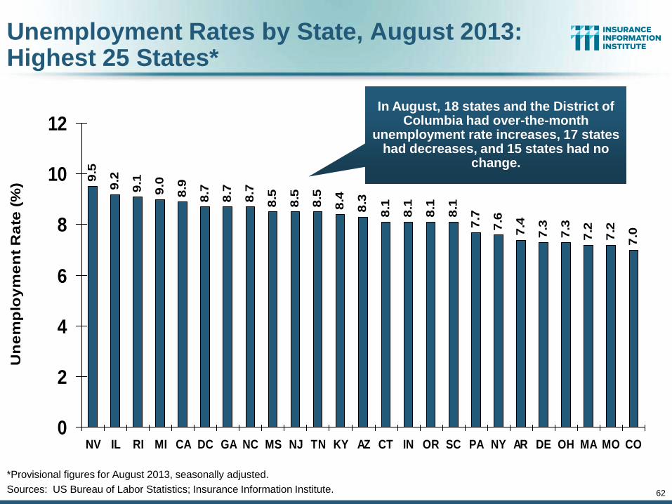
62
Unemployment Rates by State, August 2013: Highest 25 States*
9.5
9.2
9.1
9.0
8.9
8.7
8.7
8.7
8.5
8.5
8.5
8.4
8.3
8.1
8.1
8.1
8.1
7.7
7.6
7.4
7.3
7.3
7.2
7.2
7.0
0
2
4
6
8
10
12
NV IL RI MI CA DC GA NC MS NJ TN KY AZ CT IN OR SC PA NY AR DE OH MA MO CO
Un
em
plo
ym
en
t R
ate
(%
)
*Provisional figures for August 2013, seasonally adjusted.
Sources: US Bureau of Labor Statistics; Insurance Information Institute.
In August, 18 states and the District of Columbia had over-the-month
unemployment rate increases, 17 states had decreases, and 15 states had no
change.
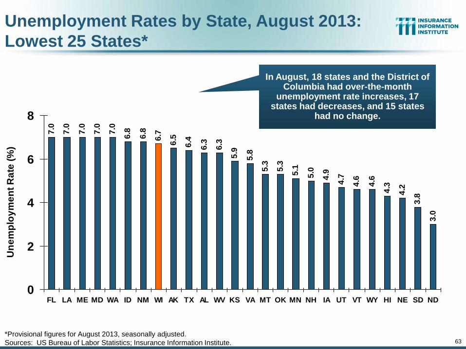
63
7.0
7.0
7.0
7.0
7.0
6.8
6.8
6.7
6.5
6.4
6.3
6.3
5.9
5.8
5.3
5.3
5.1
5.0
4.9
4.7
4.6
4.6
4.3
4.2
3.8
3.0
0
2
4
6
8
FL LA ME MD WA ID NM WI AK TX AL WV KS VA MT OK MN NH IA UT VT WY HI NE SD ND
Un
em
plo
ym
en
t R
ate
(%
)
Unemployment Rates by State, August 2013:
Lowest 25 States*
*Provisional figures for August 2013, seasonally adjusted.
Sources: US Bureau of Labor Statistics; Insurance Information Institute.
In August, 18 states and the District of Columbia had over-the-month
unemployment rate increases, 17 states had decreases, and 15 states
had no change.
64
Oil & Gas Extraction Employment, Jan. 2010—Oct. 2013*
*Seasonally adjusted
Sources: US Bureau of Labor Statistics at http://data.bls.gov; Insurance Information Institute.
15
6.4
15
6.4
15
6.7
15
7.6
15
8.7
15
7.8
15
8.0
15
9.5
16
0.0
16
1.5
16
1.2
16
1.2
16
3.1
16
4.4
16
6.6
16
9.3
17
0.1
17
1.0
17
2.5
17
3.6
17
6.3
17
8.2
17
8.5
18
0.9
18
1.9
18
3.1
18
4.8
18
5.2
18
5.7
18
6.8
18
7.6
18
8.0
18
8.0
18
8.2
19
0.0
19
1.7
19
1.9
19
3.4
19
2.4
19
2.6
19
3.1
19
3.3
19
5.0
19
6.5
19
7.5
19
8.7
150
160
170
180
190
200
210
Ja
n-1
0F
eb
-10
Ma
r-1
0A
pr-
10
Ma
y-1
0Ju
n-1
0Ju
l-1
0A
ug
-10
Se
p-1
0O
ct-
10
No
v-1
0D
ec-1
0Ja
n-1
1F
eb
-11
Ma
r-1
1A
pr-
11
Ma
y-1
1Ju
n-1
1Ju
l-1
1A
ug
-11
Se
p-1
1O
ct-
11
No
v-1
1D
ec-1
1Ja
n-1
22
/30
/2M
ar-
12
Ap
r-1
2M
ay-1
2Ju
n-1
2Ju
l-1
2A
ug
-12
Se
p-1
2O
ct-
12
No
v-1
2D
ec-1
2Ja
n-1
3F
eb
-13
Ma
r-1
3A
pr-
13
Ma
y-1
3Ju
n-1
3Ju
l-1
3A
ug
-13
Se
p-1
3O
ct-
13
Oil and gas extraction employment is up 27.0% since Jan. 2010 as the energy sector booms. Domestic energy production is essential to any robust economic recovery in
the US.
(Thousands) Highest since Aug.
1987
10
3.1
11
2.4
11
7.1
13
1.3
14
4.5 16
7.9
18
5.3 20
4.1
22
1.4
26
0.0
24
6.6
24
8.4
26
0.0
25
3.6
26
5.4
27
8.9
28
9.4
29
4.4
26
4.7
27
3.1
24
0.0
23
5.5
24
3.6
23
6.3
0
50
100
150
200
250
300
350
90 91 92 93 94 95 96 97 98 99 00 01 02 03 04 05 06 07 08 09 10 11 12 13*
Employment in the software publishing
industry now exceeds its dot
com bubble peak
Software Publishing Employment, 1990—2013*
*Seasonally adjusted year-end values. 2013 figure is as of October.
Sources: US Bureau of Labor Statistics at http://data.bls.gov; Insurance Information Institute.
Dot Com Bubble Peak
66
US Unemployment Rate Forecast
4.5
%
4.5
%
4.6
%
4.8
%
4.9
% 5.4
%
6.1
%
6.9
%
8.1
%
9.3
%
9.6
% 10
.0%
9.7
%
9.6
%
9.6
%
8.9
%
9.1
%
9.1
%
8.7
%
8.3
%
8.2
%
8.0
%
7.8
%
7.7
%
7.6
%
7.3
%
7.3
%
7.1
%
7.0
%
6.9
%6
.8%
9.6
%
4.0%
5.0%
6.0%
7.0%
8.0%
9.0%
10.0%
11.0%
07
:Q1
07
:Q2
07
:Q3
07
:Q4
08
:Q1
08
:Q2
08
:Q3
08
:Q4
09
:Q1
09
:Q2
09
:Q3
09
:Q4
10
:Q1
10
:Q2
10
:Q3
10
:Q4
11
:Q1
11
:Q2
11
:Q3
11
:Q4
12
:Q1
12
:Q2
12
:Q3
12
:Q4
13
:Q1
13
:Q2
13
:Q3
13
:Q4
14
:Q1
14
:Q2
14
:Q3
14
:Q4
Rising unemployment
eroded payrolls
and workers comp’s
exposure base.
Unemployment peaked at 10%
in late 2009.
* = actual; = forecasts
Sources: US Bureau of Labor Statistics; Blue Chip Economic Indicators (10/13 edition); Insurance Information Institute.
2007:Q1 to 2014:Q4F*
Unemployment forecasts have been revised slightly
downwards. Optimistic scenarios put the
unemployment as low as 6.5% by Q4 of next year.
Jobless figures have been revised
slightly downwards for 2013/14
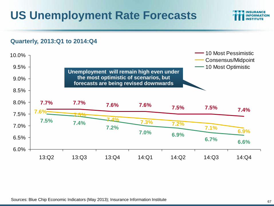
67
US Unemployment Rate Forecasts
7.5% 7.5% 7.4%
6.9%6.7%
6.6%
7.6%7.7% 7.6%7.7%
7.2%7.1%
6.9%
7.3%
7.6%7.5%
7.4%
7.0%7.2%
7.4%7.5%
6.0%
6.5%
7.0%
7.5%
8.0%
8.5%
9.0%
9.5%
10.0%
13:Q2 13:Q3 13:Q4 14:Q1 14:Q2 14:Q3 14:Q4
10 Most Pessimistic
Consensus/Midpoint
10 Most OptimisticUnemployment will remain high even under
the most optimistic of scenarios, but forecasts are being revised downwards
Sources: Blue Chip Economic Indicators (May 2013); Insurance Information Institute
Quarterly, 2013:Q1 to 2014:Q4
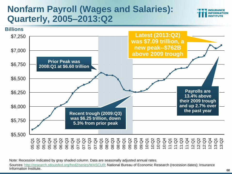
68
Nonfarm Payroll (Wages and Salaries): Quarterly, 2005–2013:Q2
Note: Recession indicated by gray shaded column. Data are seasonally adjusted annual rates.
Sources: http://research.stlouisfed.org/fred2/series/WASCUR; National Bureau of Economic Research (recession dates); Insurance Information Institute.
Billions
$5,500
$5,750
$6,000
$6,250
$6,500
$6,750
$7,000
$7,2500
5:Q
1
05
:Q2
05
:Q3
05
:Q4
06
:Q1
06
:Q2
06
:Q3
06
:Q4
07
:Q1
07
:Q2
07
:Q3
07
:Q4
08
:Q1
08
:Q2
08
:Q3
08
:Q4
09
:Q1
09
:Q2
09
:Q3
09
:Q4
10
:Q1
10
:Q2
10
:Q3
10
:Q4
11
:Q1
11
:Q2
11
:Q3
11
:Q4
12
:Q1
12
:Q2
12
:Q3
12
:Q4
13
:Q1
13
:Q2
Prior Peak was 2008:Q1 at $6.60 trillion
Latest (2013:Q2) was $7.09 trillion, a new peak--$762B
above 2009 trough
Recent trough (2009:Q3) was $6.25 trillion, down
5.3% from prior peak
Payrolls are 13.4% above
their 2009 trough and up 2.7% over
the past year
68
$2,000
$3,000
$4,000
$5,000
$6,000
$7,000
90 91 92 93 94 95 96 97 98 99 00 01 02 03 04 05 06 07 08 09 10 11 12*
$25
$30
$35
$40
$45
$50Wage & Salary DisbursementsWC NPW
69
Payroll Base* WC NWP
Payroll vs. Workers Comp Net Written Premiums, 1990-2012E
*Private employment; Shaded areas indicate recessions. WC premiums for 2012 are I.I.I. estimate based YTD 2012 actuals.
Sources: NBER (recessions); Federal Reserve Bank of St. Louis at http://research.stlouisfed.org/fred2/series/WASCUR ; NCCI; I.I.I.
Continued Payroll Growth and Rate Increases Suggest WC NWP Will Grow Again in 2012; +7.9% Growth in 2011 Was the First Gain Since 2005
7/90-3/91 3/01-11/01 12/07-6/09
$Billions $Billions
WC premium volume dropped two years before
the recession began
WC net premiums written were down $14B or 29.3% to
$33.8B in 2010 after peaking at $47.8B
in 2005
+9% in 2012E
70
U.S. Insured Catastrophe Loss Update
Catastrophe Losses in Recent Years
Have Been Very High
70
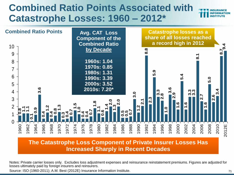
71
Combined Ratio Points Associated with Catastrophe Losses: 1960 – 2012*
Notes: Private carrier losses only. Excludes loss adjustment expenses and reinsurance reinstatement premiums. Figures are adjusted for losses ultimately paid by foreign insurers and reinsurers.
Source: ISO (1960-2011); A.M. Best (2012E) Insurance Information Institute.
0.4
1.2
0.4 0
.8 1.3
0.3 0.4 0.7
1.5
1.0
0.4
0.4 0.7
1.8
1.1
0.6
1.42
.01
.32
.00
.50
.5 0.7
3.0
1.2
2.1
8.8
2.3
5.9
3.3
2.8
1.0
3.6
2.9
1.6
5.4
1.6
3.3
3.3
8.1
2.7
1.6
5.0
2.6
3.4
8.7
9.4
3.6
0.9
0.1
1.1
1.1
0.8
0
1
2
3
4
5
6
7
8
9
10
19
60
19
62
19
64
19
66
19
68
19
70
19
72
19
74
19
76
19
78
19
80
19
82
19
84
19
86
19
88
19
90
19
92
19
94
19
96
19
98
20
00
20
02
20
04
20
06
20
08
20
10
20
12
E
The Catastrophe Loss Component of Private Insurer Losses Has Increased Sharply in Recent Decades
Avg. CAT Loss Component of the Combined Ratio
by Decade
1960s: 1.04 1970s: 0.85 1980s: 1.31 1990s: 3.39 2000s: 3.52 2010s: 7.20*
Combined Ratio Points Catastrophe losses as a share of all losses reached
a record high in 2012
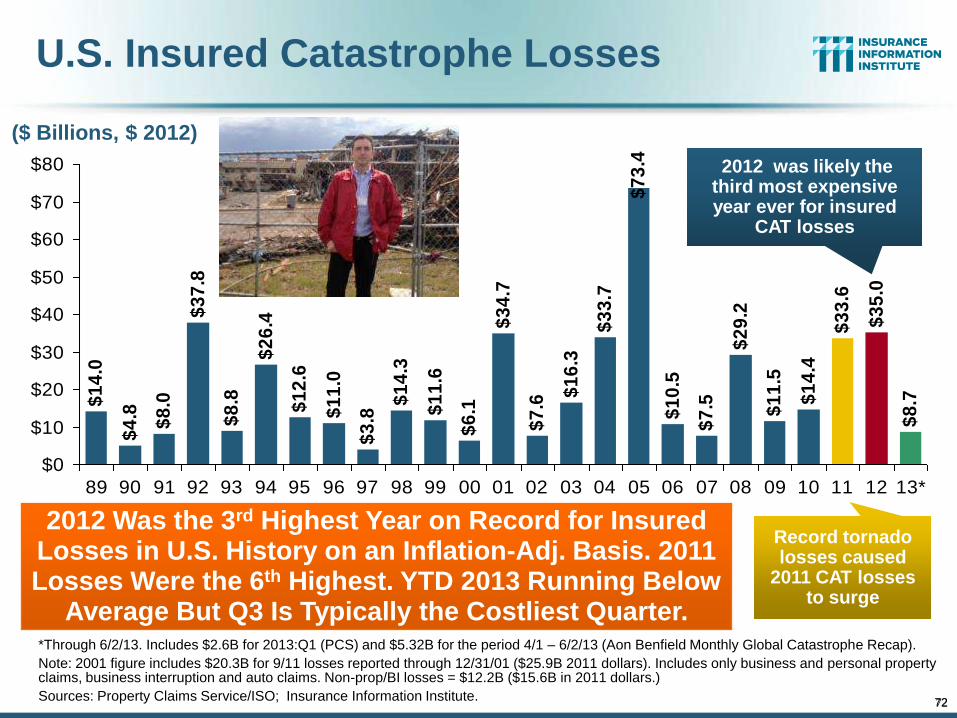
72
$1
2.6
$1
1.0
$3
.8
$1
4.3
$1
1.6
$6
.1
$3
4.7
$7
.6
$1
6.3
$3
3.7
$7
3.4
$1
0.5
$7
.5
$2
9.2
$1
1.5
$1
4.4
$3
3.6
$3
5.0
$8
.7$1
4.0
$4
.8
$8
.0
$3
7.8
$8
.8
$2
6.4
$0
$10
$20
$30
$40
$50
$60
$70
$80
89 90 91 92 93 94 95 96 97 98 99 00 01 02 03 04 05 06 07 08 09 10 11 12 13*
U.S. Insured Catastrophe Losses
*Through 6/2/13. Includes $2.6B for 2013:Q1 (PCS) and $5.32B for the period 4/1 – 6/2/13 (Aon Benfield Monthly Global Catastrophe Recap).
Note: 2001 figure includes $20.3B for 9/11 losses reported through 12/31/01 ($25.9B 2011 dollars). Includes only business and personal property claims, business interruption and auto claims. Non-prop/BI losses = $12.2B ($15.6B in 2011 dollars.)
Sources: Property Claims Service/ISO; Insurance Information Institute.
2012 Was the 3rd Highest Year on Record for Insured Losses in U.S. History on an Inflation-Adj. Basis. 2011 Losses Were the 6th Highest. YTD 2013 Running Below
Average But Q3 Is Typically the Costliest Quarter.
2012 was likely the third most expensive year ever for insured
CAT losses
Record tornado losses caused
2011 CAT losses to surge
($ Billions, $ 2012)
72
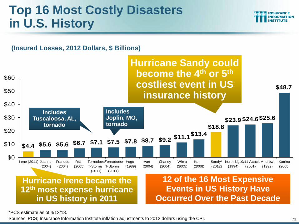
73
Top 16 Most Costly Disasters in U.S. History
(Insured Losses, 2012 Dollars, $ Billions)
$7.8 $8.7 $9.2$11.1
$13.4
$18.8$23.9 $24.6$25.6
$48.7
$7.5$7.1$6.7$5.6$5.6$4.4
$0
$10
$20
$30
$40
$50
$60
Irene (2011) Jeanne
(2004)
Frances
(2004)
Rita
(2005)
Tornadoes/
T-Storms
(2011)
Tornadoes/
T-Storms
(2011)
Hugo
(1989)
Ivan
(2004)
Charley
(2004)
Wilma
(2005)
Ike
(2008)
Sandy*
(2012)
Northridge
(1994)
9/11 Attack
(2001)
Andrew
(1992)
Katrina
(2005)
Hurricane Sandy could become the 4th or 5th costliest event in US
insurance history
Hurricane Irene became the 12th most expense hurricane
in US history in 2011
Includes Tuscaloosa, AL,
tornado
Includes Joplin, MO, tornado
12 of the 16 Most Expensive Events in US History Have
Occurred Over the Past Decade
*PCS estimate as of 4/12/13.
Sources: PCS; Insurance Information Institute inflation adjustments to 2012 dollars using the CPI.
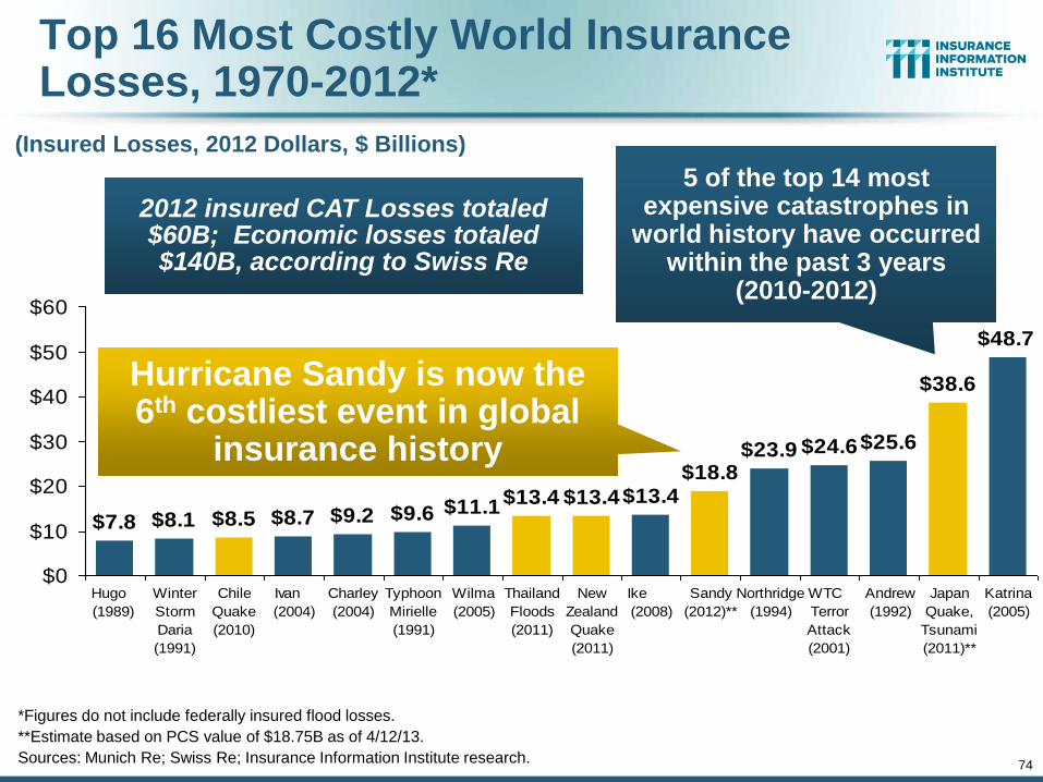
74
Top 16 Most Costly World Insurance Losses, 1970-2012*
(Insured Losses, 2012 Dollars, $ Billions)
*Figures do not include federally insured flood losses.
**Estimate based on PCS value of $18.75B as of 4/12/13.
Sources: Munich Re; Swiss Re; Insurance Information Institute research.
$11.1$13.4 $13.4$13.4
$18.8$23.9 $24.6$25.6
$38.6
$48.7
$7.8 $8.1 $8.5 $8.7 $9.2 $9.6
$0
$10
$20
$30
$40
$50
$60
Hugo
(1989)
Winter
Storm
Daria
(1991)
Chile
Quake
(2010)
Ivan
(2004)
Charley
(2004)
Typhoon
Mirielle
(1991)
Wilma
(2005)
Thailand
Floods
(2011)
New
Zealand
Quake
(2011)
Ike
(2008)
Sandy
(2012)**
Northridge
(1994)
WTC
Terror
Attack
(2001)
Andrew
(1992)
Japan
Quake,
Tsunami
(2011)**
Katrina
(2005)
5 of the top 14 most expensive catastrophes in
world history have occurred within the past 3 years
(2010-2012)
Hurricane Sandy is now the 6th costliest event in global
insurance history
2012 insured CAT Losses totaled $60B; Economic losses totaled $140B, according to Swiss Re
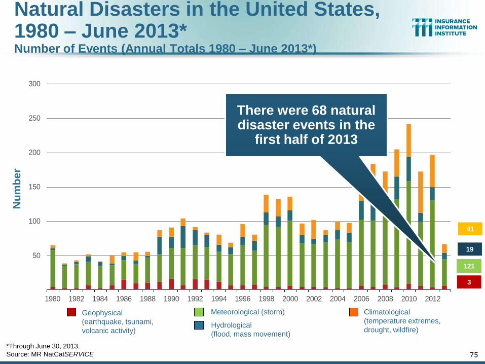
Nu
mb
er
Geophysical
(earthquake, tsunami,
volcanic activity)
Climatological
(temperature extremes,
drought, wildfire)
Meteorological (storm)
Hydrological
(flood, mass movement)
Natural Disasters in the United States, 1980 – June 2013* Number of Events (Annual Totals 1980 – June 2013*)
*Through June 30, 2013.
Source: MR NatCatSERVICE 75
41
19
121
3
50
100
150
200
250
300
1980 1982 1984 1986 1988 1990 1992 1994 1996 1998 2000 2002 2004 2006 2008 2010 2012
There were 68 natural disaster events in the
first half of 2013
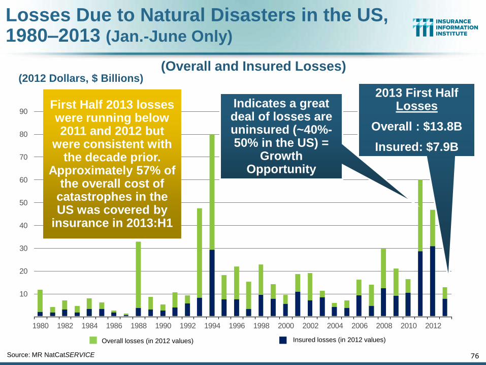
Losses Due to Natural Disasters in the US, 1980–2013 (Jan.-June Only)
76
Overall losses (in 2012 values) Insured losses (in 2012 values)
Source: MR NatCatSERVICE
(2012 Dollars, $ Billions) (Overall and Insured Losses)
10
20
30
40
50
60
70
80
90
1980 1982 1984 1986 1988 1990 1992 1994 1996 1998 2000 2002 2004 2006 2008 2010 2012
First Half 2013 losses were running below 2011 and 2012 but
were consistent with the decade prior.
Approximately 57% of the overall cost of
catastrophes in the US was covered by
insurance in 2013:H1
2013 First Half Losses
Overall : $13.8B
Insured: $7.9B
Indicates a great deal of losses are uninsured (~40%-50% in the US) =
Growth Opportunity
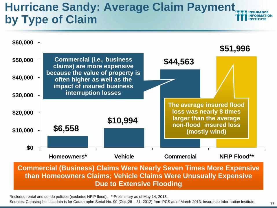
77
$6,558$10,994
$44,563
$51,996
$0
$10,000
$20,000
$30,000
$40,000
$50,000
$60,000
Homeowners* Vehicle Commercial NFIP Flood**
Commercial (i.e., business claims) are more expensive
because the value of property is often higher as well as the impact of insured business
interruption losses
*Includes rental and condo policies (excludes NFIP flood). **Preliminary as of May 14, 2013.
Sources: Catastrophe loss data is for Catastrophe Serial No. 90 (Oct. 28 – 31, 2012) from PCS as of March 2013; Insurance Information Institute.
Hurricane Sandy: Average Claim Payment by Type of Claim
The average insured flood loss was nearly 8 times larger than the average non-flood insured loss
(mostly wind)
Commercial (Business) Claims Were Nearly Seven Times More Expensive than Homeowners Claims; Vehicle Claims Were Unusually Expensive
Due to Extensive Flooding
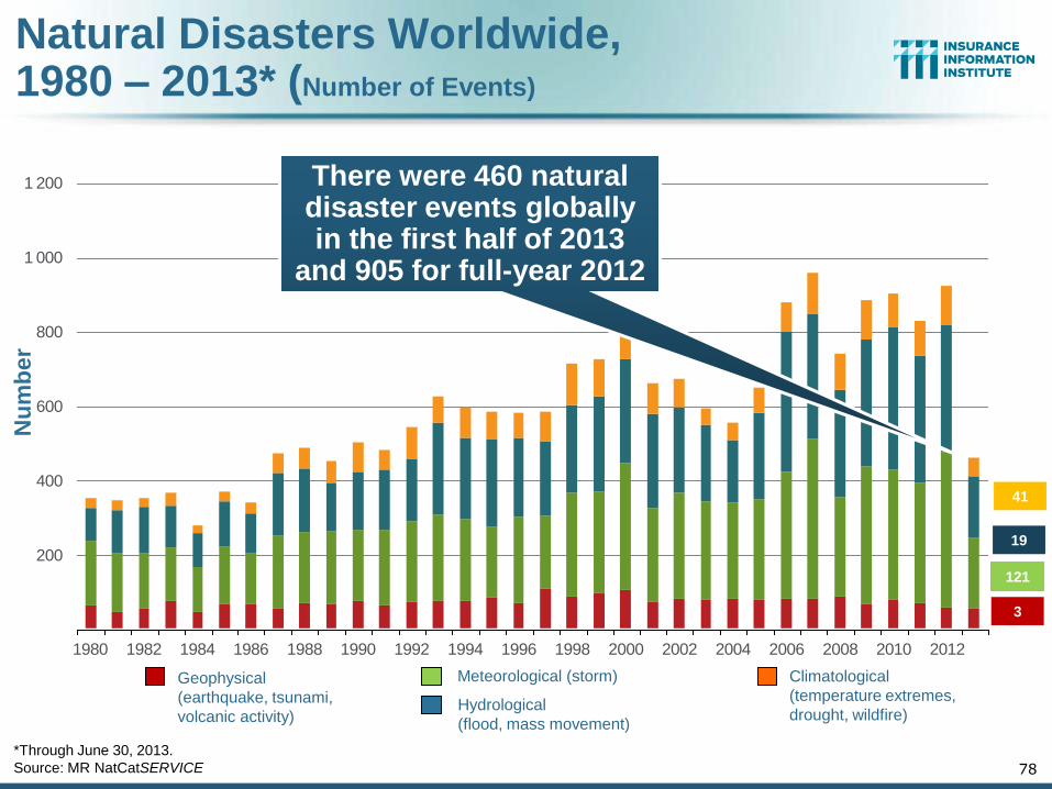
Geophysical
(earthquake, tsunami,
volcanic activity)
Climatological
(temperature extremes,
drought, wildfire)
Meteorological (storm)
Hydrological
(flood, mass movement)
Natural Disasters Worldwide, 1980 – 2013* (Number of Events)
*Through June 30, 2013.
Source: MR NatCatSERVICE 78
41
19
121
3
200
400
600
800
1 000
1 200
1980 1982 1984 1986 1988 1990 1992 1994 1996 1998 2000 2002 2004 2006 2008 2010 2012
Nu
mb
er
There were 460 natural disaster events globally in the first half of 2013
and 905 for full-year 2012
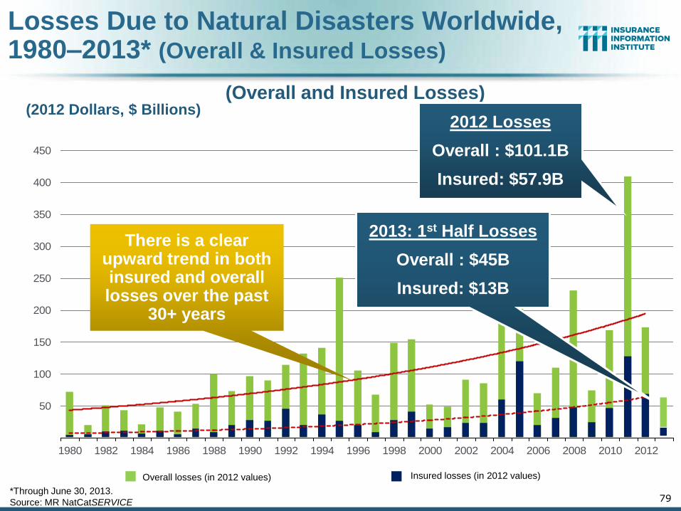
Losses Due to Natural Disasters Worldwide, 1980–2013* (Overall & Insured Losses)
79
Overall losses (in 2012 values) Insured losses (in 2012 values)
*Through June 30, 2013.
Source: MR NatCatSERVICE
(2012 Dollars, $ Billions) (Overall and Insured Losses)
50
100
150
200
250
300
350
400
450
1980 1982 1984 1986 1988 1990 1992 1994 1996 1998 2000 2002 2004 2006 2008 2010 2012
2012 Losses
Overall : $101.1B
Insured: $57.9B
There is a clear upward trend in both insured and overall losses over the past
30+ years
2013: 1st Half Losses
Overall : $45B
Insured: $13B
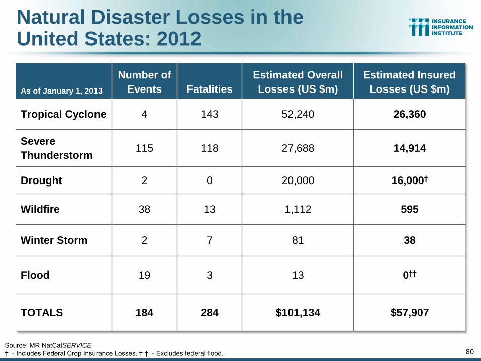
As of January 1, 2013
Number of
Events Fatalities
Estimated Overall
Losses (US $m)
Estimated Insured
Losses (US $m)
Tropical Cyclone 4 143 52,240 26,360
Severe
Thunderstorm 115 118 27,688 14,914
Drought 2 0 20,000 16,000†
Wildfire 38 13 1,112 595
Winter Storm 2 7 81 38
Flood 19 3 13 0††
TOTALS 184 284 $101,134 $57,907
Natural Disaster Losses in the United States: 2012
80 Source: MR NatCatSERVICE
† - Includes Federal Crop Insurance Losses. † † - Excludes federal flood.
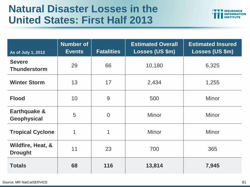
As of July 1, 2013
Number of
Events Fatalities
Estimated Overall
Losses (US $m)
Estimated Insured
Losses (US $m)
Severe
Thunderstorm 29 66 10,180 6,325
Winter Storm 13 17 2,434 1,255
Flood 10 9 500 Minor
Earthquake &
Geophysical 5 0 Minor Minor
Tropical Cyclone 1 1 Minor Minor
Wildfire, Heat, &
Drought 11 23 700 365
Totals 68 116 13,814 7,945
81 Source: MR NatCatSERVICE
Natural Disaster Losses in the United States: First Half 2013
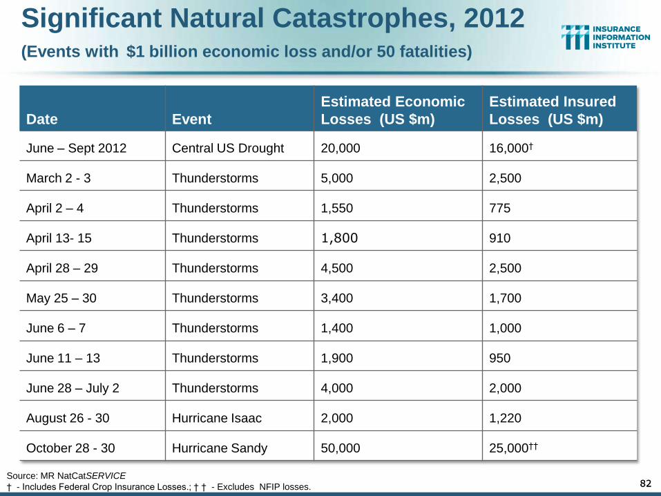
Significant Natural Catastrophes, 2012 (Events with $1 billion economic loss and/or 50 fatalities)
Date Event
Estimated Economic
Losses (US $m)
Estimated Insured
Losses (US $m)
June – Sept 2012 Central US Drought 20,000 16,000†
March 2 - 3 Thunderstorms 5,000 2,500
April 2 – 4 Thunderstorms 1,550 775
April 13- 15 Thunderstorms 1,800 910
April 28 – 29 Thunderstorms 4,500 2,500
May 25 – 30 Thunderstorms 3,400 1,700
June 6 – 7 Thunderstorms 1,400 1,000
June 11 – 13 Thunderstorms 1,900 950
June 28 – July 2 Thunderstorms 4,000 2,000
August 26 - 30 Hurricane Isaac 2,000 1,220
October 28 - 30 Hurricane Sandy 50,000 25,000††
82 82 Source: MR NatCatSERVICE
† - Includes Federal Crop Insurance Losses.; † † - Excludes NFIP losses.
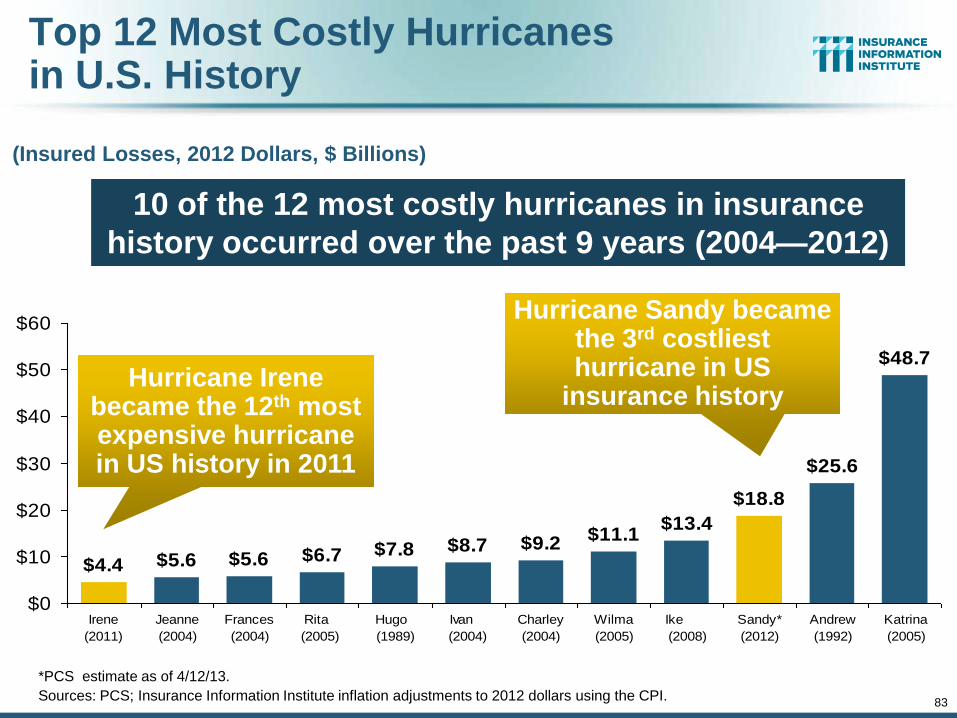
83
Top 12 Most Costly Hurricanes in U.S. History
(Insured Losses, 2012 Dollars, $ Billions)
*PCS estimate as of 4/12/13.
Sources: PCS; Insurance Information Institute inflation adjustments to 2012 dollars using the CPI.
$9.2$11.1
$13.4
$18.8
$25.6
$48.7
$8.7$7.8$6.7$5.6$5.6$4.4
$0
$10
$20
$30
$40
$50
$60
Irene
(2011)
Jeanne
(2004)
Frances
(2004)
Rita
(2005)
Hugo
(1989)
Ivan
(2004)
Charley
(2004)
Wilma
(2005)
Ike
(2008)
Sandy*
(2012)
Andrew
(1992)
Katrina
(2005)
Hurricane Sandy became the 3rd costliest hurricane in US
insurance history Hurricane Irene
became the 12th most expensive hurricane in US history in 2011
10 of the 12 most costly hurricanes in insurance
history occurred over the past 9 years (2004—2012)
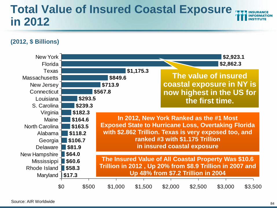
84
Total Value of Insured Coastal Exposure in 2012
(2012, $ Billions)
Source: AIR Worldwide
$293.5
$239.3
$182.3
$164.6
$163.5
$118.2
$106.7
$81.9
$64.0
$60.6
$58.3
$17.3
$567.8
$713.9
$849.6
$1,175.3
$2,862.3
$2,923.1
$0 $500 $1,000 $1,500 $2,000 $2,500 $3,000 $3,500
New York
Florida
Texas
Massachusetts
New Jersey
Connecticut
Louisiana
S. Carolina
Virginia
Maine
North Carolina
Alabama
Georgia
Delaware
New Hampshire
Mississippi
Rhode Island
Maryland
In 2012, New York Ranked as the #1 Most Exposed State to Hurricane Loss, Overtaking Florida with $2.862 Trillion. Texas is very exposed too, and
ranked #3 with $1.175 Trillion in insured coastal exposure
The Insured Value of All Coastal Property Was $10.6 Trillion in 2012 , Up 20% from $8.9 Trillion in 2007 and
Up 48% from $7.2 Trillion in 2004
The value of insured coastal exposure in NY is now highest in the US for
the first time.
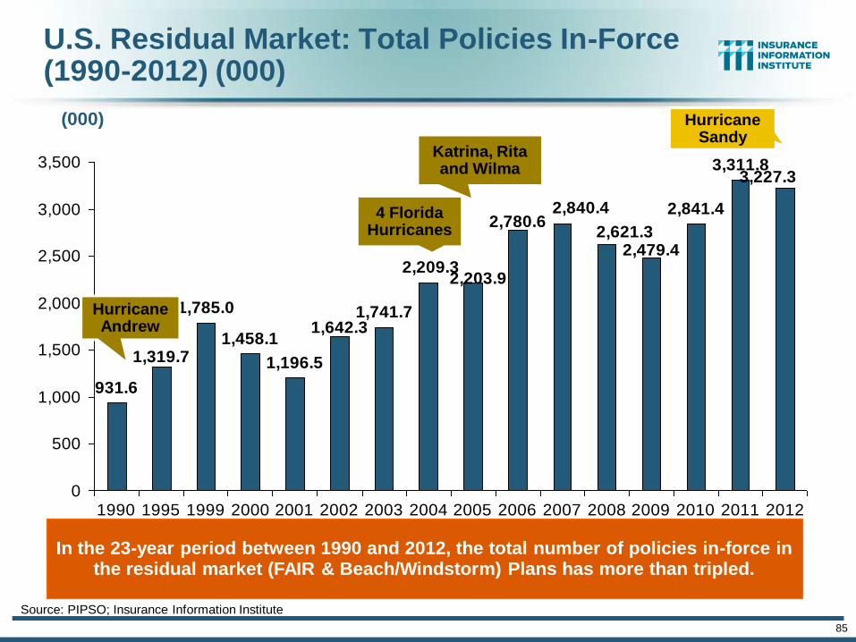
85
The combined ratios for both personal and commercial lines
improved substantially in 2013:H1
U.S. Residual Market: Total Policies In-Force (1990-2012) (000)
Source: PIPSO; Insurance Information Institute
931.6
1,785.0
1,458.1
1,196.5
1,741.7
2,841.4
3,311.83,227.3
2,479.4
1,319.7
2,621.32,780.6
1,642.3
2,840.4
2,209.32,203.9
0
500
1,000
1,500
2,000
2,500
3,000
3,500
1990 1995 1999 2000 2001 2002 2003 2004 2005 2006 2007 2008 2009 2010 2011 2012
(000)
Hurricane Andrew
4 Florida Hurricanes
Katrina, Rita and Wilma
In the 23-year period between 1990 and 2012, the total number of policies in-force in the residual market (FAIR & Beach/Windstorm) Plans has more than tripled.
Hurricane Sandy
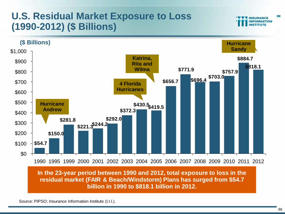
86
U.S. Residual Market Exposure to Loss(1990-2012) ($ Billions)
Source: PIPSO; Insurance Information Institute (I.I.I.).
$281.8
$884.7
$757.9$818.1
$430.5$372.3
$54.7
$150.0
$292.0$244.2
$221.3
$419.5
$656.7 $696.4
$771.9
$703.0
$0
$100
$200
$300
$400
$500
$600
$700
$800
$900
$1,000
1990 1995 1999 2000 2001 2002 2003 2004 2005 2006 2007 2008 2009 2010 2011 2012
($ Billions)
In the 23-year period between 1990 and 2012, total exposure to loss in the residual market (FAIR & Beach/Windstorm) Plans has surged from $54.7
billion in 1990 to $818.1 billion in 2012.
Hurricane Andrew
4 Florida Hurricanes
Katrina, Rita and Wilma
Hurricane Sandy
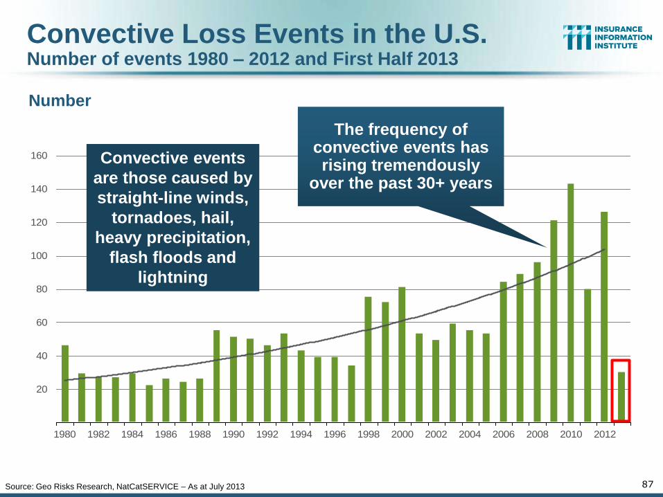
20
40
60
80
100
120
140
160
1980 1982 1984 1986 1988 1990 1992 1994 1996 1998 2000 2002 2004 2006 2008 2010 2012
Number
Convective Loss Events in the U.S. Number of events 1980 – 2012 and First Half 2013
Source: Geo Risks Research, NatCatSERVICE – As at July 2013 87
Convective events
are those caused by
straight-line winds,
tornadoes, hail,
heavy precipitation,
flash floods and
lightning
The frequency of convective events has rising tremendously
over the past 30+ years
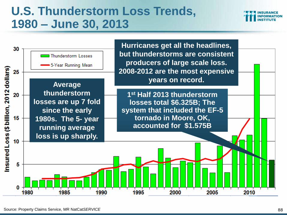
U.S. Thunderstorm Loss Trends, 1980 – June 30, 2013
88
Source: Property Claims Service, MR NatCatSERVICE
Average
thunderstorm
losses are up 7 fold
since the early
1980s. The 5- year
running average
loss is up sharply.
Hurricanes get all the headlines,
but thunderstorms are consistent
producers of large scale loss.
2008-2012 are the most expensive
years on record.
1st Half 2013 thunderstorm losses total $6.325B; The
system that included the EF-5 tornado in Moore, OK, accounted for $1.575B
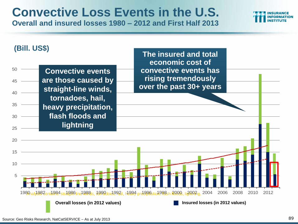
Convective Loss Events in the U.S. Overall and insured losses 1980 – 2012 and First Half 2013
Overall losses (in 2012 values) Insured losses (in 2012 values)
(Bill. US$)
Analysis contains: straight-line winds, tornadoes, hail, heavy precipitation, flash floods, lightning.
5
10
15
20
25
30
35
40
45
50
1980 1982 1984 1986 1988 1990 1992 1994 1996 1998 2000 2002 2004 2006 2008 2010 2012
89 Source: Geo Risks Research, NatCatSERVICE – As at July 2013
Convective events
are those caused by
straight-line winds,
tornadoes, hail,
heavy precipitation,
flash floods and
lightning
The insured and total economic cost of
convective events has rising tremendously
over the past 30+ years
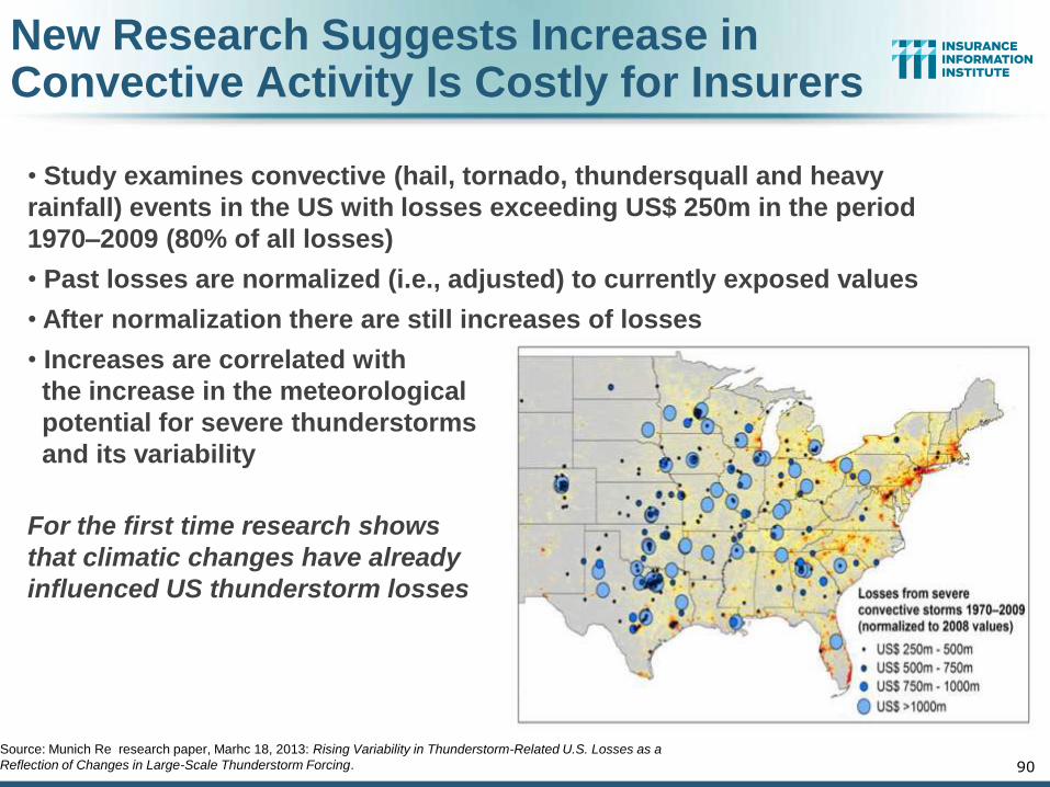
New Research Suggests Increase in Convective Activity Is Costly for Insurers
• Study examines convective (hail, tornado, thundersquall and heavy
rainfall) events in the US with losses exceeding US$ 250m in the period
1970–2009 (80% of all losses)
• Past losses are normalized (i.e., adjusted) to currently exposed values
• After normalization there are still increases of losses
• Increases are correlated with
the increase in the meteorological
potential for severe thunderstorms
and its variability
For the first time research shows
that climatic changes have already
influenced US thunderstorm losses
90
Source: Munich Re research paper, Marhc 18, 2013: Rising Variability in Thunderstorm-Related U.S. Losses as a
Reflection of Changes in Large-Scale Thunderstorm Forcing.
Hurricane Sandy Summary
91
Sandy Became One of the Most Expensive Events in
Insurance History
91
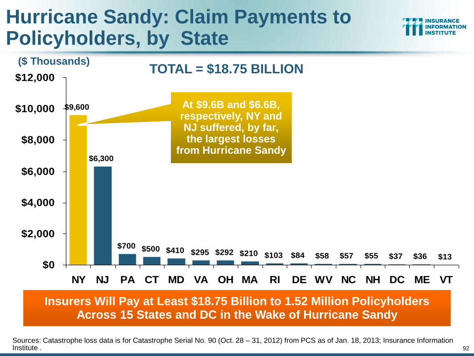
Hurricane Sandy: Claim Payments to Policyholders, by State
$9,600
$6,300
$700 $500 $410 $295 $292 $210 $103 $84 $57 $55 $37 $36 $13$58
$0
$2,000
$4,000
$6,000
$8,000
$10,000
$12,000
NY NJ PA CT MD VA OH MA RI DE WV NC NH DC ME VT
Insurers Will Pay at Least $18.75 Billion to 1.52 Million Policyholders Across 15 States and DC in the Wake of Hurricane Sandy
92
At $9.6B and $6.6B, respectively, NY and NJ suffered, by far, the largest losses
from Hurricane Sandy
TOTAL = $18.75 BILLION ($ Thousands)
Sources: Catastrophe loss data is for Catastrophe Serial No. 90 (Oct. 28 – 31, 2012) from PCS as of Jan. 18, 2013; Insurance Information Institute .
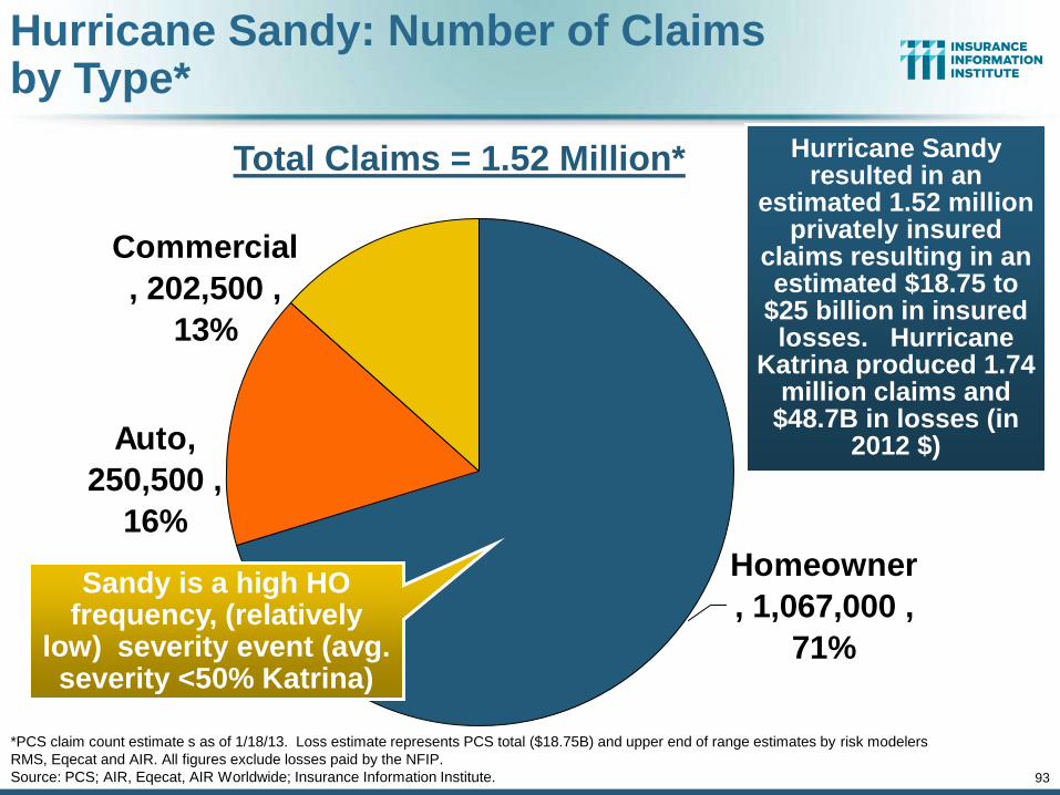
Auto,
250,500 ,
16%
Commercial
, 202,500 ,
13%
Homeowner
, 1,067,000 ,
71%
Hurricane Sandy resulted in an
estimated 1.52 million privately insured
claims resulting in an estimated $18.75 to
$25 billion in insured losses. Hurricane
Katrina produced 1.74 million claims and
$48.7B in losses (in 2012 $)
Hurricane Sandy: Number of Claims by Type*
*PCS claim count estimate s as of 1/18/13. Loss estimate represents PCS total ($18.75B) and upper end of range estimates by risk modelers
RMS, Eqecat and AIR. All figures exclude losses paid by the NFIP.
Source: PCS; AIR, Eqecat, AIR Worldwide; Insurance Information Institute. 93
Sandy is a high HO frequency, (relatively
low) severity event (avg. severity <50% Katrina)
Total Claims = 1.52 Million*
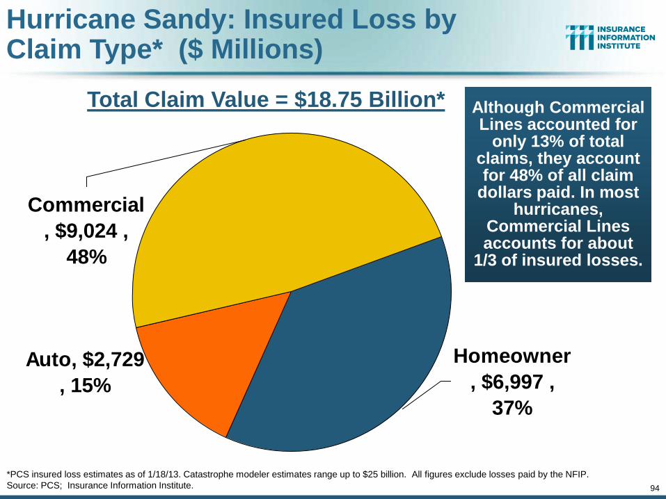
Auto, $2,729
, 15%
Commercial
, $9,024 ,
48%
Homeowner
, $6,997 ,
37%
Although Commercial Lines accounted for
only 13% of total claims, they account for 48% of all claim
dollars paid. In most hurricanes,
Commercial Lines accounts for about
1/3 of insured losses.
Hurricane Sandy: Insured Loss by Claim Type* ($ Millions)
*PCS insured loss estimates as of 1/18/13. Catastrophe modeler estimates range up to $25 billion. All figures exclude losses paid by the NFIP.
Source: PCS; Insurance Information Institute. 94
Total Claim Value = $18.75 Billion*
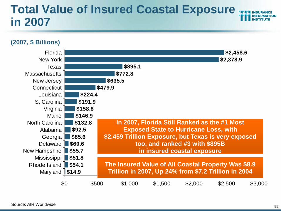
95
Total Value of Insured Coastal Exposure in 2007
(2007, $ Billions)
Source: AIR Worldwide
$224.4
$191.9
$158.8
$146.9
$132.8
$92.5
$85.6
$60.6
$55.7
$51.8
$54.1
$14.9
$479.9
$635.5
$772.8
$895.1
$2,378.9
$2,458.6
$0 $500 $1,000 $1,500 $2,000 $2,500 $3,000
Florida
New York
Texas
Massachusetts
New Jersey
Connecticut
Louisiana
S. Carolina
Virginia
Maine
North Carolina
Alabama
Georgia
Delaware
New Hampshire
Mississippi
Rhode Island
Maryland
In 2007, Florida Still Ranked as the #1 Most Exposed State to Hurricane Loss, with
$2.459 Trillion Exposure, but Texas is very exposed too, and ranked #3 with $895B
in insured coastal exposure
The Insured Value of All Coastal Property Was $8.9 Trillion in 2007, Up 24% from $7.2 Trillion in 2004
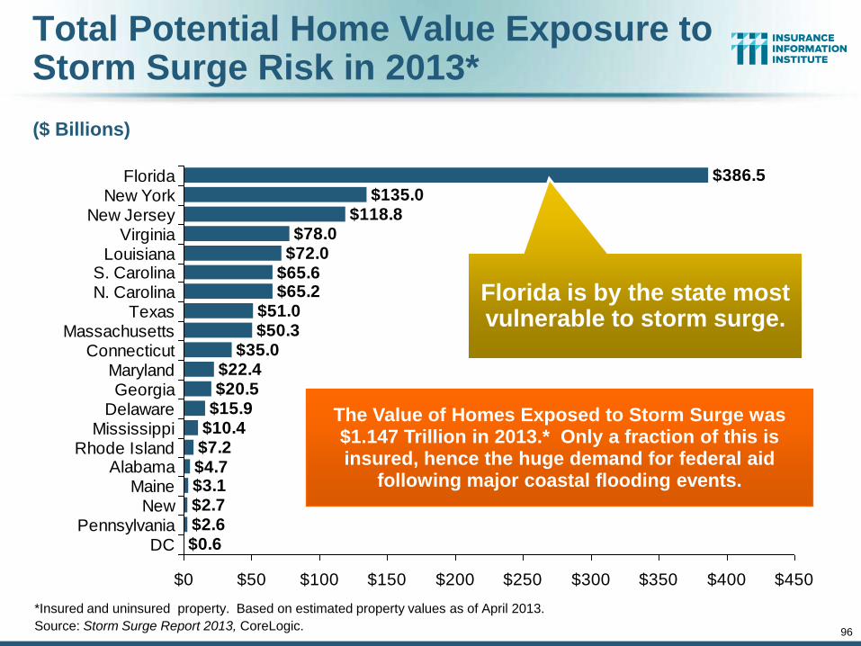
96
Total Potential Home Value Exposure to Storm Surge Risk in 2013*
($ Billions)
*Insured and uninsured property. Based on estimated property values as of April 2013.
Source: Storm Surge Report 2013, CoreLogic.
$65.2$51.0$50.3
$35.0$22.4$20.5
$15.9$10.4$7.2$4.7$3.1$2.7$2.6$0.6
$65.6$72.0$78.0
$118.8$135.0
$386.5
$0 $50 $100 $150 $200 $250 $300 $350 $400 $450
FloridaNew York
New JerseyVirginia
LouisianaS. CarolinaN. Carolina
TexasMassachusetts
ConnecticutMarylandGeorgia
DelawareMississippi
Rhode IslandAlabama
MaineNew
PennsylvaniaDC
The Value of Homes Exposed to Storm Surge was $1.147 Trillion in 2013.* Only a fraction of this is insured, hence the huge demand for federal aid
following major coastal flooding events.
Florida is by the state most vulnerable to storm surge.
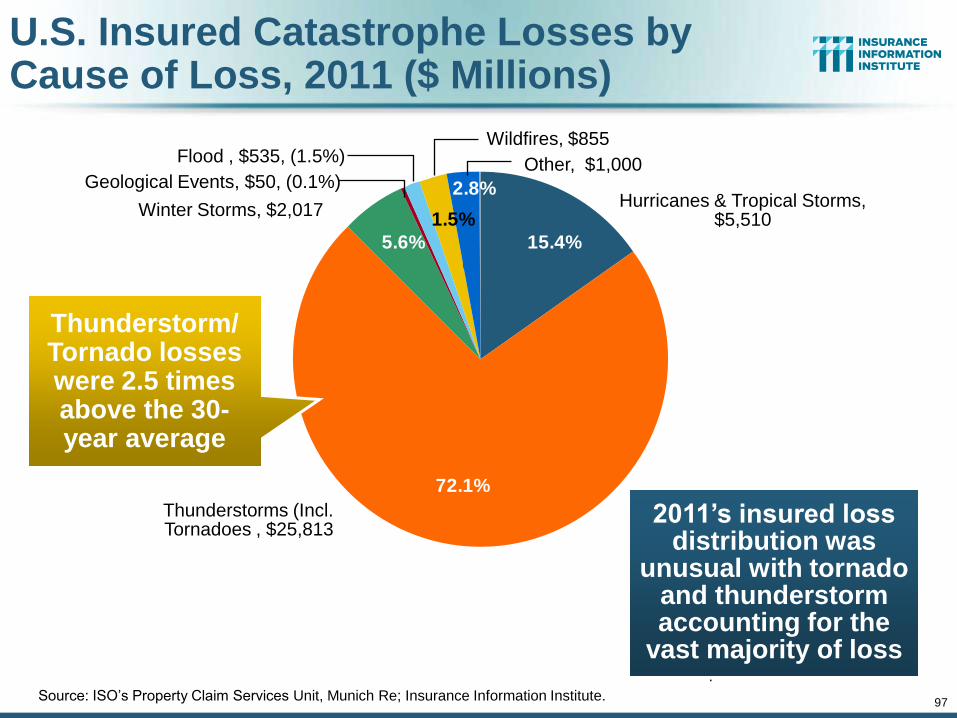
97
U.S. Insured Catastrophe Losses by Cause of Loss, 2011 ($ Millions)
2.8%
1.5%
5.6%
72.1%
15.4%
.
Source: ISO’s Property Claim Services Unit, Munich Re; Insurance Information Institute.
Hurricanes & Tropical Storms, $5,510
Wildfires, $855
Thunderstorms (Incl. Tornadoes , $25,813
Winter Storms, $2,017
Geological Events, $50, (0.1%)
Flood , $535, (1.5%) Other, $1,000
2011’s insured loss distribution was
unusual with tornado and thunderstorm accounting for the
vast majority of loss
Thunderstorm/ Tornado losses were 2.5 times above the 30-year average
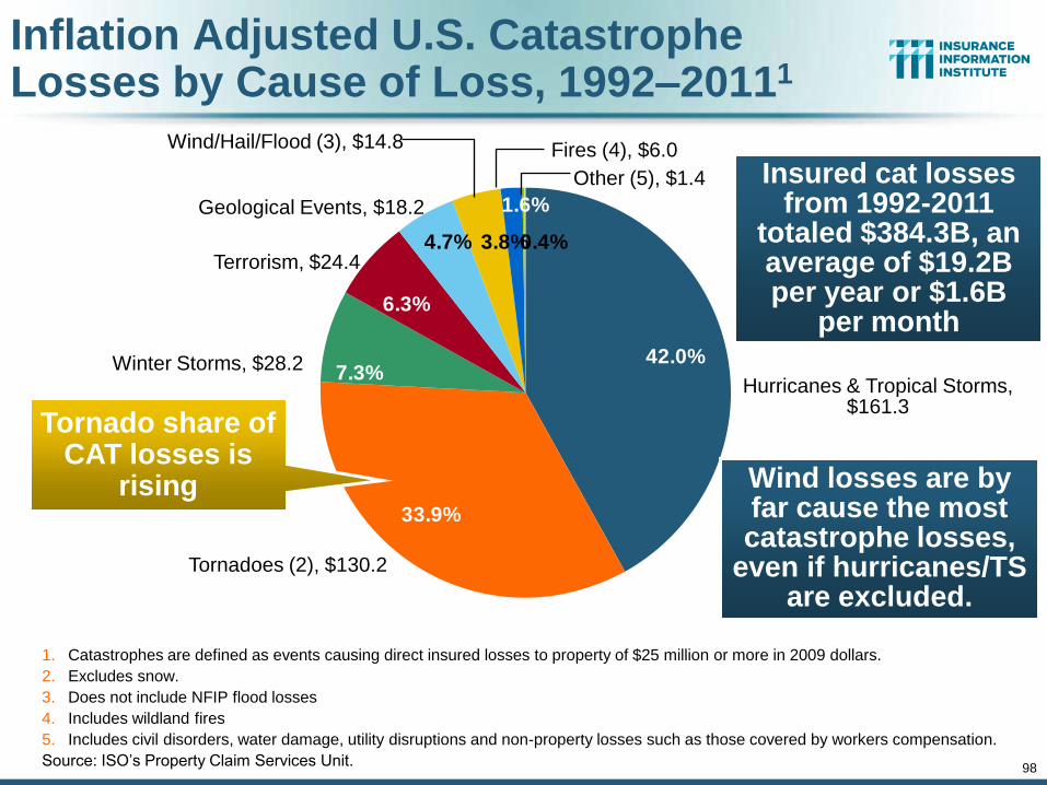
98
Inflation Adjusted U.S. Catastrophe Losses by Cause of Loss, 1992–20111
0.4%
1.6%
3.8%4.7%
6.3%
7.3%
33.9%
42.0%
1. Catastrophes are defined as events causing direct insured losses to property of $25 million or more in 2009 dollars.
2. Excludes snow.
3. Does not include NFIP flood losses
4. Includes wildland fires
5. Includes civil disorders, water damage, utility disruptions and non-property losses such as those covered by workers compensation.
Source: ISO’s Property Claim Services Unit.
Hurricanes & Tropical Storms, $161.3
Fires (4), $6.0
Tornadoes (2), $130.2
Winter Storms, $28.2
Terrorism, $24.4
Geological Events, $18.2
Wind/Hail/Flood (3), $14.8
Other (5), $1.4
Wind losses are by far cause the most catastrophe losses,
even if hurricanes/TS are excluded.
Tornado share of CAT losses is
rising
Insured cat losses from 1992-2011
totaled $384.3B, an average of $19.2B per year or $1.6B
per month
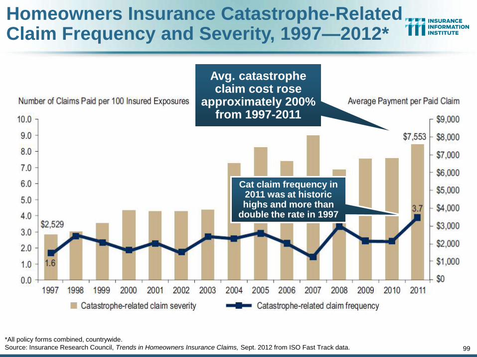
Homeowners Insurance Catastrophe-Related Claim Frequency and Severity, 1997—2012*
*All policy forms combined, countrywide.
Source: Insurance Research Council, Trends in Homeowners Insurance Claims, Sept. 2012 from ISO Fast Track data. 99
Avg. catastrophe claim cost rose
approximately 200% from 1997-2011
Cat claim frequency in 2011 was at historic highs and more than
double the rate in 1997
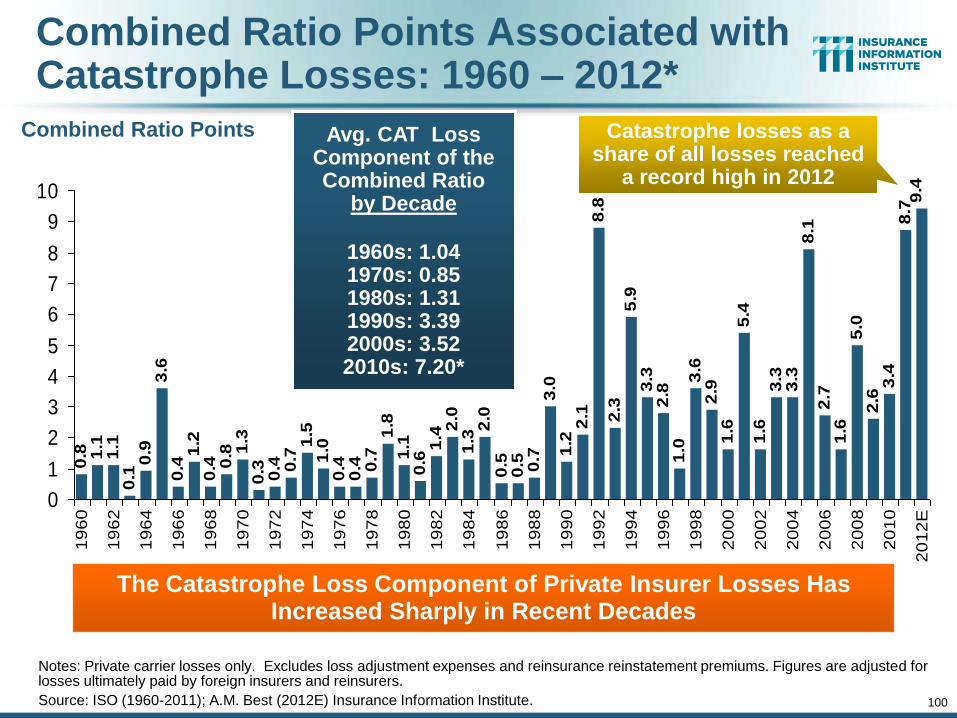
100
Combined Ratio Points Associated with Catastrophe Losses: 1960 – 2012*
Notes: Private carrier losses only. Excludes loss adjustment expenses and reinsurance reinstatement premiums. Figures are adjusted for losses ultimately paid by foreign insurers and reinsurers.
Source: ISO (1960-2011); A.M. Best (2012E) Insurance Information Institute.
0.4
1.2
0.4 0
.8 1.3
0.3 0.4 0.7
1.5
1.0
0.4
0.4 0.7
1.8
1.1
0.6
1.42
.01
.32
.00
.50
.5 0.7
3.0
1.2
2.1
8.8
2.3
5.9
3.3
2.8
1.0
3.6
2.9
1.6
5.4
1.6
3.3
3.3
8.1
2.7
1.6
5.0
2.6
3.4
8.7
9.4
3.6
0.9
0.1
1.1
1.1
0.8
0
1
2
3
4
5
6
7
8
9
10
19
60
19
62
19
64
19
66
19
68
19
70
19
72
19
74
19
76
19
78
19
80
19
82
19
84
19
86
19
88
19
90
19
92
19
94
19
96
19
98
20
00
20
02
20
04
20
06
20
08
20
10
20
12
E
The Catastrophe Loss Component of Private Insurer Losses Has Increased Sharply in Recent Decades
Avg. CAT Loss Component of the Combined Ratio
by Decade
1960s: 1.04 1970s: 0.85 1980s: 1.31 1990s: 3.39 2000s: 3.52 2010s: 7.20*
Combined Ratio Points Catastrophe losses as a share of all losses reached
a record high in 2012
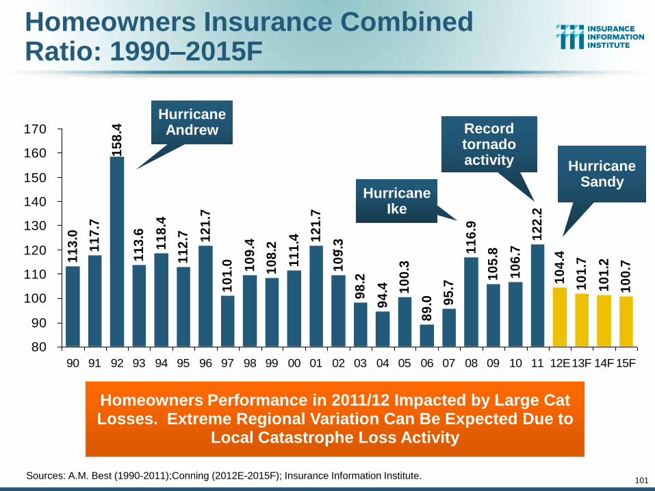
Homeowners Insurance Combined Ratio: 1990–2015F
11
3.0
11
7.7
15
8.4
11
3.6
10
1.0 10
9.4
10
8.2
11
1.4 1
21
.7
10
9.3
98
.2
94
.4 10
0.3
89
.0 95
.7
11
6.9
10
5.8
10
6.7
12
2.2
10
4.4
10
1.7
10
1.2
10
0.7
11
8.4
11
2.7 12
1.7
80
90
100
110
120
130
140
150
160
170
90 91 92 93 94 95 96 97 98 99 00 01 02 03 04 05 06 07 08 09 10 11 12E13F 14F 15F
1
Homeowners Performance in 2011/12 Impacted by Large Cat Losses. Extreme Regional Variation Can Be Expected Due to
Local Catastrophe Loss Activity
Sources: A.M. Best (1990-2011);Conning (2012E-2015F); Insurance Information Institute.
101
Hurricane Ike
Hurricane Sandy
Record tornado activity
Hurricane Andrew
102
Federal Disaster Declarations Patterns:
1953-2013
102
Disaster Declarations Set New Records in Recent Years
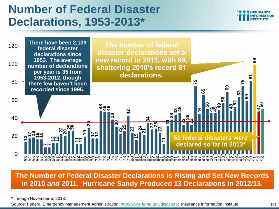
Number of Federal Disaster Declarations, 1953-2013*
13 1
7 18
16
16
7 71
21
22
22
0 25
25
11
11
19
29
17
17
48
46
46
38
30
22 2
54
22
31
52
42
13
42
7 28
23
11
31
38
45
32 3
63
27
54
46
55
04
54
5 49
56
69
48 5
26
37
55
98
19
94
7 50
43
0
20
40
60
80
100
120
53
54
55
56
57
58
59
60
61
62
63
64
65
66
67
68
69
70
71
72
73
74
75
76
77
78
79
80
81
82
83
84
85
86
87
88
89
90
91
92
93
94
95
96
97
98
99
00
01
02
03
04
05
06
07
08
09
10
11
12
13
*Through November 5, 2013.
Source: Federal Emergency Management Administration; http://www.fema.gov/disasters; Insurance Information Institute.
The Number of Federal Disaster Declarations Is Rising and Set New Records in 2010 and 2011. Hurricane Sandy Produced 13 Declarations in 2012/13.
The number of federal disaster declarations set a
new record in 2011, with 99, shattering 2010’s record 81
declarations.
There have been 2,139 federal disaster
declarations since 1953. The average
number of declarations per year is 35 from 1953-2012, though
there few haven’t been recorded since 1995.
50 federal disasters were declared so far in 2013*
103
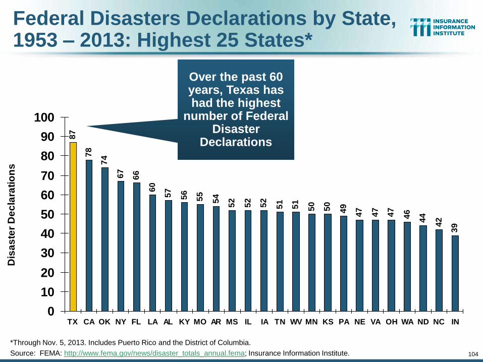
104
Federal Disasters Declarations by State, 1953 – 2013: Highest 25 States*
87
78
74
67
66
60
57
56
55
54
52
52
52
51
51
50
50
49
47
47
47
46
44
42
39
0
10
20
30
40
50
60
70
80
90
100
TX CA OK NY FL LA AL KY MO AR MS IL IA TN WV MN KS PA NE VA OH WA ND NC IN
Dis
as
ter
De
cla
rati
on
s
Over the past 60 years, Texas has had the highest
number of Federal Disaster
Declarations
*Through Nov. 5, 2013. Includes Puerto Rico and the District of Columbia.
Source: FEMA: http://www.fema.gov/news/disaster_totals_annual.fema; Insurance Information Institute.
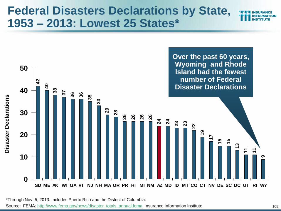
105
Federal Disasters Declarations by State, 1953 – 2013: Lowest 25 States*
42
40
38
37
36
36
35
33
29
28
26
26
26
26
24
24
23
23
22
19
17
15
15
13
11
11
9
0
10
20
30
40
50
SD ME AK WI GA VT NJ NH MA OR PR HI MI NM AZ MD ID MT CO CT NV DE SC DC UT RI WY
Dis
as
ter
De
cla
rati
on
s
Over the past 60 years, Wyoming and Rhode Island had the fewest
number of Federal Disaster Declarations
*Through Nov. 5, 2013. Includes Puerto Rico and the District of Columbia.
Source: FEMA: http://www.fema.gov/news/disaster_totals_annual.fema; Insurance Information Institute.
106
SEVERE WEATHER REPORT UPDATE: 2013
Damage from Tornadoes, Large Hail
and High Winds Keep Insurers Busy
106
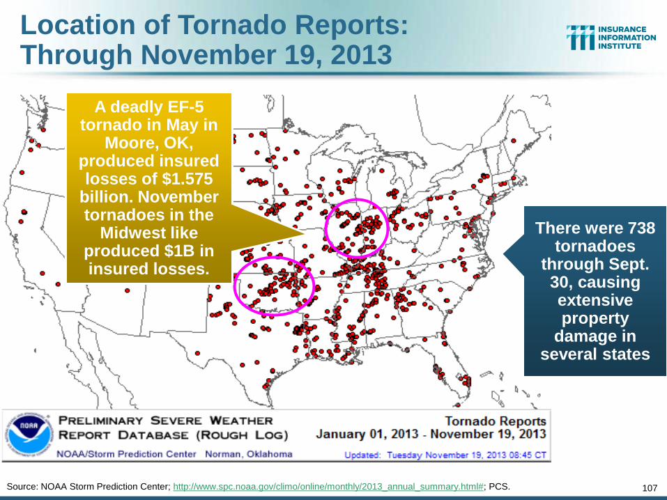
Location of Tornado Reports: Through November 19, 2013
107 Source: NOAA Storm Prediction Center; http://www.spc.noaa.gov/climo/online/monthly/2013_annual_summary.html#; PCS.
There were 738 tornadoes
through Sept. 30, causing extensive property
damage in several states
A deadly EF-5 tornado in May in
Moore, OK, produced insured losses of $1.575
billion. November tornadoes in the
Midwest like produced $1B in insured losses.
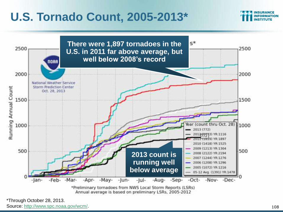
U.S. Tornado Count, 2005-2013*
108
*Through October 28, 2013.
Source: http://www.spc.noaa.gov/wcm/.
There were 1,897 tornadoes in the U.S. in 2011 far above average, but
well below 2008’s record
2013 count is running well
below average
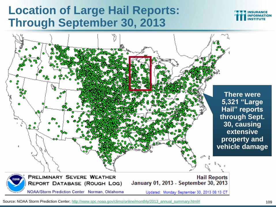
Location of Large Hail Reports: Through September 30, 2013
109 Source: NOAA Storm Prediction Center; http://www.spc.noaa.gov/climo/online/monthly/2013_annual_summary.html#
There were 5,321 “Large Hail” reports through Sept. 30, causing extensive
property and vehicle damage
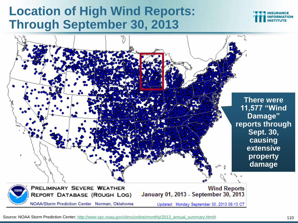
Location of High Wind Reports: Through September 30, 2013
110 Source: NOAA Storm Prediction Center; http://www.spc.noaa.gov/climo/online/monthly/2013_annual_summary.html#
There were 11,577 “Wind
Damage” reports through
Sept. 30, causing
extensive property damage
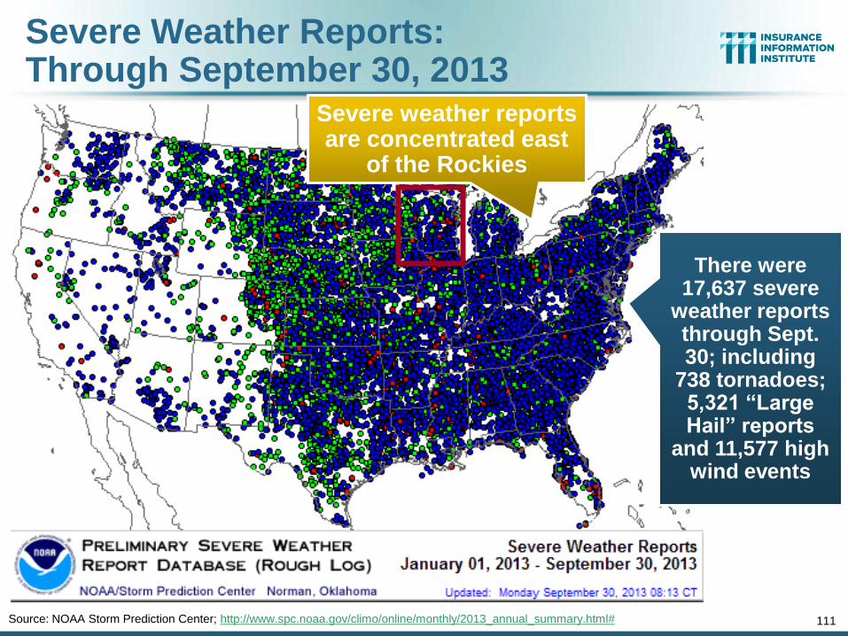
Severe Weather Reports: Through September 30, 2013
111 Source: NOAA Storm Prediction Center; http://www.spc.noaa.gov/climo/online/monthly/2013_annual_summary.html#
Severe weather reports are concentrated east
of the Rockies
There were 17,637 severe
weather reports through Sept. 30; including
738 tornadoes; 5,321 “Large Hail” reports
and 11,577 high wind events
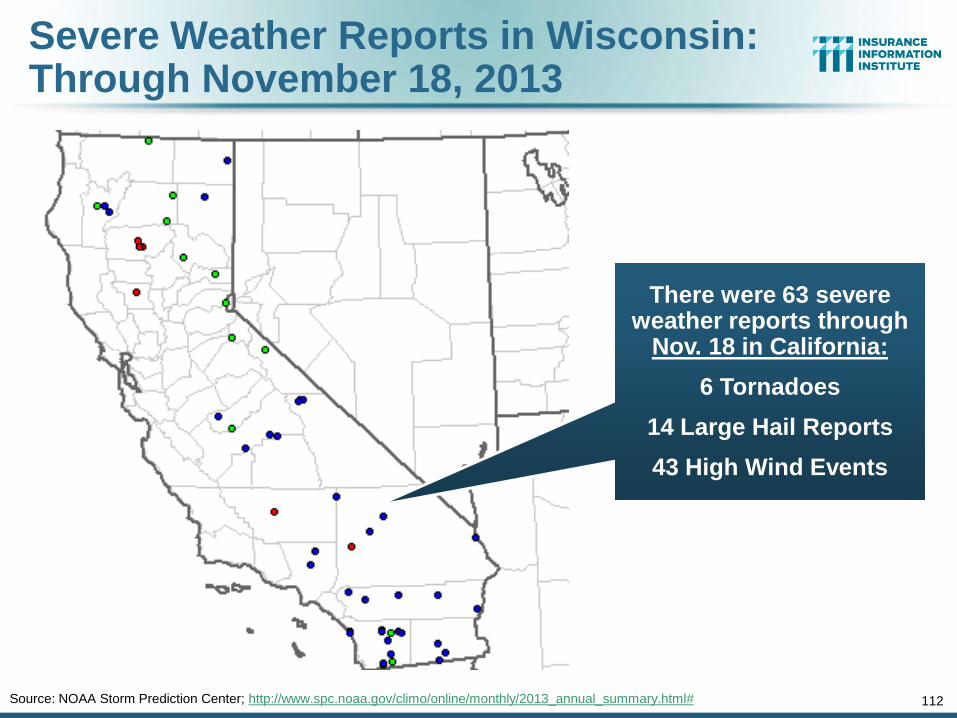
Severe Weather Reports in Wisconsin: Through November 18, 2013
112 Source: NOAA Storm Prediction Center; http://www.spc.noaa.gov/climo/online/monthly/2013_annual_summary.html#
There were 63 severe weather reports through
Nov. 18 in California:
6 Tornadoes
14 Large Hail Reports
43 High Wind Events
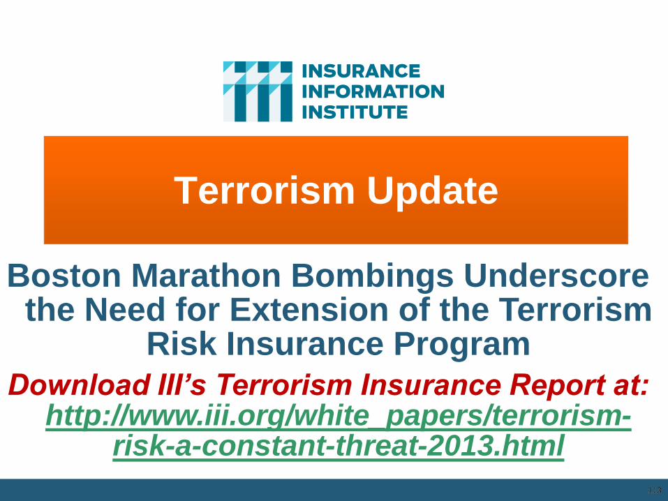
Terrorism Update
113
Boston Marathon Bombings Underscore the Need for Extension of the Terrorism
Risk Insurance Program
Download III’s Terrorism Insurance Report at: http://www.iii.org/white_papers/terrorism-
risk-a-constant-threat-2013.html
113
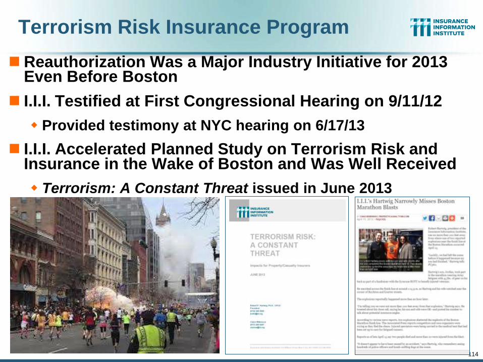
114
Terrorism Risk Insurance Program
Reauthorization Was a Major Industry Initiative for 2013 Even Before Boston
I.I.I. Testified at First Congressional Hearing on 9/11/12
Provided testimony at NYC hearing on 6/17/13
I.I.I. Accelerated Planned Study on Terrorism Risk and Insurance in the Wake of Boston and Was Well Received
Terrorism: A Constant Threat issued in June 2013
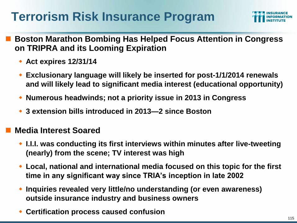
115
Terrorism Risk Insurance Program
Boston Marathon Bombing Has Helped Focus Attention in Congress on TRIPRA and its Looming Expiration
Act expires 12/31/14
Exclusionary language will likely be inserted for post-1/1/2014 renewals
and will likely lead to significant media interest (educational opportunity)
Numerous headwinds; not a priority issue in 2013 in Congress
3 extension bills introduced in 2013—2 since Boston
Media Interest Soared
I.I.I. was conducting its first interviews within minutes after live-tweeting
(nearly) from the scene; TV interest was high
Local, national and international media focused on this topic for the first
time in any significant way since TRIA’s inception in late 2002
Inquiries revealed very little/no understanding (or even awareness)
outside insurance industry and business owners
Certification process caused confusion
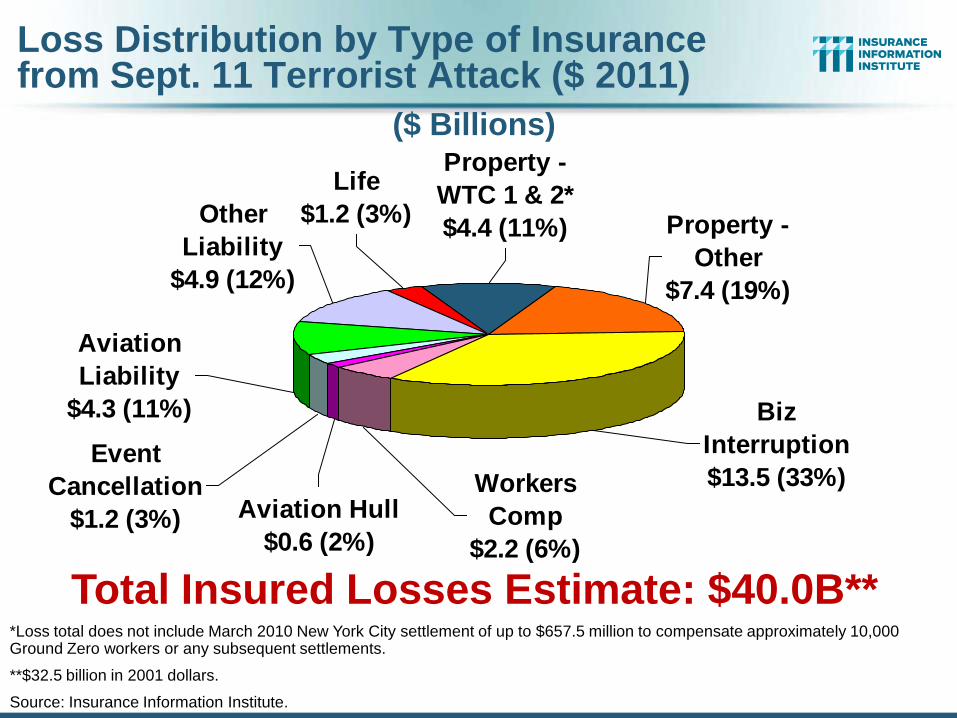
Life
$1.2 (3%)
Aviation
Liability
$4.3 (11%)
Other
Liability
$4.9 (12%)
Biz
Interruption
$13.5 (33%)
Property -
WTC 1 & 2*
$4.4 (11%) Property -
Other
$7.4 (19%)
Aviation Hull
$0.6 (2%)
Event
Cancellation
$1.2 (3%)
Workers
Comp
$2.2 (6%)
Total Insured Losses Estimate: $40.0B** *Loss total does not include March 2010 New York City settlement of up to $657.5 million to compensate approximately 10,000 Ground Zero workers or any subsequent settlements.
**$32.5 billion in 2001 dollars.
Source: Insurance Information Institute.
Loss Distribution by Type of Insurance from Sept. 11 Terrorist Attack ($ 2011)
($ Billions)
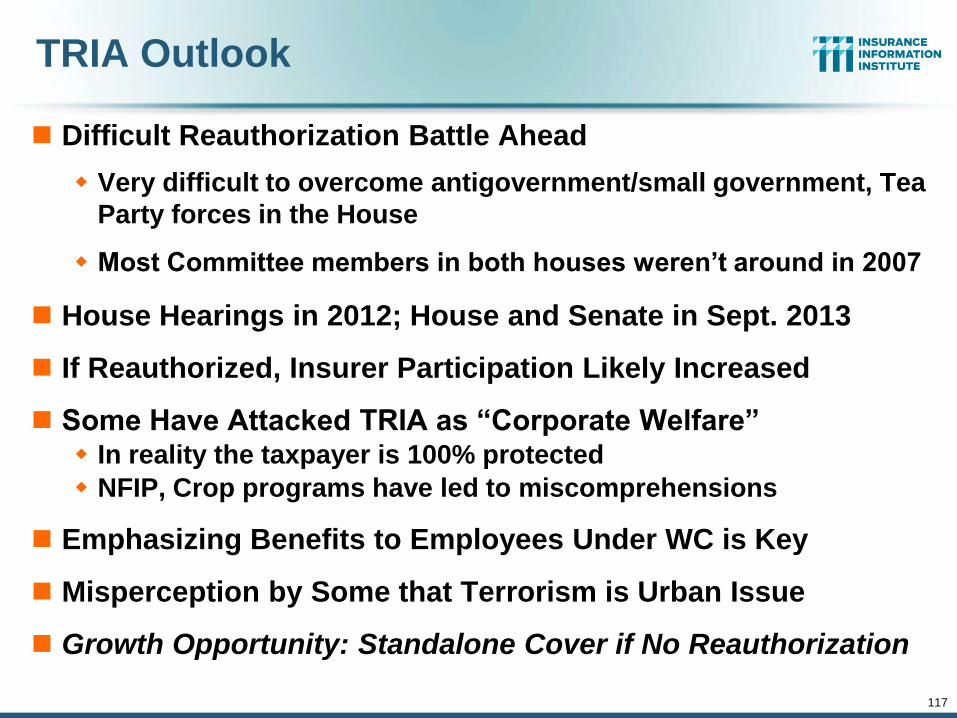
117
TRIA Outlook
Difficult Reauthorization Battle Ahead
Very difficult to overcome antigovernment/small government, Tea
Party forces in the House
Most Committee members in both houses weren’t around in 2007
House Hearings in 2012; House and Senate in Sept. 2013
If Reauthorized, Insurer Participation Likely Increased
Some Have Attacked TRIA as “Corporate Welfare” In reality the taxpayer is 100% protected
NFIP, Crop programs have led to miscomprehensions
Emphasizing Benefits to Employees Under WC is Key
Misperception by Some that Terrorism is Urban Issue
Growth Opportunity: Standalone Cover if No Reauthorization
I.I.I. TRIA Testimony Before US Senate Banking Committee (Sept. 25, 2013)
Robert Hartwig, Future of TRIA Program, U.S. Senate Banking Committee
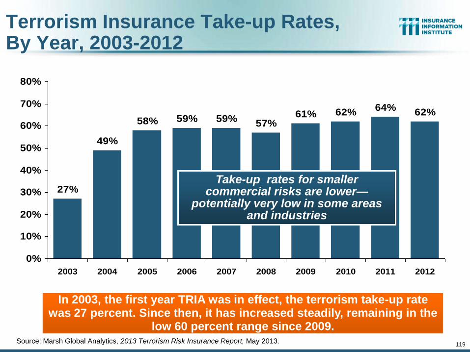
119
Terrorism Insurance Take-up Rates, By Year, 2003-2012
Source: Marsh Global Analytics, 2013 Terrorism Risk Insurance Report, May 2013.
27%
49%
58% 59% 59%57%
61% 62%64%
62%
0%
10%
20%
30%
40%
50%
60%
70%
80%
2003 2004 2005 2006 2007 2008 2009 2010 2011 2012
In 2003, the first year TRIA was in effect, the terrorism take-up rate was 27 percent. Since then, it has increased steadily, remaining in the
low 60 percent range since 2009.
Take-up rates for smaller commercial risks are lower—
potentially very low in some areas and industries
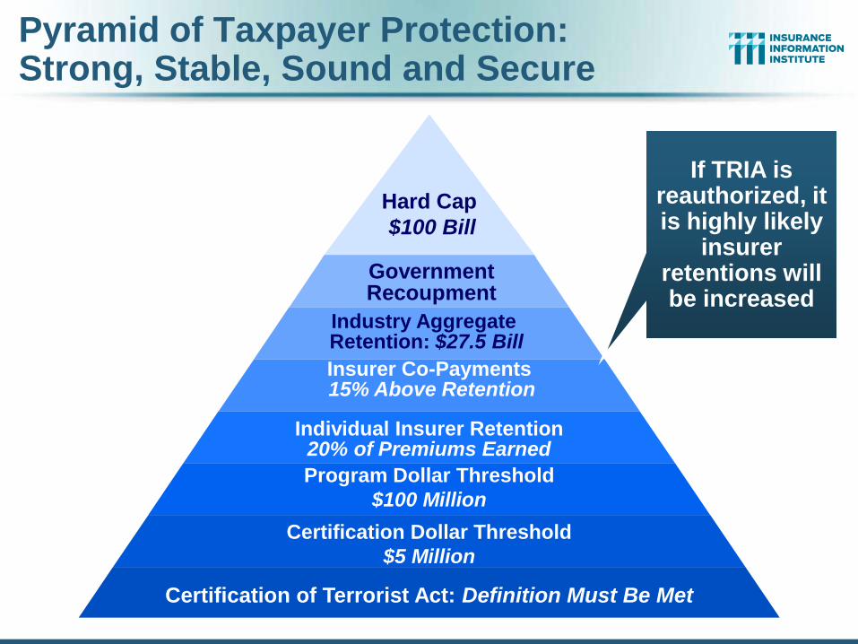
Industry Aggregate Retention: $27.5 Bill
Hard Cap
$100 Bill
Government Recoupment
Insurer Co-Payments 15% Above Retention
Individual Insurer Retention 20% of Premiums Earned
Program Dollar Threshold
$100 Million
Certification Dollar Threshold
$5 Million
Certification of Terrorist Act: Definition Must Be Met
Pyramid of Taxpayer Protection: Strong, Stable, Sound and Secure
If TRIA is reauthorized, it is highly likely
insurer retentions will be increased
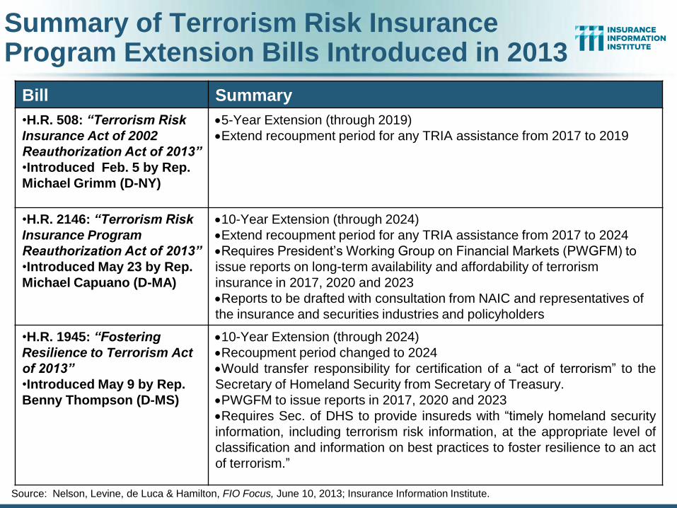
Summary of Terrorism Risk Insurance Program Extension Bills Introduced in 2013
Bill Summary
•H.R. 508: “Terrorism Risk
Insurance Act of 2002
Reauthorization Act of 2013”
•Introduced Feb. 5 by Rep.
Michael Grimm (D-NY)
5-Year Extension (through 2019)
Extend recoupment period for any TRIA assistance from 2017 to 2019
•H.R. 2146: “Terrorism Risk
Insurance Program
Reauthorization Act of 2013”
•Introduced May 23 by Rep.
Michael Capuano (D-MA)
10-Year Extension (through 2024)
Extend recoupment period for any TRIA assistance from 2017 to 2024
Requires President’s Working Group on Financial Markets (PWGFM) to
issue reports on long-term availability and affordability of terrorism
insurance in 2017, 2020 and 2023
Reports to be drafted with consultation from NAIC and representatives of
the insurance and securities industries and policyholders
•H.R. 1945: “Fostering
Resilience to Terrorism Act
of 2013”
•Introduced May 9 by Rep.
Benny Thompson (D-MS)
10-Year Extension (through 2024)
Recoupment period changed to 2024
Would transfer responsibility for certification of a “act of terrorism” to the
Secretary of Homeland Security from Secretary of Treasury.
PWGFM to issue reports in 2017, 2020 and 2023
Requires Sec. of DHS to provide insureds with “timely homeland security
information, including terrorism risk information, at the appropriate level of
classification and information on best practices to foster resilience to an act
of terrorism.”
Source: Nelson, Levine, de Luca & Hamilton, FIO Focus, June 10, 2013; Insurance Information Institute.
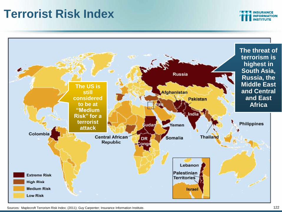
122
Terrorist Risk Index
Sources: Maplecroft Terrorism Risk Index; (2011); Guy Carpenter; Insurance Information Institute.
The threat of terrorism is highest in
South Asia, Russia, the Middle East and Central
and East Africa
The US is still
considered to be at
“Medium Risk” for a
terrorist attack
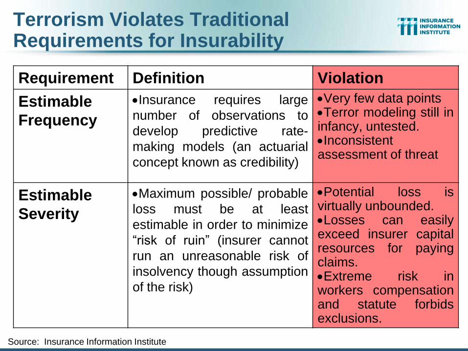
Terrorism Violates Traditional Requirements for Insurability
Requirement Definition Violation
Estimable
Frequency
Insurance requires large
number of observations to
develop predictive rate-
making models (an actuarial
concept known as credibility)
Very few data points Terror modeling still in infancy, untested. Inconsistent assessment of threat
Estimable
Severity
Maximum possible/ probable
loss must be at least
estimable in order to minimize
“risk of ruin” (insurer cannot
run an unreasonable risk of
insolvency though assumption
of the risk)
Potential loss is virtually unbounded. Losses can easily exceed insurer capital resources for paying claims. Extreme risk in workers compensation and statute forbids exclusions.
Source: Insurance Information Institute
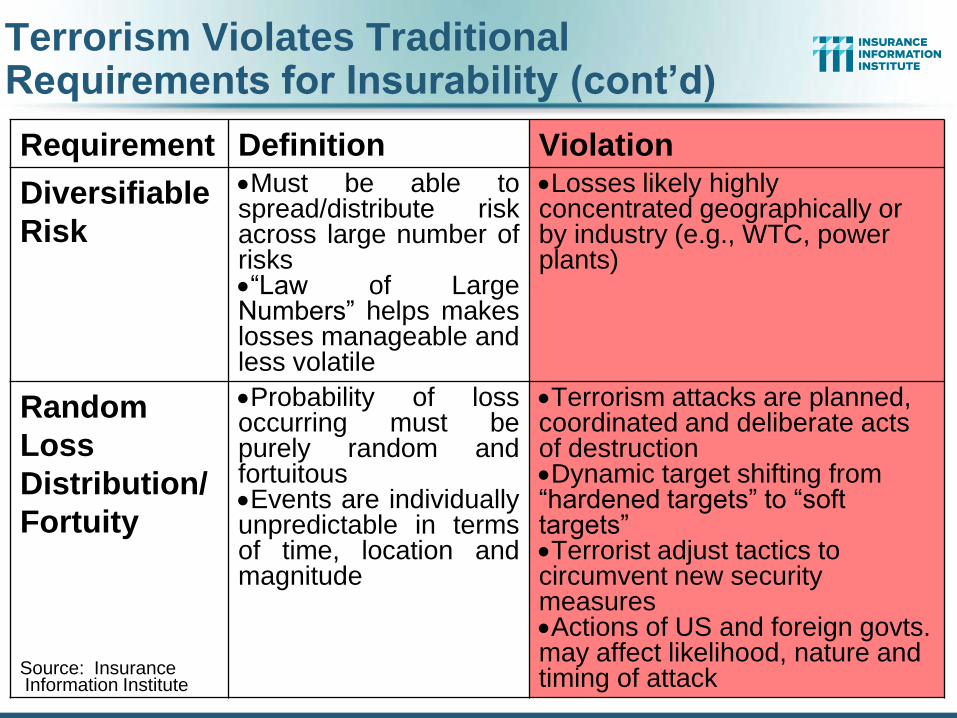
Requirement Definition Violation
Diversifiable
Risk
Must be able to spread/distribute risk across large number of risks “Law of Large Numbers” helps makes losses manageable and less volatile
Losses likely highly concentrated geographically or by industry (e.g., WTC, power plants)
Random
Loss
Distribution/
Fortuity
Probability of loss occurring must be purely random and fortuitous Events are individually unpredictable in terms of time, location and magnitude
Terrorism attacks are planned, coordinated and deliberate acts of destruction Dynamic target shifting from “hardened targets” to “soft targets” Terrorist adjust tactics to circumvent new security measures Actions of US and foreign govts. may affect likelihood, nature and timing of attack
Source: Insurance Information Institute
Terrorism Violates Traditional Requirements for Insurability (cont’d)

Public Opinion Survey
125
Disaster Preparedness Issues
125
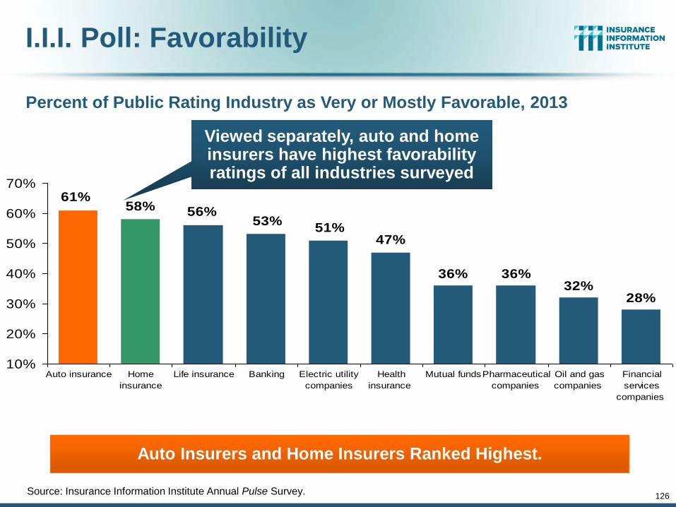
126
I.I.I. Poll: Favorability
Source: Insurance Information Institute Annual Pulse Survey.
36% 36%32%
28%
61%58% 56%
53%51%
47%
10%
20%
30%
40%
50%
60%
70%
Auto insurance Home
insurance
Life insurance Banking Electric utility
companies
Health
insurance
Mutual fundsPharmaceutical
companies
Oil and gas
companies
Financial
services
companies
Percent of Public Rating Industry as Very or Mostly Favorable, 2013
Auto Insurers and Home Insurers Ranked Highest.
Viewed separately, auto and home insurers have highest favorability ratings of all industries surveyed
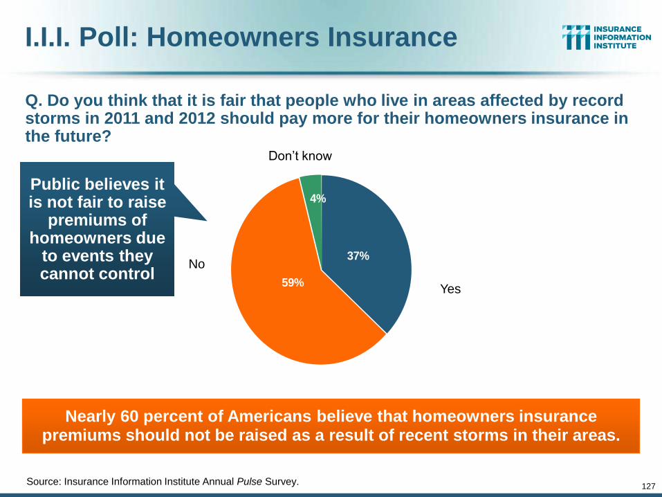
127
I.I.I. Poll: Homeowners Insurance
Q. Do you think that it is fair that people who live in areas affected by record storms in 2011 and 2012 should pay more for their homeowners insurance in the future?
Source: Insurance Information Institute Annual Pulse Survey.
Nearly 60 percent of Americans believe that homeowners insurance premiums should not be raised as a result of recent storms in their areas.
4%
37%
59%
Don’t know
Yes
No
Public believes it is not fair to raise
premiums of homeowners due
to events they cannot control
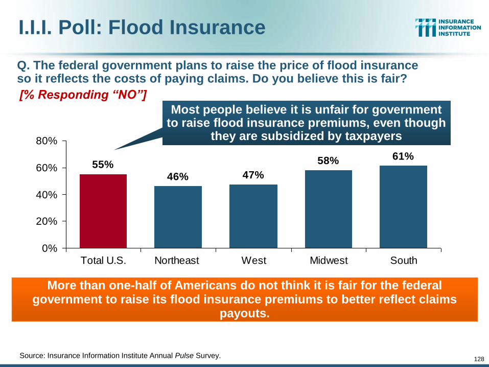
128
I.I.I. Poll: Flood Insurance
Source: Insurance Information Institute Annual Pulse Survey.
55%46% 47%
58% 61%
0%
20%
40%
60%
80%
Total U.S. Northeast West Midwest South
Q. The federal government plans to raise the price of flood insurance so it reflects the costs of paying claims. Do you believe this is fair? [% Responding “NO”]
More than one-half of Americans do not think it is fair for the federal government to raise its flood insurance premiums to better reflect claims
payouts.
Most people believe it is unfair for government to raise flood insurance premiums, even though
they are subsidized by taxpayers
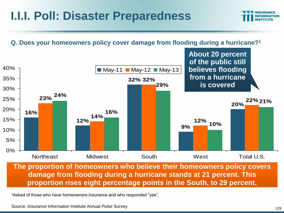
129
I.I.I. Poll: Disaster Preparedness
1Asked of those who have homeowners insurance and who responded “yes”.
Source: Insurance Information Institute Annual Pulse Survey.
16%
12%
32%
9%
20%23%
14%
32%
12%
22%24%
16%
29%
10%
21%
0%
5%
10%
15%
20%
25%
30%
35%
40%
Northeast Midwest South West Total U.S.
May-11 May-12 May-13
Q. Does your homeowners policy cover damage from flooding during a hurricane?1
The proportion of homeowners who believe their homeowners policy covers damage from flooding during a hurricane stands at 21 percent. This proportion rises eight percentage points in the South, to 29 percent.
About 20 percent of the public still believes flooding from a hurricane
is covered
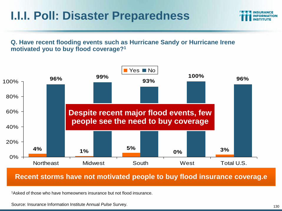
130
I.I.I. Poll: Disaster Preparedness
1Asked of those who have homeowners insurance but not flood insurance.
Source: Insurance Information Institute Annual Pulse Survey.
4% 1%5%
0% 3%
96% 99%93%
100%96%
0%
20%
40%
60%
80%
100%
Northeast Midwest South West Total U.S.
Yes No
Q. Have recent flooding events such as Hurricane Sandy or Hurricane Irene motivated you to buy flood coverage?1
Recent storms have not motivated people to buy flood insurance coverag.e
Despite recent major flood events, few people see the need to buy coverage
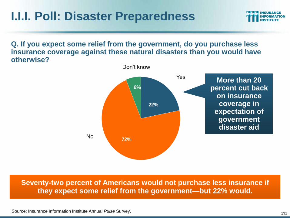
131
I.I.I. Poll: Disaster Preparedness
Q. If you expect some relief from the government, do you purchase less insurance coverage against these natural disasters than you would have otherwise?
Source: Insurance Information Institute Annual Pulse Survey.
Seventy-two percent of Americans would not purchase less insurance if they expect some relief from the government—but 22% would.
6%
22%
72%
Don’t know
Yes
No
More than 20 percent cut back
on insurance coverage in
expectation of government disaster aid
132
Growth Analysis by State and Business Segment
Premium Growth Rates Vary Tremendously by State
132
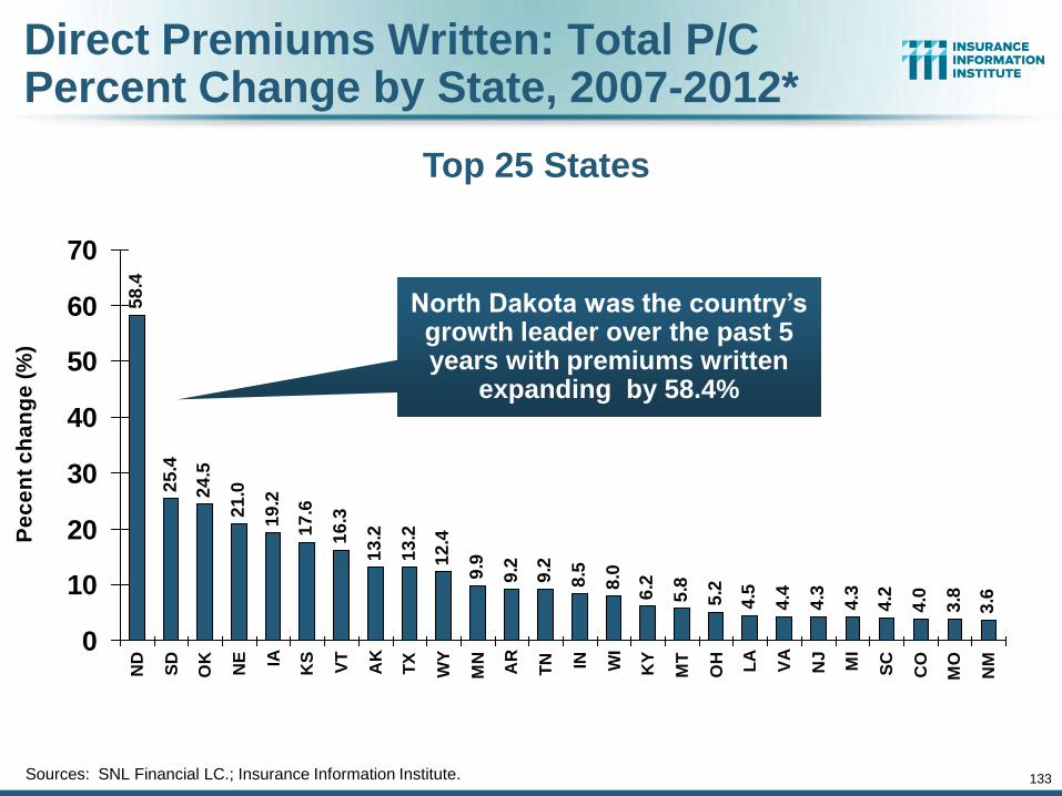
133
Direct Premiums Written: Total P/C Percent Change by State, 2007-2012*
58
.4
25
.4
24
.5
21
.0
19
.2
17
.6
16
.3
13
.2
13
.2
12
.4
9.9
9.2
9.2
8.5
8.0
6.2
5.8
5.2
4.5
4.4
4.3
4.3
4.2
4.0
3.8
3.6
0
10
20
30
40
50
60
70
ND
SD
OK
NE IA
KS
VT
AK
TX
WY
MN
AR
TN IN W
I
KY
MT
OH LA
VA
NJ
MI
SC
CO
MO
NM
Pe
ce
nt
ch
an
ge
(%
)
Sources: SNL Financial LC.; Insurance Information Institute.
Top 25 States
North Dakota was the country’s growth leader over the past 5 years with premiums written
expanding by 58.4%
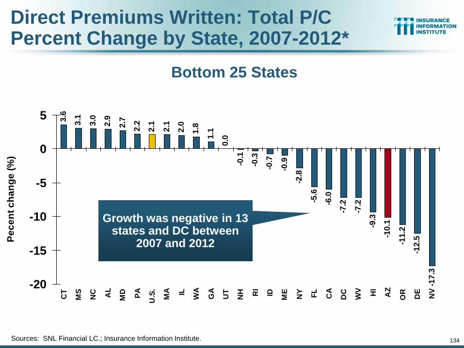
134
Direct Premiums Written: Total P/C Percent Change by State, 2007-2012*
3.6
3.1
3.0
2.9
2.7
2.2
2.1
2.1
2.0
1.8
1.1
0.0
-0.1
-0.3
-0.7
-0.9
-2.8
-5.6
-6.0
-7.2
-7.2
-9.3
-10
.1
-11
.2
-12
.5
-17
.3
-20
-15
-10
-5
0
5
CT
MS
NC AL
MD
PA
U.S
.
MA IL
WA
GA
UT
NH RI
ID
ME
NY
FL
CA
DC
WV HI
AZ
OR
DE
NV
Pe
ce
nt
ch
an
ge
(%
)
Bottom 25 States
Sources: SNL Financial LC.; Insurance Information Institute.
Growth was negative in 13 states and DC between
2007 and 2012
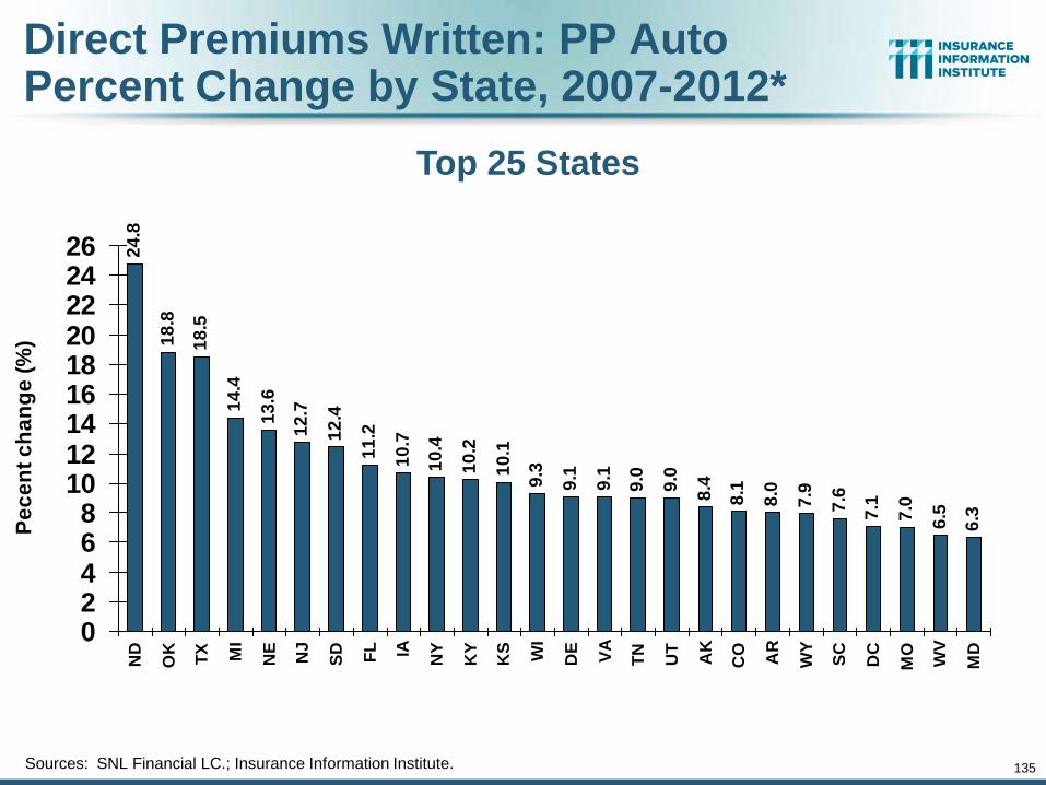
135
Direct Premiums Written: PP Auto Percent Change by State, 2007-2012*
24
.8
18
.8
18
.5
14
.4
13
.6
12
.7
12
.4
11
.2
10
.7
10
.4
10
.2
10
.1
9.3
9.1
9.1
9.0
9.0
8.4
8.1
8.0
7.9
7.6
7.1
7.0
6.5
6.3
02468
101214161820222426
ND
OK
TX MI
NE
NJ
SD FL IA
NY
KY
KS WI
DE
VA
TN
UT
AK
CO
AR
WY
SC
DC
MO
WV
MD
Pe
ce
nt
ch
an
ge
(%
)
Sources: SNL Financial LC.; Insurance Information Institute.
Top 25 States
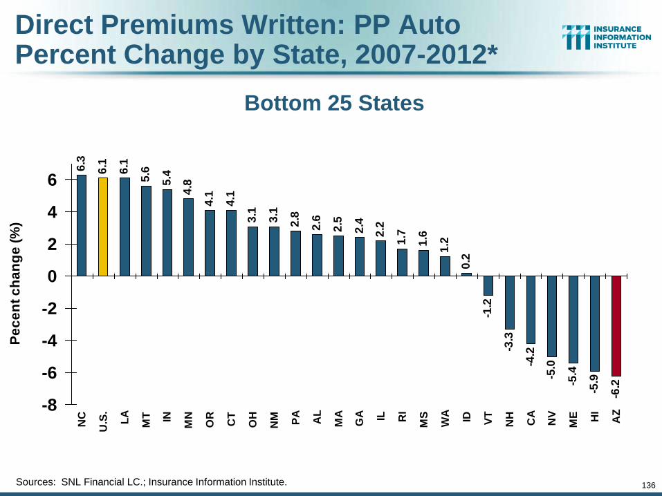
136
Direct Premiums Written: PP Auto Percent Change by State, 2007-2012*
6.3
6.1
6.1
5.6
5.4
4.8
4.1
4.1
3.1
3.1
2.8
2.6
2.5
2.4
2.2
1.7
1.6
1.2
0.2
-1.2
-3.3
-4.2
-5.0
-5.4
-5.9
-6.2
-8
-6
-4
-2
0
2
4
6
NC
U.S
.
LA
MT IN
MN
OR
CT
OH
NM PA
AL
MA
GA IL RI
MS
WA ID VT
NH
CA
NV
ME HI
AZ
Pe
ce
nt
ch
an
ge
(%
)
Bottom 25 States
Sources: SNL Financial LC.; Insurance Information Institute.
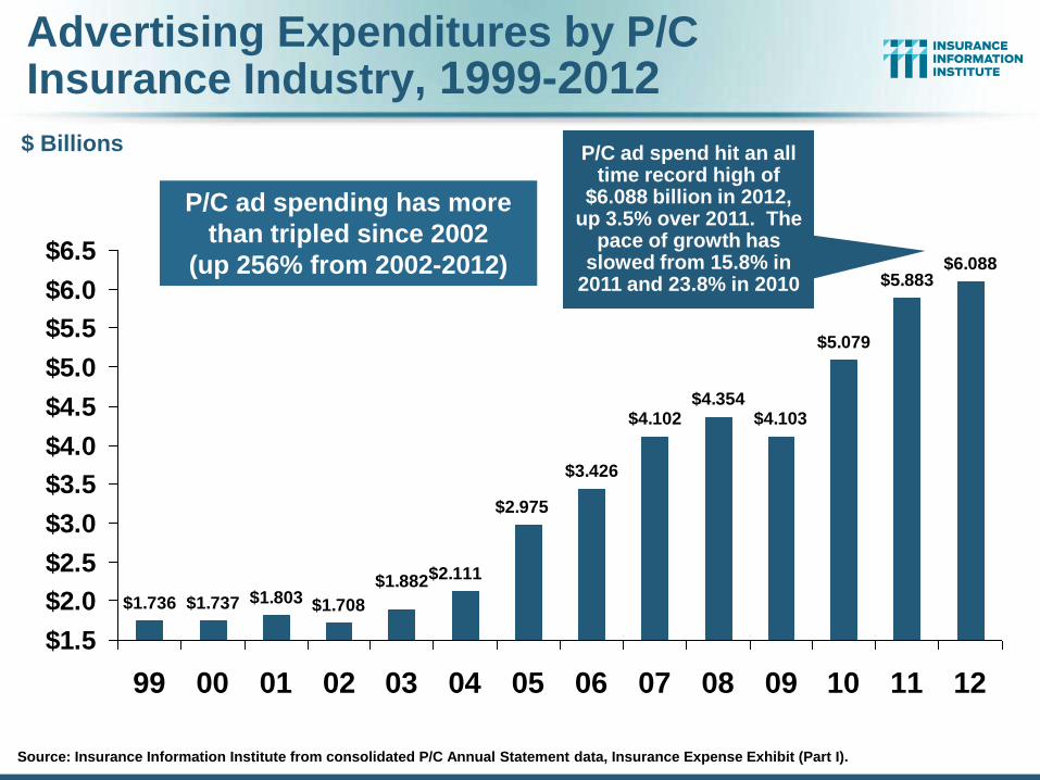
Advertising Expenditures by P/C Insurance Industry, 1999-2012
$1.736 $1.737 $1.803 $1.708
$3.426
$4.102$4.354
$4.103
$5.079
$5.883$6.088
$2.975
$2.111$1.882
$1.5
$2.0
$2.5
$3.0
$3.5
$4.0
$4.5
$5.0
$5.5
$6.0
$6.5
99 00 01 02 03 04 05 06 07 08 09 10 11 12
Source: Insurance Information Institute from consolidated P/C Annual Statement data, Insurance Expense Exhibit (Part I).
$ Billions P/C ad spend hit an all time record high of
$6.088 billion in 2012, up 3.5% over 2011. The
pace of growth has slowed from 15.8% in
2011 and 23.8% in 2010
P/C ad spending has more
than tripled since 2002
(up 256% from 2002-2012)
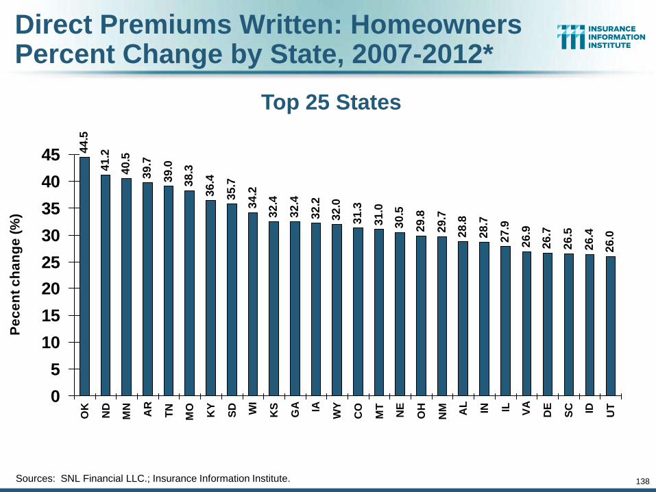
138
Direct Premiums Written: Homeowners Percent Change by State, 2007-2012*
44
.5
41
.2
40
.5
39
.7
39
.0
38
.3
36
.4
35
.7
34
.2
32
.4
32
.4
32
.2
32
.0
31
.3
31
.0
30
.5
29
.8
29
.7
28
.8
28
.7
27
.9
26
.9
26
.7
26
.5
26
.4
26
.0
0
5
10
15
20
25
30
35
40
45
OK
ND
MN
AR
TN
MO
KY
SD WI
KS
GA IA
WY
CO
MT
NE
OH
NM AL
IN IL VA
DE
SC ID UT
Pe
ce
nt
ch
an
ge
(%
)
Sources: SNL Financial LLC.; Insurance Information Institute.
Top 25 States
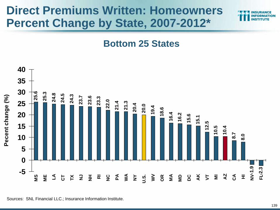
139
Direct Premiums Written: Homeowners Percent Change by State, 2007-2012*
25
.6
25
.3
24
.8
24
.5
24
.3
23
.7
23
.6
23
.3
22
.0
21
.4
21
.3
20
.4
20
.0
19
.4
18
.6
16
.4
16
.2
15
.6
15
.1
12
.5
10
.5
10
.4
8.7
8.0
-1.9
-2.3-5
0
5
10
15
20
25
30
35
40
MS
ME
LA
CT
TX
NJ
NH RI
NC
PA
WA
NY
U.S
.
WV
OR
MA
MD
DC
AK
VT
MI
AZ
CA HI
NV
FL
Pe
ce
nt
ch
an
ge
(%
)
Bottom 25 States
Sources: SNL Financial LLC.; Insurance Information Institute.
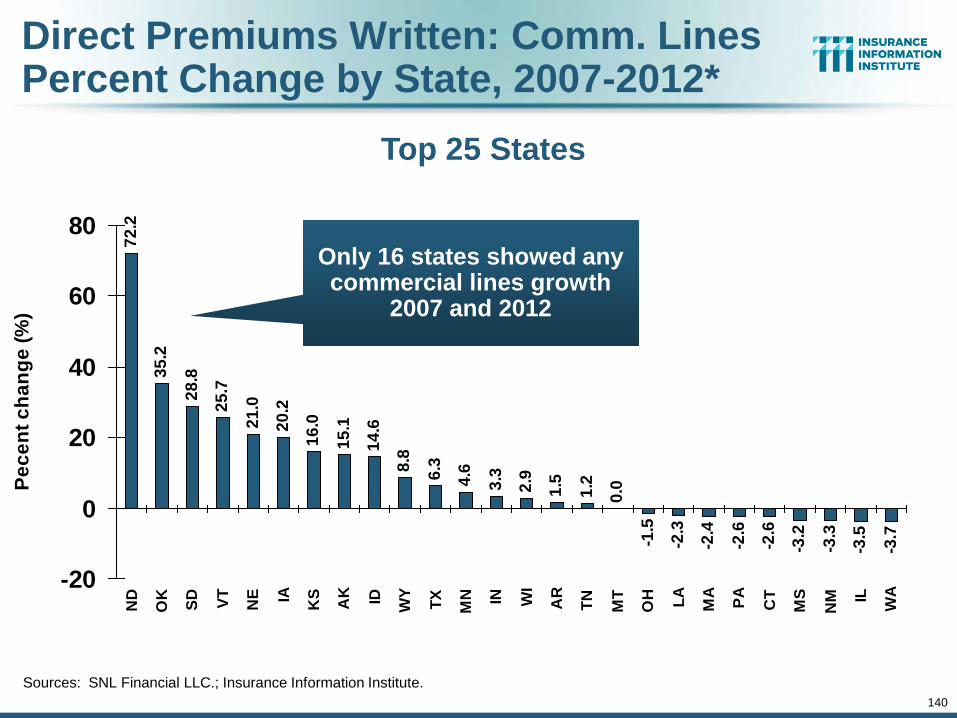
140
Direct Premiums Written: Comm. Lines Percent Change by State, 2007-2012*
72
.2
35
.2
28
.8
25
.7
21
.0
20
.2
16
.0
15
.1
14
.6
8.8
6.3
4.6
3.3
2.9
1.5
1.2
0.0
-1.5
-2.3
-2.4
-2.6
-2.6
-3.2
-3.3
-3.5
-3.7
-20
0
20
40
60
80
ND
OK
SD
VT
NE IA
KS
AK ID
WY
TX
MN IN WI
AR
TN
MT
OH LA
MA
PA
CT
MS
NM IL
WA
Pe
ce
nt
ch
an
ge
(%
)
Sources: SNL Financial LLC.; Insurance Information Institute.
Top 25 States
Only 16 states showed any commercial lines growth
2007 and 2012
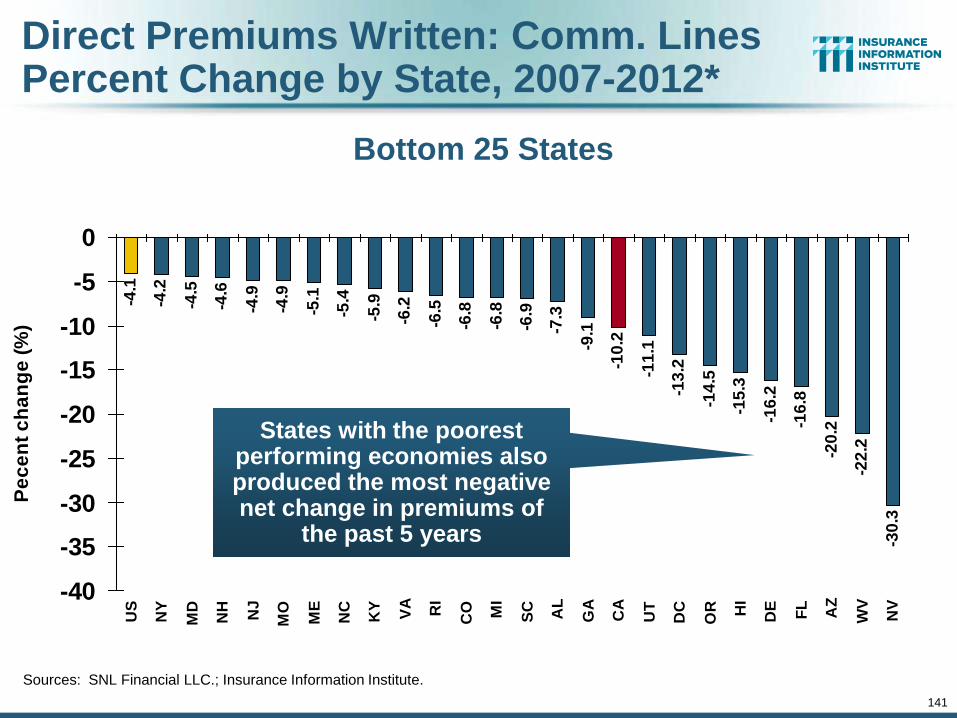
141
Direct Premiums Written: Comm. Lines Percent Change by State, 2007-2012*
-4.1
-4.2
-4.5
-4.6
-4.9
-4.9
-5.1
-5.4
-5.9
-6.2
-6.5
-6.8
-6.8
-6.9
-7.3
-9.1
-10
.2
-11
.1
-13
.2
-14
.5
-15
.3
-16
.2
-16
.8
-20
.2
-22
.2
-30
.3
-40
-35
-30
-25
-20
-15
-10
-5
0
US
NY
MD
NH
NJ
MO
ME
NC
KY
VA RI
CO MI
SC AL
GA
CA
UT
DC
OR HI
DE
FL
AZ
WV
NV
Pe
ce
nt
ch
an
ge
(%
)
Bottom 25 States
Sources: SNL Financial LLC.; Insurance Information Institute.
States with the poorest performing economies also produced the most negative net change in premiums of
the past 5 years
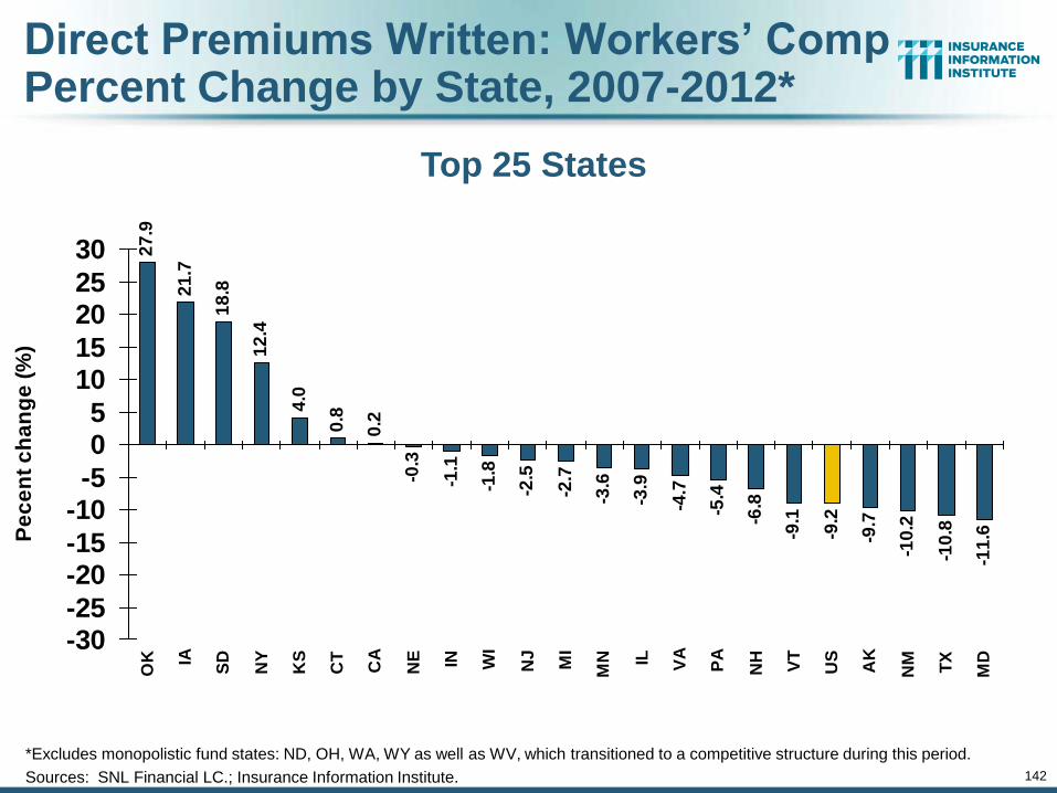
142
Direct Premiums Written: Workers’ Comp Percent Change by State, 2007-2012*
27
.9
21
.7
18
.8
12
.4
4.0
0.8
0.2
-0.3
-1.1
-1.8
-2.5
-2.7
-3.6
-3.9
-4.7
-5.4
-6.8
-9.1
-9.2
-9.7
-10
.2
-10
.8
-11
.6
-30-25
-20-15
-10-5
05
1015
2025
30
OK IA
SD
NY
KS
CT
CA
NE IN WI
NJ
MI
MN IL VA
PA
NH
VT
US
AK
NM TX
MD
Pe
ce
nt
ch
an
ge
(%
)
*Excludes monopolistic fund states: ND, OH, WA, WY as well as WV, which transitioned to a competitive structure during this period.
Sources: SNL Financial LC.; Insurance Information Institute.
Top 25 States
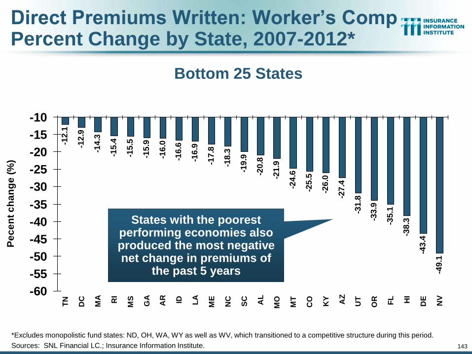
143
Direct Premiums Written: Worker’s Comp Percent Change by State, 2007-2012*
-12
.1
-12
.9
-14
.3
-15
.4
-15
.5
-15
.9
-16
.0
-16
.6
-16
.9
-17
.8
-18
.3
-19
.9
-20
.8
-21
.9
-24
.6
-25
.5
-26
.0
-27
.4
-31
.8
-33
.9
-35
.1
-38
.3
-43
.4
-49
.1
-60
-55
-50
-45
-40
-35
-30
-25
-20
-15
-10
TN
DC
MA RI
MS
GA
AR ID LA
ME
NC
SC AL
MO
MT
CO
KY AZ
UT
OR FL HI
DE
NV
Pe
ce
nt
ch
an
ge
(%
)
Bottom 25 States
*Excludes monopolistic fund states: ND, OH, WA, WY as well as WV, which transitioned to a competitive structure during this period.
Sources: SNL Financial LC.; Insurance Information Institute.
States with the poorest performing economies also produced the most negative net change in premiums of
the past 5 years
144
Distribution Trends
Distribution by Channel Type Continues to Evolve Around
the World
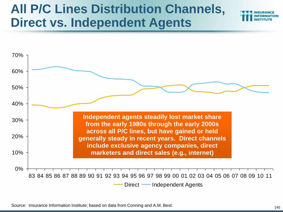
145
All P/C Lines Distribution Channels, Direct vs. Independent Agents
Source: Insurance Information Institute; based on data from Conning and A.M. Best.
0%
10%
20%
30%
40%
50%
60%
70%
83 84 85 86 87 88 89 90 91 92 93 94 95 96 97 98 99 00 01 02 03 04 05 06 07 08 09 10 11
Direct Independent Agents
Independent agents steadily lost market share from the early 1980s through the early 2000s across all P/C lines, but have gained or held
generally steady in recent years. Direct channels include exclusive agency companies, direct
marketers and direct sales (e.g., internet)
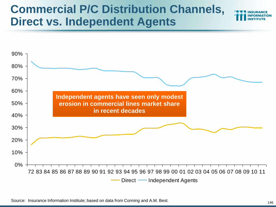
146
Commercial P/C Distribution Channels, Direct vs. Independent Agents
Source: Insurance Information Institute; based on data from Conning and A.M. Best.
0%
10%
20%
30%
40%
50%
60%
70%
80%
90%
72 83 84 85 86 87 88 89 90 91 92 93 94 95 96 97 98 99 00 01 02 03 04 05 06 07 08 09 10 11
Direct Independent Agents
Independent agents have seen only modest erosion in commercial lines market share
in recent decades
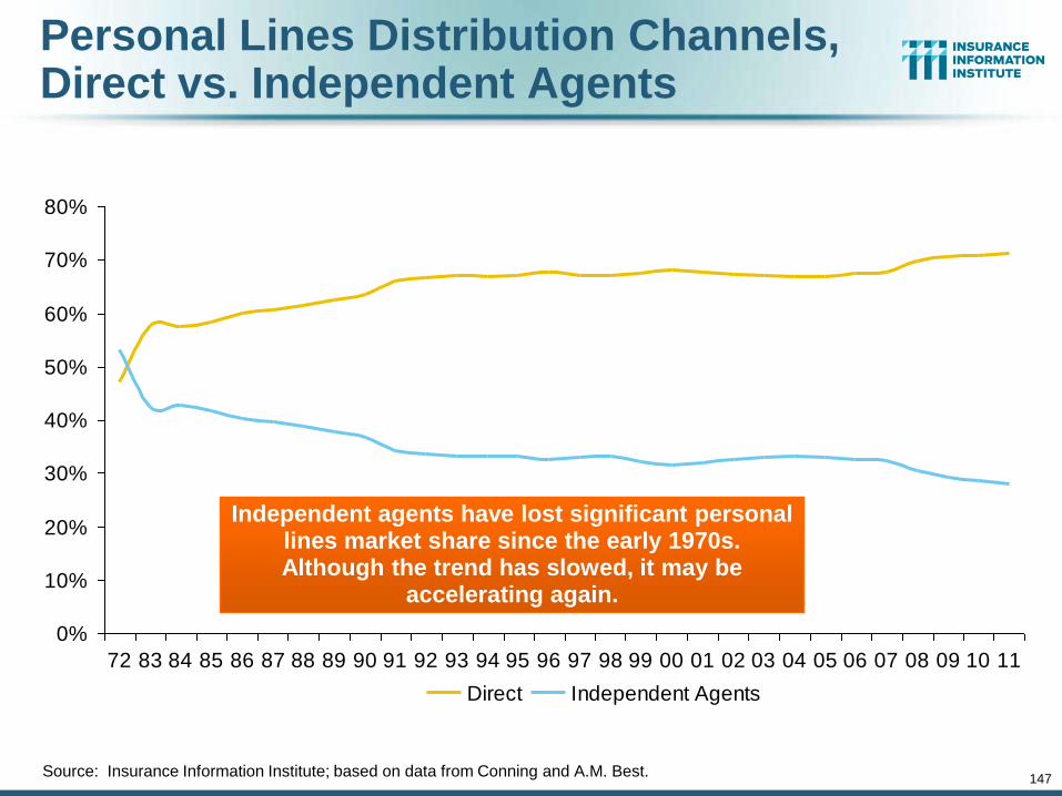
147
Personal Lines Distribution Channels, Direct vs. Independent Agents
Source: Insurance Information Institute; based on data from Conning and A.M. Best.
0%
10%
20%
30%
40%
50%
60%
70%
80%
72 83 84 85 86 87 88 89 90 91 92 93 94 95 96 97 98 99 00 01 02 03 04 05 06 07 08 09 10 11
Direct Independent Agents
Independent agents have lost significant personal lines market share since the early 1970s. Although the trend has slowed, it may be
accelerating again.

The BIG Question: Where Is the Market Heading?
148
Catastrophes and Other Factors Are Pressuring Insurance Markets
148
New Factor: Record Low Interest Rates Are Contributing to
Underwriting and Pricing Pressures

INVESTMENTS: THE NEW REALITY
149
Investment Performance is a Key Driver of Profitability
Depressed Yields Will Necessarily Influence Underwriting & Pricing
149
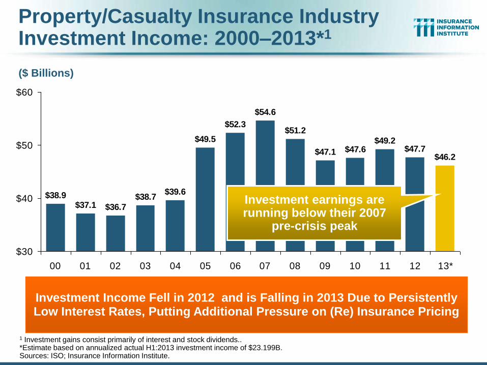
Property/Casualty Insurance Industry Investment Income: 2000–2013*1
$38.9$37.1 $36.7
$38.7
$54.6
$51.2
$47.1 $47.6$49.2
$47.7$46.2
$39.6
$49.5
$52.3
$30
$40
$50
$60
00 01 02 03 04 05 06 07 08 09 10 11 12 13*
Investment Income Fell in 2012 and is Falling in 2013 Due to Persistently Low Interest Rates, Putting Additional Pressure on (Re) Insurance Pricing
1 Investment gains consist primarily of interest and stock dividends.. *Estimate based on annualized actual H1:2013 investment income of $23.199B. Sources: ISO; Insurance Information Institute.
($ Billions)
Investment earnings are running below their 2007
pre-crisis peak
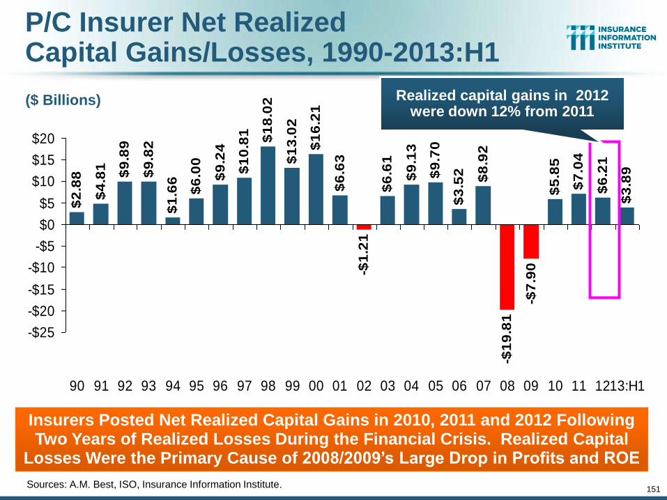
151
P/C Insurer Net Realized Capital Gains/Losses, 1990-2013:H1
Sources: A.M. Best, ISO, Insurance Information Institute.
$2
.88
$4
.81
$9
.89
$9
.82
$1
0.8
1 $1
8.0
2
$1
3.0
2
$1
6.2
1
$6
.63
-$1
.21
$6
.61
$9
.13
$9
.70
$3
.52 $8
.92
-$7
.90
$5
.85
$7
.04
$6
.21
$3
.89
-$1
9.8
1
$9
.24
$6
.00
$1
.66
-$25
-$20
-$15
-$10
-$5
$0
$5
$10
$15
$20
90 91 92 93 94 95 96 97 98 99 00 01 02 03 04 05 06 07 08 09 10 11 1213:H1
Insurers Posted Net Realized Capital Gains in 2010, 2011 and 2012 Following Two Years of Realized Losses During the Financial Crisis. Realized Capital
Losses Were the Primary Cause of 2008/2009’s Large Drop in Profits and ROE
($ Billions) Realized capital gains in 2012 were down 12% from 2011
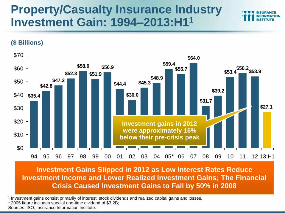
Property/Casualty Insurance Industry Investment Gain: 1994–2013:H11
$35.4
$42.8$47.2
$52.3
$44.4
$36.0
$45.3$48.9
$59.4$55.7
$64.0
$31.7
$39.2
$53.4$56.2
$53.9
$27.1
$58.0
$51.9
$56.9
$0
$10
$20
$30
$40
$50
$60
$70
94 95 96 97 98 99 00 01 02 03 04 05* 06 07 08 09 10 11 12 13:H1
Investment Gains Slipped in 2012 as Low Interest Rates Reduce Investment Income and Lower Realized Investment Gains; The Financial
Crisis Caused Investment Gains to Fall by 50% in 2008
1 Investment gains consist primarily of interest, stock dividends and realized capital gains and losses. * 2005 figure includes special one-time dividend of $3.2B; Sources: ISO; Insurance Information Institute.
($ Billions)
Investment gains in 2012 were approximately 16%
below their pre-crisis peak
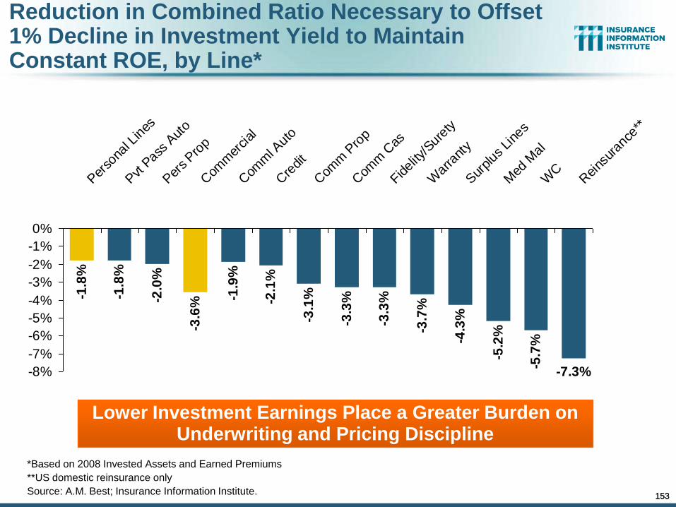
153
-1.8
%
-1.8
%
-2.0
%
-3.6
%
-3.3
%
-3.3
%
-3.7
%
-4.3
%
-5.2
%
-5.7
%
-7.3%
-1.9
%
-2.1
%
-3.1
%
-8%
-7%
-6%
-5%
-4%
-3%
-2%
-1%
0%
Per
sona
l Lin
es
Pvt P
ass
Aut
o
Per
s Pro
p
Com
mer
cial
Com
ml A
uto
Cre
dit
Com
m P
rop
Com
m C
as
Fidel
ity/S
uret
y
War
rant
y
Sur
plus
Lin
es
Med
Mal
WC
Rei
nsur
ance
**
Lower Investment Earnings Place a Greater Burden on Underwriting and Pricing Discipline
*Based on 2008 Invested Assets and Earned Premiums
**US domestic reinsurance only
Source: A.M. Best; Insurance Information Institute.
Reduction in Combined Ratio Necessary to Offset 1% Decline in Investment Yield to Maintain Constant ROE, by Line*
153
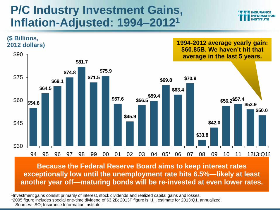
P/C Industry Investment Gains, Inflation-Adjusted: 1994–20121
$54.8
$64.5
$69.1
$74.8
$57.6
$45.9
$56.5$59.4
$69.8
$63.4
$70.9
$33.8
$42.0
$56.2$57.4$53.9
$50.0
$81.7
$71.5
$75.9
$30
$45
$60
$75
$90
94 95 96 97 98 99 00 01 02 03 04 05* 06 07 08 09 10 11 1213:Q1E
Because the Federal Reserve Board aims to keep interest rates exceptionally low until the unemployment rate hits 6.5%—likely at least
another year off—maturing bonds will be re-invested at even lower rates.
1Investment gains consist primarily of interest, stock dividends and realized capital gains and losses. *2005 figure includes special one-time dividend of $3.2B; 2013F figure is I.I.I. estimate for 2013:Q1, annualized.
Sources: ISO; Insurance Information Institute.
($ Billions, 2012 dollars) 1994-2012 average yearly gain:
$60.85B. We haven’t hit that average in the last 5 years.
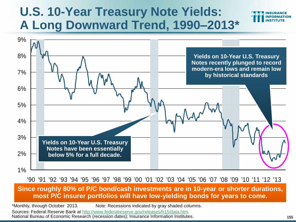
155
U.S. 10-Year Treasury Note Yields: A Long Downward Trend, 1990–2013*
*Monthly, through October 2013. Note: Recessions indicated by gray shaded columns.
Sources: Federal Reserve Bank at http://www.federalreserve.gov/releases/h15/data.htm. National Bureau of Economic Research (recession dates); Insurance Information Institutes.
1%
2%
3%
4%
5%
6%
7%
8%
9%
'90 '91 '92 '93 '94 '95 '96 '97 '98 '99 '00 '01 '02 '03 '04 '05 '06 '07 '08 '09 '10 '11 '12 '13
Yields on 10-Year U.S. Treasury Notes have been essentially below 5% for a full decade.
Since roughly 80% of P/C bond/cash investments are in 10-year or shorter durations, most P/C insurer portfolios will have low-yielding bonds for years to come.
Yields on 10-Year U.S. Treasury Notes recently plunged to record modern-era lows and remain low
by historical standards
155
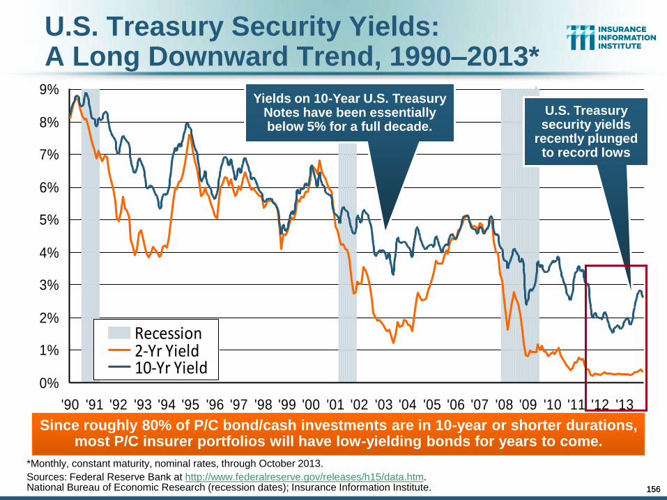
156
U.S. Treasury Security Yields: A Long Downward Trend, 1990–2013*
*Monthly, constant maturity, nominal rates, through October 2013.
Sources: Federal Reserve Bank at http://www.federalreserve.gov/releases/h15/data.htm. National Bureau of Economic Research (recession dates); Insurance Information Institute.
0%
1%
2%
3%
4%
5%
6%
7%
8%
9%
'90 '91 '92 '93 '94 '95 '96 '97 '98 '99 '00 '01 '02 '03 '04 '05 '06 '07 '08 '09 '10 '11 '12 '13
Recession2-Yr Yield10-Yr Yield
Yields on 10-Year U.S. Treasury Notes have been essentially below 5% for a full decade.
Since roughly 80% of P/C bond/cash investments are in 10-year or shorter durations, most P/C insurer portfolios will have low-yielding bonds for years to come.
U.S. Treasury security yields
recently plunged to record lows
156
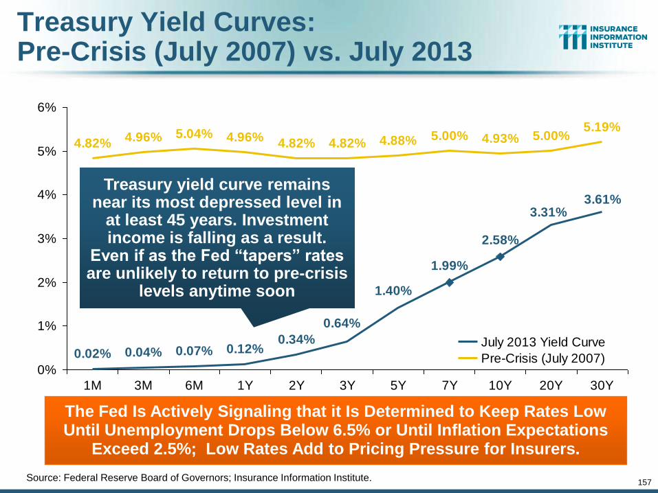
157
Treasury Yield Curves: Pre-Crisis (July 2007) vs. July 2013
0.02% 0.04% 0.07% 0.12%0.34%
1.99%
2.58%
4.82%4.96% 5.04% 4.96%
4.82% 4.82% 4.88% 5.00% 4.93% 5.00%5.19%
1.40%
0.64%
3.61%3.31%
0%
1%
2%
3%
4%
5%
6%
1M 3M 6M 1Y 2Y 3Y 5Y 7Y 10Y 20Y 30Y
July 2013 Yield Curve
Pre-Crisis (July 2007)
Treasury yield curve remains near its most depressed level in
at least 45 years. Investment income is falling as a result.
Even if as the Fed “tapers” rates are unlikely to return to pre-crisis
levels anytime soon
The Fed Is Actively Signaling that it Is Determined to Keep Rates Low Until Unemployment Drops Below 6.5% or Until Inflation Expectations
Exceed 2.5%; Low Rates Add to Pricing Pressure for Insurers.
Source: Federal Reserve Board of Governors; Insurance Information Institute.
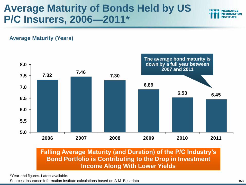
158
Average Maturity of Bonds Held by US P/C Insurers, 2006—2011*
6.456.53
6.89
7.307.46
7.32
5.0
5.5
6.0
6.5
7.0
7.5
8.0
2006 2007 2008 2009 2010 2011
*Year-end figures. Latest available.
Sources: Insurance Information Institute calculations based on A.M. Best data.
Average Maturity (Years)
Falling Average Maturity (and Duration) of the P/C Industry’s Bond Portfolio is Contributing to the Drop in Investment
Income Along With Lower Yields
The average bond maturity is down by a full year between
2007 and 2011
158
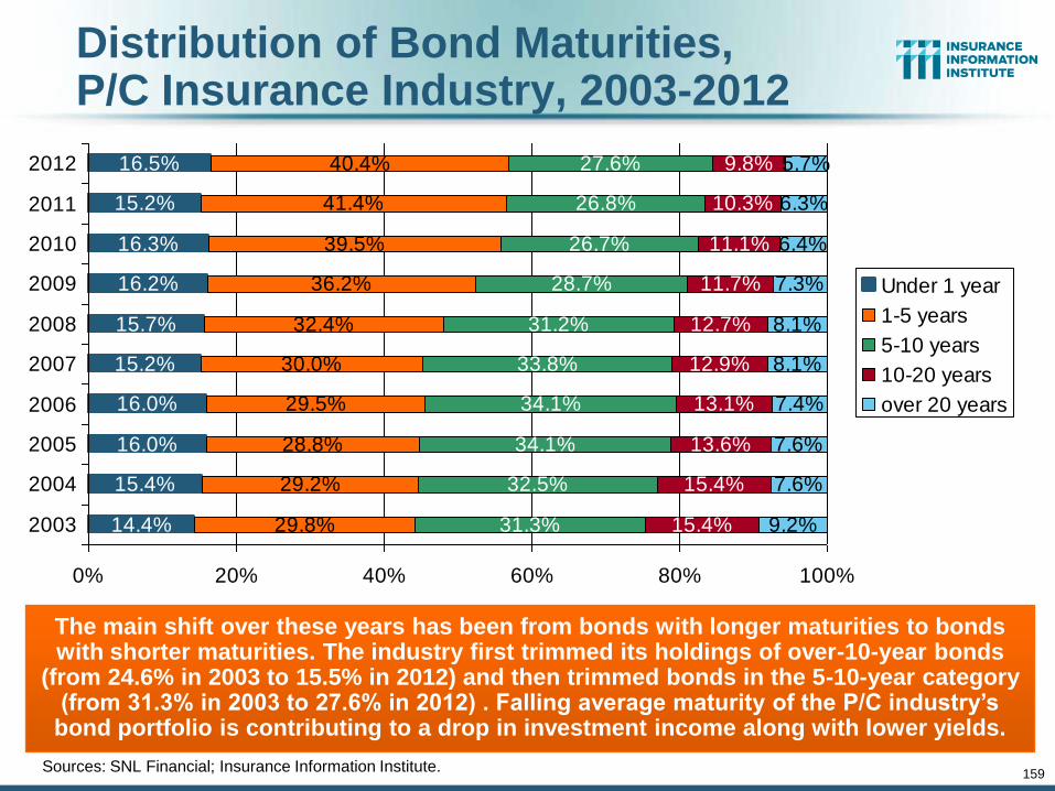
159
Distribution of Bond Maturities, P/C Insurance Industry, 2003-2012
16.0%
15.2%
15.7%
16.2%
16.3%
29.8%
29.2%
28.8%
29.5%
30.0%
32.4%
36.2%
39.5%
41.4%
40.4%
31.3%
32.5%
34.1%
34.1%
33.8%
31.2%
28.7%
26.7%
26.8%
27.6%
15.4%
15.4%
13.6%
13.1%
12.9%
12.7%
11.7%
11.1%
10.3%
9.8%
9.2%
7.6%
7.6%
7.4%
8.1%
8.1%
7.3%
6.4%
6.3%
5.7%16.5%
15.2%
14.4%
16.0%
15.4%
0% 20% 40% 60% 80% 100%
2003
2004
2005
2006
2007
2008
2009
2010
2011
2012
Under 1 year
1-5 years
5-10 years
10-20 years
over 20 years
Sources: SNL Financial; Insurance Information Institute.
The main shift over these years has been from bonds with longer maturities to bonds with shorter maturities. The industry first trimmed its holdings of over-10-year bonds
(from 24.6% in 2003 to 15.5% in 2012) and then trimmed bonds in the 5-10-year category (from 31.3% in 2003 to 27.6% in 2012) . Falling average maturity of the P/C industry’s
bond portfolio is contributing to a drop in investment income along with lower yields.
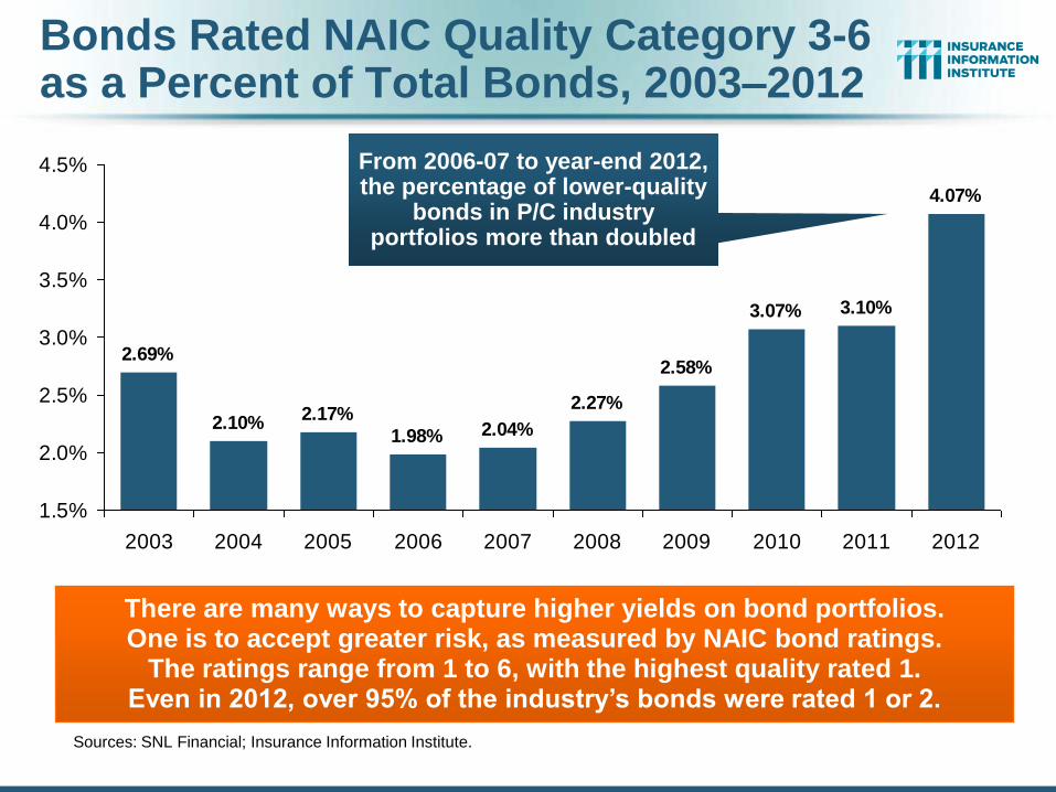
Bonds Rated NAIC Quality Category 3-6 as a Percent of Total Bonds, 2003–2012
2.69%
2.10%2.17%
1.98%
3.07% 3.10%
4.07%
2.04%
2.27%
2.58%
1.5%
2.0%
2.5%
3.0%
3.5%
4.0%
4.5%
2003 2004 2005 2006 2007 2008 2009 2010 2011 2012
There are many ways to capture higher yields on bond portfolios. One is to accept greater risk, as measured by NAIC bond ratings.
The ratings range from 1 to 6, with the highest quality rated 1. Even in 2012, over 95% of the industry’s bonds were rated 1 or 2.
Sources: SNL Financial; Insurance Information Institute.
From 2006-07 to year-end 2012, the percentage of lower-quality
bonds in P/C industry portfolios more than doubled
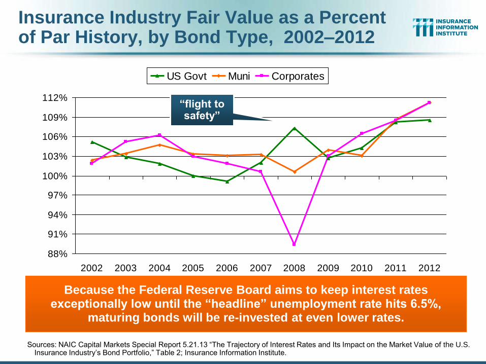
Insurance Industry Fair Value as a Percent of Par History, by Bond Type, 2002–2012
88%
91%
94%
97%
100%
103%
106%
109%
112%
2002 2003 2004 2005 2006 2007 2008 2009 2010 2011 2012
US Govt Muni Corporates
Because the Federal Reserve Board aims to keep interest rates exceptionally low until the “headline” unemployment rate hits 6.5%,
maturing bonds will be re-invested at even lower rates.
Sources: NAIC Capital Markets Special Report 5.21.13 “The Trajectory of Interest Rates and Its Impact on the Market Value of the U.S. Insurance Industry’s Bond Portfolio,” Table 2; Insurance Information Institute.
“flight to safety”
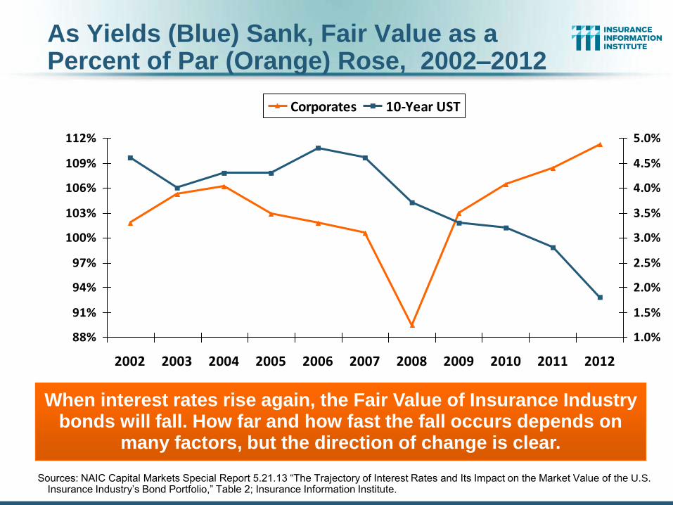
As Yields (Blue) Sank, Fair Value as a Percent of Par (Orange) Rose, 2002–2012
88%
91%
94%
97%
100%
103%
106%
109%
112%
2002 2003 2004 2005 2006 2007 2008 2009 2010 2011 2012
1.0%
1.5%
2.0%
2.5%
3.0%
3.5%
4.0%
4.5%
5.0%
Corporates 10-Year UST
When interest rates rise again, the Fair Value of Insurance Industry bonds will fall. How far and how fast the fall occurs depends on
many factors, but the direction of change is clear.
Sources: NAIC Capital Markets Special Report 5.21.13 “The Trajectory of Interest Rates and Its Impact on the Market Value of the U.S. Insurance Industry’s Bond Portfolio,” Table 2; Insurance Information Institute.
1. UNDERWRITING
163
Underwriting Losses in 2011 and 2012 Are Elevated by High
Catastrophe Losses
163
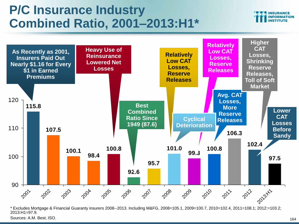
164
P/C Insurance Industry Combined Ratio, 2001–2013:H1*
* Excludes Mortgage & Financial Guaranty insurers 2008--2013. Including M&FG, 2008=105.1, 2009=100.7, 2010=102.4, 2011=108.1; 2012:=103.2; 2013:H1=97.9.
Sources: A.M. Best, ISO.
95.7
99.3100.8
106.3
102.4
97.5
101.0
92.6
100.898.4
100.1
107.5
115.8
90
100
110
120
2001
2002
2003
2004
2005
2006
2007
2008
2009
2010
2011
2012
2013
:H1
Best Combined Ratio Since 1949 (87.6)
As Recently as 2001, Insurers Paid Out
Nearly $1.16 for Every $1 in Earned Premiums
Relatively Low CAT Losses, Reserve Releases
Heavy Use of Reinsurance Lowered Net
Losses
Relatively Low CAT Losses, Reserve Releases
Avg. CAT Losses,
More Reserve Releases
Higher CAT
Losses, Shrinking Reserve
Releases, Toll of Soft
Market
Cyclical Deterioration
Lower CAT
Losses Before Sandy
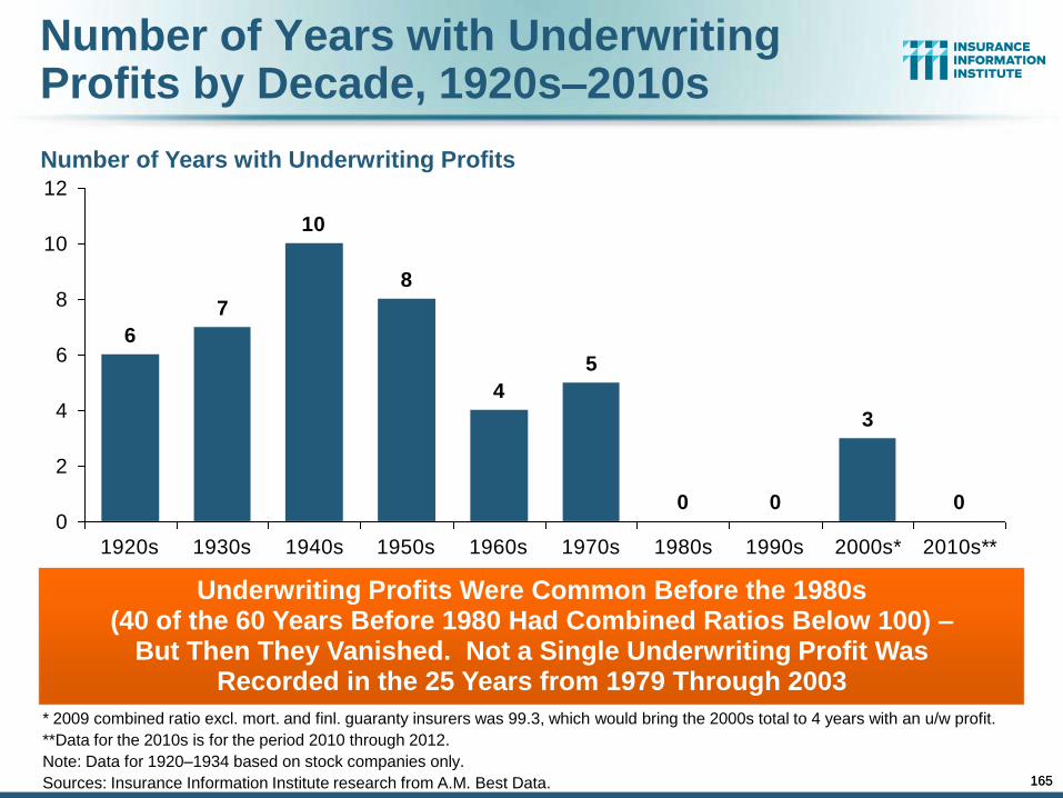
165
Number of Years with Underwriting Profits by Decade, 1920s–2010s
0 0
3
0
5
4
8
10
7
6
0
2
4
6
8
10
12
1920s 1930s 1940s 1950s 1960s 1970s 1980s 1990s 2000s* 2010s**
* 2009 combined ratio excl. mort. and finl. guaranty insurers was 99.3, which would bring the 2000s total to 4 years with an u/w profit.
**Data for the 2010s is for the period 2010 through 2012.
Note: Data for 1920–1934 based on stock companies only.
Sources: Insurance Information Institute research from A.M. Best Data.
Number of Years with Underwriting Profits
Underwriting Profits Were Common Before the 1980s (40 of the 60 Years Before 1980 Had Combined Ratios Below 100) –
But Then They Vanished. Not a Single Underwriting Profit Was Recorded in the 25 Years from 1979 Through 2003
165
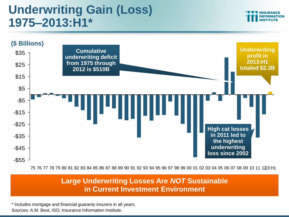
Underwriting Gain (Loss) 1975–2013:H1*
* Includes mortgage and financial guaranty insurers in all years.
Sources: A.M. Best, ISO; Insurance Information Institute.
Large Underwriting Losses Are NOT Sustainable in Current Investment Environment
-$55
-$45
-$35
-$25
-$15
-$5
$5
$15
$25
$35
75 76 77 78 79 80 81 82 83 84 85 86 87 88 89 90 91 92 93 94 95 96 97 98 99 00 01 02 03 04 05 06 07 08 09 10 11 1213:H1
Cumulative underwriting deficit from 1975 through
2012 is $510B
($ Billions) Underwriting
profit in 2013:H1
totaled $2.3B
High cat losses in 2011 led to the highest
underwriting loss since 2002
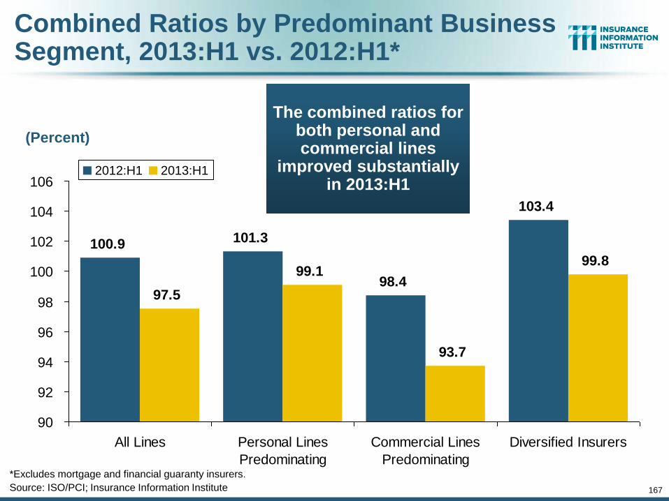
167
Combined Ratios by Predominant Business Segment, 2013:H1 vs. 2012:H1*
*Excludes mortgage and financial guaranty insurers.
Source: ISO/PCI; Insurance Information Institute
100.9 101.3
98.4
103.4
97.5
99.1
93.7
99.8
90
92
94
96
98
100
102
104
106
All Lines Personal Lines
Predominating
Commercial Lines
Predominating
Diversified Insurers
2012:H1 2013:H1
(Percent)
The combined ratios for both personal and commercial lines
improved substantially in 2013:H1
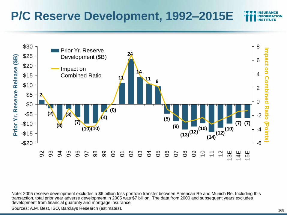
168
2
(2)
(8)
(3)
(7)
(10)(10)
(4)
(0)
11
24
14
119
(5)
(9)
(13)(12)
(10)
(14)(12)
(10)(7) (7)
-$20
-$15
-$10
-$5
$0
$5
$10
$15
$20
$25
$309
2
93
94
95
96
97
98
99
00
01
02
03
04
05
06
07
08
09
10
11
12
13
E
14
E
15
E
Pri
or
Yr.
Re
se
rve
Re
lea
se
($
B)
-6
-4
-2
0
2
4
6
8 Imp
ac
t on
Co
mb
ine
d R
atio
(Po
ints
)
Prior Yr. ReserveDevelopment ($B)
Impact onCombined Ratio(Points)
P/C Reserve Development, 1992–2015E
Note: 2005 reserve development excludes a $6 billion loss portfolio transfer between American Re and Munich Re. Including this transaction, total prior year adverse development in 2005 was $7 billion. The data from 2000 and subsequent years excludes development from financial guaranty and mortgage insurance.
Sources: A.M. Best, ISO, Barclays Research (estimates).
169
Questionable Claims:
On the Rise
Fraud Concerns:
More Questionable Claims in Most State and Across Most
Lines of Insurance 169
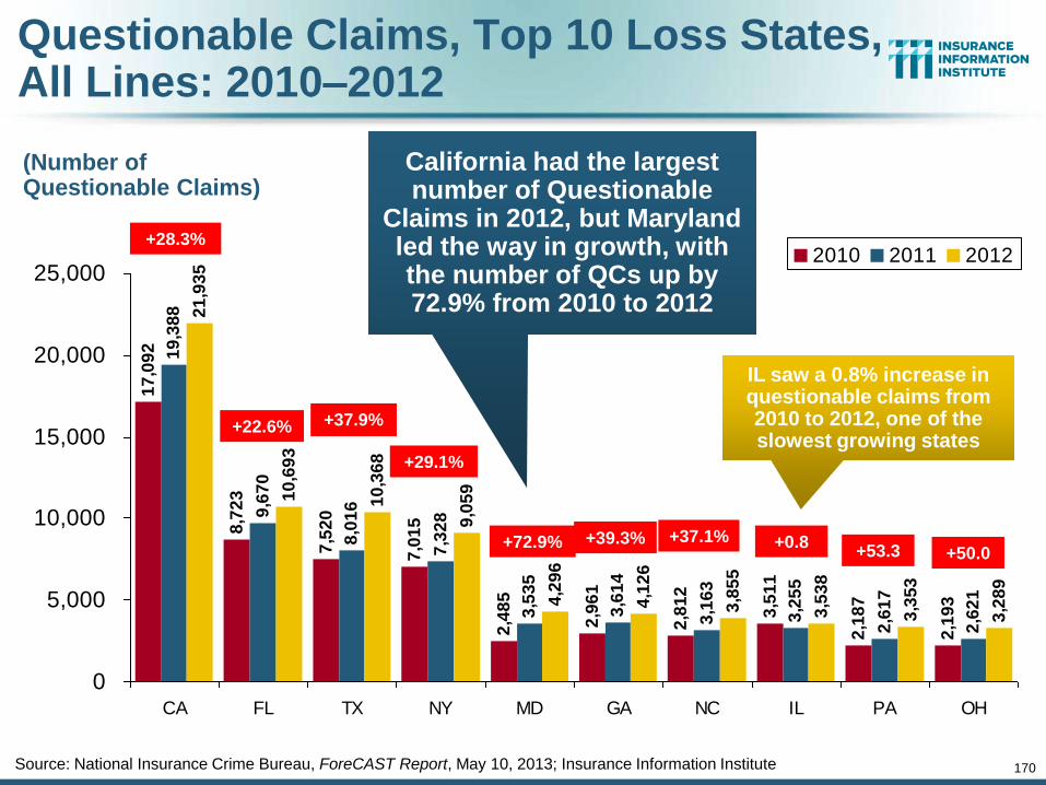
170
Questionable Claims, Top 10 Loss States, All Lines: 2010–2012
Source: National Insurance Crime Bureau, ForeCAST Report, May 10, 2013; Insurance Information Institute
17
,09
2
8,7
23
7,5
20
7,0
15
2,4
85
2,9
61
2,8
12
3,5
11
2,1
87
2,1
93
19
,38
8
9,6
70
8,0
16
7,3
28
3,5
35
3,6
14
3,1
63
3,2
55
2,6
17
2,6
21
21
,93
5
10
,69
3
10
,36
8
9,0
59
4,2
96
4,1
26
3,8
55
3,5
38
3,3
53
3,2
89
0
5,000
10,000
15,000
20,000
25,000
CA FL TX NY MD GA NC IL PA OH
2010 2011 2012
(Number of Questionable Claims)
California had the largest number of Questionable
Claims in 2012, but Maryland led the way in growth, with the number of QCs up by 72.9% from 2010 to 2012
+28.3%
+22.6% +37.9%
+29.1%
+72.9% +39.3% +37.1% +0.8 +53.3 +50.0
IL saw a 0.8% increase in questionable claims from 2010 to 2012, one of the slowest growing states
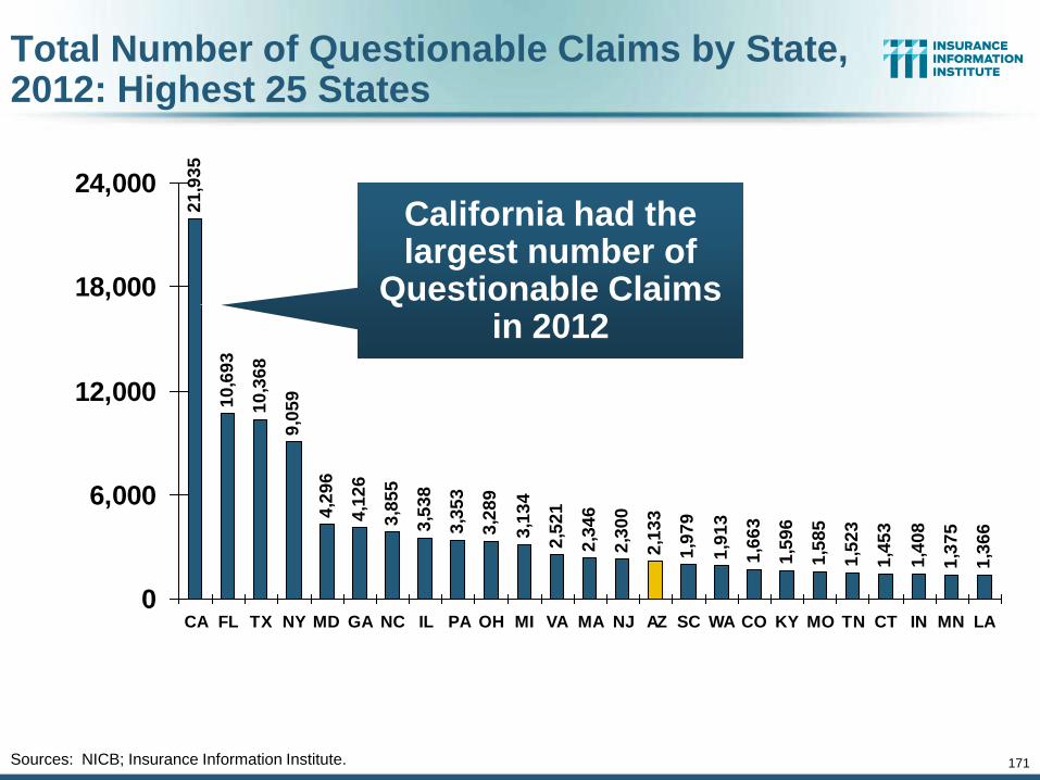
171
Total Number of Questionable Claims by State, 2012: Highest 25 States
21
,93
5
10
,69
3
10
,36
8
9,0
59
4,2
96
4,1
26
3,8
55
3,5
38
3,3
53
3,2
89
3,1
34
2,5
21
2,3
46
2,3
00
2,1
33
1,9
79
1,9
13
1,6
63
1,5
96
1,5
85
1,5
23
1,4
53
1,4
08
1,3
75
1,3
66
0
6,000
12,000
18,000
24,000
CA FL TX NY MD GA NC IL PA OH MI VA MA NJ AZ SC WA CO KY MO TN CT IN MN LA
Sources: NICB; Insurance Information Institute.
California had the largest number of
Questionable Claims in 2012
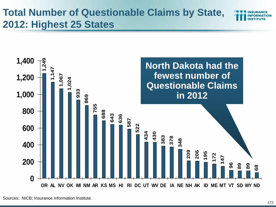
172
1,2
49
1,1
47
1,0
67
1,0
24
93
3
86
9
75
5
68
8
64
3
63
6
58
7
52
2
43
4
43
0
38
3
37
8
34
8
20
9
20
6
19
5
17
2
14
7
96
89
89
68
0
200
400
600
800
1,000
1,200
1,400
OR AL NV OK WI NM AR KS MS HI RI DC UT WV DE IA NE NH AK ID ME MT VT SD WY ND
Total Number of Questionable Claims by State,
2012: Highest 25 States
Sources: NICB; Insurance Information Institute.
North Dakota had the fewest number of
Questionable Claims in 2012
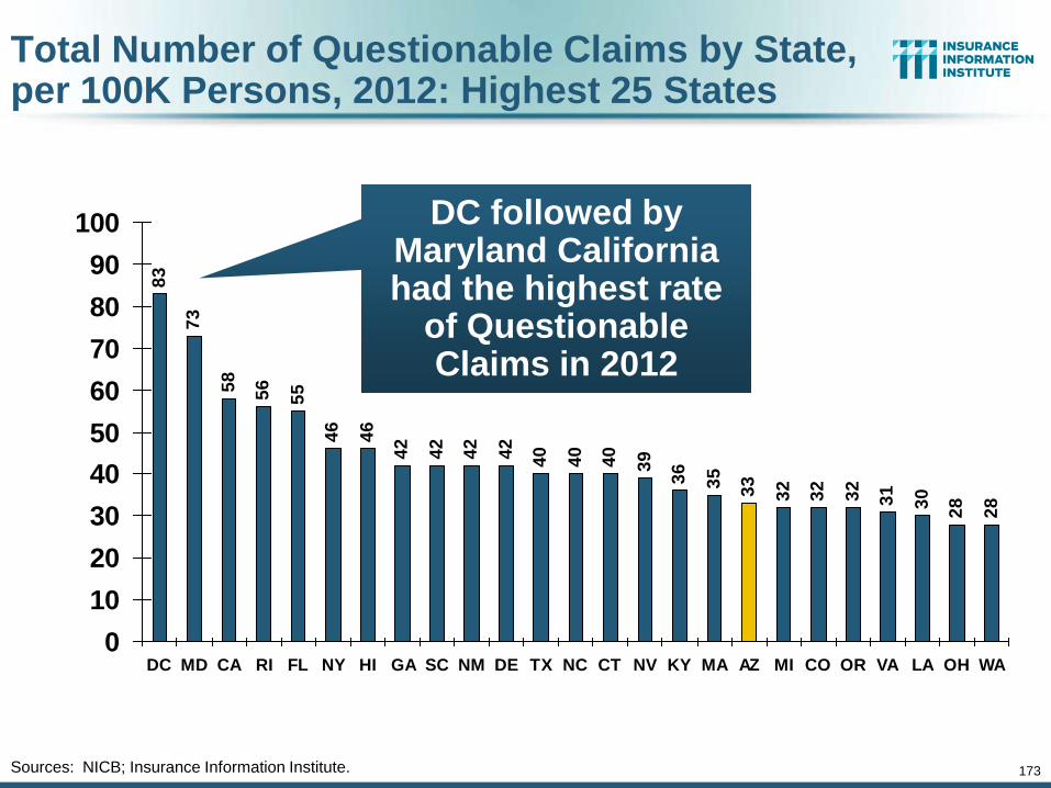
173
Total Number of Questionable Claims by State, per 100K Persons, 2012: Highest 25 States
83
73
58
56
55
46
46
42
42
42
42
40
40
40
39
36
35
33
32
32
32
31
30
28
28
0
10
20
30
40
50
60
70
80
90
100
DC MD CA RI FL NY HI GA SC NM DE TX NC CT NV KY MA AZ MI CO OR VA LA OH WA
Sources: NICB; Insurance Information Institute.
DC followed by Maryland California had the highest rate
of Questionable Claims in 2012
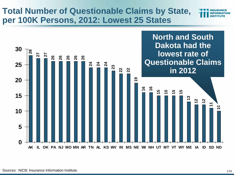
174
Total Number of Questionable Claims by State, per 100K Persons, 2012: Lowest 25 States
28
27
27
26
26
26
26
26
24
24
24
23
22
22
19
16
16
15
15
15
15
13
12
12
11
10
0
5
10
15
20
25
30
AK IL OK PA NJ MO MN AR TN AL KS WV IN MS NE WI NH UT MT VT WY ME IA ID SD ND
Sources: NICB; Insurance Information Institute.
North and South Dakota had the lowest rate of
Questionable Claims in 2012
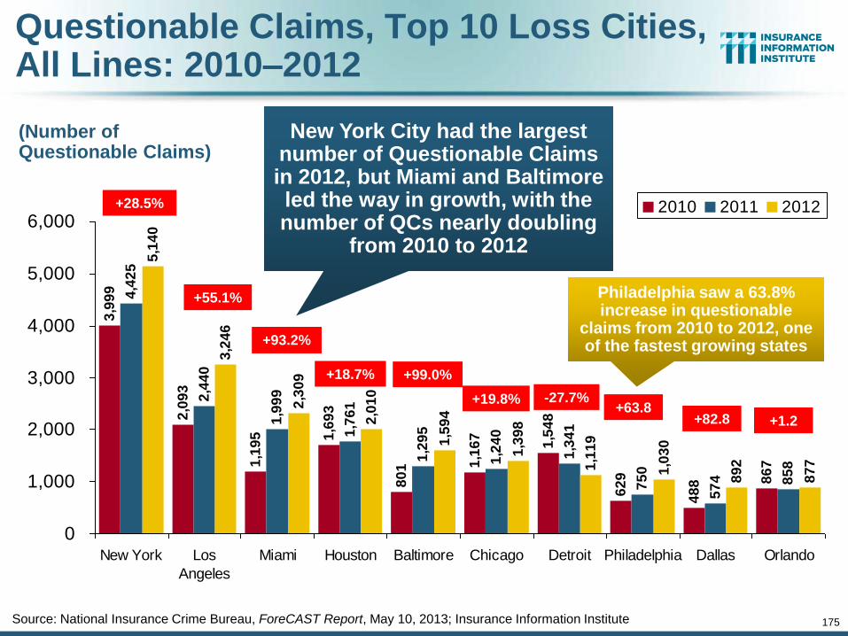
175
Source: National Insurance Crime Bureau, ForeCAST Report, May 10, 2013; Insurance Information Institute
3,9
99
2,0
93
1,1
95 1,6
93
80
1 1,1
67
1,5
48
62
9
48
8 86
7
4,4
25
2,4
40
1,9
99
1,7
61
1,2
95
1,2
40
1,3
41
75
0
57
4 85
8
5,1
40
3,2
46
2,3
09
2,0
10
1,5
94
1,3
98
1,1
19
1,0
30
89
2
87
7
0
1,000
2,000
3,000
4,000
5,000
6,000
New York Los
Angeles
Miami Houston Baltimore Chicago Detroit Philadelphia Dallas Orlando
2010 2011 2012
(Number of Questionable Claims)
New York City had the largest number of Questionable Claims in 2012, but Miami and Baltimore led the way in growth, with the number of QCs nearly doubling
from 2010 to 2012
+28.5%
+55.1%
+93.2%
+18.7% +99.0%
+19.8% -27.7% +63.8
+82.8 +1.2
Questionable Claims, Top 10 Loss Cities, All Lines: 2010–2012
Philadelphia saw a 63.8% increase in questionable
claims from 2010 to 2012, one of the fastest growing states
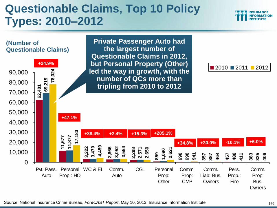
176
Source: National Insurance Crime Bureau, ForeCAST Report, May 10, 2013; Insurance Information Institute
62
,48
1
11
,67
7
3,2
22
2,8
66
2,2
98
85
9
69
8
35
7
45
7
38
3
69
,21
9
11
,87
7
3,4
70
3,0
52
2,5
71
1,0
90
69
8
38
7
48
8
32
5
78
,02
4
17
,18
3
4,4
59
3,5
54
2,6
50
2,6
21
94
1
46
4
41
1
40
6
0
10,000
20,000
30,000
40,000
50,000
60,000
70,000
80,000
90,000
Pvt. Pass.
Auto
Personal
Prop.: HO
WC & EL Comm.
Auto
CGL Personal
Prop:
Other
Comm.
Prop:
CMP
Comm.
Liab: Bus.
Owners
Pers.
Prop.:
Fire
Comm.
Prop:
Bus.
Owners
2010 2011 2012
(Number of Questionable Claims)
Private Passenger Auto had the largest number of
Questionable Claims in 2012, but Personal Property (Other) led the way in growth, with the
number of QCs more than tripling from 2010 to 2012
+24.9%
+47.1%
+38.4% +2.4% +15.3% +205.1%
+34.8% +30.0% -10.1% +6.0%
Questionable Claims, Top 10 Policy Types: 2010–2012

Financial Strength & Underwriting
177
Cyclical Pattern is P-C Impairment History is Directly Tied to
Underwriting, Reserving & Pricing
177
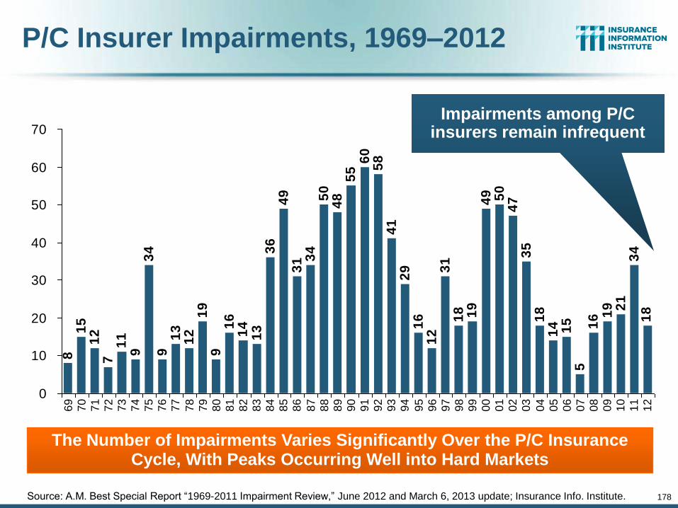
P/C Insurer Impairments, 1969–2012 8
15
12
71
19
34
91
31
21
99
16
14
13
36
49
31 3
45
04
85
56
05
84
12
91
61
23
11
8 19
49 50
47
35
18
14 15 16 1
9 21
34
18
5
0
10
20
30
40
50
60
70
69
70
71
72
73
74
75
76
77
78
79
80
81
82
83
84
85
86
87
88
89
90
91
92
93
94
95
96
97
98
99
00
01
02
03
04
05
06
07
08
09
10
11
12
Source: A.M. Best Special Report “1969-2011 Impairment Review,” June 2012 and March 6, 2013 update; Insurance Info. Institute.
The Number of Impairments Varies Significantly Over the P/C Insurance Cycle, With Peaks Occurring Well into Hard Markets
178
Impairments among P/C insurers remain infrequent
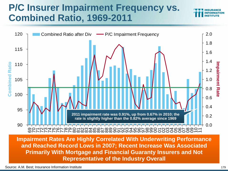
179
P/C Insurer Impairment Frequency vs. Combined Ratio, 1969-2011
90
95
100
105
110
115
1206
97
07
17
27
37
47
57
67
77
87
98
08
18
28
38
48
58
68
78
88
99
09
19
29
39
49
59
69
79
89
90
00
10
20
30
40
50
60
70
80
91
01
1
Co
mb
ine
d R
ati
o
0.0
0.2
0.4
0.6
0.8
1.0
1.2
1.4
1.6
1.8
2.0
Imp
airm
en
t Ra
te
Combined Ratio after Div P/C Impairment Frequency
Source: A.M. Best; Insurance Information Institute
2011 impairment rate was 0.91%, up from 0.67% in 2010; the rate is slightly higher than the 0.82% average since 1969
Impairment Rates Are Highly Correlated With Underwriting Performance and Reached Record Lows in 2007; Recent Increase Was Associated
Primarily With Mortgage and Financial Guaranty Insurers and Not Representative of the Industry Overall
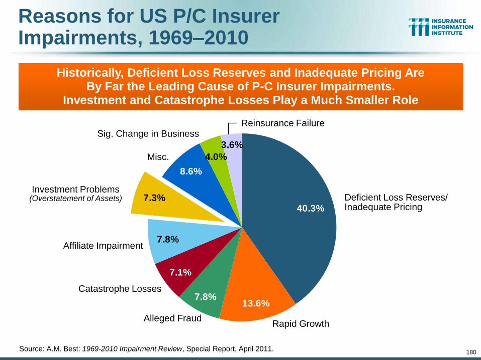
180
Reasons for US P/C Insurer Impairments, 1969–2010
3.6%
4.0%
8.6%
7.3%
7.8%
7.1%
7.8%13.6%
40.3%
Source: A.M. Best: 1969-2010 Impairment Review, Special Report, April 2011.
Historically, Deficient Loss Reserves and Inadequate Pricing Are By Far the Leading Cause of P-C Insurer Impairments.
Investment and Catastrophe Losses Play a Much Smaller Role
Deficient Loss Reserves/ Inadequate Pricing
Reinsurance Failure
Rapid Growth Alleged Fraud
Catastrophe Losses
Affiliate Impairment
Investment Problems (Overstatement of Assets)
Misc.
Sig. Change in Business
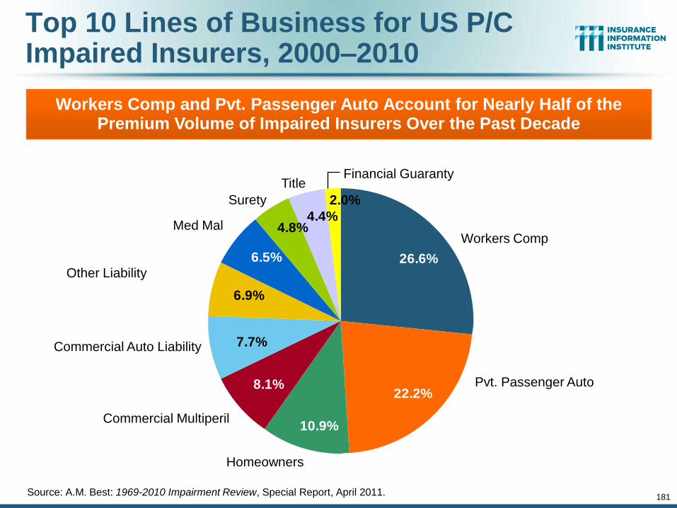
181
Top 10 Lines of Business for US P/C Impaired Insurers, 2000–2010
2.0%
4.4%4.8%
6.5%
6.9%
7.7%
8.1%
10.9%
22.2%
26.6%
Source: A.M. Best: 1969-2010 Impairment Review, Special Report, April 2011.
Workers Comp and Pvt. Passenger Auto Account for Nearly Half of the Premium Volume of Impaired Insurers Over the Past Decade
Workers Comp
Financial Guaranty
Pvt. Passenger Auto
Homeowners
Commercial Multiperil
Commercial Auto Liability
Other Liability
Med Mal
Surety
Title

182
Performance by Segment
182
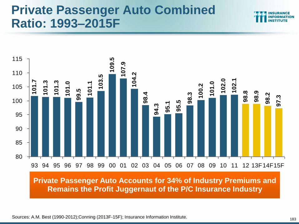
Private Passenger Auto Combined Ratio: 1993–2015F
10
1.7
10
1.3
10
1.3
10
1.0
10
9.5
10
7.9
10
4.2
98
.4
94
.3
95
.1
95
.5 98
.3 10
0.2
10
1.0
10
2.0
10
2.1
98
.8
98
.9
98
.2
97
.399
.5 10
1.1
10
3.5
80
85
90
95
100
105
110
115
93 94 95 96 97 98 99 00 01 02 03 04 05 06 07 08 09 10 11 12 13F14F15F
Private Passenger Auto Accounts for 34% of Industry Premiums and Remains the Profit Juggernaut of the P/C Insurance Industry
183
Sources: A.M. Best (1990-2012);Conning (2013F-15F); Insurance Information Institute.

Homeowners Insurance Combined Ratio: 1990–2015F
11
3.0
11
7.7
15
8.4
11
3.6
10
1.0 10
9.4
10
8.2
11
1.4 1
21
.7
10
9.3
98
.2
94
.4 10
0.3
89
.0 95
.6
11
6.6
10
5.8
10
6.9
12
2.3
10
4.1
10
1.2
10
0.5
99
.7
11
8.4
11
2.7 12
1.7
80
90
100
110
120
130
140
150
160
170
90 91 92 93 94 95 96 97 98 99 00 01 02 03 04 05 06 07 08 09 10 11 12 13F 14F 15F
1
Homeowners Performance in 2011/12 Impacted by Large Cat Losses. Extreme Regional Variation Can Be Expected Due to
Local Catastrophe Loss Activity
Sources: A.M. Best (1990-2012);Conning (2013E-2015F); Insurance Information Institute.
184
Hurricane Ike
Hurricane Sandy
Record tornado activity
Hurricane Andrew
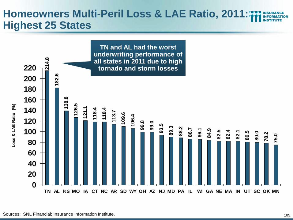
185
Homeowners Multi-Peril Loss & LAE Ratio, 2011: Highest 25 States
21
4.8
18
2.6
13
8.8
12
6.5
12
1.1
11
8.4
11
8.4
11
3.7
10
9.6
10
6.4
99
.8
99
.0
93
.5
89
.3
88
.2
86
.7
86
.1
84
.9
82
.5
82
.4
82
.1
80
.5
80
.0
78
.2
75
.0
0
20
40
60
80
100
120
140
160
180
200
220
TN AL KS MO IA CT NC AR SD WY OH AZ NJ MD PA IL WI GA NE MA IN UT SC OK MN
Lo
ss &
LA
E R
ati
o
(%)
Sources: SNL Financial; Insurance Information Institute.
TN and AL had the worst underwriting performance of all states in 2011 due to high
tornado and storm losses
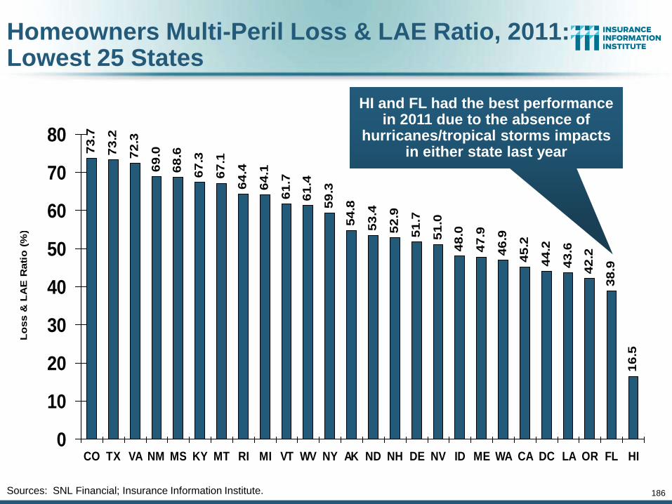
186
Homeowners Multi-Peril Loss & LAE Ratio, 2011: Lowest 25 States
73
.7
73
.2
72
.3
69
.0
68
.6
67
.3
67
.1
64
.4
64
.1
61
.7
61
.4
59
.3
54
.8
53
.4
52
.9
51
.7
51
.0
48
.0
47
.9
46
.9
45
.2
44
.2
43
.6
42
.2
38
.9
16
.5
0
10
20
30
40
50
60
70
80
CO TX VA NM MS KY MT RI MI VT WV NY AK ND NH DE NV ID ME WA CA DC LA OR FL HI
Lo
ss &
LA
E R
ati
o (
%)
Sources: SNL Financial; Insurance Information Institute.
HI and FL had the best performance in 2011 due to the absence of
hurricanes/tropical storms impacts in either state last year
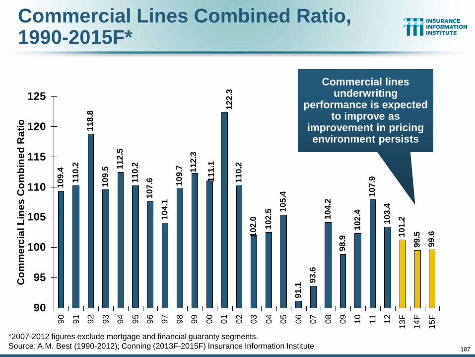
10
9.4
11
0.2
11
8.8
10
9.5 1
12
.5
11
0.2
10
7.6
10
4.1
10
9.7
11
0.2
10
2.5 1
05
.4
91
.1
93
.6
10
4.2
98
.9
10
2.4
10
7.9
10
3.4
10
1.2
99
.5
99
.610
2.0
11
1.1
11
2.3
12
2.3
90
95
100
105
110
115
120
125
90
91
92
93
94
95
96
97
98
99
00
01
02
03
04
05
06
07
08
09
10
11
12
13
F
14
F
15
F
Co
mm
erc
ial L
ine
s C
om
bin
ed
Ra
tio
*2007-2012 figures exclude mortgage and financial guaranty segments.
Source: A.M. Best (1990-2012); Conning (2013F-2015F) Insurance Information Institute
Commercial Lines Combined Ratio, 1990-2015F*
Commercial lines underwriting
performance is expected to improve as
improvement in pricing environment persists
187
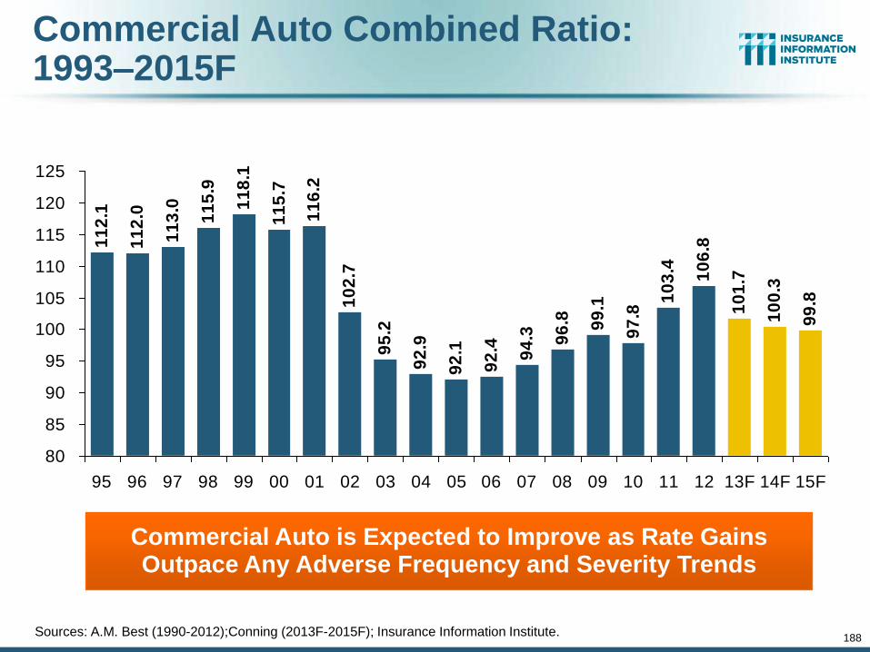
Commercial Auto Combined Ratio: 1993–2015F
11
2.1
11
2.0
11
3.0
11
5.9
10
2.7
95
.2
92
.9
92
.1
92
.4 94
.3 96
.8 99
.1
97
.8
10
3.4 10
6.8
10
1.7
10
0.3
99
.8
11
8.1
11
5.7
11
6.2
80
85
90
95
100
105
110
115
120
125
95 96 97 98 99 00 01 02 03 04 05 06 07 08 09 10 11 12 13F 14F 15F
Commercial Auto is Expected to Improve as Rate Gains Outpace Any Adverse Frequency and Severity Trends
188
Sources: A.M. Best (1990-2012);Conning (2013F-2015F); Insurance Information Institute.
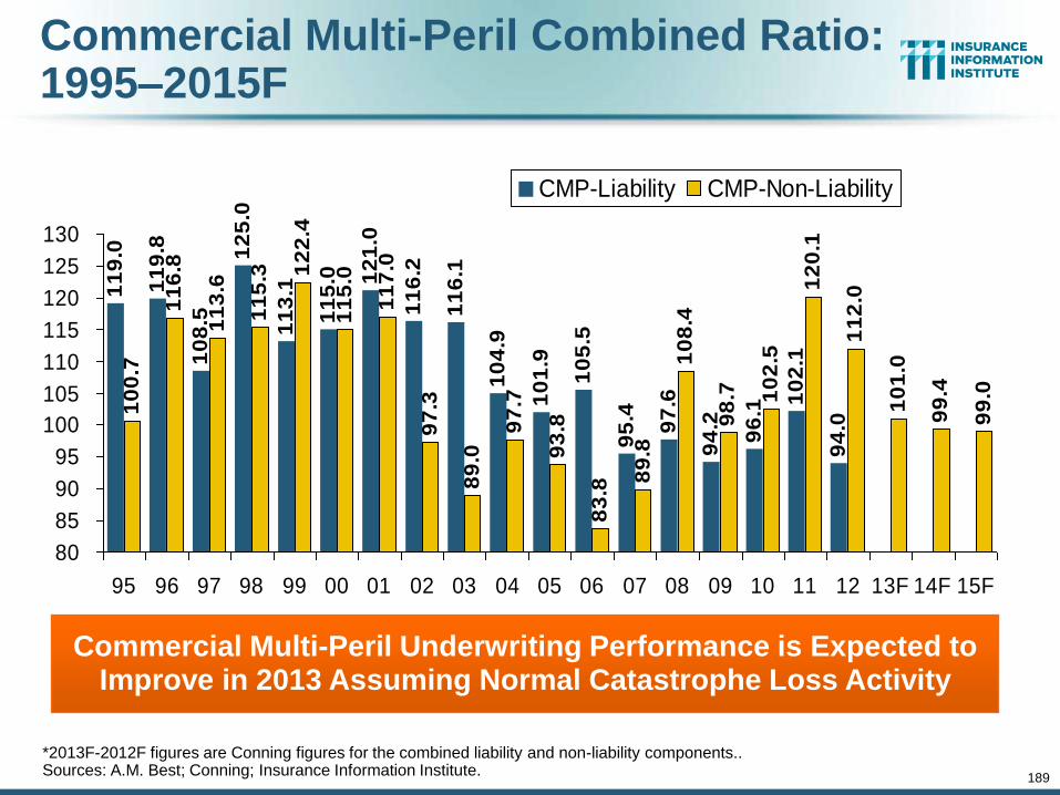
Commercial Multi-Peril Combined Ratio: 1995–2015F
11
9.0
11
9.8
10
8.5
12
5.0
11
6.2
11
6.1
10
4.9
10
1.9
10
5.5
95
.4
97
.6
94
.2
96
.1
10
2.1
94
.0
10
0.7
11
6.8
11
3.6
11
5.3 1
22
.4
11
5.0
11
7.0
97
.3
89
.0
97
.7
93
.8
83
.8
89
.8
10
8.4
98
.7 10
2.5
12
0.1
11
2.0
10
1.0
99
.4
99
.0
11
3.1
11
5.0 1
21
.0
80
85
90
95
100
105
110
115
120
125
130
95 96 97 98 99 00 01 02 03 04 05 06 07 08 09 10 11 12 13F 14F 15F
CMP-Liability CMP-Non-Liability
Commercial Multi-Peril Underwriting Performance is Expected to Improve in 2013 Assuming Normal Catastrophe Loss Activity
*2013F-2012F figures are Conning figures for the combined liability and non-liability components.. Sources: A.M. Best; Conning; Insurance Information Institute.
189
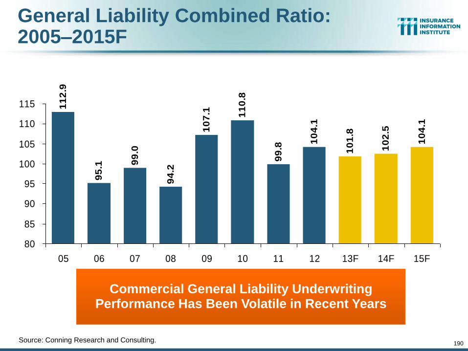
General Liability Combined Ratio: 2005–2015F
11
2.9
95
.1 99
.0
94
.2
10
4.1
10
1.8
10
2.5
10
4.1
10
7.1 11
0.8
99
.8
80
85
90
95
100
105
110
115
05 06 07 08 09 10 11 12 13F 14F 15F
Commercial General Liability Underwriting Performance Has Been Volatile in Recent Years
Source: Conning Research and Consulting.
190
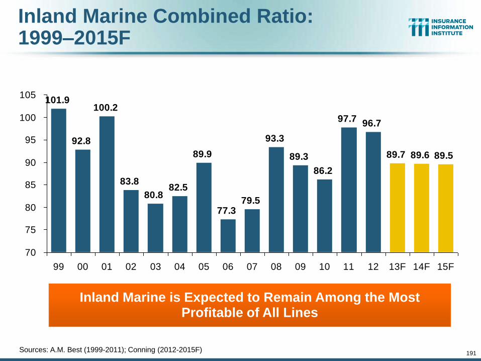
Inland Marine Combined Ratio: 1999–2015F
101.9
92.8
100.2
83.8
77.379.5
93.3
89.3
86.2
97.796.7
89.7 89.6 89.5
80.882.5
89.9
70
75
80
85
90
95
100
105
99 00 01 02 03 04 05 06 07 08 09 10 11 12 13F 14F 15F
Inland Marine is Expected to Remain Among the Most Profitable of All Lines
Sources: A.M. Best (1999-2011); Conning (2012-2015F)
191
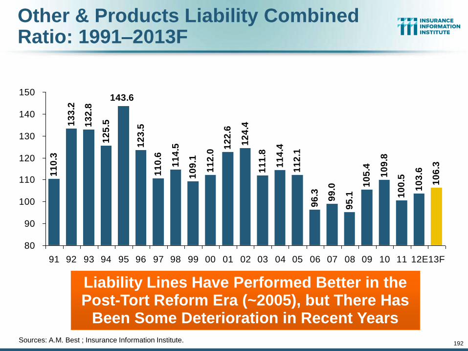
Other & Products Liability Combined Ratio: 1991–2013F
11
0.3
10
9.1
11
2.0
12
2.6
12
4.4
11
1.8
11
4.4
11
2.1
96
.3
99
.0
95
.1
10
5.4
10
9.8
10
0.5
10
3.6
10
6.3
12
5.51
32
.8
13
3.2
11
4.5
143.6
12
3.5
11
0.6
80
90
100
110
120
130
140
150
91 92 93 94 95 96 97 98 99 00 01 02 03 04 05 06 07 08 09 10 11 12E13F
Liability Lines Have Performed Better in the Post-Tort Reform Era (~2005), but There Has
Been Some Deterioration in Recent Years Sources: A.M. Best ; Insurance Information Institute.
192
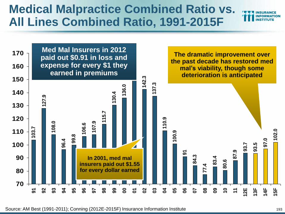
10
3.7
10
8.0
96
.4 99
.8
10
6.6
10
7.9 1
15
.7
13
0.4 13
6.0
15
4.7
14
2.3
13
7.3
11
0.9
10
0.9
91
84
.3
77
.4 83
.4
80
.6
87
.9 93
.7
93
.5 97
.0 10
2.0
12
7.9
70
80
90
100
110
120
130
140
150
160
170
91
92
93
94
95
96
97
98
99
00
01
02
03
04
05
06
07
08
09
10
11
12
E
13
F
14
F
15
F
Medical Malpractice Combined Ratio vs. All Lines Combined Ratio, 1991-2015F
Source: AM Best (1991-2011); Conning (2012E-2015F) Insurance Information Institute
Med Mal Insurers in 2012 paid out $0.91 in loss and expense for every $1 they
earned in premiums
In 2001, med mal insurers paid out $1.55 for every dollar earned
The dramatic improvement over the past decade has restored med
mal’s viability, though some deterioration is anticipated
193
Workers Compensation Operating Environment
194
The Weak Economy and Soft Market Have Made the Workers Comp Operating
Increasingly Challenging
194
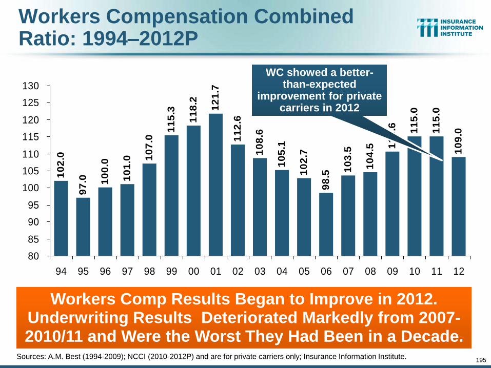
Workers Compensation Combined Ratio: 1994–2012P
10
2.0
97
.0 10
0.0
10
1.0
11
2.6
10
8.6
10
5.1
10
2.7
98
.5
10
3.5
10
4.5 1
10
.6 11
5.0
11
5.0
10
9.0
12
1.7
10
7.0
11
5.3
11
8.2
80
85
90
95
100
105
110
115
120
125
130
94 95 96 97 98 99 00 01 02 03 04 05 06 07 08 09 10 11 12
Workers Comp Results Began to Improve in 2012. Underwriting Results Deteriorated Markedly from 2007-2010/11 and Were the Worst They Had Been in a Decade.
Sources: A.M. Best (1994-2009); NCCI (2010-2012P) and are for private carriers only; Insurance Information Institute.
195
WC showed a better-than-expected
improvement for private carriers in 2012
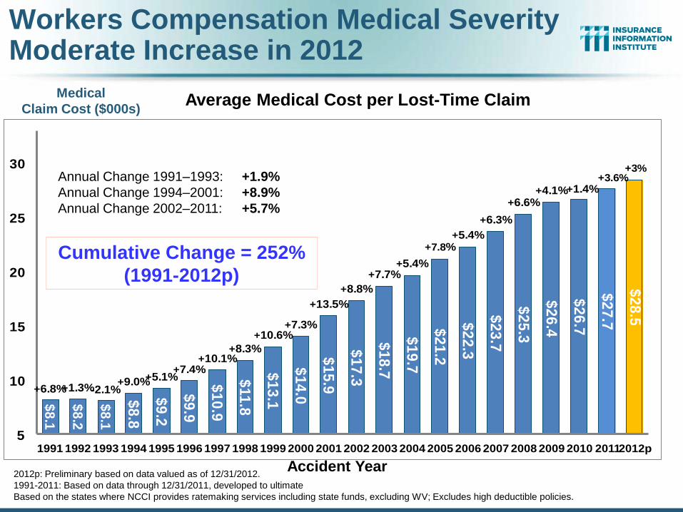
Workers Compensation Medical Severity Moderate Increase in 2012
196
Accident Year
Annual Change 1991–1993: +1.9%
Annual Change 1994–2001: +8.9%
Annual Change 2002–2010: +6.0%
Average Medical Cost per Lost-Time Claim Medical
Claim Cost ($000s)
$8
.1
$8
.2
$8
.1
$8
.8
$9
.2
$9
.9
$1
0.9
$11
.8
$1
3.1
$1
4.0
$1
5.9
$1
7.3
$1
8.7
$1
9.7
$2
1.2
$2
2.3
$2
3.7
$2
5.3
$2
6.4
$2
6.7
$2
7.7
$2
8.5
+6.8%+1.3%-2.1%+9.0%+5.1%
+7.4%+10.1%
+8.3%
+10.6%+7.3%
+13.5%
+8.8%
+7.7%+5.4%
+7.8%+5.4%
+6.3%
+6.6%+4.1%+1.4%
+3.6%+3%
5
10
15
20
25
30
1991 1992 1993 1994 1995 1996 1997 1998 1999 2000 2001 2002 2003 2004 2005 2006 2007 2008 2009 2010 20112012p
2012p: Preliminary based on data valued as of 12/31/2012.
1991-2011: Based on data through 12/31/2011, developed to ultimate
Based on the states where NCCI provides ratemaking services including state funds, excluding WV; Excludes high deductible policies.
Cumulative Change = 252%
(1991-2012p)
Annual Change 1991–1993: +1.9%
Annual Change 1994–2001: +8.9%
Annual Change 2002–2011: +5.7%
Accident Year
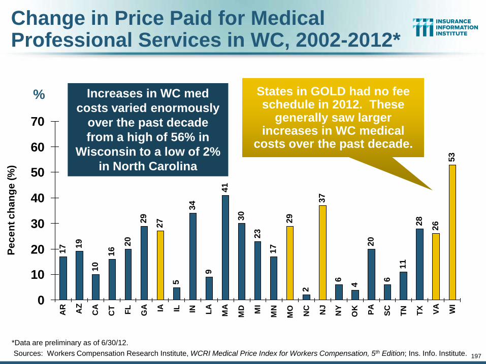
197
Change in Price Paid for Medical Professional Services in WC, 2002-2012*
17 1
9
10
16
20
29
27
5
34
9
41
30
23
17
29
2
37
6
4
20
6
11
28
26
53
0
10
20
30
40
50
60
70
AR
AZ
CA
CT
FL
GA IA IL IN LA
MA
MD MI
MN
MO
NC
NJ
NY
OK
PA
SC
TN
TX VA
WI
Pe
ce
nt
ch
an
ge
(%
)
*Data are preliminary as of 6/30/12.
Sources: Workers Compensation Research Institute, WCRI Medical Price Index for Workers Compensation, 5th Edition; Ins. Info. Institute.
States in GOLD had no fee schedule in 2012. These
generally saw larger increases in WC medical
costs over the past decade.
Increases in WC med
costs varied enormously
over the past decade
from a high of 56% in
Wisconsin to a low of 2%
in North Carolina
%
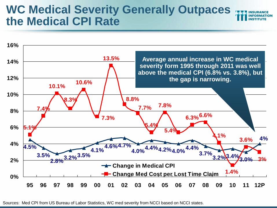
4.5%
3.5%2.8%
3.2%3.5%4.1%
4.6%4.7%4.0%
4.4%4.2%4.0%4.4%
3.7%3.2%3.4%
3.0%
5.1%
7.4%
10.1%10.6%
13.5%
5.4%
7.8%
6.3%6.6%
4.1%3.6% 4%
3%
1.4%
5.4%
8.8%
7.7%
7.3%
8.3%
0%
2%
4%
6%
8%
10%
12%
14%
16%
95 96 97 98 99 00 01 02 03 04 05 06 07 08 09 10 11 12P
Change in Medical CPI
Change Med Cost per Lost Time Claim
WC Medical Severity Generally Outpaces the Medical CPI Rate
Sources: Med CPI from US Bureau of Labor Statistics, WC med severity from NCCI based on NCCI states.
Average annual increase in WC medical severity form 1995 through 2011 was well above the medical CPI (6.8% vs. 3.8%), but
the gap is narrowing.
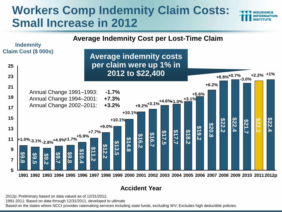
$9
.8
$9
.5
$9
.2
$9
.7
$9
.8
$1
0.4
$1
1.2
$1
2.2
$1
3.5
$1
4.8
$1
6.2
$1
6.7
$1
7.5
$2
2.2
$2
2.4
$2
2.2
$2
2.4$
18
.2
$1
7.7
$1
9.2
$2
0.8
$2
1.7
+1%
-3.0%+0.7%+8.8% +2.2%
+5.6%+3.1%
+1.0%+4.6%+3.1%
+9.2%
+10.1%
+10.1%
+9.0%
+7.7%+5.9%
+1.7%+4.9%-2.8%-3.1%+1.0%
+6.2%
5
7
9
11
13
15
17
19
21
23
25
1991 1992 1993 1994 1995 1996 1997 1998 1999 2000 2001 2002 2003 2004 2005 2006 2007 2008 2009 2010 20112012p
Indemnity
Claim Cost ($ 000s)
Annual Change 1991–1993: -1.7%
Annual Change 1994–2001: +7.3%
Annual Change 2002–2011: +3.2%
Accident Year
Workers Comp Indemnity Claim Costs: Small Increase in 2012
Average indemnity costs per claim were up 1% in
2012 to $22,400
Average Indemnity Cost per Lost-Time Claim
2012p: Preliminary based on data valued as of 12/31/2012.
1991-2011: Based on data through 12/31/2011, developed to ultimate
Based on the states where NCCI provides ratemaking services including state funds, excluding WV; Excludes high deductible policies.
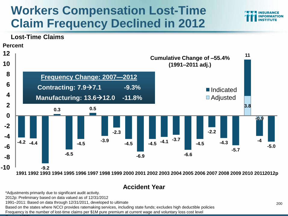
Workers Compensation Lost-Time Claim Frequency Declined in 2012
Lost-Time Claims
200
-4.2 -4.4
-9.2
0.3
-6.5
-4.5
0.5
-3.9
-2.3
-4.5
-6.9
-4.5 -4.1 -3.7
-6.6
-4.5
-2.2
-4.3
-5.7
11
-4
-5.0
3.8
-0.9
-10
-8
-6
-4
-2
0
2
4
6
8
10
12
1991 1992 1993 1994 1995 1996 1997 1998 1999 2000 2001 2002 2003 2004 2005 2006 2007 2008 2009 2010 2011 2012p
Indicated
Adjusted
Frequency Change: 2007—2012
Contracting: 7.97.1 -9.3%
Manufacturing: 13.612.0 -11.8%
Percent
Accident Year
*Adjustments primarily due to significant audit activity.
2012p: Preliminary based on data valued as of 12/31/2012
1991–2011: Based on data through 12/31/2011, developed to ultimate
Based on the states where NCCI provides ratemaking services, including state funds; excludes high deductible policies
Frequency is the number of lost-time claims per $1M pure premium at current wage and voluntary loss cost level
Source: NCCI.
Cumulative Change of –55.4%
(1991–2011 adj.)
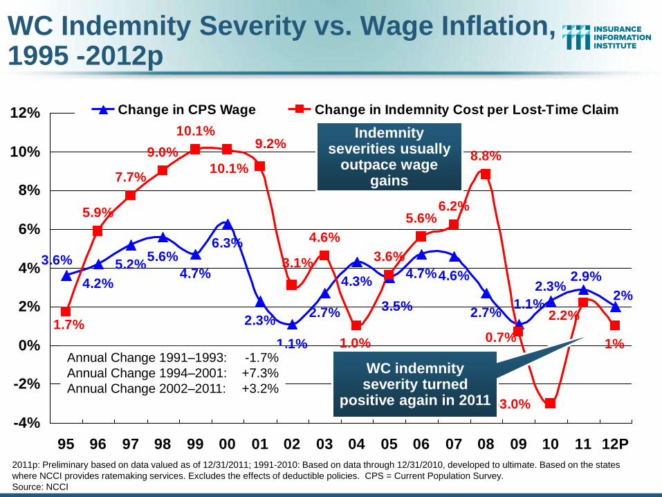
4.2%
5.2%5.6%
4.7%
6.3%
2.3%
1.1%
2.7%
4.3%4.7%4.6%
2.7%
5.9%
7.7%
9.0%
10.1%
4.6%
3.6%
5.6%6.2%
8.8%
2%
2.9%2.3%
1.1%3.5%
3.6%
1%
2.2%
0.7%
-3.0%
1.0%
1.7%
10.1%
9.2%
3.1%
-4%
-2%
0%
2%
4%
6%
8%
10%
12%
95 96 97 98 99 00 01 02 03 04 05 06 07 08 09 10 11 12P
Change in CPS Wage Change in Indemnity Cost per Lost-Time Claim
WC Indemnity Severity vs. Wage Inflation, 1995 -2012p
2011p: Preliminary based on data valued as of 12/31/2011; 1991-2010: Based on data through 12/31/2010, developed to ultimate. Based on the states
where NCCI provides ratemaking services. Excludes the effects of deductible policies. CPS = Current Population Survey.
Source: NCCI
WC indemnity severity turned
positive again in 2011
Annual Change 1991–1993: -1.7%
Annual Change 1994–2001: +7.3%
Annual Change 2002–2011: +3.2%
Indemnity severities usually
outpace wage gains
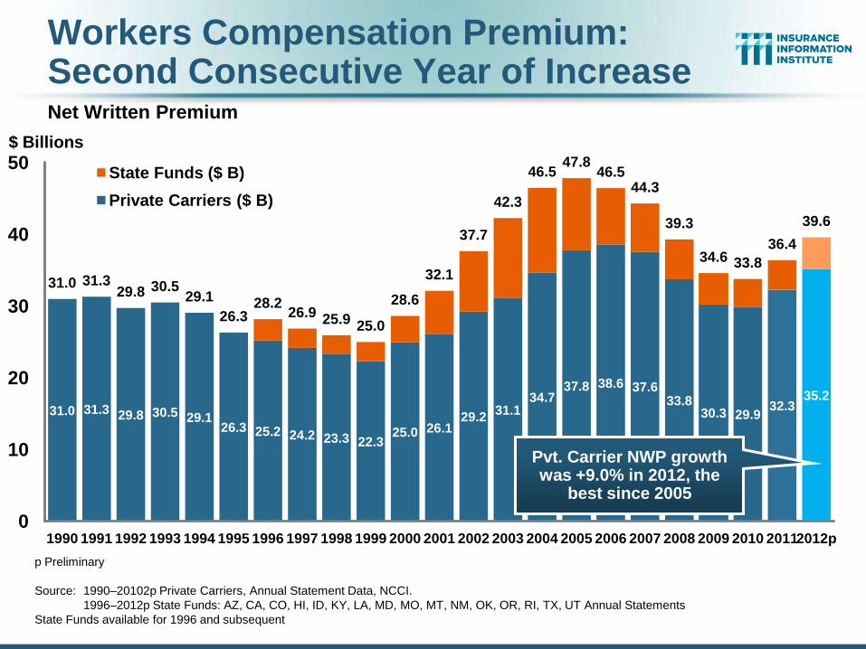
Workers Compensation Premium: Second Consecutive Year of Increase
Net Written Premium
31.0 31.3 29.8 30.5 29.1 26.3 25.2 24.2 23.3 22.3
25.0 26.1 29.2
31.1 34.7
37.8 38.6 37.6 33.8
30.3 29.9 32.3
35.2
31.0 31.3 29.8 30.5
29.1
26.3 28.2
26.9 25.9 25.0
28.6
32.1
37.7
42.3
46.5 47.8
46.5 44.3
39.3
34.6 33.8
36.4
39.6
0
10
20
30
40
50
1990 1991 1992 1993 1994 1995 1996 1997 1998 1999 2000 2001 2002 2003 2004 2005 2006 2007 2008 2009 2010 2011 2012p
State Funds ($ B)
Private Carriers ($ B)
Pvt. Carrier NWP growth was +9.0% in 2012, the
best since 2005
$ Billions
Calendar Year p Preliminary
Source: 1990–20102p Private Carriers, Annual Statement Data, NCCI.
1996–2012p State Funds: AZ, CA, CO, HI, ID, KY, LA, MD, MO, MT, NM, OK, OR, RI, TX, UT Annual Statements
State Funds available for 1996 and subsequent
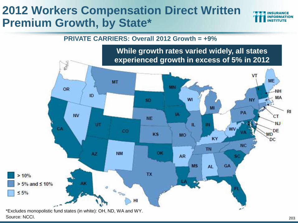
203
2012 Workers Compensation Direct Written Premium Growth, by State*
PRIVATE CARRIERS: Overall 2012 Growth = +9%
*Excludes monopolistic fund states (in white): OH, ND, WA and WY.
Source: NCCI.
While growth rates varied widely, all states
experienced growth in excess of 5% in 2012
204
Nonfarm Payroll (Wages and Salaries): Quarterly, 2005–2011:Q4
Note: Recession indicated by gray shaded column. Data are seasonally adjusted annual rates.
Sources: http://research.stlouisfed.org/fred2/series/WASCUR; National Bureau of Economic Research (recession dates); Insurance Information Institute.
Billions
$5,500
$5,750
$6,000
$6,250
$6,500
$6,7500
5:Q
1
05
:Q2
05
:Q3
05
:Q4
06
:Q1
06
:Q2
06
:Q3
06
:Q4
07
:Q1
07
:Q2
07
:Q3
07
:Q4
08
:Q1
08
:Q2
08
:Q3
08
:Q4
09
:Q1
09
:Q2
09
:Q3
09
:Q4
10
:Q1
10
:Q2
10
:Q3
10
:Q4
11
:Q1
11
:Q2
11
:Q3
11
:Q4
Peak was 2008:Q1 at $6.60 trillion
Latest (2011:Q4) was $6.71 trillion,
a new peak
Recent trough (2009:Q3) was $6.25 trillion, down
5.3% from prior peak
Growth rates in 2011 Q2 over Q1: 0.6% Q3 over Q2: 0.4% Q4 over Q3: 1.0%
Pace of payroll growth is
accelerating
204
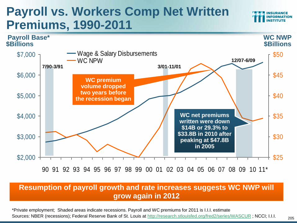
$2,000
$3,000
$4,000
$5,000
$6,000
$7,000
90 91 92 93 94 95 96 97 98 99 00 01 02 03 04 05 06 07 08 09 10 11*
$25
$30
$35
$40
$45
$50Wage & Salary DisbursementsWC NPW
205
Payroll Base* WC NWP
Payroll vs. Workers Comp Net Written Premiums, 1990-2011
*Private employment; Shaded areas indicate recessions. Payroll and WC premiums for 2011 is I.I.I. estimate
Sources: NBER (recessions); Federal Reserve Bank of St. Louis at http://research.stlouisfed.org/fred2/series/WASCUR ; NCCI; I.I.I.
Resumption of payroll growth and rate increases suggests WC NWP will grow again in 2012
7/90-3/91 3/01-11/01
12/07-6/09
$Billions $Billions
WC premium volume dropped two years before
the recession began
WC net premiums written were down $14B or 29.3% to
$33.8B in 2010 after peaking at $47.8B
in 2005
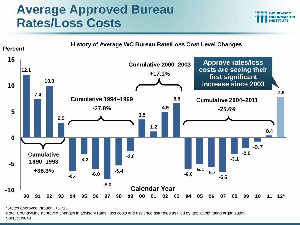
Average Approved Bureau Rates/Loss Costs
12.1
7.4
10.0
2.9
-6.4
-3.2
-6.0
-8.0
-5.4
-2.6
3.5
1.2
4.9
6.6
-6.0-5.1
-5.7-6.6
-3.1-2.0
-0.7
0.4
7.8
-10
-5
0
5
10
15
90 91 92 93 94 95 96 97 98 99 00 01 02 03 04 05 06 07 08 09 10 11 12*
Percent
Calendar Year
Cumulative
1990–1993
+36.3%
Cumulative 2000–2003
+17.1%
Cumulative 2004–2011
-25.6%
Cumulative 1994–1999
-27.8%
*States approved through 7/31/12.
Note: Countrywide approved changes in advisory rates, loss costs and assigned risk rates as filed by applicable rating organization.
Source: NCCI.
History of Average WC Bureau Rate/Loss Cost Level Changes
Approve rates/loss costs are seeing their
first significant increase since 2003
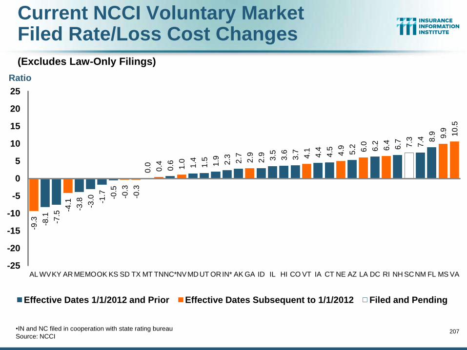
Current NCCI Voluntary Market Filed Rate/Loss Cost Changes
(Excludes Law-Only Filings)
207
-9.3
-8.1
-7.5
-4.1
-3.8
-3.0
-1.7
-0.5
-0.3
-0.3
0.0
0.4
0.6
1.0
1.4
1.5
1.9
2.3
2.7
2.9
2.9
3.5
3.6
3.7
4.1
4.4
4.5
4.9
5.2
6.0
6.2
6.4
6.7
7.3
7.4
8.9
9.9
10
.5
-25
-20
-15
-10
-5
0
5
10
15
20
25
AL WV KY AR ME MO OK KS SD TX MT TN NC* NV MD UT OR IN* AK GA ID IL HI CO VT IA CT NE AZ LA DC RI NH SC NM FL MS VA
Effective Dates 1/1/2012 and Prior Effective Dates Subsequent to 1/1/2012 Filed and Pending
Ratio
•IN and NC filed in cooperation with state rating bureau
Source: NCCI
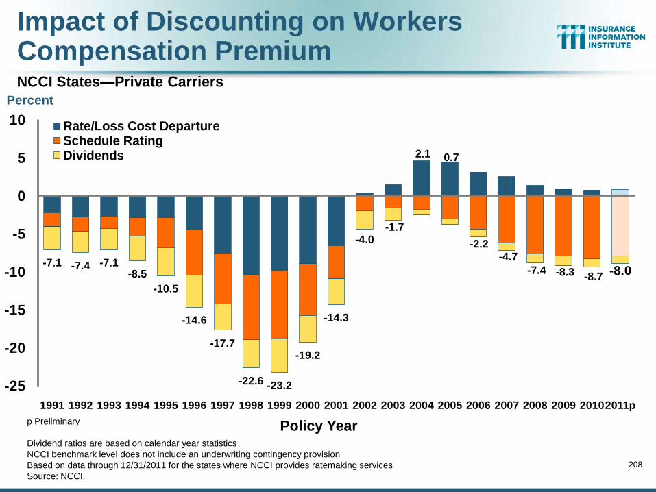
Impact of Discounting on Workers Compensation Premium
NCCI States—Private Carriers
208
-7.1 -7.4 -7.1 -8.5
-10.5
-14.6
-17.7
-22.6 -23.2
-19.2
-14.3
-4.0 -1.7
2.1 0.7
-2.2 -4.7
-7.4 -8.3 -8.7 -8.0
-25
-20
-15
-10
-5
0
5
10
1991 1992 1993 1994 1995 1996 1997 1998 1999 2000 2001 2002 2003 2004 2005 2006 2007 2008 2009 2010 2011p
Rate/Loss Cost Departure Schedule Rating Dividends
Policy Year p Preliminary
Dividend ratios are based on calendar year statistics
NCCI benchmark level does not include an underwriting contingency provision
Based on data through 12/31/2011 for the states where NCCI provides ratemaking services
Source: NCCI.
Percent
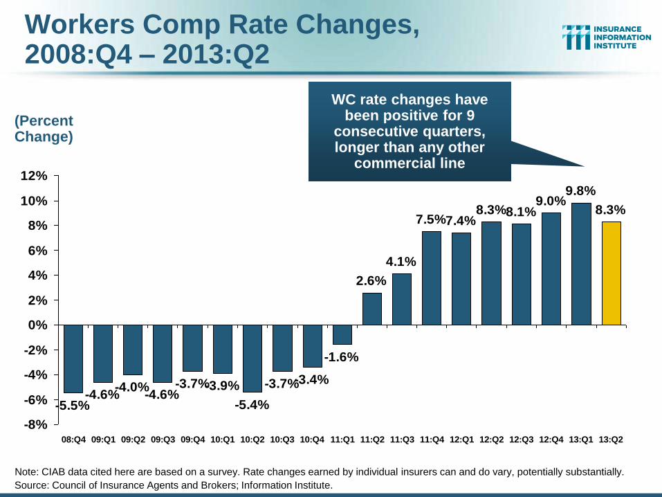
Workers Comp Rate Changes, 2008:Q4 – 2013:Q2
Source: Council of Insurance Agents and Brokers; Information Institute.
-5.5%-4.6%
-4.0%-4.6%
-3.7%-3.9%
-5.4%
-3.7%-3.4%
-1.6%
2.6%
4.1%
7.5%7.4%8.3%8.1%
9.0%9.8%
8.3%
-8%
-6%
-4%
-2%
0%
2%
4%
6%
8%
10%
12%
08:Q4 09:Q1 09:Q2 09:Q3 09:Q4 10:Q1 10:Q2 10:Q3 10:Q4 11:Q1 11:Q2 11:Q3 11:Q4 12:Q1 12:Q2 12:Q3 12:Q4 13:Q1 13:Q2
WC rate changes have been positive for 9
consecutive quarters, longer than any other
commercial line
(Percent Change)
Note: CIAB data cited here are based on a survey. Rate changes earned by individual insurers can and do vary, potentially substantially.
2. SURPLUS/CAPITAL/CAPACITY
210
How Will Large Catastrophe Losses Impact Capacity?
210
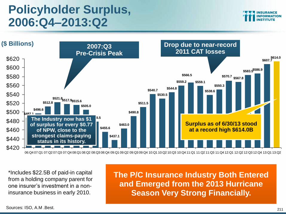
211
Policyholder Surplus, 2006:Q4–2013:Q2
Sources: ISO, A.M .Best.
($ Billions)
$487.1
$496.6
$512.8
$521.8
$478.5
$455.6
$437.1
$463.0
$490.8
$511.5
$540.7
$530.5
$544.8
$559.2 $559.1
$538.6
$550.3
$567.8
$583.5$586.9
$607.7$614.0
$570.7$566.5
$505.0
$515.6$517.9
$420
$440
$460
$480
$500
$520
$540
$560
$580
$600
$620
06:Q4 07:Q1 07:Q2 07:Q3 07:Q4 08:Q1 08:Q2 08:Q3 08:Q4 09:Q1 09:Q2 09:Q3 09:Q4 10:Q1 10:Q2 10:Q3 10:Q4 11:Q1 11:Q2 11:Q3 11:Q4 12:Q1 12:Q2 12:Q3 12:Q4 13:Q1 13:Q2
2007:Q3 Pre-Crisis Peak
Surplus as of 6/30/13 stood at a record high $614.0B
*Includes $22.5B of paid-in capital
from a holding company parent for
one insurer’s investment in a non-
insurance business in early 2010.
The Industry now has $1 of surplus for every $0.77
of NPW, close to the strongest claims-paying
status in its history.
Drop due to near-record 2011 CAT losses
The P/C Insurance Industry Both Entered and Emerged from the 2013 Hurricane
Season Very Strong Financially.
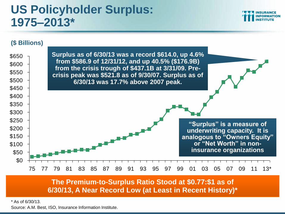
$0
$50
$100
$150
$200
$250
$300
$350
$400
$450
$500
$550
$600
$650
75 77 79 81 83 85 87 89 91 93 95 97 99 01 03 05 07 09 11 13*
US Policyholder Surplus: 1975–2013*
* As of 6/30/13.
Source: A.M. Best, ISO, Insurance Information Institute.
“Surplus” is a measure of underwriting capacity. It is
analogous to “Owners Equity” or “Net Worth” in non-
insurance organizations
($ Billions)
The Premium-to-Surplus Ratio Stood at $0.77:$1 as of 6/30/13, A Near Record Low (at Least in Recent History)*
Surplus as of 6/30/13 was a record $614.0, up 4.6% from $586.9 of 12/31/12, and up 40.5% ($176.9B) from the crisis trough of $437.1B at 3/31/09. Pre-
crisis peak was $521.8 as of 9/30/07. Surplus as of 6/30/13 was 17.7% above 2007 peak.
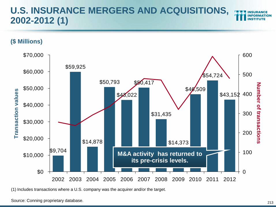
213
U.S. INSURANCE MERGERS AND ACQUISITIONS, 2002-2012 (1)
$9,704
$59,925
$14,878
$50,793
$43,022
$50,417
$31,435
$14,373
$46,509
$54,724
$43,152
$0
$10,000
$20,000
$30,000
$40,000
$50,000
$60,000
$70,000
2002 2003 2004 2005 2006 2007 2008 2009 2010 2011 2012
Tra
ns
ac
tio
n v
alu
es
0
100
200
300
400
500
600
Nu
mb
er o
f tran
sa
ctio
ns
($ Millions)
(1) Includes transactions where a U.S. company was the acquirer and/or the target.
Source: Conning proprietary database.
M&A activity has returned to its pre-crisis levels.
214
3. REINSURANCE MARKET CONDITIONS
Ample Capacity as Alternative Capital is
Transforming the Market
214

215
Global Reinsurer Capital, 2007-2013:H1*
$510
$410
$340
$400
$470 $455
$505
$0
$100
$200
$300
$400
$500
$600
2007 2008 2009 2010 2011 2012 2013:H1
*Includes both traditional and non-traditional forms of reinsurance capital.
Source: Aon Benfield Aggregate study for the 6 months ending June 2013; Insurance Information Institute.
($ Billions)
Global Reinsurance Capital Has Been Trending Generally Upward Since the Global Financial Crisis, a Trend that Seems Likely to Continue
-17%
+18%
+18% -3%
+11% +1%
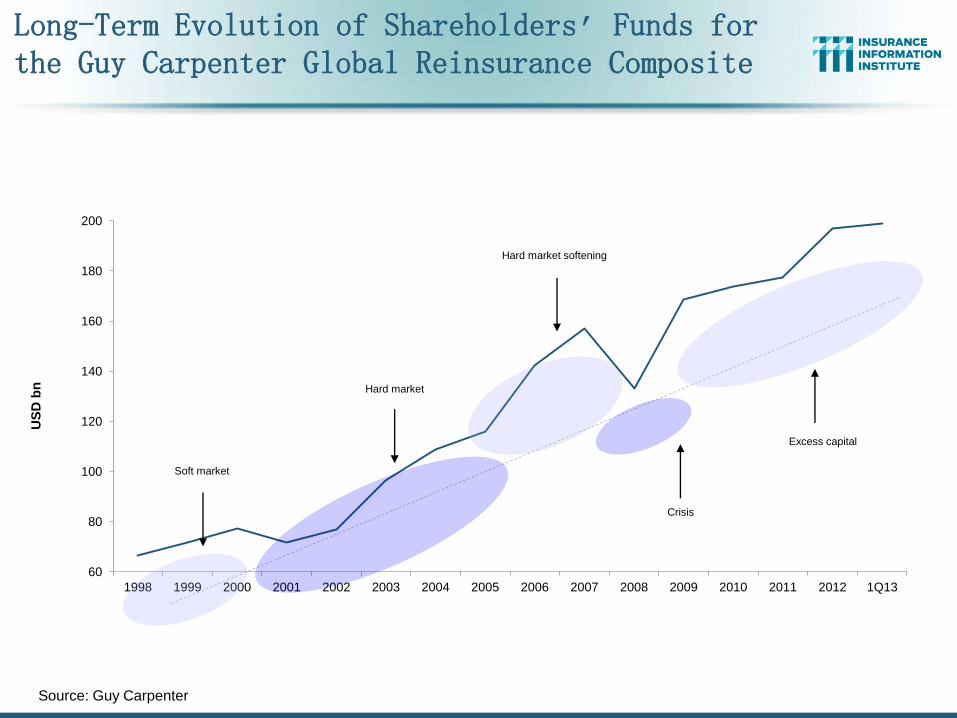
60
80
100
120
140
160
180
200
1998 1999 2000 2001 2002 2003 2004 2005 2006 2007 2008 2009 2010 2011 2012 1Q13
US
D b
n
Soft market
Hard market
Hard market softening
Crisis
Excess capital
Long-Term Evolution of Shareholders’ Funds for the Guy Carpenter Global Reinsurance Composite
Source: Guy Carpenter
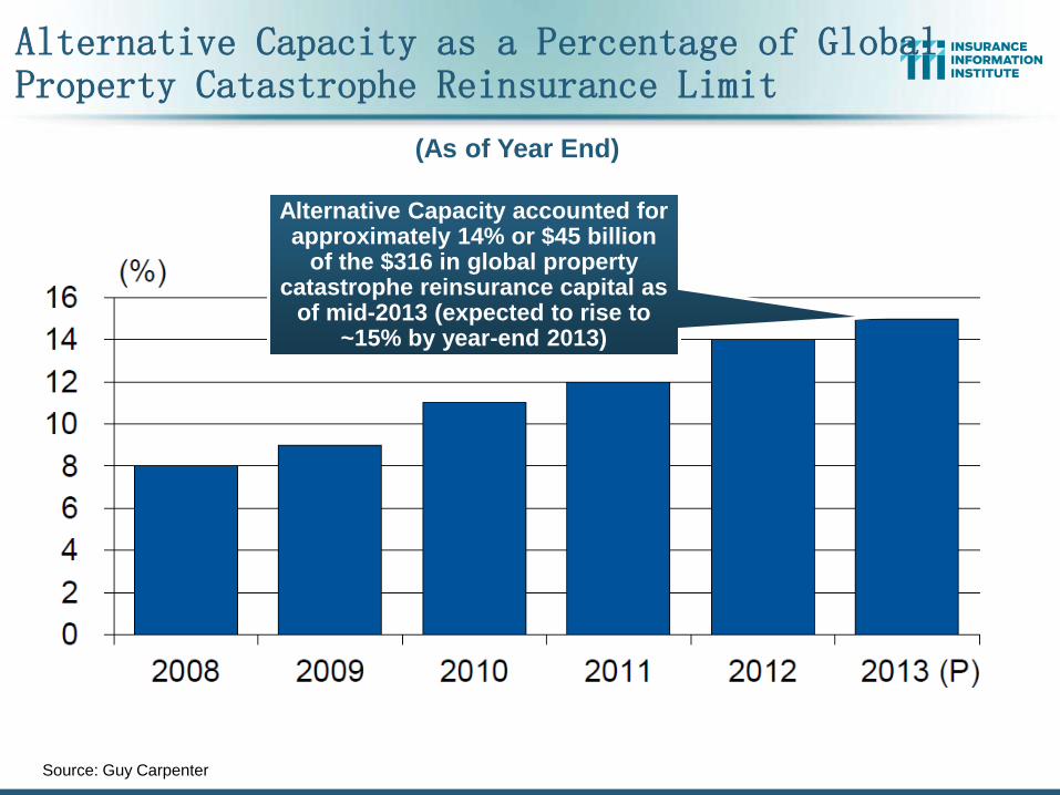
Alternative Capacity as a Percentage of Global Property Catastrophe Reinsurance Limit
Source: Guy Carpenter
(As of Year End)
Alternative Capacity accounted for approximately 14% or $45 billion
of the $316 in global property catastrophe reinsurance capital as
of mid-2013 (expected to rise to ~15% by year-end 2013)
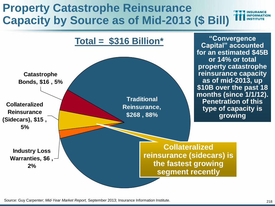
Traditional
Reinsurance,
$268 , 88%
Collateralized
Reinsurance
(Sidecars), $15 ,
5%
Industry Loss
Warranties, $6 ,
2%
Catastrophe
Bonds, $16 , 5%
“Convergence Capital” accounted
for an estimated $45B or 14% or total
property catastrophe reinsurance capacity
as of mid-2013, up $10B over the past 18 months (since 1/1/12).
Penetration of this type of capacity is
growing
Property Catastrophe Reinsurance Capacity by Source as of Mid-2013 ($ Bill)
Source: Guy Carpenter; Mid-Year Market Report, September 2013; Insurance Information Institute. 218
Collateralized reinsurance (sidecars) is
the fastest growing segment recently
Total = $316 Billion*
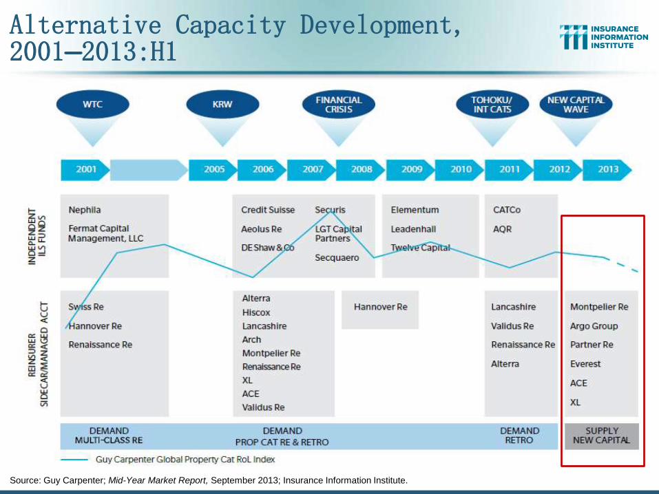
Alternative Capacity Development, 2001—2013:H1
Source: Guy Carpenter; Mid-Year Market Report, September 2013; Insurance Information Institute.
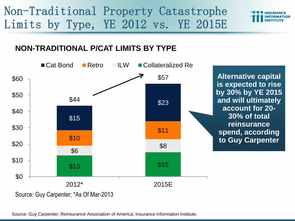
Non-Traditional Property Catastrophe Limits by Type, YE 2012 vs. YE 2015E
Source: Guy Carpenter; Reinsurance Association of America; Insurance Information Institute.
$13 $15
$6 $8
$10
$11
$15
$23 $44
$57
$0
$10
$20
$30
$40
$50
$60
2012* 2015E
NON-TRADITIONAL P/CAT LIMITS BY TYPE
Cat Bond Retro ILW Collateralized Re
Source: Guy Carpenter; *As Of Mar-2013
Alternative capital is expected to rise by 30% by YE 2015 and will ultimately
account for 20-30% of total reinsurance
spend, according to Guy Carpenter
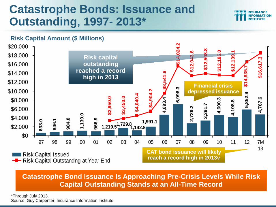
Catastrophe Bonds: Issuance and Outstanding, 1997- 2013*
Risk Capital Amount ($ Millions)
*Through July 2013. Source: Guy Carpenter; Insurance Information Institute.
63
3.0
84
6.1
98
4.8
1,1
30
.0
96
6.9 2,7
29
.2
3,3
91
.7
4,6
00
.3
4,1
08
.8
5,8
52
.9
4,7
67
.6
1,991.1
1,142.81,729.8
6,9
96
.3
4,6
93
.4
1,219.5$
3,4
50
.0
$4
,04
0.4
$4
,90
4.2
$8
,54
1.6
$1
4,0
24
.2
$1
2,0
43
.6
$1
2,5
08
.8
$1
2,1
85
.0
$1
2,1
39
.1
$1
4,8
35
.7
$1
6,6
17
.3
$2
,95
0.0
$0
$2,000
$4,000
$6,000
$8,000
$10,000
$12,000
$14,000
$16,000
$18,000
$20,000
97 98 99 00 01 02 03 04 05 06 07 08 09 10 11 12 7M
13
Risk Capital IssuedRisk Capital Outstandng at Year End
Catastrophe Bond Issuance Is Approaching Pre-Crisis Levels While Risk Capital Outstanding Stands at an All-Time Record
CAT bond issuance will likely reach a record high in 2013v
Risk capital outstanding
reached a record high in 2013
Financial crisis depressed issuance
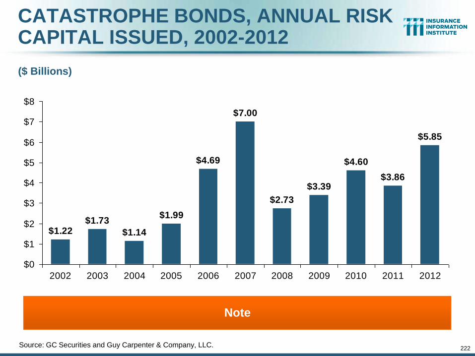
222
CATASTROPHE BONDS, ANNUAL RISK CAPITAL ISSUED, 2002-2012
$2.73
$3.39
$4.60
$3.86
$5.85
$1.22$1.73
$1.14
$1.99
$4.69
$7.00
$0
$1
$2
$3
$4
$5
$6
$7
$8
2002 2003 2004 2005 2006 2007 2008 2009 2010 2011 2012
Source: GC Securities and Guy Carpenter & Company, LLC.
($ Billions)
Note
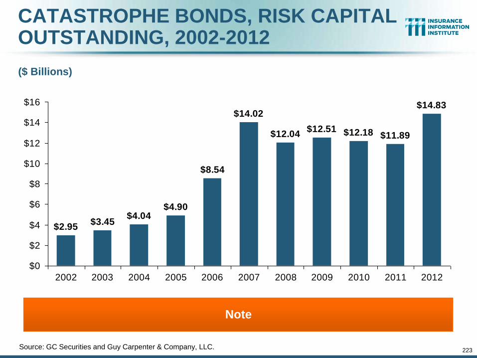
223
CATASTROPHE BONDS, RISK CAPITAL OUTSTANDING, 2002-2012
$12.04$12.51 $12.18 $11.89
$14.83
$2.95$3.45
$4.04$4.90
$8.54
$14.02
$0
$2
$4
$6
$8
$10
$12
$14
$16
2002 2003 2004 2005 2006 2007 2008 2009 2010 2011 2012
Source: GC Securities and Guy Carpenter & Company, LLC.
($ Billions)
Note
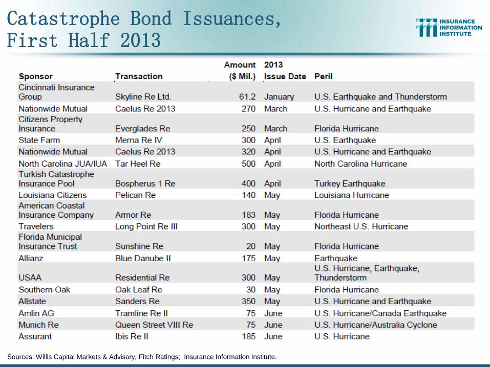
Catastrophe Bond Issuances, First Half 2013
Sources: Willis Capital Markets & Advisory, Fitch Ratings; Insurance Information Institute.
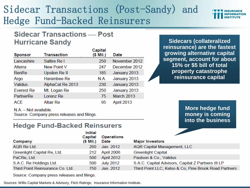
Sidecar Transactions (Post-Sandy) and Hedge Fund-Backed Reinsurers
Sources: Willis Capital Markets & Advisory, Fitch Ratings; Insurance Information Institute.
Sidecars (collateralized reinsurance) are the fastest growing alternative capital segment, account for about
15% or $5 bill of total property catastrophe reinsurance capital
More hedge fund money is coming into the business
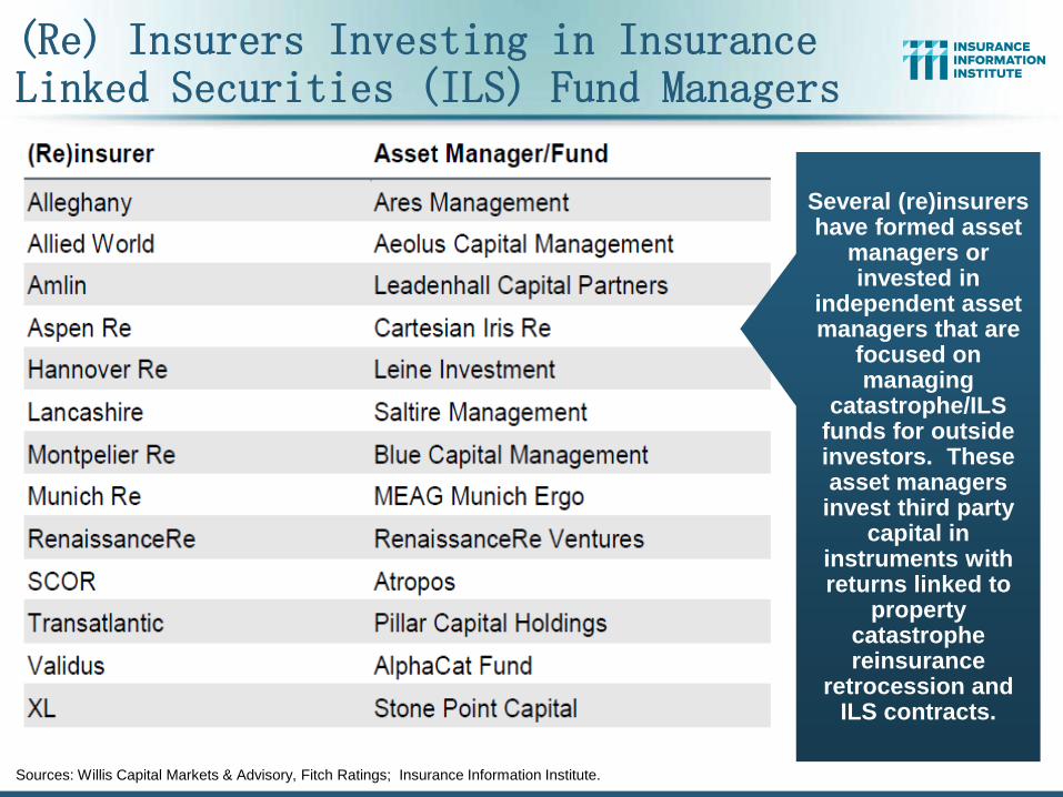
(Re) Insurers Investing in Insurance Linked Securities (ILS) Fund Managers
Sources: Willis Capital Markets & Advisory, Fitch Ratings; Insurance Information Institute.
Several (re)insurers have formed asset
managers or invested in
independent asset managers that are
focused on managing
catastrophe/ILS funds for outside investors. These asset managers invest third party
capital in instruments with returns linked to
property catastrophe reinsurance
retrocession and ILS contracts.
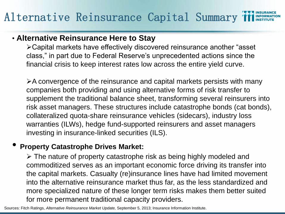
Alternative Reinsurance Capital Summary
Sources: Fitch Ratings, Alternative Reinsurance Market Update, September 5, 2013; Insurance Information Institute.
• Alternative Reinsurance Here to Stay Capital markets have effectively discovered reinsurance another “asset
class,” in part due to Federal Reserve’s unprecedented actions since the
financial crisis to keep interest rates low across the entire yield curve.
A convergence of the reinsurance and capital markets persists with many
companies both providing and using alternative forms of risk transfer to
supplement the traditional balance sheet, transforming several reinsurers into
risk asset managers. These structures include catastrophe bonds (cat bonds),
collateralized quota-share reinsurance vehicles (sidecars), industry loss
warranties (ILWs), hedge fund-supported reinsurers and asset managers
investing in insurance-linked securities (ILS).
• Property Catastrophe Drives Market:
The nature of property catastrophe risk as being highly modeled and
commoditized serves as an important economic force driving its transfer into
the capital markets. Casualty (re)insurance lines have had limited movement
into the alternative reinsurance market thus far, as the less standardized and
more specialized nature of these longer term risks makes them better suited
for more permanent traditional capacity providers.
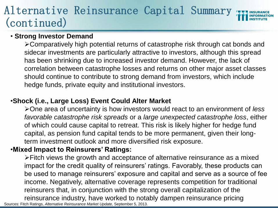
Alternative Reinsurance Capital Summary (continued)
Sources: Fitch Ratings, Alternative Reinsurance Market Update, September 5, 2013.
• Strong Investor Demand
Comparatively high potential returns of catastrophe risk through cat bonds and
sidecar investments are particularly attractive to investors, although this spread
has been shrinking due to increased investor demand. However, the lack of
correlation between catastrophe losses and returns on other major asset classes
should continue to contribute to strong demand from investors, which include
hedge funds, private equity and institutional investors.
•Shock (i.e., Large Loss) Event Could Alter Market
One area of uncertainty is how investors would react to an environment of less
favorable catastrophe risk spreads or a large unexpected catastrophe loss, either
of which could cause capital to retreat. This risk is likely higher for hedge fund
capital, as pension fund capital tends to be more permanent, given their long-
term investment outlook and more diversified risk exposure.
•Mixed Impact to Reinsurers’ Ratings:
Fitch views the growth and acceptance of alternative reinsurance as a mixed
impact for the credit quality of reinsurers’ ratings. Favorably, these products can
be used to manage reinsurers’ exposure and capital and serve as a source of fee
income. Negatively, alternative coverage represents competition for traditional
reinsurers that, in conjunction with the strong overall capitalization of the
reinsurance industry, have worked to notably dampen reinsurance pricing
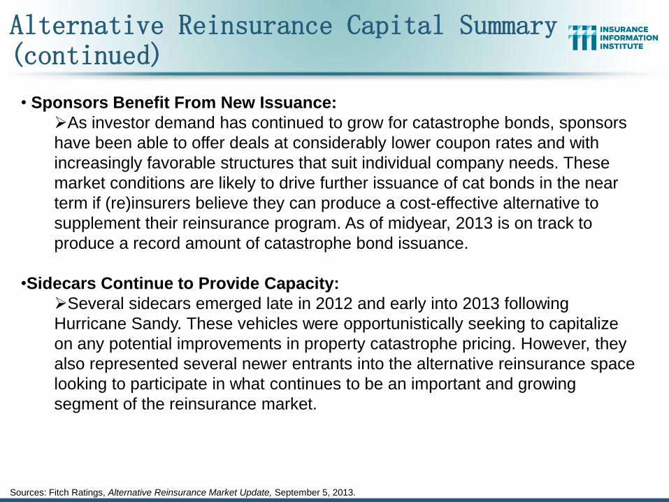
Alternative Reinsurance Capital Summary (continued)
Sources: Fitch Ratings, Alternative Reinsurance Market Update, September 5, 2013.
• Sponsors Benefit From New Issuance:
As investor demand has continued to grow for catastrophe bonds, sponsors
have been able to offer deals at considerably lower coupon rates and with
increasingly favorable structures that suit individual company needs. These
market conditions are likely to drive further issuance of cat bonds in the near
term if (re)insurers believe they can produce a cost-effective alternative to
supplement their reinsurance program. As of midyear, 2013 is on track to
produce a record amount of catastrophe bond issuance.
•Sidecars Continue to Provide Capacity:
Several sidecars emerged late in 2012 and early into 2013 following
Hurricane Sandy. These vehicles were opportunistically seeking to capitalize
on any potential improvements in property catastrophe pricing. However, they
also represented several newer entrants into the alternative reinsurance space
looking to participate in what continues to be an important and growing
segment of the reinsurance market.
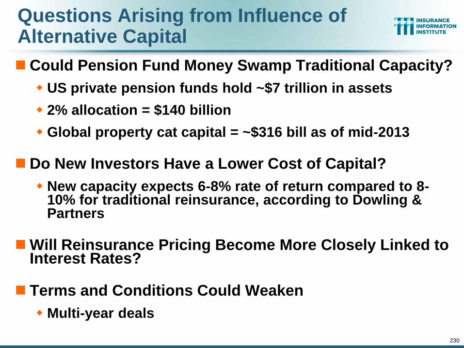
230
Questions Arising from Influence of Alternative Capital
Could Pension Fund Money Swamp Traditional Capacity?
US private pension funds hold ~$7 trillion in assets
2% allocation = $140 billion
Global property cat capital = ~$316 bill as of mid-2013
Do New Investors Have a Lower Cost of Capital?
New capacity expects 6-8% rate of return compared to 8-10% for traditional reinsurance, according to Dowling & Partners
Will Reinsurance Pricing Become More Closely Linked to Interest Rates?
Terms and Conditions Could Weaken
Multi-year deals
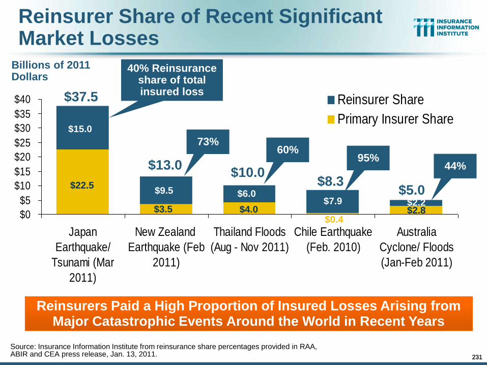
231
Reinsurer Share of Recent Significant Market Losses
Source: Insurance Information Institute from reinsurance share percentages provided in RAA, ABIR and CEA press release, Jan. 13, 2011.
Billions of 2011 Dollars
$0
$5
$10
$15
$20
$25
$30
$35
$40
Japan
Earthquake/
Tsunami (Mar
2011)
New Zealand
Earthquake (Feb
2011)
Thailand Floods
(Aug - Nov 2011)
Chile Earthquake
(Feb. 2010)
Australia
Cyclone/ Floods
(Jan-Feb 2011)
Reinsurer Share
Primary Insurer Share
40% Reinsurance share of total insured loss
Reinsurers Paid a High Proportion of Insured Losses Arising from Major Catastrophic Events Around the World in Recent Years
$0.4 $4.0
$22.5 $9.5
$15.0
$3.5
$37.5
$13.0
$6.0
$10.0
$7.9
$8.3
$2.2 $2.8
$5.0
73% 60%
95% 44%
231
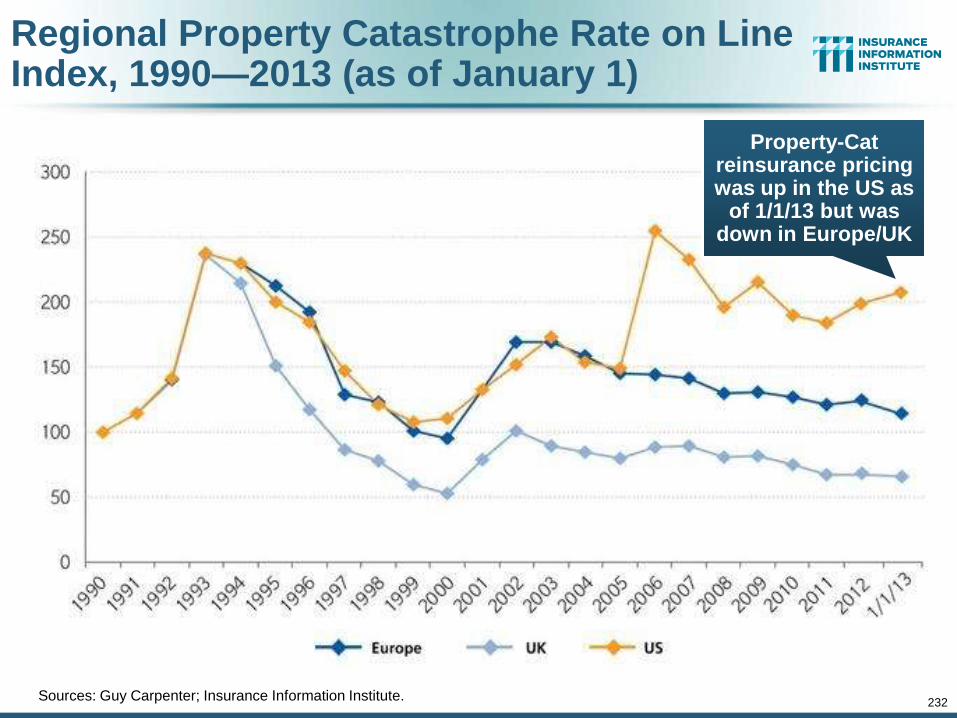
232
Regional Property Catastrophe Rate on Line Index, 1990—2013 (as of January 1)
Sources: Guy Carpenter; Insurance Information Institute.
Property-Cat reinsurance pricing was up in the US as
of 1/1/13 but was down in Europe/UK
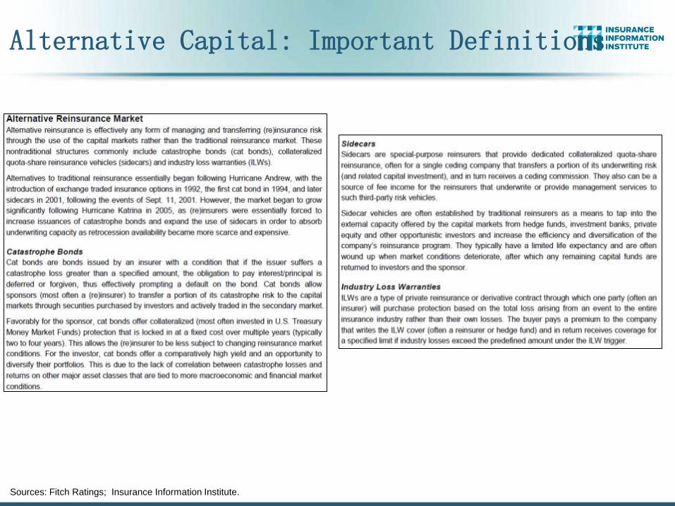
Alternative Capital: Important Definitions
Sources: Fitch Ratings; Insurance Information Institute.
4. RENEWED PRICING DISCIPLINE
234
Evidence of a Broad and Sustained Shift in Pricing
234
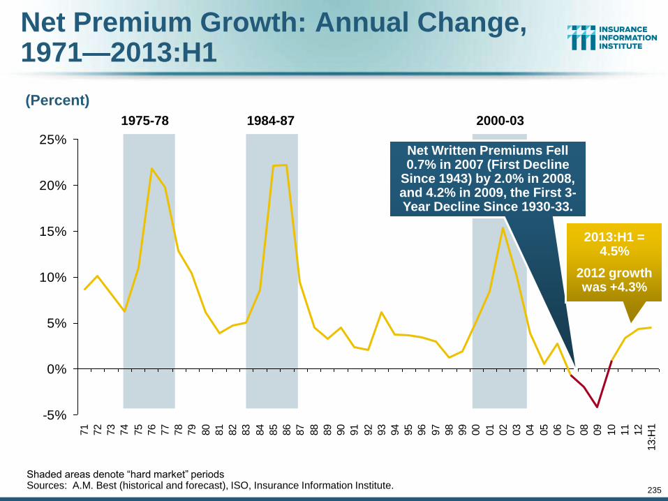
235
-5%
0%
5%
10%
15%
20%
25%
71
72
73
74
75
76
77
78
79
80
81
82
83
84
85
86
87
88
89
90
91
92
93
94
95
96
97
98
99
00
01
02
03
04
05
06
07
08
09
10
11
12
13:H
1
Net Premium Growth: Annual Change, 1971—2013:H1
(Percent)
1975-78 1984-87 2000-03
Shaded areas denote “hard market” periods Sources: A.M. Best (historical and forecast), ISO, Insurance Information Institute.
Net Written Premiums Fell 0.7% in 2007 (First Decline
Since 1943) by 2.0% in 2008, and 4.2% in 2009, the First 3-Year Decline Since 1930-33.
2013:H1 = 4.5%
2012 growth was +4.3%
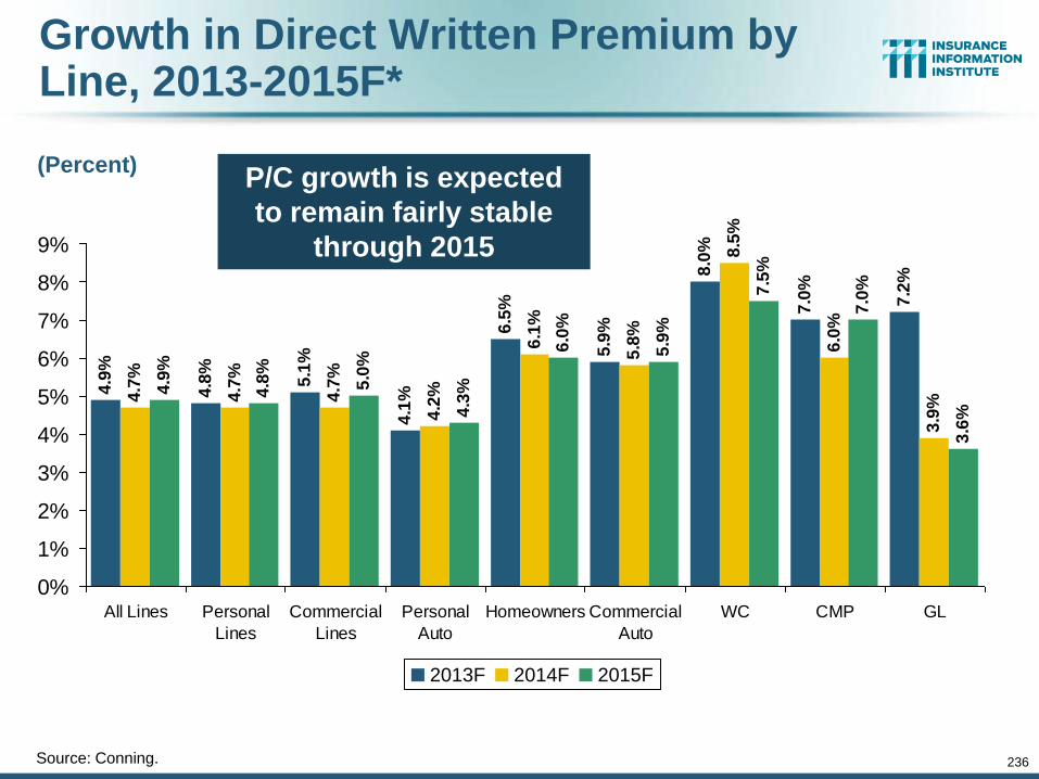
236
Growth in Direct Written Premium by Line, 2013-2015F*
Source: Conning.
4.9
%
4.8
%
5.1
%
4.1
%
6.5
%
5.9
%
8.0
%
7.0
%
7.2
%
4.7
%
4.7
%
4.7
%
4.2
%
6.1
%
5.8
%
8.5
%
6.0
%
3.9
%
4.9
%
4.8
%
5.0
%
4.3
%
6.0
%
5.9
%
7.5
%
7.0
%
3.6
%
0%
1%
2%
3%
4%
5%
6%
7%
8%
9%
All Lines Personal
Lines
Commercial
Lines
Personal
Auto
Homeowners Commercial
Auto
WC CMP GL
2013F 2014F 2015F
(Percent) P/C growth is expected
to remain fairly stable
through 2015
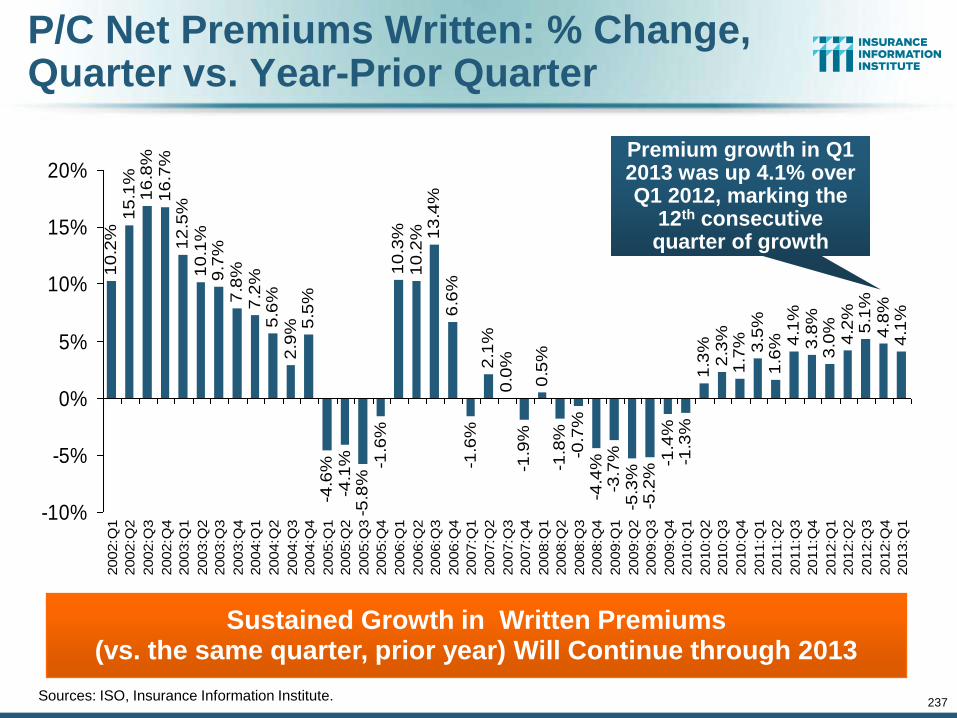
237
P/C Net Premiums Written: % Change, Quarter vs. Year-Prior Quarter
Sources: ISO, Insurance Information Institute.
Sustained Growth in Written Premiums (vs. the same quarter, prior year) Will Continue through 2013
10
.2%
15
.1%
16
.8%
16
.7%
12
.5%
10
.1%
9.7
%7
.8%
7.2
%5
.6%
2.9
% 5.5
%-4
.6%
-4.1
%-5
.8%
-1.6
%1
0.3
%1
0.2
% 13
.4%
6.6
%-1
.6%
2.1
%0
.0%
-1.9
%0
.5%
-1.8
%-0
.7%
-4.4
%-3
.7%
-5.3
%-5
.2%
-1.4
%-1
.3%
1.3
%2
.3%
1.7
% 3.5
%1
.6% 4
.1%
3.8
%3
.0%
4.2
%5
.1%
4.8
%4
.1%
-10%
-5%
0%
5%
10%
15%
20%
2002:Q
1
2002:Q
2
2002:Q
3
2002:Q
4
2003:Q
1
2003:Q
2
2003:Q
3
2003:Q
4
2004:Q
1
2004:Q
2
2004:Q
3
2004:Q
4
2005:Q
1
2005:Q
2
2005:Q
3
2005:Q
4
2006:Q
1
2006:Q
2
2006:Q
3
2006:Q
4
2007:Q
1
2007:Q
2
2007:Q
3
2007:Q
4
2008:Q
1
2008:Q
2
2008:Q
3
2008:Q
4
2009:Q
1
2009:Q
2
2009:Q
3
2009:Q
4
2010:Q
1
2010:Q
2
2010:Q
3
2010:Q
4
2011:Q
1
2011:Q
2
2011:Q
3
2011:Q
4
2012:Q
1
2012:Q
2
2012:Q
3
2012:Q
4
2013:Q
1
Premium growth in Q1 2013 was up 4.1% over Q1 2012, marking the
12th consecutive quarter of growth
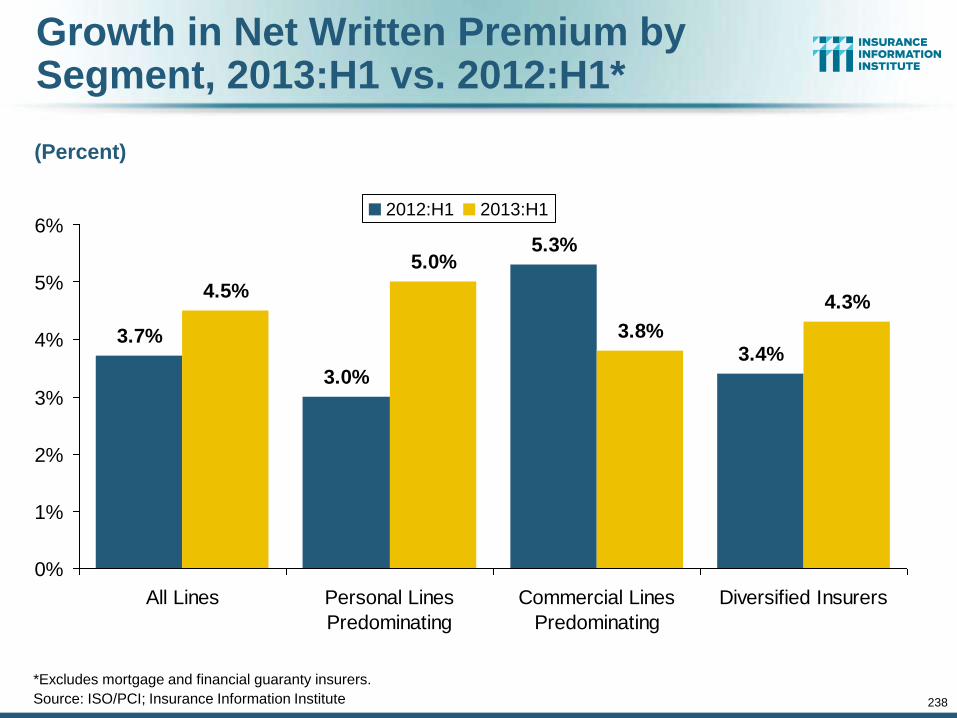
238
Growth in Net Written Premium by Segment, 2013:H1 vs. 2012:H1*
*Excludes mortgage and financial guaranty insurers.
Source: ISO/PCI; Insurance Information Institute
3.7%
3.0%
5.3%
3.4%
4.5%
5.0%
3.8%
4.3%
0%
1%
2%
3%
4%
5%
6%
All Lines Personal Lines
Predominating
Commercial Lines
Predominating
Diversified Insurers
2012:H1 2013:H1
(Percent)
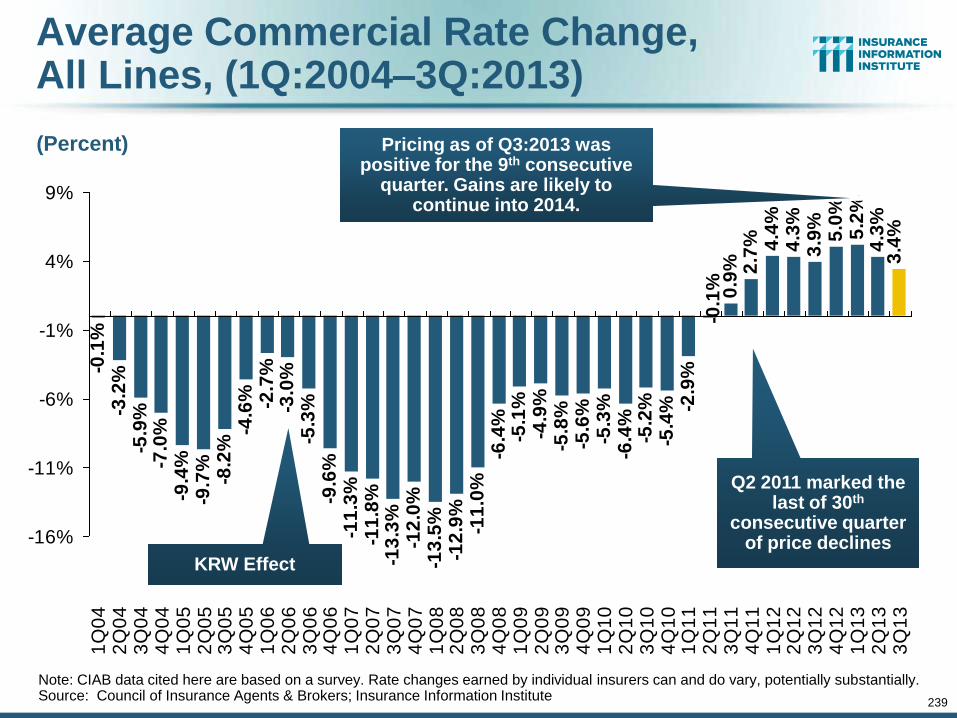
239
Average Commercial Rate Change, All Lines, (1Q:2004–3Q:2013)
-3.2
%-5
.9%
-7.0
%-9
.4%
-9.7
%-8
.2%
-4.6
% -2.7
%-3
.0%
-5.3
%-9
.6%
-11
.3%
-11
.8%
-13
.3%
-12
.0%
-13
.5%
-12
.9%
-11
.0%
-6.4
%-5
.1%
-4.9
%-5
.8%
-5.6
%-5
.3%
-6.4
%-5
.2%
-5.4
% -2.9
%
2.7
% 4.4
%4
.3%
3.9
%5
.0%
5.2
%4
.3%
3.4
%
-0.1
% 0.9
%
-0.1
%
-16%
-11%
-6%
-1%
4%
9%
1Q
04
2Q
04
3Q
04
4Q
04
1Q
05
2Q
05
3Q
05
4Q
05
1Q
06
2Q
06
3Q
06
4Q
06
1Q
07
2Q
07
3Q
07
4Q
07
1Q
08
2Q
08
3Q
08
4Q
08
1Q
09
2Q
09
3Q
09
4Q
09
1Q
10
2Q
10
3Q
10
4Q
10
1Q
11
2Q
11
3Q
11
4Q
11
1Q
12
2Q
12
3Q
12
4Q
12
1Q
13
2Q
13
3Q
13
Note: CIAB data cited here are based on a survey. Rate changes earned by individual insurers can and do vary, potentially substantially. Source: Council of Insurance Agents & Brokers; Insurance Information Institute
KRW Effect
Pricing as of Q3:2013 was positive for the 9th consecutive
quarter. Gains are likely to continue into 2014.
(Percent)
Q2 2011 marked the last of 30th
consecutive quarter of price declines
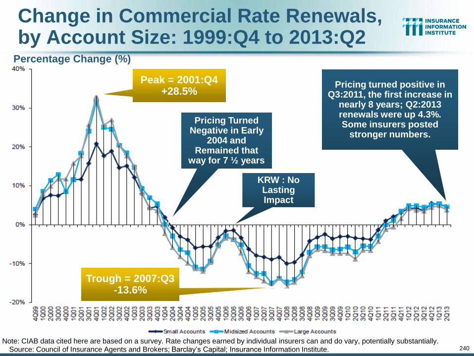
240
Change in Commercial Rate Renewals, by Account Size: 1999:Q4 to 2013:Q2
Source: Council of Insurance Agents and Brokers; Barclay’s Capital; Insurance Information Institute. Note: CIAB data cited here are based on a survey. Rate changes earned by individual insurers can and do vary, potentially substantially.
Percentage Change (%)
Pricing turned positive in Q3:2011, the first increase in
nearly 8 years; Q2:2013 renewals were up 4.3%. Some insurers posted
stronger numbers.
Pricing Turned Negative in Early
2004 and Remained that
way for 7 ½ years
Peak = 2001:Q4 +28.5%
Trough = 2007:Q3 -13.6%
KRW : No Lasting Impact
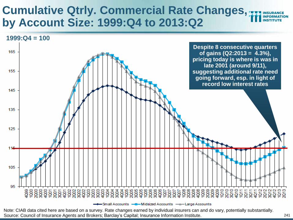
241
Cumulative Qtrly. Commercial Rate Changes, by Account Size: 1999:Q4 to 2013:Q2
Source: Council of Insurance Agents and Brokers; Barclay’s Capital; Insurance Information Institute. Note: CIAB data cited here are based on a survey. Rate changes earned by individual insurers can and do vary, potentially substantially.
1999:Q4 = 100
Despite 8 consecutive quarters of gains (Q2:2013 = 4.3%),
pricing today is where is was in late 2001 (around 9/11),
suggesting additional rate need going forward, esp. in light of
record low interest rates
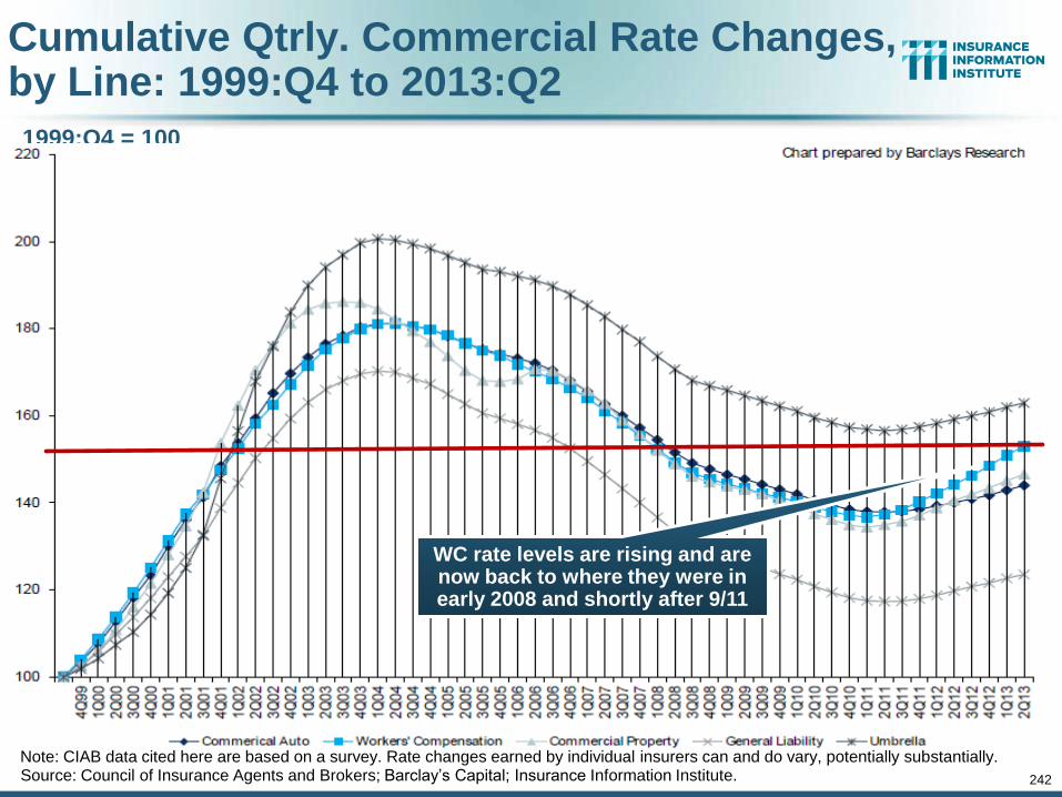
242
Cumulative Qtrly. Commercial Rate Changes, by Line: 1999:Q4 to 2013:Q2
1999:Q4 = 100
Source: Council of Insurance Agents and Brokers; Barclay’s Capital; Insurance Information Institute. Note: CIAB data cited here are based on a survey. Rate changes earned by individual insurers can and do vary, potentially substantially.
WC rate levels are rising and are now back to where they were in early 2008 and shortly after 9/11
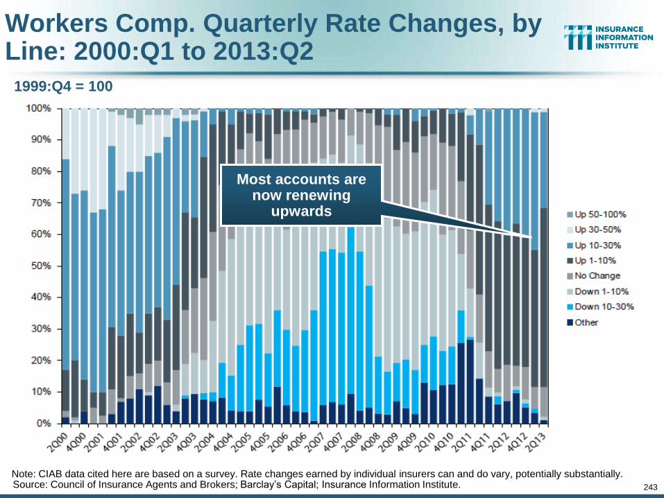
243
Workers Comp. Quarterly Rate Changes, by Line: 2000:Q1 to 2013:Q2
1999:Q4 = 100
Source: Council of Insurance Agents and Brokers; Barclay’s Capital; Insurance Information Institute. Note: CIAB data cited here are based on a survey. Rate changes earned by individual insurers can and do vary, potentially substantially.
Most accounts are now renewing
upwards
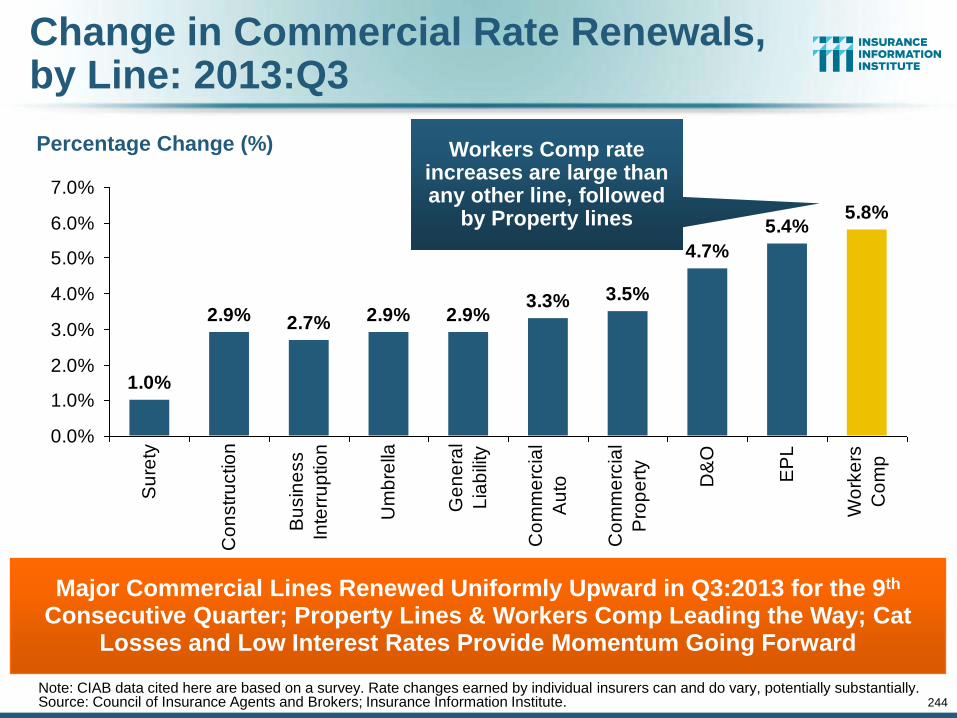
244
Change in Commercial Rate Renewals, by Line: 2013:Q3
Source: Council of Insurance Agents and Brokers; Insurance Information Institute.
Major Commercial Lines Renewed Uniformly Upward in Q3:2013 for the 9th Consecutive Quarter; Property Lines & Workers Comp Leading the Way; Cat
Losses and Low Interest Rates Provide Momentum Going Forward
Percentage Change (%)
3.5%
4.7%
5.4%5.8%
1.0%
2.9% 2.7% 2.9% 2.9%3.3%
0.0%
1.0%
2.0%
3.0%
4.0%
5.0%
6.0%
7.0%
Su
rety
Co
nstr
uctio
n
Bu
sin
ess
Inte
rru
ptio
n
Um
bre
lla
Ge
ne
ral
Lia
bili
ty
Co
mm
erc
ial
Au
to
Co
mm
erc
ial
Pro
pe
rty
D&
O
EP
L
Wo
rke
rs
Co
mp
Workers Comp rate increases are large than any other line, followed
by Property lines
Note: CIAB data cited here are based on a survey. Rate changes earned by individual insurers can and do vary, potentially substantially.
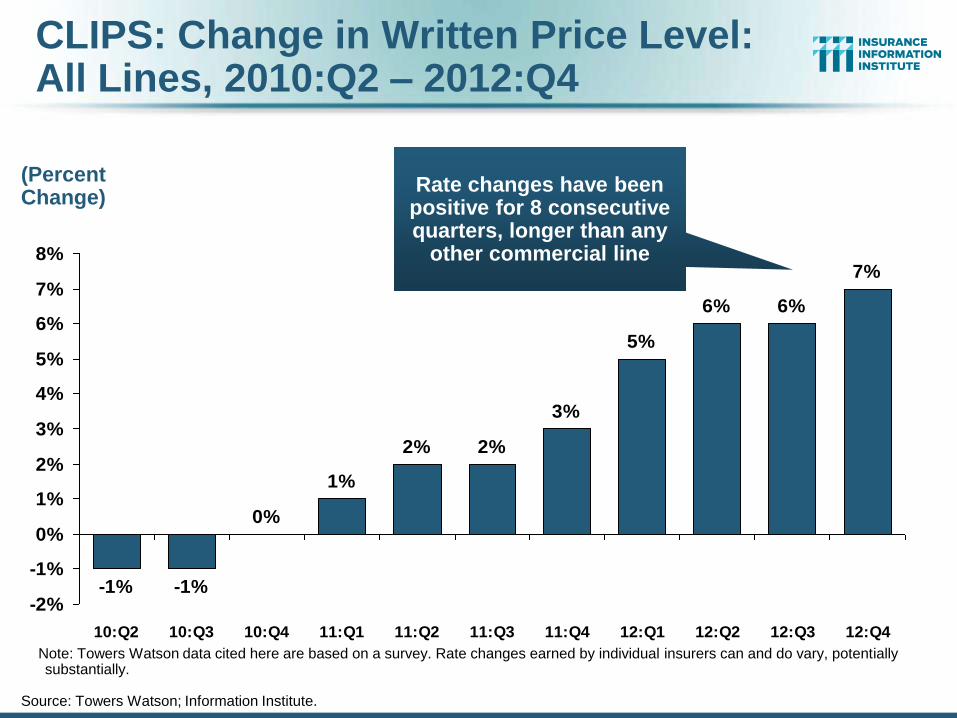
CLIPS: Change in Written Price Level: All Lines, 2010:Q2 – 2012:Q4
Source: Towers Watson; Information Institute.
-1% -1%
0%
1%
2% 2%
3%
5%
6% 6%
7%
-2%
-1%
0%
1%
2%
3%
4%
5%
6%
7%
8%
10:Q2 10:Q3 10:Q4 11:Q1 11:Q2 11:Q3 11:Q4 12:Q1 12:Q2 12:Q3 12:Q4
Rate changes have been positive for 8 consecutive quarters, longer than any
other commercial line
(Percent Change)
Note: Towers Watson data cited here are based on a survey. Rate changes earned by individual insurers can and do vary, potentially substantially.
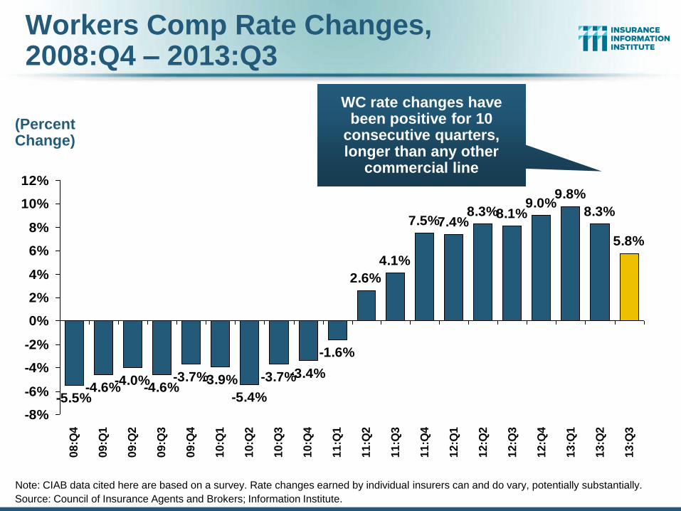
Workers Comp Rate Changes, 2008:Q4 – 2013:Q3
Source: Council of Insurance Agents and Brokers; Information Institute.
-5.5%-4.6%
-4.0%-4.6%
-3.7%-3.9%
-5.4%
-3.7%-3.4%
-1.6%
2.6%
4.1%
7.5%7.4%8.3%8.1%
9.0%9.8%
8.3%
5.8%
-8%
-6%
-4%
-2%
0%
2%
4%
6%
8%
10%
12%
08
:Q4
09
:Q1
09
:Q2
09
:Q3
09
:Q4
10
:Q1
10
:Q2
10
:Q3
10
:Q4
11
:Q1
11
:Q2
11
:Q3
11
:Q4
12
:Q1
12
:Q2
12
:Q3
12
:Q4
13
:Q1
13
:Q2
13
:Q3
WC rate changes have been positive for 10
consecutive quarters, longer than any other
commercial line
(Percent Change)
Note: CIAB data cited here are based on a survey. Rate changes earned by individual insurers can and do vary, potentially substantially.
Shifting Legal Liability & Tort Environment
247
Is the Tort Pendulum Swinging Against Insurers?
247
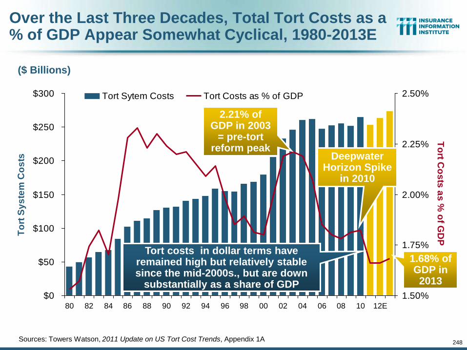
248
Over the Last Three Decades, Total Tort Costs as a % of GDP Appear Somewhat Cyclical, 1980-2013E
$0
$50
$100
$150
$200
$250
$300
80 82 84 86 88 90 92 94 96 98 00 02 04 06 08 10 12E
To
rt S
ys
tem
Co
sts
1.50%
1.75%
2.00%
2.25%
2.50%
To
rt Co
sts
as
% o
f GD
P
Tort Sytem Costs Tort Costs as % of GDP
($ Billions)
Sources: Towers Watson, 2011 Update on US Tort Cost Trends, Appendix 1A
Tort costs in dollar terms have remained high but relatively stable since the mid-2000s., but are down
substantially as a share of GDP
Deepwater Horizon Spike
in 2010
1.68% of GDP in 2013
2.21% of GDP in 2003
= pre-tort reform peak
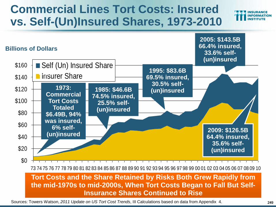
249
Commercial Lines Tort Costs: Insured vs. Self-(Un)Insured Shares, 1973-2010
Billions of Dollars
$0
$20
$40
$60
$80
$100
$120
$140
$160
73 74 75 76 77 78 79 80 81 82 83 84 85 86 87 88 89 90 91 92 93 94 95 96 97 98 99 00 01 02 03 04 05 06 07 08 09 10
Self (Un) Insured Share
Insurer Share
Tort Costs and the Share Retained by Risks Both Grew Rapidly from the mid-1970s to mid-2000s, When Tort Costs Began to Fall But Self-
Insurance Shares Continued to Rise
$9.5
$15.0
$6.0
1973: Commercial Tort Costs
Totaled $6.49B, 94% was insured,
6% self-(un)insured
1985: $46.6B 74.5% insured,
25.5% self-(un)insured
1995: $83.6B 69.5% insured,
30.5% self-(un)insured
2005: $143.5B 66.4% insured,
33.6% self-(un)insured
2009: $126.5B 64.4% insured,
35.6% self-(un)insured
Sources: Towers Watson, 2011 Update on US Tort Cost Trends, III Calculations based on data from Appendix 4. 249
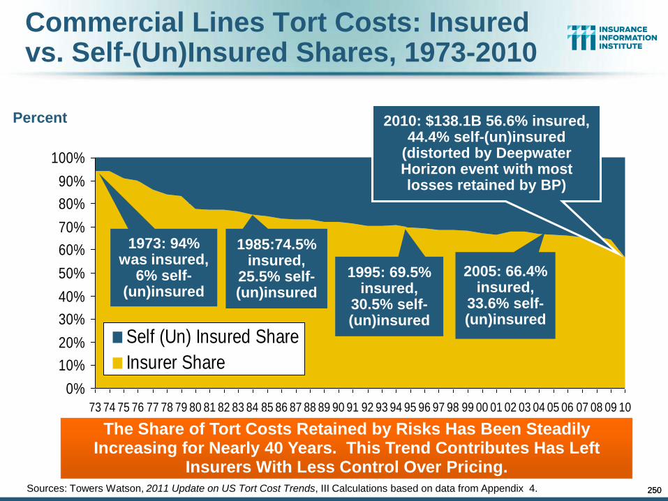
250
Commercial Lines Tort Costs: Insured vs. Self-(Un)Insured Shares, 1973-2010
Percent
0%
10%
20%
30%
40%
50%
60%
70%
80%
90%
100%
73 74 75 76 77 78 79 80 81 82 83 84 85 86 87 88 89 90 91 92 93 94 95 96 97 98 99 00 01 02 03 04 05 06 07 08 09 10
Self (Un) Insured Share
Insurer Share
The Share of Tort Costs Retained by Risks Has Been Steadily Increasing for Nearly 40 Years. This Trend Contributes Has Left
Insurers With Less Control Over Pricing.
1973: 94% was insured,
6% self-(un)insured
1985:74.5% insured,
25.5% self-(un)insured
1995: 69.5% insured,
30.5% self-(un)insured
2005: 66.4% insured,
33.6% self-(un)insured
2010: $138.1B 56.6% insured, 44.4% self-(un)insured
(distorted by Deepwater Horizon event with most losses retained by BP)
Sources: Towers Watson, 2011 Update on US Tort Cost Trends, III Calculations based on data from Appendix 4. 250
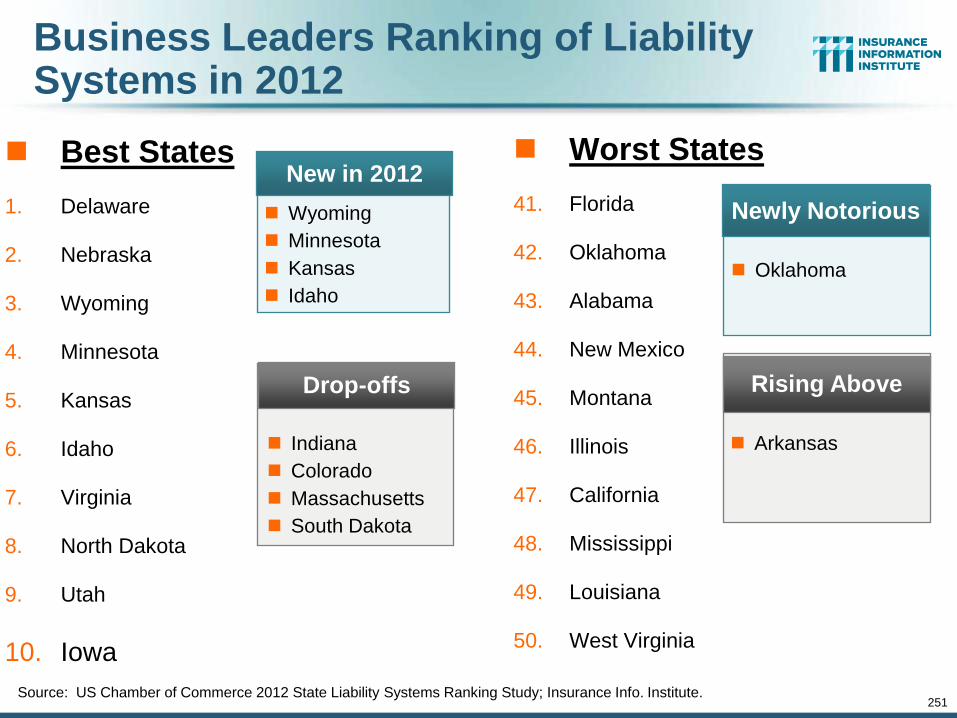
Business Leaders Ranking of Liability Systems in 2012
Best States
1. Delaware
2. Nebraska
3. Wyoming
4. Minnesota
5. Kansas
6. Idaho
7. Virginia
8. North Dakota
9. Utah
10. Iowa
Worst States
41. Florida
42. Oklahoma
43. Alabama
44. New Mexico
45. Montana
46. Illinois
47. California
48. Mississippi
49. Louisiana
50. West Virginia
Source: US Chamber of Commerce 2012 State Liability Systems Ranking Study; Insurance Info. Institute.
New in 2012
Wyoming
Minnesota
Kansas
Idaho
Drop-offs
Indiana
Colorado
Massachusetts
South Dakota
Newly Notorious
Oklahoma
Rising Above
Arkansas
251
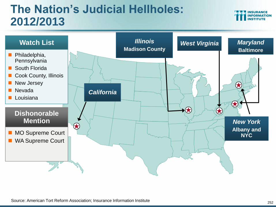
252
The Nation’s Judicial Hellholes: 2012/2013
Source: American Tort Reform Association; Insurance Information Institute
West Virginia Illinois
Madison County
New York
Albany and NYC
Watch List
Philadelphia, Pennsylvania
South Florida
Cook County, Illinois
New Jersey
Nevada
Louisiana
Dishonorable Mention
MO Supreme Court
WA Supreme Court
California
Maryland
Baltimore
CYBER RISK
253
Cyber Risk is a Rapidly Emerging Exposure for Businesses Large
and Small in Every Industry NEW III White Paper:
http://www.iii.org/assets/docs/pdf/paper_CyberRisk_2013.pdf
253
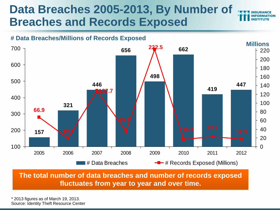
Data Breaches 2005-2013, By Number of Breaches and Records Exposed
# Data Breaches/Millions of Records Exposed
* 2013 figures as of March 19, 2013. Source: Identity Theft Resource Center
157
321
446
656
498
419447
662
17.322.9
35.7
19.1
66.9
222.5
16.2
127.7
100
200
300
400
500
600
700
2005 2006 2007 2008 2009 2010 2011 2012
0
20
40
60
80
100
120
140
160
180
200
220
# Data Breaches # Records Exposed (Millions)
The total number of data breaches and number of records exposed fluctuates from year to year and over time.
Millions
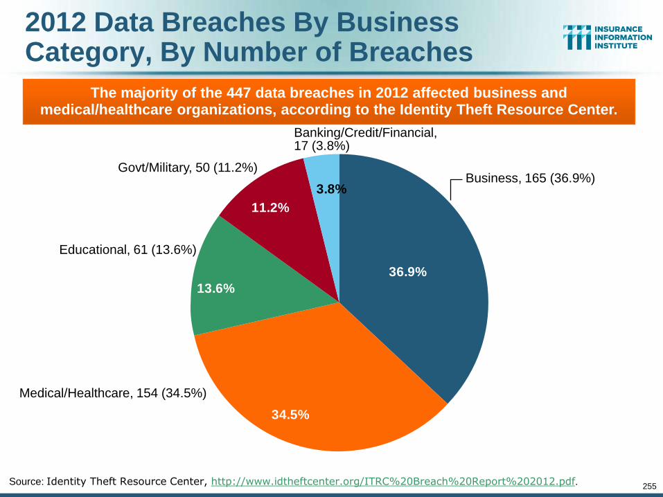
255
2012 Data Breaches By Business Category, By Number of Breaches
3.8%
11.2%
13.6%
34.5%
36.9%
Source: Identity Theft Resource Center, http://www.idtheftcenter.org/ITRC%20Breach%20Report%202012.pdf.
The majority of the 447 data breaches in 2012 affected business and medical/healthcare organizations, according to the Identity Theft Resource Center.
Business, 165 (36.9%)
Govt/Military, 50 (11.2%)
Banking/Credit/Financial, 17 (3.8%)
Educational, 61 (13.6%)
Medical/Healthcare, 154 (34.5%)
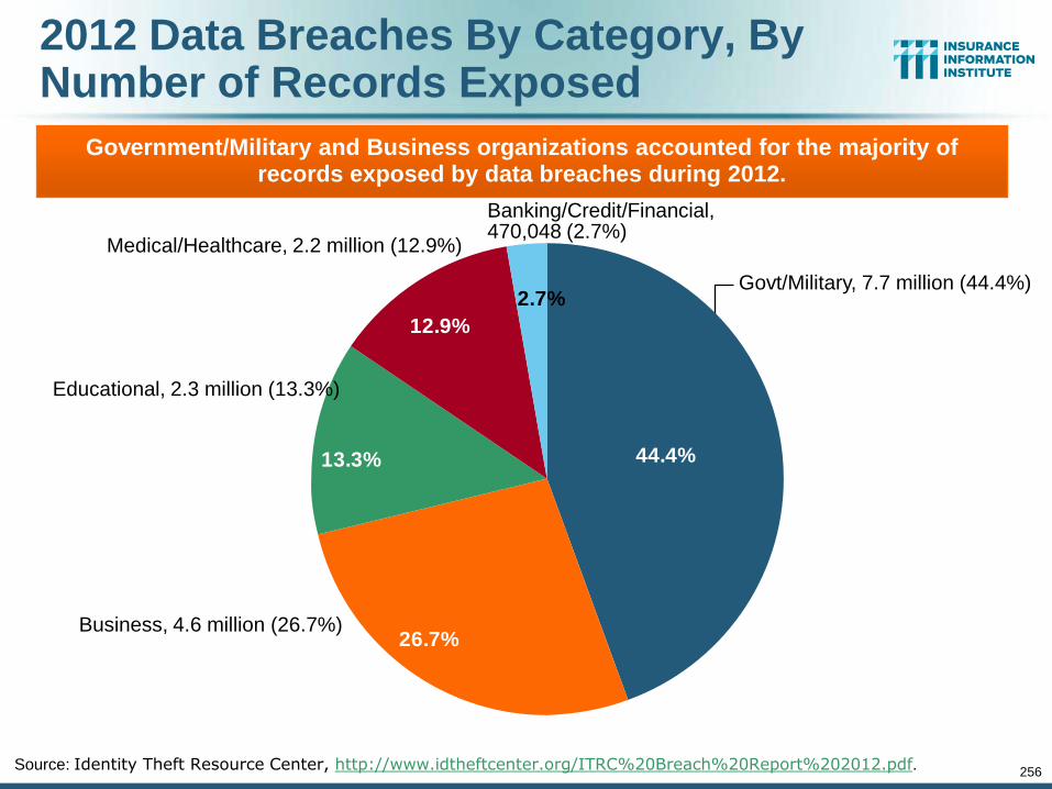
256
2012 Data Breaches By Category, By Number of Records Exposed
2.7%
12.9%
13.3%
26.7%
44.4%
Source: Identity Theft Resource Center, http://www.idtheftcenter.org/ITRC%20Breach%20Report%202012.pdf.
Government/Military and Business organizations accounted for the majority of records exposed by data breaches during 2012.
Govt/Military, 7.7 million (44.4%)
Medical/Healthcare, 2.2 million (12.9%)
Banking/Credit/Financial, 470,048 (2.7%)
Educational, 2.3 million (13.3%)
Business, 4.6 million (26.7%)
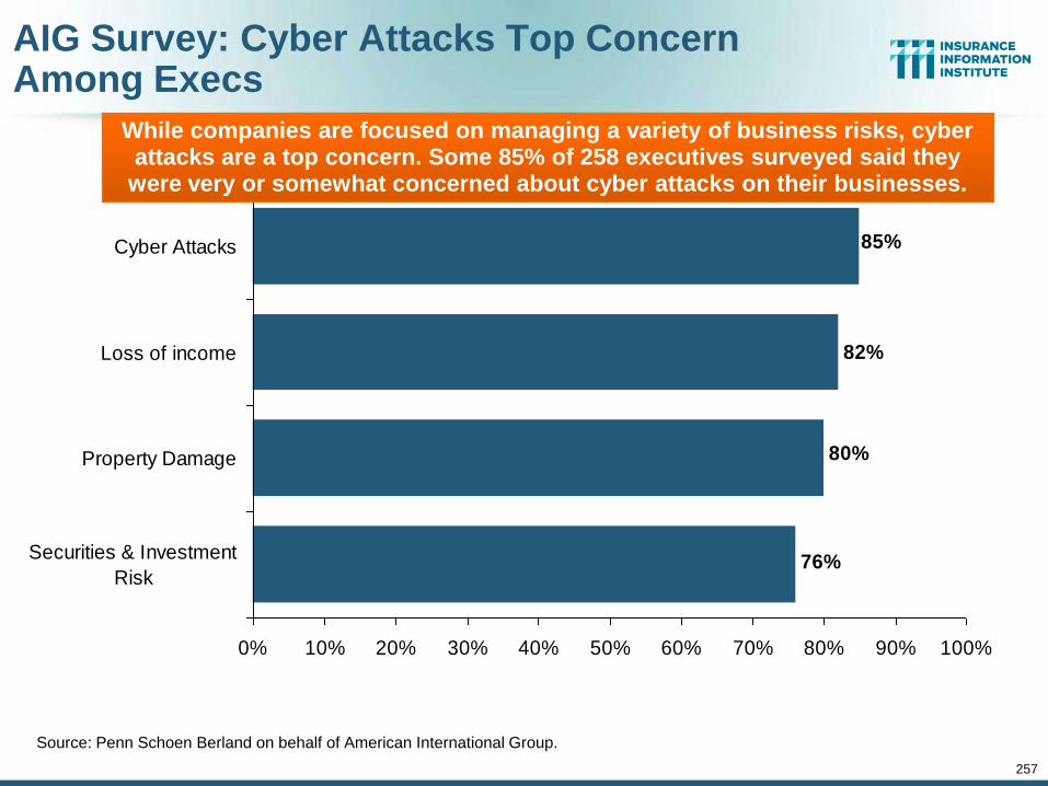
257
AIG Survey: Cyber Attacks Top Concern Among Execs
Source: Penn Schoen Berland on behalf of American International Group.
82%
76%
80%
85%
0% 10% 20% 30% 40% 50% 60% 70% 80% 90% 100%
Securities & Investment
Risk
Property Damage
Loss of income
Cyber Attacks
While companies are focused on managing a variety of business risks, cyber attacks are a top concern. Some 85% of 258 executives surveyed said they
were very or somewhat concerned about cyber attacks on their businesses.
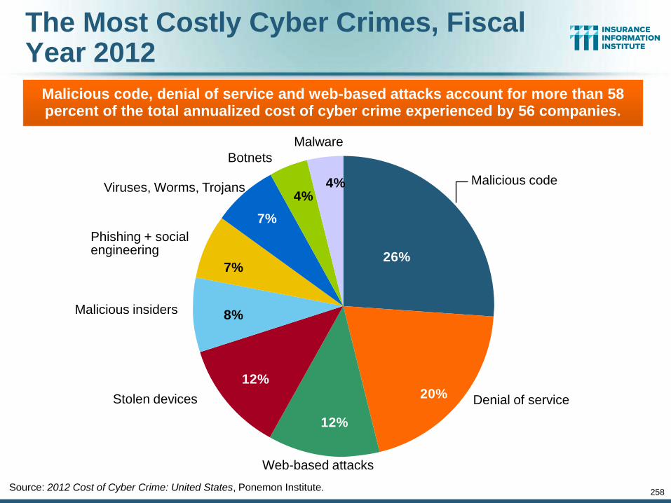
258
The Most Costly Cyber Crimes, Fiscal Year 2012
4%4%
7%
7%
8%
12%
12%
20%
26%
Source: 2012 Cost of Cyber Crime: United States, Ponemon Institute.
Malicious code, denial of service and web-based attacks account for more than 58 percent of the total annualized cost of cyber crime experienced by 56 companies.
Malicious code
Botnets
Denial of service
Malware
Viruses, Worms, Trojans
Phishing + social engineering
Malicious insiders
Stolen devices
Web-based attacks
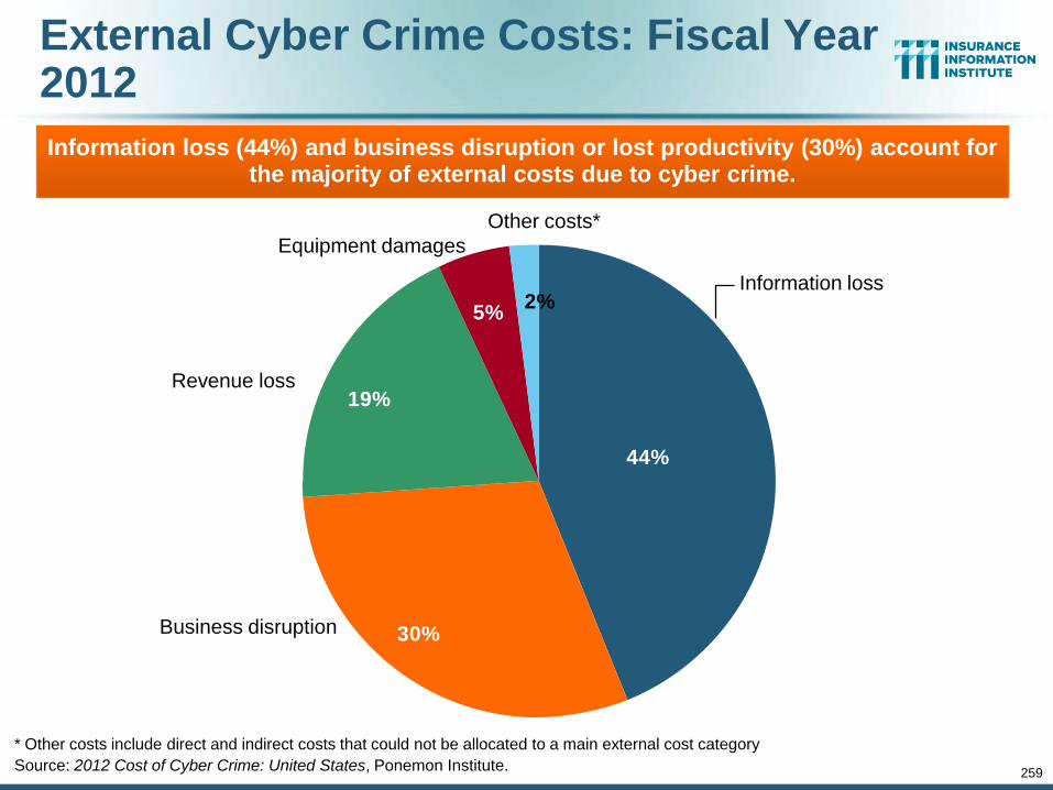
259
External Cyber Crime Costs: Fiscal Year 2012
2%5%
19%
30%
44%
* Other costs include direct and indirect costs that could not be allocated to a main external cost category
Source: 2012 Cost of Cyber Crime: United States, Ponemon Institute.
Information loss (44%) and business disruption or lost productivity (30%) account for the majority of external costs due to cyber crime.
Information loss
Equipment damages
Other costs*
Revenue loss
Business disruption
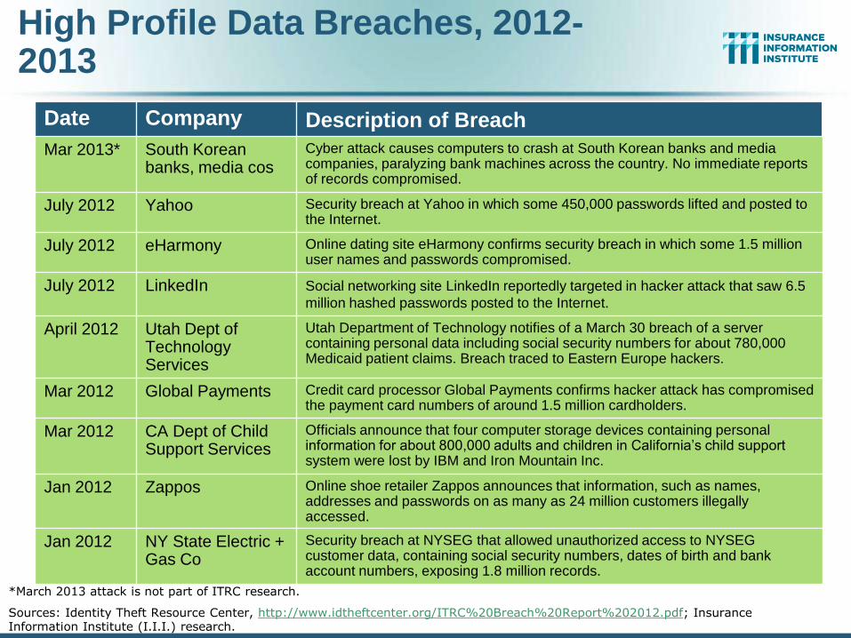
High Profile Data Breaches, 2012-2013
Date Company Description of Breach
Mar 2013* South Korean banks, media cos
Cyber attack causes computers to crash at South Korean banks and media companies, paralyzing bank machines across the country. No immediate reports of records compromised.
July 2012 Yahoo Security breach at Yahoo in which some 450,000 passwords lifted and posted to the Internet.
July 2012 eHarmony Online dating site eHarmony confirms security breach in which some 1.5 million user names and passwords compromised.
July 2012 LinkedIn Social networking site LinkedIn reportedly targeted in hacker attack that saw 6.5
million hashed passwords posted to the Internet.
April 2012 Utah Dept of Technology Services
Utah Department of Technology notifies of a March 30 breach of a server containing personal data including social security numbers for about 780,000 Medicaid patient claims. Breach traced to Eastern Europe hackers.
Mar 2012 Global Payments Credit card processor Global Payments confirms hacker attack has compromised the payment card numbers of around 1.5 million cardholders.
Mar 2012 CA Dept of Child Support Services
Officials announce that four computer storage devices containing personal information for about 800,000 adults and children in California’s child support system were lost by IBM and Iron Mountain Inc.
Jan 2012 Zappos Online shoe retailer Zappos announces that information, such as names, addresses and passwords on as many as 24 million customers illegally accessed.
Jan 2012 NY State Electric + Gas Co
Security breach at NYSEG that allowed unauthorized access to NYSEG customer data, containing social security numbers, dates of birth and bank account numbers, exposing 1.8 million records.
*March 2013 attack is not part of ITRC research.
Sources: Identity Theft Resource Center, http://www.idtheftcenter.org/ITRC%20Breach%20Report%202012.pdf; Insurance Information Institute (I.I.I.) research.
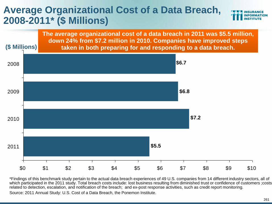
261
Average Organizational Cost of a Data Breach, 2008-2011* ($ Millions)
*Findings of this benchmark study pertain to the actual data breach experiences of 49 U.S. companies from 14 different industry sectors, all of which participated in the 2011 study. Total breach costs include: lost business resulting from diminished trust or confidence of customers ;costs related to detection, escalation, and notification of the breach; and ex-post response activities, such as credit report monitoring.
Source: 2011 Annual Study: U.S. Cost of a Data Breach, the Ponemon Institute.
$6.8
$5.5
$7.2
$6.7
$0 $1 $2 $3 $4 $5 $6 $7 $8 $9 $10
2011
2010
2009
2008
($ Millions)
The average organizational cost of a data breach in 2011 was $5.5 million, down 24% from $7.2 million in 2010. Companies have improved steps
taken in both preparing for and responding to a data breach.
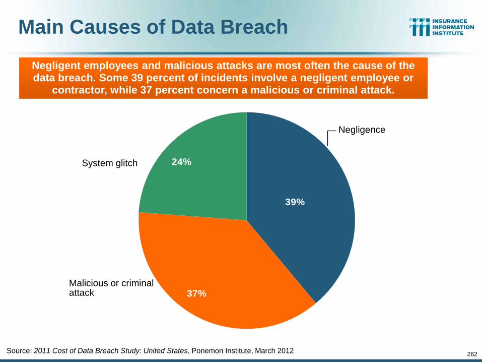
262
Main Causes of Data Breach
24%
37%
39%
Source: 2011 Cost of Data Breach Study: United States, Ponemon Institute, March 2012
Negligent employees and malicious attacks are most often the cause of the data breach. Some 39 percent of incidents involve a negligent employee or
contractor, while 37 percent concern a malicious or criminal attack.
Negligence
System glitch
Malicious or criminal attack
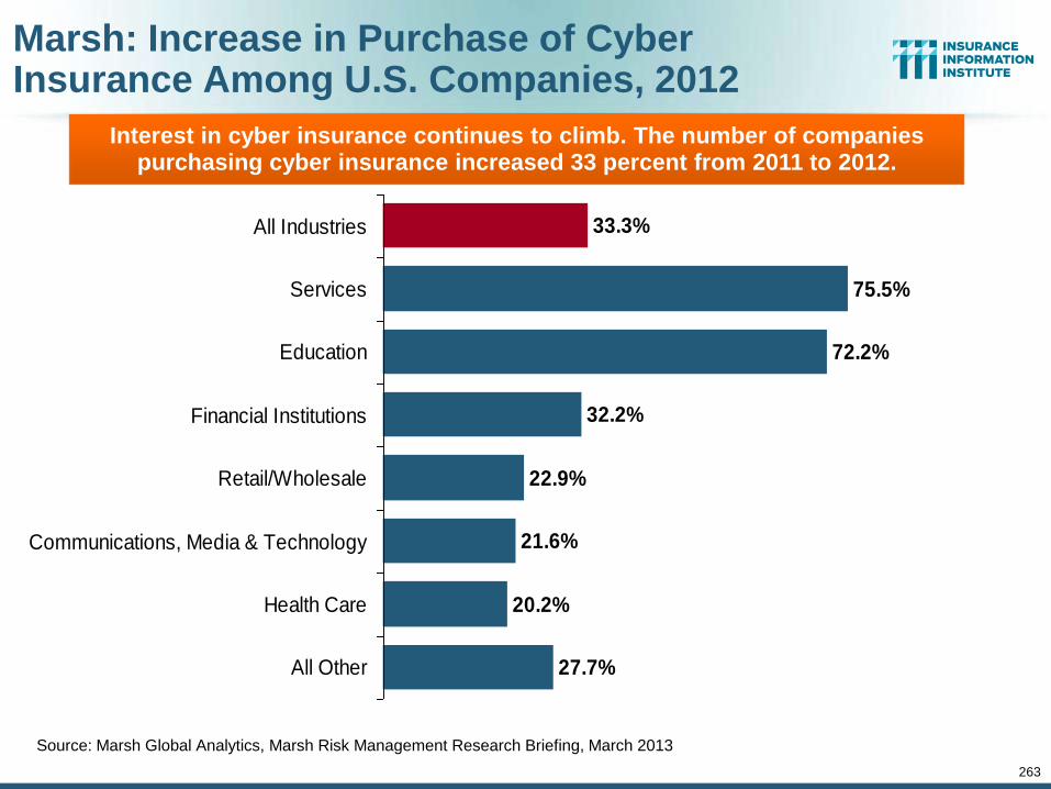
263
Marsh: Increase in Purchase of Cyber Insurance Among U.S. Companies, 2012
Source: Marsh Global Analytics, Marsh Risk Management Research Briefing, March 2013
27.7%
20.2%
21.6%
22.9%
32.2%
72.2%
75.5%
33.3%
All Other
Health Care
Communications, Media & Technology
Retail/Wholesale
Financial Institutions
Education
Services
All Industries
Interest in cyber insurance continues to climb. The number of companies purchasing cyber insurance increased 33 percent from 2011 to 2012.
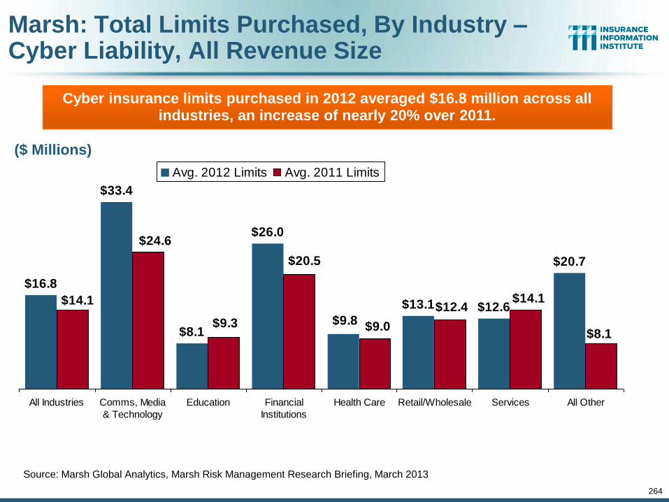
264
Marsh: Total Limits Purchased, By Industry – Cyber Liability, All Revenue Size
Source: Marsh Global Analytics, Marsh Risk Management Research Briefing, March 2013
$16.8
$33.4
$8.1
$26.0
$13.1 $12.6
$20.7
$9.8
$20.5
$9.0
$12.4
$8.1
$14.1
$9.3
$24.6
$14.1
All Industries Comms, Media
& Technology
Education Financial
Institutions
Health Care Retail/Wholesale Services All Other
Avg. 2012 Limits Avg. 2011 Limits
Cyber insurance limits purchased in 2012 averaged $16.8 million across all industries, an increase of nearly 20% over 2011.
($ Millions)
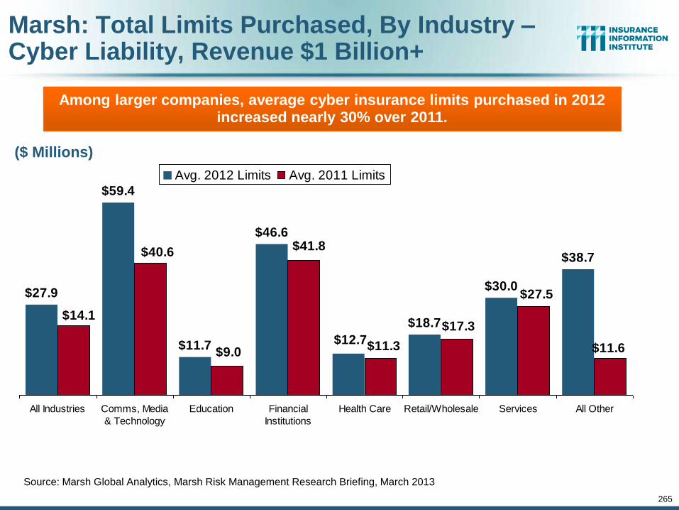
265
Marsh: Total Limits Purchased, By Industry – Cyber Liability, Revenue $1 Billion+
Source: Marsh Global Analytics, Marsh Risk Management Research Briefing, March 2013
$27.9
$59.4
$11.7
$46.6
$18.7
$30.0
$38.7
$12.7
$41.8
$11.3
$17.3
$11.6
$27.5
$9.0
$40.6
$14.1
All Industries Comms, Media
& Technology
Education Financial
Institutions
Health Care Retail/Wholesale Services All Other
Avg. 2012 Limits Avg. 2011 Limits
Among larger companies, average cyber insurance limits purchased in 2012 increased nearly 30% over 2011.
($ Millions)
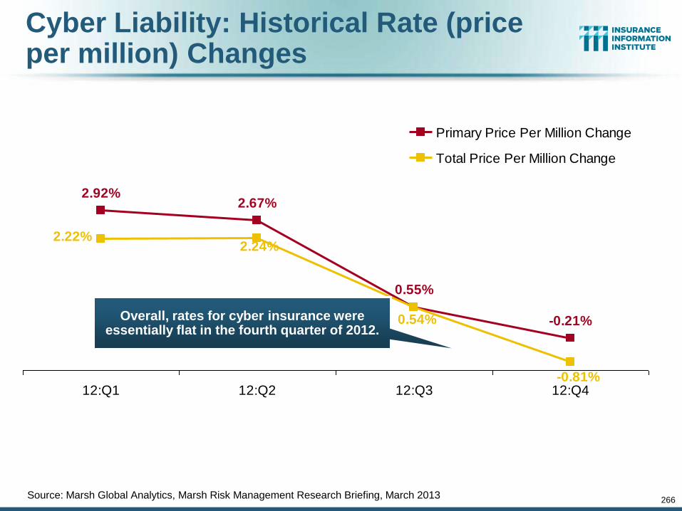
266
Cyber Liability: Historical Rate (price per million) Changes
-0.21%
2.67%
0.55%
2.92%
-0.81%
2.22%2.24%
0.54%
12:Q1 12:Q2 12:Q3 12:Q4
Primary Price Per Million Change
Total Price Per Million Change
Overall, rates for cyber insurance were essentially flat in the fourth quarter of 2012.
Source: Marsh Global Analytics, Marsh Risk Management Research Briefing, March 2013
www.iii.org
Thank you for your time and your attention!
Twitter: twitter.com/bob_hartwig
Download at www.iii.org/presentations
Insurance Information Institute Online:
267