Embed Size (px)
DESCRIPTION
This is a brochure of all of the design work that I have done through out the Winter 2015 semester in Comm130.
Citation preview

Design Project Name
Steve HodsonDesign Portfolio: 2015
Design Project NameSteven Hodson
318 Pioneer Rd. Apt. 2000
(303)653-4459
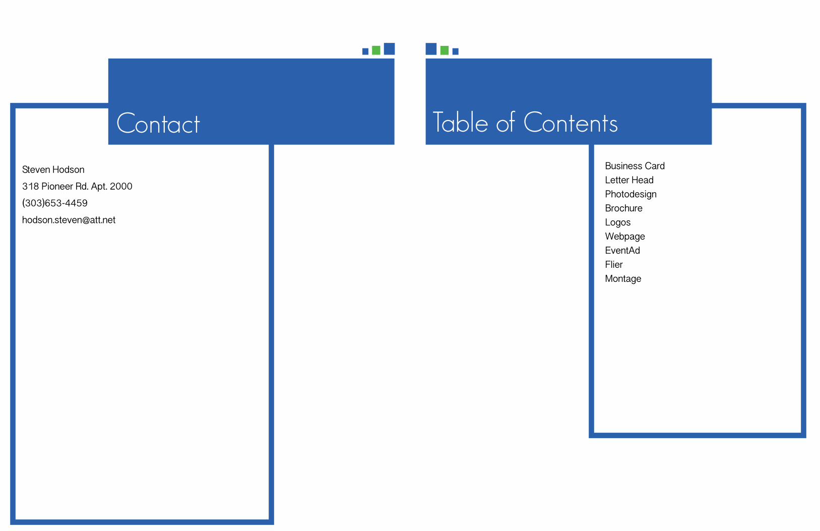
Contact Table of ContentsBusiness CardLetter HeadPhotodesignBrochureLogosWebpageEventAdFlier Montage
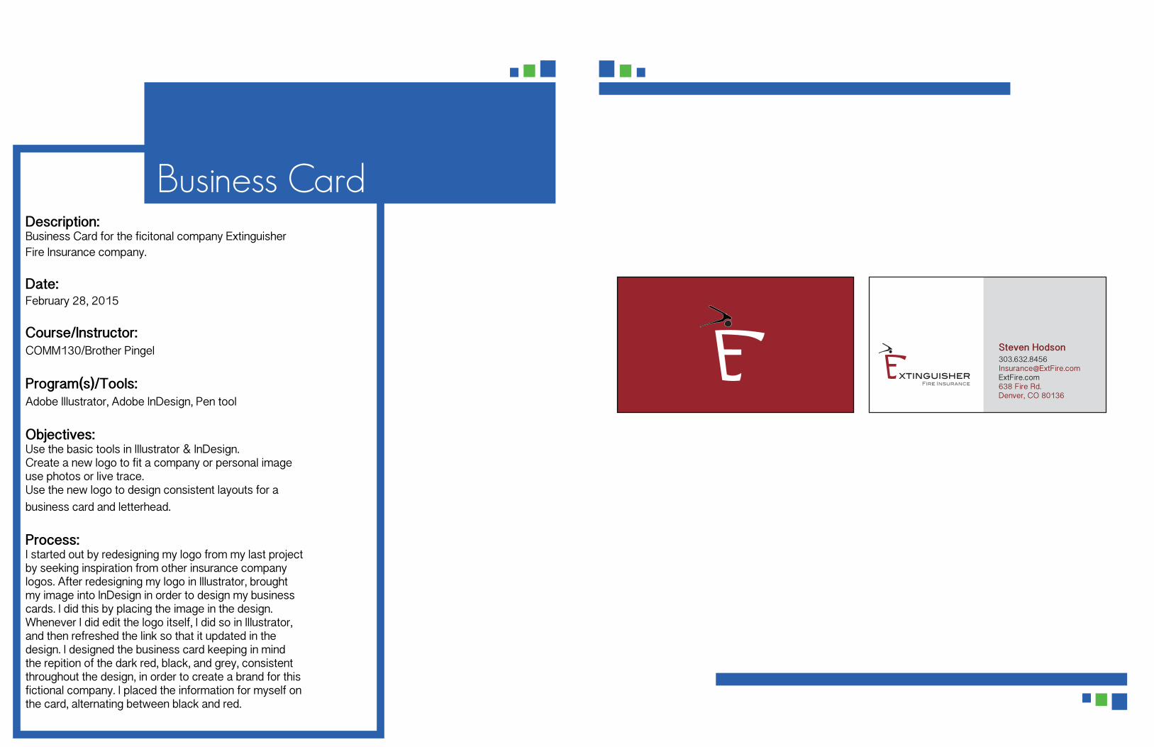
Business CardDescription: Business Card for the ficitonal company Extinguisher Fire Insurance company.
Date:February 28, 2015
Course/Instructor:COMM130/Brother Pingel
Program(s)/Tools:Adobe Illustrator, Adobe InDesign, Pen tool
Objectives:Use the basic tools in Illustrator & InDesign.Create a new logo to fit a company or personal image use photos or live trace.Use the new logo to design consistent layouts for a business card and letterhead.
Process:I started out by redesigning my logo from my last project by seeking inspiration from other insurance company logos. After redesigning my logo in Illustrator, brought my image into InDesign in order to design my business cards. I did this by placing the image in the design. Whenever I did edit the logo itself, I did so in Illustrator, and then refreshed the link so that it updated in the design. I designed the business card keeping in mind the repition of the dark red, black, and grey, consistent throughout the design, in order to create a brand for this fictional company. I placed the information for myself on the card, alternating between black and red.
xtinguisherFire Insurance
Steven [email protected] Fire Rd.Denver, CO 80136

Description: Letterhead for the ficitonal company Extinguisher Fire Insurance company.
Date:February 28, 2015
Course/Instructor:COMM130/Brother Pingel
Program(s)/Tools:Adobe Illustrator, Adobe InDesign, Pen tool
Objectives:Use the basic tools in Illustrator & InDesign.Create a new logo to fit a company or personal image use photos or live trace.Use the new logo to design consistent layouts for a business card and letterhead.
Process:This project was started much of the same way that the business card was, in order to create repition throughout the company's material, in order to establish a brand. I used the same logo, twice in this stationery, but used a watermark in the lower right-hand corner with the logo, keeping it at about 7% opactiy.
Letterhead xtinguisherFire Insurance
Steven Hodson
[email protected] Fire Rd.Denver, CO 80136
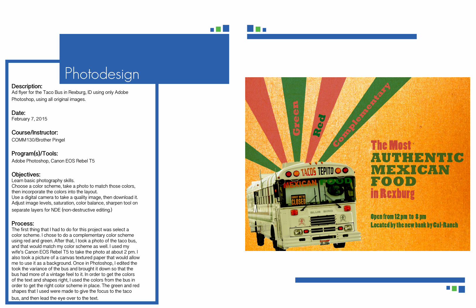
Description:Ad flyer for the Taco Bus in Rexburg, ID using only Adobe Photoshop, using all original images.
Date:February 7, 2015
Course/Instructor:COMM130/Brother Pingel
Program(s)/Tools:Adobe Photoshop, Canon EOS Rebel T5
Objectives:Learn basic photography skills.Choose a color scheme, take a photo to match those colors, then incorporate the colors into the layout.Use a digital camera to take a quality image, then download it.Adjust image levels, saturation, color balance, sharpen tool on separate layers for NDE (non-destructive editing.)
Process:The first thing that I had to do for this project was select a color scheme. I chose to do a complementary color scheme using red and green. After that, I took a photo of the taco bus, and that would match my color scheme as well. I used my wife’s Canon EOS Rebel T5 to take the photo at about 2 pm. I also took a picture of a canvas textured paper that would allow me to use it as a background. Once in Photoshop, I edited the took the variance of the bus and brought it down so that the bus had more of a vintage feel to it. In order to get the colors of the text and shapes right, I used the colors from the bus in order to get the right color scheme in place. The green and red shapes that I used were made to give the focus to the taco bus, and then lead the eye over to the text.
Photodesign

BrochureDescription:A brochure promoting the fictional bed and breakfast called Toasty Toes.
Date:March 28, 2015
Course/Instructor:COMM130/Brother Pingel
Program(s)/Tools:Adobe Photoshop, Adobe InDesign, Adobe Illustrator, Microsoft Word
Objectives:Set up and align a two-sided, folded document.Create an original, new logo and use it in a brochure.Incorporate quality images.
Process:I sketched out a design for my logo and brochure before I started anything. I then created a logo in Adobe Illustrator. I looked for inspiration on the internet for help with logos that some bed and breakfasts have made. After I made that logo, I was able to find different layouts for brochures, and different ways of folding it. Once I found this kind of envelope design, a vertical letter with an exposed flap, I decided to use a black and white layout in order to make the text and text boxes stick out. The black and white in contrast to the bright red, orange, and teal colors. The inside was a little trickier, because I wanted it to be consistent with the rest of the design. So instead, I placed a grey background, so that I could keep the photos colors vibrant.

Description:Three logos for the fictional company “Extinguisher Fire Insurance.”
Date:February 22, 2015
Course/Instructor:COMM130/Brother Pingel
Program(s)/Tools:Adobe Illustrator, Pen tool
Objectives:Create three completely different, original logos to fit a company or personal image that will appeal to the audience. Use only the Illustrator tools to create and draw your logos.
Process:I began the process by thinking of a company and a company name for the business that I wanted to create logos for. I sketched out designs after getting some inspiration by looking at logos online. Then I spent time in the lab in Illustrator tracing images and such as the fire hydrant with the pen tool. I used the i dropper tool to help with my color schemes (color wheel). The curve pen tool helped me a lot with my second and third designs. I got my logos looked at by Brother Pingel and others, then revised them and made the necessary simplifications to my third design.
Logos
xtinguisher Fire Insurance
Fire Insurance
Extinguisher Fire Insurance
Extinguisher Fire Insurance
r

Description:A web page that showcases the fictional company’s “Extinguisher Fire Insurance” logo.
Date:March 14, 2015
Course/Instructor:COMM130/Brother Pingel
Program(s)/Tools:TextWrangler, Adobe Illustrator
Objectives:Size and optimize an original logo as a .png for a web page.Write content to describe the process of creating your logo and how it appeals to a target audience. Acquire a working knowledge of HTML. Acquire a working knowledge of CSS.
Process:I created this webpage using TextWrangler. I created both the HTML document and CSS document using this editing program. I also used the validator website in order to make sure that each part of the HTML document was in order.
Web Page

Description:A color event ad made from a scanned image to promote a fictional charity run called the Gentlemen's Jog.
Date:January 31, 2015
Course/Instructor:COMM130/Brother Pingel
Program(s)/Tools:Microsoft Word, HP Scanner
Objectives:Comprehend image sizing Find, scan and import a high-quality image.Choose a color scheme and typeface(s) that work for your message and audience.Learn to use only Word design features without using any Adobe programs, including Photoshop.
Process:First, I scanned the image of a man running in a suit. I sketched out a design for the event ad with the man in a suit running. After I picked my favorite design, I began to create the text for the body copy, in order to determine how I needed to divy up the page and it’s white space. I chose the color blue for the event because that is the color for prostate awareness, and orange because it contrast well with blue. The design for Microsoft word was very simple, but a little limited. I really enjoyed working with the Microsoft and the scanner.
Event Ad
The Gentlemen’s Jog
Men’s Wearhouse Presents
5KR U N / W A L K APRIL 25, 2015 at 7AM
During Prostate Cancer Awareness Month, Men’s Wearhouse is hosting its annual charity run to help find the cure for prostate and testicular cancer. The run will begin at the LaVell Edwards Stadium. Both men and women are invited to attend. The price of entrance is $15.00.
Do not forget, the dress code is formal.
LaVell Edwards Stadium, Provo, UT
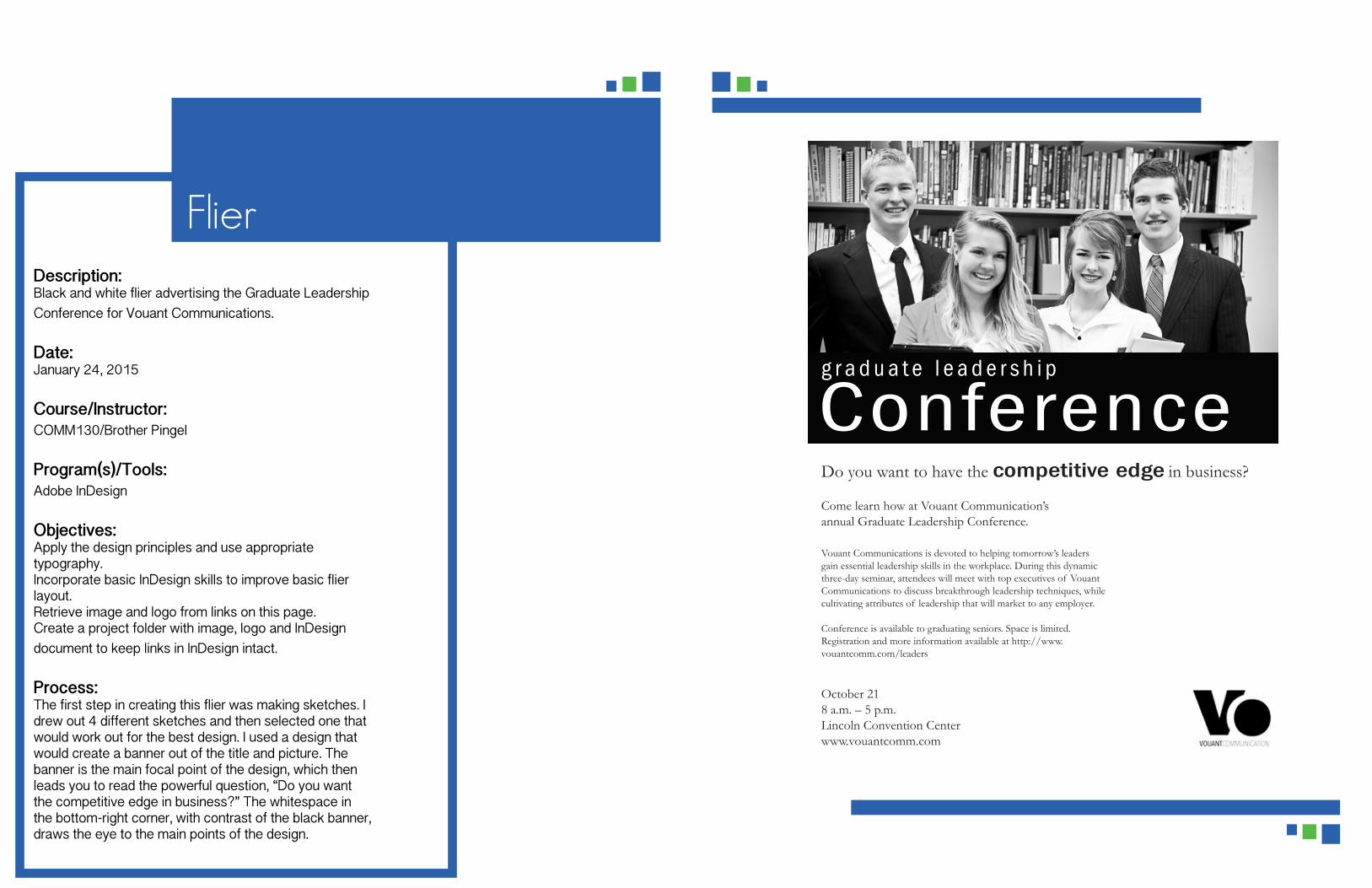
Description:Black and white flier advertising the Graduate Leadership Conference for Vouant Communications.
Date:January 24, 2015
Course/Instructor:COMM130/Brother Pingel
Program(s)/Tools:Adobe InDesign
Objectives:Apply the design principles and use appropriate typography.Incorporate basic InDesign skills to improve basic flier layout.Retrieve image and logo from links on this page.Create a project folder with image, logo and InDesign document to keep links in InDesign intact.
Process:The first step in creating this flier was making sketches. I drew out 4 different sketches and then selected one that would work out for the best design. I used a design that would create a banner out of the title and picture. The banner is the main focal point of the design, which then leads you to read the powerful question, “Do you want the competitive edge in business?” The whitespace in the bottom-right corner, with contrast of the black banner, draws the eye to the main points of the design.
Flier
g r a d u a t e l e a d e r s h i p
ConferenceDo you want to have the competitive edge in business?
Come learn how at Vouant Communication’s annual Graduate Leadership Conference.
Vouant Communications is devoted to helping tomorrow’s leaders gain essential leadership skills in the workplace. During this dynamic three-day seminar, attendees will meet with top executives of Vouant Communications to discuss breakthrough leadership techniques, while cultivating attributes of leadership that will market to any employer.
Conference is available to graduating seniors. Space is limited.Registration and more information available at http://www.vouantcomm.com/leaders
October 218 a.m. – 5 p.m.Lincoln Convention Centerwww.vouantcomm.com

Description:A spiritual montage project blending in two images and an inspirational quote.
Date:February 14, 2015
Course/Instructor:COMM130/Brother Pingel
Program(s)/Tools:Adobe Photoshop
Objectives:Unify a layout with a consistent theme and dominant spiritual messageLearn to blend two or more images together gradually, using masksDemonstrate more advanced Photoshop skills for layout with multiple elementsUse a mask to apply a filter to one part of the image
Process:I started out with a quote in mind by Elder Christofferson as the one that I was going to use in the montage. I used Photoshop as my main editing tool. Once I had that in mind, I found an image that would work well with the theme that I had, which was of a man carrying a bag and Jesus Christ as a shepherd. I used an angled brush stroke filter on the image of the man with the bag, and then I also used the replace color option in order to change it to an appropriate color scheme. I then used the masking tool in order to blend in the picture of the Savior, using about 30% opacity for the brush. I took the text and changed it so that it matched a split complementary color scheme.
Montage