Embed Size (px)
Citation preview

�
E NEw
The source of the originals.
bCPE
AsupplementtoPalatinonovadesignedbyHermannZapf
Palatino Sans
Palatino Sans
™
2
Palatino SanSshowsinitsalphabetsaninterpretationofatypedifferentfromallthetraditionalsansseriffacesofmonotonestrokesthataredonewitharuler.NoticehowthelettersofPalatinoSanshaveelegantcurvedoutlines,notasuniformandwithoutsharpedges,toconveyamoresoftexpression.Thedetailsofthestemscanbeseenespeciallyinlargersizes.TypicalforallthePalatinoalphabetsaretheopenletterP,andthecurvedlower-casel,foracleardistinctionwithinwordslikeIllinois.
Palatino Sans Ultra lightemphasizesmorethewrittenform,thepressureofthehandtogetamoredynamicimageofthelines,andtoavoidtheexpressionlessmainstrokesofothersansseriftypes.
Palatino Sans informaloffersdesignswithasomewhatindividuallook.AninnovationtoenlargetheapplicationofaSans.Withcarefullittleeffectsthelettersappeartolookmoreartistic.AnoveltyforaSanstoexpandtheversatilityofaSansseriftypeface,andnotlookinglikehundredsofotherSansaround.TheconceptofthePalatinoSansalphabets,carefullyharmonizedwiththePalatinonova,allowsmanycombi-nationsintypography,likeincontrastsorinawantedunityofadesignsolution.ButallalphabetsofPalatinoSansarewellbalancedtobeusednotonlytoaccompanyPalatinonovaorotherromanfaces,butalsotobeusedinanyprintedmaterialwhereanormalSansserifmayperhapsbetootechnical,likeinpackagingandproductdesign,inannualreports,scientificpublications,andnottobeforgotteninmagazineheadlines.Thesameasinanytypographicarrangementinwhichtwodifferenttextmattersshouldbeseparatedortobeusedincommentarynotes.ExamplesofPalatinonovamixedwithPalatinoSansareshownonthefollowingpages:7,21and23.
PalatinoSansRegular10/13,5pt
Palatino Sans,afreshandmulti-purpose
typeface,isanewstarintheLinotypeCollection.
A new interpretation of sans serif designs.
Availableintwodifferentalphabetstoaccompanythe
famousPalatinonova,andaperfectadditiontoexpandtheuseofPalatinonovainadvertisingand
expressivetypography.
Thelettersshouldbedesigned byanartist,andnotanegnineer. WilliamMorris1893
aaaaaaaaaaabbbbbbbbbbb
aaaaaaaaaaabbbbbbbbbbb
Page 4 –PalatinoSansandSansItalic.Thecompletelistofallalphabetsandexamples.
Page 5 –PalatinoSansInformalandInformalItalic.Thecompletelistofallalphabetsandexamples.
Page 6 –»TheoriginofthetermSans«.WrittenbyWalterTracyRDI,London.
Page 7 –»WhatisOpenType?«.AdescriptionofthenewdigitaltechnologyusedforPalatinoSans.
PalatinoSans
Regularwith
specialligatures

3
Palatino SanSzeigtinihrenAlphabeteneineInterpretationeinerSans,diesichvonallenanderentraditionellenGroteskschriftenmitgleichmäßigenGrundstrichen,diemiteinemLinealausgeführtsind,unterscheidet.ManbeachtebeiderPalatinoSansdieeleganten,leichtgebogenenUmrisse,dienichtuniformsindundohnescharfeEcken,umeinenetwasweicherenEindruckzuerhalten.DieDetailssindbesondersindengrößerenSchriftgradenzusehen.TypischfürallePalatinoAlphabetesind dasoffenePunddasuntengebogenel,umeineeindeutigeUnterscheidungbeiWortenwiez.B.Illinoiszuerreichen.
Palatino Sans Ultra lightbetontmehrdiegeschrie-beneForm,dieDruckverteilungdurchdieHand, umeinenmehrdynamischenAusdruckindeneinzelnenBuchstabenzubekommenundumdieausdruckslosenGrundstrichebeianderenGroteskschriftenzuvermeiden.
Palatino Sans informalAlphabetehabeneinetwaspersönlicheresAussehen.MitkleinenBesonderheitenstrahlendieBuchstabeneinkünstlerischesFlairaus.DieseInnovationermöglichteinegrößereVerwendbarkeiteinerSans,ohnewiehundertandereauszusehen.DasKonzeptderPalatinoSansAlphabetestimmtharmonischmitderPalatinonovaübereinunderlaubtvieletypographischeKombinationen,entwederimKontrastoderfüreinheitlicheLösungen. AlleAlphabetederPalatinoSanssindaufeinanderabgestimmt;abernichtnurmitderPalatinonovaundanderenAntiquaschriften.Siekönnenauchüberalldortverwendetwerden,woeinegewöhnlicheGroteskvielleichtzutechnischwirkt,etwaimVerpackungsundProduktdesign,inJahresberichten,sowieinwissenschaftlichenPublikationen,nicht zuvergessen,beiÜberschrifteninZeitschriften. DasgiltauchfürtypographischeAufgaben,wo zweiunterschiedlicheTextegetrenntwerdensollenoderfürKommentare. BeispielevonMischungenderPalatinonovamit derPalatinoSansundverwendetalsAuszeichnungsindaufdenSeiten7,21und23abgebildet.
PalatinoSansItalic10/12,5pt
Les alphabets de la famille de polices Palatino SanS sont l’interprétation d‘une police sans empattement qui se defférencie de toutes les autres polices linéales traditionnelles aux fûts homogènes réalisés à la règle. Ce qui est fascinant chez la famille Palatino Sans, ce sont ses contours élégants et légèrement arqués non homogènes, ainsi que l‘absence de coins prononcés permattant d‘obtenir une impression plus souple de l‘ensemble. Le choix de corps élevés permet de mettre particuliè-rement en évidence les détails. Le P ouvert et le l arqué en bas sont typiques de tous les alphabets Palatino et permettent de créer une différenciation évidente pour certains mots, comme par exemple Illinois.
Palatino Sans Ultra light met davantage en valeur la forme manuscrite et la répartition de la pression de la main afin d’obtenir une expression plus dynamique et d’éviter les fûts inexpressifs, caractéristiques d‘autres polices linéales. Le graphisme des alphabets Palatino Sans informal est un peu plus personnel. Il s‘agit d‘une réelle innovation permettant également d‘agrandir le domaine d‘utilisation d‘une police sans empatte-ments. Certaines caractéristiques offrent aux lettres un aspect un peu plus artistiques : une nouveauté pour une police de ce style, élargissant sa pratique sans toutefois ressembler être à des centaines d‘autres polices sans empattements. Le concept des alphabets Palatino Sans concorde de façon harmonieuse avec la famille Palatino nova et permet de nombreuses combinaisons typographi-ques, soit au niveau du contraste, soit pour des solutions uniformes. Tous les alphabets de famille de polices Palatino Sans sont adaptés les uns aux autres, mais pas seulement à la Palatino nova et aux autres polices romaines; ils peuvent être utilisés là où une police linéale habituelle crée un effet trop technique, par exemple pour la design d‘emballages et de produits, dans les rapports annuels, les publica-tions scientifiques, sans oublier les gros titres des journaux. Sont également concernées les tâches typographiques consistant à séparer deux textes différents ou l‘ajout de commentaires. Vous trouverez des exemples de combinaisons de la Palatino nova et de la Palatino Sans à la page 7, ainsi qu‘à la page 21 et 23. Palatino Sans Regular Informal 10/11,5 pt
Page 20 –»Aselectionofcomputerdevelopments«sinceKonradZuse’s»Z1«of1937.
Page 21 –»HommageàLeibniz«.Theinventorofthebinarysystemofnotationinthe17century.
Page 22 –DescriptionofsomeadditionalfeaturesespeciallyforPalatinoSansUltraLight.
Page 23 –ExamplesofPalatinoSanscombinedwithPalatinonova.

4
PalatinoSansTheclassicstyleofaSansSerif
Palatino Sans Ultra LightAlphabetpage8
Palatino Sans Ultra Light ItalicAlphabetpage10
Palatino Sans Light
Palatino Sans Light Italic
PalatinoSansRegularAlphabetpage12
PalatinoSansItalicAlphabetpage14
Palatino Sans Medium
Palatino Sans Medium Italic
Palatino Sans BoldAlphabetpage16
Palatino Sans Bold italicAlphabetpage18
� List of all the different Palatino Sans designs
Inth
elargersizesth
ecu
rved
outlin
e
ofth
estem
sareseen
moreclea
rly
andalso
theroun
dsh
aped
corne
rs
andtheed
gesinside
thelette
rs.

5
Palatino Sans InformalA more casual design of a Sans Serif
Palatino Sans Informal Ultra LightAlphabet page 9
Palatino Sans Informal Ultra Light ItalicAlphabet page 11
Palatino Sans Informal Light
Palatino Sans Informal Light Italic
Palatino Sans Informal RegularAlphabet page 13
Palatino Sans Informal ItalicAlphabet page 15
Palatino Sans Informal Medium
Palatino Sans Informal Medium Italic
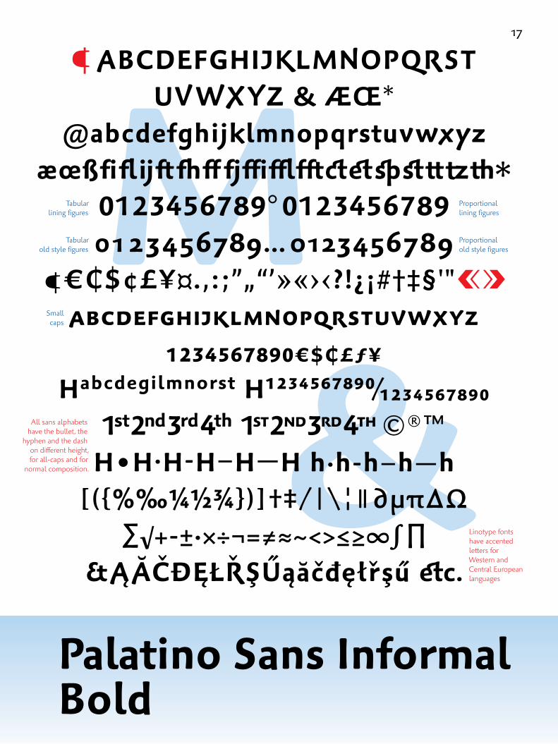
Palatino Sans informal BoldAlphabet page 17
Palatino Sans Informal Bold ItalicAlphabet page 19
Ultra Light Special Ligatures & ArrowsSpecimen page 22
AllPa
latin
oSa
nsalpha
betshav
earoun
dedlowercaself
oracleardifferen
tiatio
nwith
inw
ords
like
Illin
ois,and
anop
enP
which
isty
picalforallPa
latin
oalph
abets.Itisalsoahe
lpfo
ride
ntificatio
nofPalatinoSa
nsw
ithothersan
sserifty
pefaces.
Some historical sources:
Already Raphael (1483 – 1520) describes his imaginative decorations
for the Stanza della Segnatura in the Vatican as »Groteschi«,
Michel de Montaigne (1533 – 1592) named an antique scenery as »Grotesque«
in his Essays (1580).
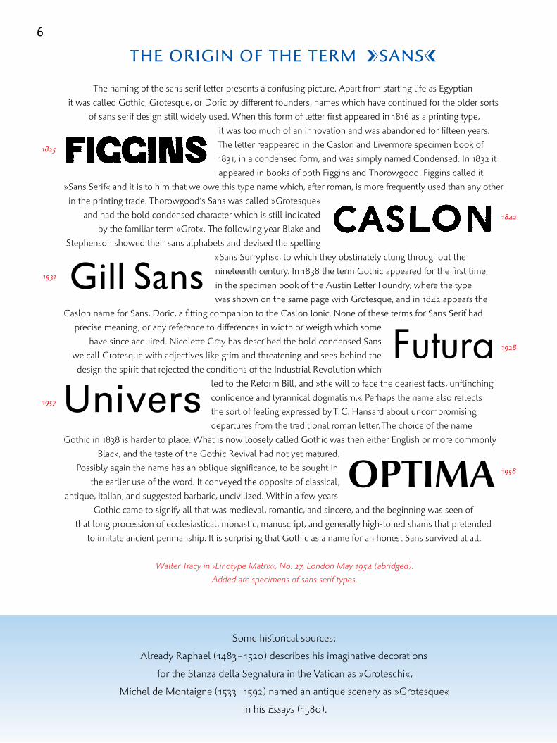
THEORIGINOFTHETERmaSANSb
The naming of the sans serif letter presents a confusing picture. Apart from starting life as Egyptian it was called Gothic, Grotesque, or Doric by different founders, names which have continued for the older sorts
of sans serif design still widely used. When this form of letter first appeared in 1816 as a printing type, it was too much of an innovation and was abandoned for fifteen years. The letter reappeared in the Caslon and Livermore specimen book of 1831, in a condensed form, and was simply named Condensed. In 1832 it appeared in books of both Figgins and Thorowgood. Figgins called it
»Sans Serif« and it is to him that we owe this type name which, after roman, is more frequently used than any other in the printing trade. Thorowgood‘s Sans was called »Grotesque«
and had the bold condensed character which is still indicated by the familiar term »Grot«. The following year Blake and
Stephenson showed their sans alphabets and devised the spelling »Sans Surryphs«, to which they obstinately clung throughout the nineteenth century. In 1838 the term Gothic appeared for the first time, in the specimen book of the Austin Letter Foundry, where the type was shown on the same page with Grotesque, and in 1842 appears the
Caslon name for Sans, Doric, a fitting companion to the Caslon Ionic. None of these terms for Sans Serif had precise meaning, or any reference to differences in width or weigth which some
have since acquired. Nicolette Gray has described the bold condensed Sans we call Grotesque with adjectives like grim and threatening and sees behind the design the spirit that rejected the conditions of the Industrial Revolution which
led to the Reform Bill, and »the will to face the deariest facts, unflinching confidence and tyrannical dogmatism.« Perhaps the name also reflects the sort of feeling expressed by T. C. Hansard about uncompromising departures from the traditional roman letter. The choice of the name
Gothic in 1838 is harder to place. What is now loosely called Gothic was then either English or more commonlyBlack, and the taste of the Gothic Revival had not yet matured.
Possibly again the name has an oblique significance, to be sought in the earlier use of the word. It conveyed the opposite of classical,
antique, italian, and suggested barbaric, uncivilized. Within a few years Gothic came to signify all that was medieval, romantic, and sincere, and the beginning was seen of
that long procession of ecclesiastical, monastic, manuscript, and generally high-toned shams that pretended to imitate ancient penmanship. It is surprising that Gothic as a name for an honest Sans survived at all.
Walter Tracy in ›Linotype Matrix‹, No. 27, London May 1954 (abridged).Added are specimens of sans serif types.
6
Gill Sans
UniversFutura
OPTIMA
1825
1931
1957
1842
1928
1958

7
WhatIsOpenType?OpenType is a font format that was
collaboratively developed by Adobe
and Microsoft during the 1990s. The first speci
fications were published in 1997, and the first
OpenType fonts came onto the market in 2000.
Today, most new fonts are released in OpenType
format, which can safely be con sidered the new
industry standard. TheOpenTypeformatsupports
Unicode™,whichiswhyOpenTypefontscan
containlargecharactersets.Infact,anOpenType
fontcancontainmorethan65,000glyphs!This
isaconsiderableincreaseincharactersetsize
overpastformats;mostPostScriptandTrueType
fontscouldonlycontain256characters.Unicode
support gives OpenType fonts much better
language support opportunities than PostScript
or TrueType fonts have available. Instead of one
font for each language group (Western Roman,
CE, Baltic, etc.), OpenType character sets can
include all of these code pages in one single font.
In addition to Western characters (ISO Latin 1, etc.)
and their accents, common additional characters
include Central European, Cyrillic, and Greek.
Some OpenType fonts may even include Chinese,
Japanese, Korean, Hebrew, or Arabic. Fonts for
languages that are written from right to left (i.e.,
Arabic) may require special applications and/or
system support in order to function properly.
OpenTypemakesadvancedtypographicand
languagedependentfeatureseasilyavailable
toallusers.Forinstance,theadvancedtypographic
featuresinOpenTypefontscommonlyincludea
widerangeofspecialglyphs,whichcaninclude
ligatures,titlingandswashcharacters,oldstyle
figures,smallcaps,fractions,andhistoricalglyphs.
Inthepast,eachoftheseso-called»Expert«
charactersetshadtobepackagedinaseparate
fontfile,makingthesettingofadvancedtypo
graphicfeaturescumbersome.Major ope rating
system manufacturers have put a lot of effort
in making OpenType fonts work in new, as
well as some older, versions of their software.
But it is important to remember that not all
OpenType features are available in every existing
app li cation; some applications are not yet
OpenTypesavvy, as support of OpenType fonts
is highly dependant on the applications’ level
of Unicode support. Adobe InDesign, as well as
Illustrator and Photoshop CS, support multiple
codepages and advanced typographic and layout
features. The newest versions of Microsoft Word
are OpenTypesavvy as well. OpenTypefonts
maystillbeusedinapplicationsthatarenot
OpenType-savvy.However,intheseapplications,
onlythefirst256charactersofthefont’scharacter
setwillbeaccessible(thisisthebasiccharacter
setforWesternRomanlanguages). Unfortunately,
in these cases, the extended language or the
typographic support of the OpenType font will
not be usable. Users of nonOpenTypesavvy
applications, such as older versions of Adobe
and Quark products, as well as most Macromedia
products, may wish to keep using PostScript or
TrueType fonts until they upgrade. The OpenType
format simplifies font management and the
publishing workflow by ensuring that all required
glyphs for a do cu ment can be contained in one
crossplatform font file and this can be used
throughout the entire publishing workflow.
Applications and operating systems can also
verify the source and integrity of OpenType
fonts because there is a digital signa ture within
every font. Unicode is a trademark of Unicode, Inc.
the art of punchcuttingformetaltype,cultivatedover500years,isreplacedtodaybydigital
technology.Itoffersnewpossibilitiesofcreativityandexpandstheamountofletterswithin
afont.Therestrictednumberoflettersbythewoodentypecaseoftheoldcompositorbelongs
nowtothepast,thankstoOpenType.Butthecreative part in designing new fontsisstill
theintentionofthedesigner,asinthepastthehumanhandcreatesthefinalform.
a

&w
8
Palatino Sans Ultra Light
¶ abcdefghijkLmnopqrStUvwXYz & ÆŒ*
@abcdefghijklmnopqrstuvwxyz æ œ ß fi fl ij ft fj ff fh ffi ffl fft ct et sp st tt tz th*
0123456789° 01234567890123456789… 0123456789
b ¶€¢$¢£¥¤.,:;”„“’»«›‹?!¿¡#†‡§'"aabcdefghijklmnopqrstuvwxyz
1234567890€$¢£ƒ¥habcdegilmnorst h1234567890⁄1234567890
©®™h•h·h-h–h—h h·h-h–h—h
[({%‰¼½¾})] †‡/|\¦|| ∂μπΔΩ∑√+-±·×÷¬=≠≈~<>≤≥∞∫∏
&ĄĂČĐĘŁŘŞŰąăčđęłřşű etc.
Proportional lining figures
Proportional old style figures
Tabular lining figures
Tabular old style figures
Small caps
Linotype fonts have accented letters for Western and Central European languages
All sans alphabets have the bullet, the
hyphen and the dash on different height, for all-caps and for
normal composition.

&W
9
Palatino Sans Informal Ultra Light
¶ abcdEfghijklmNopqrstUvWxYz & ÆŒ*
@abcdefghijklmnopqrstuvwxyz æ œ ß fi fl ij ft fj ff fh ffi ffl fft ct et sp st tt tz th*
0123456789° 01234567890123456789… 0123456789
b¶€¢$¢£¥¤.,:;”„“’»«›‹?!¿¡#†‡§'"aabcdefghijklmnopqrstuvwxyz
1234567890€$¢£ƒ¥habcdegilmnorst h1234567890⁄1234567890
©®™h•h·h-h–h—h h·h-h–h—h
[({%‰¼½¾})] †‡/|\¦|| ∂μπΔΩ∑√+-±·×÷¬=≠≈~<>≤≥∞∫∏
&ĄĂČĐĘŁŘŞŰąăčđęłřşű etc.
Proportional lining figures
Proportional old style figures
Tabular lining figures
Tabular old style figures
Small caps
Linotype fonts have accented letters for Western and Central European languages
All sans alphabets have the bullet, the
hyphen and the dash on different height, for all-caps and for
normal composition.

ctg
10
Palatino Sans Ultra Light Italic
¶ abcdefghijklmnopqrstUvwxYz & ÆŒ*
@abcdefghijklmnopqrstuvwxyz æ œ ß fi fl ij ft fj ff fh ffi ffl fft ct et sp st tt tz th*
0123456789° 01234567890123456789… 0123456789
a¶€¢$¢£¥¤.,:;”„“’»«›‹?!¿¡#†‡§'" babcdefghijklmnopqrstuvwxyz
1234567890€$¢£ƒ¥habcdegilmnorst h1234567890⁄1234567890
©®™h•h·h-h–h—h h·h-h–h—h
[({%‰¼½¾})] †‡/|\¦|| ∂μπΔΩ∑√+-±·×÷¬=≠≈~<>≤≥∞∫∏
&ĄĂČĐĘŁŘŞŰąăčđęłřşű etc.
Proportional lining figures
Proportional old style figures
Tabular lining figures
Tabular old style figures
Small caps
Linotype fonts have accented letters for Western and Central European languages
All sans alphabets have the bullet, the
hyphen and the dash on different height, for all-caps and for
normal composition.

ctg
11
Palatino Sans Informal Ultra Light Italic
¶ abcdefghijklmnopqrstUvwxYz & ÆŒ*
@abcdefghijklmnopqrstuvwxyz æ œ ß fi fl ij ft fj ff fh ffi ffl fft ct et sp st tt tz th*
0123456789° 01234567890123456789… 0123456789
b¶€¢$¢£¥¤.,:;”„“’»«›‹?!¿¡#†‡§'" aabcdefghijklmnopqrstuvwxyz
1234567890€$¢£ƒ¥habcdegilmnorst h1234567890⁄1234567890
©®™h•h·h-h–h—h h·h-h–h—h
[({%‰¼½¾})] †‡/|\¦|| ∂μπΔΩ∑√+-±·×÷¬=≠≈~<>≤≥∞∫∏
&ĄĂČĐĘŁŘŞŰąăčđęłřşű etc.
Proportional lining figures
Proportional old style figures
Tabular lining figures
Tabular old style figures
Small caps
Linotype fonts have accented letters for Western and Central European languages
All sans alphabets have the bullet, the
hyphen and the dash on different height, for all-caps and for
normal composition.

QJ
12
PalatinoSansRegular
¶ABCDEFGHIjKLmNOPqRSTUvWxyZ&ÆŒ*
@abcdefghijklmnopqrstuvwxyzæœßfiflijftfjfffhffifflfftctetspsttttzth*
0123456789°01234567890123456789…0123456789
¶€¢$¢£¥¤.,:;”„“’»«›‹?!¿¡#†‡§'"ababcDefghIjklmnopqRstuvwxyz
1234567890€$¢£ƒ¥HabcdegilmnorstH1234567890⁄1234567890
©®™H•H·H-H–H—Hh·hh–h—h[({%‰¼½¾})]†‡/|\¦||∂μπΔΩ
∑√+-±·×÷¬=≠≈~<>≤≥∞∫∏&ĄĂČĐĘŁŘŞŰąăčđęłřşűetc.
Proportional lining figures
Proportional old style figures
Tabular lining figures
Tabular old style figures
Small caps
Linotype fonts have accented letters for Western and Central European languages
All sans alphabets have the bullet, the
hyphen and the dash on different height, for all-caps and for
normal composition.

QJ
13
Palatino Sans Informal Regular
¶ AbCdefghIJkLmnoPQRSTuVwxyz & ÆŒ*
@abcdefghijklmnopqrstuvwxyz æ œ ß fi fl ij ft fj ff fh ffi ffl fft ct et sp st tt tz th*
0123456789° 01234567890123456789… 0123456789
¶€¢$¢£¥¤.,:;”„“’»«›‹?!¿¡#†‡§'"baabcdefghijklmnopqrstuvwxyz
1234567890€$¢£ƒ¥habcdegilmnorst h1234567890⁄1234567890
©®™H•H·H-H–H—H h·h-h–h—h
[({%‰¼½¾})] †‡ /|\¦|| ∂μπΔΩ∑√+-±·×÷¬=≠≈~<>≤≥∞∫∏
&ĄĂČĐĘŁŘŞŰąăčđęłřşű etc.
Proportional lining figures
Proportional old style figures
Tabular lining figures
Tabular old style figures
Small caps
Linotype fonts have accented letters for Western and Central European languages
All sans alphabets have the bullet, the
hyphen and the dash on different height, for all-caps and for
normal composition.

yf
14
PalatinoSansItalic
¶ABcDEFGHIJKLMnOPqRSTUVWxyZ&ÆŒ*
@abcdefghijklmnopqrstuvwxyzæœßfiflijftfjfffhffifflfftctetspsttttzth*
0123456789° 01234567890123456789…0123456789
¶€¢$¢£¥¤.,:;”„“’»«›‹?!¿¡#†‡§'"ababcdefghijklmnopqrstuvwxyz
1234567890€$¢£ƒ¥HabcdegilmnorstH1234567890⁄1234567890
©®™H•H·H-H–H—H h·h-h–h—h
[({%‰¼½¾})]†‡/|\¦||∂μπΔΩ∑√+±·×÷¬=≠≈~<>≤≥∞∫∏
&ĄĂČĐĘŁŘŞŰąăčđęłřşűetc.
Proportional lining figures
Proportional old style figures
Tabular lining figures
Tabular old style figures
Small caps
Linotype fonts have accented letters for Western and Central European languages
All sans alphabets have the bullet, the
hyphen and the dash on different height, for all-caps and for
normal composition.

yf
15
Palatino Sans Informal Italic
¶ abcdefghIjklmnoPqr Stuv wxyz & ÆŒ*
@abcdefghijklmnopqrstuvwxyz æ œ ß fi fl ij ft fj ff fh ffi ffl fft ct et sp st tt tz th*
0123456789° 01234567890123456789… 0123456789
¶€¢$¢£¥¤.,:;”„“’»«›‹?!¿¡#†‡§'"ababcdefghijklmnopqrstuvwxyz
1234567890€$¢£ƒ¥habcdegilmnorst h1234567890⁄1234567890
©®™H•H·H-H–H—H h·h-h–h—h
[({%‰¼½¾})] †‡/|\¦|| ∂μπΔΩ∑√+-±·×÷¬=≠≈~<>≤≥∞∫∏
&ĄĂČĐĘŁŘŞŰąăčđęłřşű etc.
Proportional lining figures
Proportional old style figures
Tabular lining figures
Tabular old style figures
Small caps
Linotype fonts have accented letters for Western and Central European languages
All sans alphabets have the bullet, the
hyphen and the dash on different height, for all-caps and for
normal composition.

&M
16
Palatino Sans Bold
¶ aBcdefghijklMnoPqrStUvwxyz & ÆŒ*
@abcdefghijklmnopqrstuvwxyz æ œ ß fi fl ij ft fj ff fh ffi ffl fft ct et sp st tt tz th*
0123456789° 01234567890123456789… 0123456789
¶€¢$¢£¥¤.,:;”„“’»«›‹?!¿¡#†‡§'"ababcdefghijklmnopqrstuvwxyz
1234567890€$¢£ƒ¥habcdegilmnorst h1234567890⁄1234567890
©®™H•H·H-H–H—H h·h-h–h—h
[({%‰¼½¾})] †‡/|\¦|| ∂μπΔΩ∑√+-±·×÷¬=≠≈~<>≤≥∞∫∏
&ĄĂČĐĘŁŘŞŰąăčđęłřşű etc.
Proportional lining figures
Proportional old style figures
Tabular lining figures
Tabular old style figures
Small caps
Linotype fonts have accented letters for Western and Central European languages
All sans alphabets have the bullet, the
hyphen and the dash on different height, for all-caps and for
normal composition.
&M
17
Palatino Sans informal Bold
¶ aBcdefghijklMnoPqrStUvwxyz & ÆŒ*
@abcdefghijklmnopqrstuvwxyz æ œ ß fi fl ij ft fj ff fh ffi ffl fft ct et sp st tt tz th*
0123456789° 01234567890123456789… 0123456789
¶€¢$¢£¥¤.,:;”„“’»«›‹?!¿¡#†‡§'"ababcdefghijklmnopqrstuvwxyz
1234567890€$¢£ƒ¥habcdegilmnorst h1234567890⁄1234567890
©®™H•H·H-H–H—H h·h-h–h—h [({%‰¼½¾})] †‡/|\¦|| ∂μπΔΩ
∑√+-±·×÷¬=≠≈~<>≤≥∞∫∏&ĄĂČĐĘŁŘŞŰąăčđęłřşű etc.
Proportional lining figures
Proportional old style figures
Tabular lining figures
Tabular old style figures
Small caps
Linotype fonts have accented letters for Western and Central European languages
All sans alphabets have the bullet, the
hyphen and the dash on different height, for all-caps and for
normal composition.

Rg
18
Palatino Sans Bold italic
¶ aBcdefghijklmnoPqRStUvwxyz & ÆŒ*
@abcdefghijklmnopqrstuvwxyz æ œ ß fi fl ij ft fj ff fh ffi ffl fft ct et sp st tt tz th*
0123456789° 01234567890123456789… 0123456789
¶€¢$¢£¥¤.,:;”„“’»«›‹?!¿¡#†‡§'"ababcdefghijklmnopqrstuvwxyz
1234567890€$¢£ƒ¥habcdegilmnorst h1234567890⁄1234567890
©®™H•H·H-H–H—H h·h-h–h—h
[({%‰¼½¾})] †‡/|\¦|| ∂μπΔΩ∑√+-±·×÷¬=≠≈~<>≤≥∞∫∏
&ĄĂČĐĘŁŘŞŰąăčđęłřşű etc.
Proportional lining figures
Proportional old style figures
Tabular lining figures
Tabular old style figures
Small caps
Linotype fonts have accented letters for Western and Central European languages
All sans alphabets have the bullet, the
hyphen and the dash on different height, for all-caps and for
normal composition.

Rg
19
Palatino Sans Informal Bold Italic
¶ aBcdefghIjklmnoPqRStuvwxyz & ÆŒ*
@abcdefghijklmnopqrstuvwxyz æ œ ß fi fl ij ft fj ff fh ffi ffl fft ct et sp st tt tz th*
0123456789° 01234567890123456789… 0123456789
¶€¢$¢£¥¤.,:;”„“’»«›‹?!¿¡#†‡§'"ababcdefghijklmnopqrstuvwxyz
1234567890€$¢£ƒ¥habcdegilmnorst h1234567890⁄1234567890
©®™H•H·H-H–H—H h·h-h–h—h
[({%‰¼½¾})] †‡/|\¦|| ∂μπΔΩ∑√+-±·×÷¬=≠≈~<>≤≥∞∫∏
&ĄĂČĐĘŁŘŞŰąăčđęłřşű etc.
Proportional lining figures
Proportional old style figures
Tabular lining figures
Tabular old style figures
Small caps
Linotype fonts have accented letters for Western and Central European languages
All sans alphabets have the bullet, the
hyphen and the dash on different height, for all-caps and for
normal composition.

› I will not venture to predict that a time will arrive when the accumulating labor which arises from the arithmetic applications of mathematical formulae acting as a constant retarding force, shall ultimately impede the useful progress of the science unless this or some equivalent method is devised for relieving it from overwhelming incumbrance of numerical detail.‹ CharlES BabbagE, LOndOn 1821
CharlesBabbage(1791–1871)designedtwomechanicalcomputingmachines,whichhenevercompleted.Hewastooaheadofhistime.
20
a Selection of coMPUter develoPMentS
Over the past 70 years, computer technology had advanced more rapidly than anyone could imagine. Whereas the first computers once filled entire rooms, requiring legions of operators, today it is not at all uncommon to carry around more powerful processors in our pockets. Let us have a look back at some of the most memorable moments in the history of computer development. 1941 • Konrad Zuse in Germany built the Z3—the first functional tape-stored and program-controlled computer in the world based on the binary system. The Z3 evolved out of earlier attempts from 1936 onward, the Z1 and Z2. After the war, Zuse developed the Z4. 1946 • eniac (Electronic Numerical Integrator and Calculator) John Mauchly and J. Presper Eckert presented this large plug board and switch computer, which they had developed for three years. It contained 18,000 tubes, performed 5,000 operations per second, weighed 30 tons, and took up 1,000 square feet of floor space. 1948 • John Bardeen, Walter Brattain, and William Shockley invented the transistor, bringing the possibility of mass productions to the computer world. 1951 • The Univac, the first commercially distributed computer, came to market. 1953 • IBM released its first computer, the IBM 701 EDPM. 1965 • Digital Equipment Corp. introduced the PdP-8, a minicomputer that achieved commercial success. Relatively small for a computer, this model was about the size of a refrigerator. 1971 • Hewlett-Packard developed the hP 2116 A, its first computer. The model was a word-addressed machine that could store up to 4096 words (4K). Around this time, HP also began selling pocket calculators. 1974 • alto At Xerox’s Palo Alto Research Center the first work station with a mouse and network capabilities was built. Similar in appearance to today’s desktop machines, the Alto was never sold commercially. 1976 • Steve Wozniak constructed the apple i. This single board computer launched Wozniak and Steve Jobs into business. The apple ii would soon follow. 1977 • commodore Pet, a personal computer, could be bought full assembled and ready for home use. Two cassette drives and a choice of 4 or 8 kilobytes were available. 1981 • IBM PC – Home Computer. IBM revolutionized the home and business market with their series of personal computers. Continually developed for over the next 20 years, IBM would sell PC’s until 2005. 1983 • apple lisa became the first home computer to employ a graphic user interface (GUI). WYSIWYG business machines had been released previously by Xerox, but did not have the success that Apple’s systems would have. 1984 • apple Macintosh computer—home GUI-based models became more affordable and popular. In 1985, Microsoft released its first version of Windows, which is the dominant operating system by the 1990s. 1986 • iBM rt—This IBM microprocessor inspired a long line of development. Despite initial setbacks, its technology made the IBM RS/6000 and Power processor line possible during the 1990s. The Power processor line would lead to the PowerPc, used in many Apple Macintoshes. 1989 • Apple released the Portable Mac, one of a series of several portable computers made available during the 1980s that would inspire the development of the laptop computer. Apple’s first true laptop, the PowerBook, was released in 1991. 1998 • Apple’s iMac, a prize winning piece of industrial design, changed many people’s perceptions about what is important when making a computer purchase. 2005 • Apple, now a firm whose name had become synonymous with design, released the Mac Mini, one of the smallest desktops ever released. The Mac Mini also featured a small price tag, costing about $500. Apple’s portable music player, the iPod, is also a favorite gadget the world over.
Exampleof
Palatinonova,
withPalatinoSans
usedtohighlight
namesanddates—
thistechnique
isoftenusedin
annualreportsto
contrastspecific
elementsfroma
largertext.

21
HommageàLeibniz* Gottfried Wilhelm Leibniz (1646 – 1716) laid the foundations for electronics and today’s
computer technology, as well for cybernetics, with the invention of a binary system of notation.
Gottfried Wilhelm Leibniz to Duke Rudolf August of BrunswickLüneburgWolfenbüttel on 2nd January 1697: »… one of the main articles of the Christian faith … is the creation of all things out of nothing by the omnipotence of God. Now one can very well say that nothing in the world represents this better, indeed virtually demonstrates it, than the origin of numbers, as it is presented here in their expression simply and solely by one and zero or nothing, and it would surely be hard to find a better model of this secret in nature or philosophy …«
Wolfenbüttel, 26th June 1708, in a letter to Jacques Lelong: »… In time this new calculus system will be widely used because everything in it follows on from one simple rule.«
Description:In1675Leibnizpresentedanexplanationofinfinitesimalcalculususinganinkblot:Thetaskwastomeasurethetotalareaconvertedbytheblot.Leibnizhitupontheideaofdividing thesurfaceintodiminutiveunits.Thesesquareunitscouldthenbecalculated. Butthereweresomeelementswhosesurfaceswereonlypartiallycoveredbythecontoursoftheblot. Thesecouldnotbedeterminedexactly.UsinghisinfinitesimalcalculusLeibnizprogressively reducedthesurfacesoftheseelementsuntiltherewerealmostnoelementsleftwithonlypartially coveredsurfaces.mathematicalcalculationthusbecamepossible.
PalatinoSans
mixedwith
Palatinonova
indifferent
typesizes.
Tabularfigures
mixedwith
oldstylefigures.
LeibnizsawthebinarySystemasasystemunderlyingCreation.HeimaginedthatthenumberonerepresentedGodandthatzerostoodforthevoid,andthatthehighestofallbeingsdrewallotherbeingsoutofthevoid,justasoneandzeroexpressallnumbersinthissystem.(PierreLaplace)
Leibnizbelievedthatthe›CharactersofFu-Hsi‹containedtheremnantsofabinaryarithmeticsystemwhichhadbeendiscoveredthousandsofyearsagoandthenforgotten.Hetracedhisownnotationsystem,whichisthebasisoftoday’scybernetics,backtoprehistoricChina.
Inprin
cipletheinkblotw
hich
Leibn
izdivided
up
intodim
inutiveelem
entsalre
adyresemblesth
edigitalraster
–calle
dabitm
ap–w
hich
isusedtore
gulateth
epixe
lsfo
rletters
inm
oderntype
setting
machine
san
dlaserp
rinters.
The8trigramsfro
mth
eI-Ching
0 0 1 1 10 2 11 3 100 4 101 5 110 6 111 71000 81001 91010 101011 111100 121101 131110 141111 15 etc.
Dasdek
adisch
eZeh
nersystem
Dasdua
le
oderbinäre
Zah
lens
ystem
0 1
1 0

22
has several additional features. The openType possibilities are used to
expand the character set. The wooden case of a compositor in the old days only had space for 125 letters.
The Palatino Sans alphabets offer in addition old style figures, small caps in upright and in italic, fractions,
ordinals and two ornaments and two different ampersands: & and &
LIgATuReS – The advantages of OpenType allow for extra f-ligatures, like ffl, ffi, fft etc., and nice
ligatures like ct, et, st, and sp. for the Palatino Sans ultra Light some special combinations are
designed for headlines and advertising purpose. (They are not available for Palatino Sans Regular).
MIxIng TyPe FACeS – An example of Palatino nova, with Palatino Sans used to highlight names and
dates, etc. in annual reports; also used to contrast specific elements from a larger text or to separate two
different pieces of information on the same page. More examples are depicted in this type specimen on
pages 7, 21 and 23.
fIguReS – The readability of figures is very important in our world of numerals. Special care was taken
for the figures designed for the Palatino Sans to avoid mistakes and confusion especially in very small
sizes like they are used for telephone numbers and bank accounts on stationary. here a comparison
with usual figures 3, 6, 9 and the figures in Palatino Sans Bold 3, 6, 9 and as a second choice in
Palatino Sans Informal bold 3, 6, 9.
ARRoWS – for Palatino Sans ultra Light a set of arrows enlarge the versatility of this alphabet, to be
arranged as signals, pointers or markers. not only in connection with Palatino Sans ultra Light but in
the same way with other Roman and sans serif types. They should be taken sparingly in job, the same
recommentation of course with the special all-caps ligatures for Palatino Sans ultra Light.
PALATINOSANS
� � � � � � �� � � � � � �
�
Palatino Sans Ultra LightSpecial Ligatures & Arrows

23
Tip: The Palatino Sans ornaments of the Light, Regular, Medium and Bold version can be used as decorative borders and frames or for filling lines at the end of a paragraph. b b b b b b b b b
ExamplesofPalatinoSanscombinedwithPalatinonova
didot pointA Didot point is a unit of measure in typography. There are 3 sorts of points:PostScript point or computer point (now the universal point in computers): 1 pt = 0,35277 mm = 0,01388889 in = 1/72 in. Didot point (continental European point system): 1 dd = 0,375 mm = 0,014831 in, approx. 1/72 French royal inch (pouce). American printer’s point (AngloAmerican point system): 1 pp = 0,3514598 mm = 0,013837 in, ca. 1/72 in.
font fileThe font (font software) is the technical transfer of a type style into a digital file for a defined computer platform (Mac, PC) and font format (OpenType, PostScript, TrueType). The font includes the character set and the digital instructions contained in the font, such as the kerning values, hinting information and feature definitions as well as other control information.
hintingHints may be included in fonts to ensure that the characters displayed are easily read on a low resolution screen.
kerningManual or automatic regulation of the spacing of certain character combinations (as in VA or TA) in a text, in order to improve letter fit.
PostScript fontA PostScript font is composed of a printer font for the output on a printer or image developer and – under Mac OS – at least one screen font for the onscreen display of different point sizes.
truetype fontBefore OpenType was introduced, TrueType was the standard font format for the Mac OS and Windows operating systems. The TrueType format combined for the first time in one single file the information for printer and screen display.
UnicodeUnicode is an international standard, which sets a unique digital code for every unit or text element with a semantic value in all known script cultures.
List of the most important typeface designs by Hermann Zapf. The first date is the year of the design, the second date the year of delivery.
Gilgengart Fraktur 1938 – 1941,Palatino 1948 – 1949, Michel angelo 1949 – 1950, Sistina 1950 – 1951, Phidias 1950 – 1951, Virtuosa Script 1947 – 1952, Saphir 1950 – 1952, Virtuosa Greek 1951 –1953, Aldus 1952 – 1954, Kompakt 1952 – 1954, Alahram Arabic 1954 – 1956, Optima 1950 – 1958, Venture Script 1960 – 1969, Medici Script 1969 – 1971, Orion 1963 – 1974, Marconi 1973 – 1976, ITC Zapf Book 1970 – 1976, Noris Script 1971 – 1976, Zapf International 1974 – 1977, ITC Zapf Dingbats 1977 – 1978, Edison 1976 – 1978, ITC Zapf Chancery 1977 – 1979, Vario Script 1978 – 1982, AMS Euler (Math.) / Euler Greek / Euler Script / Euler Fraktur 1980 – 1983, Aurelia 1980 – 1983, Renaissance Roman 1984 – 1985, Zapfino 1993 – 1998, Zapf Essentials 2001 – 2002, Zapfino Extra 1998 – 2003, Optima nova 2001 – 2003, Palatino nova 2003 – 2005, Palatino nova Greek 2004 – 2005, Palatino nova Cyrillic 2004 – 2005, Palatino Sans 2005 – 2006,Zapfino Ink 2002 – ( in progress ),Palatino Arabic 2005– ( in progress ).
The first column shows
Palatino Sans Bold in 10 pt
together with Palatino nova
Regular in 8 pt.
This column is composed
in Palatino Sans Light Italic
12 pt with some words in
Palatino Sans Bold italic
in 12 pt.
The third example is in
Palatino nova Regular 9 pt
with Palatino Sans Bold
9 pt mixed.
Old style figures should be
used within text like
the dates 1938 – 2006 in
column three. Lining figures
recommended for tabular
work and in connection
with caps.
[[[ AVAILABLE FIGURES ]]]
bbbbbbbbbbbbbbbbbbbbbbbbbbbbbbbbbbbbbbbbbbbb
bbbb
bbb
bbbbbbbbbbbbbbbbbbbbbbbbbbbbbbbbbbbbbbbbbbbb
bbbbbbbg
loSS
ary

�
LinotypeGmbHDu-Pont-Straße161352BadHomburgGermany
A+49(0)6172484418
d+49(0)[email protected]
O.linotype.com
© 2006 Linotype GmbH.
Linotype, Linotype Library, Al-ahram, Aldus, Aurelia, Edison, Gilgengart, Kompakt, Marconi, Medici Script, Melior, Michelangelo, Noris Script, Optima, Orion, Palatino, Phidias, Saphir, Sistina, Vario, Venture, Virtuosa, Zapf Essentials, and Zapfino are trademarks of Linotype GmbH, and may be registered in certain jurisdictions.
ITC Zapf Book, ITC Zapf Chancery, ITC Zapf Dingbats, and ITC Zapf International are registered trademarks of International Typeface Corporation.
Zapf Renaissance Antiqua is a trademark of Scangraphic PrePress Technology GmbH.
All other trademarks are trademarks of their respective owners.
We reserve the right of errors and changes.
Con
ceptionan
dde
sign
:Herman
nZap
fPS
-BR61
1EDF1
.01
Illustrationtitlepage:FirstsketchesforaSansSerifbyHermannZapfexecutedin1973
PalatinoSansPalatinoSans
Palatin
oSa
nsPalatinoSans
Palatino
Sans
PalatinoSans
Palat
inoSa
ns
PalatinoSans