Embed Size (px)
Citation preview

®®
I N - D E P T H
S T E P - B Y - S T E P
T U T O R I A L S
DISPLAY UNTIL OCTOBER 8, 2013
SPORTSPHOTOGRAPHY
BY DESIGNCAPTURE THE PERFECT MOMENT AND DESIGN
PRODUCTS THAT ADD TO YOUR BOTTOM LINE
THE OFFICIAL PUBLICATION OF THE NATIONAL ASSOCIATION OF PHOTOSHOP PROFESSIONALS
VISIT OUR WEBSITE AT WWW.PHOTOSHOPUSER.COM
Learn how Photoshop is used for mobile
gaming development
Turn a daytime scene into a nighttime image
of medieval proportions
GET IN THE GAME
DYNAMIC RANGE
T H E A D O B E ® P H O T O S H O P ® “ H O W - T 0 ” M A G A Z I N E › › S E P T E M B E R 2 0 1 3

Your most demanding tasks
have met their match — the
3rd Generation Intel® Core™ i7
processor — the perfect engine
for power users.
PCs based on the 3rd generation
Intel® Core™ i7 processor help
optimize your workfl ow and
maximize your productivity
during editing, importing and
exporting of photos.
Unparalleled performance will
unleash your digital creativity for
a richer and smoother experience.
The only thing more amazing
than Intel® technology is what
you will do with it.
The Intel Core i7 is my processor
of choice. It gives me a faster,
smoother and richer experience
while helping me bring my
creative vision to life. The amazing
performance lets me capture,
post-process and share my work
faster than ever. I can absolutely
breeze through archiving loads of
high-res images and multilayered
PSDs, and best of all, my work has
never looked sharper!
Scott Kelby Photographer, Designer and Award Winning Author
[ for hardcore creatives ]
you needpowerthe
WorldMags.netWorldMags.net
WorldMags.net

©2012 Intel Corporation. All rights reserved. Intel, the Intel logo, Intel Core, Intel Inside, Intel Insider, are trademarks of Intel Corporation in the U.S. and/or other countries.
Photopraghy courtesy of iStockphoto, and Scott Kelby
WorldMags.netWorldMags.net
WorldMags.net
mik
e o
liv
ella
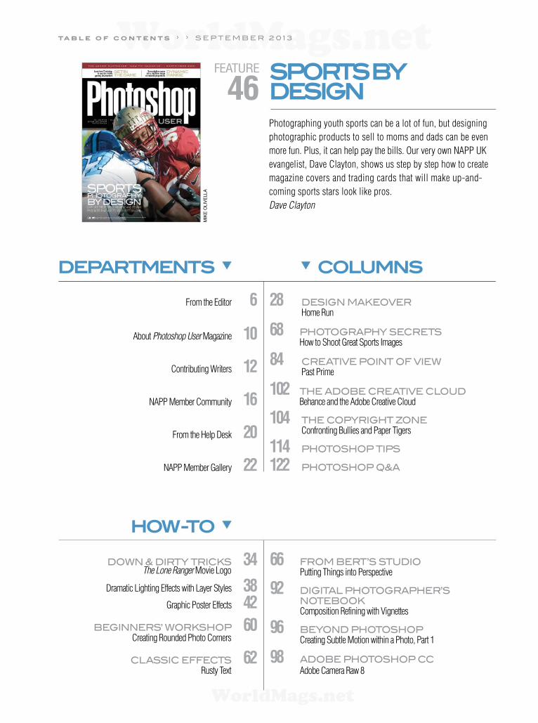
FEATURE
46SPORTS BY DESIGN
Photographing youth sports can be a lot of fun, but designing
photographic products to sell to moms and dads can be even
more fun. Plus, it can help pay the bills. Our very own NAPP UK
evangelist, Dave Clayton, shows us step by step how to create
magazine covers and trading cards that will make up-and-
coming sports stars look like pros.
Dave Clayton
DEPARTMENTS
From the Editor 6
About Photoshop User Magazine 10
Contributing Writers 12
NAPP Member Community 16
From the Help Desk 20
NAPP Member Gallery 22
HOW-TO
Down & Dirty tricks 34 The Lone Ranger Movie Logo
Dramatic Lighting Effects with Layer Styles 38
Graphic Poster Effects 42
BEGinnErs’ worksHoP 60 Creating Rounded Photo Corners
cLAssic EFFEcts 62 Rusty Text
66 FroM BErt’s stUDio Putting Things into Perspective
92 DiGitAL PHotoGrAPHEr’s
notEBook
Composition Refining with Vignettes
96 BEyonD PHotosHoP
Creating Subtle Motion within a Photo, Part 1
98 ADoBE PHotosHoP cc Adobe Camera Raw 8
COLUMNS
28 DEsiGn MAkEoVEr
Home Run
68 PHotoGrAPHy sEcrEts How to Shoot Great Sports Images
84 crEAtiVE Point oF ViEw
Past Prime
102 tHE ADoBE crEAtiVE cLoUD Behance and the Adobe Creative Cloud
104 tHE coPyriGHt ZonE
Confronting Bullies and Paper Tigers
114 PHotosHoP tiPs
122 PHotosHoP Q&A
ta b l e o f c o n t e n t s › › S E P T E M B E R 2 0 1 3
WorldMags.netWorldMags.net
WorldMags.net

Se
án
Du
gg
an
re
vo
So
lu
tio
nS
ga
me
S
LIGHTROOM
LIGHTROOM FEATURE 74
The Radial Filter
UndER THE HOOd 78 Smart Previews
UndER THE LOUPE 80 Using Photoshop CS6 with Lightroom 5
LIGHTROOM TIPs & TRIcks 83
56
88
On THe sMaLL scReen
Have you ever wondered how much developers use Photo-
shop to create and market games for mobile devices? Corey
Barker asks Revo Solutions Games that very question.
Corey Barker
bORdeRLands
Seán Duggan shows us how to take a daytime desert image
and turn it into a nighttime image that will transport the
viewer to a very different time and place.
Seán Duggan
dOWnLOAdABLE cOnTEnT Whenever you see this symbol at the end of an article, it
means there are either downloadable practice files or additional
content for NAPP members at http://members.photoshopuser
.com/magazine.
kEy cOncEPTs These icons at the beginning of columns indicate there’s a short video on a tool
or function used in that tutorial at the Key Concepts NAPP member webpage at
www.photoshopuser.com/keyconcepts.
buT waIT— THeRe’s MORe
Smart objects
Dodge & Burn tools
Quick Selection toolPen tool
Layer masksLasso tool
ReVIews
106 Wacom Cintiq 22HD Touch and 13HD
107 GoPro Hero3 Black Edition
108 Canon PIXMA PRO-10
Manfrotto 500
110 MotionComposer 1.6
Finestra Art Papers
111 PSKiss BlackMagic
Rotation 180° Professional
112 Photoshop Book Reviews
› › www .photoshopuser .com
WorldMags.netWorldMags.net
WorldMags.net
FROM THEEDITOR
ADOBE MAKES PHOTOSHOP WORLD AN EVEN GREATER VALUE
› › p
ho
to
sh
op
u
se
r › s
ep
te
mb
er
2
013
006
Adobe just did something amazing for NAPP members who are going to our annual convention (the
Photoshop World Conference & Expo) next month in Vegas. If you register for a full conference pass,
Adobe will give you a 12-month Adobe Creative Cloud membership, including the latest full versions
of Photoshop, Lightroom, InDesign, Illustrator, Premiere Pro, After Effects, Acrobat Pro, Dreamweaver,
Adobe Muse, and more. That’s amazing!
Adobe is basically handing each of our paid conference attendees $600 (for a conference that only
cost $499 if you registered early, and is still only $599 if you register today). In fact, if you’re thinking
about signing up for the full Creative Cloud, you’ll be better off going to Photoshop World than just
buying the Creative Cloud by itself. Insane, right? I think it’s incredible, and I’m so grateful to Adobe for
this incredibly generous show of support to our NAPP members and for their support of our conference
as a whole. It really means a lot to us, and to our attendees. I’m already getting emails from members
thanking us for this opportunity, but honestly the credit fully goes to Adobe, who is basically handing
our members the keys to the most advanced creative toolbox ever.
If you’re thinking of joining us in Vegas, we’re constantly updating the conference experience with
new classes, new instructors, and new content. We now have seven full training tracks that run all three
days of the conference. For example, we have specific tracks just for graphic designers and people who
want to learn the Creative Cloud programs, such as InDesign, Illustrator, and Photoshop for designers. We
have our “Lightroom Conference at Photoshop World” with a full slate of kick-butt Lightroom training
classes that run each day, taught by a who’s who of Lightroom training instructors. In fact, there are so
many Lightroom classes that you can come to Photoshop World and take nothing but Lightroom classes
the entire time. Imagine how quickly you could master Lightroom in three intense days, plus we have an
in-depth Lightroom crash course the day before the conference even kicks off.
We have full tracks for photography, general Photoshop techniques, and lighting, taught by people
like Joe McNally, Frank Doorhof, Tamara Lackey, and Joel Grimes, among others. Basically, we’ve refor-
matted the show to ensure that whatever you’re into, we have you covered.
There’s still time to come join us September 4–6 in Las Vegas. All the details are at PhotoshopWorld.com.
In other news, our full-length online training classes, exclusively for NAPP members, have been a big
hit. We’re adding new classes based on your ideas and suggestions, and there are a ton of classes up
there now. If you haven’t been to the member website in a while, you’ll be amazed at the number of
new classes and the new content that appears on the homepage daily.
Here in the mag, our cover story is called “Sports by Design” by NAPP UK evangelist, Dave Clayton.
Dave talks about designing products that photographers who shoot youth sports leagues can sell to
moms and dads to add to their bottom line. He has two tutorials: one for creating a magazine cover,
and one for creating a trading card. Kevin Ames has a really helpful article on the new features in Cam-
era Raw 8, and in our Lightroom section, Nicole S. Young takes us on an in-depth journey through the
new Radial Filter in Lightroom 5 and shows us some ways to use it that we might not have thought
of before.
We have a lot going on right now, and that’s a great thing! I look forward to meeting you in person
in Las Vegas in September, and I hope you get to take advantage of the amazing offer from Adobe.
See you there!
All my best,
Scott Kelby
NAPP President & CEO
Editor & Publisher, Photoshop User
a f e w w o r d s f r o m › › s c o t t k e l b y
WorldMags.netWorldMags.net
WorldMags.net

WorldMags.netWorldMags.net
WorldMags.net

Editorial:
Scott Kelby, Editor-in-Chief Chris Main, Managing EditorMike Mackenzie, Senior Editor
Contributing Writers
Kevin ames • Steve Baczewski • Corey Barker • Peter Bauer • larry Becker • dave Clayton • Pete Collins • “rC” Concepcion • Michael Corsentino • Seán duggan • daniel East • Katrin Eismann • Ed Greenberg • Matt Kloskowski • Bert Monroy • leslie Montenegro Jay Nelson • Mike olivella • Scott onstott • Jack reznicki • Colin Smith • lesa Snider • rob Sylvan • Erik Vlietinck • Jake Widman Nicole S. Young
GraPHiCS:
Felix Nelson, Creative Directordave damstra, Production Managertafy Cliford, Senior Associate Designerdave Korman, Senior Premedia Specialist
Marketing Team Eduardo lowe • leslie Montenegro • Margie rosenstein
Web Team Karey Johnson, Director of Web Development Melissa Cozart • Christopher reed • aaron Westgate
PuBliSHiNG:
Scott Kelby, Publisherdavid Moser, Executive PublisherKalebra Kelby, Executive V.P. Jean a. Kendra, Business Managerlarry Becker, Executive Director of the NAPP
adVErtiSiNG:
Kevin agren, V.P., Sales 813-433-2370 Jeanne Jilleba, Advertising Coordinator 800-738-8513 ext. 215 Veronica (Ronni) o’Neil, Director of Circulation/Distribution 800-738-8513 ext. 235
HoW to CoNtaCt tHE NaPP:u.S. Mail: 333 Douglas Road East • Oldsmar, FL 34677-2922Voice: 813-433-5005 • Fax: 813-433-5015Customer Service: [email protected] to the Editor: [email protected] to the lightroom Editor: [email protected] info: [email protected] Suggestions: [email protected] Wide Web including the Photoshop Help desk,Photo Gear desk, and advice desk: http://members.photoshopuser.com
ColoPHoN:Photoshop User was produced using Adobe Photoshop CS6 and Adobe InDesign CS5.5 and CS6. Blair ITC was used for headlines, Adobe Myriad Pro for subheads, and Frutiger LT Std for text.
SEPTEMBER 2013 • Volume 16 • Number 7 • Printed in USA
The ofcial publication of the National association of Photoshop Professionals
This seal indicates that all content provided herein is produced by Kelby Media,
Inc. and follows the most stringent standards for educational resources. Kelby
Media is the premier source for instructional books, DVDs, online classes, and live
seminars for creative professionals.
All contents ©COPYRIGHT 2013 National Association of Photoshop Professionals. All rights reserved. Any use of the contents of this publication without the written permis-sion of the publisher is strictly prohibited. Photoshop User is an independent journal, not affiliated in any way with Adobe Systems, Inc. Adobe, the Adobe logo, Acrobat, Illustrator, InDesign, Lightroom, and Photoshop are registered trademarks or trademarks of Adobe Systems, Inc. in the United States and/or other countries. All other trademarks mentioned belong to their respective owners. Some of the views expressed by contributors may not be the representative views of the publisher. ISSN 1535-4687
WorldMags.netWorldMags.net
WorldMags.net

Learn how to make Lightroom better
with Perfect Photo Suite 7
www.onOneSoftware.com/Lr
Fixed with Lightroom®
Finished with Perfect Photo Suite 7Perfect Photo Suite 7 is the perfect companion to Adobe® Lightroom®. With expertly crafted
photo ef ects and powerful editing tools, Perfect Photo Suite lets you do things you can’t do
with Lightroom alone and lets you create amazing images you’ll love.
©2013 onOne Software, Inc. All rights reserved. onOne Software and the onOne Software logo are registered trademarks, and Perfect Photo and Photo Effects for Everyone are trademarks
of onOne Software, Inc. Adobe® and Lightroom® are registered trademarks of Adobe Systems Incorporated in the United States and/or other countries. Image © Matt Kloskowski.
WorldMags.netWorldMags.net
WorldMags.net
a b o u t p h o t o s h o p u s e r › ›
› › p
ho
to
sh
op
u
se
r › s
ep
te
mb
er
2
013
010
ABOUT PHOTOSHOPUSER MAGAZINE
Photoshop User magazine is the official publication of the National
Association of Photoshop Professionals (NAPP). It is for members,
by members, and is not available to the public by subscription.
As a NAPP member, you automatically receive Photoshop User
delivered right to your door (or digitally) ten times a year. Each issue
features in-depth Photoshop tutorials written by the most talented
designers, photographers, and leading authors in the industry.
ABOUT NAPP
THE NATIONAL ASSOCIATION OFPHOTOSHOP PROFESSIONALS
is a dynamic trade association and the worldÕs leading resource for
Adobe¨ Photoshop¨ training, news, and education. Founded in 1998,
NAPP has become the largest graphics and digital imaging association
in the world with more than 70,000 members worldwide. NAPP is open to
any individual using Photoshop in a casual or professional environment.
ThereÕs no faster, easier, and more affordable way to get really good at Photoshop.
You can join for only $99 U.S., $129 Canada, and $99 International (digital delivery).
NAPP also offers special educational memberships.
Go to www.photoshopuser.com to get more info.
MEMBER BENEFITS
PHOTOSHOP USER MAGAZINE
Ten issues of the best Photoshop tutorial-based magazine in the industry.
MEMBERS-ONLY WEBSITE
Our extensive website features time- and money-saving content.
TUTORIALS & EDUCATION
Thousands of Photoshop tutorials, bonus classes, and quick tip videos.
MEMBER DISCOUNTS
Save anywhere from 2Ð4 times your membership cost by using our many
industry-related discounts.
TECH SUPPORT
Fast, friendly Photoshop, Lightroom, and photo gear help, equipment
advice, and more from certified experts.
MEMBER COMMUNITY
NAPP members range from beginners to pros and love to lend each other a
hand. Together, we have built the friendliest, most knowledgeable Photoshop
and photography forum on the Web.
NEWS & REVIEWS
Unbiased coverage on the latest equipment, plug-ins, and programs
in the marketplace.
MONTHLY E-NEWSLETTER
Produced exclusively for members to keep you informed of everything new
in the industry and at NAPP headquarters.
REGISTRATION DISCOUNTTO PHOTOSHOP WORLDCONFERENCE & EXPO
The semiannual NAPP convention and the largest Photoshop and photog-
raphy learning experience on the planet. ItÕs an amazing Photoshop event.
FIND NAPP MEMBERSHIP DETAILS AT www.photoshopuser.com or call 800-738-8513 MondayÐFriday, 8:30 a.m. to 7:00 p.m. EST.
IMA
GE
CO
UR
TE
SY
MIK
E O
LIV
ELLA
WorldMags.netWorldMags.net
WorldMags.net

PRE-RESERVE
FREEWITH NO OBLIGATION!*
DOMAINS
1and1.comDOMAINS | E-MAIL | WEB HOSTING | eCOMMERCE | SERVERS
New domains. New opportunities. Create your perfect web address with
over 500 new top-level domains from 1&1! Short, memorable domains
like fashion.blog and auto.shop are ideal for getting your website found easily.
Pre-reserve your preferred domain for free, with no obligation! With regular
updates from 1&1 you don´t miss the chance to get the domains you want.
Find out more on our website 1and1.com
* Pre-reserving a domain name is not a guarantee that you will be able to register that domain. Other terms and conditions may apply. Visit www.1and1.com for full promotional offer details.
Program and pricing specifi cations and availability subject to change without notice. 1&1 and the 1&1 logo are trademarks of 1&1 Internet, all other trademarks are the property of their
respective owners. © 2013 1&1 Internet. All rights reserved.
®
WorldMags.netWorldMags.net
WorldMags.net
› › p
ho
to
sh
op
us
er
› s
ep
te
mb
er
2
013
012
contributing writers
KEVIN AMEScreates evocative photographs for clients such as Westin Hotels, AT&T, and
Coca-Cola. His fourth book, published by Peach pit Press, is The Dig ital Photog-
rapher’s Notebook: A Pro’s Guide to Photo shop CS3, Light room and Bridge.
STEVE BACZEWSKIis a freelance writer, professional photographer, graphic designer, and consul-
tant. He also teaches classes in traditional and digital fine arts photography.
His company, Sore Tooth Productions, is based in Albany, California.
PETER BAUERis an Adobe Certified Expert that does computer graphics consulting for a select
group of corporate clients. His latest book is Photoshop CS6 for Dummies.
He was inducted into the Photoshop Hall of Fame in 2010.
BRUCE BICKNELLis the founder of Digital Blue Productions. He has been an instructor on Adobe’s
in-box training, and is an instructor at Sessions.edu. His clients include Time Inc.,
NFSTC, DTCC, and magazines that include People and National Geographic.
PETE COLLINSis an education and curriculum developer and website overseer for NAPP. He is
one of the Photoshop Guys and co-hosts Photoshop User TV. With a fine arts
background, Pete is well versed in photography, graphic design, and illustration.
SEÁN DUGGANis the co-author of Photoshop Masking & Compositing, Real World Digital
Photography, and The Creative Digital Darkroom. He leads workshops on
digital photography, Photoshop, and Lightroom (SeanDuggan.com).
DANIEL EASTis an author, free lance writer, presenter/trainer, and consultant with more than
20 years’ experience in photography, pro-audio, and marketing. Daniel is also
founder and president of The Apple Groups Team support network for user groups.
KATRIN EISMANNis the author of Photoshop Restoration & Retouching and co-author of Photoshop
Masking & Compositing and The Creative Digital Darkroom. Katrin is Chair of
the MPS in Digital Photography department at the School of Visual Arts in NYC.
ED GREENBERG& JACK REZNICKI
have a blog at www.thecopyrightzone.com where you can read about
their book, Photographer’s Survival Manual, published by Lark Books.
MATT KLOSKOWSKIis a full-time education director for Kelby Media Group and a Tampa-based
photographer. He’s the editor of Lightroom Magazine, a best-selling author,
and teaches Photoshop and Lightroom seminars around the world.
BERT MONROYis considered one of the pioneers of digital art. His work has been seen in countless
magazines and books. He has served on the faculty of many well-known institutions,
written dozens of books, and appeared on hundreds of TV shows around the world.
JAY NELSONis the editor of Design Tools Monthly, covering graphic design topics since 1992.
He knows a lot about digital publishing, fonts, and font management. Learn more
at www.DesignToolsMonthly.com.
SCOTT ONSTOTTis the author of Photoshop CS6 Essentials, Enhancing Architectural Drawings
and Models with Photoshop, and many other books and videos. You can see
what he’s up to at ScottOnstott.com.
COLIN SMITHis an award-winning digital artist, photographer, and lecturer who has authored
18 books and has created a series of training videos. Colin is also the founder
of the online resource PhotoshopCAFE.com and president of Software-Cinema.com.
LESA SNIDERis the author of Photoshop CC: The Missing Manual and several training videos (lesa
.in/clvideos), and co-author of iPhoto ’11: The Missing Manual. She’s on the Photo-
shop World Dream Team, a columnist for Macworld, and founder of PhotoLesa.com.
ROB SYLVANis the author of Taking Stock and Photoshop Lightroom 2 for Dummies, a
Help Desk Specialist for the NAPP, and an instructor for the Perfect Picture
School of Photography.
ERIK VLIETINCKfounded IT Enquirer in 1999 (http://it-enquirer.com). A J.D. by education, Erik
has been a freelance technology editor for more than 20 years. He has written
for Macworld, Computer Arts, Windows NT Magazine, and many others.
JAKE WIDMANis a writer and editor who lives in San Francisco. He’s been covering the intersection
of computers and graphic design for about 25 years now—since back when it was
called “desktop publishing” and Photoshop was just a piece of scanning software.
p h o t o s h o p ’ s m o s t w a n t e d › ›
WorldMags.netWorldMags.net
WorldMags.net

35% OFF35% off, plus free U.S. shipping
with discount code: KMLR5
peachpit.com/kmlightroom5
Your Source for
Lightroom 5Learning
Grab a Peachpit book, eBook, or video on Lightroom 5 by industry pros
such as Scott Kelby, Martin Evening, and more.
There’s no better way to get up to speed on all of the new features!
WorldMags.netWorldMags.net
WorldMags.net

My Tiny AdMirers by Stacey LacourSiere
WorldMags.netWorldMags.net
WorldMags.net

At MpixPro, we offer high-quality, relevant products and a simple ordering solution
so you have time to enjoy the little things in life. Now stop and smell the roses.
Stacey LacourSiere’s FAVORITE PROducTs
dEsTINATION WEddINg & NEWbORN PhOTOgRAPhER from duluTh, MINNEsOTA.
WWW.MPIxPRO.cOM
gAllERY WRAP lAYFlAT bOOK luxE VIVId METAl
WorldMags.netWorldMags.net
WorldMags.net

INDUSTRYNEWS
TRAINING AND
INFORMATION
› ›
Where you’ll find notable achievements, musings, and inspirational work from fellow members
NAPPMEMBERCOMMUNITYBY LARRY BECKER
THE BEST PHOTOSHOP WORLD OFFER EVER!
Photoshop World is right around the corner (September 4–6, with preconference sessions on the 3rd), and we’ve arranged
something phenomenal for this show. When you register for Photoshop World Las Vegas, Kelby Media Group and NAPP
are happy to announce that Adobe will provide you with a free 12-month Creative Cloud membership! Not only do you get
Photoshop CC and all of its features, but you also get access to all the other Creative Cloud applications. That’s more than a
$600 value. We not only provide you with best Photoshop and creative training in the world, but the best tools to take your
creative vision to the next level.
Attendees of Photoshop World who are already members of Creative Cloud may use their access codes to extend their
current membership one year. All attendees who already registered for a full conference pass will also receive the one-year
Creative Cloud membership.
So if you planned to subscribe to the Adobe Creative Cloud for $49.99 a month, just come get the best Photoshop, Light-
room, and photography training you’ve ever seen, packed into one event—Photoshop World, the off cial NAPP convention—
and take advantage of this special offer.
Photoshop World is always amazing. Photoshop and Lightroom users always come by the thousands for the best learning
and networking experience in the industry. But now, with a year of the Creative Cloud included, it’s just too crazy to miss it.
See you there!
NAPP MEMBER GARY NICHOLLS’ DR. WILLIAM PERCIVAL STOCKDALE PHOTOGRAPH
Ever since NAPP membership started includ-
ing a free portfolio 10 years ago, we’ve
always reviewed the images our members
upload, and we’ve had a weekly feature
honoring a handful of images (photos,
illustrations, composites, etc.) that we feel
are impressive enough to inspire the rest of
our members. It’s the NAPP Image of the
Week and these days there’s one winner
plus four Editors’ Picks (see page 24 for
some recent NAPP Images of the Week).
Several weeks ago, an image by NAPP
member Gary Nicholls called Dr. William
Percival Stockdale was honored as an
Editors’ Pick, and it received a lot of great
member feedback. It was selected specif cally because of the creative lighting that made it look like it was straight from the
1800s. In a follow-up comment under the image, Gary Nicholls mentioned how he lit the scene, and tipped his hat to the Kelby
Media digital magazine Light It because of some gear he used. It’s great to see such wonderful, creative, inspiring work in the
NAPP portfolios and it’s even more special for us staffers when we hear that some of our training played a small role, too. Thanks,
Gary. Beautiful work!
GA
RY
NIC
HO
LL
S
› › p
ho
to
sh
op
u
se
r › s
ep
te
mb
er
2
013
016
WorldMags.netWorldMags.net
WorldMags.net
NEW HP WORKSTATIONAND DISPLAYS
Here at NAPP, we know that many of our members are gear nerds and pixel
peepers, like us. We love a good display, so we were excited to read this news
from HP. They recently introduced the HP Z22i, Z23i, and Z24i IPS Displays,
which are part of their new Z Display family. According to HP, these new displays
offer outstanding image accuracy and reliability, and they’re optimized for use
with HP Z Workstations. HP Z Displays are ideal for engineers, architects, designers,
and photographers who require image accuracy at an affordable price.
HP also announced the new HP Z230 Workstation, an addition to their
award-winning Z series of workstations. The HP Z230 is available in either a
tower or small form factor, and is built for demanding application workloads.
The HP Z230 is a great choice for creative designers who require rock-solid
reliability at an affordable price. Designers using applications such Autodesk
AutoCAD and photographers using Adobe Photoshop will benef t from the
new functionality of the HP Z230.
The HP Z22i, Z23i, and Z24i Displays are available now for starting prices of
$239, $259 and $399, respectively. The HP Z230 Workstations start at $999 for
quad-core conf gurations, and are expected to be available worldwide in August.
For more information visit, www.hp.com.
› › w
ww
.p
ho
to
sh
op
us
er
.c
om
017
MORE COMMUNITY INTERACTION
› › Here are more ways to interact with us and other NAPP members
MEMBERS ONLY
NAPP members, show off your talent by uploading your
artwork to the Portfolios section. You could be the next
Editors’ Choice: Image of the Week winner (see page 24
for recent Image of the Week winners). Visit http://mem-
bers.photoshopuser.com/portfolio for inspiration.
We also have the best community around. Visit the
Forums section and become part of the conversation.
Have a look at http://forum.photoshopuser.com.
SOCIALLY SPEAKING
Friend us on Facebook, follow us on Twitter and
Google+, and check out informative blogs by
industry leaders.
NAPPwww.facebook.com/PhotoshopUser @NAPP_news
Scott Kelby [email protected]/SKelbykel.by/onGplus
Matt Kloskowskiwww.lightroomkillertips.com@mattkloskowskiwww.facebook.com/ThePhotoshopGuykel.by/MattGplus
Corey Barker [email protected]/PlanetCoreykel.by/CoreyGplus
Rafael “RC” Concepcion@aboutrc www.facebook.com/webrckel.by/rcgplus
Pete [email protected]/PeteCPhotokel.by/PeteGplus
The Grid Livekel.by/TVtheGRID@TheGridLive
Podcasts and MoreYouTube: YouTube.com/KelbyMediaGroupPhotoshop User TV: KelbyTV.com/photoshopusertvKelby TV: KelbyTV.comOff cial NAPP Gear Store: kel.by/NAPPgear
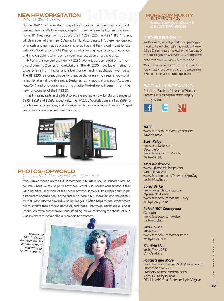
PHOTOSHOP WORLD GURU WINNERS HIGHLIGHTED
If you haven’t been on the NAPP members’ site lately, you’ve missed a regular
column where we talk to past Photoshop World Guru Award winners about their
winning pieces and some of their other accomplishments. It’s always great to get
a behind-the-scenes peek at the career of these NAPP members and the creativ-
ity that went into their award-winning images. It often helps to hear what others
did to achieve their accomplishments, and that’s what these articles are all about.
Inspiration often comes from understanding, so we’re sharing the stories of our
Guru winners to inspire all our members to greatness.
Guru winner Karin Dailey and
her award-winning entry were recently
featured on the NAPP member site.
WorldMags.netWorldMags.net
WorldMags.net
TETHER TOOLS BRINGS US PORTABLE
PHOTO BOOTHS WITH VU BOOTH
A photo booth is a known, cultural thing,
and we think of them as being at malls,
theme parks, or county fairs. But what if
you shoot weddings or other events and
you want a simple, portable, high-quality,
and affordable photo booth setup that uses
your DSLR? Well, Tether Tools has just that
with the introduction of the Vu Booth.
The Vu Booth has a modular setup that
leverages one of their Vu Monitor Mounts—
the Studio Vu, Local Vu, or Go Vu Mount—
and includes a Camera Platform, Articulating
Arm, and Rock Solid ProClamp. Once you
connect any VESA-compliant monitor to the
Vu Monitor Mount of choice, the monitor
can easily rotate from landscape to portrait
position. Then connect the ProClamp and
Articulating Arm to any tripod leg or studio
stand column (not included). The Camera
Platform mounts any camera, which can be
positioned on top, below, or to the side of
the monitor.
“Photo Booths can be large, cumbersome,
and expensive,” according to Josh Simons,
president of Tether Tools. “Tether Tools VU
Booth introduces a solution that allows pho-
tographers to integrate gear they already have
on hand to create a portable and streamlined
photo booth for their clients. With the Vu
Booth, photographers can select photo booth
software of choice and users can see their
images immediately, generating instant gratif -
cation and encouraging more event attendees
to participate.” For more information, visit
www.tethertools.com.
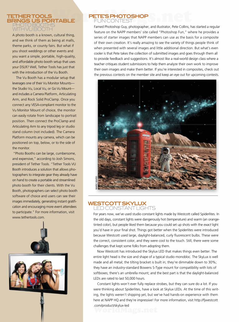
PETE’S PHOTOSHOP FUN CONTEST
Famed Photoshop Guy, photographer, and illustrator, Pete Collins, has started a regular
feature on the NAPP members’ site called “Photoshop Fun,” where he provides a
series of starter images that NAPP members can use as the basis for a composite
of their own creation. It’s really amazing to see the variety of things people think of
when presented with several images and little additional direction. But what’s even
cooler is that Pete takes the collection of submitted images and goes through them all
to provide feedback and suggestions. It’s almost like a real-world design class where a
teacher critiques student submissions to help them analyze their own work to improve
their own images and make them better. If you’re interested in composites, check out
the previous contests on the member site and keep an eye out for upcoming contests.
MA
RC
WA
RD
WESTCOTT SKYLUX LED CONSTANT LIGHTS
For years now, we’ve used studio constant lights made by Westcott called Spiderlites. In
the old days, constant lights were dangerously hot (temperature) and warm (an orange-
tinted color), but people liked them because you could set up shots with the exact light
you’d have in your f nal shot. Things got better when the Spiderlites were introduced
because Westcott used large, daylight-balanced, curly f uorescent bulbs. These were
the correct, consistent color, and they were cool to the touch. Still, there were some
challenges that kept some folks from adopting them.
Now Westcott has introduced the Skylux LED that makes things even better. The
entire light head is the size and shape of a typical studio monobloc. The SkyLux is well
made and all metal; the tilting bracket is built in; they’re dimmable down to 30%;
they have an industry-standard Bowens S-Type mount for compatibility with lots of
softboxes; there’s an umbrella mount; and the best part is that the daylight-balanced
LEDs are rated to last 50,000 hours.
Constant lights won’t ever fully replace strobes, but they can sure do a lot. If you
were thinking about Spiderlites, have a look at Skylux LEDs. At the time of this writ-
ing, the lights weren’t shipping yet, but we’ve had hands-on experience with them
here at NAPP HQ and they’re impressive! For more information, visit http://fjwestcott
.com/product/skylux-led
WorldMags.netWorldMags.net
WorldMags.net
› › p
ho
to
sh
op
u
se
r › S
EP
TE
MB
ER
2
013
020
To: Tammy
From: NAPP Help Desk
To clarify your frst point, indeed new features will be made
available to subscribers as soon as they’re considered to be fully
capable and stable by Adobe’s engineering and quality assur-
ance folks. Under the old system, new features had to wait for
an upgrade. Consider, for example, some major feature that was
almost-but-not-quite stable enough to be released in Photoshop
CS5. Under the old model it may have had to wait for the release
of Photoshop CS6, a full year later. With the subscription model,
new features can be made available as soon as they’re ready.
In Photoshop CC, you’ll fnd Camera Raw Filter near the top
of the Filter menu. It can be used with any layer or layer mask in
RGB and grayscale images, in 8-bit, 16-bit, and even 32-bit
(HDR) images. Keep in mind that applying Camera Raw Filter
doesn’t convert the target layer (or mask) to RAW data. Rather,
it’s comparable to using Adobe Camera Raw with JPEG or TIFF
fles. RAW fles captured by a digital camera contain unpro-
cessed image data that can be manipulated as if the camera
settings had been changed prior to capturing the image. JPEG
and TIFF fles opened into Adobe Camera Raw, and layers and
masks to which Camera Raw Filter are applied, contain image
information that has already been processed.
For example, when working with RAW fles, Adobe Camera
Raw’s Exposure slider manipulates the image data as if the
camera’s settings had been different. When working with
processed image data (JPEGs and TIFFs in Adobe Camera Raw
or when working with Camera Raw Filter), there’s a defned
black point and a defned white point. The image can be
adjusted between those parameters, but not beyond. RAW
image data doesn’t have a defned black or white point until
the image is opened from Camera Raw into Photoshop.
So what’s the big deal about Camera Raw Filter? It gives you
access to virtually all of Camera Raw’s powerful image manipula-
tion features right in Photoshop. You may fnd that you don’t
need to use Curves, Reduce Noise, Hue/Saturation, or Smart
Sharpen—you may just use Camera Raw Filter for all of those
tasks. Keep in mind that there are some things that you can’t
do with Camera Raw Filter (or, for that matter in Camera Raw
itself). While you have the Adjustment Brush, the Graduated
Filter, and the new Radial Filter in Camera Raw 8 that can all apply
–100 Sharpening and –100 Clarity, you don’t have a general blur
feature in Camera Raw—nothing comparable to Gaussian Blur or
Smart Blur flters in Photoshop. Camera Raw Filter does lack some
of the tools and features found in Camera Raw itself. You won’t
fnd the Crop or Straighten tools, the Rotate buttons, nor will you
be able to save snapshots or use the automated Lens Corrections
feature. Each of those features is found elsewhere in Photoshop
and can be used in conjunction with Camera Raw Filter.
Keep in mind, too, that you can create smart objects from one
or more layers in Photoshop and apply Camera Raw Filter as a
reeditable smart flter. But for the greatest fexibility and most
powerful image manipulation capabilities, shoot RAW and use
Camera Raw rather than Camera Raw Filter.
From THe HelP Desk PETER BauER Answers to Photoshop, Lightroom, and gear-related questions
NAPP commuNiTy › ›
› ›
I’m intrigued by Adobe’s new Creative Cloud subscription program, in particular, not having to wait for new features until an upgrade is released every 12 to 18 months. The frst new CC feature that’s caught my eye is the capability to use Camera Raw as a flter. How does that work?—Tammy
THe NAPP memBer HELP DESKS
Are you taking advantage of the Help Desks at the NAPP member website? This is the place where you can
get all of your Photoshop and Lightroom questions answered either by other NAPP members or by our Help
Desk experts. Not only that, you can get photo and computer gear help and advice, as well. What are you
waiting for? Visit the Help section on the NAPP member site today! ■
WorldMags.netWorldMags.net
WorldMags.net
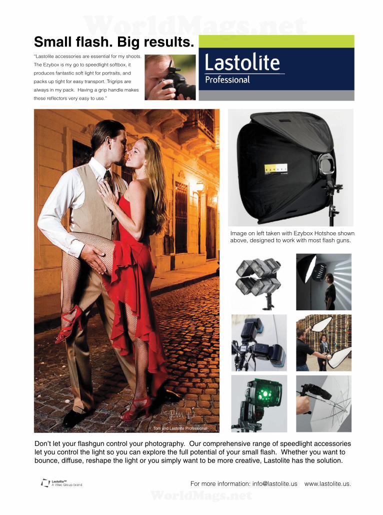
“Lastolite accessories are essential for my shoots.
The Ezybox is my go to speedlight softbox, it
produces fantastic soft light for portraits, and
packs up tight for easy transport. Trigrips are
always in my pack. Having a grip handle makes
these reflectors very easy to use.”
Small flash. Big results.
Image on left taken with Ezybox Hotshoe shown
above, designed to work with most flash guns.
Don’t let your flashgun control your photography. Our comprehensive range of speedlight accessories
let you control the light so you can explore the full potential of your small flash. Whether you want to
bounce, diffuse, reshape the light or you simply want to be more creative, Lastolite has the solution.
For more information: [email protected] www.lastolite.us.
Tom and Lastolite Professional
WorldMags.netWorldMags.net
WorldMags.net
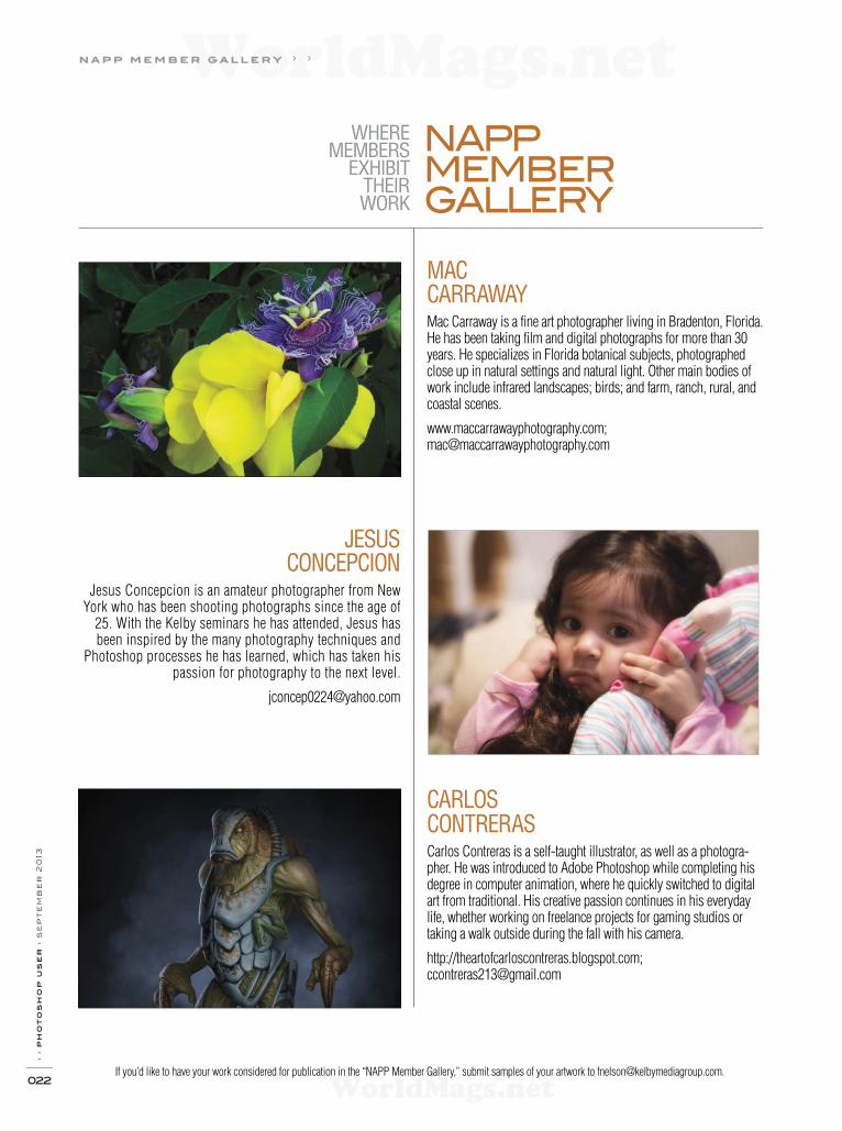
CARLOS
CONTRERAS
Carlos Contreras is a self-taught illustrator, as well as a photogra-pher. He was introduced to Adobe Photoshop while completing his degree in computer animation, where he quickly switched to digital art from traditional. His creative passion continues in his everyday life, whether working on freelance projects for gaming studios or taking a walk outside during the fall with his camera.
http://theartofcarloscontreras.blogspot.com; [email protected]
MAC
CARRAWAY
Mac Carraway is a fine art photographer living in Bradenton, Florida. He has been taking film and digital photographs for more than 30 years. He specializes in Florida botanical subjects, photographed close up in natural settings and natural light. Other main bodies of work include infrared landscapes; birds; and farm, ranch, rural, and coastal scenes.
www.maccarrawayphotography.com; [email protected]
WHERE MEMBERS
EXHIBIT THEIR WORK
NAPP MEMBER GALLERY
If you’d like to have your work considered for publication in the “NAPP Member Gallery,” submit samples of your artwork to [email protected].
n a p p m e m b e r g a l l e r y › ›
› › p
ho
to
sh
op
u
se
r › s
ep
te
mb
er
2
013
022
JESUS
CONCEPCION
Jesus Concepcion is an amateur photographer from New York who has been shooting photographs since the age of
25. With the Kelby seminars he has attended, Jesus has been inspired by the many photography techniques and
Photoshop processes he has learned, which has taken his passion for photography to the next level.
WorldMags.netWorldMags.net
WorldMags.net
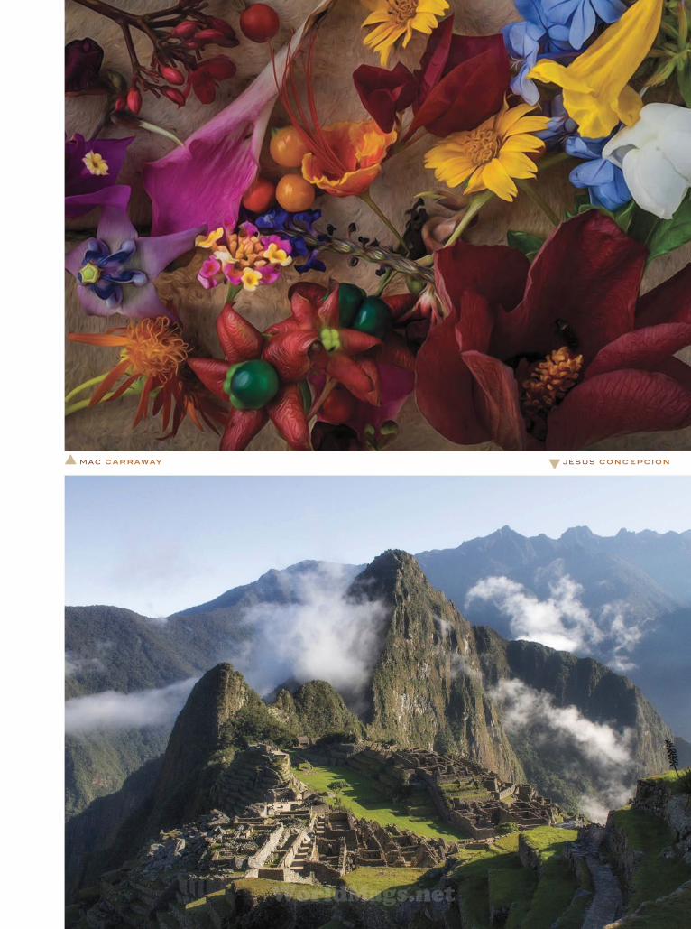
M AC CARRAWAY J E S U S CONCEPCION
WorldMags.netWorldMags.net
WorldMags.net

› › p
ho
to
sh
op
u
se
r › s
ep
te
mb
er
2
013
024
C A R LO S CO N T R E R AS
M AC C A R R A WAY C A R LO S CO N T R E R AS
J E S U S CO N C E P C I O N
I M A G ES O F T H E W E E K › ›
05 . 06 . 13 › › S h E R R I E STA m b A u g h
04 . 29. 13 › › DA N R E D R u P
05 . 13 . 13 › › J A R O N J. S h u P E
04 . 08 . 13 › › T I m R . ST R u C K
PH
OT
O: M
ICH
ELE
GA
RN
ER
WorldMags.netWorldMags.net
WorldMags.net
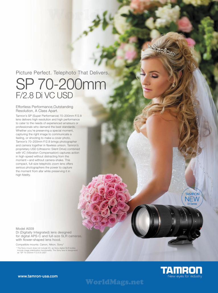
www.tamron-usa.com
Model A009Di (Digitally Integrated) lens designed for digital APS-C and full-size SLR cameras, with flower-shaped lens hood.
Compatible mounts: Canon, Nikon, Sony*
* The Sony mount does not include VC, as Sony digital SLR bodies
include image stabilization functionality. The Sony lens is designated
as “SP 70-200mm F/2.8 Di USD”.
Picture Perfect. Telephoto That Delivers.
SP 70-200mmF/2.8 Di VC USDEffortless Performance,Outstanding Resolution, A Class Apart.
Tamron’s SP (Super Performance) 70‒200mm F/2.8
lens delivers high resolution and high performance
to cater to the needs of experienced amateurs or
professionals who demand the best standards.
Whether you’re preserving a special moment,
capturing the right image to communicate a
feeling, or shooting to make a cover photo,
Tamron’s 70‒200mm F/2.8 brings photographer
and camera together in fl awless unison. Tamron’s
proprietary USD (Ultrasonic Silent Drive) combined
with VC (Vibration Compensation) captures action
in high-speed without distracting from the
moment—and without camera-shake. This
compact, full-size telephoto zoom lens offers
serious photographers the power to capture
the moment from afar while preserving it in
high fi delity.
WorldMags.netWorldMags.net
WorldMags.net

› ›
p
ho
to
sh
op
u
se
r ›
S
ep
te
mb
er
2
013
026
l i v e t r a i n i n g › ›
THE WORLD’S MOST POPULAR PHOTOGRAPHY & DESIGN SEMINARS
SEMINARS
THE SHOOT LIKE A PRO SEMINAR TOUR
Instructed by Scott Kelby
Imagine how much you can learn, and
how much farther along you’ll be after
spending a full-day immersed in just the
most important, the most impactful, and
the most fun photography techniques.
The entire workshop is designed to have
you leaving from that day with a new set
of skills, a clear set of goals, and just
what you need to start taking the type of
photos you’ve always dreamed you could.
COMING TO:
MIAMI, FL - SEPTEMBER 13
LIVONIA, MI - SEPTEMBER 18
ARLINGTON, TX - SEPTEMBER 20
WASHINGTON, DC - OCTOBER 25
BOSTON, MA - OCTOBER 29
NEW YORK, NY - NOVEMBER 14
SAN DIEGO, CA - DECEMBER 3
TORONTO, ON - DECEMBER 9
THE JOE MCNALLY ONE FLASH, TWO FLASH SEMINAR
Instructed by Joe Mcnally
This tour is all about creating great
lighting with just one, or two, f ashes. All
day, lighting problems, solutions, tactics
and strategies will be demonstrated, live,
using simple gear and small f ashes. It’s
about producing stunning results that will
thrill clients without tugging an eighteen-
wheeler full of gear around with you.
For over f ve hours, Joe will be shoot-
ing onstage with every frame shown
immediately on screen, and he’ll mix in
short video clips of lighting lessons in the
f eld, all designed to show you how to get
great results every time, with a minimum
of gear.
COMING TO:
ST. LOUIS, MO - SEPTEMBER 10
KANSAS CITY, MO - SEPTEMBER 12
CHICAGO, IL - OCTOBER 23
ORLANDO, FL - OCTOBER 30
LOS ANGELES , CA- NOVEMBER 13
SAN FRANCISCO, CA - NOVEMBER 18
DENVER, CO - OCTOBER 9
ADOBE PHOTOSHOP CREATIVITY TOUR
Instructed by Ben Willmore
Ben Willmore, renowned photographer,
and legendary Photoshop expert is back
in 2013 with a brand new tour packed
with only the hottest tips and tricks, and
most sought-after Photoshop techniques
for photographers. Ben’s created one of
his best tours ever, developed from his
25 years of pushing Photoshop to the
creative limit. You’ll be amazed at what
you can learn in just one day.
COMING TO:
TAMPA, FL - OCTOBER 4
ATLANTA, GA - OCTOBER 16
ADOBE PHOTOSHOP FOR PHOTOGRAPHERS
Instructed by Rafael “RC” Concepcion
This new tour was developed by the
world’s #1 best-selling Photoshop and
photography author, Scott Kelby, and
is taught by Photoshop guru, RC Con-
cepcion. Although we cover everything
from getting your color right to the pros’
secrets for sharpening images, this
one-day seminar covers so much more
including everything from today’s hottest
Photoshop special effects for photog-
raphers to how to work faster, smarter,
and more eff ciently in Photoshop.
COMING TO:
PHOENIX, AZ - NOVEMBER 1
CALGARY, AB - DECEMBER 11
ADOBE PHOTOSHOPLIGHTOOM 5 LIVE
Instructed by Matt Kloskowski
Get ready for the best Photoshop
Lightroom training on the planet! You’ll
be taught by Matt Kloskowski, one of
the world’s top Lightroom experts. Sit
tight as he shows you an insider’s view
of Lightroom. From Start to Finish, from
image capture to f nal print – you’ll see it
unfold right in front of you, as you learn
step-by-step how to take control of your
digital photography workf ow.
COMING TO:
FT. LAUDERDALE, FL - NOVEMBER 6
SACRAMENTO, CA - NOVEMBER 15
SEATTLE, WA - DECEMBER 6
JACKSONVILLE, FL - DECEMBER 13
PORTLAND, OR - OCTOBER 11
EDUCATIONALPARTNERS
Register 14 days prior to your event & receive $10 OFF our regular price of $99. Use Promo code KTL10
ONLY $79$99 for NON-NAPP Members
Visit KelbytrainingLIVE.com
or call 800.201.7323 to register.
WorldMags.netWorldMags.net
WorldMags.net

Color Perfectionists the world over, like renowned photographer Parish Kohanim, don’t guess about color. They know
that when the devices in their digital workfl ow are calibrated and profi led with one of the professional solutions from
X-Rite Pantone, the color they see is accurate; saving them time, money and making their world more perfect.
The global leader in Professional Color Calibration Solutions for camera, monitors, projectors,
scanners and printers. Learn more at XritePhoto.com Color perfectionists unite!
ColorMunki Solutions:Simply. Amazing. For demanding photographers
looking for absolute simplicity.
i1 Solutions:Color. Perfected. For the most discerning
photographers requiring absolute control.
Distributed by MAC Group
© Parish Kohanim
Stop Guessing. Start Knowing.
WorldMags.netWorldMags.net
WorldMags.net

› › p
ho
to
sh
op
us
er
› s
ep
te
mb
er
2
013
028
Cindy Phillips bought the Home Plate restaurant in Dunedin,
Florida, in January 2013 and spent a month and a half cleaning
it up. By the time it opened for business in February, it featured
décor that’s “a little on the modern side,” she says: light-green
walls, off-white wainscoting, and lighting from IKEA. The estab-
lishment now serves “home cooking with a f air”—everything
from conch fritters to build-your-own salads to Buffalo chicken
sandwiches—to an eclectic clientele.
The neighborhood where the Home Plate is located is home to a
“menagerie” of people with different tastes and income. “It’s a very
liberal area—all sorts of people eat here and work here,” says Phillips.
The restaurant is also right across the street from the ball f eld where
the Toronto Blue Jays have their spring training (and where the Dune-
din Blue Jays minor league team plays in the summer). The ballpark
gave the restaurant its name; the “On the Trail” tagline comes from
the fact that out back of the restaurant is the Pinellas Trail, an old rail-
road track the city has converted into a pathway. The phrase is there
in large part as a cue to locals so they know how to f nd the place.
Phillips hasn’t done a lot of promotion so far—just talking
to neighbors, notice in the local Patch.com outlet, the Chamber
of Commerce, a Facebook page, and customer word of mouth.
She’d also like their menu to do a better job of representing the
restaurant, though. She likes the pun in the current logo, in which
the baseball “home plate” is f anked by eating utensils, but she’d
like it to have “more punch.” She wants a menu that’s “friendly,
clean, and fresh,” like the food she serves. We asked three design-
ers to give the Home Plate a menu with f air.
MAKEOVER SUBMISSIONSWE’RE LOOKING FOR PRODUCT PACKAGING OR LABELS, PRINT ADVERTISEMENTS, WEBSITES, AND MAGAZINE COVERS THAT ARE CURRENTLY IN THE MAR-
KETPLACE FOR FUTURE “DESIGN MAKEOVERS.” SO IF YOU OR SOMEONE YOU KNOW HAS A DESIGN THAT YOU’D LIKE US TO CONSIDER MAKING OVER, OR
IF YOU’RE A DESIGNER AND YOU’D LIKE TO BE CONSIDERED FOR A FUTURE “DESIGN MAKEOVER,” SEND US AN EMAIL AT [email protected].
(NOTE: THIS IS PURELY A DESIGN EXERCISE AND THE DESIGNERS DO NOT WORK DIRECTLY WITH THE CLIENT, CREATE FUNCTIONING WEBSITES, ETC.)
DESIGNMAKEOVER
c o l u m n › ›
JAKE WIDMAN
CLIENT
Home Plate Restaurant
www.facebook.com/HomePlateOnTheTrail
“[PHILLIPS] WANTS A
MENU THAT’S ‘FRIENDLY,
CLEAN, AND FRESH,’ LIKE
THE FOOD SHE SERVES.”
home run
BEFORE
WorldMags.netWorldMags.net
WorldMags.net

› › w
ww
.p
ho
to
sh
op
us
er
.c
om
029
DALE WILCOX
Dale Wilcox still considers himself a newcomer to the graphic design world, having been pursuing it for only a few years. Before that, he
spent more than 12 years in the Marines. After getting out, he took a job with a decorating company that specialized in setting up trade
shows. He worked for that company for almost two years before the layoffs hit. But once laid off, he decided to go back to college and
get a degree.
Now Dale’s a full-time student at Laguna College of Art + Design, a private college in Laguna Beach, California, where he’s pursuing a
bachelor’s degree. He’s been married to his wife for more than 14 years, and she’s attending college and working on her f ne arts degree,
as well. Dale and his wife have two children who, he says, “are also showing promise in the art world.”
APPLICATIONS USED: Adobe Photoshop CS6, Adobe Illustrator CS6, and Adobe InDesign CS6
In keeping with the sports theme of the restaurant’s name, I used
the Toronto Blue Jays logo and colors to help design the menu and
logo. I started by drawing a home plate shape in Illustrator and
then added the baseball diamond and crisscross green f eld inside
it to give it more action and intensity. Not wanting it to appear f at
and boring, I cropped off the back half of the image and pasted
the remainder into Photoshop. There, I converted it to 3D and
angled it to give it more depth and action, as though the reader
were right behind home plate.
The “HOME PLATE” lettering also started out in Illustrator.
I set it in Lance Hidy’s Penumbra Flare and added a white stripe
running through each of the letters to recall the Blue Jays’ logo.
I then copied-and-pasted the words into Photoshop and turned
them into a 3D image, too. I added the shadows to the front to
add more energy and excitement and to also make the lettering
seem larger than it is. It still looked f at and lifeless, so I converted it
into a smart object and used Warp to make it more like the bleach-
ers in the outf eld of an actual ballpark.
For the rest of the menu and logo, I used ITC Symbol, the closest
font I could f nd to Penumbra Flare that also incorporated lowercase
letters. Using a dark blue for the cover background gives the menu
a cool feel for customers who may be out in the hot sun and looking
for some shade and a good place to eat. Inside, I used a light brown to
mimic the beach or the dirt in the baseball f eld. I also added a grainy
pattern to emphasize this and give the menu a nice, fun texture.
ABOUT THE DESIGNER
› › d e s i g n m a k e o v e r
DESIGNER
Dale Wilcox
www.facebook.com/DigitalDesignsbyDaleWilcox
AFTER
“USING A DARK BLUE FOR
THE COVER BACKGROUND
GIVES THE MENU A COOL FEEL
FOR CUSTOMERS WHO MAY
BE OUT IN THE HOT SUN AND
LOOKING FOR SOME SHADE
AND A GOOD PLACE TO EAT.”
WorldMags.netWorldMags.net
WorldMags.net

› › p
ho
to
sh
op
u
se
r › s
ep
te
mb
er
2
013
030
The current menu for Home Plate seemed very standard and didn’t
represent the signif cance of its location. Now that the restaurant
has a more modern atmosphere, I wanted to create a menu to
match. Like the owner, I thought the double-entendre was a clever
idea and decided to keep the home plate shape as part of the logo
design. I also kept some of the utensils in the logo, but placed them
behind the “plate.” Since the walls of the restaurant are a light
green, I implemented that color on the main logo. A custom accent
design was used to f ll in the white space around the “Home Plate”
text. I used a soft blue that would complement the light green.
I included the railroad tracks to add some depth and to help tie
in the “On the Trail” tagline. I muted the railroad image so that it
wouldn’t overpower the main logo. I applied a perspective effect to
the image since the tracks are behind the restaurant.
At the bottom of the menu, I used a swirl design to add some
f air and modern elements. I chose yellow to add a pop of color that
wouldn’t distract too much from the overall color scheme. I placed
the “Home Cooking With a Flair” line toward the bottom, away from
the “On the Trail” tagline, and included the restaurant’s address,
phone number, and hours of operation in between those two lines
to add further separation.
I used beveling and drop shadows on some of the text and images
to add some depth to the elements themselves. I chose the fonts
Microsoft’s Colonna MT and Bruce Rogers’ Centaur since they have
clean lines. I settled on this particular color scheme because it’s calm,
modern, and inviting.
d e s i g n m a k e o v e r › ›
Crystal Fleming www.cryskelly.net
DESIGNER
CRYSTAL FLEMING
Crystal Fleming has been fascinated by design ever since she discovered Lisa Frank back in the 1980s. Her interest increased even more while
working on the yearbook staff in high school. She went on to study graphic design at American InterContinental University; she also has a BS in
computer information systems. Crystal currently works in the information technology f eld while freelancing as a graphic designer and looking for
full-time work in a more creative position.
Crystal has designed f yers, brochures, business cards, logos, DVD covers, and business and organization websites, as well as page layouts for
local magazines. Her other interests include literature, music, pop culture, and interior design. In her spare time, Crystal enjoys attending concerts,
cooking, reading, and working on arts and crafts projects. Her designs have been featured on T-shirts, tote bags, greeting cards, and posters.
APPLICATION USED: Adobe Photoshop CS3
ABOUT THE DESIGNER
AFTER
“ I ALSO KEPT SOME OF
THE UTENSILS IN THE
LOGO, BUT PLACED THEM
BEHIND THE ‘PLATE.’ ”
WorldMags.netWorldMags.net
WorldMags.net
› › w
ww
.p
ho
to
sh
op
us
er
.c
om
031
› › d e s i g n m a k e o v e r
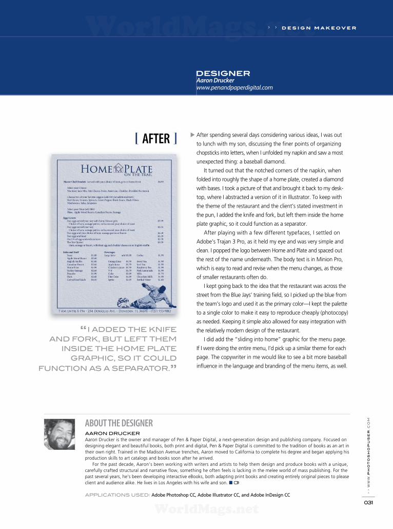
After spending several days considering various ideas, I was out
to lunch with my son, discussing the f ner points of organizing
chopsticks into letters, when I unfolded my napkin and saw a most
unexpected thing: a baseball diamond.
It turned out that the notched corners of the napkin, when
folded into roughly the shape of a home plate, created a diamond
with bases. I took a picture of that and brought it back to my desk-
top, where I abstracted a version of it in Illustrator. To keep with
the theme of the restaurant and the client’s stated investment in
the pun, I added the knife and fork, but left them inside the home
plate graphic, so it could function as a separator.
After playing with a few different typefaces, I settled on
Adobe’s Trajan 3 Pro, as it held my eye and was very simple and
clean. I popped the logo between Home and Plate and spaced out
the rest of the name underneath. The body text is in Minion Pro,
which is easy to read and revise when the menu changes, as those
of smaller restaurants often do.
I kept going back to the idea that the restaurant was across the
street from the Blue Jays’ training f eld, so I picked up the blue from
the team’s logo and used it as the primary color—I kept the palette
to a single color to make it easy to reproduce cheaply (photocopy)
as needed. Keeping it simple also allowed for easy integration with
the relatively modern design of the restaurant.
I did add the “sliding into home” graphic for the menu page.
If I were doing the entire menu, I’d pick up a similar theme for each
page. The copywriter in me would like to see a bit more baseball
inf uence in the language and branding of the menu items, as well.
ABOUT THE DESIGNERAARON DRUCKER
Aaron Drucker is the owner and manager of Pen & Paper Digital, a next-generation design and publishing company. Focused on
designing elegant and beautiful books, both print and digital, Pen & Paper Digital is committed to the tradition of books as an art in
their own right. Trained in the Madison Avenue trenches, Aaron moved to California to complete his degree and began applying his
production skills to art catalogs and books soon after he arrived.
For the past decade, Aaron’s been working with writers and artists to help them design and produce books with a unique,
carefully crafted structural and narrative flow, something he often feels is lacking in the melee world of mass publishing. For the
past several years, he’s been developing interactive eBooks, both adapting print books and creating entirely original pieces to please
client and audience alike. He lives in Los Angeles with his wife and son. ■
APPLICATIONS USED: Adobe Photoshop CC, Adobe Illustrator CC, and Adobe InDesign CC
AFTER
“I ADDED THE KNIFE
AND FORK, BUT LEFT THEM
INSIDE THE HOME PLATE
GRAPHIC, SO IT COULD
FUNCTION AS A SEPARATOR.”
DESIGNERAaron Drucker
www.penandpaperdigital.com
WorldMags.netWorldMags.net
WorldMags.net

WorldMags.netWorldMags.net
WorldMags.net

WorldMags.netWorldMags.net
WorldMags.net

STEP ONE: Open the OneRanger.psd. Create a new layer
(Layer 1) by clicking the Create a New Layer icon at the
bottom of the Layers panel. Click on the Foreground color
swatch at the bottom of the Toolbox, choose a dark-brown
color (R:67, G:50, B:45), and click OK. Now, click on the
Background color swatch, choose a light-brown color (R:161,
G:129, B:105), and click OK. Go to Filter>Render>Clouds.
Create another layer (Layer 2), change the Foreground color
to blue (R:58, G:71, B:85) and the Background color to a light
blue (R:120, G:129, B:144). Press Command-F (PC: Ctrl-F) to
apply the Clouds f lter again.
[NAPP members may download the f les used in this
tutorial at http://members.photoshopuser.com/magazine/issue/
september-2013. All f les are for personal use only.]
STEP TWO: Click the Add Layer Mask icon (circle in a square)
at the bottom of the Layers panel. Press D to set the Foreground
and Background colors to white and black, respectively. Choose
the Gradient tool (G) from the Toolbox, click the Gradient Editor
thumbnail in the Options Bar, select Foreground to Background,
and click OK. Now click-and-drag a gradient from the lower
right toward the upper left of the document.
STEP THREE: Press Command-E (PC: Ctrl-E) to Merge
Down (combine Layers 1 and 2). Duplicate this layer (Layer 1)
by dragging it onto the Create a New Layer icon at the bottom
of the Layers panel (Layer 1 copy). Duplicate Layer 1 once again
(Layer 1 copy 2). Hide both of the duplicated layers by clicking
on the Eye icon to the left of each layer in the Layers panel.
Click on Layer 1 to make it the active Layer.
STEP FOUR: Choose the Path Selection tool (A) from the
Toolbox, and click on Path 1 in the Paths panel (Window>
Paths). Click on the outer ring portion of the path (not the star),
and click on the Load Path As a Selection icon (dotted circle)
at the bottom of the Paths panel. Now, click on the Add Layer
Mask icon in the Layers panel.
Creating a glossy, metallic ef ect is quite a bit easier than trying to achieve a worn, dull, pitted one. And the
logo for The Lone Ranger movie does a great job of replicating that aged, weathered, metallic look. While most
of the ef ects I re-create in this column rely heavily on layer styles, it’s interesting to see how many times I used
the Overlay blend mode (in both the layer styles and individual layers) in this tutorial. Go ahead, count ‘em. Its
a freakin’ Overlay overload. Who knew it would work so well?
BA
CK
GR
OU
ND
: IS
TO
CK
PH
OT
O
FELIX NELSON
h o w -t o › ›
› › p
ho
to
sh
op
u
se
r › s
ep
te
mb
er
2
013
034
The Lone Ranger Movie Logo
DOWN & DIRTY TRICKS
WorldMags.netWorldMags.net
WorldMags.net

STEP FIVE: Click on the Add a Layer Style icon (ƒx) at the
bottom of the Layers panel and choose Stroke. Choose Inside
for Position, and set the Size to 1 px. Now, choose Inner
Shadow from the Styles list on the left side of the Layer Style
dialog. Change the Blend Mode to Overlay, enter 100% for
Opacity, uncheck Use Global Light, enter 153º for Angle, 4 px
for Distance, and 1 px for Size. Choose Pattern Overlay from
the Styles list. Change the Blend Mode to Overlay, enter 81%
for Opacity, and 200% for Scale. Click the down-facing arrow
next to the Pattern thumbnail, then click the gear icon at the
top right and choose Texture Fill to load the new patterns.
Click OK when the warning dialog appears, then choose
Clouds as the Pattern. Don’t click OK yet.
STEP SIX: Choose Outer
Glow from the Styles list.
Choose Multiply as the Blend
Mode, click the yellow color
swatch, choose black as the
color, and click OK. Enter
16% for Spread, and 122 px
for Size. Choose Drop Shad-
ow from the Styles list. Un-
check Use Global Light, enter
90º for Angle, 53 px for Dis-
tance, 54% for Size, and click OK to apply the layer styles.
STEP SEVEN: Click the Eye
icon next to Layer 1 copy 2 to
make it visible, and click on
that layer to select it. Click
on Path 1 in the Paths panel,
select the star portion of the
path, and load it as a selection. Click the Add a Layer Mask
icon at the bottom of the Layers panel. Now, click the Add a
Layer Style icon and choose Stroke. Choose Inside for Position,
and set the Size to 1 px. Don’t click OK yet.
STEP EIGHT: Choose Inner Glow from the Styles list. Enter
65% for Opacity and 8 px for Size. Click on the color swatch,
choose white as the color, and click OK. Choose Gradient
Overlay from the Styles list. Choose Color for the Blend Mode,
set the Angle to 131º, and click on the Gradient thumbnail
to open the Gradient Editor. Click on the black color stop on
the left side under the Gradient ramp, click the Color swatch,
choose blue (R:42, G:106, B:154) in the Color Picker, and click
OK. Click on the white color stop on the right side, click the
Color swatch, choose a tan color (R:222, G:164, B:117), and
click OK. Click OK to close the Gradient Editor. Choose Pattern
Overlay from the Styles list. Choose Overlay as the Blend Mode
and enter 65% for Opacity. Click on the down-facing arrow
next to the Pattern thumbnail, choose Clouds as the Pattern,
and click OK.
› › w
ww
.ph
oto
sh
opu
ser
.c
om
035
› › DOWN & DIRTY TRICKS
WorldMags.netWorldMags.net
WorldMags.net
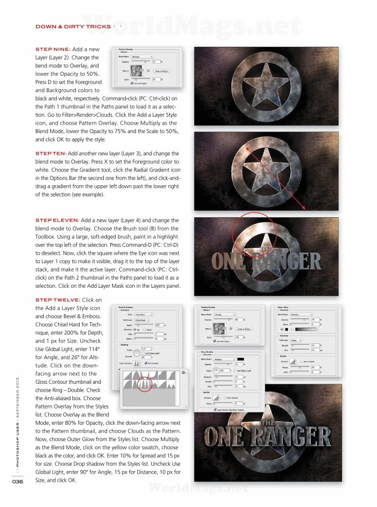
STEP NINE: Add a new
Layer (Layer 2). Change the
bend mode to Overlay, and
lower the Opacity to 50%.
Press D to set the Foreground
and Background colors to
black and white, respectively. Command-click (PC: Ctrl-click) on
the Path 1 thumbnail in the Paths panel to load it as a selec-
tion. Go to Filter>Render>Clouds. Click the Add a Layer Style
icon, and choose Pattern Overlay. Choose Multiply as the
Blend Mode, lower the Opacity to 75% and the Scale to 50%,
and click OK to apply the style.
STEP TEN: Add another new layer (Layer 3), and change the
blend mode to Overlay. Press X to set the Foreground color to
white. Choose the Gradient tool, click the Radial Gradient icon
in the Options Bar (the second one from the left), and click-and-
drag a gradient from the upper left down past the lower right
of the selection (see example).
STEP ELEVEN: Add a new layer (Layer 4) and change the
blend mode to Overlay. Choose the Brush tool (B) from the
Toolbox. Using a large, soft-edged brush, paint in a highlight
over the top left of the selection. Press Command-D (PC: Ctrl-D)
to deselect. Now, click the square where the Eye icon was next
to Layer 1 copy to make it visible, drag it to the top of the layer
stack, and make it the active layer. Command-click (PC: Ctrl-
click) on the Path 2 thumbnail in the Paths panel to load it as a
selection. Click on the Add Layer Mask icon in the Layers panel.
STEP TWELVE: Click on
the Add a Layer Style icon
and choose Bevel & Emboss.
Choose Chisel Hard for Tech-
nique, enter 200% for Depth,
and 1 px for Size. Uncheck
Use Global Light, enter 114º
for Angle, and 26º for Alti-
tude. Click on the down-
facing arrow next to the
Gloss Contour thumbnail and
choose Ring – Double. Check
the Anti-aliased box. Choose
Pattern Overlay from the Styles
list. Choose Overlay as the Blend
Mode, enter 80% for Opacity, click the down-facing arrow next
to the Pattern thumbnail, and choose Clouds as the Pattern.
Now, choose Outer Glow from the Styles list. Choose Multiply
as the Blend Mode, click on the yellow color swatch, choose
black as the color, and click OK. Enter 10% for Spread and 15 px
for size. Choose Drop shadow from the Styles list. Uncheck Use
Global Light, enter 90º for Angle, 15 px for Distance, 10 px for
Size, and click OK.
› › p
ho
to
sh
op
u
se
r › s
ep
te
mb
er
2
013
036
DOWN & DIRTY TRICKS › ›
WorldMags.netWorldMags.net
WorldMags.net
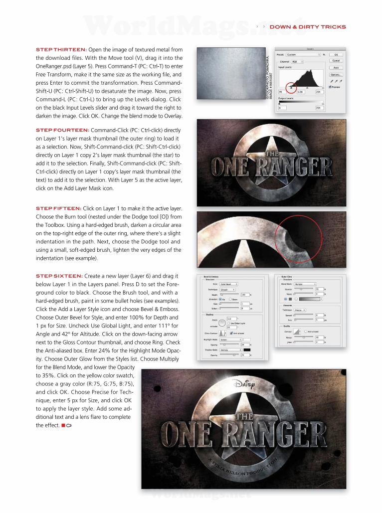
STEP THIRTEEN: Open the image of textured metal from
the download f les. With the Move tool (V), drag it into the
OneRanger.psd (Layer 5). Press Command-T (PC: Ctrl-T) to enter
Free Transform, make it the same size as the working f le, and
press Enter to commit the transformation. Press Command-
Shift-U (PC: Ctrl-Shift-U) to desaturate the image. Now, press
Command-L (PC: Ctrl-L) to bring up the Levels dialog. Click
on the black Input Levels slider and drag it toward the right to
darken the image. Click OK. Change the blend mode to Overlay.
STEP FOURTEEN: Command-Click (PC: Ctrl-click) directly
on Layer 1’s layer mask thumbnail (the outer ring) to load it
as a selection. Now, Shift-Command-click (PC: Shift-Ctrl-click)
directly on Layer 1 copy 2’s layer mask thumbnail (the star) to
add it to the selection. Finally, Shift-Command-click (PC: Shift-
Ctrl-click) directly on Layer 1 copy’s layer mask thumbnail (the
text) to add it to the selection. With Layer 5 as the active layer,
click on the Add Layer Mask icon.
STEP FIFTEEN: Click on Layer 1 to make it the active layer.
Choose the Burn tool (nested under the Dodge tool [O]) from
the Toolbox. Using a hard-edged brush, darken a circular area
on the top-right edge of the outer ring, where there’s a slight
indentation in the path. Next, choose the Dodge tool and
using a small, soft-edged brush, lighten the very edges of the
indentation (see example).
STEP SIXTEEN: Create a new layer (Layer 6) and drag it
below Layer 1 in the Layers panel. Press D to set the Fore-
ground color to black. Choose the Brush tool, and with a
hard-edged brush, paint in some bullet holes (see examples).
Click the Add a Layer Style icon and choose Bevel & Emboss.
Choose Outer Bevel for Style, and enter 100% for Depth and
1 px for Size. Uncheck Use Global Light, and enter 111º for
Angle and 42º for Altitude. Click on the down-facing arrow
next to the Gloss Contour thumbnail, and choose Ring. Check
the Anti-aliased box. Enter 24% for the Highlight Mode Opac-
ity. Choose Outer Glow from the Styles list. Choose Multiply
for the Blend Mode, and lower the Opac ity
to 35%. Click on the yellow color swatch,
choose a gray color (R:75, G:75, B:75),
and click OK. Choose Precise for Tech-
nique, enter 5 px for Size, and click OK
to apply the layer style. Add some ad-
ditional text and a lens f are to complete
the effect. ■
IST
OC
KP
HO
TO
, P
OM
AC
HK
A,
IMA
GE
#16
610
087
› › DOWN & DIRTY TRICKS
WorldMags.netWorldMags.net
WorldMags.net

› › p
ho
to
sh
op
u
se
r › s
ep
te
mb
er
2
013
038
STEP ONE: Start with a texture that will be the backdrop
of the scene for the subject who we’ll add later. This texture is
certainly f ne on its own but I want to enhance it a little more
by adding a second texture.
[NAPP members may download the f les used in this tutorial at
http://members.photoshopuser.com/magazine/issue/september-
2013. All f les are for personal use only.]
STEP TWO: This texture is a bit different from the f rst one
and has a darker vignette effect already added to it. Using the
Move tool (V), hold the Shift key and drag-and-drop this texture
into the document containing the previous texture. The Shift
key will center the texture in the document.
STEP THREE: Now let’s blend the textures using a blend
mode. Go to the Layers panel and change the layer blend mode
drop-down menu near the top left of the panel to Multiply. This
will blend only the darker areas of the top texture with the tex-
ture below and make the overall texture a bit darker. It’s a little
too dark, so drop the Opacity of the top layer to 75%.
This was a popular trick I did a while back where I nondestructively added dramatic lighting ef ects to
create a mood and a sense of space. Using simple textures and a studio model shot, you’ll see how you
can alter the mood of an image with just a few layer styles.
Step One
Step Two
Step Three
COREY BARKER
h o w -t o › ›
Dramatic Lighting Ef ects with Layer Styles
DOWN & DIRTY TRICKS
FO
TO
LIA
, S
EB
AS
TIA
N K
AU
LIT
ZK
I, IM
AG
E #
5628797
WW
W.P
HO
TO
AR
TT
EX
TU
RE
S.C
OM
WorldMags.netWorldMags.net
WorldMags.net

› › w
ww
.ph
oto
sh
opu
ser
.c
om
039
STEP FOUR: Now open the f le of your subject. Here, our
subject is shot against a wall but we need to extract here from
this background and place her on the new textured background.
Select the Quick Selection tool (W) in the Toolbox and click-and-
drag around the subject to select the background. Remember, if
any areas of the subject become selected, hold down the Option
(PC: Alt) key and drag over the undesired areas to remove them
from the selection. Once you have the selection complete, go to
the Select menu and choose Inverse. Shooting a subject against
a solid or mostly solid background makes it easier to select the
background and then invert the selection.
STEP FIVE: To fine-tune the
selection further, click on the Re-
f ne Edge button in the Options
Bar. Set the View mode to On
Layers (L) to see the subject on a
transparent background. Normally,
I would use the Refine Radius
tool f rst to clean up the edges,
but in this case, it already looks
good. Instead, I just nudged the
Edge Detection Radius slider over
just a bit to 1.0. This will ref ne
any small imperfections in the se-
lection. When that’s done, go to the Output section, set the
Output To drop-down menu to New Layer, and click OK.
STEP SIX: Once the subject is extracted from the back-
ground, drag-and-drop her onto the textured background we
created earlier. Press Command-T (PC: Ctrl-T) to put her in Free
Transform, and then scale and position her on the background.
Hold the Shift key to maintain proportions. Press Enter to com-
mit the transformation.
STEP SEVEN: There may be a little
anti-alias fringe around the edge of the
extracted subject. If so, just make sure
the layer is selected and go to Layer>Matting>Defringe. Set the
width to 1 or 2 pixels and click OK. This will remove that slight
halo around the edges.
STEP EIGHT: Now let’s add some layer style lighting start-
ing with the background. Click on the layer containing the top
texture (Layer 1) to make it active, click on the Add a Layer Style
icon (ƒx) at the bottom of the Layers panel, and choose Gradi-
ent Overlay. Use the default black-to-white gradient but change
the blend mode to Overlay and the Style to Ref ected. Check on
Reverse and change the Angle to around 117°. If you move the
Layer Style dialog out of the way, you can click on the image
directly and move the gradient to where you want it. This is like
controlling the background light. Click OK.
Step Four
Step Six
Step Eight
› › DOWN & DIRTY TRICKS
CO
RE
Y B
AR
KE
R
WorldMags.netWorldMags.net
WorldMags.net
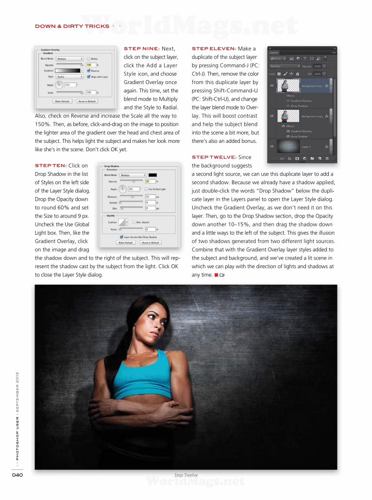
› › p
ho
to
sh
op
u
se
r › s
ep
te
mb
er
2
013
040
STEP NINE: Next,
click on the subject layer,
click the Add a Layer
Style icon, and choose
Gradient Over lay once
again. This time, set the
blend mode to Multiply
and the Style to Radial.
Also, check on Reverse and increase the Scale all the way to
150%. Then, as before, click-and-drag on the image to position
the lighter area of the gradient over the head and chest area of
the subject. This helps light the subject and makes her look more
like she’s in the scene. Don’t click OK yet.
STEP TEN: Click on
Drop Shadow in the list
of Styles on the left side
of the Layer Style dialog.
Drop the Opacity down
to round 60% and set
the Size to around 9 px.
Uncheck the Use Global
Light box. Then, like the
Gradient Overlay, click
on the image and drag
the shadow down and to the right of the subject. This will rep-
resent the shadow cast by the subject from the light. Click OK
to close the Layer Style dialog.
Step Twelve
STEP ELEVEN: Make a
duplicate of the subject layer
by pressing Command-J (PC:
Ctrl-J). Then, remove the color
from this duplicate layer by
pressing Shift-Command-U
(PC: Shift-Ctrl-U), and change
the layer blend mode to Over-
lay. This will boost contrast
and help the subject blend
into the scene a bit more, but
there’s also an added bonus.
STEP TWELVE: Since
the background suggests
a second light source, we can use this duplicate layer to add a
second shadow. Because we already have a shadow applied,
just double-click the words “Drop Shadow” below the dupli-
cate layer in the Layers panel to open the Layer Style dialog.
Uncheck the Gradient Overlay, as we don’t need it on this
layer. Then, go to the Drop Shadow section, drop the Opacity
down another 10–15%, and then drag the shadow down
and a little ways to the left of the subject. This gives the illusion
of two shadows generated from two different light sources.
Combine that with the Gradient Overlay layer styles added to
the subject and background, and we’ve created a lit scene in
which we can play with the direction of lights and shadows at
any time. ■
DOWN & DIRTY TRICKS › ›
WorldMags.netWorldMags.net
WorldMags.net
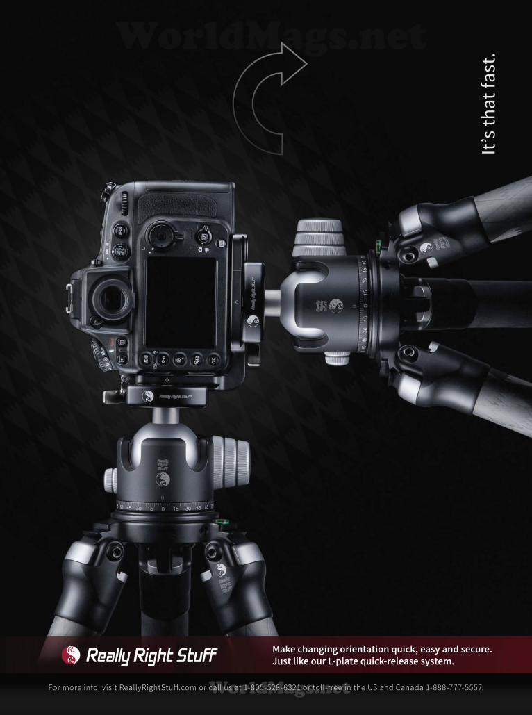
It’s
th
at
fas
t.
For more info, visit ReallyRightStuff.com or call us at 1-805-528-6321 or toll-free in the US and Canada 1-888-777-5557.
Make changing orientation quick, easy and secure.
Just like our L-plate quick-release system.
WorldMags.netWorldMags.net
WorldMags.net
› › p
ho
to
sh
op
u
se
r › s
ep
te
mb
er
2
013
042
STEP ONE: Begin by opening the model shot provided, or
feel free to use one of your own. We have a model on a white
backdrop, which will make it easier to extract the subject.
[NAPP members may download the f le used in this tutorial
from http://members.photoshopuser.com/magazine/issue/
September-2013. All f les are for personal use only.]
STEP TWO: Choose the Quick Selection tool (W) from the
Toolbox. When the background is solid or mostly solid, I’ve found
it’s easier to select the background f rst and then invert the selec-
tion. Click-and-drag along the background area and the selection
will snap to the edge of the subject and the document boundar-
ies. To remove something from the selection, press-and-hold the
Option (PC: Alt) key and click the area to be removed. When the
background is selected, choose Select>Inverse. Now the subject
herself is selected.
STEP THREE: Now go to the Options Bar and click on the
Ref ne Edge button. Choose the Ref ne Radius tool (E) on the
left. Use the Left ([) and Right (]) Bracket keys to adjust the Size
of the brush, and paint around the edge of her hair to add
some of the loose hair to the selection. Do this to any other
areas that need to be smoother. At the bottom of the Ref ne
Edge dialog is the Output section. Set the Output To menu to
New Layer and click OK.
STEP FOUR: With the subject extracted from the back-
ground, let’s create a new document to build the design in.
Press Command-N (PC: Ctrl-N) and create an 8x12" document
at 125 ppi. Click OK. Now press Command-I (PC: Ctrl-I) to
make the Background layer black.
This was an ef ect I saw in a poster for the movie The Heat starring Sandra Bullock and Melissa McCarthy.
It’s a two-tone ef ect where the skin is blown out and the rest of the subjects blend into the background
color. This can easily be achieved with a few simple layer tricks.
Step One
Step Two
COREY BARKER
h o w -t o › ›
Graphic Poster Ef ects
DOWN & DIRTY TRICKS
CO
RE
Y B
AR
KE
R
WorldMags.netWorldMags.net
WorldMags.net
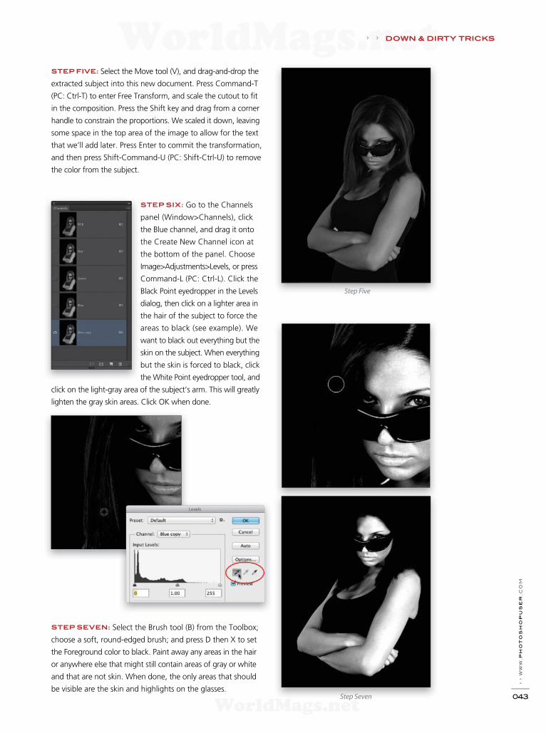
› › w
ww
.ph
oto
sh
opu
ser
.c
om
043
STEP FIVE: Select the Move tool (V), and drag-and-drop the
extracted subject into this new document. Press Command-T
(PC: Ctrl-T) to enter Free Transform, and scale the cutout to f t
in the composition. Press the Shift key and drag from a corner
handle to constrain the proportions. We scaled it down, leaving
some space in the top area of the image to allow for the text
that we’ll add later. Press Enter to commit the transformation,
and then press Shift-Command-U (PC: Shift-Ctrl-U) to remove
the color from the subject.
STEP SIX: Go to the Channels
panel (Window>Channels), click
the Blue channel, and drag it onto
the Create New Channel icon at
the bottom of the panel. Choose
Image>Adjustments>Levels, or press
Command-L (PC: Ctrl-L). Click the
Black Point eyedropper in the Levels
dialog, then click on a lighter area in
the hair of the subject to force the
areas to black (see example). We
want to black out everything but the
skin on the subject. When everything
but the skin is forced to black, click
the White Point eyedropper tool, and
click on the light-gray area of the subject’s arm. This will greatly
lighten the gray skin areas. Click OK when done.
STEP SEVEN: Select the Brush tool (B) from the Toolbox;
choose a soft, round-edged brush; and press D then X to set
the Foreground color to black. Paint away any areas in the hair
or anywhere else that might still contain areas of gray or white
and that are not skin. When done, the only areas that should
be visible are the skin and highlights on the glasses.
Step Five
Step Seven
› › DOWN & DIRTY TRICKS
WorldMags.netWorldMags.net
WorldMags.net

› › p
ho
to
sh
op
u
se
r › s
ep
te
mb
er
2
013
044
STEP EIGHT: In the Layers panel, click the black Background
layer, and press Shift-Delete (PC: Shift-Backspace) to open the
Fill dialog. Click on the Use menu and select Color. In the Color
Picker that appears, choose a red color (R:214, G:13, B:47),
click OK to close the Color Picker, and click OK again to close
the Fill dialog.
STEP NINE: Select the layer with the subject and set the blend
mode to Multiply. This will eliminate all lighter areas of the layer,
especially any subtle areas around the hair. We’ll bring back the
lighter areas in the next couple of steps.
STEP TEN: Click the Create a New Layer icon at the bottom
of the Layers panel to create a new blank layer. Choose Select>
Load Selection. In the Load Selection dialog, set the Channel
drop-down menu to Blue copy, and click OK.
STEP ELEVEN: Press Shift-
Delete (PC: Shift-Backspace) to
open the Fill dialog, choose White
from the Use menu, and click
OK. To enhance the white area
of the image, press Command-J
(PC: Ctrl-J) to duplicate the layer.
Depending on your image, this
may not be necessary but it’s
something you can try if the ef-
fect isn’t intense enough.
STEP TWELVE: Finally, add
some text at the top for the title
to complete the poster look. ■
Step Nine
Final
DOWN & DIRTY TRICKS › ›
WorldMags.netWorldMags.net
WorldMags.net

ABEO Pro 283CGH
Carbon f ber tripod with pistol grip ball head
featuring shutter release trigger
The new ABEO Pro 283CGH provides photographers with unmatched, unlim-
ited versatility by bringing together the new GH-300T pistol grip ball head with
shutter release trigger and ABEO 283CT tripod, featuring a Multi-Angle Central
Column with Instant Swivel Stop-N-Lock, Quick Adjustment central column pivot
lock, individually adjustable leg angles, and 3-in-1 All Terrain Feet.
More information at www.vanguardworld.com
Un
iqu
e S
hu
tte
r R
ele
ase
Tri
gg
er
Buy oneABEO PRO 283CGH
and receive a
$50Mail-in rebate
Of er valid from 8/1/2013to 10/31/2013
bhphotovideo.com (NY, NY)
Willoughbys.com (NYC)
Arlingtoncamera.com (TX)
hornphoto.com (Fresno, CA)
Amazon.com
Find Alta Pro at these f ne retailers and more.
adorama.com (NY, NY)
Cameta.com (Long Island, NY)
Stroudsburgfoto.com (PA)
Wayfair.com
WorldMags.netWorldMags.net
WorldMags.net

› › p
ho
to
sh
op
u
se
r › s
ep
te
mb
er
2
013
046
Creating Photographic Products for Youth Sports
For those of you who are either parents and
shoot your kids playing sports or photogra-
phers who practice sports photography at
local events, you’ve probably used the easy
access at school and youth league levels to
hone your skills and develop a good eye for
the best kind of action shots. If you’ve ever
watched Scott Kelby’s class on KelbyTraining
.com, “Beginner Sports Photography,” you’ll
have learned how to capture those great
shots from those key moments in a game. If
not, go sign up and watch now! And in this
very same issue, Mike Olivella has a great ar-
ticle on shooting sports starting on page 68.
A lot of these images will probably go
straight into your portfolio, but think about
some of those great shots that only ever end
up online. These are the types of photos that
would look great adorning the front cover of
a magazine and other sports memorabilia, so
why not use your Photoshop skills to create
something simple but effective for your kids.
Or even better, if you’re a working photogra-
pher, you can create these kinds of products to
add to your sales portfolio.
> > KEY CONCEPTS: Smart Objects Type tool T T T T T TLayout Design: Taf y Clif ord
By Dave Clayton
ME
LIS
SA
RE
YE
S-A
BB
EY
WorldMags.netWorldMags.net
WorldMags.net

› › w
ww
.p
ho
to
sh
op
us
er
.c
om
047
We’re going to show you how to lay out and build
a quick sports magazine cover template that can
be used for multiple sports and images. We’ll
then use those same images and template to cre-
ate trading cards. Let’s start with the cover.
STEP ONE: First, you need to create a new fi le in Photoshop,
so go to File>New. We’re using Photoshop CC here but this will
work in older versions, as well. Keeping in mind that this will
be output to an online print service, we’ll use the specifi cations
required by that service for this particular tutorial. So create a
fi le that’s 8x10" (203.2x254mm) at 200 ppi.
STEP TWO: Press Command-R (PC: Ctrl-R) to turn on the Rul-
ers. Turn on View>Snap so you can drag guides from the Rulers
to the top, bottom, and sides of the document. This is because
we need to add a bleed for printing, but unlike Illustrator and
InDesign, Photoshop doesn’t include a bleed setting option.
STEP THREE: Go to Image>Canvas Size. We want to add a
3-mm bleed for both the Width and Height, so click the Relative
box, select Millimeters in the drop-down menu next to the Width
fi eld, and type the number 6 in each fi eld to add 3 mm to each
side of the document. Ensure that the Canvas Extension Color
drop-down menu is set to white, and click OK.
You’ll now see the canvas extends beyond the guides that
you set in Step Two. This is your bleed area. Ensure that any-
thing that you want printed is not in this area, including text or
any important parts of your images. Our canvas is now ready to
begin adding layers.
STEP FOUR: This project will show you how to create three
different magazine covers in one easy fi le. You can later tailor
this to suit your own needs depending on what you want to
create for your client or yourself. The fi rst images we’ll place into
the fi le are the themed background images; in this case, stock
photography images of a football fi eld, a dirt track, and a base-
ball image. Choose File>Place, navigate to one of your images,
and click the Place button to place the fi rst image.
STEP FIVE: A placed image will already be in Free Transform
so you can resize it to fi t the page however you prefer. Always
hold down the Shift key to resize proportionally. In this case, we
want some of the yard numbers on the football fi eld to show on
the right edge of the fi nal design. Keep the bleed area in mind
when resizing and positioning; anything outside of the guides
will be cut off. Press Enter to commit the placement.
Step One
Step Three
Step Four
Step Five
PH
OT
OD
UN
E.N
ET
, A
NT
PK
R
WorldMags.netWorldMags.net
WorldMags.net
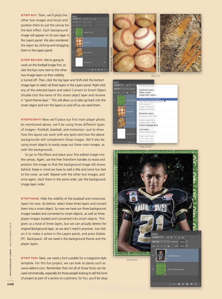
› › p
ho
to
sh
op
u
se
r › s
ep
te
mb
er
2
013
048
Step One
STEP SIX: Then, we’ll place the
other two images and resize and
position them to suit the canvas for
the best effect. Each background
image will appear on its own layer in
the Layers panel. We also re ordered
the layers by clicking-and-dragging
them in the Layers panel.
STEP SEVEN: We’re going to
work on the football image fi rst, so
click the Eye icons next to the other
two image layers so their visibility
is turned off. Then, click the top layer and Shift-click the bottom
image layer to select all three layers in the Layers panel. Right-click
any of the selected layers and select Convert to Smart Object.
Double-click the name of this smart object layer and rename
it “sport-theme-layer.” This will allow us to later go back into the
smart object and turn the layers on and off as we need them.
STEP EIGHT: Now we’ll place our fi rst main player photo.
As mentioned above, we’ll be using three different types
of images—football, baseball, and motocross—just to show
how this layout can work with any sport and how the above
backgrounds will complement these images. We’ll also be
using smart objects to easily swap out these main images, as
with the backgrounds.
So go to File>Place and place your fi rst edited image into
the canvas. Again, use the Free Transform handles to resize and
position the image so that the background image still shows
behind. Keep in mind we have to add a title and some fun text
to the cover, as well. Repeat with the other two images, and
once again, stack them in the same order, per the background
image layer order.
STEP NINE: Hide the visibility of the baseball and motocross
layers for now. As before, select these three layers and convert
them into a smart object. So now we have our three background
images loaded and converted to smart objects, as well as three
player images loaded and converted into smart objects. This
gives us a total of three layers, but we can actually delete the
original Background layer, as we don’t need it anymore. Just click
on it to make it active in the Layers panel, and press Delete
(PC: Backspace). All we need is the background theme and the
player layers.
STEP TEN: Next, we need a font suitable for a magazine-style
template. For this fun project, we can look at places such as
www.dafont.com. Remember that not all of those fonts can be
used commercially, especially for those people looking to sell this kind
of project as part of a service to customers; for fun, you’ll be okay.
Step Nine
PH
OT
OD
UN
E.N
ET, S
CU
KR
OV
PH
OT
OD
UN
E.N
ET
, B
ON
NIN
ST
UD
IO
Step Six
Step Seven
WorldMags.netWorldMags.net
WorldMags.net

I recommend www.fontsquirrel.com, as they have a great
selection of commercial usage fonts. When designing something
like this, we need to have an idea of a suitable kind of font. Look
online for magazine covers and posters. Google will provide a
lot of information. In this case, we obviously need a sports font.
For football, we can use a traditional college football-style font
but this will restrict us to just football when creating a template.
Research some fonts for other sports and keep them noted
somewhere. A good idea is to create a Photoshop fi le called
“Sports Fonts” and type the names of fonts using that font style
for future reference.
For this fi rst project, we’re going to use just two fonts but
there’s nothing stopping you from using different fonts for each
cover title. By typing “sport” into the search fi eld on FontSquirrel
.com, I came across the font Sportrop, which is a nice, modern
font with a retro multiline kind of feel.
In the results, you’ll also see two college football-style fonts.
We can use these later on for the additional text on the cover.
And remember, for those on the Creative Cloud, you’ll have
access to Typekit and there will be an abundance of fonts on
there that can be used commercially. For now, we’ll continue as
though we don’t have Typekit.
STEP ELEVEN: Press D then X to set your Foreground color to
white. Now, with the Type tool (T) active and the Sportrop font
selected in the Options Bar, we’ll type the word “SHOOTSPORTS.”
Unless you specifi cally set a font size, you’ll have to resize your
font to fi t. You can do this a couple of ways. Either double-click
the text with the Type tool to select all the letters, and then
hover the cursor over the TT icon next to the font size fi eld in
the Options Bar and scrub left or right to resize, or just hold the
Command (PC: Ctrl) key and Shift-drag the bottom corner of the
type onscreen to resize proportionally until the title fi ts.
STEP TWELVE: Next we’ll add a stroke to the type to make
it stand out. Click on the Add a Layer Style icon (ƒx) at the bot-
tom of the Layers panel and choose Stroke. We’ll select a color
from the player image to keep the style the same. For this, we’ll
click on the Color swatch, go to the Options Bar and set Sample
Size to 5 by 5 Average, and Sample to All Layers, and click a
blue color on the shirt. Click OK to close the Color Picker. Make
the stroke Size about 18 px to beef the font up a bit. Click OK.
STEP THIRTEEN: Let’s add another stroke. To do this, convert
the type layer to a smart object, click back on the Add a Layer
Style icon, and apply another stroke of approximately 3 pixels in
white, and click OK. Because it’s a smart object, we can change
the title or font and the layer style will still apply. To change the
text, double-click the smart object thumbnail for the text, make
your changes in the fi le that opens, and then save and close that
fi le. Some fonts may need the layer styles readjusted, as the stroke
may be too bold or too thin for them.
Step Ten
Step Eleven
Step Twelve
Step Thirteen
› › w
ww
.p
ho
to
sh
op
us
er
.c
om
049
WorldMags.netWorldMags.net
WorldMags.net
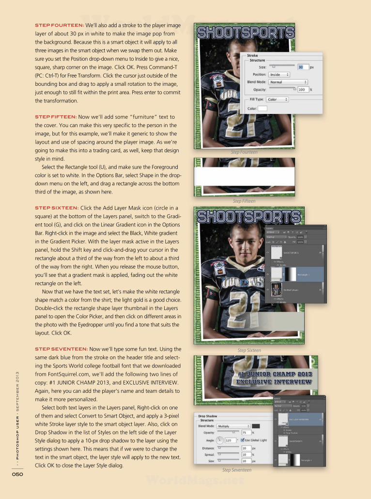
› › p
ho
to
sh
op
u
se
r › s
ep
te
mb
er
2
013
050
STEP FOURTEEN: We’ll also add a stroke to the player image
layer of about 30 px in white to make the image pop from
the background. Because this is a smart object it will apply to all
three images in the smart object when we swap them out. Make
sure you set the Position drop-down menu to Inside to give a nice,
square, sharp corner on the image. Click OK. Press Command-T
(PC: Ctrl-T) for Free Transform. Click the cursor just outside of the
bounding box and drag to apply a small rotation to the image,
just enough to still fi t within the print area. Press enter to commit
the transformation.
STEP FIFTEEN: Now we’ll add some “furniture” text to
the cover. You can make this very specifi c to the person in the
image, but for this example, we’ll make it generic to show the
layout and use of spacing around the player image. As we’re
going to make this into a trading card, as well, keep that design
style in mind.
Select the Rectangle tool (U), and make sure the Foreground
color is set to white. In the Options Bar, select Shape in the drop-
down menu on the left, and drag a rectangle across the bottom
third of the image, as shown here.
STEP SIXTEEN: Click the Add Layer Mask icon (circle in a
square) at the bottom of the Layers panel, switch to the Gradi-
ent tool (G), and click on the Linear Gradient icon in the Options
Bar. Right-click in the image and select the Black, White gradient
in the Gradient Picker. With the layer mask active in the Layers
panel, hold the Shift key and click-and-drag your cursor in the
rectangle about a third of the way from the left to about a third
of the way from the right. When you release the mouse button,
you’ll see that a gradient mask is applied, fading out the white
rectangle on the left.
Now that we have the text set, let’s make the white rectangle
shape match a color from the shirt; the light gold is a good choice.
Double-click the rectangle shape layer thumbnail in the Layers
panel to open the Color Picker, and then click on different areas in
the photo with the Eyedropper until you fi nd a tone that suits the
layout. Click OK.
STEP SEVENTEEN: Now we’ll type some fun text. Using the
same dark blue from the stroke on the header title and select-
ing the Sports World college football font that we downloaded
from FontSquirrel.com, we’ll add the following two lines of
copy: #1 JUNIOR CHAMP 2013, and EXCLUSIVE INTERVIEW.
Again, here you can add the player’s name and team details to
make it more personalized.
Select both text layers in the Layers panel, Right-click on one
of them and select Convert to Smart Object, and apply a 3-pixel
white Stroke layer style to the smart object layer. Also, click on
Drop Shadow in the list of Styles on the left side of the Layer
Style dialog to apply a 10-px drop shadow to the layer using the
settings shown here. This means that if we were to change the
text in the smart object, the layer style will apply to the new text.
Click OK to close the Layer Style dialog. Step Seventeen
Step Sixteen
Step Fourteen
Step Fifteen
WorldMags.netWorldMags.net
WorldMags.net

PHOTODUNE.NET, DOTSHOCK
STEP EIGHTEEN: This step is more of a marketing tip. Create
a Google shortener URL on goo.gl, click on the Details link,
Right-click on the QR code it creates, and select Copy Image.
Paste this onto the front of the cover in the bottom left-hand
corner. When your clients show their cover to friends and family,
they can scan the QR code, which is programmed to go to your
chosen website—you can even track the clicks.
STEP NINETEEN: Now that we have a quick magazine-style
cover ready to print, let’s go back to the other images to show
how we can easily create two more covers. Double-click the
sport-theme-layer smart object thumbnail in the Layers panel.
When this fi le opens, hide the visibility of the football fi eld layer
and turn on the baseballs layer, ensuring the bike-tracks layer
is also turned off. Close the fi le and click Save. This will update
that layer in our magazine image. Now repeat this with the
player layer and turn on the baseball pitcher image and turn the
visibility of the other two layers off in the smart object.
STEP TWENTY: Now that you have the baseball theme and
image, repeat this again for the motocross theme and image.
If you only had one theme layer and one player layer, another
way to quickly replace these images is to Right-click each smart
object layer and choose Replace Contents. In the Place dialog that
appears, locate the fi le you want to replace this with, and click
Place. This will update the image and give the same result.
MELISSA REYES-ABBEY
WorldMags.netWorldMags.net
WorldMags.net

› › p
ho
to
sh
op
u
se
r › s
ep
te
mb
er
2
013
052
Now we’ll build a trading card using the same
images and fi le size but a different layout. For this
layout, we don’t need the rectangle shape, QR
code, or the text that we used for the magazine
cover layout, so go ahead and delete those layers
in the Layers panel.
STEP ONE: Use the Move tool to drag the player image up
and over to the left so that it bleeds off the canvas, as shown
in the example. We need room to add some text and ribbon
shapes at the right side and bottom of the card for the player’s
name, team name, and position of the player.
STEP TWO: Let’s change
the color of the stroke
around the player image
and add a glow. Dou-
ble-click the word “Stroke”
that appears below the
image layer in the Layers
panel to open the Layer
Style dialog. Click the
Color swatch and sample a color from the image. Click OK to
close the Color Picker.
STEP THREE: Click on Outer Glow in the list of Styles. Click
on the color swatch and pick a similar color to the Stroke color.
Increase the Size until you get the glow that you want, and click OK.
STEP FOUR: For
the ribbon shapes
on the trading card,
we’ll use some custom
shapes. There are many
custom shape resources
on the Internet. The
shapes we’re using here
cost $4 from an online
vector resource. The more
advanced user could make these in Illustrator but for ease and
speed, we’ll use a custom shape. Select the Custom Shape tool
(nested under the Rectangle tool [U]) in the Toolbox, and then
in the Options Bar, select the shape you want to use from the
Custom Shape Picker. If you downloaded a set of shapes, click
on the gear icon at the top right of the Custom Shape Picker,
and select Load Shapes.
Step Three
Step One
WorldMags.netWorldMags.net
WorldMags.net

› › w
ww
.p
ho
to
sh
op
us
er
.c
om
053
STEP FIVE: Make sure Shape is selected in the drop-down
menu on the left side of the Options Bar, and then click on the
Foreground color and sample a color from your image (gold in
our example). Draw your shape, then duplicate the shape layer
by pressing Command-J (PC: Ctrl-J) twice so that we now have
three ribbons. Using the Move tool, distribute them approx-
imately where you want them, select all three layers, and then
click the Distribute Vertical Centers icon followed by the Align
Left Edges icon in the Options Bar.
STEP SIX: With all three layers still selected, convert them to a
smart object. We can now add a couple layer styles that will apply
to all three ribbons at the same time. Apply a Bevel & Emboss
using a 3-px Inner Bevel, followed by an 8-px Stroke, sampling
some of the red from the player’s shirt. This is just to introduce a
vibrant color to the card.
STEP SEVEN: Next, we’ll type the player’s name, position, and
year of season (we’re using the college font that we downloaded
from FontSquirrel.com). Set your Foreground color to white, type
the player’s name fi rst, and place it over the top ribbon. After ad-
justing the font size to fi t, use Free Transform to angle the word
to align with the ribbon. Then, add a simple 3-px Drop Shadow
layer style to make the text pop.
STEP EIGHT: To get the next two layers of text exactly the same,
we’ll duplicate the current text layer twice, and align each layer
over the ribbons. Then, use the Type tool to edit each layer with
the player position and season year in the fi nal two ribbons. We’re
going to add a larger ribbon for the team name at the bottom of
the card, so select all the ribbon and text layers in the Layers panel
and drag them further up the card using the Move tool.
STEP NINE: Now let’s add the additional larger ribbon at the
bottom for the team name. Set your Foreground color to the
same color that you used for the original ribbons. Select a new
ribbon shape from the Custom Shape Picker, and while holding
the Shift key, drag it
out so it’s proportional
in shape to the original.
Then, Right-click on
the original ribbon
layers smart object in
the Layers panel and
choose Copy Layer
Style, then Right-click
on the new ribbon
layer and select Paste
Layer Style. This keeps
all the effects uniform.
Step Five
Step Six
Step Seven
Step NineStep Eight
WorldMags.netWorldMags.net
WorldMags.net
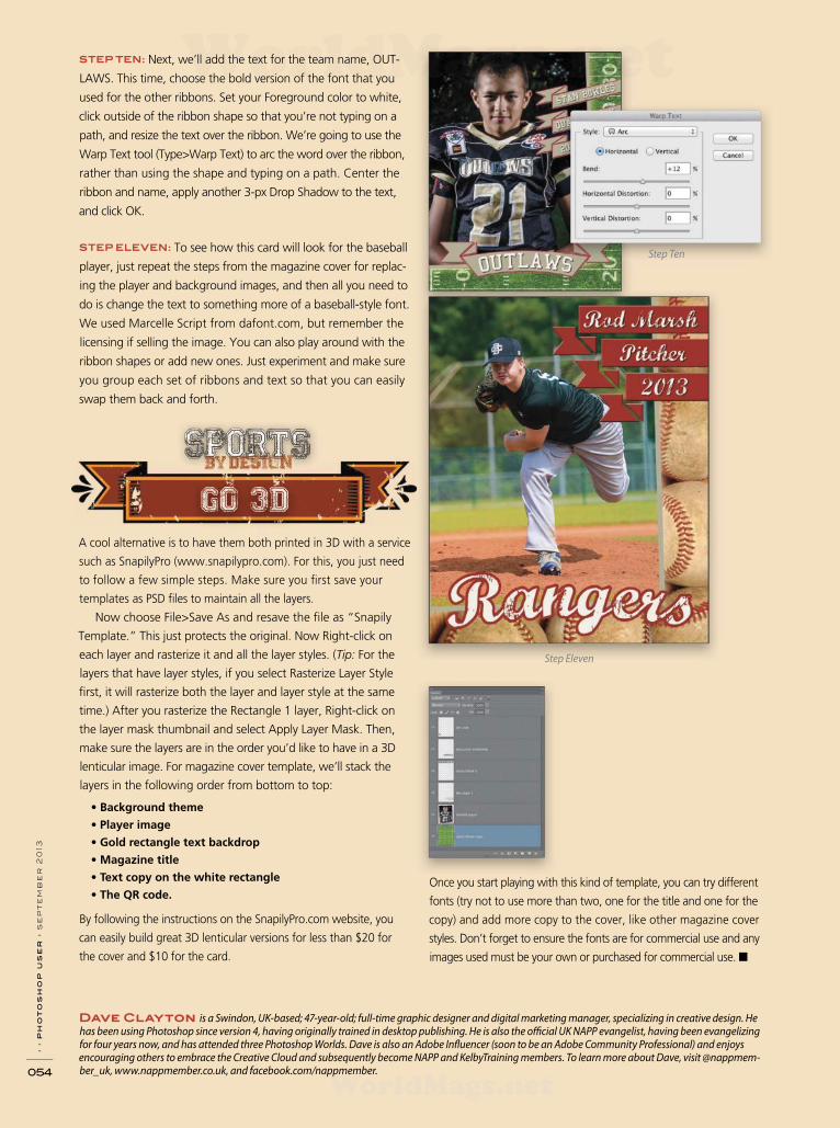
› › p
ho
to
sh
op
u
se
r › s
ep
te
mb
er
2
013
054
STEP TEN: Next, we’ll add the text for the team name, OUT-
LAWS. This time, choose the bold version of the font that you
used for the other ribbons. Set your Foreground color to white,
click outside of the ribbon shape so that you’re not typing on a
path, and resize the text over the ribbon. We’re going to use the
Warp Text tool (Type>Warp Text) to arc the word over the ribbon,
rather than using the shape and typing on a path. Center the
ribbon and name, apply another 3-px Drop Shadow to the text,
and click OK.
STEP ELEVEN: To see how this card will look for the baseball
player, just repeat the steps from the magazine cover for replac-
ing the player and background images, and then all you need to
do is change the text to something more of a baseball-style font.
We used Marcelle Script from dafont.com, but remember the
licensing if selling the image. You can also play around with the
ribbon shapes or add new ones. Just experiment and make sure
you group each set of ribbons and text so that you can easily
swap them back and forth.
A cool alternative is to have them both printed in 3D with a service
such as SnapilyPro (www.snapilypro.com). For this, you just need
to follow a few simple steps. Make sure you fi rst save your
templates as PSD fi les to maintain all the layers.
Now choose File>Save As and resave the fi le as “Snapily
Template.” This just protects the original. Now Right-click on
each layer and rasterize it and all the layer styles. (Tip: For the
layers that have layer styles, if you select Rasterize Layer Style
fi rst, it will rasterize both the layer and layer style at the same
time.) After you rasterize the Rectangle 1 layer, Right-click on
the layer mask thumbnail and select Apply Layer Mask. Then,
make sure the layers are in the order you’d like to have in a 3D
lenticular image. For magazine cover template, we’ll stack the
layers in the following order from bottom to top:
• Background theme
• Player image
• Gold rectangle text backdrop
• Magazine title
• Text copy on the white rectangle
• The QR code.
By following the instructions on the SnapilyPro.com website, you
can easily build great 3D lenticular versions for less than $20 for
the cover and $10 for the card.
Step Ten
Once you start playing with this kind of template, you can try different
fonts (try not to use more than two, one for the title and one for the
copy) and add more copy to the cover, like other magazine cover
styles. Don’t forget to ensure the fonts are for commercial use and any
images used must be your own or purchased for commercial use. ■
Dave Clayton is a Swindon, UK-based; 47-year-old; full-time graphic designer and digital marketing manager, specializing in creative design. He has been using Photoshop since version 4, having originally trained in desktop publishing. He is also the of cial UK NAPP evangelist, having been evangelizing for four years now, and has attended three Photoshop Worlds. Dave is also an Adobe Inf uencer (soon to be an Adobe Community Professional) and enjoys encouraging others to embrace the Creative Cloud and subsequently become NAPP and KelbyTraining members. To learn more about Dave, visit @nappmem-ber_uk, www.nappmember.co.uk, and facebook.com/nappmember.
Step Eleven
WorldMags.netWorldMags.net
WorldMags.net
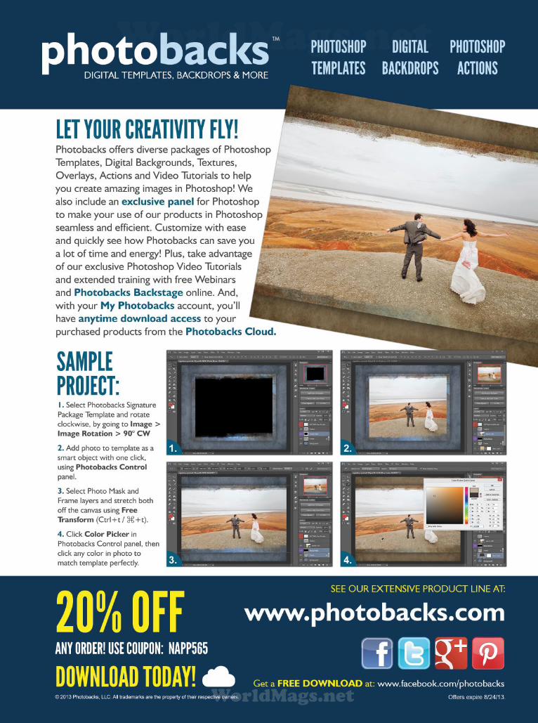
WorldMags.netWorldMags.net
WorldMags.net

› › p
ho
to
sh
op
u
se
r › s
ep
te
mb
er
2
013
056
REVO SOLUTIONS
Revo Solutions Games (www.revo-solutions.ro) is family-owned
and operated and has been in business since 2005. They’ve
become one of the pioneers in cross-platform multiplayer games.
They specialize in games of warfare, such as aerial dogfighting and
ground battles with tanks and troops, and have produced familiar
titles such as F.A.S.T. (Fleet Air Superiority Tactics) and Skies of
Glory. One of my favorites is Artillery Brigade. Brilliant game play,
and the responsiveness is much better than most games.
I was addicted immediately, but it wasn’t all because of the
fun factor. I really wanted to learn how the app combined graph-
ics, both static and animated, with the sounds and context of the
game to create a fun experience. When all of those basic areas are
covered, then an enjoyable gaming experience is inevitable. This
is something that Revo Solutions does very well.
I contacted them to learn more about how Photoshop played
a role in the conceptual process of their games. I first spoke with
one of the company managers, Andrei Hanganu, who was all too
eager to give a peek inside the process of creating a game. While
he was extremely informative about the company and projects
they had in progress, he deferred the conceptual and production
details to one of his senior 2D artists by the name of Laurentiu
Danila, a.k.a. Lari.
DESIGNING FOR MOBILE GAMING
on theSMALL SCREEN
LAYOUT DESIGN BY EDUARDO LOWE | ALL IMAGES BY REVO SOLUTIONS GAMES EXCEPT WHERE NOTED
by COREY BARKER
A couple of months ago, our executive vice
president, Dave Moser, and I started
talking about all of the portable devices in
the world today and the millions of apps available for
them. Like the Internet itself, portable technology has
changed the way we work and play, and it has made
many companies refocus and redesign their business
models to accommodate this new age. So I started
wondering, where does Photoshop fit into all of this?
The answer to this is that Photoshop is way more
involved than you might think.
Dave connected me with Revo Solutions Games, a
game developer based in Bucharest, Romania, whose
games he has been a fan of for quite some time.
Knowing Dave’s love of war history and battle, I could
see why he loved this series of games. Having piqued
my interest, I started playing their games and discov-
ered they weren’t just games, but an experience.
WorldMags.netWorldMags.net
WorldMags.net
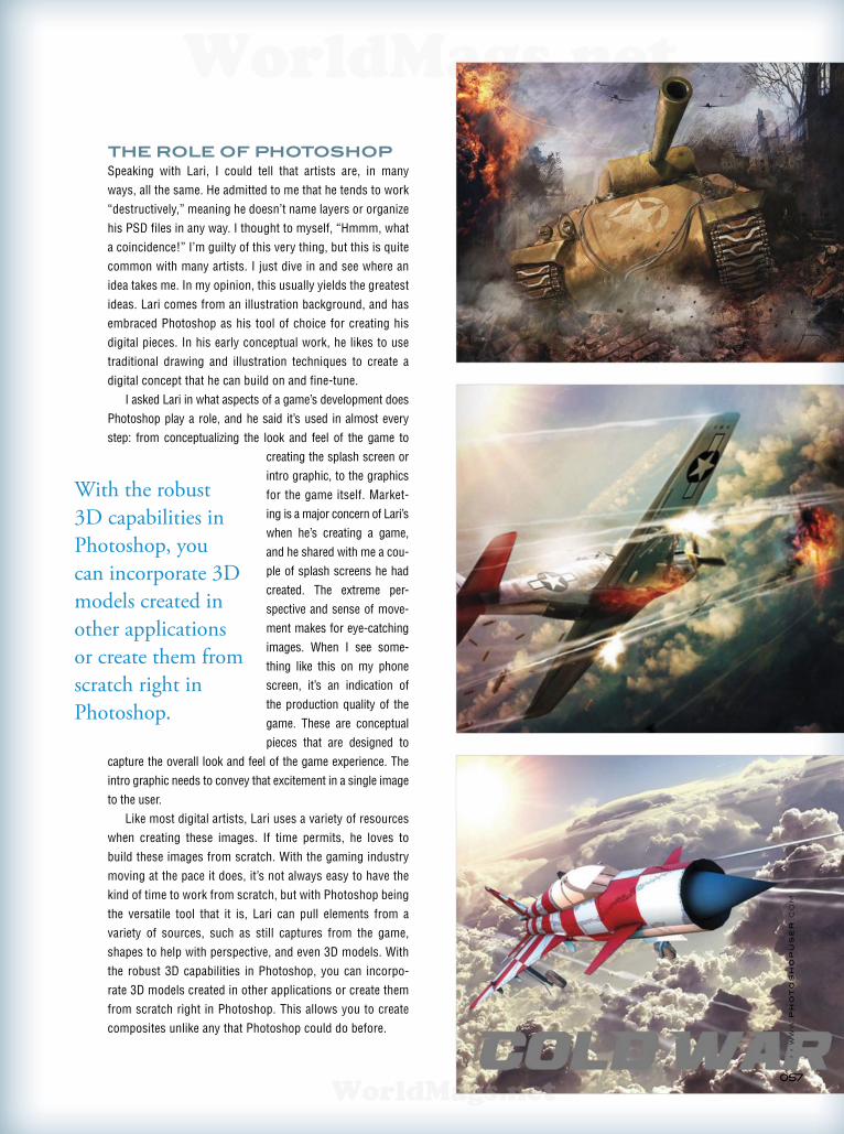
› › w
ww
.p
ho
to
sh
op
us
er
.c
om
057
THE ROLE OF PHOTOSHOP
Speaking with Lari, I could tell that artists are, in many
ways, all the same. He admitted to me that he tends to work
“destructively,” meaning he doesn’t name layers or organize
his PSD files in any way. I thought to myself, “Hmmm, what
a coincidence!” I’m guilty of this very thing, but this is quite
common with many artists. I just dive in and see where an
idea takes me. In my opinion, this usually yields the greatest
ideas. Lari comes from an illustration background, and has
embraced Photoshop as his tool of choice for creating his
digital pieces. In his early conceptual work, he likes to use
traditional drawing and illustration techniques to create a
digital concept that he can build on and fine-tune.
I asked Lari in what aspects of a game’s development does
Photoshop play a role, and he said it’s used in almost every
step: from conceptualizing the look and feel of the game to
creating the splash screen or
intro graphic, to the graphics
for the game itself. Market -
ing is a major concern of Lari’s
when he’s creating a game,
and he shared with me a cou-
ple of splash screens he had
created. The extreme per -
spective and sense of move-
ment makes for eye-catching
images. When I see some-
thing like this on my phone
screen, it’s an indication of
the production quality of the
game. These are conceptual
pieces that are designed to
capture the overall look and feel of the game experience. The
intro graphic needs to convey that excitement in a single image
to the user.
Like most digital artists, Lari uses a variety of resources
when creating these images. If time permits, he loves to
build these images from scratch. With the gaming industry
moving at the pace it does, it’s not always easy to have the
kind of time to work from scratch, but with Photoshop being
the versatile tool that it is, Lari can pull elements from a
variety of sources, such as still captures from the game,
shapes to help with perspective, and even 3D models. With
the robust 3D capabilities in Photoshop, you can incorpo-
rate 3D models created in other applications or create them
from scratch right in Photoshop. This allows you to create
composites unlike any that Photoshop could do before.
With the robust
3D capabilities in
Photoshop, you
can incorporate 3D
models created in
other applications
or create them from
scratch right in
Photoshop.
WorldMags.netWorldMags.net
WorldMags.net
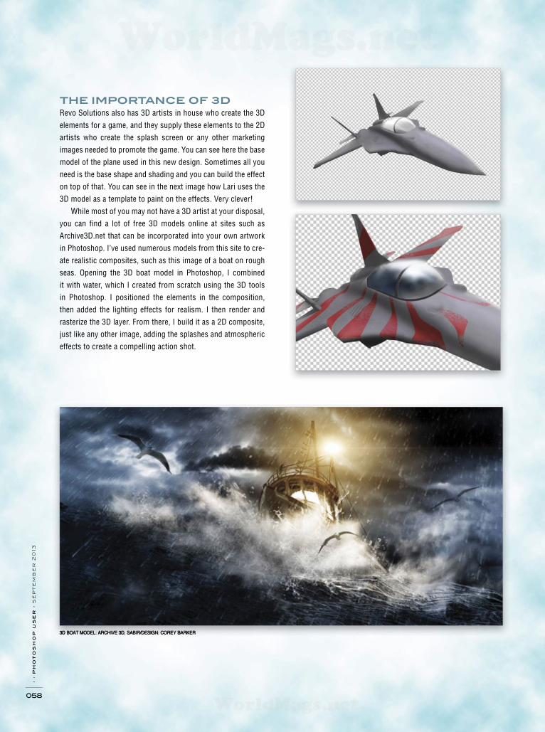
3D BOAT MODEL: ARCHIVE 3D, SABIR/DESIGN: COREY BARKER
› › p
ho
to
sh
op
u
se
r › s
ep
te
mb
er
2
013
058
THE IMPORTANCE OF 3D
Revo Solutions also has 3D artists in house who create the 3D
elements for a game, and they supply these elements to the 2D
artists who create the splash screen or any other marketing
images needed to promote the game. You can see here the base
model of the plane used in this new design. Sometimes all you
need is the base shape and shading and you can build the effect
on top of that. You can see in the next image how Lari uses the
3D model as a template to paint on the effects. Very clever!
While most of you may not have a 3D artist at your disposal,
you can find a lot of free 3D models online at sites such as
Archive3D.net that can be incorporated into your own artwork
in Photoshop. I’ve used numerous models from this site to cre-
ate realistic composites, such as this image of a boat on rough
seas. Opening the 3D boat model in Photoshop, I combined
it with water, which I created from scratch using the 3D tools
in Photoshop. I positioned the elements in the composition,
then added the lighting effects for realism. I then render and
rasterize the 3D layer. From there, I build it as a 2D composite,
just like any other image, adding the splashes and atmospheric
effects to create a compelling action shot.
WorldMags.netWorldMags.net
WorldMags.net

› › w
ww
.p
ho
to
sh
op
us
er
.c
om
059
THE CONTINUALLY
CHANGING CREATIVE
PROCESS
As a game in process evolves at Revo Solutions, things are
often revised and changes have to be made. This is the creative
process. Whether you’re the guy writing the code or designing
the look, you must be a problem solver. One of the games they
were working on at the time of this writing was a new one called
Cold War, as we saw with the airplane image earlier. While they
revealed few details about the game since it’s still in develop-
ment, the graphics tell quite a bit.
Here’s a more refined concept building on one of the exam-
ples we saw earlier. You can see once an idea is established, the
fine details are executed to enhance the overall look. Getting
that initial idea is one of toughest parts of the process, but once
you have it, then the creative process can start, and that’s where
the fun begins. The result is quite impressive. This is still in the
conceptual stages as of this writing but you can see how the
process is designed to keep polishing an idea that will become
the benchmark for the game’s overall appearance.
While the methods and tools have changed over the decades,
we’ve become a technology-based society, which is great news
for the digital artist. Now our work can be viewed in its full HD
splendor on a range of devices. Let’s be honest, our images
may look great in print but they look way better on a screen! ■
WorldMags.netWorldMags.net
WorldMags.net
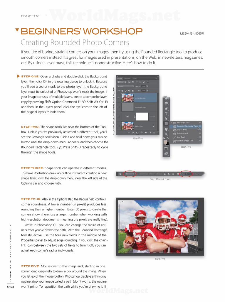
› › p
ho
to
sh
op
u
se
r › s
ep
te
mb
er
2
013
060
STEP ONE: Open a photo and double-click the Background
layer, then click OK in the resulting dialog to unlock it. Because
you’ll add a vector mask to the photo layer, the Background
layer must be unlocked or Photoshop won’t mask the image. If
your image consists of multiple layers, create a composite layer
copy by pressing Shift-Option-Command-E (PC: Shift-Alt-Ctrl-E)
and then, in the Layers panel, click the Eye icons to the left of
the original layers to hide them.
STEP TWO: The shape tools live near the bottom of the Tool-
box. Unless you’ve previously activated a different tool, you’ll
see the Rectangle tool’s icon. Click it and hold down your mouse
button until the drop-down menu appears, and then choose the
Rounded Rectangle tool. Tip: Press Shift-U repeatedly to cycle
through the shape tools.
STEP THREE: Shape tools can operate in different modes.
To make Photoshop draw an outline instead of creating a new
shape layer, click the drop-down menu near the left side of the
Options Bar and choose Path.
STEP FOUR: Also in the Options Bar, the Radius f eld controls
corner roundness. A lower number (in pixels) produces less
rounding than a higher number. Enter 50 pixels to create the
corners shown here (use a larger number when working with
high-resolution documents, meaning the pixels are really tiny).
Note: In Photoshop CC, you can change the radius of cor-
ners after you’ve drawn the path. With the Rounded Rectangle
tool still active, use the four new f elds in the middle of the
Properties panel to adjust edge rounding. If you click the chain-
link icon between the two sets of f elds to turn it off, you can
adjust each corner’s radius individually.
STEP FIVE: Mouse over to the image and, starting in one
corner, drag diagonally to draw a box around the image. When
you let go of the mouse button, Photoshop displays a thin gray
outline atop your image called a path (don’t worry, the outline
won’t print). To reposition the path while you’re drawing it (if
Step Three & Four
Step Five
Step Two
Step One
IST
OC
KP
HO
TO
, G
EO
RG
EP
ET
ER
S,
IMA
GE
#10
07
55
01
LESA SNIDER
Creating Rounded Photo Corners
BEGINNERS’ WORKSHOP
If you tire of boring, straight corners on your images, then try using the Rounded Rectangle tool to produce
smooth corners instead. It’s great for images used in presentations, on the Web, in newsletters, magazines,
etc. By using a layer mask, this technique is nondestructive. Here’s how to do it.
h o w -t o › ›
WorldMags.netWorldMags.net
WorldMags.net
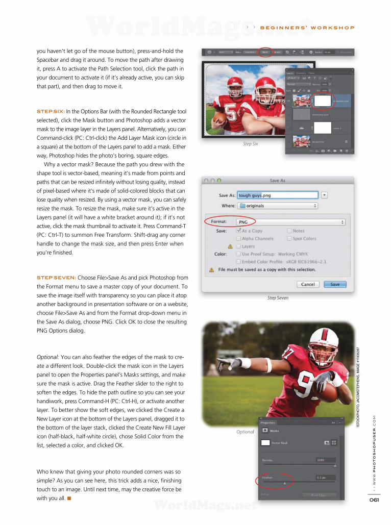
› › w
ww
.ph
oto
sh
opu
ser
.c
om
061
Step Six
Step Seven
Optional
› › b e g i n n e r s ’ w o r k s h o p
you haven’t let go of the mouse button), press-and-hold the
Spacebar and drag it around. To move the path after drawing
it, press A to activate the Path Selection tool, click the path in
your document to activate it (if it’s already active, you can skip
that part), and then drag to move it.
STEP SIX: In the Options Bar (with the Rounded Rectangle tool
selected), click the Mask button and Photoshop adds a vector
mask to the image layer in the Layers panel. Alternatively, you can
Command-click (PC: Ctrl-click) the Add Layer Mask icon (circle in
a square) at the bottom of the Layers panel to add a mask. Either
way, Photoshop hides the photo’s boring, square edges.
Why a vector mask? Because the path you drew with the
shape tool is vector-based, meaning it’s made from points and
paths that can be resized inf nitely without losing quality, instead
of pixel-based where it’s made of solid-colored blocks that can
lose quality when resized. By using a vector mask, you can safely
resize the mask. To resize the mask, make sure it’s active in the
Layers panel (it will have a white bracket around it); if it’s not
active, click the mask thumbnail to activate it. Press Command-T
(PC: Ctrl-T) to summon Free Transform. Shift-drag any corner
handle to change the mask size, and then press Enter when
you’re f nished.
STEP SEVEN: Choose File>Save As and pick Photoshop from
the Format menu to save a master copy of your document. To
save the image itself with transparency so you can place it atop
another background in presentation software or on a website,
choose File>Save As and from the Format drop-down menu in
the Save As dialog, choose PNG. Click OK to close the resulting
PNG Options dialog.
Optional: You can also feather the edges of the mask to cre-
ate a different look. Double-click the mask icon in the Layers
panel to open the Properties panel’s Masks settings, and make
sure the mask is active. Drag the Feather slider to the right to
soften the edges. To hide the path outline so you can see your
handiwork, press Command-H (PC: Ctrl-H), or activate another
layer. To better show the soft edges, we clicked the Create a
New Layer icon at the bottom of the Layers panel, dragged it to
the bottom of the layer stack, clicked the Create New Fill Layer
icon (half-black, half-white circle), chose Solid Color from the
list, selected a color, and clicked OK.
Who knew that giving your photo rounded corners was so
simple? As you can see here, this trick adds a nice, f nishing
touch to an image. Until next time, may the creative force be
with you all. ■
IST
OC
KP
HO
TO
, JA
CO
MS
TE
PH
EN
S, IM
AG
E #
11935287
WorldMags.netWorldMags.net
WorldMags.net
› › p
ho
to
sh
op
u
se
r › s
ep
te
mb
er
2
013
062
STEP ONE: Start with a good, rusty background, like this
one from Fotolia.com. I f nd that if you have an image with
bigger textures showing, you’ll need to adjust the size of your
layer styles accordingly. Select the Type tool (T) and add your
text. We’re using Gunplay from Dafont.com.
[NAPP members may download the f le used in this tuto-
rial at http://members.photoshopuser.com/magazine/issue/
september-2013. All f les are for personal use only.]
STEP TWO: With
your text formatted
the way you want it,
go to the Layers panel
and set the Fill for that
layer to 0%. We only
want the layer styles to
show through and not
the text color. Don’t
freak out because your text disappeared.
STEP THREE: Double-click to the right of the layer’s name
in the Layers panel and the Layer Style dialog will appear. Click
on Bevel & Emboss in the Styles list on the left. Here are the
settings we used. Bevel & Emboss is such a powerful style to
use, but it can be a bit daunting (or boring if you just use the
default settings). Every option in this panel can make a dramatic
difference to how the style looks, so don’t be afraid to play with
all of the settings. Later, we’ll change the bevel direction, but for
this part make sure the Direction for the bevel is set to Down.
Don’t click OK yet.
STEP FOUR: Check the box for Contour under Bevel &
Emboss on the left, but don’t make any changes. Now click
the word Texture below Contour, and then click on the Pattern
thumbnail to reveal the pattern gallery. Using the default pat-
terns, choose the f fth one from the left, Gray Granite. (Note:
If you have a bunch of other patterns in the gallery, you can
click the gear icon and choose Save Patterns, then click it again
and choose Reset Patterns. This will give you the original f ve
patterns.) You can use the settings shown here. Even though
you may be tempted, don’t click OK yet.
Step One
Step Three
Step Four
› › k e y c o n c e p t s : Layer masks Type tool
PETE COLLINS
Rusty TextThis issue, we’ll create some multipurpose rust that works great for text and can be reassigned to embellish
other design elements, as well. The process I’m going to show is mainly about getting the right settings for
your layer styles and then having fun with painting away with a layer mask.
CLASSIC EFFECTS
FO
TO
LIA
, K
EN
TO
H, IM
AG
E #
19958212
WorldMags.netWorldMags.net
WorldMags.net

› › w
ww
.ph
oto
sh
opu
ser
.c
om
063
STEP FIVE: Now we’ll give our bevel a little help by adding
Inner Shadow and Satin layer styles. Click Inner Shadow and
enter the settings shown here. Make sure to click the down-
facing arrow next to Contour and choose Half Round.
STEP SIX: Most folks understand Inner Shadow, but Satin is
one of those styles that a lot of people click on to see if it works,
and then turn it off. Satin acts like a shadow ripple effect inside
the object you’re working on. Click Satin, enter the settings
shown here, and look at the letter U in RUST. The left edge con-
tour of the U is shifted to the middle of the letter, while the right
edge does the same. Depending on your settings, where the
edges intersect will darken or lighten and give you some unique
effects inside the object. This is a great way to add a little depth
to your object, so it’s def nitely worth playing with. Now you can
click OK to apply the layer styles.
STEP SEVEN: You’re probably thinking, “This doesn’t look
that special,” and you’re right. Here’s where the magic hap-
pens. Click the Add Layer Mask icon (circle in a square) to add a
mask to your text layer. Select the Brush tool (B), click the Brush
Preset Picker in the Options Bar, and choose a Spatter brush.
You won’t need to change any brush settings, just increase the
size to 200 pixels. (Note: This is a good pixel size to begin with if
you’re using a resolution similar to mine. If you have a different
setup, you’ll have to play with the size to get the texture and
look you want.) Press D then X to set your brush to black then,
in the Options Bar, lower the Opacity to around 50%, and drop
the Flow to around 70%. Now dab and paint over the text area.
As you do, bumps and texture will start to appear. The great
thing is that this is all taking place on the layer mask, so the text
remains editable.
Step Five
Step Six
Step Seven
› › CLASSIC EFFECTS
WorldMags.netWorldMags.net
WorldMags.net
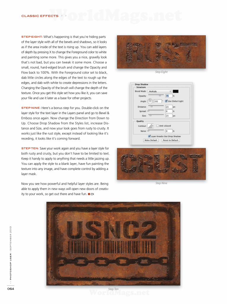
› › p
ho
to
sh
op
u
se
r › s
ep
te
mb
er
2
013
064
STEP EIGHT: What’s happening is that you’re hiding parts
of the layer style with all of the bevels and shadows, so it looks
as if the area inside of the text is rising up. You can add layers
of depth by pressing X to change the Foreground color to white
and painting some more. This gives you a nice, gravelly look
that’s not bad, but you can tweak it some more. Choose a
small, round, hard-edged brush and change the Opacity and
Flow back to 100%. With the Foreground color set to black,
dab little circles along the edges of the text to rough up the
edges, and dab with white to create depressions in the letters.
Changing the Opacity of the brush will change the depth of the
texture. Once you get this style set how you like it, you can save
your f le and use it later as a base for other projects.
STEP NINE: Here’s a bonus step for you. Double-click on the
layer style for the text layer in the Layers panel and go to Bevel &
Emboss once again. Now change the Direction from Down to
Up. Choose Drop Shadow from the Styles list, increase Dis-
tance and Size, and now your look goes from rusty to crusty. It
works just like the rust style, except instead of looking like it’s
receding, it looks like it’s coming forward.
STEP TEN: Save your work again and you have a layer style for
both rusty and crusty, but you don’t have to be limited to text.
Keep it handy to apply to anything that needs a little jazzing up.
You can apply the style to a blank layer, have fun painting the
texture into any image, and have complete control by adding a
layer mask.
Now you see how powerful and helpful layer styles are. Being
able to apply them in new ways will open new doors of creativ-
ity to your work, so get out there and have fun. ■
Step Nine
Step Eight
Step Ten
CLASSIC EFFECTS › ›
WorldMags.netWorldMags.net
WorldMags.net

Image of Blair Phillips using the Rapid Box Octa with a speedlite.
Durable framework with heavy-duty refl ective silver Provides soft and evenly refl ected light Extremely portable and lightweight design Opens and closes quickly like an umbrella Height-adjustable and rotatable tilt bracket
The Rapid Box includes 1-stopdiffusion panel, fully-adjustable bracket and compact carry case.
INTRODUCING
THE RAPID BOX™
A PERFECTLY PORTABLE SPEEDLITE SOFTBOX SYSTEM
MORE DETAILS & LIGHTING TIPS AT FJWESTCOTT.COM
“Extremely soft, even lighting on the go.
”
20" OCTA MINI #2030
$149.90
26" OCTA #2031
$169.90
10" x 24" STRIP #2032
$169.90
©BLAIR PHILLIPS
WorldMags.netWorldMags.net
WorldMags.net

› › p
ho
to
sh
op
u
se
r › s
ep
pt
em
be
r 2
013
066
Perspective allows us to portray the complex, three-dimensional
world we inhabit in a two-dimensional format and make it
believable. To understand the process of creating or compositing
images with proper perspective, it’s crucial to understand how
perspective works. There are certain fundamental principles at
work that can be used to achieve proper perspective.
HORIZON LINES AND VANISHING POINTS
All the elements in an image are created from the point of view
of the viewer. The eye level of the viewer is considered the hori-
zon line. It’s vital to establish this horizon line, even if buildings,
hills, or other elements in the image obscure it.
Note: If the horizon line is above the viewer’s eye level, it’s
what is commonly referred to as a bug’s-eye view. Things will
appear to be above the viewer and large. A horizon below the
viewer’s eye level is commonly referred to as bird’s-eye view.
Things will appear to be below the viewer.
As we view the world, all objects that fall into our f eld
of vision follow invisible lines that converge on this horizon
line. If you stand in the middle of a city street, looking down
the street as it’s receding, you can draw imaginary lines along
the edges of the sidewalk and the tops of the buildings to a
point off in the distance where the sky meets the street. If you
follow these lines, you’ll find that all the lines converge at
the same point. That point is what is known as the vanish-
ing point.
As objects get farther away from the viewer, they diminish
in size along what are known as vanishing lines. All the angles
follow the vanishing lines and converge on the horizon at the
vanishing point.
Putting Things into PerspectiveWhen compositing an object into an image, many things need to be considered. Does the object need to cast
a shadow? Does it need a strong highlight? Is it retf ective? An important thing to consider is how the object
conforms to the perspective of the scene. If the perspective doesn’t match, it will look out of place.
› › k e y c o n c e p t s : Pen tool
SINGLE AND MULTIPLE VANISHING POINTS
One-point perspective is when there’s a single point on the
horizon where all things meet. The image below shows my
painting, Damen, with the vanishing lines shown above. The
green line is the horizon, while all the red lines (vanishing lines)
are converging on a single point.
If more than one side of an object or structure is visible, it’s
necessary to create multiple vanishing points that all converge
on the same horizon line. The image below shows my painting,
Times Square. It has multiple vanishing points that all converge
on the same horizon. There’s a point going up 7th Avenue plus
one going up Broadway. There are two additional points going
east and west on 44th Street (as shown in the second image).
These were so far out of the image area that it required the use
of Illustrator to create the basic vanishing lines.
Note: Illustrator, being resolution independent, allowed me to
create the lines on a much smaller scale than the 25' image. These
lines were then separated and brought into scale where needed.
BERT MONROY FROM BERT’S STUDIO
WorldMags.netWorldMags.net
WorldMags.net
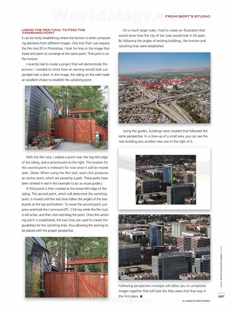
› › w
ww
.ph
oto
sh
opu
ser
.c
om
067
› › FROM BERT’S STUDIO
ALL IMAGES BY BERT MONROY
USING THE PEN TOOL TO FIND THE
VANISHING POINT
It can be tricky establishing where the horizon is when composit-
ing elements from different images. One trick that I use requires
the Pen tool (P) in Photoshop. I look for lines in the image that
travel and seem to converge at the same point. That point is on
the horizon.
I recently had to create a project that will demonstrate this
process. I needed to show how an awning would look sus-
pended over a door. In this image, the siding on the wall made
an excellent choice to establish the vanishing point.
With the Pen tool, I added a point near the top-left edge
of the siding, and a second point to the right. The location for
this second point is irrelevant for now since it will be moved
later. (Note: When using the Pen tool, each click produces
an anchor point, which are joined by a path. These paths have
been stroked in red in this example to act as visual guides.)
A third point is then created at the lower-left edge of the
siding. The second point, which will determine the vanishing
point, is moved until the two lines follow the angles of the two
boards at the top and bottom. To move the second point, just
press-and-hold the Command (PC: Ctrl) key while the Pen tool
is still active, and then click-and-drag the point. Once the vanish-
ing point is established, the two lines are used to create the
guidelines for the vanishing lines, thus allowing the awning to
be placed with the proper perspective.
On a much larger scale, I had to create an illustration that
would show how the city of San Jose would look in 50 years.
By following the angles of existing buildings, the horizon and
vanishing lines were established.
Using the guides, buildings were created that followed the
same perspective. In a close-up of a small area, you can see the
new building plus another new one to the right of it.
Following perspective concepts will allow you to composite
images together that will look like they were shot that way in
the f rst place. ■
WorldMags.netWorldMags.net
WorldMags.net
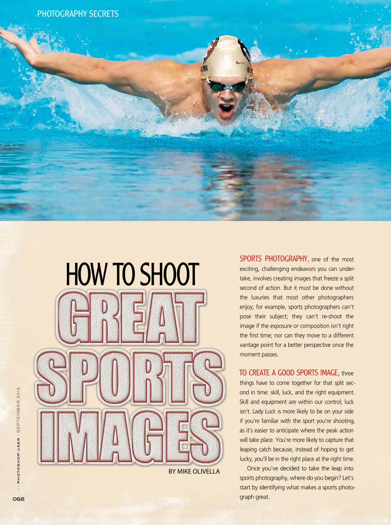
› › p
ho
to
sh
op
u
se
r › S
EP
TE
MB
ER
2
013
068
SPORTS PHOTOGRAPHY, one of the most
exciting, challenging endeavors you can under-
take, involves creating images that freeze a split
second of action. But it must be done without
the luxuries that most other photographers
enjoy; for example, sports photographers can’t
pose their subject; they can’t re-shoot the
image if the exposure or composition isn’t right
the fi rst time; nor can they move to a different
vantage point for a better perspective once the
moment passes.
TO CREATE A GOOD SPORTS IMAGE, three
things have to come together for that split sec-
ond in time: skill, luck, and the right equipment.
Skill and equipment are within our control; luck
isn’t. Lady Luck is more likely to be on your side
if you’re familiar with the sport you’re shooting,
as it’s easier to anticipate where the peak action
will take place. You’re more likely to capture that
leaping catch because, instead of hoping to get
lucky, you’ll be in the right place at the right time.
Once you’ve decided to take the leap into
sports photography, where do you begin? Let’s
start by identifying what makes a sports photo-
graph great.
BY MIKE OLIVELLA
PHOTOGRAPHY SECRETS
HOW TO SHOOT
WorldMags.netWorldMags.net
WorldMags.net

› › w
ww
.p
ho
to
sh
op
us
er
.c
om
069
Good sports photographs tell a story within the four corners of the image so viewers can tell what’s happening at a glance. A great sports image goes one step further, taking sports fans into the very heart of the game and capturing elements that aren’t visible to them from the bleachers. Just follow these general rules.
Get the face and the ball in the frame: What sets a great sports image
apart is seeing the athlete’s emotions, and that’s usually through his or
her facial expression. The eyes are the windows to the soul and the face
is the canvas for emotion. An image of the back of an athlete’s head
may be artistic, but it will be outdone by the same shot depicting the
athlete’s face and emotional expression. The icing on the cake is having
the ball in the frame—ideally in the glove, hands, or in the net, but in
the frame. Capture these two elements and you’re golden.
Shoot as tight as you possibly can: Hand in hand with getting the face in
the frame is shooting tight. Fans in the stands have a wide-angle view
of the game so they don’t see the player grimace when the bat makes
contact with the ball, or when the player goes airborne to head the ball
into the net. You, and only you, can provide a viewer that intensity by
shooting as tight as you can.
WHAT MAKES A SPORTS PHOTOGRAPH?
WorldMags.netWorldMags.net
WorldMags.net

070
› › p
ho
to
sh
op
u
se
r › S
EP
TE
MB
ER
2
013
Freeze the action: Blurred or soft images are no better than if you
missed the shot altogether. Parts of the image may not be perfectly
sharp due to depth-of-fi eld considerations, but it’s critical that key
aspects of an image are sharp. Typically, that would be the athlete’s
face, but many times it will extend to the hands and feet, depending
on the sport. Too much blurring of the feet or hands will detract
from the image; however, you can easily avoid this by controlling
your shutter speed. For example, 1/1000 will guarantee frozen
action. On occasion, I’ve gotten away with 1/400, but not all of my
images were frozen.
TIPS FOR SHOOTING THOSE GREAT PHOTOSNow that we’ve identif ed what makes an image great, here are
a few pointers on how to get those shots.
Shoot from the lowest possible position: Shooting up at athletes gives
them a distinctly superior look. If you kneel along the sidelines or sit
along the baseline, you can shoot with the ideal, eye-level perspec-
tive. That’s why you’ll see good pro sports photographers wearing
kneepads or sitting under the basket, because shooting from the
lowest vantage point yields the best images (not because they’re
trying to rest their weary bones).
Position yourself where the play will be, not where it begins: Long
before the play begins, put yourself in the best location for getting
that face and ball in the frame. When shooting a specifi c team or
player, position yourself downfi eld so the action is coming in your
direction. (If you’re behind the play, you probably won’t get both
elements in the image.) Another reason to position yourself well
ahead of the play is that the players will be coming toward you,
and they’ll become larger in your frame as the action develops. The
larger they become, the tighter you’ll be shooting.
Shoot with the sun at your back: Always ascertain where the sun will
be during the game, and then position yourself with the sun at your
back so that the players’ faces will be lit to the greatest extent pos-
sible. If you shoot into the sun, players will be backlit, and if you set
your exposure for the available light, the players will likely be under-
exposed. Conversely, if you expose for the players’ faces, the back-
ground behind them will be overexposed. Neither of these scenarios
makes for good images.
SELECTING YOUR GEARLet’s get into gear in more detail. My experience has been with
Nikon gear, but you can easily apply any of the following to
Canon or other camera manufacturers.
Full-frame (FX) or cropped-frame (DX) camera bodies: Your fi rst
equipment decision is whether to go with an FX-sensored body or a
DX-sensored body. Each has its advantages; but if you’ll be shooting
during the daytime only, a DX camera body will rival anything that
you’ll get from an FX body.
DX bodies are less expensive, but they also enjoy one huge
advantage over the FX bodies: the crop factor (Nikon DX bodies
have a 1.5x crop factor). Every DX camera body acts as if you have
a built-in teleconverter, but without any of the disadvantages of a
teleconverter, such as an increase in the wide-open aperture and
slight loss of sharpness. With a Nikon DX body, a 70–300mm
lens is the equivalent of a 105–450mm lens on an FX body, and
an 80–200mm lens is the equivalent of a 120–300mm lens. The
tradeoff is that FX bodies produce noticeably better images at
higher ISO levels, with less noise and better clarity.
Frames per second: Next, you’ll need to consider the frames per sec-
ond (fps) capability of the camera body. For sports, a camera body
that will shoot 5 fps is the minimum needed. The more fps capability
of the camera body, the better your chances of getting the shot at
peak-action moments.
New or used? Most every camera body and lens I own was bought
used, for approximately half as much as new gear. I only buy from
reputable dealers who service the equipment before a sale, and have
a money-back guarantee if the equipment fails, so I’ve only had pos-
itive experiences.
Off-brand lenses: If you decide to go with off-brand lenses, you’ll
defi nitely cut your equipment costs, but I always recommend Nikon
or Canon lenses.
WorldMags.netWorldMags.net
WorldMags.net

› › w
ww
.p
ho
to
sh
op
us
er
.c
om
071
WorldMags.netWorldMags.net
WorldMags.net

Mike Olivella is a sports photographer for the Florida State University Athletics Depart-
ment and a stringer for AP. Mike has photographed the action at NFL games, NCAA Division I regu-
lar and postseason contests, BCS Bowl games, March Madness, the US Open, Wimbledon, and the
Masters. Mike also owns and operates BaselineShots Photography Studio for glamour, fashion, and
product shoots. To see more of Mike’s work, go to www.baselineshots.com, follow Mike on Google+,
or read his blog at www.baselineshots.blogspot.com.
ALL IMAGES BY MIKE OLIVELLA
There’s a lot more to consider when diving into sports photography, but
hopefully, the information provided here is helpful. Once you’re geared
up, practice and opportunity will have you capturing images you may have thought were beyond your reach. ■
• Lean and Mean—Strictly for daytime use in good light at ISO levels
from 200–400. Start with a used Nikon D2H camera body ($300–
$400), a 4.1-megapixel, 8 fps pro body. It’s what I used up until
four or fi ve years ago. Add a Nikon 70–300mm f/4.5–5.6 lens ($300
used, $600 new), and you’re in business for less than $1,000, with
an outfi t that will reach out to the equivalent of a 105mm–450mm
lens on a full-frame body.
• Upping the Ante—Substitute a used Nikon D300 ($500–$600) for
the D2H, and you’re still getting 7 fps in a 12.3-megapixel, tough-
as-nails camera body. Still a daytime-only outfi t but, because of the
better camera body, you can push the ISO comfortably to 1,600
(when necessary) as light wanes, so long as you use some noise-
reduction software. If you go with a used lens, that’s still under
$1,000, and you’re still reaching out to 450mm at f/5.6.
• Getting Jiggy with It—Any daytime conditions are no problem with
this outfi t, and if you don’t mind some noise in the images (even
with noise-reduction software), you can try your hand at events
played in indoor gyms or at high-school football stadiums. Stick
with the used D300 but add a used battery grip ($100) to goose
your frames to 9 fps. Substitute a used Nikon 80–200mm AF-S
f/2.8D ED lens ($800–$900) for the 70–300mm lens and you’re
right at $1,500. Yes, you’ve decreased your effective focal range to
300mm, but you now have a faster-focusing, sharper lens that will
allow you to shoot in lower light.
• Doubling Down—If you want to press a bit further, pick up a used
1.4x Nikon teleconverter ($250–$275) for daytime use with the
above outfi t and you’ve extended your lens’ focal length to 420mm
at f/4, and you’re still well under $2,000.
• Best Bang for the Buck—All of the above, except swap a used Nikon
D3 ($2,000) for the D300. The D3 is a full-frame, 12.1-megapixel,
9 fps, pro body that rocked the world when it came out with its
low noise levels at high ISOs, and it still rivals most camera bodies
out there. For just a bit more than $3,000 (with noise-reduction
software), you can shoot up to ISO 6,400, which you’ll need for
acceptable images in high-school gyms or football fi elds. With a
full-frame body, your high ISO images will look better, but your
focal range will top out at 200mm without the teleconverter and
280mm with it.
The following are outfi ts that will equip you for the set-
tings described, based on my personal use of the Nikon
equipment listed, and their having provided images that
meet my quality expectations. Just remember that you’re
not going to get every shot that the guy next to you will
get with multiple Nikon D4s and an assortment of lenses.
But, by moving up and down the fi eld as the action
dictates, you’ll get your share of images.
WorldMags.netWorldMags.net
WorldMags.net
Focal Press and You.
Bound to Create
Save 20% on all Focal Press books when ordering from www.focalpress.com. Use discount code PHOTO at checkout.
Adobe PhotoshoP CC For PhotogrAPhers MArtin evening
Written by a renowned professional photographer for photographers, this bestseller has been fully updated, is packed with professional examples, step-by-step tutorials, and 750+ color images. The accompanying website features sample images, tutorial videos, and more!
9780415711753 • $54.95
PhotoshoP CC: essentiAl skills MArk gAler & PhiliP Andrews
Combining real world examples, step-by-step projects, and professional advice, this book and its companion website (with 10+ hours of movie tutorials and supporting files!) provides the ultimate learning experience for beginner to intermediate Photoshop users.
9780415715713 • $44.95
how to CheAt in PhotoshoP CC steve CAPlin
Learn all the techniques you need to create and master the art of photomontage, delivered in easy to follow step-by-step tutorials by master artist Steve Caplin. The book’s popular website delivers even more resources such as video tutorials, an “Ask the Author” forum and more!
9780415712385 • $44.95
FoCUs on PhotoshoP lightrooMdAve stevenson & nik rAwlinson
Learn the fundamentals of Lightroom and how to use the different Lightroom modules: how to import, organize, and sort your photos, edit them, create a book, video clips, or a slideshow, and how to make a great print.
9780415663236 • $19.59
WorldMags.netWorldMags.net
WorldMags.net

Layout Design: Taf y Clif ord
When Process is set to 2012 (Current) in the Camera Calibration panel, you’ll have full use of the Radial Filter.
If Process is set to an older version, such as 2010, then you’ll lose many of the sliders in the Radial Filter.
General Tips and TricksBefore you start using the Radial Filter, there are a few features and
settings you need to be aware of. To access the Radial Filter, press
Shift-M or click the circle icon in the Toolbox above the Basic panel.
[Process Version]First of all, if you want to have full-function of this fi lter, your photos
must be in the 2012 (Current) process version in the Camera Cal-
ibration panel. If you have it set to an older process version, then you
won’t have half of the sliders to play with when adjusting your fi lter.
[Invert Mask]There’s one important checkbox in the Radial Filter panel that
you’ll probably change quite often: the Invert Mask setting.
When you apply a Radial Filter, the adjustments will appear on
the outside of your oval or circle shape. If you’d like to do anything
other than a vignette-type effect, then this will need to be checked.
Unfortunately, it’s not sticky (meaning you can’t default it to being
checked all the time), so you’ll have to make that extra mouse click
each time you use the fi lter for nonvignette effects. You can also
press the Apostrophe key (’) on your keyboard to turn the Invert
Mask option on and off.
MONG THE NEW FEATURES RE-
LEASED IN LIGHTROOM 5, THE
RADIAL FILTER WAS THE ONE I HAD
BEEN HOPING FOR THE MOST.
LIGHTROOM HAS HAD LINEAR GRADIENTS FOR
SOME TIME, BUT I’VE HAD MANY OCCASIONS
WHEN THIS STRAIGHT-LINED FILTER JUST DIDN’T
CUT IT. TO GET YOU STARTED WITH THIS NEW
FEATURE, HERE ARE SOME TIPS, TRICKS, AND
WAYS I USE THE RADIAL FILTER.
› › p
ho
to
sh
op
u
se
r › s
ep
te
mb
er
2
013
074
WorldMags.netWorldMags.net
WorldMags.net
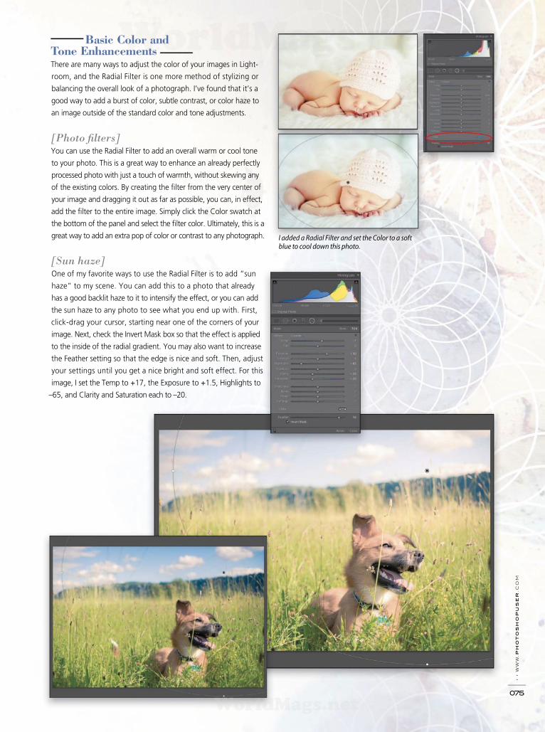
I added a Radial Filter and set the Color to a soft blue to cool down this photo.
Basic Color and
Tone Enhancements
There are many ways to adjust the color of your images in Light-
room, and the Radial Filter is one more method of stylizing or
balancing the overall look of a photograph. I’ve found that it’s a
good way to add a burst of color, subtle contrast, or color haze to
an image outside of the standard color and tone adjustments.
[Photo fi lters]You can use the Radial Filter to add an overall warm or cool tone
to your photo. This is a great way to enhance an already perfectly
processed photo with just a touch of warmth, without skewing any
of the existing colors. By creating the fi lter from the very center of
your image and dragging it out as far as possible, you can, in effect,
add the fi lter to the entire image. Simply click the Color swatch at
the bottom of the panel and select the fi lter color. Ultimately, this is a
great way to add an extra pop of color or contrast to any photograph.
[Sun haze]One of my favorite ways to use the Radial Filter is to add “sun
haze” to my scene. You can add this to a photo that already
has a good backlit haze to it to intensify the effect, or you can add
the sun haze to any photo to see what you end up with. First,
click-drag your cursor, starting near one of the corners of your
image. Next, check the Invert Mask box so that the effect is applied
to the inside of the radial gradient. You may also want to increase
the Feather setting so that the edge is nice and soft. Then, adjust
your settings until you get a nice bright and soft effect. For this
image, I set the Temp to +17, the Exposure to +1.5, Highlights to
–65, and Clarity and Saturation each to –20.
› › w
ww
.p
ho
to
sh
op
us
er
.c
om
075
WorldMags.netWorldMags.net
WorldMags.net

› › p
ho
to
sh
op
u
se
r › s
ep
te
mb
er
2
013
076
Processing Photos of People The Radial Filter is a very good tool to use with portraits. Sure, you could use the Adjustment Brush tool, but you have an easy-to-
edit, feathered edge to work with in a Radial Filter. Plus, people’s faces are oval, so it makes sense to work with a defi ned shape
with a good feather to it. Here are a few ways you can use this fi lter when processing portraits.
[Selective adjustments to eyes, mouth, and cheeks]The Radial Filter is the perfect tool to
use for making selective adjustments to
portions of the face. The rounded shape of
the gradient makes it work on almost any
portion of the face.
[Eyes]
Draw an oval shape, starting with the
cursor in the middle of the eye. Make the
shape about the size you need it, and then
resize and rotate it afterwards to fi t around
the eyes perfectly. You’ll want it to cover
the eyes from the bottom eyelashes to the
top eyelashes, and just outside of the
eyeball portion from left-to-right. To move just one side of the Radial Filter, hold the Option (PC: Alt)
key while dragging one of the control handles. If there’s excess darkening around the eyes you may want to slightly increase the size.
Check the Invert Mask box, and then play with the sliders to increase the Exposure, Clarity, and also brighten the colored portion
of the eyes with the Saturation and Shadows sliders.
[Off-center vignettes]One of the most common uses of the Radial Filter is to create off-center vignettes, but don’t feel like you have to limit
your adjustments to only adjusting the exposure of your vignette. There are so many other ways to darken the edges
and draw attention to the center of the photograph.
For this image, the main subject of my photo is in the upper-left corner. If I were to add a standard vignette,
I would risk darkening the subject more than I’d like. Instead, I chose to go with a slightly off-center vignette to keep my
subject nice and bright. First, I turned off Invert Mask then, instead of just adjusting the Exposure (set to –0.45), I also
played with the Temp (+10), Tint (+6), Contrast (+19), and Highlights (–5).
WorldMags.netWorldMags.net
WorldMags.net

› › w
ww
.p
ho
to
sh
op
us
er
.c
om
077 ALL PHOTOS BY NICOLE S. YOUNG
Tip: Once you’ve made your adjustments to each section of the face, be
sure to save it as a Radial Filter preset. To do this, click the Effect drop-down
menu at the top of the panel, choose Save Current Settings as New Preset,
and give it a name. Then, in the future, when applying a new Radial Filter,
choose the preset from the list to apply those same settings to other images.
[Mouth]Draw a skinny oval shape over the lips, and center it over the mouth.
Rotate it and increase the size so that it fi ts just around the lips.
Then, check the Invert Mask box and increase the Saturation and
Clarity sliders to see how it looks. For this image, I also added a pink
color with the Color adjustment, as well as decreased the Highlights
and increased the Temp to make the lips stand out a bit. Note: This
will usually only work best in photos with a closed mouth.
[Cheeks]The Radial Filter is a quick way to add a hint of color to the cheeks.
Just create an oval shape and rotate it so that it sits high on the
cheekbones. Then, add a pink hue from the Color setting, and
increase the Feather (I set mine to +76). For this image, I also
decreased the Exposure (–0.30) to darken the cheekbones slightly.
[Bringing attention to the face] When we look at a photo, our eyes tend to see the brightest
portion of the image fi rst. Because of this, we will likely want
the face in a portrait to be the element that stands out the
most. By using a Radial Filter, you can add a vignette that allows
you to focus the attention on the face.
To do this, fi rst add your fi lter, placing the point in the cen-
ter of the face. Rotate and resize it so that it sits just outside of
the face, then make adjustments to the Exposure and Shad-
ows (I set my Exposure to –1.45 and the Shadows to –15),
and any other setting you think will work. This adjustment,
regardless of how subtle it is, can be a good way to direct the
attention of the image more toward the face. ■
WorldMags.netWorldMags.net
WorldMags.net
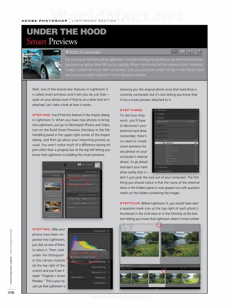
› › p
ho
to
sh
op
u
se
r › s
ep
te
mb
er
2
013
078
For as long as I’ve been using Lightroom, I’ve been storing my photos on an external hard drive
because my laptop drive f lls up too quickly. When I disconnected the external drive, however,
I really couldn’t do much with my photos. Sure, you could do certain things in the Library mod-
ule, but you couldn’t edit them in the Develop module.
Smart Previews
UNDER THE HOOD
Matt Kloskowski
Well, one of the brand-new features in Lightroom 5
is called smart previews and it lets you do just that—
work on your photos even if they’re on a drive that isn’t
attached. Let’s take a look at how it works.
STEP ONE: You’ll f nd this feature in the Import dialog
in Lightroom 5. When you have new photos to bring
into Lightroom, just go to File>Import Photos and Video,
turn on the Build Smart Previews checkbox in the File
Handling panel in the upper-right corner of the Import
dialog, and then go about your importing process as
usual. You won’t notice much of a difference during im-
port other than a progress bar at the top left letting you
know that Lightroom is building the smart previews.
STEP TWO: After your
photos have been im-
ported into Lightroom,
just click on one of them
to select it. Then, look
under the Histogram
in the Library module
(at the top right of the
screen) and you’ll see it
reads “Original + Smart
Preview.” This is your vis -
ual cue that Lightroom is
showing you the original photo since that hard drive is
currently connected; but it’s also letting you know that
it has a smart preview attached to it.
STEP THREE:
To see how they
work, you’ll have
to disconnect your
external hard drive
(remember, there’s
no need to create
smart previews for
any photos on your
computer’s internal
drives). So go ahead
and eject your hard
drive (safely that is—
don’t just yank the wire out of your computer). The f rst
thing you should notice is that the name of the external
drive in the Folders panel is now grayed out with question
marks on the folders containing the images.
STEP FOUR: Before Lightroom 5, you would have seen
a question mark icon at the top right of each photo’s
thumbnail in the Grid view or in the Filmstrip at the bot-
tom letting you know that Lightroom doesn’t know where
. . . .
a d o b e p h o t o s h o p l i g h t r o o m s e c t i o n › ›
WorldMags.netWorldMags.net
WorldMags.net
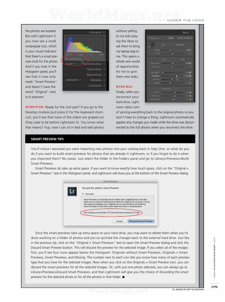
› › w
ww
.ph
oto
sh
opu
ser
.c
om
079
the photos are located.
But with Lightroom 5,
you now see a small
rectangular icon, which
is your visual indicator
that there’s a smart pre-
view built for this photo.
And if you look in the
Histogram panel, you’ll
see that it now only
reads “Smart Preview”
and doesn’t have the
word “Original” next
to it anymore.
STEP FIVE: Ready for the cool part? If you go to the
Develop module (just press D for the keyboard short-
cut), you’ll see that none of the sliders are grayed out
(they used to be before Lightroom 5). You know what
that means? Yup, now I can sit in bed and edit photos
SMART PREVIEW TIPS
You’ll notice I assumed you were importing new photos into your catalog back in Step One, so what do you
do if you want to build smart previews for photos that are already in Lightroom, or if you forgot to do it when
you imported them? No sweat. Just select the folder in the Folders panel and go to Library>Previews>Build
Smart Previews.
Smart Previews do take up extra space. If you want to know exactly how much space, click on the “Original +
Smart Previews” text in the Histogram panel, and Lightroom will show you at the bottom of the Smart Preview dialog.
Since the smart previews take up extra space on your hard drive, you may want to delete them when you’re
done working on a folder of photos and you’ve synched the changes back to the external hard drive. Just like
in the previous tip, click on the “Original + Smart Previews” text to open the Smart Preview dialog and click the
Discard Smart Preview button. This will discard the preview for the selected image. If you select all of the images
f rst, you’ll see four icons appear below the Histogram: Originals without Smart Previews, Originals + Smart
Previews, Smart Previews, and Missing. The number next to each icon lets you know how many of each preview
type that you have for the selected images. Now when you click on the Originals + Smart Preview icon, you can
discard the smart previews for all the selected images. Or, with just one photo selected, you can always go to
Library>Previews>Discard Smart Previews, and then Lightroom will give you the choice of discarding the smart
preview for the selected photo or for all the photos in that folder. ■
ALL IMAGES BY MATT KLOSKOWSKI
without yelling
to my kids play-
ing the Xbox to
ask them to bring
my laptop bag to
me. This opens a
whole new world
of opportunities
for me to give
them new tasks.
STEP SIX:
Finally, when you
reconnect your
hard drive, Light-
room takes care
of syncing everything back to the original photos so you
won’t have to change a thing. Lightroom automatically
applies any changes you made while the drive was discon-
nected to the full photos when you reconnect the drive.
› › u n d e r t h e h o o d
WorldMags.netWorldMags.net
WorldMags.net

› › p
ho
to
sh
op
u
se
r › s
ep
te
mb
er
2
013
080
a d o b e p h o t o s h o p l i g h t r o o m s e c t i o n › ›
. . . .
Since Lightroom was f rst released, it has been developed in parallel with the equivalent ver-
sion of the Adobe Camera Raw plug-in for Photoshop. This means that when a new version
of Lightroom was released, there was also a new version of the Camera Raw plug-in for the
latest version of Photoshop.
Rob Sylvan
Using Photoshop CS6 with Lightroom 5UNDER THE LOUPE
When Lightroom 4 was released, a new version of Photo-
shop (CS6) was not far behind, and along with Photoshop
CS6 came Adobe Camera Raw 7. With every update for
Lightroom 4 (up to 4.4), there was a simultaneous release
of an update for Camera Raw 7 (up to 7.4). Each of these
dot release updates brought a combination of bug f xes,
new lens prof les, and support for the RAW f les from
new camera models. Now, Adobe’s decision to continue
to provide updated Camera Raw plug-in support to
Photo shop CS6 has extended CS6’s usefulness and made
it a solid partner for Lightroom 5.
Up to this year, when a new version of Lightroom and
Photoshop were released, the previous version would no
longer be available in the Adobe store, and Adobe would
cease to provide dot release updates to those previous
versions. This changed in a couple of signif cant ways
after the release of Lightroom 5 and Photoshop CC. First,
at the time of this writing, it’s still possible to purchase
a licensed copy of Photoshop CS6 in the Adobe store
despite Photoshop CC’s availability to Creative Cloud
subscribers. Second, Adobe has broken with tradition
and released a version of Camera Raw that works with
Photoshop CS6. Note: Lightroom 4 is no longer available
and will not be updated.
NOTES ON COMPATIBILITY
Why the change? Adobe states that since Photoshop CS6
is still being sold, it will continue to provide updated RAW
f le compatibility for its customers using that product. This
comes in the form of a version of Camera Raw 8 (8.1 as
of this writing) that’s compatible with Photoshop CS6.
This special version of Camera Raw 8 has all the same
new camera support as Lightroom 5 and the version of
Camera Raw 8 for Photoshop CC, and it can render all of
the new features in Lightroom 5, such as the Radial Filter,
the Upright feature (located in the Basic tab in the Lens
Corrections panel), and the improved Spot Removal tool.
The difference is the Camera Raw 8 plug-in for Photoshop
CS6 doesn’t show the controls in the Camera Raw plug-in
itself. More on this later.
Those of you who have upgraded to Photoshop CC will
continue to get normal updates to the Camera Raw 8
plug-in, and this version of the plug-in will provide full
access to editing with all the new features in Lightroom 5
and Photoshop CC. So, really, there’s no change in policy
for those who have already upgraded, and if you fall into
that category, you may not be as interested in the rest of
this story.
WILL THIS AFFECT YOUR WORKFLOW?
If you have Lightroom 5, Photoshop CS6, and have
installed the Camera Raw 8.x update for CS6, let’s take
a closer look at what that means for your workf ow. First,
the good news: With this combination of software, you
can use Lightroom 5 with any of the RAW f le formats it
supports, develop photos with any of the new features
in Lightroom 5, and can seamlessly send a copy with
those new Lightroom adjustments to Photoshop CS6
for additional editing, just like you did with Lightroom 4.
So, if you bring in a RAW photo from a newly supported
camera into Lightroom 5 and correct perspective distor-
tion with the Upright function, remove a power line with
the new Spot Removal tool, add a Radial Filter, then send
a copy to Photoshop CS6 with Lightroom edits, you’ll see
all of those adjustments are applied to the new copy. This
is actually really great news.
Let’s contrast that against what happens to someone
using Lightroom 5, Photoshop CS6, and Camera Raw 7.4.
In this scenario, if you use the Photo>Edit In>Edit in Adobe
Photoshop CS6 menu in Lightroom 5, you’ll get a prompt
telling you that “This version of Lightroom may require the
Photoshop Camera Raw plug-in version 8.x for full compat-
ibility,” and give you the options to Cancel, Render Using
Lightroom, or Open Anyway. The best thing a Photoshop
CS6 user can do at this point is choose Cancel, then go to
Help>Updates in Photoshop to have the latest version of
WorldMags.netWorldMags.net
WorldMags.net
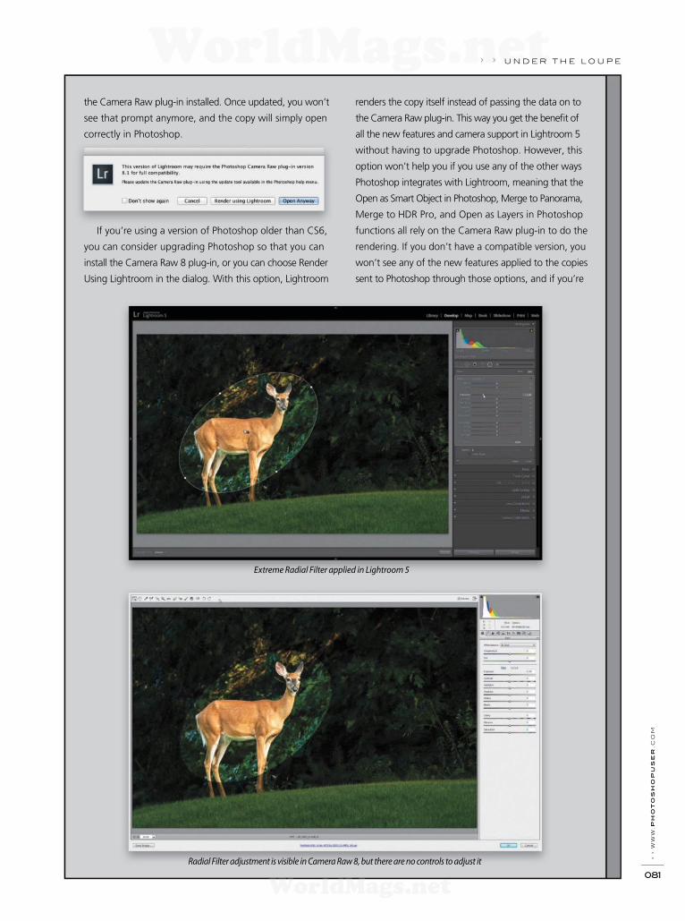
› › w
ww
.ph
oto
sh
opu
ser
.c
om
081
› › u n d e r t h e l o u p e
the Camera Raw plug-in installed. Once updated, you won’t
see that prompt anymore, and the copy will simply open
correctly in Photoshop.
If you’re using a version of Photoshop older than CS6,
you can consider upgrading Photoshop so that you can
install the Camera Raw 8 plug-in, or you can choose Render
Using Lightroom in the dialog. With this option, Lightroom
renders the copy itself instead of passing the data on to
the Camera Raw plug-in. This way you get the benef t of
all the new features and camera support in Lightroom 5
without having to upgrade Photoshop. However, this
option won’t help you if you use any of the other ways
Photoshop integrates with Lightroom, meaning that the
Open as Smart Object in Photoshop, Merge to Panorama,
Merge to HDR Pro, and Open as Layers in Photoshop
functions all rely on the Camera Raw plug-in to do the
rendering. If you don’t have a compatible version, you
won’t see any of the new features applied to the copies
sent to Photoshop through those options, and if you’re
Extreme Radial Filter applied in Lightroom 5
Radial Filter adjustment is visible in Camera Raw 8, but there are no controls to adjust it
WorldMags.netWorldMags.net
WorldMags.net

u n d e r t h e l o u p e › ›
using a newer camera model, you might not see any photo
appear at all.
LIMITATIONS
Photoshop CS6 users can be thankful for this version of
the Camera Raw plug-in for allowing the majority of their
Lightroom 5 to Photoshop CS6 workfow to work without
a hitch and without having to upgrade to Photoshop CC.
There are, however, a couple of things to keep in mind. Most
importantly is that while this special version of Camera Raw 8
can render the new features, it doesn’t allow you to edit those
same new features in the plug-in. This could potentially impact
anyone who uses the Photo>Edit In>Open as Smart Object
in Photoshop function in Lightroom 5 to send a copy of the
RAW photo with Lightroom adjustments embedded in a smart
object layer. In this scenario, the copy will visibly have all the
edits applied to it, but if you double-click the smart object
layer to open the embedded copy into the Camera Raw plug-
in, you wouldn’t be able to edit any features not supported
by Camera Raw 7.4.
Similarly, if you take advantage of the ability to write changes
into the XMP metadata space of your photos in Lightroom, then
decide to open that photo into the Camera Raw 8 plug-in
for CS6 directly, you won’t be able to alter the adjustments
from the new features. To illustrate this point, I applied
an extreme Radial Filter adjustment to the photo in the
frst image (see previous page), then used the Photo>Edit
In>Open as Smart Object in Photoshop menu to send a
copy to Photoshop CS6. In the next image, you can see
that same photo opened in the Camera Raw 8 plug-in for
CS6 with the Radial Filter applied, but there are no controls
for adjusting it further.
If you don’t use that workfow, then that really isn’t going
to affect you much, but it is important to be aware of the
limitations of this special version of Camera Raw. Looking
to the future, Adobe has not provided a timeline for how
long this special version of Camera Raw for Photoshop CS6
will continue to be updated, but I’ve been told that it will
continue to be updated for the foreseeable future. Even
when Adobe stops updating this version of the Camera
Raw plug-in for future new cameras and lenses, Lightroom 5
and Photoshop CS6 will still remain a compatible partner-
ship for some time to come. n
ALL IMAGES BY ROB SYLVAN
WorldMags.netWorldMags.net
WorldMags.net
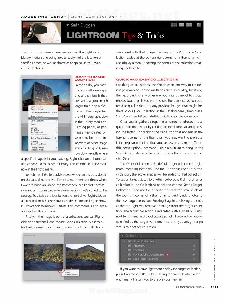
› › w
ww
.ph
oto
sh
opu
ser
.c
om
083
The tips in this issue all revolve around the Lightroom
Library module and being able to easily f nd the location of
specif c photos, as well as shortcuts to speed up your work
with collections.
JUMP TO IMAGE LOCATION
Occasionally, you may
f nd yourself viewing a
grid of thumbnails that
are part of a group much
larger than a specif c
folder. This might be
the All Photographs view
in the Library module’s
Catalog panel, or per-
haps a view created by
searching for a certain
keyword or other image
attribute. To quickly nar-
row down exactly where
a specif c image is in your catalog, Right-click on a thumbnail
and choose Go to Folder in Library. This command is also avail-
able in the Photo menu.
Sometimes, I like to quickly access where an image is stored
on the actual hard drive. For instance, there are times when
I want to bring an image into Photoshop, but I don’t necessar-
ily want Lightroom to create a new version that’s added to the
catalog. To display the location on the hard drive, Right-click on
a thumbnail and choose Show in Finder (Command-R), or Show
in Explorer on Windows (Ctrl-R). This command is also avail-
able in the Photo menu.
Finally, if the image is part of a collection, you can Right-
click on a thumbnail, and choose Go to Collection. A submenu
for that command will show the names of the collections
associated with that image. Clicking on the Photo Is in Col-
lection badge at the bottom-right corner of a thumbnail will
also display a menu, showing the names of the collections that
image belongs to.
QUICK AND EASY COLLECTIONS
Speaking of collections, they’re an excellent way to create
image groupings based on things such as quality, location,
theme, project, or any other way you might think of to group
photos together. If you want to use the quick collection but
need to quickly clear out any previous images that might be
there, click Quick Collection in the Catalog panel, then press
Shift-Command-B (PC: Shift-Ctrl-B) to clear the collection.
Once you’ve gathered together a number of photos into a
quick collection, either by clicking on the thumbnail and press-
ing the letter B or clicking the circle icon that appears in the
top-right corner of the thumbnail, you may want to promote
it to a regular collection that you can assign a name to. To do
this, press Option-Command-B (PC: Alt-Ctrl-B) to bring up the
Save Quick Collection dialog. Give the collection a name and
click Save.
The Quick Collection is the default target collection in Light-
room, meaning that if you use the B shortcut key or click the
circle icon, the active images will be added to that collection.
To assign target status to another collection, Right-click on a
collection in the Collections panel and choose Set as Target
Collection. Then use the B shortcut or click the small circle at
the top-right corner of a thumbnail to quickly add photos to
the new target collection. Pressing B again or clicking the circle
at the top right will remove an image from the target collec-
tion. The target collection is indicated with a small plus sign
next to its name in the Collections panel. The collection you’ve
specif ed as the target will remain so until you assign target
status to another collection.
If you want to have Lightroom display the target collection,
press Command-B (PC: Ctrl-B). Using the same shortcut a sec-
ond time will return you to the previous view. ■
Seán Duggan
LIGHTROOM Tips & Tricks
a d o b e p h o t o s h o p l i g h t r o o m s e c t i o n › ›
ALL IMAGES BY SEÁN DUGGAN
WorldMags.netWorldMags.net
WorldMags.net

› › p
ho
to
sh
op
u
se
r › s
ep
te
mb
er
2
013
084
Many photographers are drawn to exploring and photograph-
ing abandoned buildings, roadside debris, and family heirlooms
that echo the passage of distant times.
PHOTOGRAPHING YESTERDAY
Up until the mid-20th century, the many towns that lined the
Hudson River surrounding New York City were industrial centers
of transportation, production, manufacturing, and worldwide
trade. In the mid- to late-20th century, as the world’s economy
changed, these river towns were either left by the wayside or,
as in the case of Edgewater, Weehawken, and Hoboken, New
Jersey, they reinvented themselves by razing the old factories
and building contemporary condominiums and riverside parks.
Over the years, I’ve been photographing the changing face of
these communities as they’re transformed from working class
neighborhoods to white-collar enclaves.
Note: Being in abandoned buildings may be illegal and, due
to weakened structures, very dangerous. Always explore with
a photo partner and be alert for rotten f oorboards, rusty nails,
and chemical debris.
Photographing in old factory buildings is often a hit or miss
situation of access and light, and bracketing the handheld expo-
sure by 3 stops allows me to work quickly and have the ability to
process the dark interiors and the bright exteriors to create pleas-
ing results fairly quickly with Adobe Camera Raw and Merge
to HDR Pro. Entire books have been written on processing HDR
images; here, I’m sharing a straightforward approach that I use
to produce appealing results.
HDR image from three exposures
KATRIN EISMANNCREATIVE POINT OF VIEW
Photography relies on an integral relationship with time, as it freezes, blurs, captures, and preserves the intan-
gible presence of the f eeting moment. Many times we use the camera to immortalize the young, strong,
powerful, beautiful, and perfect. In contrast, the decayed, crumbling, and faded of er an honest glimpse into
our own mortality.
Past Prime
c o l u m n › ›
KAT
RIN
EIS
MA
NN
WorldMags.netWorldMags.net
WorldMags.net

› › w
ww
.ph
oto
sh
opu
ser
.c
om
085
STEP ONE: After downloading the images with Adobe Bridge,
select the bracketed exposures and open them in Adobe Camera
Raw (Command-R [PC: Ctrl-R]). Resist the temptation to process
the f les with any tone, contrast, or color adjustments.
STEP TWO: Click the
Select All button at the
top left of the Camera
Raw dialog to select
all of the images, go
to the Lens Correc-
tions panel (sixth panel
from the left), select
the Prof le tab, turn
on Enable Lens Prof le
Corrections, and apply
the appropriate Lens
Profile. Because the
shots in this example
were handheld, I did
not apply Manual Lens Corrections. But when shooting with a
tripod where the geometry of the images is identical, it’s f ne
to use the Manual corrections. Click Done to return to Bridge.
STEP THREE: Select the images in Bridge and choose Tools>
Photoshop>Merge to HDR Pro. If the camera or subject moved,
check Remove Ghosts, set Mode to 32 Bit, and move the high-
light slider to the right side of the White Point preview histogram.
Click OK.
STEP FOUR: Save the f le as a TIFF, close the f le, and in Bridge,
choose File>Open in Camera Raw to process this image with
the familiar and powerful ACR controls. Note: If the Open in
Camera Raw option is grayed out, go to Adobe Bridge CS6 (PC:
Edit)>Camera Raw Preferences, and select Automatically Open
All Supported TIFFs in the TIFF drop-down menu at the bottom of
the dialog.
The amount of detail allows each broken timber and crumbled
brick to speak and yields a grace to the silent John Deere excavator.
Tip: When processing HDR images in Adobe Camera Raw,
clicking Auto in the Basic panel is often a fantastic f rst step to
achieving pleasing results. The Auto algorithms were developed
through extensive research and you can then adjust the settings
further to suit your own look and style.
PRESERVING MEMORIES
On a much smaller and more intimate note, Bina Altera, a New
York-based photographic artist, has created a beautiful body of
work titled Immemorial in which she photographs a wide variety of
objects from a lock of hair to a mysteriously gilded brick to a magi-
cal collection of baby teeth. As she describes, “These objects rep-
resent legacy, death, and a way to hold onto people, and in some
ways are even used as power symbols. They serve as footprints
› › CREATIVE POINT OF VIEW
WorldMags.netWorldMags.net
WorldMags.net

› › p
ho
to
sh
op
u
se
r › s
ep
te
mb
er
2
013
086
or markers in each person’s life and span all ages. These objects
have been kept as part of one’s possessions over a long period of
time and are special and powerful to each individual. Some objects
are used as altars and others are kept tucked away in brown bags
in drawers. There is an inherent life to each object. These objects
become a part of the individual, and are tangible embodiments
of a constantly changing past, present, and future.”
Over the course of a year, Bina gathered the objects and
built a unique box or stage for each one. “This context is
represented by the treatment of the box, specif cally fabricated
to support the story of the object. Just as the stories are sup-
ported, the objects are clearly visibly supported, lending a real ity
to the hanging object. The resulting treatment and placement
of the object within the box is a combination of the signif cance
of the object to the individual as well as to me. The f nal body
of work is the translation of a secret language describing the
objects poetically, as if it were a memory or dream.”
AUTHENTICITY
In the age of overprocessed HDR images, the term “ruin porn”
was coined to denigrate images of decrepit buildings. But the
simplistic act of adding the word “porn” to photographic subject
matter is a label, which denies the beauty of the abandoned,
aged, and discarded. Delve into the materials that you’re attracted
to, build alters for them, hang them by threads, explore, experi-
ment, and never let one-dimensional labels hamper your creative
fantasy and visual journey. ■
CREATIVE POINT OF VIEW › ›
BIN
A A
LT
ER
AB
INA
ALT
ER
A
BIN
A A
LT
ER
A
WorldMags.netWorldMags.net
WorldMags.net
WorldMags.netWorldMags.net
WorldMags.net

› › p
ho
to
sh
op
u
se
r › s
ep
te
mb
er
2
013
088
Dynamic Range
STEP ONE: Open the Helmet, Pinnacles, and Fire images in Photoshop.
We’ll begin with the Pinnacles image, so make that the active fi le.
First, we’ll modify the landscape by making the distant mountain a
bit taller. Use the Lasso tool (L) to make a loose selection of the dis-
tant mountain and a bit of the sky above it. Press Command-J (PC:
Ctrl-J) to copy the selection to a new layer. Right-click on this layer in
the Layers panel and choose Convert to Smart Object. Double-click
on the layer’s name and rename it “Mountain.”
[NAPP members may download the fi les used in this tutorial from
http://members.photoshopuser.com/magazine/issue/september-2013.
All fi les are for personal use only.]
Layer masks Quick Selection tool> > KEY CONCEPTS:
In anticipation of the next fi lm installment of The Hobbit (due out in December), I’ve been thinking of some
of the composites I created for the 2nd edition of Photoshop Masking & Compositing (Peachpit, 2012),
which I co-authored with Katrin Eismann and James Porto. Several of them have a very strong Middle-Earth
(or Game of Thrones) quality to them. For this article, I’ll revisit one of my favorite composites from the book
and take it in a slightly dif erent direction.
Th
e
By Seán Duggan
Before
WorldMags.netWorldMags.net
WorldMags.net
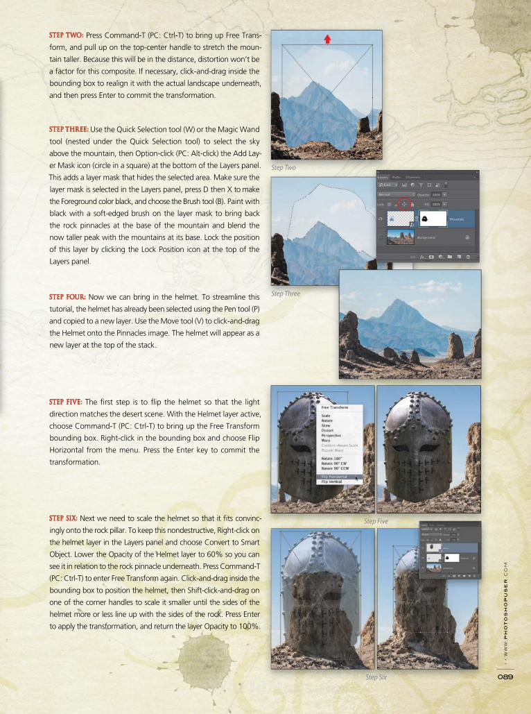
› › w
ww
.p
ho
to
sh
op
us
er
.c
om
089
STEP TWO: Press Command-T (PC: Ctrl-T) to bring up Free Trans-
form, and pull up on the top-center handle to stretch the moun-
tain taller. Because this will be in the distance, distortion won’t be
a factor for this composite. If necessary, click-and-drag inside the
bounding box to realign it with the actual landscape underneath,
and then press Enter to commit the transformation.
STEP THREE: Use the Quick Selection tool (W) or the Magic Wand
tool (nested under the Quick Selection tool) to select the sky
above the mountain, then Option-click (PC: Alt-click) the Add Lay-
er Mask icon (circle in a square) at the bottom of the Layers panel.
This adds a layer mask that hides the selected area. Make sure the
layer mask is selected in the Layers panel, press D then X to make
the Foreground color black, and choose the Brush tool (B). Paint with
black with a soft-edged brush on the layer mask to bring back
the rock pinnacles at the base of the mountain and blend the
now taller peak with the mountains at its base. Lock the position
of this layer by clicking the Lock Position icon at the top of the
Layers panel.
STEP FOUR: Now we can bring in the helmet. To streamline this
tutorial, the helmet has already been selected using the Pen tool (P)
and copied to a new layer. Use the Move tool (V) to click-and-drag
the Helmet onto the Pinnacles image. The helmet will appear as a
new layer at the top of the stack.
STEP FIVE: The fi rst step is to fl ip the helmet so that the light
direction matches the desert scene. With the Helmet layer active,
choose Command-T (PC: Ctrl-T) to bring up the Free Transform
bounding box. Right-click in the bounding box and choose Flip
Horizontal from the menu. Press the Enter key to commit the
transformation.
STEP SIX: Next we need to scale the helmet so that it fi ts convinc-
ingly onto the rock pillar. To keep this nondestructive, Right-click on
the helmet layer in the Layers panel and choose Convert to Smart
Object. Lower the Opacity of the Helmet layer to 60% so you can
see it in relation to the rock pinnacle underneath. Press Command-T
(PC: Ctrl-T) to enter Free Transform again. Click-and-drag inside the
bounding box to position the helmet, then Shift-click-and-drag on
one of the corner handles to scale it smaller until the sides of the
helmet more or less line up with the sides of the rock. Press Enter
to apply the transformation, and return the layer Opacity to 100%.
Step Two
Step Three
Step Five
Step Six
WorldMags.netWorldMags.net
WorldMags.net
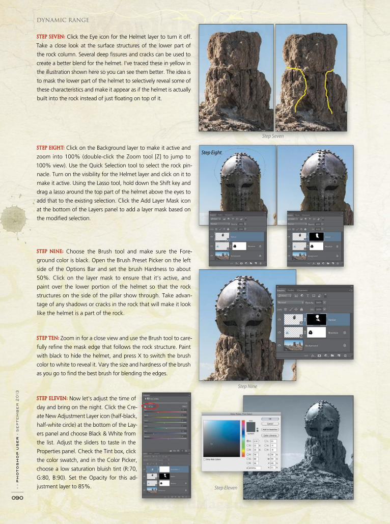
› › p
ho
to
sh
op
u
se
r › s
ep
te
mb
er
2
013
090
Step Seven
Step Eight
Step Nine
Step Eleven
Dynamic Range
STEP SEVEN: Click the Eye icon for the Helmet layer to turn it off.
Take a close look at the surface structures of the lower part of
the rock column. Several deep fi ssures and cracks can be used to
create a better blend for the helmet. I’ve traced these in yellow in
the illustration shown here so you can see them better. The idea is
to mask the lower part of the helmet to selectively reveal some of
these characteristics and make it appear as if the helmet is actually
built into the rock instead of just fl oating on top of it.
STEP EIGHT: Click on the Background layer to make it active and
zoom into 100% (double-click the Zoom tool [Z] to jump to
100% view). Use the Quick Selection tool to select the rock pin-
nacle. Turn on the visibility for the Helmet layer and click on it to
make it active. Using the Lasso tool, hold down the Shift key and
drag a lasso around the top part of the helmet above the eyes to
add that to the existing selection. Click the Add Layer Mask icon
at the bottom of the Layers panel to add a layer mask based on
the modifi ed selection.
STEP NINE: Choose the Brush tool and make sure the Fore-
ground color is black. Open the Brush Preset Picker on the left
side of the Options Bar and set the brush Hardness to about
50%. Click on the layer mask to ensure that it’s active, and
paint over the lower portion of the helmet so that the rock
structures on the side of the pillar show through. Take advan-
tage of any shadows or cracks in the rock that will make it look
like the helmet is a part of the rock.
STEP TEN: Zoom in for a close view and use the Brush tool to care-
fully refi ne the mask edge that follows the rock structure. Paint
with black to hide the helmet, and press X to switch the brush
color to white to reveal it. Vary the size and hardness of the brush
as you go to fi nd the best brush for blending the edges.
STEP ELEVEN: Now let’s adjust the time of
day and bring on the night. Click the Cre-
ate New Adjustment Layer icon (half-black,
half-white circle) at the bottom of the Lay-
ers panel and choose Black & White from
the list. Adjust the sliders to taste in the
Properties panel. Check the Tint box, click
the color swatch, and in the Color Picker,
choose a low saturation bluish tint (R:70,
G:80, B:90). Set the Opacity for this ad-
justment layer to 85%.
WorldMags.netWorldMags.net
WorldMags.net
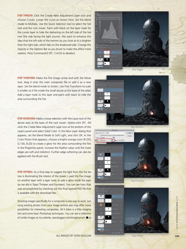
› › w
ww
.p
ho
to
sh
op
us
er
.c
om
091
STEP TWELVE: Click the Create New Adjustment Layer icon and
choose Curves. Lower the curve as shown here. Set the blend
mode to Multiply. Use the Quick Selection tool to select the hel-
met and the rock tower. Paint with black on the layer mask for
the curves layer to hide the darkening on the left side of the hel-
met (the side facing the light source). We want to enhance the
idea that the left side of the helmet (as you look at it) is brighter
than the right side, which falls on the shadowed side. Change the
Opacity in the Options Bar as you brush to make the effect more
realistic. Press Command-D (PC: Ctrl-D) to deselect.
STEP THIRTEEN: Make the Fire image active and with the Move
tool, drag it onto the main composite fi le to add it as a new
layer. Set the blend mode to Screen. Use Free Transform to scale
it smaller so it fi ts inside the small alcove at the base of the pillar.
Add a layer mask to this layer and paint with black to hide the
area surrounding the fi re.
STEP FOURTEEN: Make a loose selection with the Lasso tool of the
alcove area at the base of the rock tower. Option-click (PC: Alt-
click) the Create New Adjustment Layer icon at the bottom of the
Layers panel and select Solid Color. In the New Layer dialog that
appears, set the blend Mode to Soft Light, and click OK. In the
Color Picker that appears, choose a bright-orange color (R:255,
G:130, B:20) to create a glow for the area surrounding the fi re.
In the Properties panel, increase the Feather value until the mask
edges are soft and indistinct. Further edge softening can also be
applied with the Brush tool.
STEP FIFTEEN: As a fi nal step to suggest the light from the fi re be-
low is illuminating the interior of the tower, I used the Fire image
on another layer with a layer mask to add a glow inside the eyes
(as we did in Steps Thirteen and Fourteen). You can see how that
was accomplished by checking out the fi nal layered PSD fi le that
is available with the download fi les.
Shooting images specifi cally for a composite is one way to work, but
using existing photos from your image archive also may offer many
possibilities for interesting composites. All it takes is a little imagina-
tion and some basic Photoshop techniques. You can see a collection
of similar images at my website, seanduggan.com/imaginarium. ■
Step Twelve
Step Thirteen
Step Fourteen
Step FifteenALL IMAGES BY SEÁN DUGGAN
WorldMags.netWorldMags.net
WorldMags.net
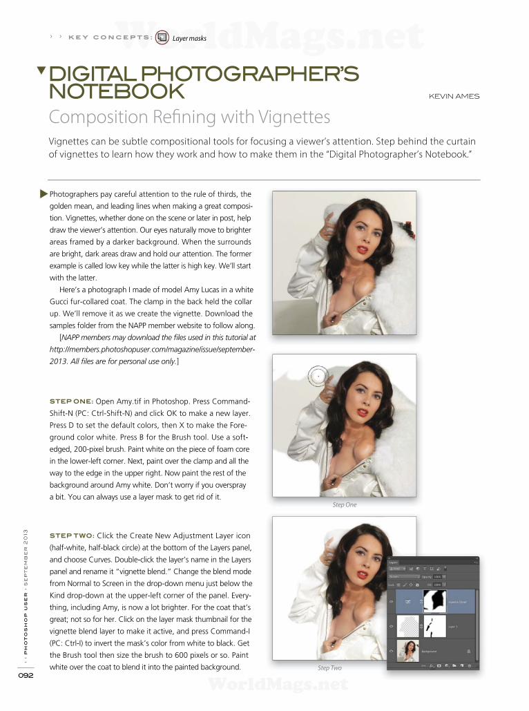
› › p
ho
to
sh
op
u
se
r › s
ep
te
mb
er
2
013
092
Photographers pay careful attention to the rule of thirds, the
golden mean, and leading lines when making a great composi-
tion. Vignettes, whether done on the scene or later in post, help
draw the viewer’s attention. Our eyes naturally move to brighter
areas framed by a darker background. When the surrounds
are bright, dark areas draw and hold our attention. The former
example is called low key while the latter is high key. We’ll start
with the latter.
Here’s a photograph I made of model Amy Lucas in a white
Gucci fur-collared coat. The clamp in the back held the collar
up. We’ll remove it as we create the vignette. Download the
samples folder from the NAPP member website to follow along.
[NAPP members may download the f les used in this tutorial at
http://members.photoshopuser.com/magazine/issue/september-
2013. All f les are for personal use only.]
STEP ONE: Open Amy.tif in Photoshop. Press Command-
Shift-N (PC: Ctrl-Shift-N) and click OK to make a new layer.
Press D to set the default colors, then X to make the Fore-
ground color white. Press B for the Brush tool. Use a soft-
edged, 200-pixel brush. Paint white on the piece of foam core
in the lower-left corner. Next, paint over the clamp and all the
way to the edge in the upper right. Now paint the rest of the
background around Amy white. Don’t worry if you overspray
a bit. You can always use a layer mask to get rid of it.
STEP TWO: Click the Create New Adjustment Layer icon
(half-white, half-black circle) at the bottom of the Layers panel,
and choose Curves. Double-click the layer’s name in the Layers
panel and rename it “vignette blend.” Change the blend mode
from Normal to Screen in the drop-down menu just below the
Kind drop-down at the upper-left corner of the panel. Every-
thing, including Amy, is now a lot brighter. For the coat that’s
great; not so for her. Click on the layer mask thumbnail for the
vignette blend layer to make it active, and press Command-I
(PC: Ctrl-I) to invert the mask’s color from white to black. Get
the Brush tool then size the brush to 600 pixels or so. Paint
white over the coat to blend it into the painted background.
Vignettes can be subtle compositional tools for focusing a viewer’s attention. Step behind the curtain
of vignettes to learn how they work and how to make them in the “Digital Photographer’s Notebook.”
Composition Ref ning with Vignettes
KEVIN AMES
DIGITAL PHOTOGRAPHER’SNOTEBOOK
› › k e y c o n c e p t s : Layer masks
Step One
Step Two
WorldMags.netWorldMags.net
WorldMags.net
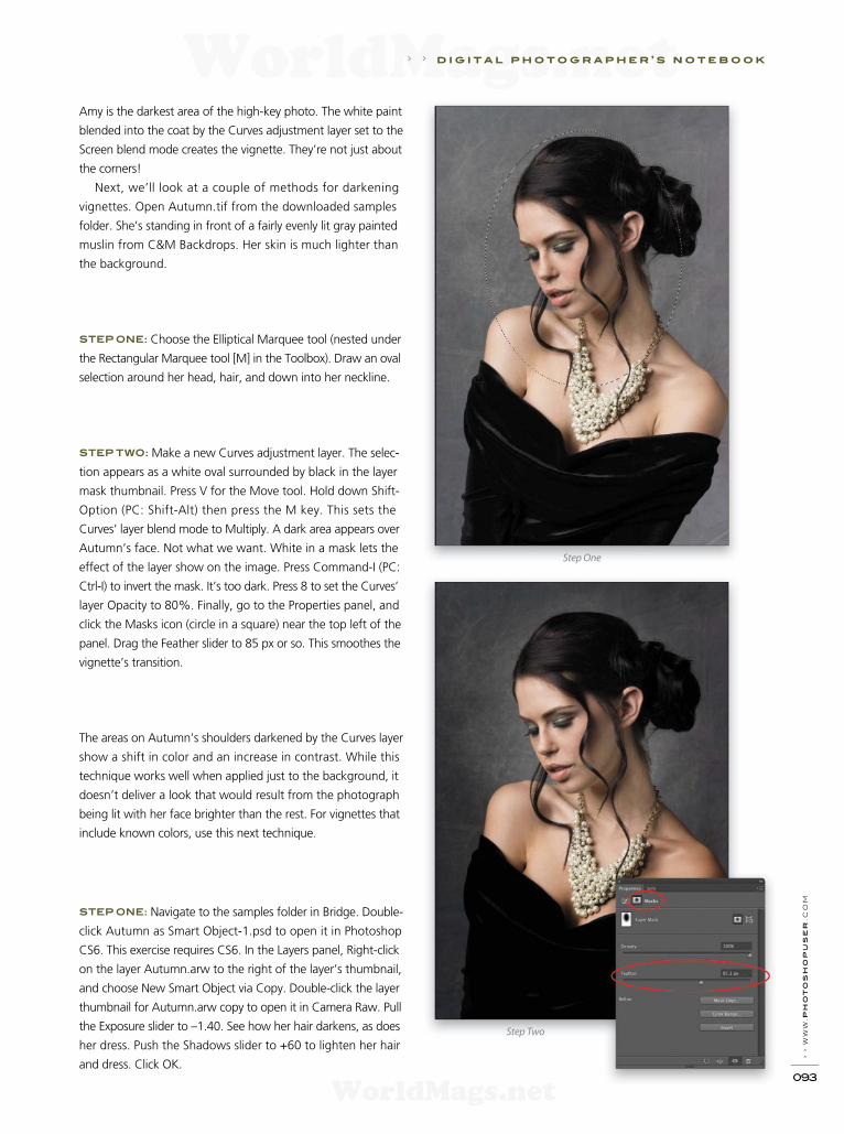
› › w
ww
.ph
oto
sh
opu
ser
.c
om
093
Amy is the darkest area of the high-key photo. The white paint
blended into the coat by the Curves adjustment layer set to the
Screen blend mode creates the vignette. They’re not just about
the corners!
Next, we’ll look at a couple of methods for darkening
vignettes. Open Autumn.tif from the downloaded samples
folder. She’s standing in front of a fairly evenly lit gray painted
muslin from C&M Backdrops. Her skin is much lighter than
the background.
STEP ONE: Choose the Elliptical Marquee tool (nested under
the Rectangular Marquee tool [M] in the Toolbox). Draw an oval
selection around her head, hair, and down into her neckline.
STEP TWO: Make a new Curves adjustment layer. The selec-
tion appears as a white oval surrounded by black in the layer
mask thumbnail. Press V for the Move tool. Hold down Shift-
Option (PC: Shift-Alt) then press the M key. This sets the
Curves’ layer blend mode to Multiply. A dark area appears over
Autumn’s face. Not what we want. White in a mask lets the
effect of the layer show on the image. Press Command-I (PC:
Ctrl-I) to invert the mask. It’s too dark. Press 8 to set the Curves’
layer Opacity to 80%. Finally, go to the Properties panel, and
click the Masks icon (circle in a square) near the top left of the
panel. Drag the Feather slider to 85 px or so. This smoothes the
vignette’s transition.
The areas on Autumn’s shoulders darkened by the Curves layer
show a shift in color and an increase in contrast. While this
technique works well when applied just to the background, it
doesn’t deliver a look that would result from the photograph
being lit with her face brighter than the rest. For vignettes that
include known colors, use this next technique.
STEP ONE: Navigate to the samples folder in Bridge. Double-
click Autumn as Smart Object-1.psd to open it in Photoshop
CS6. This exercise requires CS6. In the Layers panel, Right-click
on the layer Autumn.arw to the right of the layer’s thumbnail,
and choose New Smart Object via Copy. Double-click the layer
thumbnail for Autumn.arw copy to open it in Camera Raw. Pull
the Exposure slider to –1.40. See how her hair darkens, as does
her dress. Push the Shadows slider to +60 to lighten her hair
and dress. Click OK.
› › d i g i t a l p h o t o g r a p h e r ’ s n o t e b o o k
Step One
Step Two
WorldMags.netWorldMags.net
WorldMags.net

› › p
ho
to
sh
op
u
se
r › s
ep
te
mb
er
2
013
094
ALL IMAGES BY KEVIN AMES
Original Camera Raw Curves
d i g i t a l p h o t o g r a p h e r ’ s n o t e b o o k › ›
STEP TWO: Once again choose the Elliptical
Marquee tool. Draw a similar selection to the
one you made in the last example. Hold down
the Option (PC: Alt) key then click the Add
Layer Mask icon. The Option (PC: Alt) key inverts
the layer mask as it’s created. In the Proper-
ties panel, click the Masks icon then move the
Feather slider to the right. This time set it to
about 124 px.
Compare the original without a vignette to the
version done with Camera Raw to the one made
with Curves in the Multiply blend mode. There
are noticeably brighter highlights in her hair and
that detail is maintained in her black dress in the
Camera Raw version. The skin on her shoulders
retains pleasing color, as well.
Finally, here’s an image made with a vi gnette
created using a gridded beauty dish. The light
on Jessica’s face is about two thirds of a stop
brighter than the background.
No matter if the vignette happens in Photo-
shop or during the photography itself, careful
application of this tool makes a big difference
in viewability. Until the next installment of the
“Notebook,” keep shooting! ■
WorldMags.netWorldMags.net
WorldMags.net
Scott shares his own personal settings and studio-tested techniques, not to
mention that it’s laid out like a real workf ow. There’s also an entire chapter
containing Scott’s #1 most-asked Lightroom question… “exactly what order
am I supposed to do things in, and where does Photoshop f t in? Plus, you
get a downloadable collection of some the hottest Lightroom Develop
module presets to give you amazing ef ects with just one click!
®
T e Adobe® Photoshop®
Digital Photographersbook for
Copyright 2013 Kelby Training, Inc. – all rights reserved. All content in the above-mentioned titles is produced by Kelby Training, Inc., 333 Douglas Road East, Oldsmar, FL 34677.
www.kelbytraining.com. Adobe, Photoshop and Lightroom are registered trademarks of Adobe Systems, Incorporated.
ORDER NOW KELBYTRAINING.COM/BOOKS OR CALL 800.201.7323
WorldMags.netWorldMags.net
WorldMags.net
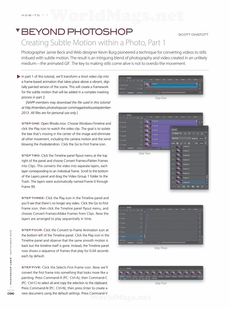
› › p
ho
to
sh
op
u
se
r › s
ep
te
mb
er
2
013
096
In part 1 of this tutorial, we’ll transform a short video clip into
a frame-based animation that takes place above a vibrant, digi-
tally painted version of the scene. This will create a framework
for the subtle motion that will be added in a complex masking
process in part 2.
[NAPP members may download the f le used in this tutorial
at http://members.photoshopuser.com/magazine/issue/september-
2013. All f les are for personal use only.]
STEP ONE: Open Rhodo.mov. Choose Window>Timeline and
click the Play icon to watch the video clip. The goal is to isolate
the bee that’s moving in the center of the image and eliminate
all other movement, including the camera motion and the wind
blowing the rhododendron. Click the Go to First Frame icon.
STEP TWO: Click the Timeline panel f yout menu at the top
right of the panel and choose Convert Frames>Flatten Frames
into Clips. This converts the video into separate layers, each
layer corresponding to an individual frame. Scroll to the bottom
of the Layers panel and drag the Video Group 1 folder to the
Trash. The layers were automatically named Frame 0 through
Frame 99.
STEP THREE: Click the Play icon in the Timeline panel and
you’ll see that there’s no longer any video. Click the Go to First
Frame icon, then click the Timeline panel f yout menu, and
choose Convert Frames>Make Frames from Clips. Now the
layers are arranged to play sequentially in time.
STEP FOUR: Click the Convert to Frame Animation icon at
the bottom left of the Timeline panel. Click the Play icon in the
Timeline panel and observe that the same smooth motion is
back but the timeline itself is gone. Instead, the Timeline panel
now shows a sequence of frames that play for 0.04 seconds
each by default.
STEP FIVE: Click the Selects First Frame icon. Now we’ll
convert the f rst frame into something that looks more like a
painting. Press Command-A (PC: Ctrl-A), then Command-C
(PC: Ctrl-C) to select all and copy the selection to the clipboard.
Press Command-N (PC: Ctrl-N), then press Enter to create a
new document using the default settings. Press Command-V
Step Four
Step One
Step Two
Step Three
SCOTT ONSTOTT BEYOND PHOTOSHOP
Creating Subtle Motion within a Photo, Part 1Photographer Jamie Beck and Web designer Kevin Burg pioneered a technique for converting videos to stills
imbued with subtle motion. The result is an intriguing blend of photography and video created in an unlikely
medium—the animated GIF. The key to making stills come alive is not to overdo the movement.
h o w -t o › ›
WorldMags.netWorldMags.net
WorldMags.net
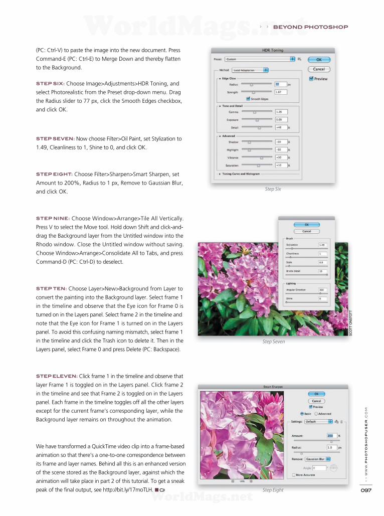
› › w
ww
.ph
oto
sh
opu
ser
.c
om
097
Step Six
Step Seven
Step Eight
(PC: Ctrl-V) to paste the image into the new document. Press
Command-E (PC: Ctrl-E) to Merge Down and thereby f atten
to the Background.
STEP SIX: Choose Image>Adjustments>HDR Toning, and
select Photorealistic from the Preset drop-down menu. Drag
the Radius slider to 77 px, click the Smooth Edges checkbox,
and click OK.
STEP SEVEN: Now choose Filter>Oil Paint, set Stylization to
1.49, Cleanliness to 1, Shine to 0, and click OK.
STEP EIGHT: Choose Filter>Sharpen>Smart Sharpen, set
Amount to 200%, Radius to 1 px, Remove to Gaussian Blur,
and click OK.
STEP NINE: Choose Window>Arrange>Tile All Vertically.
Press V to select the Move tool. Hold down Shift and click-and-
drag the Background layer from the Untitled window into the
Rhodo window. Close the Untitled window without saving.
Choose Window>Arrange>Consolidate All to Tabs, and press
Command-D (PC: Ctrl-D) to deselect.
STEP TEN: Choose Layer>New>Background from Layer to
convert the painting into the Background layer. Select frame 1
in the timeline and observe that the Eye icon for Frame 0 is
turned on in the Layers panel. Select frame 2 in the timeline and
note that the Eye icon for Frame 1 is turned on in the Layers
panel. To avoid this confusing naming mismatch, select frame 1
in the timeline and click the Trash icon to delete it. Then in the
Layers panel, select Frame 0 and press Delete (PC: Backspace).
STEP ELEVEN: Click frame 1 in the timeline and observe that
layer Frame 1 is toggled on in the Layers panel. Click frame 2
in the timeline and see that Frame 2 is toggled on in the Layers
panel. Each frame in the timeline toggles off all the other layers
except for the current frame’s corresponding layer, while the
Background layer remains on throughout the animation.
We have transformed a QuickTime video clip into a frame-based
animation so that there’s a one-to-one correspondence between
its frame and layer names. Behind all this is an enhanced version
of the scene stored as the Background layer, against which the
animation will take place in part 2 of this tutorial. To get a sneak
peak of the f nal output, see http://bit.ly/17moTLH. ■
› › BEYOND PHOTOSHOP
SC
OT
T O
NS
TO
TT
WorldMags.netWorldMags.net
WorldMags.net
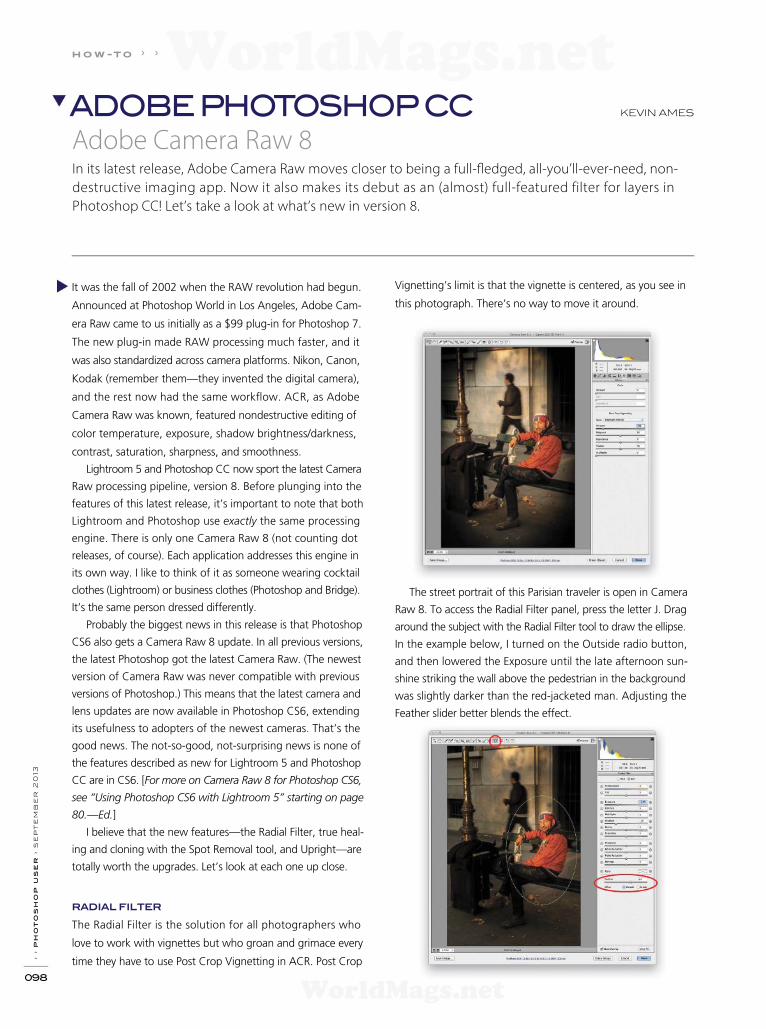
› › p
ho
to
sh
op
u
se
r › s
ep
te
mb
er
2
013
098
It was the fall of 2002 when the RAW revolution had begun.
Announced at Photoshop World in Los Angeles, Adobe Cam-
era Raw came to us initially as a $99 plug-in for Photoshop 7.
The new plug-in made RAW processing much faster, and it
was also standardized across camera platforms. Nikon, Canon,
Kodak (remember them—they invented the digital camera),
and the rest now had the same workf ow. ACR, as Adobe
Camera Raw was known, featured nondestructive editing of
color temperature, exposure, shadow brightness/darkness,
contrast, saturation, sharpness, and smoothness.
Lightroom 5 and Photoshop CC now sport the latest Camera
Raw processing pipeline, version 8. Before plunging into the
features of this latest release, it’s important to note that both
Lightroom and Photoshop use exactly the same processing
engine. There is only one Camera Raw 8 (not counting dot
releases, of course). Each application addresses this engine in
its own way. I like to think of it as someone wearing cocktail
clothes (Lightroom) or business clothes (Photoshop and Bridge).
It’s the same person dressed differently.
Probably the biggest news in this release is that Photoshop
CS6 also gets a Camera Raw 8 update. In all previous versions,
the latest Photoshop got the latest Camera Raw. (The newest
version of Camera Raw was never compatible with previous
versions of Photoshop.) This means that the latest camera and
lens updates are now available in Photoshop CS6, extending
its usefulness to adopters of the newest cameras. That’s the
good news. The not-so-good, not-surprising news is none of
the features described as new for Lightroom 5 and Photoshop
CC are in CS6. [For more on Camera Raw 8 for Photoshop CS6,
see “Using Photoshop CS6 with Lightroom 5” starting on page
80.—Ed.]
I believe that the new features—the Radial Filter, true heal-
ing and cloning with the Spot Removal tool, and Upright—are
totally worth the upgrades. Let’s look at each one up close.
RADIAL FILTER
The Radial Filter is the solution for all photographers who
love to work with vignettes but who groan and grimace every
time they have to use Post Crop Vignetting in ACR. Post Crop
Vignetting’s limit is that the vignette is centered, as you see in
this photograph. There’s no way to move it around.
The street portrait of this Parisian traveler is open in Camera
Raw 8. To access the Radial Filter panel, press the letter J. Drag
around the subject with the Radial Filter tool to draw the ellipse.
In the example below, I turned on the Outside radio button,
and then lowered the Exposure until the late afternoon sun-
shine striking the wall above the pedestrian in the background
was slightly darker than the red-jacketed man. Adjusting the
Feather slider better blends the effect.
ADOBE PHOTOSHOP CC
h o w -t o › ›
KEVIN AMES
In its latest release, Adobe Camera Raw moves closer to being a full-f edged, all-you’ll-ever-need, non-
destructive imaging app. Now it also makes its debut as an (almost) full-featured filter for layers in
Photoshop CC! Let’s take a look at what’s new in version 8.
Adobe Camera Raw 8
WorldMags.netWorldMags.net
WorldMags.net
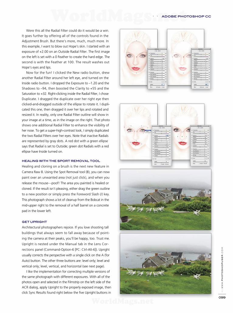
› › w
ww
.ph
oto
sh
opu
ser
.c
om
099
Were this all the Radial Filter could do it would be a win.
It goes further by offering all of the controls found in the
Adjustment Brush. But there’s more, much, much more. In
this example, I want to blow out Hope’s skin. I started with an
exposure of +2.00 on an Outside Radial Filter. The f rst image
on the left is set with a 0 Feather to create the hard edge. The
second is with the Feather at 100. The result washes out
Hope’s eyes and lips.
Now for the fun! I clicked the New radio button, drew
another Radial Filter around her left eye, and turned on the
Inside radio button. I dropped the Exposure to –1.20 and the
Shadows to –94, then boosted the Clarity to +55 and the
Saturation to +32. Right-clicking inside the Radial Filter, I chose
Duplicate. I dragged the duplicate over her right eye then
clicked-and-dragged outside of the ellipse to rotate it. I dupli-
cated this one, then dragged it over her lips and rotated and
resized it. In reality, only one Radial Filter outline will show in
your image at a time, as in the image on the right. That photo
shows one additional Radial Filter to enhance the visibility of
her nose. To get a super-high-contrast look, I simply duplicated
the two Radial Filters over her eyes. Note that inactive Radials
are represented by gray dots. A red dot with a green ellipse
says that Radial is set to Outside; green dot Radials with a red
ellipse have Inside turned on.
HEALING WITH THE SPORT REMOVAL TOOL
Healing and cloning on a brush is the next new feature in
Camera Raw 8. Using the Spot Removal tool (B), you can now
paint over an unwanted area (not just click), and when you
release the mouse—poof! The area you painted is healed or
cloned. If the result isn’t pleasing, either drag the green outline
to a new position or simply press the Foreword Slash (/) key.
This photograph shows a lot of cleanup from the Bobcat in the
mid-upper right to the removal of a half barrel on a concrete
pad in the lower left.
GET UPRIGHT
Architectural photographers rejoice. If you love shooting tall
buildings that always seem to fall away because of point-
ing the camera at their peaks, you’ll be happy, too. Trust me.
Upright is nested under the Manual tab in the Lens Cor-
rections panel (Command-Option-6 [PC: Ctrl-Alt-6]). Upright
usually corrects the perspective with a single click on the A (for
Auto) button. The other three buttons are: level only; level and
vertical only; level, vertical, and horizontal (see next page).
I like the implementation for correcting multiple versions of
the same photograph with different exposures. With all of the
photos open and selected in the Filmstrip on the left side of the
ACR dialog, apply Upright to the properly exposed image, then
click Sync Results found right below the f ve Upright buttons in
› › ADOBE PHOTOSHOP CC
WorldMags.netWorldMags.net
WorldMags.net

› › p
ho
to
sh
op
u
se
r › s
ep
te
mb
er
2
013
100
the Lens Corrections panel. To the right of that is the Reanalyze
option just in case the initial correction isn’t satisfactory.
A FILTER FOR EVERY LAYER
Camera Raw has been added to the Filter menu in Photoshop
CC. For the most part it works great. Exposure on a layer is
heavy handed, so watch out for that. It’s great for changing up
the color temperature, as well as adding Clarity or Vibrance. The
Adjustment Brush, Gradient Filter, Radial Filter, and Spot Healing
tool are all there. Most of what’s missing is minor: the Crop tool,
Rotate Image buttons, and Preferences. Snapshots are gone, as
well. I use Snapshots a lot to compare versions of settings, and
I really miss not having it in the f lter version of ACR.
Camera Raw is not destructive. You can always go back. This
ALL IMAGES BY KEVIN AMES
is not the case in the f lter version. When applied to a layer, it’s
totally destructive in that after the f le is saved and closed the
change is permanent. Avoid this by Right-clicking to the right
of a layer’s thumbnail in the Layers panel, then choose Convert
to Smart Object. Now any of the settings made on f lters that
work with smart objects, including Camera Raw Filter, can be
changed anytime.
These new tools in Camera Raw 8 have enhanced my work-
f ow not only as a timesaver, particularly with the improved
Spot Healing tool, but it has also added great creativity with
the Radial Filter. I love using it as a Photoshop f lter for tiny
tweaks. Give this updated photographers’ go-to tool a test
drive. I believe you’ll love it, too. ■
ADOBE PHOTOSHOP CC › ›
WorldMags.netWorldMags.net
WorldMags.net

GET ALL THIS (AND MORE) WHEN YOU JOIN
Where people come to get really good at Photoshop!National Association of Photoshop Professionals
Annual membership includes subscription to Photoshop User magazine (printed or digital)
JOIN TODAY @PhotoshopUser.com or CALL 800.738.8513
Just $99
Adobe, the Adobe logo, Photoshop and Lightroom are registered trademarks of Adboe Systems, Incorporated. Images courtesy of iStockphoto, and Corey Barker.
WorldMags.netWorldMags.net
WorldMags.net
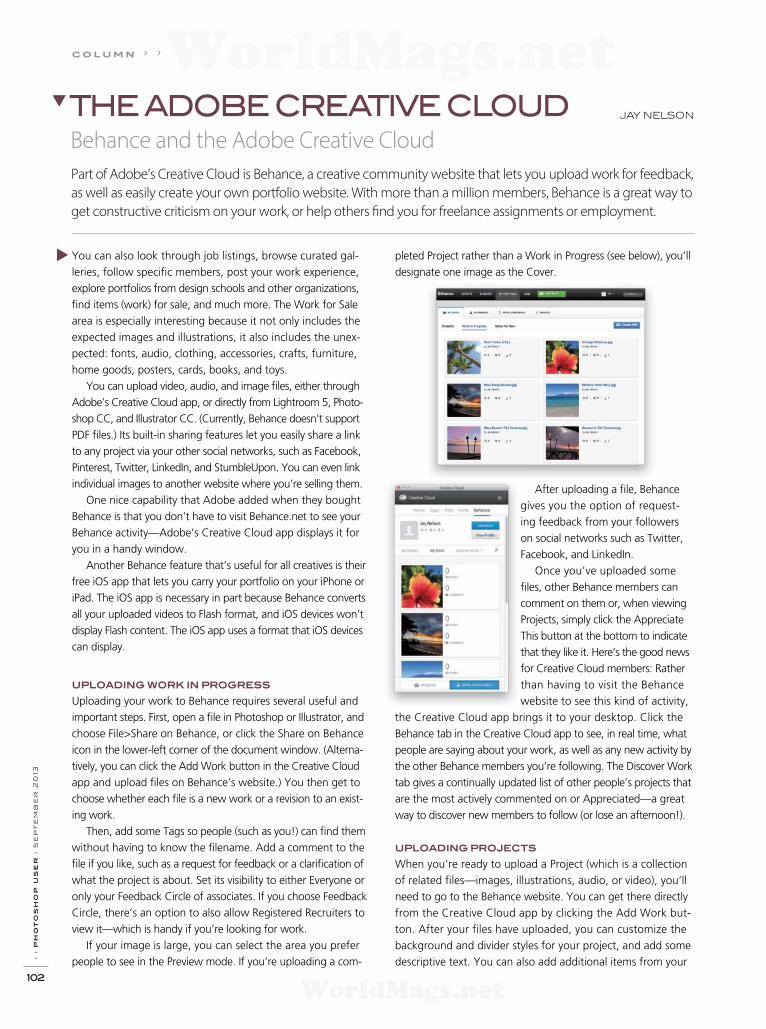
› › p
ho
to
sh
op
u
se
r › s
ep
te
mb
er
2
013
102
You can also look through job listings, browse curated gal-
leries, follow specif c members, post your work experience,
explore portfolios from design schools and other organizations,
f nd items (work) for sale, and much more. The Work for Sale
area is especially interesting because it not only includes the
expected images and illustrations, it also includes the unex-
pected: fonts, audio, clothing, accessories, crafts, furniture,
home goods, posters, cards, books, and toys.
You can upload video, audio, and image f les, either through
Adobe’s Creative Cloud app, or directly from Lightroom 5, Photo-
shop CC, and Illustrator CC. (Currently, Behance doesn’t support
PDF f les.) Its built-in sharing features let you easily share a link
to any project via your other social networks, such as Facebook,
Pinterest, Twitter, LinkedIn, and StumbleUpon. You can even link
individual images to another website where you’re selling them.
One nice capability that Adobe added when they bought
Behance is that you don’t have to visit Behance.net to see your
Behance activity—Adobe’s Creative Cloud app displays it for
you in a handy window.
Another Behance feature that’s useful for all creatives is their
free iOS app that lets you carry your portfolio on your iPhone or
iPad. The iOS app is necessary in part because Behance converts
all your uploaded videos to Flash format, and iOS devices won’t
display Flash content. The iOS app uses a format that iOS devices
can display.
UPLOADING WORK IN PROGRESS
Uploading your work to Behance requires several useful and
important steps. First, open a f le in Photoshop or Illustrator, and
choose File>Share on Behance, or click the Share on Behance
icon in the lower-left corner of the document window. (Alterna-
tively, you can click the Add Work button in the Creative Cloud
app and upload f les on Behance’s website.) You then get to
choose whether each f le is a new work or a revision to an exist-
ing work.
Then, add some Tags so people (such as you!) can f nd them
without having to know the f lename. Add a comment to the
f le if you like, such as a request for feedback or a clarif cation of
what the project is about. Set its visibility to either Everyone or
only your Feedback Circle of associates. If you choose Feedback
Circle, there’s an option to also allow Registered Recruiters to
view it—which is handy if you’re looking for work.
If your image is large, you can select the area you prefer
people to see in the Preview mode. If you’re uploading a com-
pleted Project rather than a Work in Progress (see below), you’ll
designate one image as the Cover.
After uploading a f le, Behance
gives you the option of request-
ing feedback from your followers
on social networks such as Twitter,
Facebook, and LinkedIn.
Once you’ve uploaded some
f les, other Behance members can
comment on them or, when viewing
Projects, simply click the Appreciate
This button at the bottom to indicate
that they like it. Here’s the good news
for Creative Cloud members: Rather
than having to visit the Be hance
website to see this kind of activity,
the Creative Cloud app brings it to your desktop. Click the
Behance tab in the Creative Cloud app to see, in real time, what
people are saying about your work, as well as any new activity by
the other Behance members you’re following. The Discover Work
tab gives a continually updated list of other people’s projects that
are the most actively commented on or Appreciated—a great
way to discover new members to follow (or lose an afternoon!).
UPLOADING PROJECTS
When you’re ready to upload a Project (which is a collection
of related f les—images, illustrations, audio, or video), you’ll
need to go to the Behance website. You can get there directly
from the Creative Cloud app by clicking the Add Work but-
ton. After your f les have uploaded, you can customize the
background and divider styles for your project, and add some
descriptive text. You can also add additional items from your
JAY NELSONTHE ADOBE CREATIVE CLOUD
Behance and the Adobe Creative Cloud
Part of Adobe’s Creative Cloud is Behance, a creative community website that lets you upload work for feedback,
as well as easily create your own portfolio website. With more than a million members, Behance is a great way to
get constructive criticism on your work, or help others f nd you for freelance assignments or employment.
c o l u m n › ›
WorldMags.netWorldMags.net
WorldMags.net

› › w
ww
.ph
oto
sh
opu
ser
.c
om
103
computer or your Creative Cloud account, or embed audio,
video, images, or a slide show from dozens of media-sharing
websites such as YouTube, Vimeo, Google Maps, Flickr, Picasa,
and so forth.
If you hover over an item in the project, you can change
the order in which it appears, add a caption, provide a URL to
another website where people may buy it, replace it, or delete
it. Lastly, you can upload an image for the project’s cover, and
optionally f ll in a bunch of information about the project.
Just like when you upload a Work in Progress (above), Behance
then invites you to share your Project with other social networks.
YOUR PORTFOLIO ON BEHANCE PROSITE
Believe it or not, all the Behance features mentioned so far are
available with a free Behance membership—no Creative Cloud
membership is necessary. But if you want to build and publish
a professional portfolio website with Behance’s ProSite feature,
you can either pay $99 per year to Behance, or link it to your
Creative Cloud account.
Using ProSite’s intuitive drag-and-drop interface, you can
easily create a beautiful, robust portfolio website. You can even
incorporate your Tumblr or WordPress blog, use hundreds of
Typekit Web fonts, track your stats with Google Analytics, and
integrate social sharing features such as Twitter, Facebook,
and Pinterest. If you know HTML and CSS, you can customize
almost anything. ProSite even gives you unlimited bandwidth
and lets you password-protect your site. If you already own a
URL, you can redirect it to the ProSite URL—or you can just use
the URL that ProSite provides.
TIPS & TRICKS
Here are some tips and tricks to help you get the most out of
Behance and the Adobe Creative Cloud app.
File size: Behance has an image f le size limit of 5 MB, so if you
have a bunch to upload you’ll want to batch-resize them in Light-
room, Camera Raw, or the Image Processor in Bridge.
Creative Cloud app: Adobe’s Creative Cloud app installs as a
system-wide menu bar icon, which for Mac users means that it
doesn’t appear in the Dock or in the list of Applications when
you press Command-Tab. Instead, you click it in the menu bar
and it drops down for you to use. To make it into a free-f oating
app that does appear in the Dock and the Application Switcher,
just click-and-drag the top part of its window away from the
menu bar. Alternatively, you can click the gear icon in the upper-
right corner of its window and choose Open As Window. To put
it back, just choose Pin to Menu Bar from that same gear icon.
To set this behavior permanently, click the gear icon, choose
Preferences, and enable or disable the Attach Window to Menu
Bar Icon checkbox.
Preferences dialog: The Creative Cloud app Preferences dialog is
also where you can enable or disable notif cations about updates
to Apps, as well as notif cations of comments on your Behance
projects and f les.
Edit Work in Progress: You can edit or delete your Work in Prog-
ress f les at the Behance website. Just hover your mouse over the
preview and choose an option.
Lightroom: Lightroom has a vastly more robust Behance interface
than the one in Photoshop or Illustrator—just double-click Behance
in the Publish Services panel in the Library module to invoke the
Lightroom Publishing Manager. It lets you log in and log out of
different accounts, choose f le title options, image format, color
space, size, resolution, sharpening, metadata (note the Remove
Location Info checkbox), and apply a watermark. Now you can
drag-and-drop images into the Behance published collection in the
Publish Services panel and click the Publish button to upload them.
ALL IMAGES BY JAY NELSON
Link Creative Cloud to Behance: The f rst time you access the
Behance ProSite feature, it seems to really want you to pay $99.
Instead, link it to your Creative Cloud account by visiting www
.behance.net/portfolio/promote and clicking Sign in with Adobe ID.
For tips on making the most of ProSite, be sure to download the
Beginner’s Guide PDF near the top of the ProSite homepage. ■
› › THE ADOBE CREATIVE CLOUD
WorldMags.netWorldMags.net
WorldMags.net
› › p
ho
to
sh
op
u
se
r › s
ep
te
mb
er
2
013
104
Remember the playground bully, the slightly sadistic kid who
liked to fry ants with a magnifying glass, and was always looking
to give you a wedgie? That was someone to avoid at all times.
What happened to those bullies when they grew up? Did
they outgrow their childhood behavior? Nope. They turned
into your present-day clients from hell, except now, they’re
more mature and know to frst appear with a friendly, smiling
face to lure you into their present-day playground of hell.
They’re now your worst nightmare, threatening you with
various lawsuits.
The threat of bringing a lawsuit is often intimidating and,
more often than not, you have no idea whether the threat is
credible. From the Chinese culture, the concept of the “paper
tiger” means that someone or some country threatens, yells,
and screams, but in the end does nothing and poses no real
threat. In the business world, paper tigers are hardly an endan-
gered species. Never attending law school or obtaining a license
to practice law doesn’t prevent these know-it-alls from threaten-
ing lawsuits. We see many of these paper tigers or bullies who
fancy themselves as legal experts.
How do you handle these bullies? The best way to handle
professional bullies is to shine a light on them or confront them.
As it has ever been, most bullies are good at giving, but they
become shrinking violets when they’re on the receiving end.
WHAT THIS MEANS TO YOU?
What does all this have to do with you as a photographer or
artist? Plenty. Regardless of their respective specialties, artists
are generally pleasers. They want everyone to like them and try
to keep everyone happy. This makes artists low-hanging fruit
for adult bullies who don’t tease or give them wedgies; these
bullies simply want something for nothing and expect to get it.
Photographers of all stripes see this over and over again. For
them, bullies take on the form of a bridezilla or a MOB (mother
of the bride). It’s a faceless corporation, one where the art direc-
tor claims, “It’s not me; I’m on your side. It’s company policy.”
Yeah, right! It’s that client who you think (or were made to
think) is a friend, but is really a “frenemy.” Like fesh-eating
zombies, they slowly come at you, saying in that unemotional
monotone, “Free, we want it for free.”
Bullying can be especially effective when done in subtle,
soft tones that appeal to artists. Generally, artists are risk-
averse, hate confrontation, and loathe loud voices and argu-
ments. A bully knows this and may play on those emotions by
being soft-spoken or acting mellow (or even semicomatose).
But there’s also an entire group of bully screamers. The quieter
ones are easier on the ears, but no less a pain.
HANDLING LEGAL WEDGIES
What strikes fear in most people is the ever-so-common threat
of a legal wedgie. “I’ll sue you” is the ever-present rallying cry
of today’s bully with a budget. The problem here is that most
people don’t stop to think, “Sue me for what?” Fear and panic
take over, and logic exits the building with Elvis.
At such moments, we suggest that you stop talking and start
thinking. What law have you broken? How will this sound to a
jury? This is when having a relationship with an attorney (who
you can call for timely advice) can make the difference between
losing sleep and getting a good night’s sleep. In many instances,
your lawyer will be able to assess the situation over the phone
in a short period of time. Most of the time, the threat of a law-
suit is simply that: a threat. It’s a bullying action to make you do
something the bully wants you to do. An often-effective reac-
tion is to simply say, “Sue me? No problem. Have your lawyer
call my lawyer. Here’s his name and phone number, and don’t
talk to me or contact me anymore. It’s now my lawyer’s job and
[add your attorney’s frst name here] loves this kind of stuff.”
This establishes that you have an ongoing relationship with an
attorney. Whether you do or don’t, know the drill, and exhibit
professional judgment.
This approach is reminiscent of a scene in the classic Woody
Allen flm, Annie Hall. In the movie line, Woody hears a loud,
know-it-all type preaching with great authority about the con-
cepts and themes of famed media philosopher Marshall McLuhan,
who famously coined the phrase, “The medium is the message,”
and foresaw the Internet 30 years before its birth. While the anta-
gonist was spouting his expert opinion about what McLuhan was
saying, Woody pulls the real Marshall McLuhan from off-camera
into the scene and says, “Well, I happen to have Marshall McLu-
han right here!” McLuhan himself then tells the guy that he’s full
of cow droppings.
Great scene and one you should emulate when being con-
fronted by a bully. Of course, you’d be pulling out your lawyer,
rather than the late Mr. McLuhan. (You can view the Annie
Hall clip at www.youtube.com/watch?v=9wWUc8BZgWE.)
REAL-LIFE EXAMPLE
The following is from our fles, so the names and issues are
altered to (unfortunately) protect the guilty; but these events
really happened.
c o l u m n › ›
ed GreenberG and
jack reznicki
Confronting Bullies and Paper TigersHas anyone never experienced bullying in his or her lifetime? Thankfully, the acceptance of such behavior has
changed, but in the past it was considered an ever-so-common rite of passage.
The CopyrighT Zone
WorldMags.netWorldMags.net
WorldMags.net
› › w
ww
.p
ho
to
sh
op
us
er
.c
om
105
With major editing and removal of identif ers, the com-
missioner’s spouse’s letter to the photographer read,
in part:
“This CEASE AND DESIST ORDER is to inform you that
your intimidating actions against me [name removed],
my family, and the below-named family friends, have
become intolerable. This letter is to demand that your
lies, harassment, and intimidation tactics CEASE AND
DESIST immediately. Should you continue to pursue
these activities in violation of this CEASE AND DESIST
ORDER, I will not hesitate to pursue further legal action
against you including, but not limited to, civil action
and/or criminal complaints. Note that a copy of this let-
ter and a record of its delivery will be stored. Note too
that it is admissible as evidence in a court of law and
will be used as such if need be in the future.
This CEASE AND DESIST ORDER demands that you
immediately discontinue and do not at any point in
the future under any circumstances do any of the
following to [a whole bunch of names removed],
to include all family associated with as well, and
not limited by marriage, any person with which
you have come into contact while in the presence
of [spouse] and his or her family: speak to, contact,
pursue, harass, attack, strike, bump into, brush up
against, push, tap, grab, hold, threaten, telephone
(via cellular or land line), instant message, page, fax,
email, follow, stalk, shadow, disturb our peace, keep
us under surveillance, gather and/or post informa-
tion about me or my family electronically, block our
movements at home, work, social and family gath-
erings, religious functions, and/or any other reason-
able day-to-day activities, past, present, or future.
Should you willfully choose to continue your current
course of action, I will not hesitate to f le a complaint
with the police department in your jurisdiction for your
ongoing violations of the Criminal Laws in effect in the
state of [spouse residence], and I will take appropriate
steps in the appropriate civil court(s) too.” ■
cease-and-desist letter
› › t h e c o p y r i g h t z o n e
A photographer was contacted to photograph an out-of-
town baseball tournament. The photographer covered the
games over a three-week period, hanging out with the person
who hired him or her, who happened to be the spouse of
the league’s commissioner. Long story made comprehensible:
The spouse liked bourbon, a lot. During the tournament, this
spouse determined that the photographer would be easy to
push around and negotiate a new and greatly reduced fee,
along with all the photo f les thrown in.
The twist in this scenario was that the photographer
knew the spouse was playing “extra innings” with a much
younger ballplayer. Along with wanting almost-free photos,
the spouse was worried about the commissioner f nding out
about the after-hours batting practice. Realizing this vulnerabil-
ity, the spouse sent a homemade “legal” letter to the photo-
grapher, trying to cover all bases (see “Cease-and-Desist
Letter”). In the letter, the spouse warned the photographer
to shut his or her mouth, or there would be a lawsuit and all
sorts of terrible legal stuff if the commissioner should ever
f nd out that the spouse was playing the f eld. In a moment
of semisobriety, the spouse blathered to the photographer
that he or she had graduated law school but had never really
practiced law.
The photographer contacted Jack to see what kind of trouble
this might be. When Jack stopped laughing at the “cease-and-
desist” letter, he said, “Contact Ed and let him handle this.” Even
Jack, who’s not a lawyer, recognized this as a nonlegal letter from
a bully. Something like this usually stops quickly when a real
lawyer sends out a legal letter on a real lawyer’s stationery. It’s not
an expensive proposition and, for the photographer, well worth
it just for all the good nights of sleep that any decent lawyer’s
services would provide.
Ed’s letter to the supposedly legally trained author stated that:
1. Only a court or law off cer can issue an “Order.” A private
person (attorney or not) cannot. Any f rst-year law stu-
dent knows this. It would be as if an alleged professional
photographer didn’t know the difference between a lens
and a shutter.
2. False allegations of criminal conduct put in writing may
serve as the basis for a lawsuit by the recipient.
3. Author should immediately forward a copy of the letter
to his or her counsel, as photographer would clearly take
action by his or her attorney against the author. And, oh
yes, it seemed the bill has not been paid, so the Copy-
right Registration was attached.
4. Whatever personal issues the author was afraid would
come to light owing to his or her dalliances outside of
marriage would likely come to light in the context of
any lawsuit involving the parties. Among other things,
witnesses would need to be called as to any oral busi-
ness negotiations between the parties, and the extracur-
ricular activity discussed in detail, with the participation
of [name deleted].
5. The only motivation for the cease letter was that its author
had sobered up and feared exposure of his or her activi-
ties. To help prevent that from happening, the author
elected to scare the heck out of a witness.
These scenarios occur regularly and our source materials grow
daily. This tale is just one example of a typical incident in a typi-
cal day in the life of a photographer.
WorldMags.netWorldMags.net
WorldMags.net

› › p
ho
to
sh
op
u
se
r › s
ep
te
mb
er
2
013
106
r e v i e w s › ›
Torn Between Two Lovers Review by Pete Collins
WACOM CINTIQ 22HD TOUCH AND 13HD
For the record, I think Wacom has some of the best creative tools
on the market. If you’re doing any creative project where preci-
sion and eff ciency are necessary, then you owe it to yourself to
look into at least one of these wonderful products. In case you
think I’m getting special consideration from Wacom to say these
glowing words, know that I spent four years trying to convince
my boss in a previous job to buy the original Cintiq 21UX. When
he f nally bought one, I took that machine from work to home
every day so I wouldn’t have to work on anything else. For eight
years I used and abused that machine; it became an indispens-
able part of my workf ow. Hands down, I’d give up just about
anything (including my camera) before I’d give up my Cintiq.
Now, with that preamble out of the way, let’s take a look at
two of the newest pieces of creative goodness: the Cintiq 22HD
touch and the 13HD. I’ve had the pleasure of taking both of
these machines out to see what they can do, and to be honest,
the toughest question isn’t “Should I get one of these?” but
rather “Which one should I get?” (Or maybe, “Can I sell a mem-
ber of my family and get both?”) Each is a marvel of productivity
and responsiveness, and they automatically go in the “What’s
Hot” category in my book. So what are the differences and
which should you choose?
The decision is really based on what kind of work you do,
and the environment in which you work. If you mainly work
at a desk (home or off ce), then the Cintiq 22HD touch is for
you. It’s a sleeker, lighter version of the Cintiq 21UX with more
ExpressKeys and the added bonus of touch capabilities. Working
directly onscreen using pressure sensitivity will make you faster
and more precise. And ExpressKeys are the greatest things since
sliced bread: You set up a button on the sides of the screen with
shortcuts for each specif c program. Thus, instead of hopping
back and forth between the screen and your keyboard, you now
get to stay focused on the screen and the task at hand—less
chance to get distracted and more time being creative. You
add the extra layer of being able to incorporate touch and
gestures to your workf ow, and you may never have to use your
keyboard again!
If, however, you do a lot of traveling, or f nd that you’re more
creative outside the off ce or in coffee shops, then by all means
get the Cintiq 13HD. (I call it the artist’s secret weapon.) It’s the
same size as a MacBook Pro and f ts perfectly into a computer
bag. In one package that can go anywhere, it has HD resolution
and all the great stuff you’ve come to love about a Cintiq.
Now, I never have to make do with anything less than a Cintiq.
And, since the Cintiq is a full working monitor, it allows me to
take advantage of two screens for increased productivity.
There’s no way I can do justice in such a short article to how
great these products are and how much I love them. (I’ve yet
to meet anyone who has bought a Cintiq and not fallen in love
it.) My litmus test for how good a piece of technology is comes
down to this question: “Do I feel cheated and inhibited if I can’t
use it?” Yes! My art and workf ow is diminished when I can’t use
a Cintiq and that’s the best critique I can give for how important
these products are to me. ■
Company: Wacom Price: $2,499 (22HD touch); $999 (13HD )
Web: www.wacom.com Rating: ◆◆◆◆◆
Hot: Pure hot
Not:
PRODUCT REVIEWS
WorldMags.netWorldMags.net
WorldMags.net

› › w
ww
.p
ho
to
sh
op
us
er
.c
om
107
Cigarette Lighter-Sized Camera Has Cinematic Ambitions Review by Erik Vlietinck
GOPRO HERO3
BLACK EDITION
The HERO3 is GoPro’s newest action camera. I tested the most
capable version, the Black Edition, with the new optional LCD
Touch BacPac and the new minimal-design housing, The Frame.
The optional LCD Touch BacPac allows you to frame your shots
properly and command the unit.
The HERO3 Black Edition can shoot photos at up to 12 mega-
pixels. It has burst photography, continuous video, combined
video and photo capture, and time lapse. The unit also has
WiFi built-in (WiFi remote control included). Unlike its predeces-
sor, the HERO3 writes to MicroSD cards. A 16-GB card is good for
approximately 45 minutes of 1080p/60fps video, or 2,200 photos
shot at the highest resolution setting.
The HERO3 can shoot video at 4K/15fps, 2.7K/30fps,
1440p/48fps, 1080p/60fps, 960p/100fps, 720p/120fps,
and WVGA/240fps. The last two modes allow for nice slow-
motion effects. There are also new f elds of view (FOV) to
choose from, including Medium and Narrow at 1080p and
Narrow at 720p. These are especially good if you don’t want
a f sheye effect.
Impressive resolution and frame rates don’t always translate
to high-quality output, but the HERO3’s sharpness, detail, and
noise-free image quality surprised me, shot after shot. The
low-light noise is a far cry from what the GoPro HD HERO2
gen erated, and it’s better than the performance of many
video cameras.
In my opinion, the combination of output quality and FOV
options make the GoPro HERO3 suitable for more than just
action. This camera is an all-around video and photo camera
with the sturdiness required for action shooting.
A lens that allows for focus and aperture settings would
make this the perfect B-cam. But even without those, the cam-
era can be effectively used for street videography, photography,
and documentaries.
New for the HERO3, and a great addition, is the capability to
shoot continuously. This feature, Continuous Photo, takes a series
of photos for as long as you hold down the recording button. You
can set the camera to take three, f ve, or 10 photos every second.
The Photo Burst default stands at 30 photos per second, although
you can set this to a lower number, and the camera takes about
eight seconds before it’s ready to take the next burst.
The big announcement for the GoPro HD HERO2 was Pro-
tune video, which offered a higher bit-rate and allowed for bet-
ter color grading than the regular GoPro output. In the HERO3,
Protune is more professionally implemented, with customizable
white balance and even a Camera RAW setting, which saves the
video from the sensor. The output from Protune/Camera RAW
gives you the ability to color-grade your footage exactly as you
want. You can use GoPro’s Cineform Studio to give Protune clips
a nice look, but you can really get creative by giving the faded-
looking RAW f le your very own color-and-contrast treatment
with DaVinci Resolve, SpeedGrade, Technicolor’s Color Assist, or
Red Giant’s Colorista II.
The optional LCD Touch BacPac ($79.99) that I used for this
test is a must-have if you want to properly frame your photo or
video clip. The Frame is great when you’re mounting the HERO3
on a tripod as you would any regular camera.
Finally, the HERO3 features simultaneous video and photo
shooting, and looping video. Looping allows you to capture
video for a preset time or until the card is full, after which the
previous recording starts to be progressively overwritten. ■
Company: Woodman Labs, Inc. dba GoPro Price: $399.99
Web: www.gopro.com Rating: ◆◆◆◆
Hot: High resolution; frame rates; picture quality; low-light noise
Not: No lens focus or aperture settings
› › GET THE SCOOP ON THE LATEST GEAR
WorldMags.netWorldMags.net
WorldMags.net

› › p
ho
to
sh
op
u
se
r › s
ep
te
mb
er
2
013
108
r e v i e w s › ›
Wireless Professional Inkjet Printer Review by Daniel M. East
Lightweight, Fluid Video Head Review by Michael Corsentino
PIXMA PRO-10
MANFROTTO 500
“Slow and steady wins the race,” is great in theory, unless you’re
looking for output speed instead of quality. The PIXMA PRO-10,
Canon’s successor to their PRO-1, is a more affordable (although
still pricey) professional inkjet printer that has a lot under the
hood. The PRO-10 is clearly a photo printer for superior output
with graphic design and photography applications. While put-
ting it through its paces, it was def nitely more about quality of
output than performance.
The PRO-10 is a 10-color printer that can solve a few issues for
smaller off ces or home studios. It’s wireless networking capabili-
ties are easier to use and faster than most previous models and,
as long as the software and f rmware are up to date, it performs
quite well while hard-wired or wireless. Output sizes go up to
13x19". It’s not as deep as the PRO-1, so it takes up less space—
but not a small space.
Prints are all-Canon with their inimitable clean, natural satu-
ration. Textured papers—even with paper prof les specif c to
Manfrotto’s recently released 500 f uid video head (MVH500AH
and MVH500A) replaces their popular 701HDV head. It boasts
several key improvements that are targeted for the lighter pay-
load and smaller footprint requirements of compact camcord-
ers and HDSLR cameras. The head has been redesigned with a
wider, longer, top plate that better accommodates HDSLR and
interchangeable lens camcorders; a longer quick-release (QR)
plate to ensure fast, accurate balance with long lenses; a drop-in
QR plate design for easy use with shoulder rigs; and a side lock
to make transitioning from tripod to handheld shooting quick
and easy.
Manfrotto’s signature Bridging Technology provides a light-
weight (2.5 lbs) solution that sacrif ces none of the strength,
stability, and precision f uid control they’re known for. Support-
ing up to 11 lbs of equipment, the 500 includes a 3/8" thread
Easy Link connector for mounting accessory equipment, and
left and right pan bar connections.
Available in two versions: The f at-based MVH500AH, which
is perfect for sliders, mini-jibs, and photo tripods; and the 60mm
half-ball based MVH500A for use with video tripods that have a
60mm receiving bowl. The half-ball based head, along with its
built-in leveling bubble, makes setting up shots quick and easy.
Heads are sold individually or as part of single- or twin-tube
them—seem to print with a 4% higher overall density, but that
was easily remedied with a proper printer-calibration tool. One
standout feature (often overlooked) is that the image quality on
printable CD-Rs is surprisingly good.
Even as a photo printer, however, the wait time from start to
f nish seems long—from any f le size or connection to the printer.
But, by the time that checkered f ag waves, you’ll f nd the PIXMA
PRO-10 prints are def nitely winners. ■
leg tripod/head kits, each with a padded carrying bag (included).
Single-tube leg tripod kits come in aluminum or lightweight car-
bon f ber, and are available in both f at- or ball-based versions.
The aluminum twin-tube leg tripod, compatible solely with ball-
based heads, sports a middle spreader for added stability. Addi-
tionally, a modif ed version of the MVH500AH head is included in
Manfrotto’s updated f uid monopod and head combo MVH500A—
popular with DSLR shooters on the go. ■
Company: Canon U.S.A., Inc. Price: $699.99
Web: www.usa.canon.com Rating: ◆◆◆◆
Hot: Network-ready wireless/wired; quiet; CD printing
Not: Slow
Company: Manfrotto Price: Starting at $190
Web: www.manfrotto.com Rating: ◆◆◆◆◆
Hot: Precise, smooth control; lightweight; improved QR plate design
Not:
WorldMags.netWorldMags.net
WorldMags.net

WorldMags.netWorldMags.net
WorldMags.net
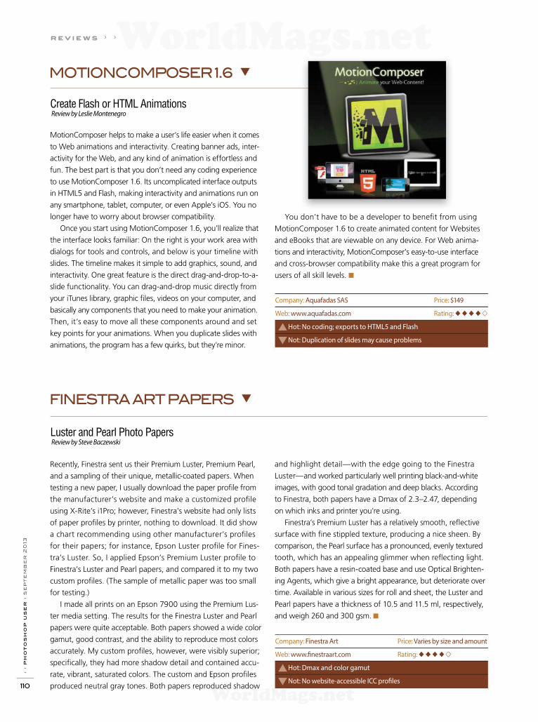
› › p
ho
to
sh
op
u
se
r › s
ep
te
mb
er
2
013
110
r e v i e w s › ›
Create Flash or HTML Animations Review by Leslie Montenegro
Luster and Pearl Photo Papers Review by Steve Baczewski
MOTIONCOMPOSER 1.6
FINESTRA ART PAPERS
MotionComposer helps to make a user’s life easier when it comes
to Web animations and interactivity. Creating banner ads, inter-
activity for the Web, and any kind of animation is effortless and
fun. The best part is that you don’t need any coding experience
to use MotionComposer 1.6. Its uncomplicated interface outputs
in HTML5 and Flash, making interactivity and animations run on
any smartphone, tablet, computer, or even Apple’s iOS. You no
longer have to worry about browser compatibility.
Once you start using MotionComposer 1.6, you’ll realize that
the interface looks familiar: On the right is your work area with
dialogs for tools and controls, and below is your timeline with
slides. The timeline makes it simple to add graphics, sound, and
interactivity. One great feature is the direct drag-and-drop-to-a-
slide functionality. You can drag-and-drop music directly from
your iTunes library, graphic f les, videos on your computer, and
basically any components that you need to make your animation.
Then, it’s easy to move all these components around and set
key points for your animations. When you duplicate slides with
animations, the program has a few quirks, but they’re minor.
Recently, Finestra sent us their Premium Luster, Premium Pearl,
and a sampling of their unique, metallic-coated papers. When
testing a new paper, I usually download the paper prof le from
the manufacturer’s website and make a customized prof le
using X-Rite’s i1Pro; however, Finestra’s website had only lists
of paper prof les by printer, nothing to download. It did show
a chart recommending using other manufacturer’s prof les
for their papers; for instance, Epson Luster prof le for Fines-
tra’s Luster. So, I applied Epson’s Premium Luster prof le to
Finestra’s Luster and Pearl papers, and compared it to my two
custom prof les. (The sample of metallic paper was too small
for testing.)
I made all prints on an Epson 7900 using the Premium Lus-
ter media setting. The results for the Finestra Luster and Pearl
papers were quite acceptable. Both papers showed a wide color
gamut, good contrast, and the ability to reproduce most colors
accurately. My custom prof les, however, were visibly superior;
specif cally, they had more shadow detail and contained accu-
rate, vibrant, saturated colors. The custom and Epson prof les
produced neutral gray tones. Both papers reproduced shadow
You don’t have to be a developer to benef t from using
MotionComposer 1.6 to create animated content for Websites
and eBooks that are viewable on any device. For Web anima-
tions and interactivity, MotionComposer’s easy-to-use interface
and cross-browser compatibility make this a great program for
users of all skill levels. ■
and highlight detail—with the edge going to the Finestra
Luster— and worked particularly well printing black-and-white
images, with good tonal gradation and deep blacks. According
to Finestra, both papers have a Dmax of 2.3–2.47, depending
on which inks and printer you’re using.
Finestra’s Premium Luster has a relatively smooth, ref ective
surface with f ne stippled texture, producing a nice sheen. By
comparison, the Pearl surface has a pronounced, evenly textured
tooth, which has an appealing glimmer when ref ecting light.
Both papers have a resin-coated base and use Optical Brighten-
ing Agents, which give a bright appearance, but deteriorate over
time. Available in various sizes for roll and sheet, the Luster and
Pearl papers have a thickness of 10.5 and 11.5 ml, respectively,
and weigh 260 and 300 gsm. ■
Company: Aquafadas SAS Price: $149
Web: www.aquafadas.com Rating: ◆◆◆◆
Hot: No coding; exports to HTML5 and Flash
Not: Duplication of slides may cause problems
Company: Finestra Art Price: Varies by size and amount
Web: www.f nestraart.com Rating: ◆◆◆◆
Hot: Dmax and color gamut
Not: No website-accessible ICC prof les
WorldMags.netWorldMags.net
WorldMags.net
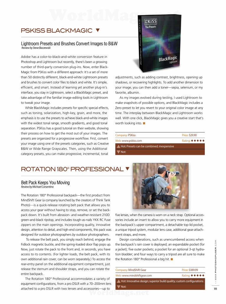
› › w
ww
.p
ho
to
sh
op
us
er
.c
om
111
Lightroom Presets and Brushes Convert Images to B&W Review by Steve Baczewski
Belt Pack Keeps You MovingReview by Michael Corsentino
PSKISS BLACKMAGIC
ROTATION 180º PROFESSIONAL
Adobe has a color-to-black-and-white conversion feature in
Photoshop and Lightroom but recently, there’s been a growing
number of third-party conversion plug-ins. Now, enter Black-
Magic from PSKiss with a different approach: It’s a set of more
than 50 distinctly different, black-and-white Lightroom presets
and brushes to convert color f les to black and white. It’s simple,
eff cient, and smart. Instead of learning yet another plug-in’s
interface, you stay in Lightroom, select a BlackMagic preset, and
take advantage of the familiar image-editing tools in Lightroom
to tweak your image.
While BlackMagic includes presets for specif c special ef fects,
such as toning, solarization, high-key, grain, and more, the
em phasis is to use the presets to achieve black-and-white images
with the widest tonal range, smooth gradients, and good tonal
separation. PSKiss has a good tutorial on their website, showing
their process on how to get the most out of your images. The
presets are organized for a progressive workf ow. First, convert
your image using one of the presets categories, such as Creative
B&W or Wide Range Grayscales. Then, using the Additional
category presets, you can make progressive, incremental, tonal
The Rotation 180° Professional backpack—the f rst product from
MindShift Gear (a company launched by the creators of Think Tank
Photo)—is a quick-release rotating belt pack that allows you to
ac cess your gear without having to stop, remove, or set the back-
pack down. It’s built from abrasion- and weather-resistant 210D
green-and-black ripstop, and includes tough-as-nails YKK RC Fuse
zippers on the main openings. Incorporating quality, innovative
design, attention to detail, and high-end components, this pack was
designed for outdoor photographers by outdoor photographers.
To release the belt pack, you simply reach behind, engage the
Fidlock magnetic buckle, and the spring-loaded door f ap pops up.
Now, just rotate the pack to the front and, in seconds, you have
access to its contents. (For lighter loads, the belt pack, with its
own additional rain cover, can be worn separately.) To access the
rear-entry panel on the additional equipment compartment, just
release the sternum and shoulder straps, and you can rotate the
entire backpack.
The Rotation 180° Professional accommodates a variety of
equipment conf gurations, from a pro DSLR with a 70–200mm lens
attached to a pro DSLR with two lenses and accessories—up to
adjustments, such as adding contrast, brightness, opening up
shadows, or recovering highlights. To add another dimension to
your image, you can then add a toner—sepia, selenium, or my
favorite, albumin.
As my images evolved during testing, I used Lightroom to
make snapshots of possible options, and BlackMagic includes a
Zero preset to let you revert to your original color image at any
time. The interplay between BlackMagic and Lightroom works
well. With one click, BlackMagic gives you a creative start that’s
worth looking into. ■
f ve lenses, when the camera is worn on a neck strap. Optional acces-
sories include an insert to allow you to carry more equipment in
the backpack’s upper compartment, a detachable top-lid pocket,
a unique tripod system, modular lens case, additional gear-attach-
ment straps, and more.
Design considerations, such as unencumbered access when
the backpack’s rain cover is deployed; an expandable pocket (for
a jacket); f ve outer pockets; a pocket for an optional 3-qt hydra-
tion bladder; and four ways to carry a tripod are all sure to make
the Rotation 180° Professional a big hit. ■
Company: PSKiss Price: $29.90
Web: www.pskiss.com Rating: ◆◆◆◆◆
Hot: Presets can be combined; inexpensive
Not:
Company: MindShift Gear Price: $389.99
Web: www.mindshiftgear.com Rating: ◆◆◆◆◆
Hot: Innovative design; superior build quality; custom conf gurations
Not:
WorldMags.netWorldMags.net
WorldMags.net
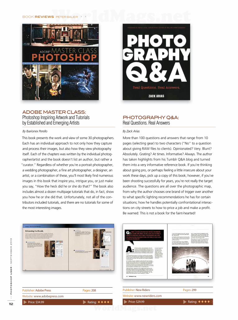
BOOK REVIEWS peter bauer › ›
› › p
ho
to
sh
op
u
se
r › s
ep
te
mb
er
2
013
112
This book presents the work and view of some 30 photographers.
Each has an individual approach to not only how they capture
and process their images, but also how they view photography
itself. Each of the chapters was written by the individual photog-
rapher/artist and the book doesn’t list an author, but rather a
“curator.” Regardless of whether you’re a portrait photographer,
a wedding photographer, a fi ne art photographer, a designer, an
artist, or a combination of these, you’ll most likely fi nd numerous
images in this book that inspire you, intrigue you, or just make
you say, “How the heck did he or she do that?” The book also
includes almost a dozen multipage tutorials that do, in fact, show
you how he or she did that. Unfortunately, not all of the con-
tributors included tutorials, and there are no tutorials for some of
the most interesting images.
More than 100 questions and answers that range from 10
pages (selecting gear) to two characters (“No” to a question
about giving RAW fi les to clients). Opinionated? Very. Blunt?
Absolutely. Grating? At times. Informative? Always. The author
has taken highlights from his Tumblr Q&A blog and turned
them into a very informative reference book. If you’re thinking
about going pro, or perhaps feeling a little insecure about your
work these days, pick up a copy of this book; however, if you’ve
been shooting successfully for years, you’re not really the target
audience. The questions are all over the photographic map,
from why the author chooses one brand of trigger over another
to what specifi c lighting recommendations he has for certain
situations; how he handles potentially confrontational interac-
tions on city streets to how to price a job and make a profi t.
Be warned: This is not a book for the faint-hearted!
PHOTOGRAPHY Q&A:
Real Questions. Real Answers
ADOBE MASTER CLASS:
Photoshop Inspiring Artwork and Tutorials by Established and Emerging Artists
By Zack AriasBy Ibarionex Perello
Publisher: Adobe Press Pages: 208
Website: www.adobepress.com
Price: $34.99 Rating: ◆ ◆ ◆ ◆
Publisher: New Riders Pages: 299
Website: www.newriders.com
Price: $29.99 Rating: ◆ ◆ ◆ ◆
WorldMags.netWorldMags.net
WorldMags.net
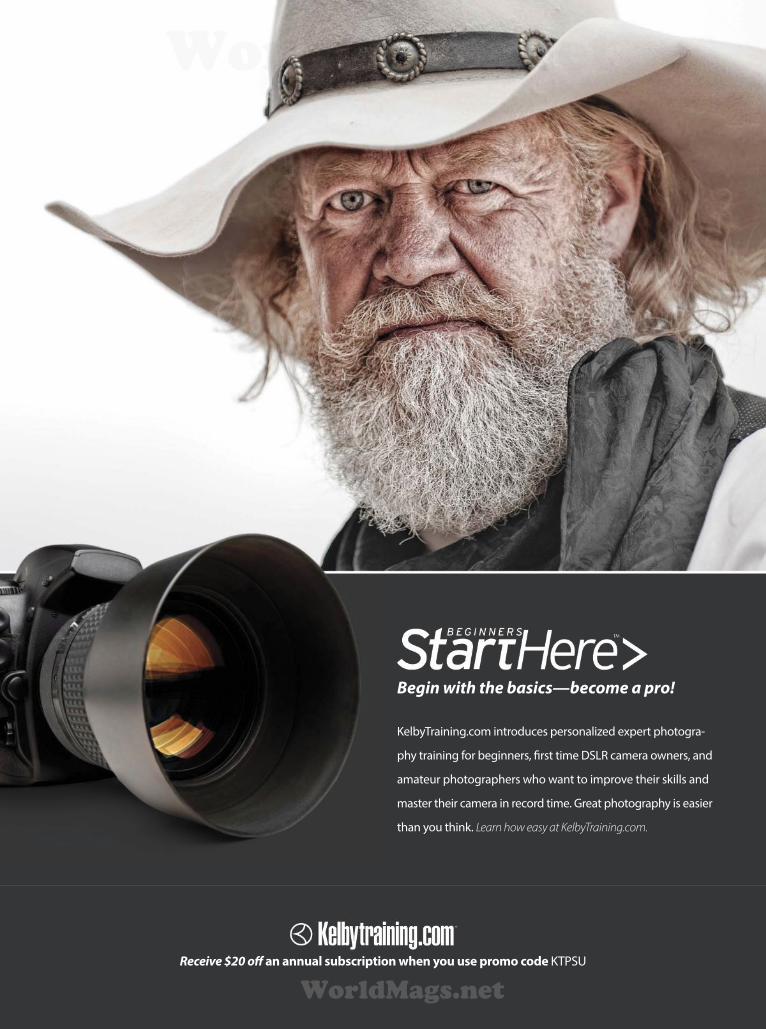
KelbyTraining.com introduces personalized expert photogra-
phy training for beginners, frst time DSLR camera owners, and
amateur photographers who want to improve their skills and
master their camera in record time. Great photography is easier
than you think. Learn how easy at KelbyTraining.com.
Begin with the basics—become a pro!
Receive $20 of an annual subscription when you use promo code KTPSU
WorldMags.netWorldMags.net
WorldMags.net

› › p
ho
to
sh
op
u
se
r › s
ep
te
mb
er
2
013
114
In this issue, I’ve included tips that are downright useful. This
isn’t about how to make beautiful images or how to do a weird
obscure thing that makes your friends go, “Wow! What hap-
pened?” This is where the bricks hit the road and you’re going
to get fast. Yep, in this issue it’s about making you fast and
eff cient in Photoshop.
TARGET YOUR RAW
In recent years, Adobe has added targeted adjustment tools
in Photoshop. You may have used them in things such as
Curves and Black & White adjustment layers. This is where
you can click-and-drag directly on an image to make adjust-
ments. A little-known fact is that there are f ve of these in
Adobe Camera Raw (ACR). You can choose Hue, Saturation,
Luminance, Grayscale Mix, or Parametric Curves from ACR.
In the top toolbar (in ACR), the Targeted Adjustment tool (T)
is the f fth tool from the left that looks like a little bull’s-eye.
Click-and-hold on this icon, and choose an option from the
drop-down list. Click-and-drag left or right on a region of the
photograph to change the underlying attribute of the image.
It works on tones and colors across the image, not just in the
actual area that you clicked (localized region). You’ll see when
you start using it. A word of caution: be gentle; it’s easy to get
carried away. Some of the settings will introduce noise in your
image when pushed to the extreme.
LAYERS OF HISTORY
When you apply a f lter to an image, have you ever wanted
to apply the f lter only in certain areas? Perhaps you dupli-
cated the layer f rst before you applied the f lter and then
masked it out, or maybe you converted to a smart f lter and
used the built-in mask. Here’s a quick-and-f exible way of
doing this task: Apply your f lter to the image. Now click the
Create a New Layer icon at the bottom of the Layers panel
to create a new layer on top. Choose the History Brush tool (Y)
and open the History panel (Window>History). Click in the
box to the left of the Open state at the top of the list. This
sets the source for the History Brush. (This is where the tip
is.) You can now paint this state onto the blank layer. Paint
exactly where you want to undo the effects of the filter.
For even more f exibility, you can add a layer mask and con-
trol it further.
LOCAL HANGOUT FOR COLOR RANGE
Do you use Color Range (Select>Color Range) for making
selections? If you don’t, you should look into it. Color Range
is a very fast and powerful way of making selections to remove
an object from its background or isolate things for editing.
One of the options that you’ll see in the Color Range dialog
is Localized Color Clusters. “Oh wow,” you say, “what the
Dickens is that?” This intimidating-sounding name masks
(pun intended) a very useful feature. Imagine you’re mask-
ing out an image of a person in front of a tree. You want to
mask out the blue sky and replace it with something more
dramatic. When you go to select the blue sky, it also selects
the person’s blue shirt and jeans. What to do? Localized
Color Clusters can let you select the blue sky in that (local)
area of the image and not make a selection in the rest of the
image. “Ah” you say, “that’s useful.”
GETTING TO THE POINT WITH COLOR CURVES
One of the useful things with Curves is the ability to click
on portions of a photo to temporarily see where that area
falls on the tone curve. This enables you to make adjustments
on the curve exactly where you want. What if you want to
add a point to the curve that will stay there? Press the Com-
mand (PC: Ctrl) key and click on the point of the image that
you want to adjust. You’ll see a point appear and stay on
the curve (unless you’re in an adjustment layer; we’ll get
to that).
COLIN SMITHPHOTOSHOP TIPS
d e pa r t m e n t › ›
WorldMags.netWorldMags.net
WorldMags.net

› › w
ww
.ph
oto
sh
opu
ser
.c
om
115
ALL IMAGES BY COLIN SMITH
Even deeper, what if you want to add a point to each of
the color (Red, Green, and Blue) curves at the same time? To
add a color point, hold down Command-Shift (PC: Ctrl-Shift)
and click. At the top of the Curves dialog, click on the Channel
drop-down menu to reveal the individual color curves. Take a
look at each curve to see the point you just added.
Okay, how about adjustment layers? This works in the same
way, but make sure you have the little f nger icon (the targeted
adjustment tool) turned on in the top left of that panel for this
to do something. Now you can just click to add a point to the
curve; you don’t have to hold the Command (PC: Ctrl) key.
THE UGLY DUCKLING IS A SWAN
I’ve heard some very disturbing things said about the Differ-
ence blend mode. I feel the need to defend this innocent blend
mode that has been so mercilessly smeared. I’ve heard people
say, “Don’t use this mode, it looks ugly.” Well, yeah, it looks
ugly. That’s because this is what I call a utility blend mode, not
a creative one. The Difference mode has a purpose, and it’s very
good at it. I’m not talking about some weird inverted x-ray-
looking effect either. This is one useful tool in compositing.
When you have an exact copy of a portion of an image on
a different layer, and you want to align it perfectly with the
original portion, this is the go-to tool. Change the top layer to
Difference mode and with the Move tool (V) active, nudge the
layer with your keyboard Arrow keys. When the layer turns com-
pletely black, then you have a perfect alignment, Houston.
DUPLICATE LAYERED DOCUMENT
There are times when you may want to duplicate your layered
document? Maybe you want to go in two different directions
and compare the two versions of the document as you work.
Do you save the document, choose File>Save As to save a copy
with a different name, then reopen the original f le? I know
you do; I’ve seen you (j/k). Here’s a much quicker and more
eff cient way of duplicating your Photoshop document: Open
the History panel (Window>History), and you’ll see a little
document with a plus sign (+) at the bottom of the panel. This
is the Create New Document from Current State icon. Click it
and you’ll see a new, layered document open in Photoshop.
It’s a perfect duplicate of the working f le. Save it and name it
whatever you like, because you’re now the proud parent
of twins.
TRIM IT GOOD
Have you ever dragged an image into an empty document,
or scaled down a layer against a transparent background,
only to be surrounded by a sea of checkerboard pattern?
In other words, you have all this transparency to trim away
around the actual pixels on the layer. You could reach for
the Crop tool, but I wouldn’t. Here’s the quick-and-easy
way to do it: Choose Image>Trim and select the Transpar-
ent Pixels option. Click OK and Photoshop will crop your
image down to the last transparent pixel. Much quicker—
I use this one all the time. ■
› › p h ot o s h o p t i p s
WorldMags.netWorldMags.net
WorldMags.net
I N D E X O F A D V E R T I S E R S
PhotoshopSeptember 2013
For advertising information, please contact Kevin Agren, V.P. Sales, at 813-433-2370. email: [email protected]
While every attempt has been made to make this listing as complete as possible, its accuracy cannot be guaranteed.
› › p
ho
to
sh
op
u
se
r › s
ep
te
mb
er
2
013
116
Intel . . . . . . . . . . . . . . . . . . . . . . . . . . . . . . . . . . . . . . . . IFC–3 www.intel.com
Interft Photographic Limited. . . . . . . . . . . . . . . . . . 87 www.interftphotographic.com
[ K ]
Kelby Training . . . . . . . . . . . . . . . . . . . . . . . . . . . . . . 109, 113
http://kelbytraining.com
[ L ]
Light It . . . . . . . . . . . . . . . . . . . . . . . . . . . . . . . . . . . . . . . . . . . 118
http://kelbytraining.com/lightit
Lightroom Magazine . . . . . . . . . . . . . . . . . . . . . . . . . . . . . 118
http://photoshopuser.com/lightroom-app-support
[ M ]
Manfrotto Distribution . . . . . . . . . . . . . . . . . . . . . . . . . . . .21
www.manfrottodistribution.us
Mpix. . . . . . . . . . . . . . . . . . . . . . . . . . . . . . . . . . . . . . . . . . .14–15
www.mpix.com
[ N ]
National Association of
Photoshop Professionals . . . . . . . . . . . . . . . . . . . . . . . . 101
http://photoshopuser.com
[ O ]
onOne Software . . . . . . . . . . . . . . . . . . . . . . . . . . . . . . . . . . . . 9
www.ononesoftware.com
[ P ]
Peachpit Publishing Group . . . . . . . . . . . . . . . . . . . . . . . .13
www.peachpit.com
Photobacks, LLC . . . . . . . . . . . . . . . . . . . . . . . . . . . . . . . . . . .55
www.photobacks.com
PhotoshopCAFE . . . . . . . . . . . . . . . . . . . . . . . . . . . . . . . . . 119
www.photoshopcafe.com
Photosmith. . . . . . . . . . . . . . . . . . . . . . . . . . . . . . . . . . . . . . . .82
www.photosmithapp.com
Professional Photographers of America (PPA). . . . . . 120
www.ppa.com
[ R ]
Really Right Stuf . . . . . . . . . . . . . . . . . . . . . . . . . . . . . . . . . .41
www.reallyrightstuf.com
[ S ]
Squarespace. . . . . . . . . . . . . . . . . . . . . . . . . . . . . . . . . . . . . . IBC www.squarespace.com
[ T ]
Tamron . . . . . . . . . . . . . . . . . . . . . . . . . . . . . . . . . . . . . . . . . . . .25 www.tamron.com
[ V ]
Vanguard. . . . . . . . . . . . . . . . . . . . . . . . . . . . . . . . . . . . . . . . . .45 www.vanguardworld.com
[ W ]
Westcott. . . . . . . . . . . . . . . . . . . . . . . . . . . . . . . . . . . . . . . . . . 65 www.fwestcott.com
[ X ]
X-Rite . . . . . . . . . . . . . . . . . . . . . . . . . . . . . . . . . . . . . . . . . . . . . 27 www.xrite.com
1&1 Internet Inc. . . . . . . . . . . . . . . . . . . . . . . . . . . . . . . . . . . .11
www.1and1.com
4 Over, Inc . . . . . . . . . . . . . . . . . . . . . . . . . . . . . . . . . . . . . . . 121
www.4over.com
[ A ]
Adobe Photoshop Lightroom 5 Book
for Digital Photographers, The . . . . . . . . . . . . . . . . . . . . . .95
http://kelbytraining.com
Adobe Photoshop Seminar Tours. . . . . . . . . . . . . . . . . .26
http://kelbytraininglive.com
Alien Skin Software. . . . . . . . . . . . . . . . . . . . . . . . . . . . . . . BC
www.alienskin.com
Anthropics/Portrait Pro . . . . . . . . . . . . . . . . . . . . . . . . . . . .19
www.anthropics.com
[ B ]
B&H Photo. . . . . . . . . . . . . . . . . . . . . . . . . . . . . . . . . . . . . . . 117
www.bhphotovideo.com
Bay Photo . . . . . . . . . . . . . . . . . . . . . . . . . . . . . . . . 32–33, 118
www.bayphoto.com
[ E ]
ExpoImaging . . . . . . . . . . . . . . . . . . . . . . . . . . . . . . . . . . . . . . . 7
www.expoimaging.com
[ F ]
Focal Press. . . . . . . . . . . . . . . . . . . . . . . . . . . . . . . . . . . . . . . . .73
www.focalpress.com
[ I ]
I.T. Supplies . . . . . . . . . . . . . . . . . . . . . . . . . . . . . . . . . . . . . . . . . 8
www.itsupplies.com
WorldMags.netWorldMags.net
WorldMags.net

NYC DCA Electronics Store Lic.#0906712; NYC DCA Electronics & Home Appliance Service Dealer Lic. #0907905; NYC DCA Secondhand Dealer – General Lic. #0907906 © 2013 B & H Foto & Electronics Corp. JN121152
420 Ninth Ave, NYCVisit Our SuperStore
800-984-4999
NAPP Hotline: 800-686-3660Speak to a Sales Associate
www.BandH.comShop conveniently online
NAPP MembersFree Shipping*
The
Professional’s Source
TM
NAPP Members Receive Exclusive Discounts from B&H
Log on to NAPP’s website: www.photoshopuser.com/members
* Any item for which UPS shipping is available will qualify for our Free Standard
Shipping via UPS up to 70 lb.
WorldMags.netWorldMags.net
WorldMags.net

Light It is the “go to” app magazine for budding and professional photogra-phers on studio lighting, small camera f ash, portrait lighting, location lighting and so much more. Readers will f nd lighting tips and tricks, a section just for beginners, interviews with the pros, and news and reviews on the latest gear.
Download Light It Today A V A I L A B L E A T T H E A P P S T O R E
Info @ KelbyTraining.com/lightit
THE LIGHTROOM®
MAGAZINE
FOR THE IPAD
DOWNLOAD THE LIGHTROOM®
MAGAZINE APP TODAY
AVA I L A B L E AT T H E A P P S T O R E
Info at PhotoshopUser.com/lightroom-app-support
THE HOW-TO APP MAGAZINE FOR LIGHTROOM® USERS
• Easiest Step-by-Step Tutorials• Hottest Tips & Tricks• Latest Plug-In News• Issues Published 8x Annually
PUBLISHED BY THE NATIONAL ASSOCIATION OF PHOTOSHOP PROFESSIONALS. PHOTOSHOP AND LIGHTROOM ARE REGISTERED TRADEMARKS OF ADOBE SYSTEMS INCORPORATED.
WorldMags.netWorldMags.net
WorldMags.net

Save 10% use code PSU213
www.PhotoshopCAFE.com/video
Wacom Tablets and Photoshop CS5
Photoshop CS6for Digital Photographers
Logo DesignIn Illustrator
Single LightIllumination Techniques
Lightroom 4for Digital Photographers
HDR and PhotoshopHigh Dynamic Range
Introduction to 3DPhotoshop CS6
Portrait RetouchingFor Everyone
10 Hour A-Z Guide to Photoshop CS6
The industry standard, Wacom tablets and Photoshop CS6
Lighting techniques using just a single light
Hypercreative method to rapid logo design
The authoritive guide on HDR and Adobe Photoshop
10 Hour A-Z Guide to Lightroom 4
13 Hour A-Z Guide to retouching in Photoshop CS6
Get started in 3D with Photoshop CS6
WorldMags.netWorldMags.net
WorldMags.net

It’s not your typical one-size-fts-all education program:
24/7 access
150+ HD online courses
Personalized learning path
4 business, 4 creative categories Nowhere else can you fnd a tailor-made program at no extra cost. It’s PPA’s newest membership beneft!
PPAeduA brand-new approachto photographic education
PPA’s taking
the guesswork
out of learning!
Get your learn on:
.com/ppaedu
As a non-proft, PPA is raising the bar in photographic education by putting online courses at your fngertips and by providing a platform to help create your own professional development path.
WorldMags.netWorldMags.net
WorldMags.net

• 4D Lenticular Prints
• Akuafoil
• Business Cards
• Buttons
• Door Hangers
• Brochures
• Calendars
• Korokards
• Envelopes
• Letterheads
• Booklets
• Magnets
• Notepads
• Linen Uncoated Stock
• Plastic Cards
• Postcards
• Puzzles
• Silk Laminate
• Stickers
• Posters
• Banners
• Banner Stands
• 4Tee
• Mugs
• Foil Worx
• Rigid Signs
• Window Clings
• Rolled & Mounted Canvas
��� and more!LOCAL
DELIVERYin select areas
PRINT SMARTPRINT WITH CONFIDENCE
REGISTER at trade.4over.com and get started today!
WorldMags.netWorldMags.net
WorldMags.net

› › p
ho
to
sh
op
u
se
r › s
ep
te
mb
er
2
013
122
I dragged a smart object layer onto the Create a New
Layer icon at the bottom of the Layers panel to create
a copy. When I double-click on the original smart object
layer and make a change, both copies are affected. How
do I get them to be individual smart objects?
Dragging the layer onto the Create New Layer icon or pressing Com-
mand-J (PC: Ctrl-J) creates a duplicate layer—not a copy. Because of
this, Photoshop believes that the smart object that you’ve duplicated
should still reference the original source. Making changes to one of
the layers with that smart object will update all of the duplicates.
Instead, Right-click on the smart object layer and select New
Smart Object via Copy. This will create a layer that looks exactly like
the original smart object layer, but will be based on a new smart
object. Now when you change the original smart object layer, it will
not update the copy.
I’m trying to nudge an item using the Arrow keys on my
keyboard while the Move tool is active, but it’s taking
forever. Trying to drag it with my mouse moves it too
much, though. Is there a happy medium?
Nudging an item using the Arrow keys will move the item 1 pixel
at a time. If you hold down the Shift key when you nudge it, it
will move it by 10 pixels. Keep in mind that if you hold down the
Shift key while dragging with the Move tool, it will keep your
movements perfectly horizontal or vertical. This should save you
some time.
I was using a brush in Photoshop on one side of the docu-
ment. When I clicked on the other side of the document, a
brushstroke shot from one side of the image to the other.
Why’s this happening?
Chances are you’re holding down the Shift key. When you click with
a brush in one spot and click on another area while holding down
the Shift key, Photoshop believes that you’re trying to draw a
straight line between these two points. It will automatically paint
along that line, causing the stroke across the image.
d e pa r t m e n t › ›
I’m working on an image in Adobe Camera Raw,
but I can’t add as much Clarity as I’d like. Should
I open this image as a smart object to add more?
I would actually go a much simpler route with this. Camera Raw
allows you to use the Adjustment Brush to paint in a variety of
effects, including Clarity. Select the Adjustment Brush (K) and
make sure that the only effect that’s present is Clarity at +100.
Paint this Clarity over the entire image. Once that’s complete,
click the New radio button. You’ll notice that the Clarity slider is
still set to +100. Paint over the image a second time. This has the
effect of having a Clarity of +200—way past the slider’s capabil-
ity. You can continue to do this for as many times as you would
like to increase the Clarity on the image.
Someone told me that you didn’t have to save the changes
you made in Camera Raw into an XMP f le. Where do these
f les get saved then?
A RAW image contains two parts: the actual RAW data from the
camera, and a recipe for how to process that image. That recipe usu-
ally resides in a f le called an XMP sidecar f le. It’s named the same
thing as the RAW f le with an extension of .xmp. When you use
a program such as Adobe Lightroom, the information that’s being
processed for those RAW f les is stored in the Lightroom database,
and you’re given the option to move any of this information into an
XMP f le later. Moving this XMP data is great if you need to hand off
the RAW f le to another computer and want to preserve all of the
edits that you’ve done to the image in Camera Raw.
By default, Photoshop stores all of the changes that you make
with RAW f les directly into the XMP f le. You can change that
behavior in the Camera Raw Preferences of Photoshop and have
it stored in a Camera Raw Database. In doing so, the changes
you make in a RAW f le will be stored on your computer and only
exported when you want them to.
I have a Photoshop document with a lot of layers. I would
like to hide all of the other layers except the one I’m work-
ing on. What’s the fastest way to do that?
If you Right-click on the Eye icon next to a layer in the Layers panel in
Photoshop, you’ll have the option to
Show/Hide All Other Layers. Click on
that, and every layer but the one you
clicked on will be hidden. If you want
to do this even quicker, just Option-
click (PC: Alt-click) on the Eye icon of
the specif c layer you want to work on.
That will do the same thing. ■
PHOTOSHOP Q&A RAFAEL “RC” CONCEPCION
WorldMags.netWorldMags.net
WorldMags.net

EVERYTHING YOU NEED TO CREATE
AN EXCEPTIONAL PHOTOGRAPHY WEBSITE
WorldMags.netWorldMags.net
WorldMags.net

Tell Your Story in New Ways Exposure 5 brings you the rich set of creative tools of the f lm world. Our careful research lets
you reproduce the subtle nuances that make analog photography beautiful. With Exposure, your
photo will look like it was made by a human, not a computer.
The redesigned user interface helps you quickly f nd just the right look. Exposure 5 can now
work as a standalone application, or inside Lightroom, Photoshop, and now Aperture.
© 2013 Alien Skin Software, LLC. All rights reserved. Exposure and Alien Skin Software are registered trademarks of Alien Skin Software, LLC.
Visit alienskin.com to try Exposure for free.
WorldMags.netWorldMags.net
WorldMags.net


![Photoshop User Magazine · PHOTOSHOP USER > JUNE 2017 [94 ] home design CLIENT [ before ] EvaÕs Phoenix WeÕre looking for real-world makeovers for future installments of the](https://img.pdfslide.net/doc/110x75/5c65f46509d3f2d12a8b801d/photoshop-user-magazine-photoshop-user-june-2017-94-home-design-client.jpg)