Embed Size (px)
Citation preview
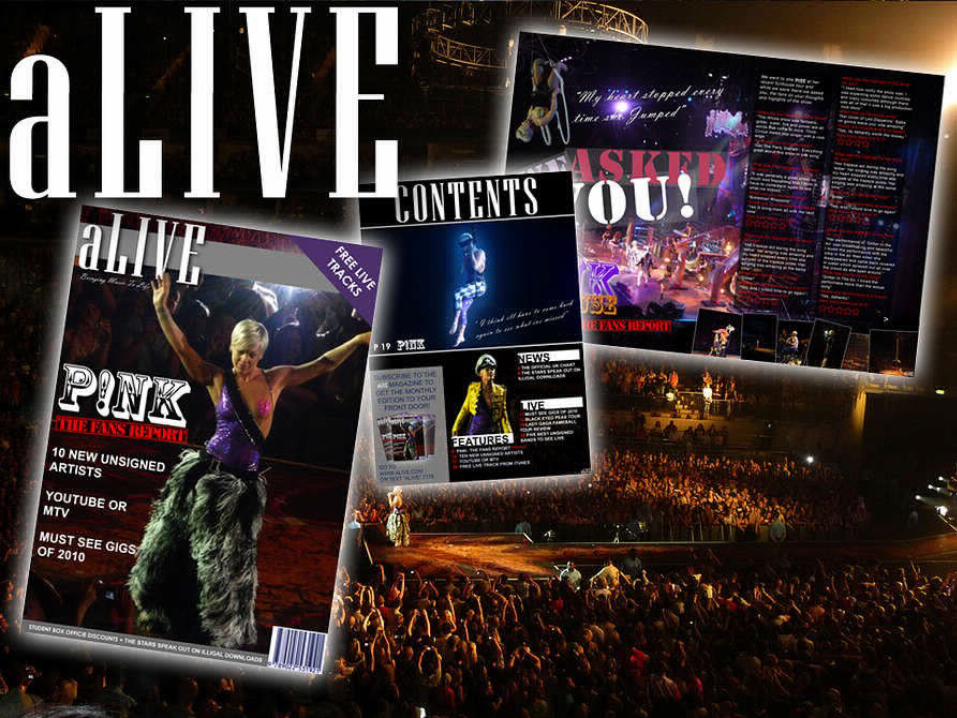
My USP for my magazine was Live music – something in which I feel is where the modern day music I based. I based this magazine for 16+ which is an age I feel is typical for going to such an event. I decided to aim my magazine at a live genre after seeing the artist I used P!nk live and the show has influenced the style of the magazine particularity the double page spread where I used one image of the whole stage as the main images which is something I feel showed of the style of her show, Funhouse. I feel my magazine is unique as there is no other of its kind solely based on Live music which I feel makes my USP very strong.
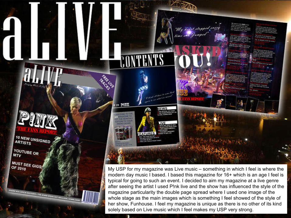
I tried to make my magazine front cover look professional but enjoyable at the same time. Throughout I used the same colour's which would stand out and fit in with the main image. Unlike most magazine I went with a full body shot as I felt the image was posed like a normal magazine but at the same time un-posed with it being live. I have kept all my coverlines on the left third including the title to the main article in which fans are reviewed about the show. Under the masthead I have included a slogo “Bringing Music to Life” which fits in the masthead “aLive’. I have included more coverlines at the bottom of the cover with a bar-code the right. Above the bar-code you will find the price and date of this issue. In the right corner I have added a shape with a line about a freebie something in which in my preliminary survey people said nit enticed them to purchase a magazine.
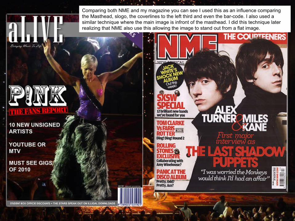
Comparing both NME and my magazine you can see I used this as an influence comparing the Masthead, slogo, the coverlines to the left third and even the bar-code. I also used a similar technique where the main image is infront of the masthead. I did this technique later realizing that NME also use this allowing the image to stand out from a flat image.