Embed Size (px)
DESCRIPTION
Citation preview

Production of my double page spread
By Joshua Connolly

For the production of my double page spread I used another of the adobe collection a programme which many magazine publishers use, In design. Using this I was able to develop my technological skills in the field of media. Here is the programme how it was when I opened it.

Using Photoshop I created the title for the double page spread. I used the line tool to create the four lines like on a sheet of music and in the shapes tool I found various notes which I randomly placed around the text “Holly Coles”. Then I saved it as a png so there was no back ground and opened it in in design.
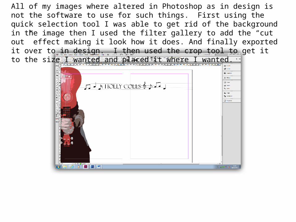
All of my images where altered in Photoshop as in design is not the software to use for such things. First using the quick selection tool I was able to get rid of the background in the image then I used the filter gallery to add the “cut out” effect making it look how it does. And finally exported it over to in design. I then used the crop tool to get it to the size I wanted and placed it where I wanted.

I then made a similar page index to the ones I have on my contents page using the shape tool I made a white rectangle and then added in the text into the box after .

I write all of my article for the double page spread in Microsoft word and then copied it. To get it into in design I made a text box and then pasted it across. Instead of doing a question answer article I simply did a review as I thought it would engage my audience more.

As my page was looking very bland with a lot of white I again used the text boxes on in design and made some quotes from the artist. I made the quotation marks bigger and red to stand out from the text. Also I added the writer of the article liike most magazines have.

Finally to add more colour to the page I added another image of the artist again this was edited in Photoshop with the quick selection tool to get rid of the background and then copied the image three times over and added a colour boost of (blue, red and grey) to keep with he colour scheme and moved them diagonally a bit. Finally I imported it into in design making the finished product you see below.