Embed Size (px)
DESCRIPTION
Reflection on graphical interfaces for illustrating European statistics. UNECE Work Session on Statistical Dissemination and Communication 13-15 May 2008 Communicating statistics in the information age. Main topics. - PowerPoint PPT Presentation
Citation preview
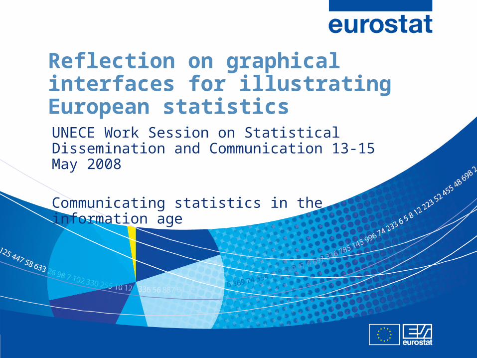
Reflection on graphical interfaces for illustrating European statistics
UNECE Work Session on Statistical Dissemination and Communication 13-15 May 2008
Communicating statistics in the information age
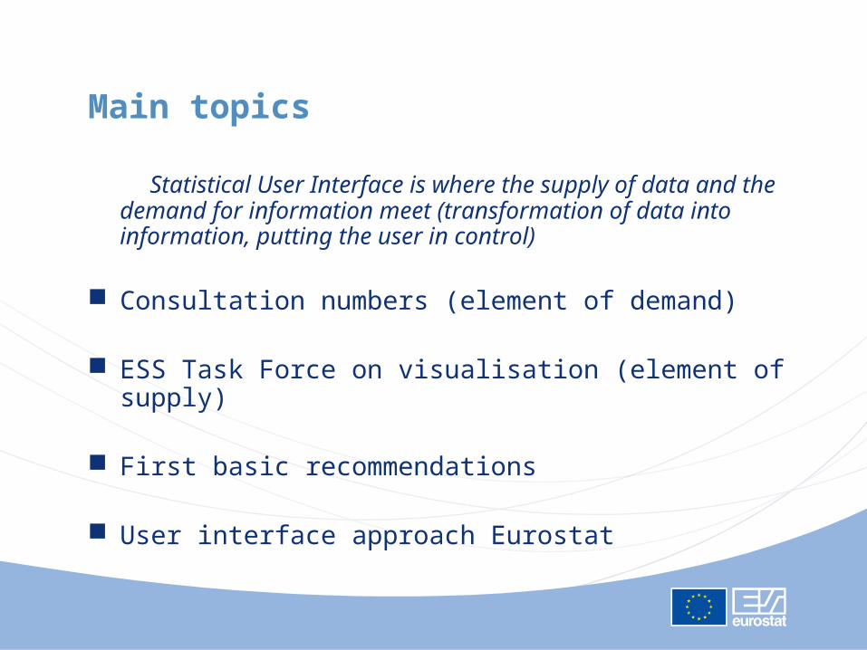
Main topics
Statistical User Interface is where the supply of data and the demand for information meet (transformation of data into information, putting the user in control)
Consultation numbers (element of demand)
ESS Task Force on visualisation (element of supply)
First basic recommendations
User interface approach Eurostat
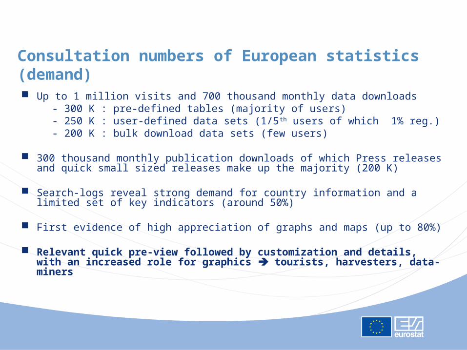
Consultation numbers of European statistics (demand)
Up to 1 million visits and 700 thousand monthly data downloads - 300 K : pre-defined tables (majority of users) - 250 K : user-defined data sets (1/5th users of which 1% reg.) - 200 K : bulk download data sets (few users)
300 thousand monthly publication downloads of which Press releases and quick small sized releases make up the majority (200 K)
Search-logs reveal strong demand for country information and a limited set of key indicators (around 50%)
First evidence of high appreciation of graphs and maps (up to 80%)
Relevant quick pre-view followed by customization and details, with an increased role for graphics tourists, harvesters, data-miners
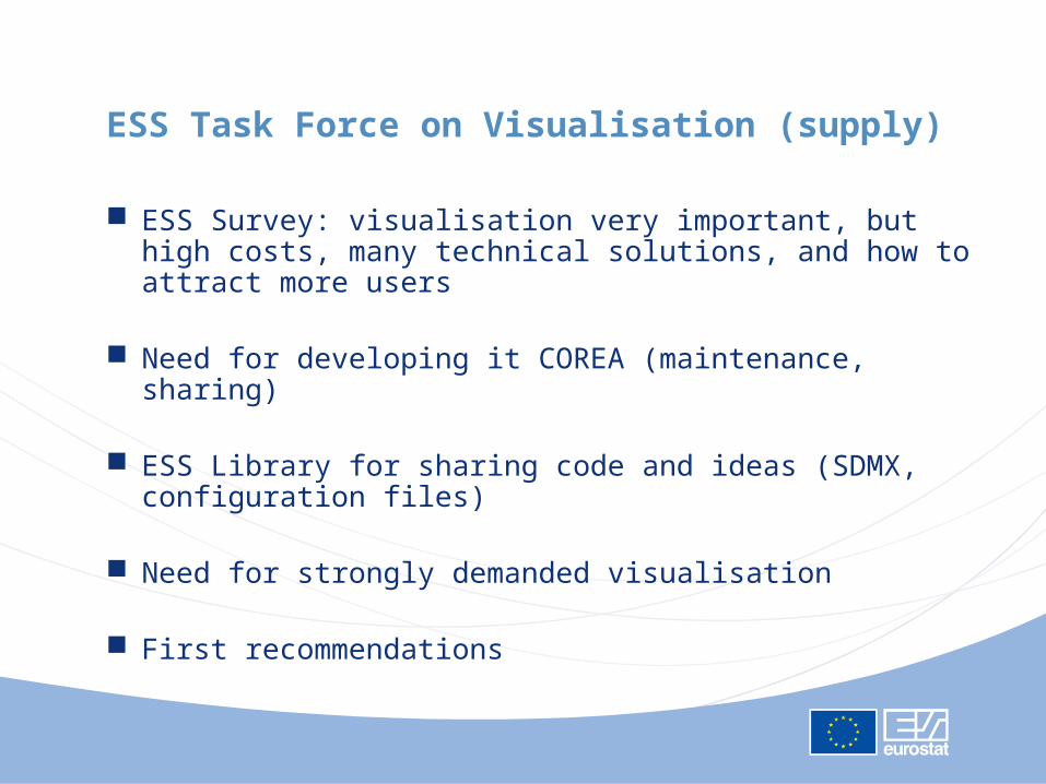
ESS Task Force on Visualisation (supply)
ESS Survey: visualisation very important, but high costs, many technical solutions, and how to attract more users
Need for developing it COREA (maintenance, sharing)
ESS Library for sharing code and ideas (SDMX, configuration files)
Need for strongly demanded visualisation
First recommendations
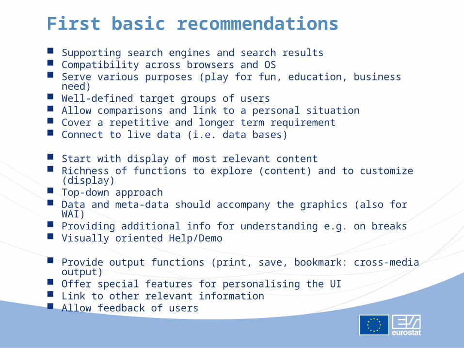
First basic recommendations
Supporting search engines and search results Compatibility across browsers and OS Serve various purposes (play for fun, education, business need) Well-defined target groups of users Allow comparisons and link to a personal situation Cover a repetitive and longer term requirement Connect to live data (i.e. data bases)
Start with display of most relevant content Richness of functions to explore (content) and to customize (display) Top-down approach Data and meta-data should accompany the graphics (also for WAI) Providing additional info for understanding e.g. on breaks Visually oriented Help/Demo
Provide output functions (print, save, bookmark: cross-media output) Offer special features for personalising the UI Link to other relevant information Allow feedback of users
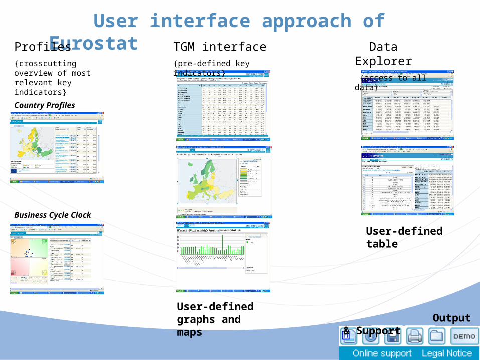
User interface approach of Eurostat TGM interface{pre-defined key indicators}
Data Explorer {access to all data}
User-defined graphs and maps
User-defined table
Output & Support
Profiles{crosscutting overview of most relevant key indicators}
Country Profiles
Business Cycle Clock

THANK YOU FOR YOUR ATTENTION!
ANY QUESTIONS?