Embed Size (px)
Citation preview
Reproducible Workflow for Cartography - Migrants Deaths inthe Mediterranean
Timothee Girauda∗, Nicolas Lambertb
a UMS RIATE, Paris Diderot University, CNRS, France, [email protected] UMS RIATE, Paris Diderot University, CNRS, France, [email protected]
* Corresponding Author
Abstract: As any scientific production, maps must be disputed and debated. The implementation of reproducibleprocesses based on free software and open data is essential. In this paper, we demonstrate that this objective can beachieved in the R software ecosystem. In our demonstration, we propose a set of cartographic visualizations based on theexample of dead and missing migrants in the Mediterranean over the period 2014-2018. Each representation focuses onone aspect of the phenomenon and the R code used is available. We argue that this multi-visualization contributes to bringnew knowledge on the migration debate at European borders and aims at illustrating its geographical complexity.
Keywords: Cartography, GeoVizualisation, Workflow, Reproducible research, Open Science, Migrations, Europe,Mediterranean
1. Introduction
”Science is infallible; but scientists are always wrong.”(France, 1928). The validity of scientific studies can beassessed by their reproducibility. Maps, as part of scien-tific production , must be reproducible. In the academiccontext, data visualization allows both exploratory analysisto generate new ideas and graphical evidences to confirmhypotheses. Maps are an efficient way to communicateand explain research findings. They are prominent parts ofstudies and there is a strong need for tracing the differentsteps taken to design them.Most of the time, several software packages are requiredto cover the entire processing chain from data gatheringto graphical representation. The stacking of multiple soft-ware packages implies a variety of datafile formats, the cre-ation of many intermediate files. Hence, the reproducibil-ity of the produced maps is difficult, it requires to possessand master each software packages involved. The use ofnon open source solutions could aslo be a serious imped-iment to reproducibility: statistical and graphical methodsare hiden inside ”black boxes” that are not available tostudy nor modification.We propose in this paper a practical example addressingthese different issues using open data, open-source statis-tics and graphics language (R), literate programing andversion control system. The aim of this scheme is to beable to produce maps and geographical analyses in a col-laborative approach that is both free and open-source, fullyreproducible and ready for scientific interactions and dis-cussions. In this contribution, we apply this technical frame-work to the example of death of migrants in the Mediter-ranean over the period 2014-2018.
2. Reproducible Workflow
2.1 The Cartographic Design ProcessA map is designed according to its aims (exploratory vs ex-planatory), to the degree of knowledge of the data (known
vs. unknown) and to the audience targeted (for me vs. for apublic). A map can have several objectives depending thecontext (MacEachren, 1994) (DiBiase, 1990).
Nevertheless, different stages always punctuate the carto-graphic construction process: data retrieval, data handlingand cleaning, data processing and analysis, data represen-tation, layout and graphic design, documentation of meth-ods. In this non-linear process, different steps are oftendistributed among different operators or tools.
In practice, each maps is the sum of a multitude of smallchoices determining the final rendering (colors, sizes, words,etc.). A map is the result of a set of technical actionsthat materializes a thinking process. The question of theobjectivity is raised at each step. Our idea is to renderthese different stages of construction in an integrated, read-able, shareable scripting language. The script describes themaking-off of the map; the written trace of the steps in-volved in its construction.
2.2 R for Spatial Analysis
Among various scripting solutions we have decided to usethe R software because of the high versatility it offers andits widespread use among our own scientific community.Most of findings we propose here are not language depen-dent and could apply to other technical solutions (Pythonfor example is a classical alternative to R). R (R Core Team,2018) is a free software environment for statistical comput-ing and graphics. R is enriched by various packages, pack-ages are user contributed plug-ins that add functionalitiesto the software. The huge increase in the number of pack-ages in the recent years (Hornik et al., 2018) reflects theever growing popularity of the software. The first purposeof the software is to compute statistics however a largenumber of thematics were rapidely introduced (economet-rics, NLP, web technologies...). Spatial thematics havebeen specifically addressed since 2003 via rgdal (provid-ing bindings to GDAL and PROJ.4 libraries to manipulategeographical projections and data import/export). Quickly
Proceedings of the International Cartographic Association, 2, 2019. 29th International Cartographic Conference (ICC 2019), 15–20 July 2019, Tokyo, Japan. This contribution underwent single-blind peer review based on submitted abstracts. https://doi.org/10.5194/ica-proc-2-38-2019 | © Authors 2019. CC BY 4.0 License.
2 of 7
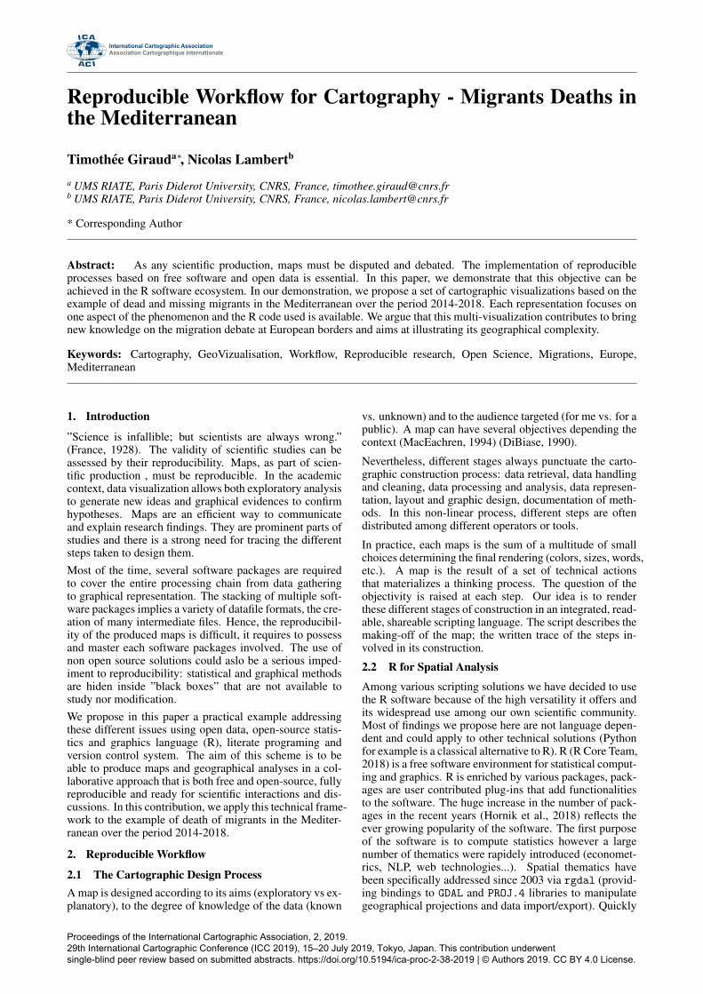
Figure 1. Reproducible mapping process in the R ecosystem
other packages were created to tackle specific thematics:raster for raster data handling, sp for vector data han-dling or rgeos, an interface to the GEOS library aiming atgeo-processing spatial features. These packages have fos-tered the developpement of a dedicated spatial environe-ment within R. In 2016, the sf package (Pebesma, 2018)was published in an effort to unite import, export, trans-formations and data handling functionnalities in a singlepackage. On the geovizualisation side, the cartographypackage (Giraud and Lambert, 2017) first appears in 2015and allows users to design maps following Bertin’s semiol-ogy rules (Bertin, 1967) and producing high quality mapswith standard layouts (barscale, north arrow...). In additionto this numerous other packages are dedicated to specificspatial data processing needs (statistical analysis, transfor-mation...). The large R ecosystem of packages covers allthe steps of the map design process: data and basemapgathering, data handling and transformation, geoprocess-ing, data analysis, statistics, geovizualisation and layoutdesign.
2.3 Ensuring Traceability and Collaborative Work
The use of a mature and vast script language like R letus design comprehensive geographical analyses. The mainoutput of these analyses is a set of raw text files (R pro-grams) and figures. This material alone is not sufficientto ensure reproducibility. Raw text files do not show ex-plicitly what tasks a program is performing. They do notexplain the methodological choices that were made. Theydo not allow to trace the various versions of the program,nor the contributions of each authors. To sum up, the studyof the bare material demand the reader a lot of effort toreproduce analyses. To ease the reproducibility, we sug-gest a toolset based on two concepts: literate programmingand version control. Literate programming, introduced byDonald Knuth (Knuth, 1984), strongly links analyses, sta-tistical outputs and their related code in a single document.We specifically suggest the use of Markdown (Leonard,2016), a lightweight markup language particularly well in-tegrated in the R environment. The Markdown languageallows easy combining or R program pieces and explaina-
tory texts. Litterate programing ensures a good readabilityof the programs and analyses and is well suited for versioncontrol systems (or VCS). VCS are made for and used insoftware development but they also meet the needs of re-producible research processes (Ram, 2013). These frame-works allow to manage and track changes and versions ofdatasets, statistical codes, figures and manuscripts. Theyalso offer asynchronous collaborations among authors bycreating ”branches” or ”forks”. Among the various opensource VCS we suggest the use of git which is widely used.
3. Mapping Deaths of Migrants in the MediterraneanSea
3.1 Thematic Issues
In March 2011, an inflatable boat with 72 migrants onboard left Libya for Europe. Running out of fuel, the boateventually drifted until it ran aground on the Libyan coast14 days later. Out of 72 passengers, 63 died, including 20women and 3 children (Heller and Pezzani, 2014). Morerecently on September 25, 2018, a ship carrying 25 mi-grants from Mdiq-Fnideq on the Moroccan coast to Spainwas stopped by the Marocan authorities. During the inter-ception a young woman was shot dead and 3 other severlyinjured. On April 18 2015, the Mediterranean was facingthe worst shipwreck in its recent history. During the night,an overloaded trawler with nearly 750 people on board cap-sized. Only 28 people were rescued.
Theses tragic events are not isolated, year after year theMediterranean is the scene of multiple shipwrecks of mi-grants seeking to reach European coasts. The Mediter-ranean is one of the most frequented and best monitoredseas in the world but also one of the most dangerous areafor migrants.
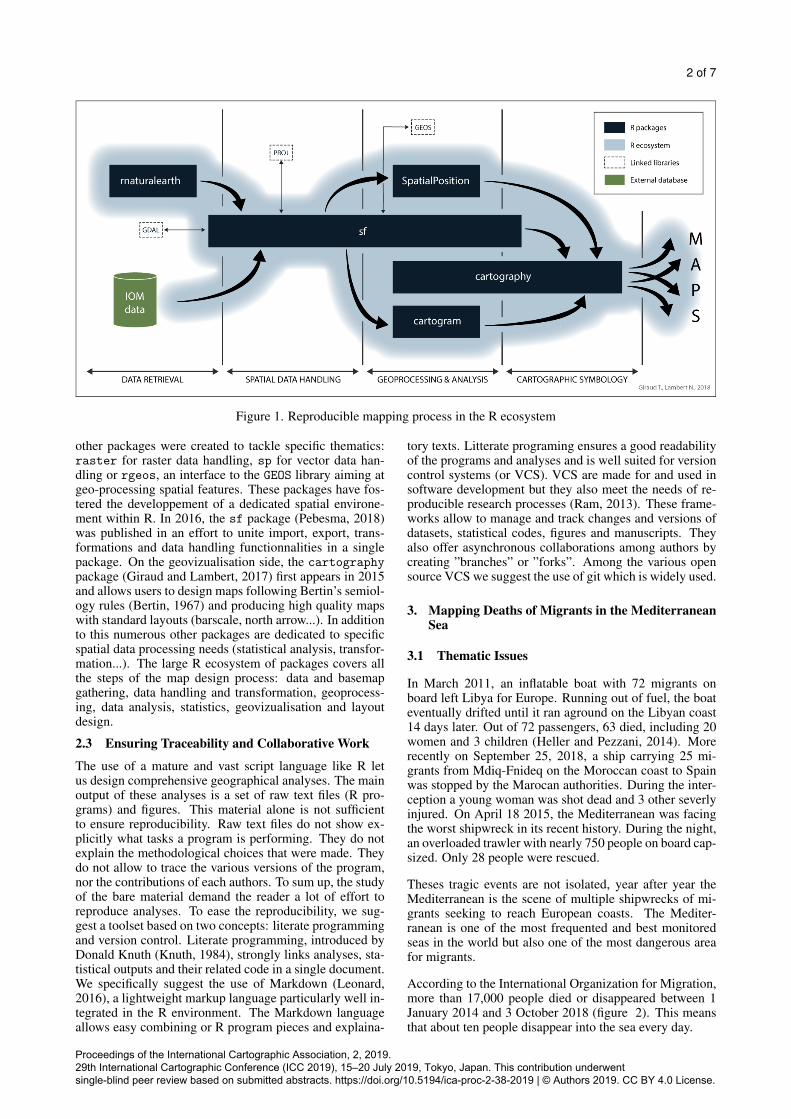
According to the International Organization for Migration,more than 17,000 people died or disappeared between 1January 2014 and 3 October 2018 (figure 2). This meansthat about ten people disappear into the sea every day.
Proceedings of the International Cartographic Association, 2, 2019. 29th International Cartographic Conference (ICC 2019), 15–20 July 2019, Tokyo, Japan. This contribution underwent single-blind peer review based on submitted abstracts. https://doi.org/10.5194/ica-proc-2-38-2019 | © Authors 2019. CC BY 4.0 License.
3 of 7
Figure 2. Dead and missing migrants in the Mediterranean,2014-2018
3.2 Data
The first database listing the dead and missing migrantsat European scale was designed in 1993 by UNITED forIntercultural Action, a Netherlands based NGO. A sec-ond database was created in 1998 by the italian journal-ist Gabriele Del Grande. Later, a collective of journalistscompiled and cross validated these previous sources andadditional ones to create a third database, the Migrant’sFile (mid 2013 - mid 2016). Since 2016 the only main-tained database on the whole mediterranea is held by anUN organization: the International Office for Migration(IOM). All theses databases have in common their col-lecting process: the gathering of information through offi-cial records, media reports, NGO’s surveys and interviewsof survivors. Data provided by these organisations canbe usefull to grasp the phenomena, even if they are notcomprehensive, and not fully reliable at the event level.Migrations experts commonly agree on the fact that thesedatabases tend to underestimate the number of dead andmissings (Kobelinsky and Le Courant, 2017).
3.3 Implementation
In the following example we used a set of R packages(figure 1) to conduct analyses and produce maps. Thesepackages cover all steps of the map production process.rnaturaleath (South, 2017), sf and base functions areused to import datasets (data and geometries). Data han-dling (basemap selection and modification) is done withsf. Some maps are based on spatial analysis and geo-processing therefore we have used specialised packagesto produce them: cartogram (Jeworutzki, 2018) for car-togram creation, SpatialPosition (Giraud and Com-menges, 2017) for spatial smoothing, cartography fortransforming irregular data to grids. We have mainly usedcartography for cartographic symbologies, layout, leg-end or scale. All data and scripts are available online1.This material allows to reproduce our analyses and can beeasily adapted to other time periods or geographical areas.
4. Geovizualisation
The first map triying to visualise the amount of dead andmissing migrants in the mediterranean area was published
1https://riatelab.github.io/MDM/index.html
in 2003 (Clochard, 2003). This initial map has been reg-ularly updated, enriched and republished by differents au-thors (Rekacewicz and Clochard, 2006), (Migreurop, 2009)(Migreurop, 2012) (Migreurop, 2017).
At each update, we can visualize the shape and the ge-ography of the European Union’s migratory border. Car-tographic visualizations help to understand the geograph-ical logics, and to measure the dangerousness of the dif-ferent routes to Europe over time (exploratory approach,scientific context). These maps are also effective toolsto alert public opinion on the magnitude of this humantragedy taking place at the borders of the European con-tinent (explanatory approach, general public). In partic-ular, this work has shown that whenever a passing pointis closed (Strait of Gibraltar, Canary Islands, Lampedusa,etc.), migration flows are redirected towards often moredangerous routes, causing an increase in the number ofdeaths. Maps can play an important function in interpellinggovernments and citizens. Considering the several carto-graphic representations already made in the past, we pro-pose in this paper several reproducible, configurable andautomated cartographic representations. Each of them pro-vides a particular focus on the thematic.
4.1 Proportional Symbols
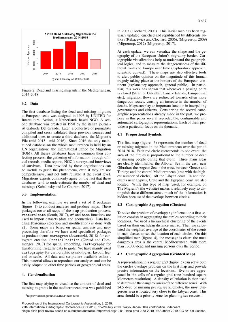
The first map (figure 3) represents the number of deador missing migrants in the Mediterranean over the period2014-2018. Each red circle corresponds to one event; thearea of the circles is proportional to the number of deador missing people during that event. Three main areasare clearly identifiable: the Alboran Sea in the east, nearGibraltar; the Aegean Sea in the west, between Greece andTurkey; and the central Mediterranean (area with the high-est number of circles), off the Libyan coast. In addition,events near Cyprus, Crete and the Egyptian coast are alsolocated. While this type of map (used, for example, onThe Migrant’s file website) makes it relatively easy to dis-tinguish these different areas, much of the information ishidden because of the overlaps between circles.
4.2 Cartographic Aggregation (Clusters)
To solve the problem of overlapping information a first so-lution consists in aggregating the circles according to theirlocations. We used a hierarchical clustering of the eventsbased on their euclidean distance matrix. Then we calcu-lated the weighted average of the coordinates of the eventsin each classes to set the location of each circles. On thissimplified map (figure 4), the message is clear: the mostdangerous area is the central Mediterranean, with morethan 13,000 dead and missing persons over the period.
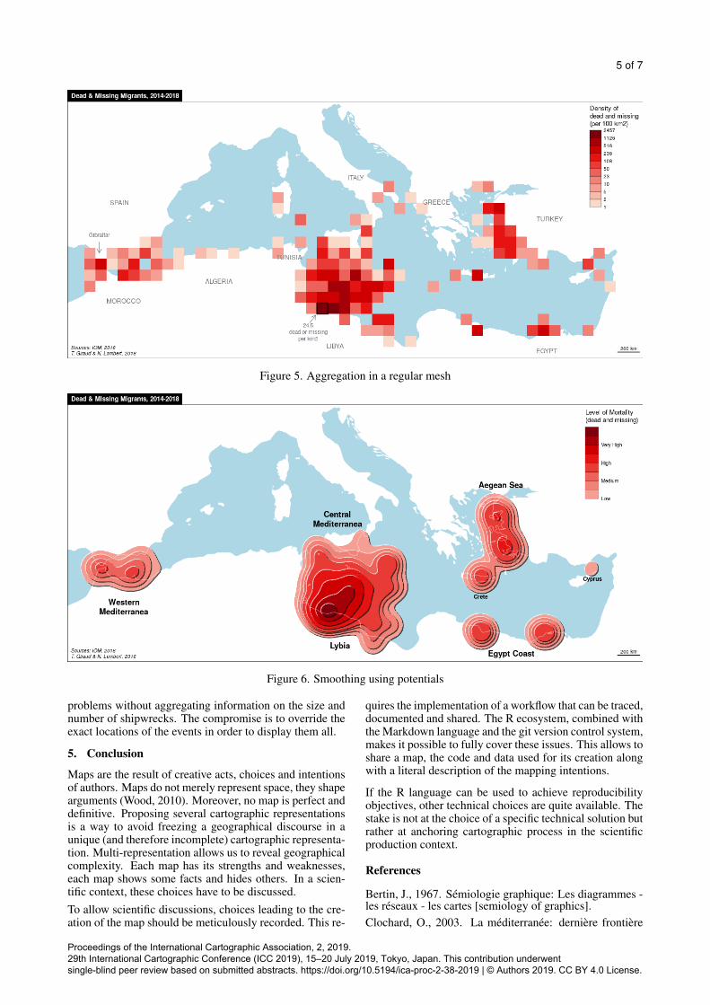
4.3 Cartographic Aggregation (Gridded Map)
A representation in a regular grid (figure 5) can solve boththe circles overlaps problem on the first map and provideprecise information on the locations. Events are aggre-gated in the cells of a regular grid (one hundred squarekilometers resolution). A density calculation is then usedto determine the dangerousness of the different zones. With24.5 dead or missing per square kilometer, the most dan-gerous area is located very close to the Libyan coast. Thisarea should be a priority zone for planning sea rescues.
Proceedings of the International Cartographic Association, 2, 2019. 29th International Cartographic Conference (ICC 2019), 15–20 July 2019, Tokyo, Japan. This contribution underwent single-blind peer review based on submitted abstracts. https://doi.org/10.5194/ica-proc-2-38-2019 | © Authors 2019. CC BY 4.0 License.
4 of 7
Figure 3. Number of dead or missing, simple representation
Figure 4. Distance based aggregation
4.4 Cartographic Aggregation (Isopleth Map)
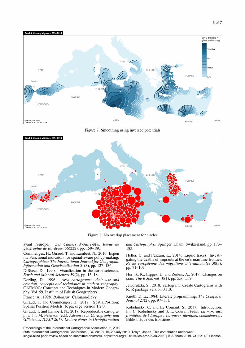
The fourth map was made using a smoothing method. Wespecificaly used the Stewart potentials with a 75km spanand an exponential interaction function, see (Stewart, 1942)and (Commenges et al., 2016) for detailed explainations.The classic output of this method is an isopleth map thatdoes not adequately reflect the order of magnitude of thedata points. That is why we used a pseudo-3D renderingusing the relief contour method (Tanaka, 1950). Smoothedmaps emphasizes the spatial structures by constructing asimplified image of a geographical phenomenon. On thismap (figure 6) the geographical organization of the phe-nomenon is clear. The Central Mediterranean is the largestarea of the region. It is also the area where the maximumvalues are observed, especially on the Lybian coast. Asraw values of potentials are difficult to interpret for noninitiated readers, we have chosen to translate them into a
qualitative scale.
4.5 A Cartographic MetaphorThe next map uses the same smoothing method but po-tentials values are inverted to represent hollows instead ofhills. This Mediterranean whirlpool is the cartographicmetaphor of the enormous chasm in which thousands mi-grants have drowned, in particular off the coast of Libya.This map is a possible representation of the European ”mi-gratory border” (Lambert and Clochard, 2015).
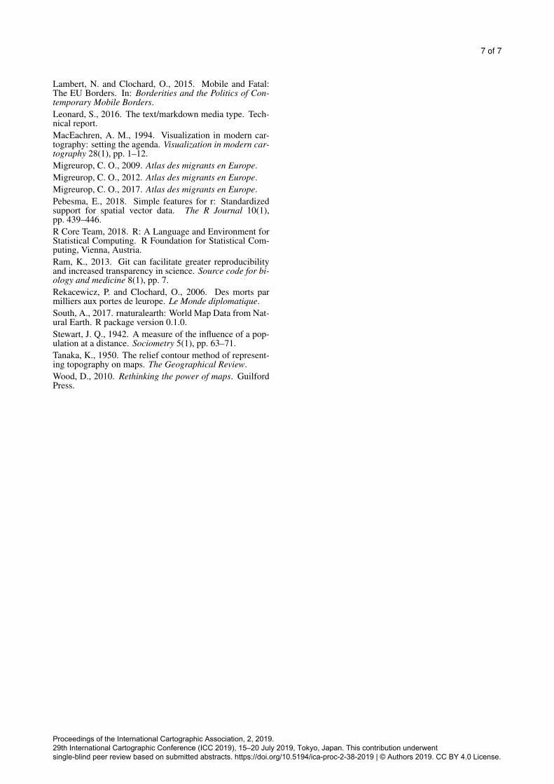
4.6 Dorling CartogramDespite allowing a good understanding of spatial struc-tures, the main flaws of the previous representations is thatthey hide each individual stories by aggregating them. Eachshipwreck is gummed and melted in a colored area on themap. The Dorling Cartogram method (Dorling, 1996) (fig-ure 8) is a good approach to solve the overlapping circles
Proceedings of the International Cartographic Association, 2, 2019. 29th International Cartographic Conference (ICC 2019), 15–20 July 2019, Tokyo, Japan. This contribution underwent single-blind peer review based on submitted abstracts. https://doi.org/10.5194/ica-proc-2-38-2019 | © Authors 2019. CC BY 4.0 License.
5 of 7
Figure 5. Aggregation in a regular mesh
Figure 6. Smoothing using potentials
problems without aggregating information on the size andnumber of shipwrecks. The compromise is to override theexact locations of the events in order to display them all.
5. Conclusion
Maps are the result of creative acts, choices and intentionsof authors. Maps do not merely represent space, they shapearguments (Wood, 2010). Moreover, no map is perfect anddefinitive. Proposing several cartographic representationsis a way to avoid freezing a geographical discourse in aunique (and therefore incomplete) cartographic representa-tion. Multi-representation allows us to reveal geographicalcomplexity. Each map has its strengths and weaknesses,each map shows some facts and hides others. In a scien-tific context, these choices have to be discussed.To allow scientific discussions, choices leading to the cre-ation of the map should be meticulously recorded. This re-
quires the implementation of a workflow that can be traced,documented and shared. The R ecosystem, combined withthe Markdown language and the git version control system,makes it possible to fully cover these issues. This allows toshare a map, the code and data used for its creation alongwith a literal description of the mapping intentions.
If the R language can be used to achieve reproducibilityobjectives, other technical choices are quite available. Thestake is not at the choice of a specific technical solution butrather at anchoring cartographic process in the scientificproduction context.
References
Bertin, J., 1967. Semiologie graphique: Les diagrammes -les reseaux - les cartes [semiology of graphics].Clochard, O., 2003. La mediterranee: derniere frontiere
Proceedings of the International Cartographic Association, 2, 2019. 29th International Cartographic Conference (ICC 2019), 15–20 July 2019, Tokyo, Japan. This contribution underwent single-blind peer review based on submitted abstracts. https://doi.org/10.5194/ica-proc-2-38-2019 | © Authors 2019. CC BY 4.0 License.
6 of 7
Figure 7. Smoothing using inversed potentials
Figure 8. No overlap placement for circles
avant l’europe. Les Cahiers d’Outre-Mer. Revue degeographie de Bordeaux 56(222), pp. 159–180.Commenges, H., Giraud, T. and Lambert, N., 2016. Esponfit: Functional indicators for spatial-aware policy-making.Cartographica: The International Journal for GeographicInformation and Geovisualization 51(3), pp. 127–136.DiBiase, D., 1990. Visualization in the earth sciences.Earth and Mineral Sciences 59(2), pp. 13–18.Dorling, D., 1996. Area cartograms: their use andcreation, concepts and techniques in modern geography.CATMOG: Concepts and Techniques in Modern Geogra-phy, Vol. 59, Institute of British Geographers.France, A., 1928. Balthasar. Calmann-Levy.Giraud, T. and Commenges, H., 2017. SpatialPosition:Spatial Position Models. R package version 1.2.0.Giraud, T. and Lambert, N., 2017. Reproducible cartogra-phy. In: M. Peterson (ed.), Advances in Cartography andGIScience. ICACI 2017. Lecture Notes in Geoinformation
and Cartography., Springer, Cham, Switzerland, pp. 173–183.
Heller, C. and Pezzani, L., 2014. Liquid traces: Investi-gating the deaths of migrants at the eu’s maritime frontier.Revue europeenne des migrations internationales 30(3),pp. 71–107.
Hornik, K., Ligges, U. and Zeileis, A., 2018. Changes oncran. The R Journal 10(1), pp. 556–559.
Jeworutzki, S., 2018. cartogram: Create Cartograms withR. R package version 0.1.0.
Knuth, D. E., 1984. Literate programming. The ComputerJournal 27(2), pp. 97–111.
Kobelinsky, C. and Le Courant, S., 2017. Introduction.In: C. Kobelinsky and S. L. Courant (eds), La mort auxfrontieres de l’Europe : retrouver, identifier, commemorer,Bibliotheque des frontieres.
Proceedings of the International Cartographic Association, 2, 2019. 29th International Cartographic Conference (ICC 2019), 15–20 July 2019, Tokyo, Japan. This contribution underwent single-blind peer review based on submitted abstracts. https://doi.org/10.5194/ica-proc-2-38-2019 | © Authors 2019. CC BY 4.0 License.
7 of 7
Lambert, N. and Clochard, O., 2015. Mobile and Fatal:The EU Borders. In: Borderities and the Politics of Con-temporary Mobile Borders.Leonard, S., 2016. The text/markdown media type. Tech-nical report.MacEachren, A. M., 1994. Visualization in modern car-tography: setting the agenda. Visualization in modern car-tography 28(1), pp. 1–12.Migreurop, C. O., 2009. Atlas des migrants en Europe.Migreurop, C. O., 2012. Atlas des migrants en Europe.Migreurop, C. O., 2017. Atlas des migrants en Europe.Pebesma, E., 2018. Simple features for r: Standardizedsupport for spatial vector data. The R Journal 10(1),pp. 439–446.R Core Team, 2018. R: A Language and Environment forStatistical Computing. R Foundation for Statistical Com-puting, Vienna, Austria.Ram, K., 2013. Git can facilitate greater reproducibilityand increased transparency in science. Source code for bi-ology and medicine 8(1), pp. 7.Rekacewicz, P. and Clochard, O., 2006. Des morts parmilliers aux portes de leurope. Le Monde diplomatique.South, A., 2017. rnaturalearth: World Map Data from Nat-ural Earth. R package version 0.1.0.Stewart, J. Q., 1942. A measure of the influence of a pop-ulation at a distance. Sociometry 5(1), pp. 63–71.Tanaka, K., 1950. The relief contour method of represent-ing topography on maps. The Geographical Review.Wood, D., 2010. Rethinking the power of maps. GuilfordPress.
Proceedings of the International Cartographic Association, 2, 2019. 29th International Cartographic Conference (ICC 2019), 15–20 July 2019, Tokyo, Japan. This contribution underwent single-blind peer review based on submitted abstracts. https://doi.org/10.5194/ica-proc-2-38-2019 | © Authors 2019. CC BY 4.0 License.